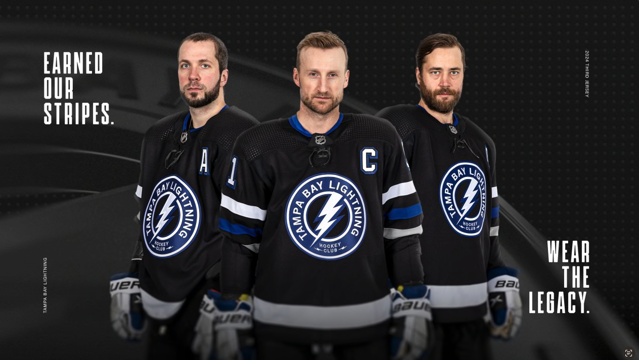
The Tampa Bay Lightning recently introduced a captivating new third jersey that will make its debut in seven games this season. The inaugural appearance is set for a faceoff against the Colorado Avalanche, initiating a three-game homestand that promises to showcase the team's fresh look.
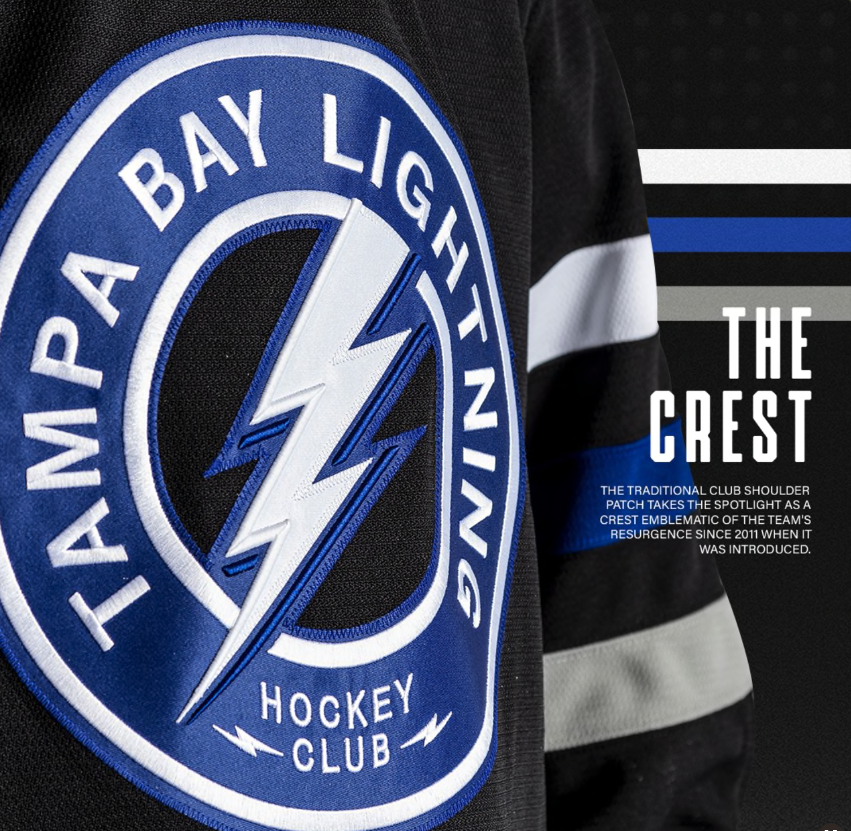
The jersey features a sleek black base adorned with four white and two blue stripes dominating the arm region. The emblematic logo takes center stage—a blue circle crest with "Tampa Bay Lightning" boldly inscribed in uppercase letters above "Hockey Club" at the bottom. The iconic lightning bolt design, synonymous with the team, graces the center of the crest.
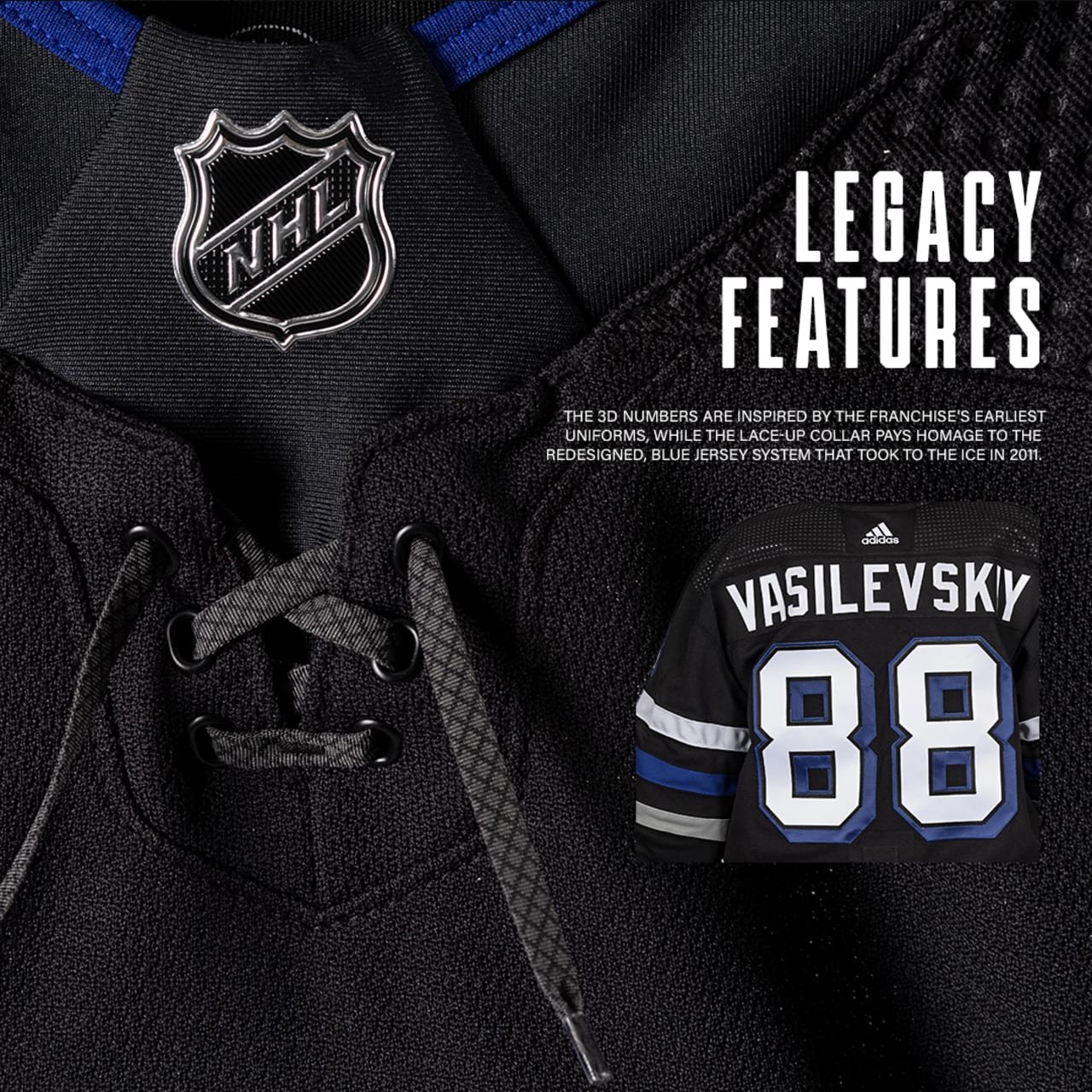
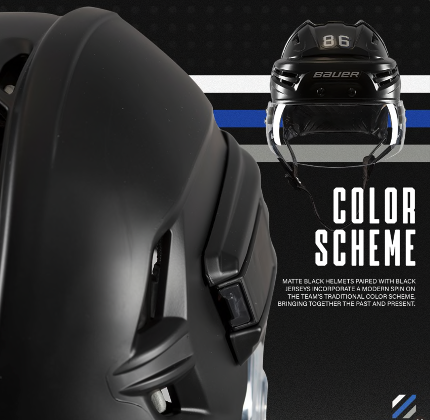
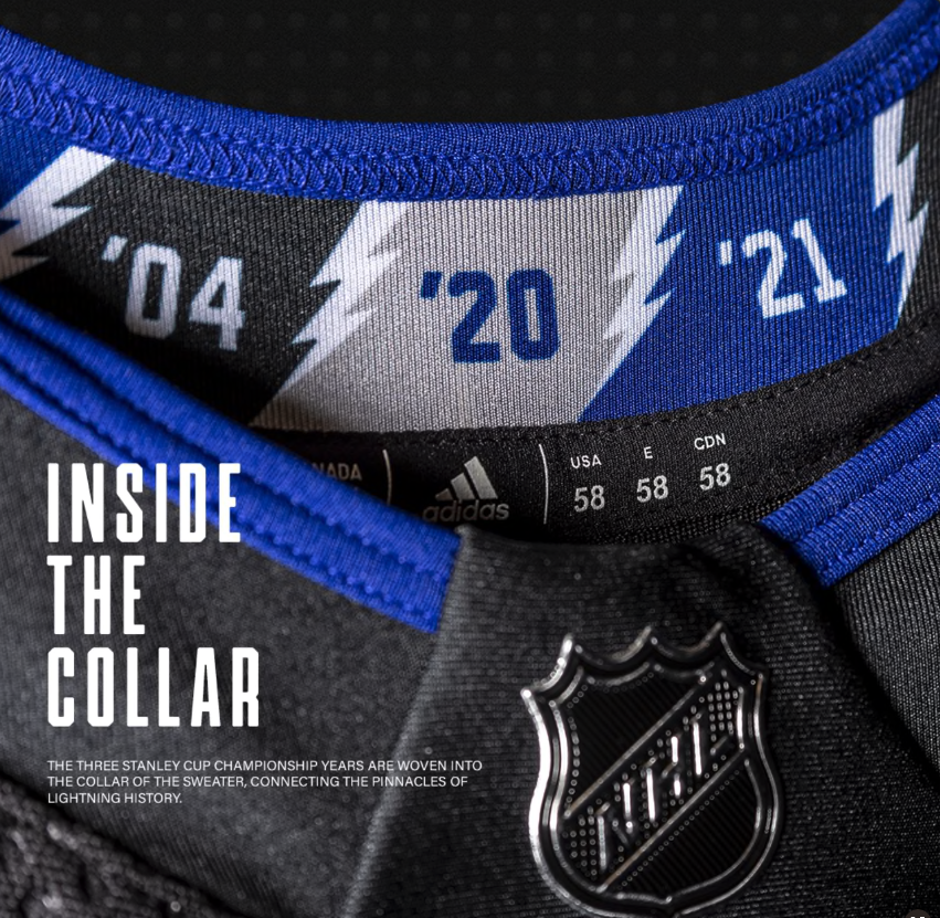
A thoughtful touch is added to the inside collar, which proudly displays the years commemorating the team's three Stanley Cup victories. The jersey numbers receive a vibrant 3D treatment, combining white and blue hues. Notably, the team's helmets will sport a matte black finish, marking a historic departure from the traditional helmet design.
This release marks the return of a black third jersey, a change from the five-year stint with a black and grey alternate look. The Lightning's choice to reintroduce black as a primary color is a nod to the team's rich history, as they predominantly featured black jerseys for most of their existence. The decision to shift to an all-blue design in the 2011-12 season and later introduce a black jersey with a "Bolts" diagonal wordmark in 2014 marked significant milestones in the team's aesthetic evolution.
Hockey enthusiasts and Lightning fans alike are sure to embrace this exciting new chapter in the team's uniform history, appreciating the balance struck between a classic black jersey and contemporary design elements. The introduction of the third jersey adds an extra layer of excitement to the Lightning's upcoming games, as they showcase their prowess on the ice with a stylish and symbolic new look.
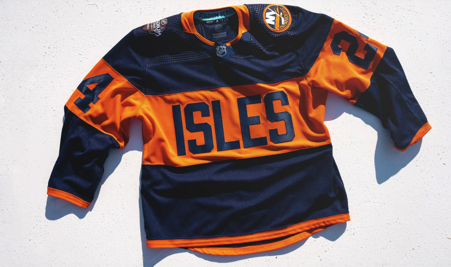
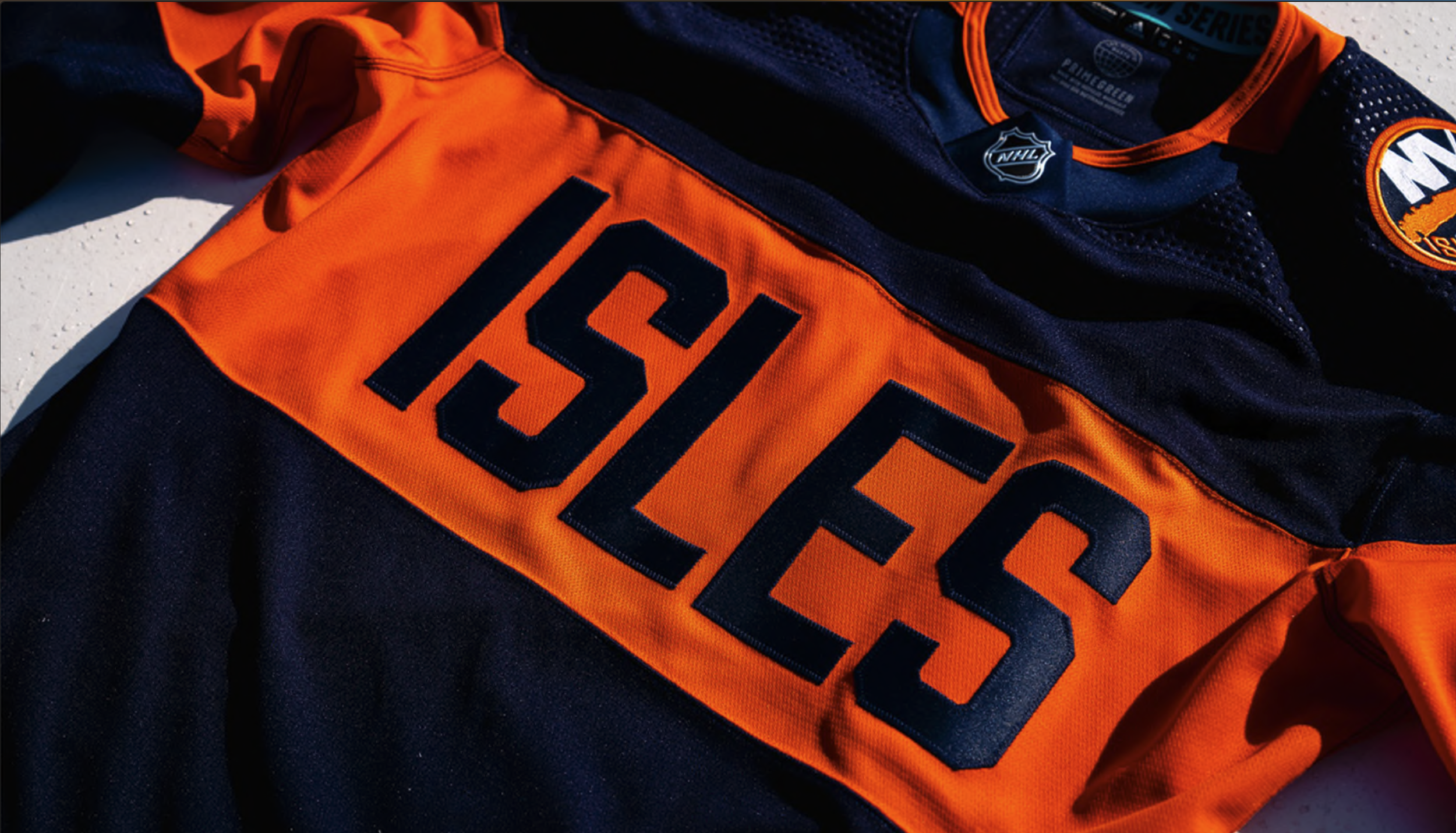
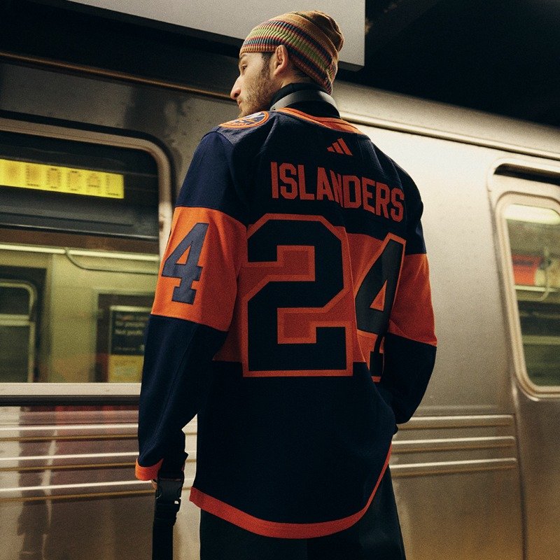
The anticipation surrounding the New York Islanders' Stadium Series jerseys reached its peak last Friday, and the Isles themselves are eagerly awaiting the opportunity to don these striking uniforms. The consensus among the players is unanimous – the jerseys are a nod to the old school, exuding an outdoorsy charm that perfectly aligns with the spirit of the upcoming game at MetLife Stadium.
"I love it," exclaimed Mathew Barzal, reflecting the collective sentiment of the team. "It looks old school. It looks outdoorsy. And I think we're going to look great over at MetLife there in those things. I was pumped to see them. I thought they looked awesome."
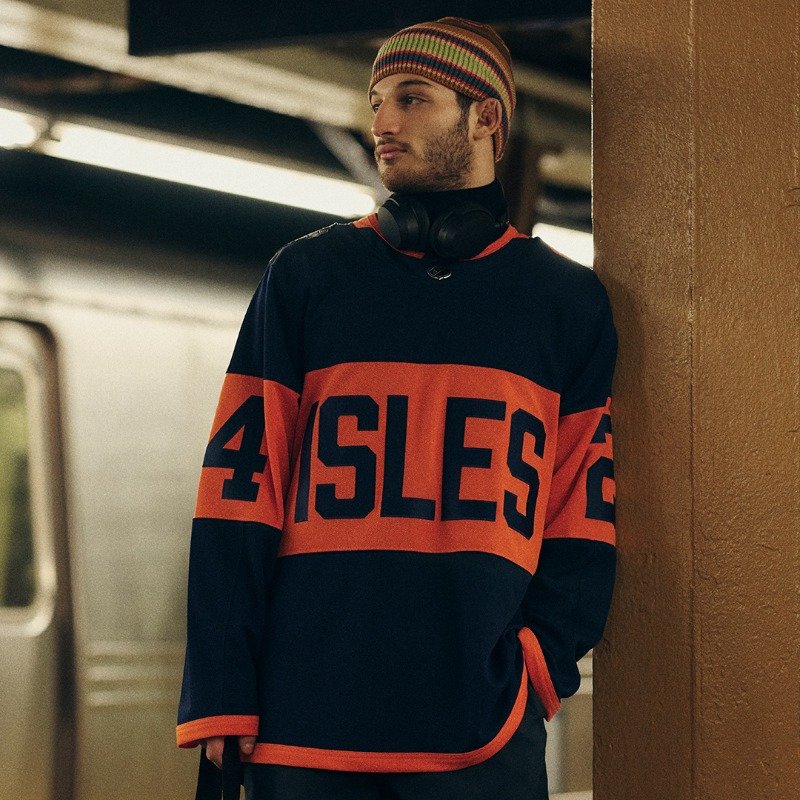
The navy blue base sets the tone for the Islanders' Stadium Series jerseys, reminiscent of classic hockey aesthetics. A bold orange horizontal stripe, reminiscent of the Minnesota Wild style, runs across the front, featuring the team name abbreviated to "ISLES" in single-color blue lettering. This innovative stripe concept extends to the sleeves, housing giant blue numbers that add a dynamic touch to the overall design.
Adding finesse to the ensemble, a thin single orange stripe adorns the cuffs, waist, and collar. The Islanders' primary logo proudly graces the left shoulder, while the Stadium Series logo finds its place on the right, creating a harmonious balance between tradition and the uniqueness of the special event.
The design choice to go for an outdoorsy, old-school look aligns seamlessly with the essence of the Stadium Series. The navy blue, bold stripes, and distinctive lettering all contribute to a visual narrative that evokes a sense of nostalgia while celebrating the Islanders' identity.
In conclusion, the New York Islanders' Stadium Series jerseys have successfully merged tradition with innovation, capturing the attention and approval of both players and fans alike. With MetLife Stadium set as the backdrop, these jerseys are poised to become a memorable part of the Islanders' history, leaving an indelible mark on the upcoming outdoor spectacle.
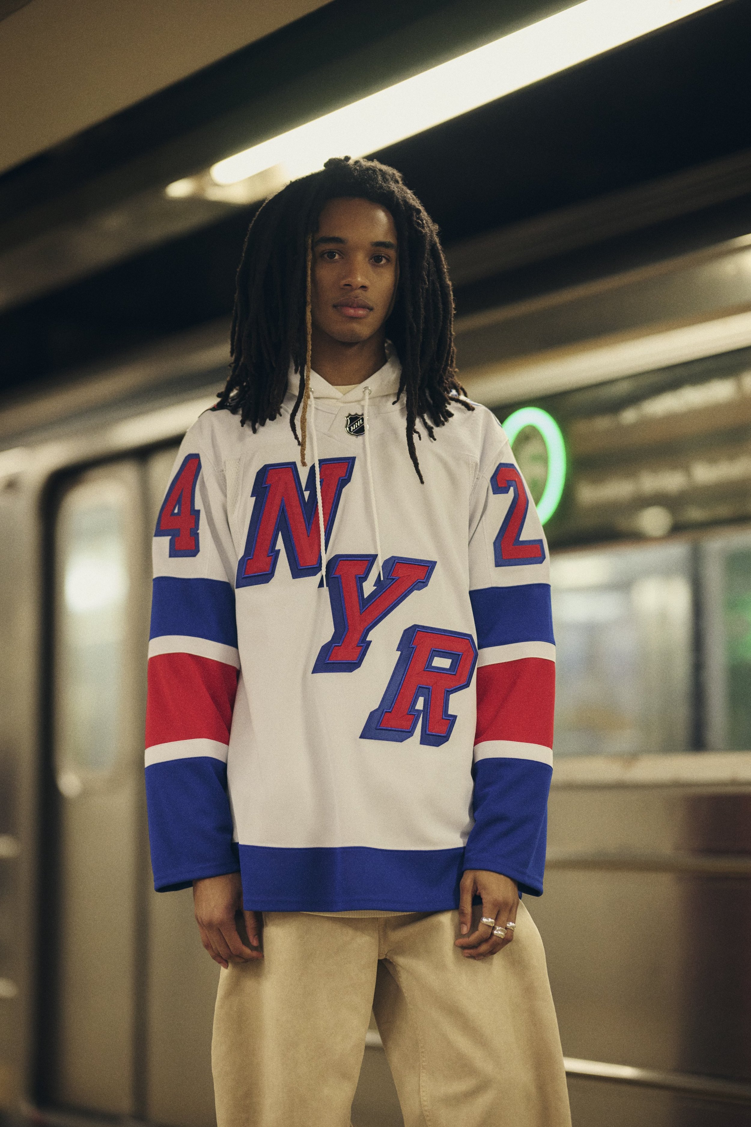
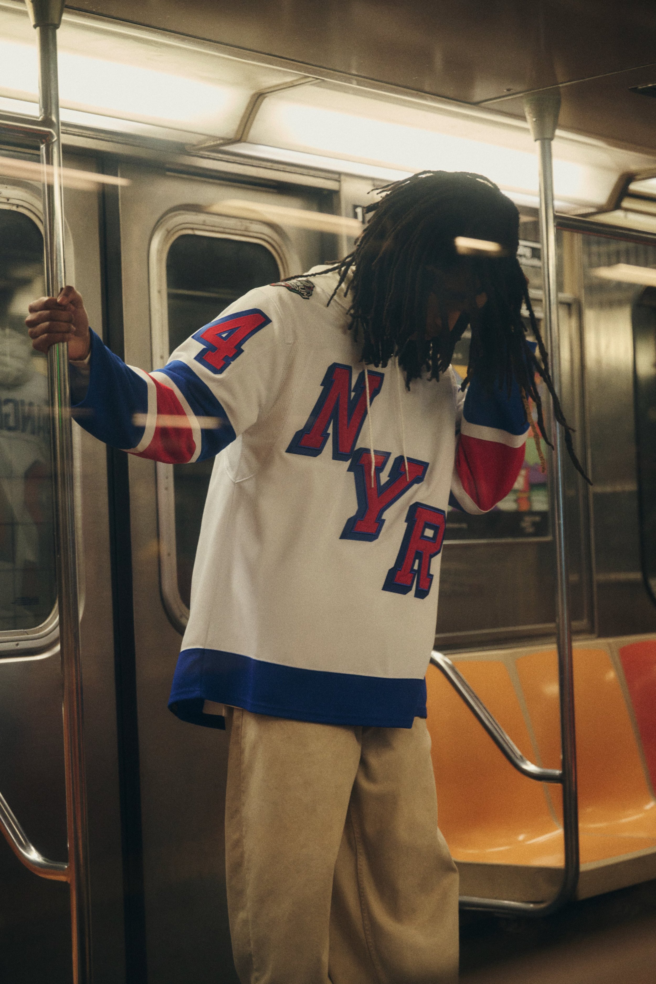
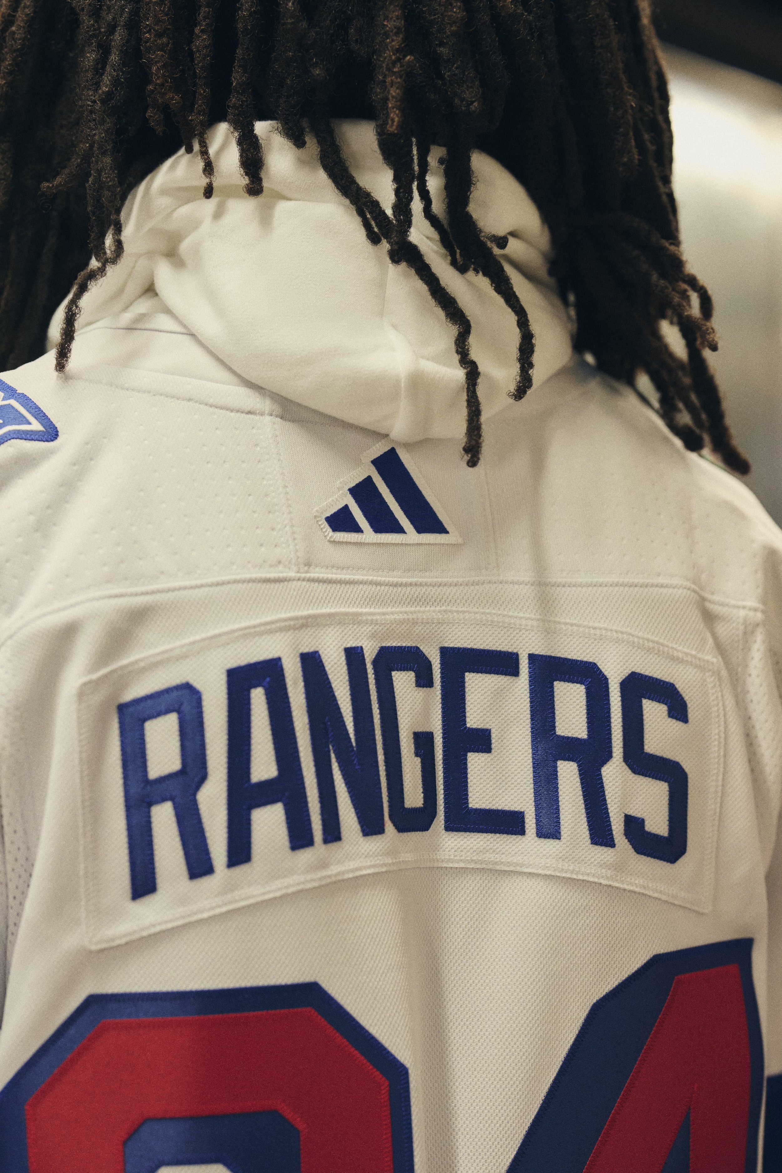
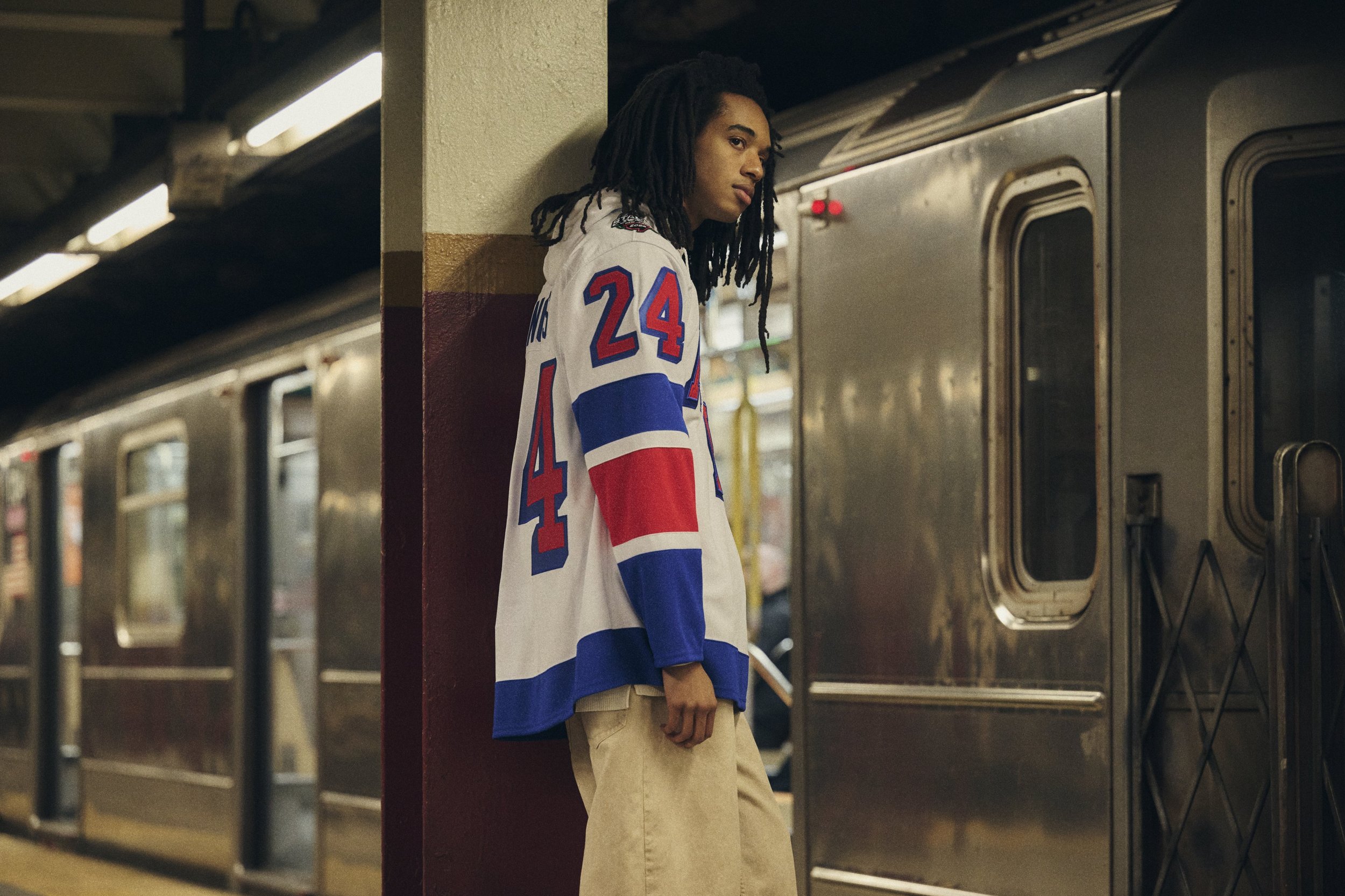
Hockey enthusiasts and New York Rangers fans alike, get ready to be captivated by a vision of the future as we unveil the design details of the 2024 Stadium Series Uniform. Featuring a blend of tradition and modernity, this uniform showcases a very Rangers-esque "NYR" across the chest, employing the same drop style as the numbers. It's not just a uniform; it's a statement, and we can't help but feel that this could be the look the Rangers embrace in the years to come.
The central focus of this forward-looking uniform is the bold "NYR" across the front, designed in the same drop style as the player numbers. This meticulous attention to detail creates a sense of cohesion and sophistication, a perfect fusion of classic Rangers aesthetics and contemporary design elements.
a cream/heritage white base serving as the canvas for this visionary design. Alternating large blue, red, blue striping, with thin cream stripes in between, adorns the jersey. The large player numbers near the shoulders, rendered in the classic Rangers drop style, add an extra layer of nostalgia and authenticity to the ensemble.
As we delve into the details of the 2024 Stadium Series Uniform, it's hard not to envision the New York Rangers gracing the ice in this stunning creation. The design feels like a natural evolution, a seamless transition into the future while paying homage to the rich heritage of the Rangers' iconic aesthetics.
In conclusion, the 2024 Stadium Series Uniform for the New York Rangers is more than just a set of colors and patterns; it's a glimpse into the future of hockey fashion. The thoughtful incorporation of Rangers' traditions into a forward-looking design creates a harmonious blend that resonates with fans and enthusiasts alike. As we eagerly await the grand reveal on the ice, one thing is certain – this uniform is poised to make a lasting impact, not just for its visual appeal but for the story it tells about the Rangers' journey into the future of the sport.
In an exciting collaboration, the Philadelphia Flyers, National Hockey League, and adidas have revealed the much-anticipated 2024 NHL Stadium Series jersey. Crafted exclusively for the Flyers vs. Devils matchup, these special-edition uniforms are set to make a stunning on-ice debut at MetLife Stadium on Saturday, February 17, during the 2024 NHL Stadium Series.
The 2024 NHL Stadium Series jersey boasts bold and statement designs that capture the essence of this unique outdoor event. One of the standout features is the oversized numbers, letters, and Flyers crest, all magnified to scale for the grandeur of MetLife Stadium. The Flyers' distinctive contrast nameplate takes center stage, stretching along the entire width of the sweater and creating a striking black stripe that complements the official burnt orange stripe along the sleeve.
This year's jerseys go beyond the ordinary with the addition of extra depth to adidas' Primegreen dimensional cresting. The innovative design incorporates layers of twill, embroidery, and raised embroidery, resulting in a textured, pique finish. Customizing the jerseys for the event, each bears the inscription "STADIUM SERIES" on the inside back neck, elegantly rendered in the Flyers' distinctive font.
The collaboration between the Philadelphia Flyers, the NHL, and adidas has once again produced a visually stunning and unique jersey that captures the spirit of the NHL Stadium Series. As the Flyers step onto the ice at MetLife Stadium, fans can expect not only an intense sporting spectacle but also a showcase of cutting-edge design and innovation in hockey fashion. Stay tuned for this highly anticipated game that promises to be a visual feast for hockey enthusiasts and jersey aficionados alike.
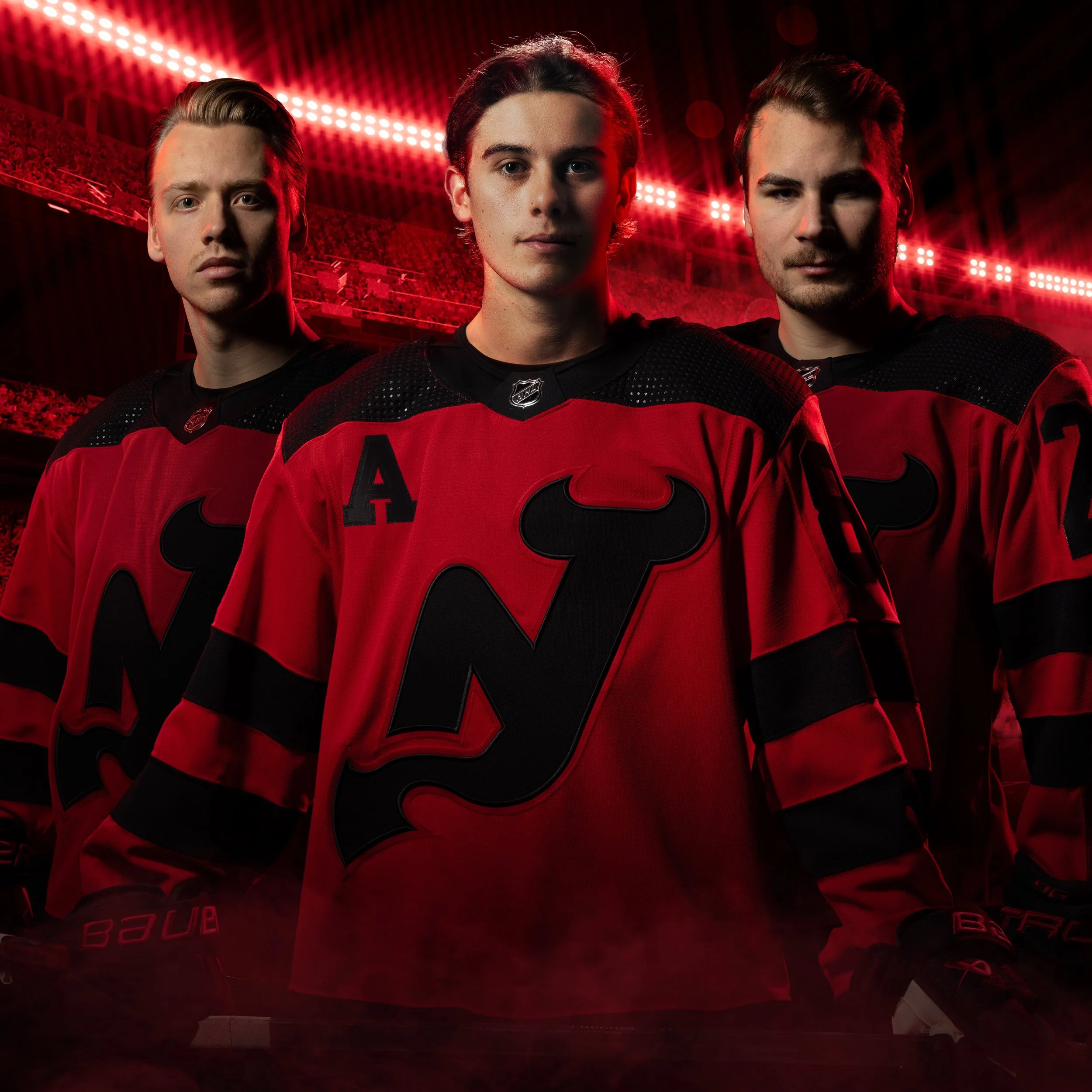
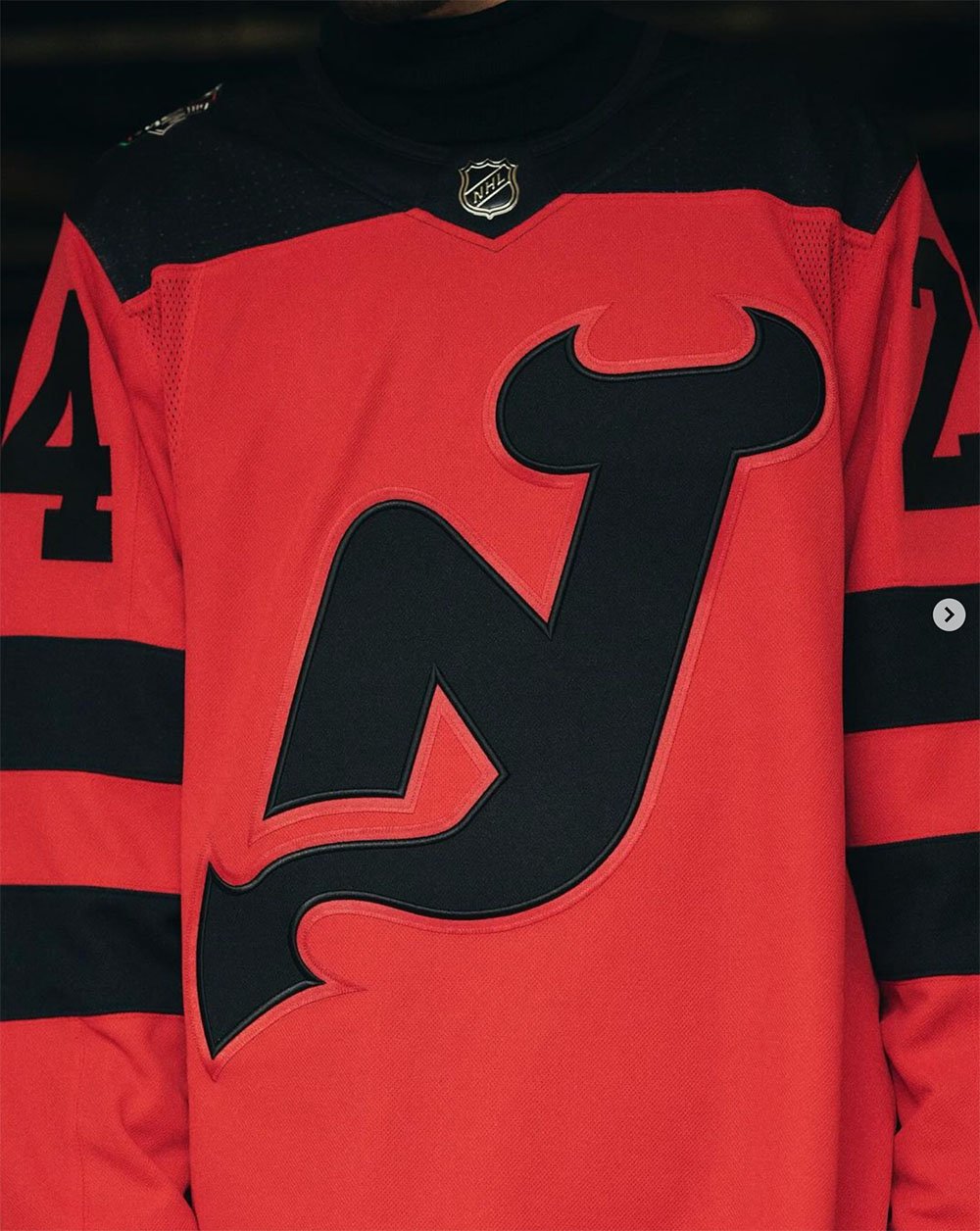
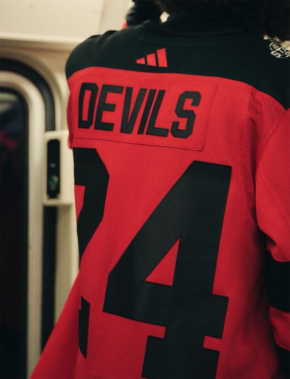
In a move that's making waves in the hockey world, the New Jersey Devils recently showcased a bold and eye-catching red uniform in their matchup against the Philadelphia Flyers for the 2024 Stadium Series. Facing off against the Flyers' classic white, the Devils opted for their signature black shoulder yoke style, creating a visually impactful and memorable on-ice presence.
The Devils' new red uniform for the 2024 Stadium Series features a distinctive design, emphasizing simplicity and boldness. Two thick black stripes grace each sleeve, creating a dynamic contrast against the vibrant red backdrop. A band of red elegantly separates the shoulder yoke and the sleeve striping, adding a sleek touch to the overall aesthetic.
The standout feature of the uniform is the single-color big black numbers, prominently displayed on the back. This design choice not only enhances visibility but also adds a touch of modernity to the Devils' on-ice look.
On the front of the jersey, the familiar "NJ" of the Devils logo takes center stage. In a unique twist, the circle surrounding the "NJ" has been removed, leaving only the iconic letters displayed in bold black. This modification not only provides a fresh perspective but also sparks conversations about the potential for this design to become a noteworthy alternate uniform once the "Jersey jersey" has run its course.
Adding an extra layer of significance to this special uniform is the placement of the 2024 Stadium Series patch on the left shoulder. This patch not only serves as a testament to the team's participation in this exciting series but also adds an extra layer of distinction to the overall design.
The New Jersey Devils' red uniform for the 2024 Stadium Series against the Flyers is more than just a change in color; it's a bold statement that captures attention and ignites excitement among fans. With its simplified yet impactful design elements, including the black shoulder yoke, thick sleeve stripes, and prominent single-color numbers, this jersey showcases the Devils' commitment to making a visual impact on the ice.
The modification to the team logo on the front, along with the inclusion of the Stadium Series patch, adds layers of intrigue and significance to this special edition uniform. As the Devils continue to make strides in their visual identity, this red jersey stands out as a symbol of their willingness to embrace change while staying true to their iconic brand.
Whether it's the spirited red hue, the striking black details, or the commemorative 2024 Stadium Series patch, the Devils' latest on-ice look is undeniably turning heads and leaving a lasting impression on the world of hockey aesthetics.
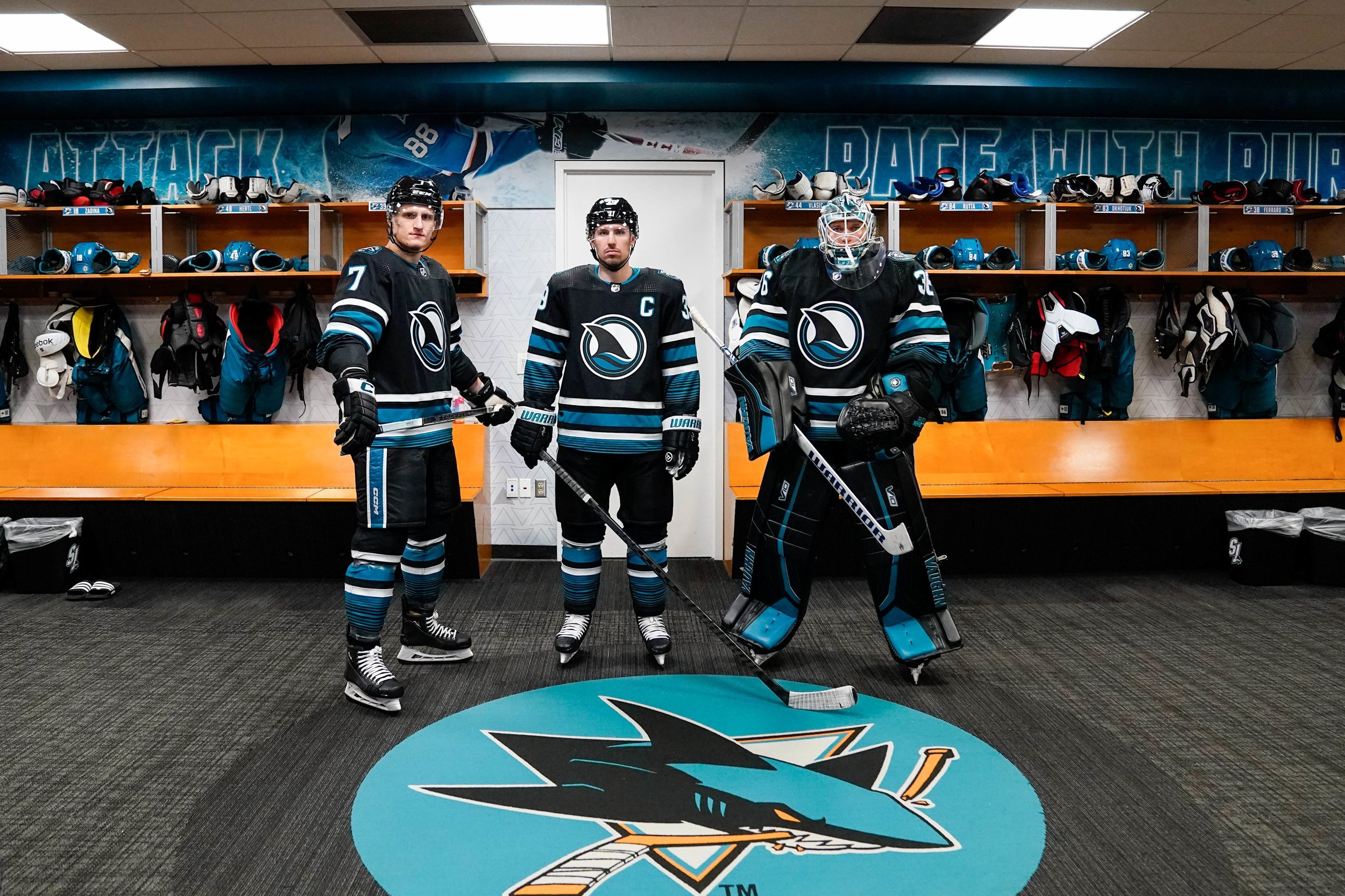
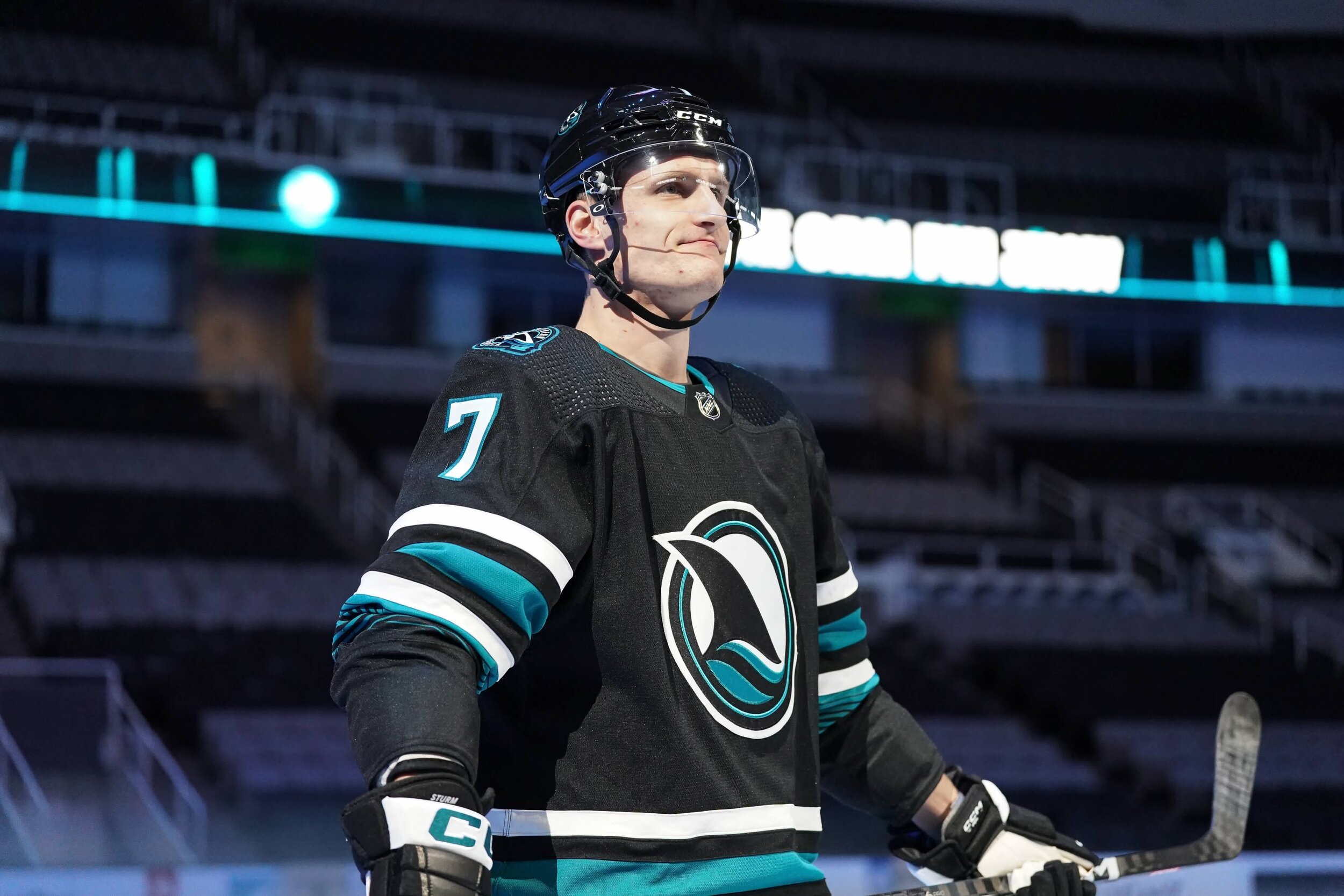
The San Jose Sharks have recently unveiled their much-anticipated Cali Fin look, marking a significant departure from the franchise's traditional appearance. This new uniform introduces a range of unique style elements while incorporating familiar details that have resonated with both players and fans over the years.
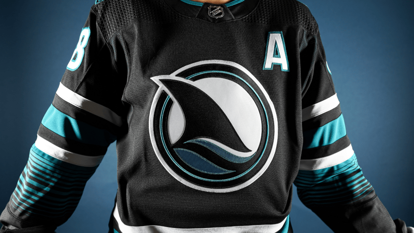
Embracing a sleek black base color, the Cali Fin uniform brings back a highly desired aesthetic that has long been associated with the Sharks. This choice adds a sense of familiarity and intensity to the team's overall look.
One of the most noteworthy changes is the introduction of the Evolve Fin as the primary crest, replacing the iconic Shark head for the first time in franchise history (excluding the Reverse Retro design). This modern representation is a bold step toward a fresh visual identity for the team.
Maintaining continuity with the team's current primary jerseys, the Cali Fin uniform incorporates a striping pattern that fans have come to appreciate. This commitment to consistency ensures a seamless blend of the new design with the team's existing visual elements.
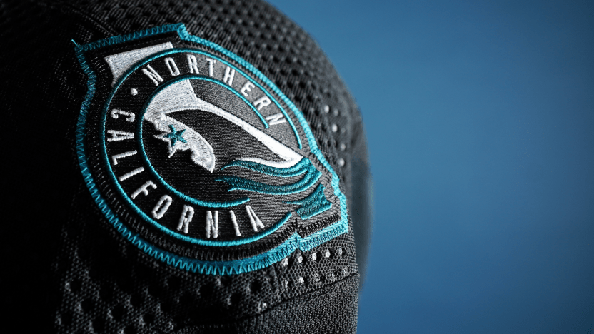
In a bid to create a jersey meaningful to the larger Bay Area community, the franchise draws inspiration from the heritage of Northern California. The inclusion of a teal yarn-dye-esque pattern on the sleeves and at the bottom of the jersey pays homage to Hispanic influences in the region, reflecting the unique textile traditions of Northern California.
The re-imagined Northern California Shark-fin shoulder patches, originally revised from the 2015 Stadium Series patch, make a return in the Cali Fin look. These patches serve as a salute to Sharks fans and supporters throughout the region, adding a touch of nostalgia to the updated design.
A distinctive shark tooth pattern incorporated into the neckline contributes to a more aggressive look for the uniform. This design element not only stands out visually but also pays tribute to the fan-favorite "Chomp" tradition, adding an extra layer of connection between the team and its supporters.
Introducing a custom font for numbers and letters, first seen with the 2022-23 primary jerseys, adds a modern and personalized touch to the Cali Fin uniform. This unique typography aligns with the team's commitment to staying current and relevant in their visual representation.
As a nod to the team's uniform history, the Cali Fin uniform reintroduces elements such as black helmets, black pants with matching striping, black gloves, and black socks with a complementary yarn-dye-esque pattern. This blend of past and present elements further enhances the richness and depth of the Sharks' visual identity.
In conclusion, the Sharks Cali Fin look represents a harmonious fusion of tradition and modernity. Beyond being a mere change in apparel, this new uniform symbolizes the Sharks' commitment to their fans, community, and the unique heritage of Northern California. As players proudly don the Cali Fin ensemble on the ice, it is poised to become a timeless representation of Sharks pride and resilience.
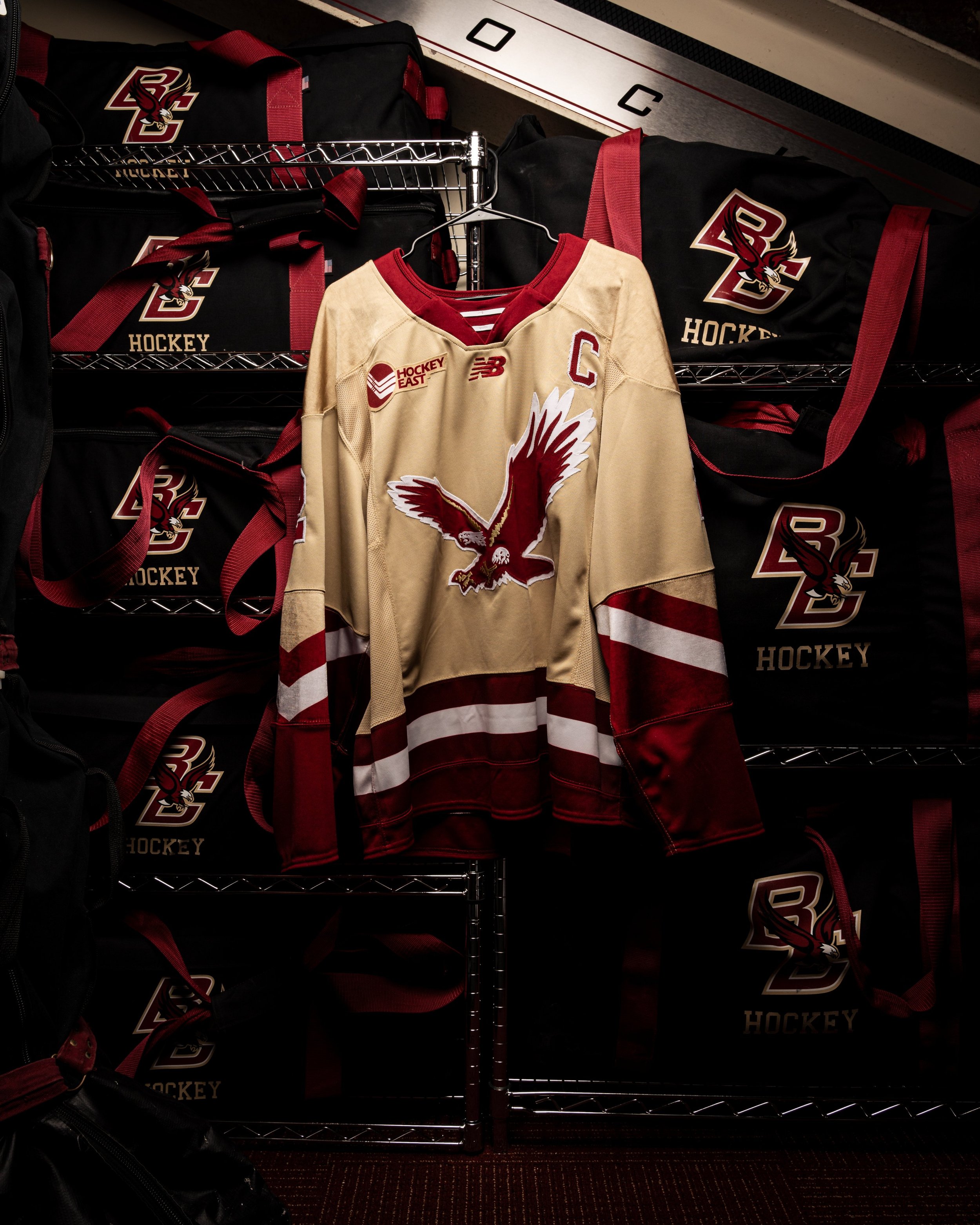
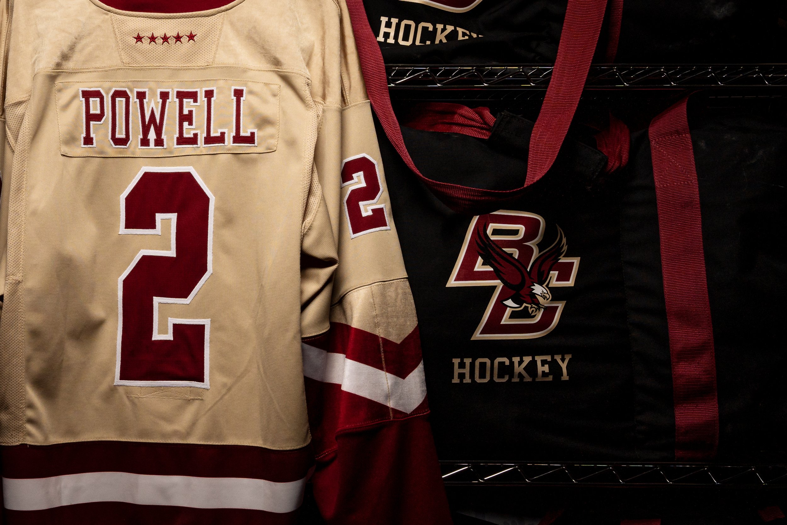
Excitement is brewing in the world of collegiate hockey as the Boston College men's hockey team announces the debut of a stunning new gold alternate jersey. This revelation comes after a hiatus from the golden look in recent years, with the team predominantly sporting their white and maroon "EAGLES" sweaters. The decision to reintroduce the gold jersey suggests a return to tradition and a nod to a classic aesthetic that fans have come to appreciate.
In recent years, Boston College opted for a departure from the gold jerseys, favoring the white and maroon "EAGLES" sweaters for most games. This shift has been well-received, offering a more classic feel to the team's appearance. While the gold jerseys haven't seen regular use since at least 2022, their sporadic appearances have only fueled fan nostalgia and heightened the anticipation surrounding their imminent return.
While gold jerseys haven't been a regular feature in recent seasons, there have been occasional glimpses, with last year's Fenway jerseys making a notable appearance. Despite their infrequent use, the gold jerseys have left a lasting impression on fans, and each appearance has been a reminder of the unique and vibrant history of Boston College hockey.
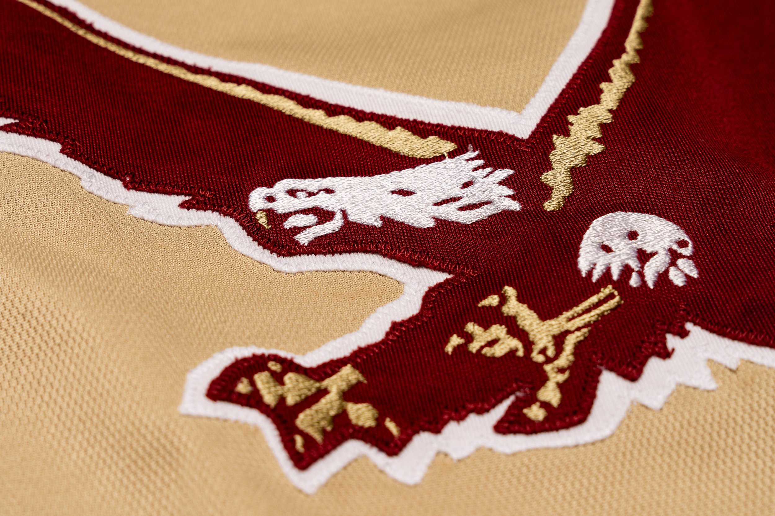
The decision to bring back the gold alternate jersey signifies more than just a change in attire; it represents a deliberate choice to enhance the team's aesthetic appeal. Gold, with its bold and distinctive hue, has consistently proven to be a fan-favorite, often outshining the all-maroon jerseys in terms of visual impact. The front of the jersey will feature the old school soaring eagle in maroon with white outlines. the bottom of the jersey will have a bold maroon and white stripe runing into the ends of the sleeves.
The forthcoming debut of Boston College's gold alternate jersey marks a welcome return to a beloved tradition. While the team has explored different jersey styles in recent years, the revival of the gold aesthetic signifies a nod to the past and a celebration of the timeless appeal that has made these jerseys a fan-favorite.
The upcoming 2024 NHL All-Star Weekend is set to showcase not only the league's top talents but also a groundbreaking collaboration between the NHL, adidas, and the fashion brand drew house, co-founded by none other than Justin Bieber.
Departing from the traditional division-based format, this year's All-Star festivities will introduce the Tim Hortons NHL All-Star Player Draft, where All-Star players and celebrity captains will select teams from the pool of players chosen through NHL selection and fan votes.
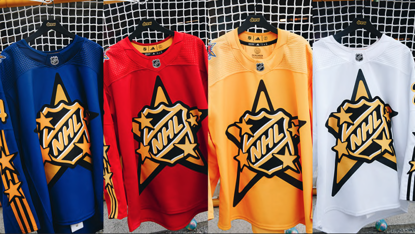
Drew house brings its unique aesthetic to the All-Star jerseys, with four distinct versions for each participating team, featuring vibrant colors of blue, red, yellow, and white. The collection pays homage to streetwear culture, emphasizing a connection to the tradition of individual NHL clubs through team shoulder patches.
Building on the success of their initial collaboration for the Toronto Maple Leafs' Next Gen jerseys, NHL Chief Brand Officer Brian Jennings expressed excitement about the opportunity to bring a bold, fashion-forward look to the NHL jerseys for the All-Star Weekend. The vibrant colors chosen for this year's collection aim to capture both youthful and classic elements, perfectly complementing the dynamic talent set to converge in Toronto.
One standout feature of the 2024 NHL All-Star jersey is the iconic NHL shield, revamped with bubble letters and enlarged dimensions. The crest itself is one of the largest ever seen on an NHL jersey, standing at an impressive 22 inches high and spanning the full width of the sweater.
As the NHL All-Star Weekend unfolds in the hockey-obsessed market of Toronto, the anticipation for this extraordinary event reaches unprecedented heights. The 2024 NHL All-Star jersey not only reflects the pinnacle of sports and fashion collaboration but also serves as a testament to the league's commitment to innovation and embracing youth culture.
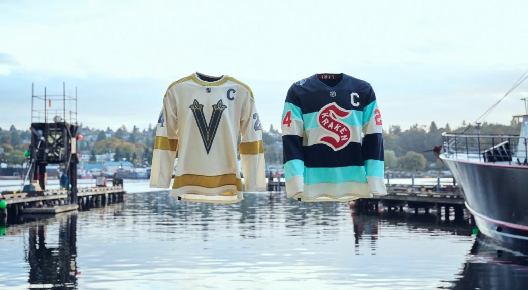
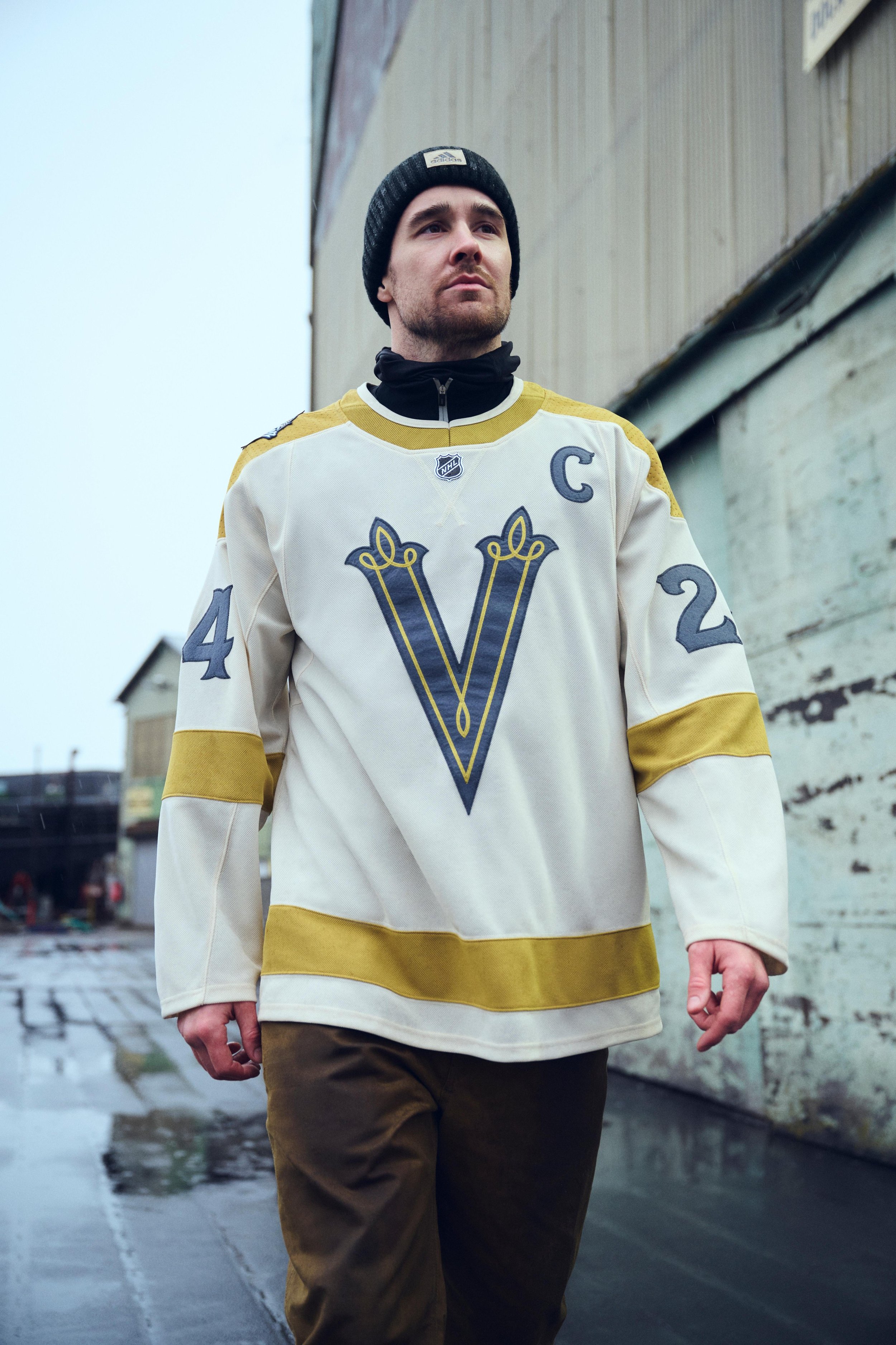
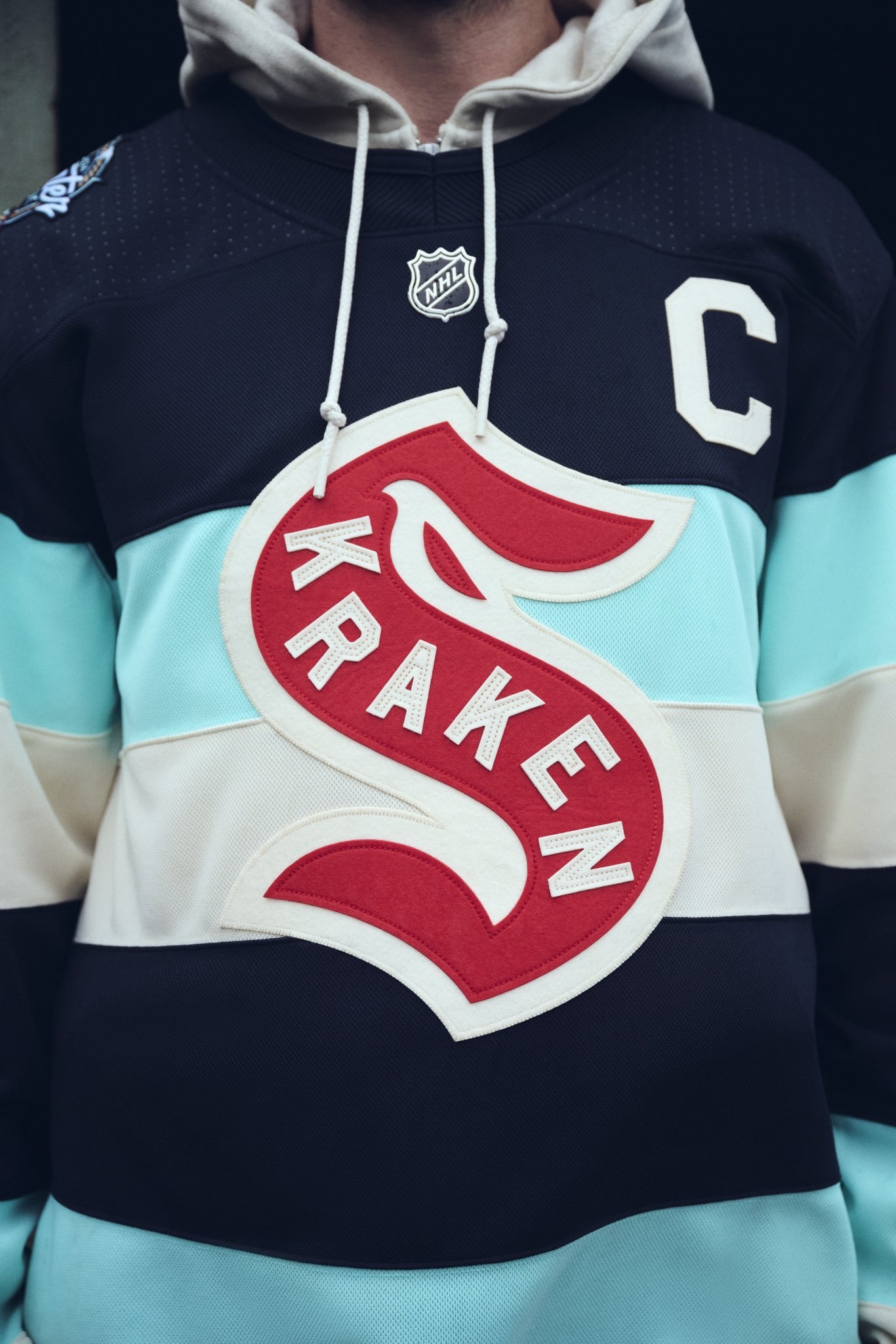
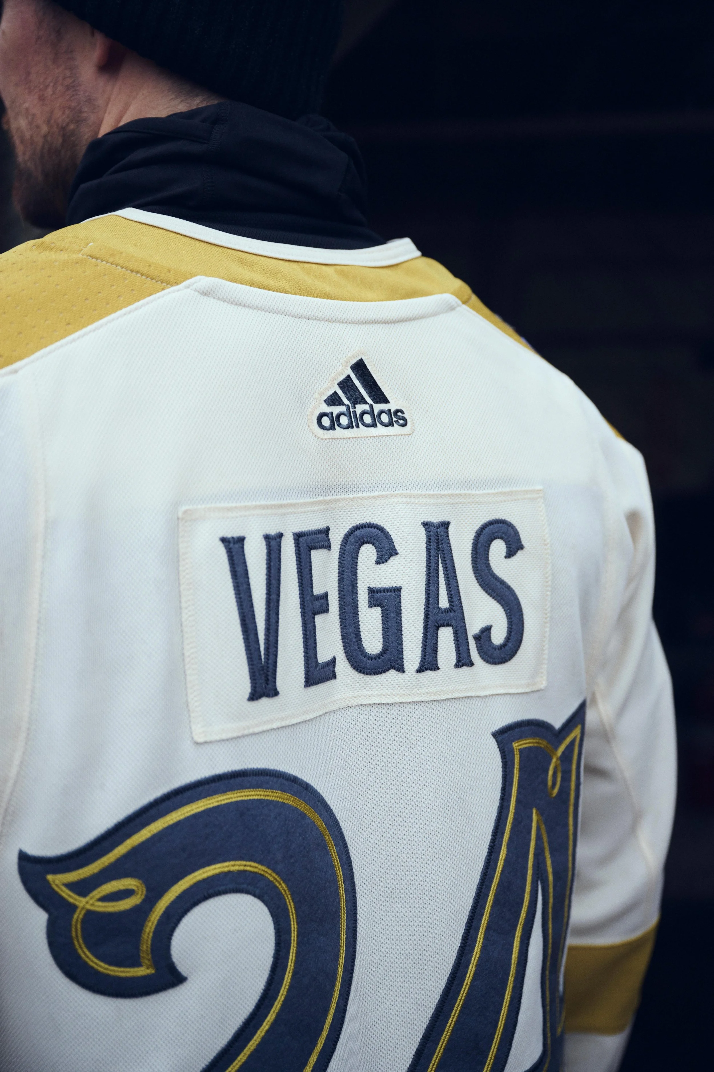
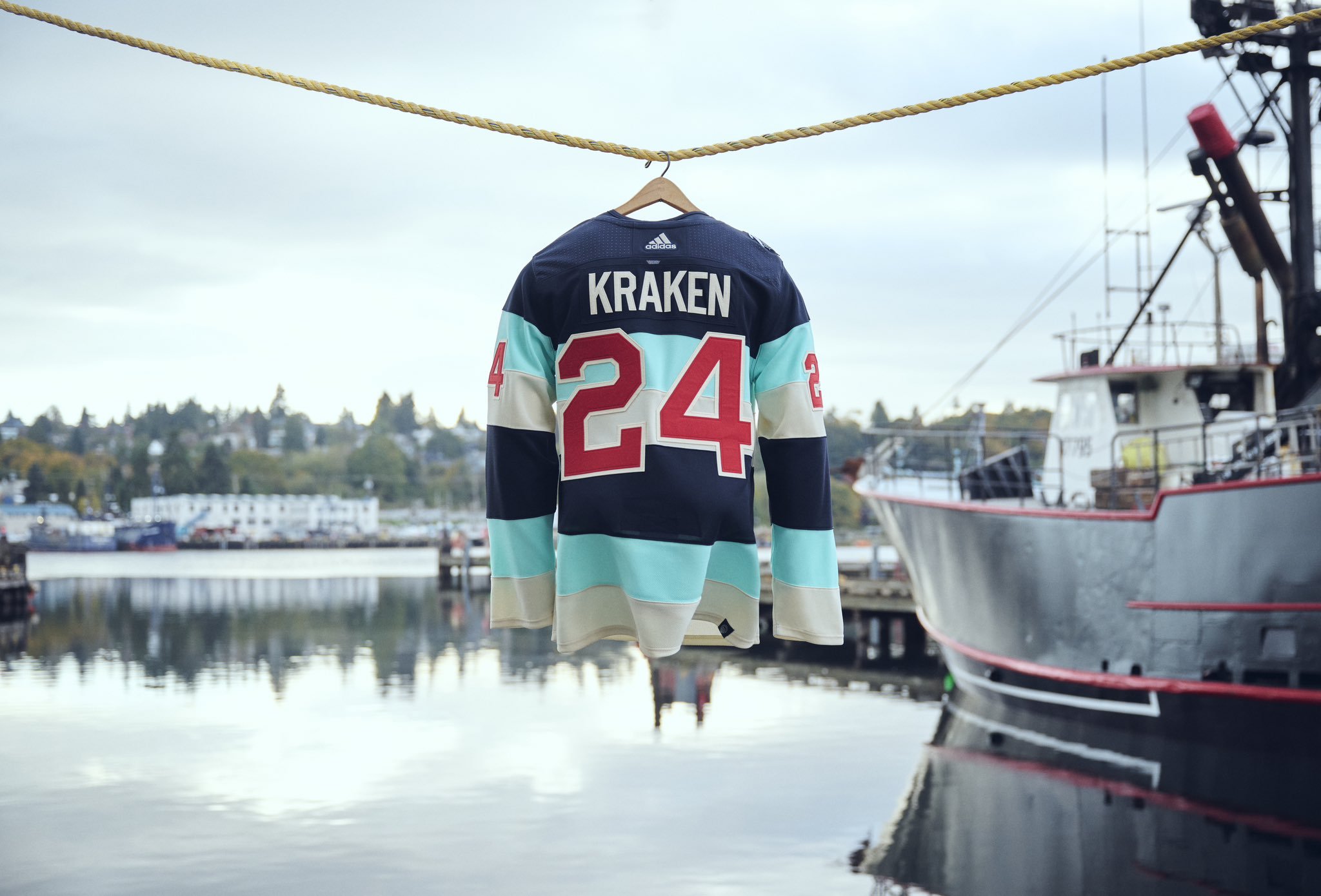
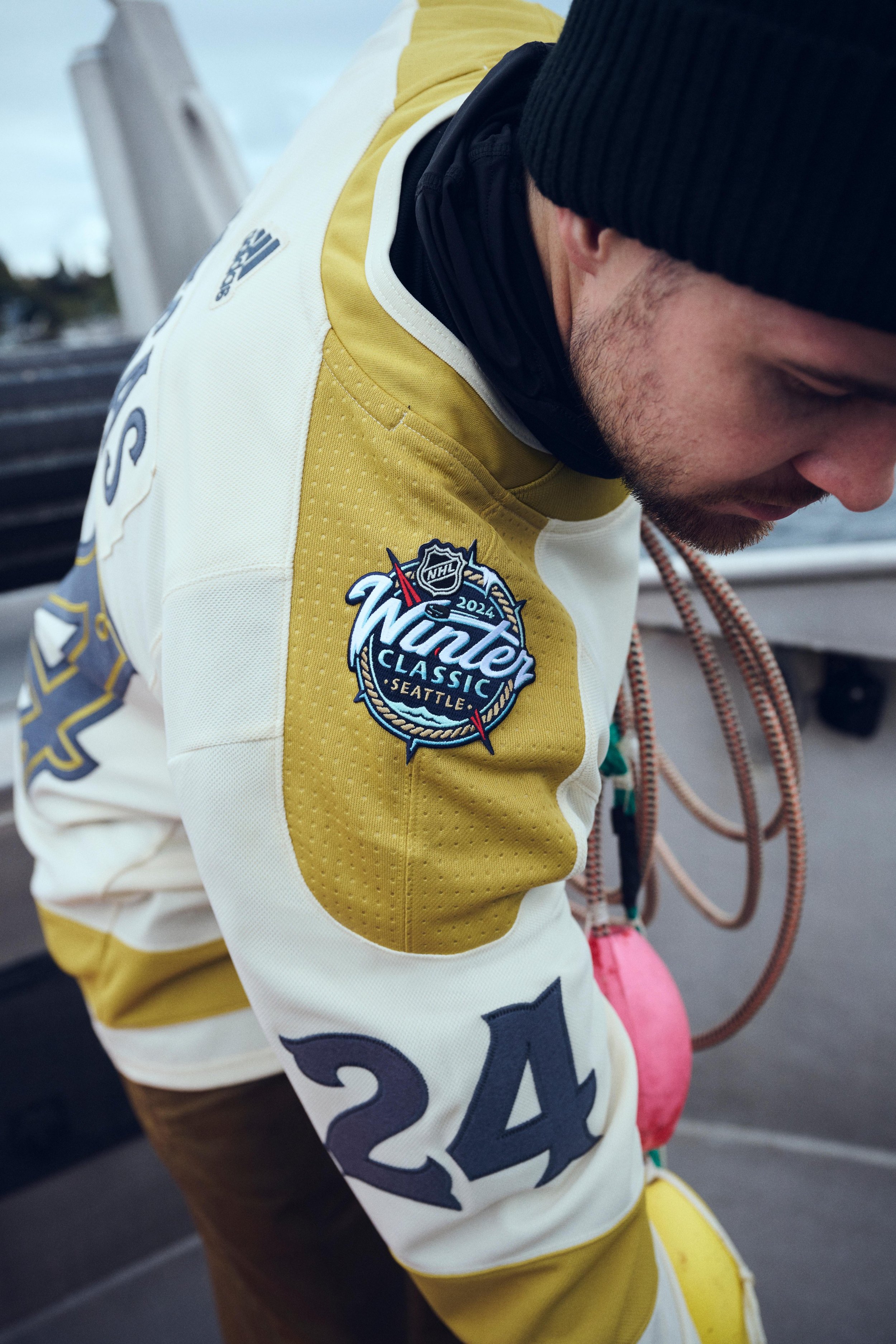
The NHL and adidas have unveiled the jerseys for the 2024 Discover NHL Winter Classic, featuring the Seattle Kraken and Vegas Golden Knights at T-Mobile Park in Seattle on January 1.
Designing jerseys for these recent NHL franchises involved a unique task, drawing inspiration from their rich histories. adidas design director Matty Merrill emphasized the joy of working with authentic hockey history and the creative freedom to invent new narratives that align with the teams' cultures.
The Golden Knights' traditional bright gold gives way to Heritage Gold with an old West vibe. The vintage white of the Winter Classic uniforms reflects 1900s working uniforms. Key details include a redesigned helmet crest, simplified striping, and military references, connecting to owner Bill Foley's West Point background.
For the Kraken, the design draws inspiration from Seattle's 1917 Stanley Cup-winning team. The unique Ice Blue color, paired with vintage white, creates a classic hockey look with barber-pole striping. Notable details include the "1917" on the neckline, symbolizing Seattle's historic Stanley Cup win.
Both jerseys feature heritage felt for numbers and crests, a Winter Classic tradition that adds to the historic and nostalgic ambiance of the event. Brian Jennings, NHL Senior Executive Vice President, expressed excitement about creating special sweaters that captivate fans on this iconic outdoor stage, describing the end result as nothing short of astonishing.
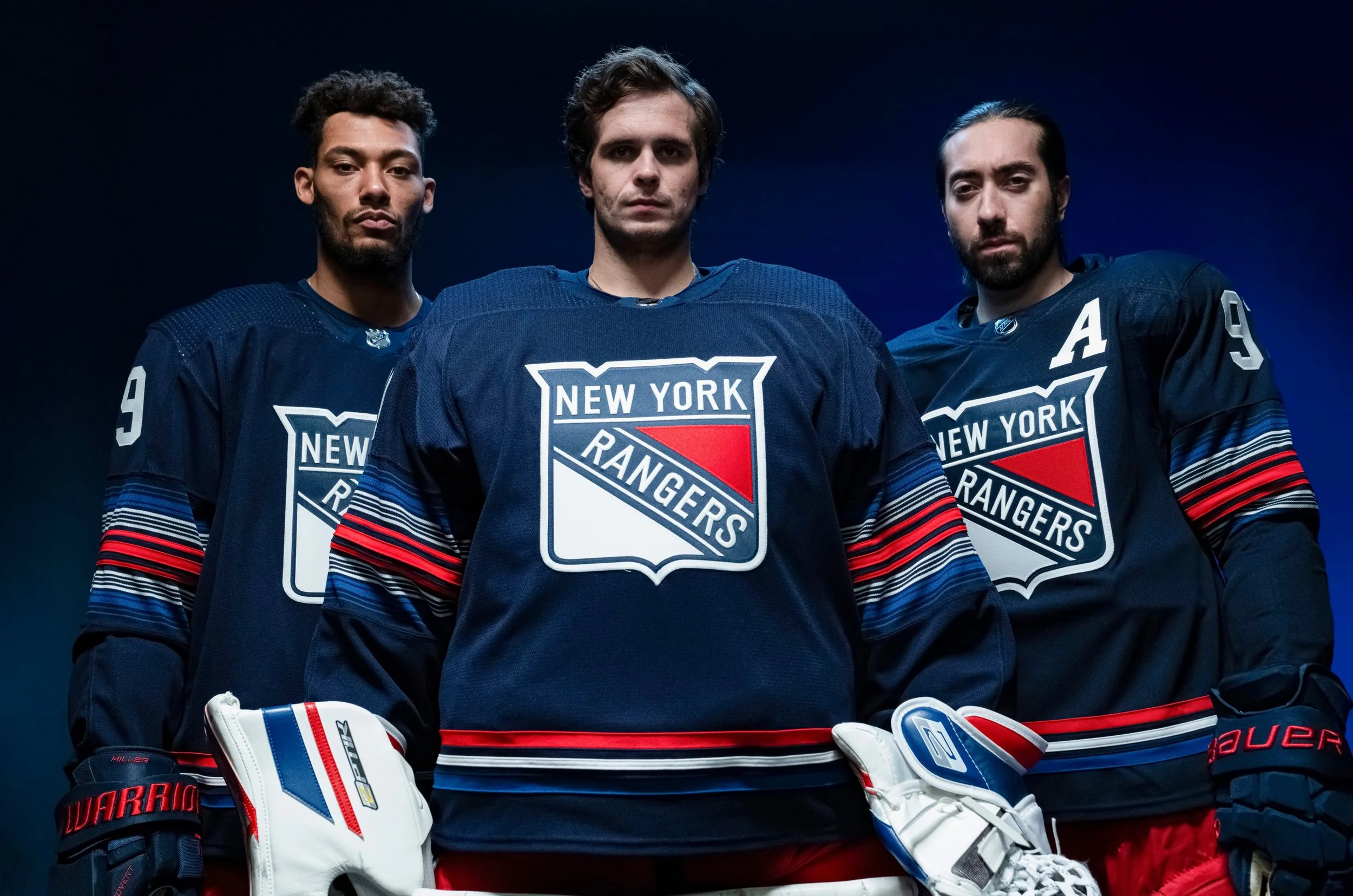
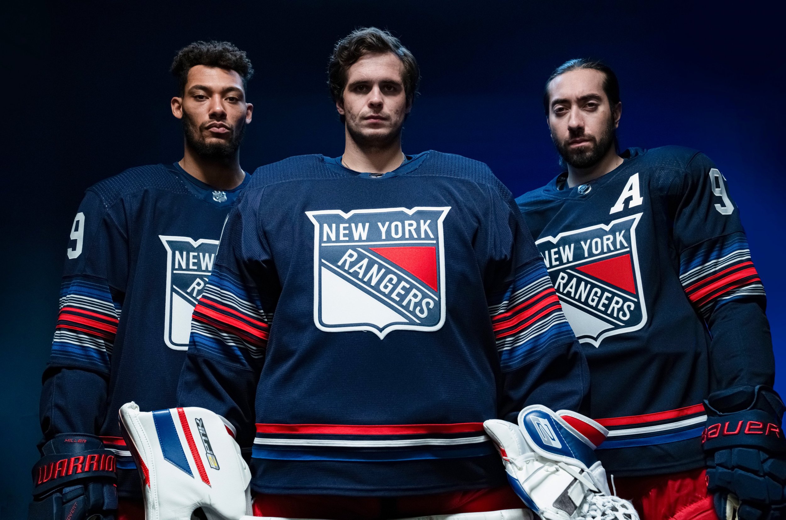
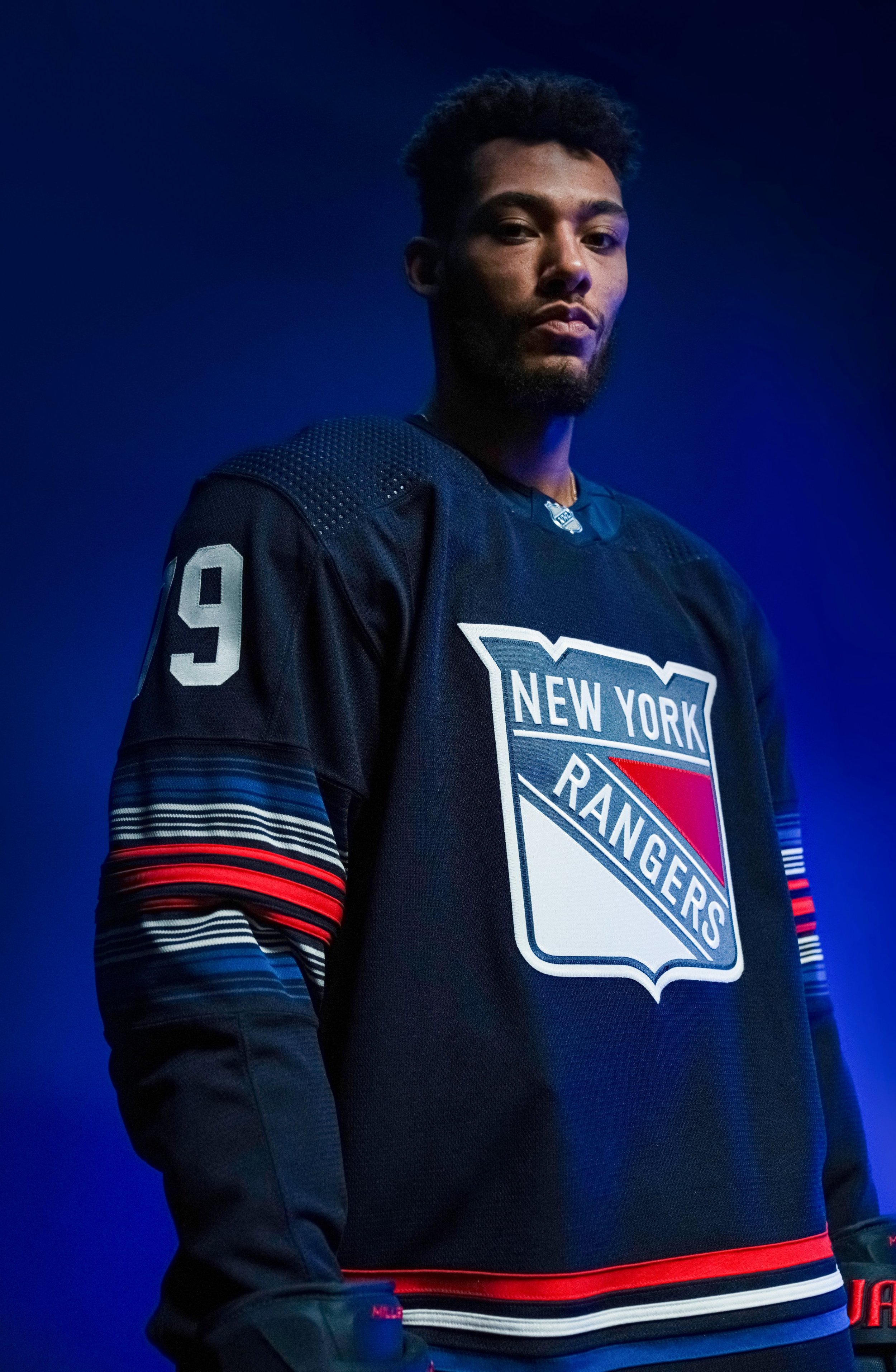
In a highly anticipated moment for Rangers fans and hockey enthusiasts alike, the New York Rangers have officially revealed their all-new third uniform for the upcoming 2023-24 season. A seamless blend of tradition and innovation, the design pays homage to the team's rich history while drawing inspiration from the vibrant energy of the city that never sleeps.
The base of the uniform is a striking navy blue, showcasing the iconic shield logo at the forefront. Notably absent is the traditional collar striping, replaced by a captivating array of 18 red, white, and royal blue stripes adorning each sleeve and sock. The three thin stripes, each representing a distinct color, elegantly encircle the waist at the bottom of the sweater.
This unique striping pattern is more than just aesthetic; it serves as a nod to the dynamic lights of Madison Square Garden, the bustling traffic of the city streets, and the relentless hustle that defines New York. A closer look reveals an intricate NYC subway tile pattern inside the back collar, spelling out the cherished nickname "BLUESHIRTS," a term as timeless as the franchise itself.
The Rangers' press release emphasizes the enduring significance of the shield, a symbol that has united the team and the city since the franchise's inception in 1926. The core elements of the design, with 'New York' emblazoned across the top and 'Rangers' diagonally from left to right, embody the unbreakable bond between the team and the city that never quits.
"We hold true to our identity but pay homage to our city and all those who call themselves New Yorkers. This is Made From New York," the team's release proudly declares.
Fans can look forward to witnessing the Rangers don this distinctive uniform during ten home games in the 2023-24 season. The grand debut is scheduled for a riveting matchup against the Los Angeles Kings on December 10th, promising a thrilling on-ice spectacle that mirrors the excitement of this uniform release.
The New York Rangers' new third uniform stands as a testament to the team's enduring connection with its hometown and its commitment to innovation within the sport. As the Rangers step onto the ice in this fresh design, they carry with them a century of tradition, a vibrant city spirit, and a legacy that continues to evolve with the pulse of New York. Get ready for a season where every game becomes a canvas for this stunning fusion of history and modernity.