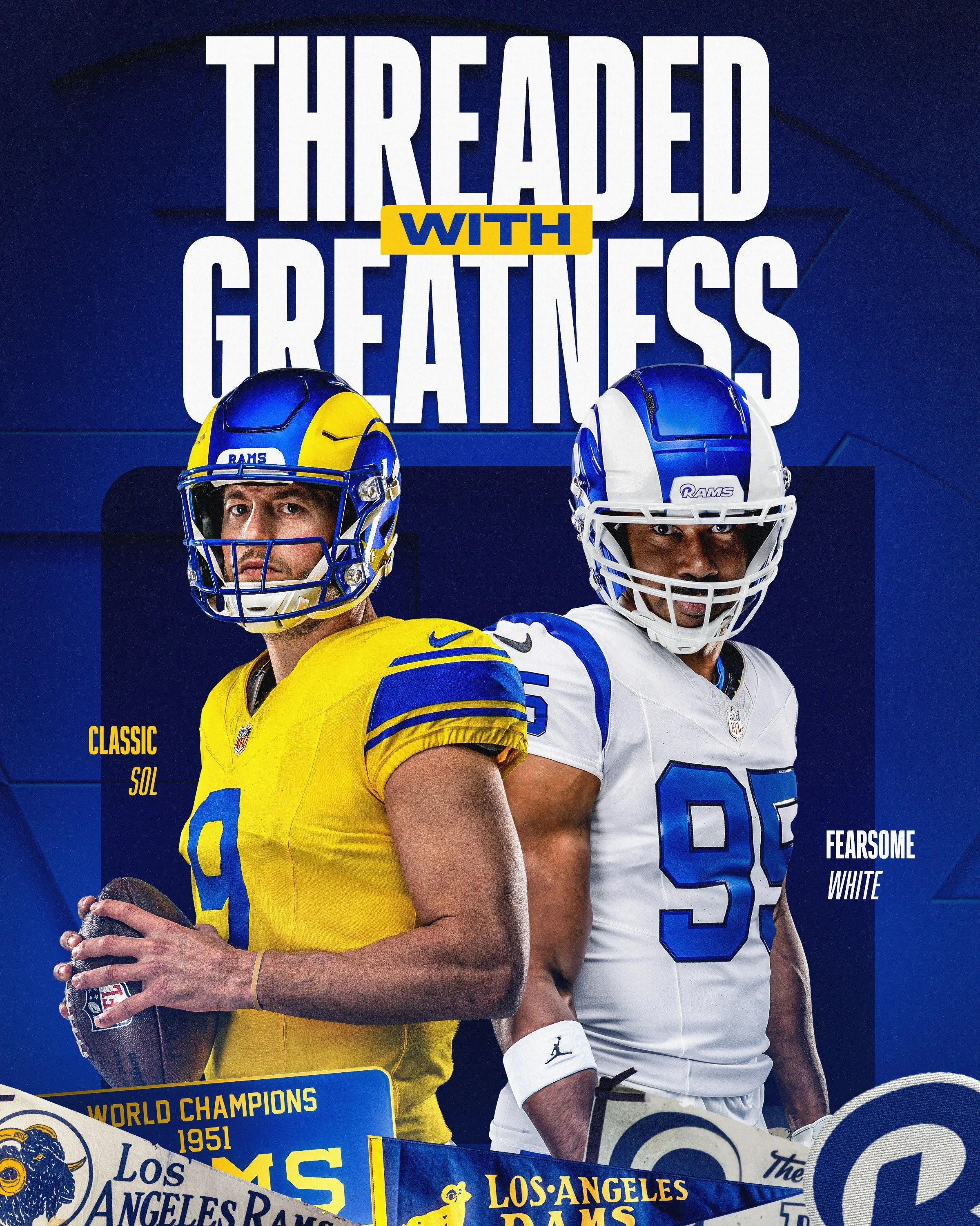
The Los Angeles Rams are celebrating two of the most iconic eras in franchise history with the introduction of two new alternate uniforms for the 2026 season.
Unveiled during the club's annual Rams Revealed Live event, the new Classic Sol and Fearsome White uniforms pay tribute to the teams and players who helped define Rams football while blending historic design elements with the club's modern look.
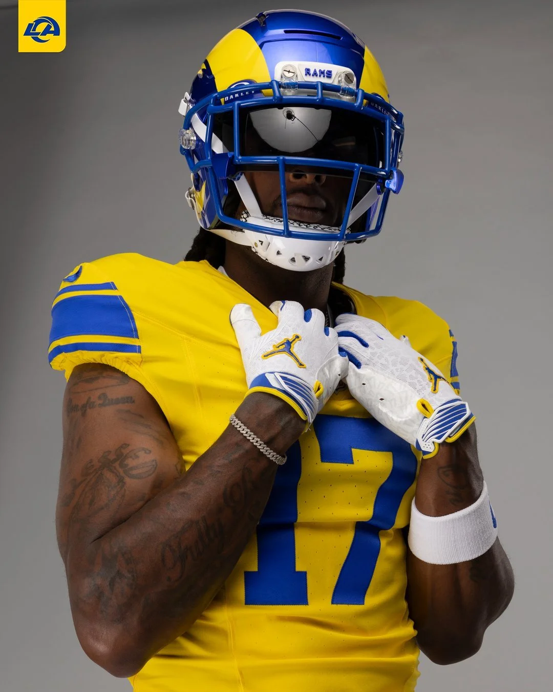
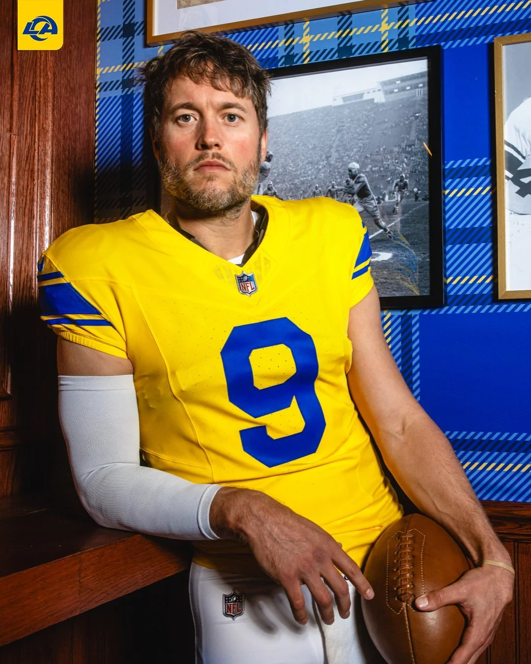
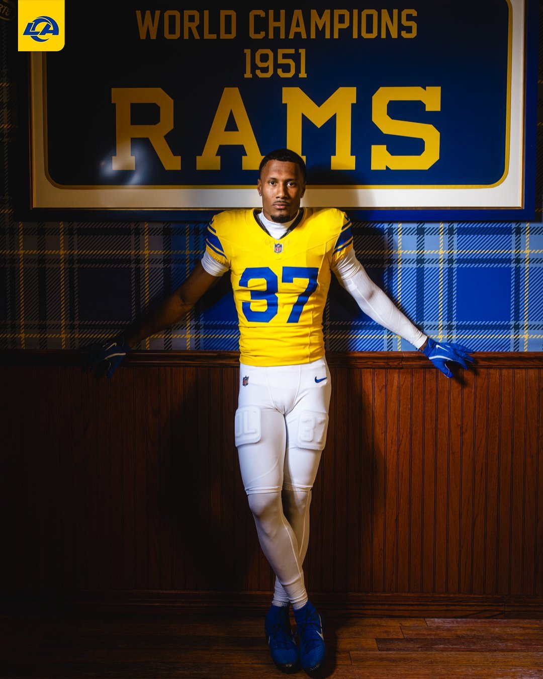
The Classic Sol uniform celebrates the 75th anniversary of the Rams' 1951 NFL Championship team, the franchise that delivered Los Angeles its first professional sports championship.
Inspired by one of the most recognizable uniforms in Rams history, the throwback-inspired design features a vibrant Sol jersey with layered and stitched Rams Royal numbers for a premium, vintage appearance.
One of the biggest throwback elements is the return of the original three-stripe sleeve design, while a custom Sol monogram neck tag and a modernized helmet bumper featuring typography inspired by the 1951 championship banner further connect the uniform to the historic title team.
The Rams' current helmet remains part of the uniform, paired with striped white pants to complete the nostalgic look
The Classic Sol uniform will be worn: Week 2 vs. New York Giants and Week 13 vs. Kansas City Chiefs.
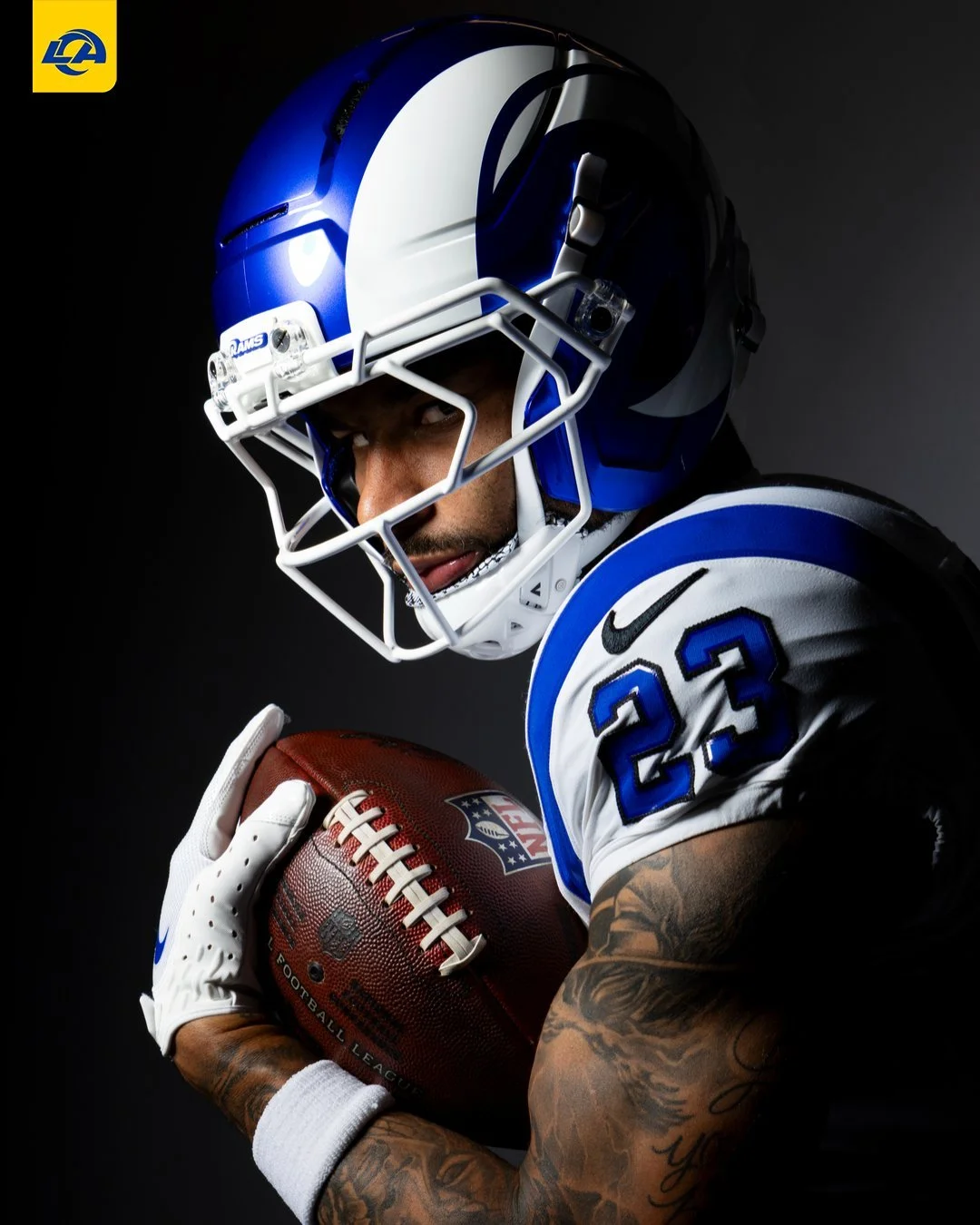
The Rams' second alternate uniform honors one of the greatest defensive units in NFL history.
The Fearsome White uniform celebrates the legendary Fearsome Foursome, Rosey Grier, Deacon Jones, Lamar Lundy, and Merlin Olsen, the defensive line that transformed pass rushing and helped redefine defensive football during the 1960s and early 1970s.
The jersey blends retro inspiration with modern performance details, featuring custom name and number styling, the return of television numbers on the sleeves, and a continuous Rams Royal shoulder stripe designed to mirror the curve of the club's iconic helmet horn.
The accompanying white pants incorporate layered Royal detailing, Midnight trim, and reflective accents designed to stand out under stadium lights.
Perhaps the biggest addition is the debut of a brand-new alternate helmet.
The royal blue shell features white horns, bringing back one of the most beloved helmet designs in franchise history while maintaining the club's current helmet profile. A newly designed Fearsome White front bumper logo completes the look.
The Fearsome White uniform will make its debut: Week 12 vs. Green Bay Packers in the NFL's first-ever Thanksgiving Eve.
The Rams didn't simply create two new alternate uniforms, they told two different chapters of the franchise's story.
SHOP Rams gear HERE

See What Else Is New
Featured

Related Articles
Featured