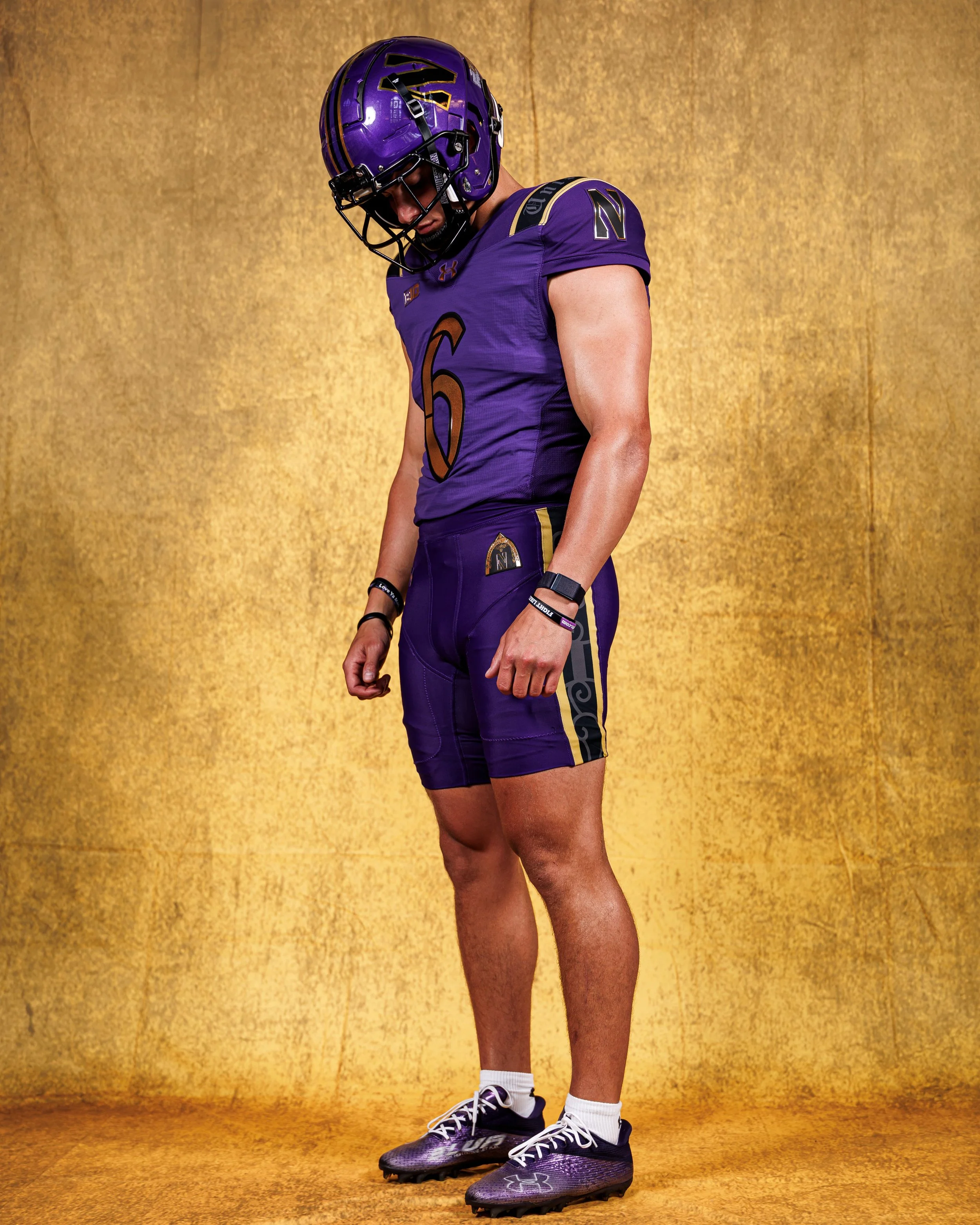
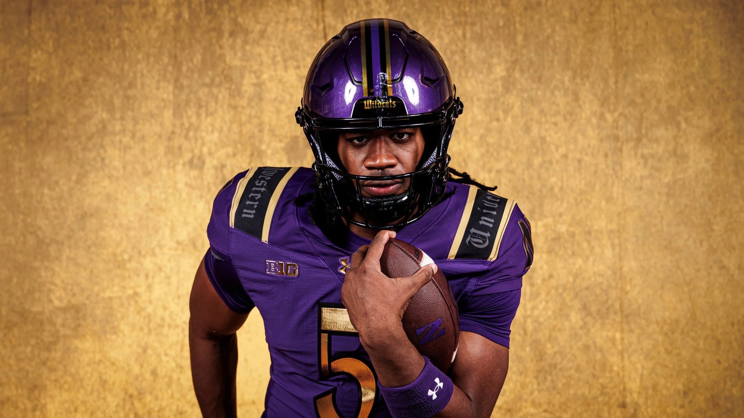
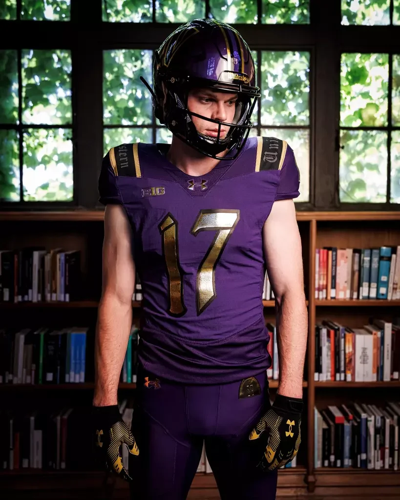
Northwestern Football has officially unveiled a new Purple Gothic look that blends the Wildcats' signature identity with architectural inspiration pulled directly from the university's historic campus.
The new design stays true to Northwestern's iconic purple while incorporating bold metallic gold accents throughout the uniform, creating one of the most unique looks in program history. Rather than reinventing the Wildcats' color palette, the design elevates it with premium finishes and intricate details that make the uniform stand out on the field.
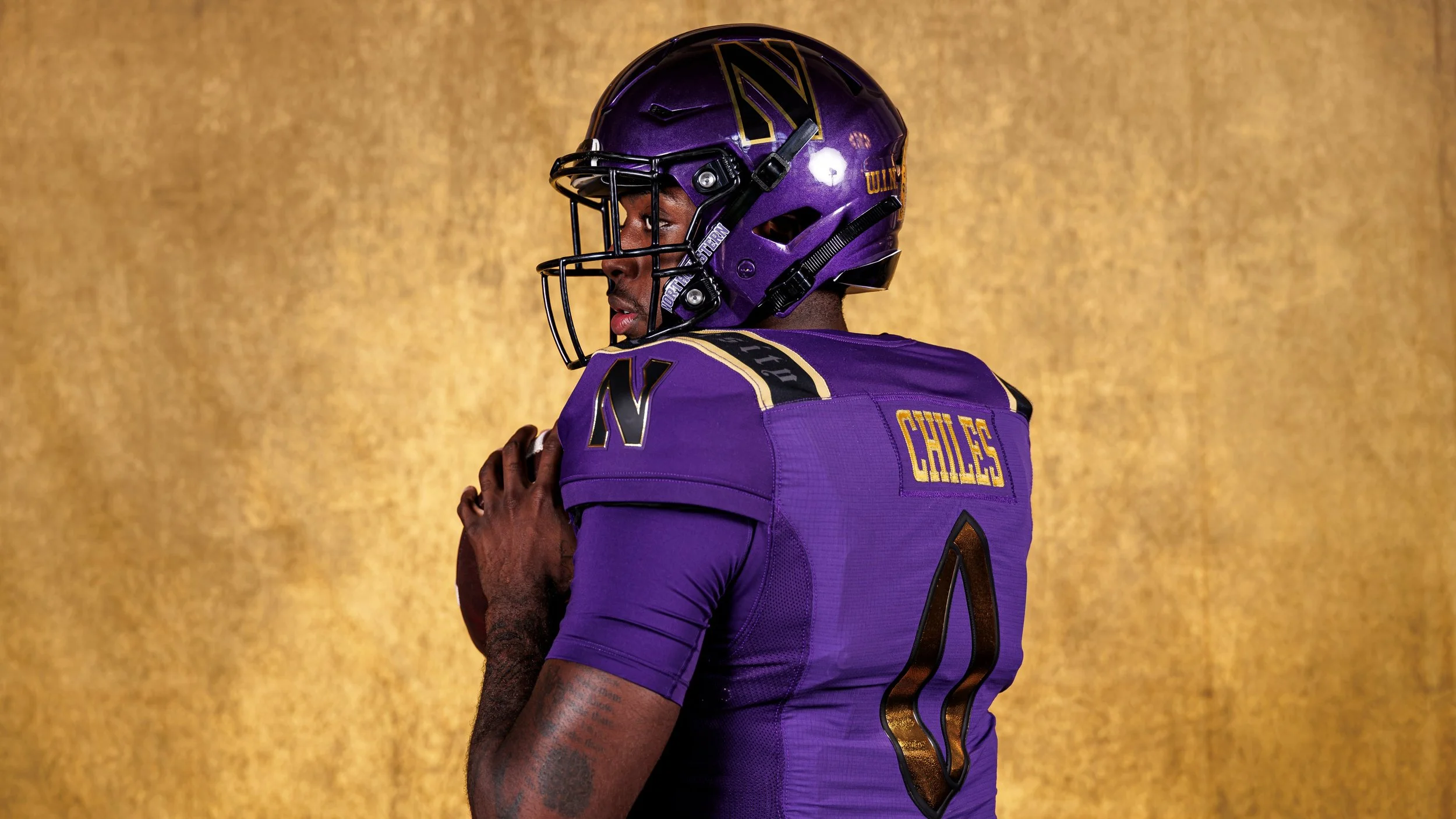
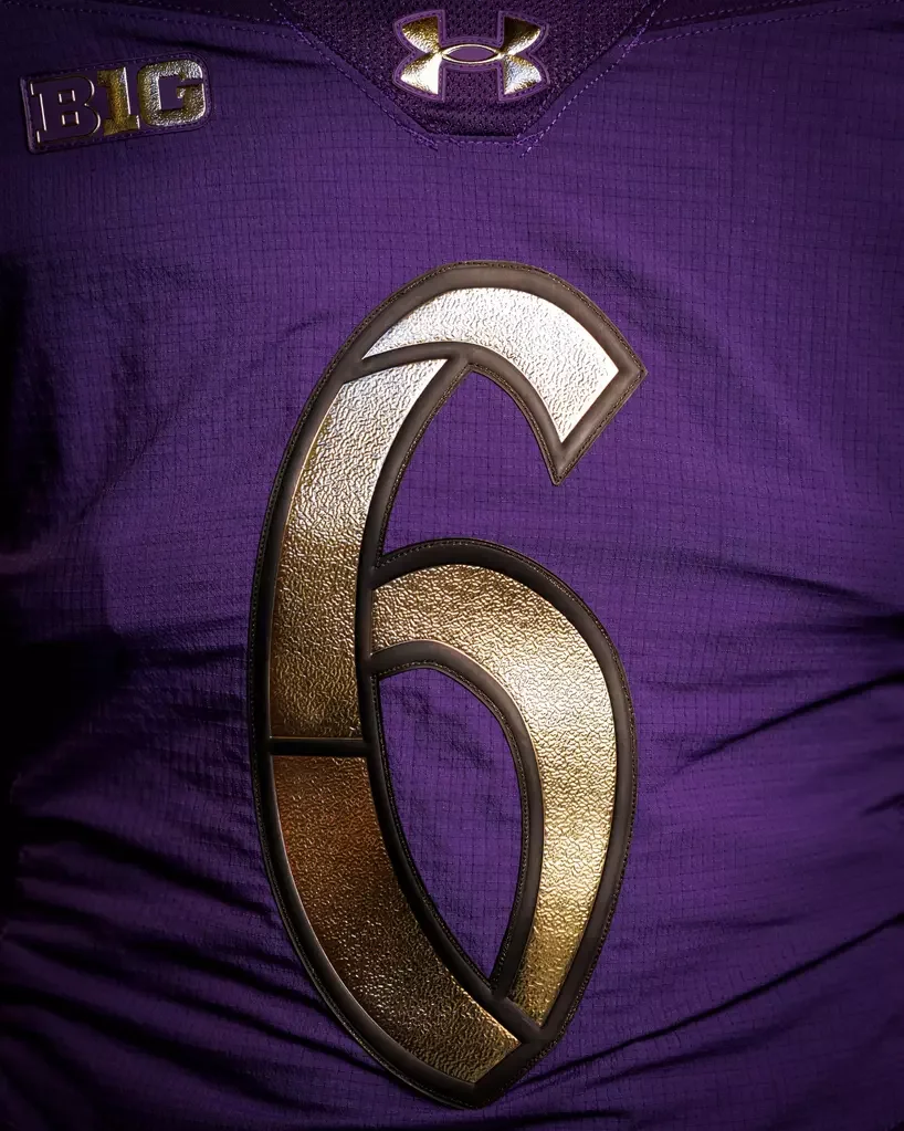
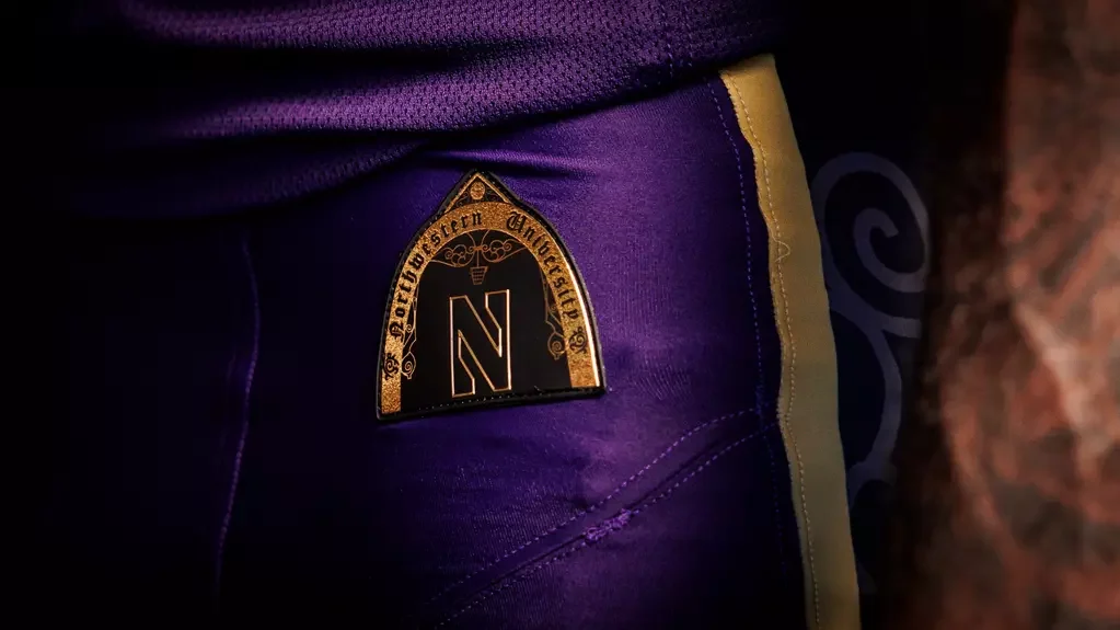
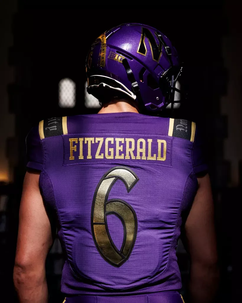
The most striking feature is the gold detailing woven throughout the jersey, pants and helmet. Metallic gold outlines the player numbers, adding depth and texture against the purple base, while matching gold striping appears across the shoulders and down the sides of the pants. The helmet continues the theme with a bold gold center stripe and oversized metallic gold "N" logos, tying the entire uniform together into a cohesive head-to-toe design.
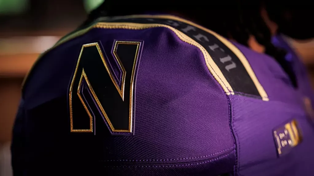
Perhaps the most unique element of the collection is its Gothic influence. The uniforms feature cathedral-inspired design details and custom Gothic lettering that pays tribute to Northwestern's historic campus architecture. "Northwestern" is displayed in a Gothic script across the shoulders, while the same typeface appears on the front helmet bumper with "Wildcats," giving the uniform a distinctive identity unlike anything else in college football.
The custom number font also embraces the Gothic theme. Finished in textured metallic gold with black outlines, the numerals create a premium appearance while complementing the medieval-inspired aesthetic found throughout the uniform.
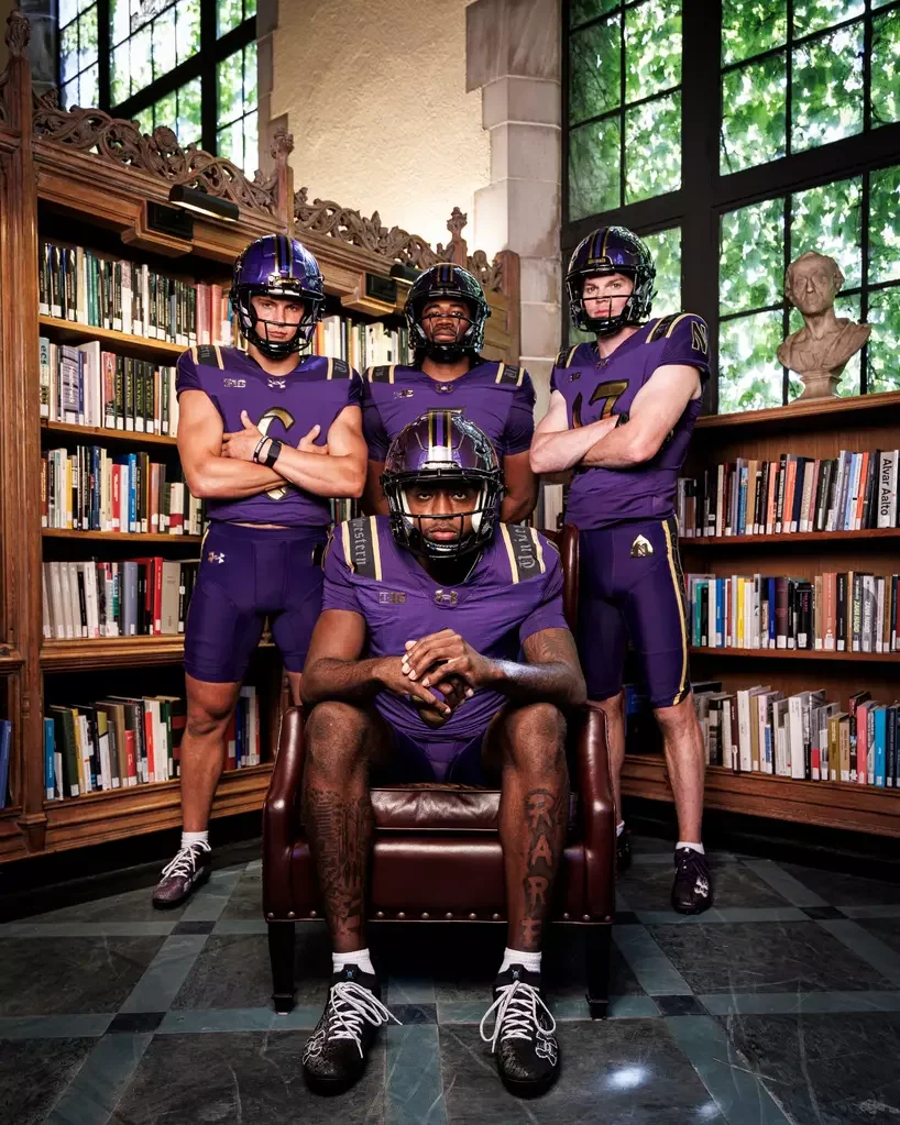
Northwestern also paired the reveal with photography inside one of the university's iconic library spaces, reinforcing the connection between the football program and the academic heritage that has defined the institution for generations. The backdrop perfectly complements the cathedral-inspired design language featured throughout the uniform.
The best uniforms are the ones that tell a story, and Northwestern's Purple Gothic uniforms do exactly that. By drawing inspiration from the university's iconic architecture instead of introducing flashy gimmicks, the Wildcats have created a look that feels authentic, premium and uniquely Northwestern. The combination of signature purple, metallic gold accents and Gothic-inspired detailing makes this one of the most memorable uniform unveilings of the 2026 college football season.
SHOP Northwestern gear HERE
See What Else Is New
Featured
Related Articles
Featured