Twins Updates Their Navy Alternates for 2026
The Minnesota Twins are not overhauling their look for 2026, but they are making the kind of change uniform fans always notice. It is small. It is subtle. And it completely shifts the feel of the jersey.
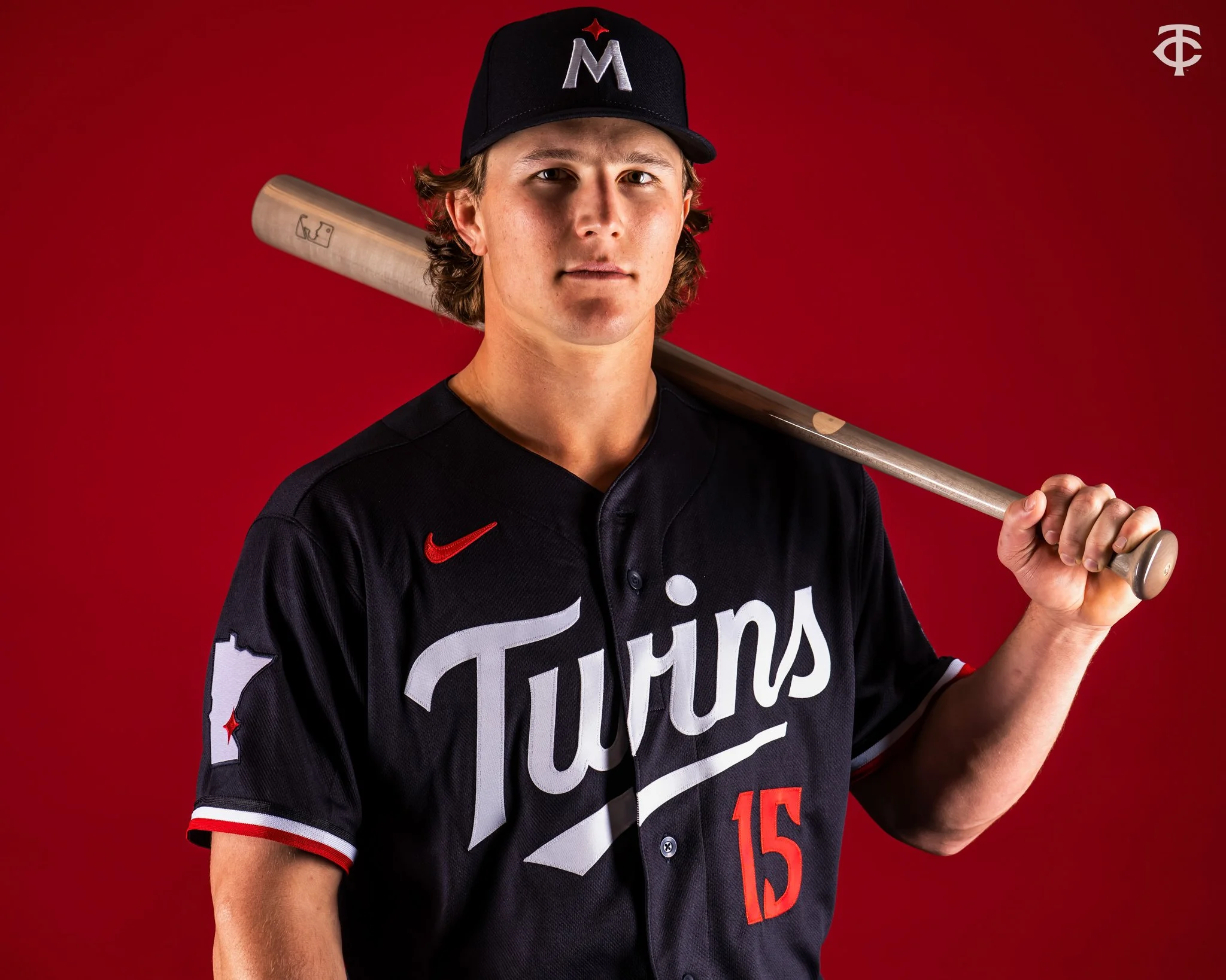
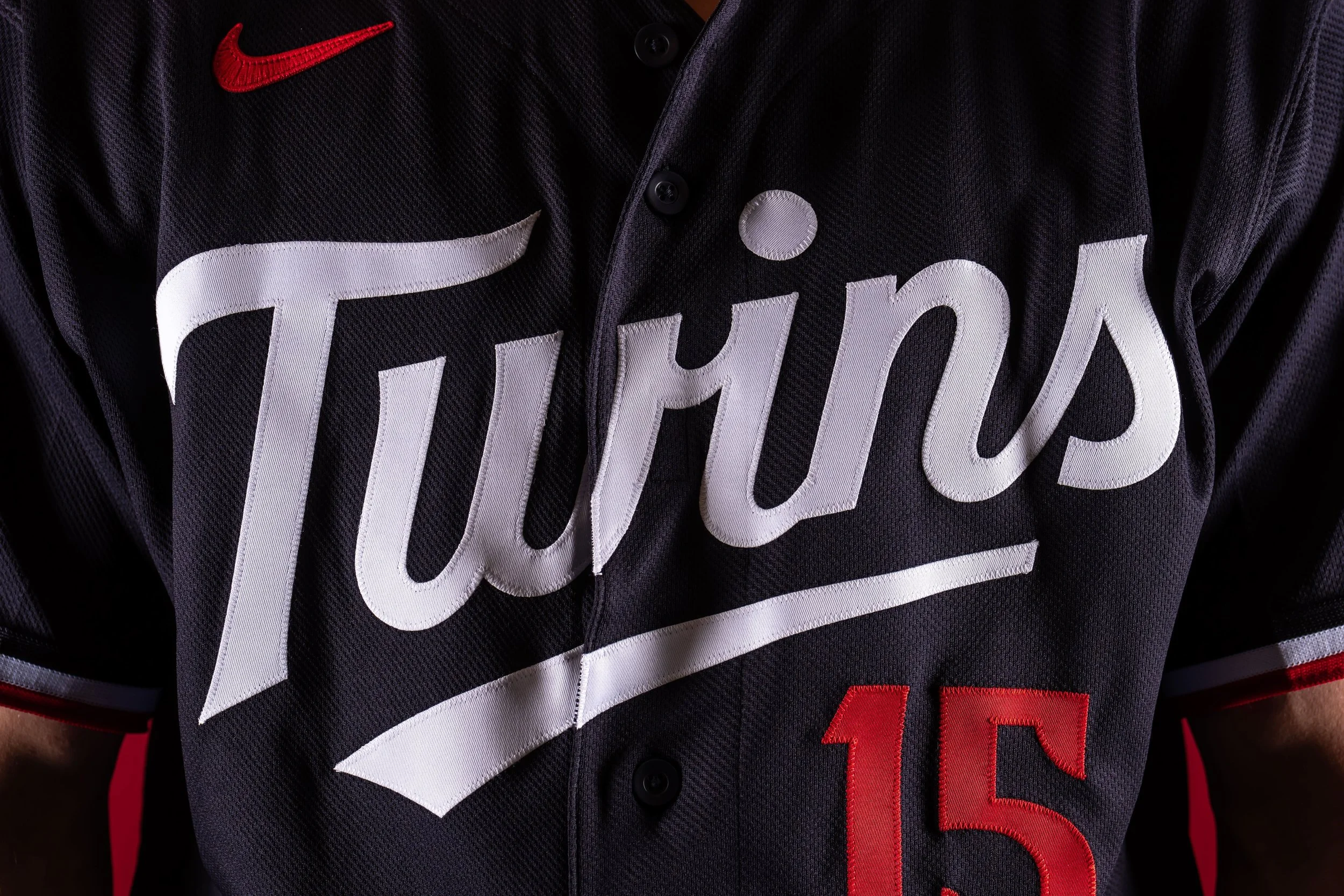
Ahead of the new MLB season, the Twins are updating their navy blue road alternate set, replacing the arched “MINNESOTA” wordmark across the chest with a white scripted “Twins” logo. Same base color. Same cap. Same overall structure. But that one swap gives the uniform a much more classic, throwback personality. Sometimes the tiniest tweaks hit the hardest.
The new script sits front and center in white, paired with the familiar red player number below. Sleeve striping stays intact in blue, white, and red, keeping that clean, traditional Twins palette that has defined the club for decades. It feels less like a redesign and more like a refinement.
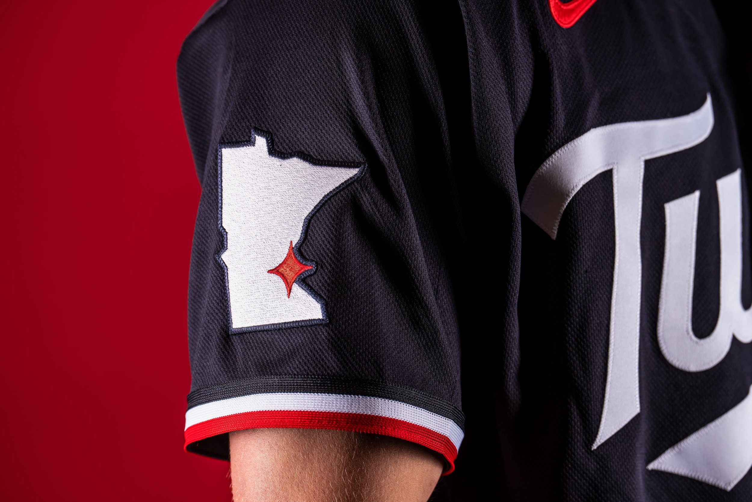
The sleeve patch also gets a meaningful update. Out goes the standard “TC” logo. In comes a state map of Minnesota, highlighted with the club’s red North Star planted directly over the Twin Cities. It is a small detail, but one that leans heavily into state pride and geography, giving the uniform a stronger sense of place. It is the kind of patch that feels tailor made for an alternate set.
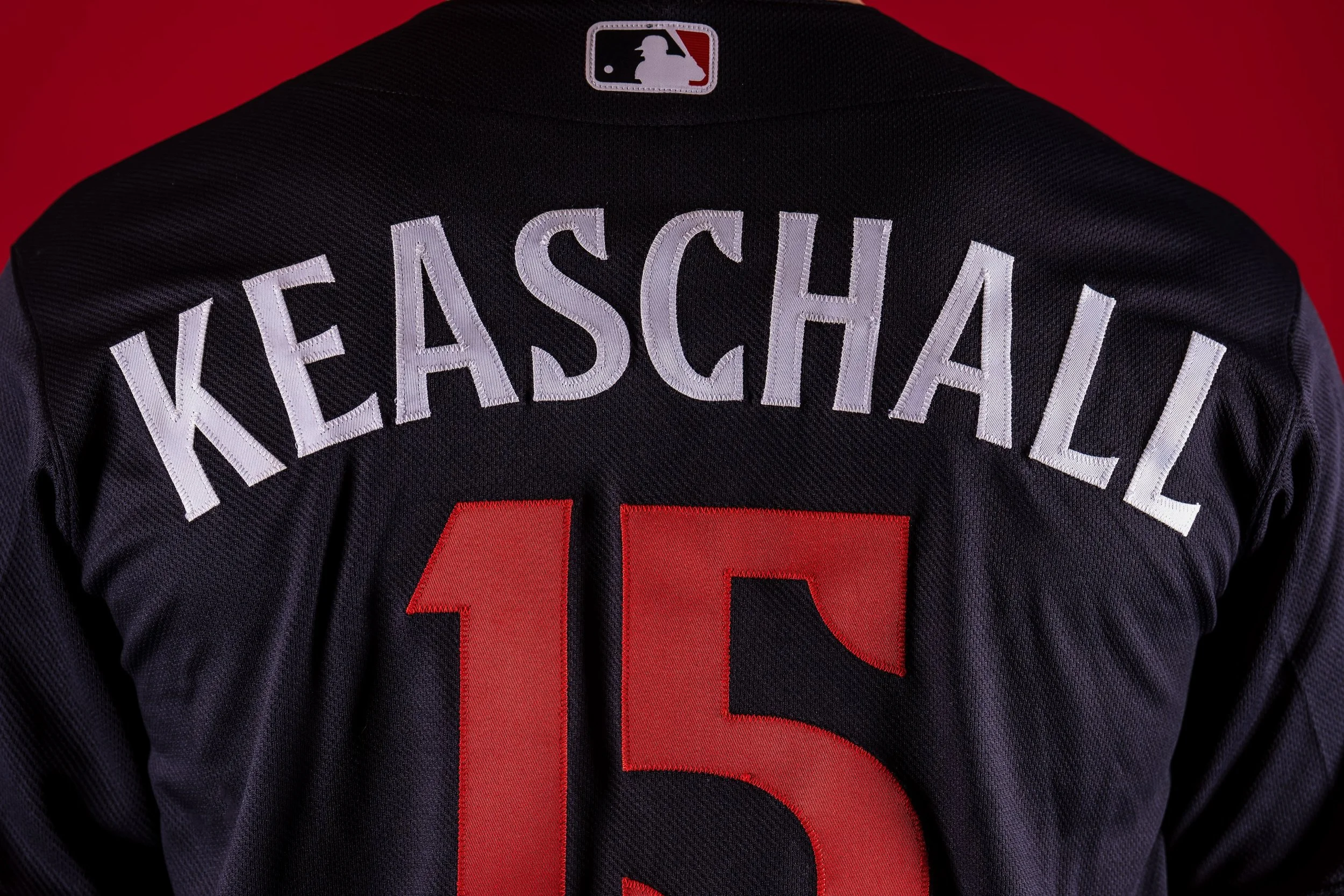
On the back, the Twins flip the color balance for better contrast. Player names move from white to red, while numbers switch from red to white. The result pops more cleanly against the navy base and should read sharper from the stands and on TV.
This navy look officially replaces the previous navy alternate the team has worn since 2023. The rest of Minnesota’s uniform lineup remains untouched, including their City Connect set.
Flexibility is part of the plan here, too. The jersey can be paired with white pants at home or grey pinstriped pants on the road. No matter where it shows up, it will always be worn with the “M” cap, keeping the identity consistent. It is a modern alternate with some old school versatility.
There is also a cool historical wrinkle baked into the update. This marks the first time the Twins will wear “Twins” across the front of a regular road uniform since the powder blue road jerseys back in 1986. For decades after that, “MINNESOTA” became the road standard, especially following the late 80s rebrand that coincided with their 1987 World Series run. It is a throwback without actually being a throwback. And that balance is what makes this one work.
Not flashy. Not loud. Just a smart, heritage driven upgrade that feels right at home in the Twins’ closet.
Shop Twins Gear Here
See What Else Is New
Featured

Related Articles
Featured