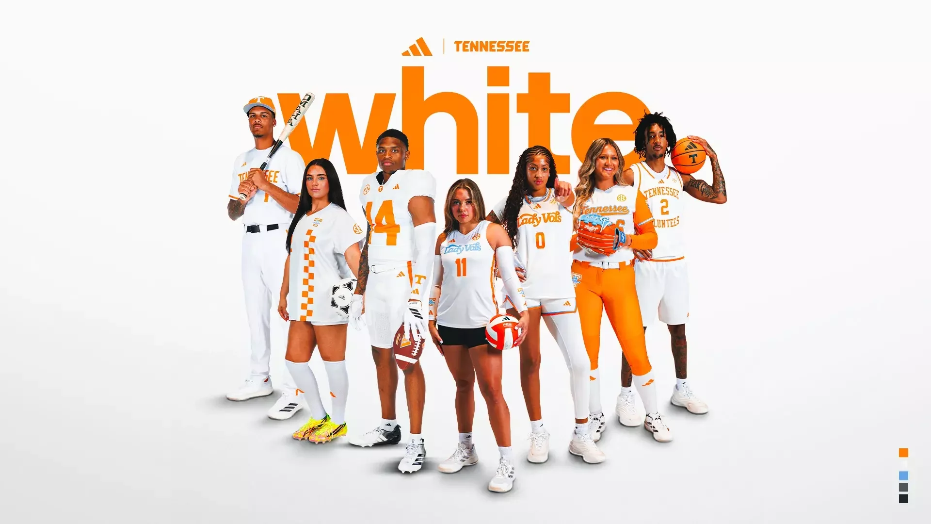
With the unveiling of Tennessee's new white adidas uniforms, that balance has been executed exceptionally well. Rather than chasing trends, Tennessee leaned into authenticity. The result is a unified collection that modernizes the Volunteers' visual identity while preserving the details that have made Tennessee one of college athletics' most recognizable brands.
The inspiration behind the collection begins with one of the university's oldest traditions. Like the orange uniforms, the new white uniforms draw inspiration from the American daisy that once grew prominently on The Hill, one of Tennessee's most historic campus landmarks. The crisp white base paired with Tennessee Orange creates a timeless combination that has become synonymous with Vol Nation. Every uniform feels intentional, allowing Tennessee's iconic colors to remain the focal point.
One of the biggest updates across nearly every sport is the introduction of Tennessee's new custom number font.
Developed through months of collaboration between Tennessee's creative team and adidas designers, the numbers blend traditional block styling with subtle modern elements. It's an update that feels current without sacrificing readability or the classic look fans expect.
Perhaps the most impressive aspect of the rollout is how cohesive the collection feels. Rather than creating isolated designs for individual programs, They built a system where every sport carries the same Tennessee identity while still allowing room for sport-specific traditions.
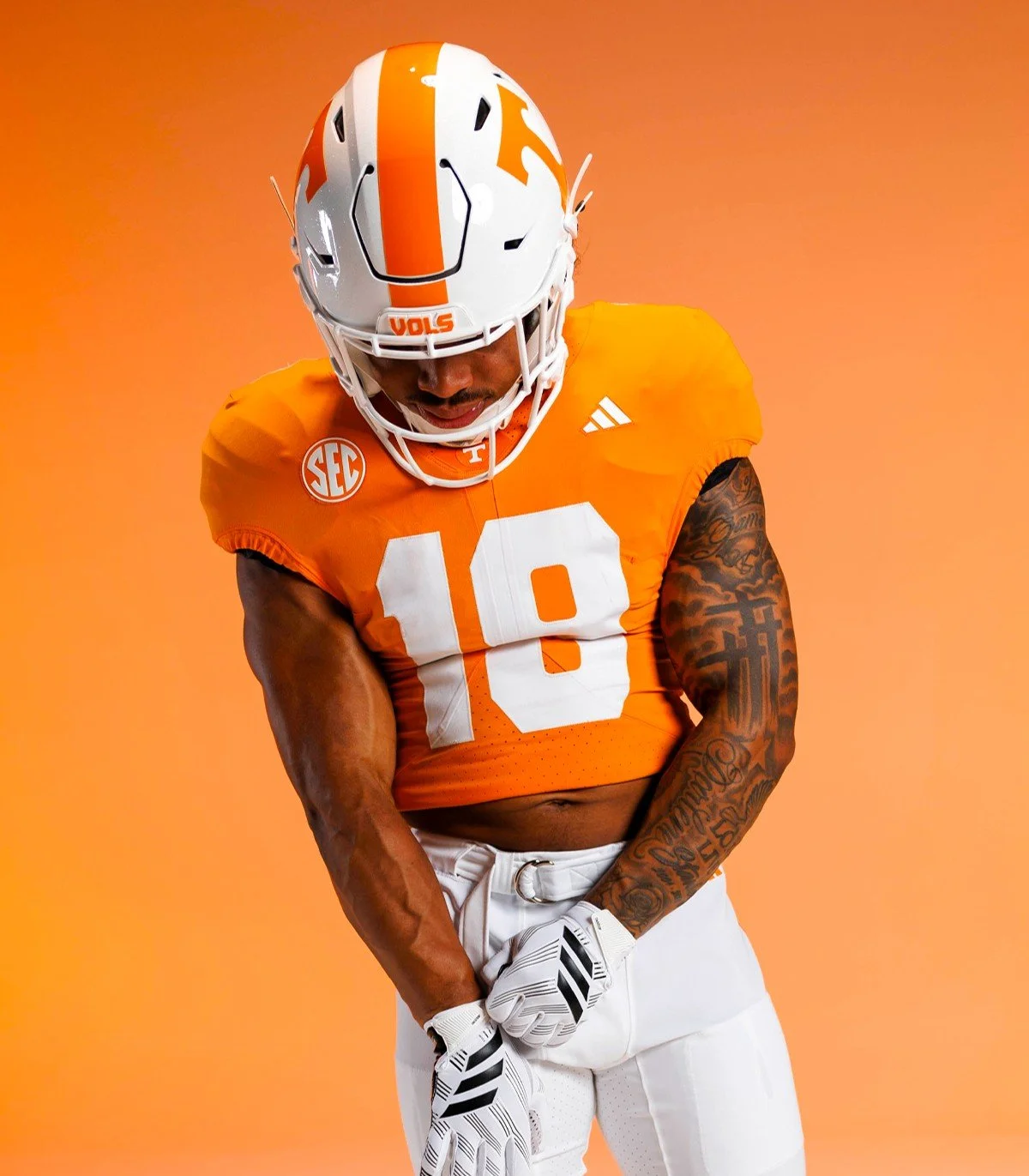
The football uniforms remain unmistakably Tennessee. The traditional striped pants return, while a subtle circular Power T logo appears on the front collar. Inside the collar, players will find the historic "I will give my all!" motto displayed in its original script, creating a meaningful connection between today's players and Tennessee's legendary past.
The men's basketball uniforms stay true to one of college basketball's cleanest looks. Updated collar and sleeve piping modernize the jersey, while a centered adidas logo and the Power T above the nameplate create stronger visual balance without changing the identity fans have known for decades.
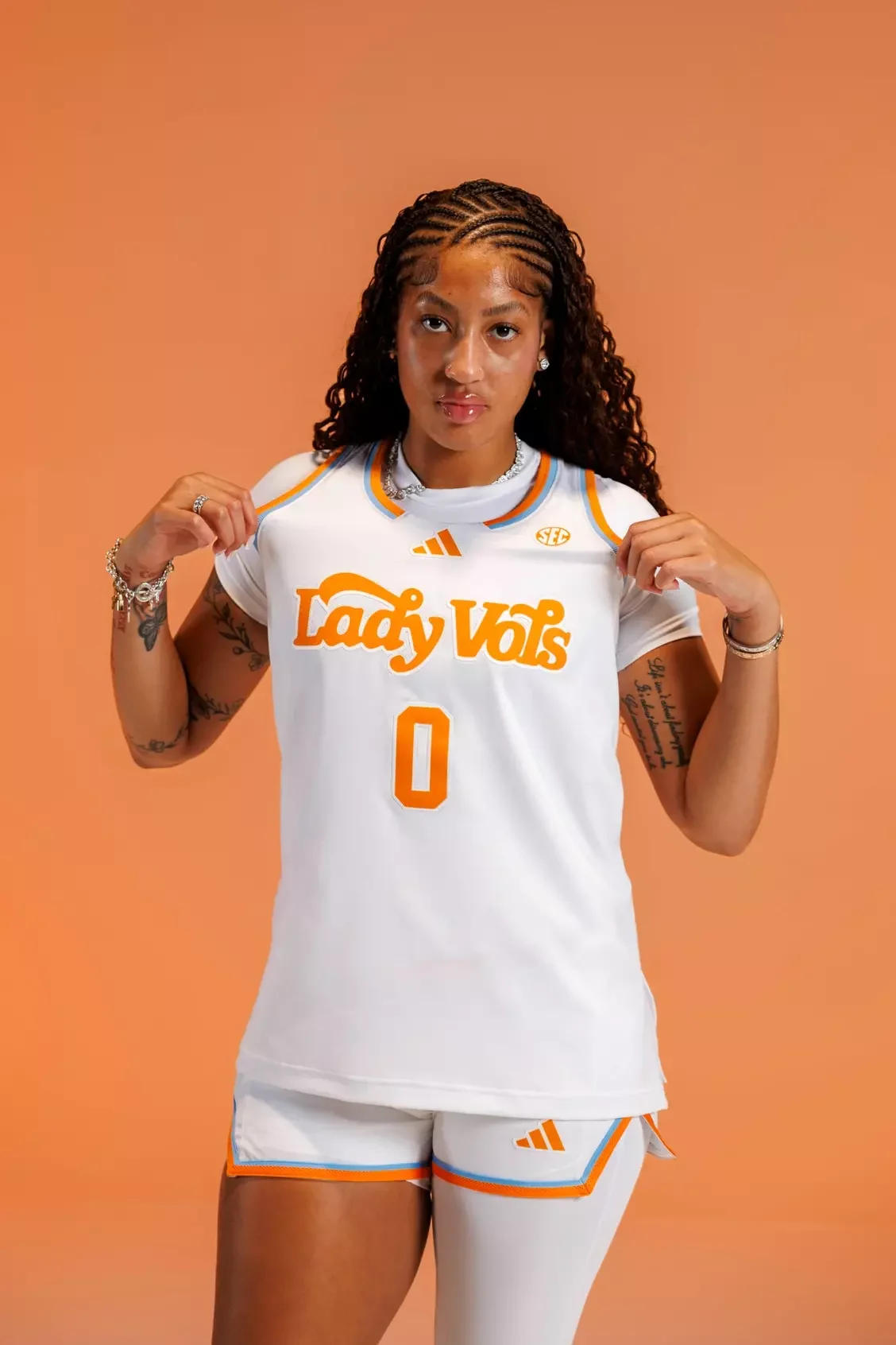
Few brands in women's college athletics carry the weight of the Lady Vol tradition. The classic Lady Vol script returns, accented with Summitt Blue outlining throughout the uniform. The subtle blue pays tribute to legendary coach Pat Summitt while reinforcing one of the most iconic identities in women's sports.
Tennessee baseball receives one of the cleanest looks in the rollout. A bold new Tennessee wordmark is paired with thin Tennessee Orange piping down the pants, creating a professional, timeless appearance that fits one of the nation's premier baseball programs.
The softball uniforms continue the Lady Vol tradition with the Tennessee script outlined in Summitt Blue, complemented by contrasting sleeves and the Lady Vol logo on the left sleeve.
Soccer may feature the most unique design element of the collection. The white jerseys include a checkerboard sash across the front, paired with a Tri-Star logo on the back neck, a subtle tribute to the state of Tennessee that gives the uniform its own identity while remaining connected to the larger athletic department.
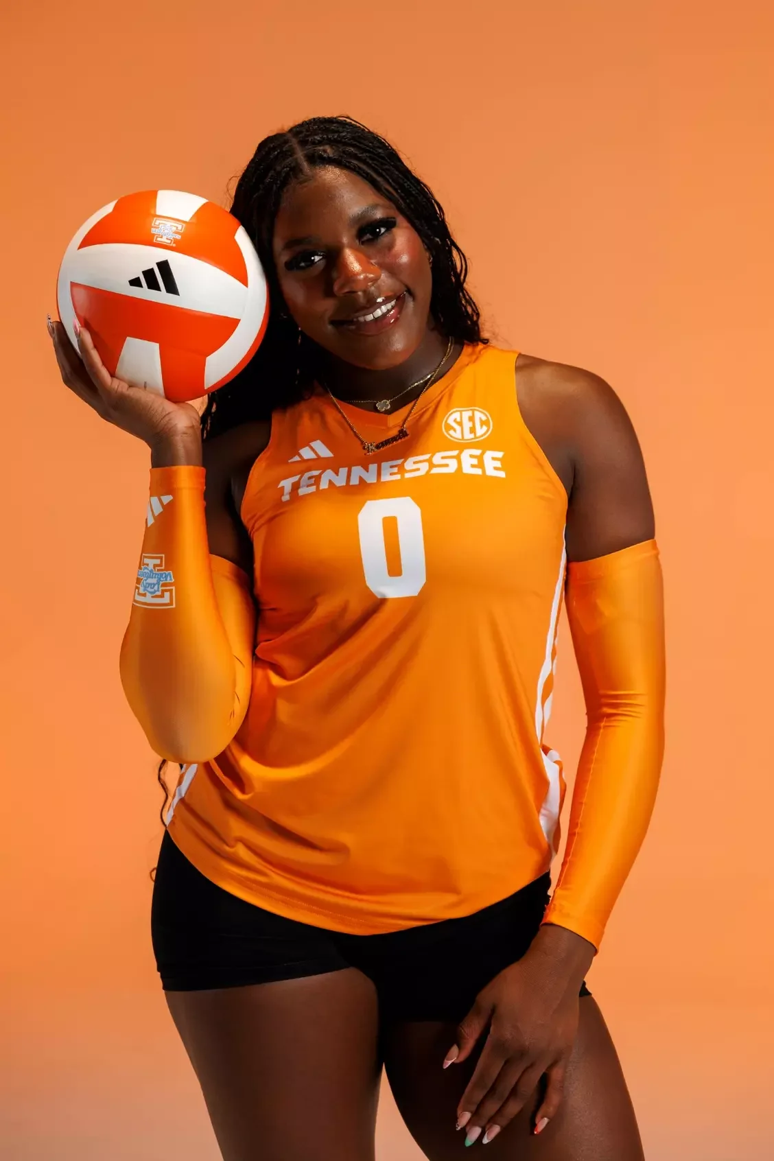
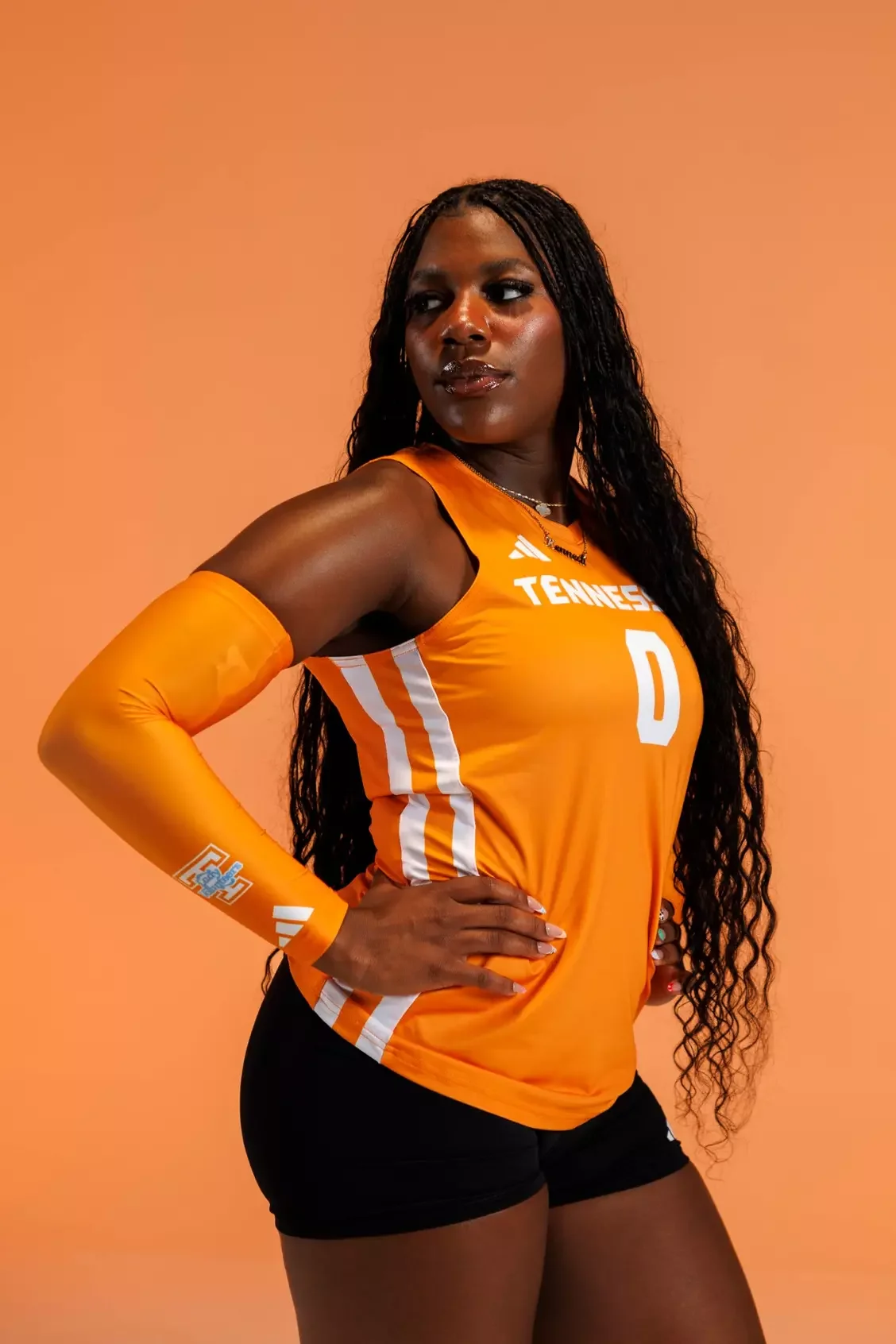
The sleeveless volleyball uniforms keep things simple. Featuring the classic Lady Vol script and a Lady Vol logo on the back neck, the uniforms prioritize clean lines while maintaining one of the strongest brands in collegiate athletics.
For Tennessee, this collection isn't just a new set of uniforms. It's a refined identity built to represent the Volunteers for years to come.
SHOP Tennessee gear HERE


See What Else Is New
Featured


Related Articles
Featured