Marlins New City Connect 2.0 Uniform
The Miami Marlins are diving into the vibrant energy of South Florida with the debut of their “Retrowave” City Connect 2.0 uniform — a bold tribute to the city’s culture, history, and future. The new look fuses nostalgic elements with modern flair, celebrating Miami’s electric personality and deep-rooted love for baseball.
“Our new Retrowave uniform combines the Marlins’ rich history with an innovative, forward-thinking approach that mirrors our organization’s trajectory,” said Marlins President of Business Operations Caroline O’Connor. “We aimed to celebrate our club’s storied past and special moments made in the teal, while looking forward to a bright future — all woven in a style that embodies the spirit of South Florida.”
The Marlins are no strangers to making a splash in the City Connect series. Their 2021 “Sugar Kings” uniforms were one of the most talked-about designs in the league. But with Retrowave, they take it a step further, pulling from the city’s multicultural makeup, neon nights, and iconic baseball moments.
One of the standout features of the Marlins’ new City Connect uniform is the 305 cap logo — a historic first in Major League Baseball. This marks the first time a team will wear its area code on the field. The bold "305" across the cap isn't just a shoutout to Miami proper, but a representation of the city’s heartbeat and its reach across South Florida, including areas like Fort Lauderdale’s 954. As ace Sandy Alcantara put it, “The 305 hat is amazing. It’s going to look very, very good on us. Hopefully the fans like it.”
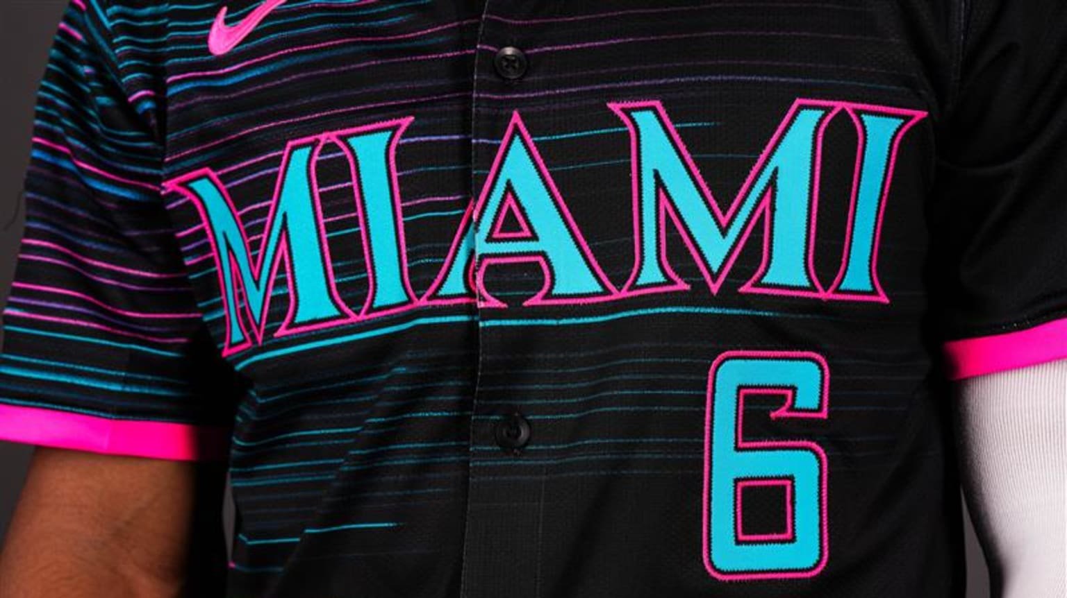
The color palette of the Retrowave uniform is a deliberate blend of nostalgia and energy. The classic teal represents the past, a nod to the Marlins’ inaugural 1993 squad and the legacy they started. Meanwhile, pink accents inject the uniform with the vibrant personality of Miami’s skyline — loud, bold, and unmistakably full of life.
At the heart of the jersey lies the bold “Miami” wordmark, a design that channels the look and energy of the original Florida Marlins era. It's both a tribute to the franchise's roots and a modern statement piece, styled to match the city’s timeless yet ever-evolving aesthetic.
Instead of traditional vertical pinstripes, the Marlins went with horizontal pinstripes, offering a fresh visual rhythm that reflects the constant movement and cultural blend of South Florida. This twist captures both heritage and innovation, showing that the team — and the city — isn’t afraid to rewrite the rules.
The sleeve patch, designed in collaboration with ADT, also got a “Retrowave” makeover. The new logo incorporates retro themes with sleek, modern elements, mirroring the team’s intent to balance historical respect with a future-forward attitude.
Finally, the jock tag grounds the uniform in place and purpose. From the beaches to the ballpark, it celebrates Miami’s vibrant identity while also symbolizing the legacy the Marlins aim to build. As Connor Norby said, “There’s four major sports teams here. There’s music, beaches — it’s always hectic. When it comes to baseball, fans want a competitive team, and I think we’re getting to that point a lot quicker than expected.”
From the city’s neon-soaked nights to its championship history and electric fan base, the Marlins’ Retrowave uniforms are more than a uniform — they’re a cultural statement. It’s Miami baseball, reimagined.
Shop Marlins Gear Here


See What Else Is New
Featured

Related Articles
Featured