Royals Unveil “Forever Fountains” City Connect Uniform
The Kansas City Royals are embracing their city’s identity in a bold new way.
The Royals unveiled their latest City Connect uniform, a design that blends the franchise’s past, present, and future while celebrating Kansas City’s reputation as the City of Fountains and the heart of the American Midwest.
Dubbed the “Forever Fountains” uniform, the look highlights one of the most recognizable aspects of the city while incorporating several meaningful design elements that connect the team directly to Kansas City’s culture and history.
The Royals will debut the new uniform at Kauffman Stadium when they take on the Chicago White Sox. After the debut weekend, the team plans to wear the uniform for every Friday home game throughout the season, continuing a tradition they established with their previous City Connect set.
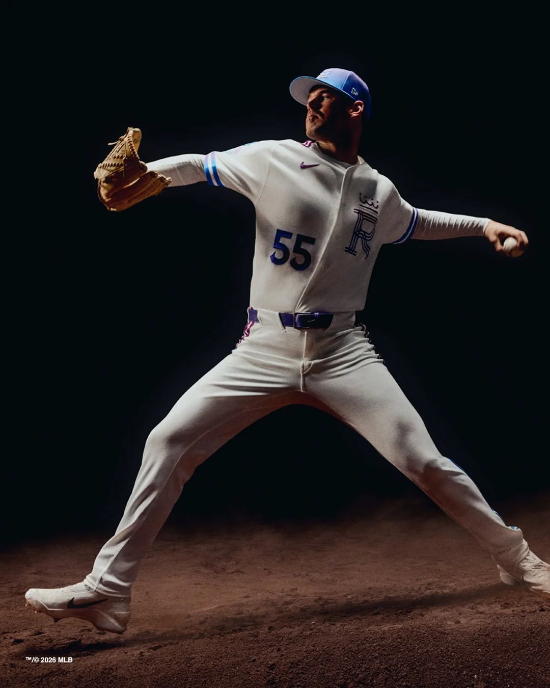
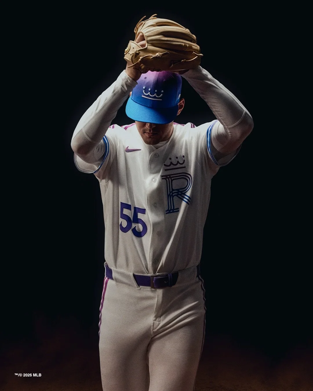
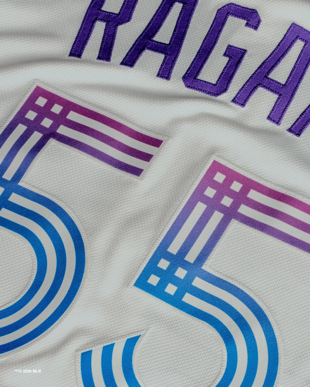
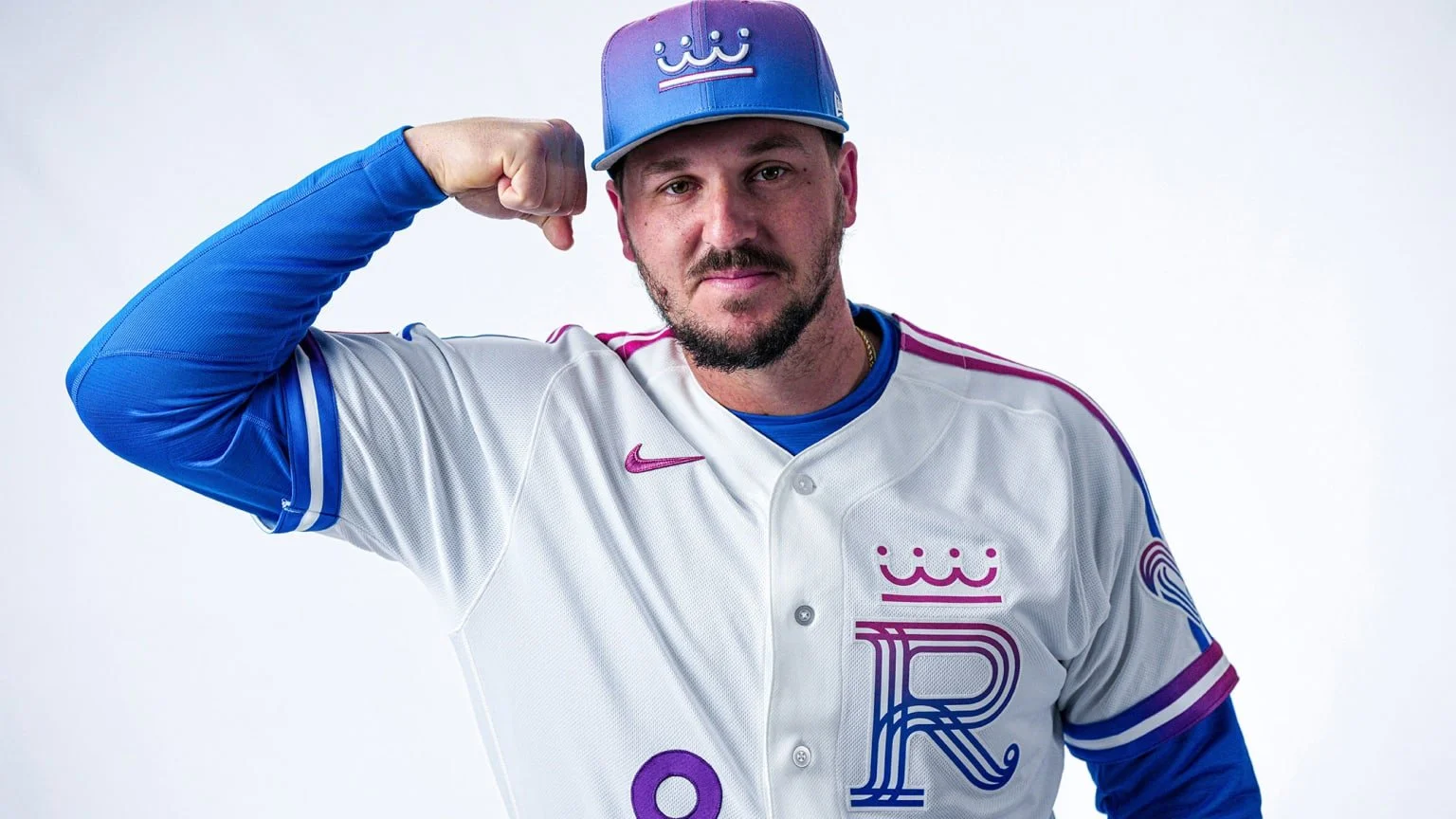
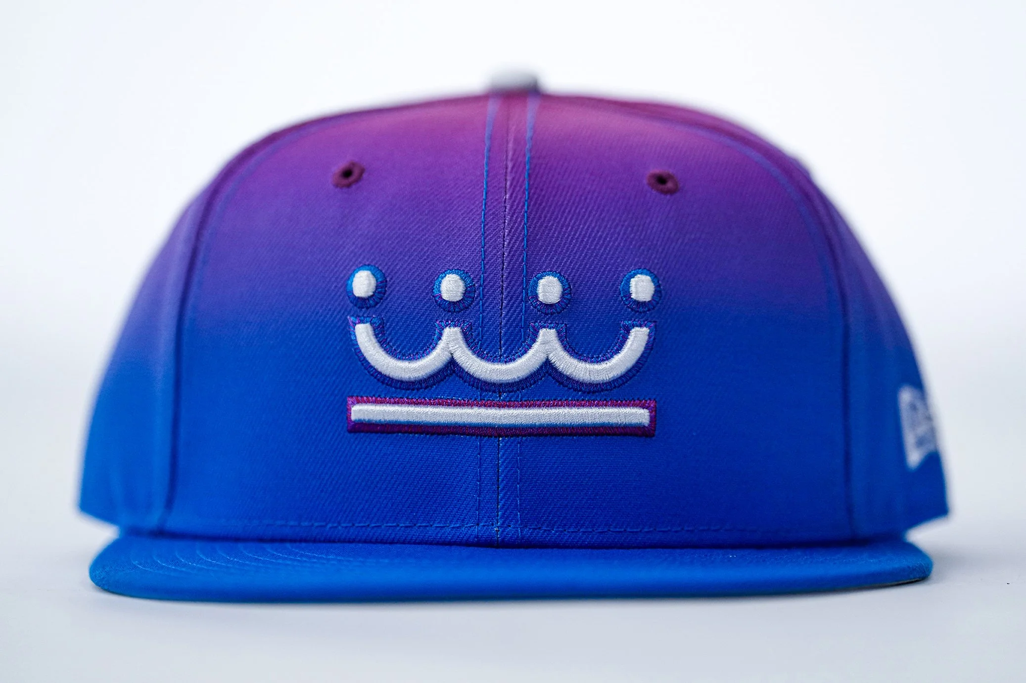
The most eye-catching element of the new uniform is its fuchsia-to-blue gradient color scheme. The design draws inspiration from the colors of a Midwestern summer sunset, blending vibrant pink tones into the Royals’ signature blue.
The blue also symbolizes the water flowing through Kansas City’s more than 200 fountains, a defining feature of the city and the inspiration behind the “Forever Fountains” name.
Kansas City officially adopted the City of Fountains nickname in 1991, and the Royals used this City Connect opportunity to highlight that identity on the national stage.
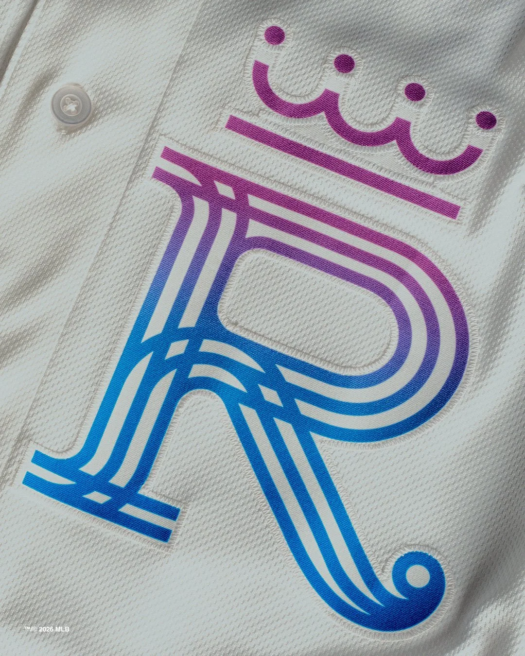
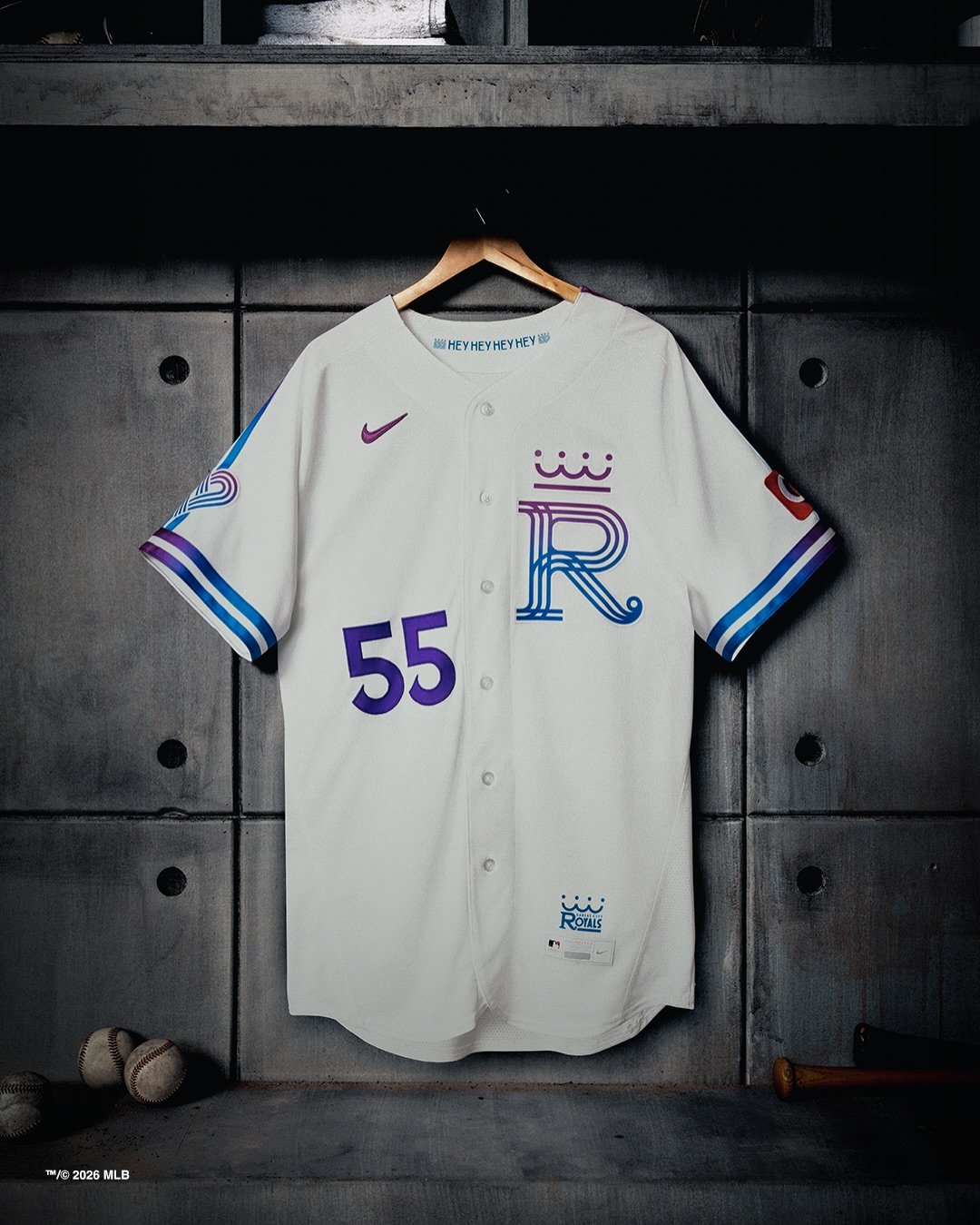
At the center of the uniform is a redesigned “R” logo, which takes inspiration from the Royals’ original logo introduced when the franchise was founded in 1969. The updated mark blends classic elements with modern styling, creating a look that honors the team’s roots while pointing toward its future. A crown sits atop the “R”, appearing both on the jersey and the cap, tying the design back to the Royals’ longstanding royal-themed branding.
Several details throughout the uniform reinforce the deep relationship between the team and the city it represents.
The jersey numbers use the same font as Kansas City’s official city logo, strengthening the connection between the club and the community it has called home since 1969.
Meanwhile, two vertical stripes on the jersey’s armbands feature a white outline, symbolizing Kansas City’s unique location along the state line between Missouri and Kansas.
Another standout detail is the heart patch on the sleeve, representing Kansas City’s role as the nation’s heartland.
According to the team, the heart symbolizes not only the city’s geographic location but also the spirit and pride of the people who live there.
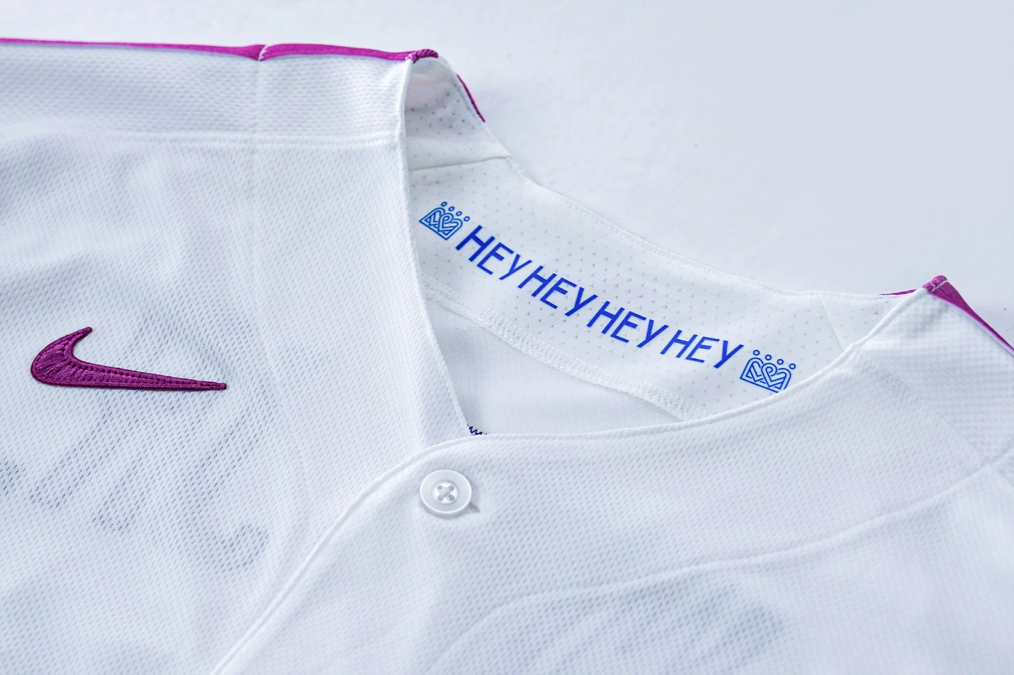
Inside the collar of the jersey is one of the more unique touches in the design. The words “HEY HEY HEY HEY” appear along the inside neckline, a tribute to a moment in Kansas City’s musical history. In 1964, The Beatles famously performed their version of “Kansas City/Hey-Hey-Hey-Hey” at Municipal Stadium. Today, the song lives on in Royals tradition, as it plays after the final out of every Royals victory at Kauffman Stadium.
With the Forever Fountains City Connect uniform, the Royals have created a design that reflects multiple layers of Kansas City’s identity — from its iconic fountains and sunsets to its music, geography, and civic pride.
By intertwining those elements with the franchise’s original branding, the Royals have crafted a uniform that feels both modern and deeply connected to the city’s history.
And when the Royals take the field in their new threads this weekend, the message will be clear: this uniform isn’t just about baseball, it’s about celebrating the heart of Kansas City.
Shop royals Gear Here
See What Else Is New
Featured


Related Articles
Featured