Milwaukee Brewers Unveil “Wisco” City Connect Uniform
The Milwaukee Brewers may play in Milwaukee, but their fanbase stretches far beyond the city limits. With their second-generation City Connect uniform, the Brewers are embracing that statewide identity in a bold way.
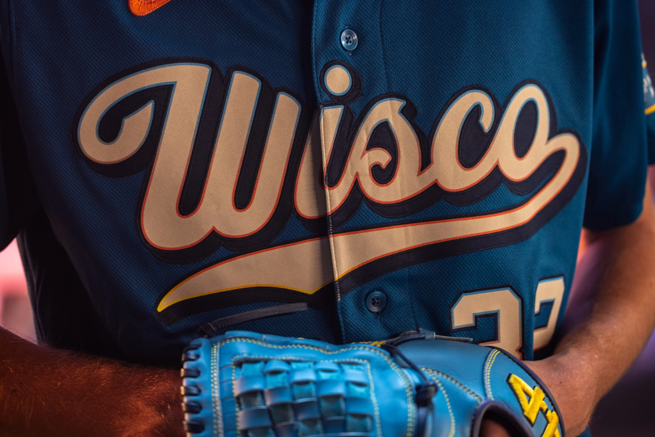
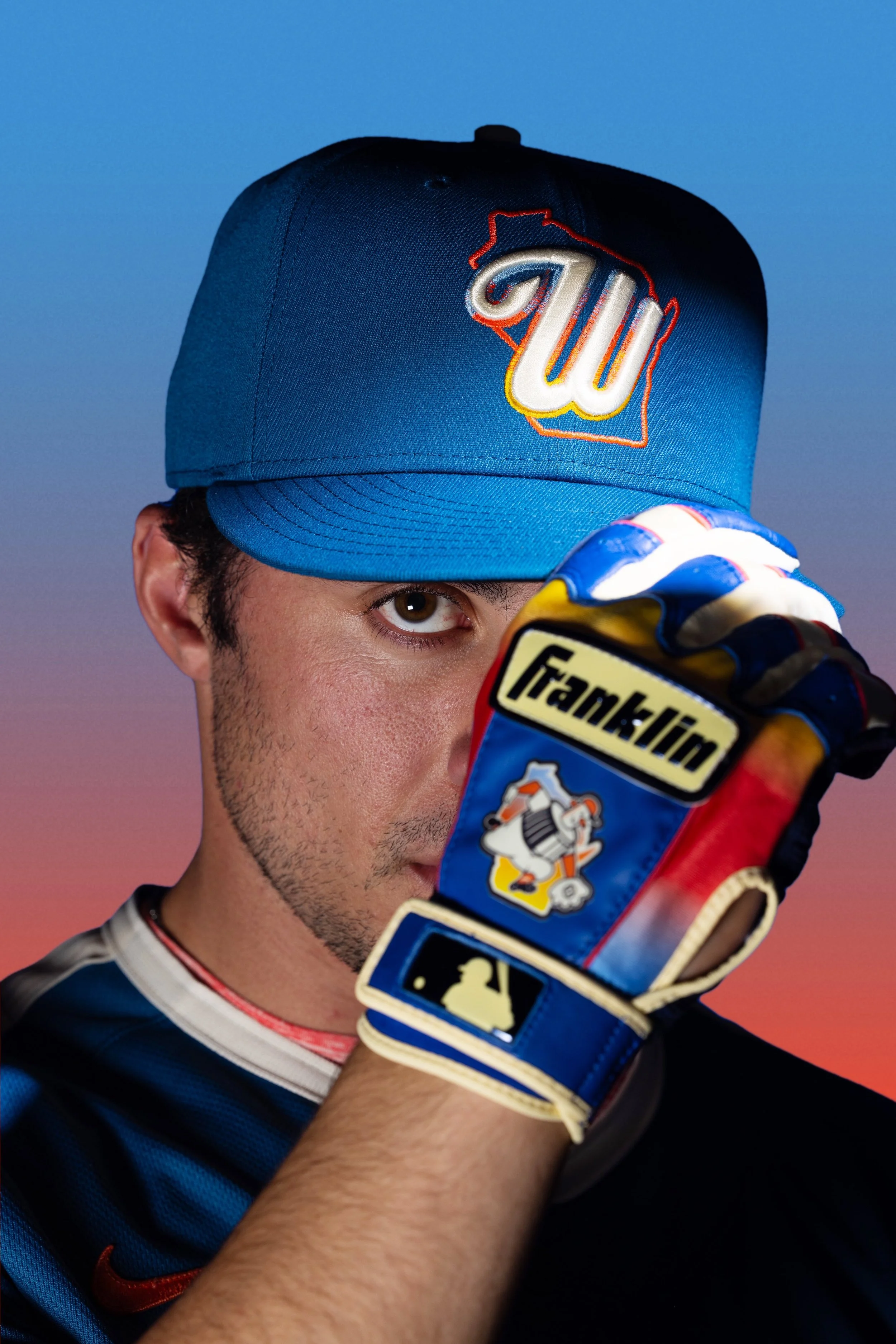
The new design features “Wisco” across the chest, a tribute to the nickname commonly used by residents throughout the state of Wisconsin. Internally, the organization has even given the uniform a different label.
While the Brewers’ first City Connect uniform focused heavily on the city of Milwaukee, this new version widens the lens to celebrate all of Wisconsin. According to team leadership, the Brewers’ strong attendance and group sales numbers show just how far the team’s reach extends across the state.
Fans regularly travel from hours away to attend games at American Family Field, often turning the experience into a full-day social event with tailgating and group outings. That statewide connection is exactly what inspired the design.
The Brewers’ new uniform incorporates colors and textures drawn directly from the state’s natural landscape. The primary blue color represents Wisconsin’s vast network of lakes, rivers, and shorelines—from the Milwaukee River to Eagle River to Lake Mendota. It symbolizes a state that is constantly moving, both geographically and culturally.
Cream accents appear throughout the uniform, inspired by sandy lakefront beaches, Door County’s shoreline, and Wisconsin’s sandstone bluffs. The tone adds a natural contrast to the deep blue base.
One of the most eye-catching features is the sunset gradient used in the wordmark, sleeve patches, and number trim. The flowing combination of orange, yellow, and blue reflects the vibrant sunsets across Wisconsin’s Northwoods and along the shoreline of Lake Michigan.
The custom “Wisco” wordmark blends modern design with vintage inspiration.
The typography draws influence from:
Early 20th-century American Association Milwaukee Brewers uniforms
Classic Wisconsin supper clubs
Traditional brewery label designs
Together, those references create a wordmark that feels uniquely tied to the state’s culture and heritage.
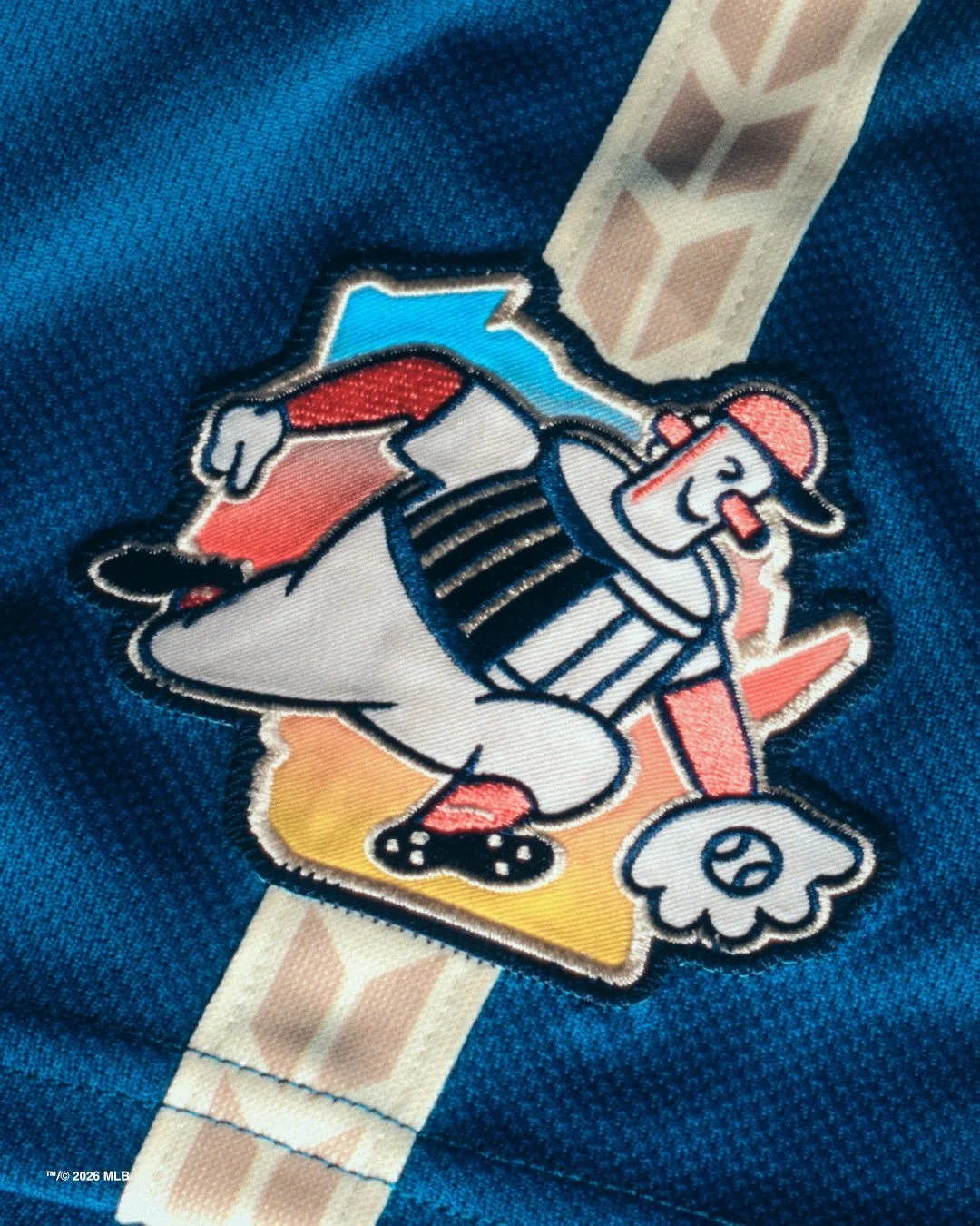
Another subtle design element appears on the shoulders and pants.
A wheat and barley braid pattern runs along the sleeve and pant piping, honoring Wisconsin’s agricultural roots and the brewing industry that inspired the team’s name.
The design acknowledges the state’s long-standing connection to farming, brewing, and local craftsmanship.
The sleeve patch also features a refreshed version of Barrelman, one of the most beloved symbols in Brewers history.
This updated version places the character alongside a full outline of the state of Wisconsin, reinforcing the idea that Brewers fandom extends to every county in the state.
It’s a modern twist on a classic logo—and another example of how the uniform balances nostalgia with a broader statewide identity.
City Connect uniforms are designed to tell stories about the communities teams represent, and the Brewers’ latest version tells a story that reaches far beyond Milwaukee.
Shop Brewers Gear Here


See What Else Is New
Featured


Related Articles
Featured