Posts in Soccer
Chelsea Unveil Sleek Black and Gold Away Kit for the 2026/27 Season

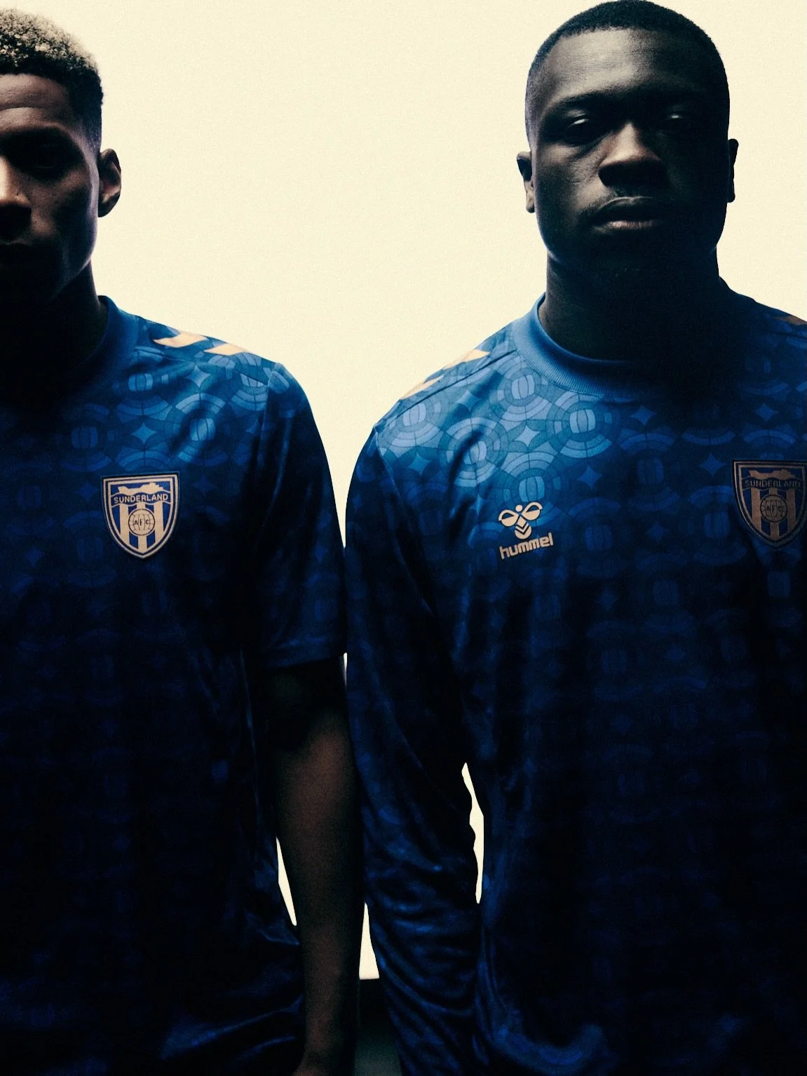
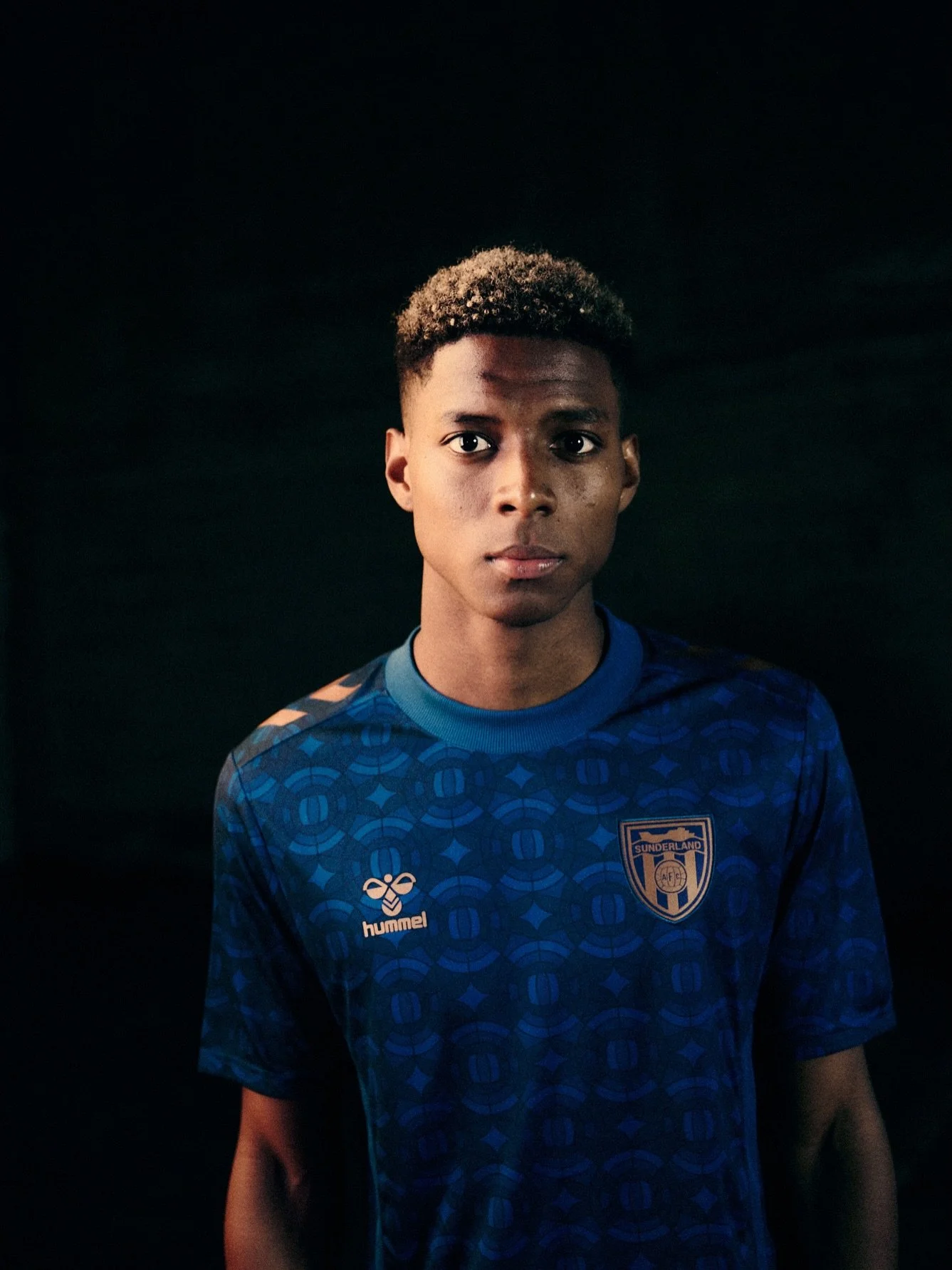
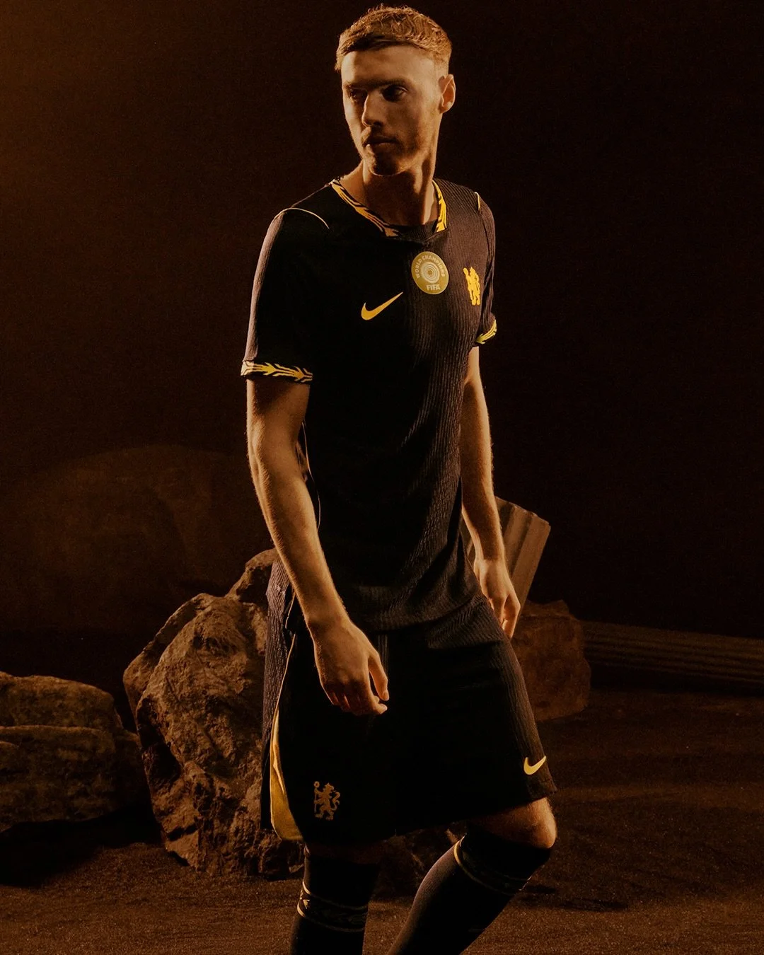
Chelsea have officially unveiled their new 2026/27 Nike away kit, and it's one of the cleanest football kits released this year.

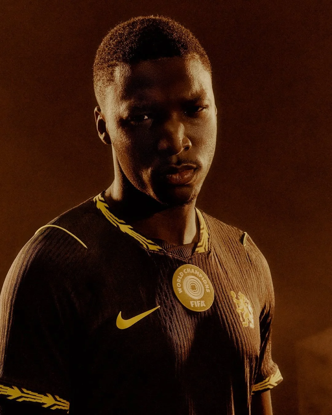
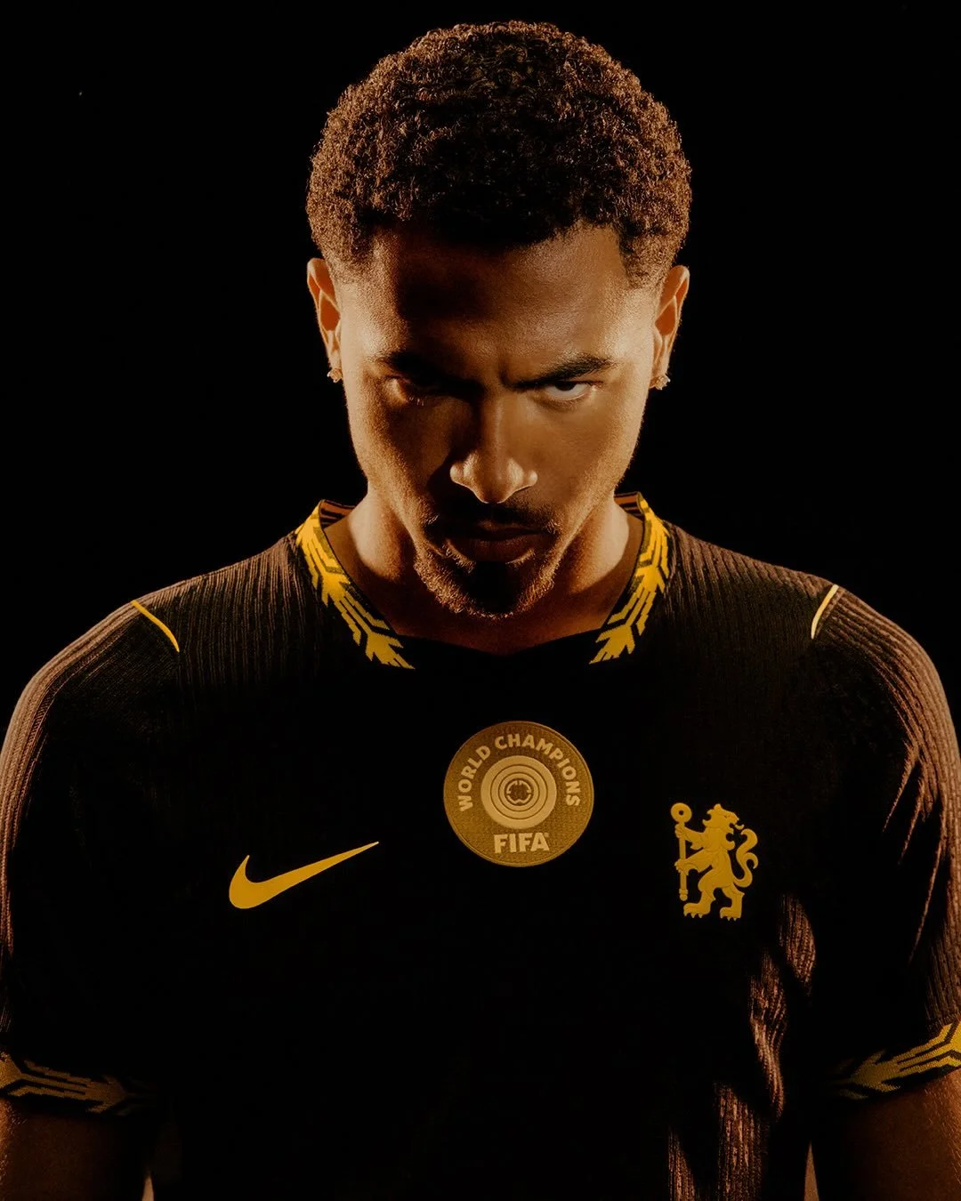
The Blues are returning to a bold black base for their new change strip, marking the club's first predominantly black away shirt since the 2016/17 season. The look is elevated by striking "Midwest Gold Lustre" accents that appear throughout the jersey, creating a premium black-and-gold color combination.

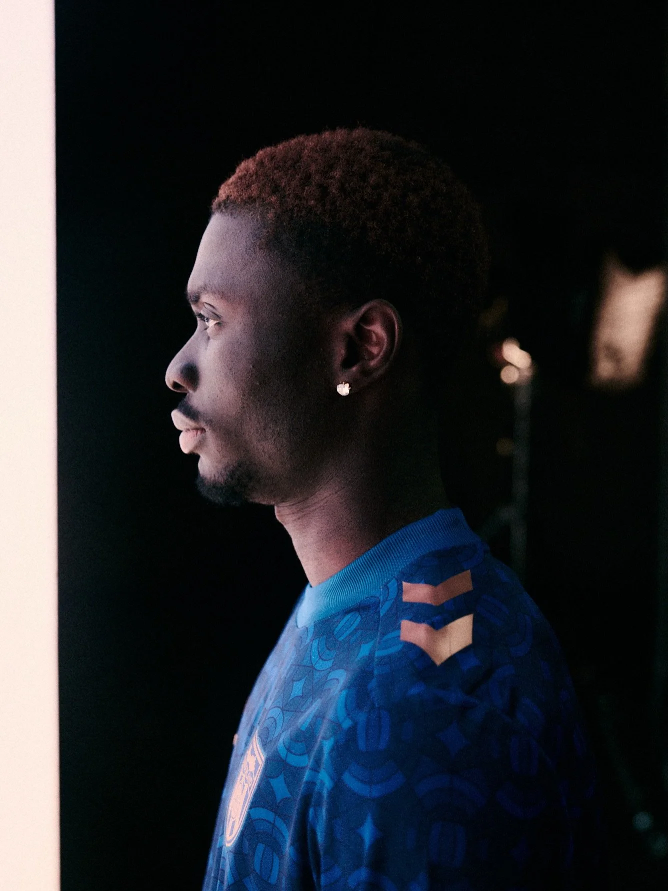
The gold detailing ties directly into Chelsea's recently released home kit. A laurel wreath motif surrounds the round neckline and sleeve cuffs before reappearing on the club's gold socks, while engineered gold ribbing across each shoulder adds another subtle design element.

The kit is being launched under Chelsea's "Unleash The Lion" campaign and continues the club's refreshed visual identity introduced for the 2026/27 season. Rather than relying on loud graphics or oversized patterns, Nike opted for a clean, modern aesthetic that lets the black-and-gold color palette do the talking.

Fans won't have to wait long to see the new look on the pitch. Chelsea will debut the away kit during the club's upcoming preseason tour of Australia and Asia, giving supporters an early look before the Premier League season begins.

SHOP Chelsea GEAR HERE


See What Else Is New

Related Articles


Manchester United Unveil Blue Away Kit for the 2026/27 Season

Manchester United are bringing back one of the club's most iconic looks.

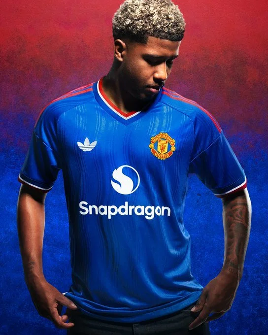
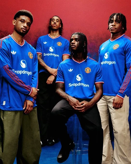
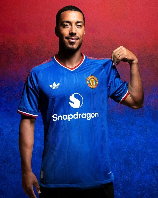
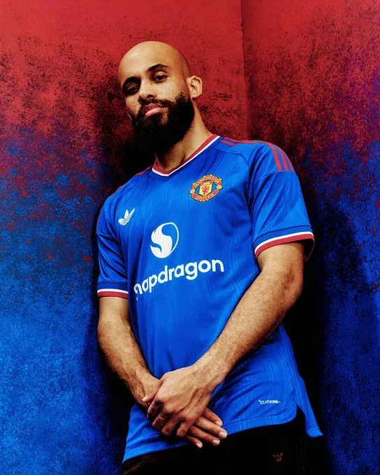
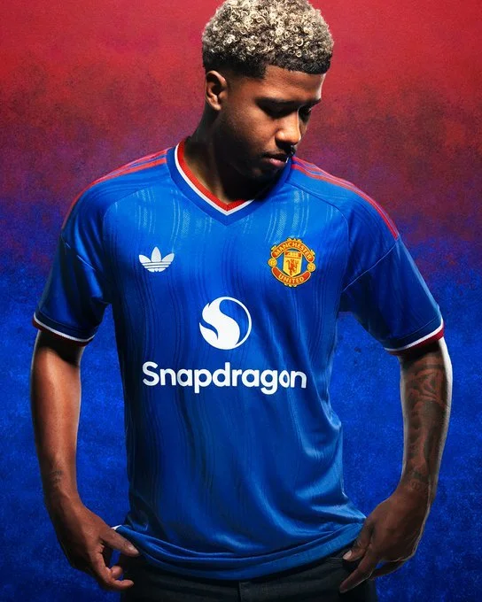
The Red Devils officially unveiled their new 2026/27 away kit on Wednesday, reintroducing the club's classic blue away identity with a modern design that blends tradition and contemporary styling.

Blue has long played a significant role in Manchester United history. Some of the club's biggest victories have come while wearing blue, including the 1968 European Cup Final, the 2009 UEFA Champions League semifinal, and the 2017 UEFA Europa League Final.

The latest edition honors that legacy while delivering a fresh look for the upcoming season. The jersey features a bold blue base accented by Manchester United's traditional red and white colors. One of the standout details is adidas' iconic Trefoil logo, giving the kit a retro-inspired touch that has become increasingly popular across football.

The result is a clean, timeless design that feels both modern and unmistakably Manchester United.

Fans won't have to wait long to see the new kit on the pitch.

Manchester United will debut the new blue away strip in Friday's friendly against Rosenborg at Lerkendal Stadium in Trondheim. The club will then wear the kit again eight days later when they face Atlético Madrid at Strawberry Arena in Stockholm.

SHOP Manchester United GEAR HERE


See What Else Is New

Related Articles


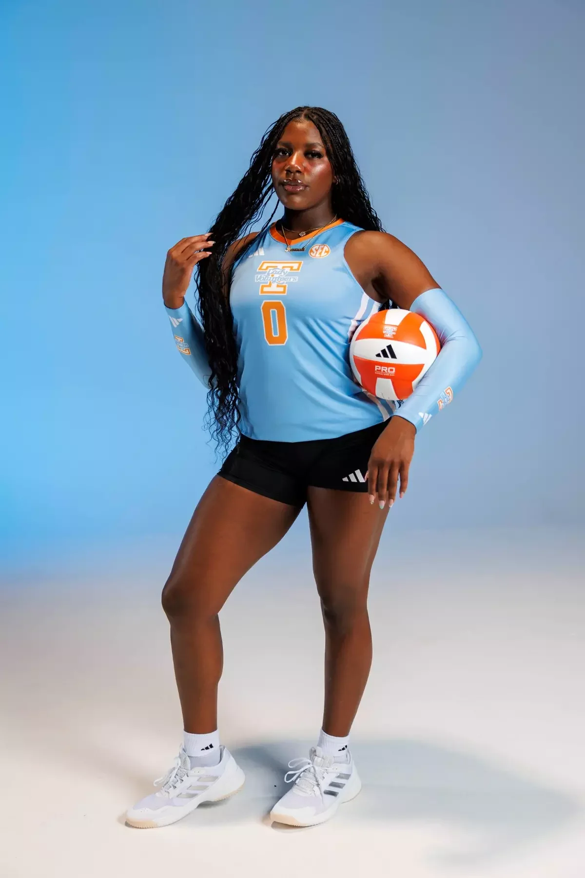
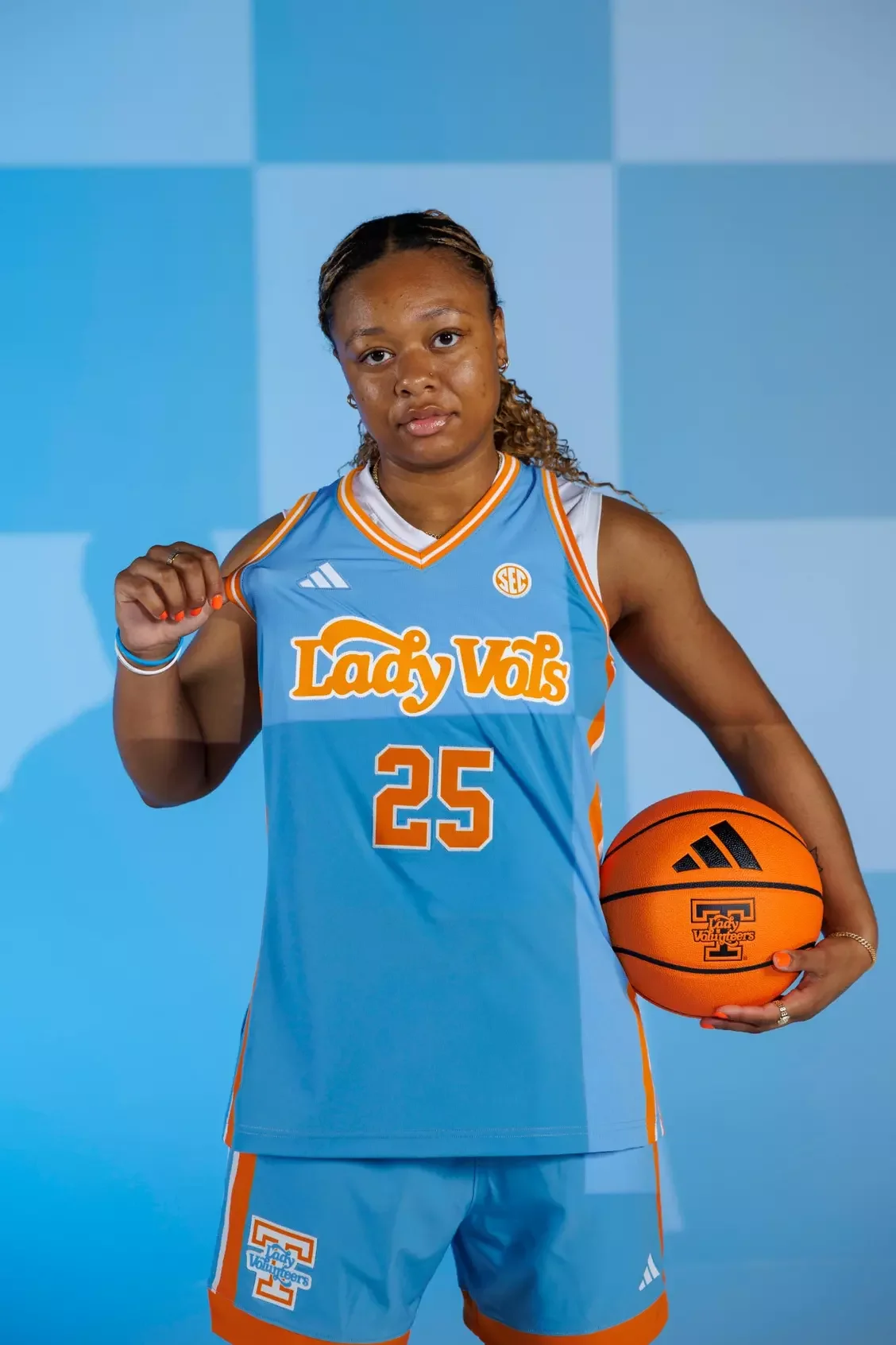
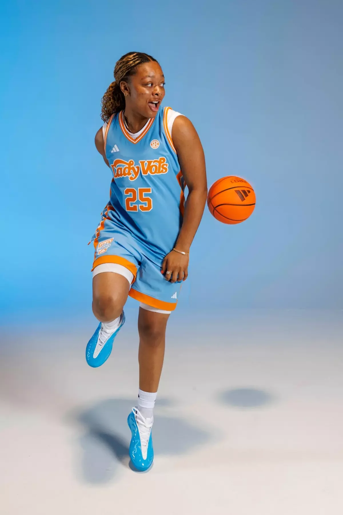
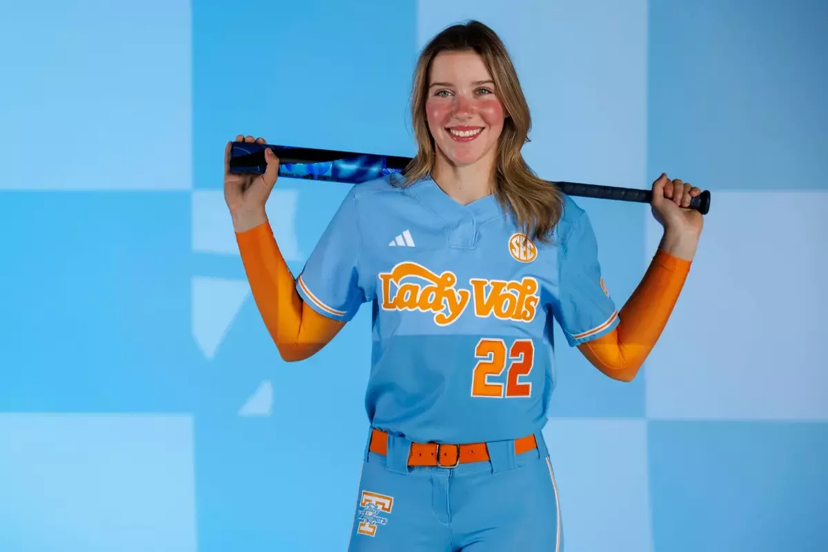
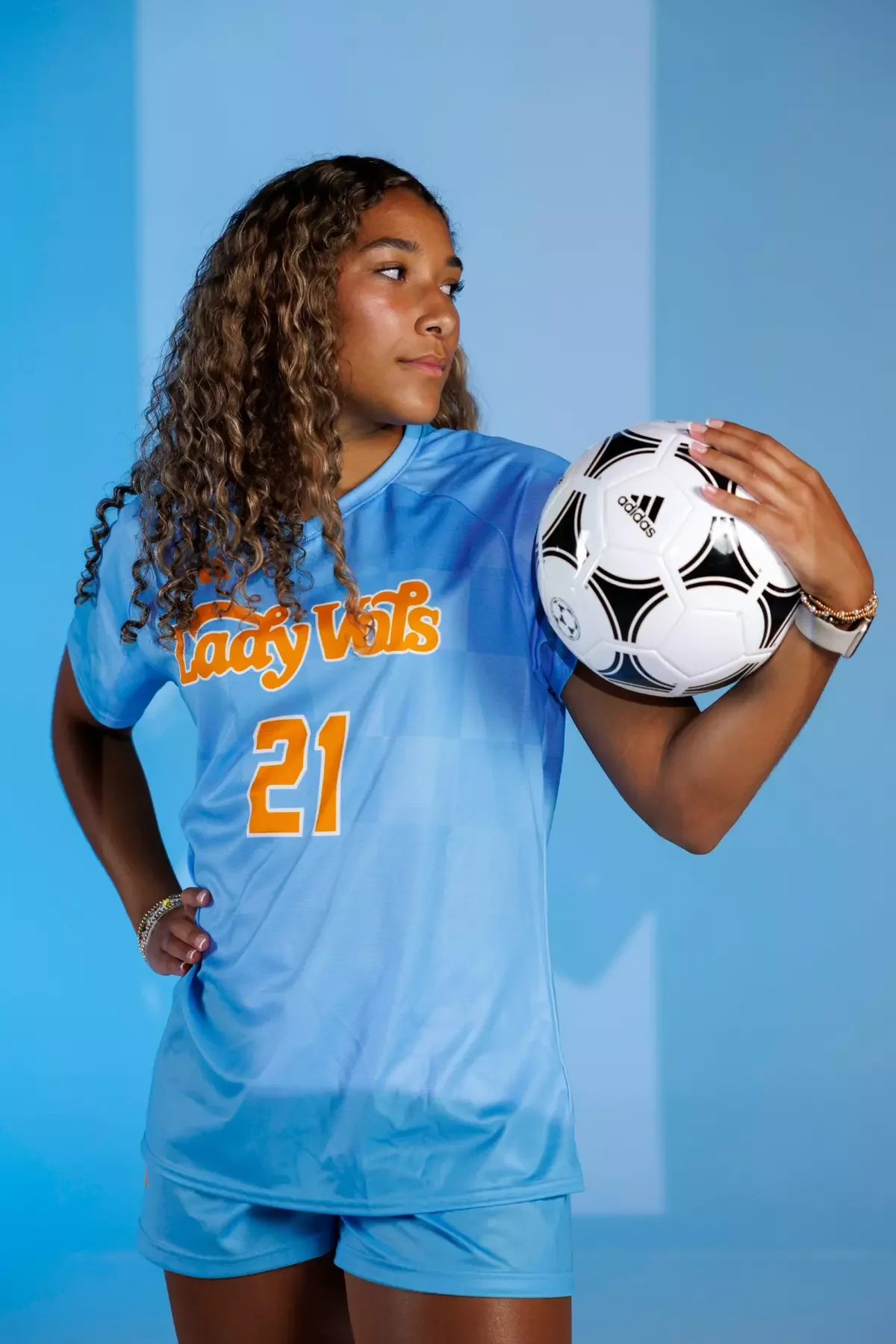
Tennessee Unveils Summitt Blue Uniforms Honoring the Legacy of Pat Summitt

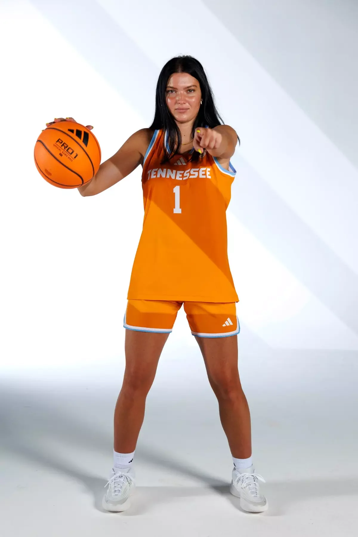
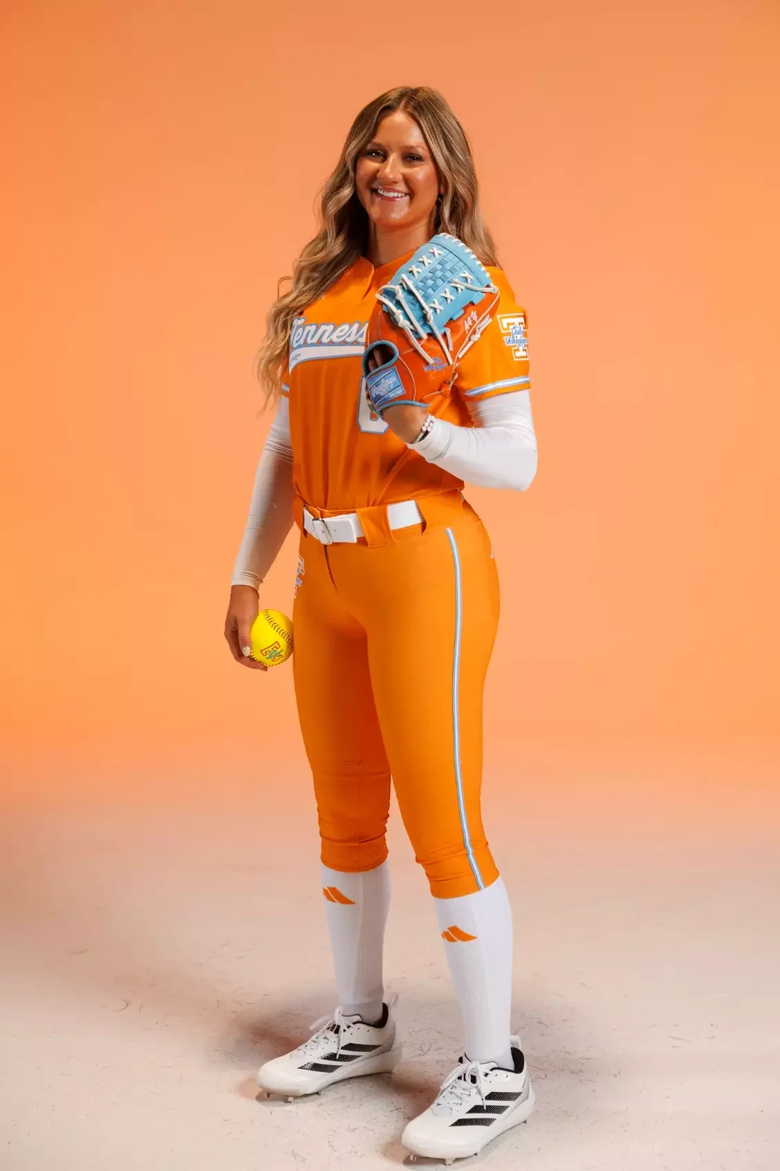
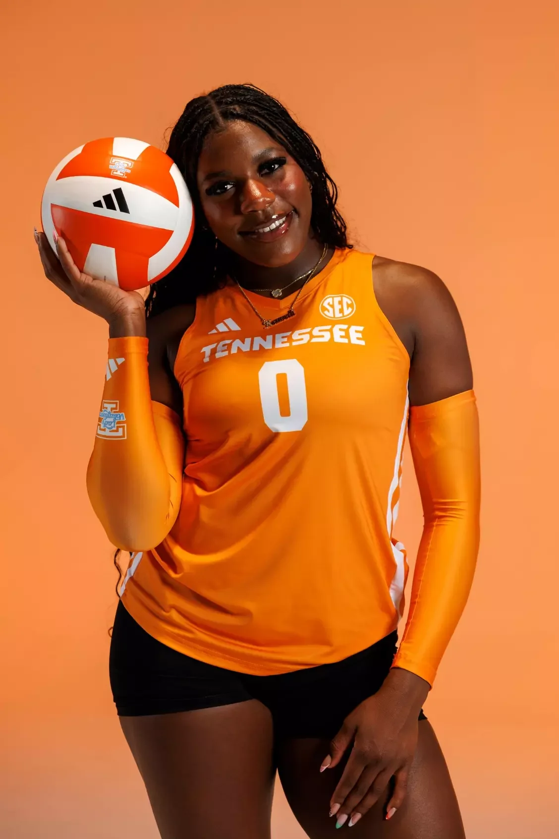
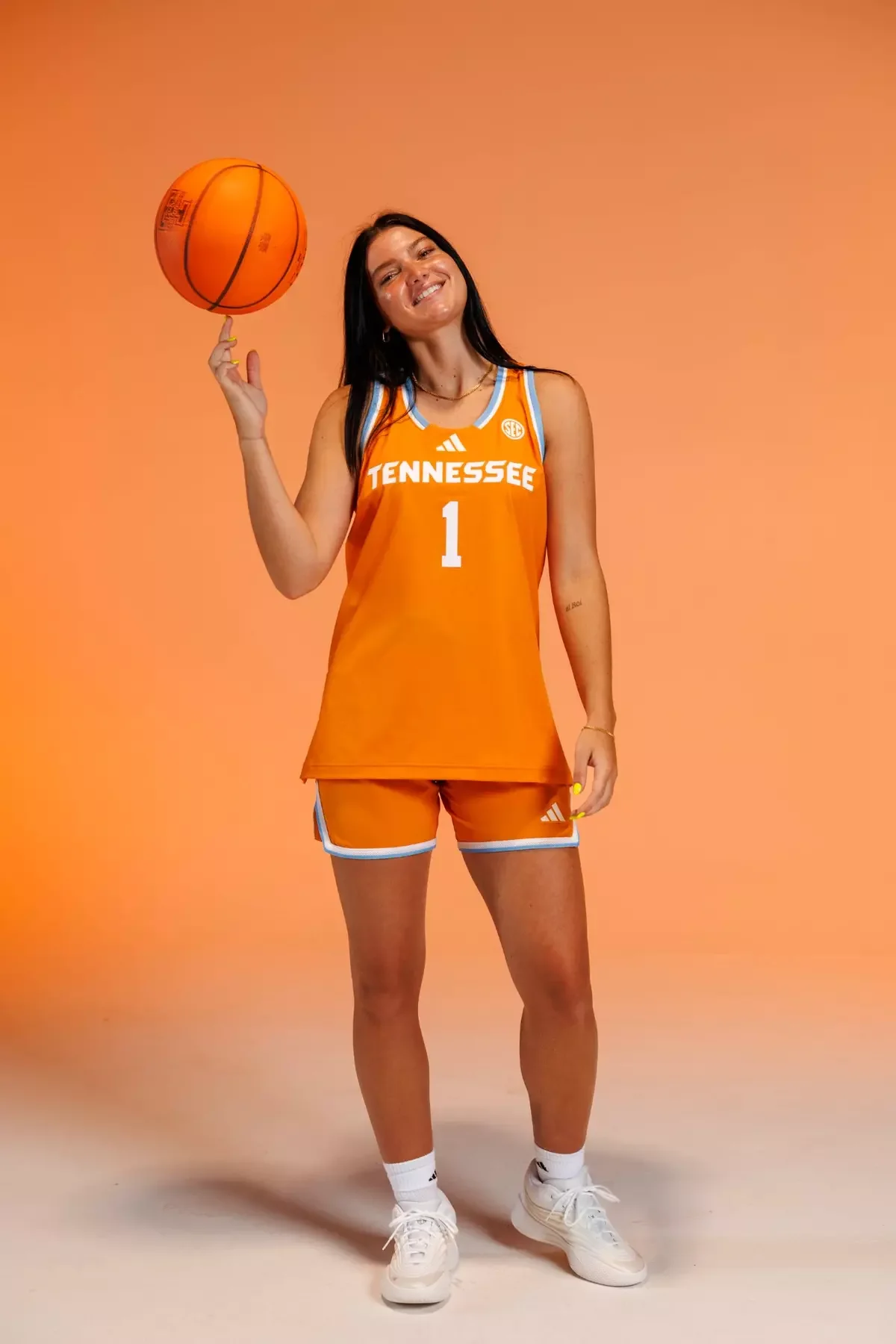
The University of Tennessee has unveiled its new Summitt Blue uniforms, a special collection that honors one of the greatest figures in sports history, legendary Lady Vols head coach Pat Summitt.

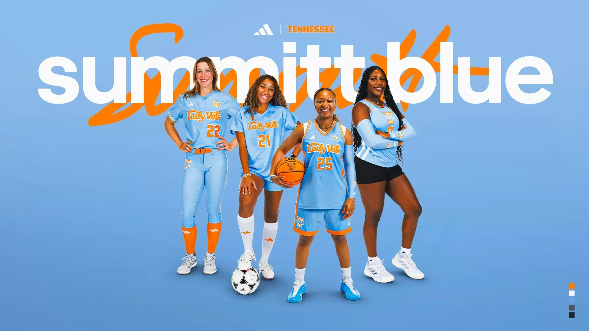
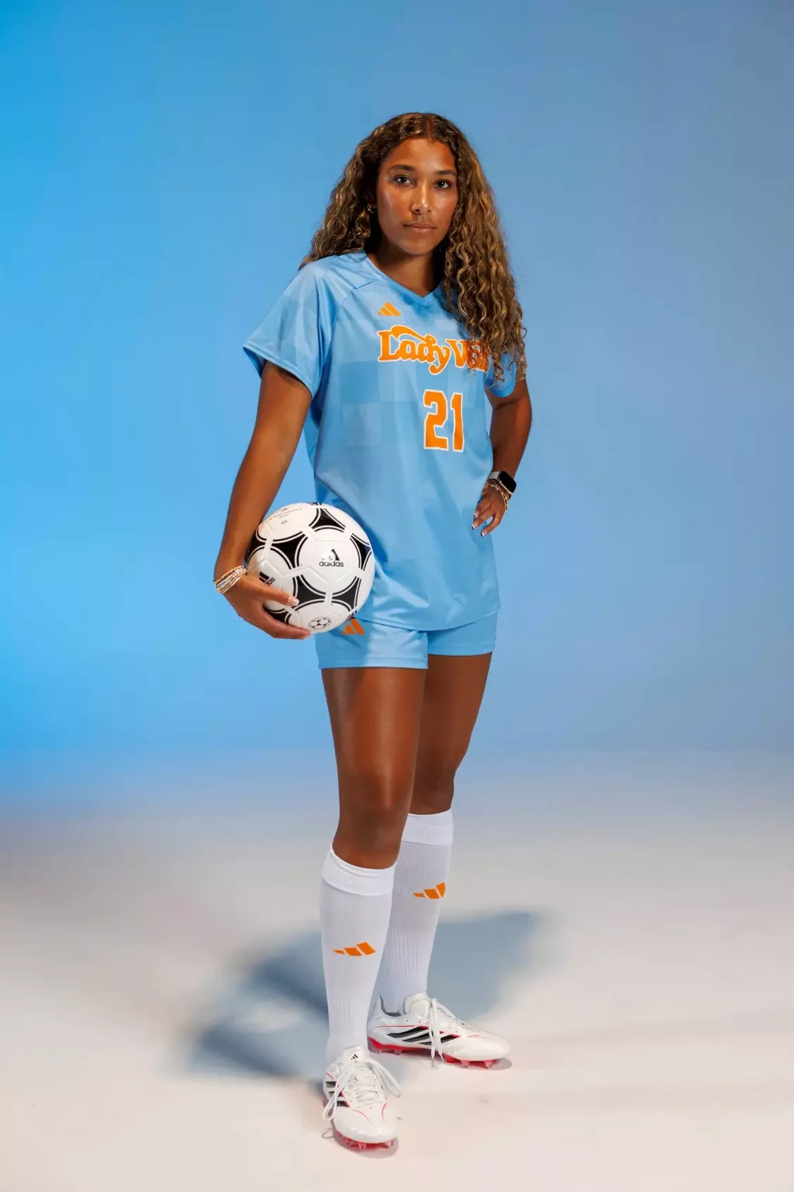
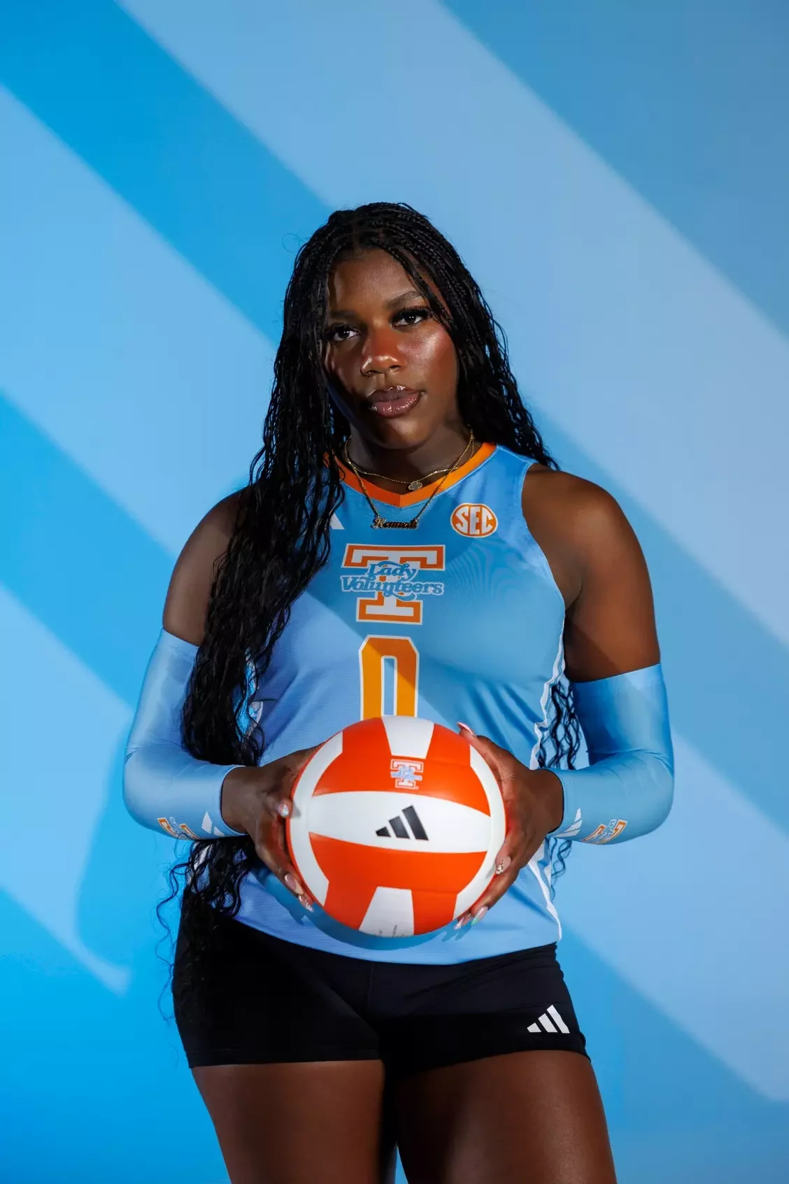
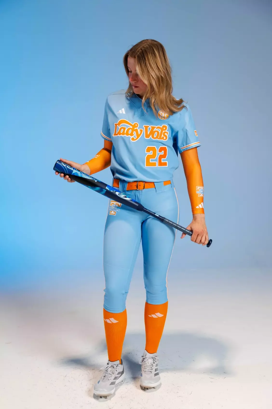
Named in tribute to the eight-time national champion coach, the Summitt Blue uniforms will be worn across Tennessee's women's programs, including women's basketball, soccer, softball, and volleyball. The collection celebrates the tradition, toughness, and championship mindset that defined Summitt's era in Knoxville.

The Summitt Blue colorway carries a timeless feel, built around simplicity, tradition, and sophistication. The classic design is meant to represent the enduring impact of the Lady Vols brand while creating a unified look across Tennessee athletics.

More than just an alternate uniform, Summitt Blue represents a connection between current student-athletes, alumni, fans, and the generations of Lady Vols who came before them.

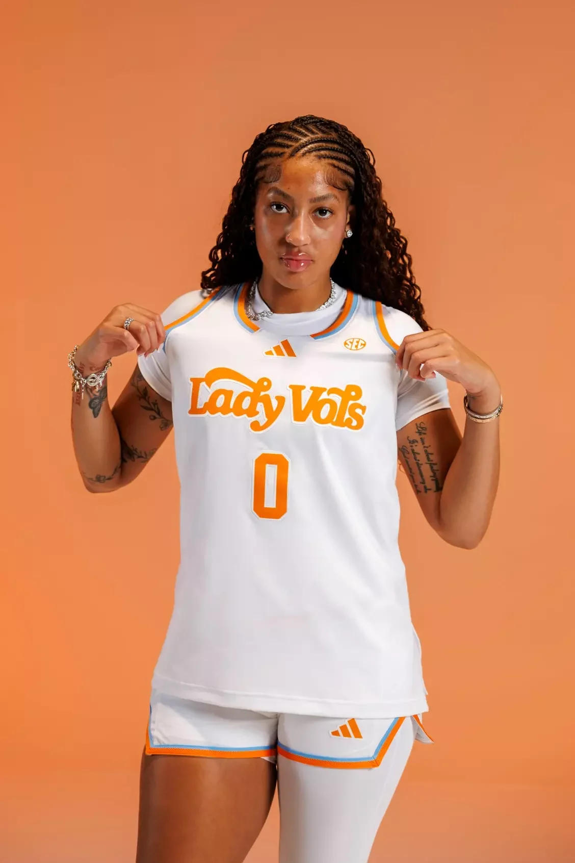
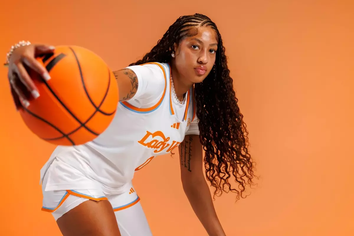
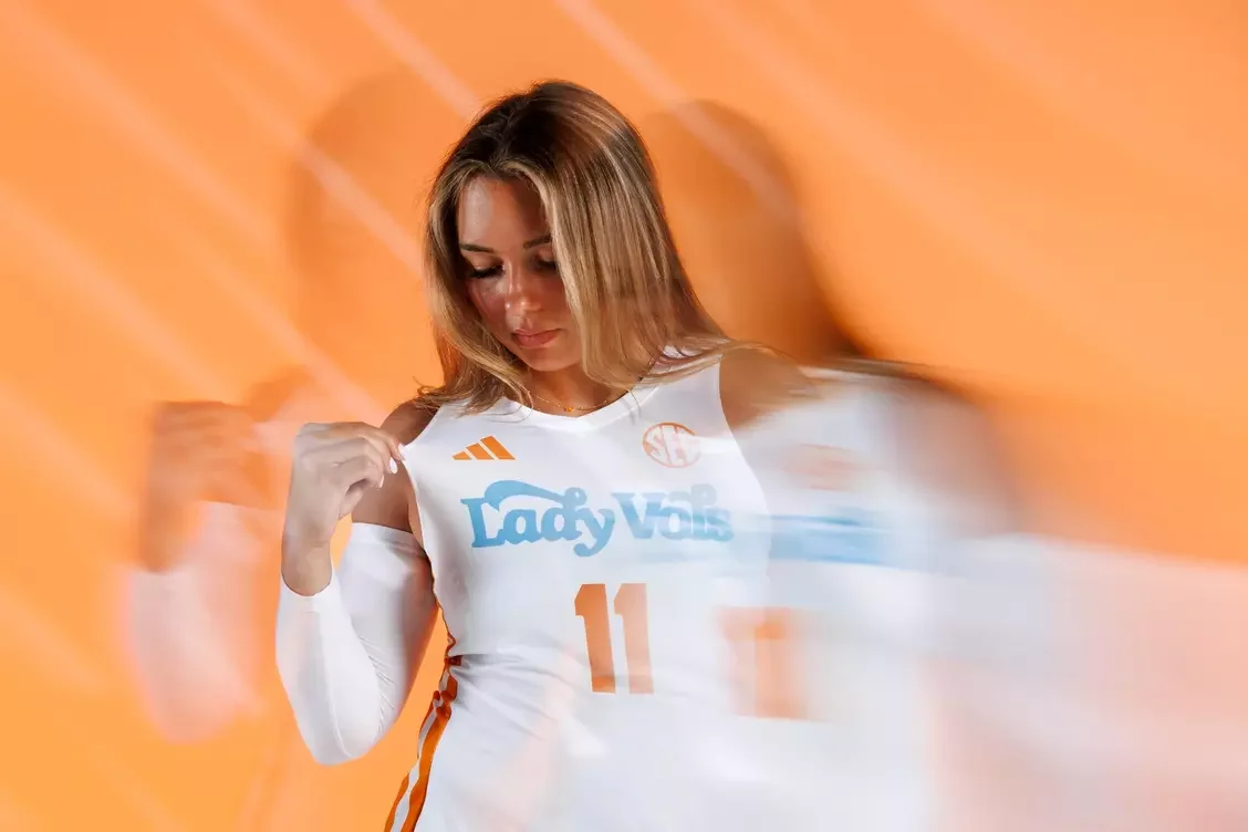
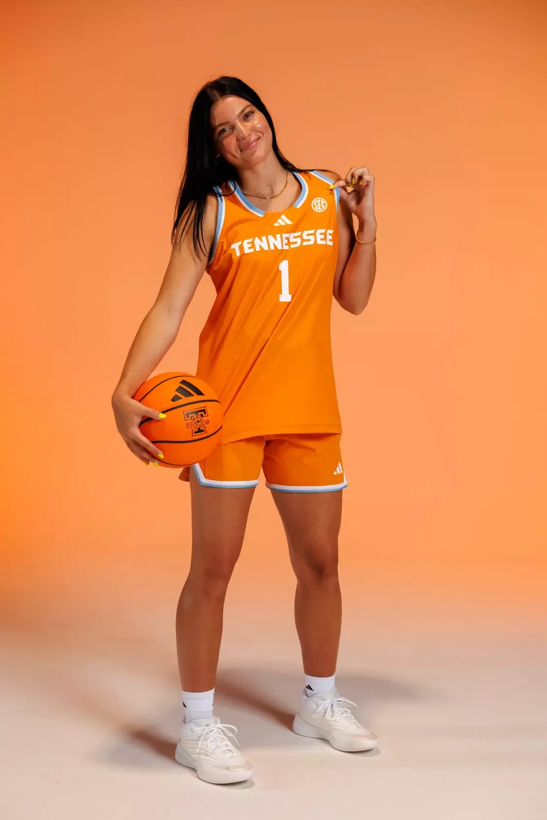
The women's basketball uniforms feature the iconic Lady Vols script across the chest, paired with updated side-panel striping on both the jersey and shorts.

The design blends Tennessee tradition with a modern performance aesthetic, creating a look that feels familiar while giving the program a fresh identity.

Each sport received a unique interpretation of the Summitt Blue collection.

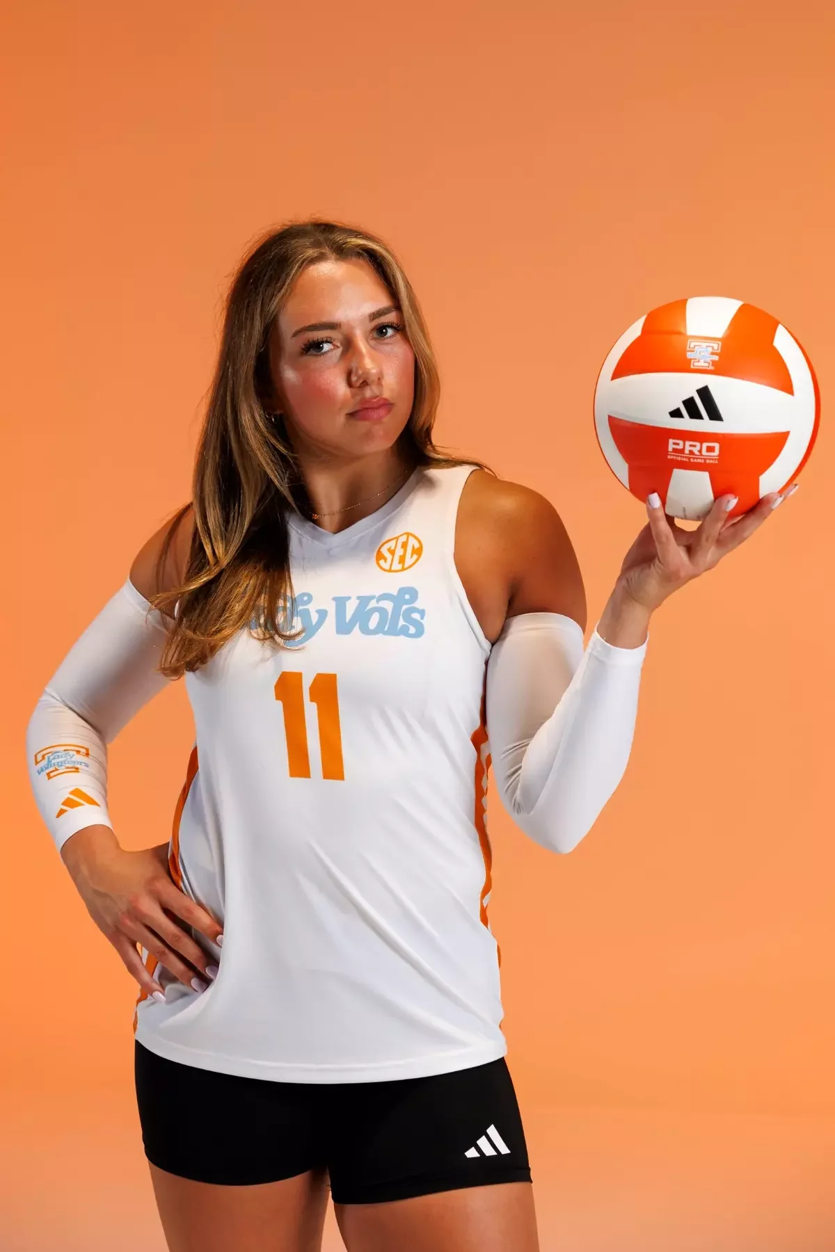
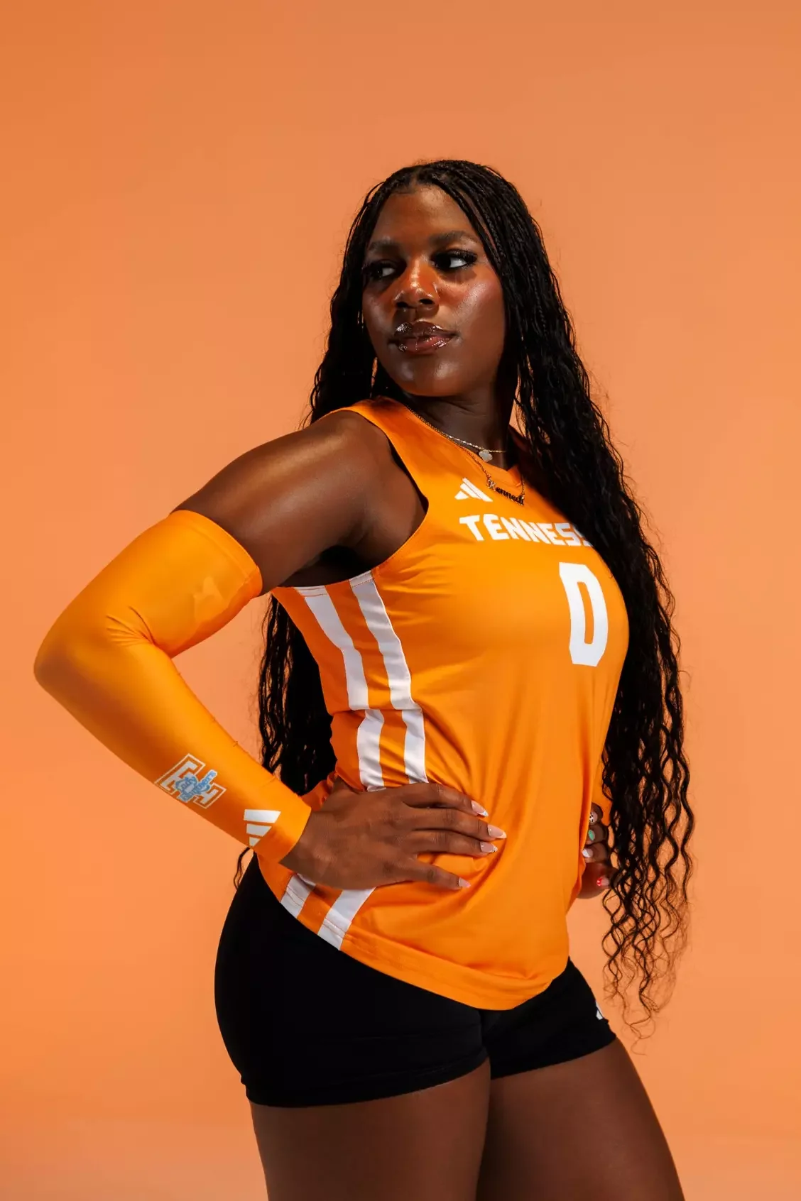
The volleyball uniforms feature a sleeveless design with the Lady Vol logo and the Tennessee wordmark positioned below the back numbers.

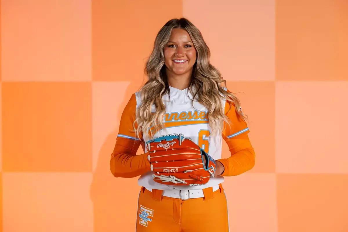
Softball keeps a classic approach with the Lady Vols script and a Summitt legacy patch on the left sleeve, a direct connection to the coach whose name inspired the collection.

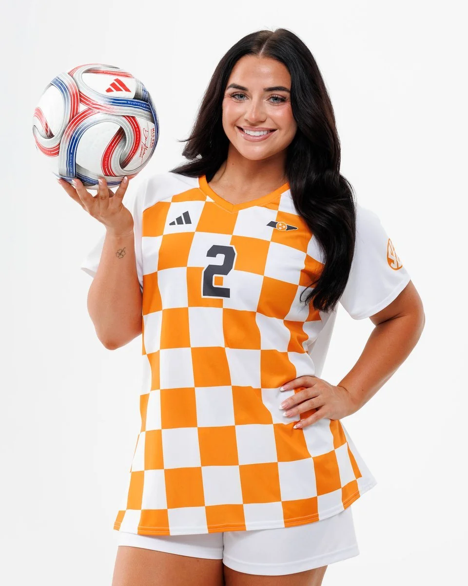
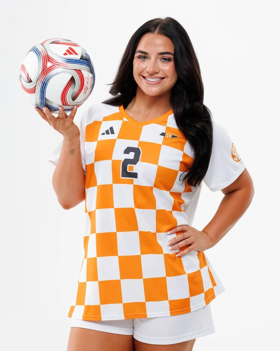
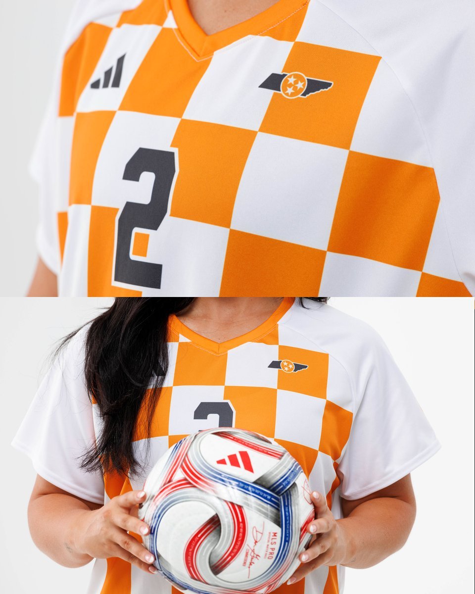
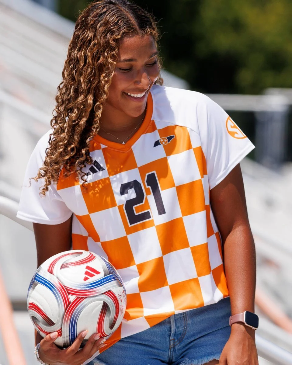
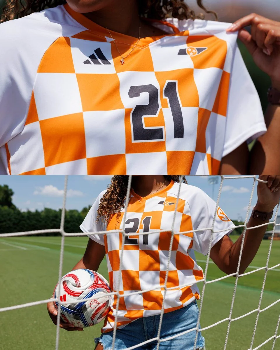
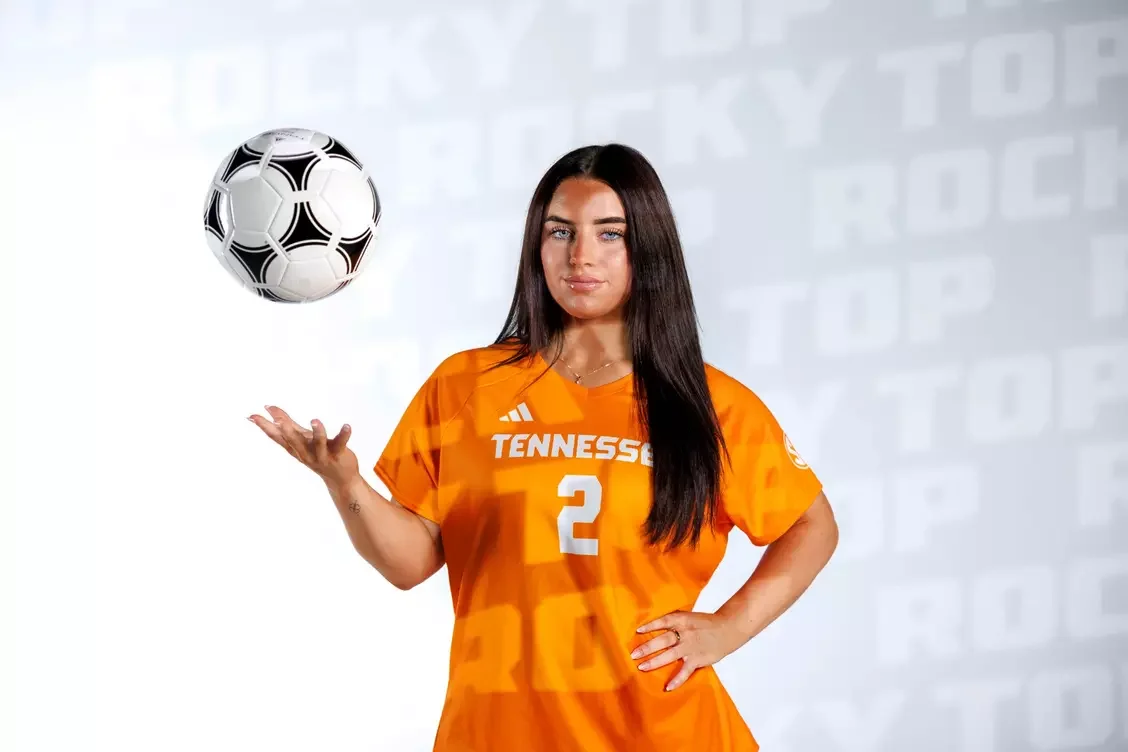
The soccer uniforms add subtle storytelling through a fading checkerboard sublimation pattern, along with a Lady Vol logo featured on the back neck.

Alongside the orange and white uniform updates, Tennessee introduced a new number font across the Summitt Blue collection.

The design combines traditional block lettering with a modern edge, representing the evolution of the Tennessee brand while respecting its history. The Tennessee creative team, working alongside adidas designers, spent months developing a style that reflects the identity of the Lady Vols.

The Summitt Blue uniforms represent what Pat Summitt built at Tennessee: excellence, consistency, and a championship mentality.

Every detail serves as a reminder that the Lady Vols legacy extends far beyond the court, field, or pitch.

SHOP Tennessee gear HERE


See What Else Is New

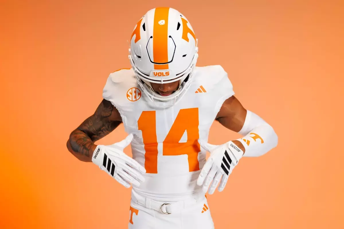
Tennessee Unveils Clean White Uniform

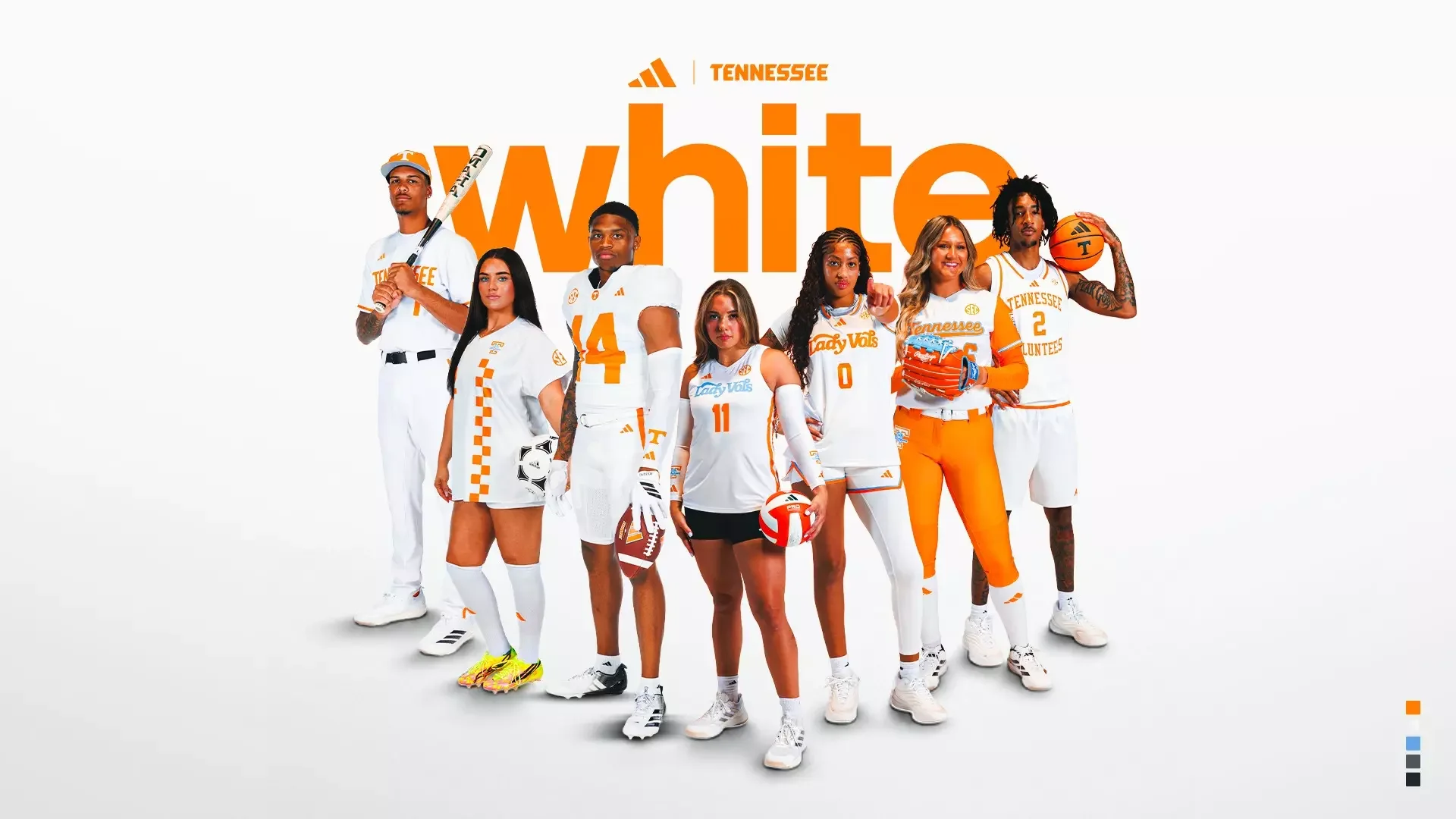
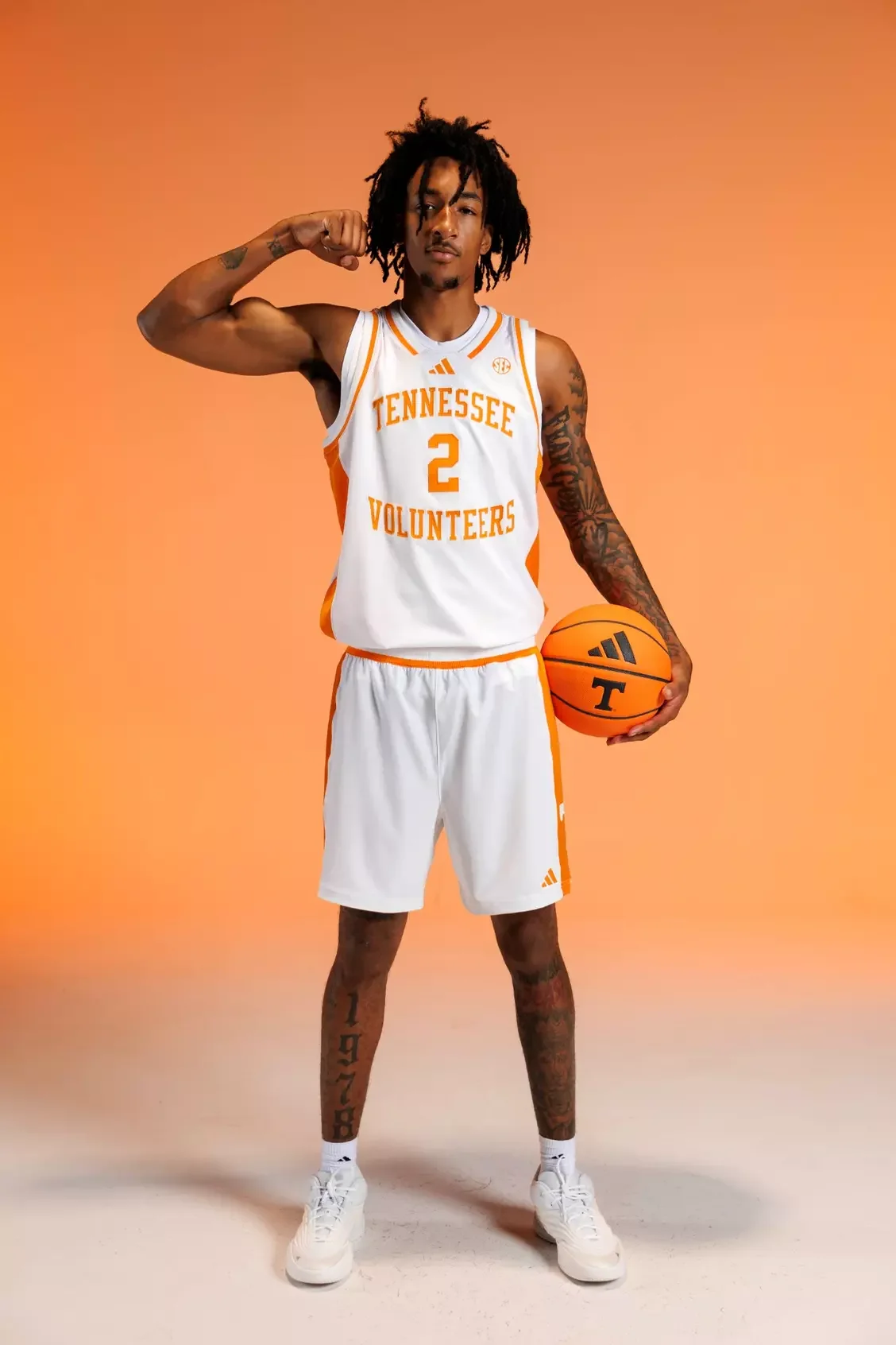
With the unveiling of Tennessee's new white adidas uniforms, that balance has been executed exceptionally well. Rather than chasing trends, Tennessee leaned into authenticity. The result is a unified collection that modernizes the Volunteers' visual identity while preserving the details that have made Tennessee one of college athletics' most recognizable brands.

The inspiration behind the collection begins with one of the university's oldest traditions. Like the orange uniforms, the new white uniforms draw inspiration from the American daisy that once grew prominently on The Hill, one of Tennessee's most historic campus landmarks. The crisp white base paired with Tennessee Orange creates a timeless combination that has become synonymous with Vol Nation. Every uniform feels intentional, allowing Tennessee's iconic colors to remain the focal point.
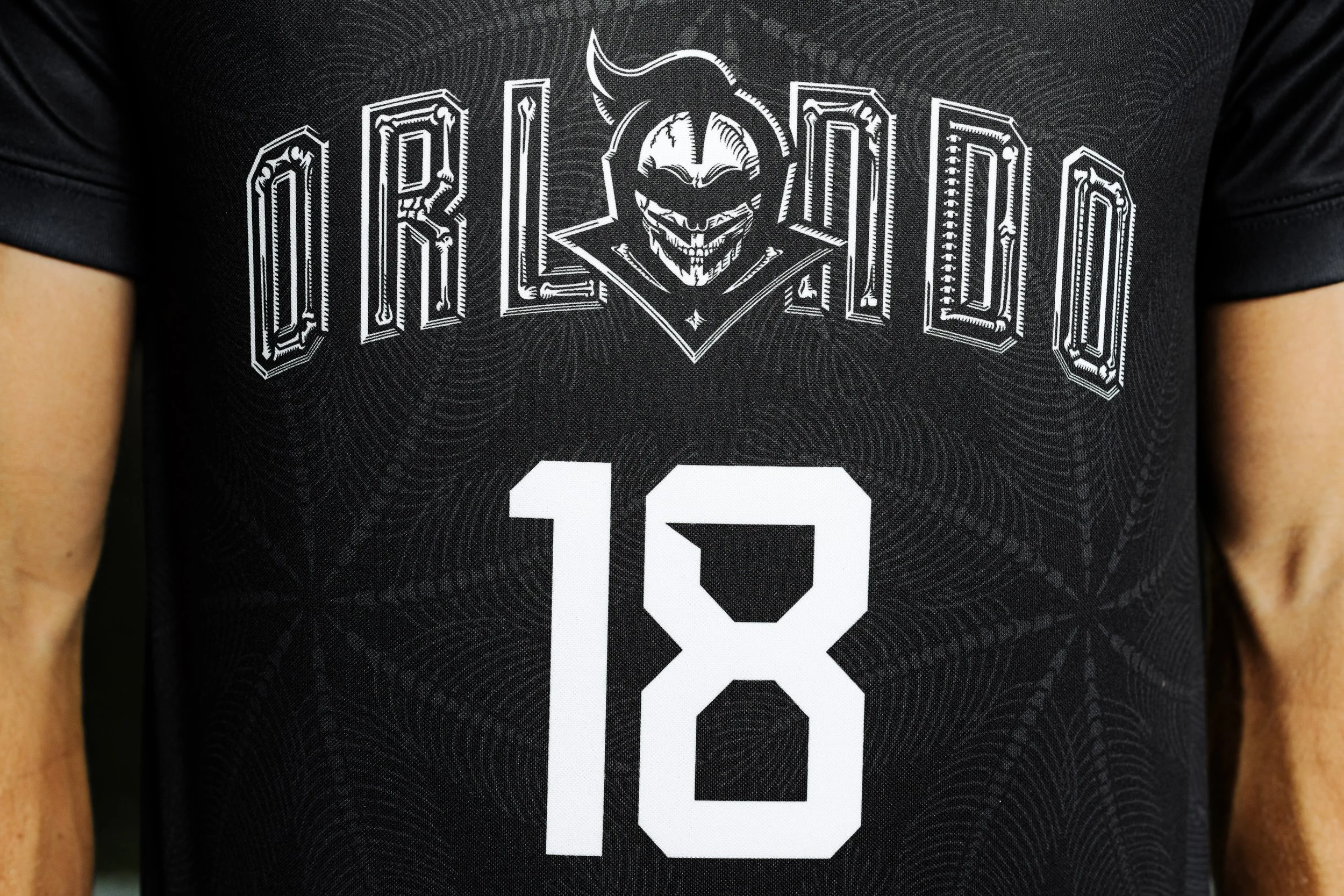
One of the biggest updates across nearly every sport is the introduction of Tennessee's new custom number font.

Developed through months of collaboration between Tennessee's creative team and adidas designers, the numbers blend traditional block styling with subtle modern elements. It's an update that feels current without sacrificing readability or the classic look fans expect.

Perhaps the most impressive aspect of the rollout is how cohesive the collection feels. Rather than creating isolated designs for individual programs, They built a system where every sport carries the same Tennessee identity while still allowing room for sport-specific traditions.

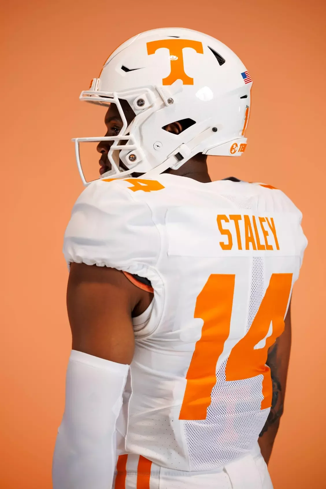
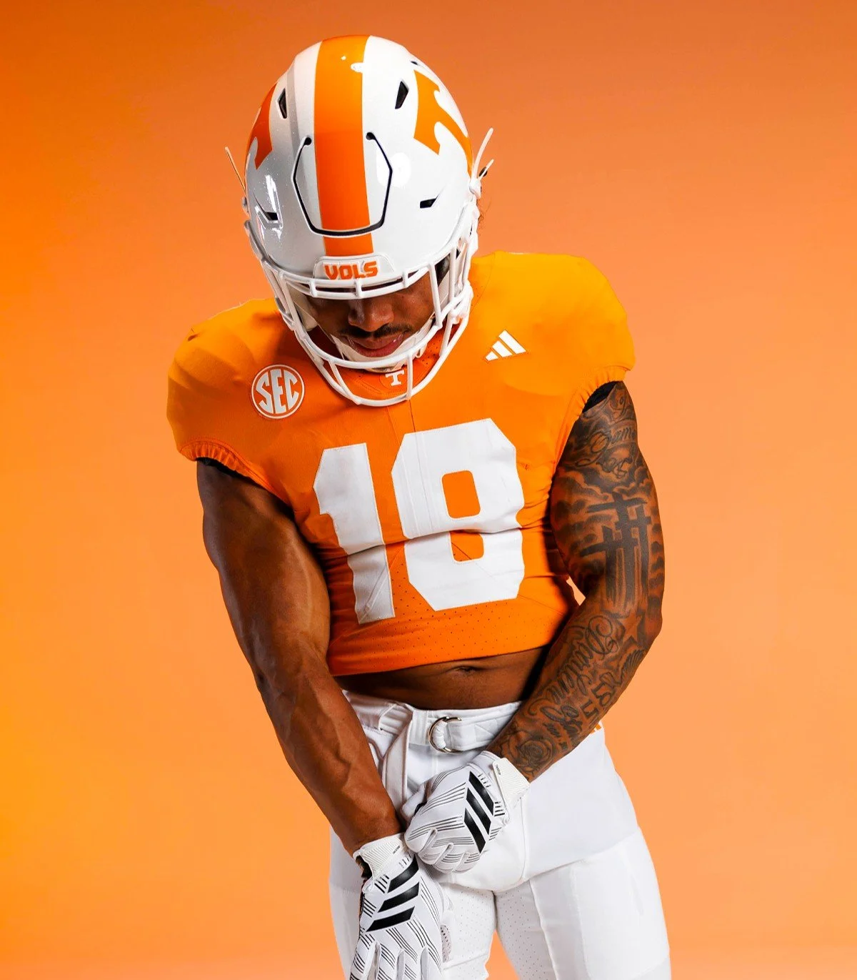
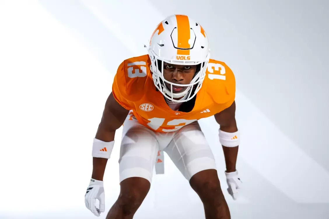
The football uniforms remain unmistakably Tennessee. The traditional striped pants return, while a subtle circular Power T logo appears on the front collar. Inside the collar, players will find the historic "I will give my all!" motto displayed in its original script, creating a meaningful connection between today's players and Tennessee's legendary past.

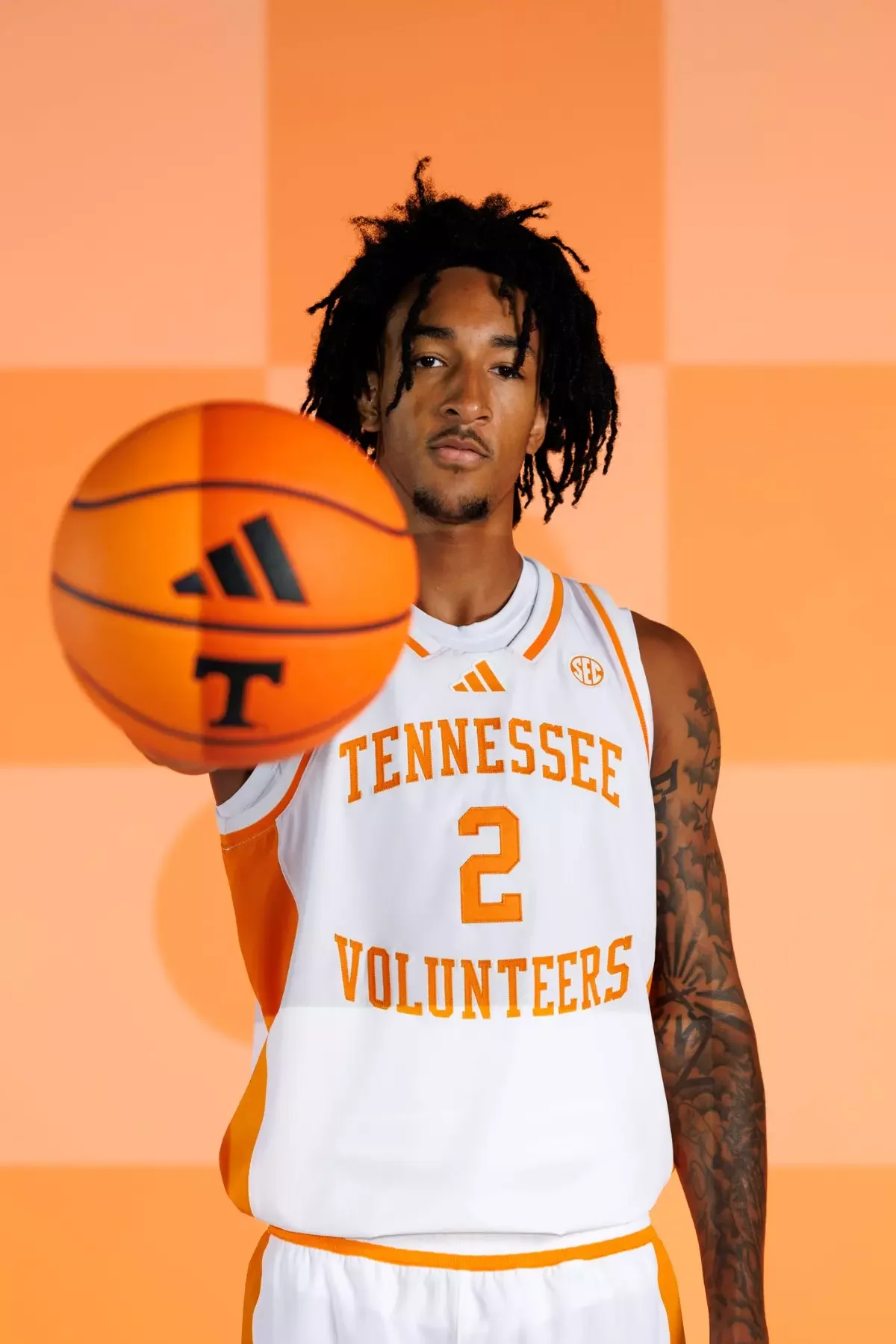
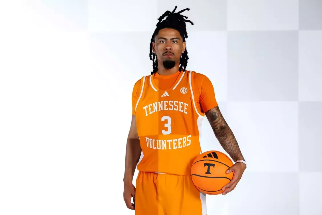
The men's basketball uniforms stay true to one of college basketball's cleanest looks. Updated collar and sleeve piping modernize the jersey, while a centered adidas logo and the Power T above the nameplate create stronger visual balance without changing the identity fans have known for decades.

Few brands in women's college athletics carry the weight of the Lady Vol tradition. The classic Lady Vol script returns, accented with Summitt Blue outlining throughout the uniform. The subtle blue pays tribute to legendary coach Pat Summitt while reinforcing one of the most iconic identities in women's sports.

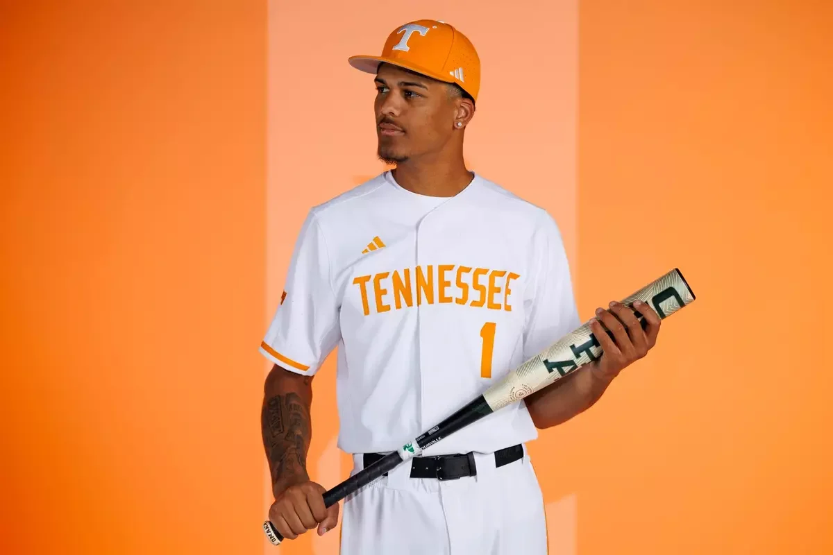
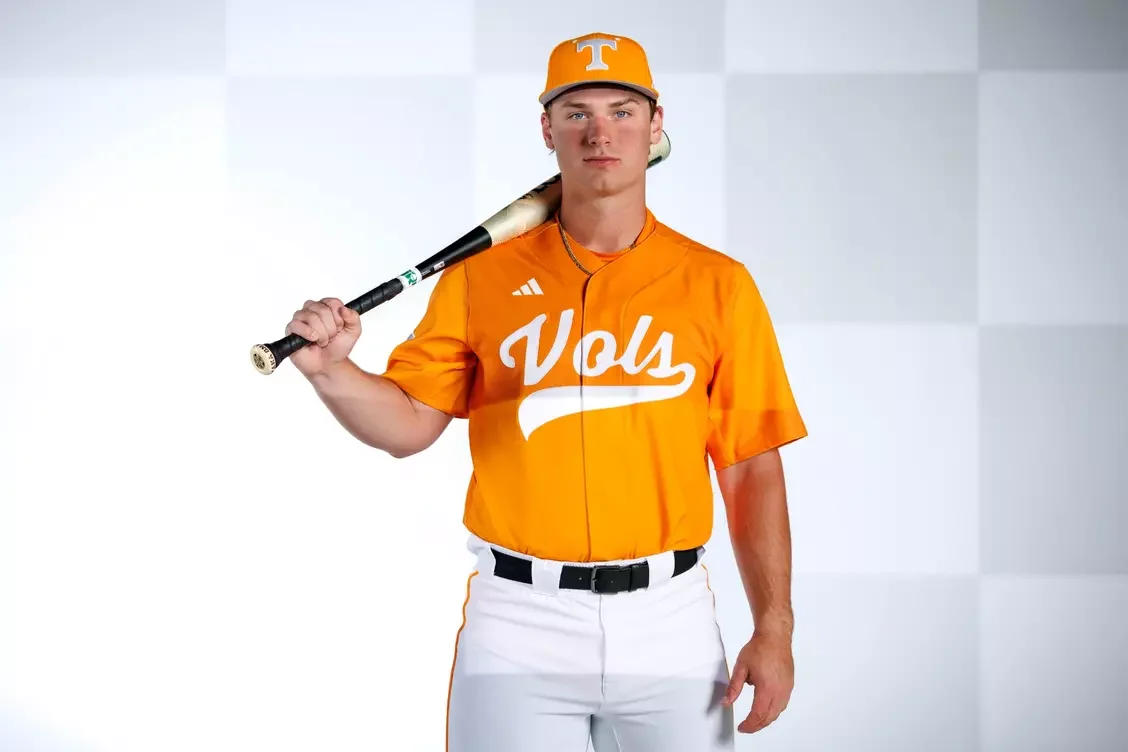
Tennessee baseball receives one of the cleanest looks in the rollout. A bold new Tennessee wordmark is paired with thin Tennessee Orange piping down the pants, creating a professional, timeless appearance that fits one of the nation's premier baseball programs.

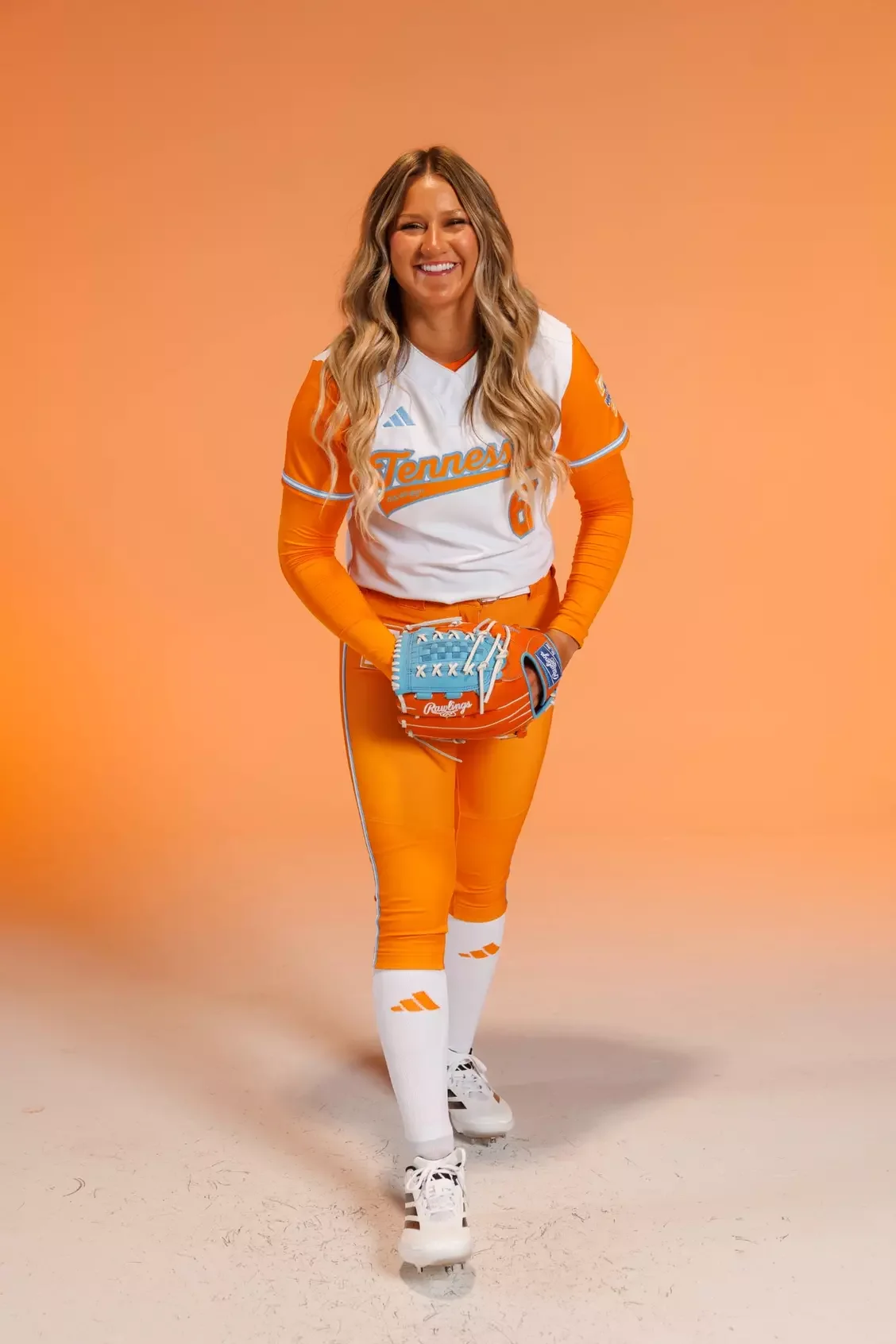
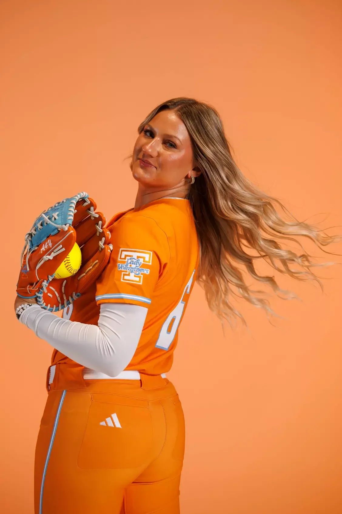
The softball uniforms continue the Lady Vol tradition with the Tennessee script outlined in Summitt Blue, complemented by contrasting sleeves and the Lady Vol logo on the left sleeve.

Soccer may feature the most unique design element of the collection. The white jerseys include a checkerboard sash across the front, paired with a Tri-Star logo on the back neck, a subtle tribute to the state of Tennessee that gives the uniform its own identity while remaining connected to the larger athletic department.

The sleeveless volleyball uniforms keep things simple. Featuring the classic Lady Vol script and a Lady Vol logo on the back neck, the uniforms prioritize clean lines while maintaining one of the strongest brands in collegiate athletics.

For Tennessee, this collection isn't just a new set of uniforms. It's a refined identity built to represent the Volunteers for years to come.

SHOP Tennessee gear HERE


See What Else Is New

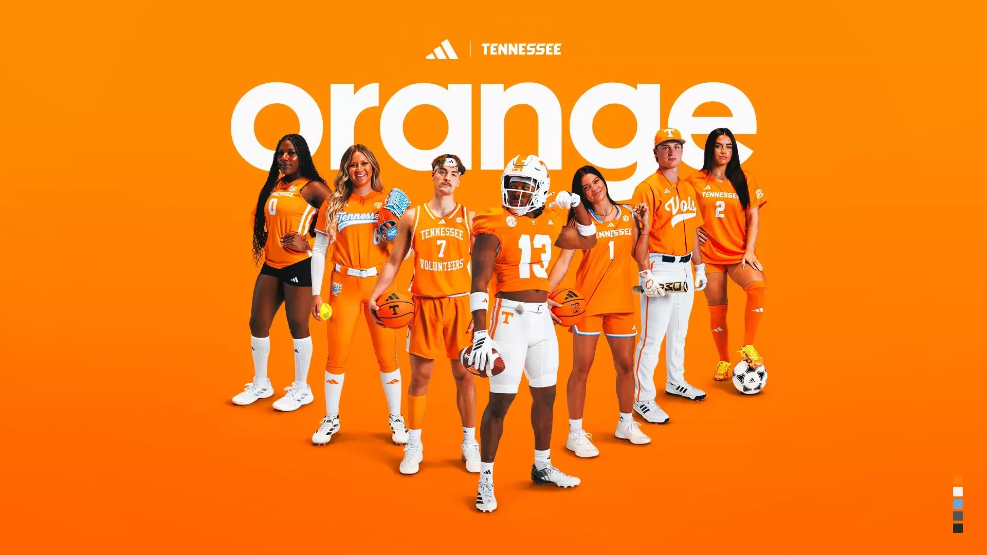
Tennessee Unveils Adidas Orange Uniforms Across All Sports

Few colors in college athletics are as instantly recognizable as Tennessee Orange.

The University of Tennessee has officially unveiled its updated orange uniforms across multiple athletic programs, introducing a refreshed look that honors the Volunteers' rich history while incorporating modern design elements. While the updates differ from sport to sport, every uniform remains rooted in the unmistakable shade of orange that has represented Tennessee since 1891.

Officially known as Pantone 151C, Tennessee Orange traces its origins back to the American daisy that once grew abundantly on The Hill, one of the university's most iconic landmarks. More than a century later, the vibrant color has become one of the most recognizable brands in college athletics, symbolizing the passion, pride and tradition shared across Vol Nation.

The updated collection was designed to preserve that legacy while refining the uniforms for today's student-athletes. Crafted from premium performance materials with meticulous attention to detail, the new uniforms ensure the university's signature shade of orange remains consistent across every sport.

One of the biggest changes comes through the introduction of a brand-new number font. Developed through months of collaboration between Tennessee's creative team and adidas designers, the updated numerals blend the classic block style synonymous with the Volunteers with modern detailing that better reflects the current Tennessee brand. The result is a cleaner, more contemporary look without sacrificing the traditional identity fans have come to know.

The football uniform receives several subtle but meaningful updates. The iconic Power T now appears on the front collar inside a subtle circular detail, adding another signature Tennessee touch. Inside the collar, players will find the historic phrase "I will give my all!" displayed in its original script, honoring one of the university's most cherished traditions. Completing the look are the classic striped football pants, maintaining one of the program's most recognizable design elements.

Tennessee's other athletic programs also receive thoughtful updates while maintaining their own identities.

The softball uniforms feature the classic Tennessee script wordmark outlined in Summitt Blue, accompanied by a Lady Vol logo on the left sleeve as a tribute to one of the most successful traditions in women's athletics.

The men's basketball uniforms retain their timeless appearance while introducing updated collar construction, refined sleeve piping, a centered adidas logo and a Power T positioned above the player nameplate.

both the soccer and volleyball programs continue to feature bold Tennessee wordmarks across the chest, with a Lady Vol logo positioned on the back neck. Volleyball's sleeveless design maintains a clean, modern aesthetic while staying true to the university's identity.

Baseball also receives a refreshed look with an all-orange jersey featuring the beloved Vols script across the chest. The accompanying white pants include thin Pantone 151C piping down each leg, creating a subtle detail that ties the uniform together.

What makes Tennessee's new collection particularly successful is its restraint. Rather than reinventing one of college athletics' most iconic brands, the university chose to refine it. The updated number font, improved construction and sport-specific details enhance the uniforms while allowing Tennessee Orange to remain the unmistakable focal point.

SHOP Tennessee gear HERE


See What Else Is New

Oklahoma State and Osage Nation Launch Historic Uniform Patch Partnership

Oklahoma State Athletics and the Osage Nation have announced a landmark partnership that will place an Osage jersey patch on all Oklahoma State varsity athletic uniforms beginning with the 2026-27 competition season.

The agreement marks a historic first for Oklahoma State Athletics, as the Osage patch becomes the first sponsor mark ever displayed on varsity athletic uniforms in the university's history. The partnership also highlights the evolving landscape of college athletics, where innovative collaborations can create meaningful opportunities while telling stories that are deeply connected to a university's identity and community.

The relationship between Oklahoma State and the Osage Nation has been years in the making. Located just minutes from the OSU-Tulsa campus, Osage Casino Hotel Tulsa became an integral part of the university community through its support of the Osage Casino Hotel Student Union in North Hall, which opened in 2020. Since then, the two institutions have continued to strengthen their ties through partnerships across several areas of mutual interest.

"Oklahoma State Athletics is building momentum in this new era of sport," said Kimberly Pearson, Chief Executive Officer of Osage Casinos and Hotels. "Osage is proud to be able to support the student-athletes and programs across the athletic department. We've built a strong connection with the university through other projects, and this brings the relationship to a broader stage. It's about visibility, opportunity and continuing to invest in the future of our people and our communities."

For Oklahoma State, the partnership also signals how the athletic department is adapting in an increasingly commercial and competitive era of college sports. Weiberg called the agreement an early example of the possibilities created through the department's new organizational structure focused on generating revenue growth and commercial opportunities.

More importantly, the Osage jersey patch represents something bigger than branding. It serves as a visible symbol of partnership, shared history and a commitment to creating opportunities that benefit both institutions and the communities they serve. Beginning in the 2026-27 season, Cowboy and Cowgirl student-athletes will carry that story with them every time they take the field, court or competition stage, proudly representing both Oklahoma State University and the Osage Nation across the country.

SHOP Oklahoma state gear HERE


See What Else Is New

U.S. Soccer and Nike Reveal 2026 National Team Kits Ahead of the World Cup

With the countdown to the 2026 FIFA World Cup continuing, U.S. Soccer Federation and Nike have officially unveiled the new national team kits that will be worn across all U.S. Soccer teams as the tournament approaches. The new uniforms arrive ahead of the historic edition of the 2026 FIFA World Cup, which will be hosted in part by the United States for the first time in more than 30 years.

The collection marks a major moment for American soccer. For the first time, every program within the federation, from youth squads to senior teams, will share a unified visual identity. The new design system connects all 27 U.S. Soccer National Teams under one crest and cohesive aesthetic, creating a consistent look across the entire national team pipeline.

The 2026 collection introduces two primary match jerseys alongside a goalkeeper kit. The first is a Stripes kit, built around bold American symbolism and designed to highlight the pride of wearing the crest. The second is the Stars kit, a darker look created with lifestyle appeal in mind, offering fans and players a versatile design that translates well both on and off the pitch.

Both jerseys aim to reflect classic American iconography while pushing the visual identity of the national teams forward as they prepare for the world’s biggest soccer stage.

The goalkeeper kit continues the “Hollywood Goalkeeper” concept that debuted in late 2025. The design celebrates the personality and individuality of goalkeepers while adding a level of glamour back to the position. By carrying the concept into the new collection, the kit reinforces the idea that every position on the field plays a role in the larger visual identity of the national team.

Beyond aesthetics, the new jerseys feature advanced performance technology designed for elite competition. Nike incorporated its AERO-FIT technology, which focuses on lightweight construction, breathability and mobility. The fabric and fit were engineered specifically for high-intensity matches and warm summer conditions—key considerations with the World Cup set to be played across North America in June and July.

The design process also included extensive collaboration with players from the United States men's national soccer team. Nike hosted workshops and listening sessions where athletes provided feedback on everything from seam placement to fabric weight and fit. That input helped shape a kit designed to perform at the highest level during the demanding tournament schedule.

Several subtle design elements add deeper meaning to the collection. Inside the collar of each jersey sits an “Inner Pride” mark, a hidden symbol representing the internal motivation players carry when representing their country. The mark also reflects U.S. Soccer’s broader “Best of U.S.” philosophy—bringing together the country’s top talent and spirit on one stage.

The new kits also introduce something completely new for the federation: custom typography. U.S. Soccer developed bespoke fonts called the Stars and Stripes typefaces, created exclusively for the national teams. The unique numbering and lettering system will appear on the jerseys and across federation branding for years to come.

The unveiling of the 2026 kits represents more than just a uniform refresh. It signals the beginning of a new visual era for U.S. Soccer as the country prepares to host the world’s biggest soccer tournament once again. The United States women's national soccer team and all other national programs will also wear the designs, reinforcing the federation’s unified identity across the entire organization.

As the United States builds toward a historic World Cup on home soil, the new kits aim to capture the pride, culture and ambition of American soccer—giving players and fans alike a look that represents the next chapter of the sport in the country.

SHOP USA GEAR HERE


See What Else Is New

Related Articles


Paris Saint-Germain Returns to Its Roots with Bold 2026-27 Home Kit

Paris Saint-Germain has officially unveiled the club’s new 2026-27 home kit, a design that feels less like a reinvention and more like a powerful return to identity.

Built around the club’s iconic royal blue base and a bold central red stripe outlined in white, the new jersey reconnects Paris Saint-Germain with some of the most recognizable visual elements in club history while introducing subtle modern refinements that push the look forward.

After years of experimentation with different stripe layouts and alternate concepts, PSG is bringing the classic Parisian aesthetic back to center stage. And honestly, it feels right.

At first glance, the jersey immediately stands out because of its simplicity. The royal blue base remains unmistakably PSG, while the oversized red center stripe bordered by thin white lines creates a clean and commanding visual structure across the shirt. It’s a direct callback to some of the club’s most beloved kits and reinforces the design DNA supporters instantly associate with Paris Saint-Germain. But this isn’t just a retro remake.

The proportions of the stripe feel bolder and more modern, giving the jersey a stronger on-pitch presence while still preserving the elegance traditionally tied to PSG’s identity. One of the biggest changes comes with the placement of the crest and Nike swoosh.

For the 2026-27 season, both logos move centrally onto the jersey, a bold design decision that further emphasizes symmetry and reinforces the full vertical stripe concept running uninterrupted down the front and back of the kit.

According to the club, the jersey draws direct inspiration from the atmosphere created inside Parc des Princes.

The central graphic represents the movement of flags rising throughout the stadium’s stands, transforming supporter energy into a wearable design element. Rather than focusing solely on heritage aesthetics, PSG wanted the jersey to capture the emotional connection between players and fans. That idea becomes the foundation of the entire launch.

The club described the shirt as a “love letter” to Paris and its supporters, designed to symbolize the shared passion between the pitch and the stands. Whether inside the Parc des Princes or watching globally, the jersey is meant to connect generations of Rouge & Bleu supporters through a common identity.

The uninterrupted center stripe, balanced logo placement, and classic royal blue palette all reinforce the idea that some of the strongest uniforms come from refining tradition rather than abandoning it.

SHOP PSG GEAR HERE


See What Else Is New

Related Articles


Washington Soccer Unveils “Identity Jersey”

Fresh off a national title run, Washington Huskies men's soccer aren’t just celebrating, they’re redefining what it means to be part of the program.

As 2026 season tickets officially go on sale, the Huskies are introducing a powerful new concept: a jersey that literally connects fans to the team’s legacy.

After capturing the 2025 NCAA Championship, Washington is marking the moment with a new white kit called the “Identity Jersey.”

At first glance, it’s clean and modern. But look closer, and the storytelling hits differently. The jersey features a fingerprint-inspired design, with every line made up of the names of 2026 season ticket holders, turning the fanbase into a permanent part of the uniform itself.

In addition to the unique pattern, the Huskies are adding a championship star above the block “W”, a timeless symbol in soccer that marks title-winning teams. It’s a clean but powerful addition, one that instantly elevates the kit while honoring the program’s biggest achievement.

Washington is doubling down on the fan-first approach. Supporters who purchase premium season tickets for the 2026 campaign will receive their own Identity Jersey, giving them the chance to wear a piece of history that includes their name embedded in the design. It’s a rare crossover between merchandise and meaning, and one of the more creative fan integrations we’ve seen in college athletics.

SHOP Washington GEAR HERE


See What Else Is New

Related Articles


SoccerSkye TilsonComment
Flamengo Introduce “White Manto 1” Kit for the 2026 Season

One of football’s most iconic clubs is rethinking the idea of an away kit. The Brazilian giants CR Flamengo have officially unveiled their new white uniform for the 2026 season. But this launch comes with a twist: the club has retired the traditional “away kit” label altogether. Instead, the new jersey will now be known as “White Manto 1.”

The concept behind the name change reflects the club’s massive and passionate global fanbase. Over the past decade, Flamengo has recorded the highest average attendance in Brazilian football, with supporters consistently traveling and filling stadiums across Brazil and beyond. Whether the team plays at home or on the road, Flamengo fans are known for transforming stadiums into environments that feel like home. Because of that reality, the club believes the term “away kit” no longer reflects the experience of Flamengo matches.

The white kit carries deep significance in Flamengo history. One of the most memorable examples came during the 1981 Intercontinental Cup, when Flamengo defeated Liverpool F.C. while wearing white. The victory in Japan cemented one of the greatest achievements in the club’s history.

By renaming the shirt White Manto 1, Flamengo is emphasizing that the uniform represents more than a secondary option, it’s a key part of the club’s identity and legacy.

The 2026 kit features a clean white base, combined with classic Flamengo elements that connect the design to past eras. The most noticeable detail is the return of the red-and-black chest hoops, a design element last seen in 2019, another historic season for the club.

Other design highlights include:

Thicker red adidas three stripes on the shoulders

Black shorts paired with white socks

A modern athletic fit designed for on-field performance

The combination creates a bold but balanced look that merges Flamengo’s classic color palette with a refreshed visual style.

For Flamengo supporters, the word “Manto” meaning mantle or cloak has long been synonymous with the club’s jerseys.

With the introduction of White Manto 1, Flamengo is reinforcing the idea that every kit represents the club equally, regardless of where the match is played.

SHOP Flamengo GEAR HERE


See What Else Is New

Related Articles


SoccerSkye TilsonComment