NHL and Fanatics Bring Local Culture to the Ice With Hometown Remix
The NHL and Fanatics are giving all 32 teams a new way to represent home. Unveiled Monday, Hometown Remix is a leaguewide special-edition uniform, apparel and headwear program built around the fans, landmarks, traditions and local culture that shape each franchise.
The collection reaches beyond familiar color combinations. Arena architecture becomes sleeve striping, city landmarks influence custom number fonts, and regional landscapes bring new textures to team crests. Debossed patterns, metallic embroidery and detailed hem treatments give fans reasons to look closer.
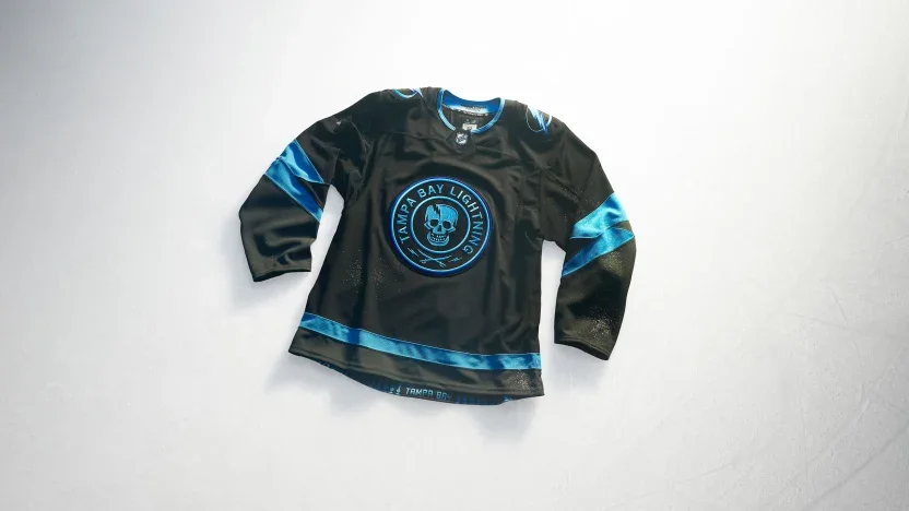
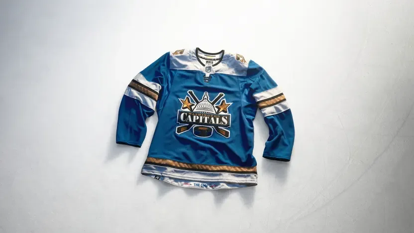
Some teams revisit recognizable identities, including the Islanders’ Fisherman and the Lightning’s Stadium Series skull. Others introduce a different focal point, from Carolina’s Stormy crest to Washington’s Capitol Dome design. Together, the jerseys offer 32 interpretations of what it means to wear your hometown.
Anaheim Ducks
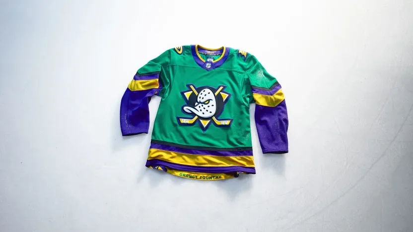
Anaheim brings a ’90s-inspired approach to Orange County life with green and gold drawn from local parks and sunsets over the water. A wave pattern along the hem reflects the waterfront, while the Ducks’ current flying V sleeve treatment connects the new palette to their established identity. “Orange Country” stitching adds a local play on words.
Boston Bruins
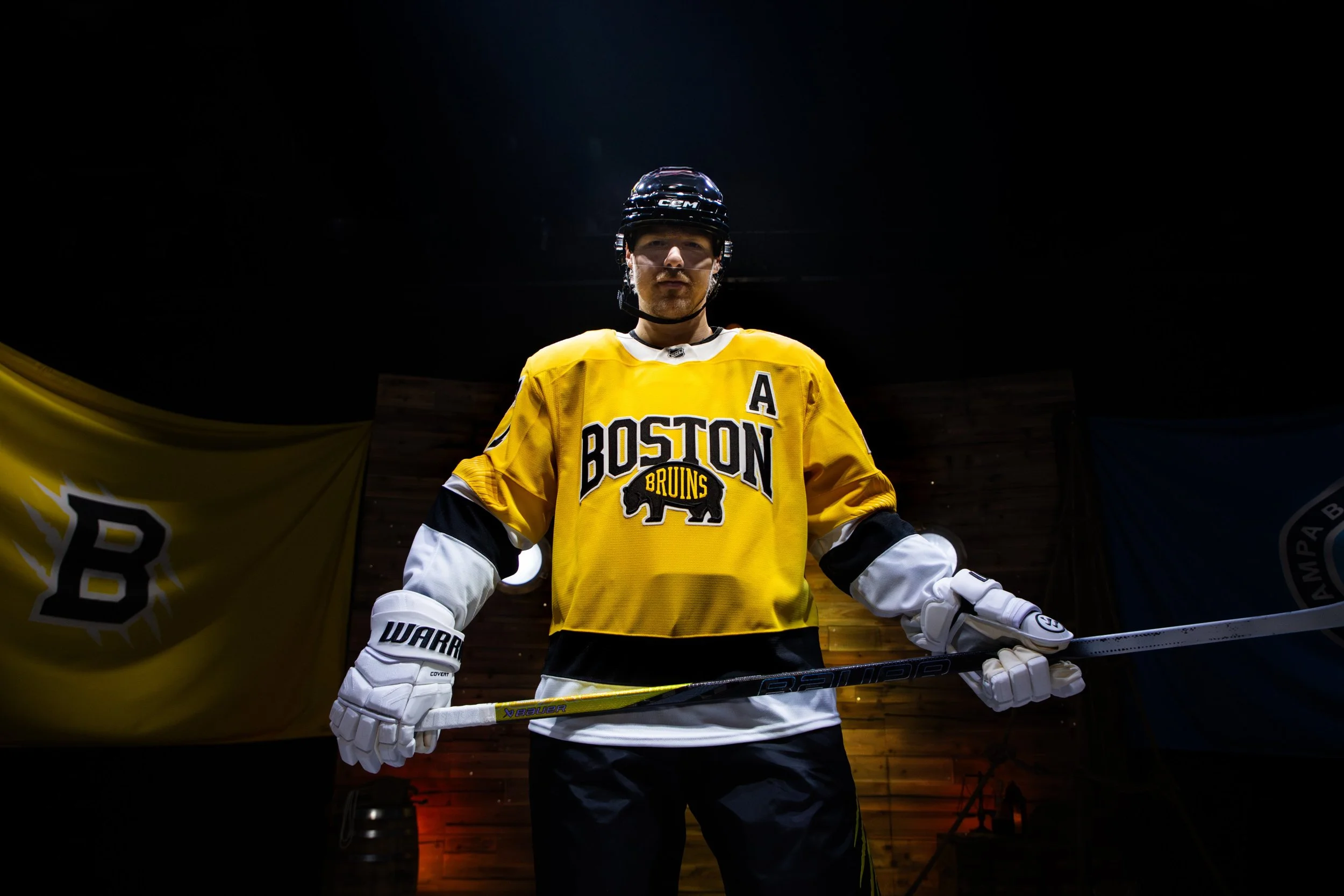
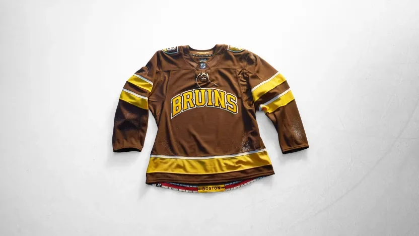
Boston leans into its college culture with an all-brown uniform that also references the Bruins’ inaugural season. Collegiate lettering, a shield shoulder patch and traditional striping give the jersey a varsity sweater feel. A brick pattern along the hem connects the design to the Freedom Trail.
Buffalo Sabres
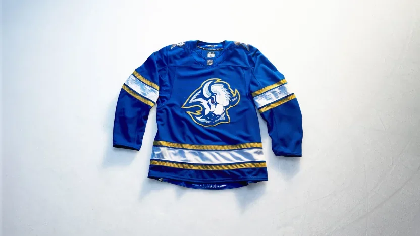
Buffalo turns its City of Light identity into an electric blue-and-gold design. The buffalo crest features a red eye and metallic gold Lurex outline, while a shoulder mark pairs the team’s B with an electrified sabre. Debossed lightning bolts and stars carry the theme through the sleeves.
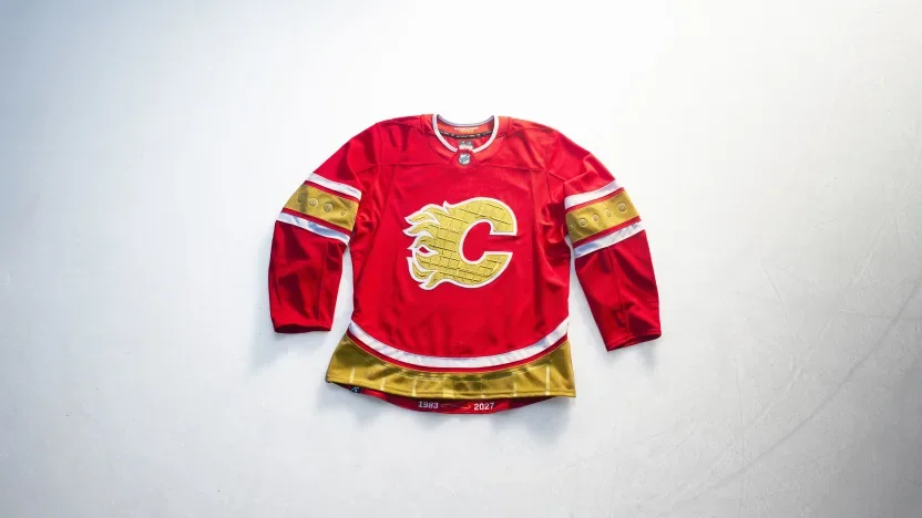
Calgary Flames
Calgary makes the Saddledome the centerpiece of its design. The arena’s ceiling texture appears within the “88 Gold” crest, its window shapes influence debossed sleeve details, and its roofline carries into the hem striping. Custom numbers draw from the building’s shutters, extending the architectural tribute across the uniform.
Carolina Hurricanes
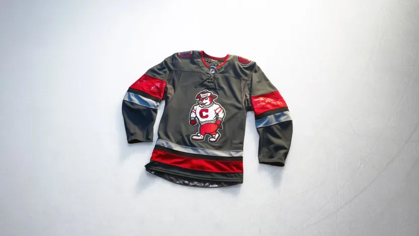
Carolina puts Stormy front and center, giving the mascot the jersey’s main crest for the first time. A storm-grey base with red and black accents sets the tone, while architectural shoulder patches, debossed oak leaves and a City of Oaks skyline connect the look to Raleigh.
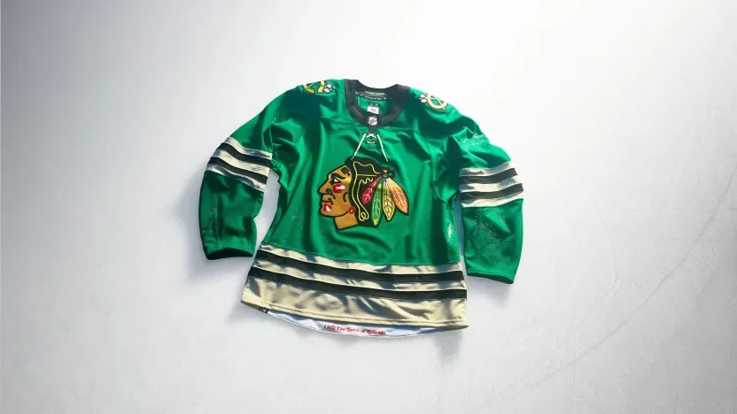
Chicago Blackhawks
Chicago introduces a vivid green base with its current crest and gold shoulder patches. Four debossed six-pointed stars on each sleeve reference the city flag. The concept draws on Chicago’s “I Will” spirit, connecting the uniform to civic ambition, progress and resilience.
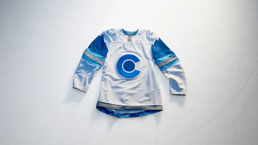
Colorado Avalanche
Colorado builds its jersey around the snow-covered Rocky Mountains. Graduated blue elevation patterns appear within the crest and back numbers, while mountain imagery continues onto the shoulders. Metallic silver accents give the blue-and-white design a frosted finish.
Columbus Blue Jackets
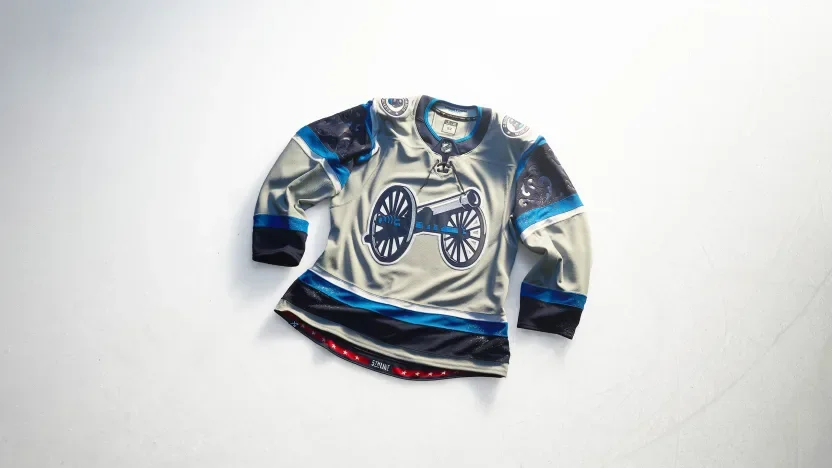
Columbus celebrates the Arch City with arched sleeve elements and a debossed filigree pattern behind the sleeve numbers. A solid grey base lets the cannon crest and white-outlined numbers stand out. An italicized “5th Line” graphic at the hem recognizes the fans’ place within the team’s identity.
Dallas Stars
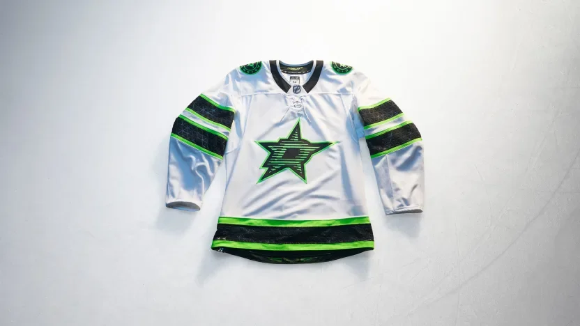
Dallas draws from its illuminated skyline and neon nightlife. Skyline-inspired texture adds detail to the front crest, while a linear Dallas wordmark at the hem continues the neon concept. Black and green stand sharply against the white base.
Detroit Red Wings
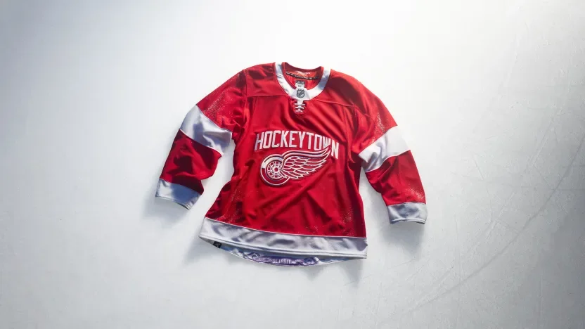
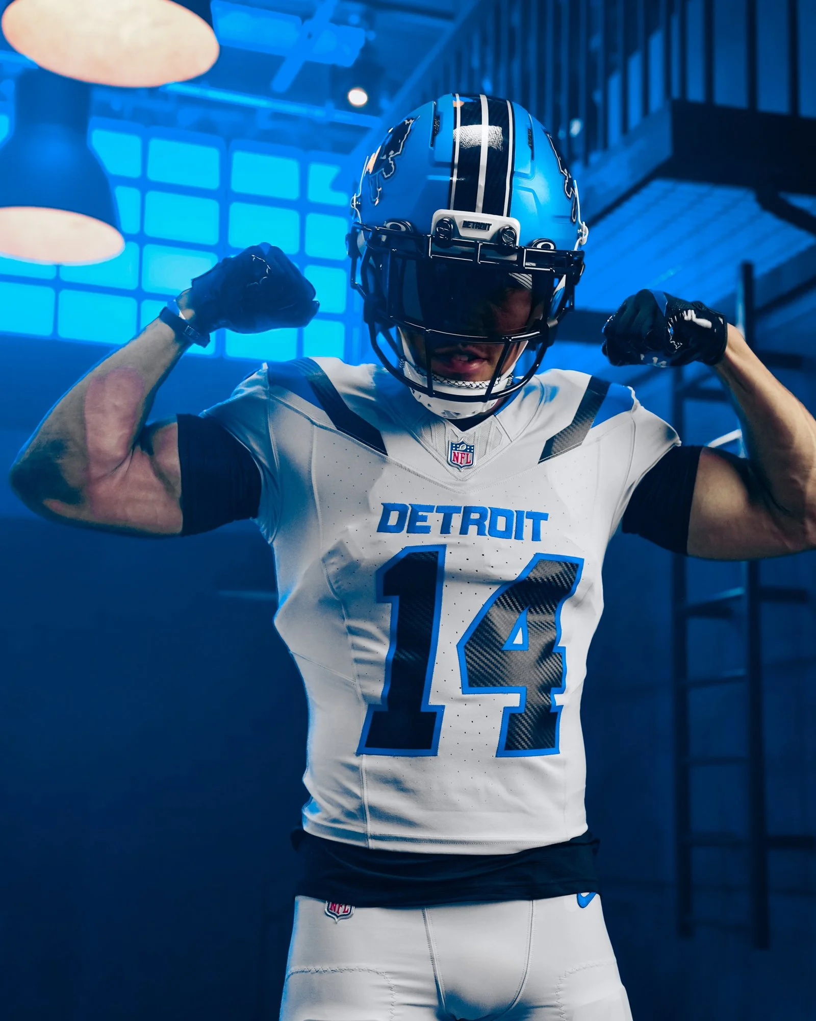
Detroit brings “Hockeytown” across the chest alongside the Winged Wheel, making the city’s hockey identity the focal point. Bold sleeve stripes reinforce the traditional look, while a purple octopus tucked inside the hem recognizes one of the franchise’s most familiar fan traditions.
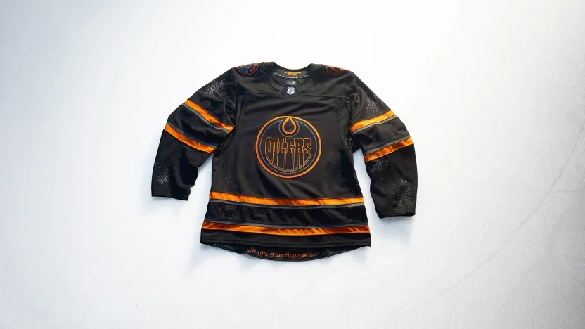
Edmonton Oilers
Edmonton takes an industrial approach with a black base, tonal crest and warning-orange accents. “Oil Country” and oil rig worker shoulder patches connect the design to the region’s people and industry. Warning bars frame “This Is Oil Country” inside the hem.
Florida Panthers
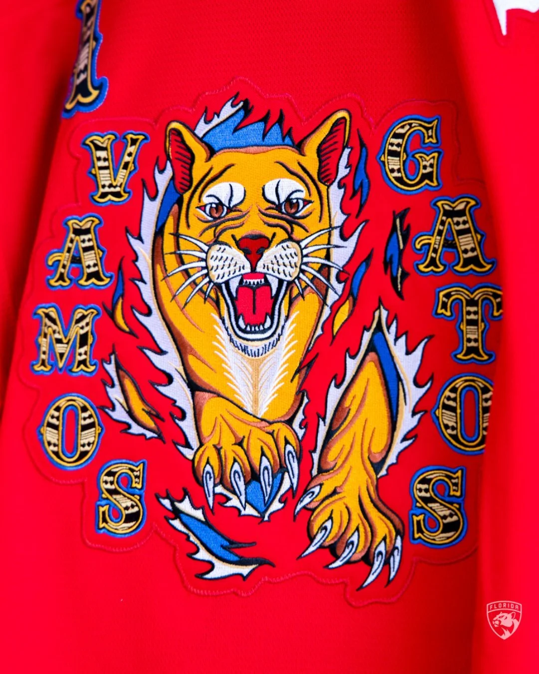
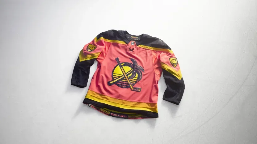
Florida embraces a South Florida sunrise palette with a design inspired by graphic beach tees. A remixed throwback shoulder logo moves to the front, while sunrise patterns stretch across the sleeves. Recolored Panthers marks complete a look rooted in the region’s waterfront lifestyle.
Los Angeles Kings
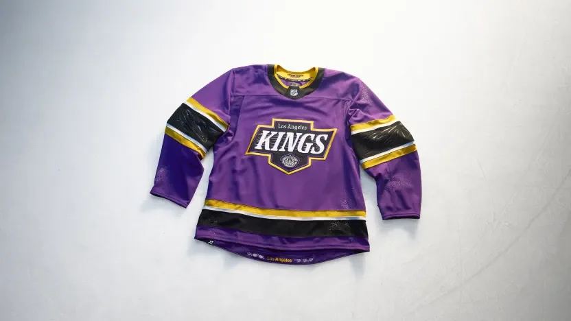
The Kings bring royal purple into a design celebrating six decades of hockey and Los Angeles street and art culture. A Hollywood-inspired serif crest combines crown imagery with pinstripe details. Debossed palm trees appear on the sleeves, while six interior diamonds represent the franchise’s six decades.
Minnesota Wild
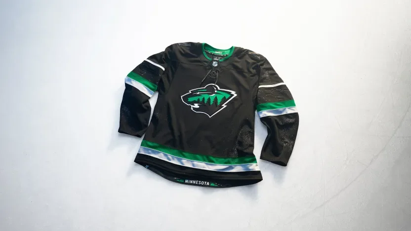
Minnesota turns to its night skies with a black jersey and a crescent-moon interpretation of the Wild crest. Debossed Ursa Major and Ursa Minor constellations decorate the sleeves, while twin stars within the numbers recognize the Twin Cities. Wilderness imagery at the hem completes the northern theme.
Montreal Canadiens
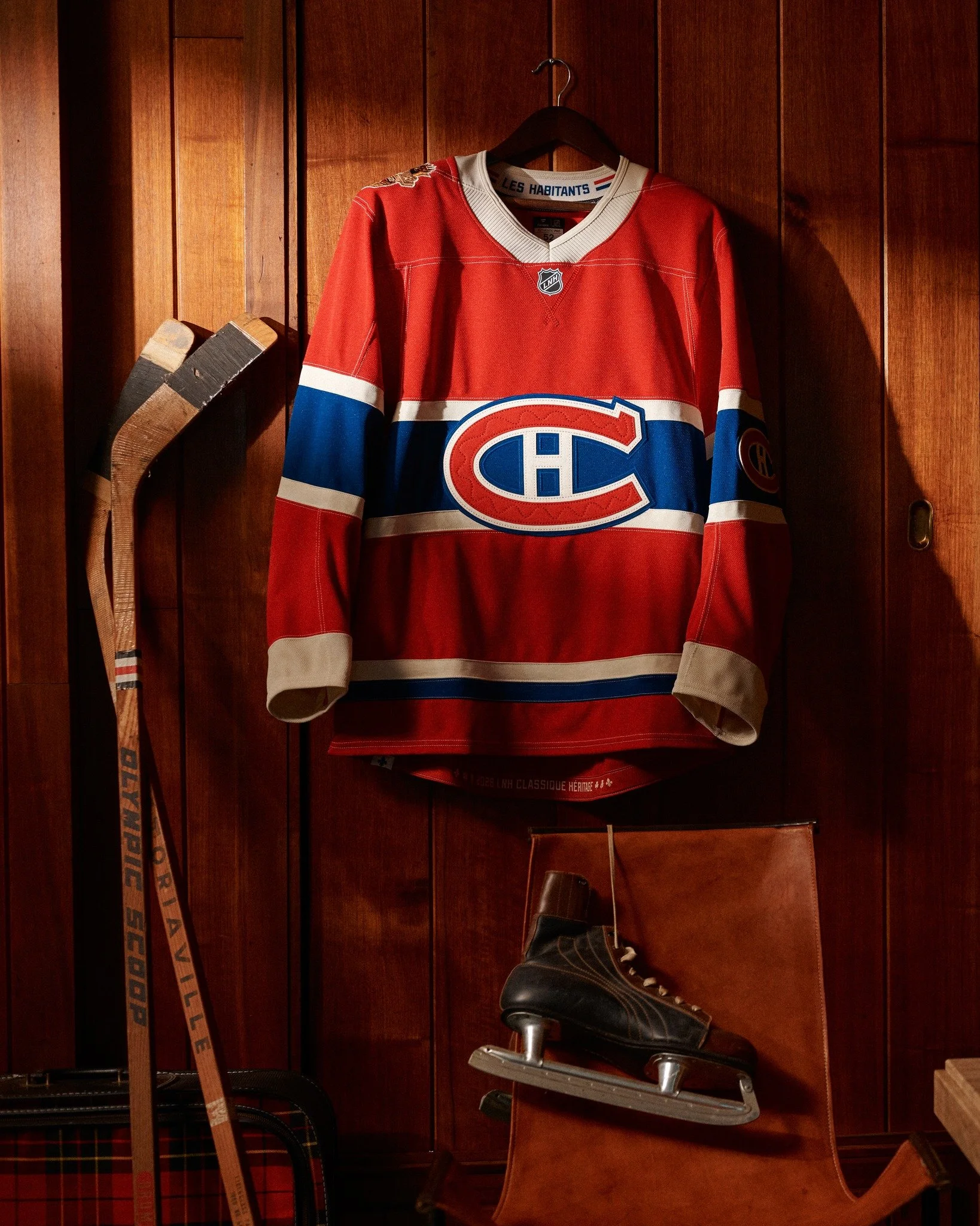
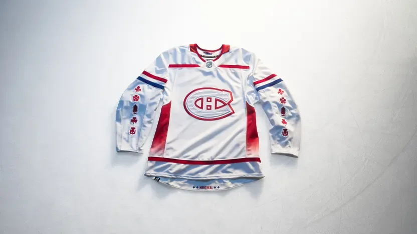
Montreal incorporates white pine, fleur-de-lys, rose, thistle and clover imagery across the sleeves to recognize the city’s cultural roots. Architectural etching adds texture to the Canadiens crest, while Mount Royal inspires gradient side panels. Custom numbers reference Old Montréal, with additional fleur-de-lys details framing the city name at the hem.
Nashville Predators
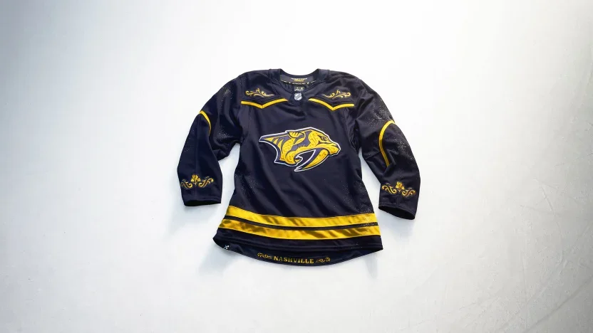
Nashville translates country stagewear and rodeo tailoring into a jersey filled with tonal filigree. Decorative yoke and sleeve treatments incorporate Tennessee’s iris, while matching artwork frames the city name at the hem. Letterpress-inspired numbers carry the same embroidered detailing.
New Jersey Devils
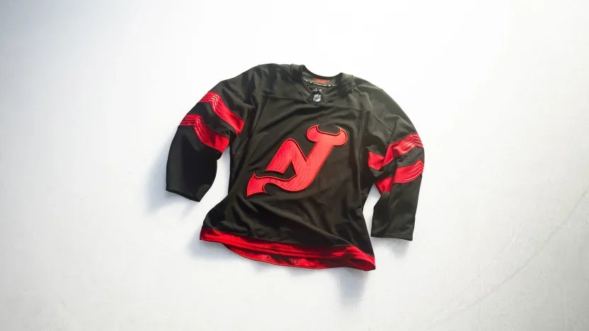
New Jersey removes the enclosing circle from its NJ crest, allowing the horns and tail to stand on their own. Sculpted sleeve stripes and debossed details give the black-and-red uniform added depth. Custom lettering combines curves with angular cuts, while state outlines frame the New Jersey name inside the hem.
New York Islanders
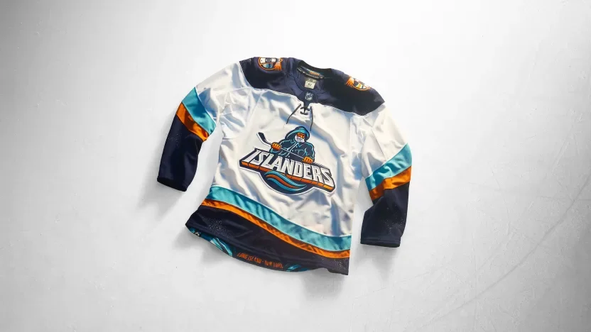
The Fisherman returns with a streamlined crest and updated coastal details. Wavy sleeve striping references the Atlantic, while lighthouse shoulder patches feature LI and NY identifiers. Hook-inspired typography and cross-grained twill add dimension to the names and numbers.
New York Rangers
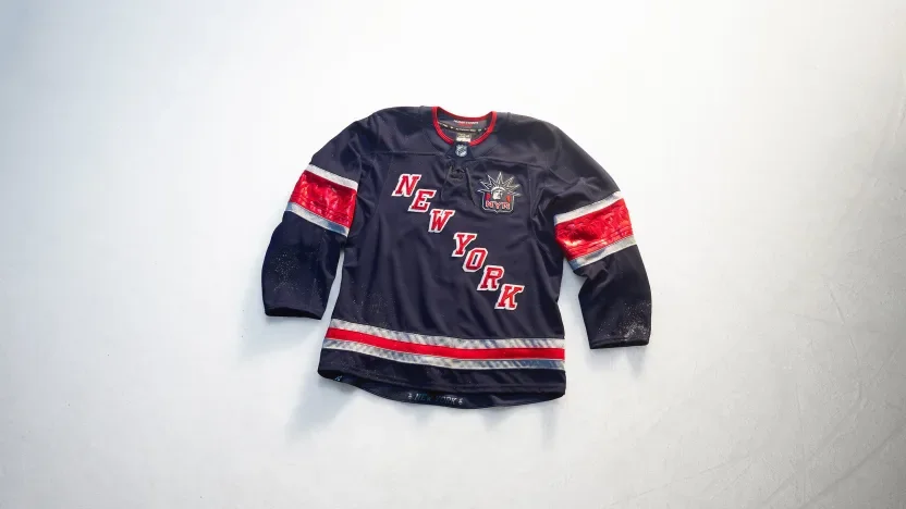
The Rangers introduce a stairstep NEW YORK wordmark with Lady Liberty positioned over the heart. Silver accents reference the city’s architectural metalwork, while debossed sleeve patterns draw from the Statue of Liberty’s torch base. A captain’s patch honors first responders, and torch graphics frame the city name at the hem.
Ottawa Senators
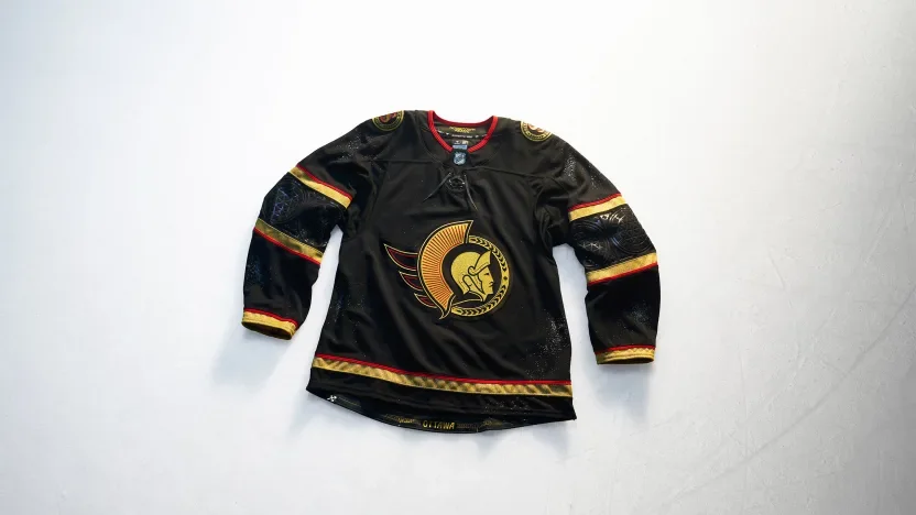
Ottawa pairs black and gold with details inspired by the city’s Gothic architecture. A brushed metallic gold Lurex crest leads the design, complemented by geometric sleeve striping and arched-window-inspired numbers. English and French shoulder marks celebrate the city’s bilingual identity, while bridge imagery recognizes the connection between Ottawa and Gatineau.
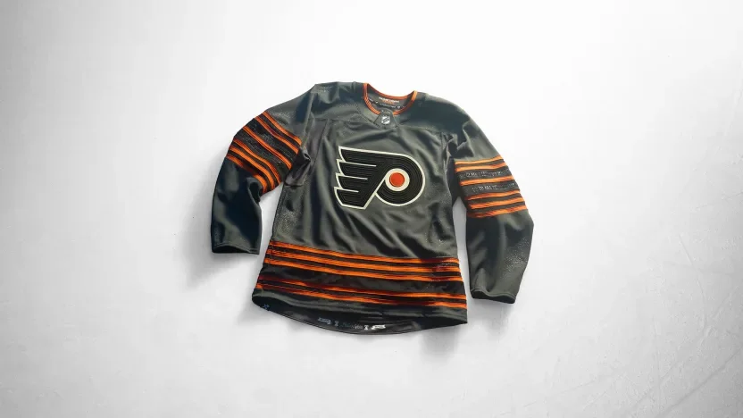
Philadelphia Flyers
Philadelphia builds its concept around the Liberty Bell. Six sleeve stripes recognize the franchise’s 60th anniversary, with debossed inscription details adding texture. Crack-inspired numbers continue the theme, while Constitution script, the Liberty Bell and the date of Independence bring the city’s national significance into the hem treatment.
Pittsburgh Penguins
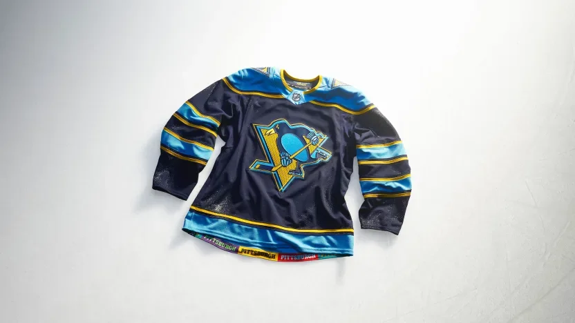
Pittsburgh introduces a pop-art interpretation of its identity through offset graphics and halftone textures. The crest, numbers and shoulder patches share that visual approach, with an igloo referencing the former arena and a triangle recognizing the Three Rivers. A colorful hem treatment connects the jersey to the city’s communities.
San Jose Sharks
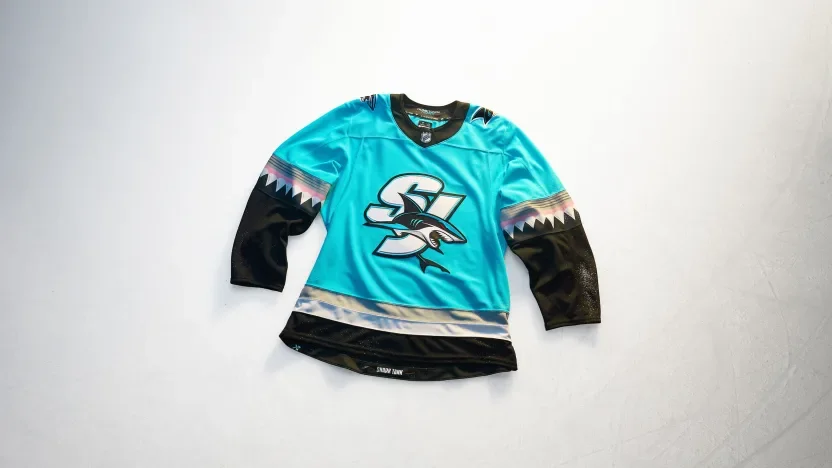
San Jose puts an SJ crest against a Scuba Blue base, drawing inspiration from the Sharks Head used during the team’s pregame entrance. Angular shark-tooth striping carries the concept down the sleeves. “Shark Tank” lettering and chomped-stick graphics finish the hem.
Seattle Kraken
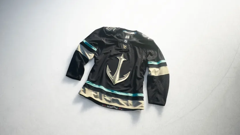
Seattle makes its anchor logo the centerpiece of a maritime-inspired design. Scrimshaw embroidery adds detail to custom nautical lettering, numbers and shoulder artwork. Mount Rainier and regional mountain imagery appear on the sleeves, while rhododendrons bring another Pacific Northwest reference to the hem.
St. Louis Blues
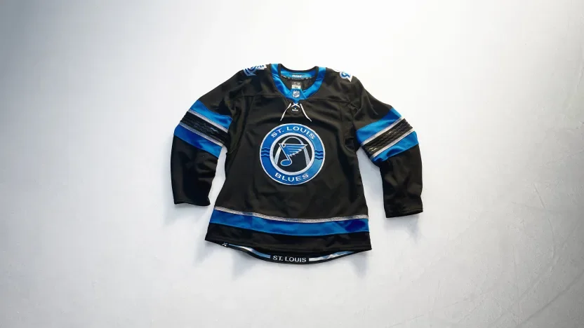
St. Louis introduces a black base inspired by the Mississippi River’s dark waters. The crest incorporates three river-wave lines, with debossed waves continuing across the sleeves. Beveled lettering and numbers reference the Gateway Arch’s metallic finish, while the hem frames the city name from beneath the landmark.
Tampa Bay Lightning
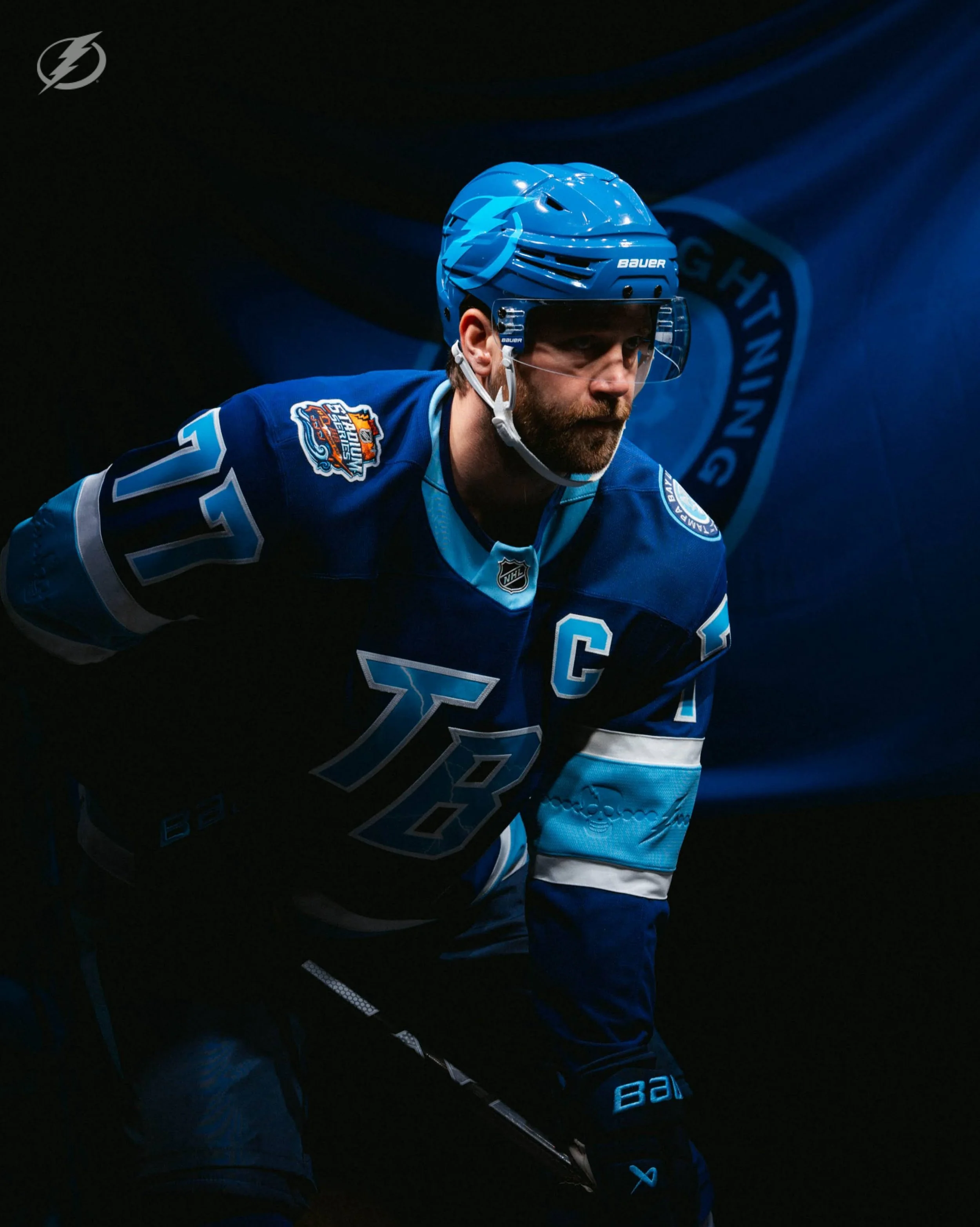
Tampa Bay combines familiar elements from past uniforms, moving its Stadium Series skull to the front with an updated expression. Sky Blue returns against black, supported by Lightning Blue accents and cut-and-sew sleeve bolts. The Bayshore Balustrade appears inside the hem as a local finishing touch.
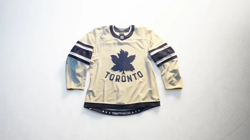
Toronto Maple Leafs
Toronto revisits its original Maple Leafs logo with tonal vein details and an arched Toronto wordmark. The leaf-vein pattern continues through the sleeve stripes and numbers, creating a consistent texture across the uniform. “Toronto Forever” appears at the hem alongside leaf logos from different chapters of team history.
Utah Mammoth
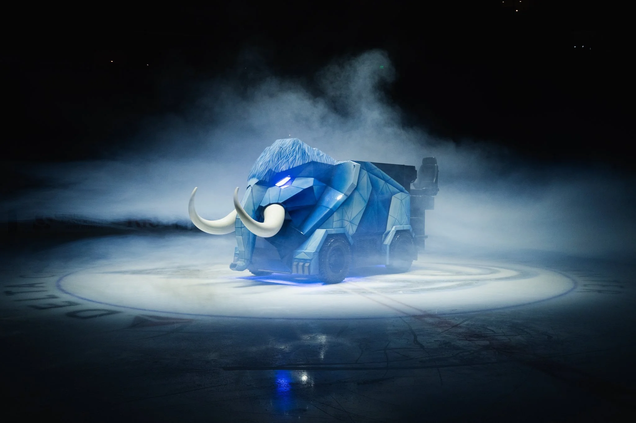
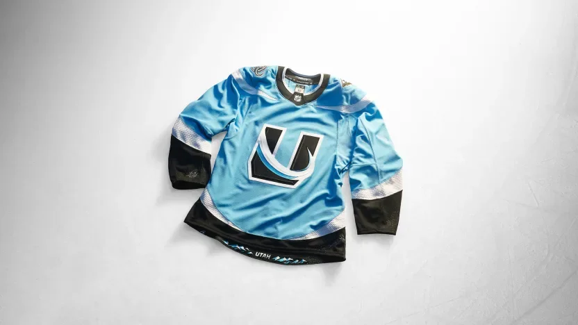
Utah places its U Tusk mark at the center of a Mountain Blue, Rock Black and Salt White design. The shoulder yoke, sleeve stripes and hem work together to form rising tusks when the wearer’s arms are down. Snow-shimmer debossing adds texture to the white striping, while the Wasatch Range anchors the hem artwork.
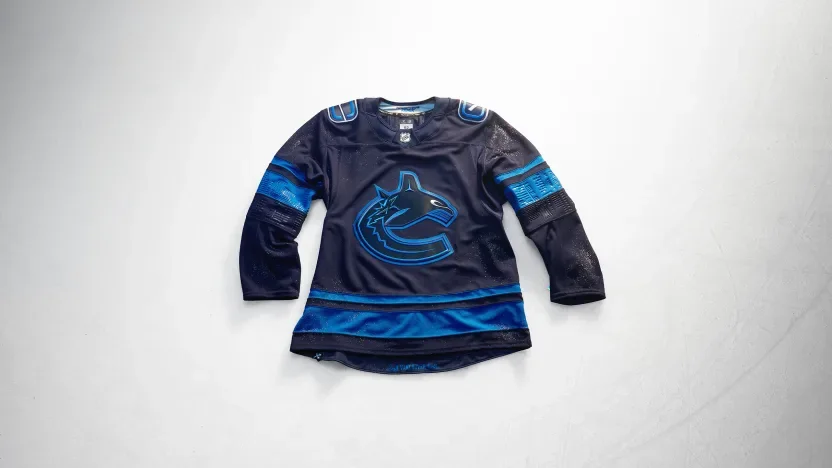
Vancouver Canucks
Vancouver draws from the city after dark with a deep-blue orca featuring silver eyes. Debossed sleeve artwork reflects the skyline mirrored in the bay, while the hem references the lions guarding Lions Gate Bridge. Custom names and numbers include a distinctive V-notch detail.
Vegas Golden Knights
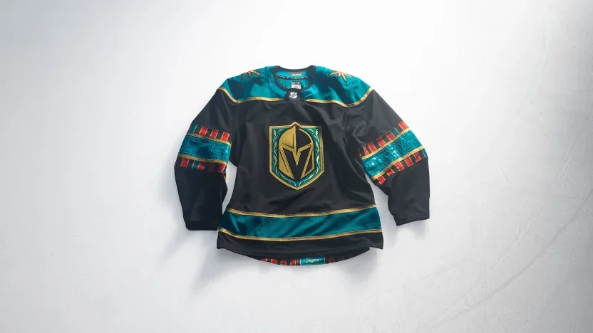
Vegas brings casino imagery into the uniform with a jade-green shoulder yoke inspired by gaming felt. Playing-card suits, roulette graphics and gold striping carry the concept throughout the design. A custom card-inspired number font completes the look, with a reference to the franchise’s 2017 arrival at the hem.
Washington Capitals
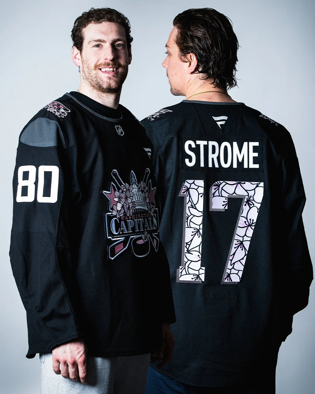
Washington introduces a Capitol Dome crest incorporating stars, hockey sticks and the Statue of Freedom. Marble texturing covers the sleeves and shoulder yoke, while monument lettering influences the beveled numbers. Screaming eagle shoulder patches connect to team history, and cherry blossoms at the hem recognize the wider DMV.
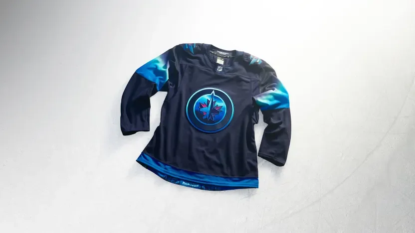
Winnipeg Jets
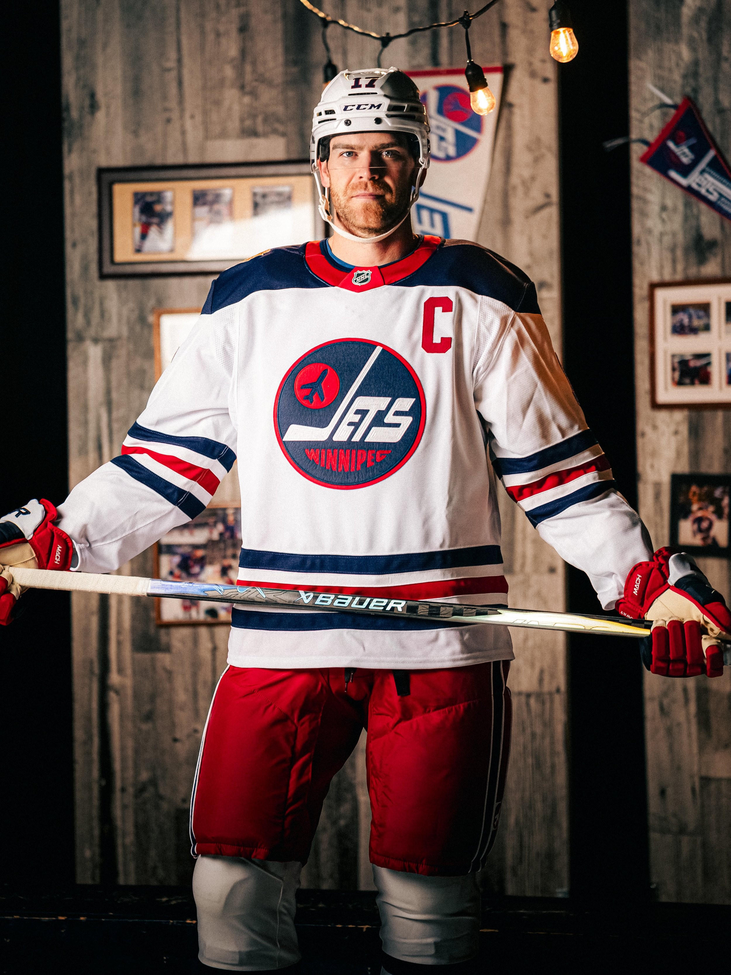
Winnipeg turns the northern lights into a uniform concept with a night-sky palette and illuminated crest details. Blue-to-light-green sleeve gradients mirror the aurora, while softly blended names and numbers create a glowing effect. A full aurora scene along the hem completes the tribute to Manitoba’s winter skies.
Across the collection, the strongest connections often appear in the smallest details: Boston’s brickwork, Calgary’s arena textures, Seattle’s scrimshaw and Winnipeg’s glowing numbers. Hometown Remix gives each team room to explore a different side of its identity while giving fans more of their city to recognize in the jersey.
SHOP NHL GEAR HERE
See What Else Is New
Featured

Related Articles
Featured