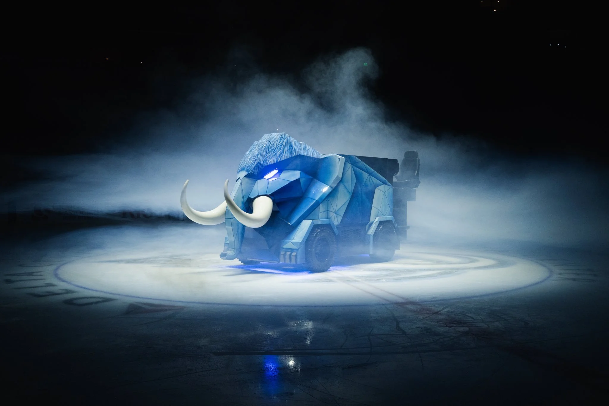
Fans of the Utah Mammoth are getting a new and unforgettable addition to the game-day experience this season, and it’s rolling right onto the ice.
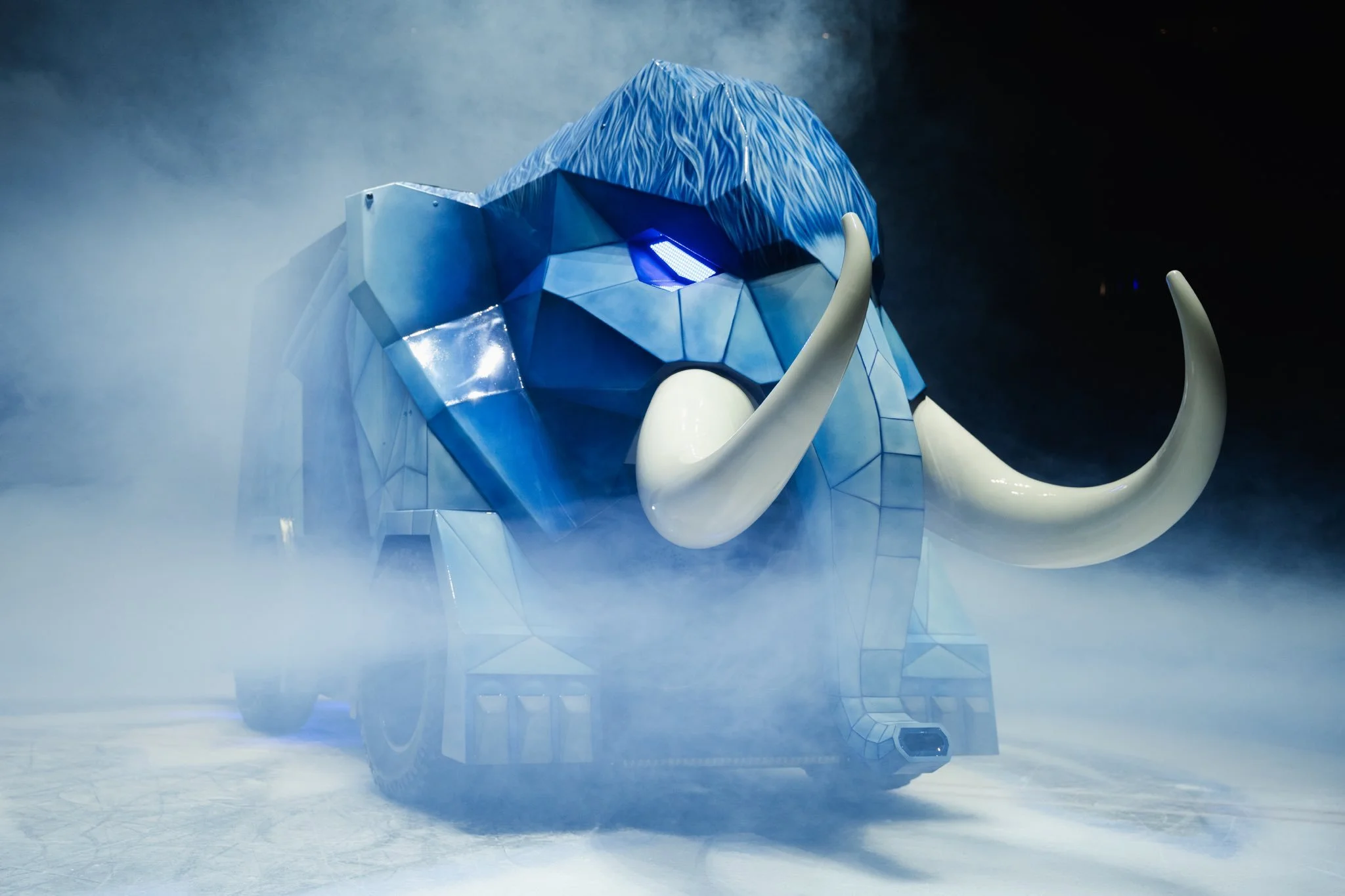
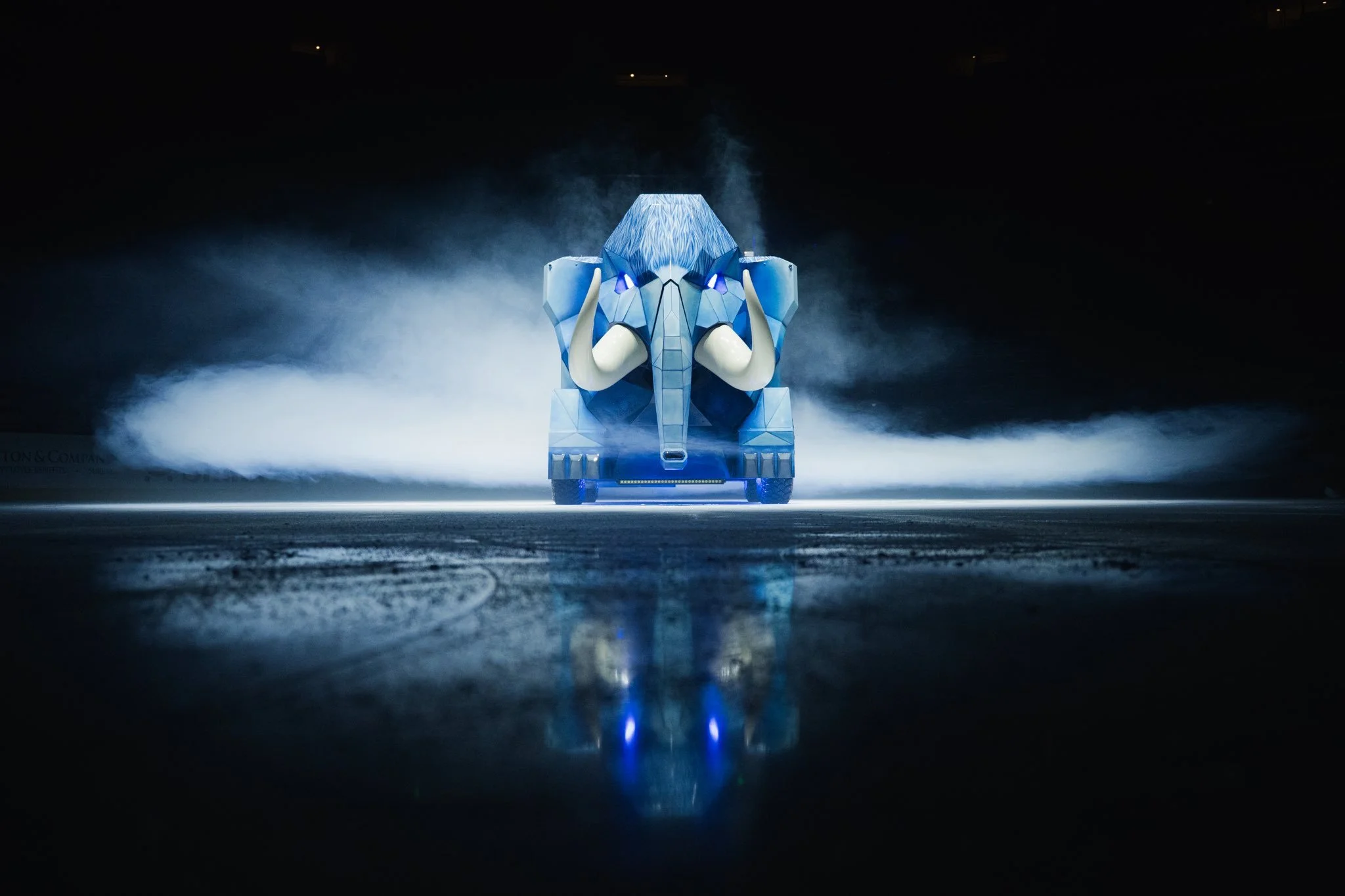
the team unveiled a brand-new look for its ice resurfacing machine, revealing a Mammoth-themed Zamboni that the organization has officially dubbed the “Zammoth.” The custom design blends the team’s branding with a creative, larger-than-life aesthetic that instantly turns a routine part of hockey operations into a centerpiece of entertainment at the rink.
Beyond the fresh design, the Zammoth carries a unique piece of sports history. The machine itself is the same Zamboni used during the 2002 Winter Olympics, connecting Utah’s newest NHL-era identity with one of the state’s most iconic sporting moments.
Now, more than two decades later, that same machine has been transformed with a bold Mammoth makeover.
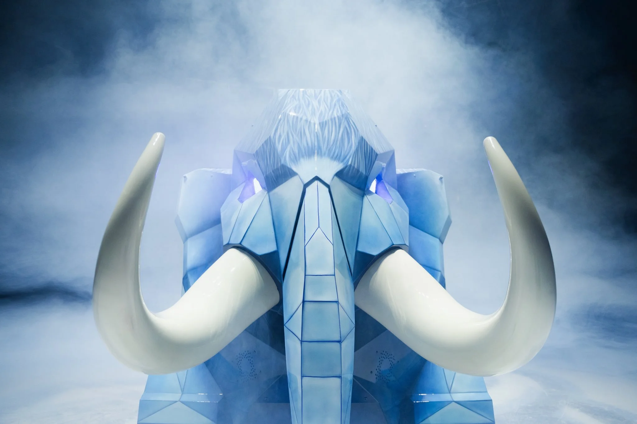
The exterior features a sleek graphic treatment inspired by the team’s prehistoric namesake, complete with massive tusk visuals and Mammoth-themed detailing that wrap around the body of the resurfacer. The result is a machine that looks just as intimidating and memorable as the team’s branding.
The Zammoth isn’t just for show, it’s also designed to bring fans closer to the action. The resurfacing machine can carry up to eight fans at a time, offering a unique ride experience as it circles the ice during pregame and intermissions at Delta Center.
For the Utah Mammoth, the new Zammoth represents more than just an ice resurfacer, it’s a blend of team identity, fan experience, and Utah sports history all wrapped into one ride around the rink.
SHOP mammoth GEAR HERE

See What Else Is New
Featured


Related Articles
Featured