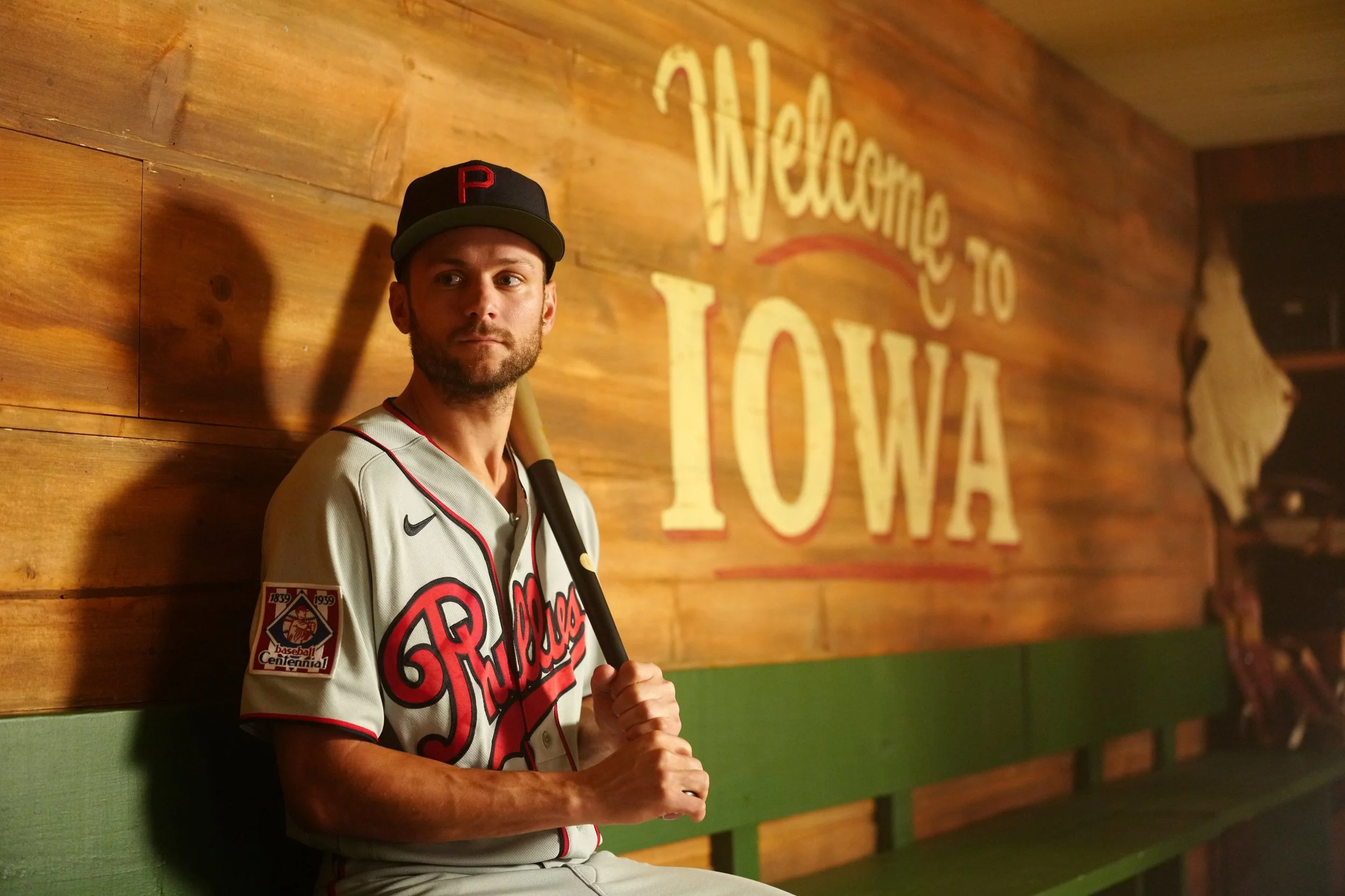
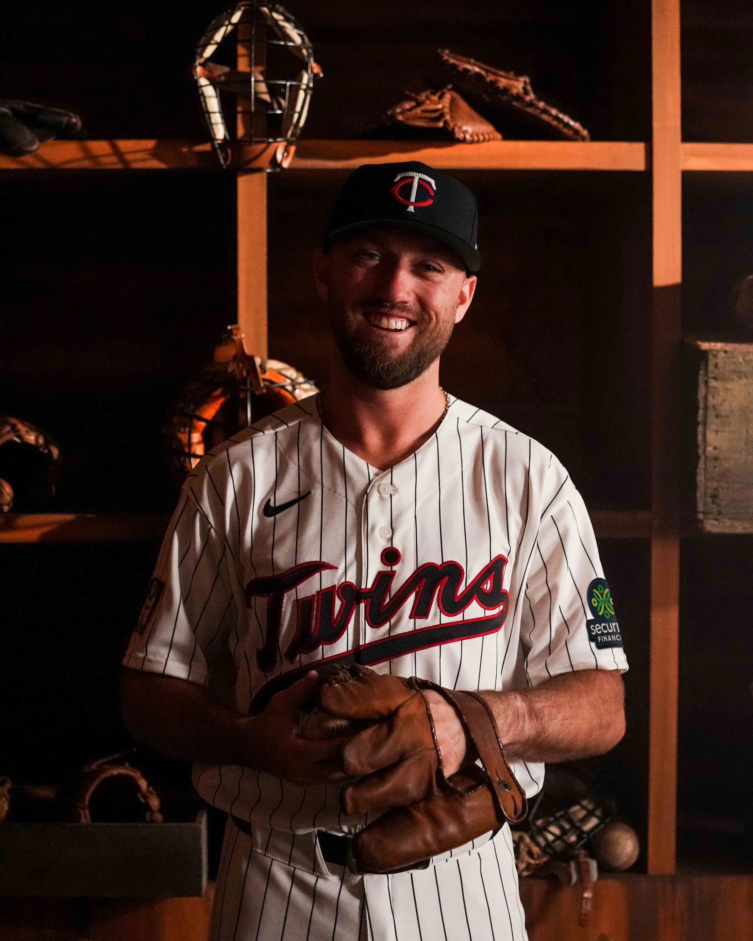
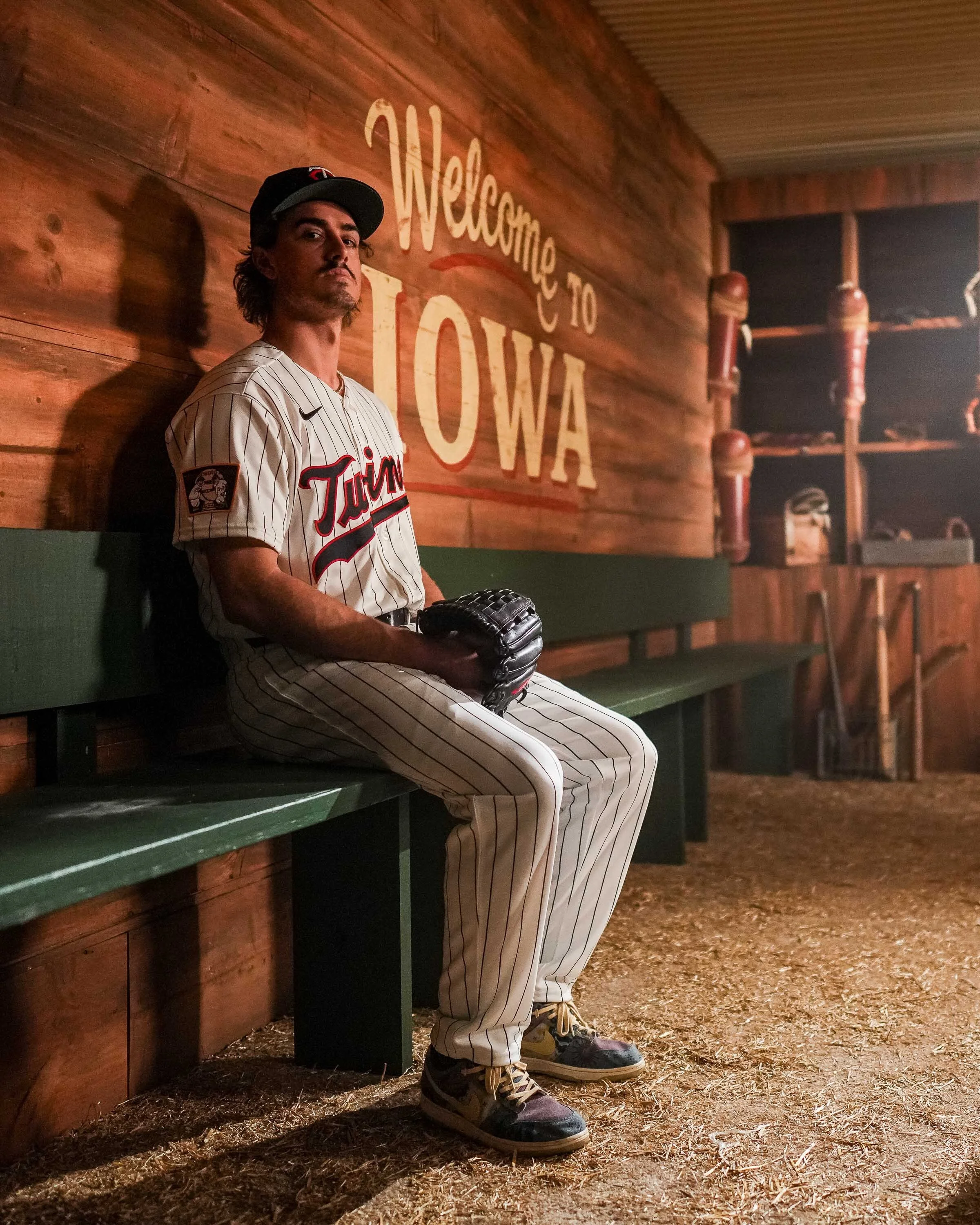
Posts in Baseball
Marlins New City Connect 2.0 Uniform

The Miami Marlins are diving into the vibrant energy of South Florida with the debut of their “Retrowave” City Connect 2.0 uniform — a bold tribute to the city’s culture, history, and future. The new look fuses nostalgic elements with modern flair, celebrating Miami’s electric personality and deep-rooted love for baseball.

“Our new Retrowave uniform combines the Marlins’ rich history with an innovative, forward-thinking approach that mirrors our organization’s trajectory,” said Marlins President of Business Operations Caroline O’Connor. “We aimed to celebrate our club’s storied past and special moments made in the teal, while looking forward to a bright future — all woven in a style that embodies the spirit of South Florida.”

The Marlins are no strangers to making a splash in the City Connect series. Their 2021 “Sugar Kings” uniforms were one of the most talked-about designs in the league. But with Retrowave, they take it a step further, pulling from the city’s multicultural makeup, neon nights, and iconic baseball moments.

One of the standout features of the Marlins’ new City Connect uniform is the 305 cap logo — a historic first in Major League Baseball. This marks the first time a team will wear its area code on the field. The bold "305" across the cap isn't just a shoutout to Miami proper, but a representation of the city’s heartbeat and its reach across South Florida, including areas like Fort Lauderdale’s 954. As ace Sandy Alcantara put it, “The 305 hat is amazing. It’s going to look very, very good on us. Hopefully the fans like it.”

The color palette of the Retrowave uniform is a deliberate blend of nostalgia and energy. The classic teal represents the past, a nod to the Marlins’ inaugural 1993 squad and the legacy they started. Meanwhile, pink accents inject the uniform with the vibrant personality of Miami’s skyline — loud, bold, and unmistakably full of life.

At the heart of the jersey lies the bold “Miami” wordmark, a design that channels the look and energy of the original Florida Marlins era. It's both a tribute to the franchise's roots and a modern statement piece, styled to match the city’s timeless yet ever-evolving aesthetic.

Instead of traditional vertical pinstripes, the Marlins went with horizontal pinstripes, offering a fresh visual rhythm that reflects the constant movement and cultural blend of South Florida. This twist captures both heritage and innovation, showing that the team — and the city — isn’t afraid to rewrite the rules.

The sleeve patch, designed in collaboration with ADT, also got a “Retrowave” makeover. The new logo incorporates retro themes with sleek, modern elements, mirroring the team’s intent to balance historical respect with a future-forward attitude.

Finally, the jock tag grounds the uniform in place and purpose. From the beaches to the ballpark, it celebrates Miami’s vibrant identity while also symbolizing the legacy the Marlins aim to build. As Connor Norby said, “There’s four major sports teams here. There’s music, beaches — it’s always hectic. When it comes to baseball, fans want a competitive team, and I think we’re getting to that point a lot quicker than expected.”

From the city’s neon-soaked nights to its championship history and electric fan base, the Marlins’ Retrowave uniforms are more than a uniform — they’re a cultural statement. It’s Miami baseball, reimagined.

Shop Marlins Gear Here


See What Else Is New

Related Articles


White Sox New City Connect 2.0 Uniform

The Chicago White Sox have officially raised the bar for MLB uniforms with the debut of their latest Nike City Connect Series release — and this one is for the history books.

The new City Connect uniform marks a first-of-its-kind collaboration between two iconic franchises: the White Sox and the Chicago Bulls. This groundbreaking on-field look pays tribute to the deep roots of Chicago sports culture, merging design elements from both clubs into one striking uniform.

The concept was born out of a challenge — how could the White Sox follow up their wildly popular “Southside” City Connect drop? According to Chief Revenue and Marketing Officer Brooks Boyer, the answer was clear: “No one has ever done a collaboration between a Major League Baseball team and an NBA team. In a market like Chicago with a history of both teams, how great would it be to collaborate with our partners in the Bulls, along with Nike and Fanatics, to do something that is unique and very different.”

The result is a bold black and red jersey that nods to the Bulls’ legendary '90s era while honoring the Sox’s own storied legacy. Pinstripes connect the two dynasties visually, and perhaps the most powerful detail sits just below the collar — nine stars, representing all the combined championships the franchises have claimed: three for the Sox (1906, 1917, 2005) and six for the Bulls (1991–1993, 1996–1998).

Making more history, the White Sox will also become the first team in the league to sport two on-field caps with the same City Connect set. One features classic pinstripes, while the other — dubbed the “Chicago Bred Cap” — leans into the cultural legacy of the city. Each cap’s interior includes nods to both franchises, a “Southside” script, and dual “Chicago” callouts to complete the theme.

“We couldn’t pick just one,” Boyer explained. “The detail inside the cap really tells the story — two teams, one city, united.”

The new uniforms will make their on-field debut this Friday, May 2, when the White Sox take on the Astros at home. The team plans to wear the collaboration look during every Friday game throughout the 2025 season as part of the second wave of MLB’s City Connect program.

With its sleeved silhouette evoking the look of a basketball jersey and a shared “Chicago” wordmark across the chest, the White Sox have redefined what a baseball uniform can be — and set the stage for future cross-league innovation.

Stay locked on UNISWAG for more uniform drops and exclusive behind-the-scenes looks as City Connect 2.0 takes over the diamond.

Shop white sox Gear Here


See What Else Is New

Related Articles


New Cream Uniform for Penn State Baseball

Penn State Baseball is keeping it classic — and fresh — with the reveal of their new cream uniforms for the 2025 season. In true Nittany Lion fashion, the new set blends tradition with subtle swagger, putting a premium on clean lines, vintage vibes, and school pride.

The uniform features a full-cream base with sharp navy piping down the chest and legs, delivering a retro-inspired look that feels perfectly at home in Happy Valley. The script is swapped out for a bold “Penn State” lion patch over the heart, nodding to old-school varsity styles.

But what really pulls the look together? It’s the little things — the two-button top, navy belt and socks combo, and a crisp “P S” logoed cap that pulls straight from the archives. It’s understated but confident — just like the team.

Shot in front of the university’s historic Old Main, the photo drop did the new fit justice. Whether it’s a weekend series at Medlar Field or a postseason push, this uniform is built for big moments.

Penn State continues to remind everyone that when it comes to looking good on the diamond — tradition still wins. And when that tradition is done right, it turns heads.

Shop Penn state Gear Here


See What Else Is New

Related Articles


Rockies New City Connect 2.0 Uniform

The Mile High City just got a lot more colorful. The Colorado Rockies have officially unveiled their brand-new Nike City Connect uniforms—and they’re a complete visual reset from the team’s previous look. Inspired by Denver’s stunning sunsets and snowcapped skylines, this bold new drop is all about energy, youth, and the beauty of the Rockies.

Revealed Saturday morning, the fresh design makes its on-field debut Friday, April 18, when the Rockies take on the Nationals. From that point on, fans can expect to see the team rocking the new City Connect uniforms for every Friday home game the rest of the season.

Gone is the dark green, license plate-inspired design that once turned heads for its unexpected yet iconic nod to Colorado’s DMV aesthetic. In its place: psychic purple, cobalt blue, razor pink, and laser orange—a vibrant palette drawn directly from the skyline views seen from Coors Field at dusk.

“I like it, man,” said third baseman Ryan McMahon. “It’s a little louder than our last ones. So it should be cool.”

And loud it is—in the best way possible. The jerseys break free from the previous design’s subtlety, opting instead for a bold and expressive tribute to the spirit of Colorado. According to Jim Kellogg, the Rockies’ VP of Community and Retail Operations, the change was very much by design.

“We have a young team, so we want to make sure that we're tying into a new day, a new sunrise and sunset,” Kellogg said. “Nike came up with these colors looking at the sunsets that we had. It’s bold and it’s fun.”

While the colors bring the noise, the details bring the depth. The jersey features a unique ripstop fabric—a nod to the materials worn by skiers and snowboarders across the state. This subtle pattern not only adds a textured layer to the uniform but also speaks to the grit and adaptability of life in the mountains.

Players will also appreciate the functional upgrades. The jersey is a pullover—the first in Nike’s City Connect lineup to feature this style—echoing the gear many athletes grew up wearing before they went pro. Plus, unlike the previous all-dark-green look, this version pairs the vibrant top with white pants, designed to beat the Colorado heat during day games.

Of course, the look wouldn’t be complete without those fan-favorite extras:

  • A reimagined Rockies logo with a baseball soaring past the mountain tops

  • A unique sleeve patch

  • the city-stamped “DEN” on the jock tag for that added drip (especially for fans wearing it untucked)

“It’s creating conversation around our brand, our team,” Kellogg said. “Not everyone is going to like this… and that’s fine with us. We’re just trying to put something out there that’s fun. And if you’re taking it too seriously, you’re taking it too seriously.”

The Rockies' classic purple pinstripes will always be the crown jewel—but with this new City Connect set, the team proves they’re not afraid to mix tradition with innovation. It’s bold, it’s fresh, and it captures everything that makes Colorado—on the field and off—unforgettable.

Shop Rockies Gear Here


See What Else Is New

Related Articles


Giants New City Connect 2.0 Uniform

The San Francisco Giants just redefined what a City Connect jersey can be. In a groundbreaking collaboration with Bay Area-based music label EMPIRE, the Giants unveiled their newest look—a bold, purple-drenched City Connect jersey that bridges the city’s deep musical roots with its storied baseball legacy.

The fresh design came together through a collective creative effort led by local legends, including artists Rexx Life Raj, LaRussell, and EMPIRE CEO Ghazi Shami. Together, they infused the jersey with a distinctly Bay Area energy, blending historical nods with a streetwear edge.

The most striking detail come with That deep violet hue laced throughout the kit. It draws direct inspiration from the stage lights of the Fillmore and the psychedelic posters of Haight-Ashbury—a visual homage to San Francisco’s rebellious, artistic past. But it also connects back to the Giants' roots, when the franchise wore violet from 1913 to 1917 while in New York, repping NYU.

Adding even more layers of storytelling is the stitched glove patch—modeled after 1960s gig posters—that fuses the ballpark and the concert hall into one visual statement. It’s a tribute to the Giants' tradition, but remixed through the lens of a new generation of creators.

“San Francisco’s music scene has always been a powerful expression of the city’s soul, making this collaboration with Ghazi and EMPIRE a natural fit for the debut of our new City Connect uniform,” said Rachel Heit, chief marketing officer of the Giants. “As one of baseball’s most storied franchises, the Giants have always reflected the energy of our city, and this City Connect uniform is our way of honoring that legacy by remixing it with the culture and spirit that makes San Francisco so special.”

Shop Giants Gear Here


See What Else Is New

Related Articles


2025 NFL Draft Hats

The 2025 NFL Draft is not only a pivotal event for teams and prospects but also a showcase for fresh fashion statements, particularly through the unveiling of the official Draft caps. This year, New Era has introduced a collection that seamlessly blends tradition with modern design elements, ensuring that both players and fans can represent their teams with pride and style.

Each team's cap prominently features the franchise's logo, accompanied by the team's location beneath it. A standout addition to this year's design is a signature pin unique to each franchise, adding a personalized touch that resonates with the team's identity.

For instance, the Denver Broncos' cap showcases "Mile High City" across the front, paying homage to Denver's renowned elevation and its significance to the team's heritage.

In conclusion, the 2025 NFL Draft caps by New Era encapsulate a fusion of tradition and contemporary design, offering fans a stylish means to celebrate their team's new additions. As with any bold fashion statement, opinions may vary, but these caps undoubtedly add a fresh dynamic to the Draft day experience.

Shop NFL Gear Here


See What Else Is New

Related Articles


Dodgers Unveil World Series Championship Rings

The Los Angeles Dodgers celebrated their latest World Series title in grand fashion, unveiling a championship ring that is as rich in symbolism as it is in brilliance. Designed to honor the team’s storied history, the ring incorporates several intricate details that pay tribute to the franchise's legacy, its players, and the unforgettable moments that led to another title.

At first glance, the ring’s face is adorned with eight diamonds, each representing a championship in the Dodgers' illustrious history. However, the most unique feature is hidden within—opening the ring reveals an engraving of the World Series trophy set against the iconic backdrop of Dodger Stadium. Encircling this centerpiece are 34 stones, a heartfelt nod to Dodgers legend Fernando Valenzuela. In a special touch, the ring also contains an actual piece of a base used during the World Series, emblazoned with the team’s City Connect logo.

Additional details include five diamonds on the bottom of the band, symbolizing the Dodgers' incredible five-run comeback in the decisive Game 5 against the New York Yankees. Every element of the design reflects a part of the team’s championship journey, ensuring that players and fans alike will remember the road to victory.

"The ring is incredible," said Max Muncy. "It was a good way to start the day. The ceremonies are a lot, but I’m not gonna complain about it."

The championship celebration was in full swing as players received their rings, while the night’s starting pitchers warmed up in the background. In a twist of fate, one of those pitchers was Jack Flaherty, who was instrumental in last season’s postseason run before returning to Detroit in the offseason. Dodgers manager Dave Roberts made sure to acknowledge Flaherty’s impact on the team’s success.

"He was the right person at the right time for our club," Roberts said. "I’m happy that he got family and friends that got to see him in a Dodger uniform, get a championship ring. And now we can go beat him up today, and give him his ring tomorrow."

With another championship banner raised and an unforgettable ring ceremony in the books, the Dodgers have cemented their place in baseball history once again. And as they turn the page to a new season, they do so with a reminder of the greatness they achieved—now immortalized in gold and diamonds.

Shop doDgers Gear Here


See What Else Is New

Related Articles


Texas Tech Baseball Unveils Patrick Mahomes Alternate Uniform

The Texas Tech Red Raiders are once again teaming up with one of their most famous alumni, Patrick Mahomes, to introduce a special alternate uniform for the baseball team. Mahomes, best known for his NFL dominance, has deep baseball roots—his father, Pat Mahomes, was an MLB pitcher, and Patrick himself played multiple sports, including baseball, during his time at Texas Tech.

Following in the footsteps of the Red Raiders football program, which has collaborated with Mahomes on uniforms in the past, the baseball team is now set to take the field in a bold, Mahomes-branded look.

The uniform features a sleek black jersey and matching cap, complemented by white pants to create a striking contrast. The jersey highlights a fresh “Tech” script across the chest, written in Mahomes’ signature font, in red with thin white and bold silver-gray outlines. His personal logo is prominently displayed on the upper right chest, reinforcing his influence on the design.

Additional design elements include white front numbers outlined in silver-gray, positioned below the “Tech” script on the left side of the jersey. The sleeves showcase red and silver-white stripes just above the hems, adding a touch of sharp detailing.

The uniform set is completed with a custom pair of white pants featuring a red, silver-gray, and black stripe running the full length of the leg. This trim ties in seamlessly with the jersey’s color scheme and enhances the overall aesthetic of the alternate look.

As Texas Tech continues to celebrate its connection to Mahomes, these special uniforms serve as a nod to his multi-sport background and lasting legacy at the university. Fans can expect the Red Raiders to take the field in style, representing both their school and one of its greatest athletes.

Shop Texas TEch Gear Here


See What Else Is New

Related Articles


Nationals New City Connect 2.0 Uniform

The Washington Nationals have officially unveiled their latest City Connect uniforms, paying tribute to the rich cultural and architectural heritage of the nation’s capital. The new design, primarily featuring a bold blue color scheme, will make its on-field debut on March 29 against the Philadelphia Phillies.

This latest uniform set follows the Nationals' first City Connect release, which prominently featured Washington, D.C.’s iconic cherry blossoms. While those floral elements return, this new iteration expands its homage to the city with a range of symbolic details.

One of the most striking additions is a new stylized “W” that incorporates the outline of the Capitol dome. This emblem appears on both the cap and jersey patch, flanked on either side by cherry blossoms. The patch sits on a background inspired by the architectural tile work seen in some of D.C.’s most renowned buildings, including the Capitol rotunda, the Library of Congress, and even the city’s Metro stations.

The jersey itself is a testament to Washington, D.C.’s structure and layout, featuring a city grid pattern in tones reminiscent of American denim. Even the underbill of the cap carries this city grid, alongside the Nationals’ signature curly W, reinforcing the team’s deep connection to its home.

“This season marks our 20th anniversary, and my family and I are so proud of how this team has become woven into the fabric of our city,” Nationals principal owner Mark D. Lerner shared in the team’s press release. “These uniforms are a great representation of how baseball has the power to bring us all together, and we are continually honored to play for the people of Washington, D.C.”

Adding a touch of nostalgia, the Nationals have brought back the interlocking “DC” logo, which was featured on uniforms from 2006 to 2010. However, this version boasts a modern 3D design, inspired by the classic block W logo worn by the 1956 Washington Senators.

The uniform is completed with white pants that feature a mosaic trim, a nod to the diverse makeup of the city. This subtle detail ties into the broader theme of the uniform set—honoring Washington, D.C.’s legacy while embracing the present-day community that the Nationals represent.

As the Nationals gear up for their City Connect debut, these new uniforms stand as a powerful visual tribute to the heart of the city. Whether it’s the cherry blossoms, the Capitol dome, or the city’s historic grid, every detail weaves together a narrative that celebrates Washington, D.C.’s identity in a bold and stylish fashion.

Shop Nationals Gear Here


See What Else Is New

Related Articles


Astros Unveil City Connect 2.0 Uniform

The Houston Astros have officially launched their City Connect 2.0 uniforms, bringing a modernized twist to their already iconic space-themed look. From players to manager Joe Espada, the new design has been met with widespread enthusiasm in the clubhouse.

The excitement in the clubhouse was evident, with shortstop Jeremy Peña sharing his approval: “I love them. I think they look clean. I think they did a great job with the uniforms, and I think the fans are going to love them.” Manager Joe Espada echoed the enthusiasm, noting that players were already posting the new look on social media. “The players are excited. I see they’re putting it on their social media. I really like that. I think the jerseys and the hats are going to be flying off the shelf here in a little bit. I like that it’s white, too. I liked the blue [City Connect] jersey, but the white looks clean … looks fresh. It looks really, really nice. I’ll be looking forward to wearing it on Monday.”

The Astros will debut their City Connect 2.0 uniforms on March 31 against the Giants at Daikin Park. They will continue wearing them for Monday home games throughout the regular season and during City Connect Weekend, April 11-13.

The City Connect 2.0 design stays true to Houston’s deep-rooted connection to space exploration while incorporating a sleek and futuristic aesthetic. For the first time, “Stros” is displayed across the chest, giving the jersey a bold new identity. The uniform features a lunar pattern trim and pinstripes, paying tribute to the moon landing and upcoming space missions, while a rainbow gradient offers a modernized nod to the Tequila Sunrise pattern, bridging the team’s past and future. The futuristic hat logo introduces a redesigned broken star in rainbow gradient, wrapped in a modified “A” (replacing the traditional “H”), inspired by concept art from throughout the team’s history.

Other thoughtful design elements further connect the uniform to Houston's space legacy. Inside the hat, a Mars pattern is imprinted alongside the words “The Next Frontier,” signifying the next step in space exploration. The neckline features the phrase “Space City” placed along a lunar surface texture, merging Houston’s past with its future. The mission patch, inspired by the historic Union Station logo, ties the team back to a key landmark near Daikin Park. Along the belt loop, HTX is stitched as a tribute to Houston. The afterburner socks, featuring a fiery orange and yellow mix, symbolize the afterburners of a rocket ship, while the jock tag captures a pivotal moment in space history, honoring President John F. Kennedy’s legendary space travel speech on Sept. 12, 1962, at Rice University.

Shop Astros Gear Here


See What Else Is New

Related Articles