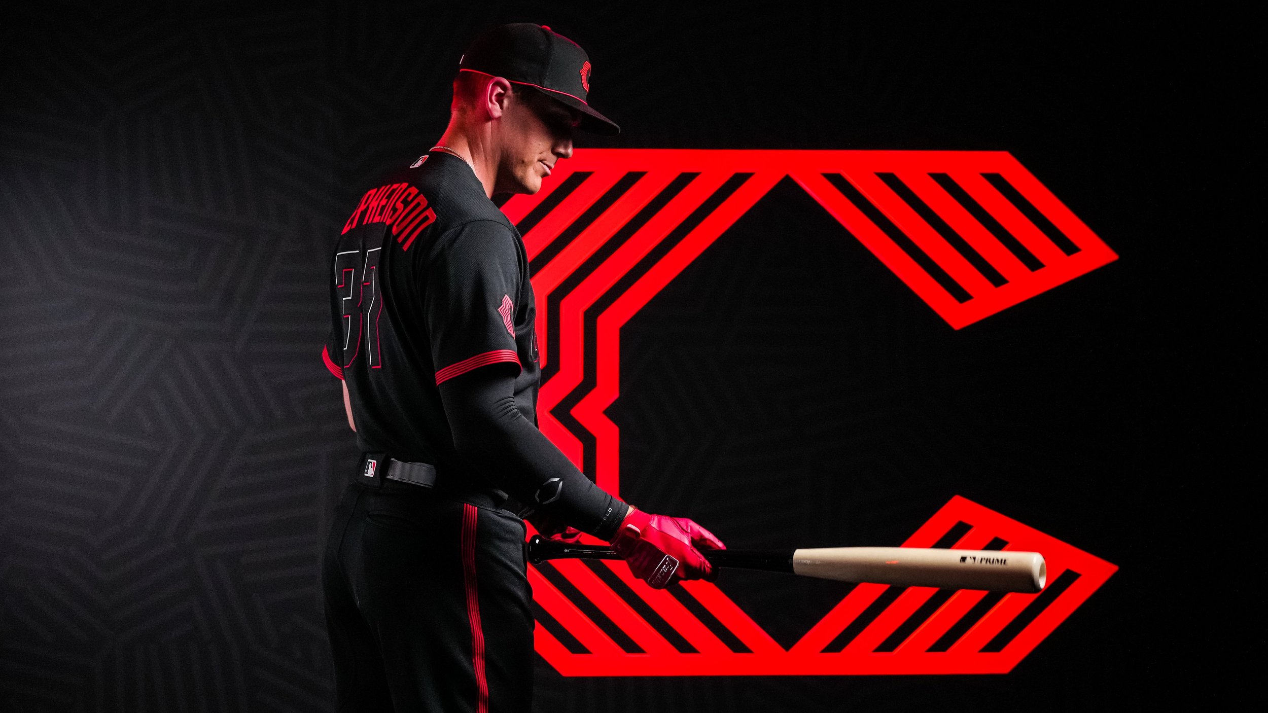
Each year, baseball fans eagerly anticipate the unveiling of the latest MLB All-Star Game uniforms in the weeks leading up to the Midsummer Classic. This summer is no exception, and in addition to a new uniform design for the 2023 All-Star Game, a groundbreaking uniform technology is set to revolutionize the MLB in 2024.
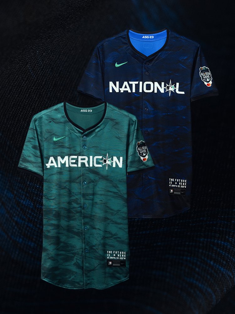
In a joint effort between MLB and Nike, the 2023 All-Star Game uniforms were unveiled on Friday, offering a glimpse into the attire that players will don for this year's Midsummer Classic at T-Mobile Park in Seattle on July 11. Staying true to recent tradition, the uniforms pay homage to the host city by incorporating elements that represent Seattle's ocean, forests, topography, and the movement of air.
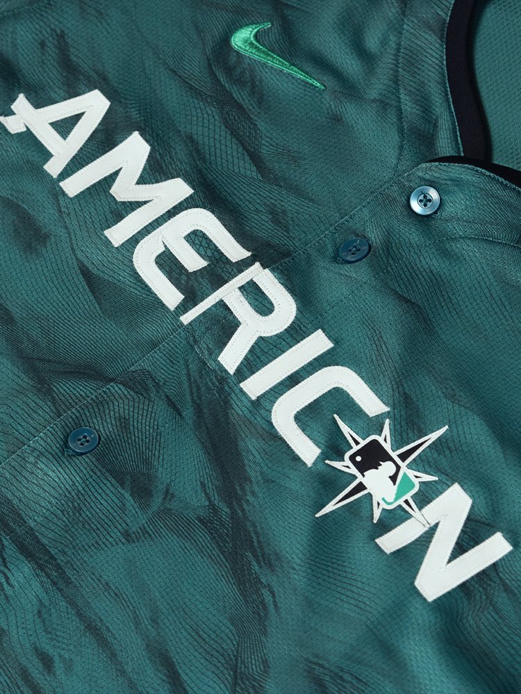
This year's jerseys feature a striking print that seamlessly blends these elements, showcasing the beauty and spirit of the Pacific Northwest. The American League squad, serving as the home team, will don light teal jerseys, while the visiting National League team will sport dark navy jerseys. Beyond the aesthetic appeal, these jerseys mark the debut of Nike's latest uniform innovation, known as Nike Vapor Premier.
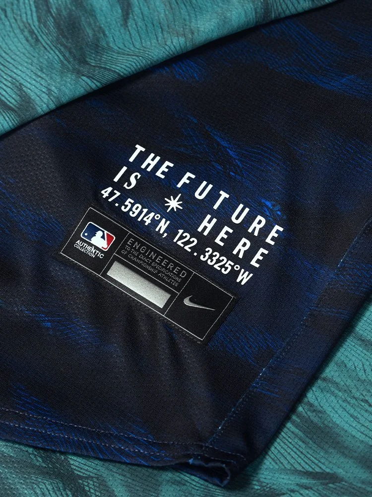
The introduction of Nike Vapor Premier technology brings forth a new era of uniforms engineered to enhance mobility, moisture management, and overall fit. Constructed from a breathable, lightweight, high-performance fabric comprising at least 90% recycled polyester yarns, Vapor Premier sets a new standard for performance attire. Its incorporation allows the jersey to offer 25% more stretch, providing players with a wider range of motion on the field. Moreover, the innovative fabric enables the jersey to dry 28% faster, thanks to the inclusion of moisture-wicking Dri-Fit ADV technology, which keeps players cool and comfortable in any situation.
To ensure the perfect fit, Nike body-scanned over 300 baseball players, meticulously analyzing and studying their proportions and movements. This comprehensive approach resulted in an athletic and form-fitting design that surpasses previous models. By considering the unique physique and demands of baseball players, Nike has created a uniform that optimizes performance and comfort simultaneously.
Perhaps the most exciting news is that starting from the next MLB season, this new uniform chassis will be implemented across all MLB uniforms.
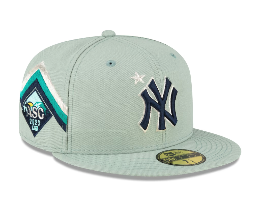
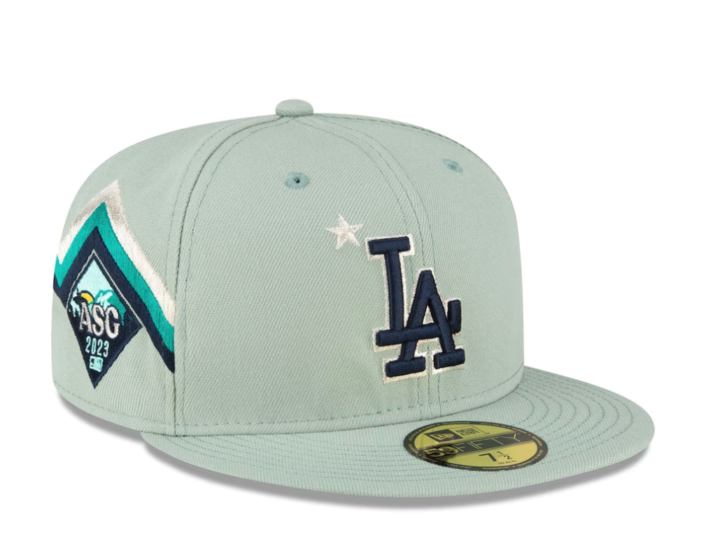
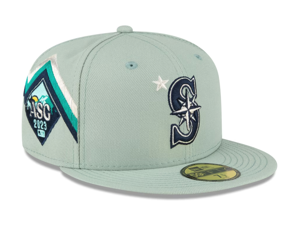
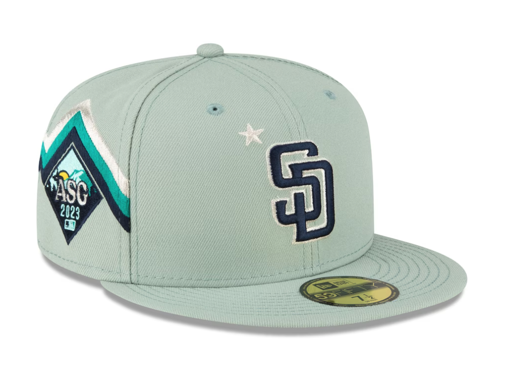
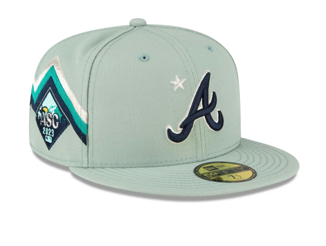
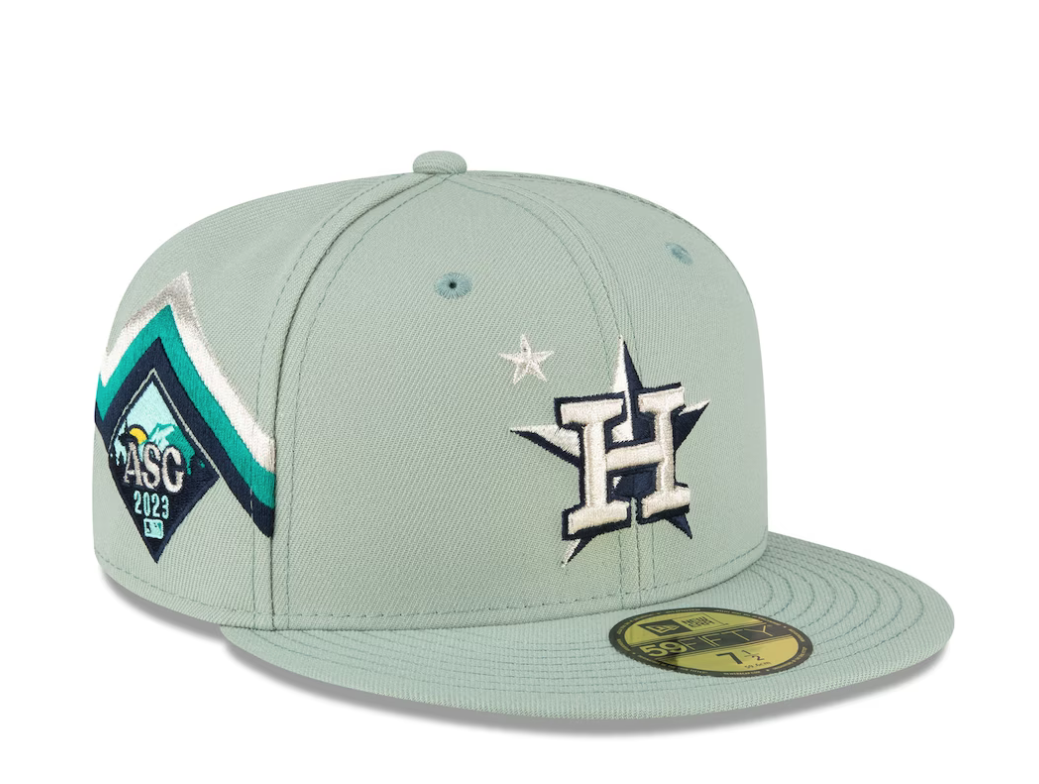
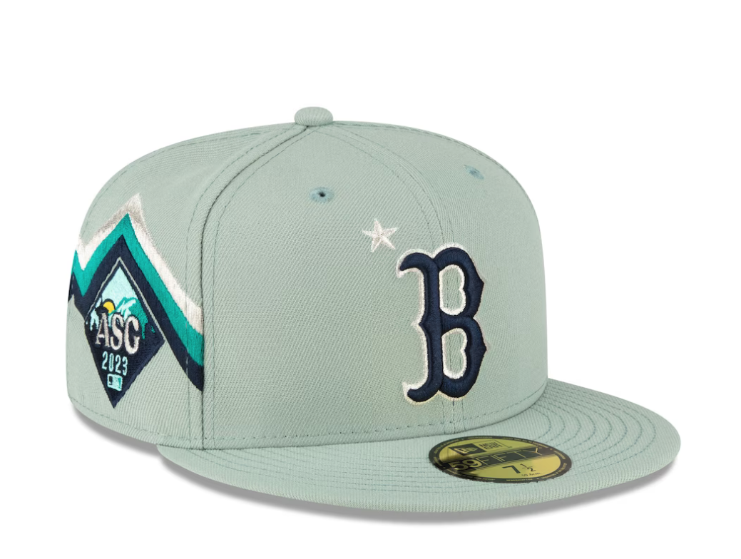
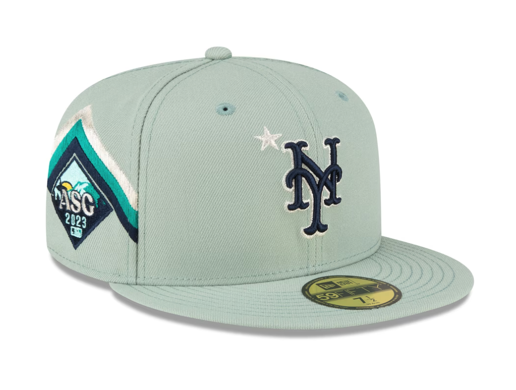
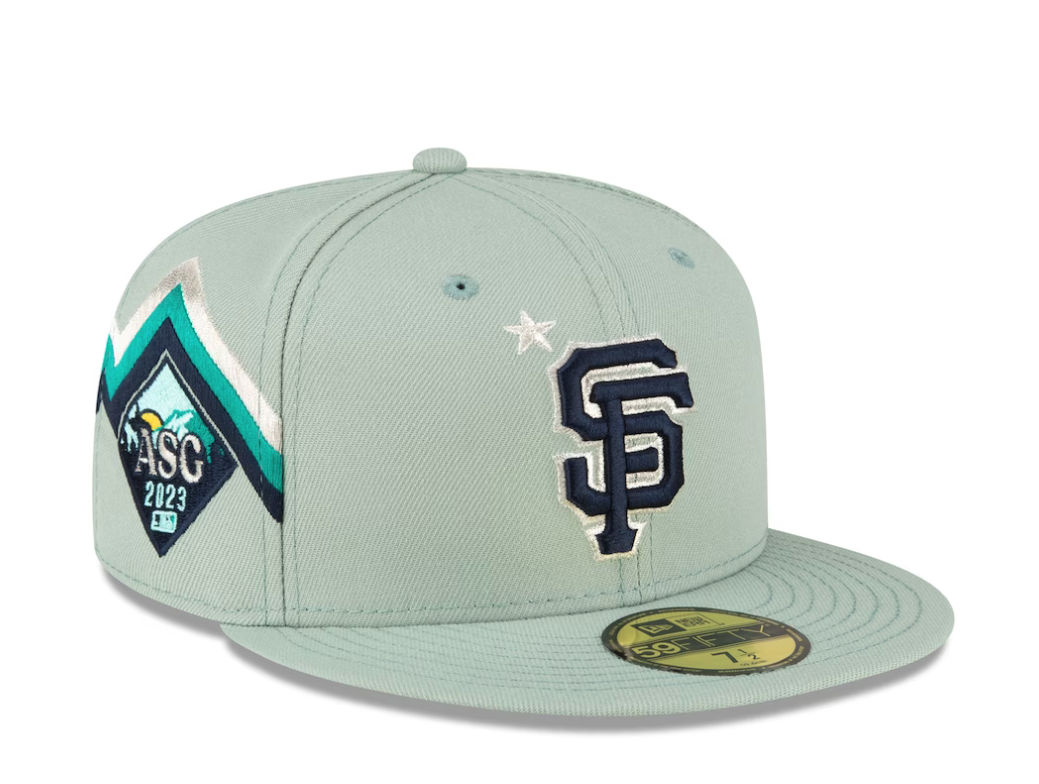
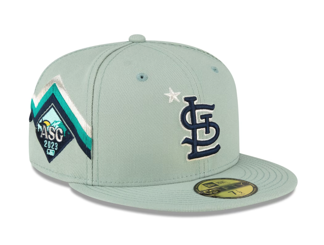
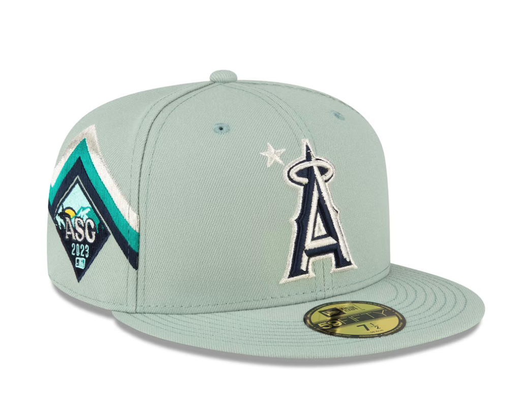
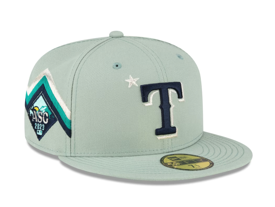
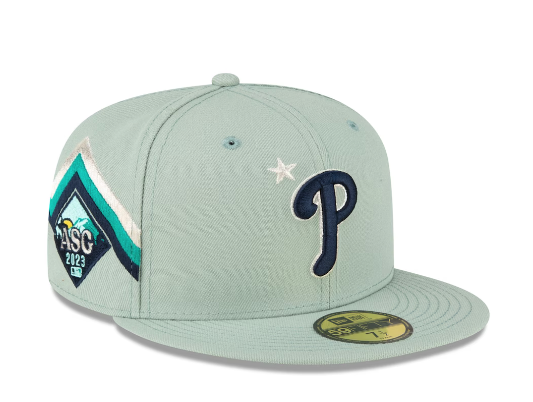
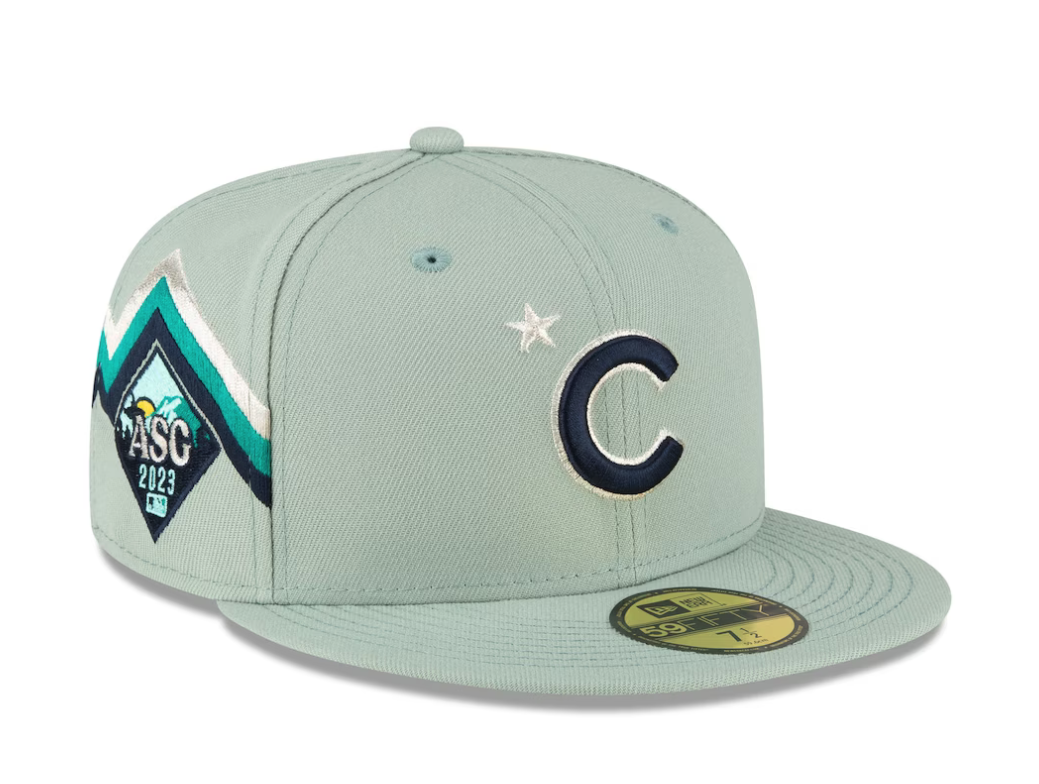
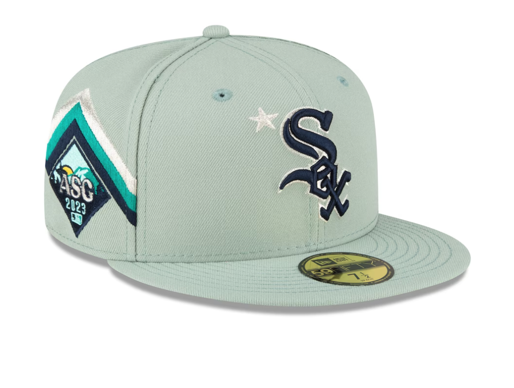
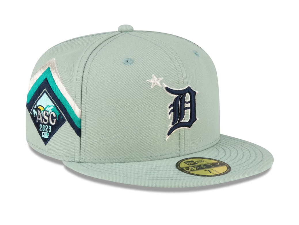
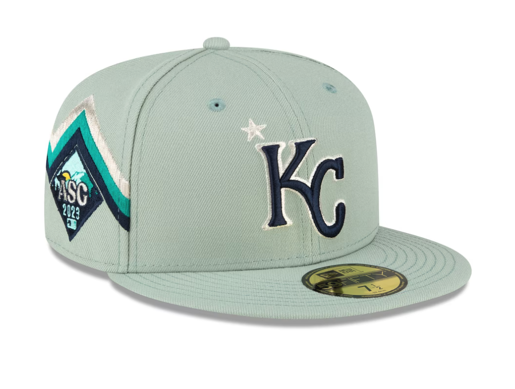
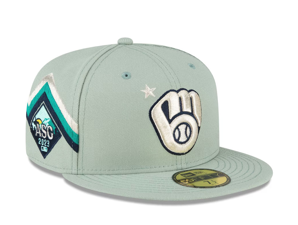
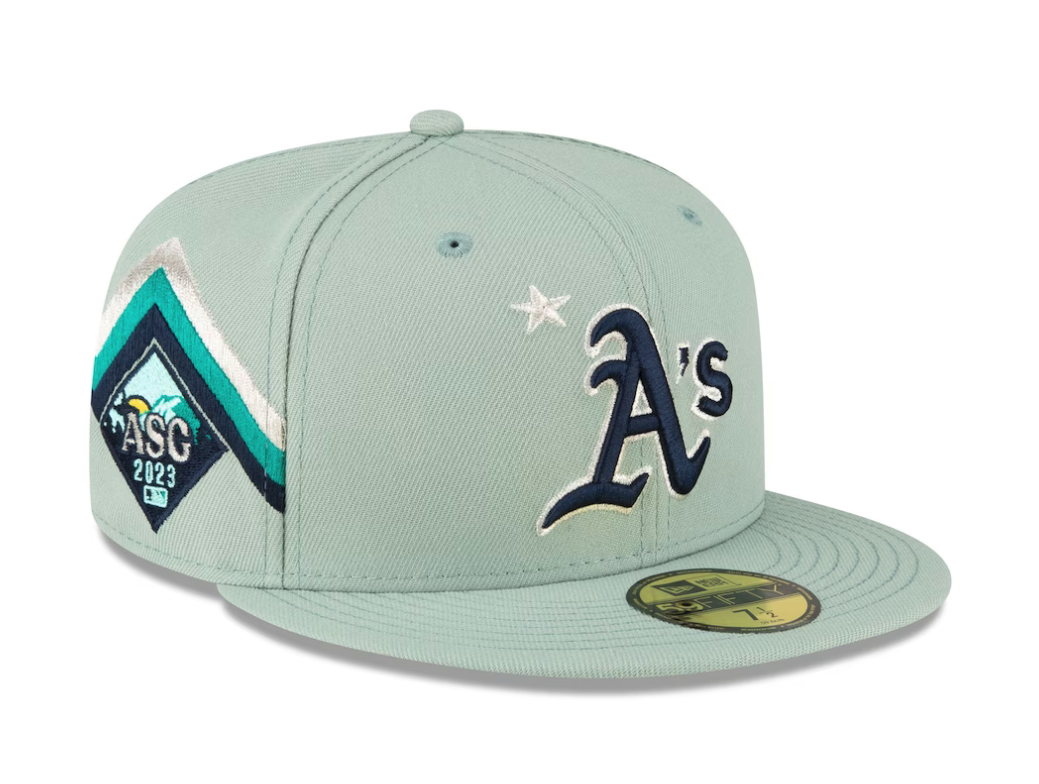
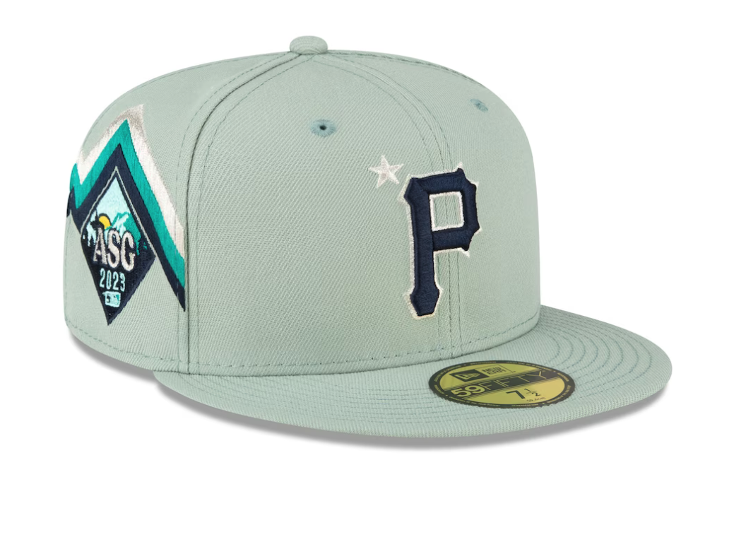
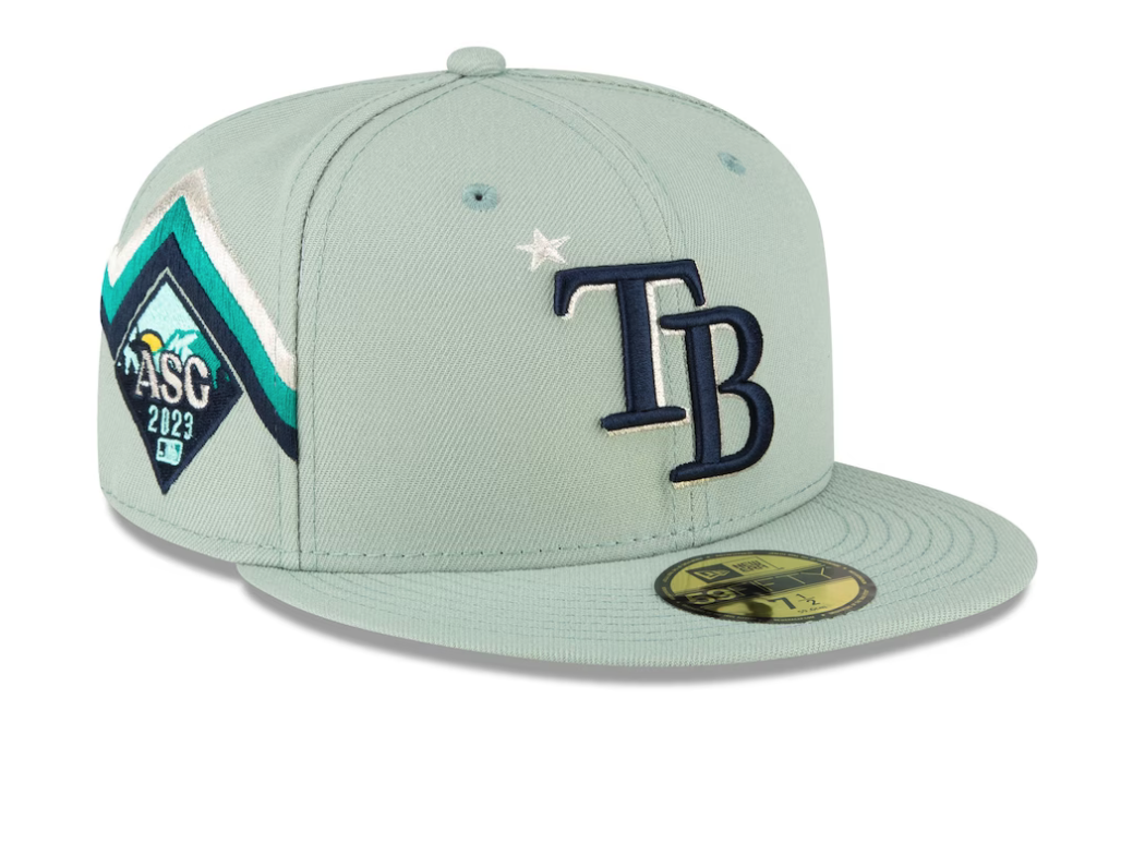
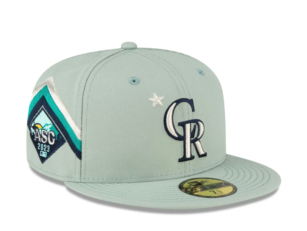
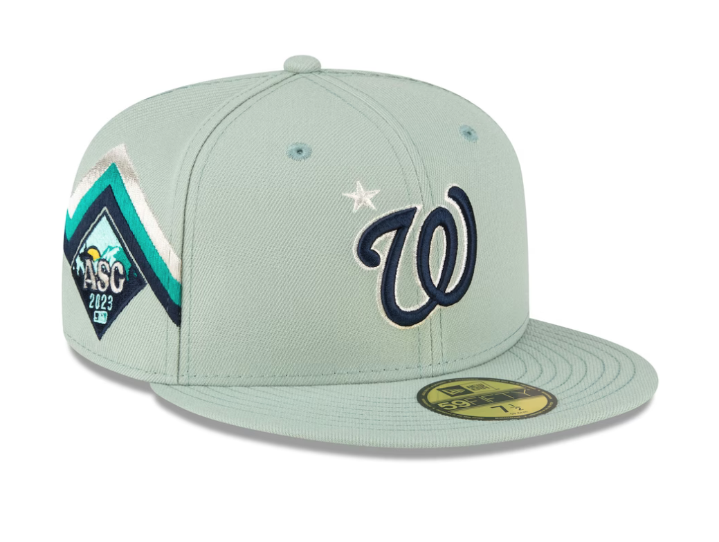
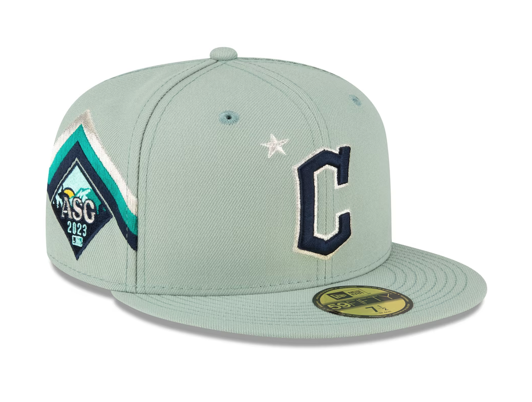
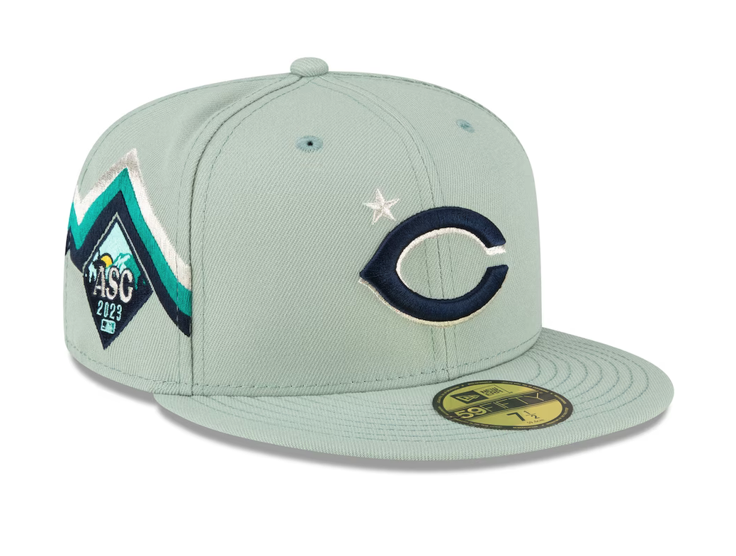
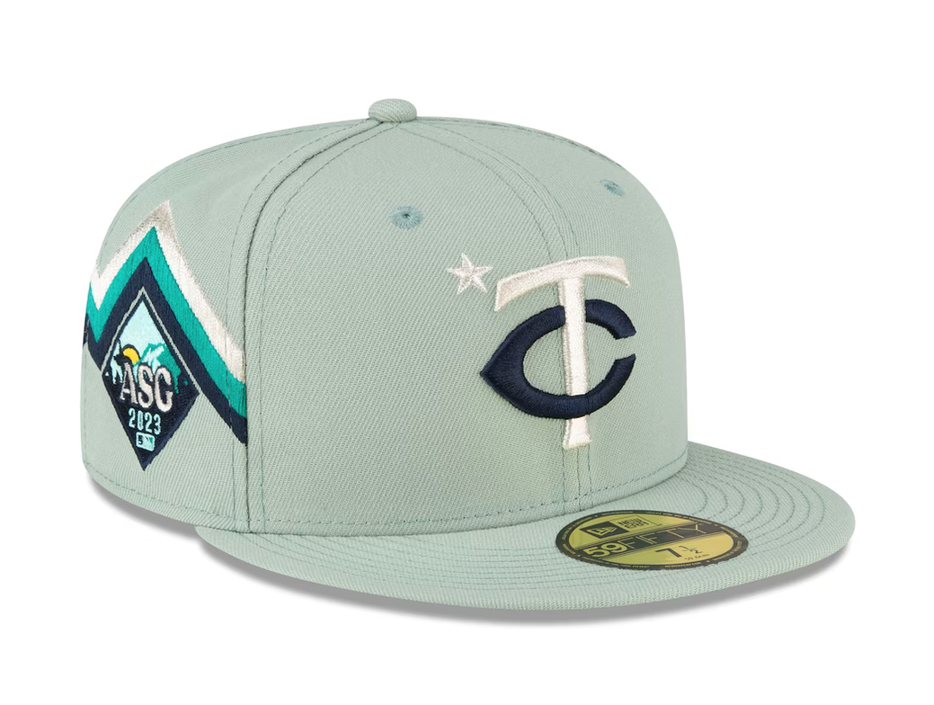
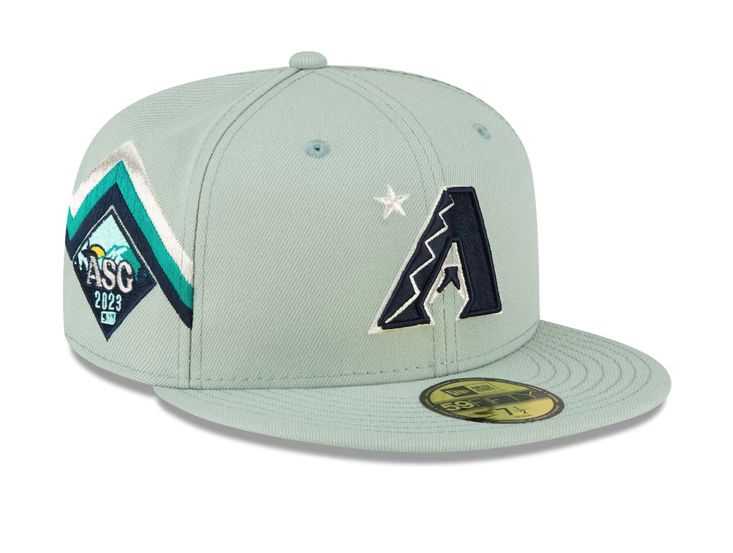
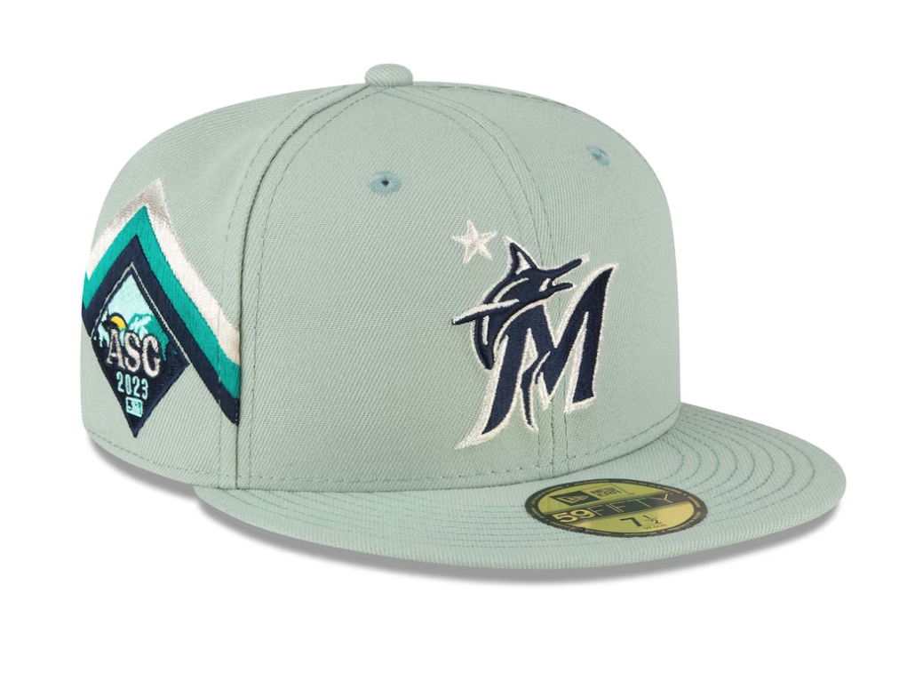
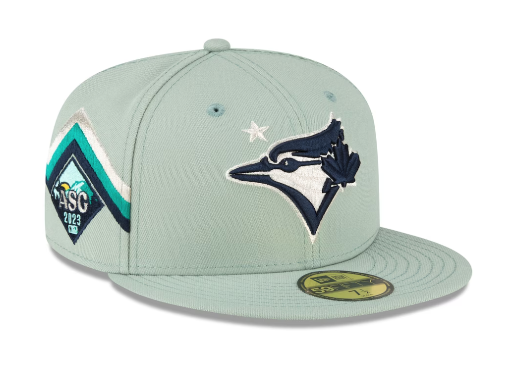
Major League Baseball has revealed the highly anticipated caps for this season's All-Star Game, and they are sure to turn heads. Confirming earlier leaks, the caps feature a captivating sea-foam green hue, creating a fresh and unique look. The team logos, showcased in a striking combination of dark navy and white, exude a classic elegance. Adding a touch of local pride, each cap also incorporates a side insignia in the colors of the Seattle Mariners, paying homage to the host city. These All-Star caps are set to make a bold statement on the field and become coveted pieces among fans.
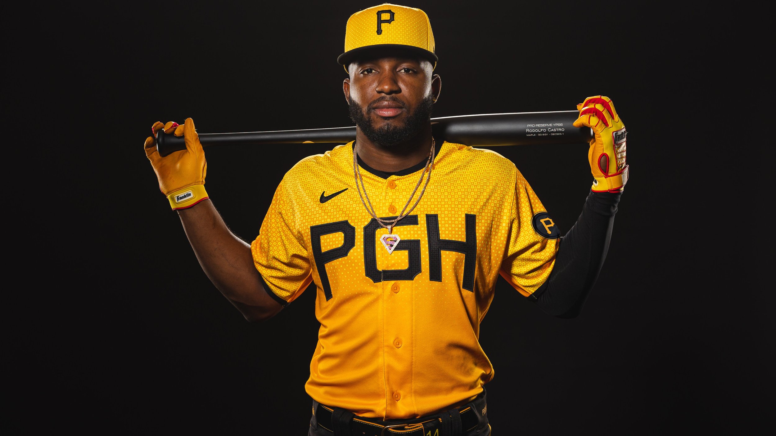
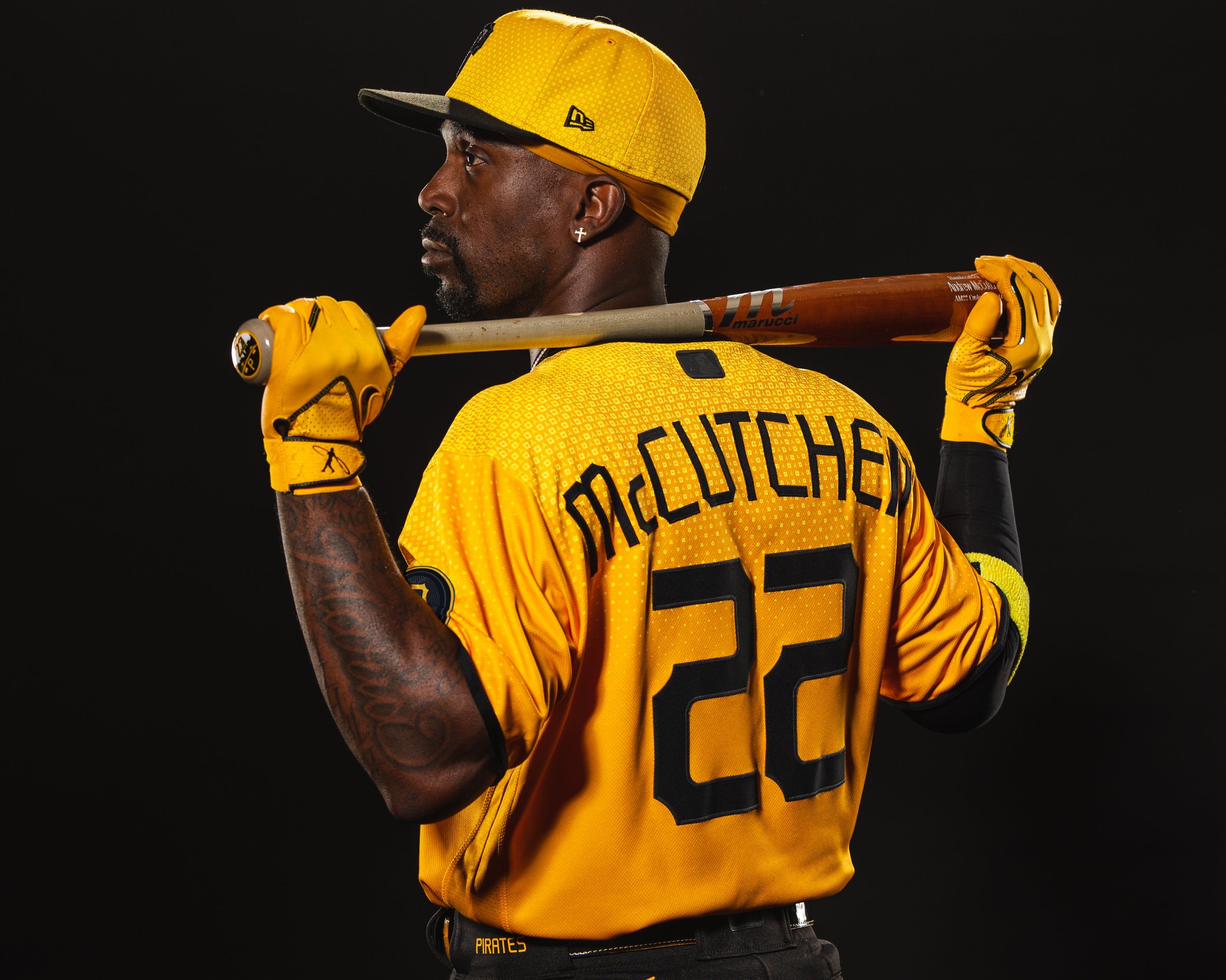
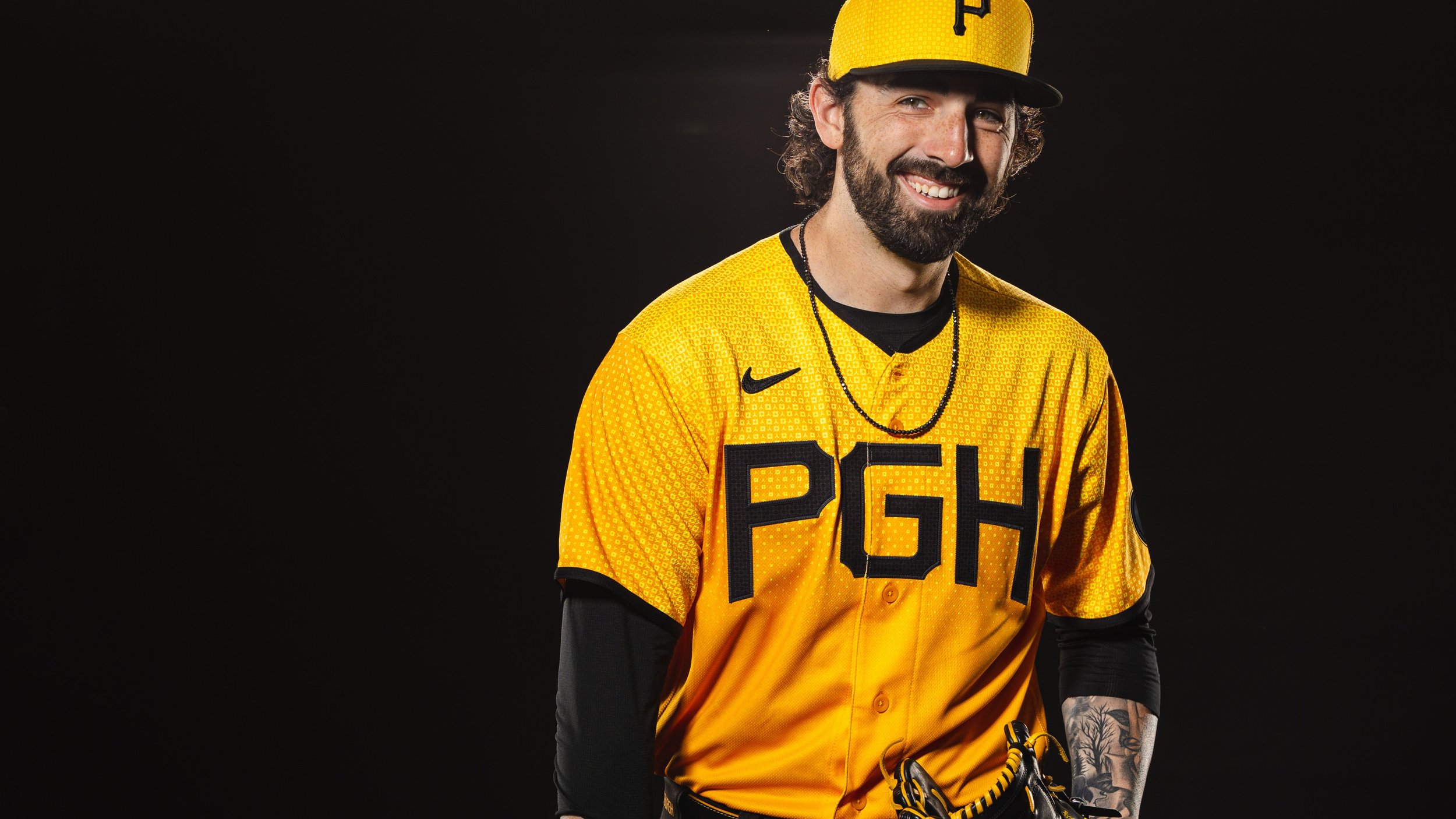
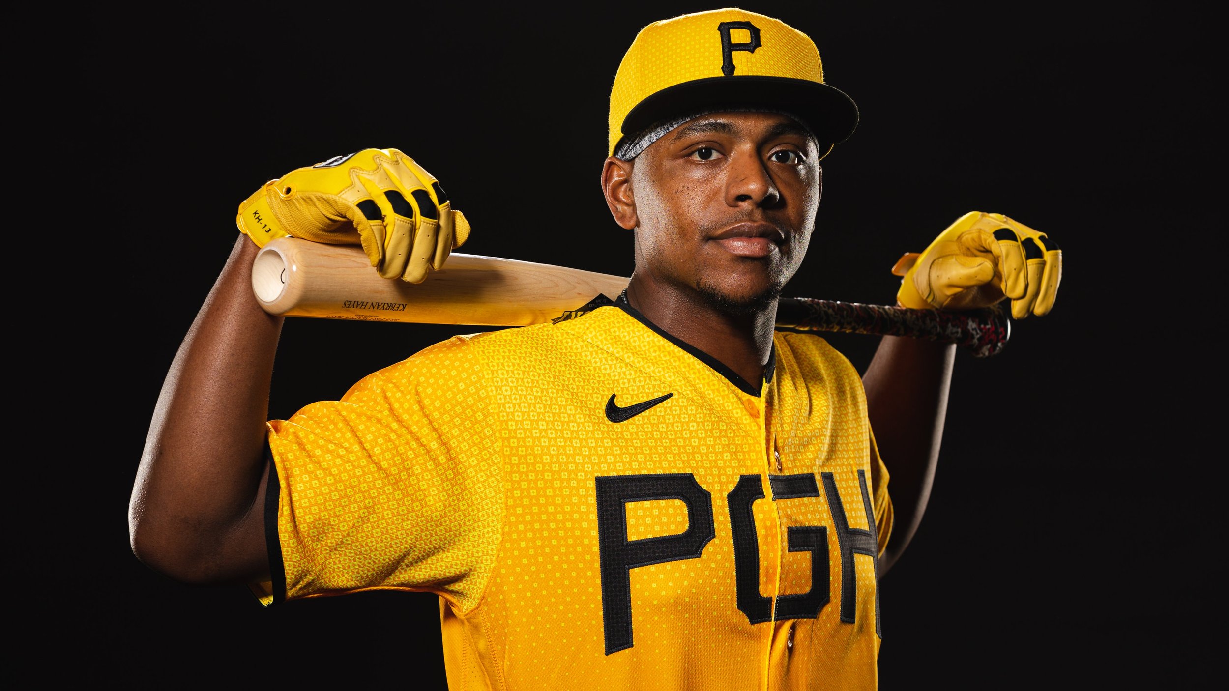
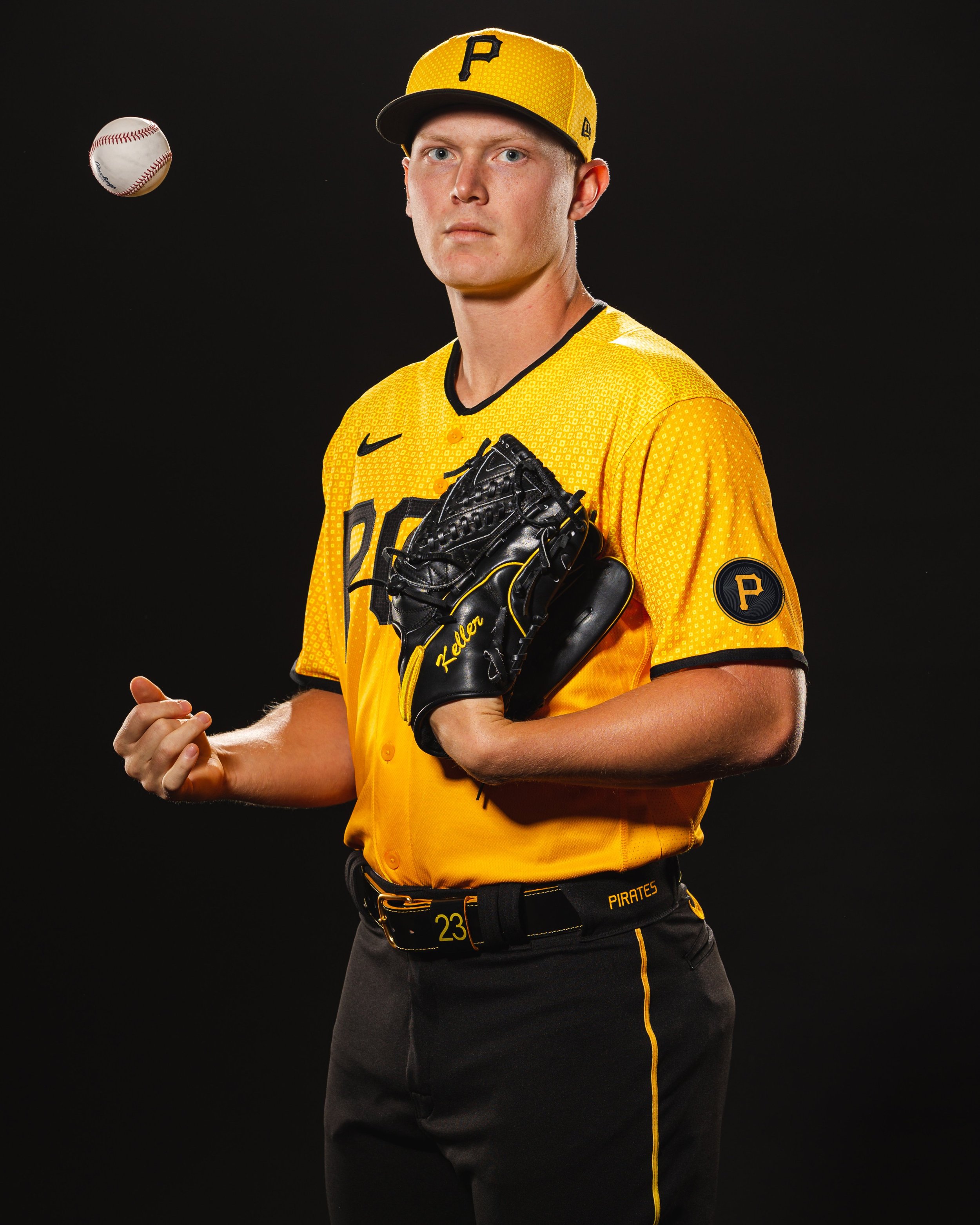
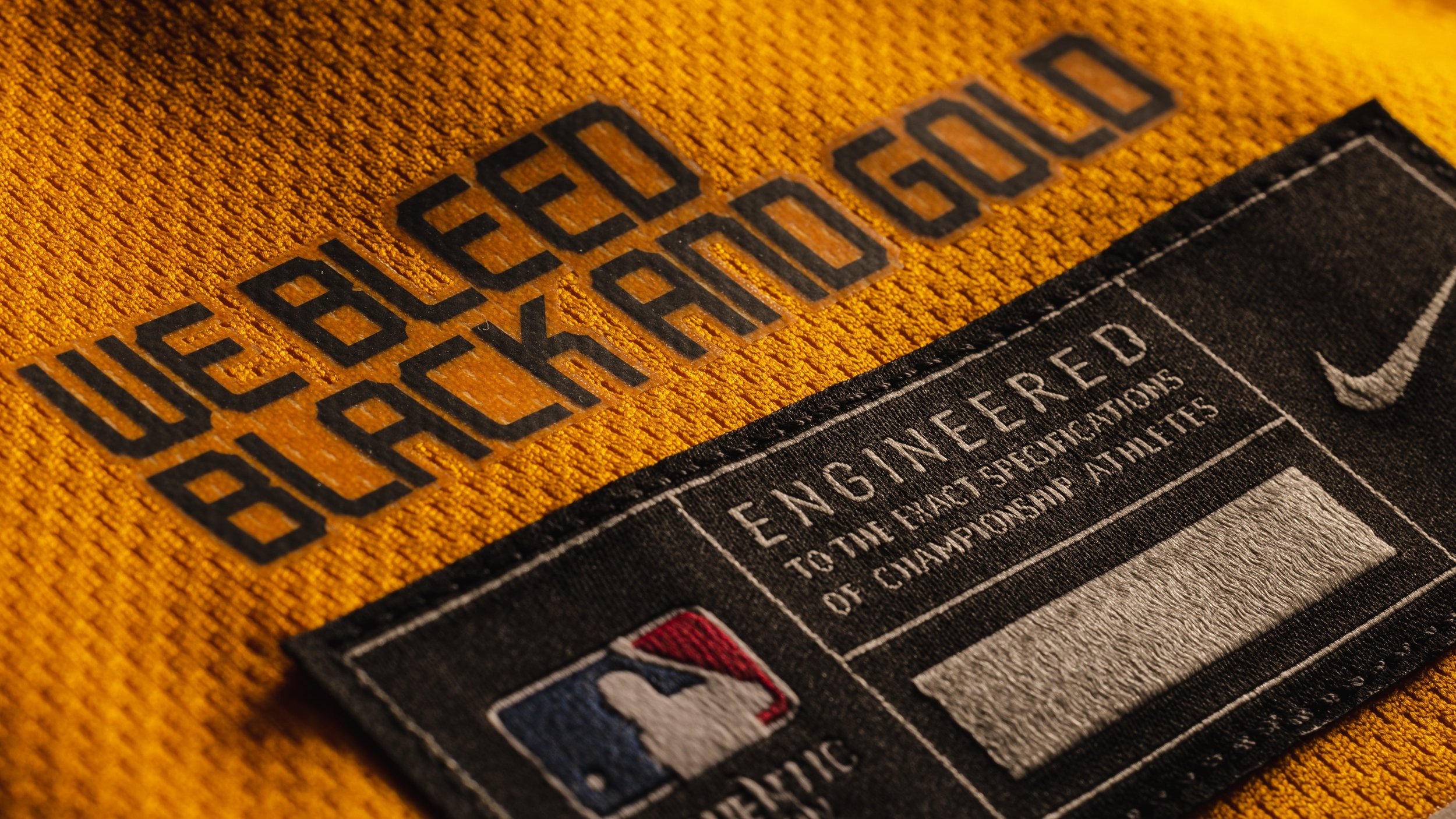
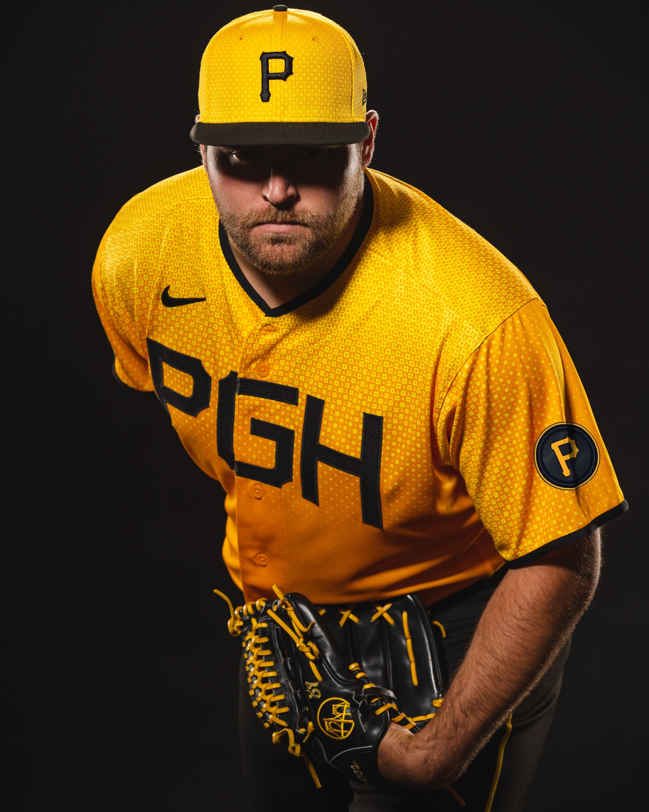
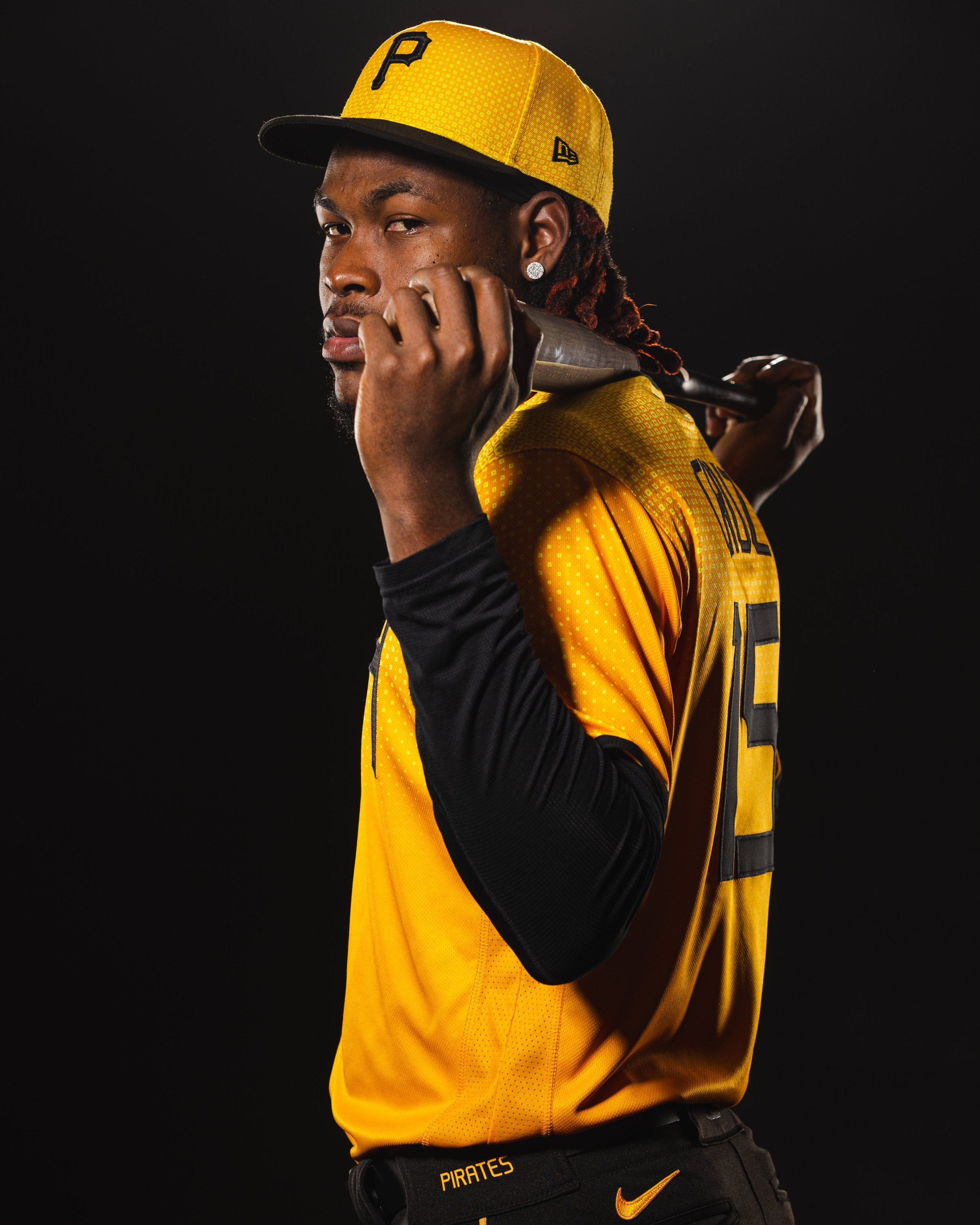
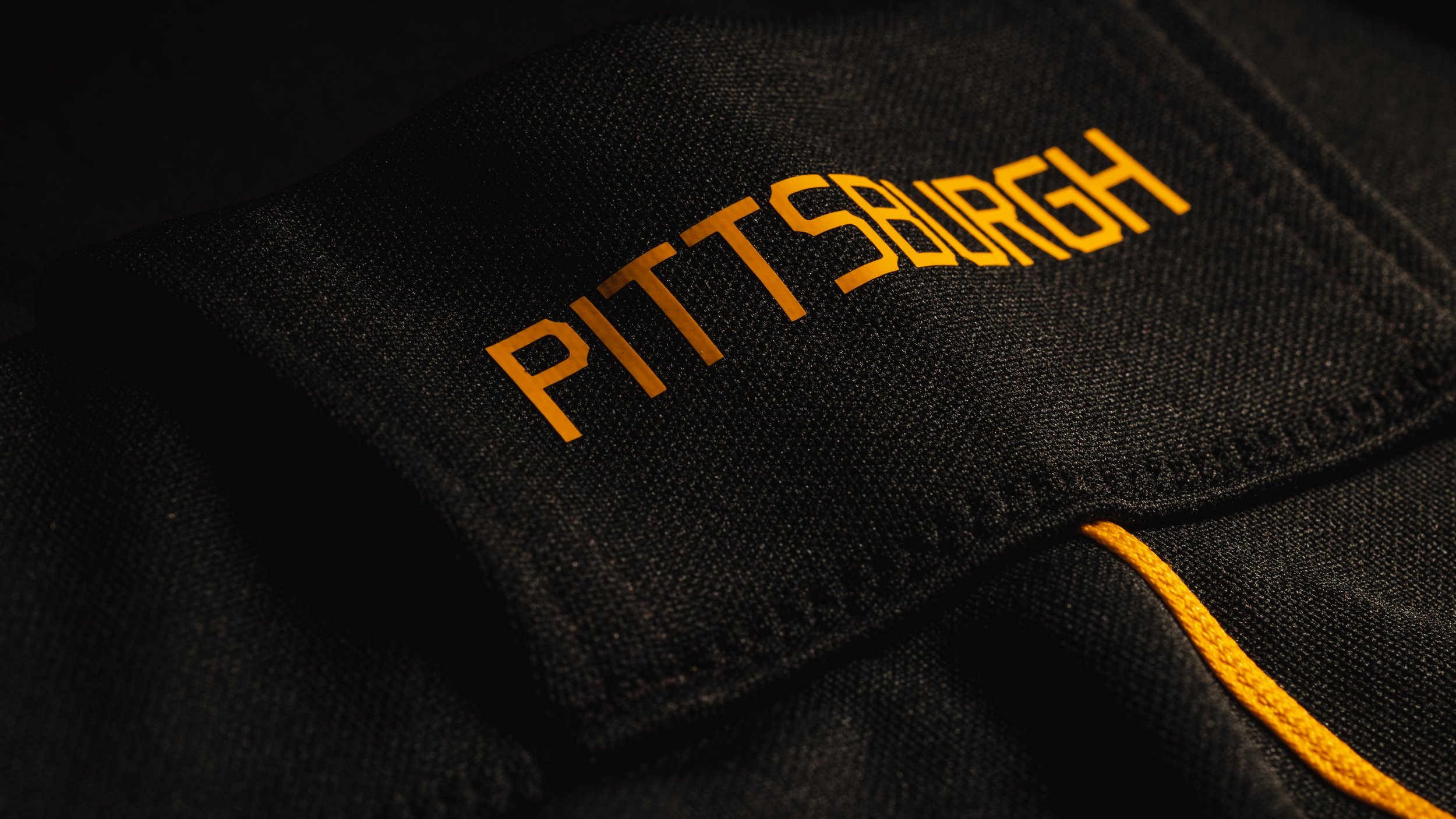
Deeply rooted in the love for their city, the Pittsburgh Pirates proudly unveil their City Connect jersey, a vibrant homage to the steel industry, iconic bridges, and unwavering loyalty to the city of Pittsburgh. This custom graphic print uniform embodies the essence of the city's heritage, while seamlessly blending innovation and contemporary design. Join us as we explore the intricate details of the City Connect jersey, a symbol of unity, resilience, and the enduring spirit of the Pirates.
The City Connect jersey pays tribute to Pittsburgh's storied steel industry. Incorporating a custom graphic print inspired by the city's flag, the three rivers, and the checkerboard pattern reminiscent of steel industry icons, the Pirates honor the legacy of innovation and progress that defined Pittsburgh for decades. This fusion of symbolism not only represents the team's pride but also showcases the city's enduring spirit.
A closer look at the City Connect jersey reveals intricate details inspired by the Roberto Clemente Bridge. The texture on each letter of the "PGH" logo echoes the steel grates found on the bridge's pillars, serving as a tangible reminder of the city's strength and unity. Additionally, the arching text adorning the jersey pays homage to Pittsburgh's iconic bridges, connecting the team to the city's proud heritage.
The City Connect jersey proudly showcases the iconic Pittsburgh "P" emblem on its sleeve—a symbol of the city's rich sports history and unwavering loyalty to its teams. This emblem serves as a rallying cry for Pittsburgh fans, representing the unbreakable bond between the community and the Pirates. The black and gold colors that permeate the uniform epitomize the collective pride and passion that flow through the veins of every Pittsburgh resident.
The circular pattern within the "PGH" on the front of the jersey pays tribute to the Roberto Clemente Bridge, a beloved symbol of Pittsburgh's unity and strength. This bridge, named after a true Pittsburgh legend, connects not only the physical aspects of the city but also its past and present. It symbolizes the vital connection between the Pirates, the community, and the enduring spirit of Pittsburgh.
As the Pittsburgh Pirates introduce their City Connect jersey, they honor the city's rich heritage, celebrate its innovation, and unite the community in unwavering loyalty.
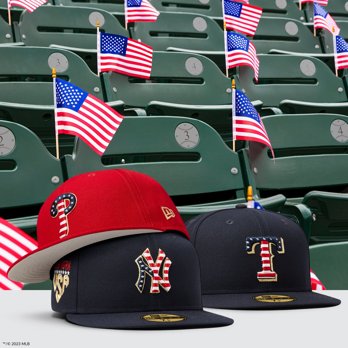
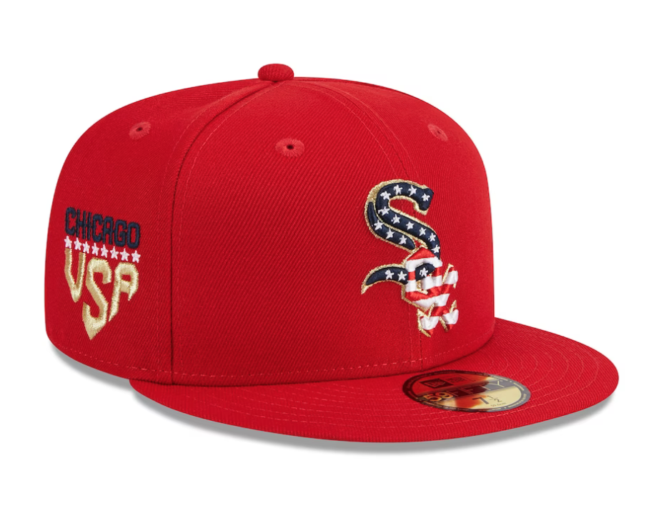
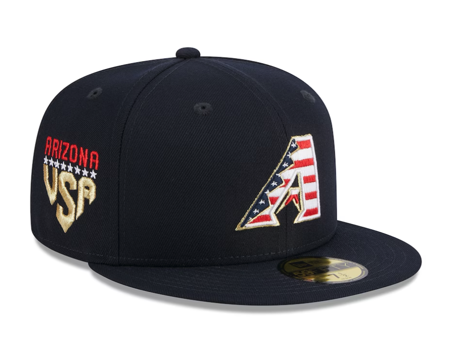
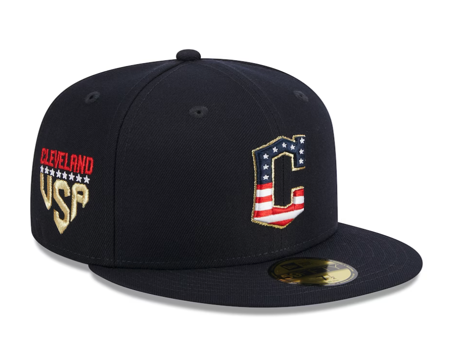
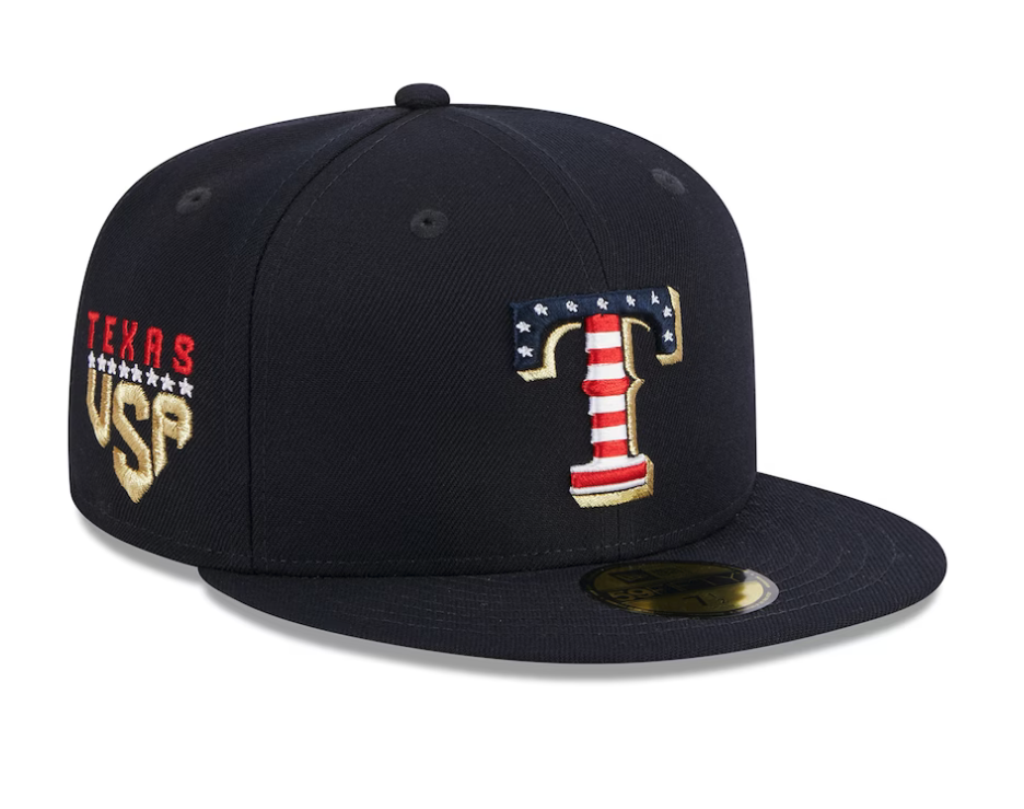
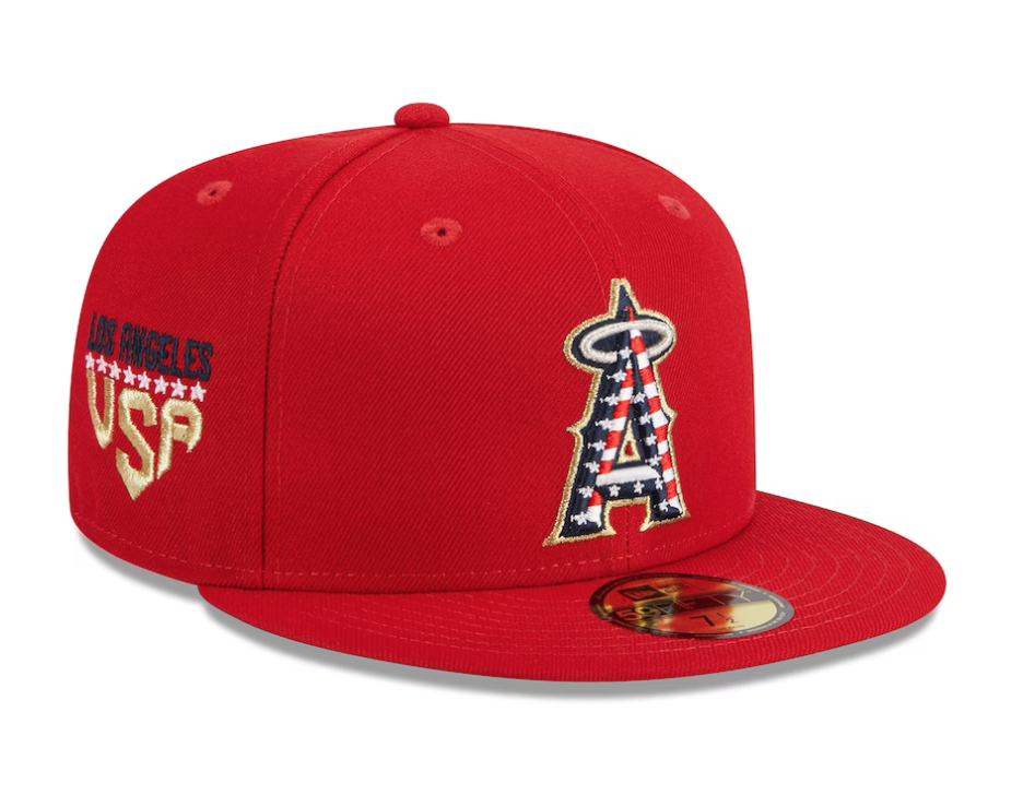
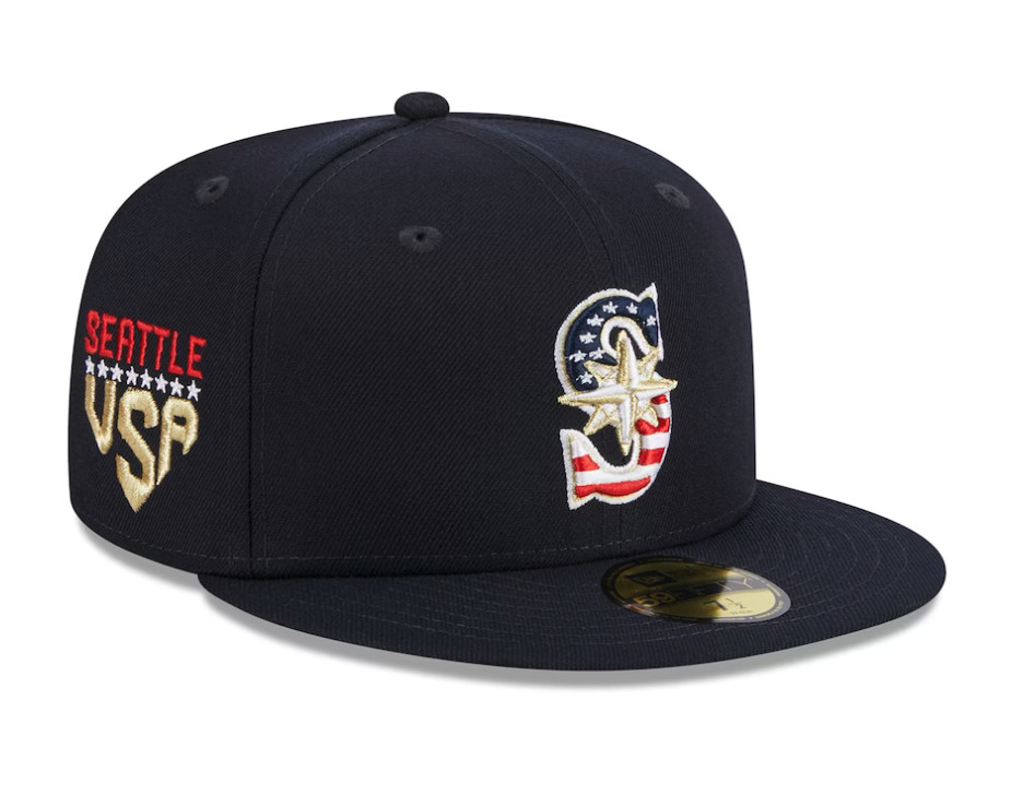
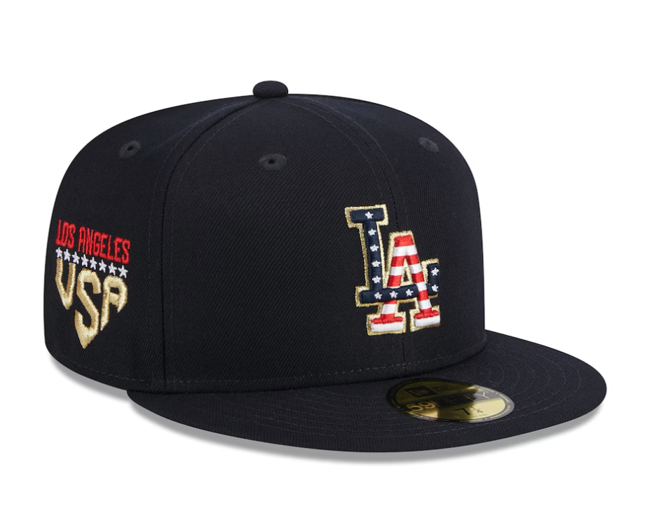
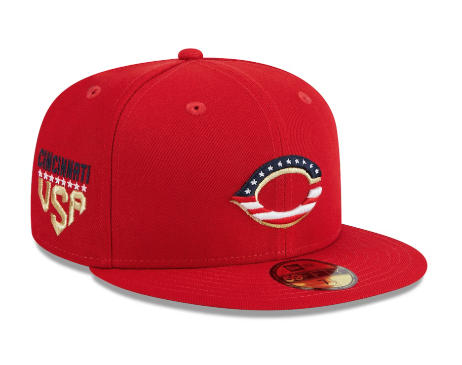
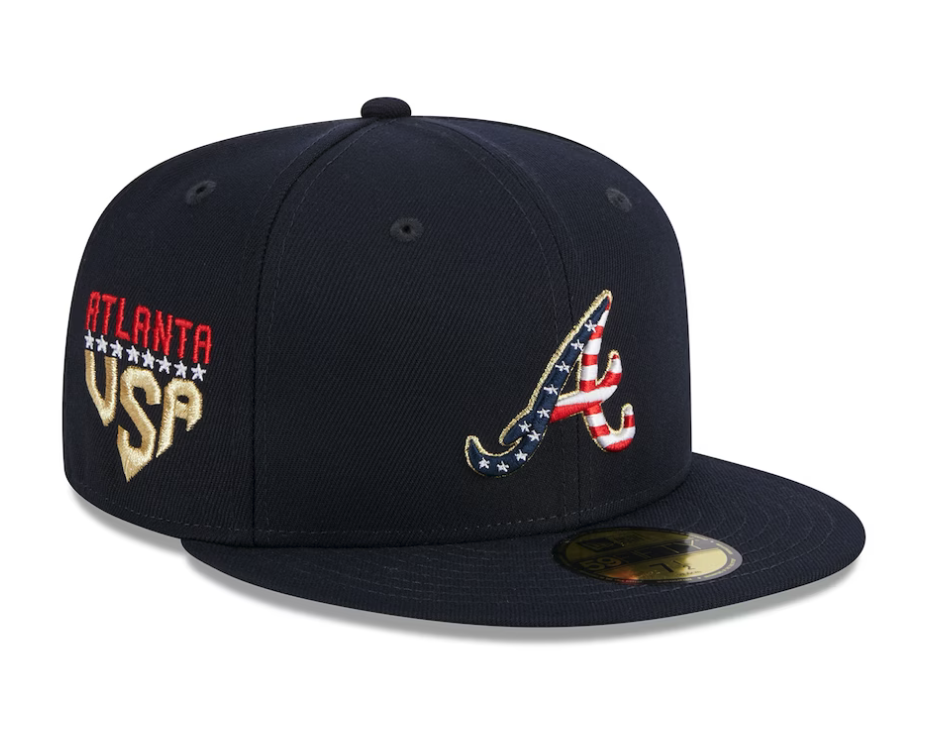
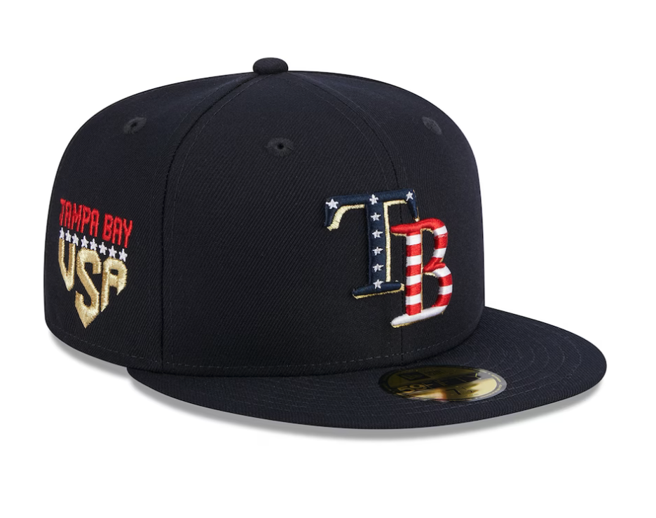
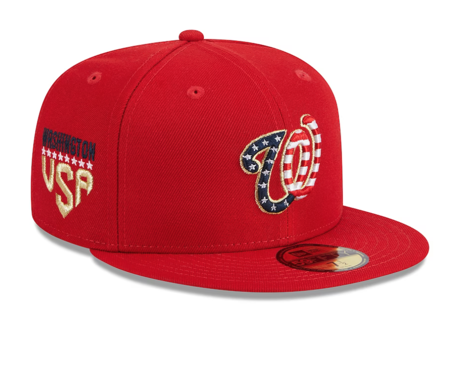
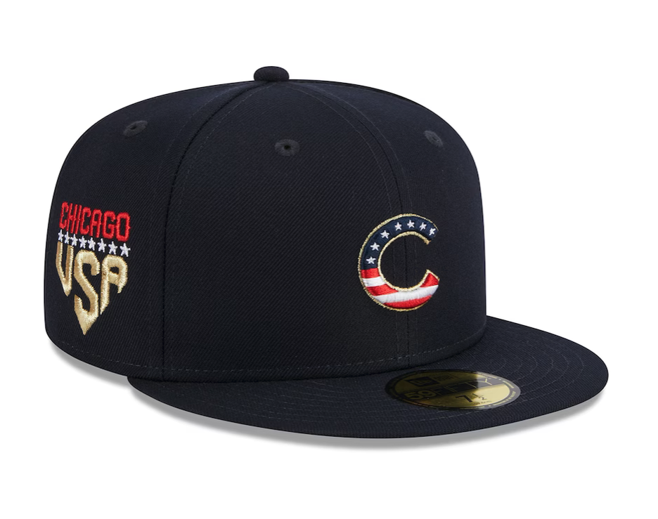
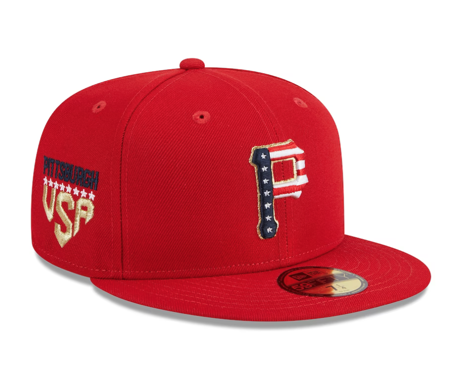
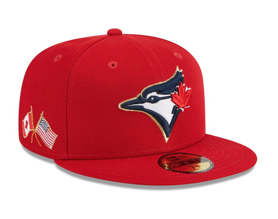
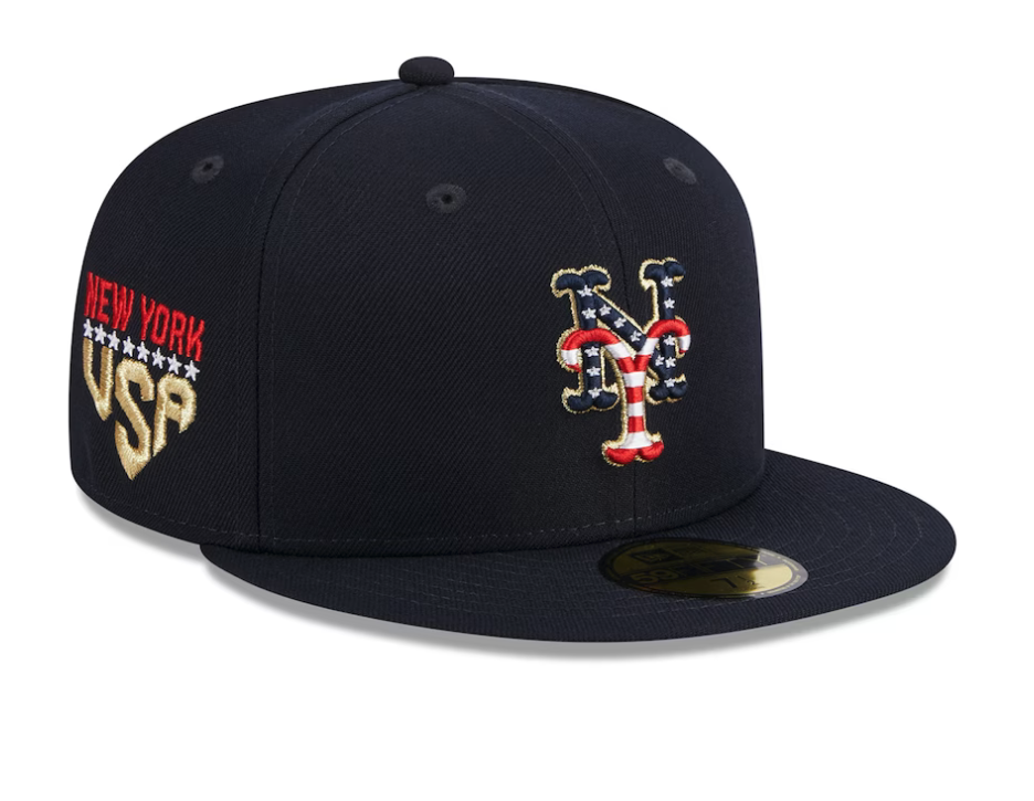
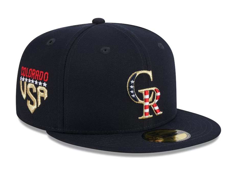
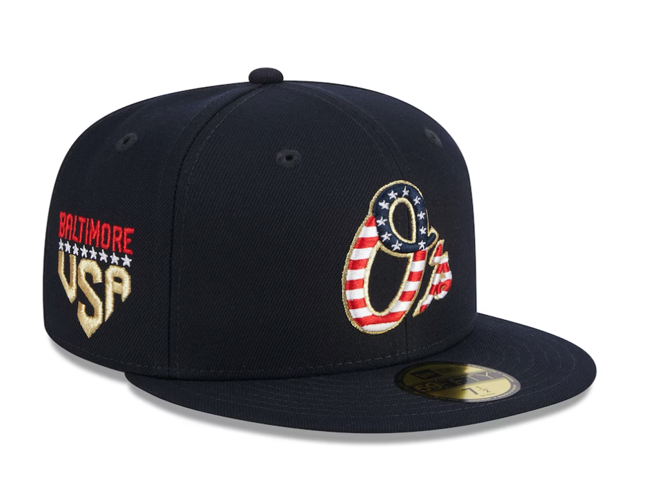
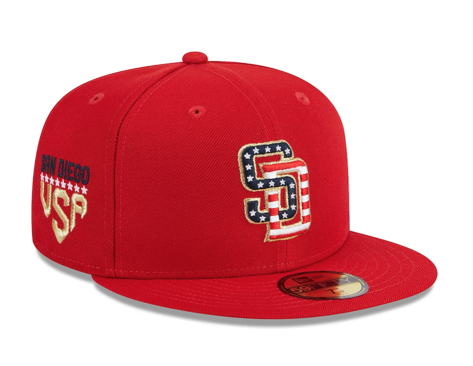
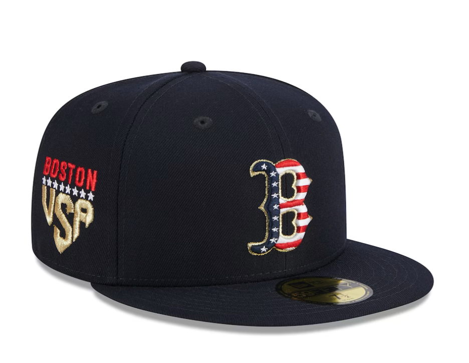
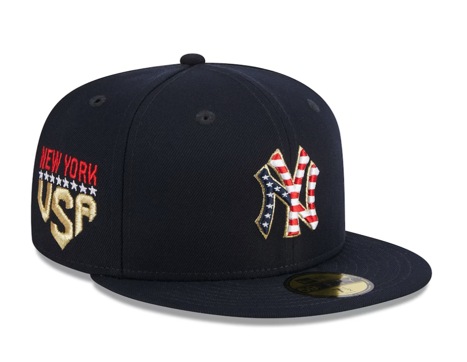
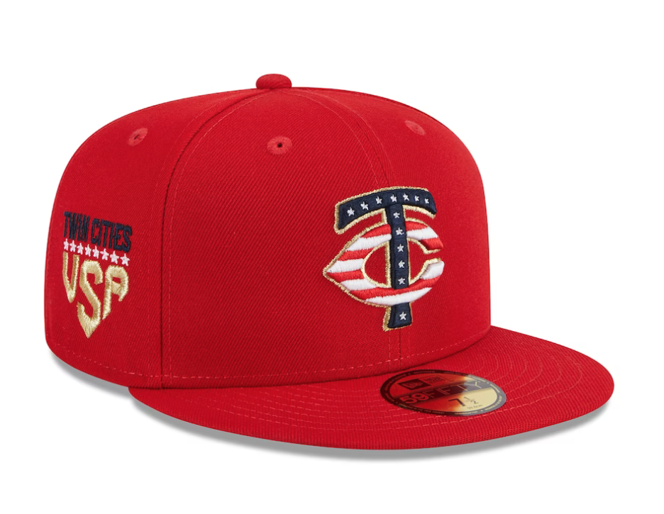
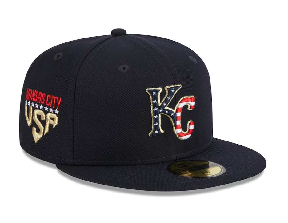
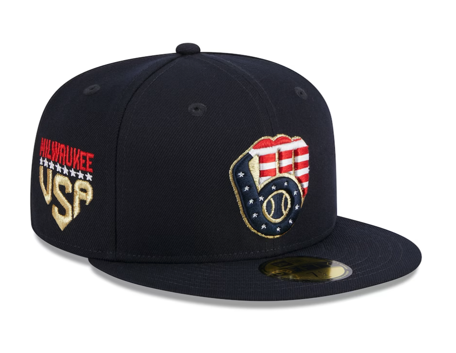
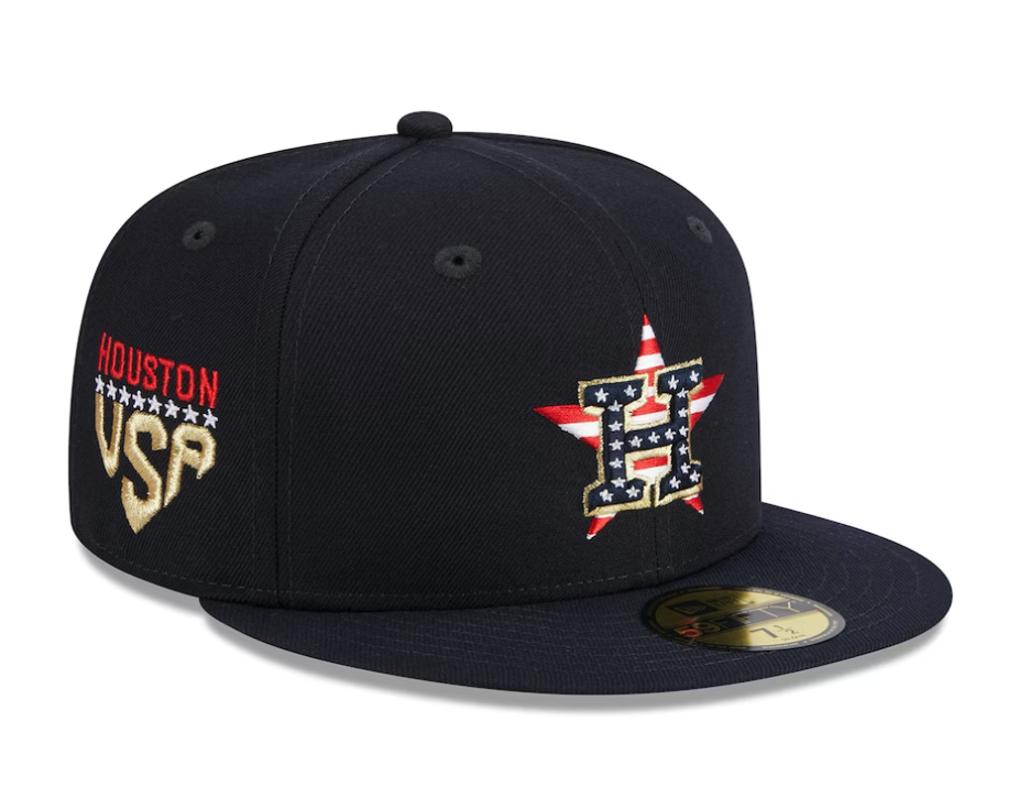
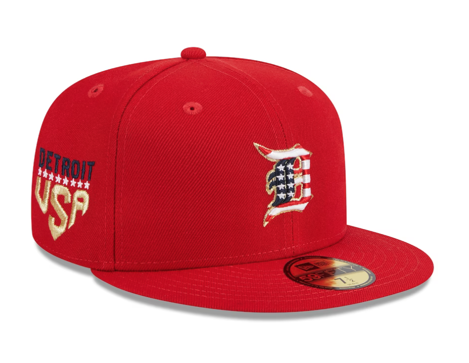
Get ready for the Fourth of July with the stylish Independence Day 2023 59FIFTY Fitted Cap of your favorite team. This cap features a stars and stripe themed team logo embroidered on the front panels and a matching MLB Batterman logo at the rear. The cap also includes the city name and USA wordmark on the right-wear side, along with a gray undervisor.
— Rawlings Baseball (@RawlingsSports) June 9, 2023
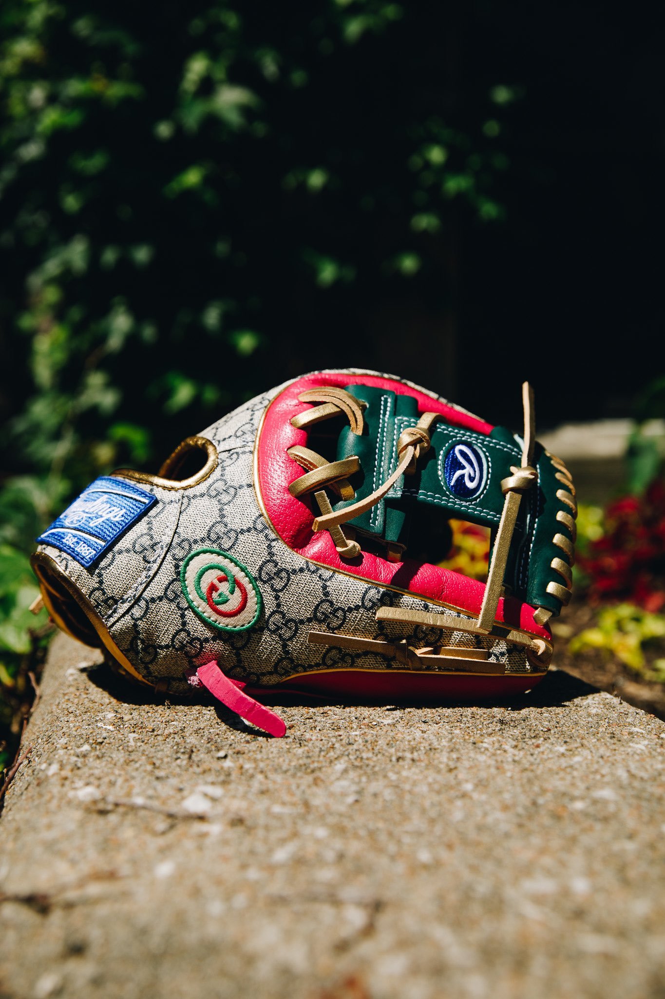
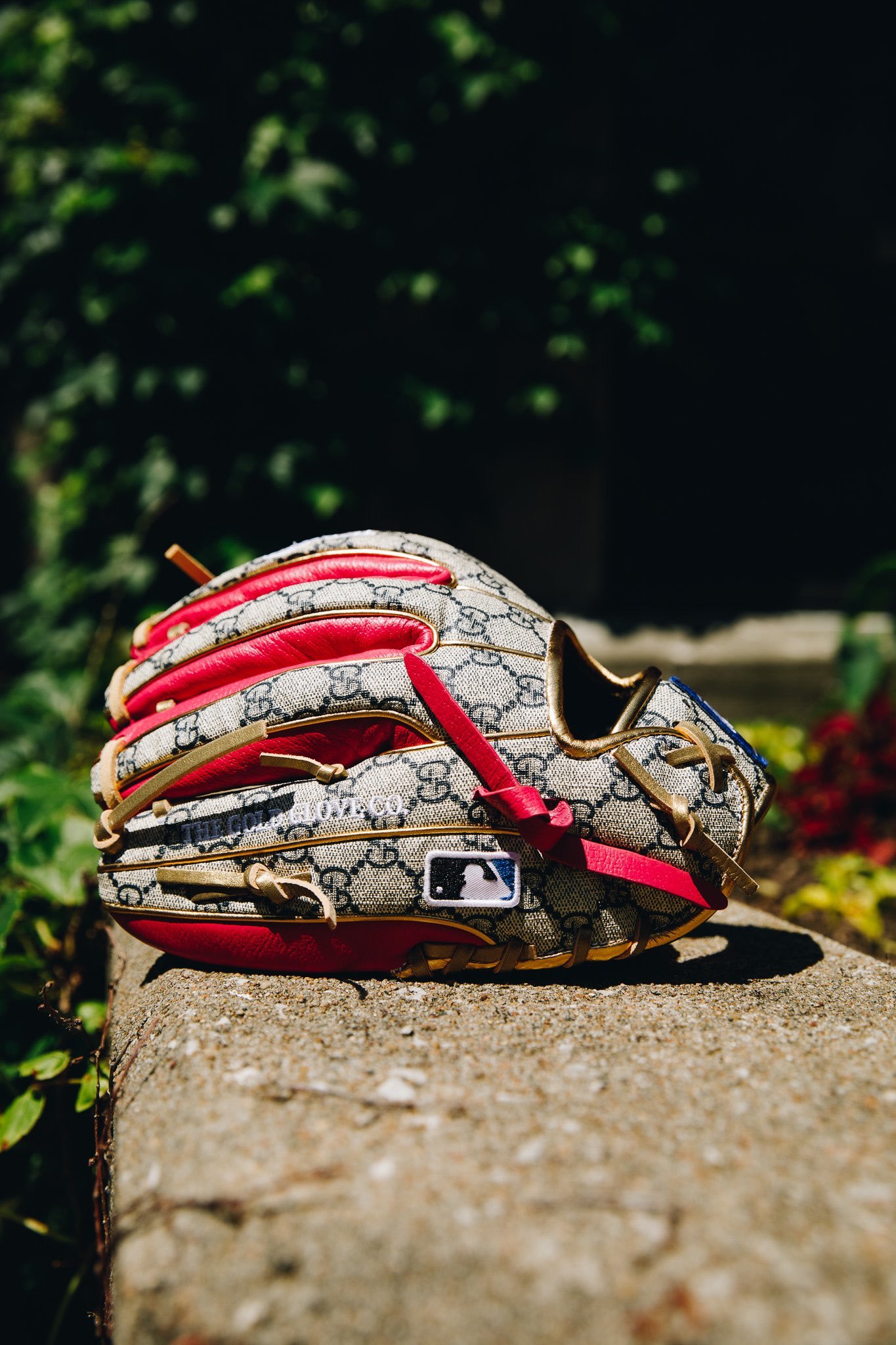
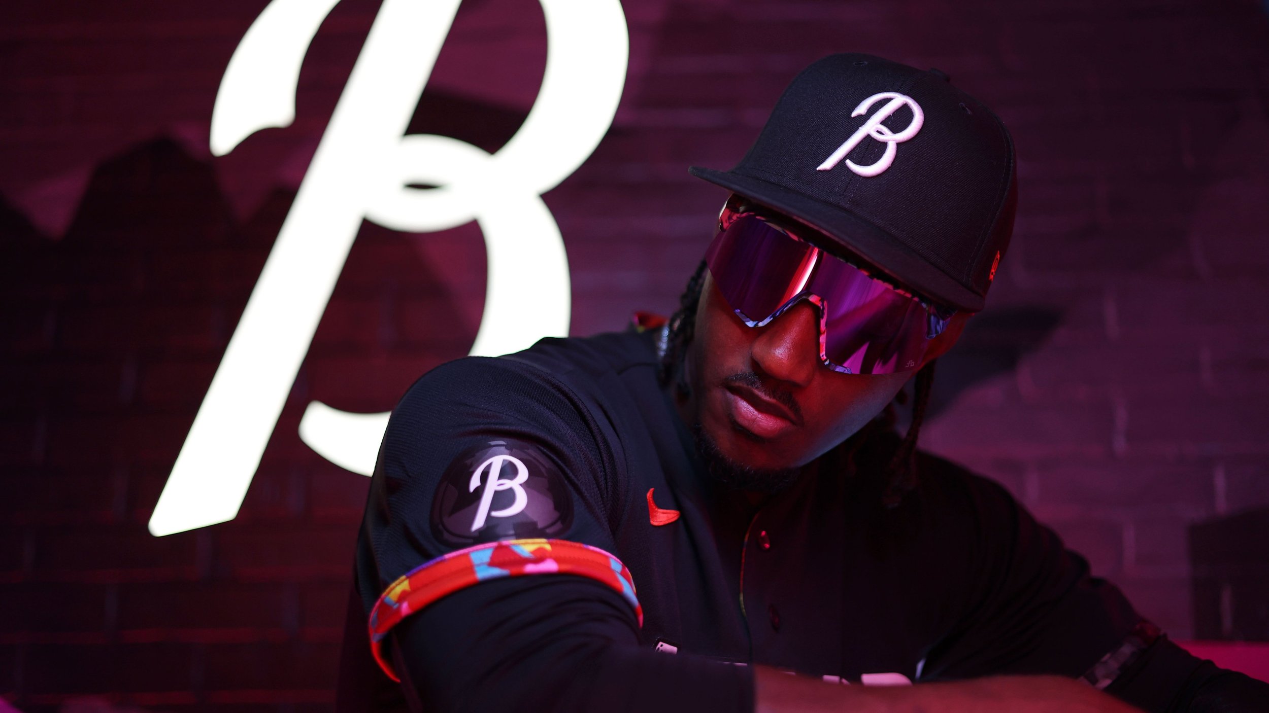
In the realm of sports, few athletes can seamlessly blend style and substance like Francisco Lindor. Renowned for his fashion-forward approach, Lindor recently unveiled a groundbreaking collaboration that transcends the boundaries of traditional sports gear. a one-of-a-kind baseball glove, a collaboration of Rawlings craftsmanship and Gucci's iconic design sensibilities.
Lindor, known for his involvement in designing his Rawlings gloves and his own New Balance shoe line, was taken aback by the Gucci collaboration. With no input in the glove's look or style, he found himself the fortunate recipient of a remarkable masterpiece. "I never thought I would own a Gucci glove," Lindor confessed, chuckling. "It was completely out of my realm of imagination. But now, anything seems possible."
The Gucci x Rawlings collaboration represents a significant milestone in the convergence of fashion and Major League Baseball. Lindor understands the broader impact of such collaborations, recognizing their potential to captivate fans from diverse corners of the world. "I think it's really cool," he enthused. "It's a fun glove. And it's great for the game that brands like Gucci partner with MLB, attracting fans who may not be familiar with baseball but are drawn in by the allure of iconic brands."
Francisco Lindor's foray into the Gucci x Rawlings collaboration signals a paradigm shift where fashion and baseball converge like never before.
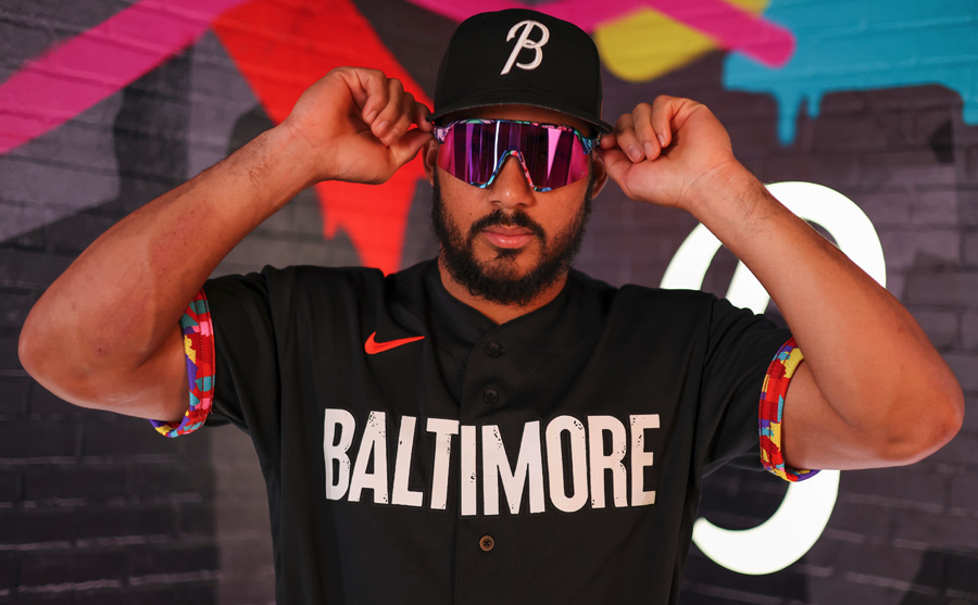
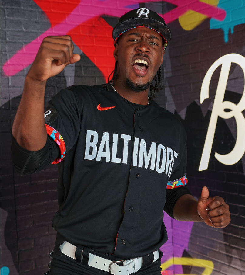
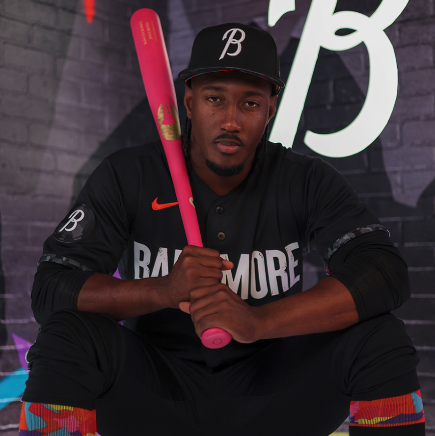
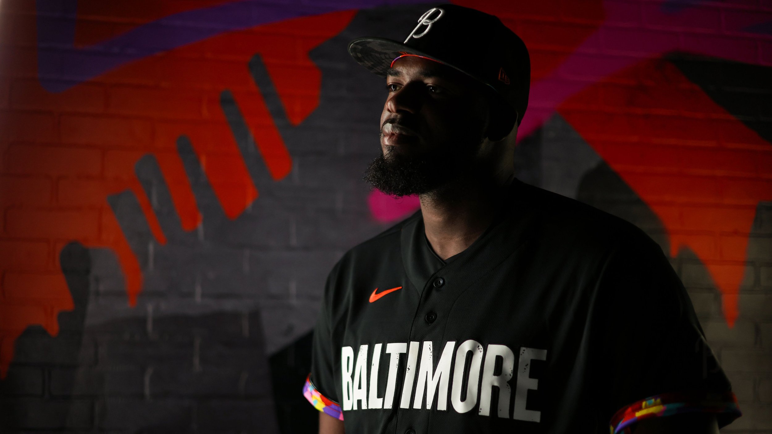
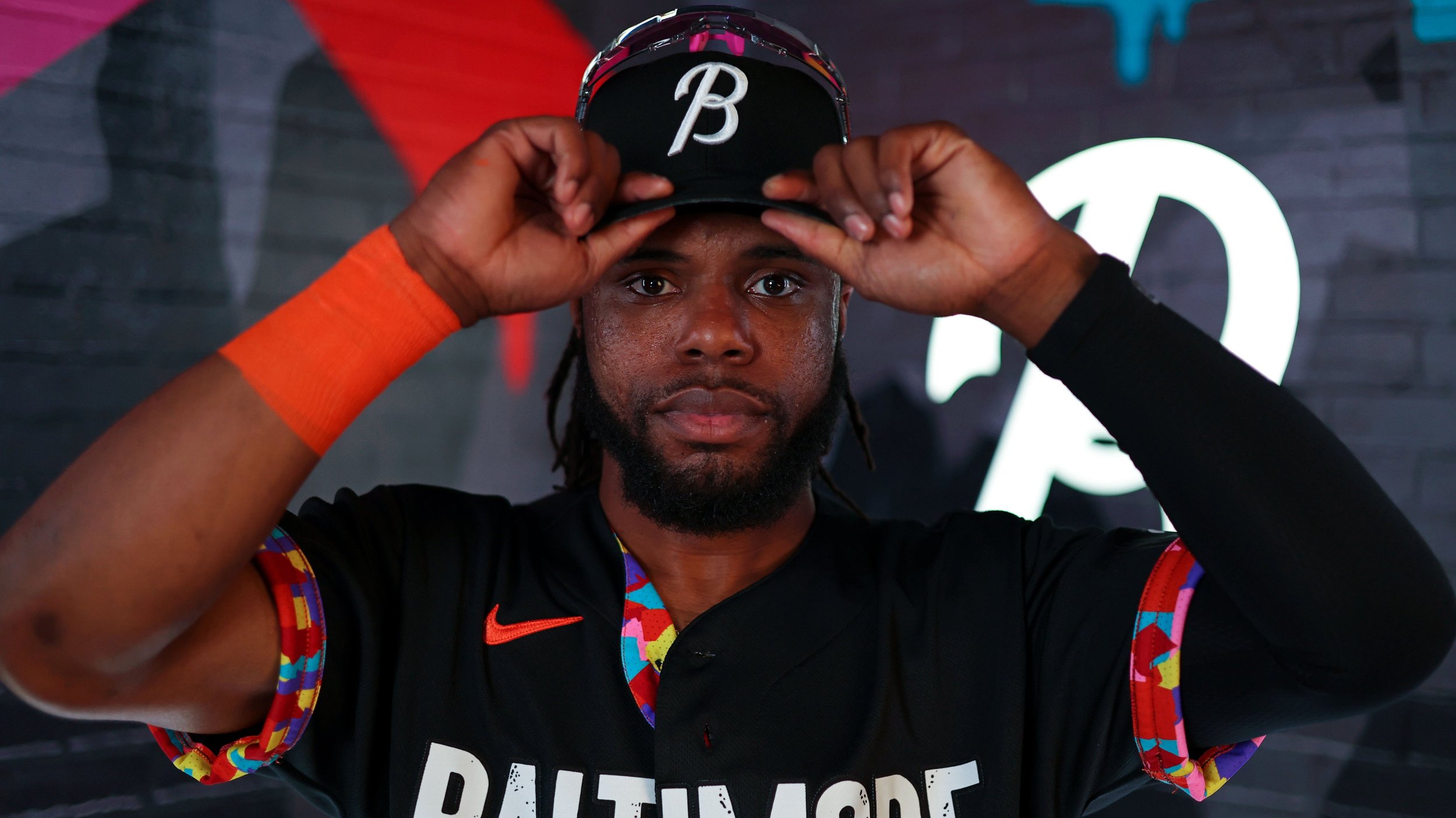
The Baltimore Orioles recently unveiled their highly anticipated City Connect uniforms, showcasing a bold and meaningful tribute to the diverse neighborhoods and rich stories that define the city. With a striking all-black aesthetic and unique design elements, the uniforms aim to honor Baltimore's cultural heritage and artistic spirit. The release marks a significant moment in Major League Baseball history, as the Orioles become the first team to incorporate an intricately designed interior into their jerseys, symbolizing the city's vibrant arts culture.
The City Connect uniform dons an all-black look, exuding a sense of elegance and strength. Emblazoned across the front in a block font reminiscent of the Globe Collection and Press at Maryland Institute College of Art, the word "Baltimore" serves as a powerful statement, representing the team's pride and commitment to their city.
the Orioles have incorporated a colored mosaic design inspired by Baltimore's arts culture into the interior of the jerseys. The captivating mosaic, symbolizing the city's vibrant tapestry, pays homage to the rich history of creativity and artistic expression that thrives within Baltimore's neighborhoods.
The sleeve piping and uniform socks also feature a black and white mosaic design, further embracing the essence of Baltimore's cultural diversity and artistic heritage. The visual tapestry beautifully weaves together various neighborhoods, celebrating the collective spirit and unity of the city.
Orioles outfielder Austin Hays expressed his excitement about donning the new uniform, noting the significance of wearing the city's name on the front. He spoke of the honor and privilege it is to represent Baltimore and its people through this unique tribute. Hays' sentiments echo the sentiments of the entire team, as they eagerly anticipate the opportunity to showcase their city's rich heritage on the field of Camden Yards.
The Baltimore Orioles' City Connect uniforms serve as a reminder that sports can be a platform for unity, celebration, and appreciation of the vibrant communities that shape our lives.
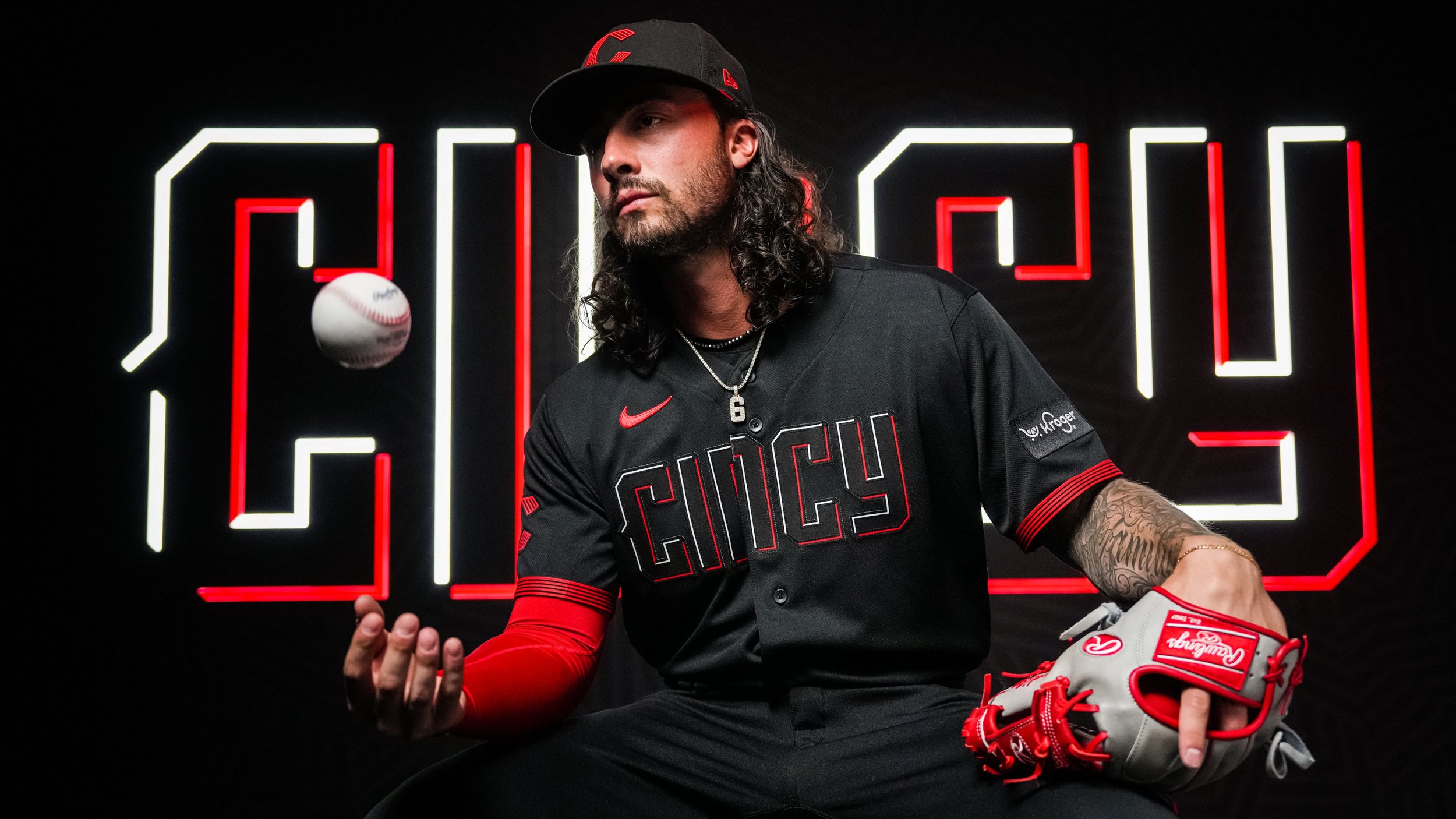
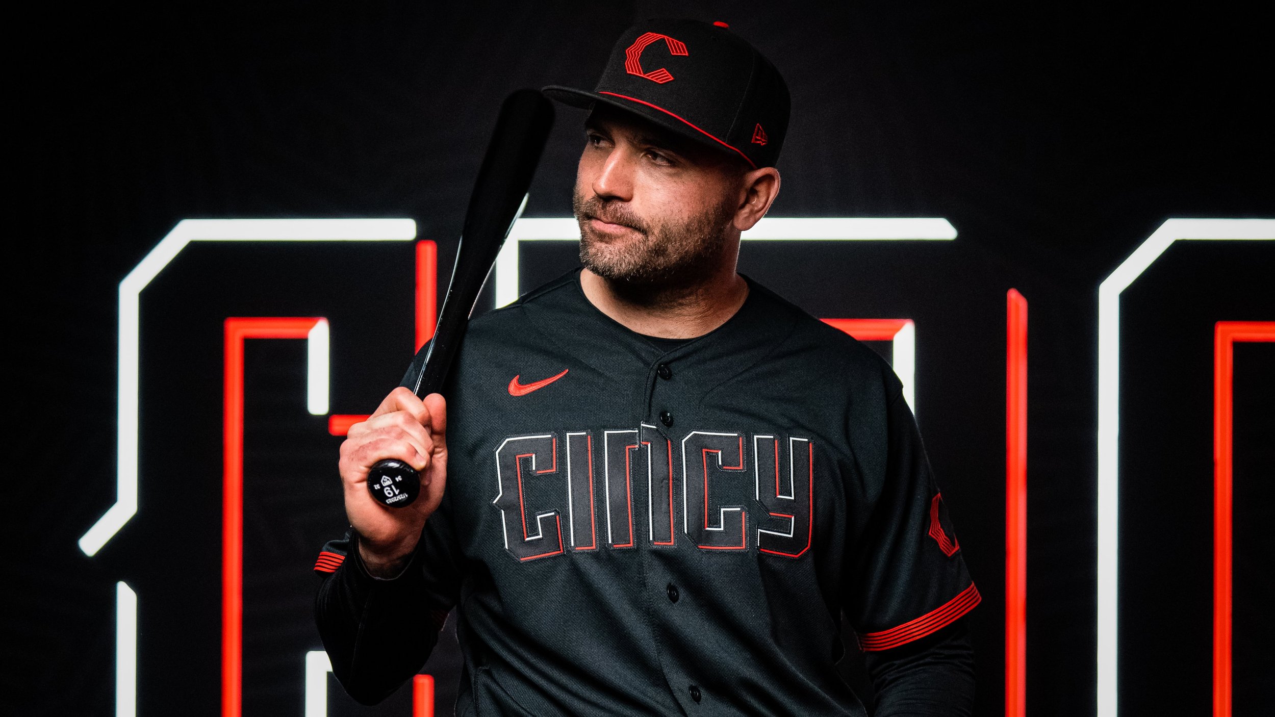
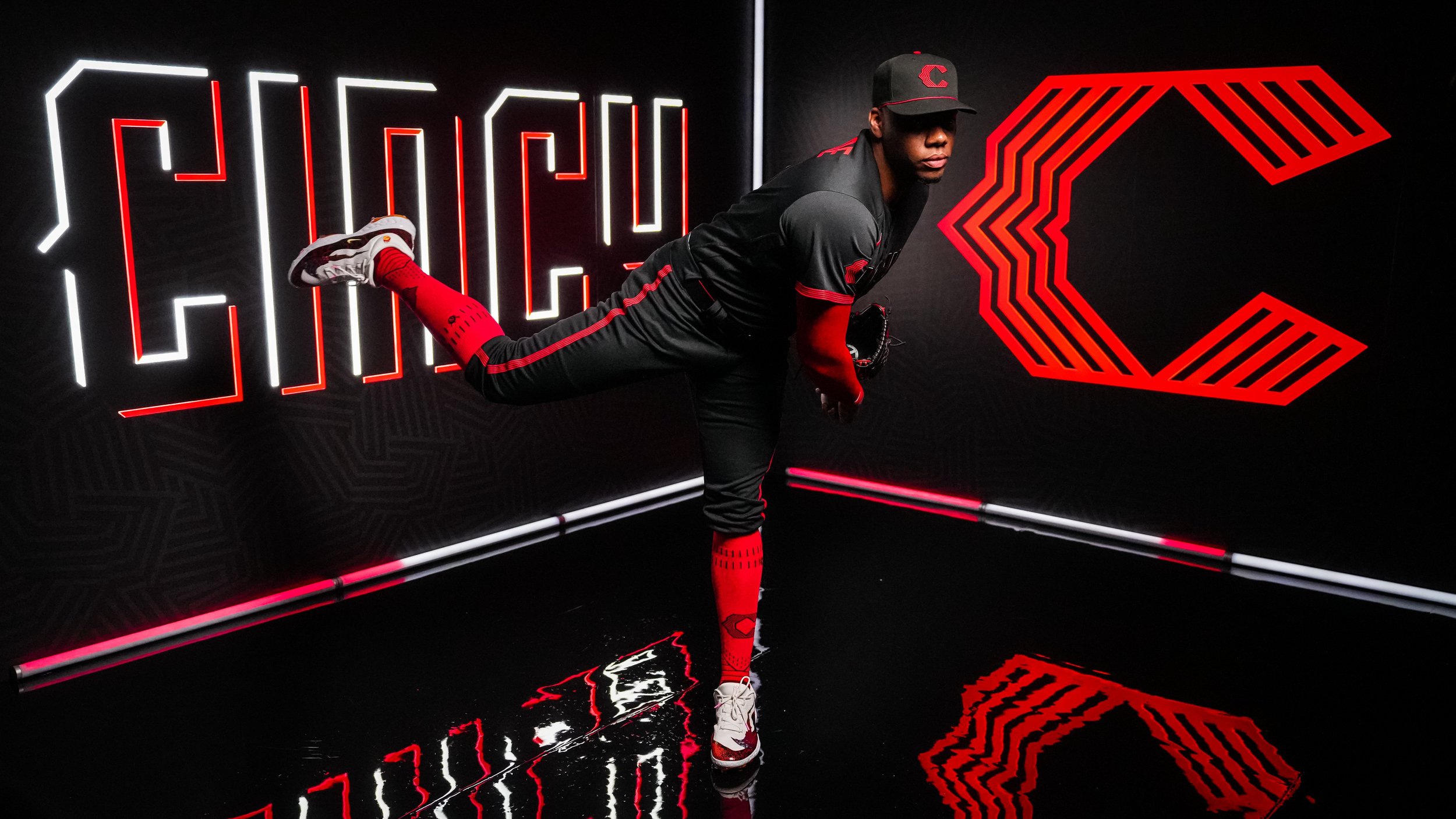
As the oldest professional franchise in baseball with a rich history spanning 154 years, the Cincinnati Reds have always celebrated their past. However, when it came to designing their City Connect uniforms in collaboration with Nike, the team decided to break away from tradition and embrace a futuristic aesthetic. The unveiling of the final design took place on Saturday, showcasing an all-black uniform with "Cincy" boldly emblazoned across the chest in a vibrant red and white font, giving it an infrared-style appearance. The purpose behind this bold departure from their previous uniforms was to appeal to a younger generation of fans.
The Reds' City Connect uniforms will make their debut during the series opener against the Yankees on Friday, and they will continue to be worn for all Friday home games throughout the remainder of the 2023 season. Ralph Mitchell, the club's vice president of communications and marketing, explained the inspiration behind the design choice: "We see Cincinnati as this vibrant, energetic city. It’s a cutting-edge city. We draw parallels from that to our current roster. We’re an energetic, young team. There’s a parallel path between the city and its evolution and the team and its evolution."
While the Reds have always cherished their history, they already took a nostalgic look back at their past uniform templates during their 150th anniversary season in 2019, where they sported multiple throwback uniforms. However, with the introduction of the MLB and Nike's City Connect program in 2021, the Reds aimed to create a forward-thinking look that would attract a new audience while still resonating with their existing fan base.
The Reds' City Connect uniform incorporates various key elements to create a cohesive and modern look. The black caps feature a contemporary 'C' logo in red, paying homage to the team's 1919-era caps from the Field of Dreams game in Iowa. The same logo also appears on the sleeve. The batting helmets mirror the caps' design with a sleek matte black finish.
The jersey lettering is designed to resemble illuminated neon lights, incorporating flashes of "infrared" red color. The pants feature five "wavelength lines" along the sides, symbolizing progress and lighting the way to the future. Nike explains that this contemporary piping represents moving forward and what lies ahead.
Inside the jersey's collar, the team proudly displays the city's Latin motto, "Juncta Juvant," which translates to "Strength in unity." Additionally, a modernized buckeye leaf, similar in style to the lettering and logos, represents the state of Ohio.
Forgus highlighted the vibrant red color used in the uniform, stating, "That color of red, if you look at it against our standard red, it’s much hotter. You needed it to come across as more luminescent."
Before the official unveiling, a select group of Reds players had the opportunity to preview their new uniforms during a top-secret photo shoot held at Goodyear Ballpark in Goodyear, Arizona, during Spring Training. Reds starting pitcher Hunter Greene expressed his excitement, stating, "The black and red is really cool. It will be cool to have black uniforms... The fact that they went all black is perfect."
By joining the City Connect program, the Reds become the 18th team to reveal their unique uniforms
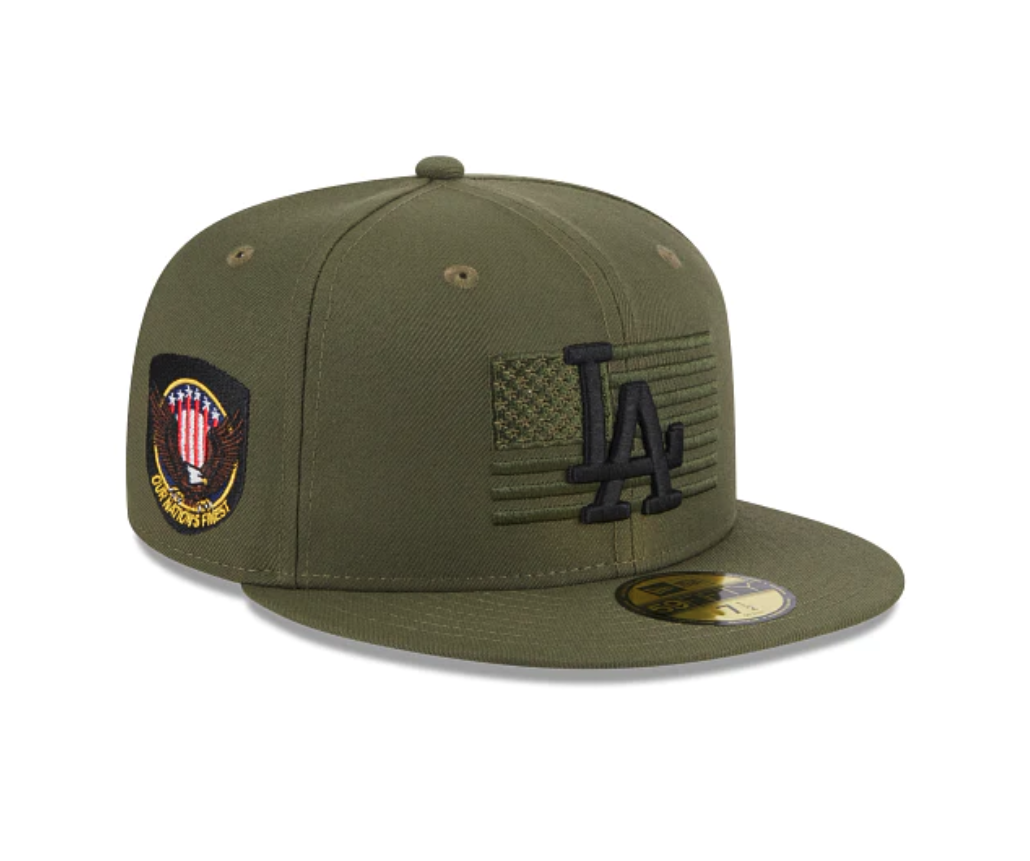
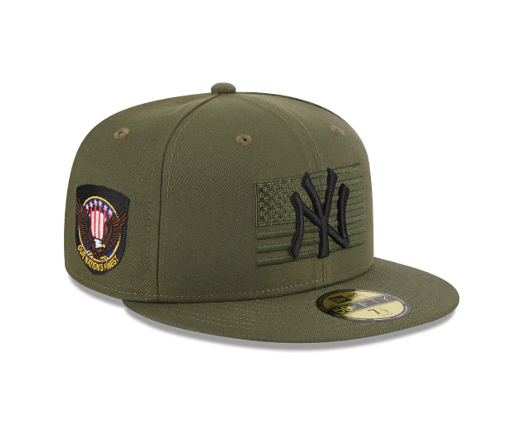
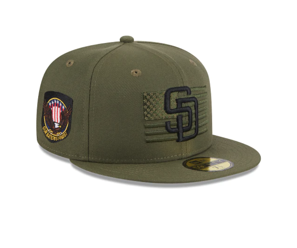
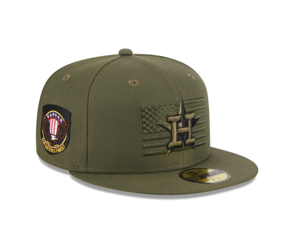
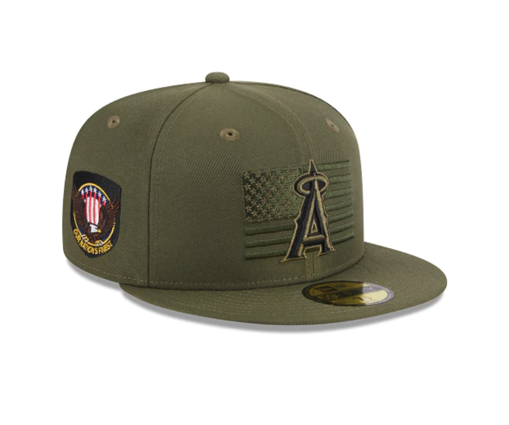
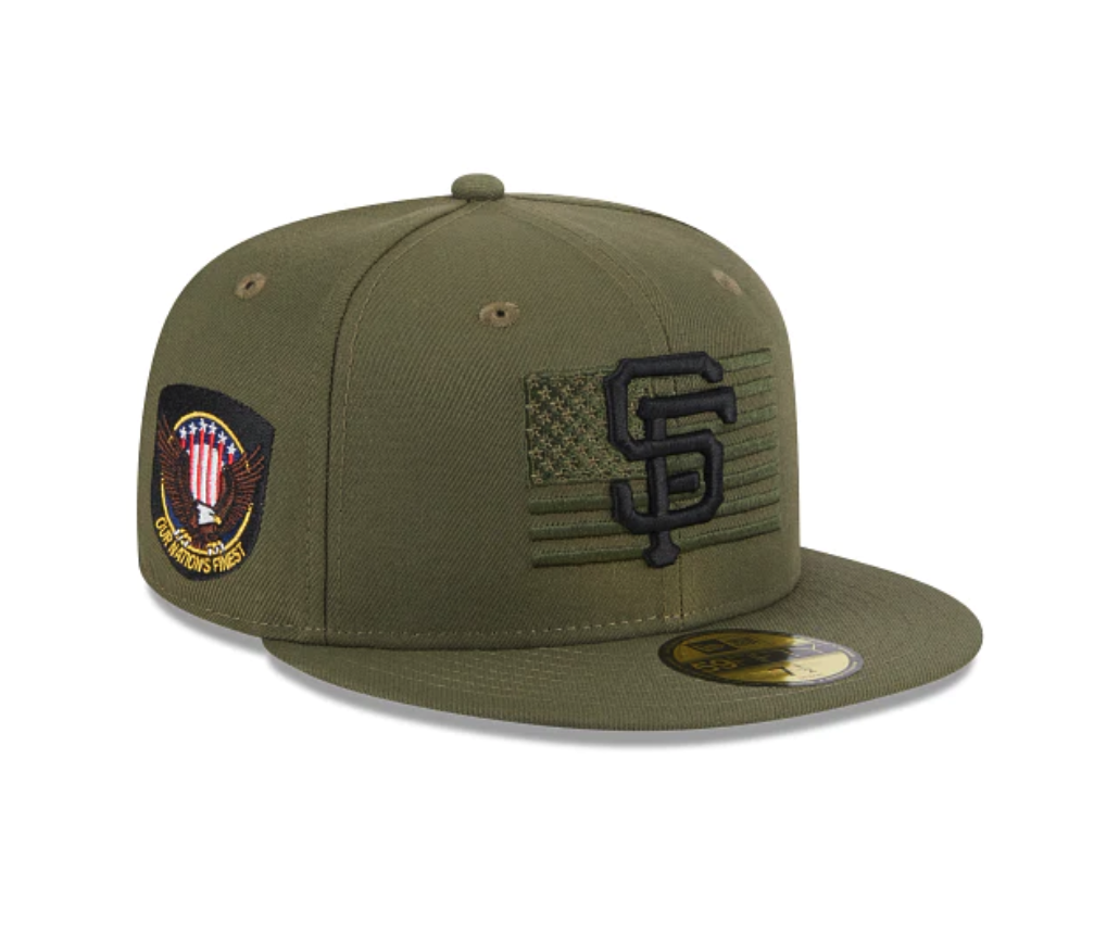
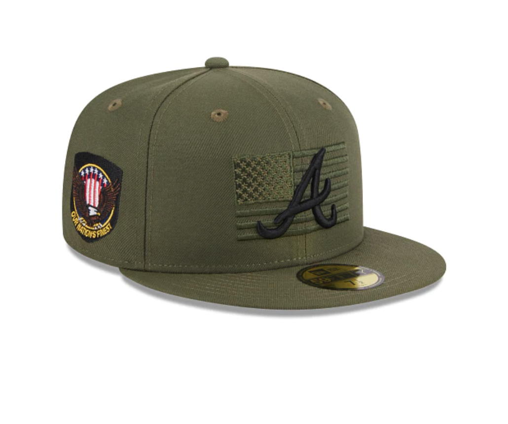
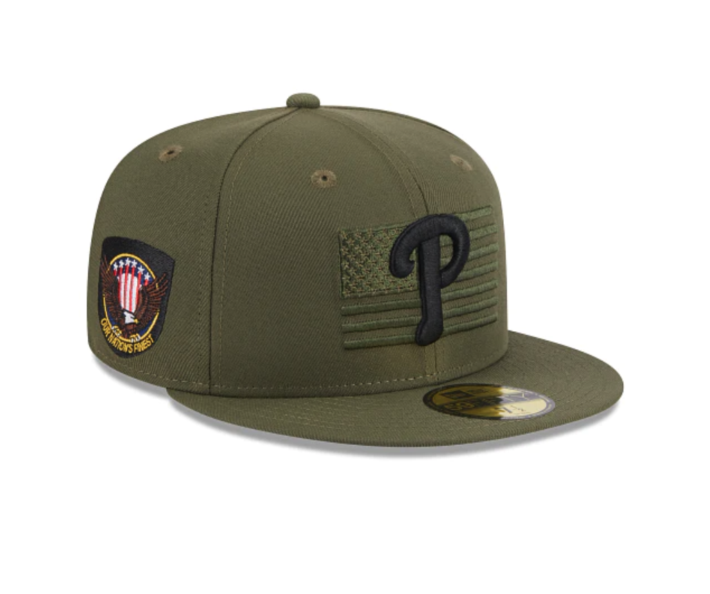
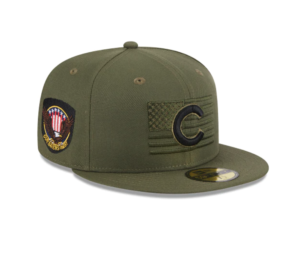
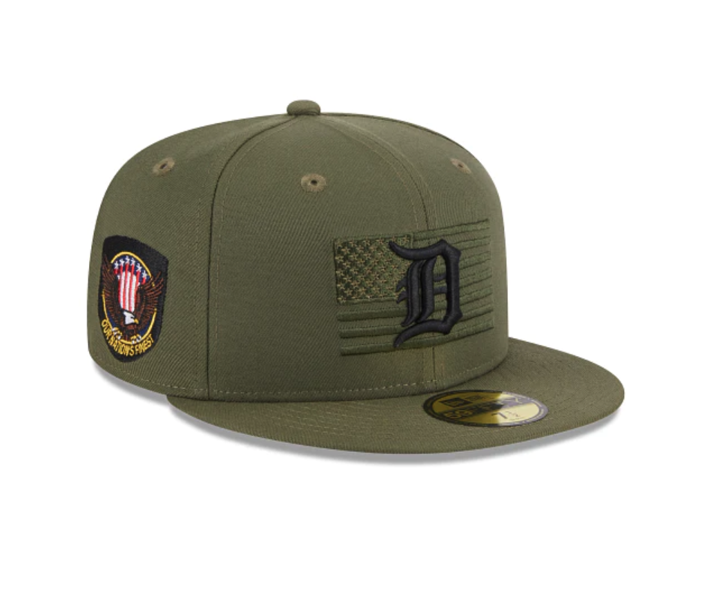
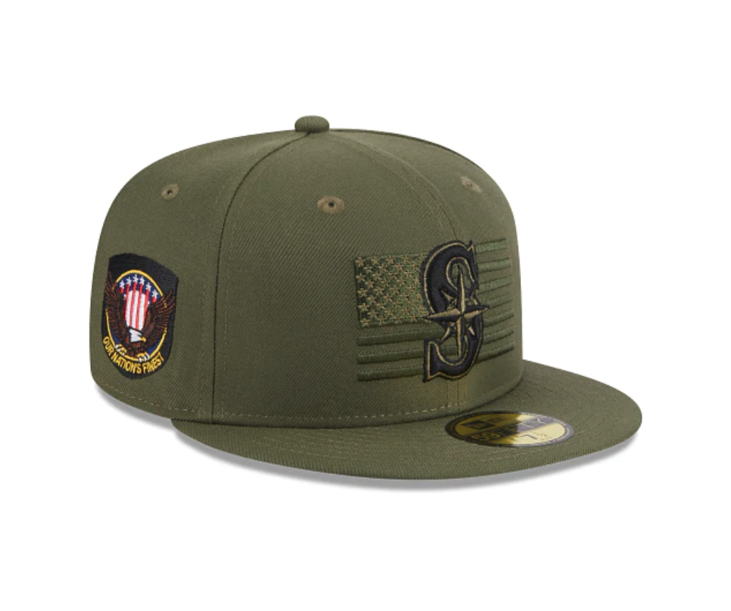
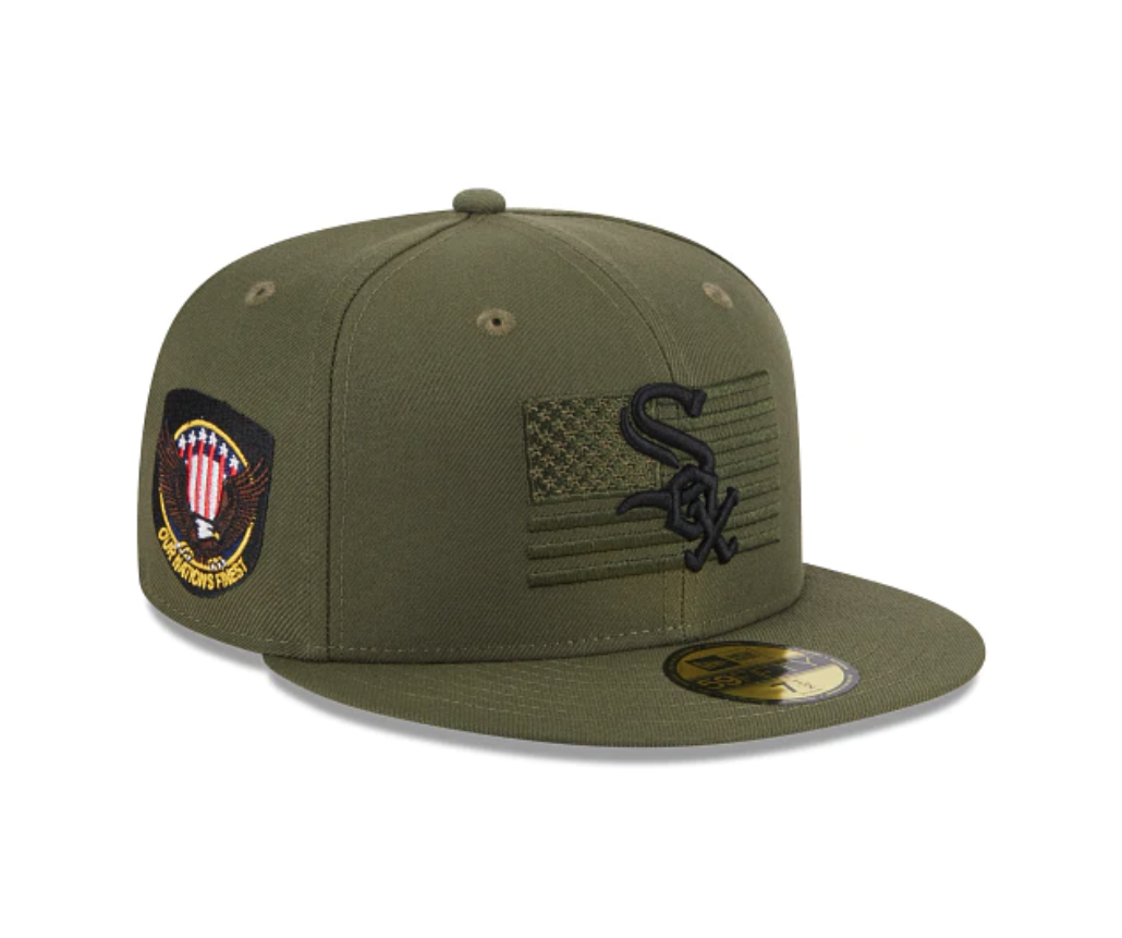
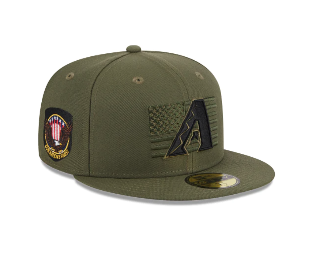
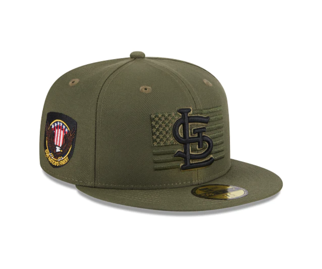
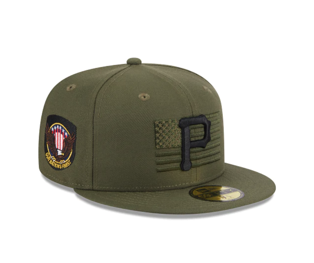
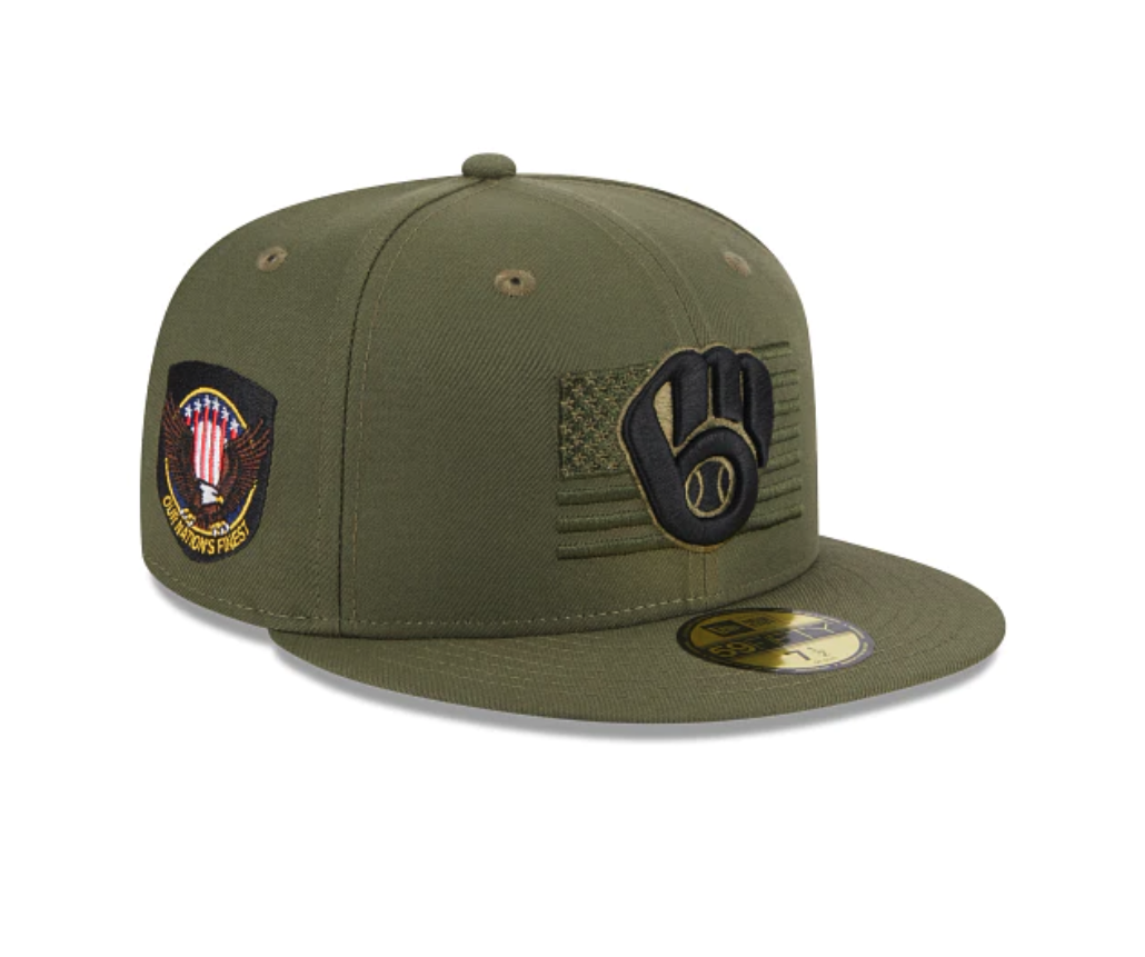
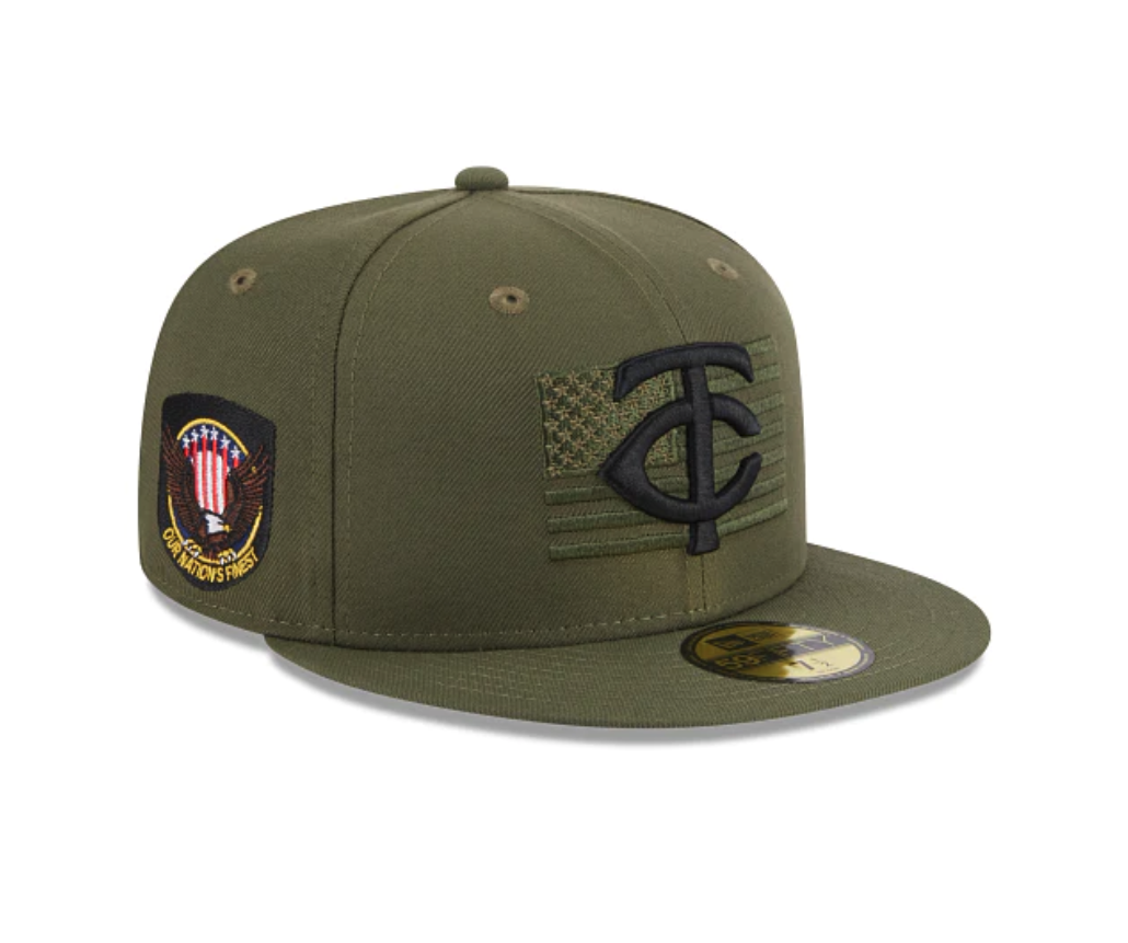
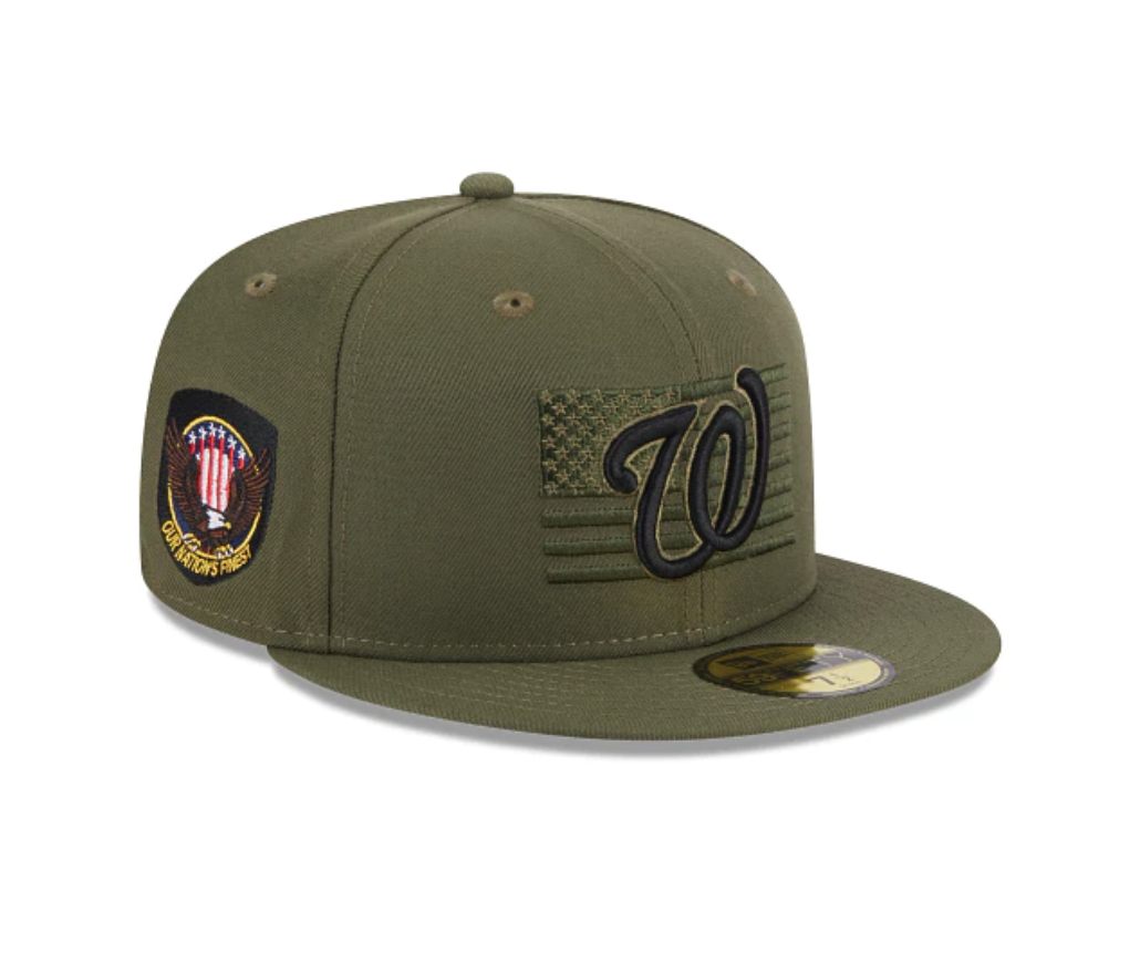
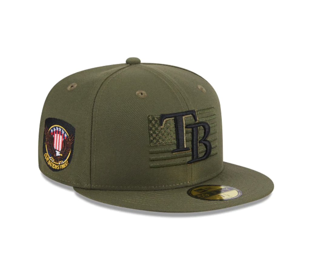
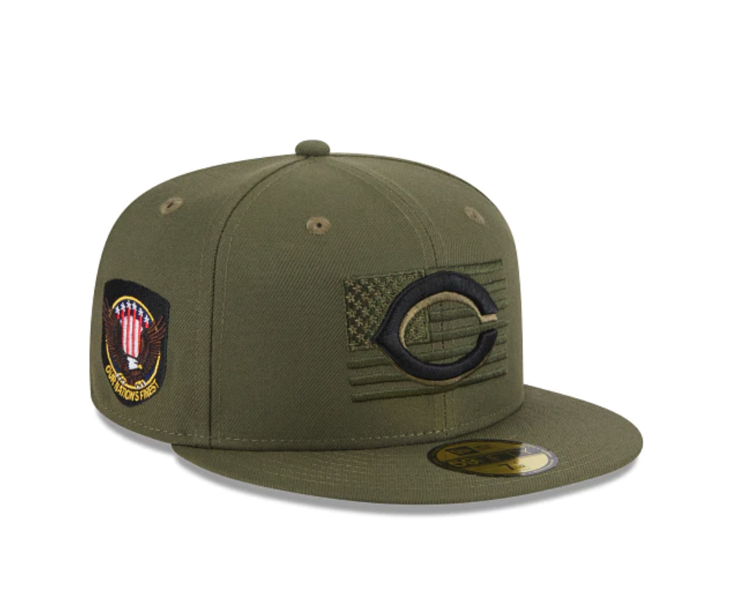
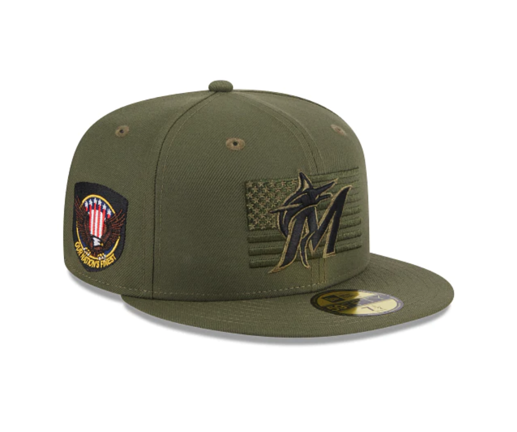
The 2023 MLB Armed Forces Day Hats have been official revealed. This year's hats are designed to honor the brave men and women who serve our country and keep us safe. The official on-field cap of Armed Forces Weekend is the perfect way to show your appreciation for those who have sacrificed so much for our freedom.
The 2023 MLB Armed Forces Day Hats are designed with a patriotic flair that's sure to turn heads. Each hat features the American Flag on the front with the team’s logo overlayed. the right side of the hat features Our Nation's Finest patch.
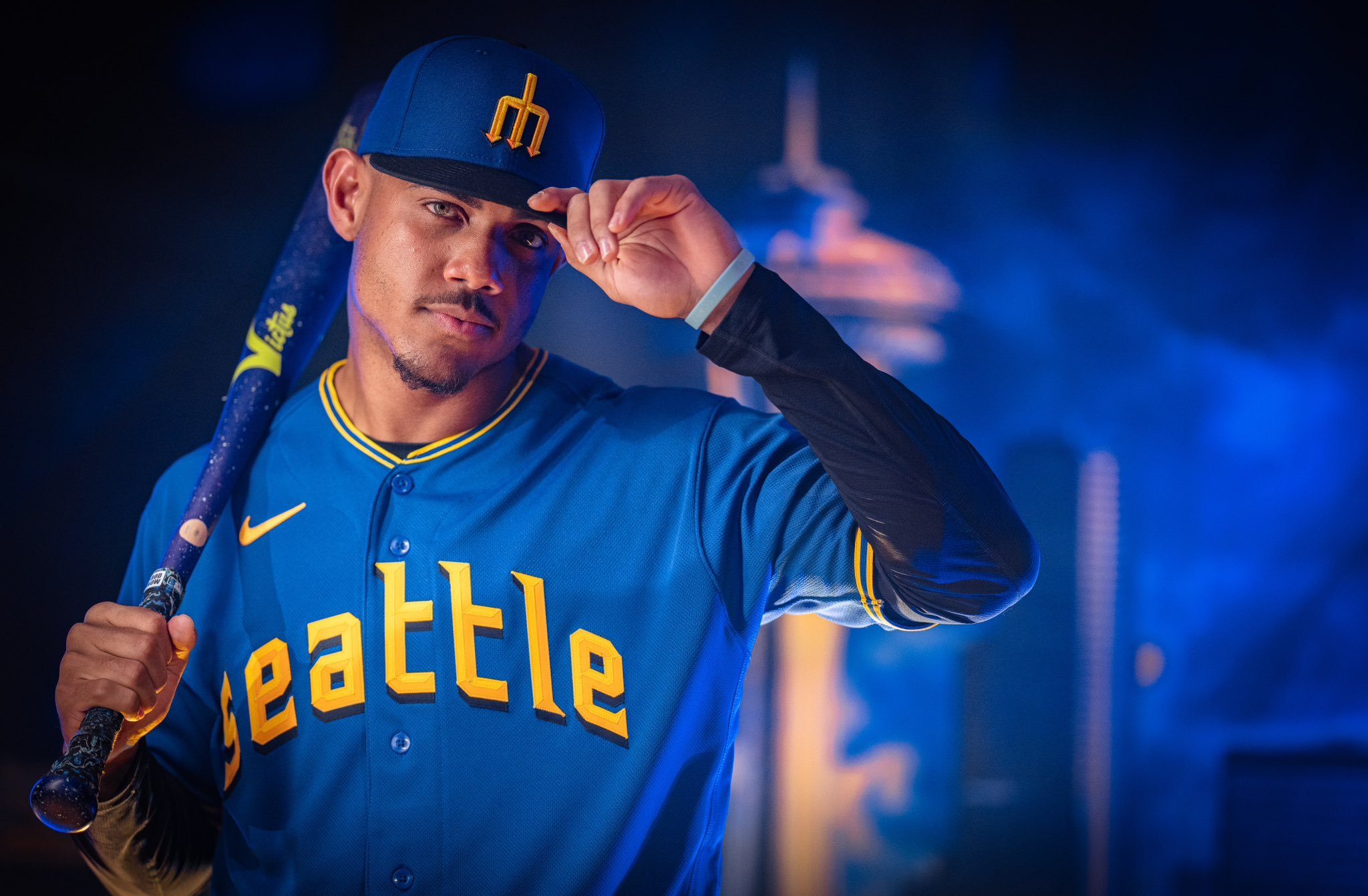
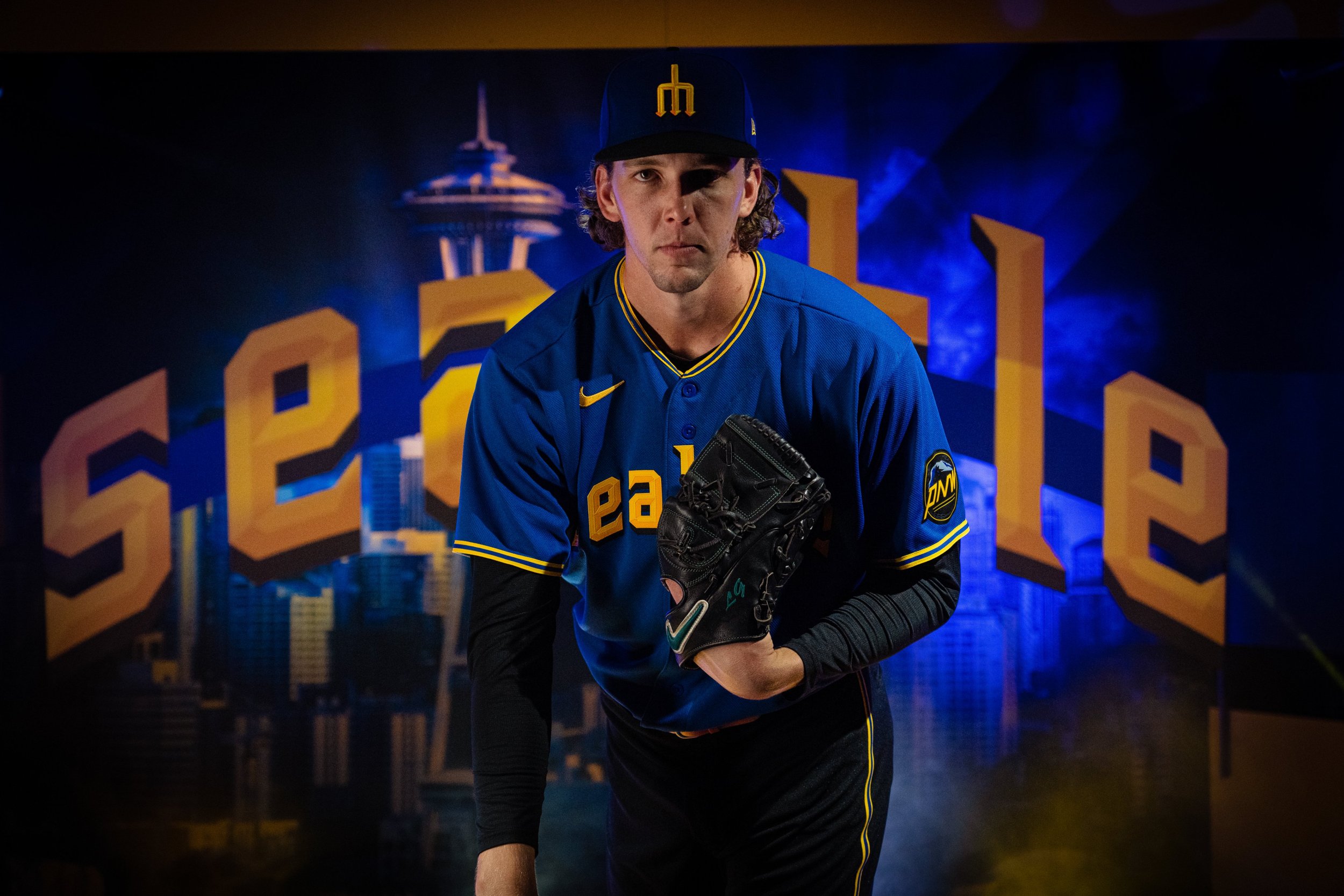
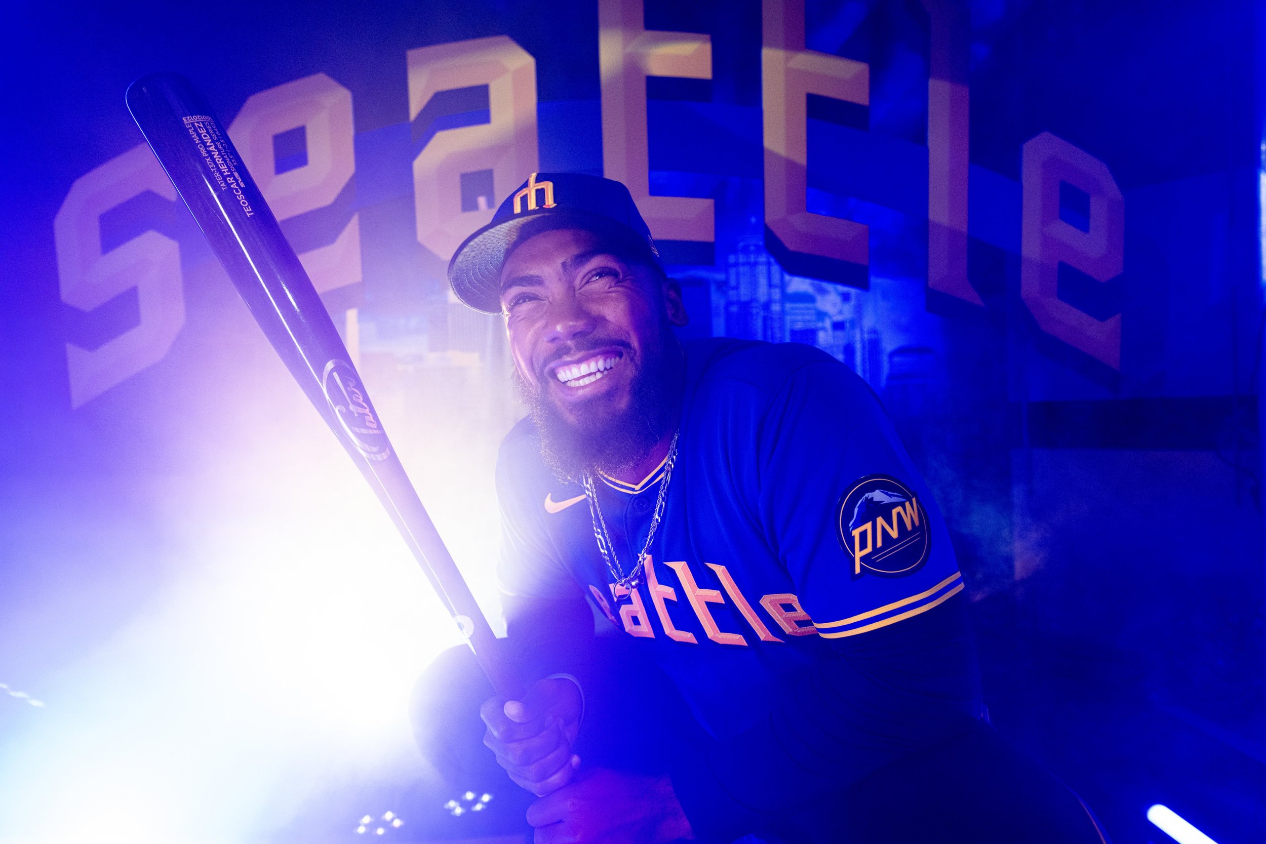
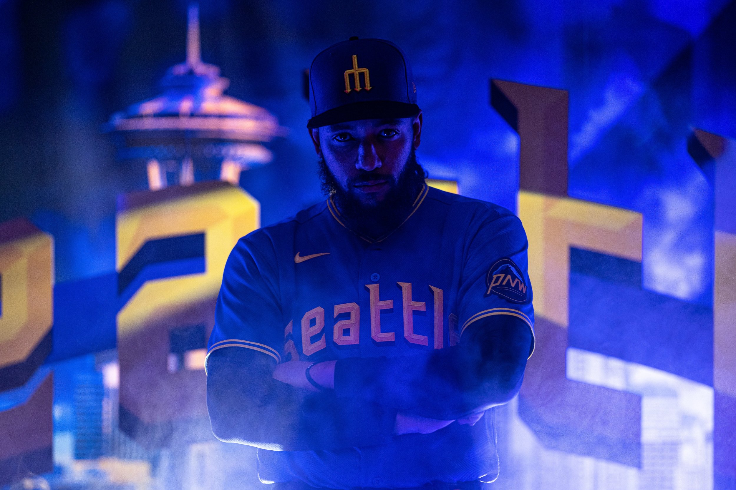
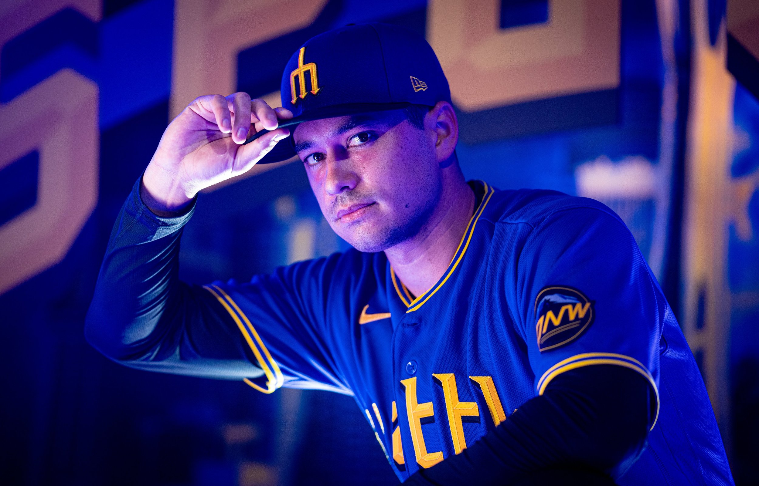
The Seattle Mariners have unveiled their City Connect uniforms, and These uniforms pay homage to the rich baseball history of Seattle while giving the team a fresh, modern look. The design includes nods to both the Pilots and the Steelheads, two teams that played a significant role in the city's baseball past.
One of the standout features of the uniform is the return of the trident logo. While the logo has been a source of controversy in the past, the team's senior vice president of marketing, Kevin Martinez, hopes that the City Connect uniforms will wipe the slate clean. "There's a lot of love for the trident here," Martinez said. "We've listened to our fans, and if you come to a ballgame here, you'll see it everywhere." The trident is prominently featured on the cap, which features a blue crown and a black visor, a color combination that has never been used in Seattle baseball history.
The front of the jersey features "Seattle" written in a font similar to the Seattle Pilots, the city's original MLB team that played one season in 1969. The typeface also includes a drop shadow used by the Seattle Rainiers, a minor league team that won the Pacific Coast League championship in 1955. This attention to detail is a testament to the Mariners' commitment to honoring the city's baseball history.
The uniform also includes two phrases that are sure to resonate with fans. "Sodo Mojo" is emblazoned across the front in reference to the neighborhood where the Mariners play. Additionally, "My oh my" appears on the jock tag, a reference to Hall of Fame broadcaster Dave Niehaus' iconic phrase. These phrases serve as a reminder of the team's connection to the city and its fans.
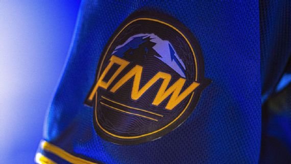
The sleeve of the uniform features a patch dedicated to the Pacific Northwest, featuring Mount Rainier, PNW lettering, and leaf embellishments meant to evoke the bills of the Pilots caps. This patch is a nod to the region's natural beauty and the Mariners' commitment to their community.
Overall, the Seattle Mariners' City Connect uniforms are a beautiful tribute to the city's baseball history. They give the team a fresh, modern look while honoring the past. The Mariners have a young, dynamic team, and these uniforms give them an identity as they move into a new era of Mariners baseball. With these uniforms, the team is sure to make a statement both on and off the field.
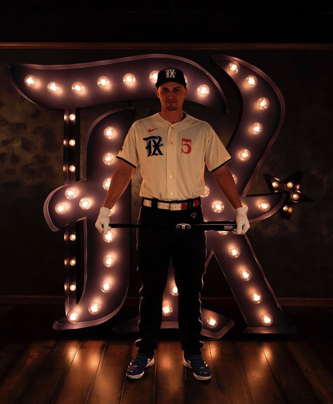
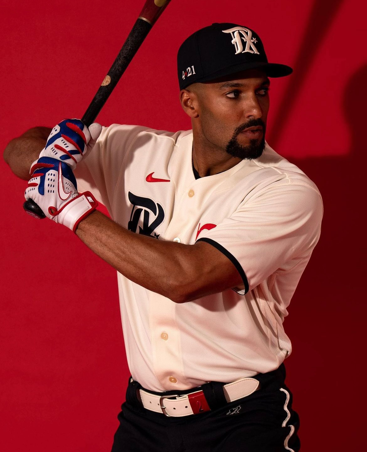
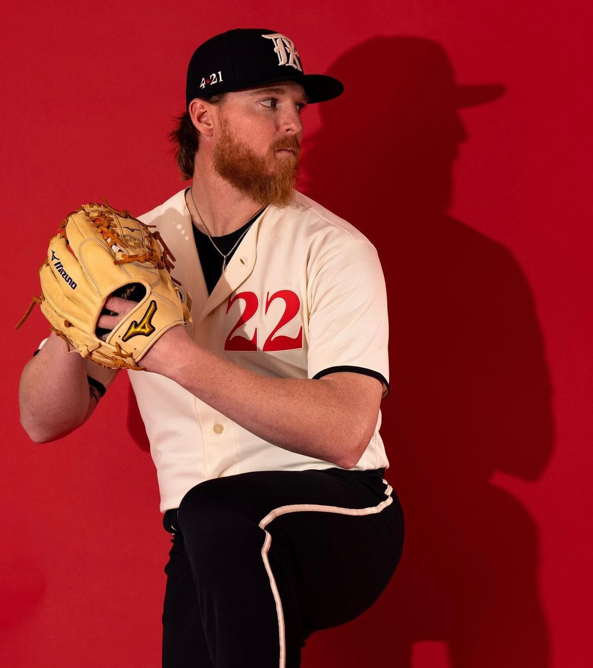
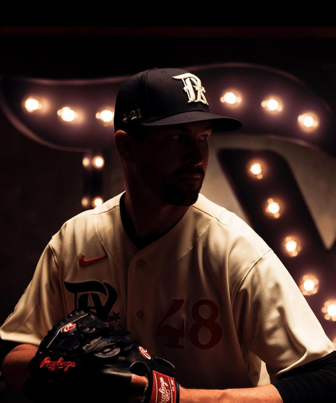
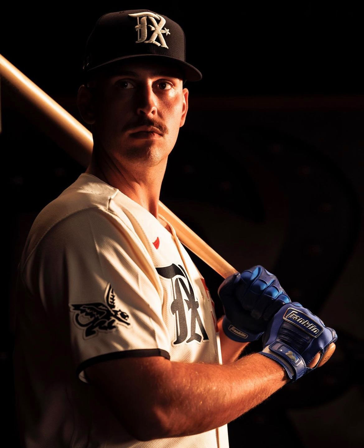
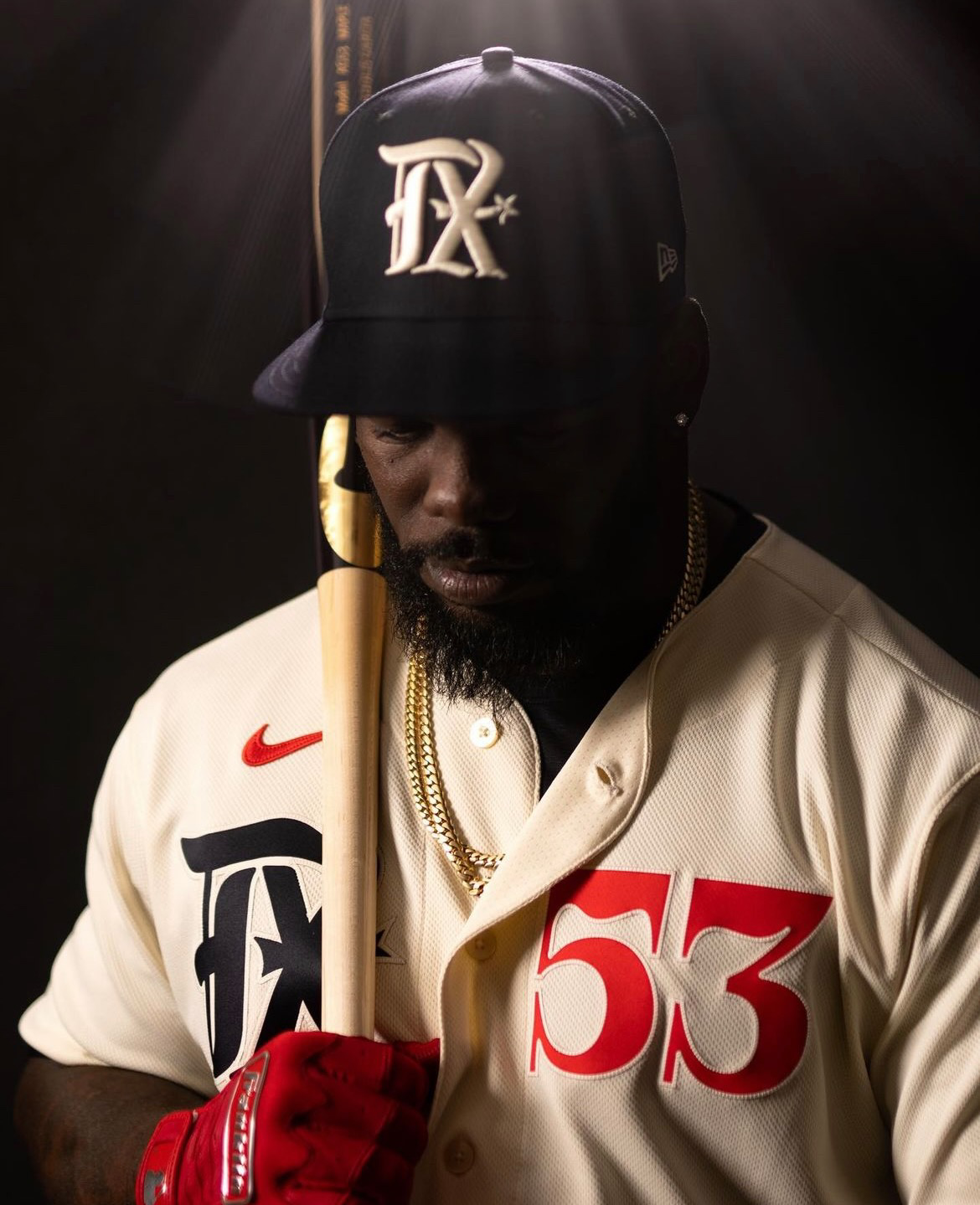
The Texas Rangers have unveiled their new City Connect uniform, designed to pay homage to the team's origin story and the Texas spirit that brought Dallas and Fort Worth together in Arlington through baseball. The uniform features a variety of elements that represent the history and culture of the region, and it's clear that every detail has been carefully considered to create a cohesive and meaningful design.
The TX logo, for example, draws inspiration from the gothic lettering of the Dallas Eagles and includes a spur as a tribute to the Dallas-Fort Worth Spurs, the team that connected the two rival cities to play baseball in Arlington and paved the way for the Rangers. The "Peagle," a mythical creature created by blending the mascots of the Dallas Eagles and Fort Worth Panthers in the style of the Eagles, is another nod to the team's history and the region's culture.
At the heart of the Rangers' origin story is the date April 21, a vital date in the history of Texas, baseball in Texas, and the Texas Rangers. This date is represented in the uniform's design and serves as a reminder of the importance of the Rangers to the region.
The "Dream the Big Dream" sentiment is also represented in the uniform, paying tribute to Arlington Mayor Tom Vandergriff, whose bold vision and tireless efforts to bring an MLB team to the region helped connect Dallas and Fort Worth in Arlington. The DFW Spurs mark is an homage to the Dallas-Fort Worth Spurs, the Texas League team that played in Arlington and proved that the region could support a major league baseball team.
The typography of the uniform is inspired by the 1920 championship medal won by the Fort Worth Panthers. In the 1920s, the Panthers won the Texas League title six years in a row and are regarded as one of the greatest teams in minor league history. The rope braid piping is a nod to the logo texture of the Dallas-Fort Worth Spurs and adds a touch of traditional baseball style to the modern uniform design.
Overall, the Texas Rangers' new City Connect uniform is a thoughtful and meaningful tribute to the team's origin story and the spirit of Texas. From the logo to the typography and piping, every element has been carefully chosen to tell the story of the Rangers and the region they represent. Fans of the team and baseball history buffs alike will appreciate the attention to detail and the celebration of Texas culture in this impressive new uniform.