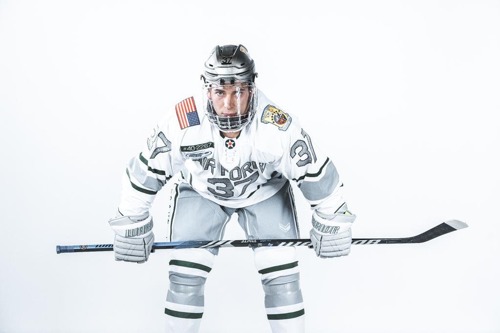
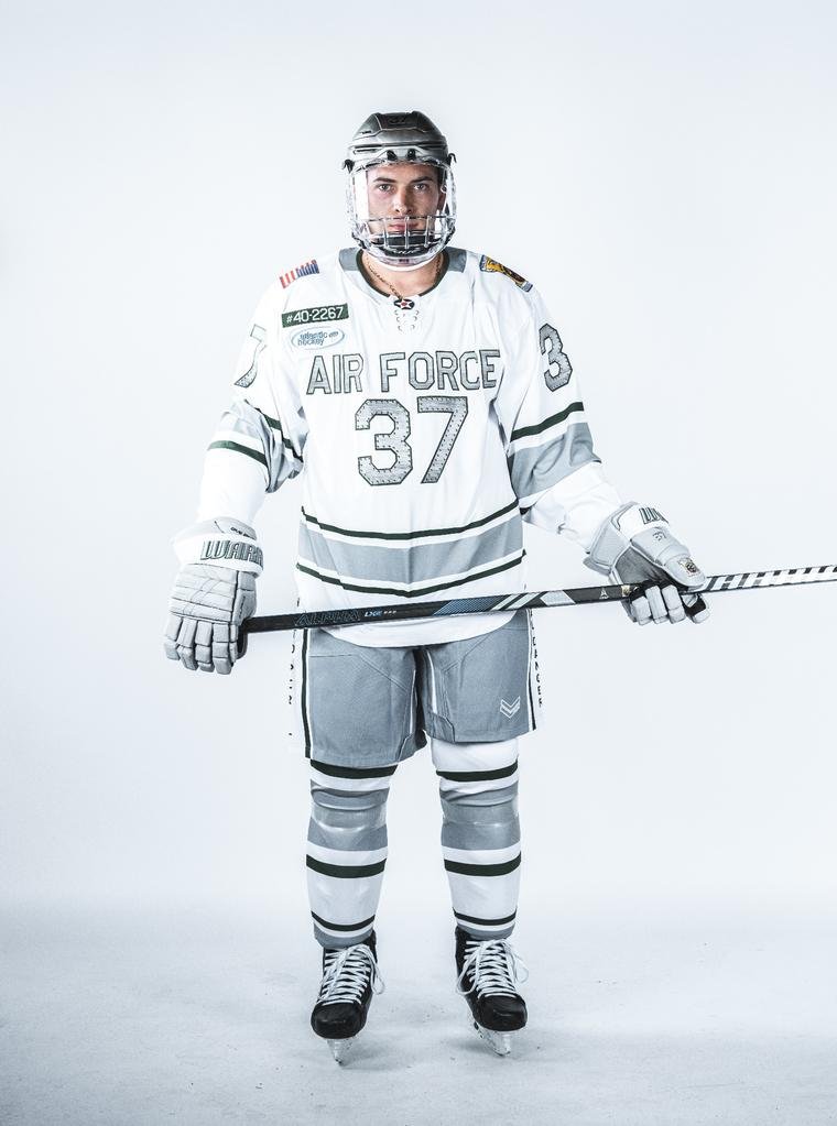
In a powerful tribute to the valiant heroes of World War II, the Air Force hockey team will proudly honor the legacy of the Doolittle Raiders through a special edition of their Air Power Legacy Series uniforms. The Falcons are set to don these distinguished jerseys during their games against Army on November 10-11 at the Cadet Ice Arena, marking a significant moment of remembrance and respect.
The Doolittle Raiders, a group of 80 pilots and crew members across 16 B-25B Mitchell bombers, etched their place in history through the daring and pivotal Doolittle Raid on April 18, 1942. Led by the fearless United States Army Air Force Lt. Col. James H. "Jimmy" Doolittle, these brave individuals executed a mission that struck selected targets in the heart of the Japanese capital, Tokyo, as well as other crucial military locations on the Japanese homeland.
This extraordinary mission was a response to the devastating attack on Pearl Harbor on December 7, 1941. The meticulous planning for the raid commenced in January 1942, showcasing the resilience and determination of the American forces during one of the darkest periods of the war. The Raiders launched their 16 B-25B medium bombers from the U.S. Navy aircraft carrier, USS Hornet (CV-8), and gallantly carried out their mission.
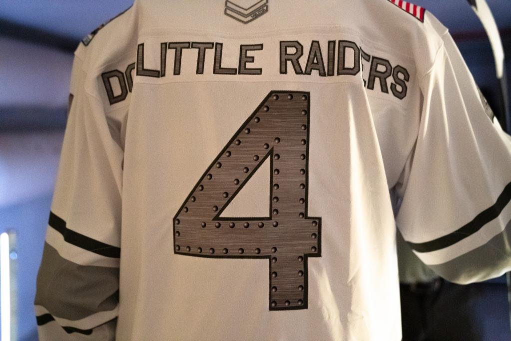
The Air Force hockey team's commemorative jerseys have been meticulously designed to honor the indomitable spirit of the Doolittle Raiders. The uniforms feature striking details, including letters and numbers resembling brushed steel and rivets, reminiscent of the B-25 aircraft flown by the Raiders during their historic mission.
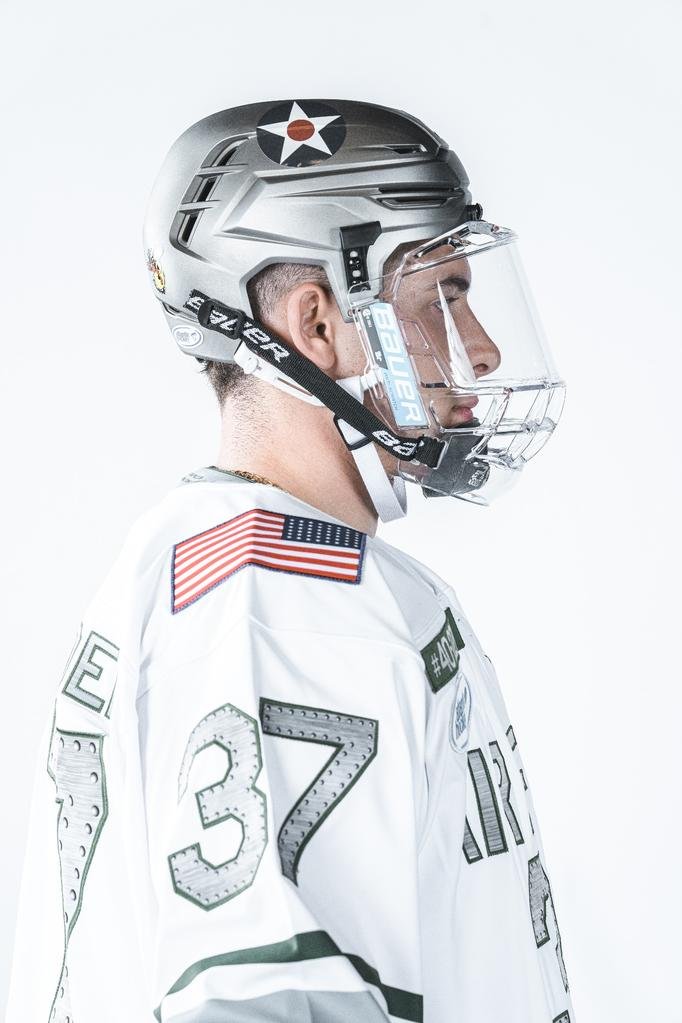
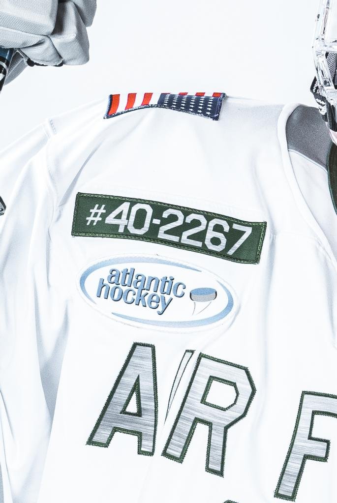
Notably, the jersey pays homage to the Raiders' aircraft by listing the tail numbers of the bombers involved in the mission. The left sleeve proudly showcases the squadron patch of the Raiders, generously permitted for use by the Doolittle Tokyo Raiders Association. Additionally, the right sleeve bears a 48-star flag, symbolizing the number of states in 1942, while the back nameplate reads "Doolittle Raiders."
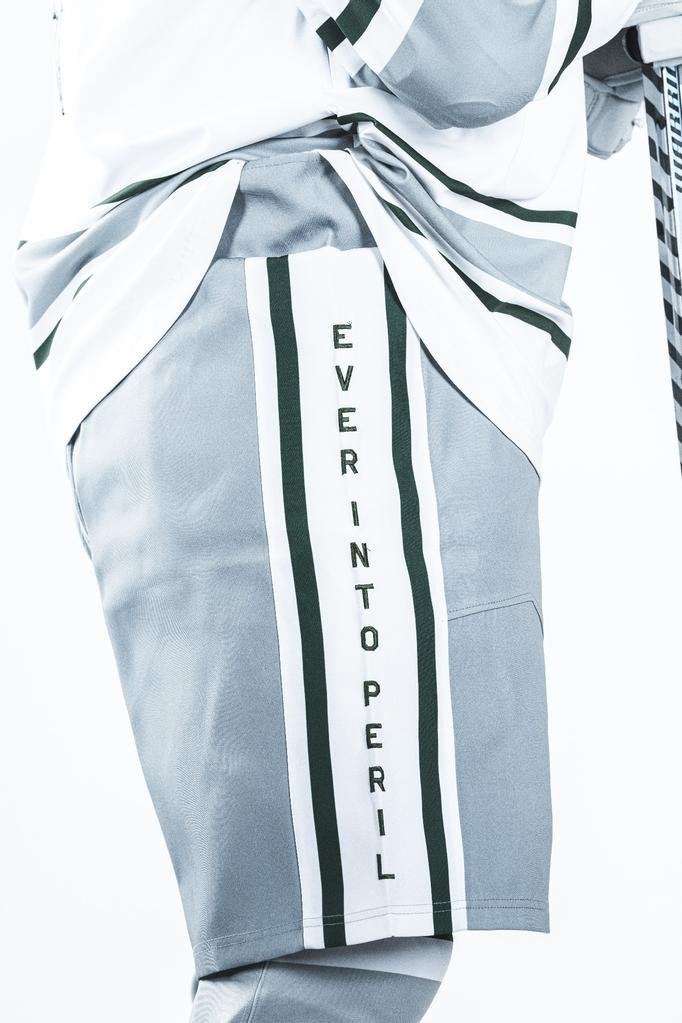
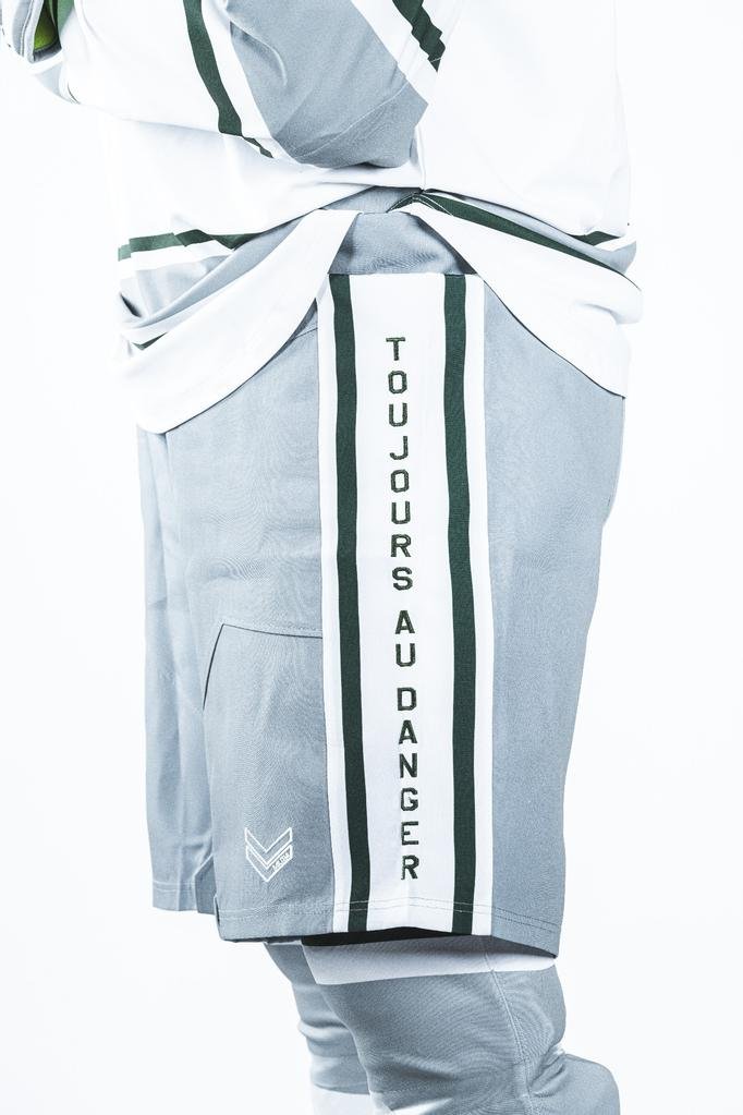
The mantra of the Raiders, "Ever into Peril," is featured on the right side of the pants, while the French equivalent, "Toujours au Danger," graces the left leg, serving as a poignant reminder of their courage and determination in the face of danger.
Moreover, the helmets worn by the players will bear decals honoring the USS Hornet from which the Doolittle Raiders launched their historic mission. The back and left sides of the helmets will also feature decals displaying the squadron patches of the esteemed Raiders, symbolizing the unity and bravery of these remarkable individuals.
As the Air Force hockey team takes to the ice in these special jerseys, they not only honor the memory of the Doolittle Raiders but also pay tribute to all servicemen and women who have displayed unparalleled courage in defense of their country.
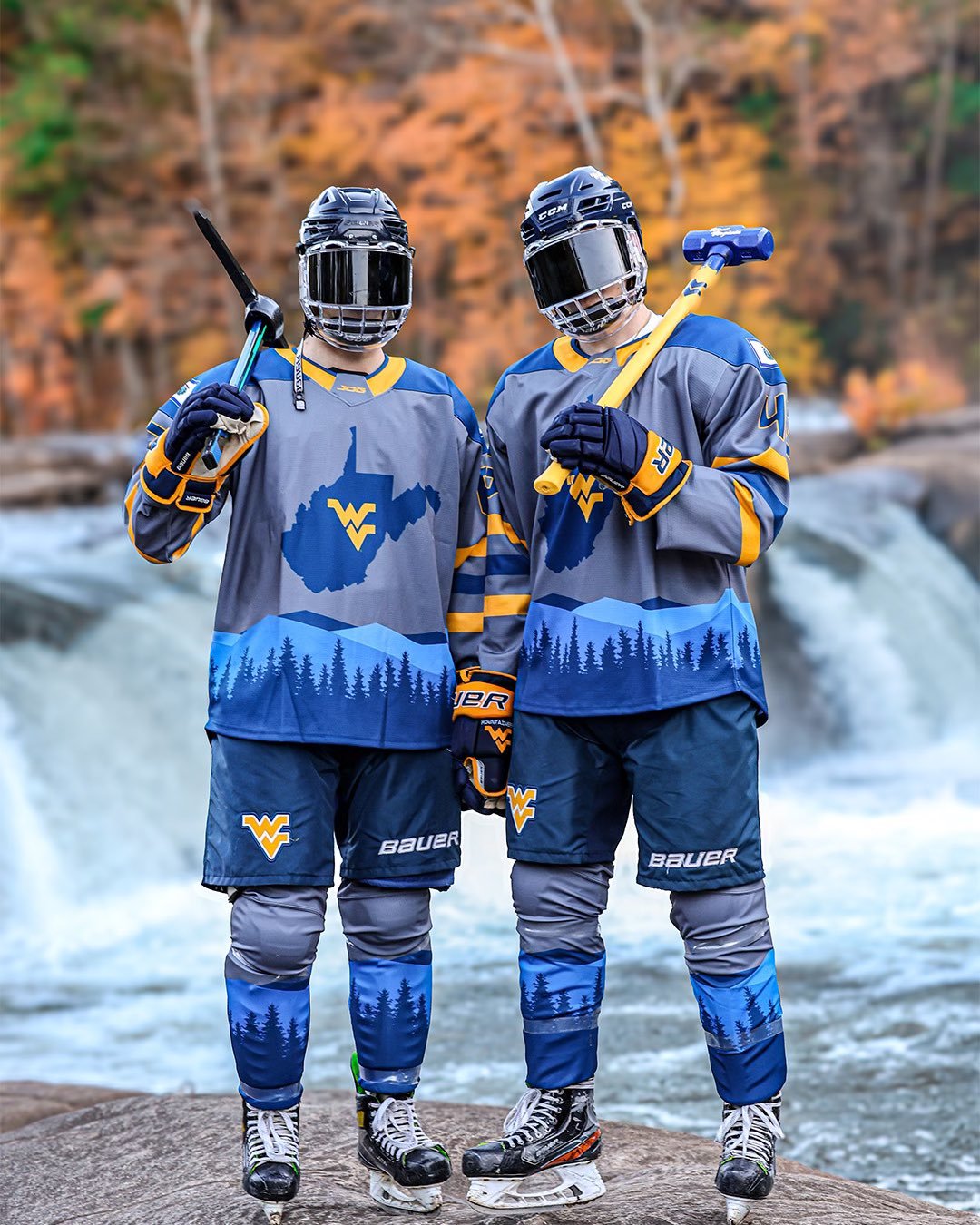
In the world of sports fashion, West Virginia University has never shied away from making a bold statement. While their football program has been known for its unique alternate uniforms, it's now the WVU hockey team's turn to take the spotlight and unveil a fresh, exciting look that has sent social media into a frenzy.
The moment these jerseys made their debut, social media erupted in a whirlwind of excitement and admiration. Aptly named "Almost Heaven," these jerseys are not just a piece of sportswear; they're a work of art.
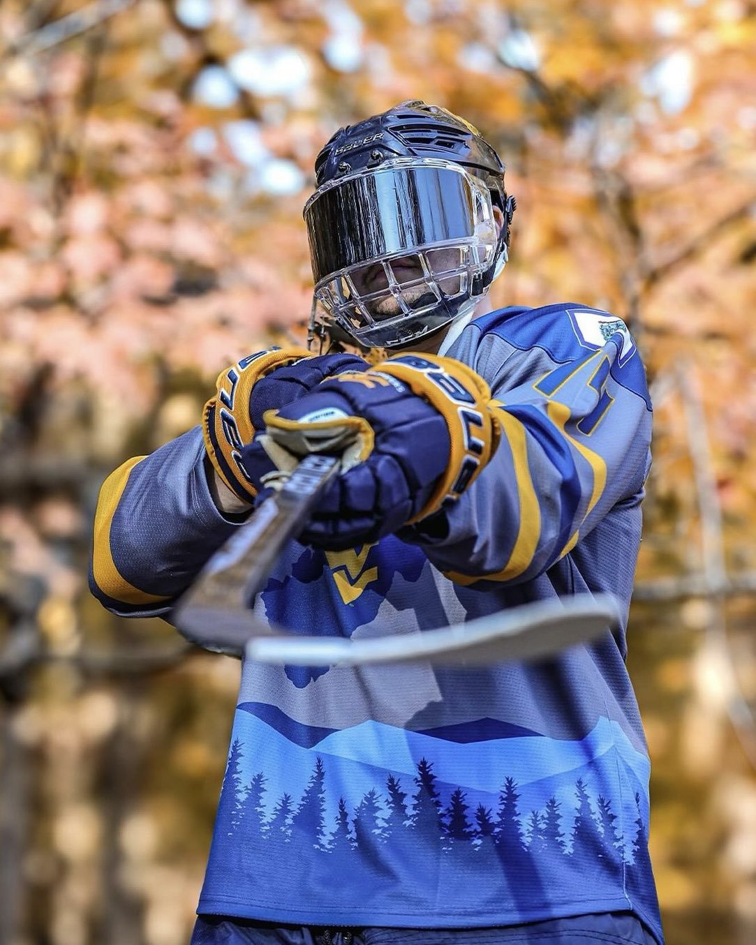
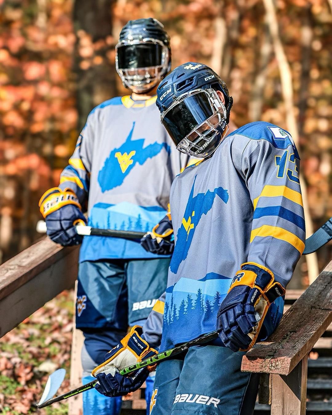
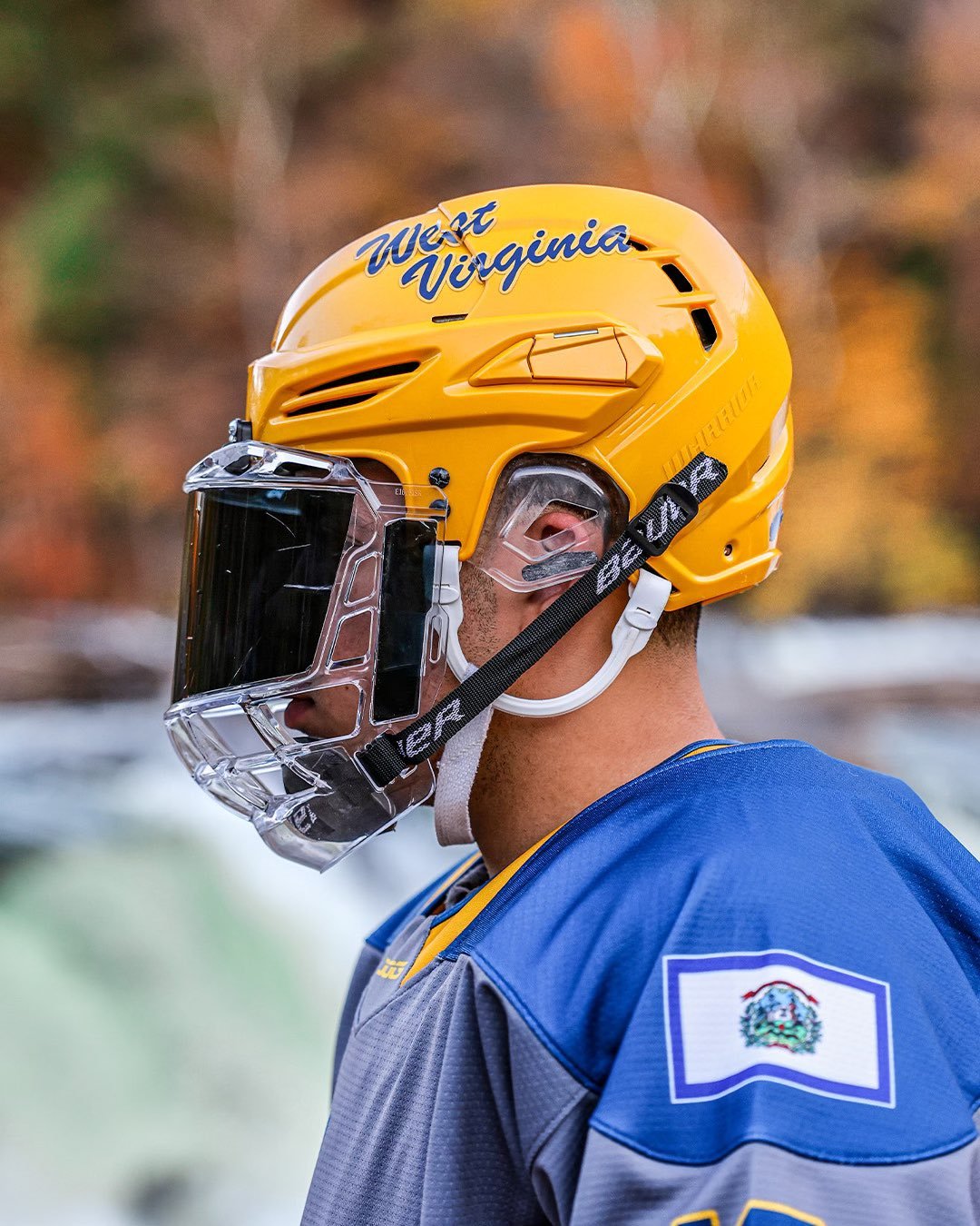
Designed in multiple shades of blue with intricate gold outlines, these alternate jerseys capture the essence of West Virginia's stunning natural beauty. The picturesque landscape of mountains and trees adorns the lower portion of the sweater, setting the stage for a design that is both unique and captivating.
What truly sets these jerseys apart is the colossal image of the state of West Virginia boldly emblazoned across the chest. It's a visual testament to the team's deep-rooted connection to their home state and a symbol of the pride they carry onto the ice.
The state design is adorned with West Virginia University's iconic WV logo, elegantly rendered in gold and placed at the center of the state's outline. It's a powerful reminder of the university's role as a unifying force, bridging the gap between athletics and state pride.
The attention to detail in these unifroms is evident from head to toe. The helmets and gloves complement the overall design, available in a striking dark shade of blue or a resplendent gold, offering a perfect blend of tradition and innovation.
As the WVU hockey team takes to the ice in these "Almost Heaven" jerseys, they aren't just showcasing a new look; they're sharing a piece of their state's essence with the world. It's a reminder of the natural beauty, the rugged terrain, and the profound connection to West Virginia that runs deep within each player.
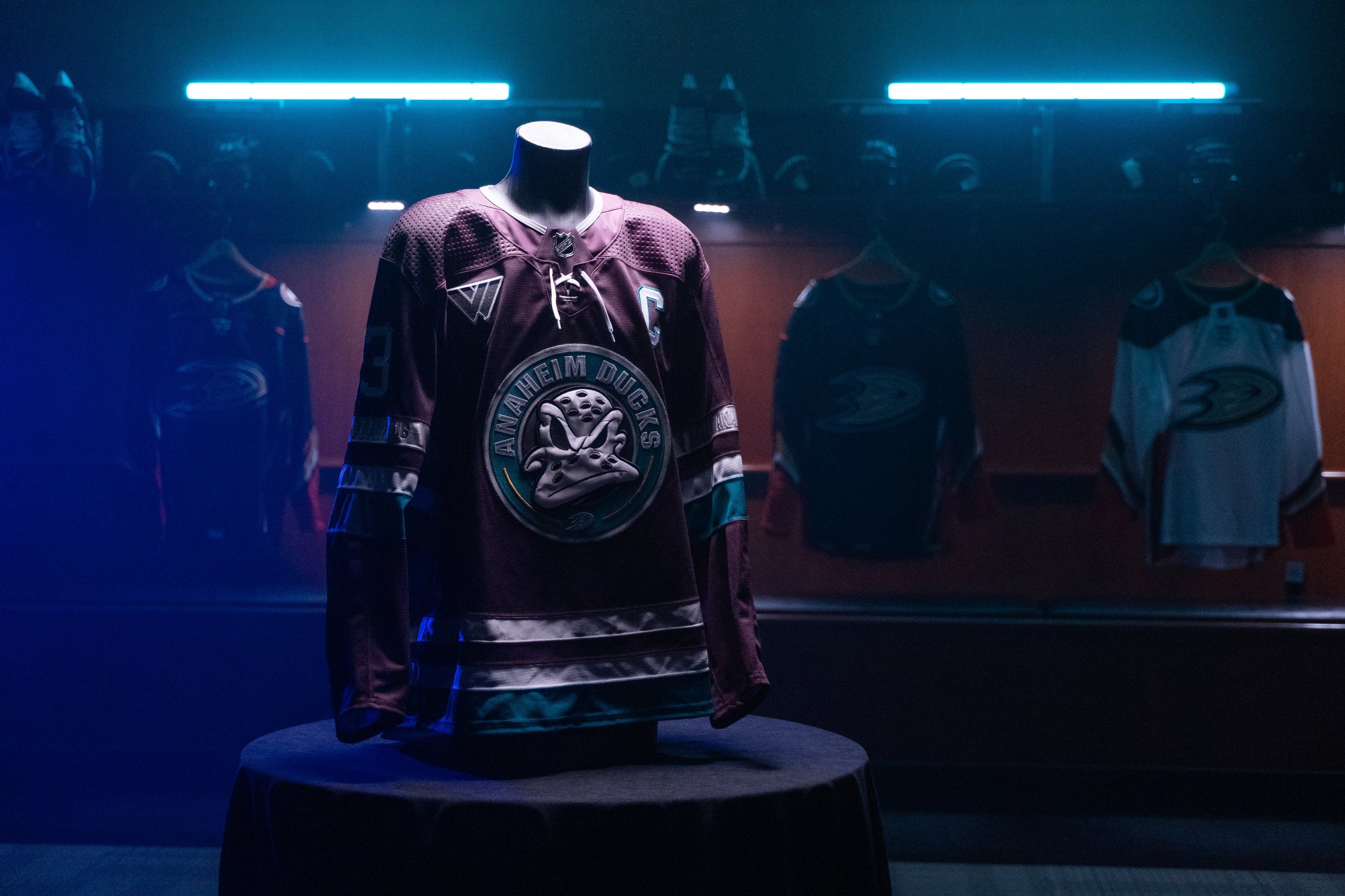
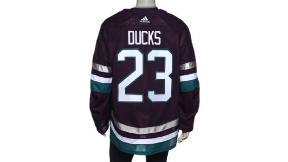
As the Anaheim Ducks soar into their remarkable 30th year, they proudly pay tribute to their rich legacy. Embarking on a celebration steeped in history, the Ducks' journey, which originated on the silver screen, has grown mighty and resonates with fans across generations. In honor of this milestone, the team is delighted to introduce their striking Third Jersey for the 30th Anniversary season.
The unveiling of the Third Jersey marks an exciting moment for the Ducks and their loyal fanbase. Vice President of Marketing, Merit Tully, expressed their pride in introducing a jersey that encapsulates the team's 30-year journey, successful history, and origins.
Anchored in plum and jade, the Third Jersey pays homage to the Ducks' original 1993-94 season road jersey, reviving the team's original color scheme. At the heart of the jersey, the focal point is a crest featuring the iconic circular "Mighty Ducks" shoulder patch, prominently featuring Wild Wing. This design element serves as an ode to the Mighty Ducks legacy, cleverly reimagined for the present while surrounded by the words "Anaheim Ducks." The jersey incorporates the number and letter styling from Anaheim's original jerseys, symbolizing the cohesive look of the team's inaugural 1993-94 sweaters. The interior collar features the word "Mighty" in the original wordmark font, a nostalgic touch that adds to the jersey's allure.
The Third Jersey will be complemented by plum pants, socks, helmets, and gloves, creating a cohesive and visually striking ensemble that showcases the team's distinctive color palette.
Fans will have the opportunity to witness the grand debut of the 30th Anniversary jersey during Anaheim's home opener on Sunday, October 15, as they face the Carolina Hurricanes at the Honda Center. Additionally, the Ducks will proudly wear the jersey on select theme nights and games throughout the 2023-24 NHL season, with specific game dates to be announced in due course.
With the unveiling of their captivating Third Jersey for the 30th Anniversary season, the Anaheim Ducks embark on a year-long celebration of their remarkable journey.
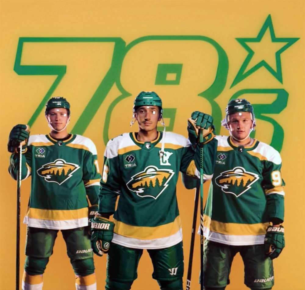
The Minnesota Wild have just unveiled a new alternate uniform that's sure to send waves of nostalgia through the hearts of hockey fans. Dubbed "The 78's" in honor of their predecessor franchise, the North Stars, these throwback alternate jerseys pay homage to the late-1970s design and colors that once adorned the North Stars' uniforms. With a Kelly Green base color and bright yellow striping, "The 78's" introduce a whole new colorway that celebrates the rich hockey history of Minnesota.
The North Stars are a beloved chapter in Minnesota's hockey history, and "The 78's" alternate uniforms serve as a beautiful tribute to that legacy. These jerseys resurrect the iconic late-1970s design that became synonymous with the North Stars, evoking memories of legendary players and unforgettable moments on the ice.
John Maher, Minnesota Wild Senior Brand Advisor, shared the enthusiasm of fans for this legacy look. "Our primary home and road jerseys are as popular as ever with our fans," he said. "They also let us know last season that they still loved this legacy look, so we decided to keep it in our mix as a new alternate jersey, with some updated 'State of Hockey' details."
While "The 78's" draw inspiration from the past, they also incorporate some modern updates. These jerseys are based on the Minnesota Wild's Reverse Retro uniforms from the 2020-21 and 2022-23 seasons, which were the result of a collaboration with adidas and the NHL. However, "The 78's" feature additional details that set them apart.
One notable addition is a shoulder patch featuring the "State of Hockey" logo, a nod to the pride and passion of Minnesota's hockey community. Another distinctive treatment is found in the captain and alternate captains' 'C' and 'A' on the upper left chest. These symbols are now layered over a patch in the shape of Minnesota, further emphasizing the team's connection to its home state.
Hockey fans will have the pleasure of seeing "The 78's" in action as the Minnesota Wild plan to wear this alternate uniform for 15 games during the upcoming season. Each time they take the ice in these throwback jerseys, it will be a celebration of Minnesota's hockey heritage and a reminder of the enduring love for the sport in the State of Hockey.
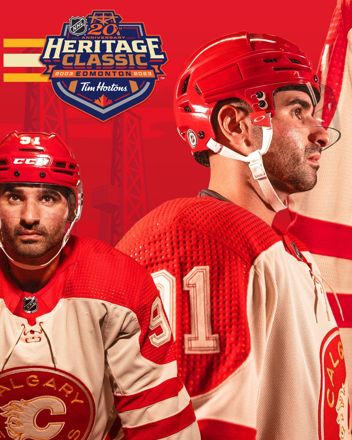
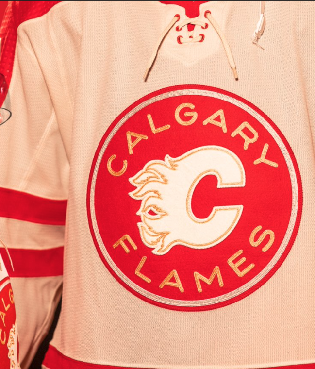
The Calgary Flames are gearing up for a remarkable journey down memory lane as they prepare to face off against the Edmonton Oilers in the 2023 NHL Heritage Classic. While the on-ice action promises to be unforgettable, the Flames are turning heads even before the puck drops with their classic and nostalgic Heritage Classic uniform, designed in collaboration with adidas.
In the world of sports, tradition runs deep, and the Flames are paying tribute to their heritage in a striking way. The Flames Heritage Classic look is a heartfelt nod to the historic red and white colorway used by the Calgary Stampeders hockey team. It's a choice that immediately evokes memories of a bygone era and adds a sense of nostalgia to the uniform.
While red and white take center stage in this classic design, there's a subtle and meaningful touch of gold incorporated into the uniform. The only instance of Flames gold is found in the word "CALGARY FLAMES" on the crest and the top stitch detailing in the numbers. These gold accents serve as a subtle yet powerful reminder of the team's identity while maintaining the vintage-inspired aesthetic.
One of the standout features of the Flames' Heritage Classic uniform is the player names and numbers. Designed by adidas, these elements are rendered in felt, providing a tactile and nostalgic quality to the jerseys. The top stitch details on the names and numbers are meant to evoke denim-reinforced sewing techniques seen on a cowboy's blue jeans. It's a unique touch that adds to the overall charm of the uniform.
The attention to detail in this uniform is truly exceptional. Every element has been carefully considered to create an authentic and nostalgic look. One such detail is the extended yoke that drops so low on the sleeve that the sleeve numbers sit upon it. This design choice is inspired by vintage hockey designs and adds an extra layer of authenticity to the uniform.
As the Flames prepare to take the ice in their Heritage Classic uniforms, fans can't help but feel a sense of pride and nostalgia. It's more than just a uniform; it's a symbol of the Flames' enduring legacy in the world of hockey. While the game itself will be a spectacle, the uniform is a testament to the team's commitment to honoring their past.
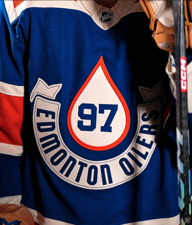
Hockey fans, get ready for a journey back in time! the highly anticipated 2023 NHL Heritage Classic, where the Edmonton Oilers and the Calgary Flames will face off in an outdoor showdown. While the game itself promises to be a spectacle, the uniforms that the teams will be donning for this historic event have already stolen the spotlight.
In the world of sports, there's something undeniably magical about classic, vintage-inspired uniforms. They transport us to a different era, evoking memories of legends who graced the ice in days gone by. For the 2023 NHL Heritage Classic, adidas has paid meticulous attention to every detail, ensuring that these uniforms capture the essence of hockey's storied history.
with the Oilers' Heritage Classic uniform adidas has gone above and beyond to create a design that seamlessly blends vintage aesthetics with the distinctive identity of the Oilers. The front crest artwork is a testament to this effort, featuring the iconic oil drop emblem of the team with a player's number elegantly incorporated within it. It's a unique and eye-catching touch that adds to the charm of the uniform.
But it doesn't stop there. The new player names and numbers are rendered in layered felt, providing a tactile and nostalgic element to the jerseys. It's these little details that make all the difference and truly transport fans back to a different era of the sport.
To complete the traditional look, adidas has considered every aspect of the uniform. One noticeable detail is the use of sleeve numbers on only one arm, a throwback to the classic hockey style of yesteryears. Additionally, the captain's marks overlap the shoulder yoke, adding to the authenticity of the design. It's clear that no stone has been left unturned in the pursuit of perfection.
These meticulously crafted uniforms are more than just clothing; they're a bridge between generations of fans and players. So, whether you're cheering for the Oilers or the Flames, the 2023 NHL Heritage Classic promises to be an unforgettable experience that brings the past and present of hockey together on one frozen stage.
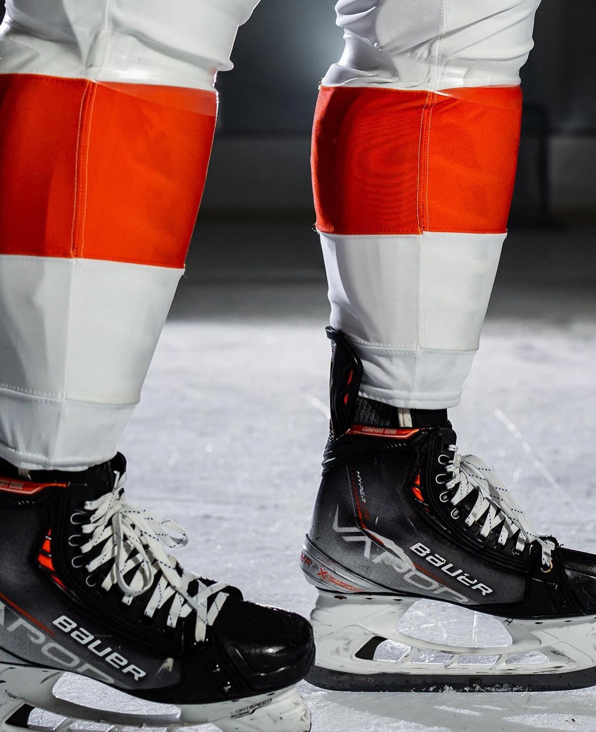
The Philadelphia Flyers have revealed their new home and road uniforms. This marks the official arrival of the team's New Era of Orange, combining a rich heritage with a fresh, contemporary design. The Flyers' iconic primary home and away uniforms have received their first significant updates since 2010, sending ripples of excitement through the fanbase and beyond.
Chairman & CEO of Comcast Spectacor and Governor of the Philadelphia Flyers, Daniel J. Hilferty, expressed his enthusiasm for the New Era of Orange, stating, "This new chapter in Flyers history is all about paying homage to our illustrious past while forging an exhilarating future. These new uniforms embody that sentiment flawlessly, blending nostalgic elements with a modern twist. We are thrilled to have Independence Blue Cross as our inaugural jersey patch partner, a company that holds immense significance for me personally and the entire Philadelphia region."
Collaborating with adidas, the NHL's league-wide uniform partner, the Flyers embarked on an extensive design journey that involved input from various stakeholders. Flyers season ticket members, alumni, and broadcasters were among those consulted, ensuring a collective vision and a true representation of the team's spirit.
To honor their tradition while embracing a new era, the Flyers have ingeniously merged distinctive elements from their iconic jerseys of yesteryears into a contemporary adaptation. The wide, eye-catching shoulder and arm striping, a trademark feature of Flyers uniforms, has been enhanced to encapsulate each player's numbers seamlessly, resulting in a sleek and streamlined aesthetic. Furthermore, the sleeve numbers have returned to a single-color design reminiscent of the original 1967-1970 uniforms, reintroducing a classic touch not seen for decades.
Delivering a visual punch, the black horizontal stripe has been relocated to the bottom edge of the jersey, aligning harmoniously with the black pants to create a fluid and cohesive look reminiscent of the uniforms introduced in 1982. The striking contrasting name-plate design, introduced in 2008, remains a distinctive feature exclusive to the Flyers among NHL teams.
Undoubtedly, the jerseys' crowning glory is the highly sought-after "burnt orange," which defined the Flyers' powerhouse teams of the 80s and 90s. This iconic shade takes center stage, serving as the base color for the home jerseys and adorning the arm and shoulder panels, as well as the prominent player numbers on the away jerseys. The burnt orange theme extends to both sets of socks, ensuring a complete and visually captivating ensemble.
Throughout the dynamic design changes, the Flyers' legendary "flying P" logo remains at the heart of the uniform set. This timeless emblem, tracing back to the team's inception in 1967, epitomizes speed and the exhilarating motion of flying across the ice, symbolizing the spirit of the Flyers' franchise.
As the Philadelphia Flyers usher in their New Era of Orange, they do so with a profound appreciation for their storied past and an unwavering commitment to embracing a bright future. These revamped uniforms embody the team's rich heritage while infusing a modern and captivating aesthetic that is bound to leave a lasting impression on fans, players, and hockey enthusiasts alike. The Flyers are ready to take flight into this exciting new chapter, united under the banner of the New Era of Orange.
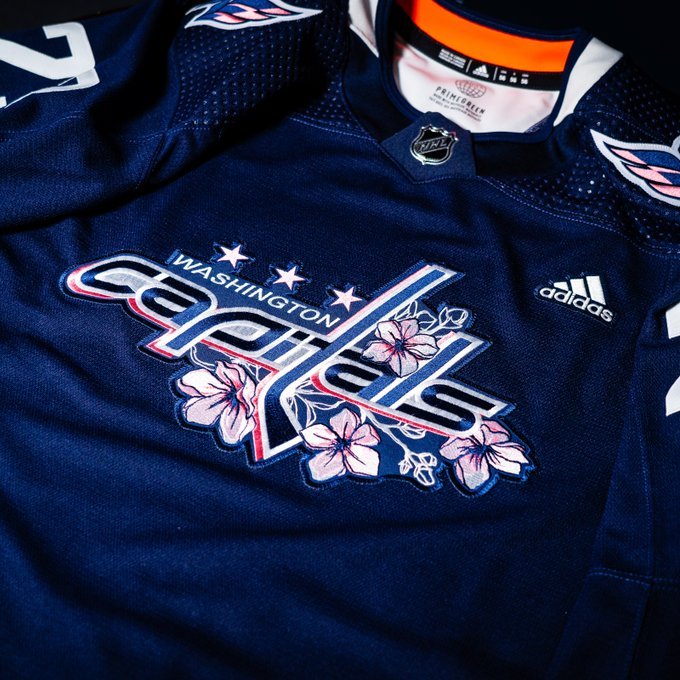
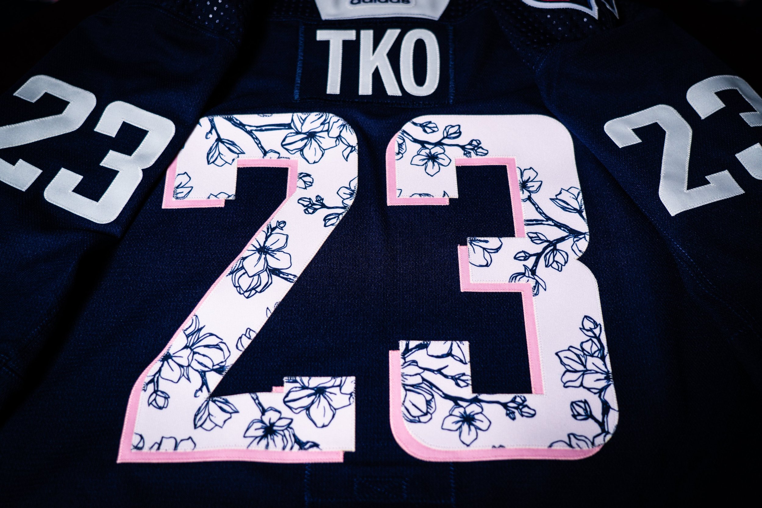
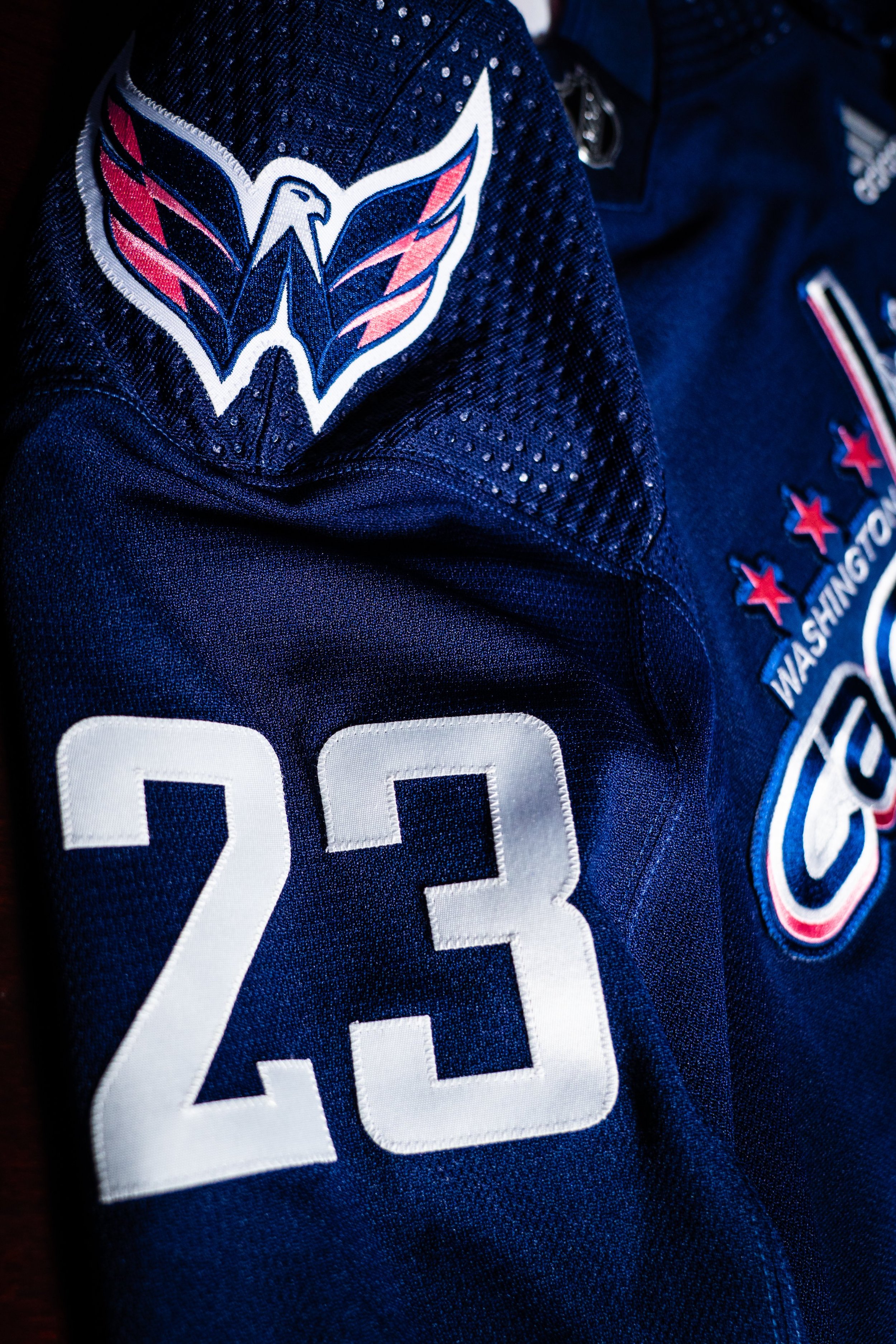
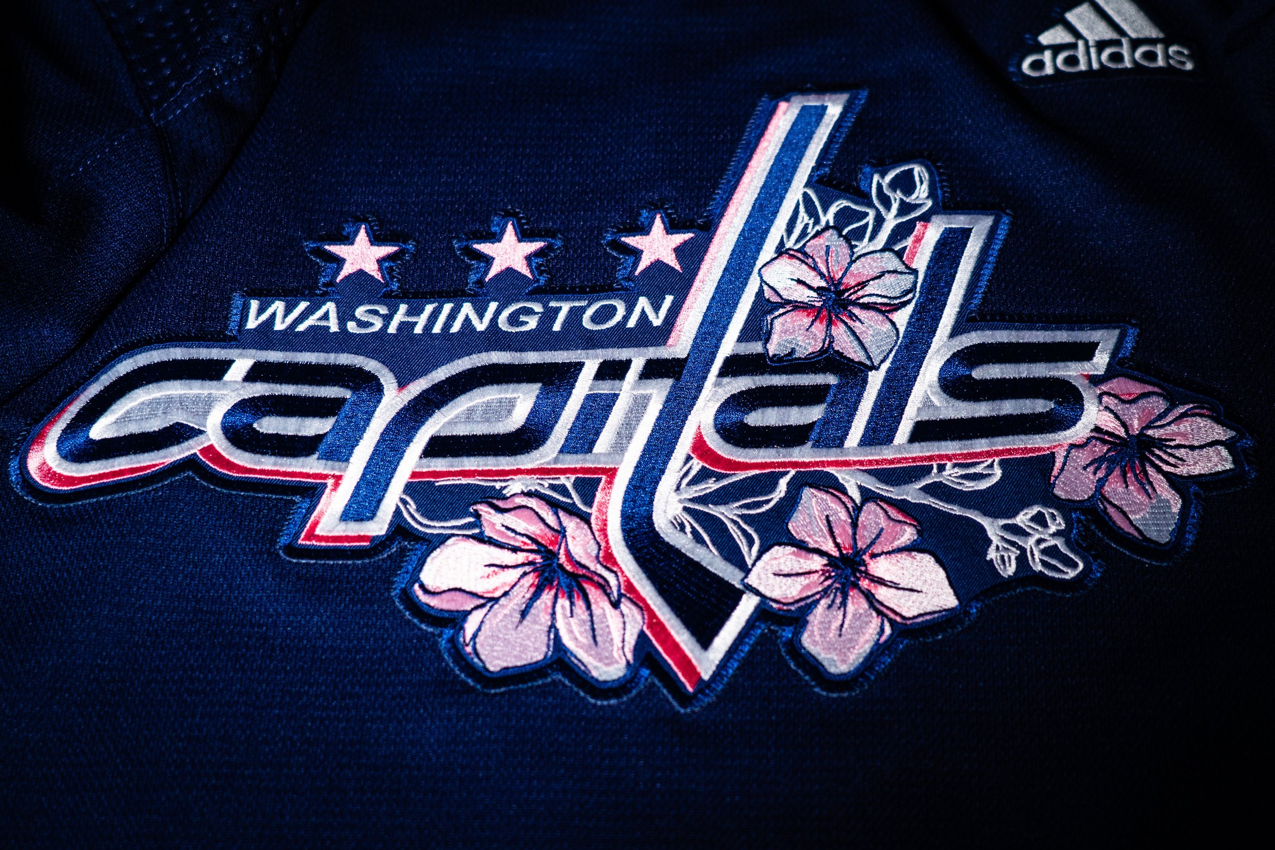
The Washington Capitals released special Cherry blossom warmup jerseys. The jerseys RECEIVED their INSPIRATIOn from DC’s cherry blossom season and feature hand-drawn blossoms around the Capitals logo. We see The design continue into the players numbering on the backs of the jersey.
The jersey, were designed by Washington, D.C., based artist Taylor Kampa Olson of TKOPaintings. We will see the capitals hit the ice in the special Jerseys during warmups when they hos the Rangers on April 2nd.
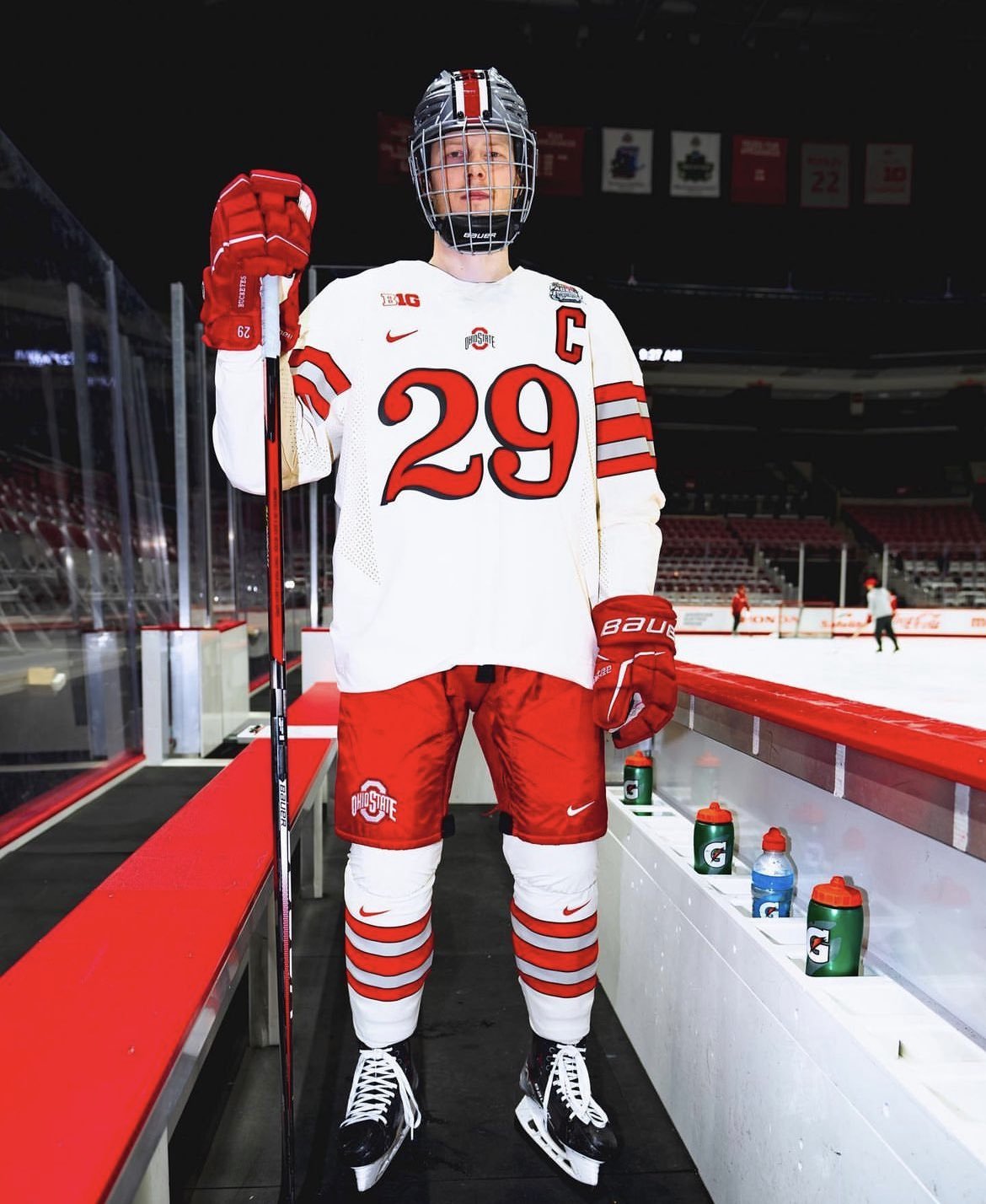
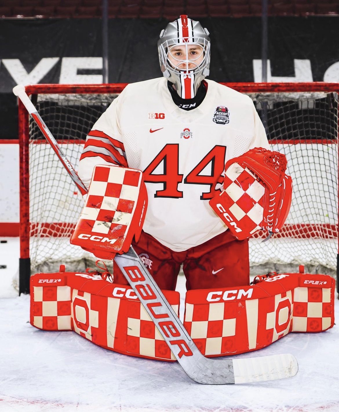
The Ohio State Hockey Team has revealed special threads for the Faceoff on the Lake matchup vs Michigan. The Buckeyes will wear white jerseys that feature scarlet numbers on the front, player names on the back with different cursive and stripe accents. The uniform’s look is meant to resemble that of the Ohio State football teams from back in the 1940s, which includes the 1942 national championship team. TO finish off the look the uniform includes scarlet pants, white socks and gray helmets that have Buckeye leaf stickers as accents.
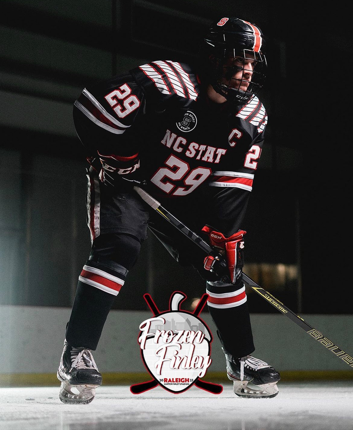
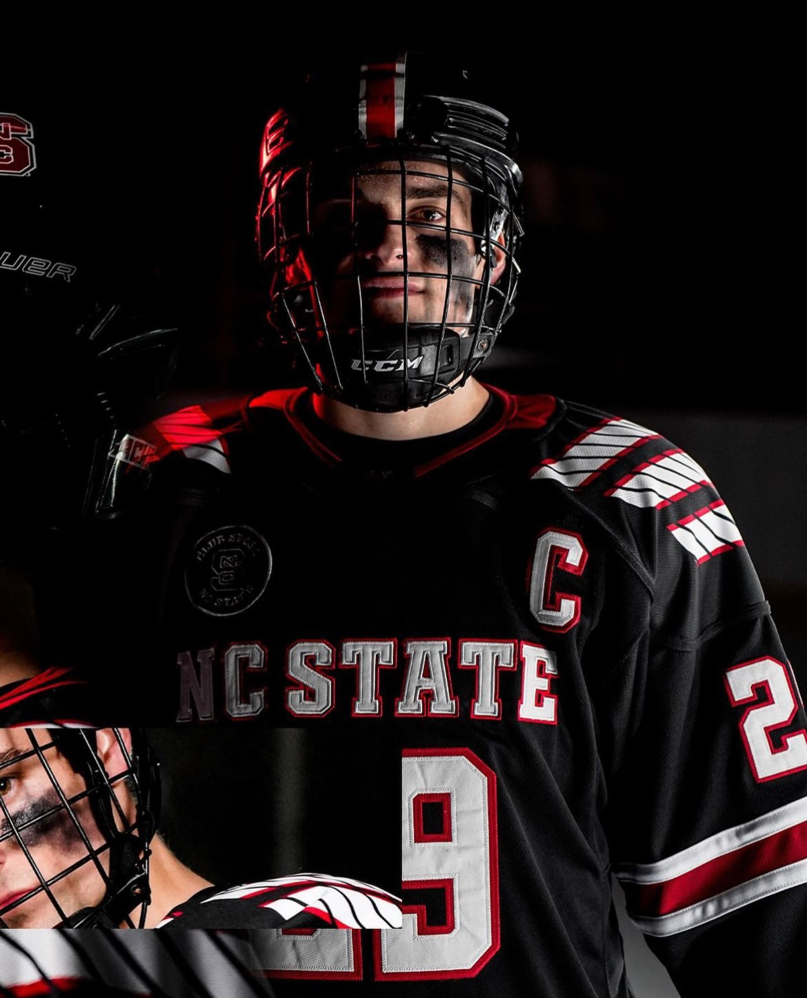
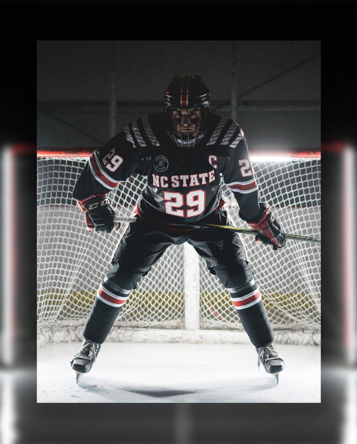
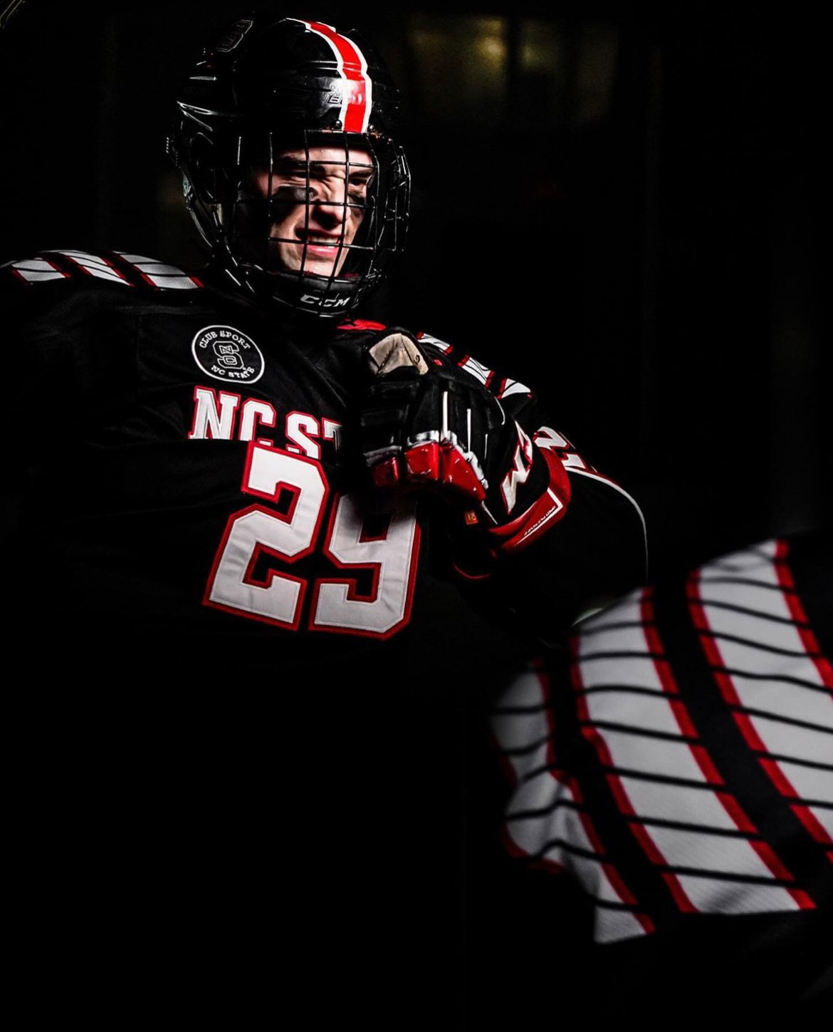
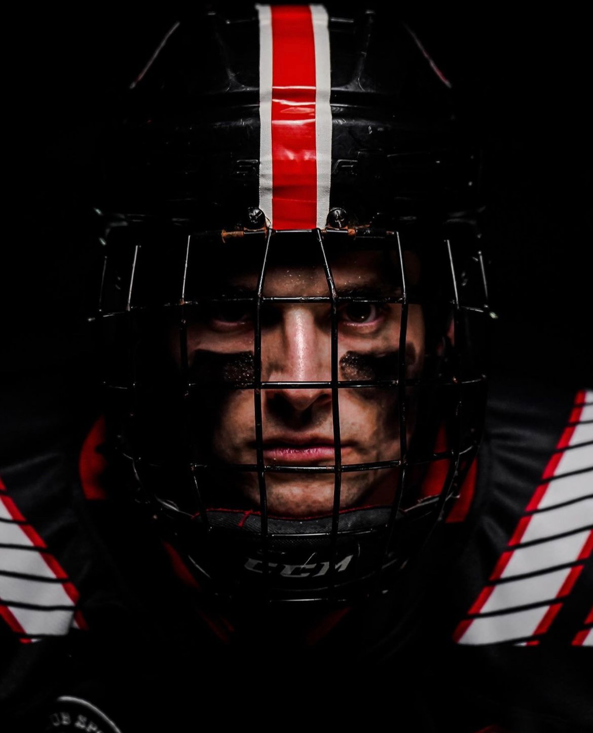
The NC State Wolfpack Hockey team has revealed their special uniform for the upcoming 2023 Stadium Series Game at Carter-Finley Stadium. The black threads feature the same shoulder pattern we have seen the NC State football team wear. Across the chest is NC State in white outlined in red with numbers on the front and sleeves to match. The black helmet will feature the NC State logo on each side with a bold red stripe straddled by two white stripes running down the center.