Posts in Baseball
MLB Unveils 2026 St. Patrick’s Day Caps

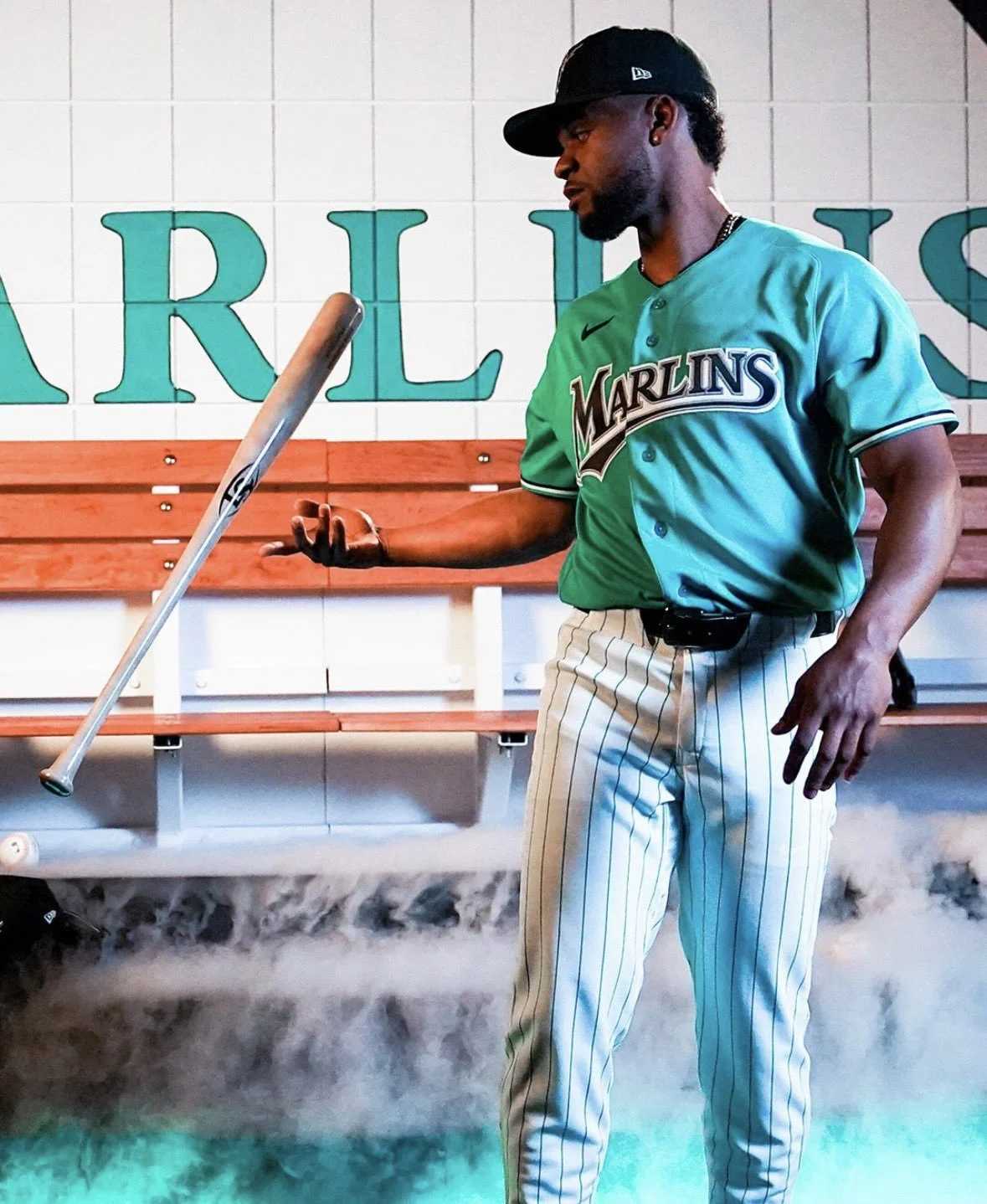
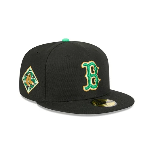
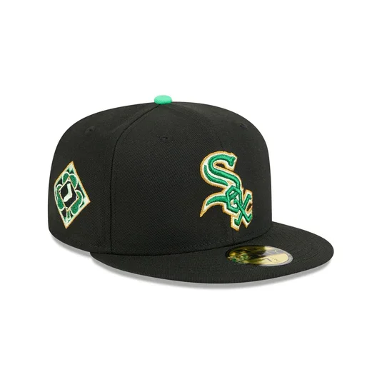
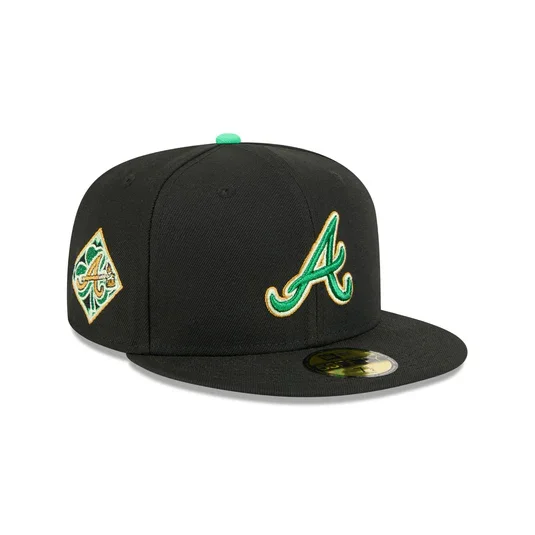
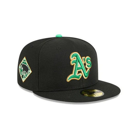
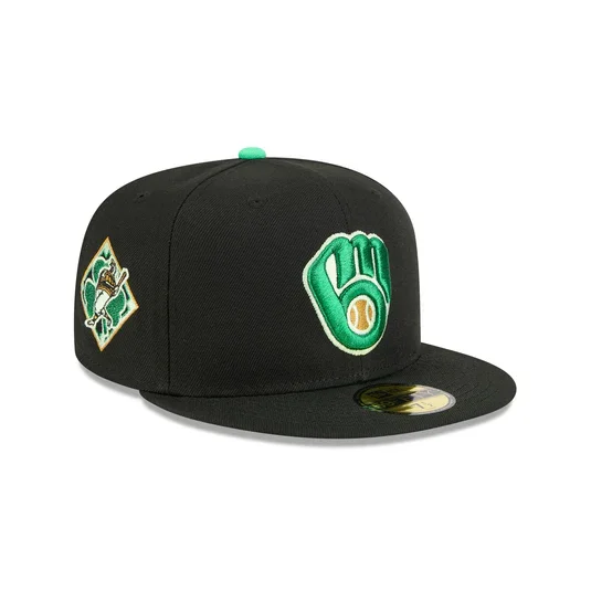
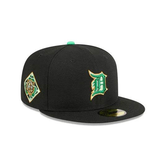
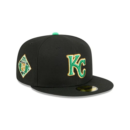
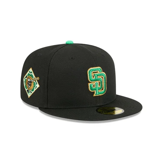
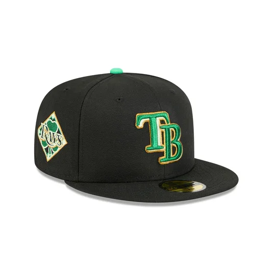
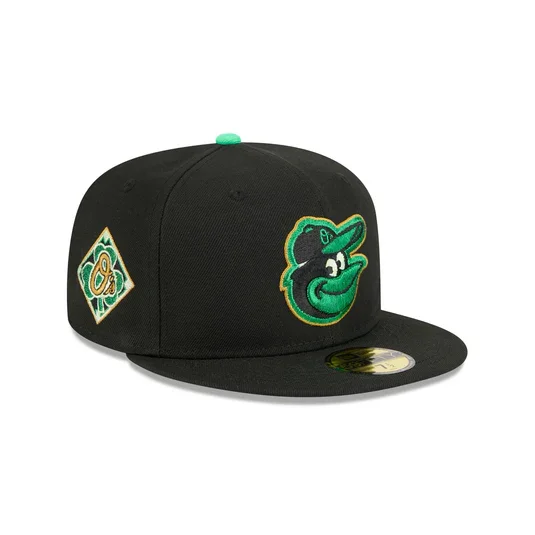
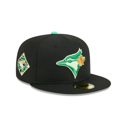
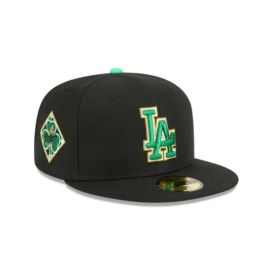
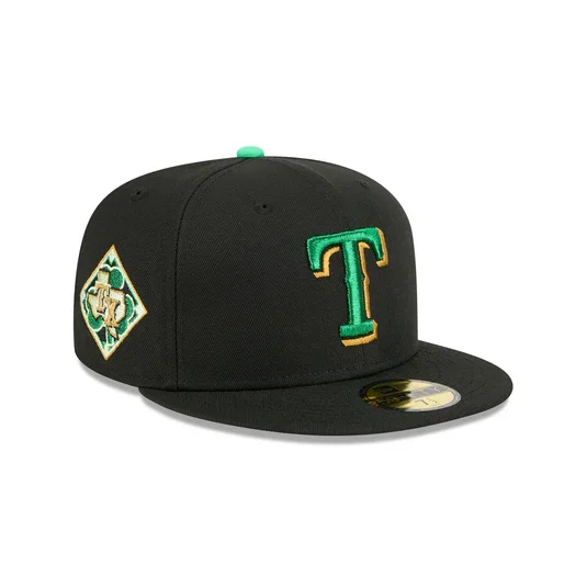
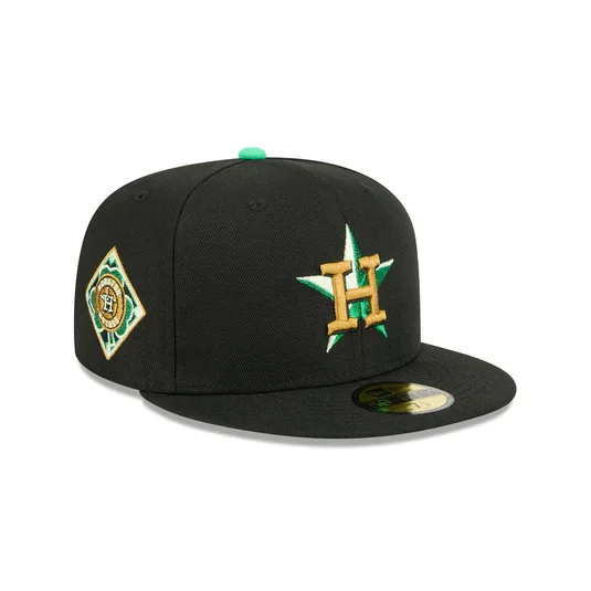
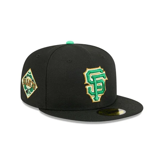
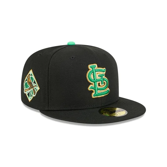
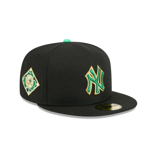
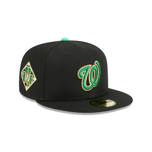
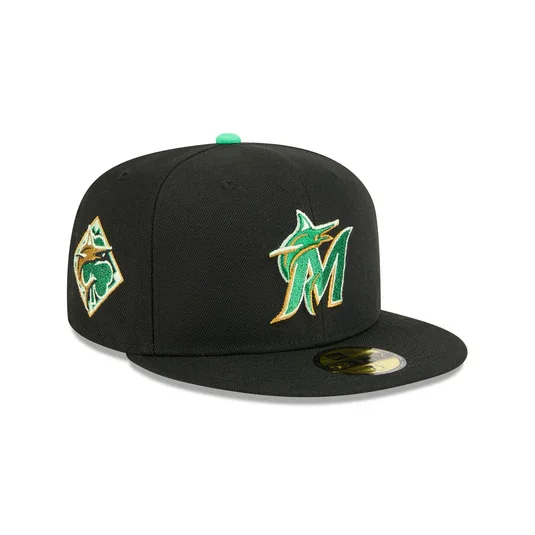
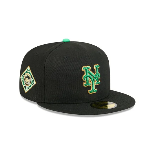
With St. Patrick’s Day around the corner, Major League Baseball and New Era have unveiled the official 2026 MLB St. Patrick’s Day caps, giving every club a festive look just in time for spring.

Each team across the league will sport the same themed design structure, allowing their individual logos to shine while still tying into the holiday’s signature green aesthetic.

The 2026 caps feature a black poly crown and visor. At the center of the design sits each team’s logo, embroidered in a Kelly green, gold, and white color combination. The vibrant palette ensures that the logos pop against the darker base while staying true to the St. Patrick’s Day theme.

Several smaller design touches bring the look together. A diamond-shaped side patch featuring a shamrock print adds another festive detail, while a green shamrock embroidered on the back of the cap reinforces the holiday connection. The hats are finished with a black undervisor, keeping the overall aesthetic clean and balanced.

MLB’s annual St. Patrick’s Day caps have become a fan-favorite collectible over the years, offering a seasonal twist on traditional team headwear.

Shop MLB Gear Here


See What Else Is New

Related Articles


West Virginia Baseball's Coal Rush Uniform

College baseball season is rolling, and the West Virginia Mountaineers baseball are already stacking up wins. Head coach Steve Sabins recently made program history by becoming the fastest head coach to reach 50 wins, and now the Mountaineers are adding a new look to their lineup as the season continues. WVU has unveiled its Coal Rush alternate jerseys, bringing one of the university’s most recognizable uniform themes to the baseball diamond for the first time.

The Coal Rush concept has already appeared across several Mountaineer programs, including football and basketball, and now it’s making its way to Kendrick Family Ballpark. The design features a bold black-and-white color scheme that pays tribute to the state’s deep roots in the coal mining industry, a defining part of West Virginia’s heritage.

While an official debut date has not yet been announced, the Mountaineers are expected to wear the Coal Rush jerseys during **Big 12 Conference play later this season. The debut could also bring a unique game-day atmosphere, similar to the themed introductions that accompanied previous Coal Rush uniform reveals across WVU athletics.

The Coal Rush look originally made waves when West Virginia Mountaineers football debuted the uniforms in 2024 against Iowa State Cyclones football. That night featured a powerful tribute to the state’s mining community, including coal miners greeting players during the Mountaineer Man Trip and a dramatic pregame light show where fans illuminated the stadium with their phone flashlights.

Similar celebrations followed when the theme appeared for the university’s men’s and women’s basketball teams, and fans will now be watching to see how the baseball program creates its own spin on the Coal Rush tradition.

Shop West Virginia Gear Here


See What Else Is New

Related Articles


Detroit Tigers Unveil Navy & Orange Alternate Uniforms

After nearly two years of research, fan surveys, and clubhouse feedback, the Detroit Tigers are introducing navy blue and orange alternate uniforms that honor the franchise’s history while delivering a fresh look for today’s game. The new alternates will be worn at select road and home games during the 2026 season, appear during Spring Training alongside MLB’s GrapefRuit League caps.

The project was shaped by 18 months of fan and player input, revealing a consistent message: supporters were ready for alternate uniforms but wanted the club’s tradition protected. The Tigers have long been one of the few MLB teams without a regular alternate set outside of their City Connect look, making this rollout especially significant. The challenge was clear, introduce something new while preserving the iconic Olde English “D” and the legacy tied to the 1984 championship era.

The final designs deliver exactly that balance. The home orange alternate jersey features the Olde English “D” across the chest in navy, echoing the placement seen on the club’s classic home whites. On the road navy version, the familiar script “Detroit” appears in orange with white trim, a colorful twist on the lettering that has defined the franchise for decades.

Both uniforms incorporate details inspired by the 1984 World Series team, including three-color sleeve striping, V-neck styling, and a circular Detroit Tigers patch reminiscent of the club’s tiger logo used from 1961 through the early 1990s. The striping extends to the white and gray pants, tying the full look together with a retro-modern aesthetic.

The alternate caps complete the set, featuring the Olde English “D” in orange paired with an orange bill, a nod to styles worn during the 1990s. These caps will be worn with the alternates once the regular season begins and will be available alongside the jerseys.

Detroit’s orange alternates will join the home rotation with the Motor City City Connect uniforms, which return for a third season. Together, the lineup offers a broader visual identity for the club while staying grounded in tradition, a thoughtful evolution that reflects both the franchise’s heritage and the city it represents.

For a team built on history, the Tigers’ new alternates prove modernization doesn’t require reinvention, just the right balance of legacy and bold design.

Shop Tigers Gear Here


See What Else Is New

Related Articles


BaseballSkye TilsonComment
Teal Is Back: Marlins Unveil Throwback Sunday Uniforms for 2026

The Marlins officially unveiled new throwback uniforms that will be worn on home Sundays throughout the 2026 season, bringing the franchise’s original signature shade back to the field in a big way. for the first time in team history, a teal Marlins jersey will be worn during a regular season game.

It is a move that instantly taps into nostalgia while still feeling fresh, reconnecting today’s roster with the era that first put baseball in South Florida on the map.

Teal is not just a design choice here. It is the foundation of the Marlins’ identity.

The base of the uniform pays tribute to the original Florida Marlins look introduced in 1993, the same era that produced the club’s early fanbase and two unforgettable championship runs. For a lot of fans, teal is the Marlins. It is the shade people picture when they think about the Fightin’ Fish.

Bringing it back full time on Sundays feels less like a throwback and more like a homecoming.

As Marlins Chief Brand Officer Alex Parker put it, teal represents the moment fans first fell in love with Marlins baseball. This set is meant to connect that legacy with today’s team and today’s fan.

The throwback look keeps things clean and intentional. Across the chest, an “Always Marlins” wordmark reinforces the idea that while colors and eras change, the name stays constant. It is a subtle but smart storytelling touch that bridges past and present without feeling forced. On the sleeve, players will wear a Florida Marlins legacy patch that honors the franchise’s beginnings. It is the kind of detail uniform nerds appreciate, giving the jersey a little extra authenticity and pride.

The overall construction blends modern tailoring and performance materials with a timeless aesthetic. So while it looks straight out of the 90s, it is built like a 2026 uniform should be.

Shop Marlins Gear Here


See What Else Is New

Related Articles


BaseballSkye TilsonComment
Twins Updates Their Navy Alternates for 2026

The Minnesota Twins are not overhauling their look for 2026, but they are making the kind of change uniform fans always notice. It is small. It is subtle. And it completely shifts the feel of the jersey.

Ahead of the new MLB season, the Twins are updating their navy blue road alternate set, replacing the arched “MINNESOTA” wordmark across the chest with a white scripted “Twins” logo. Same base color. Same cap. Same overall structure. But that one swap gives the uniform a much more classic, throwback personality. Sometimes the tiniest tweaks hit the hardest.

The new script sits front and center in white, paired with the familiar red player number below. Sleeve striping stays intact in blue, white, and red, keeping that clean, traditional Twins palette that has defined the club for decades. It feels less like a redesign and more like a refinement.

The sleeve patch also gets a meaningful update. Out goes the standard “TC” logo. In comes a state map of Minnesota, highlighted with the club’s red North Star planted directly over the Twin Cities. It is a small detail, but one that leans heavily into state pride and geography, giving the uniform a stronger sense of place. It is the kind of patch that feels tailor made for an alternate set.

On the back, the Twins flip the color balance for better contrast. Player names move from white to red, while numbers switch from red to white. The result pops more cleanly against the navy base and should read sharper from the stands and on TV.

This navy look officially replaces the previous navy alternate the team has worn since 2023. The rest of Minnesota’s uniform lineup remains untouched, including their City Connect set.

Flexibility is part of the plan here, too. The jersey can be paired with white pants at home or grey pinstriped pants on the road. No matter where it shows up, it will always be worn with the “M” cap, keeping the identity consistent. It is a modern alternate with some old school versatility.

There is also a cool historical wrinkle baked into the update. This marks the first time the Twins will wear “Twins” across the front of a regular road uniform since the powder blue road jerseys back in 1986. For decades after that, “MINNESOTA” became the road standard, especially following the late 80s rebrand that coincided with their 1987 World Series run. It is a throwback without actually being a throwback. And that balance is what makes this one work.

Not flashy. Not loud. Just a smart, heritage driven upgrade that feels right at home in the Twins’ closet.

Shop Twins Gear Here


See What Else Is New

Related Articles


BaseballSkye TilsonComment
Hawaiʻi Baseball Unveils Nike Uniforms For 2026

A new season is right around the corner in Honolulu and the University of Hawaiʻi baseball program is entering 2026 with a fresh look.

The Rainbow Warriors debuted one of their new Nike uniform sets during last weekend’s alumni game. The spotlight was firmly on a cream-colored uniform featuring a vintage Rainbow Warriors colorway, instantly standing out as a throwback-inspired nod to the program’s past. the team has also introduced Kelly green home uniforms, Classic road grays, and Pinstriped designs paying homage to Hawaiʻi baseball history

The collection blends modern performance with visual cues that longtime fans will instantly recognize.

For senior infielder/outfielder Ben Zeigler-Namoa, the uniforms represent more than just game-day gear they’re part of the program’s identity.

“Coach Rich talks about wanting his guys to fill out their uniforms and look good in them,” Zeigler-Namoa said. “Our uniforms always look clean, and they do a really good job with them. I’m just excited.”

Head COach Rich Hill also noted that the uniforms were designed with the future in mind, particularly the next wave of Hawaiʻi athletes watching from the stands.

“The keiki are really looking up to us,” he said. “I want their jaws to drop when they see the names on the back, the pinstripes, the Kelly green and the grays — paying homage to what Coach Les started. I love it.”

With vintage elements, bold colorways, and a clear respect for the program’s roots, Hawaiʻi’s 2026 uniforms strike the perfect balance between past and present. As the Rainbow Warriors prepare to take the field, they’ll do so wearing a look that reflects not just a team, but an entire state.

Shop Hawaii Gear Here


See What Else Is New

Related Articles


BaseballSkye TilsonComment
NASCAR-Inspired Threads for the 2025 Speedway Classic

When baseball meets horsepower, you get a uniform drop like no other.

On August 2nd, the Atlanta Braves and Cincinnati Reds will collide under the lights for the 2025 Speedway Classic, and the fits are going full throttle. While the matchup itself is one to circle on the calendar, it’s the racing-inspired gear that’s turning heads before first pitch.

Nike, New Era, and Rawlings teamed up to deliver a collection that blends the heart of Major League Baseball with the adrenaline of NASCAR. The jerseys stick close to the Braves’ and Reds’ traditional looks but inject just enough racing DNA to shift into high gear. Custom back numbers mimic those found on race cars — bold outlines, dynamic shadowing, and a sleek italicized design that gives off straight speed.

But it doesn’t stop at the jerseys.

New Era Caps: The Braves will sport a cap featuring flames blazing off the visor, while the Reds will bring the heat with checkered flag graphics — a nod to that finish-line energy.

Rawlings Batting Helmets: These helmets steal the show. Designed to resemble NASCAR lids, they come equipped with race car-style numbers, checkered flag emblems, and racing decals that make them feel more pit crew than dugout.

The Speedway Classic is bringing something fresh to the league — not just on the field, but in the threads too. Whether you’re a diehard baseball fan or a motorsports junkie, this is the kind of drop that hits in both worlds.

Shop Speedway Classic Gear Here


See What Else Is New

Related Articles


2025 MLB Stars and Stripes Caps

Just in time for Independence Day, Major League Baseball and New Era have dropped the 2025 edition of their annual Stars and Stripes cap collection, and this year’s look adds a fresh twist to a fan-favorite tradition.

All 30 MLB teams are represented in this year’s drop, which officially launched on June 9. The caps feature a light blue crown, a gray underbrim, and a contrasting white rope with flecks between the crown and the brim, giving off a vintage, nautical feel. The team logos across the front are outlined in royal blue and filled with the American flag pattern of stars and stripes, delivering a patriotic punch that's become a signature of these yearly designs.

Each team’s cap is styled with either a royal blue or red brim, with the squatchee (the button on top) and the New Era logo matching the brim color. The rope across the front features flecks that contrast with the brim (blue flecks on red brims, red flecks on blue brims), adding a subtle layer of detail.

On the back, U.S. teams’ caps carry the MLB batterman logo redesigned in red, white, and royal blue — continuing the Independence Day theme right through every angle.

But north of the border, the Toronto Blue Jays get a custom take. Their cap swaps the stars and stripes for a clean red and white version of their team logo with no American flag elements — a nod to Canada’s own national identity. The brim, top button, rope flecks, and New Era logo are all in red, while the back MLB logo goes red and white only.

The 2025 Fourth of July collection blends tradition and trend, with modern color blocking and vintage-inspired accents, making it one of the most wearable and collectible drops yet. Whether you're hitting the ballpark or the barbecue, this year’s Stars and Stripes caps deliver a full dose of summertime swagger.

Shop MLB Gear Here


See What Else Is New

Related Articles


Red Sox Unveil New City Connect Uniforms Inspired by Fenway Park

When the Boston Red Sox take the field for their Rivalry Weekend opener against the Braves, they’ll do so in a fresh new look—one that pays homage to one of the most iconic venues in all of sports. The latest addition to Nike’s City Connect series draws its inspiration not from the city at large, but from the beating heart of Boston baseball: Fenway Park.

Built in 1912, Fenway is the oldest stadium in Major League Baseball, and it’s more than just a ballpark—it’s a symbol, a shrine, and a living thread connecting generations of Red Sox fans. That emotional connection became the driving force behind the new City Connect uniforms, which are draped in the unmistakable hue of the Green Monster.

“We’ve been intrigued by the idea of somehow making Fenway the star of a jersey,” said Troup Parkinson, Red Sox chief marketing and partnership officer.

And they’ve done just that. The jerseys are a study in subtle tribute, with clever nods to Fenway’s details woven throughout the design. The Green Monster scoreboard font spells out “Red Sox” across the chest—a decision made after experimenting with “Boston,” which ultimately didn’t capture the same visual impact. As Parkinson noted, “We kind of liked the idea that the only Boston front jerseys we wear are on Patriots’ Day.”

The color itself was the biggest design challenge. Matching the exact shade of the Monster took years of collaboration between the Red Sox design team and Nike. But their patience paid off, with a final product that hits all the right notes.

the jersey numbers appear on both the front and back, with the front numbers in yellow—mirroring the color used on the Fenway scoreboard when the Sox score a run—while the back numbers are in white to match the manual scoreboard plates. The neckline is shaded to resemble the concrete interior of the Monster, and inside the neck is a stitched “1912” as a tribute to the year Fenway opened. Near the bottom of the jersey, tucked into the pants, are small green and red dots that represent the balls, strikes, and outs display from the scoreboard. These subtle details will become even more visible when the team debuts their City Connect batting practice hats next week.

The launch of these jerseys marks the second installment in Boston’s City Connect story. The fan-favorite yellow-and-blue Boston Marathon-inspired set unveiled in 2021 will remain in the rotation, but this new green set brings a different energy—grounded not in tradition alone, but in the living, breathing legacy of Fenway Park.

The Red Sox will wear the new City Connects again on May 23 against the Orioles, a night that will include a special ballpark giveaway for the first 7,500 fans. As for future appearances, that’ll be up to manager Alex Cora and the players.

“I wouldn't be shocked if AC makes this kind of the Friday uniform and then we wear yellow Saturday and white Sunday,” said Parkinson. “But we’ll see.”

Regardless of how often they’re worn, one thing is clear: this jersey isn’t just another alternate—it’s a tribute. A statement. A salute to the place where Red Sox legends are made, and where Bostonians come together in celebration, heartbreak, and everything in between.

Fenway Park isn’t just the backdrop. It’s the main character.

Shop Red sox Gear Here


See What Else Is New

Related Articles


Houston Baseball 'Houston Blue' Threads

The Houston Cougars baseball team has officially stepped into the colorway crossfire, debuting a bold new set of uniforms unveiling what it’s calling ‘Houston Blue’ uniforms. And yes, they’ve entered the blue uniform conversation in a big way.

The uniforms feature light blue jerseys with ‘Houston’ written in clean white script, outlined in red—a nod to both tradition and bold experimentation. The colorway is immediately recognizable for its layered references, especially for longtime football fans in Texas. And that’s exactly why it’s turning heads.

The baseball cap features a light blue bill and back, contrasted with a white front panel that proudly displays the Cougars’ red UH logo.

Both sleeves are patched up—one with the Big 12 logo and the other with the Texas state flag.

To cap it off, players will rock custom Marucci gloves stitched in matching light blue script.

This isn’t just about aesthetics. The Cougars' use of Columbia blue continues a broader trend at the University of Houston that’s made waves across the state. For context: the Tennessee Titans, who own the rights to the former Houston Oilers’ brand and color scheme, have made clear their displeasure over others tapping into the iconic “Luv Ya Blue” visuals.

Shop Houston Gear Here


See What Else Is New

Related Articles