Game of Thrones Soccer Jerseys
As today marks the beginning of the final season of Game of Thrones designer Josh Guereque designed a jersey for what each of the different houses within the world of Westeros would look like. Check out each of the looks below along with the inspirations behind each design.
Shop Game of Thrones Gear Here

Team Stark
The gray tone for the jersey represents the grey tone of the dire wolves coloring. We see the top portion of the jersey covered in the texture of snowflakes reflecting on the family saying of “Winter is Coming”. The same phrase is placed on the back of the jersey near the neckline. Located on the bottom of the jersey is a faded forest texture that draws inspiration from Winterfell and the guardians of the north. The Stark crest is found on the chest of the jersey with a red outline to bring attention to the Weirwood tree.

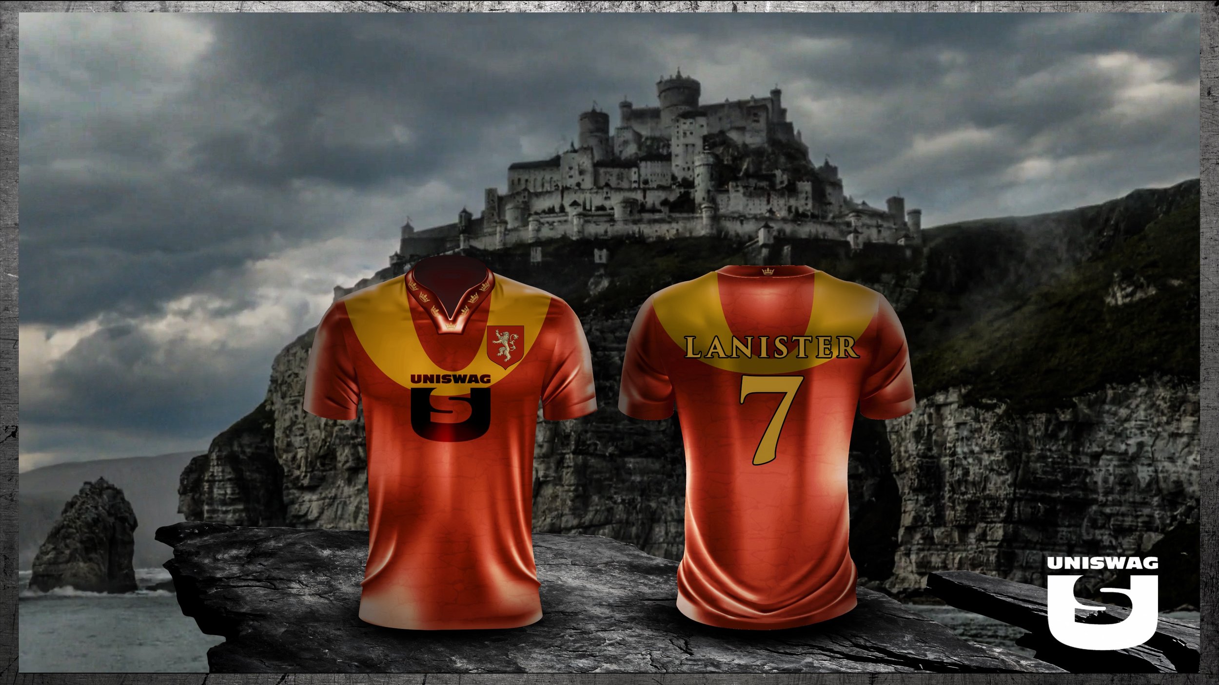
Team Lannister
The Lannister family is well represented with the red tones found throughout the jersey. A rock texture has been added to tie in the home of the Lannister‘s at Casterly Rock. Around the collar are crowns that are inspired by the Lannister’s pursuit for power. The two giant golden loops found on both sides of the jerseys symbolize the royalty of the Lannister family but also bring a more important detail of their history to light. If you look directly above the shoulders of the jersey the loops create a zero which represents their famous slogan “A Lannister always pays his debts”.
Team Targaryen
The black Targaryen jersey is highlighted with fiery tones and Dragon textures. The jersey is covered in fiery volcanic cracks to represent the fire and blood of the Targaryen family. On the sleeves and collar of the jersey, there is a texture of dragon scales representing the mother of dragons. Located on the back of the collar there is a crown for the long reign of the Targaryen family throughout Westeros’ history.

Team White Walkers
The icy cold and blue tones of the White Walkers was a major inspiration for this jersey. The spiral design seen on the front is meant to represent the symbols left after the white walkers take over an area. The cold and empty souls of the white walker is signified through the light blue coloring found within the design. On the back of the jersey there are light blue veins inspired from the cold blood and heart that runs through the white walkers and their army of the dead.

Team Night’s Watch
The Nights Watch prides themselves on being the protectors of the wall and that is represented in the ice stripe on the top of the jersey. The crow is a big part of the Nights Watch identity and that is shown by the crow feather texture on the back of the midnight black jersey.

See What Else Is New
Featured

Related Articles
Featured