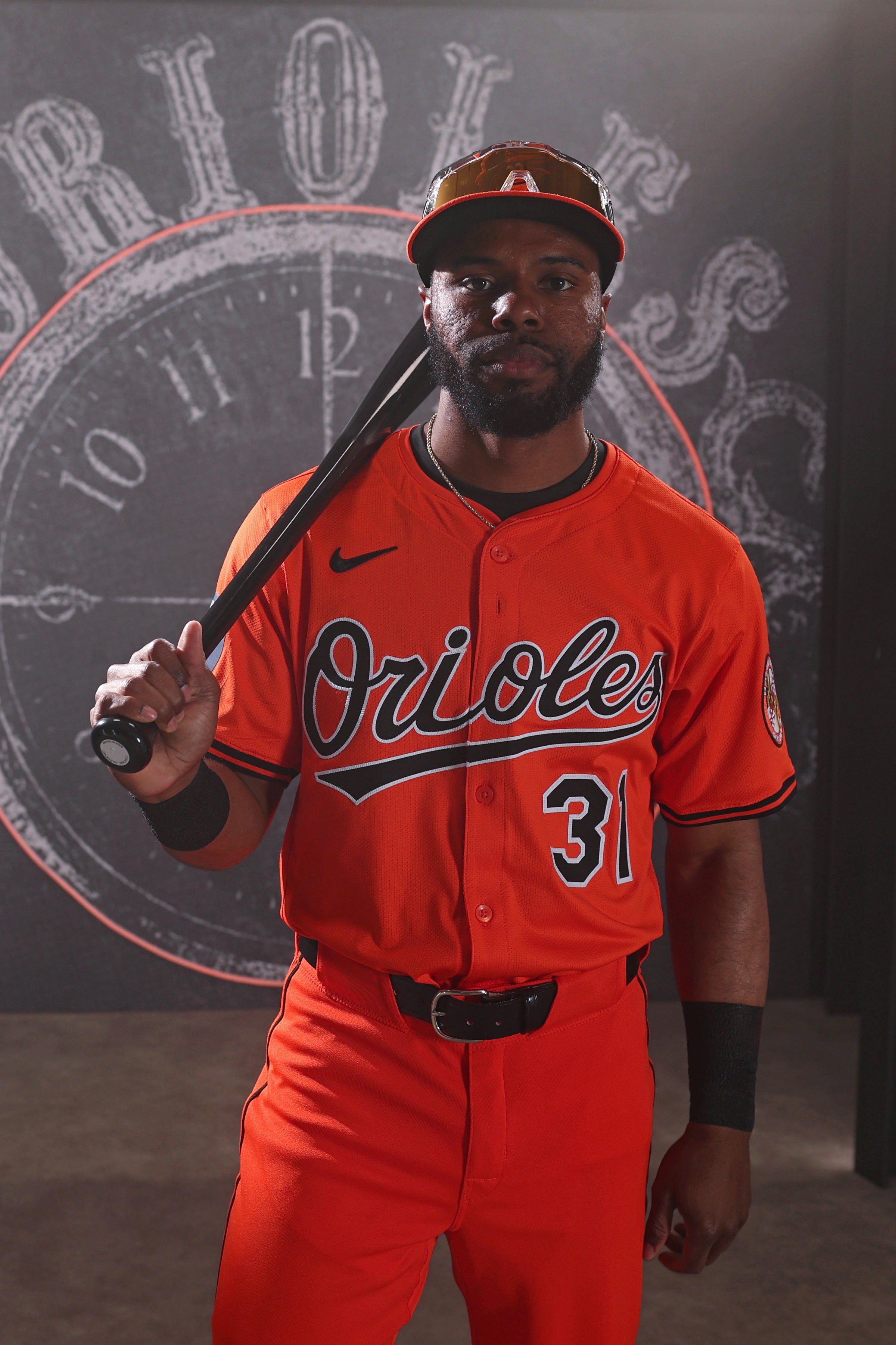
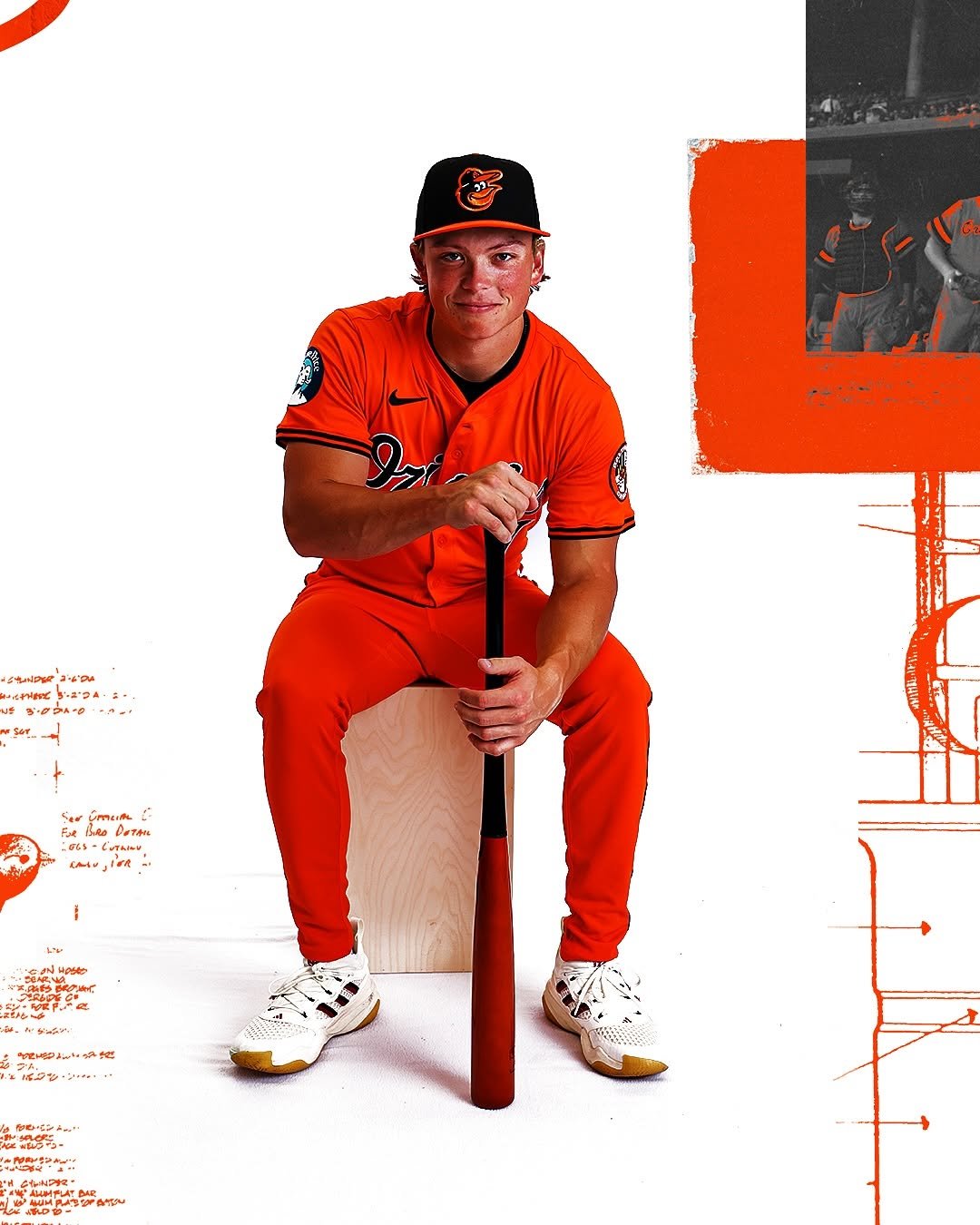
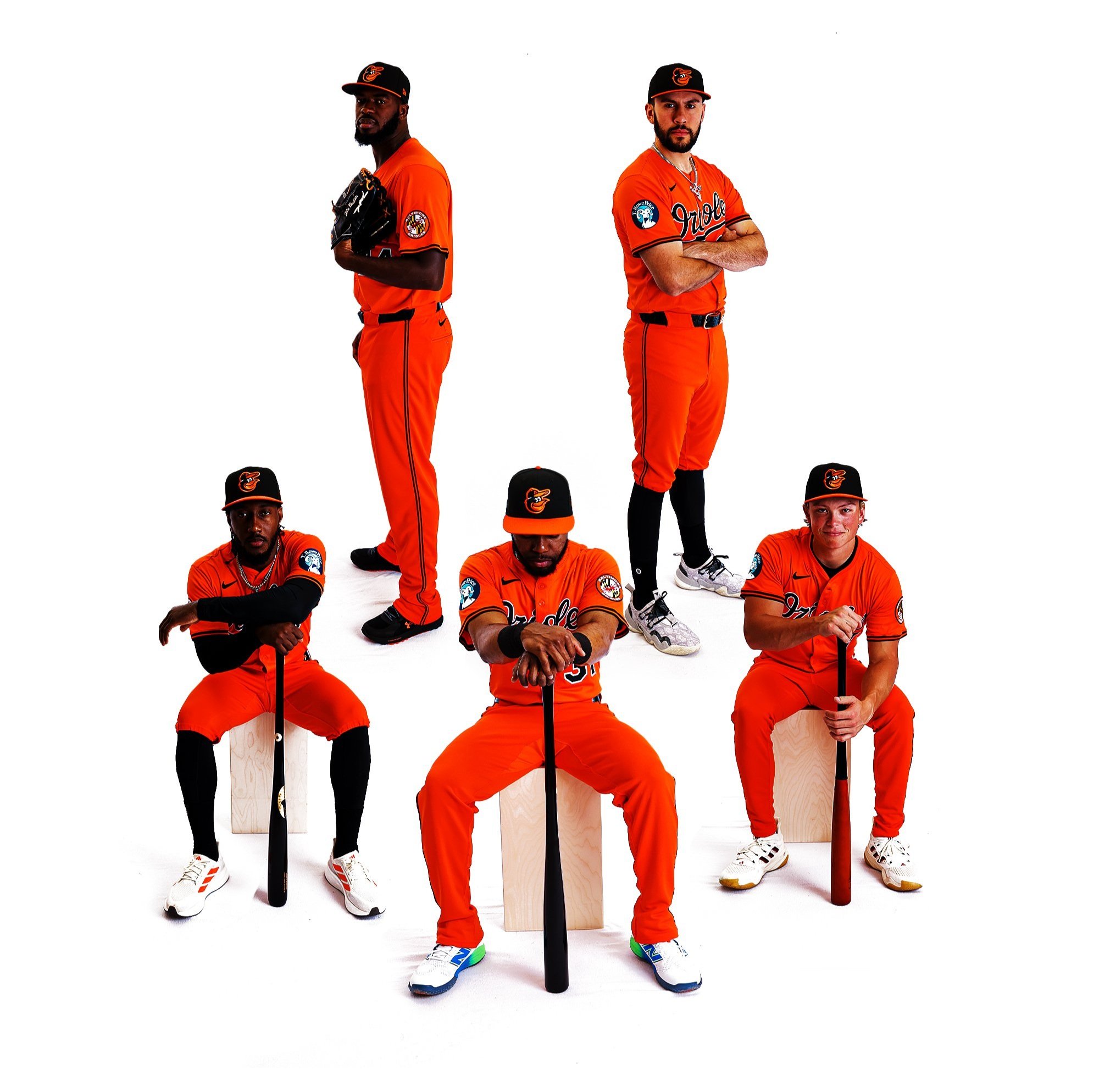
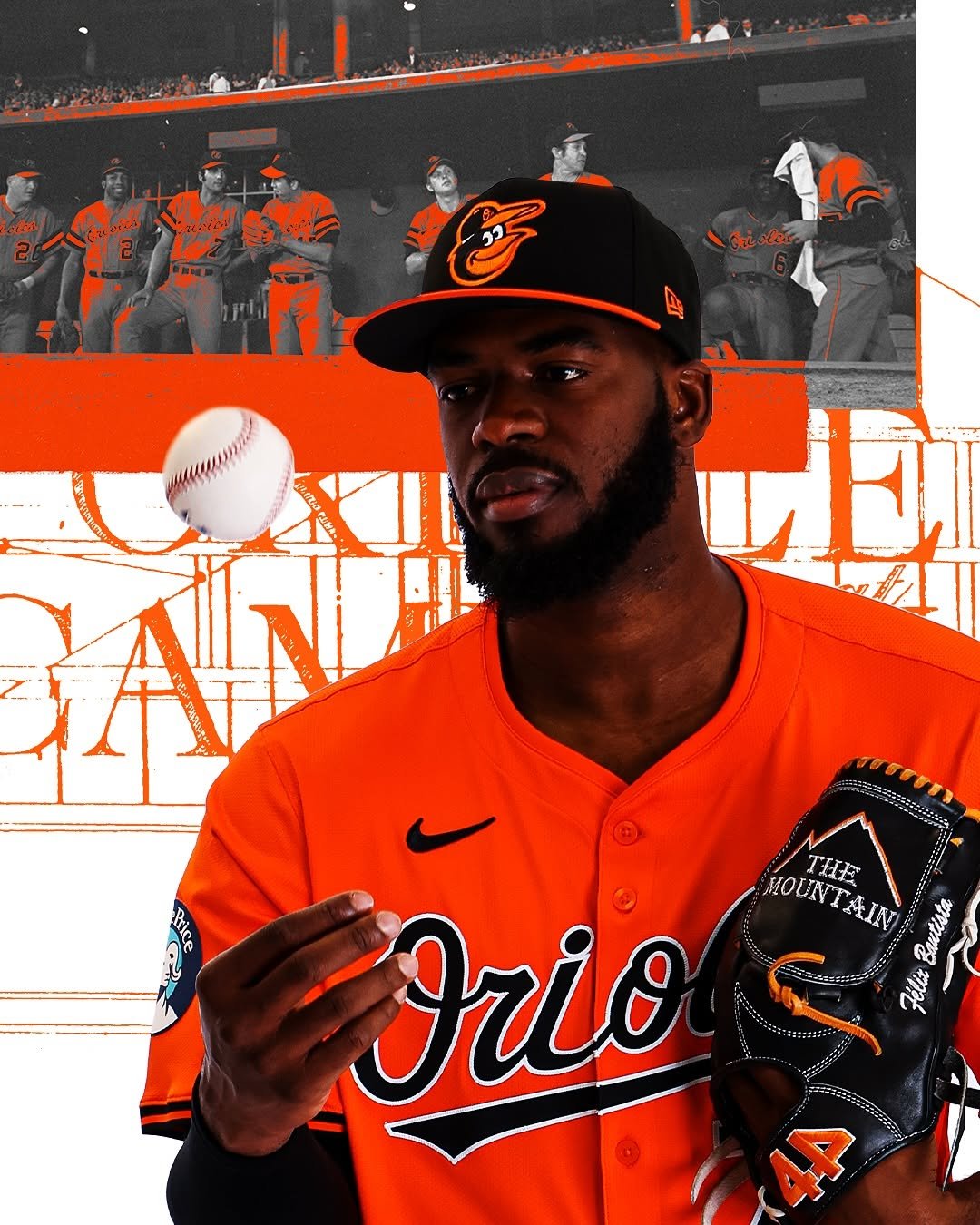
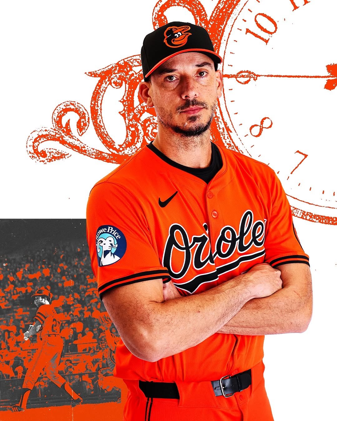
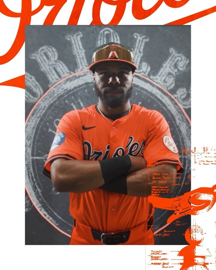
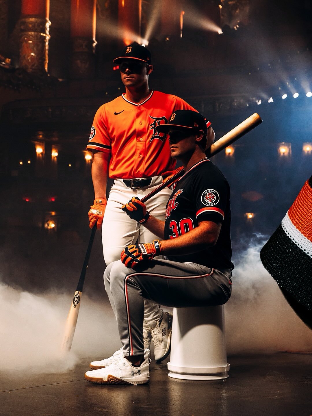
The Baltimore Orioles are set to turn heads this season with the return of an all-orange uniform combination, a look that hasn’t been part of their official rotation in over 50 years. Announced on Monday, the O’s will now pair their familiar orange alternate jersey—a staple since 2012—with matching orange pants, creating a vibrant, unified set.
This new uniform combination draws inspiration from Hall of Famer Brooks Robinson and the classic all-orange look of the early 1970s. Perhaps the most famous moment featuring this style came during the 1971 season, when the Orioles’ legendary pitching staff—Dave McNally, Mike Cuellar, Pat Dobson, and Jim Palmer—posed in the monochrome orange set after each winning 20 games in a single season. The bold look was dropped after the 1972 season, but now, after decades away, it’s making a comeback.
Fans won’t have to wait long to see the return of the all-orange Orioles on the field. The look will debut on April 12, when Baltimore hosts the Toronto Blue Jays at 4:05 p.m. ET. As an added bonus, the first 15,000 fans in attendance will receive an orange Cedric Mullins T-shirt, helping to fill Camden Yards with a sea of orange.
While the addition of orange pants shakes things up, the rest of the Orioles’ uniform set remains unchanged from 2024. Players will pair the look with their hats featuring a black front panel, tying the modern refresh back to Baltimore’s deep baseball roots.
With the resurgence of throwback aesthetics across Major League Baseball, the Orioles’ decision to bring back this iconic, all-orange look is both a nod to their storied past and a bold statement for the future. Fans can expect plenty of excitement when Baltimore takes the field in this striking new combination.
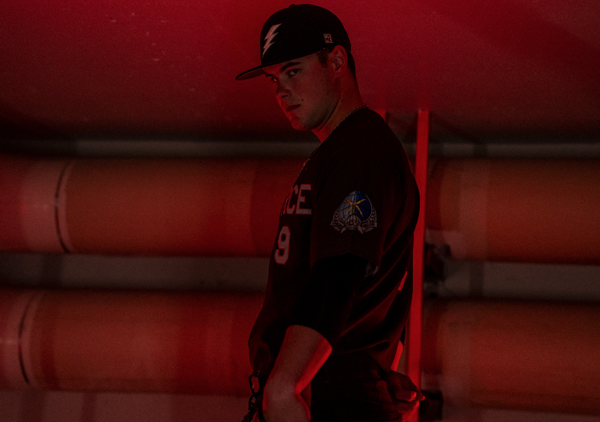
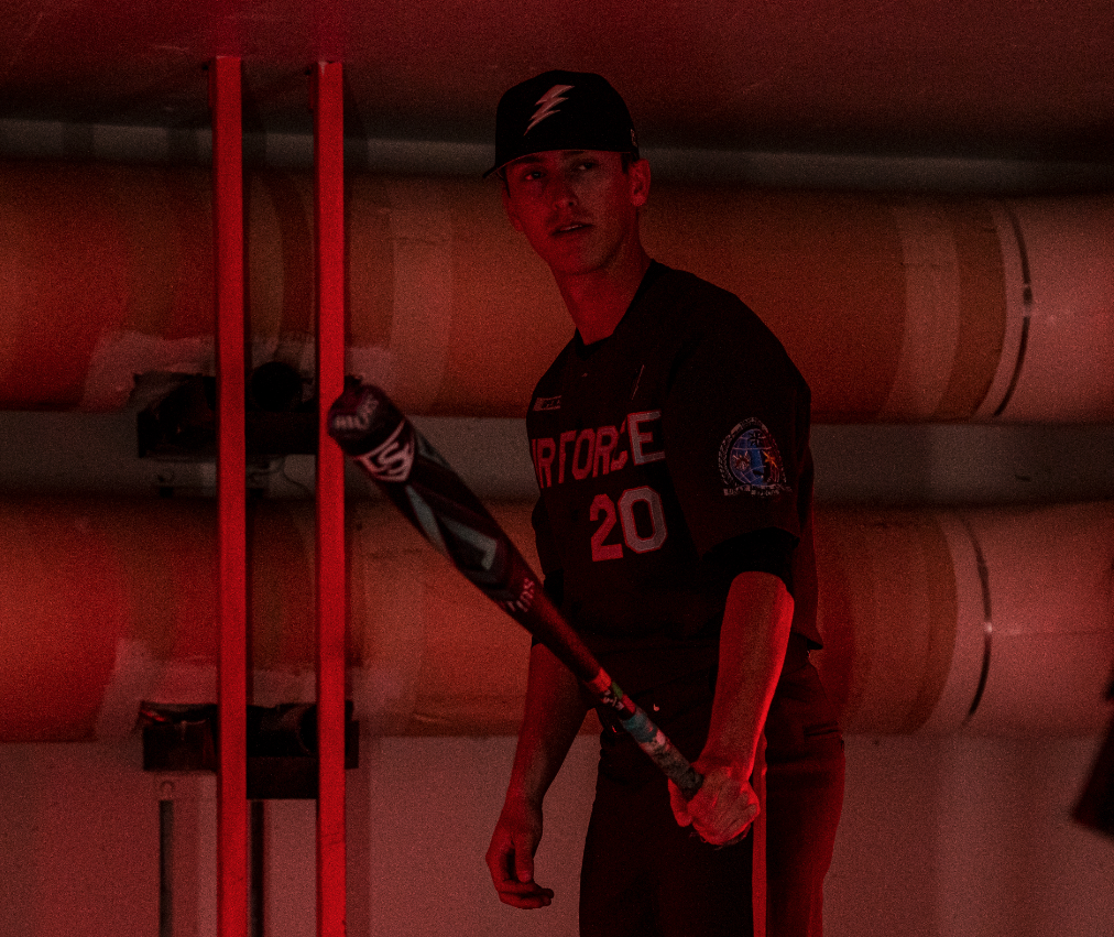
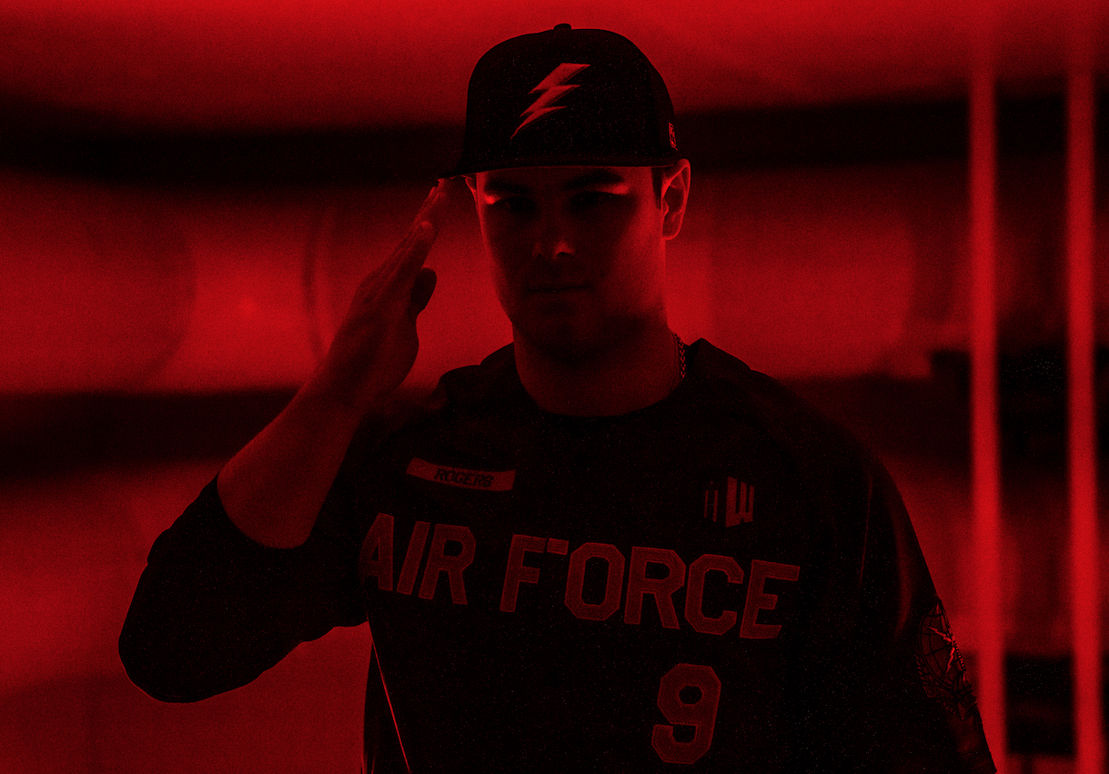
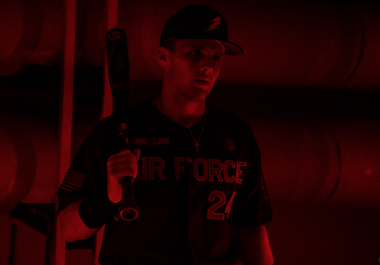
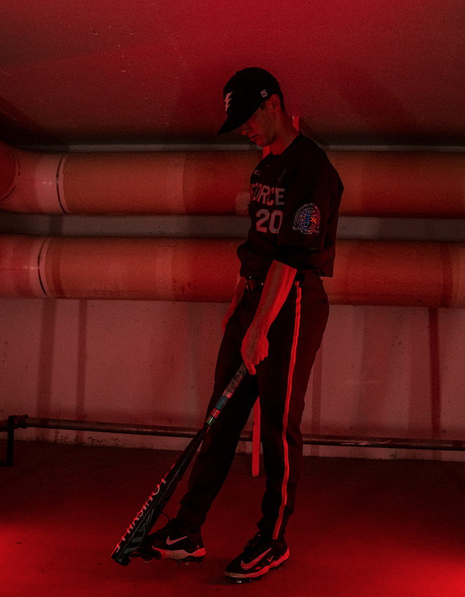
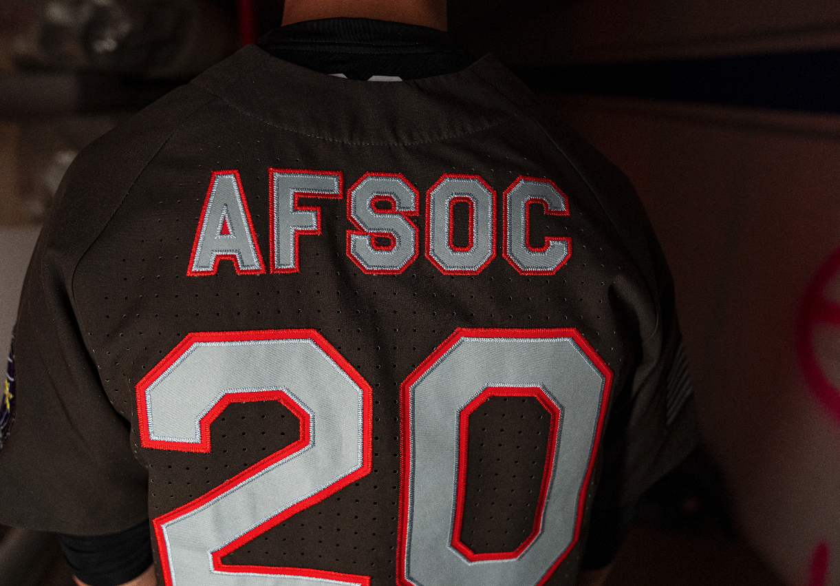
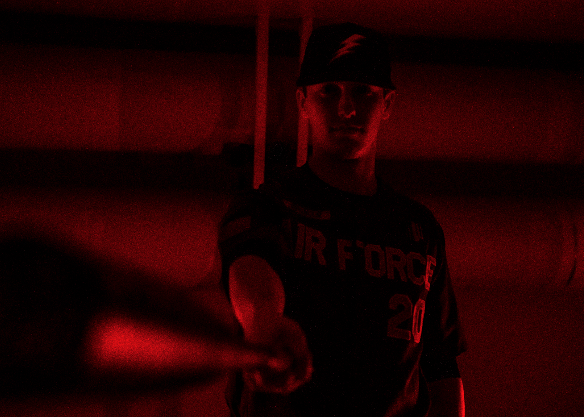
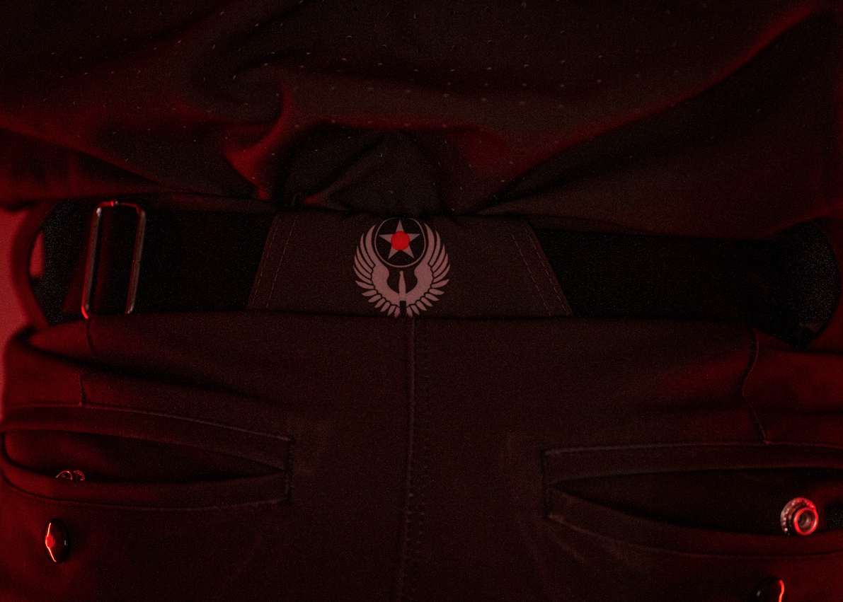
The Air Force Falcons baseball team has revealed a special edition Air Power Legacy Series uniform for the 2024 season, paying tribute to the Air Force Special Operations Command (AFSOC). This year’s design is packed with symbolic elements that honor the elite Airmen who carry out critical special operations missions around the world.
Each season, Air Force Athletics uses the Air Power Legacy Series to highlight different aspects of Air Force history and heritage, and in 2024, the focus is on AFSOC. The Falcons’ latest uniform features carefully crafted details that reflect the bravery and skill of these Airmen.
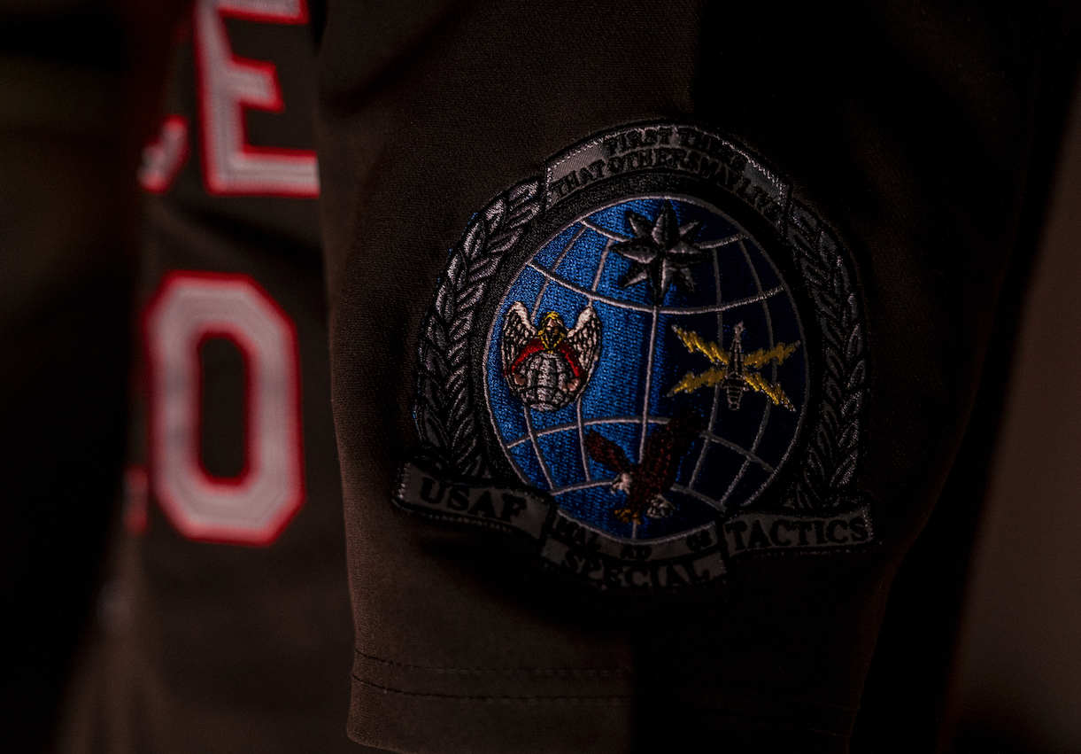
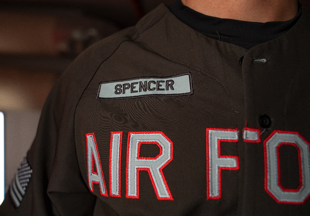
The jersey is designed with red-outlined numbers, a nod to the scarlet beret worn by Special Tactics Combat Controllers. Across the back, the nameplate reads "AFSOC", further cementing the connection to the special operations community. The uniform also includes meaningful sleeve patches—an American flag on the right sleeve and one of three Air Force Special Tactics badges on the left sleeve.
This latest Air Power Legacy Series uniform is more than just a jersey—it’s a powerful tribute to the Air Force Special Operations Command and the warriors who execute high-risk missions worldwide. With bold design choices and meaningful symbols, the Air Force Falcons will take the field not just representing their academy, but honoring the legacy of AFSOC.
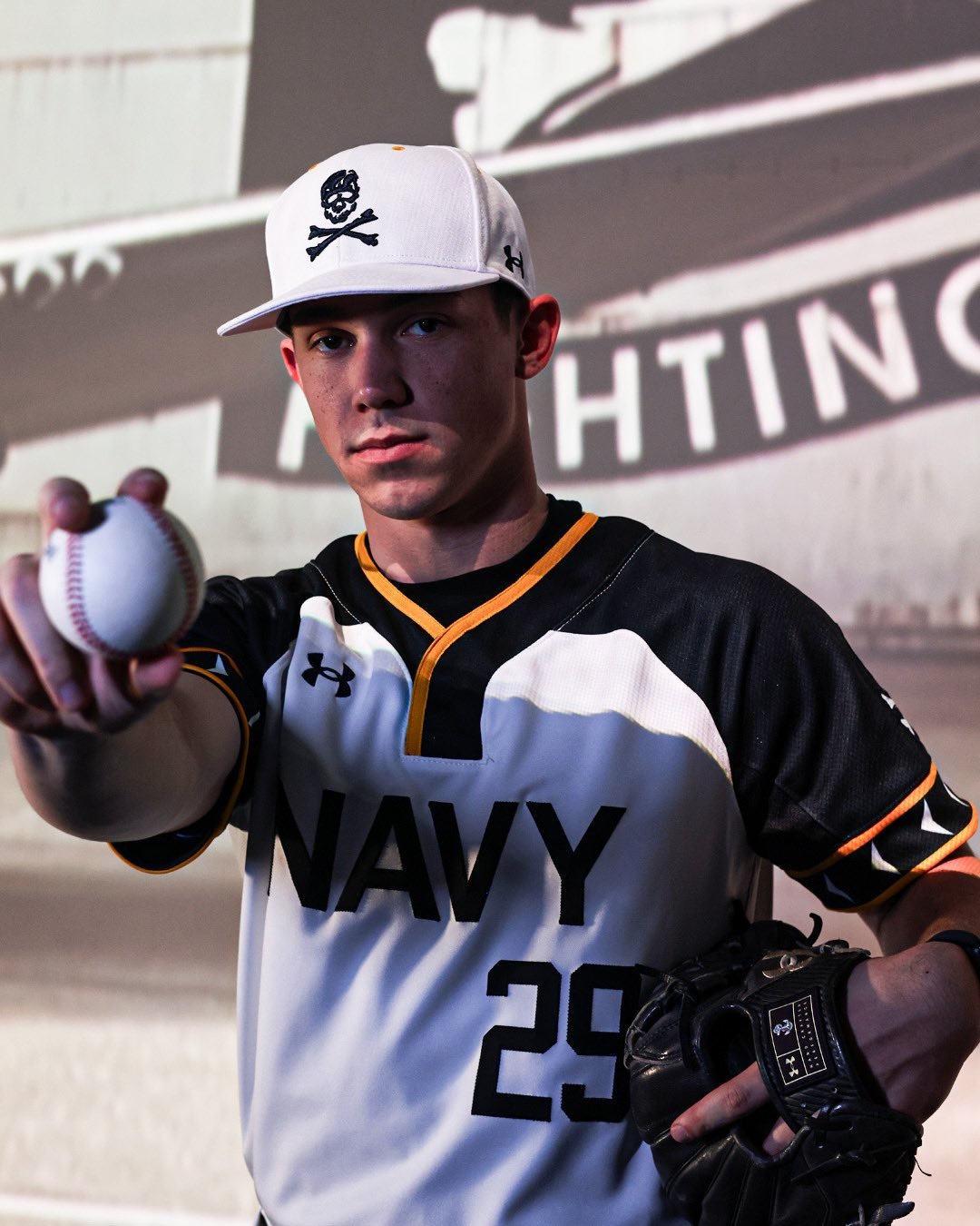
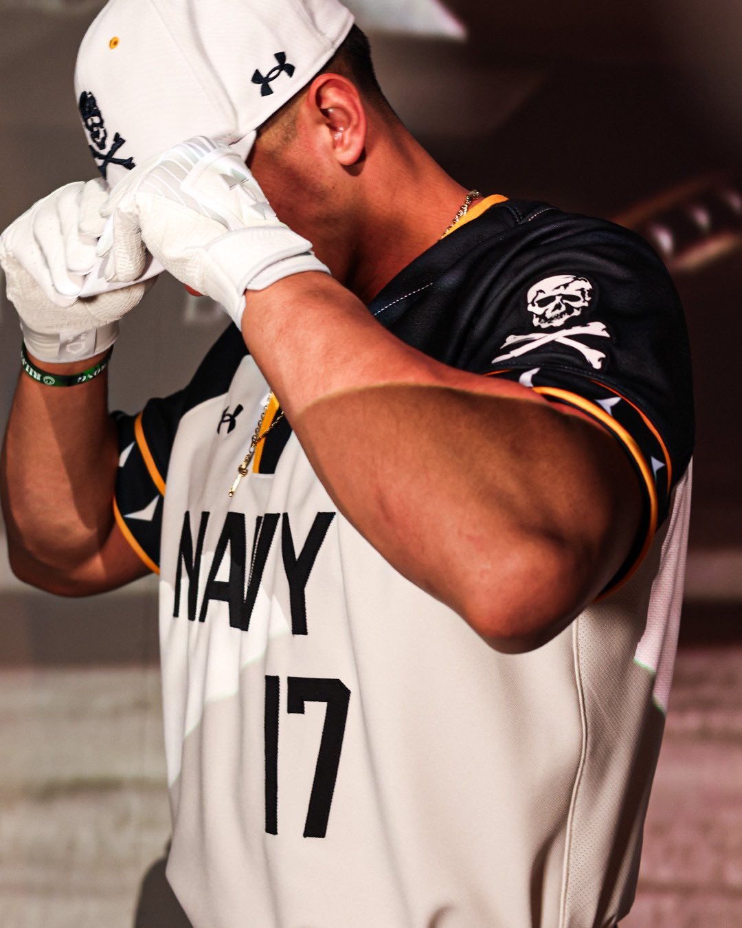
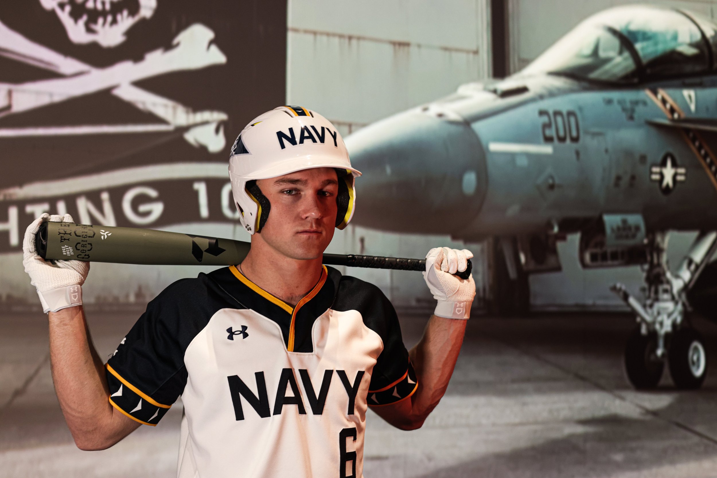
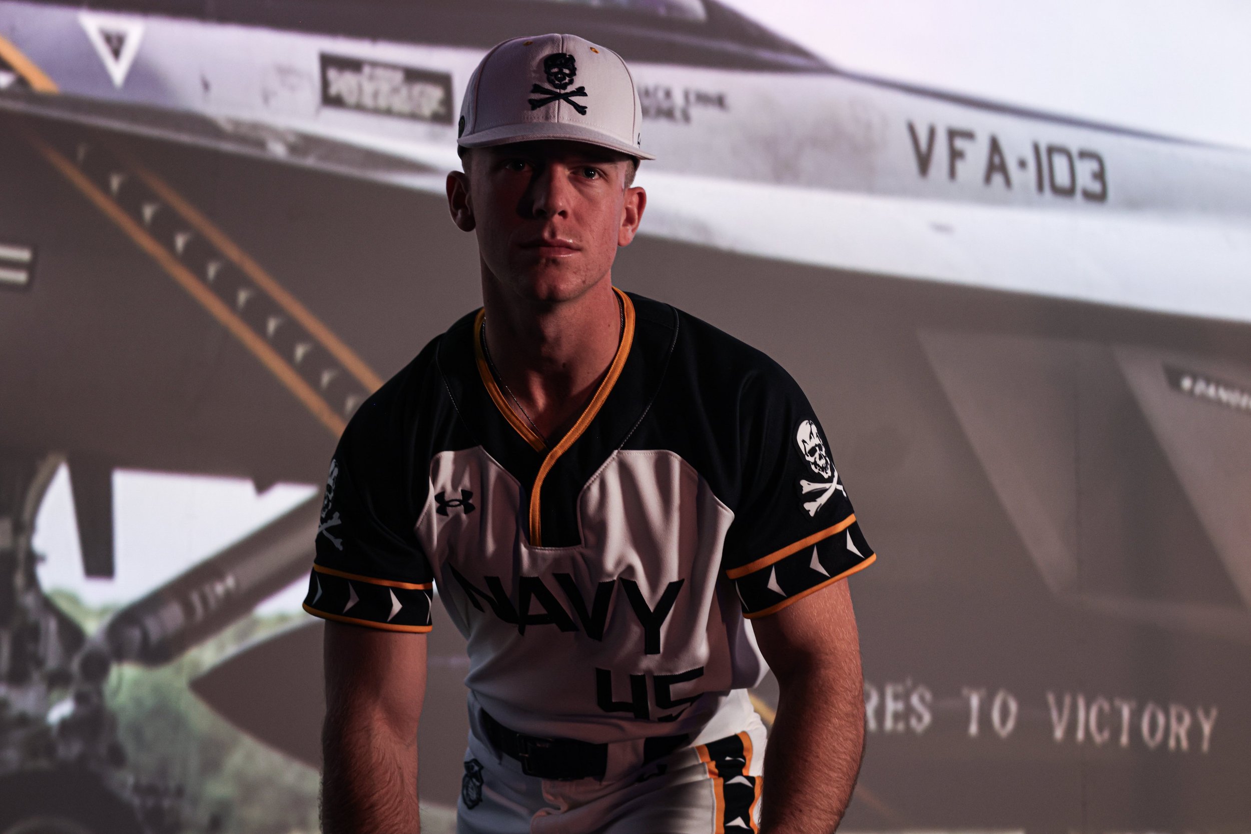
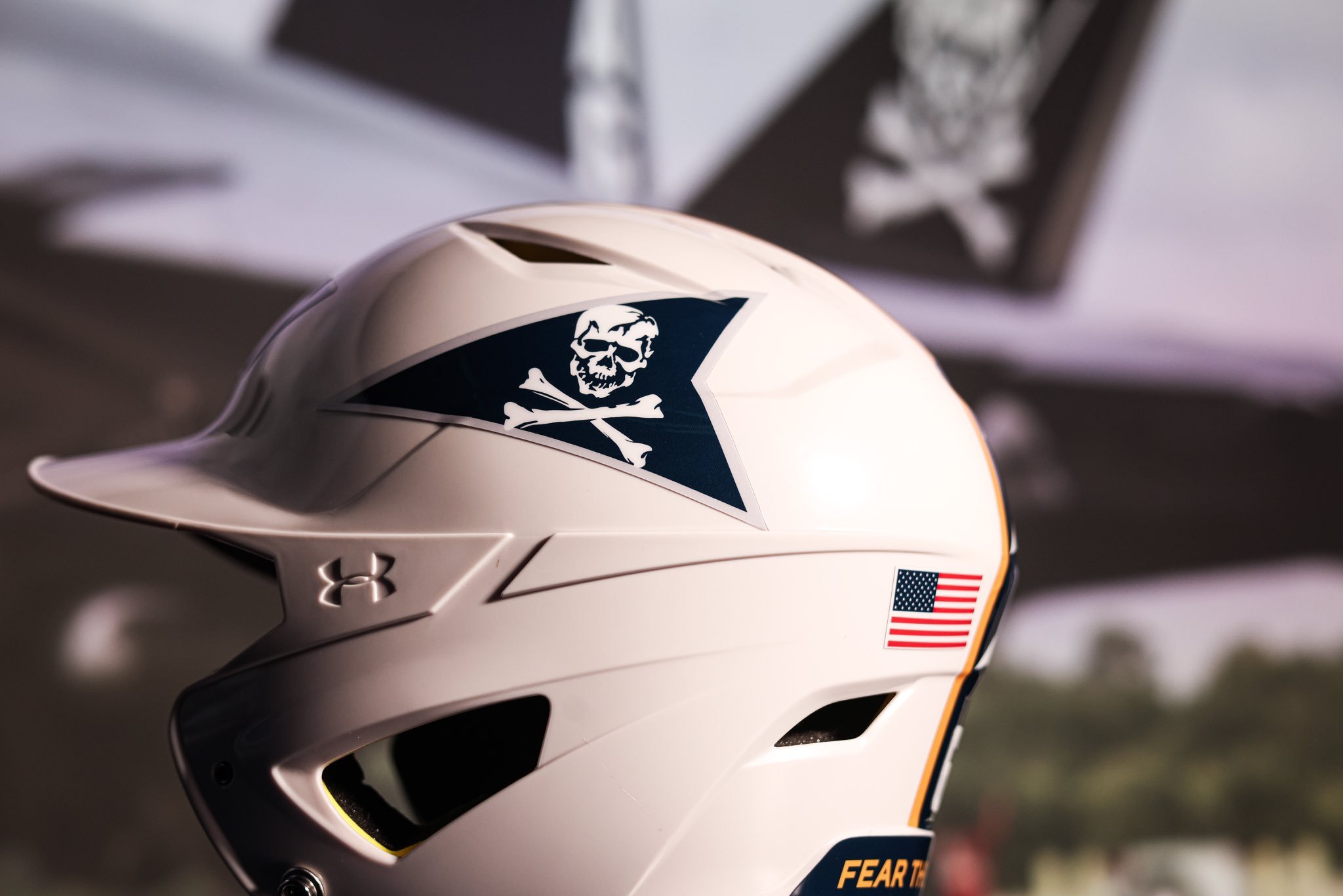
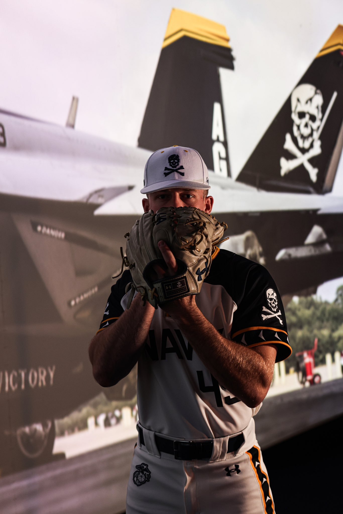
Navy Baseball has taken the field with a bold new look, honoring the legendary Jolly Rogers aviators with uniforms packed full of history and symbolism. The tribute uniforms celebrate the iconic VF-84 and VFA-103 fighter squadrons, known for their daring missions and unmistakable skull and crossbones insignia.
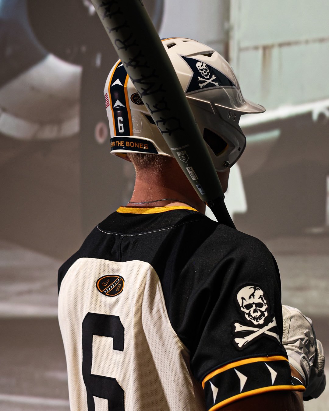
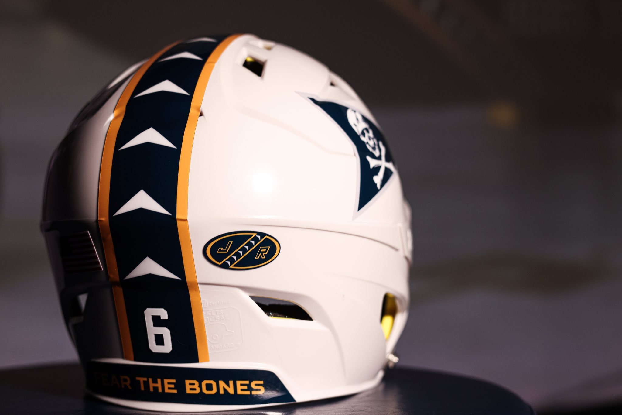
The helmet design pays homage to past and present Jolly Rogers aviator helmets. It features chevron detailing on the sides, a reflective white base coat representing the VFA-103 helmet, and a bold stripe down the back. The finishing touch? “Fear the Bones,” a mantra synonymous with the Jolly Rogers, appears prominently on the helmet’s back.
Navy’s jersey color blocking mirrors the iconic paint scheme of the Jolly Rogers aircraft, complete with dark navy shoulders and the signature skull and crossbones insignia. The collar striping is a direct nod to the tail fin design, bringing aviation heritage directly onto the diamond.
On the front of the jersey and helmet, the bold “NAVY” wordmark is inspired by the aircraft’s fuselage lettering. The uniform numbers follow suit, styled after the aircraft side numbers found on the wings and fuselage.
The design team left no stone unturned, adding hidden gems throughout the uniform. Inside the collar, players will find the phrase “Fear the Bones,” adding an extra layer of pride and meaning. Locker tags on the jersey back and side of the hat mirror the VF-84 tail fin design, complete with a drop shadow “JR” for Jolly Rogers.
From top to bottom, the uniform honors the aviators’ legacy. The sleeves and pant legs feature the traditional angled Jolly Rogers stripe, tying the whole tribute together. Even the front of the hat proudly showcases the skull and crossbones, while the back echoes the aircraft-inspired wordmark.
Navy Baseball’s Jolly Rogers uniforms are a perfect fusion of athletic style and military heritage, giving the team a bold identity while celebrating the fearless spirit of the Jolly Rogers. These uniforms are more than just gear—they’re a tribute to those who flew before, reminding everyone to always Fear the Bones.
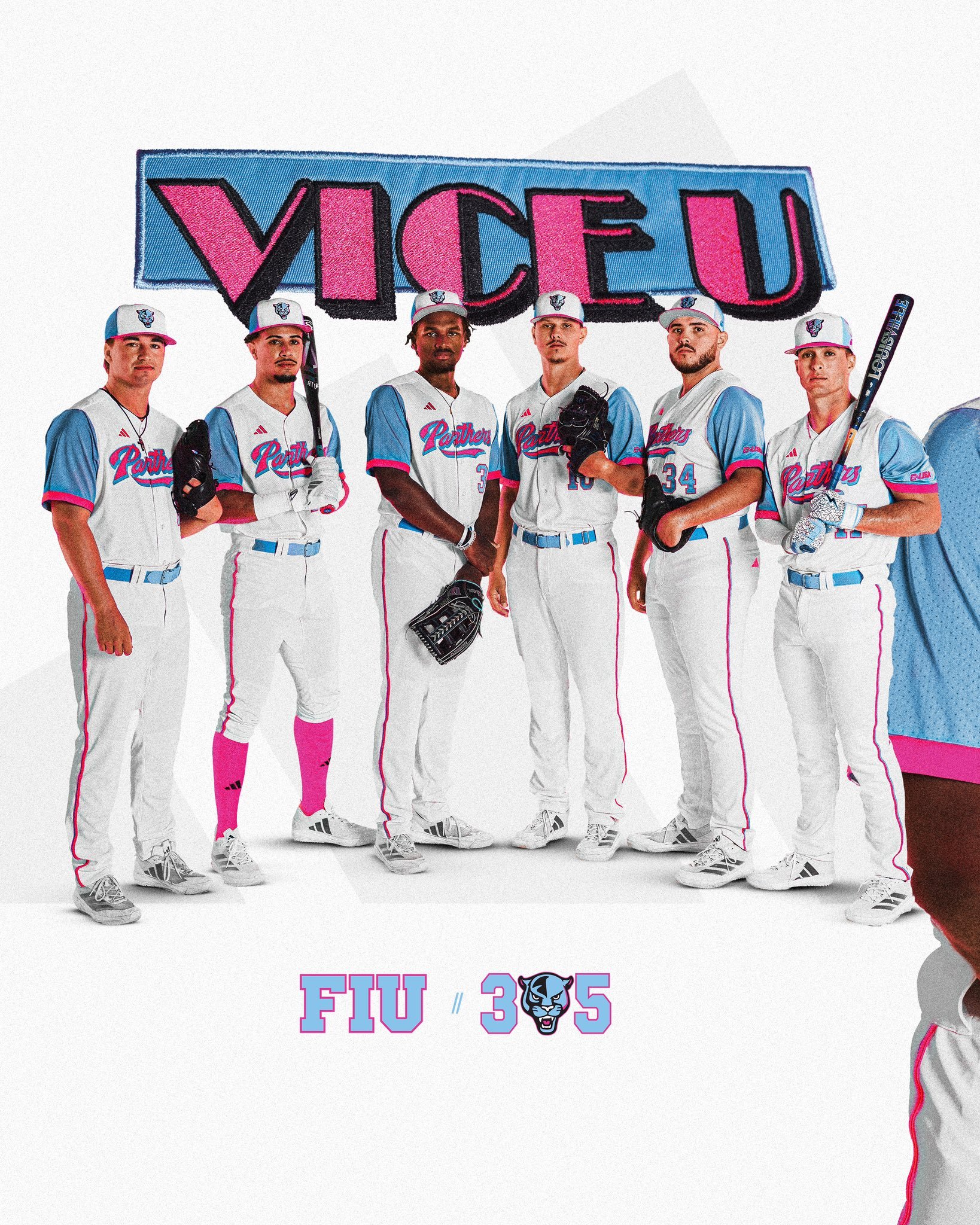
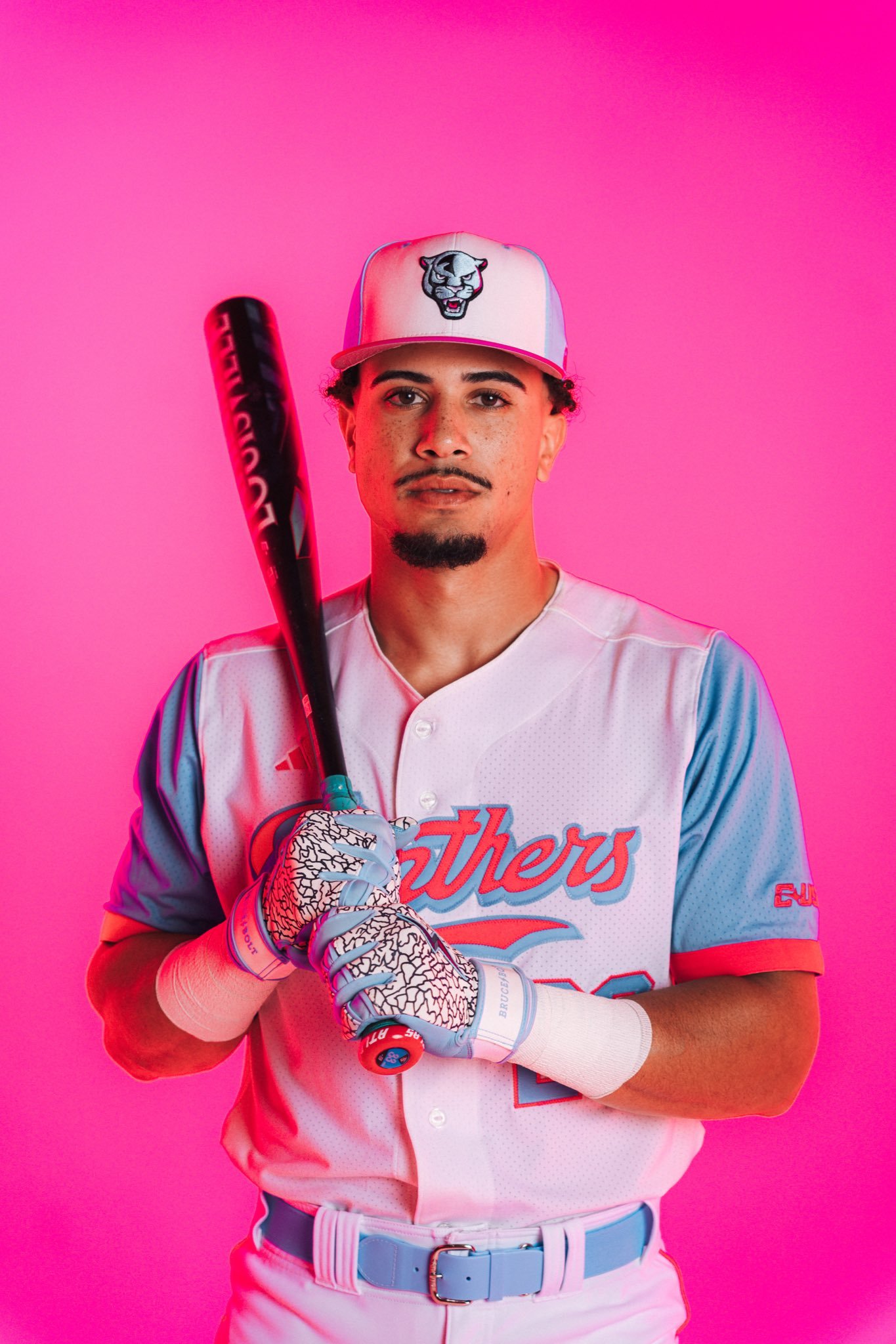
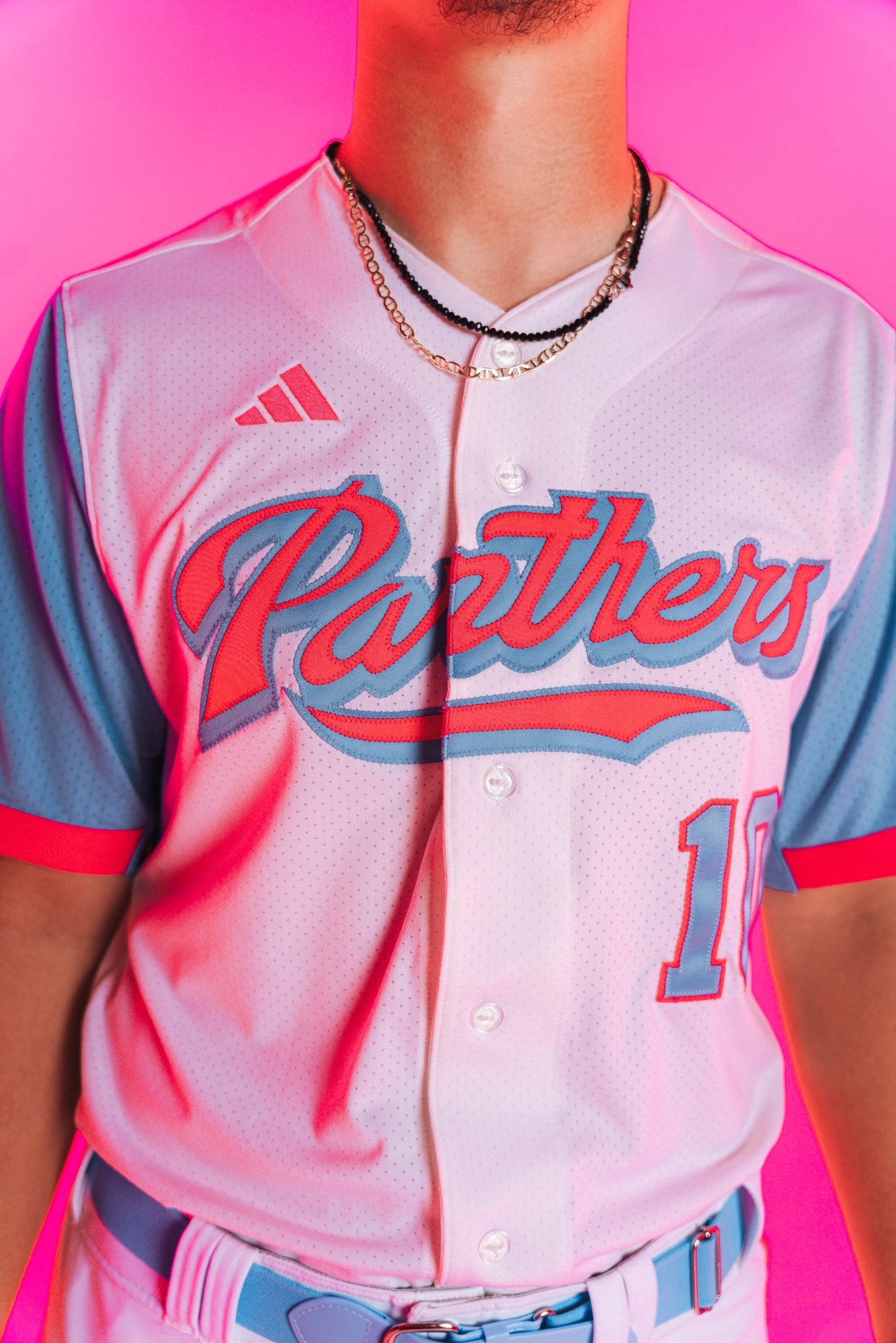
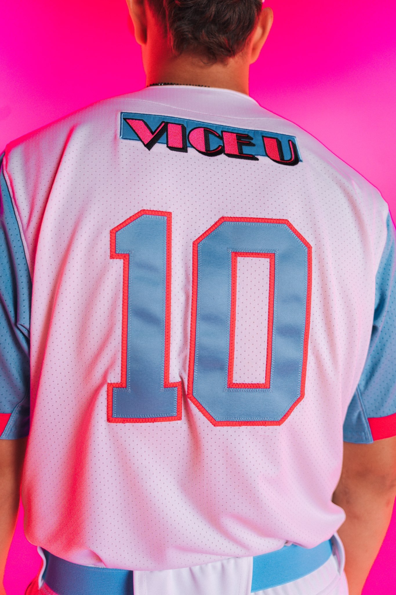
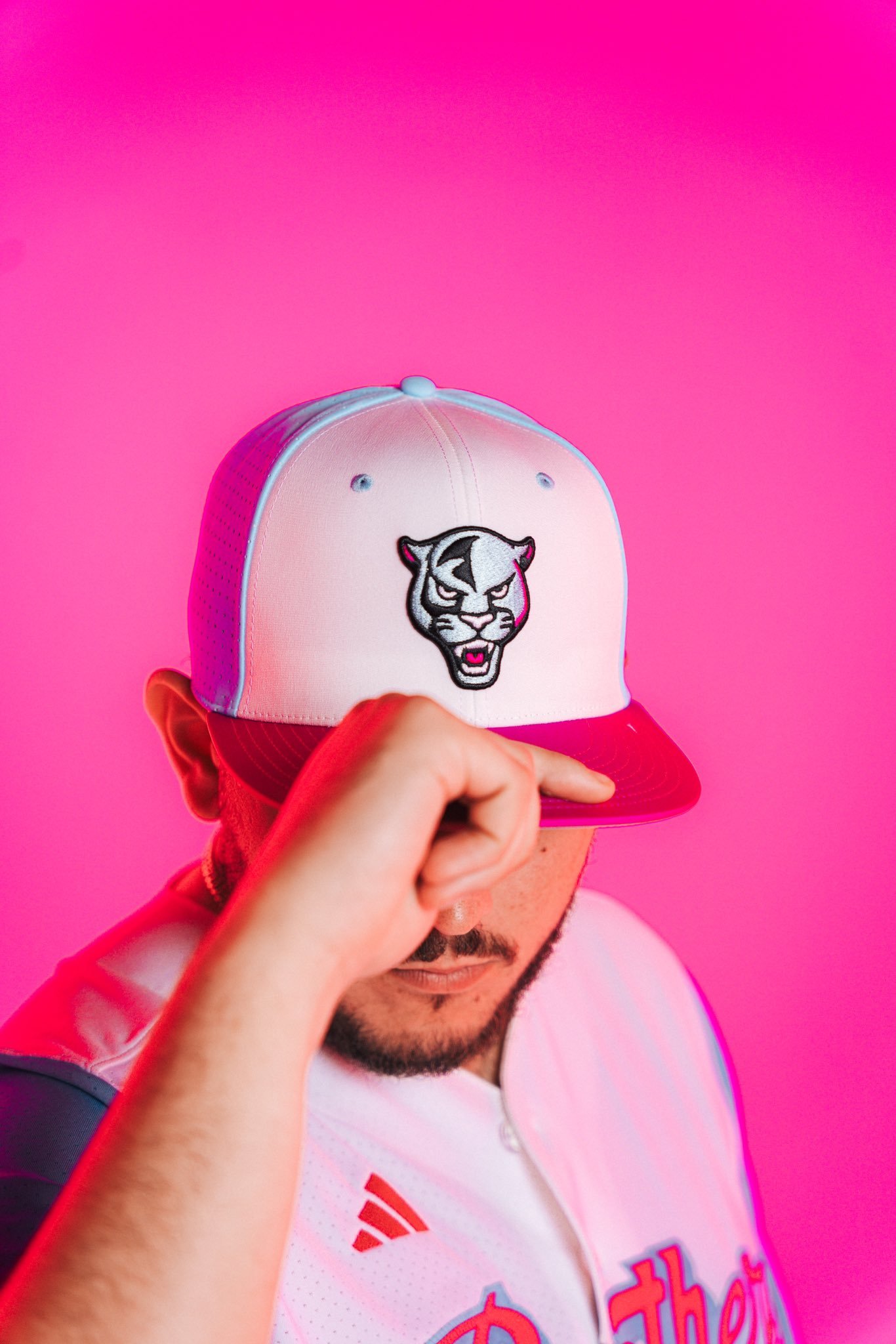
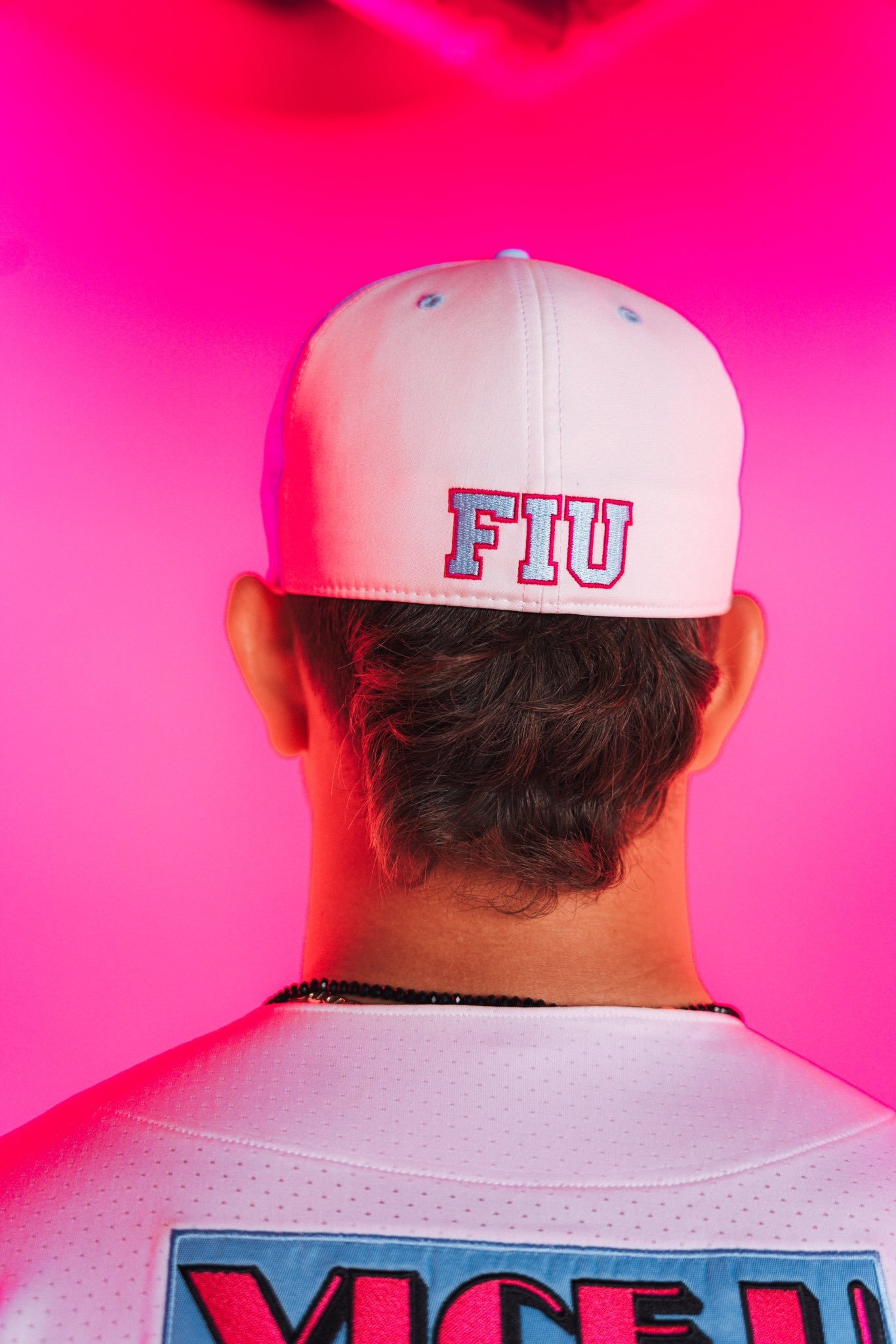
FIU Baseball is turning up the heat for the 2025 season with the official unveiling of their highly anticipated VICE uniforms, a bold look inspired by the vibrant colors and iconic style of Miami VICE. The Panthers will debut the new threads under the lights at FIU Baseball Stadium on Friday, February 28, when they take on Merrimack at 6:30 p.m.
The VICE uniforms perfectly capture the energy and flair of Miami, blending FIU’s unique identity with the city’s unmistakable neon-soaked, retro aesthetic. It’s a fitting tribute to the program’s South Florida roots and a creative way to bring some serious swagger to the diamond.
Fans won’t have to wait long for another chance to see the new look in action. FIU will suit up in the VICE uniforms once again for one of the biggest games of the year — a showdown against the Miami Hurricanes at loanDepot Park on Tuesday, March 4, at 7 p.m. Tickets for this marquee matchup, giving fans the perfect opportunity to catch the VICE uniforms on the big stage.
The VICE uniforms won’t be a one-night wonder either — FIU plans to showcase the vibrant look at select home games throughout the 2025 season, giving Panther fans plenty of chances to see the new gear.
From the bright lights of Miami to the bold designs on their backs, FIU Baseball’s VICE uniforms are set to make a statement all season long — a perfect fusion of sport, style, and South Florida culture.
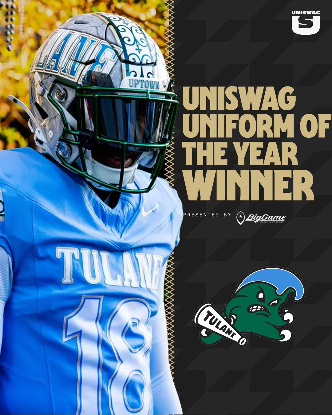
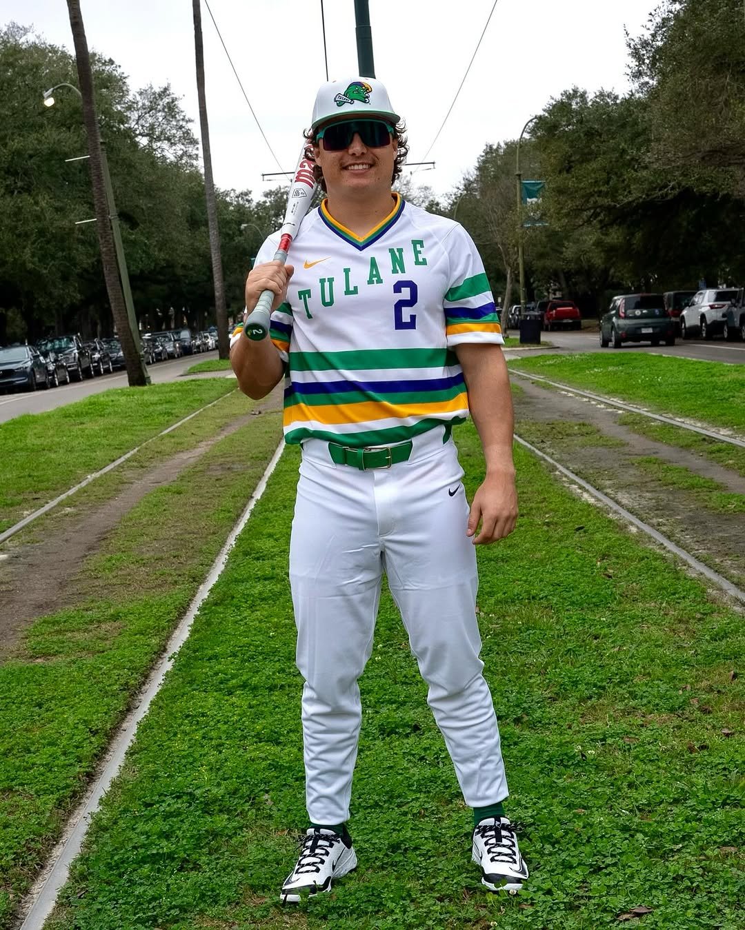
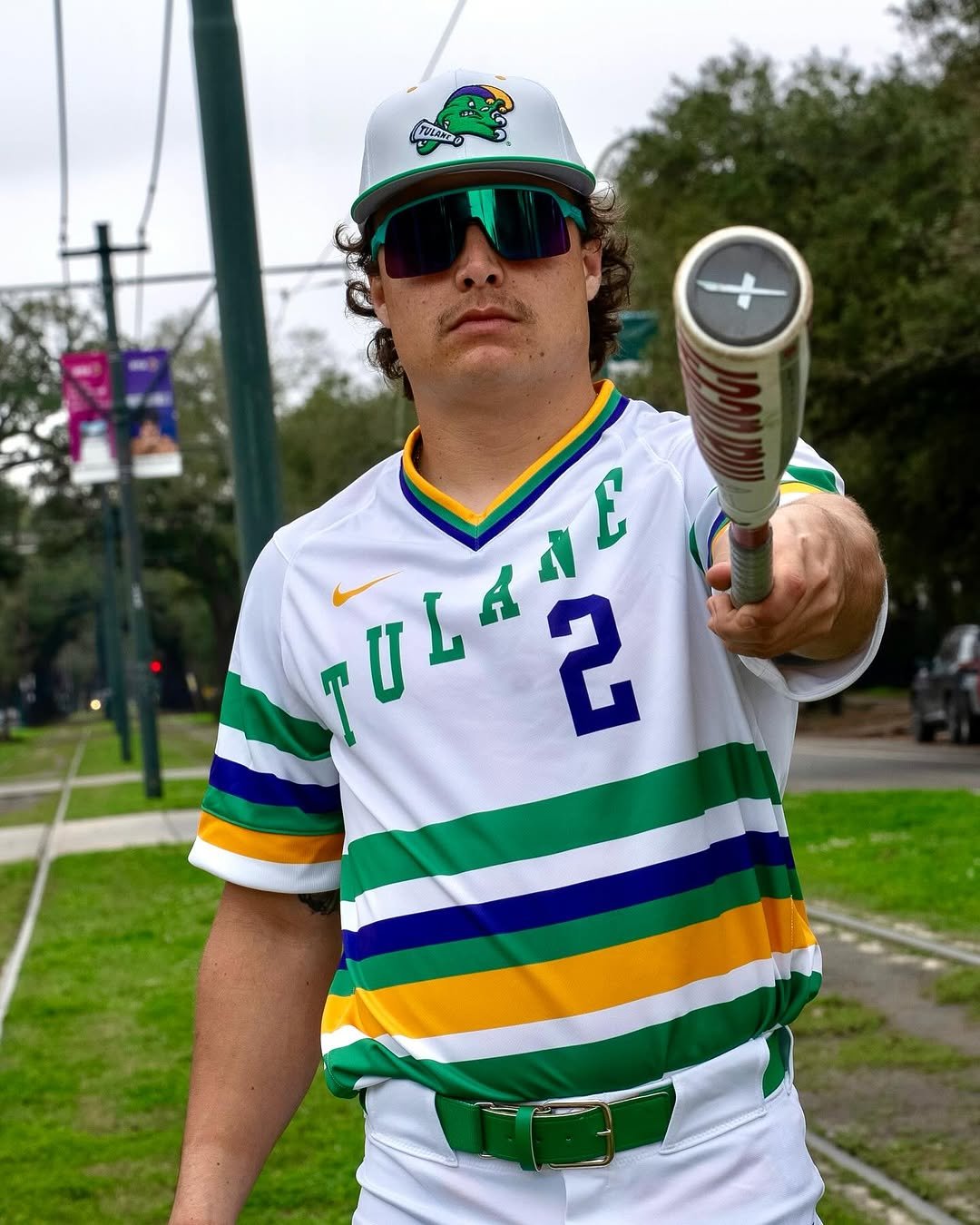
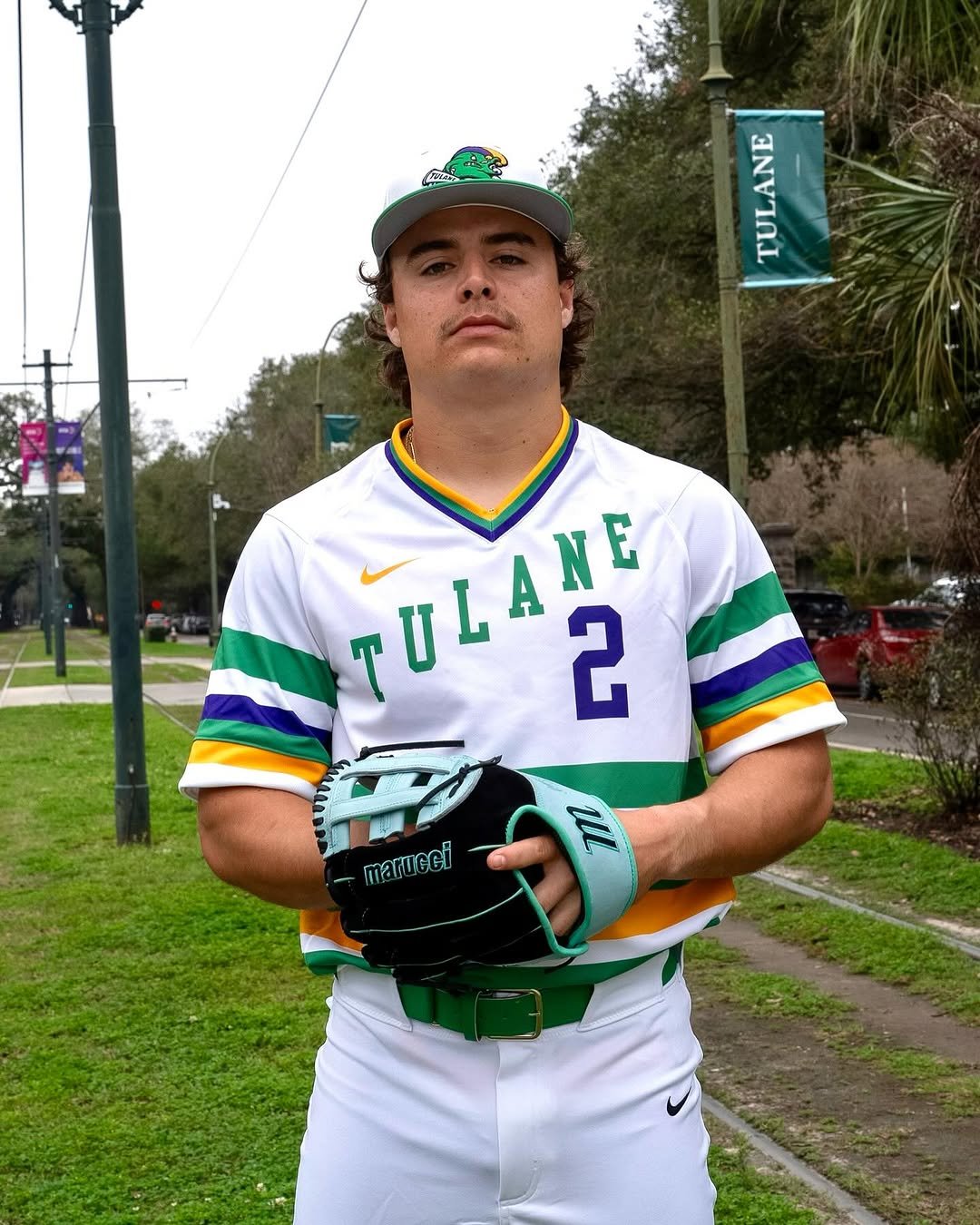
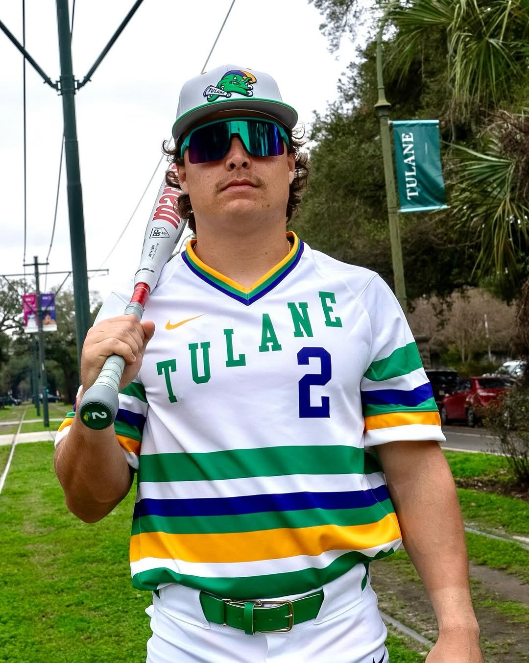
Tulane Baseball is bringing the vibrant energy of New Orleans to the diamond with their latest Mardi Gras-themed uniforms. These stunning kits embrace the city’s deep-rooted culture, combining bold colors and sharp design elements that capture the spirit of the Big Easy.
The uniform features a white base with horizontal stripes in Tulane’s signature green, along with traditional Mardi Gras hues of gold and purple. These bold stripes run across the jersey, delivering a striking visual that pays homage to the festive season that defines New Orleans. The green trim on the pants and belt tie the entire look together, creating a seamless blend of school pride and carnival flair.
Tulane’s wordmark is prominently displayed across the chest in green with an angle, embodying the classic baseball aesthetic while staying true to the university’s brand. The jerseys are paired with a custom Tulane cap featuring the team’s angry wave logo, giving the full uniform a fierce and stylish edge.
Releasing these uniforms just in time for Mardi Gras, Tulane Baseball is making sure they stand out not just for their performance on the field, but also for their look. This set represents more than just a uniform—it’s a celebration of the culture, energy, and passion that make New Orleans and Tulane unique.
Expect these uniforms to turn heads all season long as the Green Wave brings their signature style to the field. Whether you’re a Tulane fan, a baseball enthusiast, or just someone who appreciates high-quality uniform design, this Mardi Gras-themed look is one to remember.
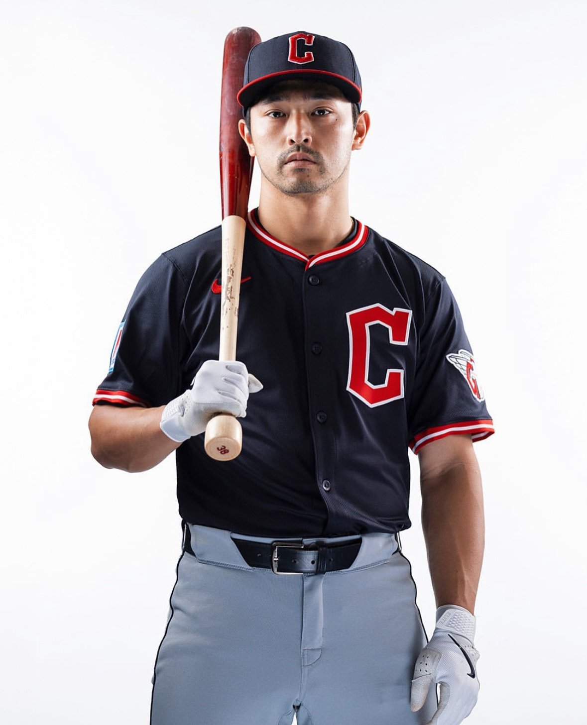
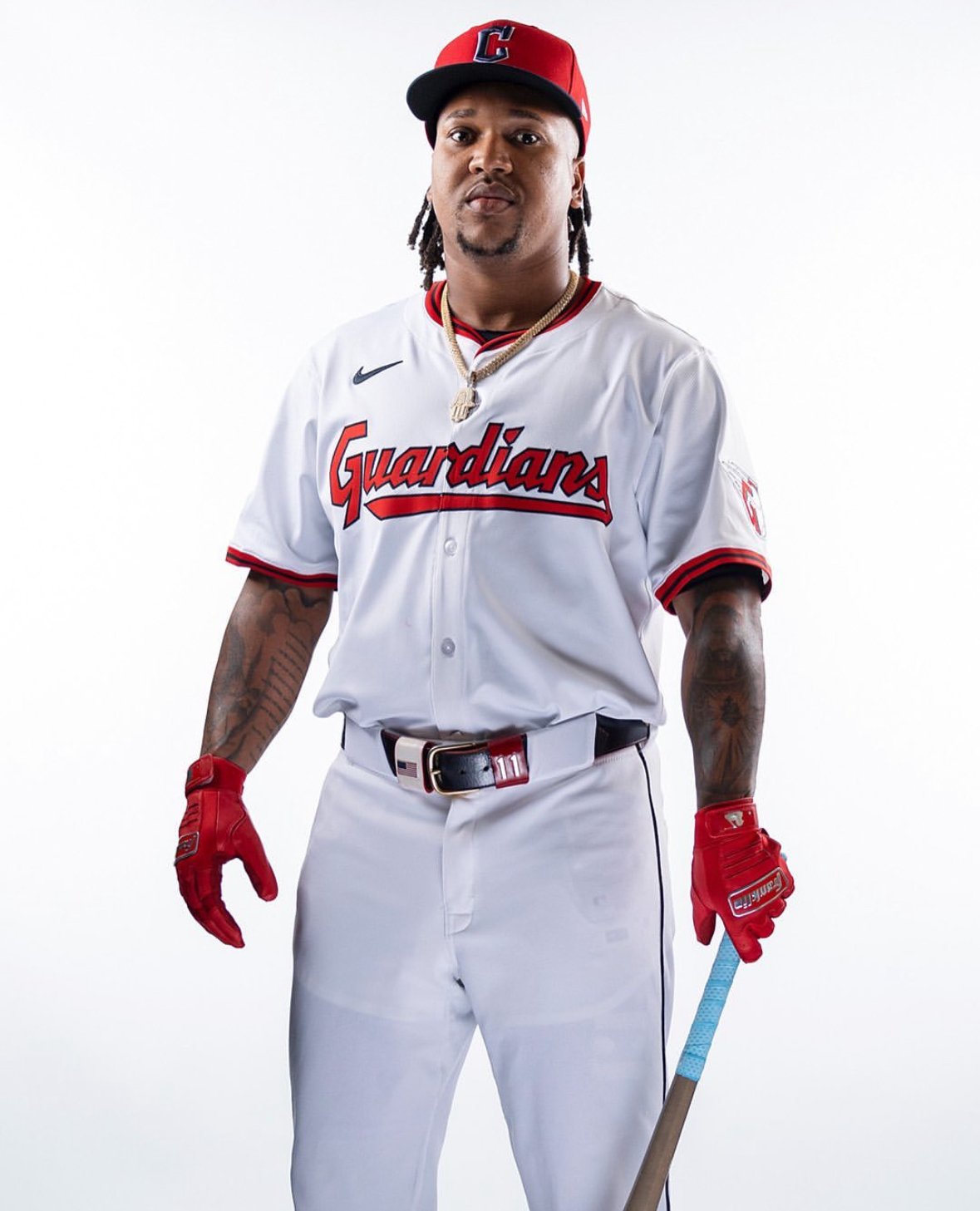
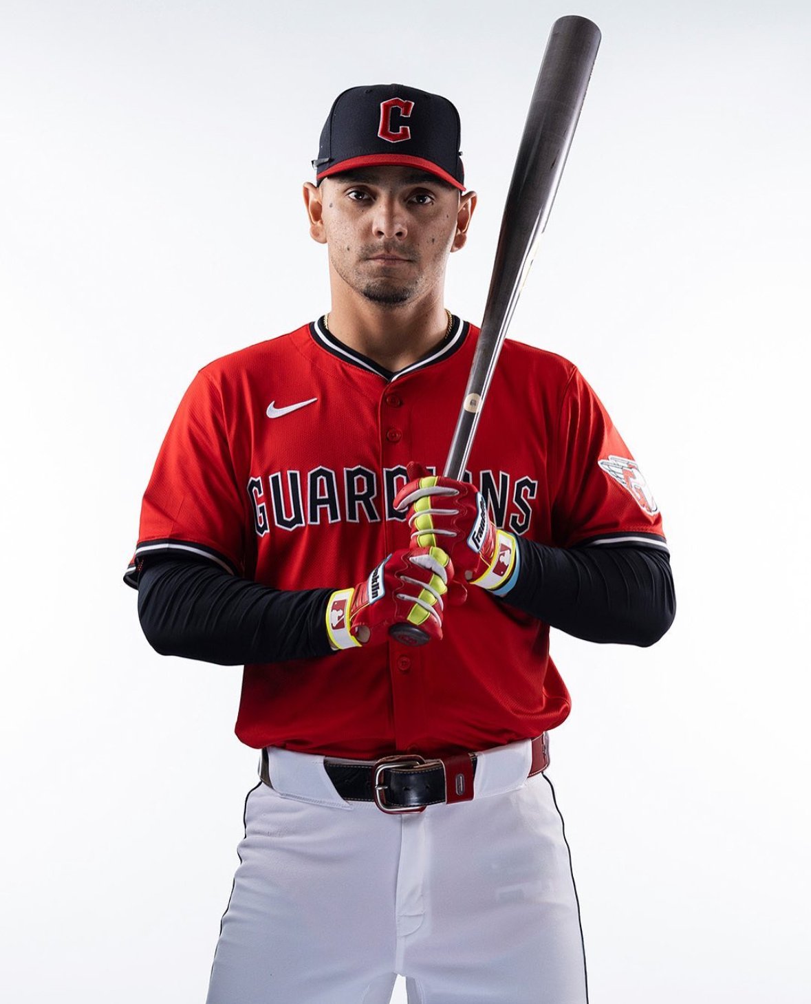
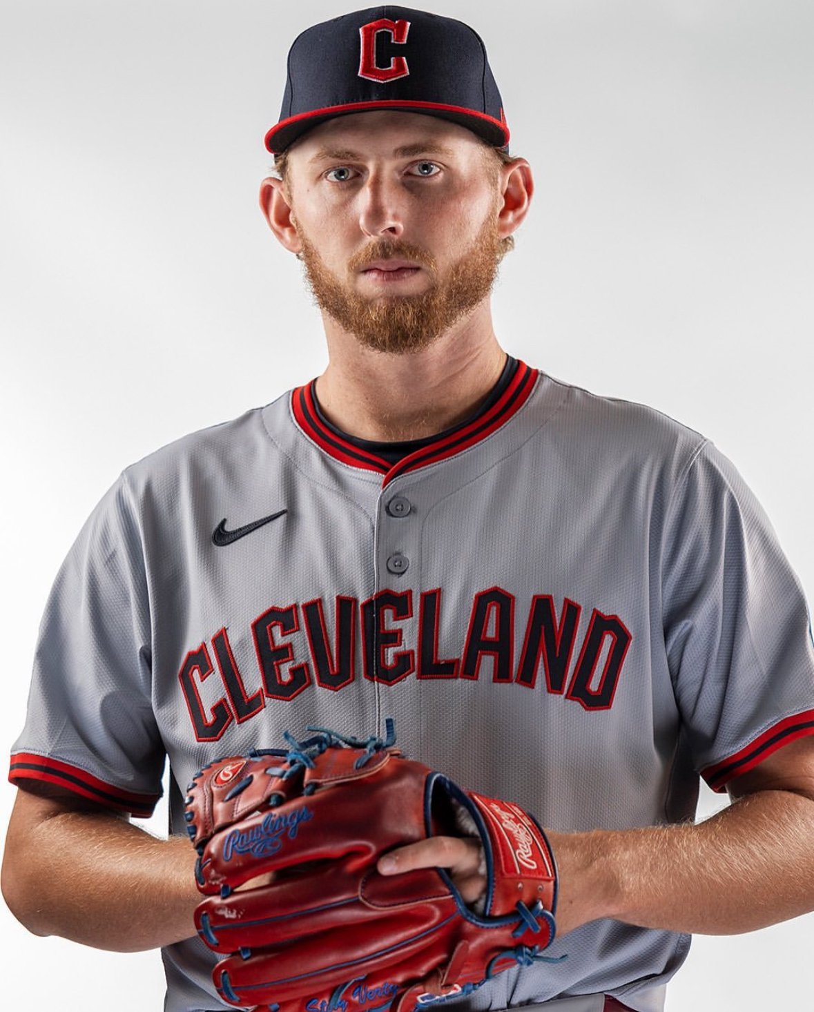
The Cleveland Guardians have unveiled exciting changes to their jersey lineup for the 2025 season, blending a fresh energy with the franchise's rich 124-year history. The updated set includes refinements to four jerseys—blue alternative road, red alternative home, white home, and gray road—that, along with the City Connect uniforms, complete Cleveland’s on-field look for 2025.
The most notable transformation comes with the blue alternative road jersey. While retaining its classic navy base, the jersey shifts from displaying "Cleveland" across the chest to featuring the Guardians' iconic Diamond C logo. This design pays homage to Cleveland’s early jerseys, which also showcased a "C" from 1901 to 1945, including the uniform of the 1920 World Series champions.
The piping on the blue jersey takes on a distinct red-white-red pattern, setting it apart from the other uniforms and adding a vibrant contrast to the navy backdrop.
The red alternative home jersey undergoes a bold transformation, replacing the 2024 script “Guardians” with a Bridge Print font spelling out “Guardians” across the chest. This font, already featured in the numbers on all Cleveland jerseys, further incorporates the team’s brand identity into their uniform set.
The jersey's piping adopts a striking blue-white-blue design, adding a dynamic flair to the bold red uniform.
Cleveland’s white home uniform continues its traditional appearance with subtle yet impactful updates. The script "Guardians" across the chest shifts from its slanted design to a horizontal orientation for a cleaner look. Complementing this change is a new red-blue-red piping pattern on the neckline and sleeves.
A revamped home hat debuts alongside the white uniform in 2025. The new cap features a red crown with a blue bill, adding a fresh twist to Cleveland’s iconic headwear. Meanwhile, the blue cap with a red bill will remain the standard for all other jerseys.
The gray road uniform remains a classic, featuring “Cleveland” in Bridge Print font across the chest. The piping on this jersey mirrors the red-blue-red design seen on the white home uniform, tying the two looks together and creating a cohesive brand aesthetic.
The Guardians’ 2025 jersey updates seamlessly blend nostalgia with modernity. Whether it’s the nod to the 1920 World Series team in the blue alternative road uniform or the continued integration of the Bridge Print font, every detail has been thoughtfully designed to honor the franchise’s storied history while energizing its visual identity for the future.
For years, STATES & CO’s baseball jerseys have been the gold standard, meticulously handcrafted and reserved exclusively for the most elite baseball players and teams worldwide. These jerseys represent the pinnacle of quality and performance, worn by those who demand nothing but the best on the field.
Now, thanks to an exciting partnership between STATES & CO and UNISWAG, fans finally have the opportunity to experience that same level of excellence. No longer just a dream, professional-quality jerseys are now within reach for every baseball enthusiast.
This new series of jerseys takes fan engagement to a whole new level by incorporating the unique designs and elements of each city, bringing them to life for fans to wear. The creative process behind these jerseys involved a deep dive into the cultural and aesthetic aspects of each city, ensuring that every detail resonates with the spirit and pride of the local community.
Crafted from proprietary 4-way stretch, sweat-wicking fabric, these jerseys ensure maximum comfort and performance, whether you're playing or cheering from the stands. For those who value breathability, optional laser-cut venting is available to keep you cool under pressure. Fans can also choose between fully embroidered/twill or fully sublimated names, numbers, and logos, ensuring that each jersey is as unique as the individual wearing it.
And perhaps the most exciting feature of all? The ability to customize your jersey with your very own name and number. This is your chance to wear the same quality gear as the pros, personalized just for you.
STATES & CO and UNISWAG are making it possible for fans to not just support their favorite teams, but to do so in style with jerseys that stand toe-to-toe with those worn by the elite. This is more than just fan gear—it's a piece of the game, infused with the essence of each city, now available to everyone.
The limited drop is available until 9/8/24. Get yours today!
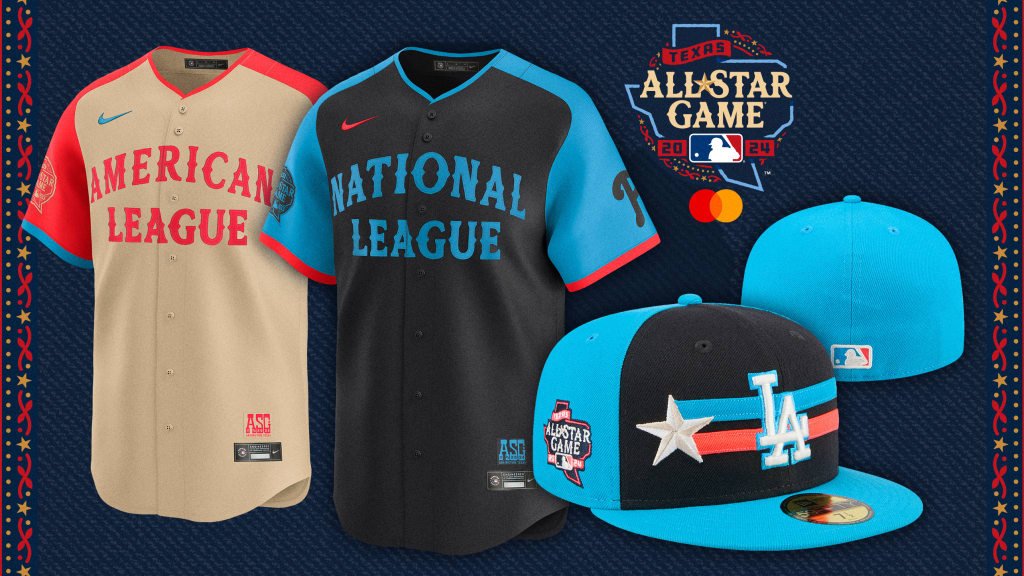
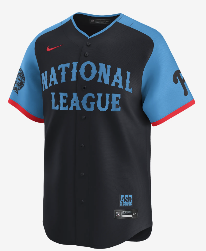
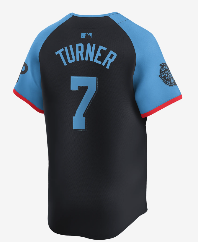
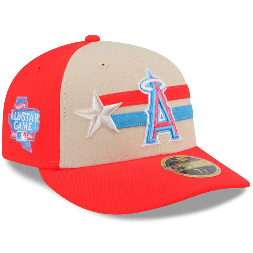
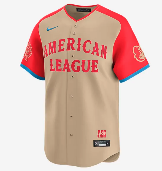
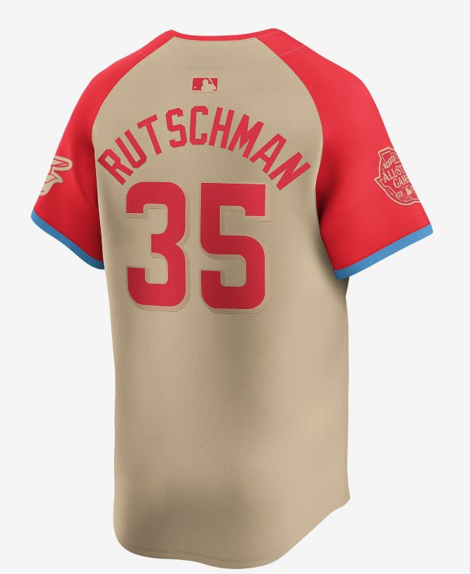
The 2024 MLB All-Star Game, set to take place in Arlington, will have a distinct Texas flair, perfectly embodied in the players' uniforms. The jerseys for the 94th Midsummer Classic were unveiled showcasing a design that draws inspiration from Texas' rich western heritage. The typography and graphics evoke the classic vibes of the Lone Star State, while incorporating a contemporary aesthetic that bridges the past and the future.
The home American League jerseys feature a sandy base complemented by red sleeves and lettering. In contrast, the National League jerseys boast a navy blue base with light blue sleeves and lettering. This bold color blocking, modern trims, and vibrant highlights give the uniforms a striking and memorable look.
Though all players in each league will wear the same uniform, each jersey includes personalized elements. The player's individual team logo is prominently displayed on the left sleeve, while the All-Star Game logo adorns the right sleeve. This blend of team pride and All-Star distinction makes each jersey unique.
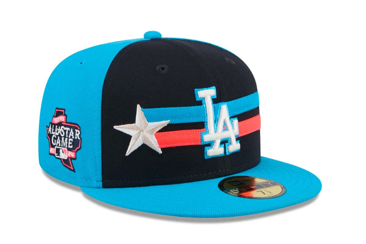
The All-Star caps match the bold design of the jerseys, featuring horizontal lines behind the team logo and a single star to the side. This star symbolizes both the All-Star honor and Texas' "Lone Star" nickname, adding an extra layer of regional pride to the ensemble.
This year marks the second time Arlington has hosted the All-Star Game, the first being in 1995. The 2024 event promises to be a spectacular showcase of baseball talent, with the uniforms serving as a perfect tribute to the host state’s iconic heritage.
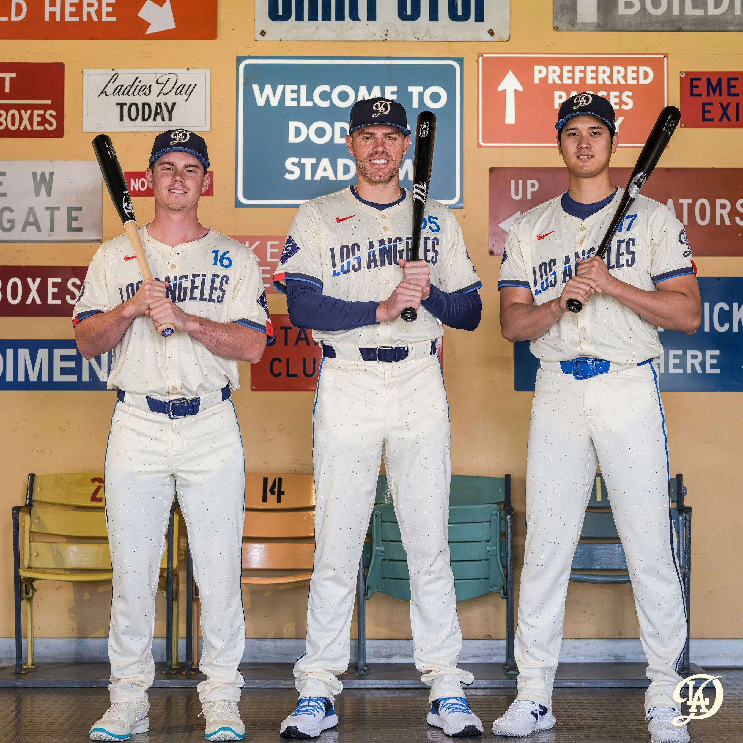
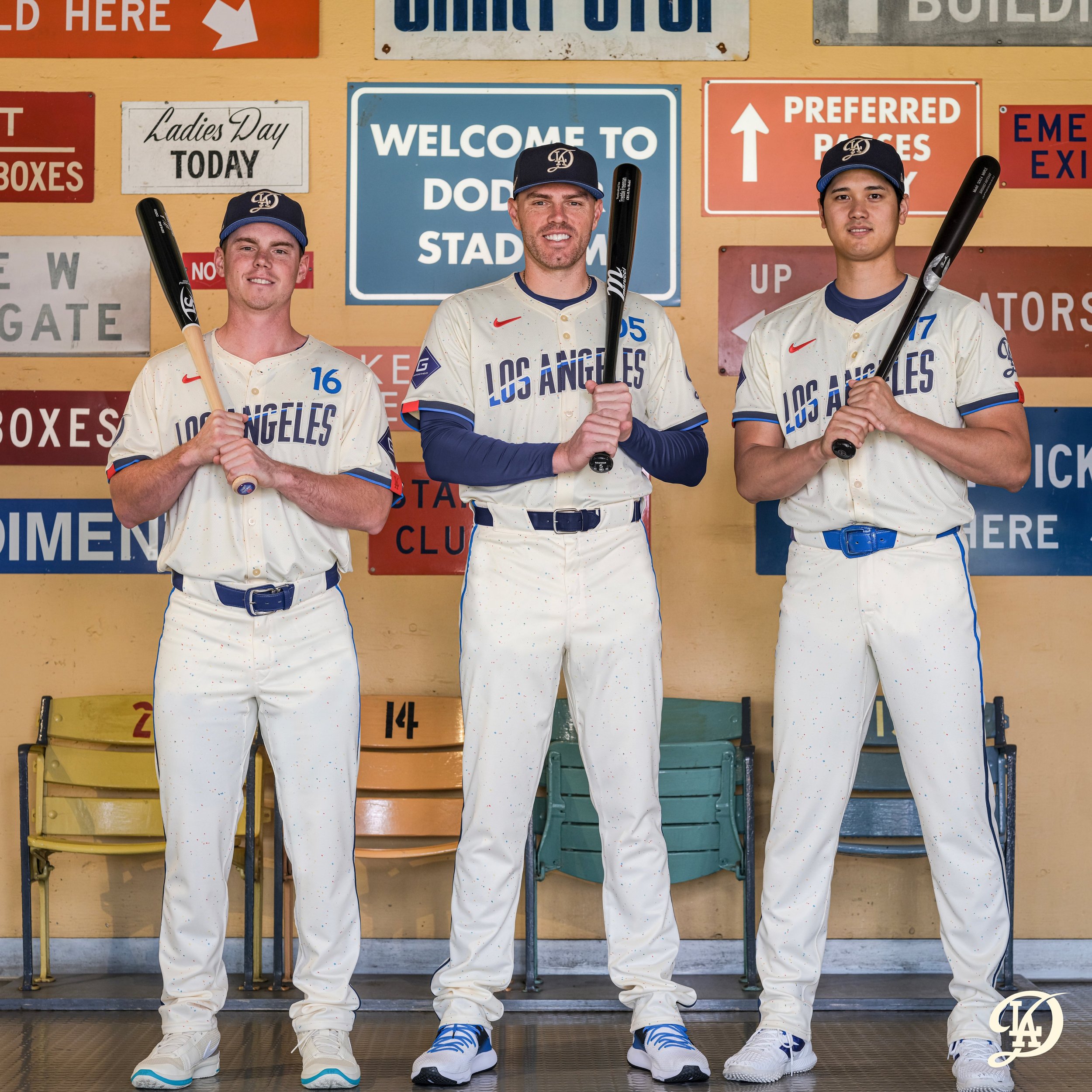
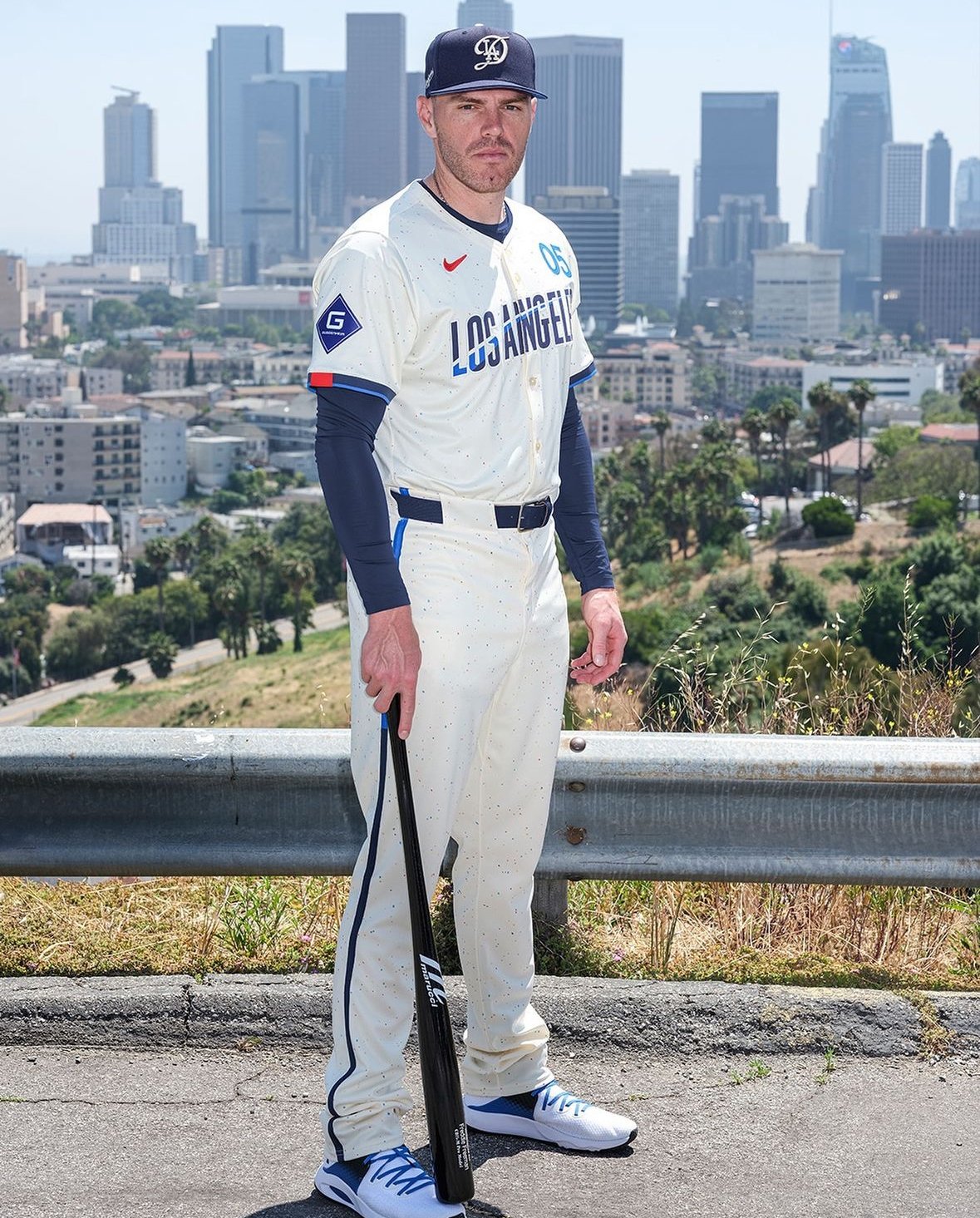
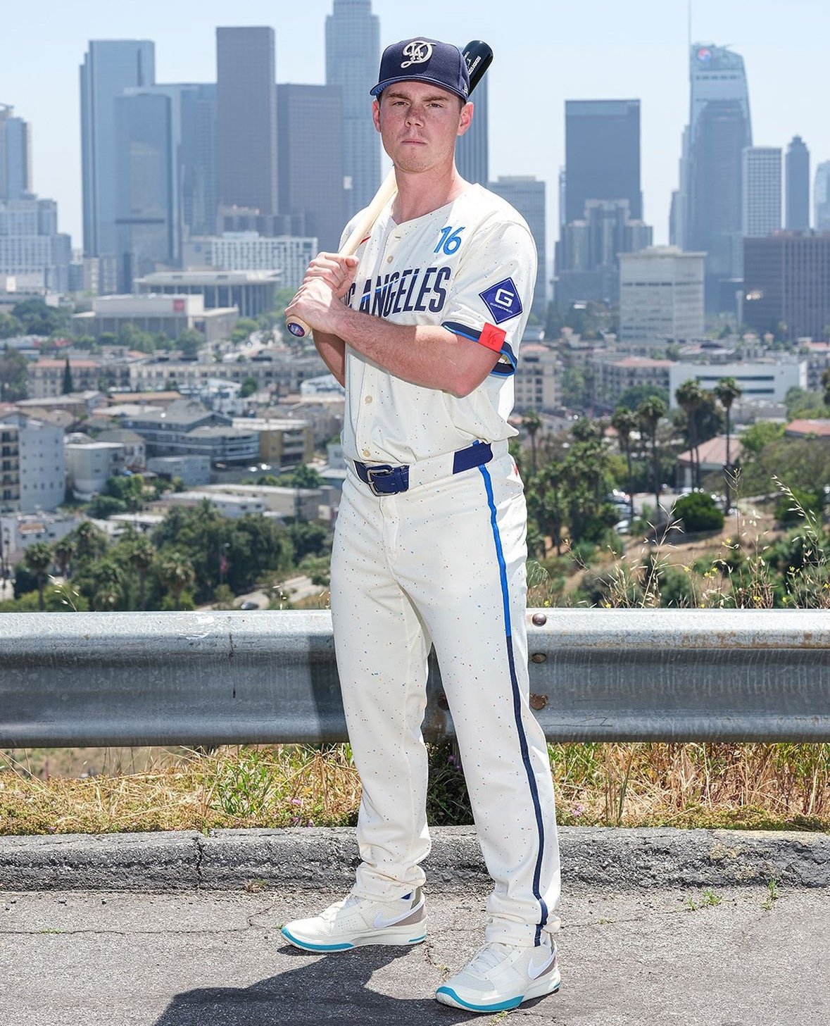
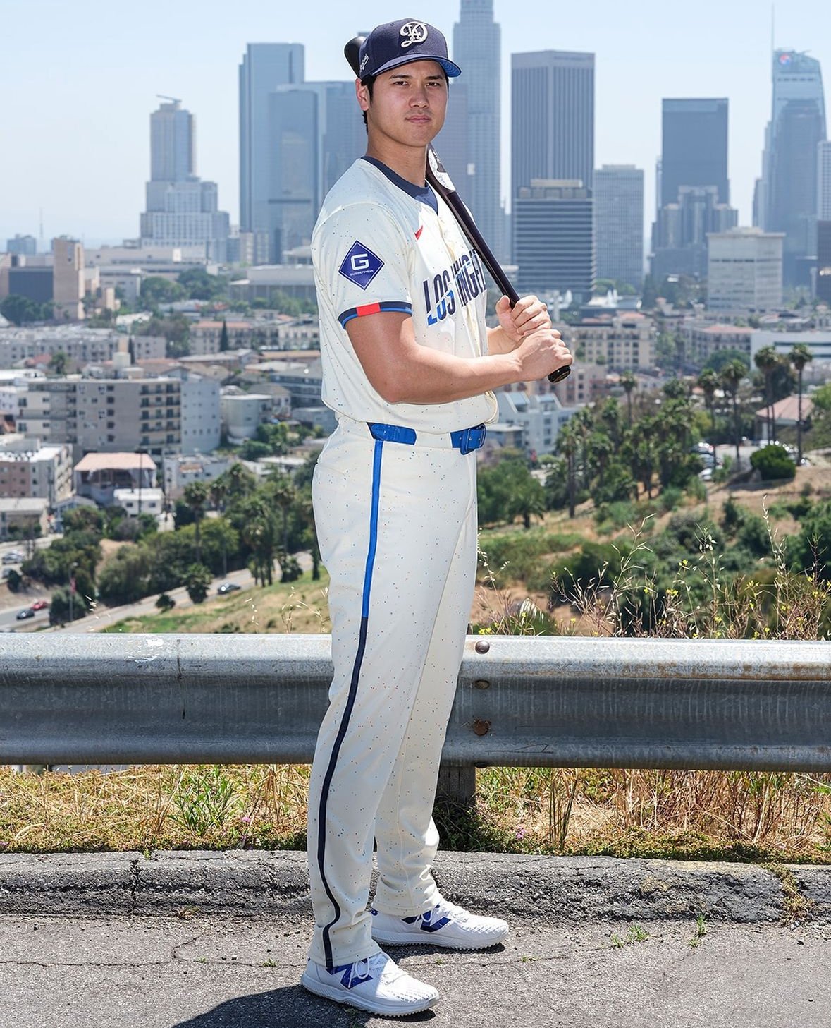
The Los Angeles Dodgers have revealed their second City Connect design, set to debut on Saturday against the Los Angeles Angels. This new design features cobalt and electric blue hues with a hint of chili red, paying homage to the iconic red numbers on the Dodgers' primary uniforms.
“The new jerseys for 2024 are a nod to the city's longstanding connection to being a city of dreams and dreamers,” the Dodgers stated in their press release. “A city filled with those shooting for the stars where impossible dreams can turn into reality.”
This latest design marks the Dodgers as the first team to unveil a second uniform in the City Connect series. Their original look, released in August 2021, featured "Los Dodgers" on both the cap and jersey. The new uniform continues this trend of celebrating the city’s unique culture and history.
One of the standout features of the new design is the "Los Angeles" front watermark, inspired by the signage at the Los Angeles Memorial Coliseum, where the Dodgers played from 1958 to 1961 after moving from Brooklyn. This watermark includes a contrail with an upward trajectory, symbolizing the city's relentless pursuit of what lies beyond.
The Dodgers have also updated their iconic interlocking "LA" logo on the cap. The new design retains the prominent "LA" but now features a swooping "D" behind it, representing the "LAD" team code. This abbreviation also appears as a sleeve patch, further integrating the team’s identity into the new look.
The uniform numbers, positioned above the "Los Angeles" watermark, draw inspiration from the mid-century typeface popular during the Dodgers' move from Brooklyn. This element, along with the electric blue and red dots scattered throughout the fabric, creates a "galaxy of stars" effect, symbolizing the brilliance and diversity of Los Angeles.
Each jersey also includes the acronym "#ITFDB" in the bottom corner, standing for "It's time for Dodger baseball," a phrase made famous by the legendary Dodgers broadcaster Vin Scully. This tribute to Scully underscores the Dodgers' deep connection to their storied past and their beloved fans.
The Dodgers' new City Connect uniform beautifully blends modern design with historical and cultural references, celebrating Los Angeles as a city of dreams and dreamers. This unveiling concludes this year’s series of City Connect uniforms, with the Dodgers' innovative and thoughtful design setting a high standard for future releases.
Fans can look forward to seeing the Dodgers sport these striking new uniforms on Saturday, as they continue to honor their past while boldly stepping into the future.
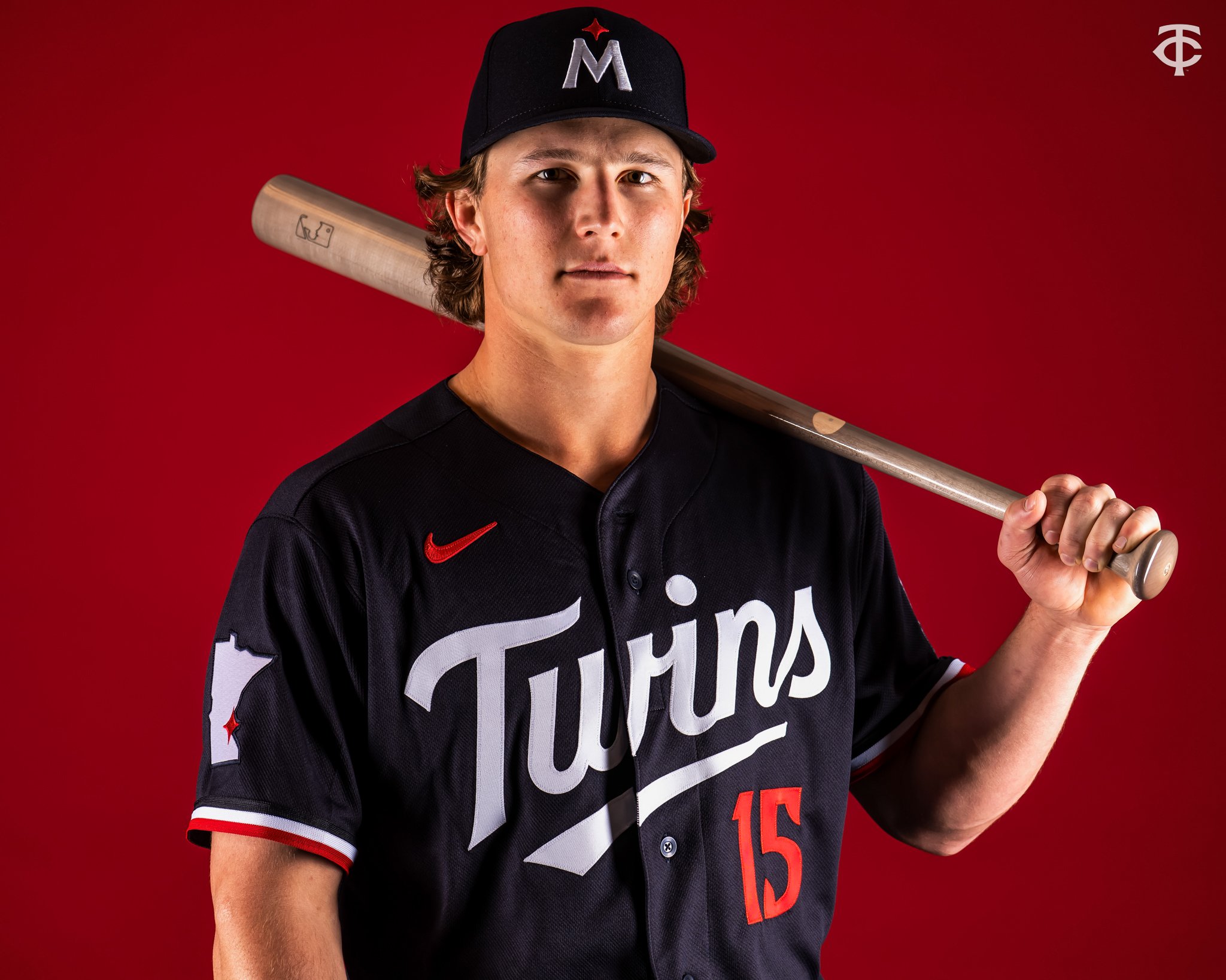
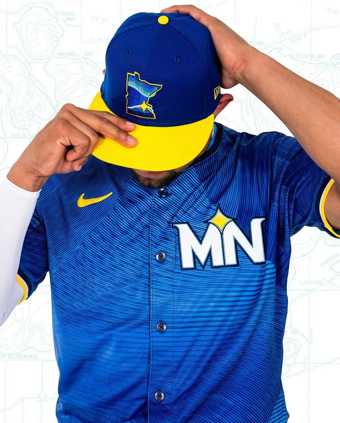
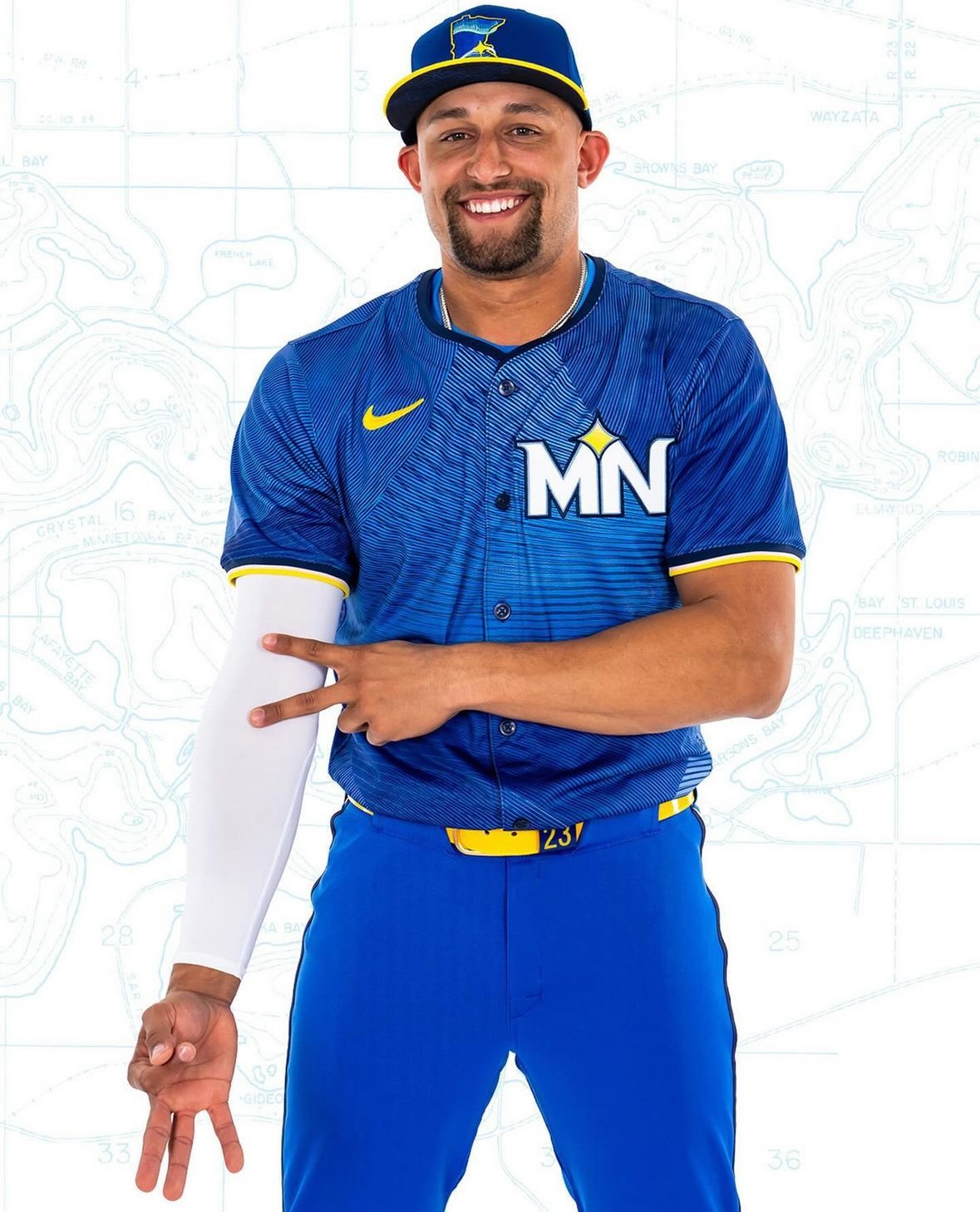
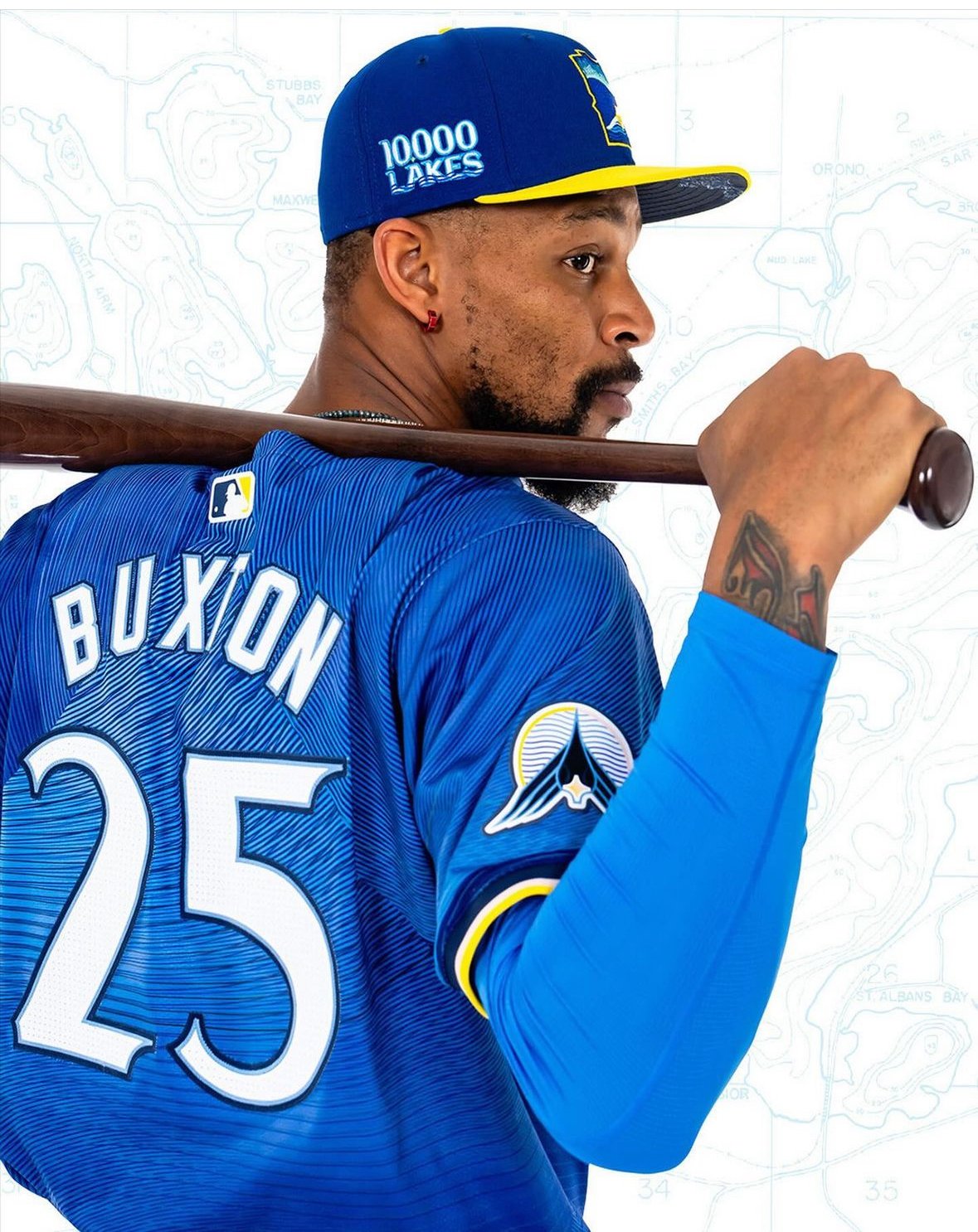
The Minnesota Twins have a legacy of representing their entire state rather than just their home city, and their new "City Connect" jerseys take this tradition to heart. The Twins' latest uniforms embrace a "State Connect" concept, paying homage to the Land of 10,000 Lakes.
The new uniforms, unified around an azure blue hue, reflect the central role of water in Minnesota. Accented with yellow belts and cap brims, the design evokes the sun shining over a lake. These uniforms will debut this Friday and be worn 10 more times throughout the 2024 regular season, primarily on home game Fridays.
"It's cool that they're different," remarked Joe Ryan. "It's cool to get away from what our normal uniforms look like. They did a good job with that. It will be fun to see what works and doesn't work with cleats and have a little bit of our own personal flair in there."
The design, developed over two years, embodies the "Ripple Effect" tagline. The intention was to go beyond a simple visual representation of lakes and to capture the serene, ripple-like impact lakes have on Minnesotans' lives.
"We really feel like that’s what the Twins do: We create positive action and we hope that that ripples out throughout the community," said Heather Hinkel, the Twins’ vice president of brand marketing. "So that’s the story we’re going to be telling, along with the jersey."
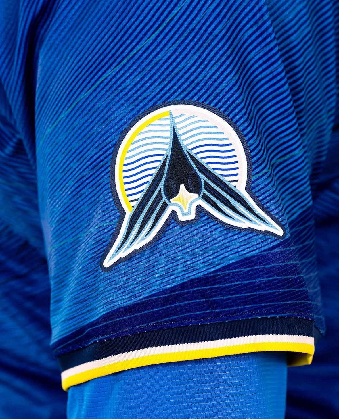
The dark blue caps with yellow brims feature a new insignia in the shape of Minnesota, outlined in yellow. The logo includes a North Star motif placed at the Twin Cities’ location, with the Northern Lights reflected in a lake’s water line.
"Really honing in on kind of what Minnesota stands for, where the water reflects the sky," Hinkel explained. "It doesn’t necessarily say Twins, but it really speaks to Minnesota."
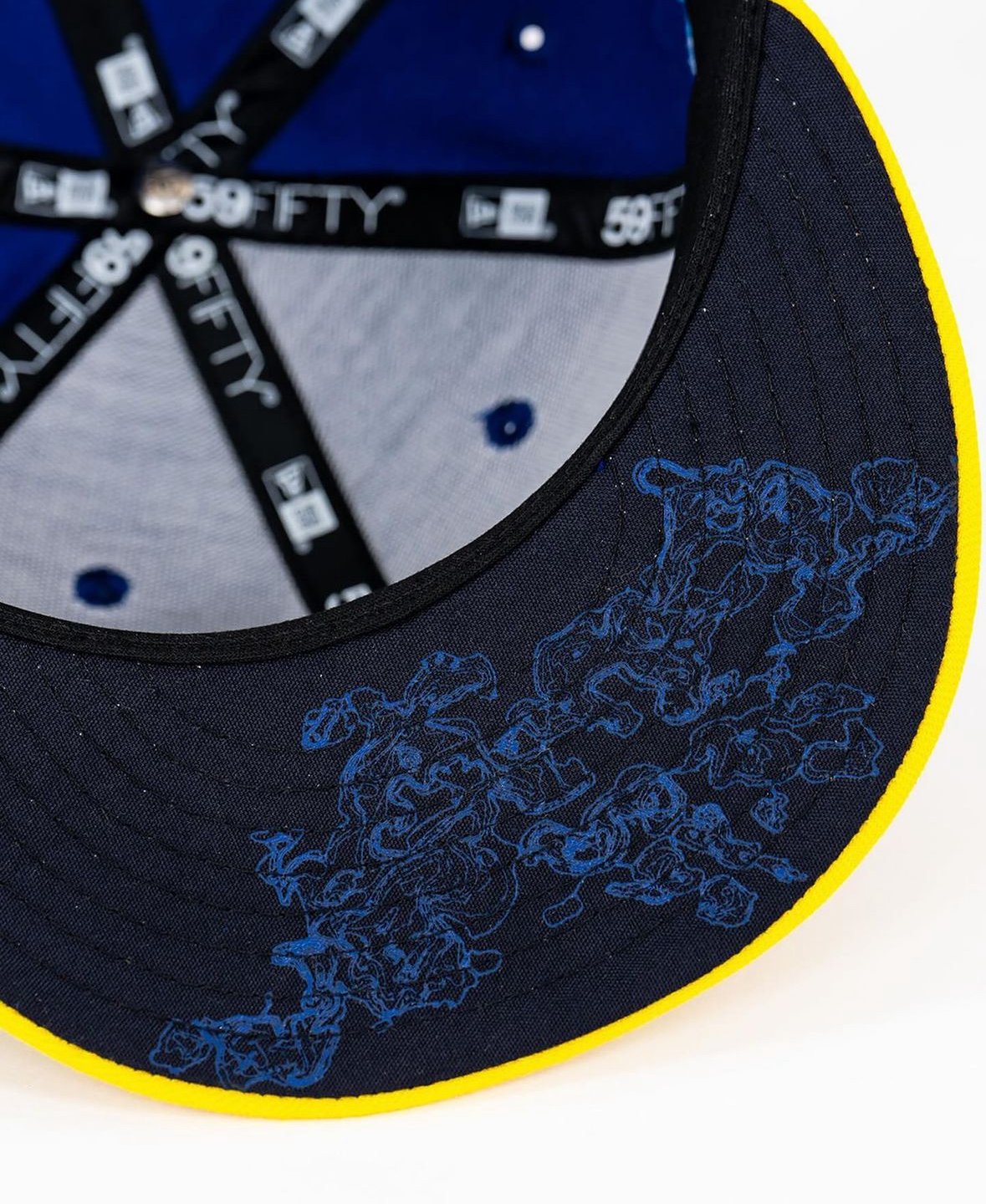
The caps also feature a "10,000 Lakes" decal and a topographical depth map of Lake Minnetonka under the brim—a nod to Prince’s iconic "Purple Rain" movie line.
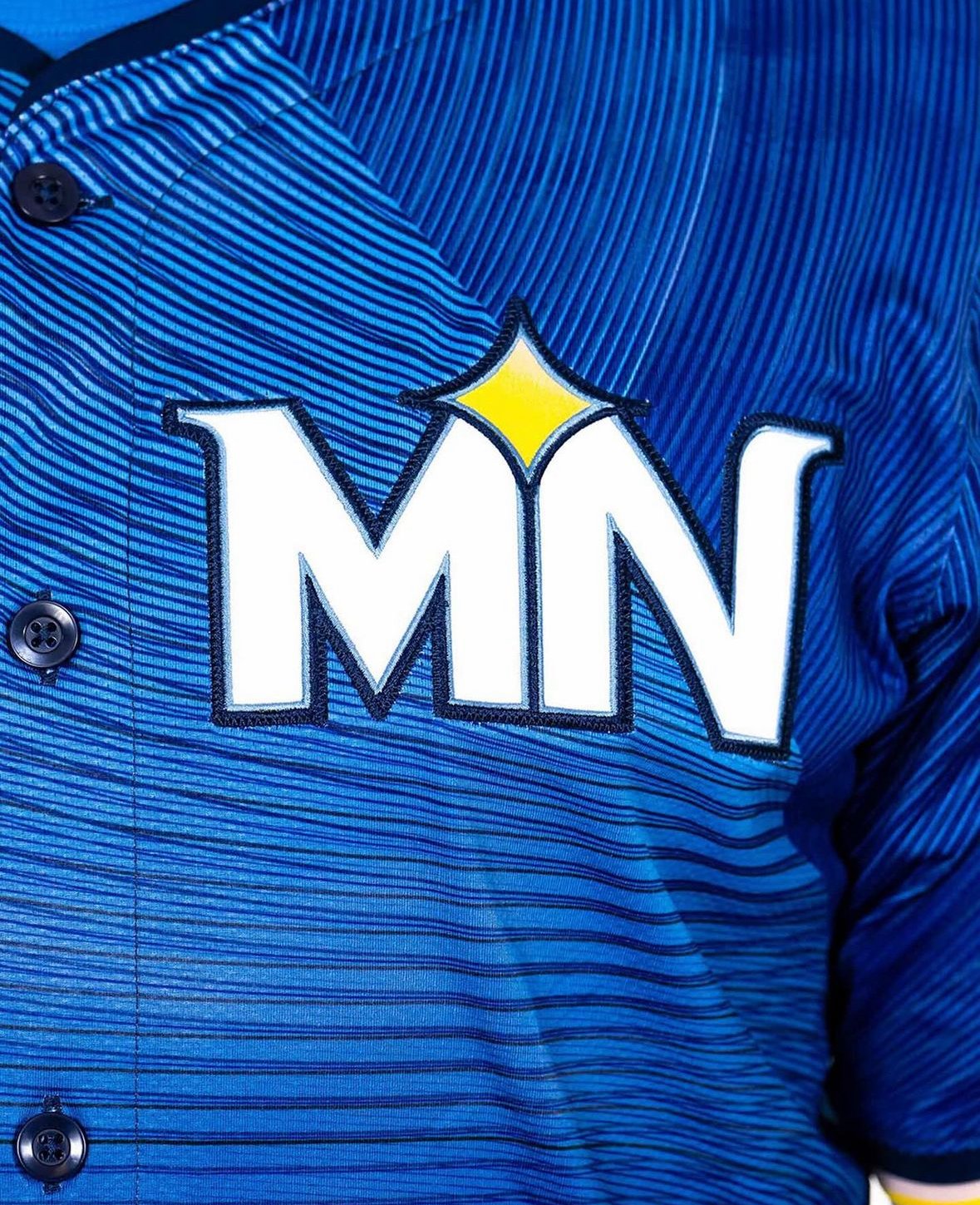
The jersey tops feature a sublimation pattern with various shades of blue and black striations, representing lake ripples. Instead of a traditional wordmark, the chest patch displays a white “MN” logo with the North Star motif, emphasizing the entire state rather than just Minneapolis and St. Paul. A loon logo on one sleeve, with baseball stitching for eyes and the North Star as its beak, adds another unique element.
The solid blue pants with neon yellow belts and multi-colored piping along the sides unify the look from head to toe. The piping, incorporating yellow, black, white, and pink, represents the varied colors of a sunset.
"That’s to reflect the hues of the sun setting over the lake," Hinkel said. "When you get that great sunset, it’s not just bright yellows. There’s some pink hues in there, so we’ve added the piping here."
While this year's iteration uses blue pants, the Twins are considering white pants for future seasons.
The Minnesota Twins have once again demonstrated their commitment to representing their state with pride, blending tradition with modern design in their new "State Connect" uniforms.