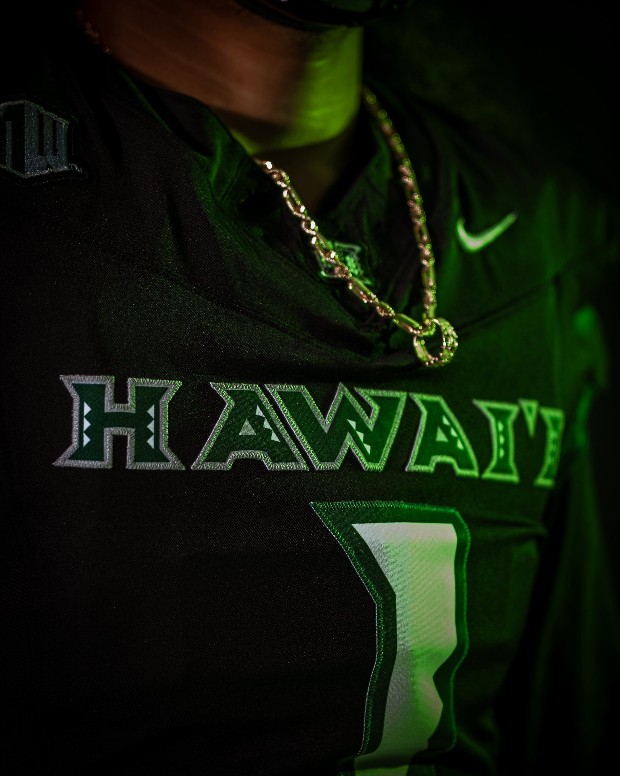
The islands just got even tougher. Hawai’i Football has dropped their new black Nike uniform set for the 2025 season, and it’s everything you’d expect from the Rainbow Warriors: clean, culturally rich, and straight-up intimidating.
This look stays true to the program’s roots while bringing fresh energy to the field under the lights. From the "HAWAI‘I" wordmark stitched across the chest to the Polynesian pattern accents, every detail on the new uniforms is intentional and symbolic of the islands' heritage and strength. paying tribute back to the days of Colt Brennan.
The base is a black jersey that lets the signature green and silver tones pop throughout the design. “HAWAI‘I” stretches across the chest in a bold tribal-style font, filled with traditional island motifs and trimmed in silver. The numbers — oversized and outlined in green — feature subtle angular cuts, nodding to native tattooing styles and patterns.
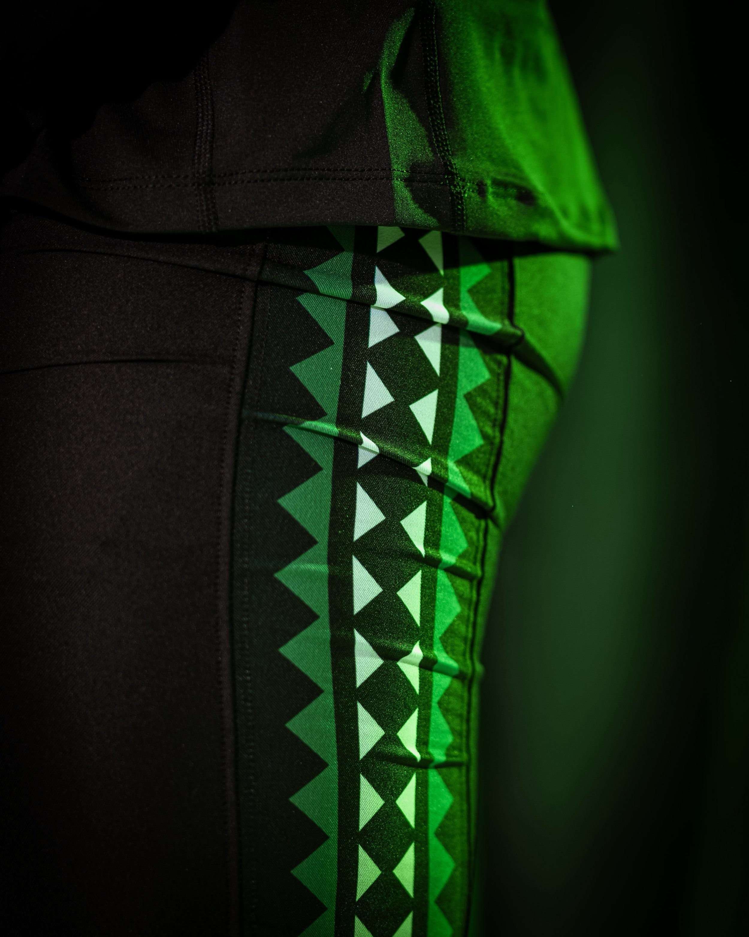
On the shoulders, triangle-patterned tapa designs in green and teal pay homage to Polynesian culture, offering both a nod to the past and a modern, aggressive edge.
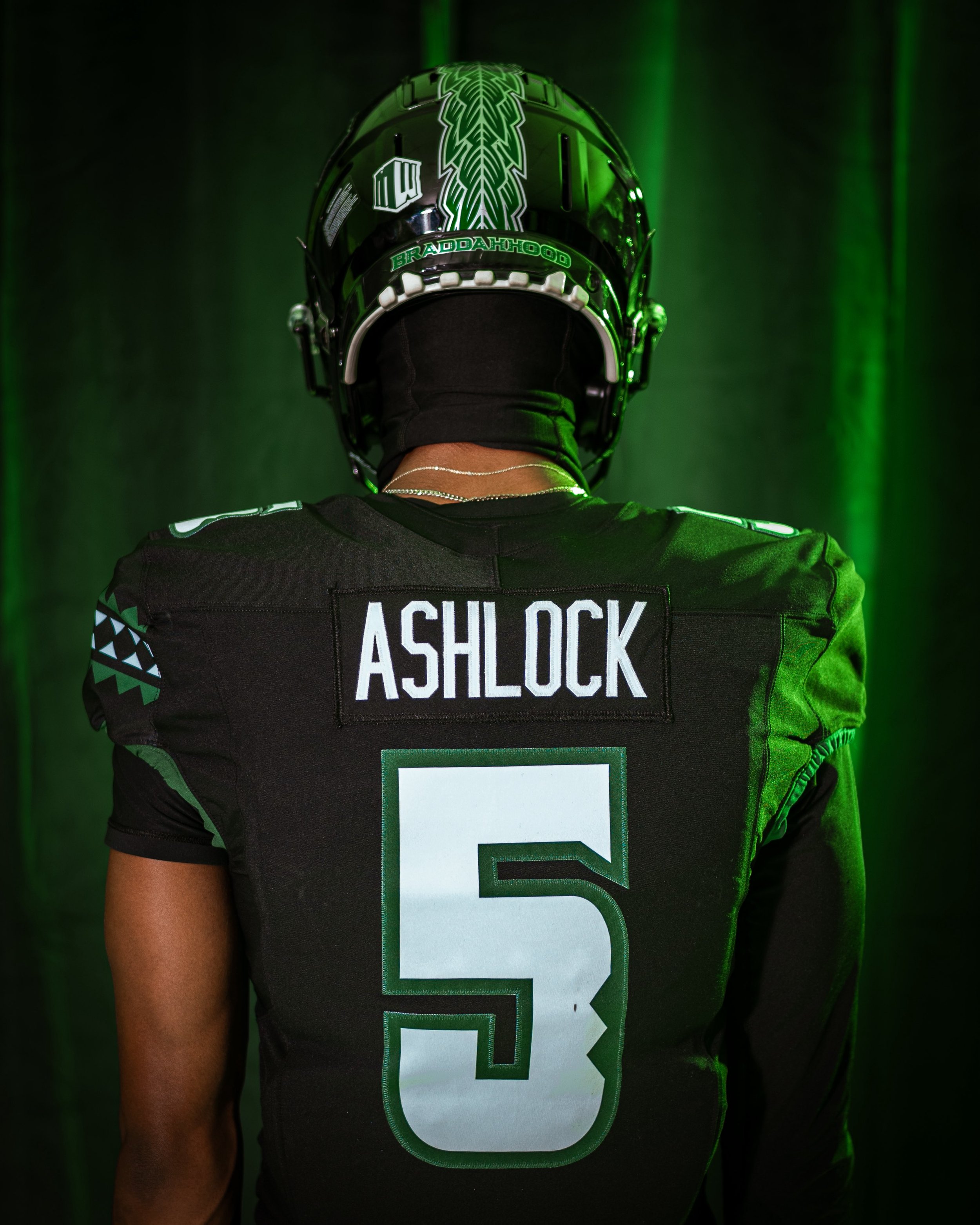
The helmet is where the culture really shows out. A glossy black shell features a vertical feathered pattern, with the word “BRADDAHOOD” on the back bumper.
Expect to see these new black unis become a fan favorite — and a recruiting weapon — as the Rainbow Warriors continue to evolve under the lights of Mānoa.
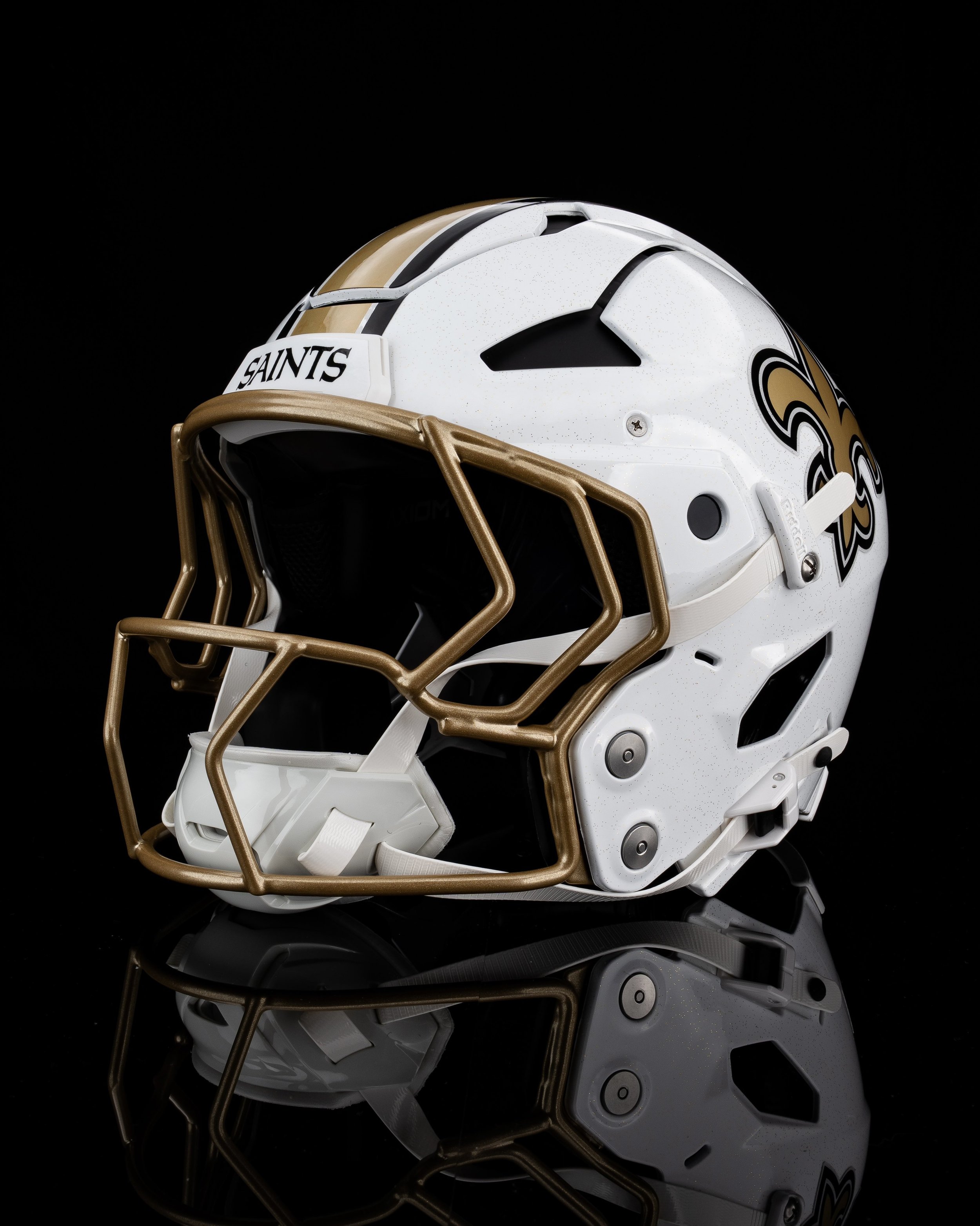
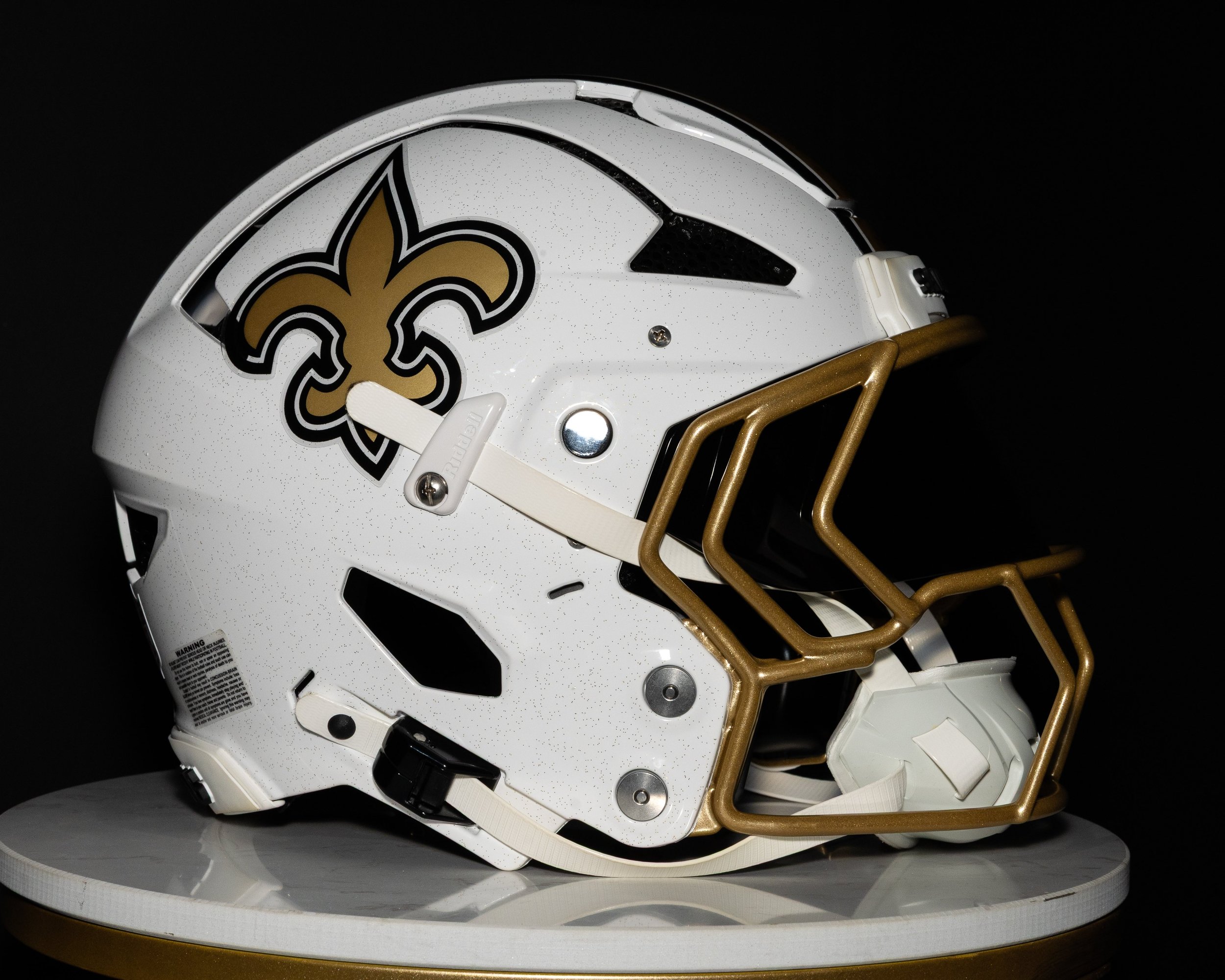
The New Orleans Saints are stepping into the 2025 season with a fresh look up top. The team revealed a brand-new white alternate helmet, joining the growing list of NFL squads expanding their lid lineup under the league’s relaxed alternate helmet rules.
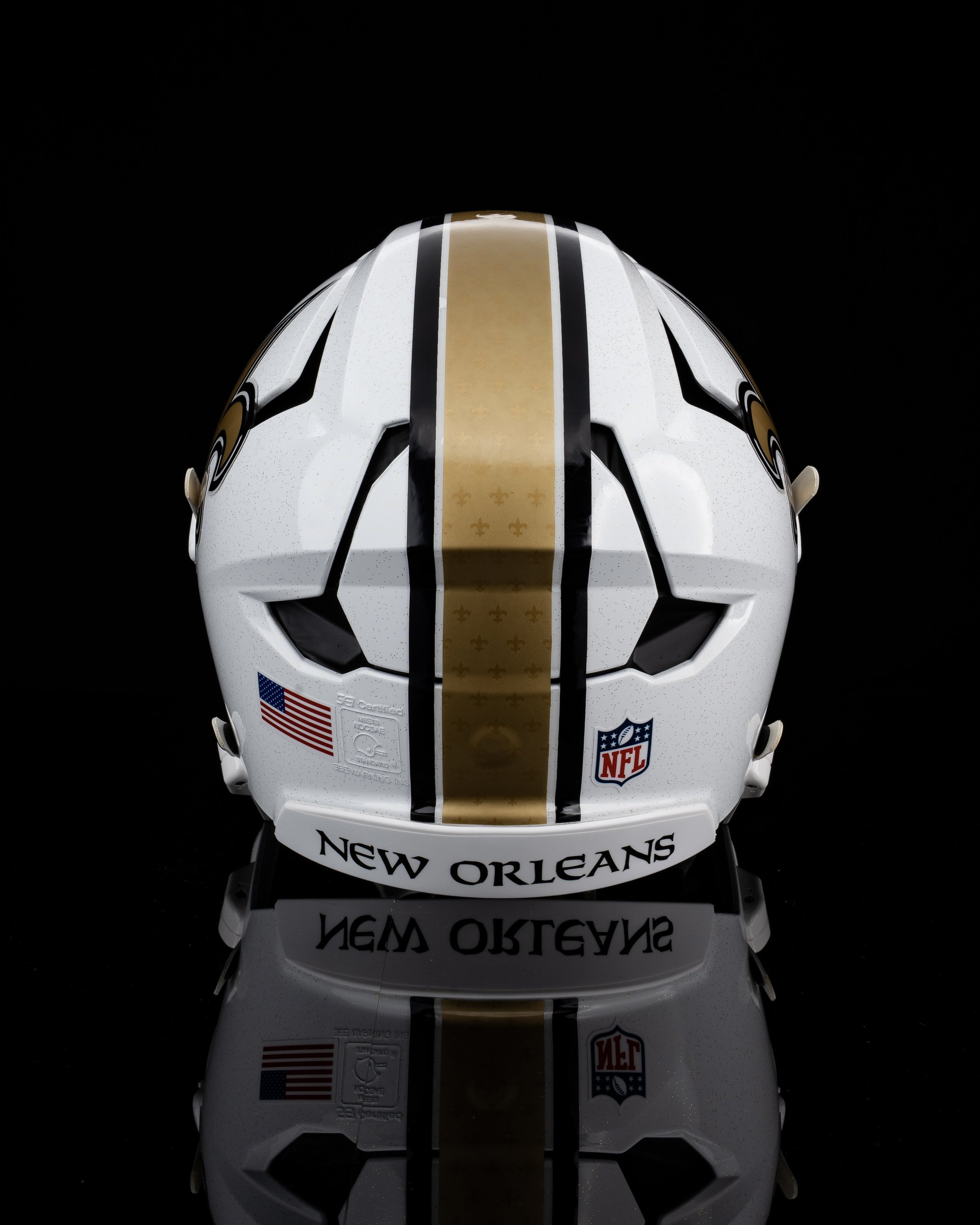
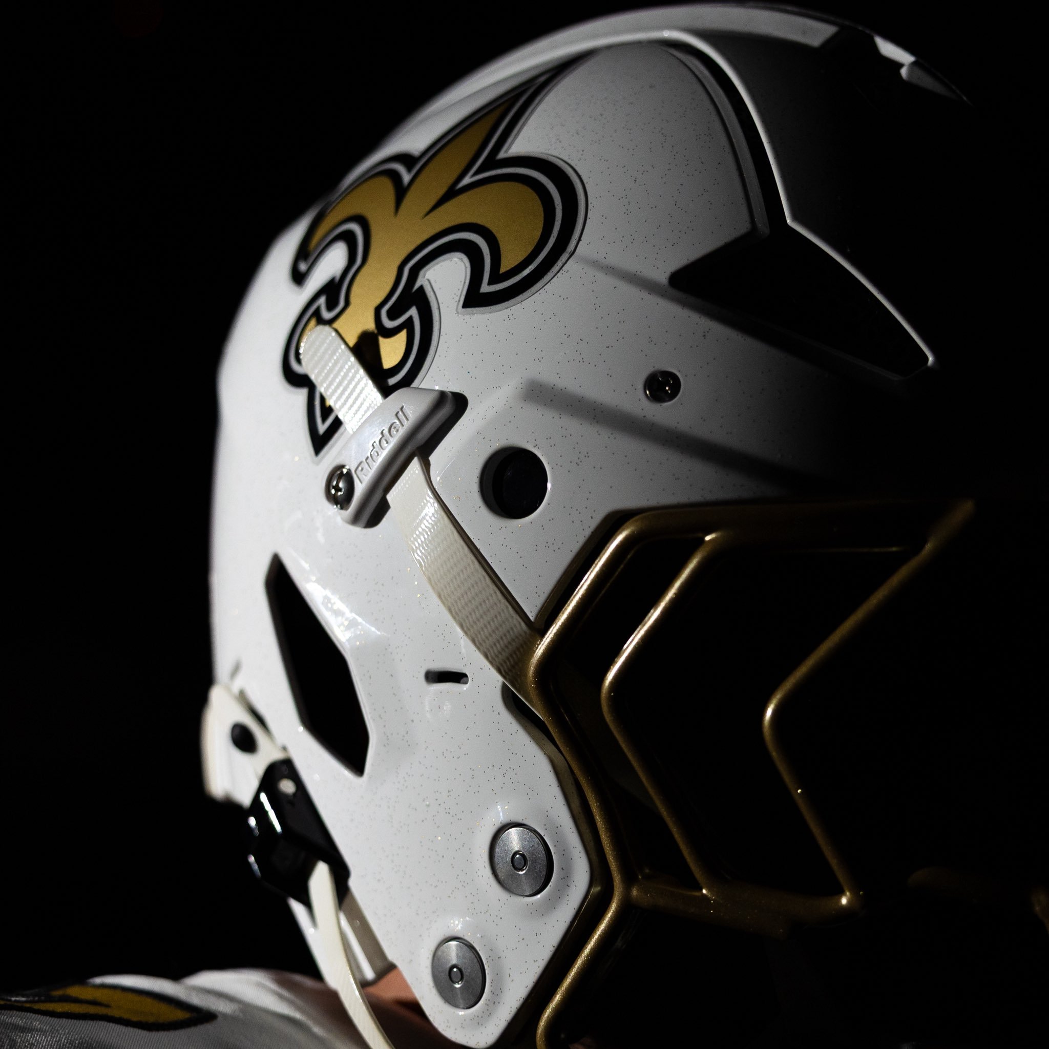
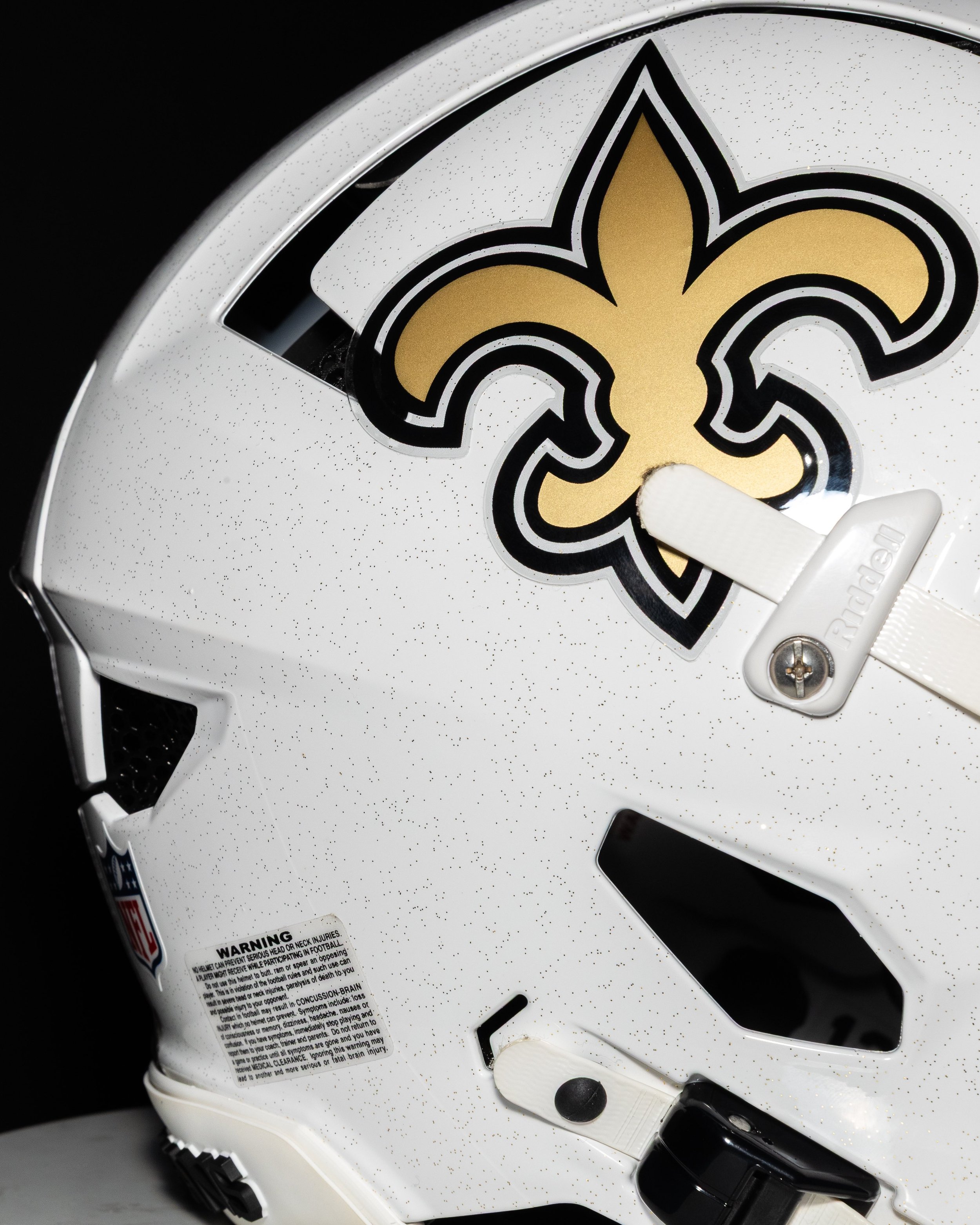
The new shell stays true to the Saints’ identity while introducing a fresh, modern twist. It features a crisp white base adorned with subtle black flecks, giving the helmet a speckled texture that fans have already compared to vanilla ice cream, a playful nod to New Orleans’ King Cake culture. The iconic gold fleur-de-lis logo remains front and center on both sides, while a bold gold stripe runs down the middle of the helmet, embossed with repeated fleur-de-lis symbols for added depth and detail. That stripe is bordered by two thin black lines for contrast, and the look is finished off with gold facemasks that tie the whole aesthetic together.
Unlike the Saints’ black alternate helmet introduced in 2022, the white version drops the fade or taper effect and keeps things sharp and symmetrical.
The Saints confirmed that the white helmet will debut with their Color Rush uniforms — a fan-favorite combo of white jersey and white pants, accented with gold numbers and black-and-gold trim.
Previously, the black helmet was always paired with the Color Rush set. It made four appearances over the last three seasons but never in the Superdome. With the arrival of the white shell, that lid might now rotate into black-on-black combos, giving the Saints more flexibility and, hopefully, better results.
— Washington Commanders (@Commanders) July 9, 2025
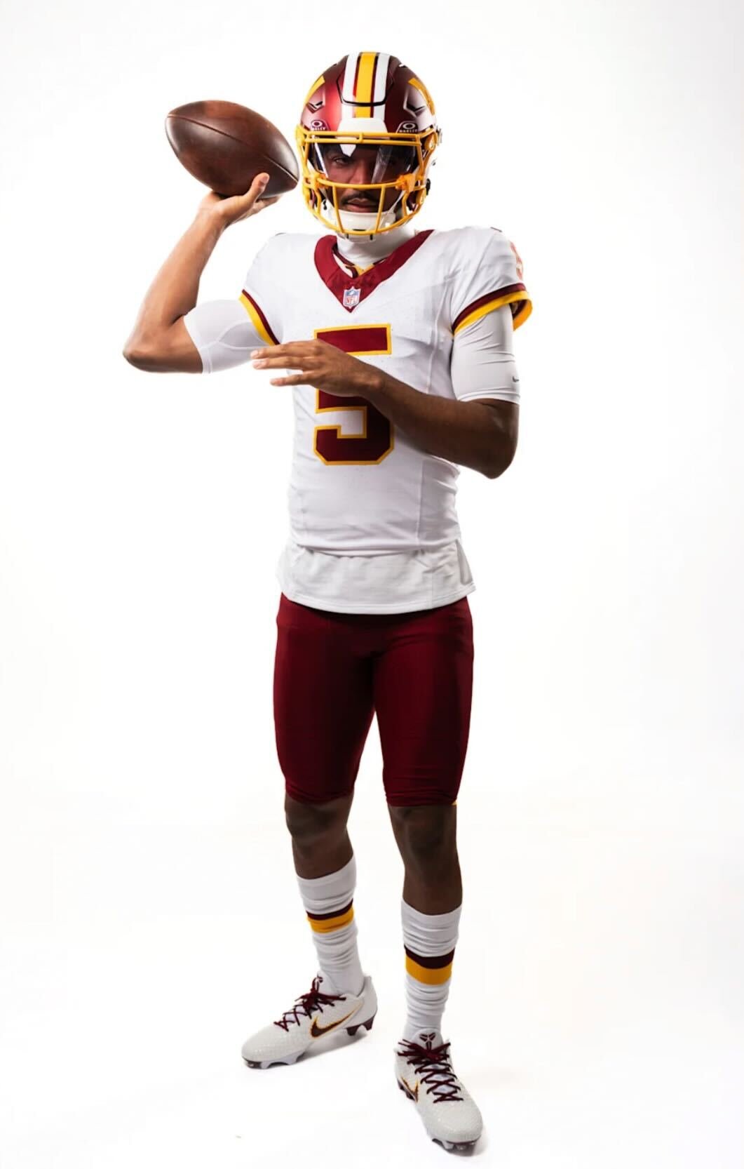
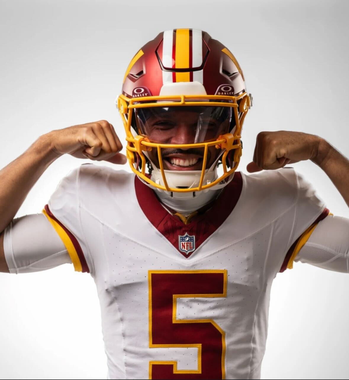
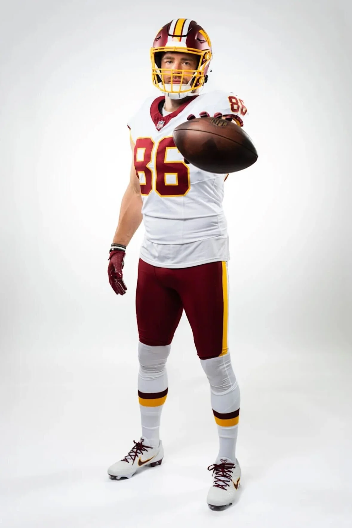
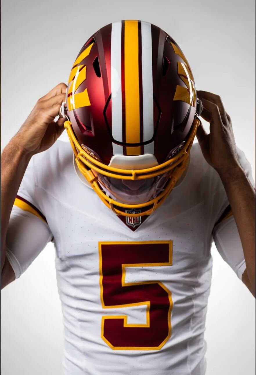
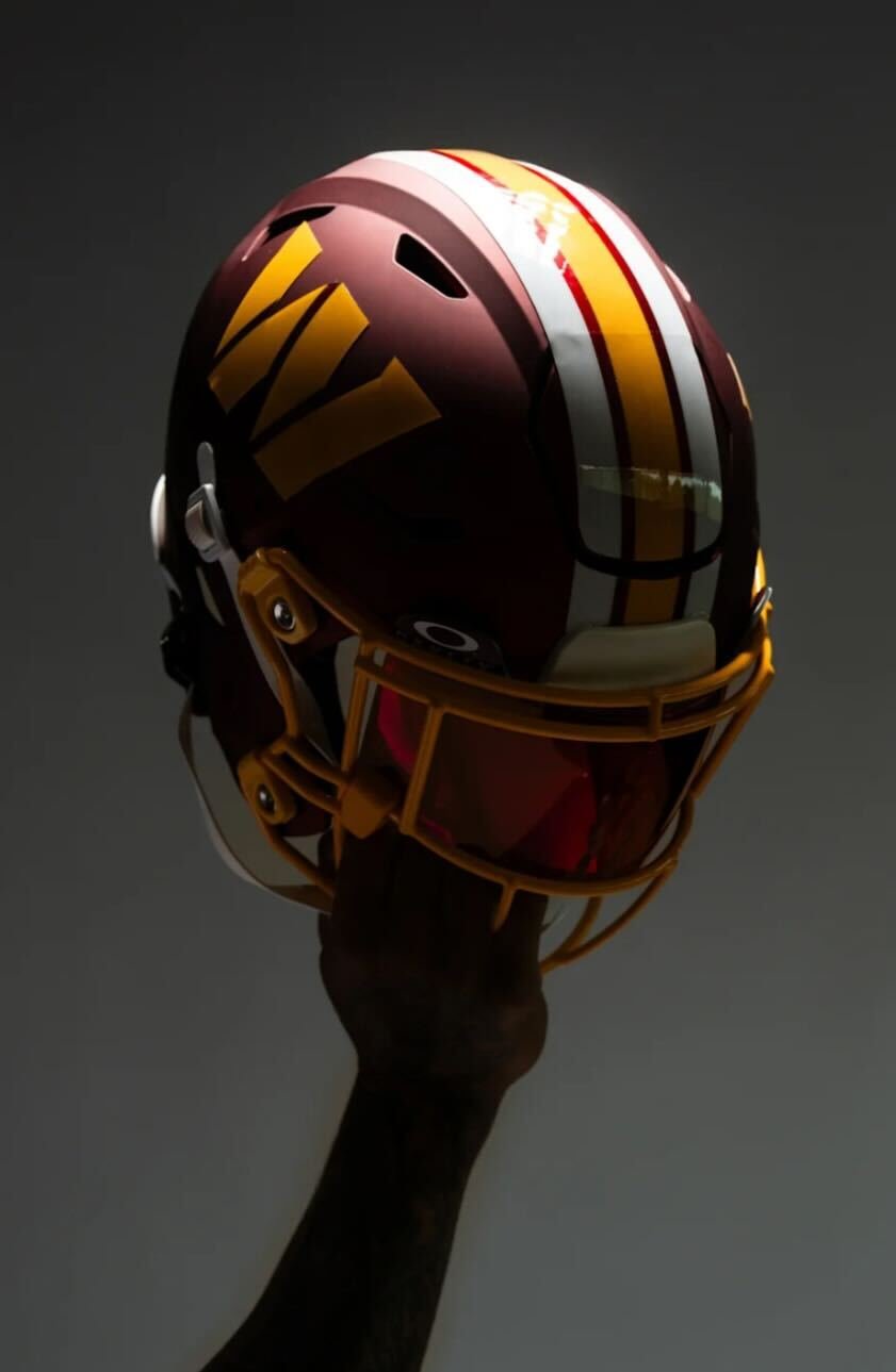
Washington is turning back the clock in a big way for the 2025 season. On the 93rd anniversary of the franchise's founding, the team officially unveiled a brand-new alternate uniform set inspired by their iconic Redskins “Super Bowl Era” — a nod to the glory days that brought Washington three championships in the 1980s and early 1990s.
The alternate uniforms includes a throwback-inspired helmet that will be worn three times during the season, starting with a primetime debut in Week 9 on Sunday Night Football against the Seattle Seahawks (Nov. 2). Fans will also see the set in action Week 13 vs. the Denver Broncos (Nov. 30) and on Christmas Day vs. the Dallas Cowboys (Week 17).
These alternates are rooted in history, pulling direct inspiration from the looks worn during Washington’s Super Bowl runs in 1982, 1987, and 1991. The white jersey is clean and classic, featuring burgundy numbers outlined in gold and gold stripes on the sleeves. Nameplates are burgundy with gold outlining — a subtle detail that stays true to the era.
Paired with burgundy pants that include gold and white striping, plus matching socks, the full uniform is a head-to-toe tribute to the franchise’s golden years as the washington redskins.
“We are excited to celebrate Washington's rich history with these iconic, Super Bowl Era uniforms this season,” said Commanders Team President Mark Clouse. “Ever since Josh Harris and our ownership group acquired the team back in 2023, they've placed great value in finding ways to connect the past and present and pay homage to those that made the Burgundy & Gold what it is today."
He continued, “These uniforms honor the most successful era of our franchise — one that reflects a culture of excellence and encompasses many historical moments and special memories amongst our fanbase. We look forward to bringing that nostalgic feeling back to fans, while incorporating a modern feel for our next generation of fans.”
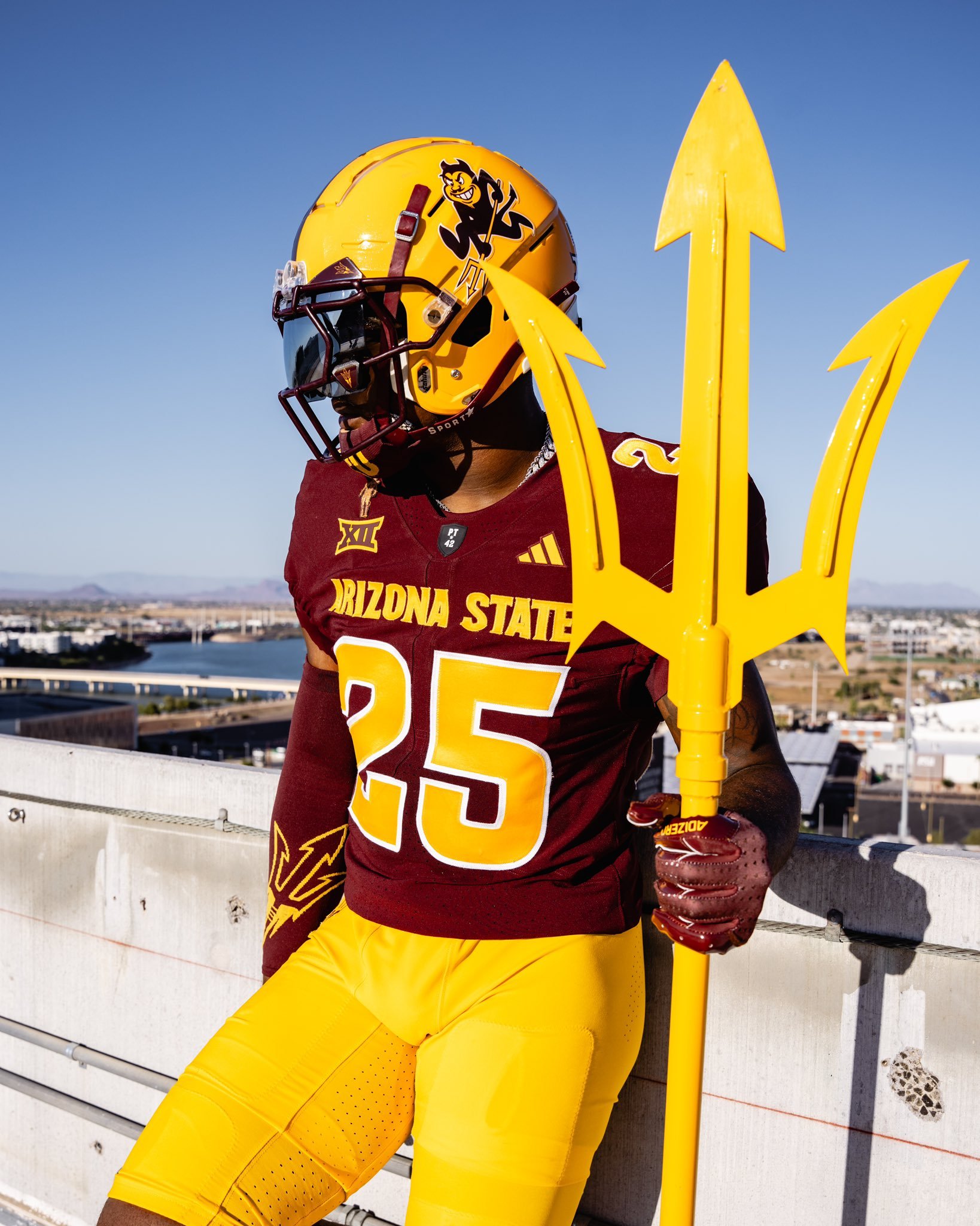
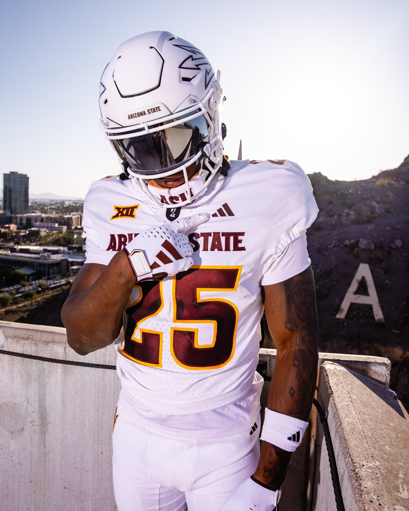
The Arizona State Sun Devils have officially revealed a bold new look. Dropped with the theme “Tradition meets evolution,” the updated uniforms showcase a fresh blend of heritage and modern flair.
ASU introduced two primary sets: a classic maroon and a clean white kit. The maroon jersey features gold numbers and lettering, with “Arizona State” emblazoned across the chest, paired with a gold helmet that proudly displays Sparky—the school’s iconic mascot. On the white set, maroon lettering and numbers are complemented by a sleek white helmet marked with the signature pitchfork logo.
While the color schemes and logos reflect ASU’s longstanding tradition, several updated touches signal a new chapter. Both jerseys include the Big 12 patch on the left shoulder. Under the neckline sits the revered “PT42” patch, a tribute to Pat Tillman, the legendary ASU alum and American hero. On the maroon jersey, a silhouette of Tillman himself is stitched above the Big 12 logo, further honoring his legacy.
The new uniforms strike a balance between honoring ASU’s storied past and embracing its future in a new conference. With tradition stitched into every detail and a bold aesthetic to match, the Sun Devils are geared up for a fresh era of football in the desert..
As the Tigers head into the new season, they’ve officially unveiled their uniforms—and while there’s no sweeping overhaul, the minor details show a program that respects its roots while sharpening its visual edge.
The home set sticks to the traditional navy jersey, highlighted by crisp orange and white sleeve stripes that have become synonymous with Auburn’s brand of football. On the road, the Tigers will again suit up in their signature “storm trooper” look—white jerseys with navy and orange sleeve striping, paired with white pants featuring navy and orange piping down the sides.
The helmets, as expected, remain unchanged: white shell, navy stripe, and the iconic interlocking AU on either side.
Where fans will notice something new is in the typography. Auburn has updated the font on both the numbers and nameplate. The numbers now appear in a bold, old-school block font—large, clean, and designed to pop from the field or on screen. Meanwhile, the nameplate adopts a taller, narrower style, giving the back of the jersey a sharper, more defined look than in recent years.
This minor update achieves what Auburn fans typically want: tradition respected, but visuals refreshed. The result is a uniform that feels unmistakably Auburn—with just enough evolution to keep things fresh in 2025.
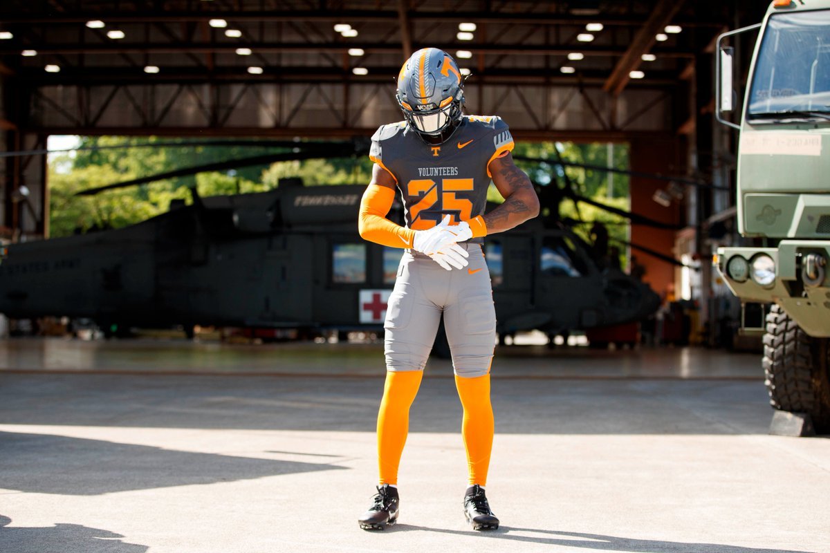
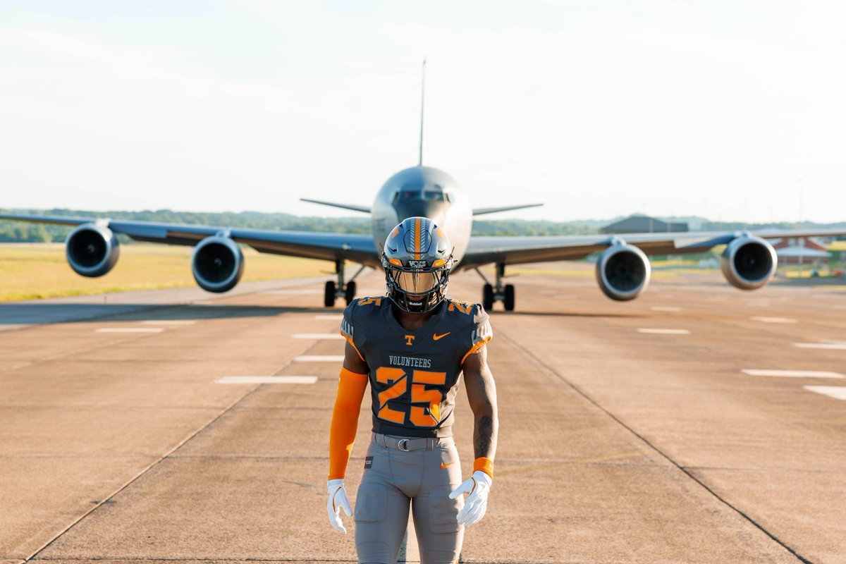
Tennessee Football is once again blending tradition, state pride, and service into the fabric of its game-day look with the unveiling of the 2025 edition of its Smokey Grey Series. This year’s theme, “Volunteer Spirit,” pays homage to the deep-rooted legacy of military service within the state of Tennessee, while honoring the brave individuals who have answered the call to protect and serve.
Set to debut on November 15, 2025, when the Volunteers host New Mexico State for their annual Salute to Service game, the uniform celebrates the backbone of the Tennessee identity: the spirit of service and sacrifice.
The “Volunteer Spirit” design draws on centuries of tradition, starting with one of Tennessee’s most legendary figures—Davy Crockett. Known as the “ultimate Volunteer,” Crockett and more than 30 Tennesseans gave their lives at the Battle of the Alamo in 1836. That legacy lives on in what Tennessee Football proudly wears on the field.
Prominent in the design is “The Davy Stripe”, a stylized take on Crockett’s famous fringed frontier uniform. It runs alongside the bold orange center stripe on the helmet and lines the sleeves of the jersey, adding a nod to Tennessee’s frontier past and military valor.
The uniform features a two-tone Smokey grey jersey and pant set, evoking the forged steel and tactical precision of military equipment. The stencil-style numbers on the chest, shoulders, and helmet echo standard military typography, while the word “Volunteers” is stitched boldly across the chest—a statement of both heritage and honor.
The helmet and pants also feature the return of the fan-favorite “Star Vols” logo, this time reimagined as a military-style patch, connecting Tennessee’s football identity with a respectful nod to our nation’s service members.
A custom Tennessee Tri-Star logo honoring the 134th Air Refueling Wing was created specifically for this edition, serving as a visual bridge between the state’s identity and its military strength.
This marks the fourth version of the Smokey Grey Series, a tradition launched in 2022. From the “OG” debut at LSU, to 2023’s “Artful Dodger” tribute to Condredge Holloway, and 2024’s “Volunteer State” uniform inspired by the Tri-Star flag, each edition has told a meaningful story.
— Cincinnati Football (@GoBearcatsFB) July 2, 2025
The Cincinnati Bearcats are leveling up in 2025 with a sharp, unified look that blends tradition and innovation. With three core colorways — black, white, and red — the Bearcats' latest Nike-designed uniforms are more than just fresh gear; they’re a bold statement about pride, identity, and a program on the rise.
The updated uniform lineup features three primary sets:
"Classic Black"
"Pure White"
"CINCY" Red
Each version includes matching pants and helmets, staying true to Cincinnati’s signature toughness while refreshing the visuals fans have come to know and love. The iconic C-Paw remains front and center on the helmet, now marking its 36th consecutive season as the program’s primary logo — a testament to its deep-rooted presence in Bearcat lore.
One of the standout changes? The brand-new "Cincy Stripe 2.0." The updated striping pattern, seen on the sleeves and running down the pants, adds a modern twist to a familiar motif, showing respect to the past while pushing forward with a sleeker, faster look.
In a first for Bearcats football, two-toned numbers make their debut. Designed exclusively for Cincinnati by Nike, the "Speed Block" number font adds a distinct edge and increased visibility. It’s the first time UC has featured a dual-color number scheme since 2007, and it instantly adds character to each uniform set.
Perhaps the most symbolic addition to the 2025 uniforms is the "Cincy" wordmark across the chest of the red alternate jerseys. First introduced by the basketball program in 2023, this branding element has quickly taken root among Bearcat athletes and fans. It captures the gritty, unapologetic spirit of both the university and the city itself.
This new uniform rollout does more than refresh the Bearcats’ look — it solidifies their identity. While the classic black and white looks anchor the team in its traditional visual DNA, the red "CINCY" alternate sends a clear message: this program isn’t just playing football — it’s building a brand, and doing so with a nod to its city’s culture and resilience.
— Georgia Tech Football (@GeorgiaTechFB) July 1, 2025
It’s July, and the countdown to kickoff is officially on. With fewer than two months until Georgia Tech takes the field under the Friday night lights in Boulder against Colorado, the Yellow Jackets just gave fans even more reason to get hyped.
The program dropped their 2025 uniform collection, showcasing three fresh looks—white, gold, and grey.
The white jersey with gold numbers returns from the 2024 set, a clean, classic look that honors Tech's traditional palette. But what really stands out in this new drop are the grey and gold-on-gold combinations, each offering a unique identity that blends innovation with tradition.
The grey-on-grey uniform features gold numbers and a modernized number font. While the design echoes Georgia Tech’s 2023 “ghost” uniforms, this year’s grey set takes a more grounded approach. It’s bold but wearable, offering a fresh alternative to the typical road or blackout looks.
Then there’s the gold-on-gold set, arguably the crown jewel of the collection. Featuring white numbers on a rich, metallic gold base, this uniform is a nod to both the literal color of Georgia Tech’s brand and the winning legacy rooted in The Flats.
While the uniforms are officially out, the helmet situation remains a mystery. Georgia Tech has yet to confirm whether they’ll debut new lids or stick with their standard design.
— Louisville Football (@LouisvilleFB) July 1, 2025
The Cardinals are taking the field in 2025 with a fresh look that blends historic identity and modern detail—Louisville Football has officially dropped its latest uniforms, and they’re filled with nods to the past, the city, and the fanbase.
For the first time since 2004, Louisville’s iconic primary mark—the bold, aggressive bird head—is back in a prominent way. You’ll now find it proudly stitched onto the collar line of the jersey, reestablishing one of the most recognizable visuals in the program’s history.
Custom-designed specifically for Louisville, a new fleur-de-lis pattern is subtly woven into the uniform’s striping. It’s a nod to the city’s French heritage and local pride—designed in the Ville, for the Ville.
Hidden within the collar is a simple, powerful message: For the Ville. It’s a quiet but constant reminder of who these players represent every time they suit up.
The uniform’s sharp linework mirrors the angles and weight of the fleur-de-lis design, while also reflecting the customized ligatures used in the Louisville wordmark. It’s subtle, smart, and uniquely Louisville.
Another throwback touch—numbers return to the shoulder pads, restoring a clean, classic football detail that helps with player identification and gives the jerseys that timeless gridiron feel.
Temple Football is dialing up the tradition and doubling down on style with the reveal of their all-new uniforms for the 2025 season. It’s not just a redesign—it’s a statement. The Owls are embracing their legacy while charging full speed into a new era, blending classic elements with fresh energy.
The iconic Temple “T” is back in full force.
After years of experimentation and alternate designs, the beloved Temple T returns to both sides of the helmet, proudly reclaiming its place as the centerpiece of the Owls’ visual identity. The logo also appears on the shoulder sleeves, creating a bold and unified look from head to toe. For Temple fans, it's more than a design—it's a symbol of pride, grit, and North Philly toughness.
Inspired by Temple’s legendary “Acres of Diamonds” speech, the uniform incorporates new and revamped diamond patterns across the collar, helmet, and pants. These subtle yet powerful design cues connect players to the deep-rooted tradition of Temple Football while also representing untapped potential and the promise of what’s to come.
It’s a visual metaphor that’s long been part of the university’s DNA—and now it’s stitched directly into the uniform.
The evolution doesn’t stop at heritage. Temple also introduced a brand-new secondary logo, which makes its debut on the collar of the jersey. It’s sleek, modern, and built for a program with eyes firmly on the future. This new mark signals that while tradition fuels the Owls, innovation drives them forward.
From the iconic T to the deeper symbolism of the diamonds, Temple’s new uniforms strike the perfect balance between nostalgia and next-gen design. Whether you’re watching from the stands at Lincoln Financial Field or catching the Owls on national TV, one thing is clear: Temple is back—and they look the part.