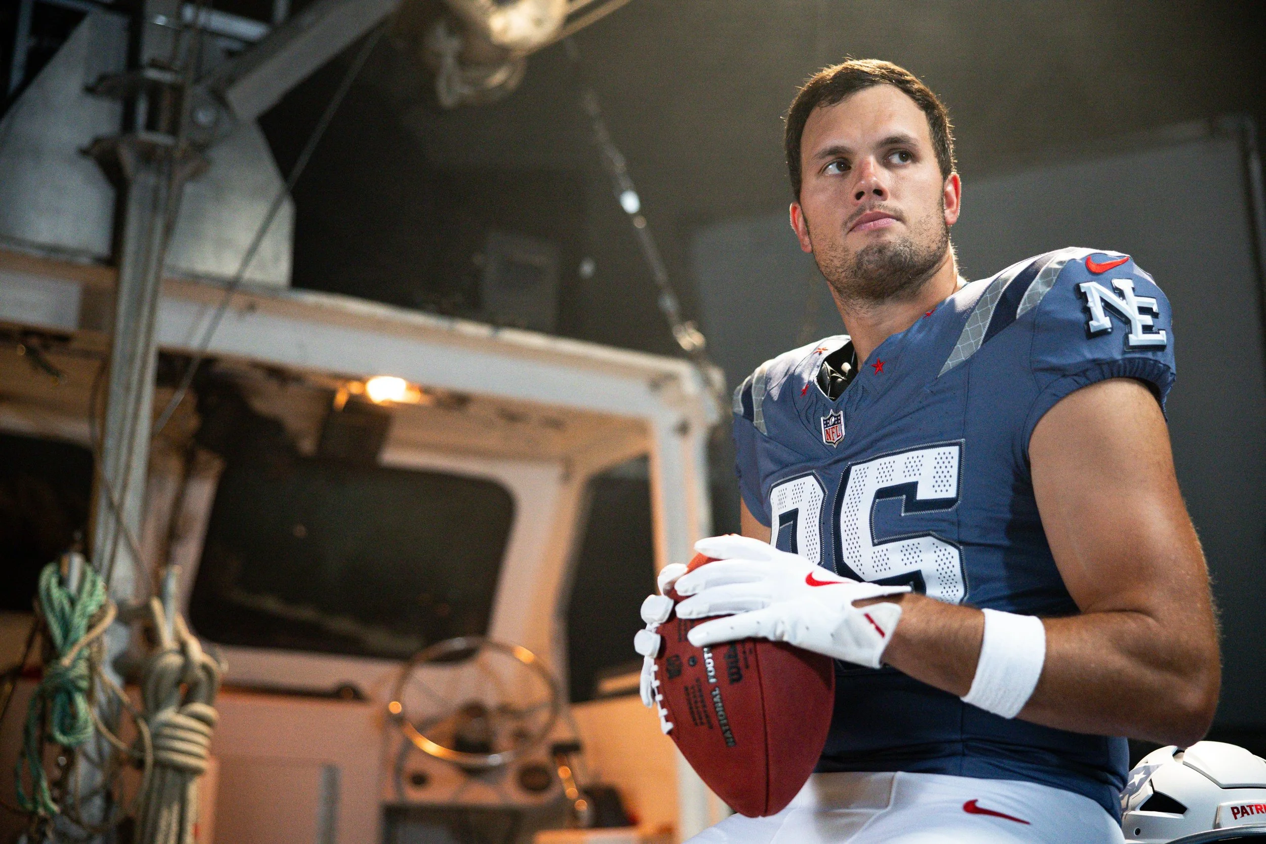
The New England Patriots have revealed their Rivalries uniform, a storm blue look that blends regional pride, franchise history, and iconic New England imagery. Inspired by the fog that rolls through the region, the design serves as both a nod to the six states that make up New England and to the dynasty that delivered six Super Bowl titles.
Around the neckline sit six red stars — one for each state and each championship. The details continue across the shoulders and pants with reflective silver stripes, representing beams of light shining from the Gillette Stadium Lighthouse. Towering 218 feet tall, the lighthouse is the tallest nontraditional lighthouse in the country, and it stands as a beacon for fans across the region.
Additional touches tie the uniform back to both heritage and legacy. A silver “NE” patch sits on the sleeve, while the neckline carries the iconic phrase “We Are All Patriots,” first spoken by owner Robert Kraft following the team’s Super Bowl XXXVI victory in the wake of 9/11. The numbers feature perforated stripes and embroidery in a subtle callback to the Drew Bledsoe era uniforms.
The set is completed with silver pants, giving the look a sleek and modern finish.
For the on-field debut, it’s only fitting that New England will wear the Rivalries uniform against the New York Jets, one of the fiercest rivalries in the NFL.
“Patriots vs. Jets isn’t just another game on the schedule — it’s a battle of pride, history and two fan bases that want nothing more than to see the other side walk off the field disappointed,” said Hall of Famer and former linebacker Andre Tippett.
With regional pride stitched into every detail, the Patriots’ Rivalries uniform is a fresh take on tradition — and a bold new way to represent New England on the biggest stage.
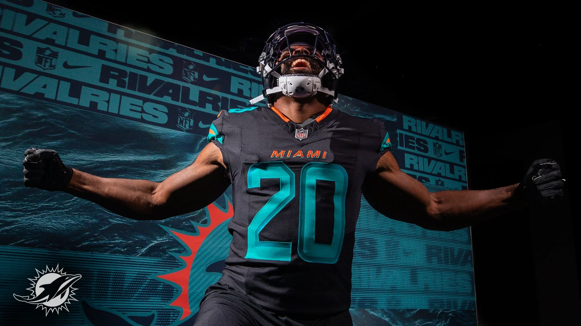
The Miami Dolphins are turning up the tempo in 2025 with the reveal of their all-new Rivalries uniform, a look designed to match the blazing speed of their roster and the energy of their fanbase.
With two of the league’s fastest playmakers in Tyreek Hill and De’Von Achane, Miami leaned into speed as the central theme of the design. The uniform introduces dark-pitch blue threads accented with iridescent aqua and sharp orange details, echoing the power and movement of dolphins cutting through water.
The helmet, sleeves, and pant stripes feature turbo green and orange striping, a bold nod to motion and acceleration. Inside the back collar, the Dolphins’ rally cry “Go Fins!” is stitched in orange — a detail built to fire up players and fans alike.
The uniform will make its on-field debut in one of the NFL’s classic rivalries: Miami vs. the New York Jets.
“The Jets have always been our biggest rival. They’re the team that, no matter what their record is, they’re always going to play us tough,” said former Dolphins wide receiver Nat Moore. “And with so many New Yorkers living in South Florida, the rivalry just feels that much more real.”
Completing the look are dark-pitch blue pants, giving the entire combination a sleek, modern edge.
This Rivalries drop continues the NFL and Nike’s effort to bring city and fan identity into uniform design. For the Dolphins, that identity is pure speed — and now it’s stitched into their game-day threads.
The Los Angeles Rams have officially unveiled their latest look, Midnight Mode, a striking alternate uniform designed as part of the NFL’s new Rivalries program.
Inspired by the sleek, modern architecture of SoFi Stadium, Midnight Mode reflects the energy of the Rams’ House after dark, capturing the team’s deep connection to the city of Los Angeles. The uniform is a tribute to the countless individuals who work in the shadows of L.A., grinding behind the scenes to eventually earn their moment in the spotlight.
Fans won’t have to wait long to see the look under the lights. The Rams will debut Midnight Mode on Sunday, November 16, when they host the Seattle Seahawks at SoFi Stadium.
This release marks the Rams’ entry into the Rivalries program, the NFL and Nike’s bold new uniform initiative celebrating divisional matchups with one-of-a-kind designs. Each Rivalries uniform is crafted to embody the culture, history, and identity of its city, and Midnight Mode captures the essence of Los Angeles: modern, electric, and always ready for the spotlight.
With the Rams set to roll out this all-new look against a bitter division rival, expect SoFi Stadium to bring an entirely different vibe when the lights go down.
The San Francisco 49ers are turning up the heat in 2025 with a bold new Rivalries uniform, a striking all-black look that will debut in Week 18 against the Seattle Seahawks at Levi’s® Stadium.
As part of the NFL’s new Rivalries program in collaboration with Nike, the 49ers join the rest of the NFC West and AFC East in unveiling one-of-a-kind uniforms designed to celebrate divisional showdowns. Each design is tailored to the team’s city, culture, and fanbase — and in San Francisco’s case, the Faithful themselves played a major role in shaping the look.
“This is all everybody has been asking about,” defensive back Deommodore Lenoir said. “I know the crowd is going to go crazy.”
Uniform Highlights
Helmet: A first-of-its-kind midnight black shell with bold red stripes and a gold-coated facemask.
Jersey & Pants: All-black with red stripes and bold red numbers outlined in gold. The custom Saloon-style numbering pays tribute to the historic 49ers wordmark.
Faithful Script: A stitched script beneath the collar honoring the loyalty of 49ers fans around the world.
George Kittle, “The People’s Tight End,” was heavily involved in the design process and couldn’t hide his excitement.
“We wanted something fun, something different that we don’t really ever do,” Kittle said. “I haven’t worn all black since my rookie season. But we never had black helmets, and so I’m the most excited about this bad boy. Holy cow we are going to look cool.”
Kittle added that the all-black kit brings an edge to the rivalry game.
“I feel violent when we wear all black. Like we’re just standing on business. All ten toes.”
The reveal itself leaned into the 49ers’ heritage and California roots, with the Stereo Creative team using projection mapping to highlight textures of history and moments of lore, bringing the uniform to life in a dynamic studio shoot.
This Rivalries uniform won’t just be a new look; it’s a statement. With only one scheduled appearance this season, against their biggest rival, it’s set to become one of the most anticipated uniform debuts of the year.
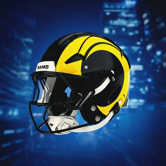
The innovative design introduces an Iridescent Green helmet and uniform accents, with soundwaves and 12 logos to reflect the noise that reverberates throughout the stadium on gamedays.
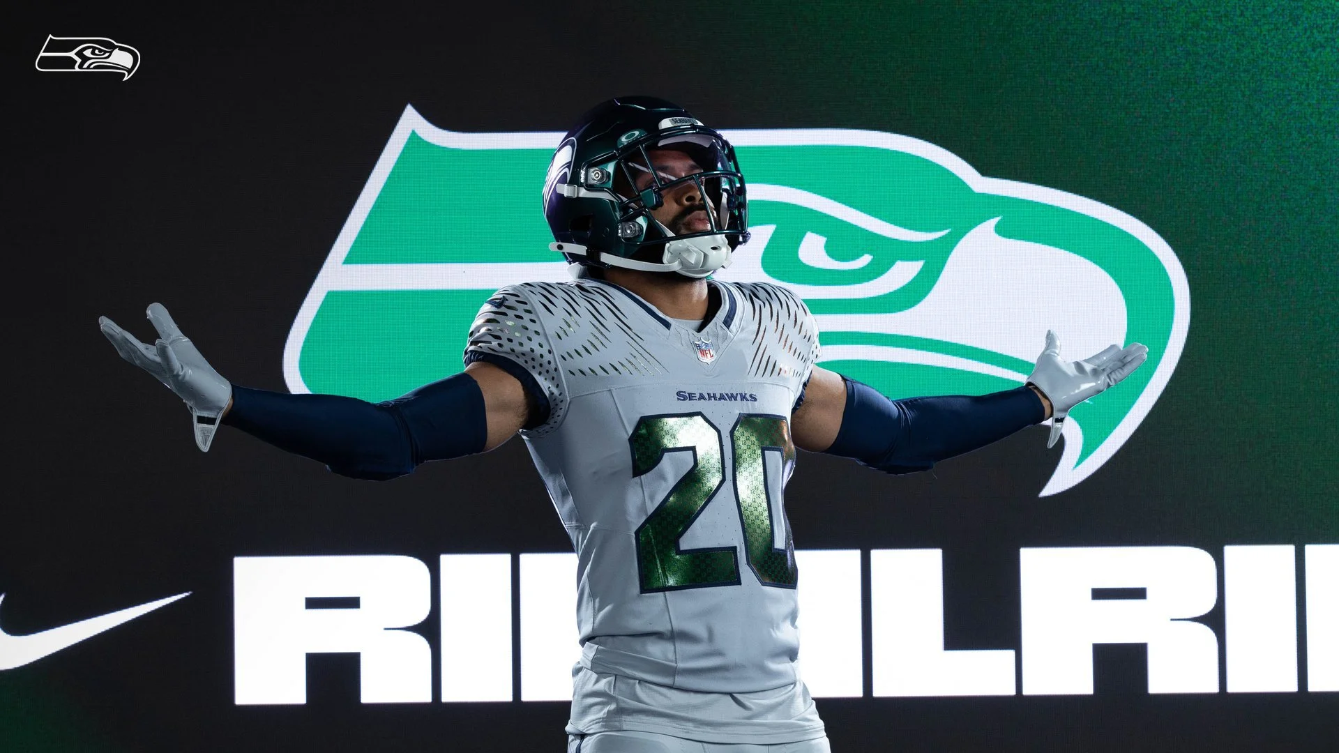
The Seattle Seahawks turned the spotlight on their fans Thursday, unveiling their brand-new Rivalries uniform, a bold wolf grey and iridescent green look that celebrates the heart of the franchise: the 12s.
Set to debut in Week 16 when the Seahawks host the Los Angeles Rams at Lumen Field, the Rivalries fit is packed with details that tie directly back to Seattle’s connection with its fanbase.
The design starts with wolf grey jerseys and pants, accented by iridescent green numbers that shimmer and shift with the light. The helmet matches in iridescent green with a metallic chrome finish, creating a futuristic edge unique to the Pacific Northwest.
But the true standout? The 12s. A 12s patch stitched into the uniform. A 12 pattern inside the jersey numbers that reflects under the lights. Helmet bumpers that read “12 As One.” Soundwave graphics on the shoulders and down the pant legs, representing the earth-shaking noise that makes Lumen Field the loudest stadium in the NFL.
“The Rivalries program is about celebrating what makes our team and city unique,” said Allison Hoover, Seahawks managing director of marketing. “Without question, that’s the 12s. This uniform is a tribute to the 12s, the loudest, most passionate fans in sports. When opposing teams come to Lumen Field, they not only face fierce competition on the field, but also the high-decibels of the 12s in the stands.”
The Seahawks join the rest of the NFC West and AFC East in this first wave of Rivalries uniforms. Each team will debut their look for one home game against a division rival this season, with the rest of the league rolling out designs over the next three years. Nike, the NFL, and each franchise worked together to ensure every uniform was tailored to the team’s city, history, and culture.
From wolf grey grit to iridescent flash, Seattle’s Rivalries uniform is more than just a new look — it’s a wearable tribute to the 12s who define the Seahawks’ identity.
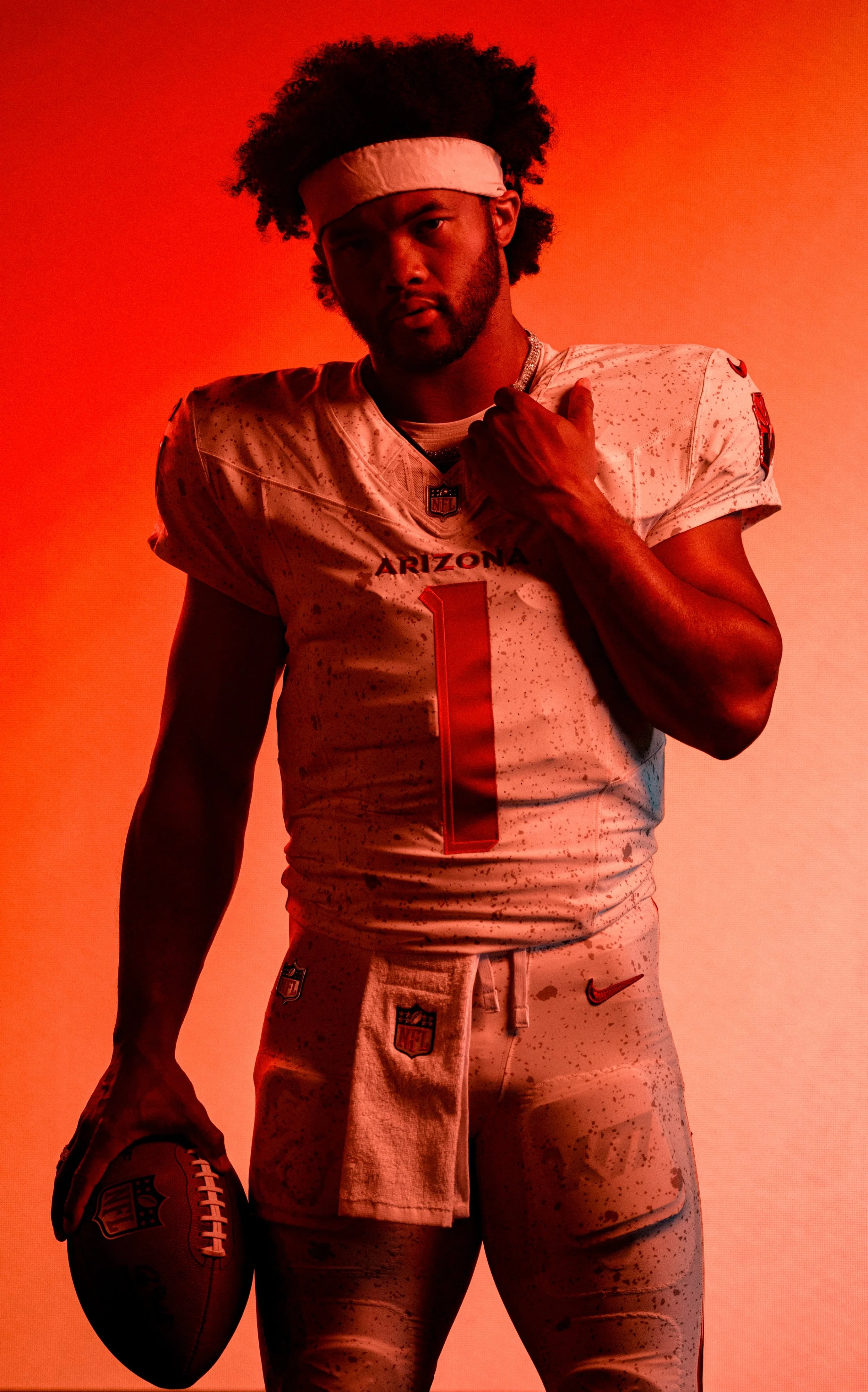
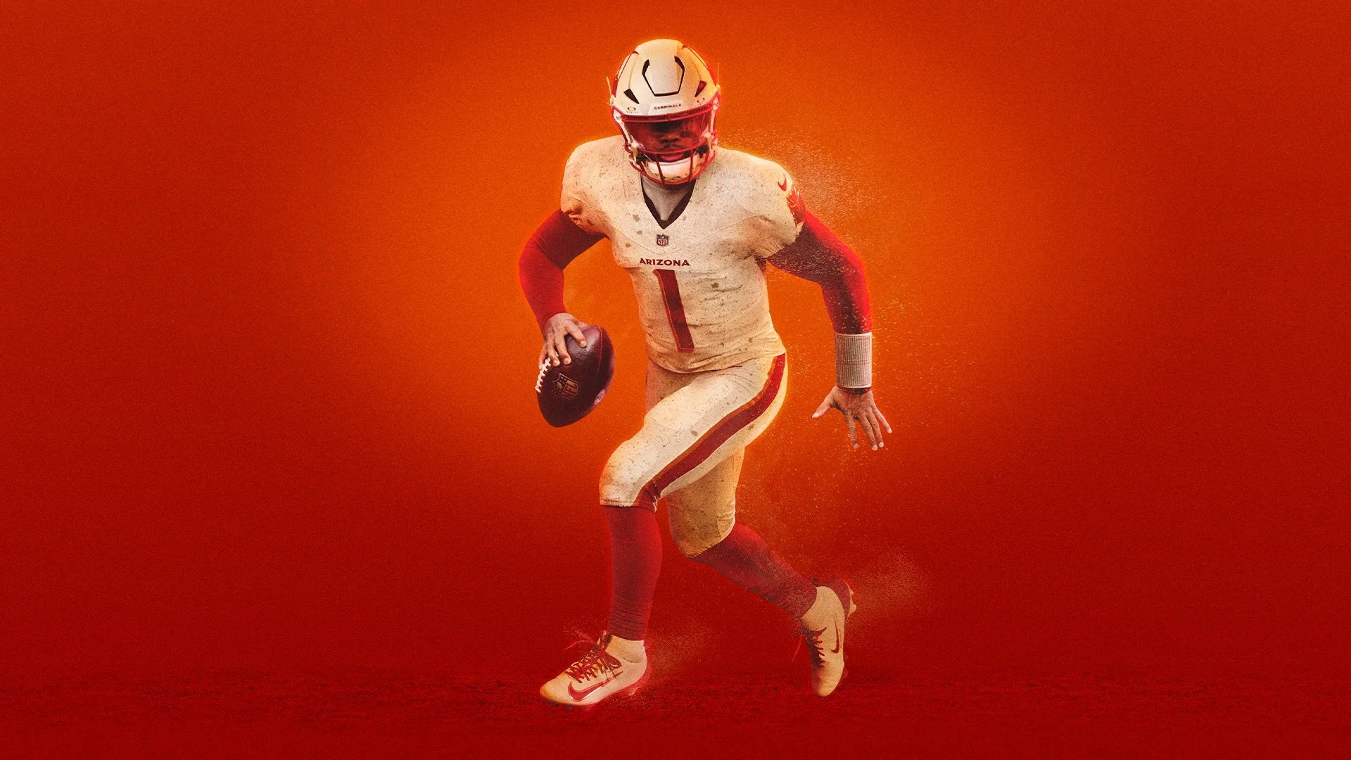
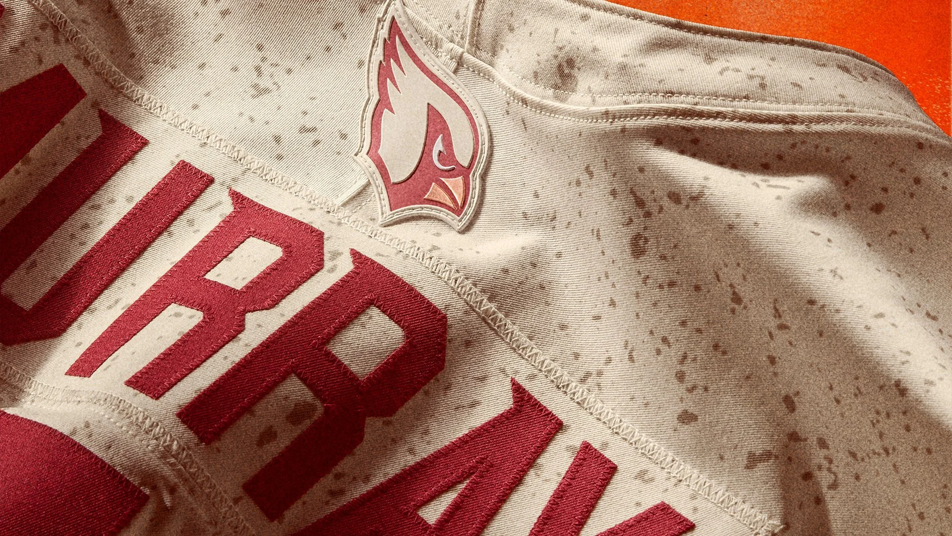
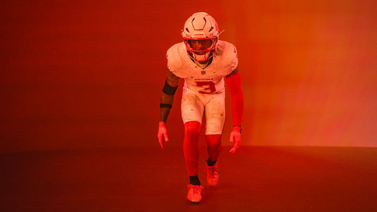
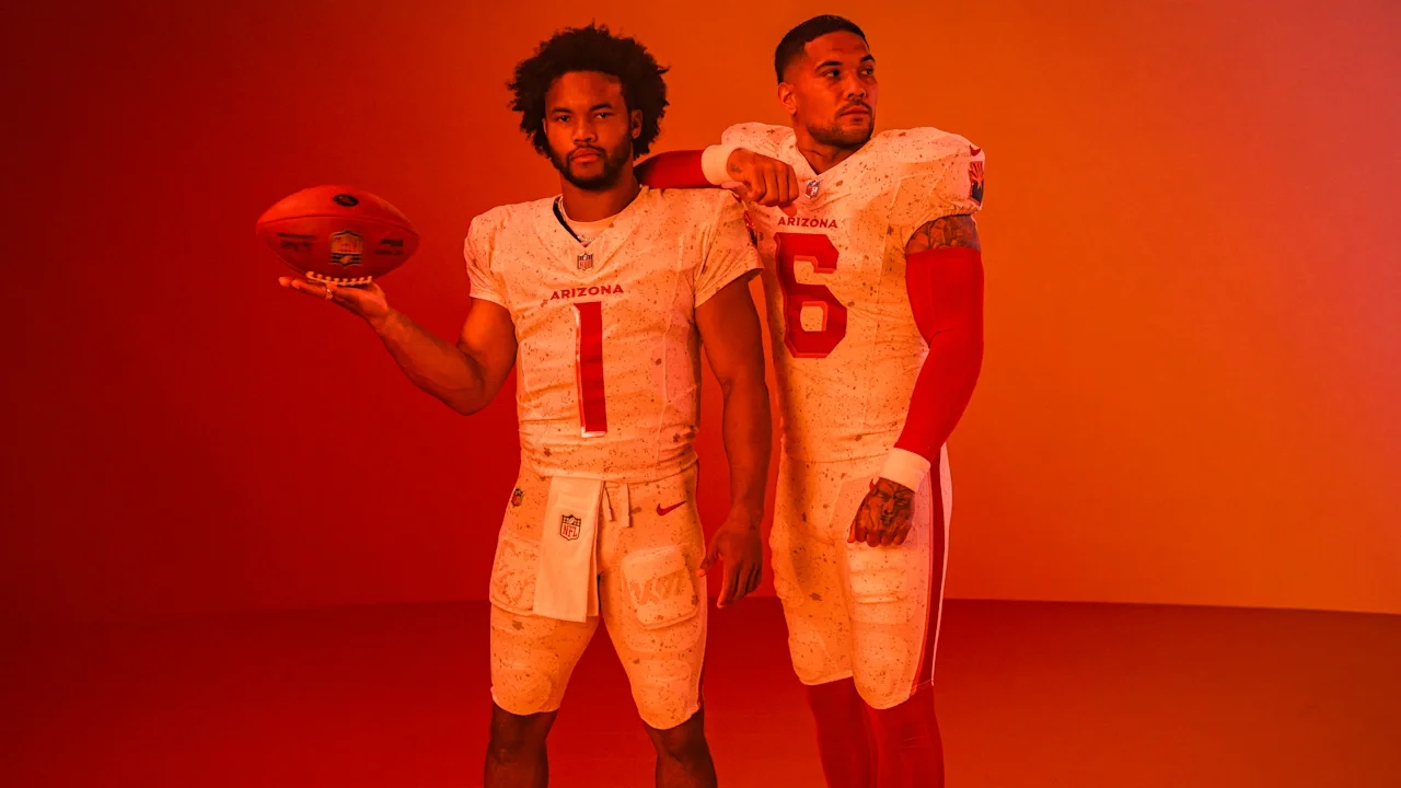
The Arizona Cardinals are bringing the storm to the desert. On June 5, the team unveiled their new Rivalries uniform, a look forged by sand, heat, and grit set to debut under the lights on Thursday Night Football when they host the Seattle Seahawks.
Running back James Conner, fresh off a video shoot where movie magic transformed him into the middle of a sandstorm, summed up the new fit perfectly: “Desert vibe, the sand, everything plays into it. The copper, the details, I just think it’s awesome. The perfect fit.”
The Cardinals teased a storm for more than a year, and now it’s here. The Rivalries uniform captures Arizona’s harsh but beautiful landscape:
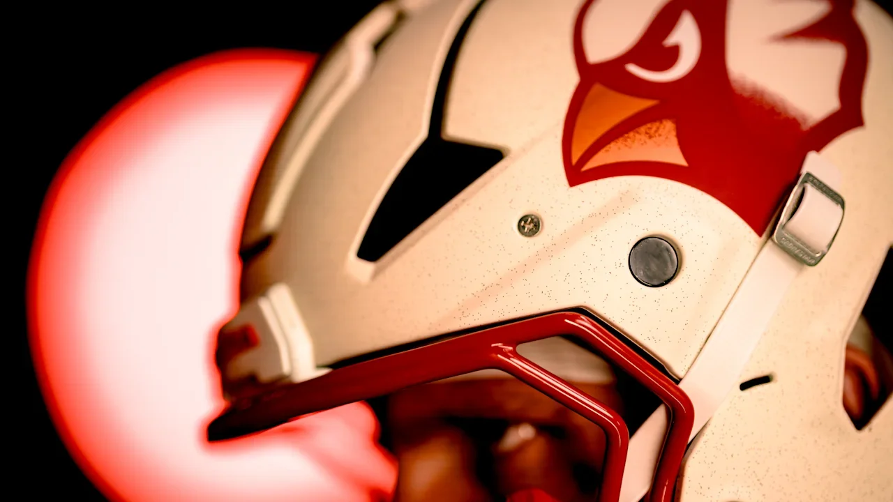
Sandblasted matte helmet with a 3D birdhead logo and copper beak.
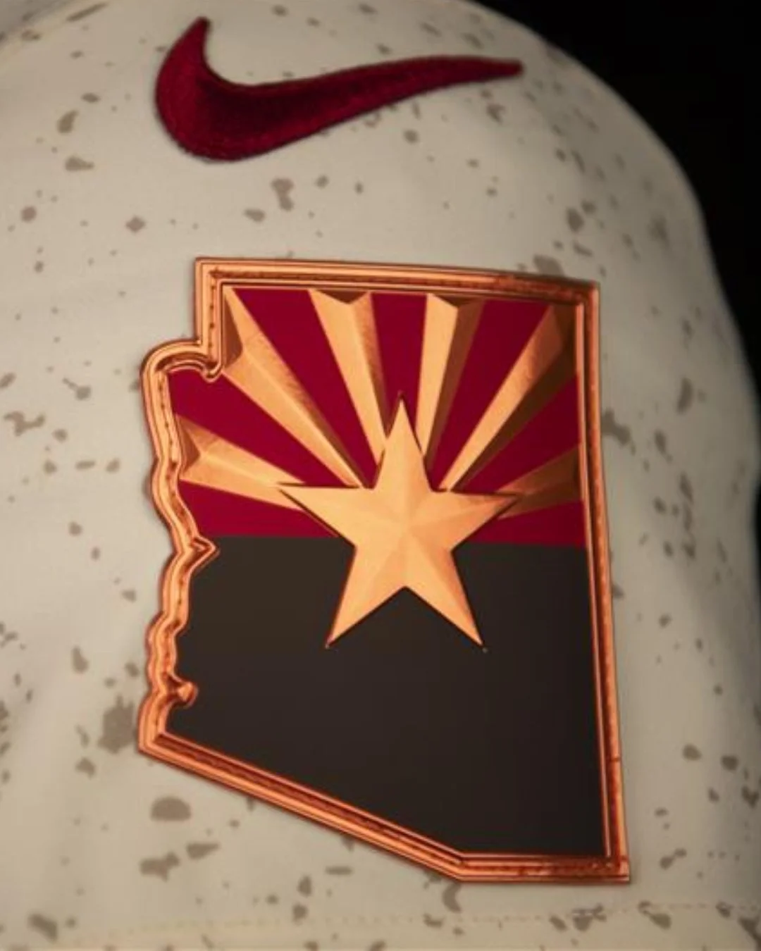
Tan, red, and copper color palette, echoing both the Desert Cardinal and the commerce that built the state.
Arizona state flag within the outline of the state on the shoulder.
Design elements inspired by the desert’s resilience — from scorching heat to swirling sandstorms.
Owner Michael Bidwill called the uniform a true embodiment of Arizona’s toughness: “The design reflects the strength and toughness required to thrive in the desert and celebrate the passion and perseverance that define us. The sandstorm imagery is a fitting metaphor for our identity as a team and a region.”
Quarterback Kyler Murray didn’t hold back either: “I told (equipment manager Jeff Schwimmer) these were the best jerseys we’ve got. Probably the best jerseys I’ve seen us wear. They turned out perfect.”
Linebacker Zaven Collins echoed the fan-first vision: “I feel like this is something the Valley wanted and everyone will love it.”
The Cardinals are among the first eight teams, along with the rest of the NFC West and AFC East, to take part in the Rivalries program, Nike’s new multi-year initiative that celebrates the culture, history, and communities that fuel the NFL’s most storied matchups. Each team’s Rivalry uniform will be worn once a season for the next three years, with other divisions joining in from 2026 through 2028.
For the Cardinals, the Rivalries debut isn’t just about a new look. It’s a statement. Forged in desert heat, built to withstand the storm, and designed to showcase Arizona’s identity to the world.
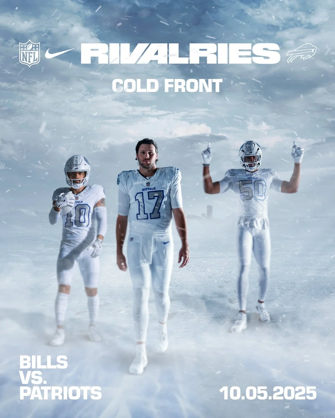
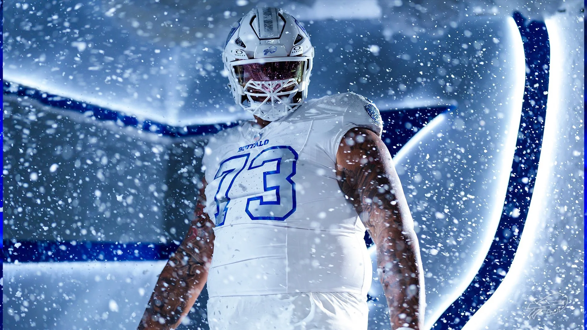
There’s nothing quite like facing your rival under the lights, and the Buffalo Bills are turning up the intensity with a brand-new look. The Bills will debut their “Cold Front” uniforms in Week 5 on Sunday Night Football when they host AFC East rival New England Patriots.
More than just a uniform, “Cold Front” represents Buffalo itself, a city built for the cold, defined by grit, and proud of its toughness. It’s ice in the air, resilience in the soul, and a fanbase that thrives in the elements. Simply put: it’s Buffalo, stitched into fabric..
As concepts were explored throughout 2023, one vision quickly stood out. “The clear choice was to celebrate our region’s climate, especially when it comes to later in the season,” said Aaron LaPorta, Bills Director of Design.
To create the icy, snow-covered identity, the design team made a bold move — stripping away the red. “Visually, red means warmth, and in order to create a true icy and snowy feel, it needed to be removed,” LaPorta explained. “That was a big decision for us, because we’ve never done anything like that.”
With red gone, the challenge became reimagining the Bills’ look through elevated uses of blue, white, and gray. “We don’t want to look like another team. We want to have our own identity,” LaPorta said. “So how do we achieve that?”
The result is “Cold Front,” a fresh but authentic take on Buffalo football — one that perfectly mirrors the team, the city, and the fans who embrace the cold like no other.
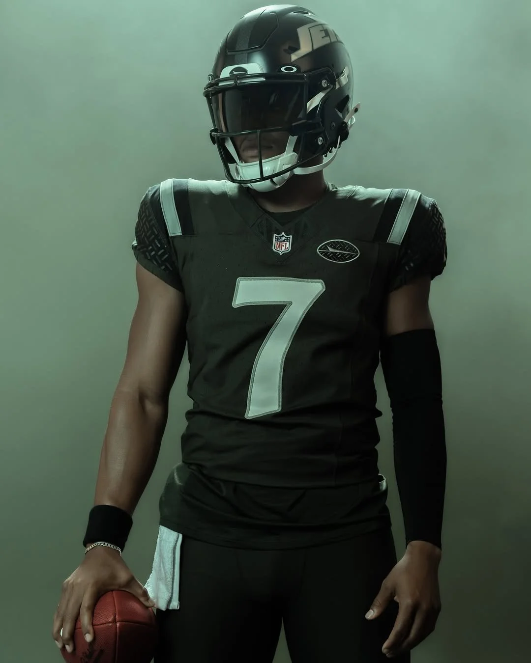
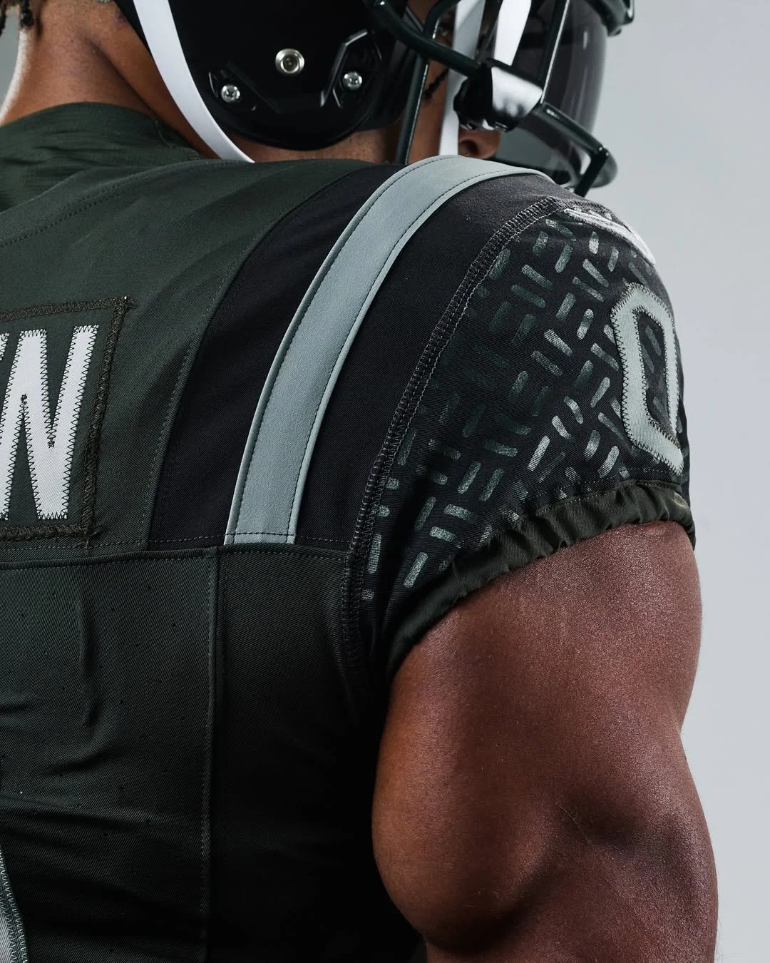
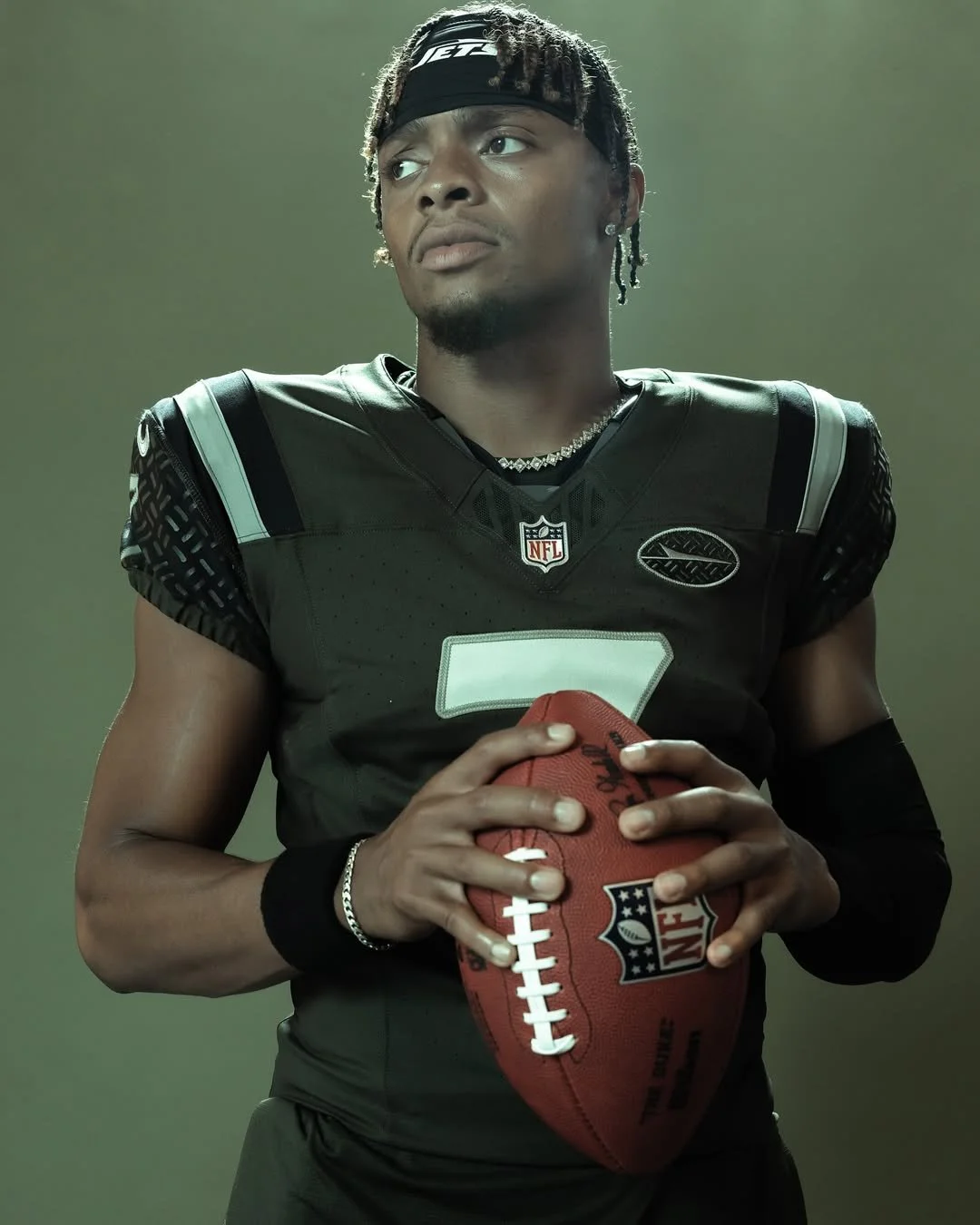
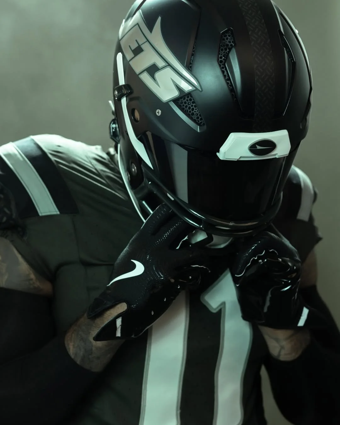
The New York Jets are adding a new chapter to their storied history with the unveiling of their “Gotham City Football” Rivalries uniform. Revealed Thursday morning, the look will make its on-field debut when the Jets host the Miami Dolphins on December 7 at MetLife Stadium.
As part of the NFL and Nike’s newly launched Rivalries program, the Jets are one of the first teams to showcase an alternate uniform designed to capture the spirit of their city and their fiercest matchups. Inspired by the grit and identity of New York, the “Gotham City Football” design pays homage to the toughness and work ethic that define the region.
“It quickly became evident that Gotham City Football was an obvious direction for us to take with the Rivalry uniform,” said Chris Pierce, vice president of fan commerce for the Jets. “Our green is filtered to reflect the hazy, steamy, smoky city streets, and we added Black, Light Iron Ore, and Dark Stucco to mirror the streetscape of New York. The nod to the iconic NYC manhole pattern on the shoulders and behind the plane logo is uniquely our own and powerful imagery for what it means to be a New York Jet. Adding our fifth uniform and third helmet in 16 months is something we’re extremely proud of. We want our uniforms to resonate with players and fans and showcase a deep emotional connection to this franchise.”
Nike and the NFL announced the Rivalries program during draft weekend, describing it as a four-year rollout designed to elevate some of the league’s most iconic rivalries. “The unveiling of the first eight Rivalries club uniforms and fan gear marks a significant moment for the NFL, Nike and Fanatics,” said Taryn Hutt, vice president of club marketing at the NFL. “Rivalries will bring fresh energy to the field with each new uniform, while amplifying the community and hometown pride that is rooted in each NFL fan.”
The Rivalries program will continue to expand in the coming years. In 2026, teams from the AFC South and NFC North will join the mix, followed by NFC East and AFC West in 2027, and finally the AFC North and NFC South in 2028. The Jets, meanwhile, will remain in the program through the 2028 season, giving fans plenty of opportunities to see how “Gotham City Football” evolves into a central part of the team’s identity.
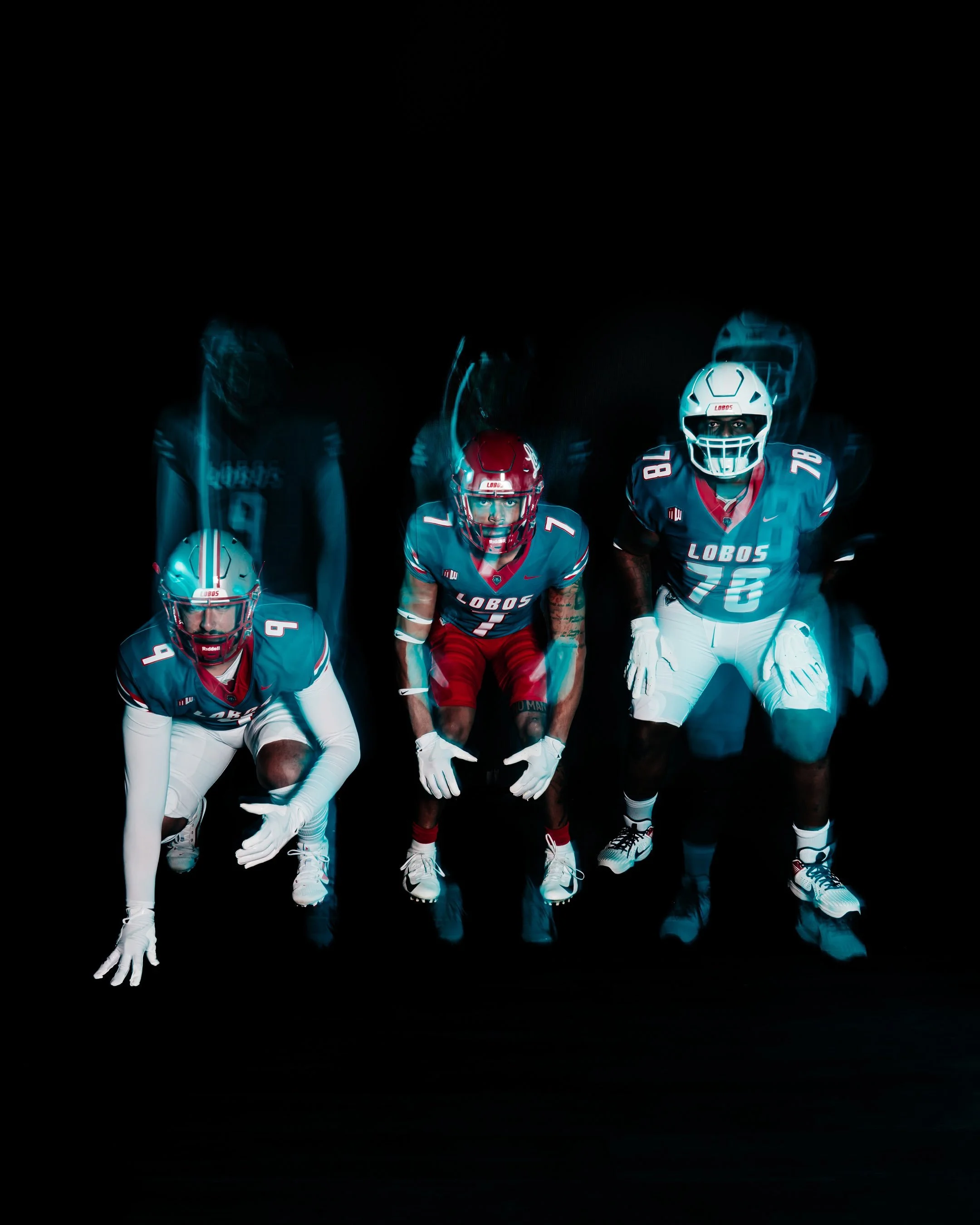
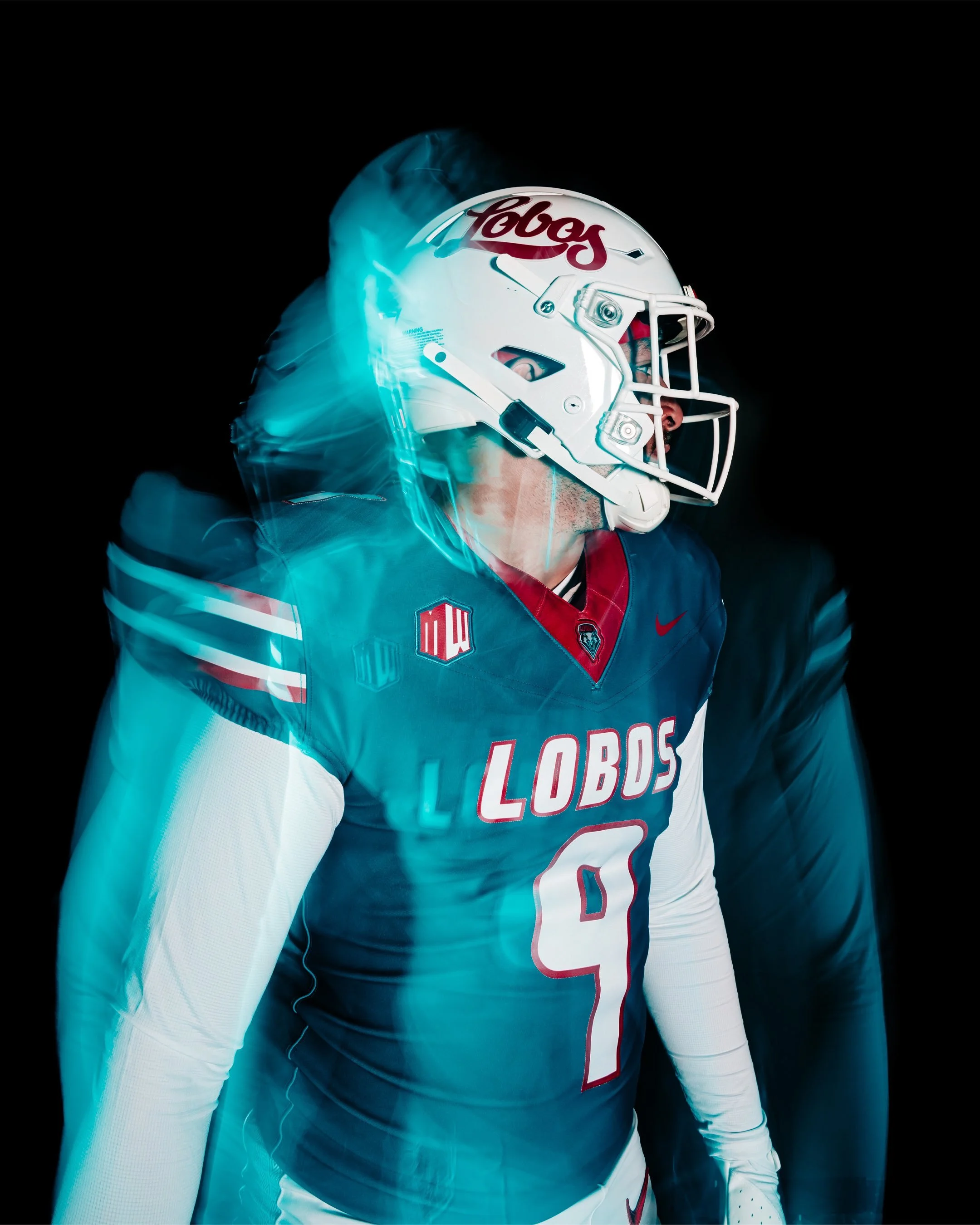
This fall, New Mexico Football is bringing back turquoise, a color with roots that run deep in the state’s culture and the Lobos’ athletic tradition. More than just a design choice, turquoise represents life, resilience, and identity. When the Lobos take the field in their United in Turquoise uniforms, they’ll be wearing a symbol of who they are — for the past they honor, for the state they live in, and for the future they represent.
The story of turquoise at UNM is rich and layered. The Lobos’ earliest colors in the 1890s were black and gold, but those never truly captured the essence of New Mexico. It was Harriet Jenness, a faculty member who taught art, drama, and music, who suggested crimson and silver to better reflect the landscape. Crimson for the evening glow of the Sandia Mountains, and silver for the Rio Grande winding like a ribbon through the valley. Her vision stuck, and cherry and silver became the official identity of the Lobos.
In 1973, turquoise was officially added to the palette of school colors, and for six seasons the football team made it their own. The Lobos wore turquoise jerseys at home, creating one of the most iconic looks in program history before returning to cherry and silver in 1980. Their last game in turquoise came in a 17-3 win over Wyoming on November 24, 1979, marking the end of an era.
The color made a return in 2013 as an alternate accent, with UNM donning white jerseys with turquoise numbers and trim against Fresno State. The Lobos continued to wear turquoise accents once a season through 2022, while experimenting with other alternates like silver and anthracite along the way. Still, fans longed for a true revival of the original 1970s turquoise look.
Now, that wait is over. For the first time in over four decades, New Mexico Football will once again wear the turquoise jerseys in their full glory, honoring the past while uniting players and fans in the vibrant identity of the state.
It’s more than a uniform. It’s a connection to heritage. A reminder of resilience. And a celebration of New Mexico itself.
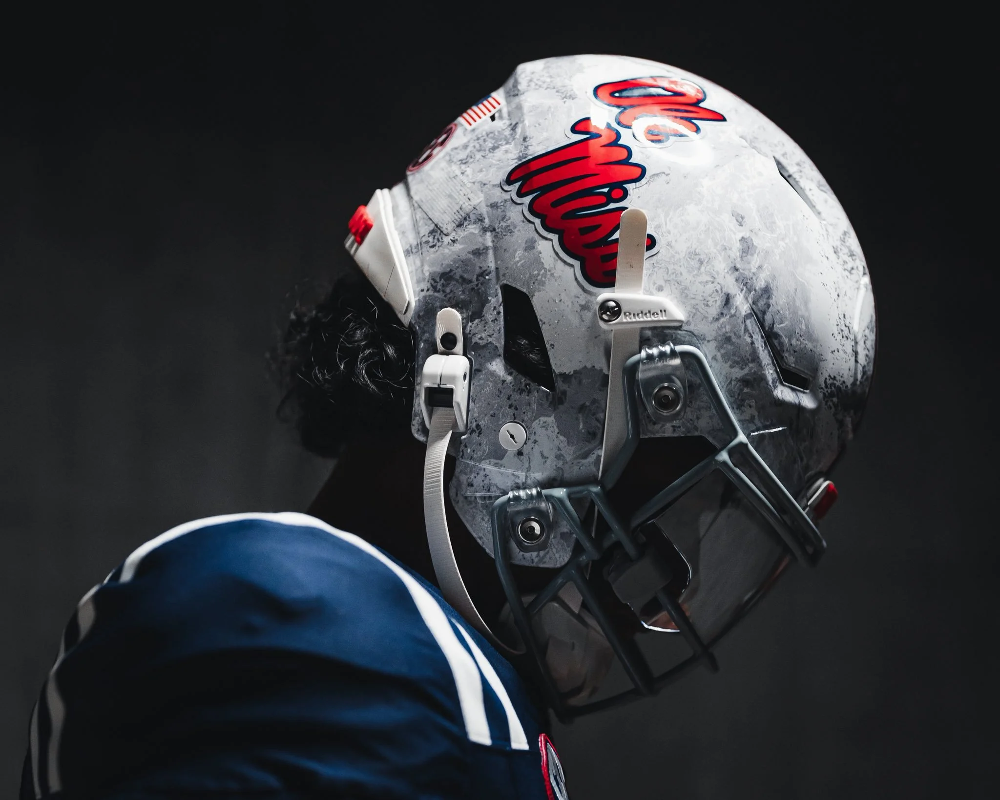
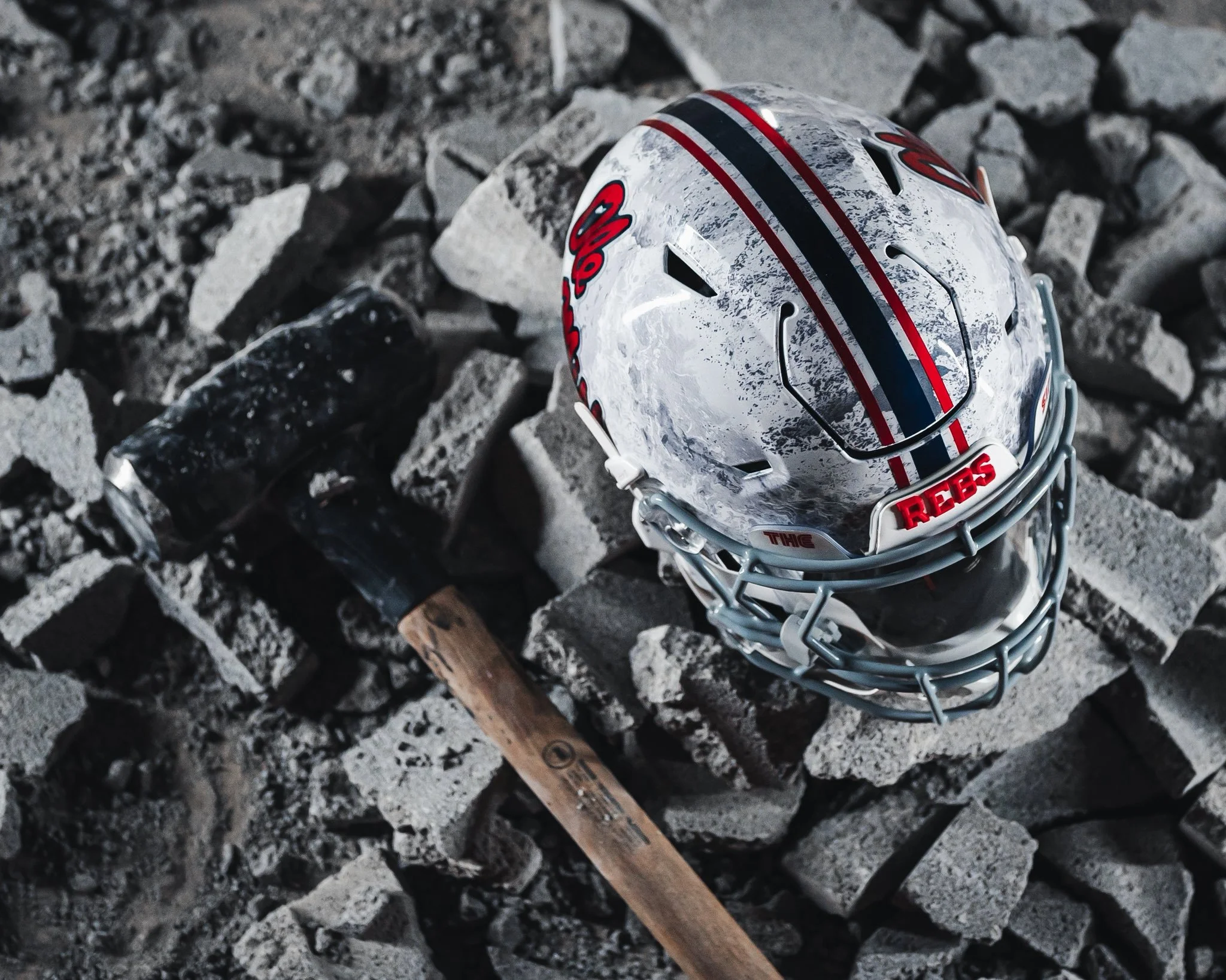
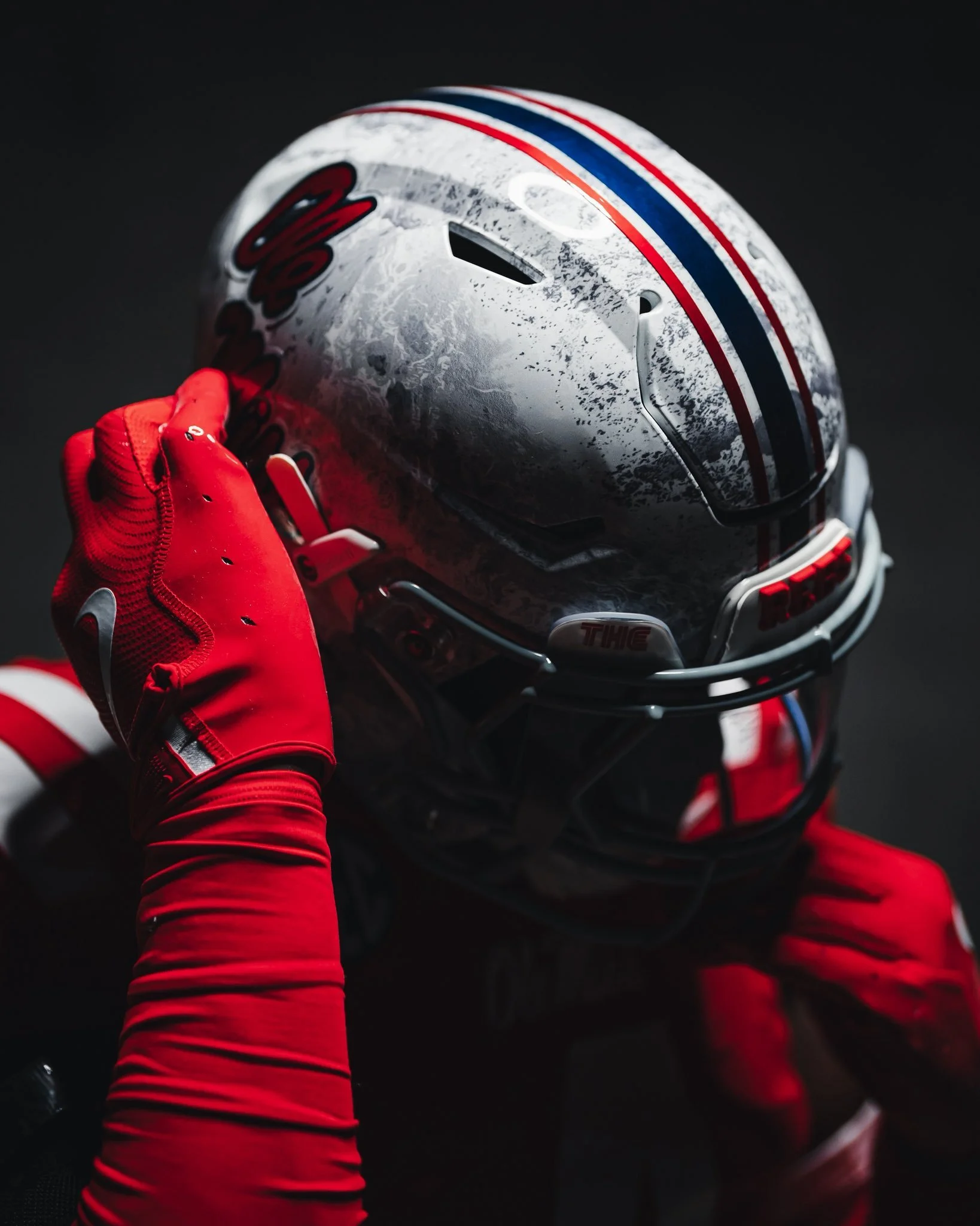
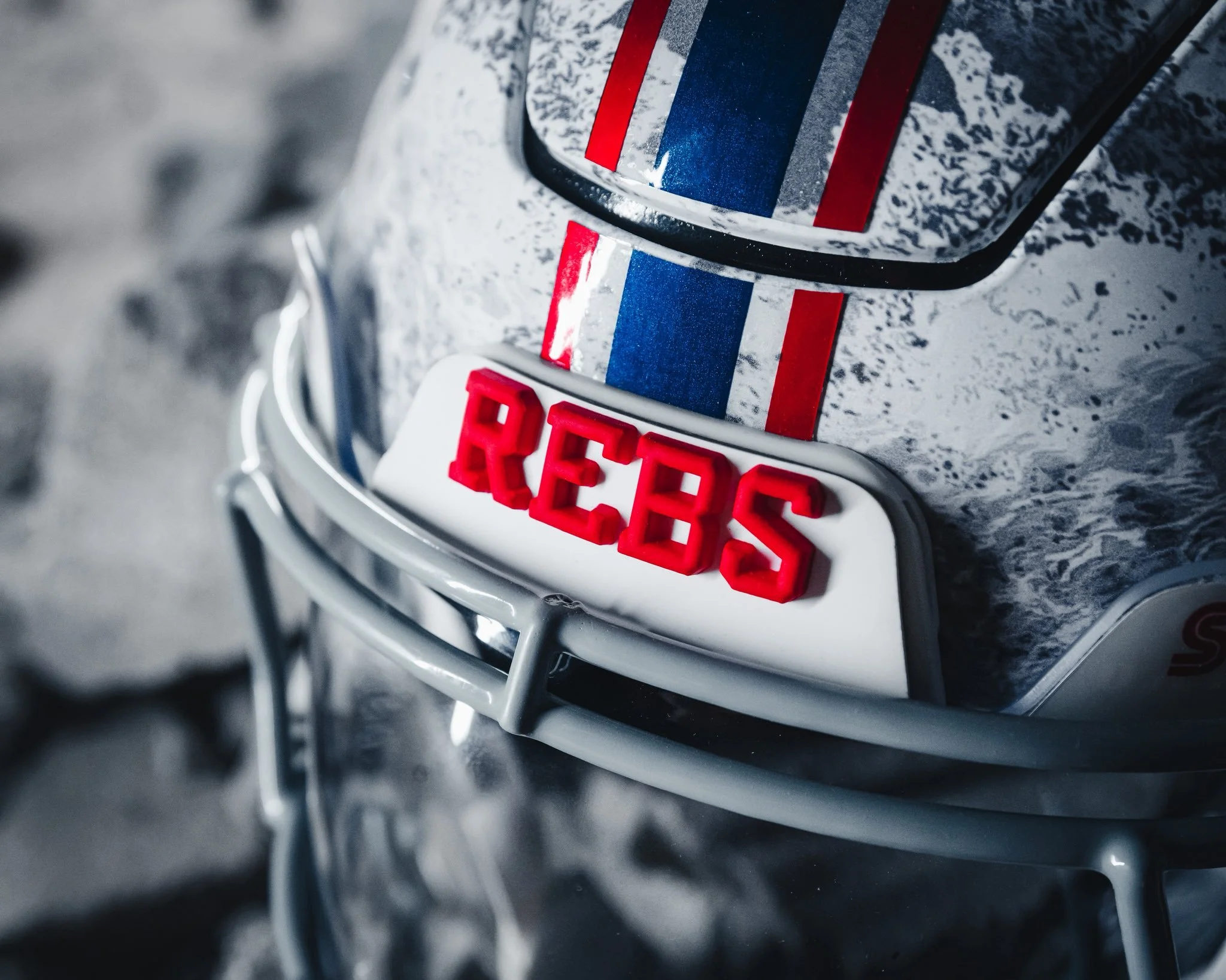
For the third straight year, Ole Miss is adding some serious flair to its helmet lineup, and once again, they’ve teamed up with Realtree to do it. The Rebels revealed their newest alternate look: awhite camouflage helmet, the latest in what’s quickly become one of the most anticipated traditions in college football.
The camo concept began back in 2023 when Ole Miss debuted a powder blue and white pattern against Texas A&M. That design wasn’t just a fan favorite — it was voted 2023 UNISWAG Helmet of the Year. A year later, the Rebels doubled down on the creativity, unveiling a navy and white version for their matchup with Oklahoma in Oxford. Both helmets turned heads, and both games ended in Ole Miss victories.
Now, the 2025 edition takes things in a cooler direction with the crisp, icy white camo pattern. The Rebels will break out the helmet for a marquee Week 10 showdown with No. 13 South Carolina on November 1, hoping to continue the winning tradition tied to their alternate lids.
Between the design innovation, the collaboration with Realtree, and the on-field success, Ole Miss has carved out a unique space in the uniform game. If history is any indication, the icy white camo might not just be one of the cleanest looks of the year.