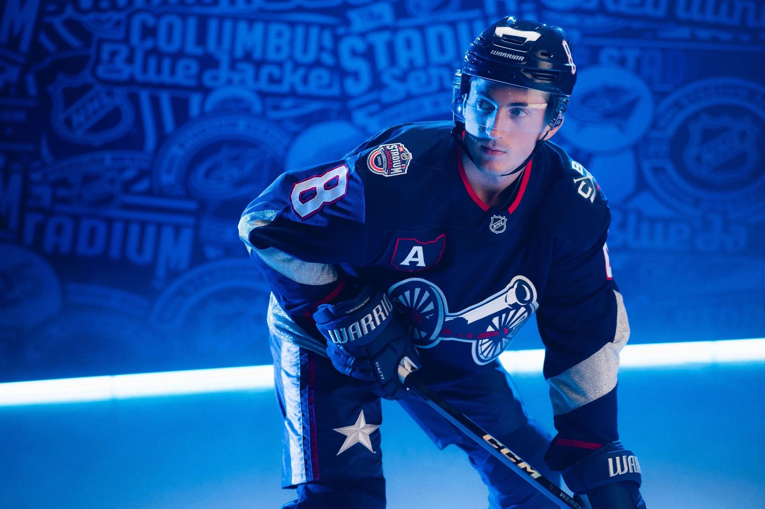
These jersey are going to look nice in the Horseshoe. We surprised the Blue Jackets with their Stadium Series jersey when they walked into the locker room. pic.twitter.com/S2uRnet6lj
The Columbus Blue Jackets are set to showcase their rich connection to history with a special sweater inspired by the uniforms of the Union Army. This unique design will debut during the 2025 NHL Stadium Series game on March 1 at Ohio Stadium, where the Blue Jackets will face off against the Detroit Red Wings. The outdoor event highlights the rivalry between Michigan and Ohio while celebrating the distinct cultural identities of each team’s home state.
The Blue Jackets’ 2025 Stadium Series sweater pays homage to the Union Army’s military uniforms, blending historical elements with modern hockey aesthetics. The design incorporates several key features that tie back to the Civil War era while celebrating the team’s identity. A bold chevron stripe on the sleeves represents the rank insignia of the era, adding a sense of authority and historical significance. The shoulders feature a new “CBJ” mark, which surrounds two crossed hockey sticks—a subtle nod to the unit designation pins worn on the front of the soldiers' slouch caps. This detail connects the team’s name and identity with its historical inspiration.
At the center of the uniform is the front crest, highlighting “The Cannon,” an iconic element derived from the Blue Jackets’ alternate logo and a staple of any home game in Columbus. The crest is elevated with metallic silver and red accents, adding a modern flair to the historical theme. These refined details bring the past and present together, creating a jersey design that is both meaningful and visually striking.
The Columbus Blue Jackets’ Stadium Series uniform is more than just a nod to history; it’s a tribute to the courage and resilience of those who fought during the Civil War, embodying the spirit of Ohio’s contributions to the Union Army. By incorporating these historical elements, the Blue Jackets celebrate their roots while energizing their fanbase with a design that is both bold and unique.
The outdoor game against the Detroit Red Wings promises to be an unforgettable event, with the Blue Jackets’ sweater adding another layer of significance to the occasion. Whether it’s the chevron sleeve stripes, the “CBJ” shoulder patch, or the cannon crest, every detail of the uniform connects players and fans to the legacy of the Blue Jackets and the history of Ohio.
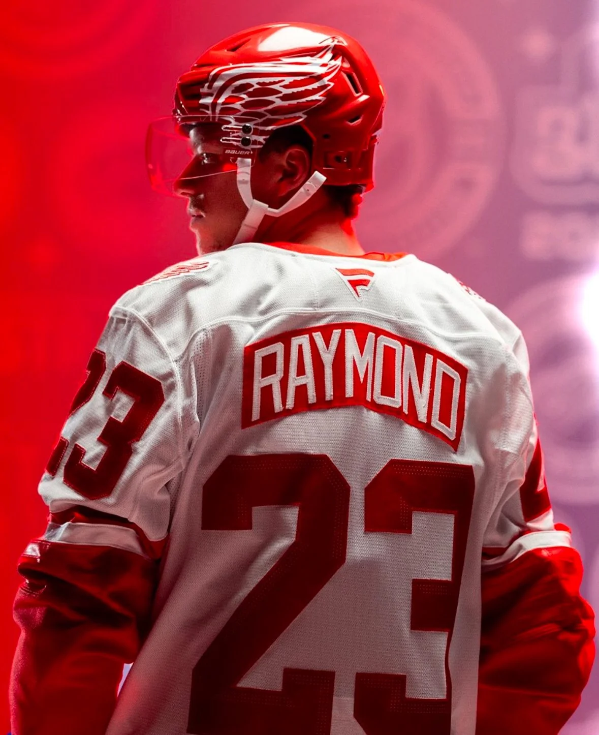
One of the great jerseys in sports gets a special spin for the Stadium Series. We surprised Moritz Seider & Lucas Raymond with a first look when they came into the locker room. pic.twitter.com/is5qJpmogY
The Detroit Red Wings are set to pay tribute to the Motor City’s iconic automotive industry and its rich hockey culture with a special sweater for the upcoming 2025 NHL Stadium Series. The game, scheduled for March 1 at Ohio Stadium, will feature the Red Wings facing off against the Columbus Blue Jackets in the 43rd regular-season outdoor game in NHL history.
Fanatics, the NHL’s official outfitter, described the Red Wings’ sweater as a tribute to Detroit’s automotive legacy. The design incorporates several auto-inspired elements that seamlessly blend the city’s industrial roots with its passion for hockey. The front crest features a bold, new script inspired by classic automotive insignias, giving the sweater a sleek and powerful look. The wordmark and back numbers include laser-perforated accents, mirroring the luxurious textures found in a car’s upholstered leather interior. The sleeves and socks feature speed stripe designs reminiscent of high-performance racing cars, adding a sense of motion and energy to the uniform. The player helmets sport a racing stripe and oversized winged wheel logos on each side, complete with a metallic flake finish that evokes the brilliance of automotive paint jobs.
The 2025 Stadium Series sweater reflects Detroit’s dual identity as the heart of the automotive world and a hockey powerhouse. By combining bold design elements with nods to the city’s storied past, the Red Wings’ uniform serves as a testament to the pride and passion of both the team and its hometown.
This unique design will surely captivate fans and players alike as they take to the ice in the grandeur of Ohio Stadium. Whether it’s the metallic accents or the speed stripes, the Red Wings’ sweater is a fitting tribute to Detroit’s legacy of innovation and its enduring love for the game of hockey.
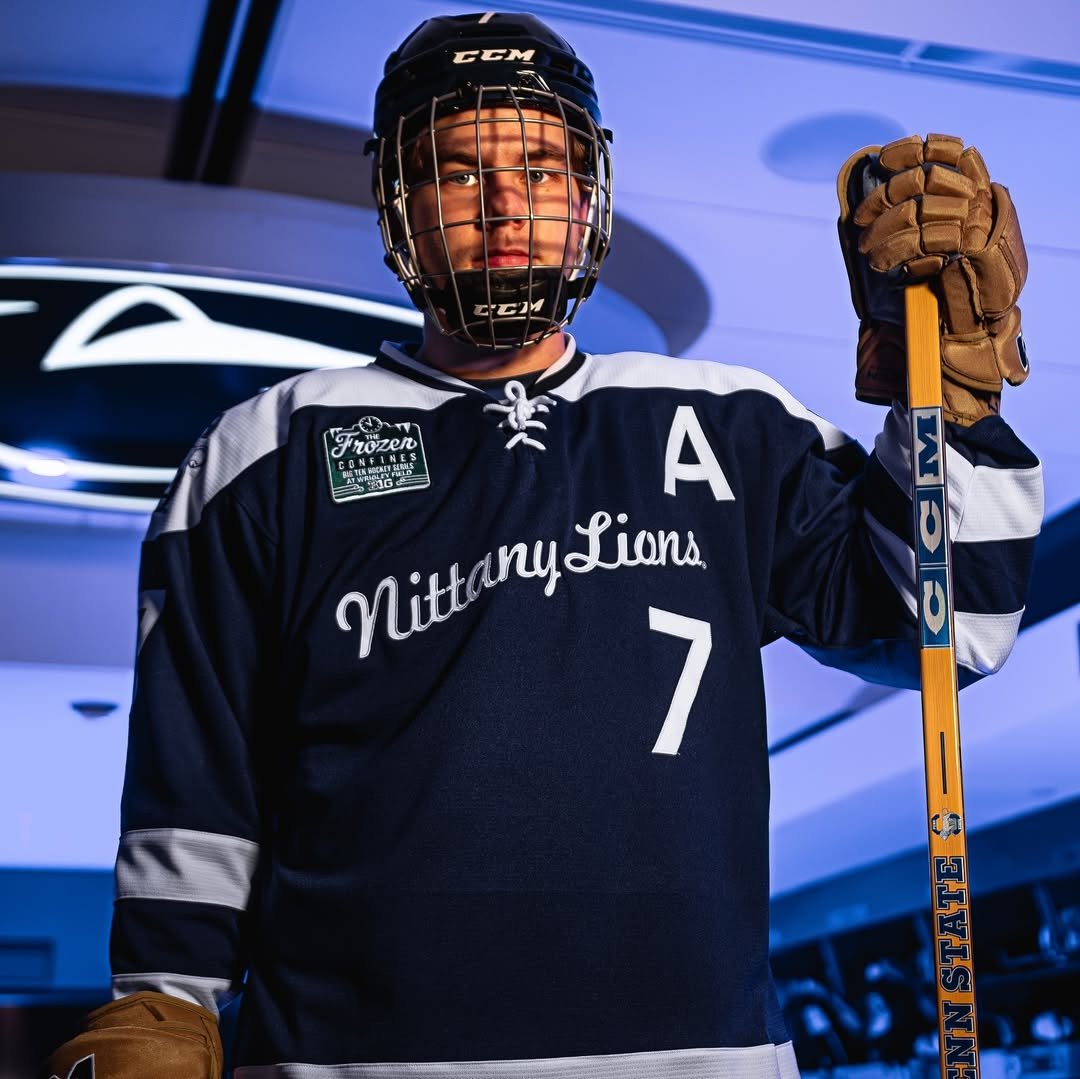
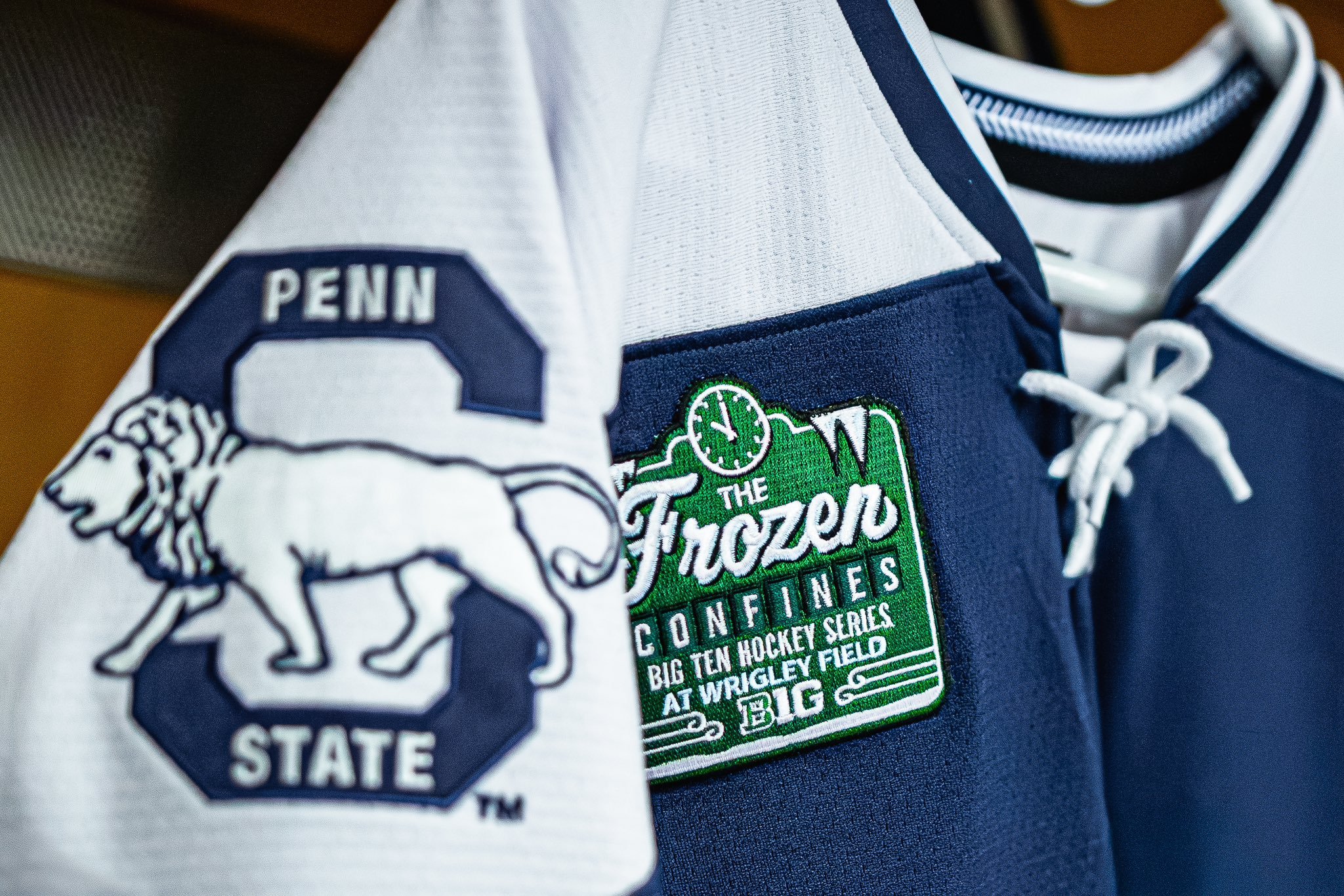
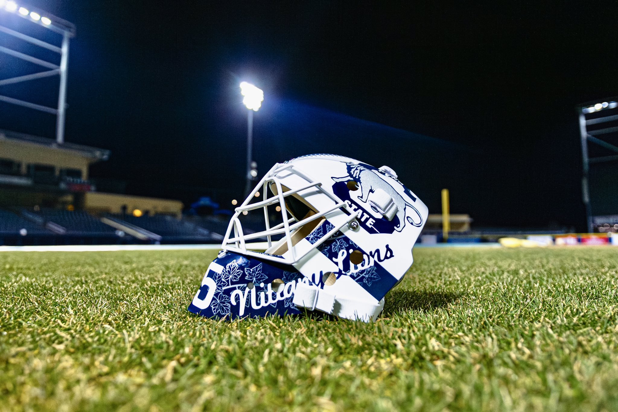
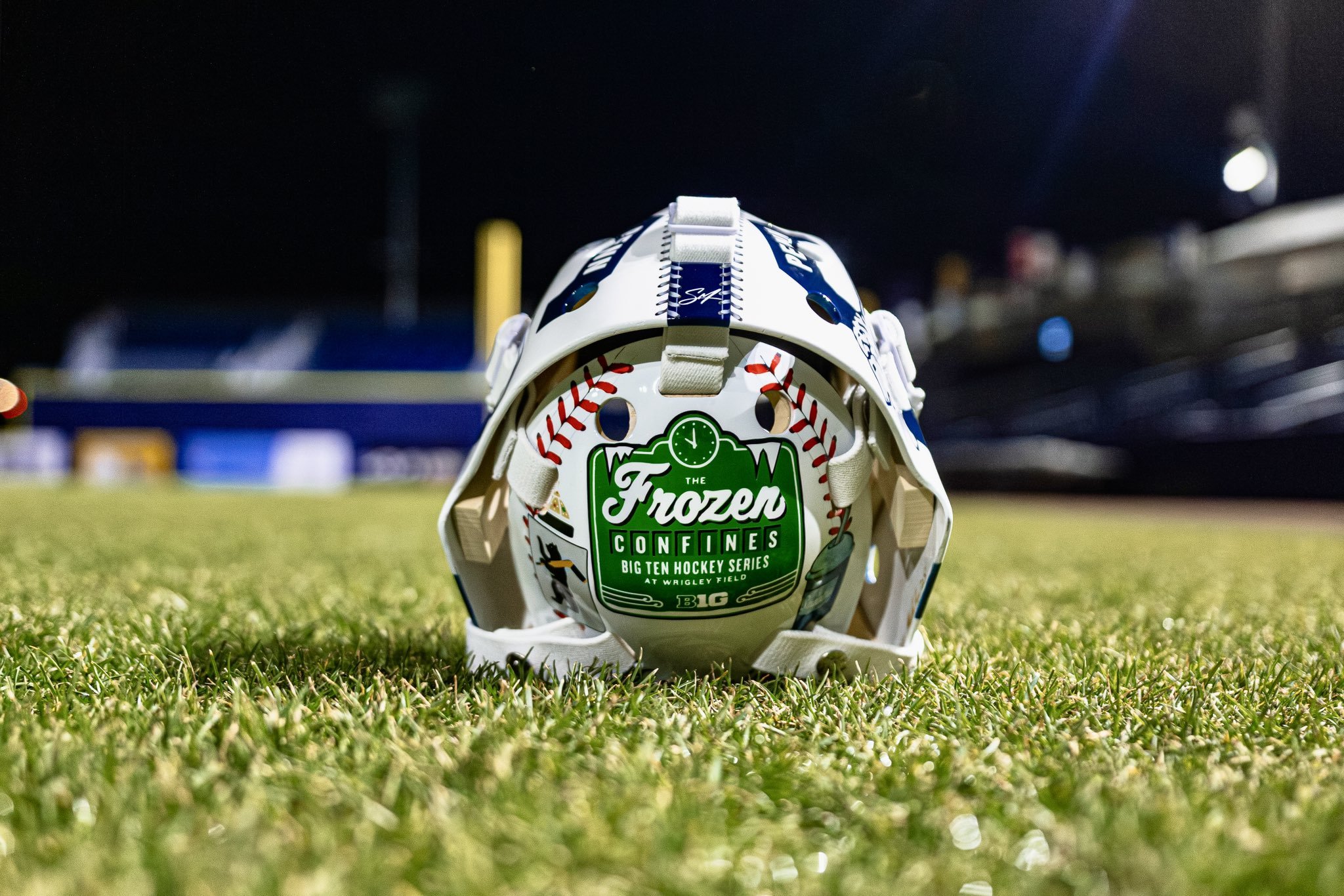
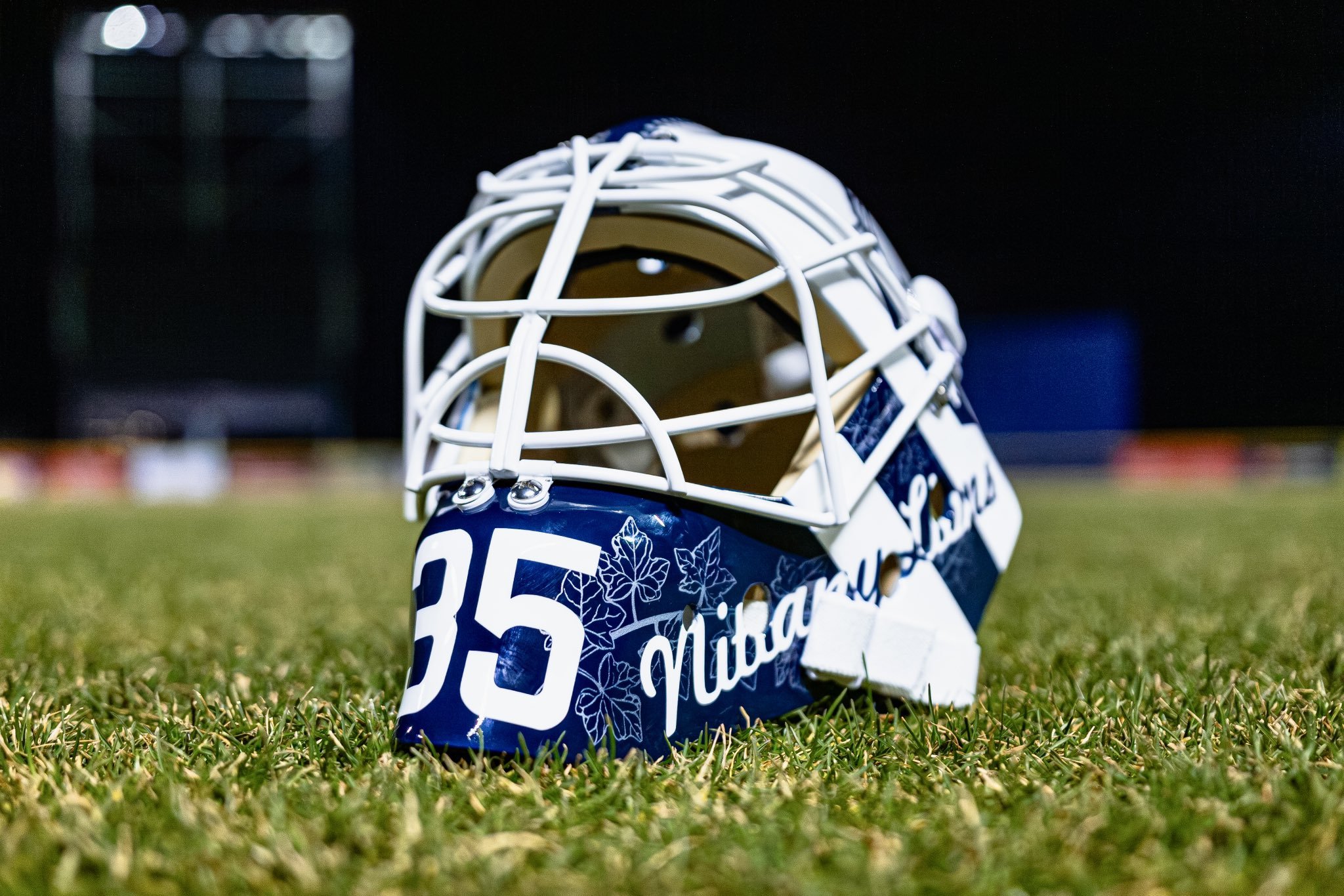
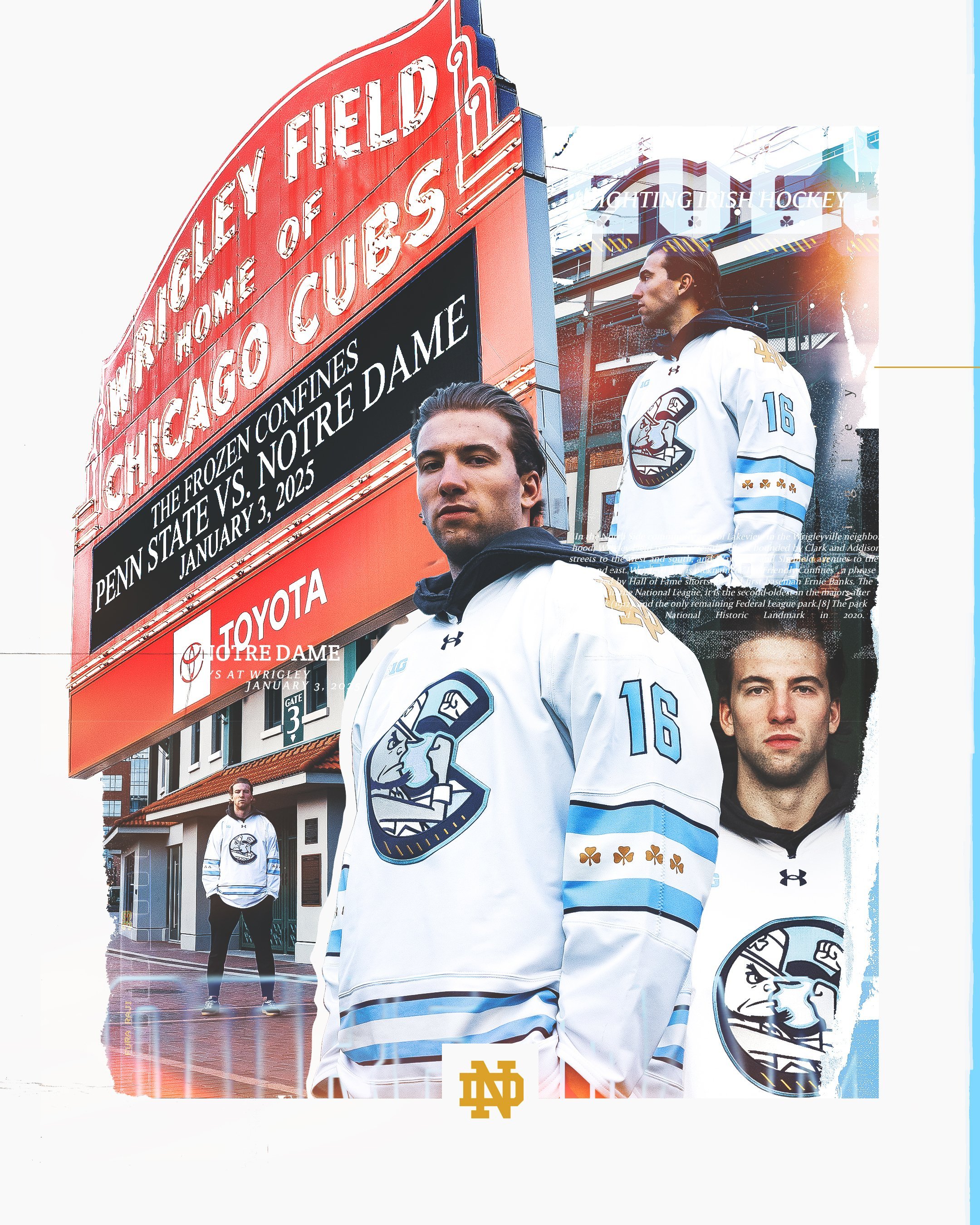
The Penn State Men’s Ice Hockey team has revealed a new sweater design ahead of their much-anticipated showdown at the Frozen Confines: Big Ten Hockey Series. This marquee event, set to take place at the historic Wrigley Field on January 3, 2025, will see the Nittany Lions face off against the Notre Dame Fighting Irish in a conference clash to kick off their second-half schedule.
The newly unveiled jerseys are a masterful blend of tradition and innovation, paying homage to Wrigley Field’s primary tenant, the Chicago Cubs, while also celebrating Penn State’s own baseball team. With subtle, baseball-inspired details seamlessly integrated into the design, the sweaters are a nod to the rich history of one of Major League Baseball’s most iconic venues while maintaining a distinctly “Hockey Valley” identity.
The navy jerseys feature an angled script “Nittany Lions” crest across the chest in tackle twill, paired with front player numbering positioned on the belly, reminiscent of Penn State baseball’s alternate blue jerseys. This design bridges the two sports and establishes a connection to the Cubs’ aesthetic.
The shoulders are adorned with a white yoke, a throwback to the 1950s club hockey era at Penn State. On each shoulder, the “Walking Lion” logo mirrors the Cubs’ iconic “Walking Bear” logo, a subtle yet powerful tribute to the storied franchise. Traditional collar laces complete the front design, with a ‘W’ placed behind them as a nod to the Cubs’ famous “Fly the W” victory flag. Adding to the baseball influence, the inside collar features a hanger effect with baseball-style stitching.
Thick, double stripes on the jersey sleeves and socks draw inspiration from the 1979-80 Penn State Icers team, grounding the design in the program’s storied history. Arched namebars, lettering, and numbers are styled in the Cubs’ jersey font, with team captain Simon Mack’s ‘C’ highlighted in the same distinctive Cubs ‘C’ design. The oversized numbers ensure enhanced visibility for the outdoor game setting and feature sublimated ivy leaves, a thoughtful nod to the iconic ivy on Wrigley Field’s outfield walls.
To complement the sweaters, the Nittany Lions will don navy helmets with a raised, script “Penn State” sticker on each side. The uniforms will also incorporate brown, faux-leather gloves and pants shells from their throwback alternates, adding a touch of vintage charm to the overall ensemble.
Penn State’s latest hockey sweater is more than just a uniform; it’s a celebration of sports history, collaboration, and the shared love of the game. By embracing elements from both baseball and hockey, the design captures the essence of Wrigley Field while staying true to Penn State’s legacy. Fans of both teams and sports enthusiasts alike will undoubtedly appreciate the thoughtfulness and creativity poured into this unique design.
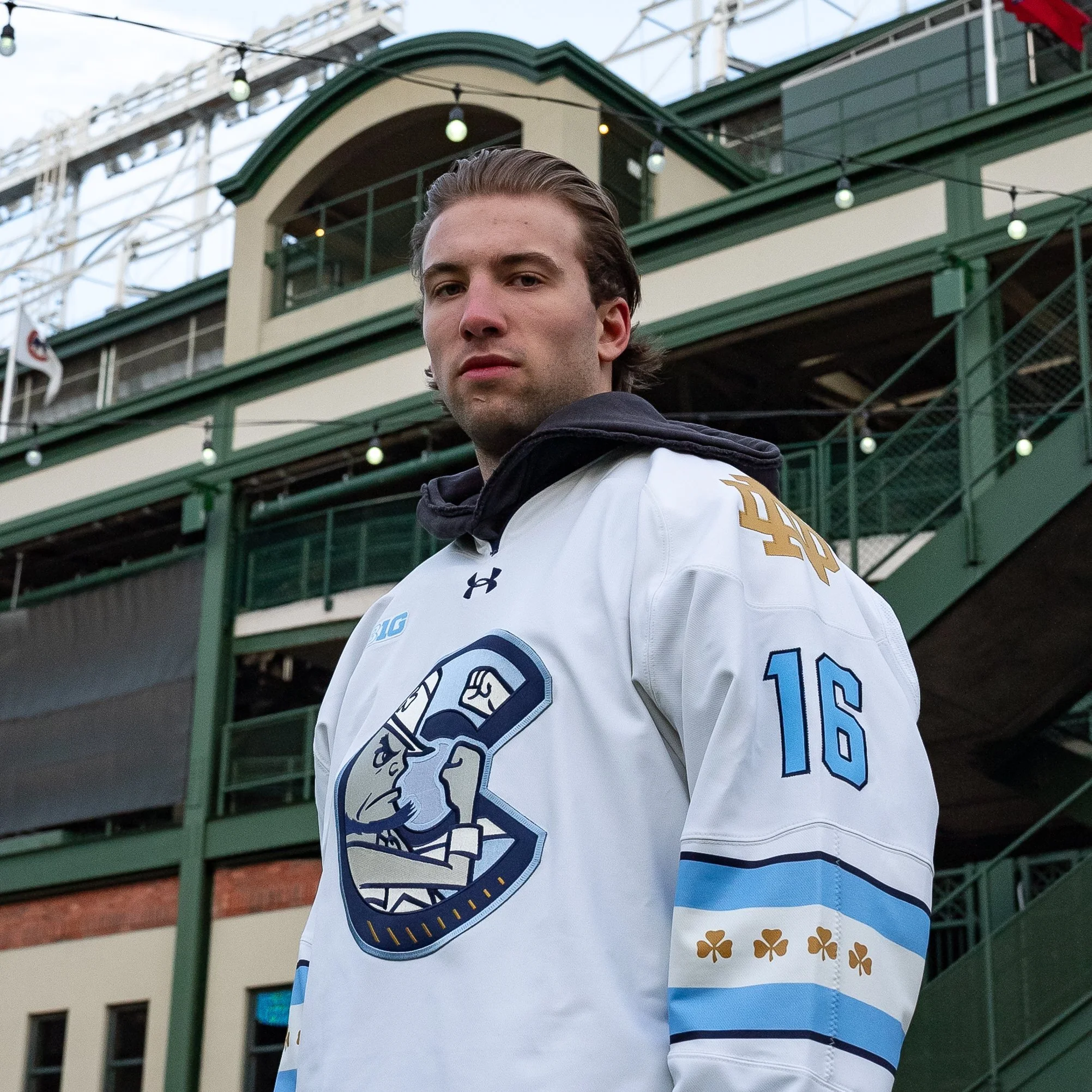
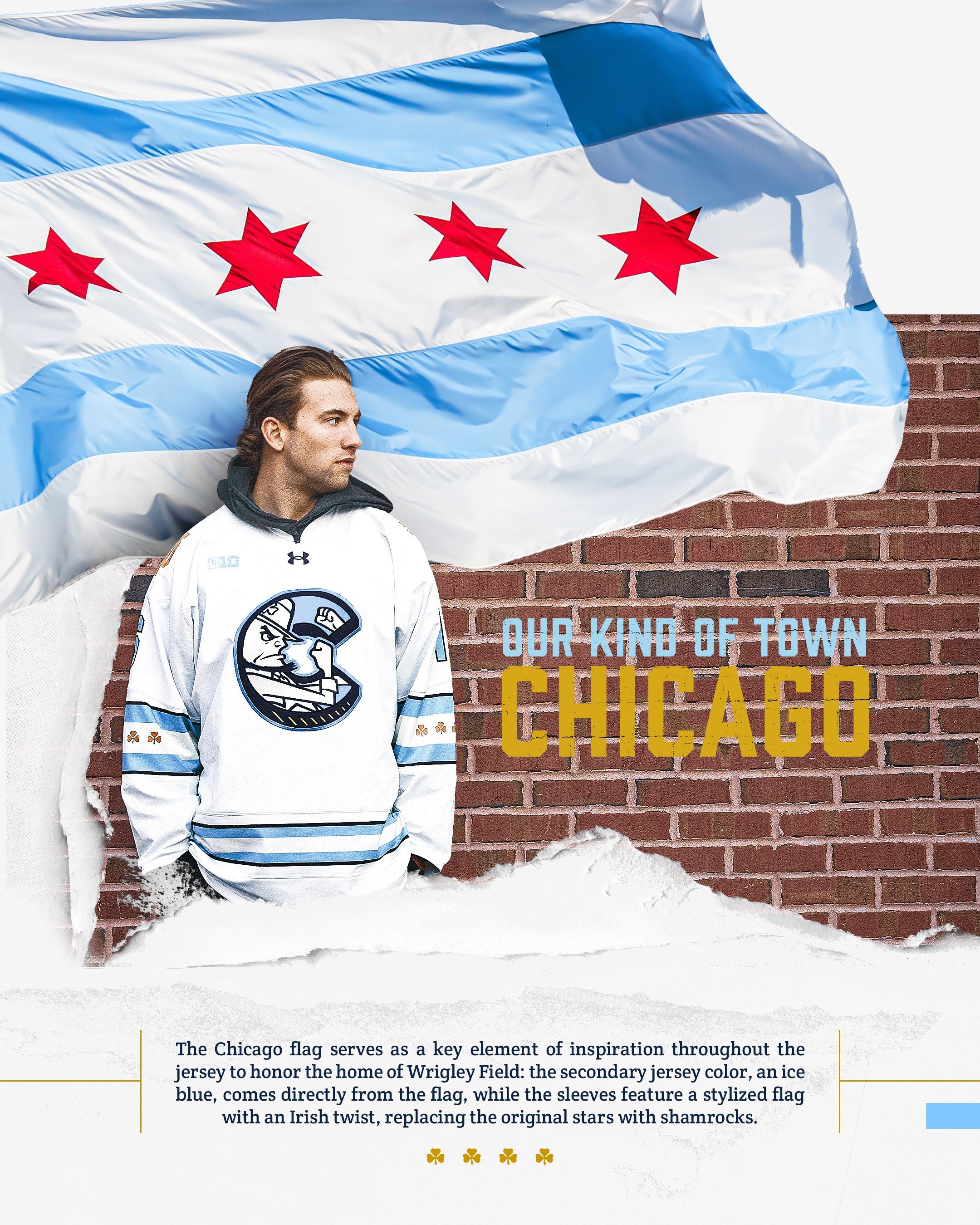
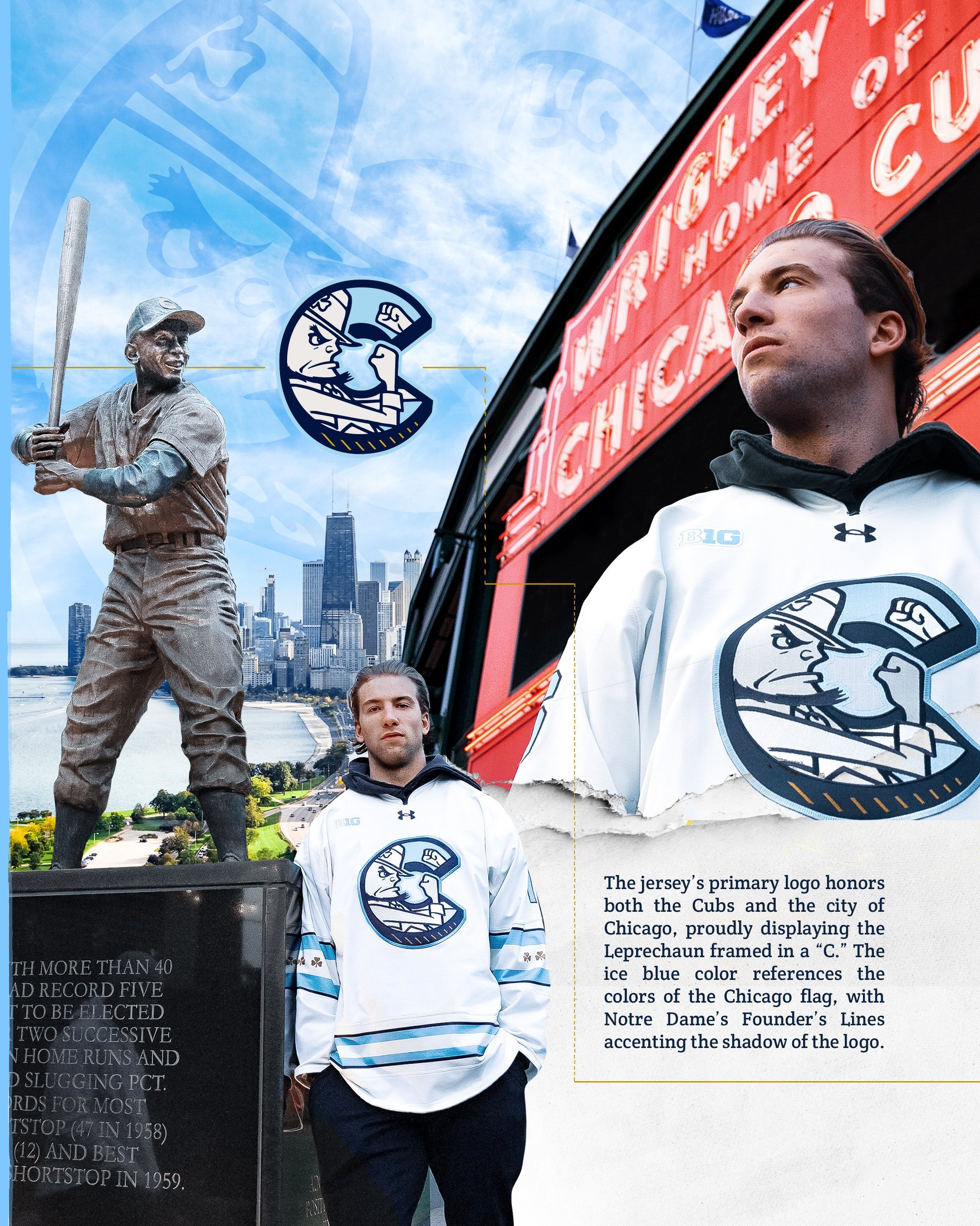
Notre Dame Hockey has once again captured the spirit of their fanbase and city connections with their latest alternate jersey. Paying homage to Chicago, the Windy City itself, these new uniforms feature a creative blend of history, tradition, and stunning design. For their game vs penn state that will be played at Wrigley Field.
At the heart of the jersey is a bold primary logo that celebrates the city of Chicago while honoring the Notre Dame Fighting Irish identity. The design highlights the iconic Notre Dame Leprechaun, uniquely framed in a "C" to reflect Chicago’s legendary sports teams. The use of ice blue in the jersey is a deliberate nod to the Chicago flag, blending seamlessly with Notre Dame's signature colors. Additionally, the Founder's Lines, a Notre Dame staple, add subtle shadow accents to the logo, giving it a fresh, dynamic appearance.
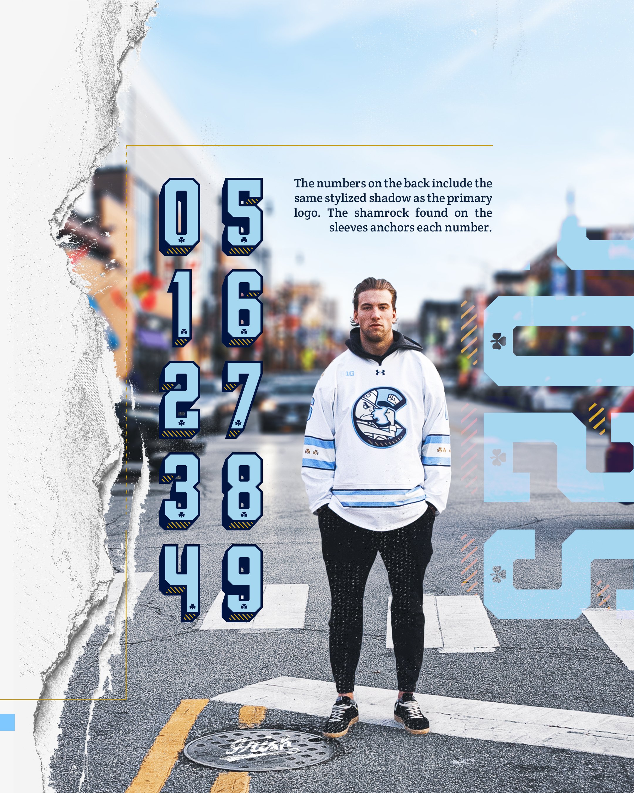
The artistry doesn’t stop at the logo. The numbers on the back of the jersey carry the same stylized shadow seen in the primary logo, maintaining design continuity. On the sleeves, a shamrock anchors each number, a subtle yet powerful symbol of the Fighting Irish spirit.
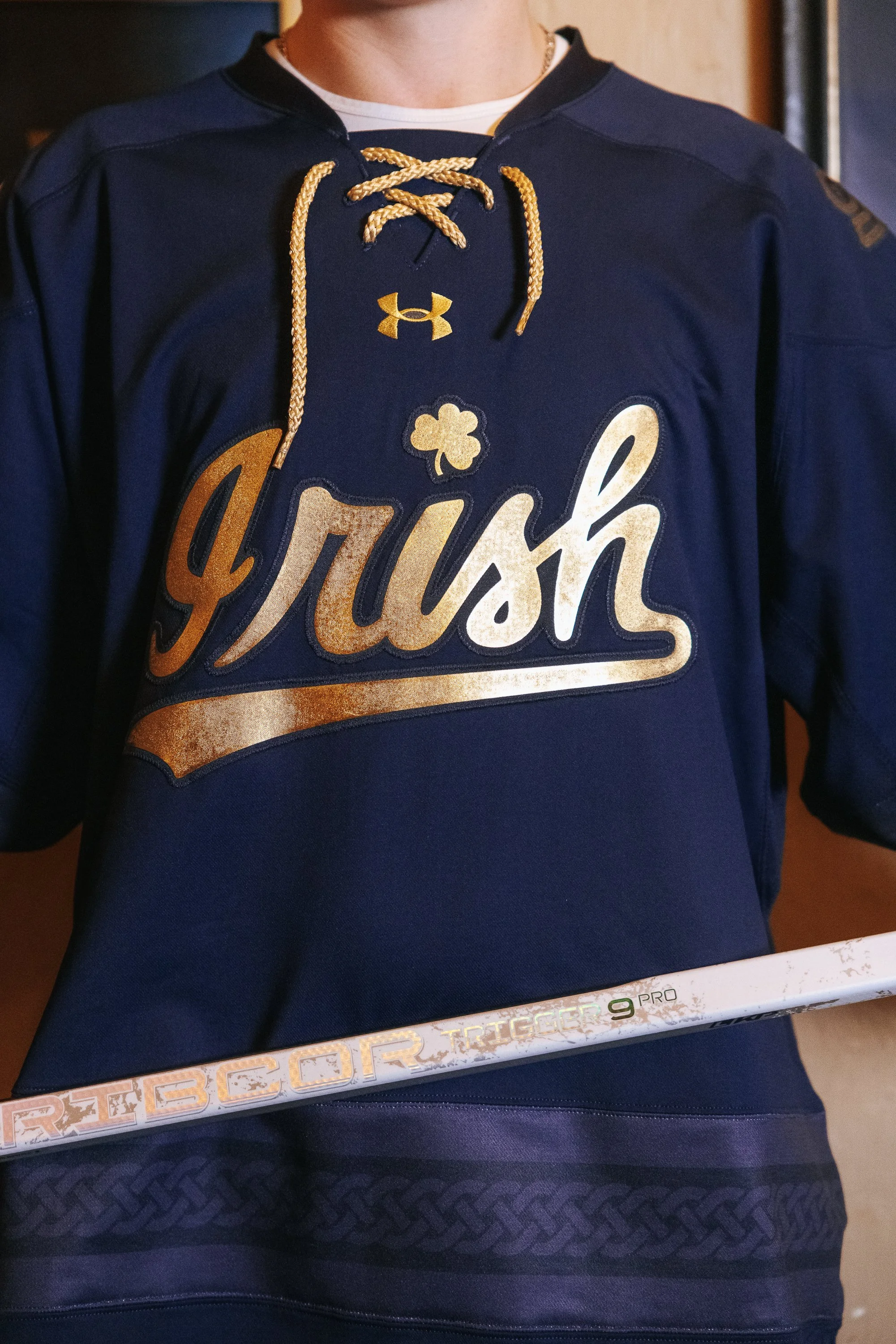
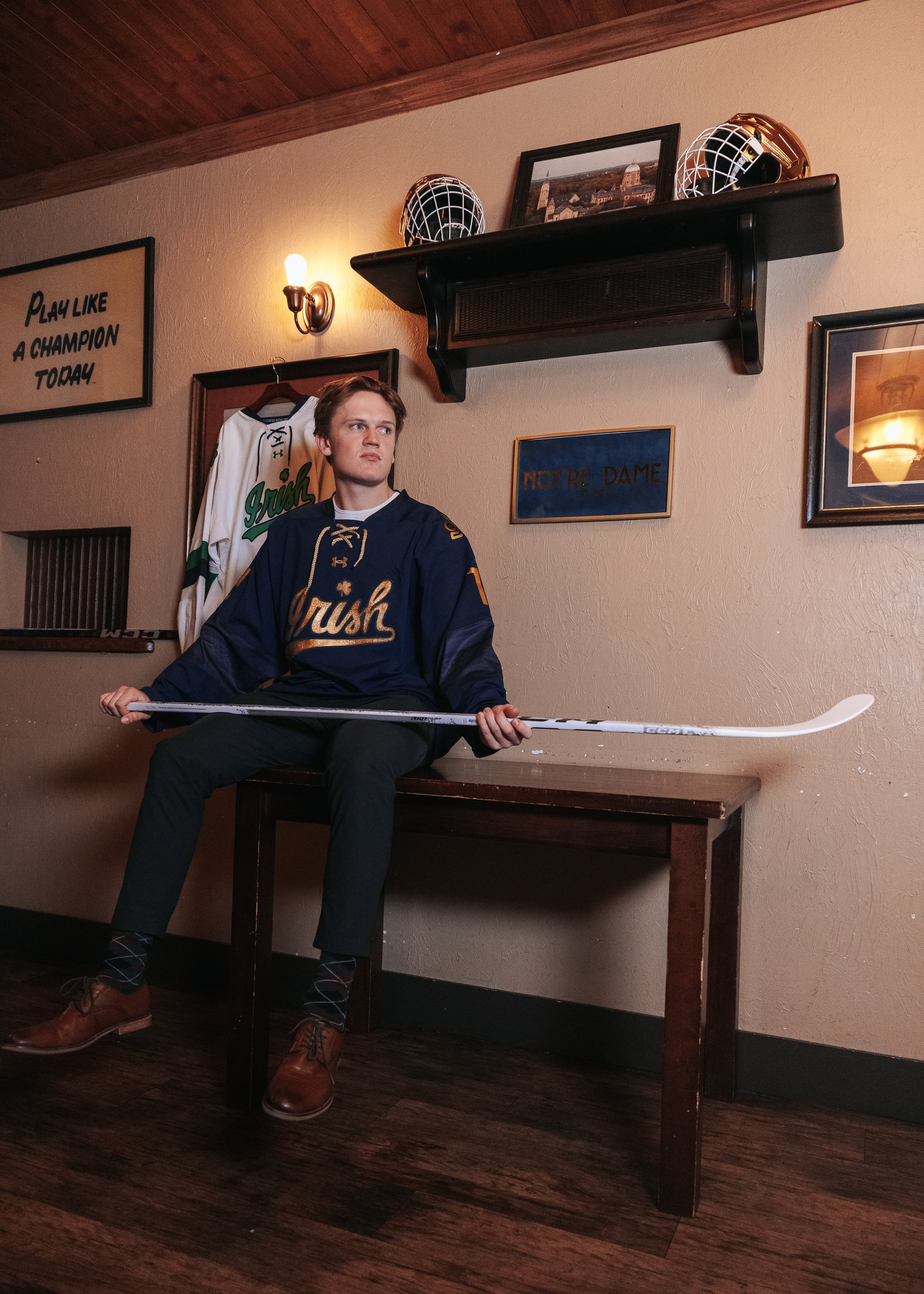
As the University of Notre Dame hockey team prepares for its first-ever international competition at the Friendship Four tournament in Belfast, Northern Ireland, the Irish are embracing the occasion with a unique new look. Notre Dame has released a specialty jersey that celebrates both the team’s heritage and the cultural richness of their host country.
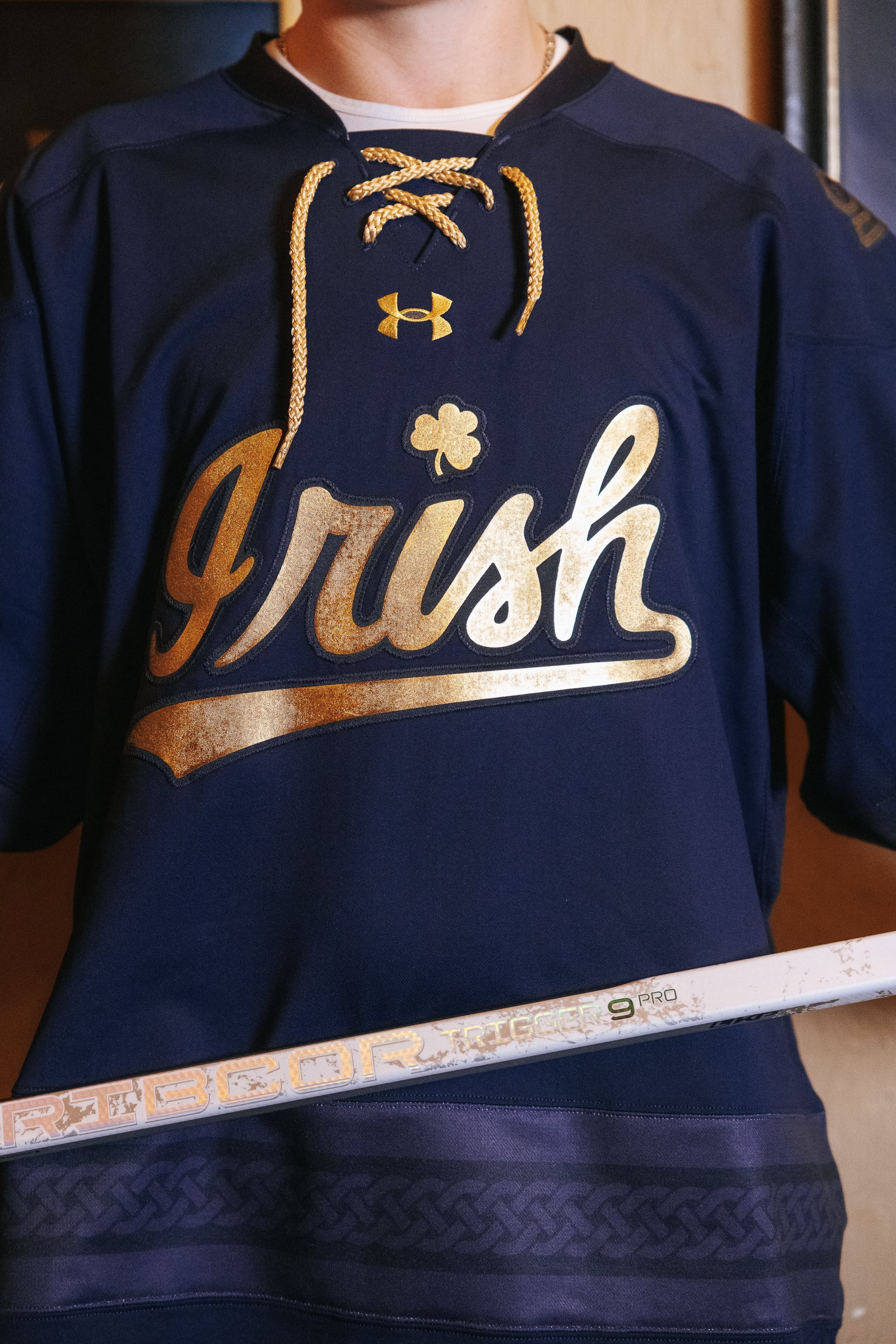
The new navy jersey captures the spirit of Notre Dame’s connection to Ireland, with a striking gold script “Irish” across the chest. In a thoughtful nod to the country’s storied history, the design incorporates elements inspired by the Book of Kells—a renowned medieval manuscript known for its ornate and intricate lettering. This influence is reflected in the stylized nameplate font, where each letter mirrors the distinctive forms from the historic text.
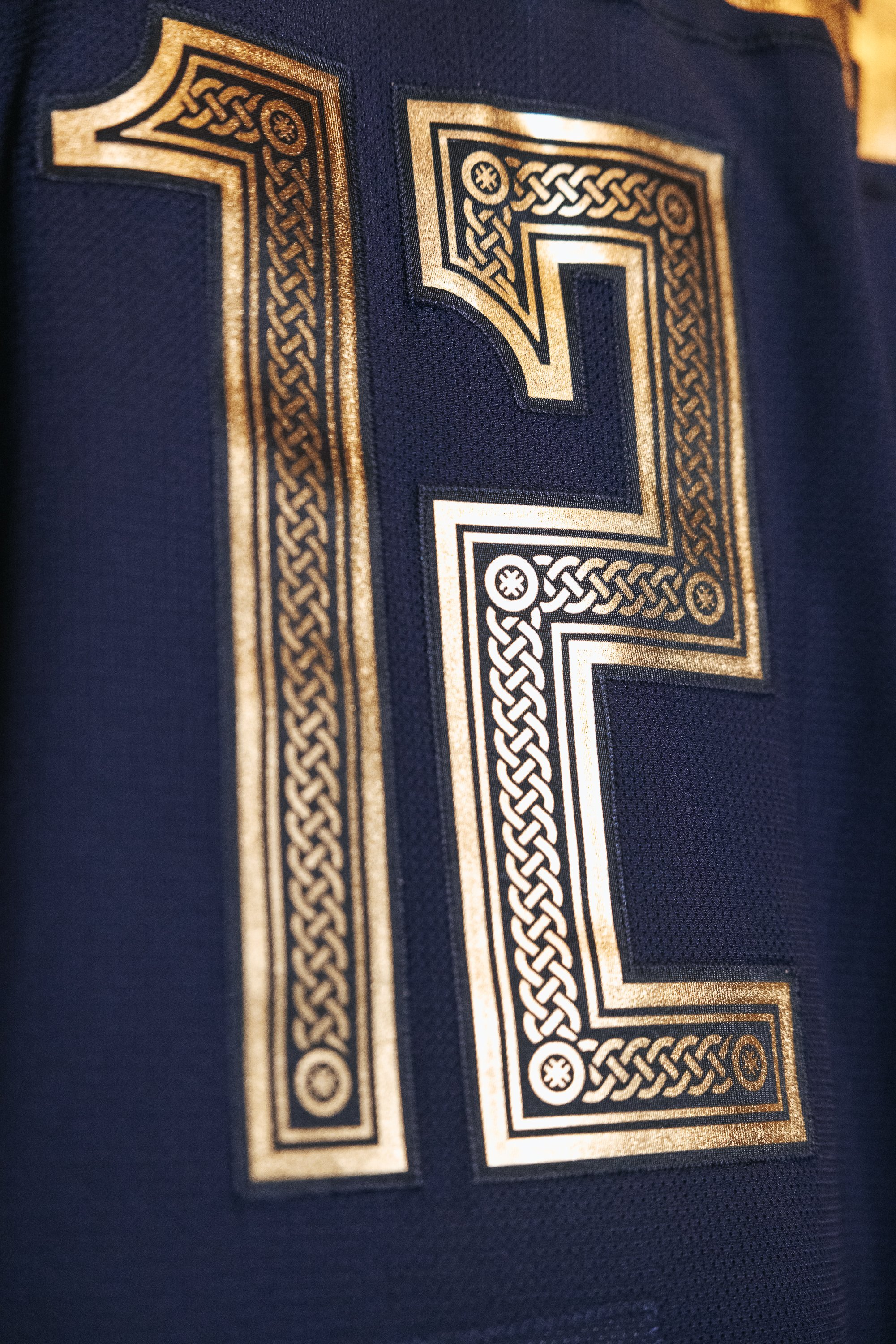
The back of the jersey continues this artistic homage, with numbers inspired by the Book of Kells that feature Notre Dame’s iconic Celtic Knot running through the center. This touch ties the jersey design back to Notre Dame’s identity while honoring the intricacy of Irish art and craftsmanship.
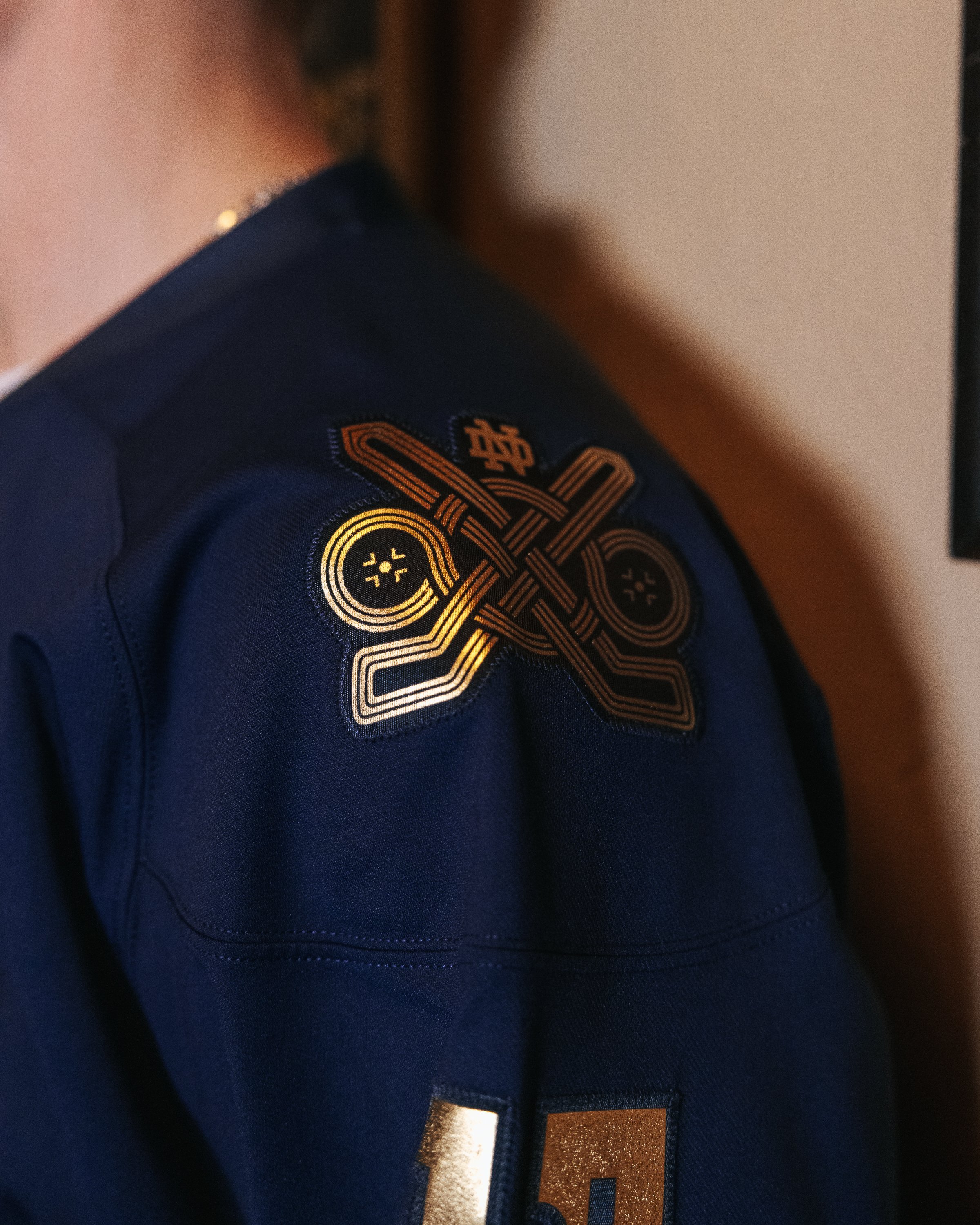
The shoulders showcase exclusive patches created specifically for the Friendship Four tournament. Woven into each patch is a Celtic knot that forms the shape of two hockey sticks and face-off circles, symbolizing the two games the Irish will play in Belfast. This design brings together traditional Irish symbols with the team’s competitive spirit, highlighting the cultural bridge Notre Dame will build through sport.
This specialty jersey marks a historic moment for Notre Dame hockey and gives fans a unique piece of memorabilia that represents not only the team’s trip abroad but also the deeper connection between Notre Dame and Ireland. The Friendship Four tournament provides a chance for the Irish to compete internationally while paying tribute to the rich heritage that both the university and the host country share.
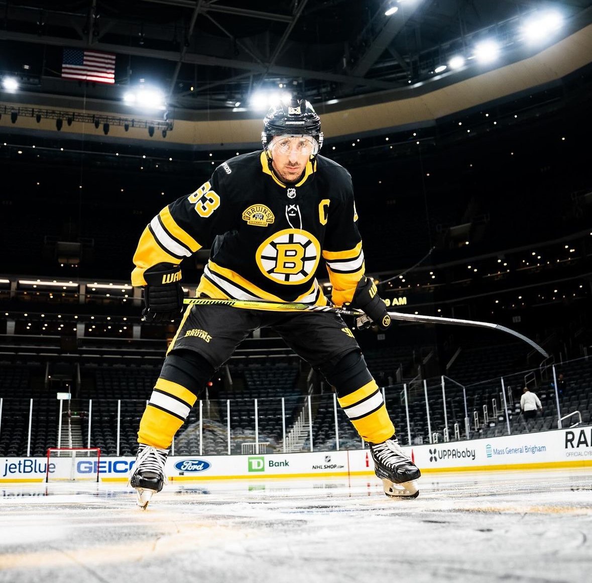
The Boston Bruins have unveiled a brand-new alternate uniform, set to make its debut on December 1 for the Bruins' centennial game. This new look will also serve as the team’s alternate jersey throughout the remainder of the season, adding a fresh yet nostalgic twist to the team’s lineup of uniforms.
The new alternate uniforms have quickly caught the attention of fans, especially with the return of yellow socks—a feature that hasn’t been seen since 2017. This retro detail is part of a design that feels both familiar and updated, with subtle adjustments that set it apart from previous Bruins jerseys. The jersey’s most noticeable change is the removal of the yellow and white shoulder yoke, which gives the alternate a cleaner and more streamlined appearance.
At first glance, the new alternate might look similar to last year’s centennial season home uniforms. However, there are key differences that make this version stand out. The black is a deeper shade, the gold leans more toward a rich yellow, and the sleeve stripes have been simplified. The Bruins have retained their iconic simplified spoked-B crest, which has been updated with these refined colors, harking back to their history while presenting a fresh take.
The Bruins have put thoughtful touches into the design to celebrate their century-long legacy. The inner collar proudly displays the scoreline from the Bruins’ first-ever game, while the inner bottom lining is inscribed with the words “tradition, grit, passion, heart”—a tribute to the core values that have defined the team since its inception.
The centennial theme continues with a special patch, which takes up a prominent spot on the jersey’s chest, with the team's jersey ad relocated to the right shoulder to accommodate it. Meanwhile, the team’s new secondary logo makes its debut on the pants, adding an extra layer of detail that will surely catch fans' attention on the ice.
The new uniform design draws inspiration from the Bruins’ uniforms of the 1970s through the 1990s—a period many fans remember fondly. The deep black and bright yellow tones evoke memories of legends like Bobby Orr and Ray Bourque, and it’s clear that the design team aimed to channel that era’s essence while incorporating modern elements.
Whether or not the Bruins ultimately adopt this design as their full-time look, the new alternates are a fitting tribute to the franchise’s rich legacy and a stylish way to celebrate 100 years of Bruins hockey. As the team takes the ice in these new threads, fans can look forward to a season where tradition and innovation blend seamlessly, creating a look that’s truly worthy of the Black and Gold.
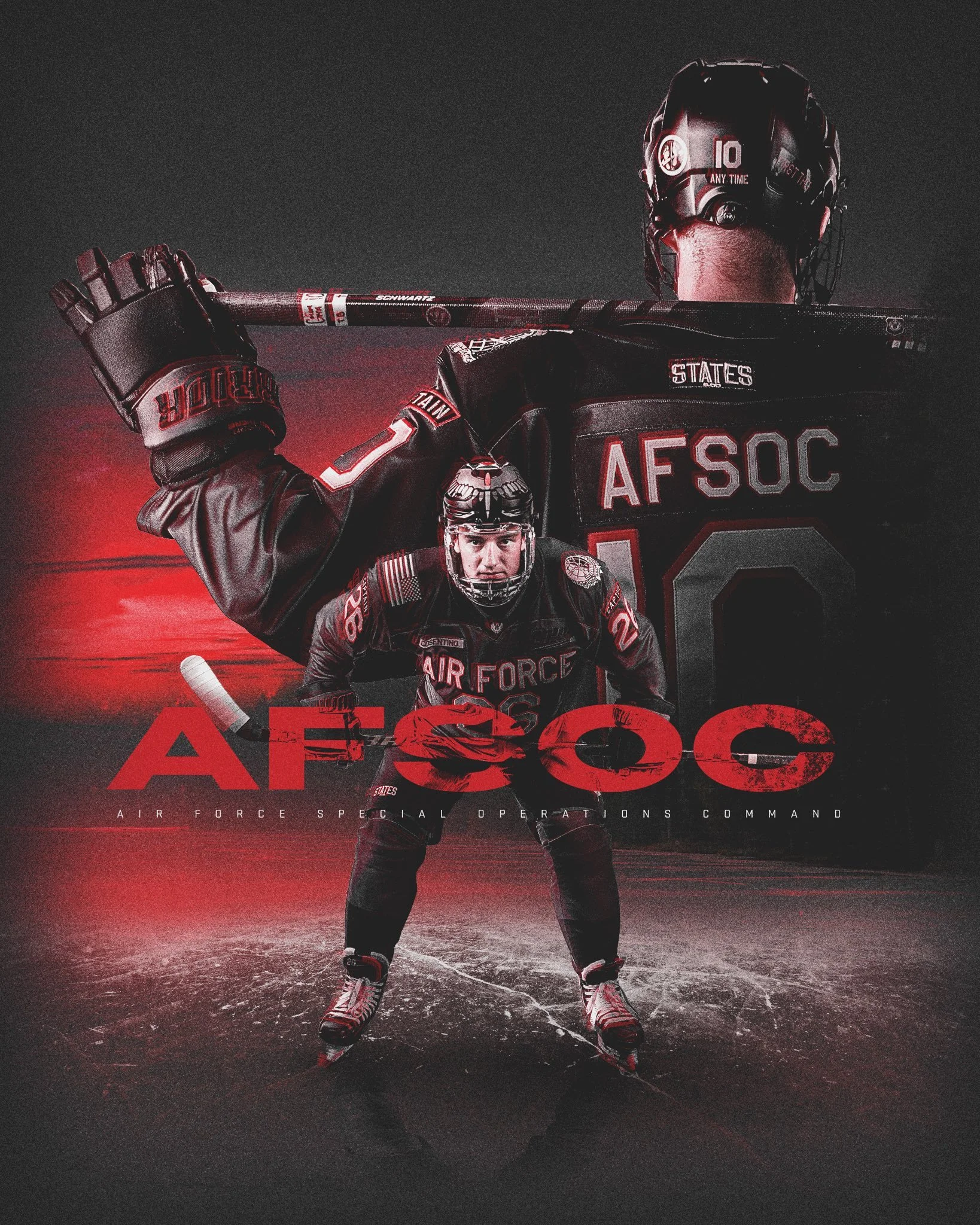
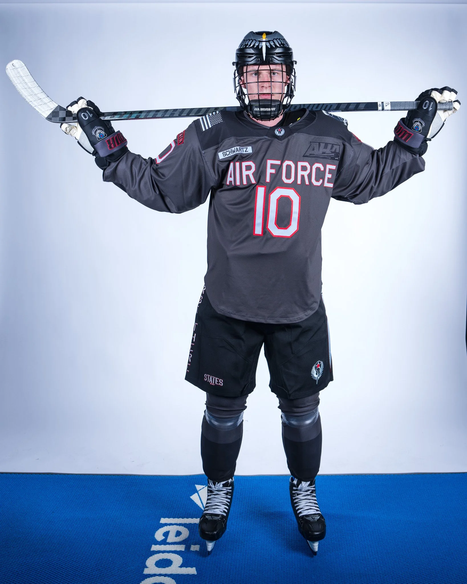
The Air Force hockey team is set to honor the Air Force Special Operations Command in a remarkable way with their latest uniform reveal. Designed by States & Co., these uniforms will be worn in tribute to the elite forces of AFSOC. Known for their rapid global deployments and elite operational readiness, AFSOC's contributions are honored through unique design elements in this special edition uniform.
Each aspect of the uniform carries significant meaning, symbolizing AFSOC’s mission and honoring the dedication of Special Operations forces. The helmet prominently features the official AFSOC emblem, embodying the command's spirit.
The jerseys are equally detailed, with a nameplate for each player on the right chest, while the right sleeve carries the American flag. The left sleeve showcases one of three distinct badges from Air Force Special Tactics, representing the unit’s specialized skills. The numbers and red accents on the jersey and pants are inspired by the scarlet beret worn by Special Tactics Combat Controllers. The nameplate on the back of each jersey will proudly display "AFSOC," reinforcing the connection to this elite group. A dagger is placed on the left pant leg, and the right leg features the “First There” motto, further symbolizing the role of Special Operations.
Air Force Special Tactics operators play a crucial role in missions involving precision strike, global access, personnel recovery, and battlefield surgery. These elite ground forces operate both independently and alongside other special operations partners, such as Navy SEALs, Army Special Forces, and Marine Raiders. Not only are they instrumental in combat missions, but they are also essential in global humanitarian efforts. Since 2000, 21 Special Tactics operators have given their lives in service, including three Air Force Academy graduates, highlighting the risks and sacrifices of this prestigious unit.
The new Air Force hockey uniforms serve as a tribute to AFSOC’s enduring legacy, and more importantly, to the brave men and women who serve within it. With the incorporation of symbolic details and powerful imagery, the uniforms will remind players and fans alike of the heroism of Air Force Special Tactics and their unwavering commitment to the mission of protecting and saving lives around the globe.
The Washington Capitals are celebrating a significant milestone—50 years of hockey in the nation’s capital. As part of the celebration, the Capitals will take to the ice wearing a throwback that fans know and love: the special black "Screaming Eagle" jersey. This jersey will make its return for six home games during the 2024-25 season, paying homage to one of the most iconic designs in team history.
The "Screaming Eagle" jersey debuted in 1995, introducing a bold new look for the team. This year's special edition keeps the essence of that original design while adding modern updates to commemorate the Capitals’ half-century of history. The sleek color scheme—featuring blue, black, and bronze—exudes power, while the distinctive eagle design, swooping downward in flight, captures the energy and speed that define the sport of hockey.
The eagle, chosen for its status as the national bird of the United States, is a perfect symbol of both the team and the city it represents. This predatory pose gives the jersey a fierce, dynamic presence, embodying the team's relentless pursuit of victory.
The design isn’t just about the eagle. A shoulder patch featuring the Capitol Building in front of two crossed hockey sticks honors the team’s strong ties to Washington, D.C. The two stars in the background represent the nation’s capital, while a hockey puck nested between the blades of the sticks highlights the team's mission on the ice. This blend of historic and symbolic elements helps elevate the jersey from a simple uniform to a powerful emblem of tradition, pride, and strength.
Fans looking to catch the Capitals in this special edition jersey can mark their calendars for six home games during the upcoming season:
Wednesday, Nov. 6th vs. Nashville Predators
Friday, Nov. 29th vs. New York Islanders
Tuesday, Dec. 31st vs. Boston Bruins
Saturday, Jan. 18th vs. Pittsburgh Penguins
Saturday, Feb. 1st vs. Winnipeg Jets
Sunday, April 13th vs. Columbus Blue Jackets
Each game will provide fans with an opportunity to witness the Capitals honoring their storied history, while looking forward to what lies ahead for the franchise.
As the Washington Capitals gear up for their 50th-anniversary season, the return of the "Screaming Eagle" jersey serves as a reminder of the team’s journey—from its bold rebranding in 1995 to becoming one of the NHL's most exciting franchises. The jersey represents more than just the team's evolution; it’s a symbol of the Capitals' commitment to their fans, their city, and the game of hockey.
Keep an eye out for these special games, and make sure you don’t miss the chance to see the "Screaming Eagle" soar once again.
Orange isn't just a color for the Anaheim Ducks; it's the essence of who they are. It represents the vibrant community of Orange County and the pride they take in their home. The Ducks' new uniforms for the 2024 season embrace this bold identity, blending classic elements with modern design to create a powerful and cohesive look.
The new uniforms feature a dominant orange hue, symbolizing the heart of the Anaheim Ducks and their deep connection to Orange County. Complementing this bold color are classic black and white tones, which provide sharp contrast and a sense of elegance. Gold accents complete the look, reflecting the golden, sandy beaches that define the region.
Every aspect of the new design has been crafted with intent, seamlessly merging tradition with modernism. The sharper angles and striking presence of the uniforms reflect the team's ambition. The logo's determined expression embodies the Ducks' evolution, while Wild Wing's "WW" remains a foundational element on the stick blades. The former primary mark has been refined and now serves as the secondary logo, preserving the team's rich heritage.
The meticulous attention to detail in every stitch and hue showcases the Ducks' philosophy and commitment to excellence. The new uniforms are not just about aesthetics; they represent the unity and spirit of the Anaheim Ducks and their fans. Each distinctive element comes together to build a powerful identity that resonates with the community.
The Ducks' new identity is a fusion of heritage, spirit, and vision. From the sleek new typeface to the streamlined representation of their past on each shoulder, the new uniforms at home and on the road symbolize the team's journey and aspirations. The Ducks are proud to be Orange County’s team, a place known for its warm, sunny weather and passionate fans who stand by their team through thick and thin.
The Los Angeles Kings have officially unveiled their new home and road jerseys, reigniting a wave of nostalgia among their fan base. Announced on Wednesday, these jerseys mark a significant rebrand for the franchise, one that harks back to the glory days of the late 1980s and early 1990s.
For fans who closely followed the Stanley Cup playoffs, the new direction might not come as a surprise. During their three road games against the Edmonton Oilers, the Kings sported their alternate white sweaters featuring the iconic "chevron"-style logo. This logo, originally introduced in 1988 with the arrival of Wayne Gretzky, has made periodic appearances over the years. The angular design of the chevron logo, reminiscent of the automobile brand Chevrolet, has now officially replaced the "shield"-style logo that the team adopted in 2011-12.
Despite the success the Kings enjoyed with the shield logo, including two Stanley Cup victories, the allure of nostalgia proved too strong to ignore. "We’ve seen years of fans wearing that jersey, whether they had bought it recently through Mitchell & Ness or any of the other heritage brands, or had it back from the ’80s and ’90s when they first bought it and they still wear it," said Kings chief operating officer Kelly Cheeseman. "When you come to a Kings game, for better or for worse, you see a plethora of jerseys out there from all the different eras."
The decision to revert to the chevron logo was influenced by the fans' continued affection for the design. The Kings tested the waters with their heritage jersey in the 2019-20 season, incorporating the chevron logo with a "Forum blue" and gold scheme, which received strong reviews. "We started utilizing companies that have gone undefeated as brand partners to sell new merchandise with that inspiration in it," Cheeseman explained. "You started seeing the popularity and also new generations and new fans from different areas of the city going, ‘That’s cool if you want to be a part of it.’"
The Los Angeles Kings' latest rebrand taps into the powerful sentiment of nostalgia, reviving a beloved era in the team's history. By reintroducing the chevron-style logo, the franchise honors its past while appealing to both long-time supporters and new fans. As the Kings gear up for the 2024 season, these new jerseys symbolize a bridge between their storied history and a promising future.