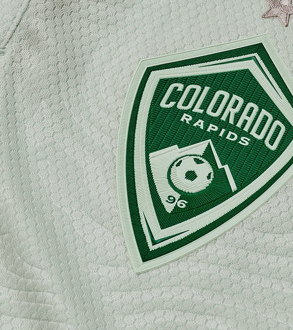
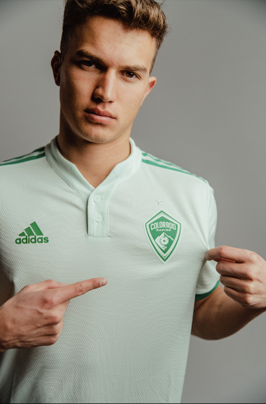
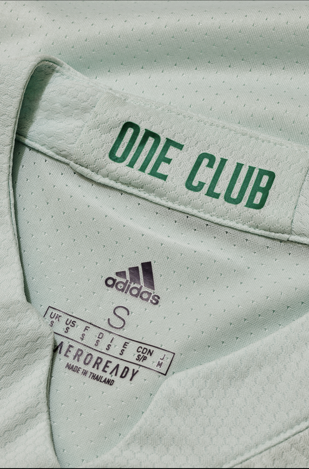
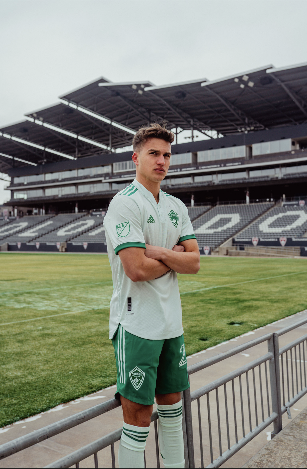
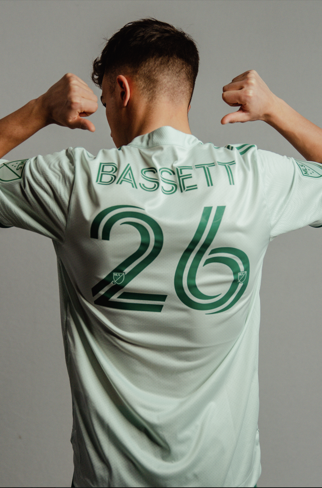
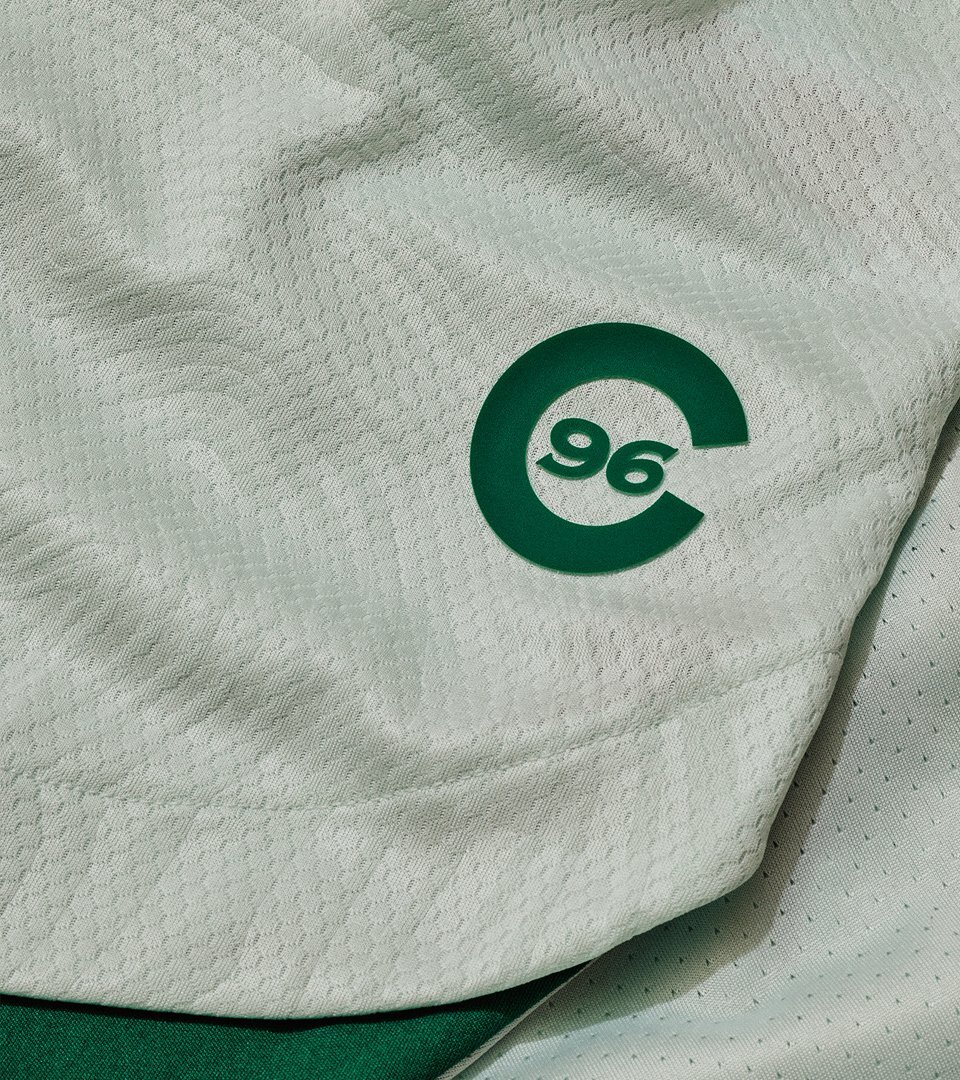
The Colorado Rapids have release their latest kit dubbed “Class 5”. The new kit features topography lines embossed throughout the kit. The lines are authentic Colorado maps of six 14,000 foot mountains GRAYS PEAK, TORREYS PEAK, PIKES PEAK, MT. BIERSTADT AND QUANDARY PEAK. The C96 tag on the front of the jersey represents them being A FOUNDING MEMBER OF THE LEAGUE as well as TO REPRESENT THE ENTIRE STATE OF COLORADO FOR their 26TH MLS SEASON.
“The Class 5 jersey represents the innate drive within each of us to keep climbing toward our goals, whether it’s reaching the top of a 14er or the top of the league. Like the mountains that inspired the colors and the design, the Class 5 jersey reminds us to dare to reach new heights in every aspect of our lives.” - Colorado Rapids
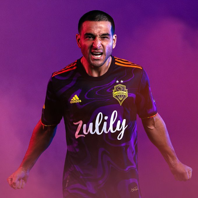
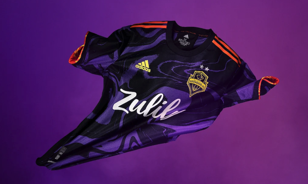
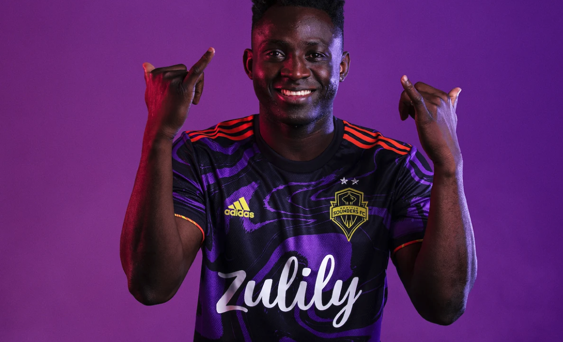
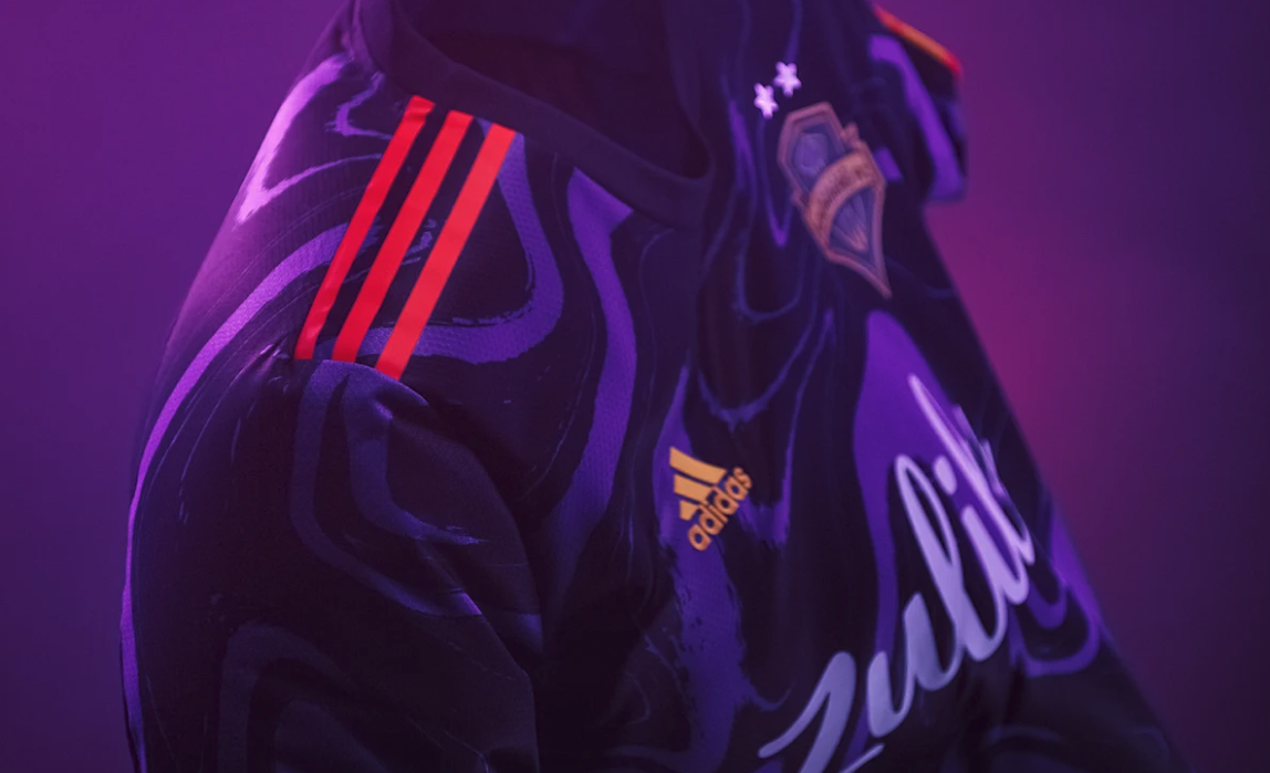
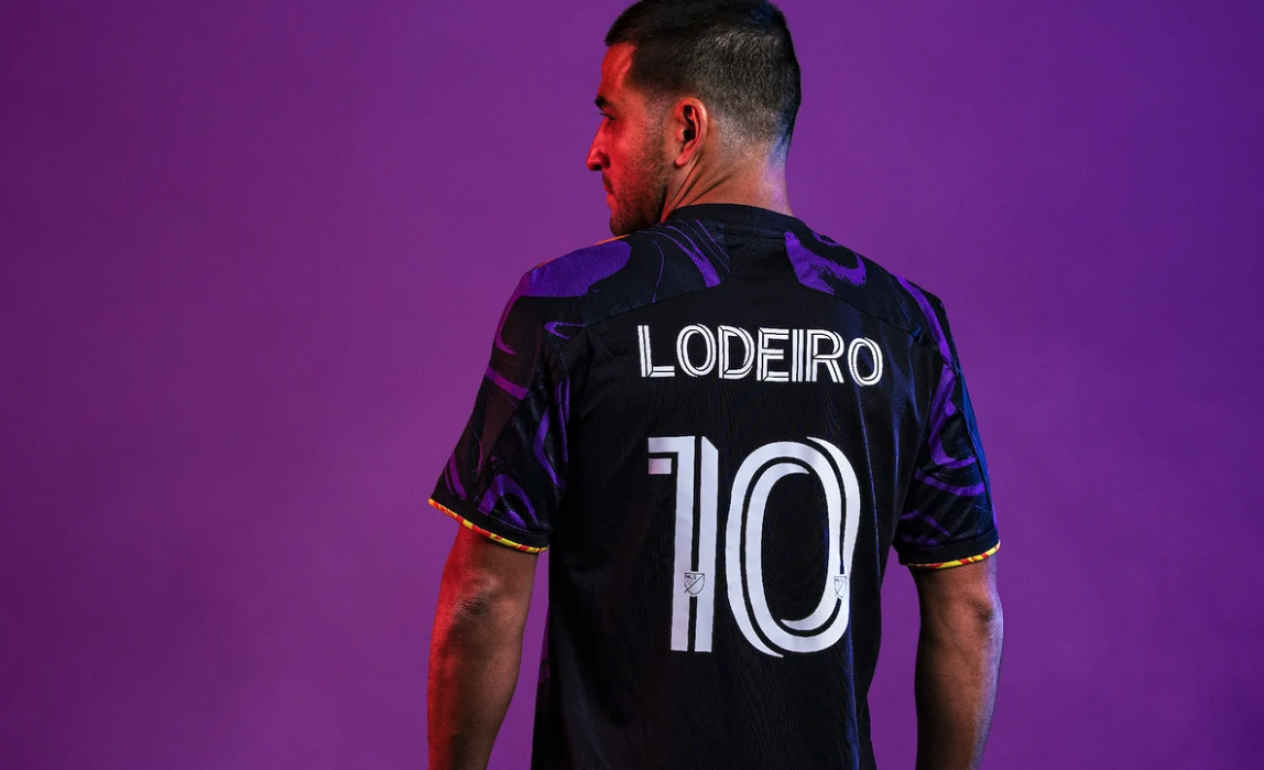
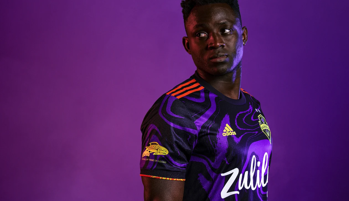
The Seattle Sounders have released their new secondary kit for the 2021-2022 seasons. The new look pays homage to Jimi Hendrix and is properly dubbed “The Jimi Hendrix Kit”.
The kit’s design is one of the most unique the Sounders FC has ever had, with the primary purple color and accents of bright orange and yellow. The psychedelic pattern is a nod to Hendrix’s affinity for vivid colors and patterns, highlighted on his album covers and through his personal style. On the bottom left corner of each jersey Hendrix’s signature is displayed. While the neck tape features lyrics from his “Straight Ahead” reproduced in his original handwriting.
“We couldn’t be more excited and proud to finally introduce The Jimi Hendrix Kit to the world; a true intersection of sports, music and pop culture. Jimi’s legacy looms large, not just here in Seattle where he was born and raised, or for the Sounders, where his iconic rendition of ‘All Along the Watchtower’ has been a part of matchday tradition for years, but across the entire world. In his short life, Jimi gifted us with his talent, and, even more so, with his generous and loving spirit. We wanted this kit to embody that colorful, creative personality, while also using it as a way to further good, just as Jimi used his own platform.”- Sounders FC Owner and President of Business Operations Peter Tomozawa
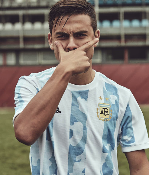
Argentina has released their latest jersey that we will see them wear for the 2022 World Cup qualifiers and Copa America Finals. The simple white jersey will feature three light blue stripes down the front. The design within the stripes features a camouflage design that is meant to represent the regions of Argentina. The jerseys will be matched with black shorts that have three light blue stripes running down either side and the club’s crest on the right leg.
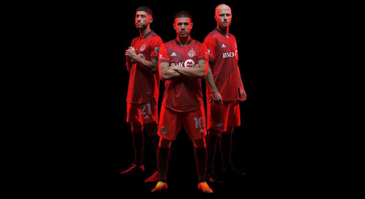
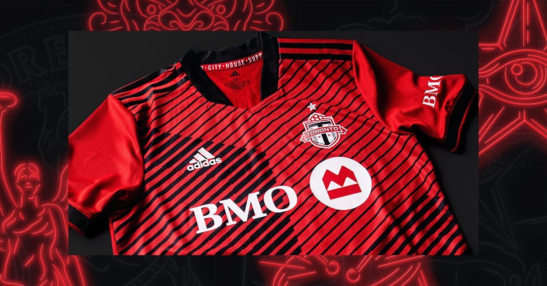
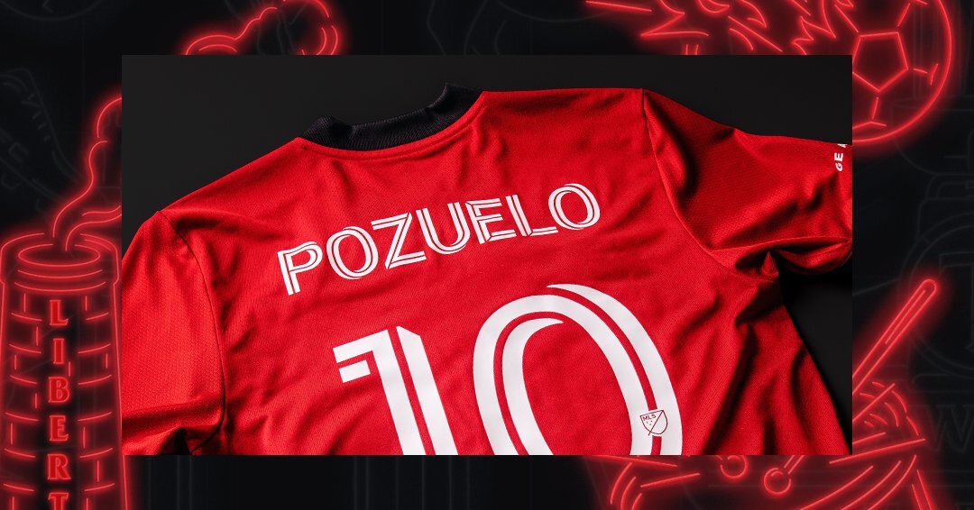
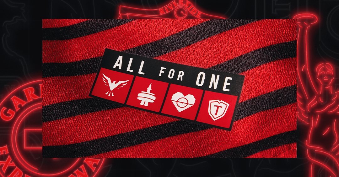
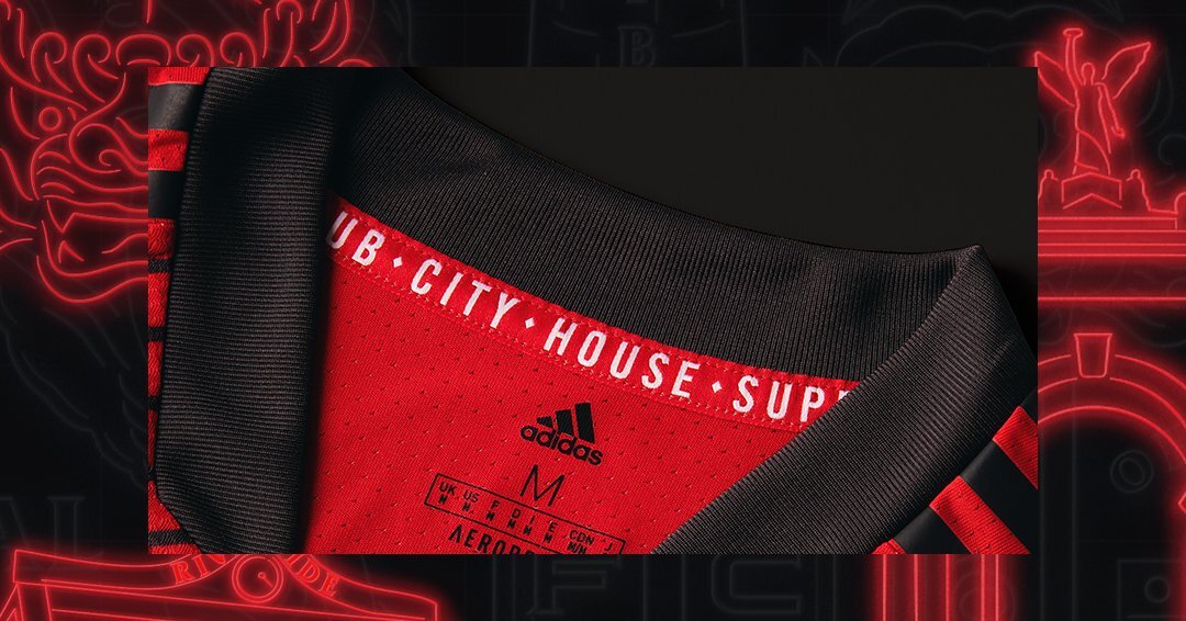
Toronto FC has revealed their latest kit. The new “A41” kit will serve as the team’s primary home kit for the 2021 and 2022 seasons. The kit’s name is an abbreviation of the club’s motto “All For One”. Displayed on the front of the red jerseys are black stripes coming in with different widths divided into the four quarters. The divide is meant to represent the Club, city, house, supporter, the club’s four pillars. The jersey’s design reflects the club’s founding principles, making an impression by fusing a classic soccer design with contemporary details created from glitched maple leafs.
The finishing touches comes with the jock tag containing the “All For One” motto and icons representing each of the four “pillars”. While the inside of the collars feature the words “CLUB • CITY • HOUSE • SUPPORTER”. Lastly the star above the TFC crest represents the club’s 2017 MLS Cup championship.
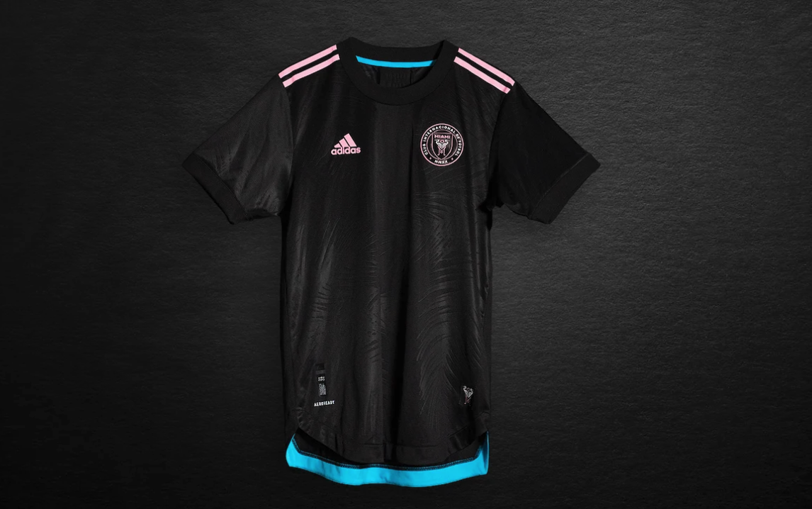
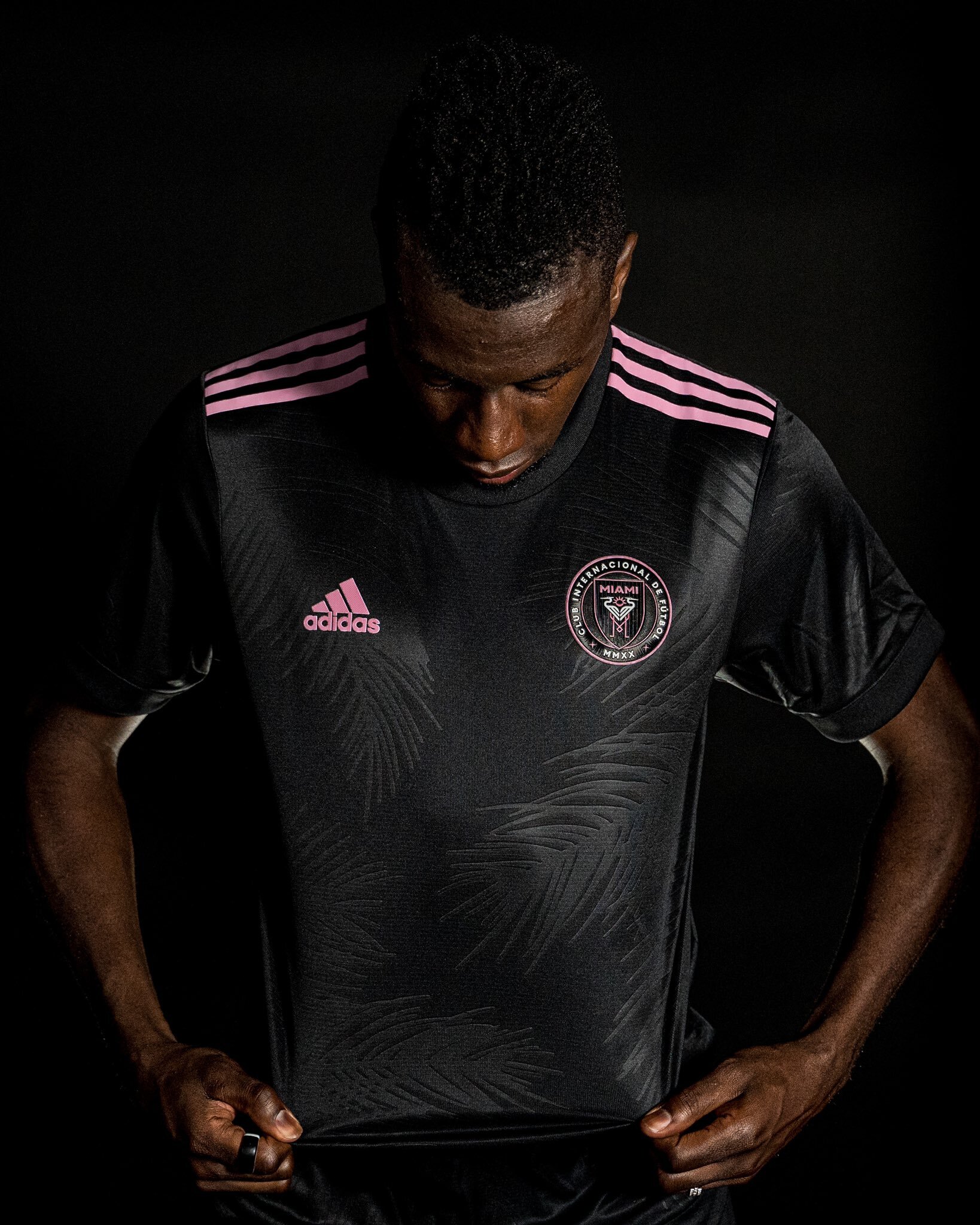
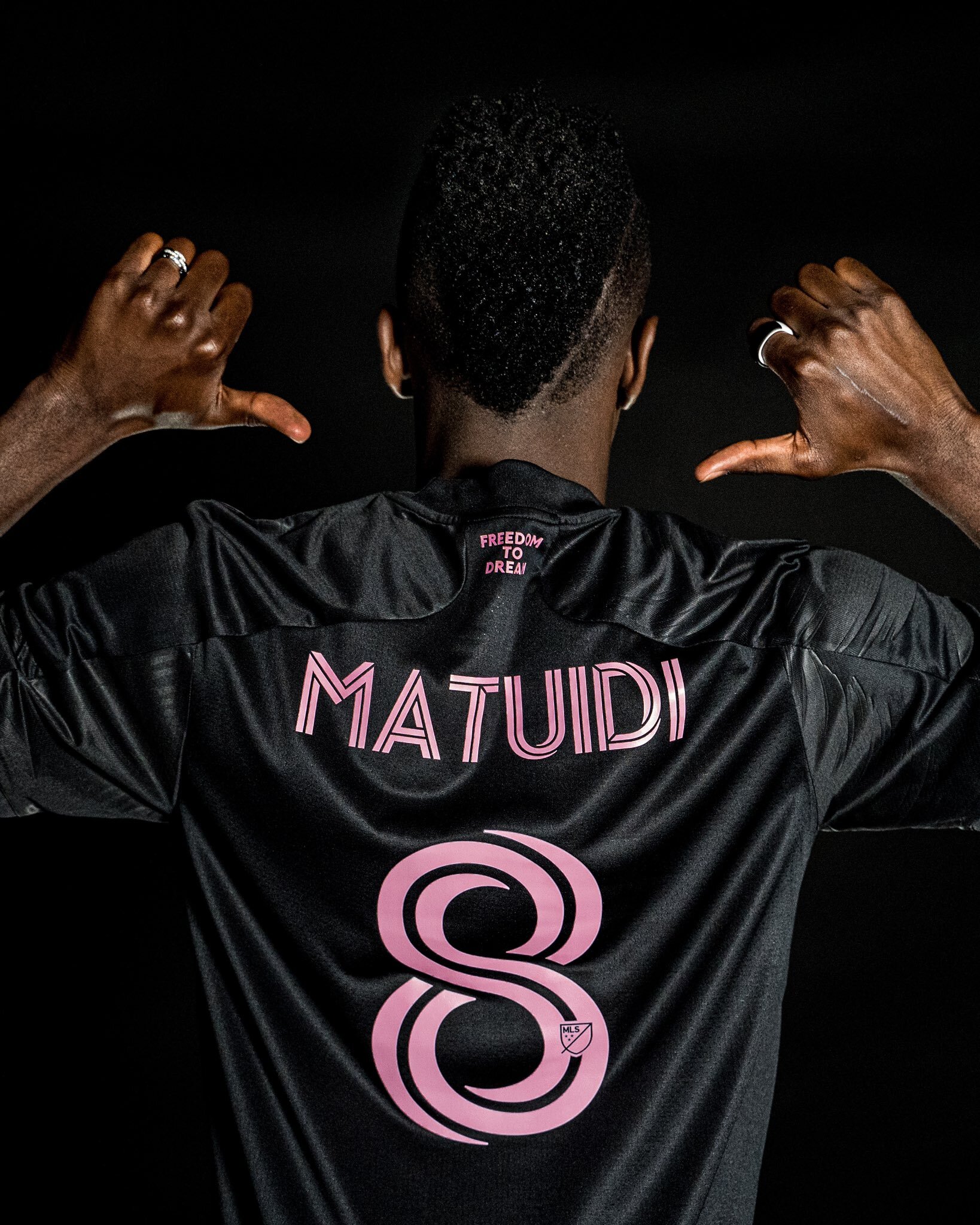
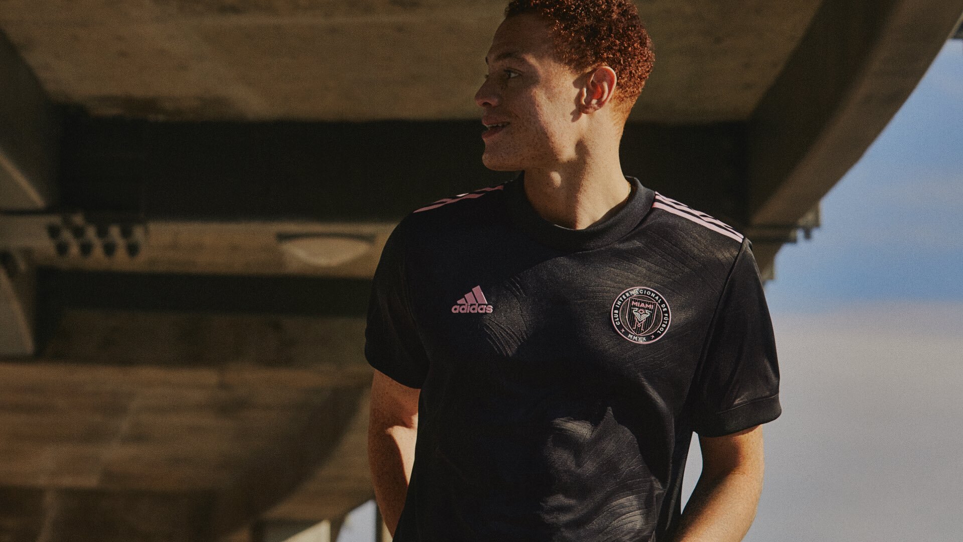
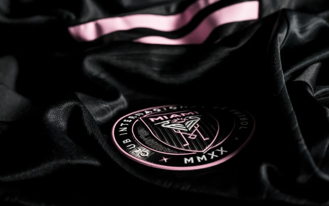
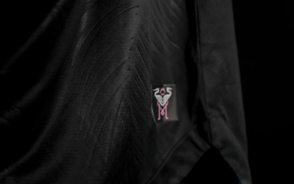
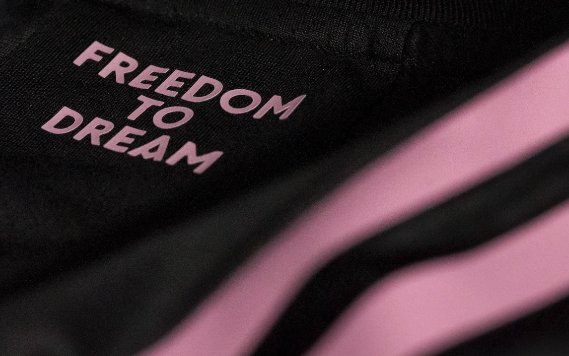
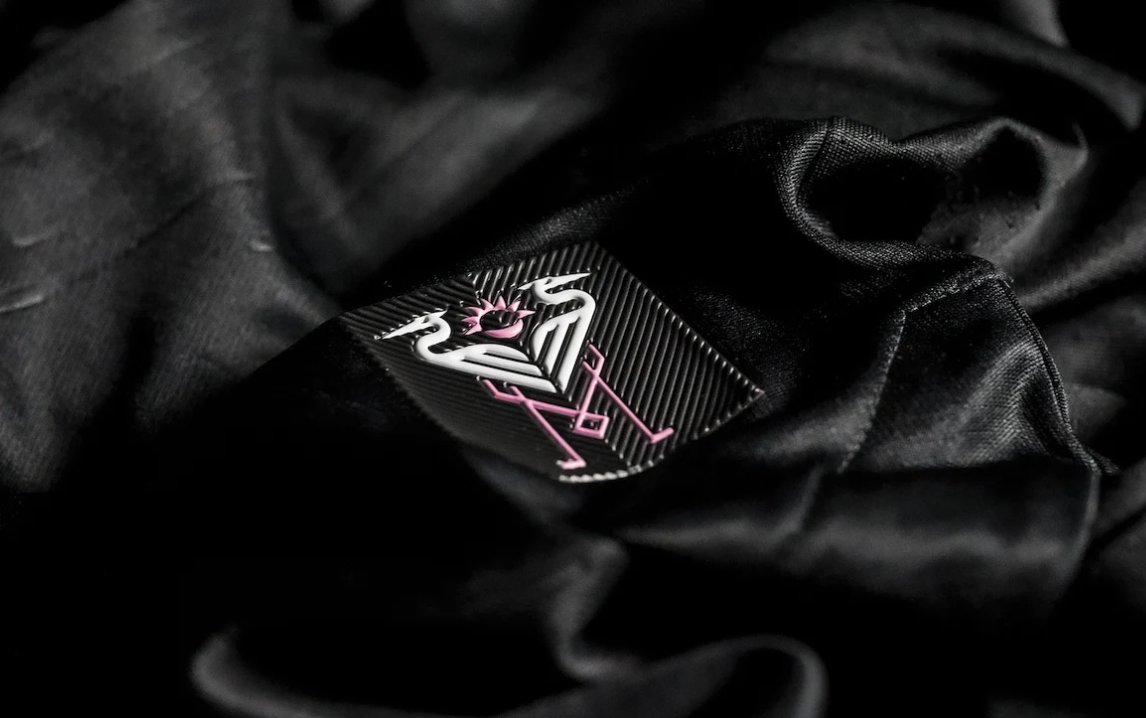
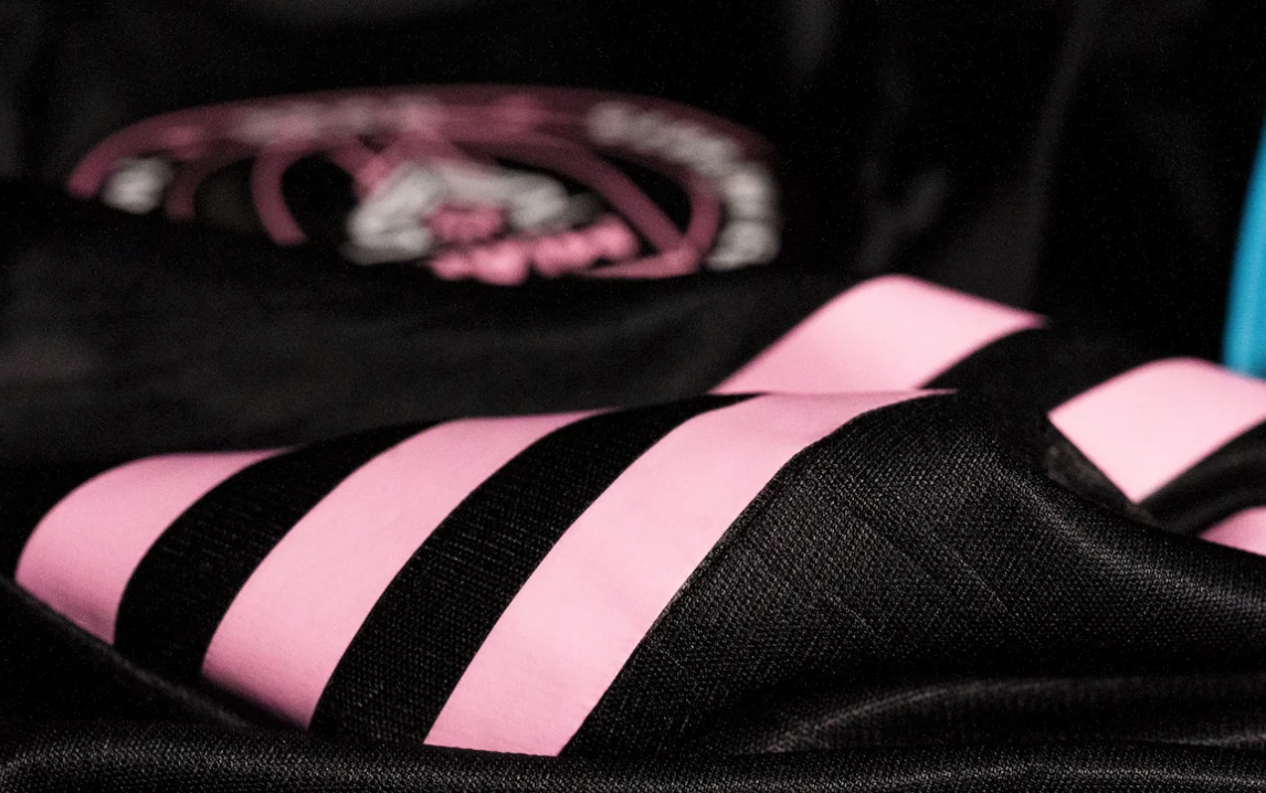
Inter Miami CF has revealed the club’s new 2021 secondary jersey named “La Palma”. The new jersey is meant to represent the deep bond the fans have with the team. The black jersey features pink accents and a subtle palm pattern as a symbol of unity, triumph, longevity, victory, royalty and honor. The herons on the jersey are an embodiment of unification and a core element of the Club’s identity. The jersey features blue on the collar and on the inside of the bottom of the jersey as a subtle tribute to Biscayne Bay, which lines and connects South Florida. The finishing touch comes with the Club’s mantra, “Freedom to Dream,” positioned on the outside of the neck on the back side of the jersey.
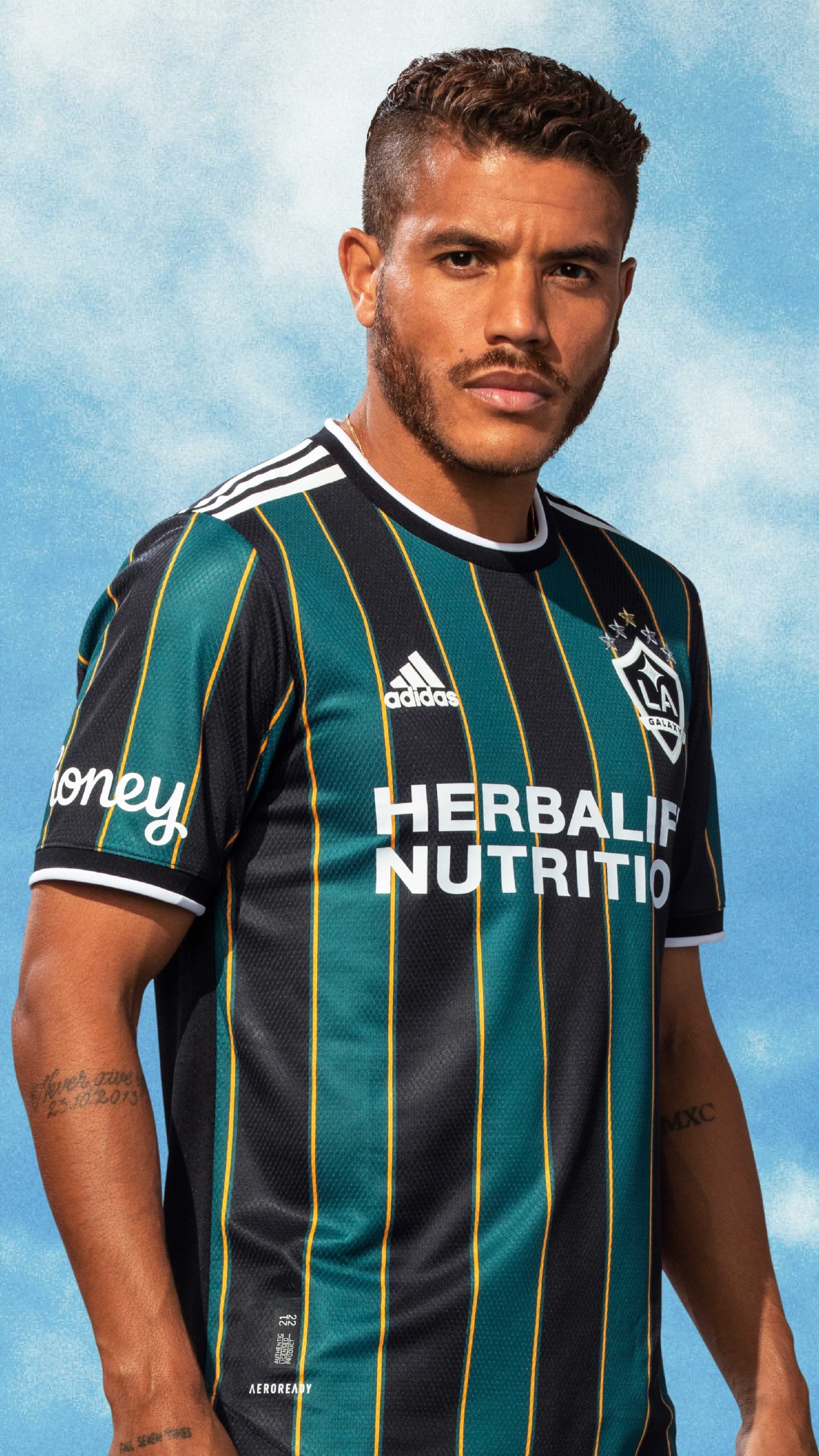
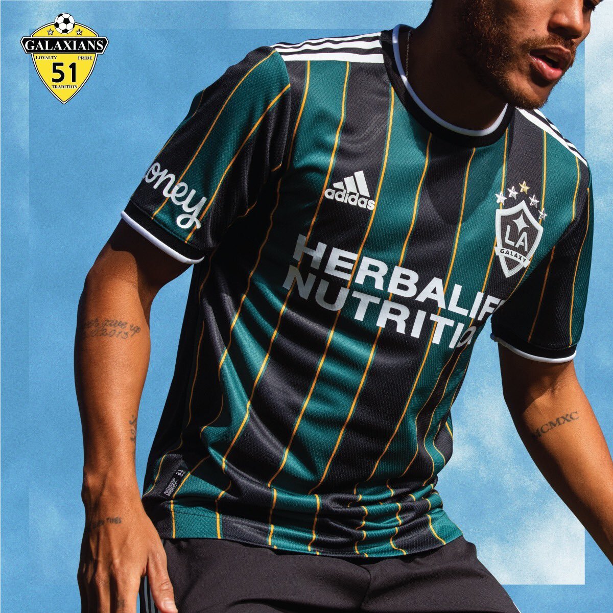
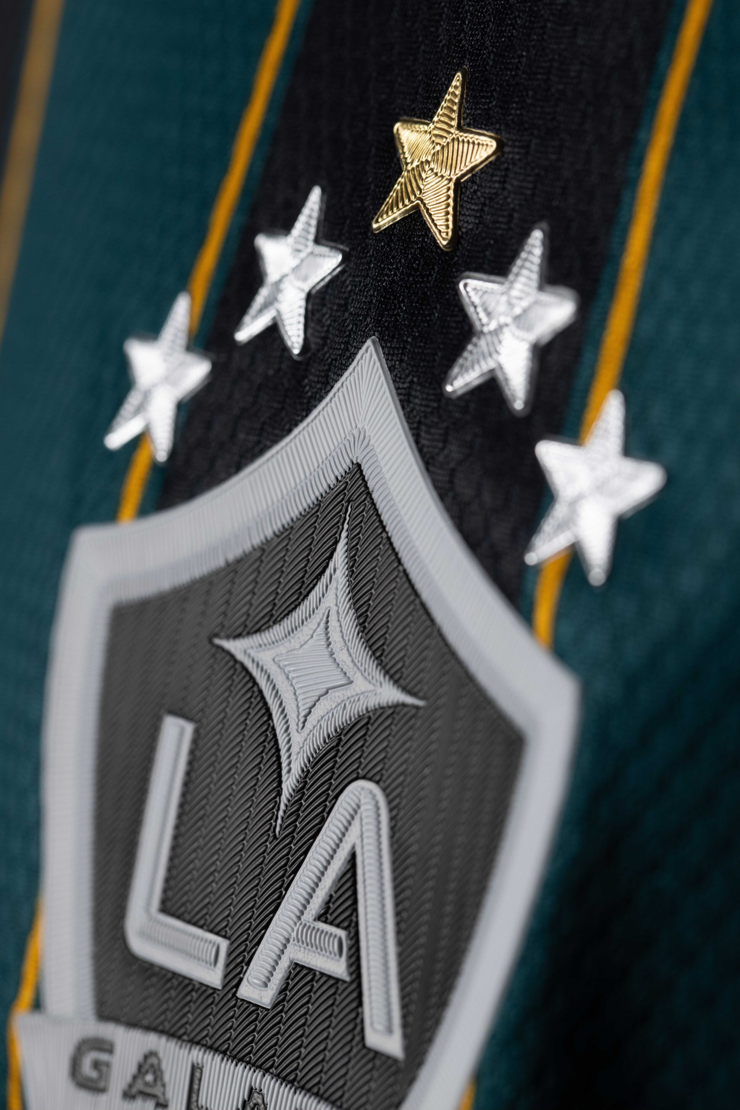
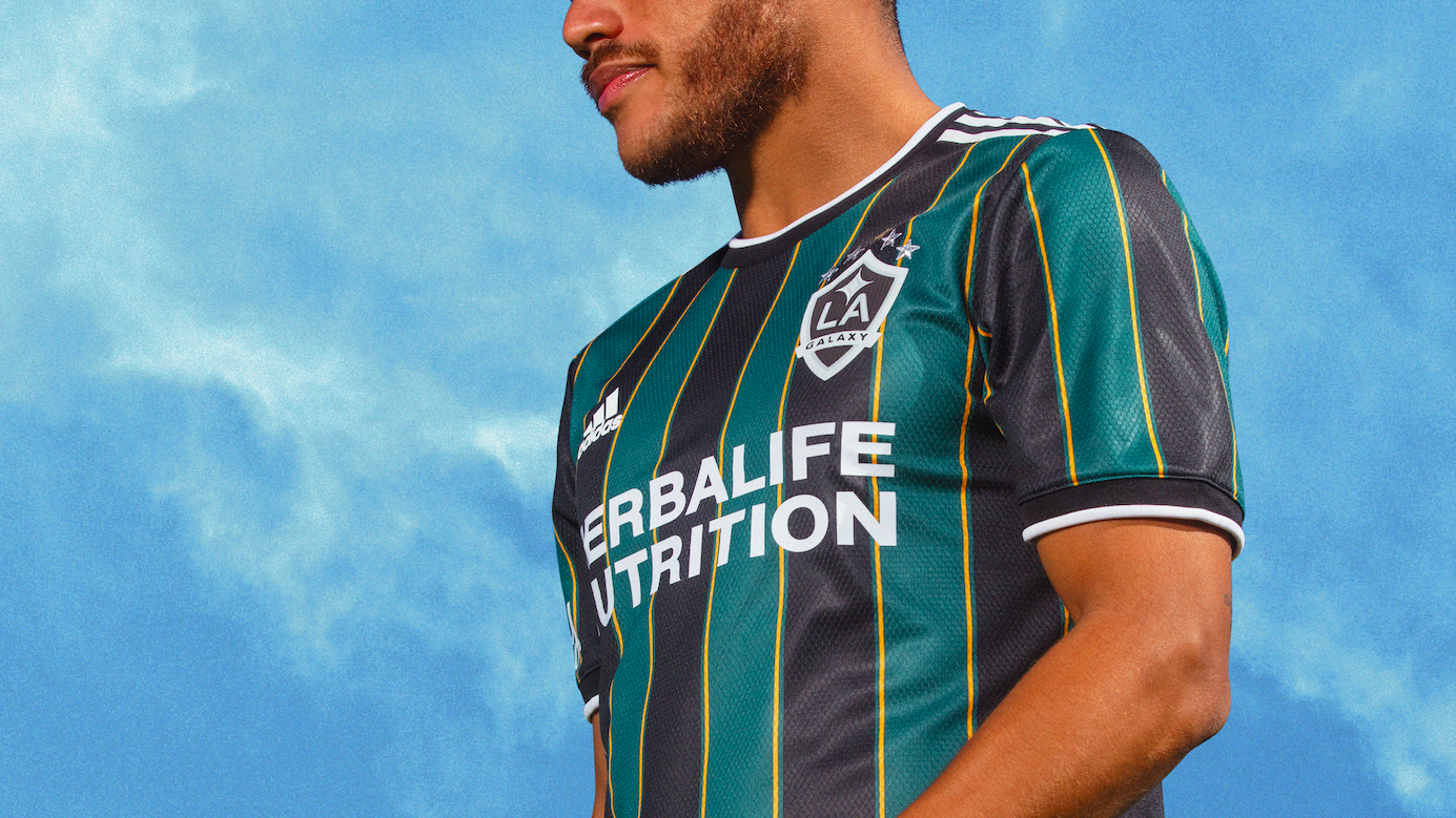
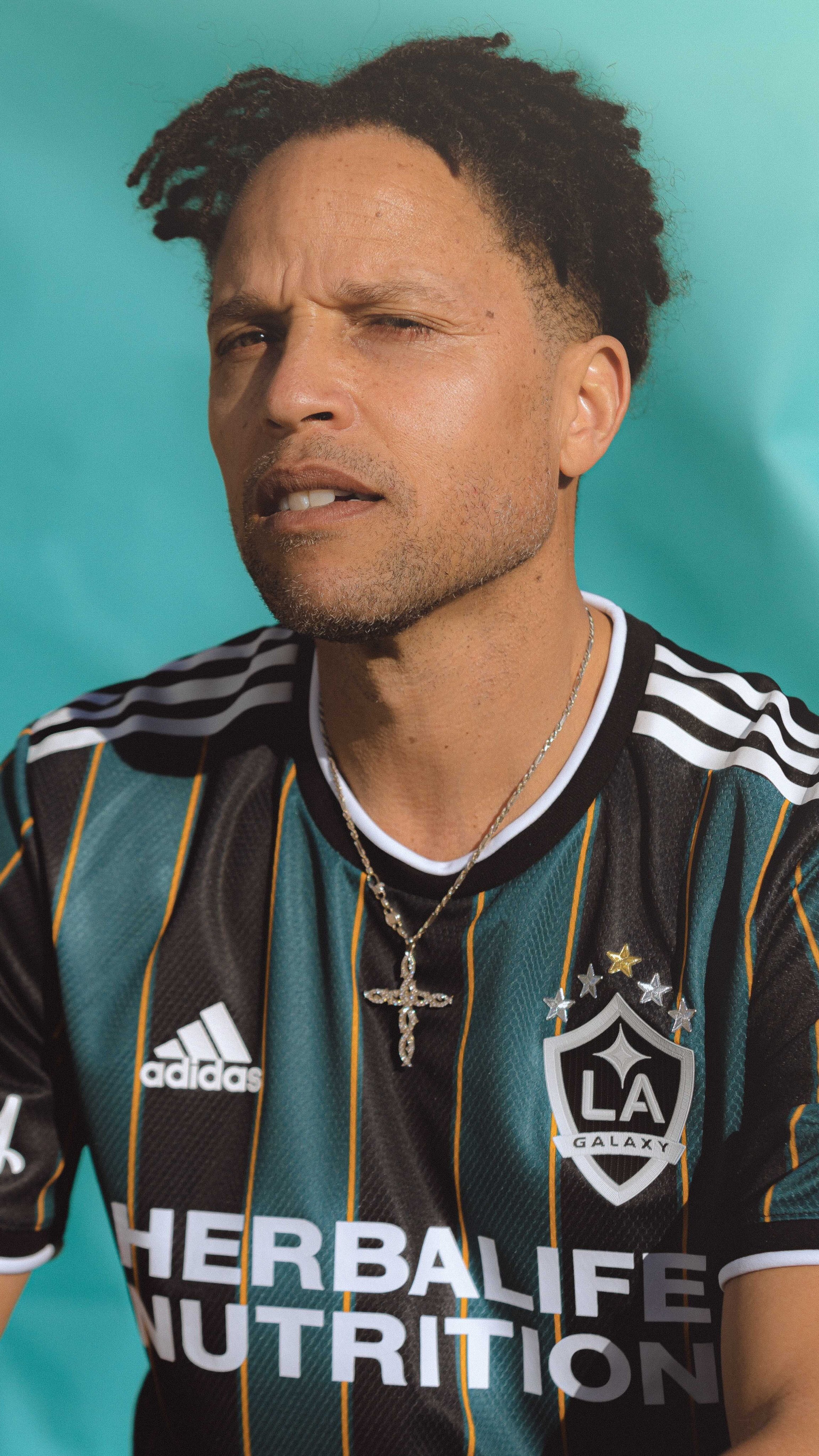
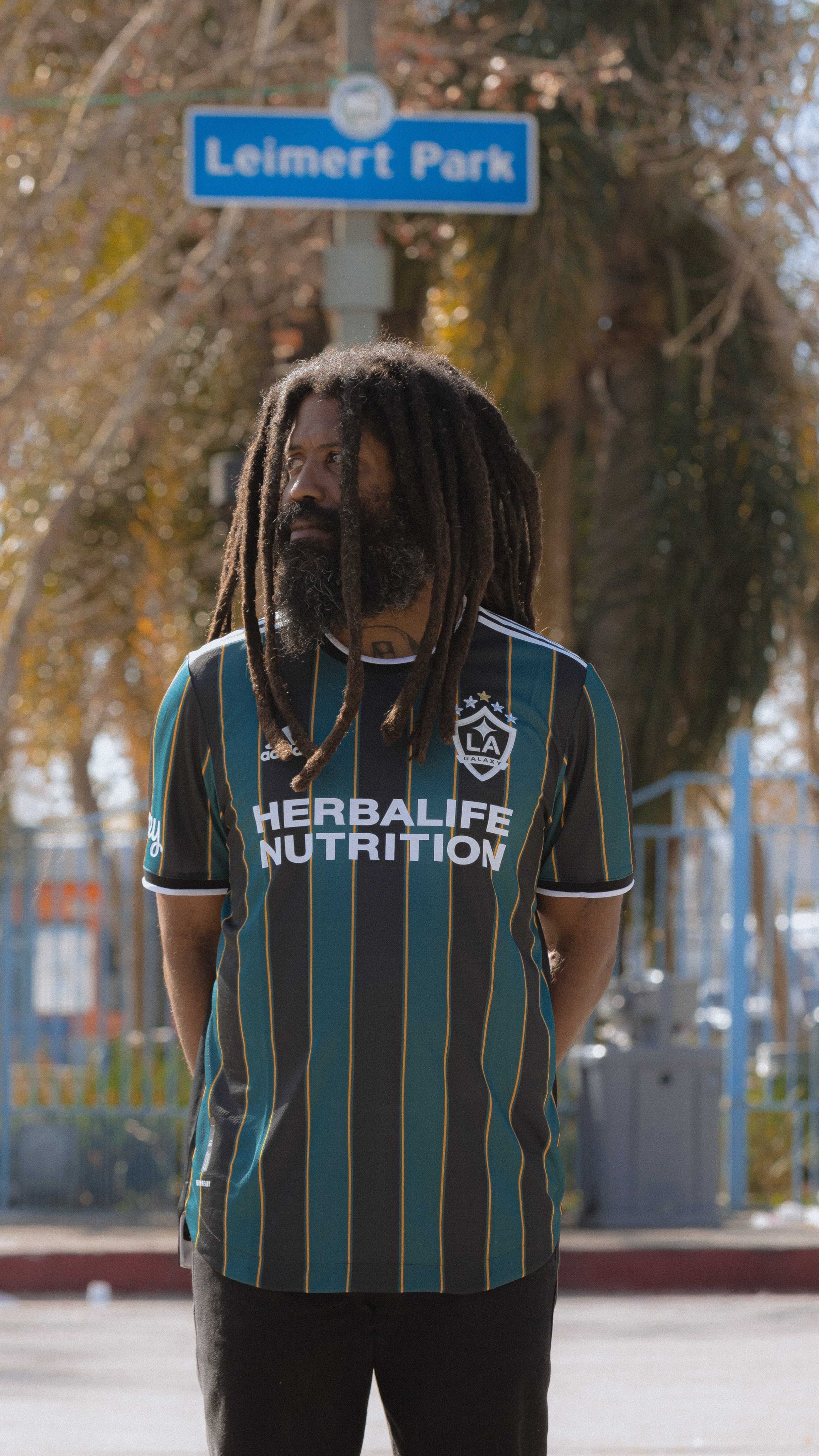
The LA Galaxy have revealed their new 2021 Community Kit. The new kit embodies the club’s culture and features vertical stripes in black, tech green, and gold paying homage to the club’s past kit. The jersey design is a modern take on the past and inspired by the teams days of playing at the Rose Bowl.
On the back of the neck on the jersey is the club’s new LA quasar mark. All the kits for the Galaxy will display five stars on the jersey to represent the LA Galaxy's record five MLS Cups won in 2002, 2005, 2011, 2012 and 2014.
"We are excited to unveil the LA Galaxy Community Kit that will serve as our secondary kit for the next two seasons. We are the club of champions in the city of champions and this classic jersey design pays tribute to that. We are proud of our history and hope our fans love the progressive spin on this retro-inspired kit." -LA Galaxy President Chris Klein
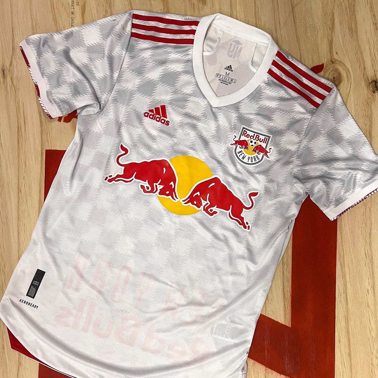
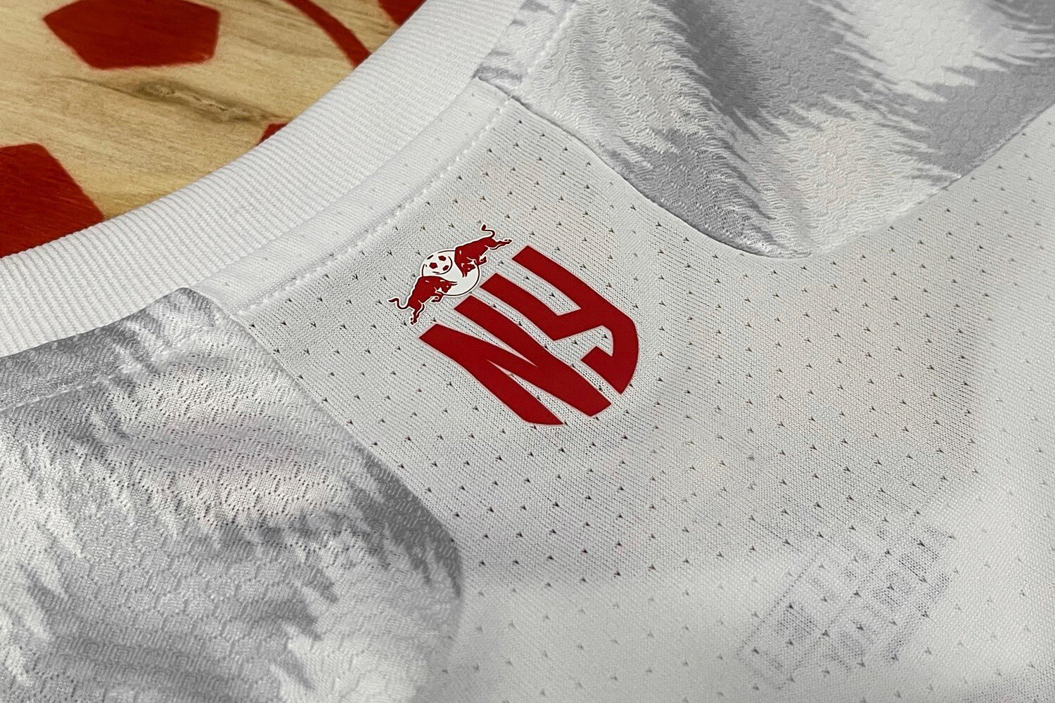
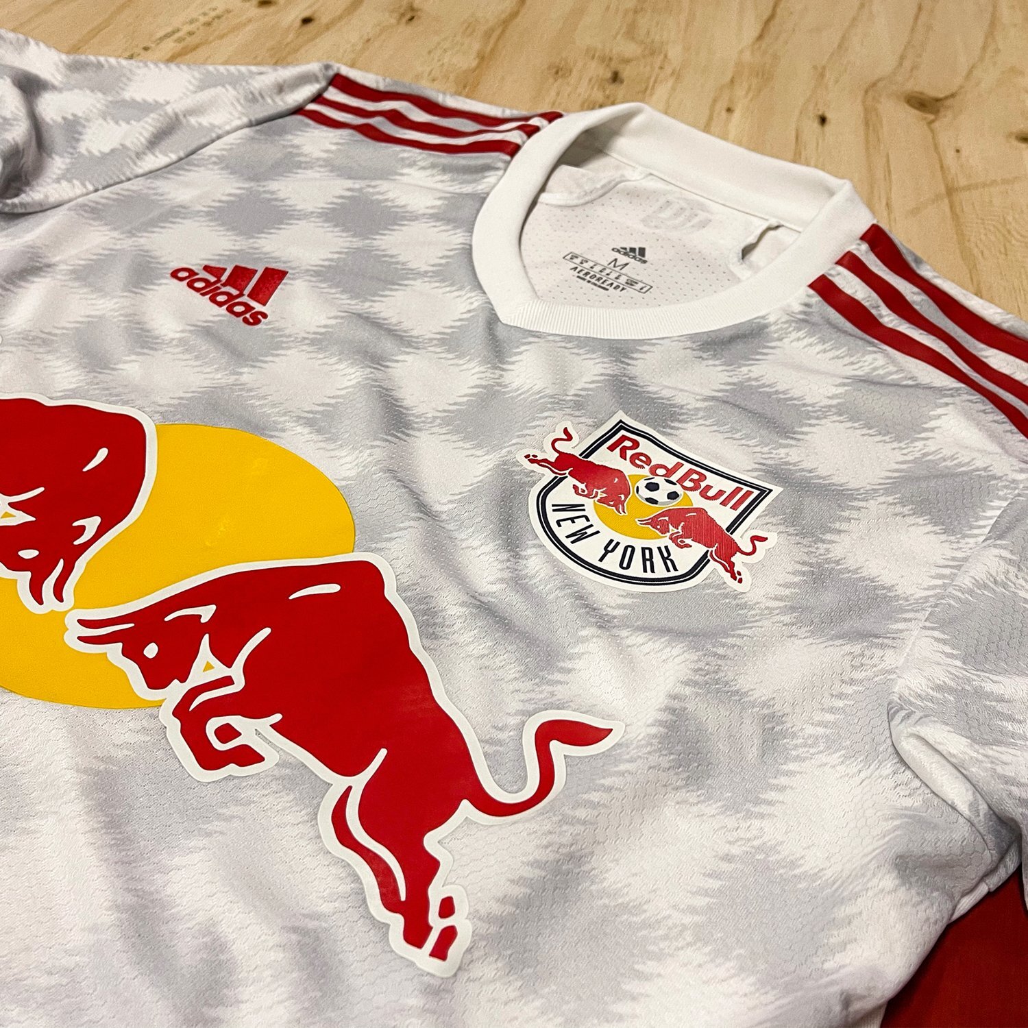
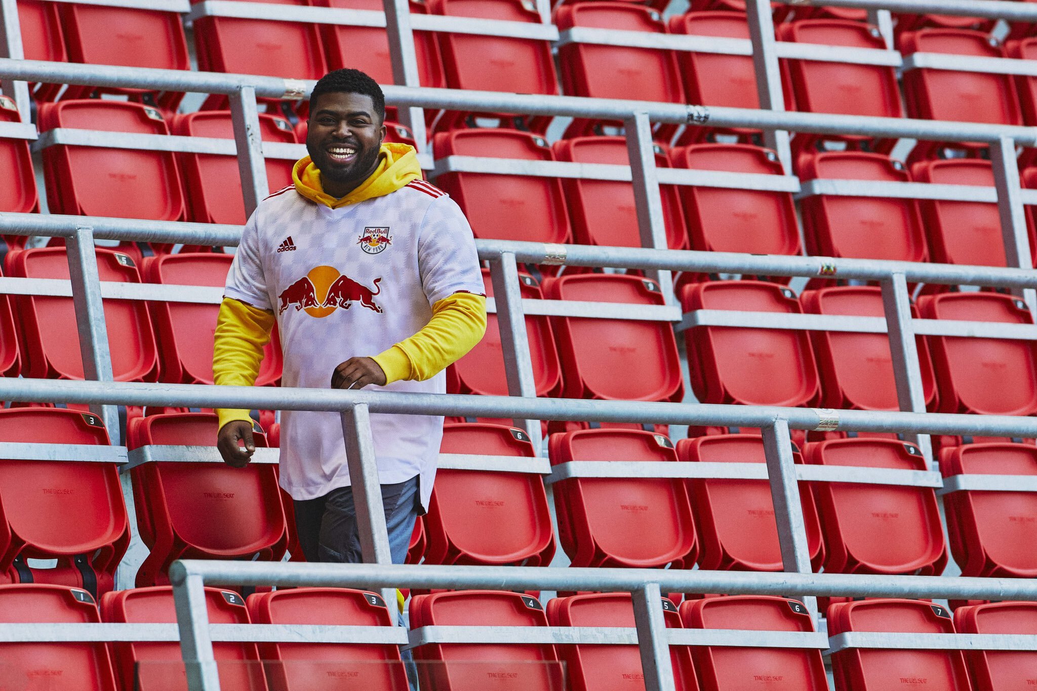
The New York Red Bulls have revealed their new 2021 home jersey. The team’s new 2021 ‘1Beat Kit’ was designed to be worn on matchdays, as well as in everyday life. The jersey features a unique checker pattern that was created to celebrate the integral part of the club’s supporters. A new NY monogram will be featured on the back of the neck of the jersey. The monogram was designed to embody all of the different communities of fans for the Red Bulls.
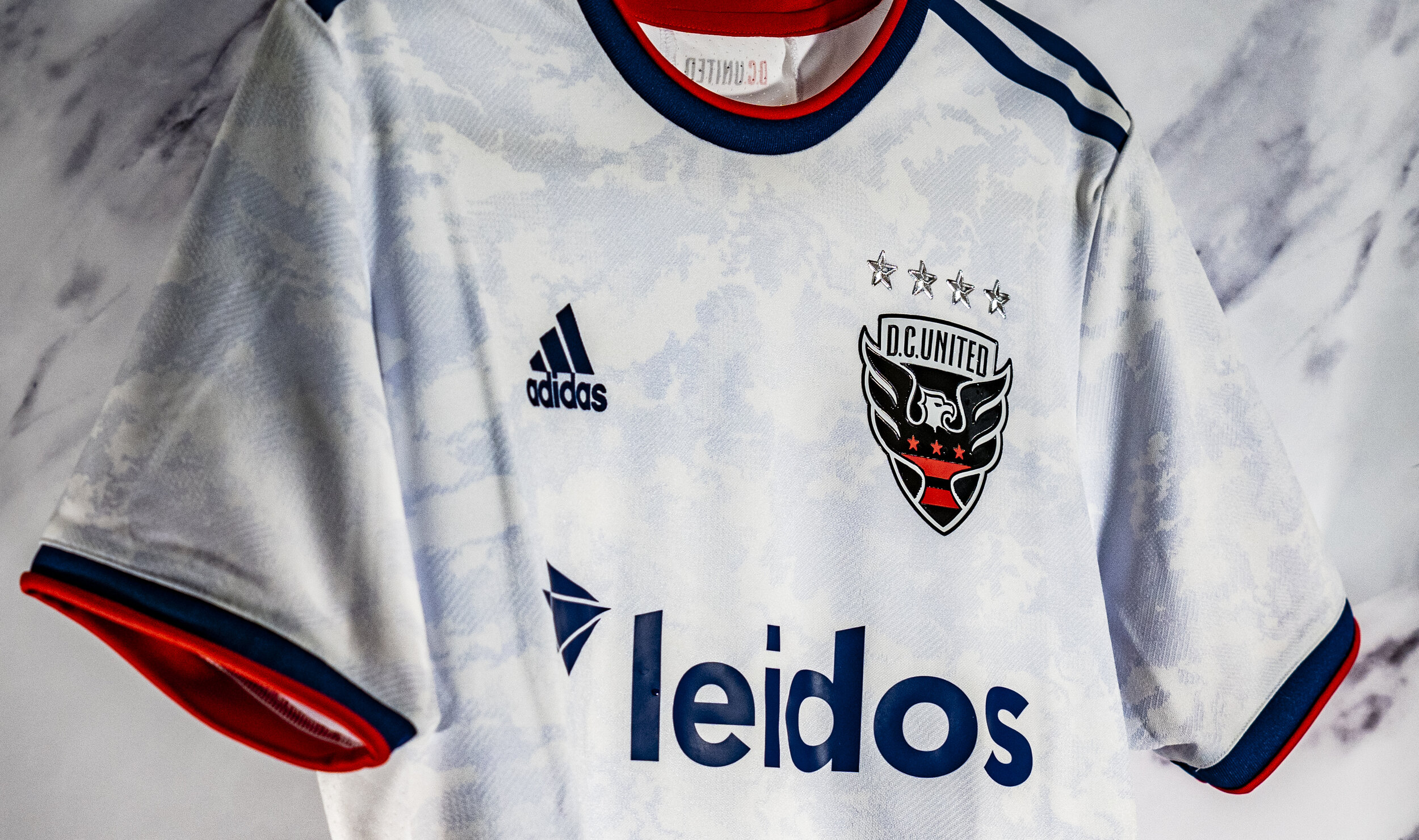
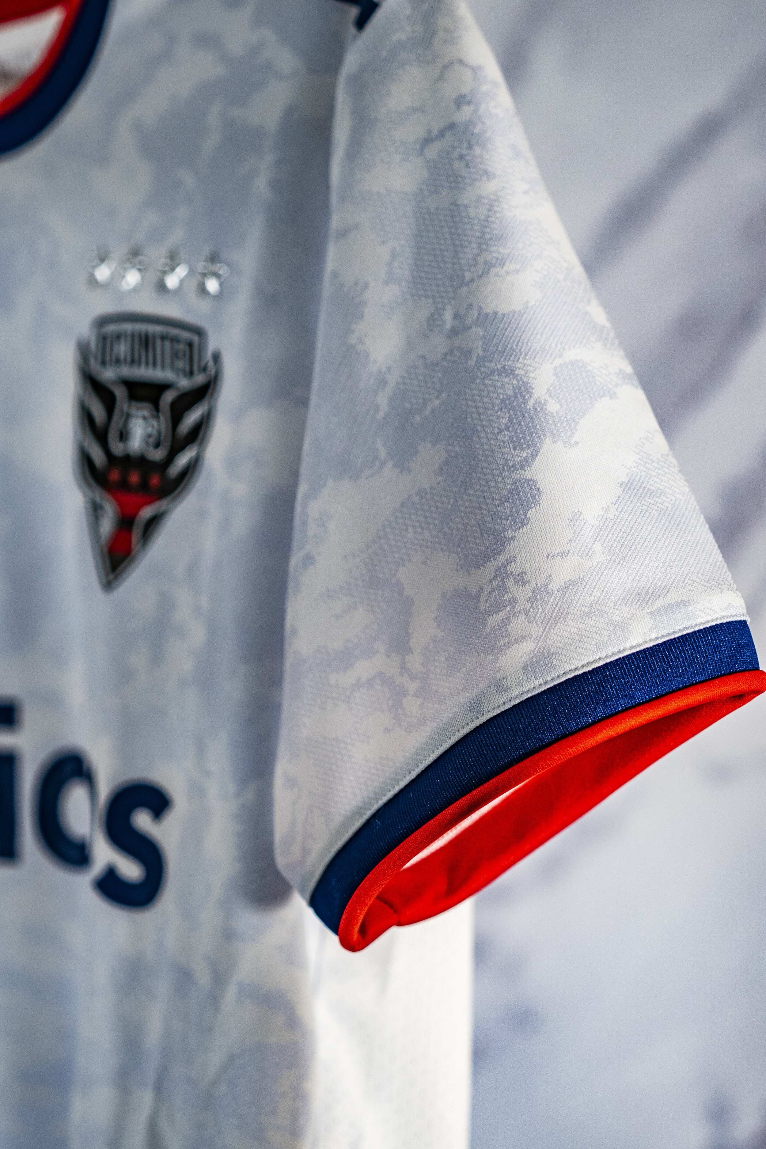
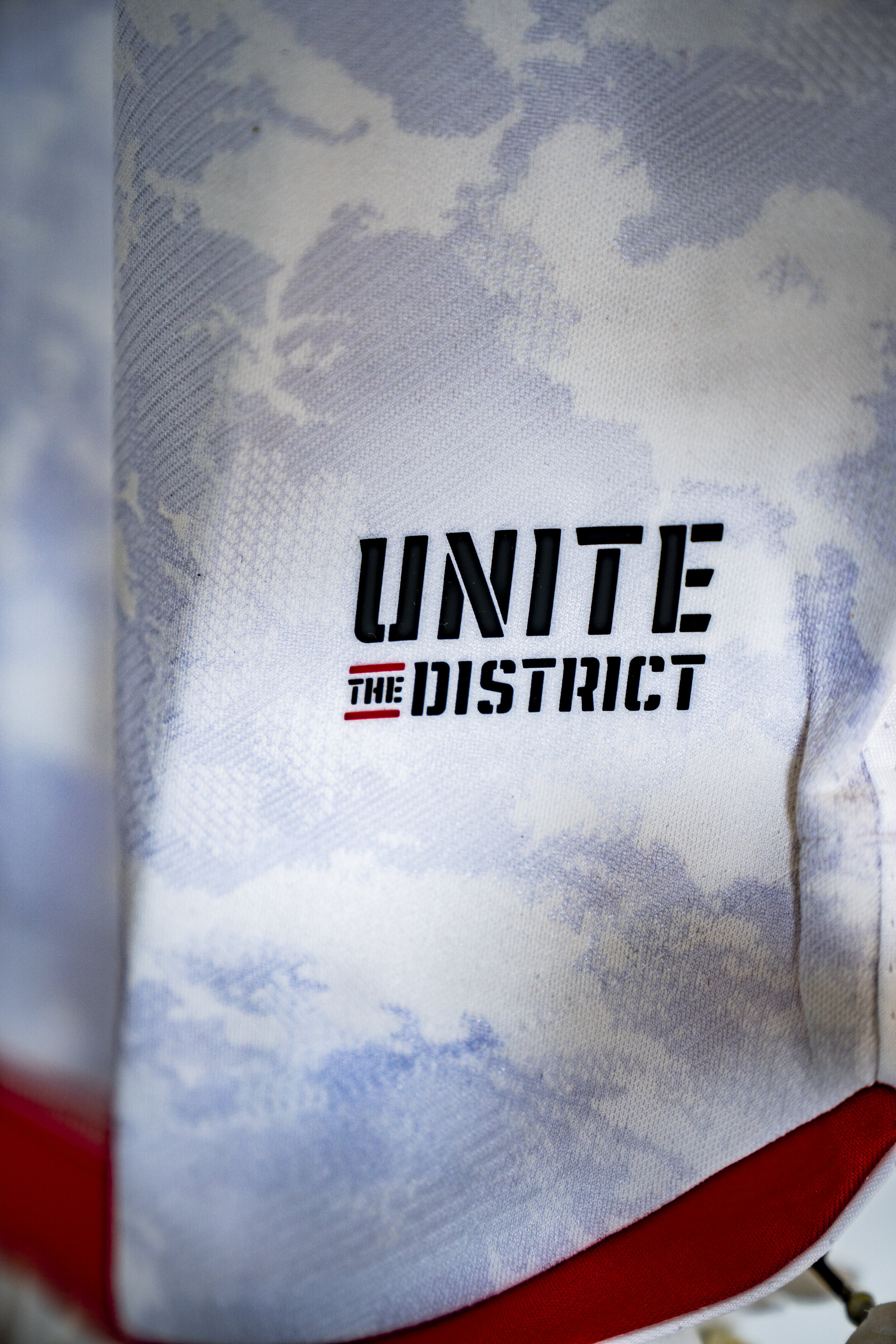
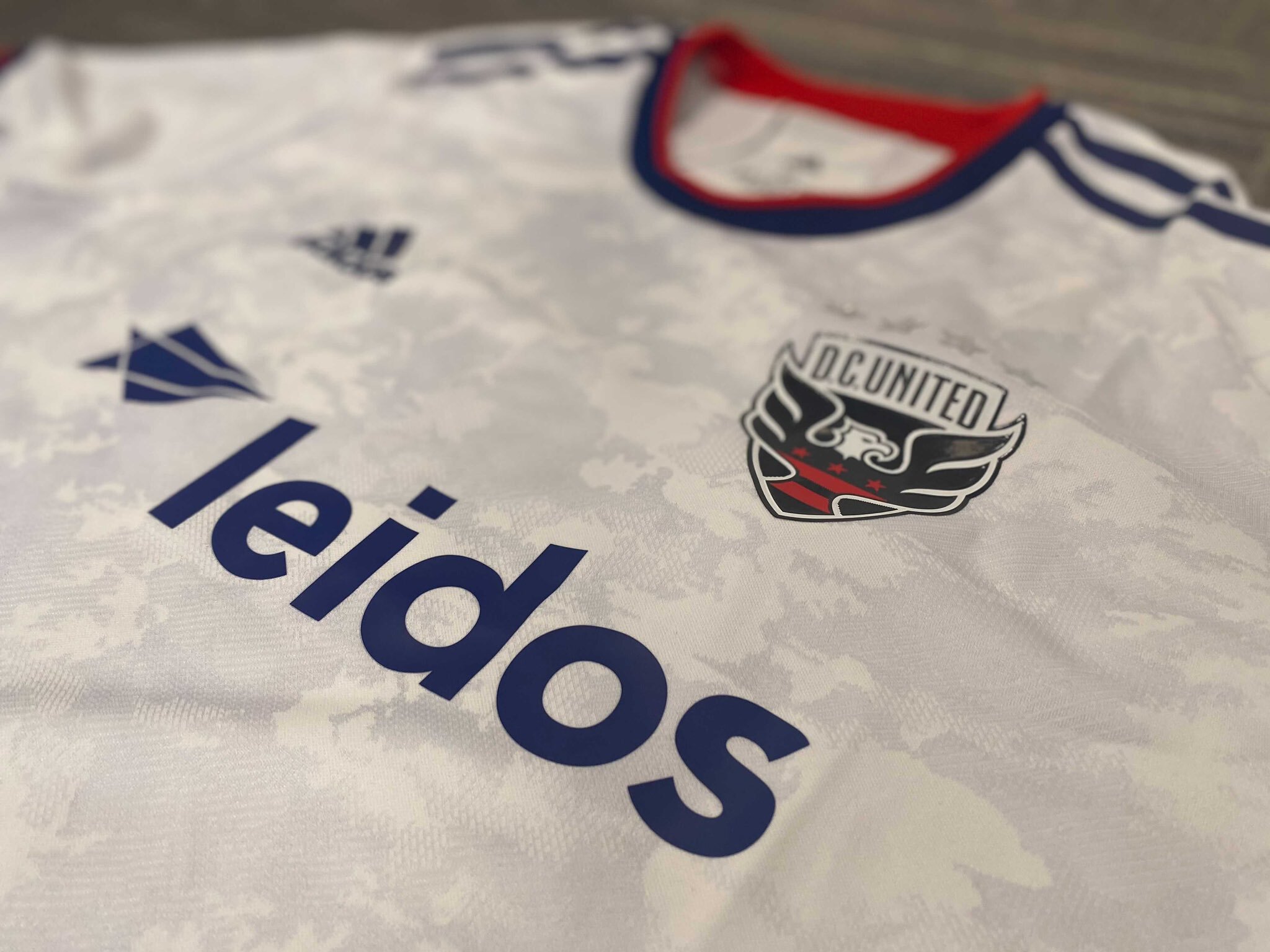
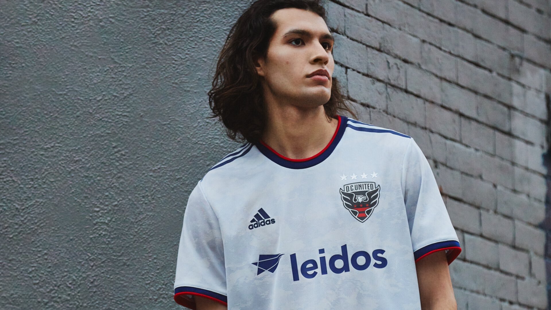
DC United has announced their new away jersey for the 2021 season. The new jersey features a Marble pattern is meant to symbolize the iconic national monuments found in Washington D.C. The Red, White and Blue color scheme runs throughout the jersey representing the United States capital and the colors of our country. The finishing touch for the Marble Jersey comes with the new “Unite the District” shirt tag.
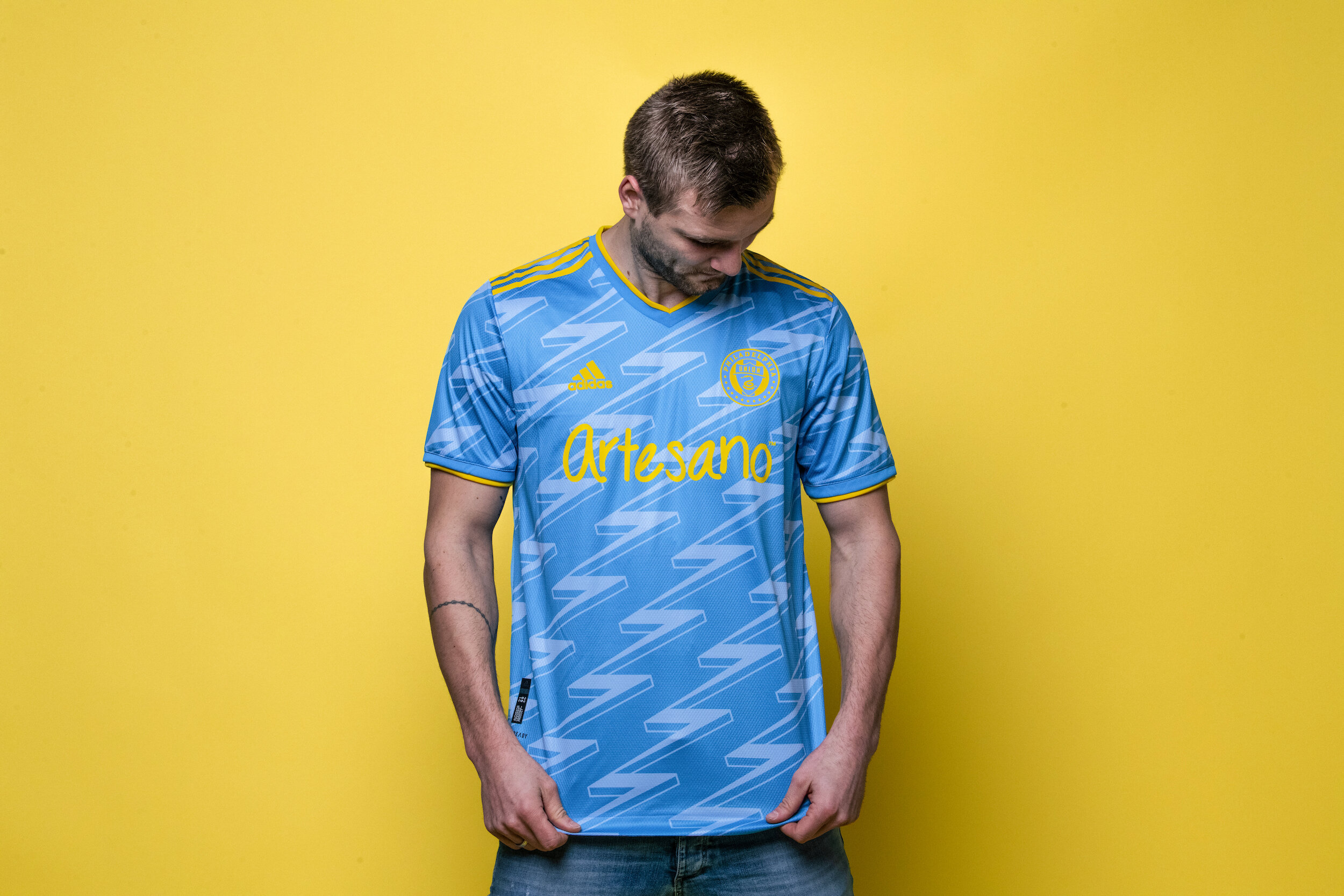
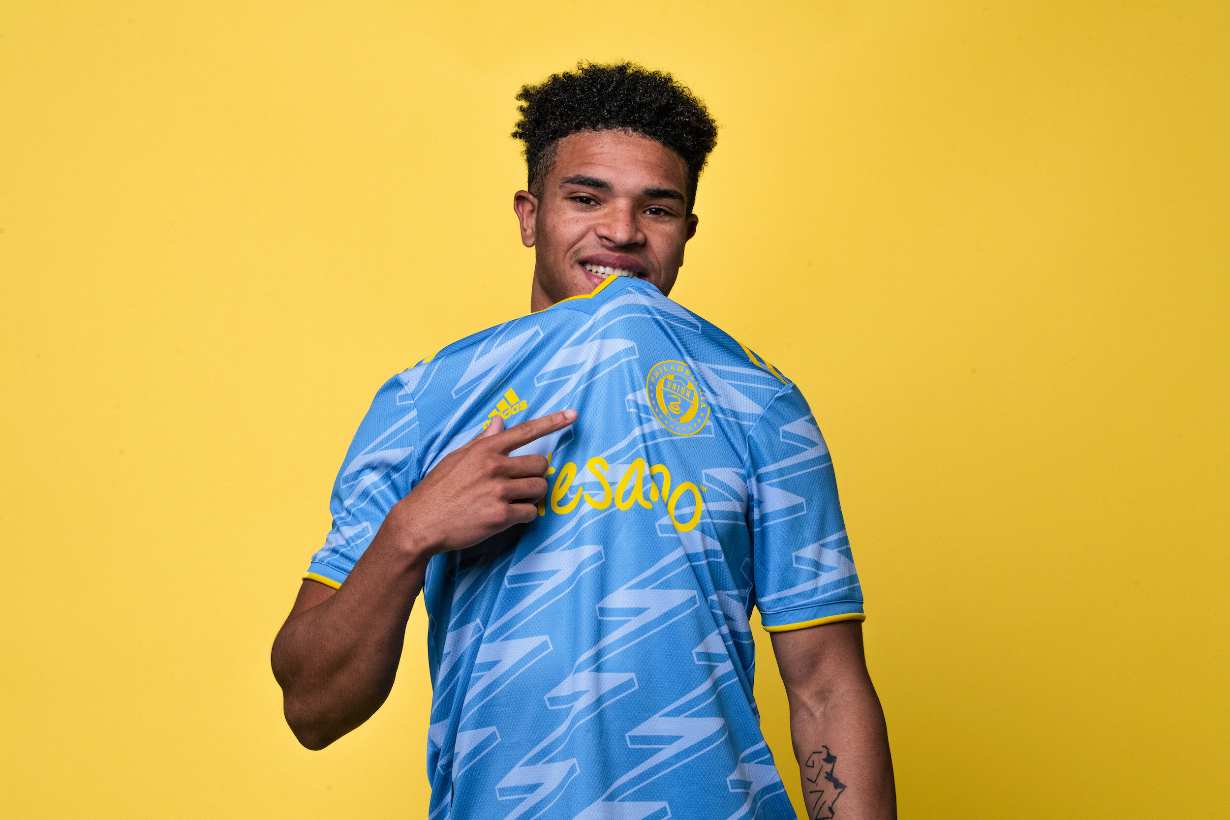
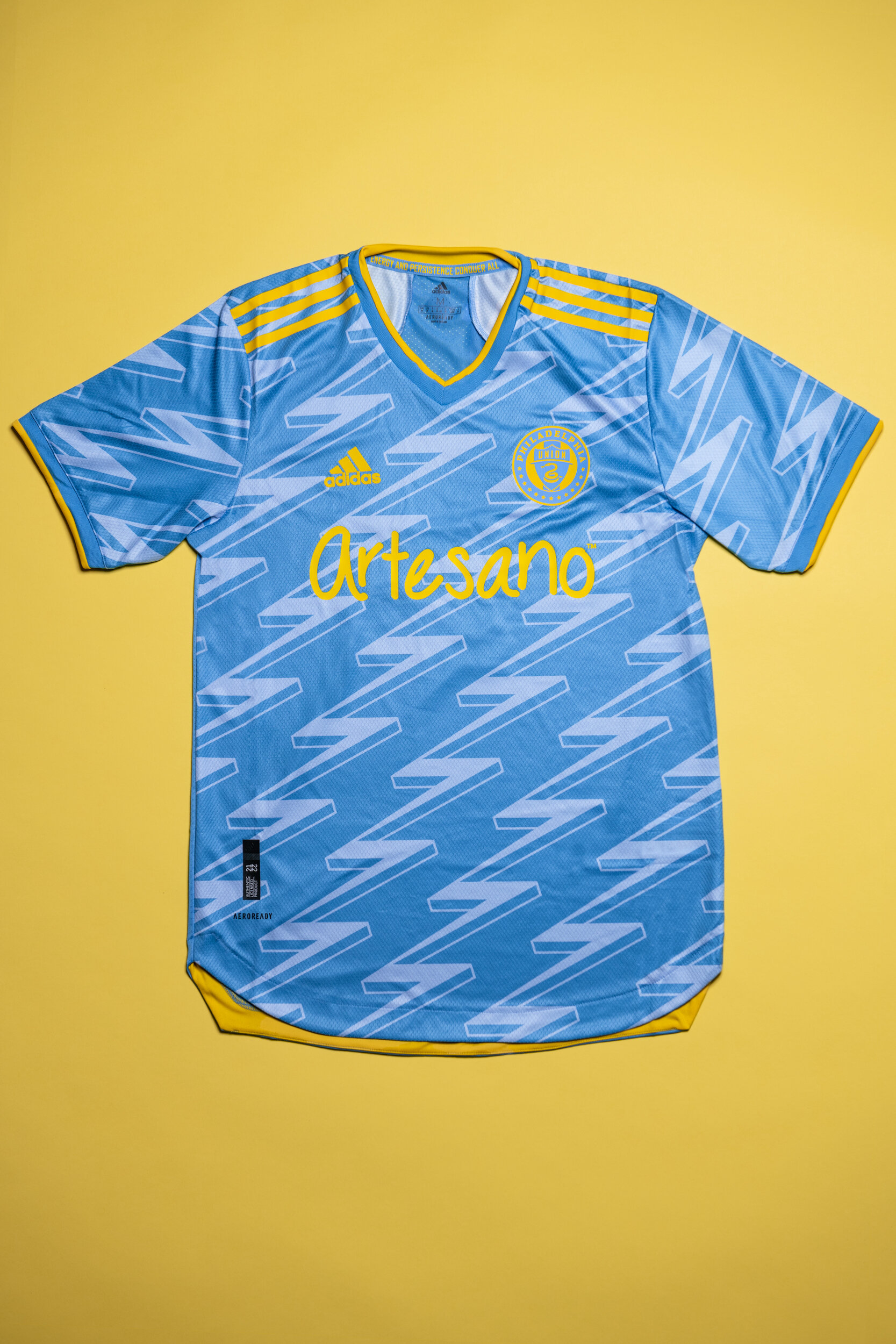
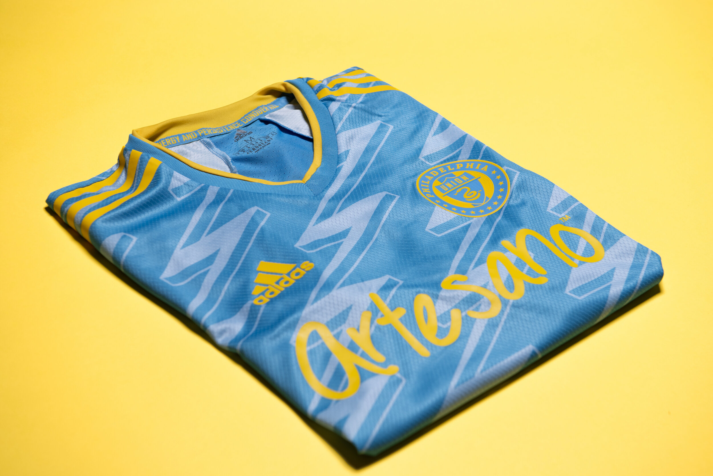
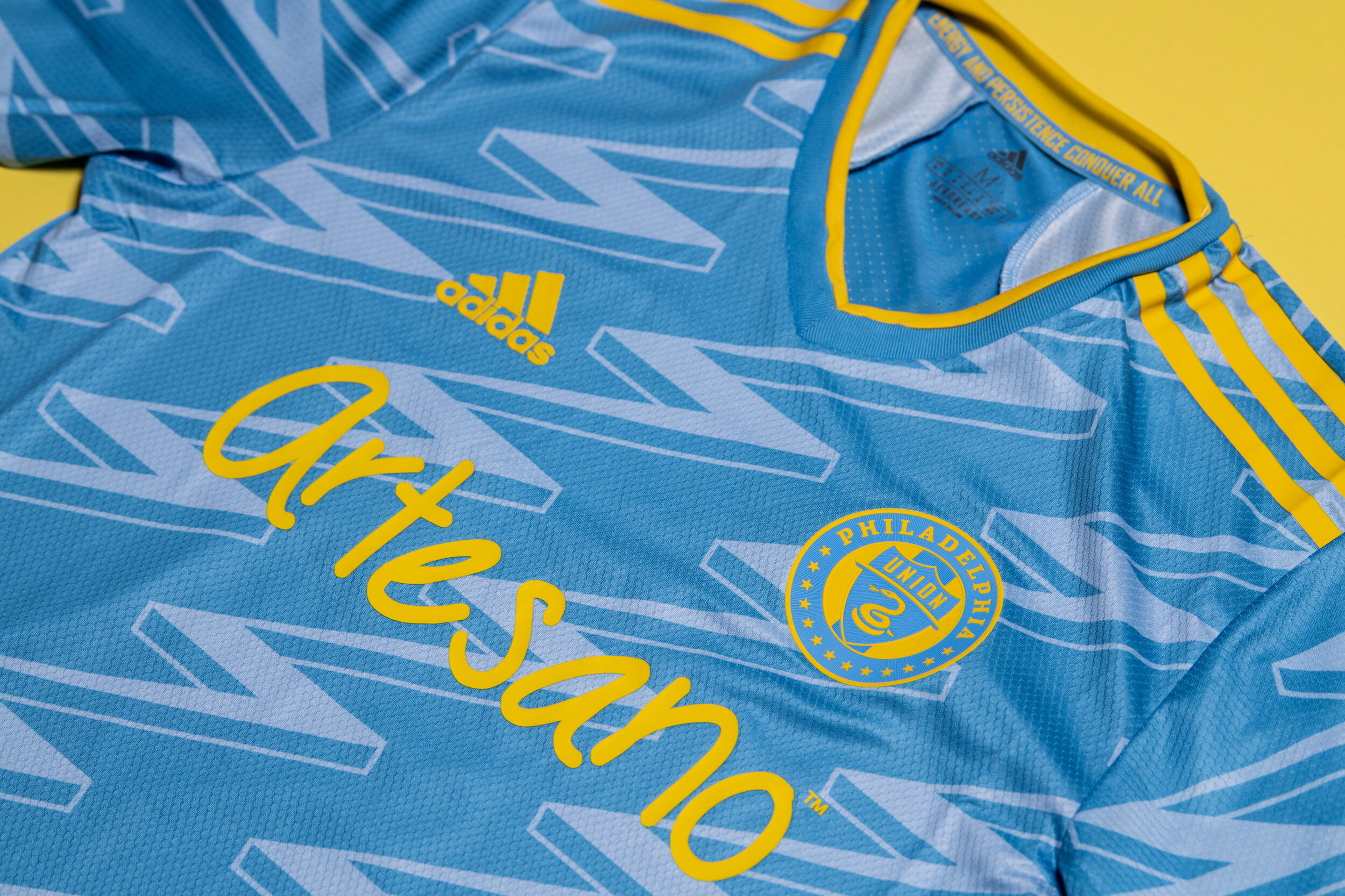
The Philadelphia Union have revealed their new secondary kit. The new kit features a unique style and color template for the team in their tenth year of play. The special kit was designed from start to finish by the Union Creators’ Collective, a group of fans.
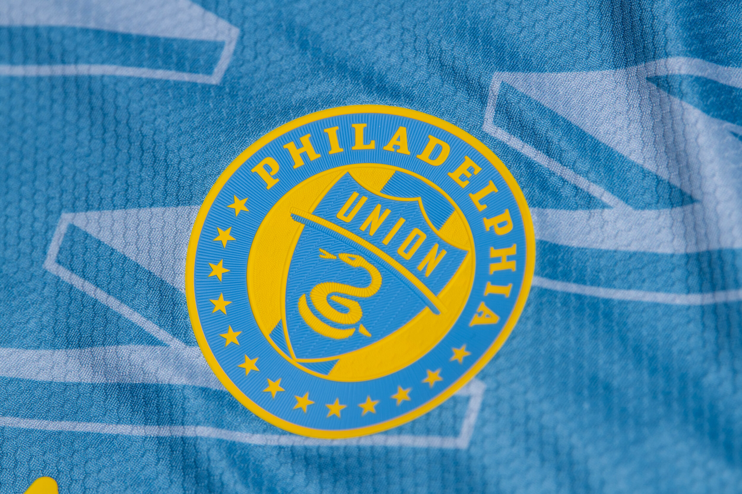
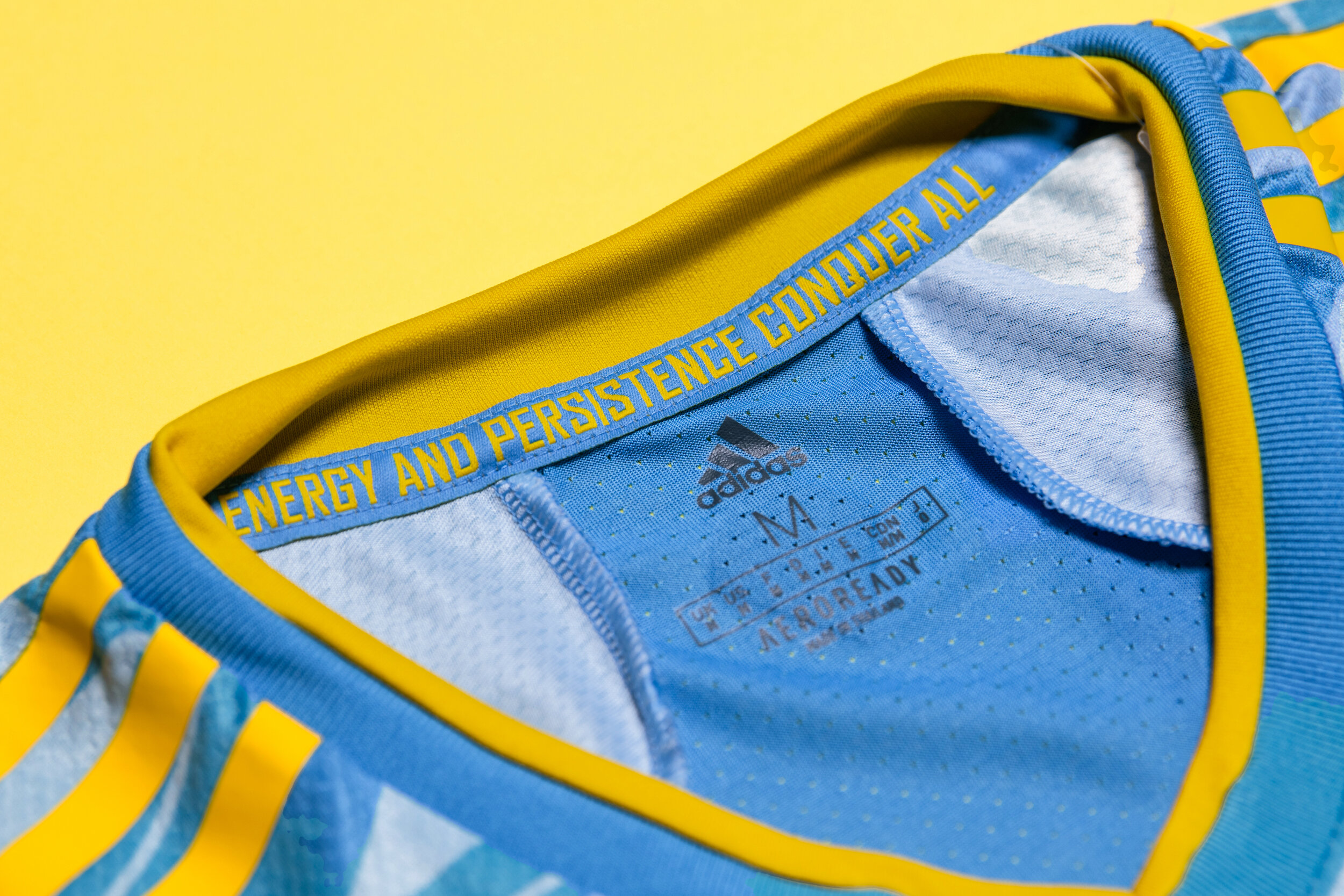
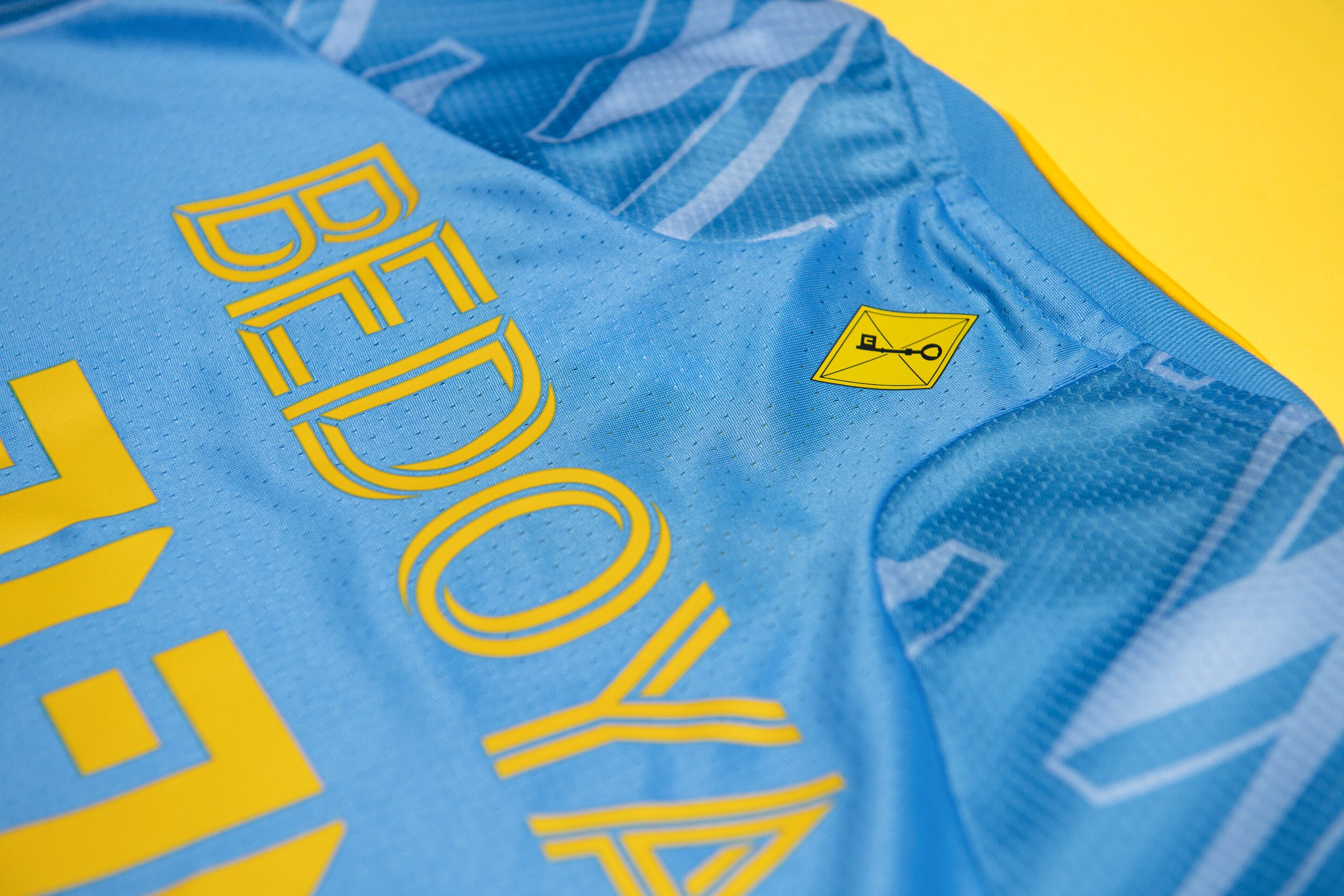
The special Blue and Yellow Union kit, or the “BY|U” kit, has a blue base with a tonal lightning pattern that includes bolt yellow accents. We see on the left chest the Union’s logo in colors derived from the flags of Philadelphia, New Jersey, and Delaware as well as a nod to the branding of Union supporters’ group, the Sons of Ben.
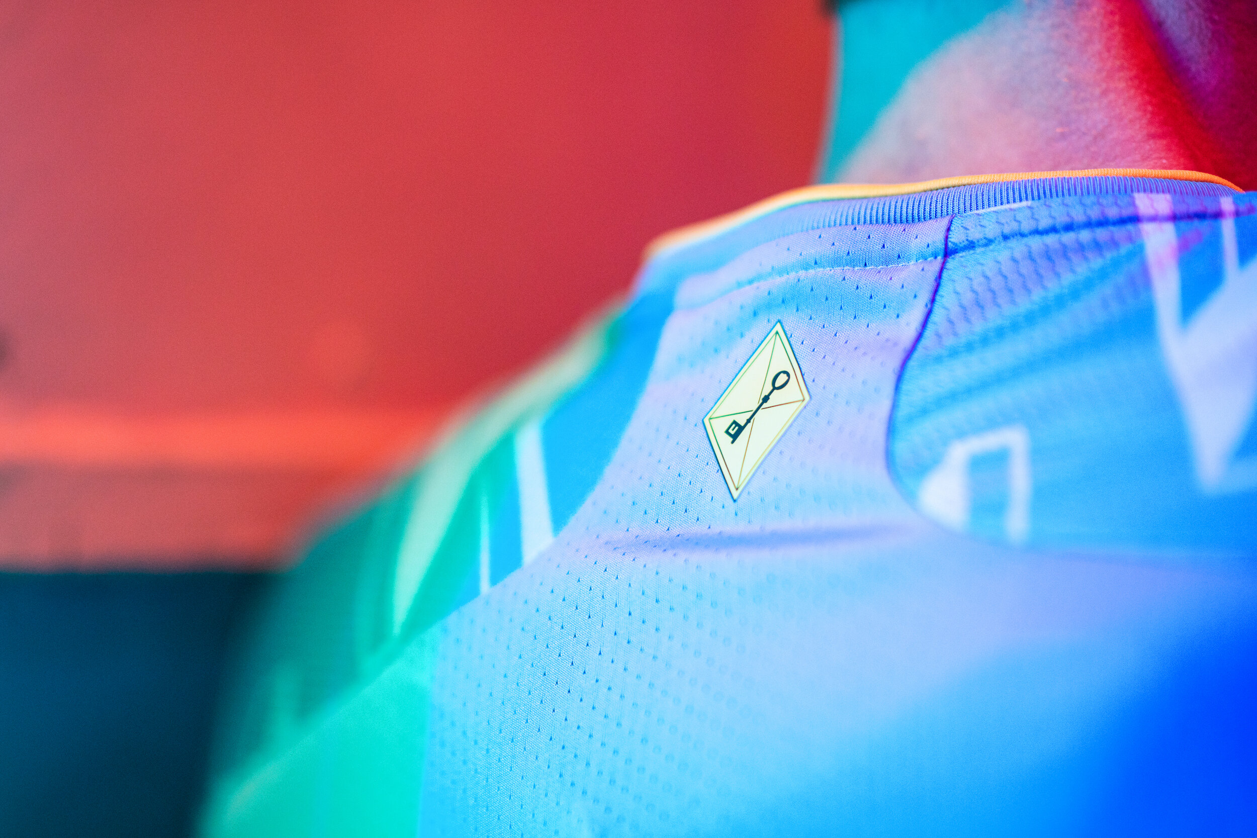
On the inside the phrase “Energy and persistence conquer all” is featured, a quote attributed to Benjamin Franklin and his belief that nothing could defeat the combination just like this city and team. The final touch comes above the player name and number, where a kite and key icon is featured, bringing full circle the inspiration and design elements behind the uniform design.
“The new kit is truly by the fans, by ‘the U’. Fans wanted colors influenced by the flags of the Delaware Valley, a design inspired by innovation born in our city, and they wanted to shock the soccer world. This kit is Philadelphia. The gritty, beautiful, diverse, creative place that we all love. As a Philly native and an original season ticket holder years before working at the Union, I have not had a prouder moment in bringing our community together to shape the future of our club. ” -Doug Vosik, Chief Marketing Officer
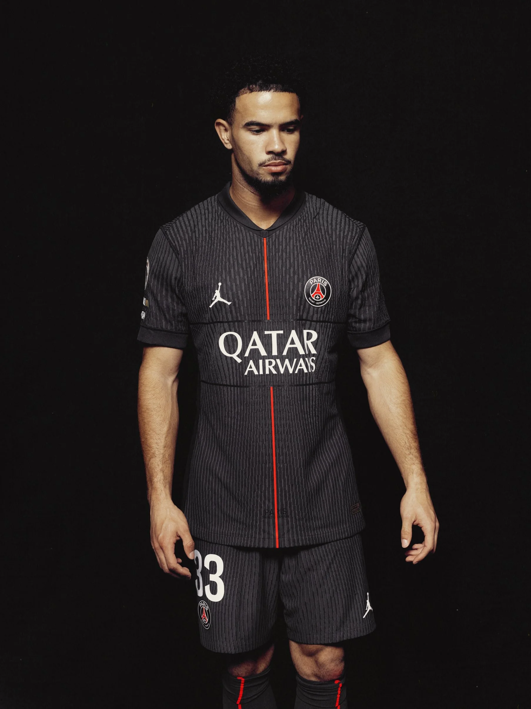
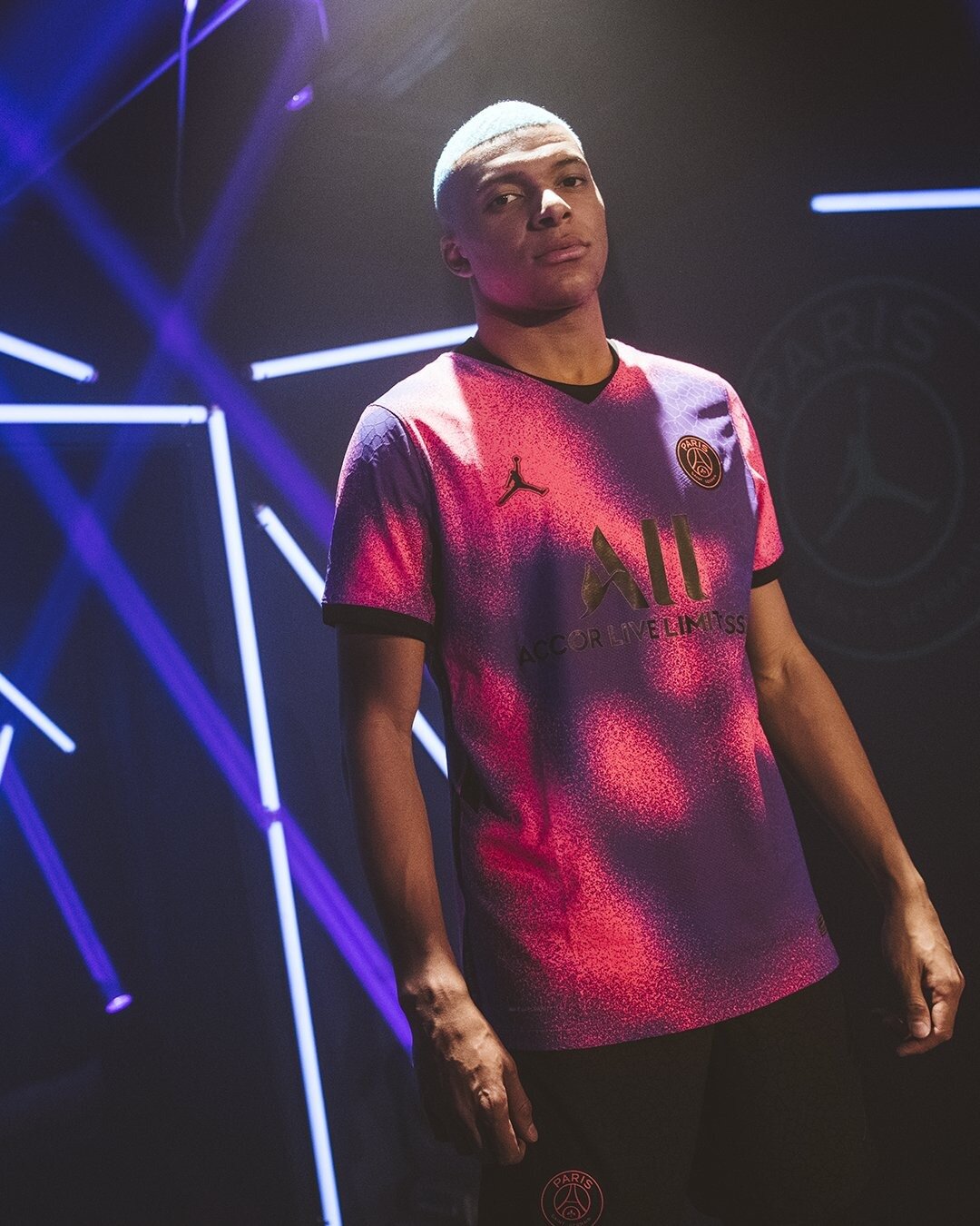
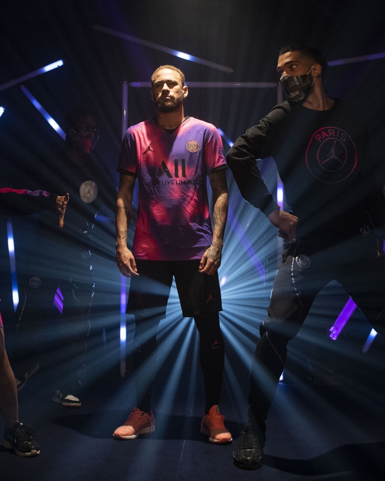
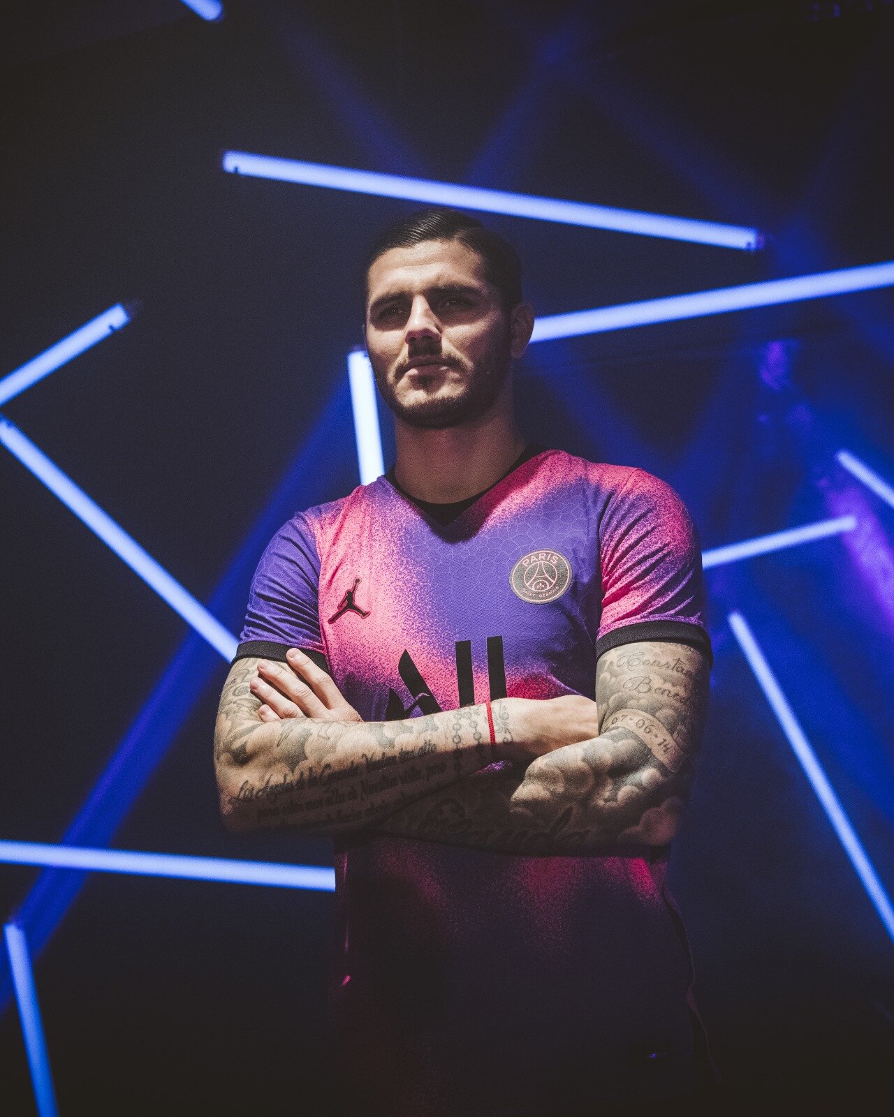
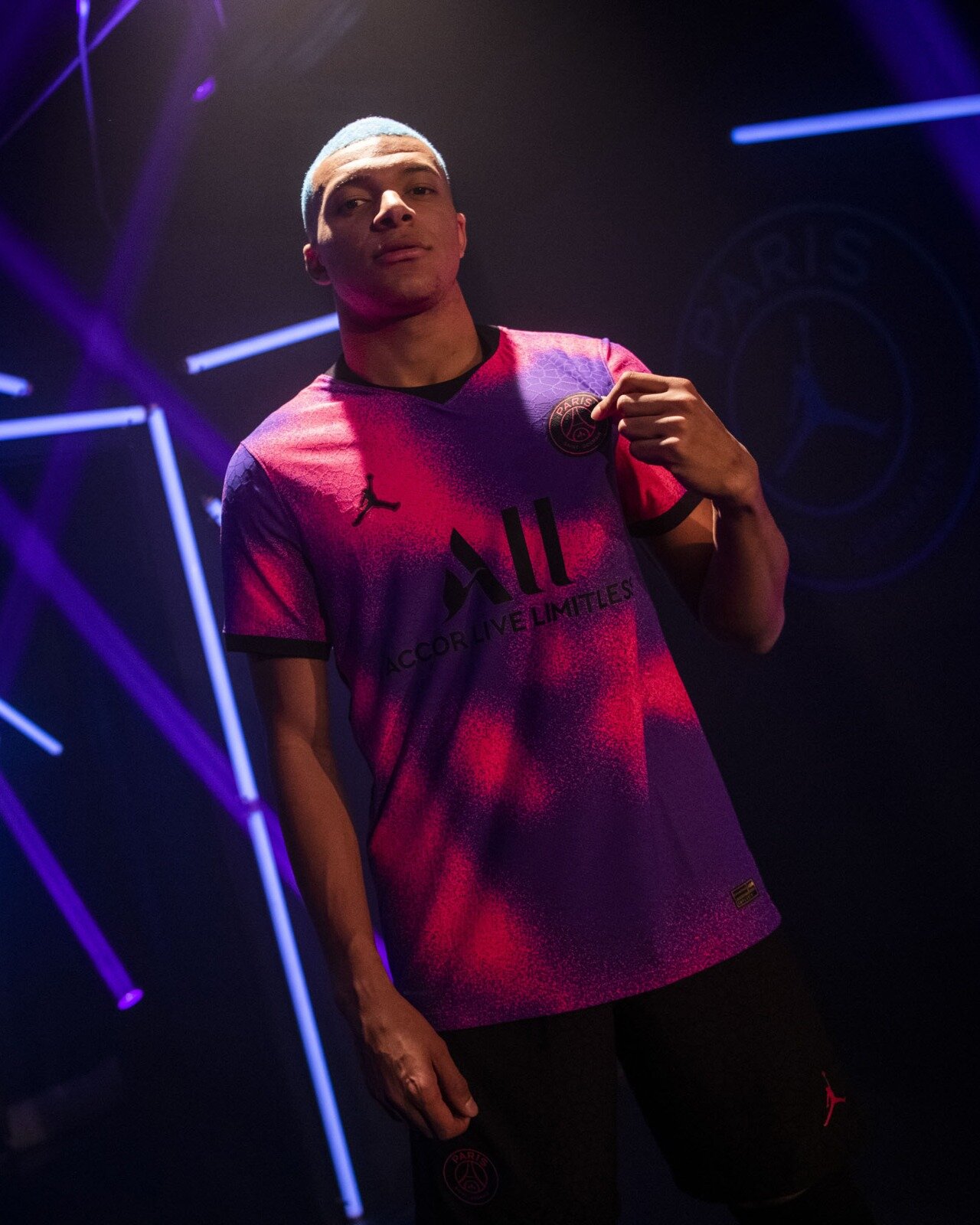
Paris Saint-German has revealed the club’s newest kit. The fourth kit will be a collaboration with Jordan Brand. The new look features a unique pattern of Hyper Pink, Psychic Purple and black, nodding to the famous elephant print created for the Air Jordan III. The jersey will feature the Jordan Point of View neckline, which combines the V-neck and crew neck styles into one. This new neckline helps bring to life new design lines, while mimicking the broken side seam on the jersey and the iconic Jordan diamond short.