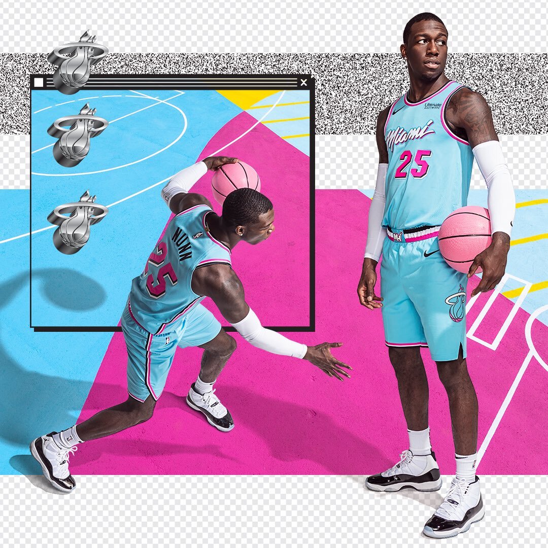
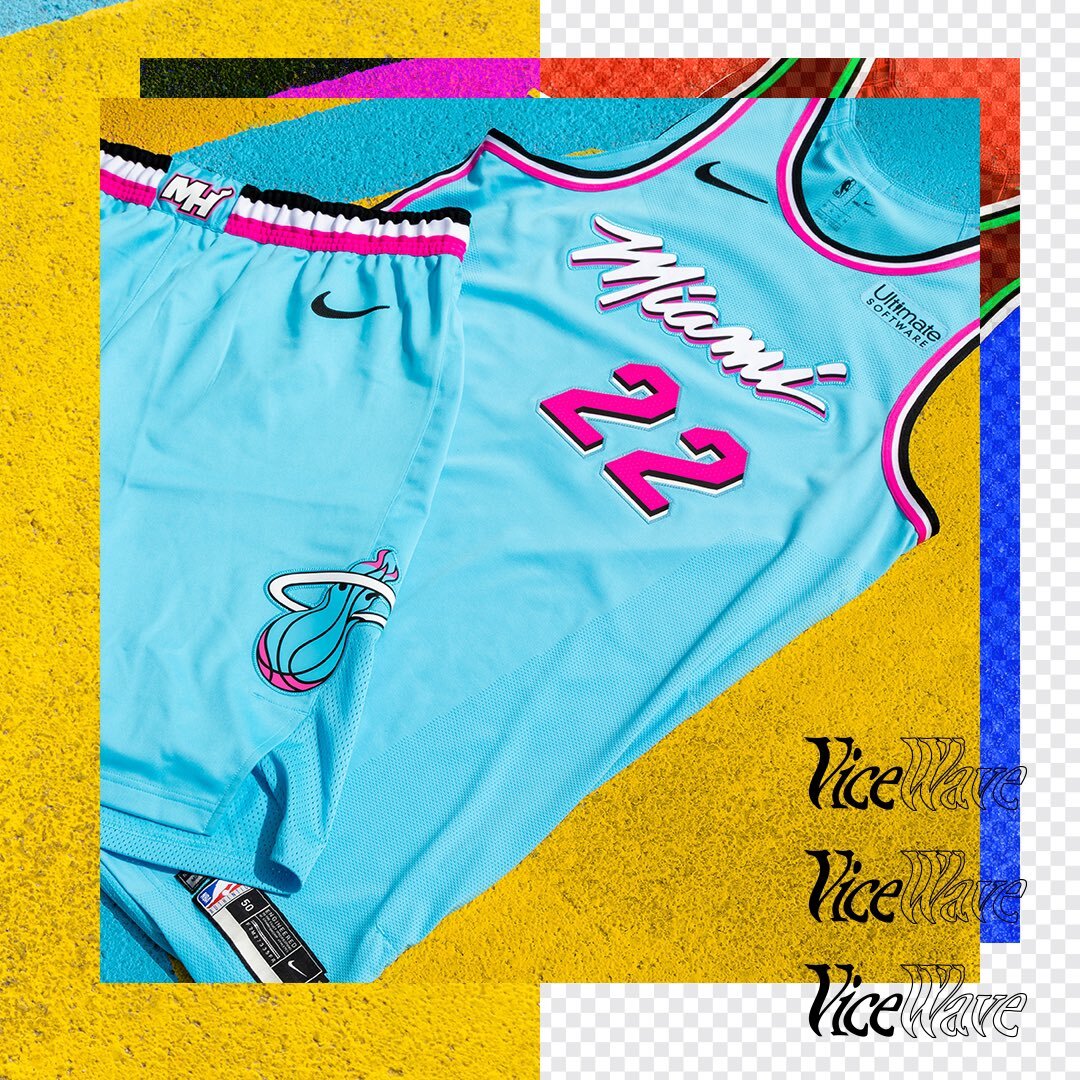
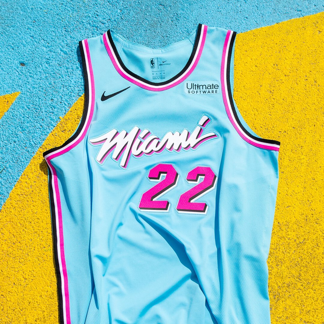
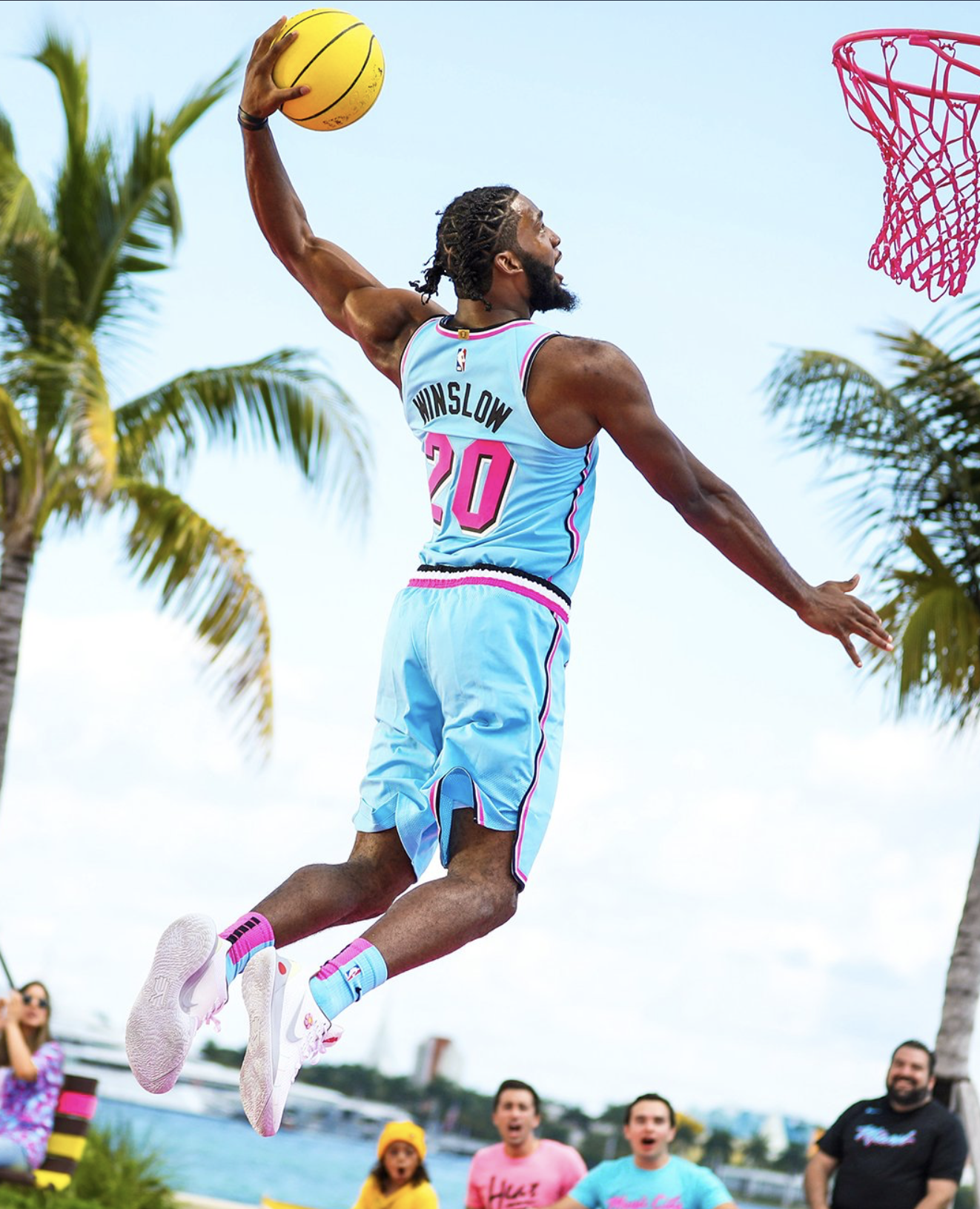
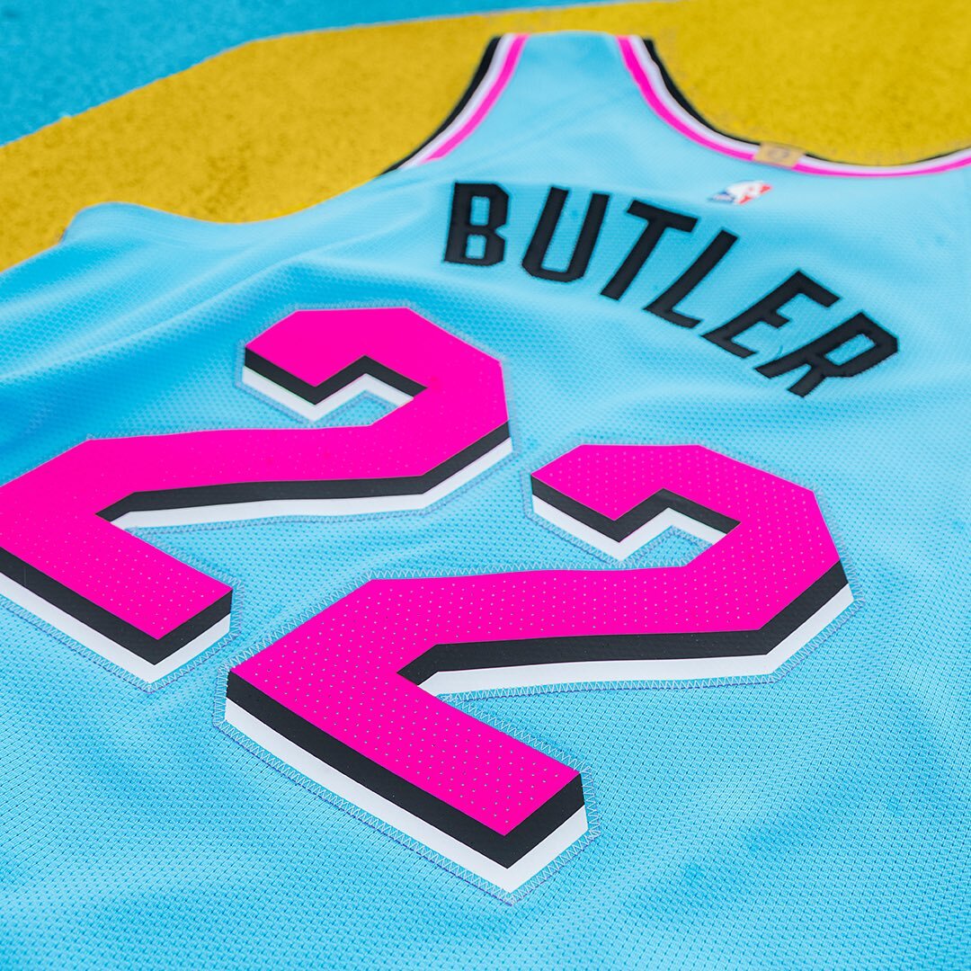
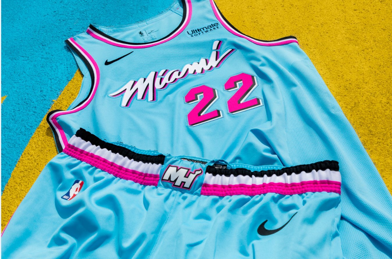
The Miami Heat has revealed their newest uniform in the Vice ‘City Edition’ lineup, The Vice Wave. The special uni will be a fan favorite once again as it come in with a neon blue base and neon pink numbers and accents. On the chest of the flashy jersey will read Miami in the Vice font. We will see the Vice Wave uniform twenty-two times this season.
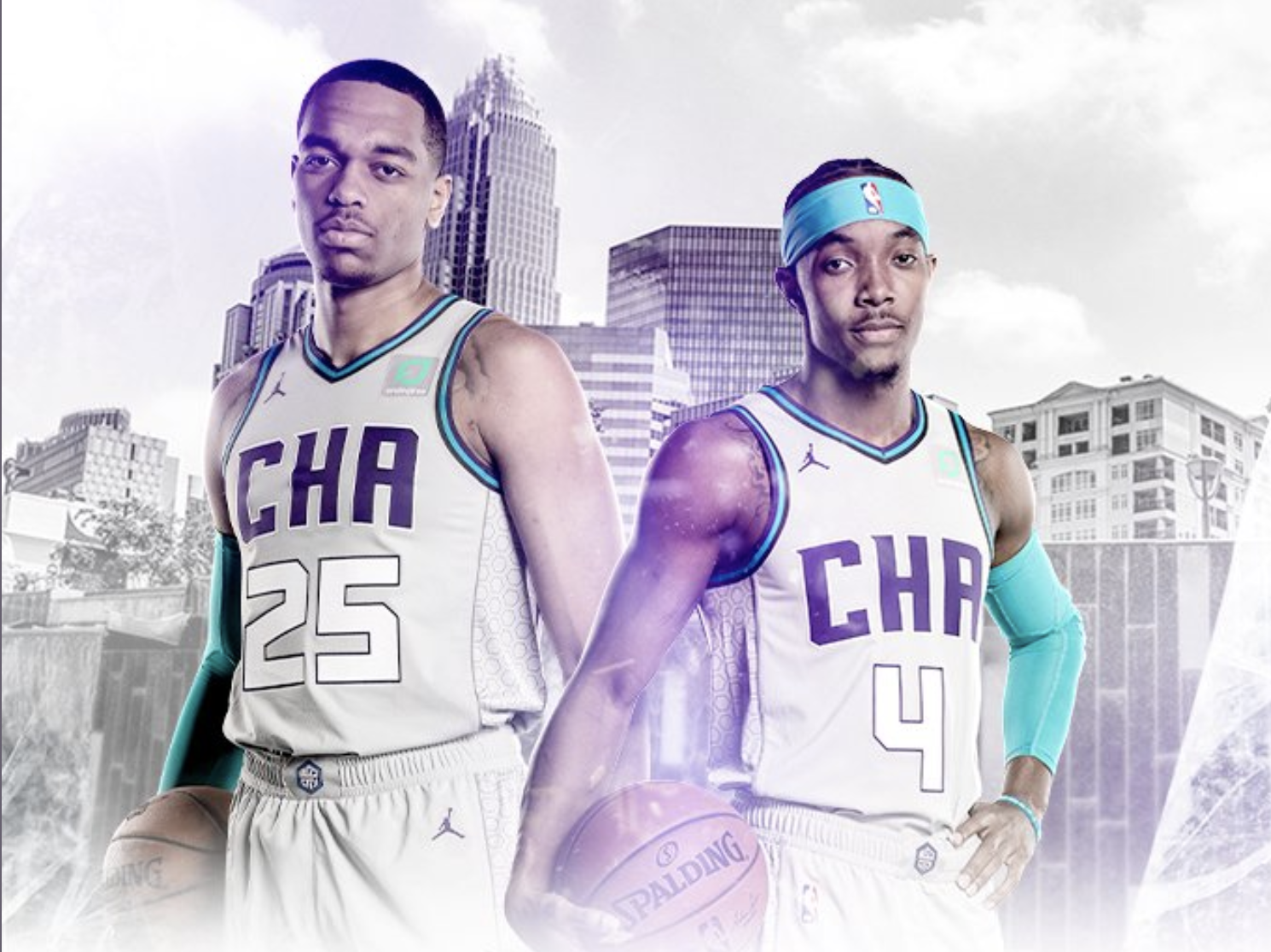
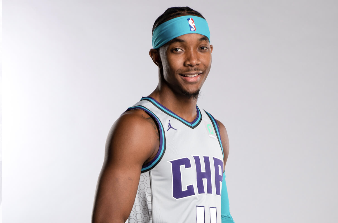
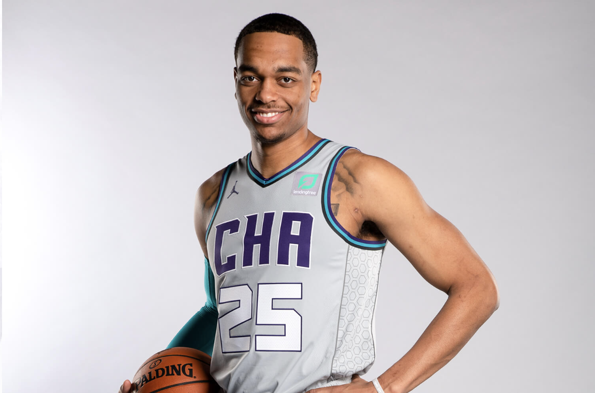
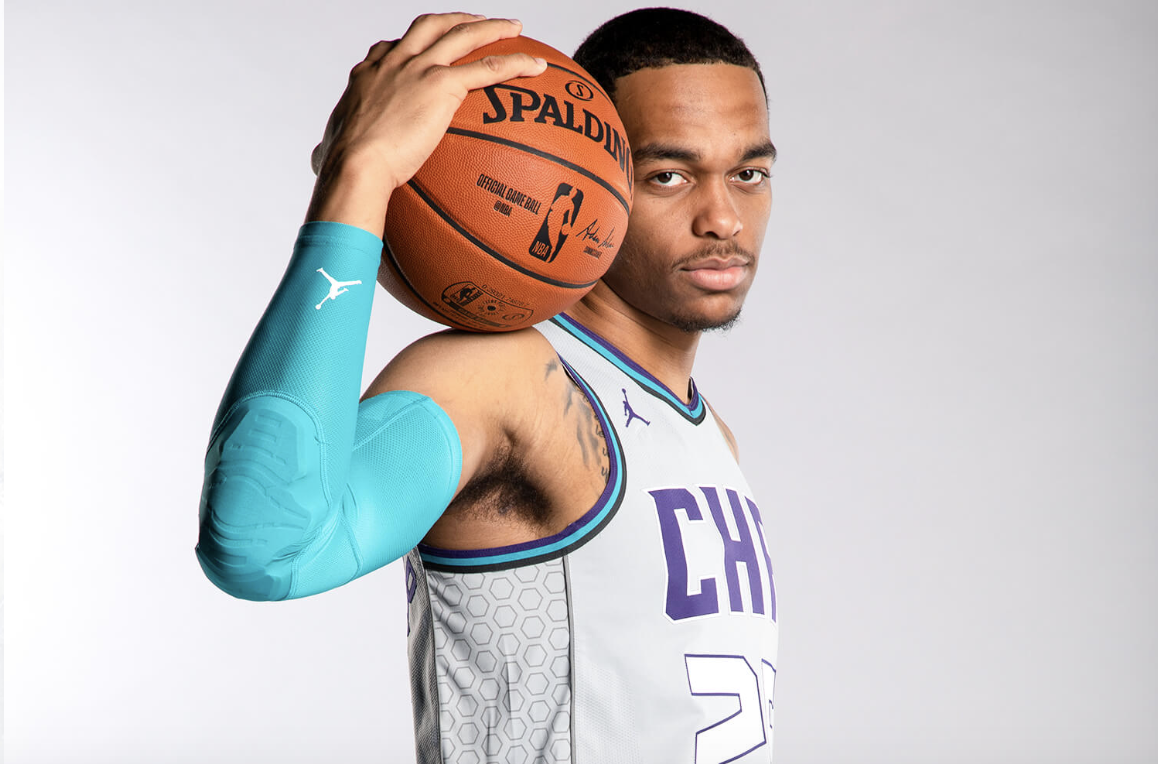
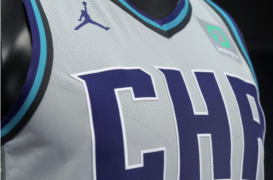
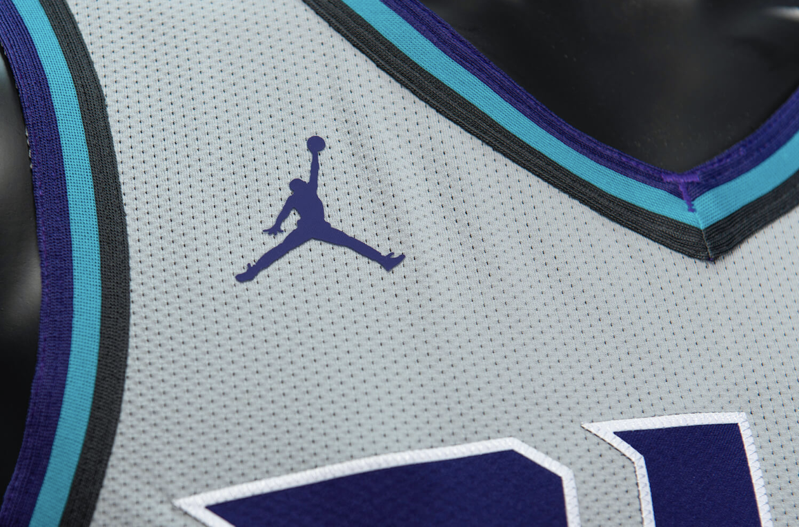
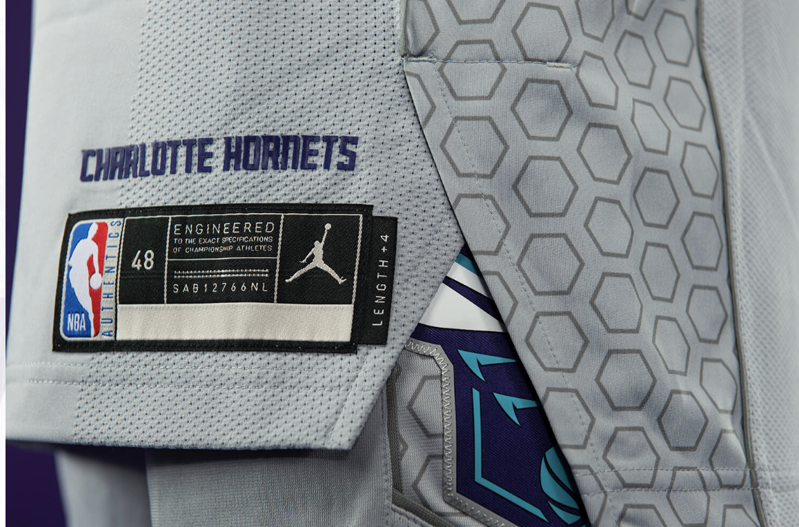
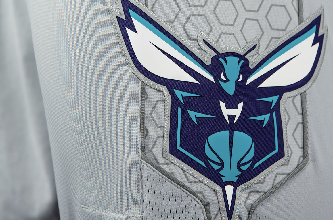
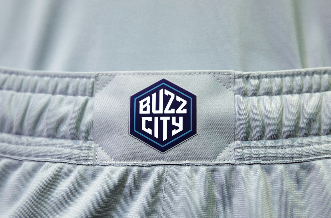
The Hornets reveal their new Cool Gray ‘City Edition’ uniform, this marks the first Gray uniform in franchise history. The cool gray became an accent color the Hornets upon their return to Charlotte in 2014. The new uniform features the team’s abbreviation “CHA” across the chest, marking the first season we will see the team use the abbreviation as the primary mark. On the sides of the jersey and shorts we see a cell pattern, which is a new look added to the team’s uniform design. To finish off the details the Buzz City logo will appear on the front of the short’s waistband. We will see the new look for the Hornets a total of fifteen time this season.
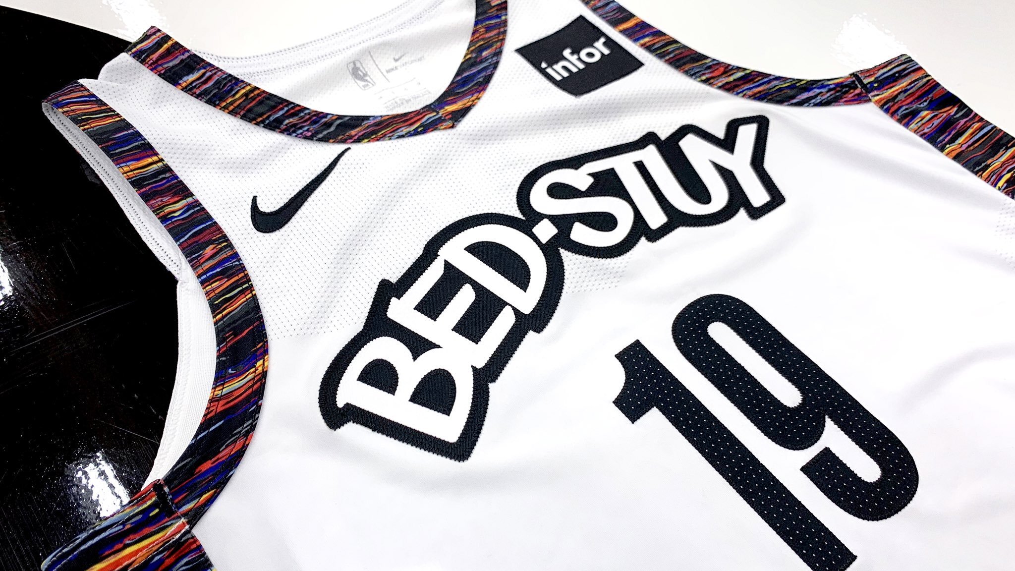
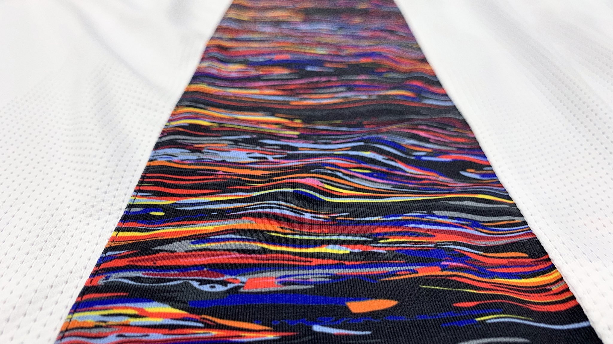
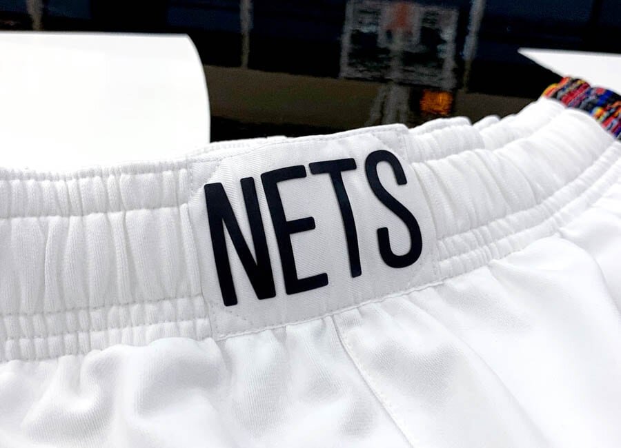
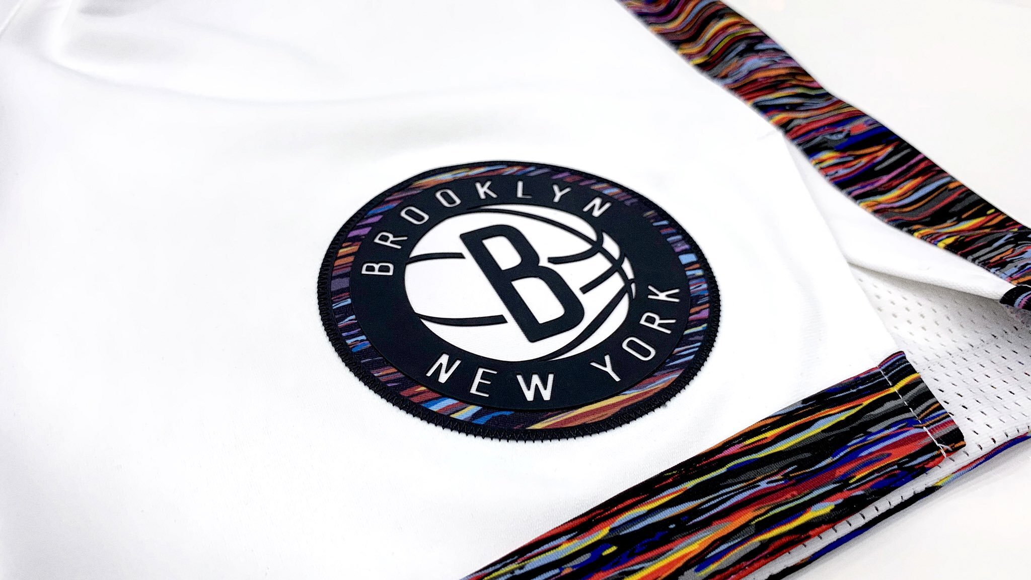
This season’s ‘City Edition’ uniform for the Nets pays tribute to Brooklyn’s Bedford-Stuyvesant neighborhood, which was home to one of the borough’s most famous native sons, The Notorious B.I.G. The jersey will feature “BED-STUY” emblazoned across the chest, with the multi-color “Brooklyn Camo” pattern running down the sides of the jersey and shorts as well as used for the trim around the neck and arms.
“The BED-STUY mark was designed by renowned Brooklyn artist Eric Haze, whose work can also be seen on the team’s 2019-20 Statement Edition uniform, as well as on the Nets’ City Edition uniforms from last season. As with all Nets uniforms, the jersey will feature the Infor patch on the top left chest.” - Brooklyn Nets
We will see the Nets in their new look a total of twenty-eight times this season, with its debut on November 29th.
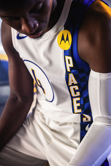
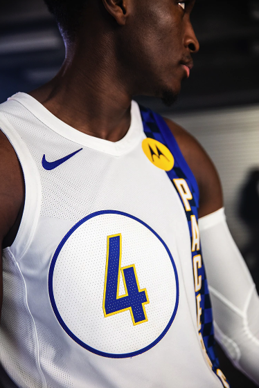
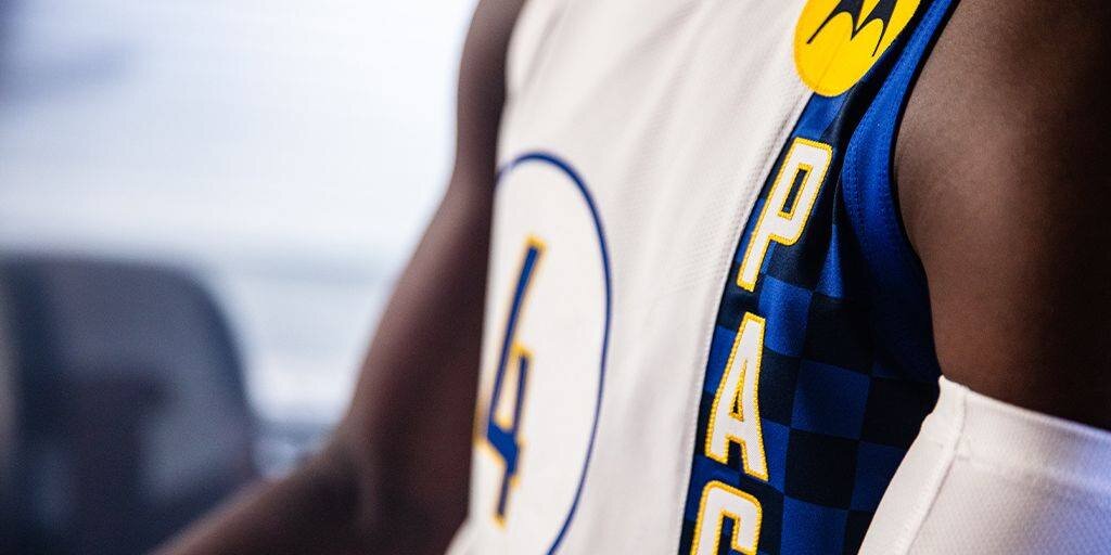
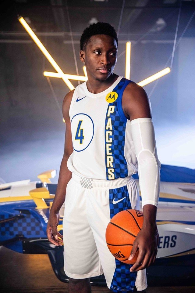
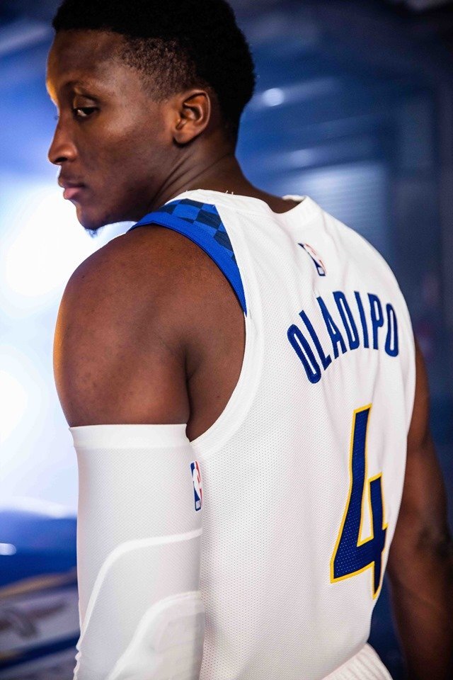
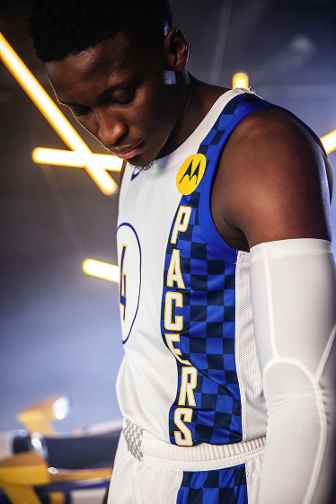
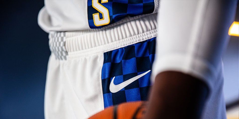
The Indiana Pacers release their new ‘City Edition’ uniform that embodies the rich tradition of high-speed sports in Indiana. The look is similar to the ‘City Edition’ uniform from the 2017-18 season, but this year the team will go with a white base uniform. The numbers are featured in circle to give the classic IndyCar vibe, while on the left side of the jersey is a two tone blue checker pattern tying into the racing culture even more. We will see the Pacers in their new uniform fifteen times this season debuting on November 27.
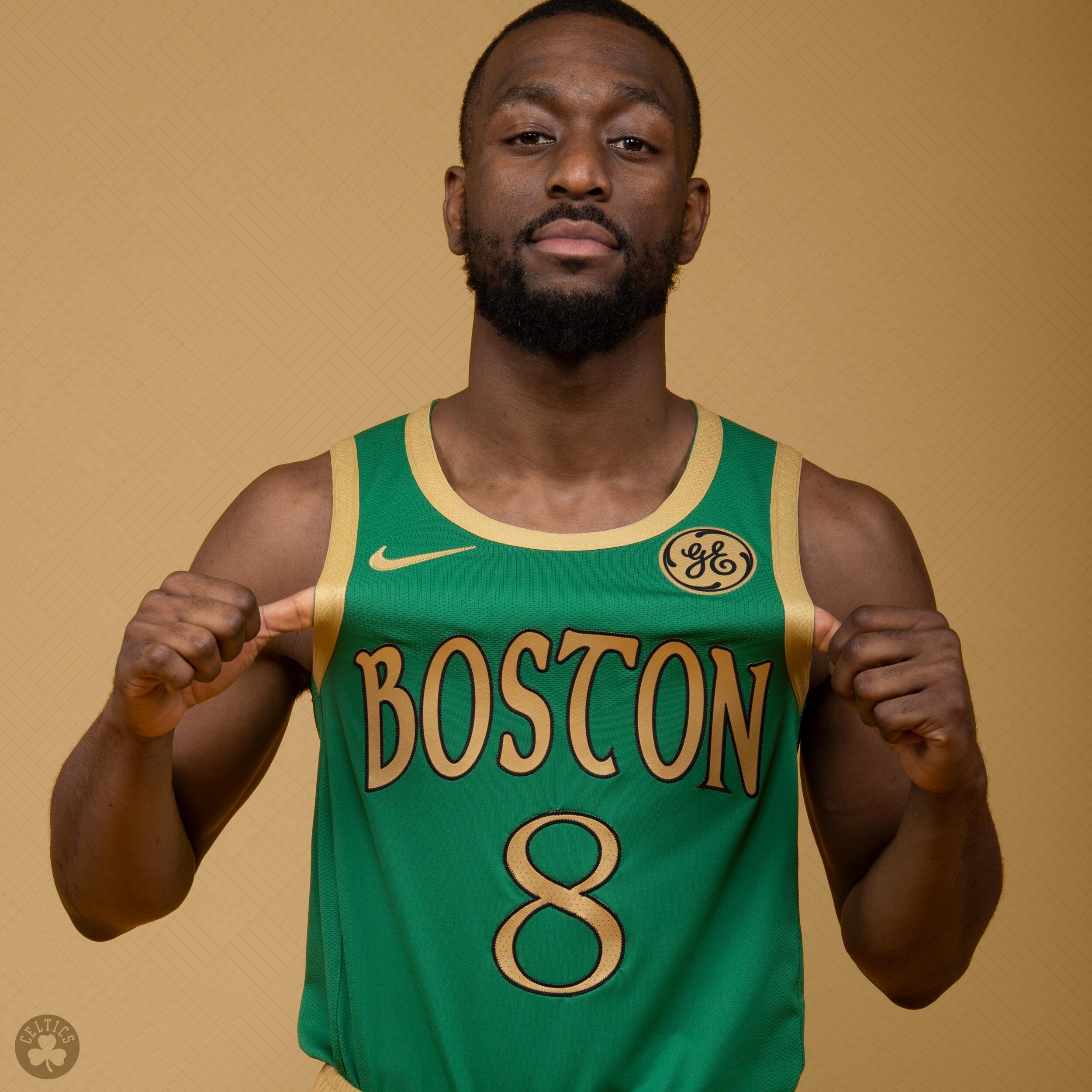
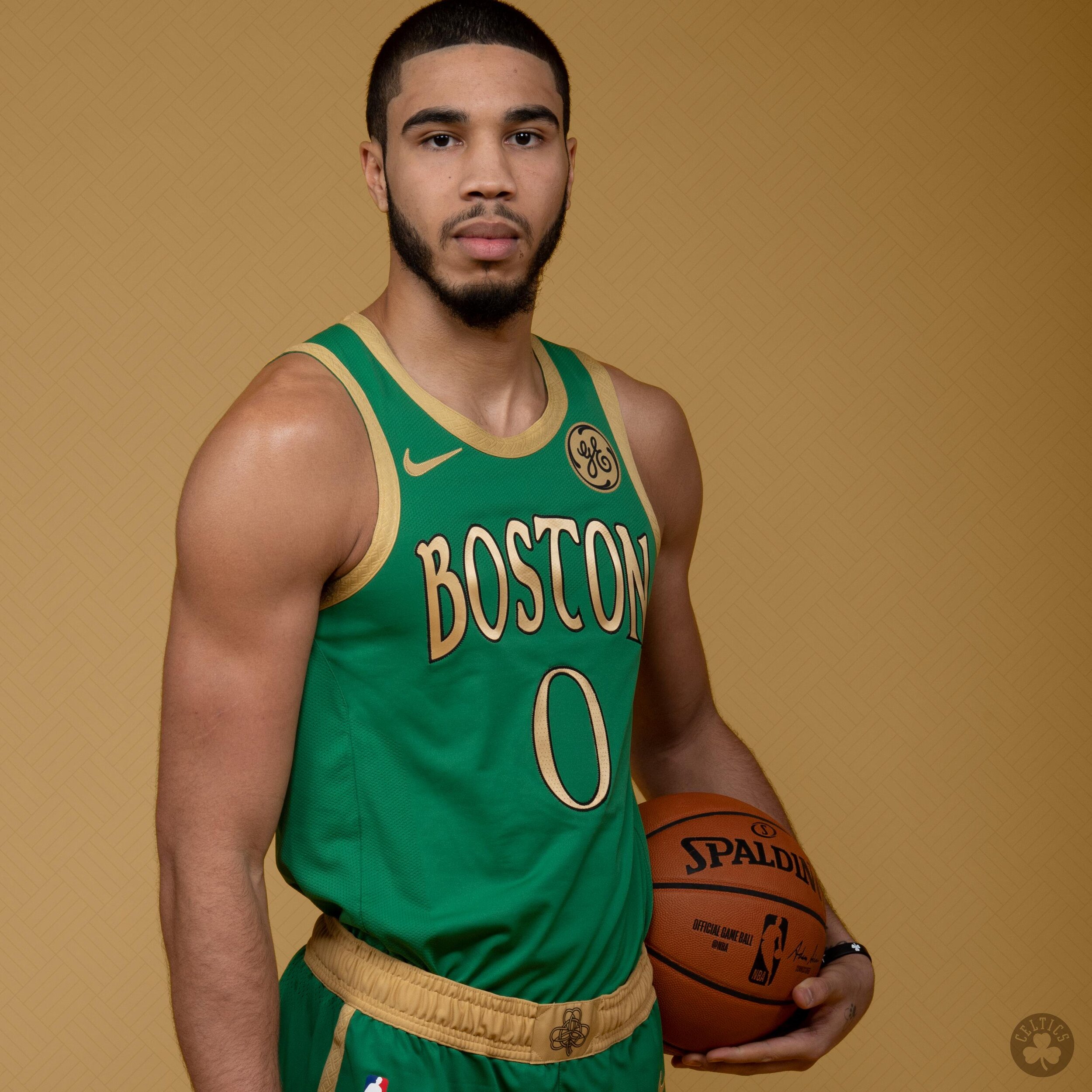
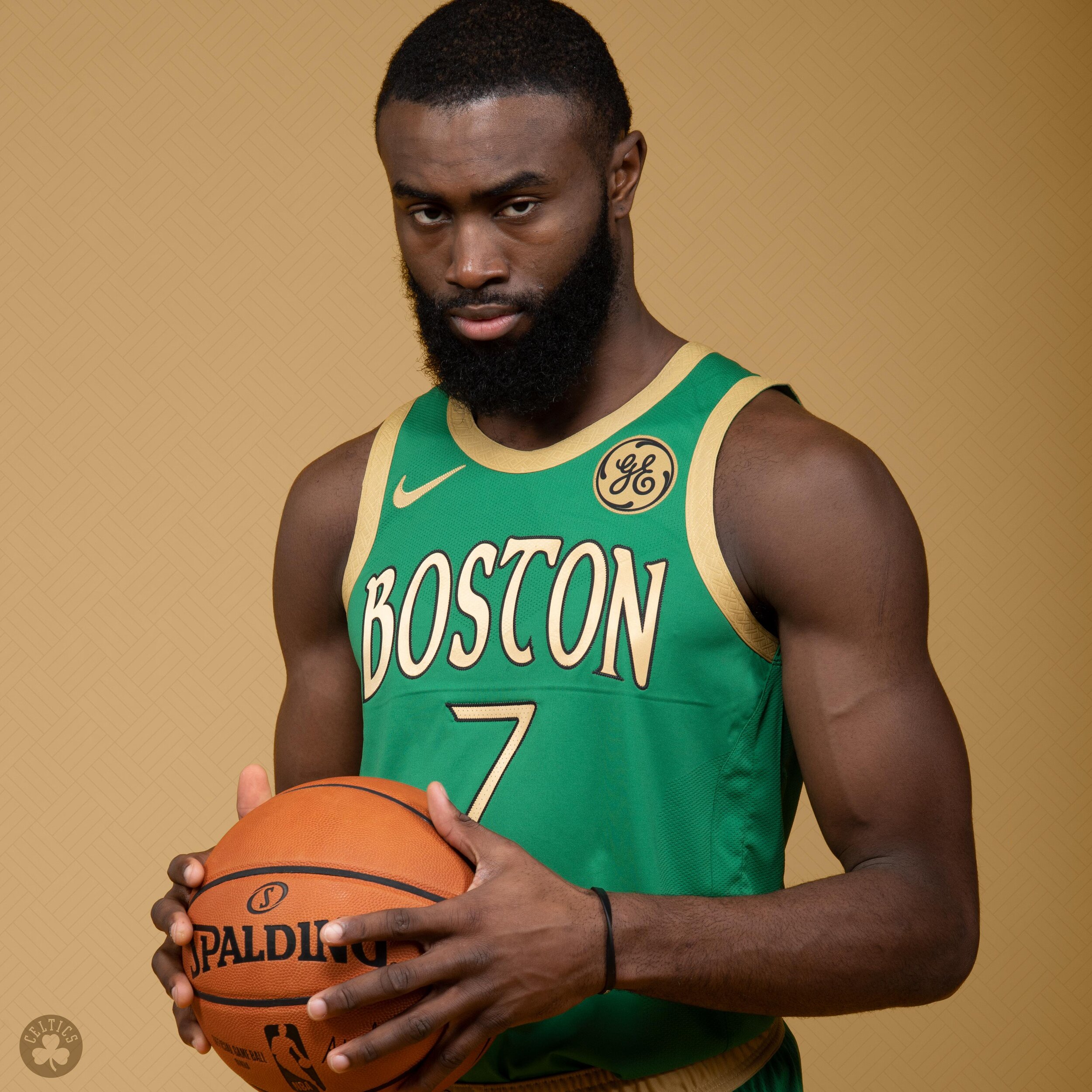
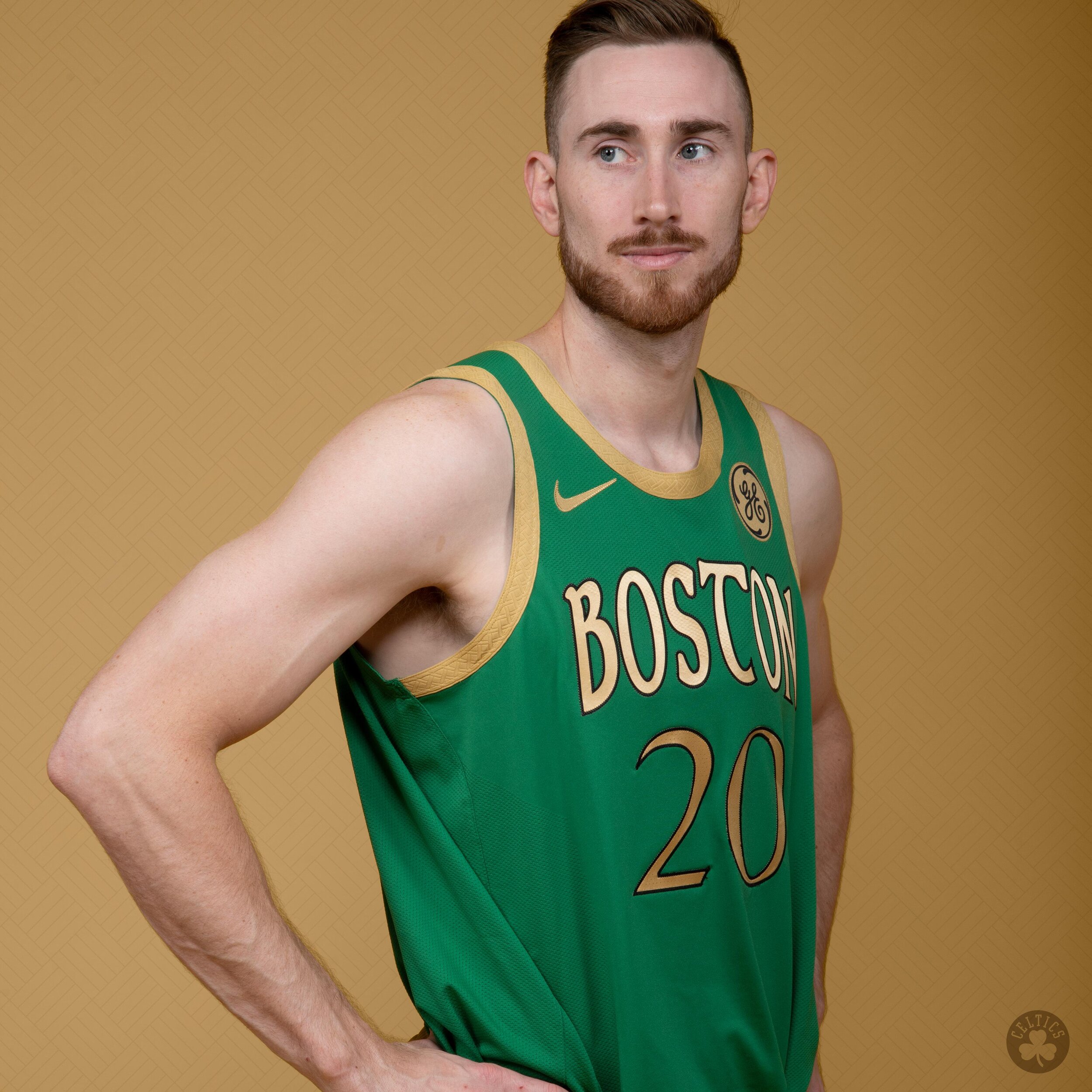
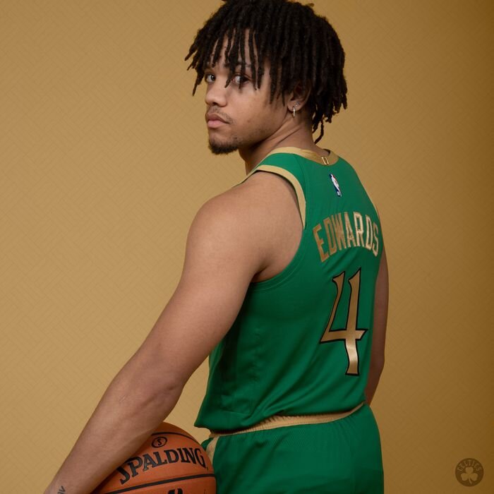
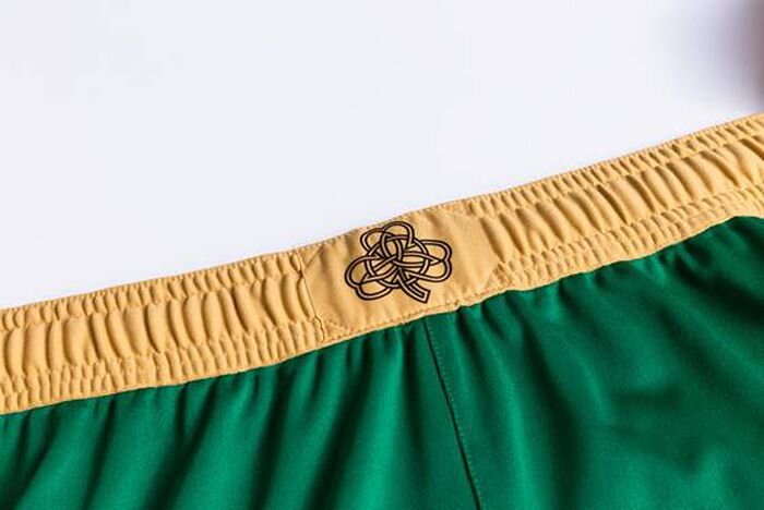
The new ‘City Edition’ uniform for the Boston Celtics pays tribute to city’s rich history. The solid green base uniform is highlighted with gold letters, numbers and trim, giving it a similar look to the Celtics 2006 St. Patrick’s Day uniform. The Boston across the chest as well as the numbers of the jersey features a unique Celtics font that ties in with the Celtic knot on the waistband of the shorts.
The Celtics will hit the court in their new look on November 27th.
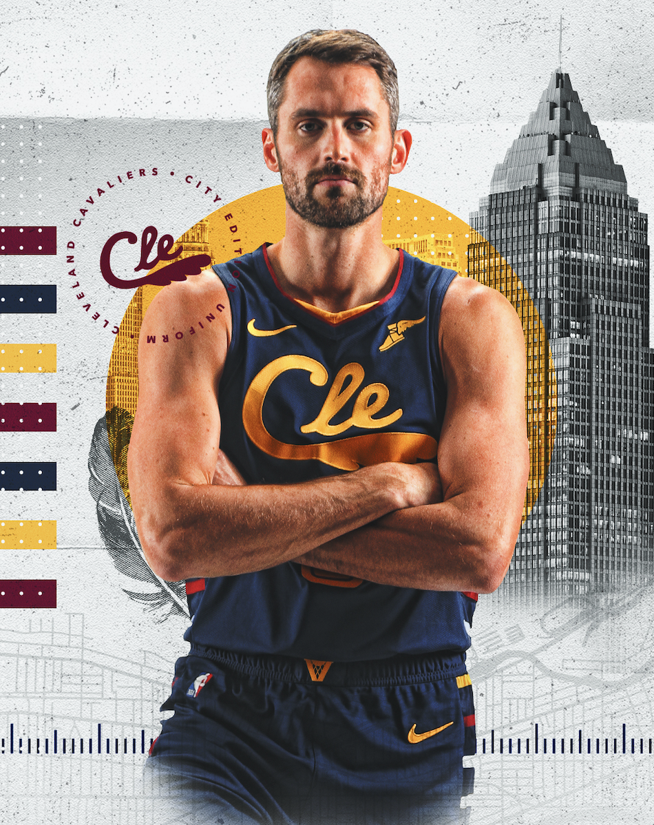
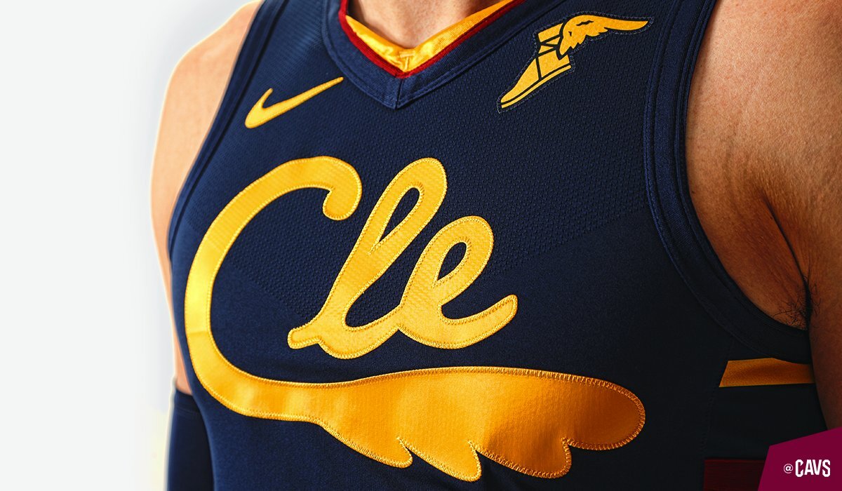
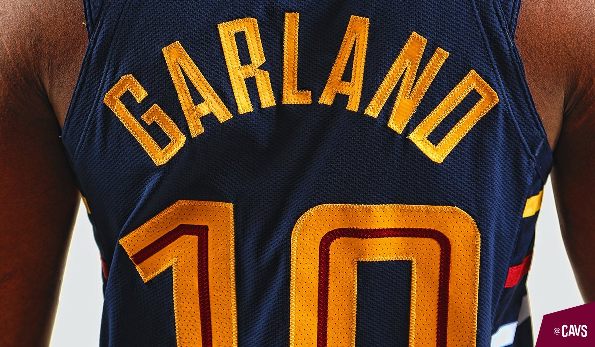
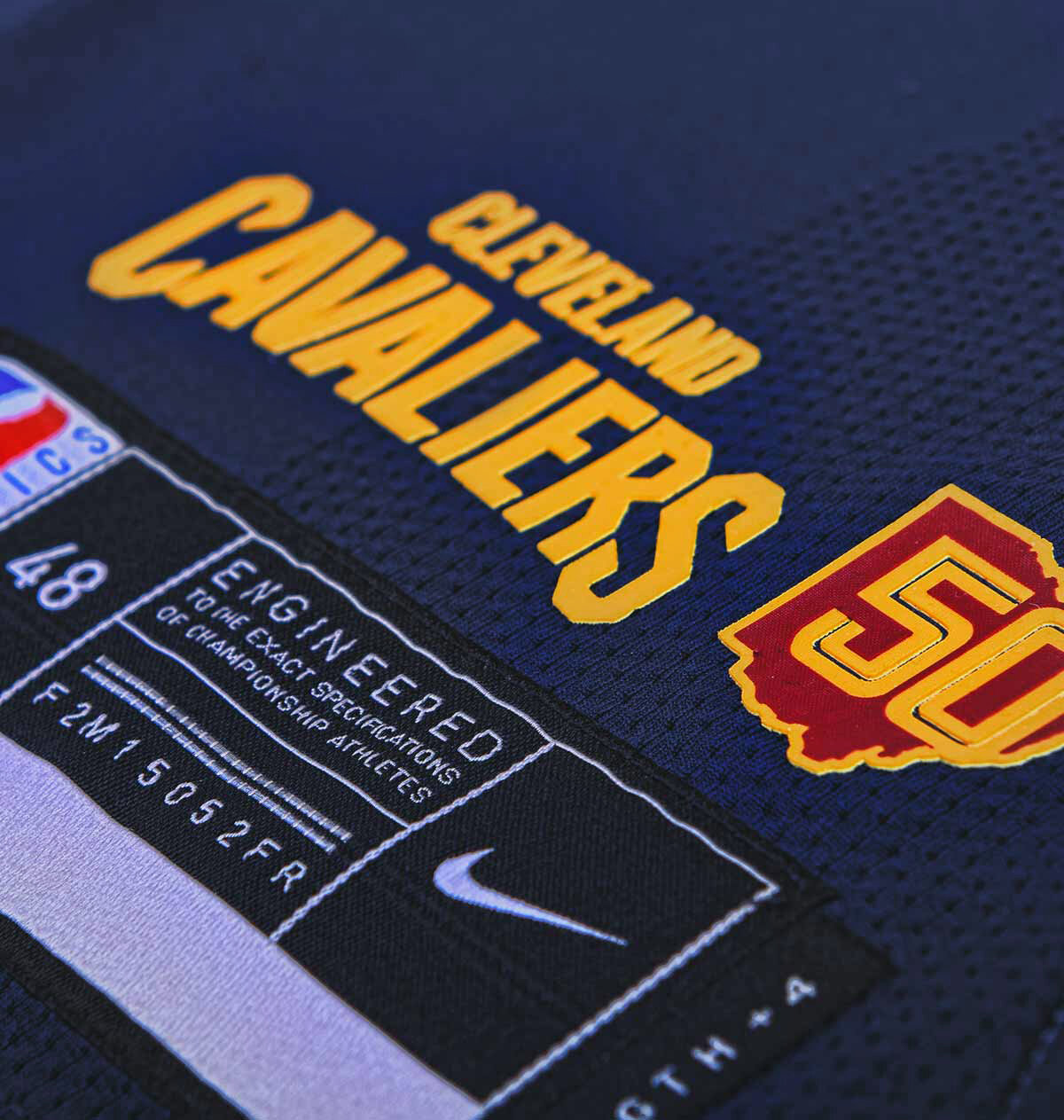
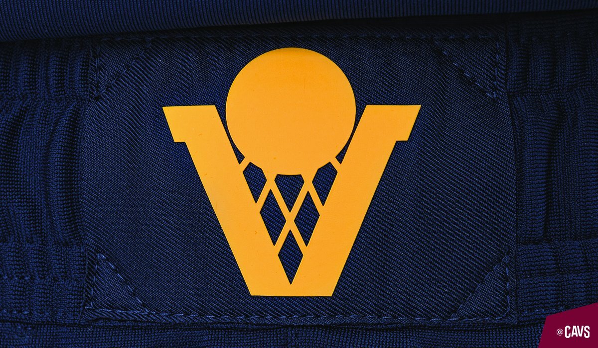
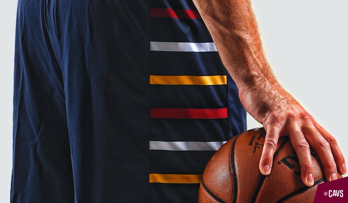
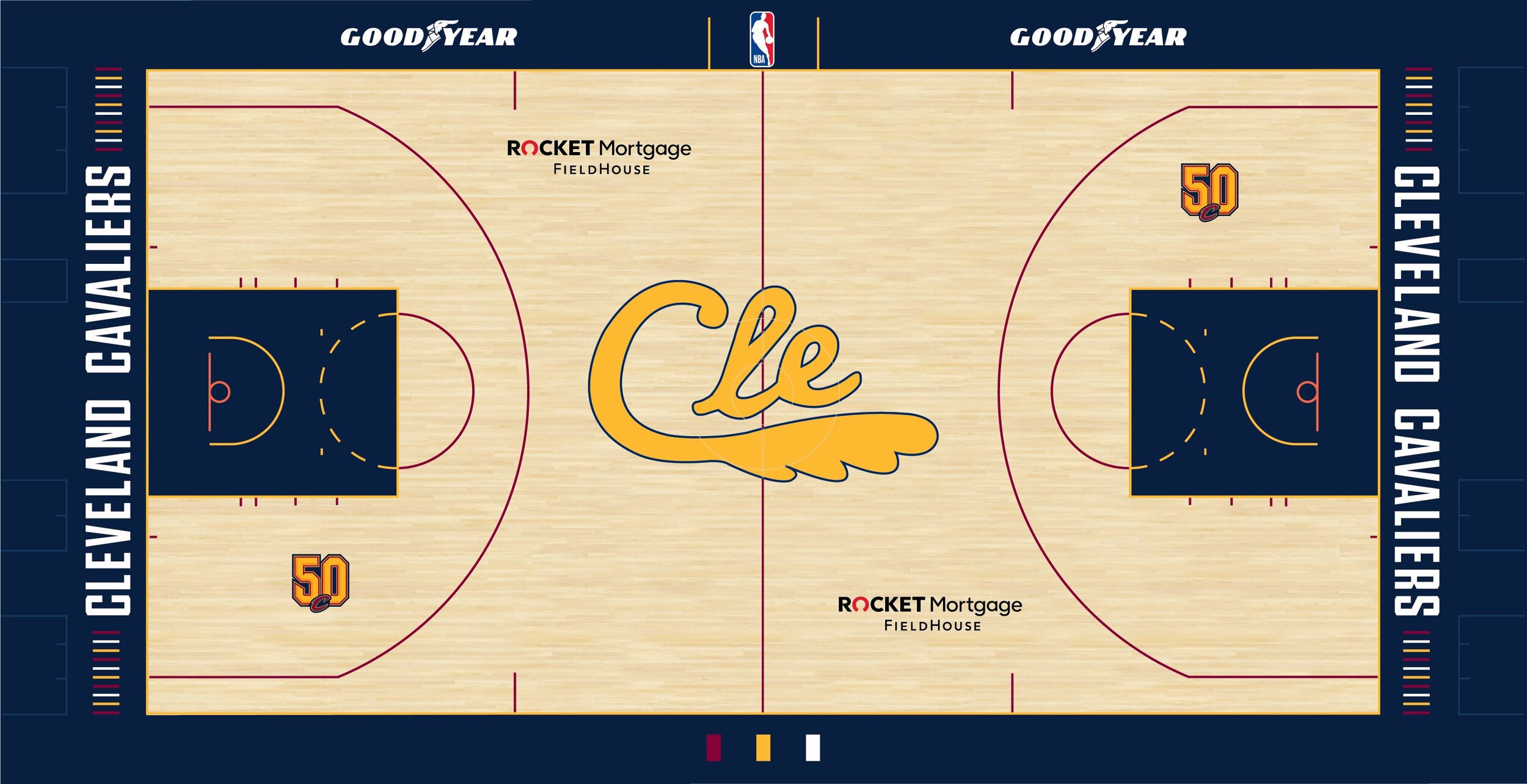
The Cavaliers introduce the new ‘City Edition’ uniform for the team’s 50th season. The new uniform receives its inspiration from a range of different Cavaliers uniforms over the past 50 seasons. The uniforms base navy colorway is inspired by the team’s alternate uniform from 2005-2010. The CLE gold script with the feather mark on the front of the jersey is meant to acknowledge the uniforms worn by the Cavs inaugural team. The player number appears in a wine and gold inline font that is inspired by the uniforms that the team wore when they returned to the city in 1994. The finishing touches come with the side panelling that has wine, gold and white marks, meant to resemble the design of the unis from 1974-1980. As well as the ‘V-basket’ logo on the waistband of the shorts from the 1983-1994 teams.
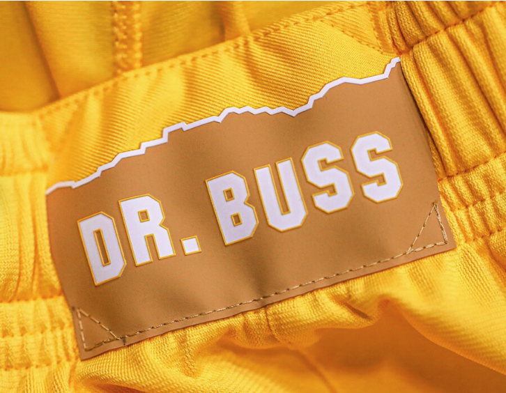
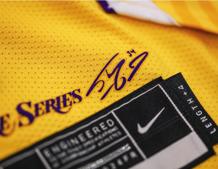
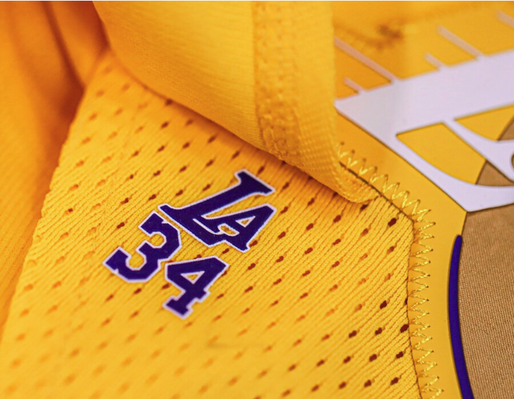
The Lakers have continued their ‘Lore Series’ uniform again this season with having another Laker great design the team’s ‘City Edition’ uniform. This season Shaquille O'Neal was given the honor to come up with the look that LeBron and the Lakers will hit the court in. The gold uniform will feature a white Lakers wordmark across the chest with a purple drop shadow. Featured on the white vertical piping is “M.D.E” standing for “Most Dominant Ever,” which was one of his nicknames. The side panels of the jersey are highlighted with three stars to represent the number of championships Shaq won with the Lakers. Another old school touch comes in the form of the wishbone collar that is reminiscent of the style jersey the Lakers switched to at the start of the 1999 season.
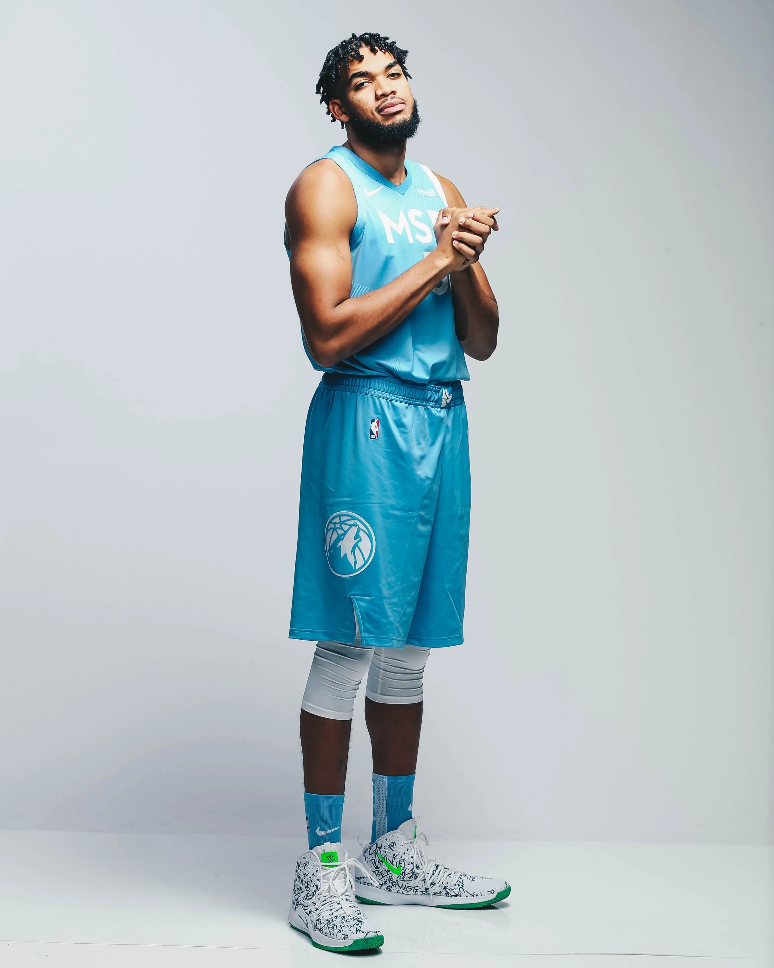
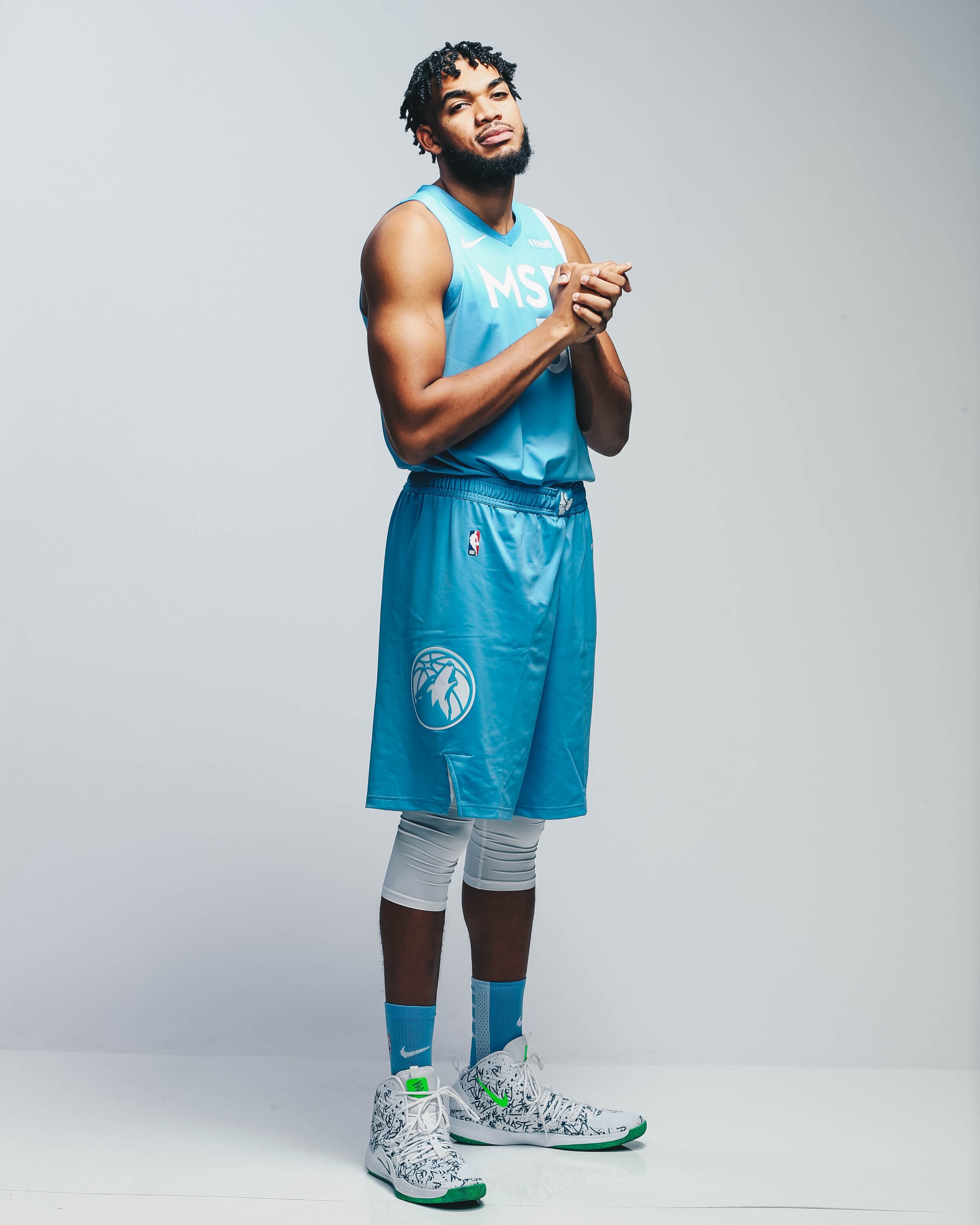
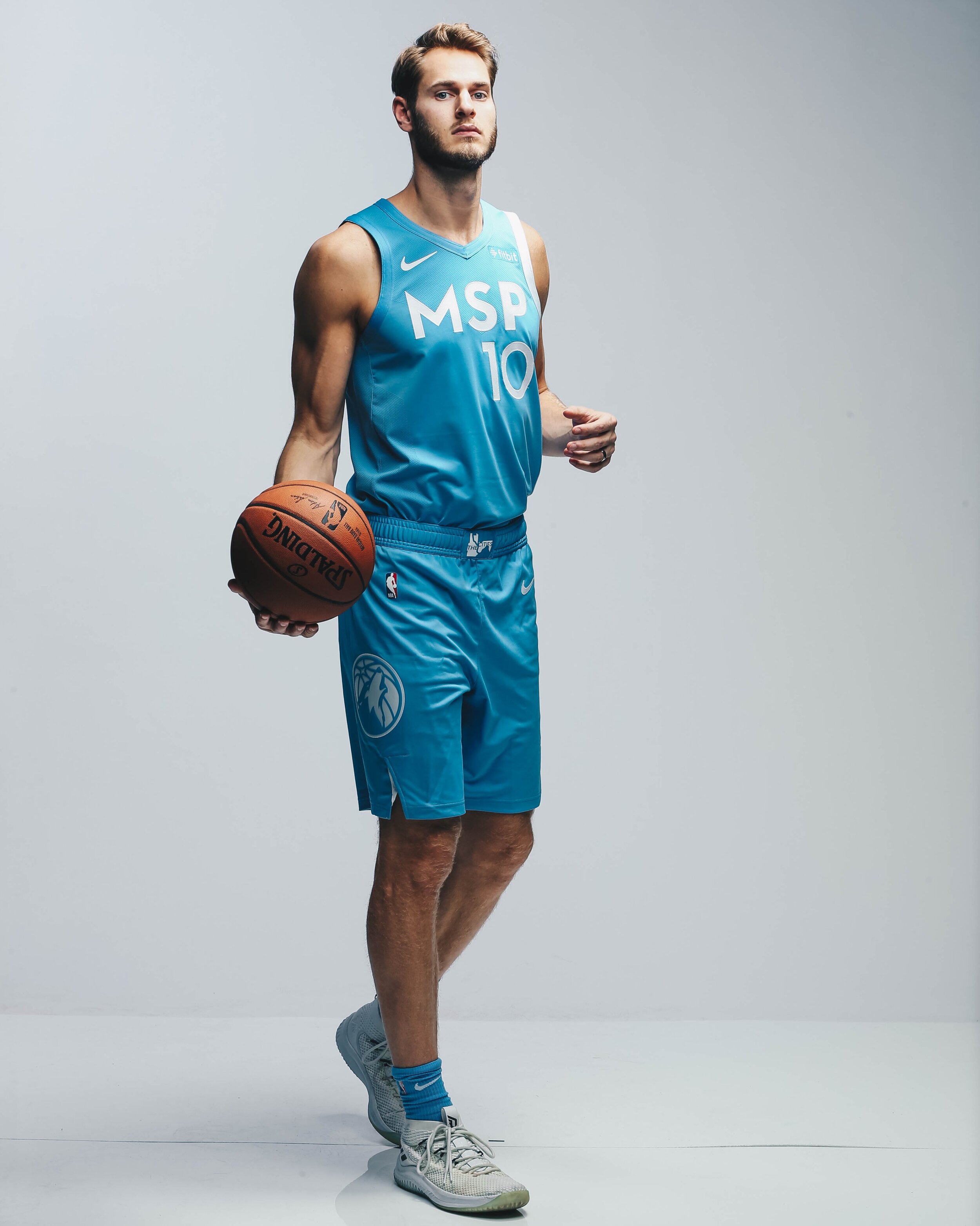
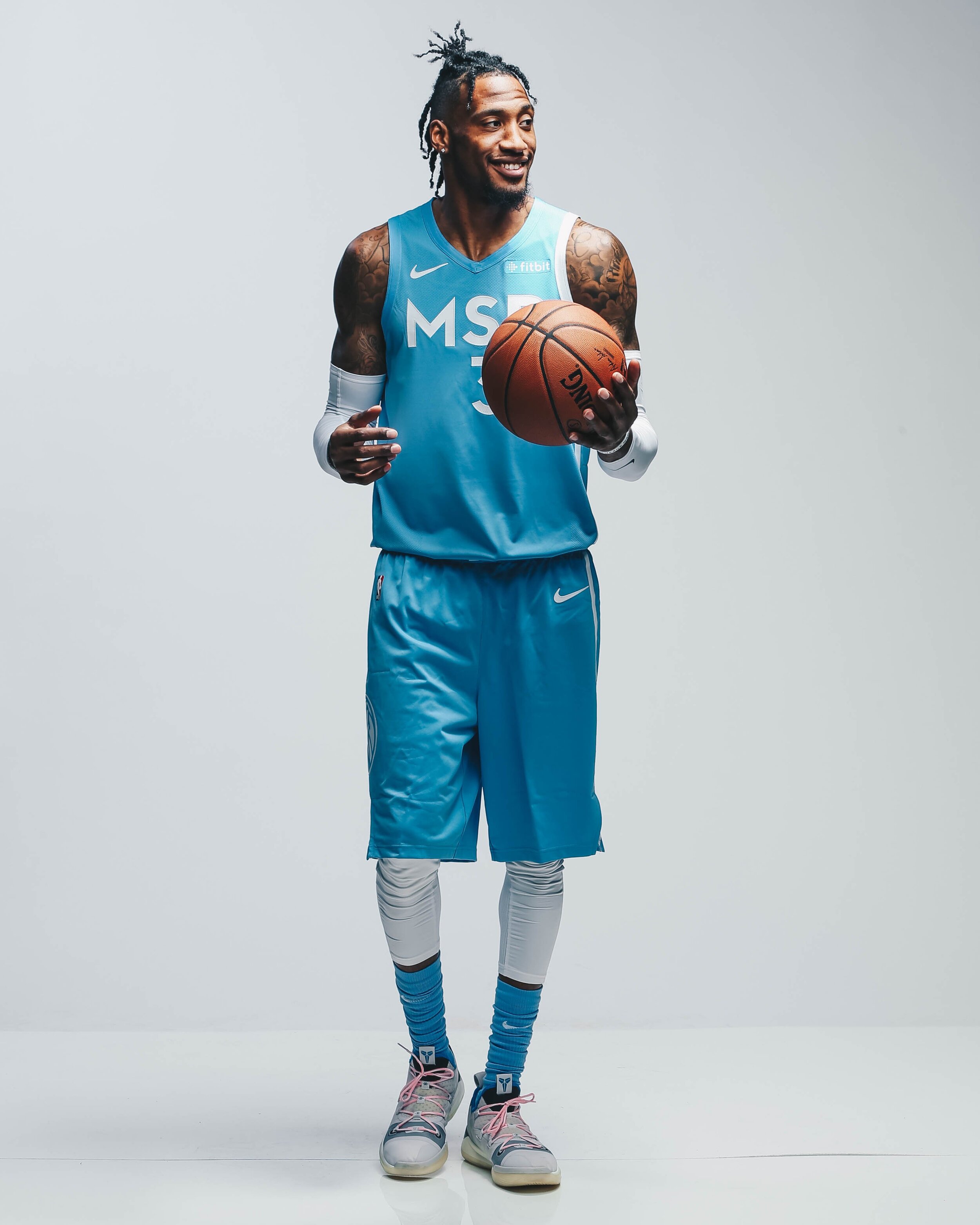
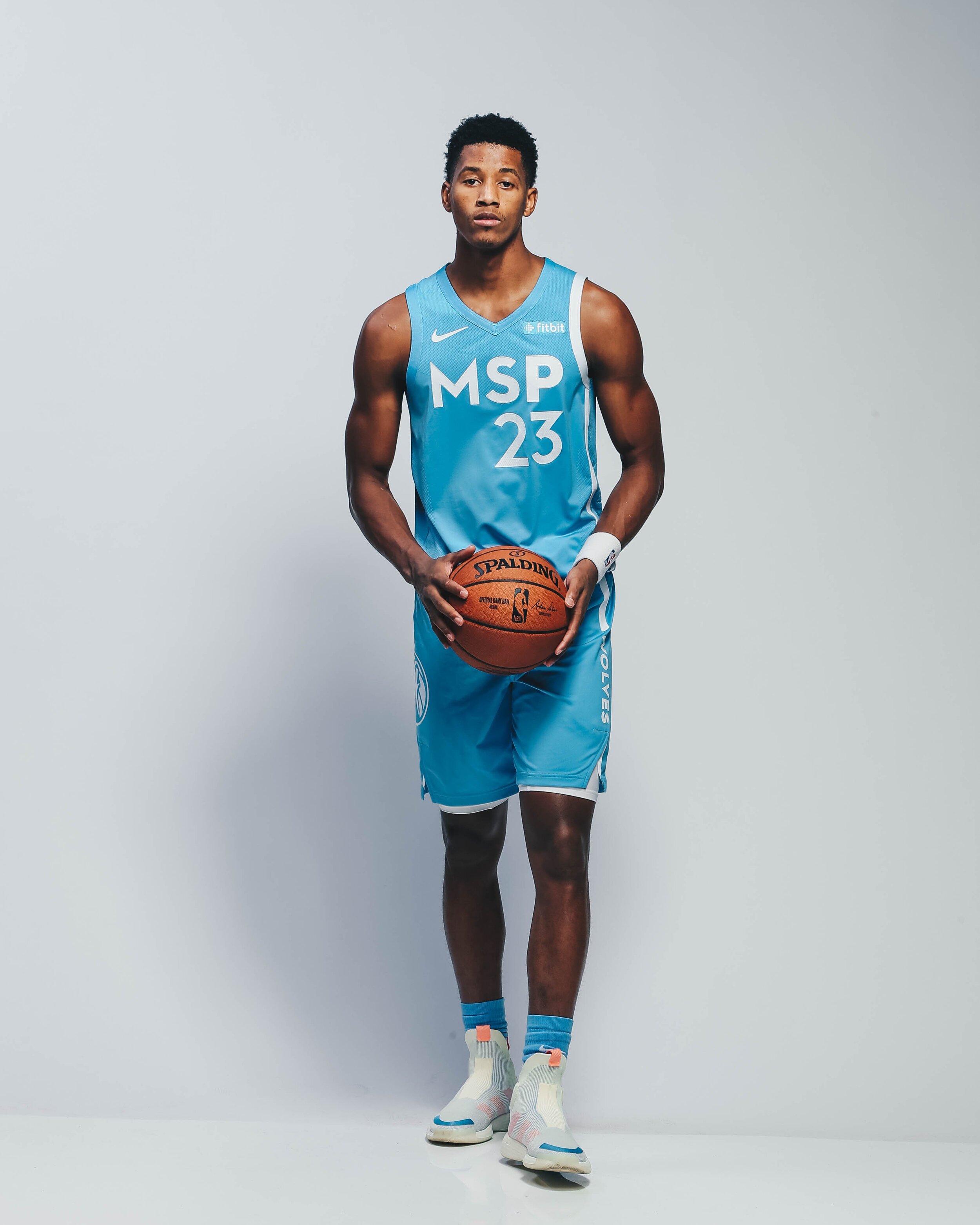
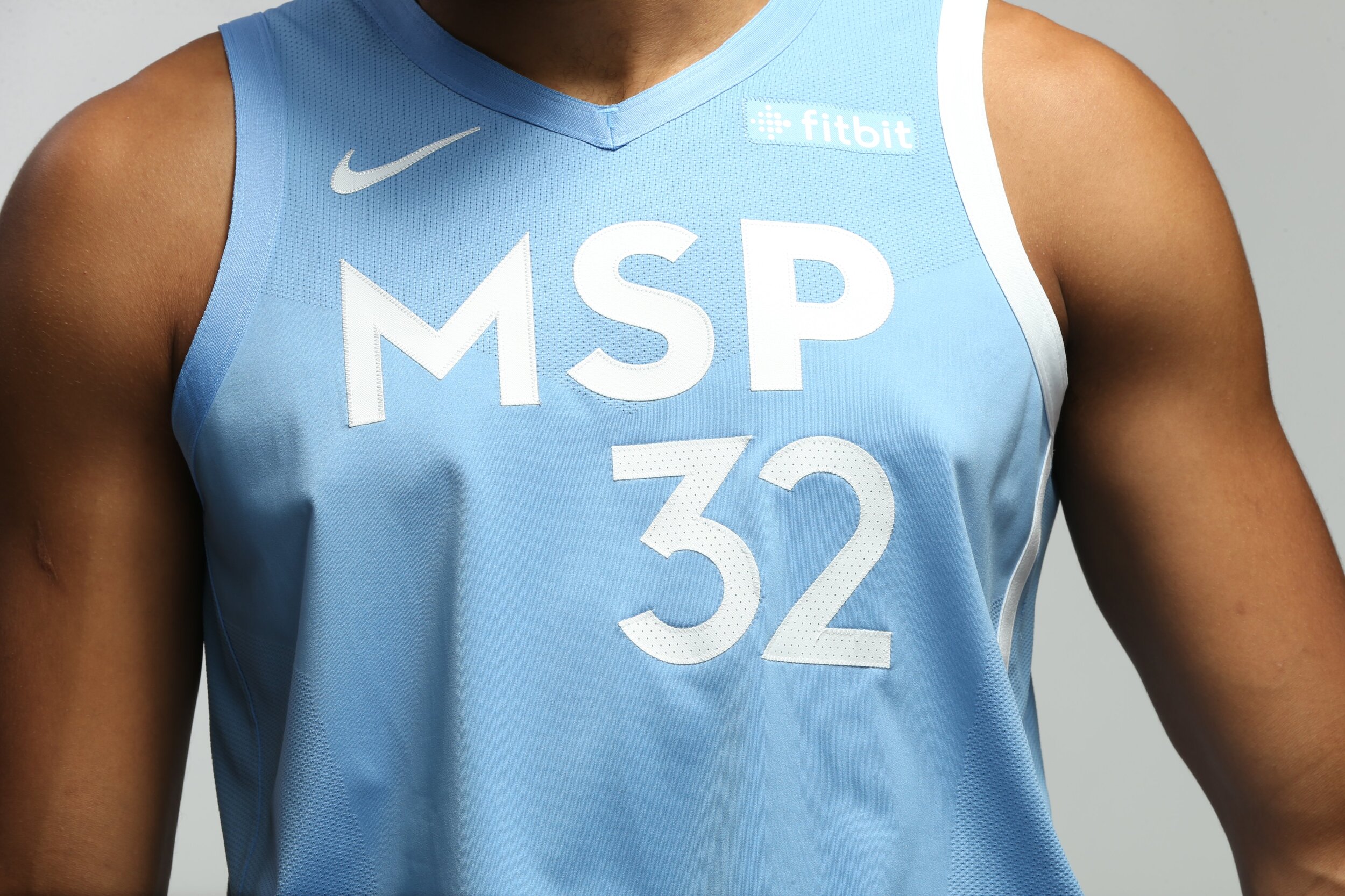
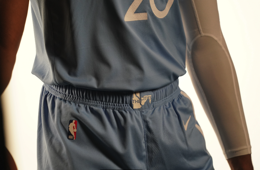
The Timberwolves have revealed their newest ‘Cities Edition’ uniform that draws its inspiration from the two cities of Minneapolis and St. Paul, the diverse people and neighborhoods that makes the Twin Cities thrive, and the river that divides yet unites its residents. The uniform comes in with a sky blue colorwary inspired by the blue waters that run throughout the cities. The left side of the uniform represents the Mississippi River with the outline beginning at the collar of the uniform and flowing down all the way to the bottom of the shorts. Across the chest of the jersey reads MSP standing for the two cities, Minneapolis and St. Paul. On the front of the waistband of the shorts is a logo that features the last city of the east, the first city of the west, connected by the Mississippi River.
“The two cities of Minneapolis and St. Paul are full of diverse people, neighborhoods, and communities that make up the DNA of the Twin Cities. The MSP City Edition uniform celebrates them, what they do to make our Cities thrive, and why the Timberwolves are proud to call the Twin Cities our home.” -Timberwolves CEO Ethan Casson.
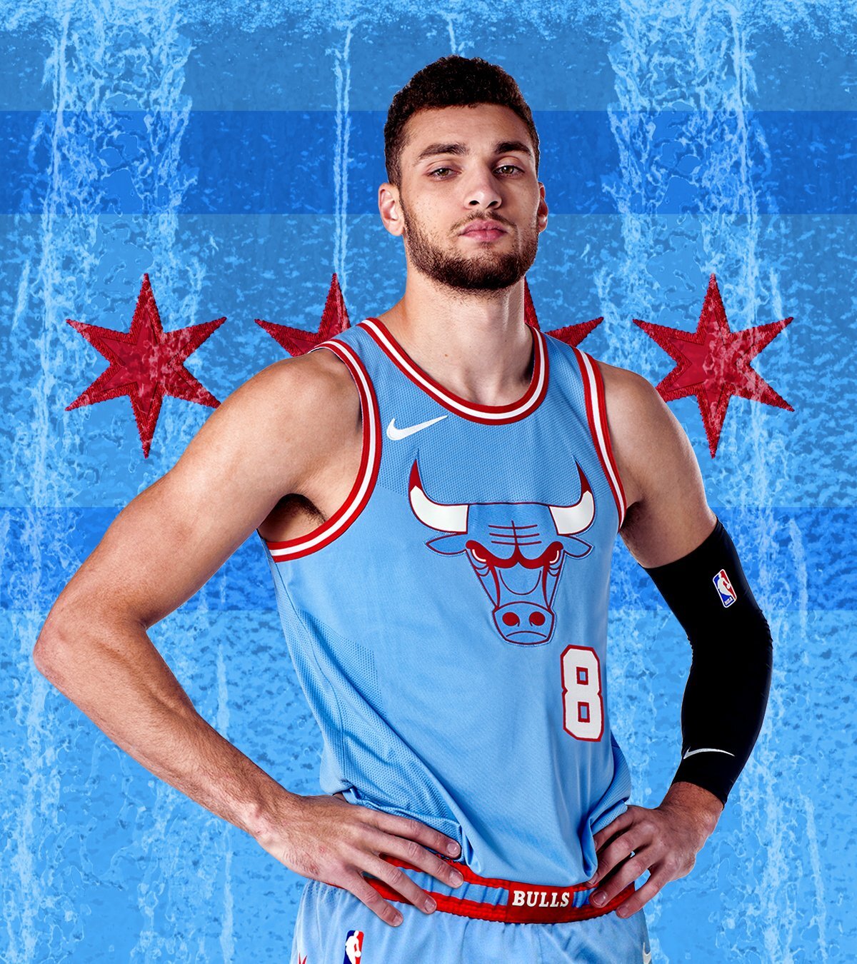
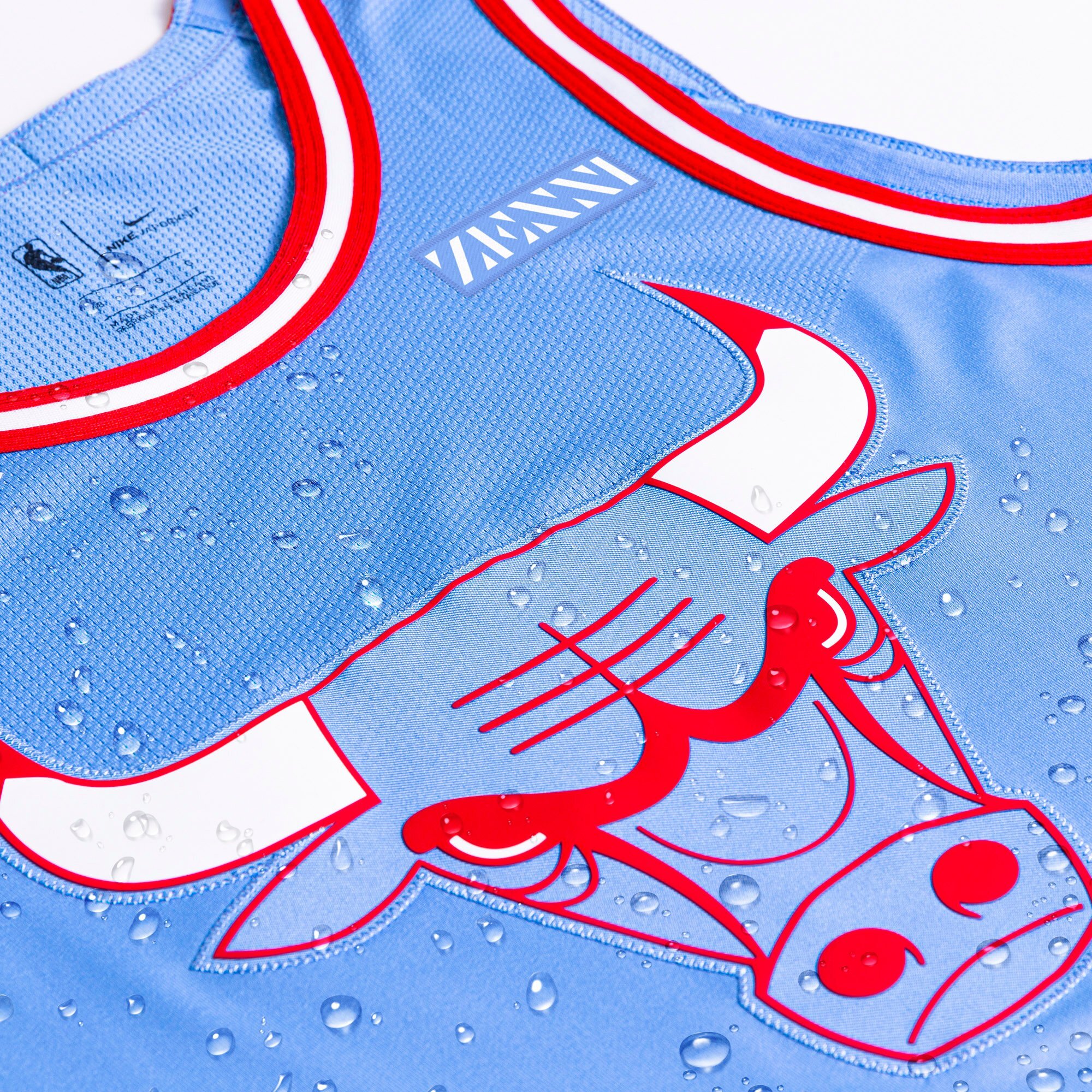
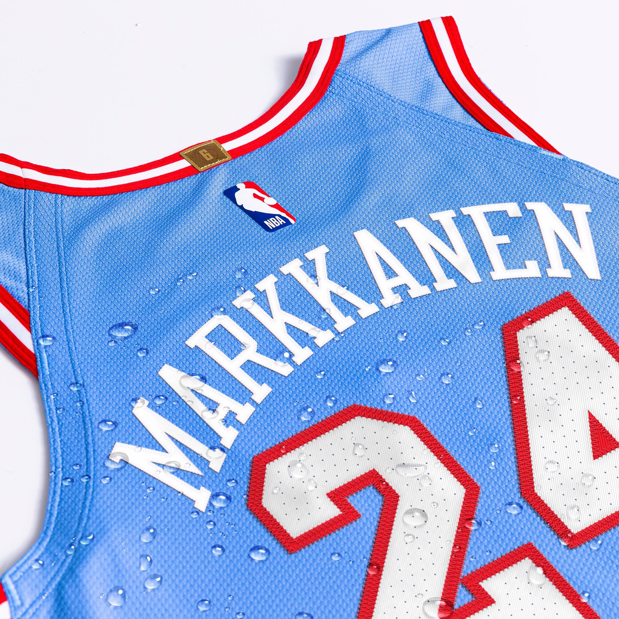
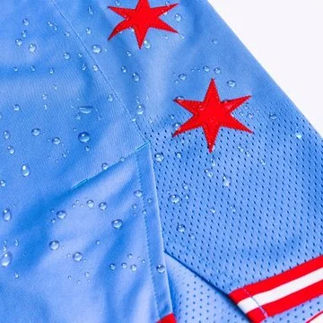
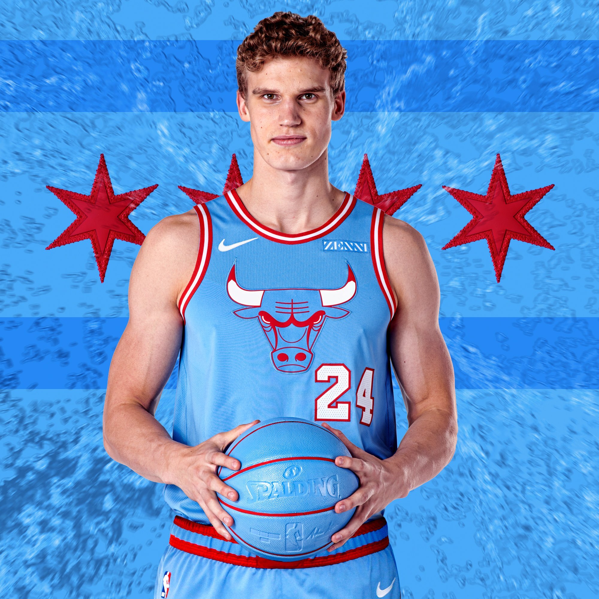
The Chicago Bulls are going blue with their latest ‘City Edition’ uniform. The team took their inspiration from the bodies of water that are identified with Chicago, Lake Michigan and the two branches of the Chicago River. The team also drew inspiration from the Chicago flag to create this season’s look. On the chest of the jersey is a blue Bull’s logo outlined in red to match the red and white piping found throughout the uniform.
The Team will wear the special ‘City Edition’ uniform a total of five times this season.
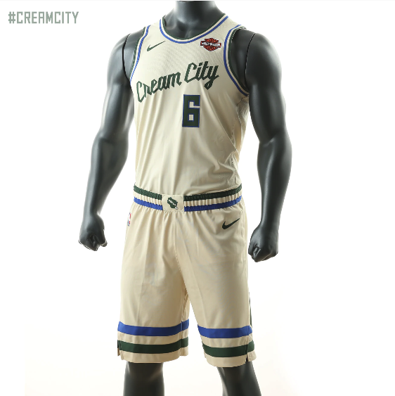
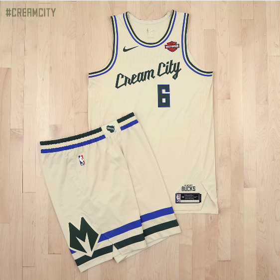
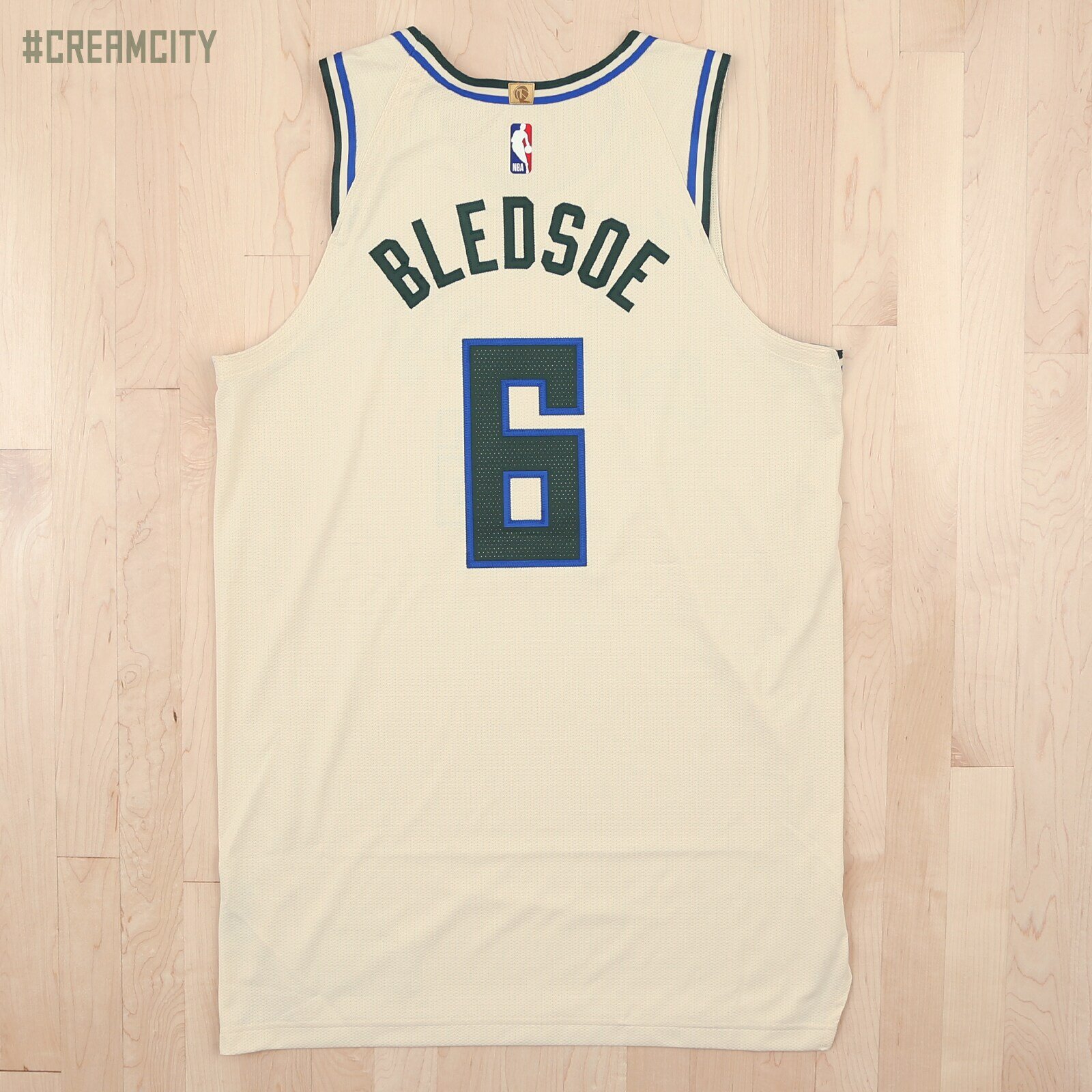
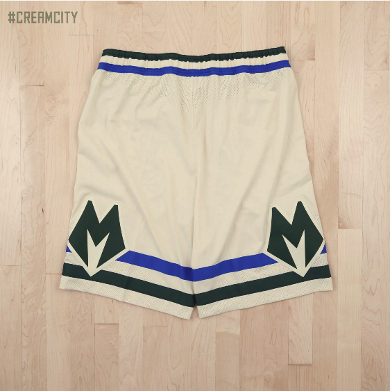
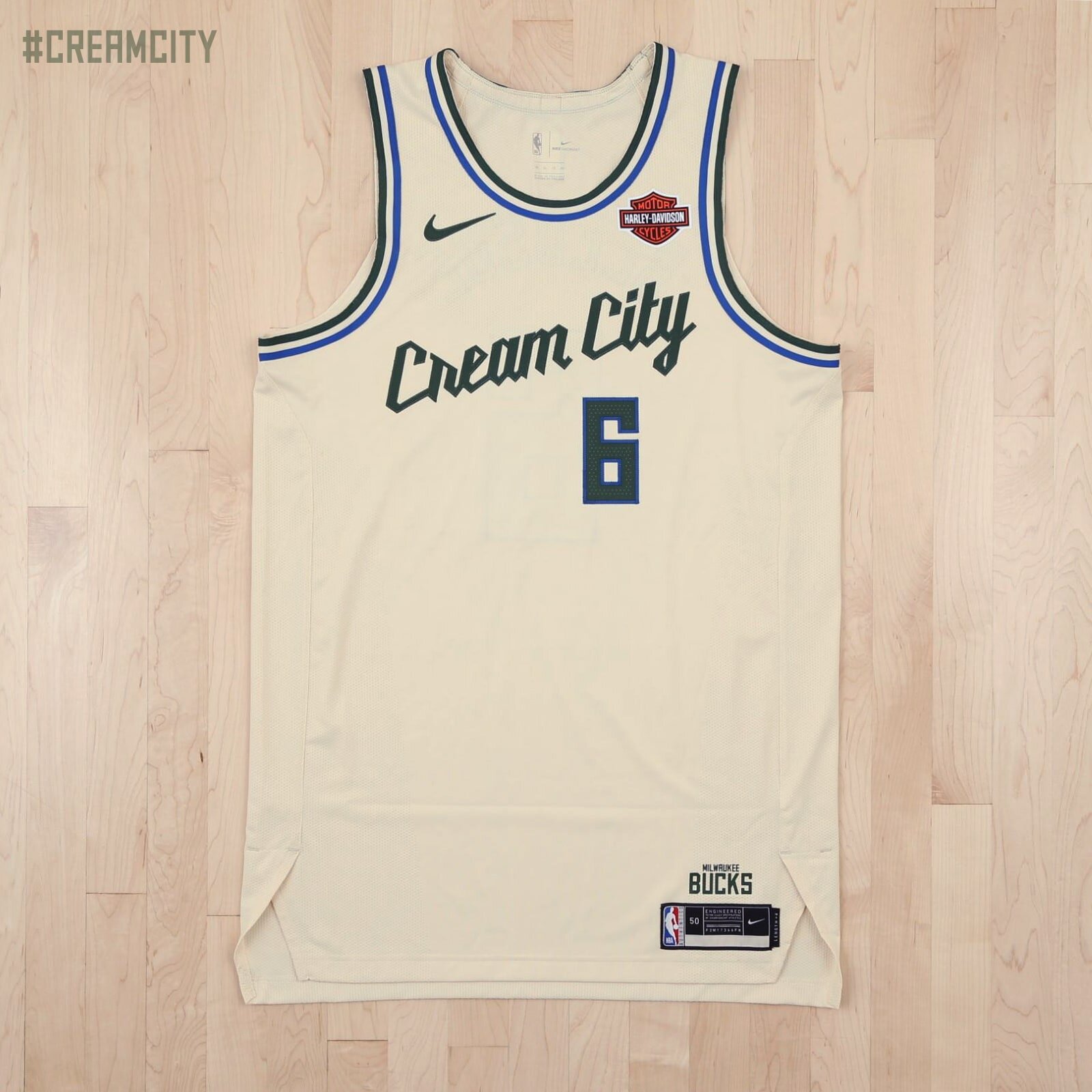
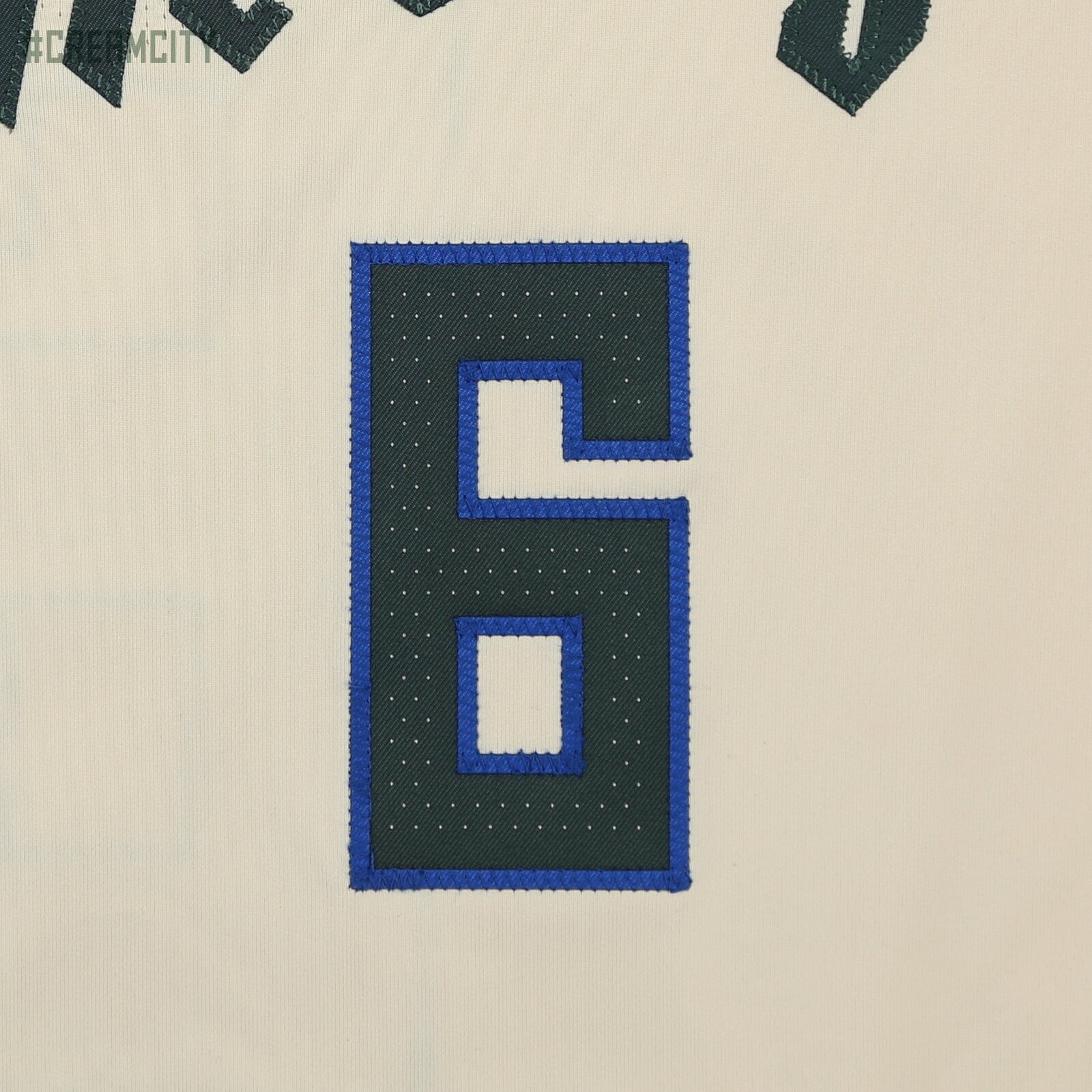
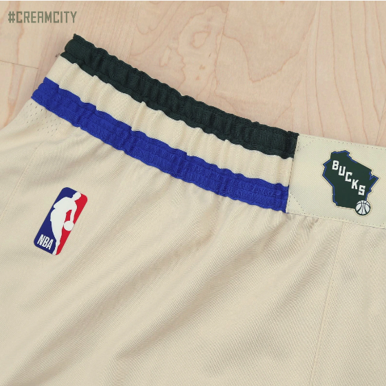
The Milwaukee Bucks have revealed their new ‘City Edition’ uniform for the upcoming season. The uniform is a cream colorway, meant to serve as a nod to the bricks that built the foundation of Milwaukee and its nickname “Cream City”. We see the wordmark Cream City displayed across the front of the jersey. The uniform features details, including the Bucks’ green and blue striping and script font, which are reminiscent of the Bucks’ earliest days, but with a modern twist. The ‘City Edition’ shorts feature the stylized “M” mark on the sides, as well as the state of Wisconsin on the front.
We will see the uniform twenty times throughout the season, and will make its debut on Saturday, Nov. 30.