New Threads for the Orlando Magic
The Orlando Magic are embracing their past while looking boldly toward the future with a refreshed identity that blends nostalgia with modern flair. During a special celebration, the team unveiled a redesigned logo and three new uniforms—each infused with symbolism that speaks to the franchise’s storied legacy and its championship ambitions.
At the center of this rebrand is the return of an iconic symbol: the star. A fan-favorite from the Magic’s early days, the star has re-emerged as the heartbeat of the franchise's visual identity. The updated primary logo revives the cascading star trail—this time with a fresh, dynamic edge—while cleverly integrating stars into the wordmarks, replacing the “A” in both “Orlando” and “Magic.” This “reach for the stars” theme reflects the team’s upward momentum and unyielding pursuit of greatness.
The logo’s core colors—Magic blue, black, and silver—remain, grounding the rebrand in the team’s roots. The refreshed secondary logo, featuring a ball in motion behind a shining star, symbolizes progress and evolution since the franchise’s inception in 1989.
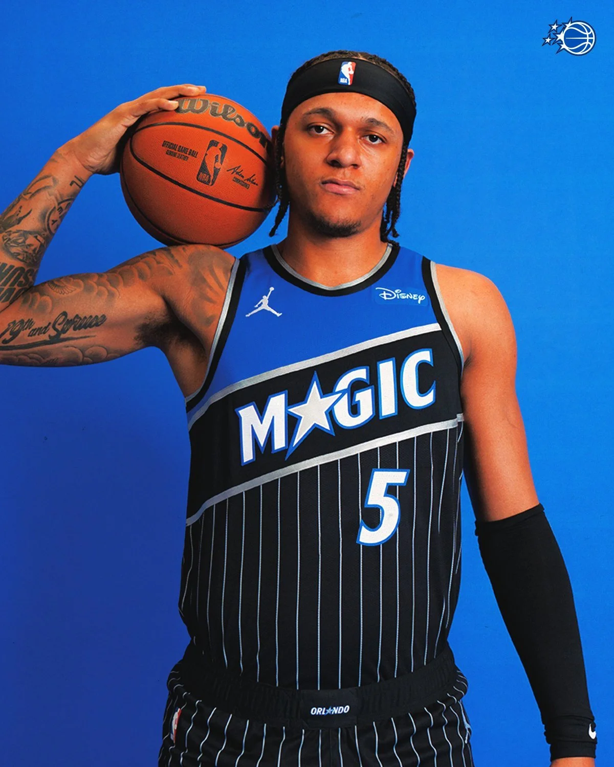
Complementing the new logo are three revitalized uniforms: the Association (white), Icon (blue), and Statement (black) editions. These threads are a love letter to the Magic’s most beloved jersey eras, with a modern twist that fits today’s fashion-forward game.
The Association and Icon editions feature bold pinstripes, a nod to the iconic '90s Magic look, with “MAGIC” and “ORLANDO” wordmarks respectively across the chest. The uniforms also include sleek trim and a prominent star on the shorts, reinforcing the celestial theme that runs throughout the brand.
The Statement uniform—crafted by Jordan Brand—is perhaps the boldest of the bunch. Inspired by the Magic’s original warm-up jackets, it channels vintage energy with modern precision. Black with pinstripes and featuring the new star-centric icon on the shorts, this uniform is built for statement moments on the hardwood.
Shelly Wilkes, Magic Executive Vice President of Marketing and Social Responsibility, emphasized the collaborative effort behind the redesign: “Based on fan feedback, the new logo was a collaboration and really a labor of love keeping in mind the affinity our fans have for our brand identity... This logo and new uniforms signify the beginning of a new era of excellence for the Magic while paying homage to the past.”
As the franchise charges into the next chapter, this refreshed identity reminds fans that while styles may evolve, greatness remains timeless. The Magic have always been about looking up—and now, with stars leading the way, that message has never been clearer.
Shop Magic Gear Here


See What Else Is New
Featured

Related Articles
Featured