The Minnesota Timberwolves are turning the page to a new era while honoring their history. The franchise officially unveiled a complete brand refresh featuring new logos, uniforms and court designs that combine some of the most beloved elements from the team's past with the confidence and momentum of today's Timberwolves.
According to the organization, the new identity is designed to blend "familiar pieces of Timberwolves history with the swagger, confidence and energy of the team leading the franchise today."
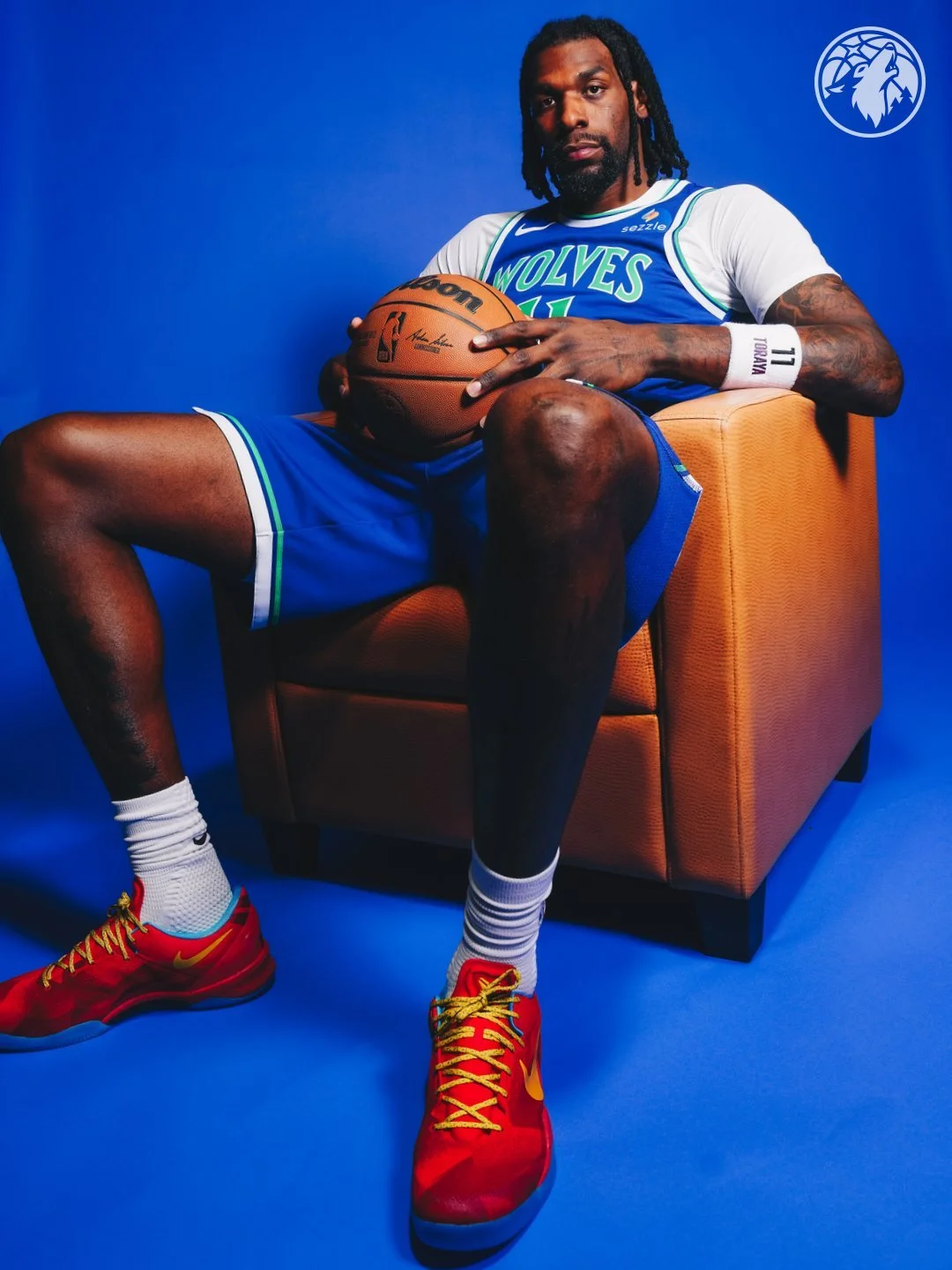
The Timberwolves' new Association (white) and Icon (blue) uniforms bring back the classic blue, green and white color palette that the franchise wore during its inaugural 1989-90 season.
Both uniforms feature design details inspired by Minnesota's original look, including the iconic three-stripe trim pattern. The thick and thin blue and green striping reflects the state's natural landscape while creating a direct visual connection to the team's roots.
The chest wordmarks and jersey numbers also receive a fresh update, with lettering inspired by wolf fangs to reinforce the team's identity.
On the shorts, Minnesota reintroduces the beloved "Old Shep" logo, another nod to the franchise's early years that fans have embraced for decades.
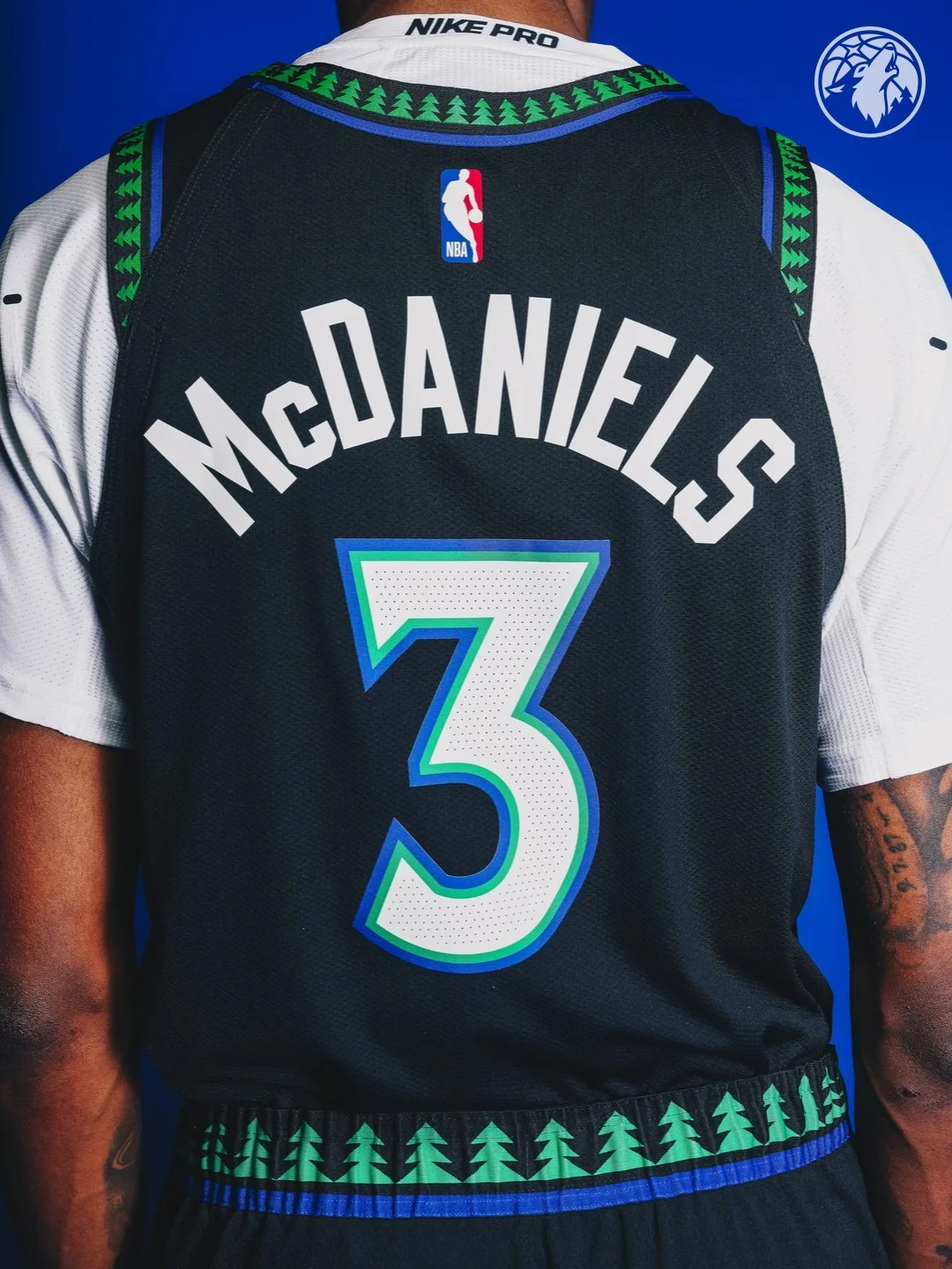
While the white and blue uniforms lean heavily into the Timberwolves' origins, the new Statement uniform revives one of the most popular eras in franchise history.
The black jersey brings back the famous pine tree trim that became synonymous with Timberwolves basketball during the late 1990s and early 2000s. However, this isn't simply a recreation of the classic design.
Instead of the traditional "Timberwolves" wordmark, the new Statement uniform features "Wolves" outlined in glowing blue and green accents. The pine tree trim also includes a bright blue edge, a subtle tribute to Minnesota's 10,000-plus lakes. The result is a modernized version of one of the NBA's most recognizable uniform designs.
The Timberwolves also introduced several new custom elements across all three uniforms. A newly created "Tree-M" monogram appears on the belt buckle area, while a lineup of five trees sits above every jock tag. According to the team, the five-tree design serves as a subtle tribute to the starting five on the court. These additions help create a unique visual identity while reinforcing the franchise's longstanding connection to Minnesota's forests and outdoor culture.
One thing is clear: Minnesota didn't choose between its past and future. Instead, the Timberwolves found a way to wear both.
Shop Timberwolves Gear Here


See What Else Is New
Featured


Related Articles
Featured