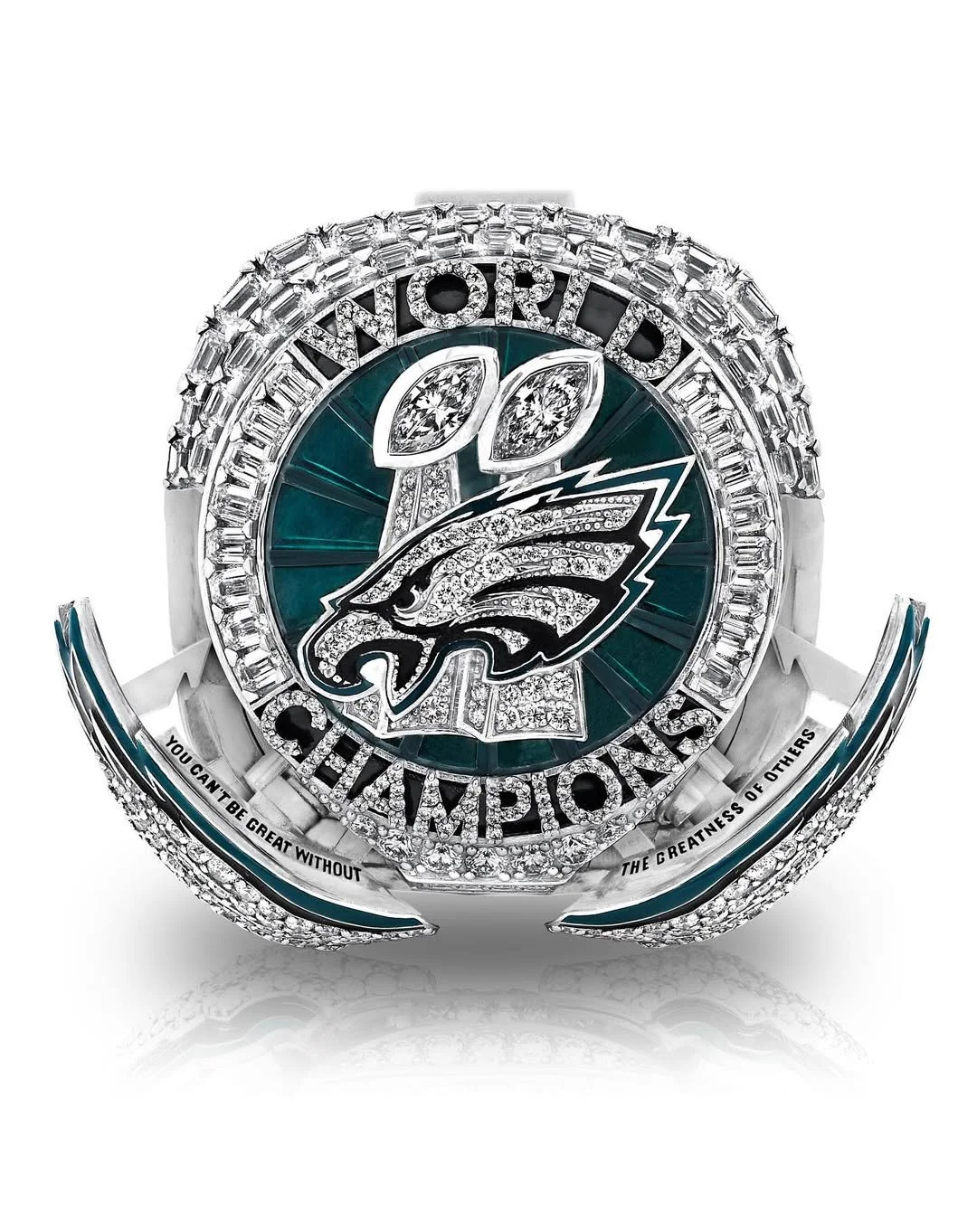
When you win the biggest prize in football, you celebrate big. And the Philadelphia Eagles went massive with their Super Bowl LIX Championship Ring — a 41-millimeter, 12-carat, 140-gram masterpiece that doesn’t just shine — it speaks.
Unveiled during a private ceremony in Philly, this ring is more than a symbol. It’s a story. One that starts in Brazil, peaks on Bourbon Street, and ends with over a million fans flooding Broad Street in celebration. Every single element of the ring has a purpose, a stat, or a message behind it. Here's how the Eagles turned their unforgettable 2024 season into wearable history.
From first glance, this ring hits hard. The bezel features 145 diamonds — a tribute to the Eagles’ 145 points scored during the postseason, setting a new NFL playoff record. Sitting atop the ring, the words “WORLD CHAMPIONS” are crafted with 40 points worth of diamonds, marking the 40 points the Eagles put up in their Super Bowl LIX win over the Kansas City Chiefs.
Just behind the Eagles’ logo are two Vince Lombardi Trophies, representing the franchise’s two Super Bowl titles — Super Bowl LII and the most recent LIX — both under owner Jeffrey Lurie. Inside the trophies is one carat of marquise-shaped diamonds, symbolizing a dominant defense that ranked first in total yards allowed per game (278.4), and a historic ground game led by Saquon Barkley, who racked up an NFL-record 2,504 rushing yards (including playoffs), becoming the league’s rushing champion.
Surrounding the top of the ring are 18 green stones — each one representing a win in the Eagles’ remarkable 2024 campaign. Tying an NFL record with 18 combined regular-season and postseason victories, the team tied a franchise best with 14 wins in the regular season before sweeping three home playoff games and capping it all off with the Super Bowl LIX title.
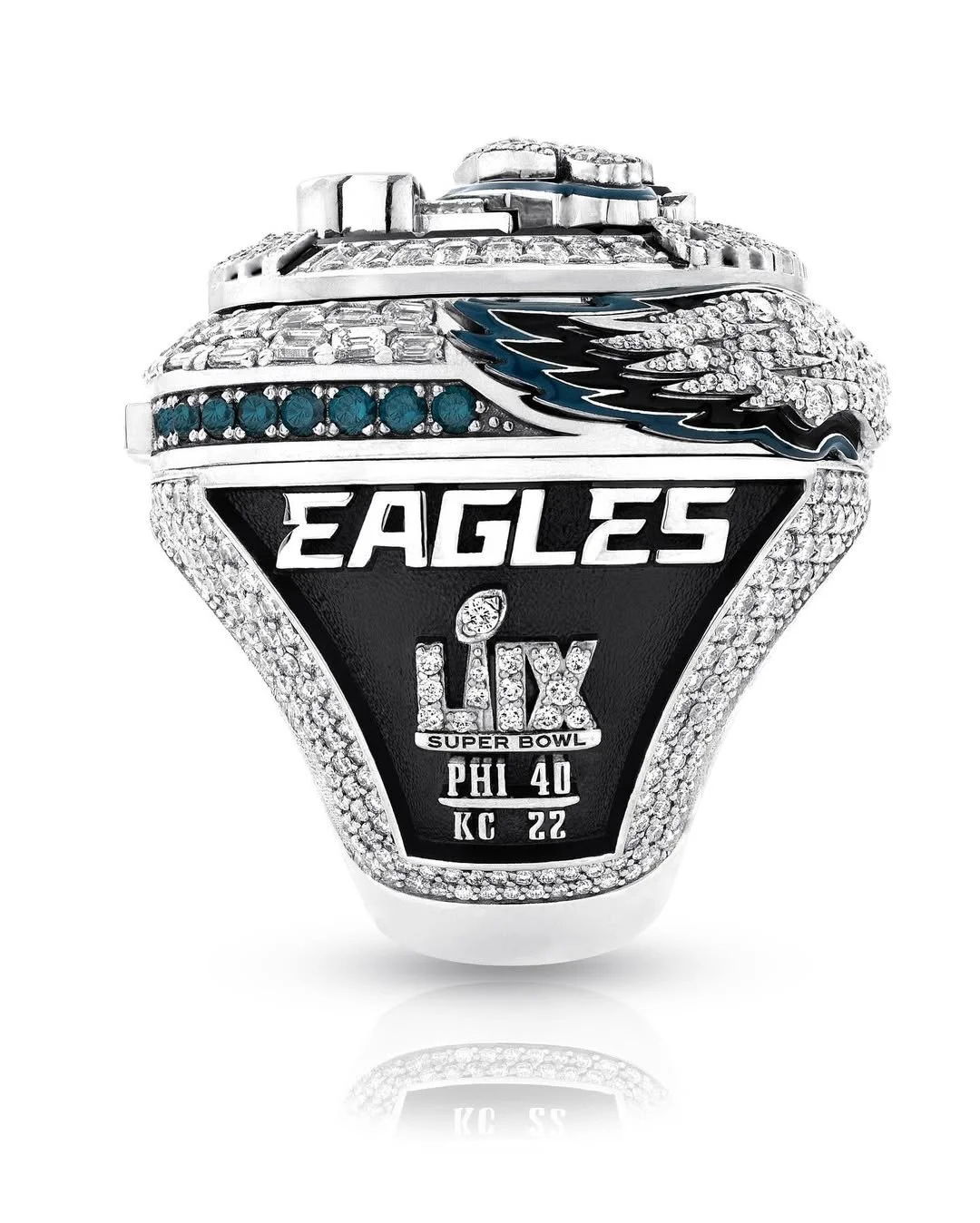
On one side of the ring, the Super Bowl LIX logo is placed between the Eagles wordmark and the game’s final score of 40-22. Embedded within the Super Bowl logo are 10 points of diamonds, commemorating the Eagles’ 10-game winning streak during the regular season — a franchise record that set the tone for a championship run.
The opposite side of the ring features each player’s last name and jersey number in diamonds, with a background design of Lincoln Financial Field, saluting the fans who packed the stadium all year. For team staff members, the rings instead feature the Eagles logo in the center of the same layout.
What truly sets this ring apart is the innovation. Built with a hidden button mechanism, each ring has wings that open from the bezel — the first of its kind in championship ring history. Once the wings spread open, they reveal the inscription: “YOU CAN’T BE GREAT WITHOUT THE GREATNESS OF OTHERS.” This powerful message reflects head coach Nick Sirianni’s season-long mantra of unity and selflessness — the heartbeat of the team’s culture.
On the wings themselves are 0.9 carats of diamonds, a nod to the six sacks and three turnovers delivered by the defense in Super Bowl LIX — one of the most dominant defensive performances the big game has ever seen. Players like Josh Sweat (2.5 sacks), Milton Williams (2 sacks), and Jordan Davis (1 sack) brought relentless pressure, while Cooper DeJean (pick-six), Zack Baun (interception), and Williams (fumble recovery) contributed to the trio of takeaways.
At the top of the ring’s button mechanism, five diamonds shine, each one representing a player who put points on the board in the Super Bowl. Jalen Hurts led the way with three total touchdowns. A.J. Brown added a 12-yard touchdown catch. DeVonta Smith hauled in a 46-yard score. Cooper DeJean struck with a pick-six, and kicker Jake Elliott tied the Super Bowl record for most field goals made.
Hidden inside the ring is a stamp of the Brazilian flag, commemorating the Eagles’ season-opening win against the Packers in São Paulo — the first NFL game ever played in South America. Beneath that, the words “TOUGH. DETAILED. TOGETHER.” — Coach Sirianni’s guiding values — are engraved as a constant reminder of what defined their locker room.
Also etched inside are the scores of all four playoff games and the number “145” in tribute to the Eagles’ record-setting playoff point total. Players' rings even include their signatures on the underside, while staff rings feature the phrase: “FROM BRAZIL, TO BOURBON, TO BROAD” — the perfect summary of the team’s championship journey from opening kickoff to parade confetti.
Chairman and CEO Jeffrey Lurie summed it up best:
“This ring represents the commitment, determination, and sacrifice of every member of our organization... It will forever serve as a reminder of just how magical the 2024 season was for our organization and fans.
The Eagles didn’t just design a ring. They built a tribute to dominance, unity, and grit — with every carat, every detail, every hidden gem. And once again, Philly proves: when it comes to UNISWAG, they don’t just win — they leave a legacy.
— Kennesaw State Football (@kennesawstfb) July 16, 2025
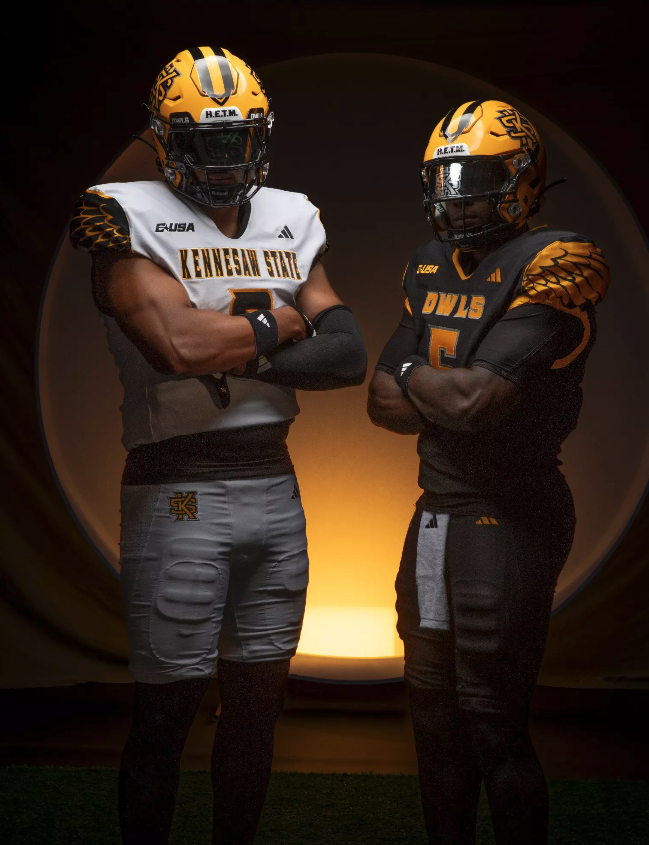
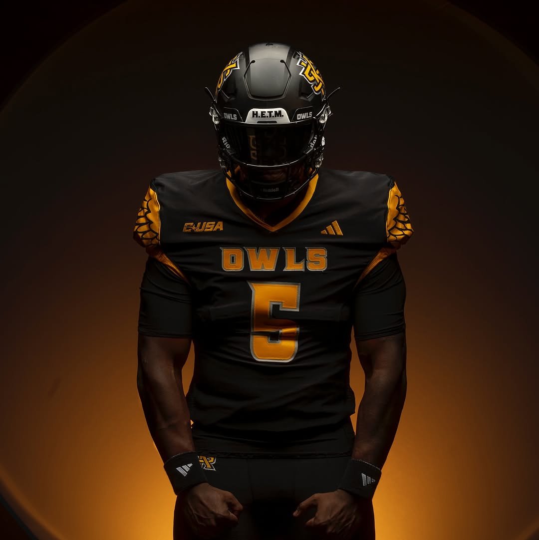
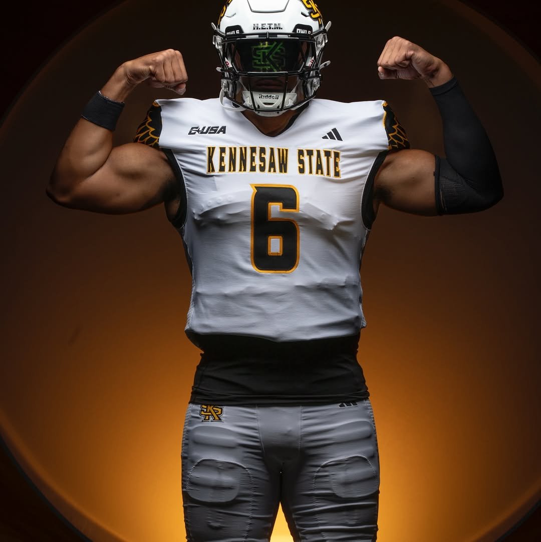
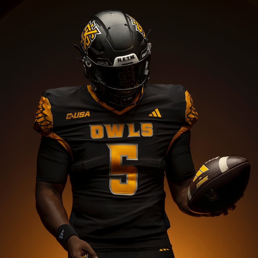
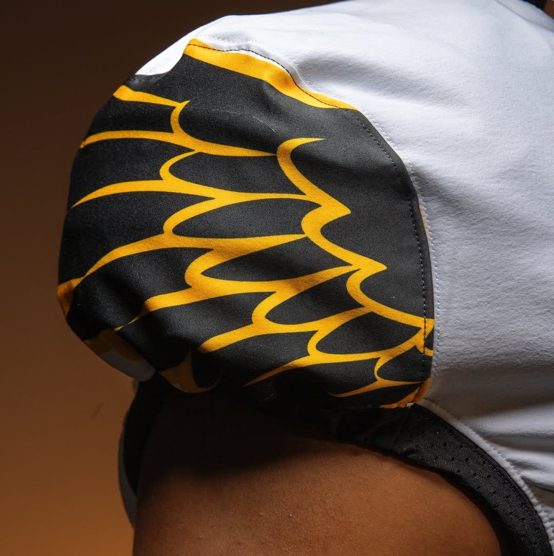
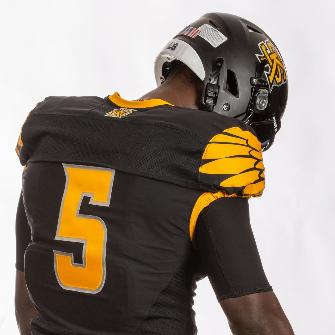
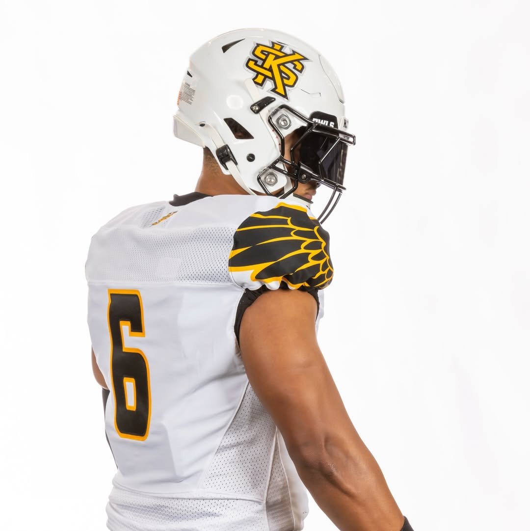
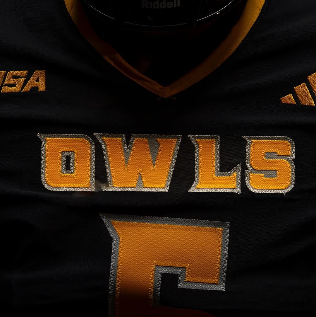
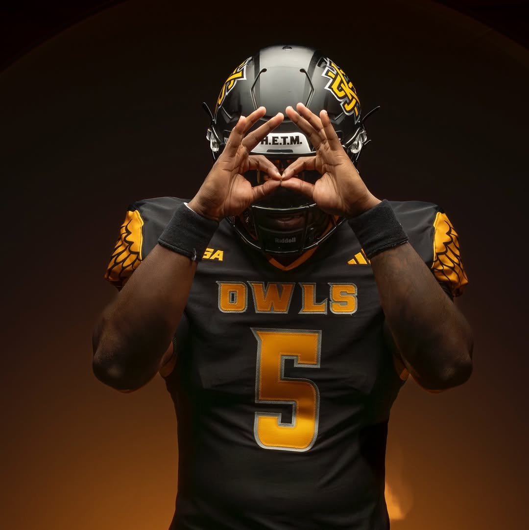
The Kennesaw State Owls are taking flight with an aggressive and symbolic uniform design. The most eye-catching element of the new uniforms is The wing pattern boldly spread across the shoulders. Golden feathers stretch over a black base, representing both the “Owls” nickname and a fearless elevation of their brand identity. The wing design isn’t just aesthetic.
The primary uniform features a sleek black jersey with vibrant gold numbers outlined in silver, complemented by the word “OWLS” stitched across the chest in matching bold lettering. Kennesaw State’s iconic “KS” logo is proudly placed on the helmet, which sticks to a matte black base, adding a stealthy feel to the entire set.
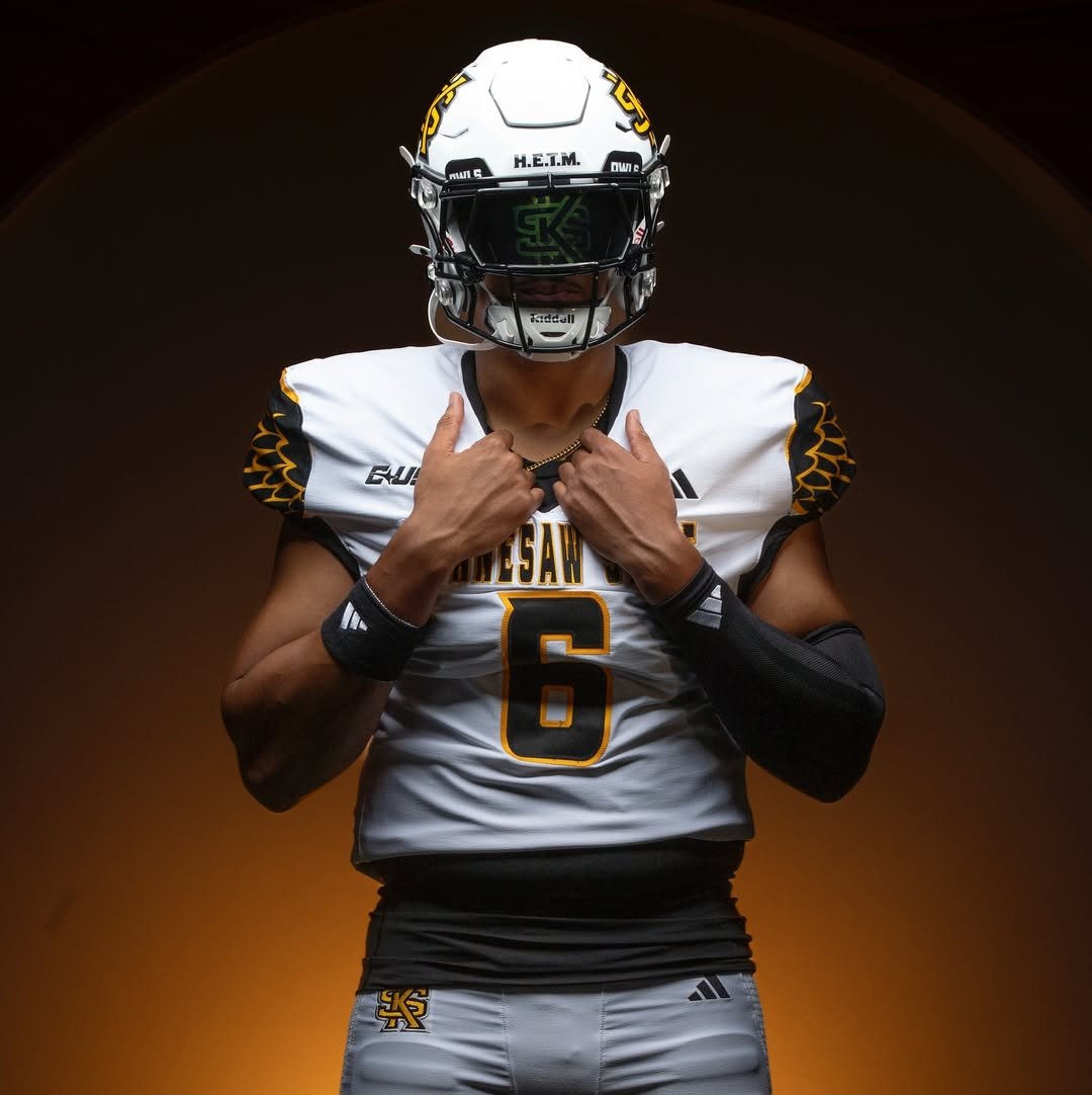
The white uniform features striking black wings on the shoulders outlined in gold, adding a bold and dynamic look. Across the chest, the Kennesaw State wordmark is proudly displayed, while the numbers are black with gold outlines, creating a clean and cohesive design that ties the whole look together.
Subtle but sharp accents like the gold collar, embroidered conference and Adidas logos, and silver stitching give the uniform extra dimension. It’s clear these weren’t just designed—they were engineered with purpose. From the shoulder wings to the font and finish, every piece reflects a program that’s serious about taking the next step.
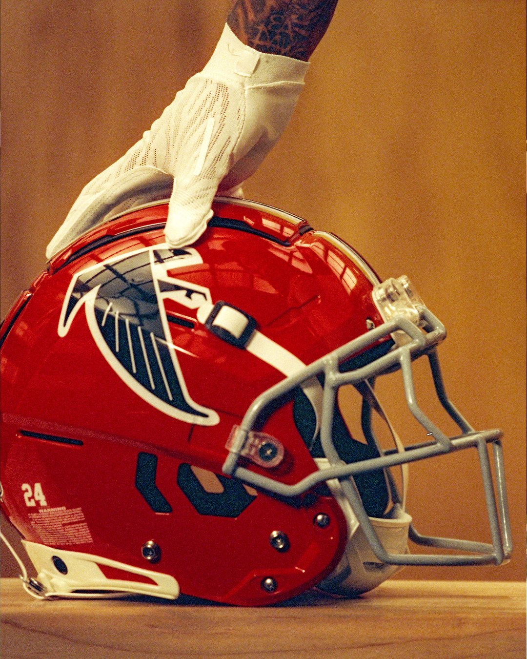
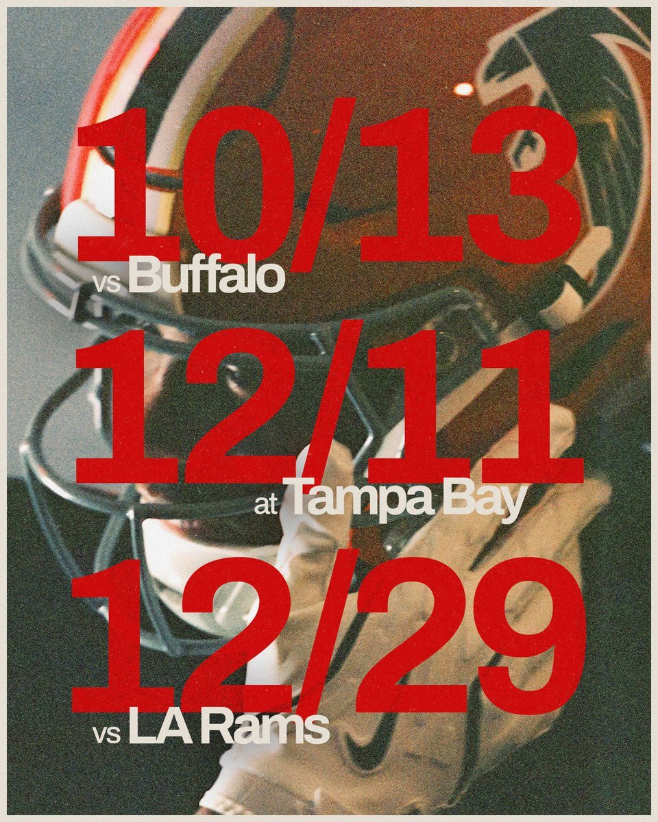
The Atlanta Falcons are ready to shine under the lights—and they’re doing it in style. The team announced that their fan-favorite throwback uniforms will return for three prime-time games during the 2025 regular season. The move not only taps into Atlanta’s rich football heritage but also signals a growing trend: when the Falcons go throwback, they win.
Atlanta will first suit up in the retro fits on October 13 in a Week 6 home matchup against the Buffalo Bills. Kickoff is set for 7:15 p.m. ET on ESPN, marking the Falcons’ first home prime-time game of the season.
The throwbacks will make a second appearance in Week 15 on December 11, when the Falcons travel to take on the Tampa Bay Buccaneers for Thursday Night Football on Amazon Prime.
The final throwback game is set for Week 17, as the Falcons host the Los Angeles Rams on Monday Night Football (December 29), closing out their throwback slate in front of a national audience once again.
It’s not just a style statement—it’s a winning formula. Last season, the Falcons went 3-0 in their throwback uniforms, notching key victories against divisional rivals and finishing the look off with a dominant performance over the Giants:
With a clean vintage design, black helmets, red jerseys, and white pants, the Falcons' throwback look continues to connect with longtime fans while energizing the current squad on the field.
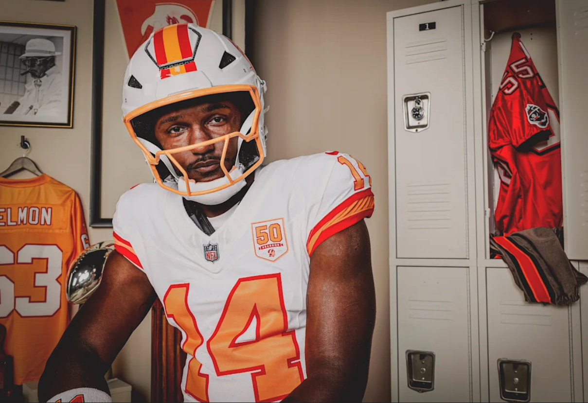
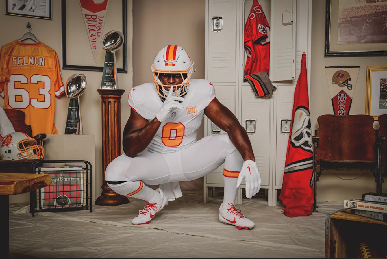
The Tampa Bay Buccaneers are throwing it all the way back. To celebrate their historic 50th season in the NFL, the Bucs are bringing back a look that helped define their identity from day one, the iconic 1976 uniforms.
Set to debut during the 2025 season opener against the New York Jets on September 21, the recreated kits mark the first time since the team’s inaugural season that the original uniform design will be worn in a game. While fans have seen the Creamsicle palette make return appearances in throwback games over the years, this drop is different. This is history reborn—down to the stitching.
“The '76 Jersey represents a piece of Buccaneers history and serves as a tribute to the generations of fans and players who shaped this franchise,” said Bucs COO Brian Ford. “As we launch into our 50th season, we're proud to reintroduce The '76 Jersey and the tradition it embodies.”
The 1976 throwback uniform is a full replica of the Bucs’ original design:
White jersey with bold orange numbers outlined in red
Classic sleeve striping—one orange stripe bordered by two red stripes
White pants, white helmet with the original Bucco Bruce logo, and striped socks
A special 50th season Creamsicle patch added to mark the milestone year
And in a subtle—but-nostalgic twist, the inside of the collar features the phrase “Hey! Hey! Tampa Bay!” in tribute to the team’s original fight song, which debuted in 1979 during the Bucs' first playoff run.
While the look stays true to its 1976 roots, the uniform itself is far from outdated. In partnership with Nike, the team’s design incorporates the latest in performance innovation using the Nike Vapor F.U.S.E. chassis—a lightweight, stretch-woven system designed for optimal mobility and breathability.
Made from 85% recycled materials, the jersey also features Nike’s Dri-FIT technology and laser-cut ventilation zones, combining sustainability and high performance without sacrificing heritage.
When the Buccaneers first took the field in 1976, few could have predicted the journey the franchise would take through long rebuilds, dramatic turnarounds, and Super Bowl championships. This 50th season isn’t just about the wins, though. It’s about honoring the evolution of the brand, the city, and the fanbase that’s grown alongside the team.
By reviving the '76 uniforms in a game setting for the first time in nearly five decades, the Bucs are giving a new generation of fans a tangible connection to their roots—while letting the OGs relive a moment that started it all.
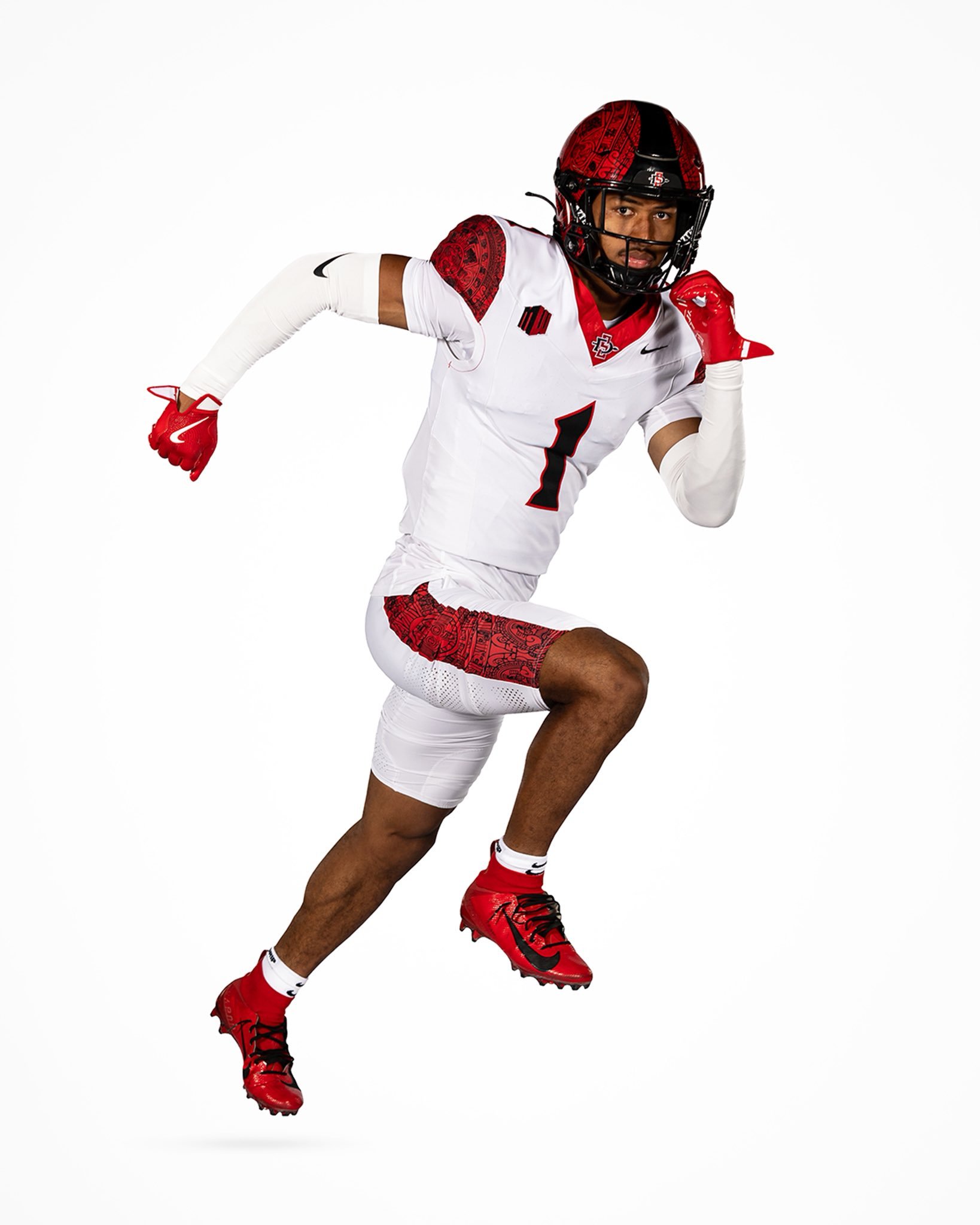
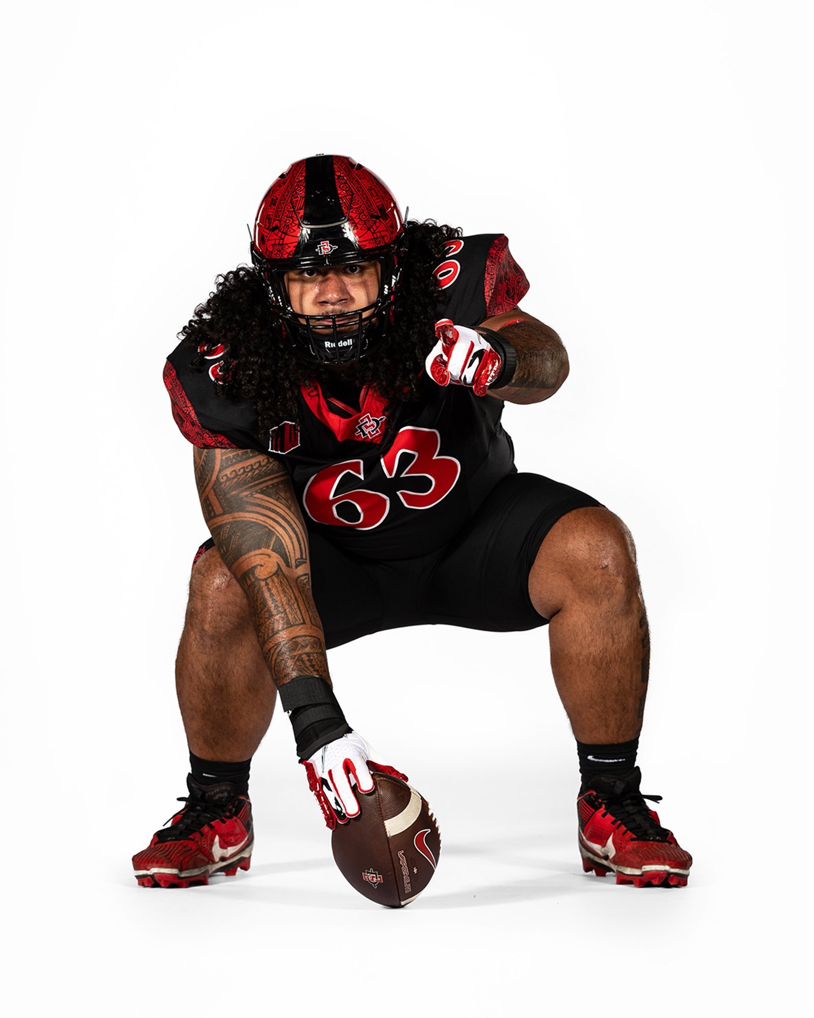
San Diego State Football just dropped a uniform refresh that pays homage to its heritage while dialing up the clean, bold aesthetic. The Aztecs have streamlined their look for the upcoming season, delivering a design that’s rooted in tradition but built for today’s game.
The most noticeable change is The removal of the “San Diego State” wordmark across the chest. This subtle but impactful update allows the rest of the uniform to breathe, giving the jersey a cleaner and more modern silhouette. It's a move that leans into simplicity and lets the details do the talking.
One of those standout details is the iconic Aztec Calendar pattern, woven directly into the shoulders of the jersey and running down the side of the pants. This design element has long been a signature for the program, paying tribute to the cultural legacy that defines SDSU athletics. We will see the same helmet shell that features the design.
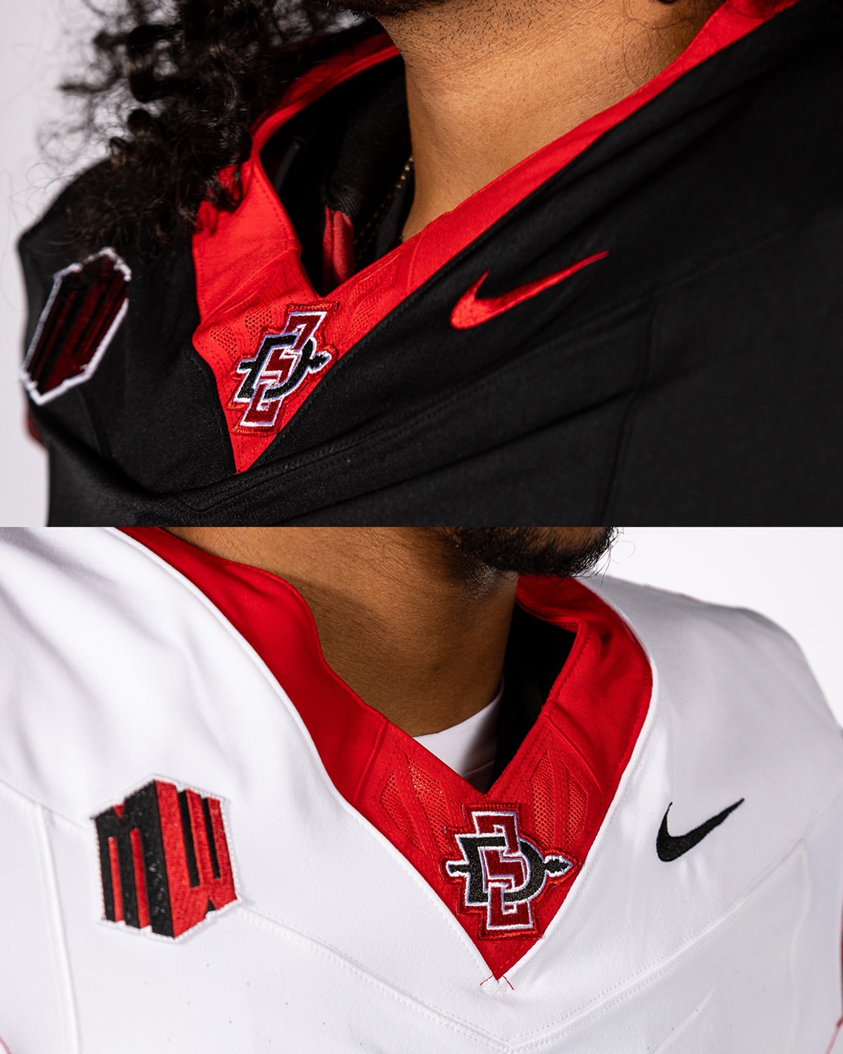
Both the black and white base uniforms now feature striking red collars—a sharp contrast that brings a burst of energy to the neckline. Sitting front and center on the "V" of the neck, is the SDSU logo, giving the look a branded finish that ties it all together.
Color-wise, the black jersey pops with red numbers outlined in white, while the white jersey flips the palette with black numbers outlined in red. It’s a balanced, high-contrast scheme that ensures visibility and style no matter where the Aztecs are playing.
This update doesn’t try to reinvent the wheel—it sharpens what was already one of college football’s most unique looks. With cultural significance, streamlined design, and renewed energy, SDSU’s updated uniforms are a perfect blend of tradition and swagger.
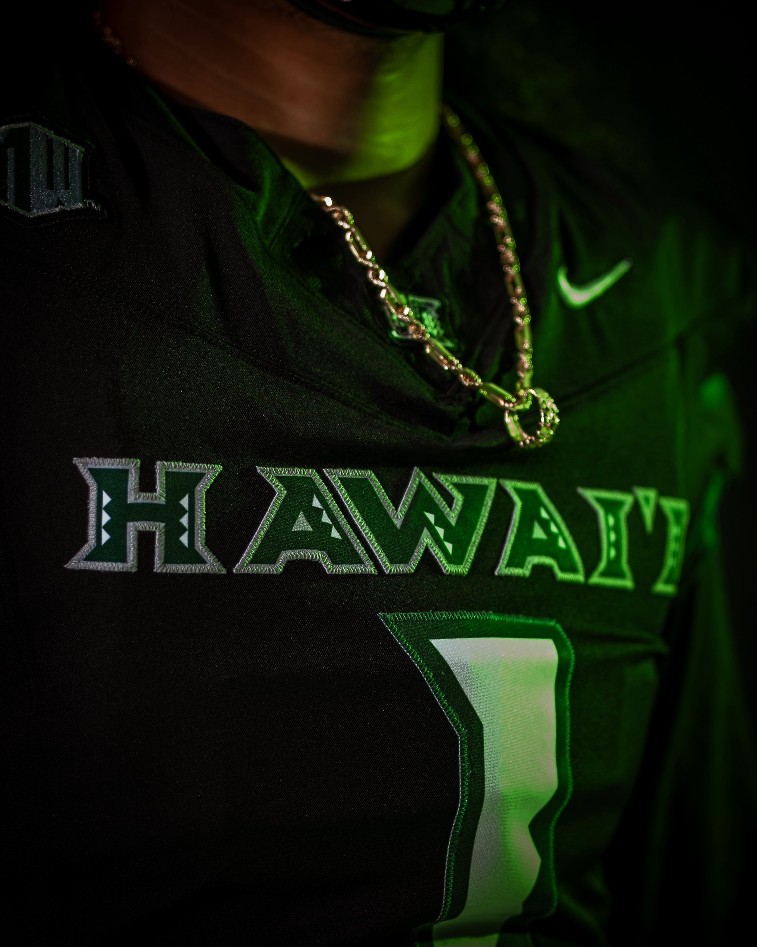
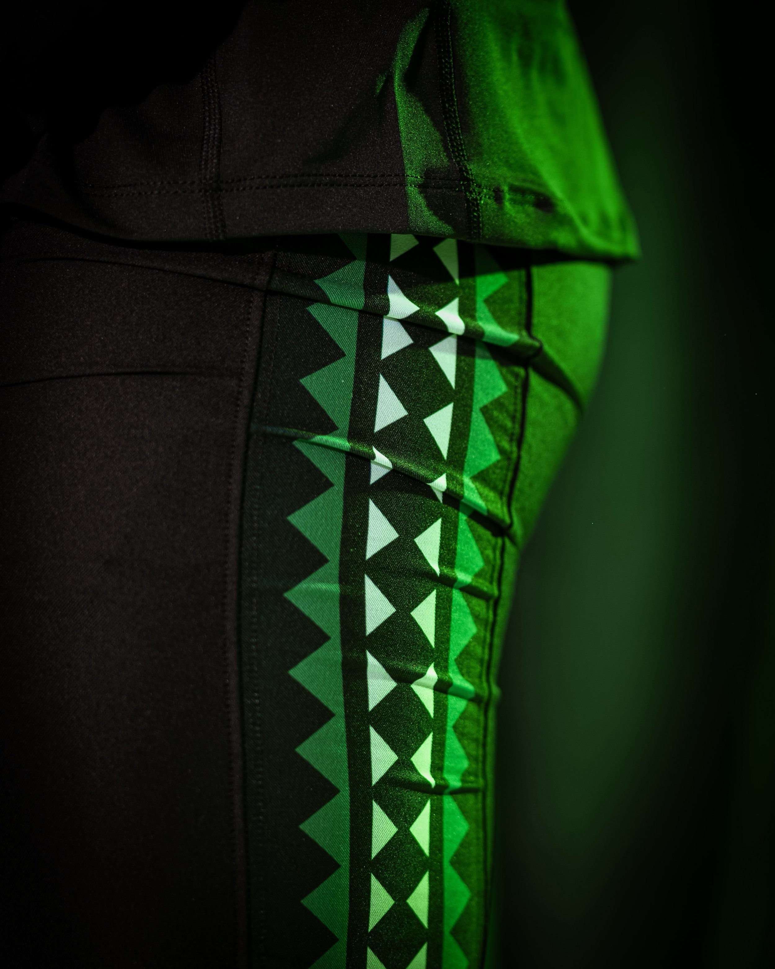
The islands just got even tougher. Hawai’i Football has dropped their new black Nike uniform set for the 2025 season, and it’s everything you’d expect from the Rainbow Warriors: clean, culturally rich, and straight-up intimidating.
This look stays true to the program’s roots while bringing fresh energy to the field under the lights. From the "HAWAI‘I" wordmark stitched across the chest to the Polynesian pattern accents, every detail on the new uniforms is intentional and symbolic of the islands' heritage and strength. paying tribute back to the days of Colt Brennan.
The base is a black jersey that lets the signature green and silver tones pop throughout the design. “HAWAI‘I” stretches across the chest in a bold tribal-style font, filled with traditional island motifs and trimmed in silver. The numbers — oversized and outlined in green — feature subtle angular cuts, nodding to native tattooing styles and patterns.
On the shoulders, triangle-patterned tapa designs in green and teal pay homage to Polynesian culture, offering both a nod to the past and a modern, aggressive edge.
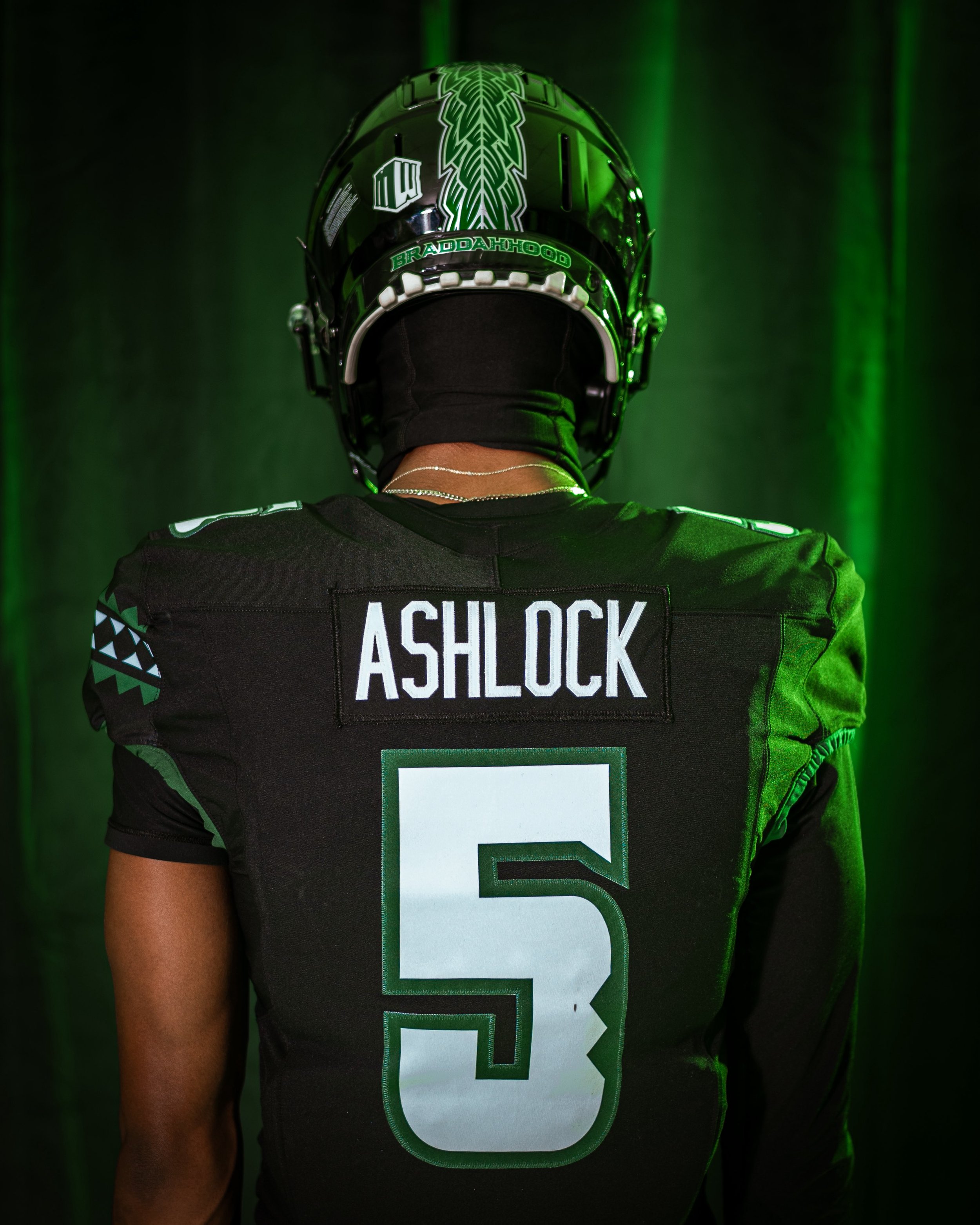
The helmet is where the culture really shows out. A glossy black shell features a vertical feathered pattern, with the word “BRADDAHOOD” on the back bumper.
Expect to see these new black unis become a fan favorite — and a recruiting weapon — as the Rainbow Warriors continue to evolve under the lights of Mānoa.
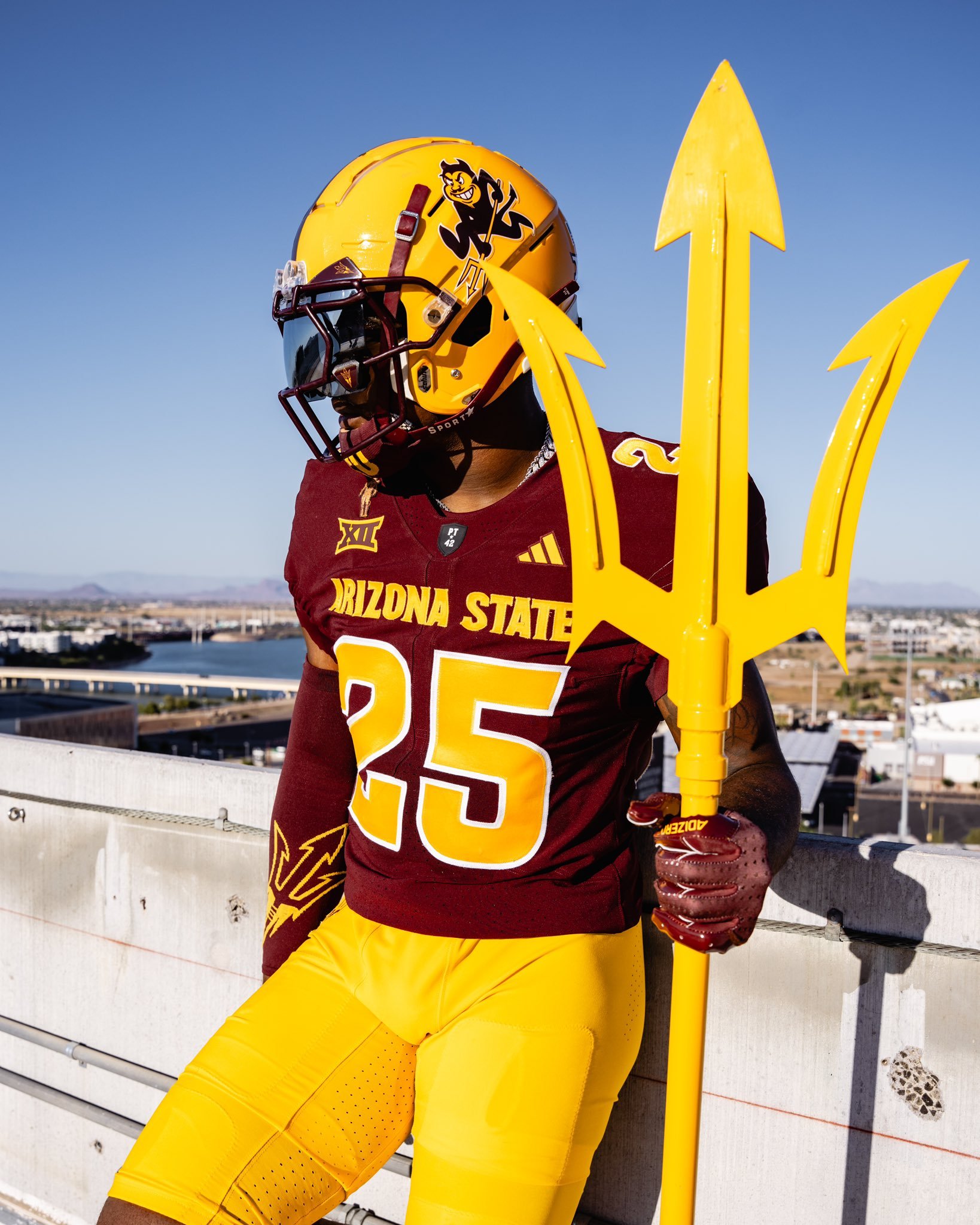
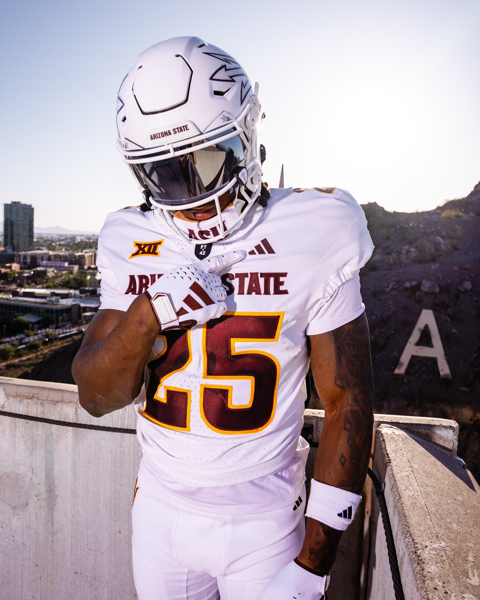
The Arizona State Sun Devils have officially revealed a bold new look. Dropped with the theme “Tradition meets evolution,” the updated uniforms showcase a fresh blend of heritage and modern flair.
ASU introduced two primary sets: a classic maroon and a clean white kit. The maroon jersey features gold numbers and lettering, with “Arizona State” emblazoned across the chest, paired with a gold helmet that proudly displays Sparky—the school’s iconic mascot. On the white set, maroon lettering and numbers are complemented by a sleek white helmet marked with the signature pitchfork logo.
While the color schemes and logos reflect ASU’s longstanding tradition, several updated touches signal a new chapter. Both jerseys include the Big 12 patch on the left shoulder. Under the neckline sits the revered “PT42” patch, a tribute to Pat Tillman, the legendary ASU alum and American hero. On the maroon jersey, a silhouette of Tillman himself is stitched above the Big 12 logo, further honoring his legacy.
The new uniforms strike a balance between honoring ASU’s storied past and embracing its future in a new conference. With tradition stitched into every detail and a bold aesthetic to match, the Sun Devils are geared up for a fresh era of football in the desert..
As the Tigers head into the new season, they’ve officially unveiled their uniforms—and while there’s no sweeping overhaul, the minor details show a program that respects its roots while sharpening its visual edge.
The home set sticks to the traditional navy jersey, highlighted by crisp orange and white sleeve stripes that have become synonymous with Auburn’s brand of football. On the road, the Tigers will again suit up in their signature “storm trooper” look—white jerseys with navy and orange sleeve striping, paired with white pants featuring navy and orange piping down the sides.
The helmets, as expected, remain unchanged: white shell, navy stripe, and the iconic interlocking AU on either side.
Where fans will notice something new is in the typography. Auburn has updated the font on both the numbers and nameplate. The numbers now appear in a bold, old-school block font—large, clean, and designed to pop from the field or on screen. Meanwhile, the nameplate adopts a taller, narrower style, giving the back of the jersey a sharper, more defined look than in recent years.
This minor update achieves what Auburn fans typically want: tradition respected, but visuals refreshed. The result is a uniform that feels unmistakably Auburn—with just enough evolution to keep things fresh in 2025.
— Cincinnati Football (@GoBearcatsFB) July 2, 2025
The Cincinnati Bearcats are leveling up in 2025 with a sharp, unified look that blends tradition and innovation. With three core colorways — black, white, and red — the Bearcats' latest Nike-designed uniforms are more than just fresh gear; they’re a bold statement about pride, identity, and a program on the rise.
The updated uniform lineup features three primary sets:
"Classic Black"
"Pure White"
"CINCY" Red
Each version includes matching pants and helmets, staying true to Cincinnati’s signature toughness while refreshing the visuals fans have come to know and love. The iconic C-Paw remains front and center on the helmet, now marking its 36th consecutive season as the program’s primary logo — a testament to its deep-rooted presence in Bearcat lore.
One of the standout changes? The brand-new "Cincy Stripe 2.0." The updated striping pattern, seen on the sleeves and running down the pants, adds a modern twist to a familiar motif, showing respect to the past while pushing forward with a sleeker, faster look.
In a first for Bearcats football, two-toned numbers make their debut. Designed exclusively for Cincinnati by Nike, the "Speed Block" number font adds a distinct edge and increased visibility. It’s the first time UC has featured a dual-color number scheme since 2007, and it instantly adds character to each uniform set.
Perhaps the most symbolic addition to the 2025 uniforms is the "Cincy" wordmark across the chest of the red alternate jerseys. First introduced by the basketball program in 2023, this branding element has quickly taken root among Bearcat athletes and fans. It captures the gritty, unapologetic spirit of both the university and the city itself.
This new uniform rollout does more than refresh the Bearcats’ look — it solidifies their identity. While the classic black and white looks anchor the team in its traditional visual DNA, the red "CINCY" alternate sends a clear message: this program isn’t just playing football — it’s building a brand, and doing so with a nod to its city’s culture and resilience.
— Georgia Tech Football (@GeorgiaTechFB) July 1, 2025
It’s July, and the countdown to kickoff is officially on. With fewer than two months until Georgia Tech takes the field under the Friday night lights in Boulder against Colorado, the Yellow Jackets just gave fans even more reason to get hyped.
The program dropped their 2025 uniform collection, showcasing three fresh looks—white, gold, and grey.
The white jersey with gold numbers returns from the 2024 set, a clean, classic look that honors Tech's traditional palette. But what really stands out in this new drop are the grey and gold-on-gold combinations, each offering a unique identity that blends innovation with tradition.
The grey-on-grey uniform features gold numbers and a modernized number font. While the design echoes Georgia Tech’s 2023 “ghost” uniforms, this year’s grey set takes a more grounded approach. It’s bold but wearable, offering a fresh alternative to the typical road or blackout looks.
Then there’s the gold-on-gold set, arguably the crown jewel of the collection. Featuring white numbers on a rich, metallic gold base, this uniform is a nod to both the literal color of Georgia Tech’s brand and the winning legacy rooted in The Flats.
While the uniforms are officially out, the helmet situation remains a mystery. Georgia Tech has yet to confirm whether they’ll debut new lids or stick with their standard design.