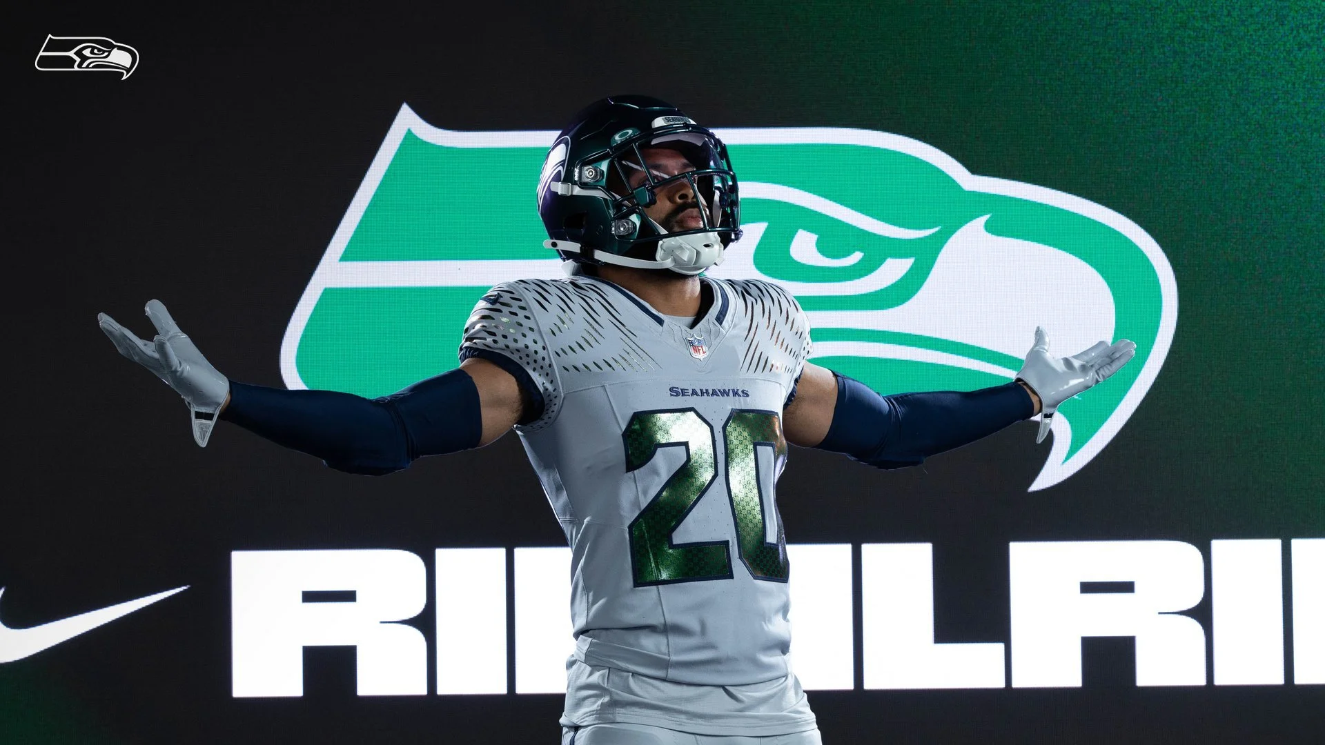
The innovative design introduces an Iridescent Green helmet and uniform accents, with soundwaves and 12 logos to reflect the noise that reverberates throughout the stadium on gamedays.
The Seattle Seahawks turned the spotlight on their fans Thursday, unveiling their brand-new Rivalries uniform, a bold wolf grey and iridescent green look that celebrates the heart of the franchise: the 12s.
Set to debut in Week 16 when the Seahawks host the Los Angeles Rams at Lumen Field, the Rivalries fit is packed with details that tie directly back to Seattle’s connection with its fanbase.
The design starts with wolf grey jerseys and pants, accented by iridescent green numbers that shimmer and shift with the light. The helmet matches in iridescent green with a metallic chrome finish, creating a futuristic edge unique to the Pacific Northwest.
But the true standout? The 12s. A 12s patch stitched into the uniform. A 12 pattern inside the jersey numbers that reflects under the lights. Helmet bumpers that read “12 As One.” Soundwave graphics on the shoulders and down the pant legs, representing the earth-shaking noise that makes Lumen Field the loudest stadium in the NFL.
“The Rivalries program is about celebrating what makes our team and city unique,” said Allison Hoover, Seahawks managing director of marketing. “Without question, that’s the 12s. This uniform is a tribute to the 12s, the loudest, most passionate fans in sports. When opposing teams come to Lumen Field, they not only face fierce competition on the field, but also the high-decibels of the 12s in the stands.”
The Seahawks join the rest of the NFC West and AFC East in this first wave of Rivalries uniforms. Each team will debut their look for one home game against a division rival this season, with the rest of the league rolling out designs over the next three years. Nike, the NFL, and each franchise worked together to ensure every uniform was tailored to the team’s city, history, and culture.
From wolf grey grit to iridescent flash, Seattle’s Rivalries uniform is more than just a new look — it’s a wearable tribute to the 12s who define the Seahawks’ identity.
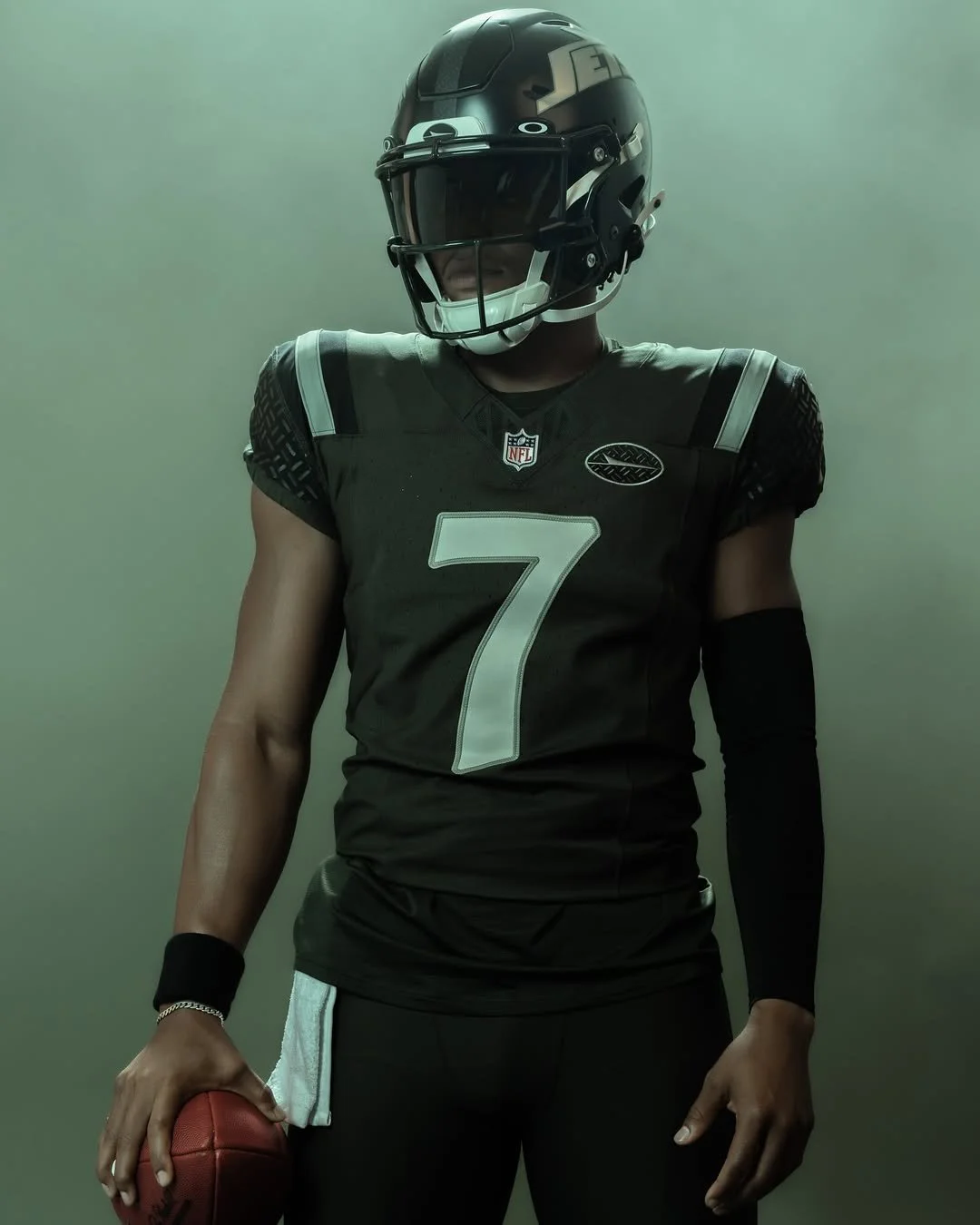
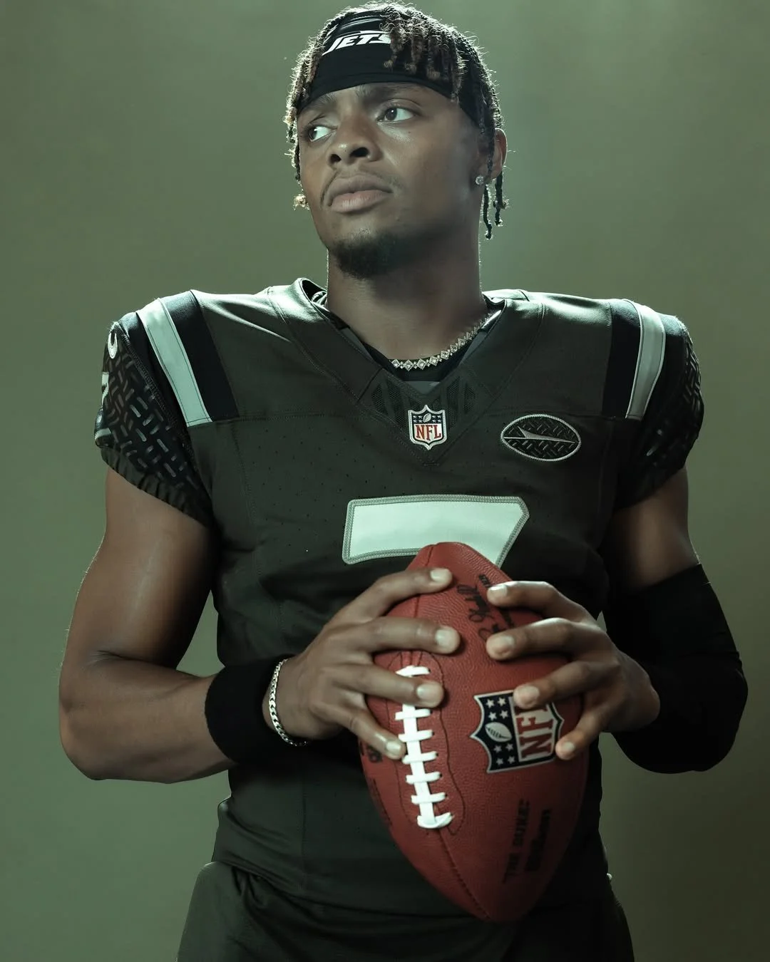
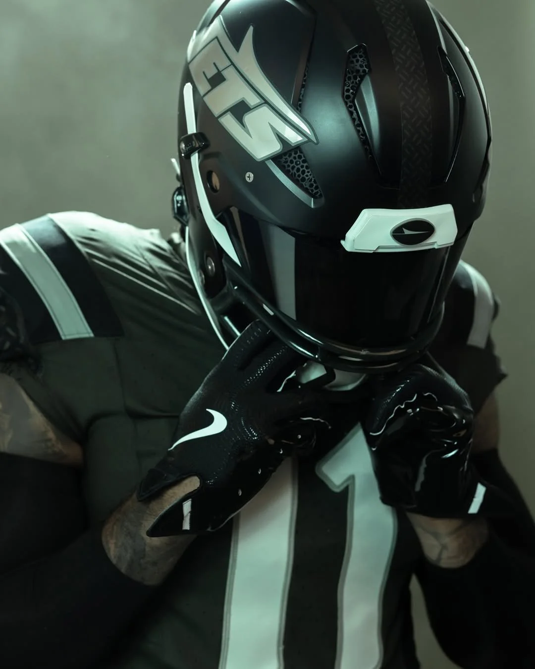
The New York Jets are adding a new chapter to their storied history with the unveiling of their “Gotham City Football” Rivalries uniform. Revealed Thursday morning, the look will make its on-field debut when the Jets host the Miami Dolphins on December 7 at MetLife Stadium.
As part of the NFL and Nike’s newly launched Rivalries program, the Jets are one of the first teams to showcase an alternate uniform designed to capture the spirit of their city and their fiercest matchups. Inspired by the grit and identity of New York, the “Gotham City Football” design pays homage to the toughness and work ethic that define the region.
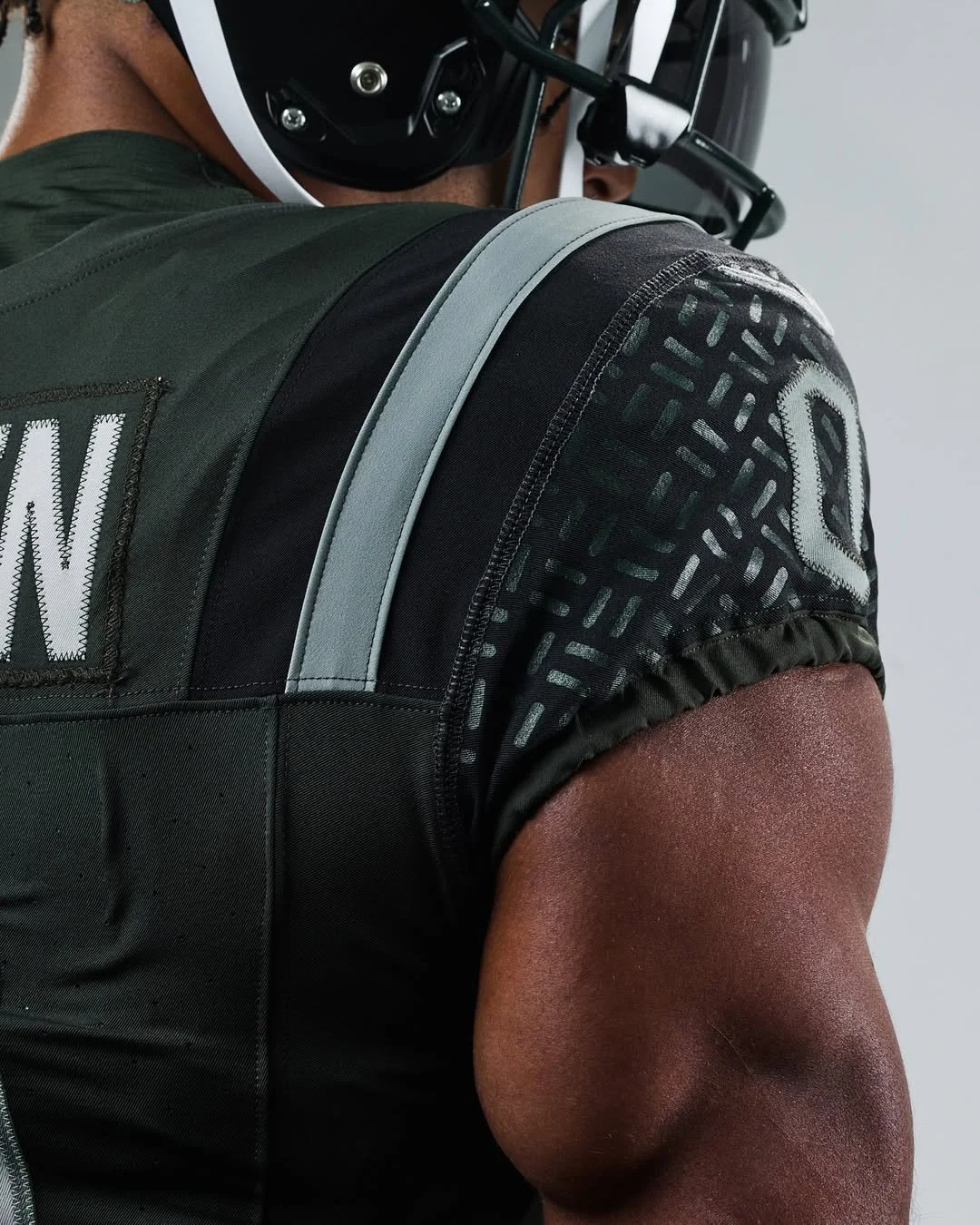
“It quickly became evident that Gotham City Football was an obvious direction for us to take with the Rivalry uniform,” said Chris Pierce, vice president of fan commerce for the Jets. “Our green is filtered to reflect the hazy, steamy, smoky city streets, and we added Black, Light Iron Ore, and Dark Stucco to mirror the streetscape of New York. The nod to the iconic NYC manhole pattern on the shoulders and behind the plane logo is uniquely our own and powerful imagery for what it means to be a New York Jet. Adding our fifth uniform and third helmet in 16 months is something we’re extremely proud of. We want our uniforms to resonate with players and fans and showcase a deep emotional connection to this franchise.”
Nike and the NFL announced the Rivalries program during draft weekend, describing it as a four-year rollout designed to elevate some of the league’s most iconic rivalries. “The unveiling of the first eight Rivalries club uniforms and fan gear marks a significant moment for the NFL, Nike and Fanatics,” said Taryn Hutt, vice president of club marketing at the NFL. “Rivalries will bring fresh energy to the field with each new uniform, while amplifying the community and hometown pride that is rooted in each NFL fan.”
The Rivalries program will continue to expand in the coming years. In 2026, teams from the AFC South and NFC North will join the mix, followed by NFC East and AFC West in 2027, and finally the AFC North and NFC South in 2028. The Jets, meanwhile, will remain in the program through the 2028 season, giving fans plenty of opportunities to see how “Gotham City Football” evolves into a central part of the team’s identity.
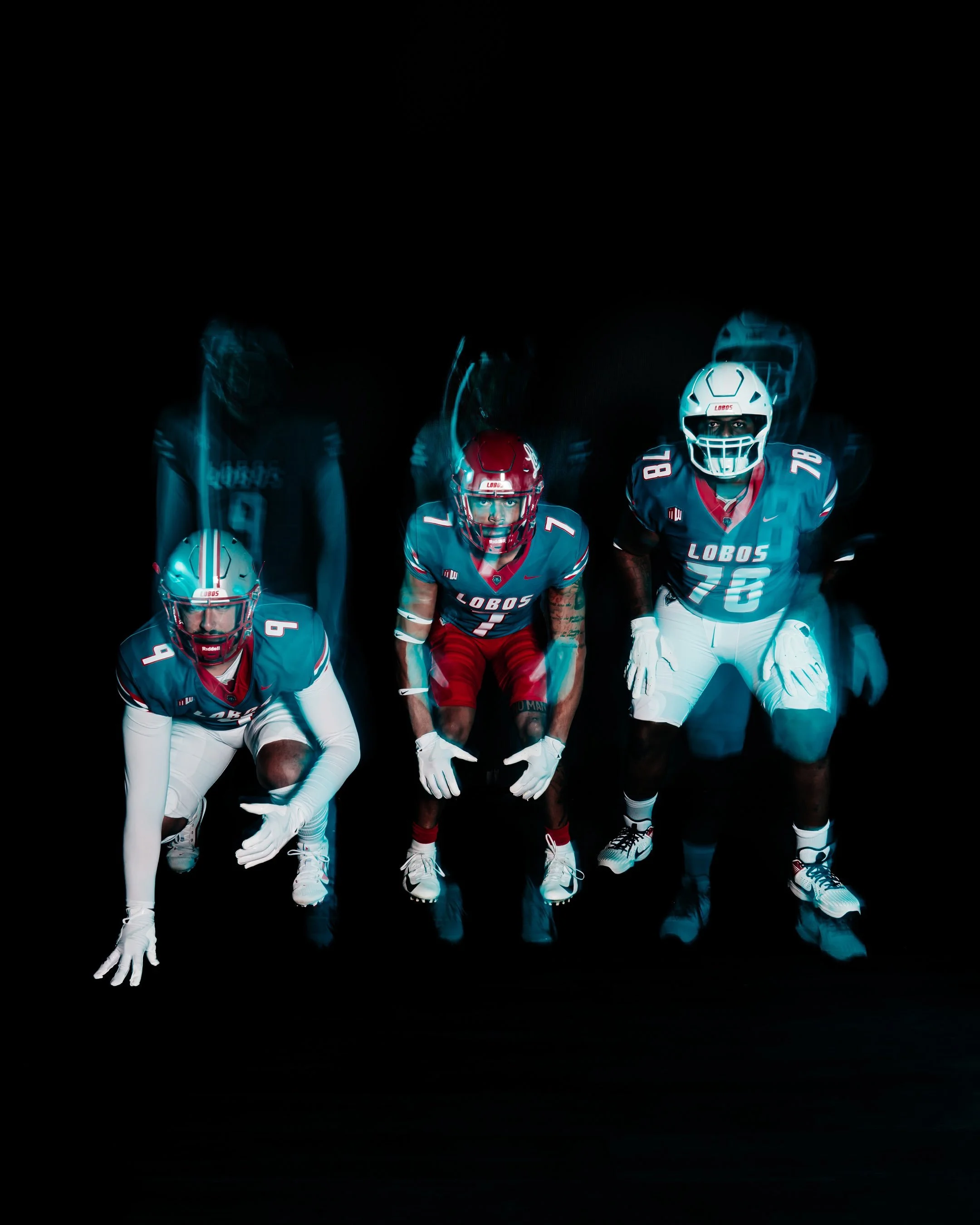
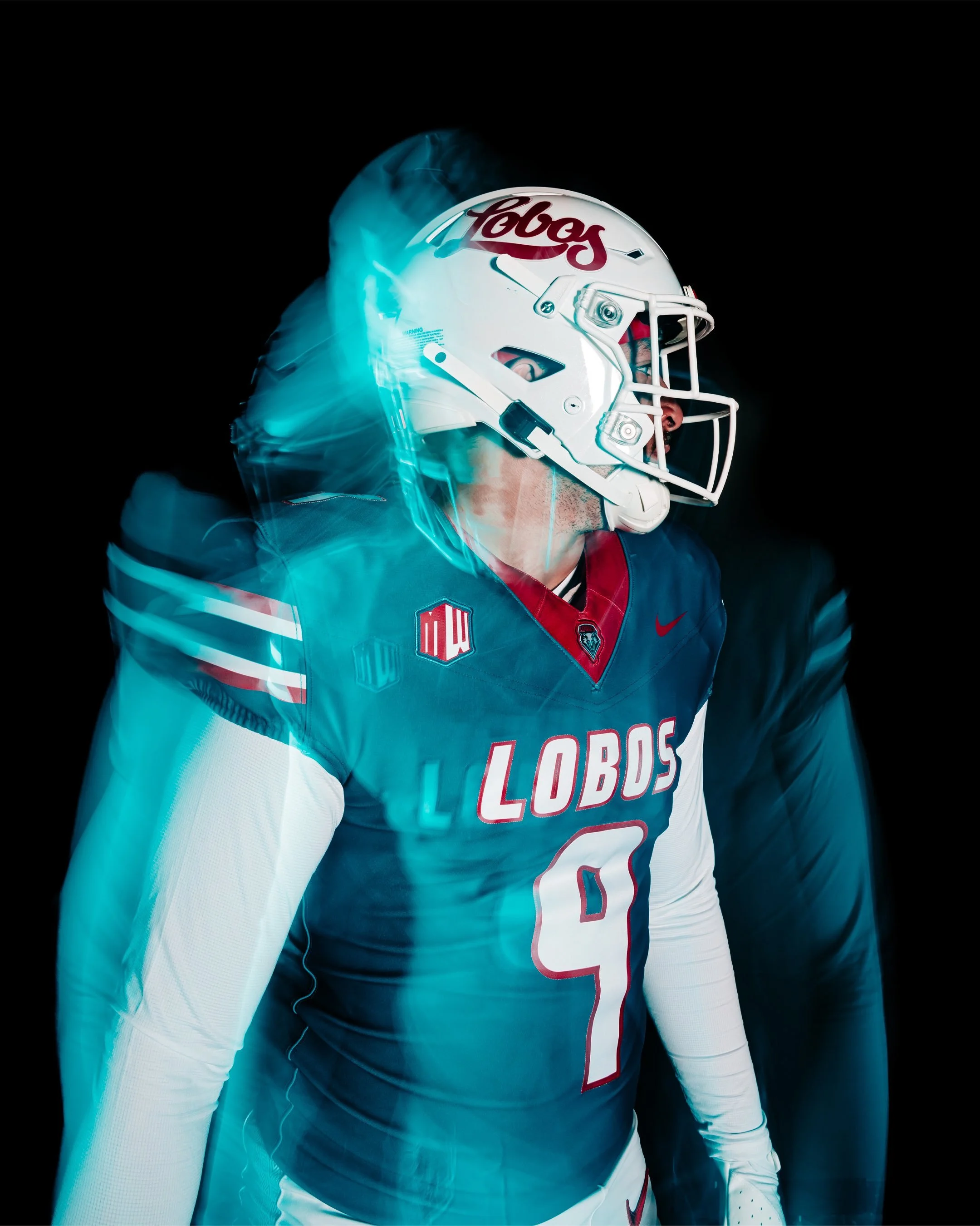
This fall, New Mexico Football is bringing back turquoise, a color with roots that run deep in the state’s culture and the Lobos’ athletic tradition. More than just a design choice, turquoise represents life, resilience, and identity. When the Lobos take the field in their United in Turquoise uniforms, they’ll be wearing a symbol of who they are — for the past they honor, for the state they live in, and for the future they represent.
The story of turquoise at UNM is rich and layered. The Lobos’ earliest colors in the 1890s were black and gold, but those never truly captured the essence of New Mexico. It was Harriet Jenness, a faculty member who taught art, drama, and music, who suggested crimson and silver to better reflect the landscape. Crimson for the evening glow of the Sandia Mountains, and silver for the Rio Grande winding like a ribbon through the valley. Her vision stuck, and cherry and silver became the official identity of the Lobos.
In 1973, turquoise was officially added to the palette of school colors, and for six seasons the football team made it their own. The Lobos wore turquoise jerseys at home, creating one of the most iconic looks in program history before returning to cherry and silver in 1980. Their last game in turquoise came in a 17-3 win over Wyoming on November 24, 1979, marking the end of an era.
The color made a return in 2013 as an alternate accent, with UNM donning white jerseys with turquoise numbers and trim against Fresno State. The Lobos continued to wear turquoise accents once a season through 2022, while experimenting with other alternates like silver and anthracite along the way. Still, fans longed for a true revival of the original 1970s turquoise look.
Now, that wait is over. For the first time in over four decades, New Mexico Football will once again wear the turquoise jerseys in their full glory, honoring the past while uniting players and fans in the vibrant identity of the state.
It’s more than a uniform. It’s a connection to heritage. A reminder of resilience. And a celebration of New Mexico itself.
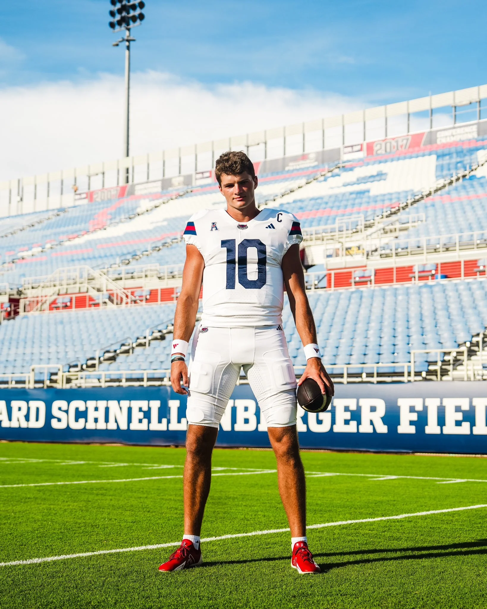
Florida Atlantic Football is turning 25 years old this season, and the Owls are marking their Silver Anniversary with a brand-new look. On August 21, just nine days before their season opener, FAU revealed their updated uniforms. The redesign also signals the start of the Zach Kittley era, ushering in a streamlined aesthetic that leans heavily into tradition and simplicity. The new set features: Two helmets: blue and white, Two jerseys: blue and white, and Two pants: blue and white.
Noticeably missing from the lineup is red, which has been reduced to an accent color rather than a primary element. This marks a significant shift from FAU’s recent uniform history, where red, along with black and even sand-colored alternates, made appearances throughout the last decade. For now, the Owls are keeping it clean and consistent, with blue and white as the foundation of the program’s identity.
While FAU may eventually reintroduce red helmets, jerseys, or pants down the line, the initial reveal focuses on four core combinations that balance tradition with a modern edge. The stripped-down look is designed to give the program a strong, cohesive brand presence as they enter their 25th season on the gridiron.
For a team looking to make a statement in the American Conference, these new uniforms represent more than just a change of wardrobe — they’re a symbol of a new era for FAU Football.
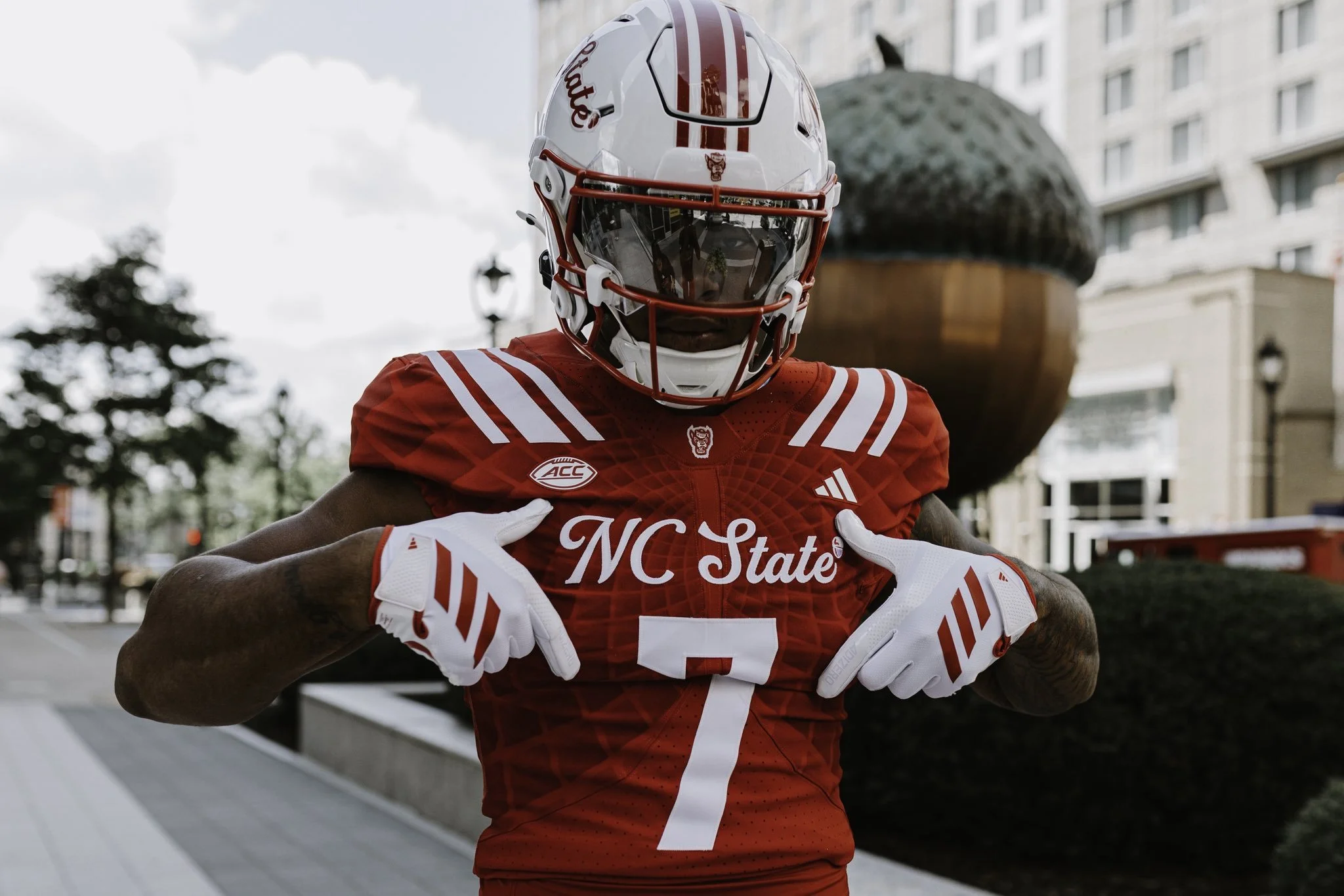
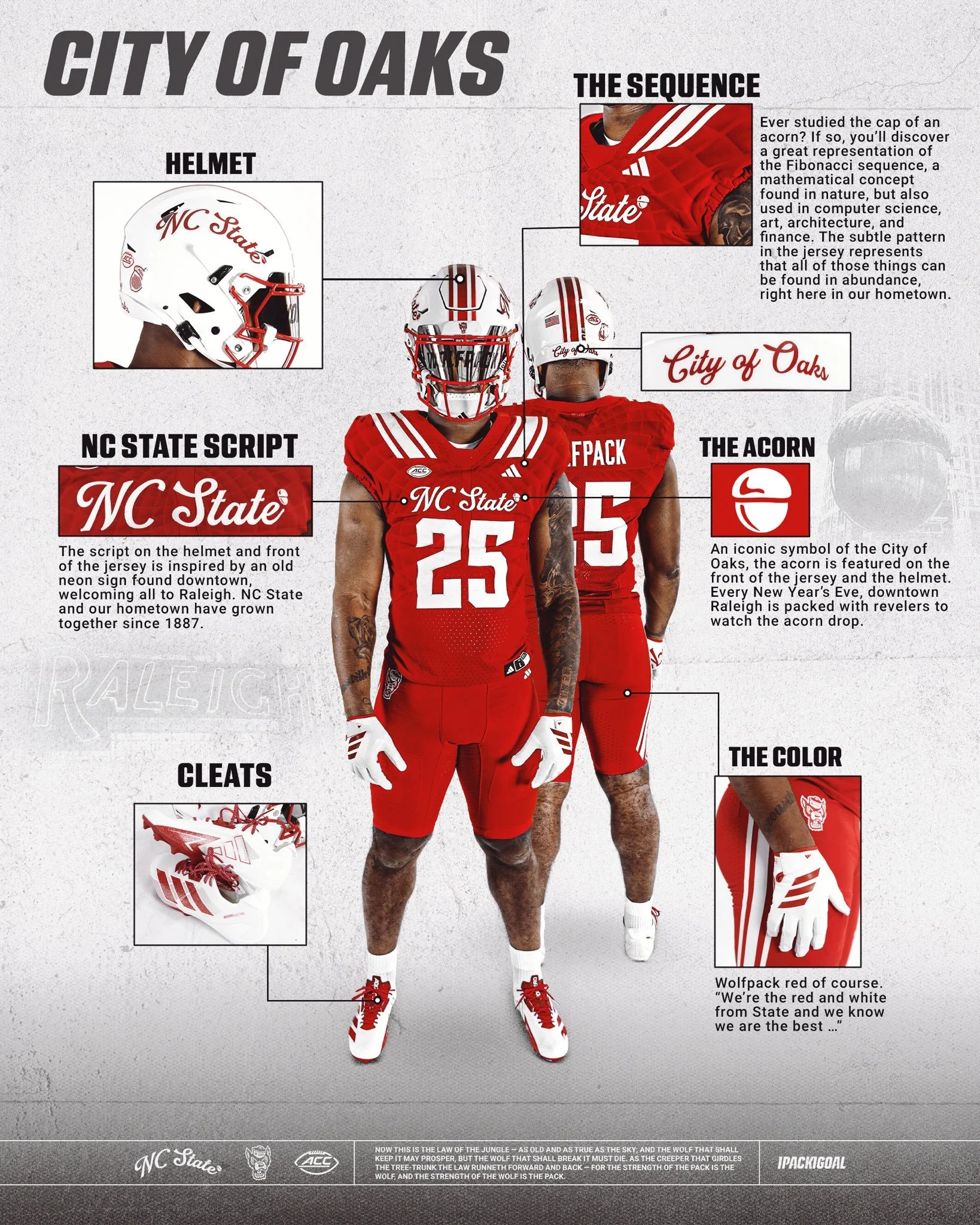
NC State has revealed a new uniform that blends tradition, local pride, and modern design in a way that perfectly represents the Wolfpack and their hometown of Raleigh, the City of Oaks.
The defining feature of the uniform is the script "NC State" showcased on both the helmet and the front of the jersey. The inspiration comes from an old neon sign once found downtown, welcoming all to Raleigh. Just as NC State and the city have grown together since 1887, this script pays homage to that shared history.
Look closely at the jersey fabric and you’ll find a subtle pattern inspired by the Fibonacci sequence, a mathematical design rooted in nature. Much like the acorn’s cap, where this sequence is famously visible, the detail reflects how art, science, architecture, and innovation thrive throughout Raleigh, making the city a true hub of culture and progress.
No symbol is more closely tied to Raleigh than the acorn. Known as the City of Oaks, the acorn is featured proudly on the front of the jersey and helmet. It’s a nod to a beloved local tradition, where every New Year’s Eve thousands gather downtown to watch the giant acorn drop at midnight.
And of course, no NC State uniform is complete without Wolfpack Red — bold, fierce, and instantly recognizable. As the school fight song reminds us: “We’re the red and white from State, and we know we are the best…”
With these thoughtful design touches, the “Script Pack” uniform is more than just a look; it’s a celebration of Raleigh, its history, and the Wolfpack’s connection to the city they proudly represent.
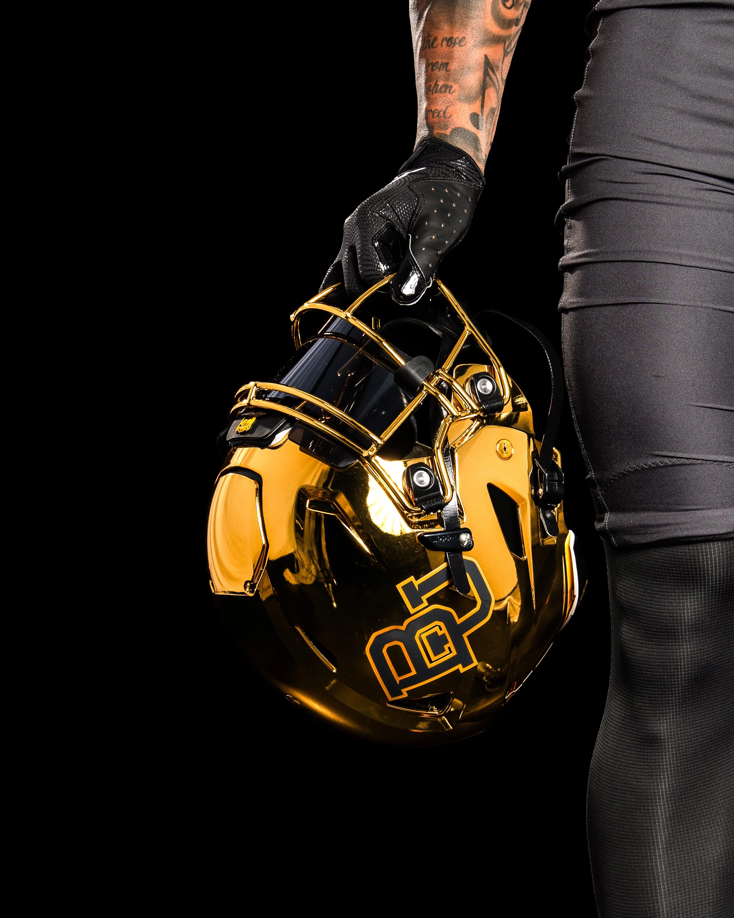
The shine is back in Waco. Baylor football is officially bringing chrome helmets back to the field for the first time since 2017, adding a bold and modern twist to its 2025 uniform lineup.
The Bears first introduced chrome lids in 2013 during one of the program’s most successful stretches in history, wearing them through the 2017 season. That era included back-to-back Big 12 championships, four straight bowl appearances, and some of the most explosive offenses college football has ever seen.
Deputy Athletics Director and COO Jovan Overshown explained that the return has been in the works for years.
“This helmet has been a secret passion project for a couple of years now. We wanted the perfect look and perfect moment — one that nods to the storied success of those who wore the chrome before us, while giving it a modern, refined edge that captures the energy and expectation of today and the future.”
The chrome helmet made its Baylor debut on October 5, 2013, in a 73–42 blowout win over West Virginia. Over the next four years, the helmet became a signature look, worn in nine games — including the unforgettable 61–58 win over TCU and the 38–27 Big 12–clinching victory against Kansas State in 2014. The final appearance of the original chrome came on November 11, 2017, against Texas Tech.
Those years are remembered not just for championships, but also for an offense that lit up the scoreboard. During Baylor’s 2013–2014 title run, the Bears wore chrome six times, piling up 167 touchdowns, 1,259 points, and more than 15,000 yards of total offense.
The 2025 reveal featured none other than Baylor legend and 2025 Athletics Hall of Fame inductee Bryce Petty.
“Look good, feel good, play good,” Petty said. “If you can’t feel good in that thing, then I don’t know what you can feel good in. We’re going to play fast, and we’re going to win a lot in these things.
For Petty, who quarterbacked those high-flying Baylor offenses, the helmet represents more than just style — it’s a symbol of Baylor football’s energy and swagger returning to the spotlight.
Head coach Dave Aranda echoed the sentiment:
“It’s really cool to be part of bringing something back that carries so much meaning and reflects such an energized period in Baylor football. Seeing our student-athletes’ excitement, former players and our fans, it further fuels everything we’re about.”
After nearly eight seasons away, Baylor’s chrome helmets are back brighter, bolder, and ready to bring a new shine to the Bears’ future.
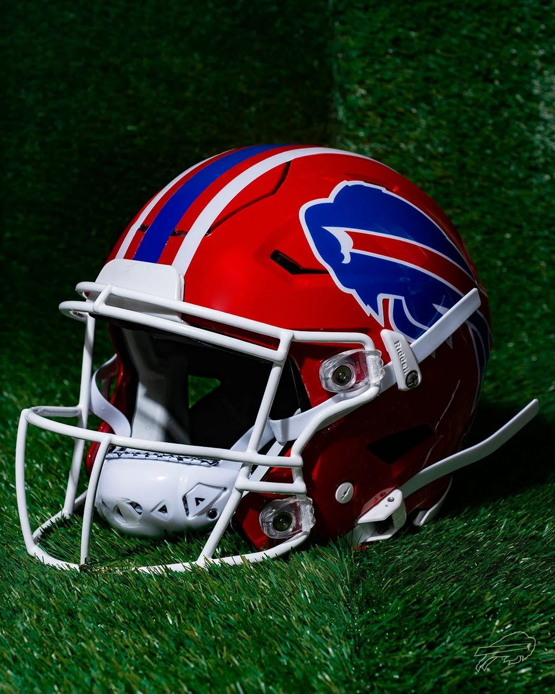
It’s official: the red lids are making their return to Buffalo.
The Buffalo Bills have announced the comeback of their iconic red helmets, worn from 1987 to 2001, for a special Week 18 matchup against the New York Jets — marking the final regular season game at the current Highmark Stadium before the team moves into their new home in 2026. And that’s not all. The Bills will also revive their classic Standing Buffalo throwback uniforms for two additional games during the 2025 NFL season.
With bold red shells, traditional blue-and-white striping, and a crisp white facemask, the red helmet is a direct throwback to a golden era of Bills football — the Super Bowl runs of the '90s, the legends that built the franchise, and a look that is forever etched into league history.
“There’s no better way to celebrate our fans and honor our team’s history than by bringing back the red helmets,” said Pete Guelli, Bills COO. “This is a great way to commemorate the closing of Highmark Stadium in our regular season finale.”
As the team prepares to move on from the current Highmark Stadium, the return of the red helmets and the classic throwbacks give fans a proper send-off. It’s a tribute not only to the players who built the franchise but also to the most loyal fanbase in football. For Week 18, expect the crowd in Orchard Park to be loud, proud, and decked out in red.
This is more than just a uniform drop — it’s a celebration of Bills history, a moment to reflect, and a look forward to the next era of Buffalo football.
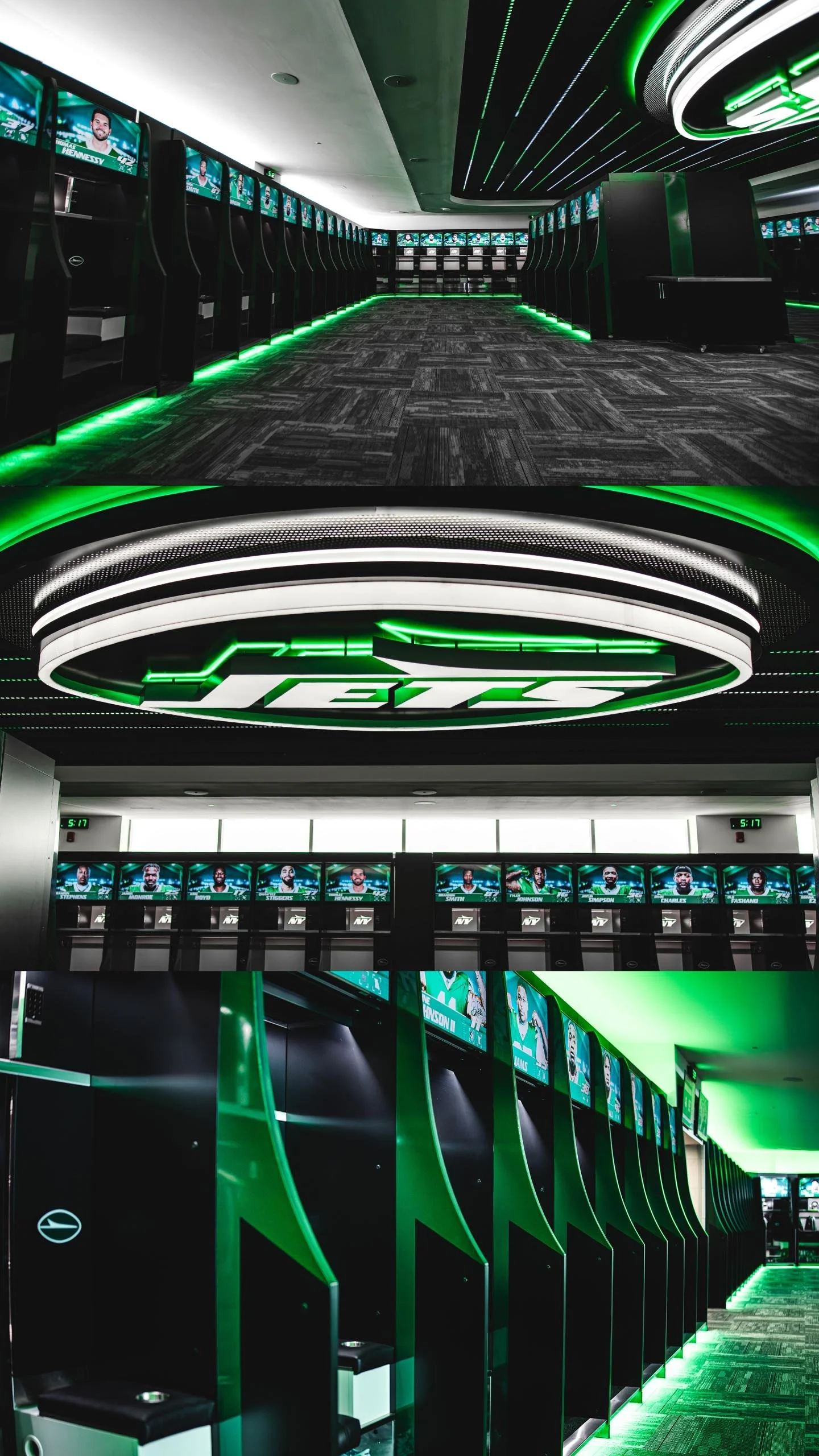
When the New York Jets reported to training camp this year, it wasn’t just the beginning of a new season — it was the unveiling of a game-changing upgrade to their home turf.
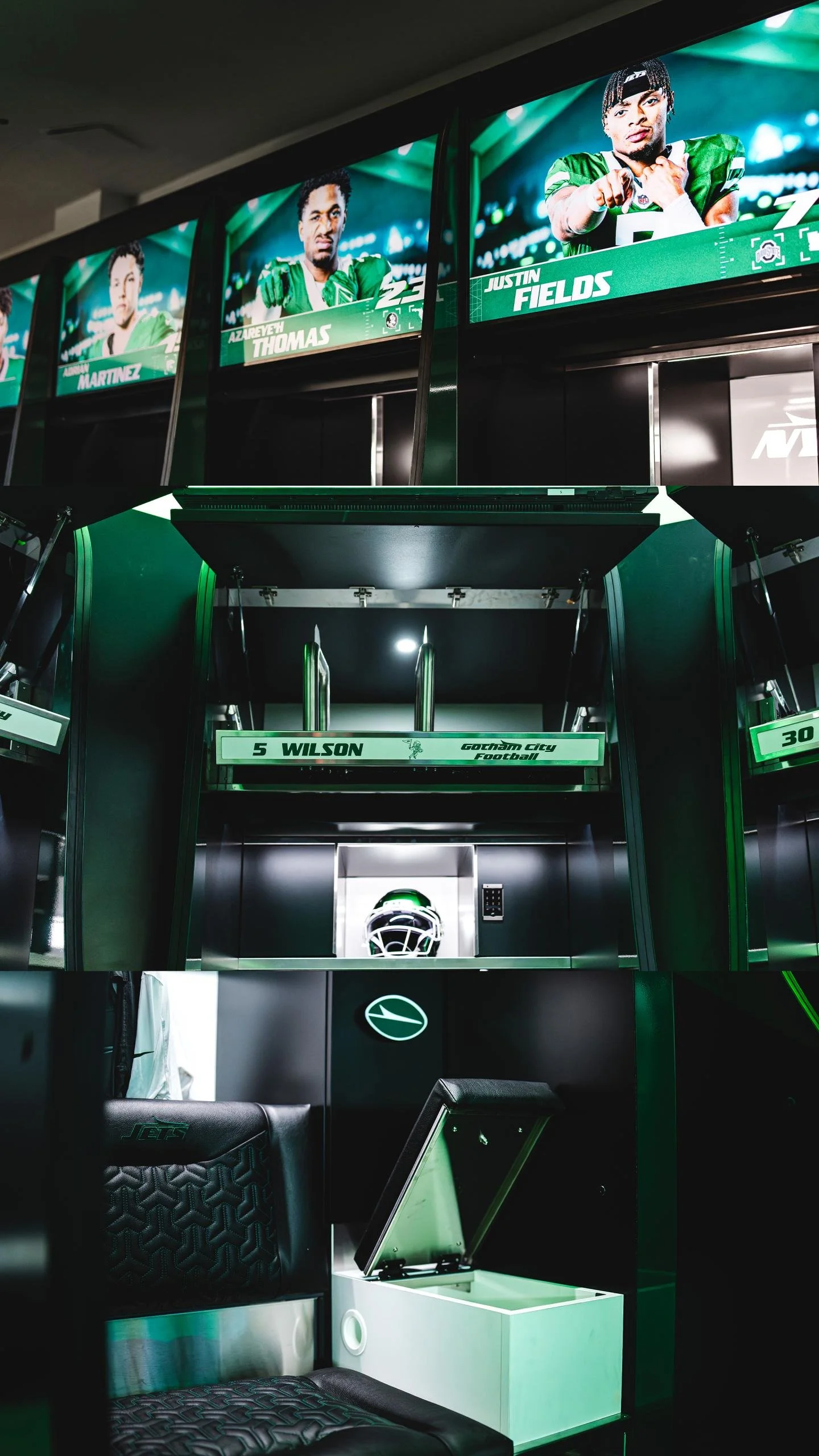
The Jets revealed a completely redesigned state-of-the-art locker room and team facilities at the Atlantic Health Jets Training Center, setting a new standard for player spaces in the NFL. From high-tech lockers and wellness enhancements to a vintage-inspired barbershop and a massive ceiling logo, the team’s facility is now a perfect blend of performance, comfort, and swagger.
The new setup features 92 custom-built lockers constructed from premium veneer, melamine, and stainless steel. These 1,000-pound units are anything but standard. Each one includes:
Automated video screens that can display schedules, messages, and motivational content.
Three ventilation fans dedicated to drying shoulder pads, helmets, and cleats.
USB charging ports, plush seats embroidered with the Jets logo, and green LED strip lighting that adds a glow of energy and edge to the room.
speakers integrated for a fully immersive audio experience.
The goal? Make every player feel like their locker is their own personal suite — and do it all in the name of wellness, performance, and pride.
“We are the first pro team or NCAA team to implement a fully automated video display into the lockers,” said Robert Mastroddi, Senior VP of Security and Facility Operations. “We made sure we had everything covered—from the size of the cupholders to the ventilation for gear. Every detail matters.”
Upgrades weren’t just for style. The wet area has been completely redone, and the new, larger sauna is optimized for recovery. Forced-air ventilation across the locker room minimizes moisture and reduces the risk of infection — all in service of peak player performance and longevity.
But perhaps the most jaw-dropping addition? A 2,000-pound, three-dimensional Jets logo suspended from the ceiling, featuring over 500 lights and a fully backlit and frontlit design. The hallway leading to the indoor fieldhouse now feels like a runway, with black textured wallpaper and green LEDs guiding players through the space.
Players won’t have to leave the facility to stay sharp. The Jets introduced a custom barbershop outfitted with two vintage black chairs from the 1950s, reimagined with green stitching and full personalization. It's a finishing touch that shows the franchise cares about every minute of a player's day — from workouts to wind-downs.
“Woody and Christopher Johnson have always been committed to providing a home for players that is second to none,” said Mastroddi. “That standard will never change.”
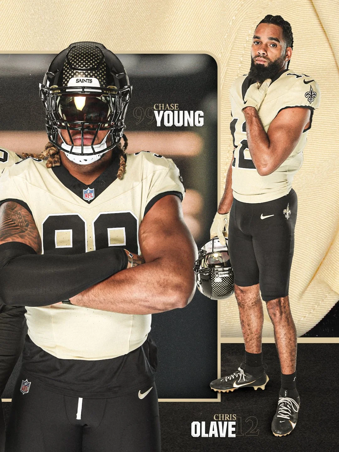
The New Orleans Saints are turning back the clock — with style.
the Saints officially unveiled their reimagined “Gameday Golds” alternate uniforms, marking a powerful return to a fan-favorite look with a modern twist. Set to debut during the 2025 NFL season, the new gold jerseys pay tribute to the franchise’s deep roots while signaling the start of a new era in the Crescent City.
The Saints haven’t worn gold jerseys since 2002, when they suited up against the Minnesota Vikings. Now, more than two decades later, the 2025 version refreshes that iconic energy with elevated design details, bold color choices, and a statement of pride for both the team and its fanbase.
The “Gameday Golds” were designed to evoke nostalgia for long-time fans while offering a sleek, updated aesthetic for a new generation of Saints supporters. The look ties the franchise’s past to its future, walking the line between vintage and cutting-edge — and it does so with swagger.
More info is still to come, including which matchup will mark the official on-field debut of the alternates, but one thing is for sure — the Superdome is about to shine brighter than ever.
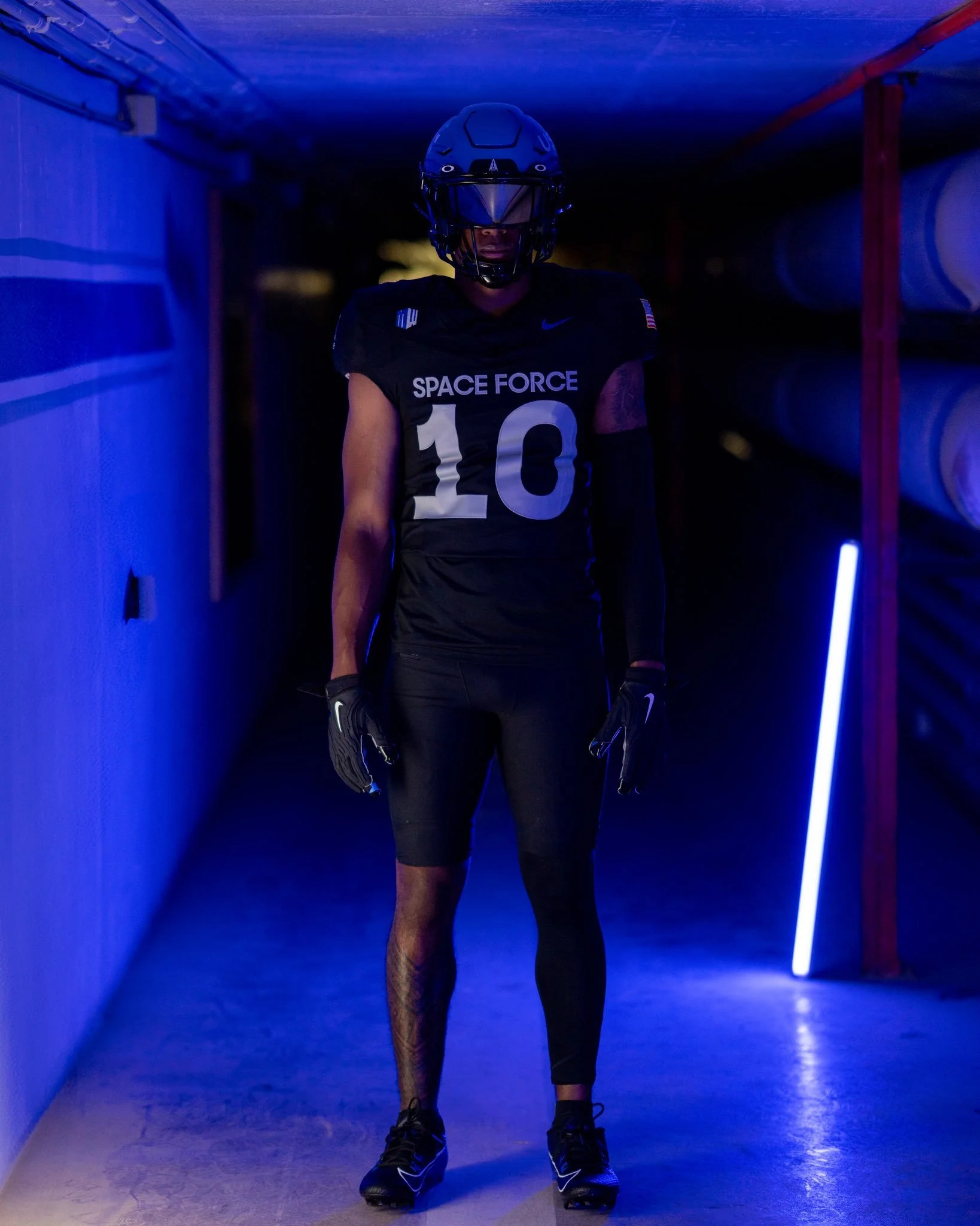
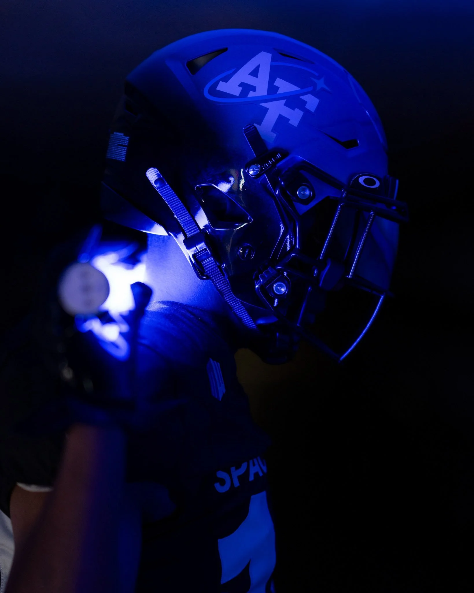
The United States Air Force Academy is reaching new heights with the latest uniform. This time, the Falcons are going intergalactic with a bold, blacked-out look that pays tribute to the United States Space Force, the newest branch of the U.S. military.
The 2025 special uniforms feature a sharp contrast in tones and texture. The jersey and pants are solid black, a dramatic departure from the traditional Air Force blue, designed to reflect the mystery and power of outer space.
On the right side of the helmet, a white “AF” decal nods to tradition. The left side shifts focus toward the future, featuring a bold white “USSF” (United States Space Force) mark — a clean and powerful symbol of the Academy’s evolving mission. A black facemask ties the helmet into the uniform's overall stealth aesthetic.
The front of the jersey is simple and strong. “SPACE FORCE” is printed across the chest in sans-serif font, resting above the player number. A conference patch and maker’s mark complete the look. On the back, the uniforms replace traditional last names with the motto “SEMPER SUPRA”, Latin for “Always Above,” which is the official slogan of the U.S. Space Force. White numbers on the back maintain a high-contrast finish that pops against the black base.
On one pant leg, “USSF” runs vertically down the side — a powerful detail that reinforces the Space Force theme from top to bottom. While the opposite pant leg's design hasn't been fully revealed yet, the overall aesthetic leans into symmetry, stealth, and symbolism.