Posts in Football
Colts Unveil “Anvil Strike” Rivalries Uniform

The Indianapolis Colts are bringing a completely different look to the field this season.

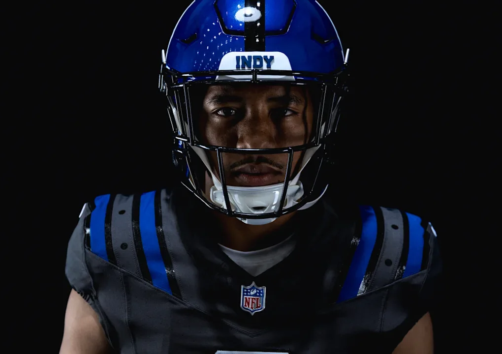
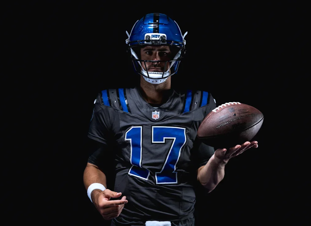
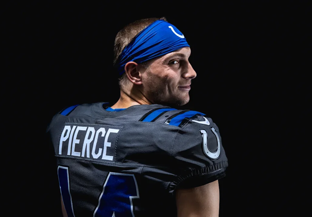
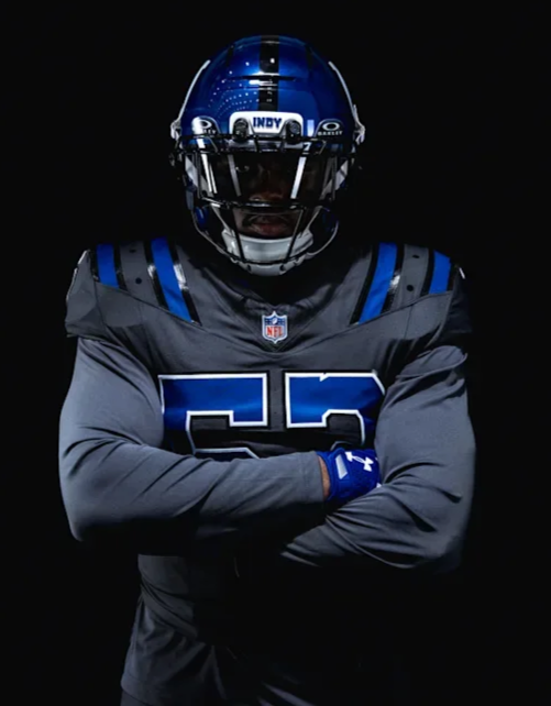
As part of the NFL Rivalries program, the Colts unveiled their new “Anvil Strike” Rivalries uniform, which will make its debut on Sept. 27 against AFC South rival the Houston Texans at Lucas Oil Stadium.

The design draws inspiration from the anvil, a symbol long associated with Colts football and representing strength, resilience and the relentless mentality of the franchise. The result is one of the boldest uniform departures in Colts history while still maintaining recognizable elements of the team’s identity.

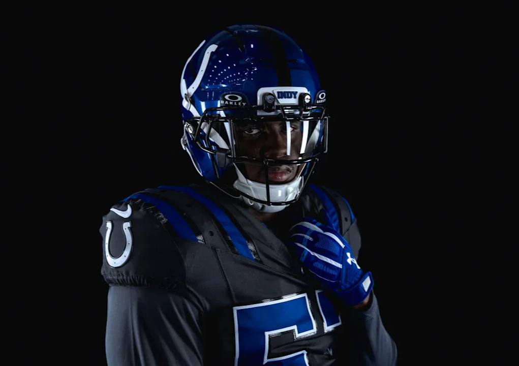
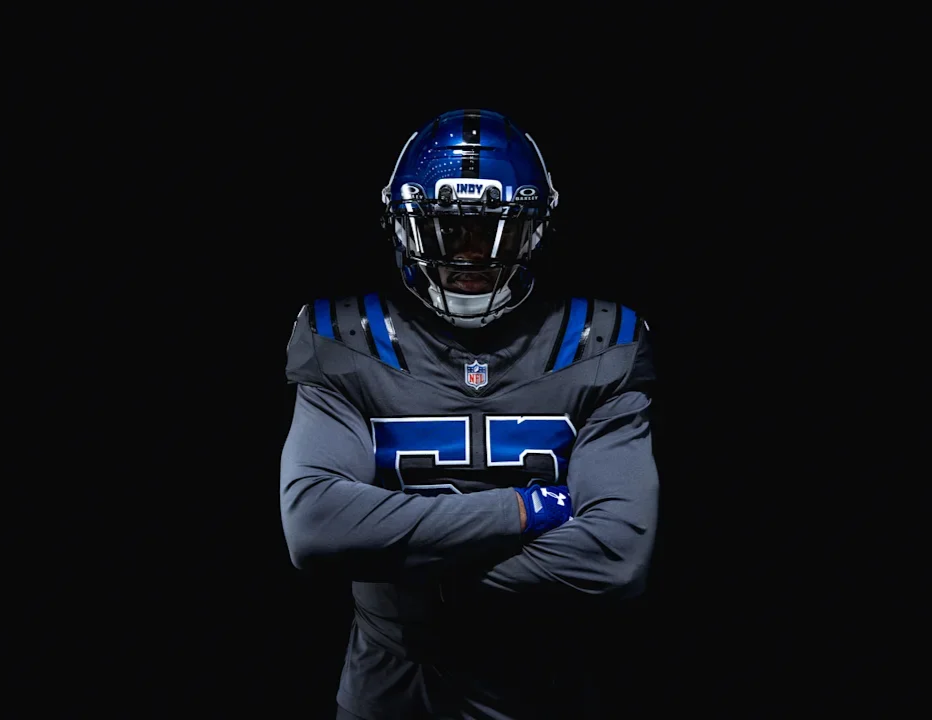
The centerpiece of the uniform is a metallic blue helmet featuring a high-shine finish that gives the Colts' traditional blue a completely different appearance. The helmet is finished with an “INDY” bumper on the front, paying tribute to the city the Colts call home.

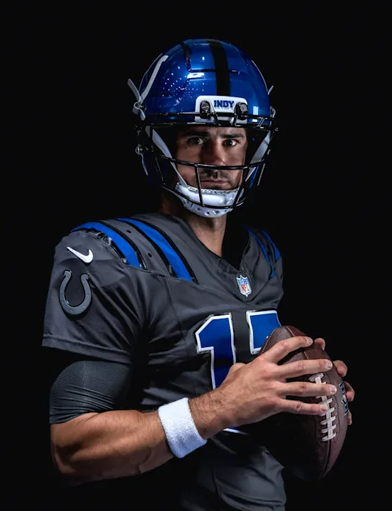
The jersey moves away from the Colts' traditional white and blue combination, instead utilizing a dark anthracite “Anvil Steel” color inspired by the look of forged steel. High-shine and reflective elements are incorporated throughout the uniform to mimic the sparks and movement created when an anvil is struck.

One of the biggest changes comes with the Horseshoe. For the first time in franchise history, the iconic symbol is integrated directly into the jersey design with a silver metallic finish.

The shoulder-pad striping receives an updated treatment, while horseshoe-inspired grommets add another subtle reference to the franchise's most recognizable symbol. The numbers remain in a classic Colts-inspired style, helping maintain a connection to the team's traditional identity despite the dramatically different color palette. Inside the collar, the phrase “FOR THE SHOE” serves as a rallying cry to Colts fans, while the metallic finishes throughout the uniform reinforce the overall forged-steel concept.

The result is a uniform that combines the Colts' traditional iconography with a much more aggressive, industrial aesthetic.

The Colts will debut the “Anvil Strike” look on Sept. 27 against the Houston Texans at Lucas Oil Stadium.

The “Anvil Strike” gives Indianapolis a striking new visual identity for one of its biggest divisional matchups, and adds another completely different look to the Colts' uniform rotation.

SHOP Colts gear HERE

See What Else Is New

Related Articles


Jaguars Unveil “Bold City” Rivalries Uniform

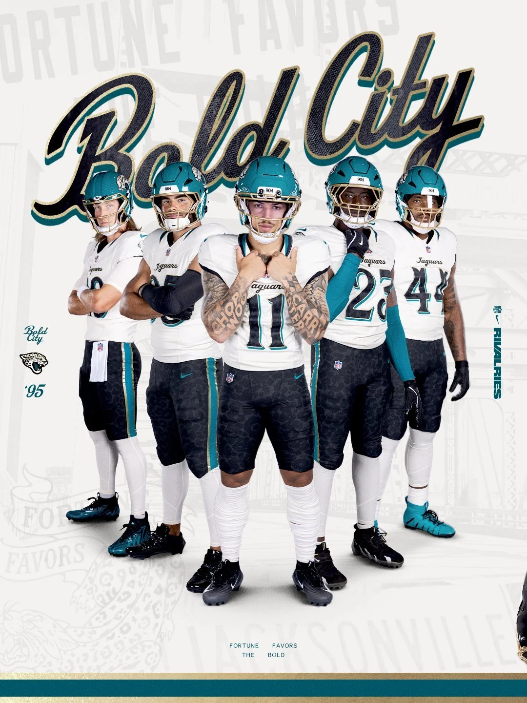
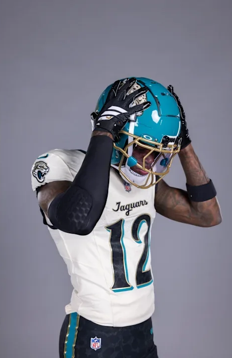
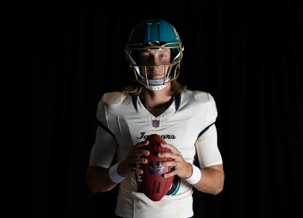
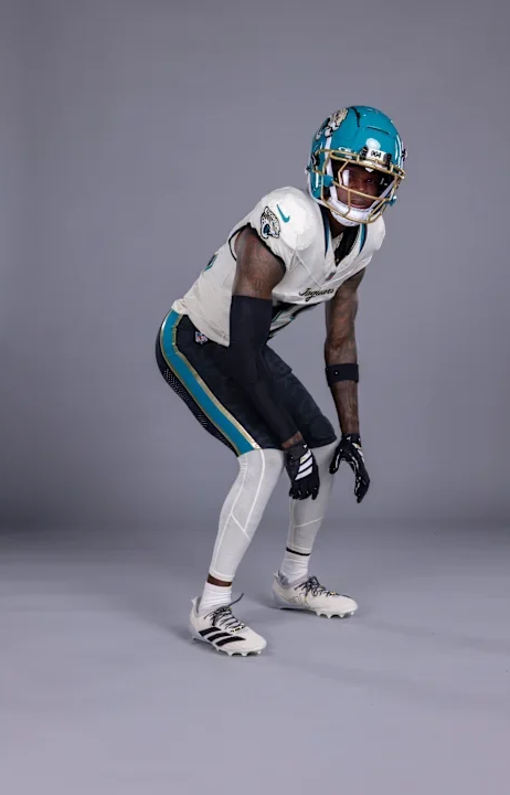
The Jacksonville Jaguars are putting Bold City pride front and center. As part of the second year of the NFL Rivalries program, the Jaguars have unveiled a new uniform designed specifically around the identity, history and confidence of Jacksonville. The Jaguars will debut the uniform Nov. 1 against AFC South rival the Indianapolis Colts.

The Rivalries program gives participating NFL teams an opportunity to create uniforms rooted in the communities they represent, with Nike, the NFL and each club working together to develop designs that go beyond traditional team branding.

For Jacksonville, the result is a look built around the city's motto and attitude: “Fortune Favors the Bold.”

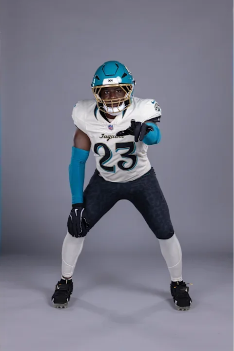
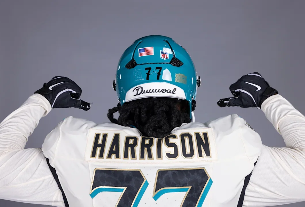
The centerpiece of the new uniform is the helmet. Jacksonville's teal shell gets a gloss finish, while a prominent “904” mark appears on the helmet, representing the area code that has become synonymous with Jacksonville.

The helmet is paired with a striking gold facemask, giving the Jaguars a unique combination that immediately separates the Rivalries look from their standard uniforms. It's a simple detail, but one that makes the helmet feel distinctly Jacksonville.

Another detail appears on the outside of the collar. “Since '95” commemorates the Jaguars' inaugural season and the beginning of the franchise's history in Jacksonville. The jersey also features a cursive “Jaguars” script, a nod to the team's Southern roots and another departure from the club's more traditional typography.

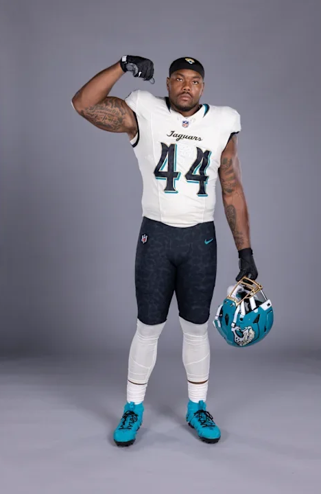
The Jaguars will wear the Rivalries uniform with a white jersey, black pants and white socks.

The black pants feature a prominent teal stripe with gold trim, but there's another detail hidden within the design. The pants feature a subtle jaguar-print pattern, creating a tonal texture that is easy to miss from a distance.

Hidden within the jaguar spots are the names of Jacksonville neighborhoods. It's one of the most personal details in the Rivalries collection, turning the pants into a representation of the communities that make up the city. Rather than simply putting Jacksonville's name on the uniform, the Jaguars incorporated the actual neighborhoods that make up the city.

The Rivalries uniform isn't a one-game-only special.

After debuting against Indianapolis on Nov. 1, the new look will become part of Jacksonville's regular uniform lineup for three years, joining the team's existing alternate uniforms.

For Jacksonville, the Rivalries uniform is more than another alternate. It's 904. It's DUUUVAL. It's Bold City.

SHOP Jaguars gear HERE


See What Else Is New

Related Articles


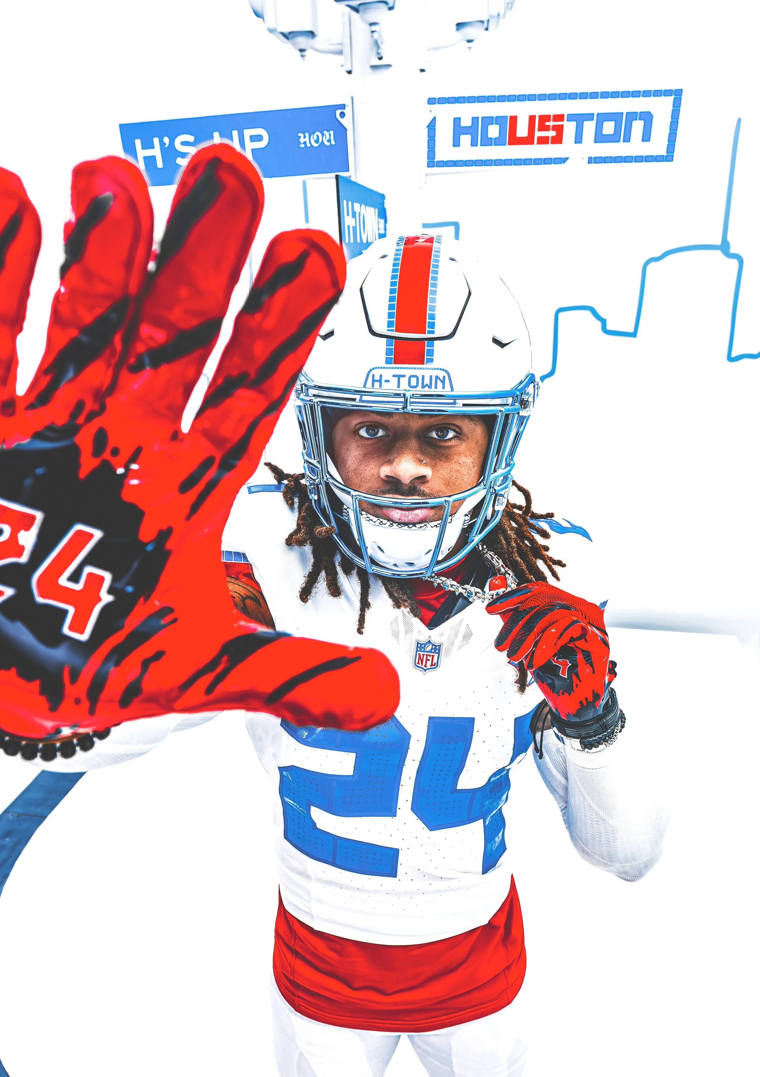
Houston Texans Unveil “HOUSTON/US” Rivalries Uniform

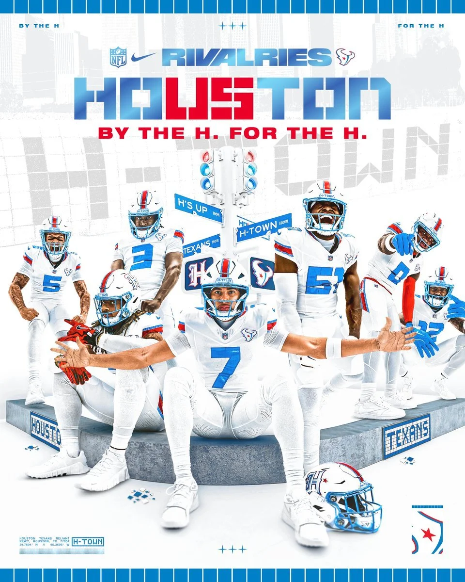
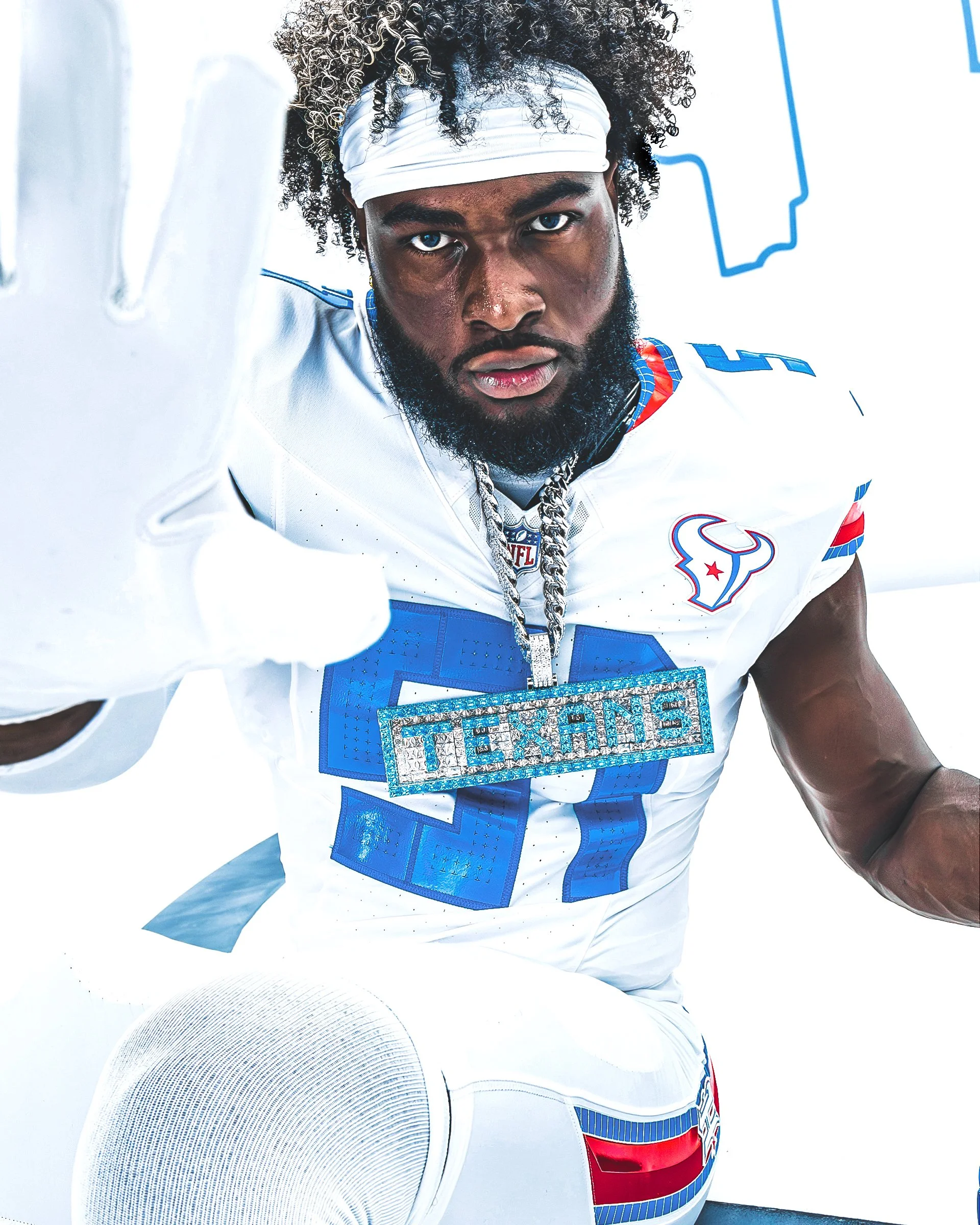
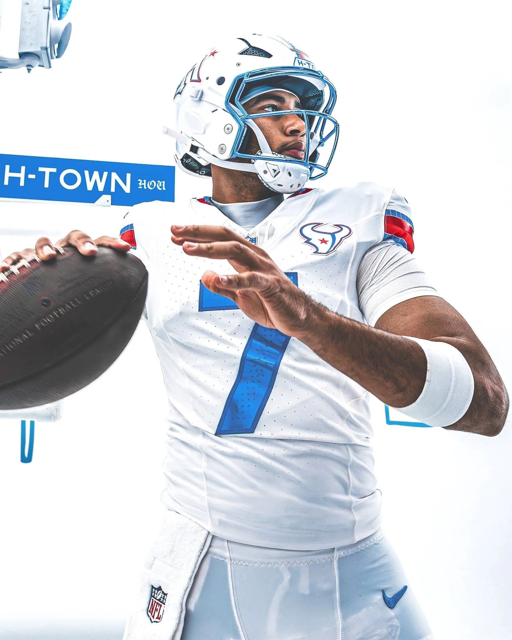
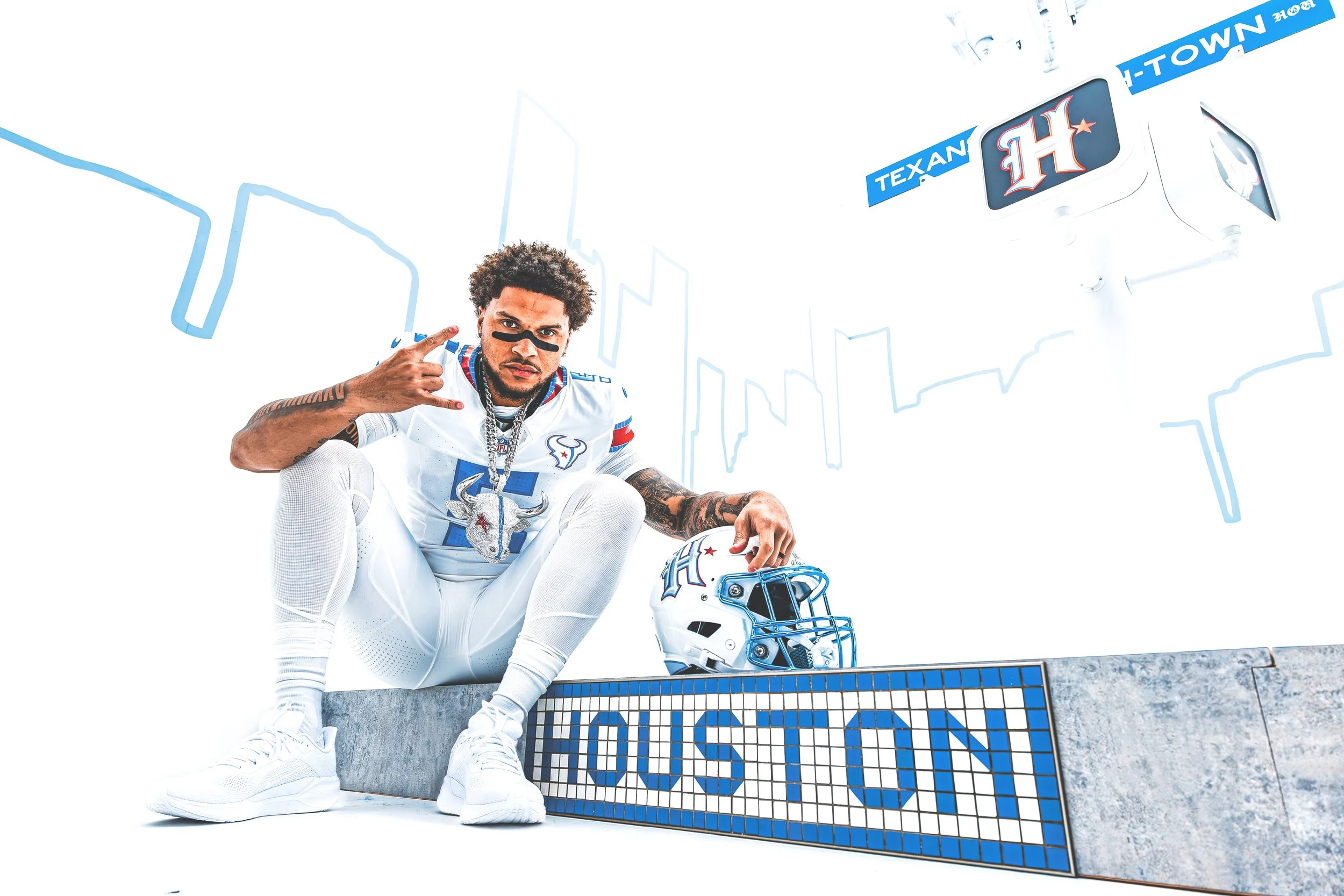
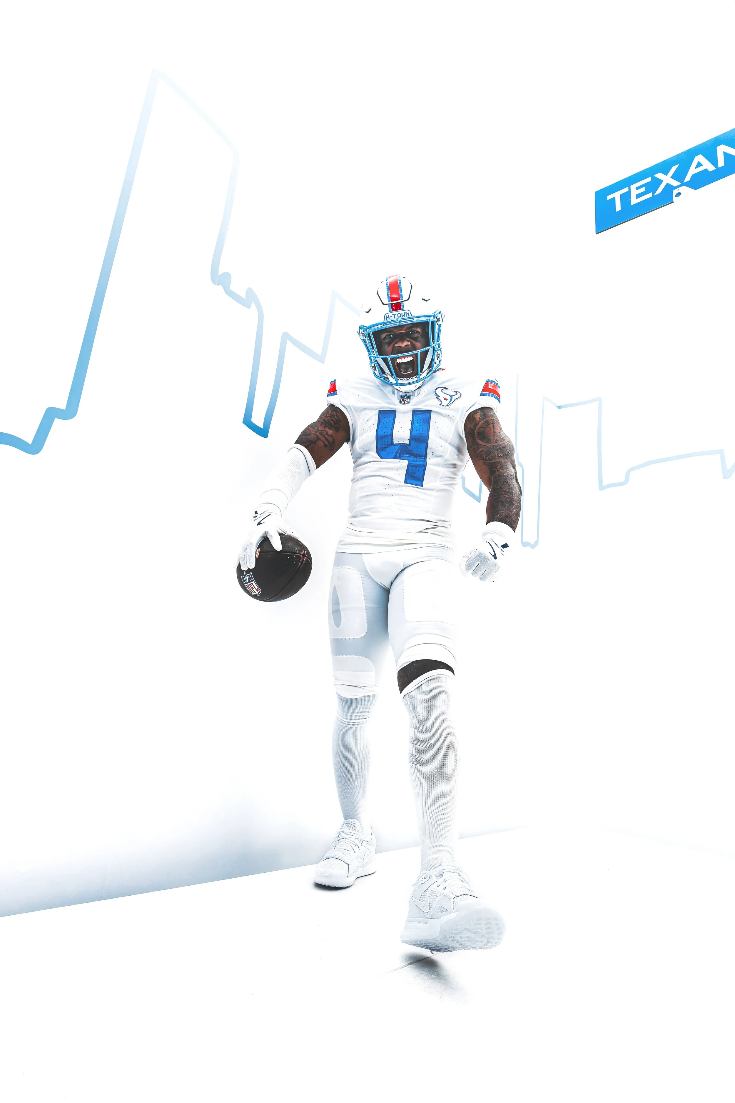
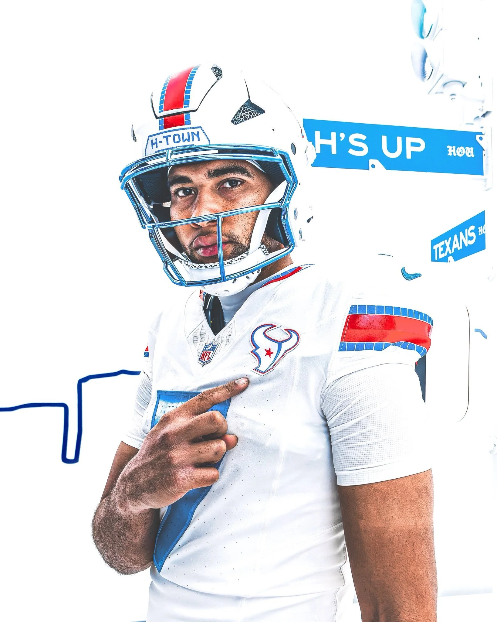
The Houston Texans are putting H-Town front and center. The Texans have officially unveiled their new “HOUSTON/US” Rivalries uniform. The new look is designed as a celebration of Houston, its culture and the millions of people who call the city home.

The Texans will debut the uniform in Week 11, when Houston hosts the Indianapolis Colts on Thursday Night Football.

The uniform is built around the idea of “By The H. For The H.”, bringing together visual elements from Houston's streets, art, car culture and iconic landmarks.

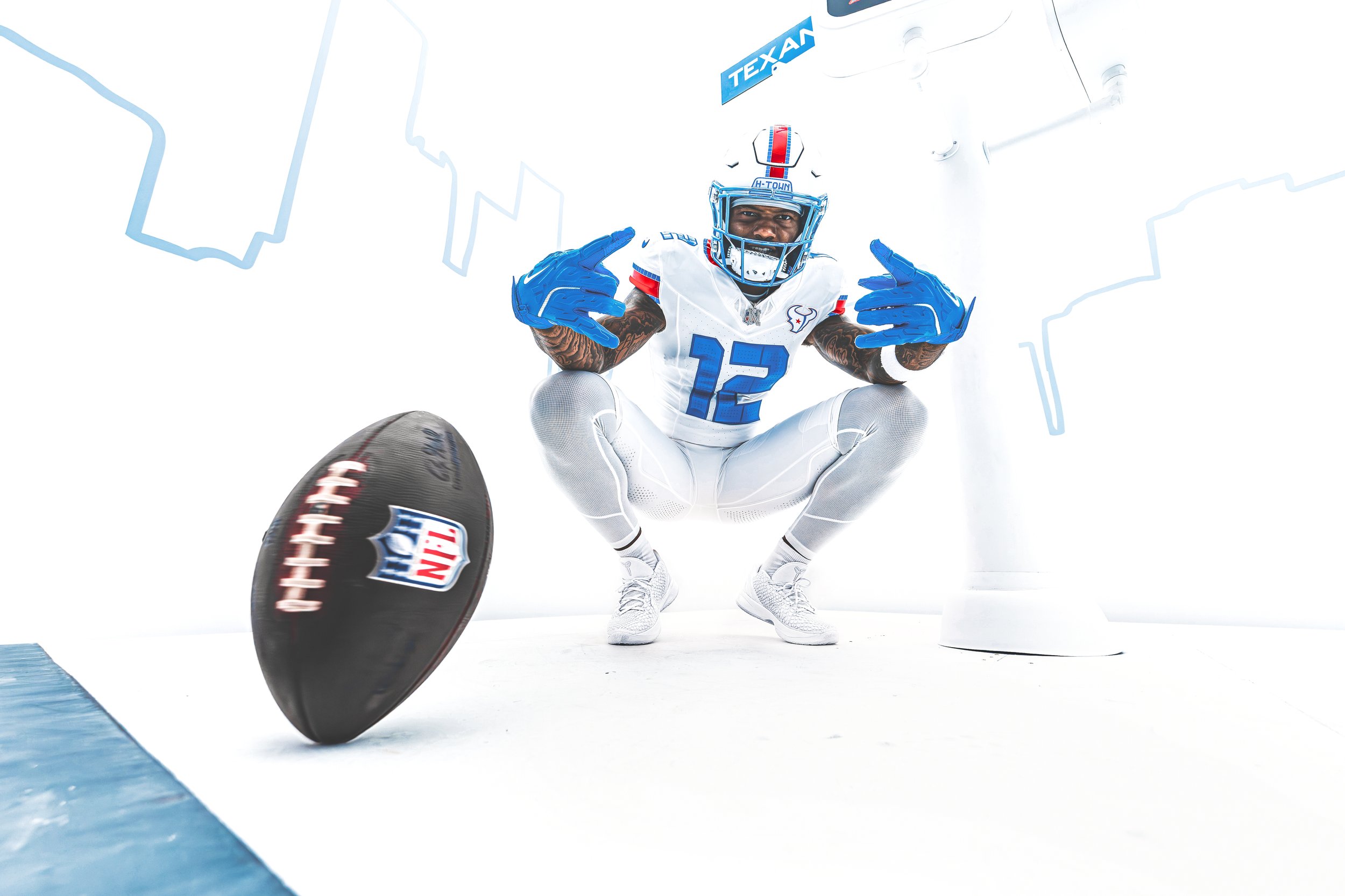
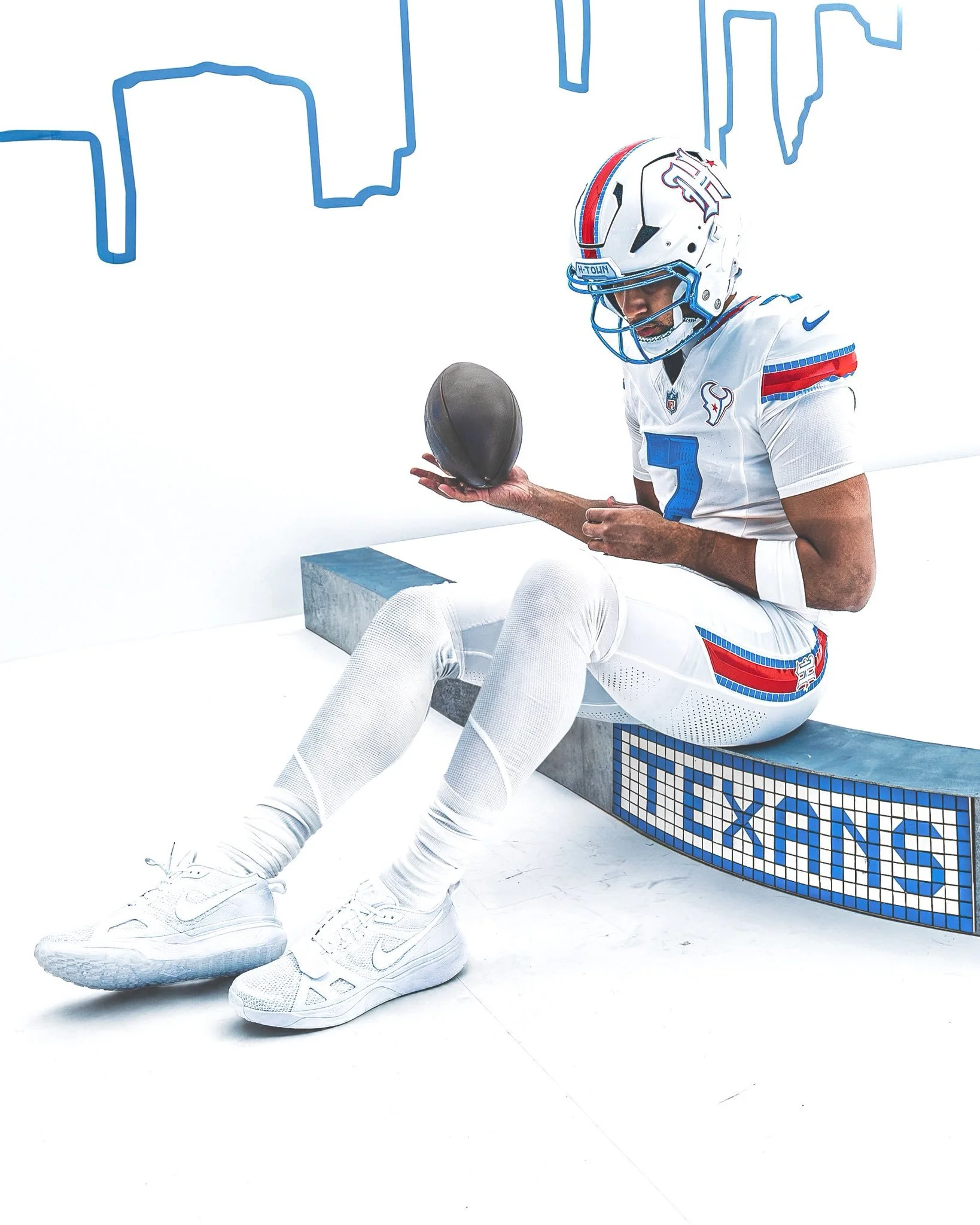
The color palette combines Liberty White, H-Town Blue and Battle Red, while the uniform incorporates Houston's signature blue-and-white street tiles, the “Be Someone” bridge and details inspired by the city's custom car scene.

The result is one of the most Houston-specific uniforms the Texans have ever created. “This is the most Houston uniform that will ever grace the gridiron,” Texans Senior Vice President and Chief Marketing Officer Doug Vosik said.

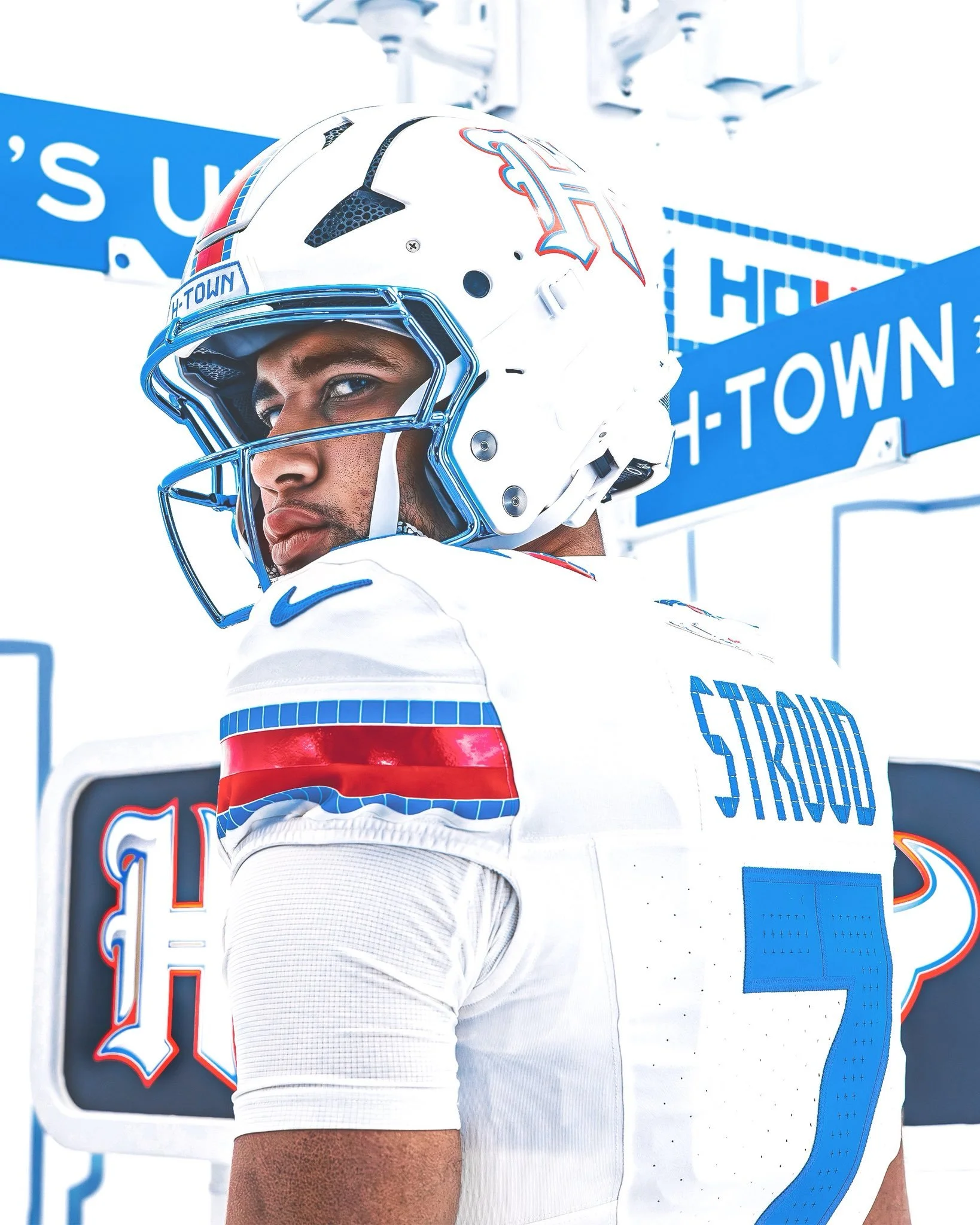
The centerpiece of the new look might be the Texans' first-ever Liberty White helmet. The helmet is a direct nod to the franchise's early history. Before the Texans ultimately settled on their iconic Deep Steel Blue helmet, late founder Robert C. McNair was photographed holding up an early white helmet prototype in 1999.

More than two decades later, that concept has been reimagined for the Rivalries uniform.

The helmet features a candy-paint-inspired finish, with Houston's blue-and-white street tiles incorporated throughout the design. The front bumper spells out “H-Town”, while “Texans” appears on the back.

The helmet also features a white version of the blackletter “H” logo introduced during the Texans' 2024 rebrand, with metallic silver, H-Town Blue and Battle Red accents.

One of the standout details is the facemask. The Texans went with a chrome H-Town Blue facemask, directly inspired by Houston's well-known custom car culture.

That same polished, candy-paint aesthetic carries into other elements of the uniform, giving the look a finish that feels more like a customized Houston ride than a traditional football uniform.

Houston's famous “Be Someone” bridge also makes its way onto the uniform. The jersey numbers feature a chrome H-Town Blue finish and use the distinctive stenciled block font associated with the bridge.

A tiled perforation texture surrounds the numbers, creating another connection to Houston's street-level identity. The nameplate takes the idea even further. Each player's last name is rendered in a tiled font inspired by Houston's iconic blue-and-white street signs, connecting the players directly to the city they represent.

The blue-and-white street tile pattern might be the most recognizable visual element throughout the uniform. The pattern appears across the helmet bumpers, nameplates and the sleeve, collar and pant stripes.

The stripes feature Houston's signature tiles lining a beveled, two-tone Battle Red stripe with the same candy-paint finish. It's a small detail that helps tie the entire uniform together.

The Texans are also changing the placement of one of their most recognizable logos. For the first time in franchise history, the Bullhead logo sits over the heart of the jersey. The logo is primarily white, with H-Town Blue and Battle Red accents, giving the front of the uniform a clean centerpiece while reinforcing the idea of Houston pride.

The final major detail is hidden inside the jersey. The inner collar features a Battle Red “Houston” wordmark using the same distinctive font associated with the “Be Someone” bridge. The word “Us” is highlighted in H-Town Blue. Together, it reads HOUSTON/US, representing the community connection between the Texans and the approximately 8 million people who call the Houston area home. It's also where the uniform's entire concept comes together: Houston isn't just where the Texans play. It's who they represent.

From the street tiles to the “Be Someone” bridge, custom cars and the franchise's original white helmet prototype, nearly every element has a story behind it.

The Texans call it “By The H. For The H.” And this might be the most Houston uniform they've ever put on the field.

SHOP Texans gear HERE


See What Else Is New

Related Articles


Maryland Unveils “Los Terps” Helmet for Hispanic Heritage Night

Maryland is adding another unique helmet to its ever-growing collection.

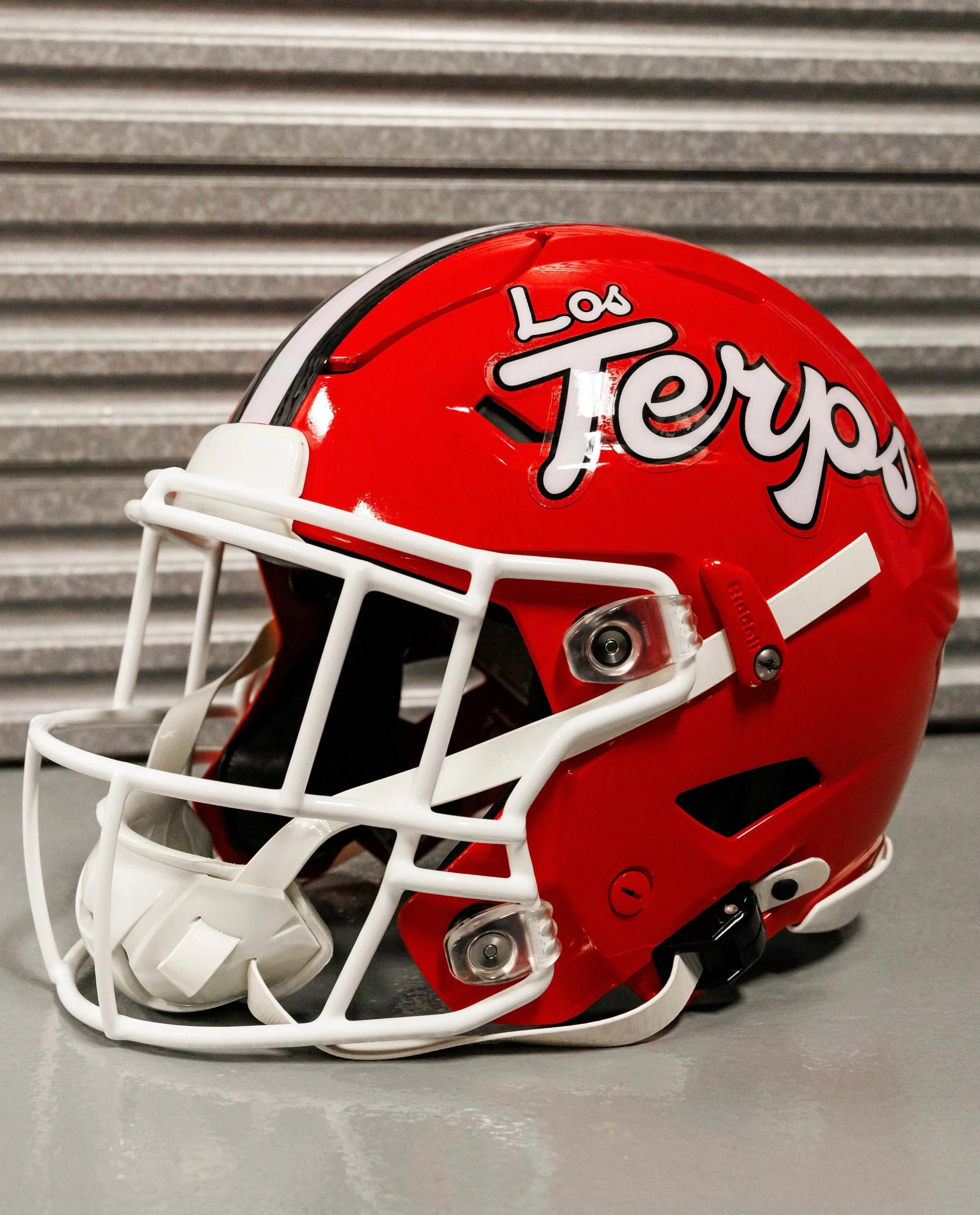
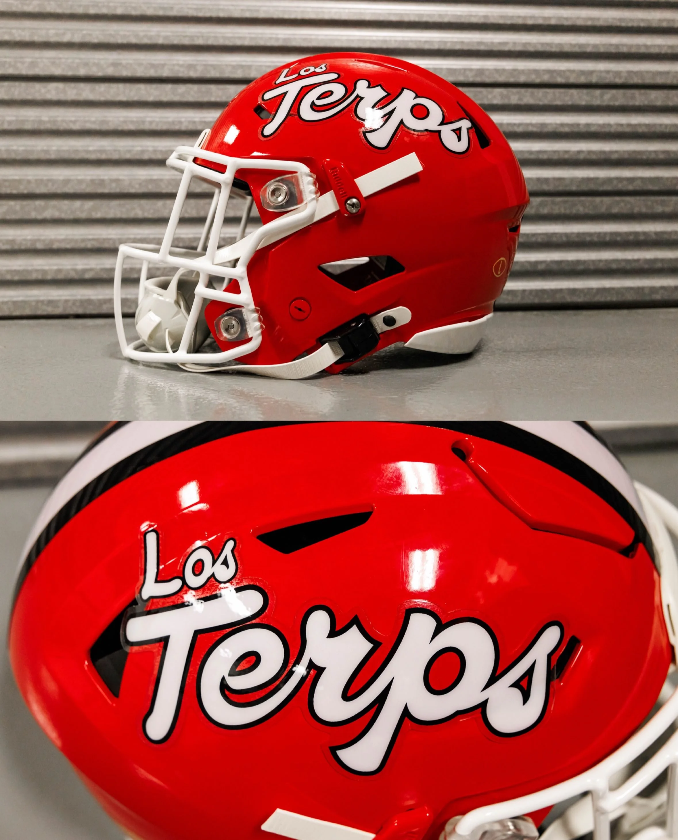
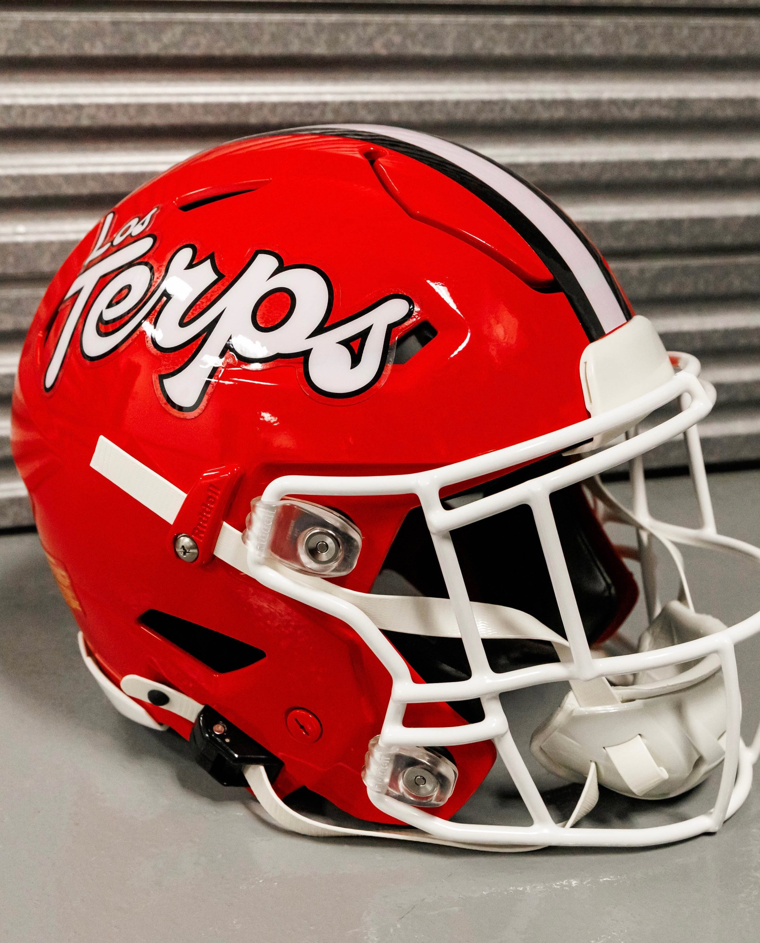
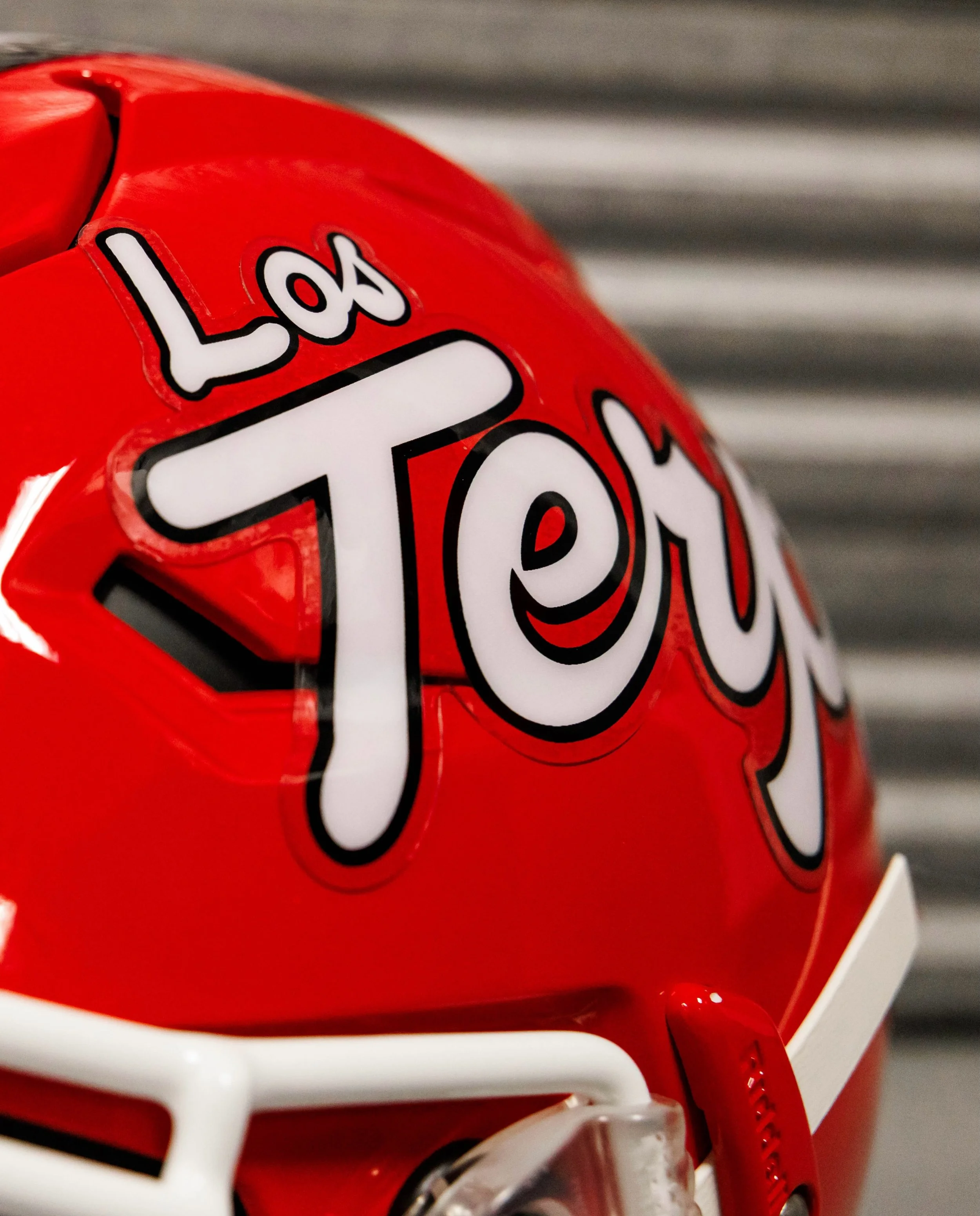
The Terrapins will wear a special “Los Terps” helmet on Sept. 19 when Maryland hosts Virginia Tech at SECU Stadium for Hispanic Heritage Night. The helmet is part of a larger celebration recognizing the Hispanic community throughout the DMV and Maryland’s diverse fanbase.

The helmet will feature Spanish-language “Los Terps” branding, giving Maryland another distinctive look while directly connecting the program to the Hispanic community it represents.

According to Maryland Athletics, the Terps are among the first collegiate football programs to feature Spanish writing on a football helmet.

Head coach Michael Locksley said the helmet and the Hispanic Heritage Night celebration provide an opportunity to recognize the diversity of the DMV while doing so on a national stage.

The helmet is part of a much larger Hispanic Heritage Night initiative involving Maryland Athletics and El Tiempo Latino, a Washington, D.C.-based Latino media company.

The “Los Terps” helmet will be available as a selectable uniform option in EA SPORTS College Football 27, with the helmet scheduled to appear in the game on Sept. 3.

That gives Maryland fans another opportunity to use the new look before the Terps even take the field in it.

The celebration is another example of Maryland using its uniforms and branding to tell a larger story about the program and its community.

SHOP Maryland gear HERE


See What Else Is New

Related Articles


Minnesota Football Brings Back Fan-Favorite Gold Chrome Helmets

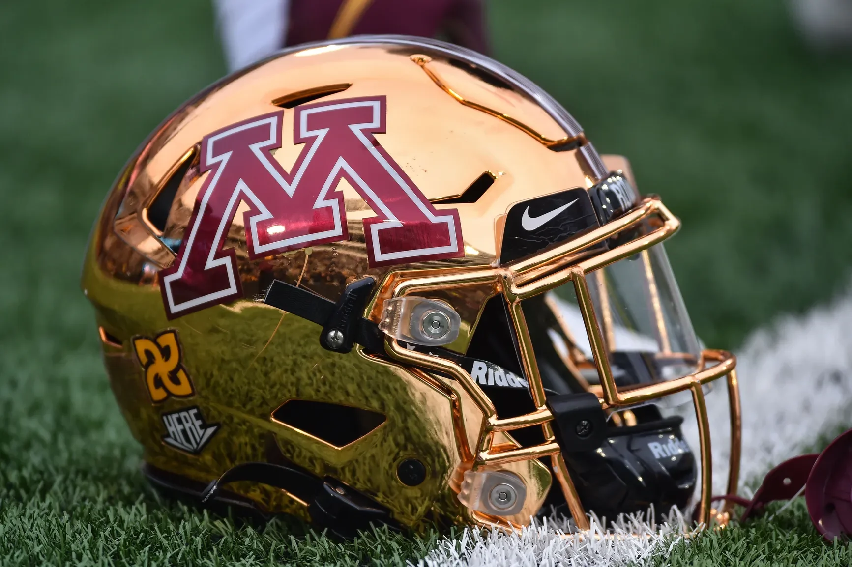
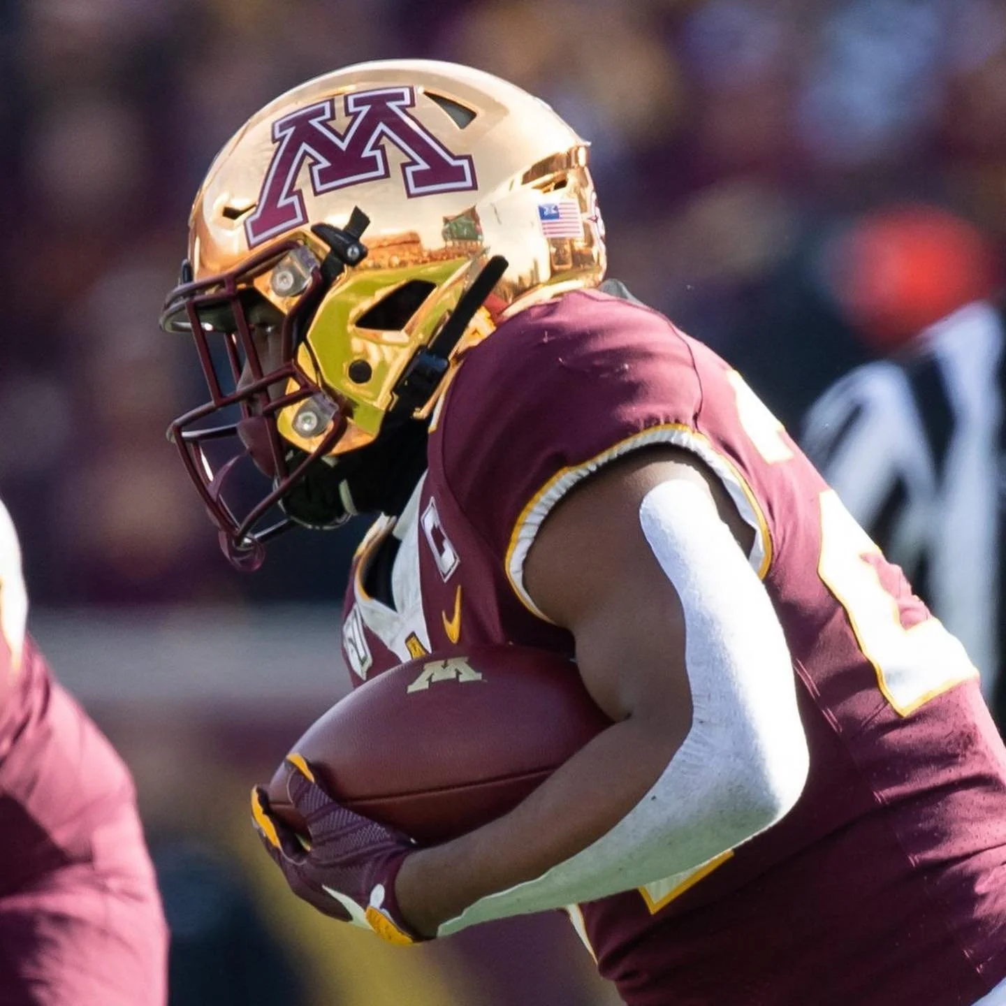
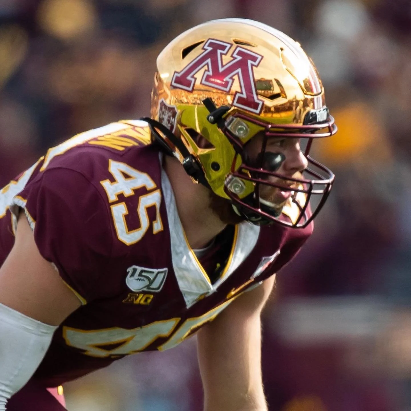
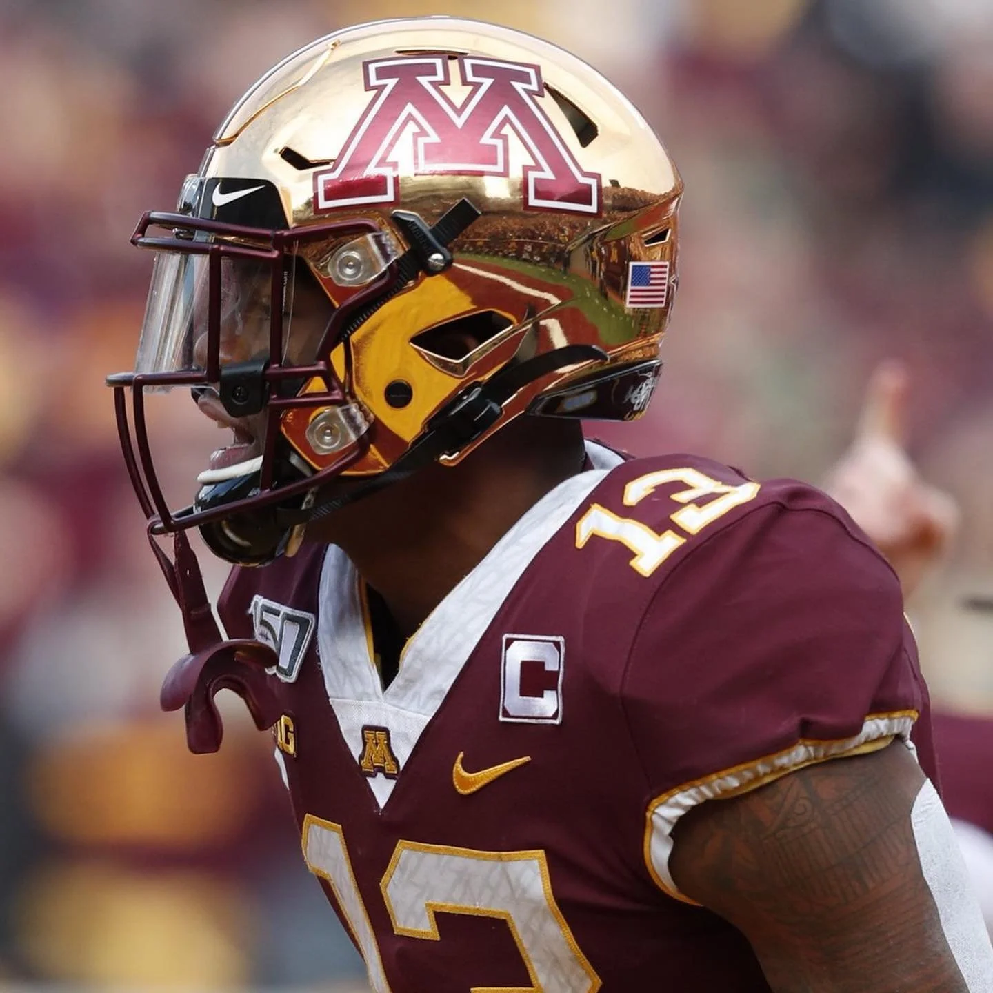
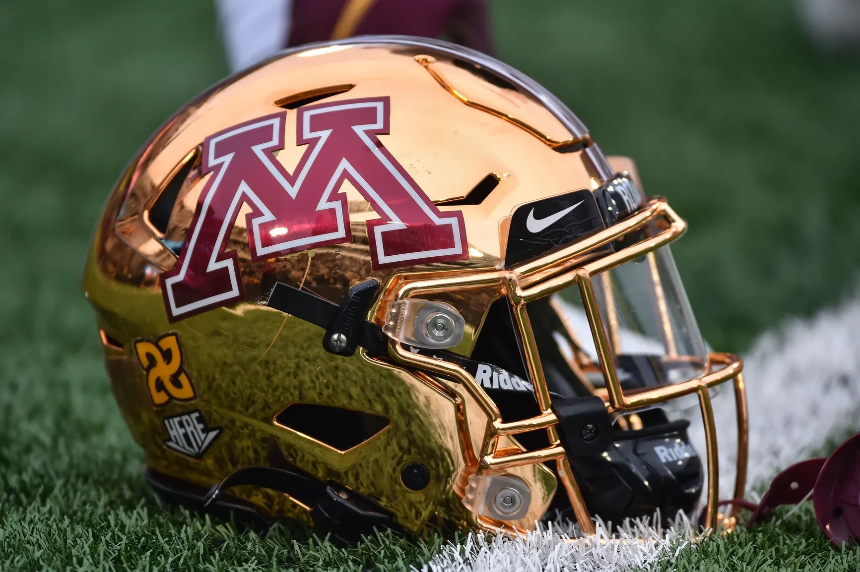
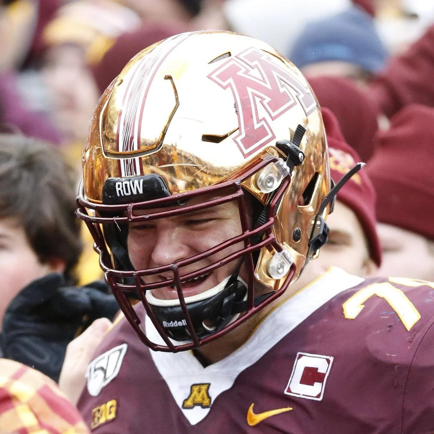
The Golden Gophers are bringing back the chrome. After sitting out the past two seasons, Minnesota's fan-favorite gold chrome helmets are officially returning to the Gophers' uniform rotation in 2026.

The program has not yet revealed exactly when the helmets will make their return to the field, but the announcement is already generating plenty of excitement among Gophers fans.

The gold chrome helmets became closely associated with Minnesota's magical 2019 season, when the Gophers finished 11-2 and capped the year with a win over Auburn in the Outback Bowl. The helmets continued to appear in Minnesota's rotation through the 2023 season before disappearing for the past two years.

Now, after two seasons on the shelf, one of the most recognizable pieces of Minnesota's recent uniform history is back.

Minnesota has gone through plenty of uniform combinations since P.J. Fleck took over the program in 2017, but the gold chrome helmet has remained one of the most popular looks among the fanbase.

SHOP Minnesota gear HERE


See What Else Is New

Related Articles


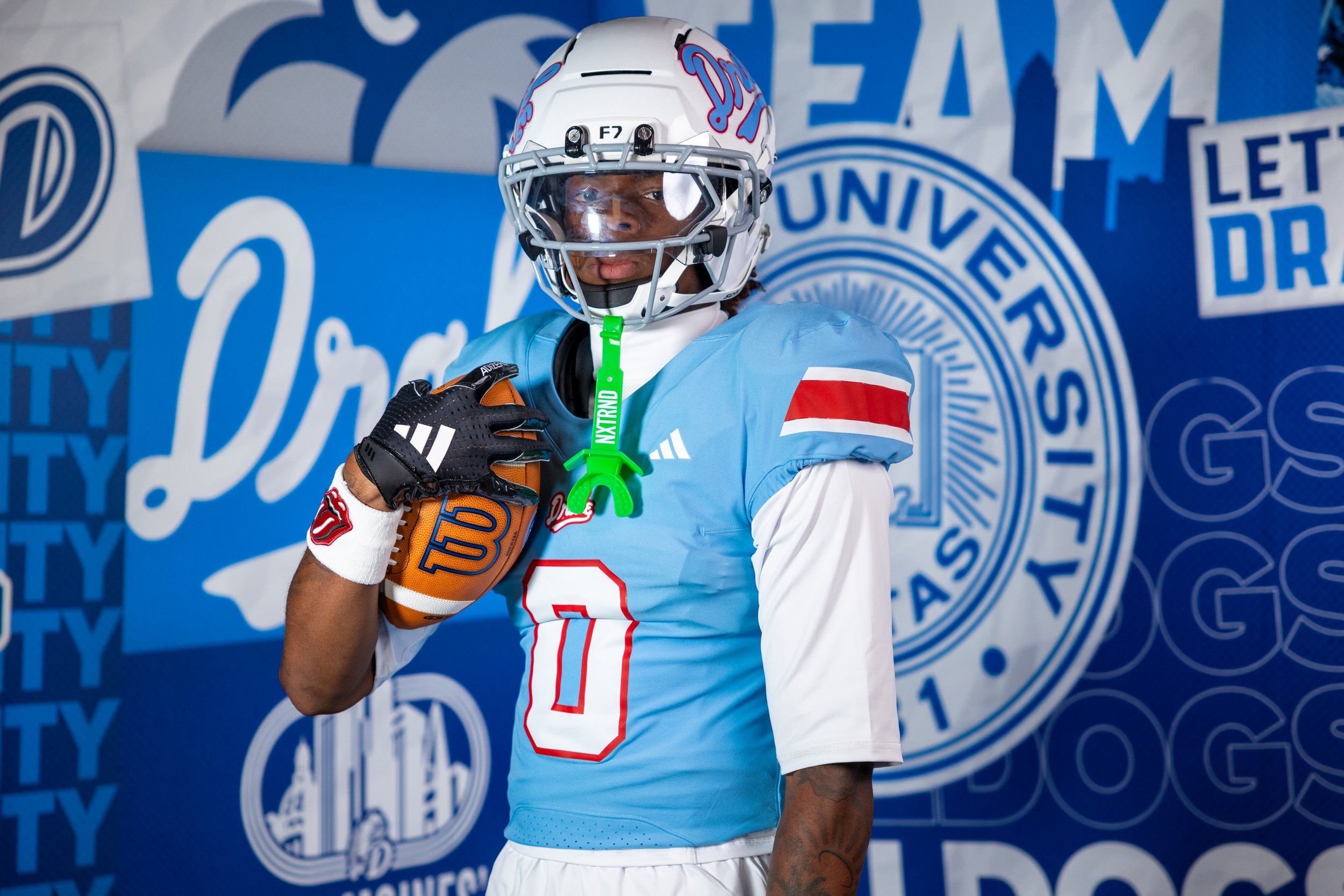
Drake Football Brings 1969 Final Four Style to the Field With Powder Blue Throwback Uniforms

Drake football is borrowing a page from one of the most iconic chapters in Bulldogs history.

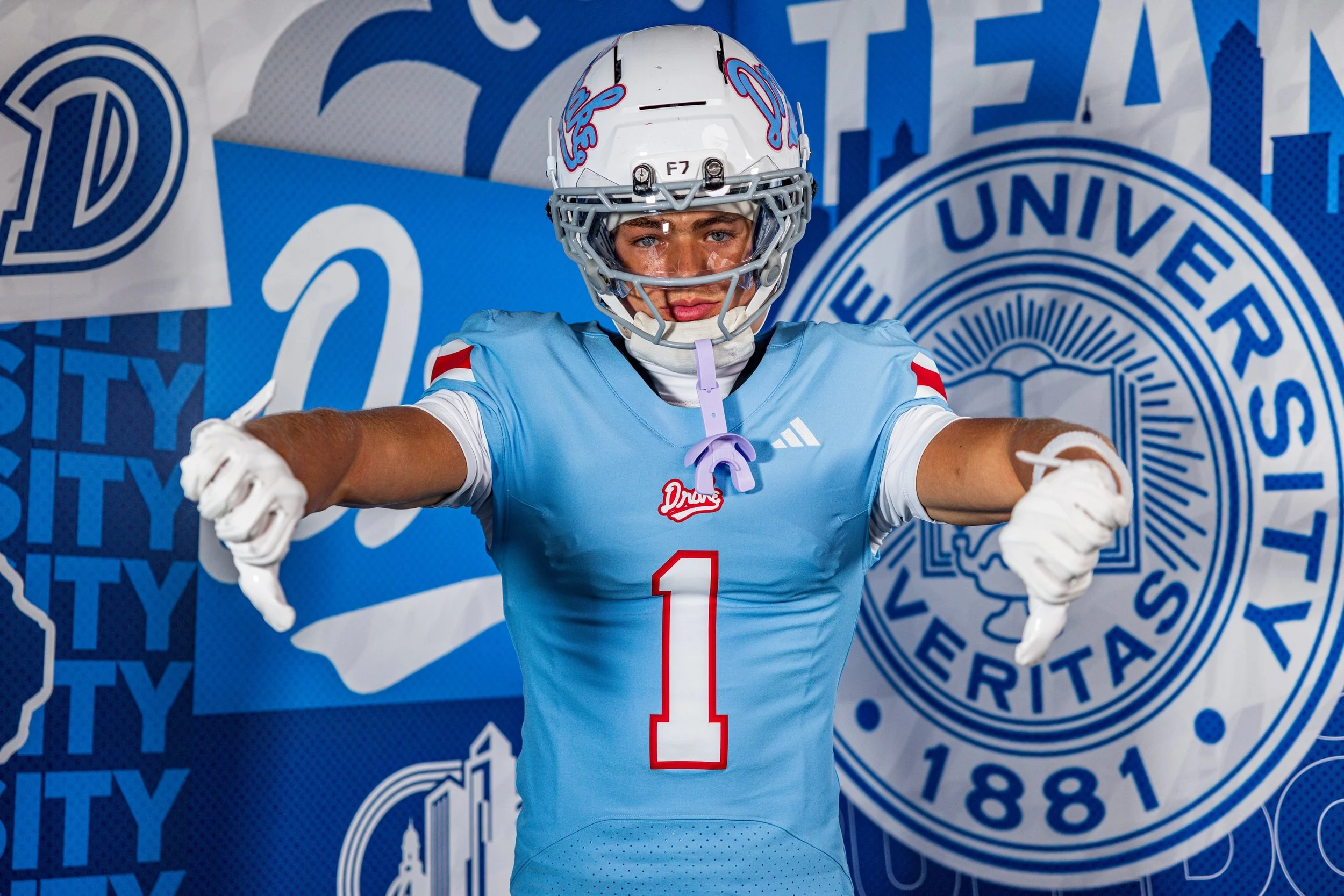
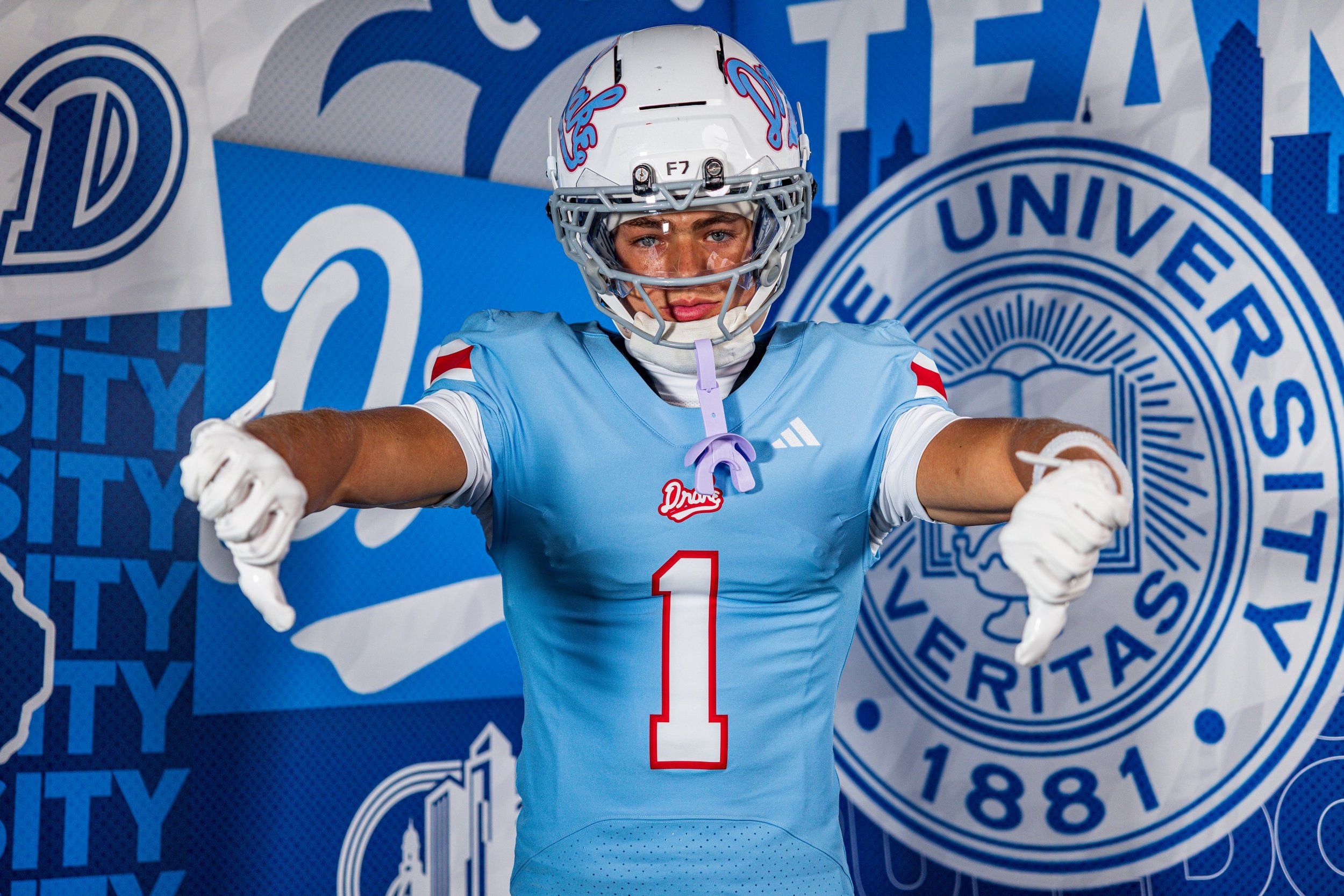
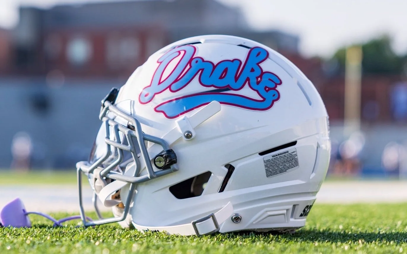
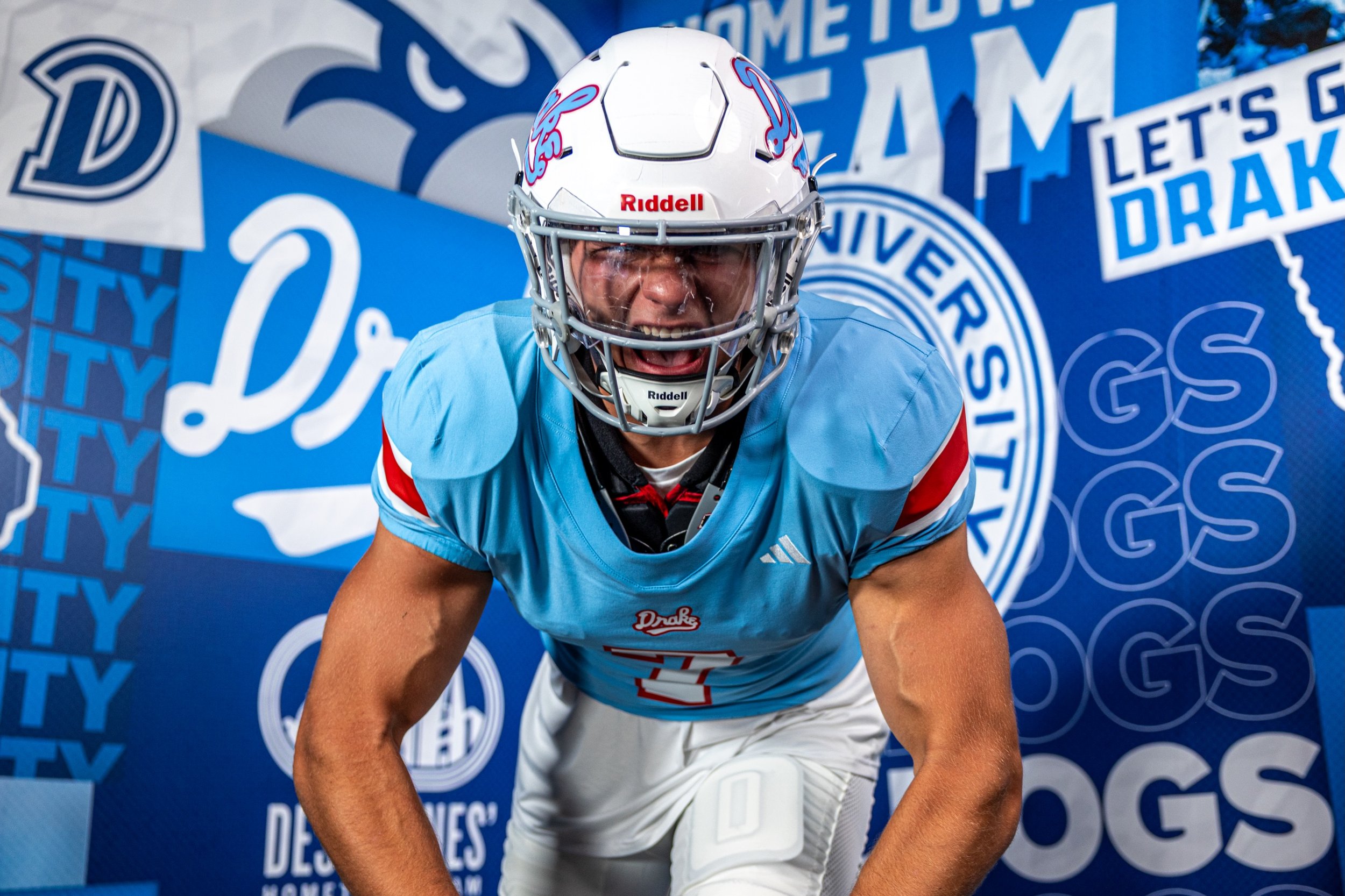
Ahead of the 2026 season, Drake unveiled a powder blue football uniform and matching helmet inspired by the school's legendary 1968-69 men's basketball team, bringing one of the most recognizable looks in Drake Athletics history to the gridiron.

The uniform combines powder blue with bold red accents, creating a look that feels distinctly different from a traditional football uniform while immediately connecting the Bulldogs to their basketball history.

The inspiration comes from Drake's unforgettable 1968-69 men's basketball team, which went 26-5 under head coach Maury John and advanced to the Final Four.

The standout detail on the football helmet is a vintage Drake script logo, taken directly from the white uniforms worn by the 1968-69 Final Four team.

The rest of the uniform embraces the same powder blue and red color combination that has become synonymous with Drake's basketball throwback looks.

The powder blue base gives the Bulldogs a completely different appearance from their typical football uniforms, while the red detailing provides the contrast needed to make the design pop.

It's a color combination that immediately reads as vintage, but the football construction keeps the look from feeling like a straight basketball uniform transplanted onto the gridiron.

What makes this uniform especially interesting is that Drake isn't celebrating a historic football team. Instead, the Bulldogs are taking one of the greatest moments in Drake Athletics history and translating it into another sport.

The 1968-69 basketball team's legacy remains deeply connected to the identity of the university. Drake has previously incorporated the team's script into basketball uniforms, merchandise and other throwback designs, and now football is getting its own interpretation.

It's a great example of how a school's uniform history doesn't have to stay confined to one sport.

SHOP Drake gear HERE


See What Else Is New

Related Articles


Texas Tech Unveils Third Patrick Mahomes-Inspired Uniform With “Let’s Ride” Look

Patrick Mahomes' influence on Texas Tech football continues to grow.

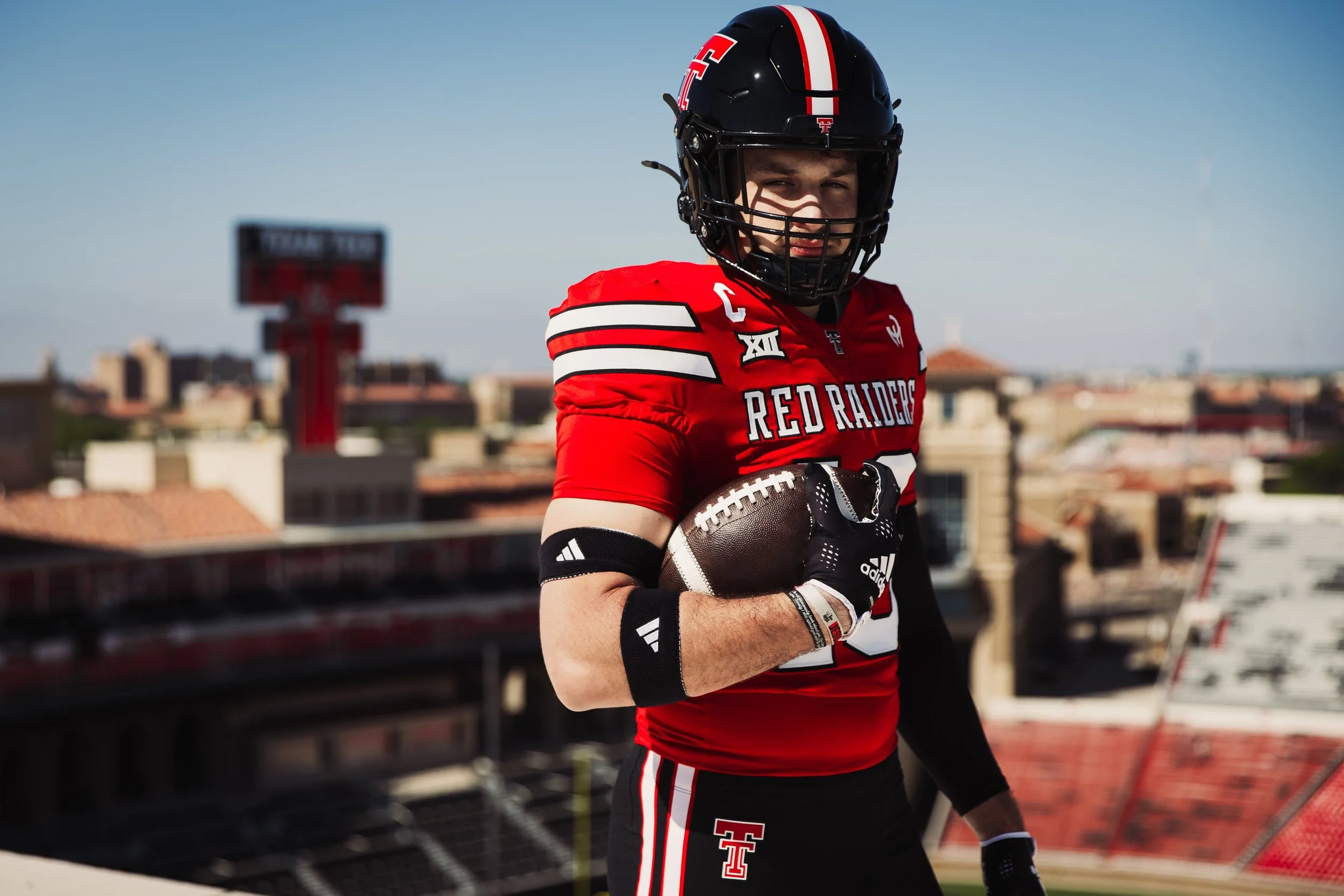
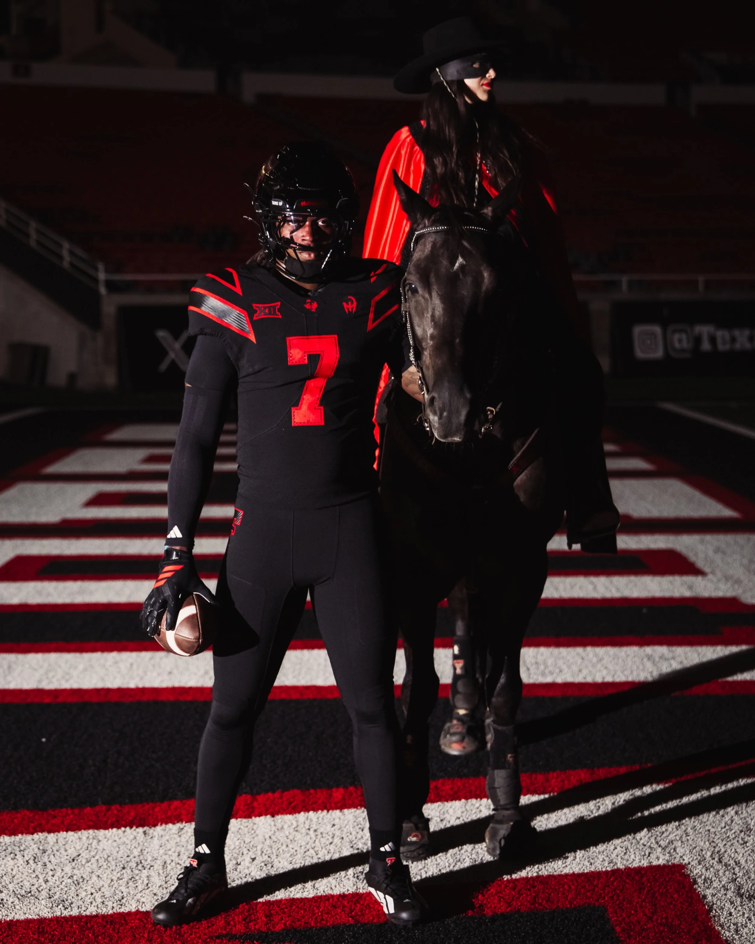
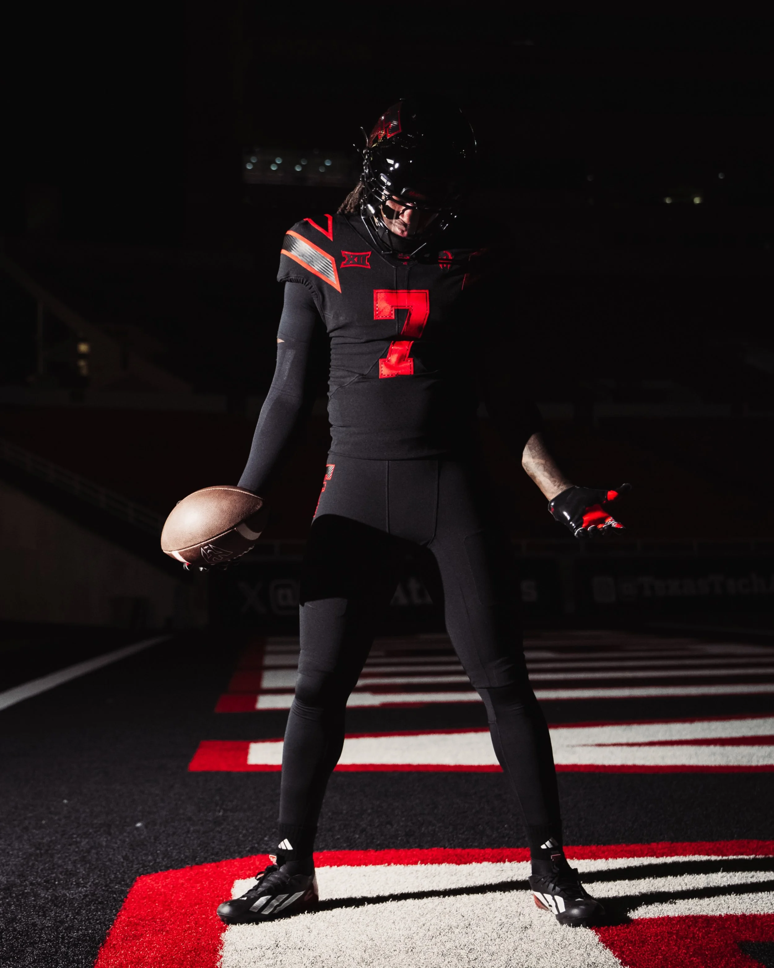
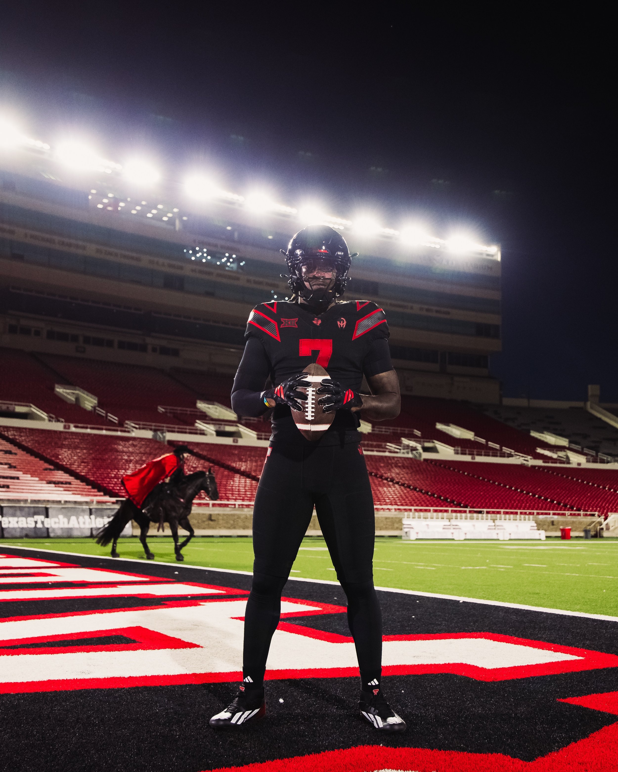
The Red Raiders have unveiled their third Patrick Mahomes-inspired uniform, introducing a new "Let's Ride" look in collaboration with adidas and the Kansas City Chiefs quarterback ahead of the 2026 college football season.

Texas Tech will debut the uniform Sept. 18 against Houston in a Week 3 matchup at Jones AT&T Stadium.

The new uniform features a red and black color scheme, continuing the visual direction established by Texas Tech's previous Mahomes-inspired designs.

The look features Mahomes' signature "Gladiator" logo, which appears throughout the uniform. His name is featured on the back of the helmet, making the connection to the Red Raiders legend impossible to miss. The result is another uniform that blends Texas Tech's identity with the personal brand Mahomes has built since leaving Lubbock for the NFL.
The "Let's Ride" uniform continues a partnership that began before the 2024 season.

The “Let’s Ride” uniform is built around a sleek black base with bold red detailing throughout. The jersey features Texas Tech’s iconic Double T prominently on the chest, while the Big 12 logo and Adidas branding are incorporated into the upper design. The shoulder treatment is one of the standout elements, with angular red and silver striping creating a sharp, modern look that carries onto the sleeves. Mahomes’ signature Gladiator logo is featured prominently on the right chest, while the red numbers are outlined in black for a clean, aggressive finish.
The helmet continues the all-black aesthetic with a large red-and-white Double T on the side and Patrick Mahomes’ branding incorporated throughout. His name appears on the back bumper alongside the “GUNS UP” phrase, while the Gladiator logo returns to tie the entire uniform together. The pants continue the black base with subtle Texas Tech branding, giving the Red Raiders an almost entirely blacked-out look with red and silver accents providing the contrast.

SHOP Texas Tech gear HERE


See What Else Is New

Related Articles


Tennessee Unveils Smokey Grey Uniform Honoring 100 Years of Gen. Robert Neyland

Tennessee is taking a century of history onto the field.

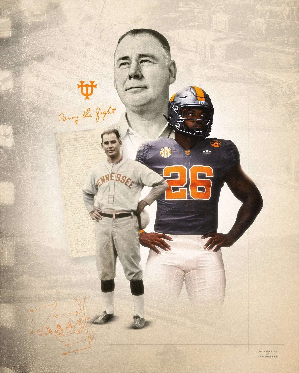
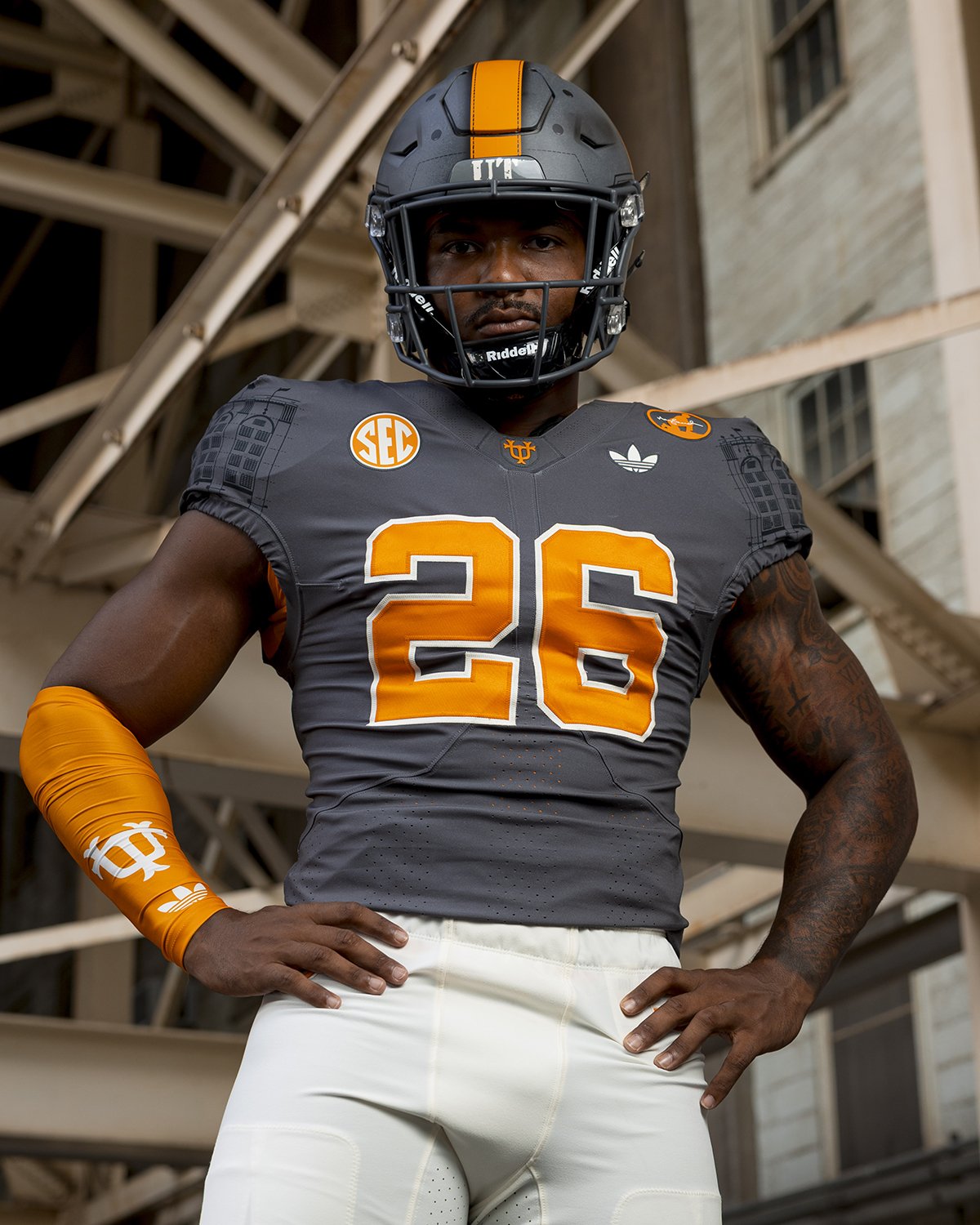
The 2026 football season marks 100 years since Gen. Robert Neyland began his first season as head coach of the Tennessee Volunteers, and Tennessee Athletics has teamed up with adidas to celebrate the milestone with a new "Smokey Grey" alternate uniform honoring his legacy.

The Vols will debut the uniform Oct. 3 against Auburn at Neyland Stadium, bringing together design elements from throughout Neyland's legendary tenure from 1926 through 1952.

Rather than recreating one specific uniform, Tennessee pulled details from multiple eras of Neyland's career, incorporating references to his military background, championship teams, football philosophy and the evolution of Shields-Watkins Field into what is now Neyland Stadium.

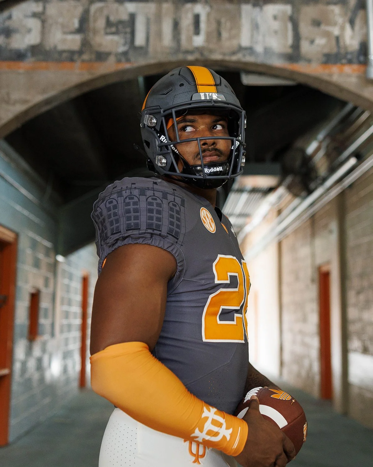
The helmet might be the most striking piece of the collection. The design draws inspiration from the leather helmets Tennessee players wore from the program's early days through 1949, including cross-pattern and stitching details pulled from the Vols' 1938 national championship helmet.

That 1938 team was dominant, allowing just 16 points across an 11-game season, including eight shutouts, on its way to Tennessee's first national championship.

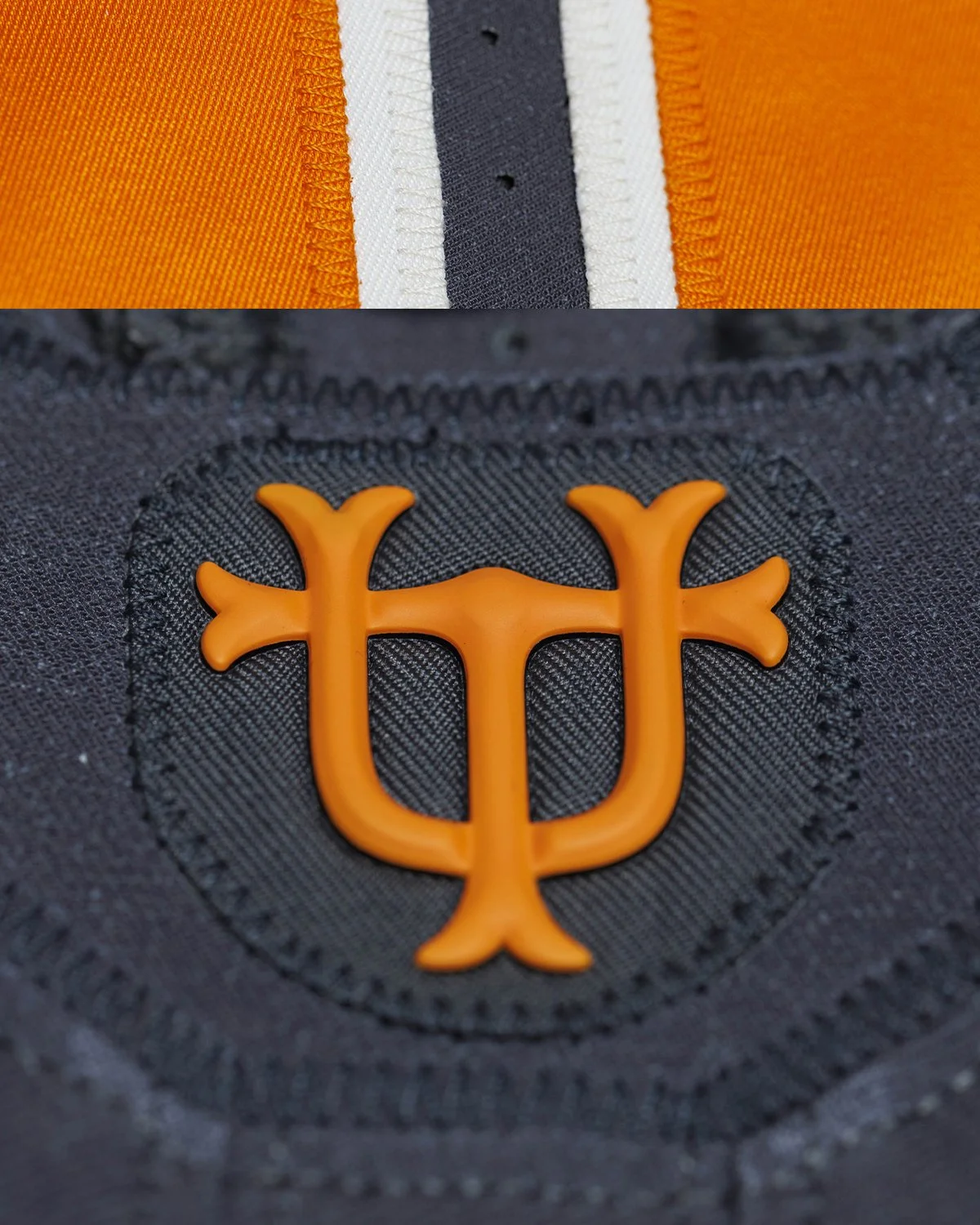
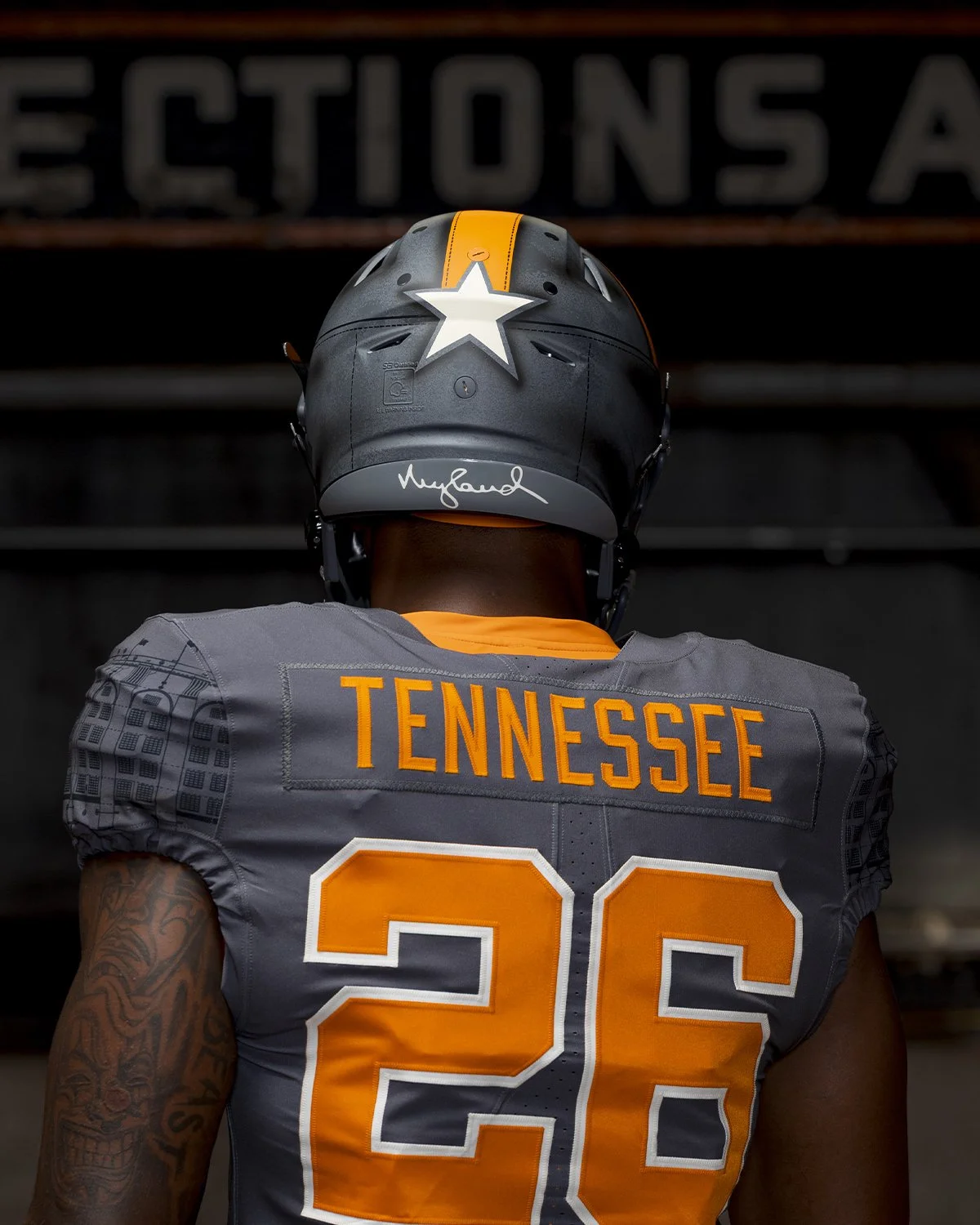
A bold star appears on the back of the helmet, representing Neyland's rank as a Brigadier General. His signature is featured on the back bumper, while a stenciled "UT" on the front bumper references the type of lettering seen on Tennessee practice gear during the Neyland era.
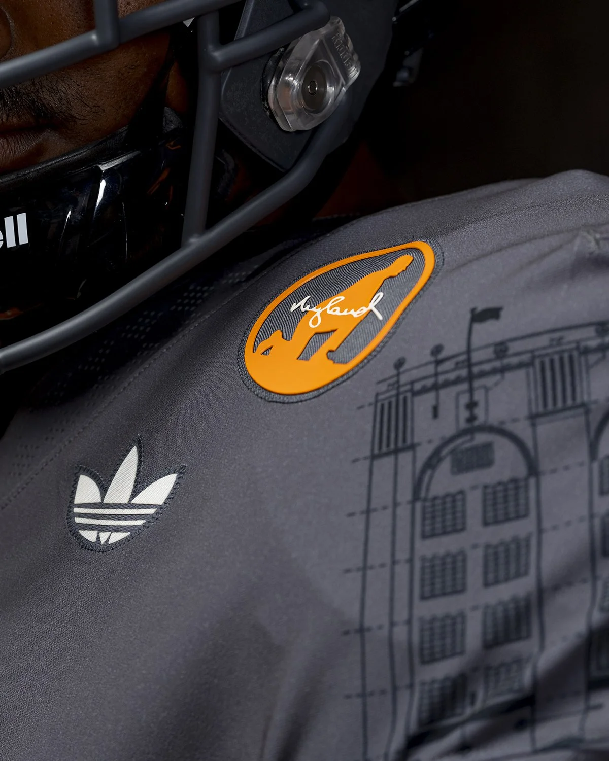
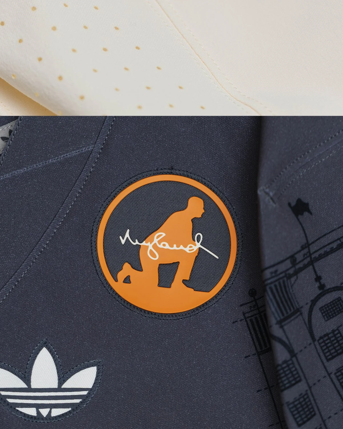
One of the most personal details is the Neyland patch. The patch uses the silhouette of Neyland's famous kneeling pose, the same image used for his statue that now serves as the centerpiece of Champions Corner on the southwest side of Neyland Stadium. His signature is incorporated into the patch, making it one of the uniform's most direct tributes to the legendary coach.

Neyland wasn't only a football coach. His background in the Army Corps of Engineers also influenced the development of Tennessee's home venue.

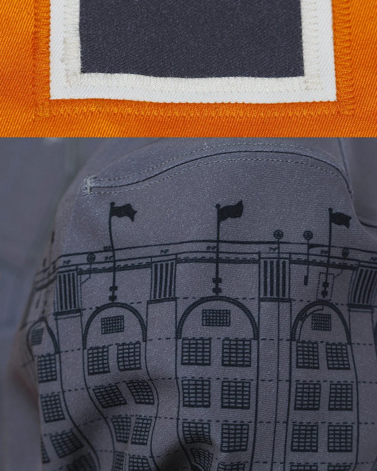
The shoulder design features architectural blueprints from the 1948 expansion of Shields-Watkins Field, which helped create the south end of the stadium. Those architectural details remain visible in some of the oldest portions of what is now Neyland Stadium. It's a particularly fitting detail considering how closely Neyland's legacy is tied to the stadium that eventually carried his name.

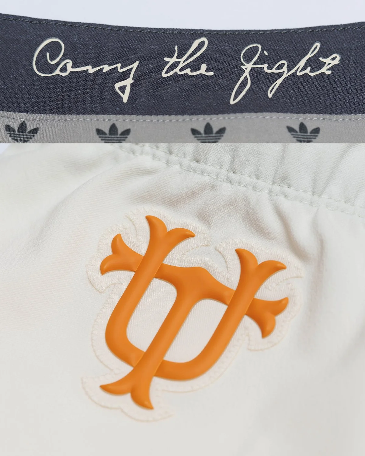
Another deep-cut historical reference appears in the form of the interlocking UT. The design comes from a 1952 photograph of Neyland wearing a rarely seen, baseball-inspired version of the Tennessee logo. The reference also connects to Neyland's own playing career.

Before becoming one of college football's legendary coaches, Neyland played baseball at Army from 1913-16 as a pitcher and first baseman. He finished his Army pitching career with a 35-5 record, an .875 winning percentage that remains second in program history.

While Tennessee officially adopted orange and white as its primary colors in 1891, the Vols' early uniforms weren't always the instantly recognizable orange-and-white combination fans know today. During the program's first half-century, Tennessee uniforms featured a mixture of orange, white, grey, black and tan. The cream accents on the new uniform specifically reference the color of the tan leather helmets and football pants worn during the early years of the program.
That helps explain why the Smokey Grey uniform feels so different from a typical Tennessee alternate while still being rooted in legitimate program history.

The uniform's number font is another historical callback.

The typography and sizing recreate the numbers used by Tennessee's 1938 and 1939 teams, bringing another detail from Neyland's championship era into the modern design. It's the kind of small detail that may go unnoticed at first glance but gives the uniform considerably more historical depth.

Perhaps the most personal detail is hidden inside the uniform. Neyland developed 38 team maxims throughout his coaching career. Seven of them, known as the Game Maxims, continue to be used by Tennessee teams today.

The inside of the back collar features "Carry the Fight" in Neyland's handwriting, referencing the opening command of his seventh Game Maxim. It's a subtle reminder that the uniform isn't only celebrating what Neyland wore or how his teams looked. It's also celebrating the philosophy he left behind.

Tennessee and adidas went even deeper with the design. The front collar features checkerboard perforations, referencing Neyland's famous command for his players to "charge the checkerboards" atop Ayres Hall, which sits north of Shields-Watkins Field.

Meanwhile, the perforations at the bottom of the jersey feature vertical traction lines inspired by the stripes found on some of Tennessee's earliest football uniforms.
Tennessee's Smokey Grey uniform is much more than another alternate.

Nearly every major element has a purpose, from the leather helmet-inspired construction and 1938 championship details to Neyland's signature, military rank, stadium blueprints and handwritten maxims.
The result is a uniform that tells the story of Robert Neyland, Tennessee football and the evolution of one of college football's most iconic programs.

SHOP Tennessee gear HERE


See What Else Is New

Related Articles


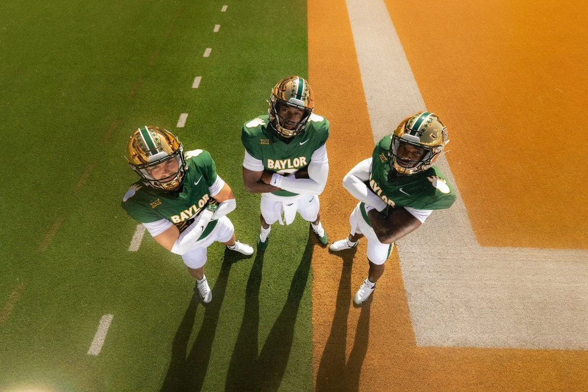
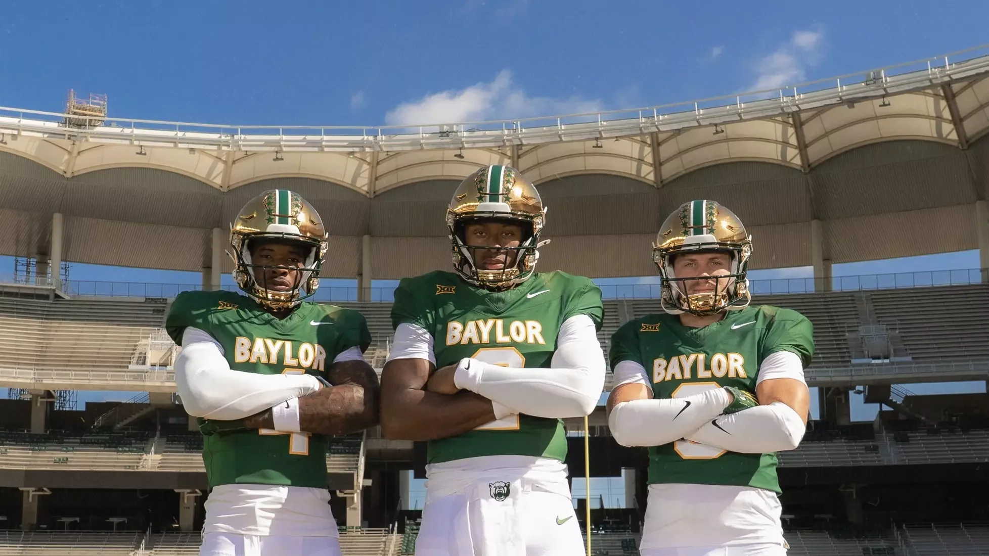
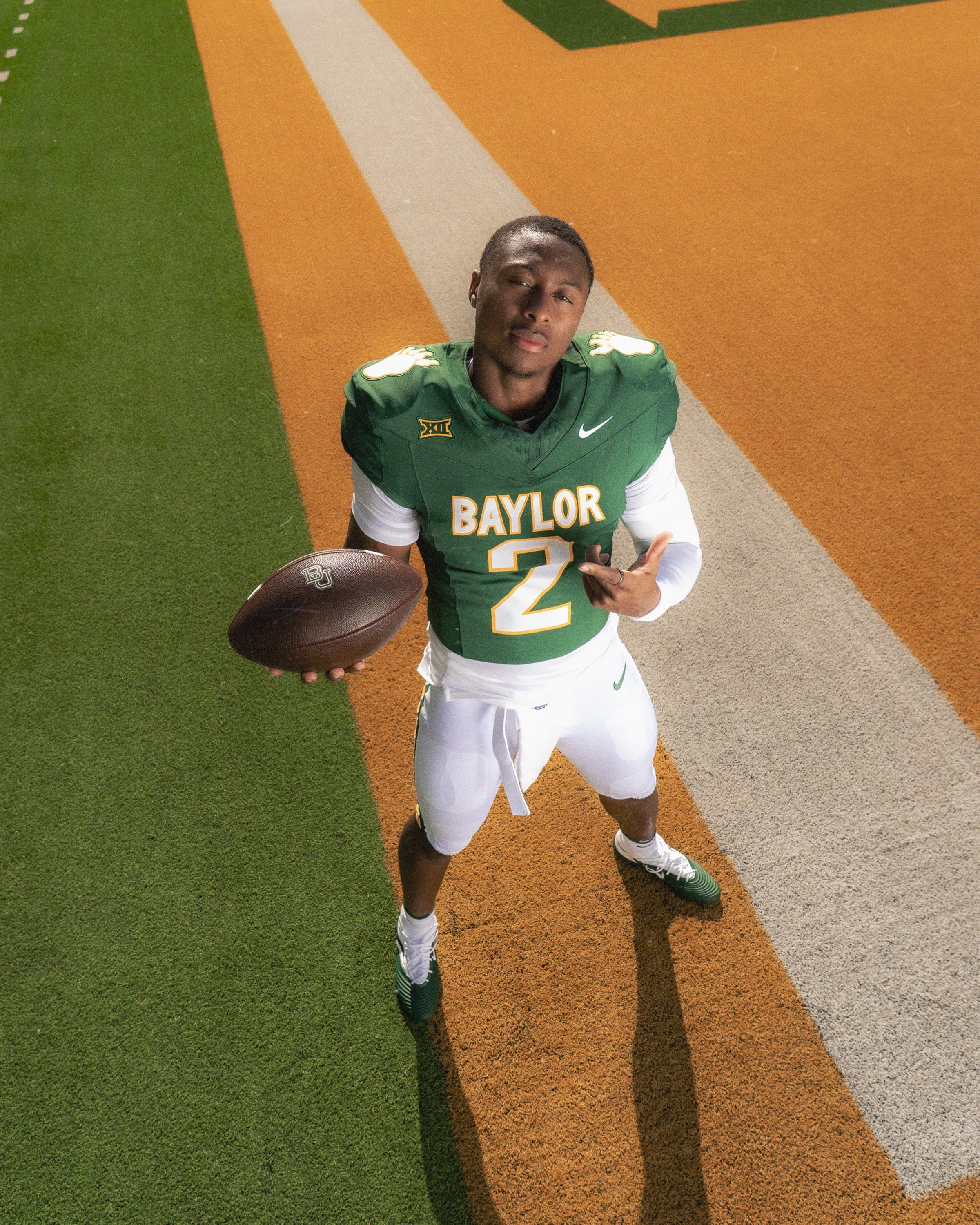
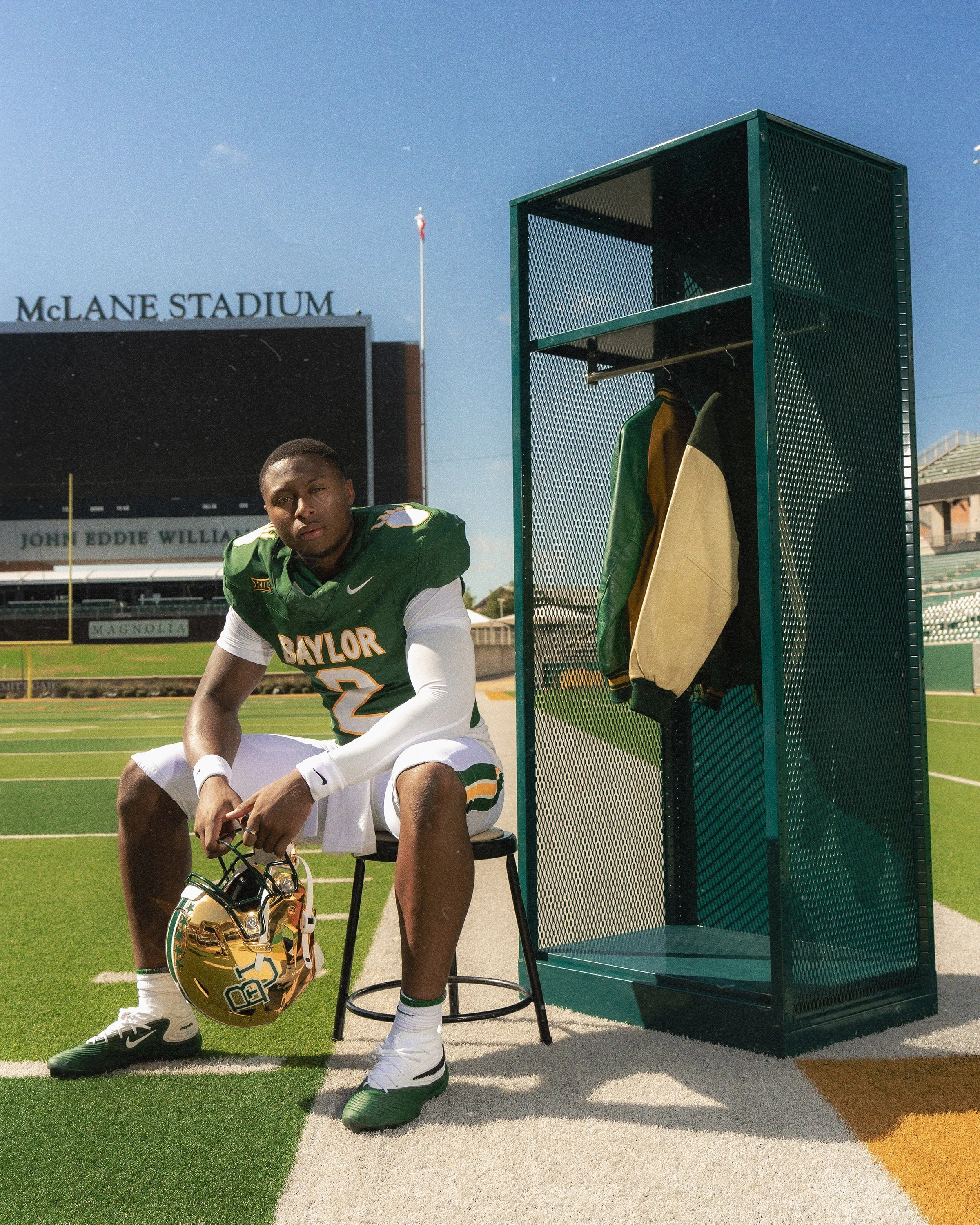
Baylor Brings Back Iconic Bear Paw Uniform for Throwback Game

Baylor is bringing back one of the most recognizable looks in program history.

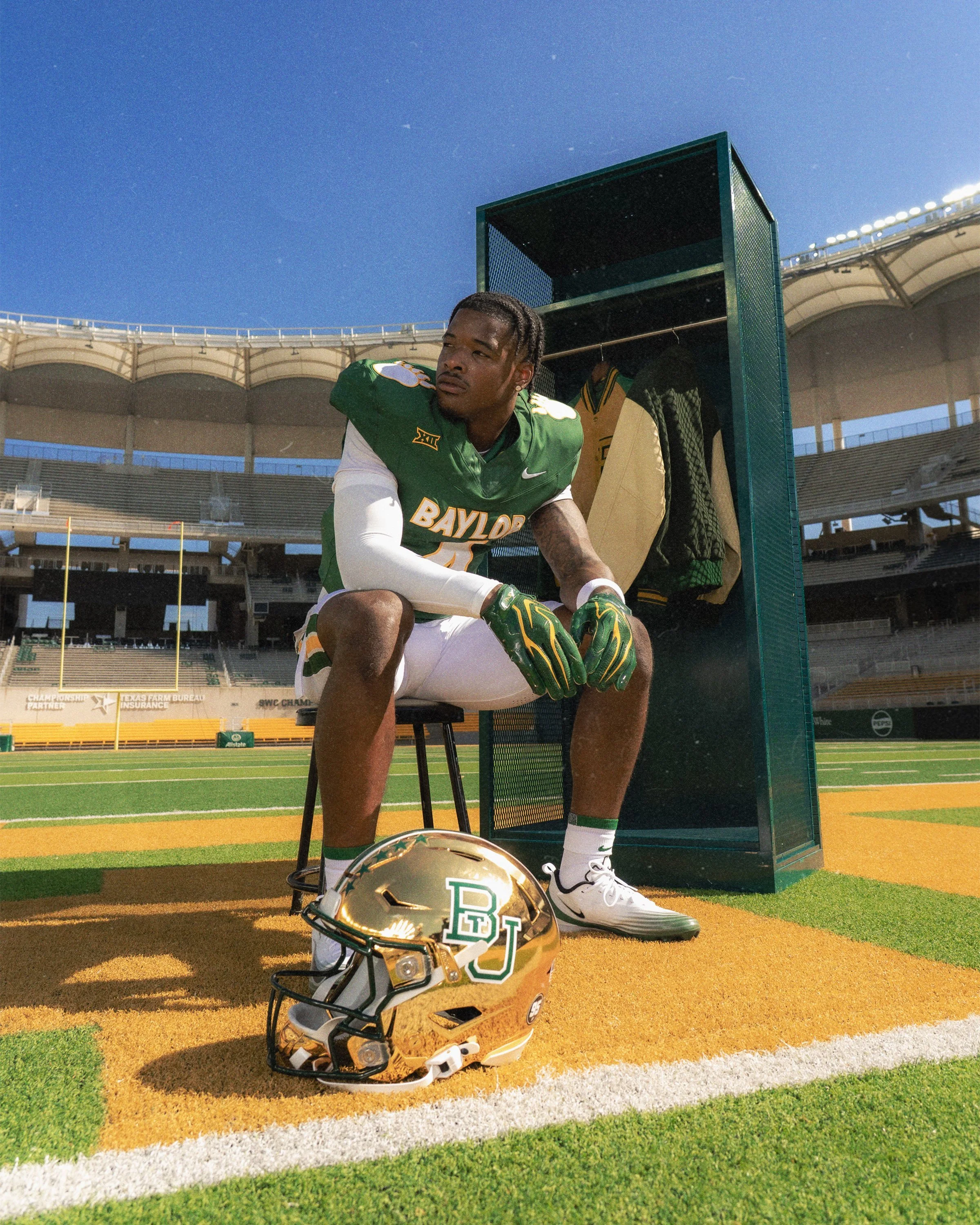
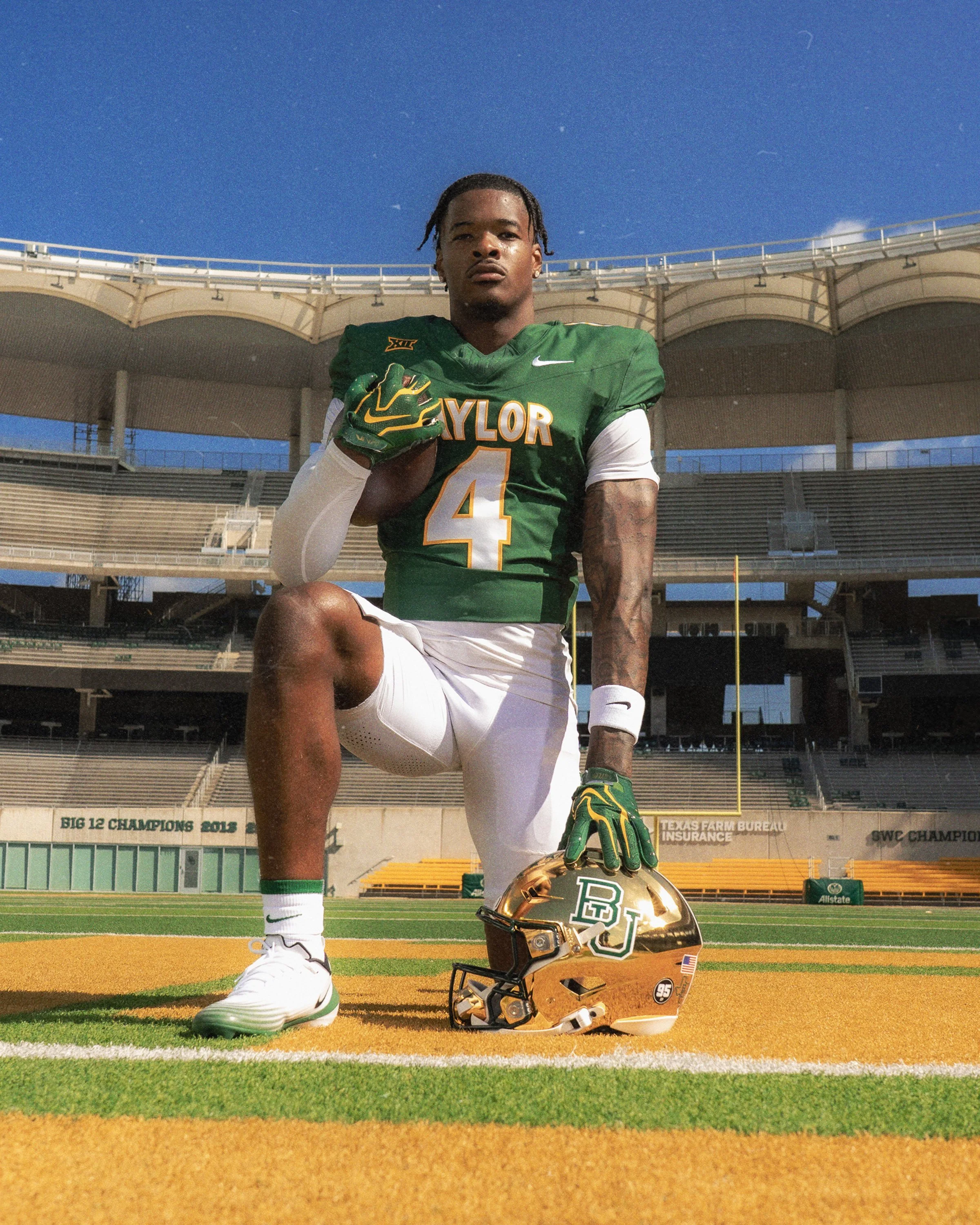
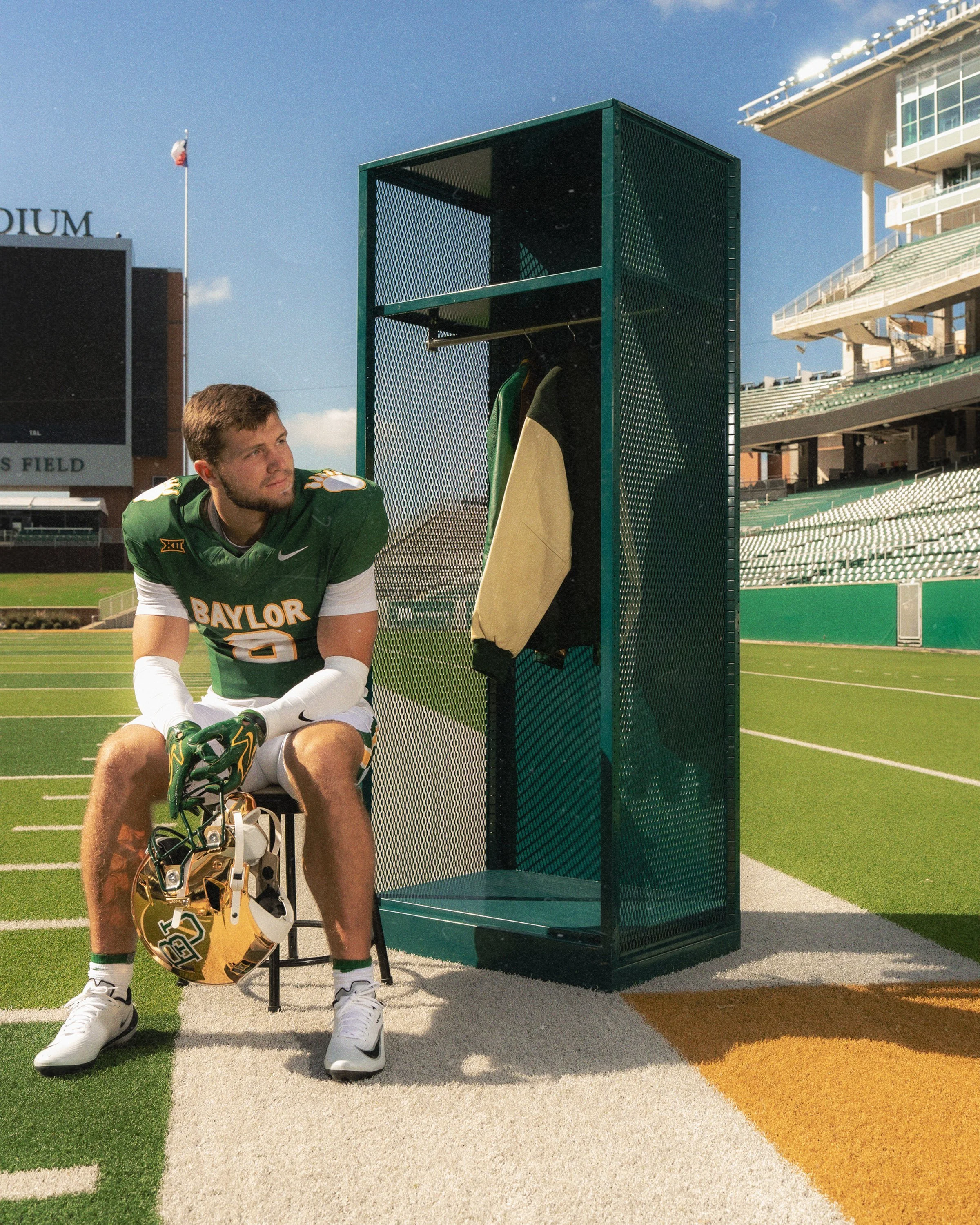
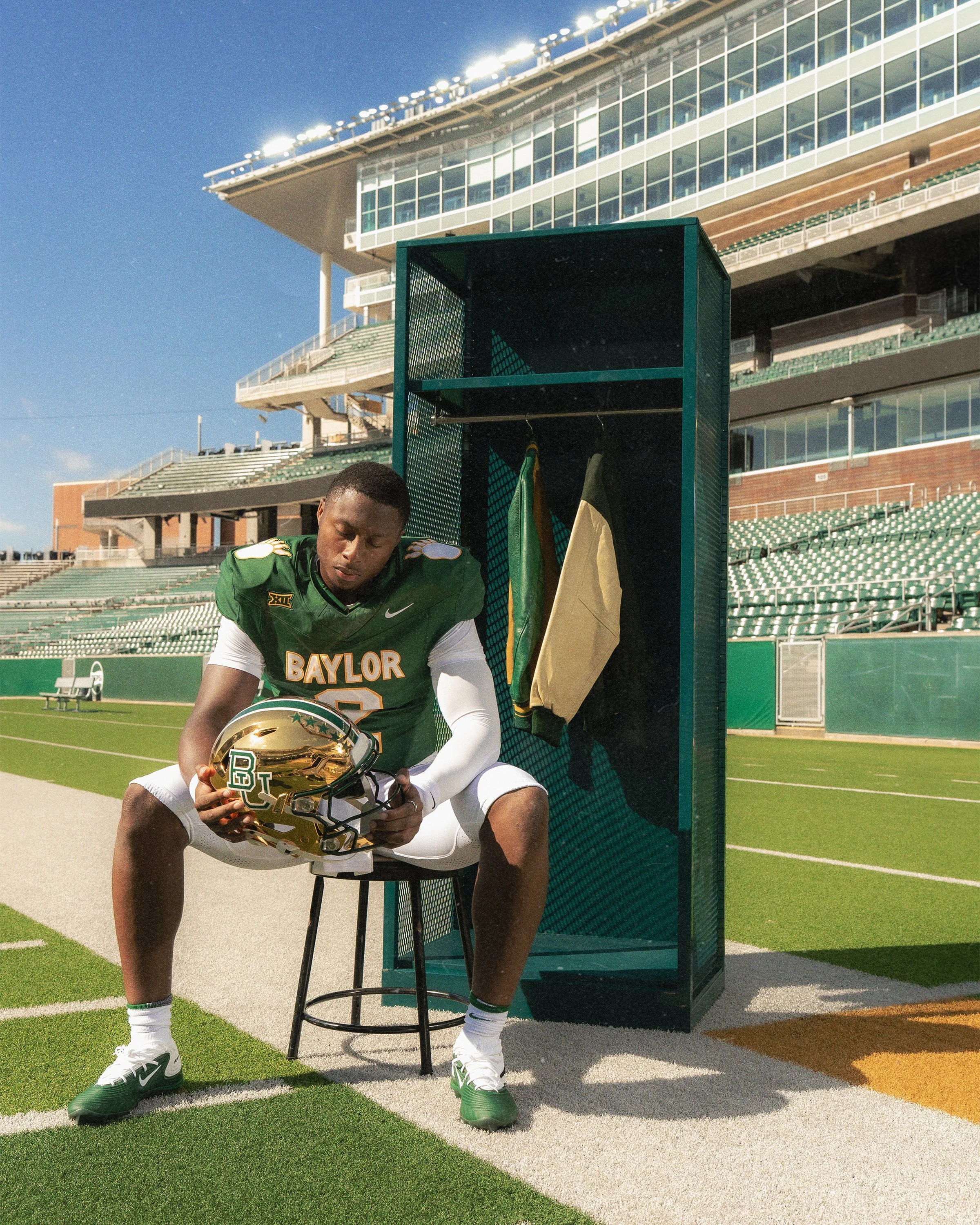
The Bears unveiled a throwback uniform featuring the iconic bear paw, which will take the field Sept. 26 when Baylor hosts Colorado at McLane Stadium for its Big 12 opener.

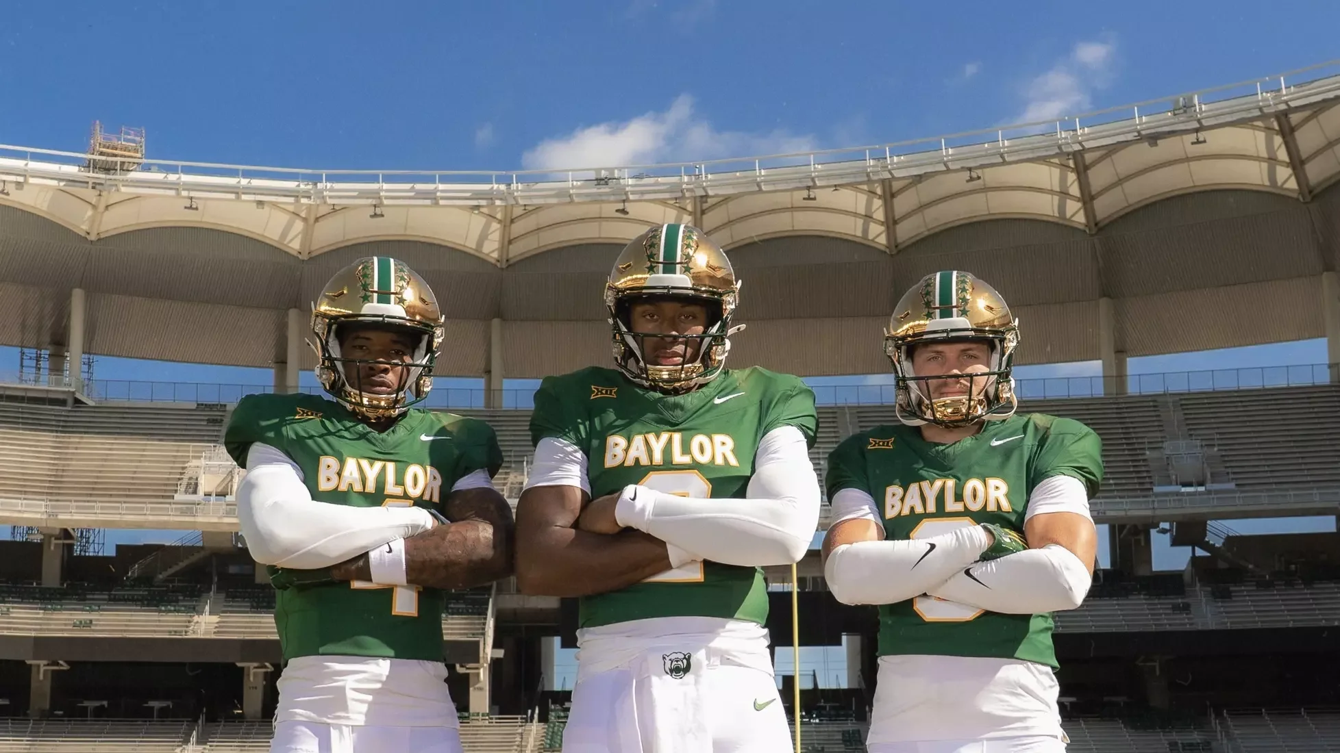
The uniform pays tribute to the Grant Teaff era, recreating a look worn by Baylor from 1982 through 1992 and celebrating some of the most memorable teams in program history.

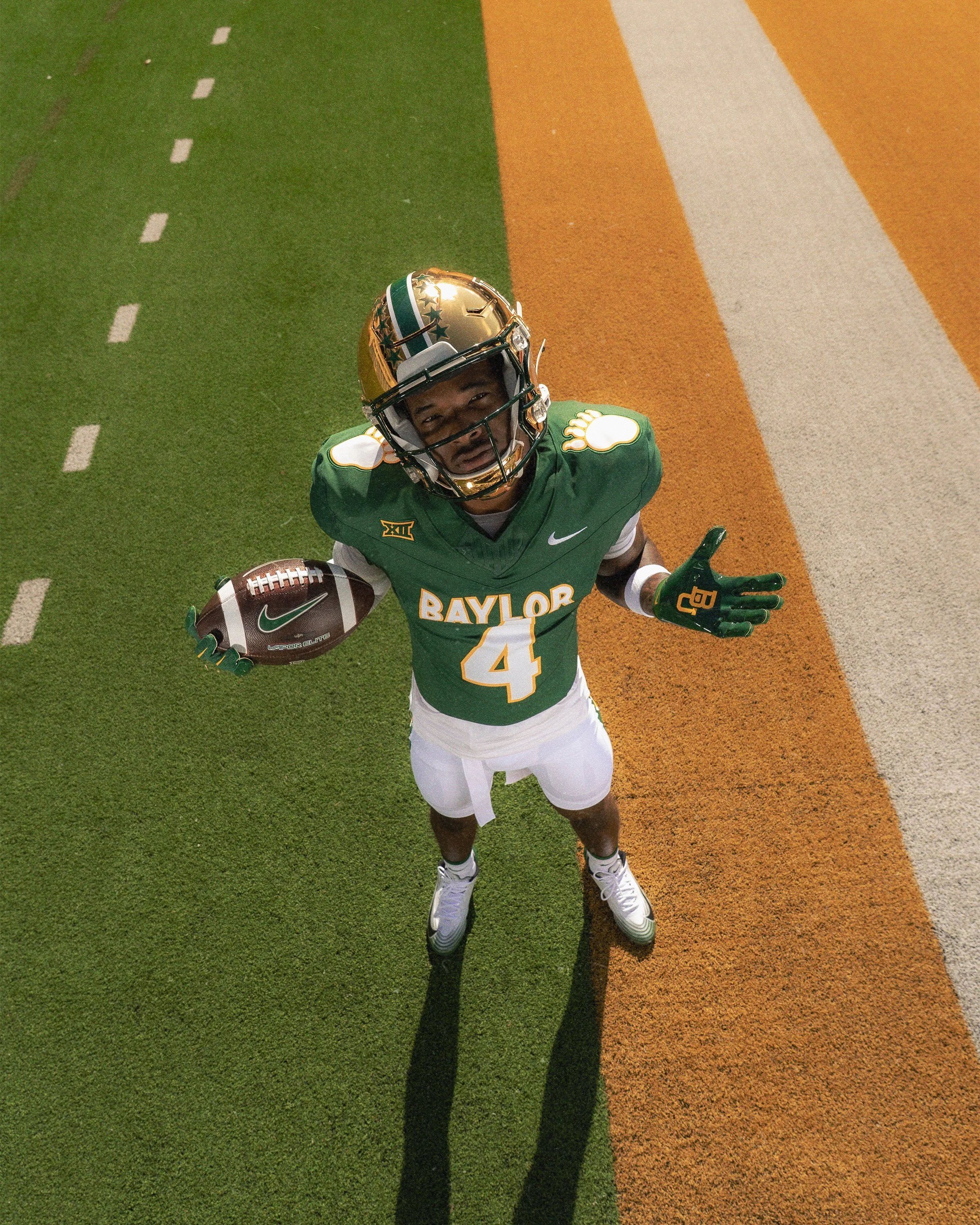
The centerpiece of the throwback is the return of the bear paw on the shoulder pads, marking the first time the iconic design has appeared on a Baylor football uniform in more than three decades.

The jersey also features Baylor across the chest, recreating another defining element of the original uniforms. Rather than simply copying the past, Baylor has incorporated several details that connect the uniform directly to the Teaff era and the program's history.

The helmet features 10 stars, a tribute to Hall of Fame head coach Grant Teaff. Teaff originally introduced the star decals to Baylor's helmets and led the Bears to their first 10-win season. He also recorded 10 victories over Texas during his legendary tenure in Waco.

The stars therefore carry multiple layers of meaning, connecting the throwback uniform to one of the most successful periods in Baylor football history.

The Sept. 26 game against Colorado will have an even stronger connection to the past as Baylor honors the 1991 team, one of the most memorable squads from the Teaff era.

That team delivered one of the program's signature victories when the Bears traveled to Boulder and defeated defending national champion Colorado.

The bear paw uniform has remained popular among Baylor fans long after it disappeared from the field.

Its return gives the program an opportunity to celebrate the players who wore it while introducing a new generation of fans to an important chapter of Baylor football history.

SHOP Baylor gear HERE


See What Else Is New

Related Articles


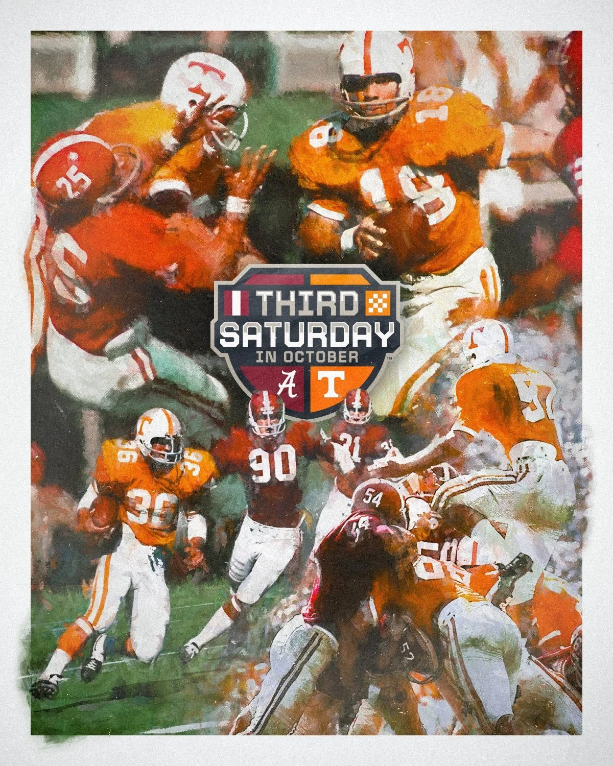
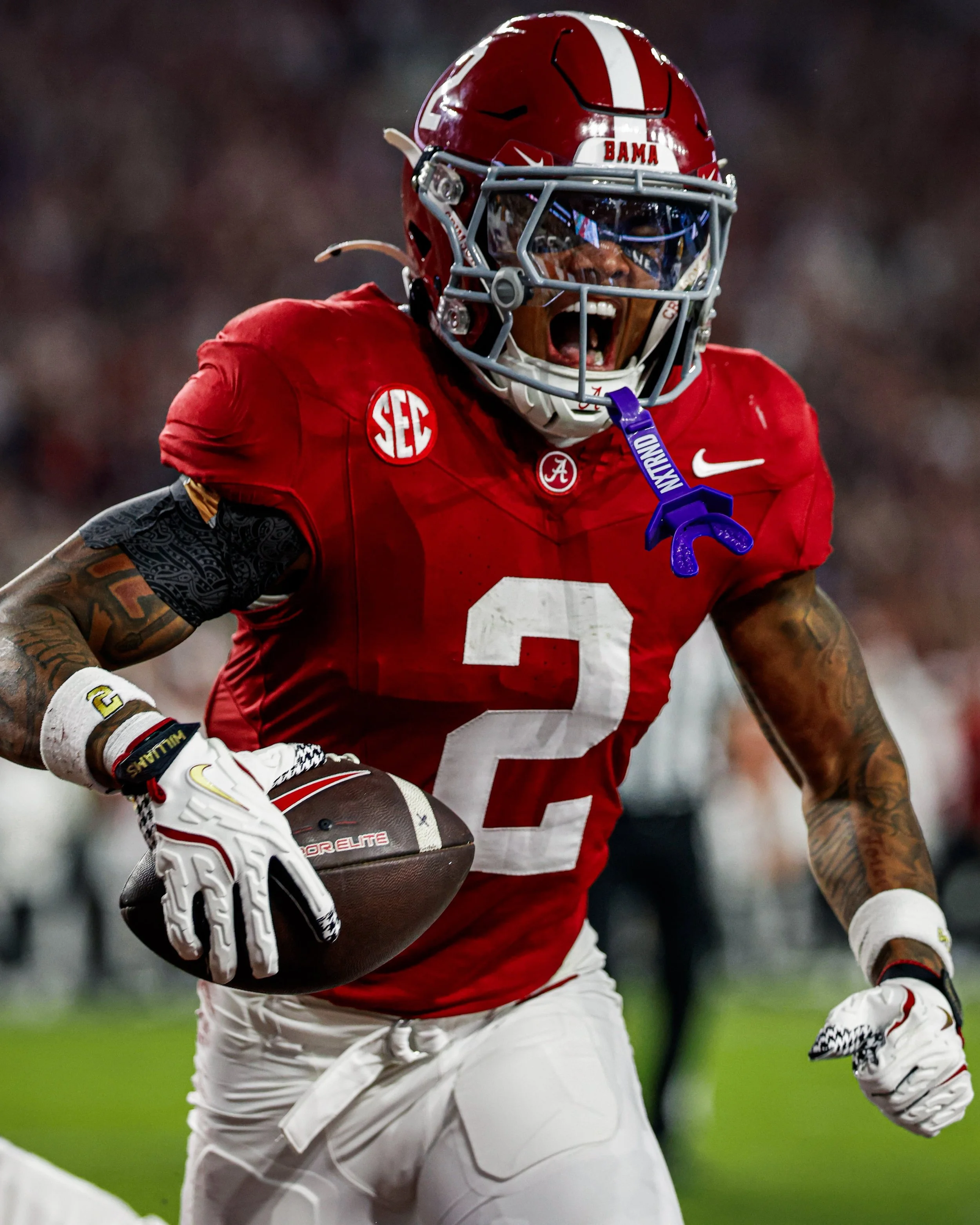
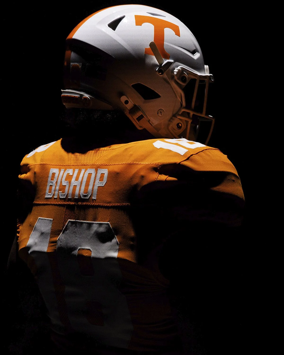
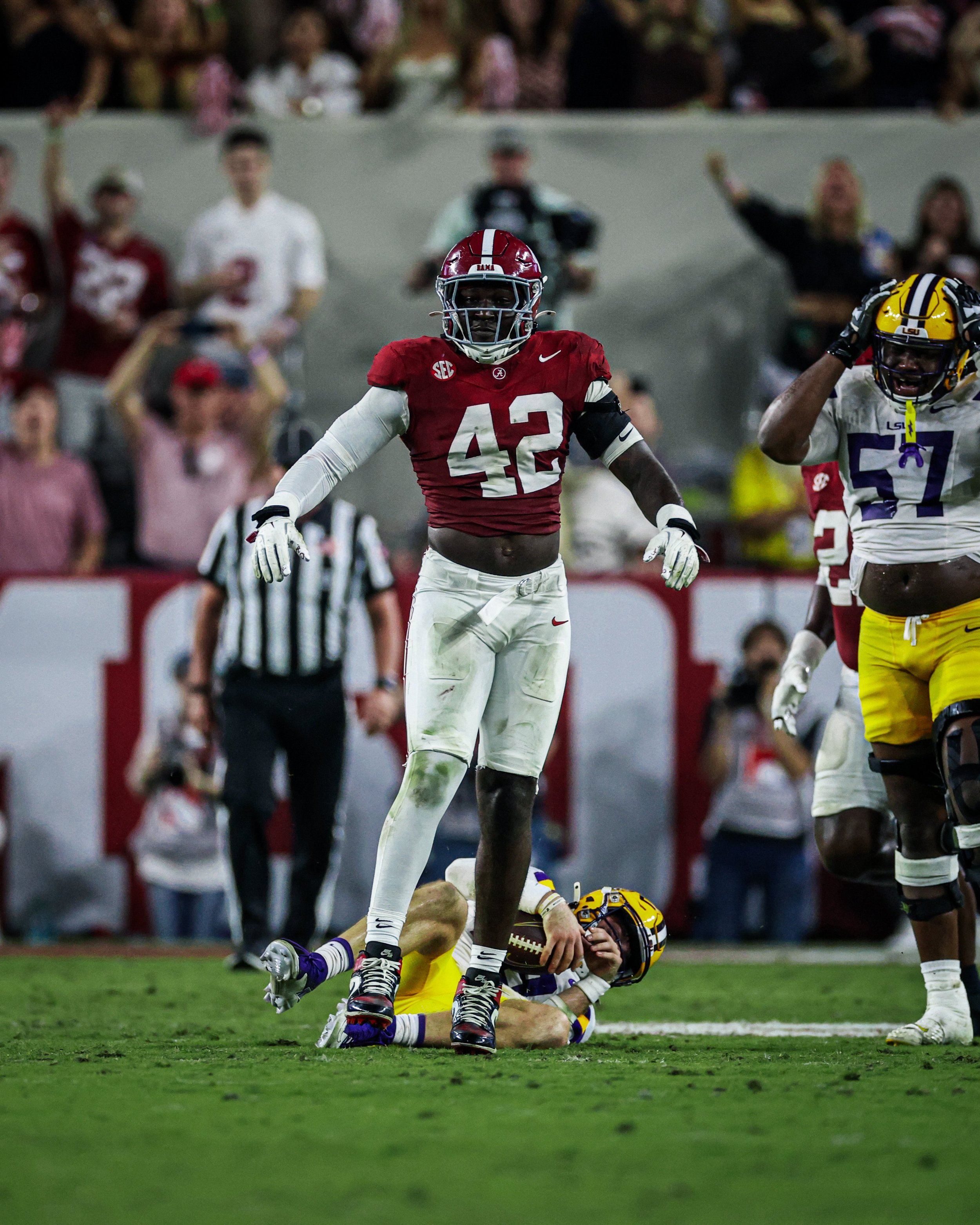
Alabama and Tennessee Are Bringing Back a Classic Uniform Tradition

The Third Saturday in October is getting a throwback look.

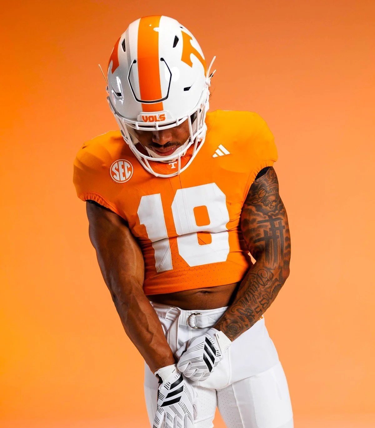
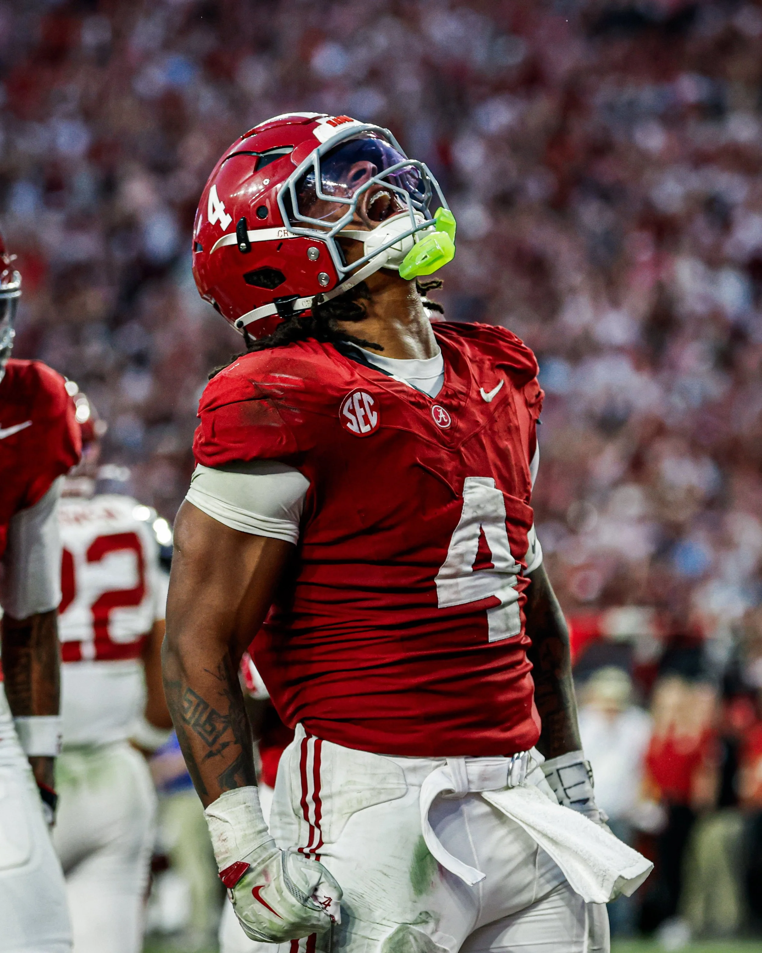
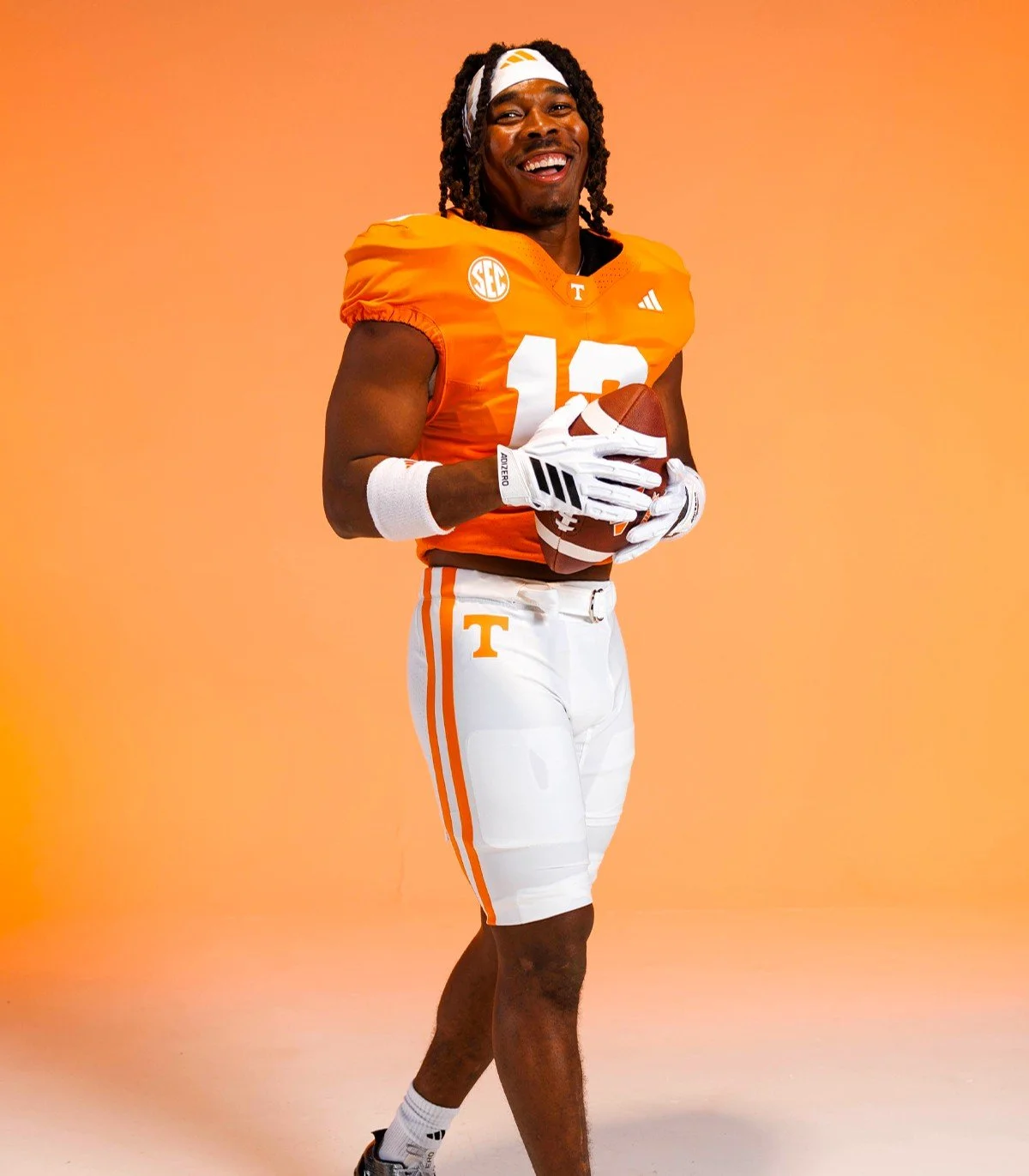
Alabama and Tennessee announced that they will bring back a long-standing rivalry tradition, with both teams wearing their home jerseys when they face each other in 2026 and 2027.

That means Alabama will wear its iconic crimson jersey at Neyland Stadium on Oct. 17, 2026, while Tennessee will wear its orange jersey at Saban Field at Bryant-Denny Stadium in 2027. The two-year agreement was coordinated by both schools, their head coaches and the SEC.

The 2026 matchup will mark the first time since Oct. 17, 1970 that Alabama and Tennessee have both worn their home jerseys in Knoxville.

The 2027 meeting will make even more history. When Tennessee travels to Tuscaloosa, the Volunteers will wear their orange jerseys inside Saban Field at Bryant-Denny Stadium for the first time ever.

The uniform decision is a natural callback to the history behind the rivalry's famous nickname. Alabama and Tennessee first played on the traditional third Saturday in October in 1928, and the matchup continued on that date for 66 consecutive years through 1994. SEC scheduling changes ended the annual third-Saturday tradition in 1995, although the rivalry has continued to carry the name.

The rivalry itself dates back even further, with the programs first meeting in 1901. The teams have played every season since 1928 except 1943, when Tennessee did not field a team during World War II. The 2026 matchup will be the 109th meeting between the two programs.

Alabama currently leads the series 61-39-8 under the NCAA's historical accounting.

The Third Saturday in October, that's about as fitting as it gets.

SHOP NCAA gear HERE


See What Else Is New

Related Articles