The Florida Panthers are once again on top of the hockey world, and now, they have the hardware to prove it. The Panthers celebrated their back-to-back championships as players, coaches, and staff received their 2025 Stanley Cup Championship Rings during a private ceremony at the War Memorial Auditorium in Fort Lauderdale.
Handcrafted in 14-karat white and yellow gold and featuring over 450 diamonds and genuine rubies, the ring captures both the legacy and the grit of a team that defended its title “against overwhelming odds.”
“When designing this ring we wanted to appropriately memorialize the story of the 2024-25 Florida Panthers,” said Panthers Owner & Alternate Governor Teresa Viola. “This ring symbolizes our continued pursuit of excellence, our commitment to the community and the values embodied by our players, coaches and staff.”
The ring’s top showcases ‘PANTHERS’ in 14-karat yellow gold, sitting above two Stanley Cups that represent the team’s 2024 and 2025 titles. Surrounding these Cups are 81 diamonds and 60 rubies, symbolizing the back-to-back championships. The perimeter features the words ‘STANLEY CUP CHAMPIONS’, also set in gold and adorned with an additional 145 diamonds, while another 122 diamonds and 18 princess-cut rubies complete the design.
“The 2025 ring features details that bring the back-to-back champions’ story to life,” said Chris Poitras, SVP and GM of The Champions Collective. “We are honored to present it to the Panthers organization.”
Each ring is personalized for its recipient, featuring their name and title on the left side, along with a panel shaped like the team’s primary shield logo. The right side displays ‘FLORIDA’ in yellow gold above the Leaping Cat logo, framed by two palm trees that represent the palms lining Amerant Bank Arena.
White gold palm trees wrap around the interior, leading to a prowling panther engraving on the outer edge, a sleek finishing touch that embodies the team’s fearless spirit.
Inside the ring, engravings tell the story of the Panthers’ journey:
“WE APOLOGIZE TO NO ONE,” the team’s rallying mantra, is boldly etched above the playoff series results.
The date of their championship-clinching victory — June 17, 2025 — is immortalized.
And finally, a small black rat engraving pays tribute to one of the most beloved fan traditions in hockey.
With over 450 gemstones totaling approximately 16.15 carats, the 2025 Stanley Cup ring isn’t just a symbol of victory—it’s a tribute to a team that has defined resilience, confidence, and culture in South Florida sports.
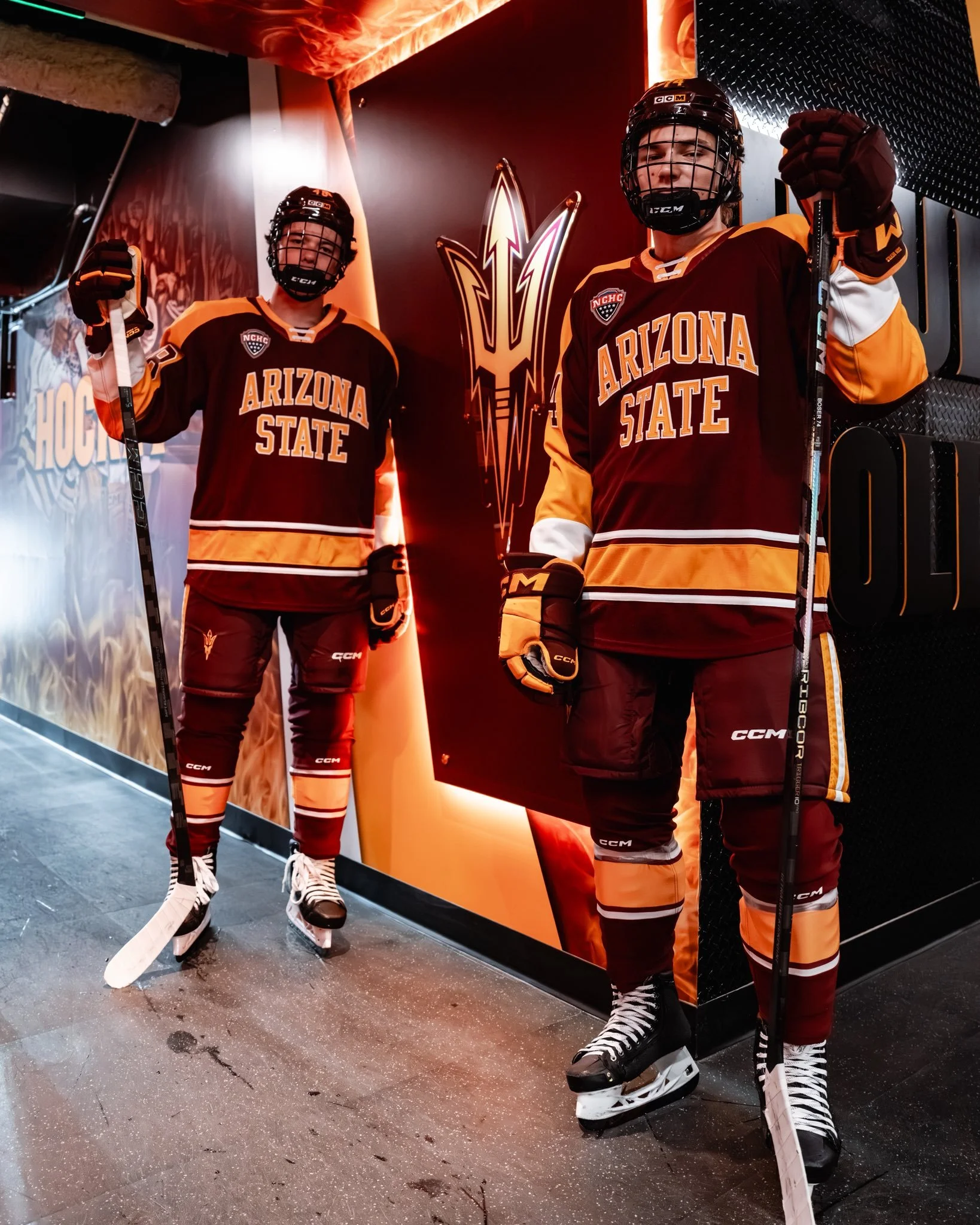
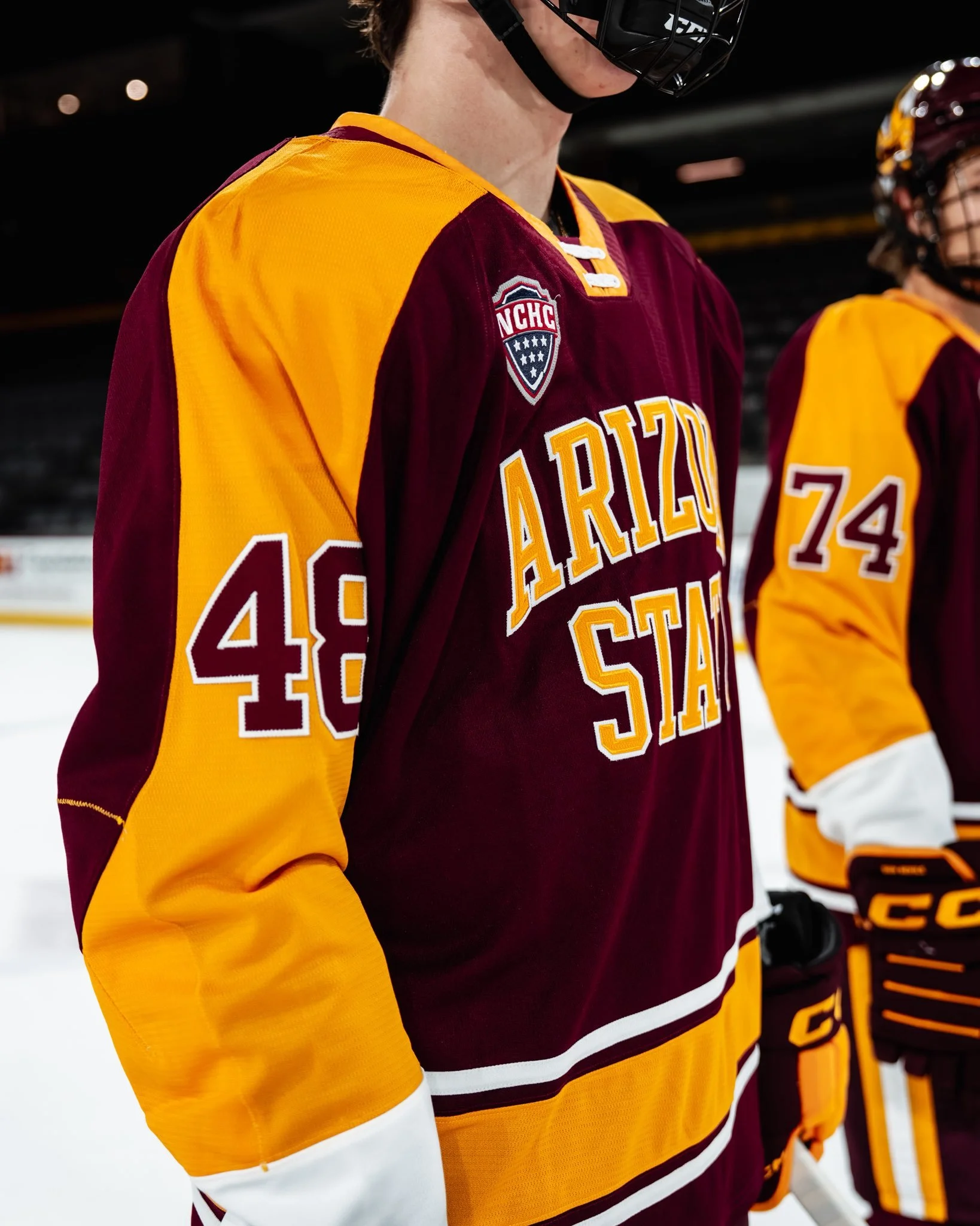
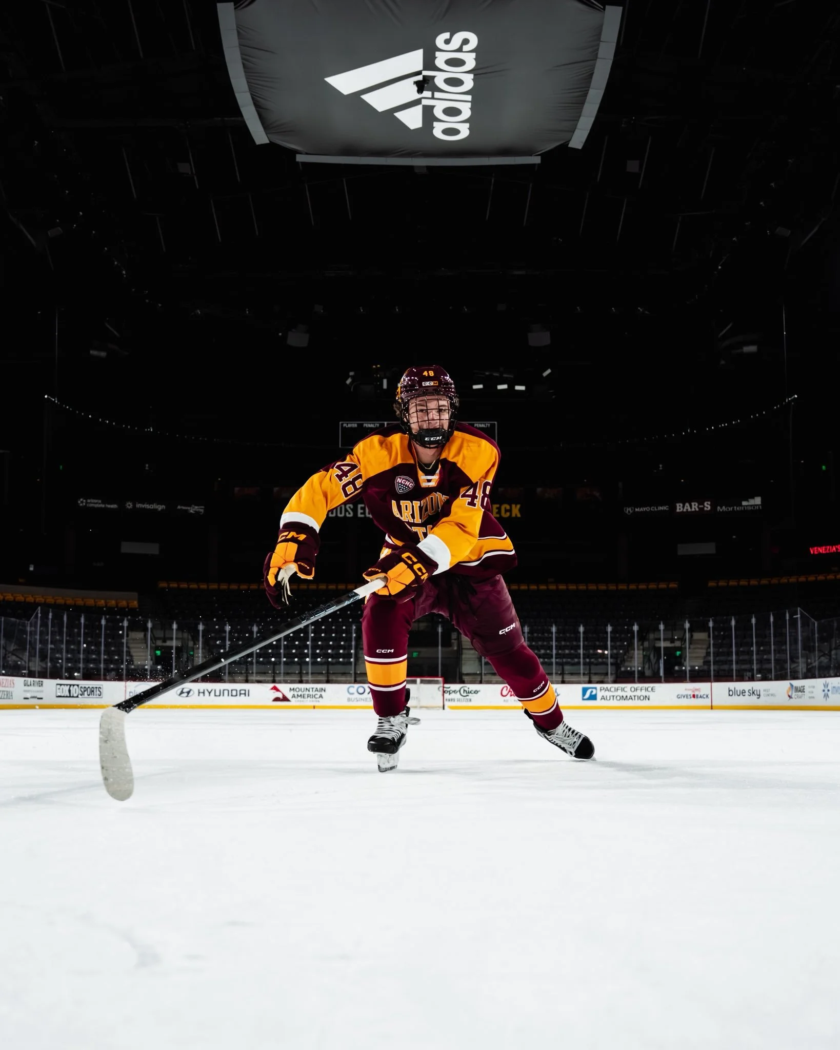
Arizona State hockey is skating into the new season with a fresh look that’s sure to turn heads. The Sun Devils revealed their latest uniform set, and it’s a perfect blend of school pride and hockey swagger.
The new jerseys feature a maroon base with “Arizona State” spelled proudly across the chest in gold lettering. Along the hem runs a thick gold stripe flanked by two crisp white stripes, giving the kit a traditional hockey vibe with a modern Sun Devil twist.
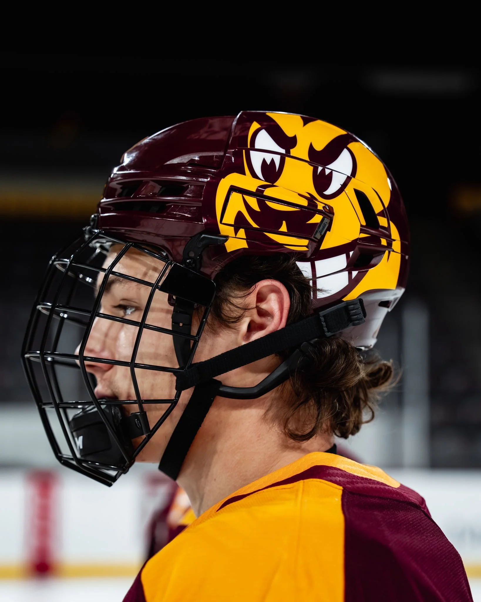
On the sleeves, thick gold paneling showcases the players’ numbers, ensuring visibility while tying the look together in true ASU fashion. The finishing touch might just be the most iconic, a large Sparky face stamped on the helmet, bringing the program’s beloved mascot into the spotlight every time the team hits the ice.
With this design, Arizona State has delivered a uniform that captures both tradition and attitude. It’s classic maroon and gold, but reimagined in a way that feels fresh and unmistakably Sun Devil. Fans in Tempe will have plenty to cheer for this season, and now they’ll get to do it with one of the sharpest looks in college hockey.
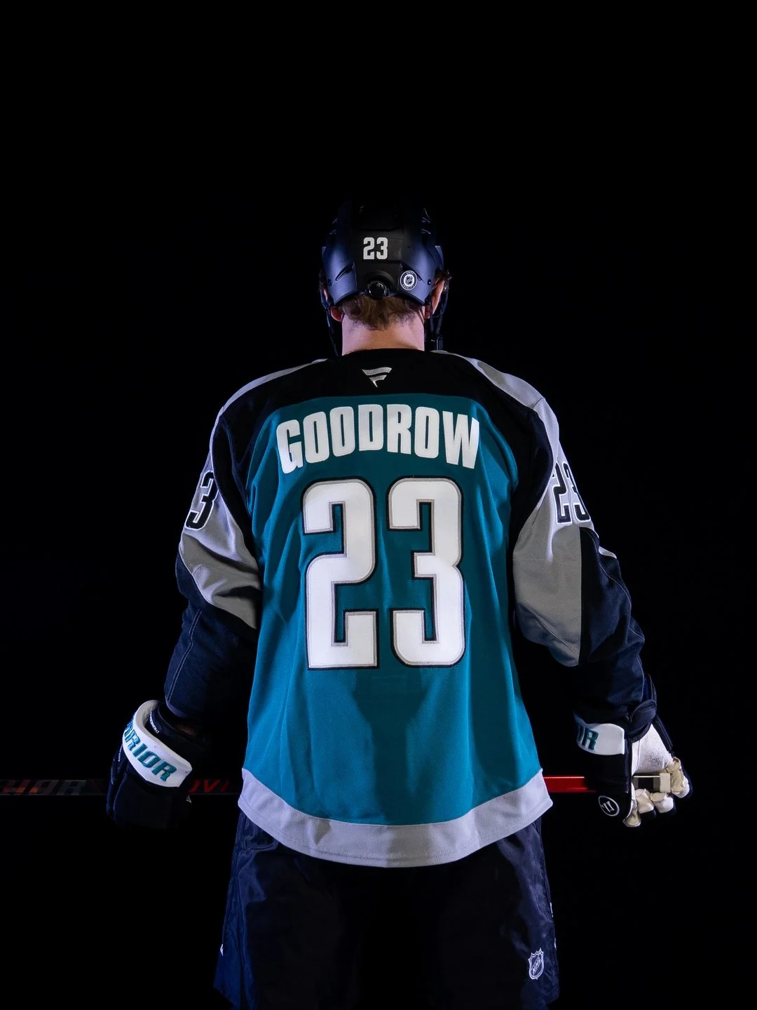
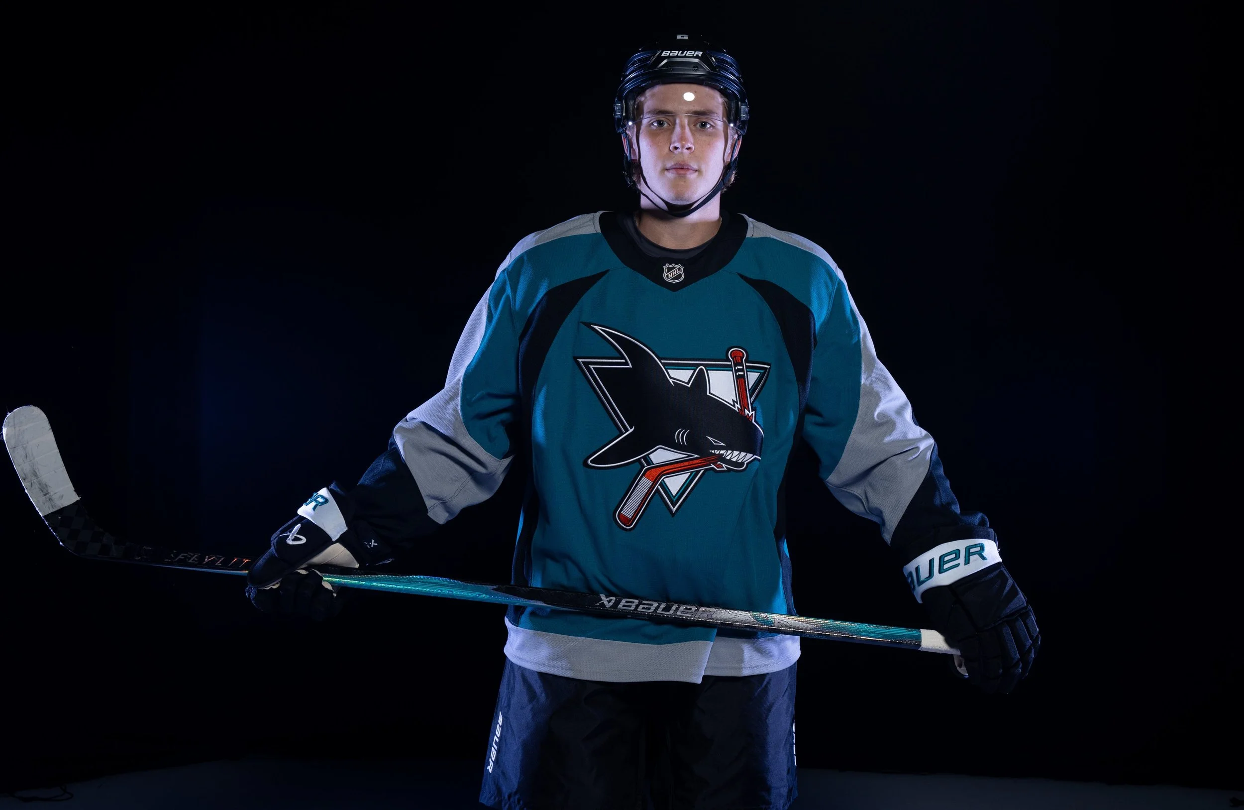
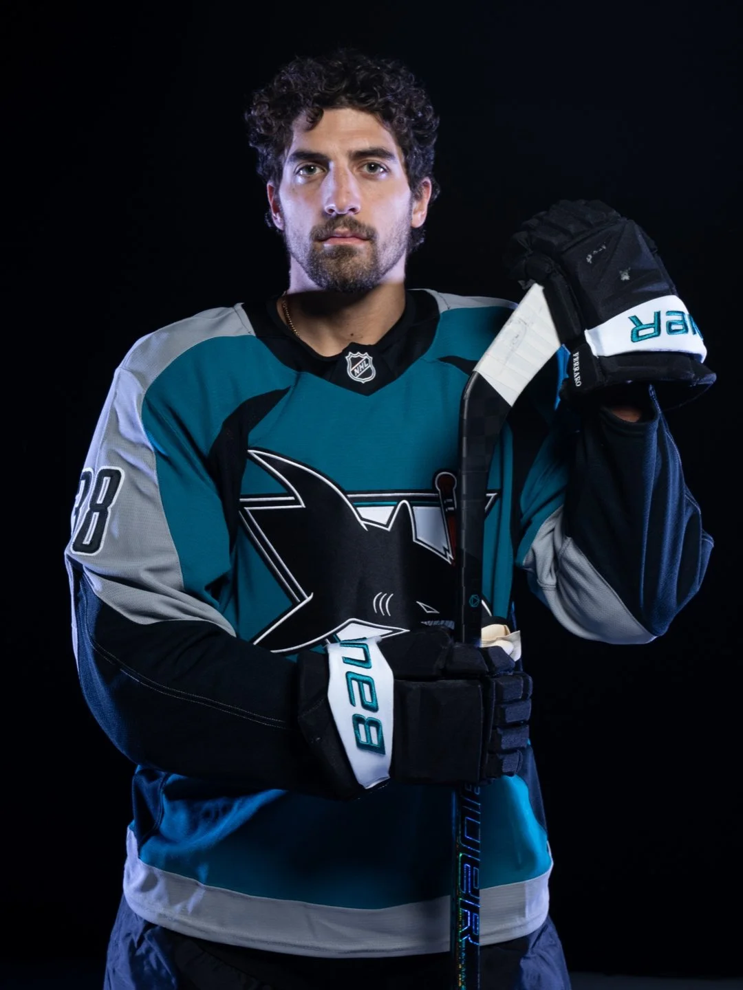
As the San Jose Sharks get ready to celebrate their 35th anniversary season, the team is turning back the clock while looking ahead to the future. The franchise unveiled the Sharks Heritage 2.0 jersey, a modern tribute to one of the most iconic looks in team history.
Originally worn between 1998 and 2007, the second-generation Sharks jersey became a symbol of an unforgettable era, defined by legends like Patrick Marleau, Joe Thornton, Evgeni Nabokov, Jonathan Cheechoo, Owen Nolan, and more. Now, the look is back with a fresh twist designed to connect fans across generations under one teal banner.
Heritage 2.0 carries forward the bold lettering and design of the original while refreshing the details for today’s game. The neckline “bleeds teal,” and every stitch is meant to tell the story of 35 years of Sharks hockey—from franchise-defining goals to the moments that built Sharks Territory.
Sharks Chief Marketing Officer Doug Bentz summed it up perfectly: “Heritage 2.0 isn’t just a jersey, it’s a symbol of the era that made us who we are, on and off the ice.”
The celebration extends beyond the ice. Fans can shop the full Heritage 2.0 merchandise line, which includes jerseys, hoodies, tees, hats, pins, pucks, and stickers—ensuring the look lives everywhere in Sharks Territory.
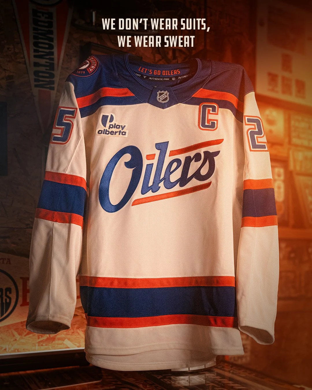
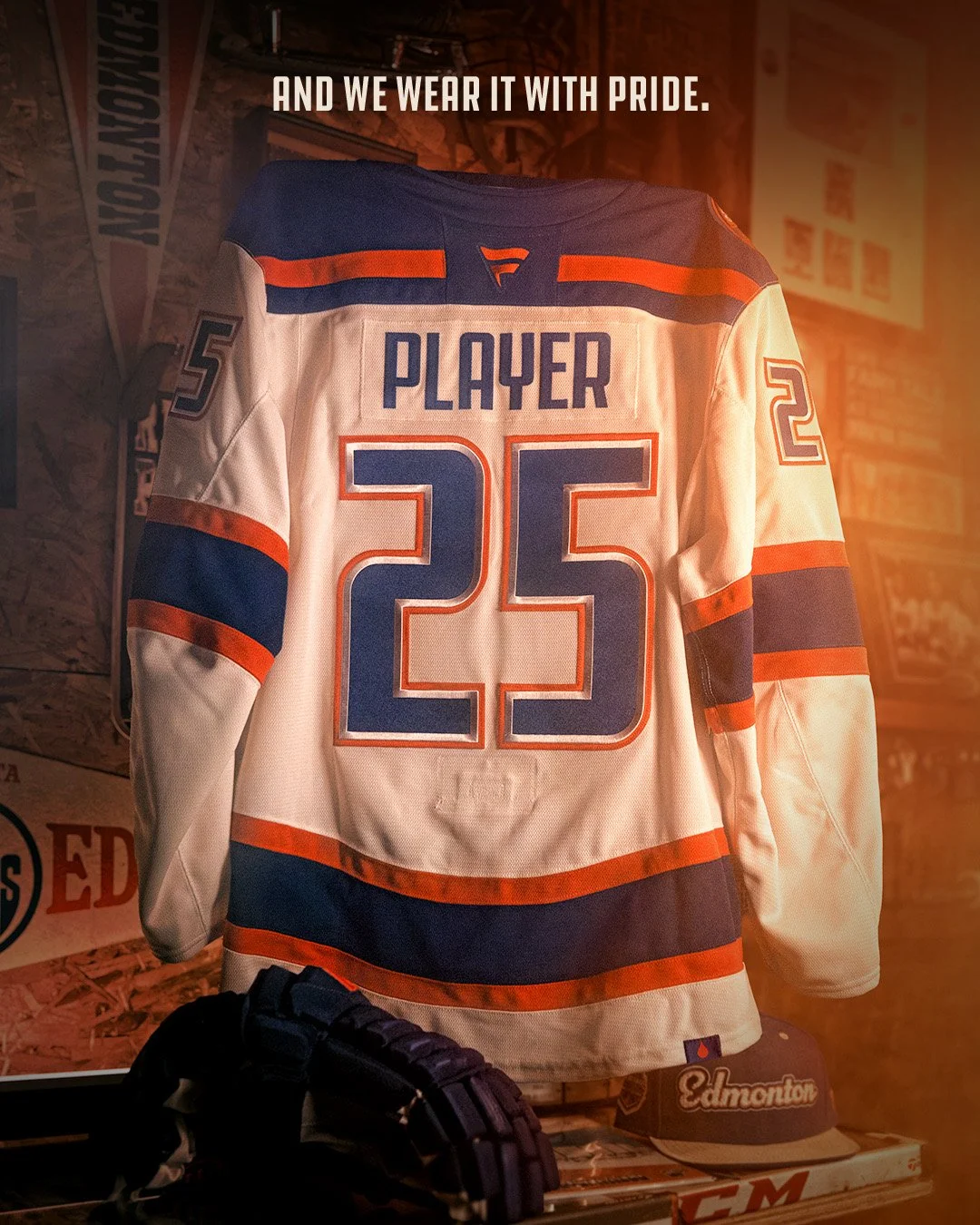
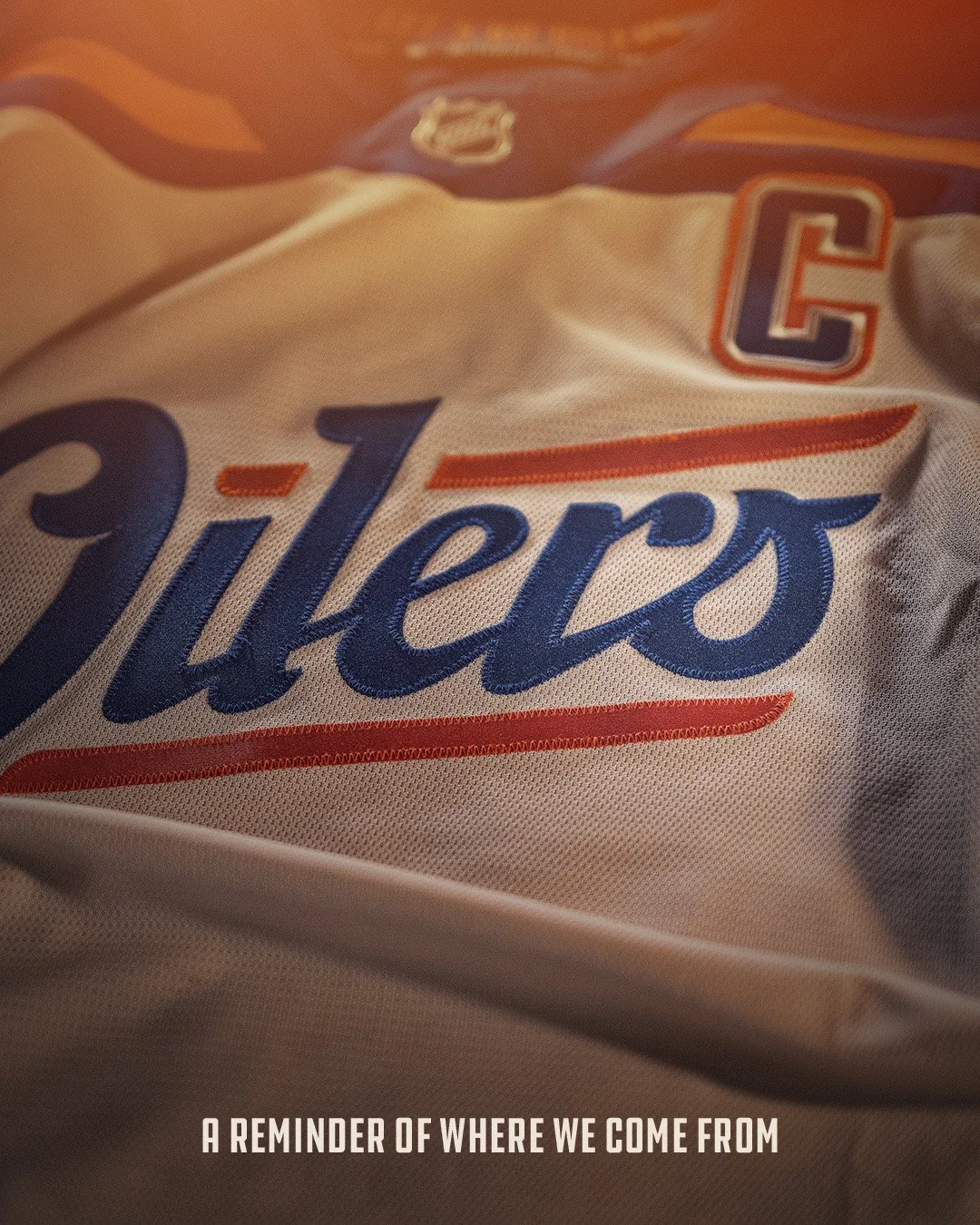
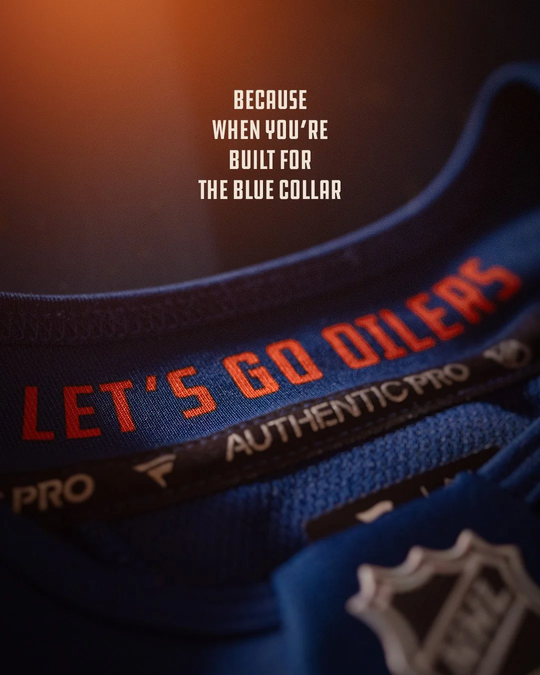
The Edmonton Oilers gave fans a special surprise at their sixth annual Fan Day, unveiling a brand-new alternate jersey that will hit the ice during the 2025-26 season. Blending Fanatics’ modern innovation with a nod to the region’s industrial roots, the look pays tribute to Oil Country in a way the team has never done before.
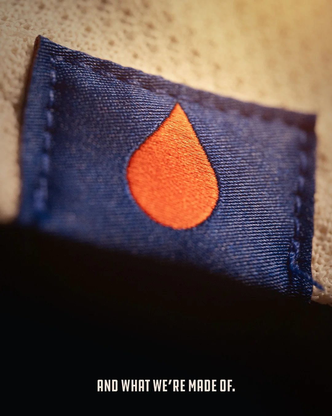
The alternate features a light tan base that carries a broken-in, workwear-inspired feel, representing the grit and determination of the industries that built Northern Alberta. A bold blue collar serves as a symbolic reminder of the hardworking spirit of Oil Country, while oil drop details can be found throughout—from a scripted “s” to a subtle tag sewn on the back hemline.
A special patch salutes the dedication and work ethic of the region’s industries, further connecting the jersey to the people who power the community. Nostalgic design cues evoke trusted heritage brands that once fueled machines and workplaces across the area.
The Oilers will debut the alternate on October 28 against the Utah Mammoth. Fans will also see it at home games on December 4 (Seattle), December 6 (Winnipeg), December 23 (Calgary), and January 31 (Minnesota).
Beyond Edmonton, the Oilers will showcase the look on the road in Chicago on January 12 and Nashville on January 13, bringing a piece of Oil Country with them.
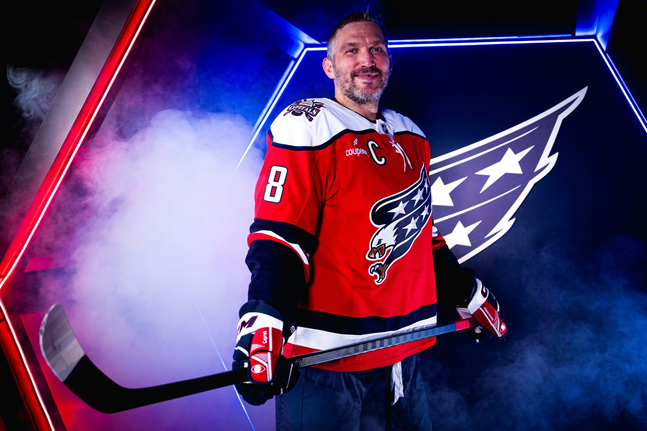
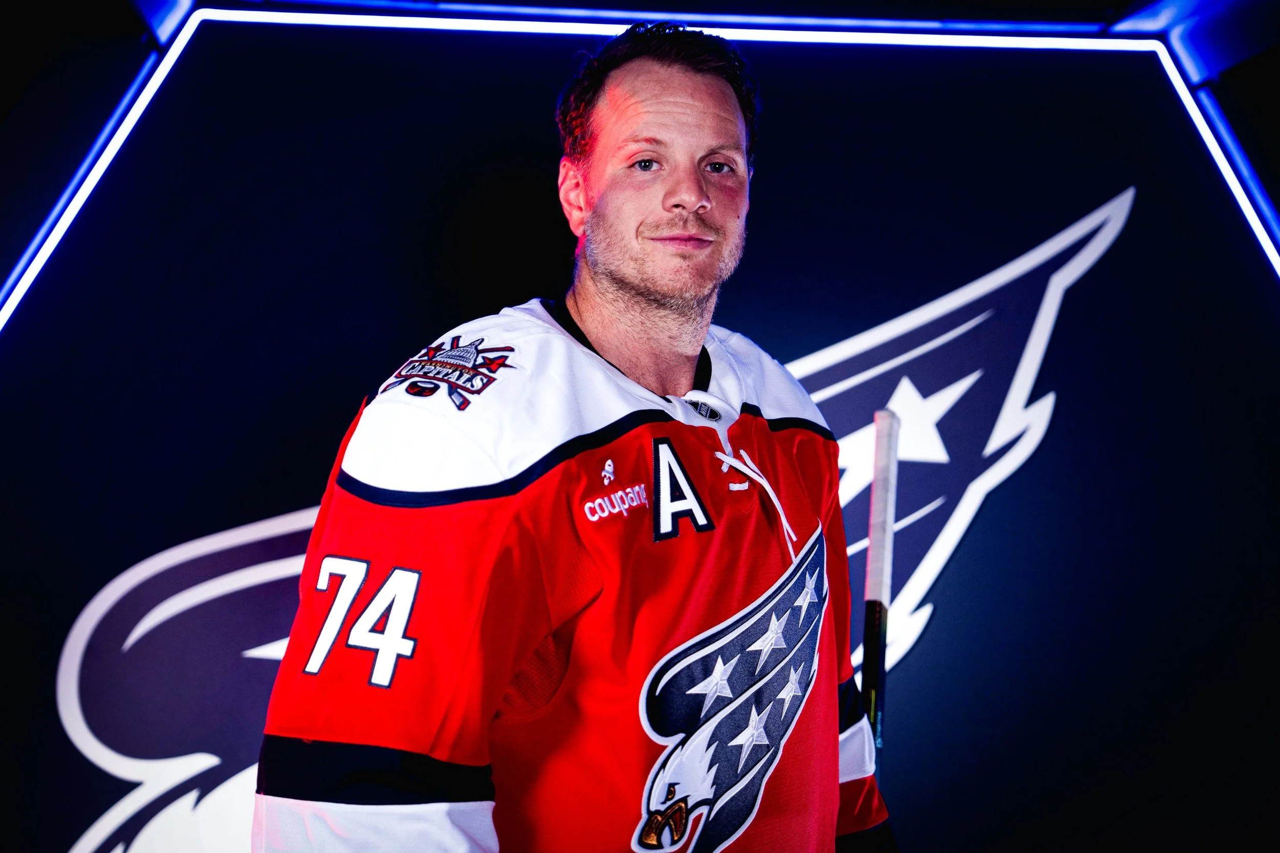
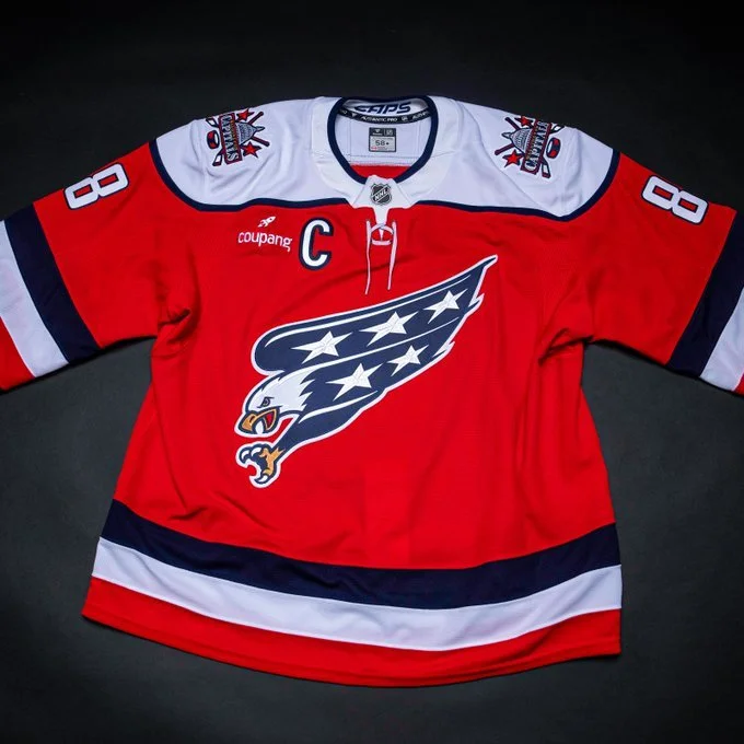
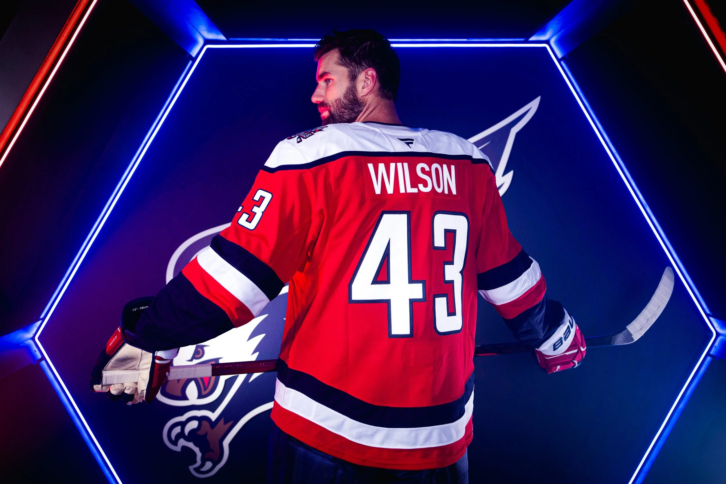
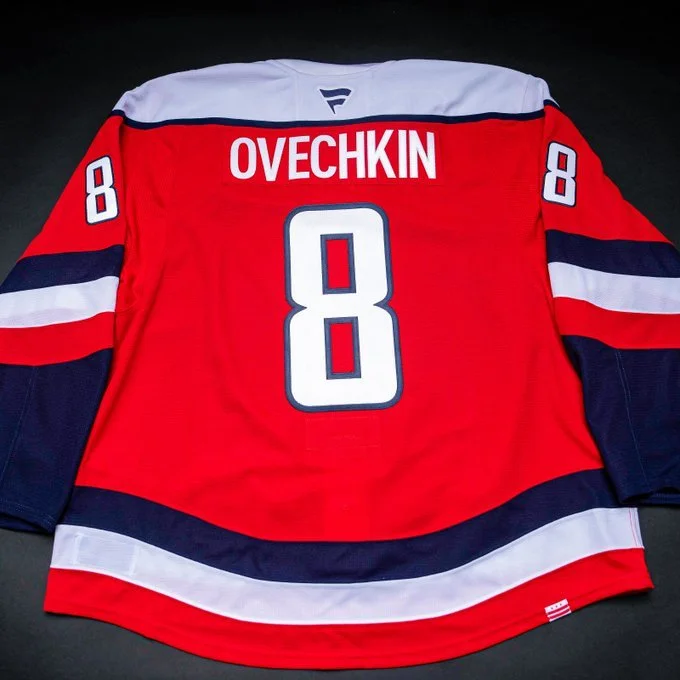
The Washington Capitals are bringing back one of their most beloved looks with a modern twist. The team unveiled a brand-new red third jersey featuring the iconic screaming eagle logo, set to debut during the 2025-26 NHL season. The Capitals will wear the design for 15 home games this year, and it will remain in rotation as the official third uniform for the next three seasons.
Designed in partnership with Fanatics, the uniform blends eras of Capitals history while pushing the brand forward. The primary red base ties back to the team’s signature color and passionate fan base, while a white rounded shoulder yoke and classic striping across the hem pay tribute to the Capitals’ early uniforms from the 1970s and 80s.
A lace-up neckline adds timeless hockey character, while the return of the 1990s Capitol Dome shoulder patch delivers a wave of nostalgia. At the center, the screaming eagle logo takes flight once again, its downward dive symbolizing speed, strength, and dominance.
The uniform is filled with subtle details that connect to the District: three stars on the pants and three sleeve stripes in red, white, and blue represent the loyal DMV fan base, while a District of Columbia flag loop label at the back hem provides a hidden discovery element. Inside the collar, the “Caps” wordmark serves as a final nod to team pride.
Alongside the jersey, the Capitals are rolling out refreshed creative rooted in the screaming eagle identity. The design system uses sharp “eagle scratch” textures inspired by the logo itself, bold ALL CAPS typography pulled from the jersey neckline, and a red, blue, and gold color palette to create a modern yet heritage-driven look.
The screaming eagle jersey is more than a third sweater; it’s a statement. By honoring multiple eras of franchise history while embracing the team’s connection to DC and its fans, the Capitals have delivered a design that blends nostalgia with fresh energy. For longtime fans and new ones alike, this third jersey will be a must-watch every time it hits the ice at Capital One Arena.
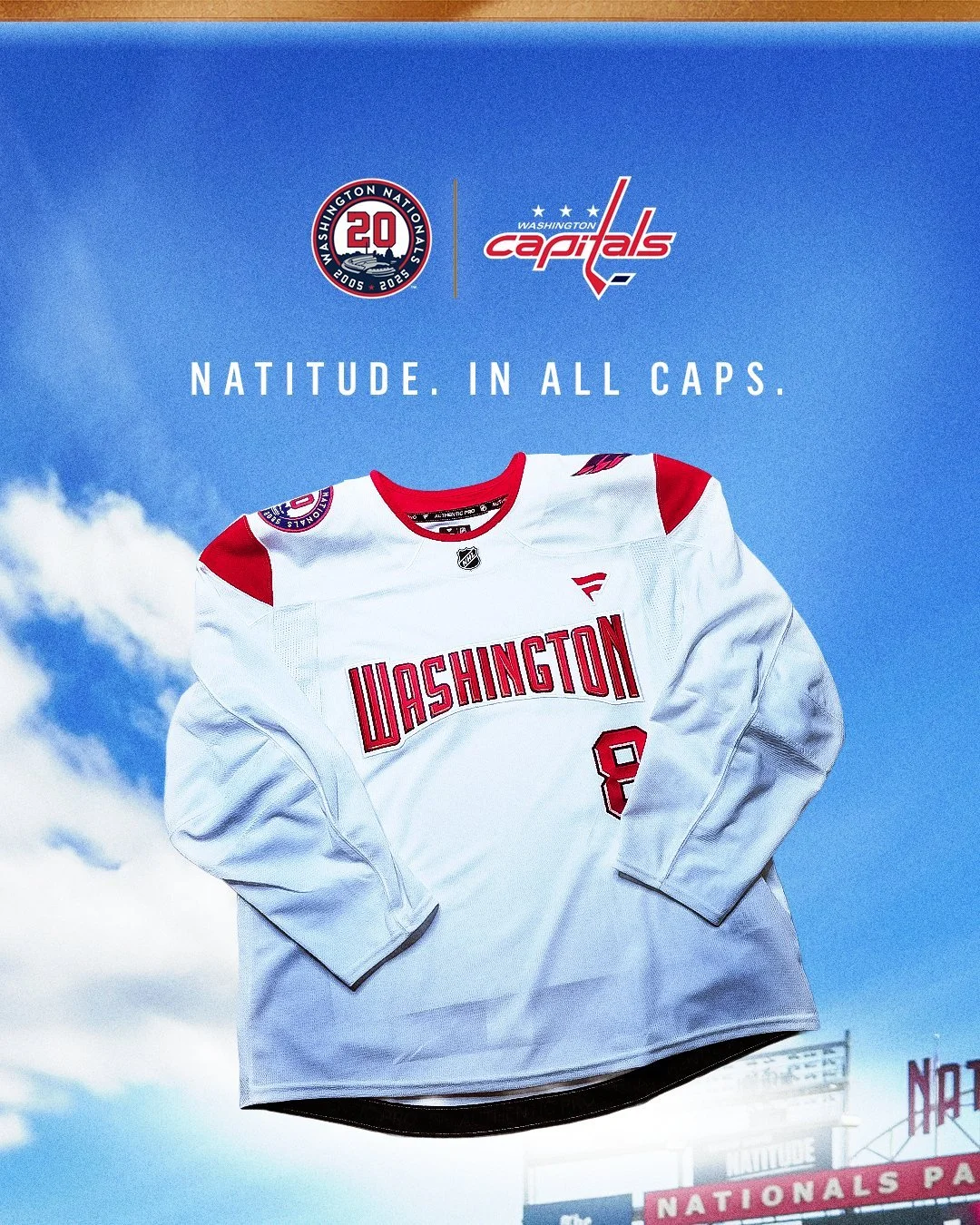
Two of D.C.’s most iconic franchises are joining forces. The Washington Capitals and Washington Nationals have unveiled a collaborative specialty jersey, celebrating the shared history and pride both teams bring to the nation’s capital.
As the Nationals wrap up their 20th anniversary season and the Capitals reflect on their 50th anniversary milestone last year, the jersey stands as a symbol of the strong bond between the organizations and their connection to the city they represent.
The partnership between the Caps and Nats has been highlighted by unforgettable moments:
The 2015 NHL Winter Classic at Nationals Park.
Ceremonial first pitches and cross-sport appearances.
The Stanley Cup’s visit to Nationals Park in 2018.
Nationals players taking a Zamboni ride at Capital One Arena following their 2019 World Series win.
Both teams delivered championships to Washington in back-to-back years, with the Capitals’ Stanley Cup in 2018 and the Nationals’ World Series in 2019, cementing their legacies in D.C. sports history.
The jersey design proudly features “Washington” across the chest as a nod to shared city pride on both the diamond and the ice. Its font and numbering are inspired by the Nationals’ 2005 home uniform, paying tribute to the return of Major League Baseball to D.C. after a 33-year absence. Completing the look, one shoulder displays the Capitals’ iconic Weagle logo, while the other showcases the Nationals’ 20th anniversary logo, tying together the history and identity of both franchises.
The jersey blends history, tradition, and a sense of unity, capturing the essence of both franchises while celebrating their milestones.
To mark the collaboration, Capitals forward Dylan Strome will wear the specialty jersey while throwing out the ceremonial first pitch on Monday, Sept. 15, as the Nationals host the Atlanta Braves. Nationals players will also take batting practice in special-edition Capitals T-shirts, with additional Caps-themed activations happening throughout the ballpark that night.
This collaboration is more than just a jersey; it’s a celebration of D.C.’s sports culture, uniting fans of the red, white, and blue across the city.
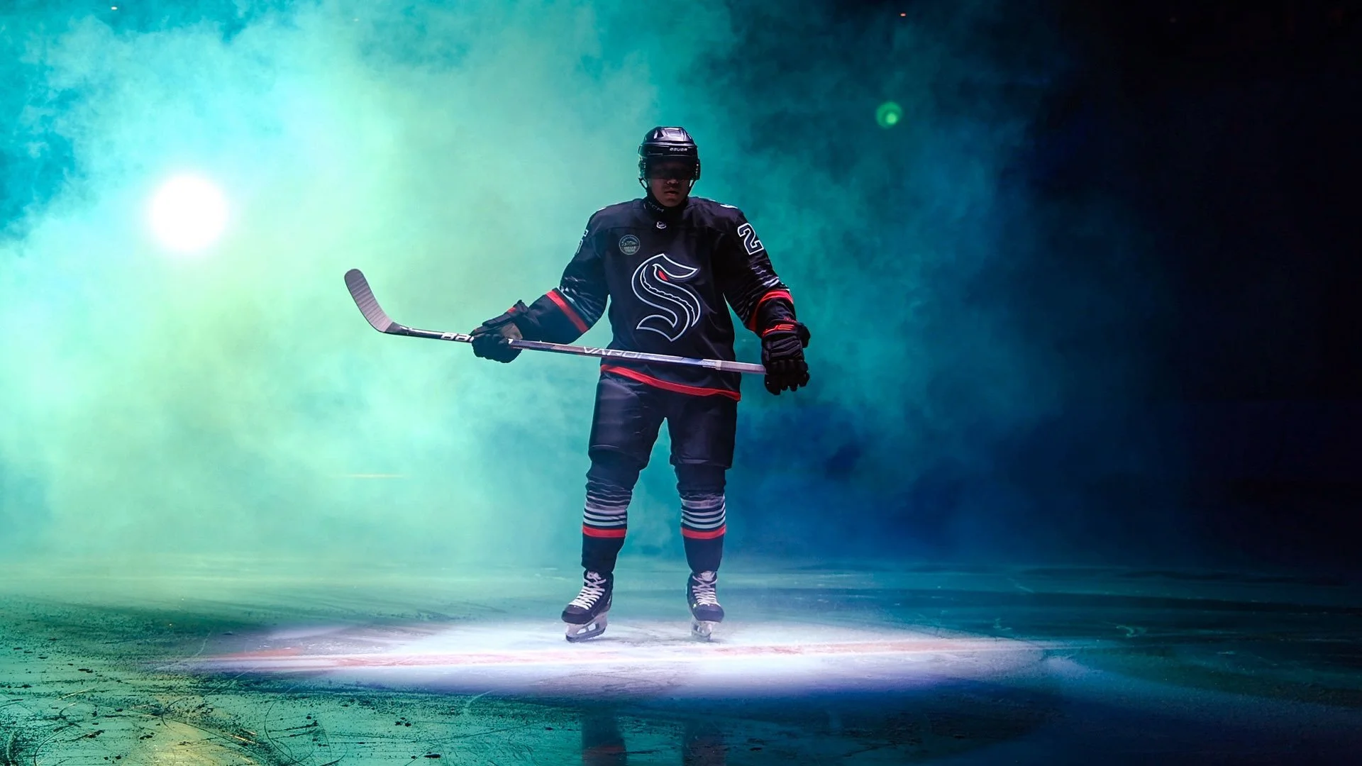
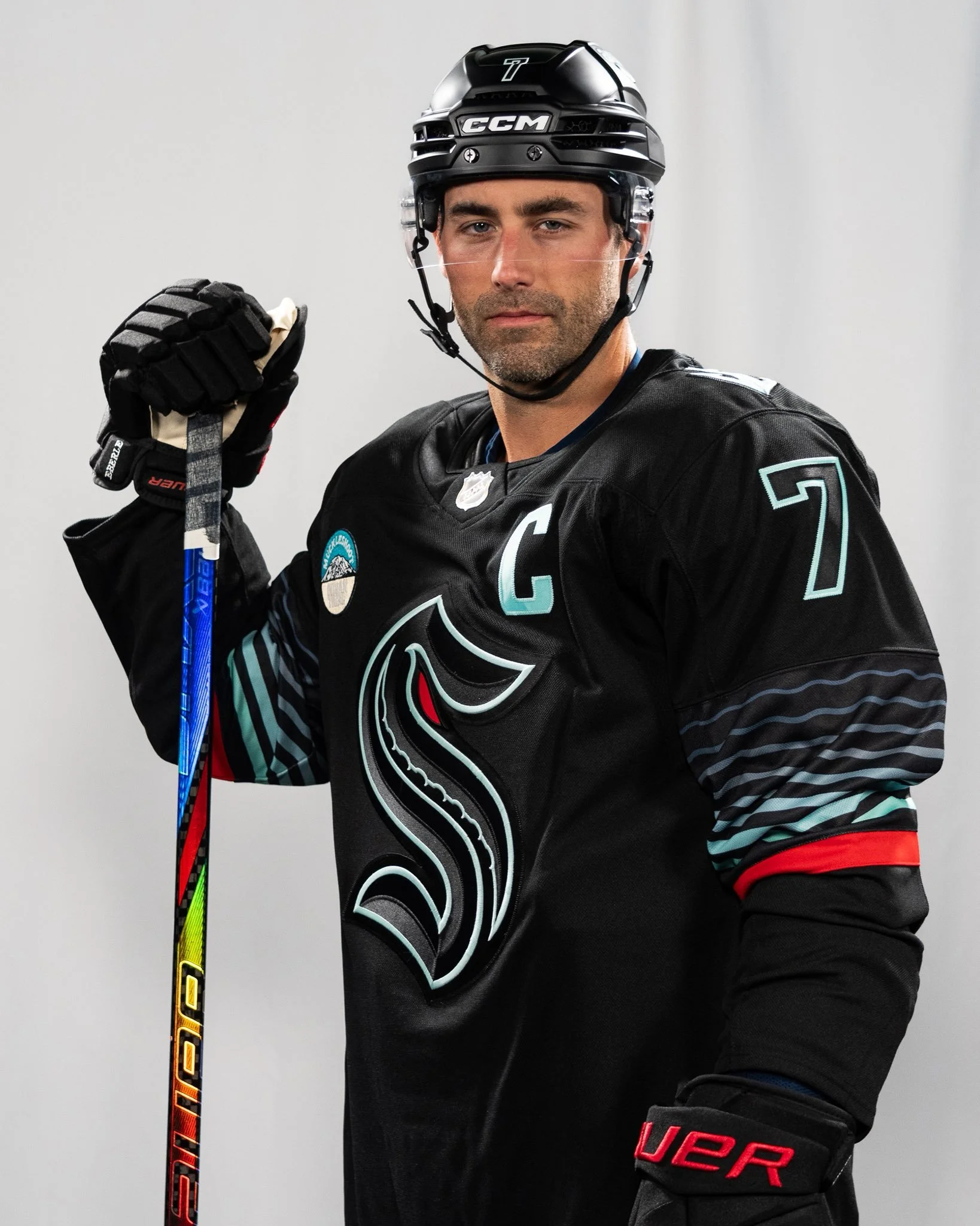
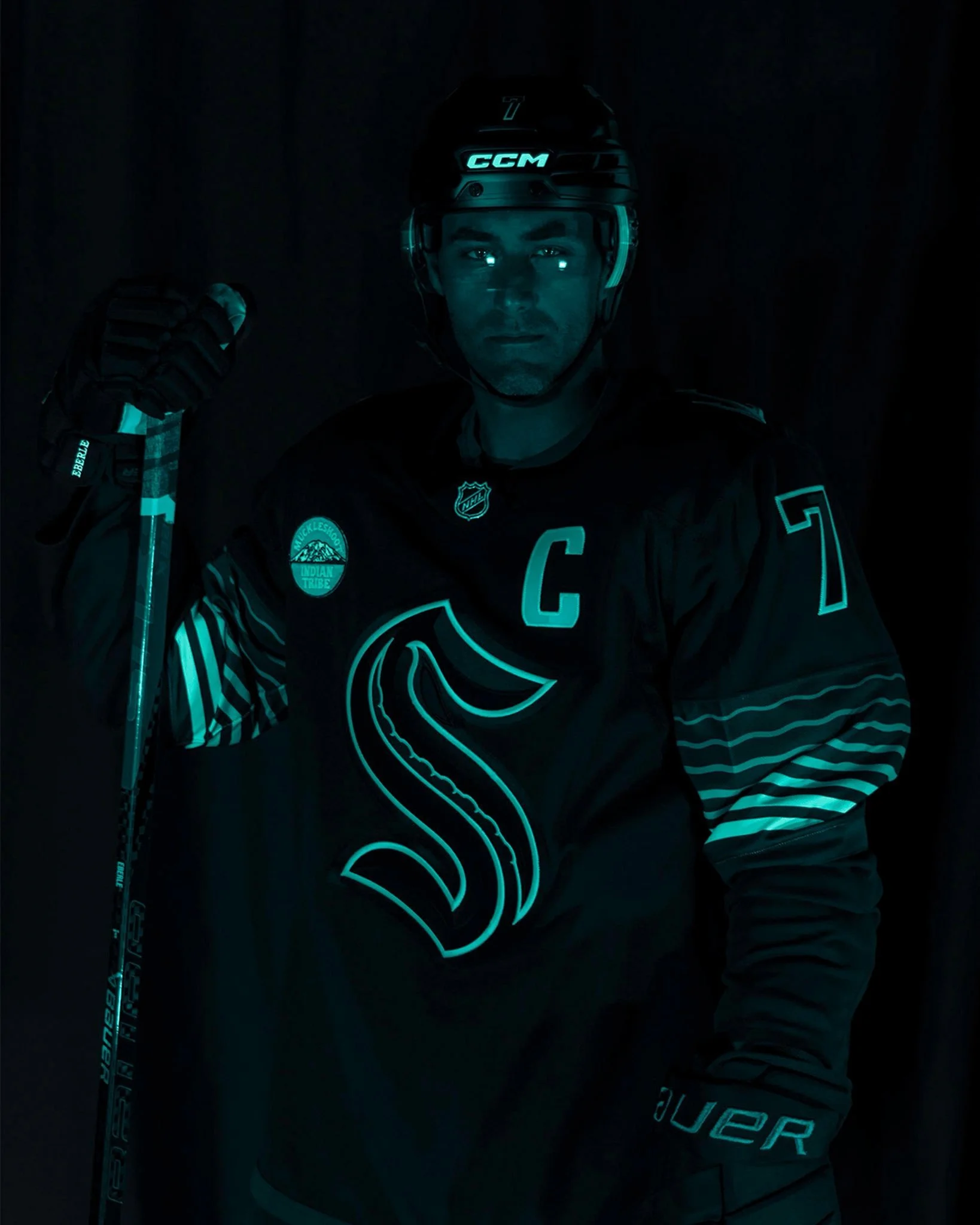
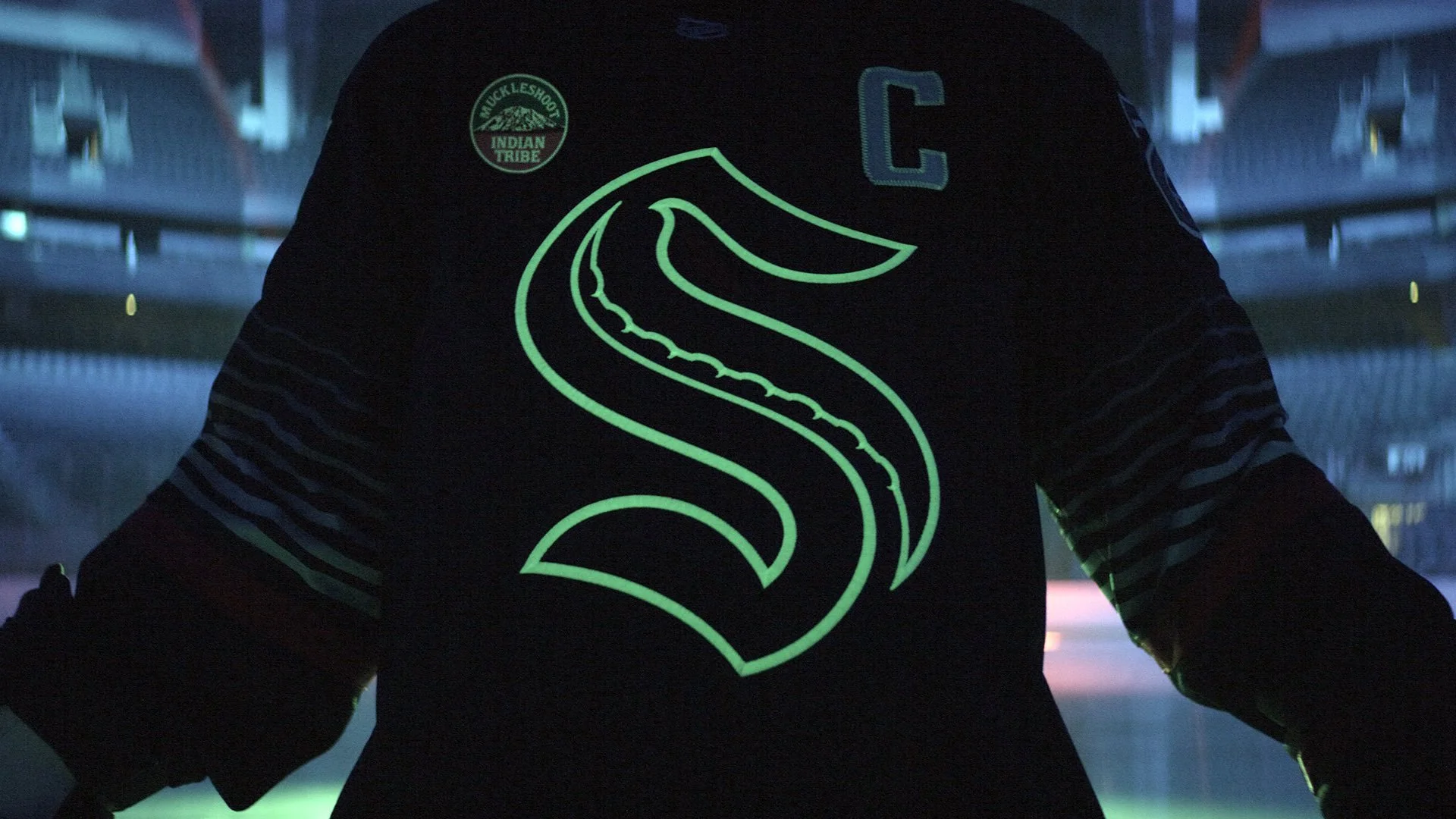
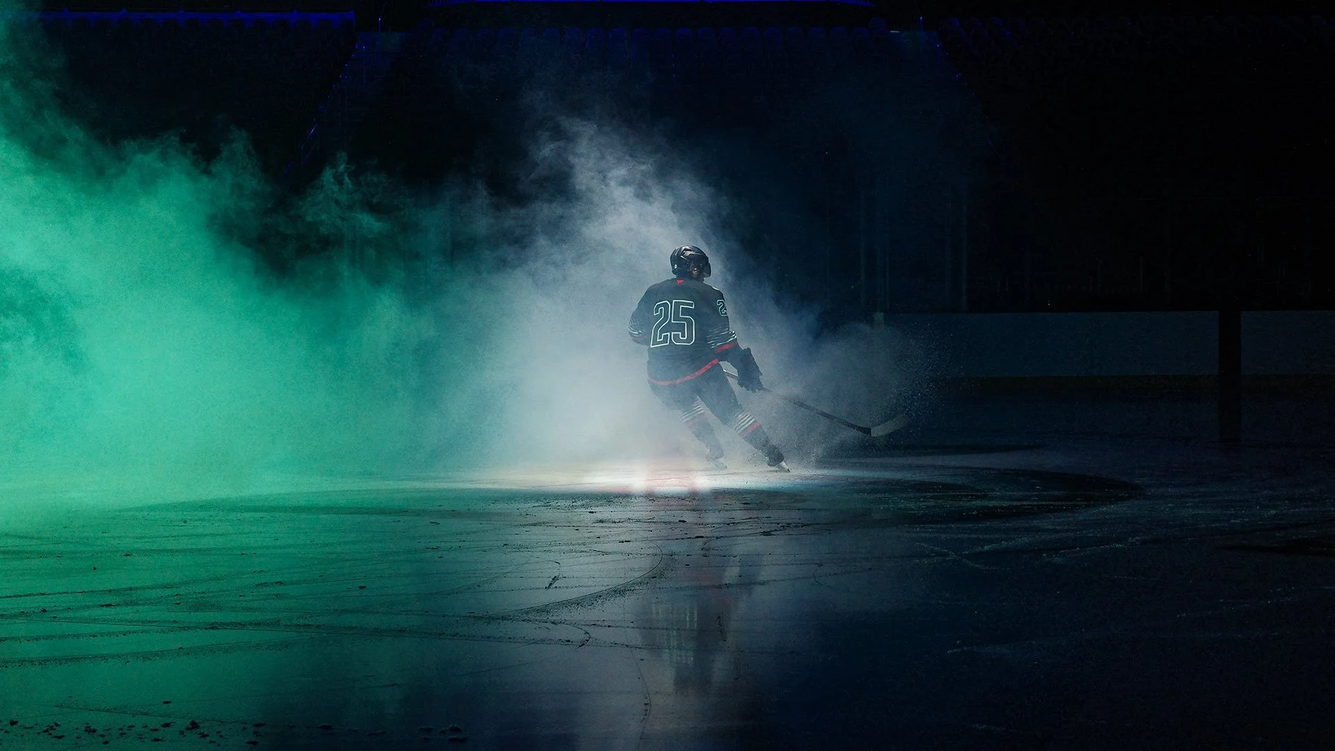
The Seattle Kraken are diving deeper than ever before with the reveal of their brand-new third uniform: The Jersey from the Abyss. Forged in shadows and lit by the eerie glow of bioluminescence, this all-black kit is designed to bring stealth, intimidation, and Northwest identity to the ice.
From helmet to blade, the Kraken’s new look is head-to-toe matte black, creating a fluid silhouette that moves silently across the ice. The sleeves and socks are patterned with sonar pings, an echo through the darkness that hints at what lies just beyond sight.
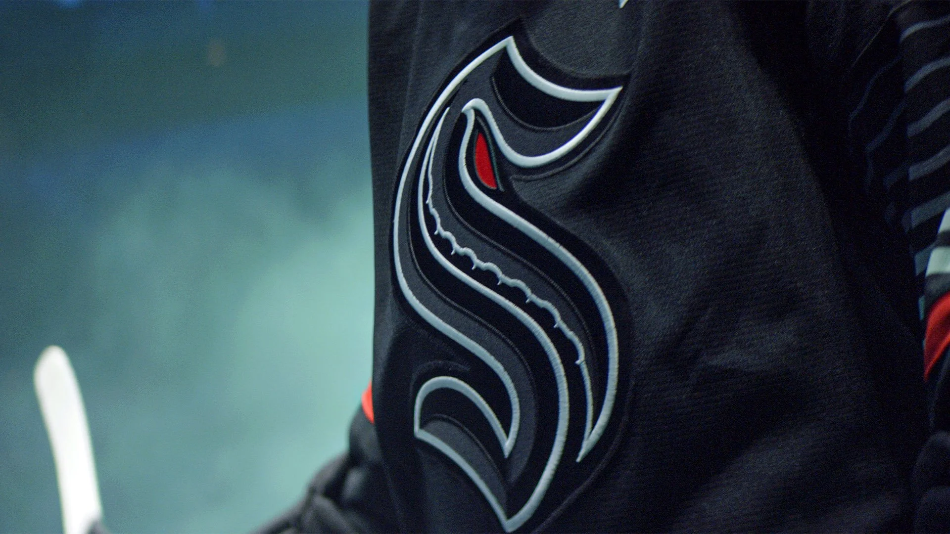
The Kraken logo has been reimagined in tonal black-on-black stitching, making it nearly invisible at first glance—like a predator lying in wait. But when the lights dim, the iconic “S” comes alive.
Encircling the crest is an Ice Blue glow-in-the-dark outline, a nod to the rare natural phenomenon of bioluminescence found in the waters of the Pacific Northwest. It’s a detail that makes this jersey unlike anything else in the NHL, capturing the mystery of the deep.
The Kraken continue to celebrate local heritage with the Muckleshoot Indian Tribe patch, which is given a glowing treatment to match the jersey’s theme. It’s a reminder that the team’s roots are tied directly to the region they represent.
“The Jersey from the Abyss” is more than just a third uniform—it’s a statement piece. The combination of stealth black, sonar-inspired design, and glow-in-the-dark detailing sets a new bar for creativity in NHL sweaters. Fans can expect a one-of-a-kind experience when these hit the ice at Climate Pledge Arena.
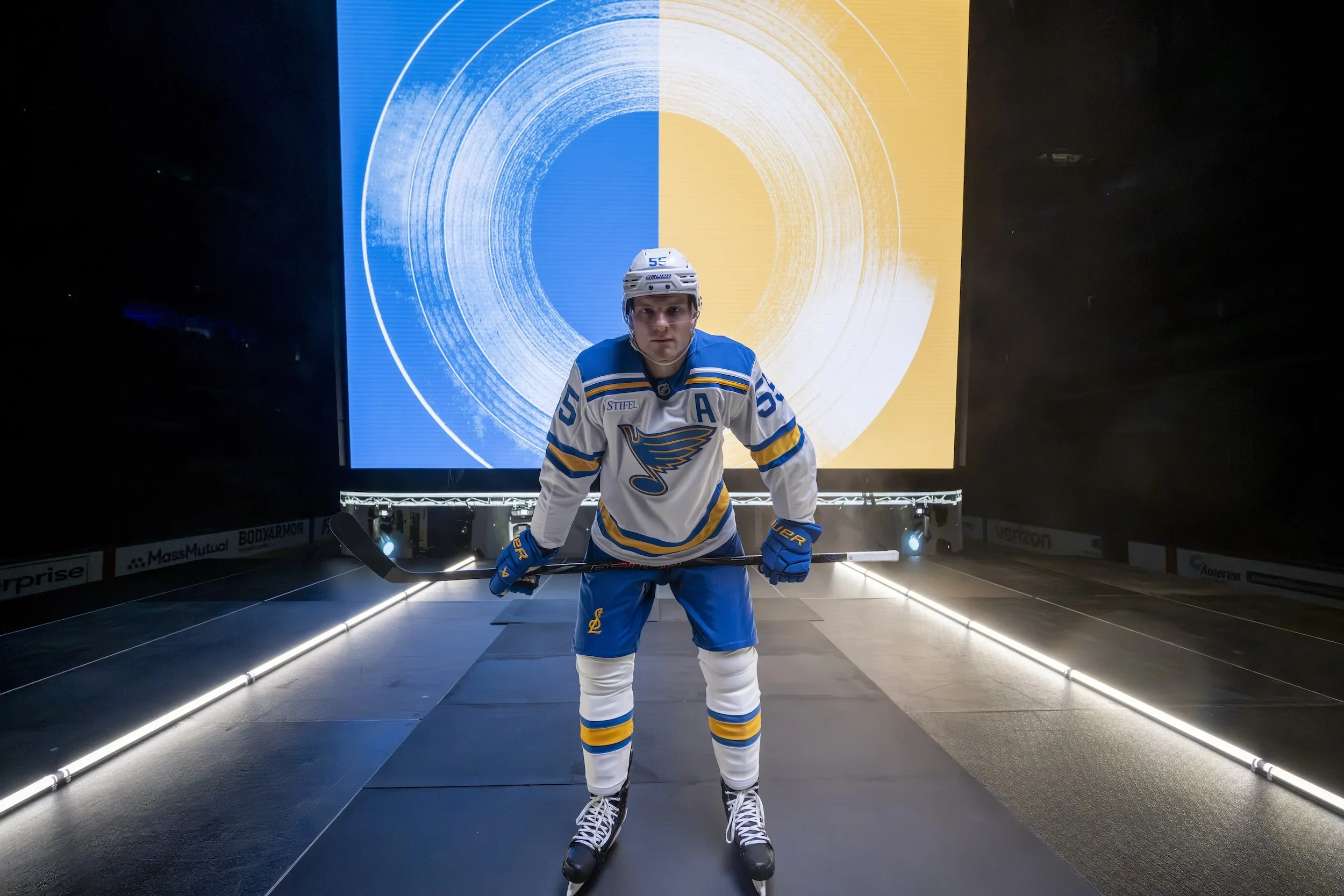
The St. Louis Blues are striking a powerful chord with their fanbase once again, this time through a comprehensive reimagining of their core look. The NHL franchise has officially unveiled brand-new primary home and away uniforms, embracing the club’s roots while harmonizing their history with a sharp, modern identity. The result? A bold new era built on decades of musical and cultural legacy.
Inspired by the jerseys first worn in 1967, the new look marks a return to the Blues’ original color palette—a vibrant blue and yellow refreshed for the modern age. Designed in collaboration with RARE Design and Fanatics over a three-year span, the updated uniforms and brand system are the latest example of how a team can respect its past while confidently stepping into the future.
Fans of the Winter Classic series will recognize the inspiration behind the new threads. The home set draws from the 2017 Winter Classic uniform, while the away jersey references the 2022 Winter Classic design, swapping the cream base for crisp white to align more closely with traditional NHL looks. The Blues are also transitioning the royal blue jersey (formerly their primary) to a new role as their official third jersey, giving the fresh primary set more room to shine.
Design enhancements include:
One-color numbers for improved clarity and visual impact
A new interlocking STL logo on the pant leg, tying together the city and the team
Thicker striping and bold color blocking reminiscent of the club’s early years
The legendary Blue Note logo, one of the most iconic symbols in all of hockey, has undergone a subtle yet significant transformation. Moving from three colors to two—eliminating beige—the updated Note features thicker blue and yellow keylines and a slightly reshaped design that balances modernity with familiarity. This evolution ensures the logo pops across all platforms, from HD screens to retail gear.
Introduced in 1997-98, the previous version served the franchise for over two decades. The new Blue Note is more dynamic and digitally optimized, while still playing the same timeless melody fans know and love.
The Blues didn’t stop at the jersey. They’ve also added new tertiary and secondary brand marks that celebrate the unique identity of St. Louis:
The Fleur – A refined fleur-de-lis inspired by the St. Louis city flag, with a treble clef flourish and note head stem
Interlocking STL – A bold, modern emblem blending musical elements with civic pride
River Music – A stunning mark combining the Gateway Arch and the Mississippi River to form a trumpet—a tribute to the city’s jazz and blues heritage
These marks allow fans new ways to represent their team and city, deepening the emotional connection between community and club.
The brand overhaul also introduces custom wordmarks and typography that dance to the rhythm of the Mississippi. The primary wordmark mirrors the river’s steady flow, while a stylized version pays homage to the iconic 1914 "St. Louis Blues" sheet music cover by W.C. Handy.
The custom Blues font merges sharp edges with smooth curves—a typographic reflection of the intensity and grace of the game itself.
“Remixed. Remastered. Reborn” isn’t just a tagline—it’s a philosophy. The fan-favorite looks of the past are no longer reserved for special events. Based on overwhelming support from fans and feedback from surveys and jersey contests, the heritage-inspired identity is now the foundation of the Blues brand moving forward.
“Evolving one of the most iconic marks in our sport was a responsibility our brand team and equipment staff undertook with great pride,” said Chris Zimmerman, Blues President and CEO of Business Operations. “The evolution of the Blue Note, and development of additional brand marks, provides our fans new ways to express and celebrate their support for the St. Louis Blues.”
From jersey to logo, font to symbolism, the Blues’ 2025 identity is a masterclass in how to modernize without losing soul.
What started as a temporary name and a blank slate has officially transformed into one of the boldest identities in professional hockey. After more than 850,000 votes and a year-long rebranding process, Utah’s NHL franchise has a name, a look, and a rallying cry: Utah Mammoth is here to stay — and it’s stomping in with purpose.
the new identity is the product of 13 months of community input, a rapid design timeline, and a vision to build something by Utah, for Utah. The team partnered with Doubleday & Cartwright to bring the brand to life, and fans showed up in force to help shape every element of the new look.
“The community chose the Utah Mammoth brand, and it stands as a symbol of who we are, where we came from and the unstoppable force we’re building together,” said owners Ryan and Ashley Smith.
The new identity centers on the "Mountain Mammoth" logo — a mammoth charging forward with the Wasatch Mountains on its crown, the outline of Utah carved into the peaks, and tusks forming a bold "U." It's a logo packed with meaning and motion, and it's now front and center on the franchise’s permanent home and away uniforms.
The home jersey features the Mountain Mammoth charging across the chest, while the away kit introduces a bold step-down “U-T-A-H” wordmark running diagonally down the front — an evolution of the team’s inaugural design.
Other design details include:
Primary Colors: Rock Black, Mountain Blue, and Salt White (a carryover from the inaugural season).
Typography: A custom-designed font called Mammoth Sans, which leans forward at a 10-degree angle, mimicking Utah’s jagged terrain. The “A” and “H” carry angular crossbars, linking back to the team’s original lettering.
Collar Detail: Both jerseys include “EST. 2024” stitched into the neckline — a nod to the franchise's roots.
Shoulder Logos: The home jerseys carry a new Utah Badge — a stylized patch with the state outline, “U-T-A-H,” and a hockey stick. The away jerseys carry the Mountain Mammoth on the shoulders.
Pant Detail: A tusk cuts through the “U” on both sets of pants, tying the whole identity together from top to bottom.
Very few professional teams have invited fans this deeply into the rebranding process, especially on such an accelerated timeline. The franchise began as the Utah Hockey Club after acquiring the Arizona Coyotes in April 2024. From there, it launched a four-round fan vote to determine the permanent name and identity.
That passion was rewarded with an identity that hits hard on every level: geographic, historic, visual, and cultural. From the Ice Age legacy of the mammoth to the modern, clean aesthetic of the jerseys, the Utah Mammoth feel fully formed — like they've been part of the NHL landscape for decades.
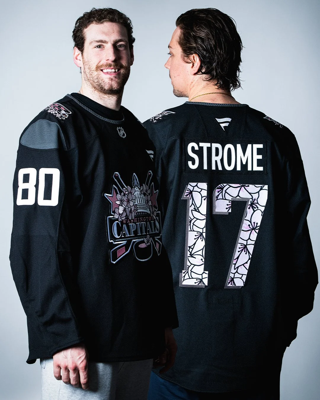
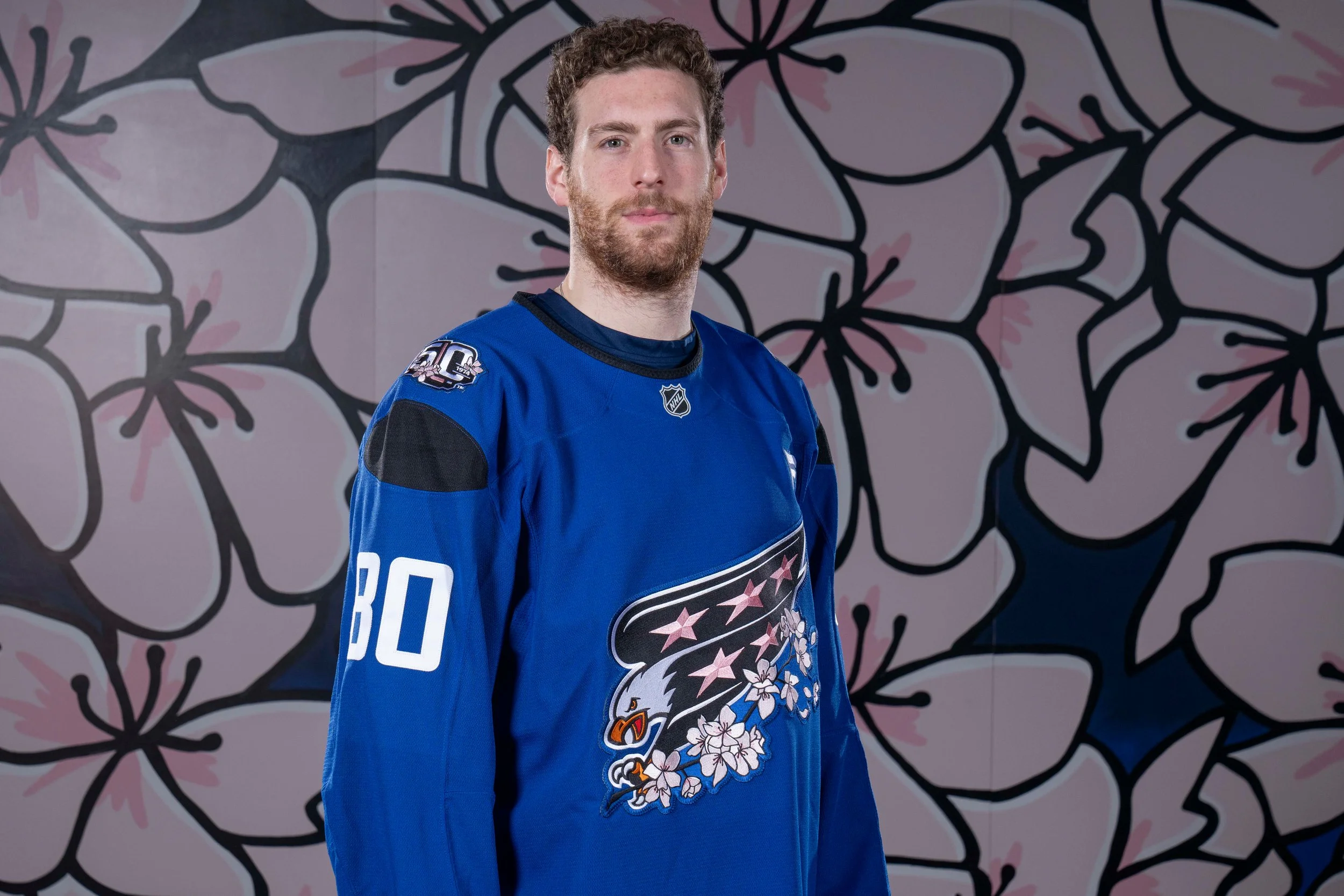
Introducing our special 50th Anniversary edition Cherry Blossom jerseys, designed by @tkopaintings. These specialty sweaters will be auctioned off in support of @MSEFndn starting March 18.#ALLCAPSpic.twitter.com/nDlSCFpi9Q
The Washington Capitals are blending tradition, art, and iconic D.C. culture with the launch of their 50th Anniversary Cherry Blossom Jersey, just in time for peak bloom. This special edition jersey is a tribute to both the team’s rich history and the beauty of the District’s famous cherry blossoms.
The design reimagines the classic Screaming Eagle logo, now clutching a cherry blossom branch, with soft pink tones inspired by the petals. Blossoms and stems weave through the jersey’s numbering, while the shoulders feature the Capitals’ 50th Anniversary patch, reimagined in pink and adorned with even more blossoms.
Designed by D.C.-based artist Taylor Kampa Olson, the jersey will be worn by Capitals players during arrivals ahead of their March 18 matchup against the Detroit Red Wings. Fans eager to get their hands on this unique piece can bid on the jerseys through an MSE Foundation auction, with proceeds supporting local community programming.
Combining heritage, local culture, and fresh design, the Cherry Blossom jersey perfectly captures the spirit of D.C. and adds a stylish twist to the Caps’ 50th Anniversary celebration.