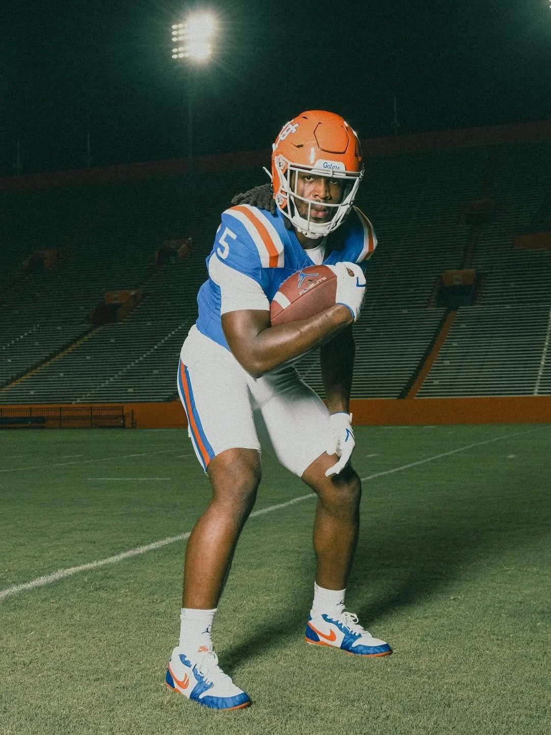
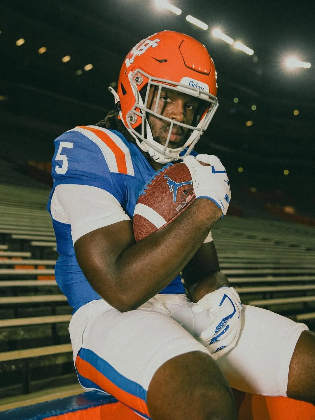
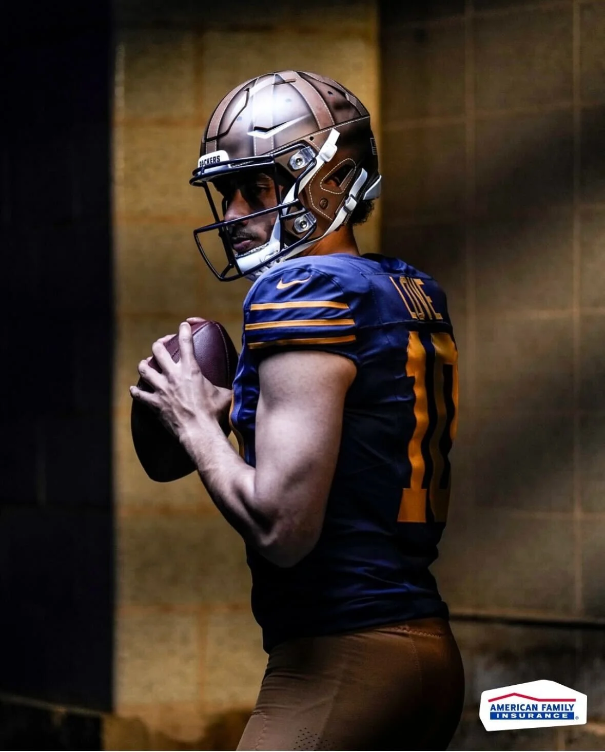
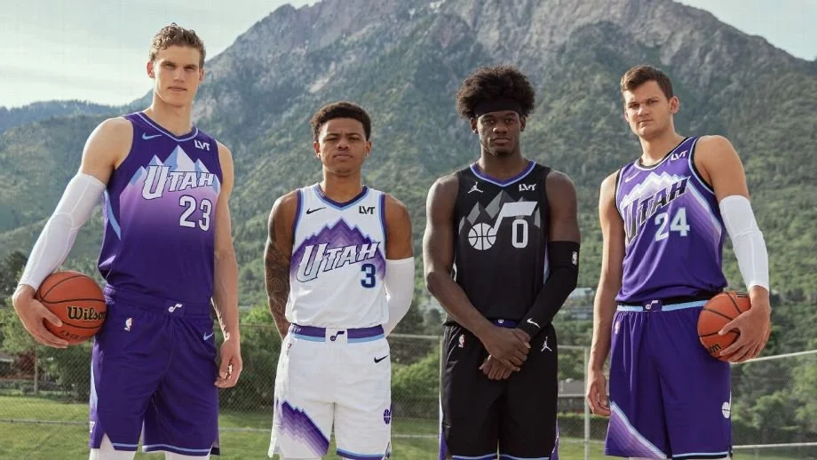
The throwbacks are back in The Swamp. A fan-favorite look within the Florida Gators community, the 1960s throwback uniforms are returning this season after a four-year hiatus. Florida last wore the classic combo in 2021 against Vanderbilt, a game that ended in a dominant 42-0 victory. Now, the look is set to return on October 18 for the Gators’ Homecoming matchup against Mississippi State.
This year’s throwback combination features the iconic orange helmet with the interlocking “UF” logo, paired with blue throwback jerseys and white throwback pants. Over the years, Florida has showcased different variations of throwbacks, but this particular combo has cemented itself as a fan favorite — blending nostalgia with on-field swagger.
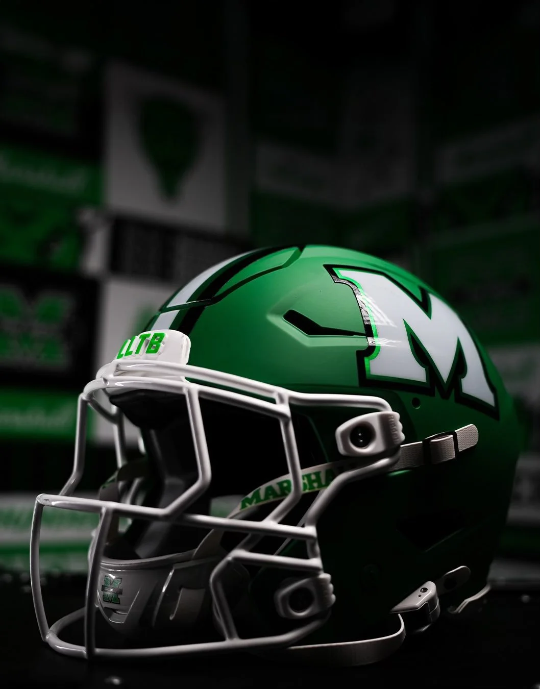
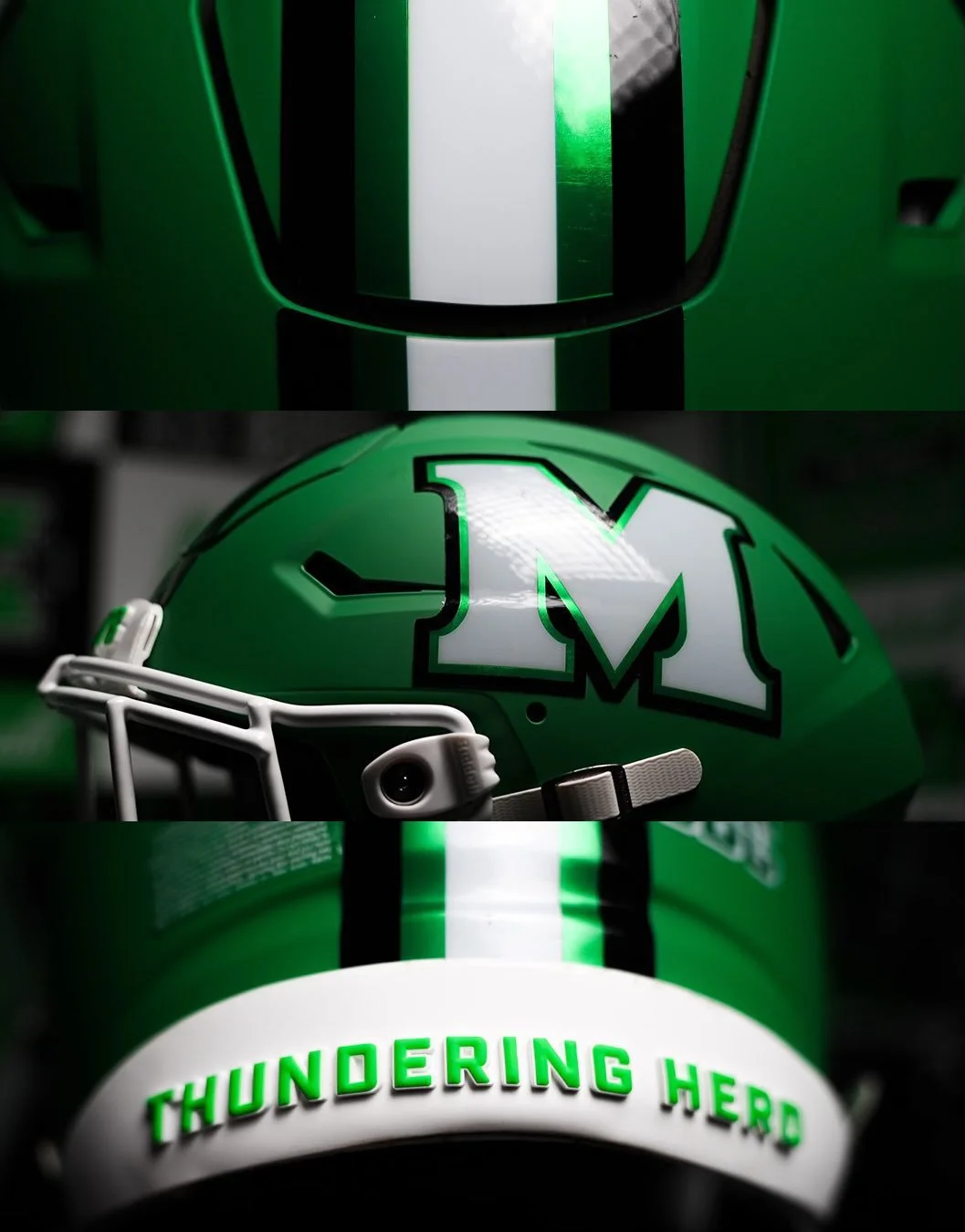
The Thundering Herd are going green again. Marshall Football unveiled a brand-new green alternate helmet for the 2025 season, bringing back a look fans haven’t seen since 2009. Complete with the program’s iconic “M” logo, the new lids will mark the first time in 15 years that the Herd will take the field in green.
The last time Marshall wore green helmets came in the 2009 Little Caesars Pizza Bowl, a 21-17 victory over Ohio at Ford Field.
While the throwback connection is clear, the 2025 version comes with a modern twist. The helmet features a matte finish and Marshall’s current stylized “M” logo, a sleeker design compared to the block “M” of the past. The striping pattern remains similar to the late-2000s edition, but the updated aesthetic brings it in line with the program’s current brand identity.
From 2010 through 2021, Marshall stuck exclusively with white helmets. Over the past three seasons, the Herd introduced black lids to the rotation, giving the program a two-color helmet set. The addition of green in 2025 makes it a three-helmet rotation — white, black, and now the long-awaited green.
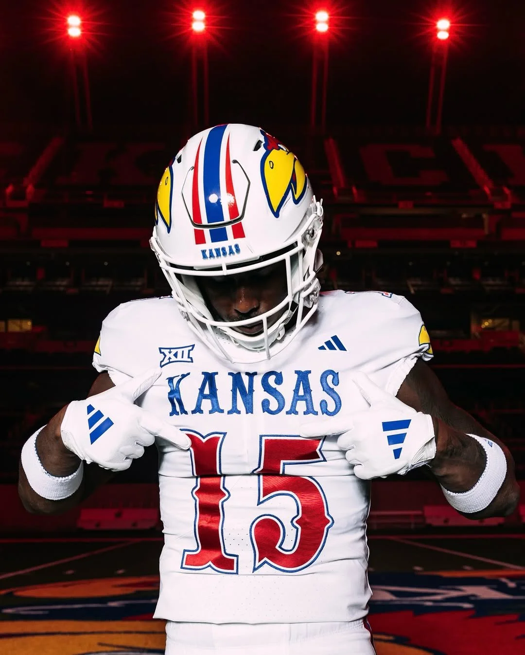
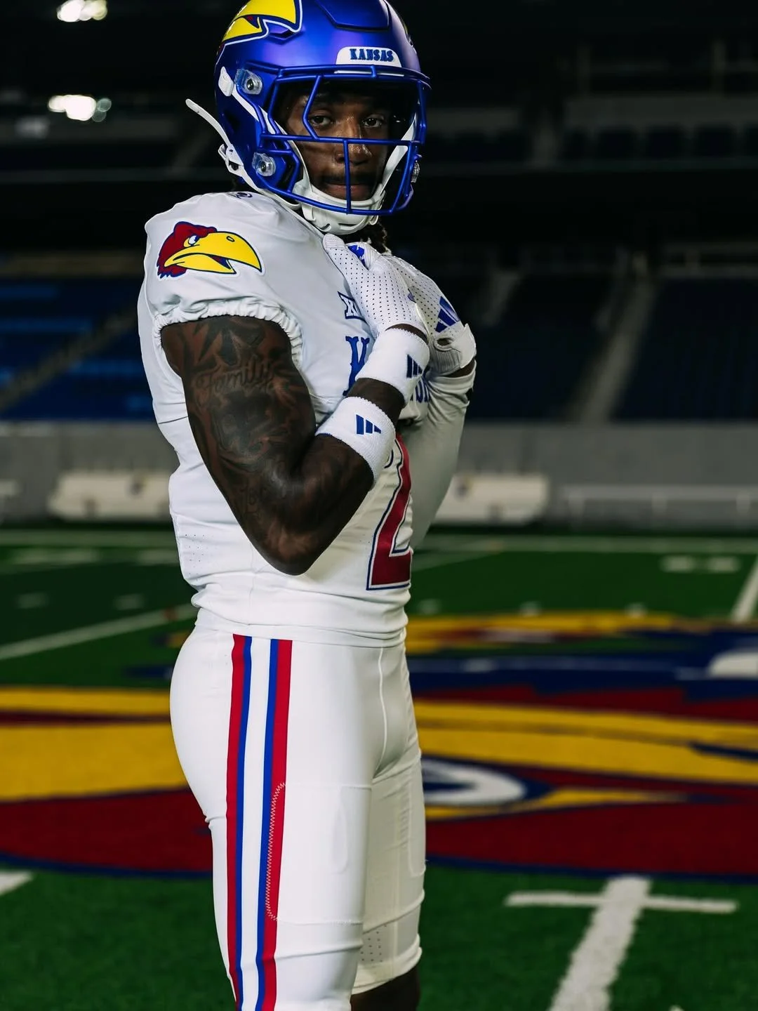
Kansas football is turning heads again with a twist on a fan-favorite alternate uniform. After debuting the all-black “Blackhawk” look a few years ago, KU is bringing that concept back for 2025, this time in white.
The “Blackhawk” first appeared in 2023 for a game against Illinois, featuring a full-on black palette: helmets, jerseys, pants, socks, and cleats. KU revived the look last year against UNLV, and fans loved it. The uniform’s defining features, the classic 1941 Jayhawk bird head, circus-style font spelling “Kansas,” and gameday flag on the back neck, made it instantly recognizable and deeply tied to the program’s traditions.
Adidas officially announced the 2025 return of the alternate, now dubbed the “Whitehawk.” Scheduled for KU’s Oct. 4 game against UCF, the Whitehawk flips the Blackhawk’s color scheme while retaining all the beloved elements. The jersey is white with red numbers outlined in blue, compared to the inverse on the black uniform. White pants complete the look, while helmet choices are still TBD, giving fans a chance to see multiple combinations in action.
A recent KU social media video showcases several ways the Whitehawk can be styled. Defensive end Justice Finkley wore the full white uniform, while quarterback Jalon Daniels modeled it with red pants, center Bryce Foster paired it with blue pants, and safety Lyrik Rawls added KU’s blue helmet. Running back Daniel Hishaw Jr. demonstrated a black helmet and black pants combination reminiscent of a previous road game at BYU. These mix-and-match options highlight the flexibility and creativity behind the alternate’s design.
The Whitehawk continues a three-year streak of KU experimenting with alternate looks. Beyond the Blackhawk, the Jayhawks wore all-red uniforms against TCU in 2024 and debuted a light-blue alternate for the 2024 season opener against Lindenwood. Each new uniform blends Kansas’ heritage with modern style, giving fans a fresh visual identity while honoring the program’s history.
With the Whitehawk, Kansas football proves it’s not afraid to take risks and embrace bold, memorable designs. Between the classic 1941 Jayhawk logo, circus font, gameday flag, and colorful striping, this alternate is a love letter to KU’s legacy — all while giving fans something new to rally behind in 2025.
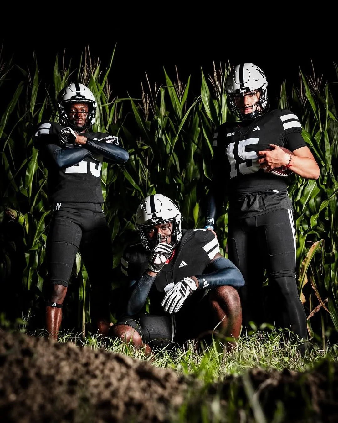
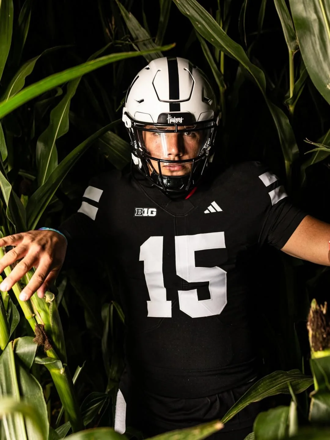
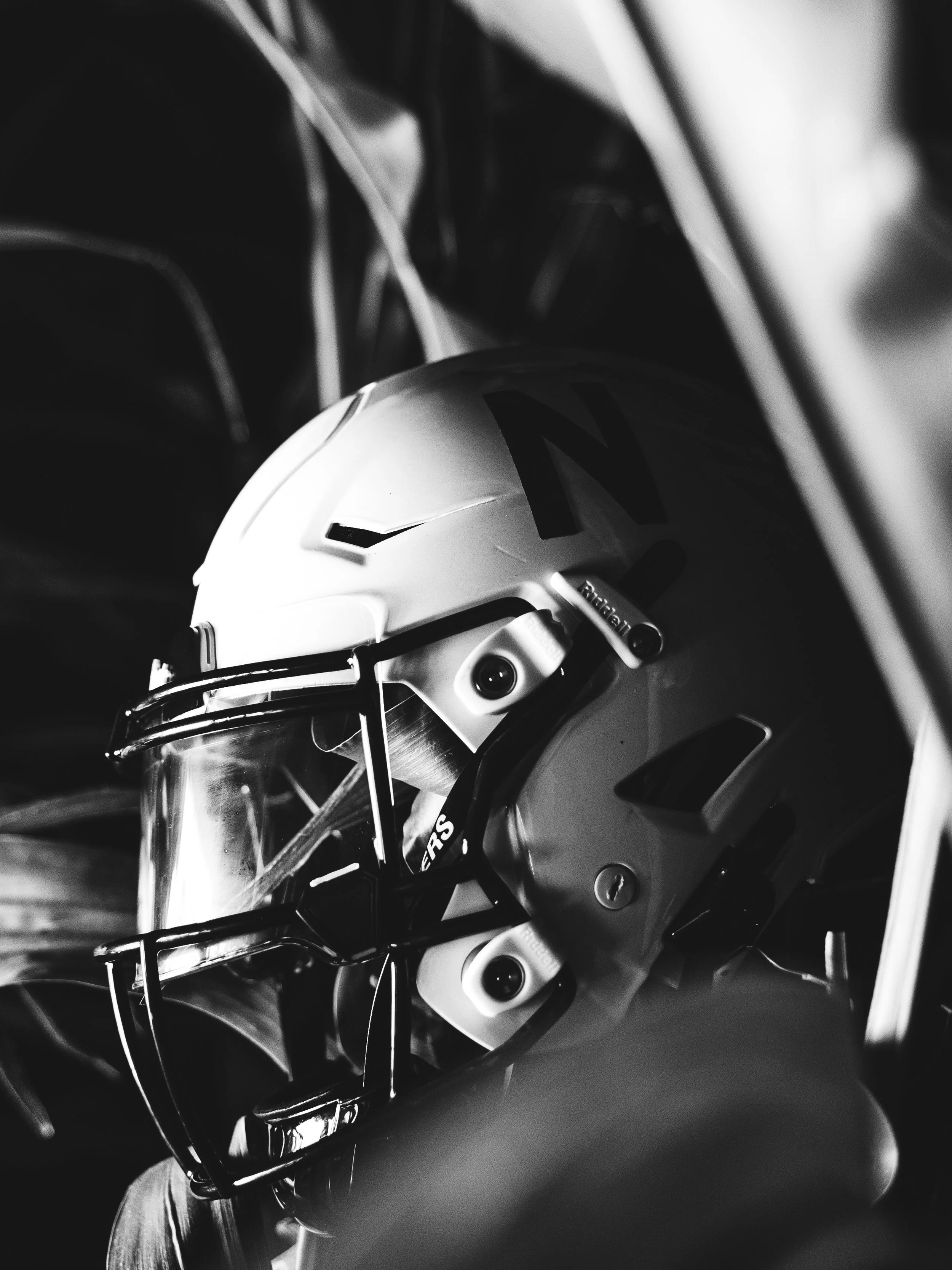
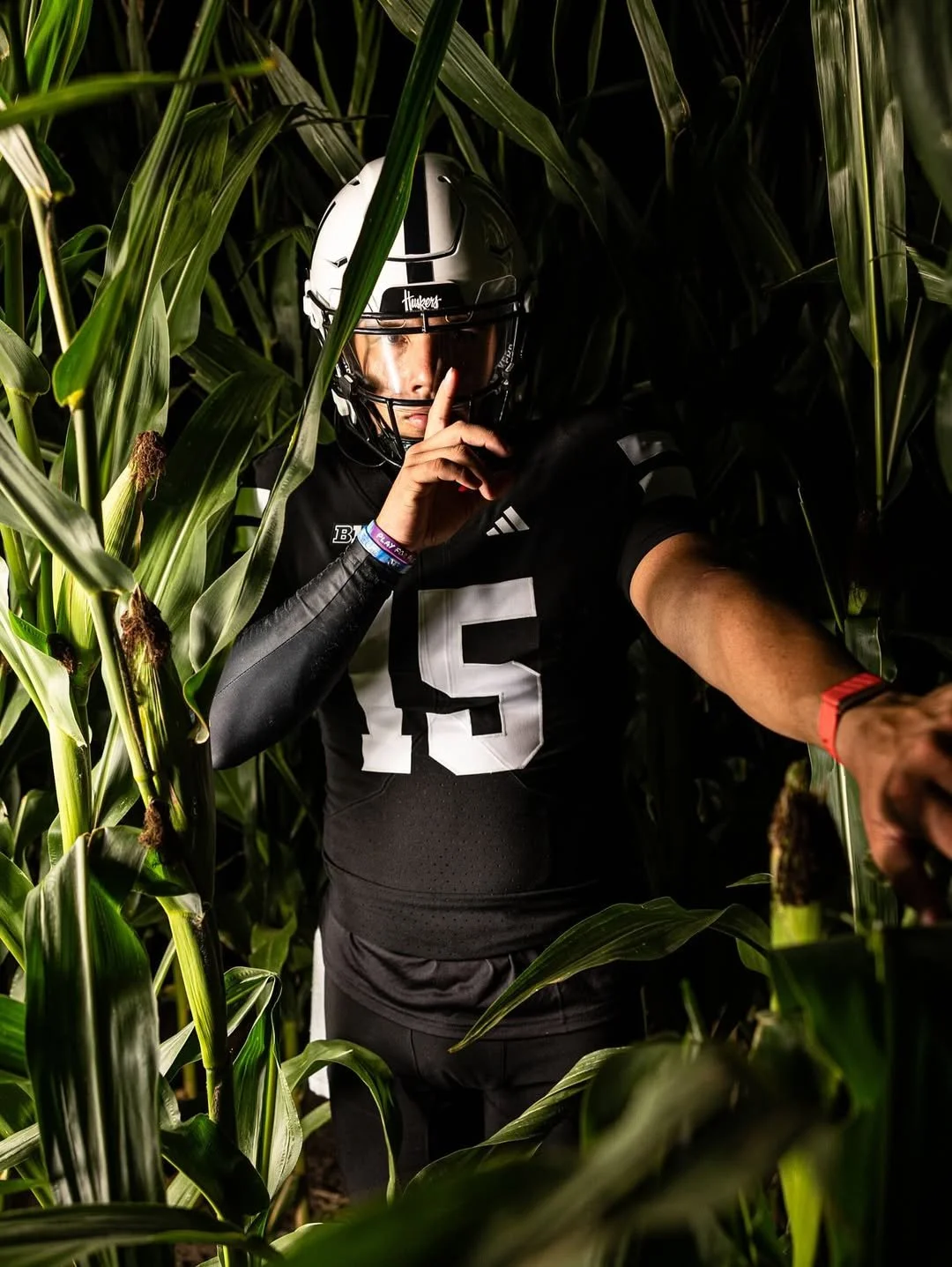
The Nebraska Huskers are going dark this season for their Nov. 1 matchup against USC. The Huskers will don an all-black alternate uniform, marking the first trip to Lincoln for the Trojans since 2007.
The uniform stays true to the Huskers’ classic design while flipping the color script. The jersey mirrors the standard look with two white sleeve stripes and bold block numbers, but all the iconic red has been swapped for black. Even the famed red “N” on the helmet is now black. One subtle touch: the “Winning Tradition” patch has moved from the front of the jersey to the inside of the collar.
Nebraska fans are known for their Sea of Red, but for this game, the school is calling for a full blackout inside Memorial Stadium. Attendees are encouraged to wear black apparel, giving the Huskers a unified, intimidating presence as they face the Trojans. It’s a rare visual twist on one of college football’s most iconic home environments.
This isn’t the first time NU has gone dark. The last black alternate was worn in 2020 against Illinois. Previous black alternates include matchups against Indiana in 2019, Northwestern in 2015, and UCLA in 2013.
With this alternate, Nebraska not only nods to a history of bold uniform choices but also gives fans a fresh, intimidating look that’s perfect for the spotlight of November football.
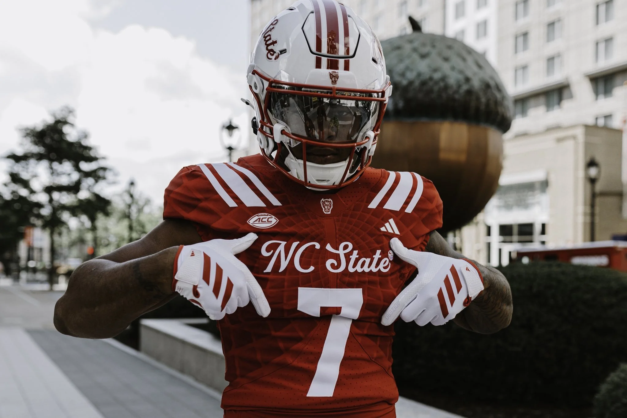
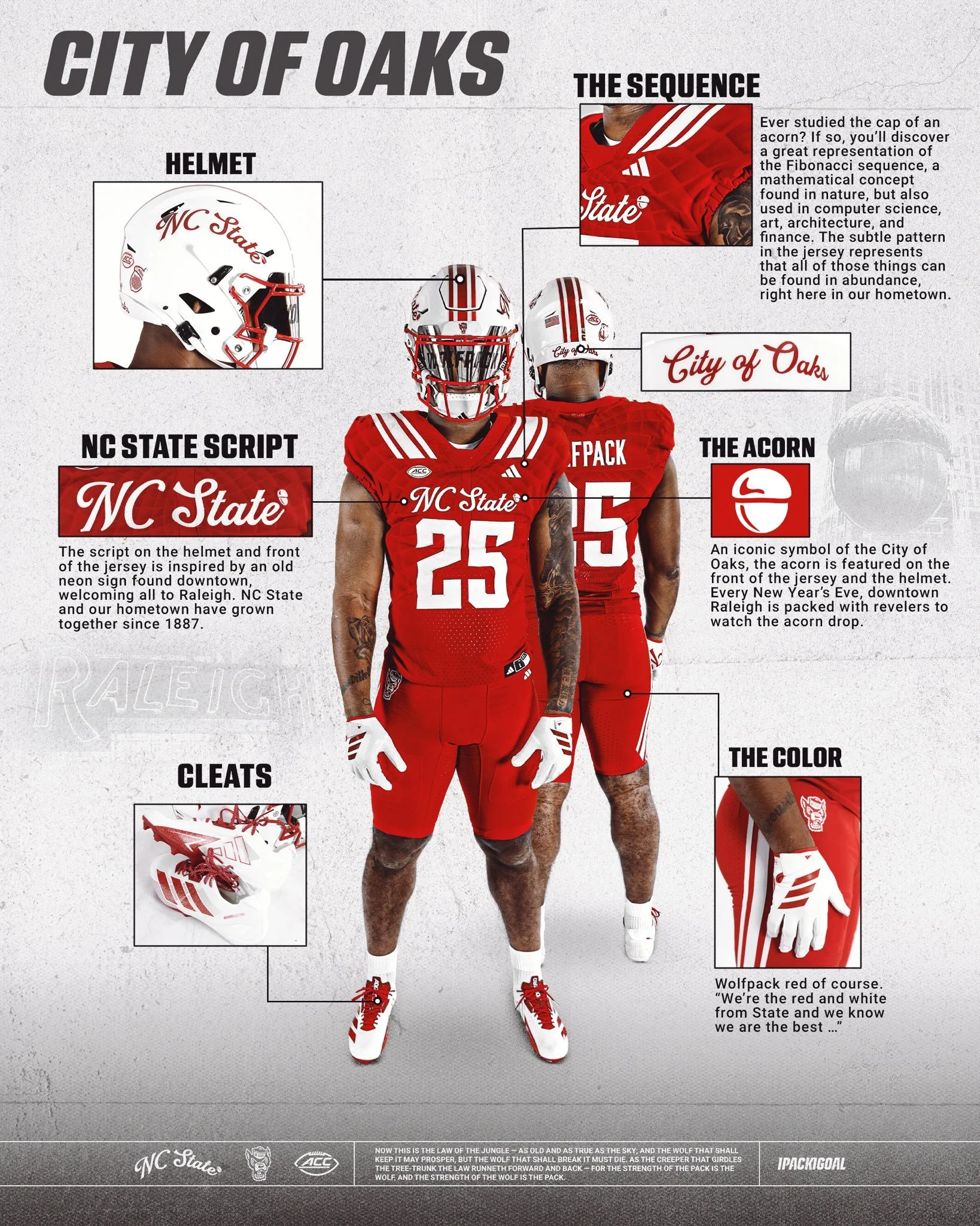
NC State has revealed a new uniform that blends tradition, local pride, and modern design in a way that perfectly represents the Wolfpack and their hometown of Raleigh, the City of Oaks.
The defining feature of the uniform is the script "NC State" showcased on both the helmet and the front of the jersey. The inspiration comes from an old neon sign once found downtown, welcoming all to Raleigh. Just as NC State and the city have grown together since 1887, this script pays homage to that shared history.
Look closely at the jersey fabric and you’ll find a subtle pattern inspired by the Fibonacci sequence, a mathematical design rooted in nature. Much like the acorn’s cap, where this sequence is famously visible, the detail reflects how art, science, architecture, and innovation thrive throughout Raleigh, making the city a true hub of culture and progress.
No symbol is more closely tied to Raleigh than the acorn. Known as the City of Oaks, the acorn is featured proudly on the front of the jersey and helmet. It’s a nod to a beloved local tradition, where every New Year’s Eve thousands gather downtown to watch the giant acorn drop at midnight.
And of course, no NC State uniform is complete without Wolfpack Red — bold, fierce, and instantly recognizable. As the school fight song reminds us: “We’re the red and white from State, and we know we are the best…”
With these thoughtful design touches, the “Script Pack” uniform is more than just a look; it’s a celebration of Raleigh, its history, and the Wolfpack’s connection to the city they proudly represent.
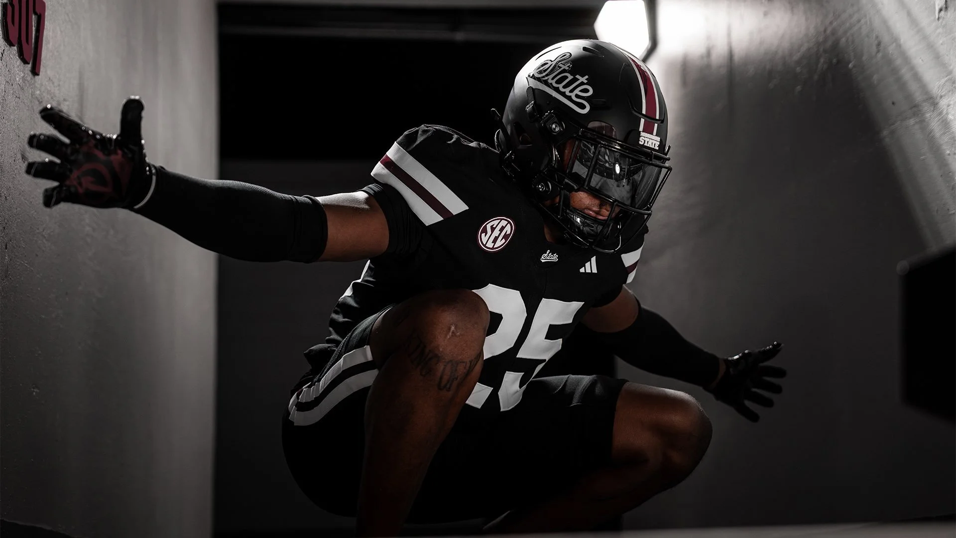
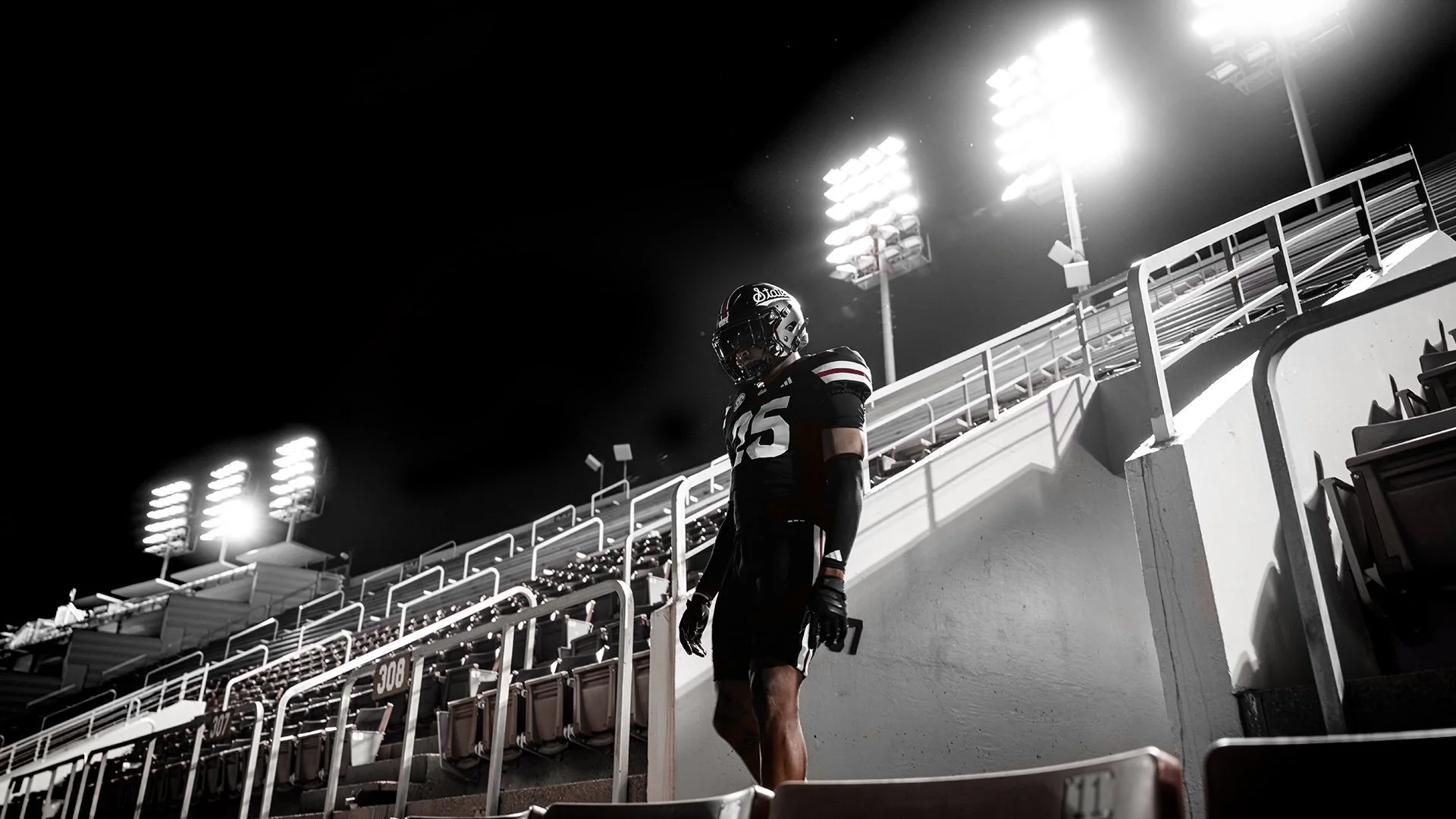
The Mississippi State Bulldogs are going black for Week 2, unveiling an all-new all-black look nicknamed “Dark Mode.” The Bulldogs dropped the uniform reveal on social media with phrases like “Out of the Darkness” and “From the Shadows to the Spotlight,” setting the tone for their September 6th showdown against Arizona State in Starkville.
The jerseys are A simple black base with bold white block numbers. Across the collar sits “State” in script, paired with conference and maker’s marks. The sleeves feature two thick white stripes split by a thin maroon stripe, adding some balance.
The Helmets are Matte black with a stripe running down the middle in white–maroon–white. “State” appears in script on both sides, tying back to the jersey collar design.
The Pants are Black with a matching stripe pattern, thick white, thin maroon, thick white, mirroring the sleeve design.
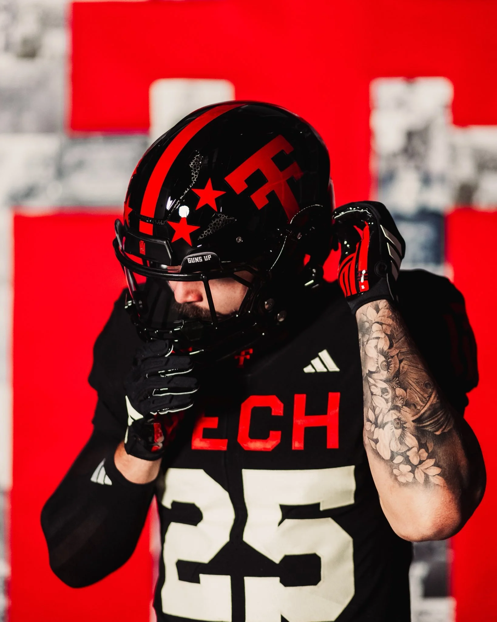
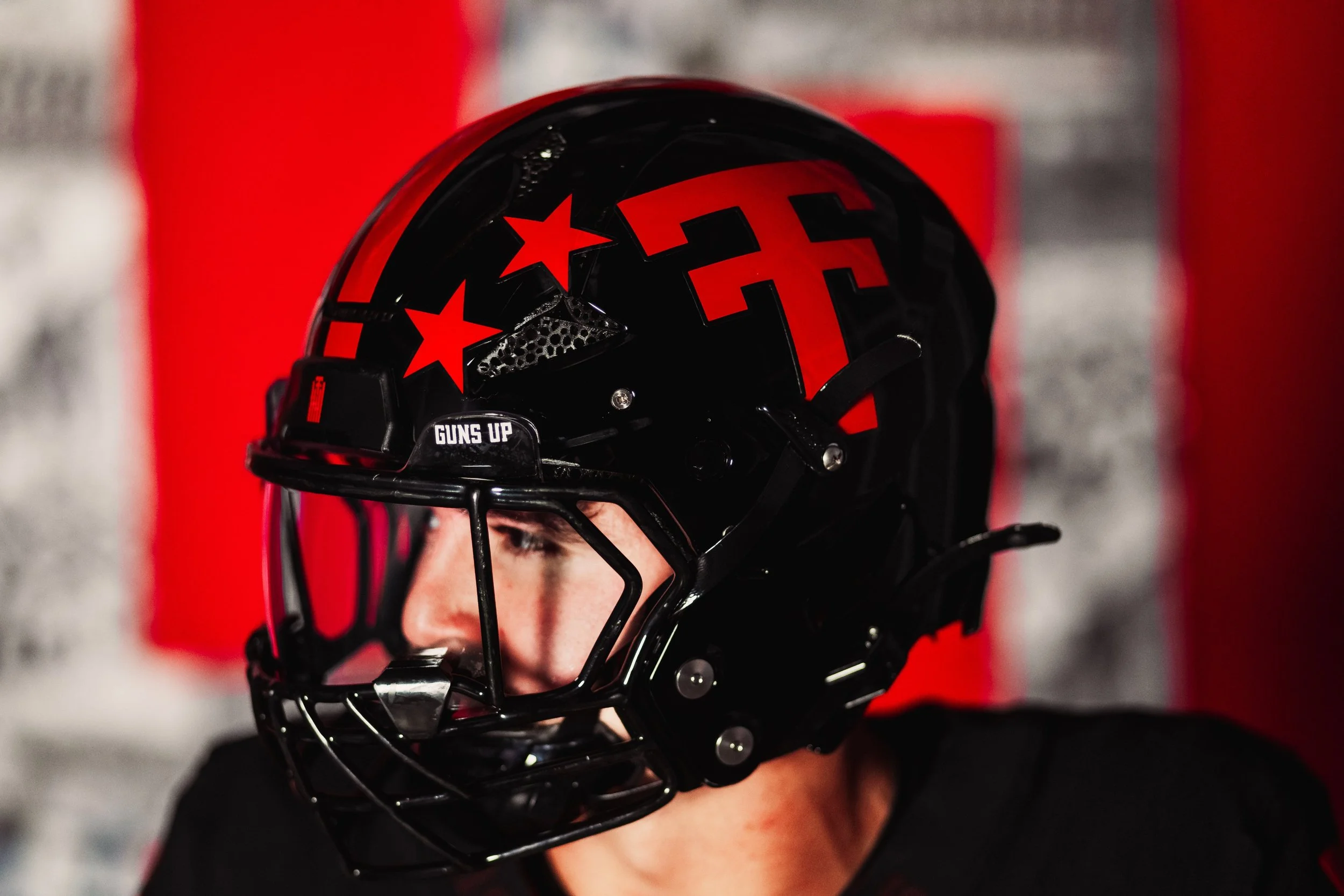
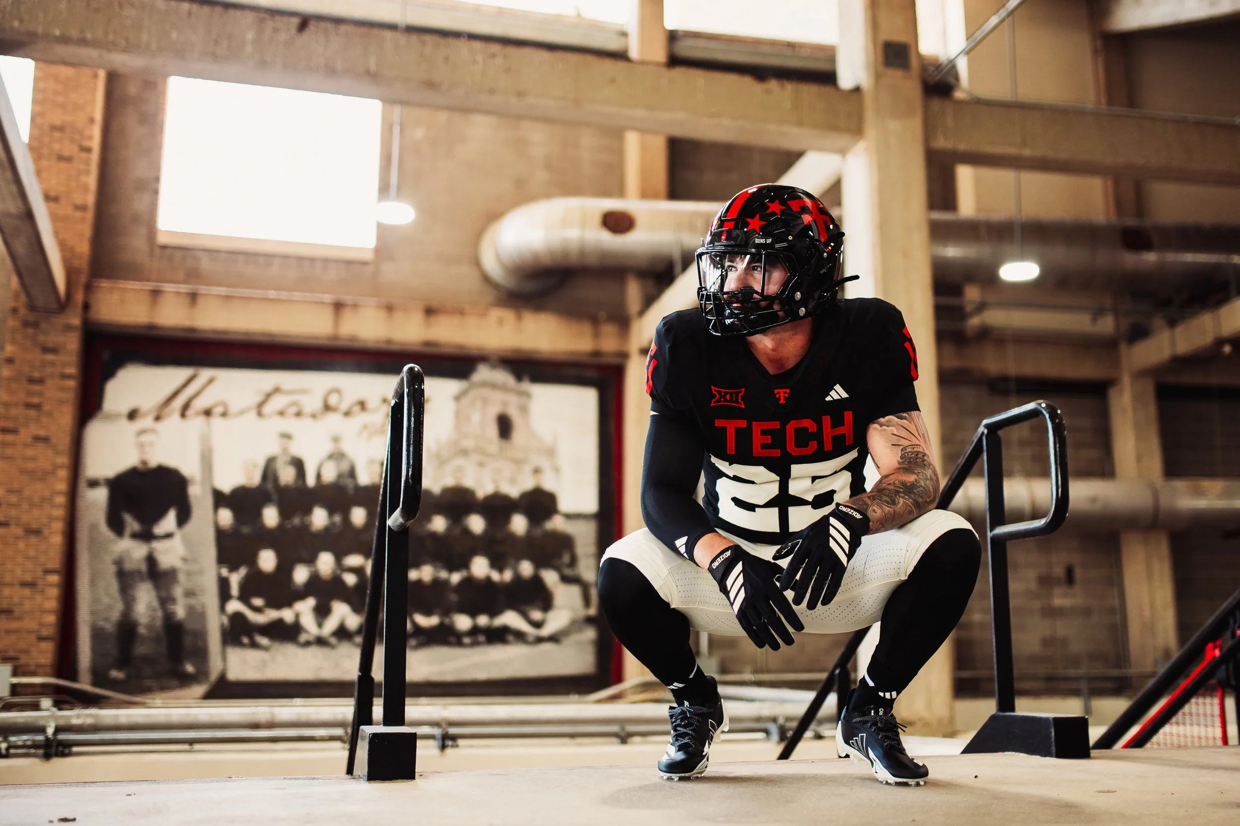
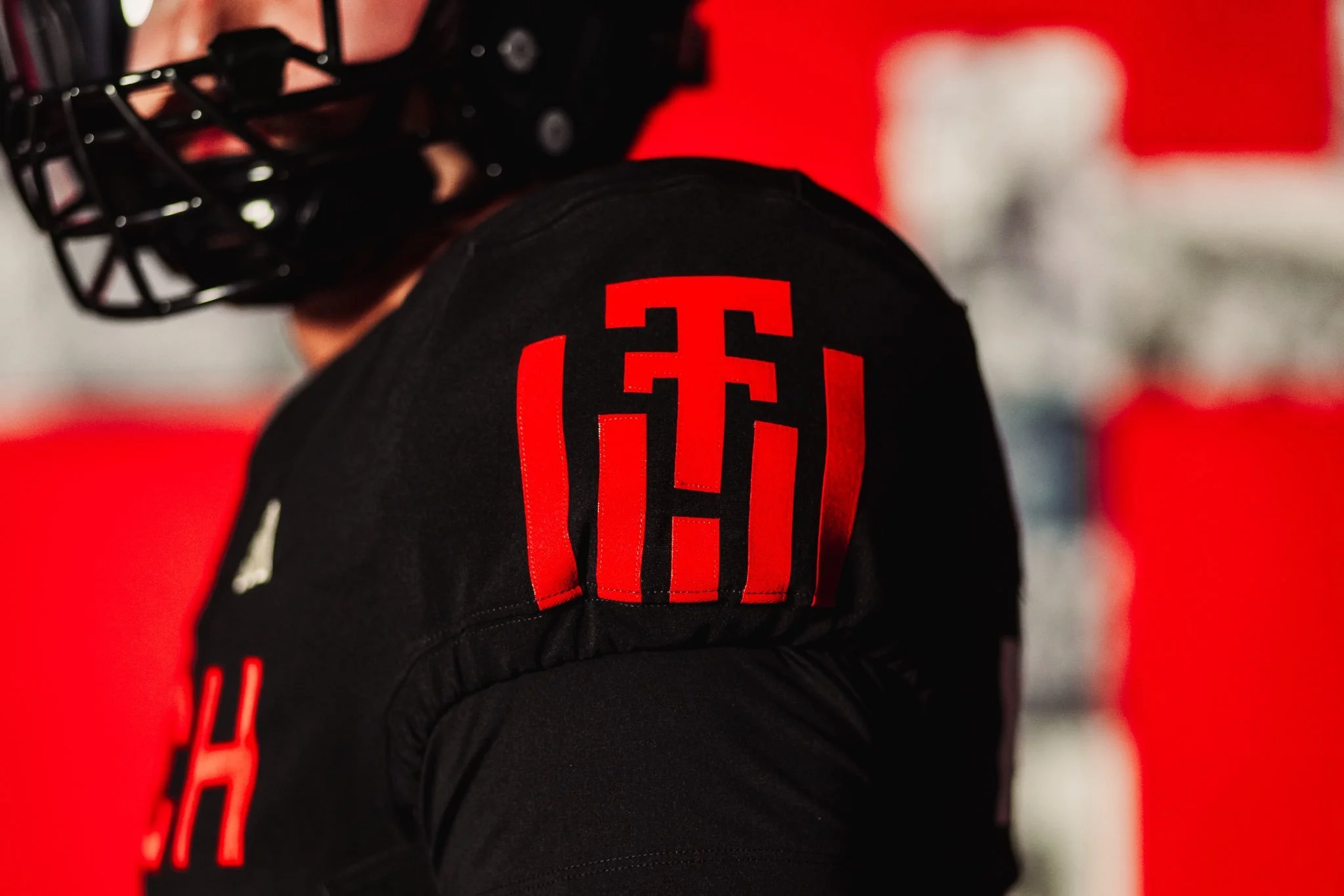
Texas Tech football is honoring a century of tradition in 2025 with a special throwback uniform celebrating the program’s 100th anniversary. The look not only nods to the Red Raiders’ historic past but also highlights key milestones in uniform design that shaped the team’s identity over the decades.
The program’s first football team took the field in 1925, when the “Tech” wordmark first appeared on the team’s uniform. Just a year later, in 1926, the now-iconic Double T made its debut, establishing a logo that would become one of the most recognizable marks in college sports.
By 1930, Texas Tech was already pushing the boundaries of uniform design by incorporating the Double T into traction stripes, a cutting-edge look for its time.
In 1935, the program introduced jersey numbers to the front of the uniform for the first time, bringing both functionality and identity to the design. Fast forward to the mid-1960s, when stripes inspired by the Masked Rider and the horse’s breast collar were added to the uniforms in 1965, further cementing a connection to Tech’s most famous tradition. Just a few years later, in 1969, helmet stars were introduced as awards, giving players a chance to showcase their individual achievements while adding another memorable layer of style.
Each detail in the 2025 throwback uniform is a nod to these defining eras, from the early wordmarks to the stripes and symbols that became staples of Texas Tech’s identity. By weaving in elements from across decades, the Red Raiders’ centennial look is a visual timeline of 100 years of grit, innovation, and football in Lubbock.
As the Red Raiders take the field in their anniversary throwbacks, the uniforms will stand as more than just a jersey; they’re a tribute to the players, coaches, and fans who built Texas Tech football into what it is today.
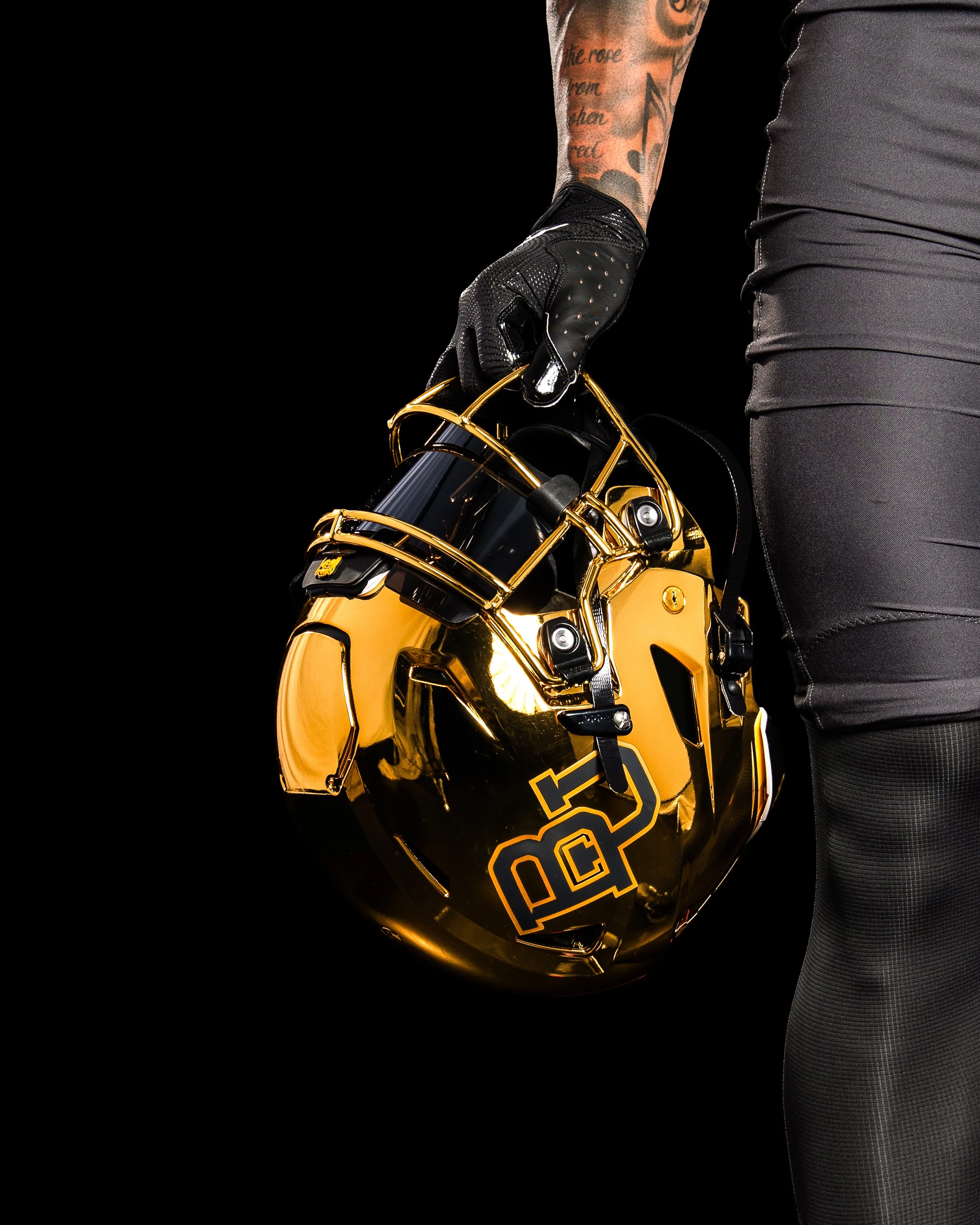
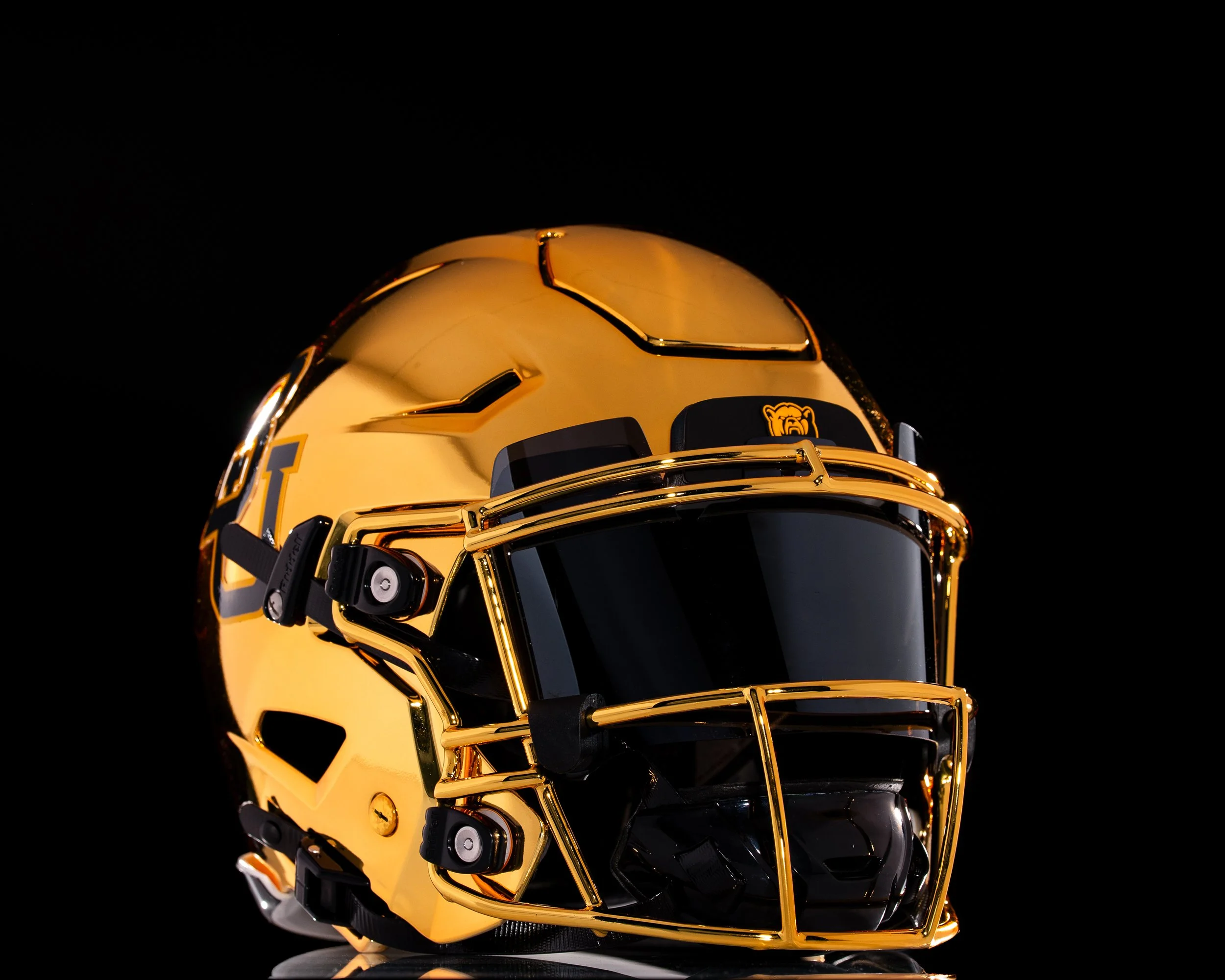
The shine is back in Waco. Baylor football is officially bringing chrome helmets back to the field for the first time since 2017, adding a bold and modern twist to its 2025 uniform lineup.
The Bears first introduced chrome lids in 2013 during one of the program’s most successful stretches in history, wearing them through the 2017 season. That era included back-to-back Big 12 championships, four straight bowl appearances, and some of the most explosive offenses college football has ever seen.
Deputy Athletics Director and COO Jovan Overshown explained that the return has been in the works for years.
“This helmet has been a secret passion project for a couple of years now. We wanted the perfect look and perfect moment — one that nods to the storied success of those who wore the chrome before us, while giving it a modern, refined edge that captures the energy and expectation of today and the future.”
The chrome helmet made its Baylor debut on October 5, 2013, in a 73–42 blowout win over West Virginia. Over the next four years, the helmet became a signature look, worn in nine games — including the unforgettable 61–58 win over TCU and the 38–27 Big 12–clinching victory against Kansas State in 2014. The final appearance of the original chrome came on November 11, 2017, against Texas Tech.
Those years are remembered not just for championships, but also for an offense that lit up the scoreboard. During Baylor’s 2013–2014 title run, the Bears wore chrome six times, piling up 167 touchdowns, 1,259 points, and more than 15,000 yards of total offense.
The 2025 reveal featured none other than Baylor legend and 2025 Athletics Hall of Fame inductee Bryce Petty.
“Look good, feel good, play good,” Petty said. “If you can’t feel good in that thing, then I don’t know what you can feel good in. We’re going to play fast, and we’re going to win a lot in these things.
For Petty, who quarterbacked those high-flying Baylor offenses, the helmet represents more than just style — it’s a symbol of Baylor football’s energy and swagger returning to the spotlight.
Head coach Dave Aranda echoed the sentiment:
“It’s really cool to be part of bringing something back that carries so much meaning and reflects such an energized period in Baylor football. Seeing our student-athletes’ excitement, former players and our fans, it further fuels everything we’re about.”
After nearly eight seasons away, Baylor’s chrome helmets are back brighter, bolder, and ready to bring a new shine to the Bears’ future.
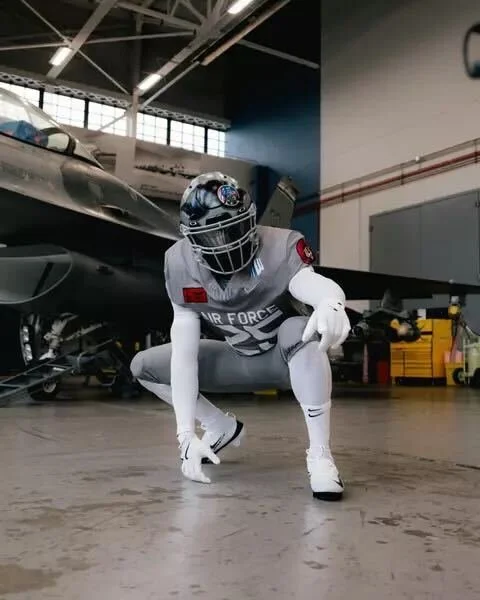
The Air Force football team is set to take the field in a powerful tribute for the 2025 edition of the Air Power Legacy Series, honoring the legendary F-16 Fighting Falcon. The Falcons will debut the special look when they face Navy on Saturday, Oct. 4, at Noon ET inside Navy-Marine Corps Memorial Stadium. The rivalry matchup will be broadcast nationally on CBS, giving fans everywhere a front-row seat to one of the most striking uniform reveals of the season.
The uniform’s most eye-catching element is the custom helmet, designed to replicate a fighter pilot’s gear.
Front bumper: A silhouette of the F-16.
Visor cover: Features the F-16 Fighting Falcon patch alongside the word “Psycho” — the call sign of Col. William Andrews, an F-16 hero who was shot down in Operation Desert Storm.
Back bumper: Reads “Viper”, the aircraft’s widely used nickname.
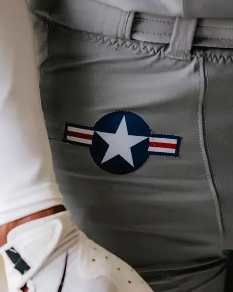
The pants carry the U.S. Air Force roundel on the hip, with “Viper” running down one leg and “Fighting Falcon” down the other.
The jersey front displays Air Force above the player’s number, along with the corresponding squadron patch. The sleeves feature both the American flag and the squadron’s insignia. On the back, players will sport the tail flash of their respective fighter squadron.
This year’s design honors multiple units, including:
The F-16 Fighting Falcon is a compact, multi-role fighter aircraft known for its unmatched maneuverability, proven combat record, and versatility in both air-to-air and air-to-surface missions. Capable of withstanding up to nine G’s, this lightweight yet powerful jet can deliver weapons with pinpoint accuracy, defend against enemy aircraft, and operate in all weather conditions.
Its bubble canopy offers pilots unmatched visibility, while a 30-degree seat-back angle enhances comfort and G-force tolerance. The aircraft’s fly-by-wire system, side stick controller, and advanced avionics make it one of the most reliable and efficient fighters in the world — a perfect symbol of speed, precision, and resilience for the Air Force football program.
The Air Power Legacy Series has become a tradition of honoring U.S. Air Force history through football uniforms, blending aviation heritage with game-day pageantry. The 2025 edition may be one of the boldest yet, paying tribute to an aircraft that has defined aerial dominance for decades.
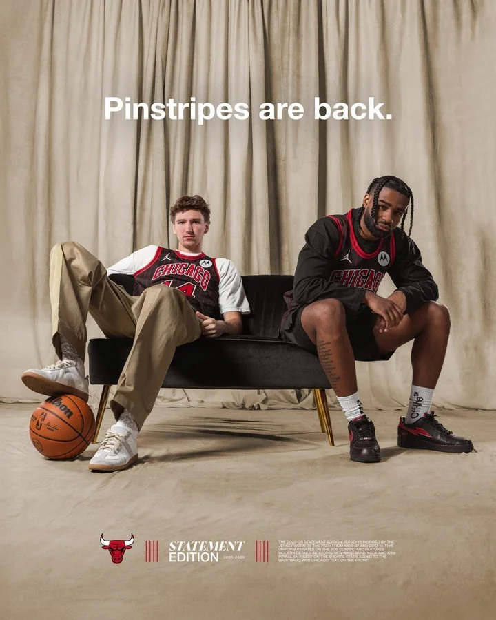
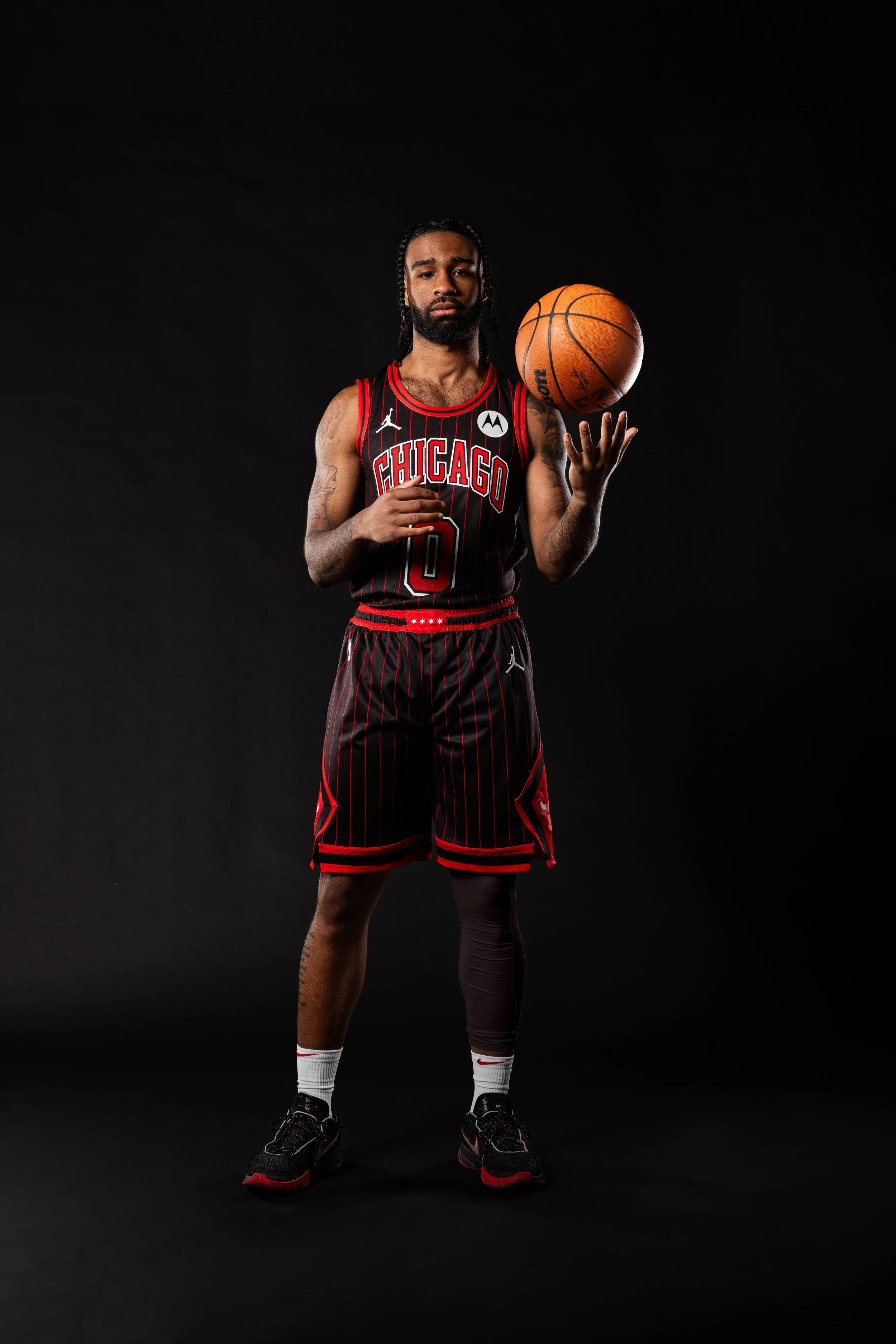
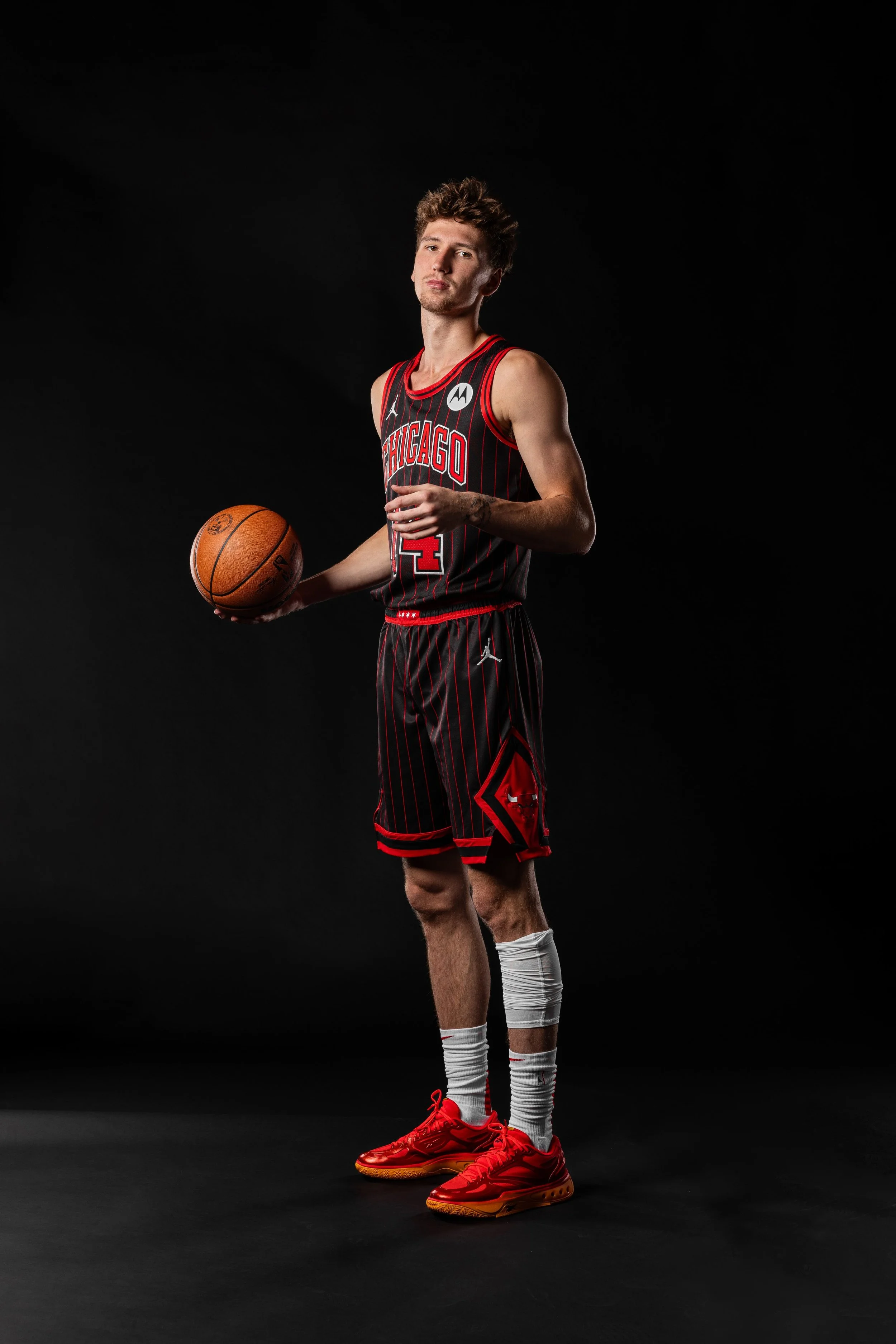
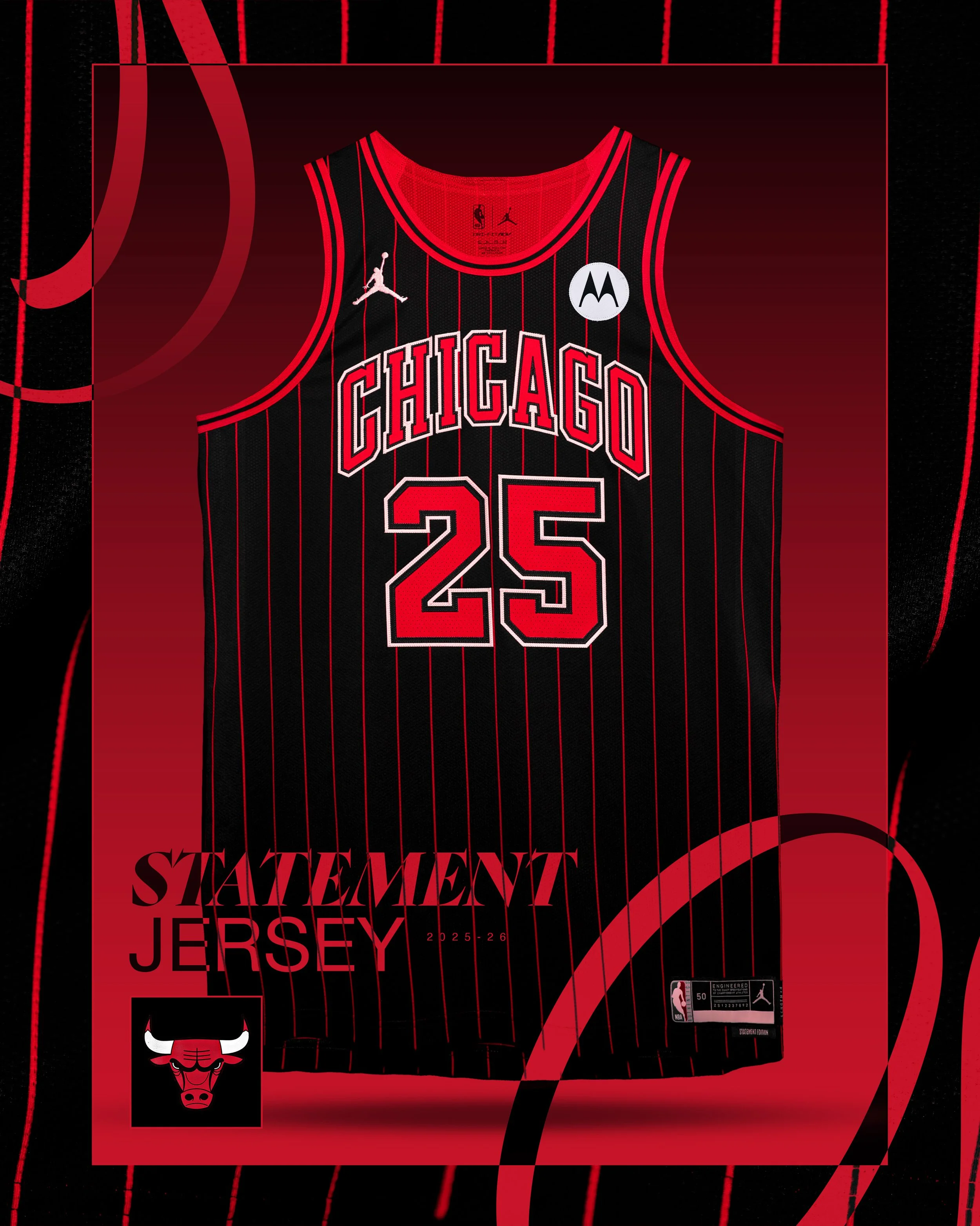
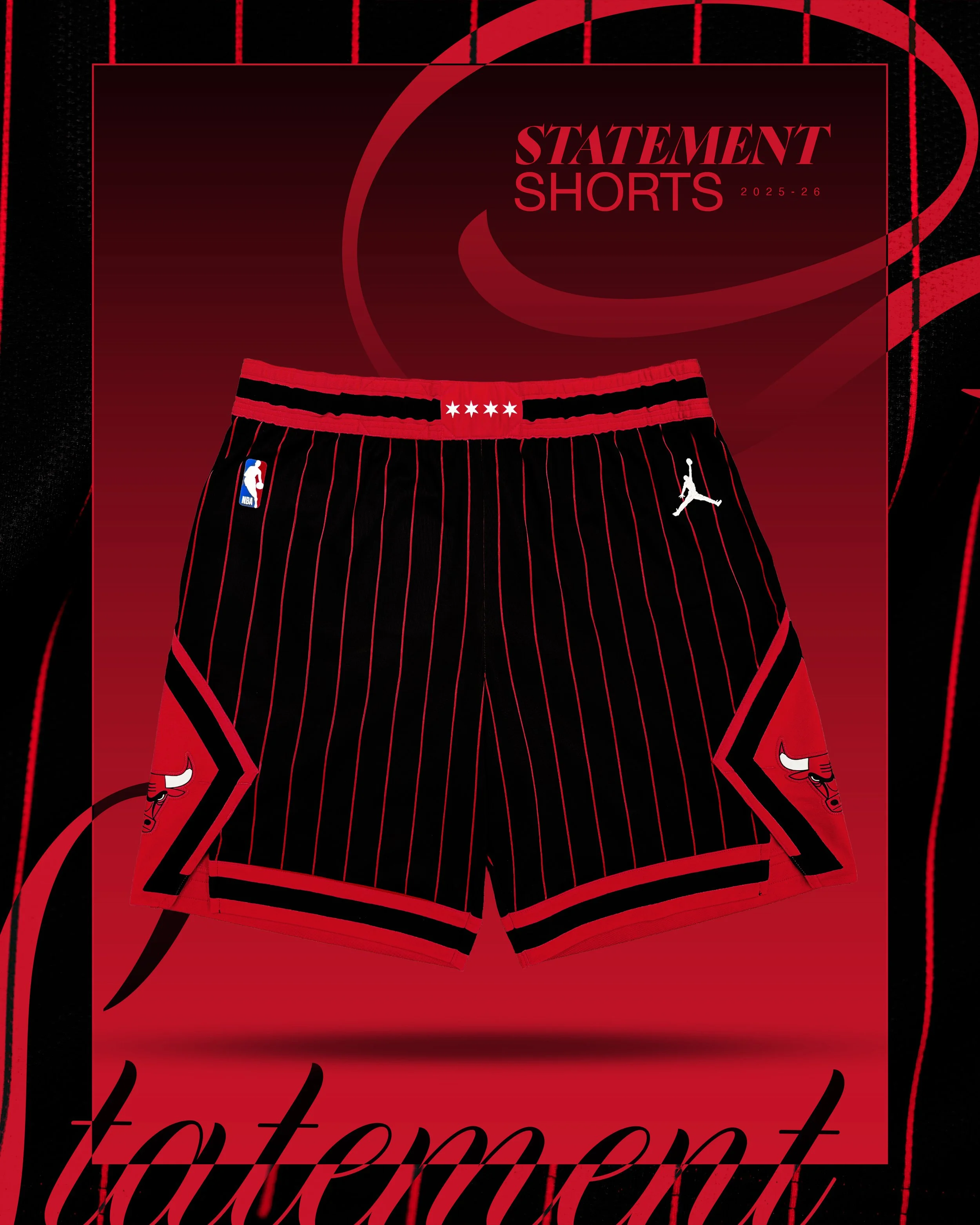
There’s never a wrong time for the Chicago Bulls to dip into the Michael Jordan era, and they just did it again, big time.
The Bulls officially revealed their 2025-26 Statement Edition uniforms, a black-and-red pinstriped look that instantly calls back to their legendary dominance in the '90s. First introduced during the 1995-96 season, a year the Bulls went 72-10 and won it all, this iconic uniform design hasn’t hit the court since the 2012-13 season. Now, it’s back and reimagined for a new generation.
Chicago turned to a fitting face for the reveal: Dennis Rodman, who rocked the pinstripes alongside MJ during back-to-back championship runs. In a hype video with current Bulls Coby White and rookie Matas Buzelis, Rodman got his hands on the new look and summed it up perfectly:
“These are nice. I remember when we first introduced this. It was legendary, man. These jerseys right here are legendary. It's not even a throwback — it’s brand-new for the new generation. This is gonna be really cool for Chicago … this brings back memories.”
The return of the pinstripes isn’t just a visual win, it’s a statement of legacy. From Jordan’s mid-air moments to the grit of the '96 squad, this design is soaked in Bulls history. It’s also a continuation of the black-and-red pinstripe takeover in Chicago sports, the White Sox unveiled a similar City Connect look earlier this year.