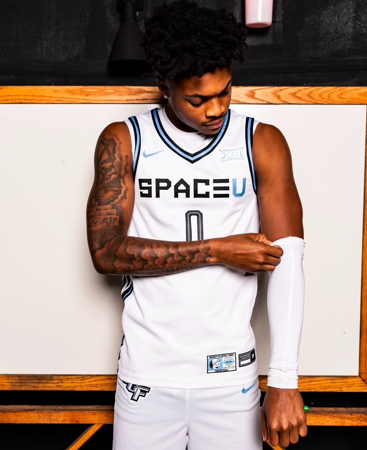
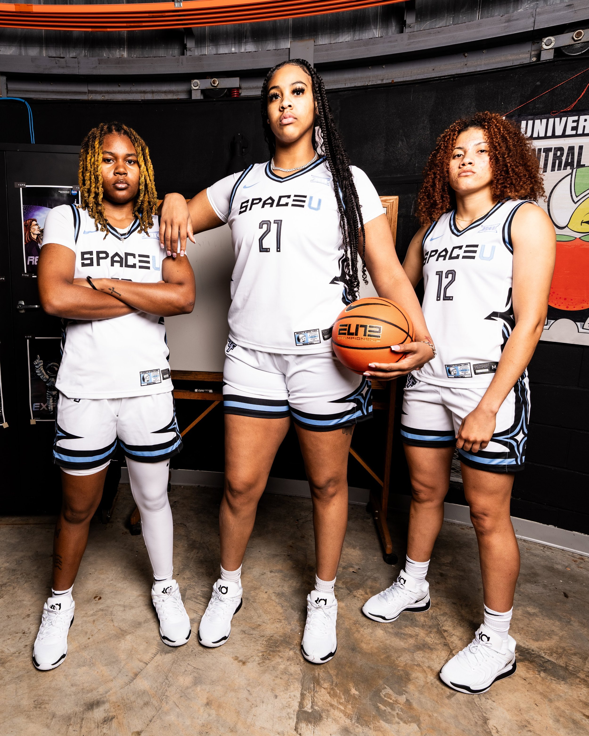
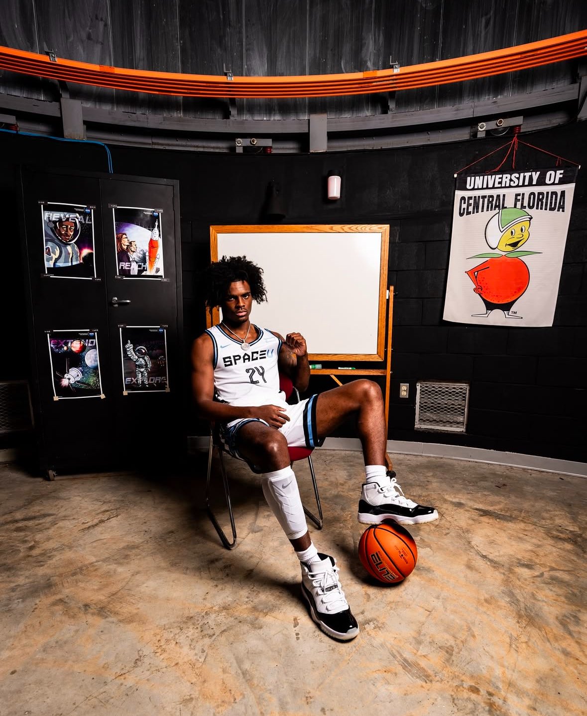
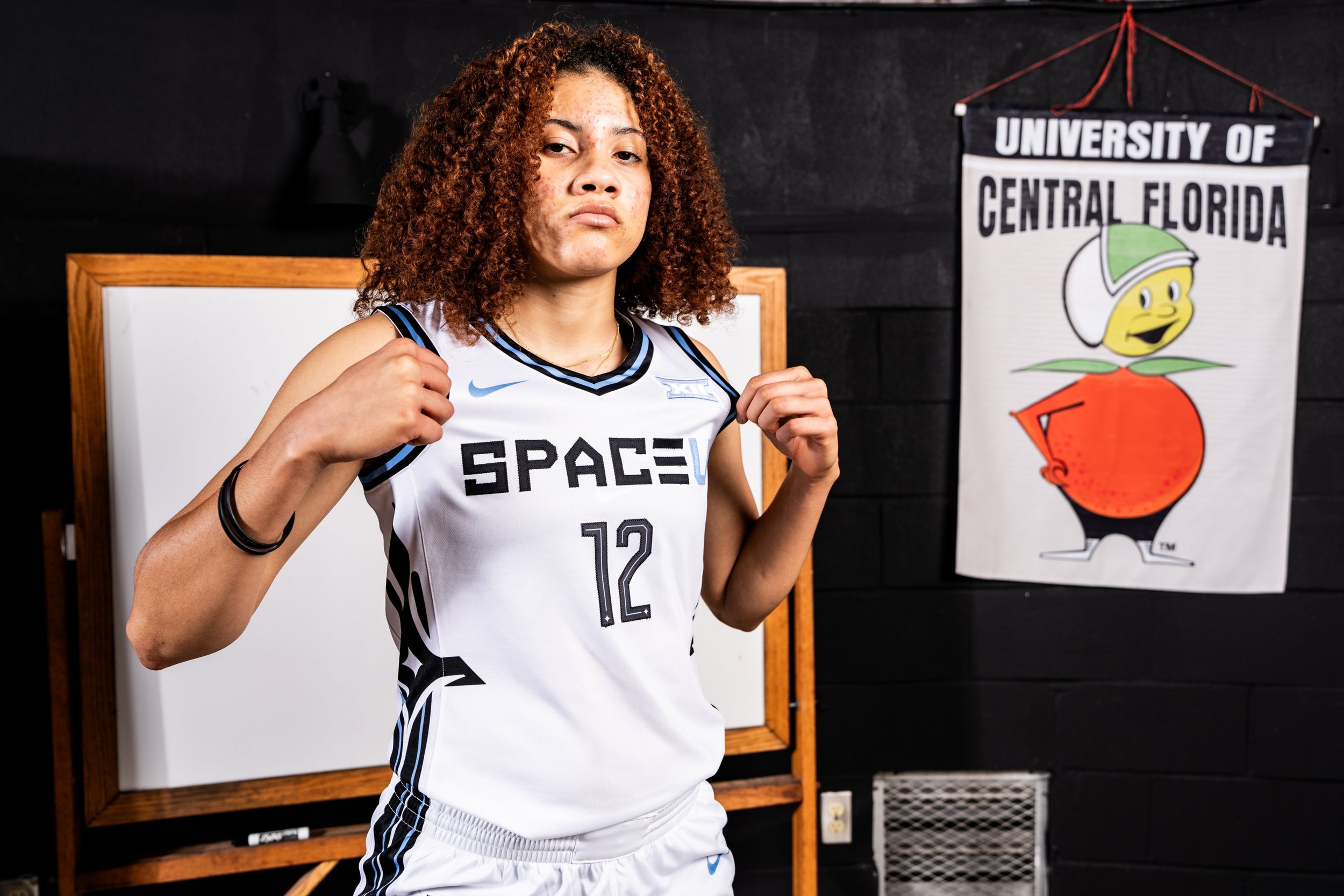
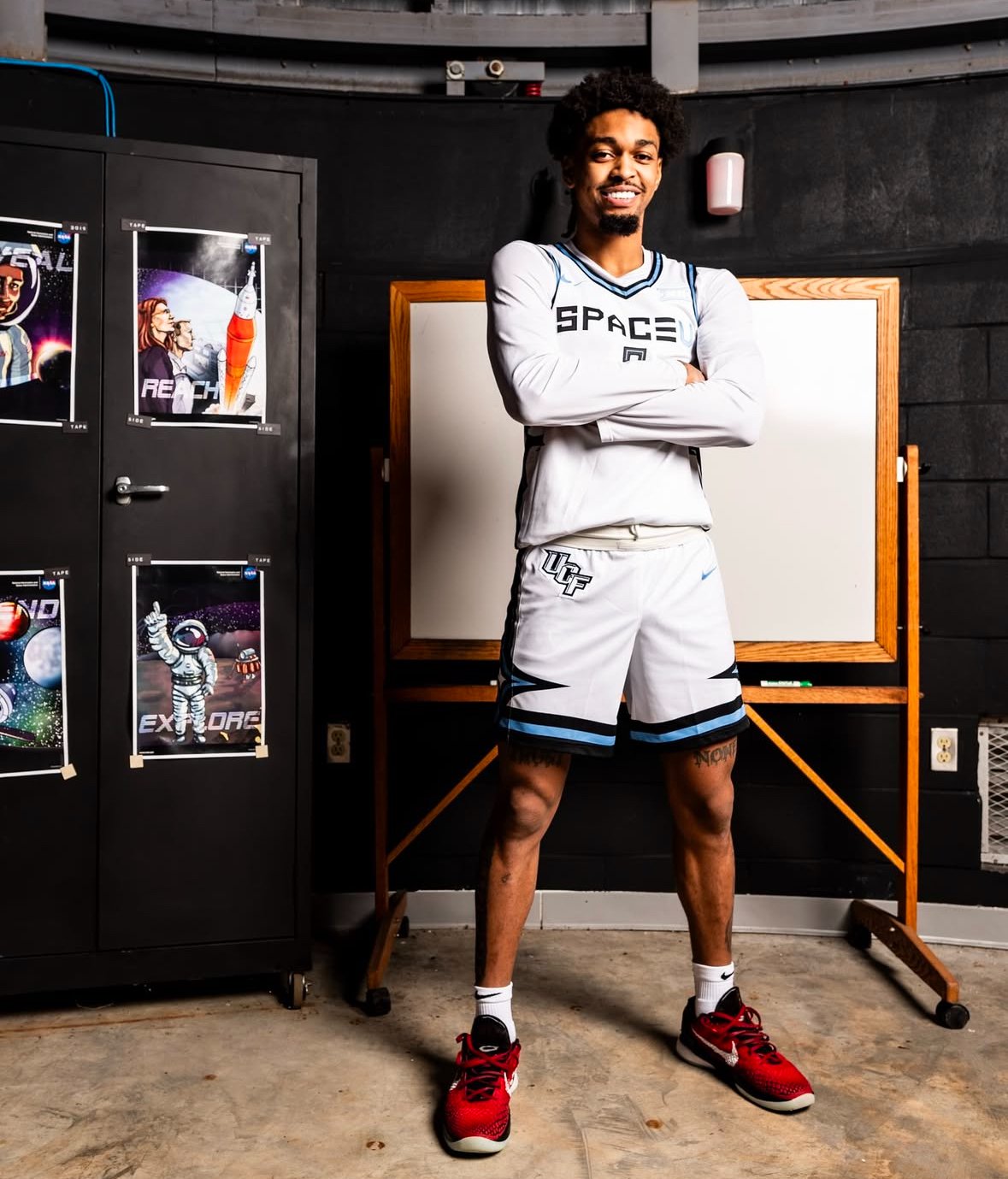
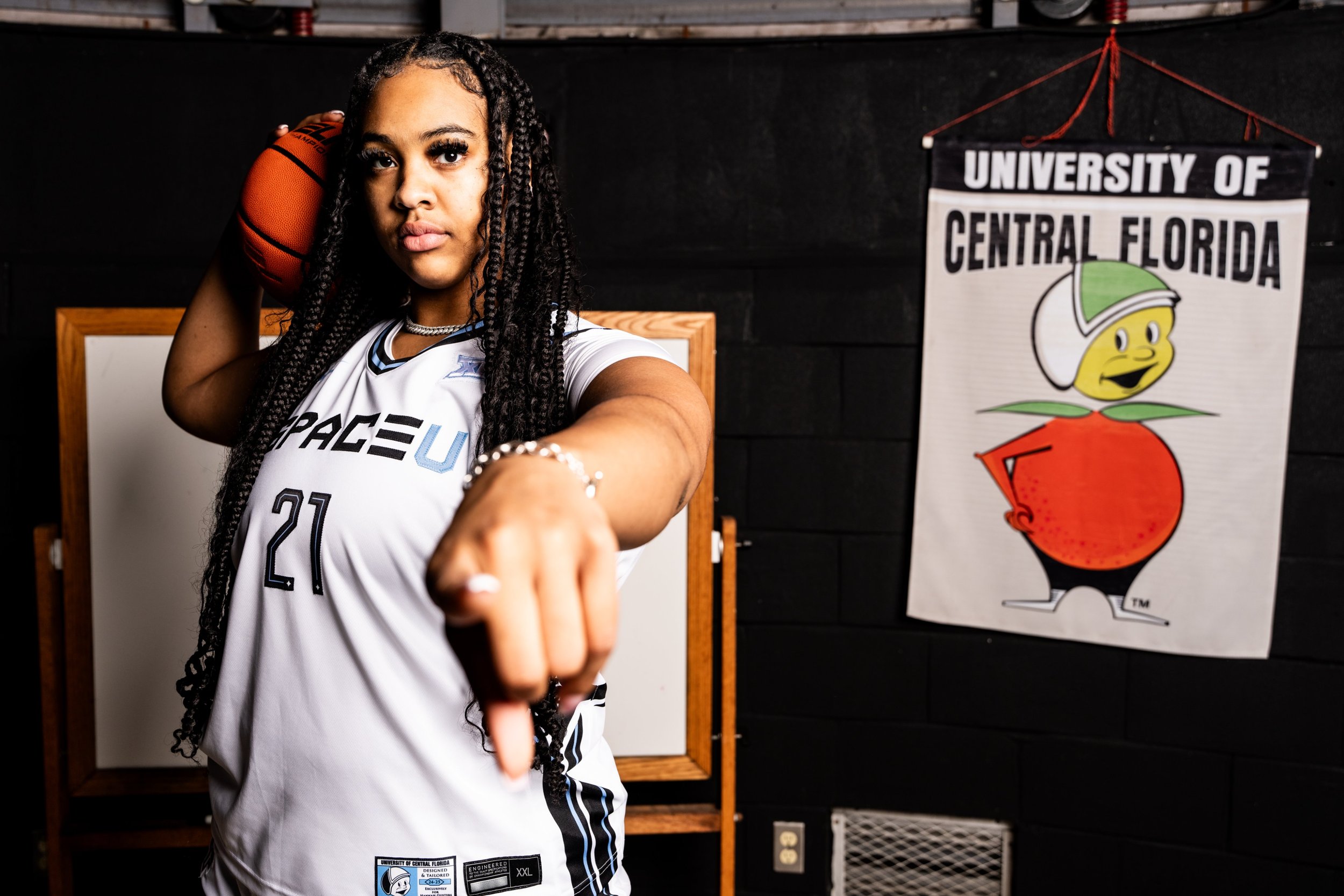
The University of Central Florida has once again embraced its ties to space exploration with the unveiling of the 2024-25 "Space U" basketball uniforms for both the men’s and women’s teams. This latest iteration of UCF’s Space-themed attire continues to celebrate the university’s rich connection to the stars and its identity as a hub for aerospace innovation.
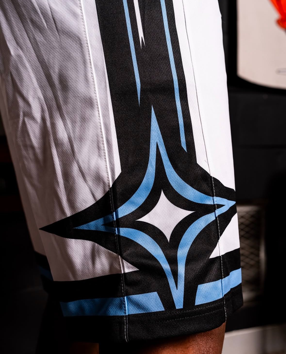
The uniforms feature a sleek white base, offering a clean and futuristic canvas for the bold "SPACE U" lettering emblazoned across the chest. This centerpiece is complemented by custom number fonts that add a unique flair to the design. Black and carnival blue piping along the edges bring sharp contrast and a pop of vibrant color, perfectly encapsulating the spirit of the Space U branding.
With each detail meticulously crafted, these uniforms are more than just gear—they’re a statement of UCF’s commitment to innovation and excellence both on and off the court. Fans can expect to see these standout designs in action throughout the 2024-25 season, showcasing the Knights’ pride and their unbreakable connection to the cosmos.
As UCF continues to cement its legacy in athletics and space exploration, the "Space U" uniforms are yet another reminder of the university’s bold vision and unique identity. Keep an eye on the Knights as they take to the court in style, aiming for new heights in both basketball and beyond.
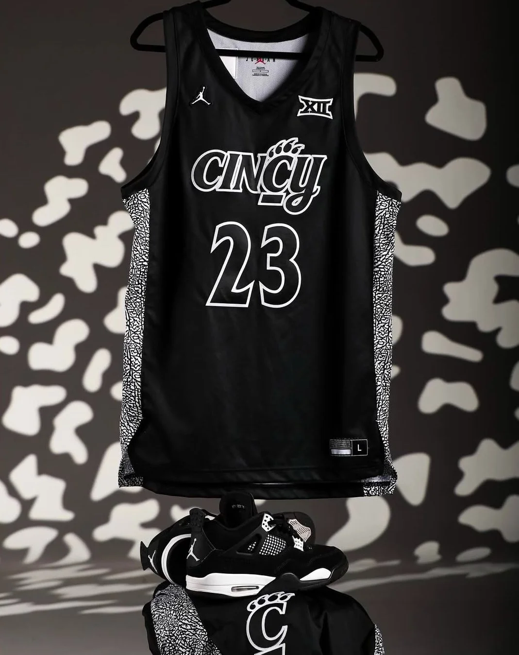
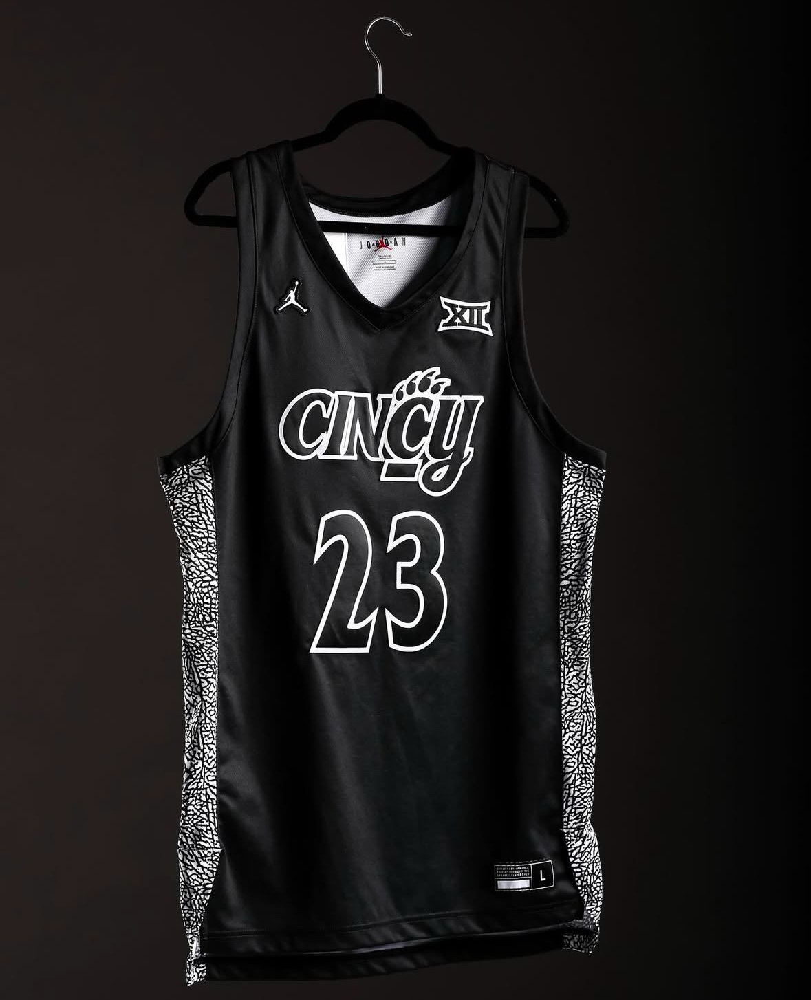
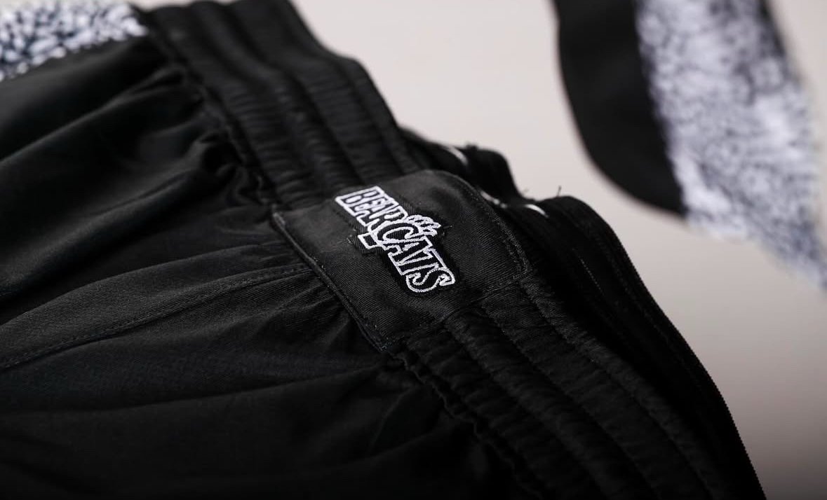
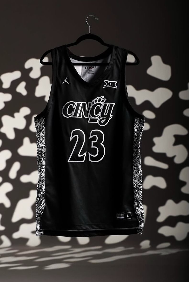
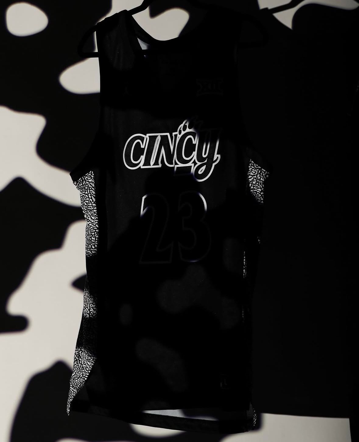
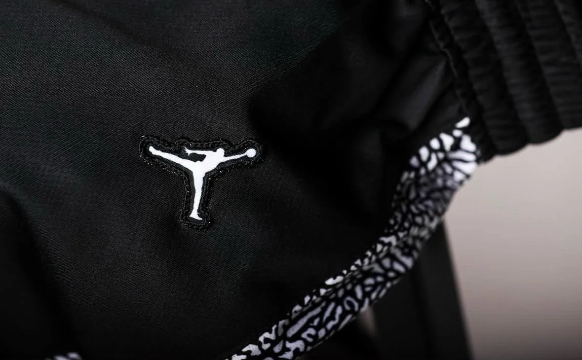
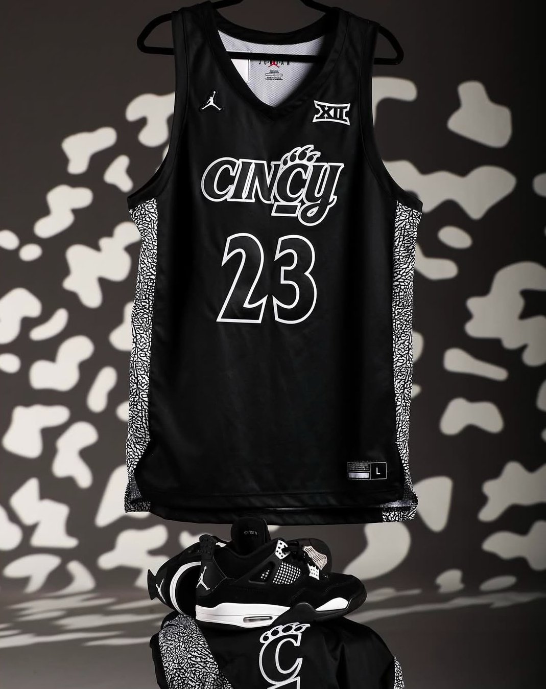
The University of Cincinnati men’s basketball team is taking their style to the next level with the unveiling of fresh alternate uniforms from Jordan Brand. these standout jerseys incorporate the brand's iconic elephant print, adding a bold and dynamic element to the team’s look.
The dark combination serves as a nod to both Cincinnati’s fierce basketball culture and Jordan Brand’s storied legacy in sportswear. The elephant print, famously associated with some of the most legendary Air Jordan sneakers, makes these alternates a statement piece, setting them apart from traditional uniform designs.
Fans won’t have to wait long to see these uniforms in action. Cincinnati is set to debut the new look at home on Saturday during the Crosstown Shootout, one of college basketball’s most intense rivalries. The Bearcats will take the court not only with their signature competitive edge but also with a fresh aesthetic that reflects their swagger and determination.\
The Wisconsin Badgers men’s basketball team has unveiled its latest “By the Players” alternate uniforms, a tradition that puts the creative power in the hands of the athletes themselves. Now in its fifth edition, this unique collaboration continues to showcase the pride and personality of the program.
This year’s design was led by veteran guards and Wisconsin natives Kamari McGee and Max Klesmit, who brought their vision to life with a look that highlights both state pride and the team's fierce spirit. The jerseys feature Madison’s skyline prominently placed above the players’ last names, creating a direct connection between the university and its capital city. Adding to the bold design are a pair of oversized Bucky Badger logos on the shorts, emphasizing the school’s beloved mascot, and a red emblem of the state of Wisconsin on the waistband for a touch of homegrown pride.
The details don’t stop there. This season’s uniforms incorporate a dynamic black and red zig-zag pattern running down each side of the torso, offering a modern and edgy twist to the classic look. Set against a clean white backdrop, the jerseys feature red lettering outlined in black, creating a sharp contrast that ties together the vibrant elements of the uniform.
For the players, this process is about more than just designing a jersey—it’s an opportunity to leave their mark on the program. The “By the Players” initiative allows team members to express their connection to Wisconsin’s culture and history while crafting a uniform that resonates with fans.
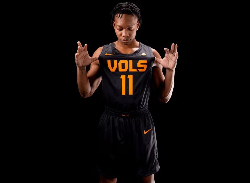
The Tennessee Volunteers basketball team is turning up the intensity with their latest uniform reveal: the much-anticipated "Dark Mode" look. This bold design represents more than just a stylistic shift; it’s a cross-sport identity that unites Vols athletics. Following the success of Tennessee’s baseball and football teams in their respective black uniforms, the basketball squad is set to make its own mark in these striking kits.
The new basketball uniforms feature a sleek and minimalistic design, keeping the focus on the bold contrasts and the unmistakable school pride. The jersey is solid black, with "VOLS" displayed in Tennessee-orange font across the chest, situated above a matching orange number. The back mirrors this aesthetic, with the name and number popping in the same vibrant orange. Every detail reinforces the team's connection to the Volunteer spirit, including the shorts, which carry a clean, no-frills black design accented by the phrase “ROCKY TOP” on the waistband—an homage to Tennessee’s beloved fight song.
This isn’t just about aesthetics. Since Nike took over as Tennessee’s uniform provider in 2015, the school has embraced the shortened “VOLS” branding across its sports programs, creating a unifying identity. Baseball fans have seen it in orange letters across their jerseys, and football fans recognize it prominently featured on helmet nose bumpers. With this latest addition, the basketball team joins a tradition that emphasizes unity, strength, and pride in the Volunteer name.
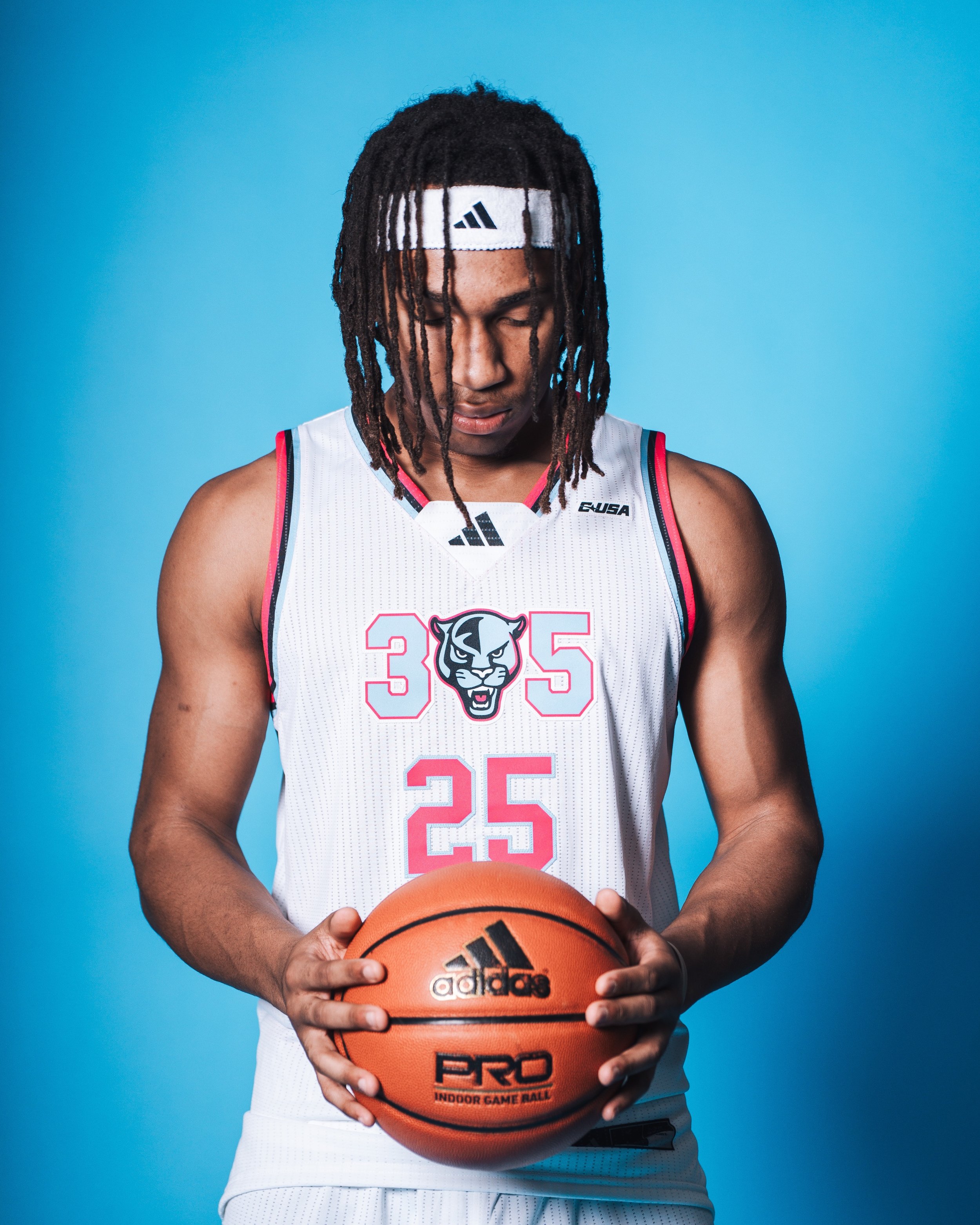
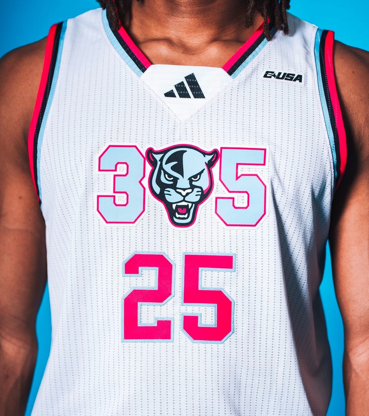
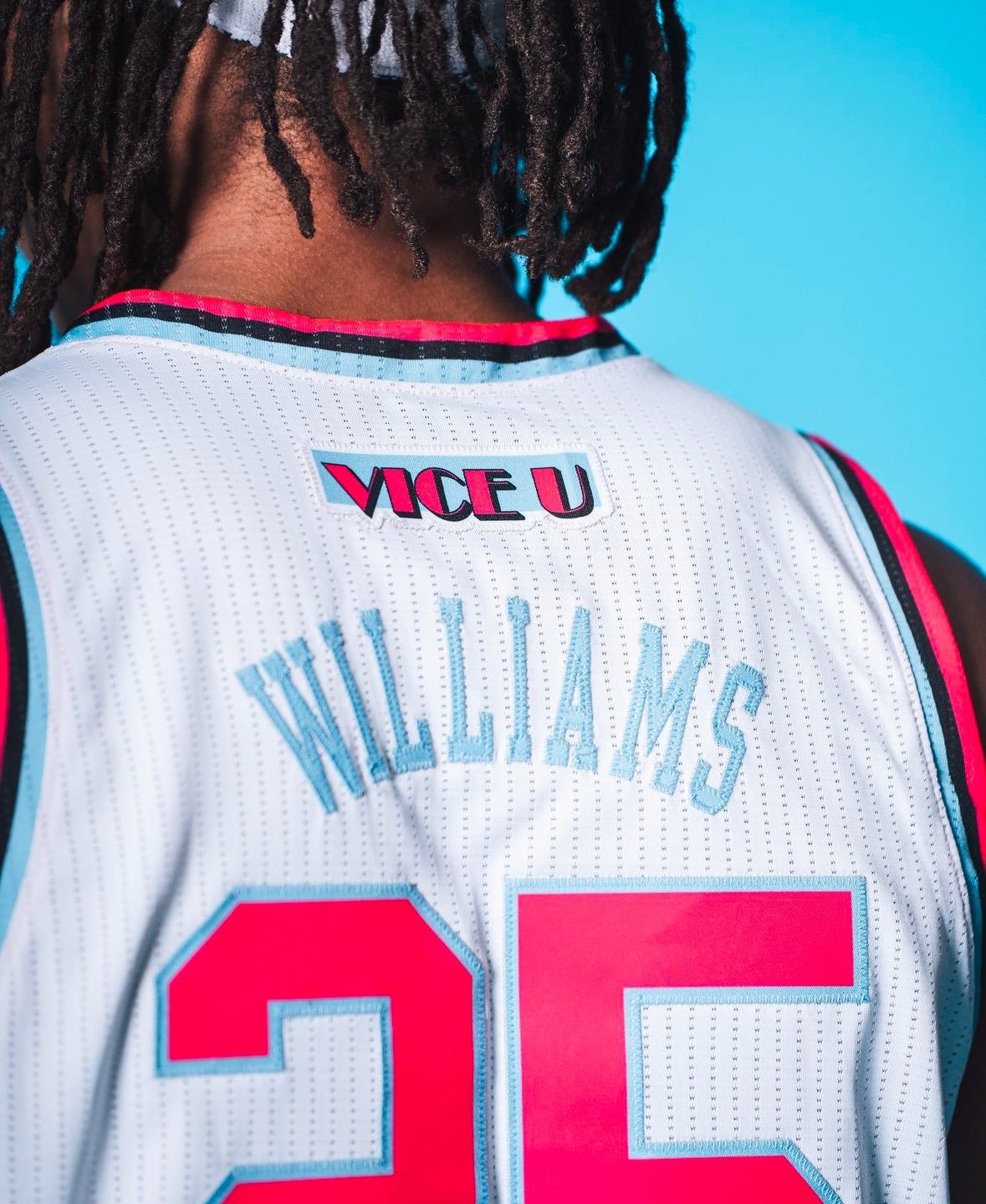
FIU Men’s Basketball has turned up the heat with the reveal of their newest uniform set, inspired by the vibrant energy of Miami and its iconic Vice City aesthetic. The "Vice U" uniforms blend pink, blue, and white into a bold design that perfectly captures the cultural flair of South Florida.
The jersey centers on a clean white base that provides the perfect canvas for the striking pink and blue accents. Across the chest, "305" pays homage to Miami’s area code, with a creative twist—the Panther head logo replaces the "0," seamlessly integrating FIU’s identity into the design.
The player numbers are showcased in vivid pink with a crisp blue outline, adding a touch of modern elegance while maintaining a dynamic look on the court.
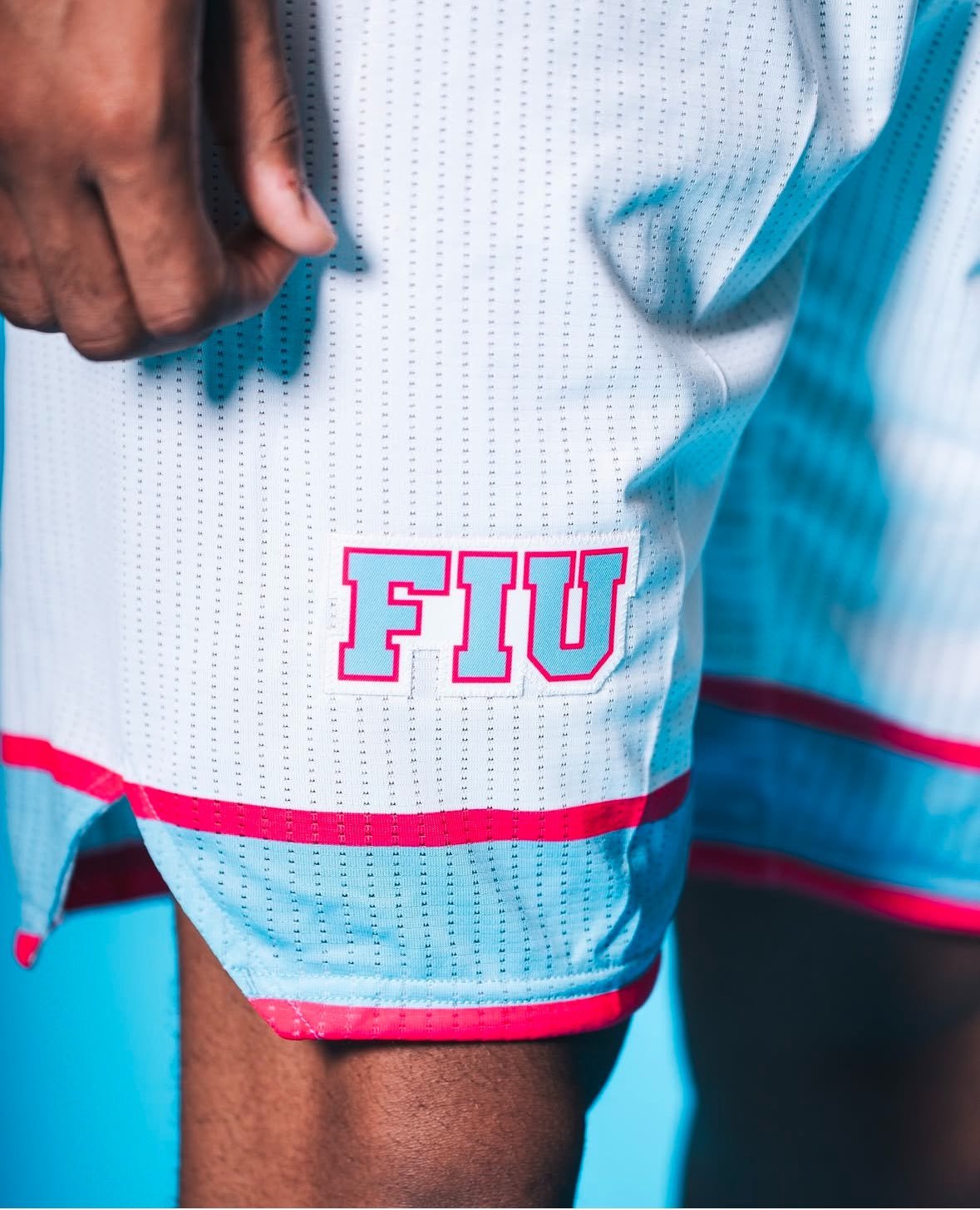
The shorts complete the ensemble with equally bold details. "FIU" is prominently displayed on the hem, while a horizontal blue stripe bordered in pink adds a sharp and stylish contrast. These elements come together to create a cohesive design that embodies Miami’s unmistakable vibe.
The Vice U uniforms are more than just a new look—they’re a tribute to the unique culture and vibrancy of FIU’s hometown. The pink and blue palette, reminiscent of Miami's neon-lit skyline and ocean views, captures the essence of a city that never stops.
These uniforms celebrate not only FIU’s athletic spirit but also its connection to a community known for its diversity, energy, and unmistakable flair.
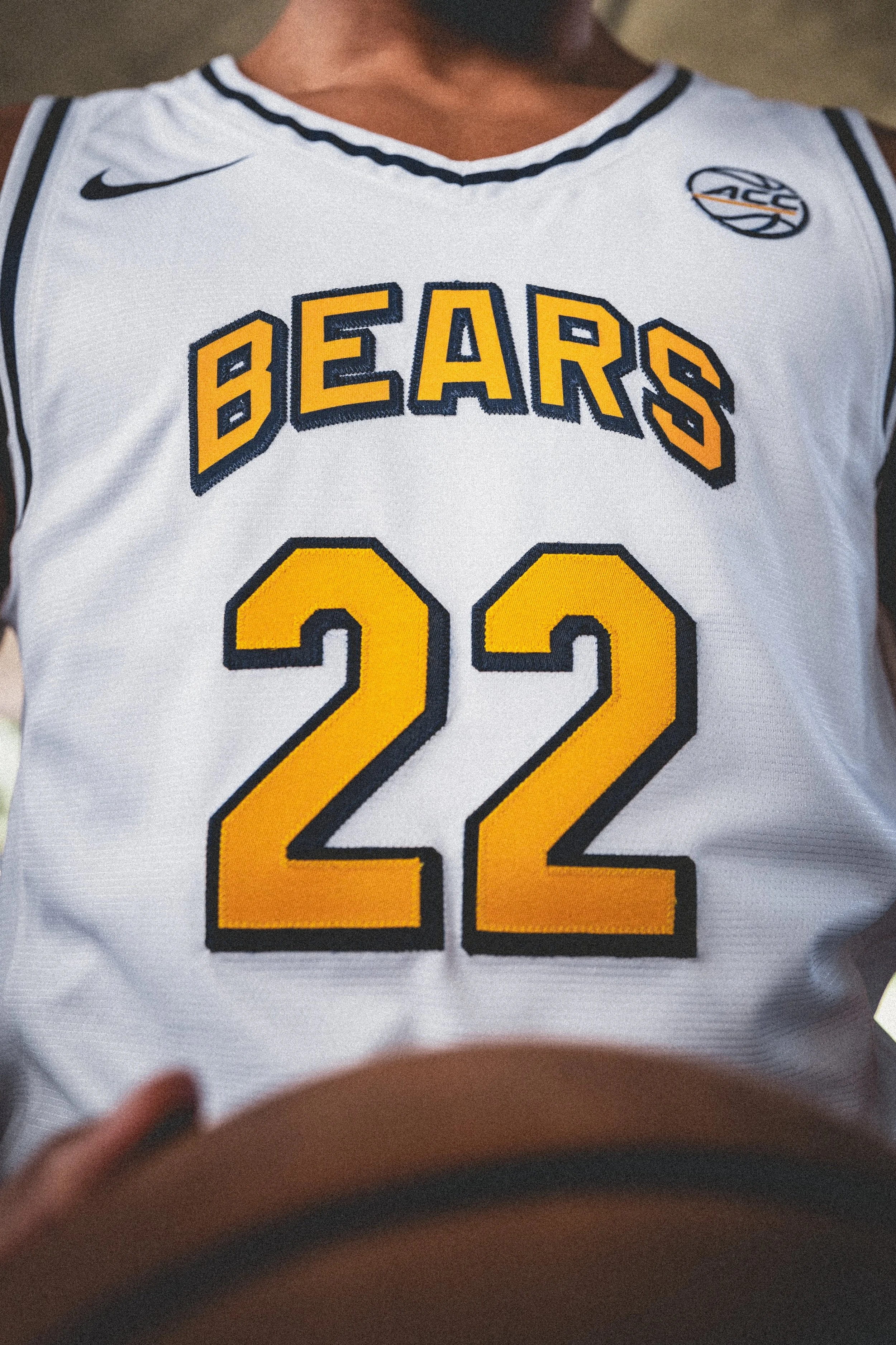
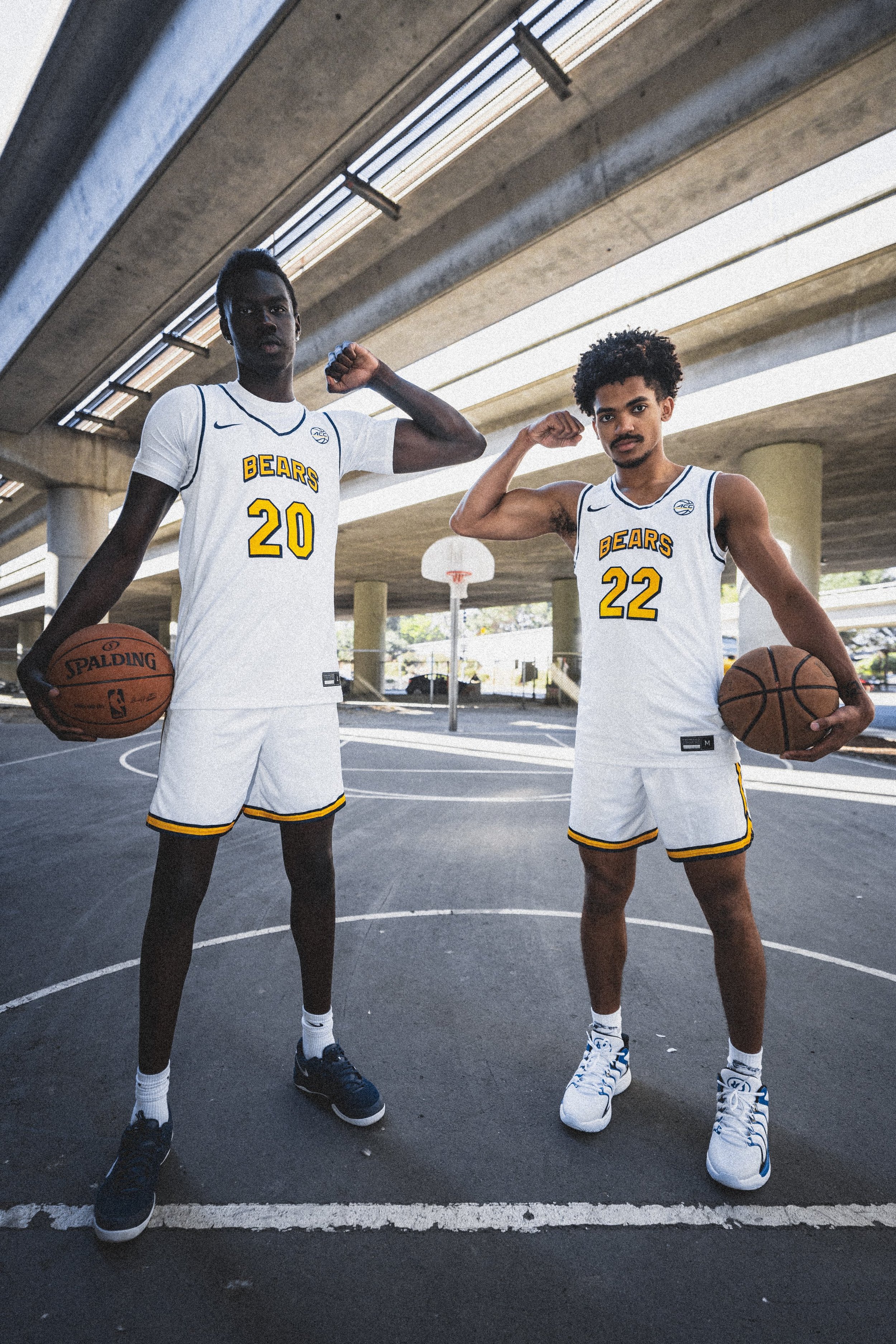
The Cal Men’s Basketball team is stepping onto the court this season with a bold new look. The freshly revealed uniforms blend simplicity with striking details, showcasing a design that fans and players alike can rally behind.
The new uniforms feature a crisp white base that emphasizes Cal’s signature colors of gold and navy. Across the chest, "Bears" is displayed in bold gold lettering with a navy shadow, creating a layered effect that adds depth and dimension. The player numbers mirror this design, combining gold with a navy drop shadow for a cohesive and polished look.
Details like a navy pinstripe around the neck and armholes subtly frame the uniform, adding a touch of contrast to the predominantly white design. The shorts continue the theme with a standout thick gold stripe running down the sides and at the hem, bordered by thin navy stripes that tie the ensemble together.
These uniforms strike a balance between honoring Cal’s basketball legacy and embracing contemporary design trends. The clean lines and bold colors make a statement while maintaining a classic aesthetic that resonates with fans of all ages.
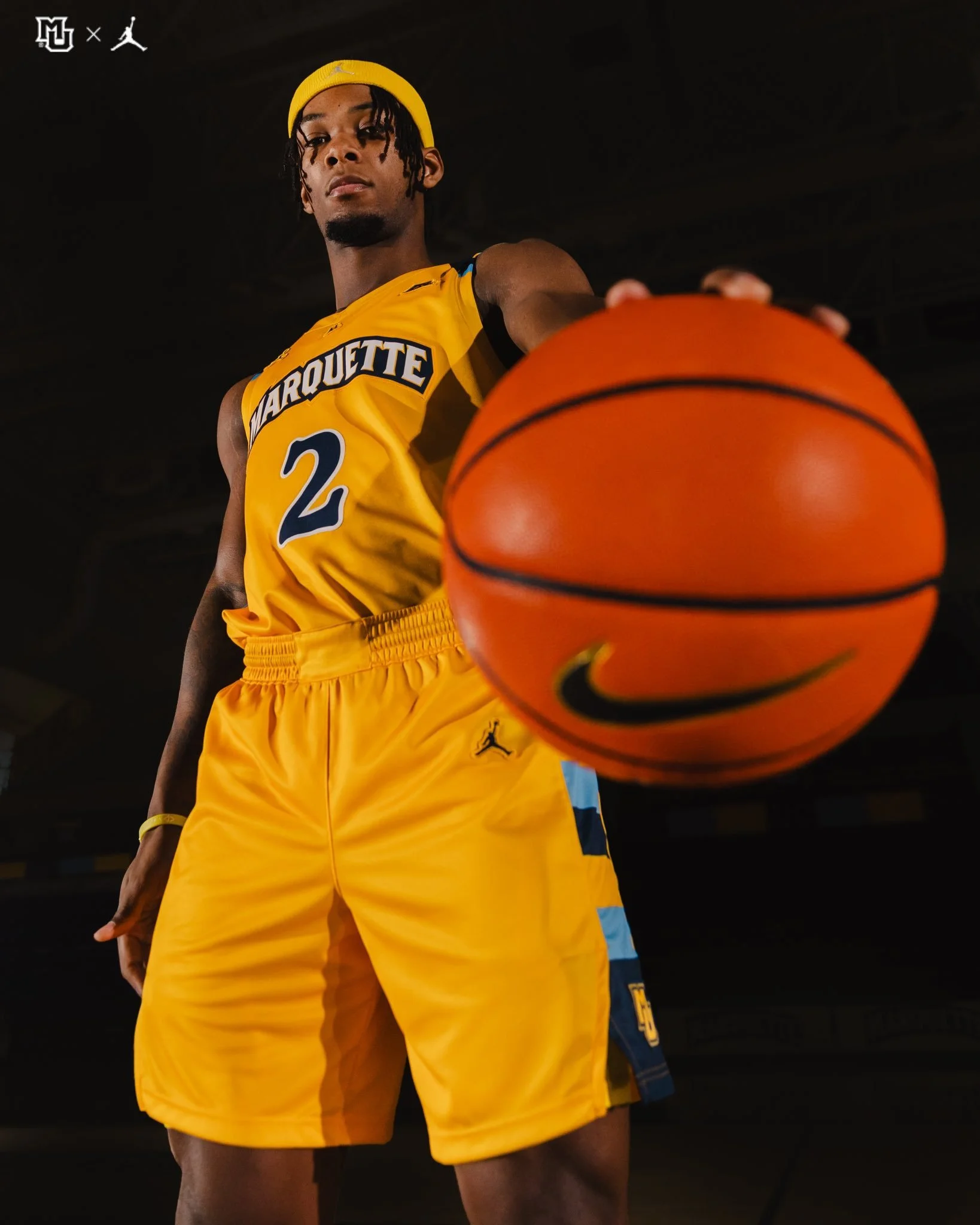
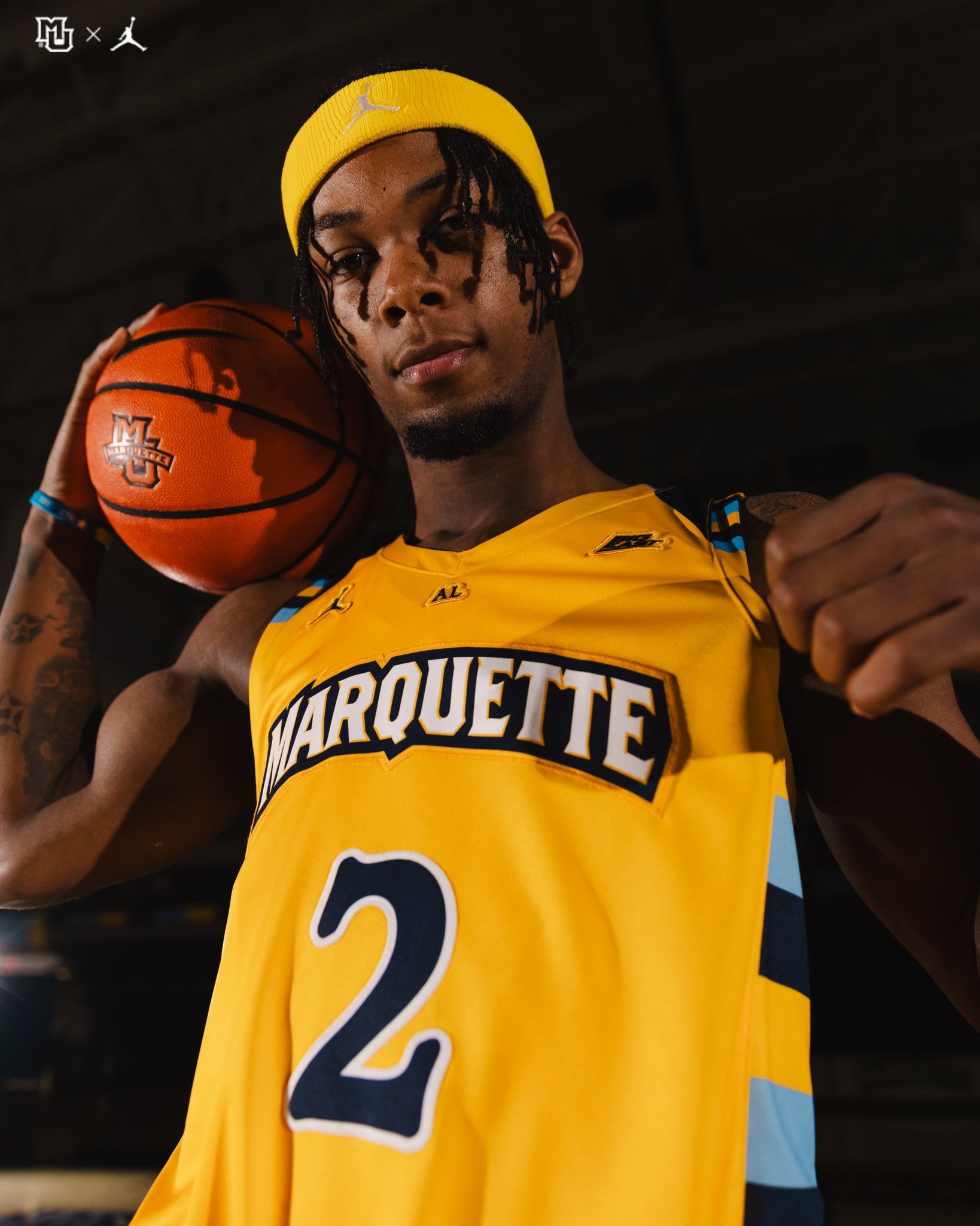
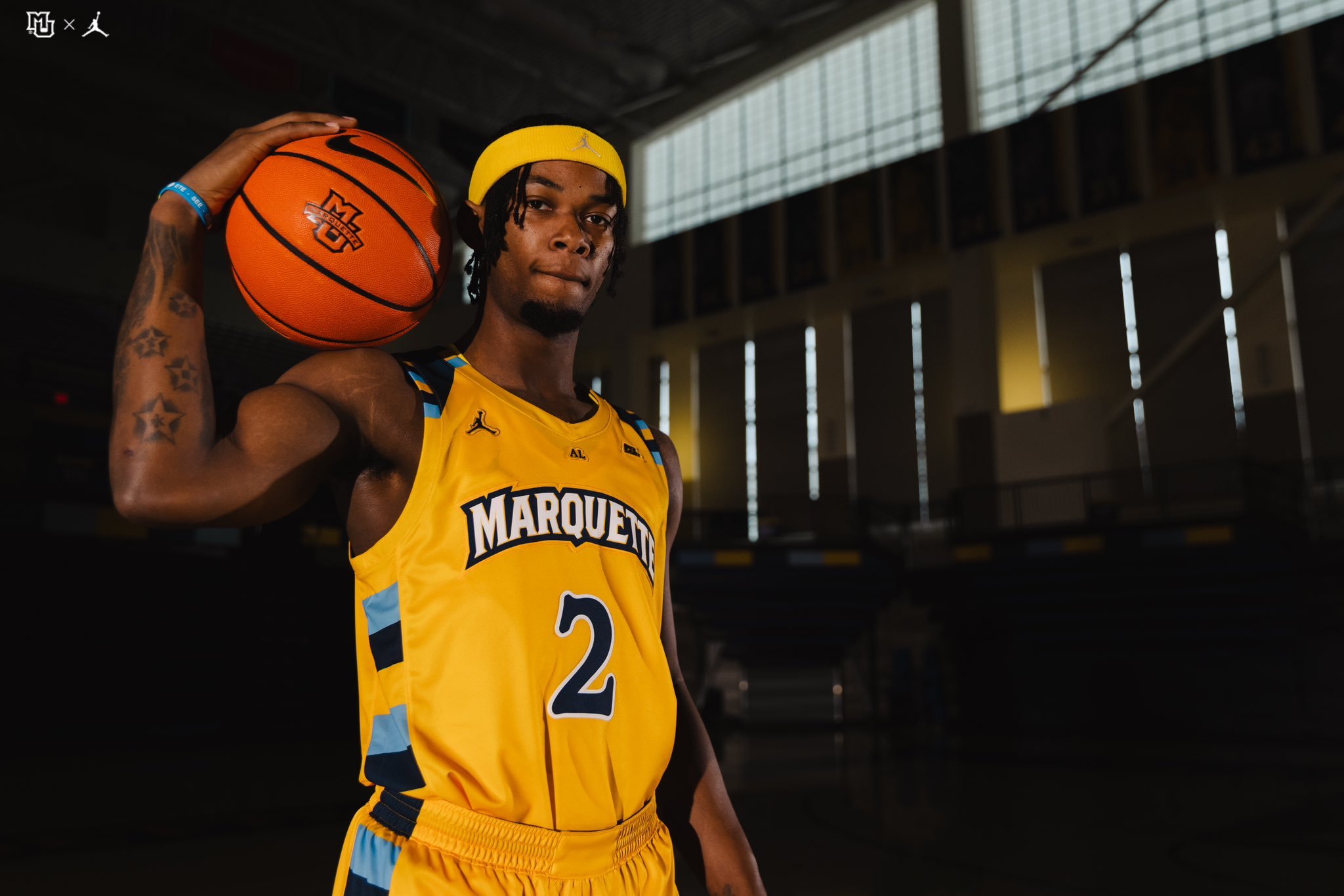
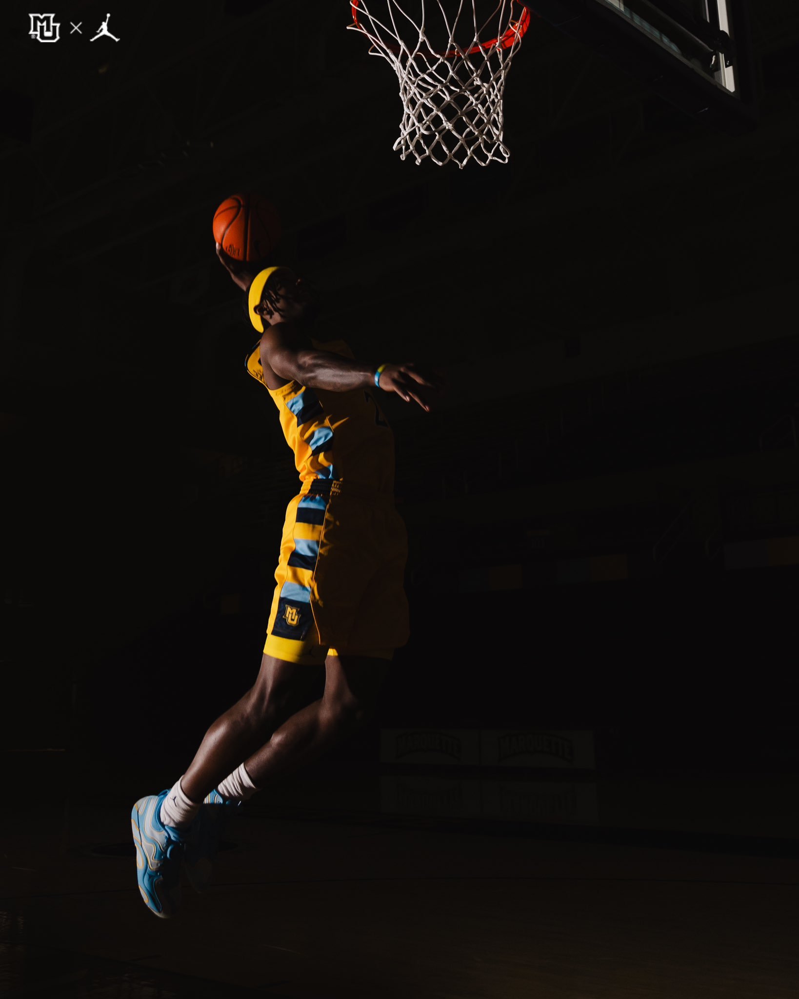
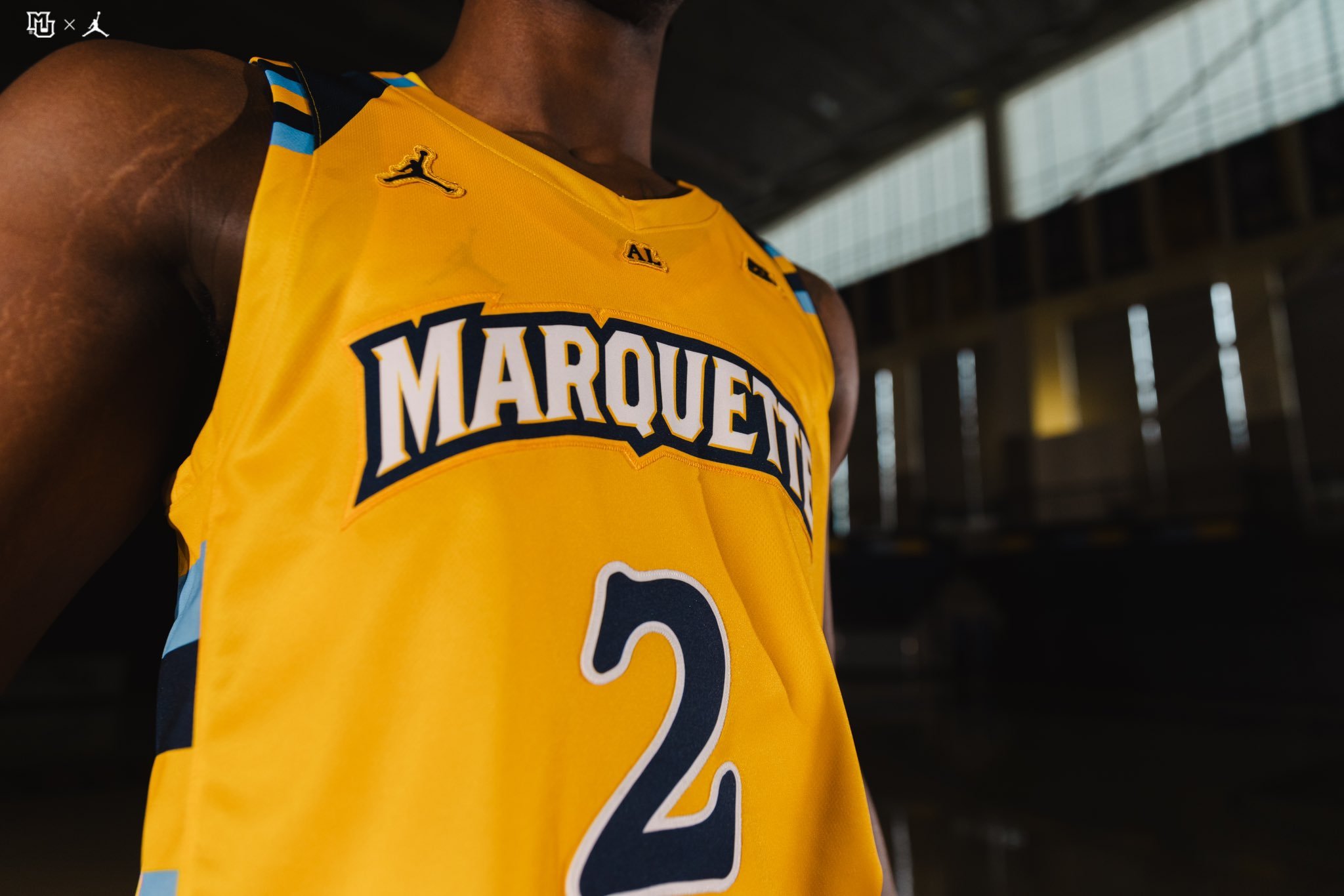
The Marquette Golden Eagles men’s basketball program has long been celebrated for its bold and memorable uniforms, a hallmark of its storied history. From the unmistakable bumblebee stripes to the untucked jersey revolution and the tiger-striped designs worn during the tenure of current Milwaukee Bucks head coach Doc Rivers, Marquette has continually set itself apart in the world of college basketball fashion.
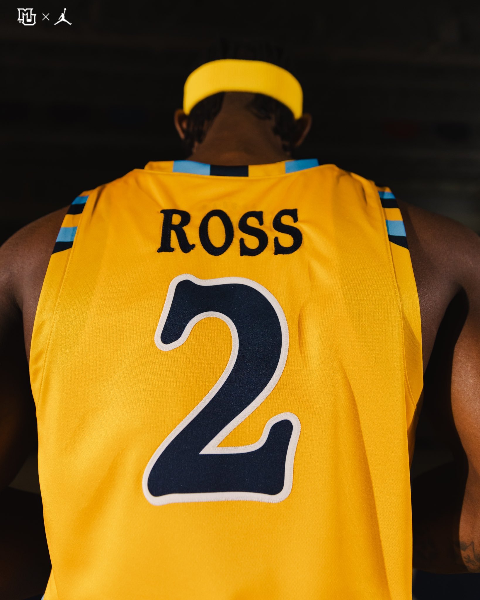
Now, the program is taking a nostalgic step back to honor another fan-favorite era. Marquette announced that the team would don replica jerseys inspired by their late 2000s and early 2010s squads. These teams not only captured the spirit of competition but also brought a distinct look that became synonymous with Marquette basketball during that period.
As part of the announcement, the program released a heartfelt video that further emphasized the connection between the past and present. In the video, members of the current Golden Eagles team presented a replica jersey to Wesley Matthews Jr., a standout player from the era being honored. Matthews, who has since forged a successful NBA career, was visibly moved by the gesture, reinforcing the deep bonds shared within the Marquette basketball family.
For fans, this jersey tribute is more than just a fashion statement; it’s a celebration of the program’s legacy. The late 2000s and early 2010s teams were defined by their grit, unity, and exciting play, leaving an indelible mark on Marquette’s basketball history.
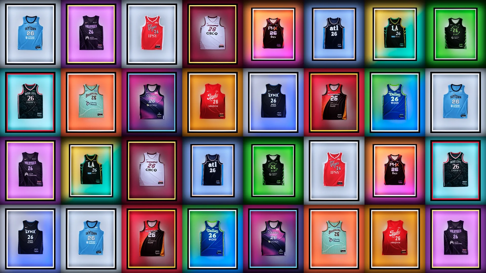
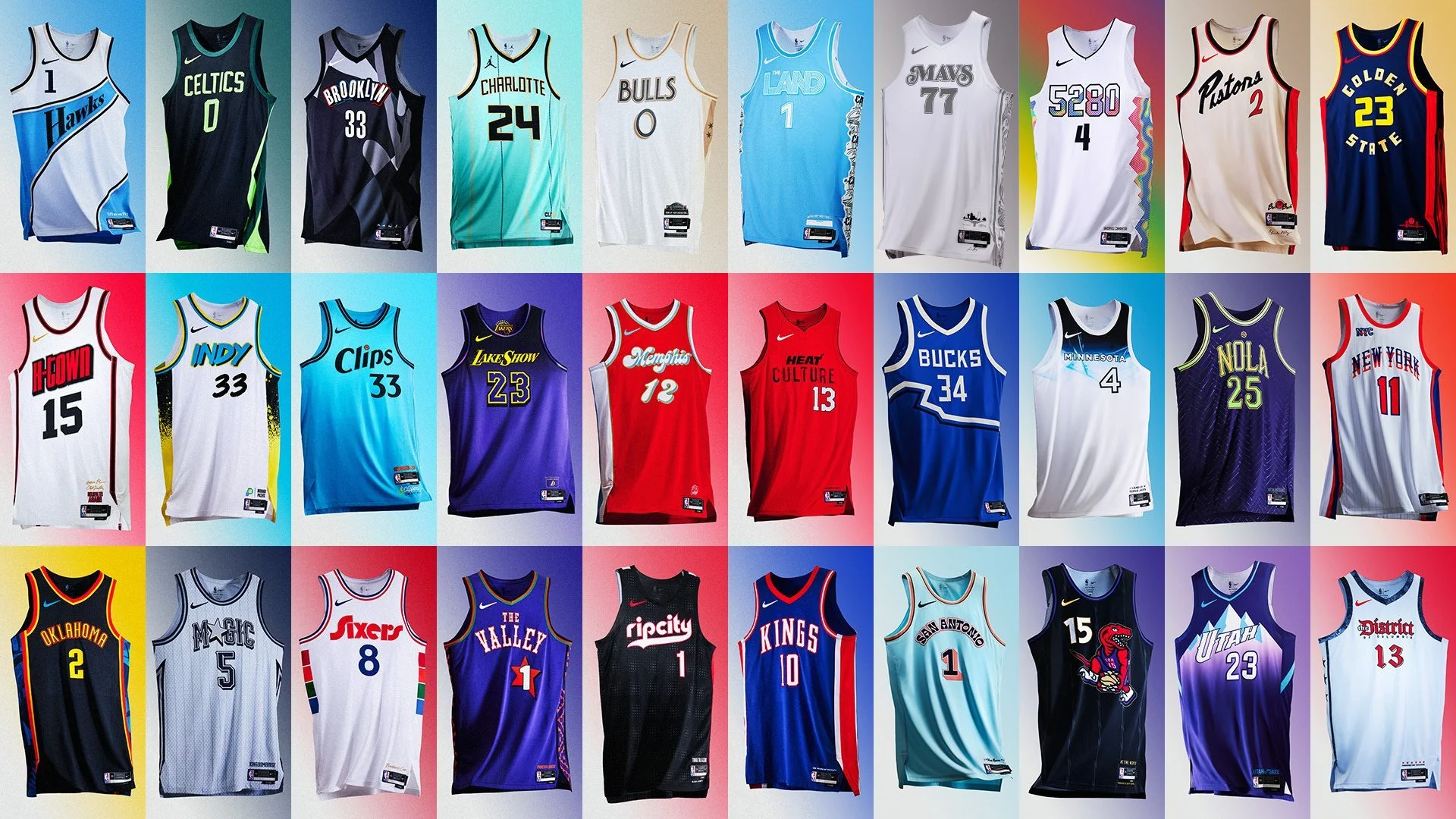
The much-anticipated Nike City Edition uniforms are back for the 2024-25 NBA season, ready to make a statement both on and off the court. First introduced in the inaugural in-season competition last year, these uniforms quickly became fan favorites for their vibrant designs and deeper connections to each team’s unique heritage. Now, as we gear up for another season, fans everywhere can look forward to seeing all 30 NBA teams in their new City Edition uniforms, starting November 17th.
Nike’s City Edition uniforms are more than just a fresh look—they’re carefully crafted expressions of each team’s identity, city, and culture. Each design thoughtfully incorporates elements that pay homage to the team’s history and the city it represents. Whether it’s through colors, patterns, or symbols, every uniform tells a story that connects the team with its community. This year’s line-up continues that tradition, blending modern design with meaningful references that resonate with local fans and spark pride across the league.
While each uniform is distinct, the entire City Edition collection is unified by the shared theme of honoring heritage. From nods to iconic city landmarks and tributes to historic figures, to colors that represent local landscapes, every detail contributes to the overall storytelling. Some teams have opted for a retro look that channels the energy of their franchise’s golden years, while others showcase forward-thinking designs that look to the future.
The new Nike City Edition uniforms will make their on-court debut on November 17th as teams tip off in this season’s in-season competition. It’s a fitting stage to showcase these designs, celebrating both the diversity of the league and the cities that each team calls home. For fans and collectors, this first appearance is not only a game to watch but a chance to catch a glimpse of how each team represents its roots in style.
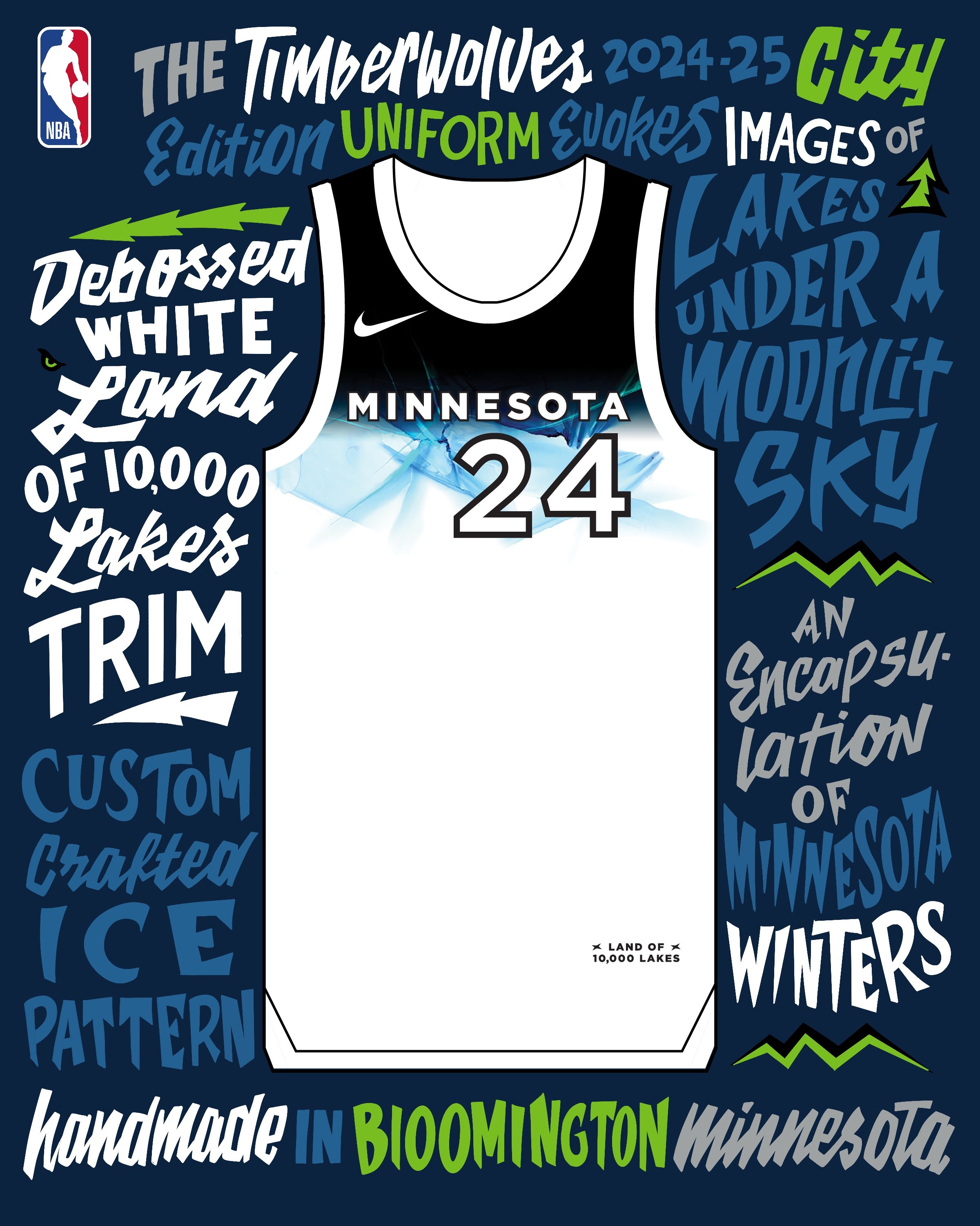
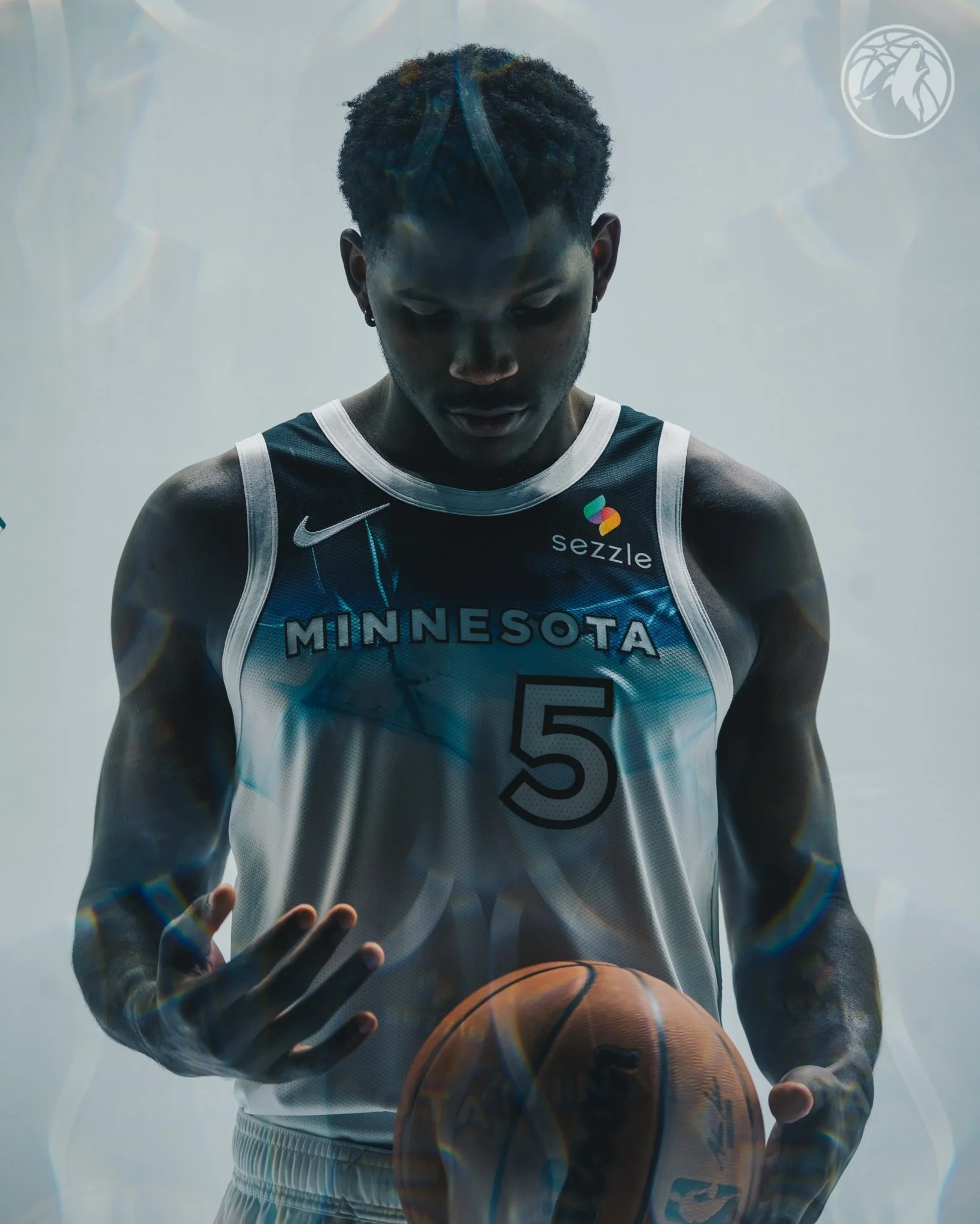
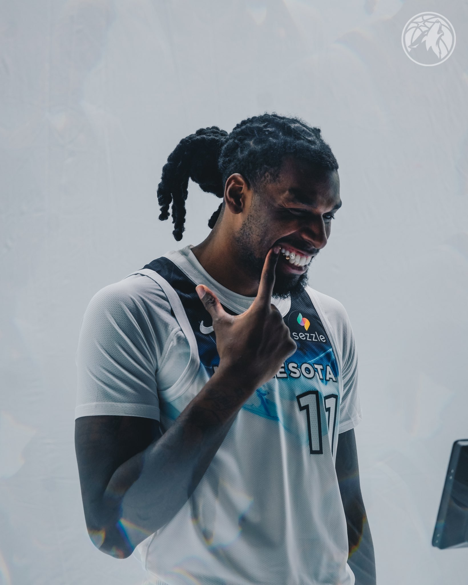
The Minnesota Timberwolves have revealed their 2024-25 NBA City Edition uniform, a tribute to the frigid elegance of Minnesota’s winters and the spirit of “lake life” that defines the state. In collaboration with Nike, this uniform is the culmination of a two-year story arc celebrating Minnesota’s deep connection to its natural landscape, particularly the iconic lakes that freeze over during the winter months. The design captures the serene beauty of snow-covered terrain under a moonlit sky, inviting fans to embrace the season’s stark yet captivating charm.
"Here in Minnesota, we don’t just survive the cold; we thrive in it," said Timberwolves Chief Marketing Officer Mike Grahl. "Completing Nike and the NBA’s two-year City Edition story, this uniform is a tribute to Minnesota’s lake life in ice-cold style." The design blends a crisp white and bold black palette, evoking the icy calm of a Minnesota winter. At the core of the uniform is a custom-crafted ice pattern, meticulously designed in Bloomington, Minnesota, to reflect the layered textures of ice-covered lakes.
The “MINNESOTA” wordmark remains across the chest, serving as a proud reminder of the team’s roots and the close-knit bond between the Timberwolves and their community. Encasing the primary Timberwolves logo on the shorts, the icy black-and-white color scheme features a frozen pattern, symbolizing the powerful seasonality of winter in Minnesota. The trim on the uniform bears the phrase “Land of 10,000 Lakes,” with a debossed white finish designed to look like tracks pressed into freshly fallen snow, adding a tangible sense of wintry texture.
The waistband of the shorts features a white silicone emblem of Minnesota, creating a tone-on-tone effect that keeps the focus on the state’s snowy landscape. The phrase “Land of 10,000 Lakes” is also displayed along the baseline, flanked by the North Stars, reinforcing the team’s connection to Minnesota’s natural beauty and resilient character.
This City Edition uniform will be worn by the Timberwolves throughout the season, debuting in their game against the Phoenix Suns on November 17. Alongside the uniform, the Timberwolves will unveil a custom City Edition court that brings the wintry theme to life with an apron painted a deep black to resemble the night sky. The icy gradient lanes blend from black to frosty white, mimicking the look of frozen lakes, and the Timberwolves logo at center court reflects the icy texture of the jersey design. “Land of 10,000 Lakes” is proudly displayed along the sideline, reminding fans of the state’s defining landscapes.
The Timberwolves’ 2024-25 City Edition uniform is more than just a seasonal design; it’s a celebration of Minnesota’s iconic winter landscape and the resilient spirit that its people embody. The uniform and the custom court embody the essence of “lake life,” showing that for the Timberwolves and their fans, winter is a time not only to endure but to celebrate.
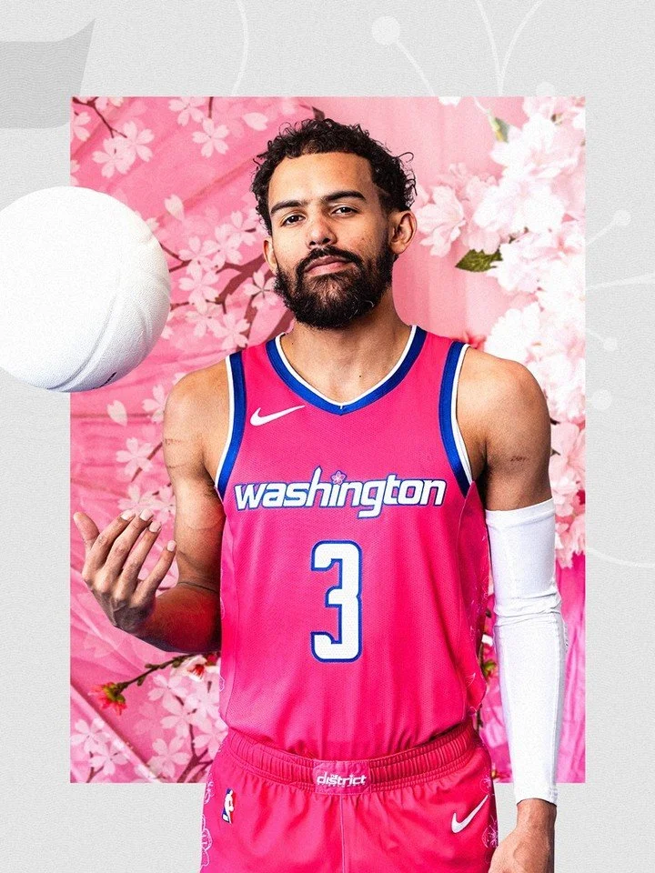
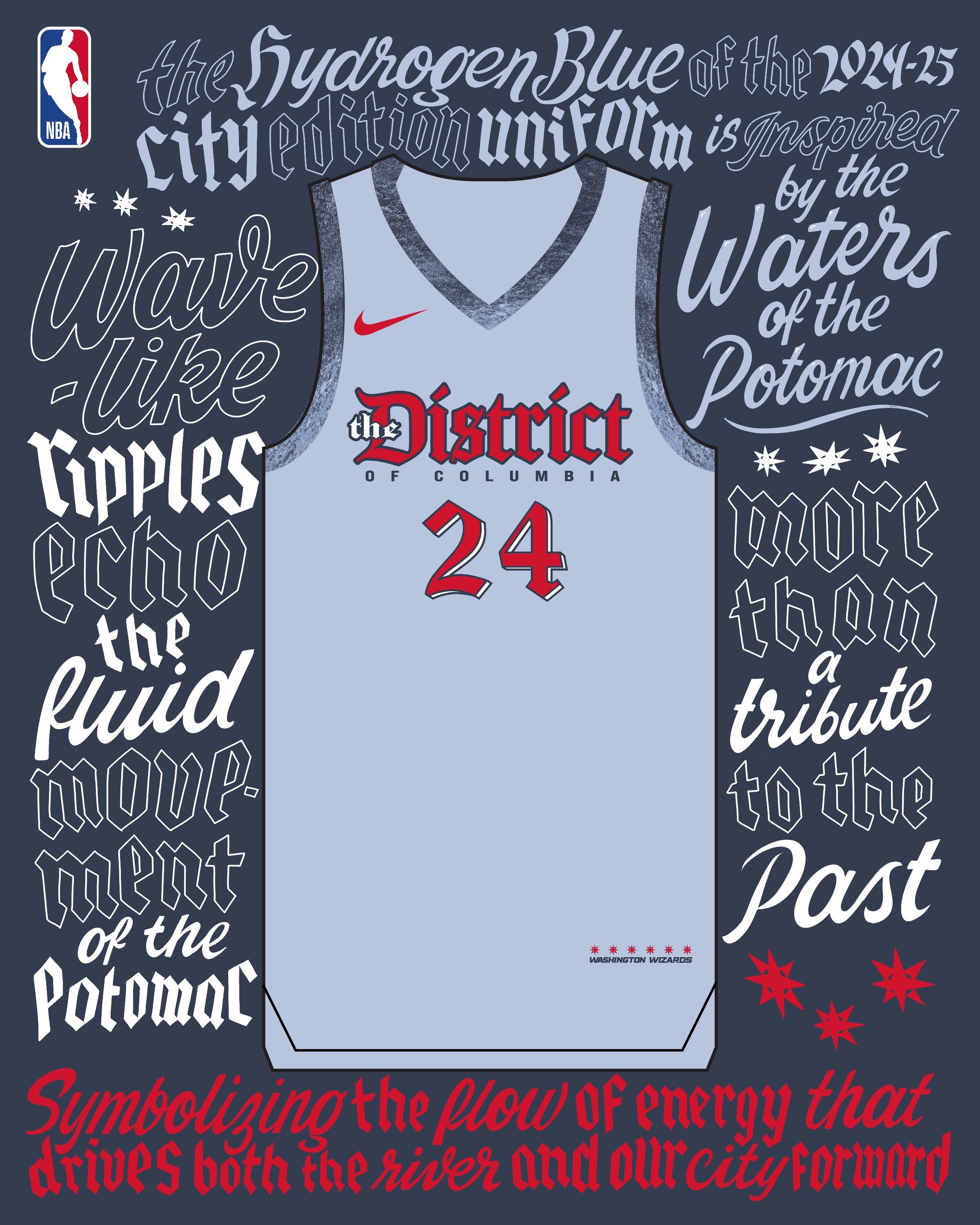
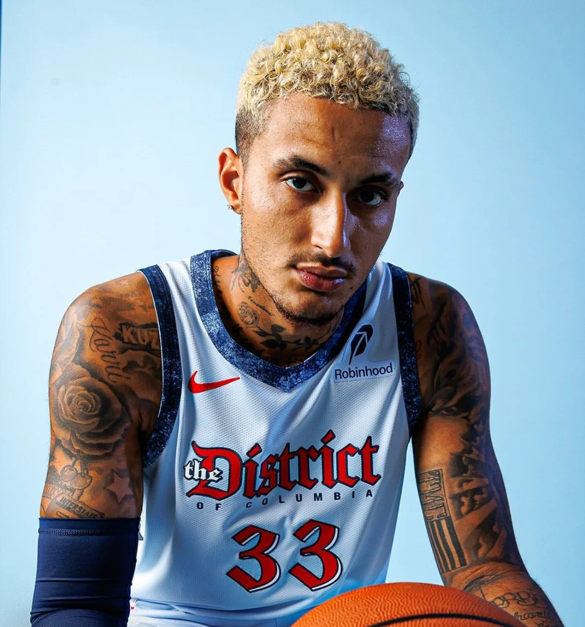
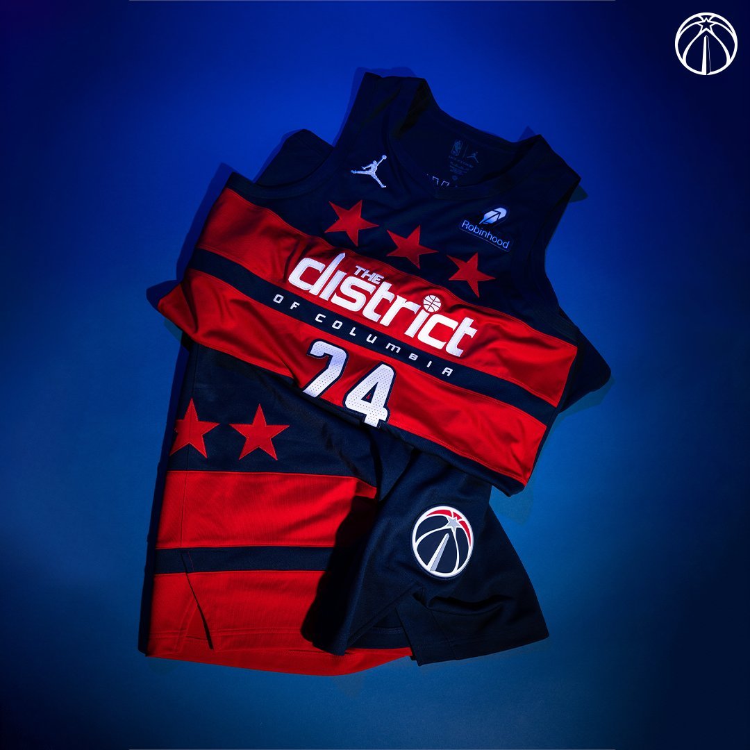
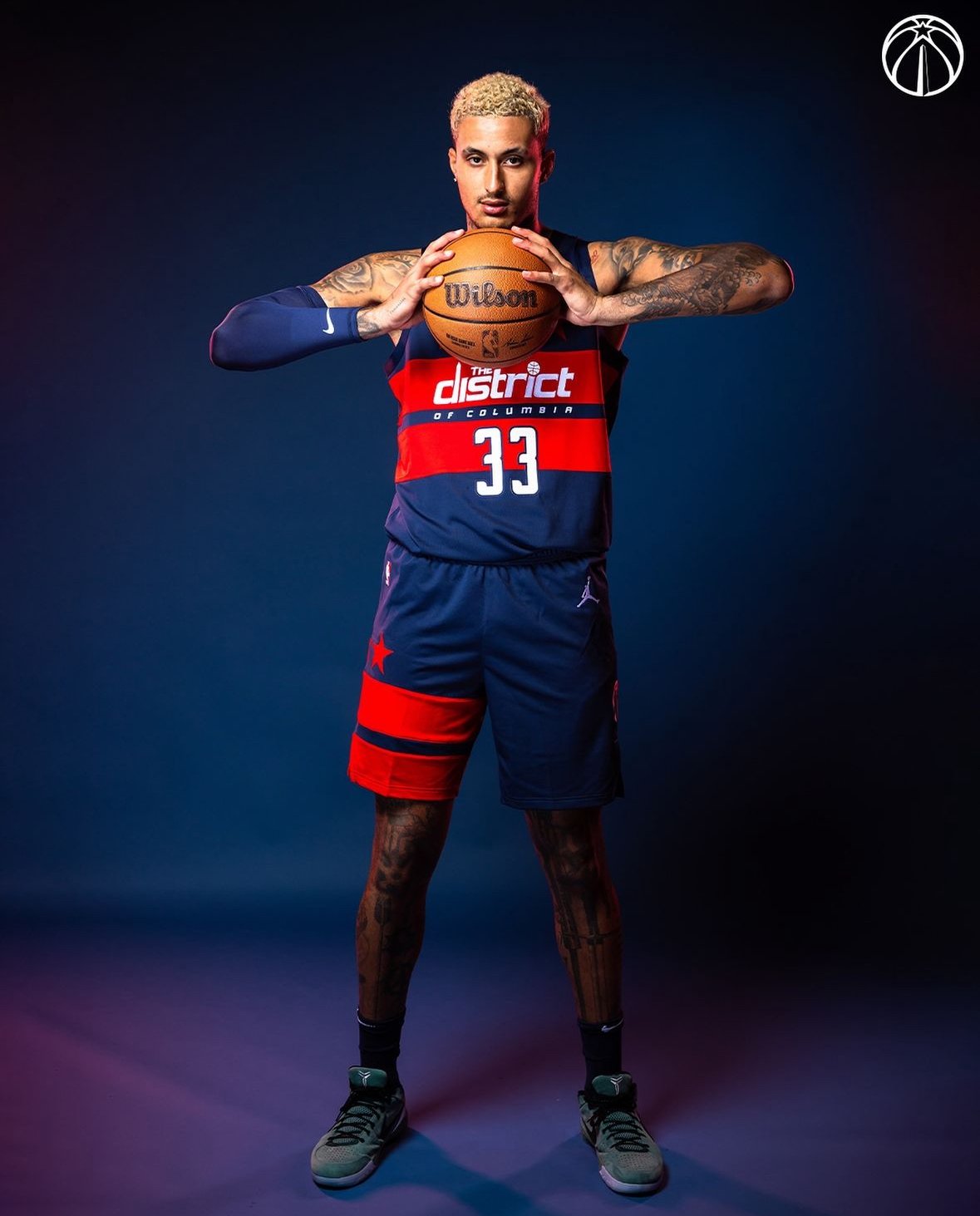
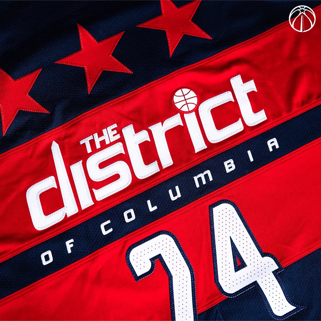
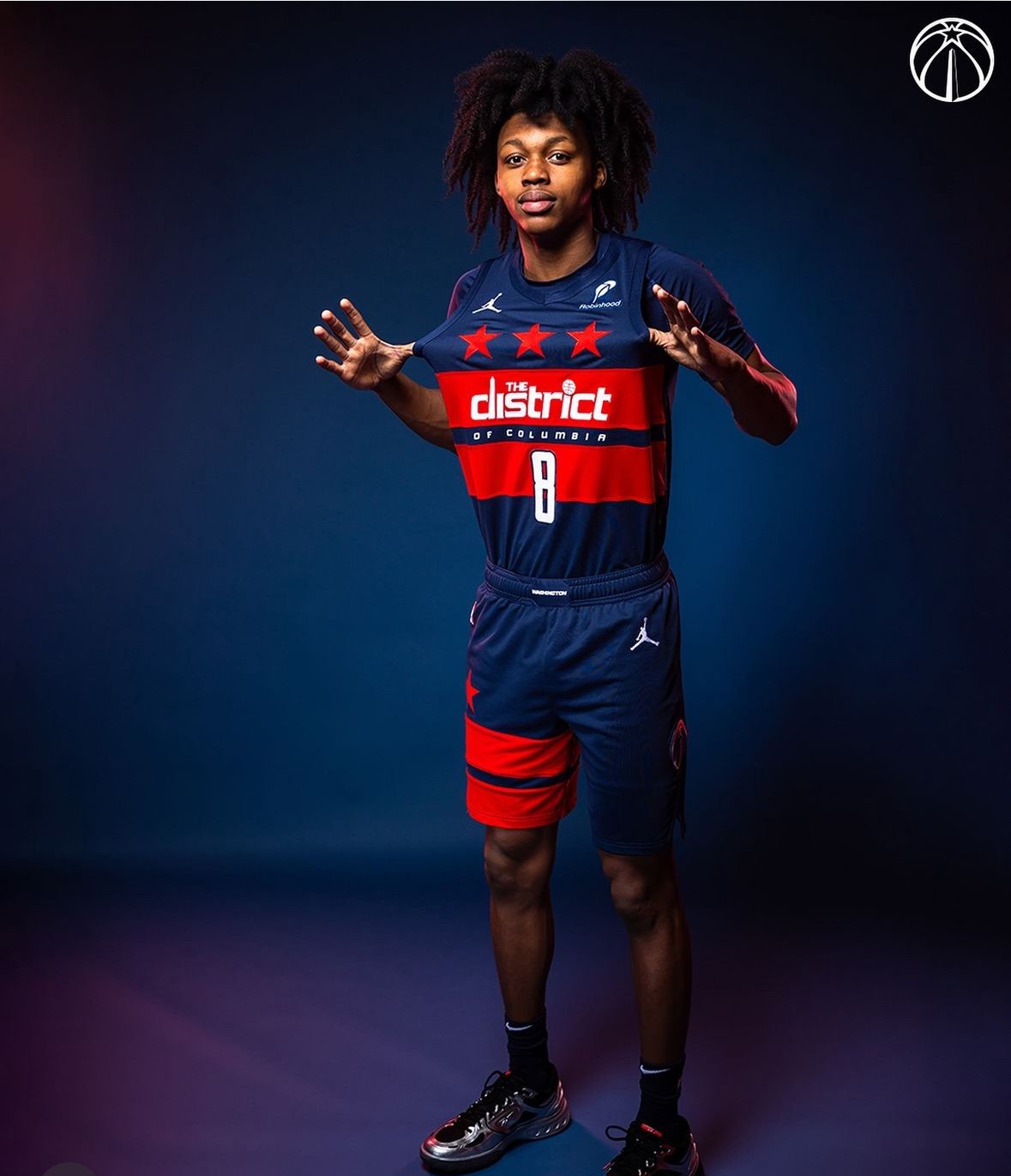
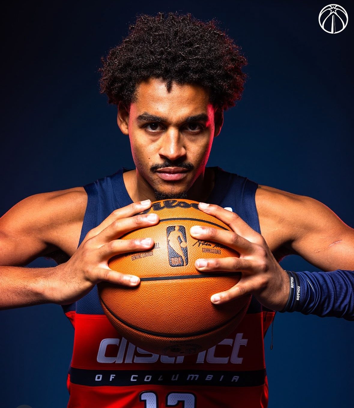
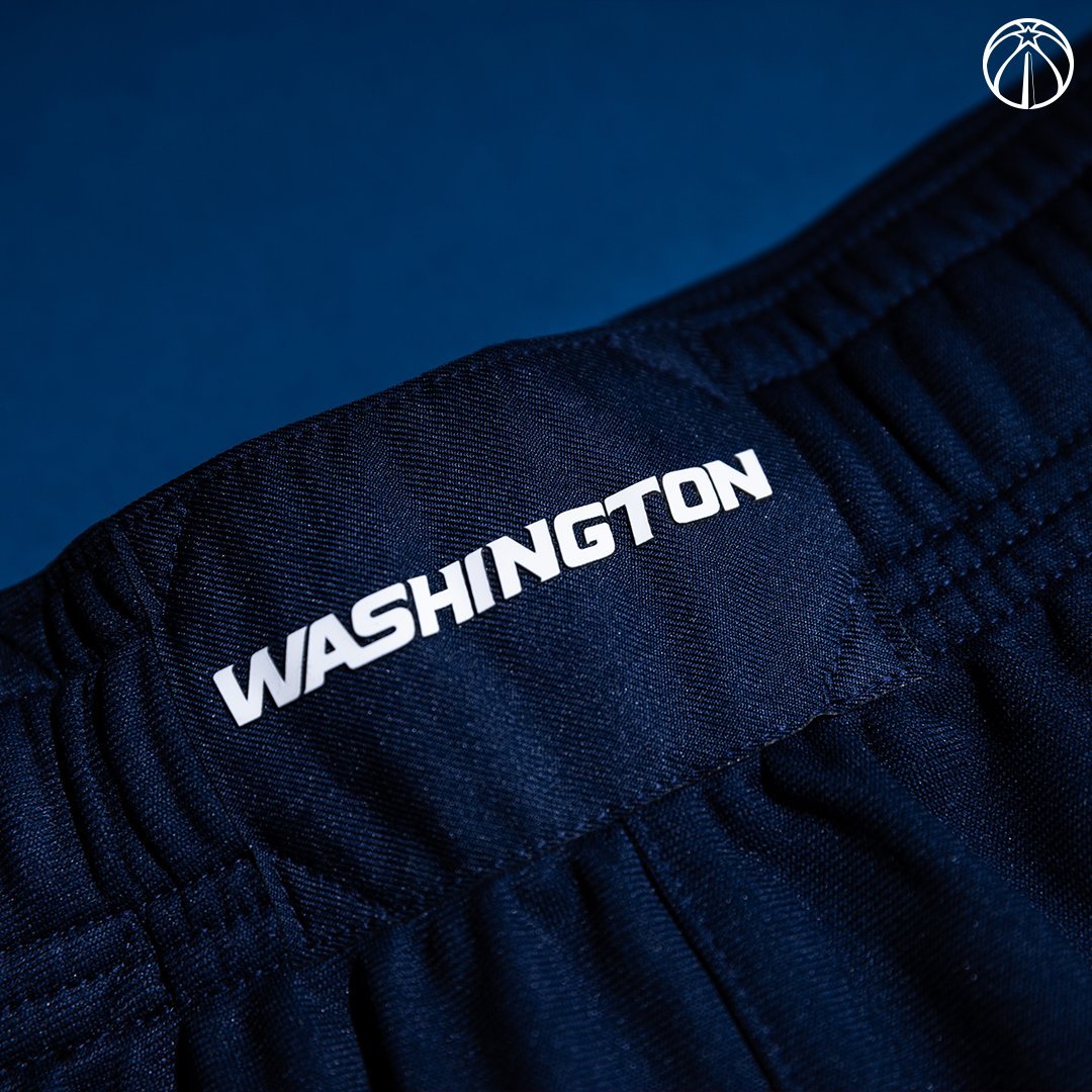
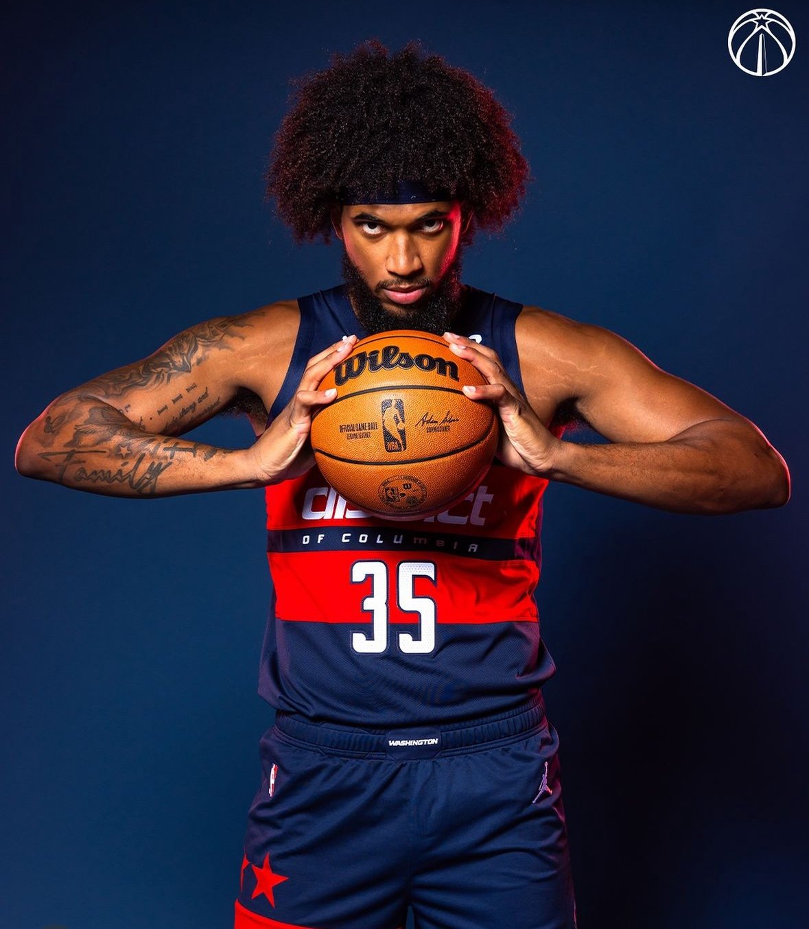
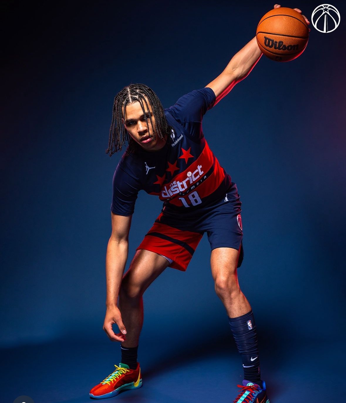
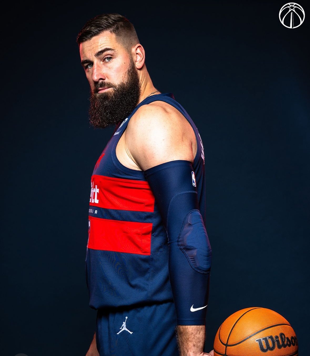
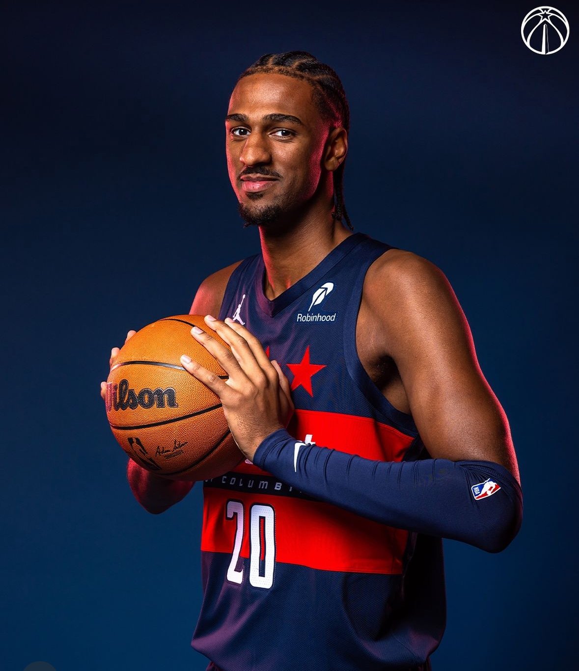
The Washington Wizards have introduced a fresh new look for the 2024-25 season with their “Beyond Boundaries” City Edition uniforms. Building on the “boundary stone” theme introduced last season, this new uniform celebrates Washington, D.C.'s historic legacy and boundary-breaking spirit, with an emphasis on a future without limits. With a bold "hydrogen blue" base and thoughtful details that connect the past and the present, the Wizards’ latest threads have both a compelling story and a striking appearance.
The “Beyond Boundaries” uniform pays homage to Benjamin Banneker, the African American mathematician and astronomer who, in the 18th century, placed 40 stone markers around Washington’s original boundary. Last season’s uniform honored Banneker’s work, and this year’s design extends the theme with updated colors and patterns. The timing of the uniform’s unveiling on Banneker’s birthday highlights the Wizards’ commitment to honoring his legacy.
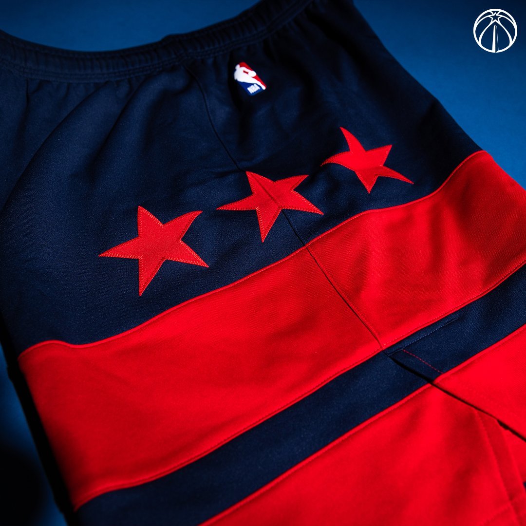
Six stars appear down the side of the jersey, with three representing Banneker’s triangulation of the first boundary stone, tying back to his mathematical contributions. The blue ripple effect on the trim further symbolizes the movement and energy that defines D.C., radiating out to the greater DMV area.
One of the most noticeable elements is the unique “hydrogen blue” color—a shade that has never before appeared on an NBA uniform. According to the Wizards, the color represents the energy and flow that D.C. brings to the region, capturing the city’s vibrant and evolving character. This “hydrogen blue” is complemented by the ripple effect pattern along the trim, creating a visual link to the powerful impact that Washington has had and continues to have on the surrounding areas.
The jersey’s typography also connects to history. “District of Columbia” is written across the chest in a typeface inspired by 18th-century map lettering, echoing the city’s historical roots. The same font style is used for “DMV” on the buckle of the shorts, grounding the uniform in both city and regional pride.
A remix of the Wizards’ City Edition logo, featuring a boundary stone replacing the Washington Monument, appears on the shorts and connects the uniform’s theme back to the team’s identity. With their new City Edition threads, the Wizards emphasize that "no boundaries can contain us,” merging the city’s groundbreaking history with a modern look for a team that represents the heart of D.C.
The Wizards will showcase the “Beyond Boundaries” uniform 19 times this season, debuting the look on December 1 in a home game against the Dallas Mavericks on a themed court. Fans can look forward to seeing the Wizards celebrate the energy, resilience, and history of Washington, D.C., every time they take the court in these powerful new uniforms.