Posts in Football
Tulane Unveils Mardi Gras-Inspired “King of Mardi Gras” Uniform

Tulane is bringing the spirit of New Orleans to the football field with its latest Mardi Gras-inspired uniform, delivering one of the most detailed designs in the program’s history.

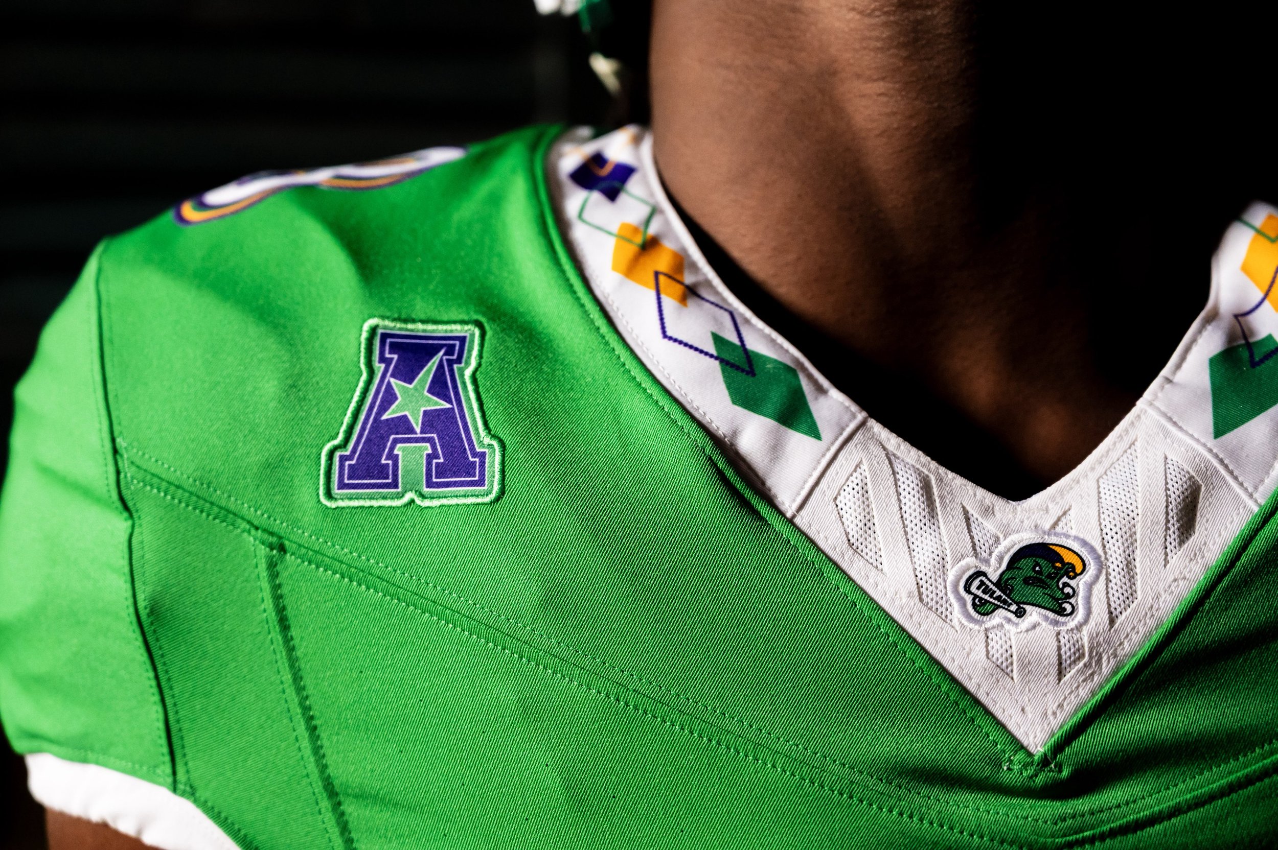
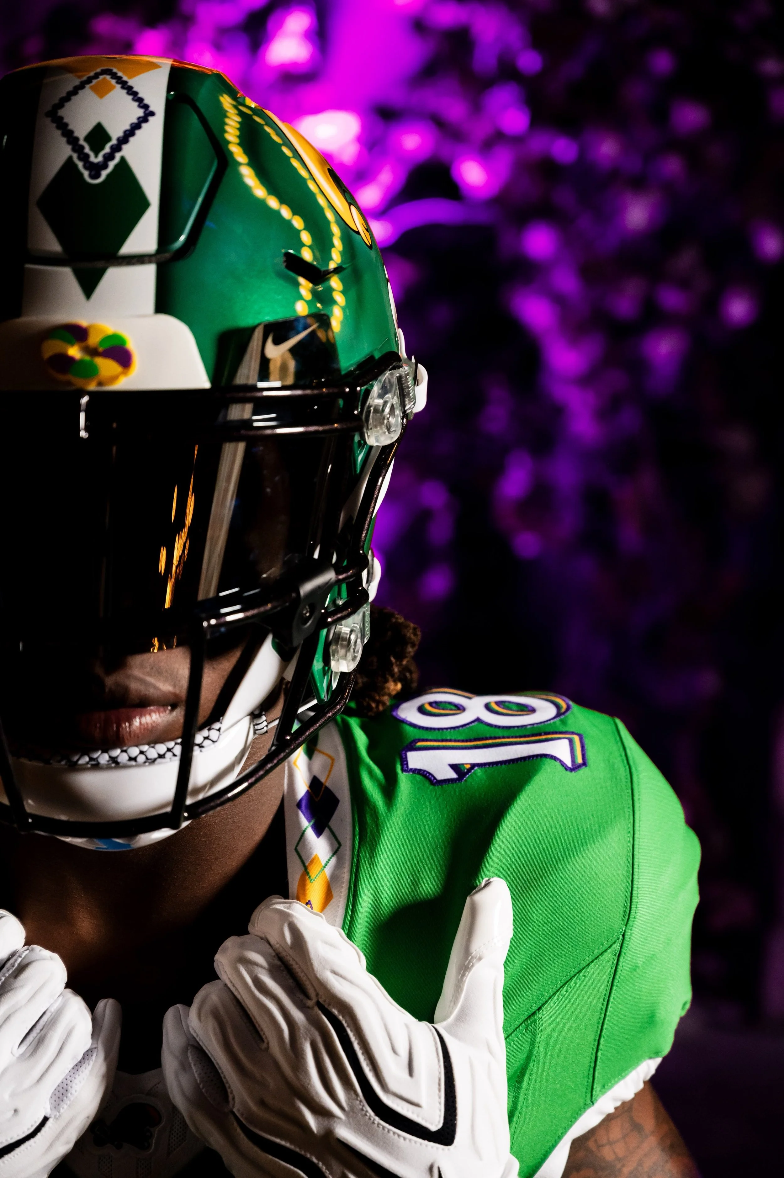
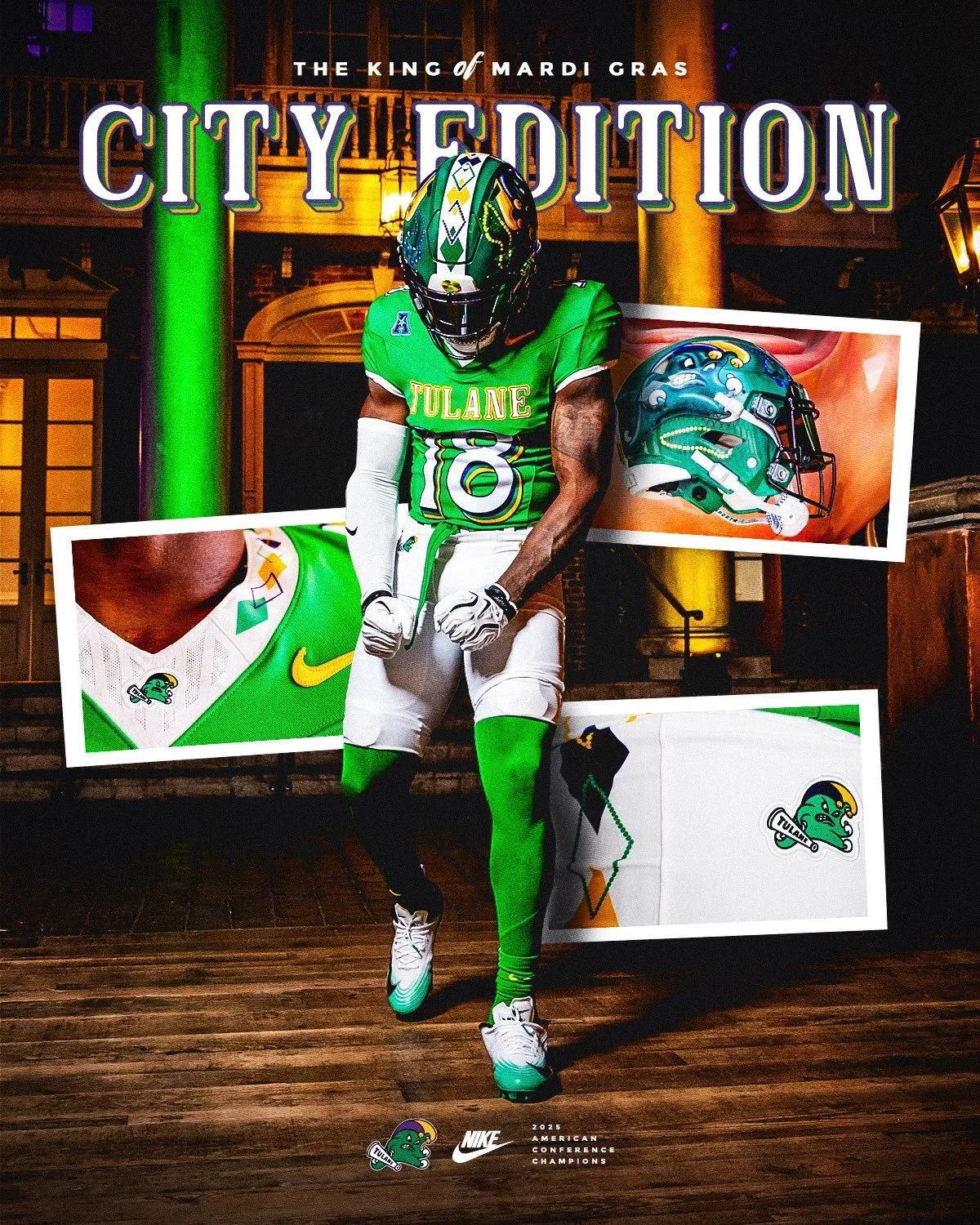
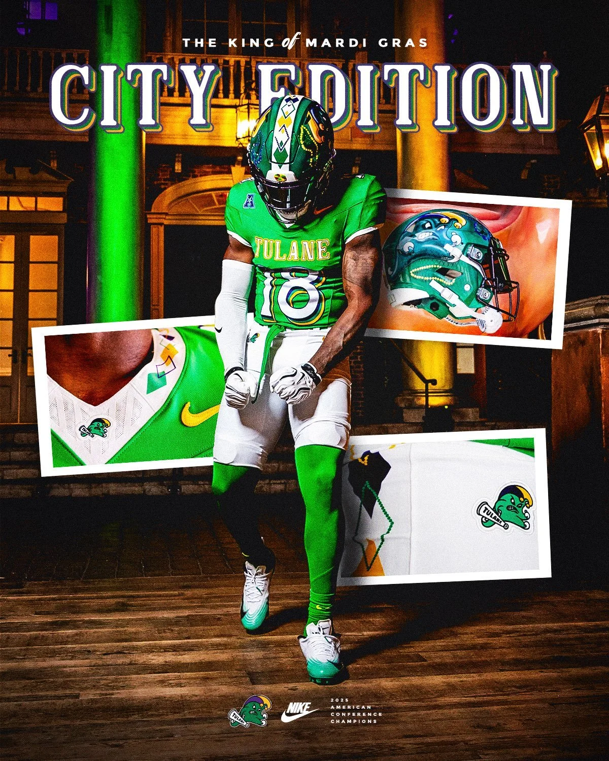
Dubbed the “King of Mardi Gras,” the uniform embraces the city’s iconic purple, green and gold color palette while incorporating a collection of details inspired by Mardi Gras traditions and Tulane football history.

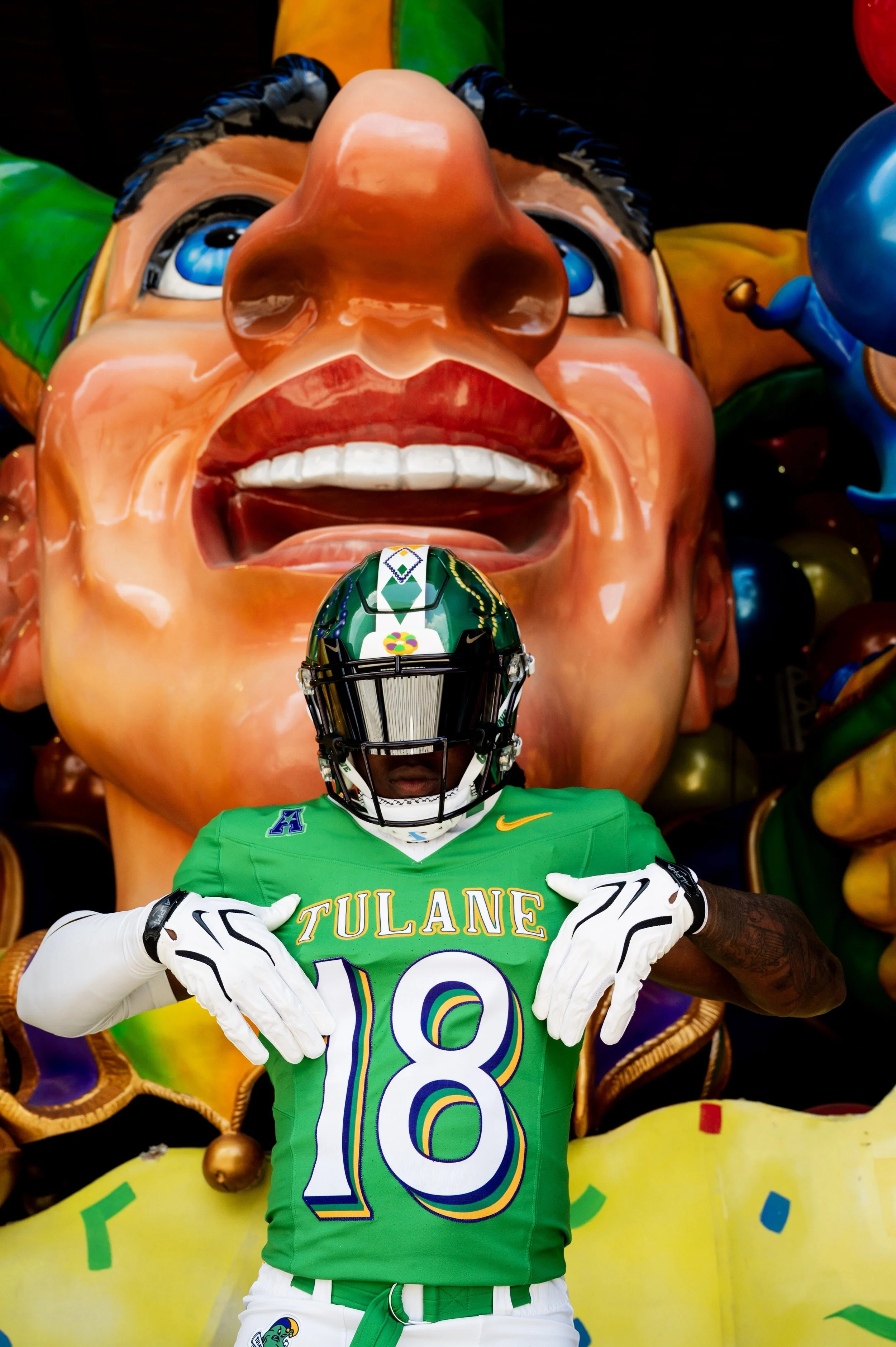
The centerpiece of the uniform is a vibrant green jersey featuring purple, green and gold triple-drop-shadow numberson the front, back and shoulders. The nameplate continues the Mardi Gras theme, with beads hanging from the first and last letters of each player’s name.

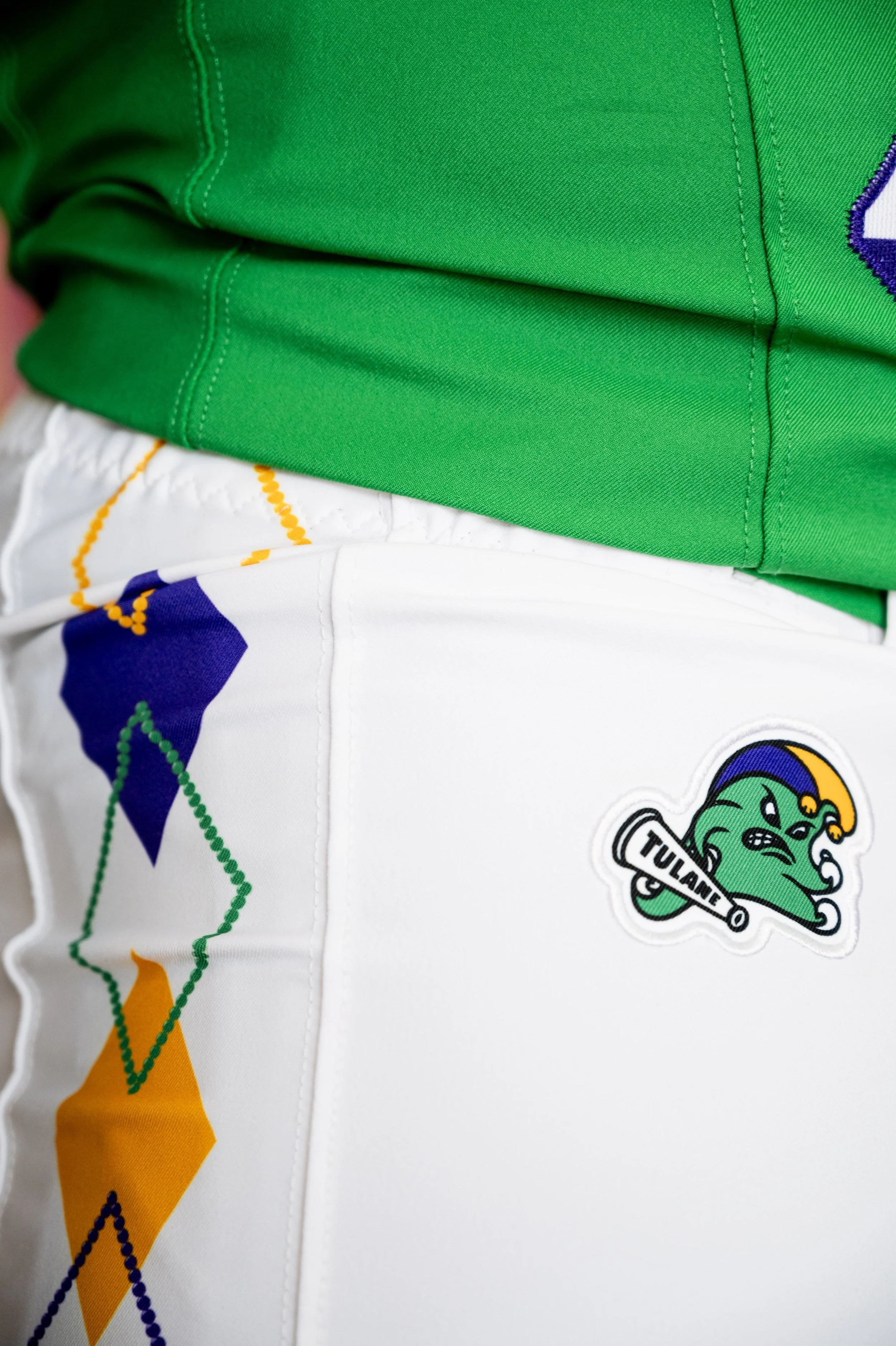
The jersey also introduces the Jester Angry Wave to the collar and pants for the first time. The collar features an argyle pattern inspired by Tulane jerseys from the early 2000s, while the same pattern extends down the side of the pants in alternating purple, green and gold.

The argyle design takes another step forward with an alternating pattern that features one solid diamond followed by a diamond outlined with Mardi Gras beads.

But the helmet might be the biggest statement of the entire uniform.

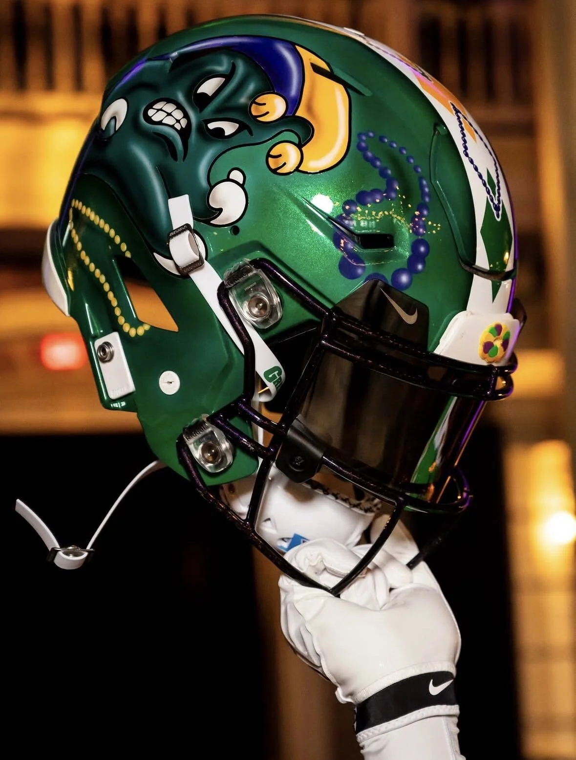
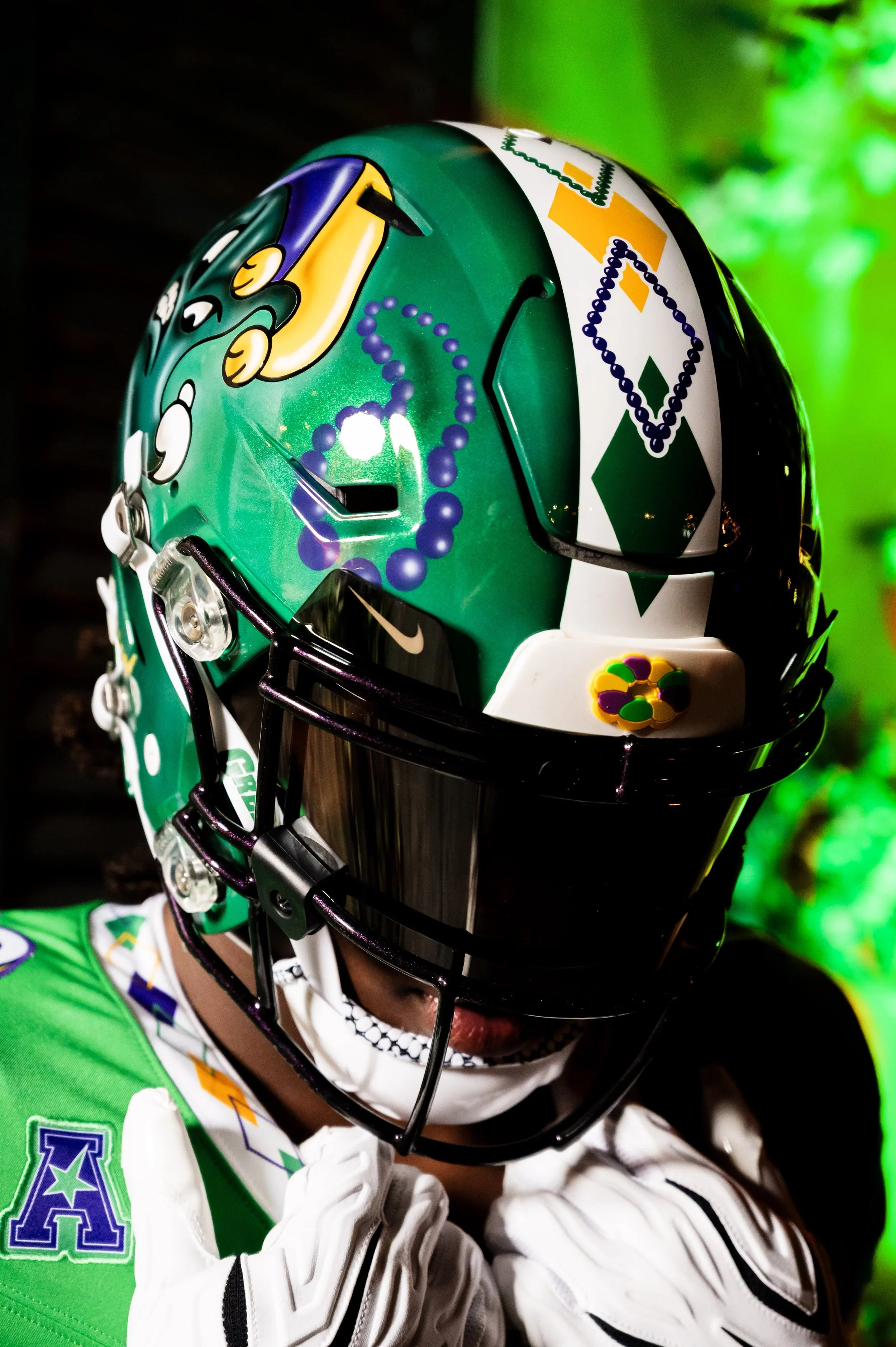
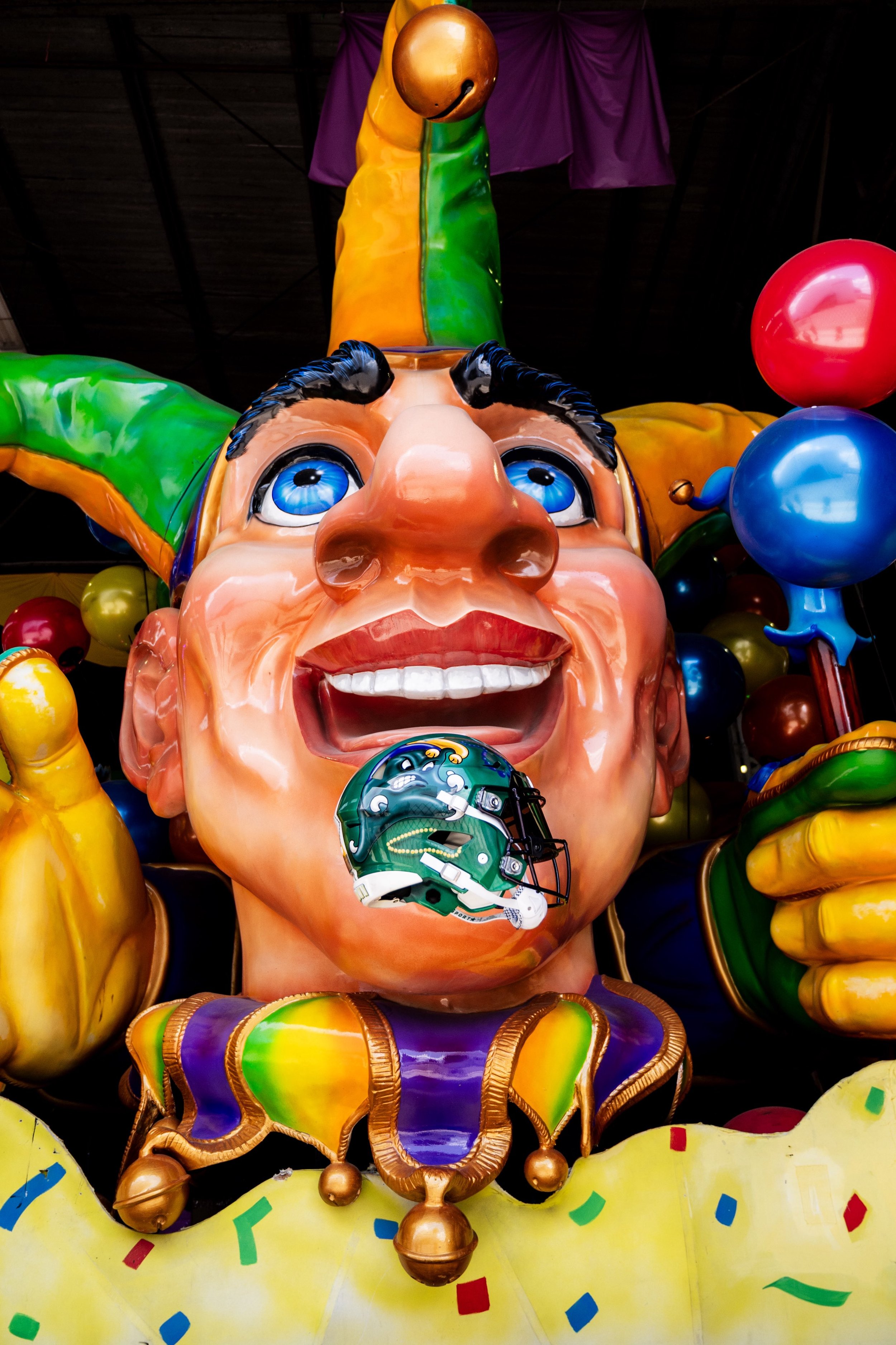
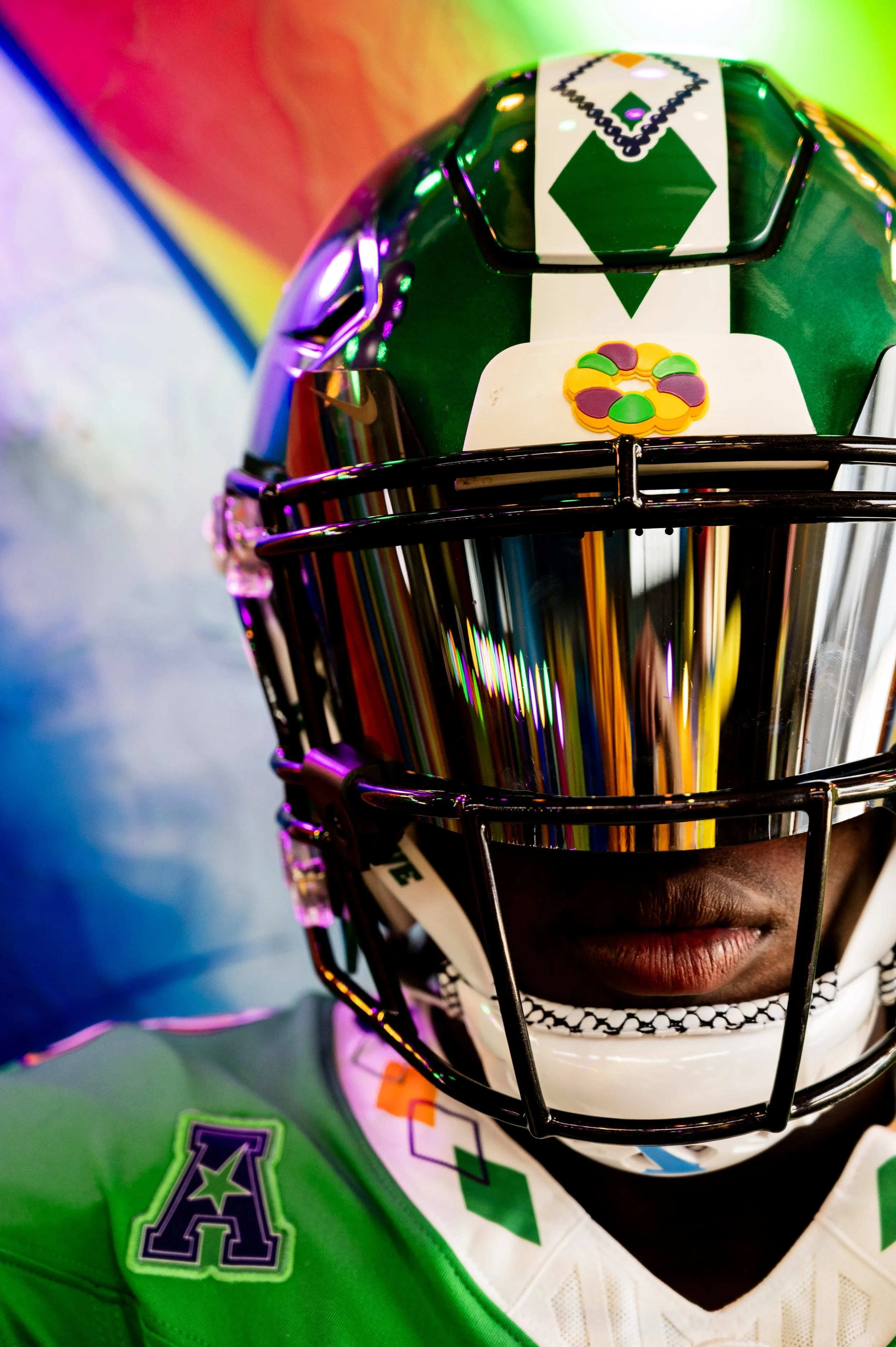
For the first time, the Jester Angry Wave appears on a Tulane football helmet, with the design hand-painted by Armando Villarreal. The helmet uses a Kelly green base and features the Angry Wave prominently on both sides in the style of a classic Mardi Gras float.

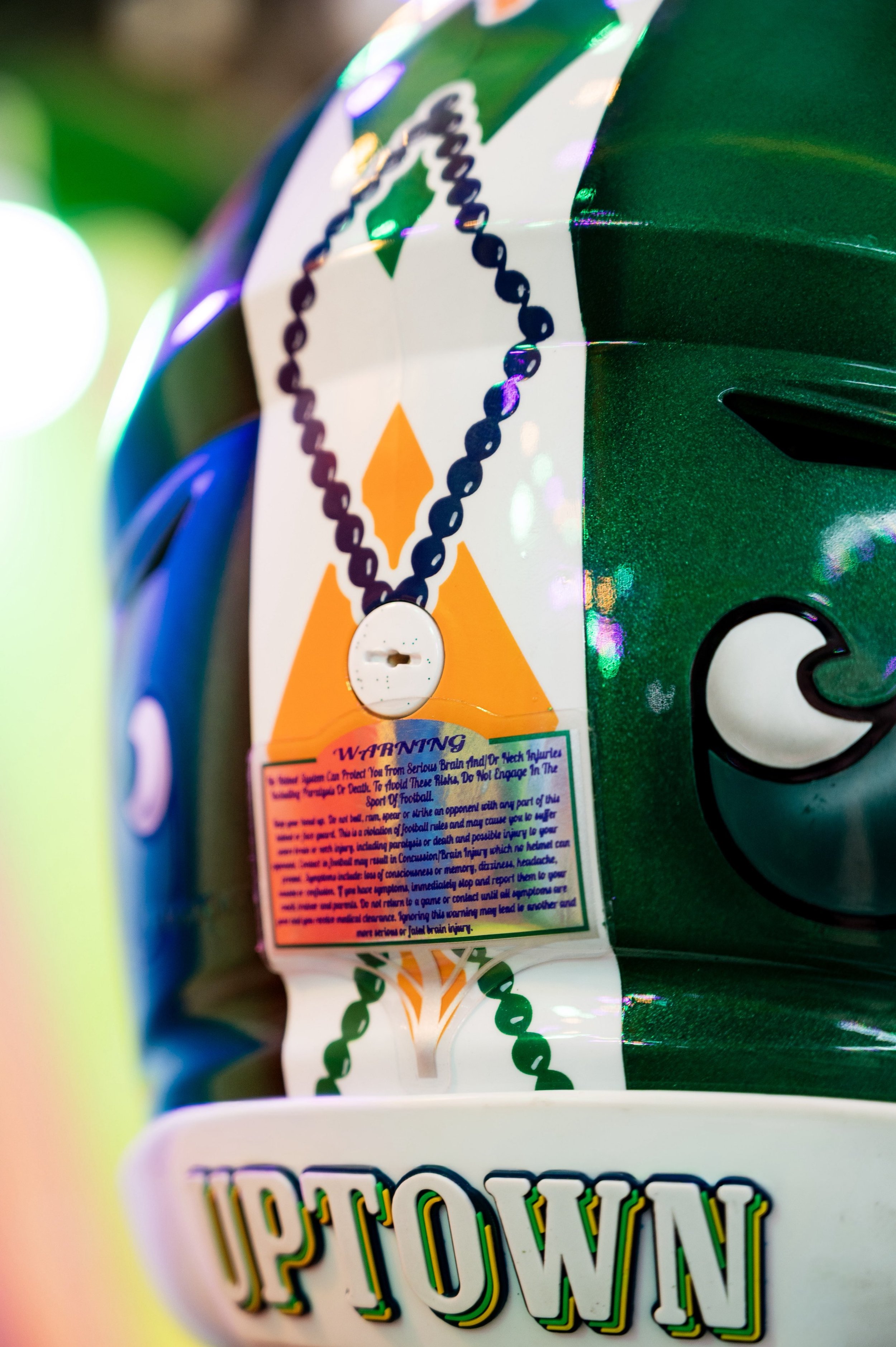
Mardi Gras details continue throughout the helmet, including beads scattered across the design, an argyle stripe running through the middle, and a rear bumper reading “UPTOWN”, a nod to the historic Uptown parade route.

Even the helmet warning sticker gets a Mardi Gras makeover, taking the shape of a traditional Mardi Gras float title sign.

The complete look ties Tulane football directly to the culture of New Orleans, blending the program's history with the colors, characters and traditions that make Mardi Gras unique.

Tulane is bringing plenty of personality to the field with a uniform that feels unmistakably New Orleans and unmistakably Tulane.

SHOP Tulane gear HERE

See What Else Is New

Related Articles


FootballSkye TilsonComment
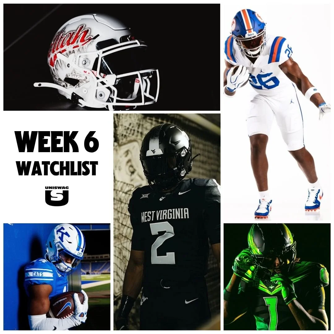
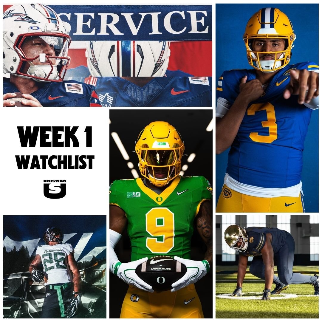
2026 Week 1 UNISWAG Watchlist

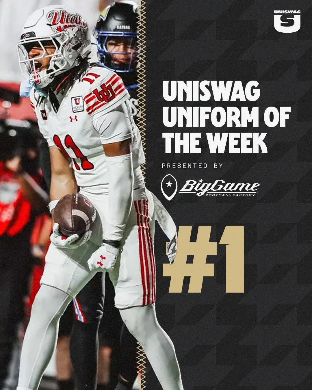
The wait is over. College football is officially back, and so is the UNISWAG Uniform of the Week Countdown.

Week 1 marks the beginning of another season of new uniforms, classic throwbacks, alternate looks and some of the best uniform combinations college football has to offer. With teams across the country taking the field, there will be plenty of fresh looks to keep an eye on throughout the opening weekend.

Each week, UNISWAG will be tracking the best uniform combinations from around the country and narrowing them down to our Top 10. The official Week 1 Top 10 will be revealed Tuesday, leading up to the announcement of the UNISWAG Uniform of the Week.

From the helmets and jerseys to the pants, accessories and overall execution, we'll be looking at the complete uniform combination to determine which teams stood out above the rest.

The 2026 season is officially underway. Who will make the Week 1 Top 10, and which team will take home the first UNISWAG Uniform of the Week award of the season?

Check back Tueday to see who made the cut.

SHOP COLLEGE GEAR HERE


Air Force

BYU

Cal

Utah State

ODU

ucf

Minnesota

grambling state

Utah

Coastal

boise state

ORegon

virginia tech

Colorado

liberty

buffalo

JMU

Notre Dame

Wisconsin

Georgia tech

portland state

louisville

West Virginia

ECU

ASU

Georgia state

Rice

Oregon state

Texas TEch

Cincinnati


See What Else Is New

Related Articles


FootballSkye TilsonComment
Cal Brings Back Joe Roth Era Uniforms for 2026 Season Opener

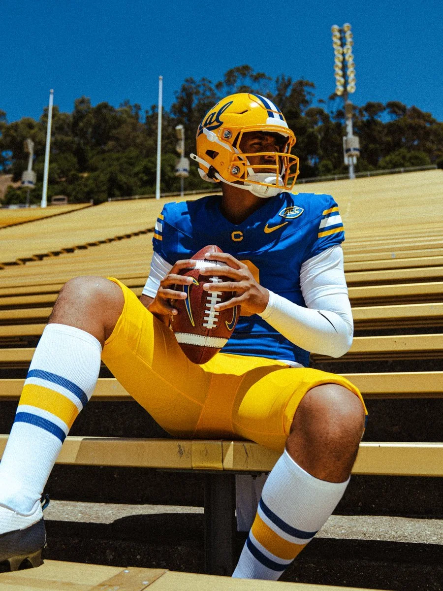
Cal is opening the 2026 college football season by honoring one of the most important figures in Golden Bears history.

The program announced Wednesday that it will bring back its Joe Roth-era uniforms for the season opener against UCLA, reintroducing a classic look with a powerful connection to Cal's history.

Roth was Cal's starting quarterback for two seasons in 1975 and 1976, emerging as one of the top players in the country during his senior season. He finished ninth in Heisman Trophy voting in 1976 before his life was tragically cut short the following year. Roth died from melanoma in 1977 at just 21 years old.

Cal's announcement centered on Roth's legacy beyond what he accomplished on the football field.

The uniforms serve as a tribute to that legacy while bringing back a look from one of the most memorable eras in Cal football.

The choice of UCLA as the opponent makes the return even more meaningful.
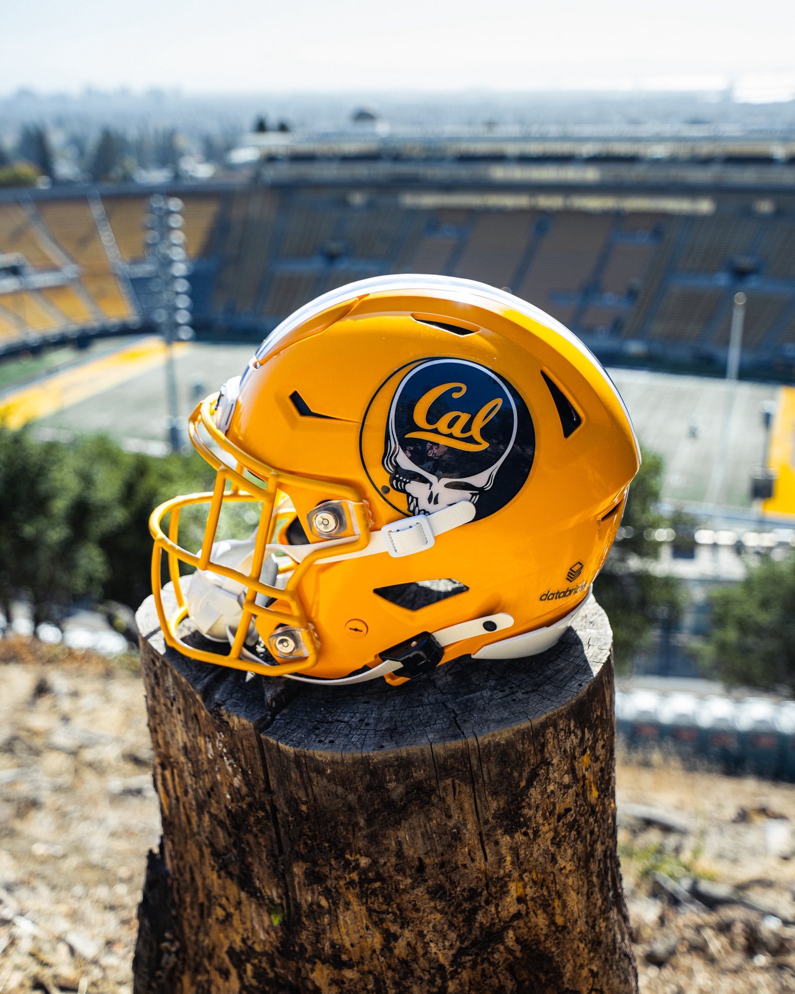
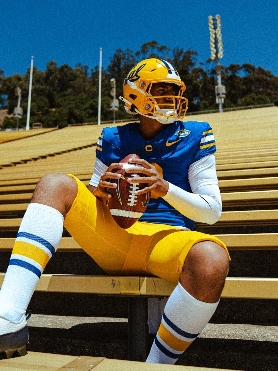
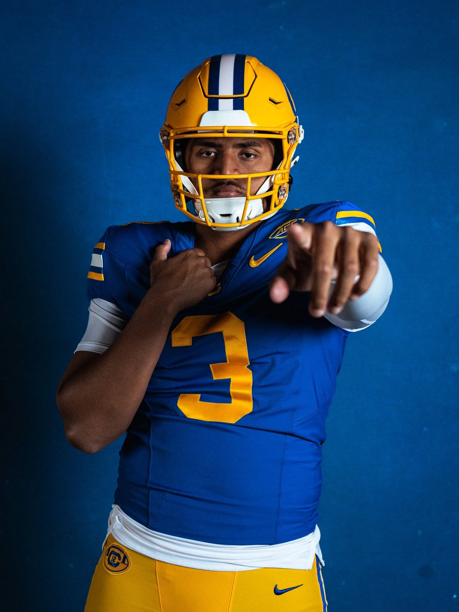
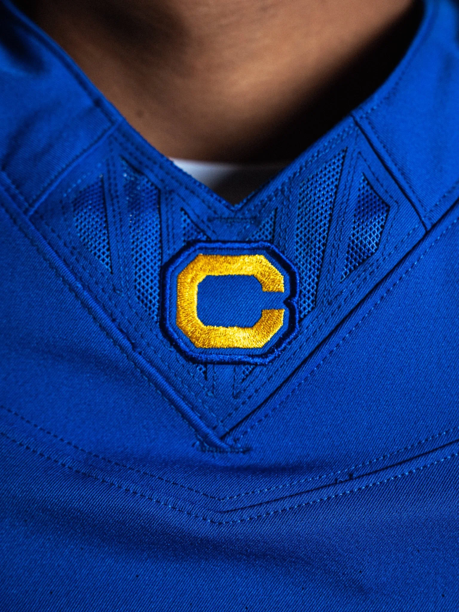
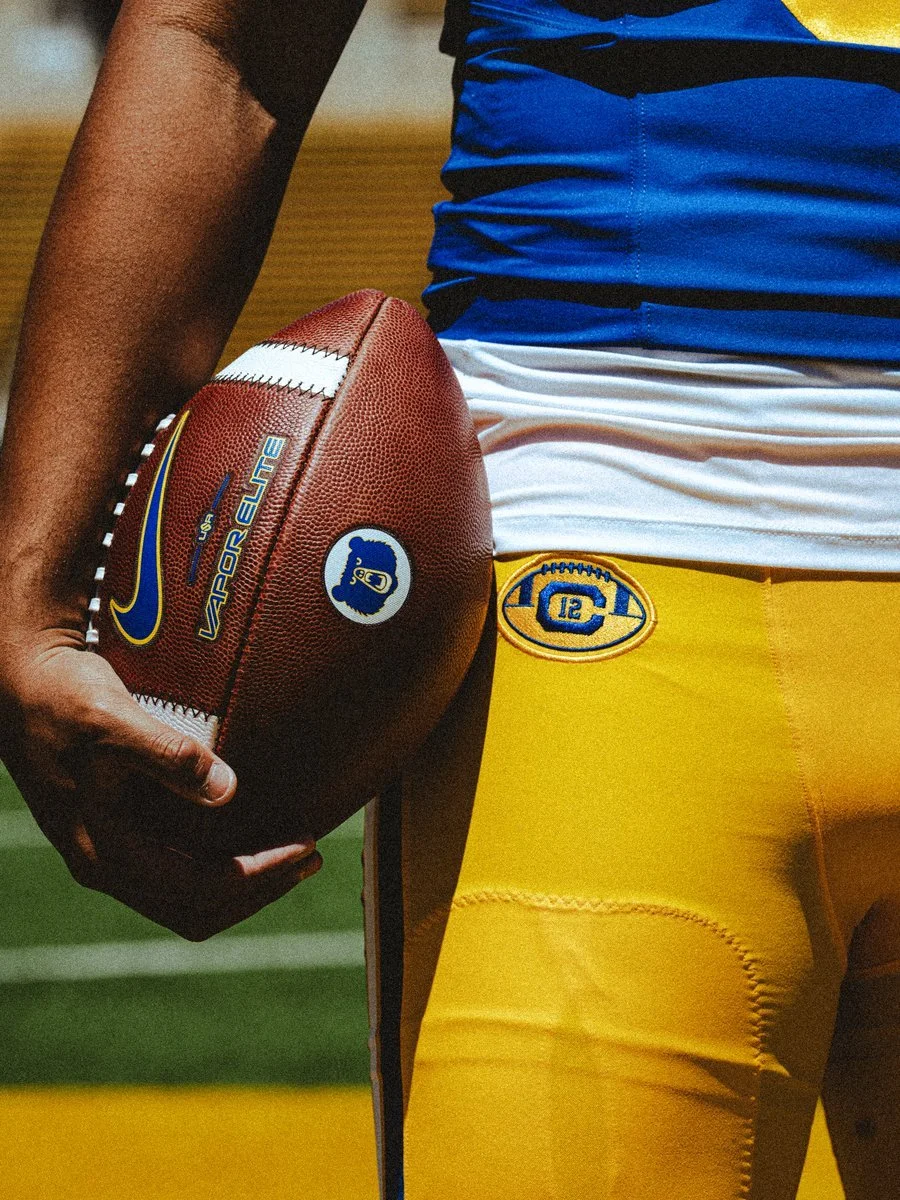
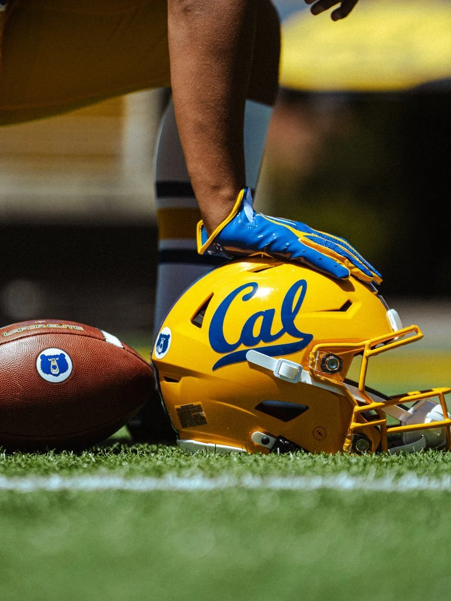
The throwback uniform closely recreates Cal’s 1970s-era look, featuring a classic blue jersey paired with solid gold pants. The jersey includes bold white-and-gold striping on the shoulders and sleeves, a traditional gold “C” centered on the chest, and the vintage Cal script logo prominently featured on the gold helmet. The helmet also brings back the era’s blue center striping, while the gold pants are finished with matching blue-and-white accents for a complete throwback look.
Cal has historically worn its Joe Roth throwback uniforms for its annual home matchup against either UCLA or USC. The tradition dates back to the programs' days together in the Pac-12, when those matchups were regular fixtures on the schedule.

Joe Roth's legacy returns to the field when Cal opens the 2026 season against UCLA.

SHOP Cal gear HERE


See What Else Is New

Related Articles


FootballSkye TilsonComment
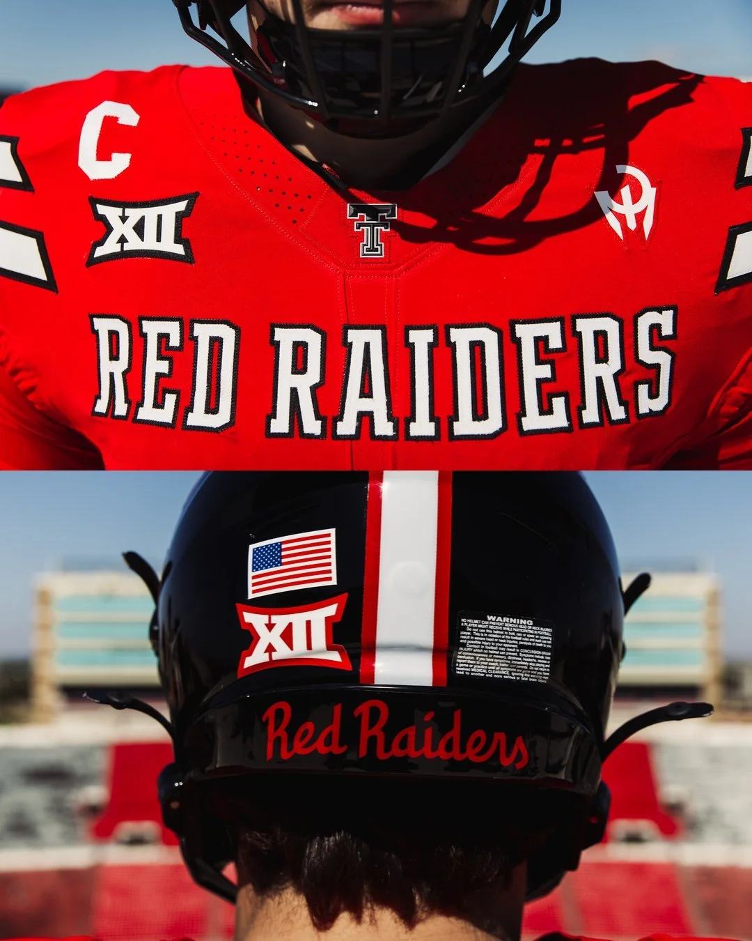
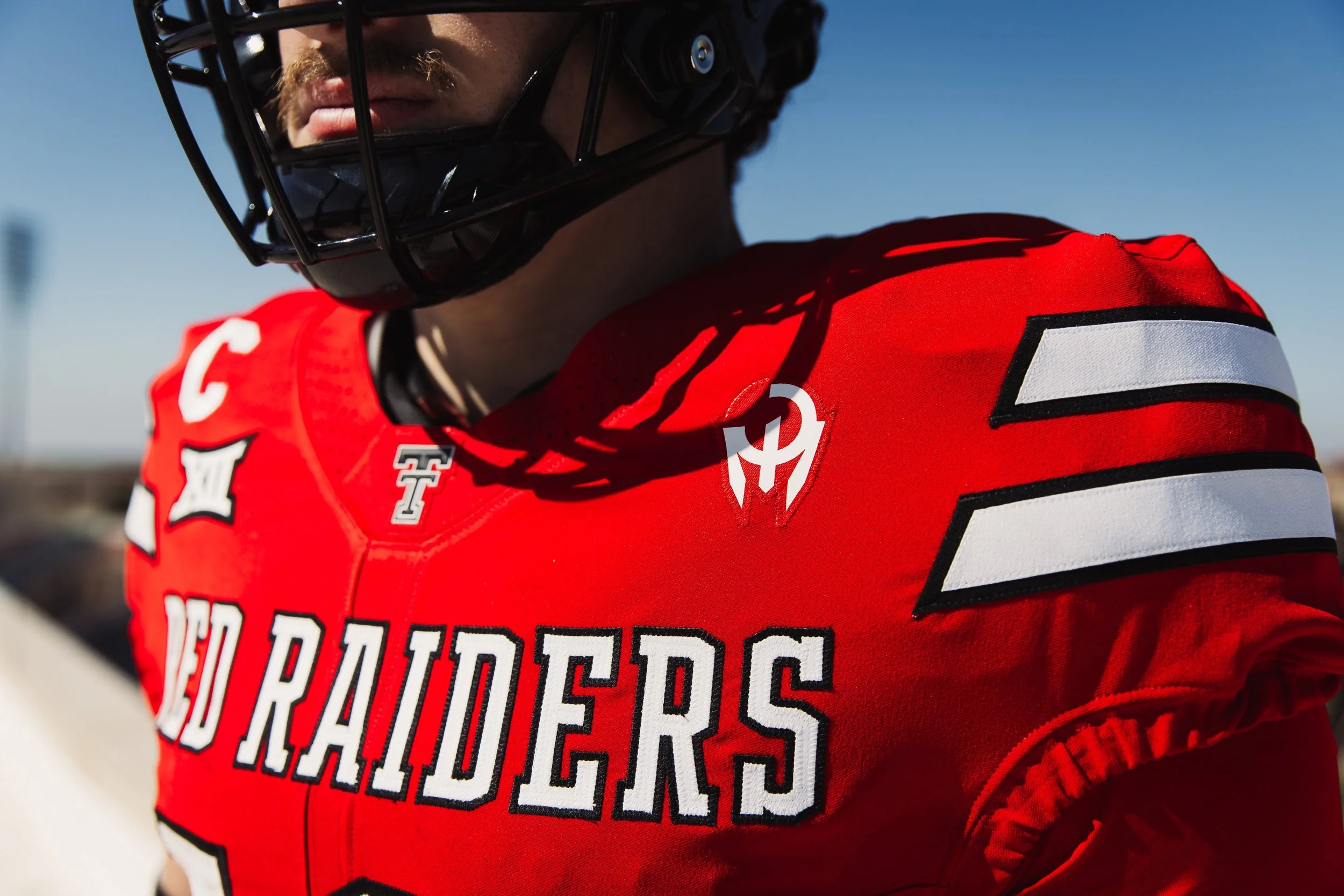
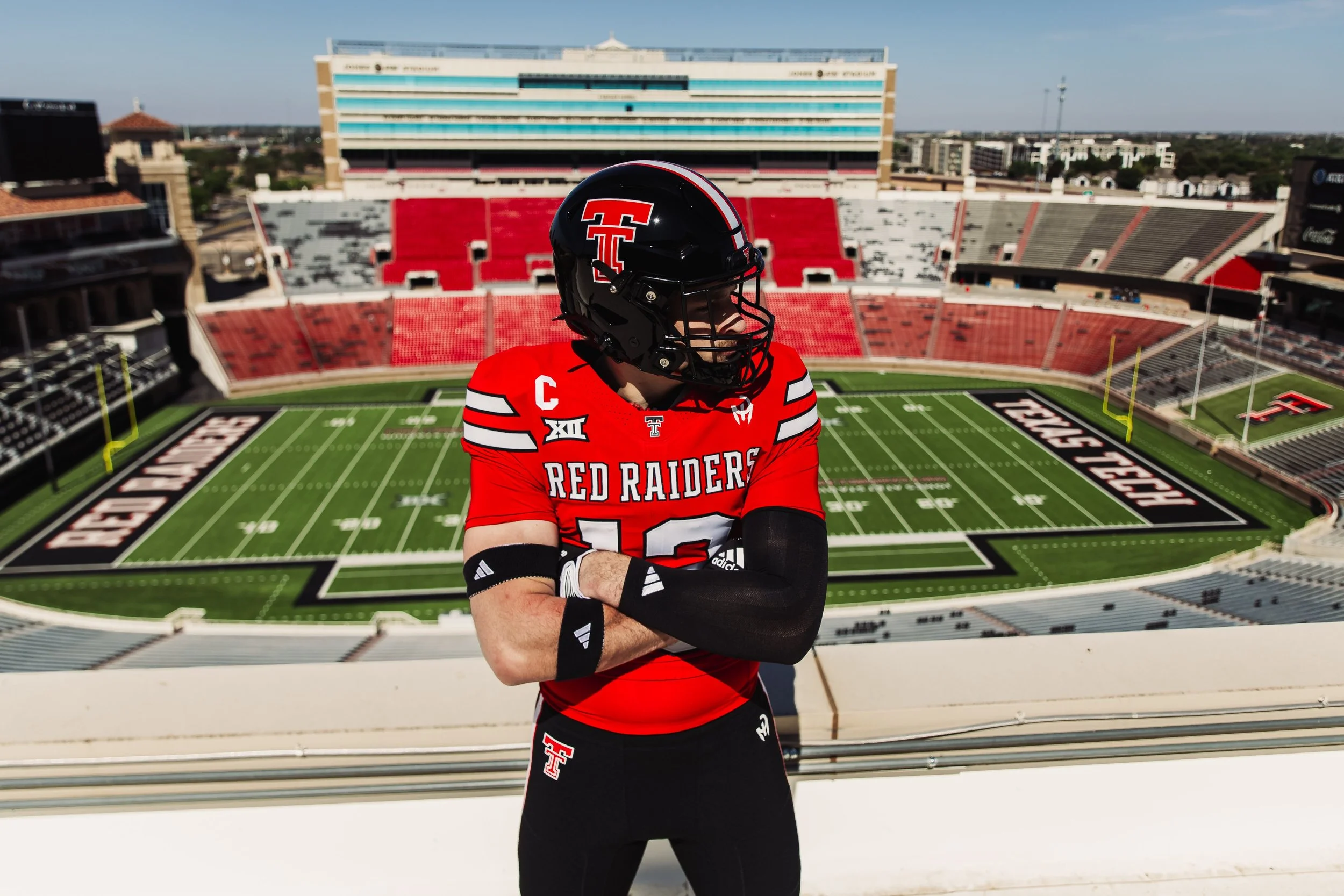
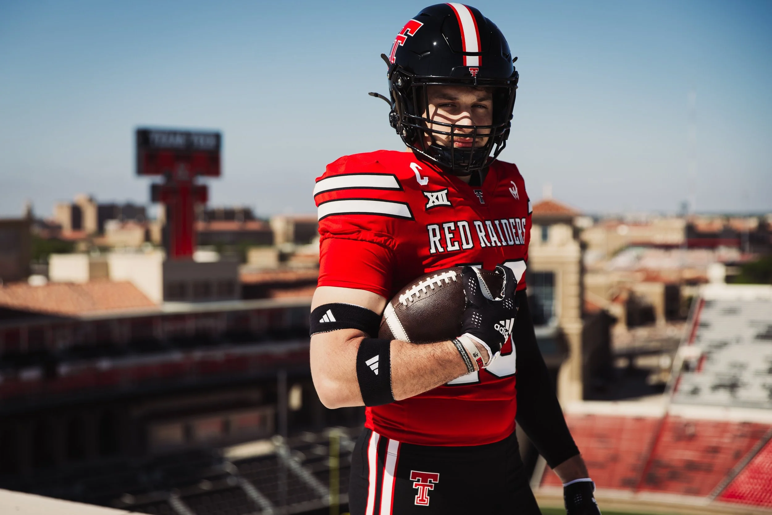
Texas Tech Red Raiders Unveil New Patrick Mahomes Uniforms for 2026

The Texas Tech Red Raiders have officially revealed their first new football uniform combination for the 2026 season, and while the rollout was more teaser than full unveiling, the details have already generated plenty of conversation.

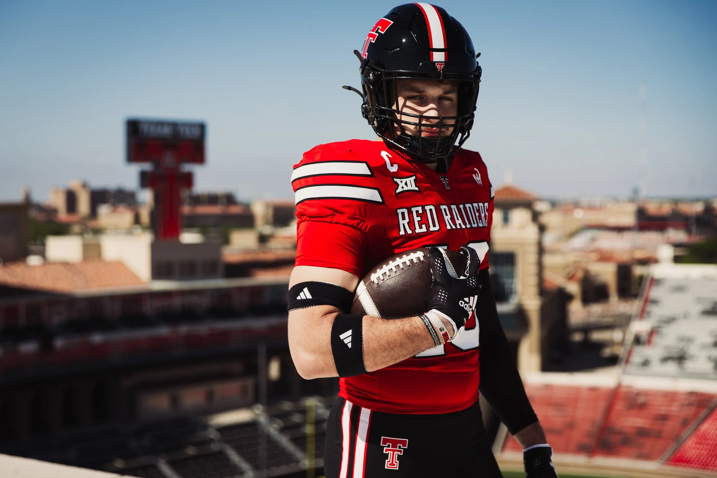
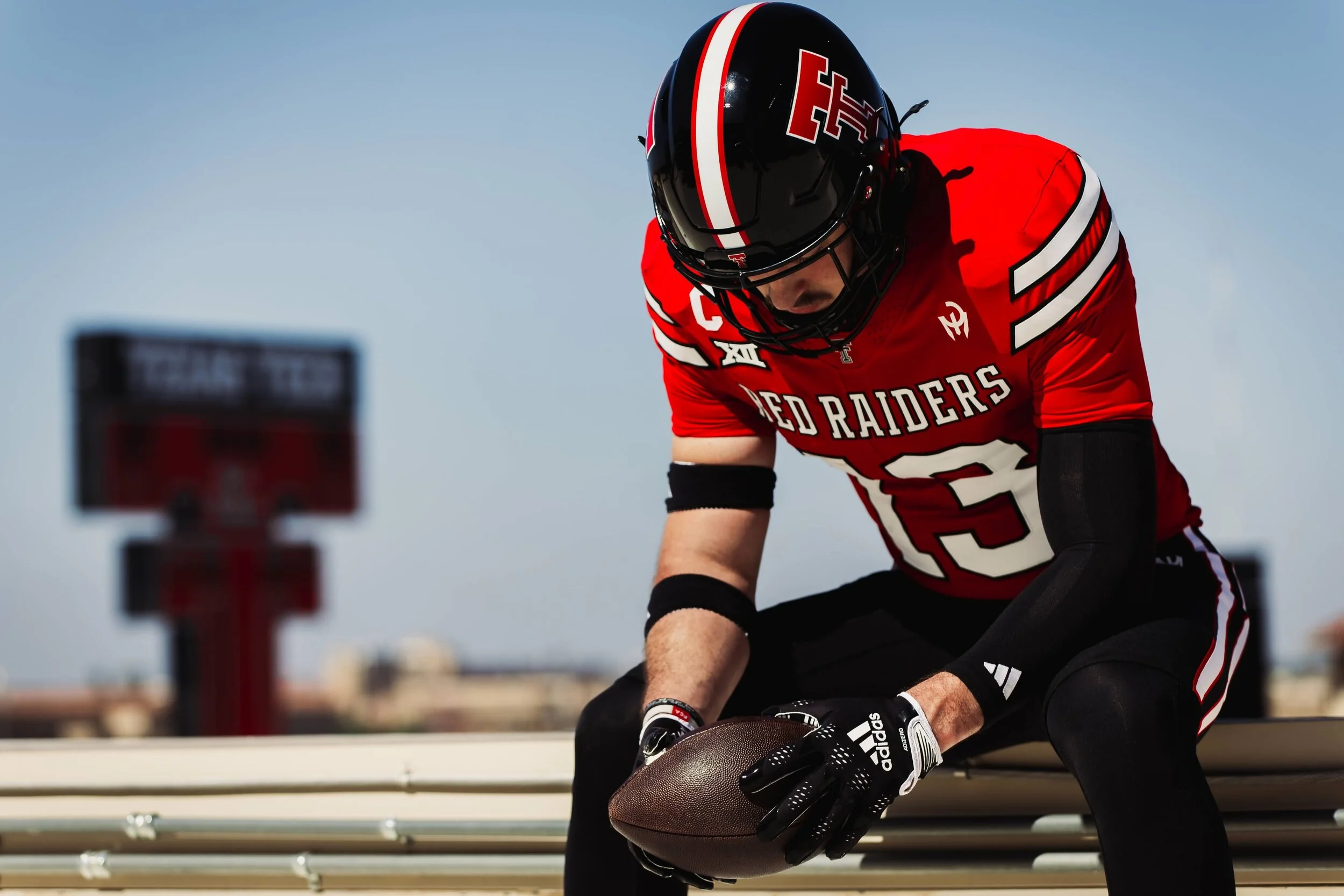
The uniform combination showcased in the reveal featured a black helmet, red jersey, and black pants, a classic Texas Tech look that remains one of the strongest combinations in the program's rotation. While the overall color scheme remains familiar, several key design updates stand out.
Most notably, Texas Tech alum and Kansas City Chiefs quarterback Patrick Mahomes' signature "Gladiator" logo now appears on the jersey and pants in place of traditional adidas branding. The reveal also showcased the university's modernized Double T logo, further emphasizing the program's evolving visual identity.

The inclusion of Mahomes' logo is another major step in the growing relationship between Texas Tech, adidas, and the three-time Super Bowl champion.

Since Texas Tech and adidas entered into their landmark partnership in 2024, Mahomes has played a significant role in the collaboration. The partnership led to the creation of the Team Mahomes NIL program and annual special-edition uniform projects, including the popular "Too Cold" alternate uniforms.

With the 2026 season approaching, Texas Tech's latest reveal only adds to the anticipation for what could still be a much larger uniform rollout ahead.

SHOP texas tech gear HERE


See What Else Is New

Related Articles


Wisconsin Unveils Special Lambeau Field Uniforms

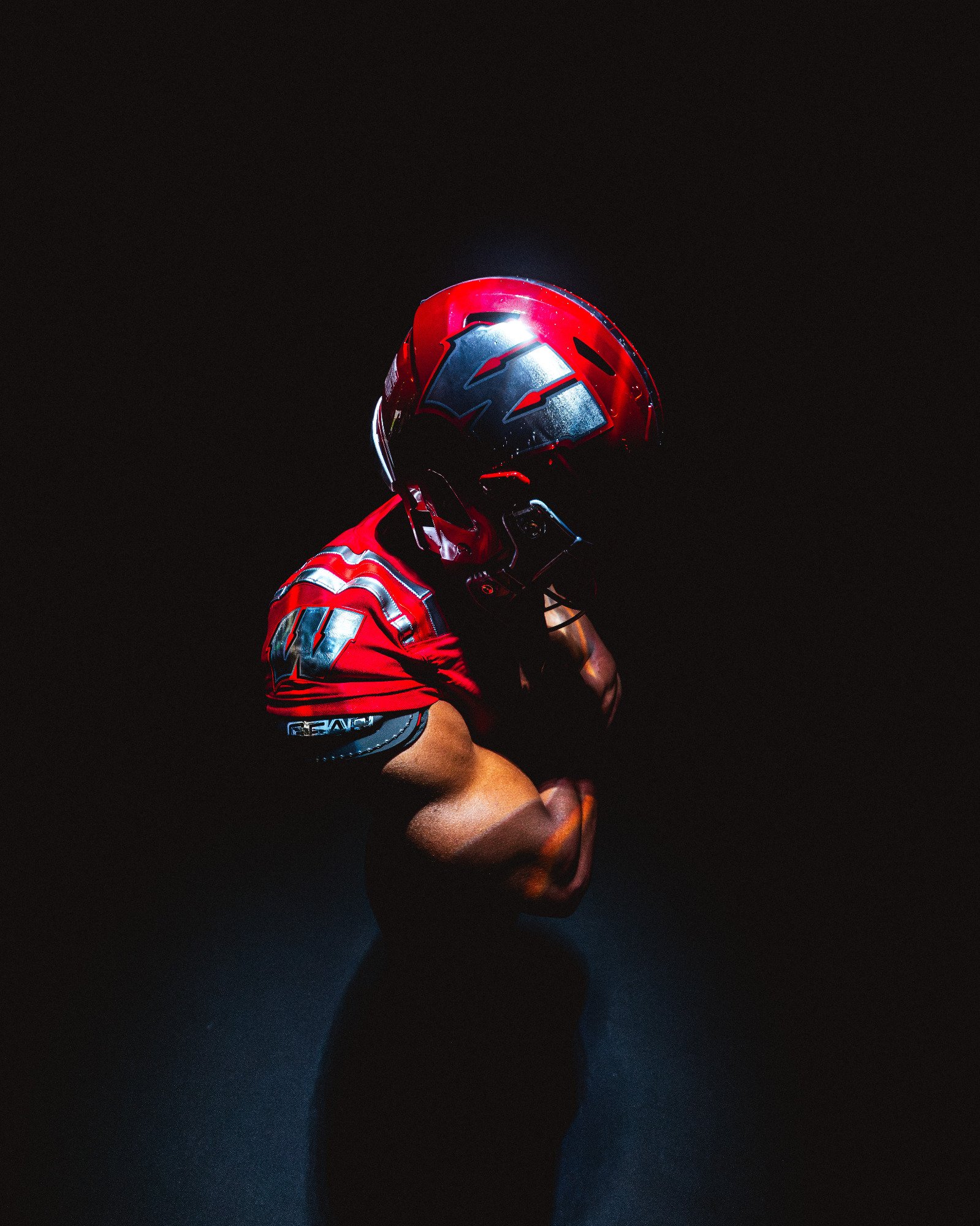
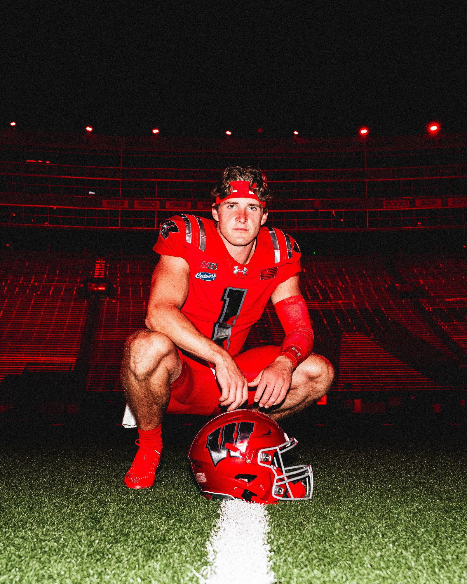
The Wisconsin Badgers are opening the 2026 season in style. Ahead of their highly anticipated matchup against Notre Dame on Sunday, September 6, at Lambeau Field, Wisconsin has unveiled a special edition uniform that pays tribute to the rich football history shared between the University of Wisconsin and the Green Bay Packers.

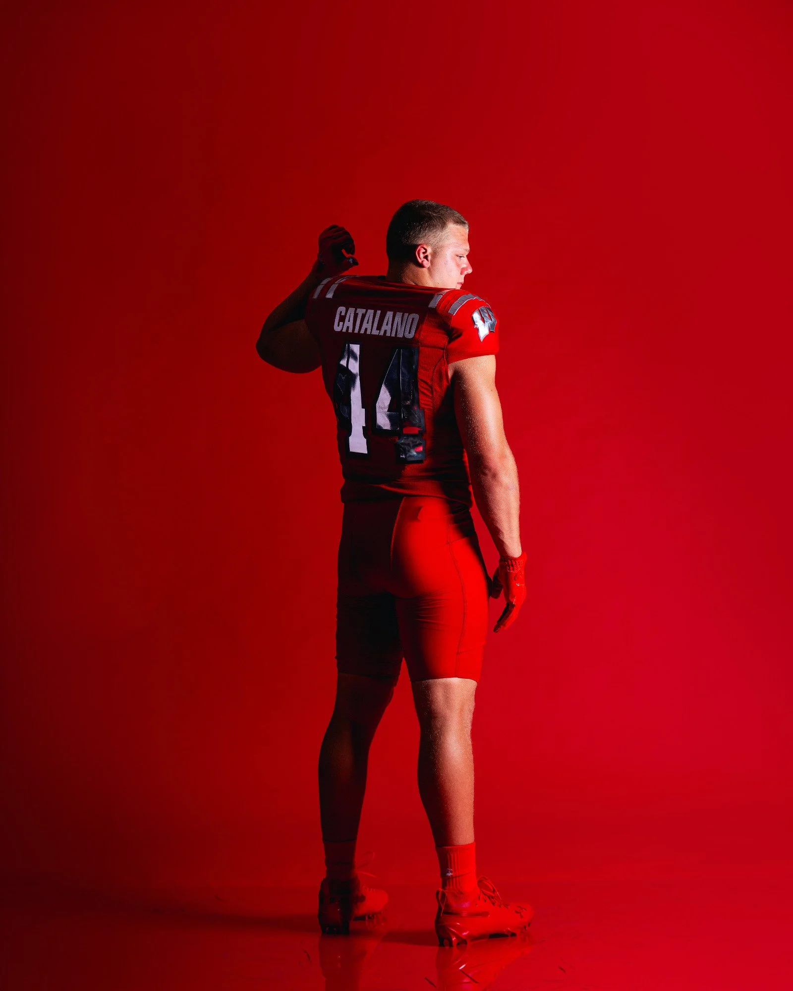
The concept celebrates two of the most iconic football venues in the country, Camp Randall Stadium and Lambeau Field, bringing together generations of championship tradition in one bold uniform. For the occasion, the Badgers are going all red.

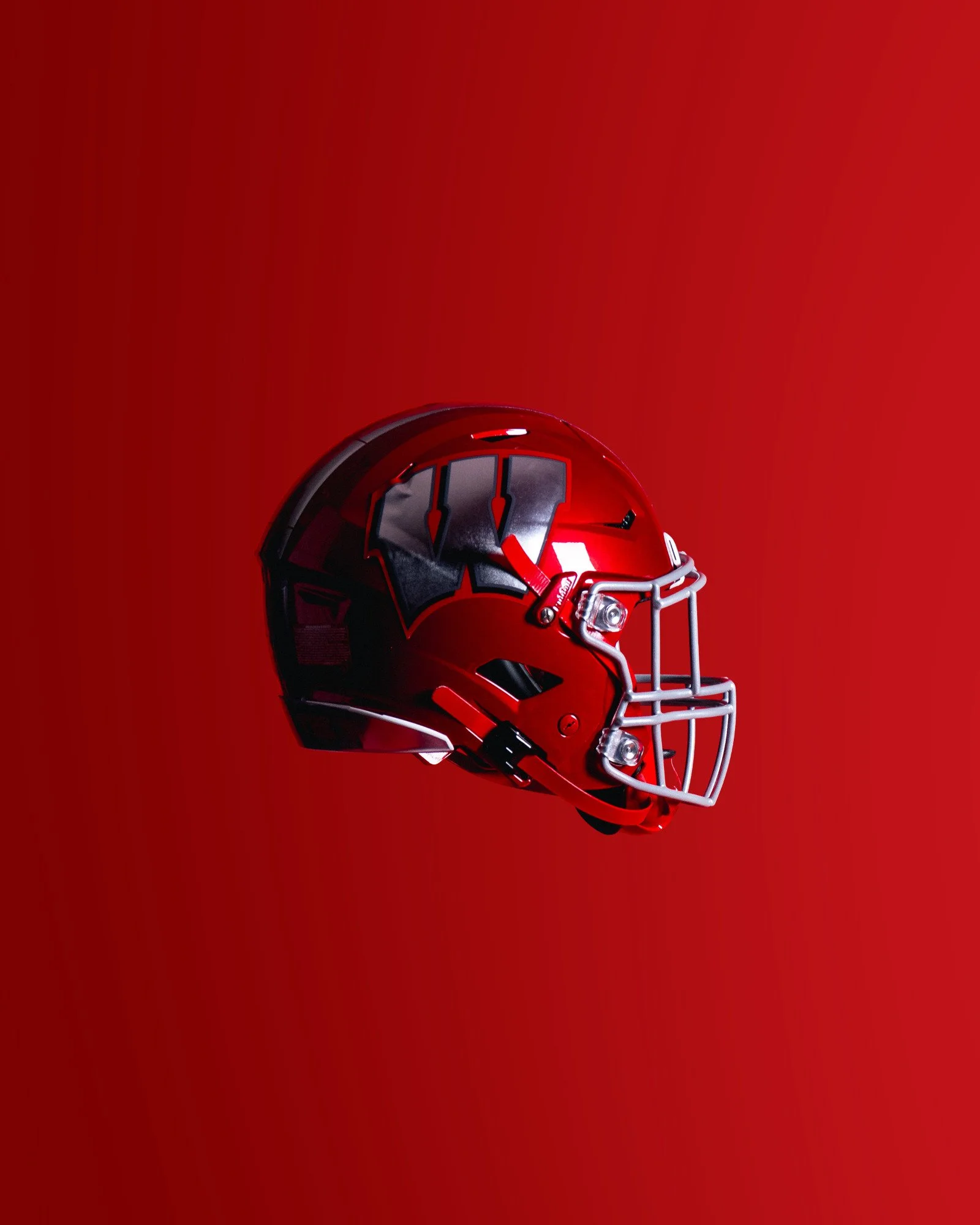
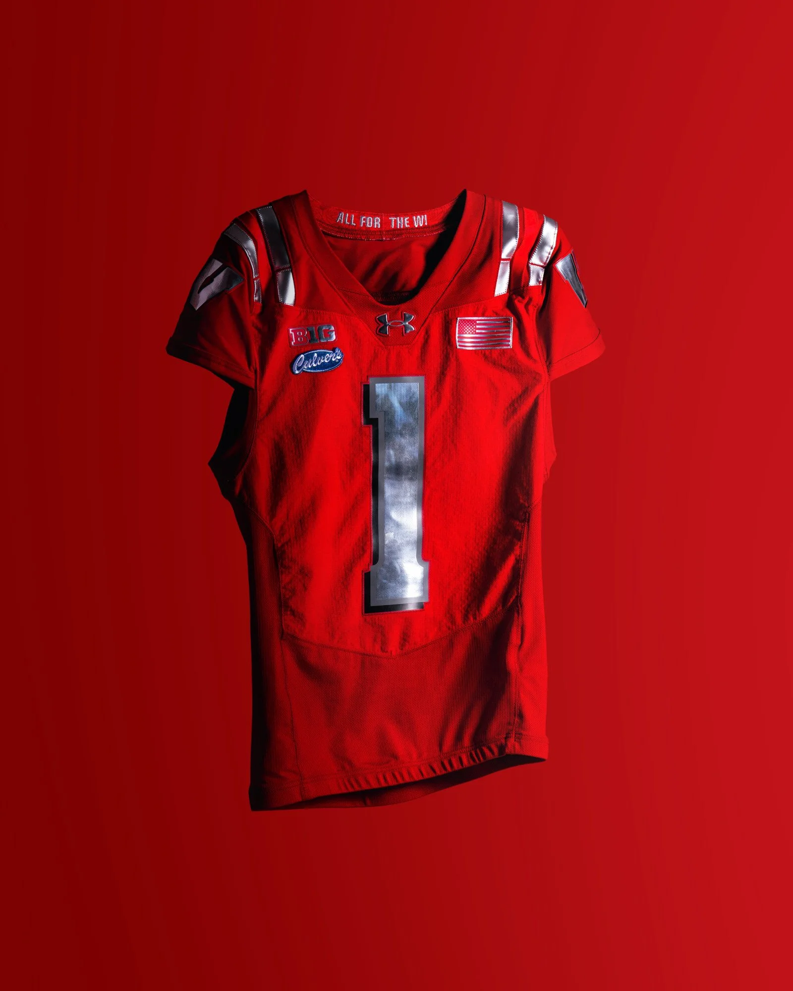
The monochromatic look features a striking red helmet, jersey and pants, creating one of Wisconsin's boldest uniform combinations in recent memory. Chrome accents elevate the design, appearing on the iconic Motion W helmet logo, jersey numbers and striping. According to Wisconsin, the chrome finish serves as a representation of Lombardi trophies, adding another layer of symbolism to the uniform.

The reflective chrome details provide just enough contrast against the red base, giving the uniform a premium feel while maintaining Wisconsin's classic identity. More than just an alternate uniform, the design tells the story of football in the Badger State.

From the tradition of Camp Randall to the legendary history of Lambeau Field, the uniform honors the generations of players, coaches and fans who have shaped Wisconsin football. With the season opener taking place inside one of football's most historic venues, the tribute feels especially fitting.

SHOP wisconsin gear HERE


See What Else Is New

Related Articles


FootballSkye TilsonComment
Notre Dame Unveils Green Bay Shamrock Series Uniform Honoring Two Football Icons

Some uniforms are made for a game. Others are made for history.

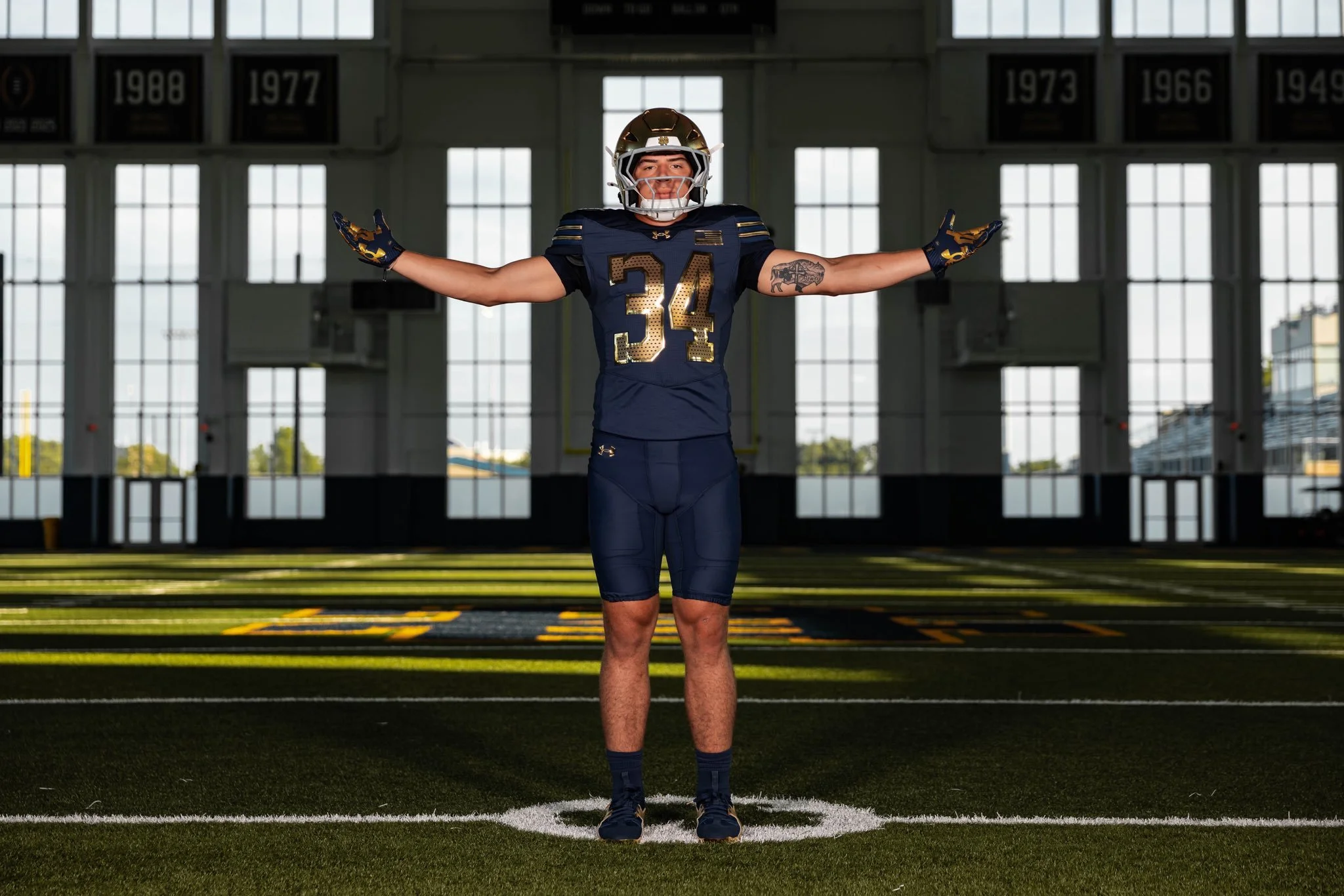
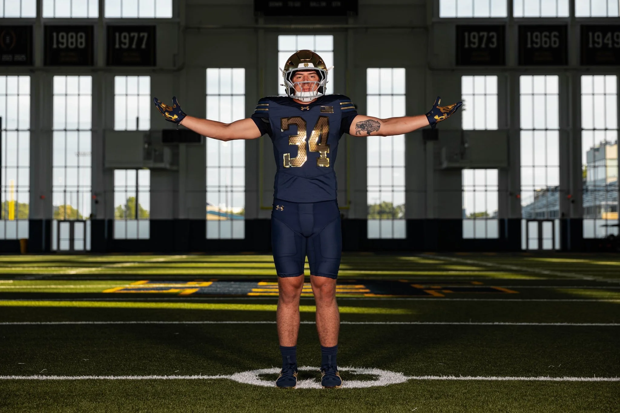
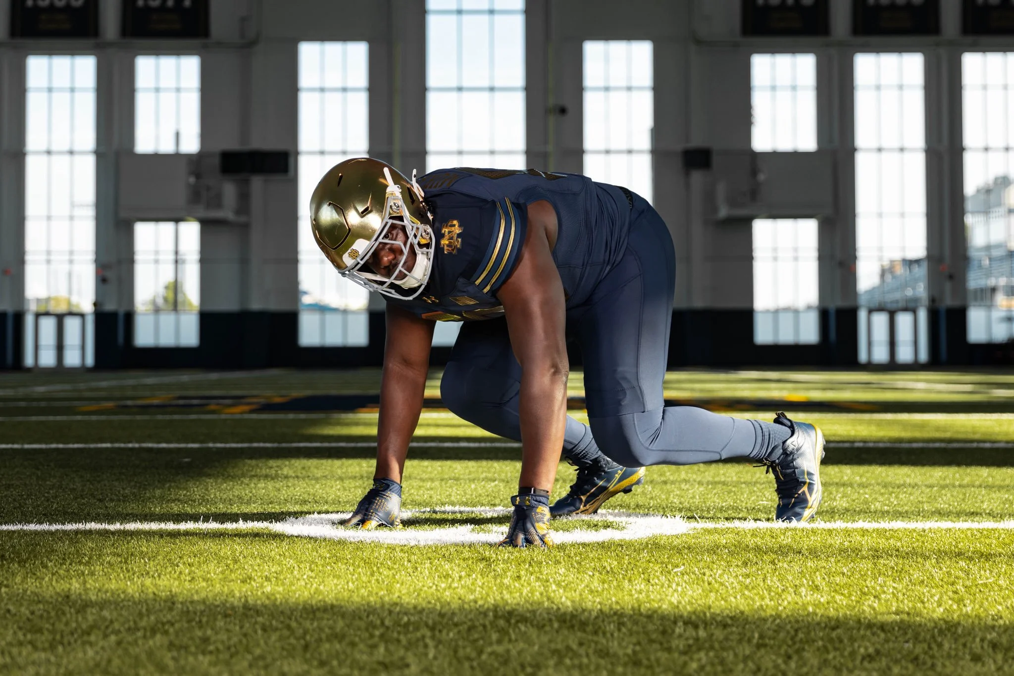
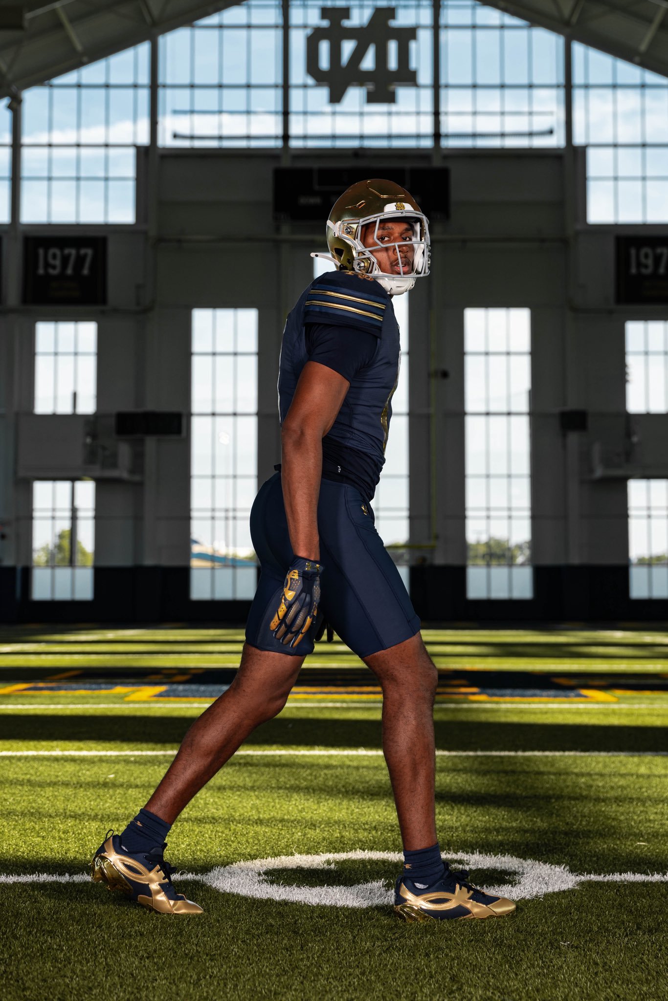
Notre Dame's latest Shamrock Series uniform is packed with storytelling, paying tribute to the program's historic connection with the Green Bay Packers while celebrating generations of football tradition. Every detail, from the jersey color to the numbers and even the custom cleats, was designed with purpose.

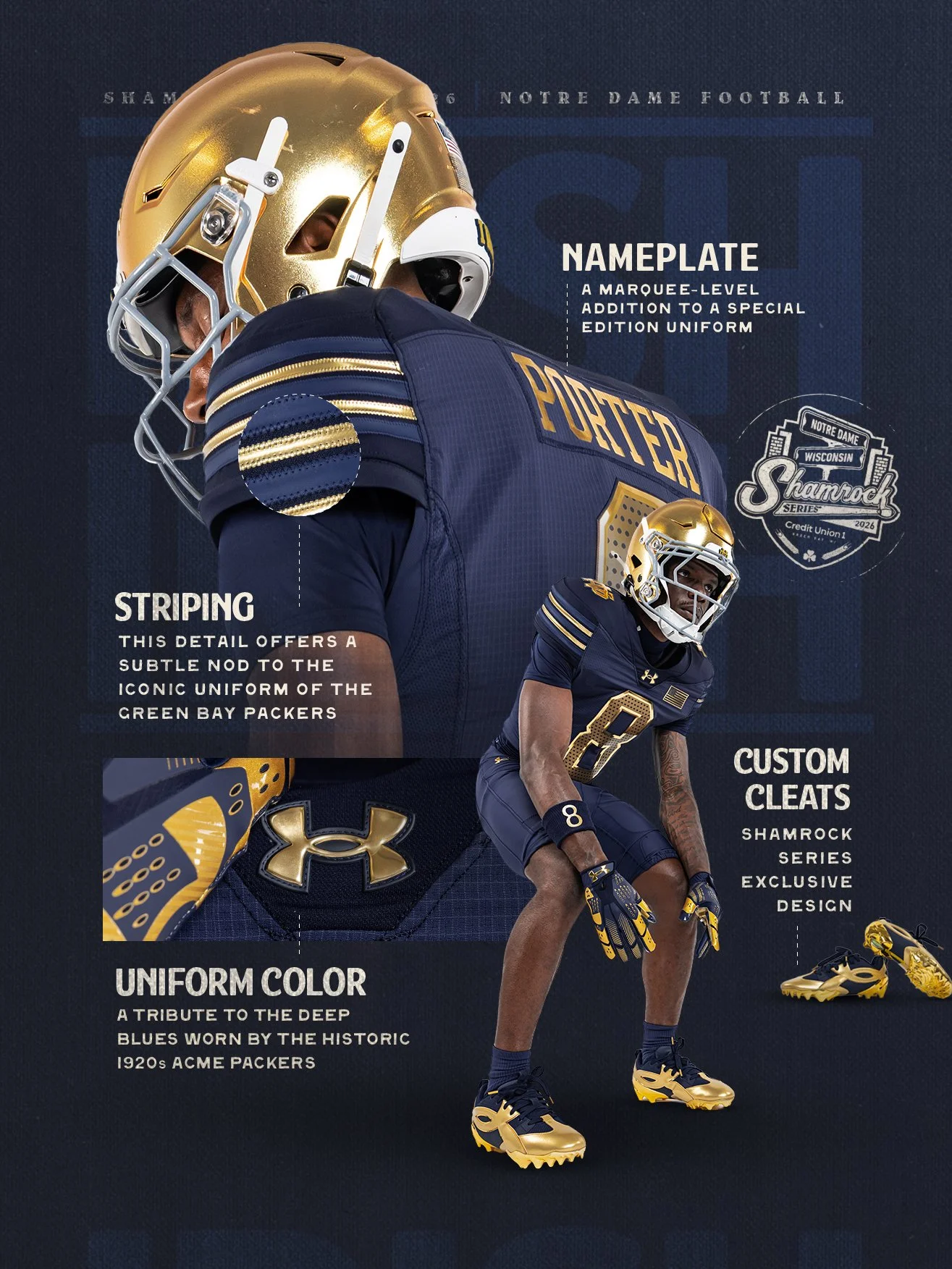
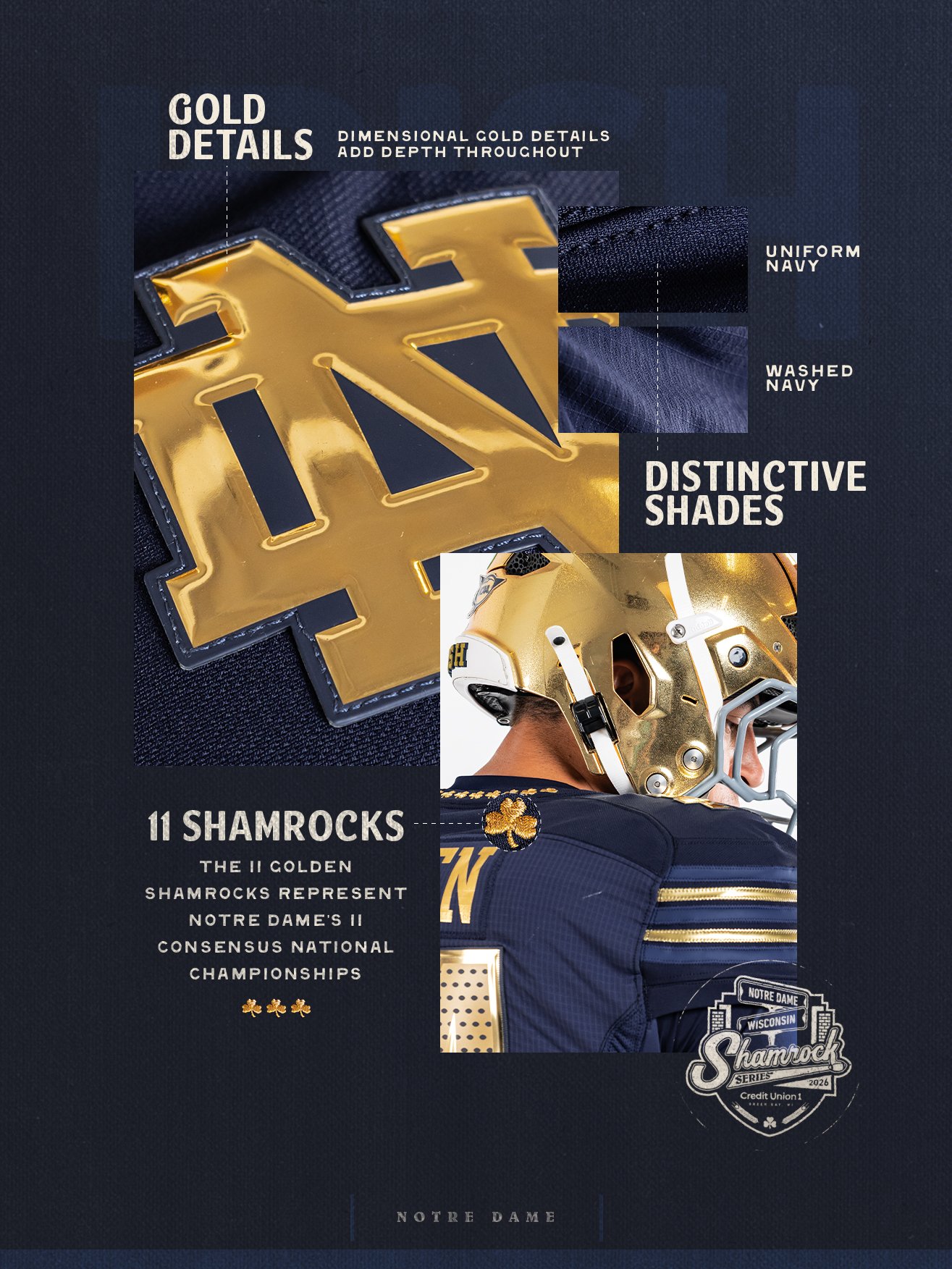
The foundation of the uniform is its deep blue color, inspired by the shades worn by the 1920s Acme Packers, one of the earliest versions of the franchise before it became the Green Bay Packers we know today. It's a subtle throwback that connects two of college and professional football's most iconic brands.

The uniform's striping continues the theme, offering a modern interpretation of classic Green Bay uniform elements without sacrificing Notre Dame's identity.

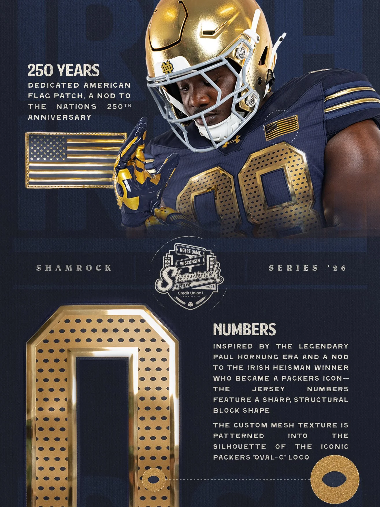
The jersey numbers draw inspiration from the legendary Paul Hornung era.

The sharp block-style numerals pay tribute to the Irish Heisman Trophy winner who became one of the greatest players in Packers history. The design bridges Hornung's legendary careers in South Bend and Green Bay, making him the perfect figure to connect both programs.

As expected with every Shamrock Series release, the smallest details carry some of the biggest meaning.

The uniform features:

A custom nameplate exclusive to this special edition.

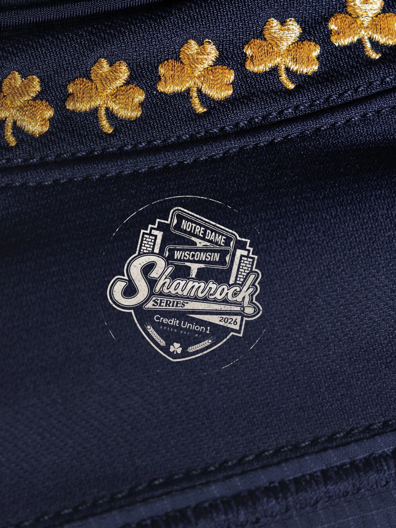
Eleven golden shamrocks incorporated into the design, representing Notre Dame's 11 consensus national championships.

A dedicated American flag patch recognizing the United States' 250th anniversary.

A custom mesh texture featuring the silhouette of the iconic Packers "Oval-C" logo woven directly into the fabric.

Exclusive custom cleats created specifically for the Shamrock Series matchup.

Notre Dame's Shamrock Series uniforms have become some of the most anticipated alternate uniforms in college football, and this year's edition continues that tradition.

Rather than relying on bold colors or dramatic redesigns, this uniform tells a deeper story. It celebrates the shared history between Notre Dame and the Green Bay Packers while honoring one of the greatest players ever to represent both programs.

It's a uniform built on legacy, and one that proves the best designs aren't just worn, they're remembered.

SHOP Notre Dame gear HERE


See What Else Is New

Related Articles


FootballSkye TilsonComment
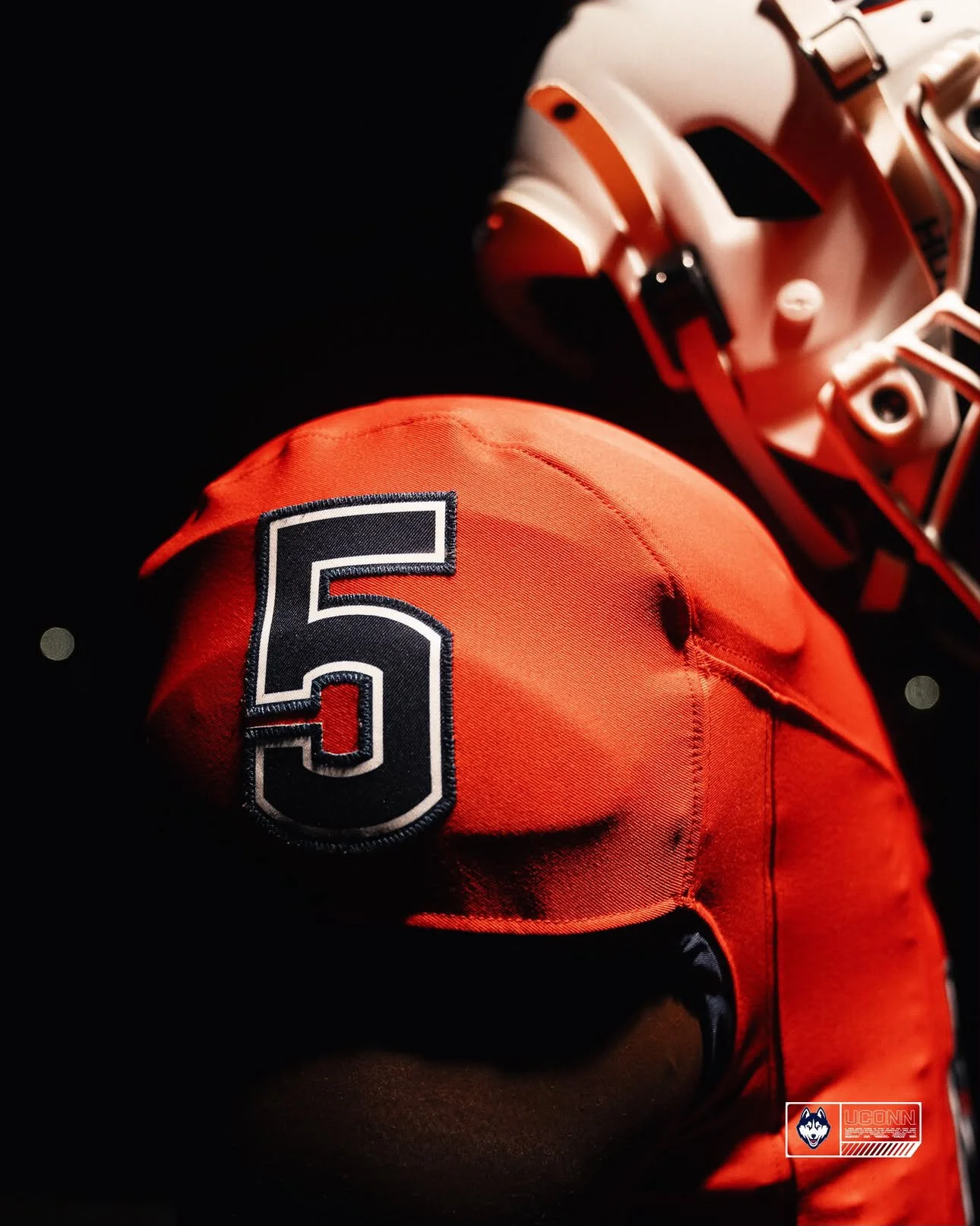
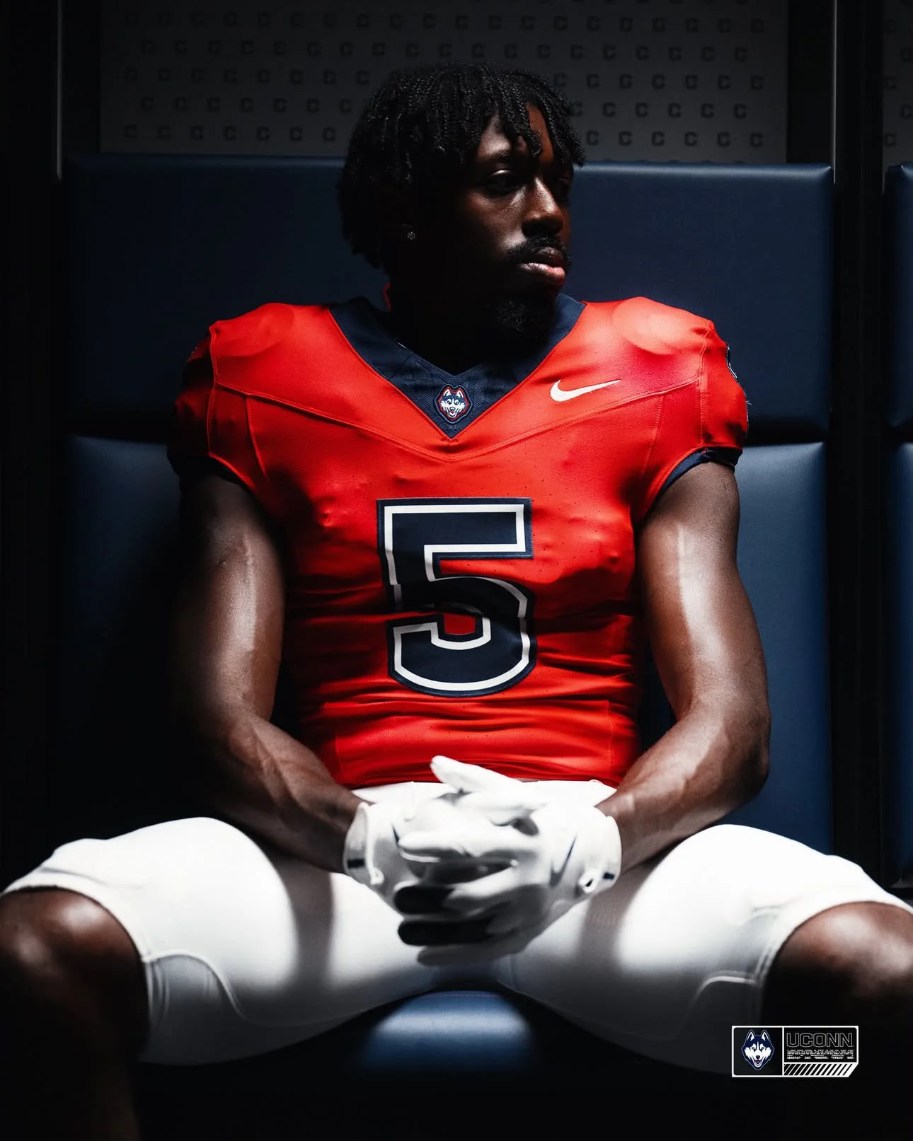
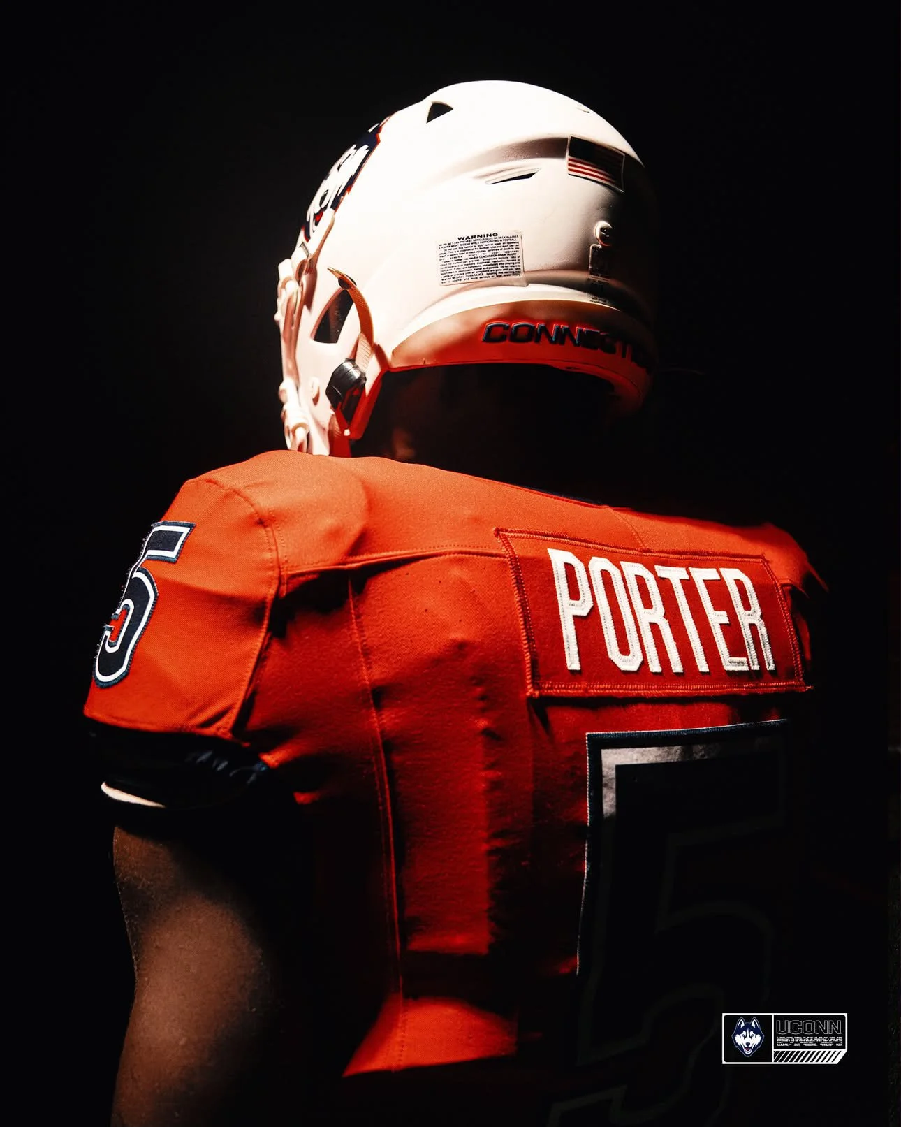
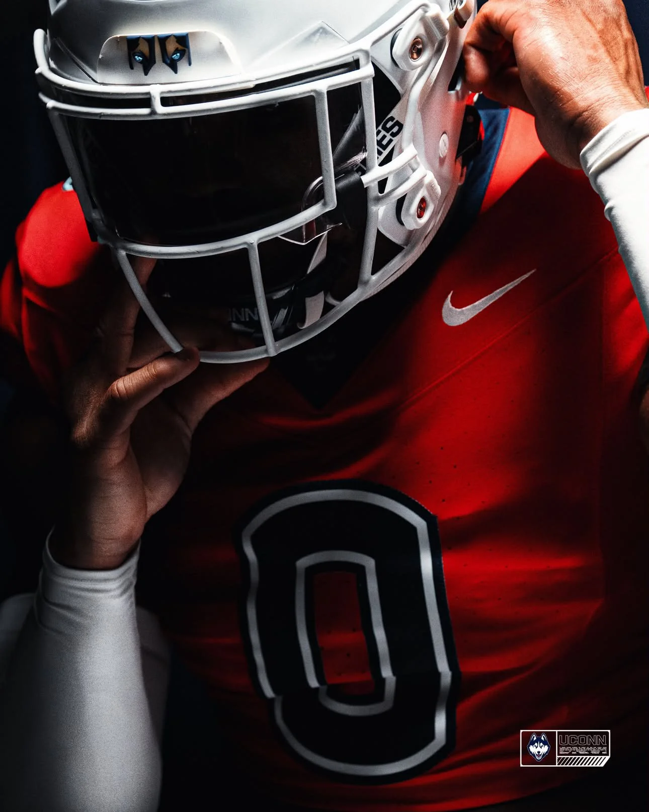
UConn Football Unveils First-Ever Red Alternate Jersey

UConn football is adding a new color to its on-field rotation.

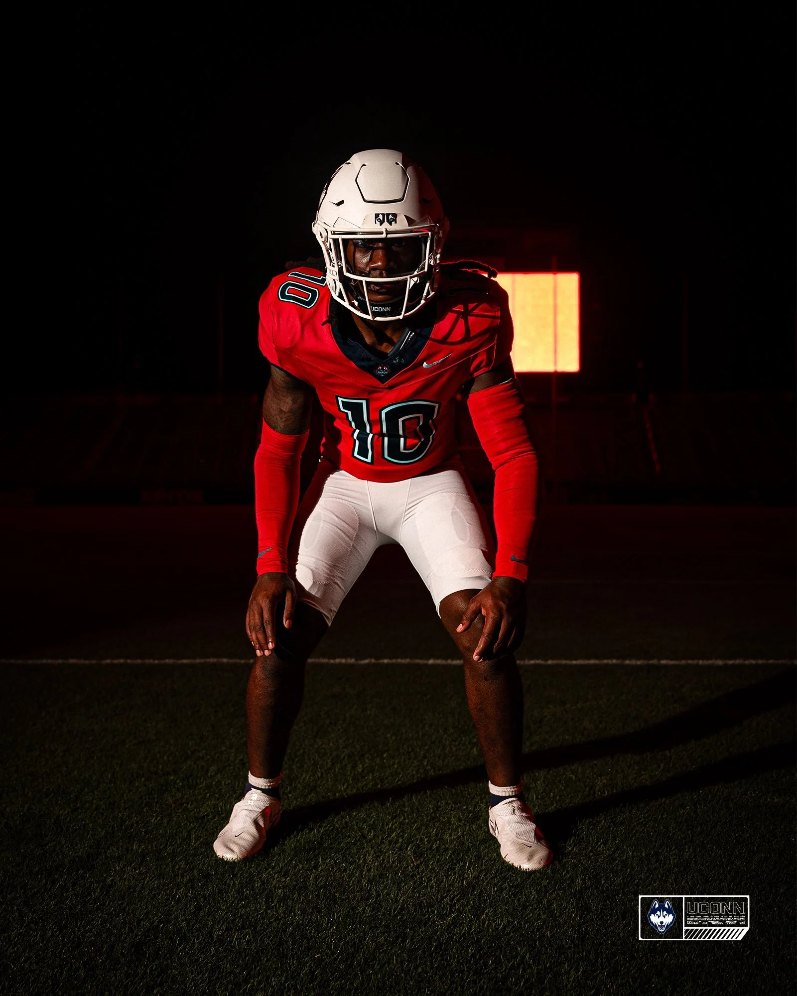
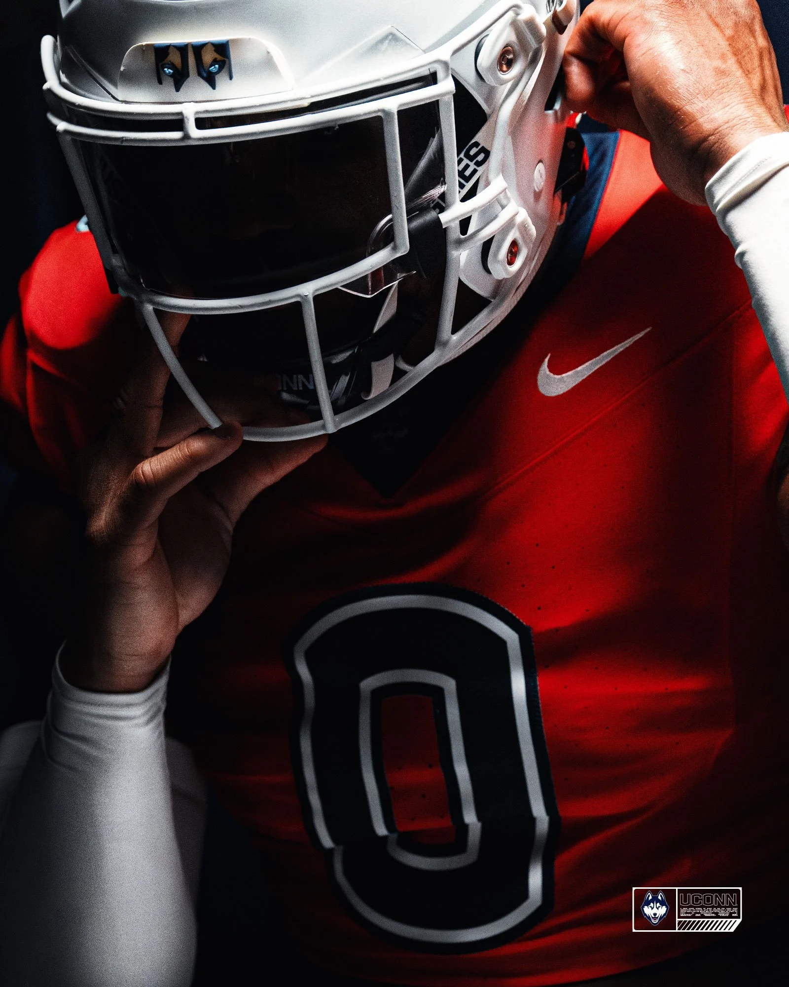
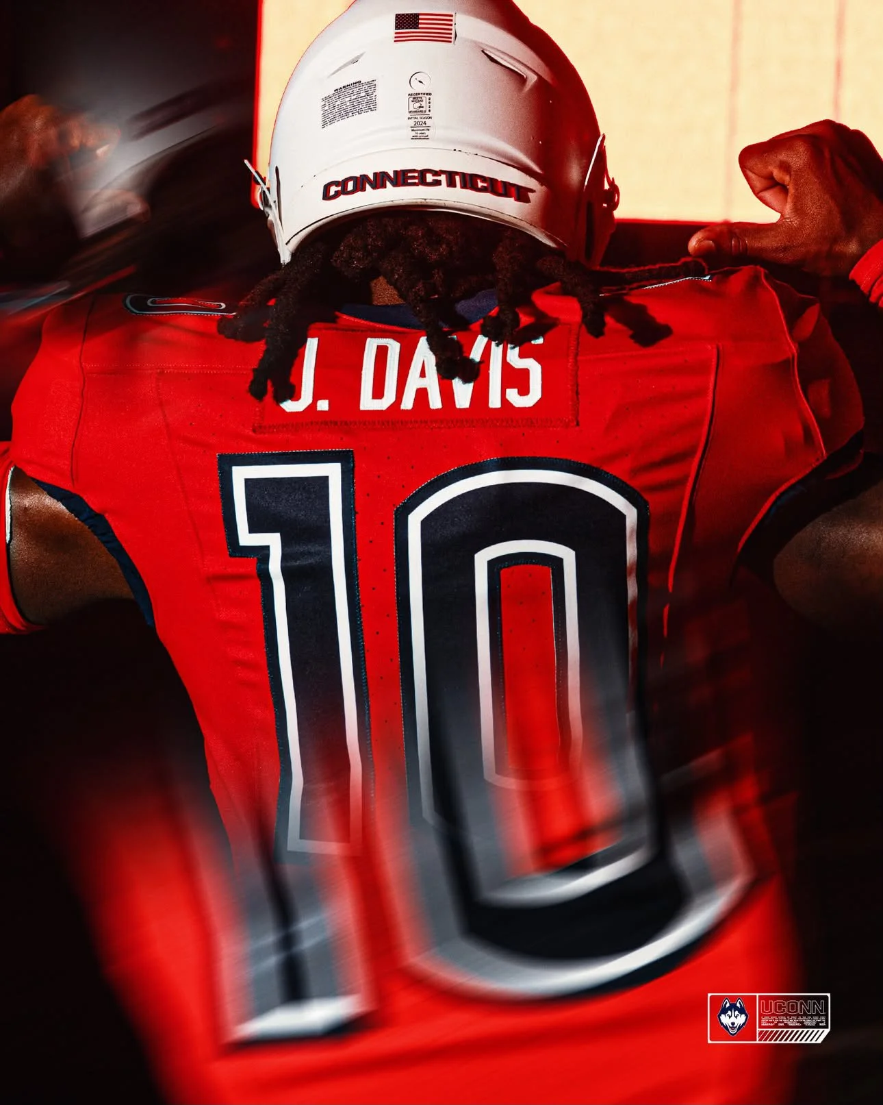
The UConn Huskies football unveiled a new red alternate jersey on Wednesday, marking the first time a UConn program has worn a primarily red jersey.

The new look is expected to make its debut during the 2026 season and gives the Huskies their first true alternate jersey in a decade.

The red jersey is essentially a color swap of UConn's current white road jersey. It features a primarily red base with white trim around the numbers, replacing the gray accents found on the white version.

After years of primarily sticking to blue, white and occasional gray, UConn is finally adding a new primary jersey color to the mix.

The red alternate gives the Huskies another option for the 2026 season while maintaining the relatively simple design language of their current uniforms.

SHOP Uconn gear HERE


See What Else Is New

Related Articles


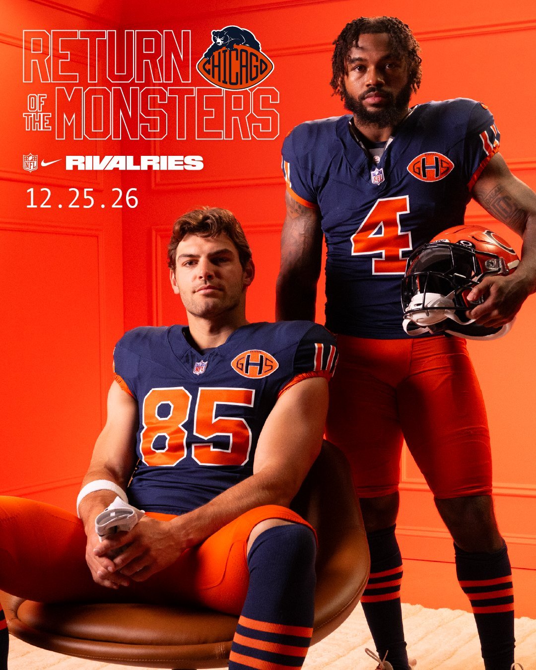
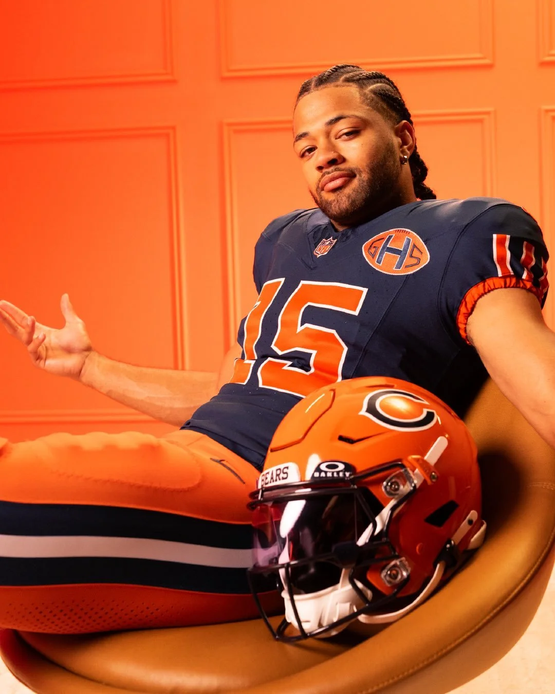
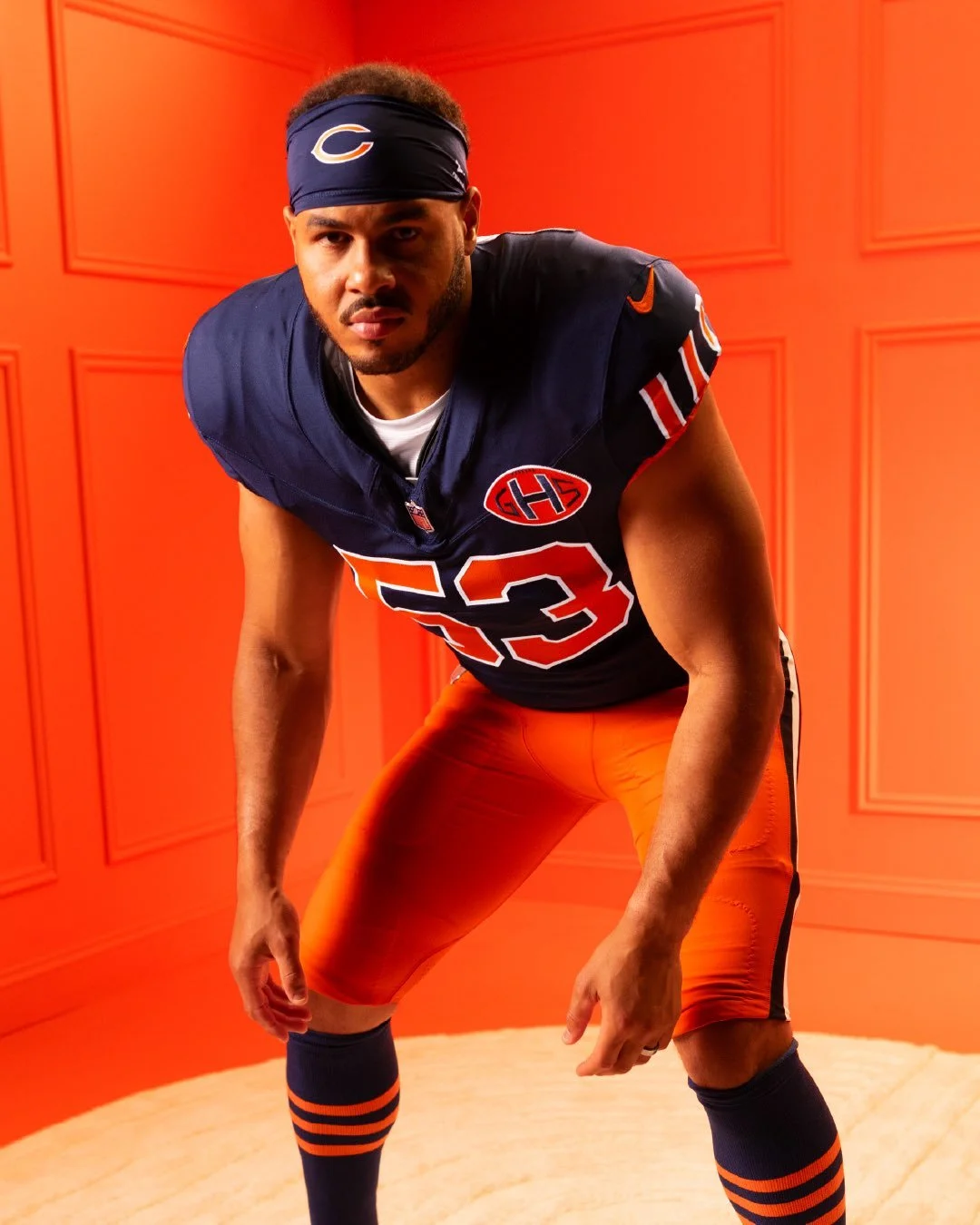
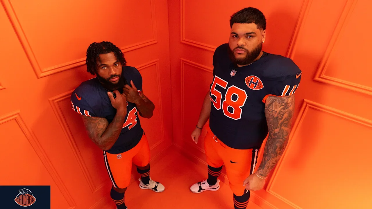
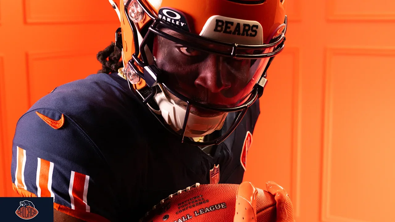
Chicago Bears Unveil "Return of the Monsters" Rivalries Uniform

The Chicago Bears are adding another chapter to one of the NFL’s greatest rivalries with a new Rivalries uniform, set to debut on Christmas Day when the Bears host the Green Bay Packers at Soldier Field.

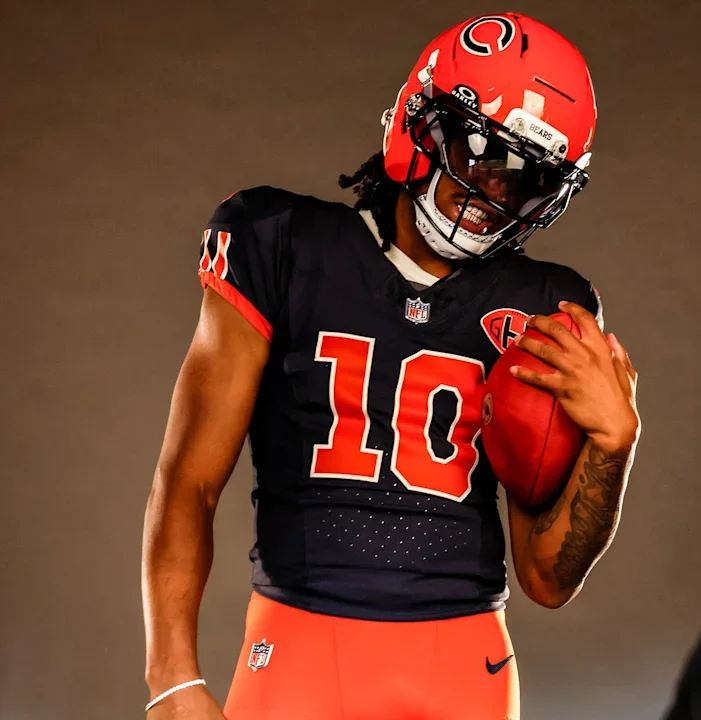
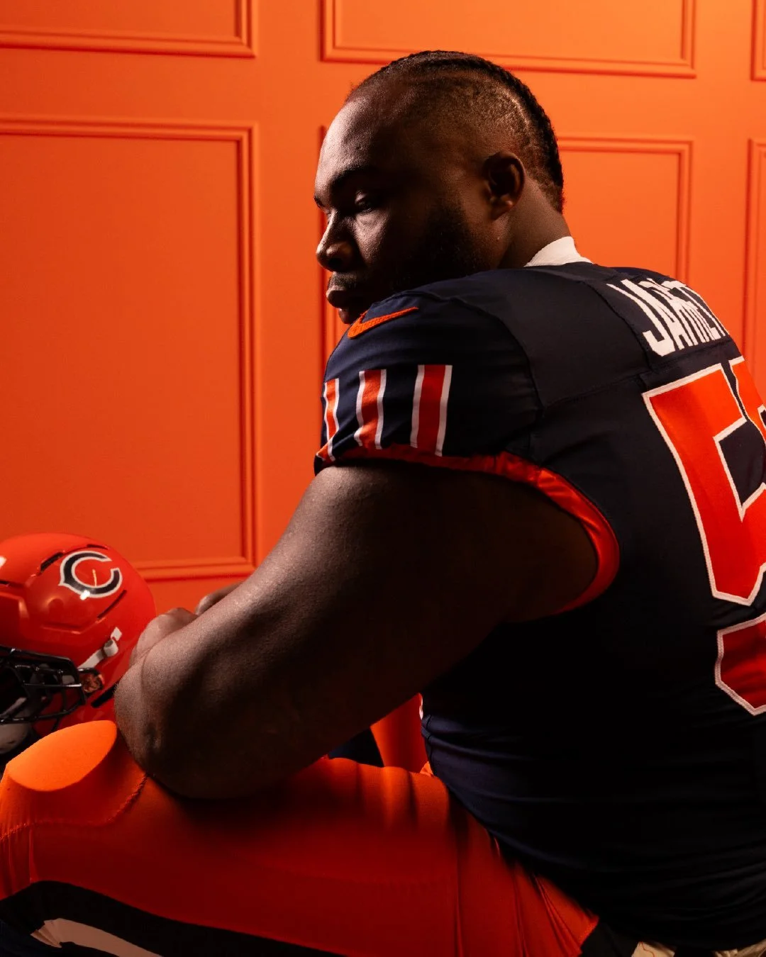
the uniform draws from the Bears’ extensive history, the city of Chicago and the generations of players who helped establish the franchise’s “Monsters of the Midway” identity. Rather than completely reinventing the Bears’ look, the design blends familiar elements from the past with a fresh presentation.

“We really saw this as an evolution rather than a reinvention,” Bears vice president of brand creative John Conroy said.

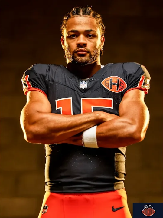
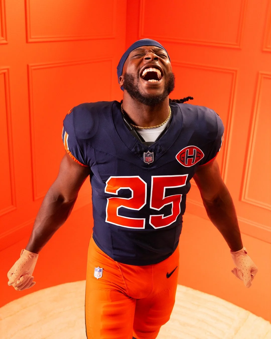
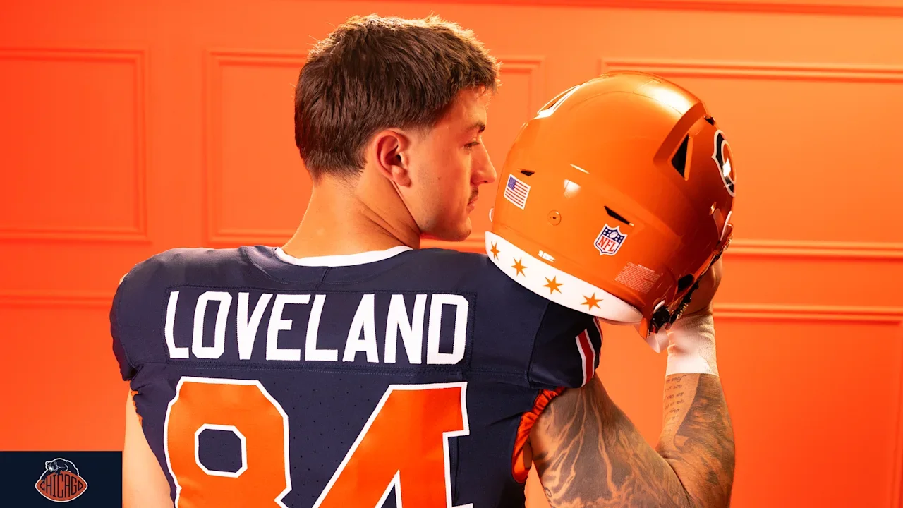
The Bears kept their traditional navy, orange and white color palette front and center. The jersey is primarily navy with orange numerals outlined in white, with the number font inspired by the Bears’ 1948 uniform.

The sleeves feature a new take on one of the franchise’s most recognizable design elements. Instead of the traditional horizontal striping, the Rivalries jersey uses vertical stripes, reinterpreting the three-stripe pattern that has been part of the Bears’ uniform identity since the early 1930s.

A “GSH” patch also appears on the front of the jersey. The detail is a replica of the patch worn by the Bears in 1983 following the death of legendary founder George Halas.

Inside the collar, the team added another piece of history with a subtle “Monsters of the Midway” inscription.

The helmet is perhaps the biggest departure from the Bears’ standard look.

The Rivalries uniform features an orange helmet with a navy “C” outlined in white. The front bumper carries an updated “BEARS” wordmark, while the rear bumper features Chicago’s iconic four stars, connecting the team directly to the city it represents.

The orange continues onto the pants, which feature a double navy-and-white stripe running vertically down each leg.

Together, the helmet and pants create a distinctly throwback-inspired appearance while giving the Bears a new combination for one of their biggest games of the season.

The Rivalries uniform will make its debut on Christmas Day against the Green Bay Packers, adding another layer to the NFL’s oldest and most historic rivalry.

The result is a uniform that feels familiar without simply being another throwback, bringing together 1940s-inspired numbers, historic striping, the GSH patch, Monsters of the Midway branding and Chicago iconography into one new look.

SHOP Bears gear HERE


See What Else Is New

Related Articles


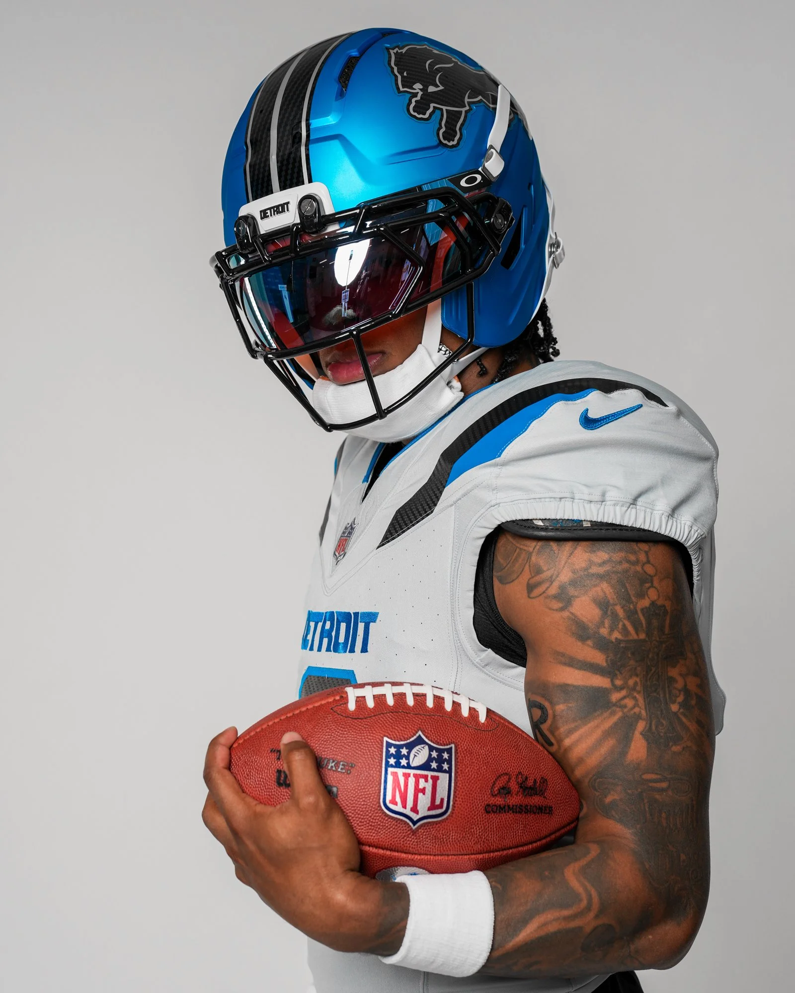
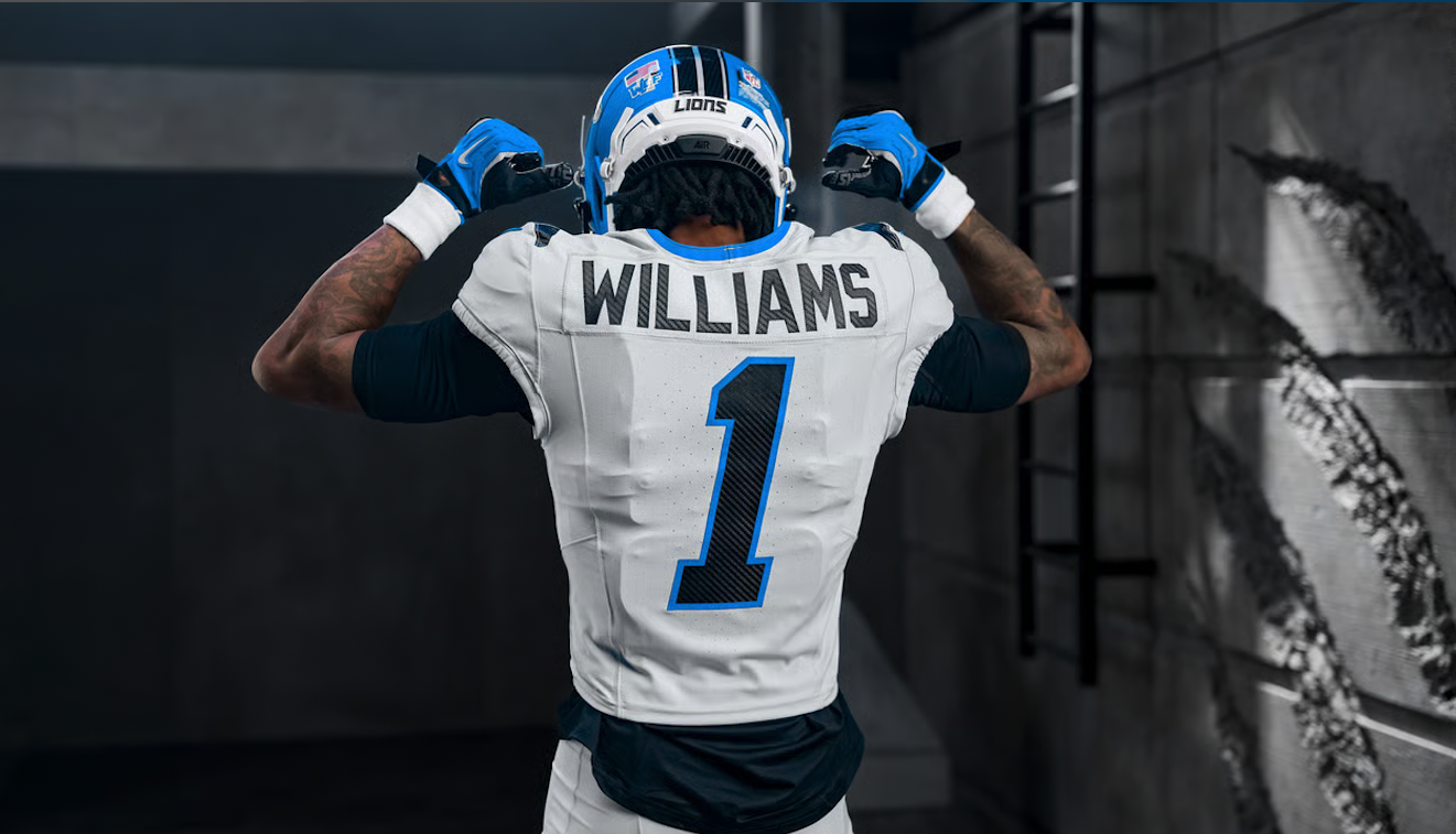
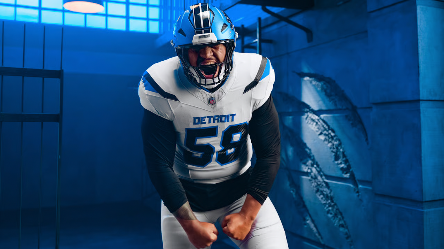
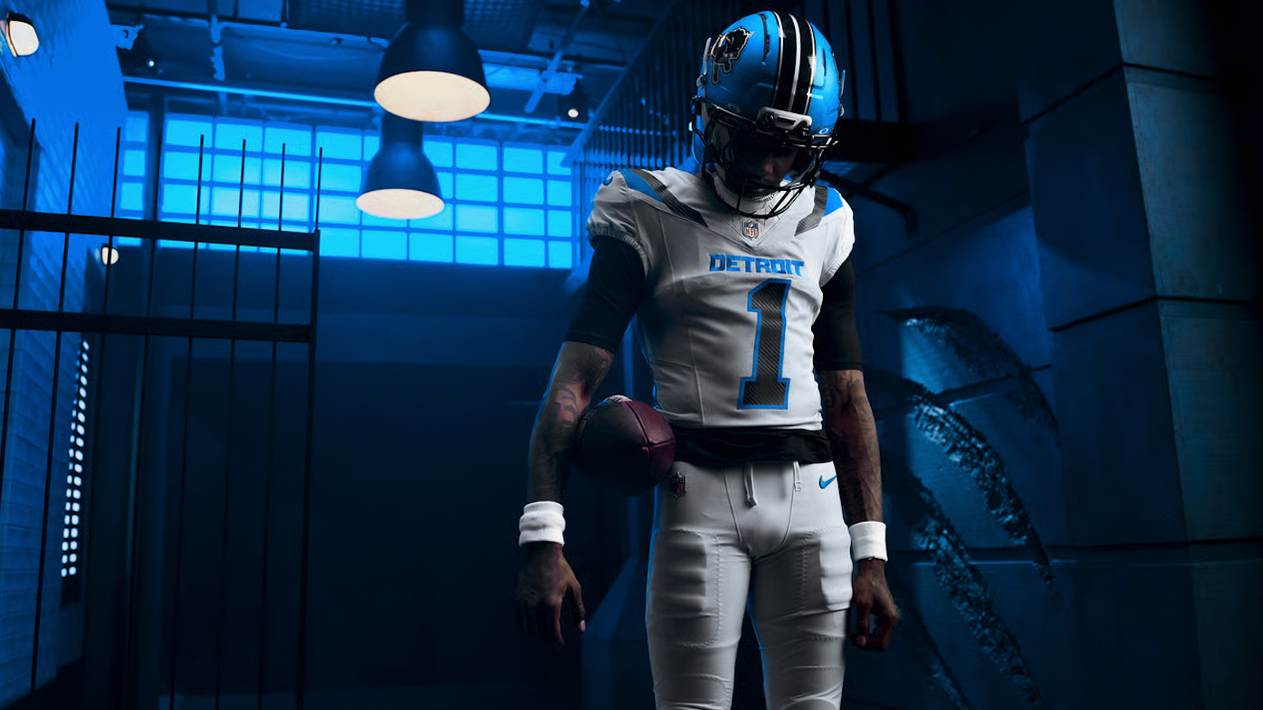
Detroit Lions Unveil “Defend the Den” Rivalries Uniform

The Detroit Lions are adding a new edge to their uniform collection with the introduction of the “Defend the Den”uniform, created as part of the NFL and Nike’s Rivalries program.

Rooted in Detroit’s identity, the new look is built around the mentality of protecting home turf. The Lions’ concept draws a parallel between the city’s history of building and its modern identity as a city that refuses to back down. That same attitude carries onto the football field, where every opponent is viewed as an intruder entering the Den.

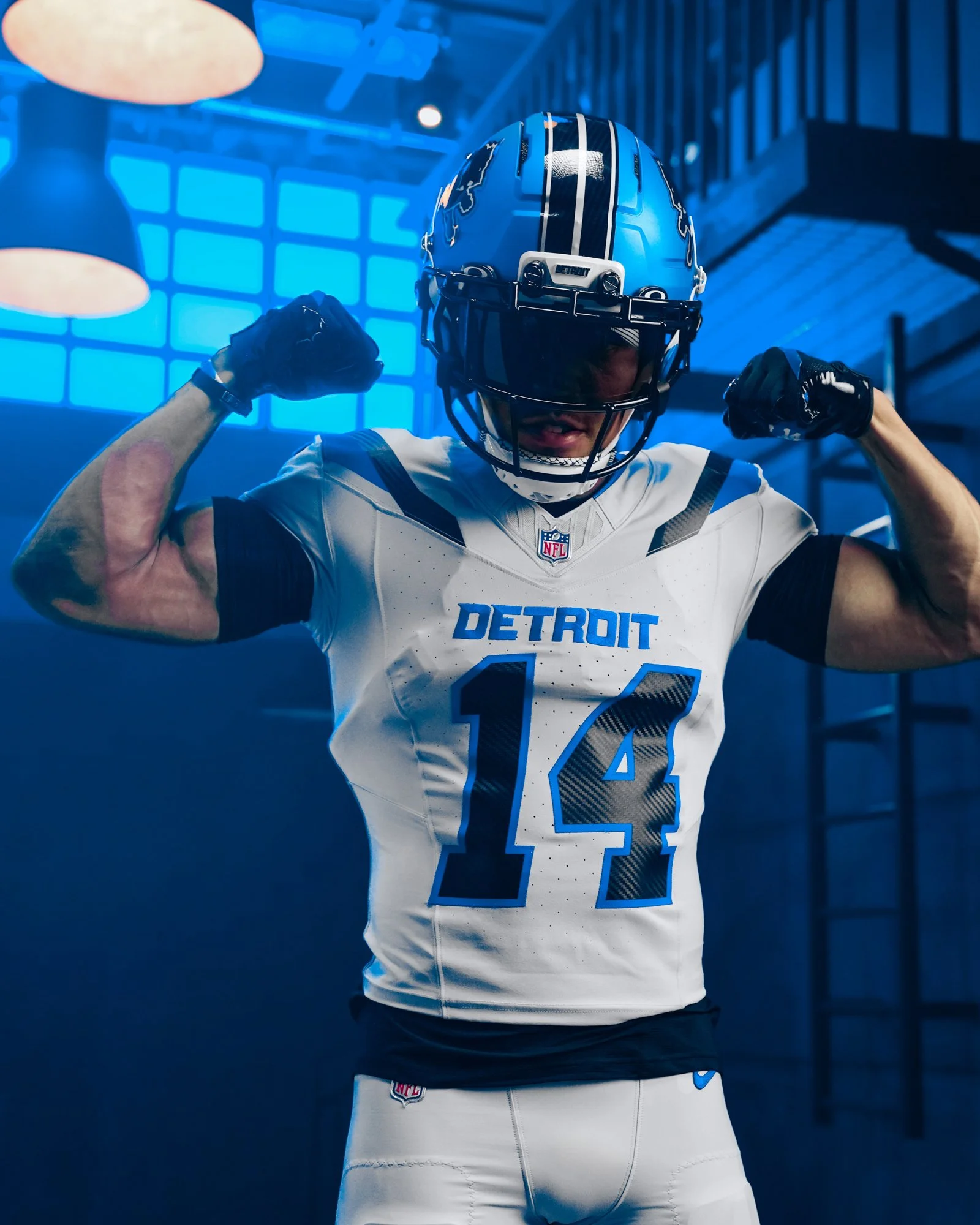
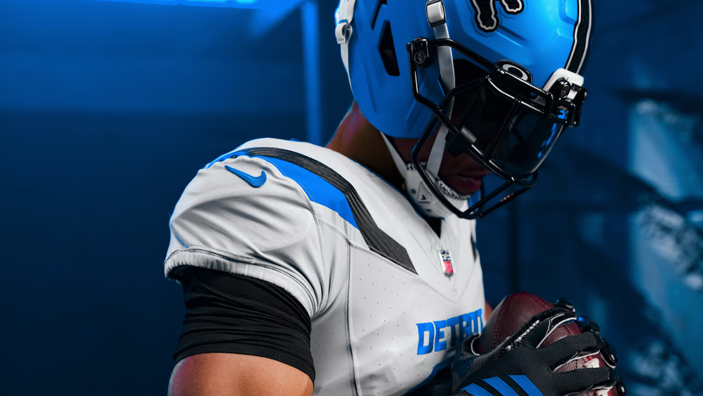
The uniform brings together Honolulu blue and black, with the darker elements designed to mimic the intense gaze of a lion locking onto its prey. The combination gives the Lions’ traditional color palette a noticeably more aggressive appearance.

One of the standout details is the “Defend the Den” inscription, which appears on the collar. The mantra represents the pride surrounding the Lions’ home-field advantage and the mentality the team wants to bring to Ford Field.

The helmet also features a unique carbon-fiber-inspired texture within the decals. Beyond adding another layer of detail to the helmet, the texture connects the uniform to Detroit's automotive and racing heritage.

The jersey numbers take on an italicized design, leaning forward to create a sense of motion and speed. Additional paint-stripe details appear throughout the uniform, helping tie the different elements together.

Perhaps the simplest detail is also one of the most important: “Detroit” is proudly displayed across the chest, connecting the Rivalries uniform back to the Lions’ existing identity and emphasizing that the uniform is ultimately about the city.

The result is a darker, more aggressive take on the Lions’ look while keeping the focus firmly on Detroit. With “Defend the Den,” the Lions are using the Rivalries program to turn their home-field mentality and the city’s culture into a uniform built around one simple idea: protect the Den.

SHOP Lions gear HERE


See What Else Is New

Related Articles


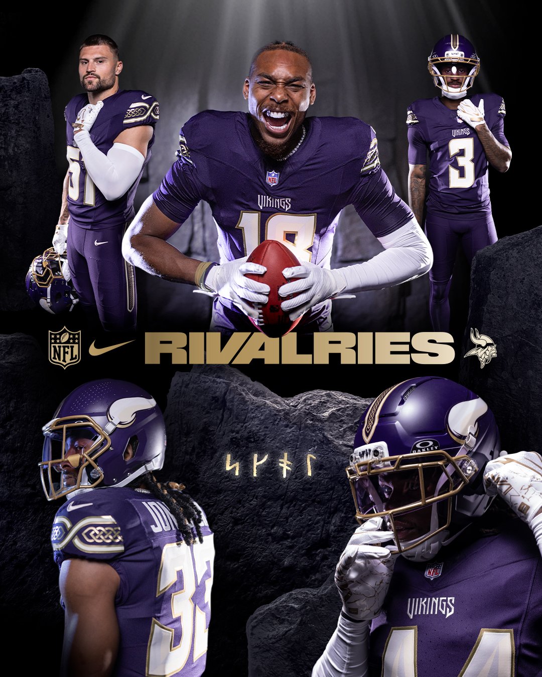
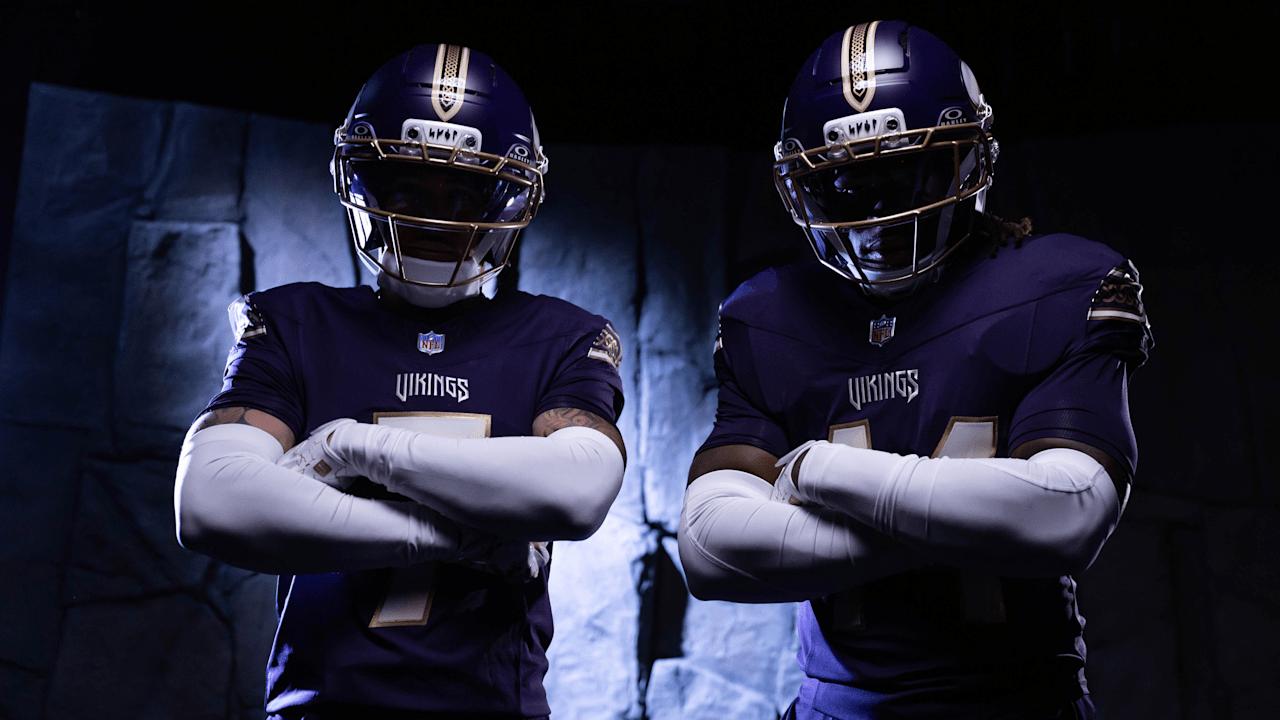
Minnesota Vikings Unveil Warrior-Inspired Rivalries Uniform

The Minnesota Vikings are going to battle in a new look this season.

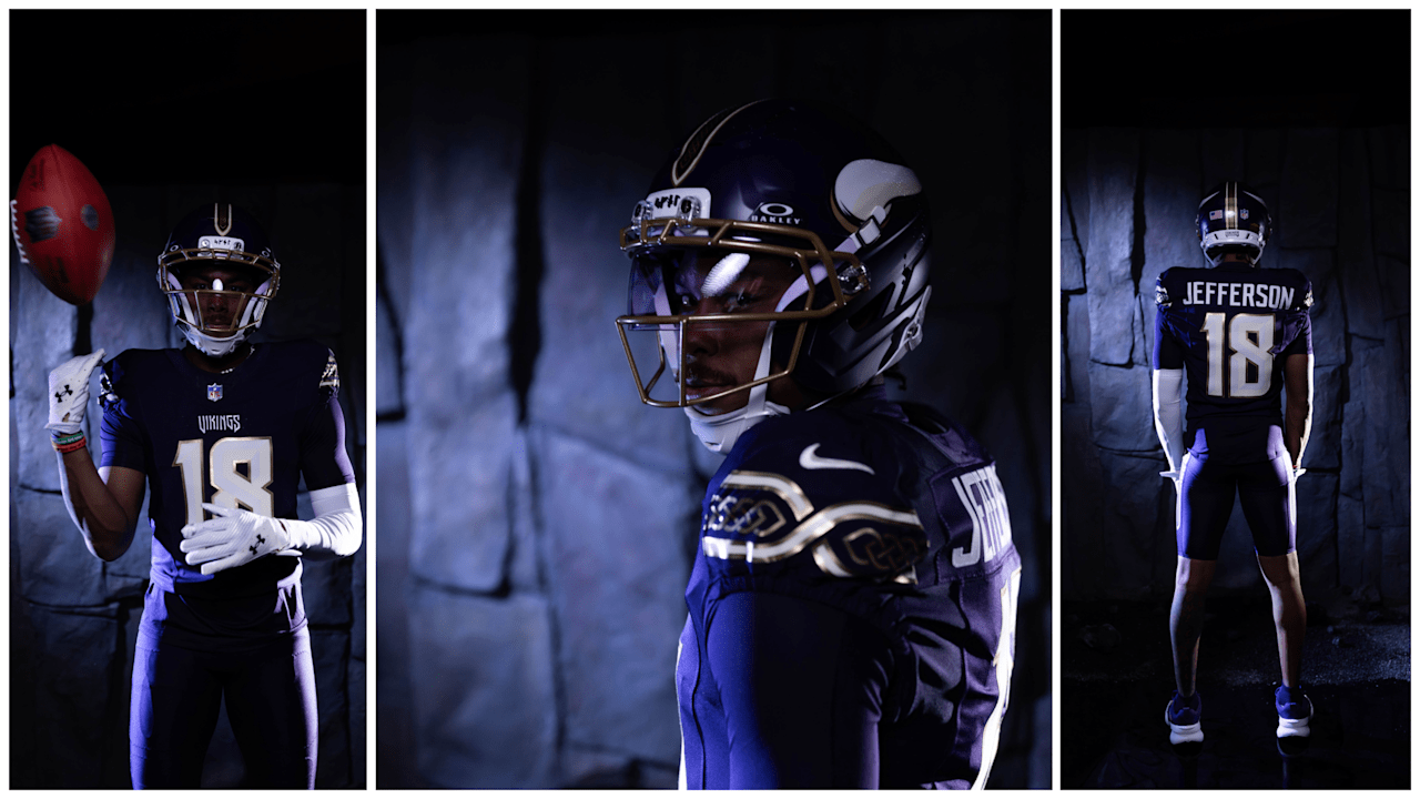
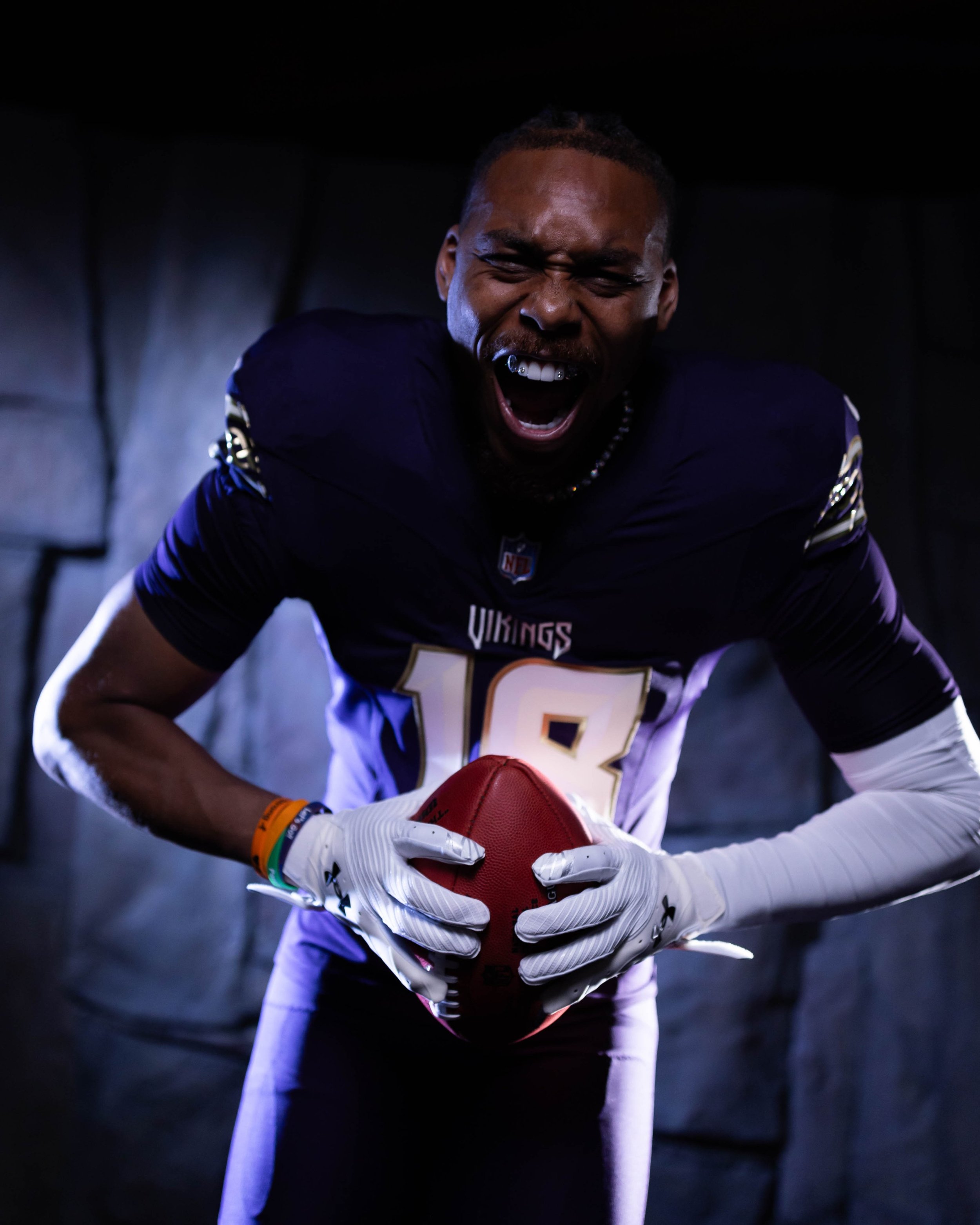
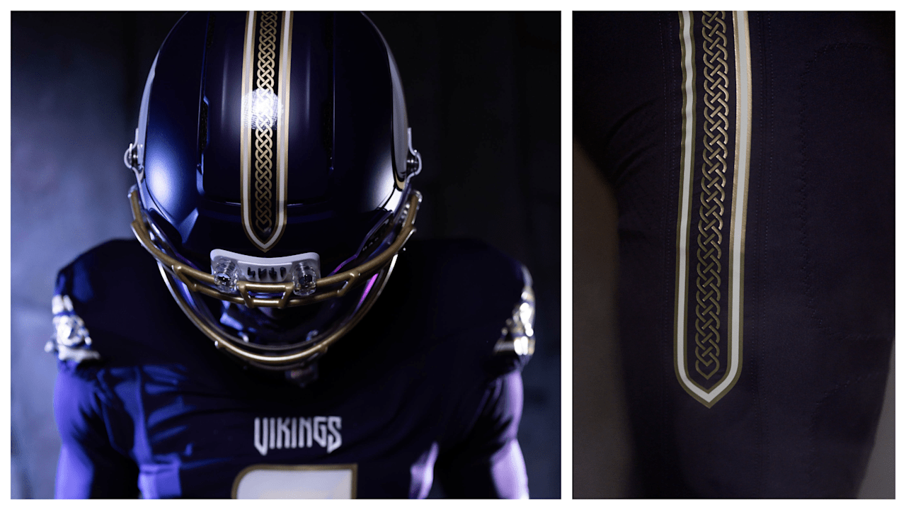
The Vikings have unveiled their 2026 Rivalries uniform, a design inspired by ancient Viking warriors, Minnesota's Northern identity and the team's own gameday traditions. The new uniform will debut Dec. 20 against the Detroit Lions.

The concept behind the uniform actually dates back to the development of Minnesota's Winter Warrior alternate. While the Vikings ultimately went with the all-white design for Winter Warrior, the team had also explored a darker Viking warrior concept featuring historical armor and textures.

When Nike introduced the opportunity to create a fifth uniform without the same restrictions placed on traditional alternates, the Vikings brought that darker concept back to life.

Rather than going with an all-black “dark mode,” the Vikings wanted something that felt uniquely theirs. Nike introduced the team to Purple Dynasty, an extremely deep purple that maintains the franchise's identity while creating a much darker appearance.

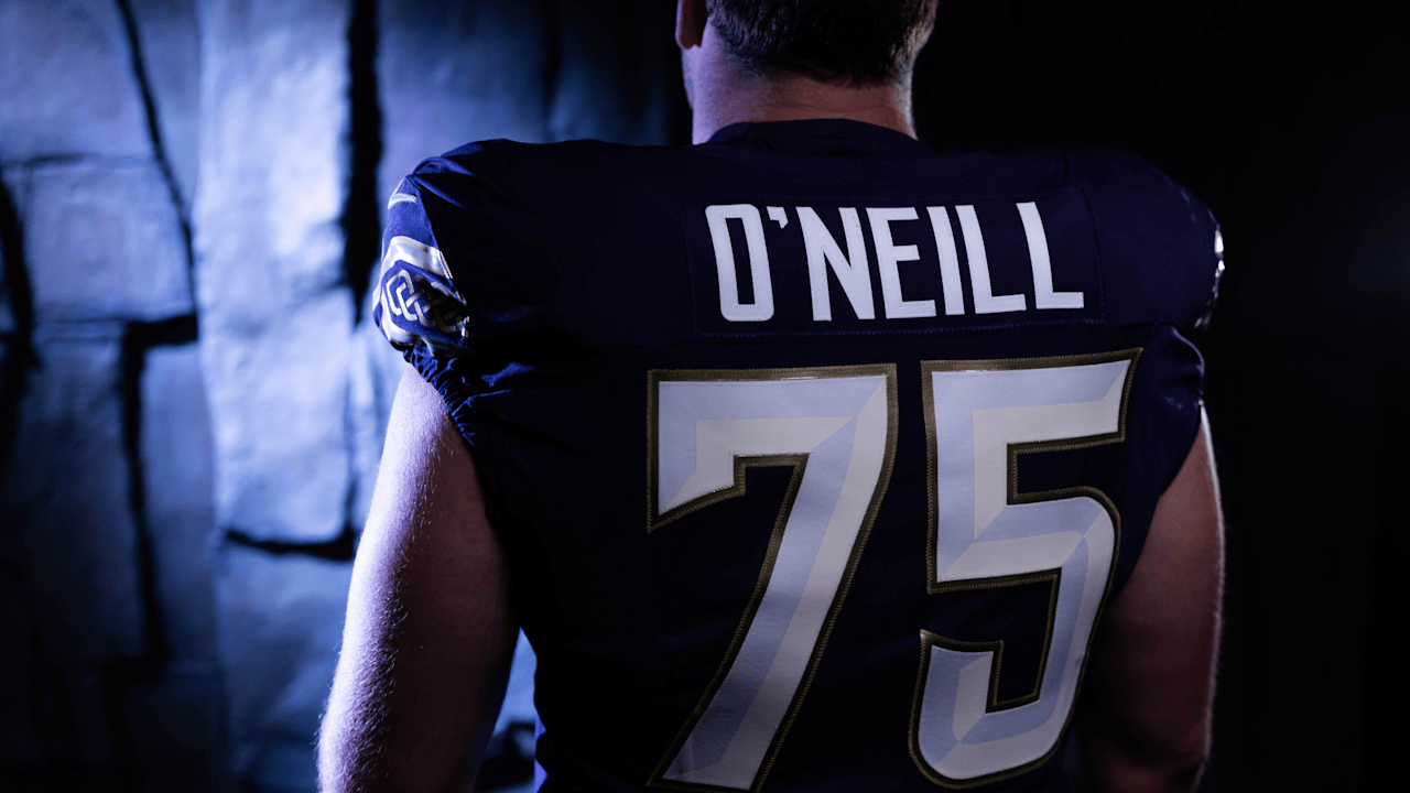
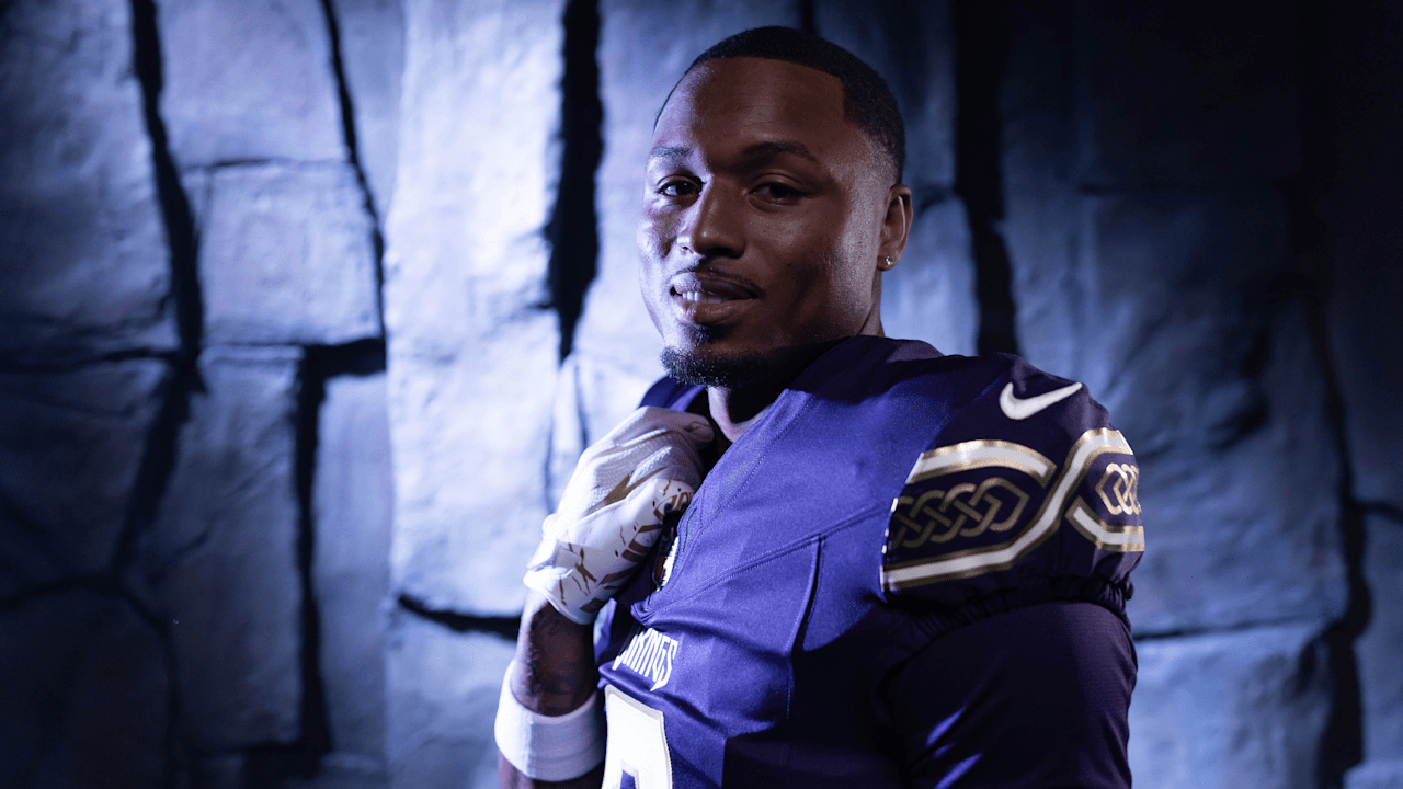
The uniform combines Purple Dynasty with ivory and metallic gold, giving the look an earthy, premium feel inspired by Viking armor, natural materials and precious metals.

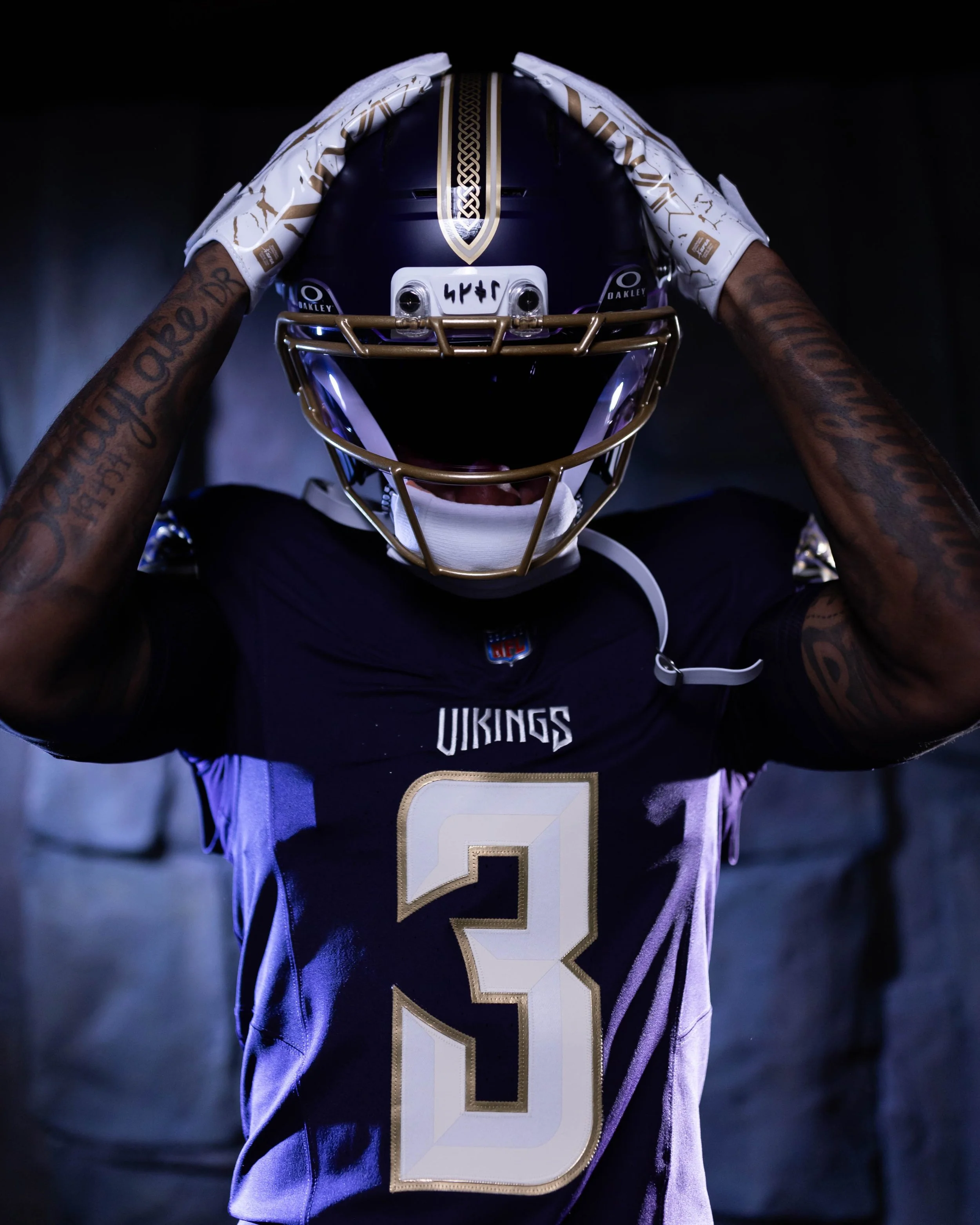
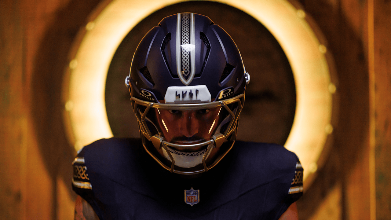
The Vikings went deep into their history and culture when designing the uniform. The SKOL wordmark appears in Younger Futhark runes, the 16-character alphabet used in Scandinavia during the Viking Age. Those same runic characters are featured on the runestones lining the team's tunnel at U.S. Bank Stadium and now appear on the inside collar and the helmet's 3D front bumper.
The uniform also features a Nordic knot pattern inspired by the design found on the Vikings' Gjallarhorn. That same pattern appears along the pants, where the stripe comes to a point resembling a battle sword. A similar design runs down the center of the helmet, inspired by the nose piece of an ancient Viking helmet.
The jersey numbers feature a two-tone treatment designed to make them look as though they were chiseled from stone or ivory, while a completely new VIKINGS wordmark takes inspiration from the structure of carved runes.
The color palette may be one of the strongest aspects of the uniform. Purple Dynasty brings back the darker purple associated with some of the franchise's earliest uniforms and helmets. Ivory is inspired by the Vikings' Gjallarhorn, while metallic gold elevates the traditional purple-and-gold identity and connects to the precious metals and artistry associated with Viking culture.

The result is a uniform that feels dramatically different from Minnesota's traditional combinations without abandoning what makes the Vikings recognizable.

From the deep purple and metallic gold to the runes, Nordic knots, Gjallarhorn references and battle-inspired elements, virtually every part of the uniform was designed to make the players look like a modern-day Viking preparing for battle.

SHOP Vikings gear HERE


See What Else Is New

Related Articles