NHL and Fanatics Bring Local Culture to the Ice With Hometown Remix

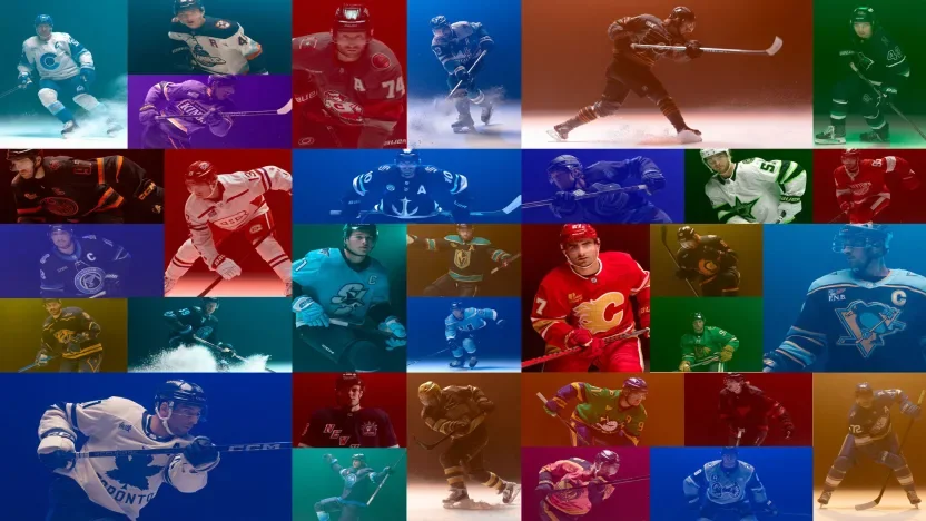
The NHL and Fanatics are giving all 32 teams a new way to represent home. Unveiled Monday, Hometown Remix is a leaguewide special-edition uniform, apparel and headwear program built around the fans, landmarks, traditions and local culture that shape each franchise.

The collection reaches beyond familiar color combinations. Arena architecture becomes sleeve striping, city landmarks influence custom number fonts, and regional landscapes bring new textures to team crests. Debossed patterns, metallic embroidery and detailed hem treatments give fans reasons to look closer.

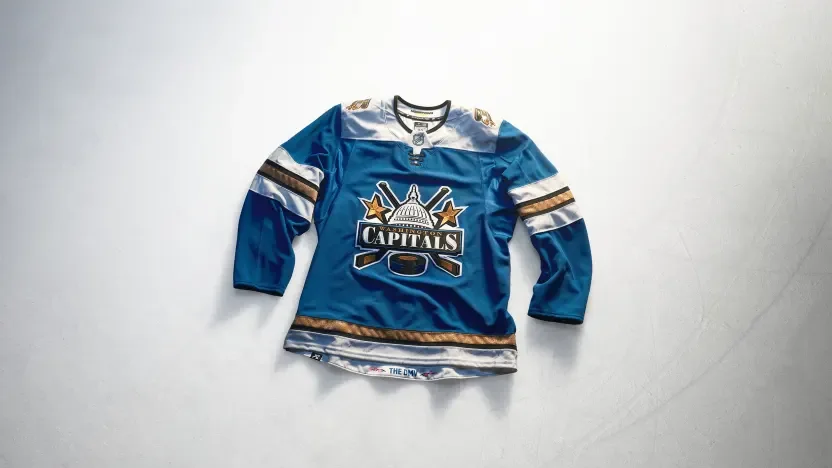
Some teams revisit recognizable identities, including the Islanders’ Fisherman and the Lightning’s Stadium Series skull. Others introduce a different focal point, from Carolina’s Stormy crest to Washington’s Capitol Dome design. Together, the jerseys offer 32 interpretations of what it means to wear your hometown.

Anaheim Ducks

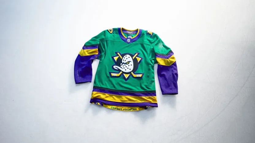
Anaheim brings a ’90s-inspired approach to Orange County life with green and gold drawn from local parks and sunsets over the water. A wave pattern along the hem reflects the waterfront, while the Ducks’ current flying V sleeve treatment connects the new palette to their established identity. “Orange Country” stitching adds a local play on words.

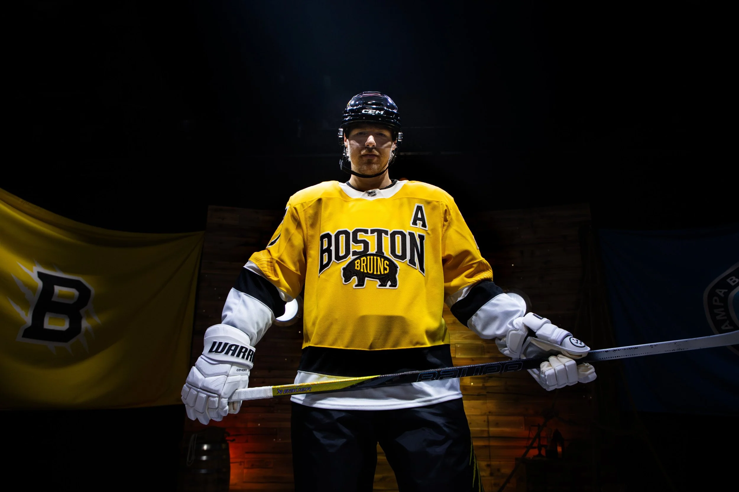
Boston Bruins

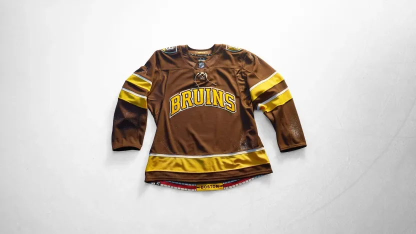
Boston leans into its college culture with an all-brown uniform that also references the Bruins’ inaugural season. Collegiate lettering, a shield shoulder patch and traditional striping give the jersey a varsity sweater feel. A brick pattern along the hem connects the design to the Freedom Trail.

Buffalo Sabres

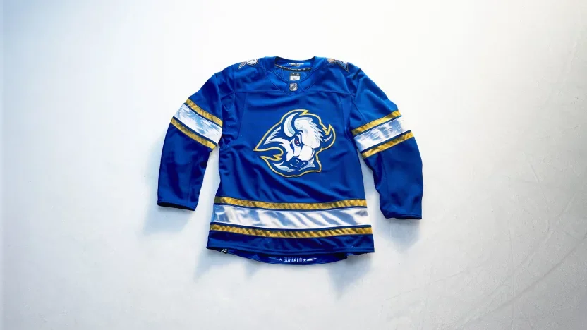
Buffalo turns its City of Light identity into an electric blue-and-gold design. The buffalo crest features a red eye and metallic gold Lurex outline, while a shoulder mark pairs the team’s B with an electrified sabre. Debossed lightning bolts and stars carry the theme through the sleeves.

Calgary Flames

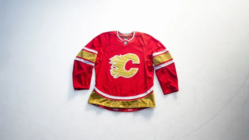
Calgary makes the Saddledome the centerpiece of its design. The arena’s ceiling texture appears within the “88 Gold” crest, its window shapes influence debossed sleeve details, and its roofline carries into the hem striping. Custom numbers draw from the building’s shutters, extending the architectural tribute across the uniform.

Carolina Hurricanes

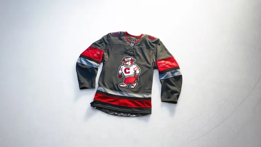
Carolina puts Stormy front and center, giving the mascot the jersey’s main crest for the first time. A storm-grey base with red and black accents sets the tone, while architectural shoulder patches, debossed oak leaves and a City of Oaks skyline connect the look to Raleigh.

Chicago Blackhawks

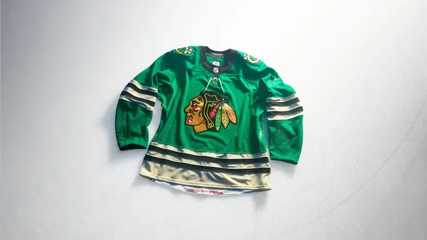
Chicago introduces a vivid green base with its current crest and gold shoulder patches. Four debossed six-pointed stars on each sleeve reference the city flag. The concept draws on Chicago’s “I Will” spirit, connecting the uniform to civic ambition, progress and resilience.

Colorado Avalanche

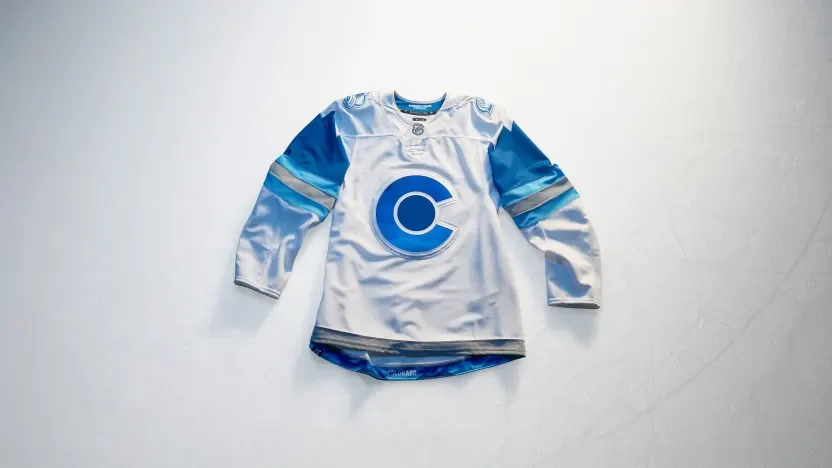
Colorado builds its jersey around the snow-covered Rocky Mountains. Graduated blue elevation patterns appear within the crest and back numbers, while mountain imagery continues onto the shoulders. Metallic silver accents give the blue-and-white design a frosted finish.

Columbus Blue Jackets

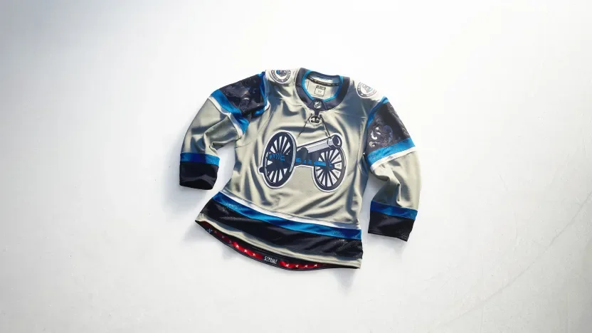
Columbus celebrates the Arch City with arched sleeve elements and a debossed filigree pattern behind the sleeve numbers. A solid grey base lets the cannon crest and white-outlined numbers stand out. An italicized “5th Line” graphic at the hem recognizes the fans’ place within the team’s identity.

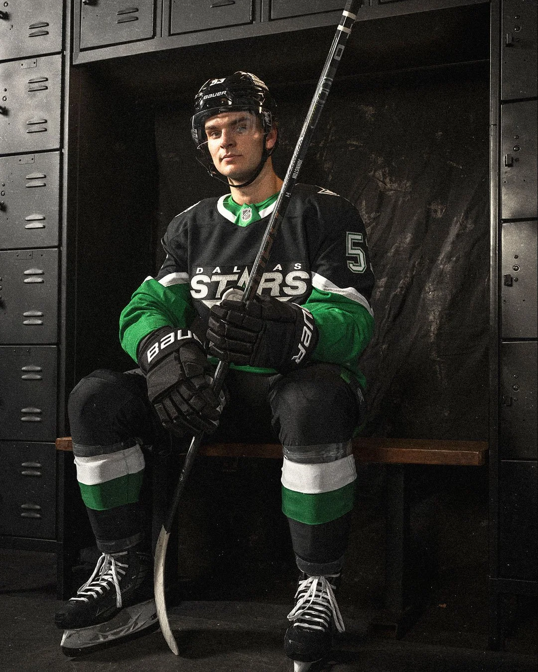
Dallas Stars

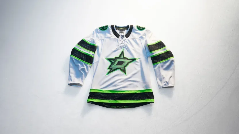
Dallas draws from its illuminated skyline and neon nightlife. Skyline-inspired texture adds detail to the front crest, while a linear Dallas wordmark at the hem continues the neon concept. Black and green stand sharply against the white base.

Detroit Red Wings

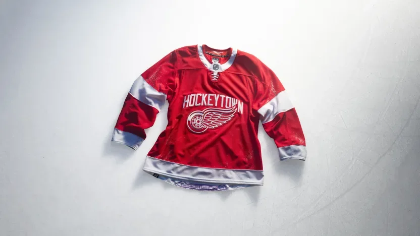
Detroit brings “Hockeytown” across the chest alongside the Winged Wheel, making the city’s hockey identity the focal point. Bold sleeve stripes reinforce the traditional look, while a purple octopus tucked inside the hem recognizes one of the franchise’s most familiar fan traditions.

Edmonton Oilers

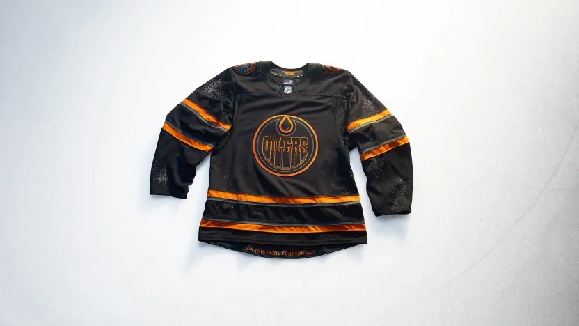
Edmonton takes an industrial approach with a black base, tonal crest and warning-orange accents. “Oil Country” and oil rig worker shoulder patches connect the design to the region’s people and industry. Warning bars frame “This Is Oil Country” inside the hem.

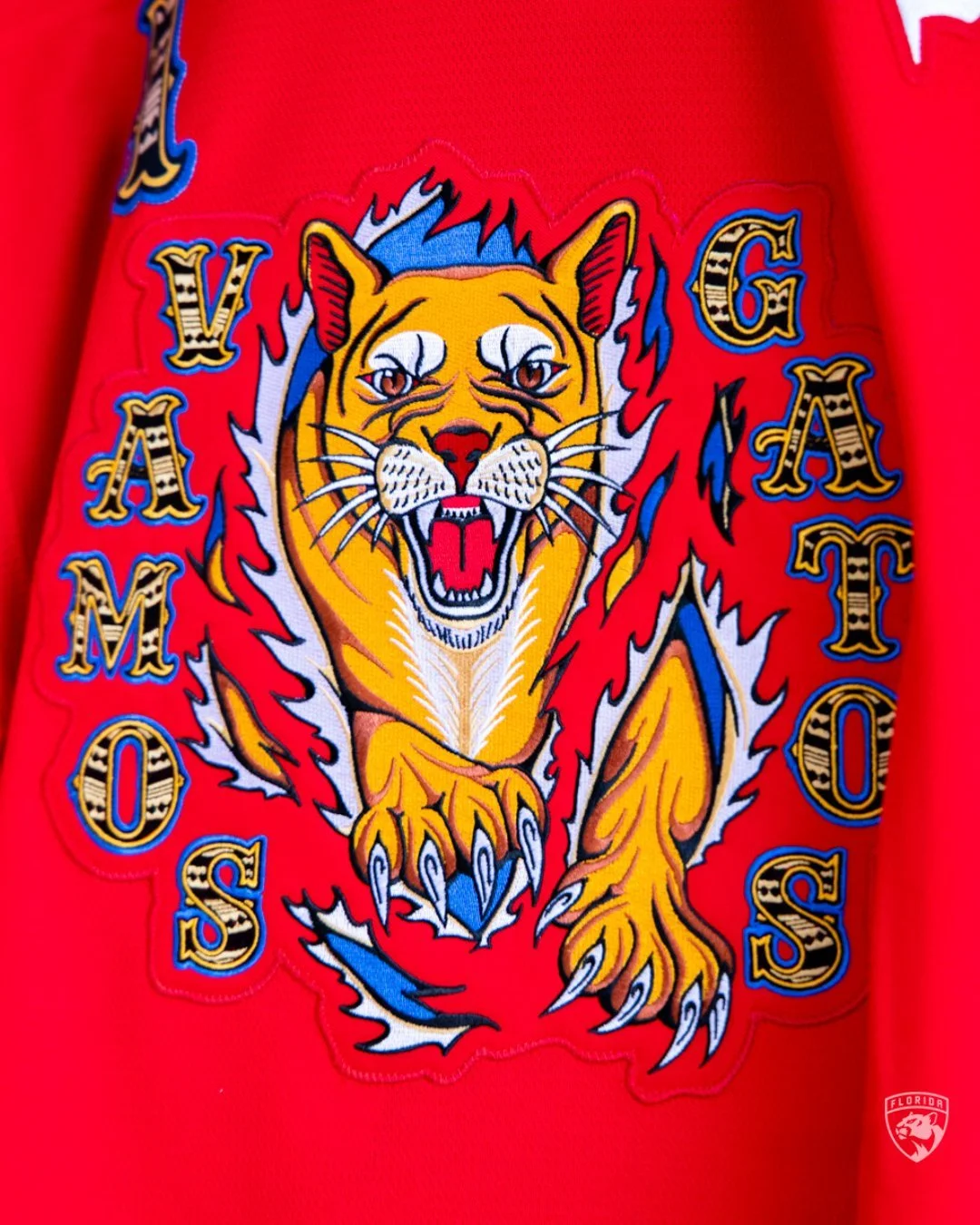
Florida Panthers

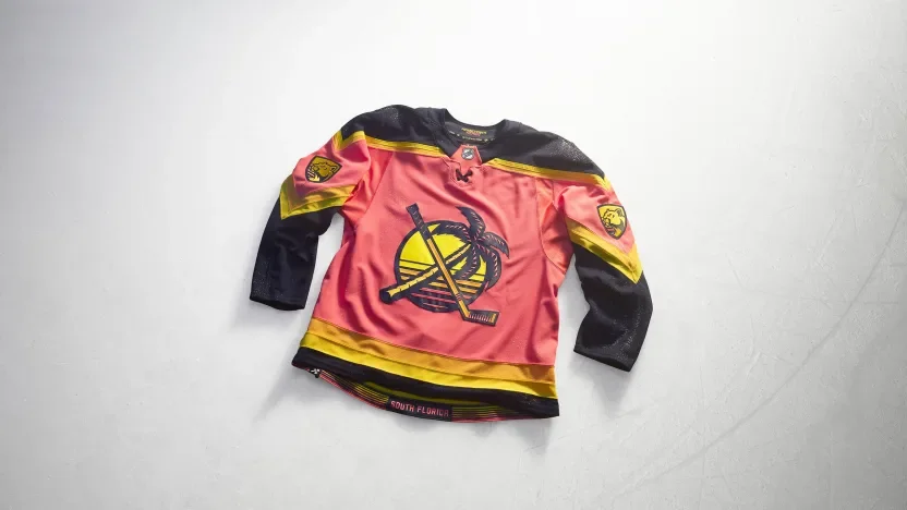
Florida embraces a South Florida sunrise palette with a design inspired by graphic beach tees. A remixed throwback shoulder logo moves to the front, while sunrise patterns stretch across the sleeves. Recolored Panthers marks complete a look rooted in the region’s waterfront lifestyle.

Los Angeles Kings

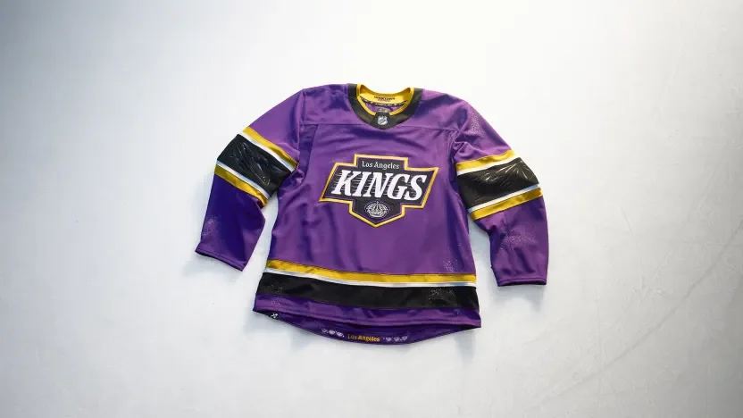
The Kings bring royal purple into a design celebrating six decades of hockey and Los Angeles street and art culture. A Hollywood-inspired serif crest combines crown imagery with pinstripe details. Debossed palm trees appear on the sleeves, while six interior diamonds represent the franchise’s six decades.

Minnesota Wild

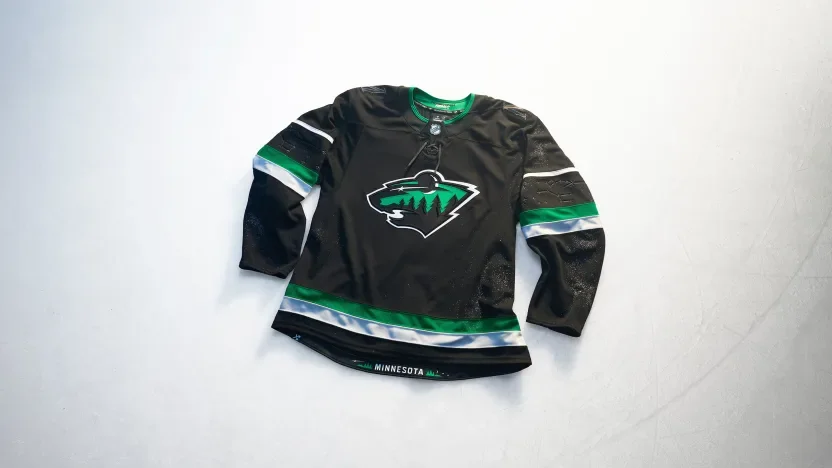
Minnesota turns to its night skies with a black jersey and a crescent-moon interpretation of the Wild crest. Debossed Ursa Major and Ursa Minor constellations decorate the sleeves, while twin stars within the numbers recognize the Twin Cities. Wilderness imagery at the hem completes the northern theme.

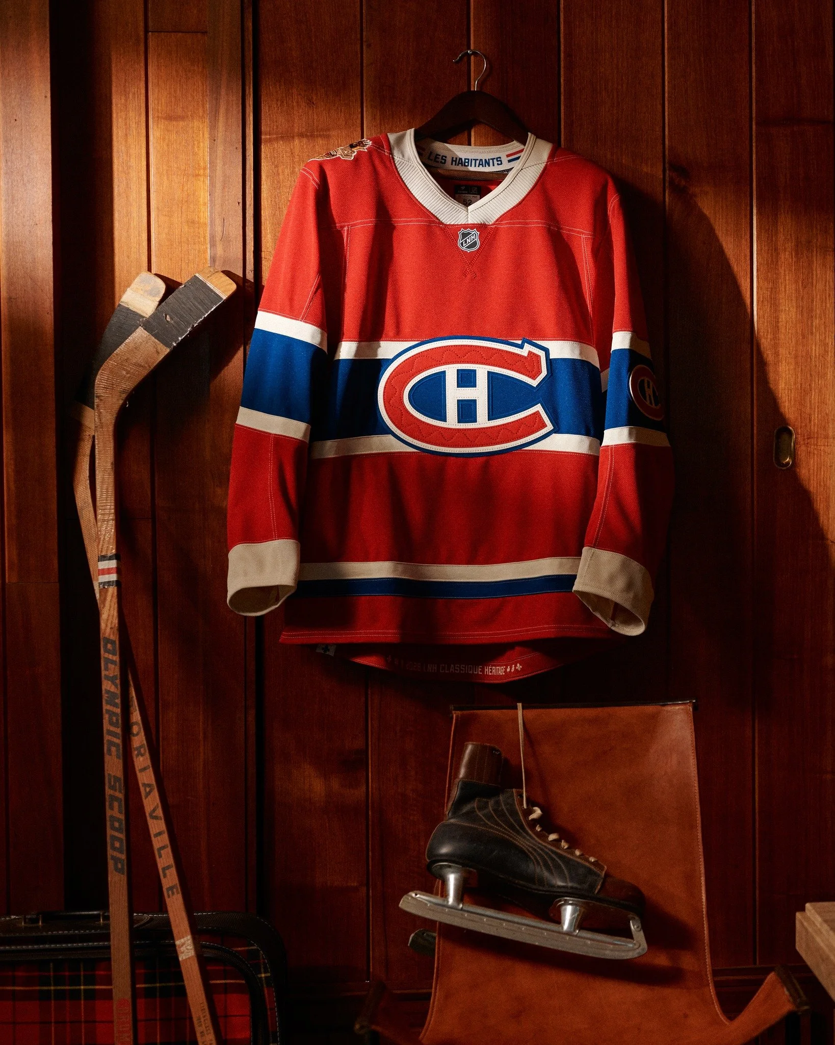
Montreal Canadiens

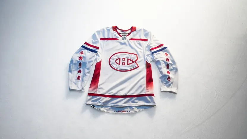
Montreal incorporates white pine, fleur-de-lys, rose, thistle and clover imagery across the sleeves to recognize the city’s cultural roots. Architectural etching adds texture to the Canadiens crest, while Mount Royal inspires gradient side panels. Custom numbers reference Old Montréal, with additional fleur-de-lys details framing the city name at the hem.

Nashville Predators

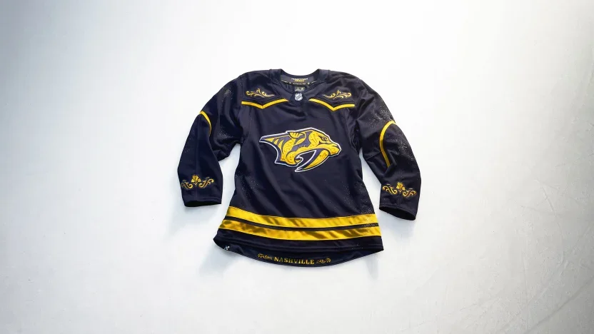
Nashville translates country stagewear and rodeo tailoring into a jersey filled with tonal filigree. Decorative yoke and sleeve treatments incorporate Tennessee’s iris, while matching artwork frames the city name at the hem. Letterpress-inspired numbers carry the same embroidered detailing.

New Jersey Devils

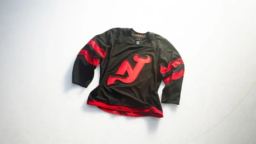
New Jersey removes the enclosing circle from its NJ crest, allowing the horns and tail to stand on their own. Sculpted sleeve stripes and debossed details give the black-and-red uniform added depth. Custom lettering combines curves with angular cuts, while state outlines frame the New Jersey name inside the hem.

New York Islanders

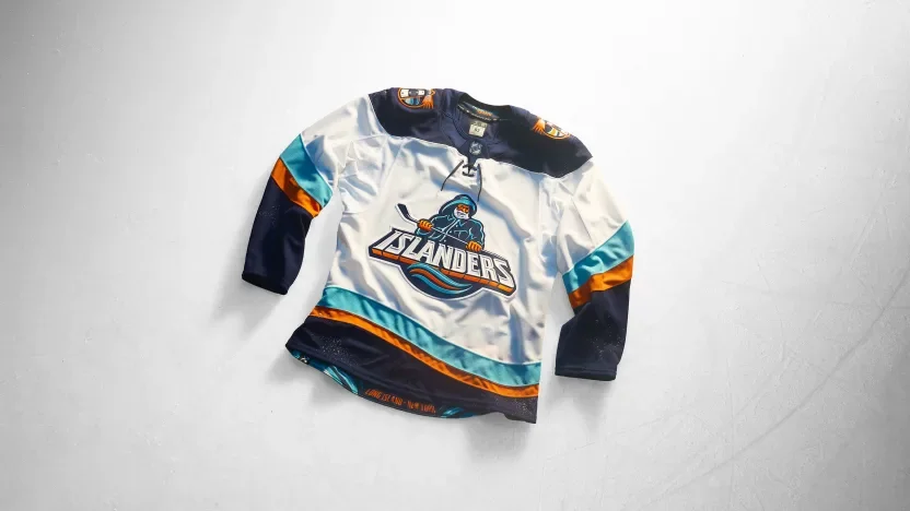
The Fisherman returns with a streamlined crest and updated coastal details. Wavy sleeve striping references the Atlantic, while lighthouse shoulder patches feature LI and NY identifiers. Hook-inspired typography and cross-grained twill add dimension to the names and numbers.

New York Rangers

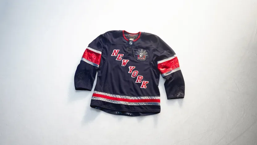
The Rangers introduce a stairstep NEW YORK wordmark with Lady Liberty positioned over the heart. Silver accents reference the city’s architectural metalwork, while debossed sleeve patterns draw from the Statue of Liberty’s torch base. A captain’s patch honors first responders, and torch graphics frame the city name at the hem.

Ottawa Senators

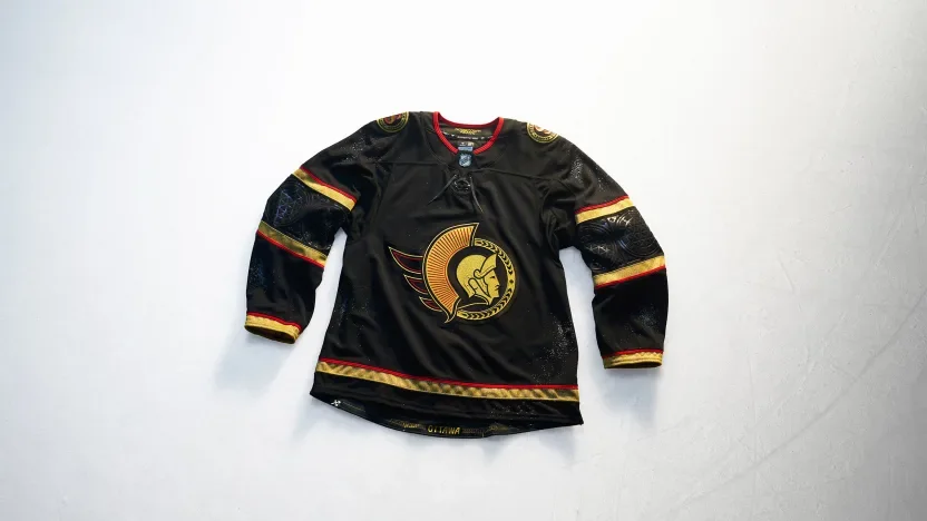
Ottawa pairs black and gold with details inspired by the city’s Gothic architecture. A brushed metallic gold Lurex crest leads the design, complemented by geometric sleeve striping and arched-window-inspired numbers. English and French shoulder marks celebrate the city’s bilingual identity, while bridge imagery recognizes the connection between Ottawa and Gatineau.

Philadelphia Flyers

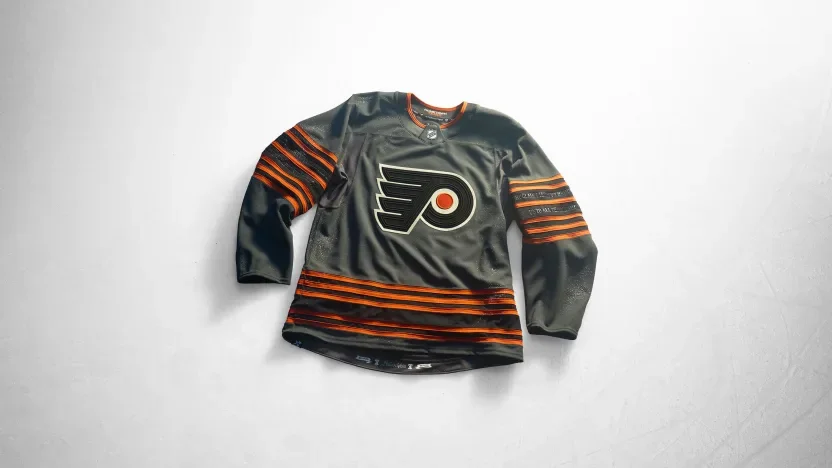
Philadelphia builds its concept around the Liberty Bell. Six sleeve stripes recognize the franchise’s 60th anniversary, with debossed inscription details adding texture. Crack-inspired numbers continue the theme, while Constitution script, the Liberty Bell and the date of Independence bring the city’s national significance into the hem treatment.

Pittsburgh Penguins

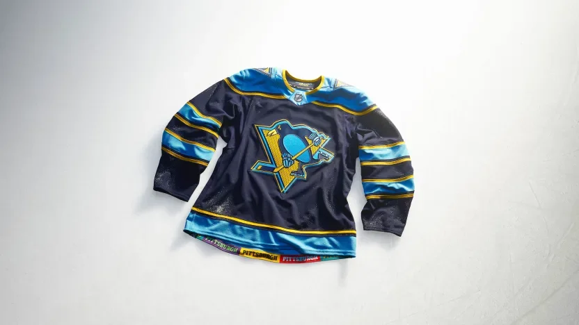
Pittsburgh introduces a pop-art interpretation of its identity through offset graphics and halftone textures. The crest, numbers and shoulder patches share that visual approach, with an igloo referencing the former arena and a triangle recognizing the Three Rivers. A colorful hem treatment connects the jersey to the city’s communities.

San Jose Sharks

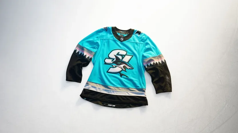
San Jose puts an SJ crest against a Scuba Blue base, drawing inspiration from the Sharks Head used during the team’s pregame entrance. Angular shark-tooth striping carries the concept down the sleeves. “Shark Tank” lettering and chomped-stick graphics finish the hem.

Seattle Kraken

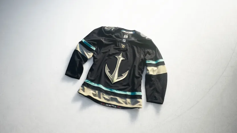
Seattle makes its anchor logo the centerpiece of a maritime-inspired design. Scrimshaw embroidery adds detail to custom nautical lettering, numbers and shoulder artwork. Mount Rainier and regional mountain imagery appear on the sleeves, while rhododendrons bring another Pacific Northwest reference to the hem.

St. Louis Blues

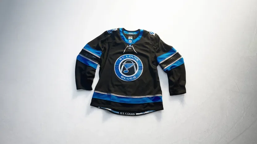
St. Louis introduces a black base inspired by the Mississippi River’s dark waters. The crest incorporates three river-wave lines, with debossed waves continuing across the sleeves. Beveled lettering and numbers reference the Gateway Arch’s metallic finish, while the hem frames the city name from beneath the landmark.

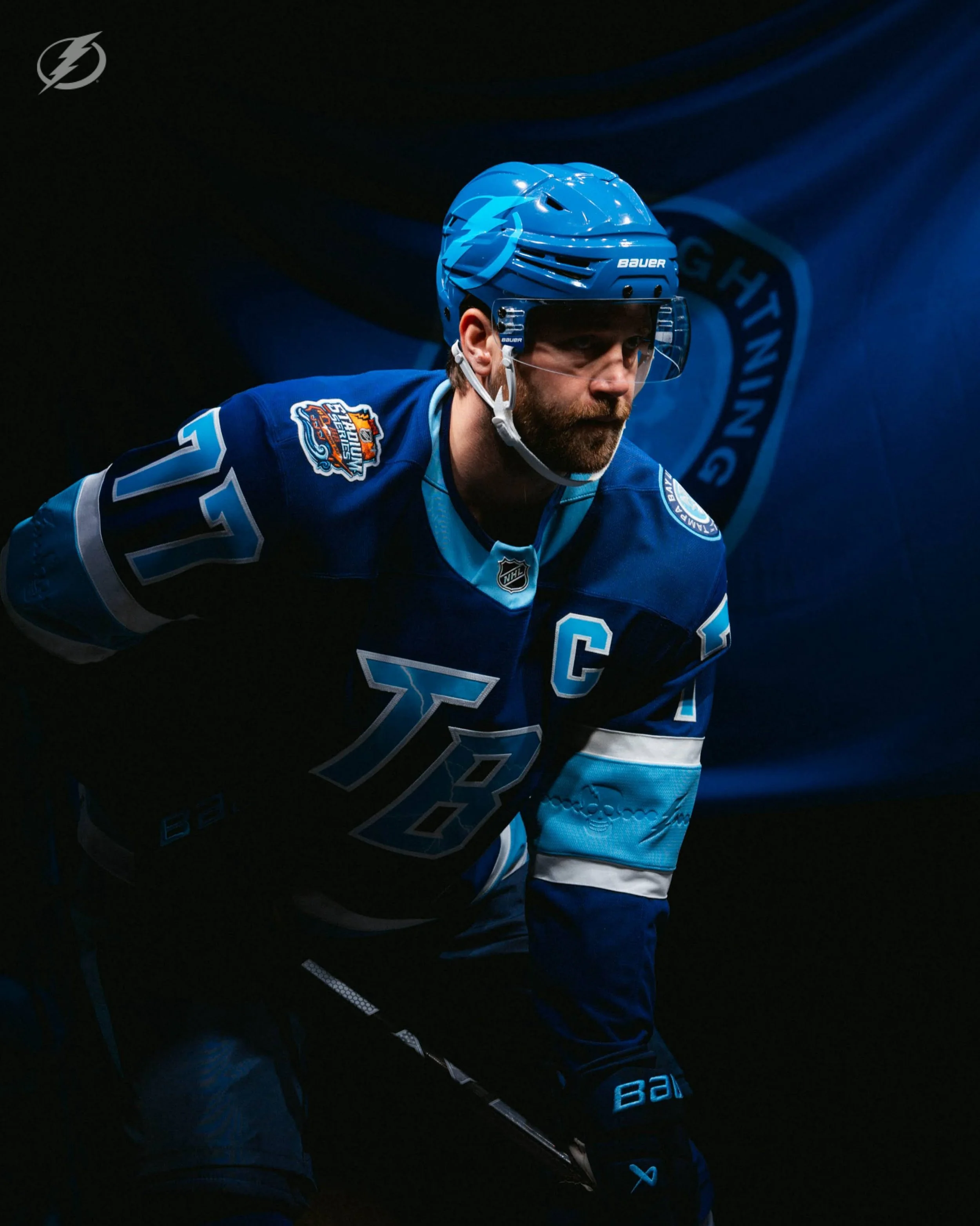
Tampa Bay Lightning

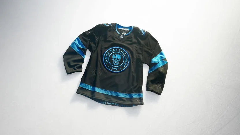
Tampa Bay combines familiar elements from past uniforms, moving its Stadium Series skull to the front with an updated expression. Sky Blue returns against black, supported by Lightning Blue accents and cut-and-sew sleeve bolts. The Bayshore Balustrade appears inside the hem as a local finishing touch.

Toronto Maple Leafs

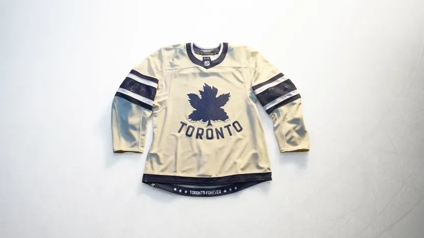
Toronto revisits its original Maple Leafs logo with tonal vein details and an arched Toronto wordmark. The leaf-vein pattern continues through the sleeve stripes and numbers, creating a consistent texture across the uniform. “Toronto Forever” appears at the hem alongside leaf logos from different chapters of team history.

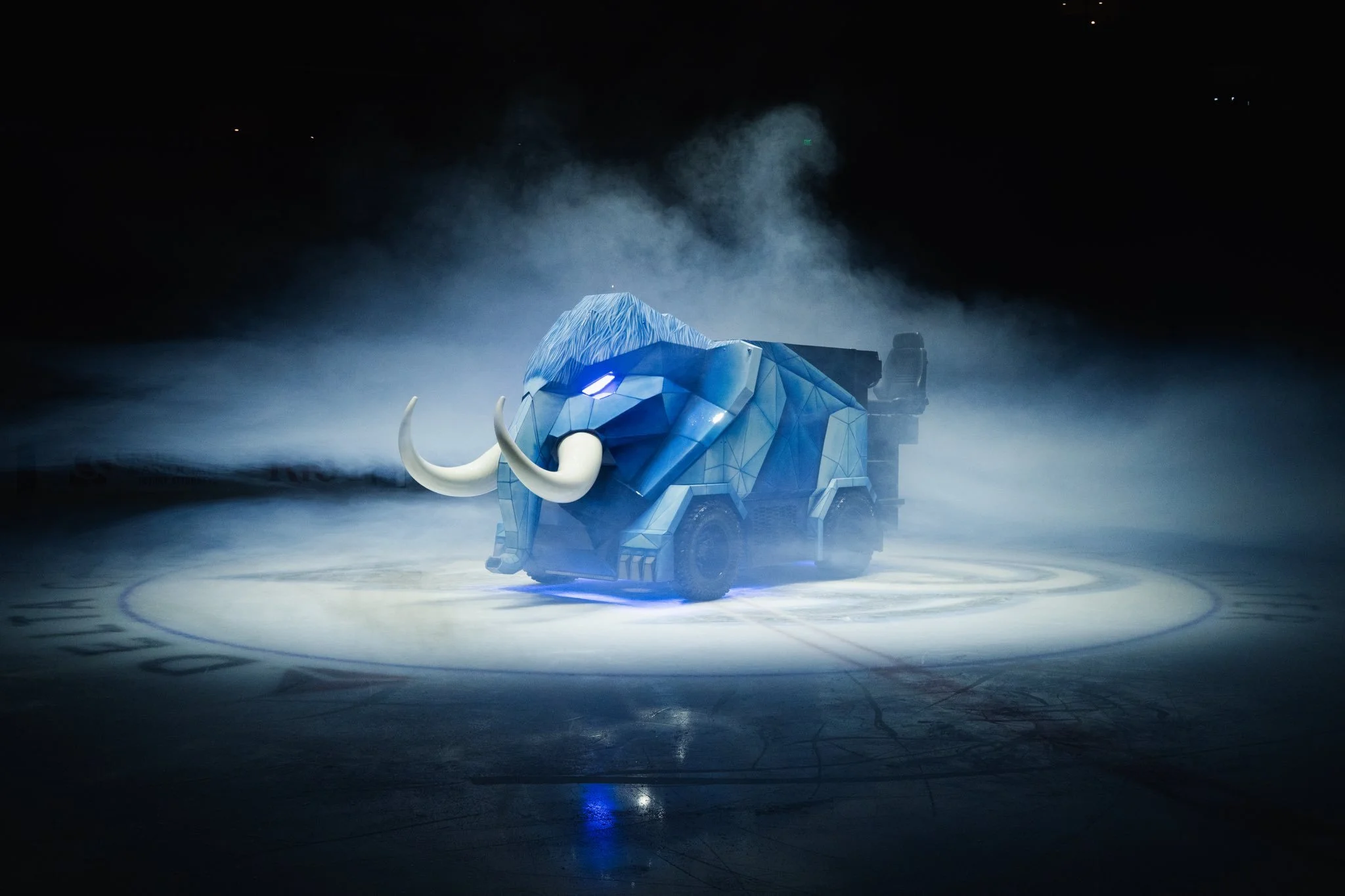
Utah Mammoth

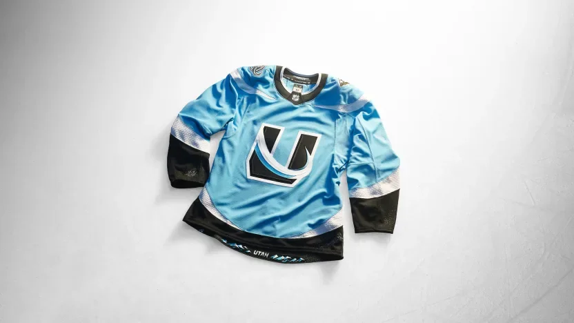
Utah places its U Tusk mark at the center of a Mountain Blue, Rock Black and Salt White design. The shoulder yoke, sleeve stripes and hem work together to form rising tusks when the wearer’s arms are down. Snow-shimmer debossing adds texture to the white striping, while the Wasatch Range anchors the hem artwork.

Vancouver Canucks

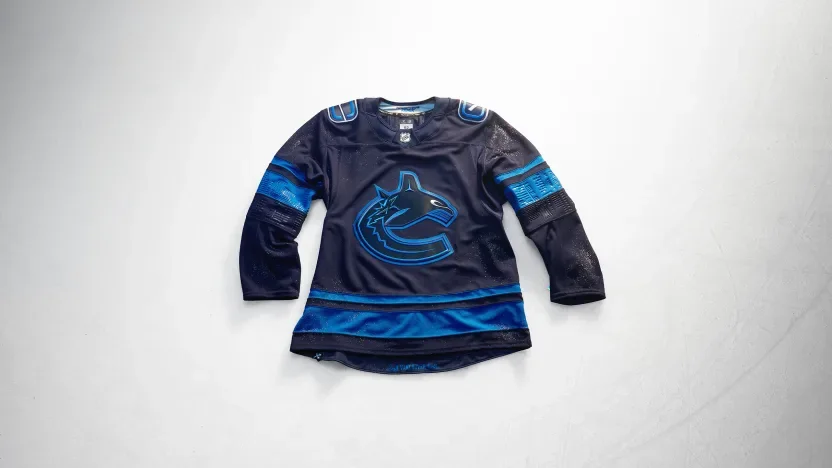
Vancouver draws from the city after dark with a deep-blue orca featuring silver eyes. Debossed sleeve artwork reflects the skyline mirrored in the bay, while the hem references the lions guarding Lions Gate Bridge. Custom names and numbers include a distinctive V-notch detail.

Vegas Golden Knights

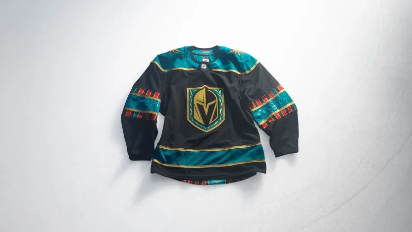
Vegas brings casino imagery into the uniform with a jade-green shoulder yoke inspired by gaming felt. Playing-card suits, roulette graphics and gold striping carry the concept throughout the design. A custom card-inspired number font completes the look, with a reference to the franchise’s 2017 arrival at the hem.

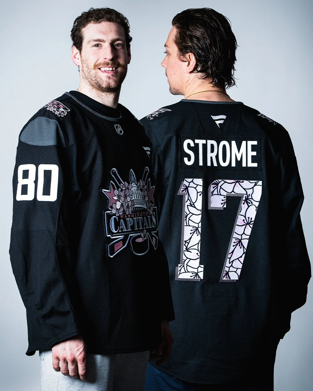
Washington Capitals

Washington introduces a Capitol Dome crest incorporating stars, hockey sticks and the Statue of Freedom. Marble texturing covers the sleeves and shoulder yoke, while monument lettering influences the beveled numbers. Screaming eagle shoulder patches connect to team history, and cherry blossoms at the hem recognize the wider DMV.

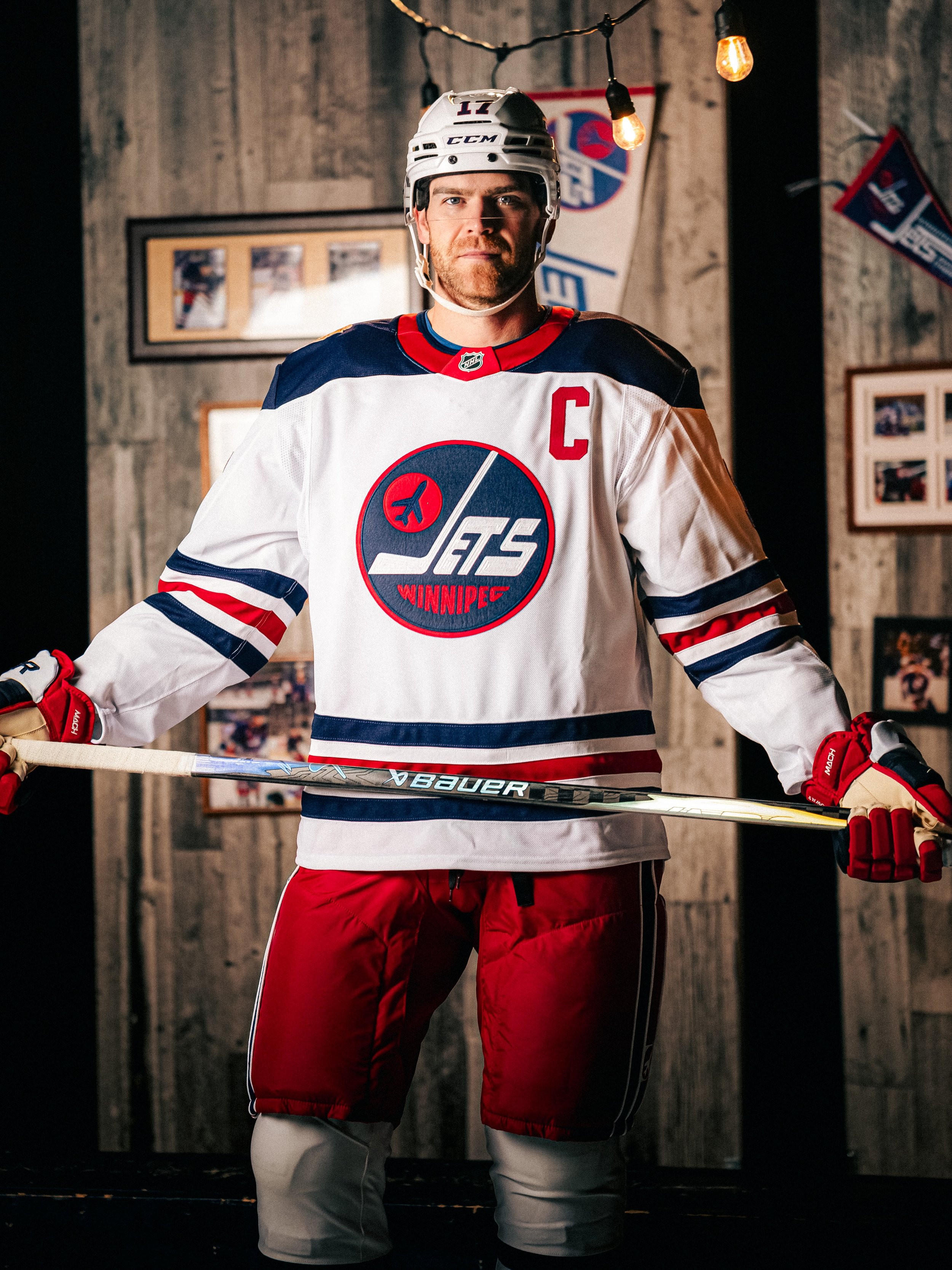
Winnipeg Jets

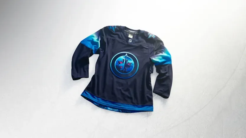
Winnipeg turns the northern lights into a uniform concept with a night-sky palette and illuminated crest details. Blue-to-light-green sleeve gradients mirror the aurora, while softly blended names and numbers create a glowing effect. A full aurora scene along the hem completes the tribute to Manitoba’s winter skies.

Across the collection, the strongest connections often appear in the smallest details: Boston’s brickwork, Calgary’s arena textures, Seattle’s scrimshaw and Winnipeg’s glowing numbers. Hometown Remix gives each team room to explore a different side of its identity while giving fans more of their city to recognize in the jersey.

SHOP NHL GEAR HERE

See What Else Is New

Related Articles


HockeySkye TilsonComment
2026 WEEK 9 UNISWAG COUNTDOWN

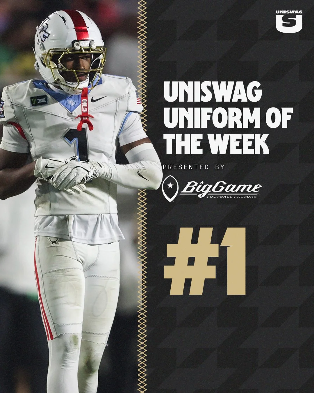
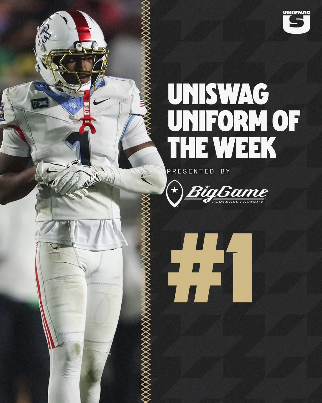
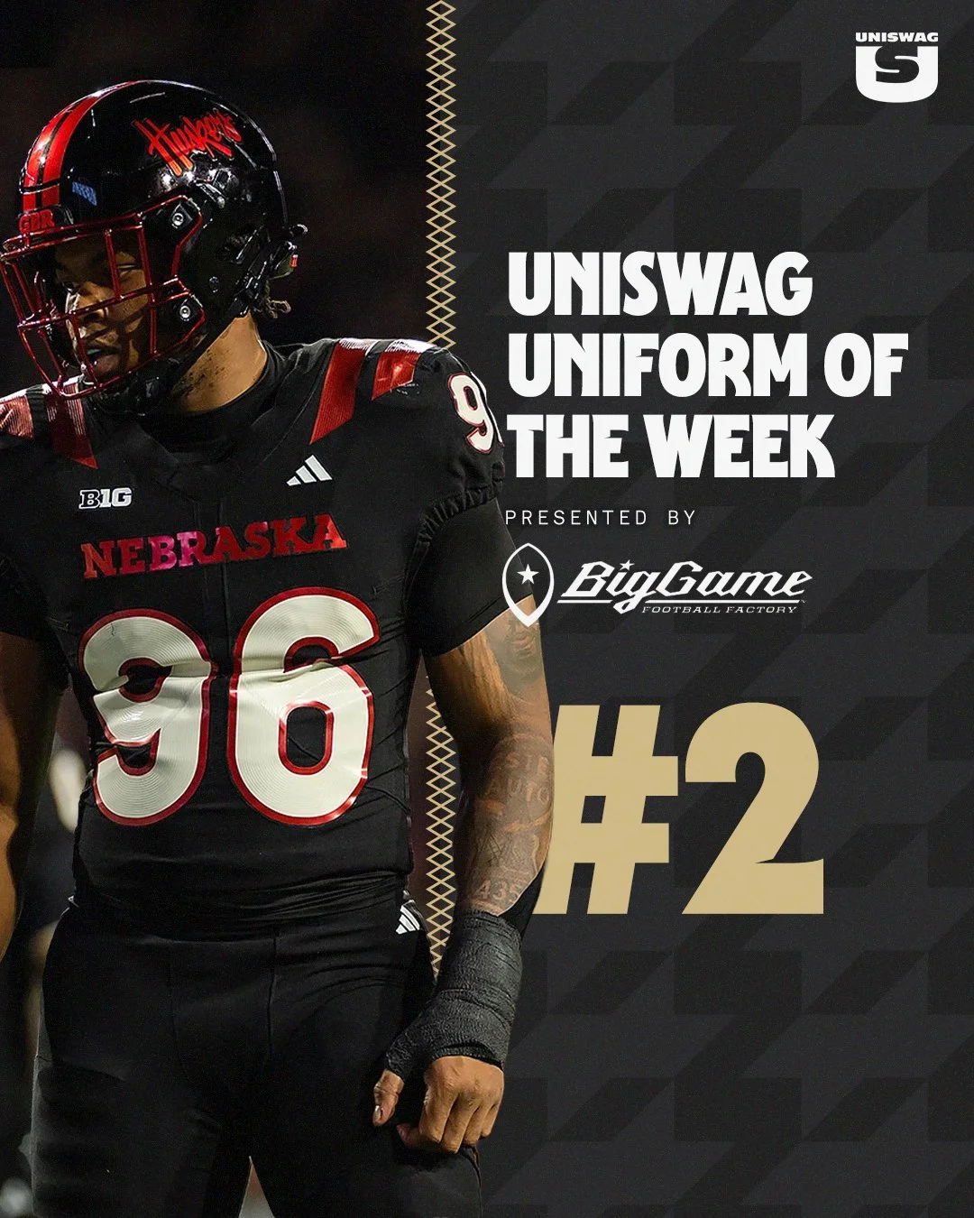
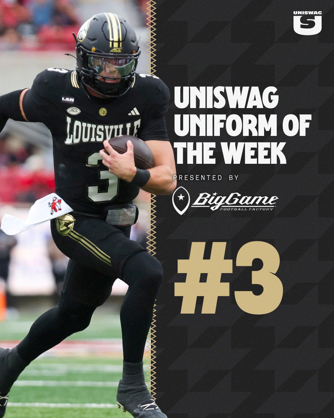
From UCF’s spacesuit-inspired uniforms to Nebraska’s Blackshirt look and Louisville’s Muhammad Ali tribute, Week 10 brought bold concepts and meaningful details to the field. Chrome gold, scarlet accents and boxing-inspired striping gave this week’s lineup stories that reached beyond the game.

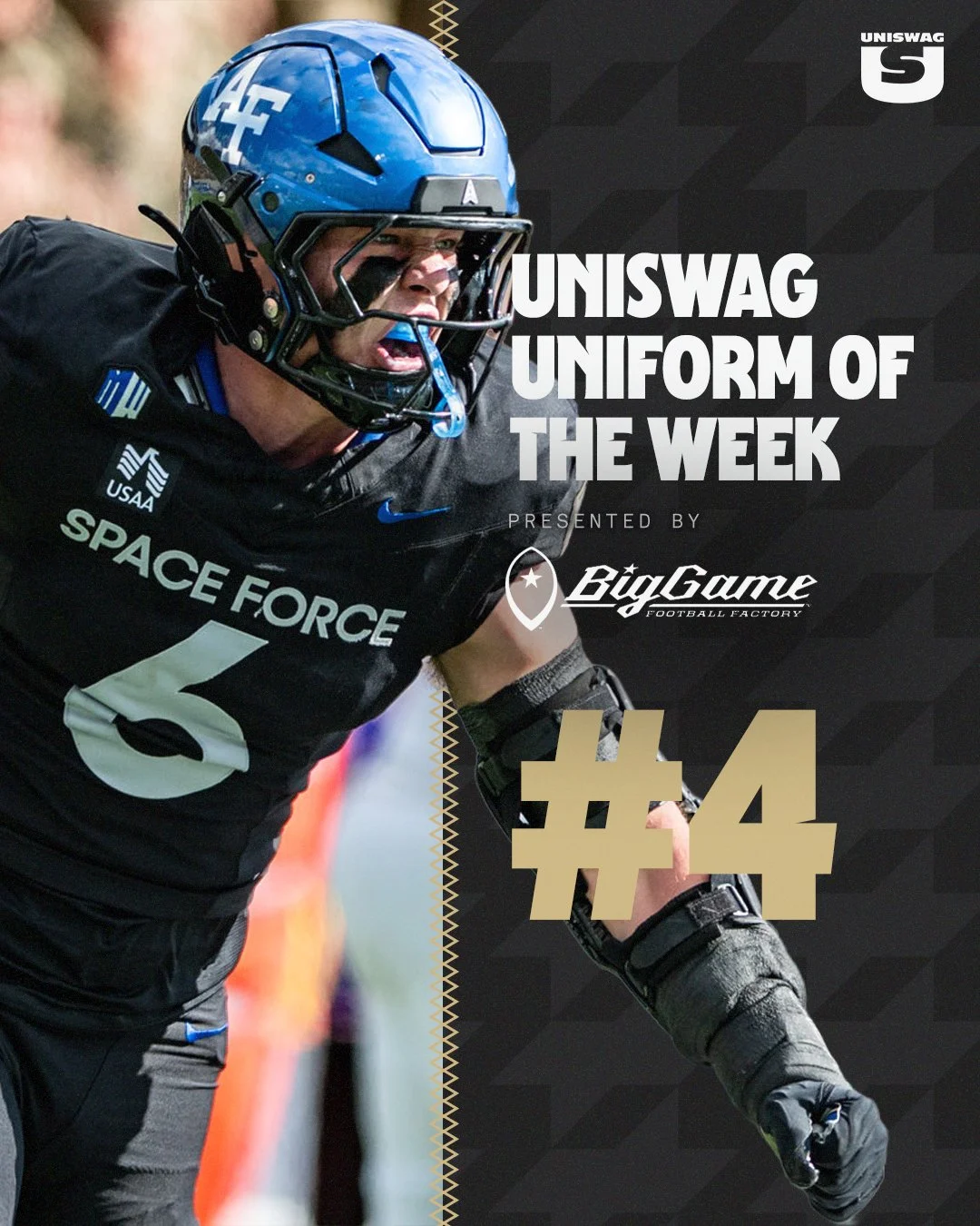
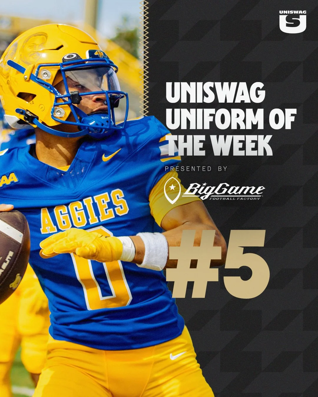
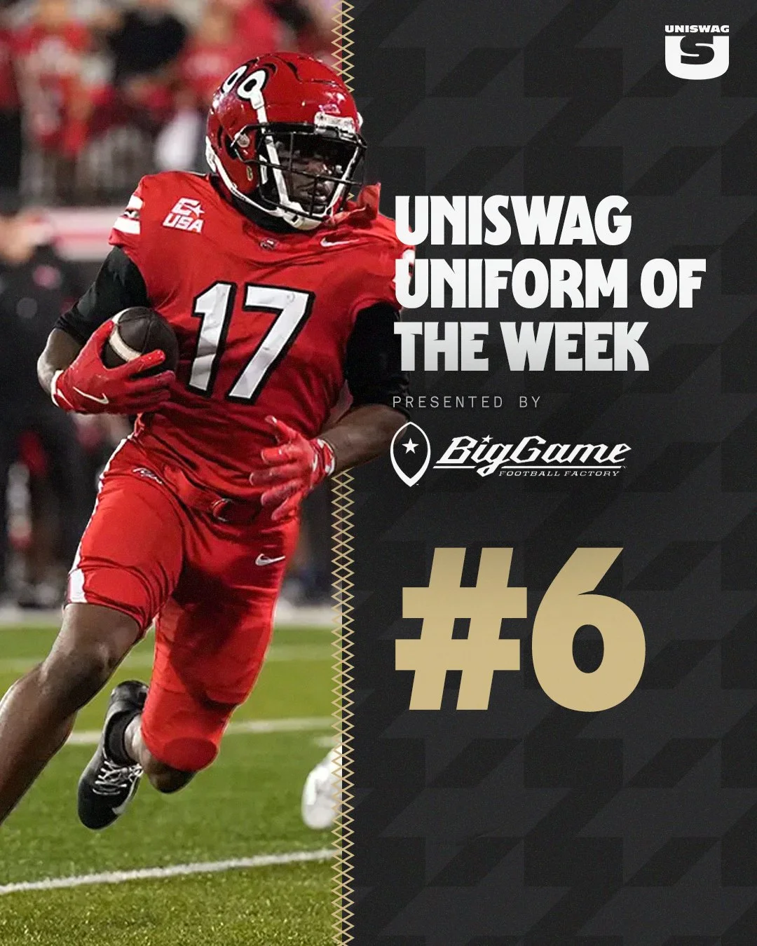
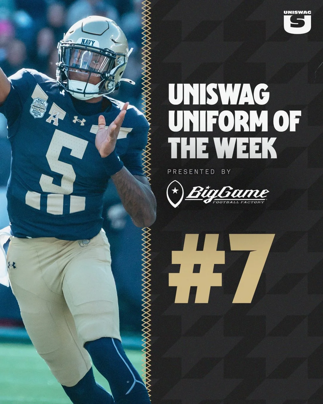
Air Force brought out their black Space Force uniforms, while North Carolina A&T brought vibrant blue and gold together with detailed helmet artwork. WKU went all red with Big Red on the helmets, and Navy honored its 1926 national championship team with a commemorative navy-and-gold look.

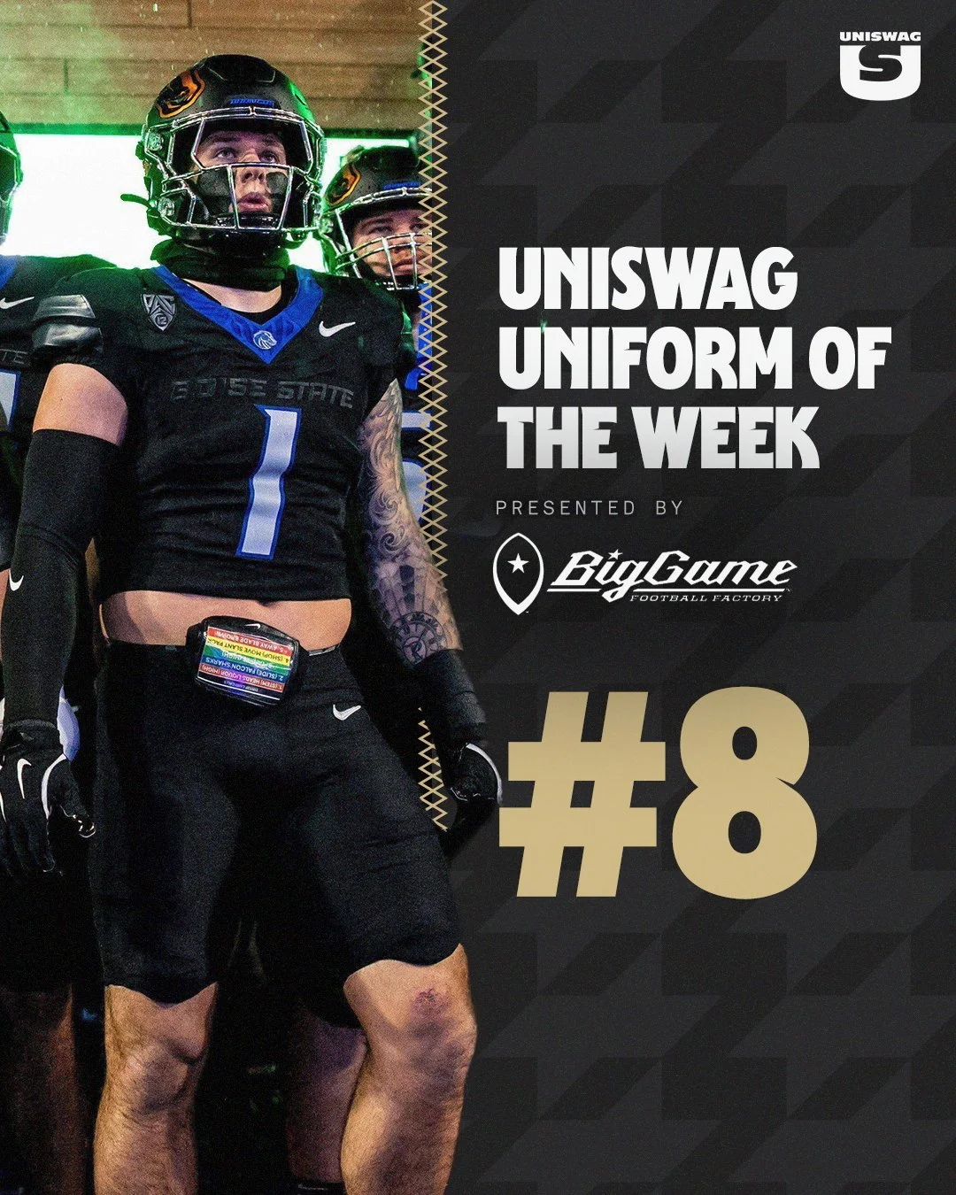
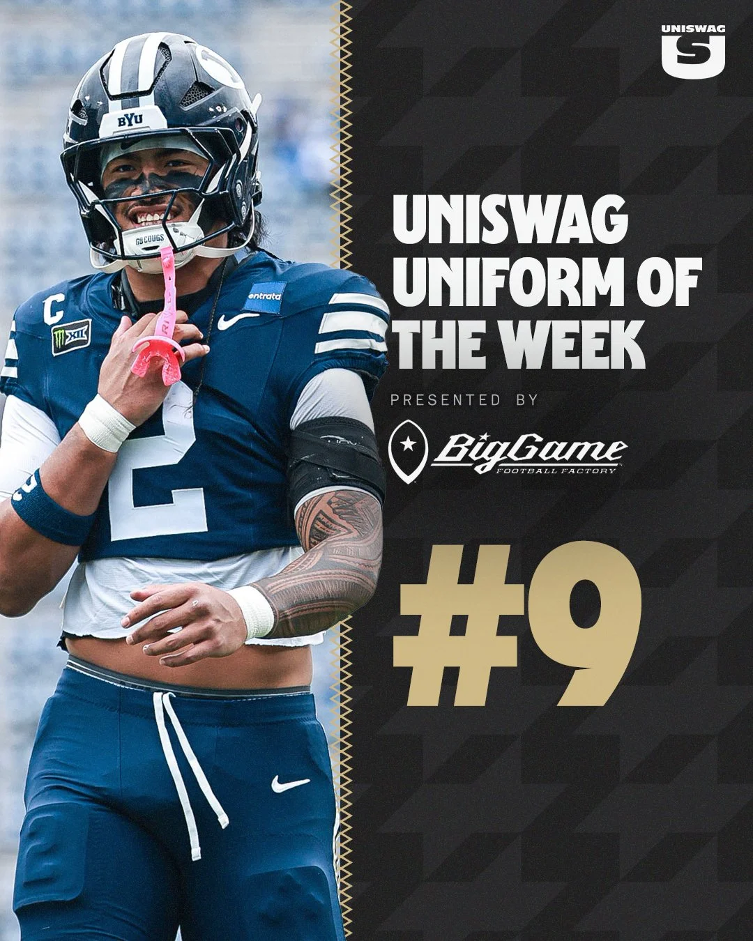
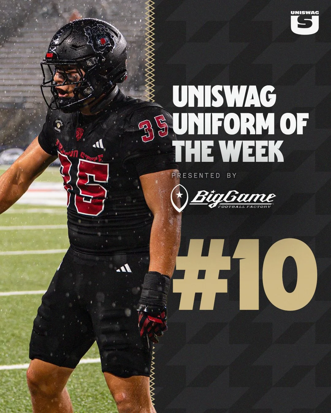
Boise State, BYU and Fresno State complete a Top 10 featuring blackouts, familiar striping and strong contrasts. From Boise State’s blue accents to BYU’s coordinated navy combination and Fresno State’s red-on-black details, every element helped build a complete look.

We’ve examined the helmets, jerseys, pants and finishing touches. Now it’s time to see where your favorites landed, and which team earned the top spot.

Let’s count down the Week 10 UNISWAG Uniform of the Week Top 10, presented by Big Game USA.

Shop College Football Gear Here


See What Else Is New

Related Articles


FootballSkye TilsonComment
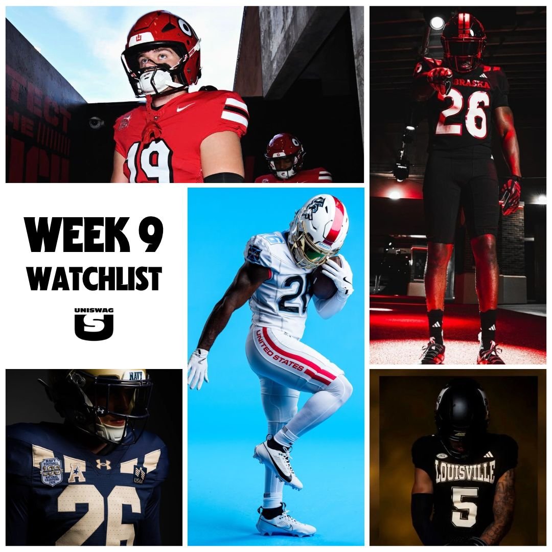
2026 Week 9 UNISWAG Watchlist

WEEK 9 BRINGS FRESH LOOKS, BOLD COMBINATIONS AND ANOTHER OPPORTUNITY TO EARN A SPOT IN THE UNISWAG COUNTDOWN. THE SEARCH FOR THIS WEEK’S BEST UNIFORM STARTS NOW.

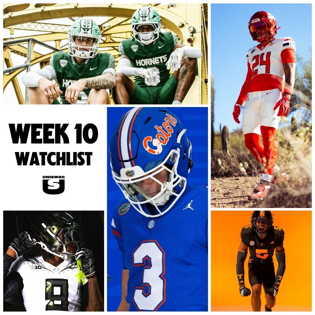
FROM HALLOWEEN-WEEKEND ALTERNATES TO CLASSIC TEAM COLORS, WE’RE WATCHING THE UNIFORMS TAKING THE FIELD ACROSS COLLEGE FOOTBALL.

THE COMPLETE LOOK MATTERS. HELMETS, JERSEYS, PANTS AND ACCESSORIES ALL PLAY A PART IN TURNING A STRONG DESIGN INTO A STANDOUT GAME-DAY COMBINATION.

WE’LL EXAMINE THE DETAILS, SELECT OUR TOP 10 AND CROWN ONE TEAM THE WEEK 9 UNISWAG UNIFORM OF THE WEEK WINNER.

FIND OUT WHO MAKES THE COUNTDOWN WHEN IT DROPS MONDAY, PRESENTED BY BIG GAME USA.

SHOP COLLEGE GEAR HERE

NEBRaska

syracuse

UCF

BYU

KENNESAW state

ecu

Air Force

UNLV

iowa state

WKU

sac state

jmu

baylor

navy

usf

washington state

Tulane

louisville

maryland

ulm

Wake

oklahoma state

uva

Utah

Oregon

wmu

utep

fresno state

georgia southern

kent state

Arizona

Cincinnati

georgia tech

boise state

ARIZONA state

memphis

texas tech


See What Else Is New

Related Articles


FootballSkye TilsonComment
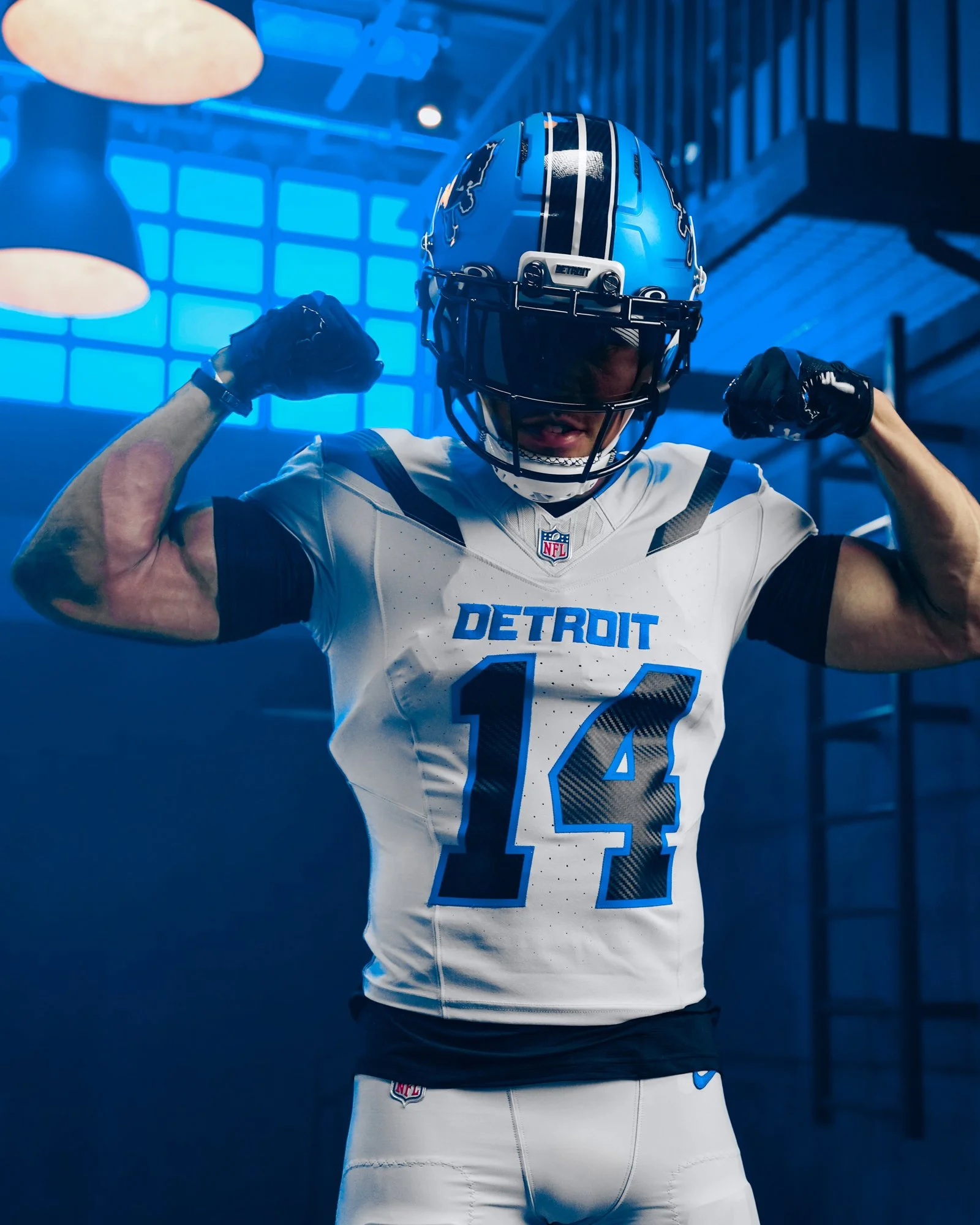
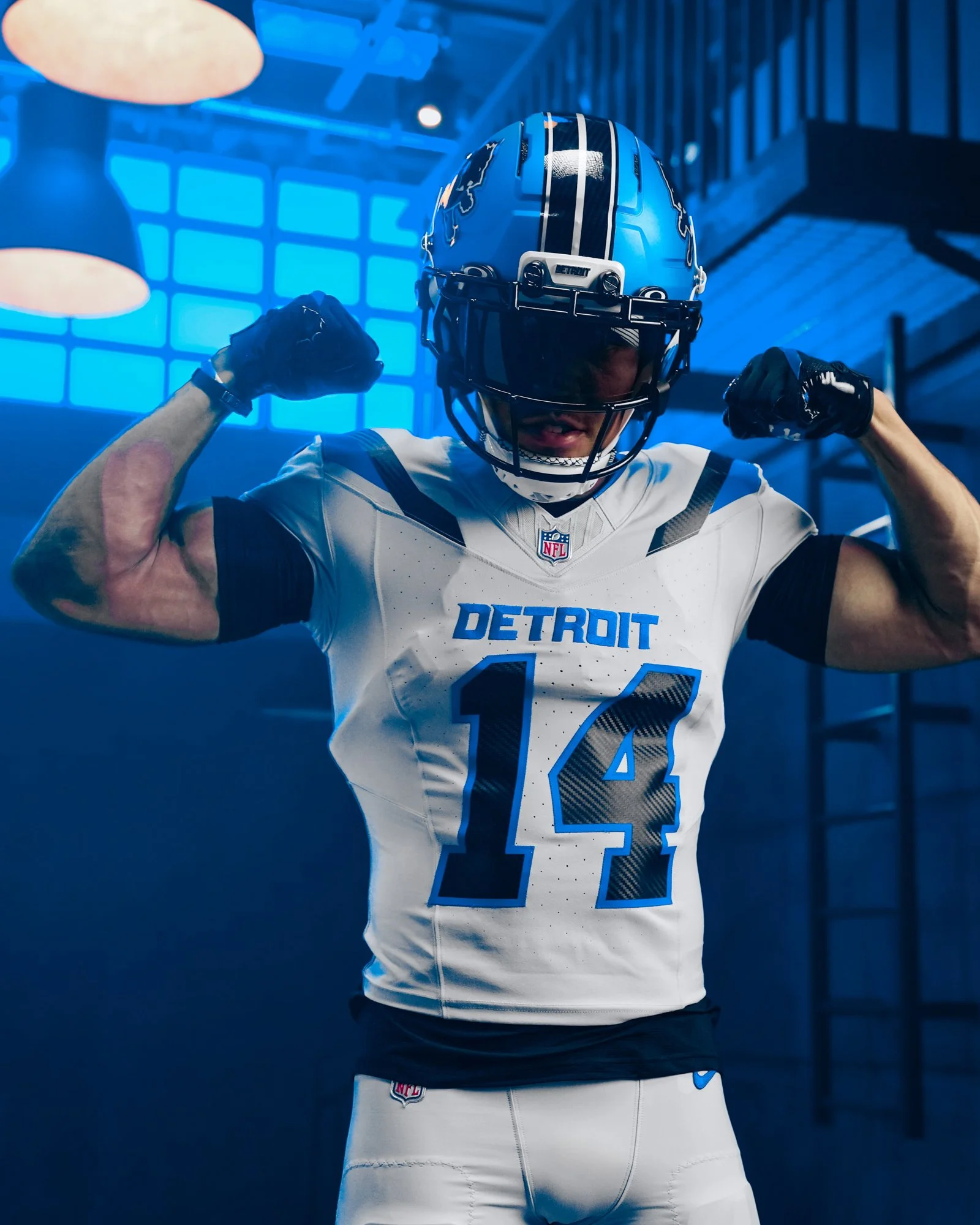
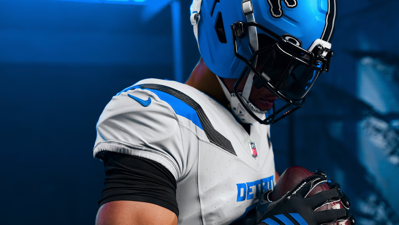
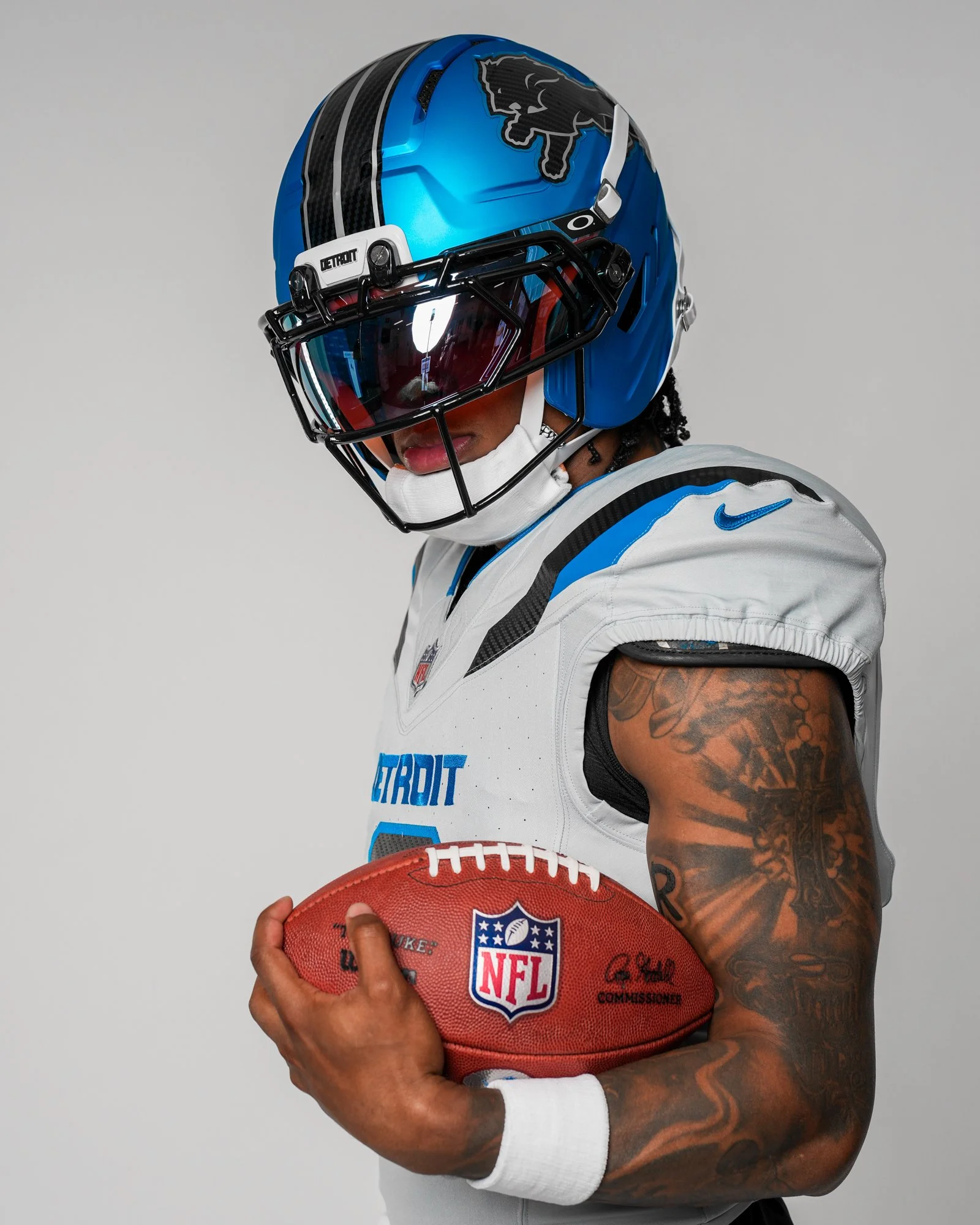
Detroit Lions Unveil “Defend the Den” Rivalries Uniform

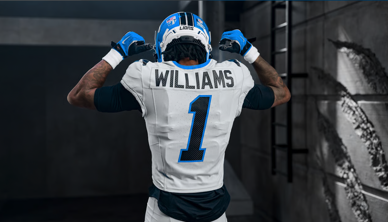
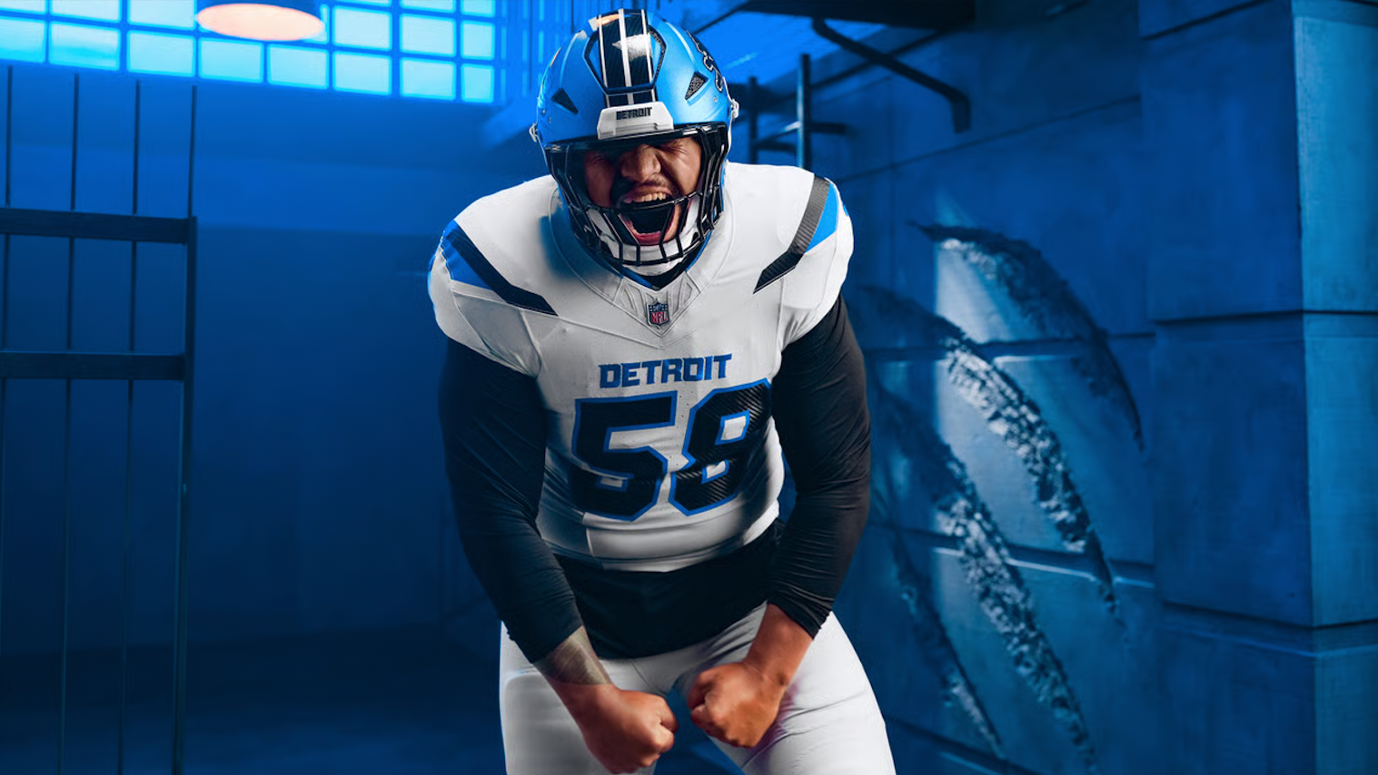
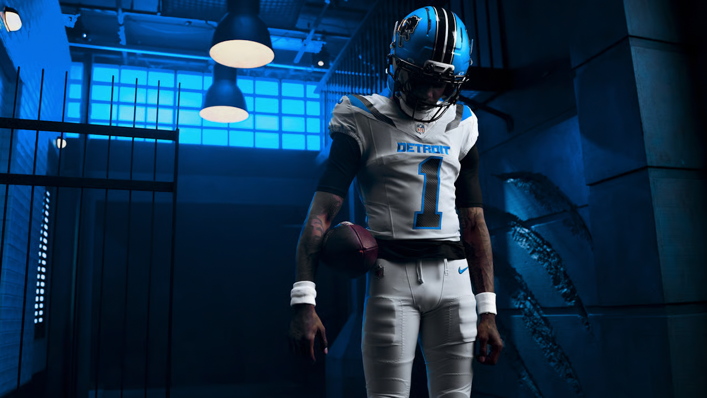
The Detroit Lions are adding a new edge to their uniform collection with the introduction of the “Defend the Den”uniform, created as part of the NFL and Nike’s Rivalries program.

Rooted in Detroit’s identity, the new look is built around the mentality of protecting home turf. The Lions’ concept draws a parallel between the city’s history of building and its modern identity as a city that refuses to back down. That same attitude carries onto the football field, where every opponent is viewed as an intruder entering the Den.

The uniform brings together Honolulu blue and black, with the darker elements designed to mimic the intense gaze of a lion locking onto its prey. The combination gives the Lions’ traditional color palette a noticeably more aggressive appearance.

One of the standout details is the “Defend the Den” inscription, which appears on the collar. The mantra represents the pride surrounding the Lions’ home-field advantage and the mentality the team wants to bring to Ford Field.

The helmet also features a unique carbon-fiber-inspired texture within the decals. Beyond adding another layer of detail to the helmet, the texture connects the uniform to Detroit's automotive and racing heritage.

The jersey numbers take on an italicized design, leaning forward to create a sense of motion and speed. Additional paint-stripe details appear throughout the uniform, helping tie the different elements together.

Perhaps the simplest detail is also one of the most important: “Detroit” is proudly displayed across the chest, connecting the Rivalries uniform back to the Lions’ existing identity and emphasizing that the uniform is ultimately about the city.

The result is a darker, more aggressive take on the Lions’ look while keeping the focus firmly on Detroit. With “Defend the Den,” the Lions are using the Rivalries program to turn their home-field mentality and the city’s culture into a uniform built around one simple idea: protect the Den.

SHOP Lions gear HERE


See What Else Is New

Related Articles


FootballSkye TilsonComment
Georgia’s OutKast Game Football Puts a Crown on the Bulldogs’ Identity

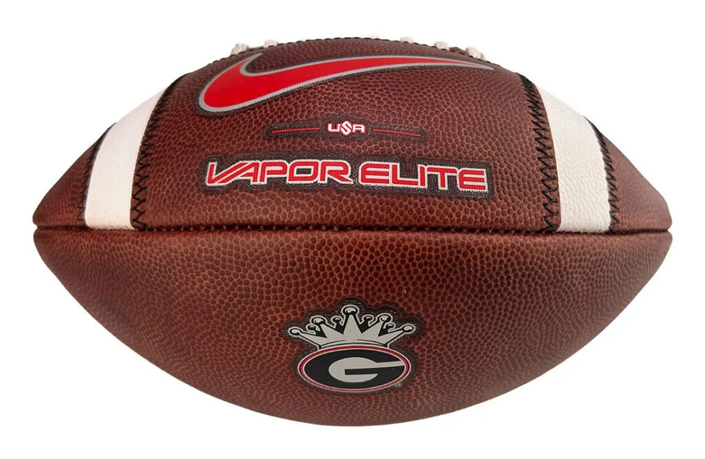
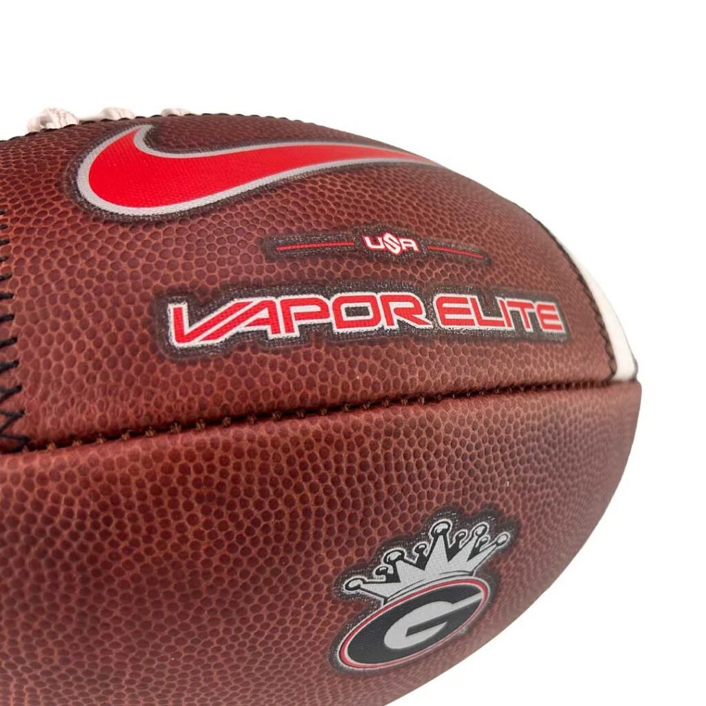
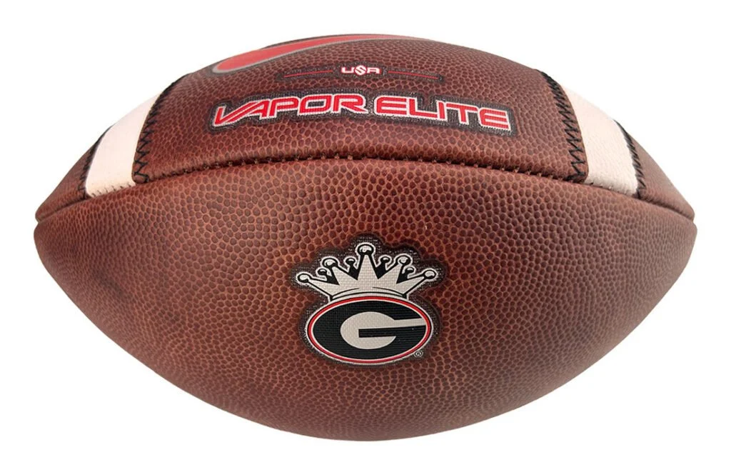
Georgia football’s collaboration with OutKast extends to the game ball with the 2026 Special Edition Georgia Bulldogs OutKast Nike Vapor Elite Game Football. Handcrafted by Big Game Football Factory in Dallas, Texas, the special edition connects the Dawgs’ identity with the influential Georgia music duo.

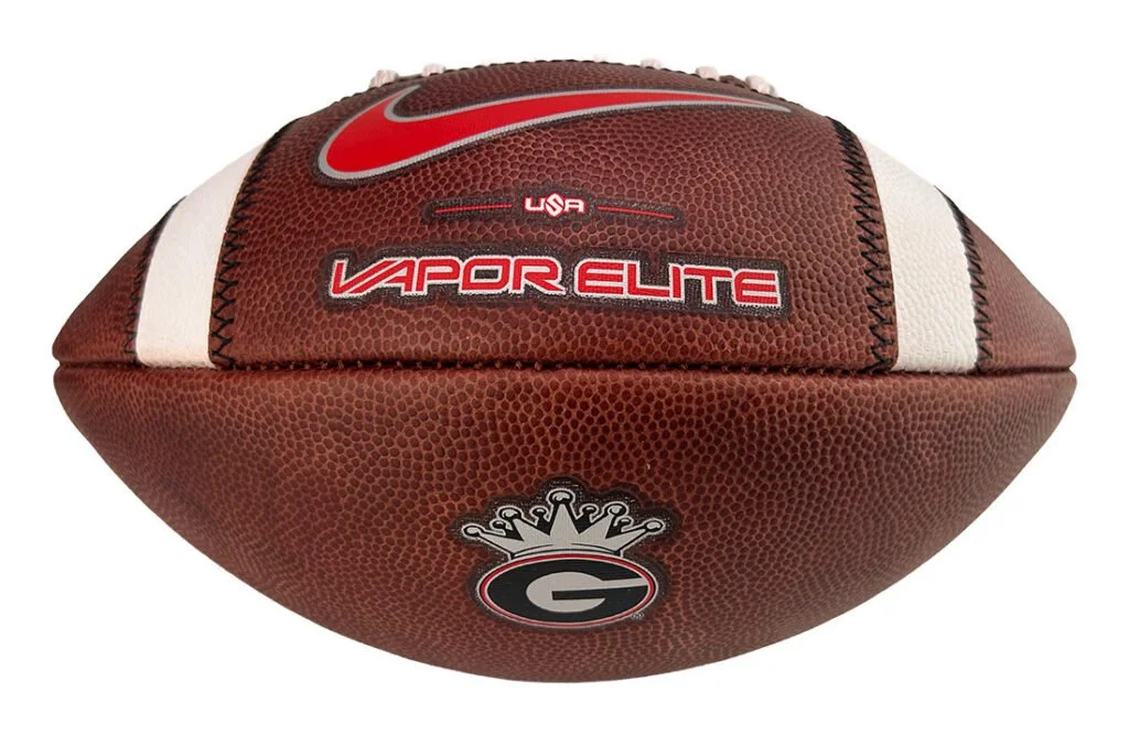
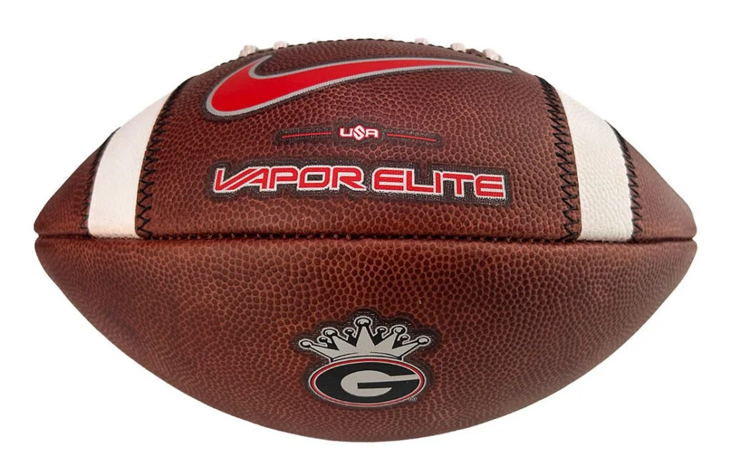
The defining detail is a crowned Georgia G, bringing OutKast’s crown imagery together with the Bulldogs’ familiar oval logo. Positioned against brown leather, the graphic gives the football a distinct connection to the wider Georgia x OutKast collection.

A red Nike Swoosh and Vapor Elite branding complement the crowned mark, while white stripes frame the design. The combination keeps Georgia’s red, black and white prominent, carrying the collaboration onto a traditional leather football.

Built for accuracy, grip and control, the Nike Vapor Elite model pairs its special-edition artwork with game-ready construction. Big Game’s Dallas-based production adds American craftsmanship to a football designed to represent the Bulldogs on the field.

The ball also connects with the collaboration’s performance equipment and sideline apparel created for Georgia’s matchup against Florida. Crowned G graphics appear across gloves, wristbands, skullcaps and apparel, giving the football a place within a coordinated collection celebrating Southern football and music culture.

For fans, the special edition offers a collectible that brings both identities together in one recognizable detail. Each football includes a Certificate of Authenticity identifying it as an official on-field model.

The 2026 Special Edition Georgia Bulldogs OutKast Nike Vapor Elite Game Football is priced at $174.99 and available through Big Game USA.

SHOP Georgia Football HERE


See What Else Is New

Related Articles


FootballSkye TilsonComment
Georgia x Outkast Brings “So Fresh, So Clean” Style to the Field

Georgia football is bringing Outkast’s creative identity into its game-day look against Florida. The collaboration pairs the Bulldogs’ familiar red, black and white with crown graphics and “So Fresh” and “So Clean” details across exclusive performance equipment and sideline apparel.

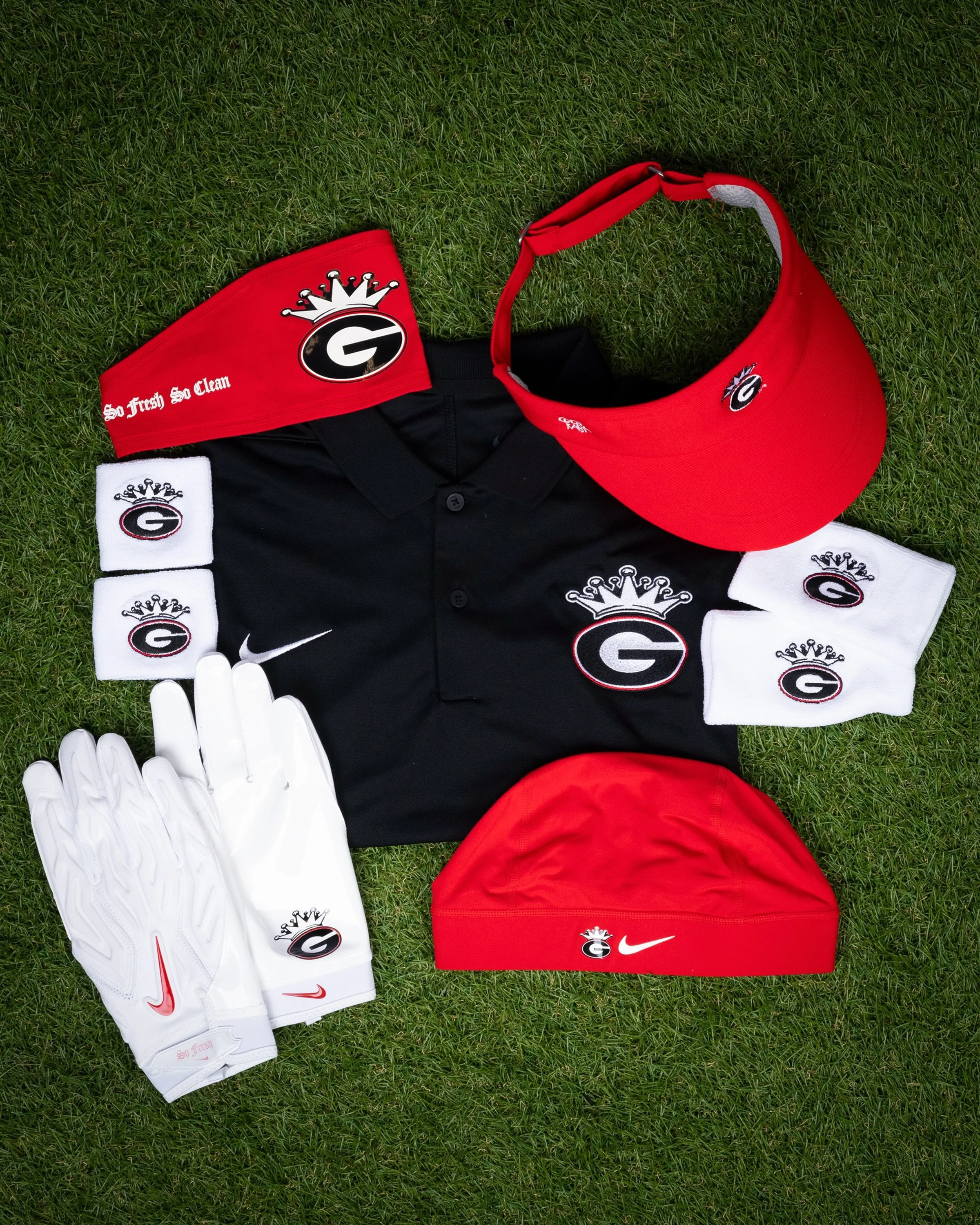
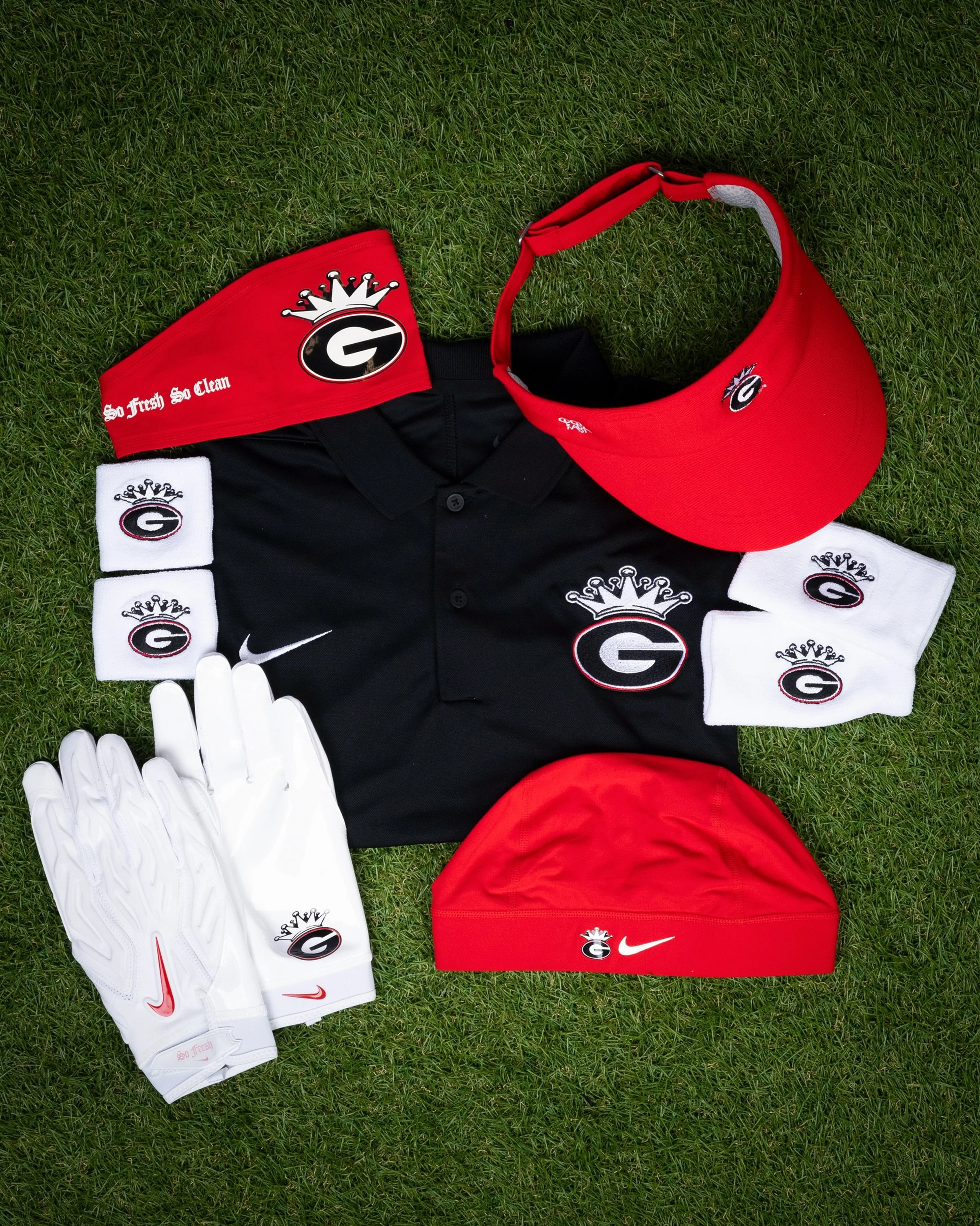
The centerpiece is a crowned Georgia G, combining the program’s oval logo with Outkast’s crown imagery. The mark appears throughout the collection, giving athletes, coaches and staff a shared design that connects Georgia football with Southern music culture.

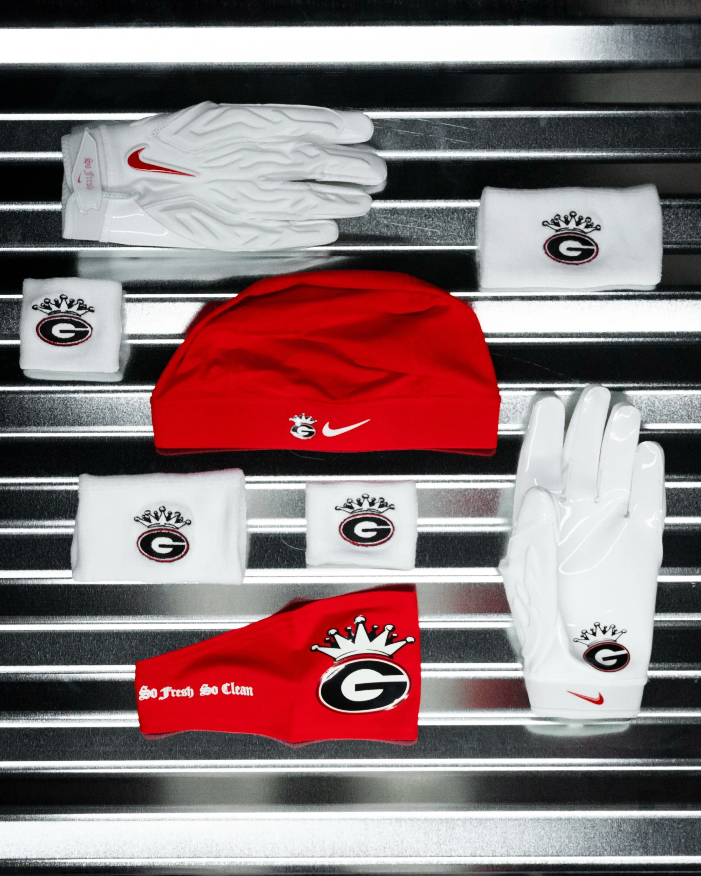
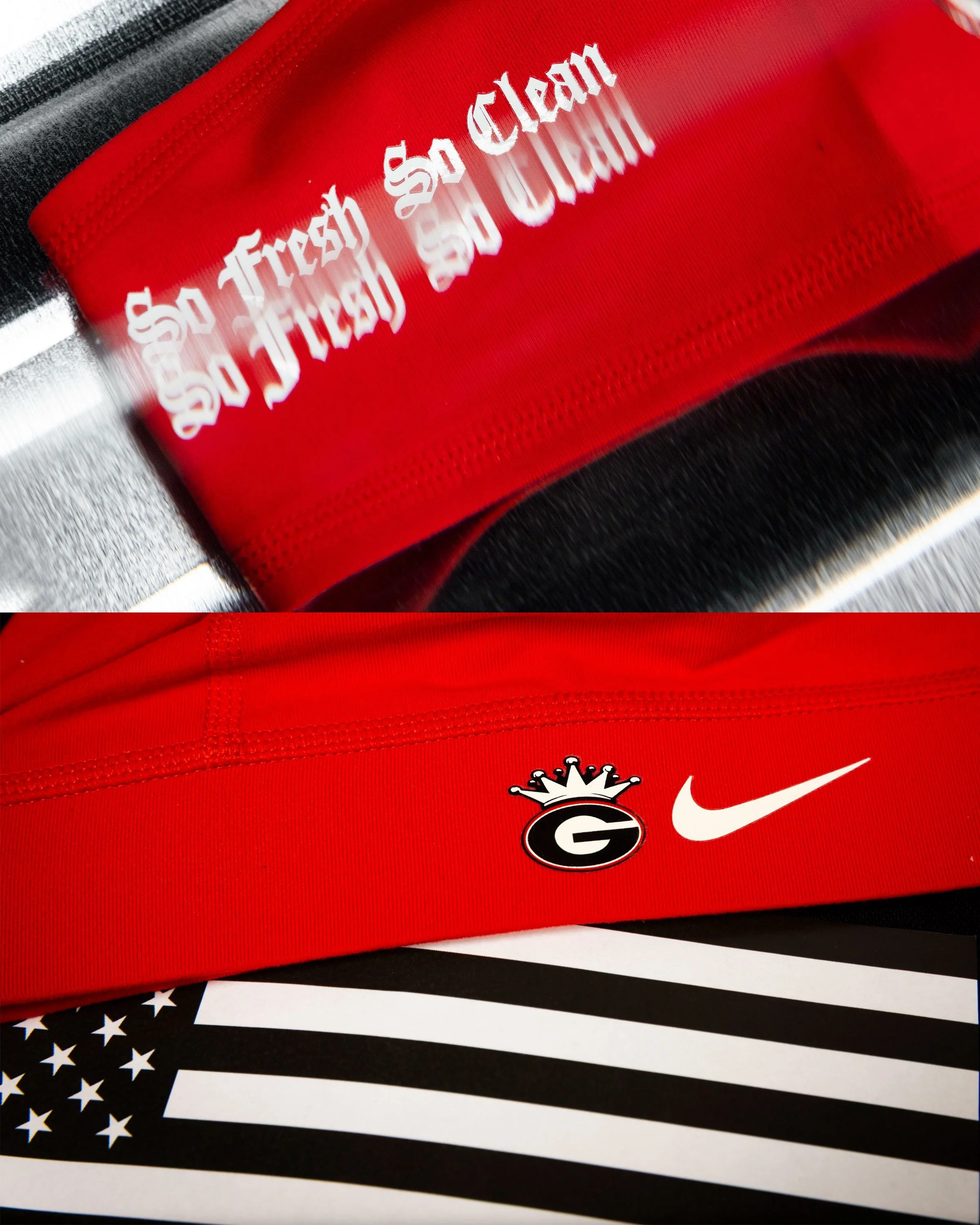
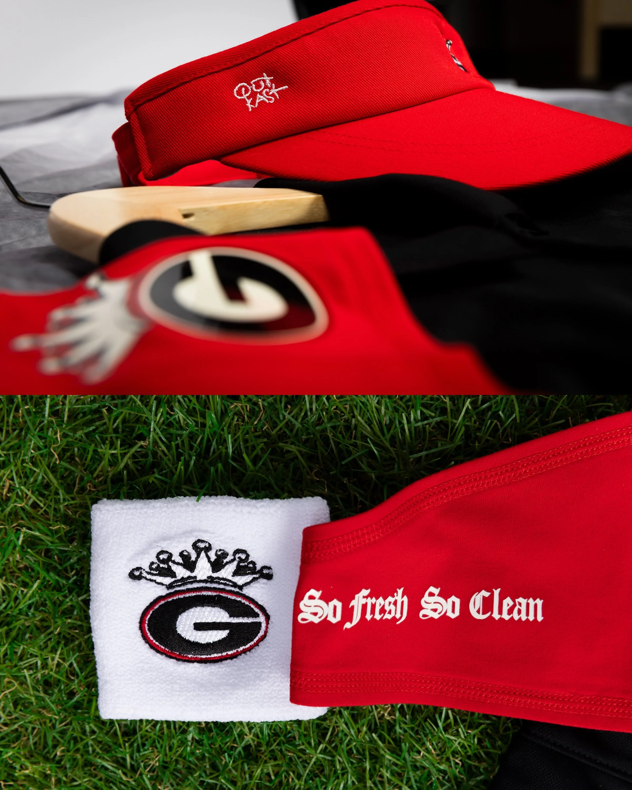
On the field, eye-shield decals and skullcaps carry the collaboration into the Bulldogs’ equipment. Red accessories feature contrasting white lettering, with “So Fresh So Clean” presented in an Old English-style font. The crowned G adds another recognizable detail alongside Nike branding.

Wristbands, mouthguards and three glove styles give players additional ways to wear the collaboration. Among the featured pieces are white gloves with red Swooshes, crowned Georgia graphics and subtle lettering at the wrist. White wristbands repeat the crown treatment, tying the accessories together across different parts of the uniform.
The sideline collection follows the same approach. A black polo features an embroidered crowned G on the chest, while a red visor pairs the collaboration’s graphics with Outkast lettering. Georgia’s established colors keep the pieces connected to the Bulldogs while allowing the new artwork to stand out.

The crowned identity also appears on a Nike Vapor Elite football. Set against brown leather and white stripes, the graphic extends the collection’s visual theme to another piece of game-day equipment.

Created exclusively for Georgia athletes, coaches and staff for the Florida matchup, the on-field and sideline pieces celebrate the relationship between football and the sound of the South. Through a consistent crown graphic and carefully placed lettering, Georgia x Outkast gives the Bulldogs a coordinated look with a cultural connection that reaches beyond the field.

SHOP Georgia gear HERE


See What Else Is New

Related Articles


FootballSkye TilsonComment
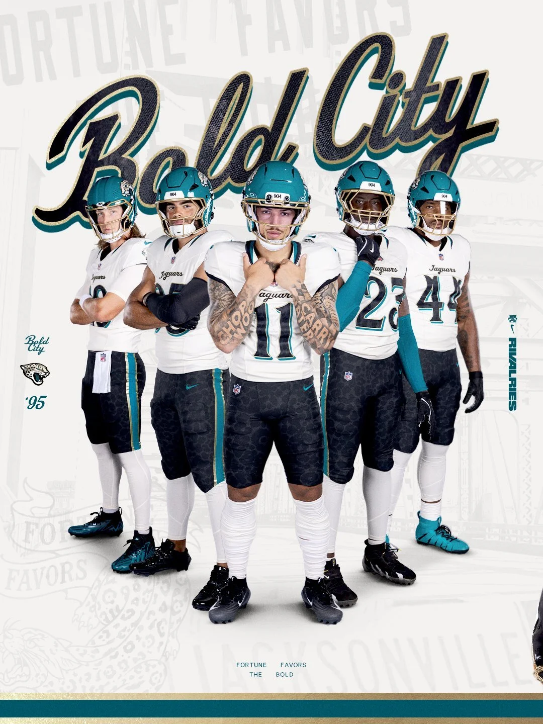
Jaguars Unveil “Bold City” Rivalries Uniform

The Jacksonville Jaguars are putting Bold City pride front and center. As part of the second year of the NFL Rivalries program, the Jaguars have unveiled a new uniform designed specifically around the identity, history and confidence of Jacksonville. The Jaguars will debut the uniform Nov. 1 against AFC South rival the Indianapolis Colts.

The Rivalries program gives participating NFL teams an opportunity to create uniforms rooted in the communities they represent, with Nike, the NFL and each club working together to develop designs that go beyond traditional team branding.

For Jacksonville, the result is a look built around the city's motto and attitude: “Fortune Favors the Bold.”

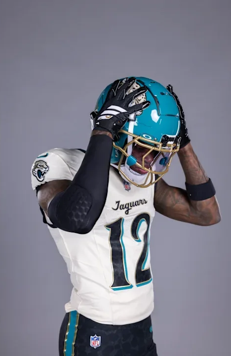
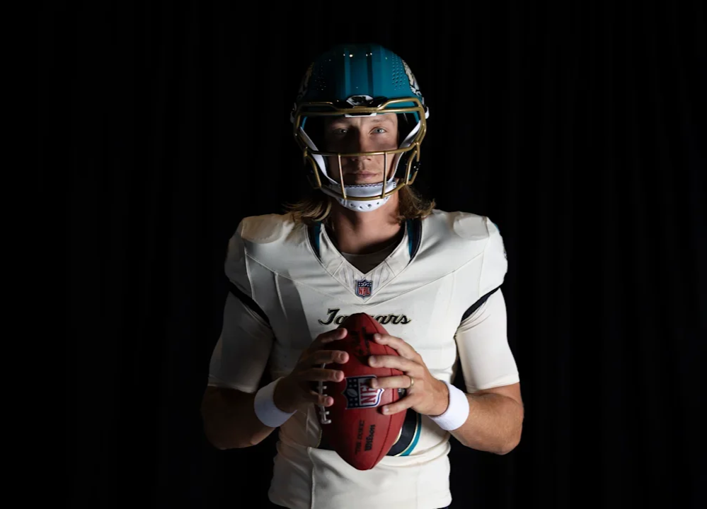
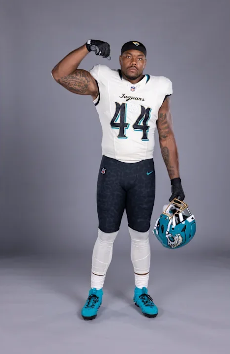
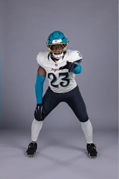
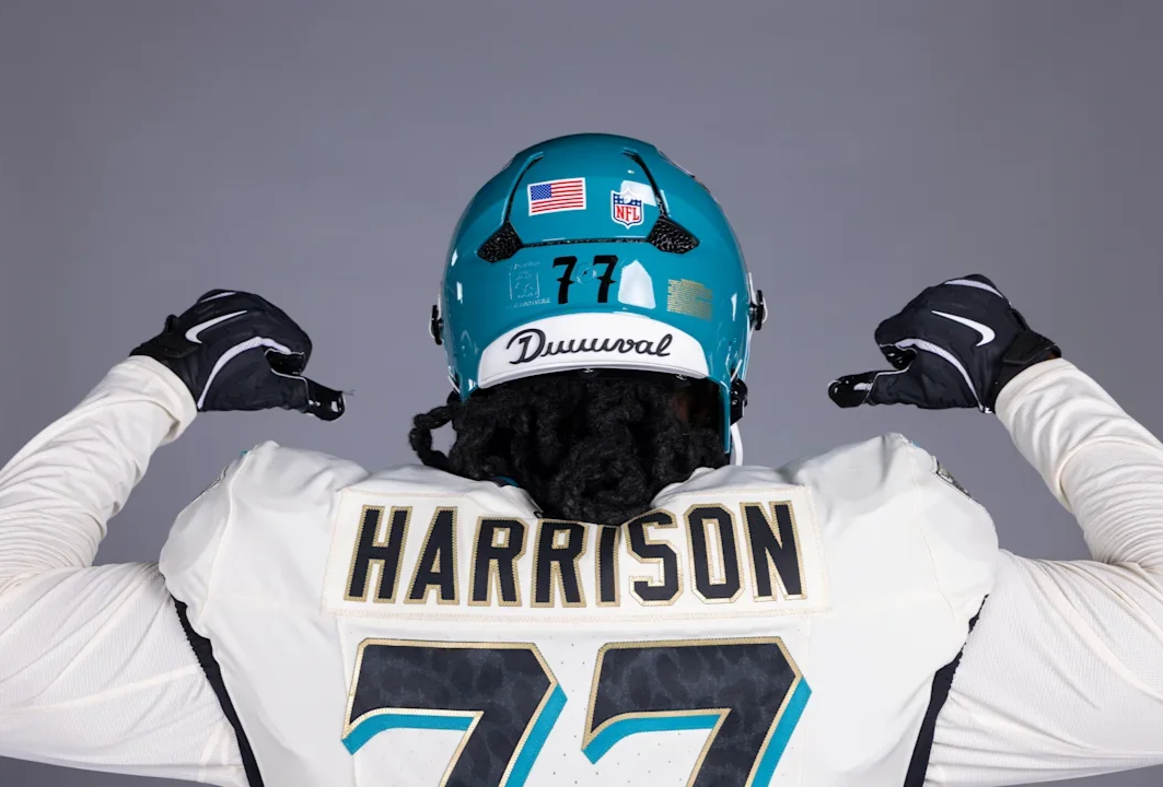
The centerpiece of the new uniform is the helmet. Jacksonville's teal shell gets a gloss finish, while a prominent “904” mark appears on the helmet, representing the area code that has become synonymous with Jacksonville.

The helmet is paired with a striking gold facemask, giving the Jaguars a unique combination that immediately separates the Rivalries look from their standard uniforms. It's a simple detail, but one that makes the helmet feel distinctly Jacksonville.

Another detail appears on the outside of the collar. “Since '95” commemorates the Jaguars' inaugural season and the beginning of the franchise's history in Jacksonville. The jersey also features a cursive “Jaguars” script, a nod to the team's Southern roots and another departure from the club's more traditional typography.

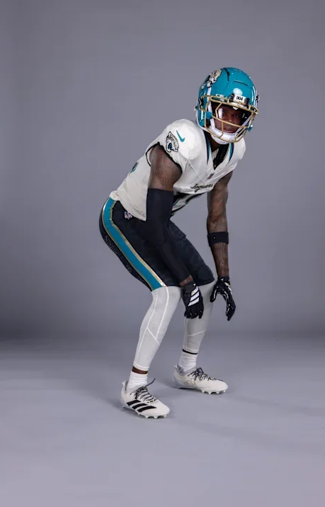
The Jaguars will wear the Rivalries uniform with a white jersey, black pants and white socks.

The black pants feature a prominent teal stripe with gold trim, but there's another detail hidden within the design. The pants feature a subtle jaguar-print pattern, creating a tonal texture that is easy to miss from a distance.

Hidden within the jaguar spots are the names of Jacksonville neighborhoods. It's one of the most personal details in the Rivalries collection, turning the pants into a representation of the communities that make up the city. Rather than simply putting Jacksonville's name on the uniform, the Jaguars incorporated the actual neighborhoods that make up the city.

The Rivalries uniform isn't a one-game-only special.

After debuting against Indianapolis on Nov. 1, the new look will become part of Jacksonville's regular uniform lineup for three years, joining the team's existing alternate uniforms.

For Jacksonville, the Rivalries uniform is more than another alternate. It's 904. It's DUUUVAL. It's Bold City.

SHOP Jaguars gear HERE


See What Else Is New

Related Articles


FootballSkye TilsonComment
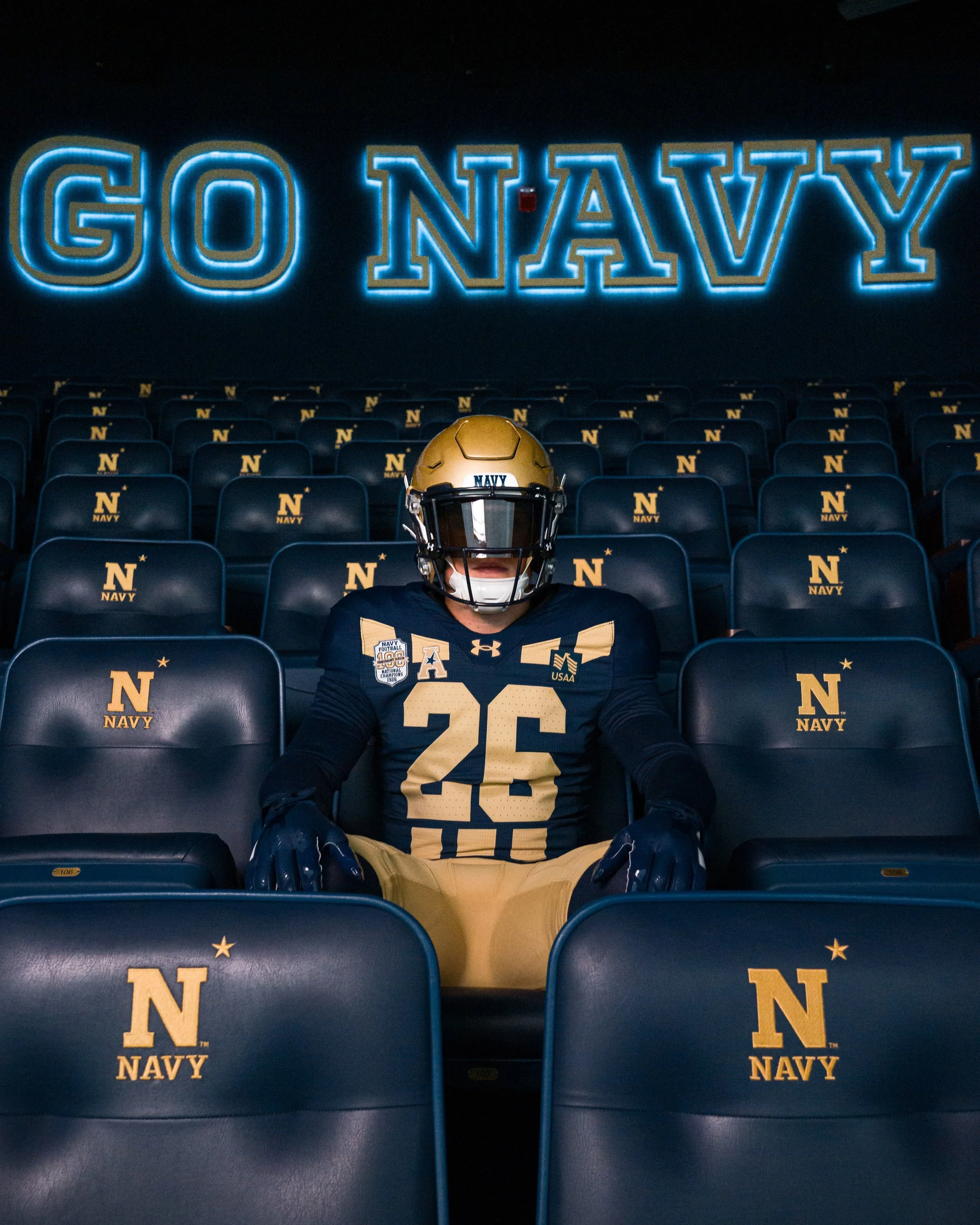
Navy Football Honors 1926 National Championship Team With Throwback-Inspired Uniform

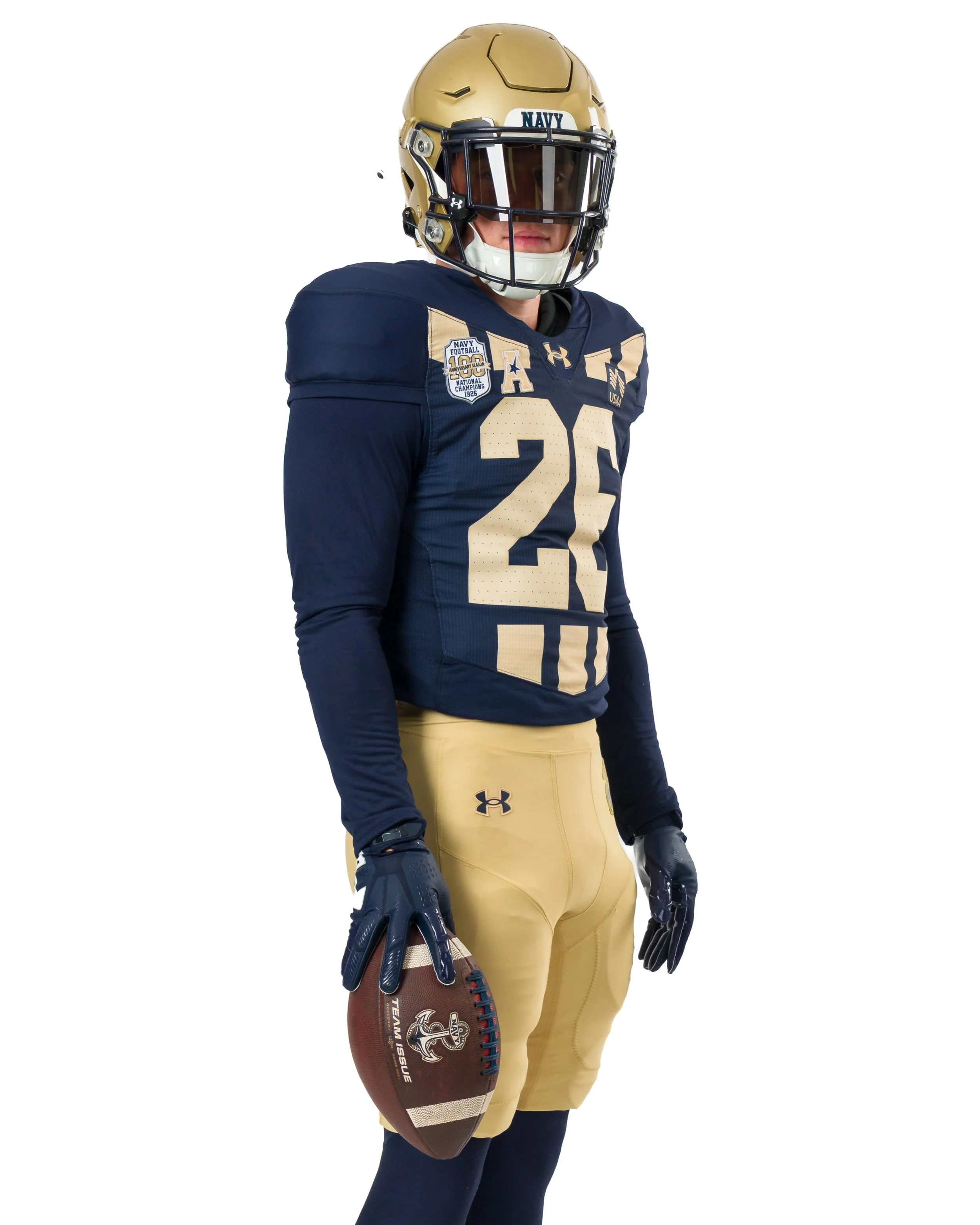
Navy football is taking a trip back through its storied history this fall, unveiling a commemorative Under Armour uniform celebrating the 100th anniversary of the program’s 1926 national championship season.

The Midshipmen will wear the throwback-inspired look when they take on Notre Dame at Gillette Stadium in Foxborough, Massachusetts, on Saturday, Oct. 31.

The uniform pays tribute to Navy’s only football national championship team, which finished the 1926 season undefeated at 9-0-1 and earned a share of the national championship.

Rather than simply recreating the uniform worn nearly a century ago, Navy built a modern interpretation around several meaningful details from the 1926 season.

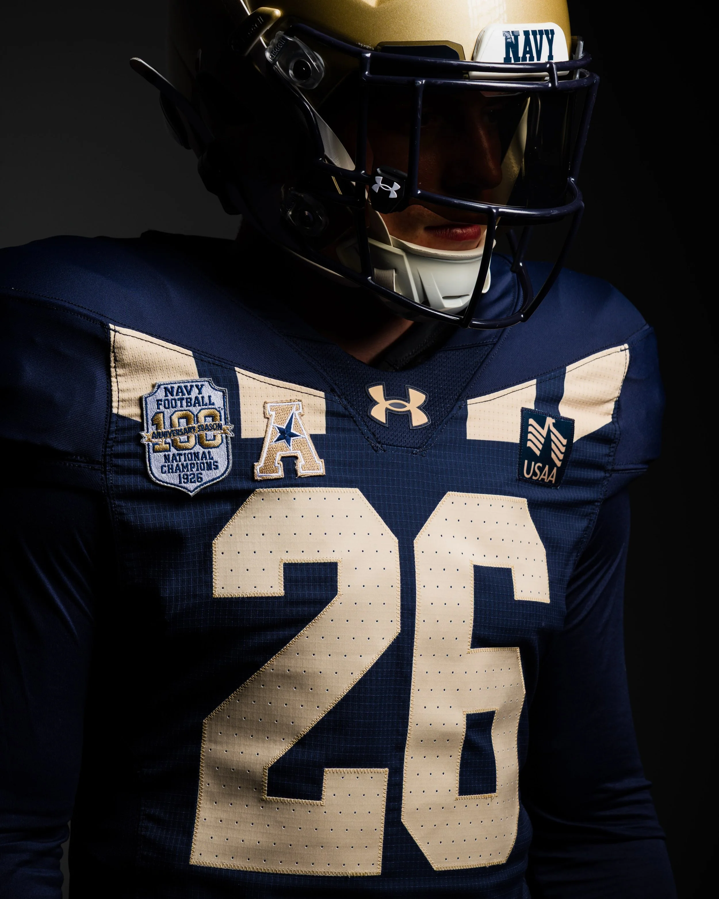
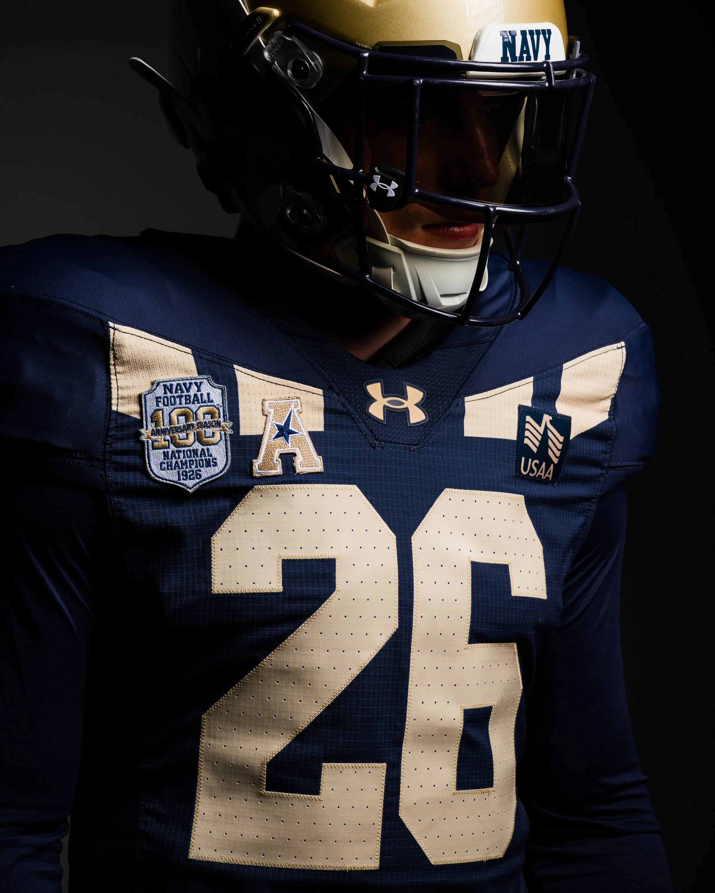
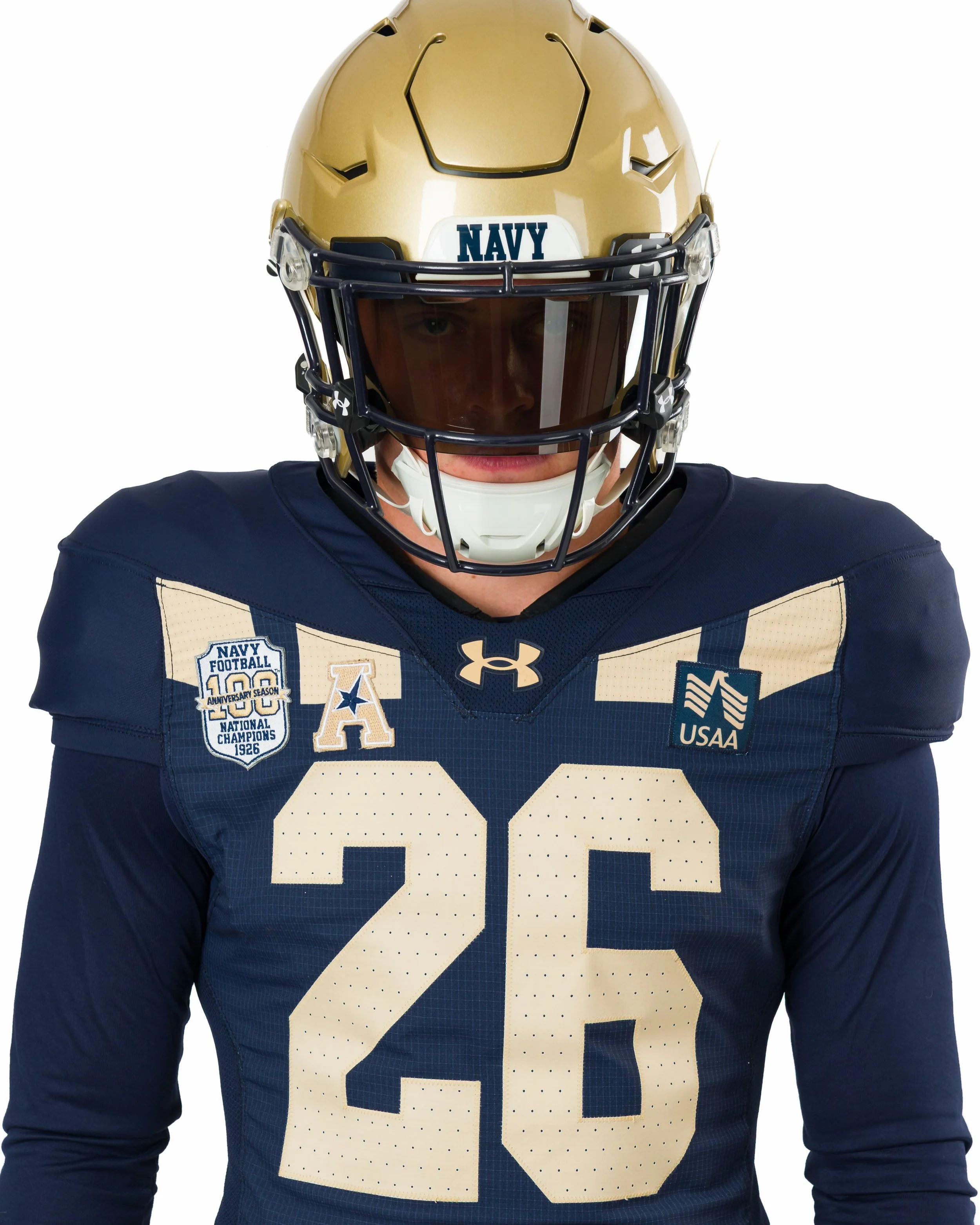
The centerpiece of the uniform is a modern take on Navy’s iconic 1926 “Chevron Stripe” jersey.

The design features nine stripes across the upper body, four on the front and five on the back, representing the nine victories recorded by the undefeated Midshipmen during the championship season.

Navy’s traditional blue-and-gold color palette remains at the heart of the design, while additional details connect the uniform to the Naval Academy’s history and traditions.

The words “Navy Blue and Gold” are featured on the interior collar, paying tribute to the Academy’s alma mater. The song was first performed publicly in its current form on April 24, 1926, before officially becoming the Naval Academy’s alma mater in 1927.
Some of the uniform’s most significant details come directly from Naval Academy artifacts associated with the Class of 1926.

The back-neck locker tag is inspired by the Class of 1926 pin, which features an eagle, trident and the year 1926. The same emblem was also incorporated into the class ring.
The jersey numbers take inspiration from the typography found on that same class pin, giving the uniform another subtle connection to the championship era.
A commemorative patch recognizing the 100th anniversary of Navy’s 1926 national championship completes the look.

Together, the details create a uniform that connects Navy’s modern program to one of the most important seasons in its history.

It’s more than a throwback. It’s a modern uniform built around one of the most significant chapters in Navy football history.

SHOP Navy gear HERE


See What Else Is New

Related Articles


FootballSkye TilsonComment
Nebraska Brings the Blackshirt Identity to Its Special Edition Game Football

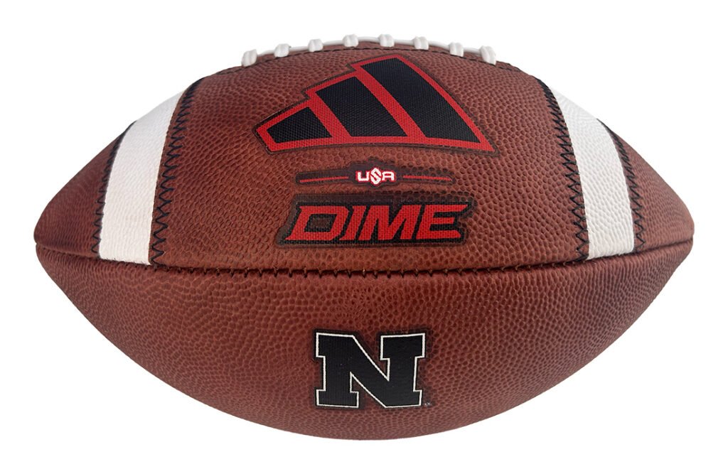
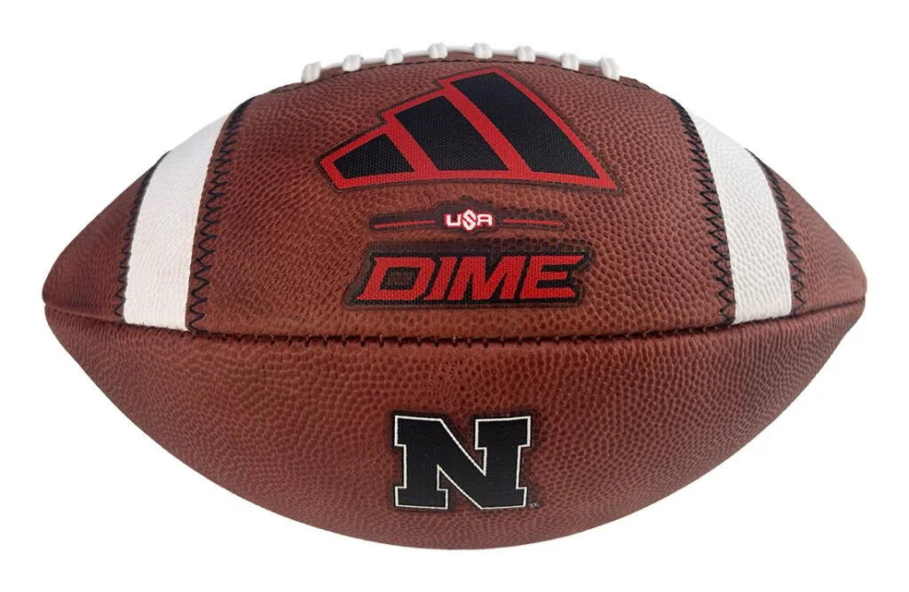
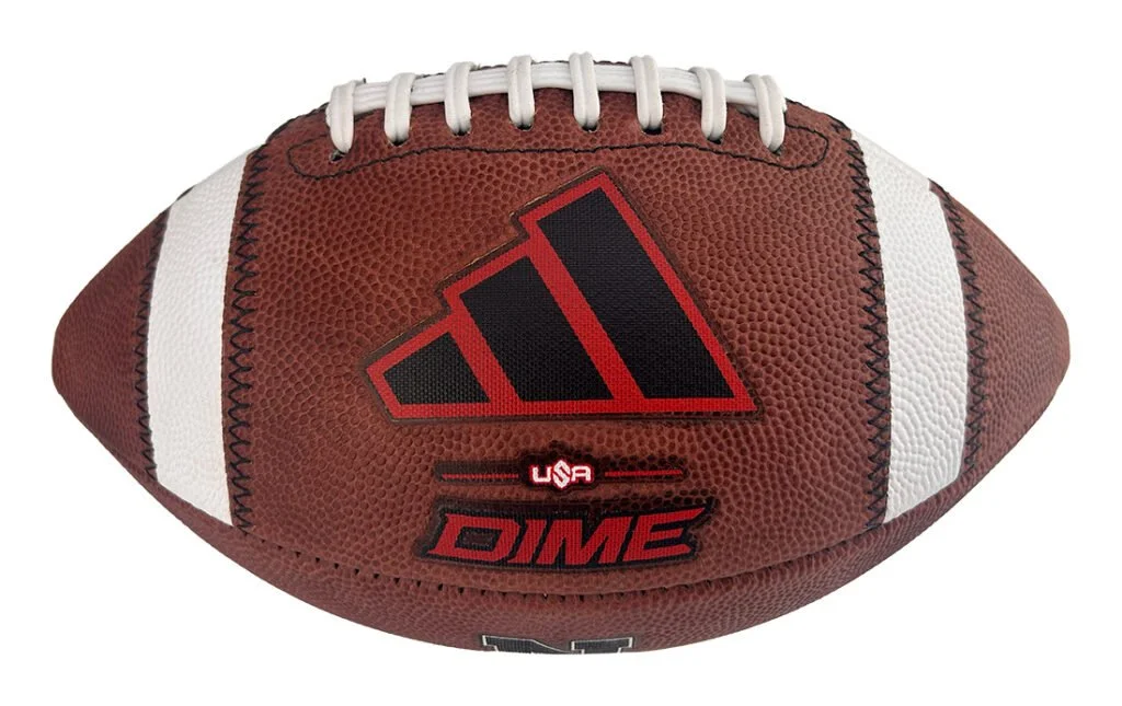
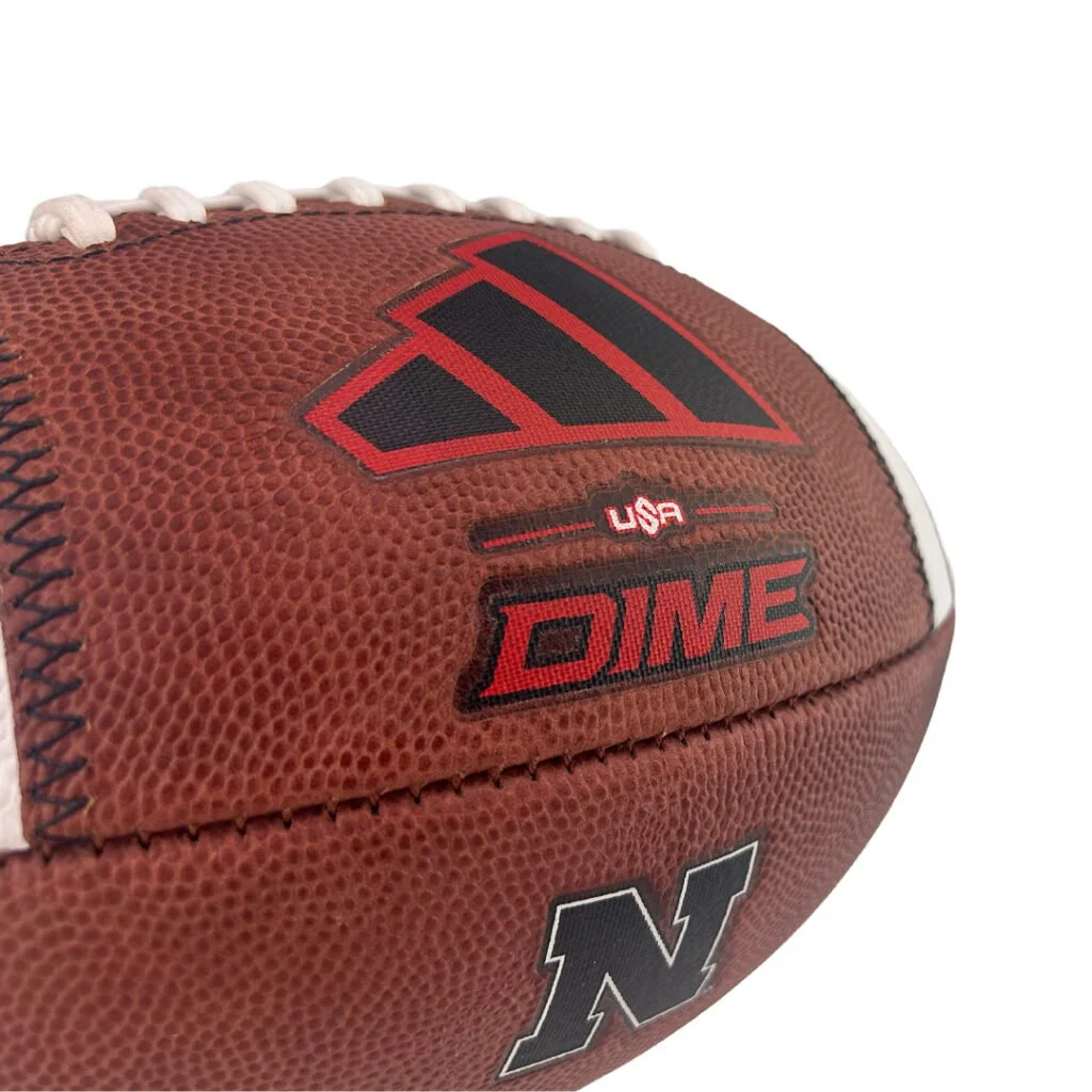
Nebraska’s blackout look extends to the football with the 2026 Special Edition Nebraska Cornhuskers Blackshirt adidas Dime Game Football. Handcrafted by Big Game Football Factory, the limited-edition ball brings black details to a design built to the Huskers’ specifications.

The football arrives as Nebraska prepares to welcome Washington to Memorial Stadium on October 31, bringing the program’s blackout tradition back into the spotlight.

A black Block N outlined in white anchors the design, giving Nebraska’s familiar mark a treatment that connects to the Blackshirt theme. The black adidas Dime logo sits against scarlet red, keeping the Huskers’ signature color part of the look.

Premium brown leather provides the foundation, while black SRS stripe stitching carries the theme across the ball. White KR19 laces add contrast and complete a design that pairs traditional football materials with details created for the occasion.

Crafted in the USA, the special edition follows the Nebraska football team’s specifications. Each ball also includes a Certificate of Authenticity identifying it as an official on-field model, giving fans a collectible tied to the Huskers’ game-day equipment.

The 2026 Special Edition Nebraska Cornhuskers Blackshirt adidas Dime Game Football is available for $174.99 through Big Game USA.

SHOP Nebraska Football HERE


See What Else Is New

Related Articles


FootballSkye TilsonComment
Nebraska Unveils New Black Uniform

Nebraska is embracing the darkness.

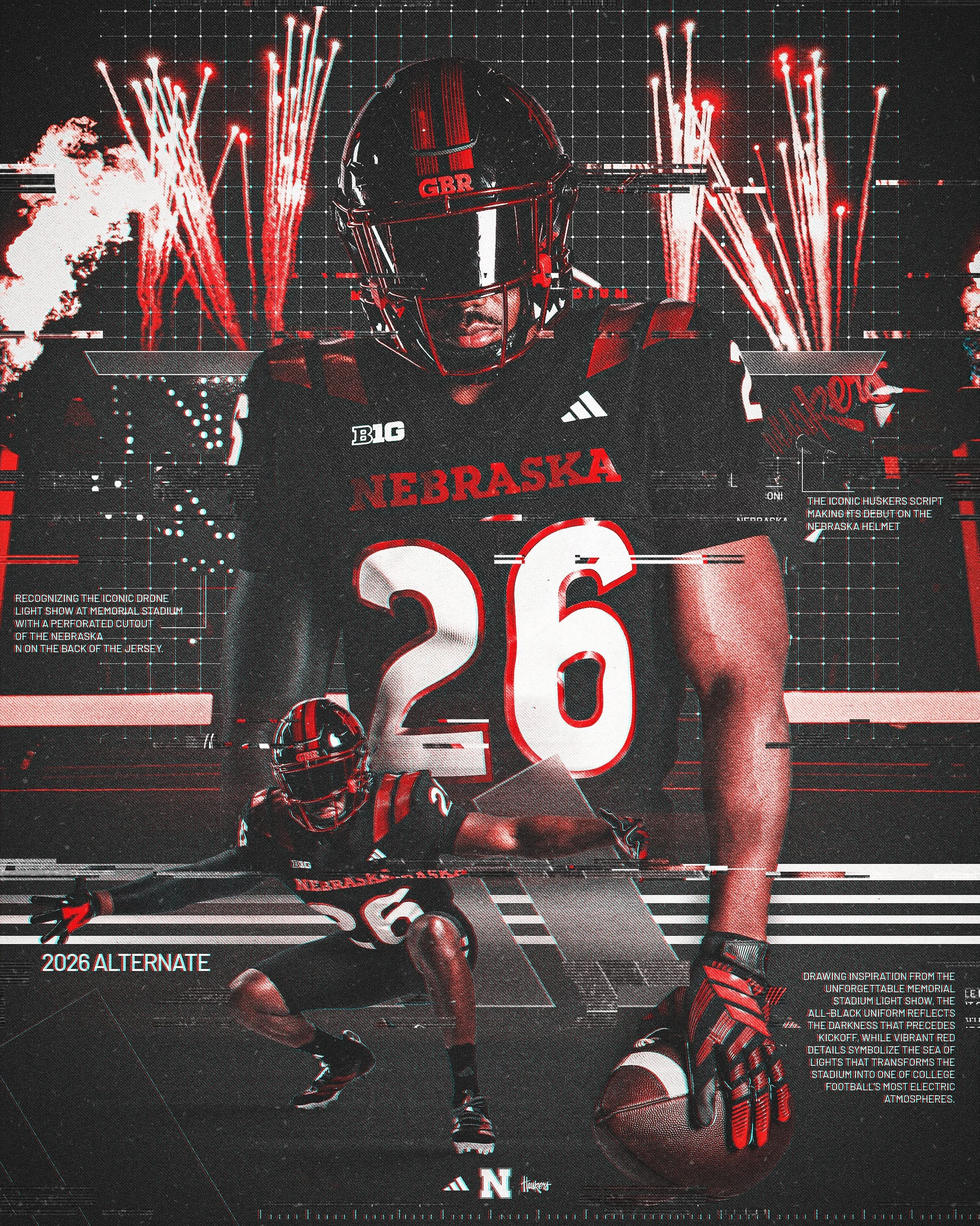
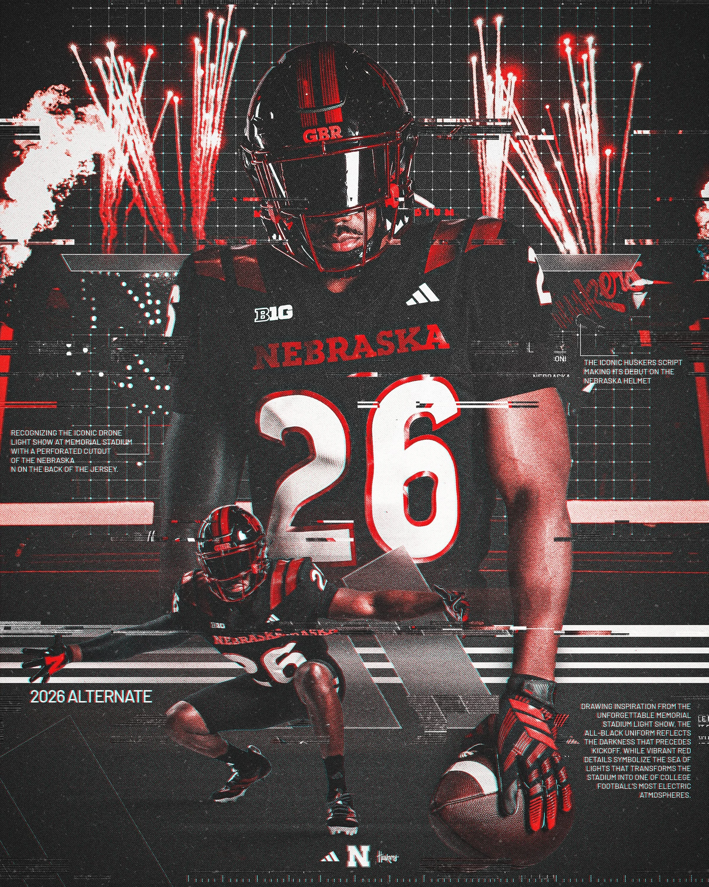
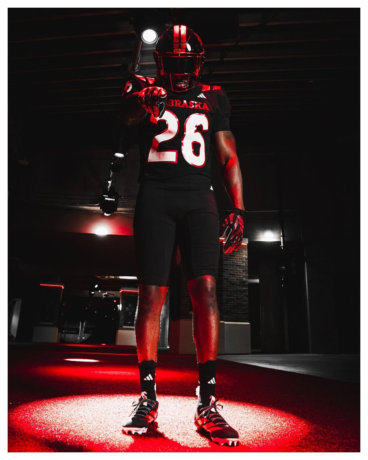
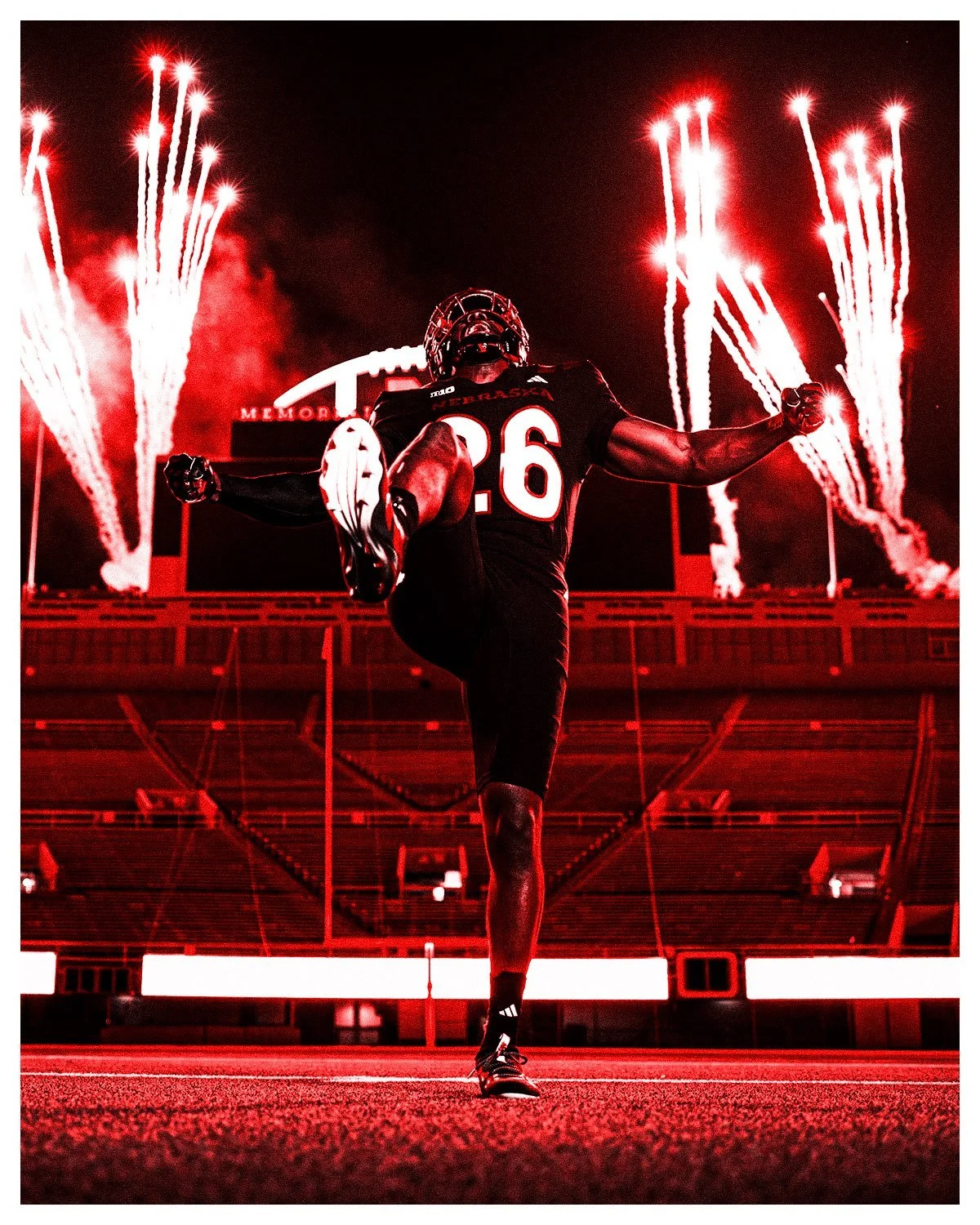
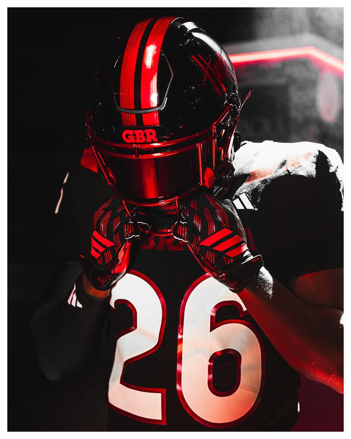
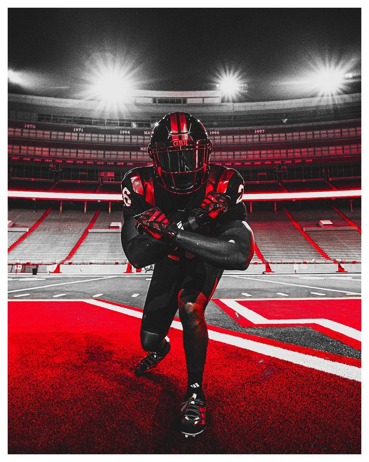
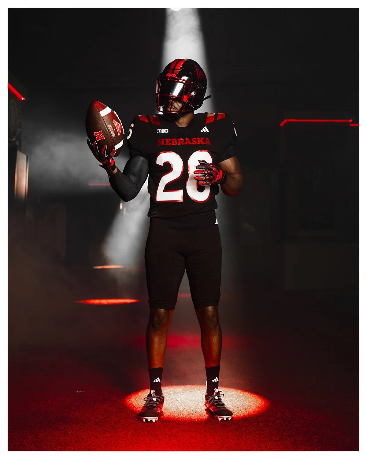
The Huskers unveiled their 2026 alternate football uniform, a bold black look inspired by the unforgettable atmosphere of a Nebraska night game inside Memorial Stadium.

Built around the theme “Our Red Burns Brighter,” the new uniform combines Nebraska’s iconic red with a black base and metallic red details designed to capture the energy, lights and traditions that make a night in Lincoln unlike anything else in college football. The uniform starts with a black base, providing a dramatic backdrop for metallic red accents throughout the set.

The metallic red details are inspired by the glow that takes over Memorial Stadium during night games, including flames, fireworks and the sea of red in the stands.

The design also draws inspiration from some of Nebraska’s newest game-day traditions, including the synchronized light shows, the fire tower flames in the end zone and the red fireworks that light up the sky above the North Stadium scoreboard.

The result is a uniform that transforms the familiar Nebraska color palette into something much darker and more aggressive.

Nebraska packed several meaningful details into the design.

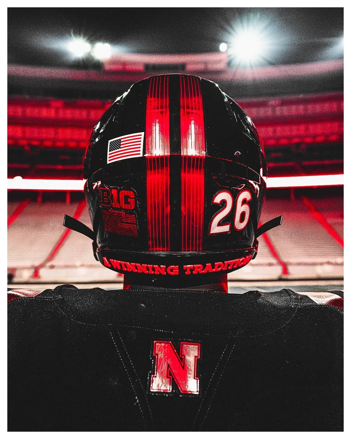
At the bottom of the jersey's back panel is a custom perforated Block “N,” inspired by the drone shows that have quickly become a signature part of Husker game days heading into the fourth quarter.

Inside the collar, “A Winning Tradition” serves as a tribute to Nebraska's remarkable history under the lights. The Huskers have won more than 81 percent of their night games at Memorial Stadium, adding another layer of meaning to the phrase.

The traditional Block “N” also appears on the back collar.

The uniform is completed by a brand-new black helmet, highlighted by the debut of the iconic Huskers script in metallic red.

The back of the helmet features an “A Winning Tradition” emblem, matching the message found inside the jersey collar.

Perhaps the most unique helmet detail can be found on top. The metallic red helmet stripe features a crop row pattern, serving as a tribute to Nebraska's agricultural heritage. It's a subtle detail that connects the modern Blackout look back to the state itself.

Nebraska will debut the new alternate uniform on Halloween, when the Huskers host Washington at Memorial Stadium for the second annual Blackout game.

With an all-black base, metallic red accents, a new helmet script and details inspired by the sights and sounds of a Nebraska night game, the Huskers have created a look that is unlike anything they've worn before.

SHOP Nebraska gear HERE


See What Else Is New

Related Articles


FootballSkye TilsonComment