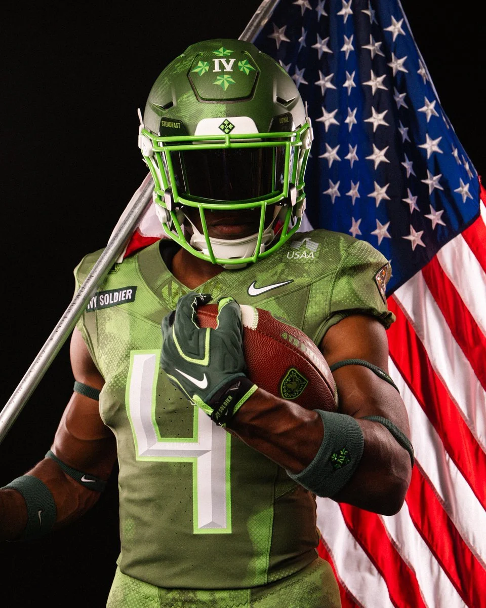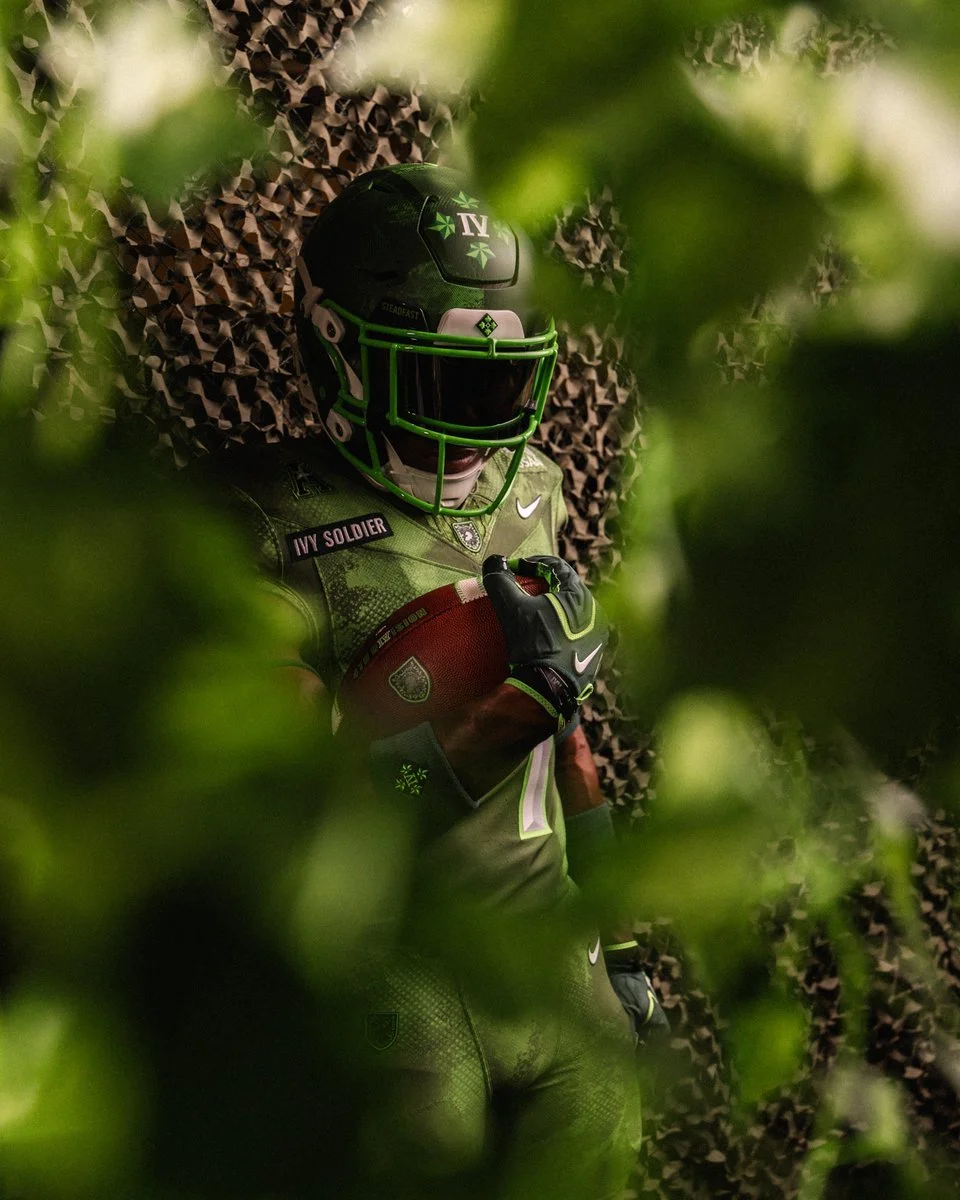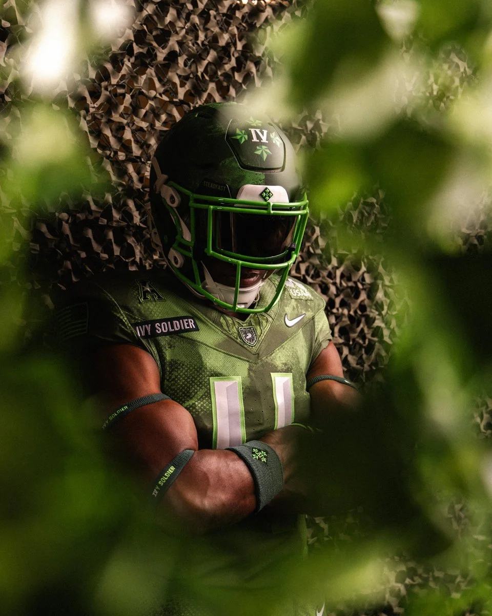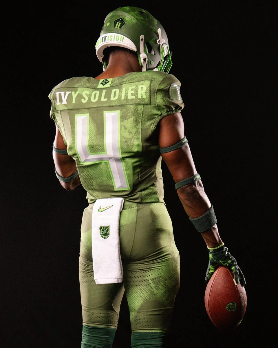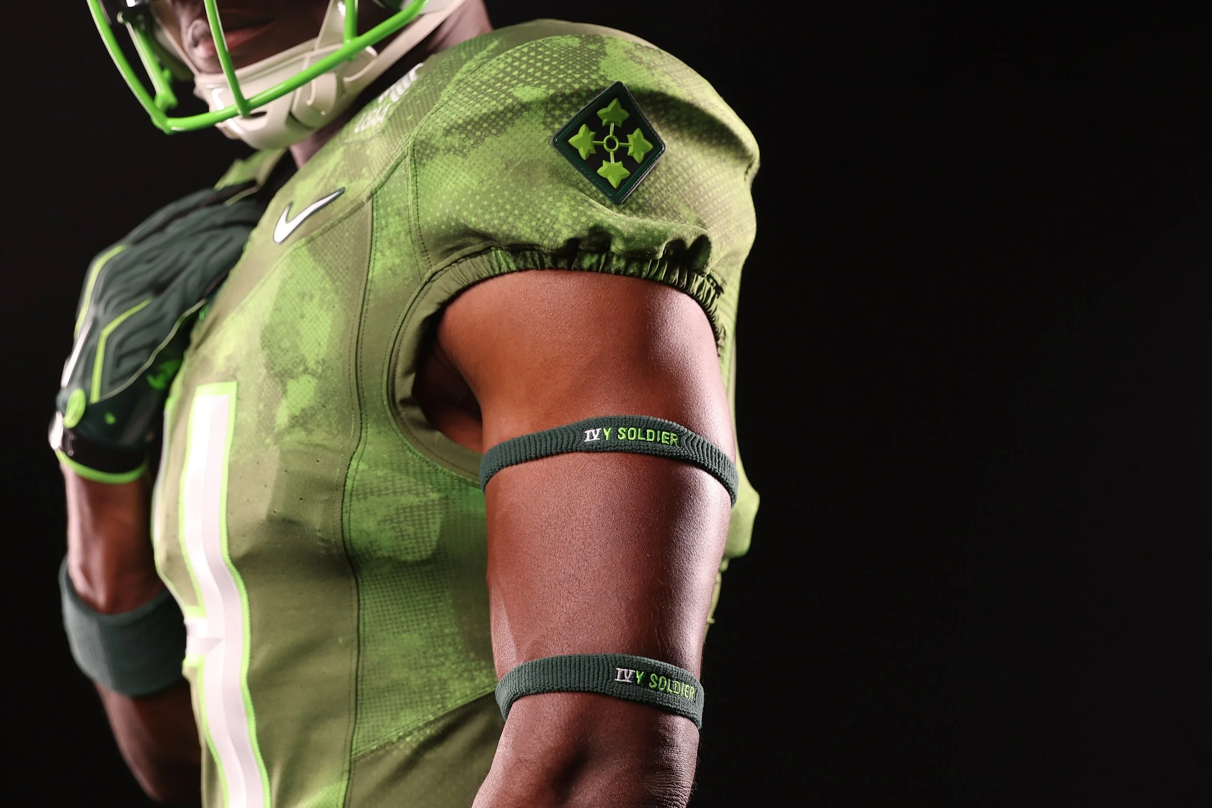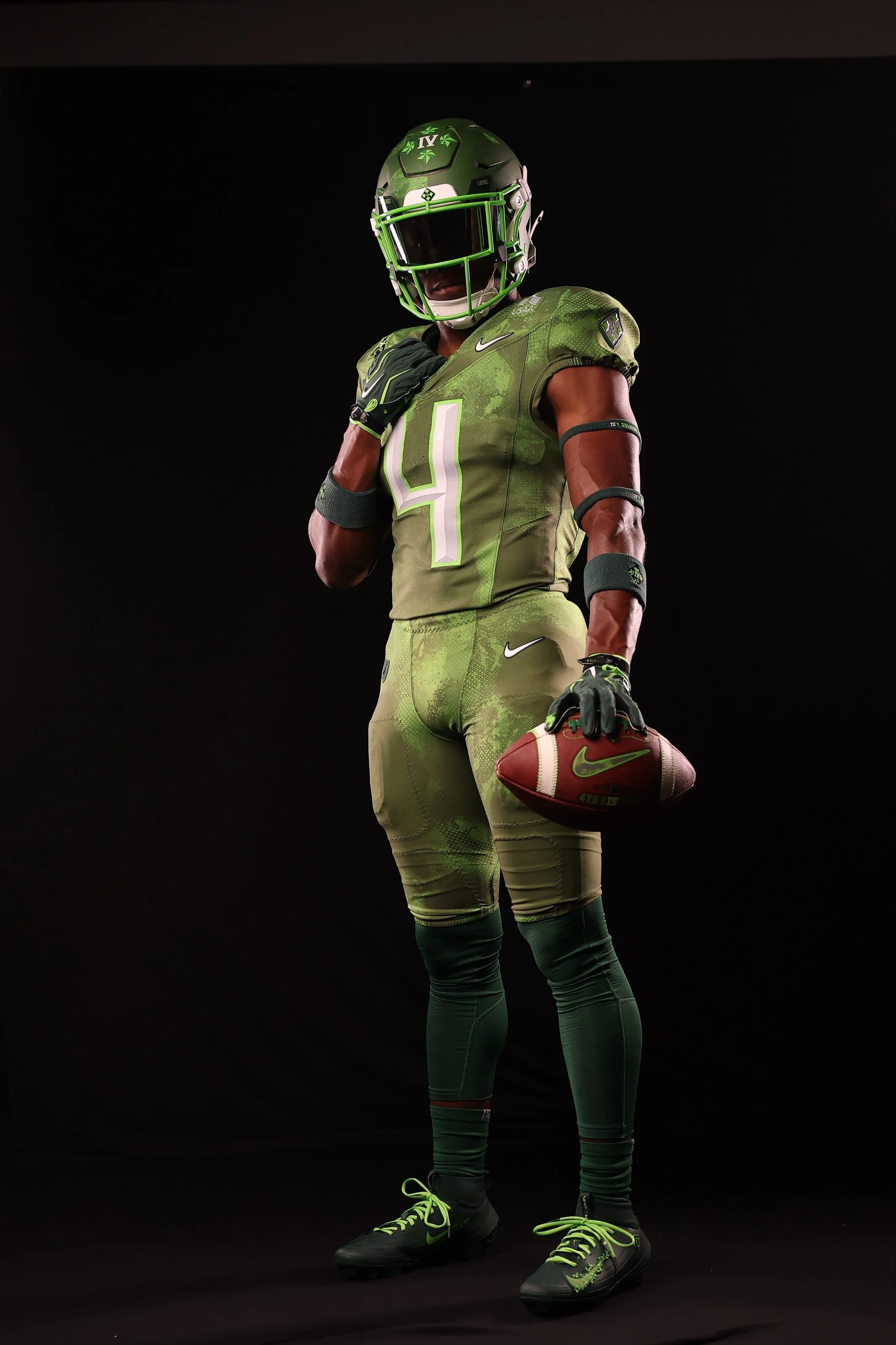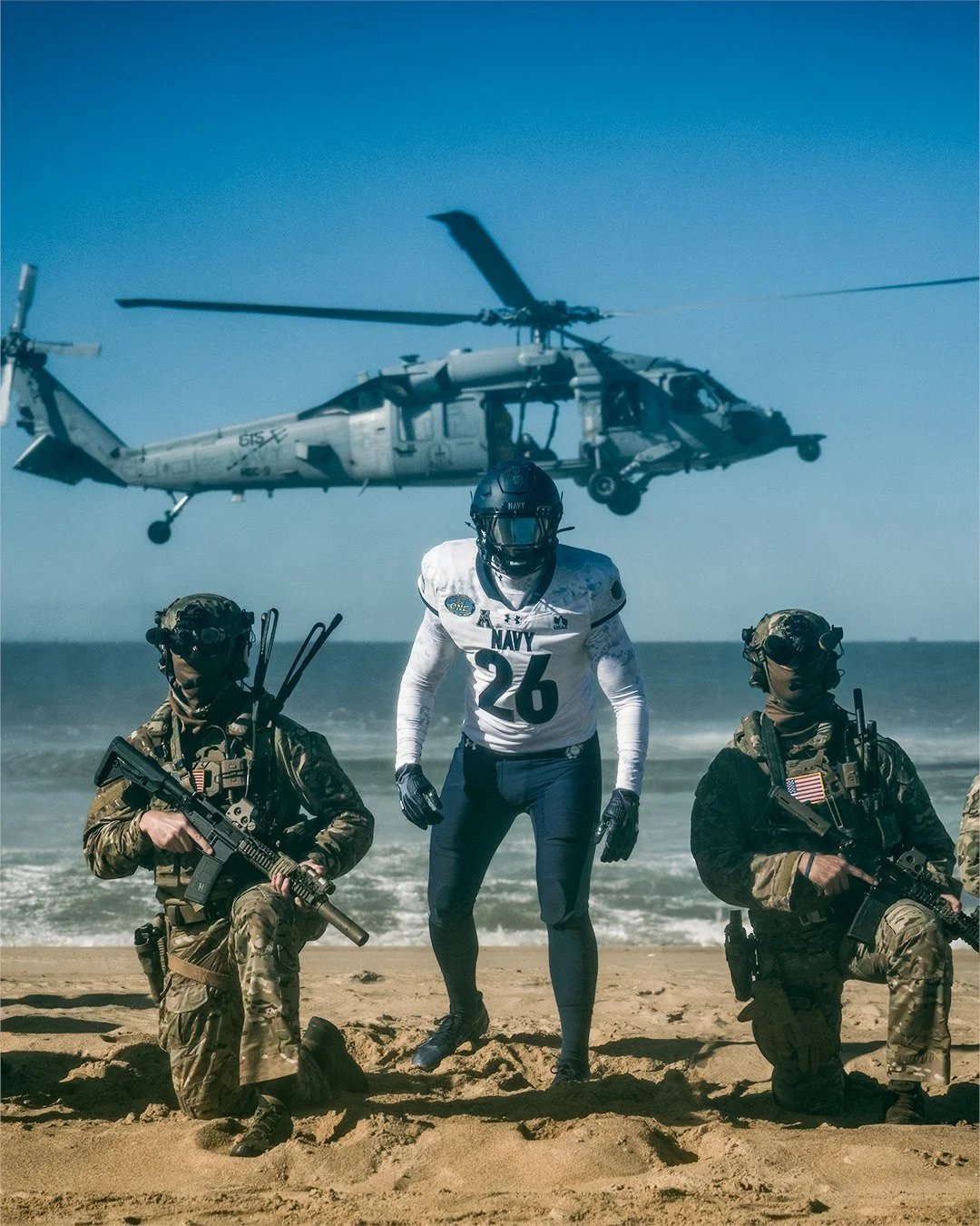
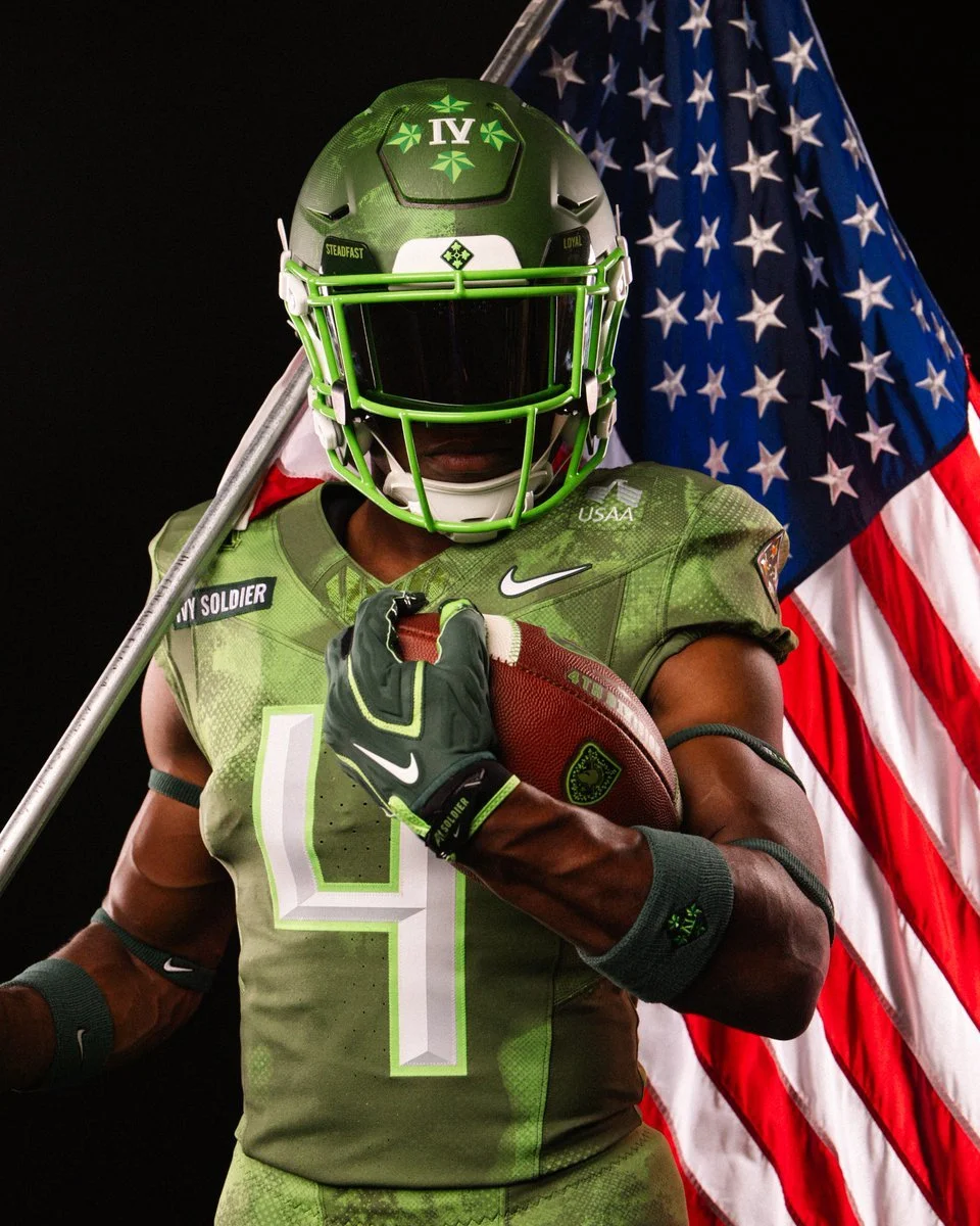
Army and Nike are bringing the legacy of the 4th Infantry Division to the field with the Black Knights’ new “Ivy Soldier” uniforms. Created for the 127th Army-Navy Game, the look combines camouflage green, ivy imagery and memorial-inspired lettering to honor a division that has served under the motto “Steadfast and Loyal” since 1917.
The design begins with the division’s identity. Established during World War I, the 4th Infantry Division became known as the “Ivy Division” through its Roman numeral designation, IV. That connection carries throughout the uniform, with the division insignia appearing on the jersey’s left shoulder and the front of the helmet.
Camouflage green sets the tone for the combination. The color and pattern reference the dense, ivy-covered foliage of Central and Eastern Europe, connecting the uniform to the landscapes associated with the division’s service. Ivy detailing extends into Army West Point’s Athena Shield, giving the familiar program mark a treatment specific to this year’s tribute.
The typography adds another layer of meaning. Chiseled numbers and lettering draw inspiration from military memorials, including the Utah Beach monument. Their carved appearance brings a sense of permanence and craftsmanship to the uniform, reinforcing the history behind the design.
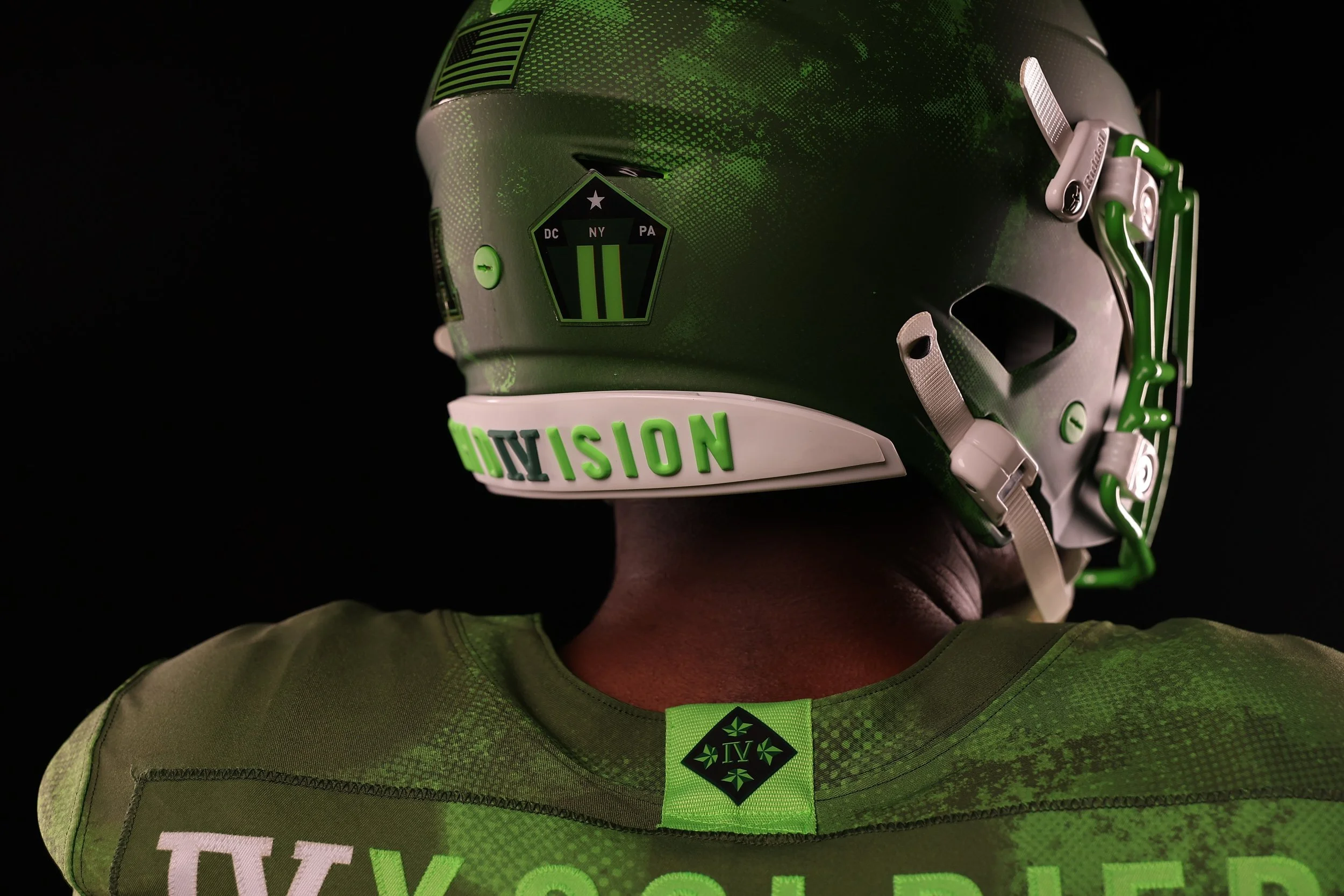
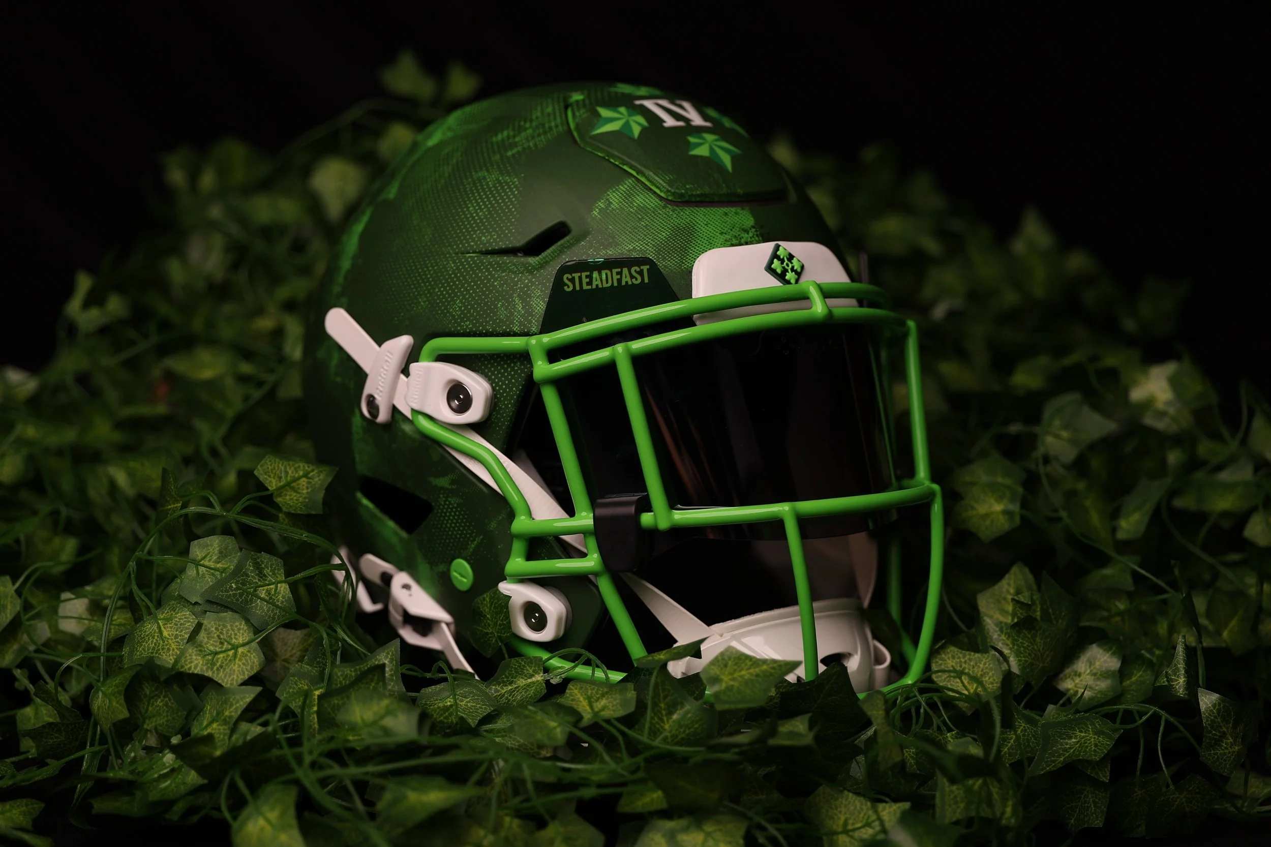
The helmet continues that storytelling with an IV decal surrounded by four ivy leaves. “Steadfast and Loyal” appears on the visor wings, while a rear 9/11 decal recognizes the division’s commitment and sacrifice in the 25 years since the September 11 attacks. Those placements carry the tribute across multiple angles of the helmet, giving each detail its own place in the presentation.
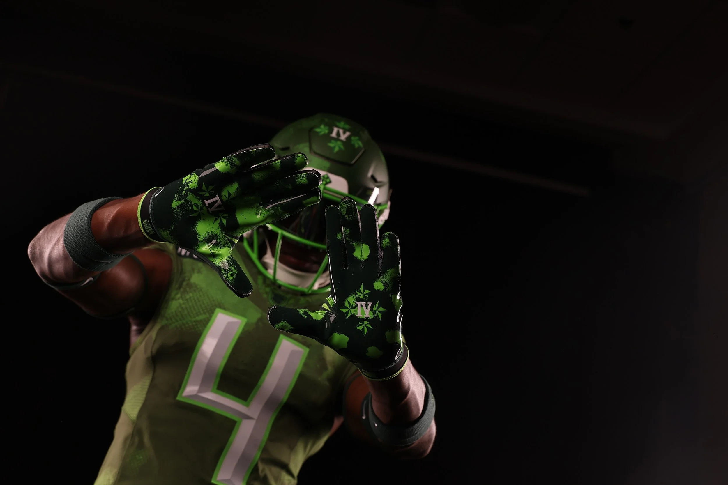
Nike’s gloves and Vapor cleats extend the ivy theme beyond the jersey and helmet. The coordinated equipment gives players another way to carry the division’s identity, building a complete game-day look around the same visual language.
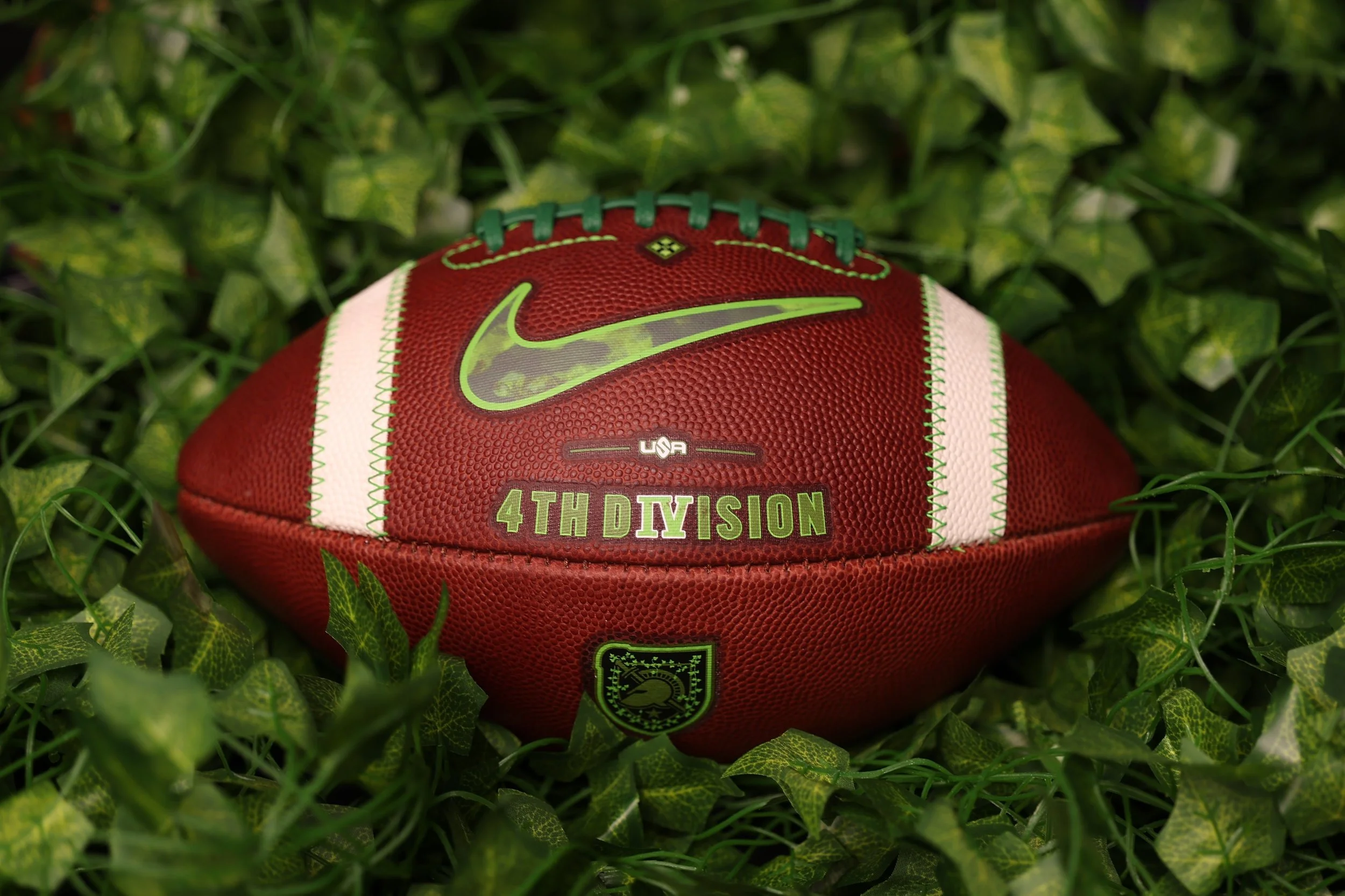
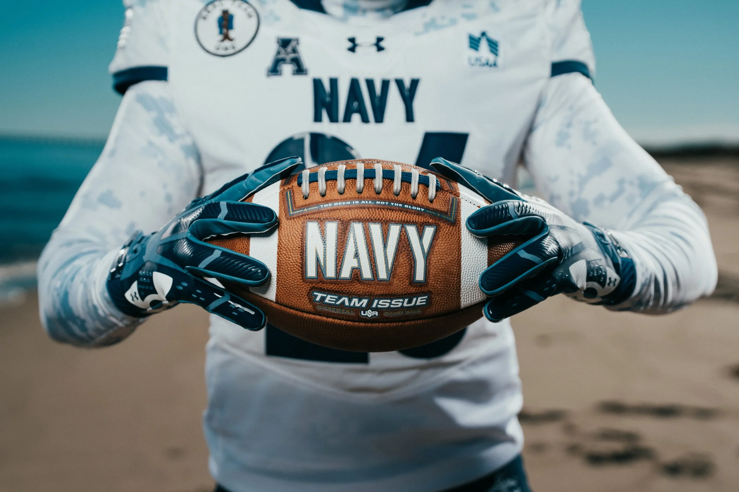
Even the football receives a custom treatment. Army’s game balls feature the 4th Infantry Division insignia and ivy-adorned Athena Shield, along with a Nike Swoosh filled with the uniform’s camouflage green color and pattern. It brings the tribute directly into the action, connecting the ball to the story carried across the players’ equipment.
The Ivy Soldier reveal marks the 11th consecutive season of collaboration among Army Football, the United States Military Academy’s Department of History and War Studies, and Nike. Since launching in 2016, the initiative has used Army’s annual matchup with Navy to recognize the people, units and missions behind the academy’s military heritage.
For this year’s edition, the strength of the design comes from that consistent connection. The ivy, IV insignia, memorial-inspired lettering and custom equipment all point back to the soldiers being honored, giving the uniform a clear identity from helmet to cleats.
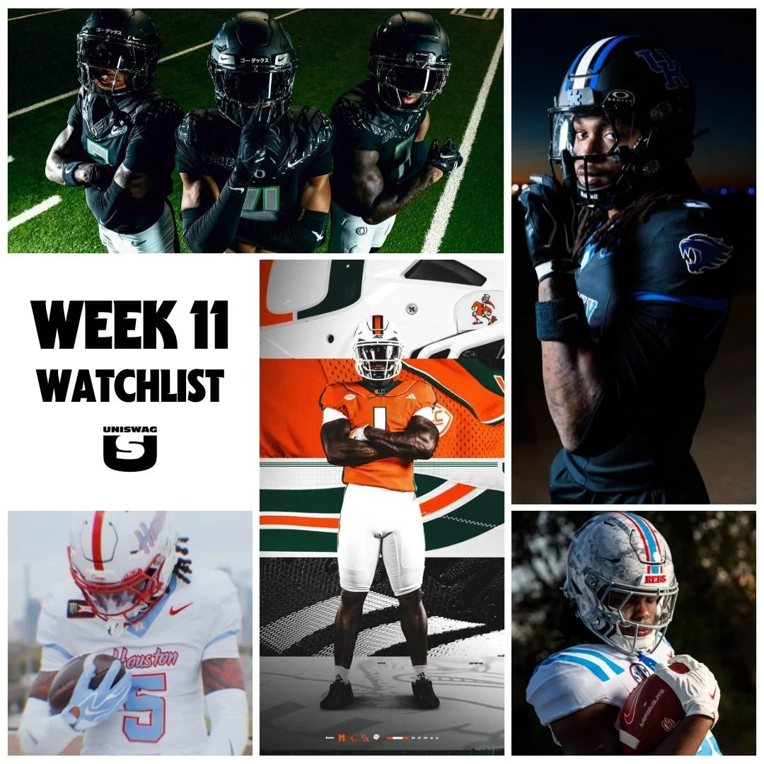
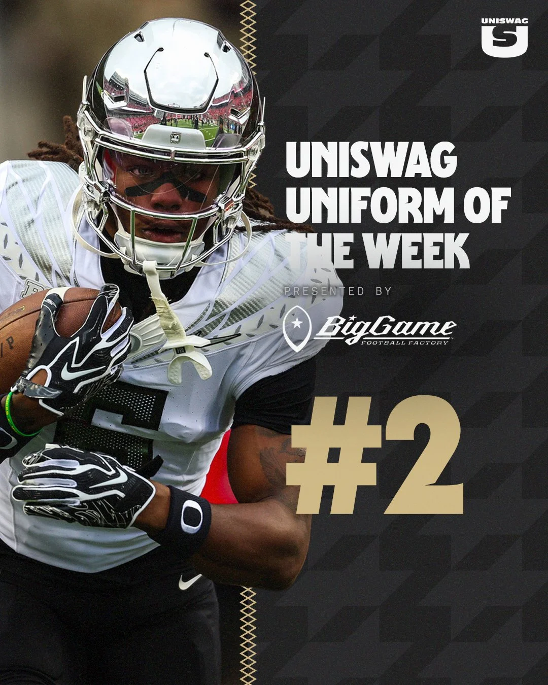
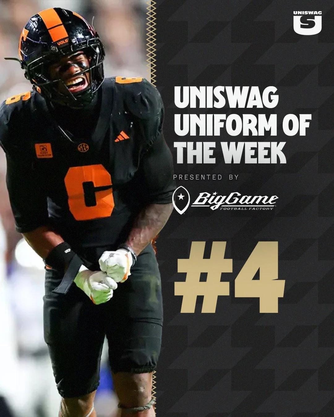
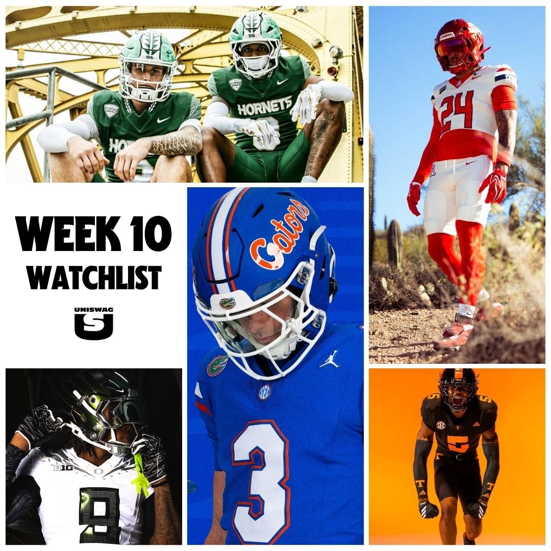
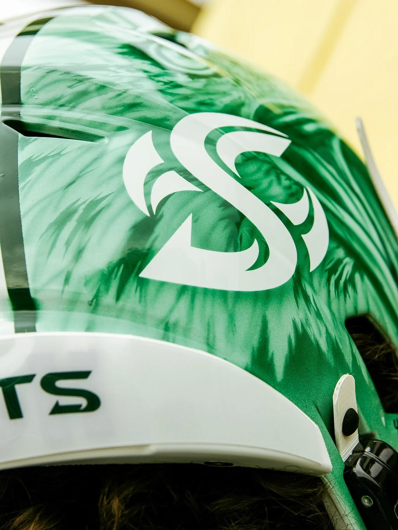
From Sacramento State’s Native American Heritage uniforms to Oregon’s Mummy Ducks and Tennessee’s Dark Mode look, Week 10 brought meaningful artwork and striking combinations to the field. Hand-painted details, reflective finishes and bold accents gave this week’s lineup plenty to explore.
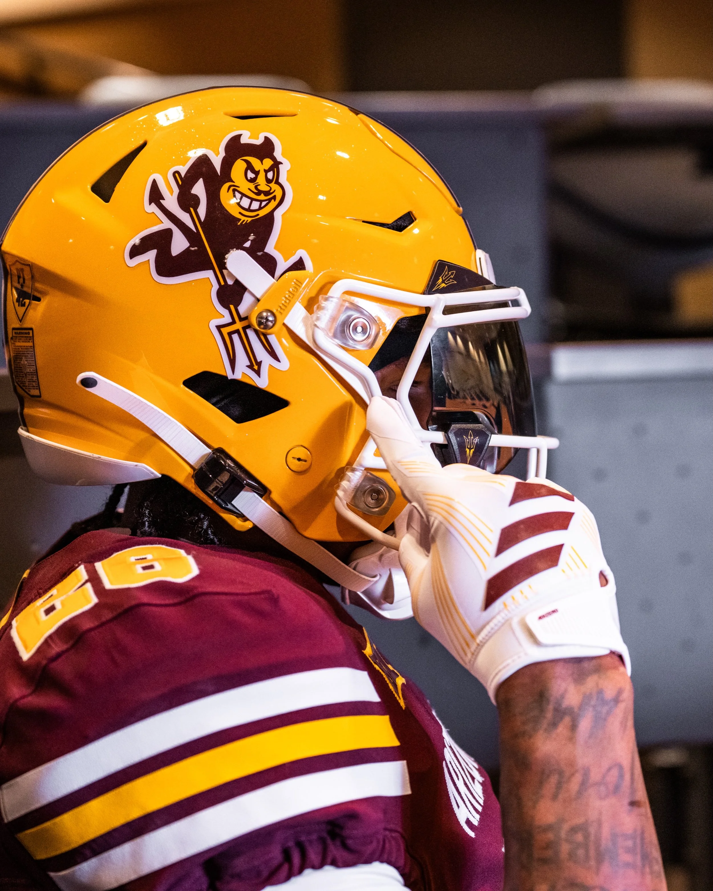
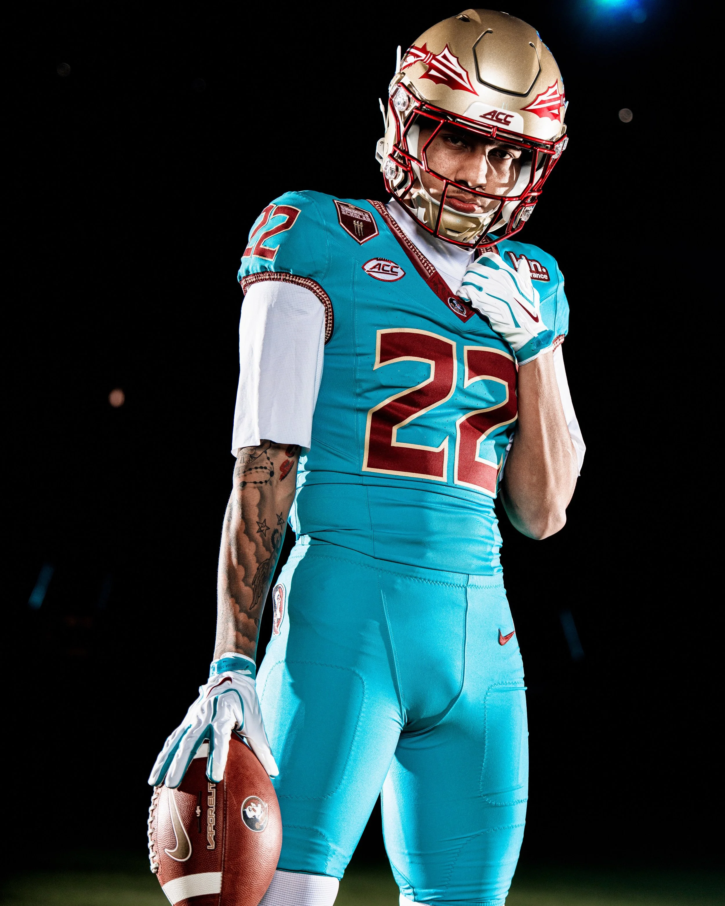
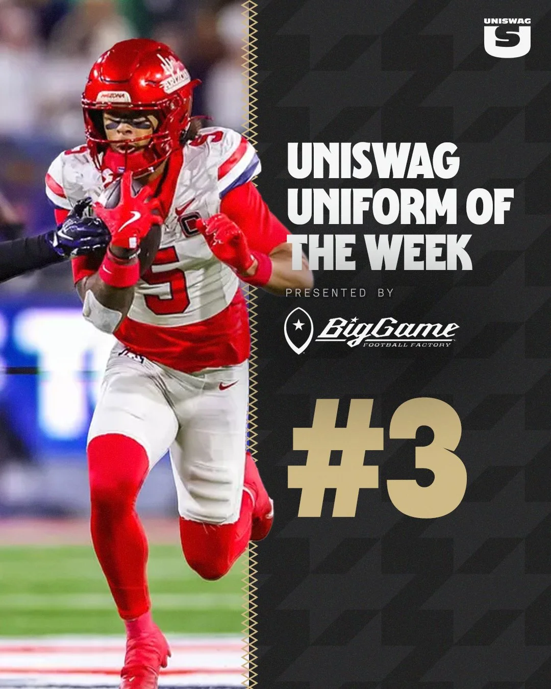
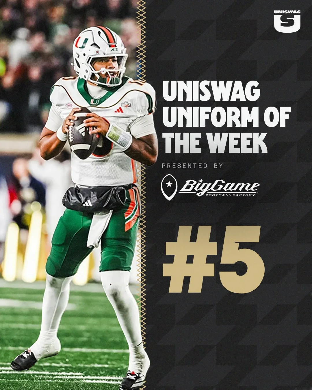
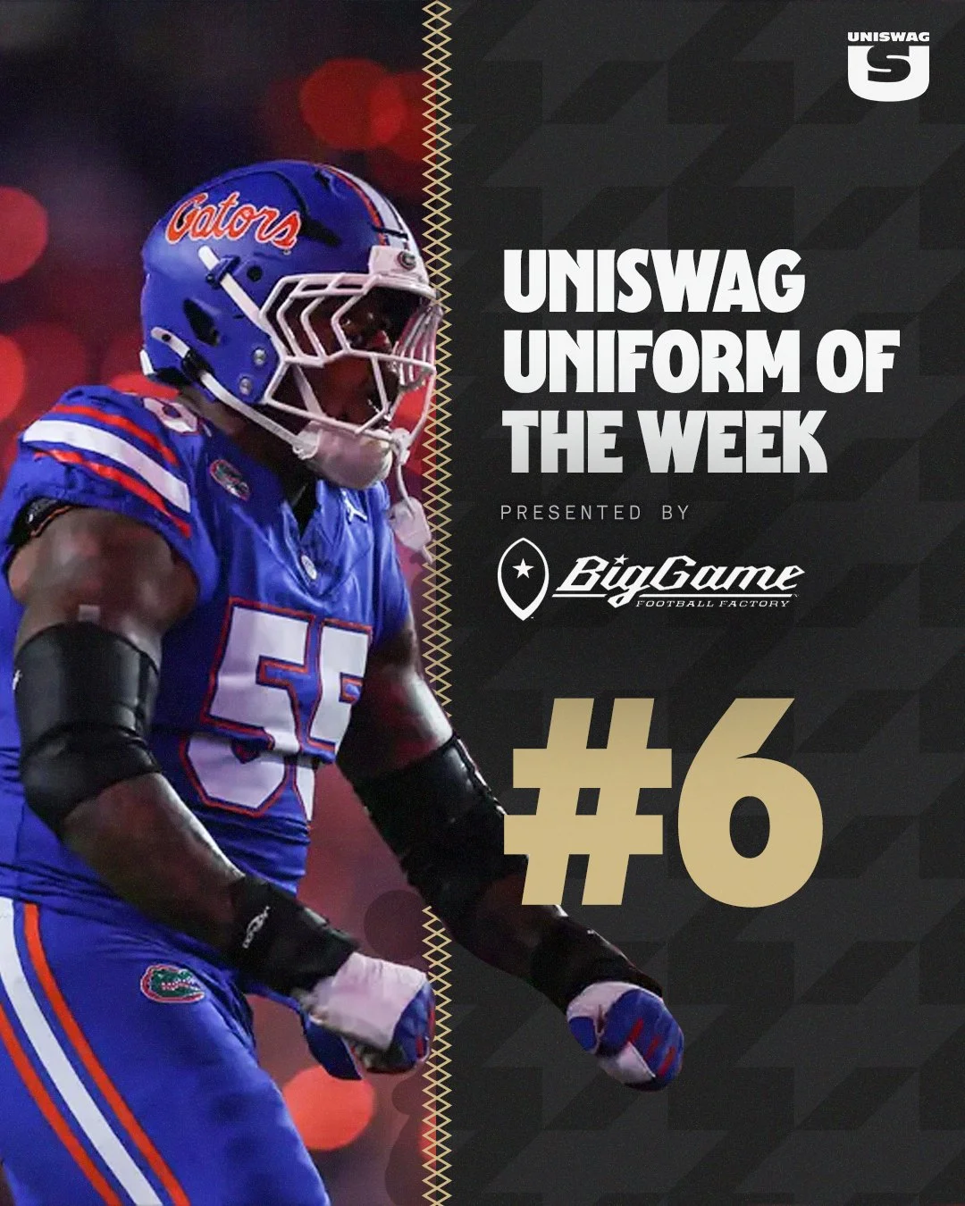
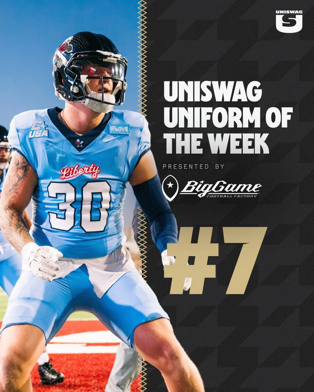
Arizona paired red helmets with white jerseys and pants, while Miami brought its throwbacks. Florida went blue from helmet to pants, and Liberty added a different shade to the mix with a light blue combination and dark helmets.
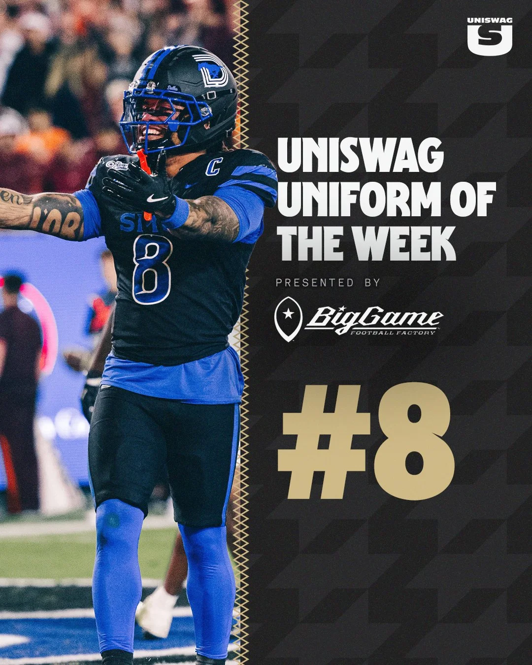
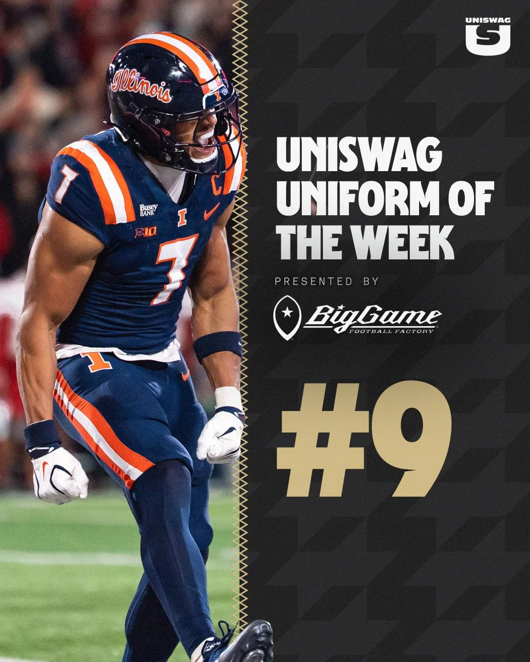
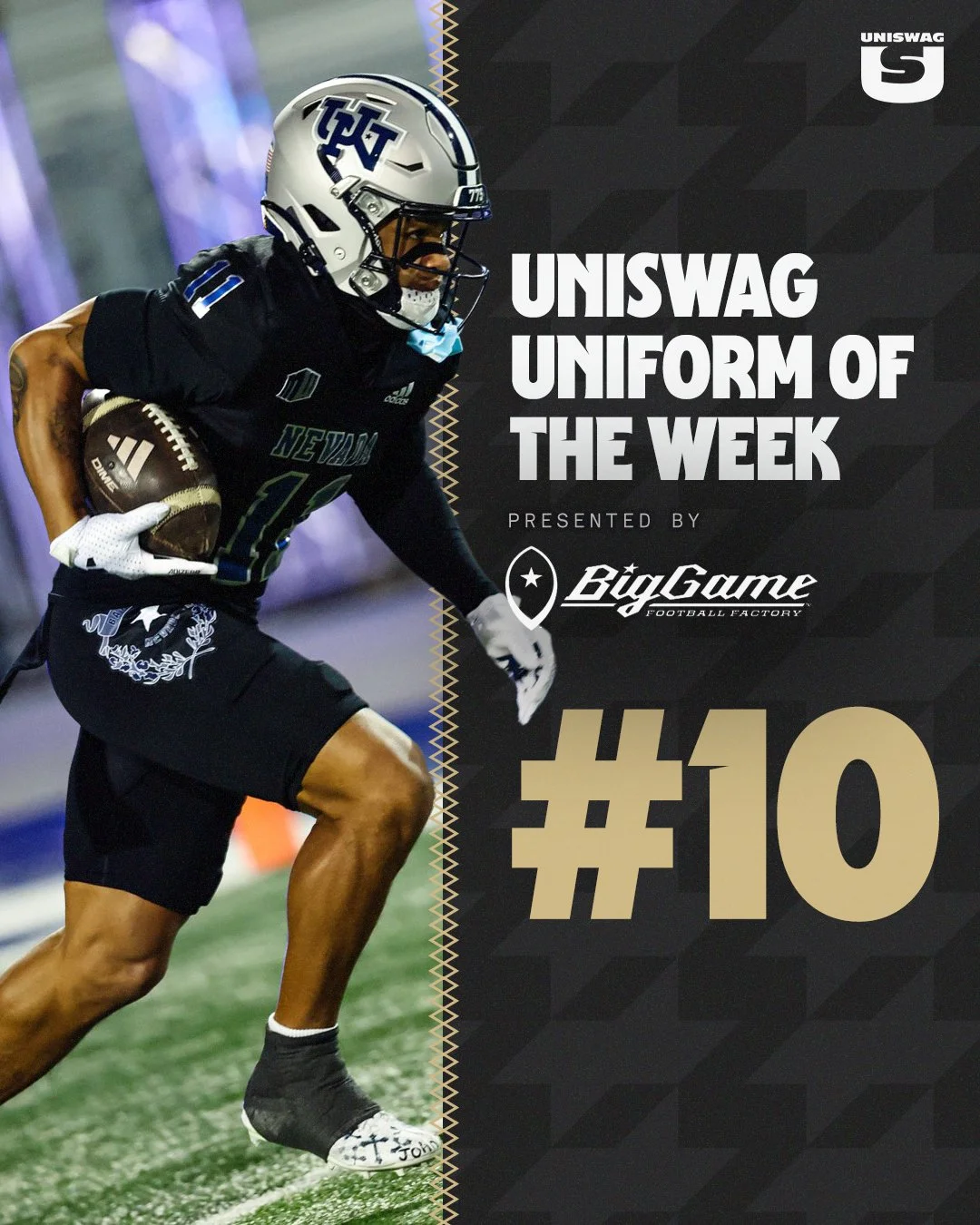
SMU, Illinois and Nevada complete a Top 10 that balances bold alternates with familiar identities. SMU’s black-and-blue look, Illinois’ coordinated navy uniforms and Nevada’s silver helmets over black threads showed how color, striping and finishing touches bring a complete combination together.
We’ve examined the helmets, jerseys, pants and finishing touches. Now it’s time to see where your favorites landed, and which team earned the top spot.
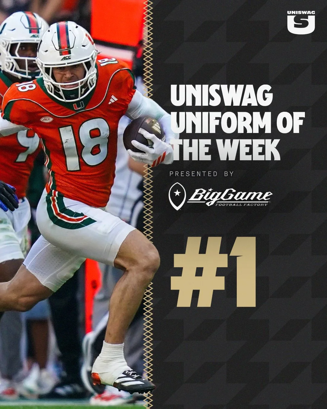
Let’s count down the Week 10 UNISWAG Uniform of the Week Top 10, presented by Big Game USA.
Week 10 brings another lineup of fresh combinations, meaningful details and standout uniforms to college football. The hunt for this week’s best look starts now.
From heritage-inspired designs to bold alternates and timeless team colors, we’re watching what takes the field and which teams put it all together.
Every piece counts. Helmets, jerseys, pants and accessories work together to create a complete look, with the smallest details often making the biggest difference.
We’ll break down the combinations, select our Top 10 and crown the Week 10 UNISWAG Uniform of the Week winner.
See who earns a spot when the countdown drops Monday, presented by Big Game USA.
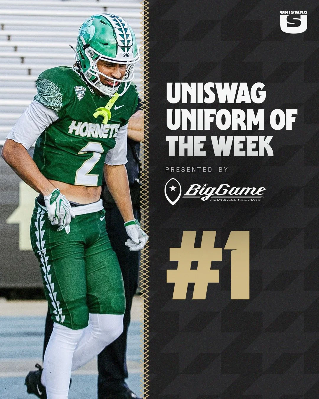
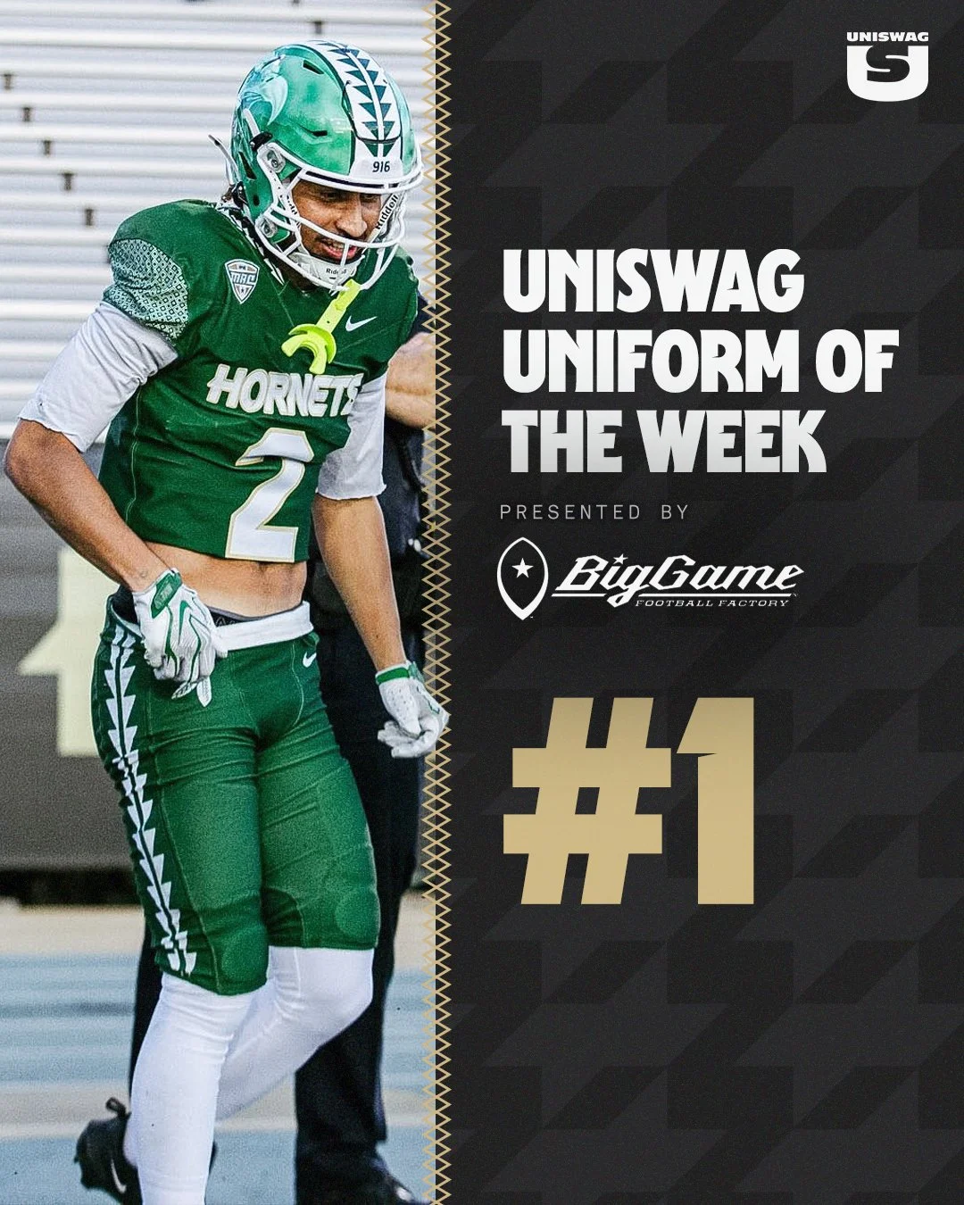
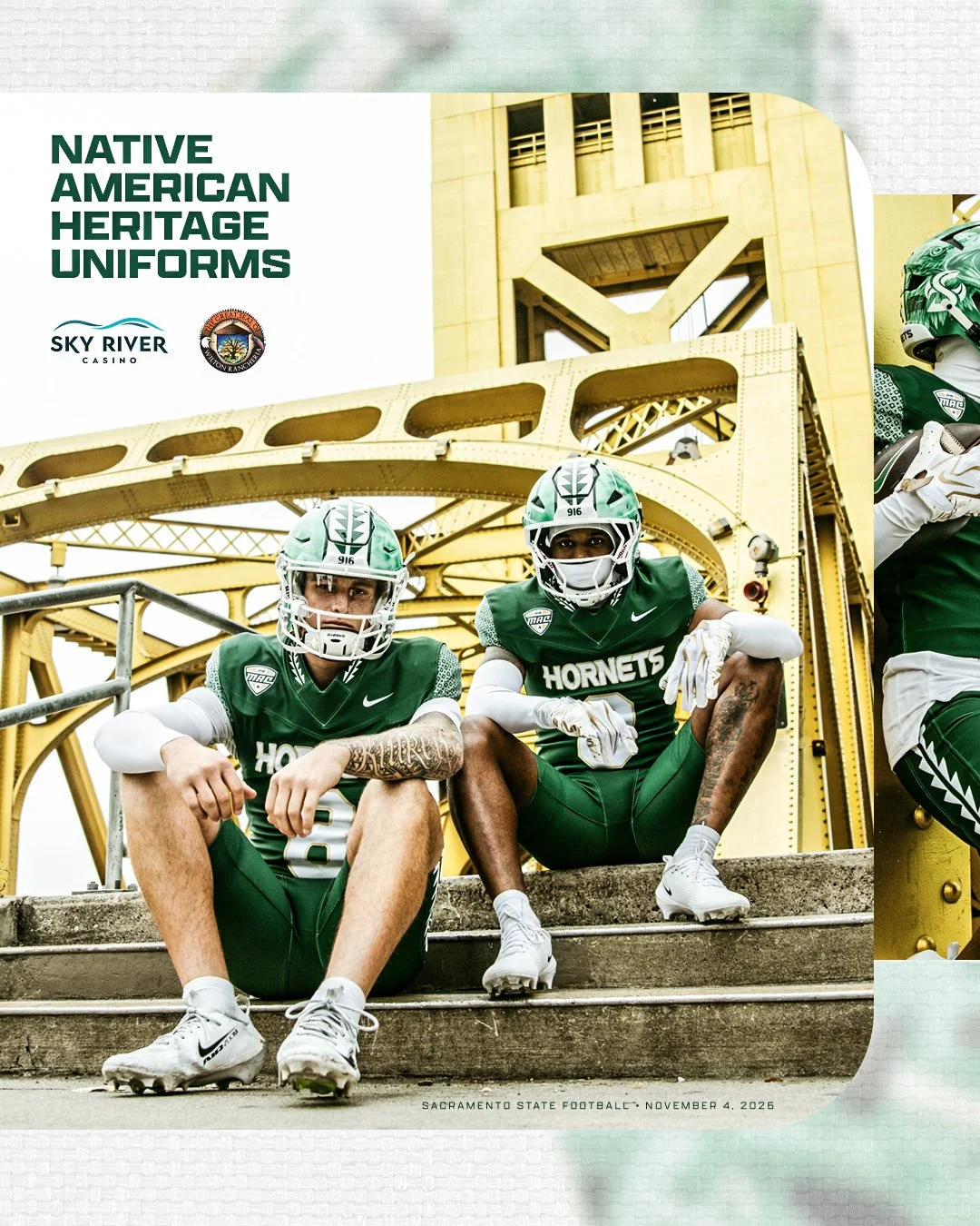
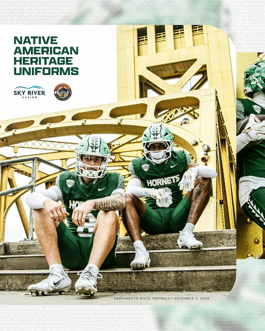
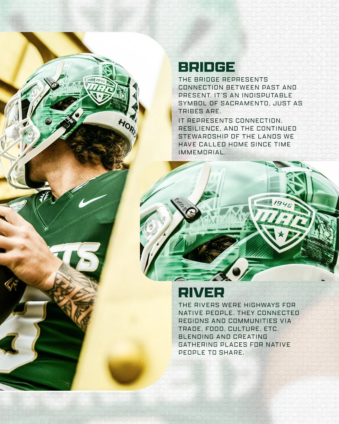
Sacramento State’s Native American Heritage uniforms bring a story of community, resilience and connection to the field. Built around hand-painted helmets and detailed green jerseys and pants, the look incorporates imagery representing Native heritage and the Sacramento region.
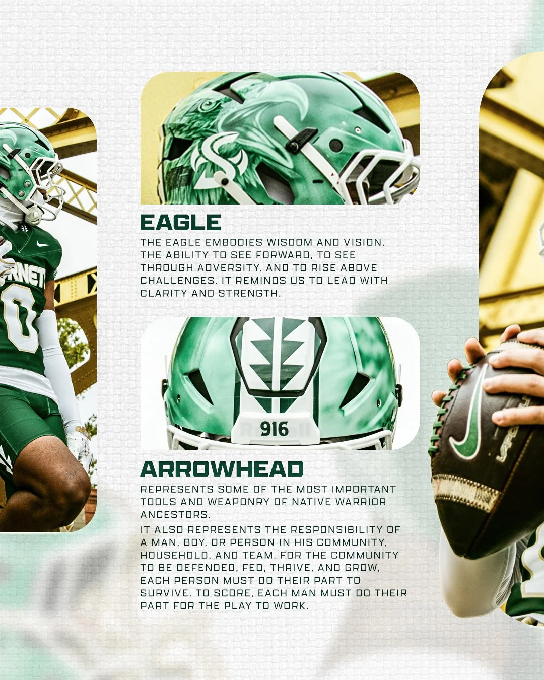
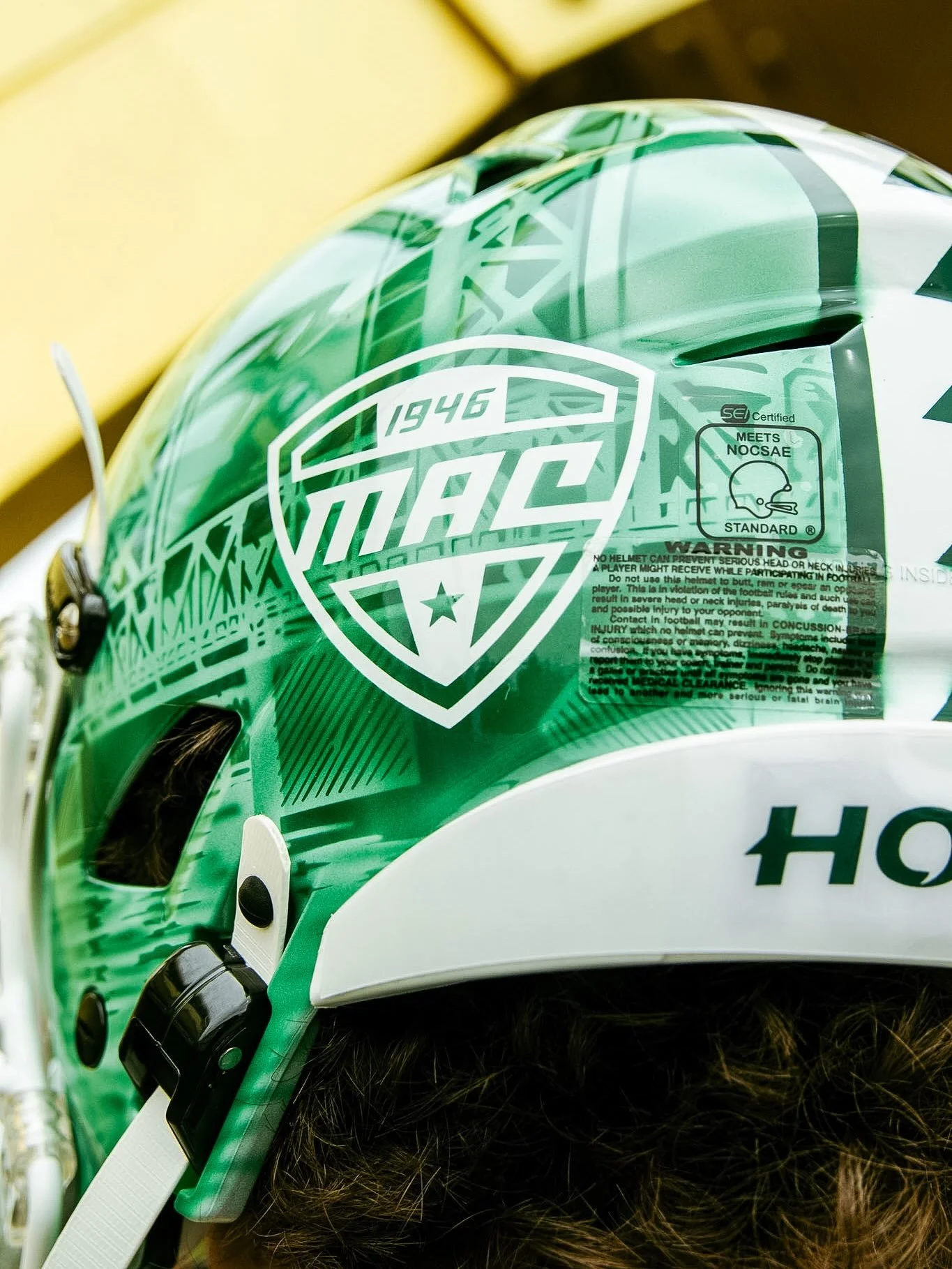
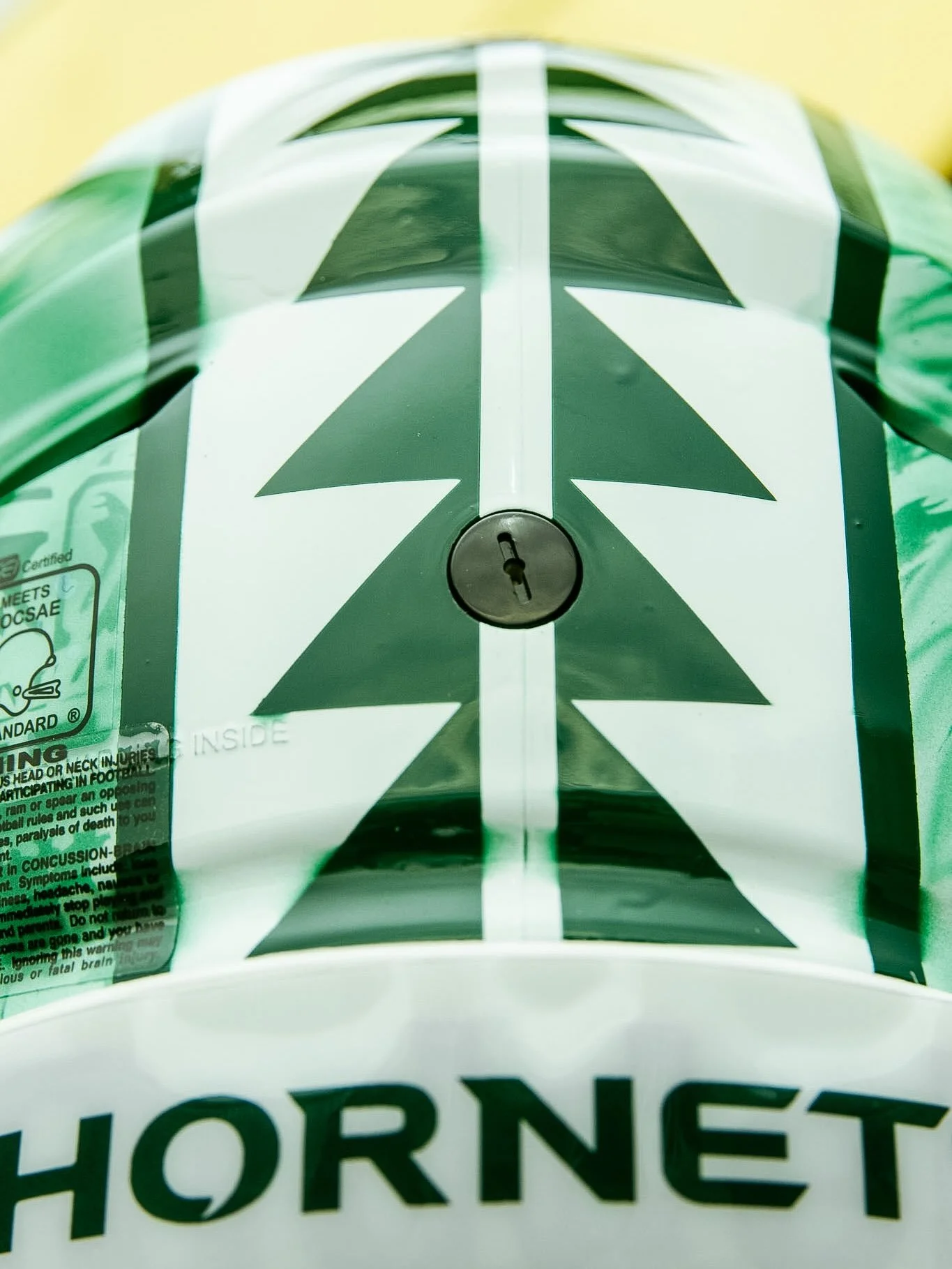
The helmets serve as the centerpiece, layering eagle artwork, a bridge and river imagery across a green shell. White Sacramento State branding, a white facemask and a bold patterned center stripe frame the artwork, while “916” on the front bumper adds a local touch.
According to the team’s design breakdown, the eagle embodies wisdom and vision, the ability to look ahead, see through adversity and rise above challenges. Its presence on the helmet reinforces a message of leading with clarity and strength.
The arrowhead design connects ancestral tools and weaponry with individual responsibility. Within the uniform’s story, it represents each person’s role in supporting and protecting a community, household or team. That idea translates directly to football, where every player must fulfill an assignment for a play to succeed.
Sacramento’s bridge imagery adds another layer to the helmet. The design uses the bridge to represent a connection between past and present, along with resilience and the continued stewardship of Native homelands. River imagery complements that message, recognizing waterways as routes that connected Native communities through trade, food and cultural exchange.
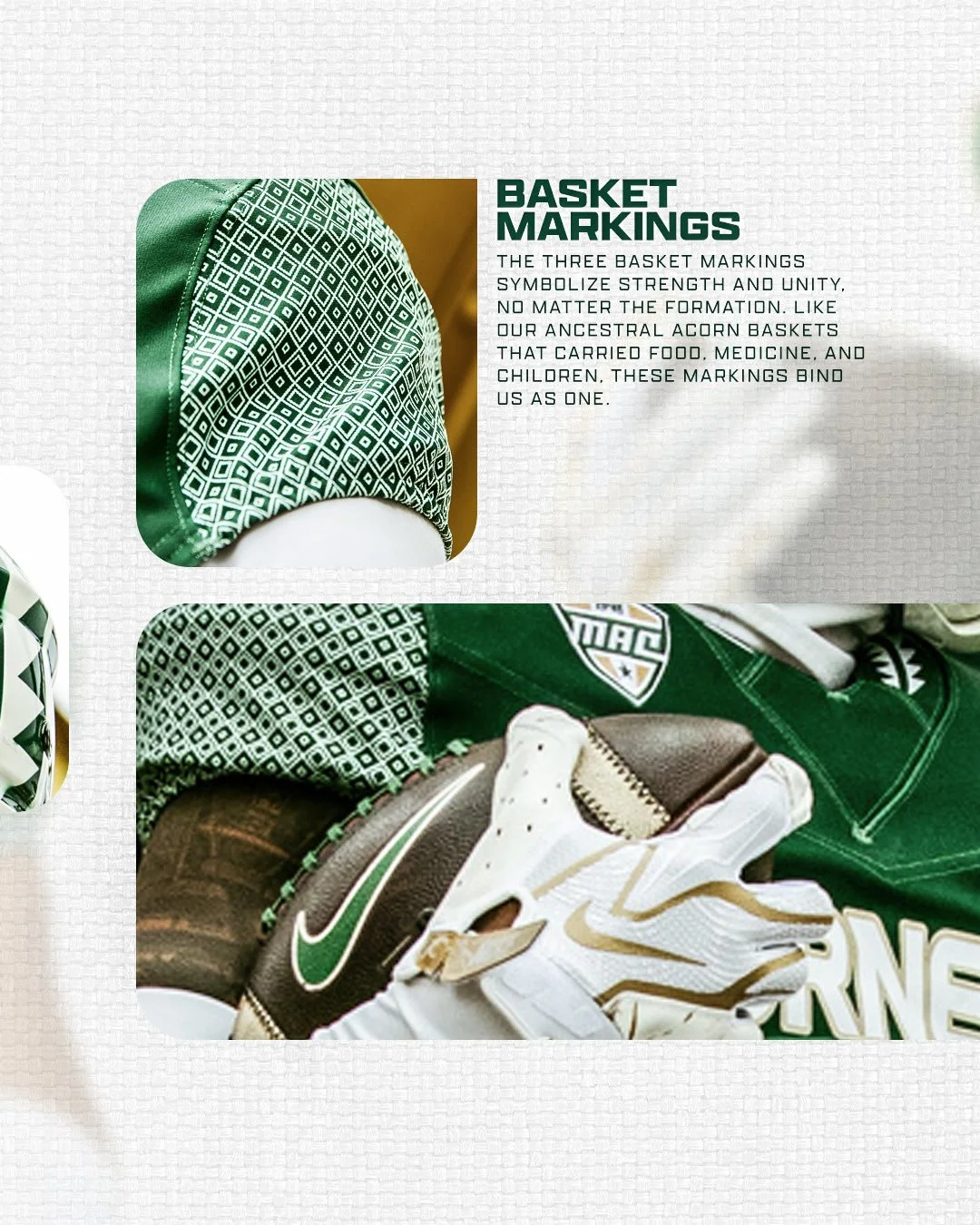
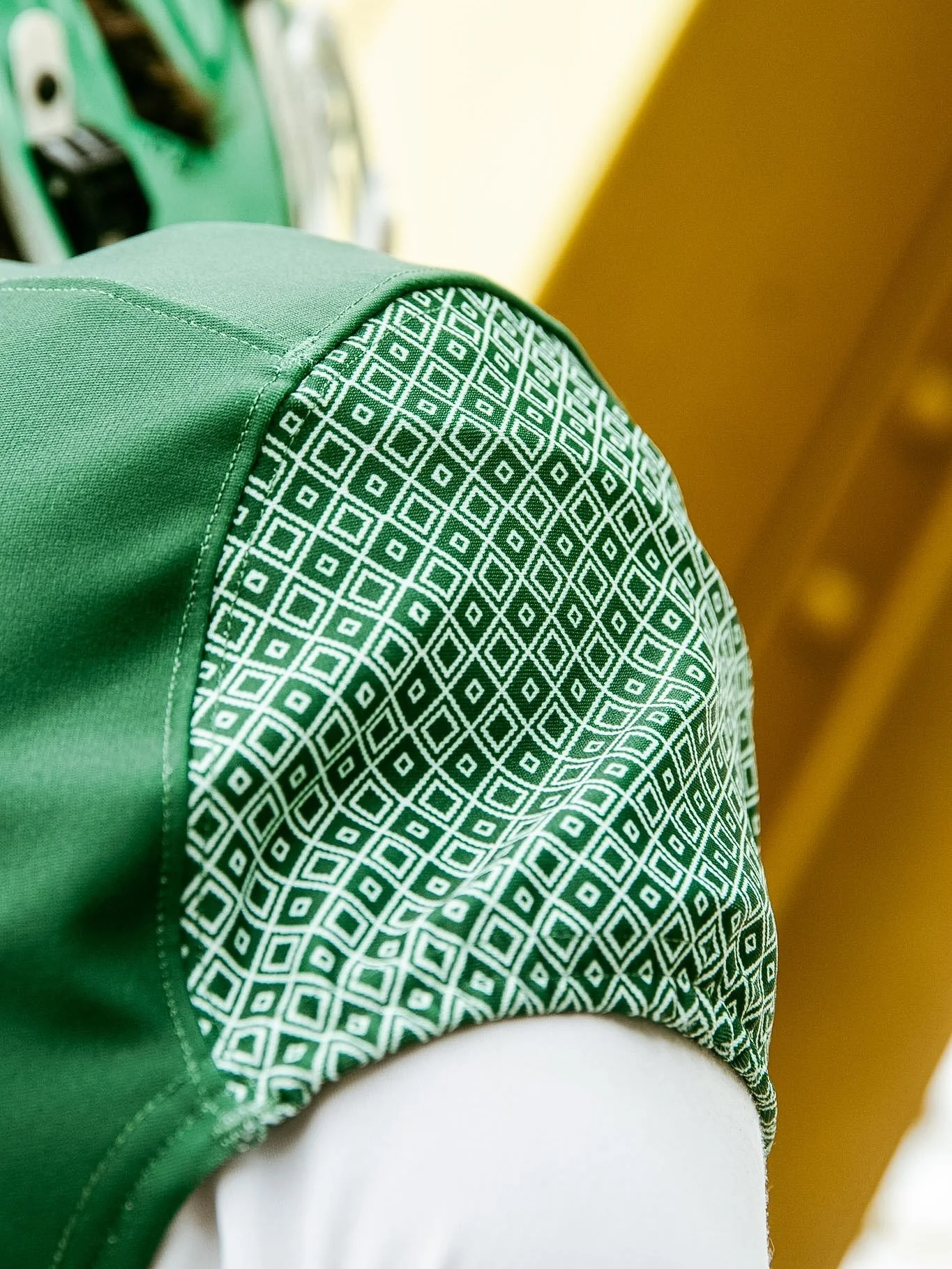
The storytelling continues across the green jerseys, where intricate white basket markings cover the sleeves. The three markings symbolize strength and unity, drawing from ancestral acorn baskets associated with carrying food, medicine and children. Their repeating arrangement gives the shoulders a distinctive texture while reinforcing the collection’s emphasis on connection.
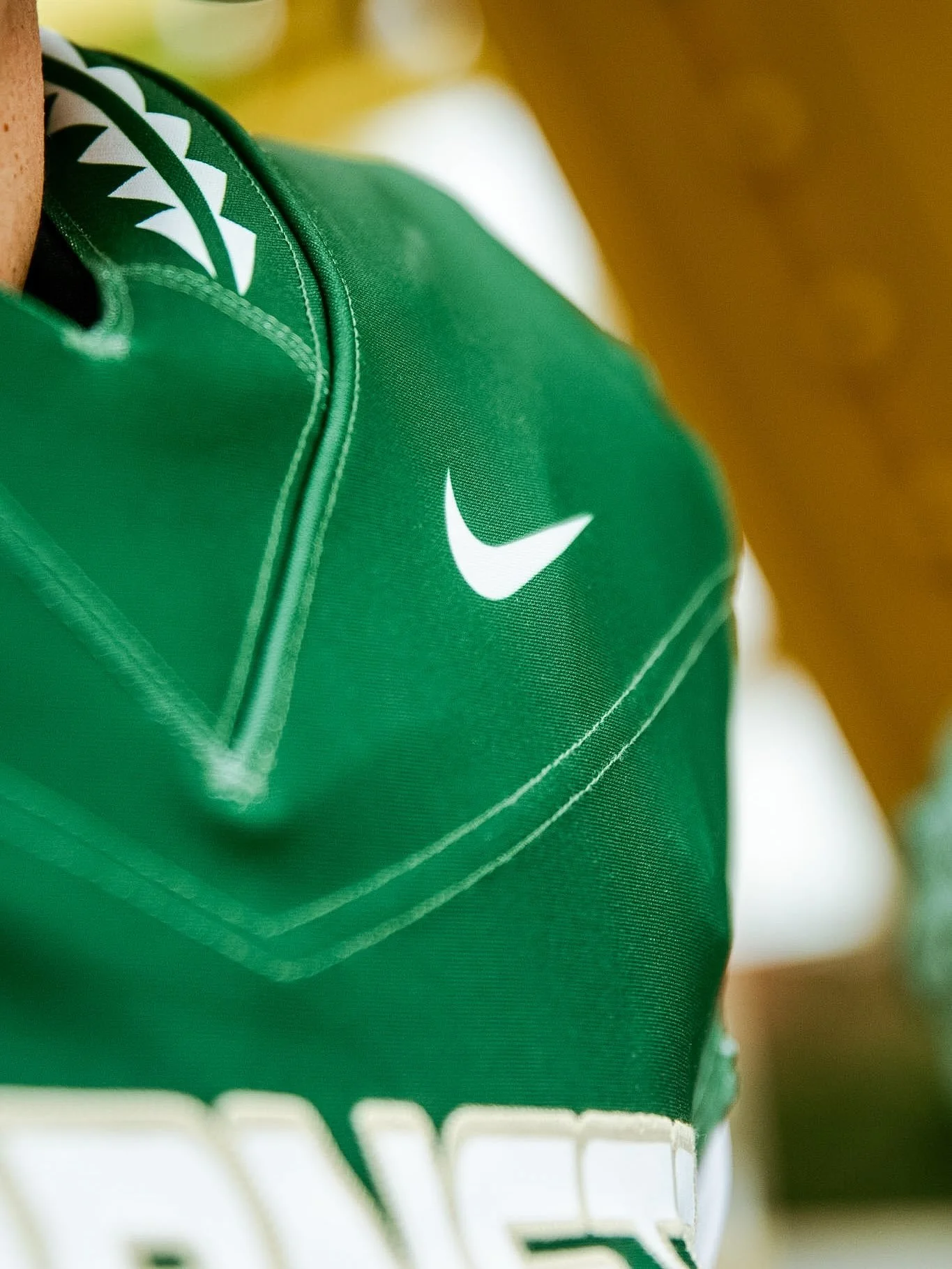
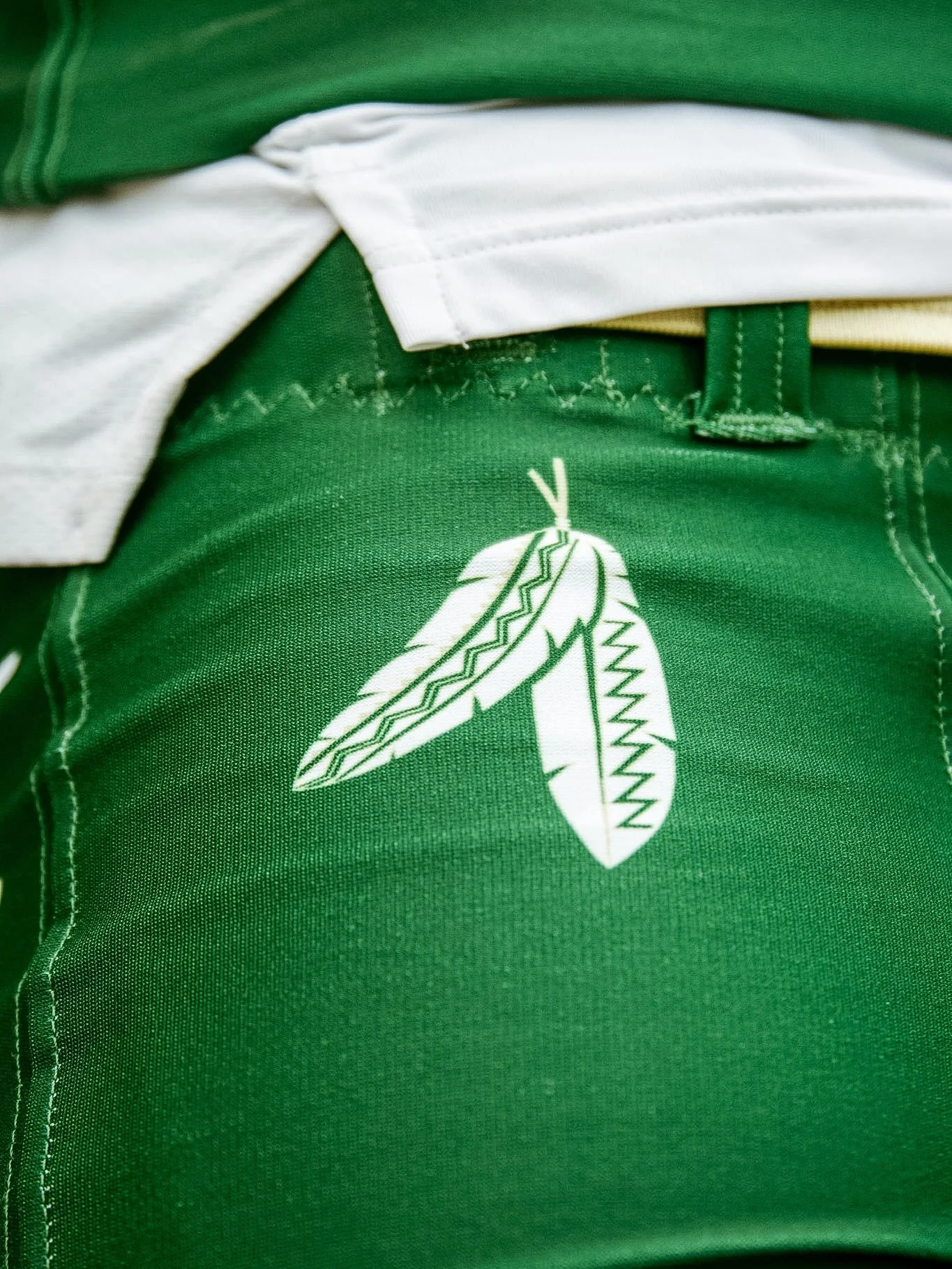
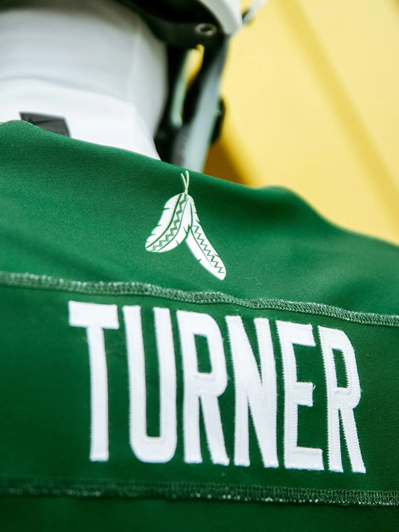
White arrowhead motifs at the collar and along the pants carry the helmet’s geometric details into the rest of the uniform. Paired feather graphics appear above the player names on the jerseys and near the pants’ waist, while white numbers outlined in gold and the HORNETS chest wordmark maintain Sacramento State’s familiar identity.
From the hand-painted eagle to the basket-inspired sleeve patterns, Sacramento State has built a uniform with meaning throughout. Each element contributes to a larger story honoring Native communities and their enduring connection to the place the Hornets call home.
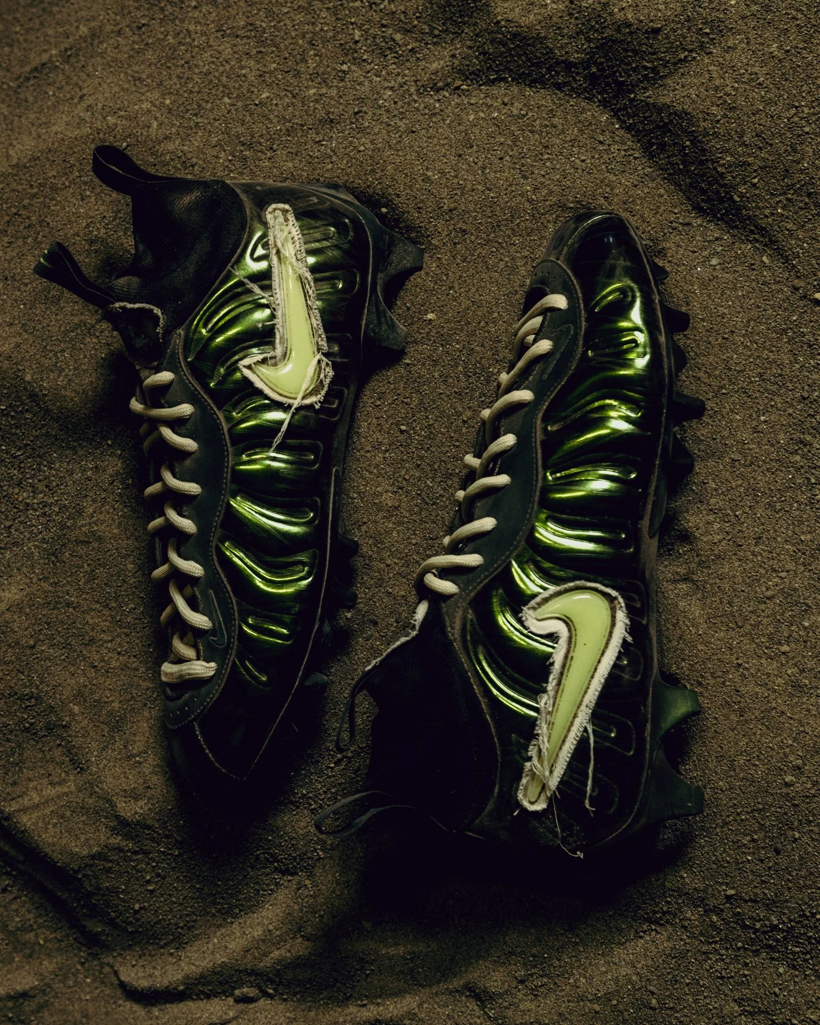
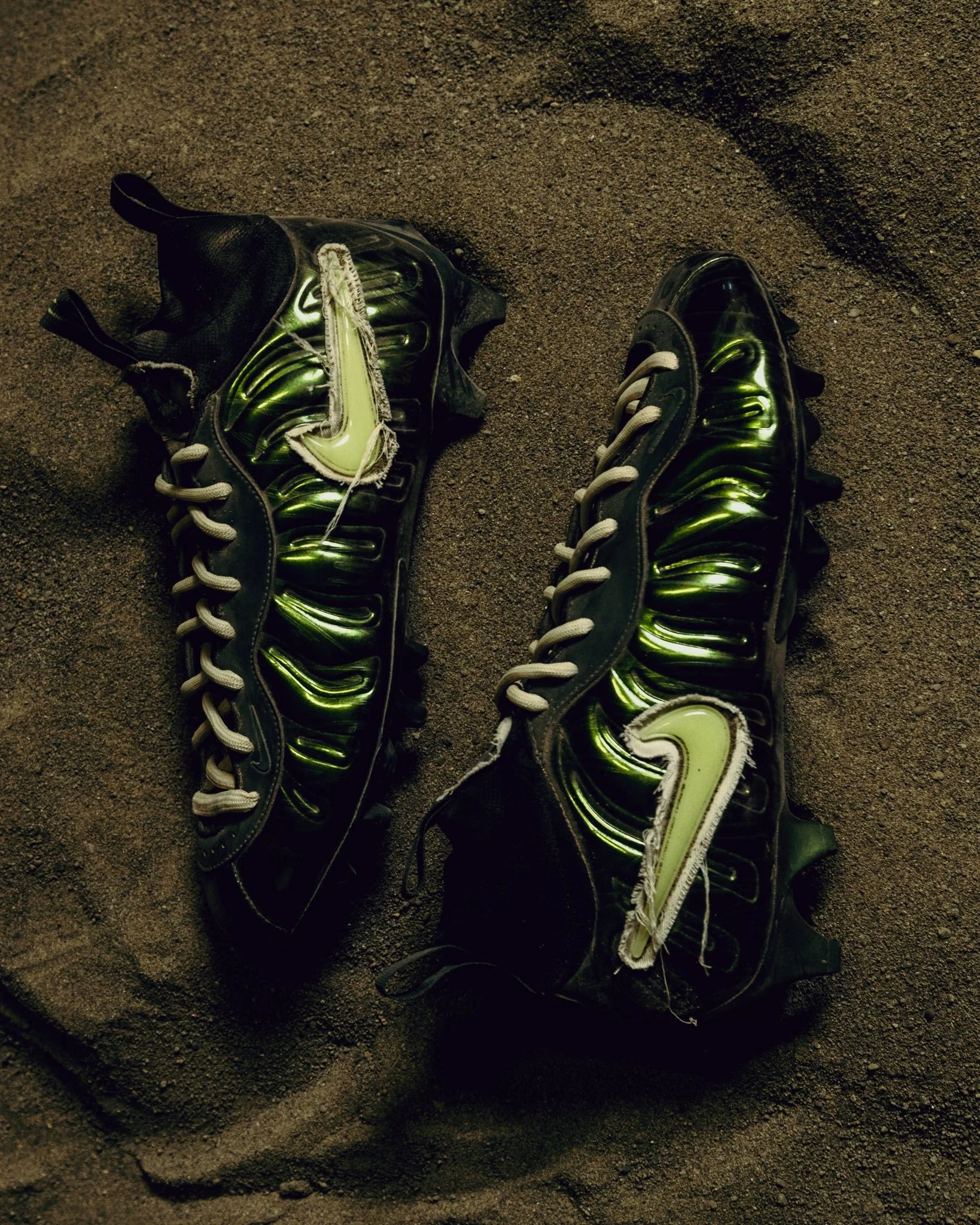
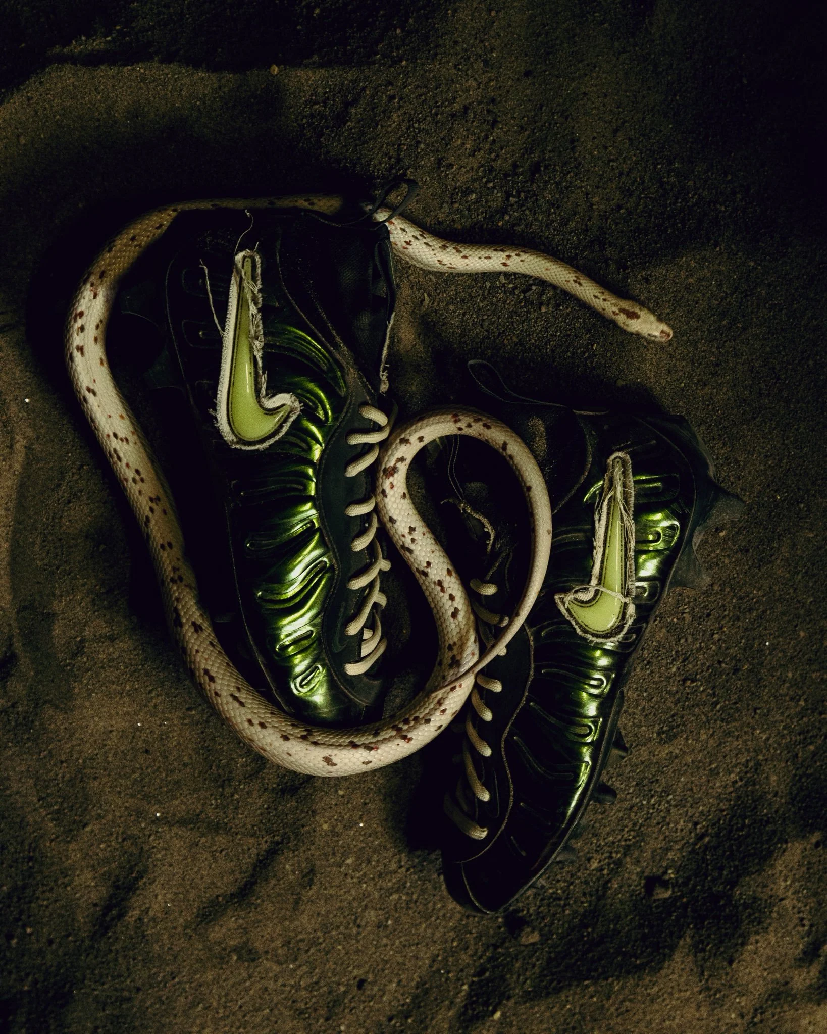
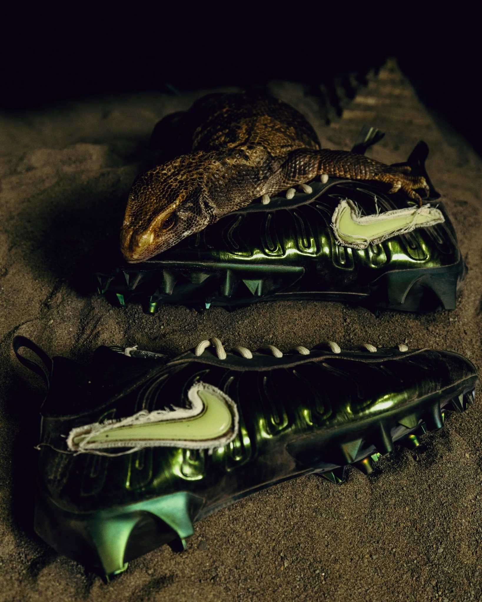
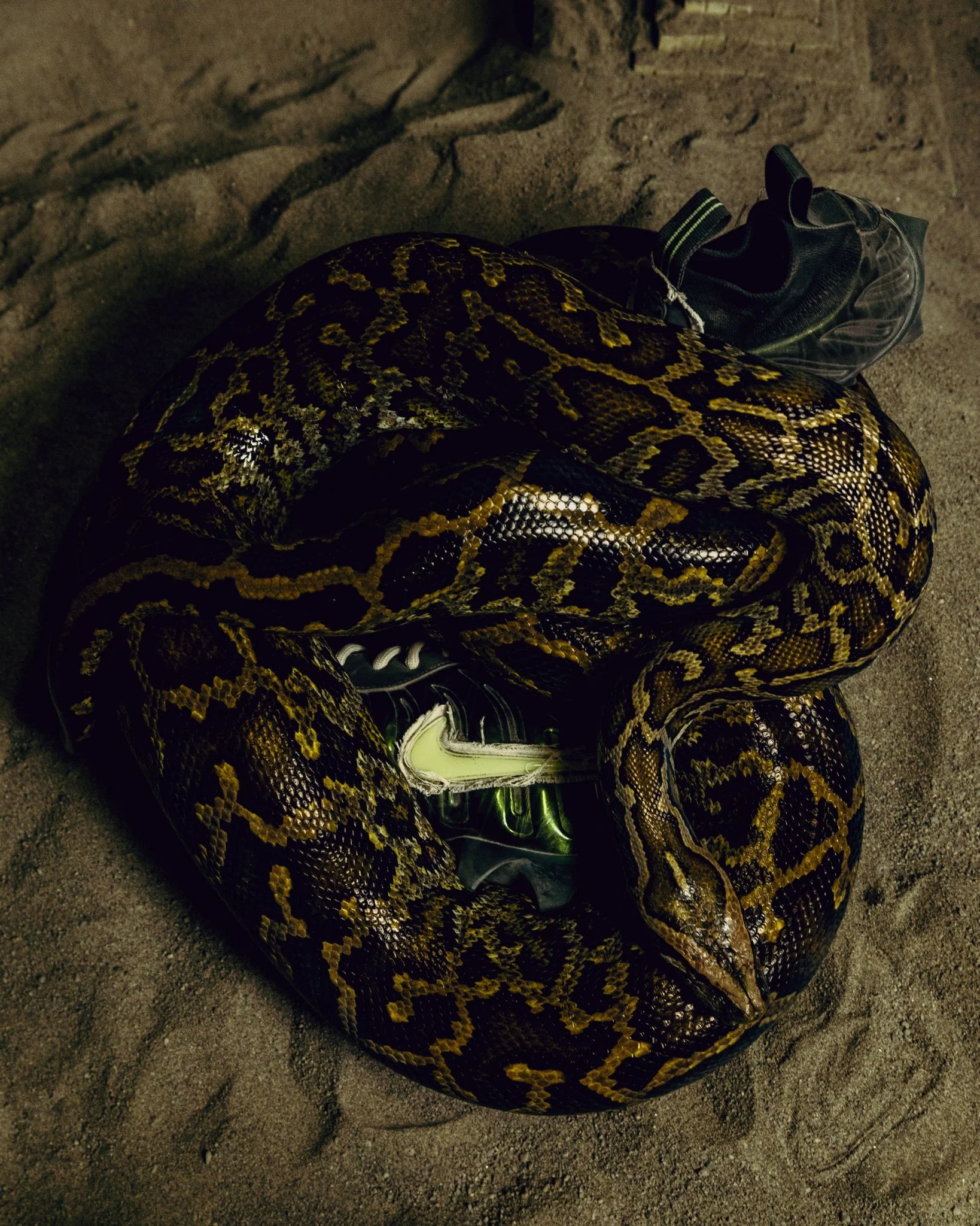
Oregon’s “Mummy Duck” is returning for another round. The Ducks have unveiled the Nike Vaporposite Pro “Mummy Duck” football cleat, carrying the theme forward with an iridescent finish, wrapped branding and a special version of Oregon’s mascot.
The design builds on the Mummy Duck footwear Oregon and Nike introduced last year, which included Foamposite sneakers and football cleats. With the Foamposite recently making its retail debut, the Vaporposite Pro gives the theme another opportunity to move from Oregon’s equipment room into fans’ collections.
The molded upper leads the look with a dark finish that shifts between brown, green and purple depending on the light. Black detailing through the knit collar and eyestay frames the metallic shell, while white laces create a sharp contrast across the top.
The signature detail comes through the Swoosh. Pale green branding is surrounded by frayed white fabric, giving the logo a weathered, mummy-wrapped appearance. That treatment adds texture against the molded upper and connects the cleat directly to the collection’s theme.
On the tongue, a custom Oregon Duck graphic gets the full mummy treatment, bringing the mascot into the design. Underfoot, the cleated plate carries over the upper’s shifting metallic finish, extending the look through the entire pair.
The result is another distinctive addition to Oregon’s Nike footwear lineup, with the Mummy Duck identity carried through color, texture and character graphics.
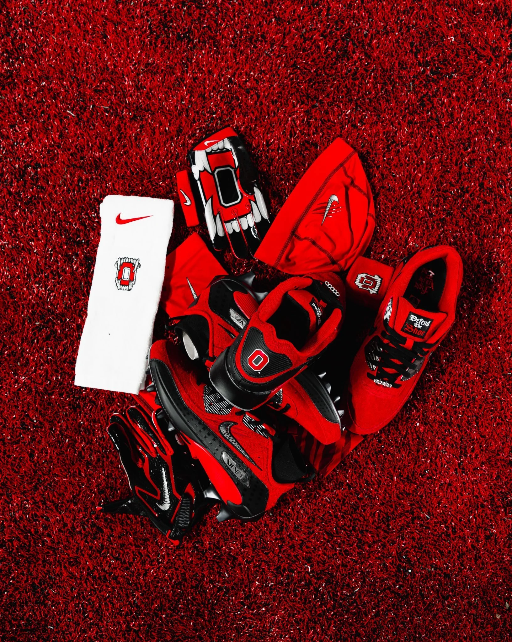
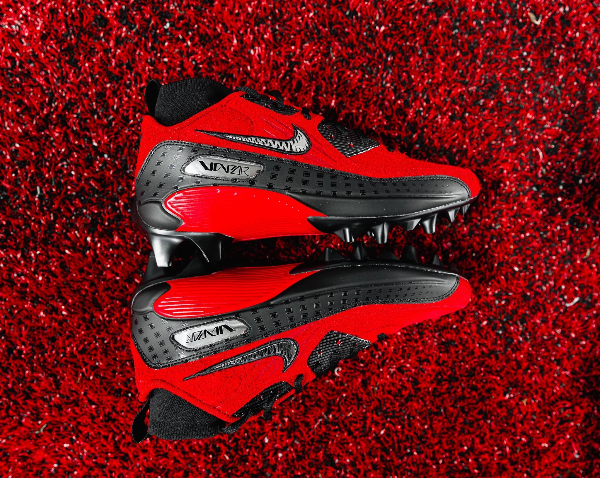
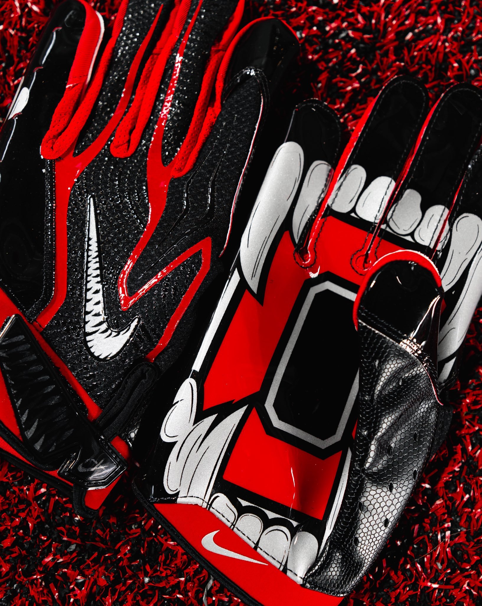
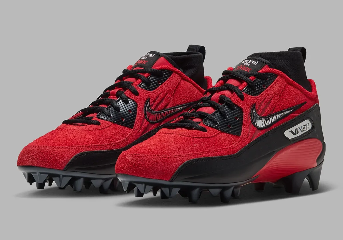
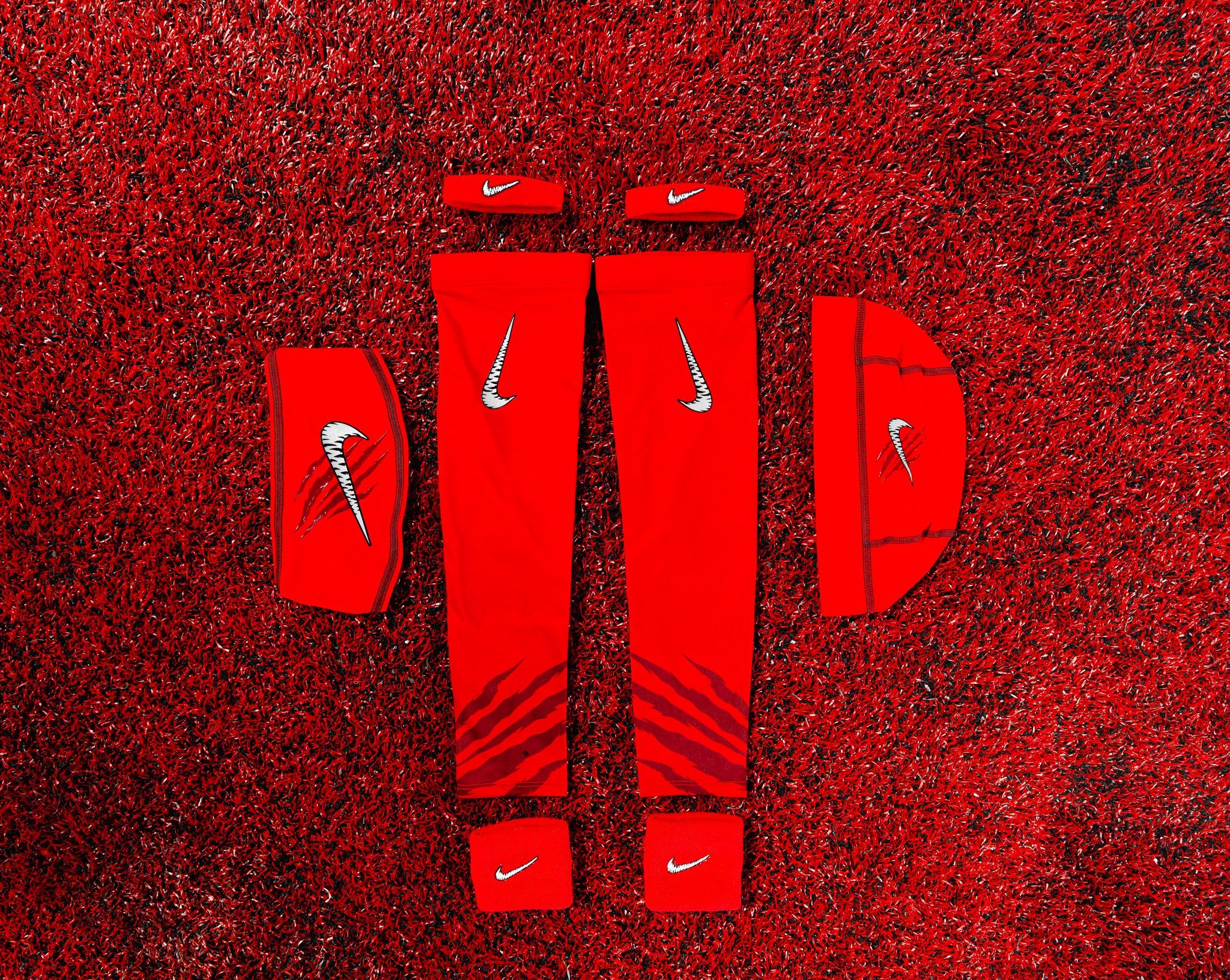
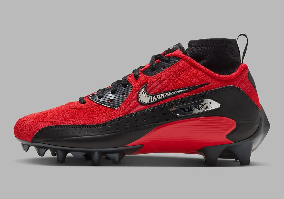
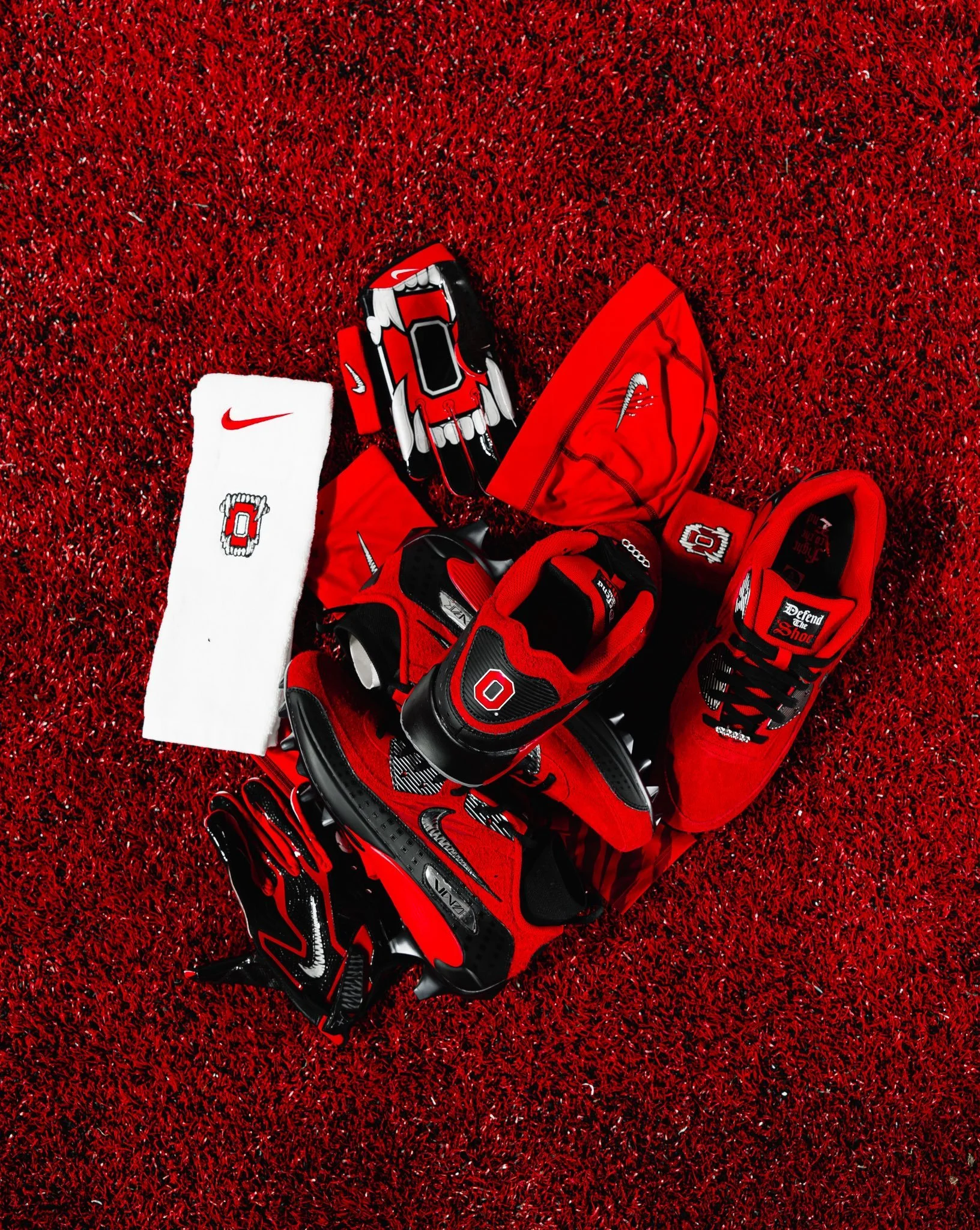
Ohio State’s latest Nike capsule gives the Buckeyes’ scarlet and black gear a fierce new treatment. From tooth-filled Swooshes to a fanged Block O, the collection carries a coordinated design across cleats, gloves and accessories.
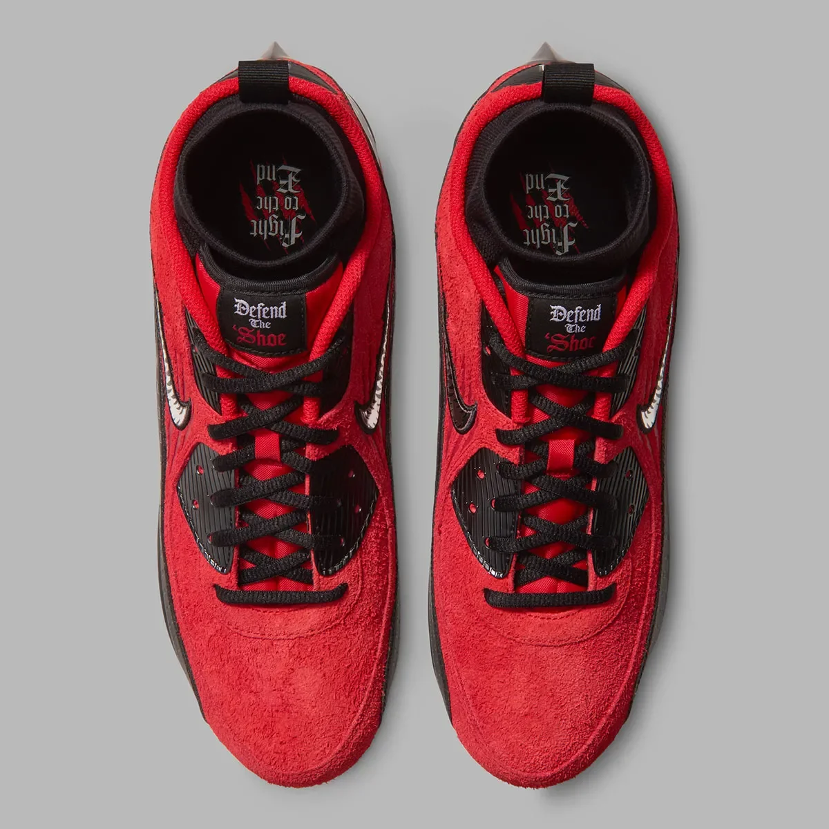
The Nike Max 90 Vapor cleats headline the capsule, combining the recognizable styling of the Air Max 90 with a football-ready build. Scarlet textured uppers sit above black overlays, with metallic accents adding contrast. The standout detail comes on the sides, where the Nike Swoosh is filled with sharp teeth and framed by claw-mark graphics.
The Ohio State references continue throughout the footwear. “Defend the Shoe” appears on the tongue patches in Gothic lettering, while “Fight to the End” is featured inside. A Block O on the heel completes the school-specific treatment, giving the cleats details to discover from every angle.
The gloves take the concept even further. Black and scarlet backs feature the tooth-filled Swoosh, while the palms showcase an oversized Block O surrounded by an open mouth of teeth and long fangs. It’s the capsule’s boldest graphic and gives a familiar Ohio State mark a much more aggressive appearance.
Matching scarlet sleeves, headwear and wrist accessories extend the look, repeating the custom Swoosh and claw marks. A white towel adds contrast while carrying the same fanged Block O graphic.
For Ohio State, the teeth, claw marks and “Defend the Shoe” messaging give this collection a clear identity, one built to bring an extra edge to the Buckeyes’ game-day look.
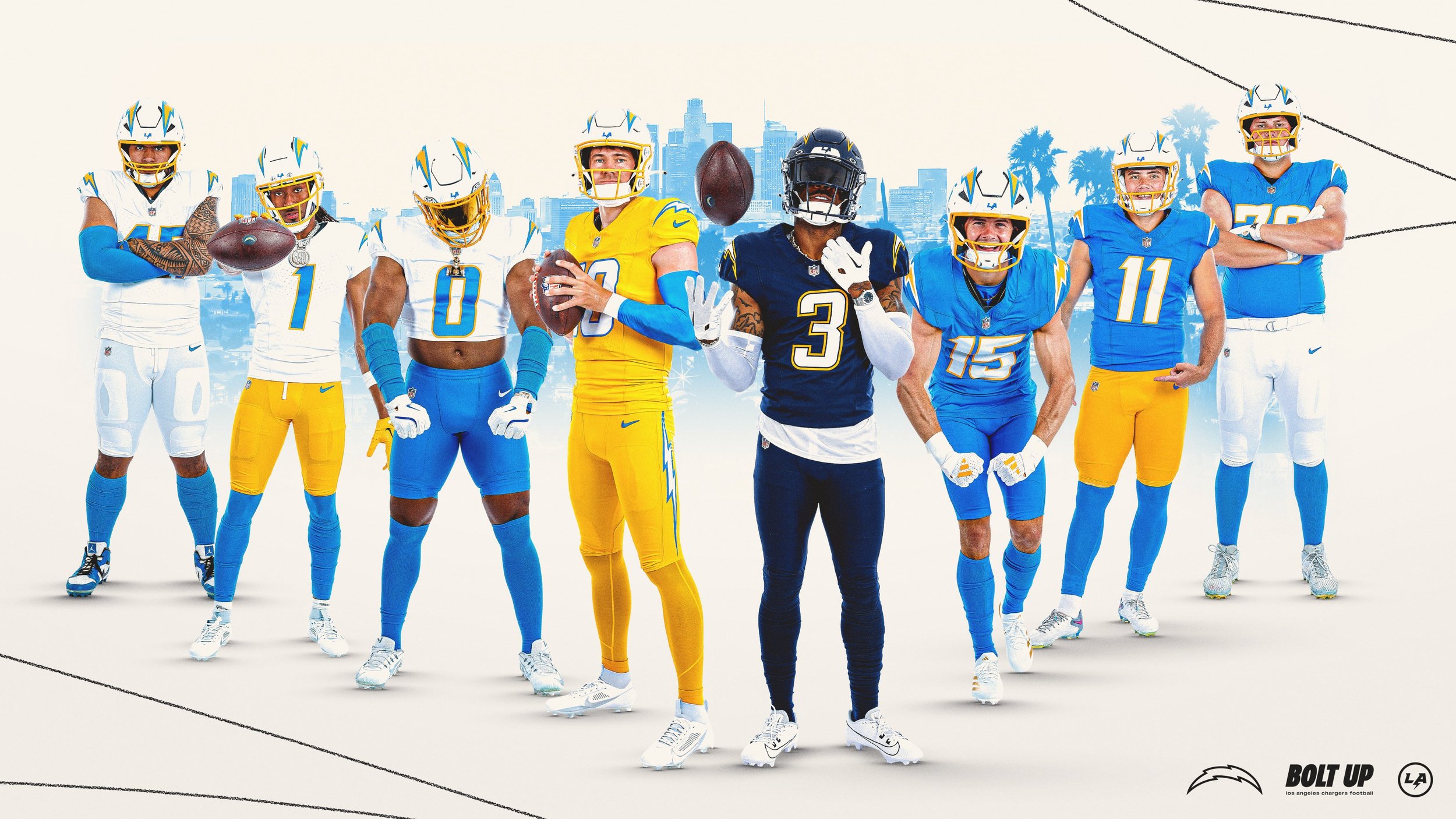
the Los Angeles Chargers delivered one of the boldest uniform drops of the NFL offseason, unveiling two fresh alternate looks—“Charger Power” and “Super Chargers”—plus the long-awaited debut of powder blue pants to their primary kit.
From the revolutionary “Air Coryell” days of the late ‘70s to the hard-hitting navy era of the 2000s, the Chargers are tapping into their past while adding a serious dose of modern swag.
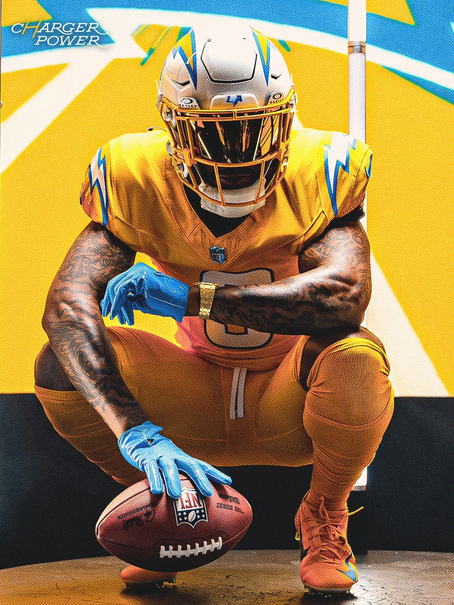
For the first time in franchise history, the Bolts are going gold—and they’re doing it right.
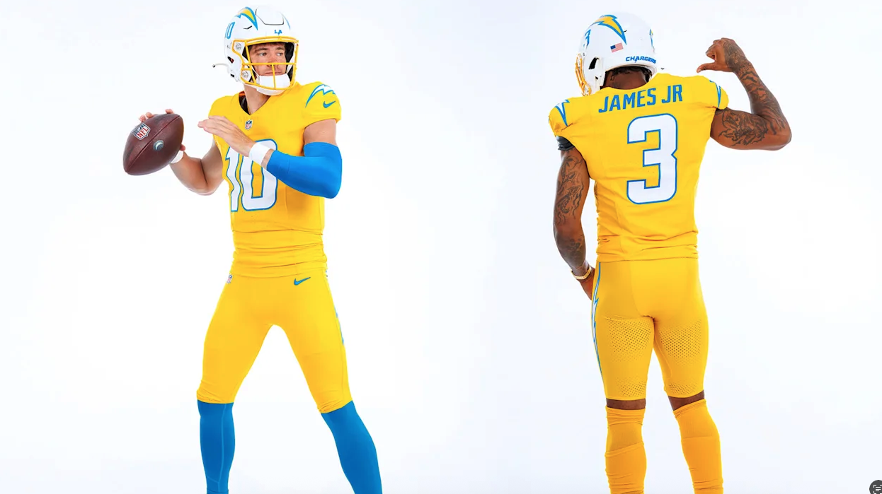
Dubbed Charger Power, this new alternate uniform features a vibrant gold jersey, paired with gold pants and the team’s current white helmet. It’s a bold look that honors the energy of the Air Coryell era, when Hall of Famer Dan Fouts and his legendary trio of Winslow, Joiner, and Jefferson transformed the game.
The gold jersey pops with white numbers outlined in powder blue, and the phrase Charger Power stitched on the collar adds an era-defining touch. Though gold jerseys have been sold in retail before, this is the first time the team will take the field in them—specifically in Week 7 against the Colts for Legends Weekend at SoFi.
From Derwin James Jr. to Tuli Tuipulotu, current Chargers are hyped:
“If you’re going to do gold, the way we did it with all gold, it looks amazing,” said James. “Once I put it on, it looked amazing. It’s one of my favorites. It’s fire,” added Tuipulotu.
Next up: a return to one of the most iconic looks in franchise history.
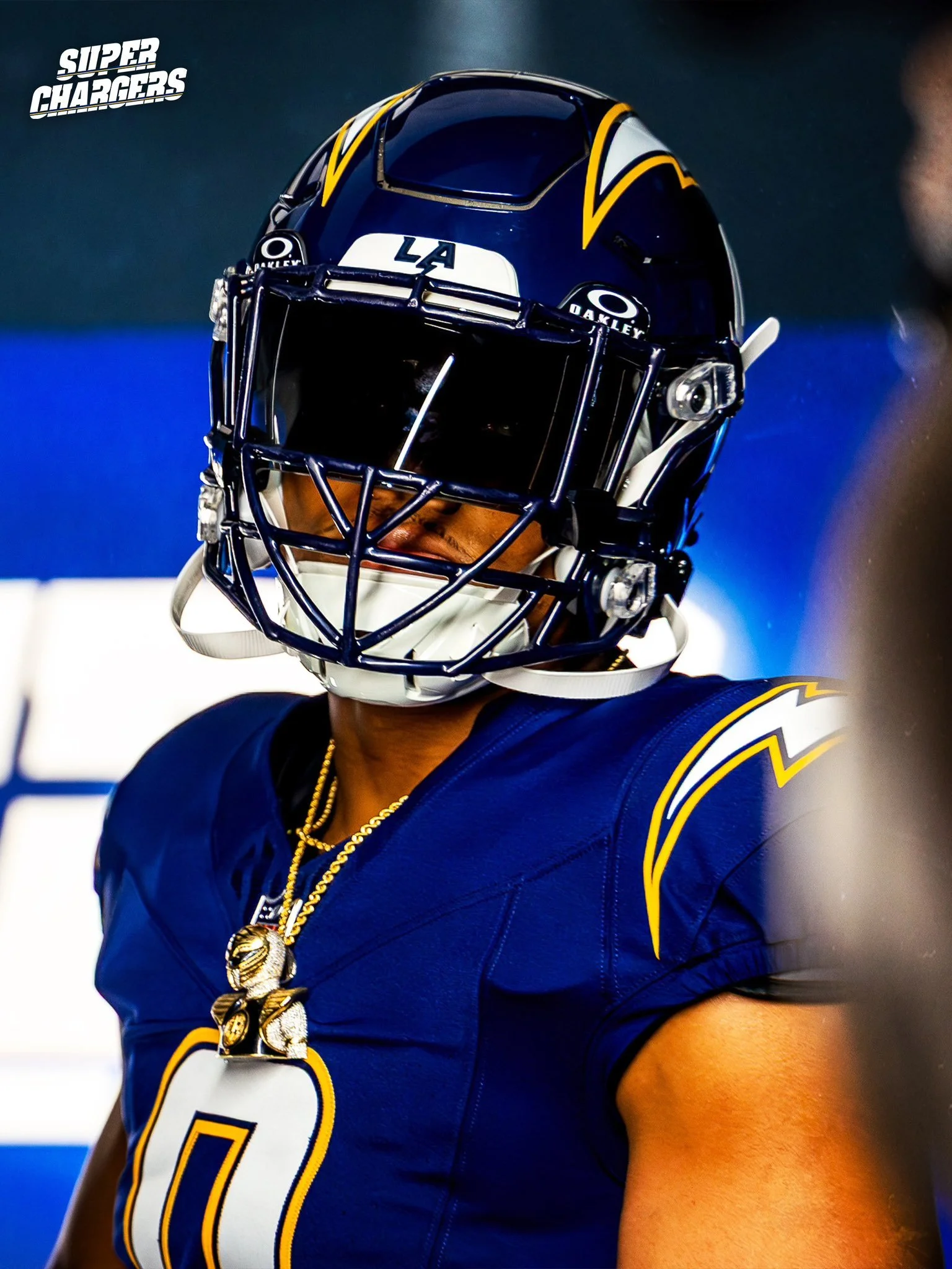
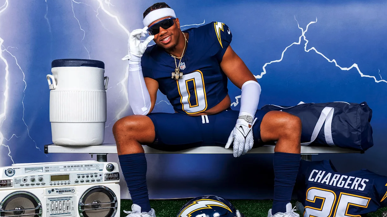
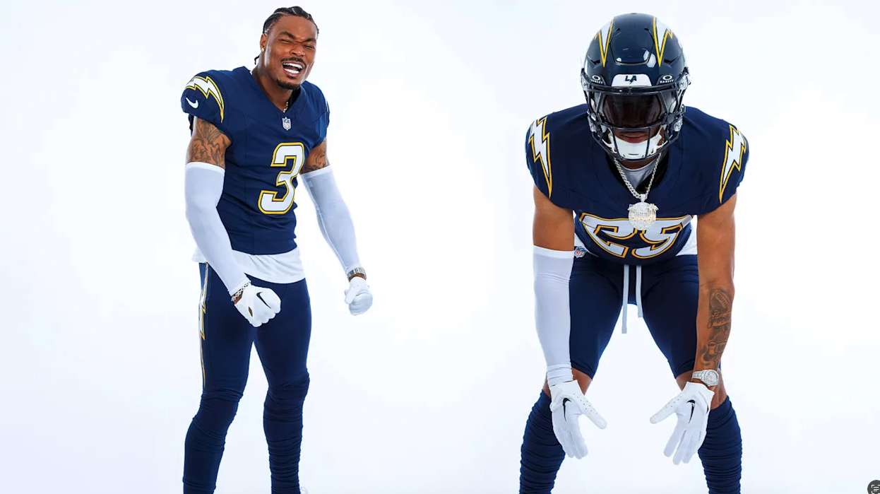
The Super Chargers uniform is a full navy-on-navy set—helmet, jersey, and pants—all updated with modern cuts while staying true to the look worn by Chargers legends like LaDainian Tomlinson, Junior Seau, Rodney Harrison, Antonio Gates, and Shawne Merriman.
The navy helmet features the bolt, now more streamlined, along with a player’s number on the side—a clean nod to the early 2000s. The jersey is loaded with detail: white numbers trimmed in gold, smaller bolts on the shoulders, and Super Chargers stitched across the collar.
“When we came out in those navies, you knew what time it was,” Merriman said. “That jersey meant pain for the other team.”
The Chargers will debut the Super Chargers look at home in Week 8 vs. the Vikings. The navy set returns again in Week 13 against the Raiders.
Rounding out the drop: powder blue pants are officially part of the Chargers’ primary uniform kit.
While the Bolts have already dominated with their powder blue tops since the 2020 redesign, fans and players alike have been asking: Where are the powder blue pants?
Now, they’re here—and they look clean.
“They are sick,” said kicker Cameron Dicker. “All the blue just looks so good.”
These pants can now be paired with either the home powder blue jerseys or the road white tops, adding more versatility to what is already widely regarded as one of the best uniform sets in the league.
From top to bottom, the Chargers have once again positioned themselves as trendsetters in NFL uniform culture.
Three distinct looks. All tied to moments that made the franchise legendary. And now, they’re ready to make new memories—in gold, navy, and powder blue.
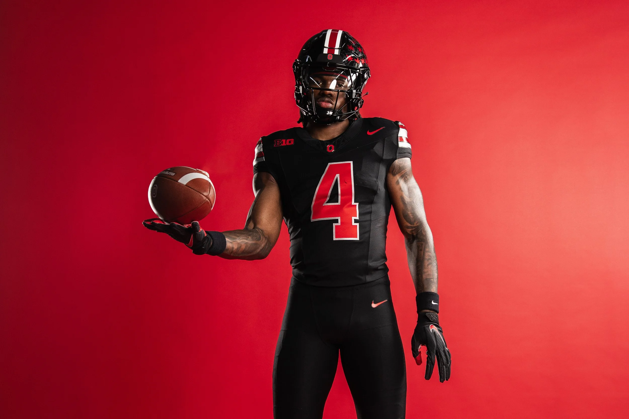
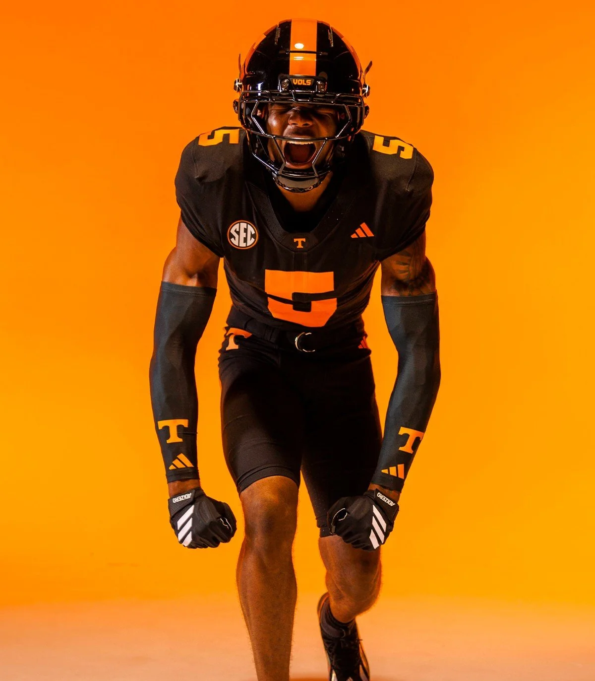
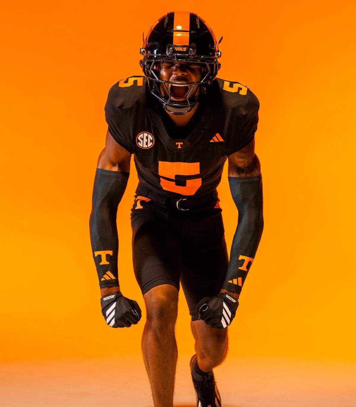
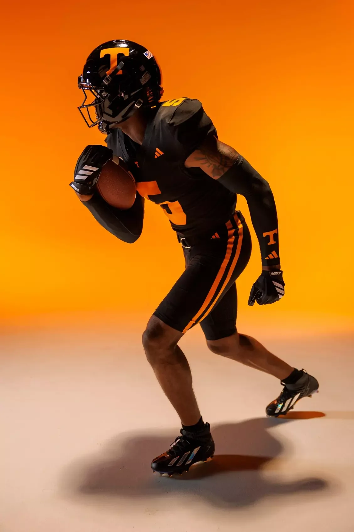
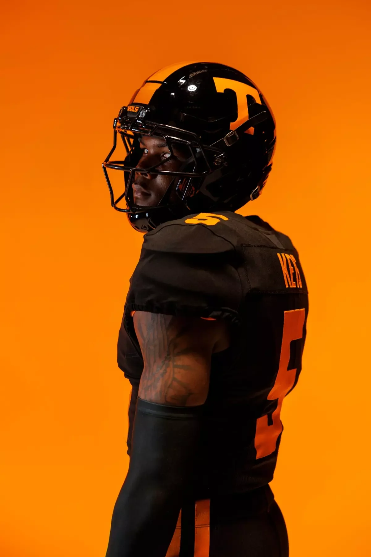
Tennessee officially unveiled its updated Dark Mode football uniforms for the 2026 season, continuing a tradition that has become synonymous with electric nights inside Neyland Stadium. First introduced in 2009 and revived in 2021, the all-black look has evolved into one of the Volunteers' signature alternate uniforms.
The latest version pushes the design forward while maintaining the identity fans have come to expect.
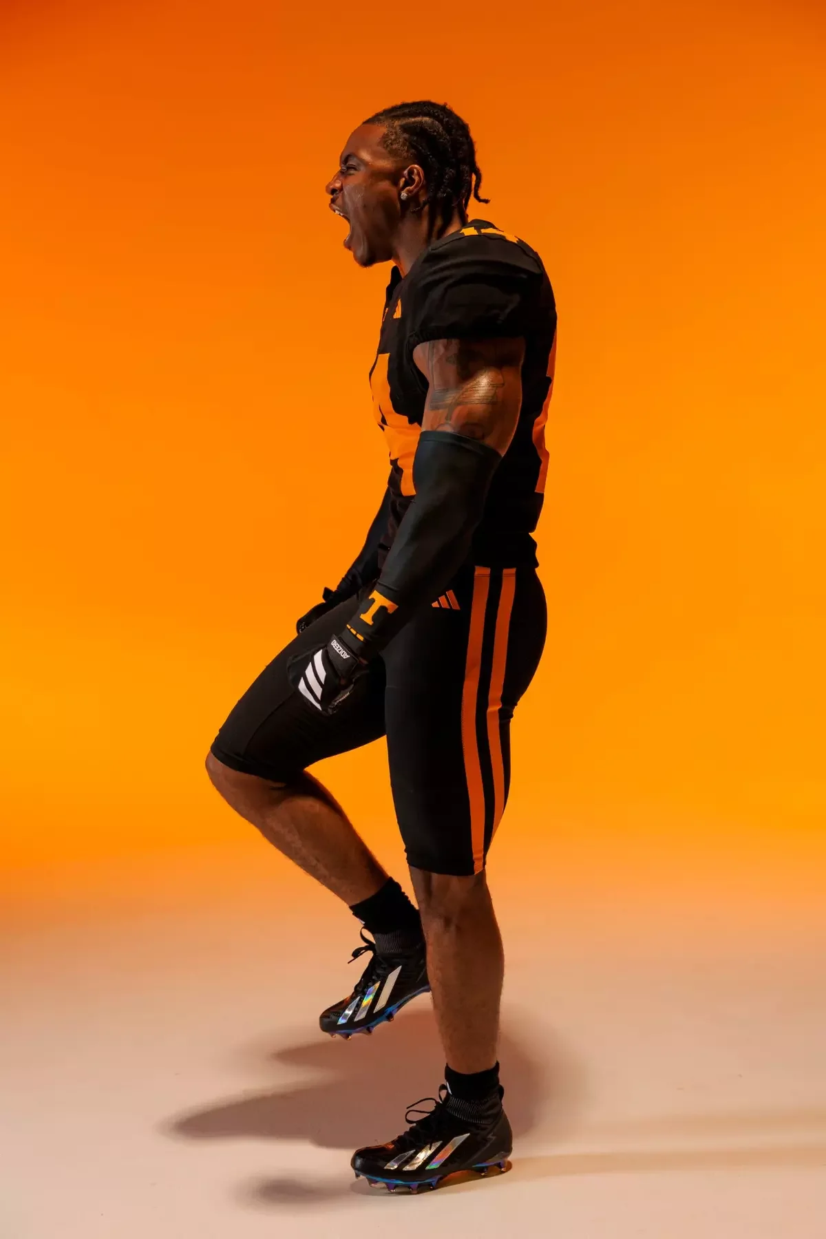
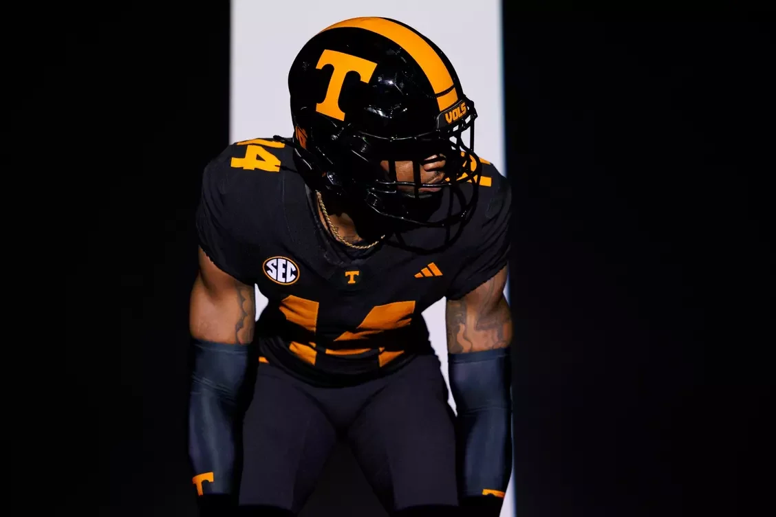
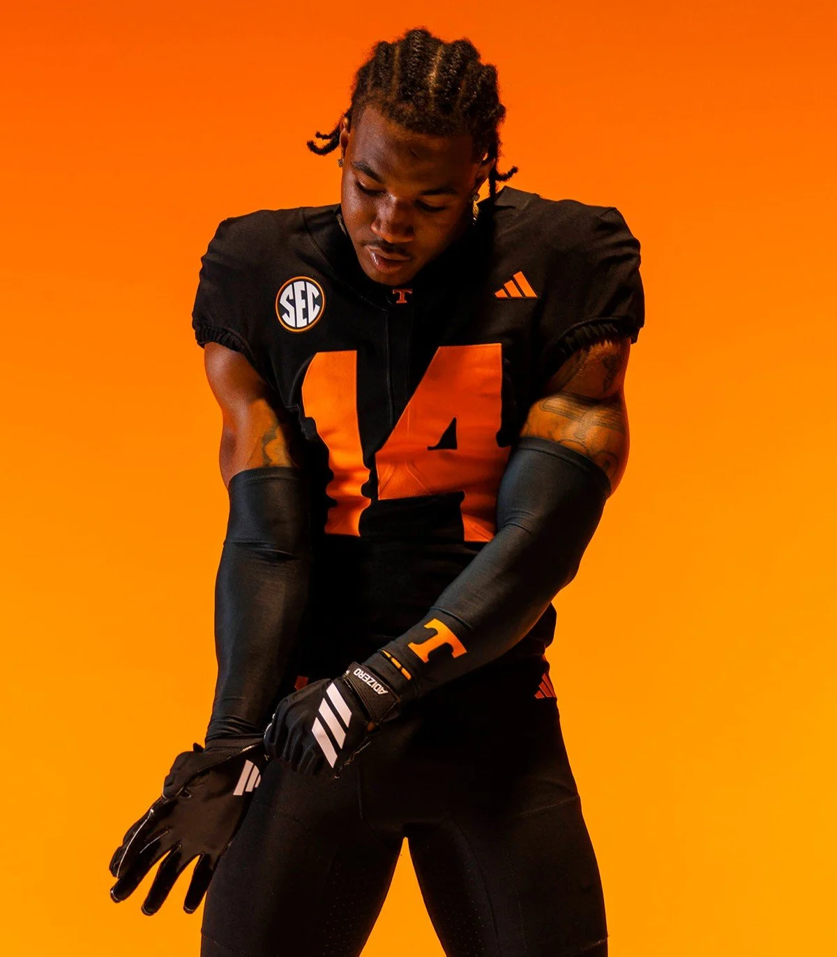
The all-black uniform returns with matching black helmet, jersey and pants, creating the intimidating monochromatic look that has become a fan favorite. While the overall color scheme remains familiar, several new design elements modernize the uniform for a new era of Tennessee football.
One of the biggest updates is the introduction of Tennessee's redesigned number font. Developed through months of collaboration between Tennessee's creative team and adidas designers, the new numbers blend the Volunteers' traditional block style with modern lines, creating a look that feels fresh without abandoning the program's history.
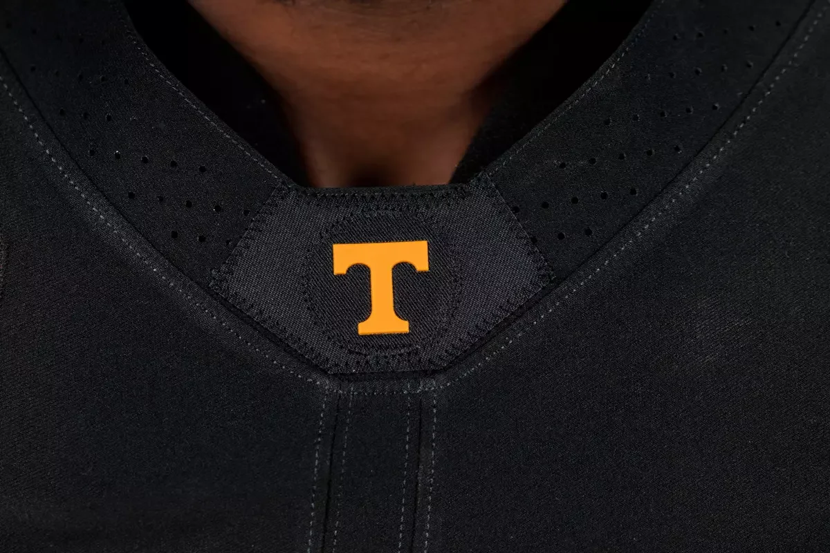
The front collar also receives a subtle but meaningful update with the iconic Power T logo placed inside a circular mark, giving the uniform another distinctive Tennessee element.
Inside the collar, players will continue to carry one of the most meaningful traditions in college athletics. The historic "I will give my all!" phrase appears in its original script, serving as a reminder of the standard and culture that has defined Tennessee football for generations.
Traditional striping also returns to the pants, tying together classic Volunteer design cues with the uniform's modern execution.
According to Tennessee, the Dark Mode uniforms are intended to represent the future of the program. Rather than looking back, the design embraces innovation while providing opportunities to introduce new features and styling never before seen on a Volunteers football uniform.
The result is an alternate uniform that feels contemporary without losing what makes Tennessee instantly recognizable.
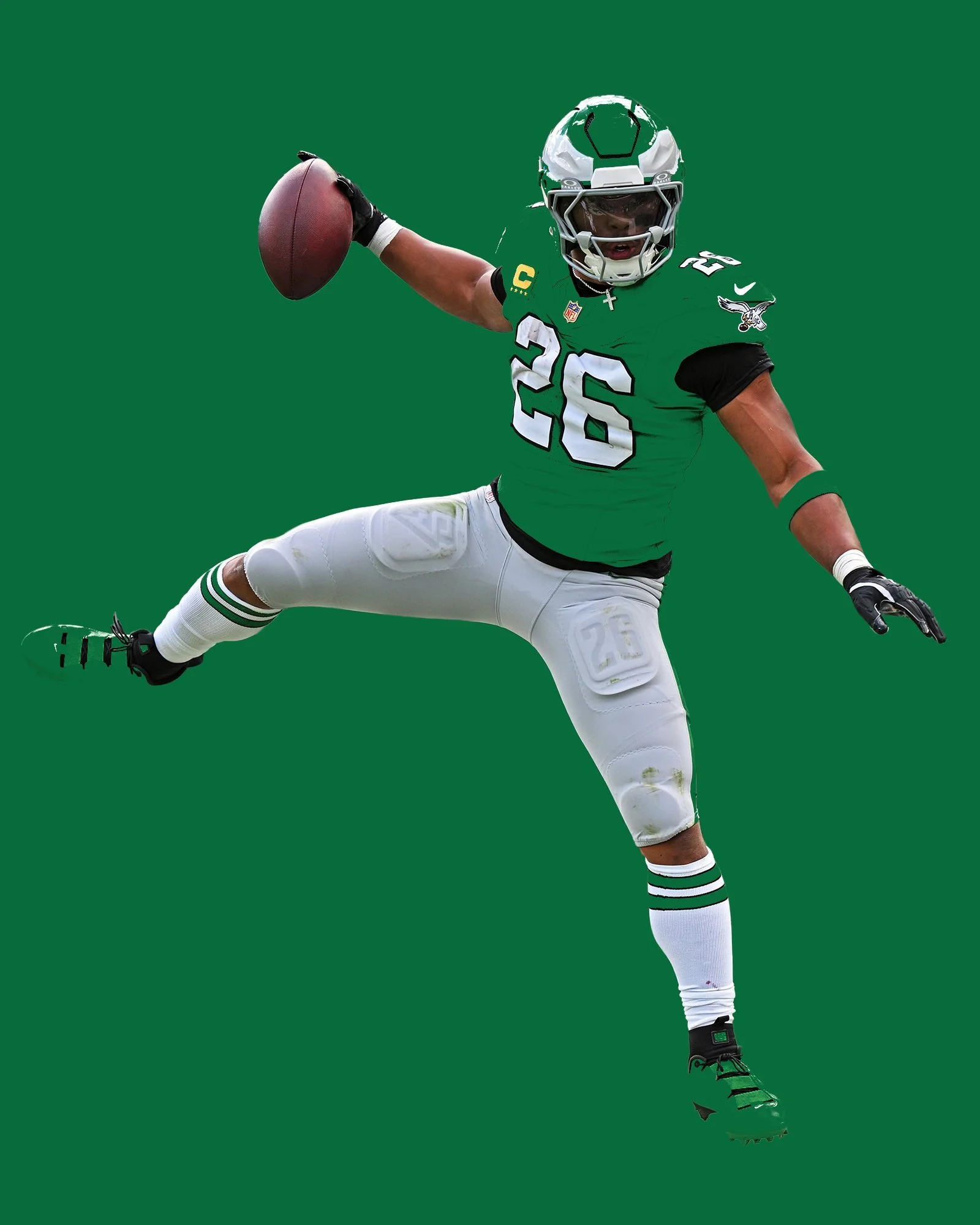
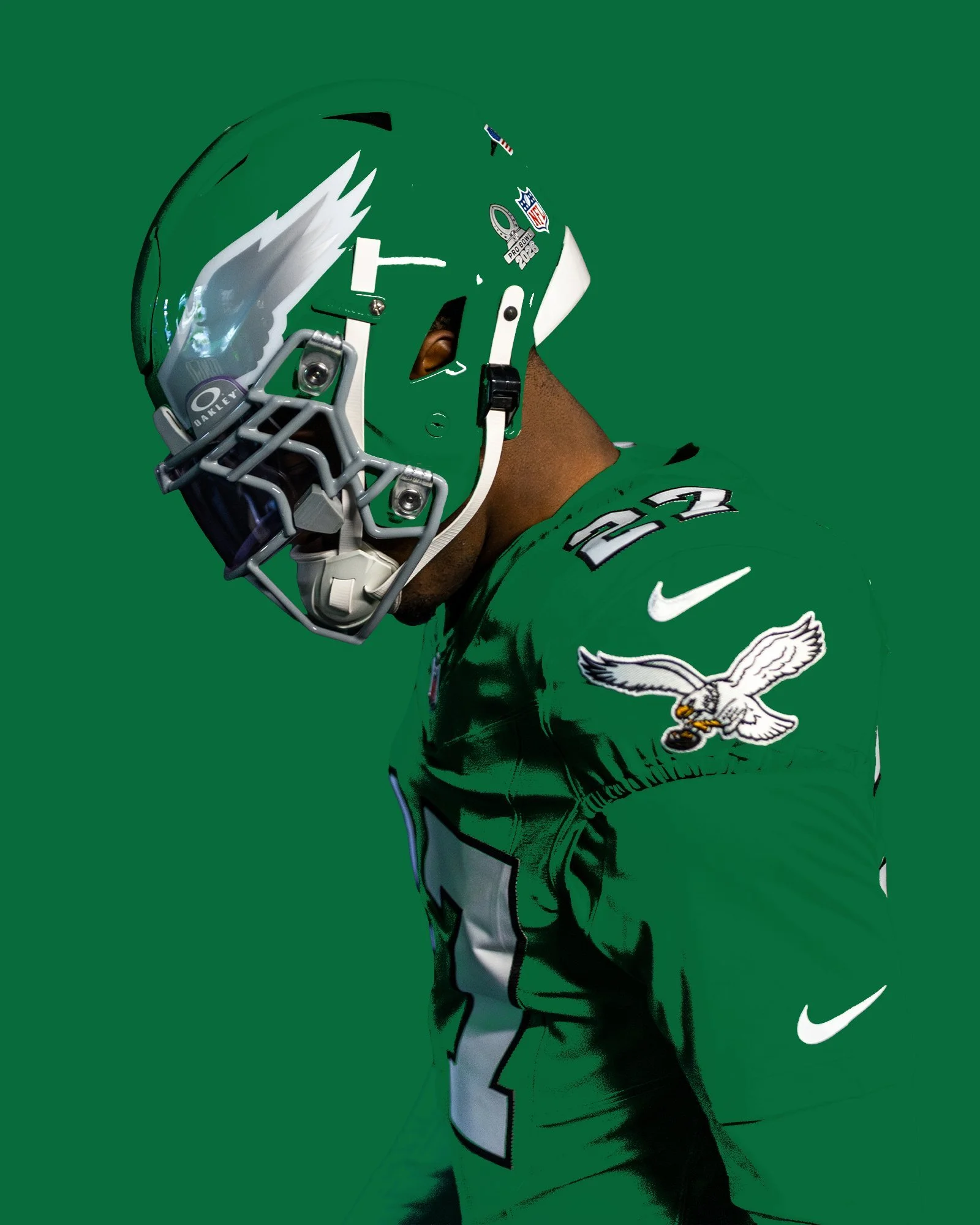
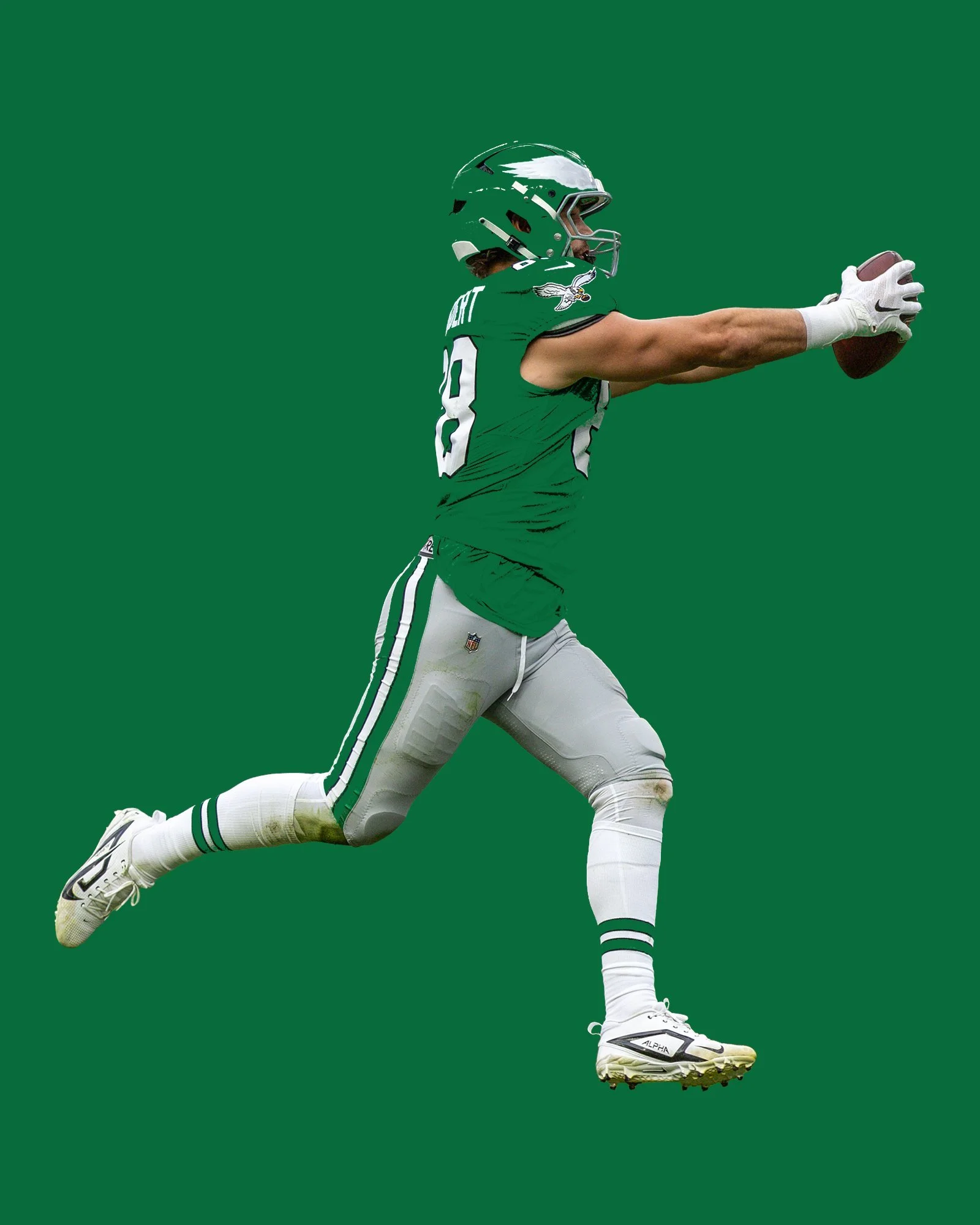
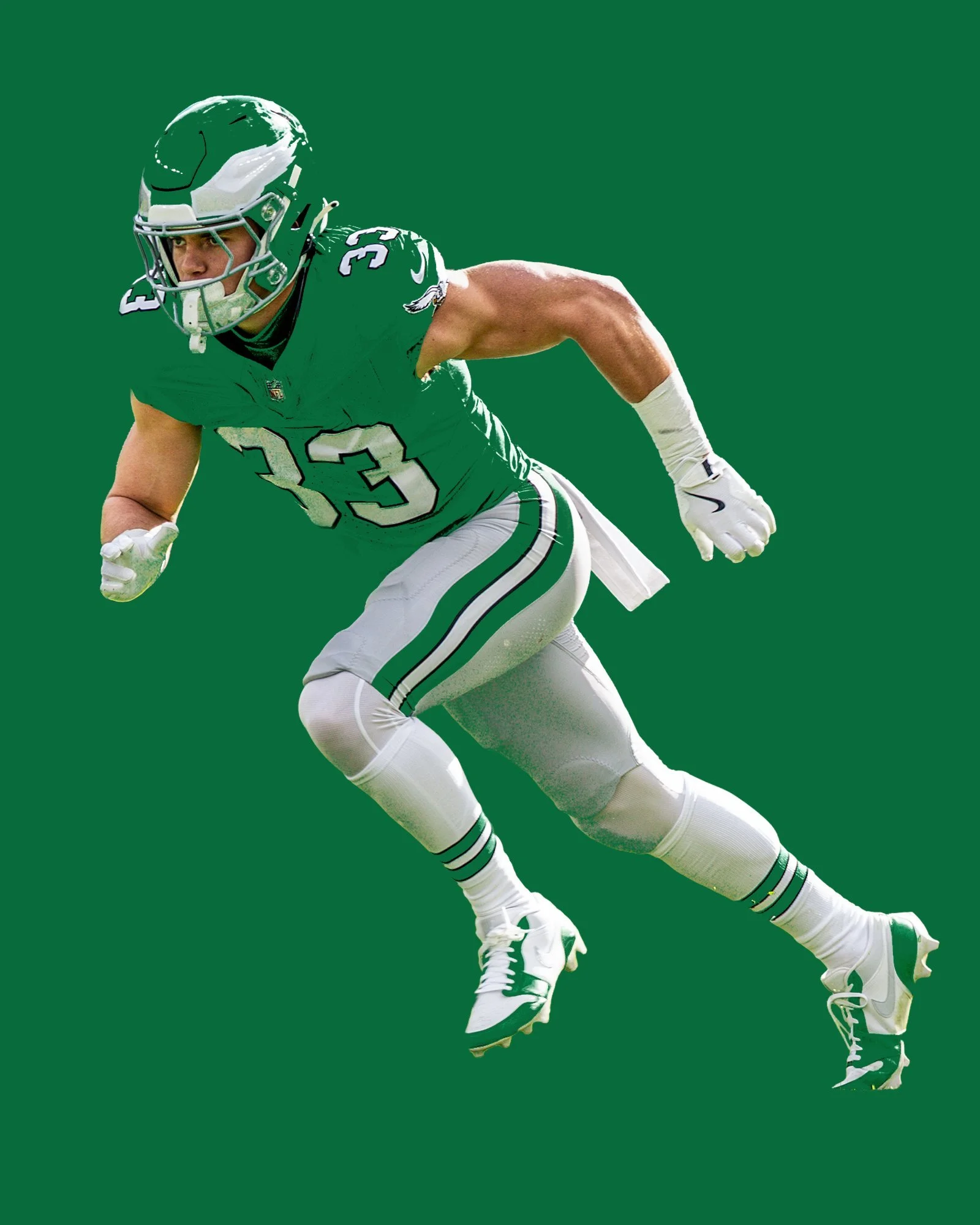
In a delightful turn of events, the Philadelphia Eagles are set to transport their fans back in time with a nod to the Randall Cunningham era, as they unveil their much-anticipated Kelly green throwback uniforms. These jerseys are an unmistakable tribute to a period when the Eagles donned the classic Kelly green, harking back to the years 1987-95.
The uniforms are a meticulous replication of the past, echoing the glory days of Randall Cunningham. They feature Kelly green jerseys adorned with bold white block numbers outlined in black. Additionally, the iconic Eagles' 1987-95 alternate logo graces the sleeves, adding an extra layer of nostalgia for fans.
But it doesn't stop there. The throwback experience is brought to life with Kelly green helmets, showcasing silver wings elegantly outlined in white. The helmets also boast a silver facemask, a classic touch that perfectly complements the overall ensemble.
The pants are a nod to the past as well, sporting a silver hue with a Kelly green and white striping pattern, ensuring a cohesive and stylish look from head to toe. To complete the attire, the players will wear white socks, adorned with two Kelly green stripes.
This throwback journey marks only the second time that Philadelphia has graced the field in Kelly green throwback uniforms since their transition to midnight green in 1996. The first occurrence was during the 2010 season opener against the Green Bay Packers, making this revival all the more special for fans who cherish the team's storied history.
Director of merchandise Emily McNichol shared her excitement, emphasizing how well retro products and jerseys resonate with fans. She looks forward to making the dreams of fans come true as they witness players like Jalen Hurts don these retro jerseys.
For Eagles fans, these throwback uniforms aren't just clothing; they are a journey down memory lane and a testament to the enduring legacy of their beloved team. As they celebrate the past, they also look to the future, with an eagerness to see their team shine in the classic Kelly green once again.
The NHL and Fanatics are giving all 32 teams a new way to represent home. Unveiled Monday, Hometown Remix is a leaguewide special-edition uniform, apparel and headwear program built around the fans, landmarks, traditions and local culture that shape each franchise.
The collection reaches beyond familiar color combinations. Arena architecture becomes sleeve striping, city landmarks influence custom number fonts, and regional landscapes bring new textures to team crests. Debossed patterns, metallic embroidery and detailed hem treatments give fans reasons to look closer.
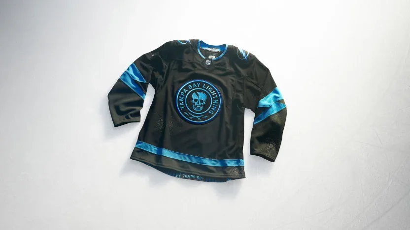
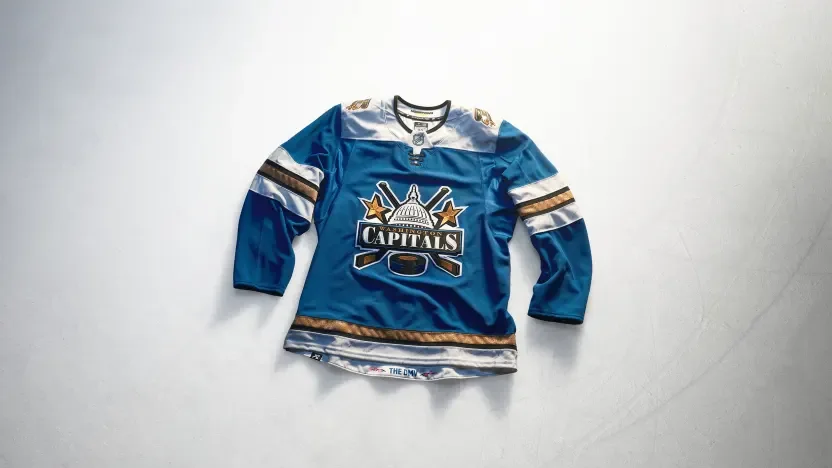
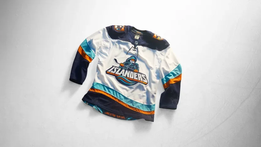
Some teams revisit recognizable identities, including the Islanders’ Fisherman and the Lightning’s Stadium Series skull. Others introduce a different focal point, from Carolina’s Stormy crest to Washington’s Capitol Dome design. Together, the jerseys offer 32 interpretations of what it means to wear your hometown.
Anaheim Ducks
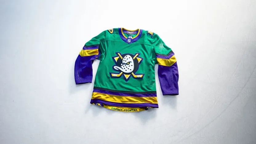
Anaheim brings a ’90s-inspired approach to Orange County life with green and gold drawn from local parks and sunsets over the water. A wave pattern along the hem reflects the waterfront, while the Ducks’ current flying V sleeve treatment connects the new palette to their established identity. “Orange Country” stitching adds a local play on words.
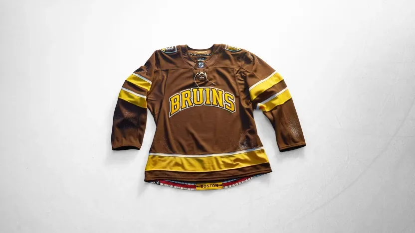
Boston Bruins
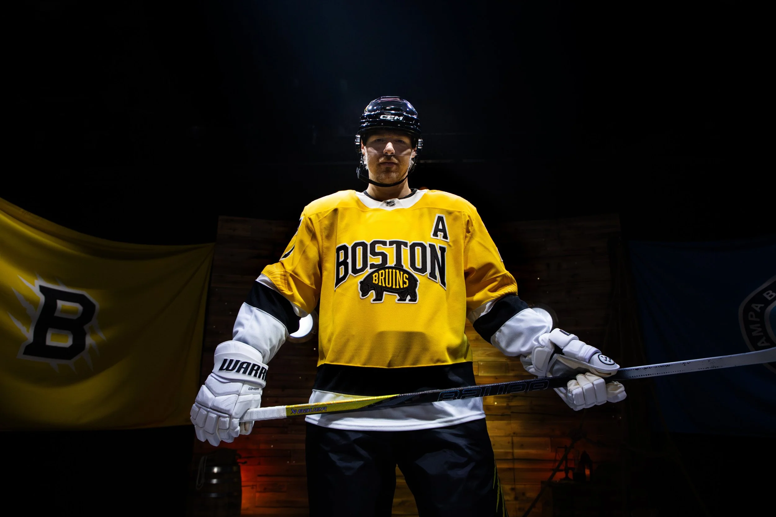
Boston leans into its college culture with an all-brown uniform that also references the Bruins’ inaugural season. Collegiate lettering, a shield shoulder patch and traditional striping give the jersey a varsity sweater feel. A brick pattern along the hem connects the design to the Freedom Trail.
Buffalo Sabres
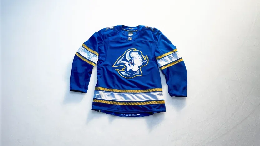
Buffalo turns its City of Light identity into an electric blue-and-gold design. The buffalo crest features a red eye and metallic gold Lurex outline, while a shoulder mark pairs the team’s B with an electrified sabre. Debossed lightning bolts and stars carry the theme through the sleeves.
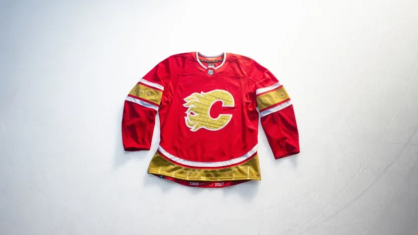
Calgary Flames
Calgary makes the Saddledome the centerpiece of its design. The arena’s ceiling texture appears within the “88 Gold” crest, its window shapes influence debossed sleeve details, and its roofline carries into the hem striping. Custom numbers draw from the building’s shutters, extending the architectural tribute across the uniform.
Carolina Hurricanes
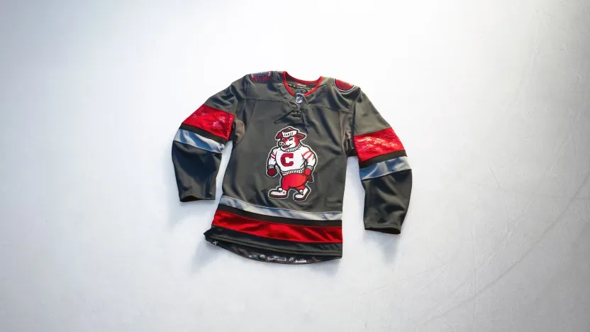
Carolina puts Stormy front and center, giving the mascot the jersey’s main crest for the first time. A storm-grey base with red and black accents sets the tone, while architectural shoulder patches, debossed oak leaves and a City of Oaks skyline connect the look to Raleigh.
Chicago Blackhawks
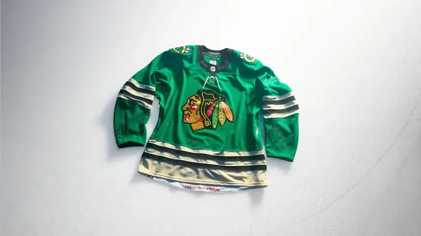
Chicago introduces a vivid green base with its current crest and gold shoulder patches. Four debossed six-pointed stars on each sleeve reference the city flag. The concept draws on Chicago’s “I Will” spirit, connecting the uniform to civic ambition, progress and resilience.
Colorado Avalanche
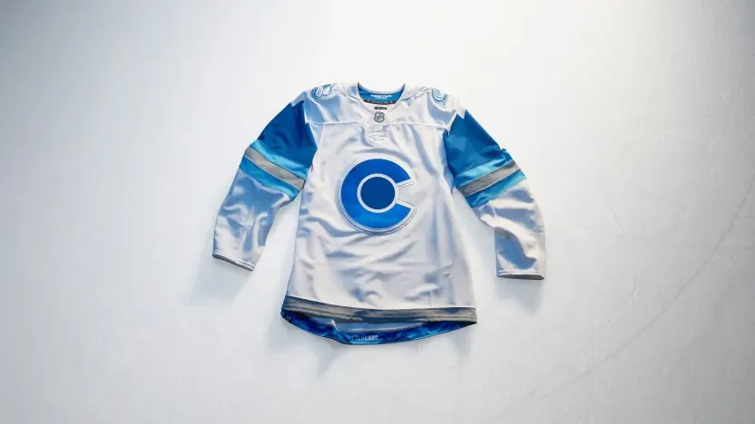
Colorado builds its jersey around the snow-covered Rocky Mountains. Graduated blue elevation patterns appear within the crest and back numbers, while mountain imagery continues onto the shoulders. Metallic silver accents give the blue-and-white design a frosted finish.
Columbus Blue Jackets
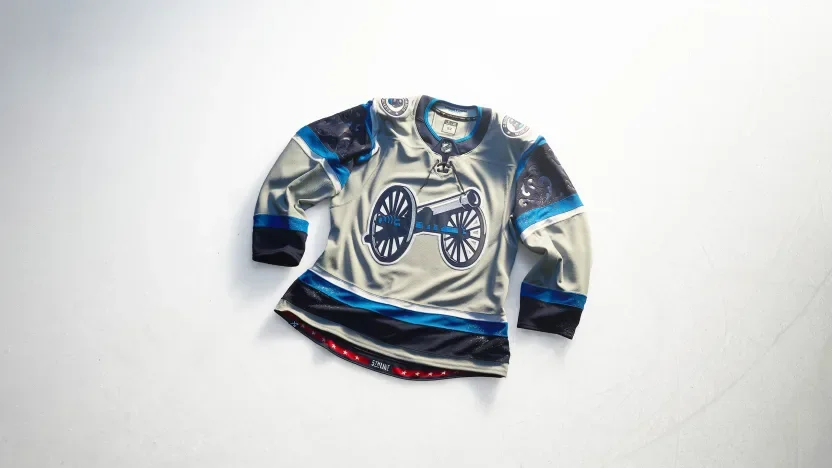
Columbus celebrates the Arch City with arched sleeve elements and a debossed filigree pattern behind the sleeve numbers. A solid grey base lets the cannon crest and white-outlined numbers stand out. An italicized “5th Line” graphic at the hem recognizes the fans’ place within the team’s identity.
Dallas Stars
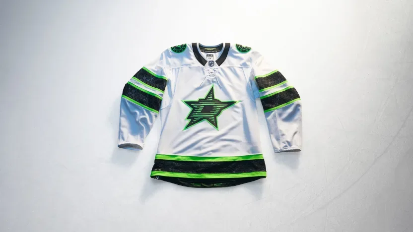
Dallas draws from its illuminated skyline and neon nightlife. Skyline-inspired texture adds detail to the front crest, while a linear Dallas wordmark at the hem continues the neon concept. Black and green stand sharply against the white base.
Detroit Red Wings
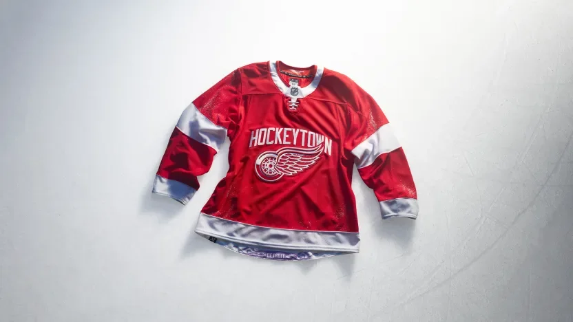
Detroit brings “Hockeytown” across the chest alongside the Winged Wheel, making the city’s hockey identity the focal point. Bold sleeve stripes reinforce the traditional look, while a purple octopus tucked inside the hem recognizes one of the franchise’s most familiar fan traditions.
Edmonton Oilers
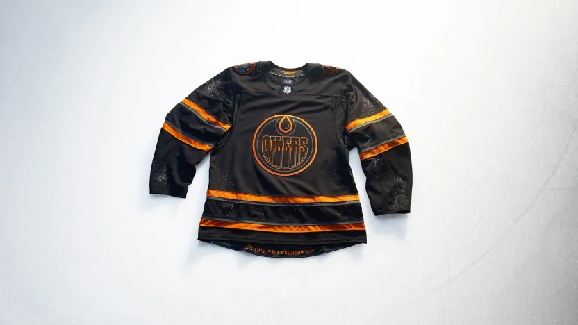
Edmonton takes an industrial approach with a black base, tonal crest and warning-orange accents. “Oil Country” and oil rig worker shoulder patches connect the design to the region’s people and industry. Warning bars frame “This Is Oil Country” inside the hem.
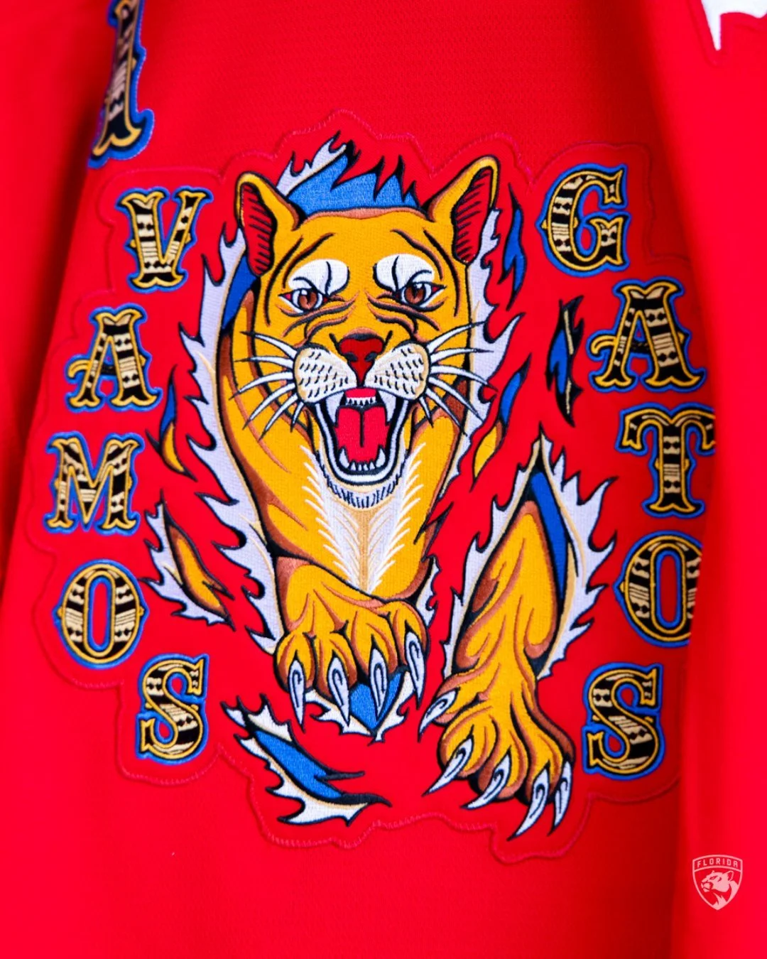
Florida Panthers
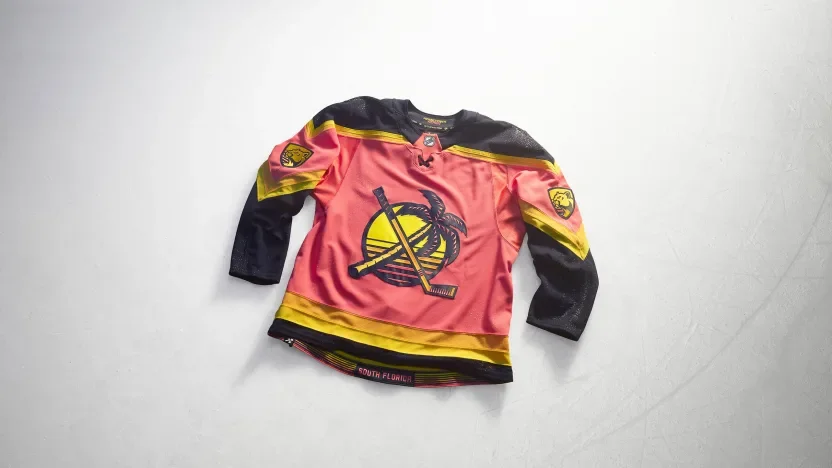
Florida embraces a South Florida sunrise palette with a design inspired by graphic beach tees. A remixed throwback shoulder logo moves to the front, while sunrise patterns stretch across the sleeves. Recolored Panthers marks complete a look rooted in the region’s waterfront lifestyle.
Los Angeles Kings
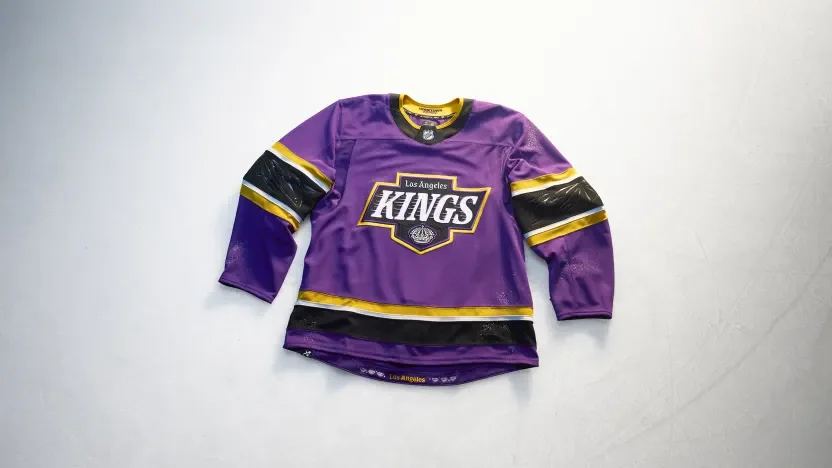
The Kings bring royal purple into a design celebrating six decades of hockey and Los Angeles street and art culture. A Hollywood-inspired serif crest combines crown imagery with pinstripe details. Debossed palm trees appear on the sleeves, while six interior diamonds represent the franchise’s six decades.
Minnesota Wild
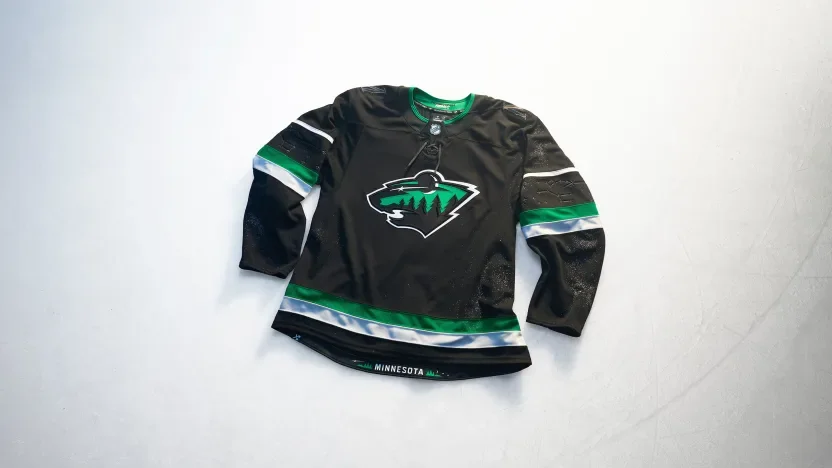
Minnesota turns to its night skies with a black jersey and a crescent-moon interpretation of the Wild crest. Debossed Ursa Major and Ursa Minor constellations decorate the sleeves, while twin stars within the numbers recognize the Twin Cities. Wilderness imagery at the hem completes the northern theme.
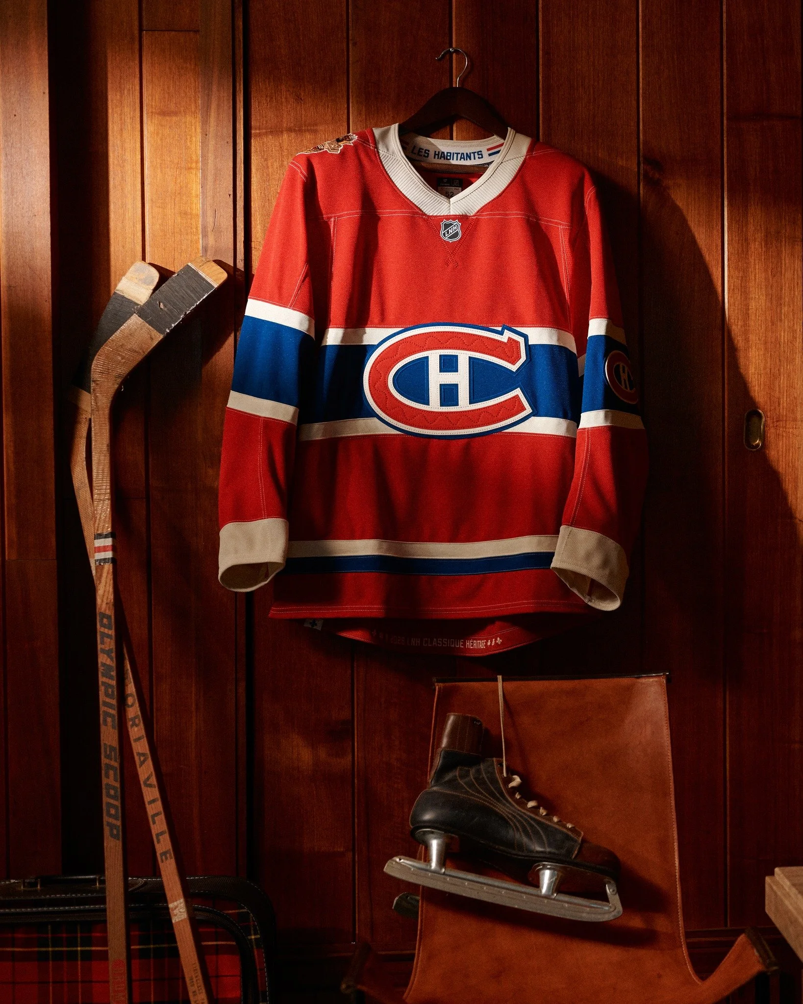
Montreal Canadiens
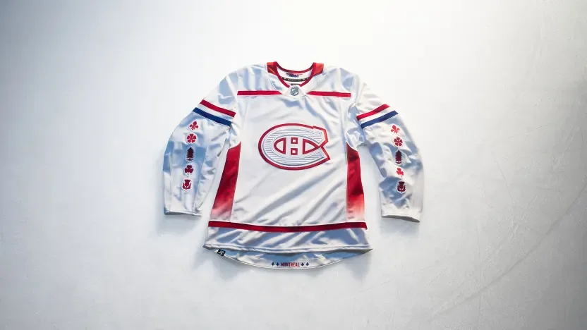
Montreal incorporates white pine, fleur-de-lys, rose, thistle and clover imagery across the sleeves to recognize the city’s cultural roots. Architectural etching adds texture to the Canadiens crest, while Mount Royal inspires gradient side panels. Custom numbers reference Old Montréal, with additional fleur-de-lys details framing the city name at the hem.
Nashville Predators
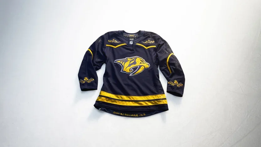
Nashville translates country stagewear and rodeo tailoring into a jersey filled with tonal filigree. Decorative yoke and sleeve treatments incorporate Tennessee’s iris, while matching artwork frames the city name at the hem. Letterpress-inspired numbers carry the same embroidered detailing.
New Jersey Devils
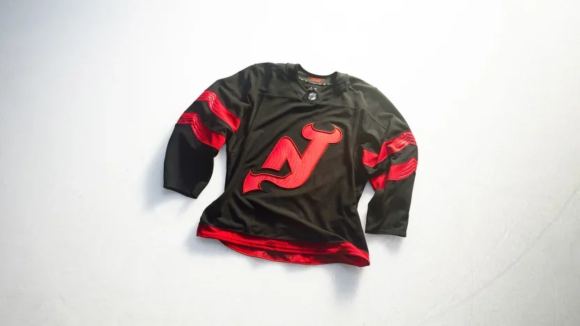
New Jersey removes the enclosing circle from its NJ crest, allowing the horns and tail to stand on their own. Sculpted sleeve stripes and debossed details give the black-and-red uniform added depth. Custom lettering combines curves with angular cuts, while state outlines frame the New Jersey name inside the hem.
New York Islanders
The Fisherman returns with a streamlined crest and updated coastal details. Wavy sleeve striping references the Atlantic, while lighthouse shoulder patches feature LI and NY identifiers. Hook-inspired typography and cross-grained twill add dimension to the names and numbers.
New York Rangers
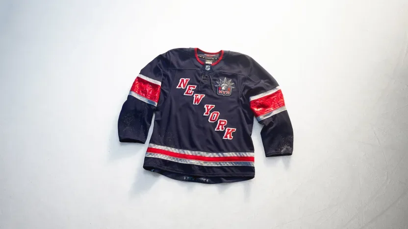
The Rangers introduce a stairstep NEW YORK wordmark with Lady Liberty positioned over the heart. Silver accents reference the city’s architectural metalwork, while debossed sleeve patterns draw from the Statue of Liberty’s torch base. A captain’s patch honors first responders, and torch graphics frame the city name at the hem.
Ottawa Senators
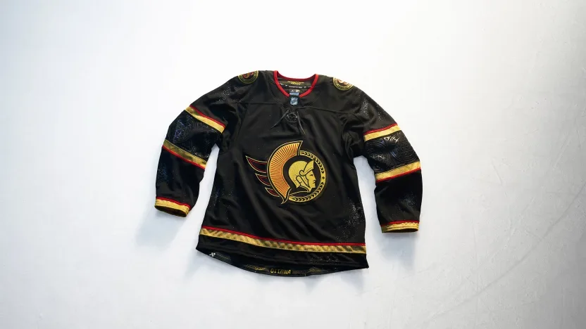
Ottawa pairs black and gold with details inspired by the city’s Gothic architecture. A brushed metallic gold Lurex crest leads the design, complemented by geometric sleeve striping and arched-window-inspired numbers. English and French shoulder marks celebrate the city’s bilingual identity, while bridge imagery recognizes the connection between Ottawa and Gatineau.
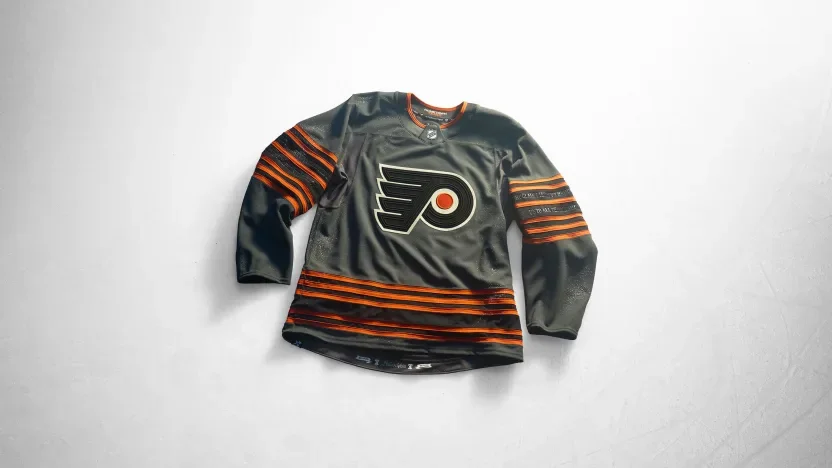
Philadelphia Flyers
Philadelphia builds its concept around the Liberty Bell. Six sleeve stripes recognize the franchise’s 60th anniversary, with debossed inscription details adding texture. Crack-inspired numbers continue the theme, while Constitution script, the Liberty Bell and the date of Independence bring the city’s national significance into the hem treatment.
Pittsburgh Penguins
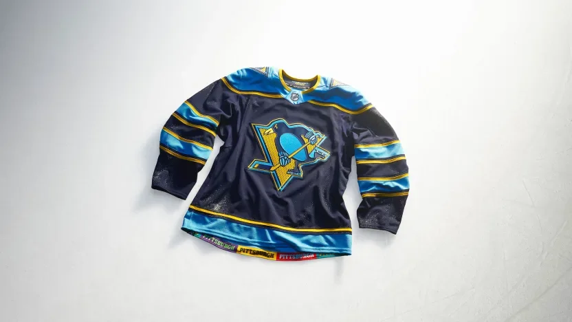
Pittsburgh introduces a pop-art interpretation of its identity through offset graphics and halftone textures. The crest, numbers and shoulder patches share that visual approach, with an igloo referencing the former arena and a triangle recognizing the Three Rivers. A colorful hem treatment connects the jersey to the city’s communities.
San Jose Sharks
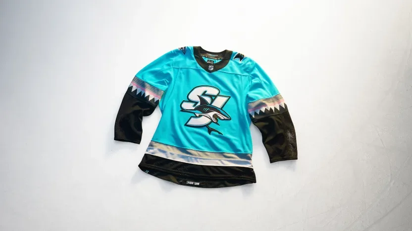
San Jose puts an SJ crest against a Scuba Blue base, drawing inspiration from the Sharks Head used during the team’s pregame entrance. Angular shark-tooth striping carries the concept down the sleeves. “Shark Tank” lettering and chomped-stick graphics finish the hem.
Seattle Kraken
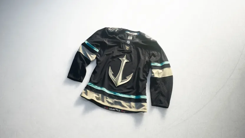
Seattle makes its anchor logo the centerpiece of a maritime-inspired design. Scrimshaw embroidery adds detail to custom nautical lettering, numbers and shoulder artwork. Mount Rainier and regional mountain imagery appear on the sleeves, while rhododendrons bring another Pacific Northwest reference to the hem.
St. Louis Blues
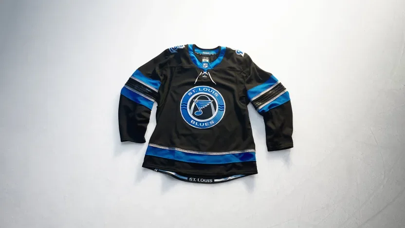
St. Louis introduces a black base inspired by the Mississippi River’s dark waters. The crest incorporates three river-wave lines, with debossed waves continuing across the sleeves. Beveled lettering and numbers reference the Gateway Arch’s metallic finish, while the hem frames the city name from beneath the landmark.
Tampa Bay Lightning
Tampa Bay combines familiar elements from past uniforms, moving its Stadium Series skull to the front with an updated expression. Sky Blue returns against black, supported by Lightning Blue accents and cut-and-sew sleeve bolts. The Bayshore Balustrade appears inside the hem as a local finishing touch.
Toronto Maple Leafs
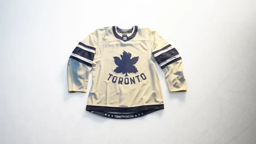
Toronto revisits its original Maple Leafs logo with tonal vein details and an arched Toronto wordmark. The leaf-vein pattern continues through the sleeve stripes and numbers, creating a consistent texture across the uniform. “Toronto Forever” appears at the hem alongside leaf logos from different chapters of team history.
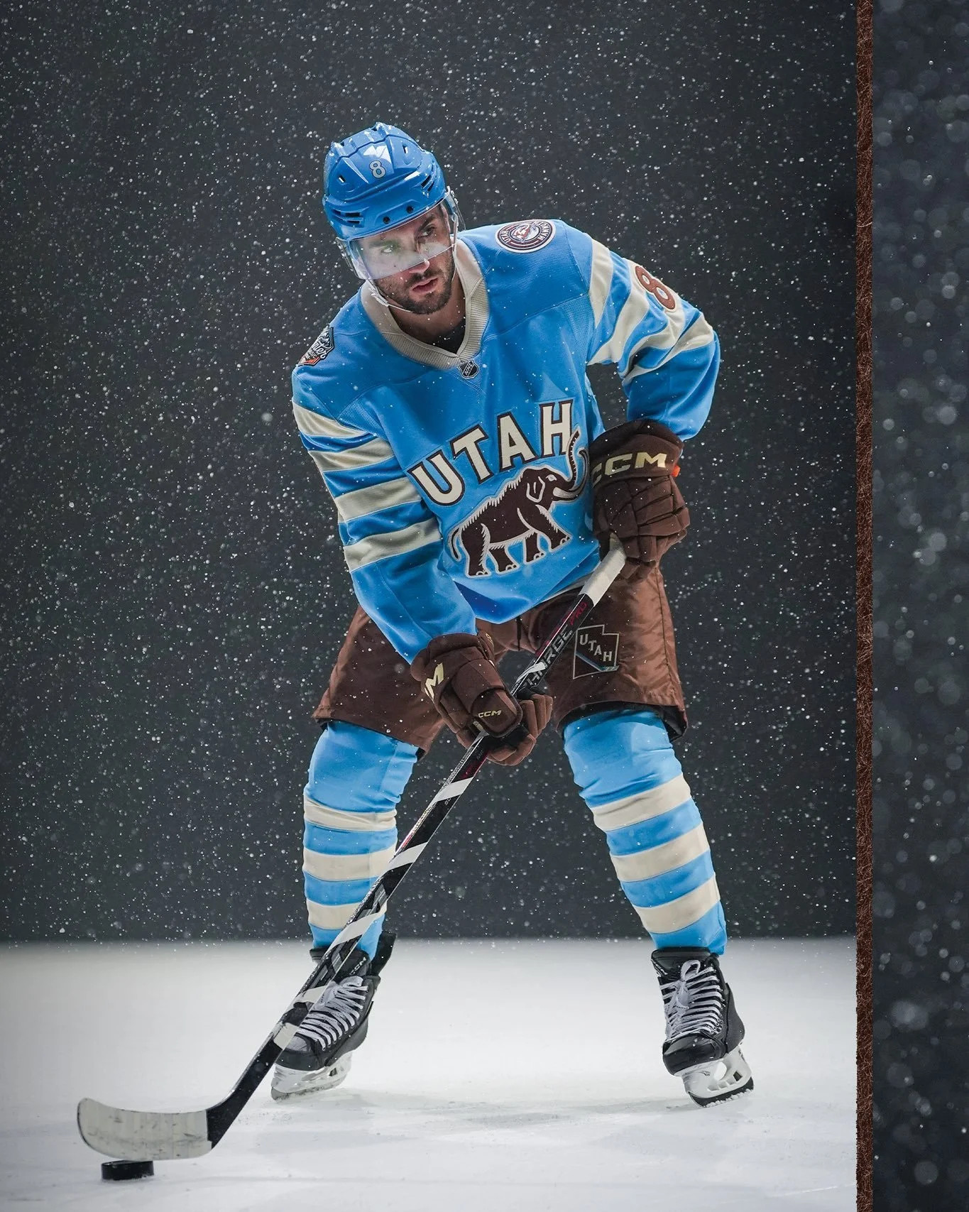
Utah Mammoth
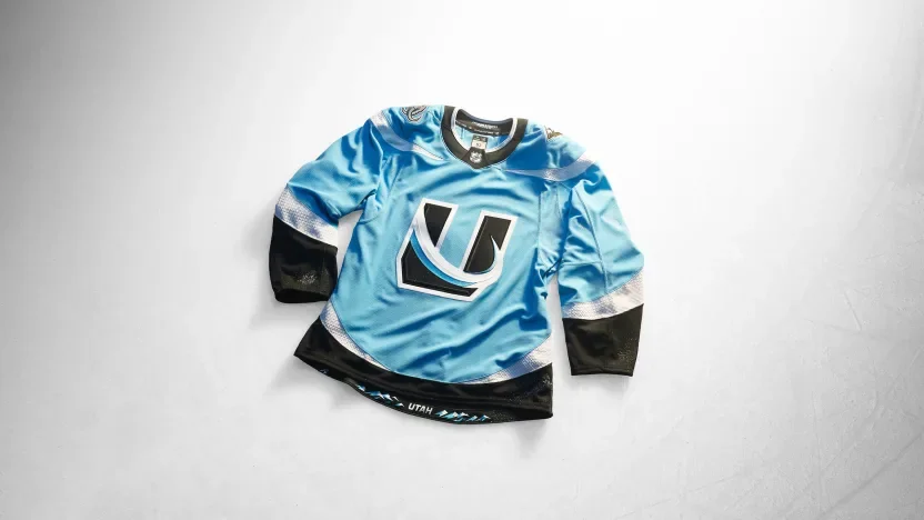
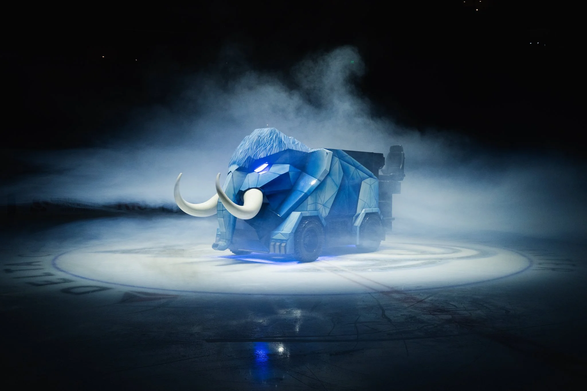
Utah places its U Tusk mark at the center of a Mountain Blue, Rock Black and Salt White design. The shoulder yoke, sleeve stripes and hem work together to form rising tusks when the wearer’s arms are down. Snow-shimmer debossing adds texture to the white striping, while the Wasatch Range anchors the hem artwork.
Vancouver Canucks
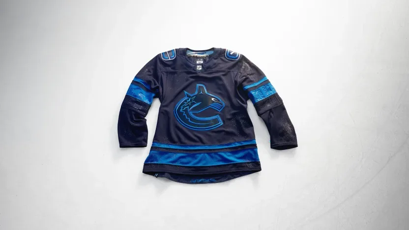
Vancouver draws from the city after dark with a deep-blue orca featuring silver eyes. Debossed sleeve artwork reflects the skyline mirrored in the bay, while the hem references the lions guarding Lions Gate Bridge. Custom names and numbers include a distinctive V-notch detail.
Vegas Golden Knights
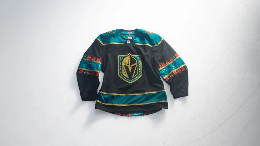
Vegas brings casino imagery into the uniform with a jade-green shoulder yoke inspired by gaming felt. Playing-card suits, roulette graphics and gold striping carry the concept throughout the design. A custom card-inspired number font completes the look, with a reference to the franchise’s 2017 arrival at the hem.
Washington Capitals
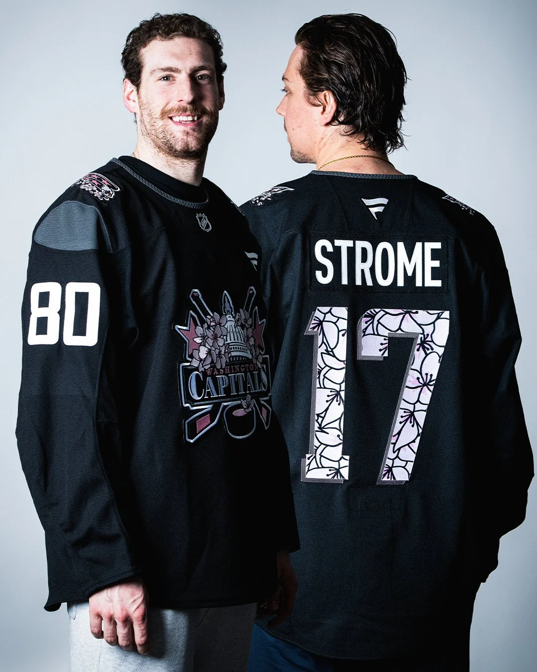
Washington introduces a Capitol Dome crest incorporating stars, hockey sticks and the Statue of Freedom. Marble texturing covers the sleeves and shoulder yoke, while monument lettering influences the beveled numbers. Screaming eagle shoulder patches connect to team history, and cherry blossoms at the hem recognize the wider DMV.
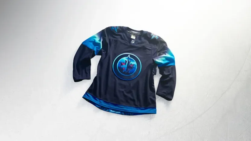
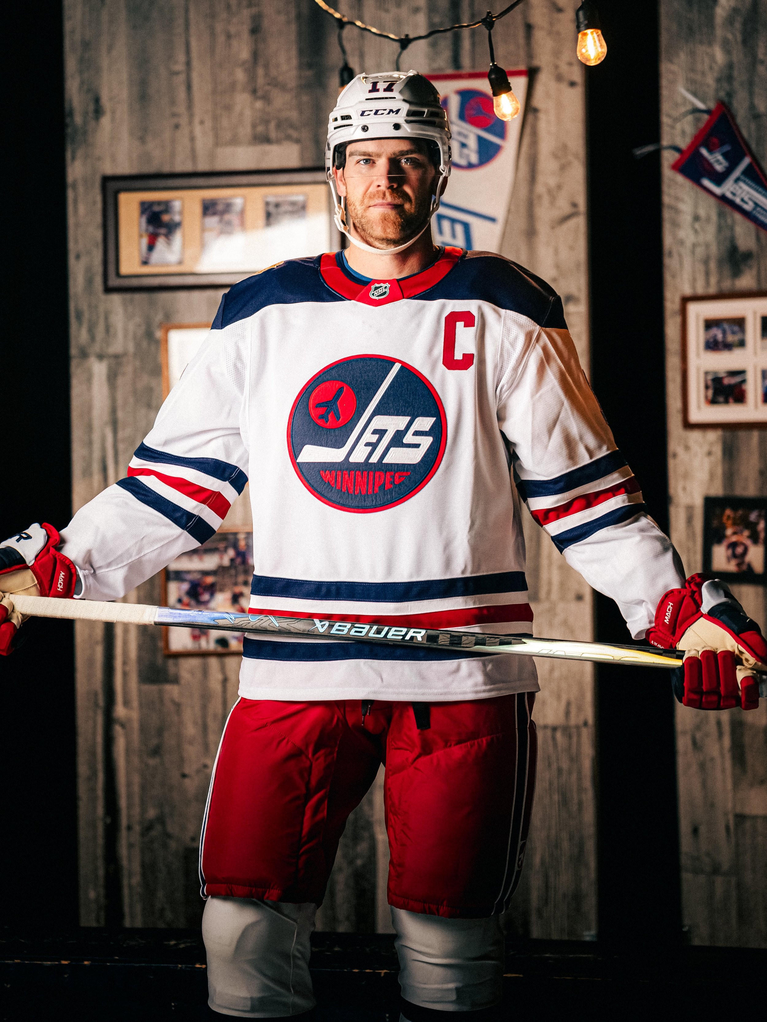
Winnipeg Jets
Winnipeg turns the northern lights into a uniform concept with a night-sky palette and illuminated crest details. Blue-to-light-green sleeve gradients mirror the aurora, while softly blended names and numbers create a glowing effect. A full aurora scene along the hem completes the tribute to Manitoba’s winter skies.
Across the collection, the strongest connections often appear in the smallest details: Boston’s brickwork, Calgary’s arena textures, Seattle’s scrimshaw and Winnipeg’s glowing numbers. Hometown Remix gives each team room to explore a different side of its identity while giving fans more of their city to recognize in the jersey.