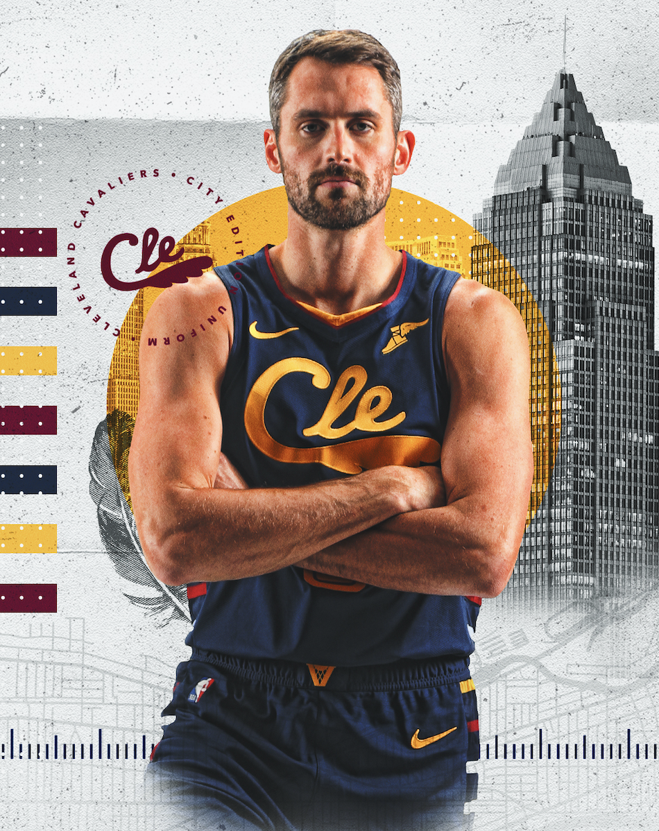
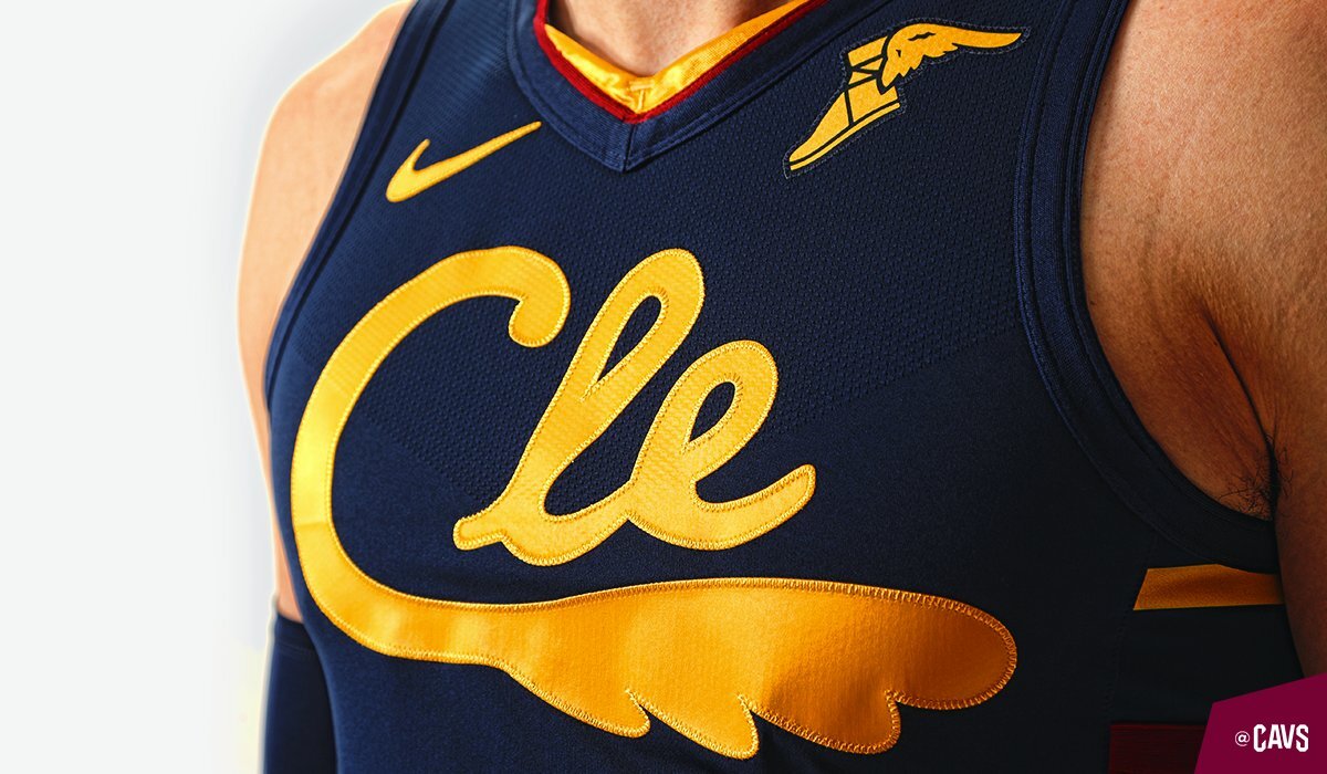
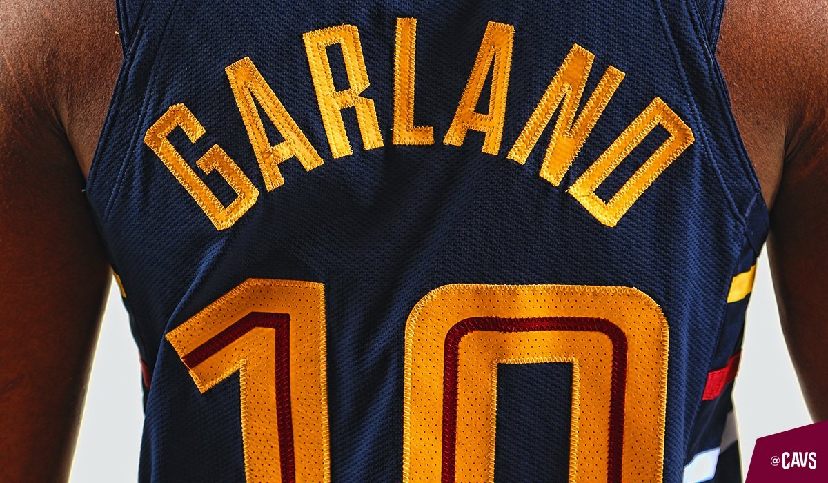
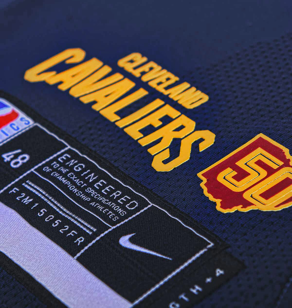
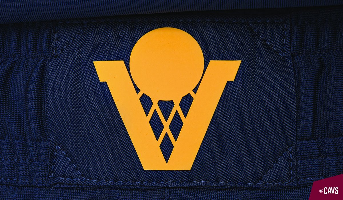
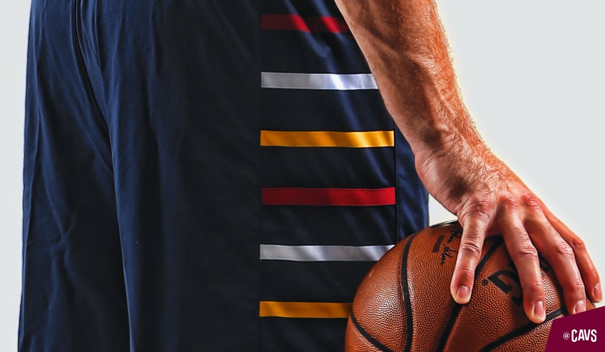
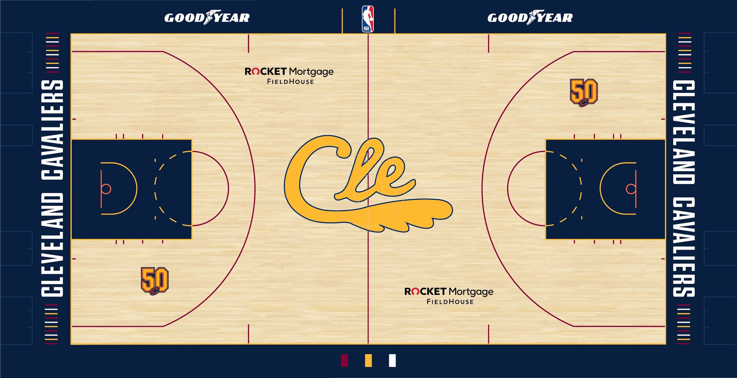
The Cavaliers introduce the new ‘City Edition’ uniform for the team’s 50th season. The new uniform receives its inspiration from a range of different Cavaliers uniforms over the past 50 seasons. The uniforms base navy colorway is inspired by the team’s alternate uniform from 2005-2010. The CLE gold script with the feather mark on the front of the jersey is meant to acknowledge the uniforms worn by the Cavs inaugural team. The player number appears in a wine and gold inline font that is inspired by the uniforms that the team wore when they returned to the city in 1994. The finishing touches come with the side panelling that has wine, gold and white marks, meant to resemble the design of the unis from 1974-1980. As well as the ‘V-basket’ logo on the waistband of the shorts from the 1983-1994 teams.
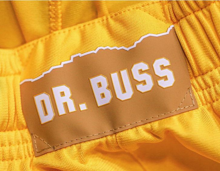
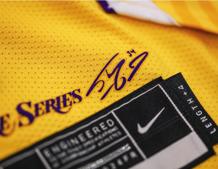
The Lakers have continued their ‘Lore Series’ uniform again this season with having another Laker great design the team’s ‘City Edition’ uniform. This season Shaquille O'Neal was given the honor to come up with the look that LeBron and the Lakers will hit the court in. The gold uniform will feature a white Lakers wordmark across the chest with a purple drop shadow. Featured on the white vertical piping is “M.D.E” standing for “Most Dominant Ever,” which was one of his nicknames. The side panels of the jersey are highlighted with three stars to represent the number of championships Shaq won with the Lakers. Another old school touch comes in the form of the wishbone collar that is reminiscent of the style jersey the Lakers switched to at the start of the 1999 season.
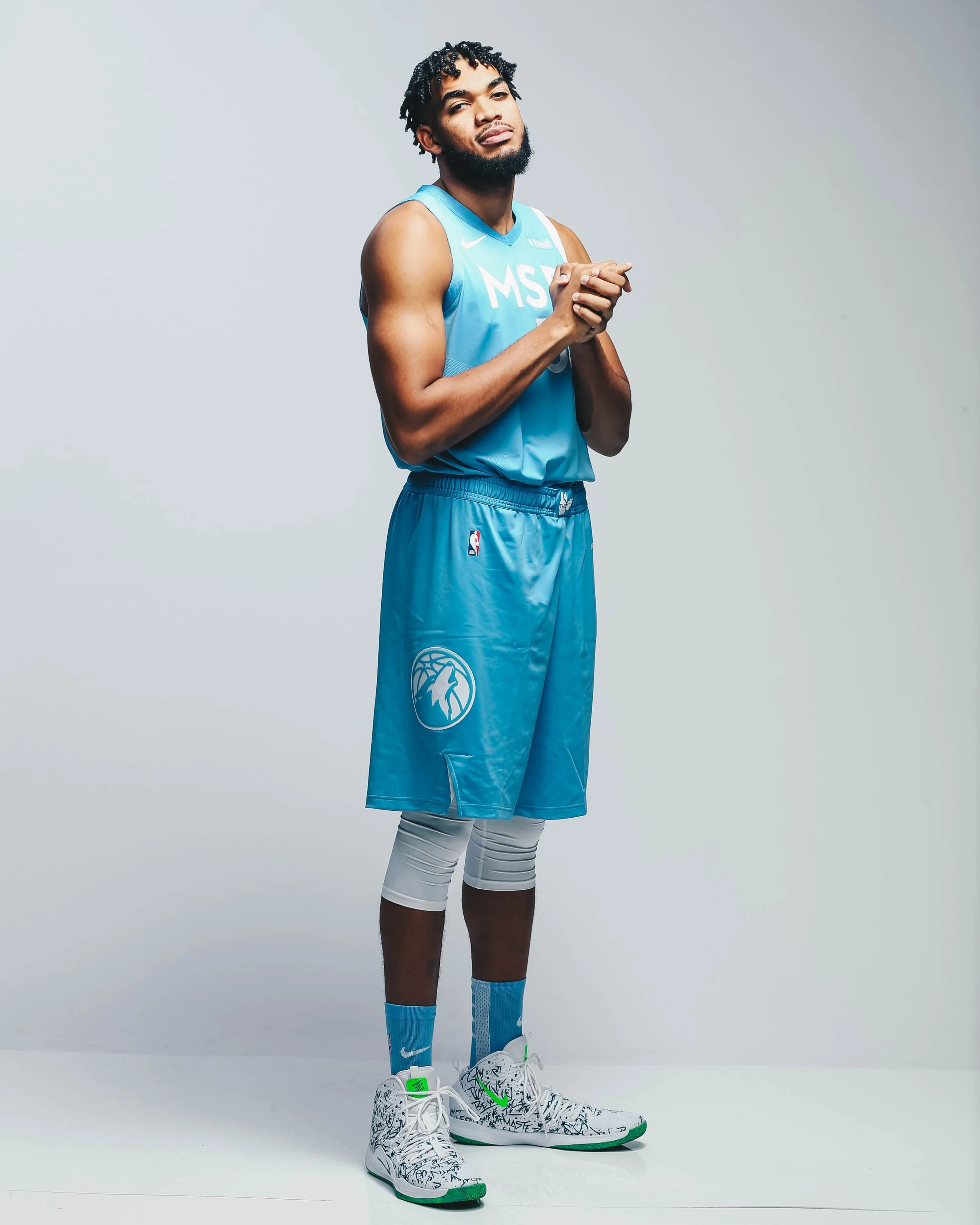
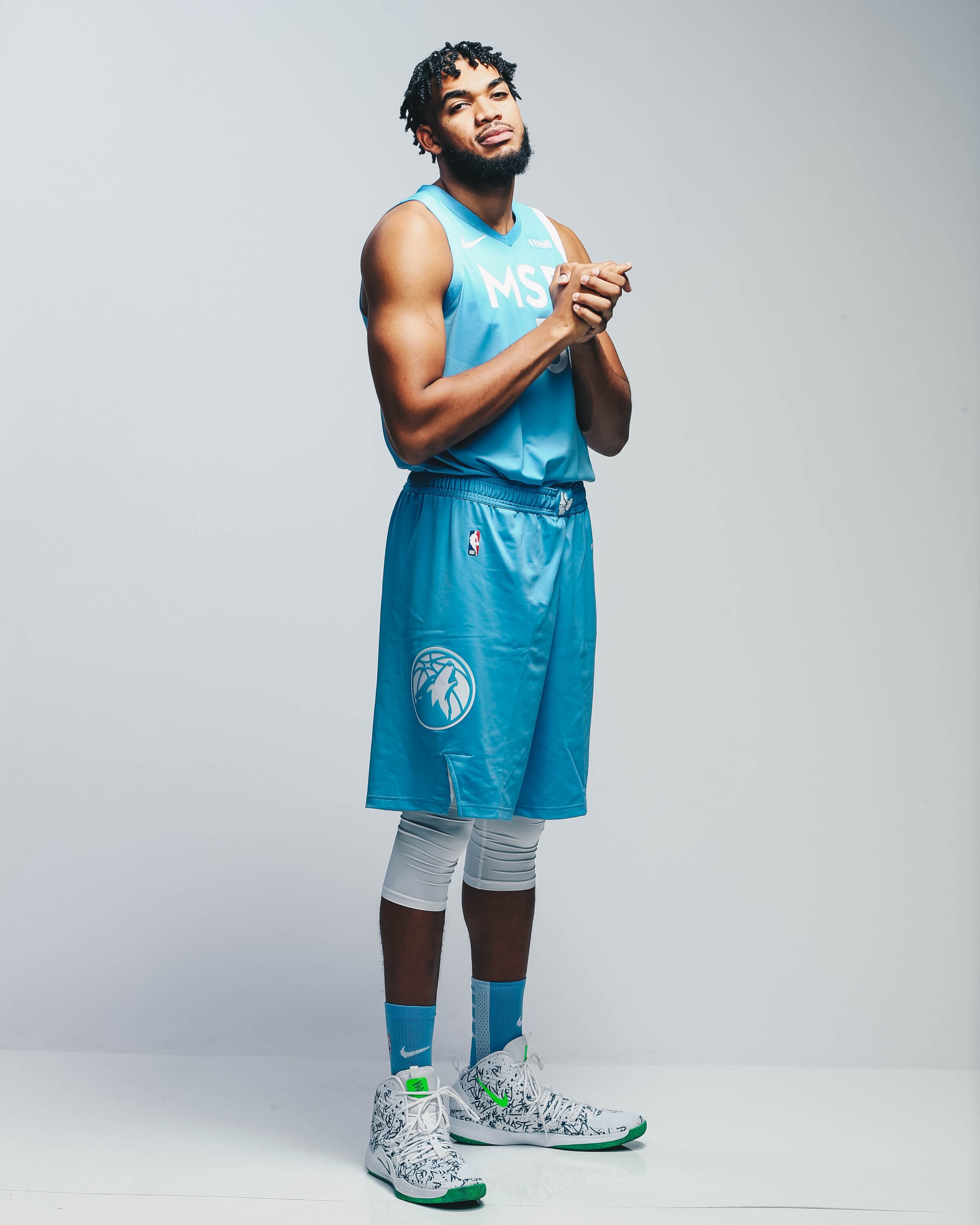
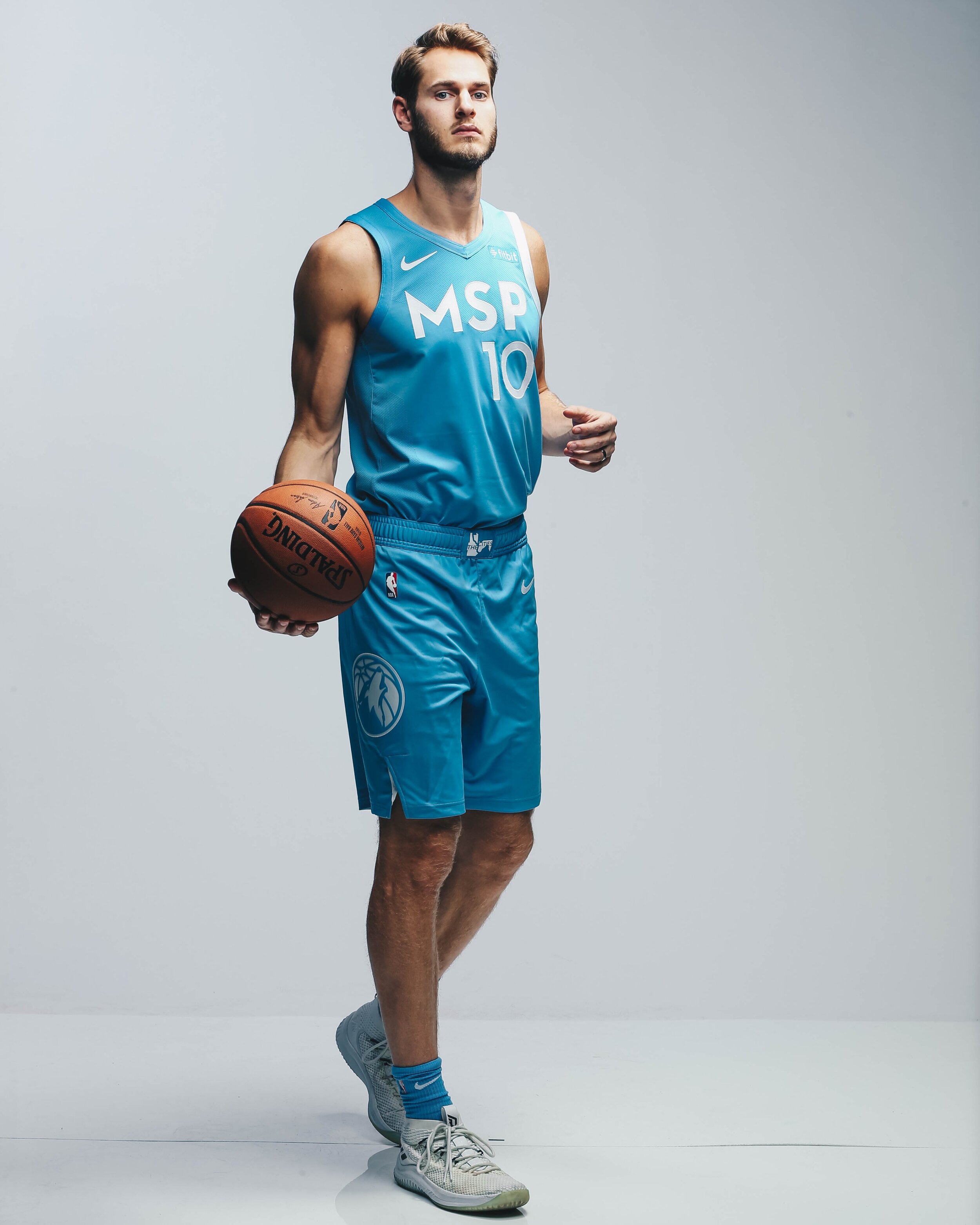
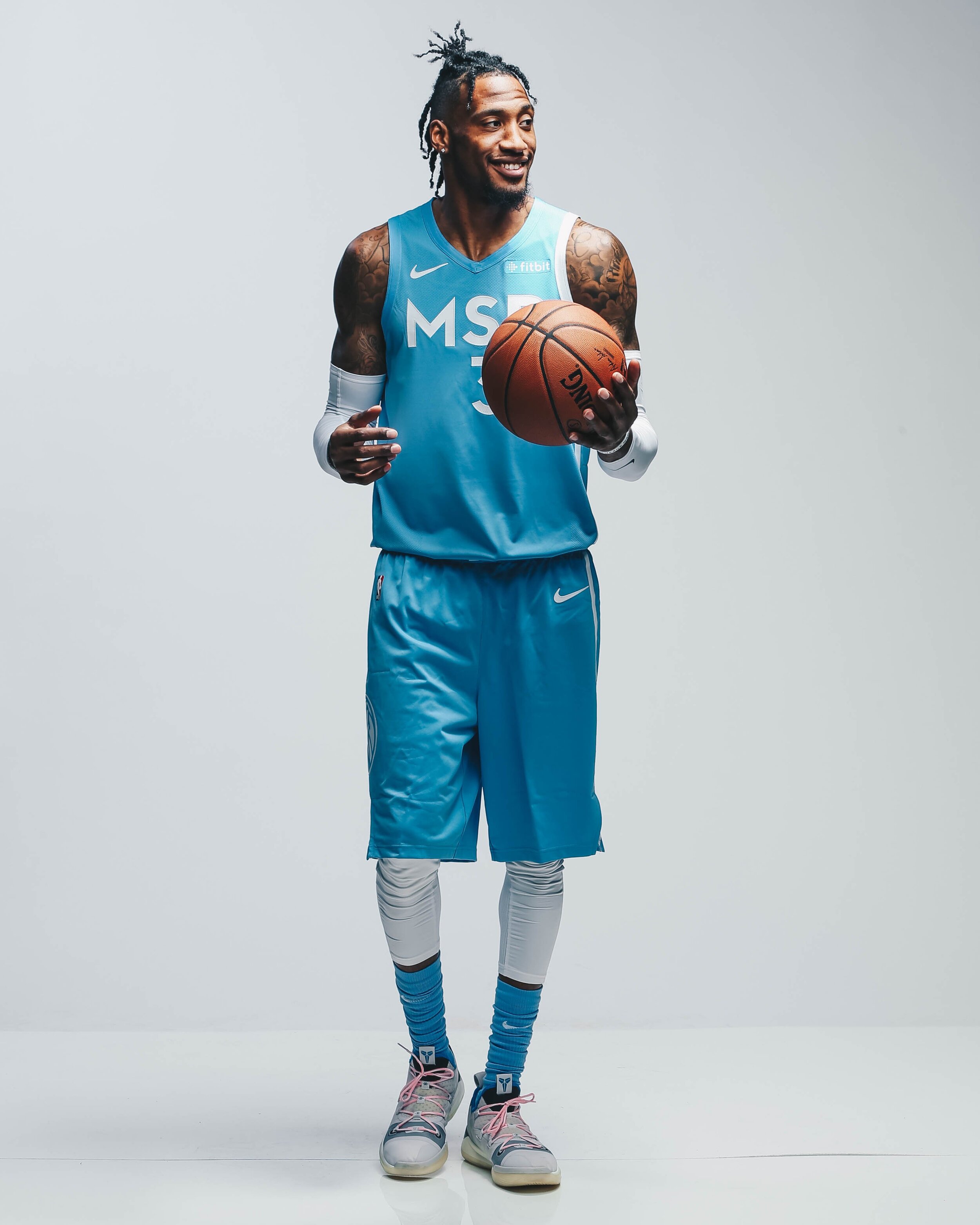
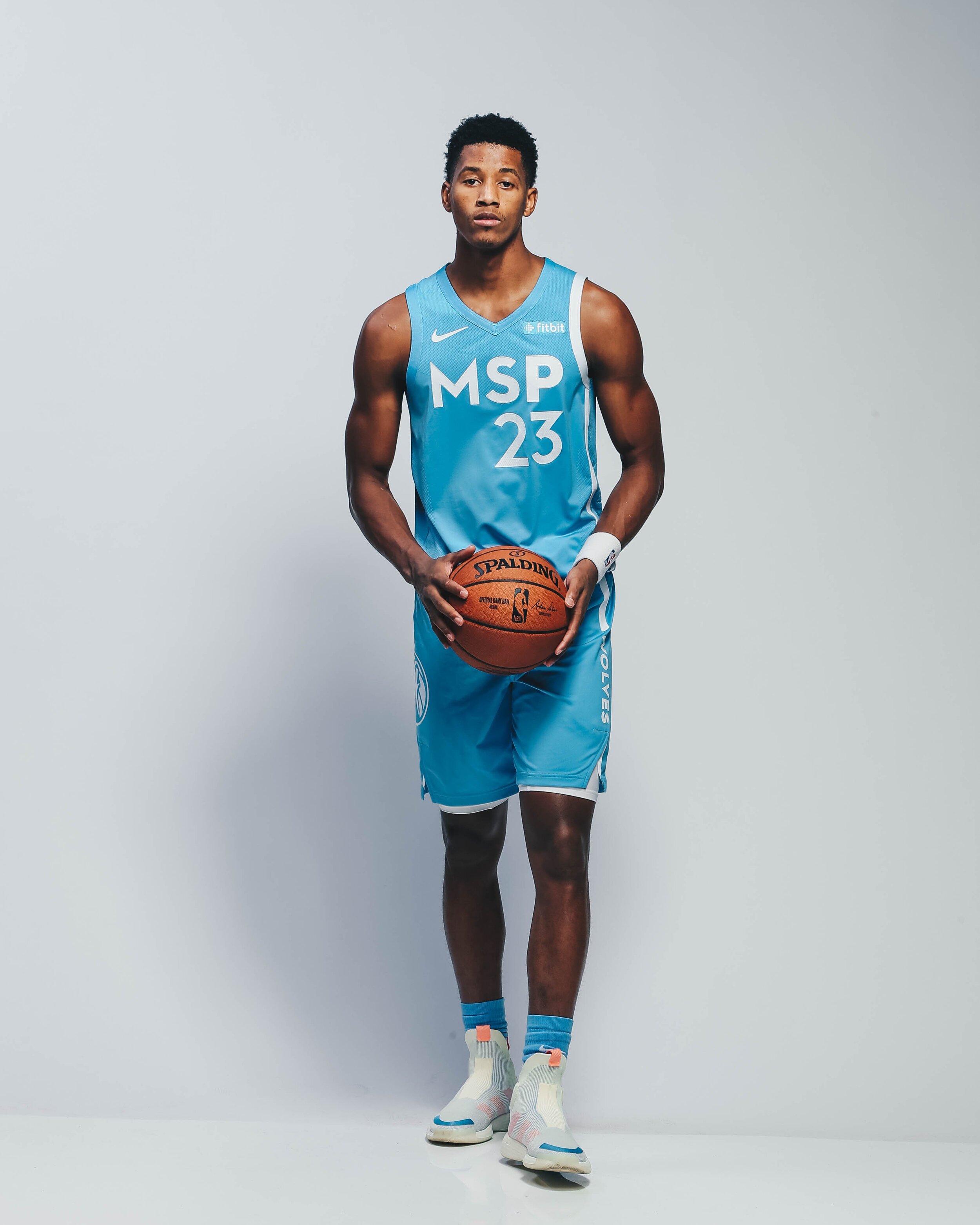
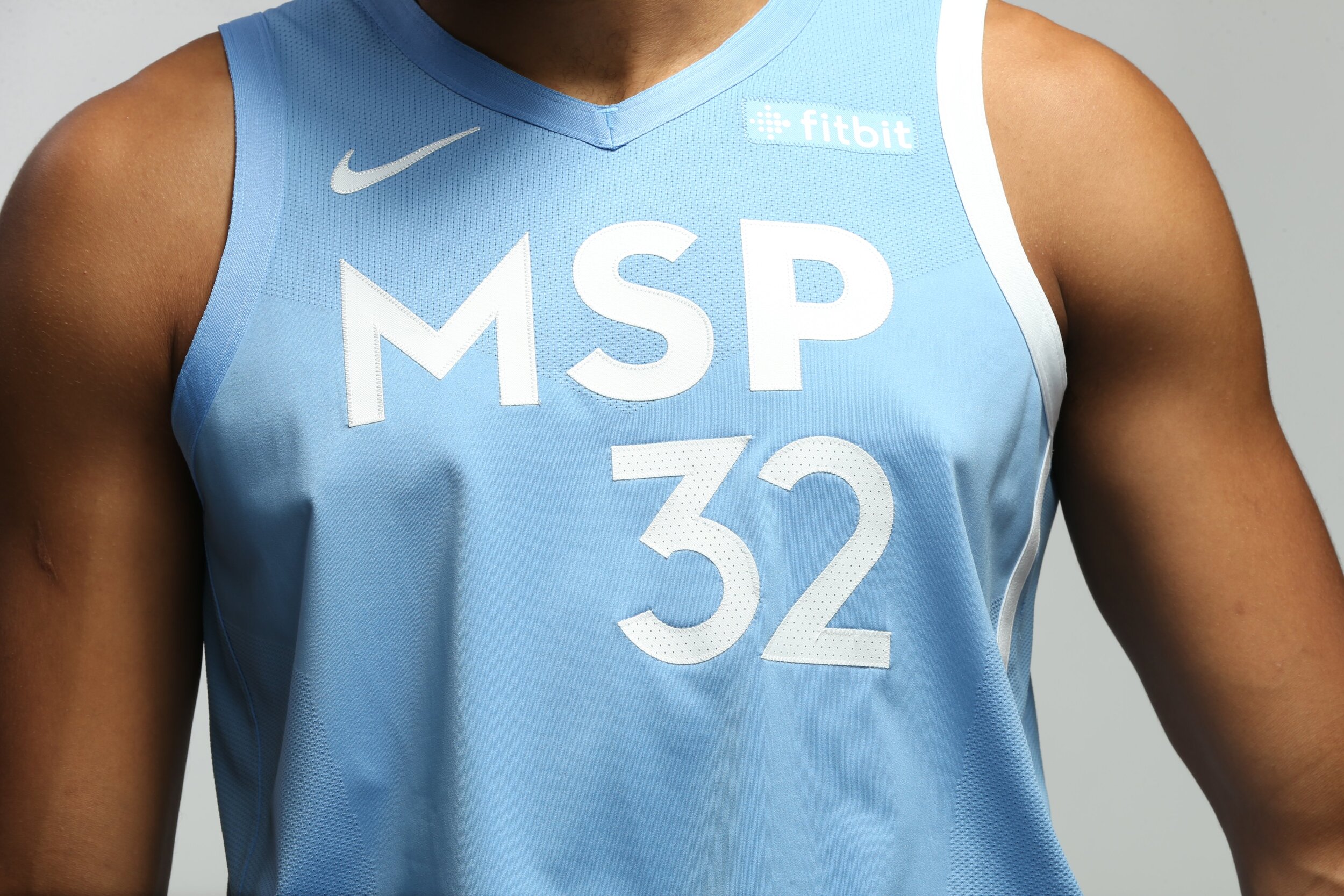
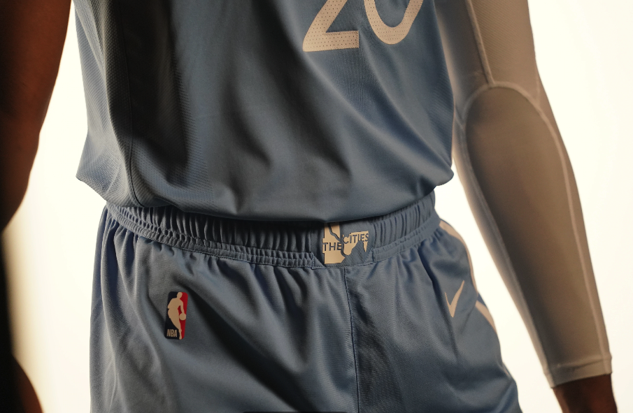
The Timberwolves have revealed their newest ‘Cities Edition’ uniform that draws its inspiration from the two cities of Minneapolis and St. Paul, the diverse people and neighborhoods that makes the Twin Cities thrive, and the river that divides yet unites its residents. The uniform comes in with a sky blue colorwary inspired by the blue waters that run throughout the cities. The left side of the uniform represents the Mississippi River with the outline beginning at the collar of the uniform and flowing down all the way to the bottom of the shorts. Across the chest of the jersey reads MSP standing for the two cities, Minneapolis and St. Paul. On the front of the waistband of the shorts is a logo that features the last city of the east, the first city of the west, connected by the Mississippi River.
“The two cities of Minneapolis and St. Paul are full of diverse people, neighborhoods, and communities that make up the DNA of the Twin Cities. The MSP City Edition uniform celebrates them, what they do to make our Cities thrive, and why the Timberwolves are proud to call the Twin Cities our home.” -Timberwolves CEO Ethan Casson.
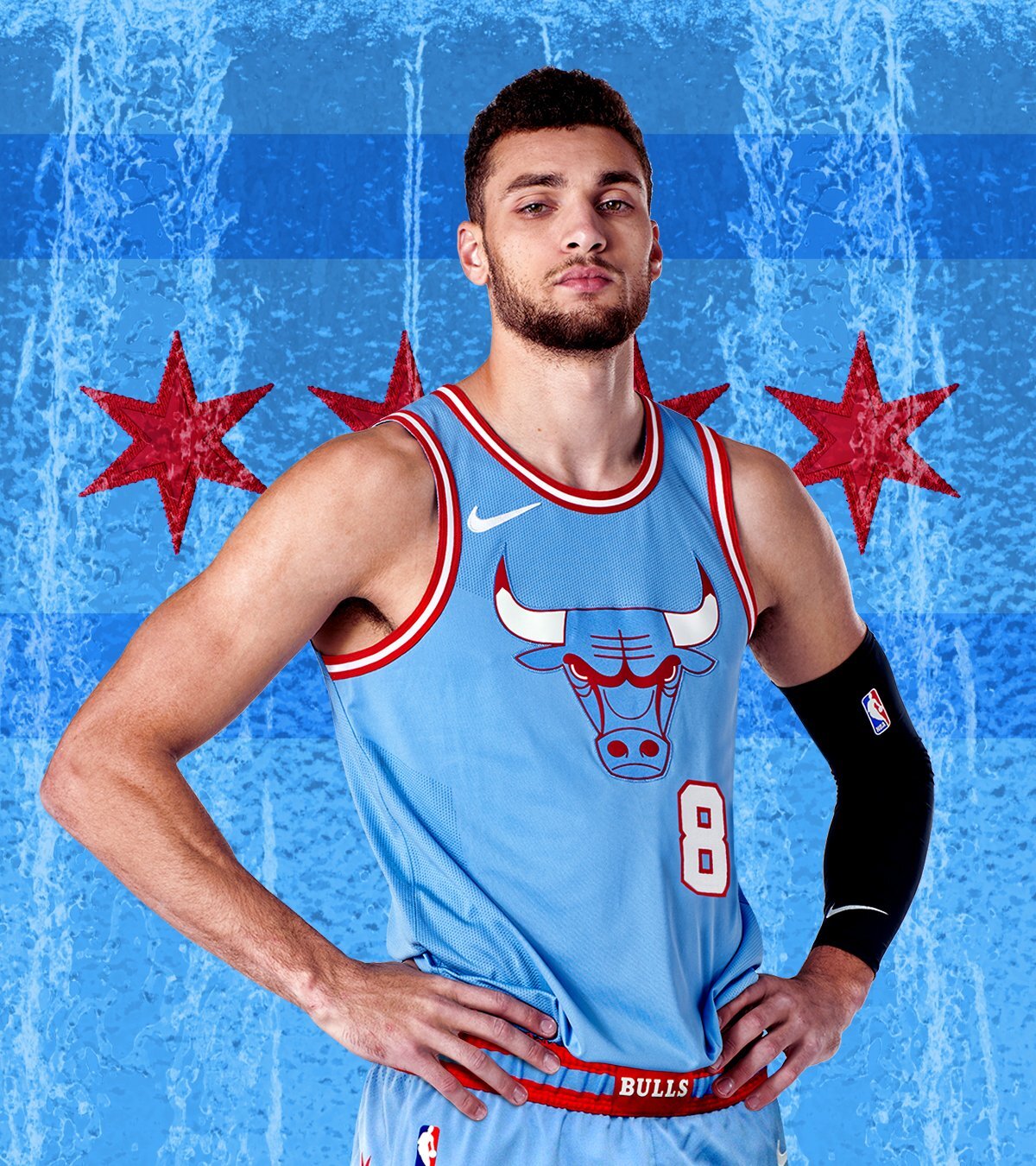
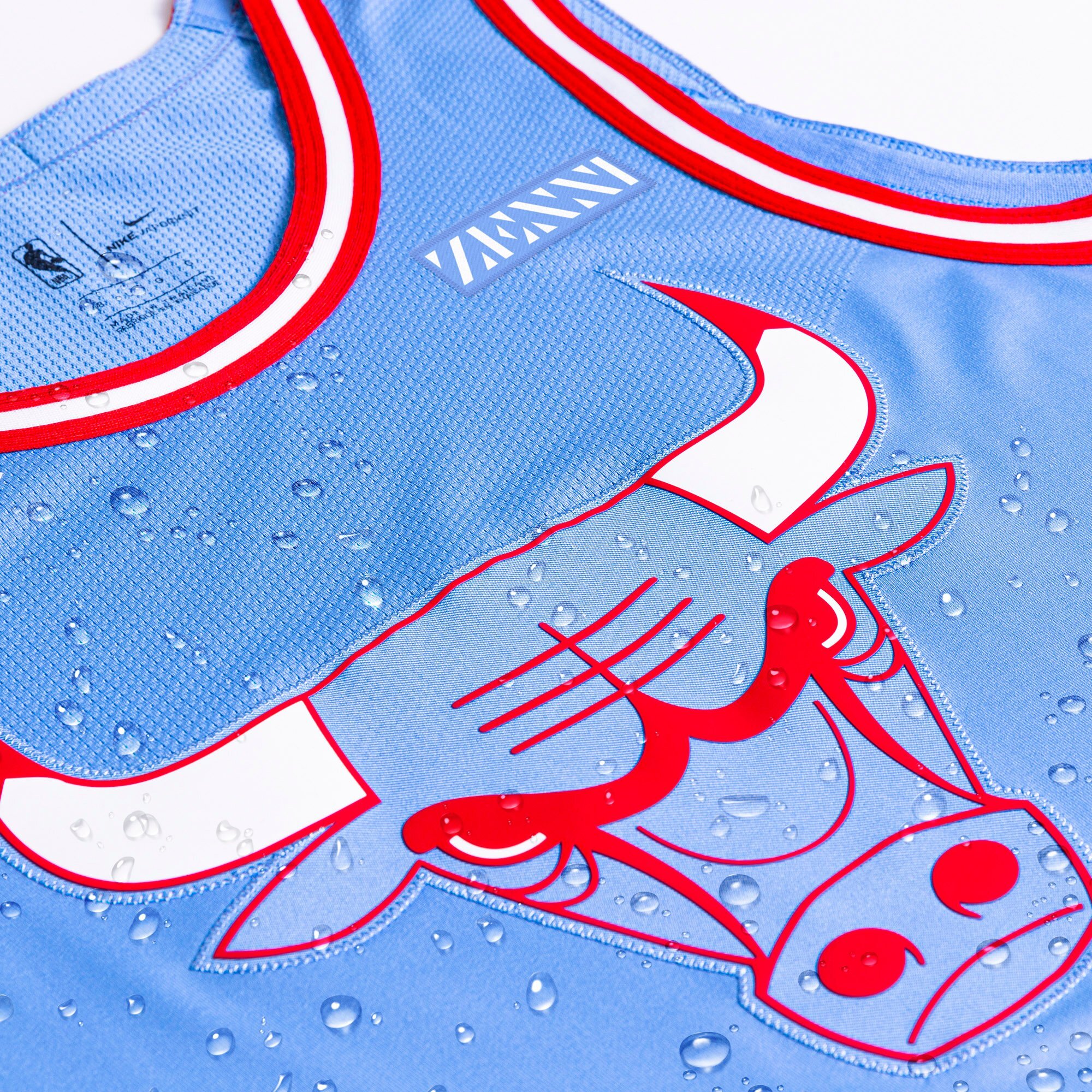
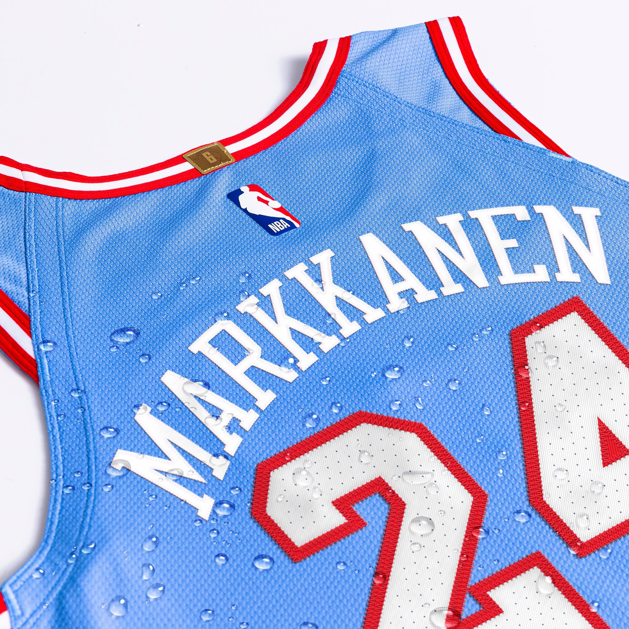
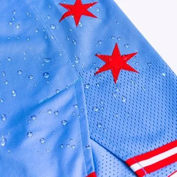
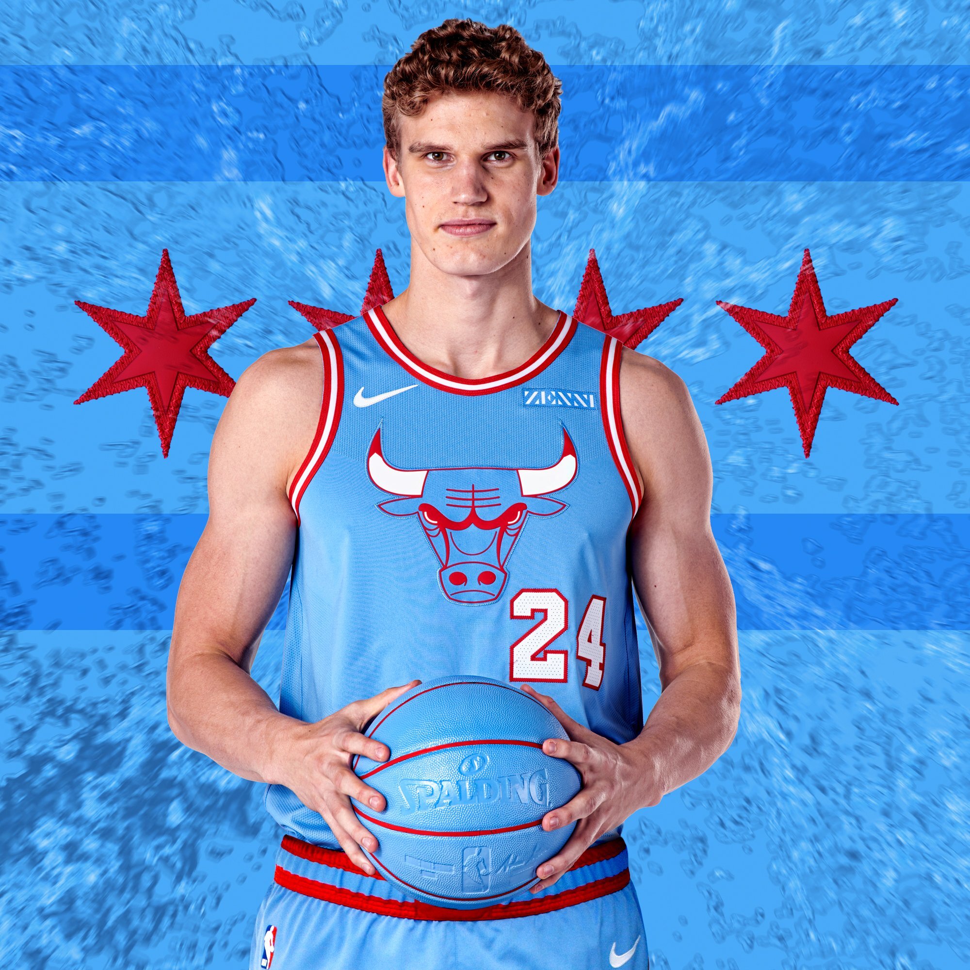
The Chicago Bulls are going blue with their latest ‘City Edition’ uniform. The team took their inspiration from the bodies of water that are identified with Chicago, Lake Michigan and the two branches of the Chicago River. The team also drew inspiration from the Chicago flag to create this season’s look. On the chest of the jersey is a blue Bull’s logo outlined in red to match the red and white piping found throughout the uniform.
The Team will wear the special ‘City Edition’ uniform a total of five times this season.
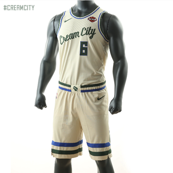
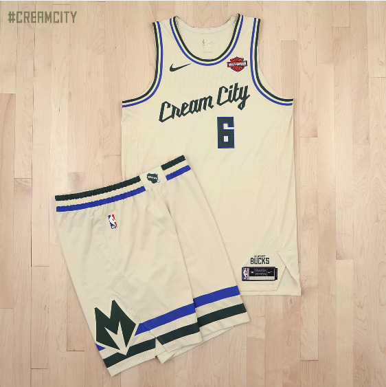
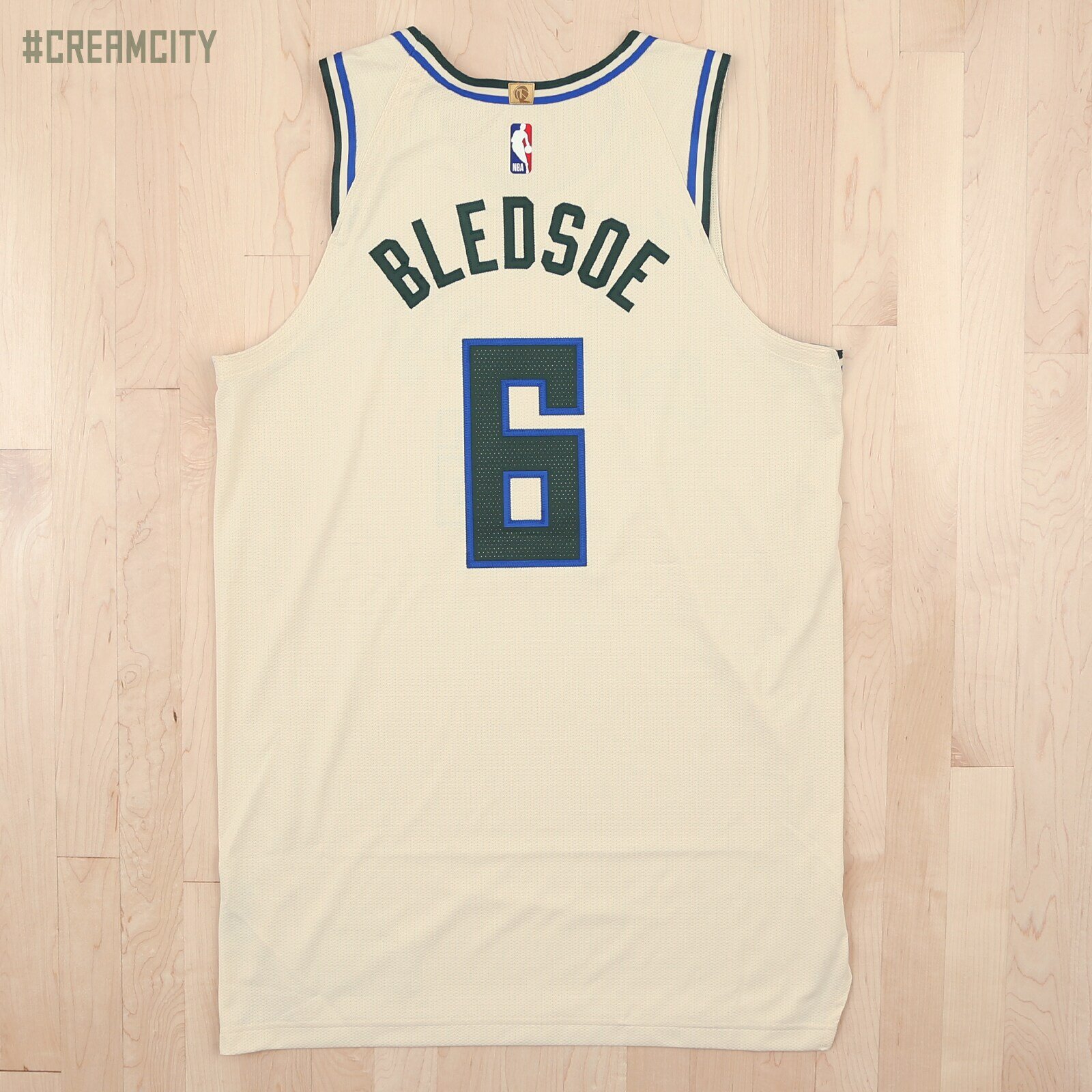
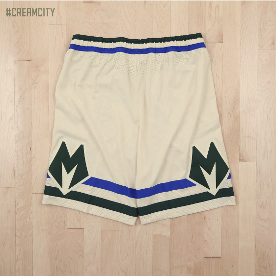
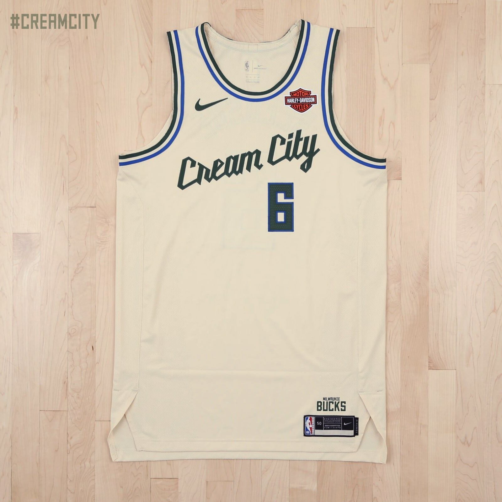
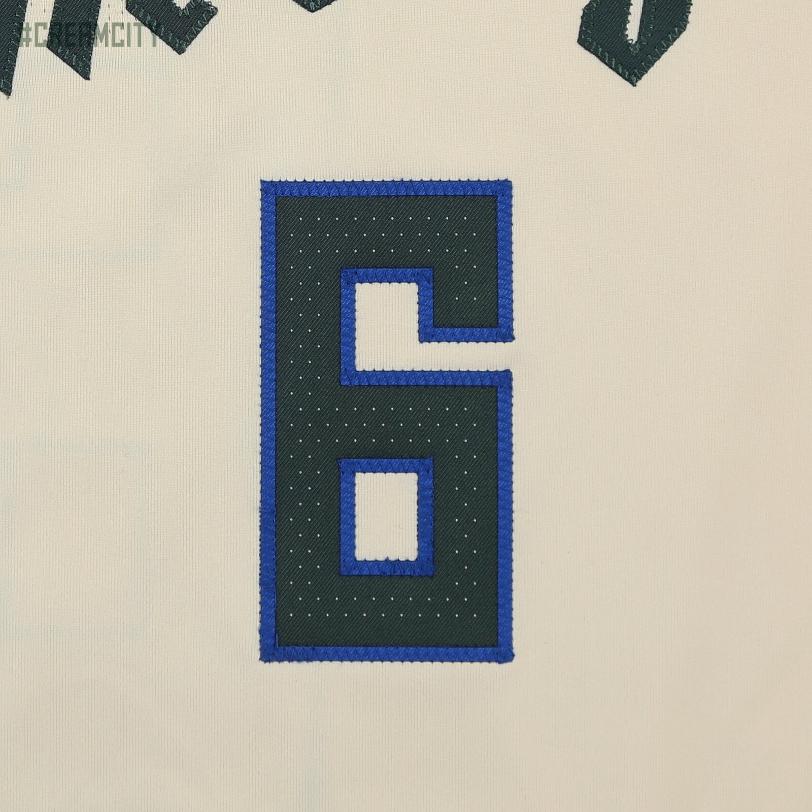
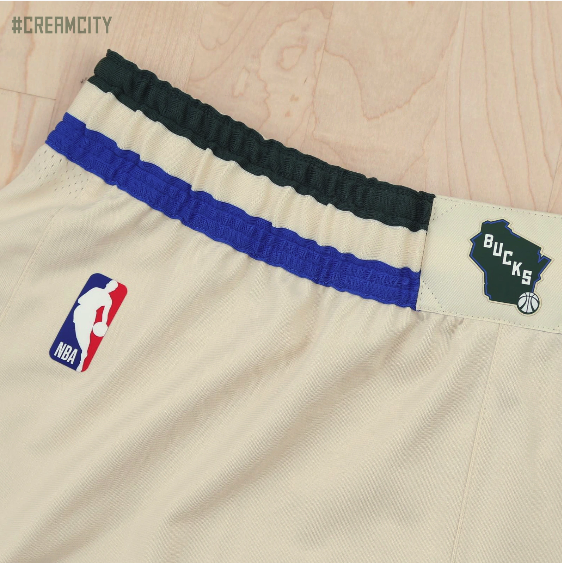
The Milwaukee Bucks have revealed their new ‘City Edition’ uniform for the upcoming season. The uniform is a cream colorway, meant to serve as a nod to the bricks that built the foundation of Milwaukee and its nickname “Cream City”. We see the wordmark Cream City displayed across the front of the jersey. The uniform features details, including the Bucks’ green and blue striping and script font, which are reminiscent of the Bucks’ earliest days, but with a modern twist. The ‘City Edition’ shorts feature the stylized “M” mark on the sides, as well as the state of Wisconsin on the front.
We will see the uniform twenty times throughout the season, and will make its debut on Saturday, Nov. 30.
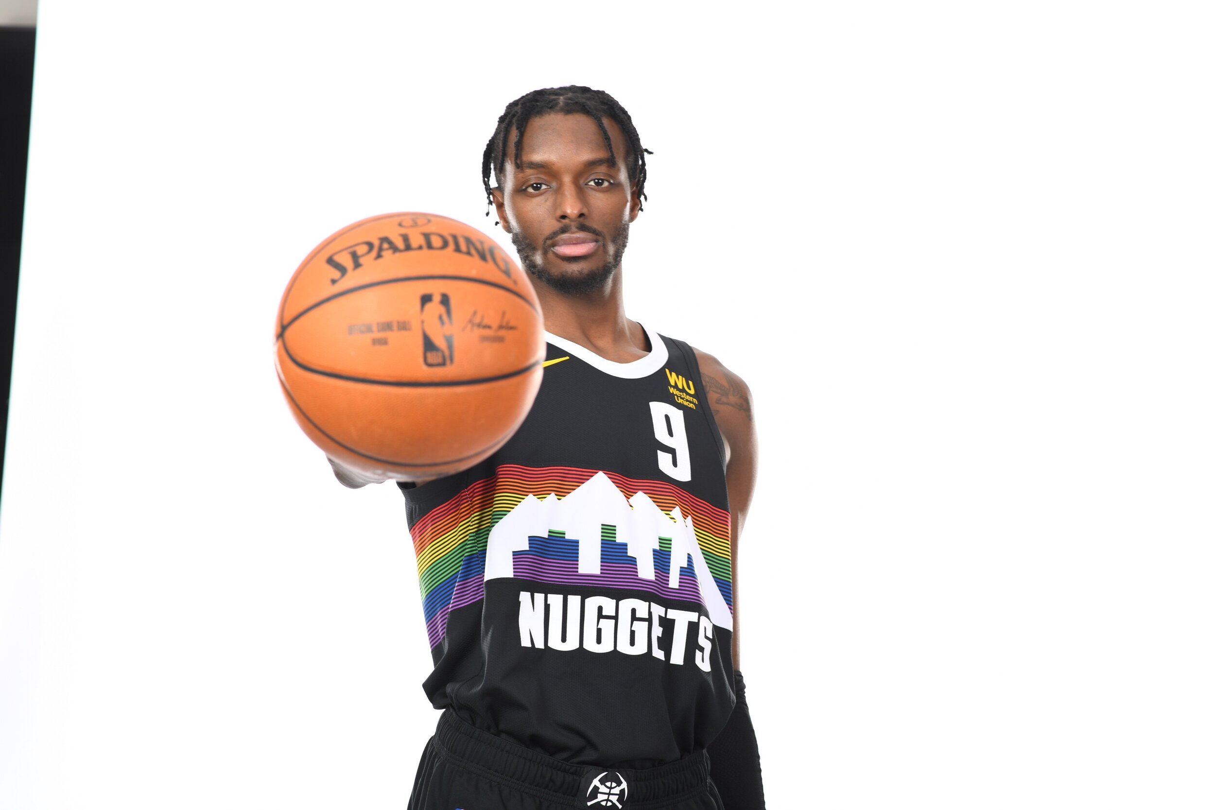
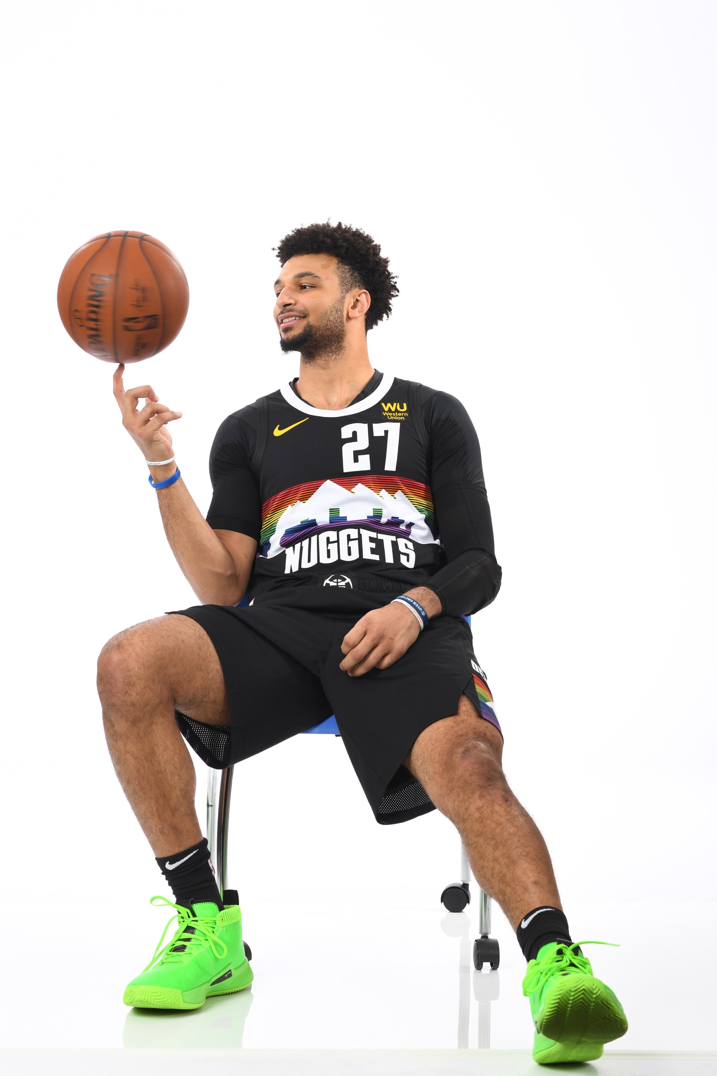
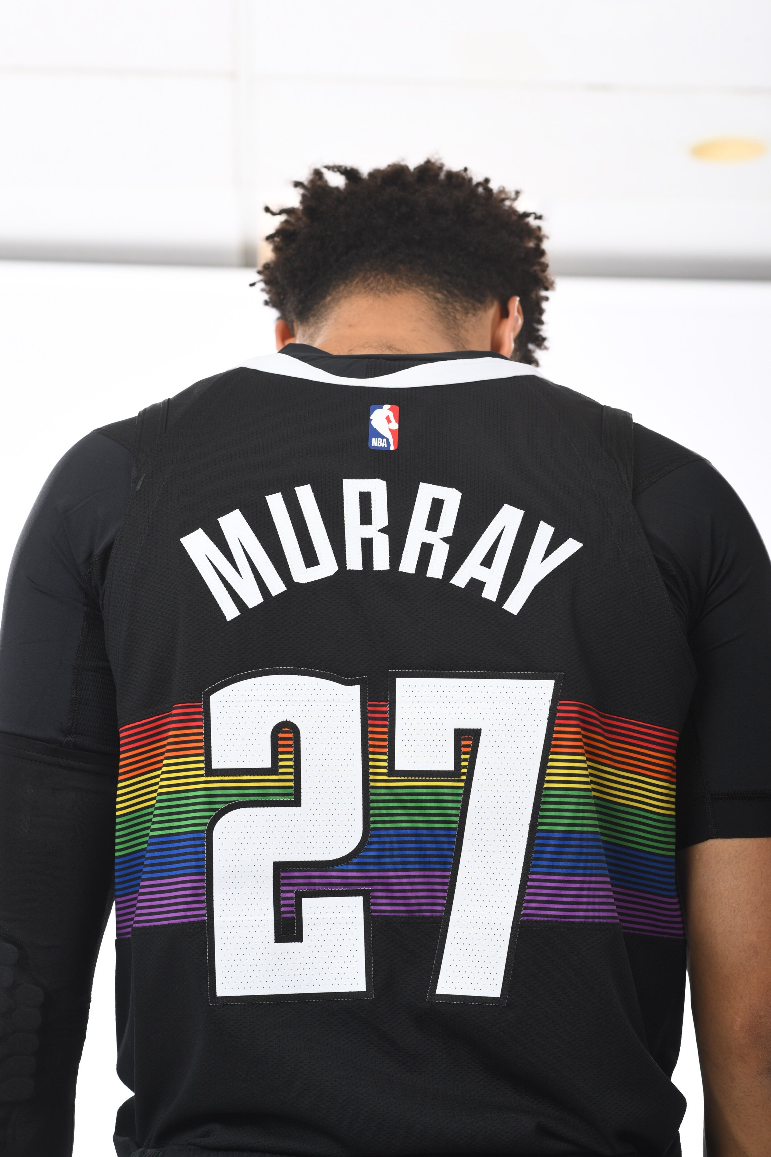
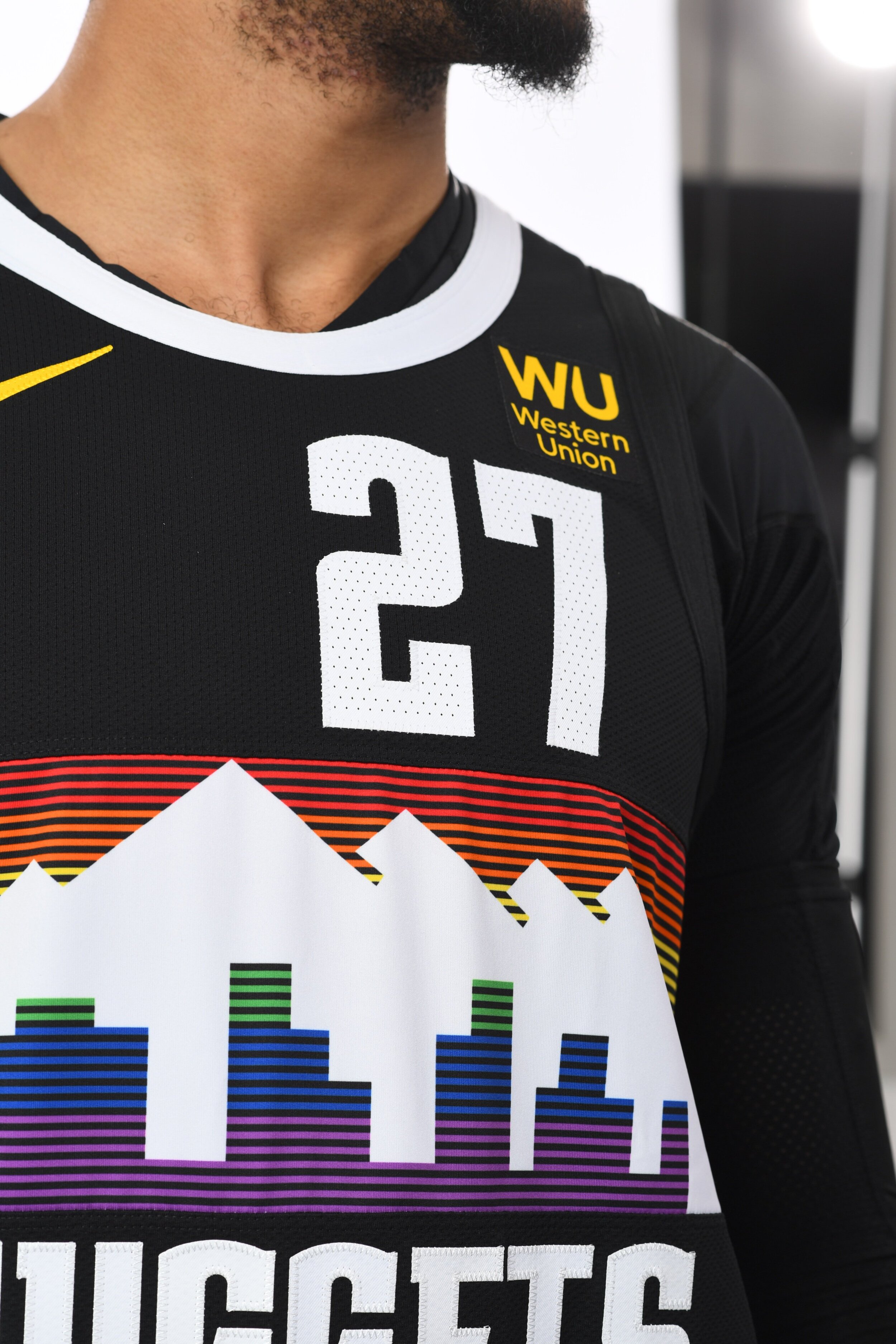
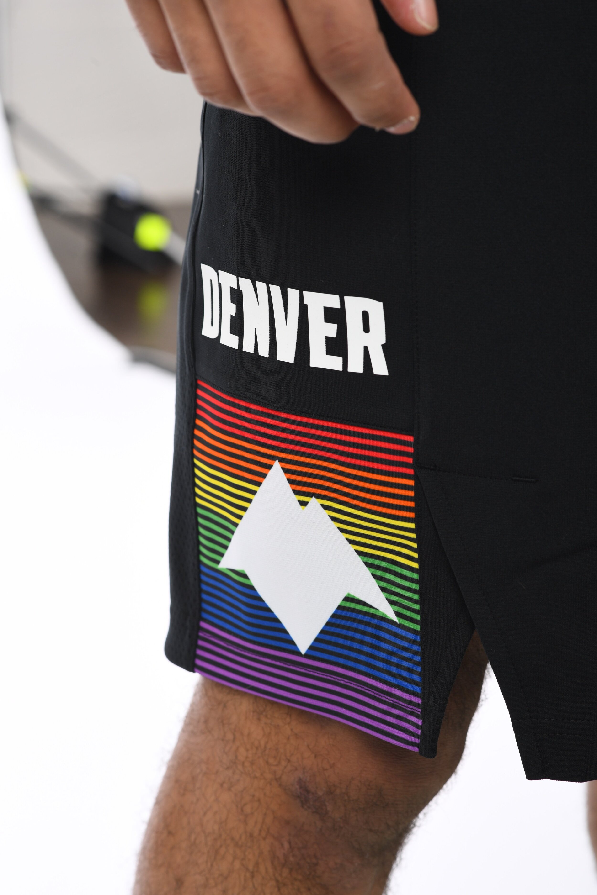
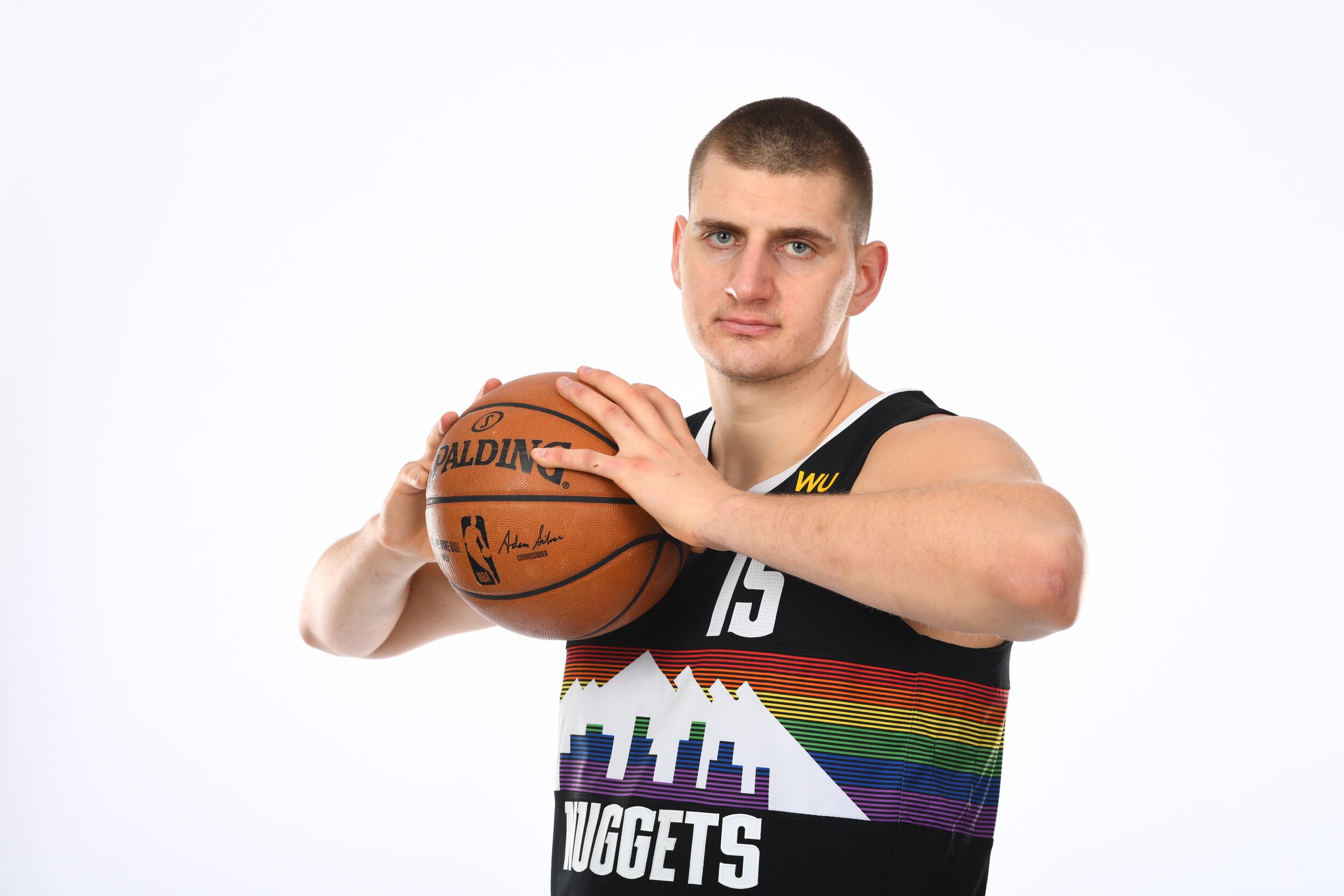
The Nuggets have revealed their newest version of their ‘City Edition’ uniforms. The new uniform is a celebration of the people and neighborhoods that make Denver unique. The design was inspired by the team’s original Rainbow Skyline uniform that was worn from the 1981-1993. The team took the same design that we saw on last season’s ‘City Edition’ uniform and used a black based uniform this season to have the rainbow colors pop even more. We will see the team rock these unis seven times this season.
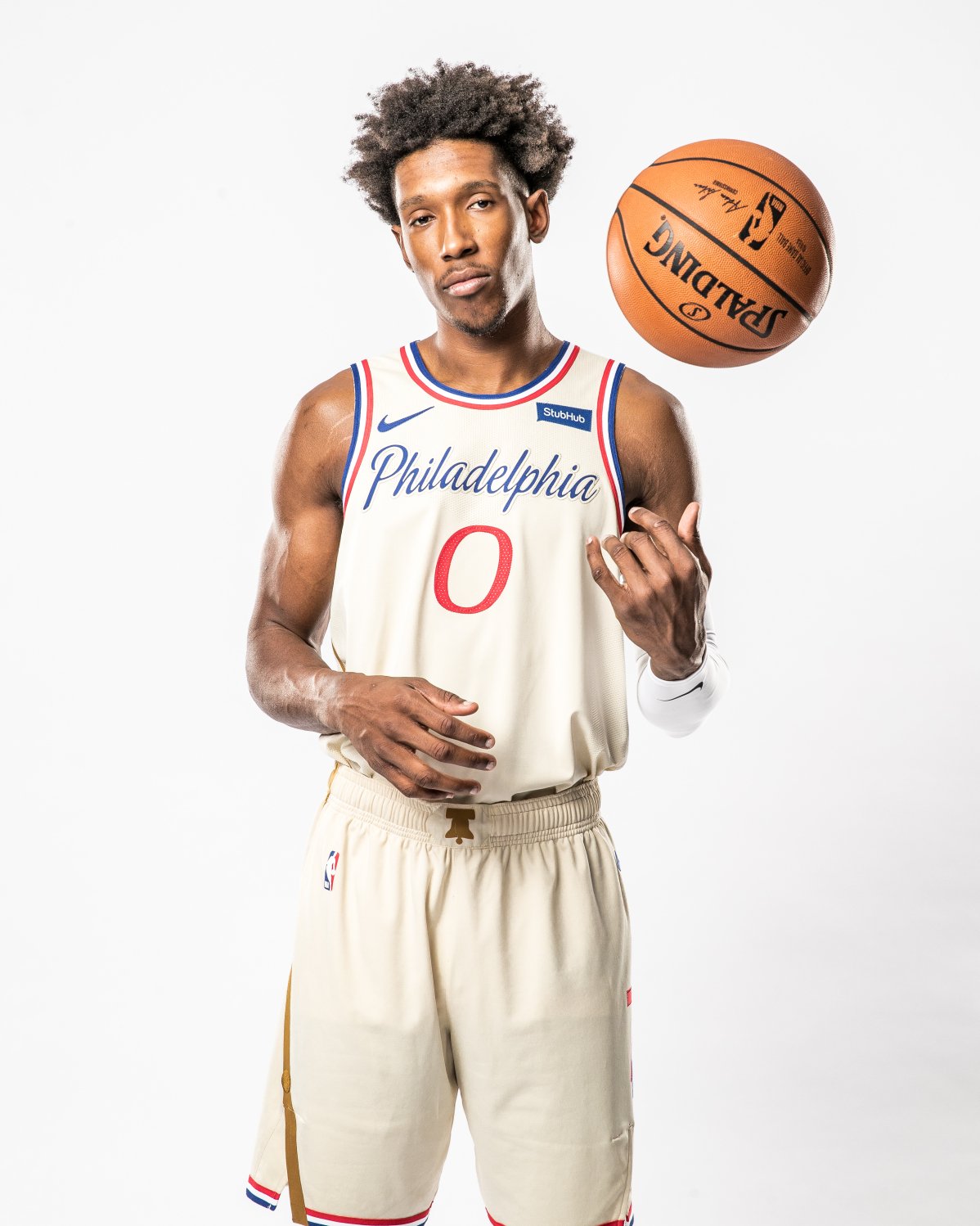
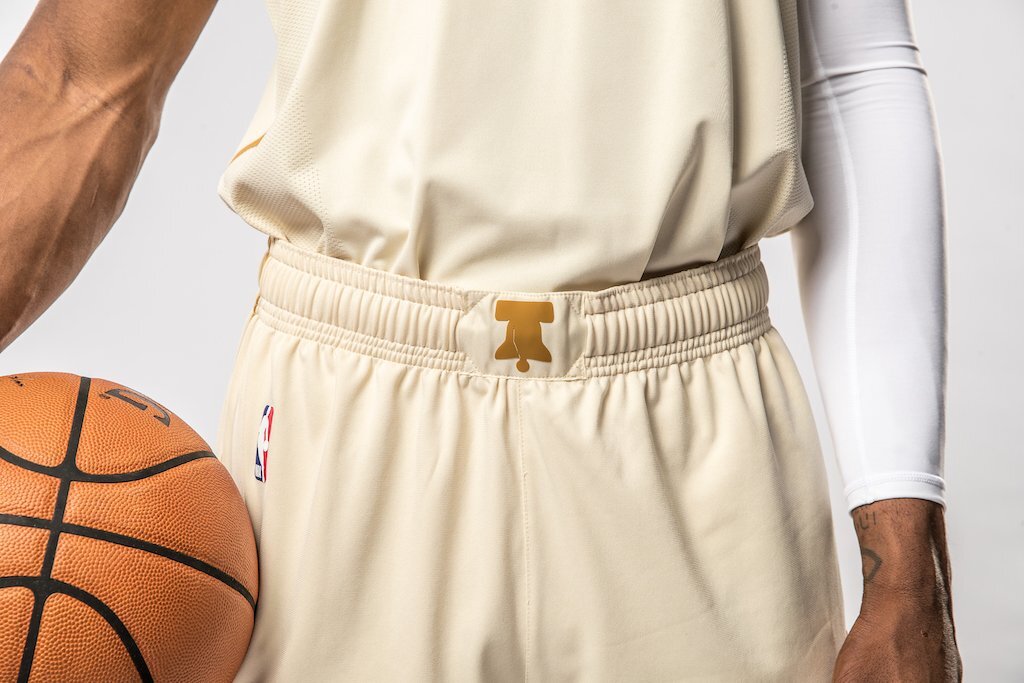
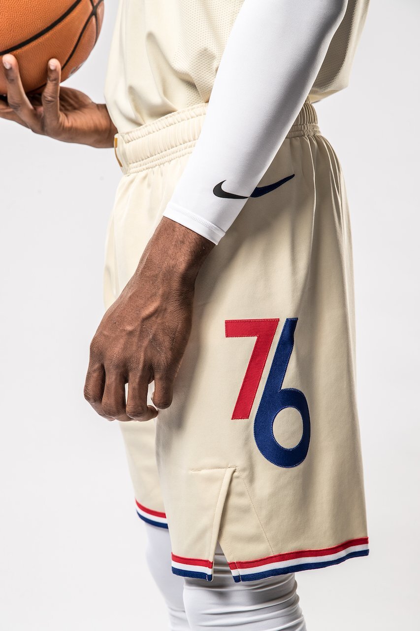
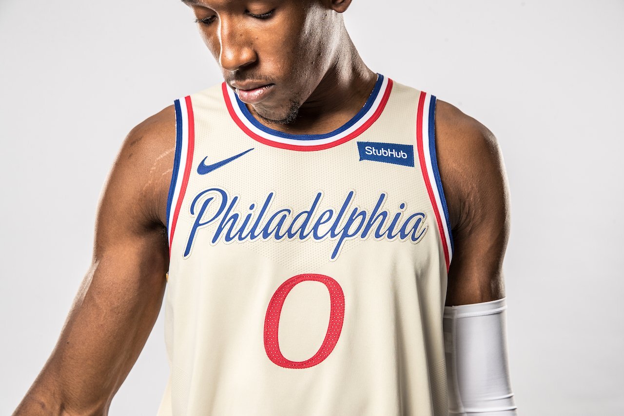
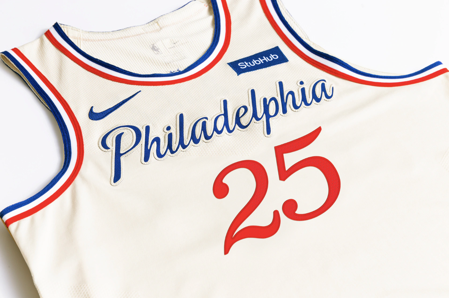
The new ‘City Edition’ uniform for the Sixers pays homage to a staple of the Philadelphia community, the Liberty Bell. The uniform is a parchment colorway that features a blue “Philadelphia” cursive script wordmark across the chest. On the sides of the uniform we see the crack in the Liberty Bell displayed predominately. Located on the front hem of the jersey the phrase “Pass and Stow,” is embroidered to mimic that of the inscription on the front of the Liberty Bell, the two names are derived from Philadelphia foundry workers, John Pass and John Stow, who recast the original bell in 1753.
“It’s important to our organization to pay tribute to Philadelphia’s rich history, culture and landmarks as frequently and authentically as we can. In partnership with StubHub, we designed the City Edition jersey to celebrate the Liberty Bell, a Philadelphia icon that transcends time and brings to life a powerful symbol that unites us all. We look forward to enjoying many special moments with our fans wearing these uniforms throughout the remainder of the season.” -76ers President Chris Heck
The new ‘City Edition’ is the fifth option for the Sixers to wear this season and will get its first action Nov. 30th.
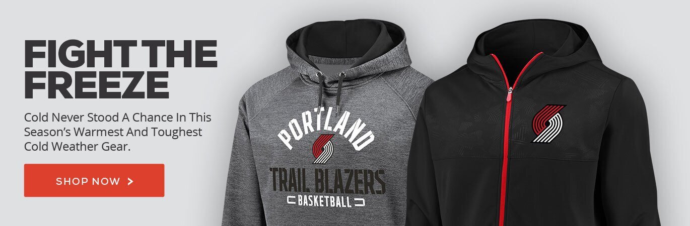
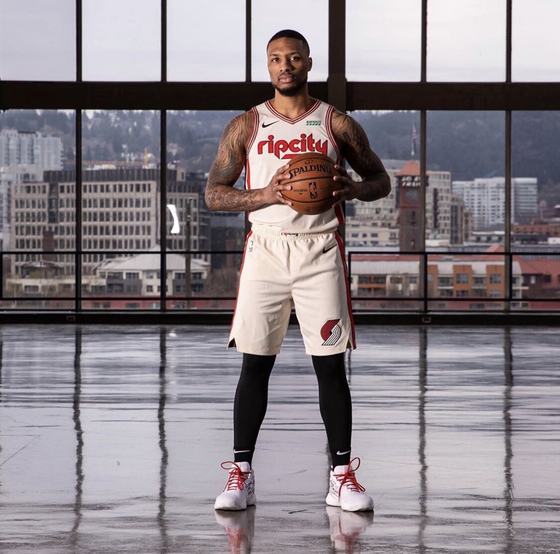
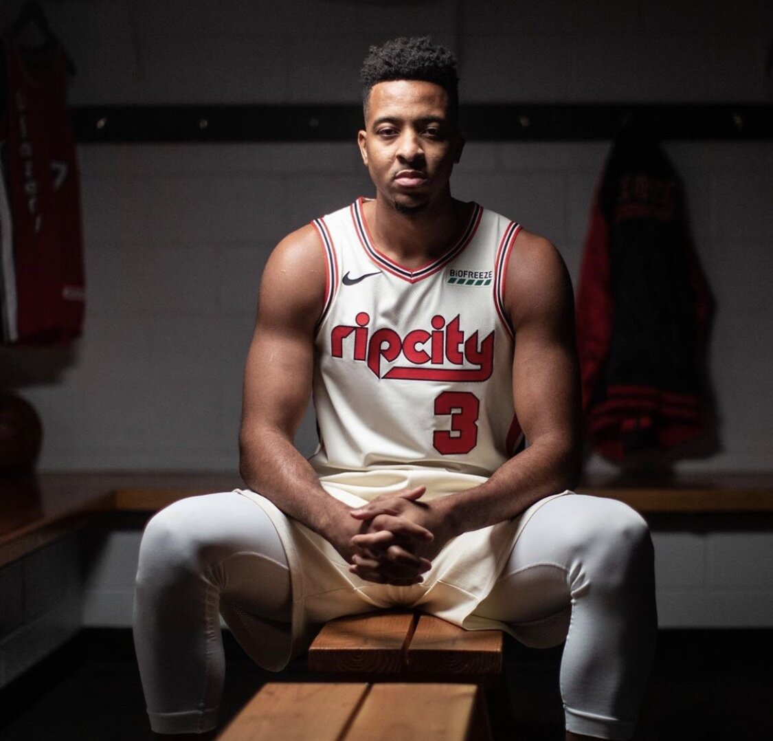
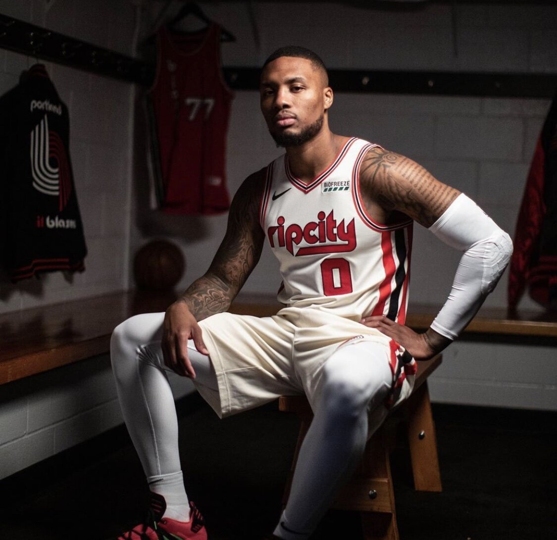
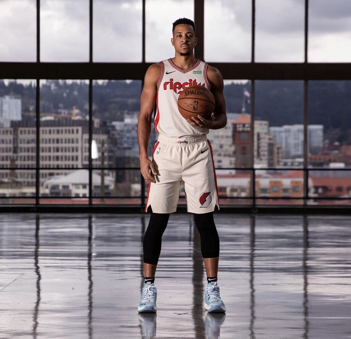
The Portland Trail Blazers introduce their new Rip ‘City Edition’ uniform. The new design pays tribute to the teams heritage with a retro look combining modern accents and vintage coloring. Across the chest of the players jerseys will be the RipCity wordmark. We will see Portland take the court in the new ‘City Edition’ vs OKC on Nov. 27th.
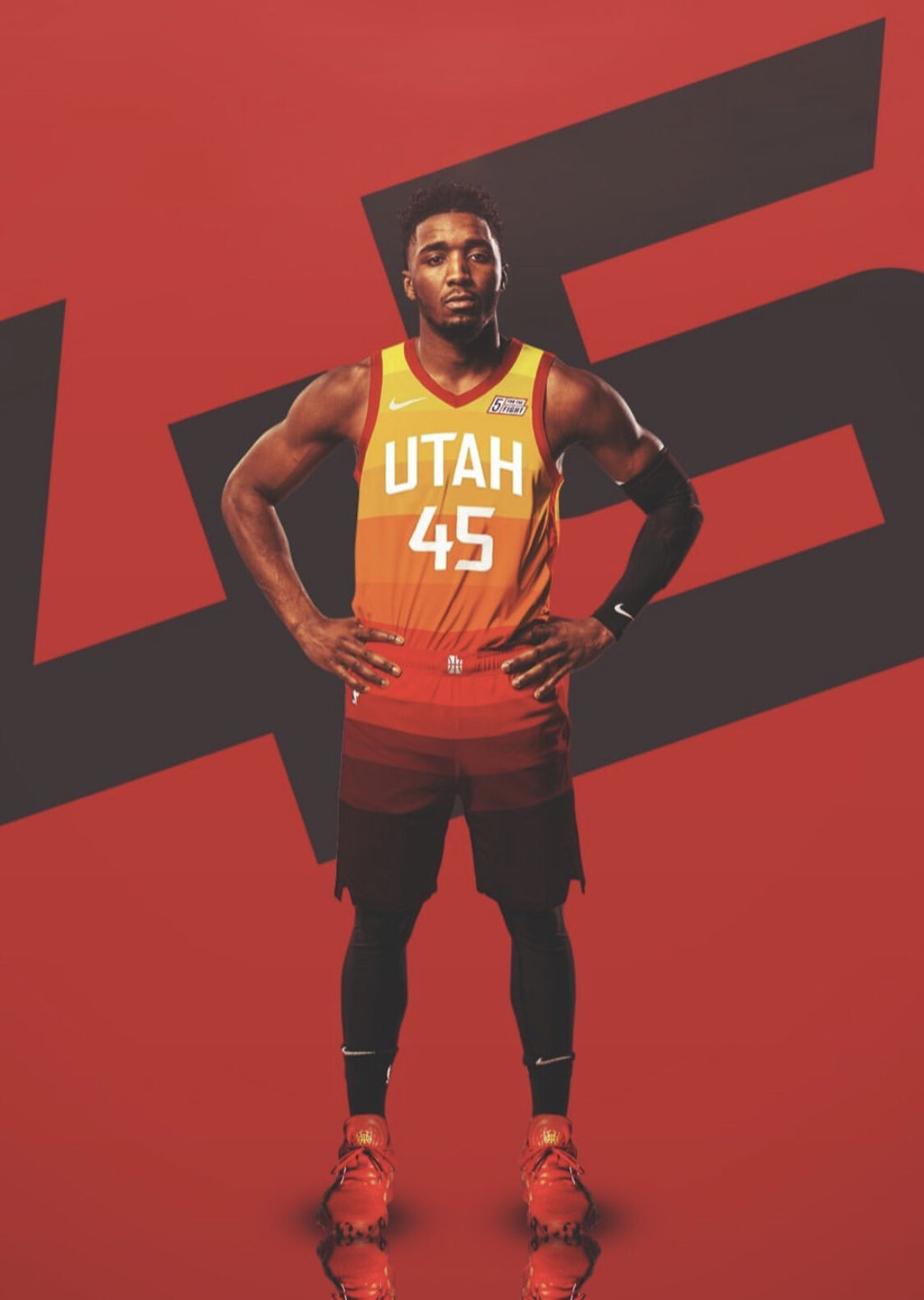
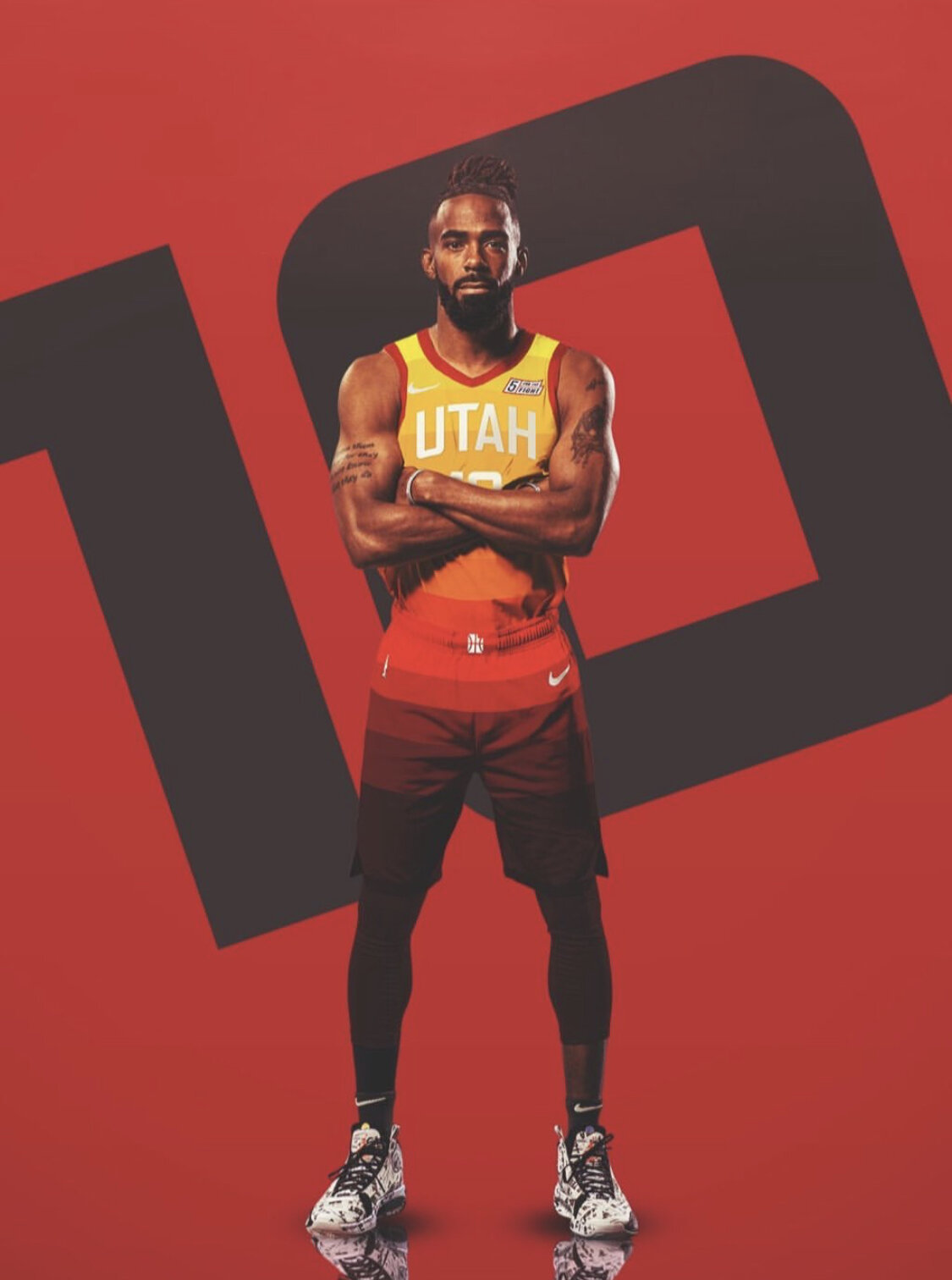
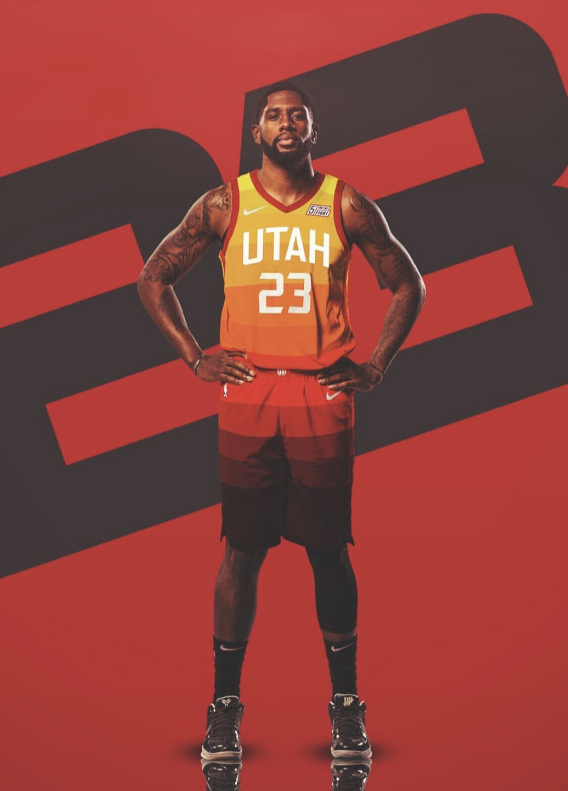
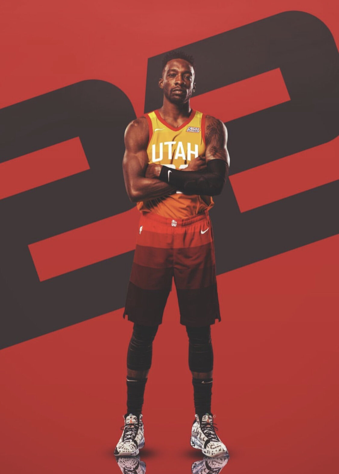
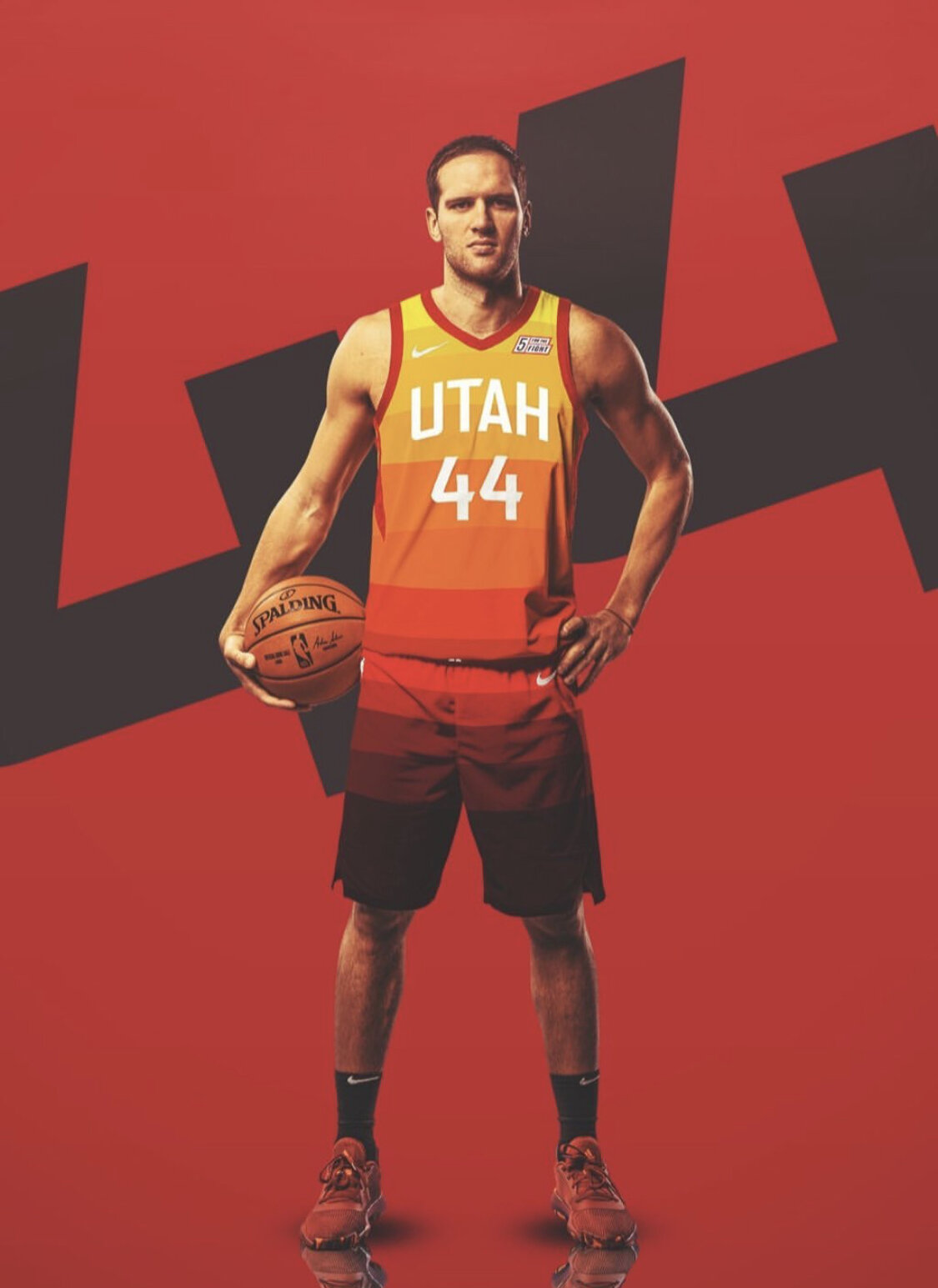
The Utah Jazz will once again keep their fan favorite ‘City Edition’ uniform for the 2019-20 season. The team introduced the look inspired by red-rocks in Utah. We will see the team in their ‘City Edition’ uniform for sixteen games this season.
“I see a lot more of the City uniforms than any other uniforms around town. It catches a different feel for the Jazz that’s being exposed to the world. I think it’s pretty dope to have that. It gives people a different sense of what Utah’s about.” -Donovan Mitchell
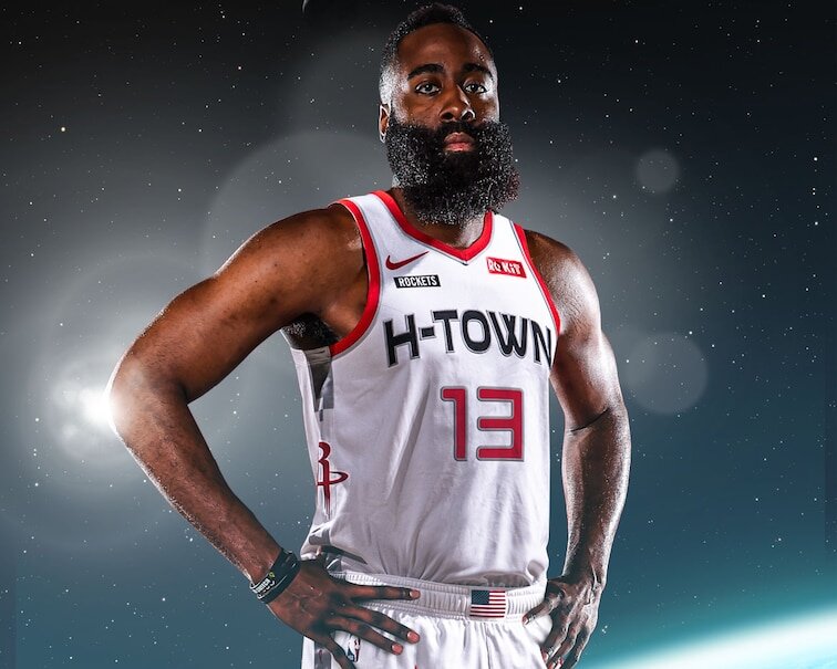
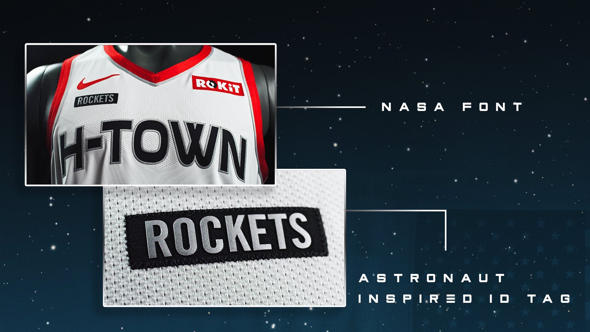
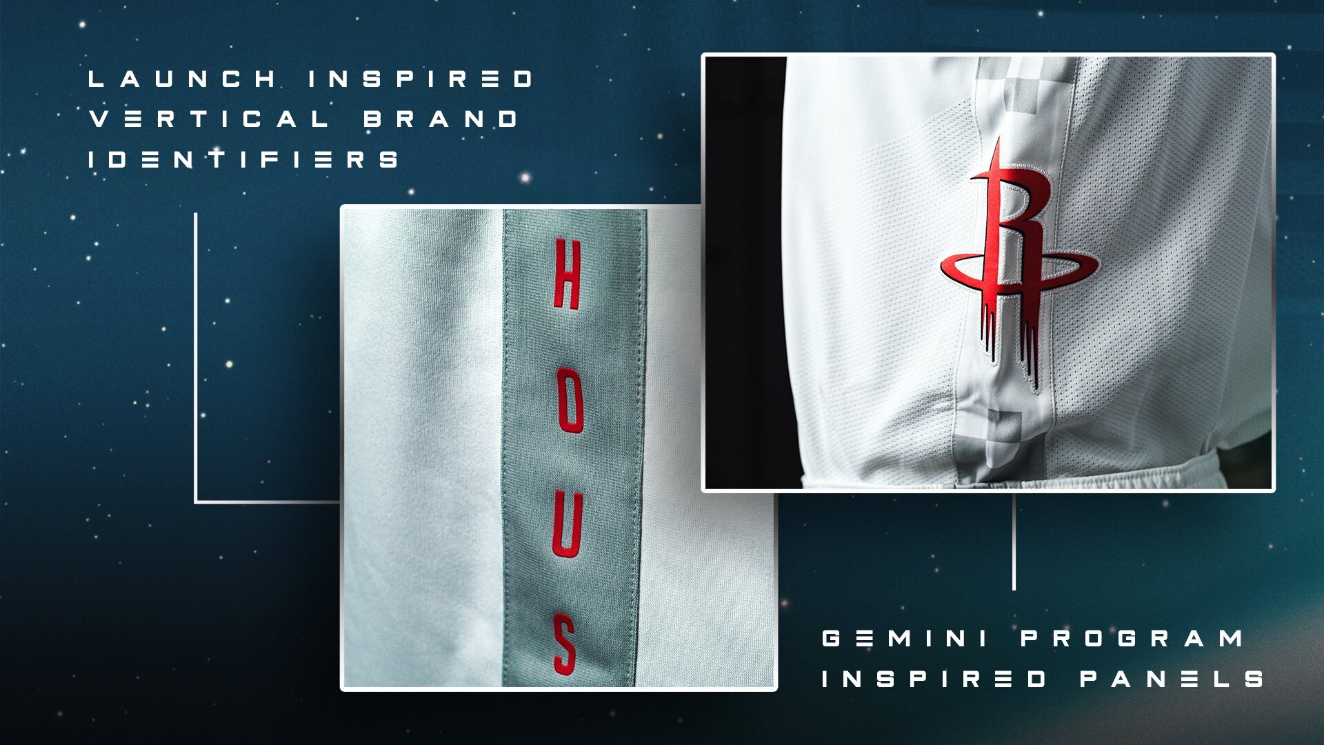
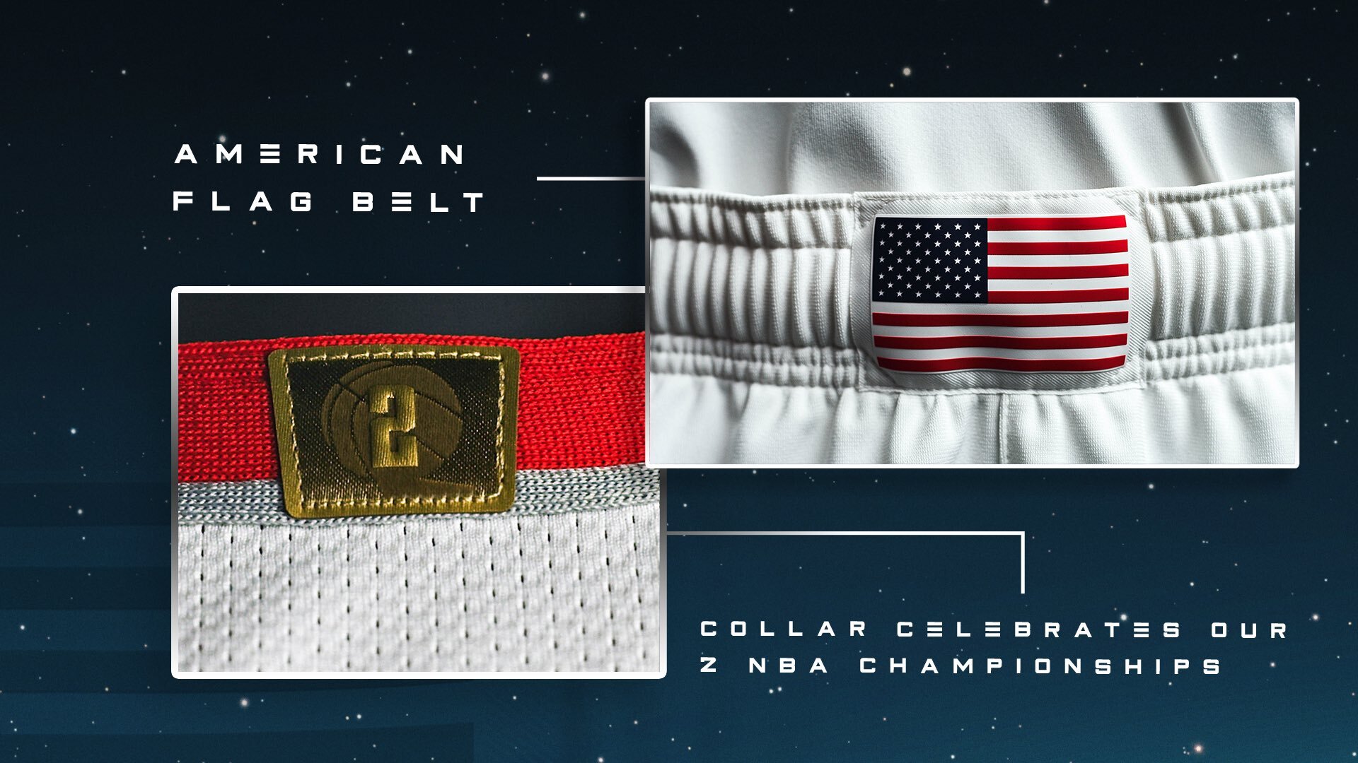
The Rockets have revealed their new ‘City Edition’ uniform to go with the new uniform set they revealed early this year. The team drew their inspiration for the uniform from the NASA Space Program, which has strong ties to Houston historically and presently. The uniform features a special font that was inspired from the spaceships used by NASA. On the upper right chest of each jersey is a traditional Astronaut ID tag, giving another tie into the space program. The shorts feature an American flag on the front of the belt line, along with Houston spelled vertically to resemble a rocket launch. To finish off the look the jersey and shorts will have special side panels that were inspired by the Gemini Program that helped NASA prepare for the Apollo moon landings.
The Rockets will wear their new space uniforms every Saturday home or away starting on Nov. 30th.