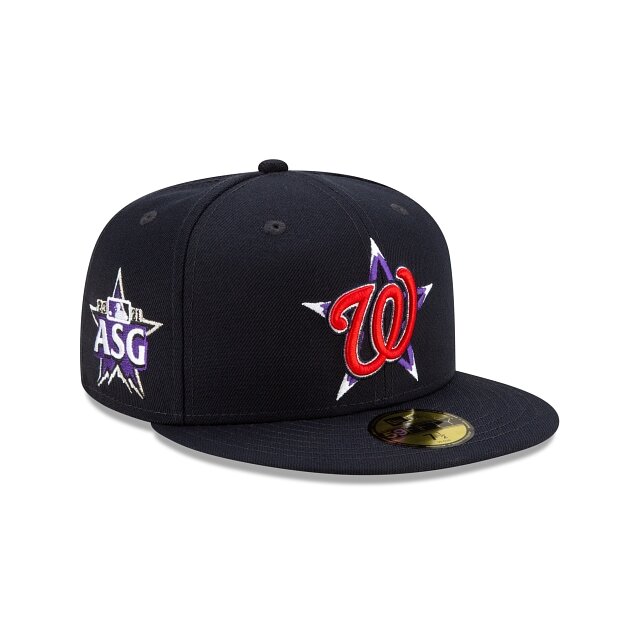
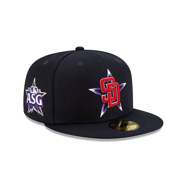
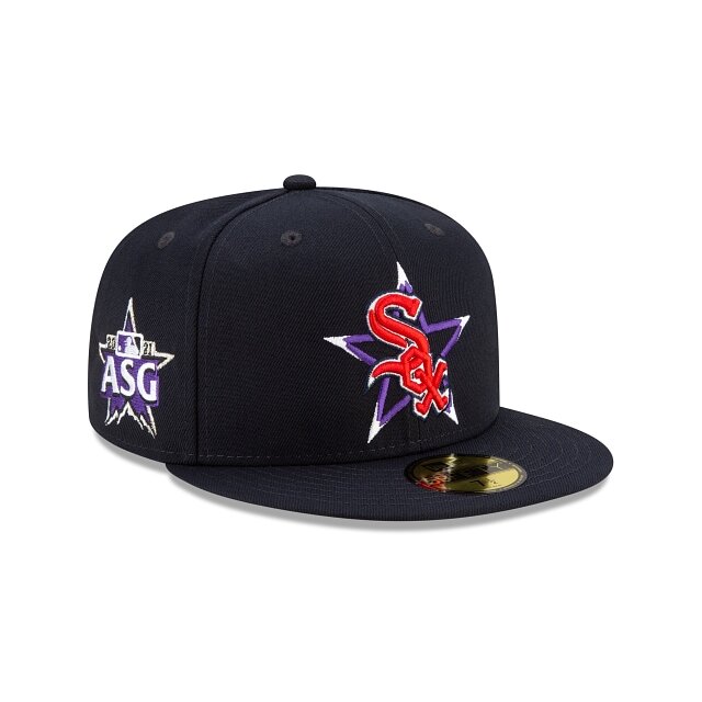
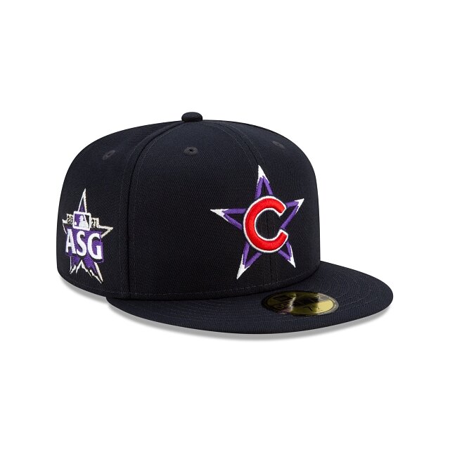
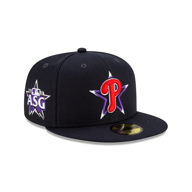
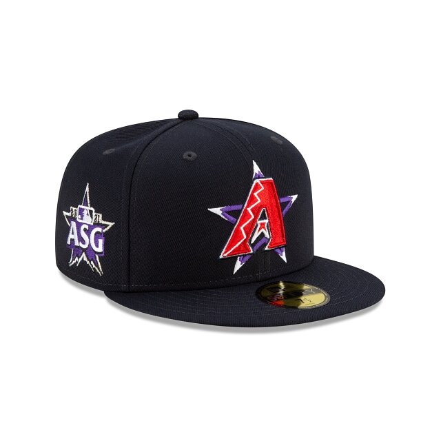
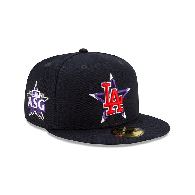
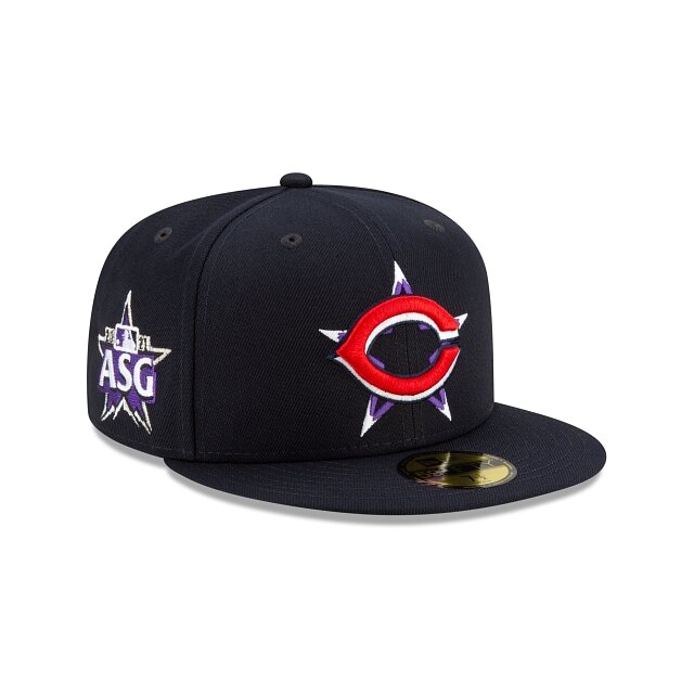
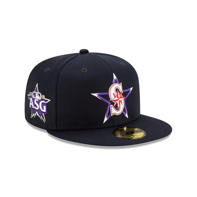
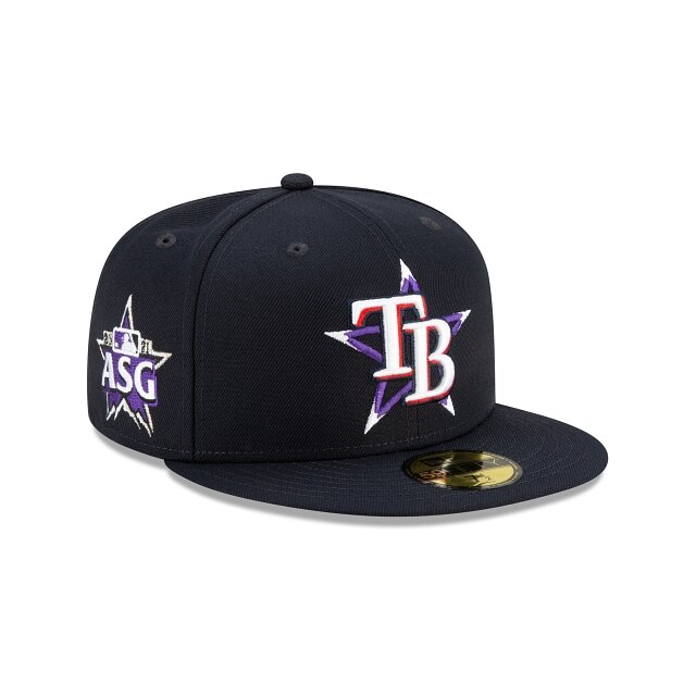
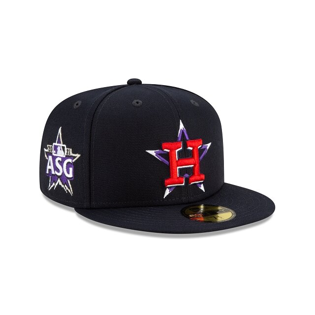
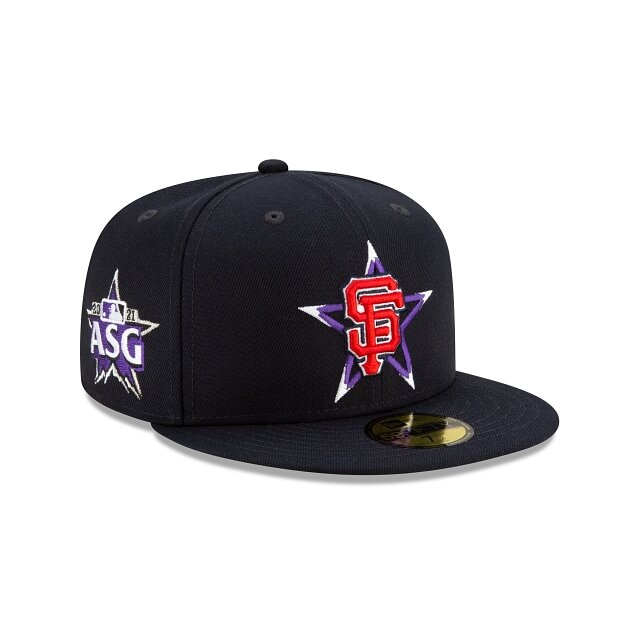
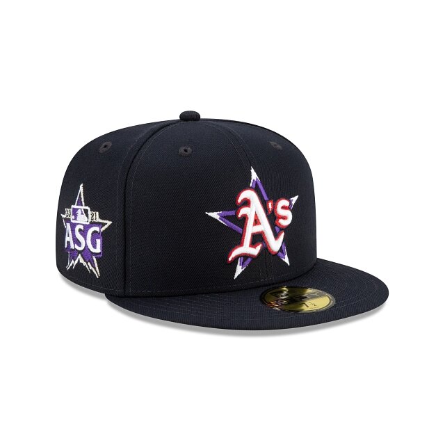
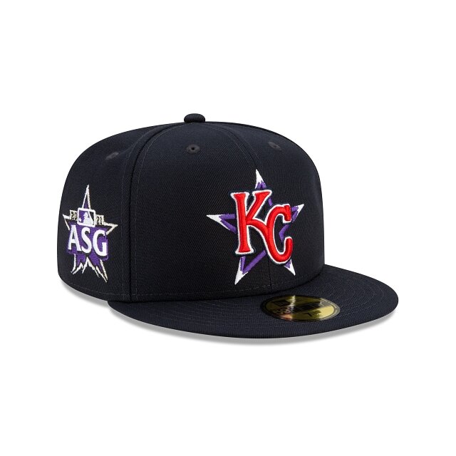
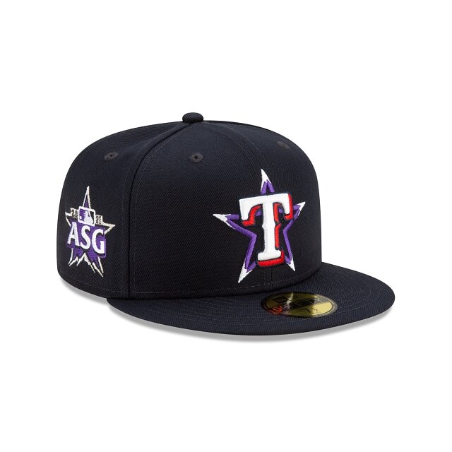
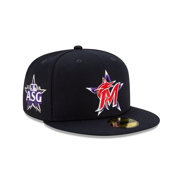
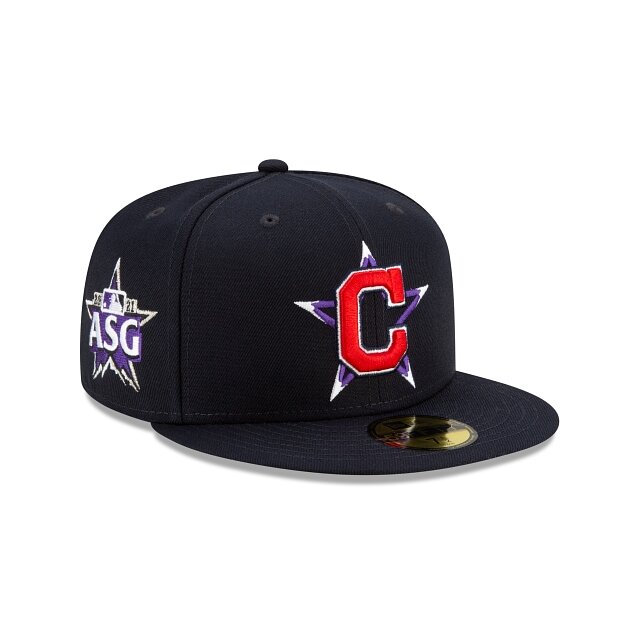
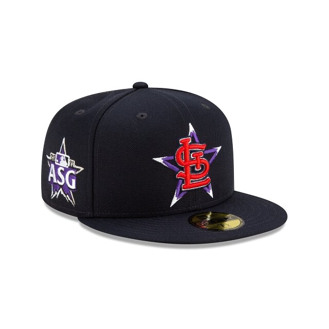
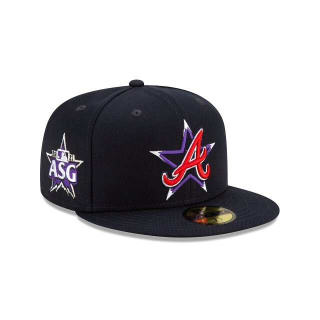
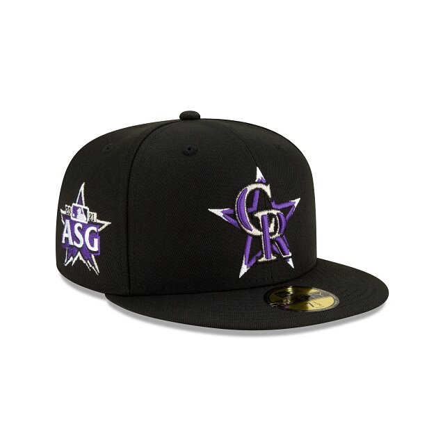
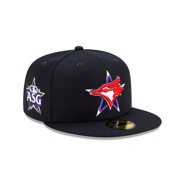
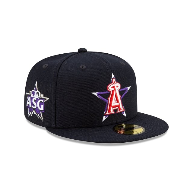
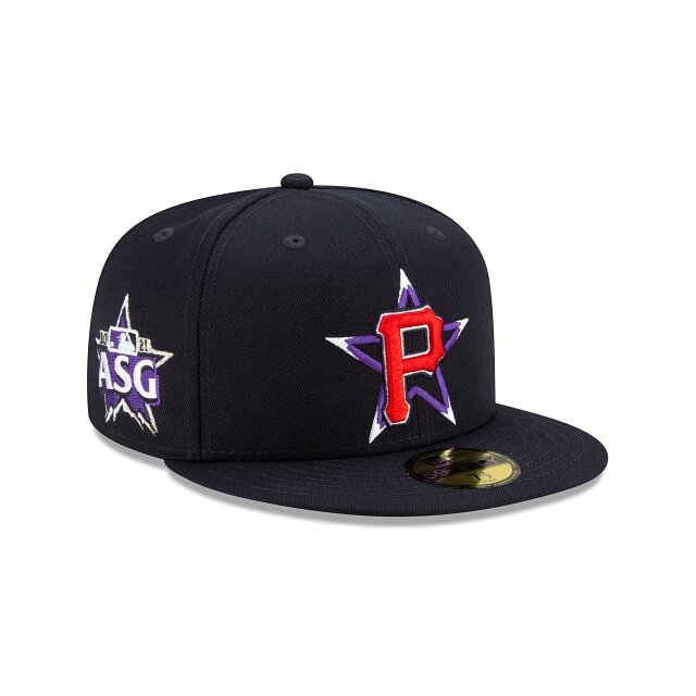
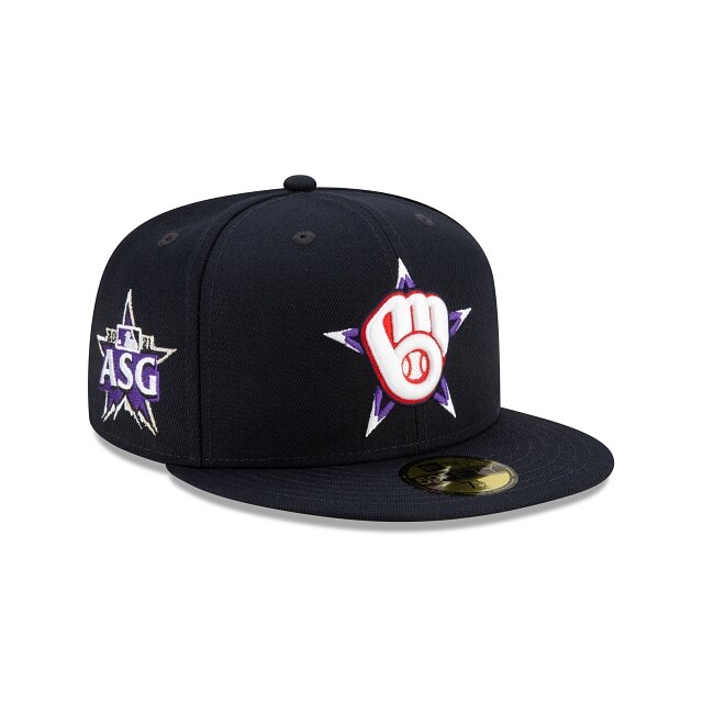
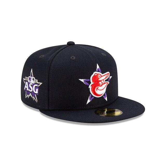
The MLB has revealed the 2021 All-Star Game hats for each team. The hat will feature the team’s main logo on a purple star to celebrate the host city of Colorado at the front panels. The right side of the cap features the embroidered MLB All-Star logo. Take a look at each of the team’s All-Star Game hats below.
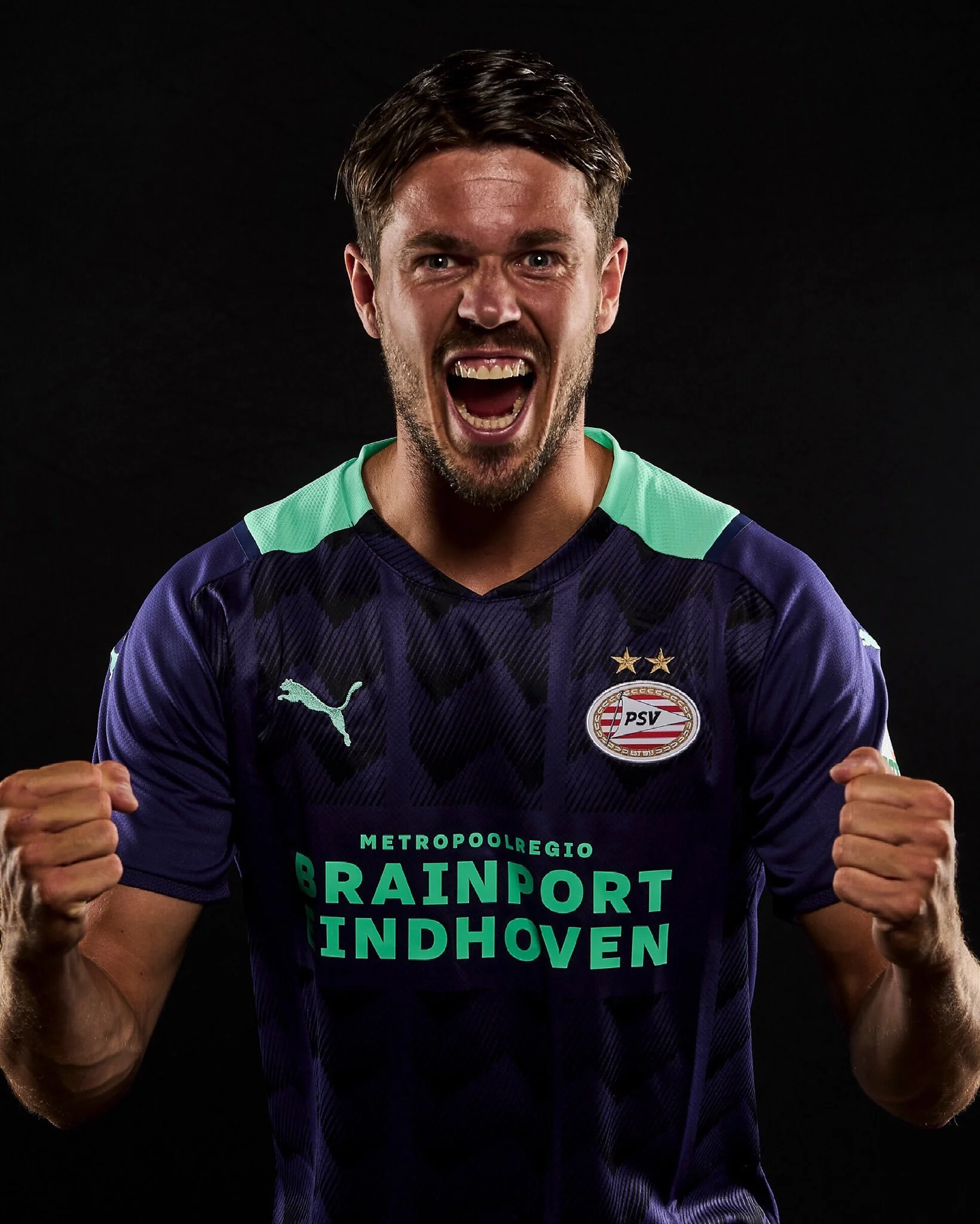
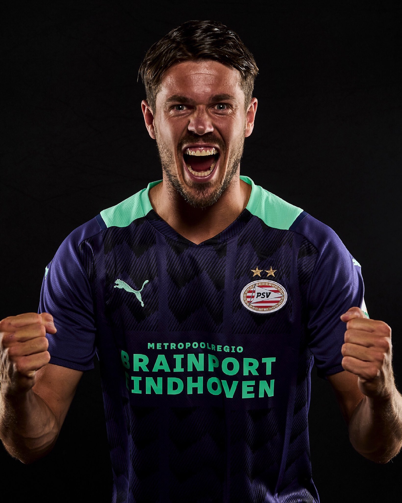
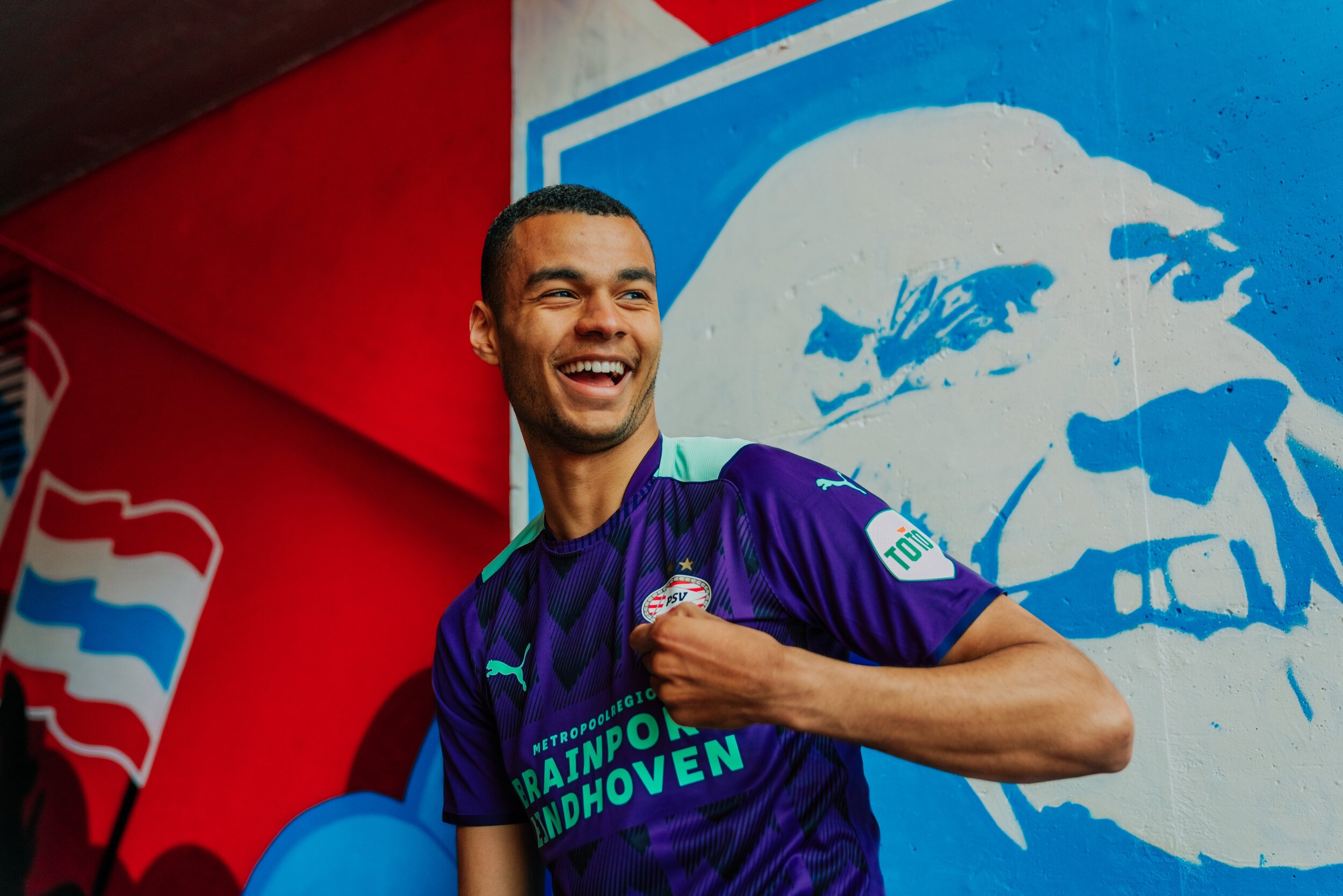
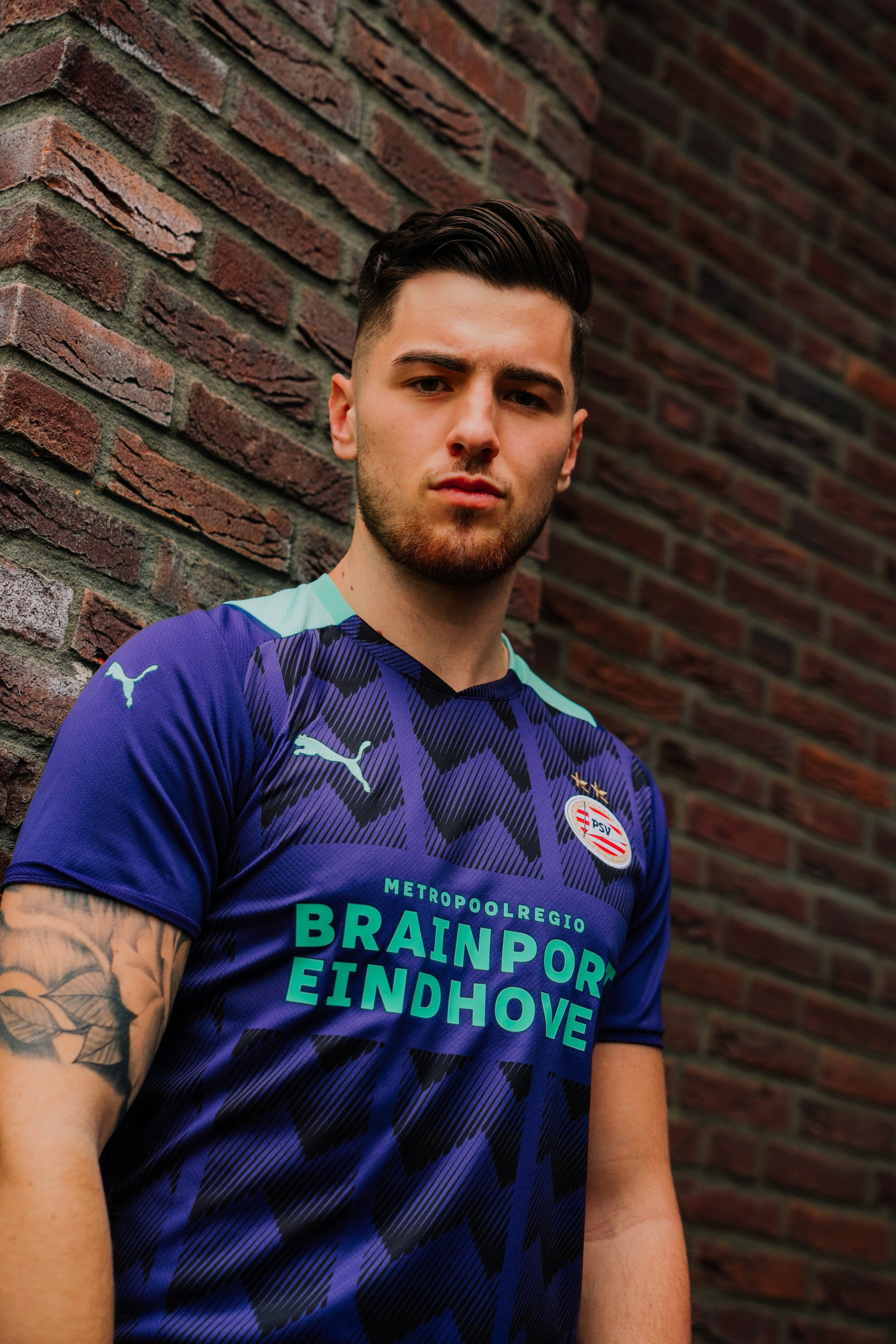
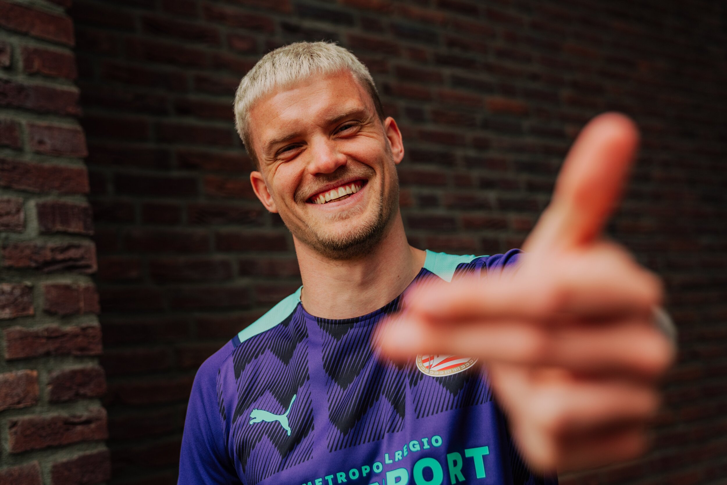
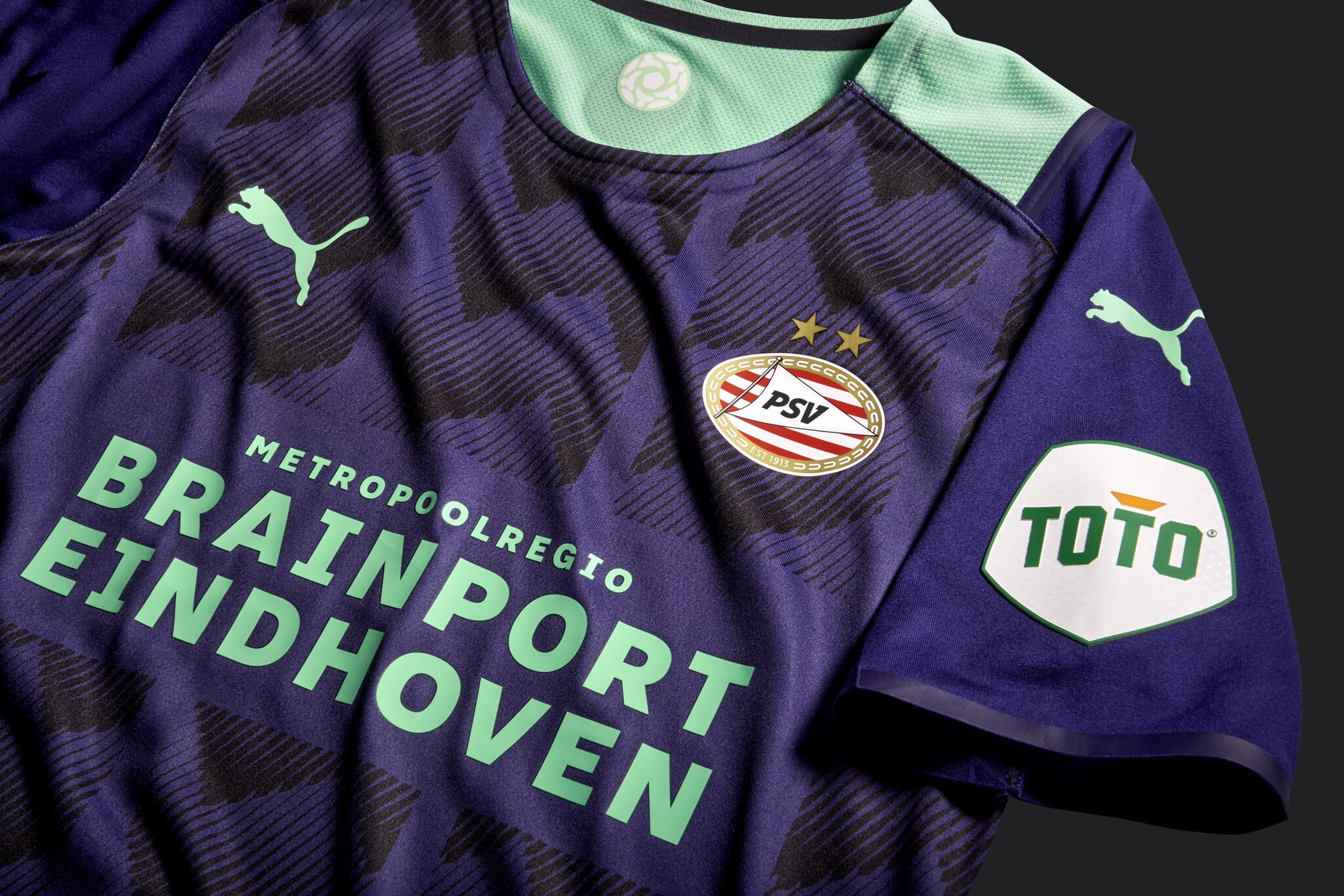
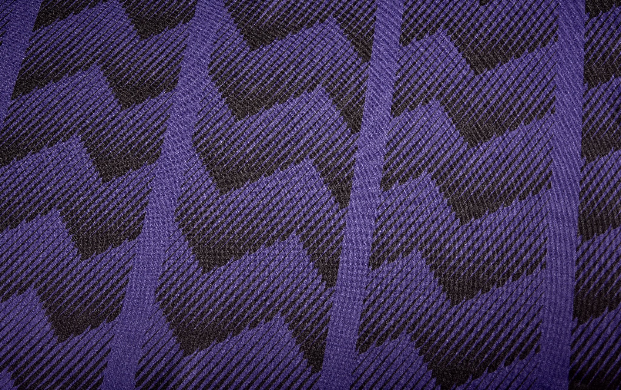
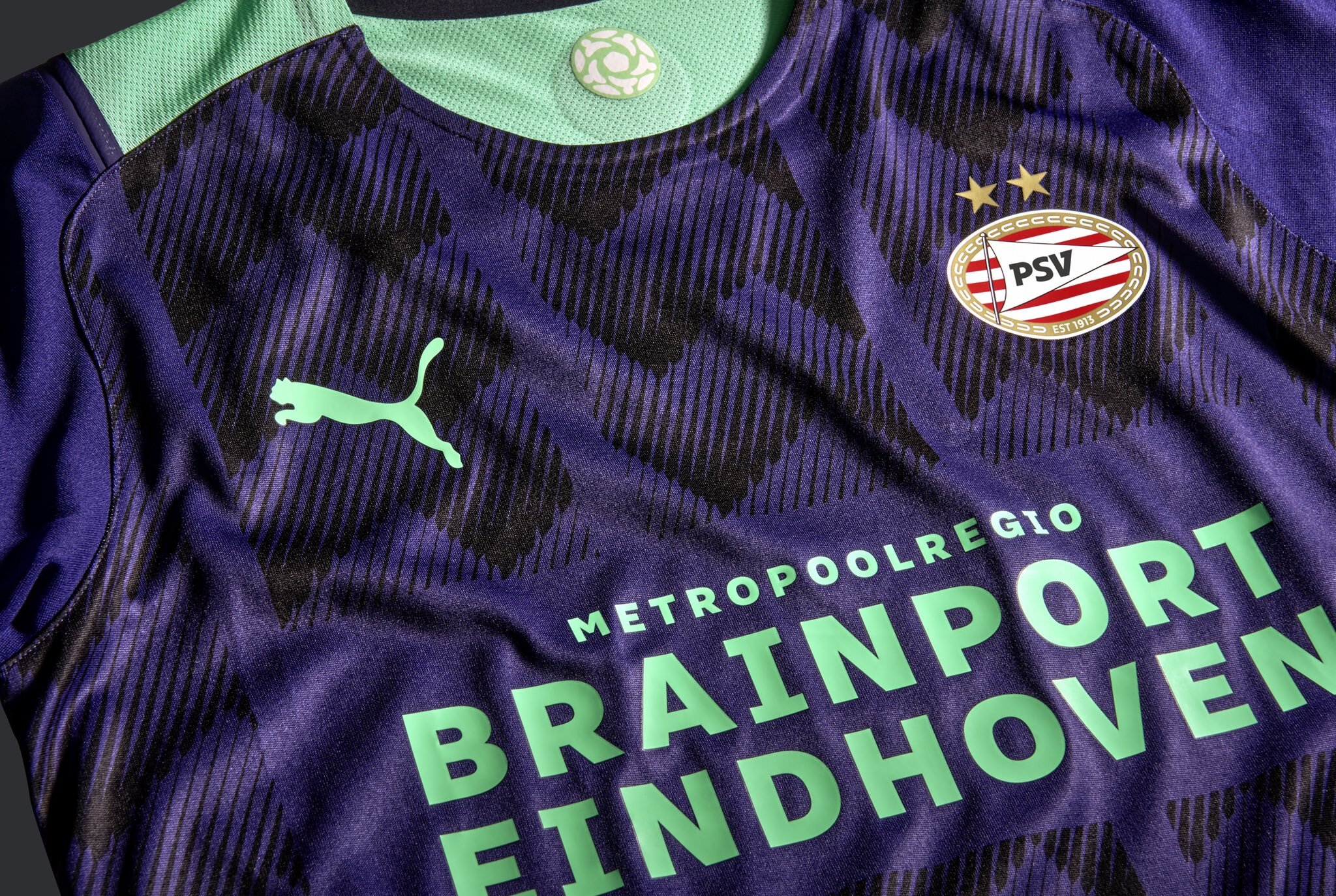
PSV has revealed their new 2021-22 away kit. The look is an unusual look coming in with a purple and green colorway, that is inspired by the 1990s and the club's foundation. The jersey features a subtle graphic that is inspired by the city flag. On the inner neck of the jersey the logo of the PSV foundation is seen.
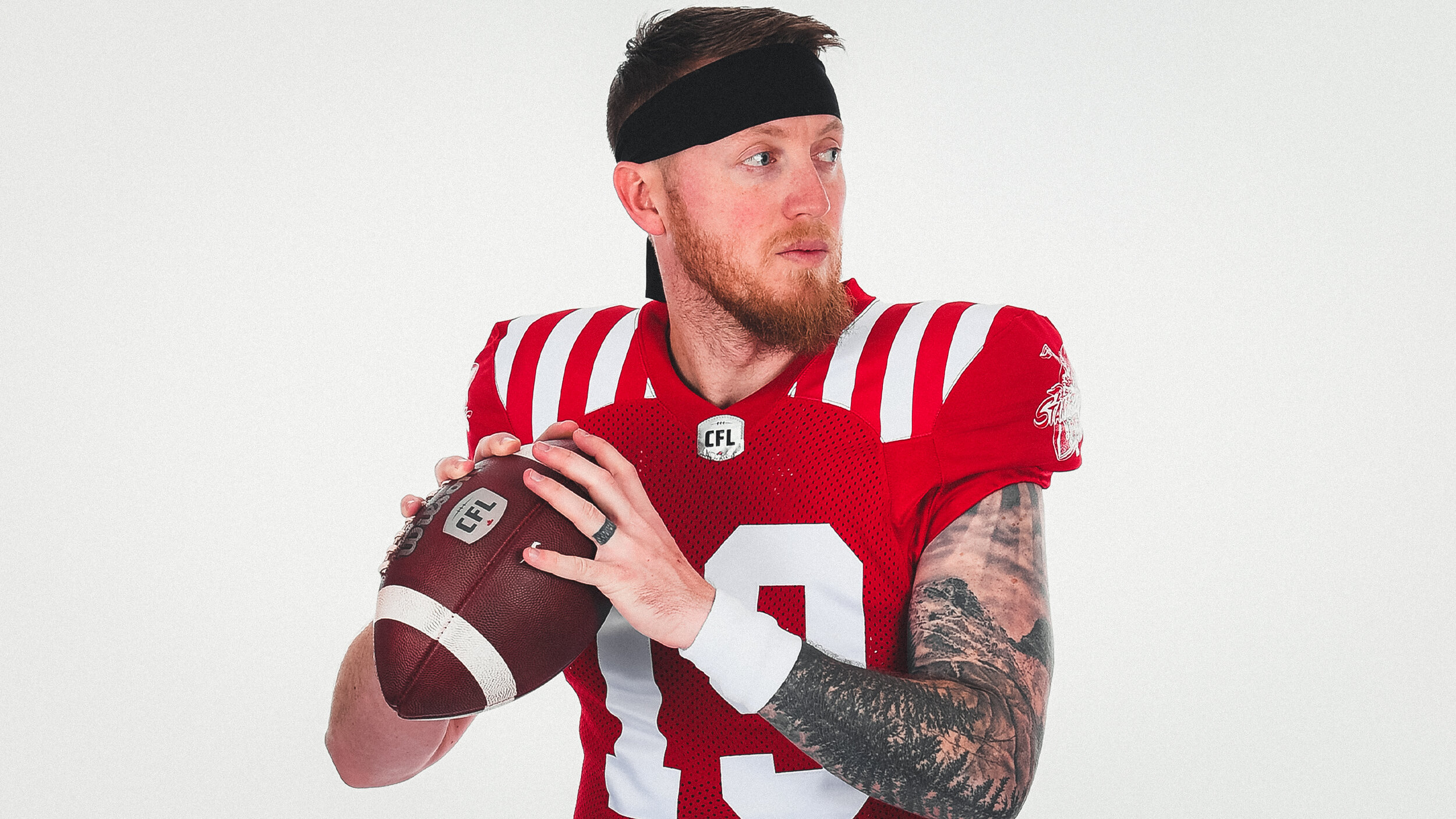
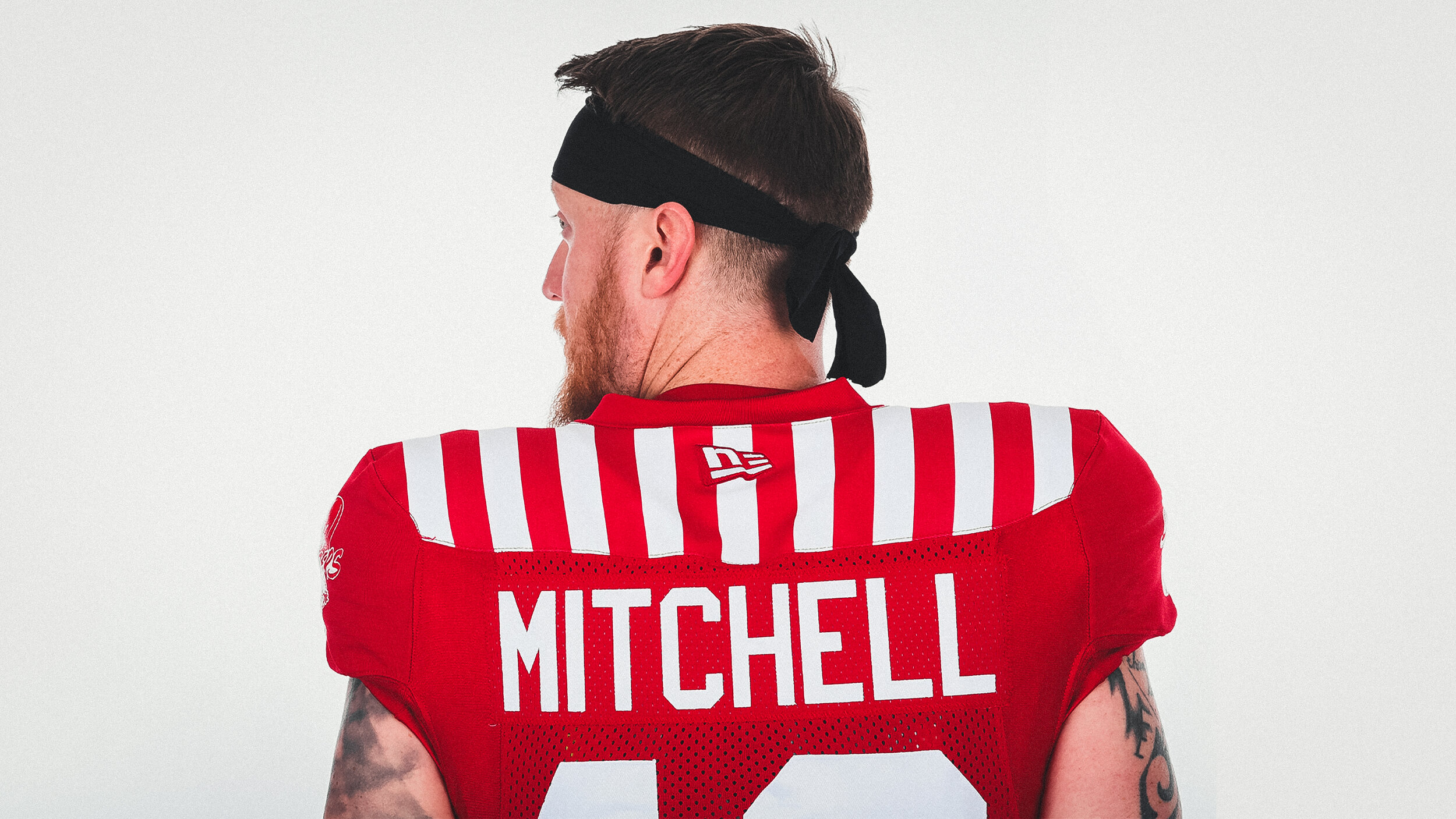
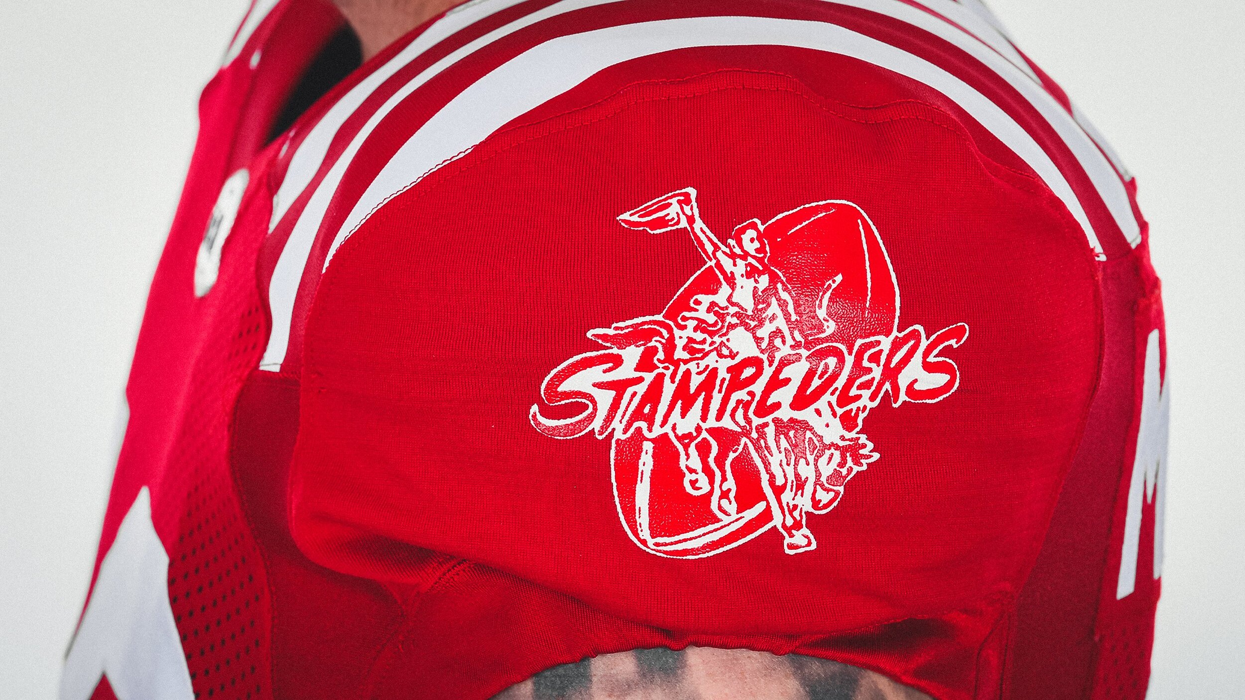
The CFL Calgary Stampeders are celebrating their 75th year. For the special season the Stampeders will have a special-edition retro uniform. The jersey is a modern take on the one that was worn from 1948-52 seasons, with red and white vertical striping on the shoulders as well as a classic number font. The finishing touch comes with the team’s retro logo that was featured from 1945-71 on display on both sleeves.
“As part of the celebrations of our 75th season, it’s fitting that were wearing jerseys inspired by the early Stampeders teams including the undefeated 1948 Grey Cup champions. These are the iconic jerseys that made the Stampeders the Red and White and were worn by legendary players including Keith Spaith, Normie Kwong and Sugarfoot Anderson. The unveiling of this jersey has been a long time coming and we have to take a moment to acknowledge the hard work of former Stampeders employee Jessica Littel in the early days of this project to help it come to life.”- Stampeders equipment manager George Hopkins
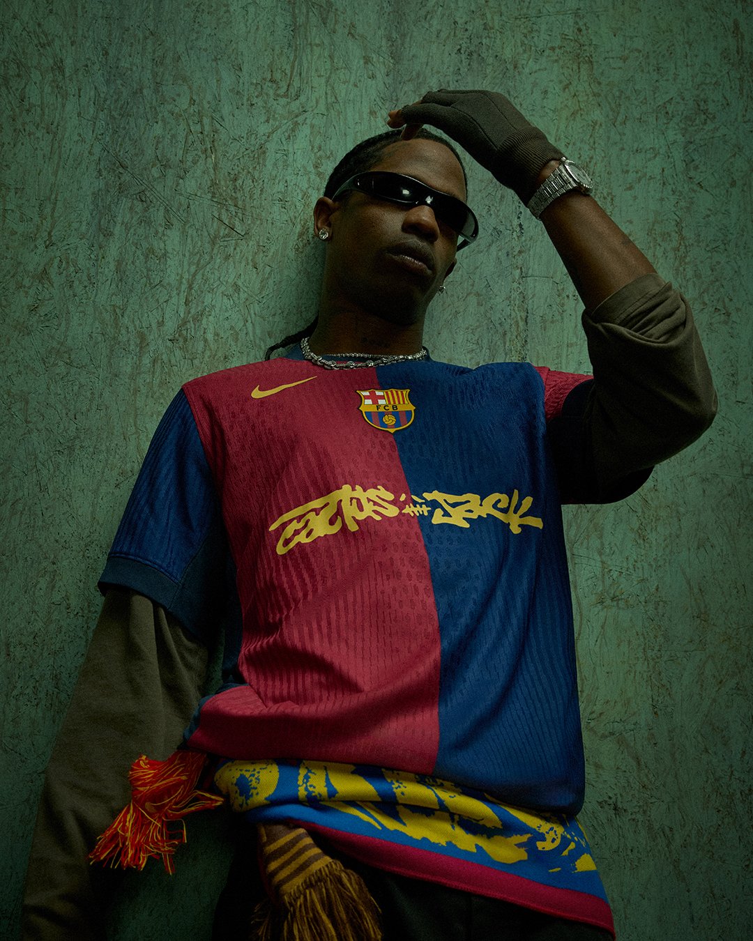
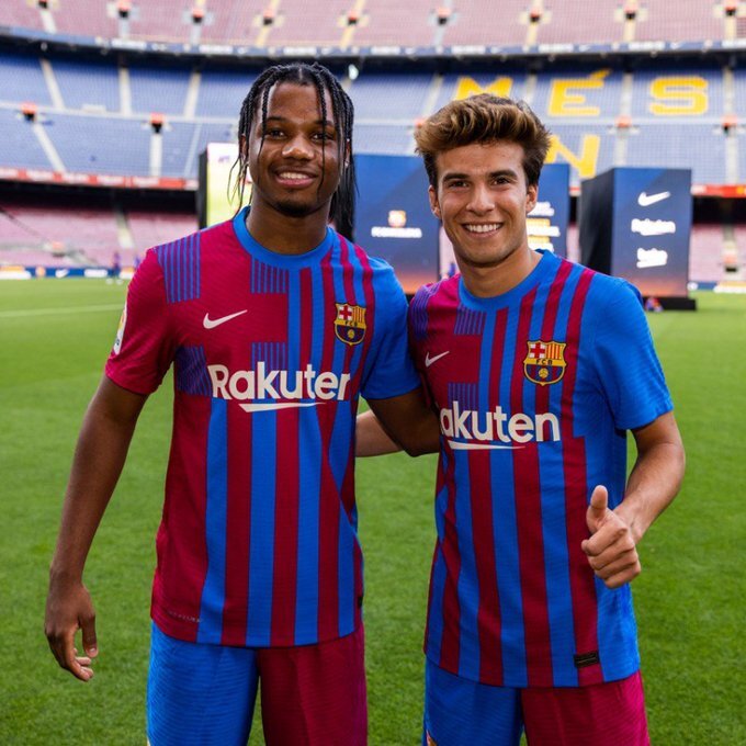
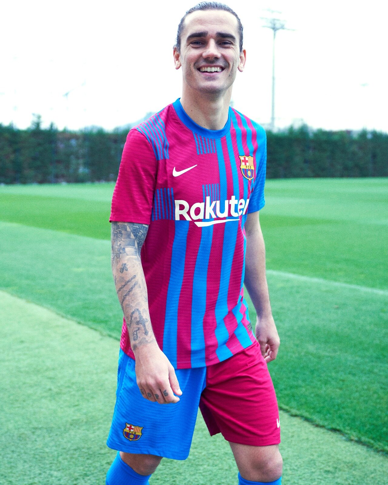
FC Barcelona has revealed their new 2021-22 home kit. The look brings a fresh perspective to the Blaugrana identity with a new design that has reimagined the iconic stripe layout. The shorts for the kit will be half blue and half garnet that will be paired with matching striped socks. The back of the jersey’s neck was inspired by the club’s Senyera heritage that has been modified from red stripes over a yellow base.
“The fans have taken me as their own since I joined and it's amazing to see a jersey which captures the identity and values of such a wonderful club.” -Midfielder Frenkie De Jong
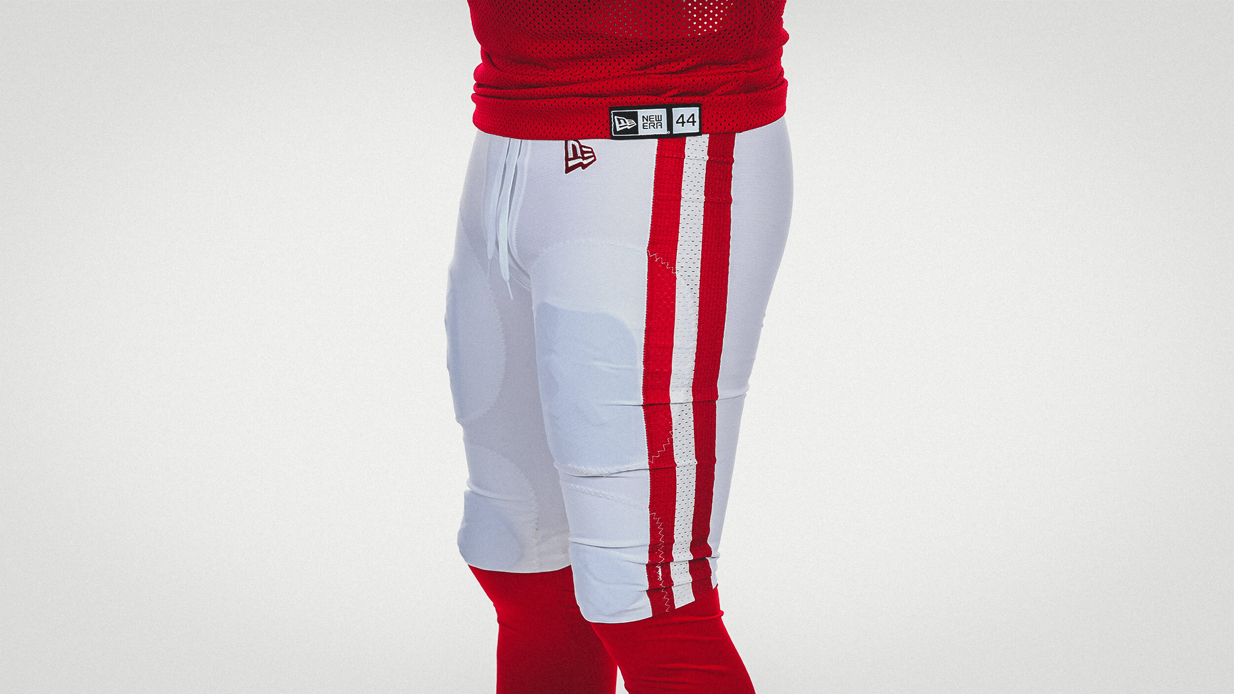
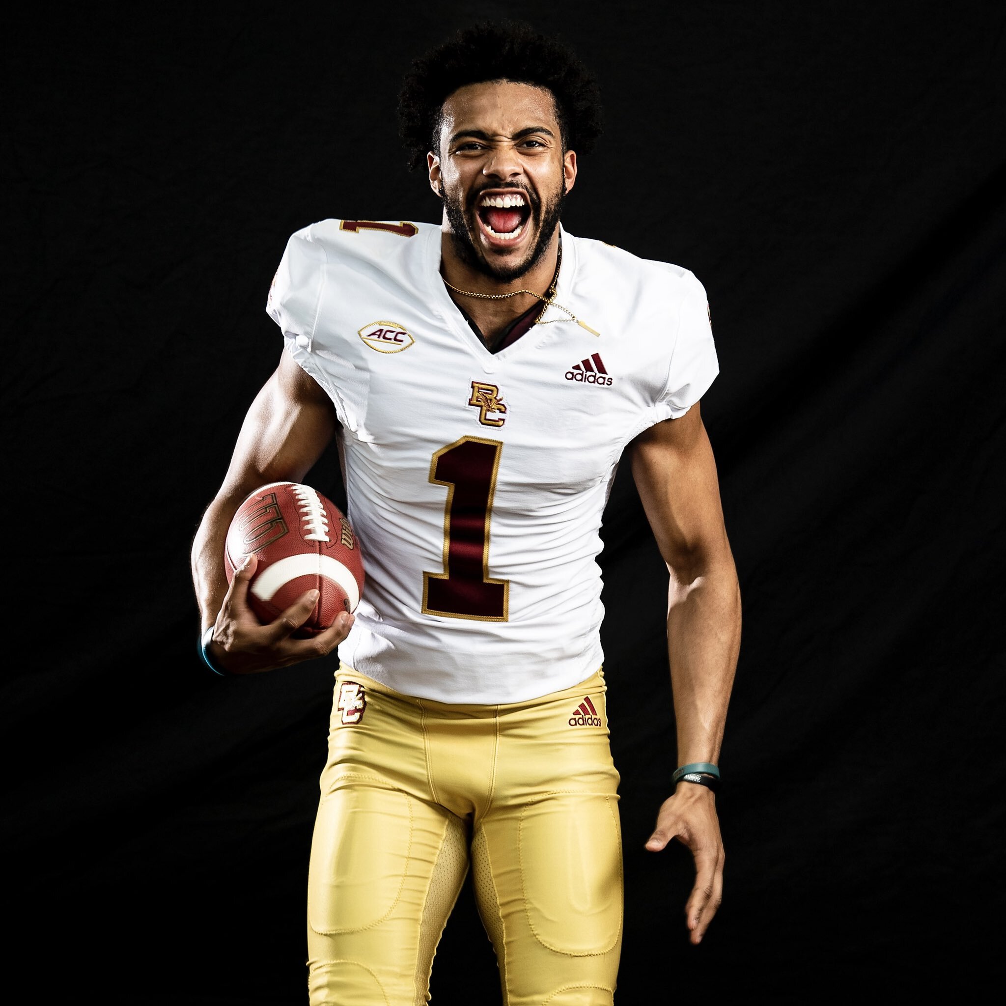
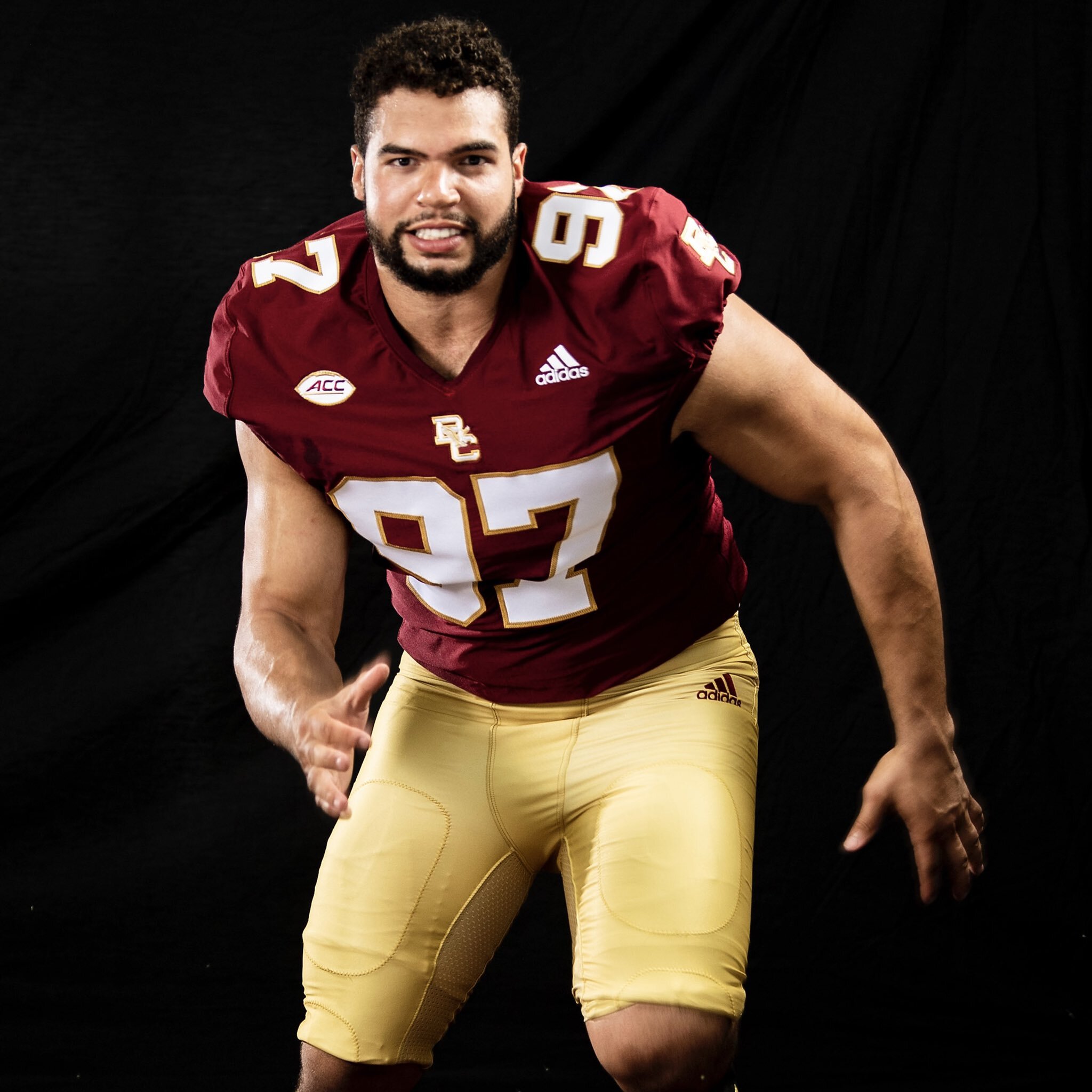
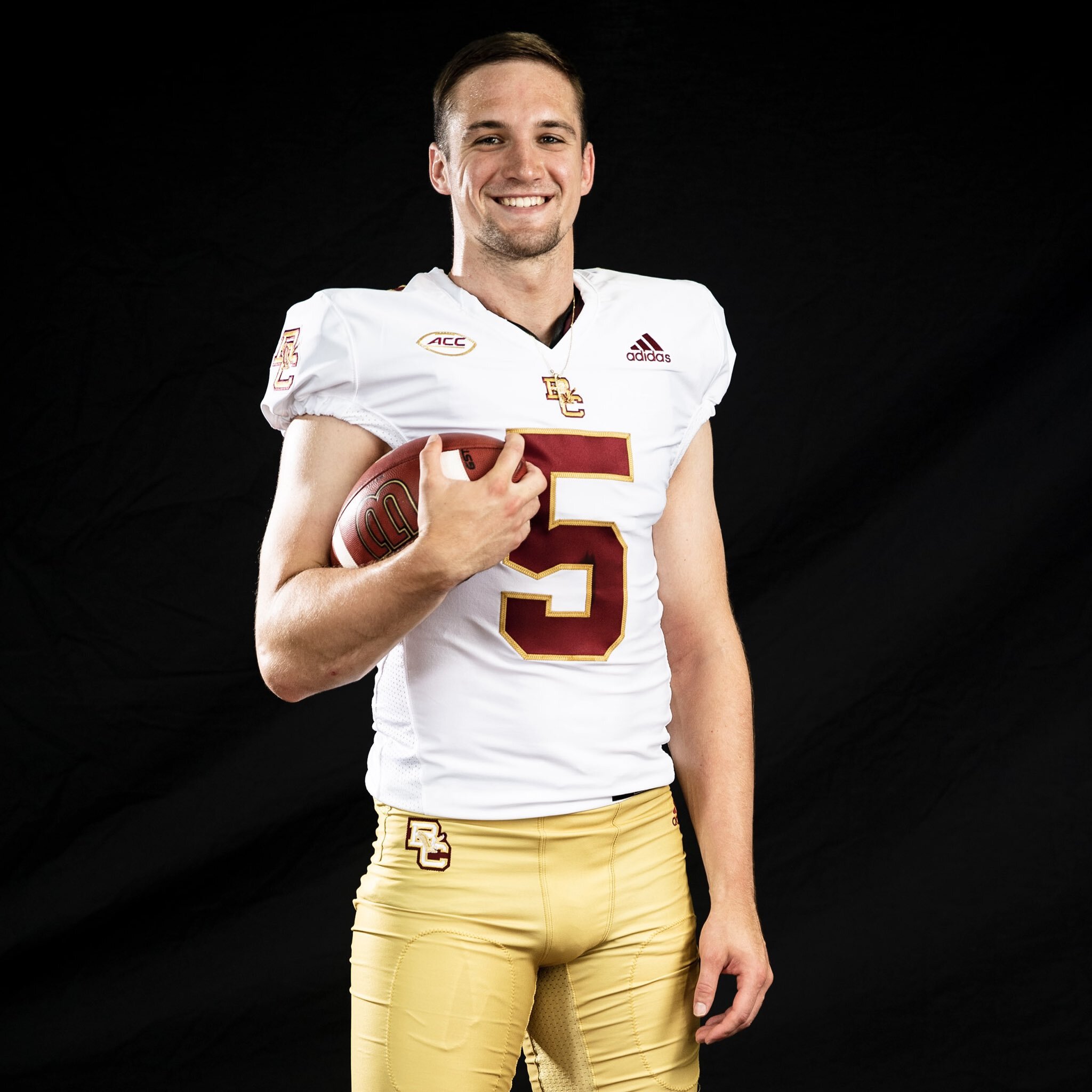
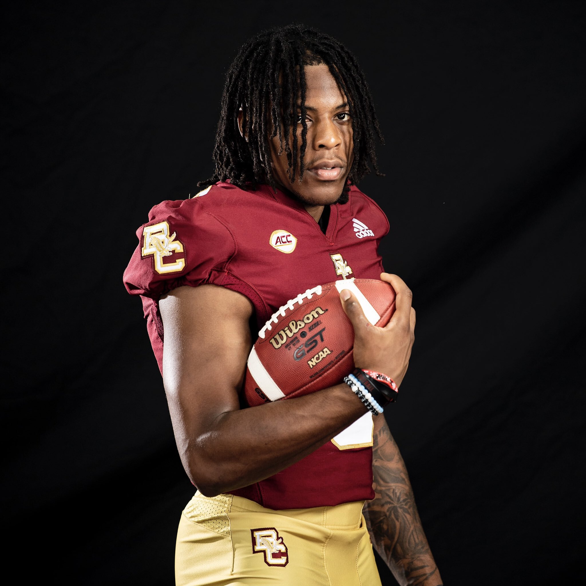
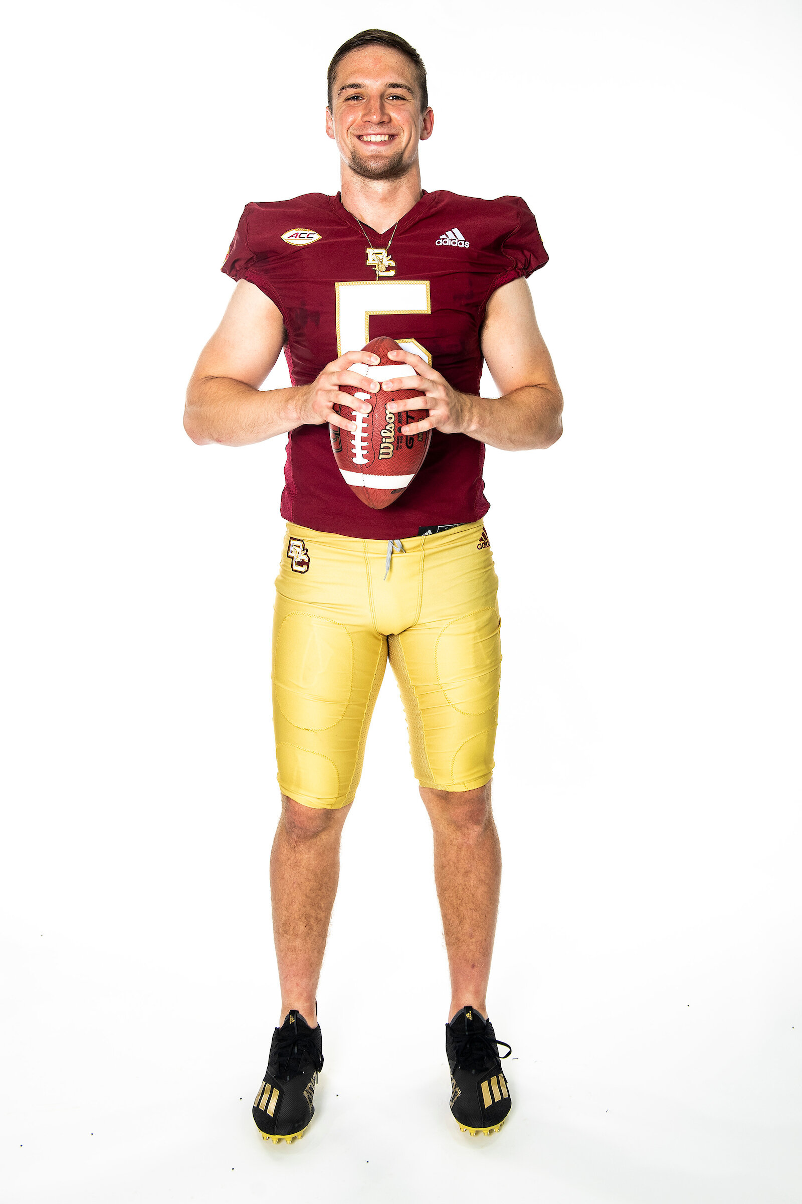
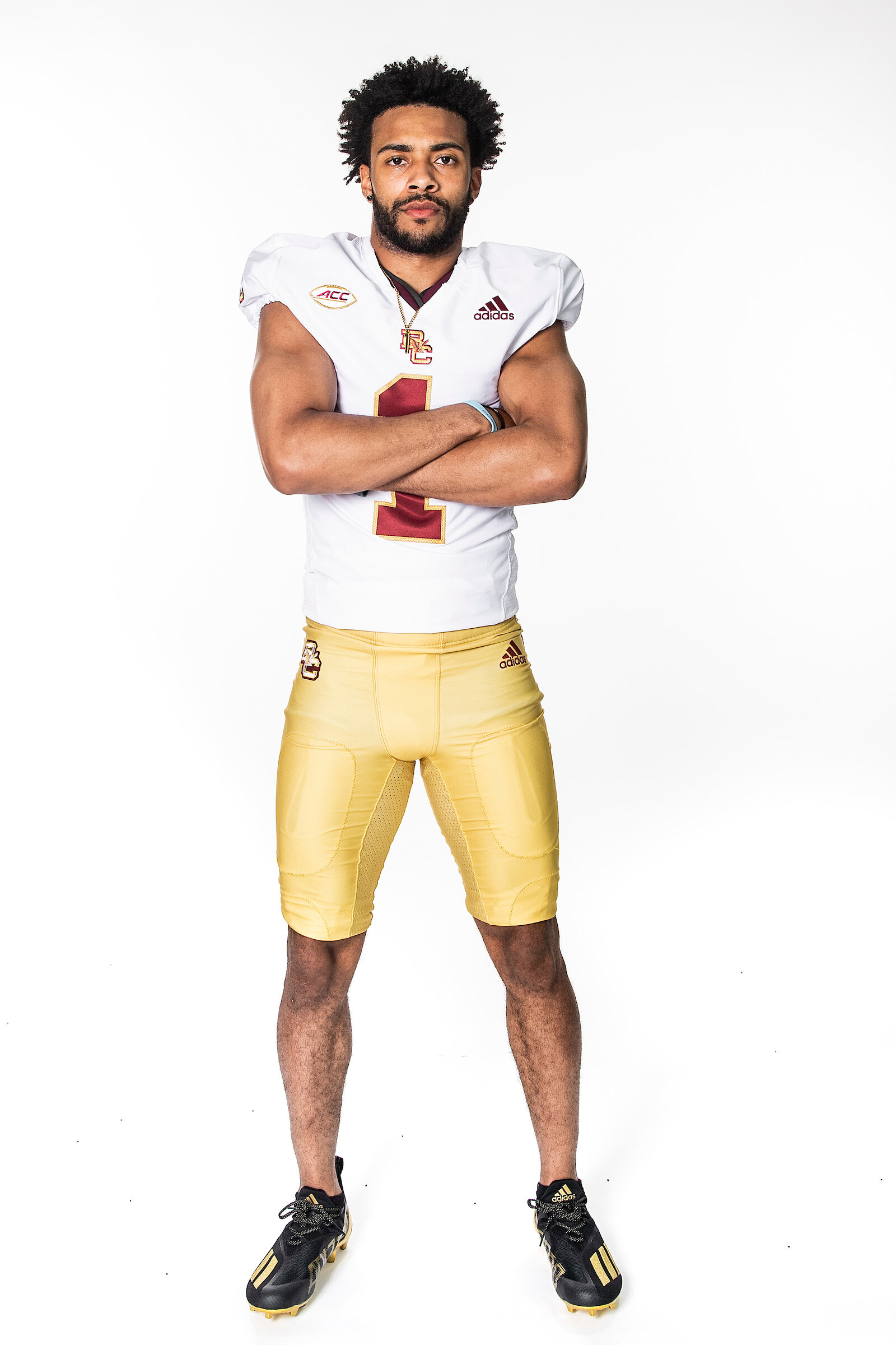
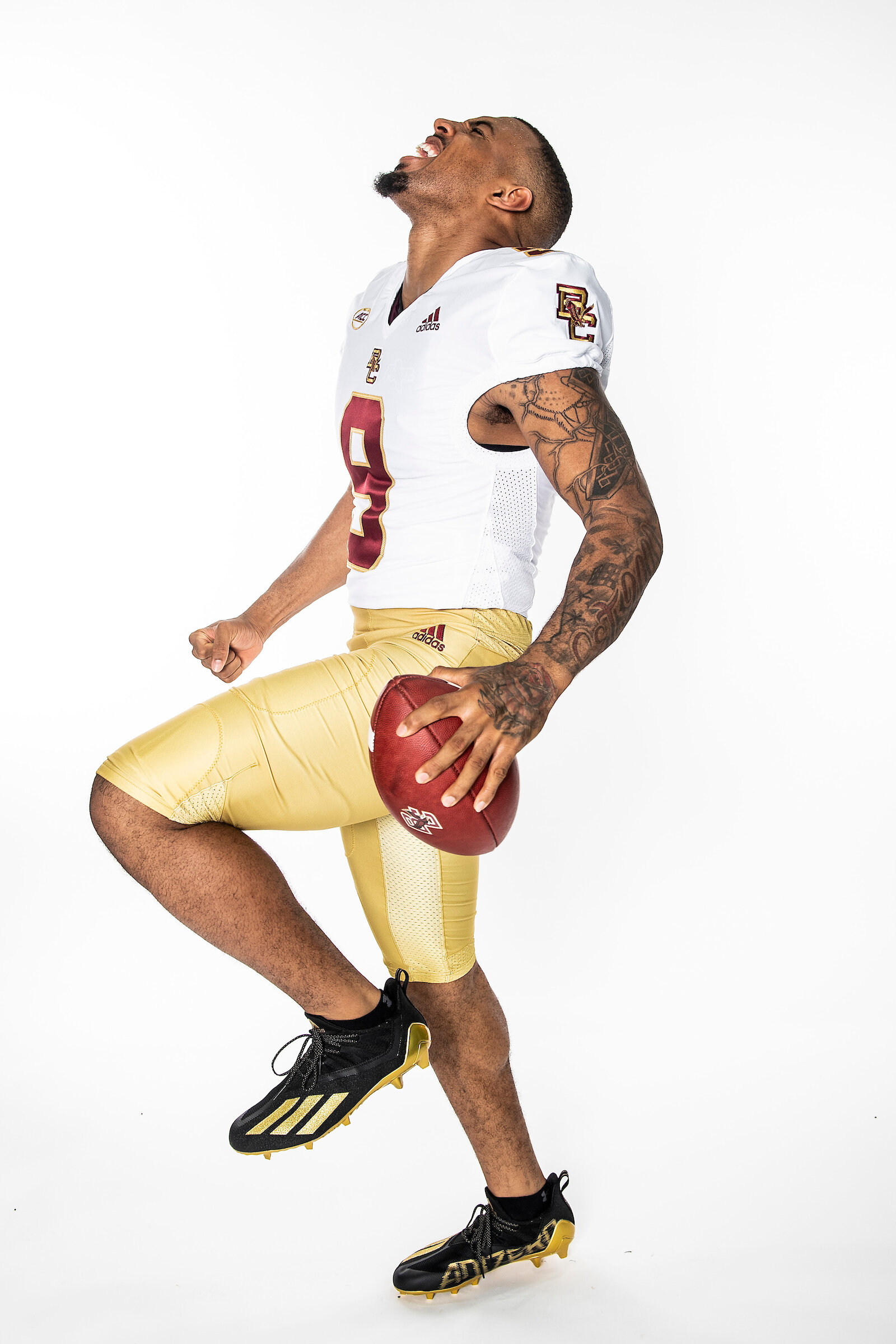
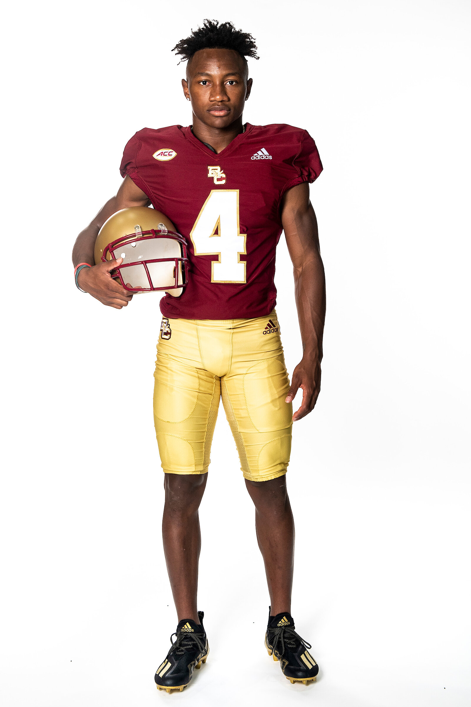
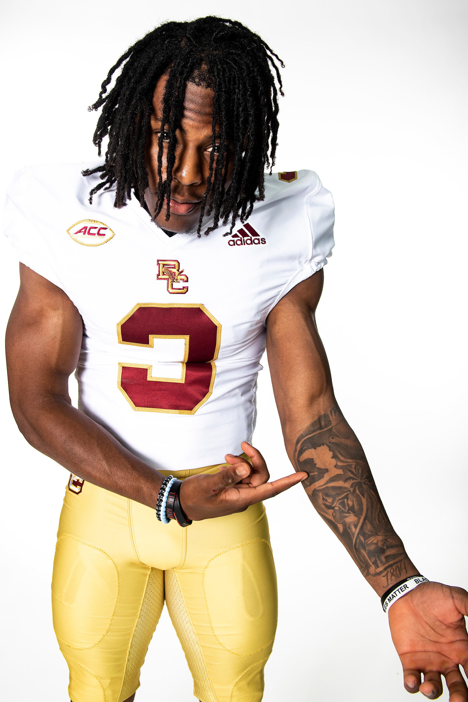
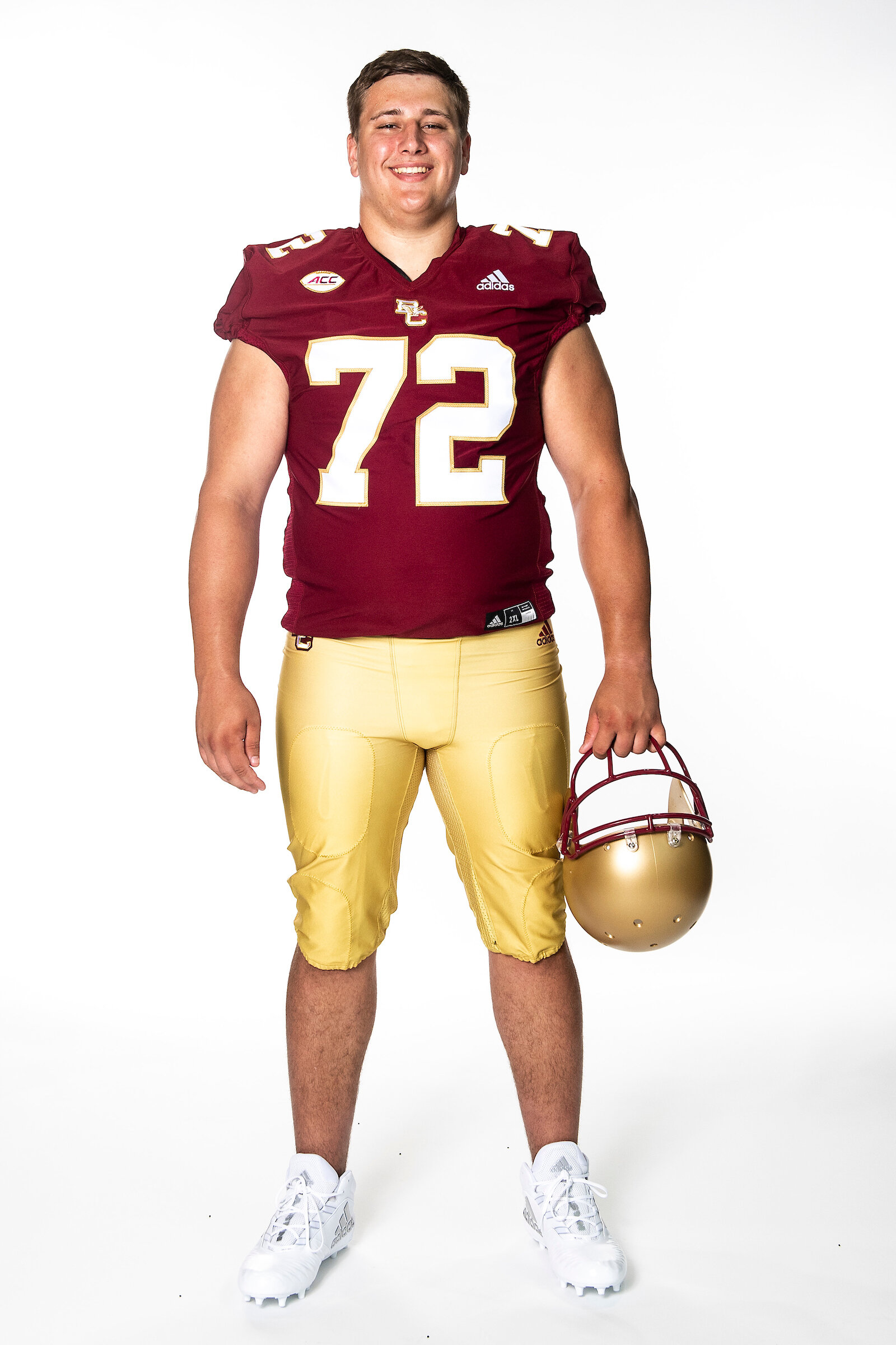
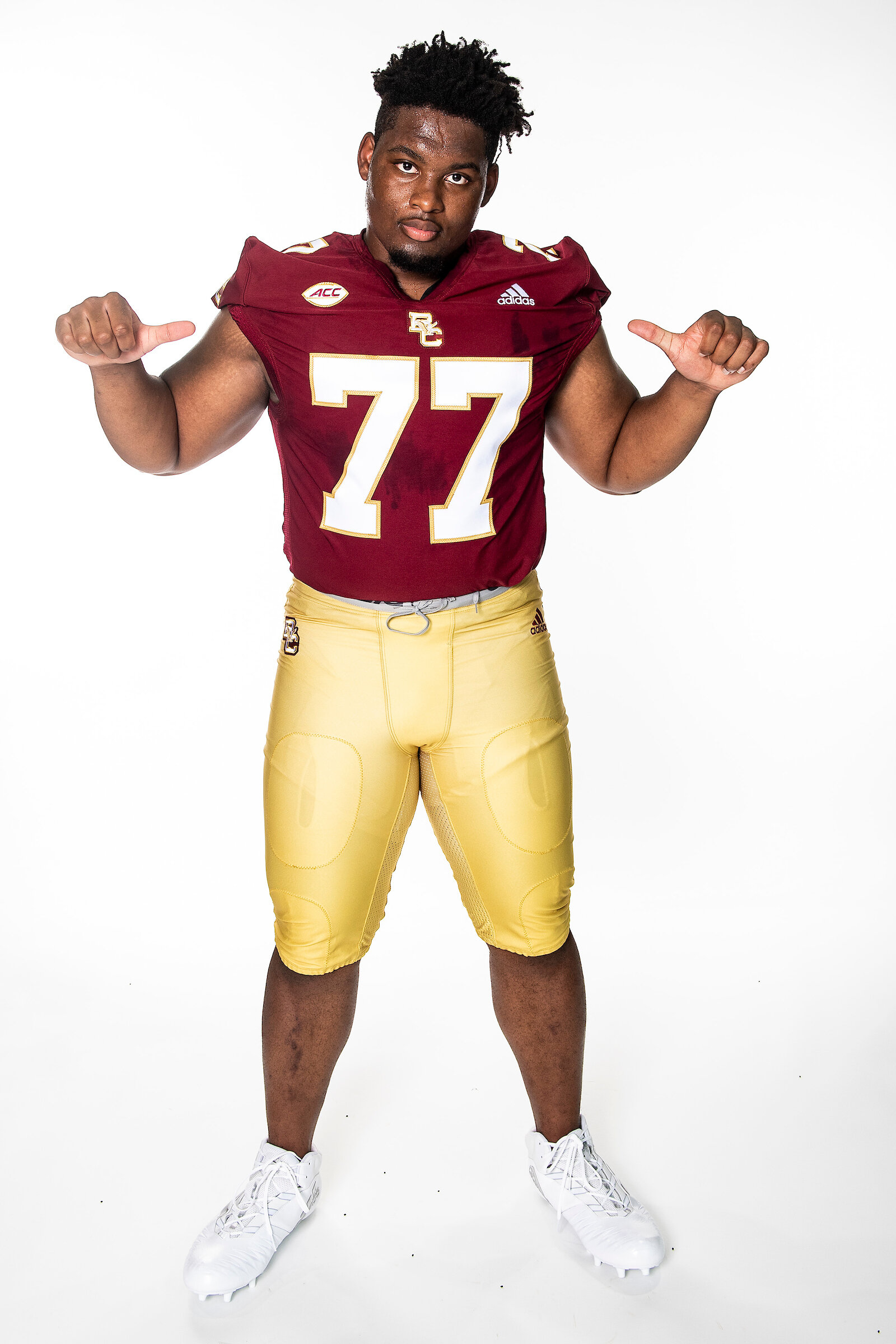
Boston College recently announced a new apparel deal leaving long time partner, Under Armour, for a new deal with Adidas for the football team and New Balance for the rest of their sports. The new football uniforms will please the BC fan base as they feature the old school block BC logo and are a clean retro look. The team revealed their white and maroon jerseys that are highlighted with large bold numbers. The BC logo is found on the front of the jersey as well as on the sleeves and hip of the pants. The tops of the shoulders will have the players numbers. Both jerseys have been paired with the iconic BC gold pants.
“This is an exciting partnership with Adidas and one that will truly benefit our student-athletes. In choosing Adidas, we were able to join forces with a global brand that is one of the leaders in football footwear, apparel and accessories. Our student-athletes will be outfitted with more footwear and apparel than ever before with this new partnership.” - Director of Athletics Pat Kraft
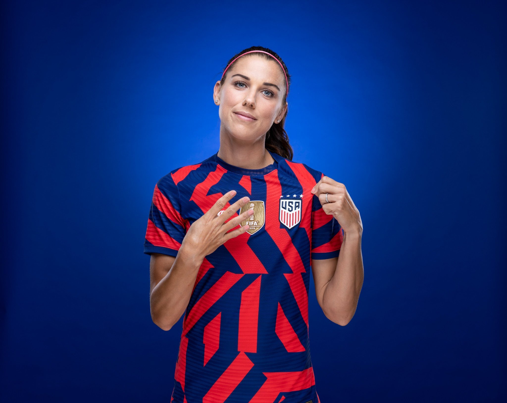
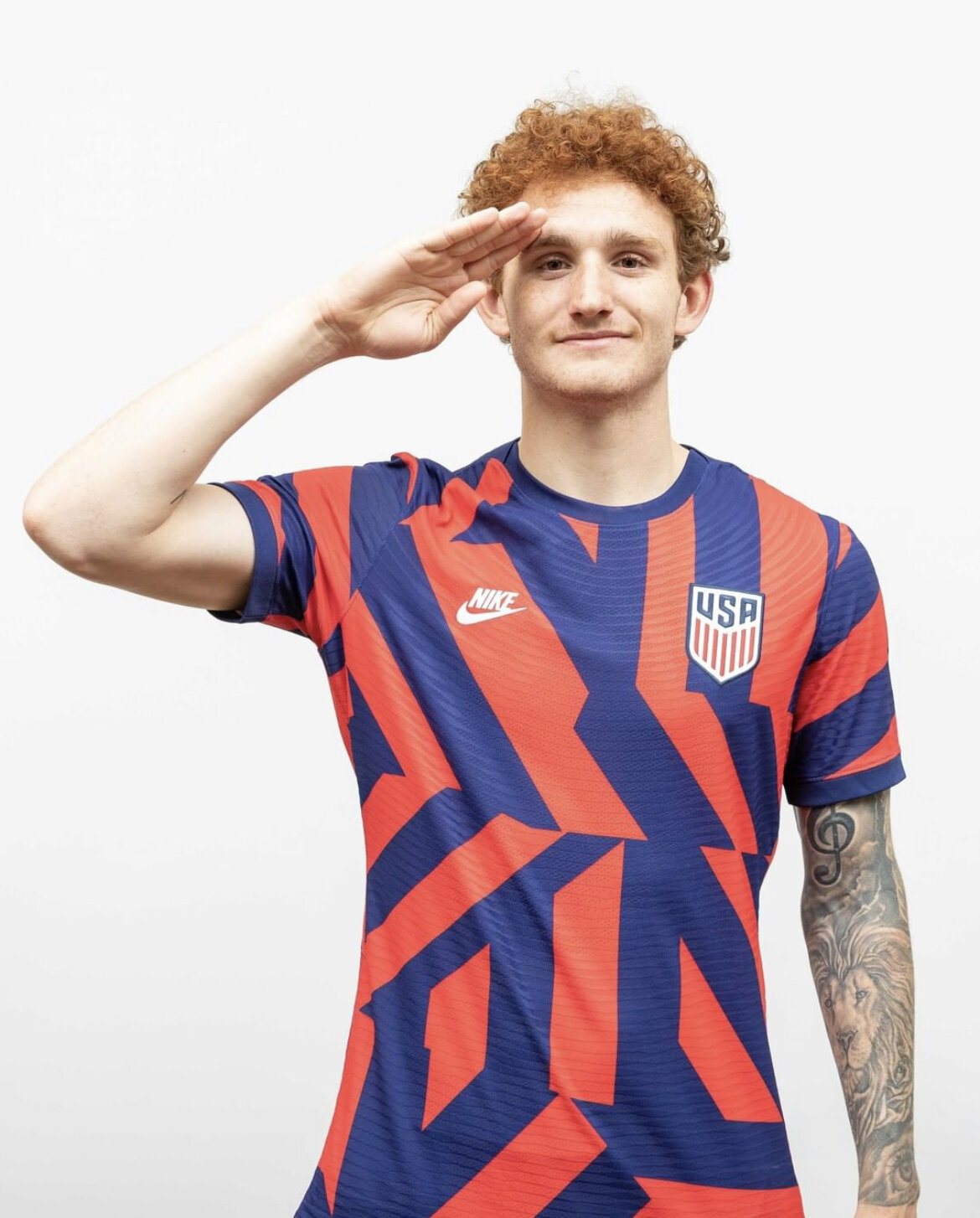
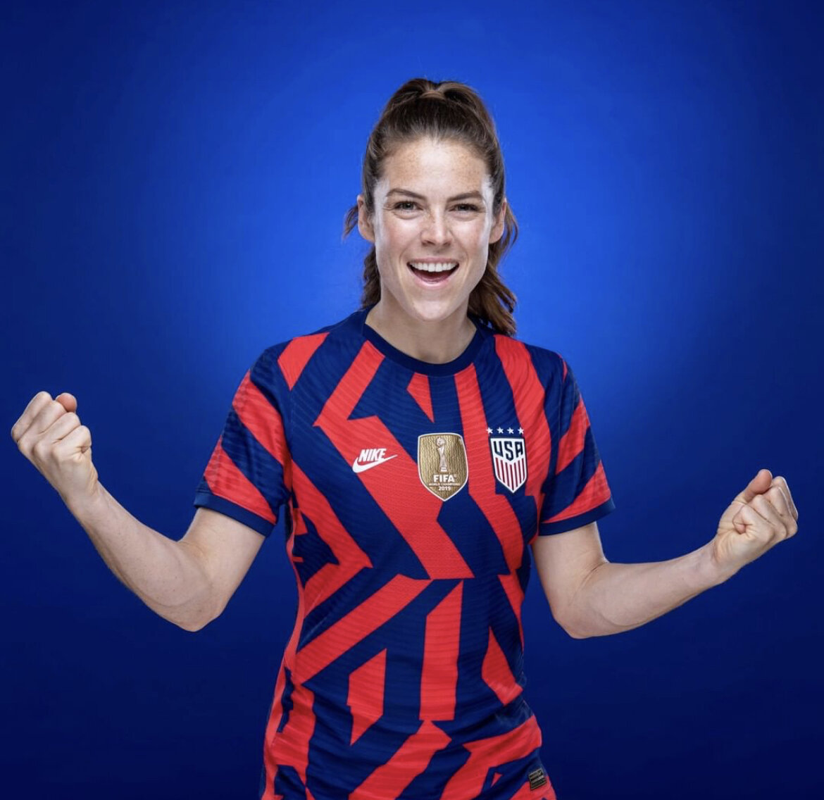
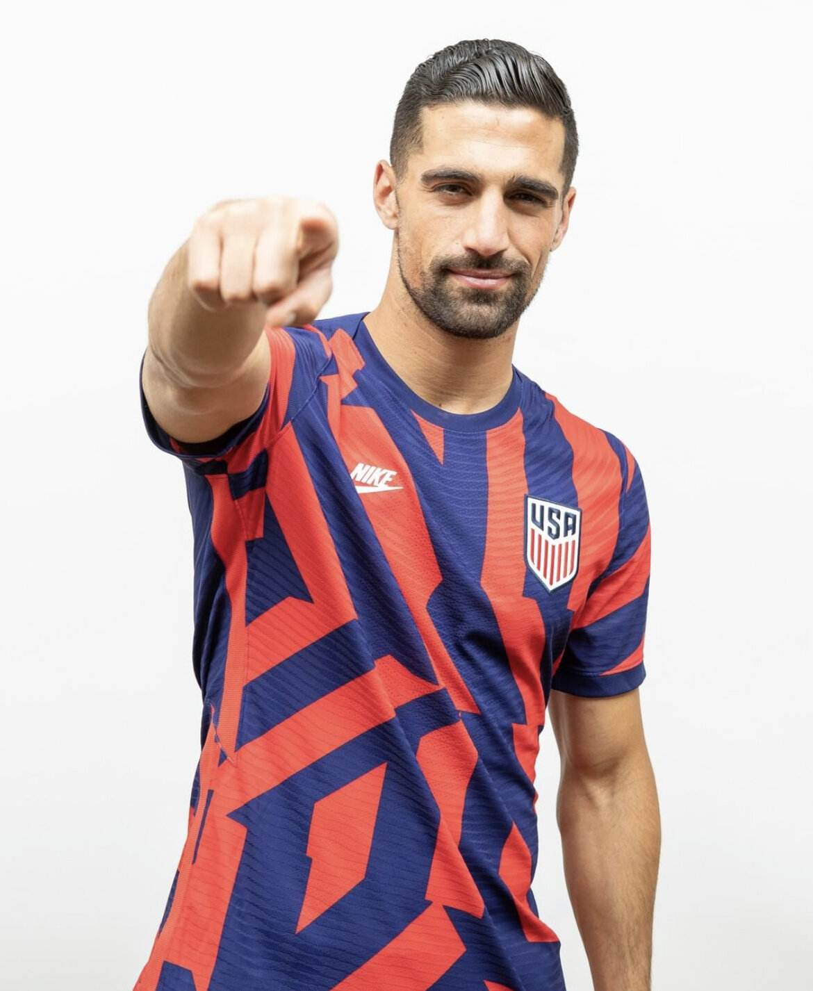
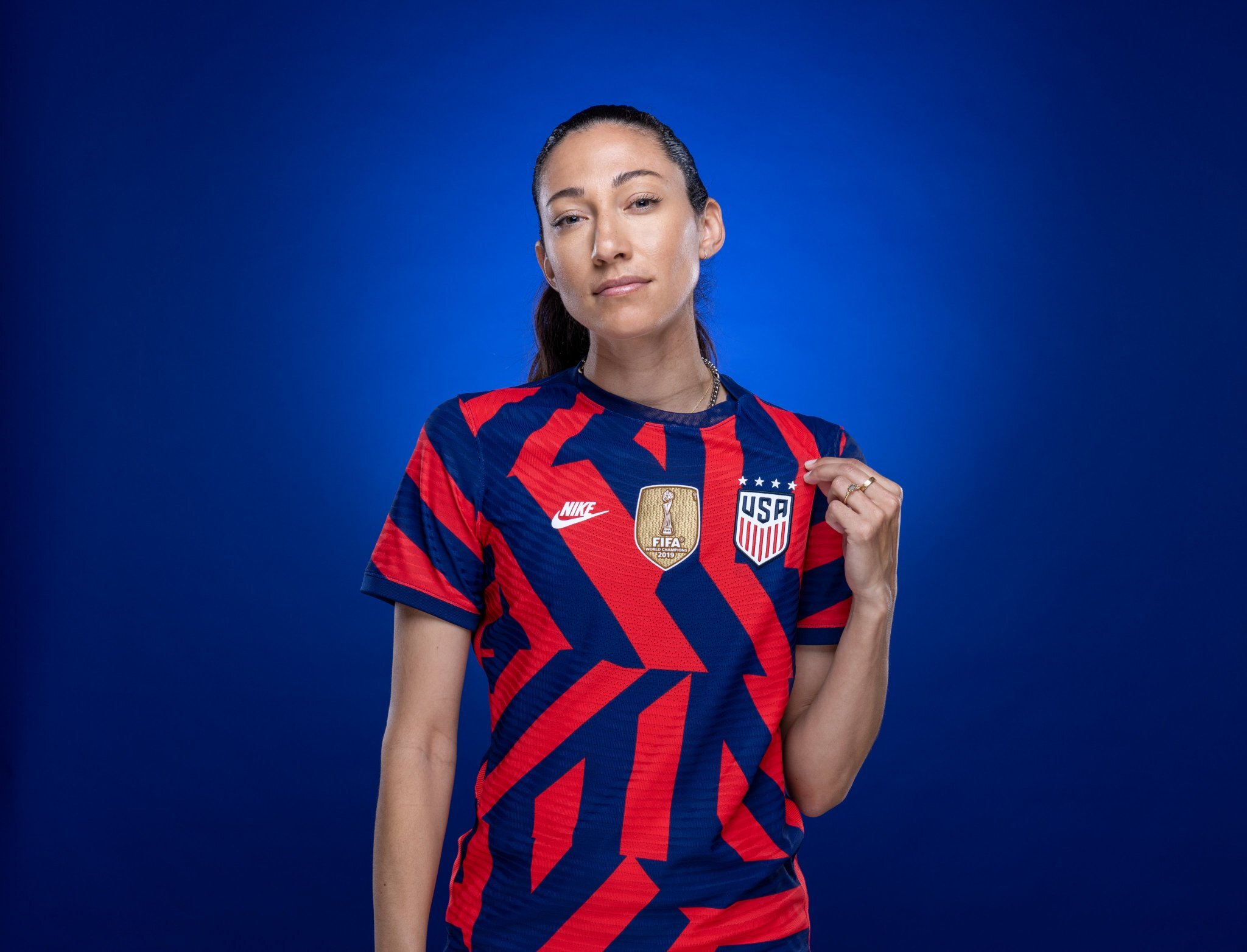
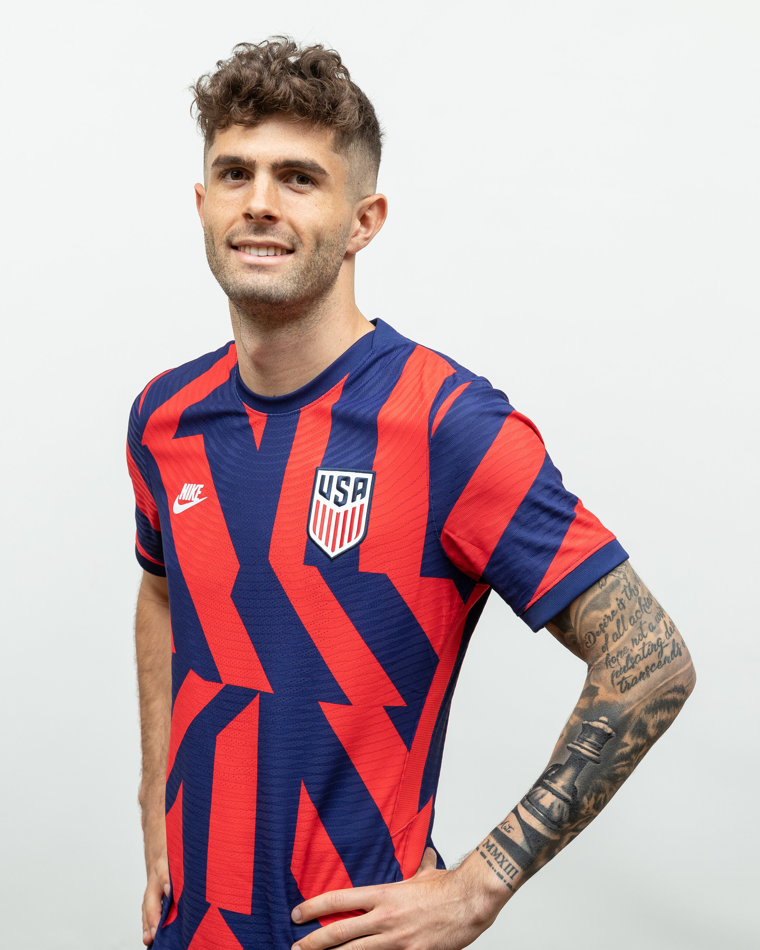
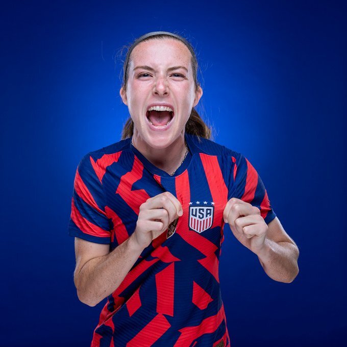
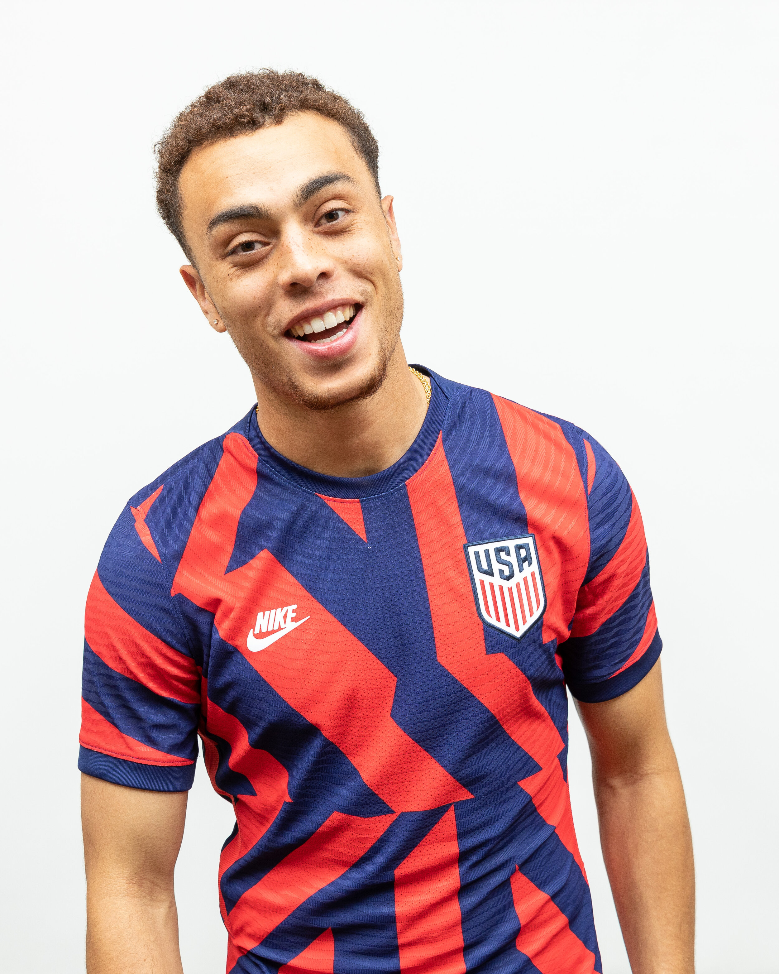
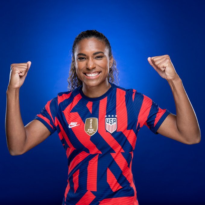
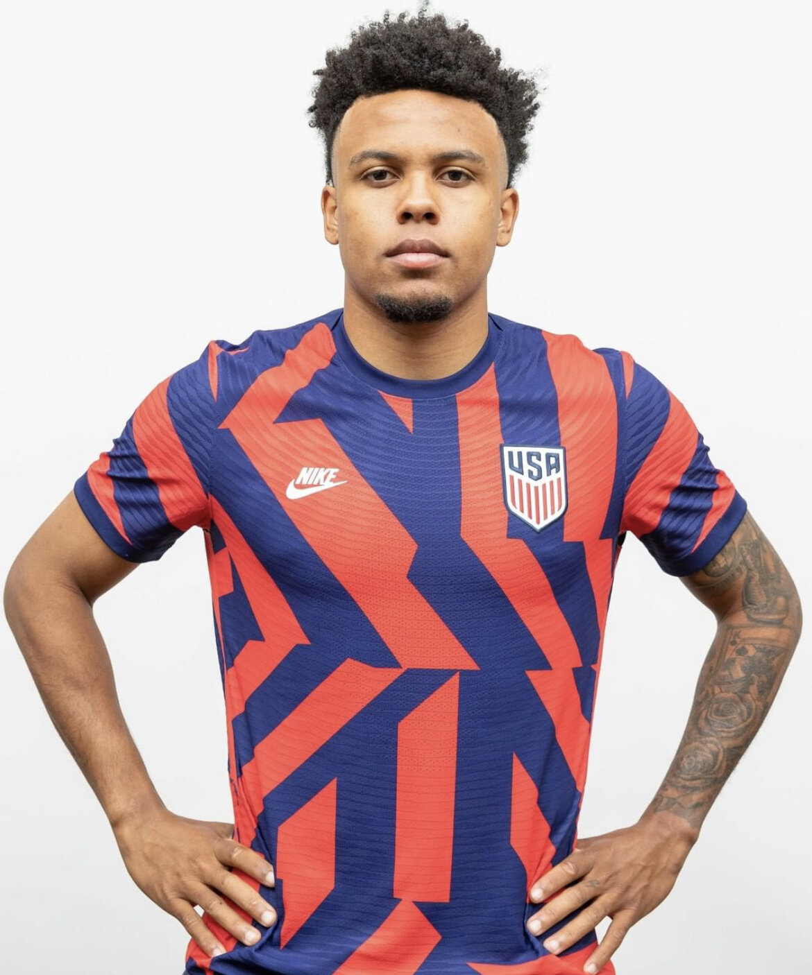
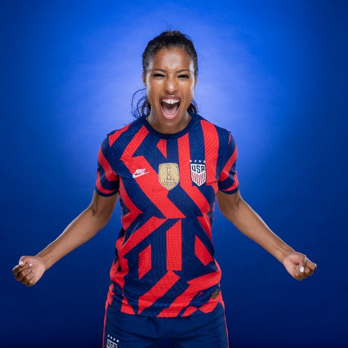
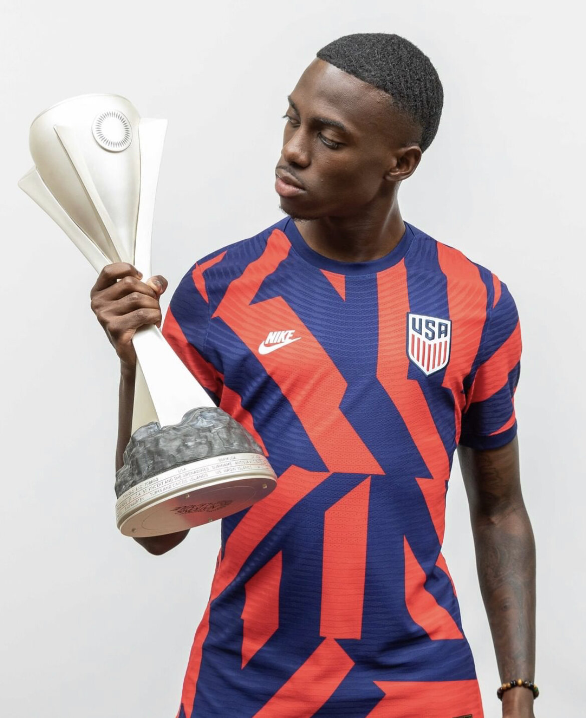
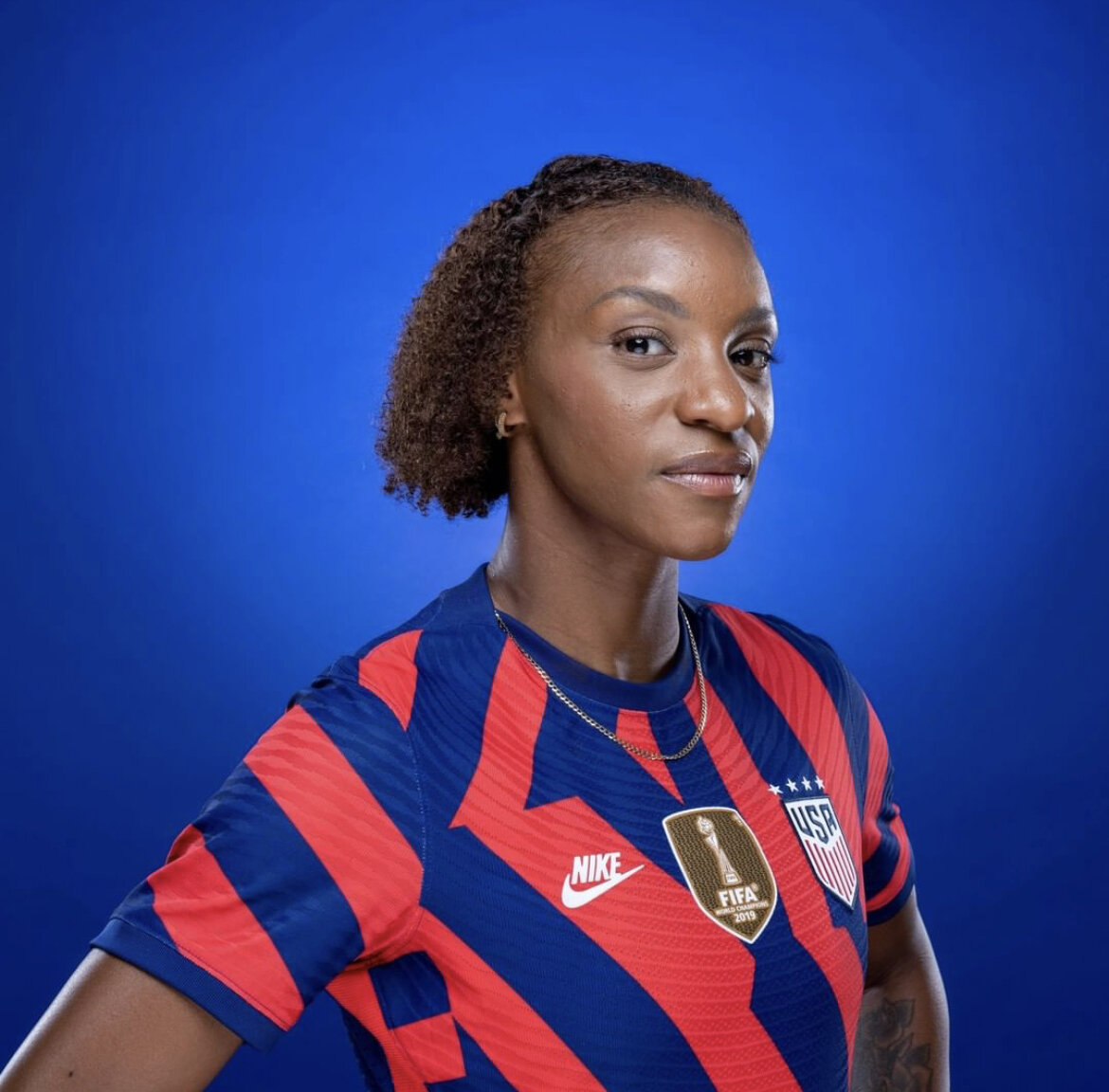
The US National Teams have revealed their new 2021 away kits. Both men’s and women’s national team will wear the same jersey that introduces a new bold and eye-catching design in red and blue. The look is finished off with navy shorts and striped socks for both USMNT & USWNT.
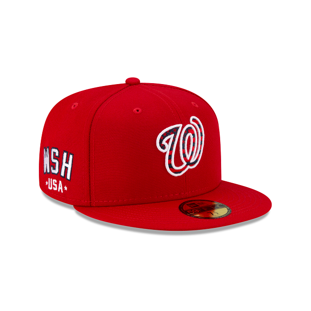
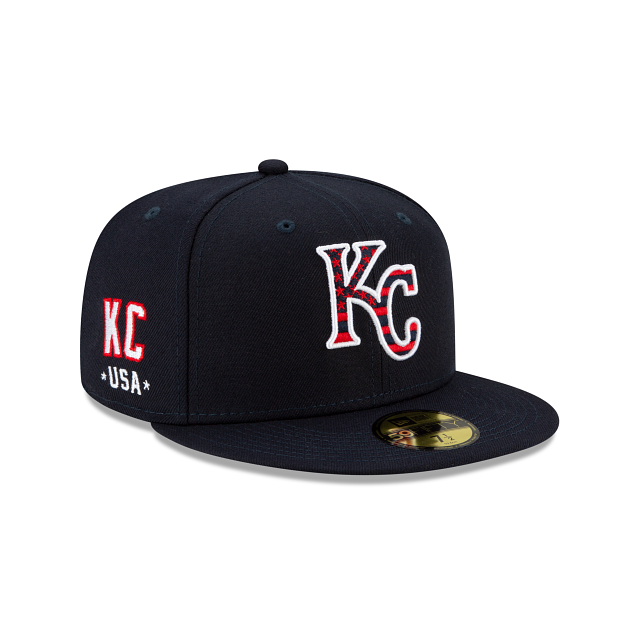
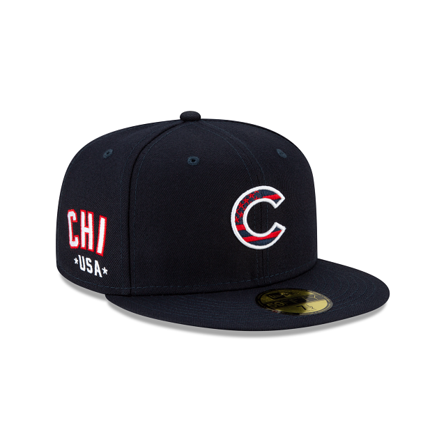
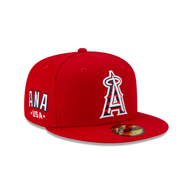
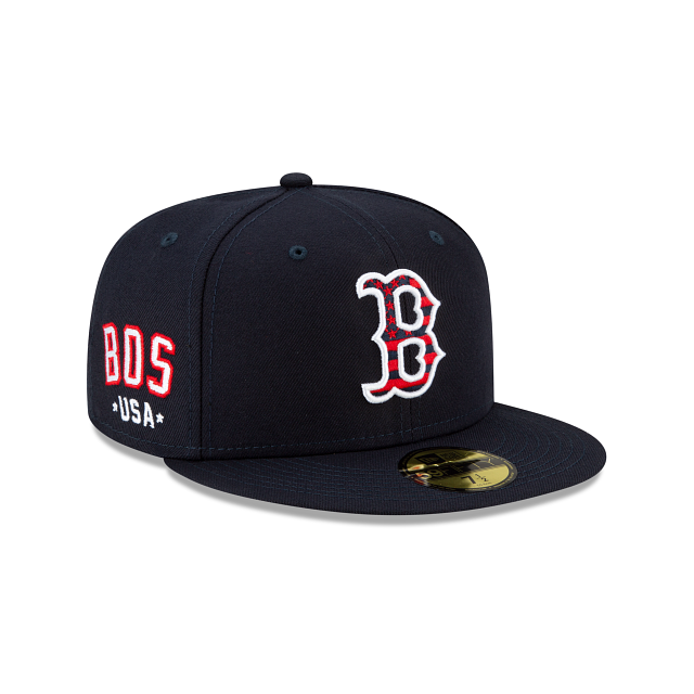
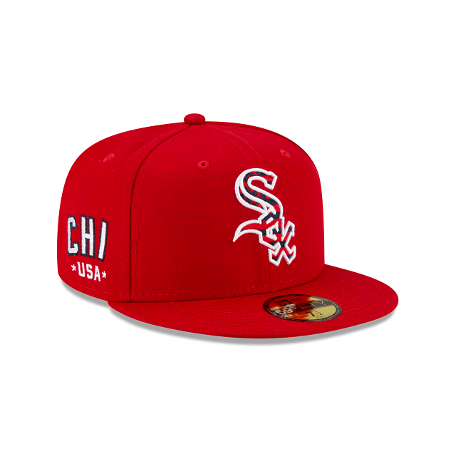
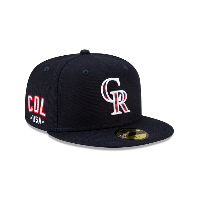
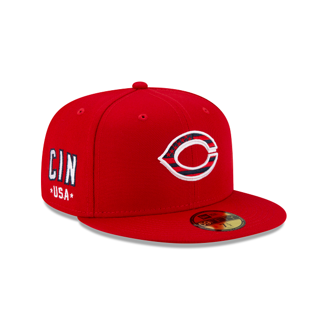
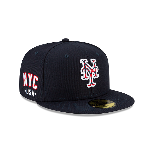
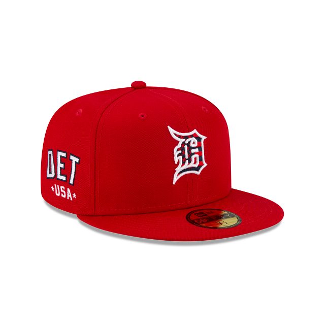
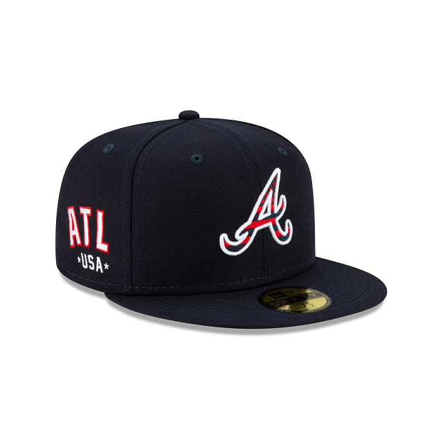
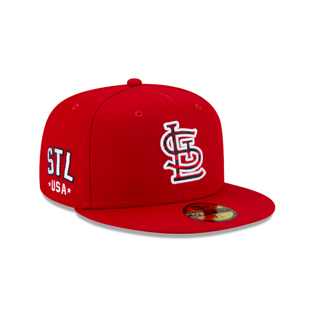
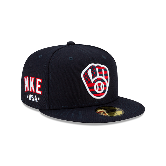
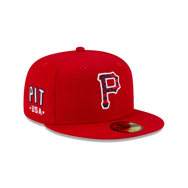
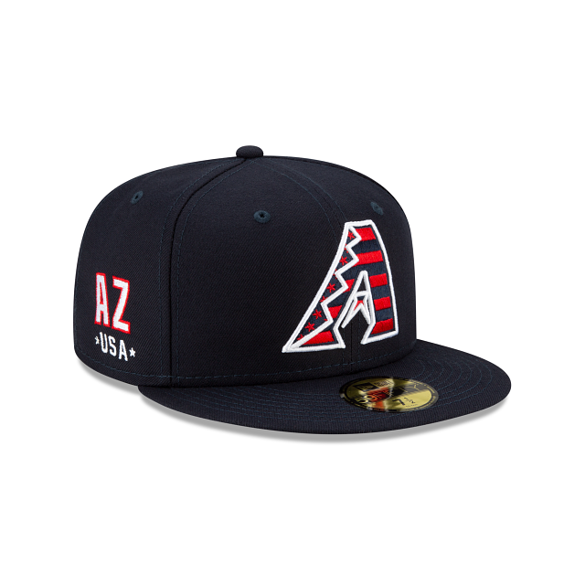
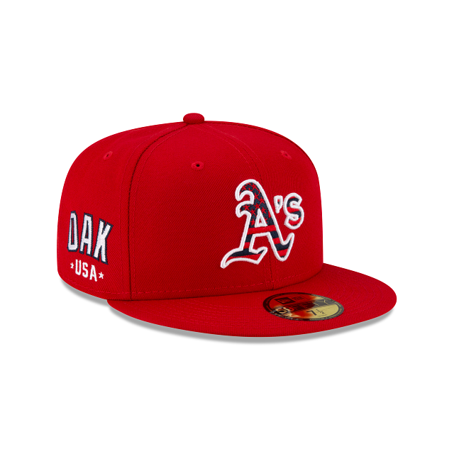
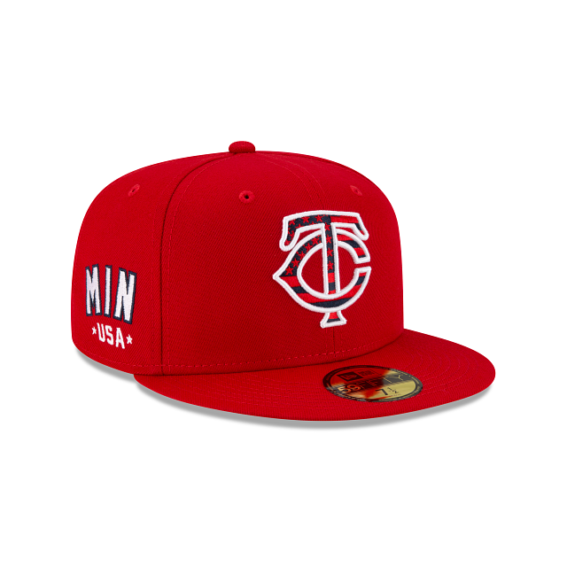
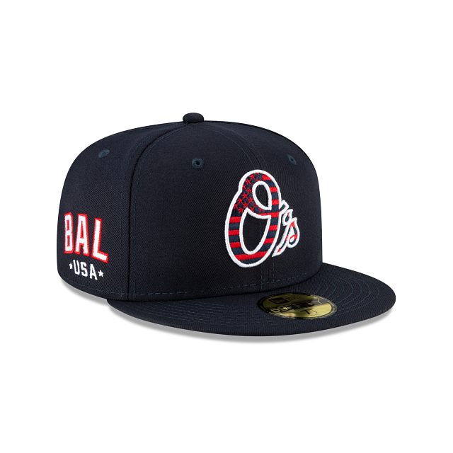
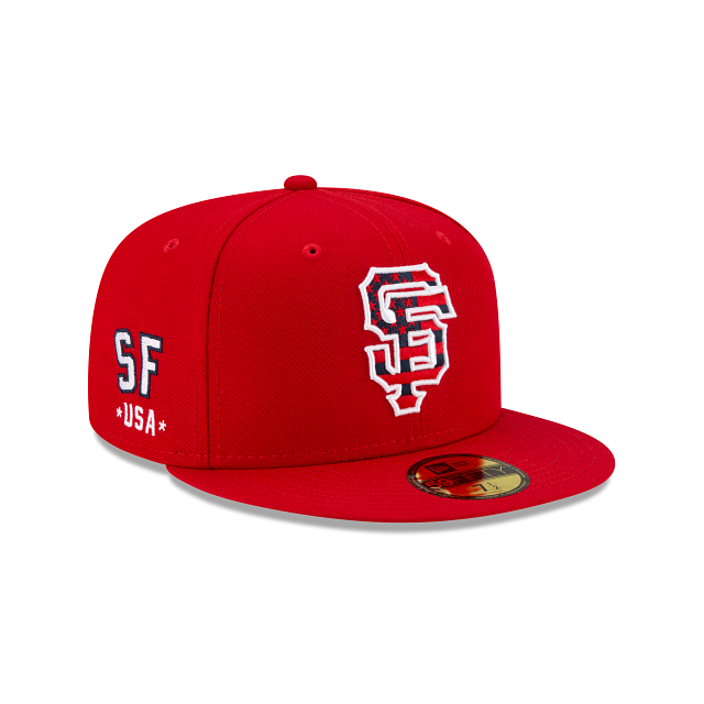
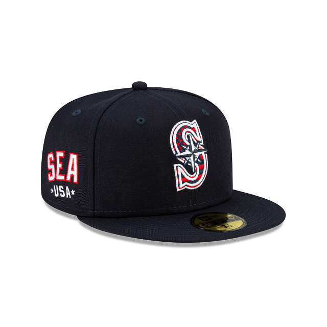
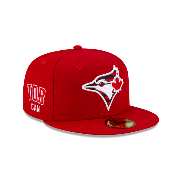
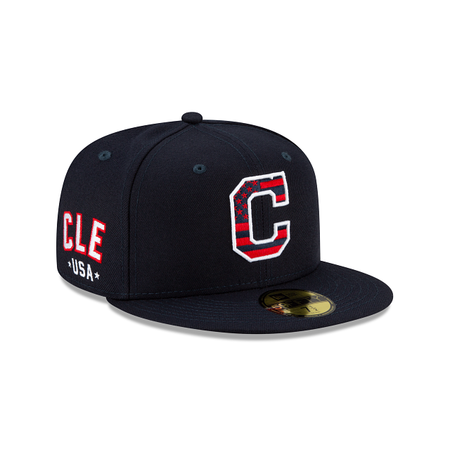
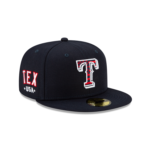
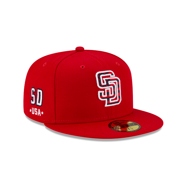
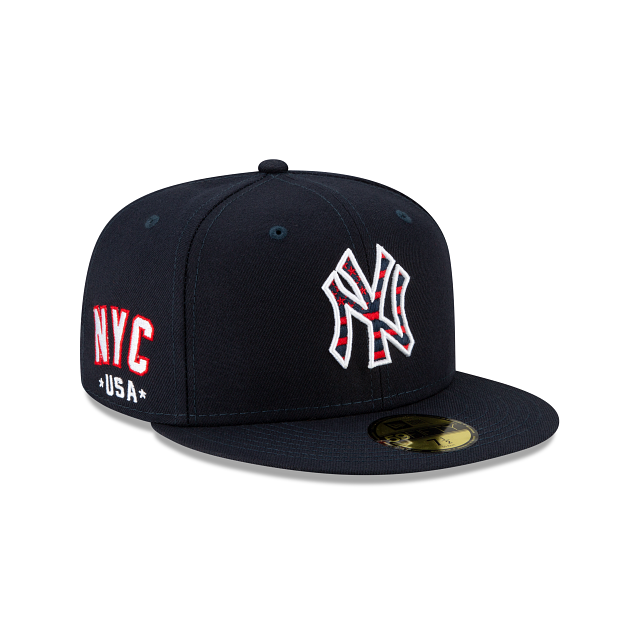
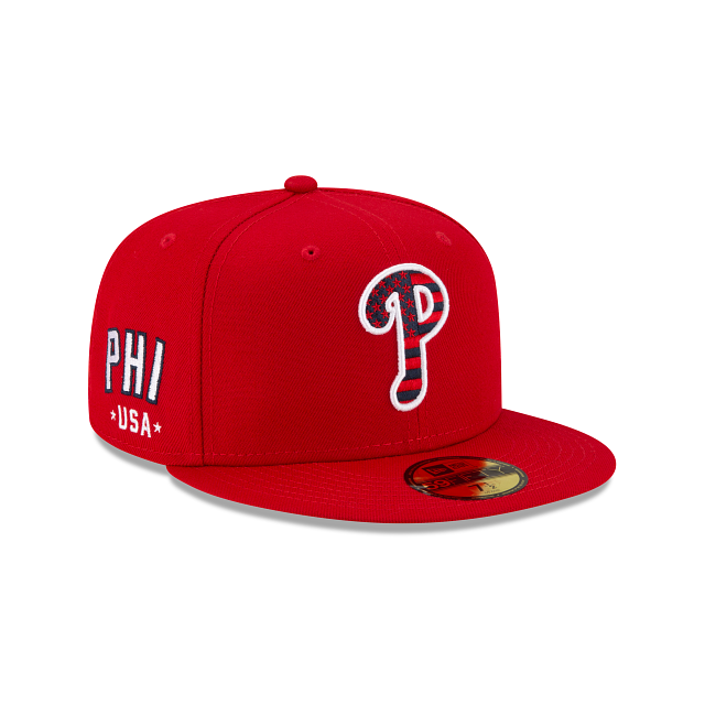
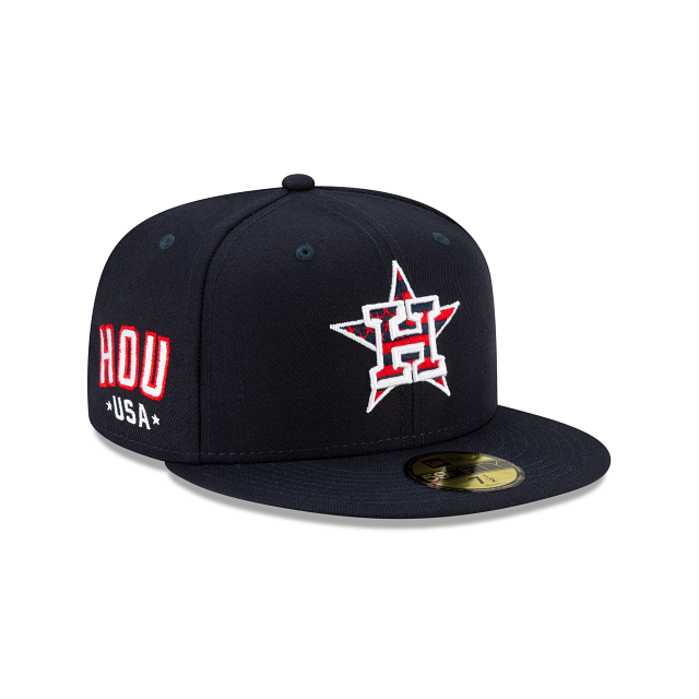
The MLB has revealed the 2021 4th of July hats. Each team will either have a navy blue or red colored cap with their main logo in Stars and Stripes on the front. Seen on the right side of the cap is a logo paying tribute to where the team’s home is with either city or state abbreviation. Below the abbreviation will be USA located in-between two stars to finish off the patriotic theme.
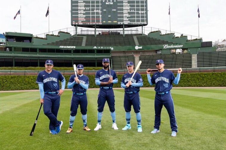
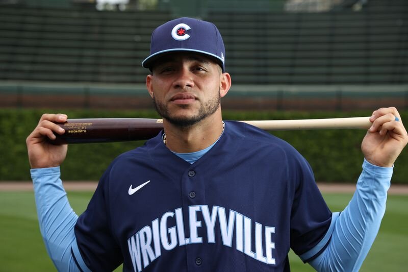
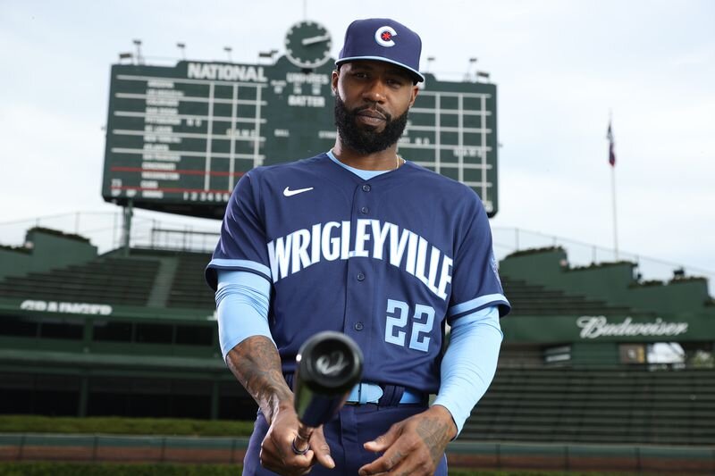
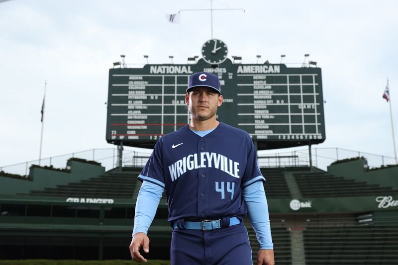
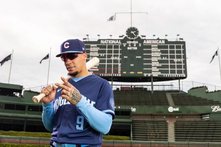
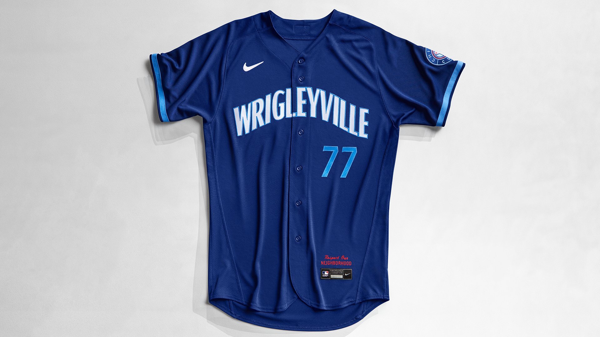
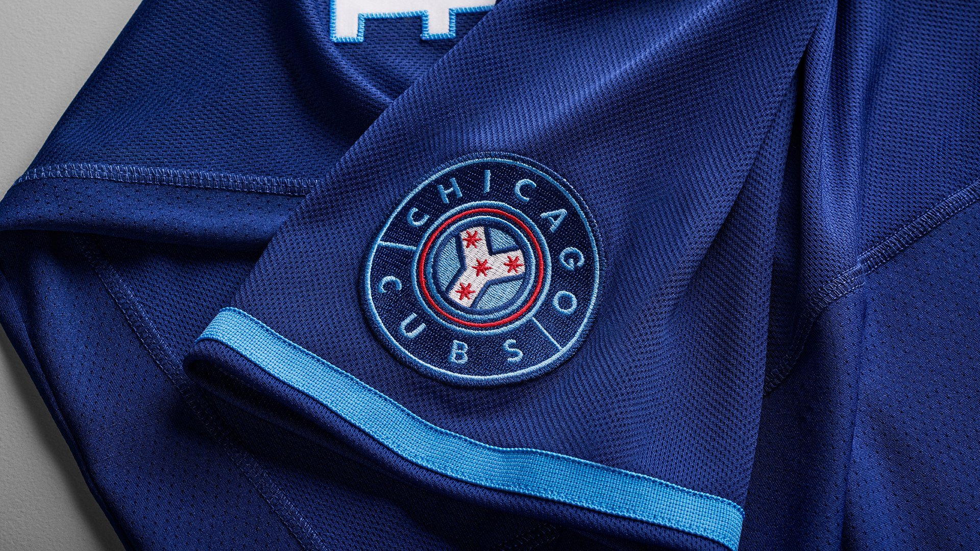
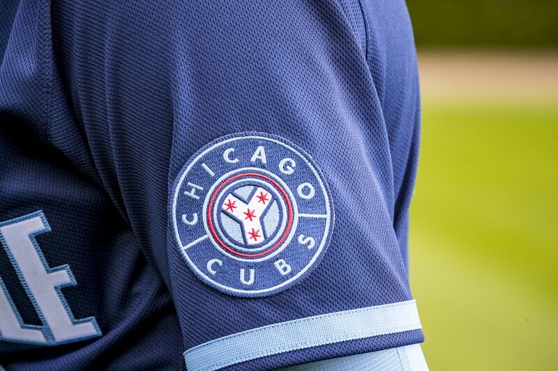
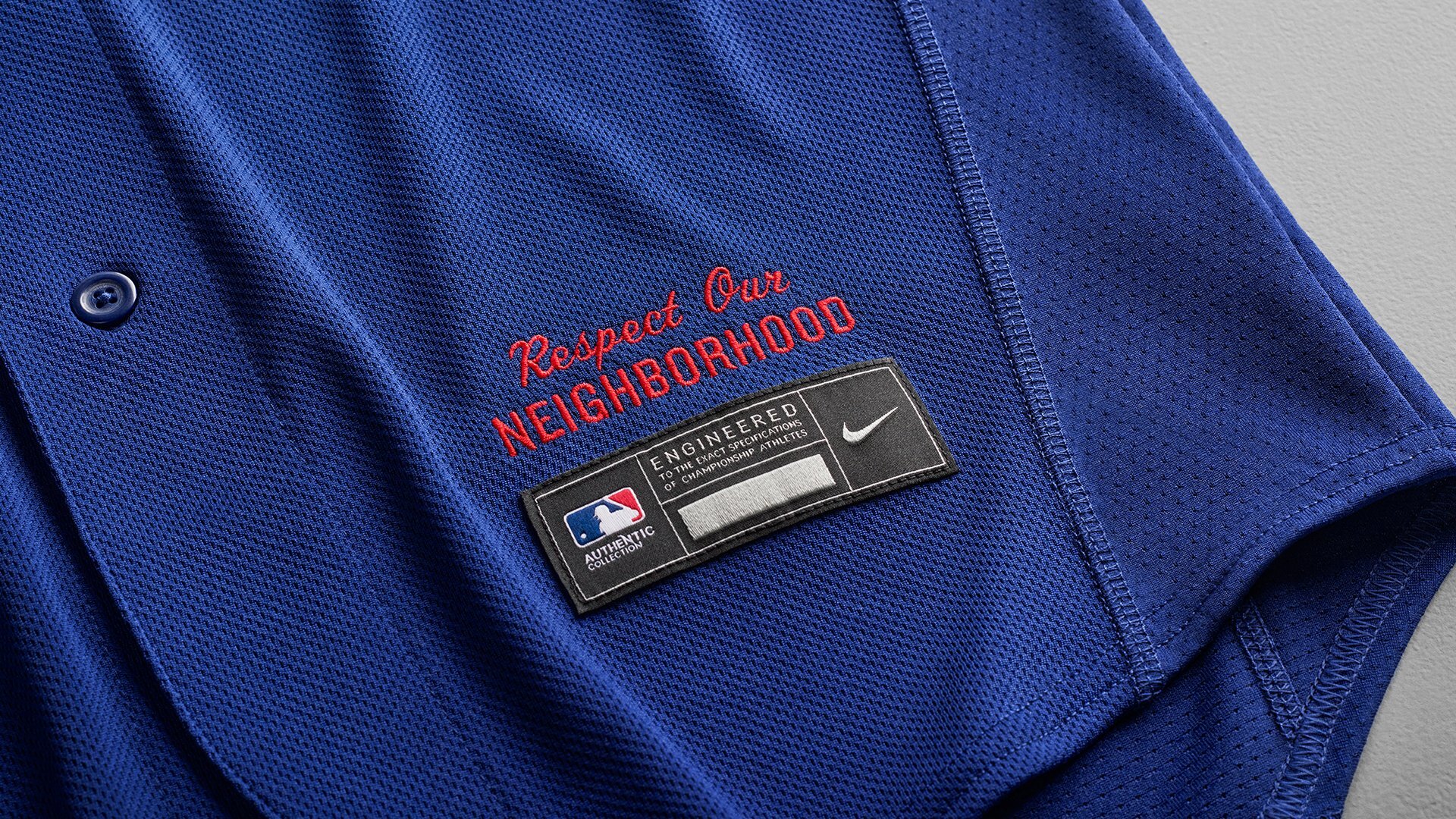
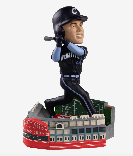
The Chicago Cubs are the latest team to reveal their ‘City Connect’ alternate uniform. The look pays respect to all 77 neighborhoods in Chicago. The dark blue jersey features “Wrigleyville” across the chest written to mirror the shape of the Wrigley’s marquee. Dark blue pants will be paired with the jerseys. The hat has the iconic Cubs’ C logo with a light blue bill and red star which is meant to represent the Chicago Flag. The finishing touches come on the shoulder patch which has the Chicago Y, inspired by Wolf Point, a y-shaped intersection of the Chicago River that cleaves the city into three neighborhoods, and ‘Respect our Neighborhoods’ on the jock tag of the jersey.
“We’re aware of the impact we have not only on the neighbourhood surrounding us, but on all of Chicago’s 77 neighborhoods. Cubs fans don’t just reside on the North Side.” - Cubs VP of Marketing Lauren Fritts
The University of Maryland football team has revealed their new team facilities. The Jones-Hill House is the latest state-of-the-art football facility to enter the college football world. The strength and condition area boasts 22 custom weight racks that include Perch video technology, which serves as a coaches eye to capture reps and speed of movement. The 24,000 square feet area features custom flooring as well as 40 yards of turf for different developmental work. The new locker room will have over 120 individual lockers with each featuring a recliner with ottoman, a custom turtle shell wireless phone charger and vents in all storage spaces to cool and dry gear. The players lounge is highlighted by custom pool table, a barber shop, a recording studio, and custom furniture throughout. Take look at the photos below to see all the custom and unique features of the Jones-Hill House for Maryland football.
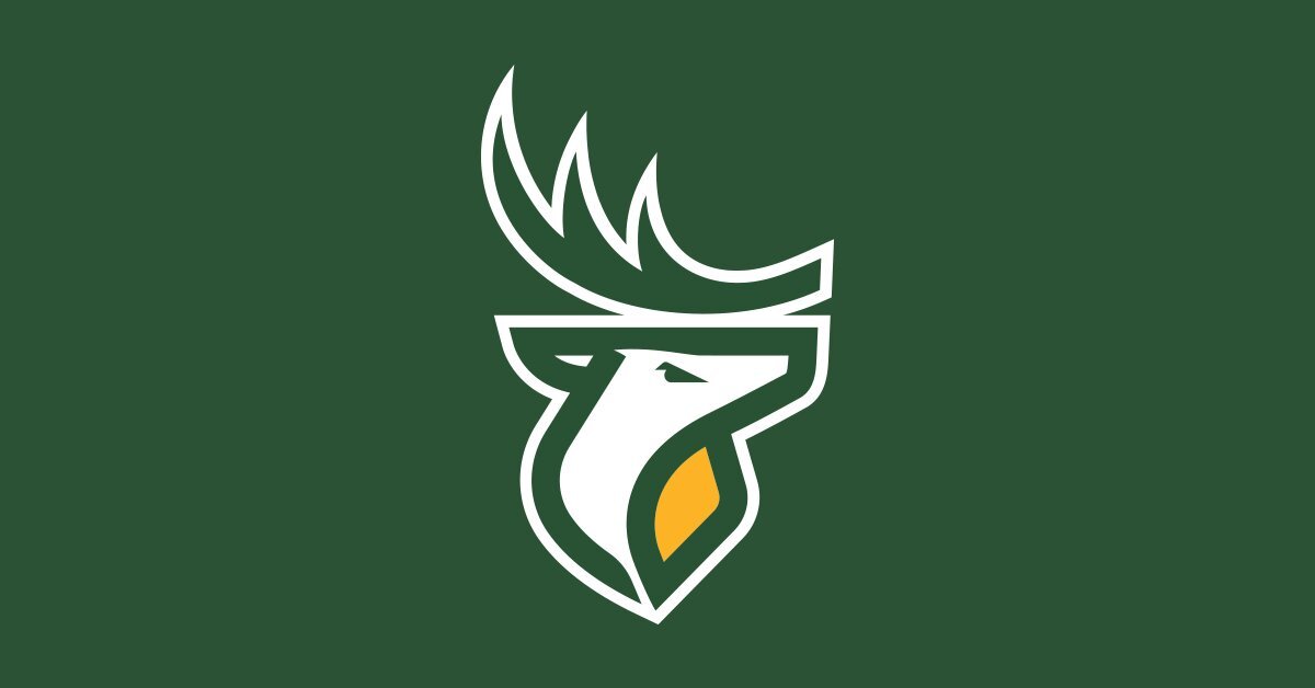
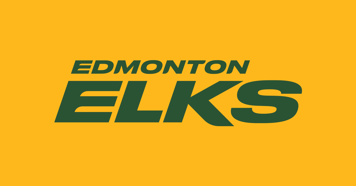
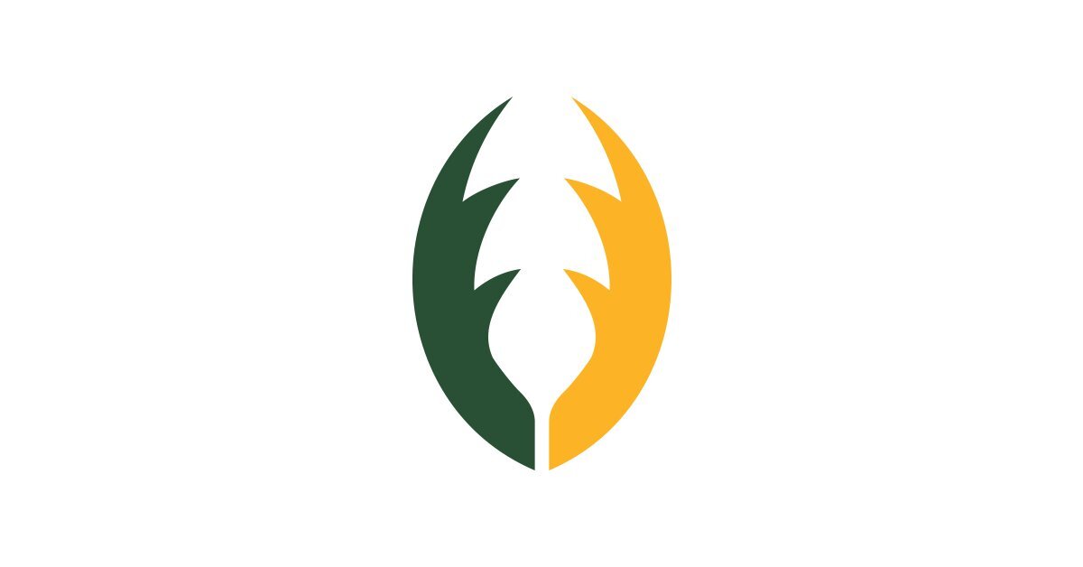
The Edmonton CFL team has released their new team name and logos. The team has transitioned away from the Edmonton Eskimos and will now be known as the Edmonton Elks. The new name received input from fans, players and coaches which saw the Elks name receive highest approval from each group. The team will keep their same green and gold colors while adding new marks. The elk logo will serve as the primary logo for the team and be on display at midfield for home games. While the team will have have a few new secondary logos, they are keeping the double EE logo with a new updated treatment to fit within the new brand identity.
“THE ENTIRE PROCESS HAS BEEN EXCITING. IT HAS ALLOWED US TO KEEP OUR ICONIC GREEN AND GOLD COLOURS AS WELL AS THE DOUBLE E, WHILE EXPLORING NEW OPPORTUNITIES WITH OUR NEW PRIMARY LOGO, SECONDARY LOGO AND WORDMARK. THIS MERGING OF THE OLD AND THE NEW ALLOWS US A CONTINUATION OF OUR GREAT HISTORY AND TRADITION. LISTENING TO EVERYONE THROUGH ENGAGEMENT SLOWED THE PROCESS BUT TAKING THE TIME TO LISTEN ALLOWED US TO BE RIGOROUS, AND THOUGHTFUL IN OUR PURSUIT OF EXCELLENCE. THE NAME WAS ULTIMATELY CHOSEN BY THE FANS. ‘ELKS’ FINISHED FIRST OR SECOND AMONG ALL SEGMENTS WHO PARTICIPATED. WE ARE LOOKING FORWARD TO PRESERVING OUR HERITAGE AND COMBINING THAT WITH THE OPPORTUNITIES TO USHER IN A NEW NAME AND NEW BRAND. PLEASE JOIN US IN PROTECTING AND HONOURING THE PAST, AND DEVELOPING THE FUTURE.” - CHRIS PRESSON, PRESIDENT AND CEO OF THE EDMONTON ELKS