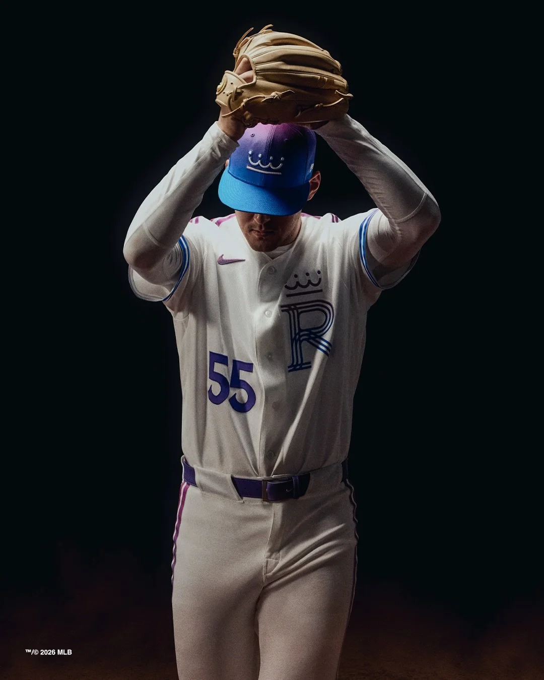
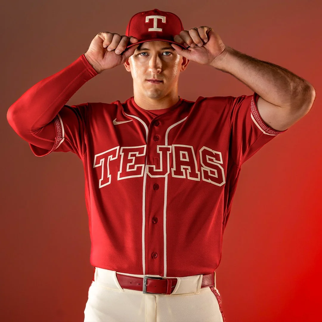
Texas Rangers Unveil City Connect 2.0 Uniform
The Texas Rangers have officially revealed their City Connect 2.0 uniforms, ushering in a bold new chapter in the club’s identity while celebrating the deep Mexican and Tejano influences that shape culture across the state of Texas.
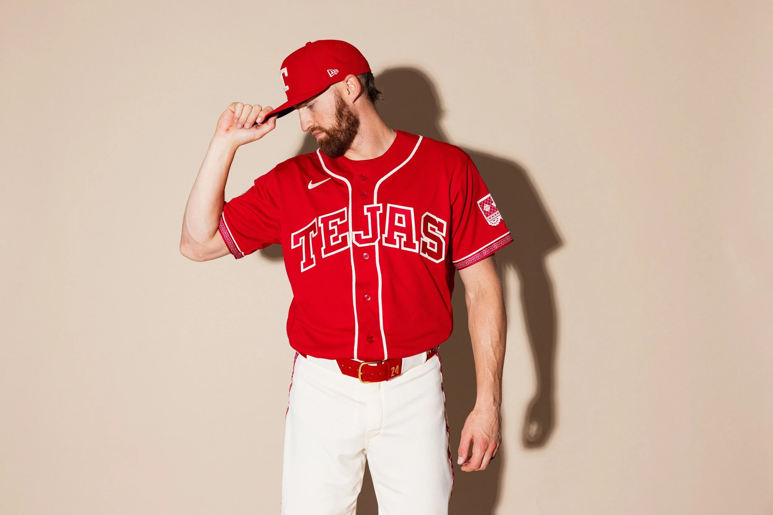
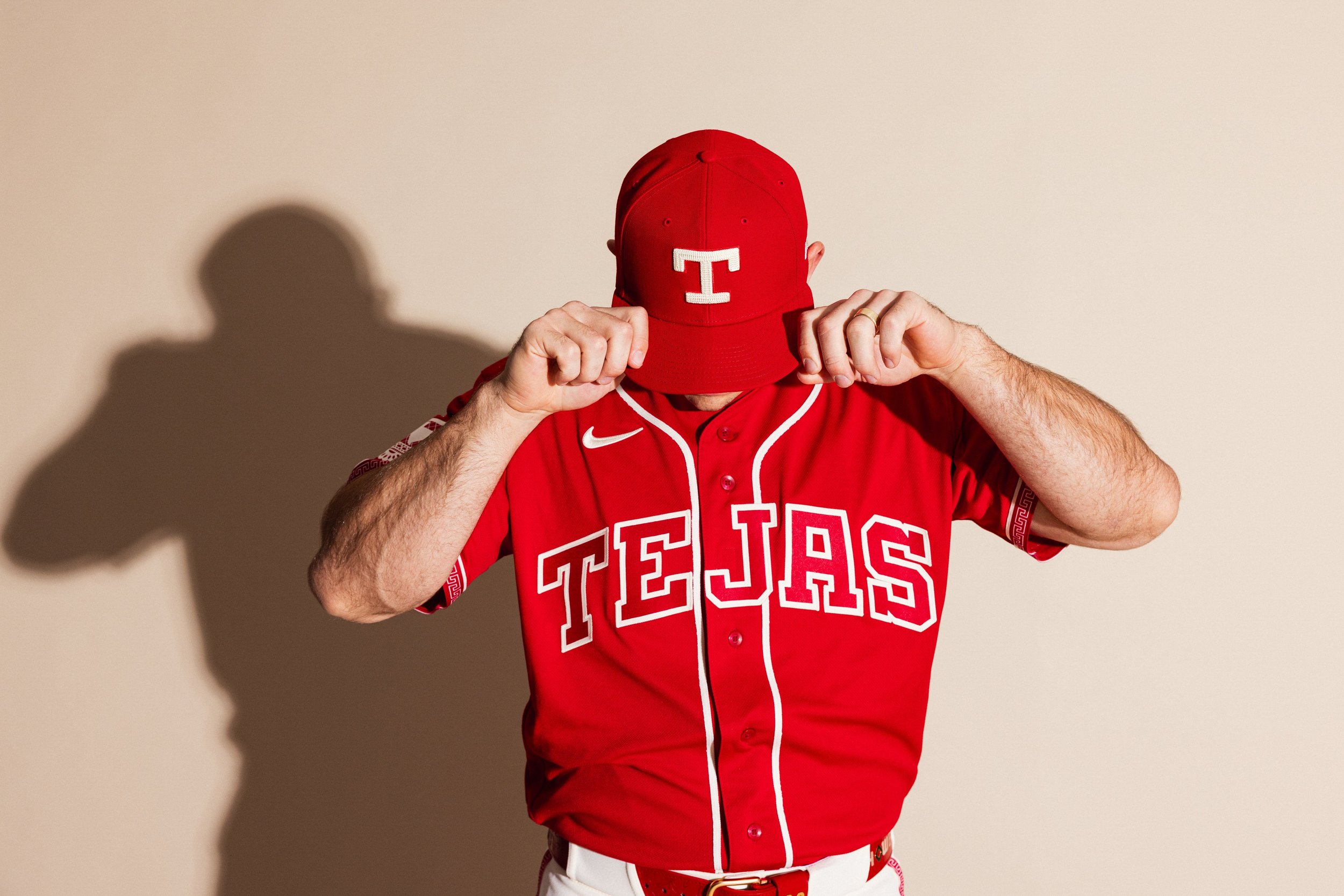
As the Rangers retire their popular “Peagle” City Connect look, the new uniform shifts the focus from the Metroplex to a broader celebration of Texas heritage, particularly the traditions and communities rooted in Mexican-American culture. At the center of the new design is the word “Tejas,” displayed prominently across the chest.
While many recognize it simply as “Texas” in Spanish, the word actually traces its origins to the Caddo language, spoken historically by Native American groups throughout Texas and Oklahoma. Over time, the word evolved into “Texas,” making “Tejas” both a linguistic and cultural bridge between the region’s Indigenous and Hispanic roots.
For the Rangers, the use of “Tejas” is also a direct tribute to the Tejano culture that has long shaped the state’s identity.
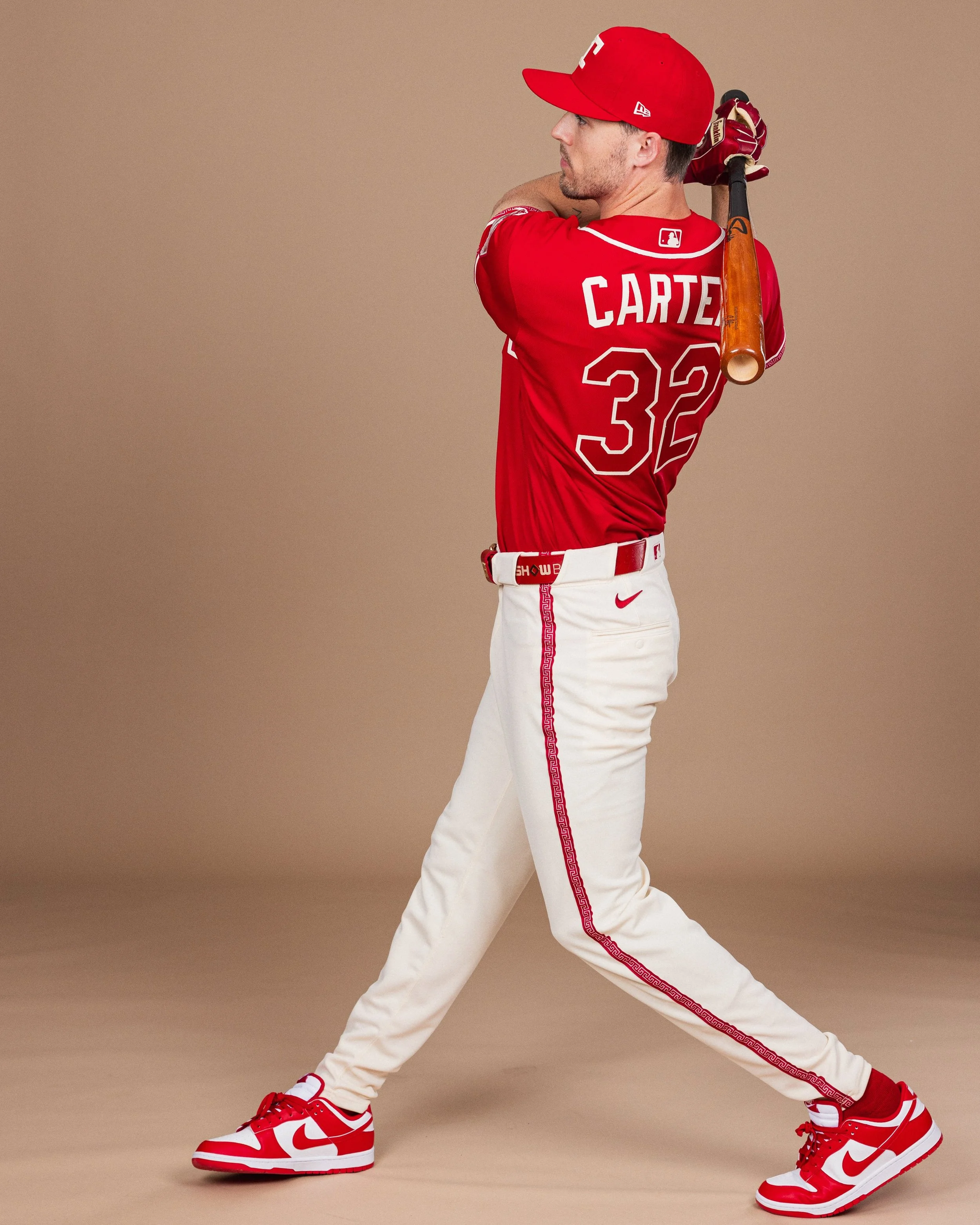
One of the most striking elements of the uniform is its rich crimson red color. While red appeared in the Rangers’ uniforms during the 1980s and 1990s, it disappeared from the rotation after 2022. Now, the shade returns with deeper meaning.
The red used in the City Connect uniform is inspired by cochineal dye, a historically significant crimson pigment derived from the cochineal insect. The dye has been used for centuries in Mexican art, textiles, and clothing worn by nobility and royalty. The result is a shade that feels both historic and symbolic, tying the uniform to artistic traditions that stretch back generations.
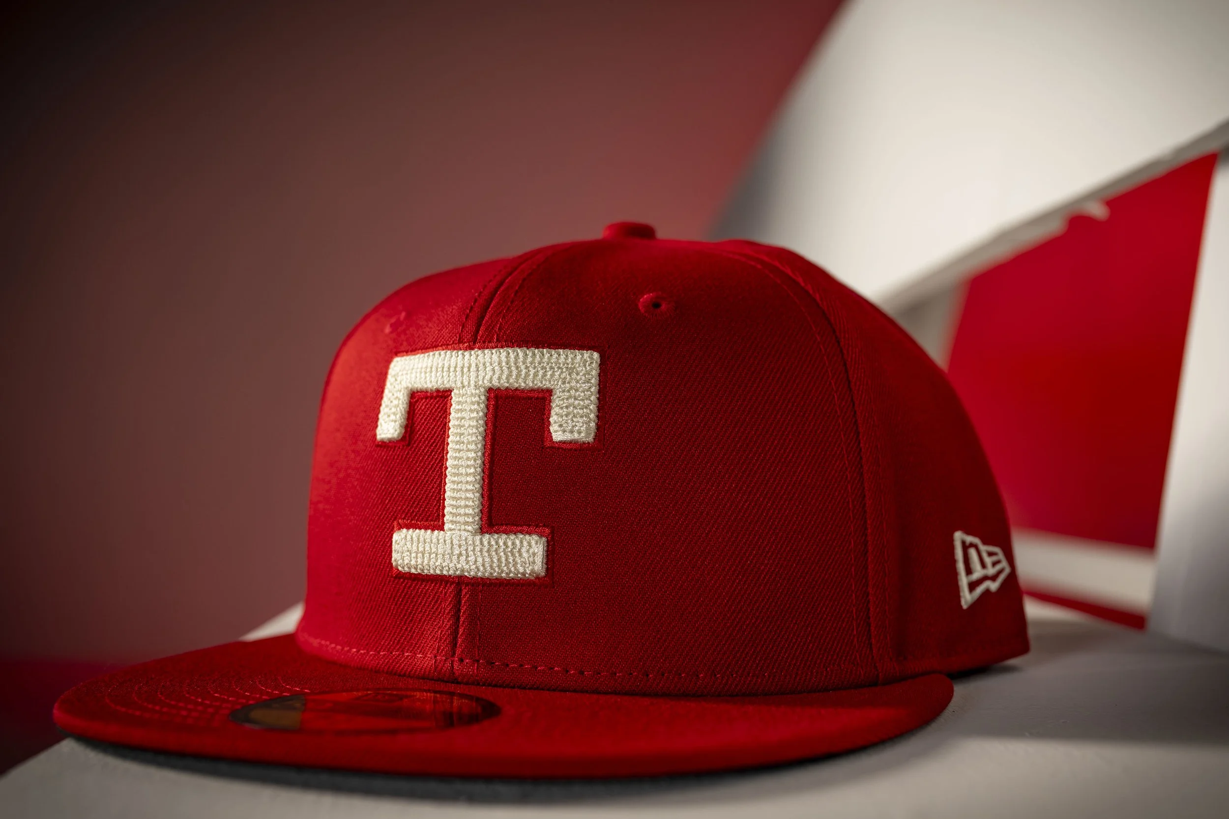
The typography on the uniform also nods to the franchise’s past. The block “T” logo on the cap mirrors the design used on Rangers uniforms during the 1970s, while the block lettering used for “Tejas” draws inspiration from the team’s road grey uniforms of the 1980s and early 1990s.
Together, the design elements reflect the theme of “reimagining tradition.” Rather than introducing something entirely new, the Rangers and Nike combined historic franchise visuals with cultural storytelling to create something that feels both nostalgic and modern.
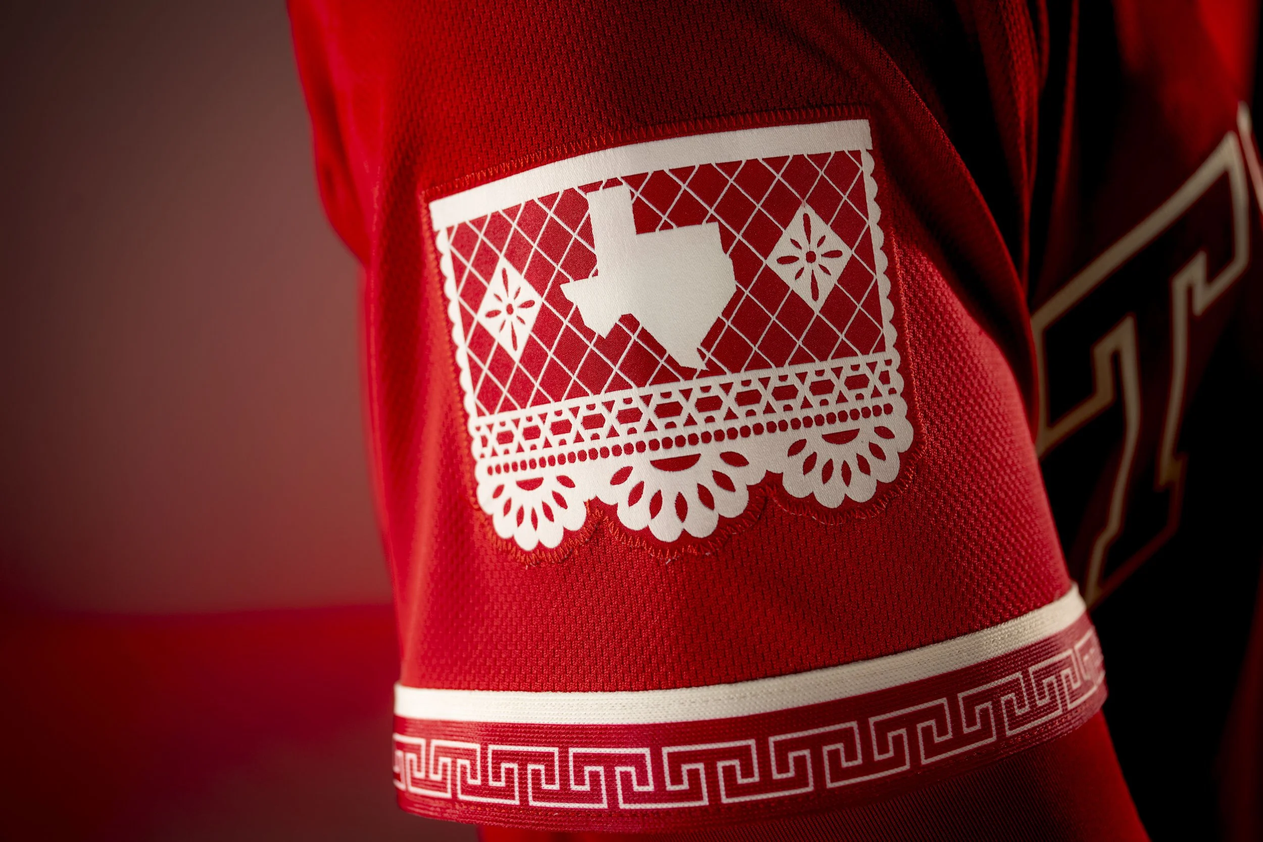
Look closer at the uniform and you'll find one of its most intricate design touches. A Charro-inspired pattern runs along the sleeve piping and pant piping, while also appearing on the belt, socks, inside the cap, and inside the jersey collar. The Charro design originates from the traditional attire worn by Mexican horsemen and is also commonly seen on mariachi trajes, including those worn by the Mariachis de los Texas Rangers identity. It’s a subtle but elegant design element that ties the uniform back to Mexican heritage and craftsmanship.
Another standout detail appears on the left sleeve. The sleeve patch features a papel picado-inspired design, referencing the traditional Mexican folk art of cutting elaborate patterns into colorful tissue paper. Papel picado is often seen during celebrations such as weddings, festivals, and the Día de los Muertos. The patch includes an outline of the state of Texas with the Texas flag reimagined in a papel picado style, symbolizing both celebration and joy, two themes deeply embedded in Mexican cultural traditions.
City Connect uniforms are designed to tell stories about the communities teams represent, and the Rangers’ City Connect 2.0 does exactly that.
Shop rangers Gear Here
See What Else Is New
Featured

Related Articles
Featured