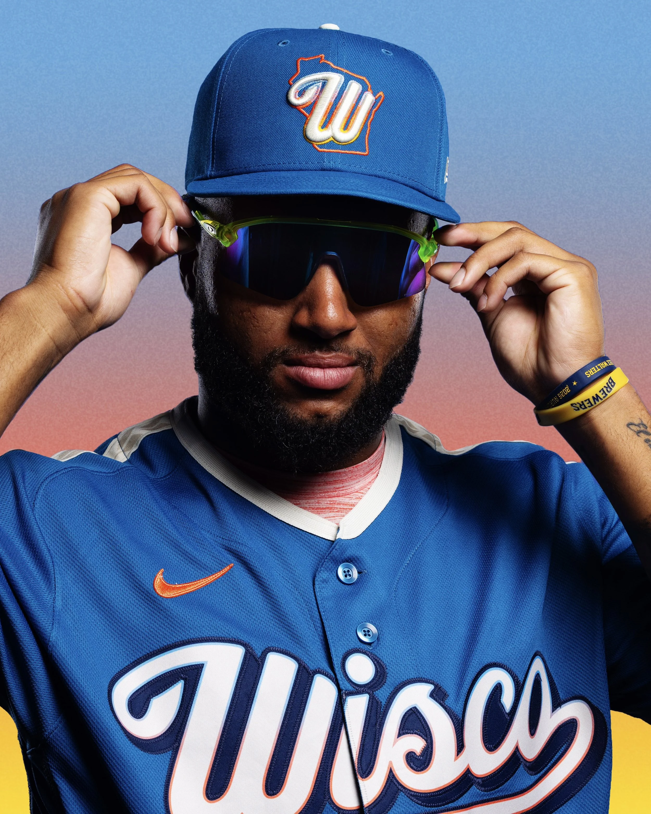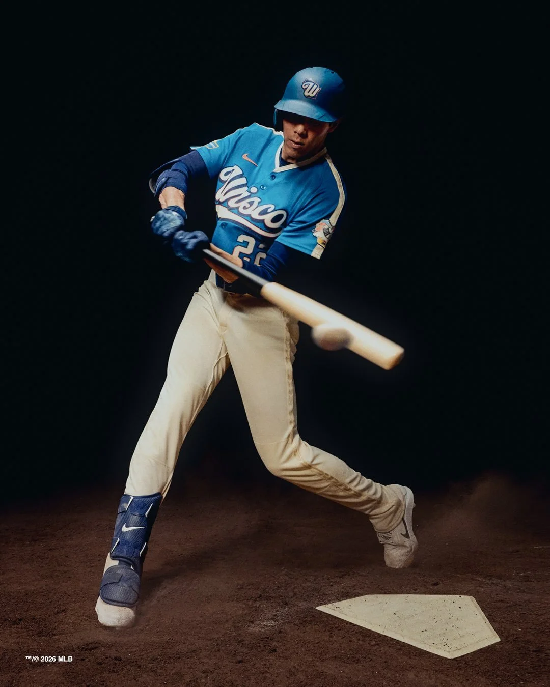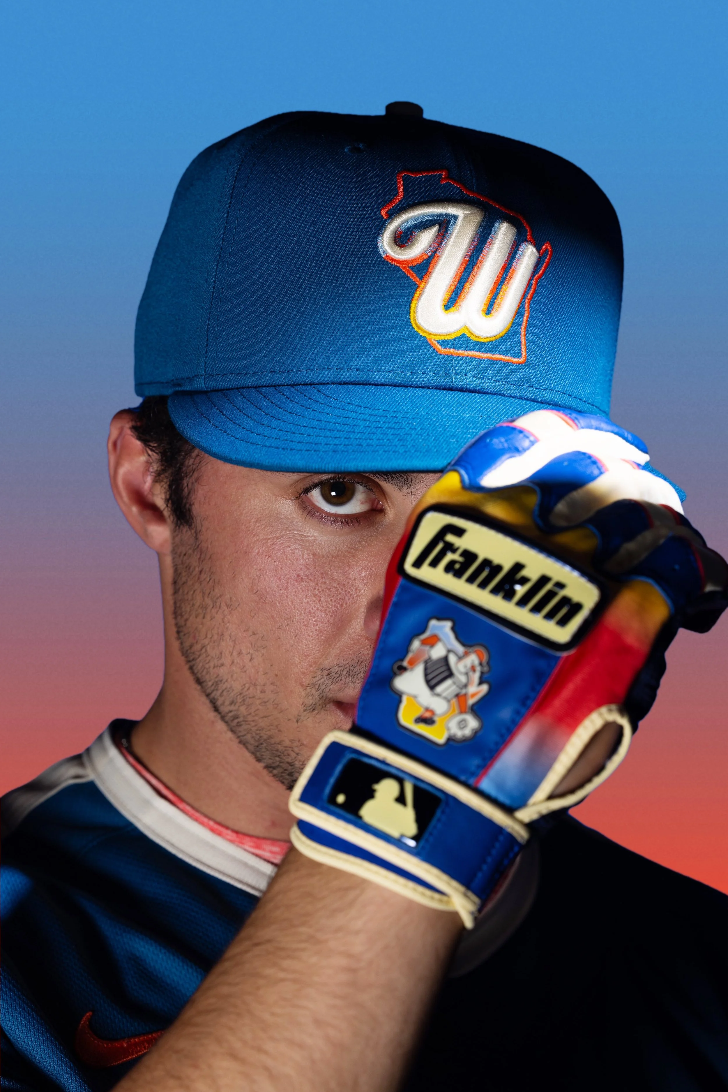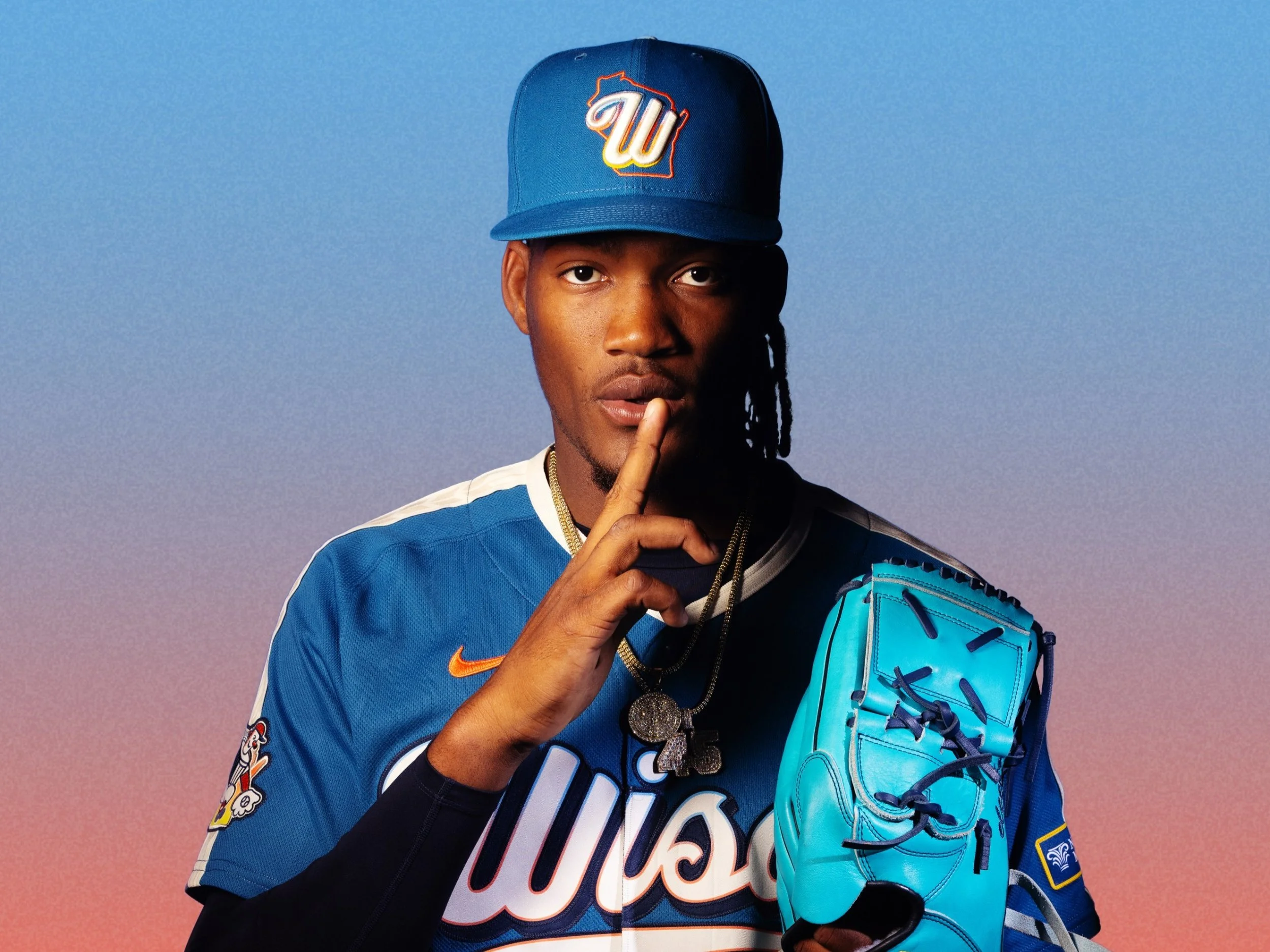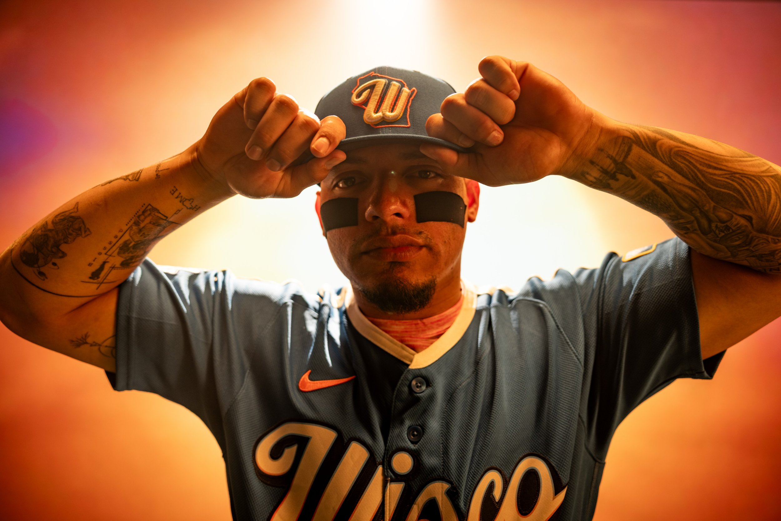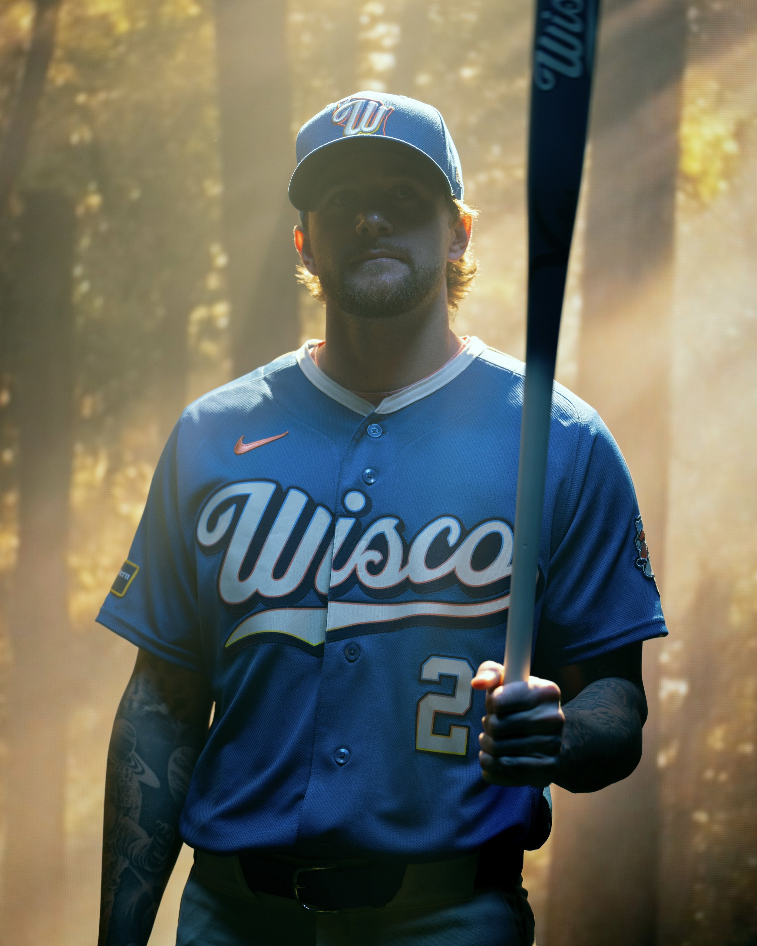
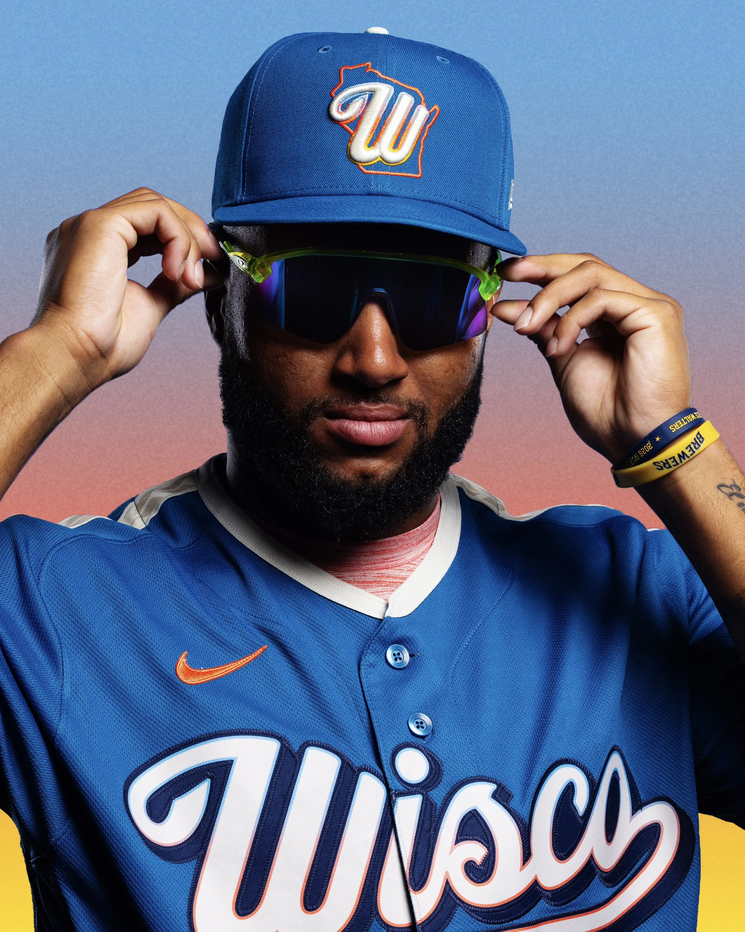
The Milwaukee Brewers may play in Milwaukee, but their fanbase stretches far beyond the city limits. With their second-generation City Connect uniform, the Brewers are embracing that statewide identity in a bold way.
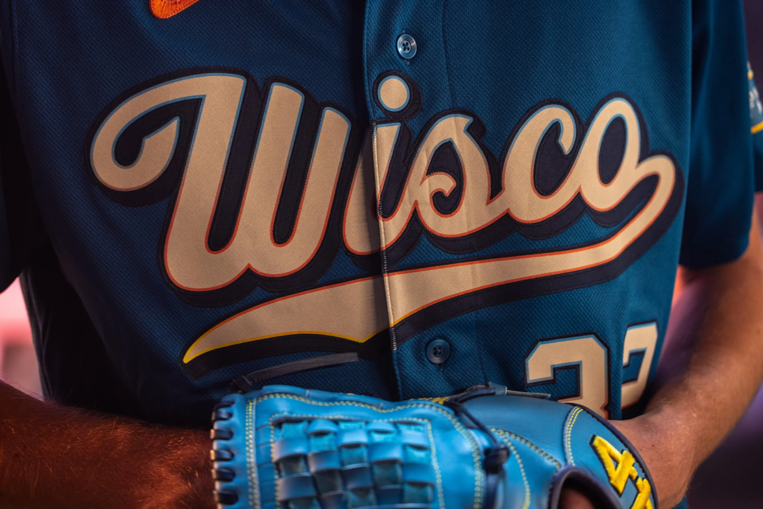
The new design features “Wisco” across the chest, a tribute to the nickname commonly used by residents throughout the state of Wisconsin. Internally, the organization has even given the uniform a different label.
While the Brewers’ first City Connect uniform focused heavily on the city of Milwaukee, this new version widens the lens to celebrate all of Wisconsin. According to team leadership, the Brewers’ strong attendance and group sales numbers show just how far the team’s reach extends across the state.
Fans regularly travel from hours away to attend games at American Family Field, often turning the experience into a full-day social event with tailgating and group outings. That statewide connection is exactly what inspired the design.
The Brewers’ new uniform incorporates colors and textures drawn directly from the state’s natural landscape. The primary blue color represents Wisconsin’s vast network of lakes, rivers, and shorelines—from the Milwaukee River to Eagle River to Lake Mendota. It symbolizes a state that is constantly moving, both geographically and culturally.
Cream accents appear throughout the uniform, inspired by sandy lakefront beaches, Door County’s shoreline, and Wisconsin’s sandstone bluffs. The tone adds a natural contrast to the deep blue base.
One of the most eye-catching features is the sunset gradient used in the wordmark, sleeve patches, and number trim. The flowing combination of orange, yellow, and blue reflects the vibrant sunsets across Wisconsin’s Northwoods and along the shoreline of Lake Michigan.
The custom “Wisco” wordmark blends modern design with vintage inspiration.
The typography draws influence from:
Early 20th-century American Association Milwaukee Brewers uniforms
Classic Wisconsin supper clubs
Traditional brewery label designs
Together, those references create a wordmark that feels uniquely tied to the state’s culture and heritage.
Another subtle design element appears on the shoulders and pants.
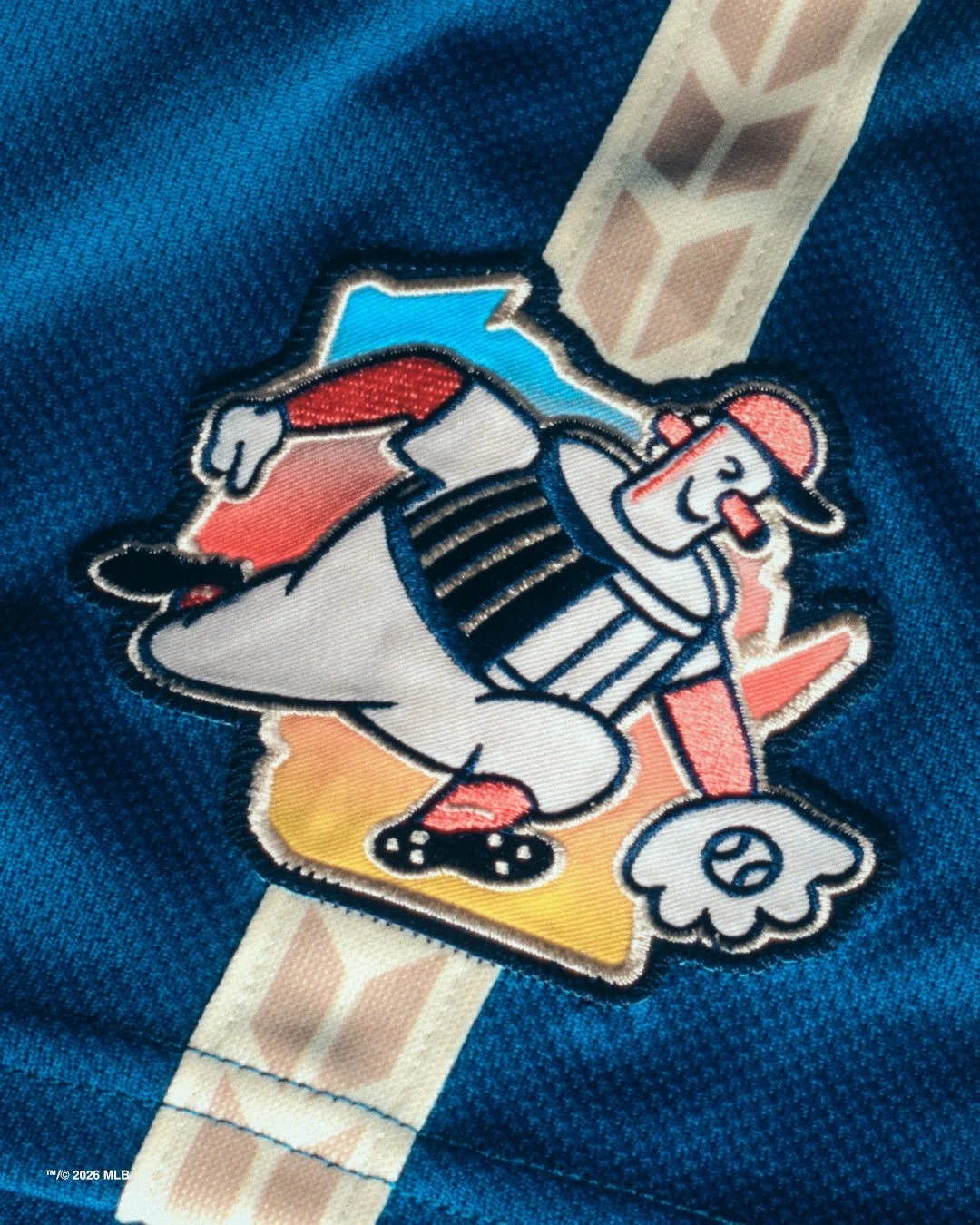
A wheat and barley braid pattern runs along the sleeve and pant piping, honoring Wisconsin’s agricultural roots and the brewing industry that inspired the team’s name.
The design acknowledges the state’s long-standing connection to farming, brewing, and local craftsmanship.
The sleeve patch also features a refreshed version of Barrelman, one of the most beloved symbols in Brewers history.
This updated version places the character alongside a full outline of the state of Wisconsin, reinforcing the idea that Brewers fandom extends to every county in the state.
It’s a modern twist on a classic logo—and another example of how the uniform balances nostalgia with a broader statewide identity.
City Connect uniforms are designed to tell stories about the communities teams represent, and the Brewers’ latest version tells a story that reaches far beyond Milwaukee.
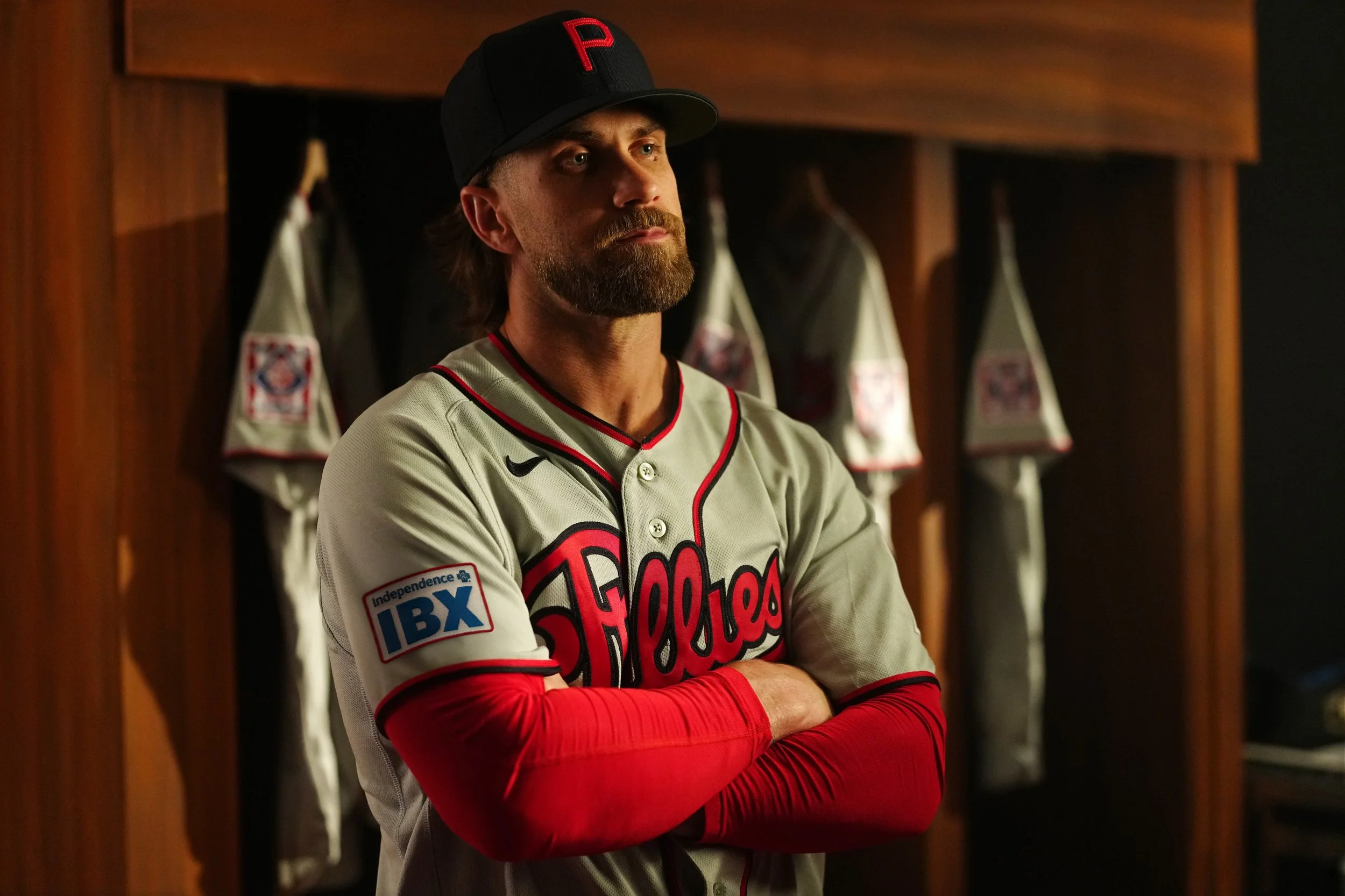
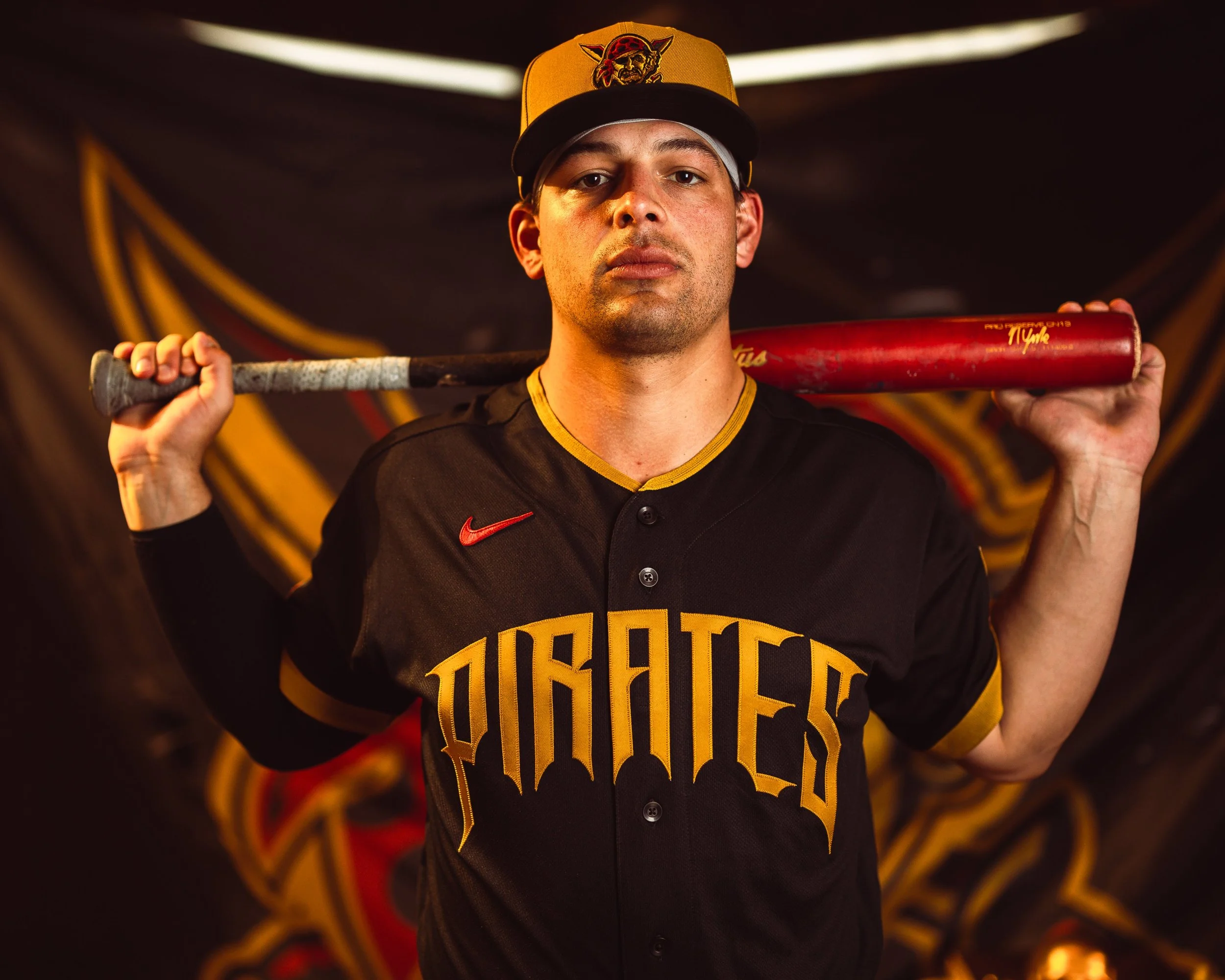
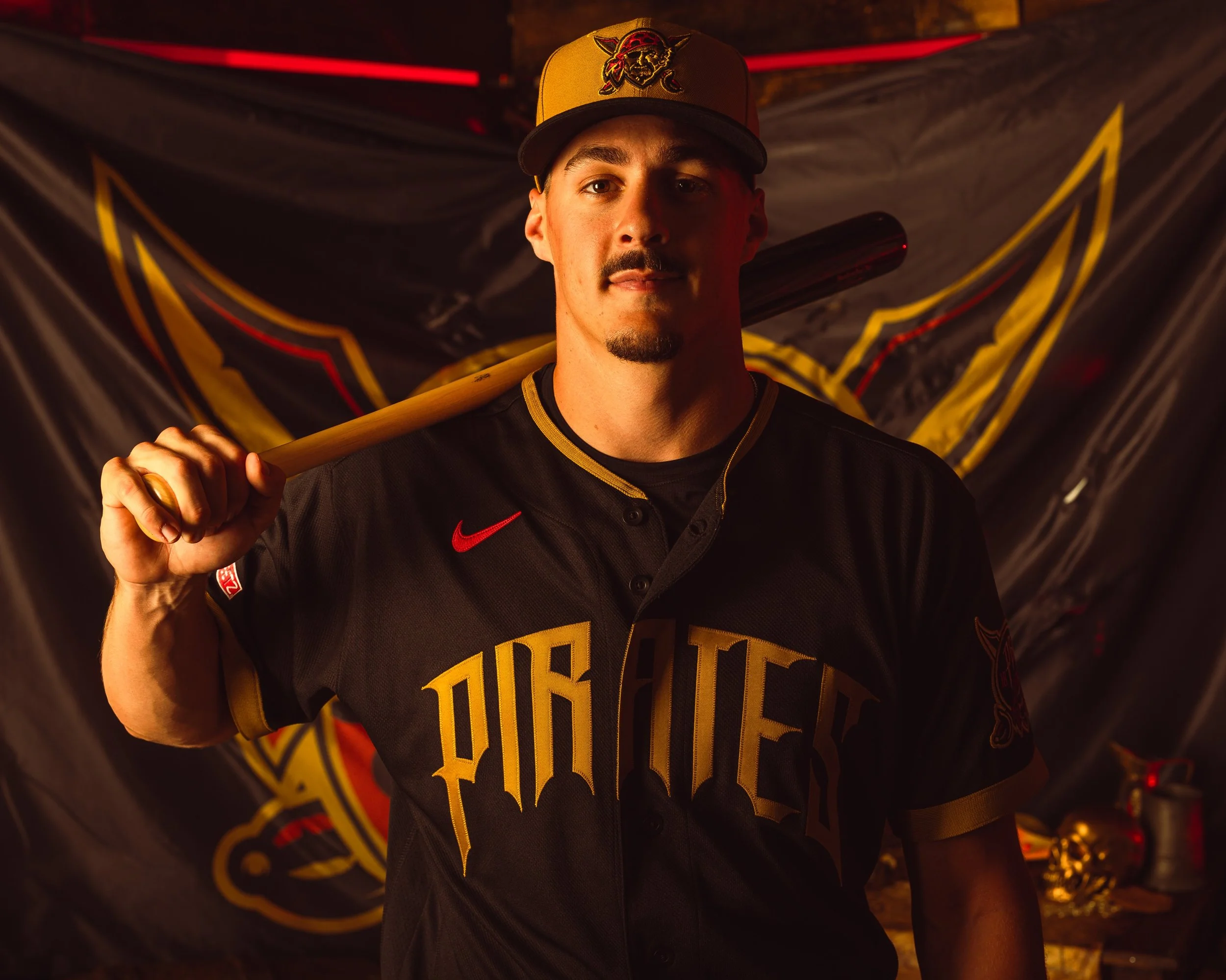
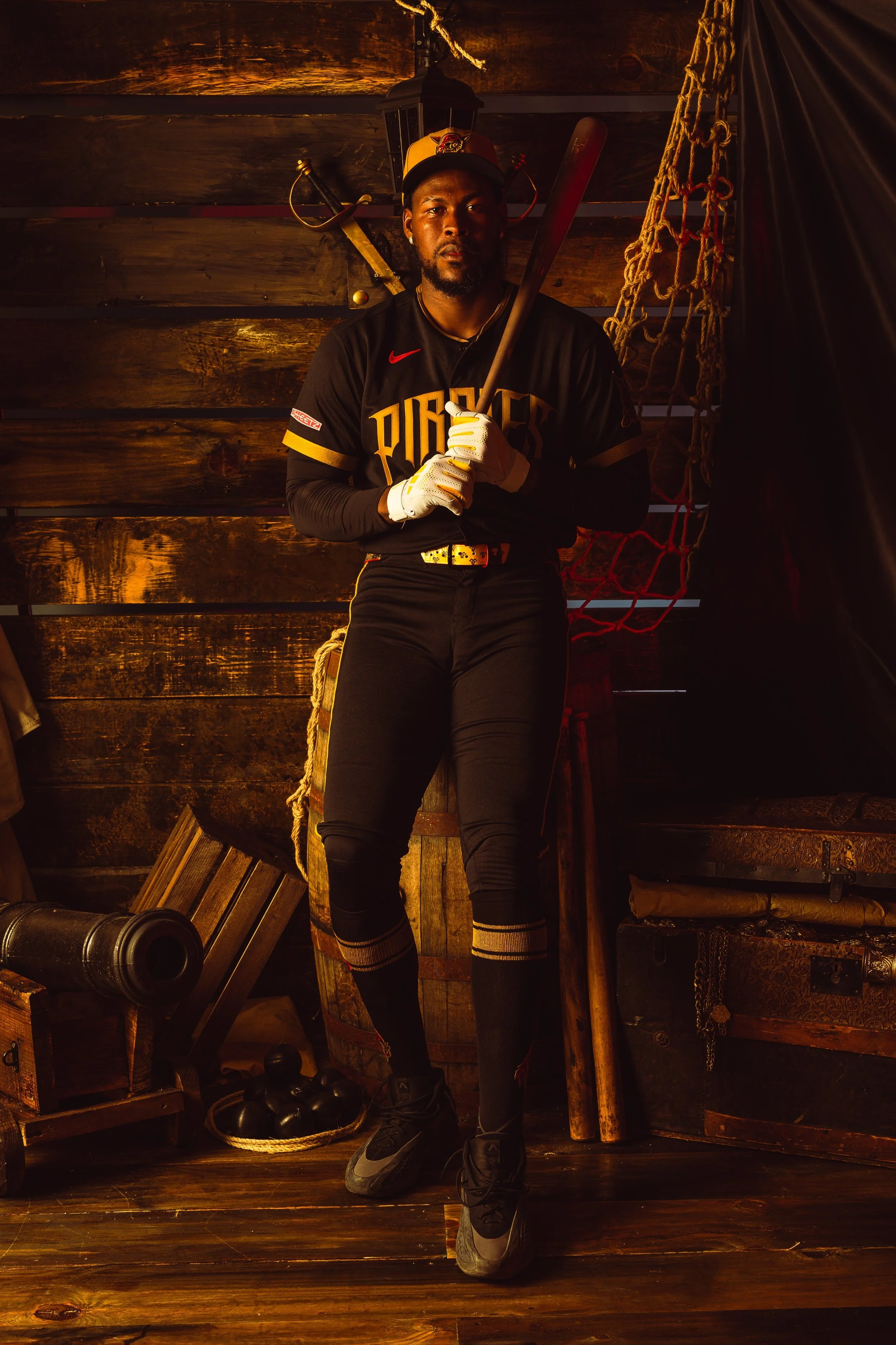
The Pittsburgh Pirates are leaning into their identity with the unveiling of their newest City Connect uniform, a design that blends the city’s tough reputation with the franchise’s historic pirate roots.
The latest look builds on the team’s previous City Connect concept while introducing darker tones, sharper details, and subtle nods to Pittsburgh’s past. The result is a uniform that players and former Pirates alike say perfectly captures the gritty energy of the Steel City.
Burnett joked that the black-heavy uniform and sharp lettering reminded him of something straight out of Batman’s Gotham City. In fact, the aesthetic impressed him so much that he admitted he would have worn the uniform any chance he got during his playing days.
“I would’ve worn that thing every five days whether it was a City Connect night or not,” Burnett said. “It’s just a sweet-looking uniform.”
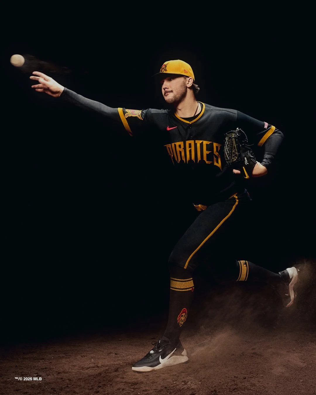
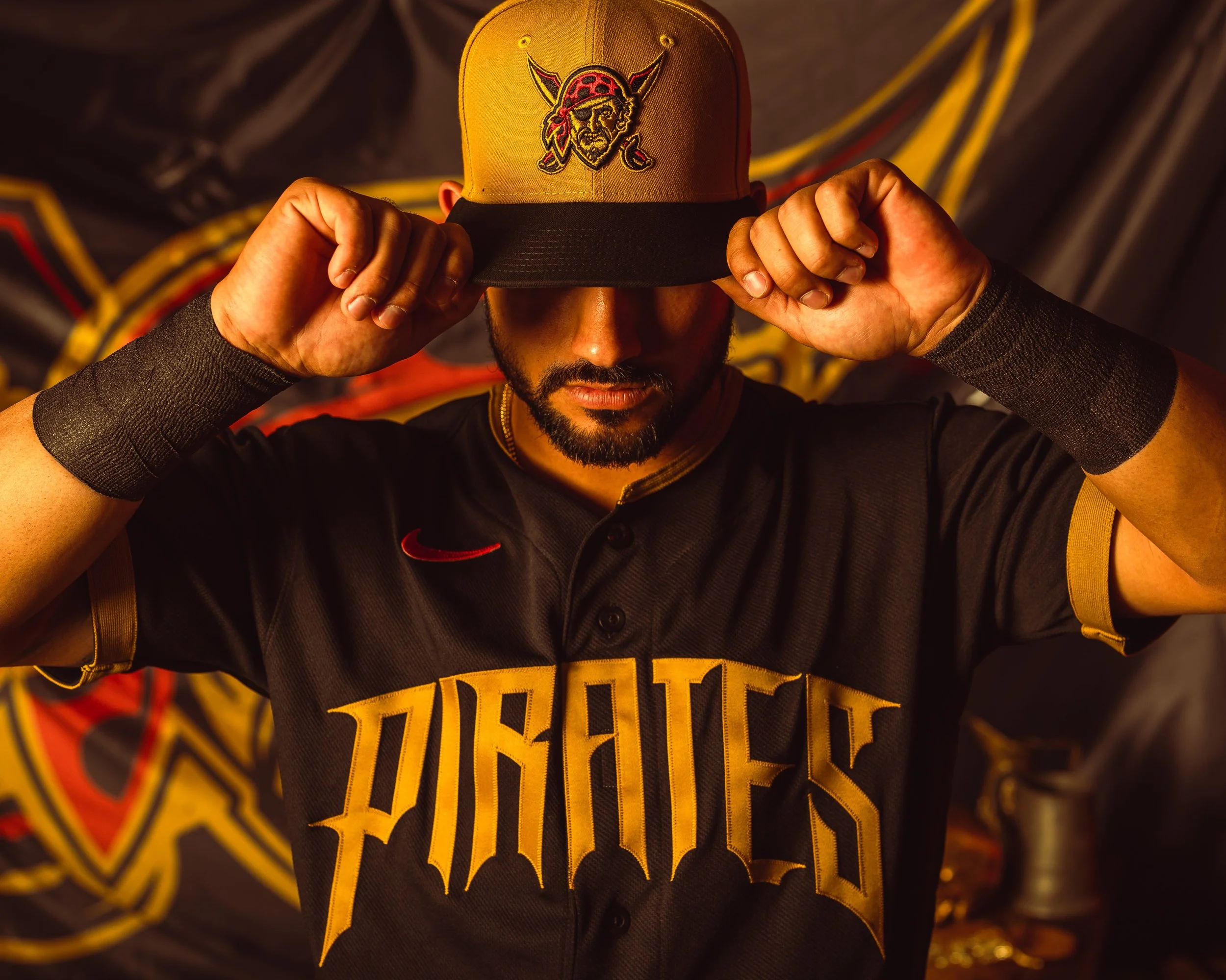
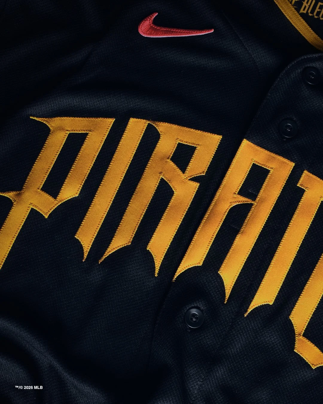
The new design features a dominant black color scheme, highlighted by accents of mustard gold and red, creating a bold visual contrast that fits the Pirates’ identity.
While the design feels modern, it also embraces the franchise’s namesake. The “Pirates” wordmark across the chest features stylized lettering with curved, pointed edges—details that resemble blades or dripping liquid, reinforcing the swashbuckling theme behind the franchise name.
Several elements also reference specific eras in Pirates history. The left sleeve includes a patch featuring the 1997-era Pirate mascot, complete with an eyepatch and red bandana. Alongside it is a graphic featuring “1887” split by “PGH,” referencing the year the franchise was first established in Pittsburgh.
For players like pitcher Isaac Mattson, the design feels like a return to the team’s roots. “It’s a cool revamp,” Mattson said. “I really love the font they chose, kind of getting back to our roots as pirates. It’s gritty.”
The Pirates’ new City Connect uniform ultimately blends Pittsburgh toughness, pirate mythology, and modern design into one cohesive look.
From the dark, Gotham-like color palette to the historic sleeve details and sharp lettering, the uniform reflects the personality of both the team and the city it represents.
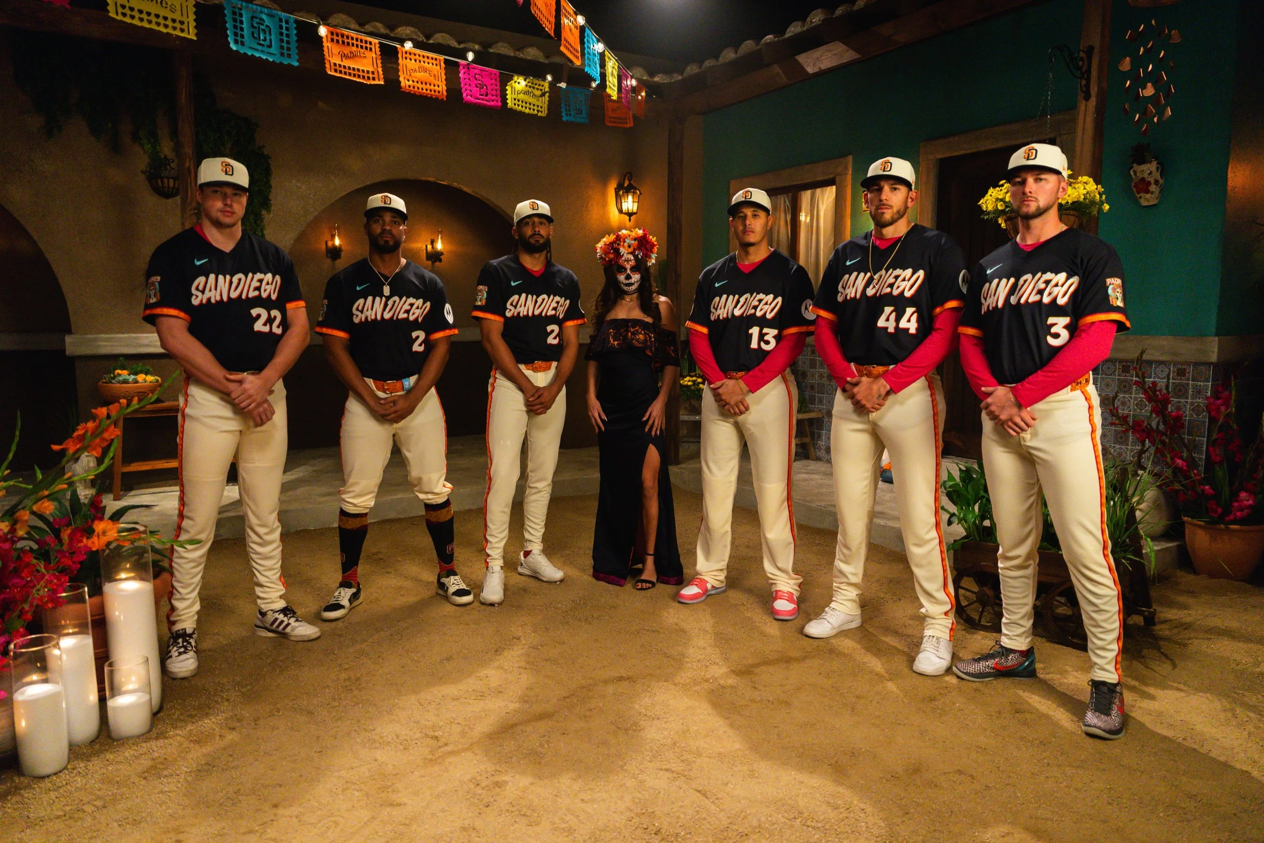
The San Diego Padres are once again bringing bold color and regional storytelling to the diamond.
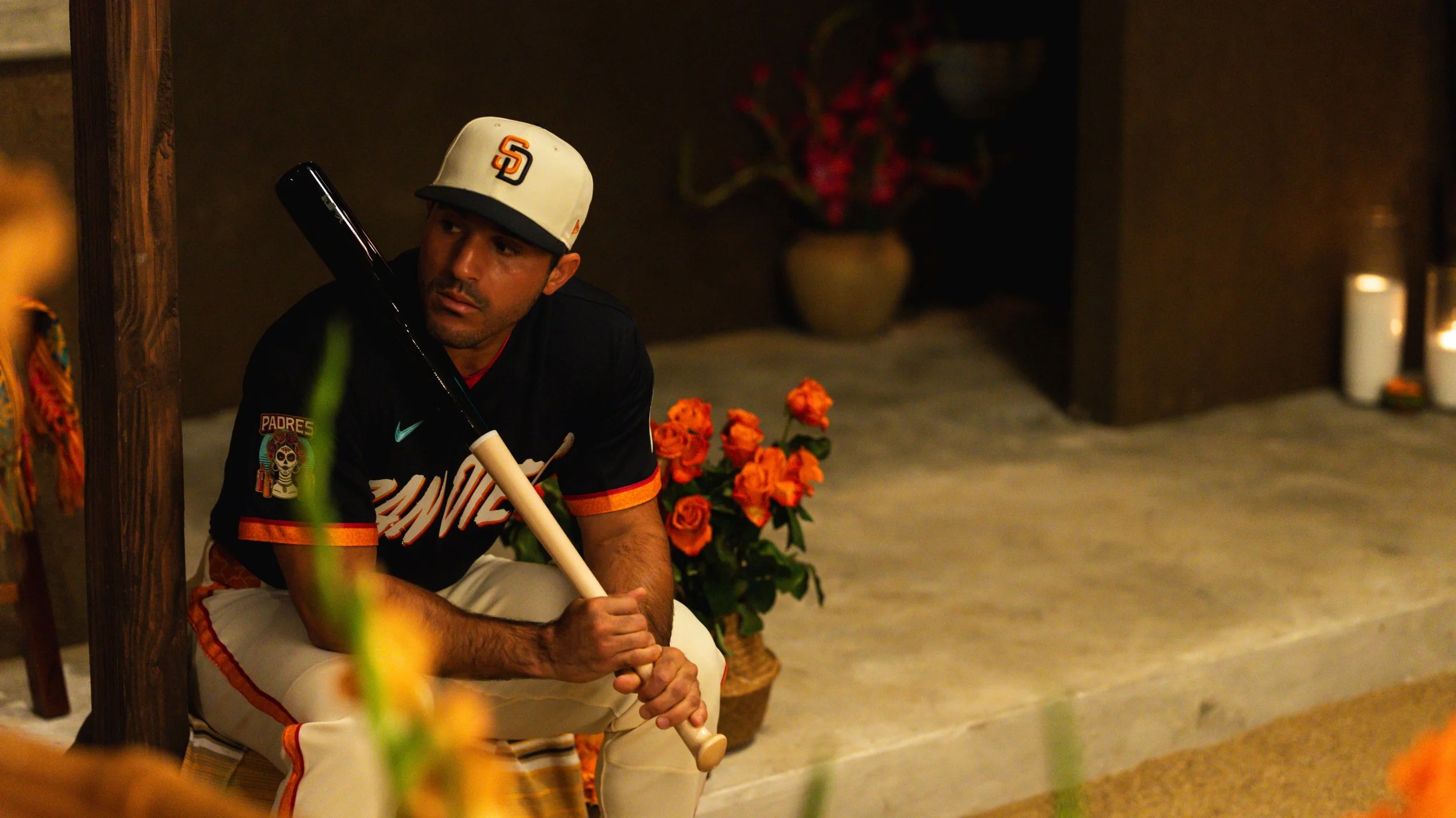
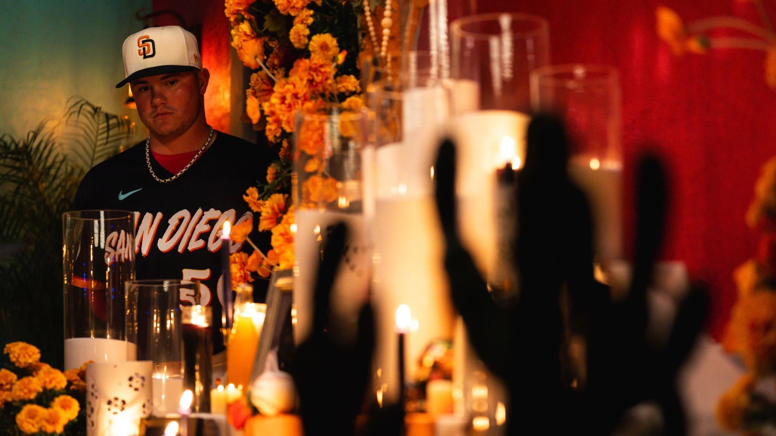
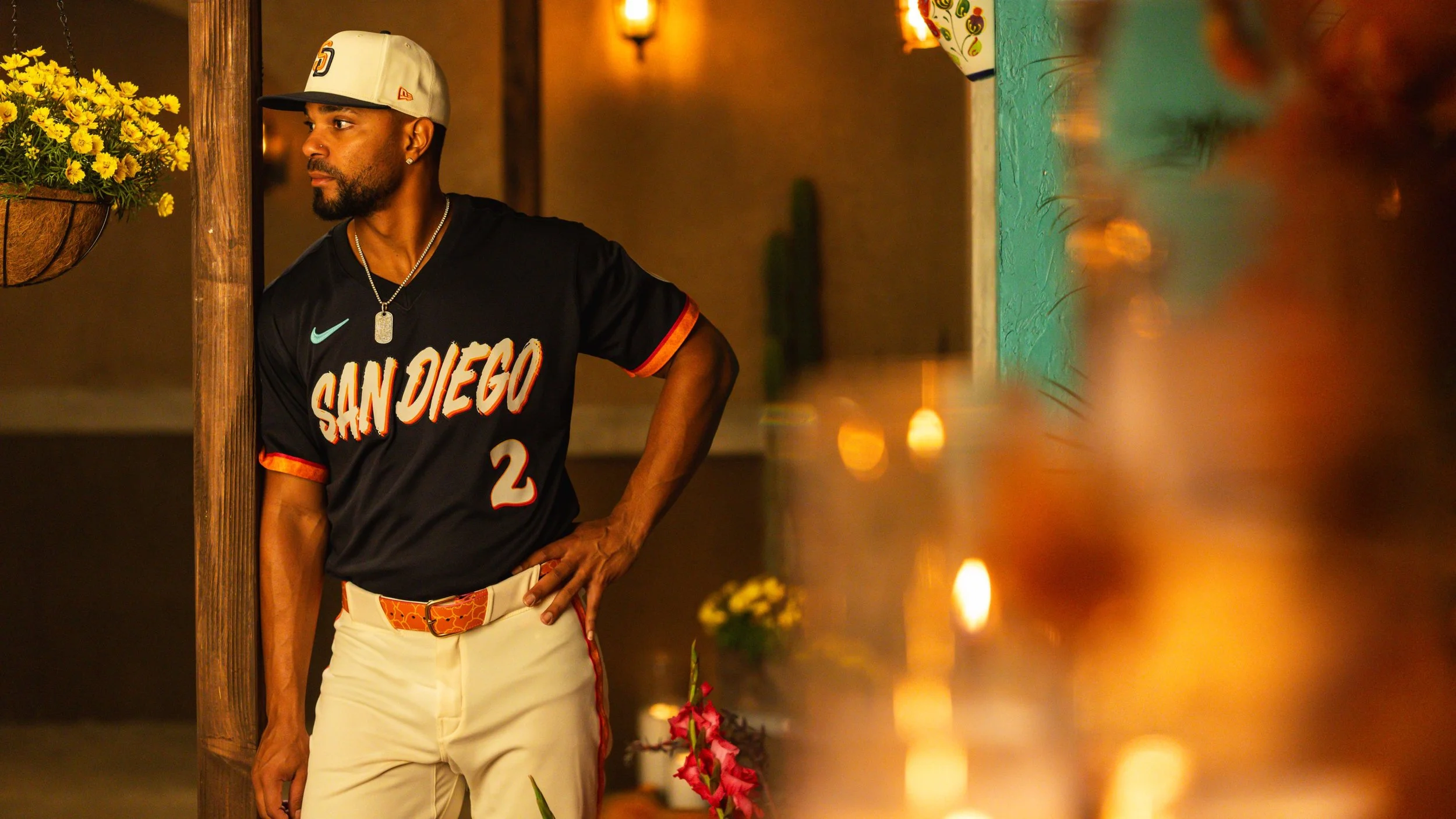
As part of the latest wave of the Major League Baseball City Connect program, the Padres unveiled their new City Connect uniforms, a design that celebrates the binational culture of Southern California and Mexico while continuing the franchise’s reputation for some of the most vibrant looks in baseball.
The new set blends striking colors, cultural symbolism, and coastal inspiration to create a uniform that reflects the identity of San Diego and its surrounding region.
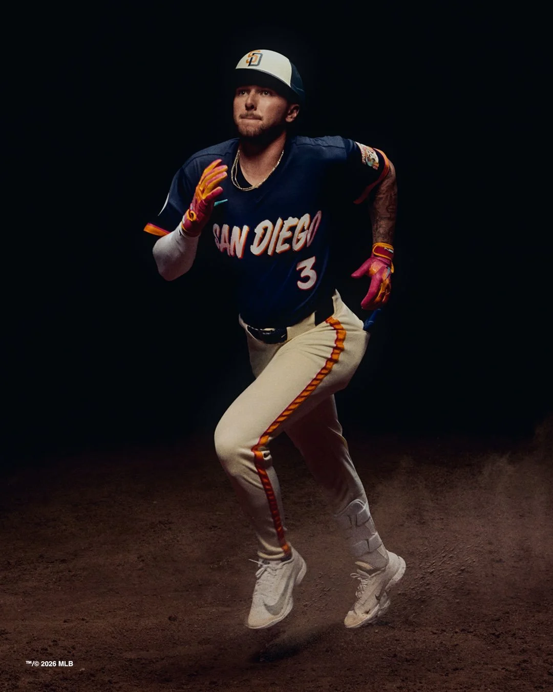
The Padres’ new City Connect design revolves around a unique color palette that the team says reflects the area’s landscape, culture, and traditions. The official colors include: Bone, Obsidian, Marigold, Aqua, Fireberry, and Padres Gold
The jersey itself features a deep obsidian base, allowing the colorful wordmark across the chest to stand out prominently against the darker background. The vibrant lettering is a refreshed take on the wordmark from the team’s previous City Connect design.
According to the team, the typography continues to draw inspiration from San Diego’s shared coastline with Mexico, breathtaking sunsets, and the active outdoor lifestyle that defines the region.
The uniform is paired with bone-colored pants, while the sleeves feature a distinctive marigold pattern, adding another bright visual element to the overall look.
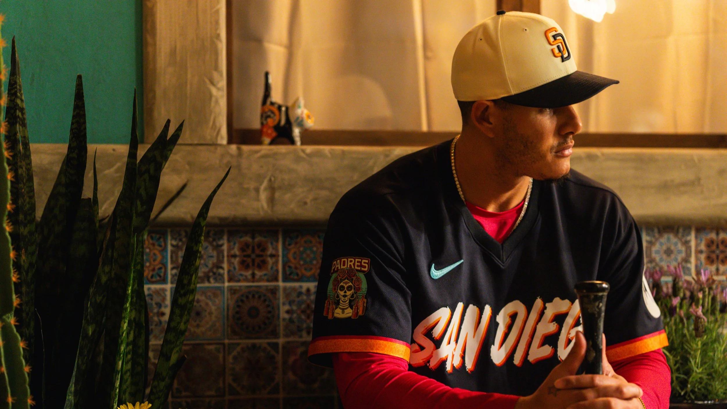
Perhaps the most meaningful detail on the uniform appears on the sleeve.
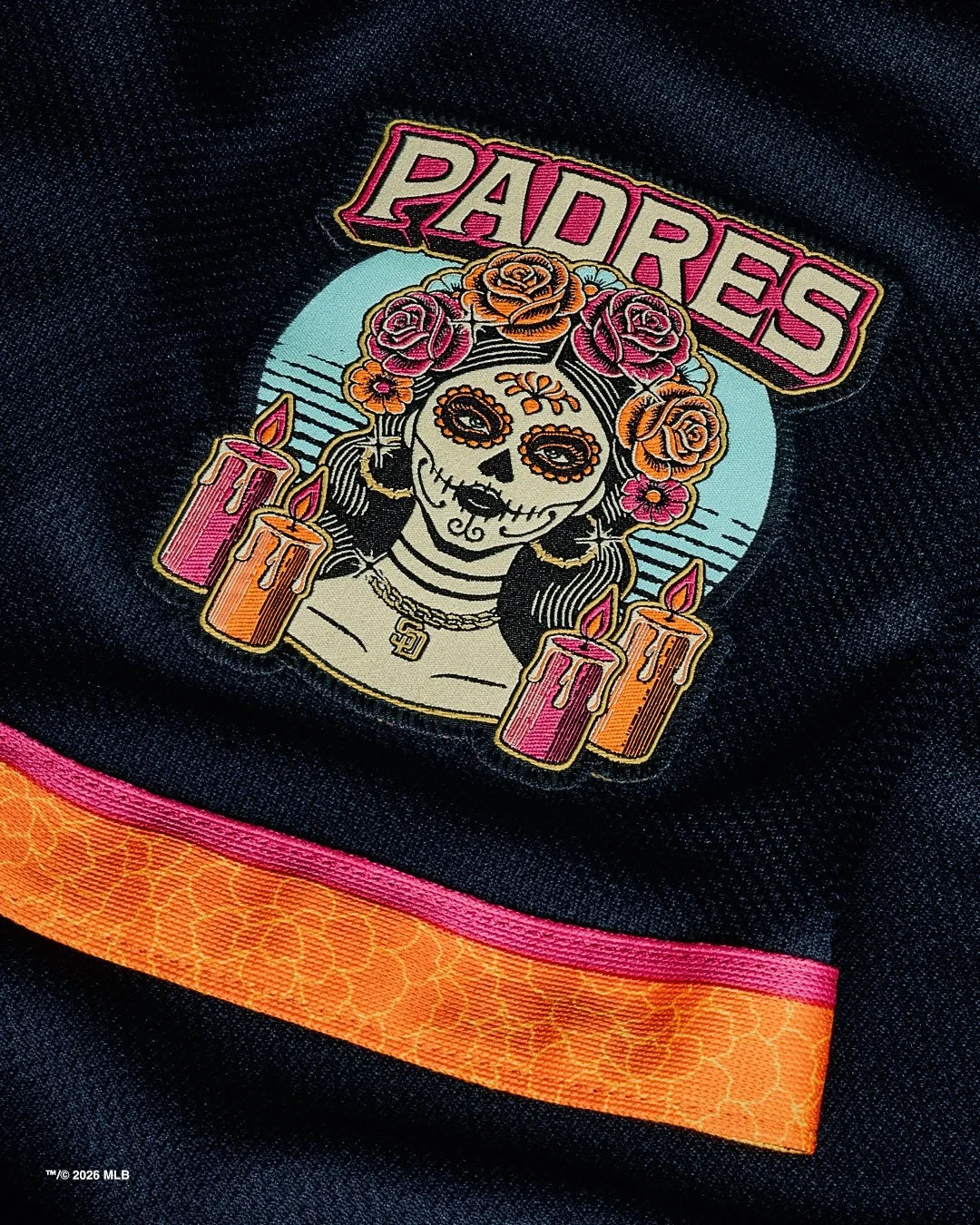
The jersey includes a patch featuring La Catrina, one of the most recognizable symbols of Día de los Muertos.
La Catrina, traditionally depicted as an elegantly dressed skeleton, represents remembrance and celebration of life within Mexican culture. On the Padres’ uniform patch, she is illustrated wearing a traditional floral crown, surrounded by ofrenda candles, with an aqua-colored Pacific Ocean backdrop tying the imagery back to San Diego’s coastal setting.
The inclusion of the patch further highlights the team’s effort to acknowledge and celebrate the shared cultural identity between San Diego and neighboring Mexico.
The City Connect look also includes a redesigned cap. The hat features the familiar interlocking “SD” logo, but with a new color combination: a marigold “S” layered over an obsidian “D.” The logo sits on a bone-colored crown, paired with an obsidian bill, tying together the palette used throughout the uniform. The result is a cap that feels both distinctive and cohesive with the jersey design.
Fans won’t have to wait long to see the new uniforms in action.
The Padres will debut the City Connect set during a matchup against the Colorado Rockies at Petco Park. Following the debut, the team plans to wear the uniforms primarily on Friday nights, continuing the tradition established with their previous City Connect set.
Since the launch of the City Connect series, the Padres have embraced bold designs more than most franchises.
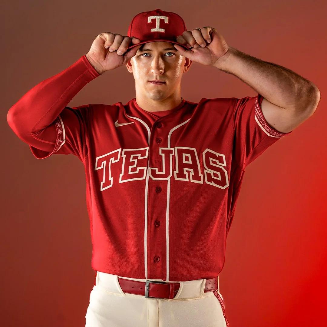
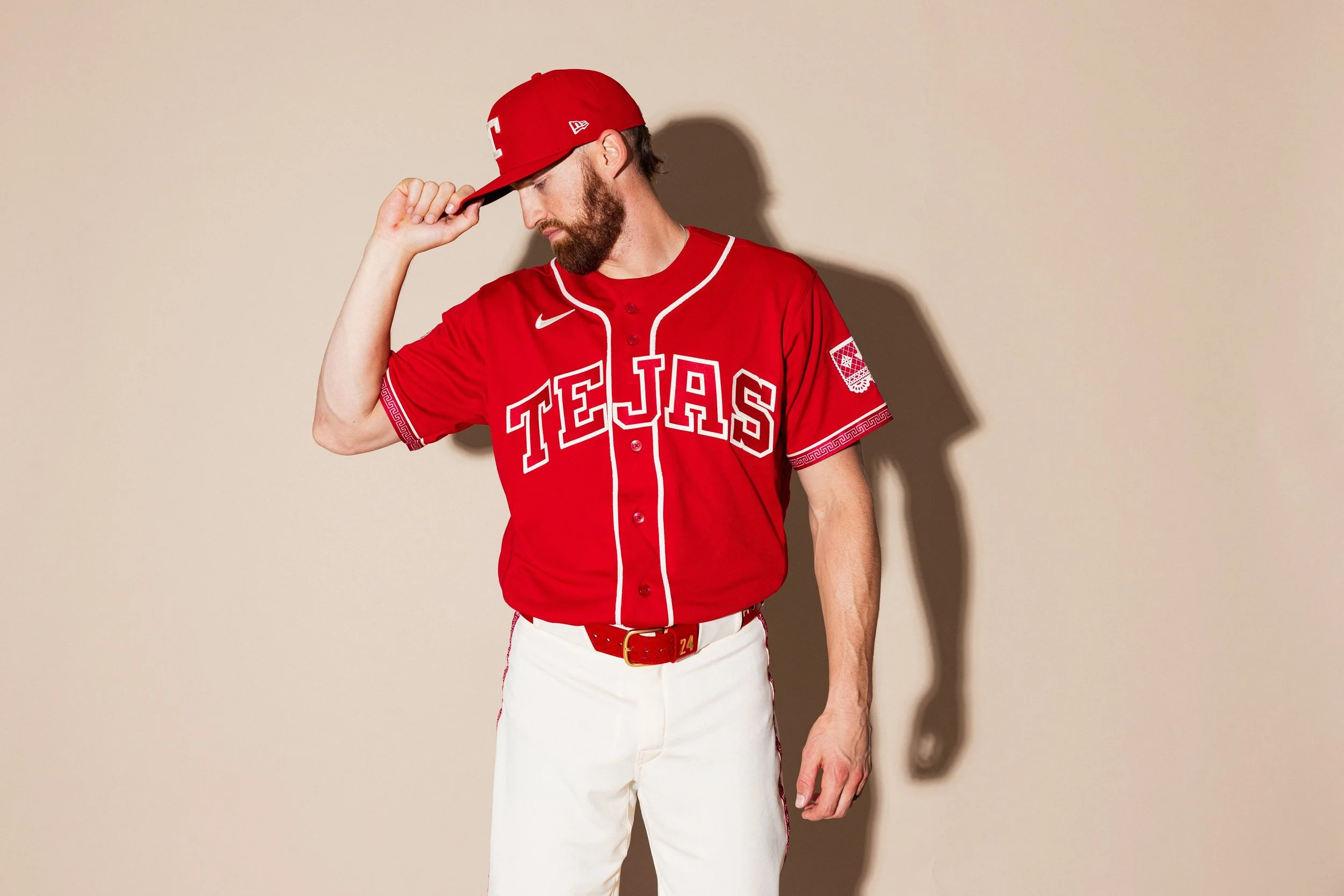
The Texas Rangers have officially revealed their City Connect 2.0 uniforms, ushering in a bold new chapter in the club’s identity while celebrating the deep Mexican and Tejano influences that shape culture across the state of Texas.
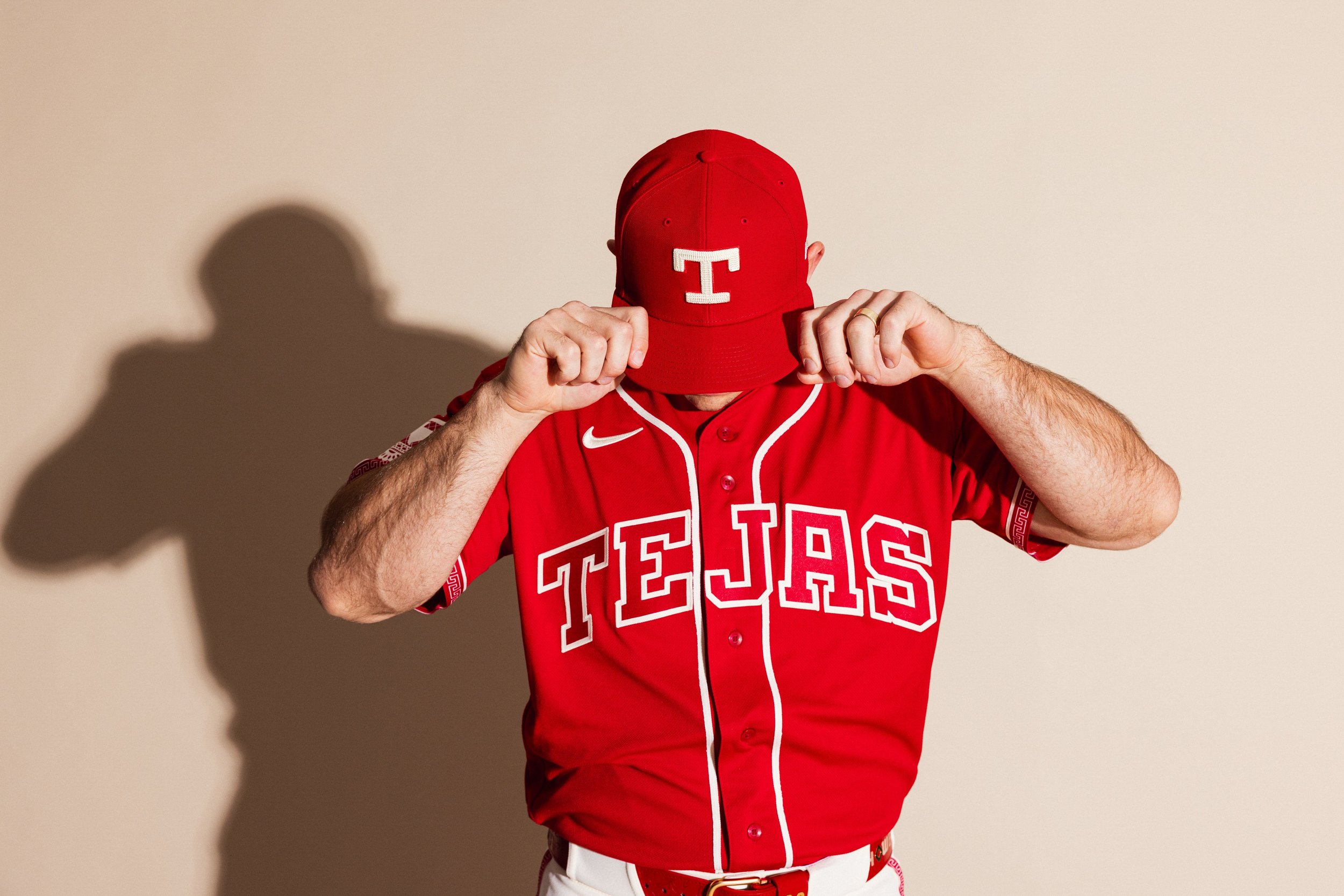
As the Rangers retire their popular “Peagle” City Connect look, the new uniform shifts the focus from the Metroplex to a broader celebration of Texas heritage, particularly the traditions and communities rooted in Mexican-American culture. At the center of the new design is the word “Tejas,” displayed prominently across the chest.
While many recognize it simply as “Texas” in Spanish, the word actually traces its origins to the Caddo language, spoken historically by Native American groups throughout Texas and Oklahoma. Over time, the word evolved into “Texas,” making “Tejas” both a linguistic and cultural bridge between the region’s Indigenous and Hispanic roots.
For the Rangers, the use of “Tejas” is also a direct tribute to the Tejano culture that has long shaped the state’s identity.
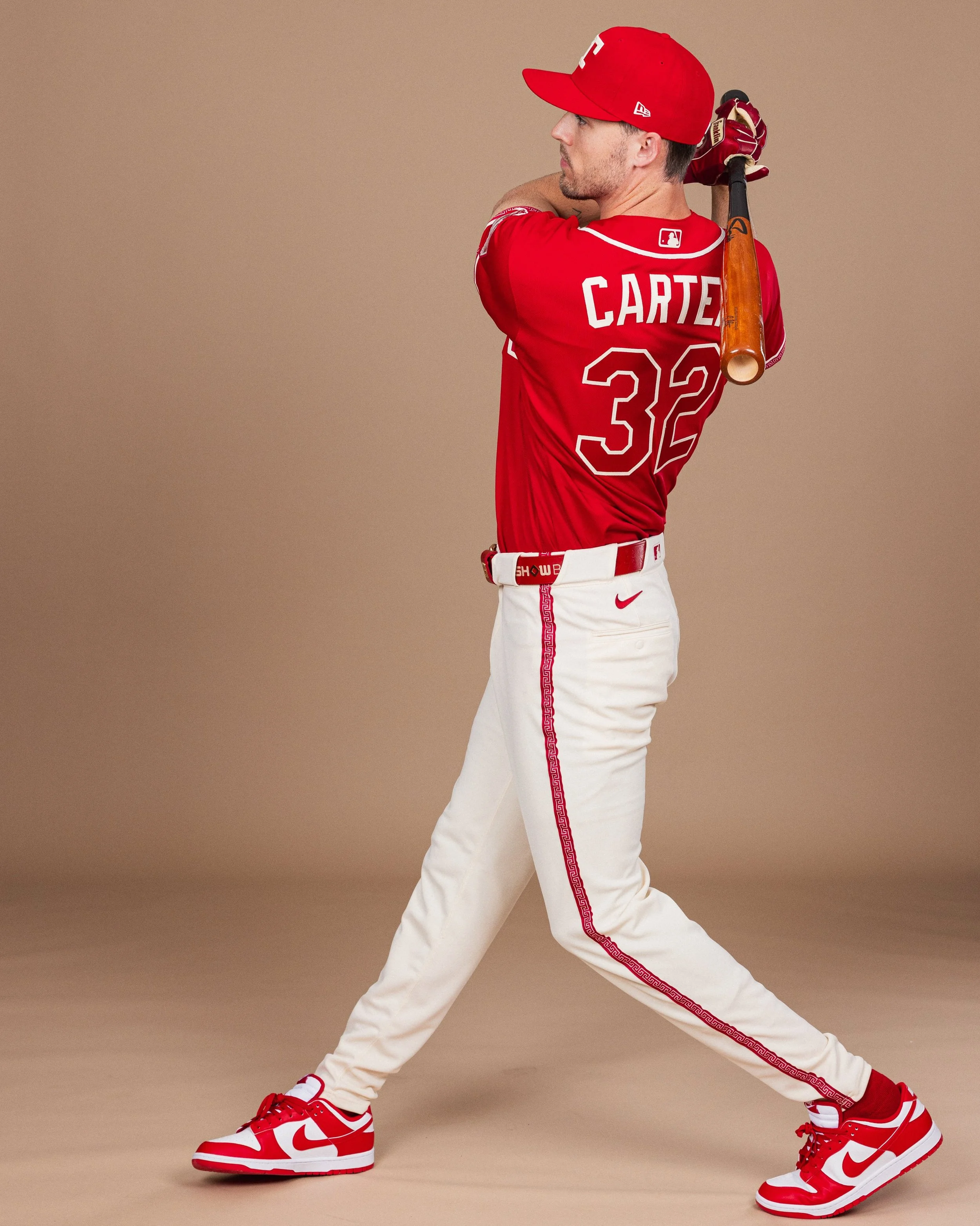
One of the most striking elements of the uniform is its rich crimson red color. While red appeared in the Rangers’ uniforms during the 1980s and 1990s, it disappeared from the rotation after 2022. Now, the shade returns with deeper meaning.
The red used in the City Connect uniform is inspired by cochineal dye, a historically significant crimson pigment derived from the cochineal insect. The dye has been used for centuries in Mexican art, textiles, and clothing worn by nobility and royalty. The result is a shade that feels both historic and symbolic, tying the uniform to artistic traditions that stretch back generations.
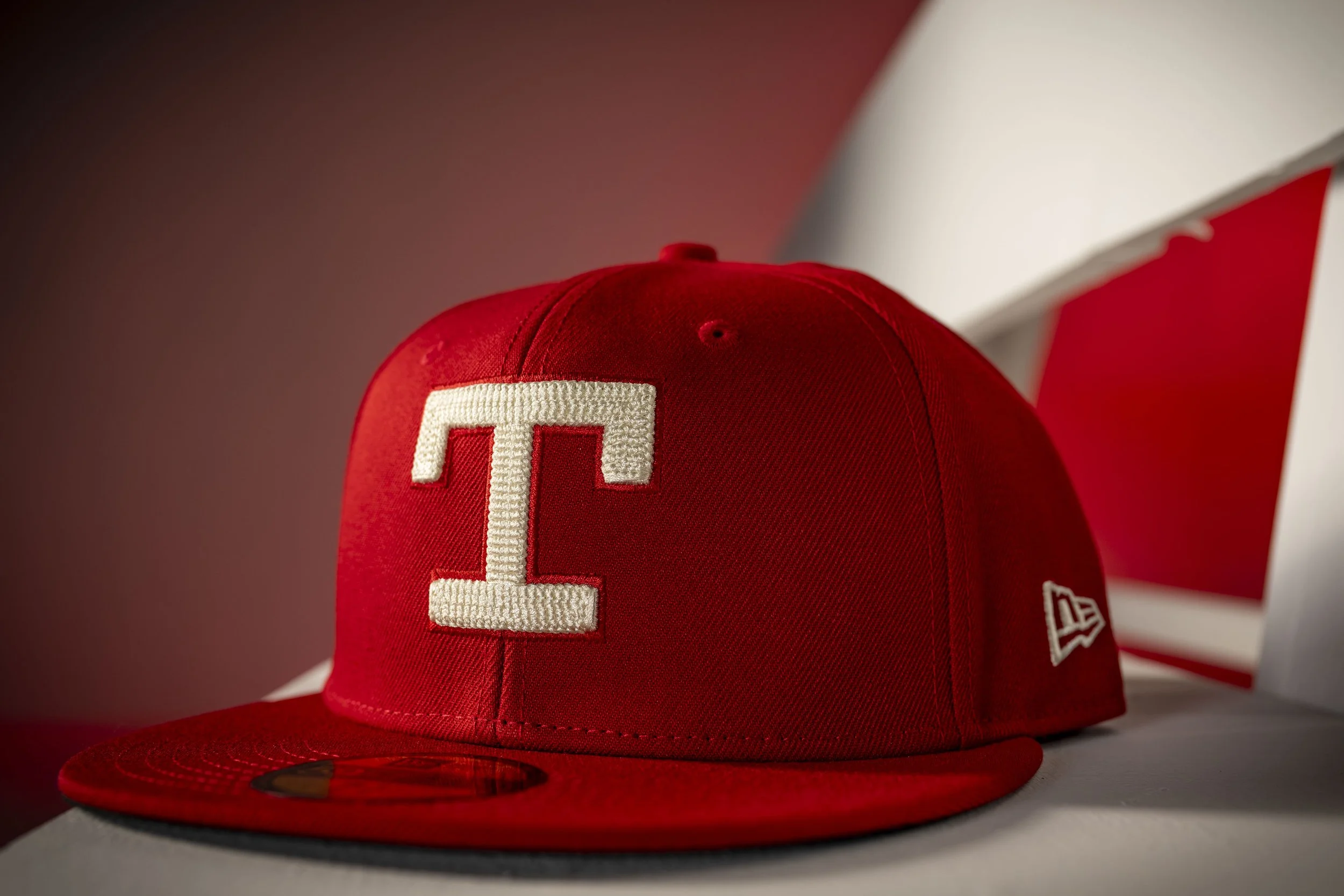
The typography on the uniform also nods to the franchise’s past. The block “T” logo on the cap mirrors the design used on Rangers uniforms during the 1970s, while the block lettering used for “Tejas” draws inspiration from the team’s road grey uniforms of the 1980s and early 1990s.
Together, the design elements reflect the theme of “reimagining tradition.” Rather than introducing something entirely new, the Rangers and Nike combined historic franchise visuals with cultural storytelling to create something that feels both nostalgic and modern.
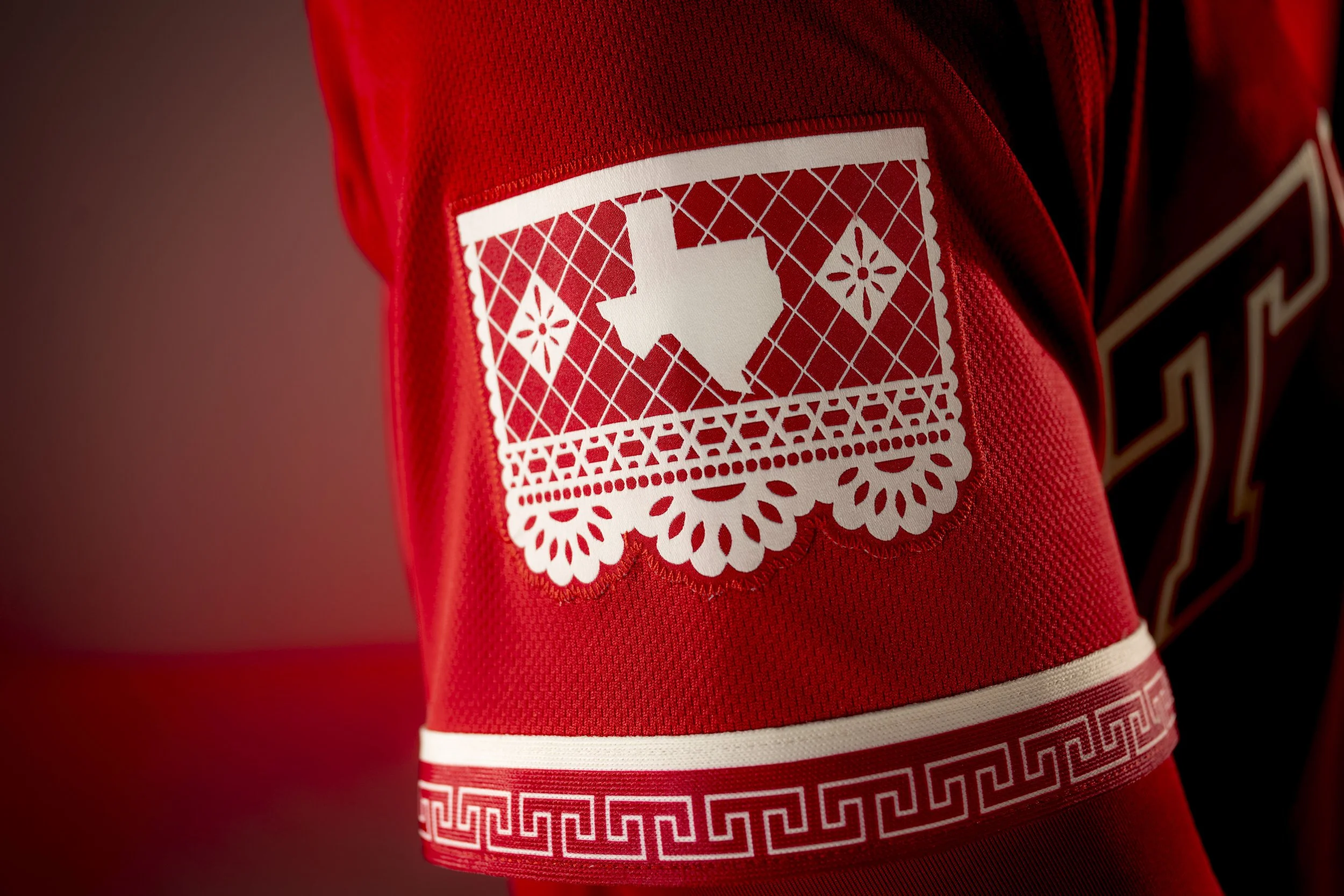
Look closer at the uniform and you'll find one of its most intricate design touches. A Charro-inspired pattern runs along the sleeve piping and pant piping, while also appearing on the belt, socks, inside the cap, and inside the jersey collar. The Charro design originates from the traditional attire worn by Mexican horsemen and is also commonly seen on mariachi trajes, including those worn by the Mariachis de los Texas Rangers identity. It’s a subtle but elegant design element that ties the uniform back to Mexican heritage and craftsmanship.
Another standout detail appears on the left sleeve. The sleeve patch features a papel picado-inspired design, referencing the traditional Mexican folk art of cutting elaborate patterns into colorful tissue paper. Papel picado is often seen during celebrations such as weddings, festivals, and the Día de los Muertos. The patch includes an outline of the state of Texas with the Texas flag reimagined in a papel picado style, symbolizing both celebration and joy, two themes deeply embedded in Mexican cultural traditions.
City Connect uniforms are designed to tell stories about the communities teams represent, and the Rangers’ City Connect 2.0 does exactly that.
Few athletes in sports history carry the cultural and athletic significance of Jackie Robinson. While most fans remember Robinson for breaking baseball’s color barrier with the Brooklyn Dodgers, his legacy also runs deep through the foundation of UCLA Bruins baseball.
Now, the Bruins are honoring that connection with a special Jackie Robinson-inspired uniform that celebrates one of the most iconic figures in both baseball and UCLA history.
Before Robinson became a global symbol for equality in sports, he was already making waves in college athletics. Raised in Pasadena, California, Robinson stayed close to home when he enrolled at University of California, Los Angeles.
Once he arrived in Westwood, Robinson quickly proved he was a once-in-a-generation athlete. He wasn’t just a standout in baseball. Robinson starred across four different sports at UCLA.
His incredible versatility made him one of the most dynamic athletes in school history. While baseball would ultimately become the path that carried him to worldwide recognition, Robinson’s impact on UCLA athletics remains unmatched.
That connection still exists today, as the Bruins play their home games at Jackie Robinson Stadium—a constant reminder of the legend who once wore the same colors.
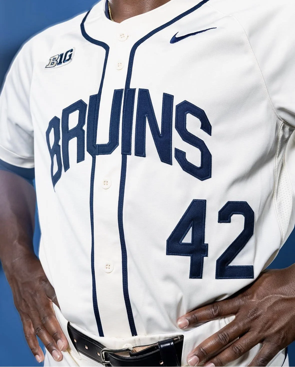
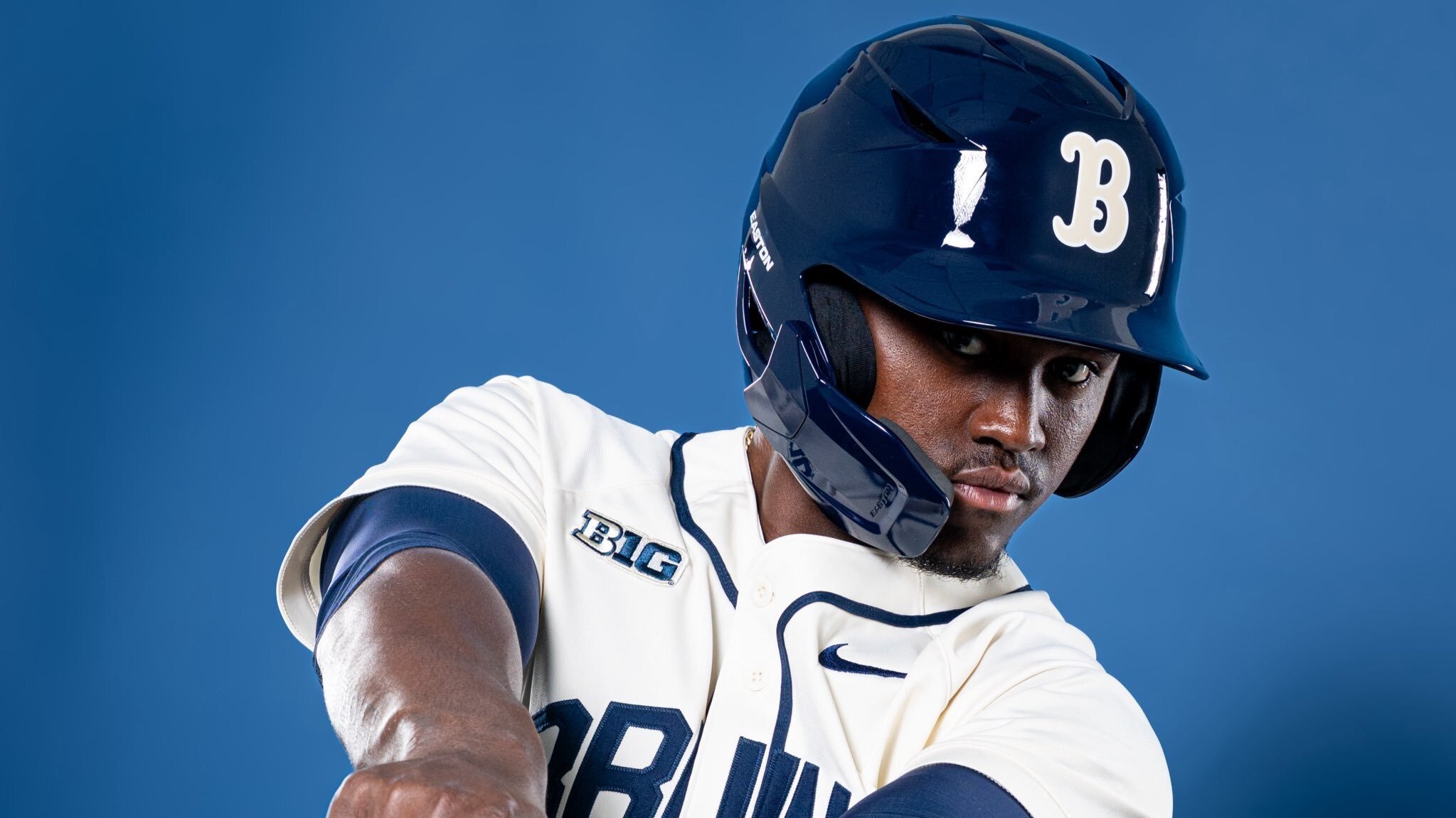
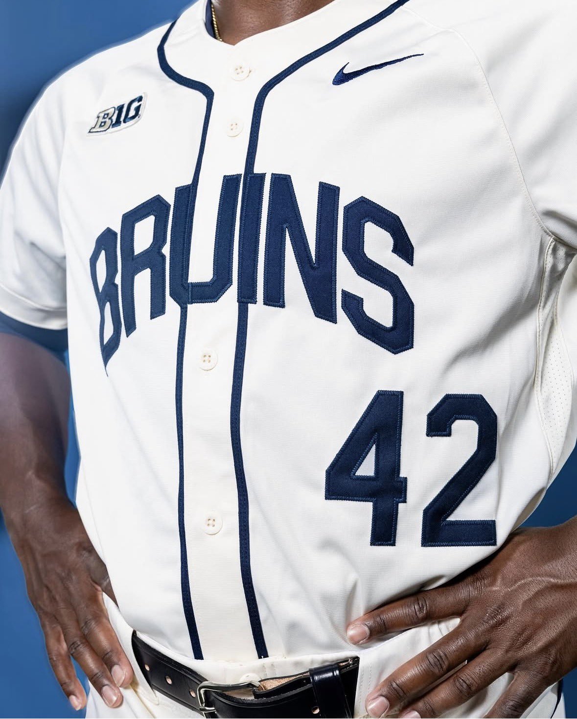
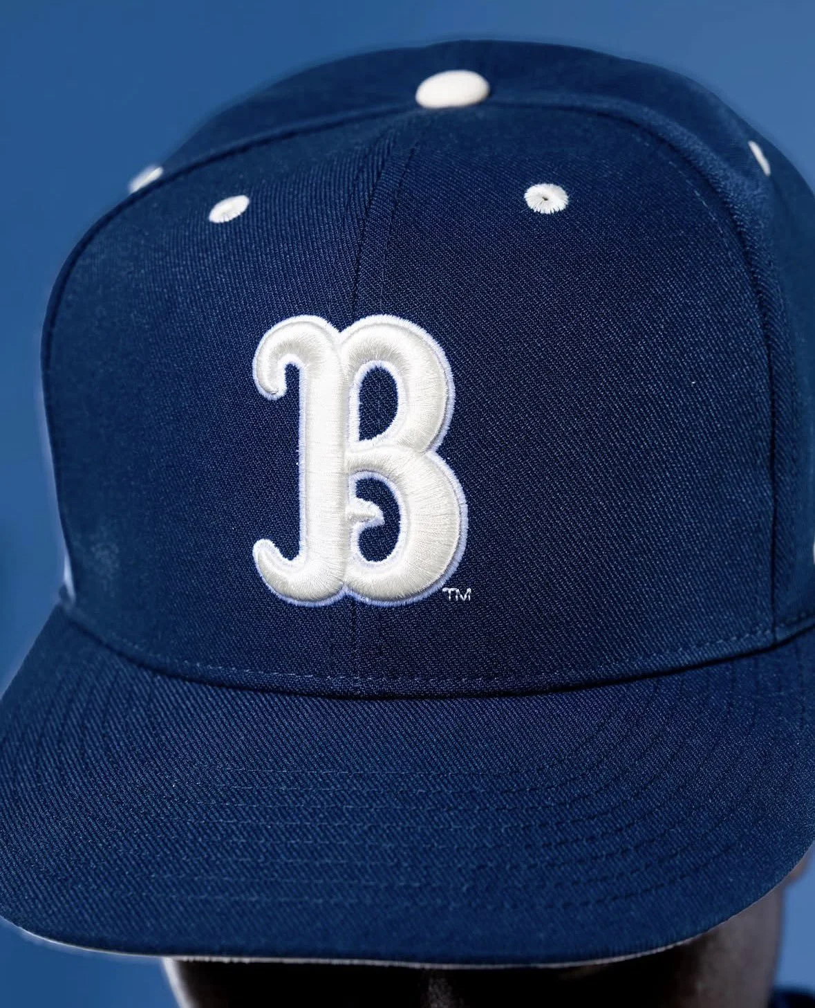
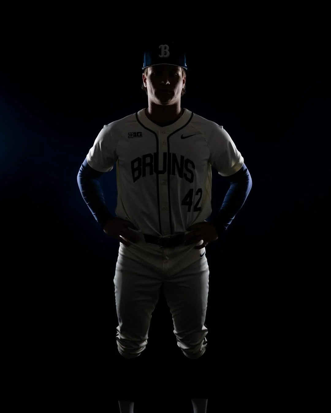
Recently, the official account for UCLA baseball shared images of a special Robinson-themed jersey, giving fans a first look at the tribute design.
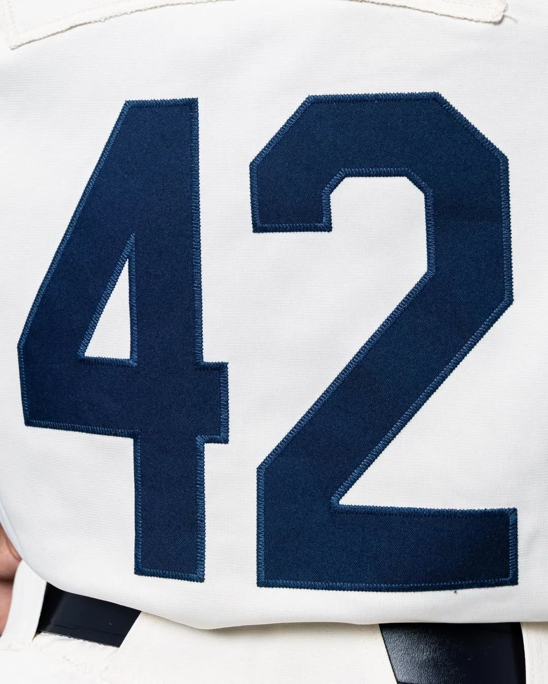
The uniform features a darker navy shade than the Bruins’ standard look, creating a distinct visual identity while still staying rooted in the program’s traditional color palette. Front and center on the jersey is Robinson’s iconic No. 42, a number synonymous with his impact on the game.
It’s a simple yet powerful design, one that connects past and present while paying respect to the athlete who helped shape both UCLA and baseball history.
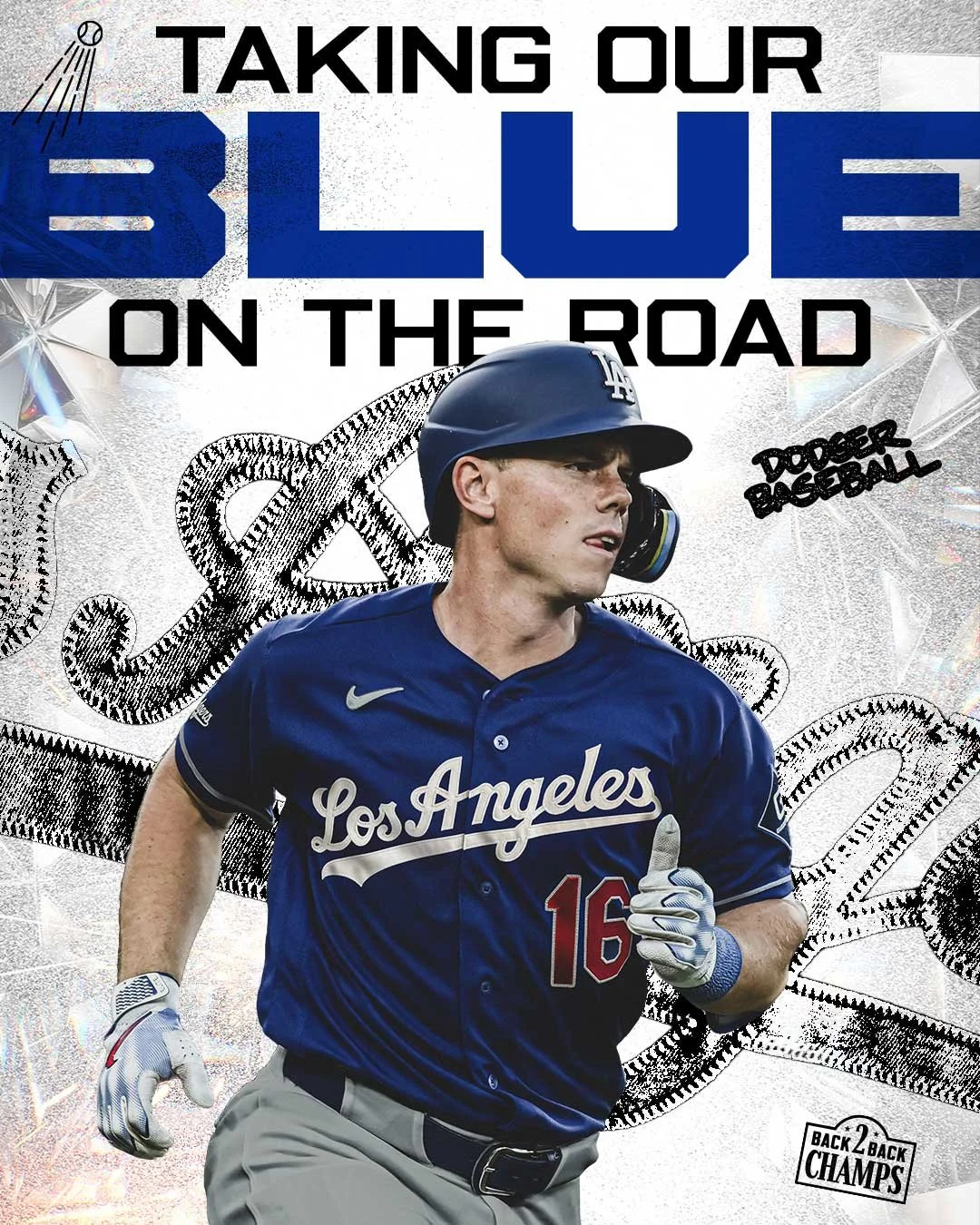
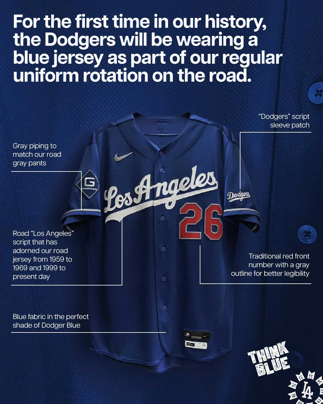
For the first time in franchise history, the Dodgers will debut blue road jerseys as part of their regular road uniform rotation. The club revealed the new look on Thursday, signaling a subtle but meaningful shift in one of baseball’s most iconic uniform traditions.
“Dodger Blue” is one of the most recognizable colors in sports. While the Dodgers have worn blue jerseys during spring training and for alternate uniforms in the past, they have never included a blue jersey as part of their official road rotation until now.
“It’ll be fun. First time, I guess, in history, so it’ll be a nice thing to see,” said Dodgers manager Dave Roberts. “They look good.”
The introduction of the new road option keeps the team’s classic identity intact while adding a modern variation for players and fans. The jersey stays true to the franchise’s signature look. Across the front sits the iconic “Los Angeles” script, the same design that has appeared on the team’s traditional grey road uniforms since 1999. The familiar red player numbers also return to the front of the jersey, now featuring a grey outline to complement the overall road aesthetic.
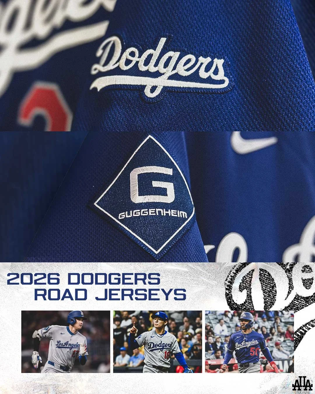
The sleeves introduce a notable change: a script “Dodgers” patch replaces the traditional interlocked “LA” logo typically seen on Dodgers uniforms.
Grey piping along the sleeves ties the jersey together with the team’s classic grey road pants, helping the new design feel like a natural extension of the Dodgers’ long-standing uniform system.
While the blue jerseys represent a historic addition, the Dodgers aren’t abandoning their traditional road looks.
The team will continue wearing its two long-standing grey road uniforms, including:
The grey jersey with “Los Angeles” across the chest
The grey jersey with “Dodgers” across the front
Both classic designs still feature the team’s signature red numbers on the front, a hallmark detail that has defined the Dodgers’ road identity for decades.
For a franchise with one of the most recognizable uniforms in professional sports, even a small change can feel significant.
The addition of blue road jerseys allows the Dodgers to expand their uniform rotation while staying rooted in tradition. By pairing the familiar “Los Angeles” script and classic number styling with Dodger Blue, the team has created a look that feels both historic and fresh at the same time.
And when the Dodgers step onto the field in Washington this week, fans will witness a small but notable moment in uniform history—the first true blue road jersey in Dodgers franchise history.
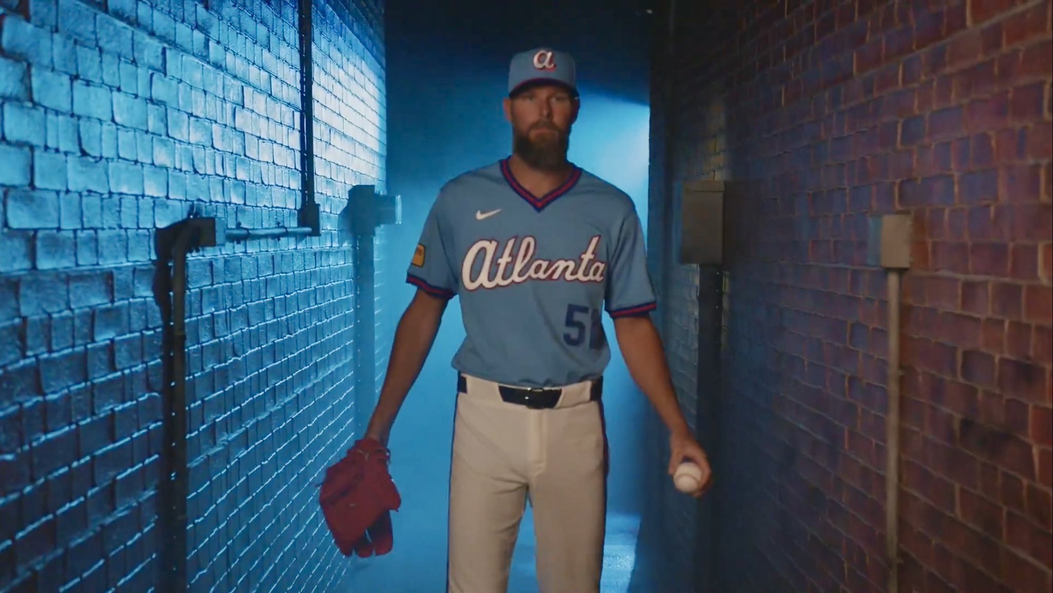
The Atlanta Braves are leaning into nostalgia with the unveiling of their newest City Connect uniform, a design that celebrates one of the most unique eras in baseball broadcasting, the time when Braves games were televised nationwide on Turner Broadcasting System.
The release video for the uniform paid tribute to the period when the Braves became “America’s Team” thanks to their games airing across the country on TBS. The timing of the reveal is fitting, coinciding with the franchise’s 60th anniversary in Atlanta and the launch of the club’s new direct-to-consumer broadcast platform, BravesVision, later this year.
Together, the uniform and the broadcast initiative signal a return to the team’s deep television roots while embracing the modern era of baseball distribution.
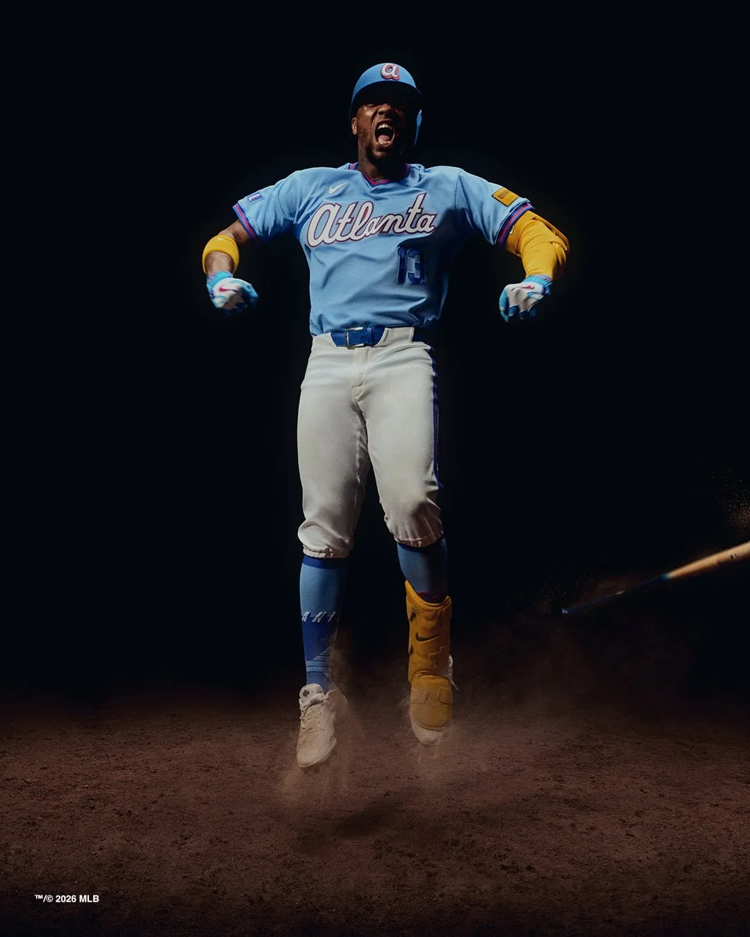
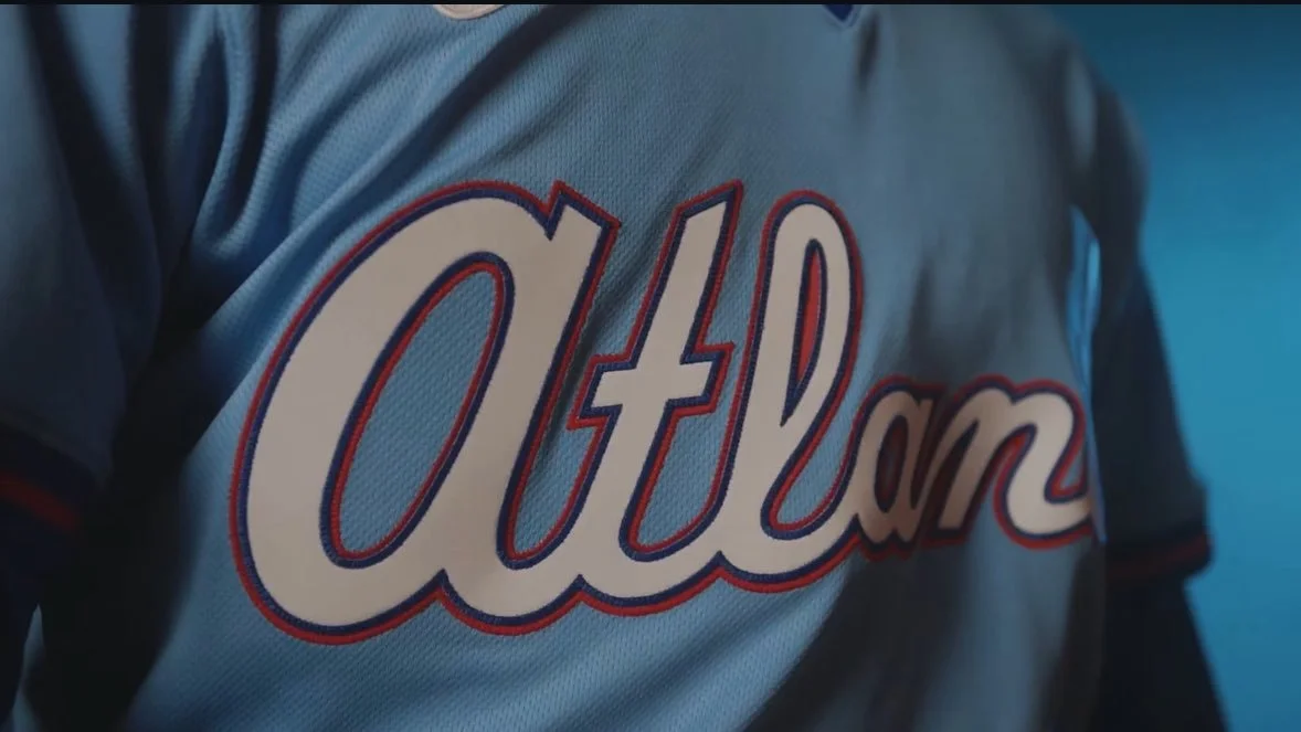
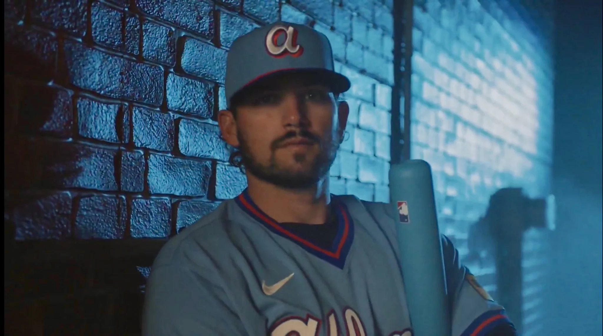
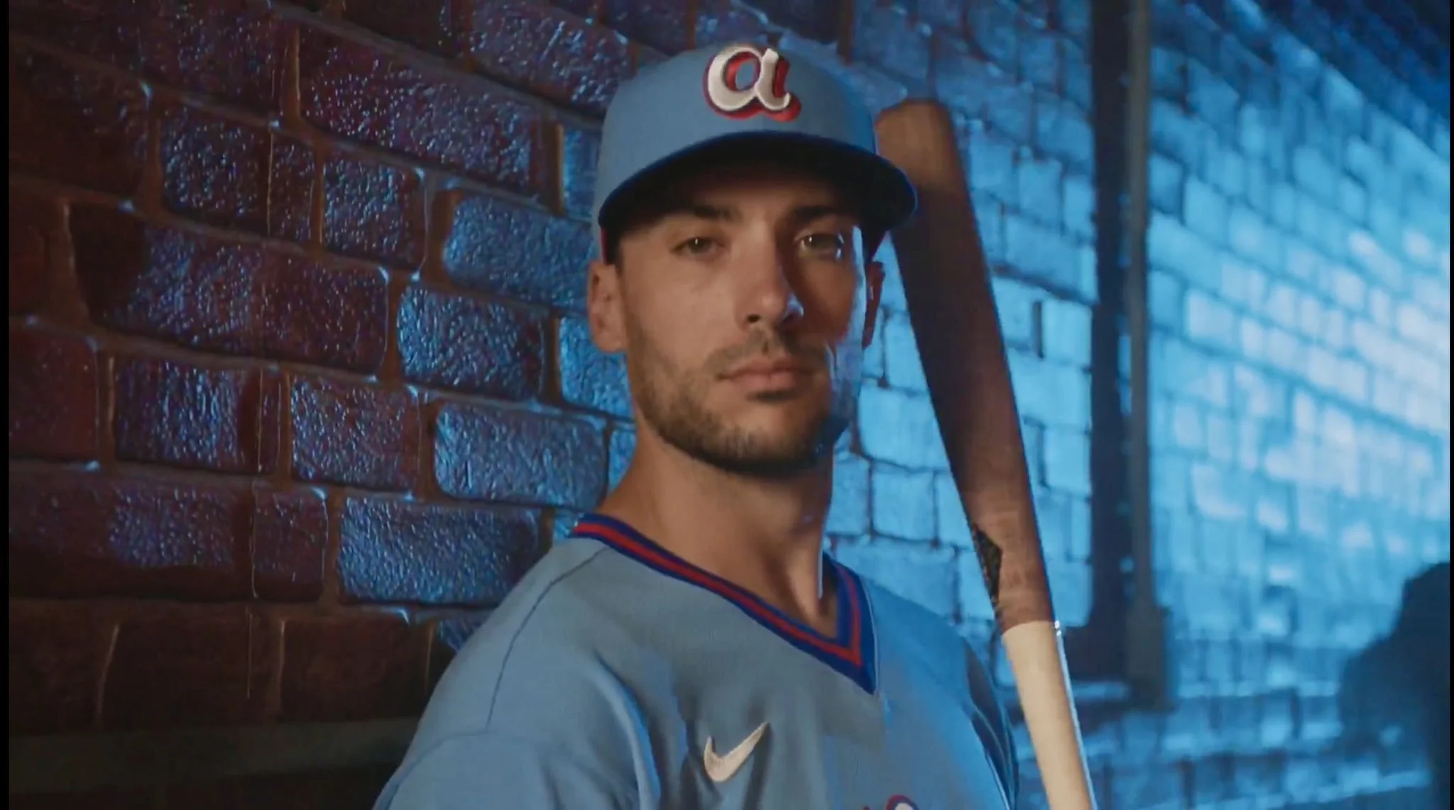
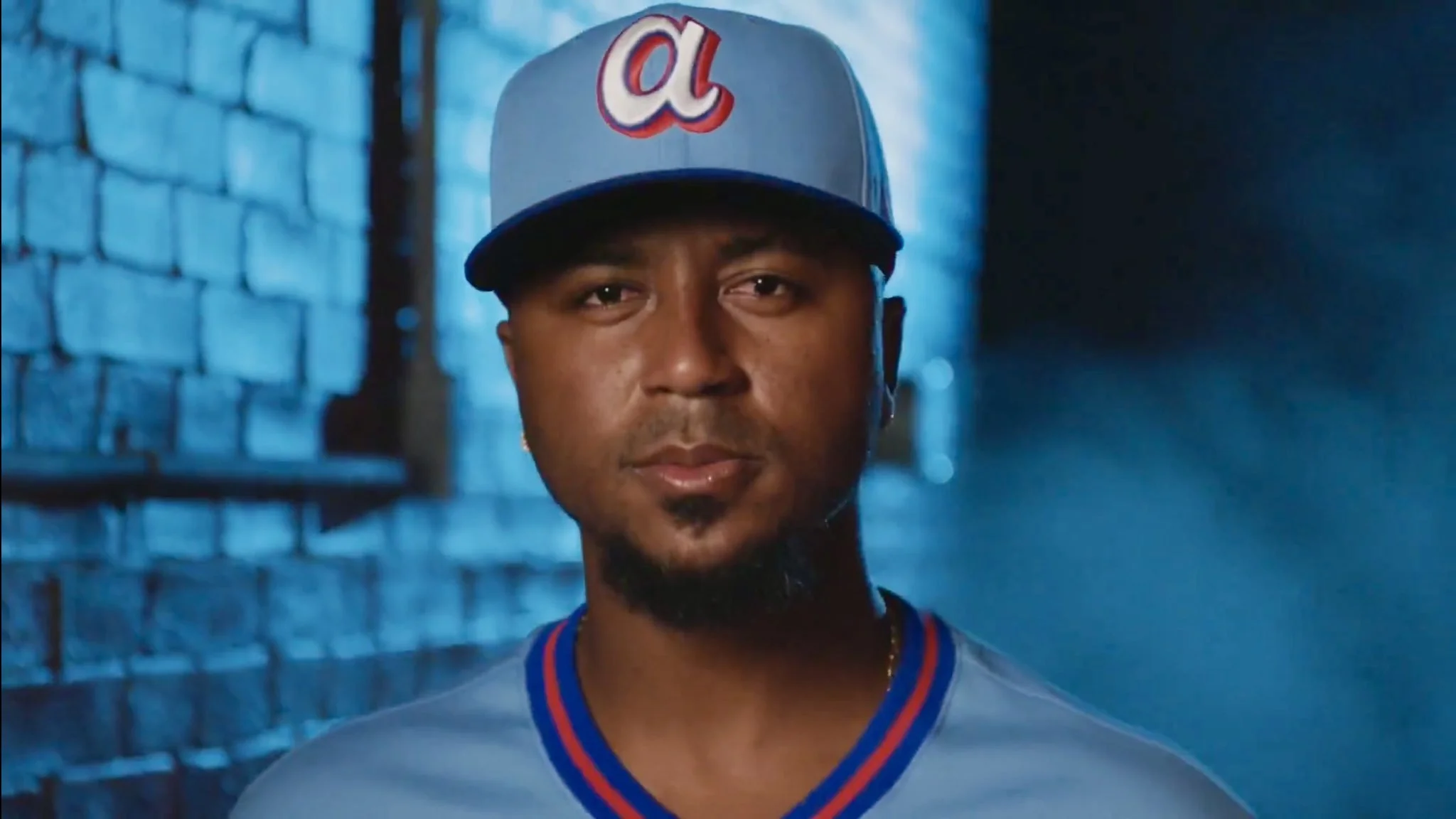
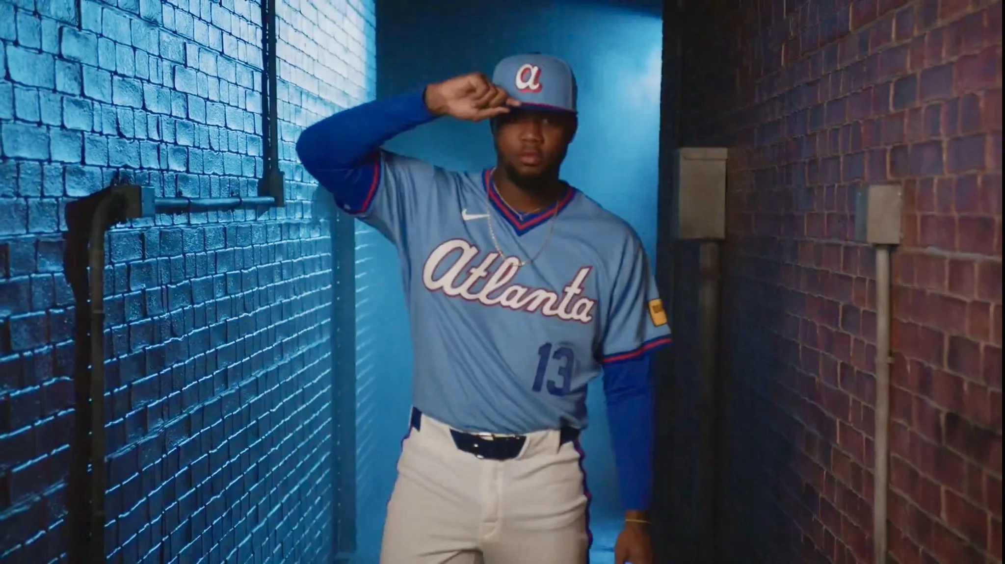
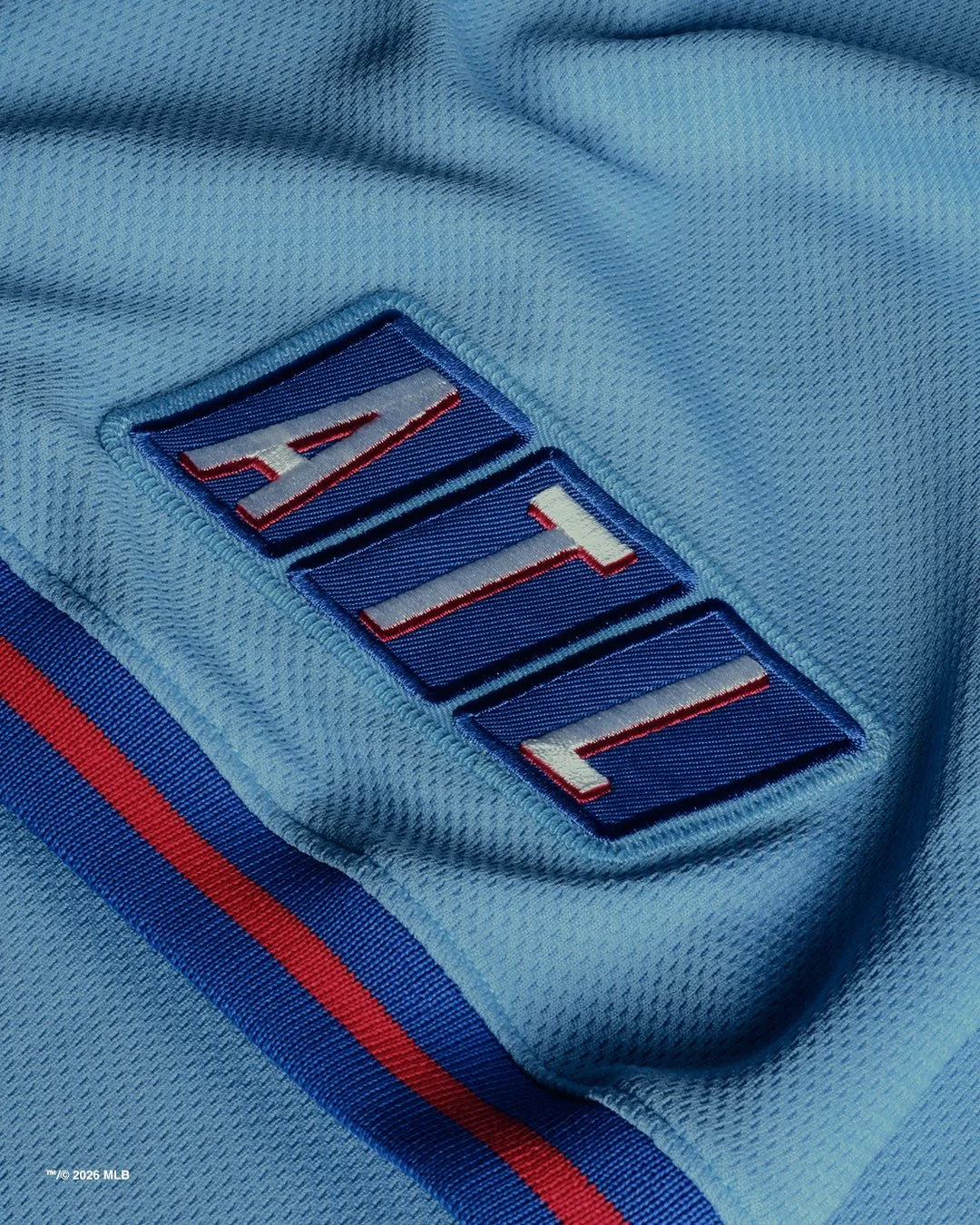
The centerpiece of the new uniform is a baby blue jersey, a color that immediately evokes classic Braves looks from the 1980s. Across the chest sits “Atlanta” in white script with a red outline, giving the jersey a clean and unmistakably retro feel. Blue and red piping runs along the sleeves and collar, a design element reminiscent of the uniforms worn during the era of franchise legend Dale Murphy.
While those classic uniforms leaned heavily on blue and white, the addition of red here brings the design more in line with the Braves’ modern color palette.
The jersey is paired with white pants featuring red and blue piping running down the sides of each leg, further reinforcing the vintage aesthetic.
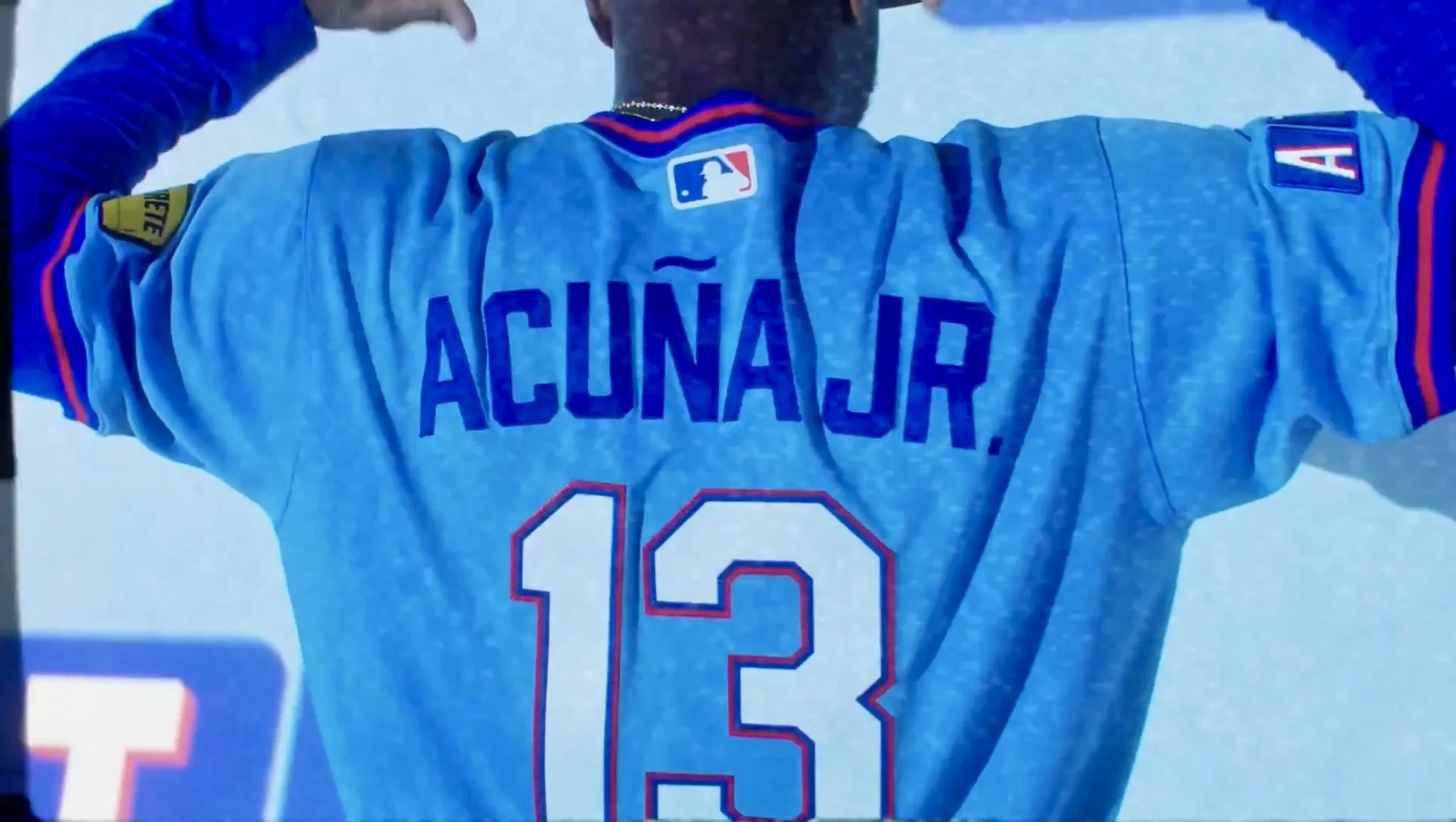
On the back, the player numbers appear in white with a red outline, while the front number is a darker shade of blue, creating contrast against the baby blue jersey base. It’s a subtle but effective detail that helps the uniform maintain readability while adding visual depth.
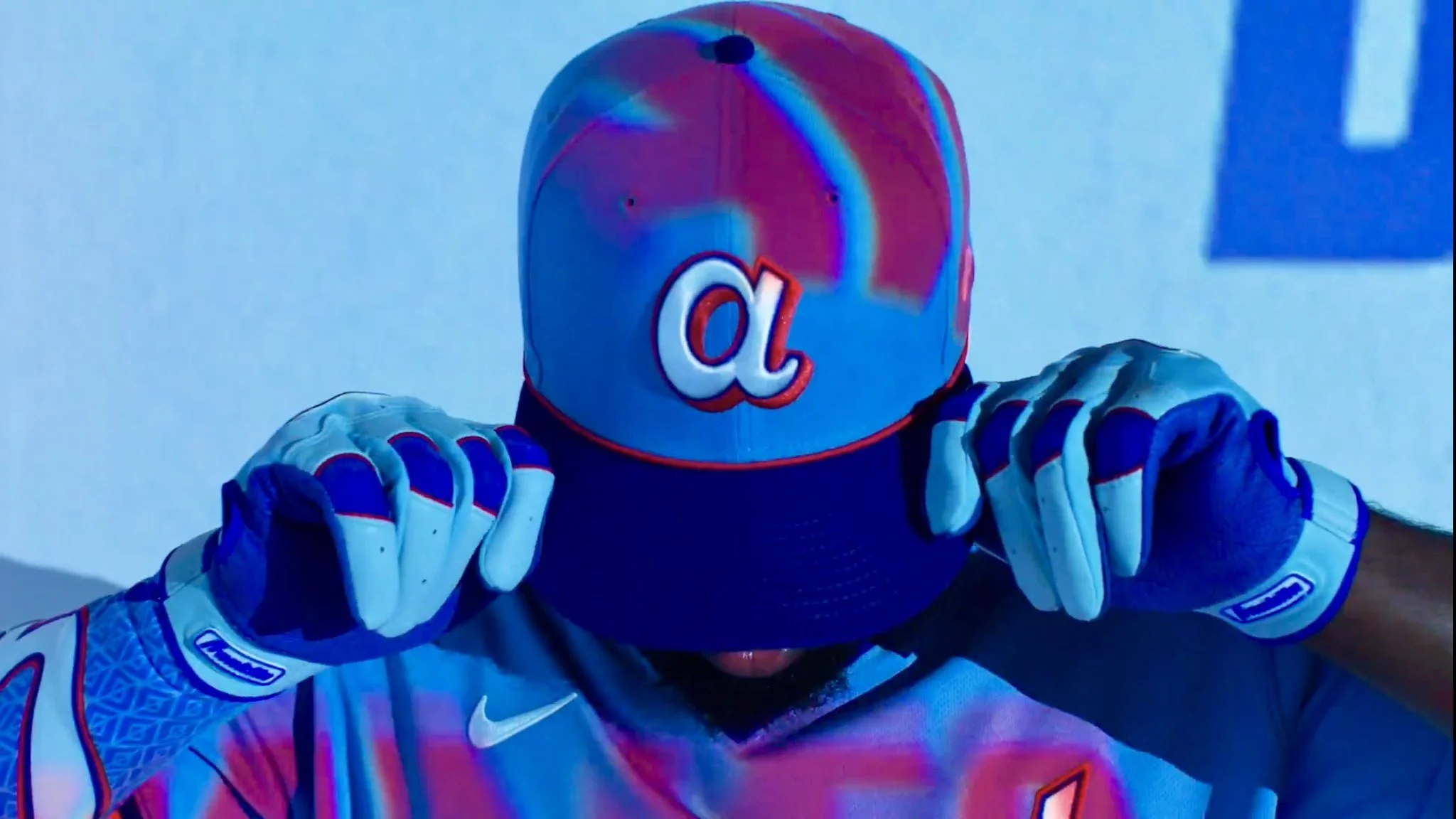
Completing the look is a cap featuring a white lowercase “A”, a simple mark that keeps the focus squarely on the uniform’s retro storytelling.
One of the most interesting elements of the design appears on the sleeve. An “ATL” patch closely resembles the look and feel of the classic TBS logo, directly referencing the Braves’ long-standing relationship with the network that helped turn the club into a national brand.
For decades, Braves games aired nationwide through TBS broadcasts, introducing fans across the country to the team and its players. With the decline of regional sports networks and the rise of direct-to-consumer streaming, the launch of BravesVision represents a new chapter in that broadcasting legacy.
The uniform’s design intentionally taps into that pre-regional sports network nostalgia, honoring what many fans still refer to as the “Braves Station.”
The new design will replace the Braves’ previous City Connect uniform, introduced in 2023.
That look featured the “For the A” slogan and was inspired by the 1970s era when Hank Aaron made baseball history by hitting his 715th career home run, passing Babe Ruth on the all-time list during the Hank Aaron's 715th home run.
While that uniform honored one of the greatest moments in baseball history, the new City Connect shifts the focus toward Atlanta’s national television legacy and the franchise’s cultural reach.
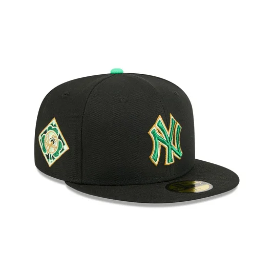
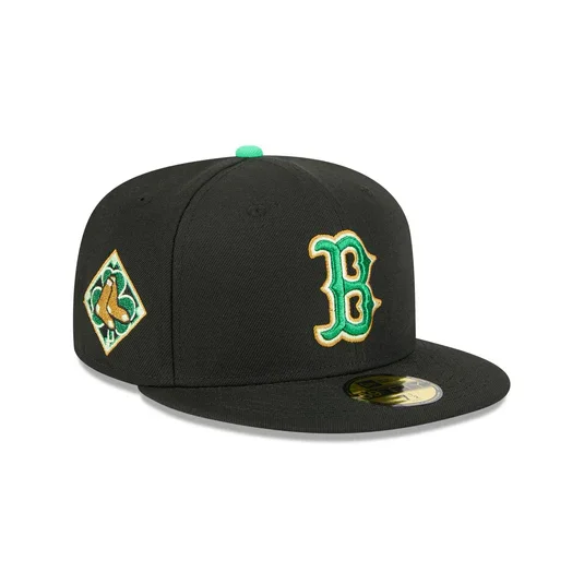
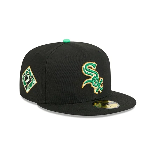
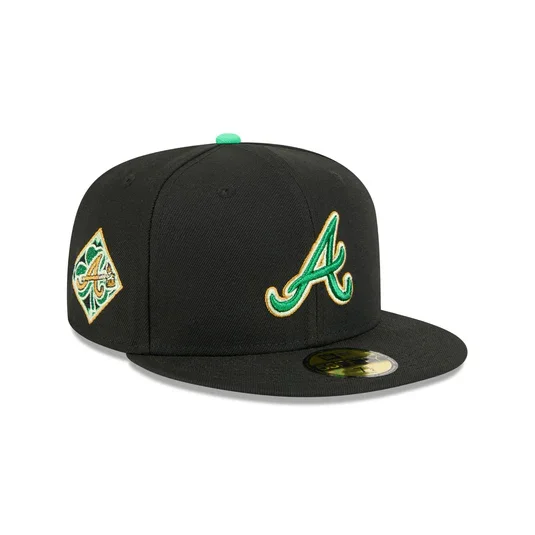
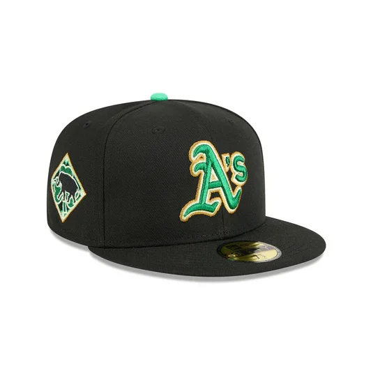
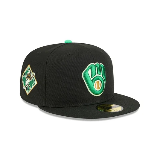
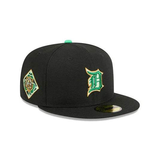
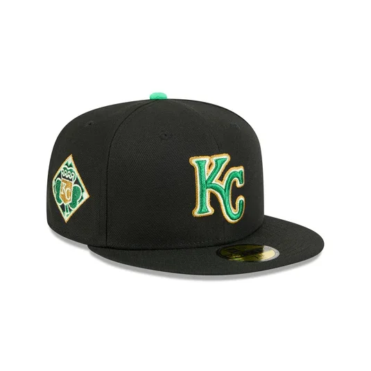
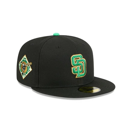
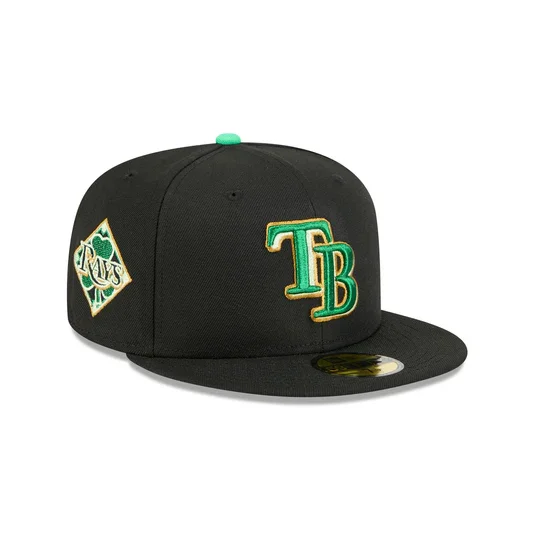
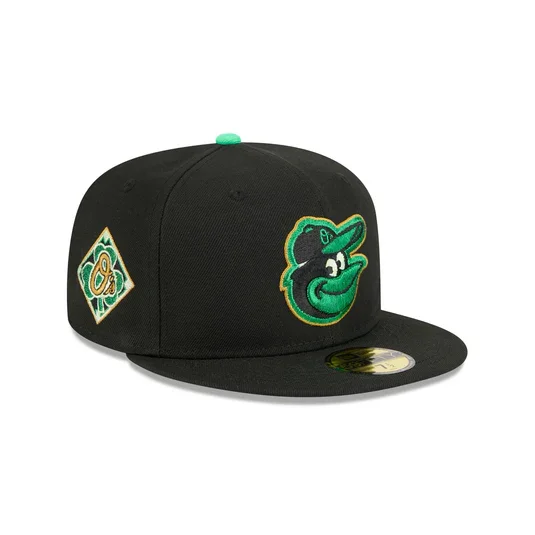
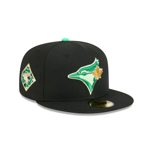
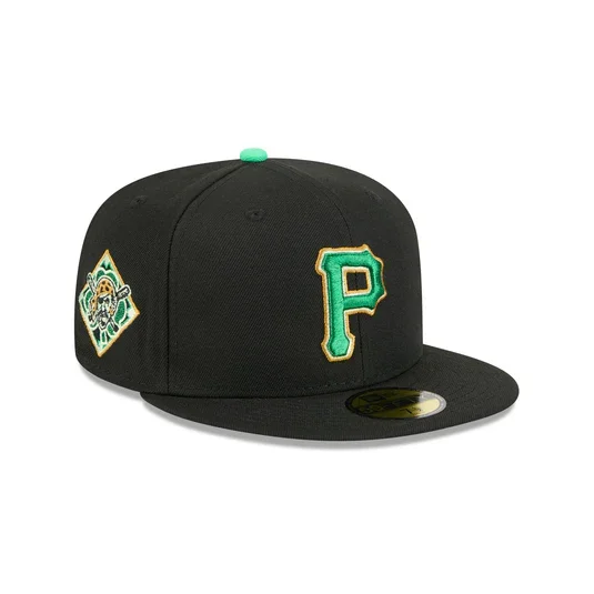
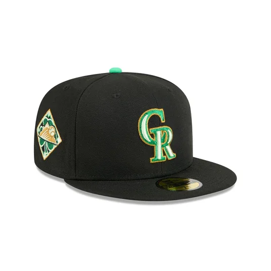
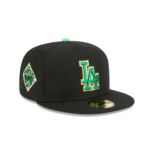
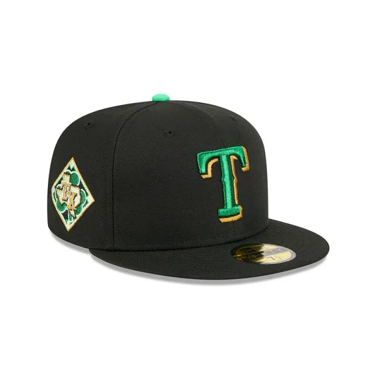
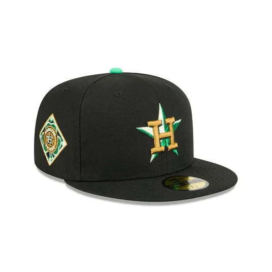
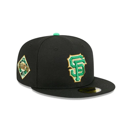
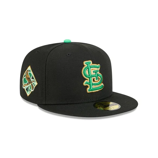
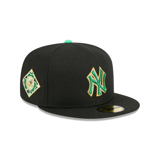
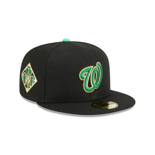
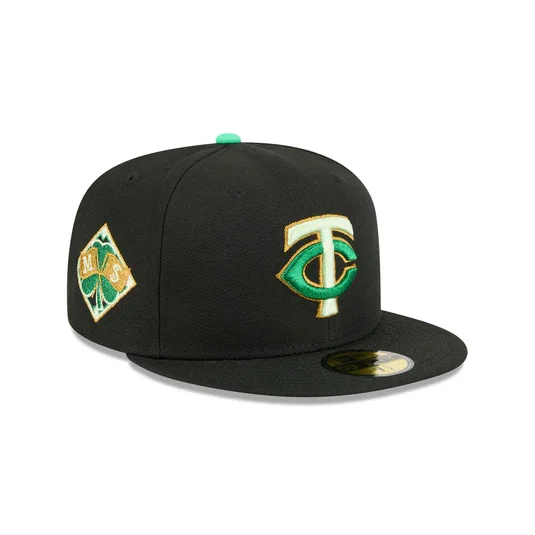
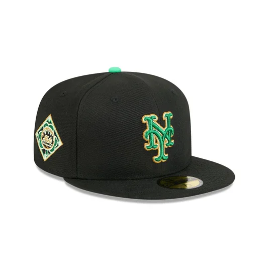
With St. Patrick’s Day around the corner, Major League Baseball and New Era have unveiled the official 2026 MLB St. Patrick’s Day caps, giving every club a festive look just in time for spring.
Each team across the league will sport the same themed design structure, allowing their individual logos to shine while still tying into the holiday’s signature green aesthetic.
The 2026 caps feature a black poly crown and visor. At the center of the design sits each team’s logo, embroidered in a Kelly green, gold, and white color combination. The vibrant palette ensures that the logos pop against the darker base while staying true to the St. Patrick’s Day theme.
Several smaller design touches bring the look together. A diamond-shaped side patch featuring a shamrock print adds another festive detail, while a green shamrock embroidered on the back of the cap reinforces the holiday connection. The hats are finished with a black undervisor, keeping the overall aesthetic clean and balanced.
MLB’s annual St. Patrick’s Day caps have become a fan-favorite collectible over the years, offering a seasonal twist on traditional team headwear.
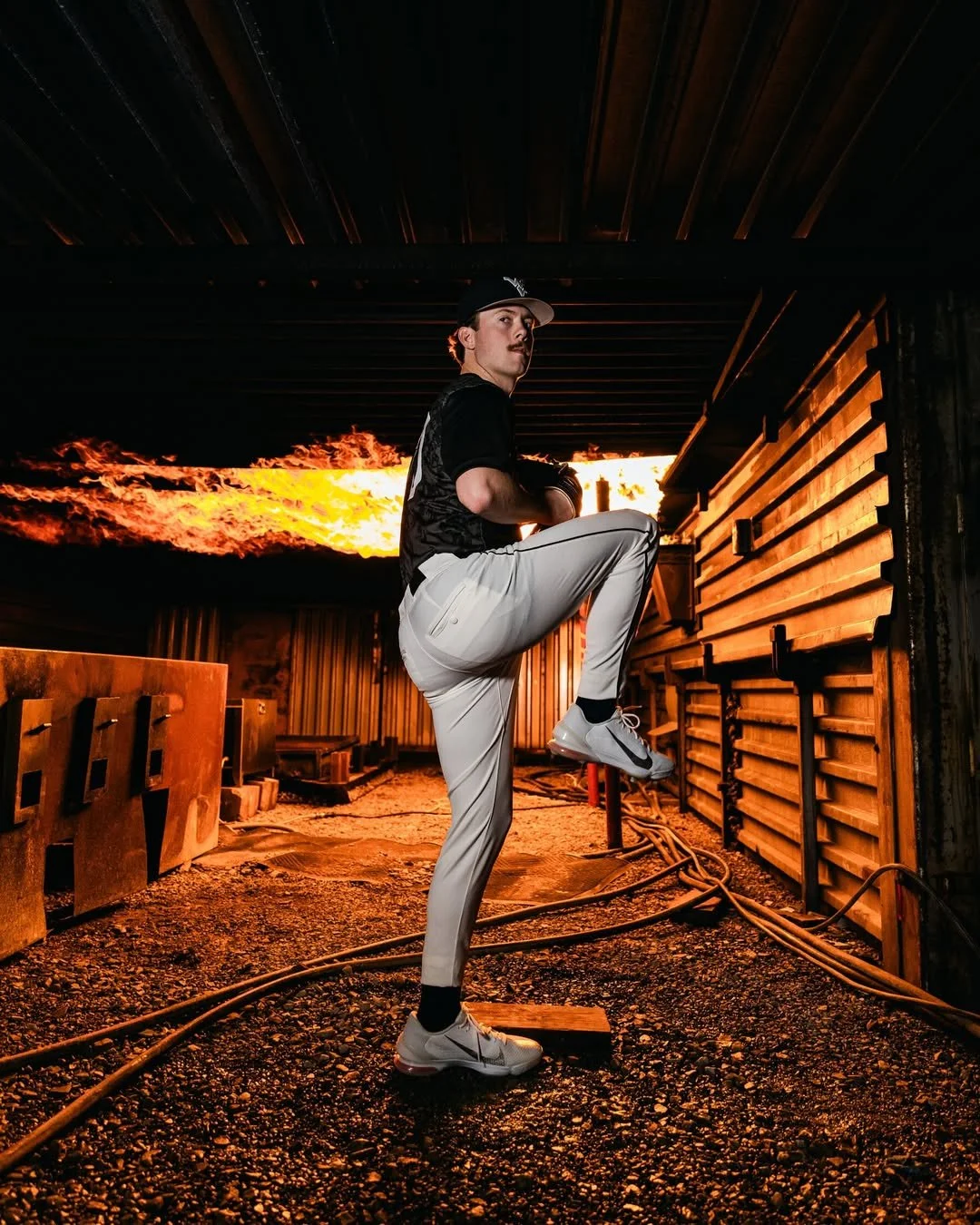
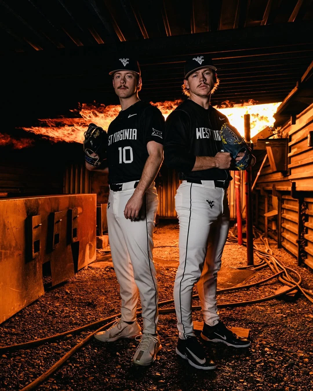
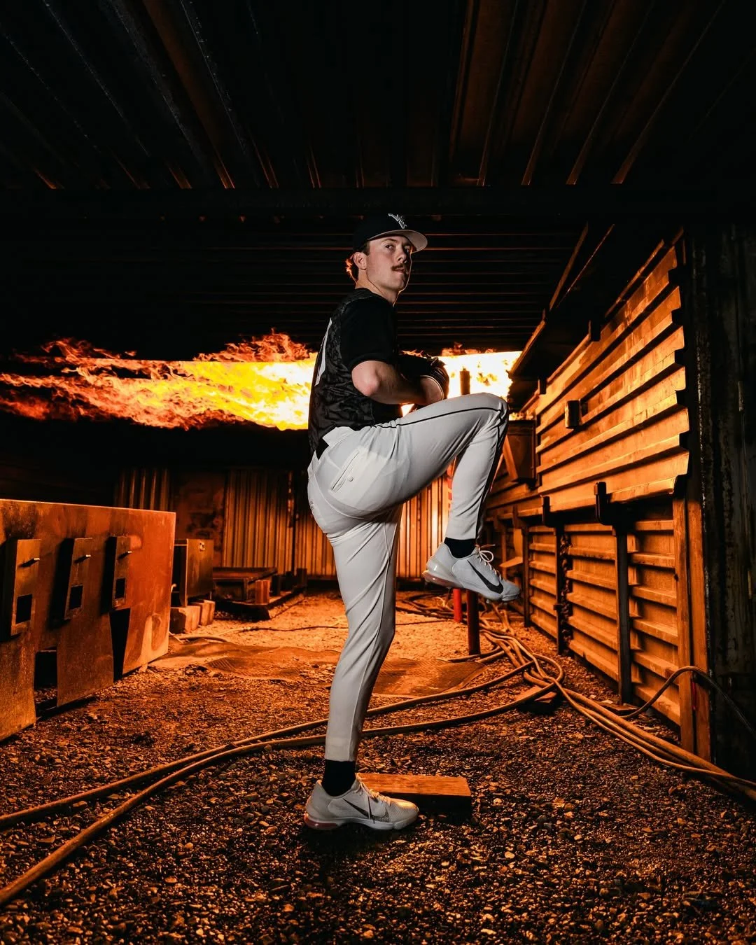
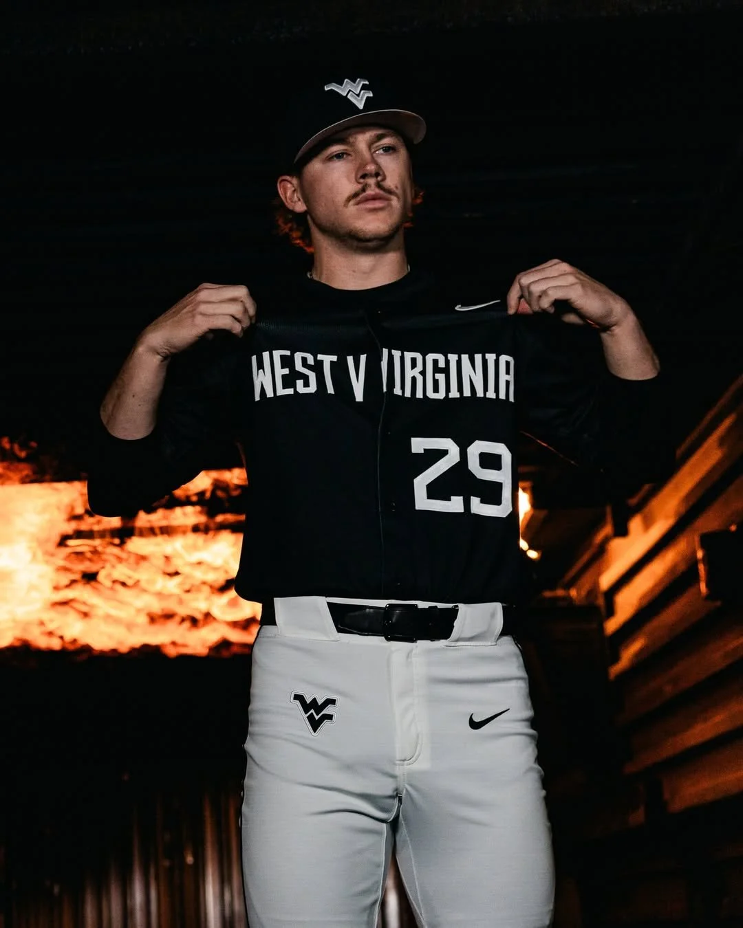
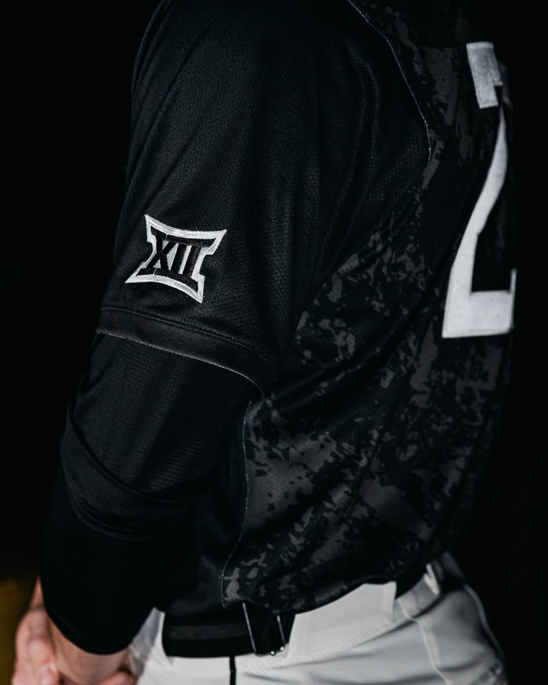
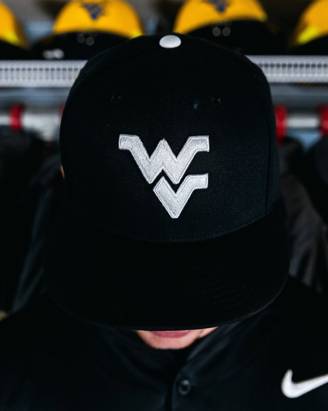
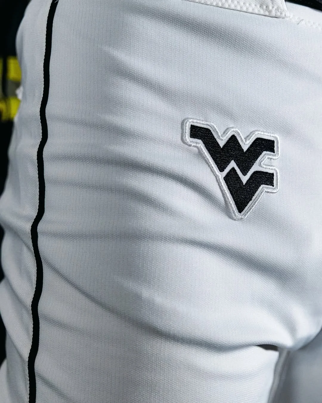
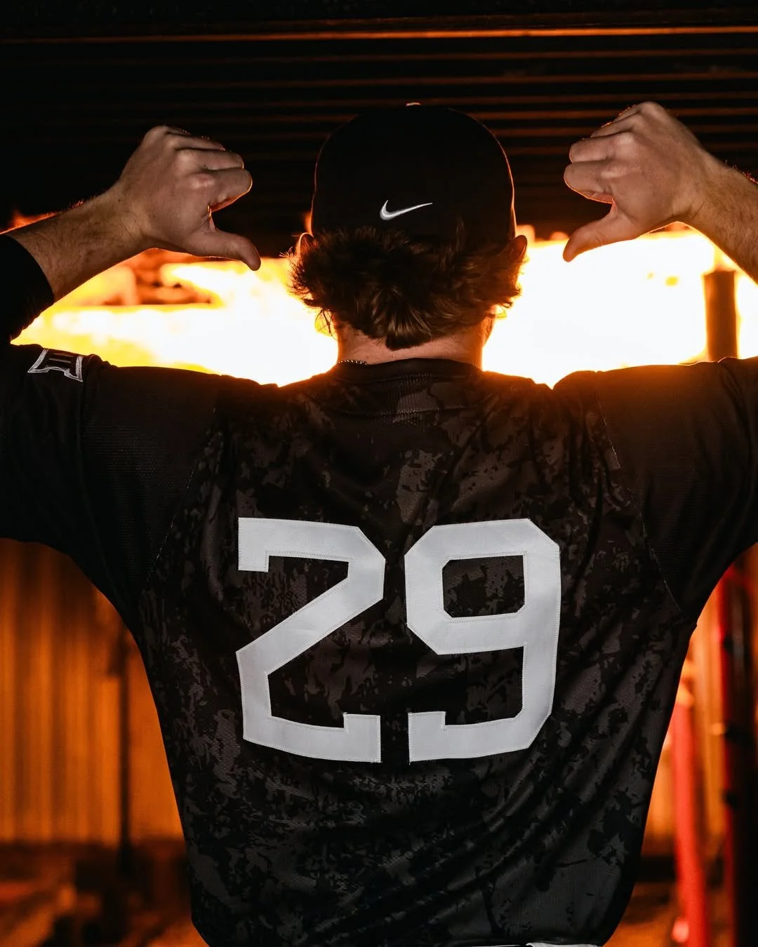
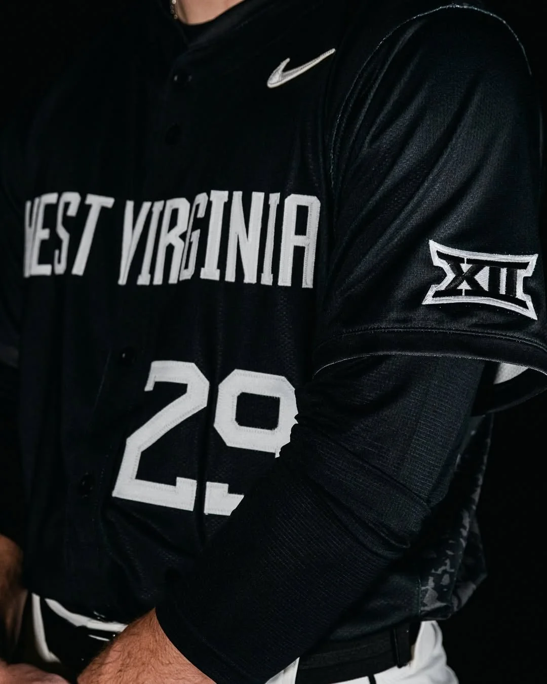
College baseball season is rolling, and the West Virginia Mountaineers baseball are already stacking up wins. Head coach Steve Sabins recently made program history by becoming the fastest head coach to reach 50 wins, and now the Mountaineers are adding a new look to their lineup as the season continues. WVU has unveiled its Coal Rush alternate jerseys, bringing one of the university’s most recognizable uniform themes to the baseball diamond for the first time.
The Coal Rush concept has already appeared across several Mountaineer programs, including football and basketball, and now it’s making its way to Kendrick Family Ballpark. The design features a bold black-and-white color scheme that pays tribute to the state’s deep roots in the coal mining industry, a defining part of West Virginia’s heritage.
While an official debut date has not yet been announced, the Mountaineers are expected to wear the Coal Rush jerseys during **Big 12 Conference play later this season. The debut could also bring a unique game-day atmosphere, similar to the themed introductions that accompanied previous Coal Rush uniform reveals across WVU athletics.
The Coal Rush look originally made waves when West Virginia Mountaineers football debuted the uniforms in 2024 against Iowa State Cyclones football. That night featured a powerful tribute to the state’s mining community, including coal miners greeting players during the Mountaineer Man Trip and a dramatic pregame light show where fans illuminated the stadium with their phone flashlights.
Similar celebrations followed when the theme appeared for the university’s men’s and women’s basketball teams, and fans will now be watching to see how the baseball program creates its own spin on the Coal Rush tradition.
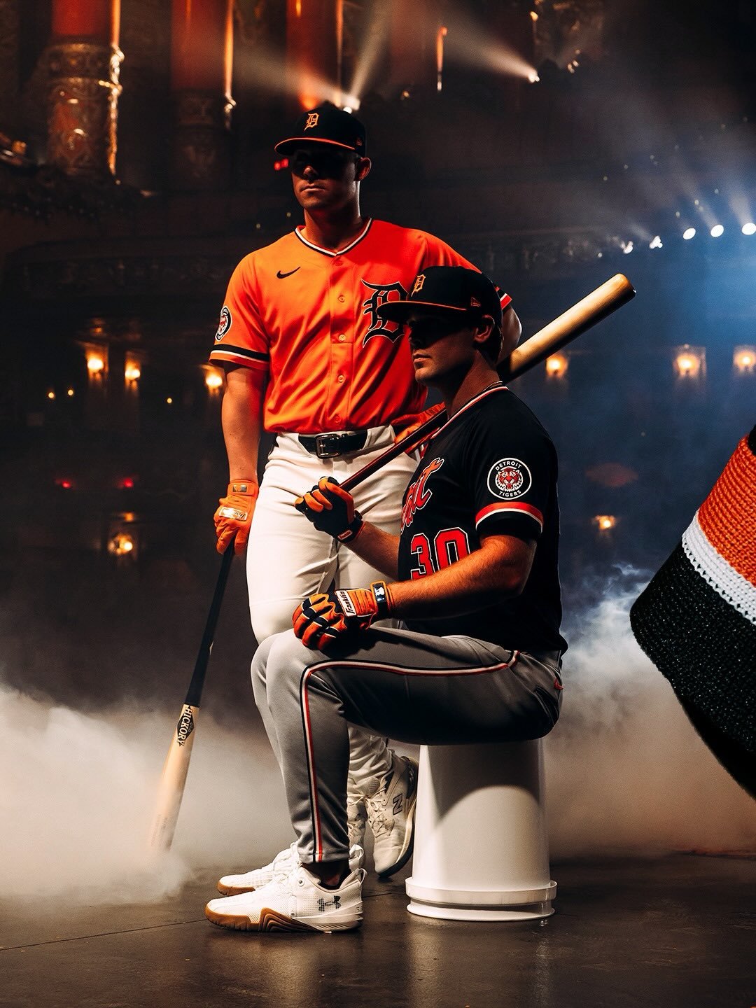
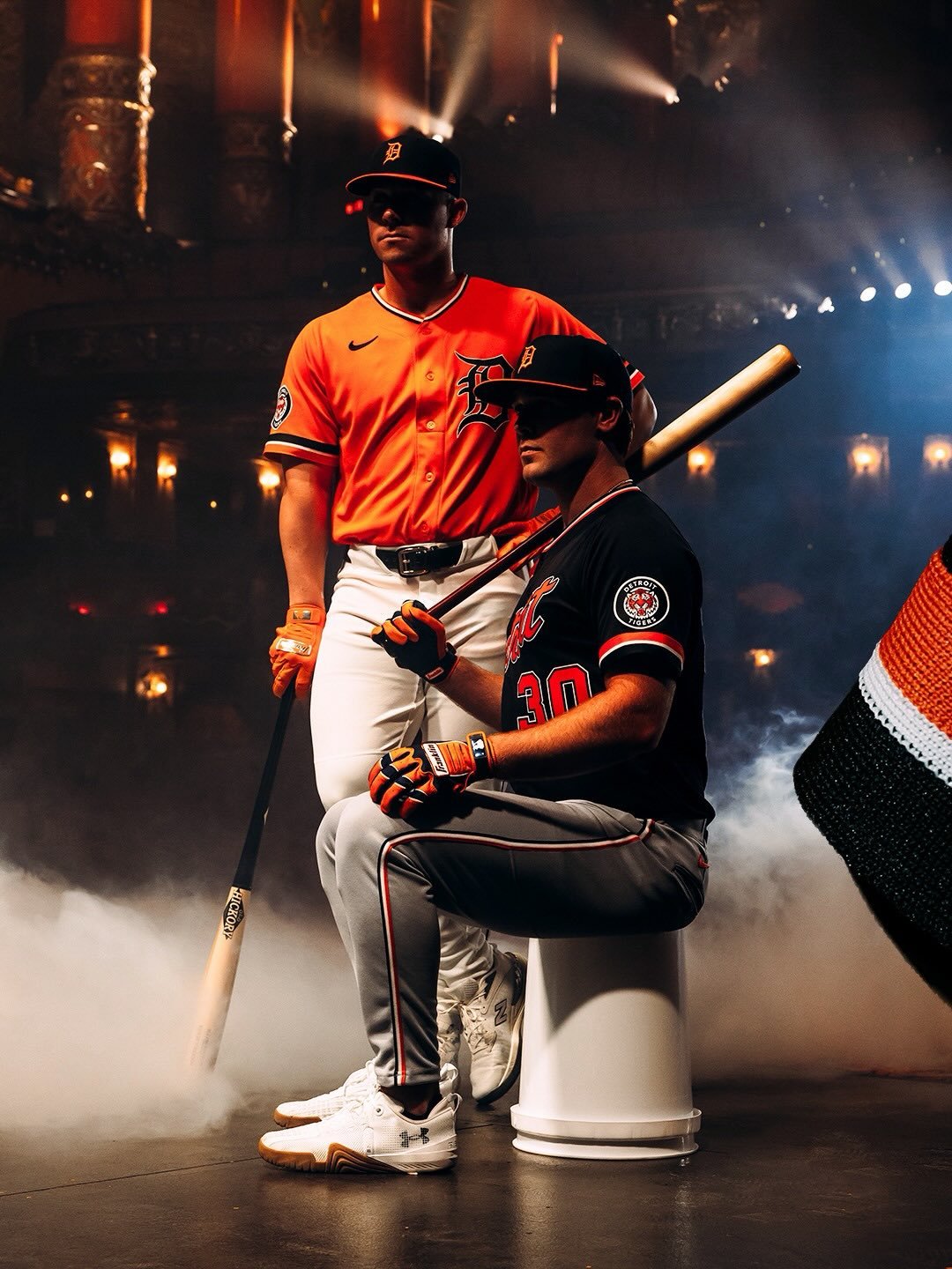
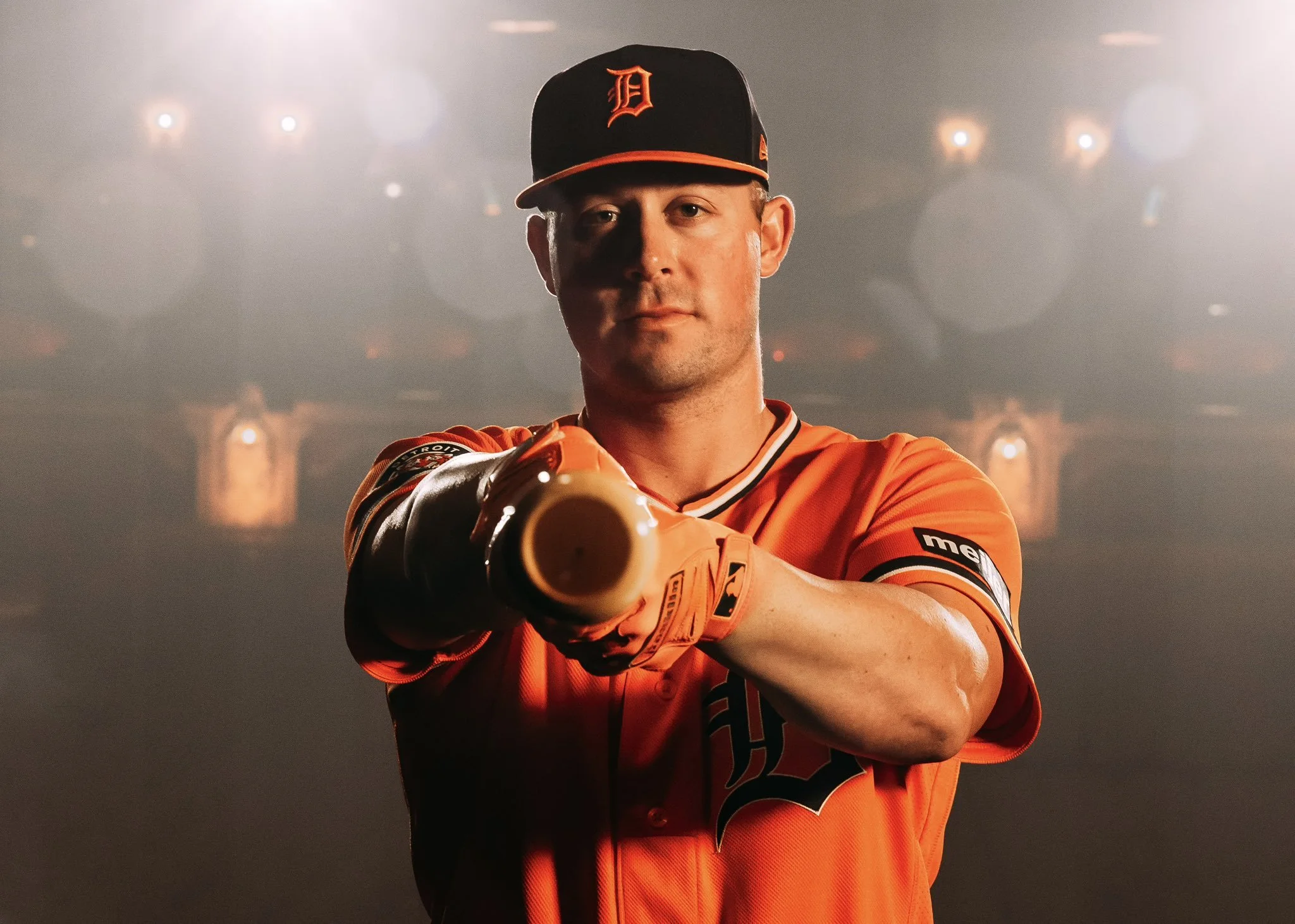
After nearly two years of research, fan surveys, and clubhouse feedback, the Detroit Tigers are introducing navy blue and orange alternate uniforms that honor the franchise’s history while delivering a fresh look for today’s game. The new alternates will be worn at select road and home games during the 2026 season, appear during Spring Training alongside MLB’s GrapefRuit League caps.
The project was shaped by 18 months of fan and player input, revealing a consistent message: supporters were ready for alternate uniforms but wanted the club’s tradition protected. The Tigers have long been one of the few MLB teams without a regular alternate set outside of their City Connect look, making this rollout especially significant. The challenge was clear, introduce something new while preserving the iconic Olde English “D” and the legacy tied to the 1984 championship era.
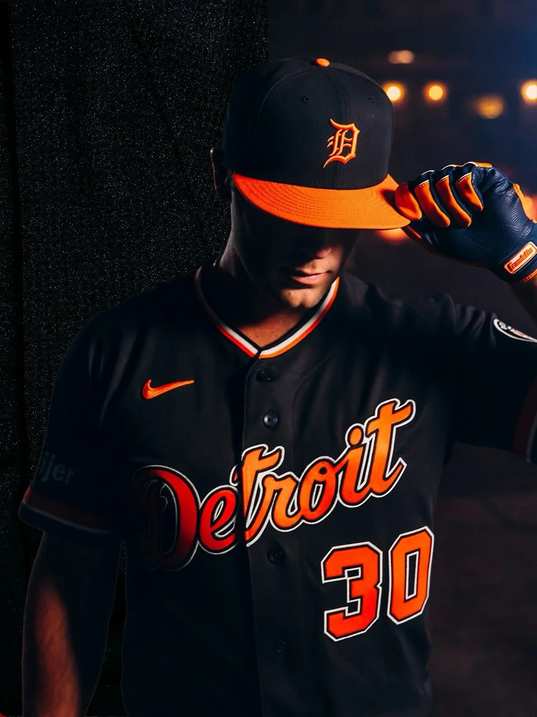
The final designs deliver exactly that balance. The home orange alternate jersey features the Olde English “D” across the chest in navy, echoing the placement seen on the club’s classic home whites. On the road navy version, the familiar script “Detroit” appears in orange with white trim, a colorful twist on the lettering that has defined the franchise for decades.
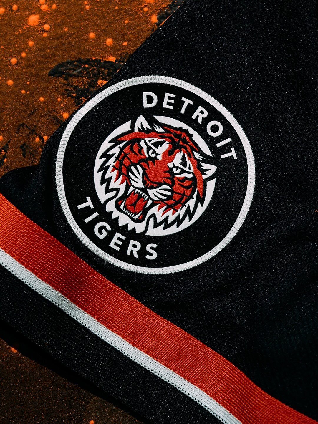
Both uniforms incorporate details inspired by the 1984 World Series team, including three-color sleeve striping, V-neck styling, and a circular Detroit Tigers patch reminiscent of the club’s tiger logo used from 1961 through the early 1990s. The striping extends to the white and gray pants, tying the full look together with a retro-modern aesthetic.
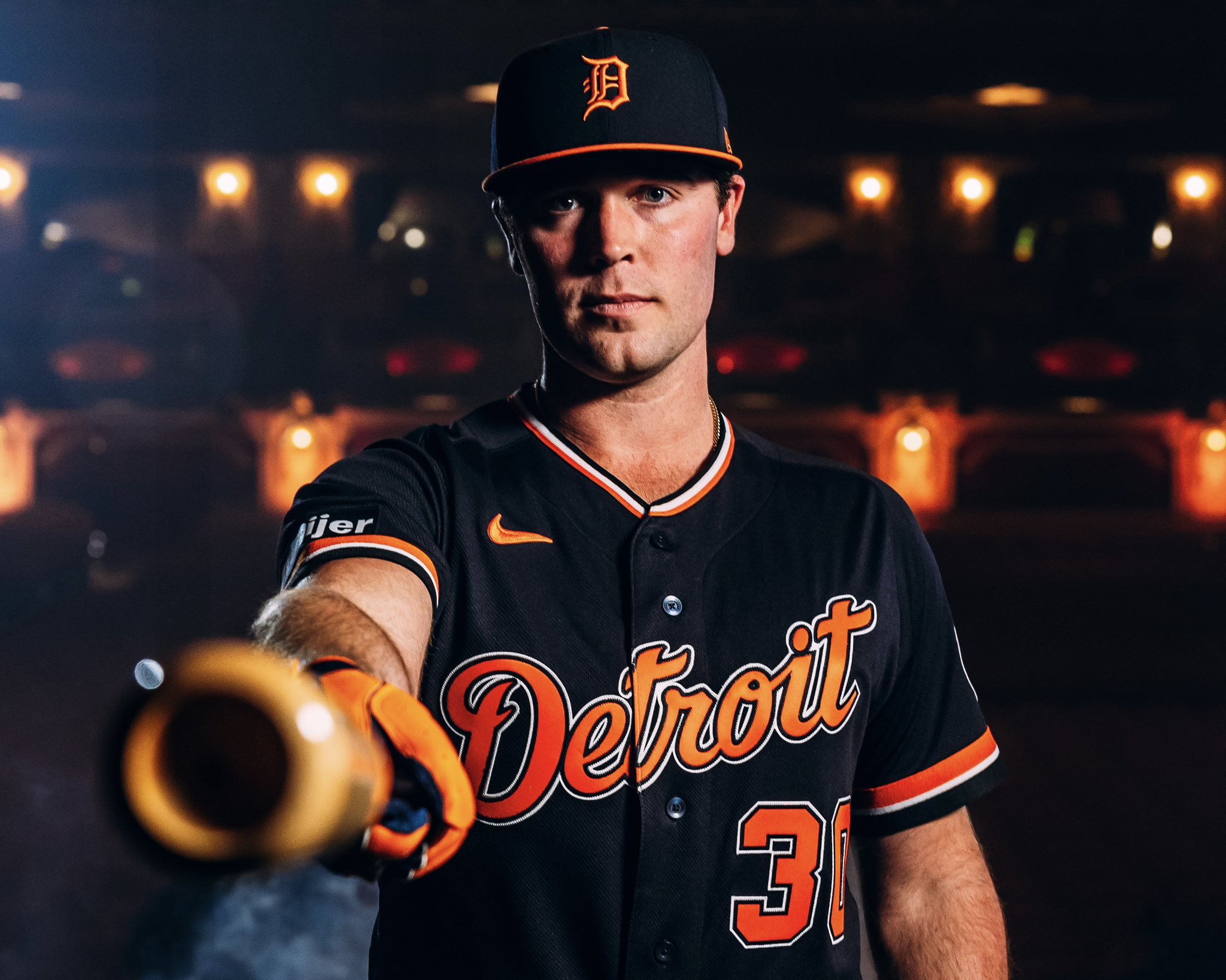
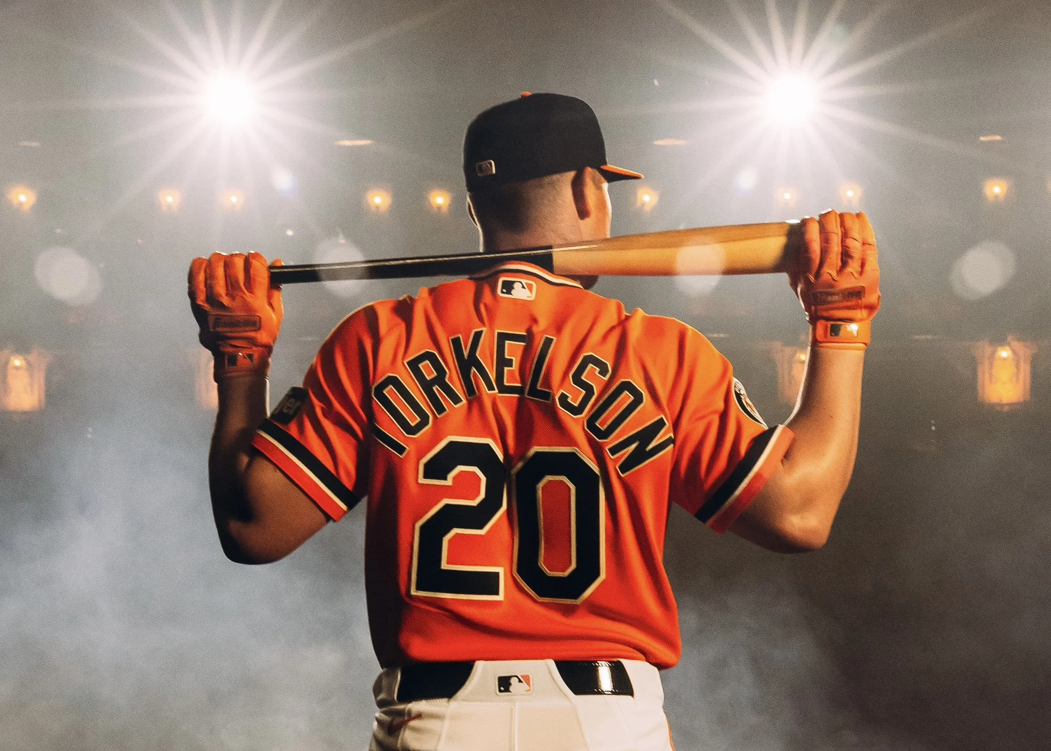
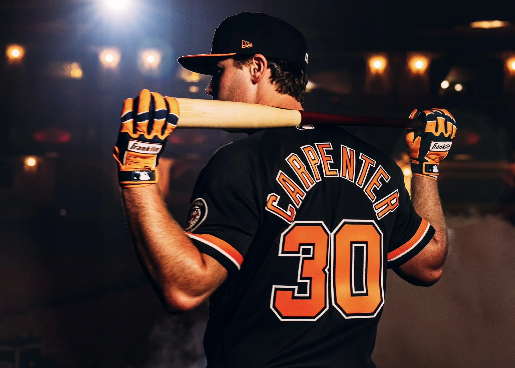
The alternate caps complete the set, featuring the Olde English “D” in orange paired with an orange bill, a nod to styles worn during the 1990s. These caps will be worn with the alternates once the regular season begins and will be available alongside the jerseys.
Detroit’s orange alternates will join the home rotation with the Motor City City Connect uniforms, which return for a third season. Together, the lineup offers a broader visual identity for the club while staying grounded in tradition, a thoughtful evolution that reflects both the franchise’s heritage and the city it represents.
For a team built on history, the Tigers’ new alternates prove modernization doesn’t require reinvention, just the right balance of legacy and bold design.