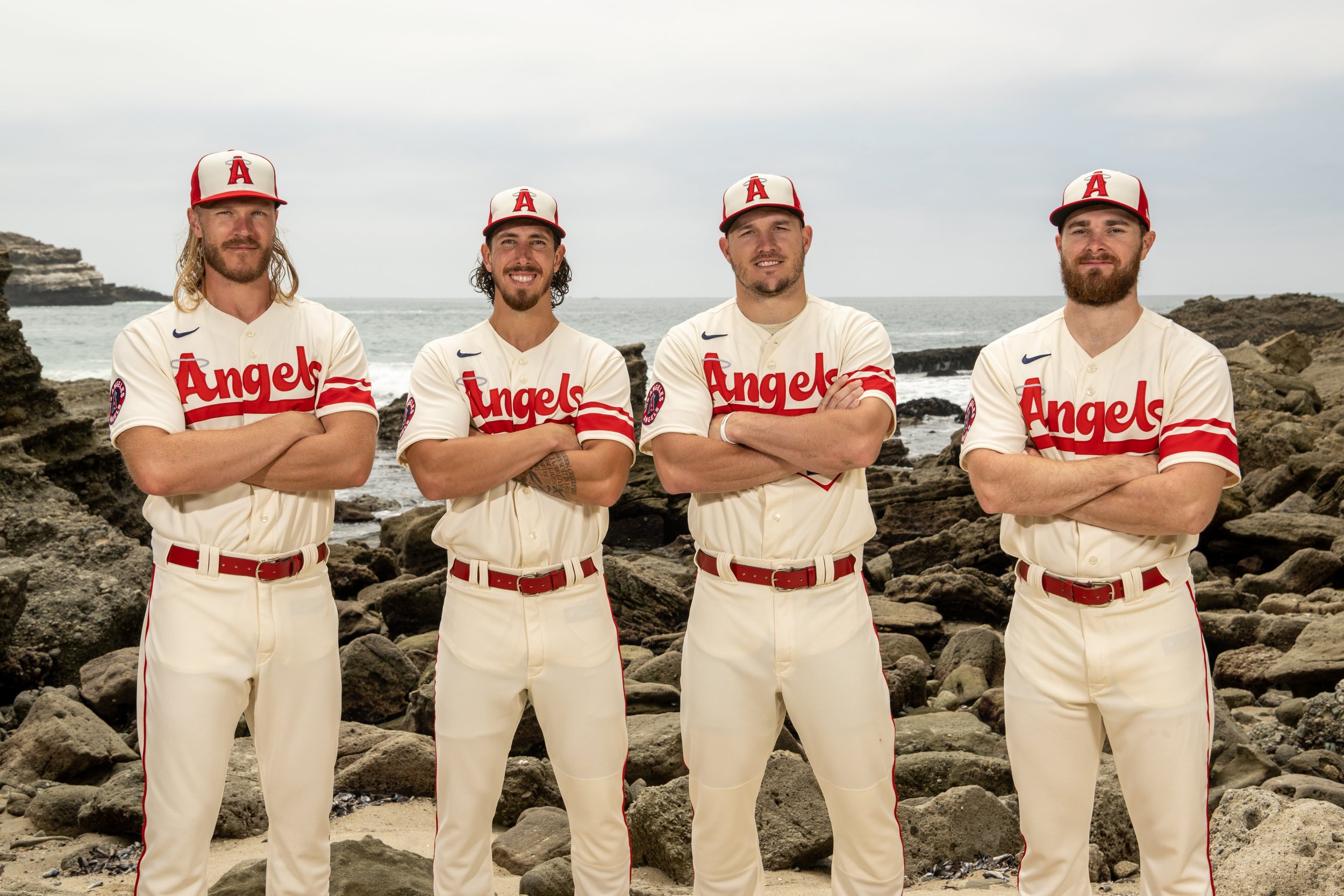
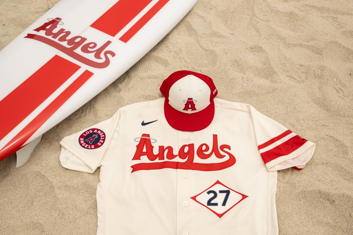
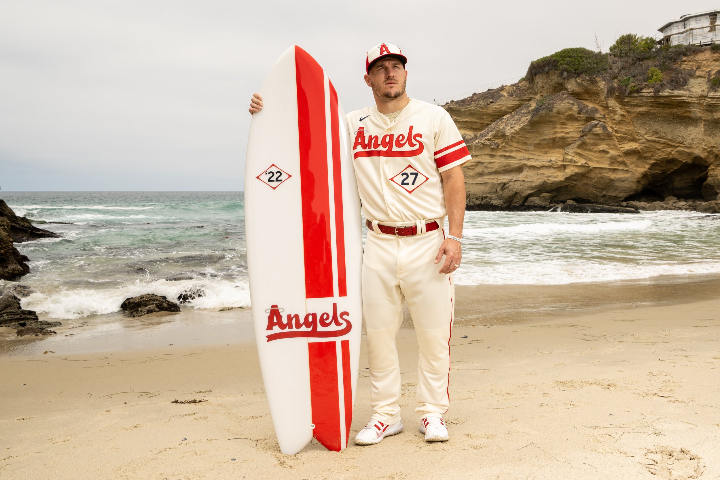
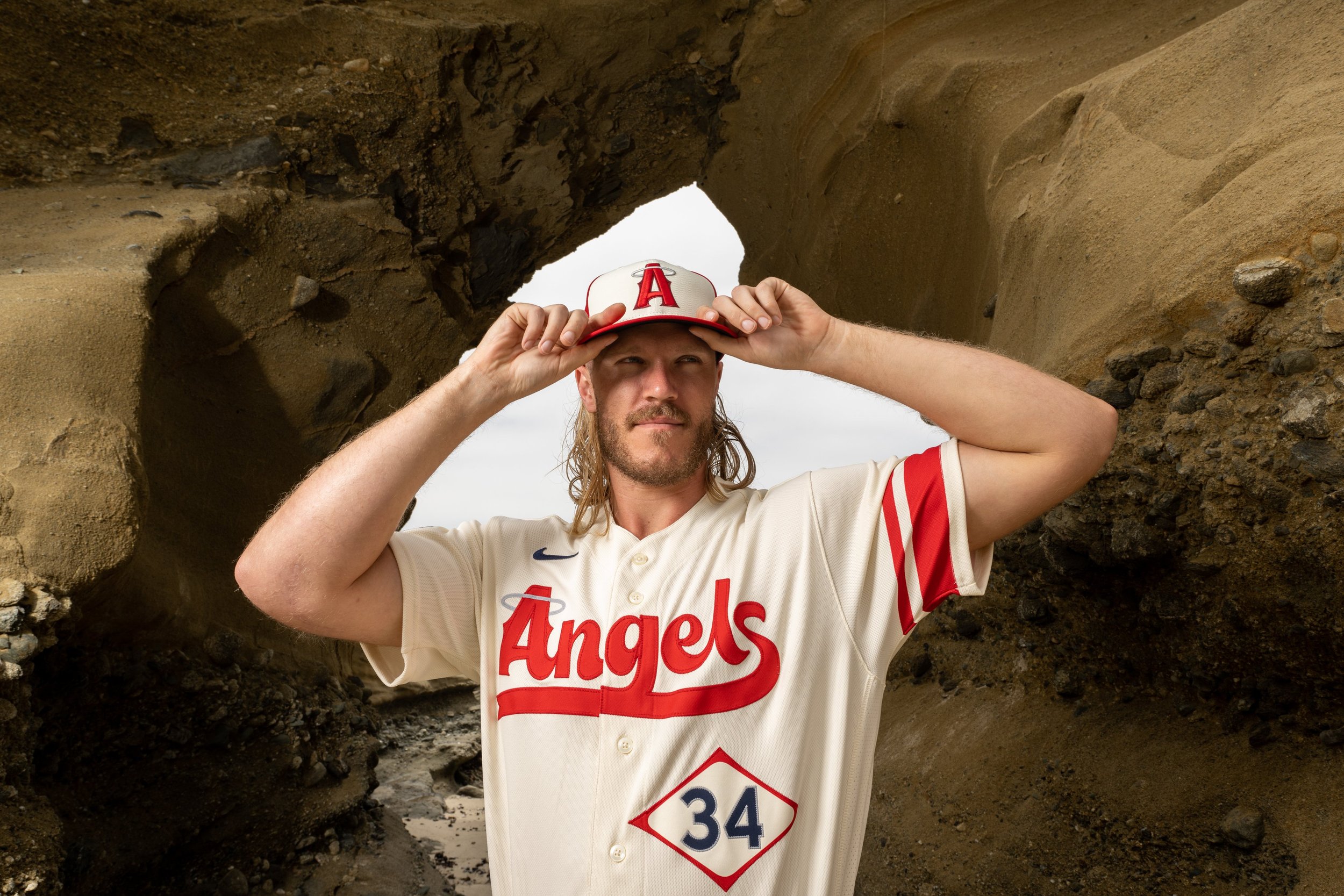
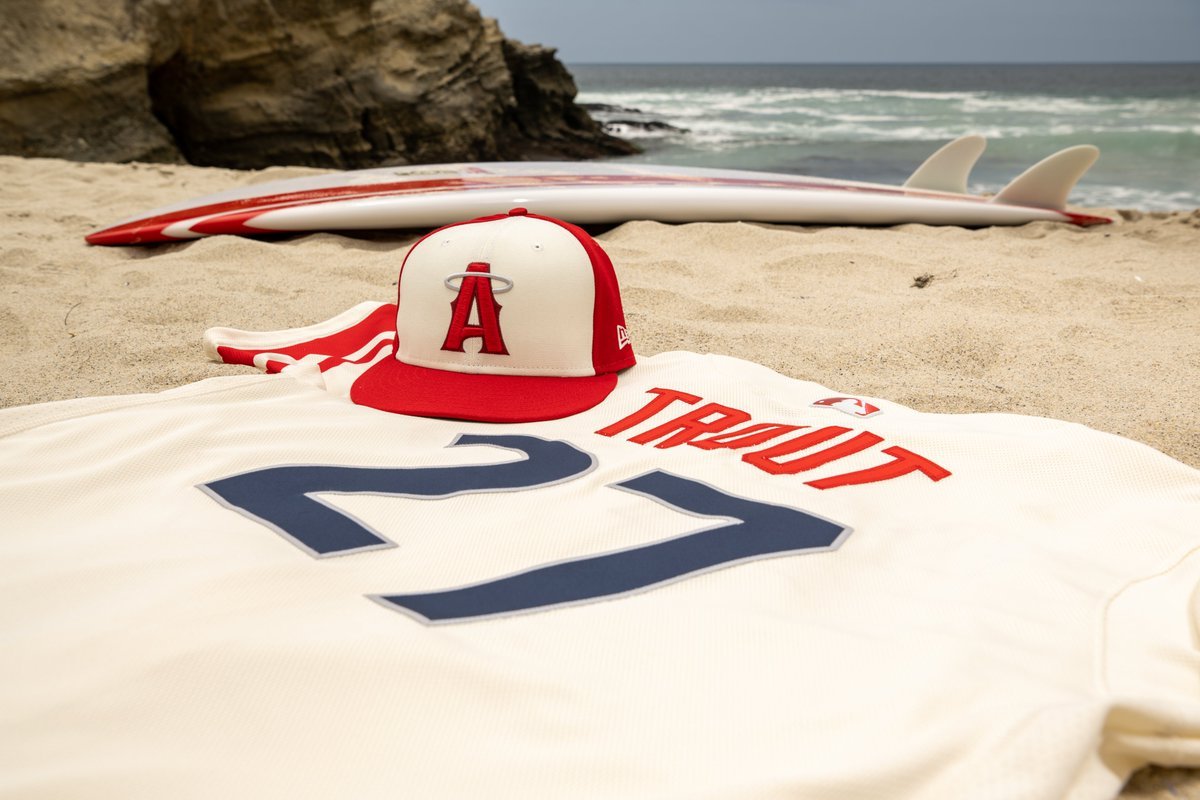
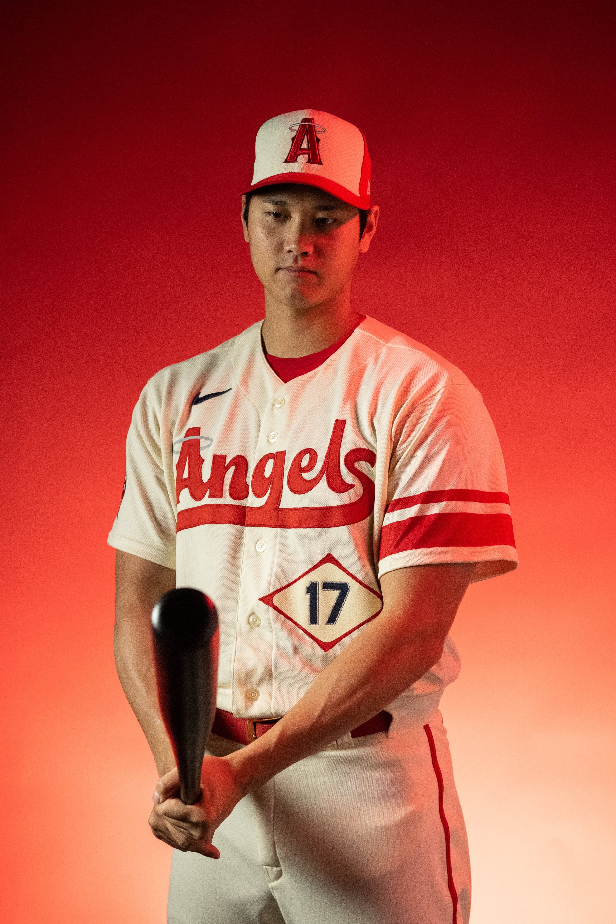
The Los Angeles Angels have released their special City Connect uniform. The design inspiration tapped into the rich history of surfing in the area with the vintage surf style lettering, numbers and stripes. Across the chest of the jersey is Angles spelled out in a special surf style script font. Under the script lettering is the player number inspired by the font seen on the California lifeguard towers, and is set in a diamond similar to local vintage surf brands.
On the left sleeve two red stripes wrap around it with one thick and the other thin, paying homage to the old school surfboard designs. The finishing touch comes above the jock tag with a red surfboard as “a reminder to keep paddling”.
“In Southern California, there are few things more synonymous with summer than days at the beach and nights at the ballpark. Our City Connect uniforms look to celebrate those traditions by bringing the local beach culture to the Big A.”- Los Angeles Angels President, John Carpino
The Angels will break out the special threads for their home game, on Saturday, June 11, vs the New York Mets.
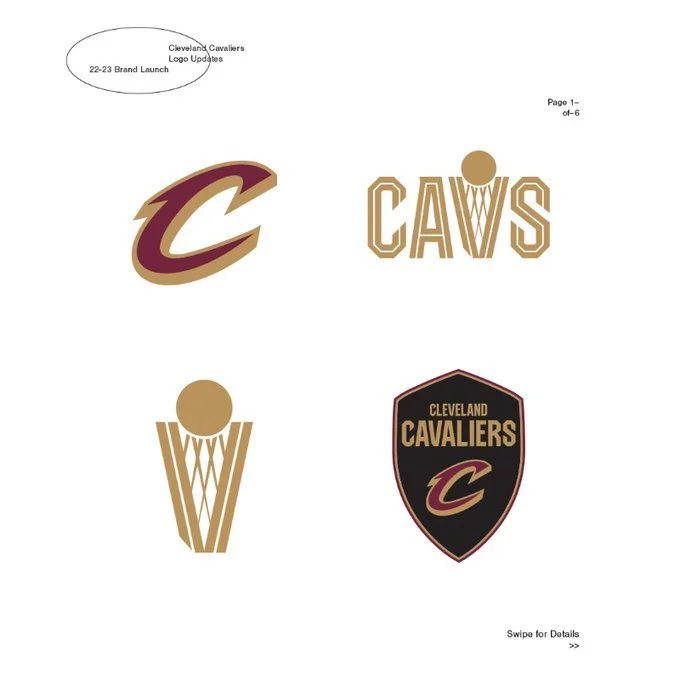
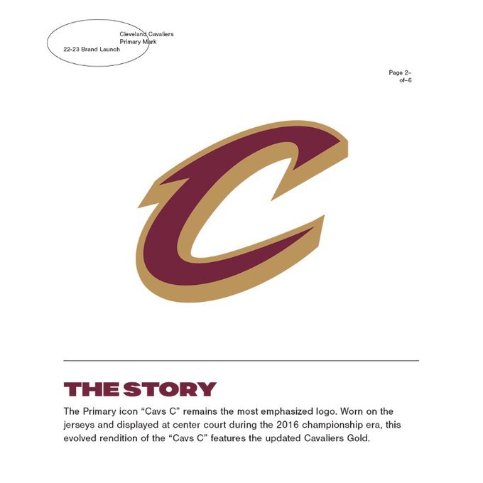
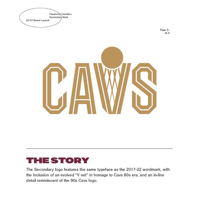
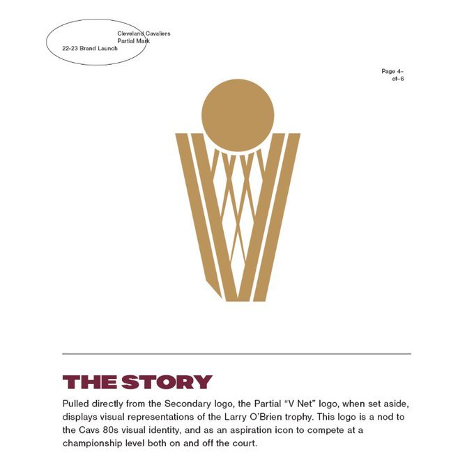
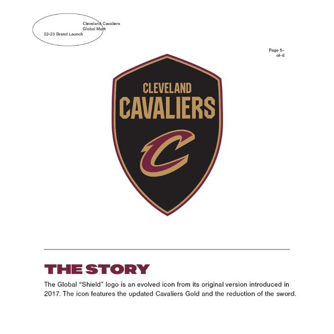
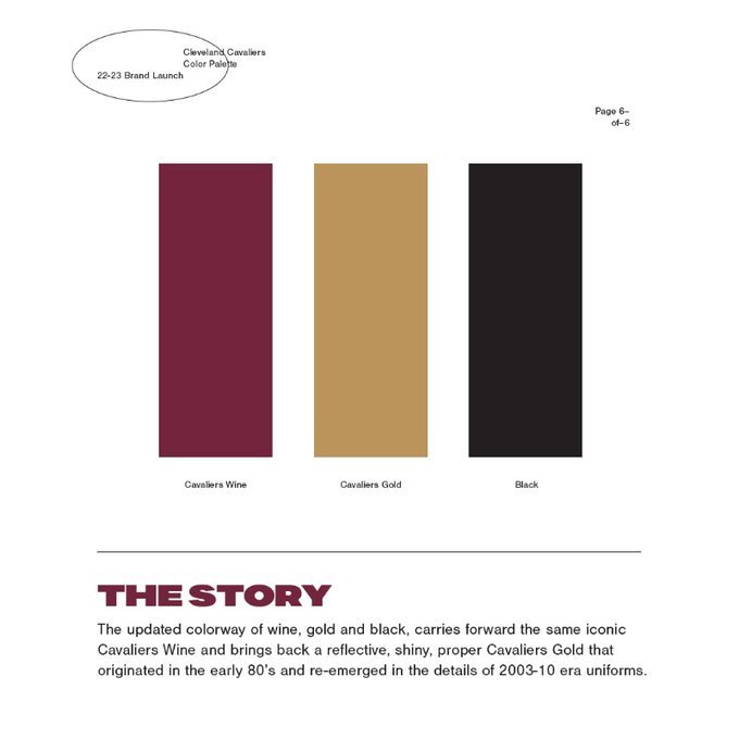
The Cleveland Cavaliers have introduced a refreshed brand identity. The new logo set embodies the Cavs history pulling inspiration from different eras. The new colorway of wine, gold and black brings back the reflective, shiny Cavaliers gold from the early 80s.
“Through the years there have been layered interpretations of the Cavs logos and color hues to represent the brand. In thinking about the next chapter of where to go with the design, the approach was to compose distilled versions of the logos to create a refreshed identity.”- Daniel Arsham Creative Director
The transition to the new brand identity will start for the 2022-23 season, including new Cavaliers Statement, Icon and Association Edition uniforms to be unveiled later this summer.
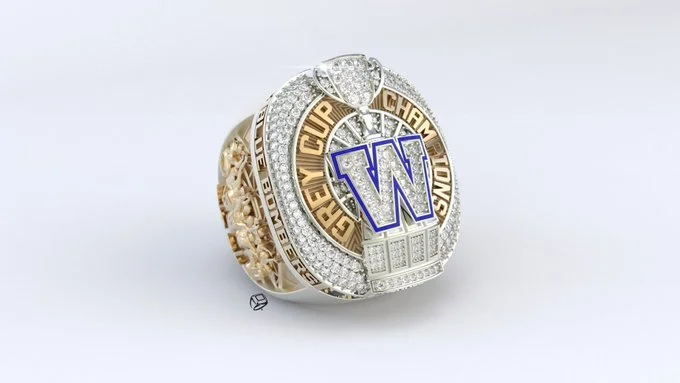
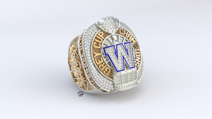
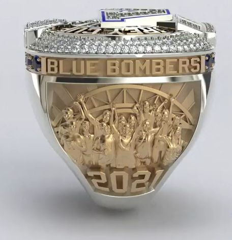
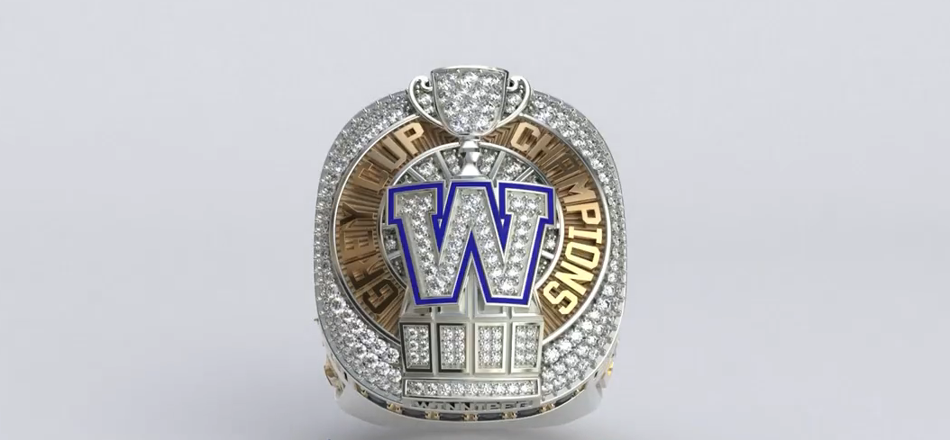
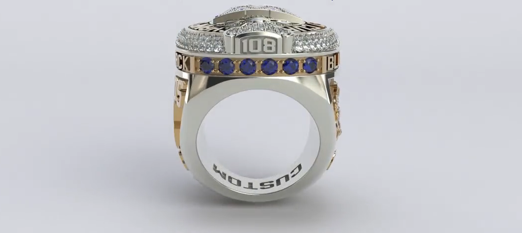
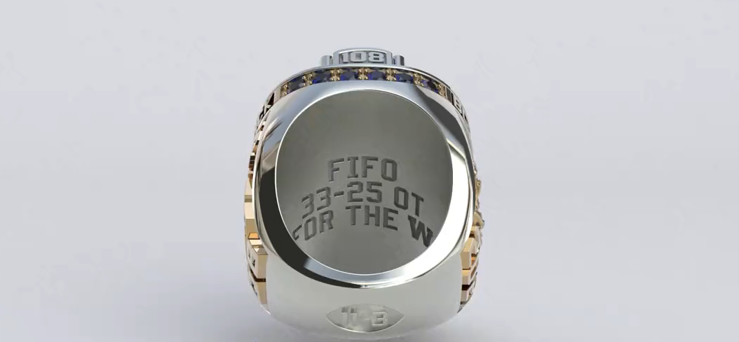
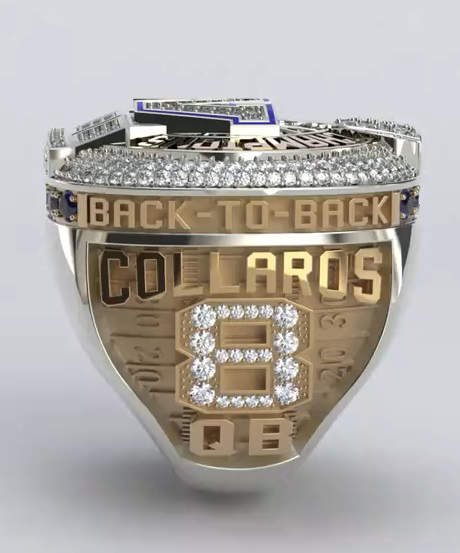
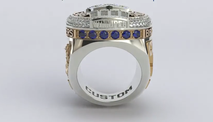
— Winnipeg Blue Bombers (@Wpg_BlueBombers) May 29, 2022
The Winnipeg Blue Bombers have revealed their 2021 Grey Cup Championship rings. The top of the ring features the clubs W logo sitting atop the Grey Cup with 33 diamonds in the bottom section representing the points scored by the club in the 33-25 overtime victory. The outer edge of the ring features the saying ‘Back-to-Back’ with the one side featuring the player’s name, number, and position. The other side features an image of an actual photo taken of fans during the 2021 season.
“It’s absolutely beautiful. They did an amazing job on it, there’s a lot of detail on it and, of course, I love the ‘Back-to-Back.’ I wasn’t sure how you could improve on the 2019 ring, but they did it with this one. It’s sweet.”- DE Jackson Jeffcoat
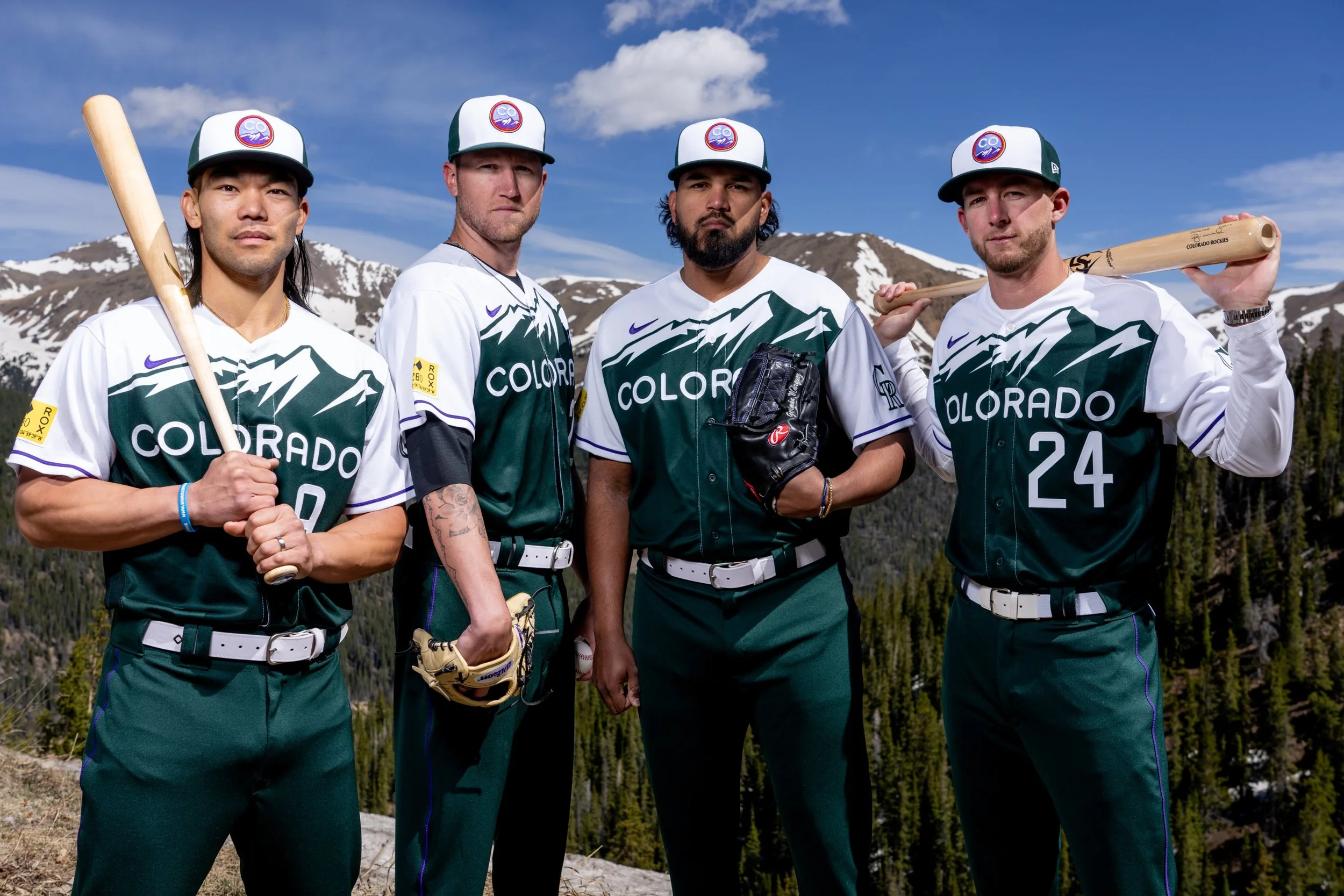
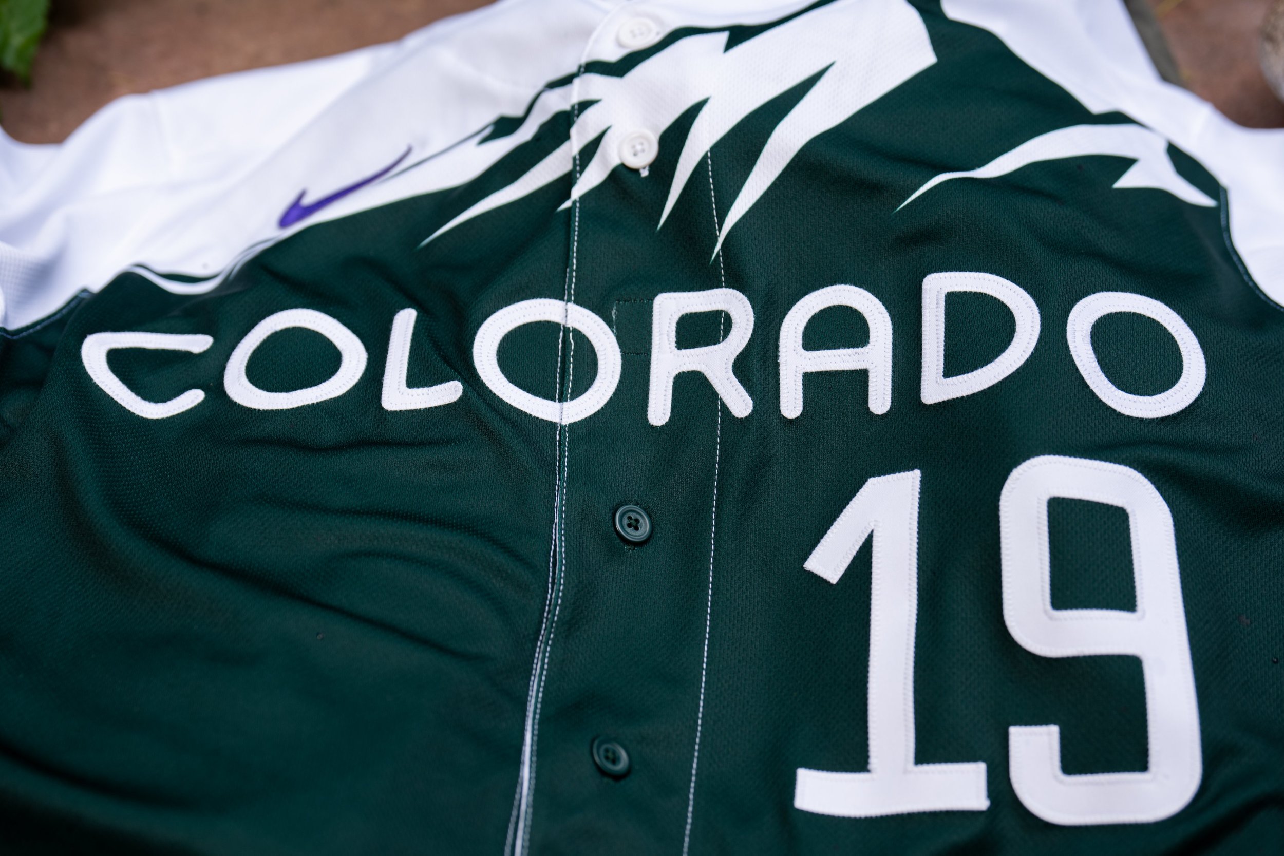
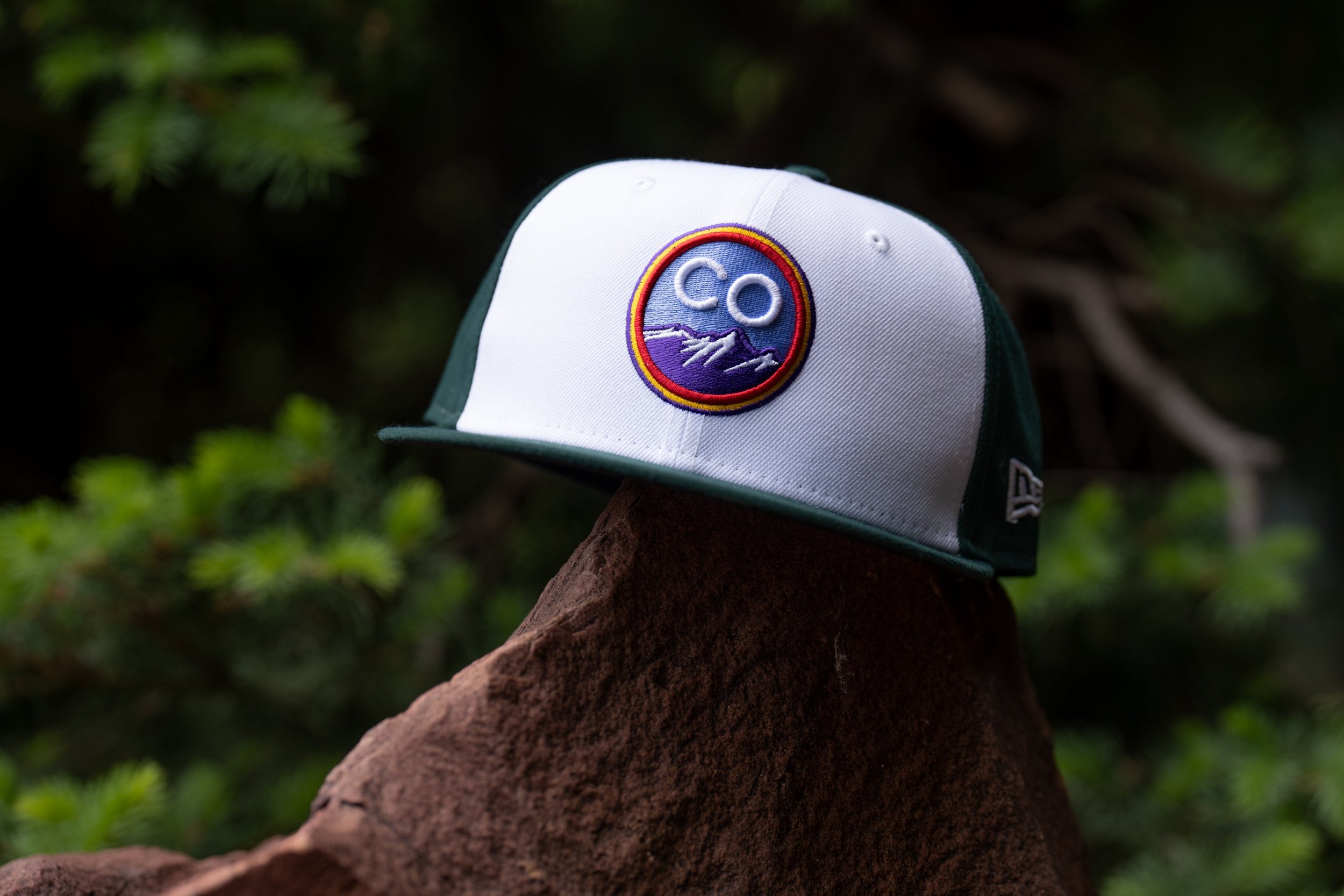
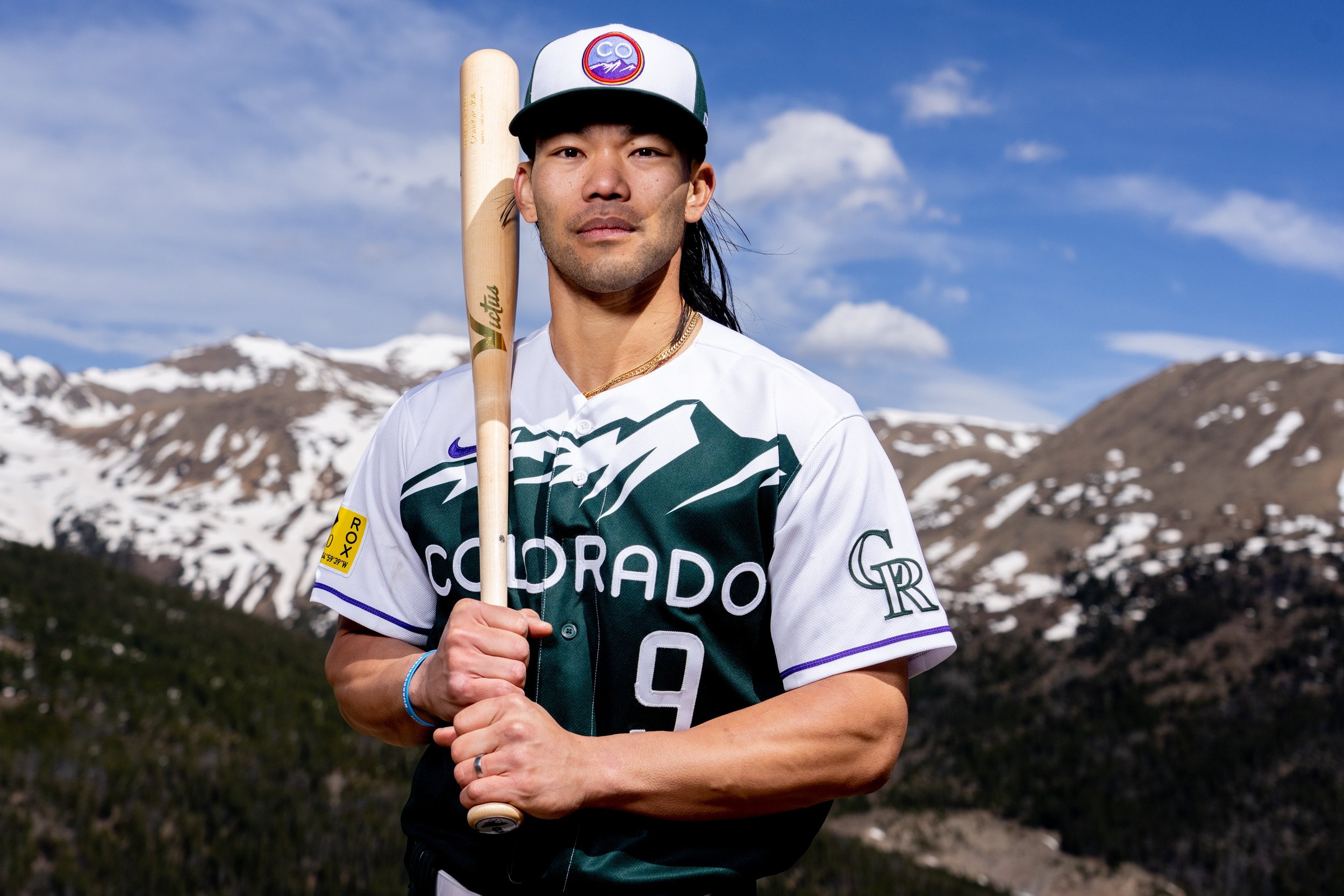
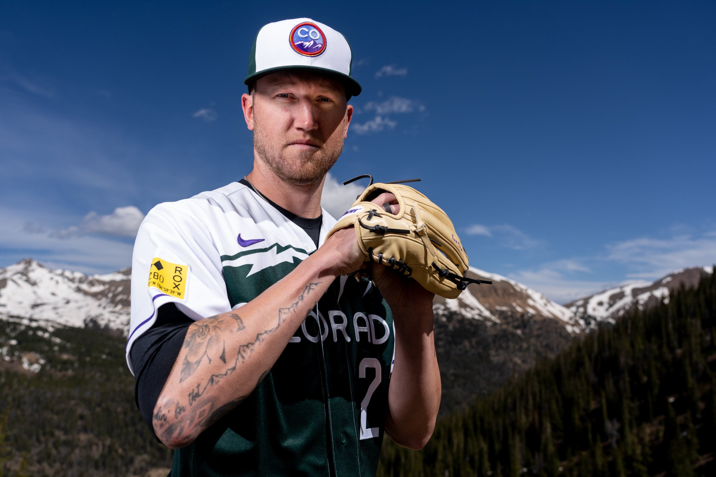
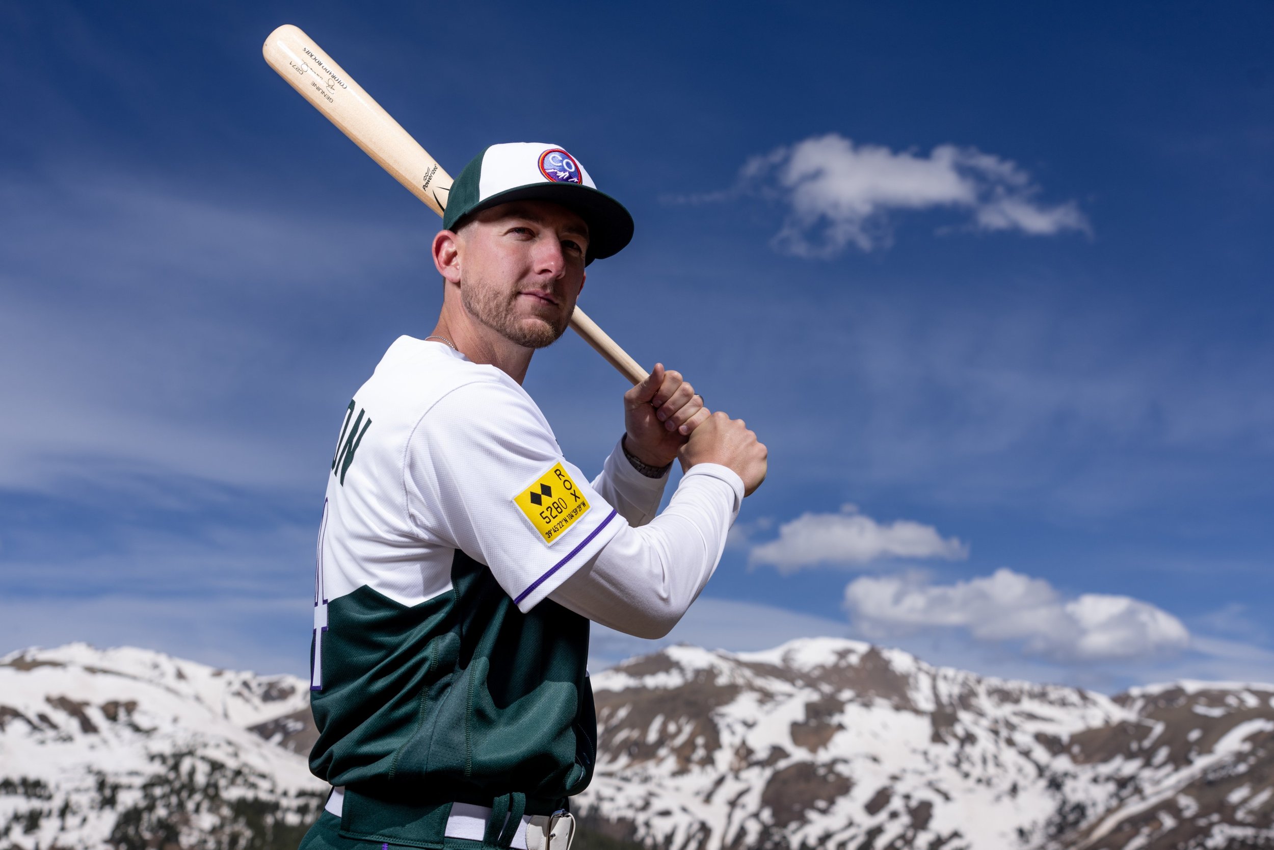
The Colorado Rockies have revealed their special City Connect uniform. The look of the uniform draws its inspiration from the Colorado license plate first introduced in 1960 with the green and white mountain range. The letters and numbers of the jersey are the same font that is used on the actual license plate. The sleeves and pants have purple trim, as well as the numbers on the back of the jersey, representing the row of purple seats at the club’s stadium which designates exactly one mile above sea level.
On the right sleeve is a salute to Denver’s mile-high nickname with 5280 emblazoned on a yellow “sticker”, above that we see two black diamonds, noting Double Black Diamond ski runs as a nod to Colorado’s vibrant ski and snowboard community, and with the coordinates of Coors Field seen below it.
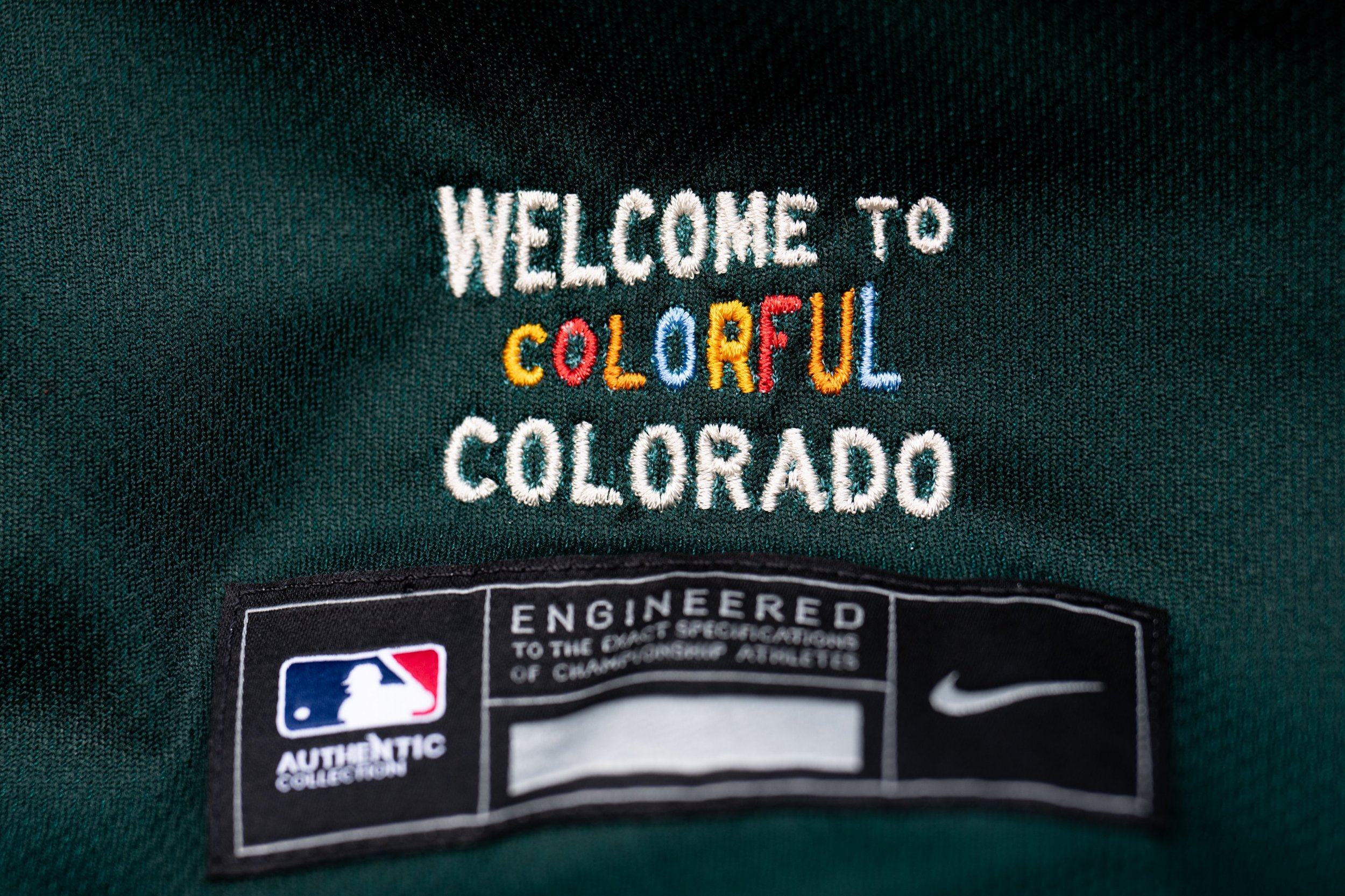
The finishing touch comes on the jock tag with the phrase “Welcome to Colorful Colorado” that was inspired by the highway signs welcoming you to the state.
“While the uniform series is called City Connect, it was important they represent fans across the state. As a Colorado native, I am proud that these uniforms embody the character of Colorado and the unique sense of pride we have in our home state. I am beyond excited to see them come to life on the field on June 4 at Coors Field.”- Rockies Owner, Chairman and CEO Dick Monfort
The Rockies will debut their look on June 4th against the Atlanta Braves and then they will wear them every Sunday home game for the rest of the season.
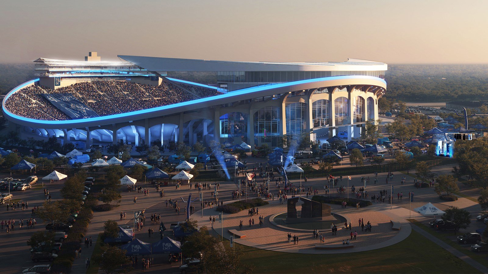
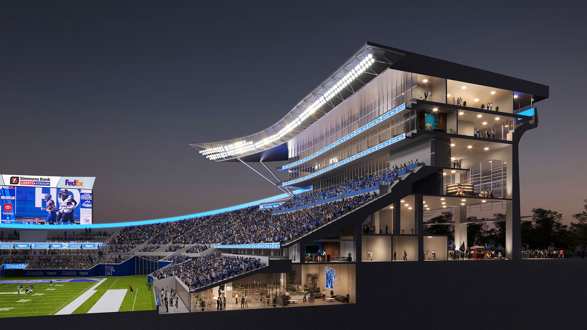
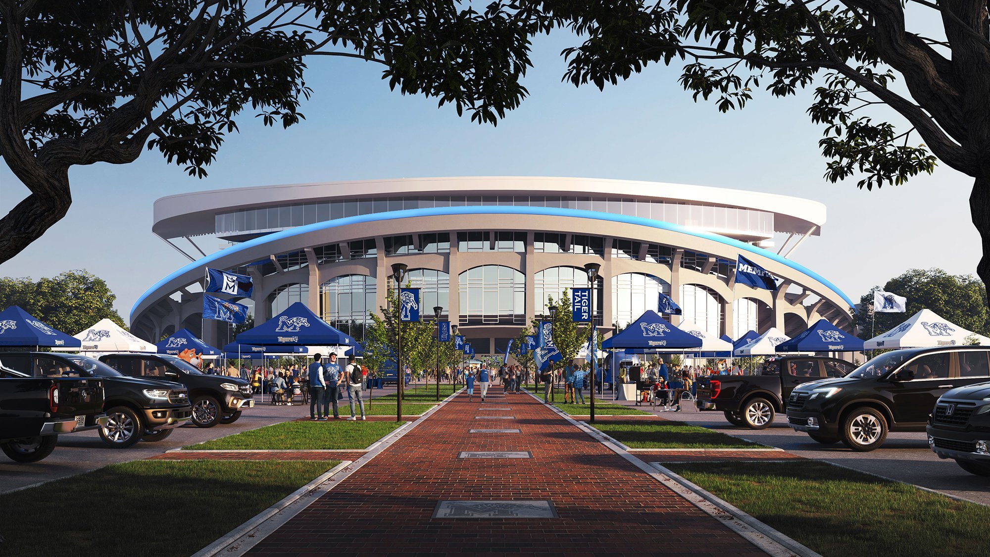
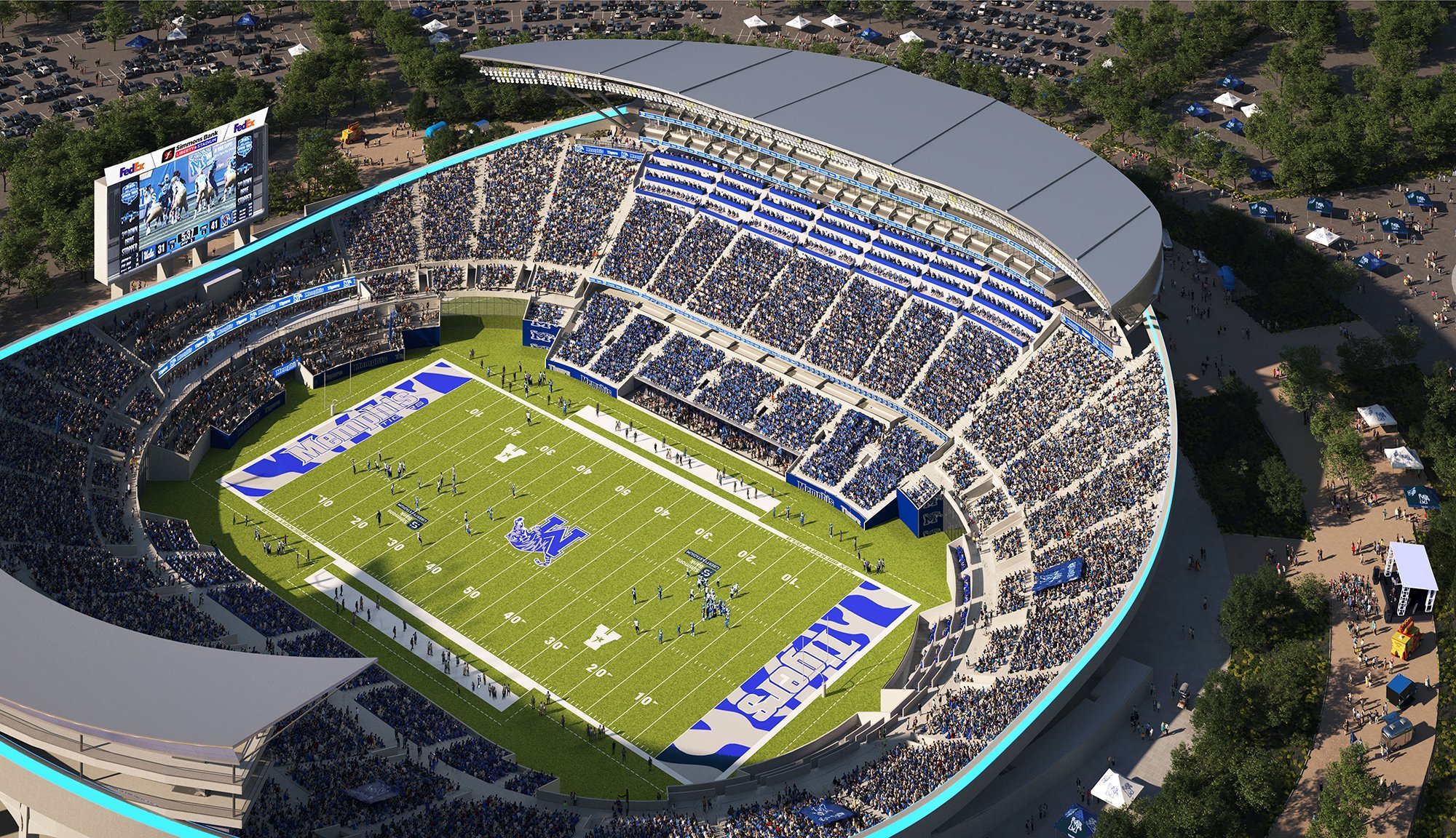
The Memphis Tigers football team is planning on getting an upgrade to their stadium. The major renovation is planned to take place in the next three years and estimated to cost $150-200 million. The biggest changes that we see in the renderings Memphis posted on social media include:
A transformation of the stadium’s west side, providing several innovative premium seating options
Creating a hospitality experience within the halo space surrounding the stadium
Other new seating options, such as family boxes on the north end and party deck patios for students on the south end
A potential repurpose and retrofit of the east side suite tower
“I mean a 150 plus million into our Liberty Bowl on top of what Accelerate Memphis and the city and the mayor are doing for Liberty Park next door. I think it’s a transformation game-changer,” Councilman Frank Colvett said.
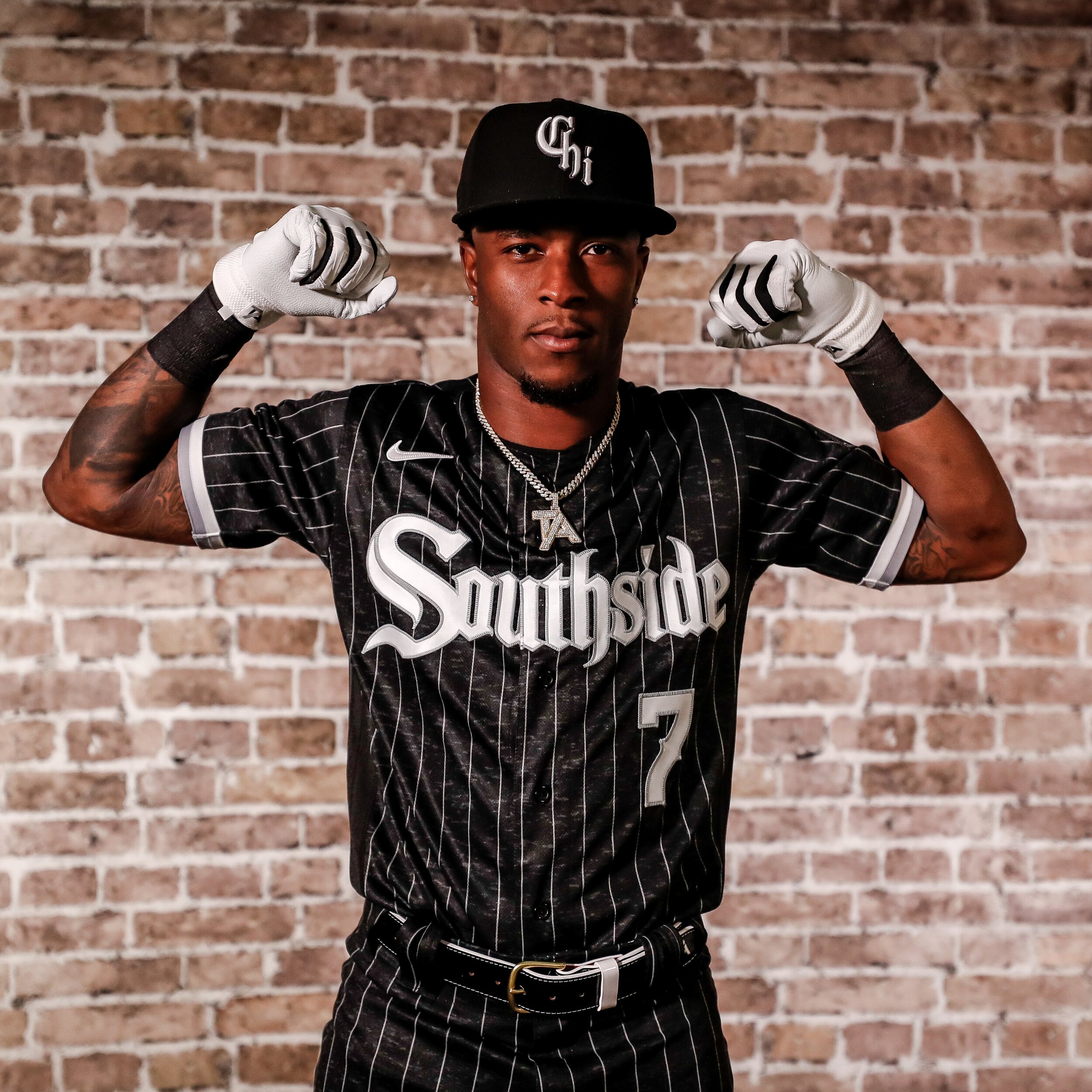
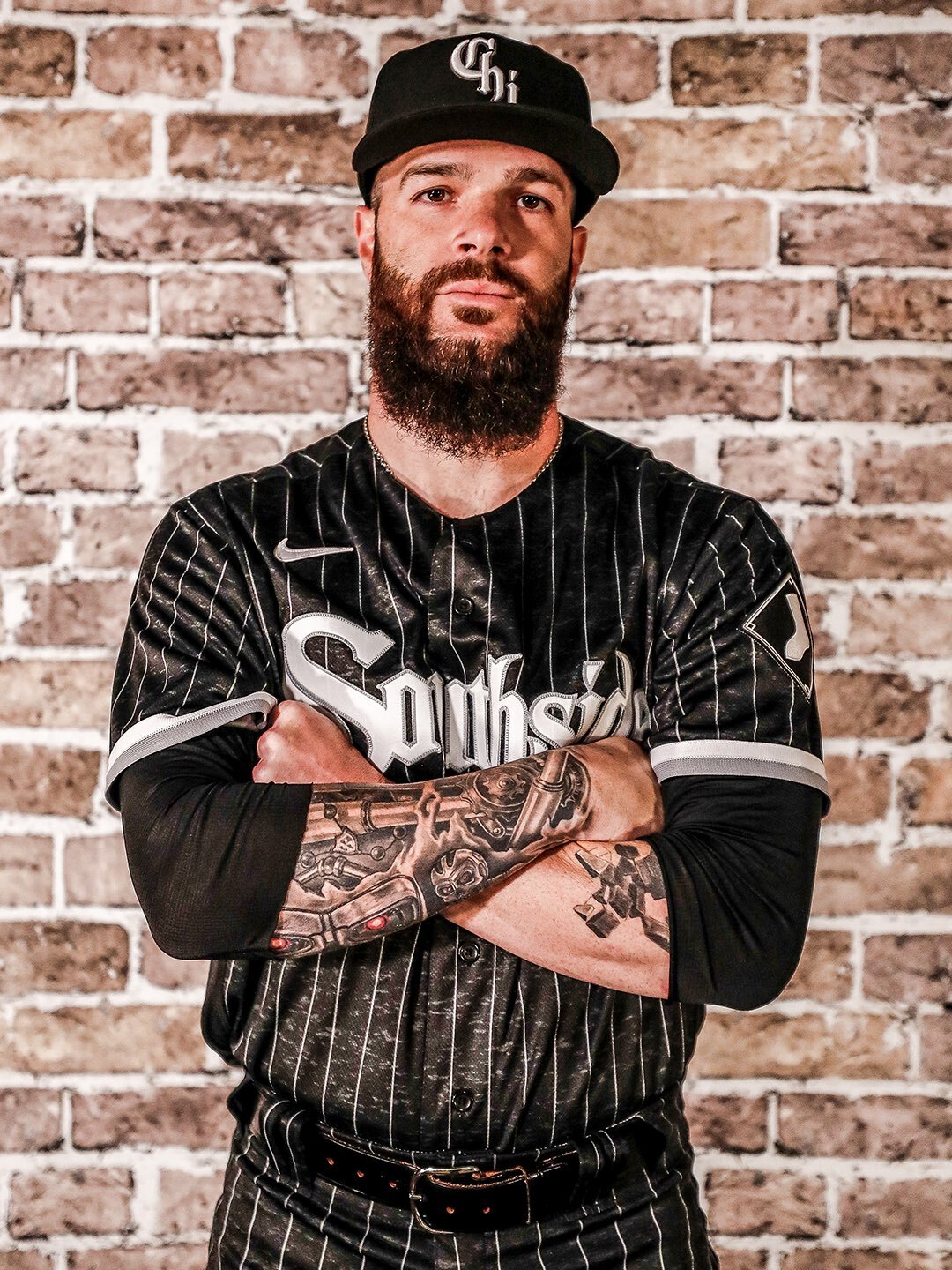
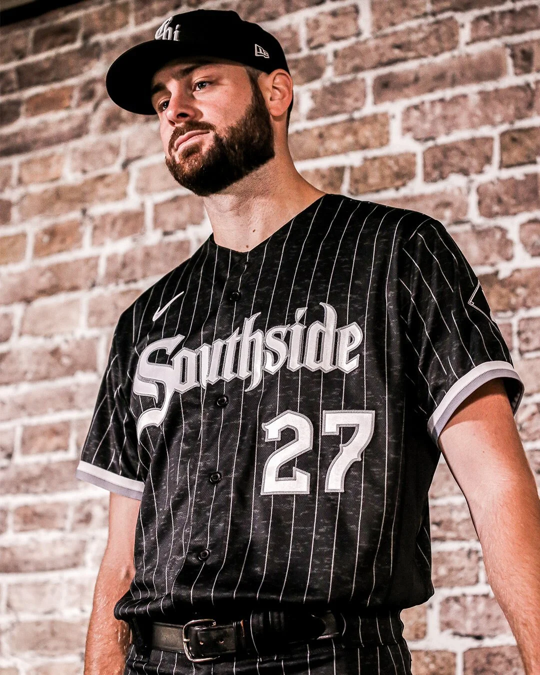
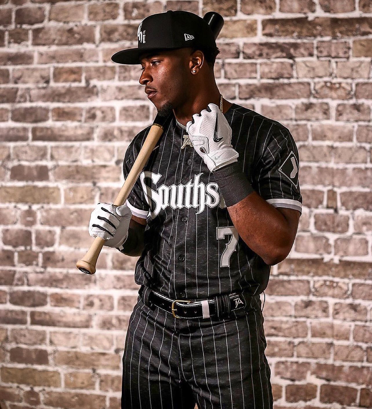
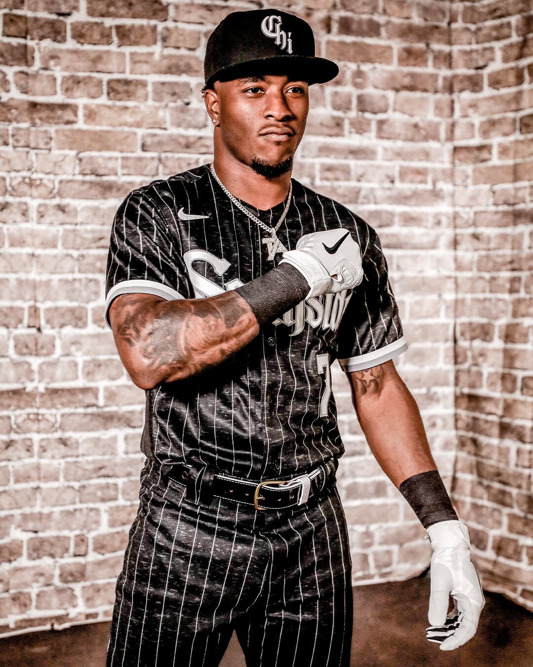
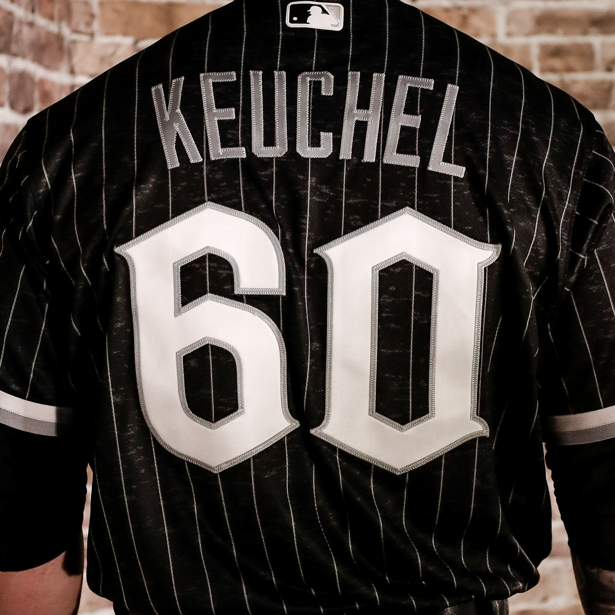
The Chicago White Sox have revealed their special edition ‘City Connect’ uniform. The uniforms inspiration is an ode to the hardworking and resilient mentality of Chicago’s Southside community. The dark grey uniform drew its inspiration from Chicago’s well-known Greystone architectural style. Across the chest of the jersey the word “Southside” is displayed in the White Sox gothic script. The team’s hats will feature CHI in the same iconic White Sox gothic script font.
“We wanted to do something cool and kind of be authentic. This is more authentic as it gets, having Southside on the front. It’s relatable. Just using that term definitely makes it a lot more realistic to people who actually grew up on the South Side and have been Sox fans their whole life. I think it’s definitely real relatable and think it’s really cool.” - White Sox shortstop Tim Anderson
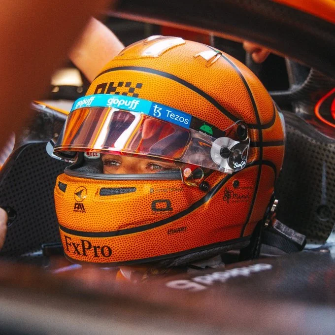
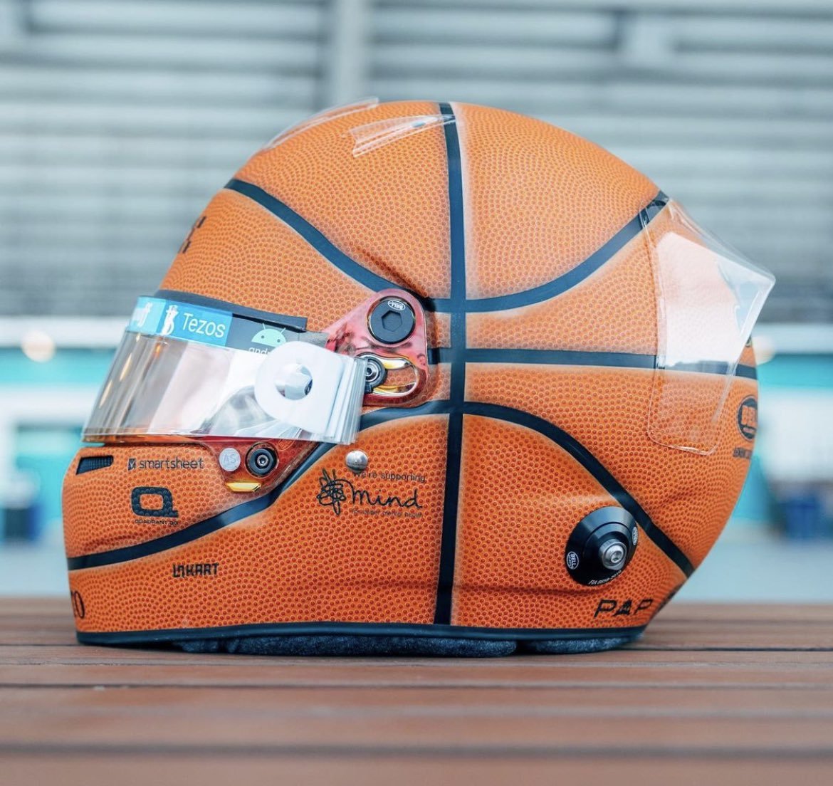
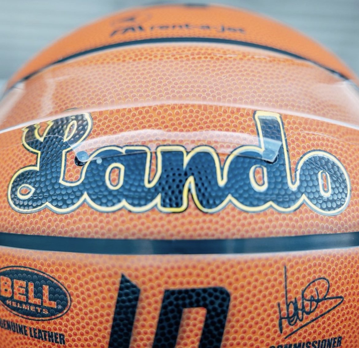
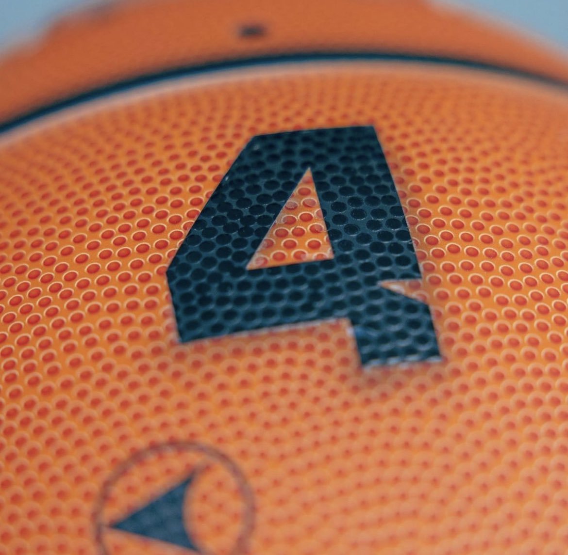
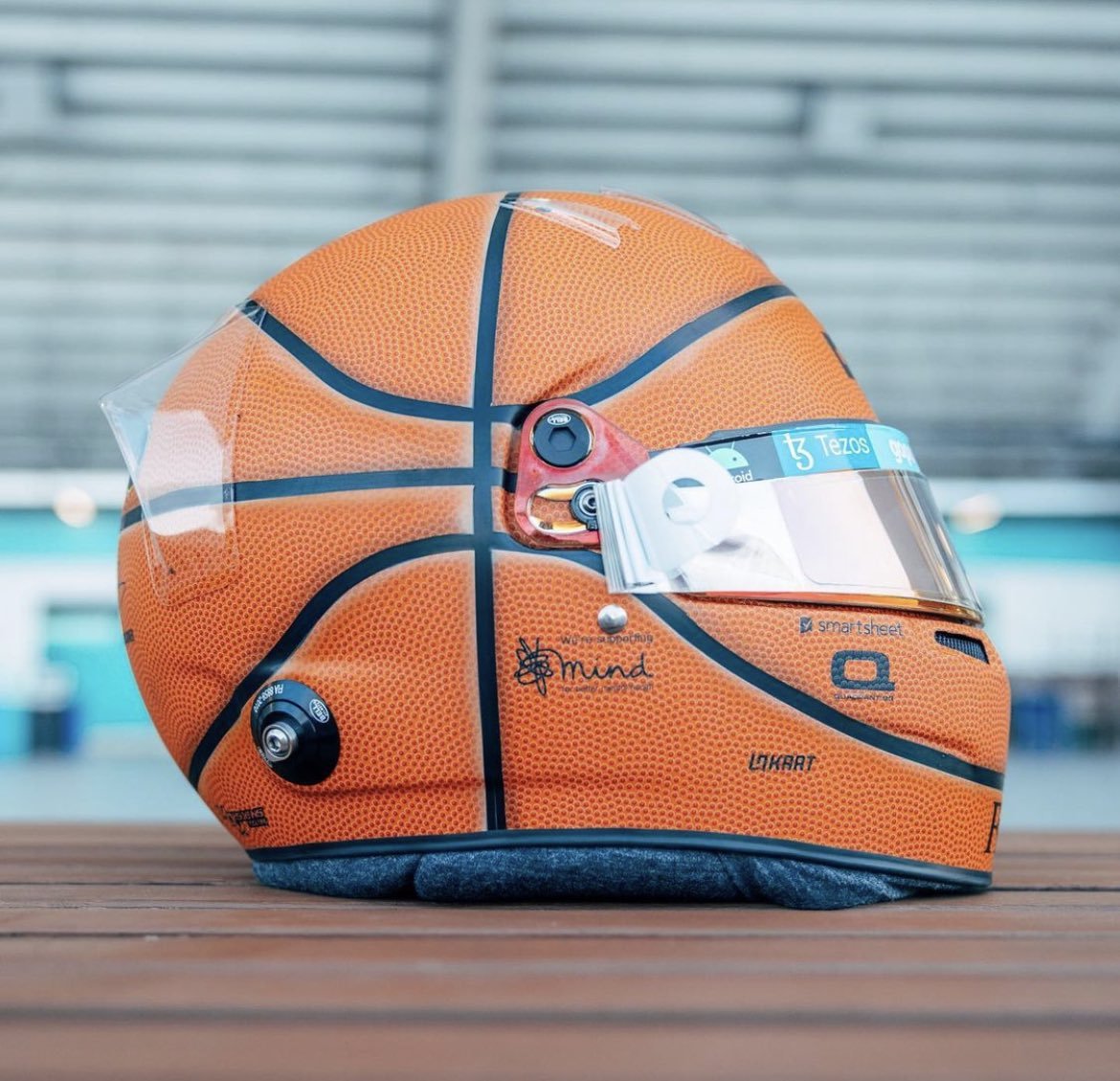
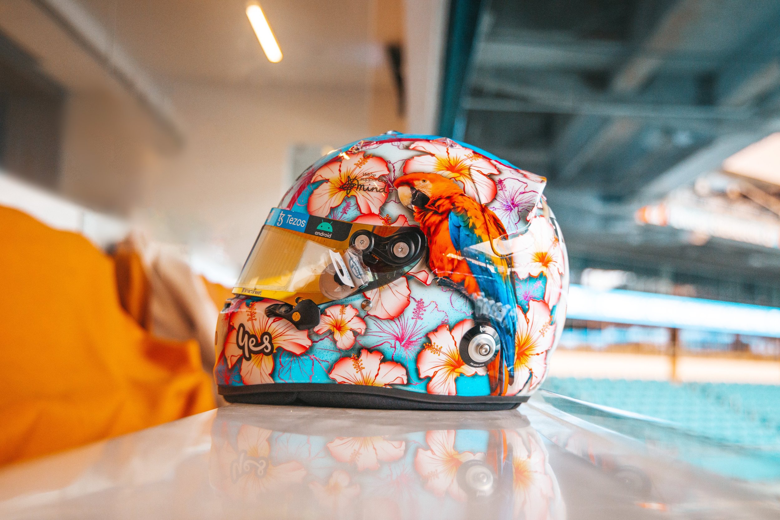
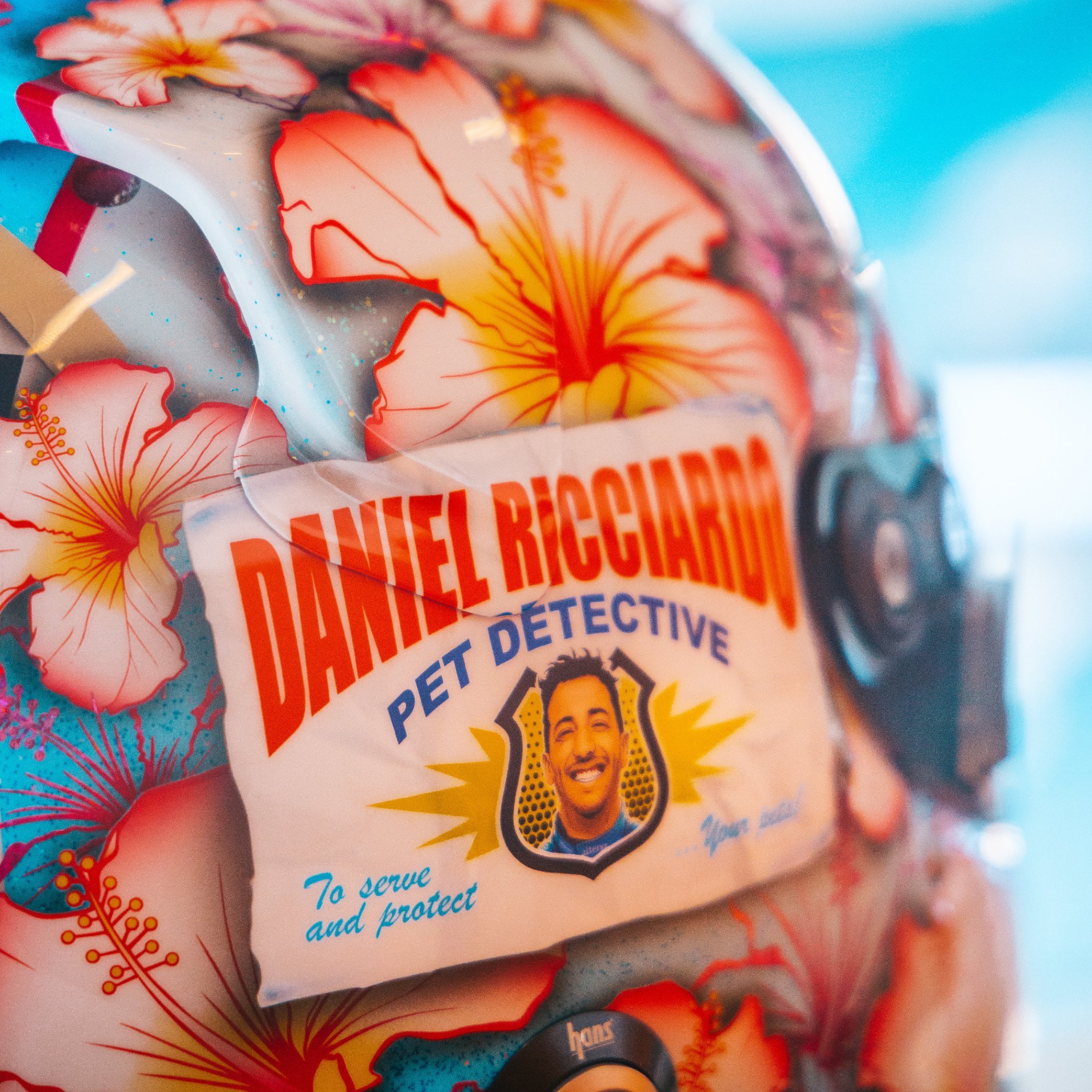
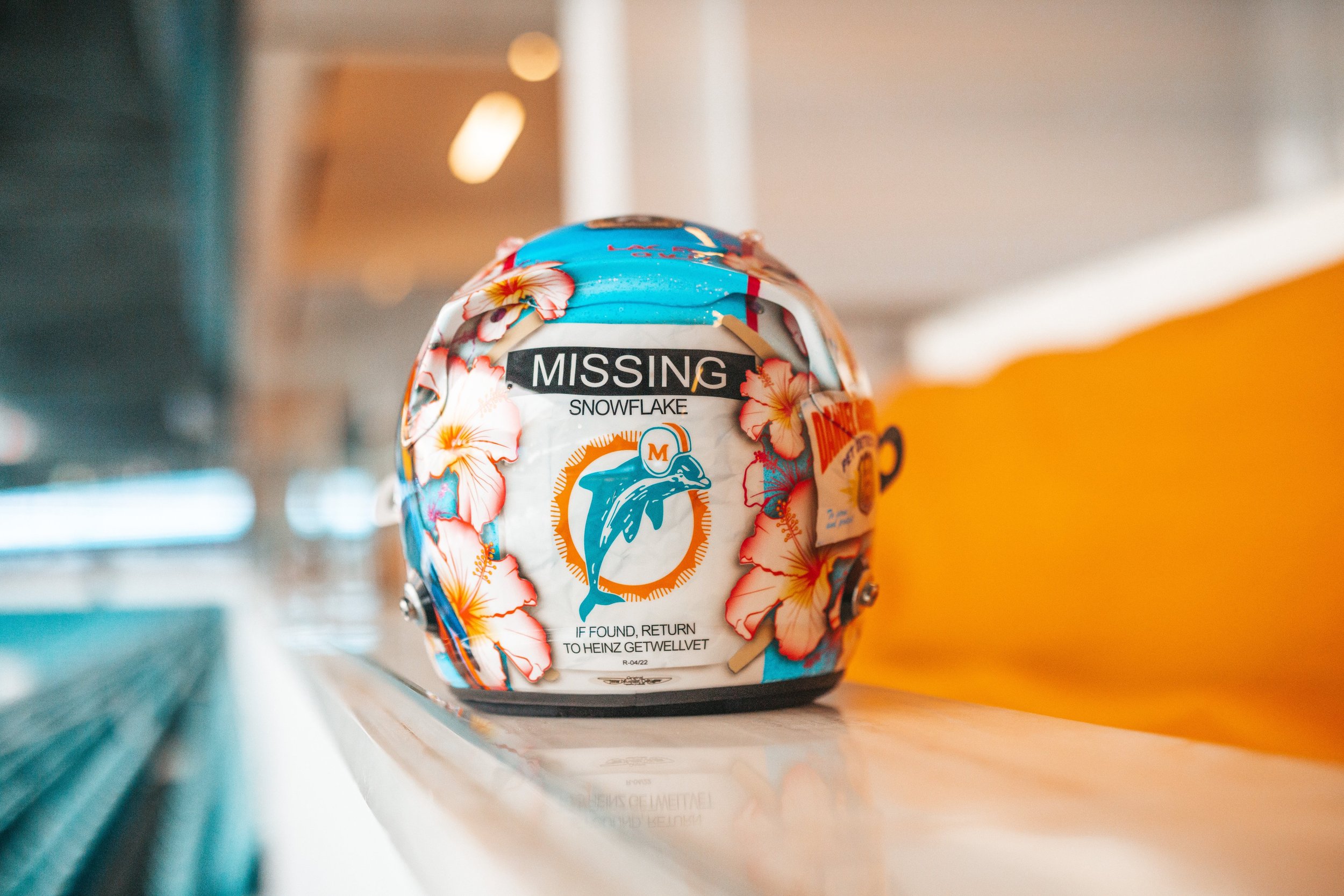
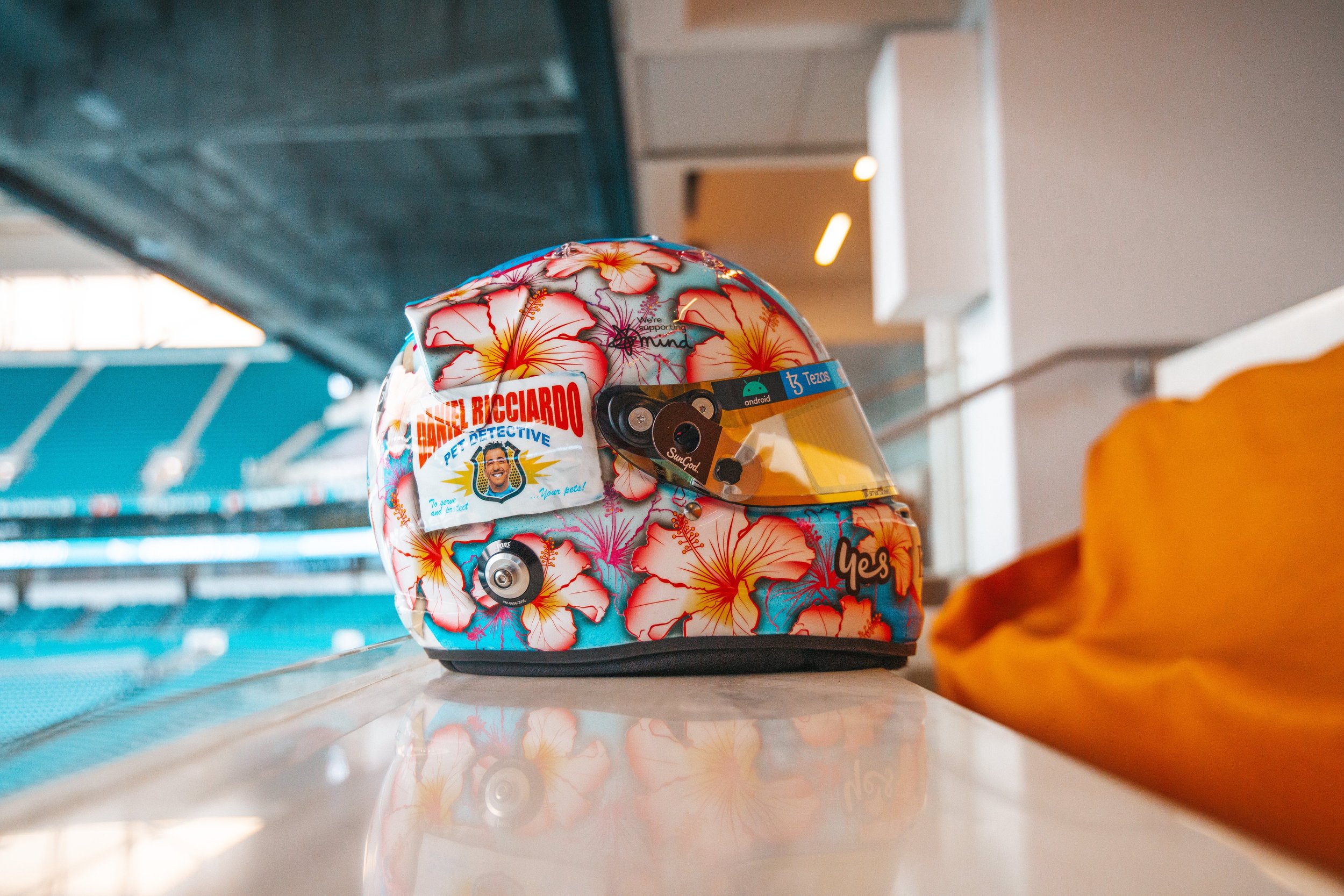
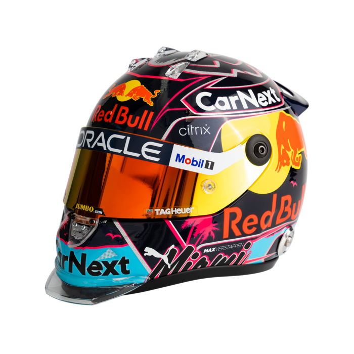
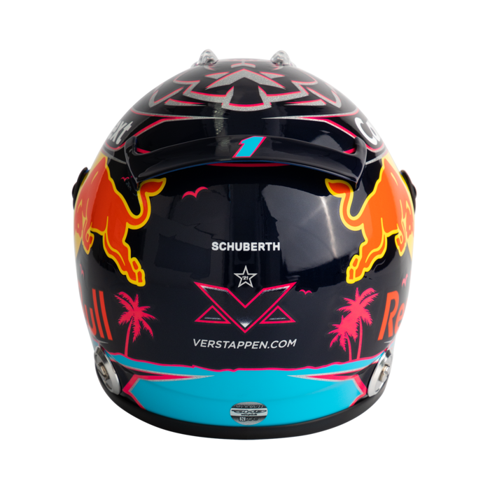
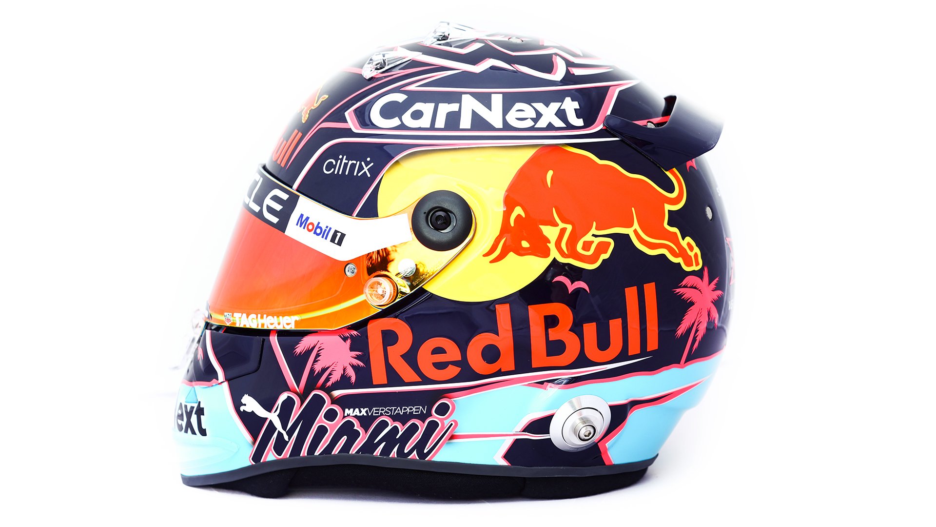
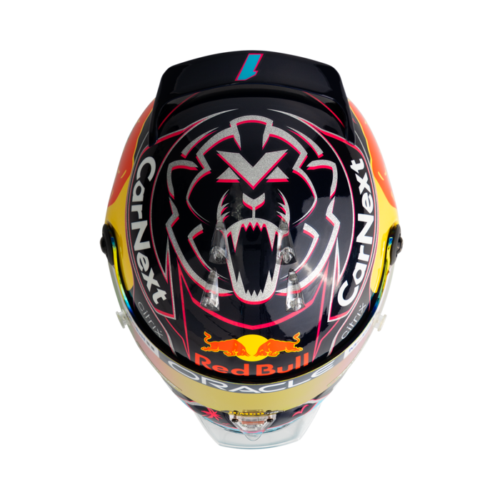
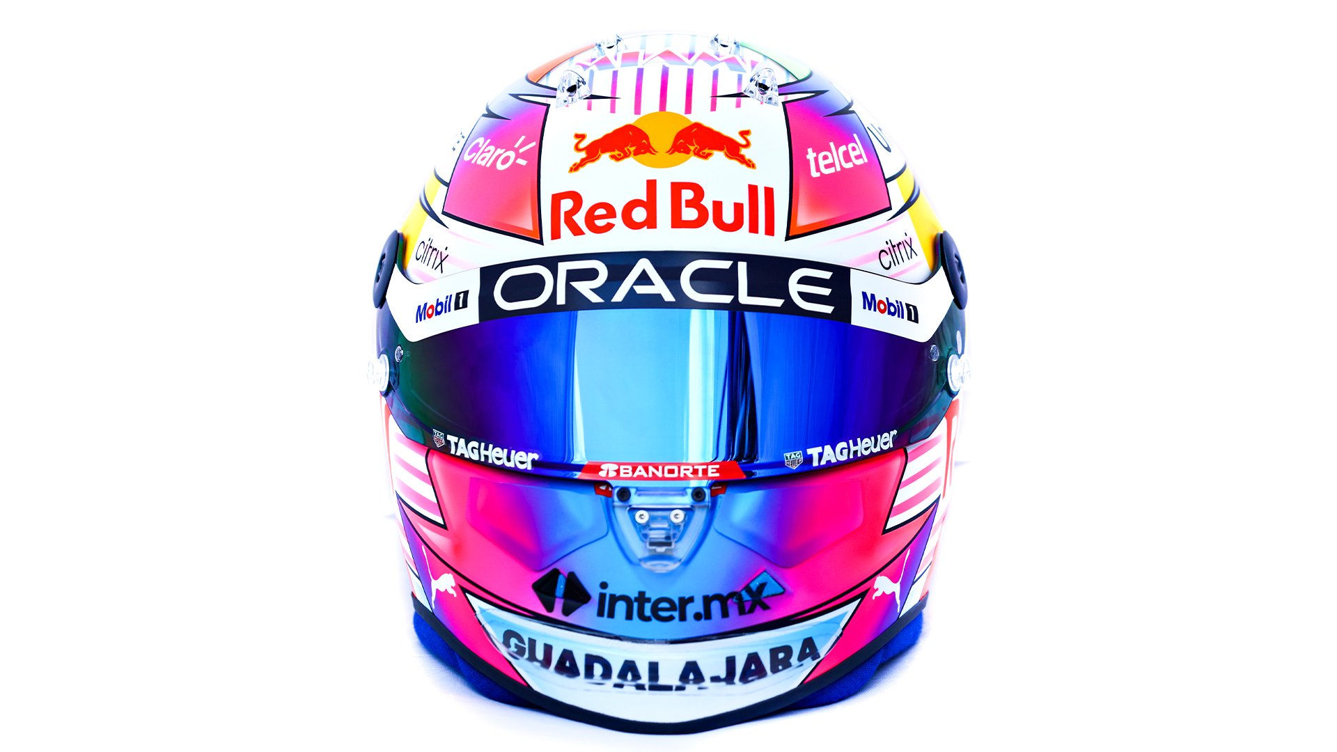
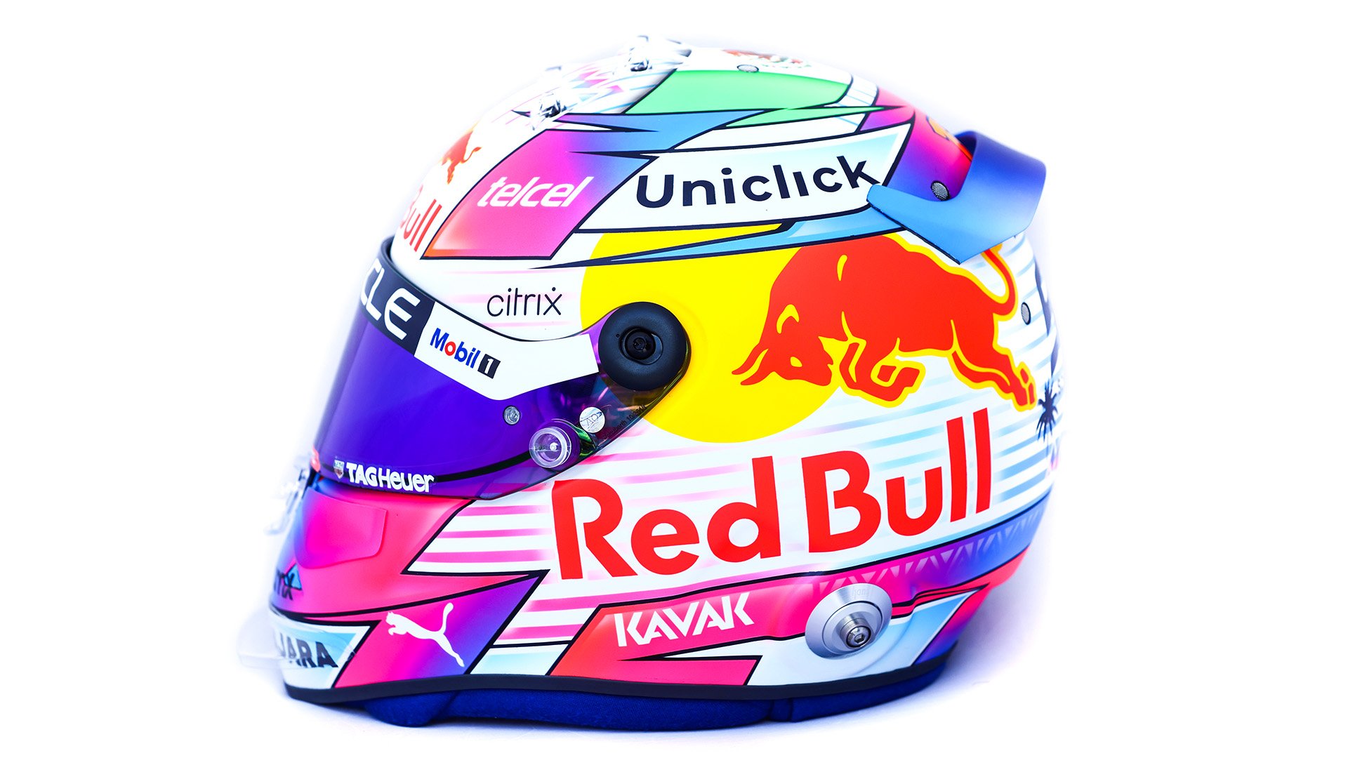
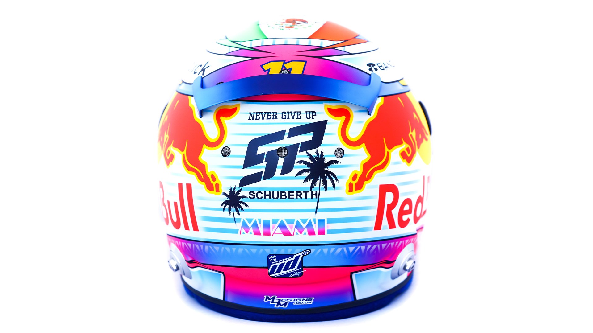
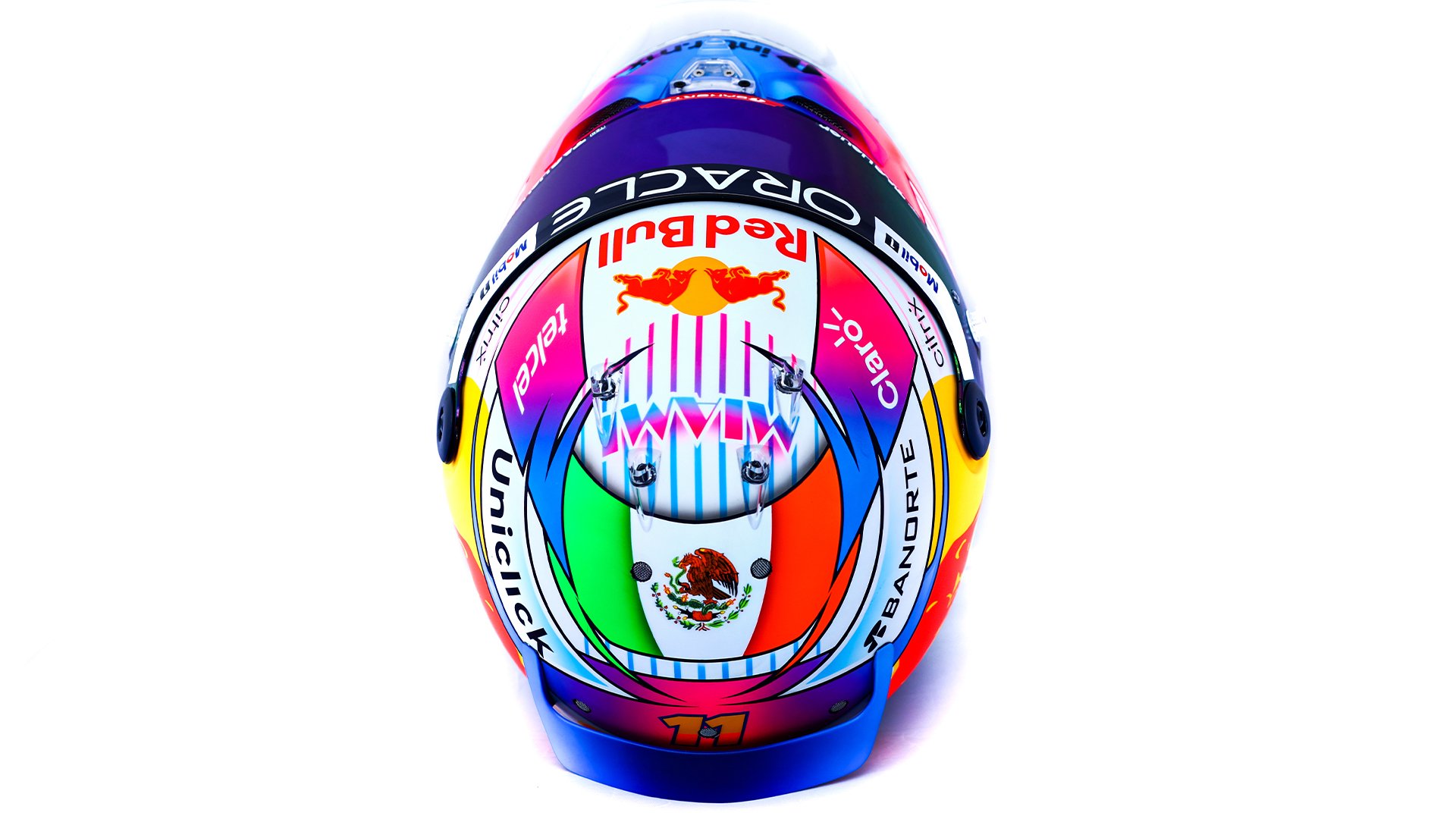
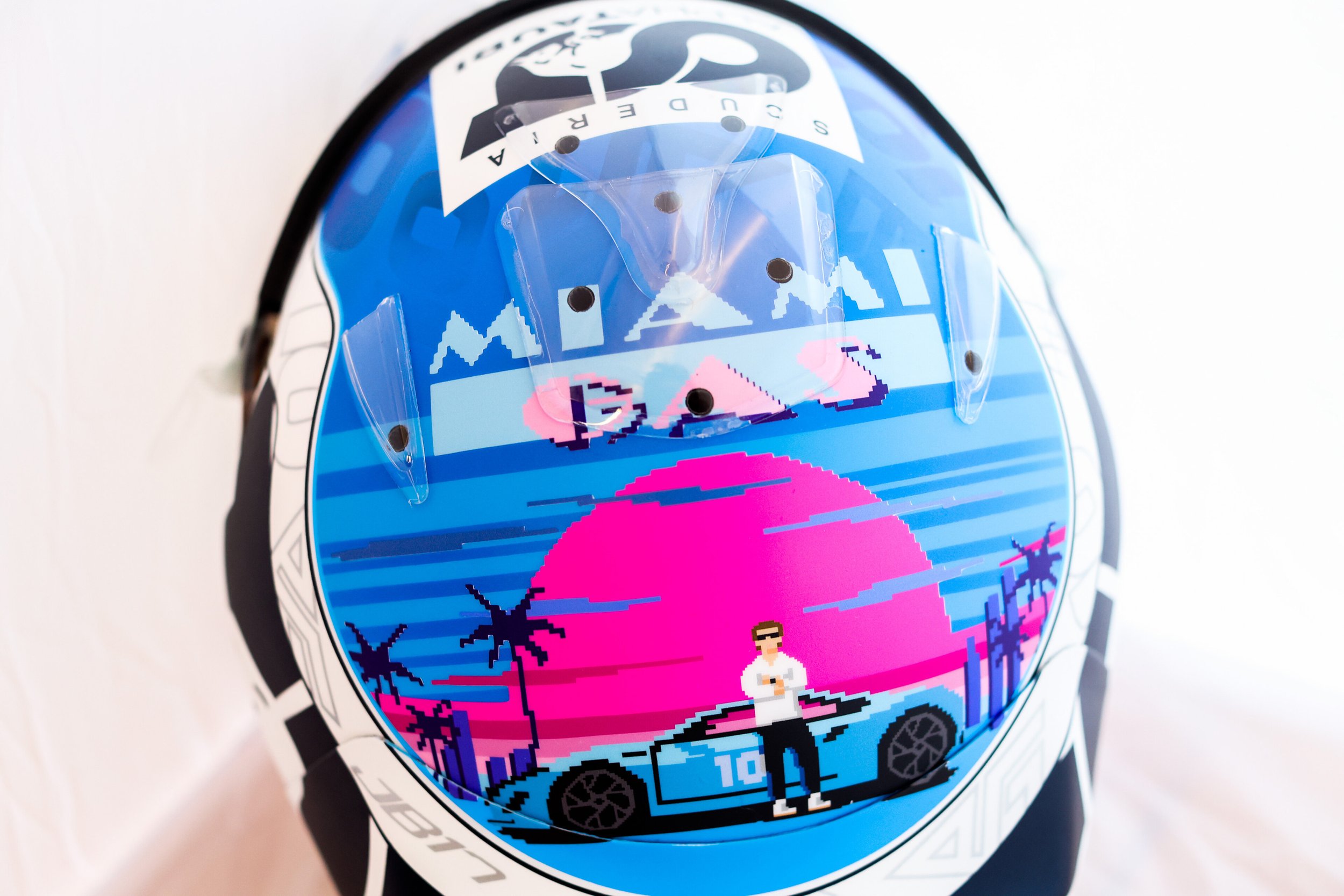
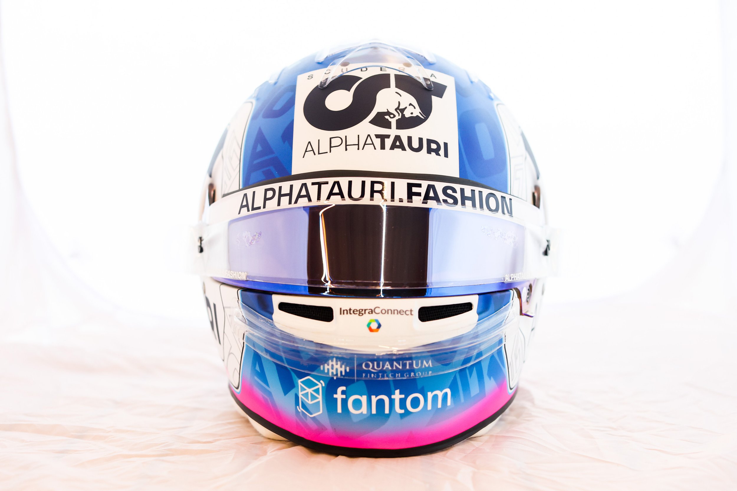
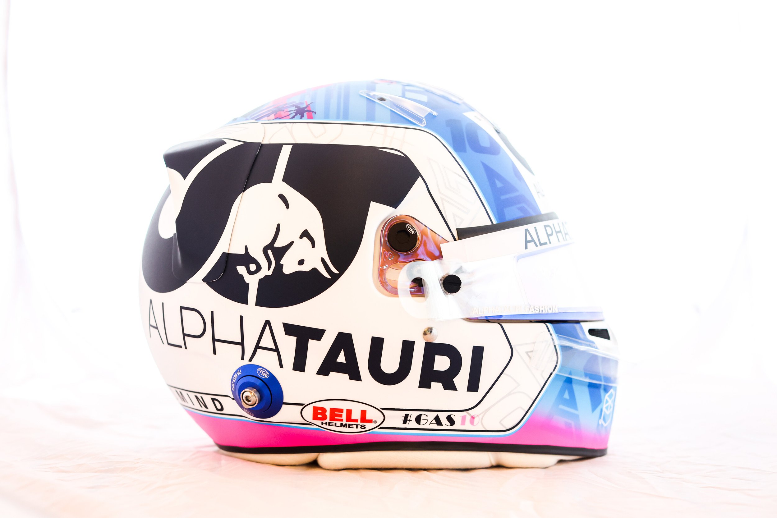
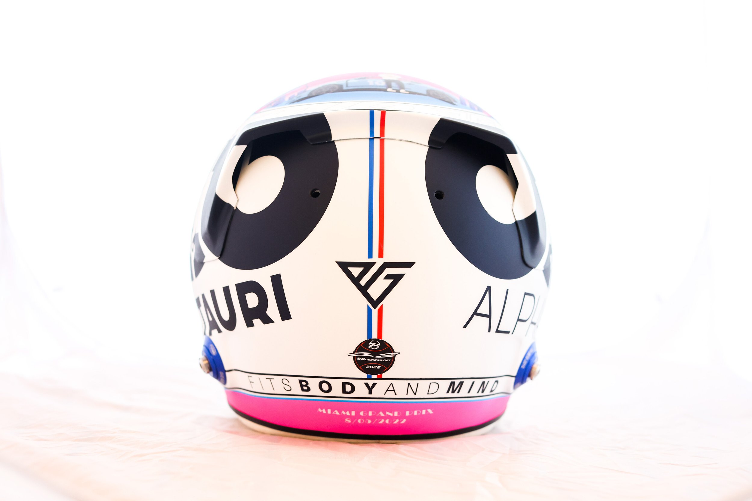
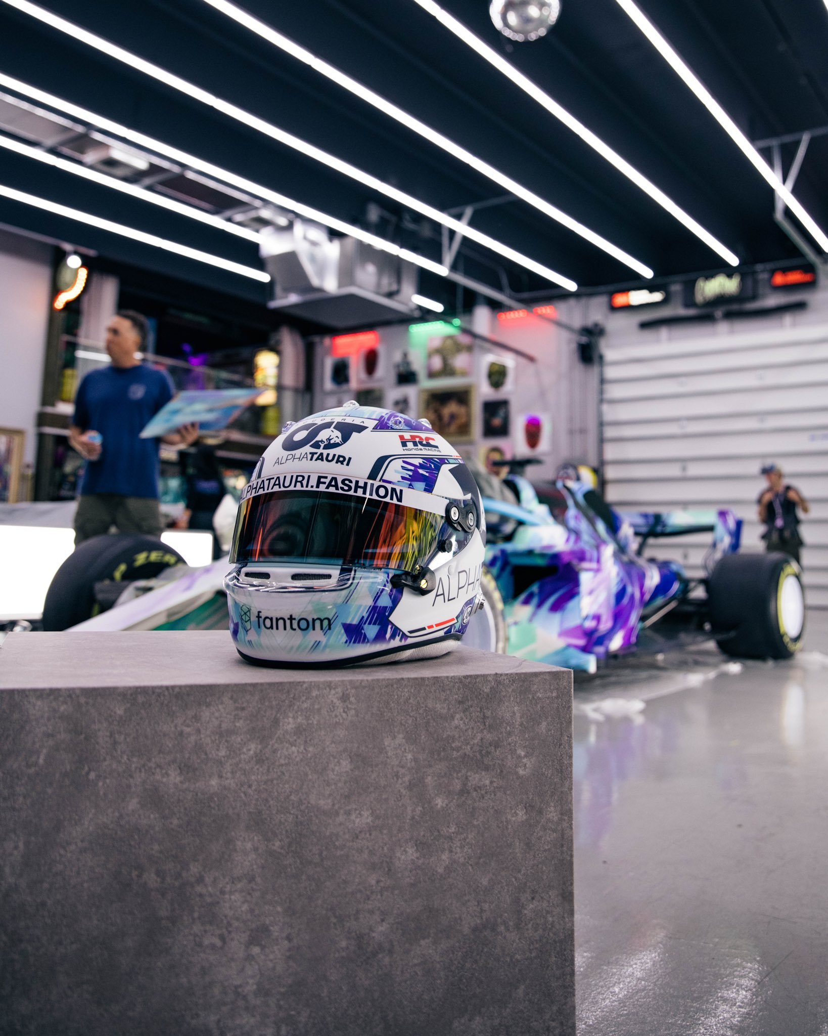
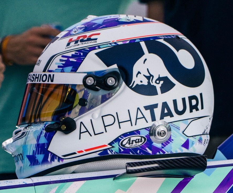
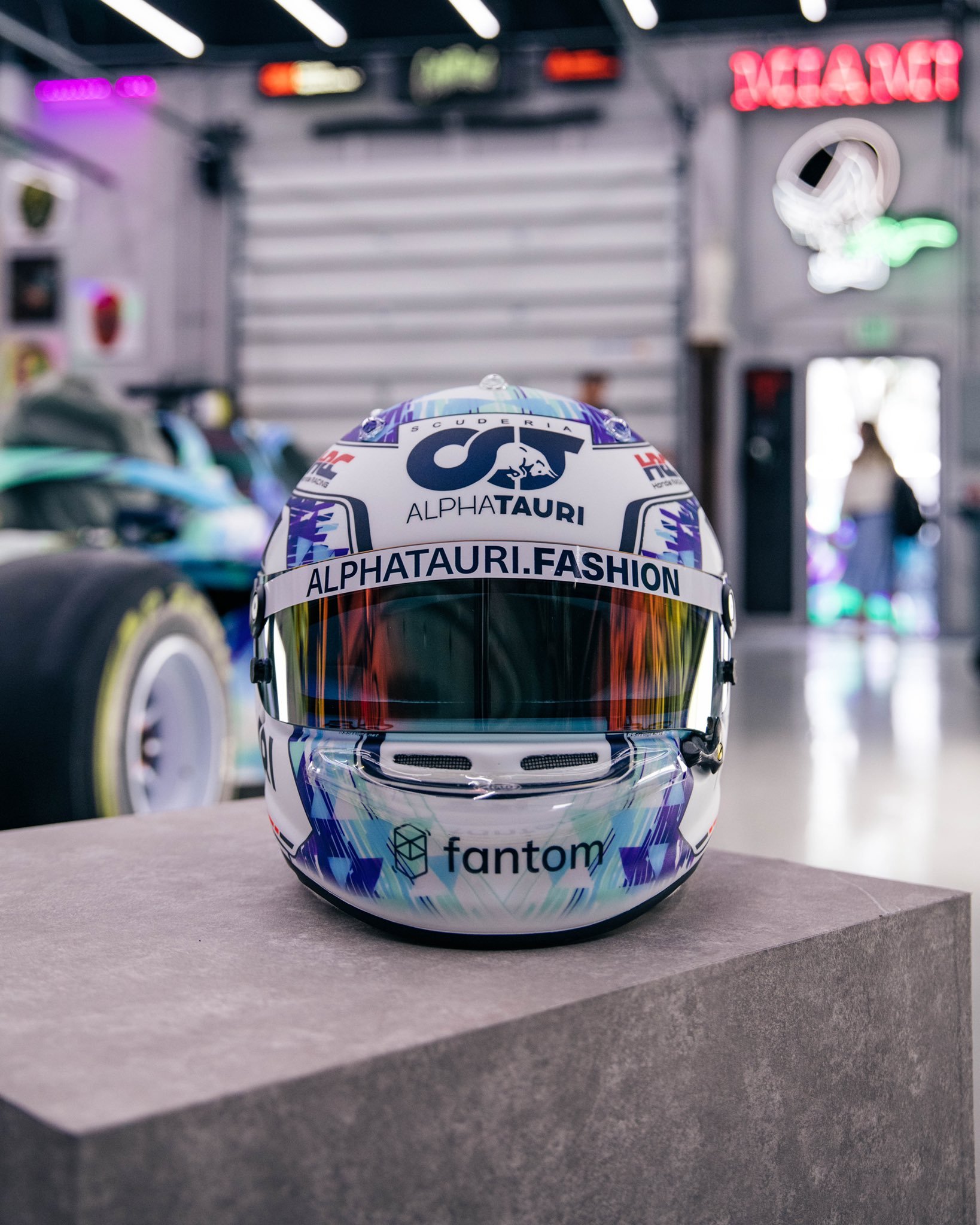
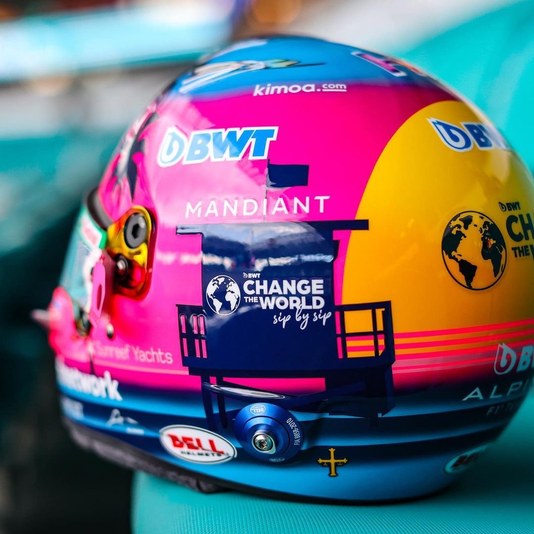
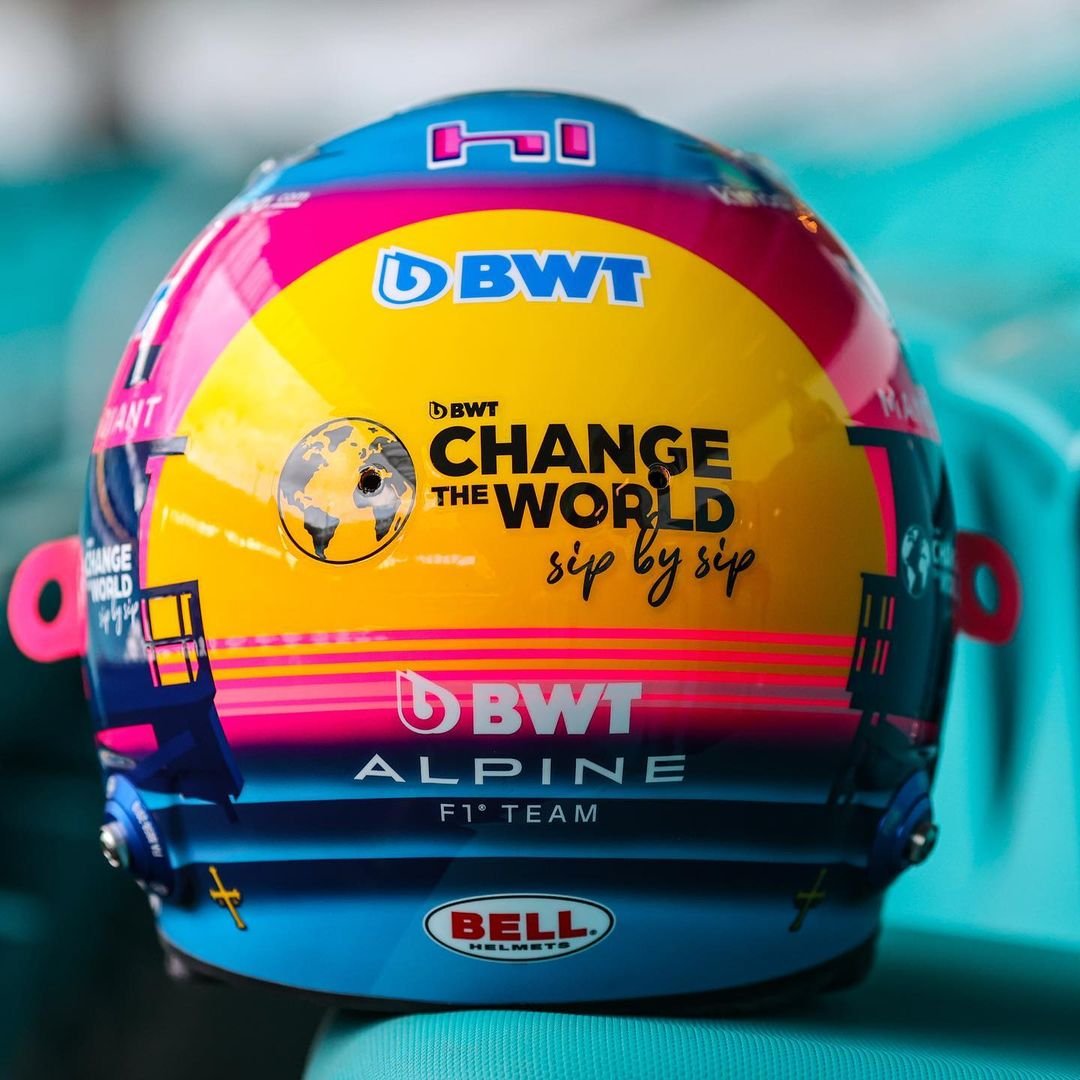
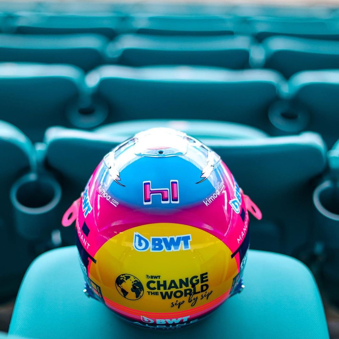
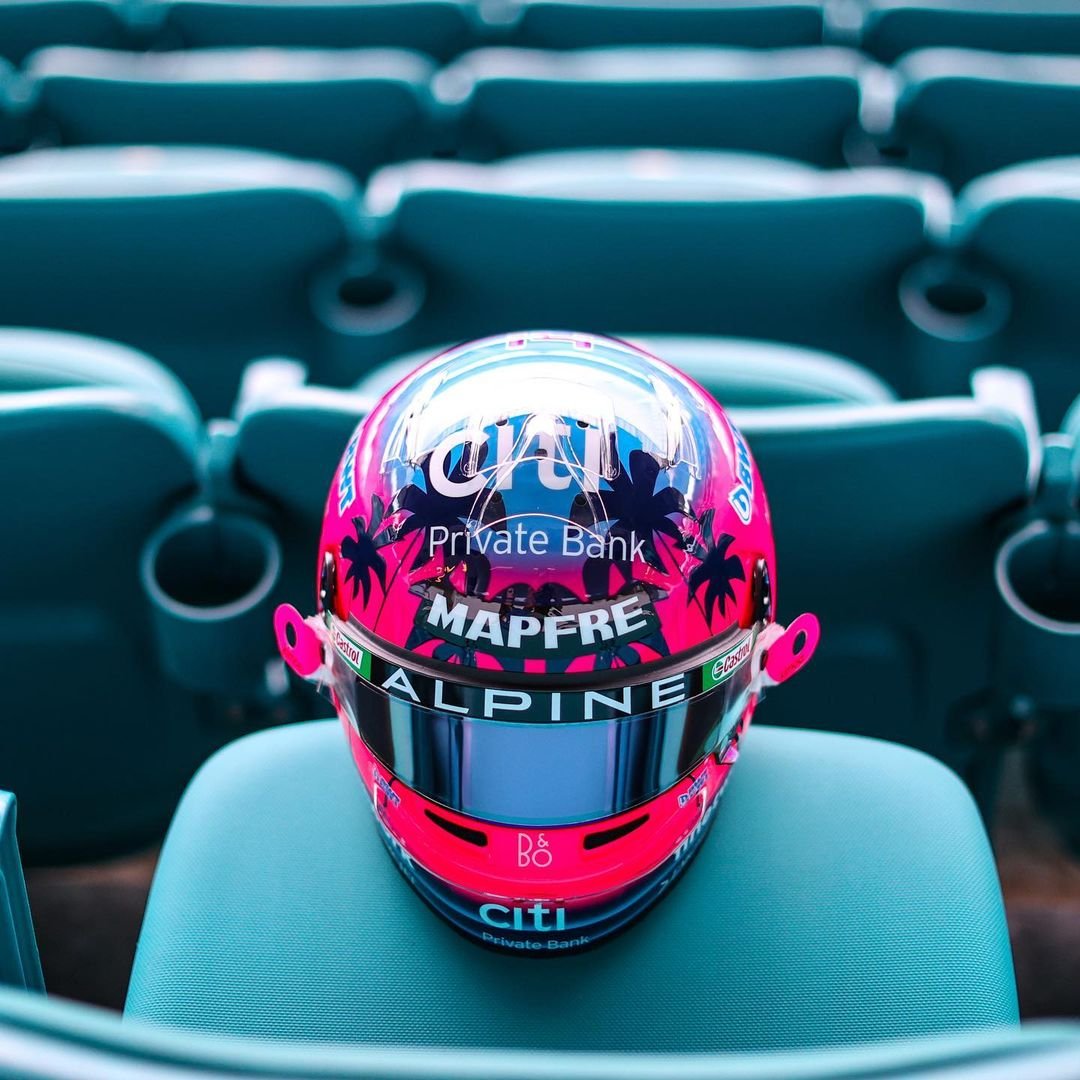
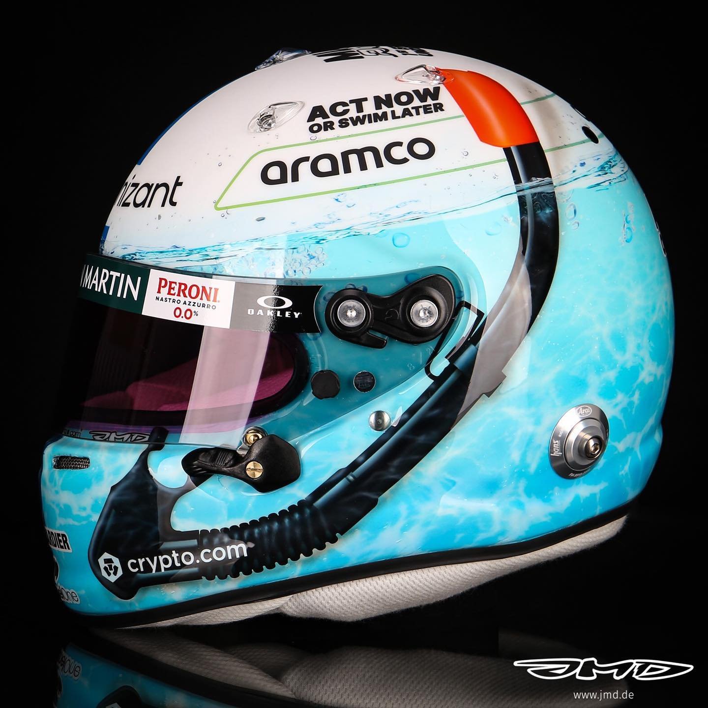
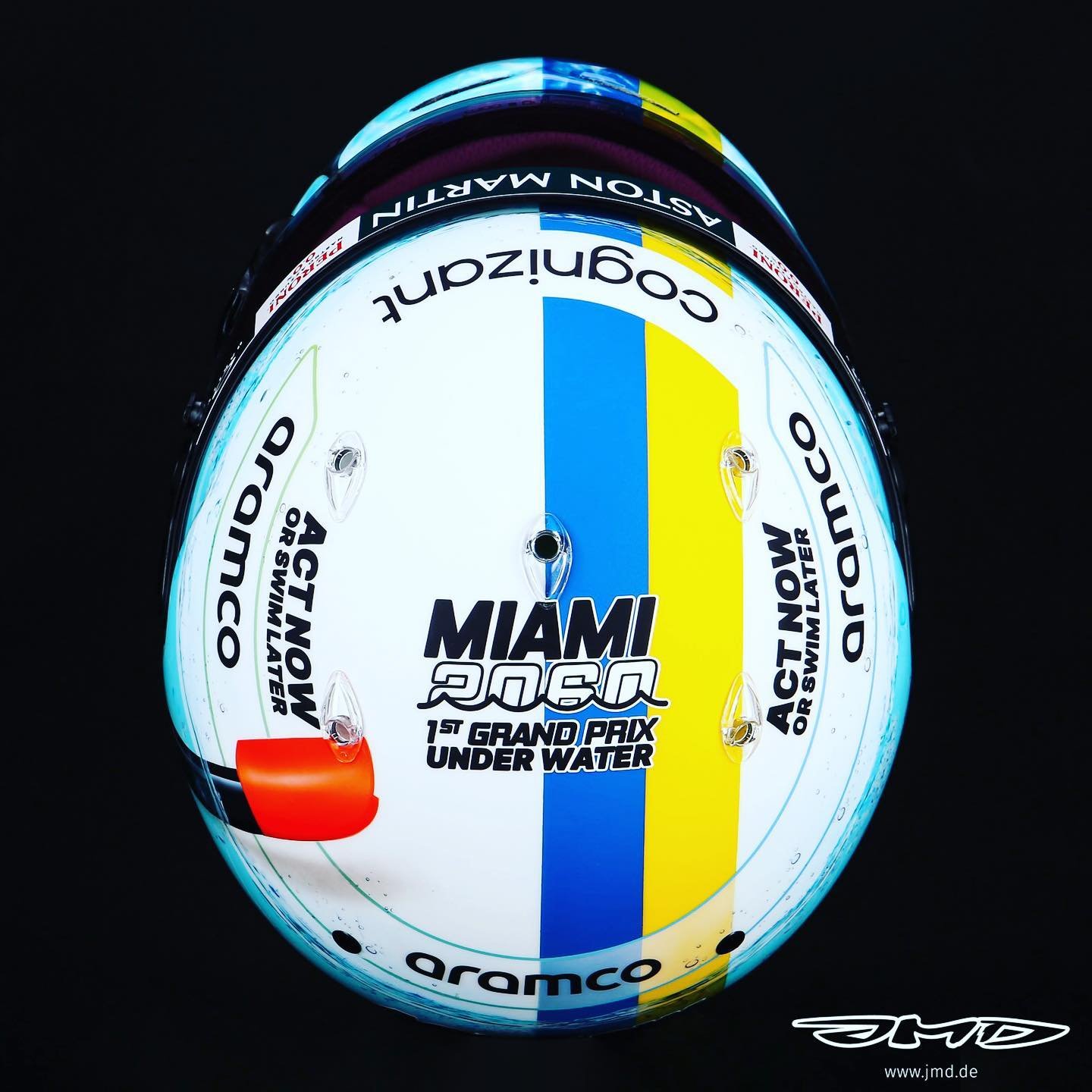
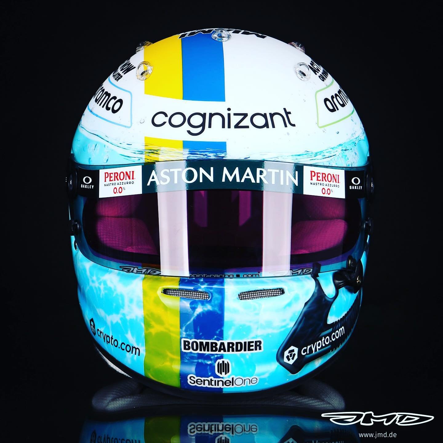
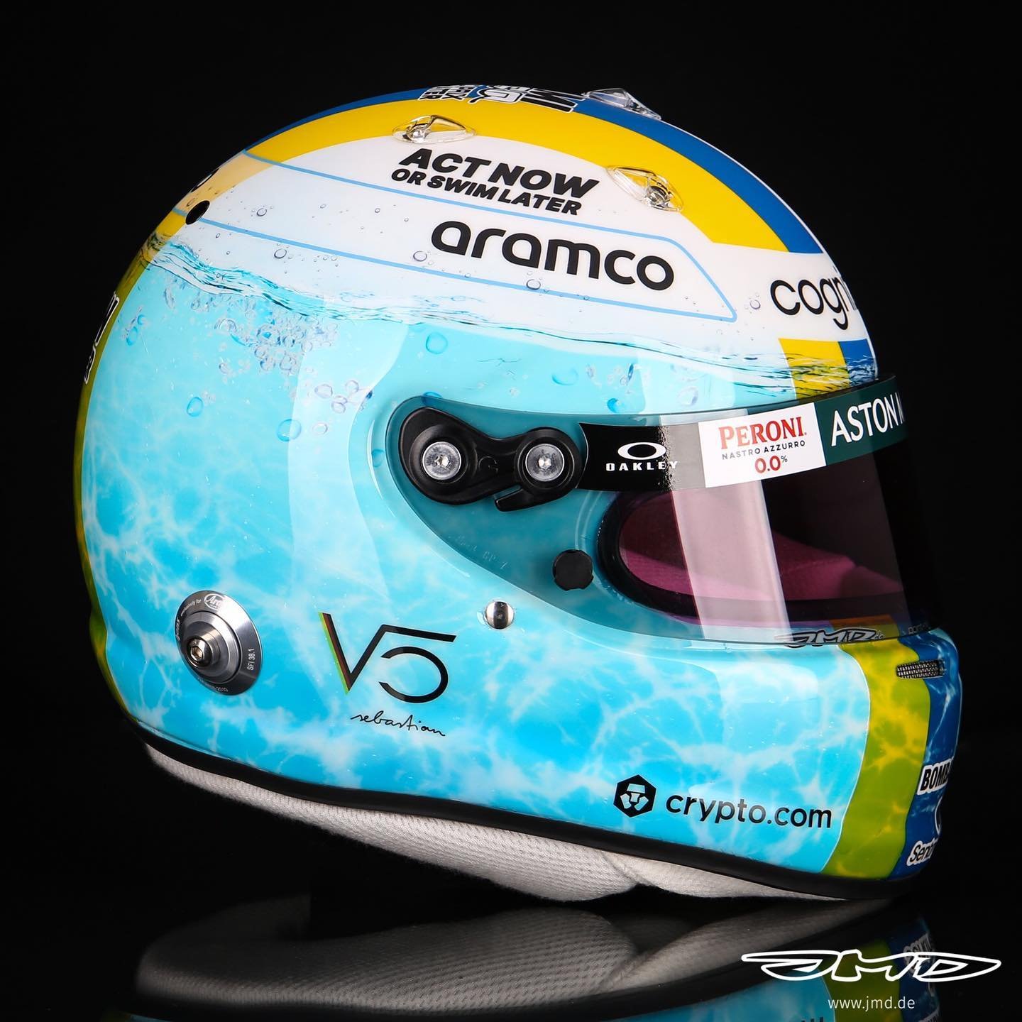
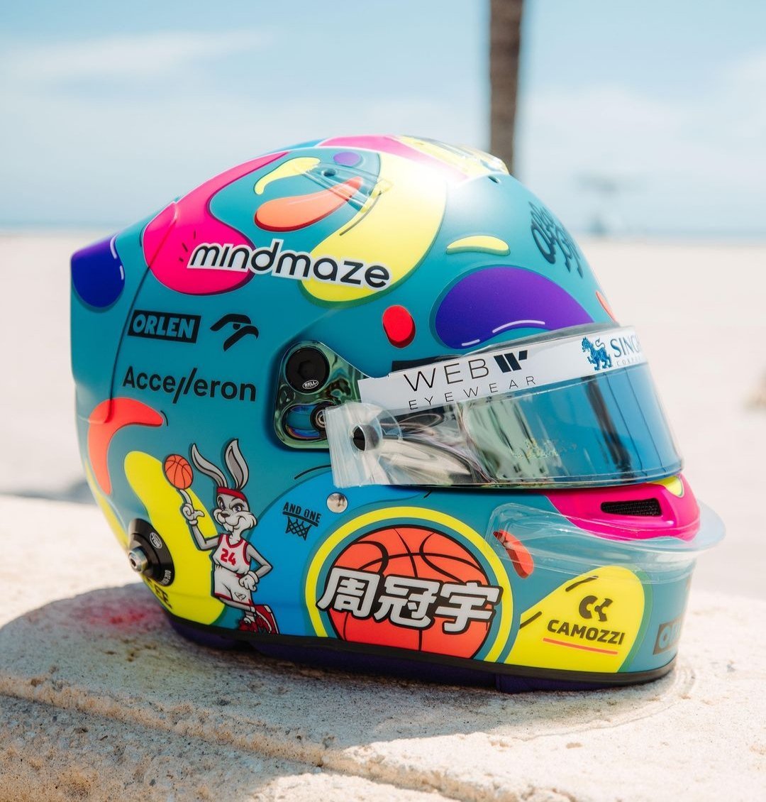
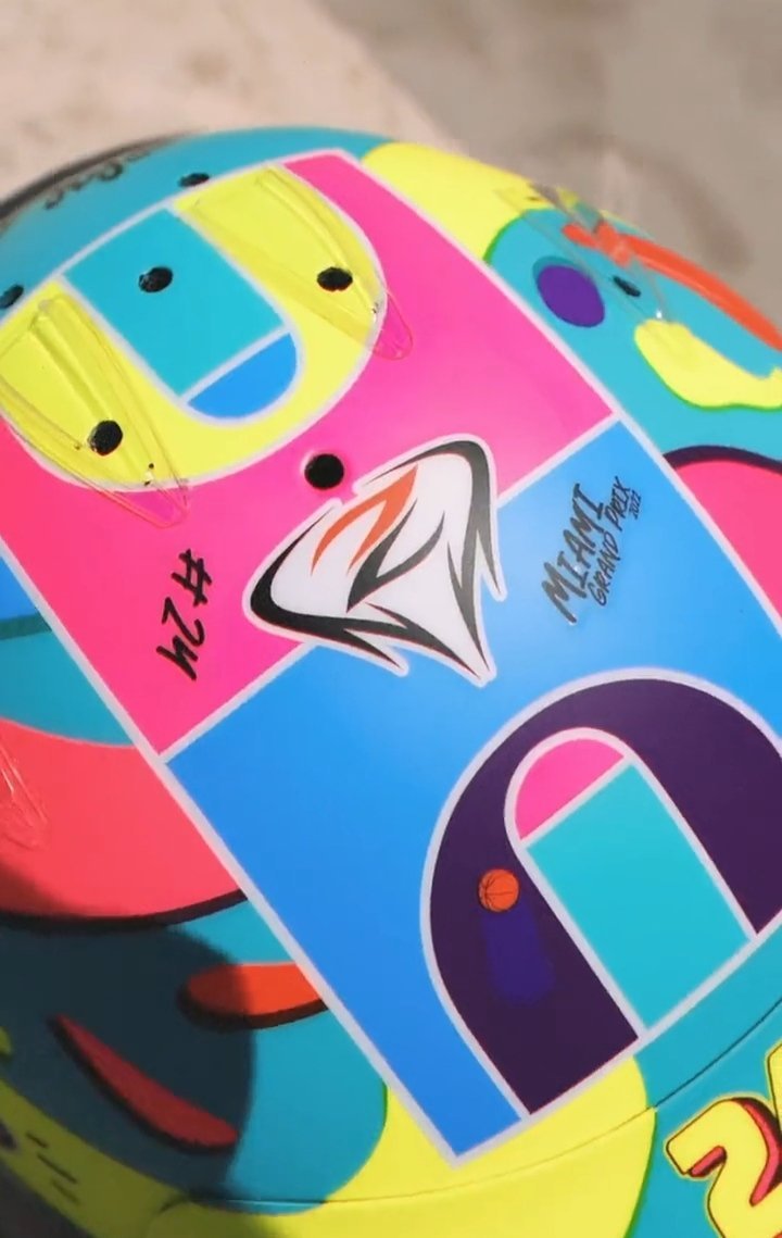
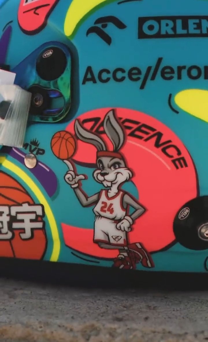
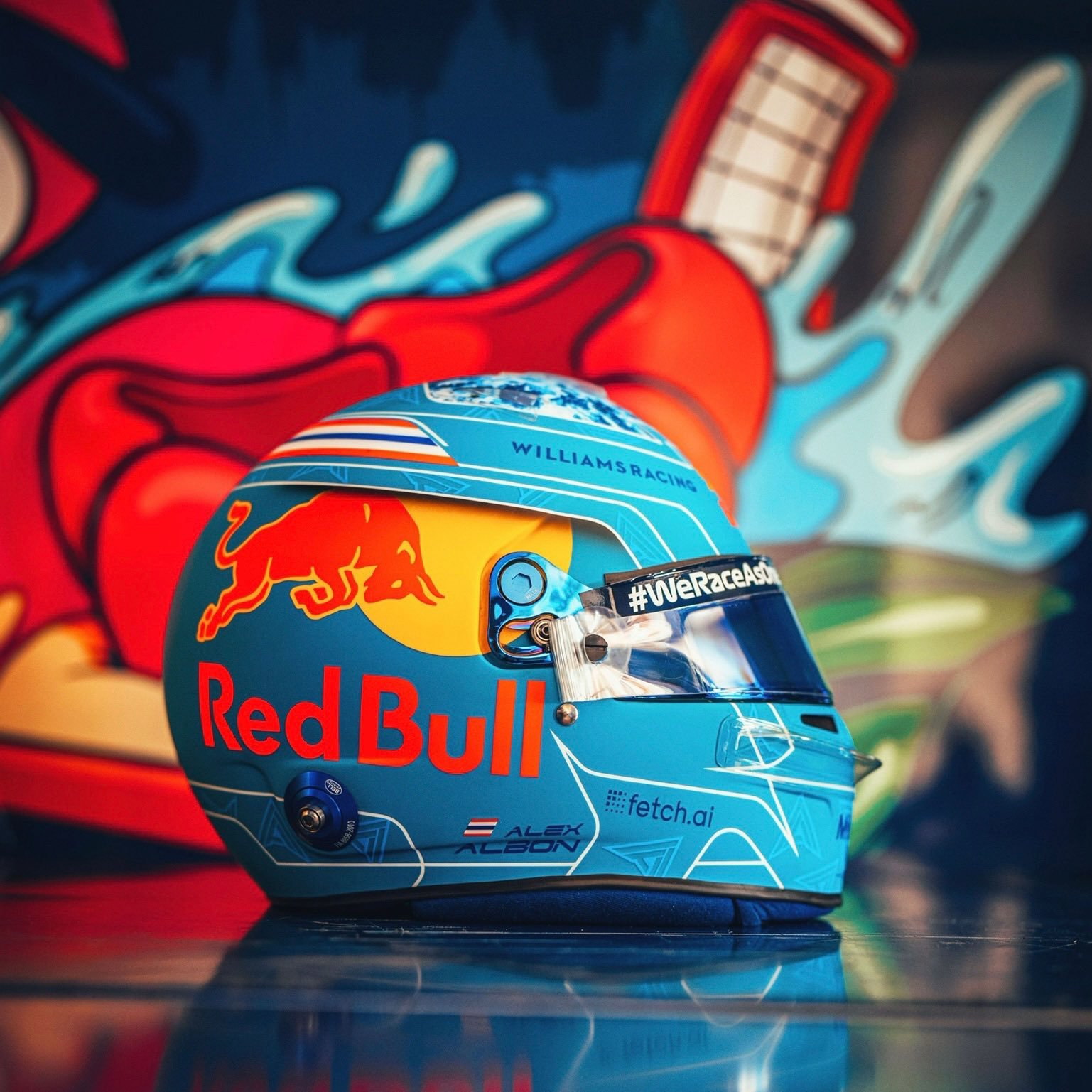
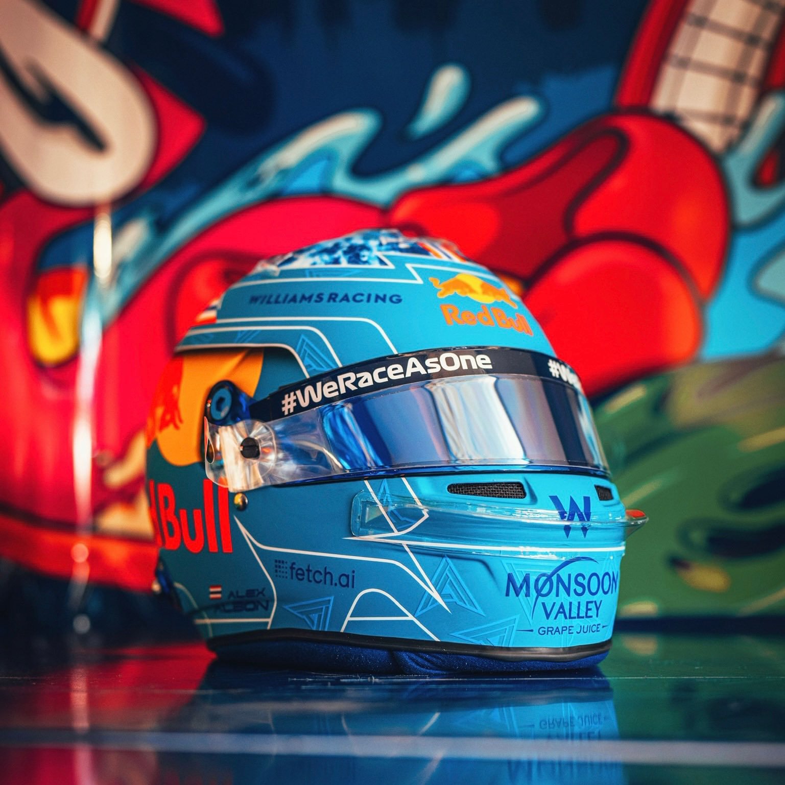
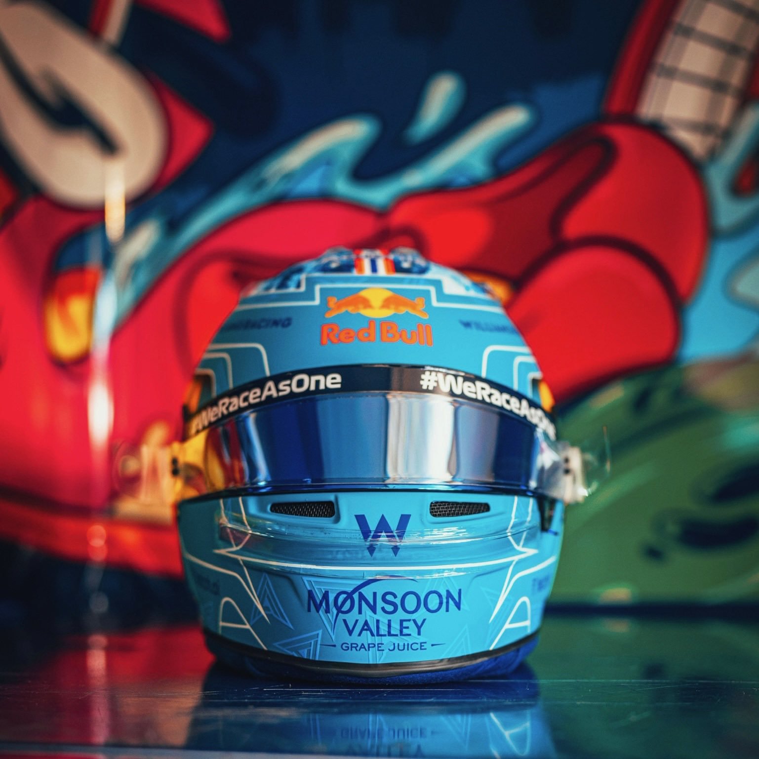
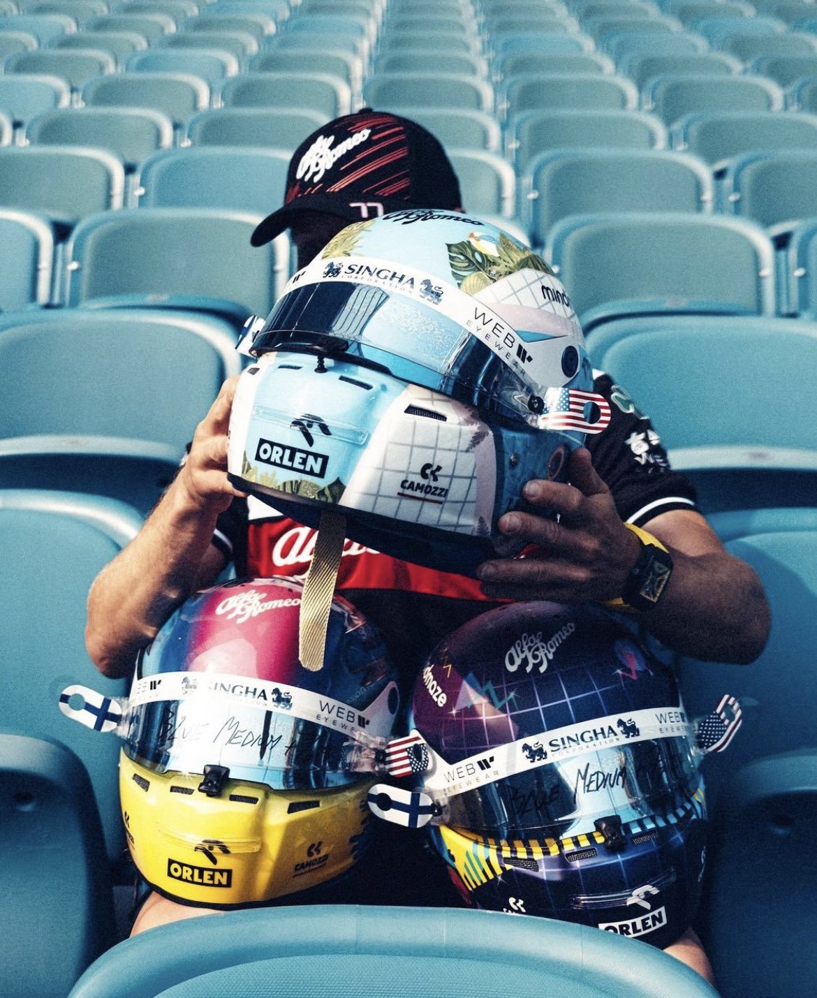
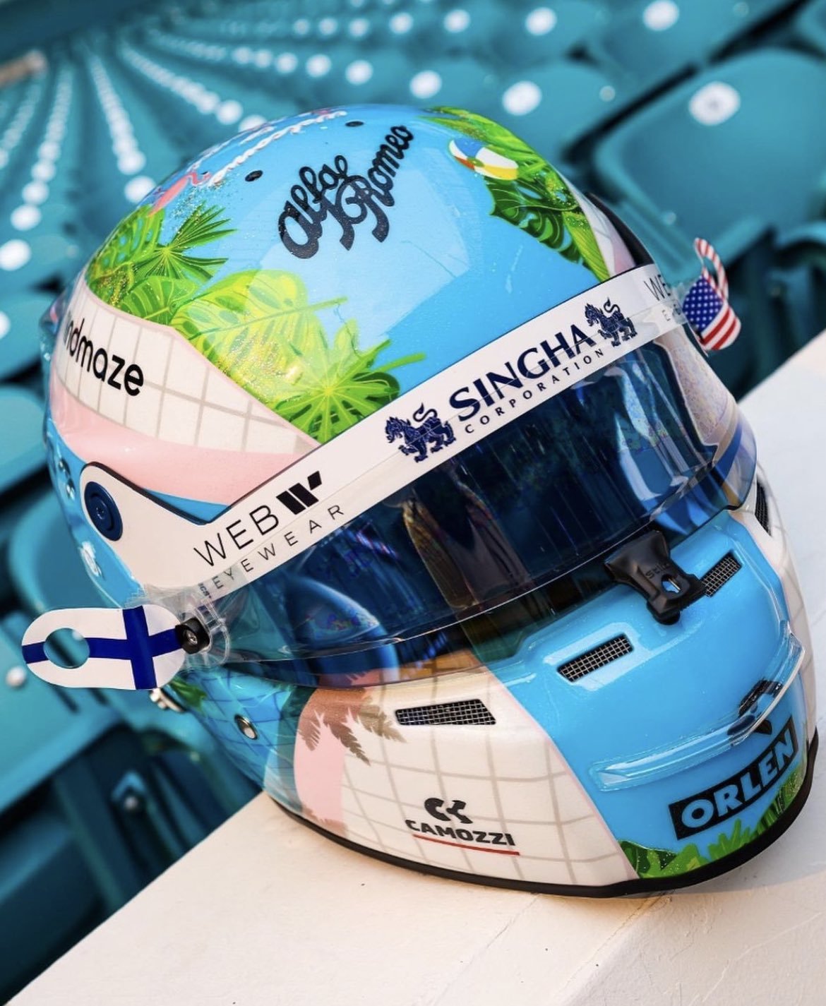
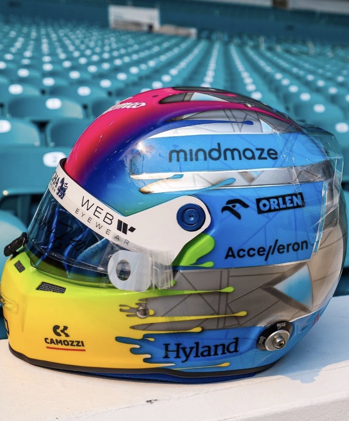
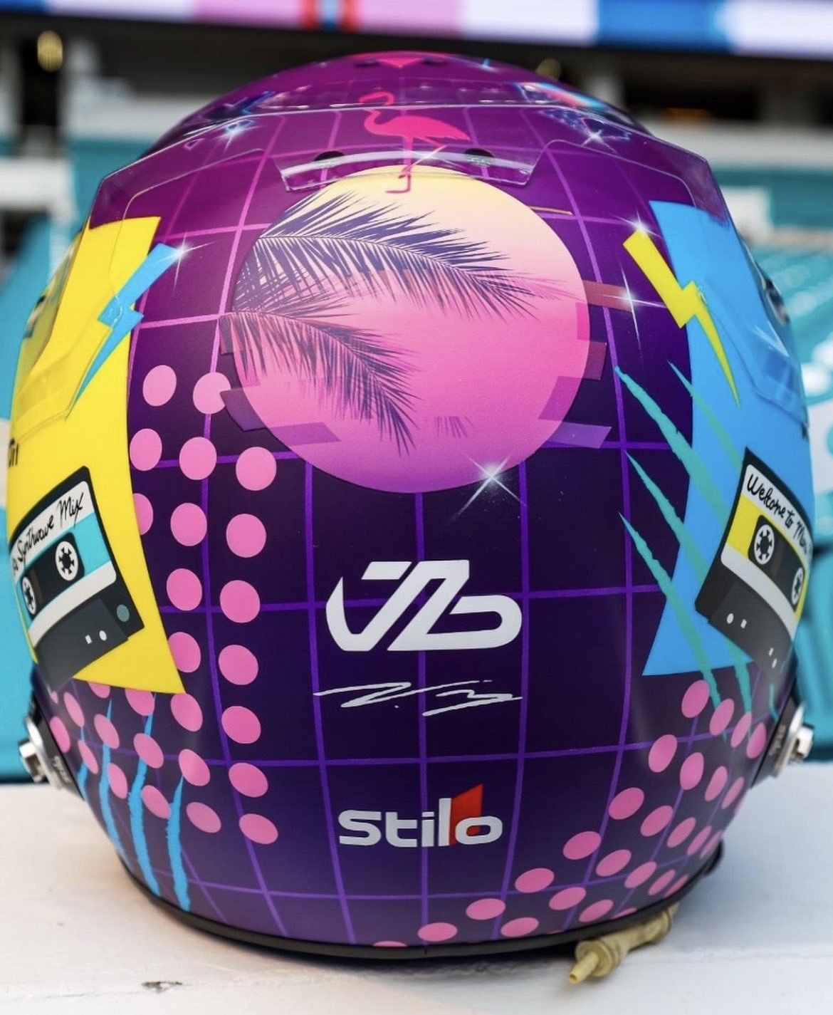
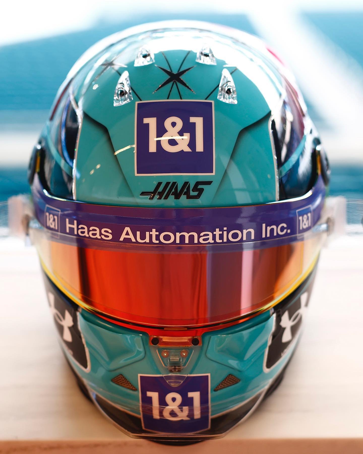
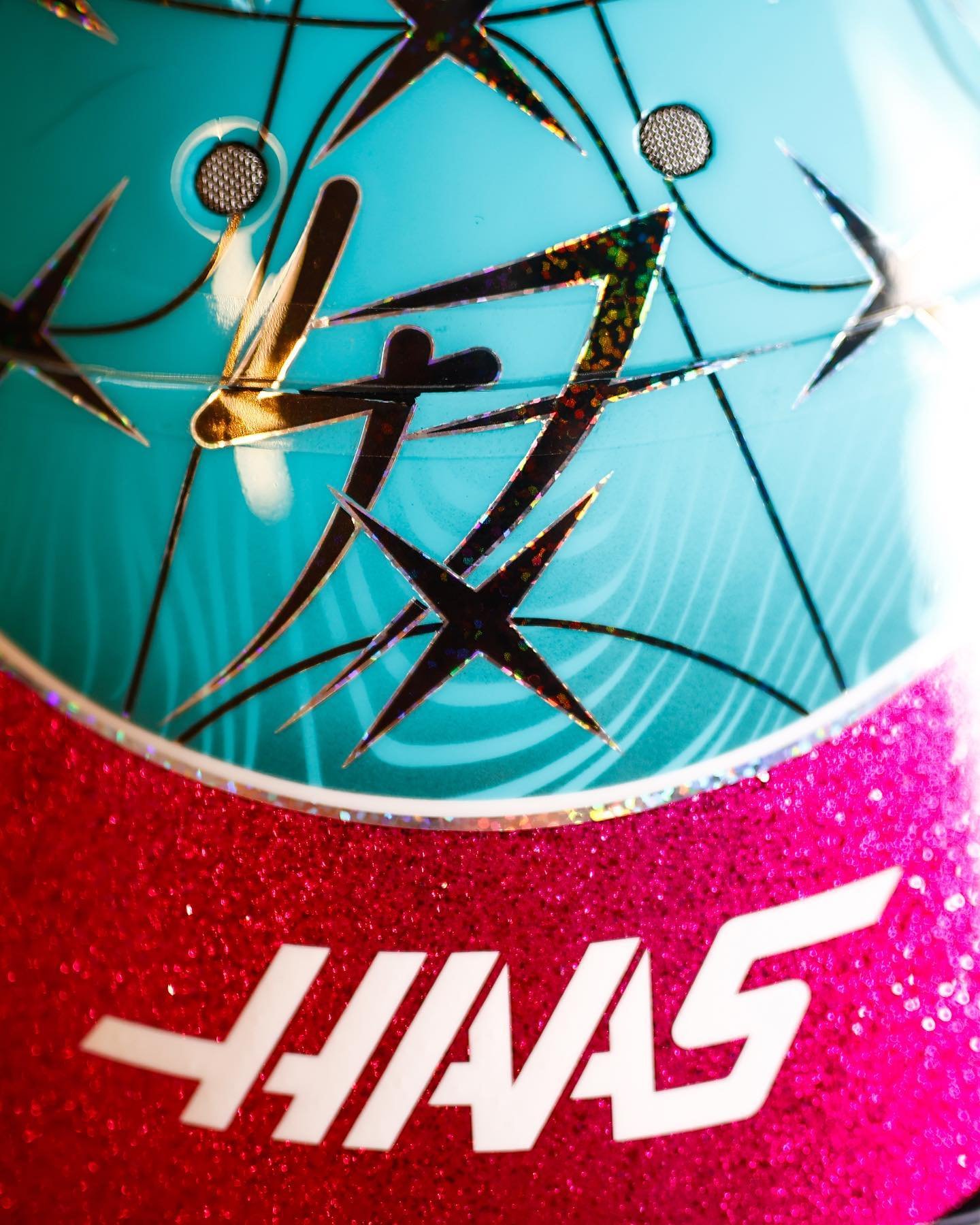
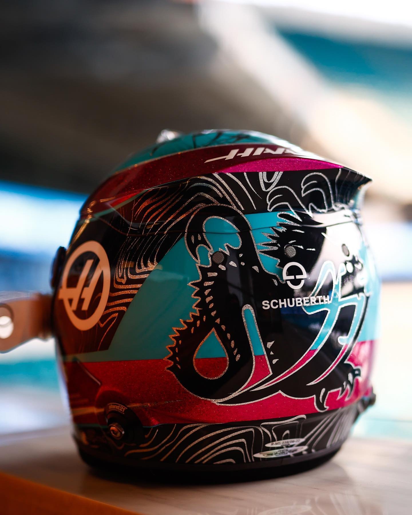
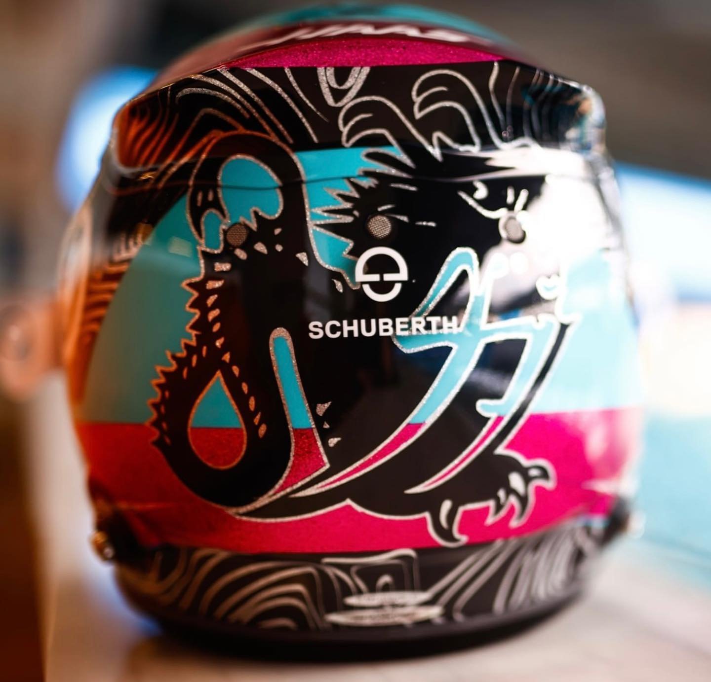
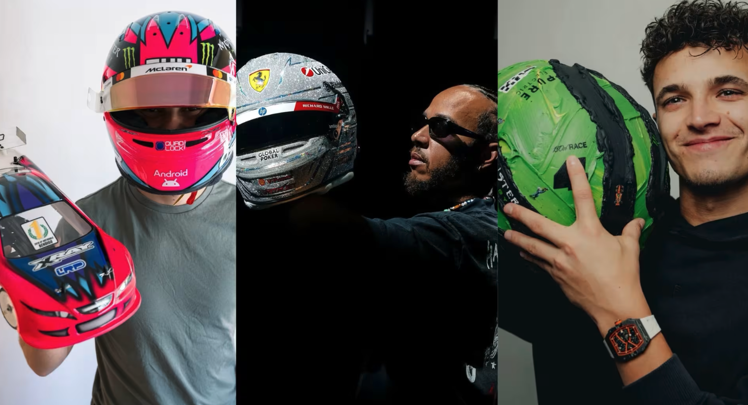
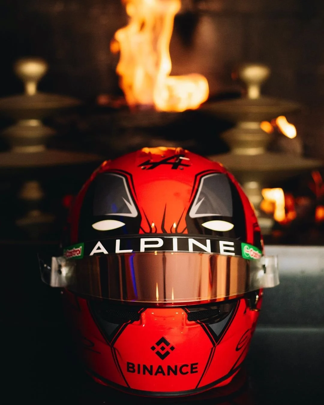
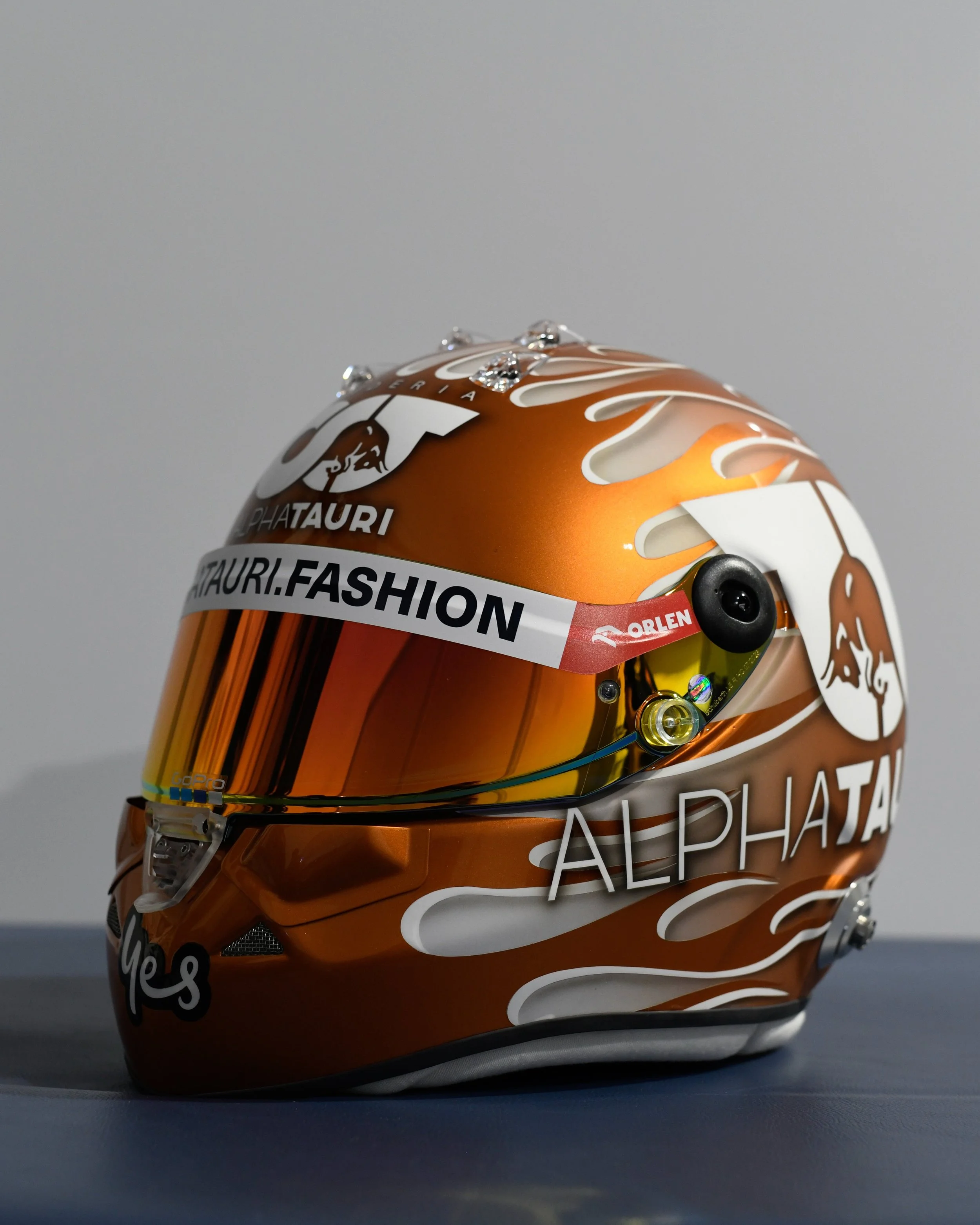
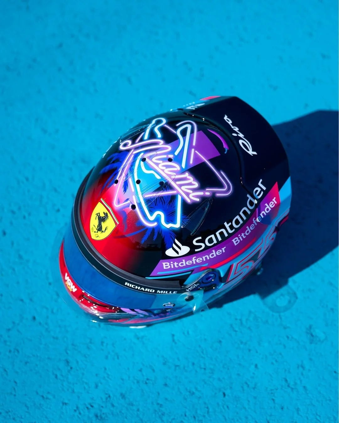
Formula One has come to Miami for the first time. The Miami Grand Prix is an opportunity to see each drive show off their style and flash with special Miami themed helmets. Take a look below at some of the top helmets from the weekend.
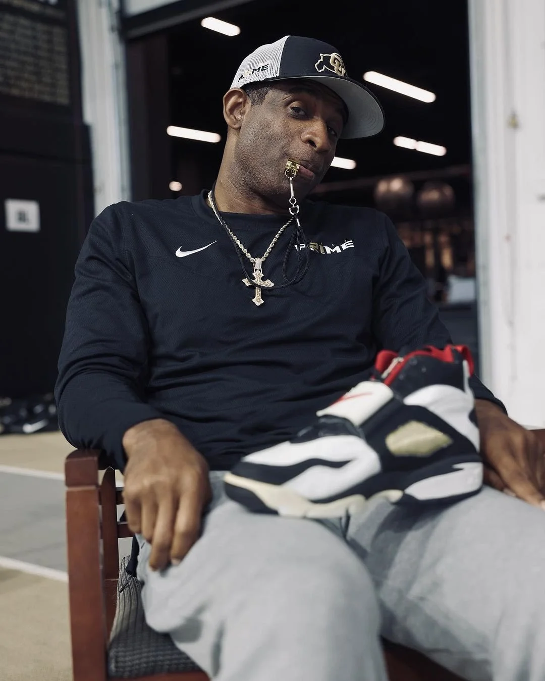
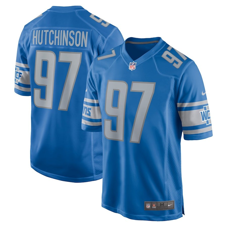
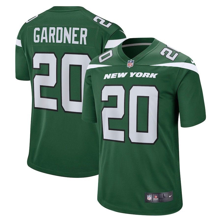
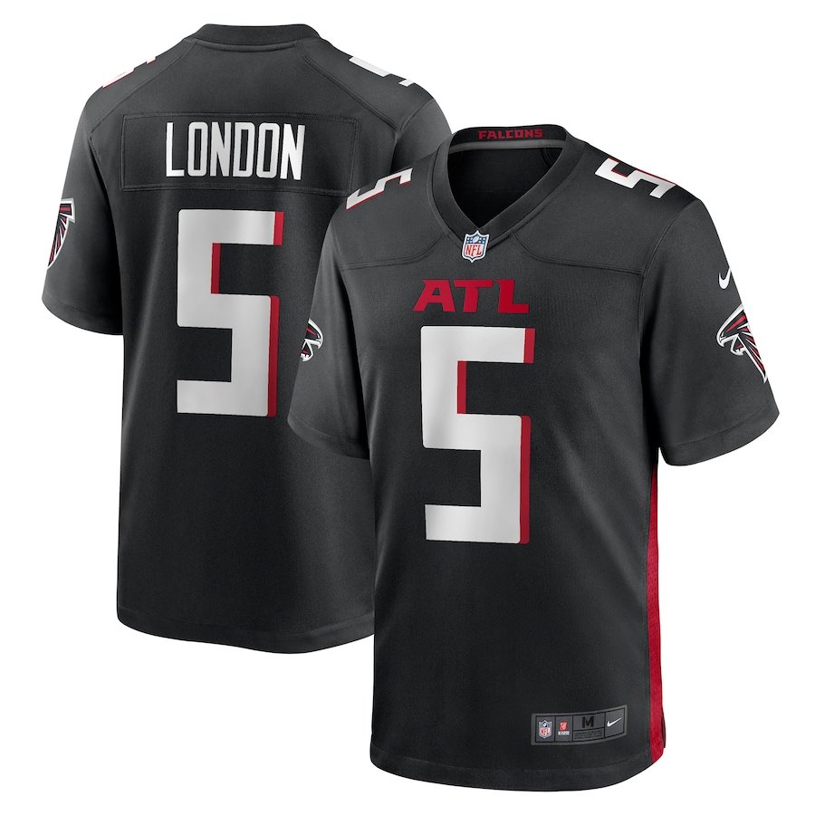
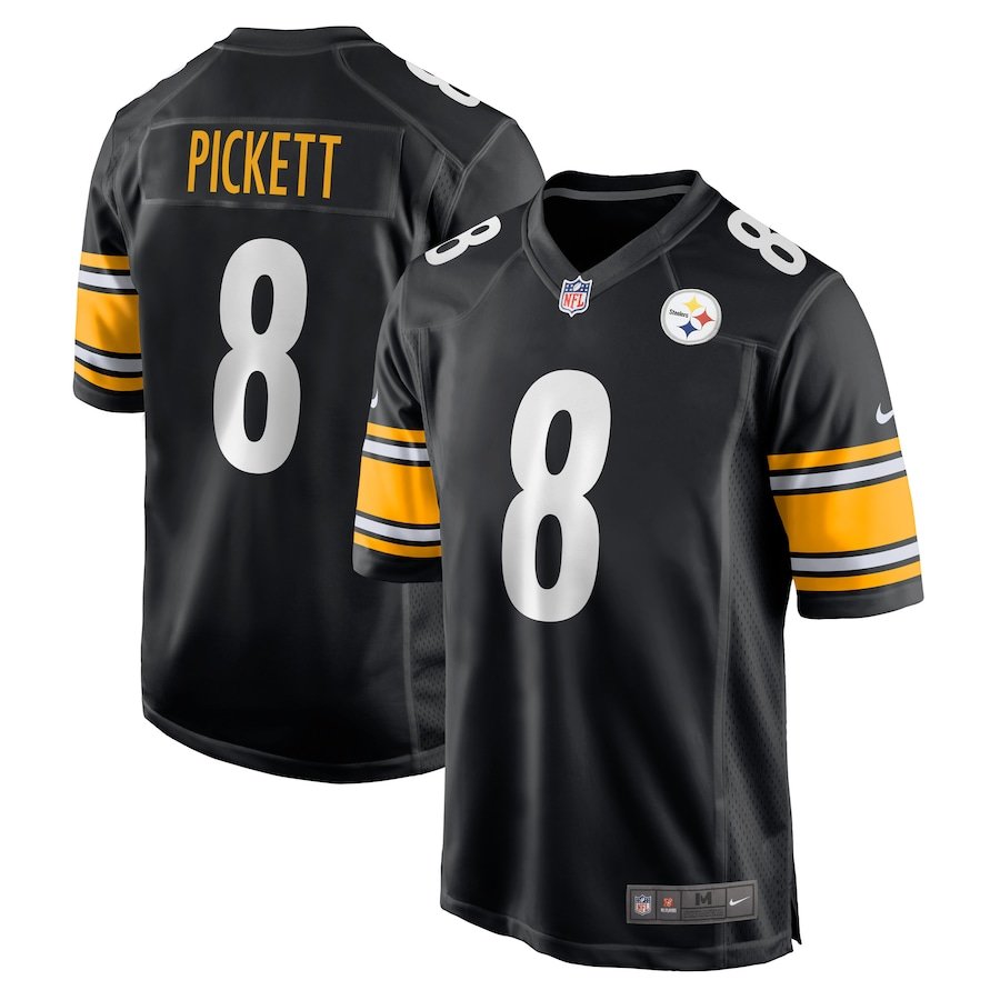
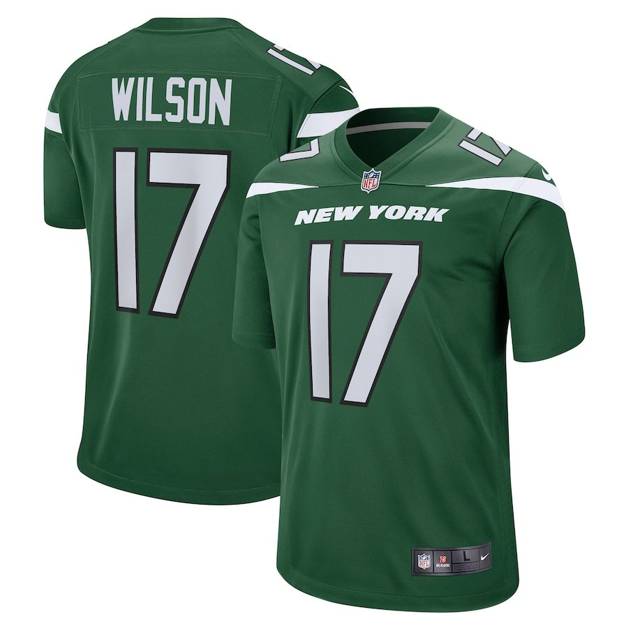
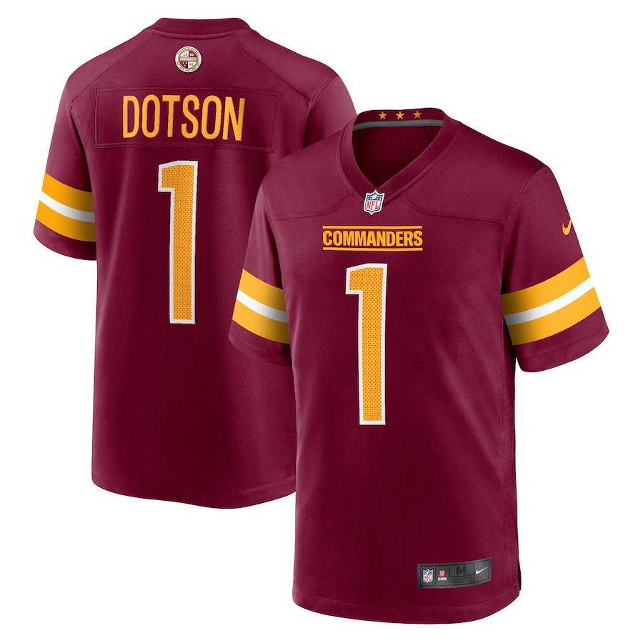
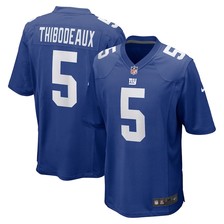
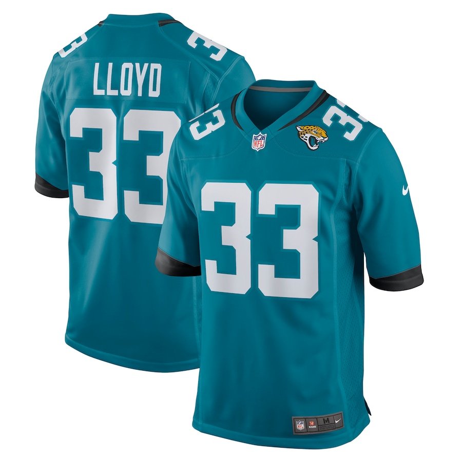
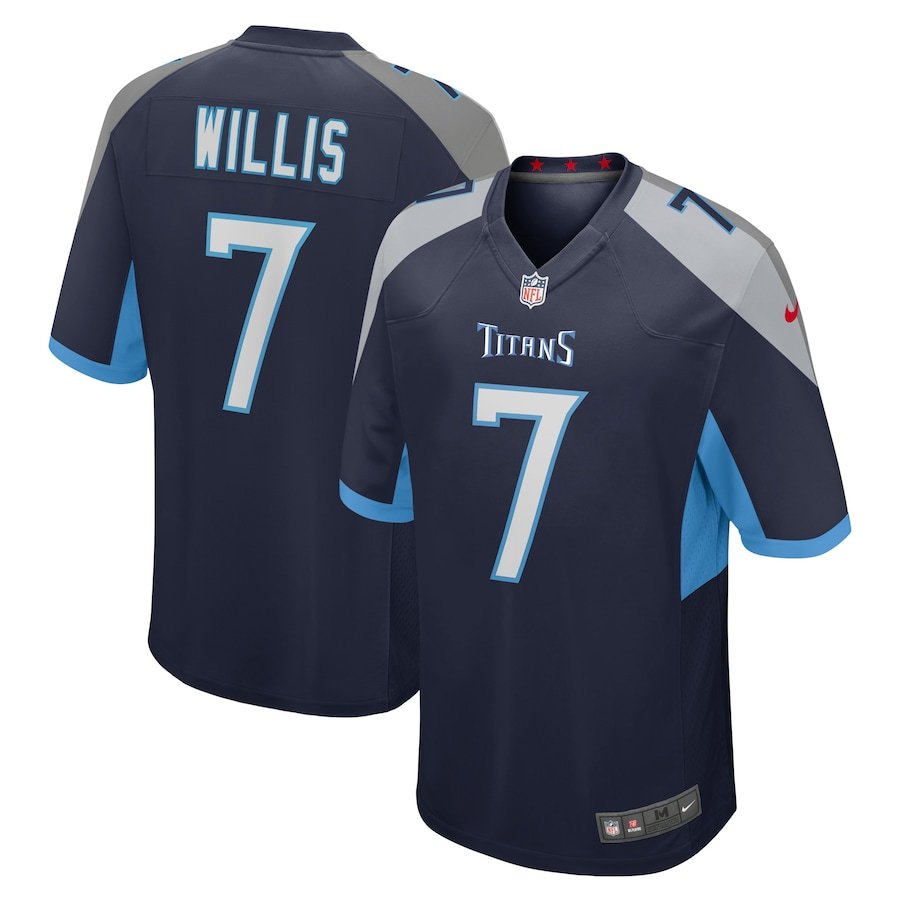
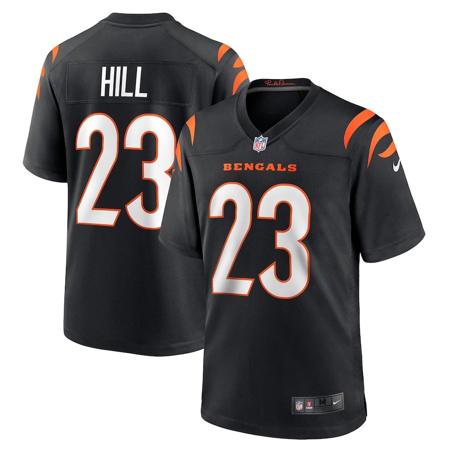
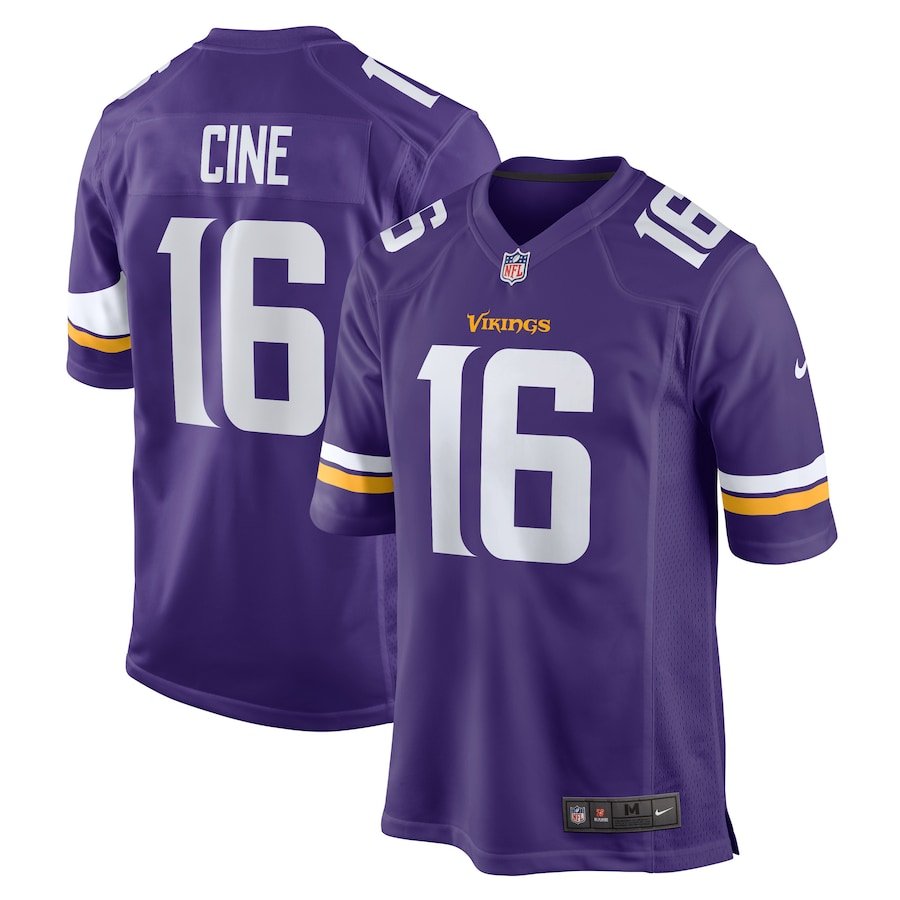
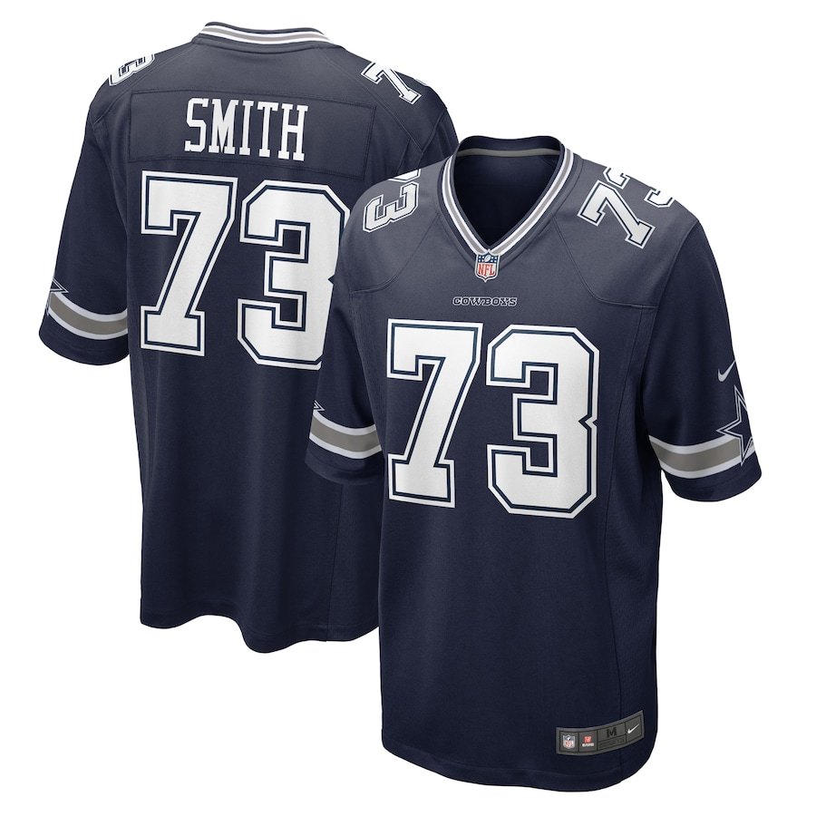
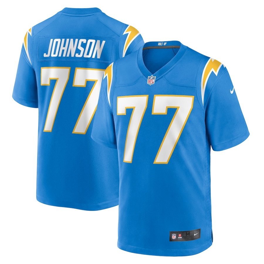
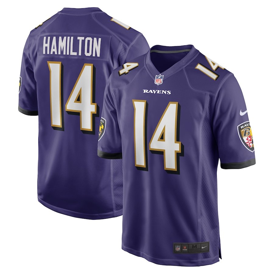
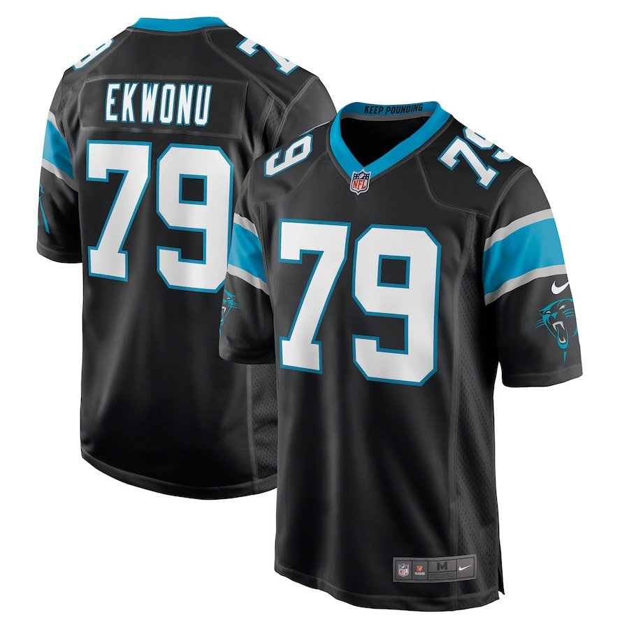
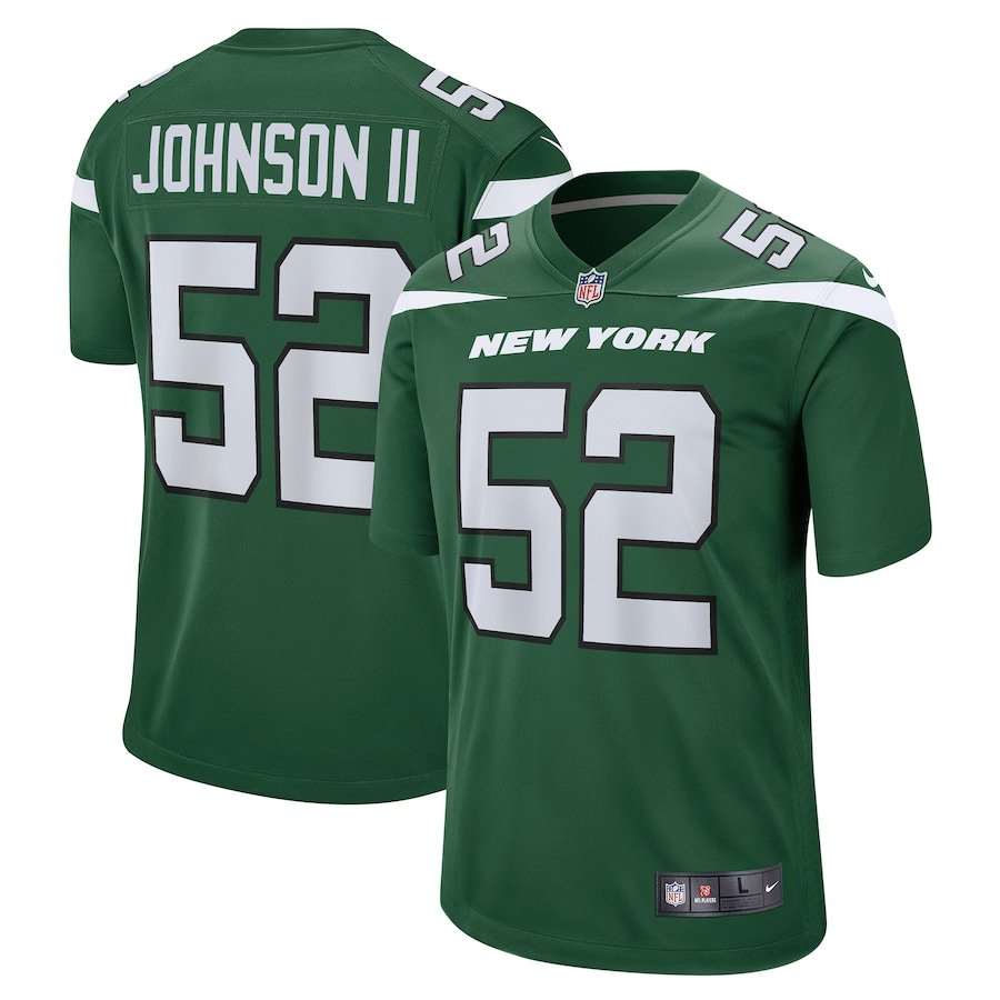
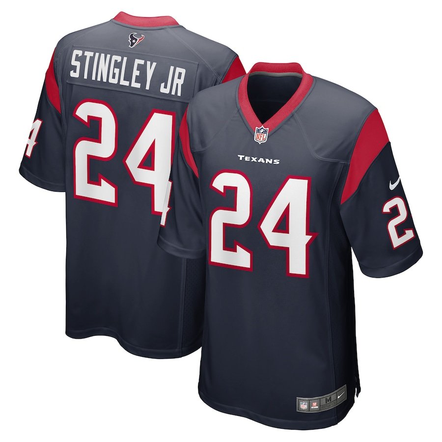
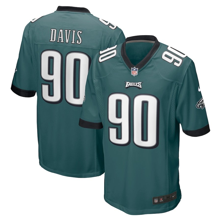
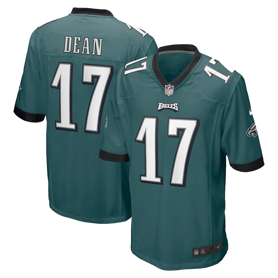
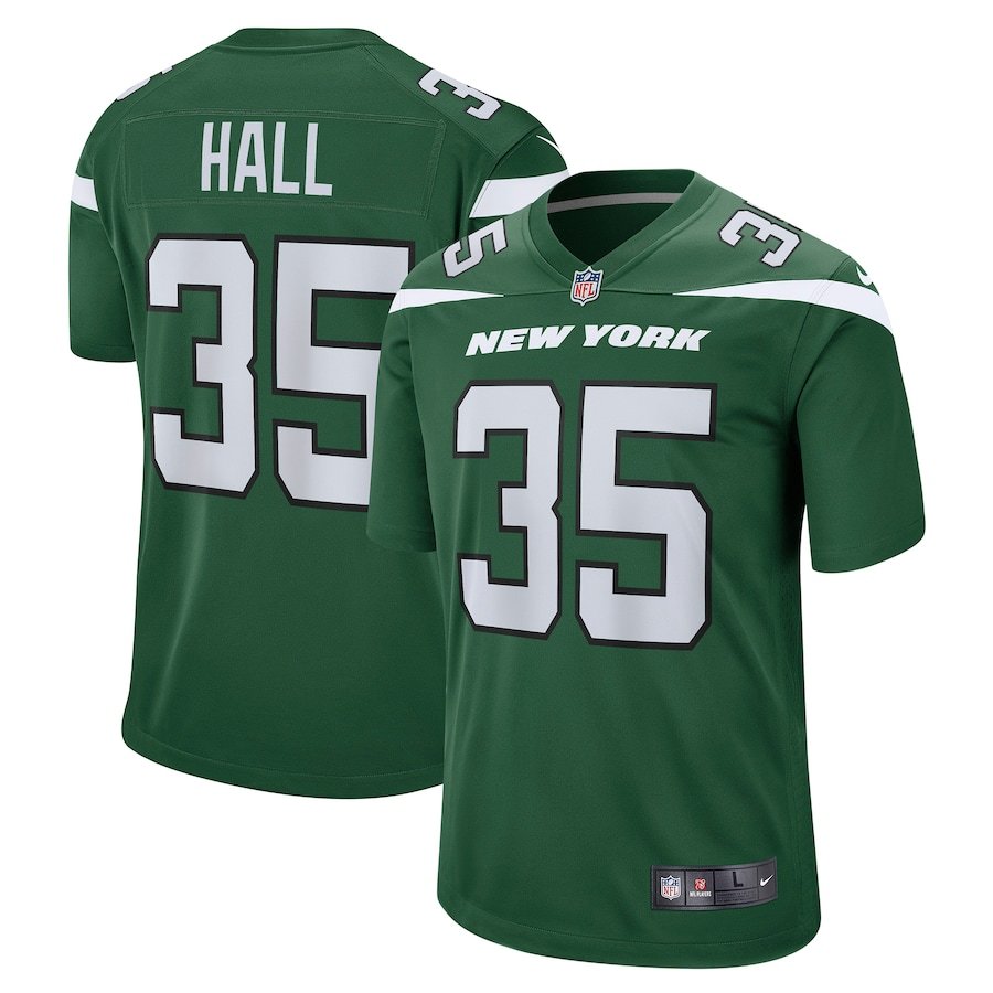
As the 2022 NFL Draft has come to an end this year’s rookie class will start to pick their numbers that they will wear with their new teams. Some will be in new colors and numbers while other may remain the same as their college days. Take a look below and some of the newest names on the backs of new team jerseys.
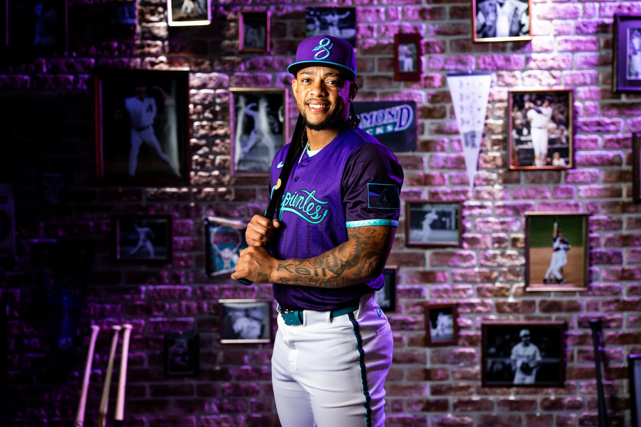
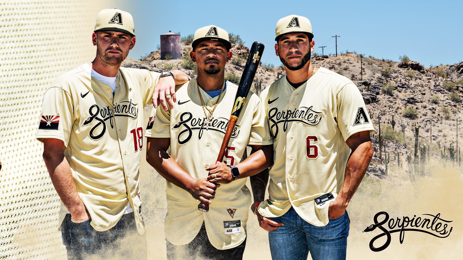
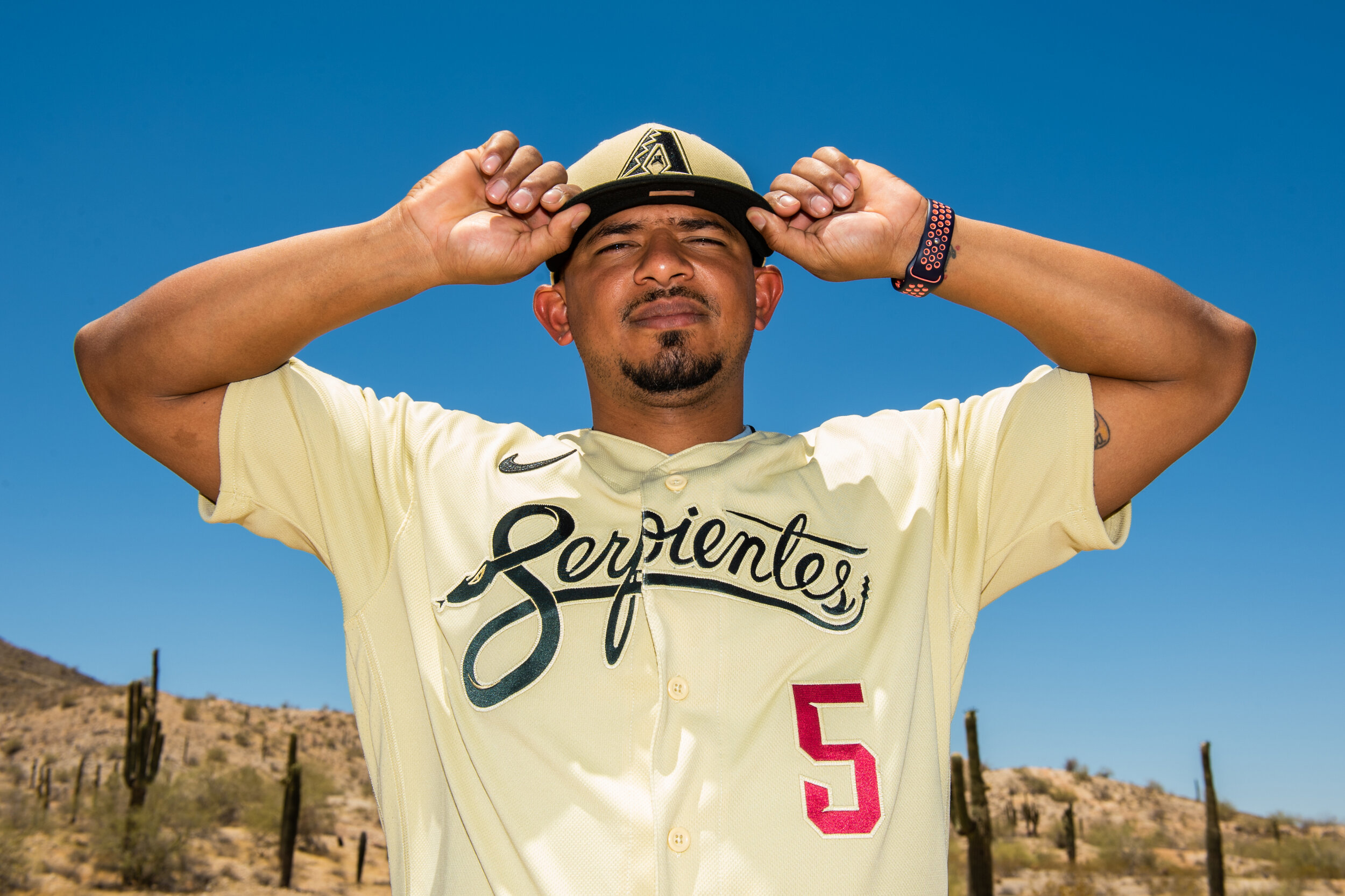
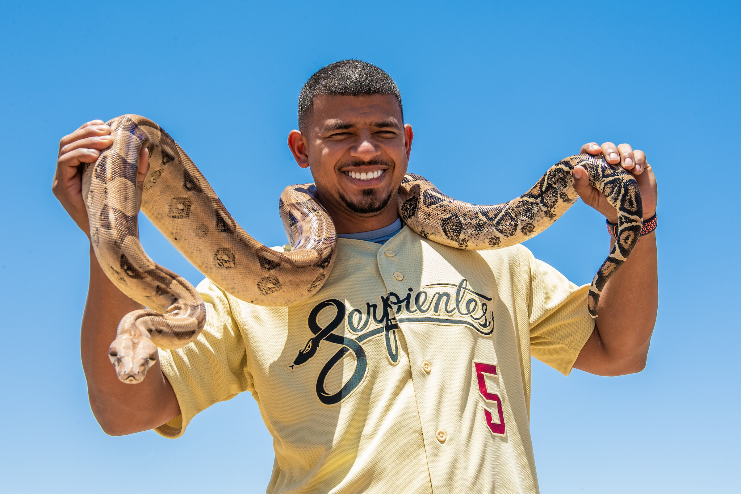
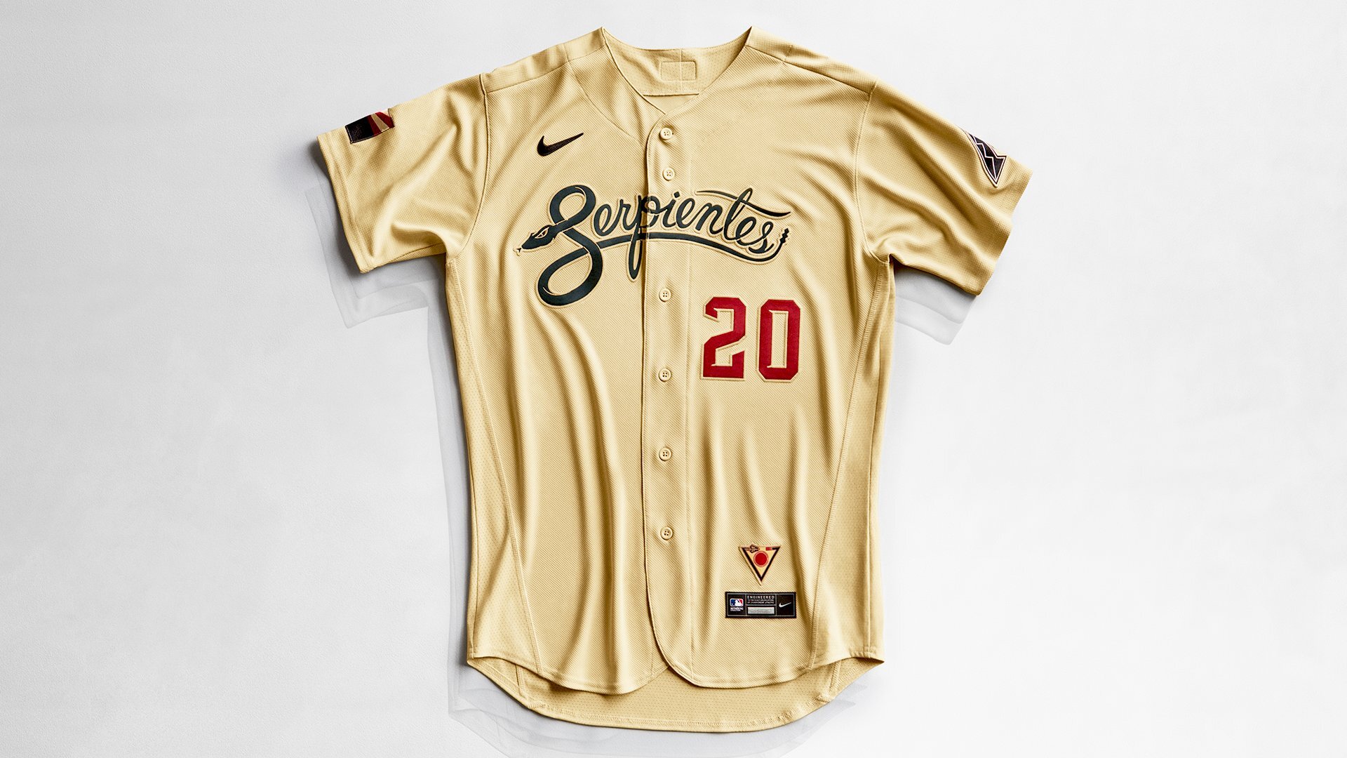
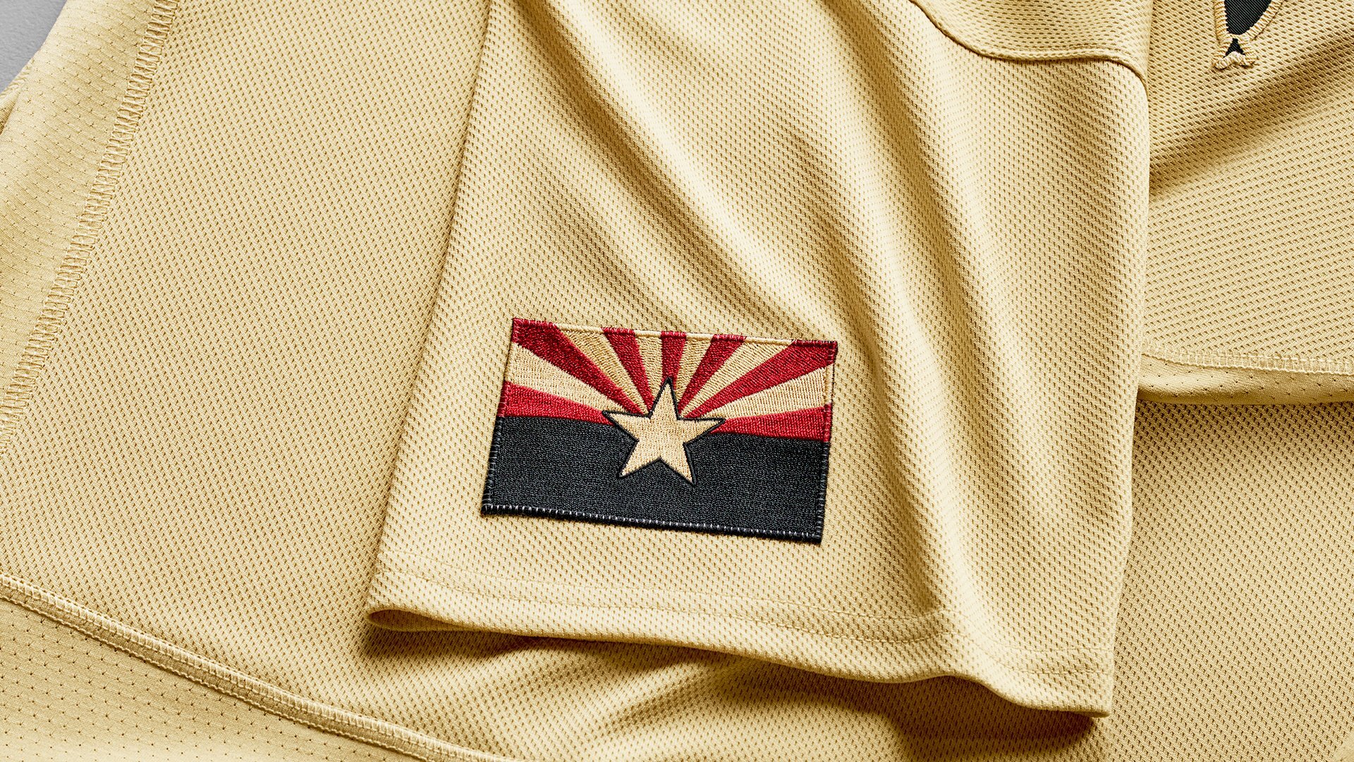
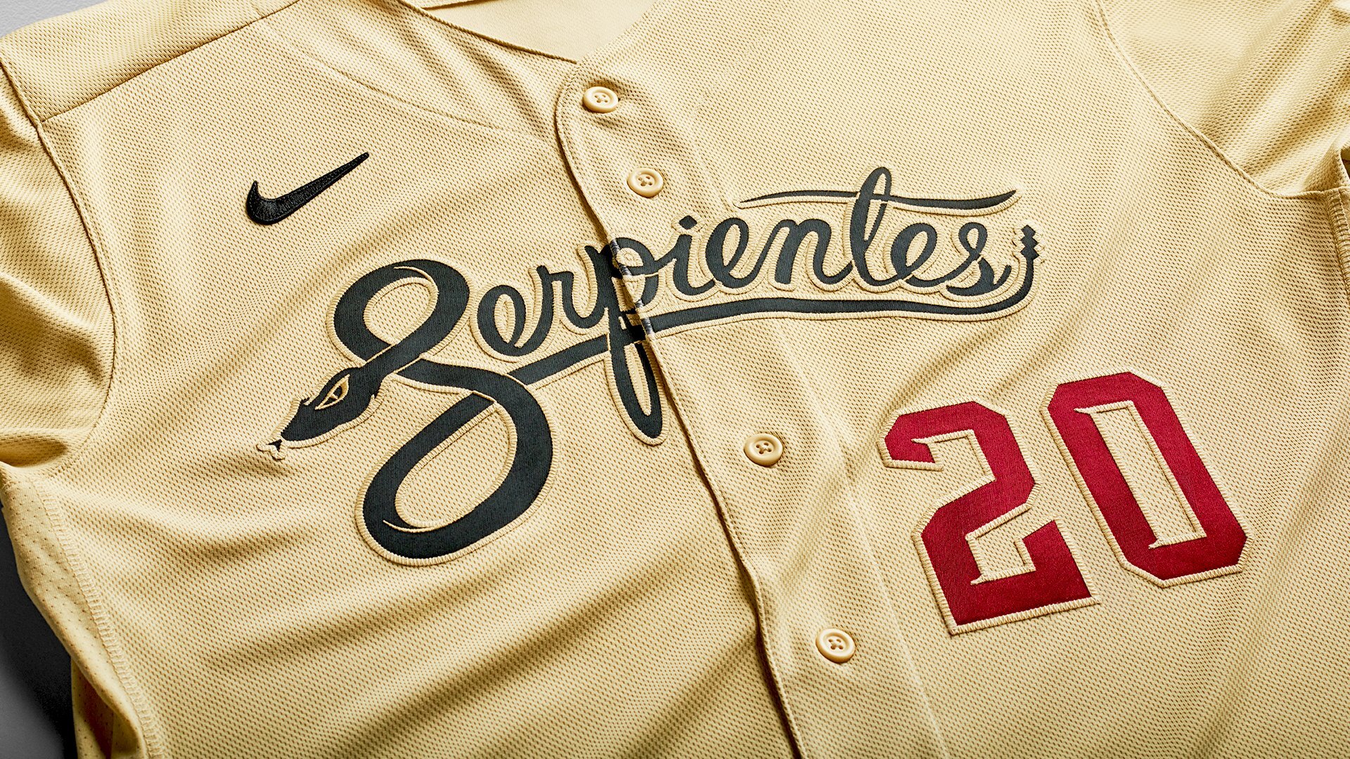
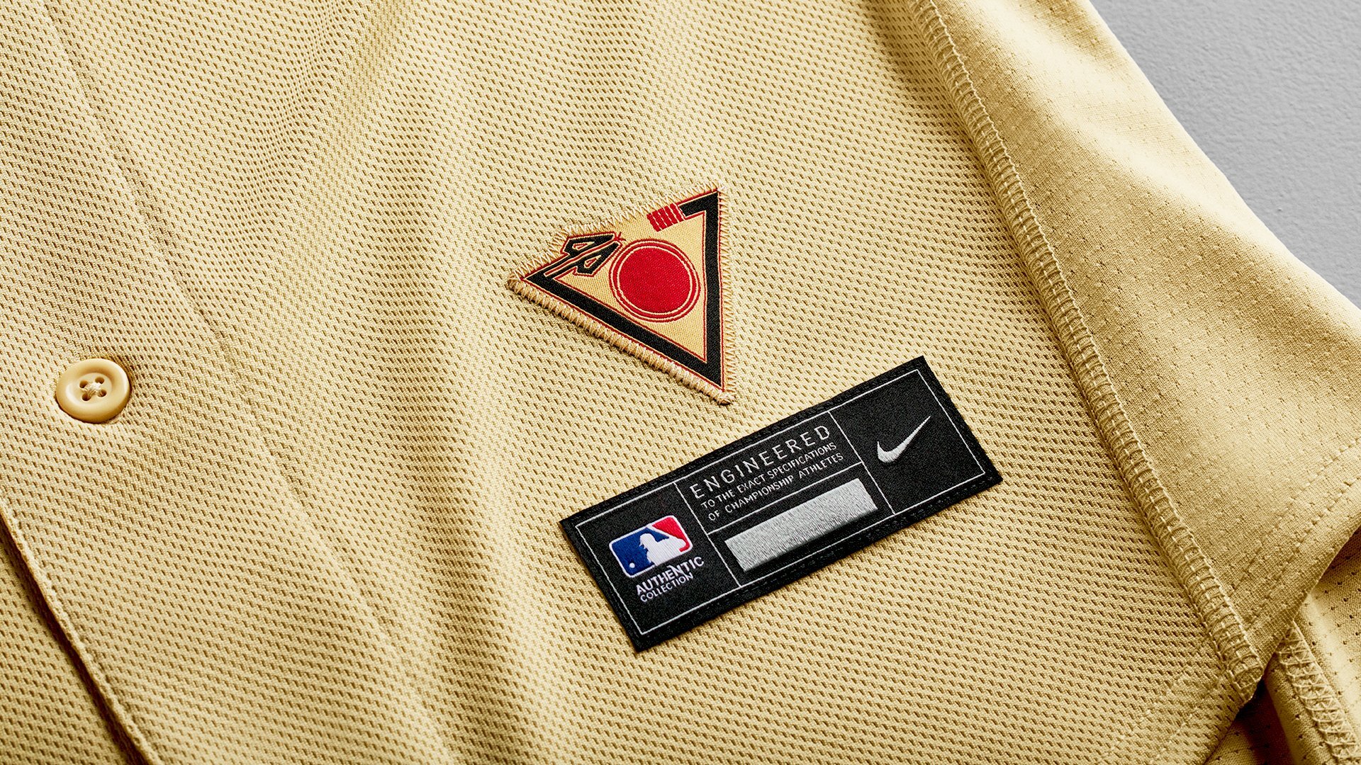
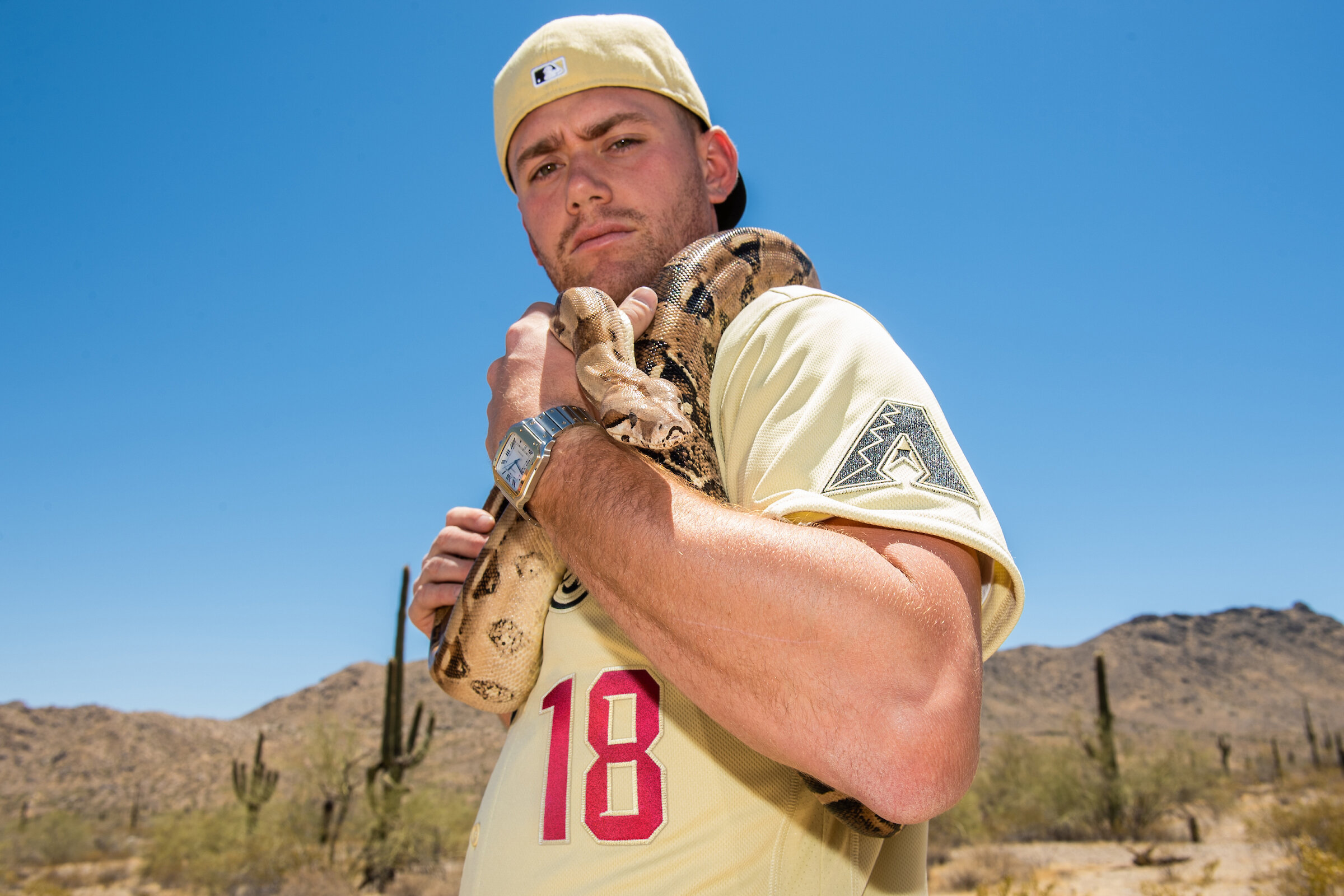
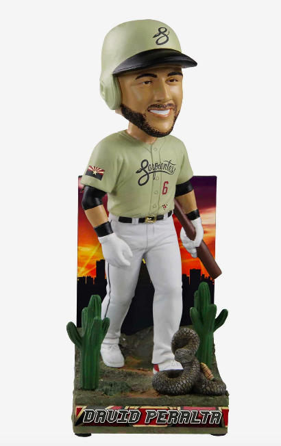
The Arizona Diamondbacks introduce their new ‘City Connect’ alternate uniform. The sand color of the jersey and hat are inspired by the Sonoran desert. Across the chest of the jersey reads ‘Serpientes’, which is Spanish for snake. Seen below the wordmark is the player’s number in the team’s standard font and colored Sedona Red. Additional detail of the Arizona state flag is found on the right sleeve is a re-coloured black, red, and sand.
“We are proud to be among the first teams to launch our City Connect uniforms that pay homage to so much of what makes life in Arizona unique. This concept is about bringing our community together, with respect for the past and an eye toward the future.” -D-backs President & CEO Derrick Hall
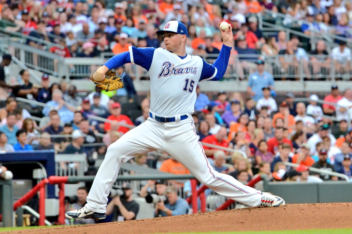
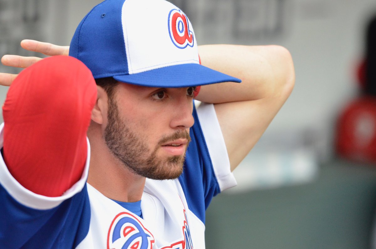
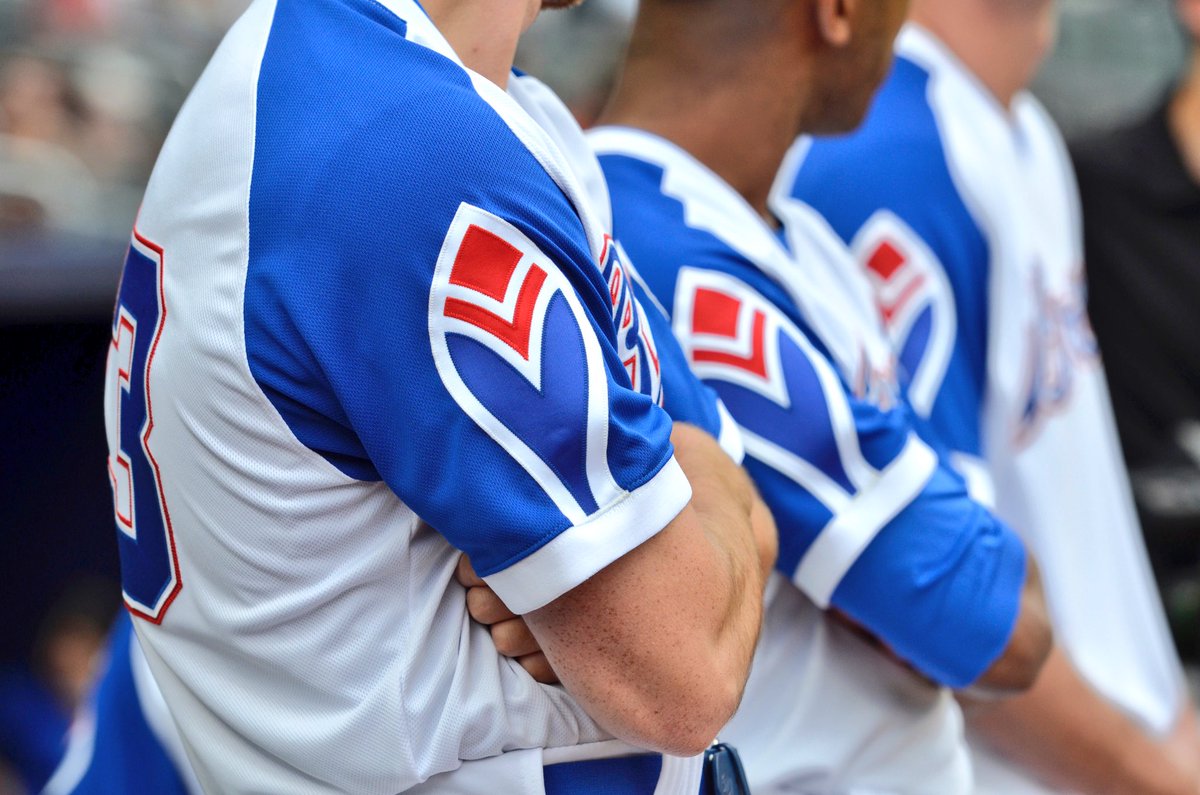
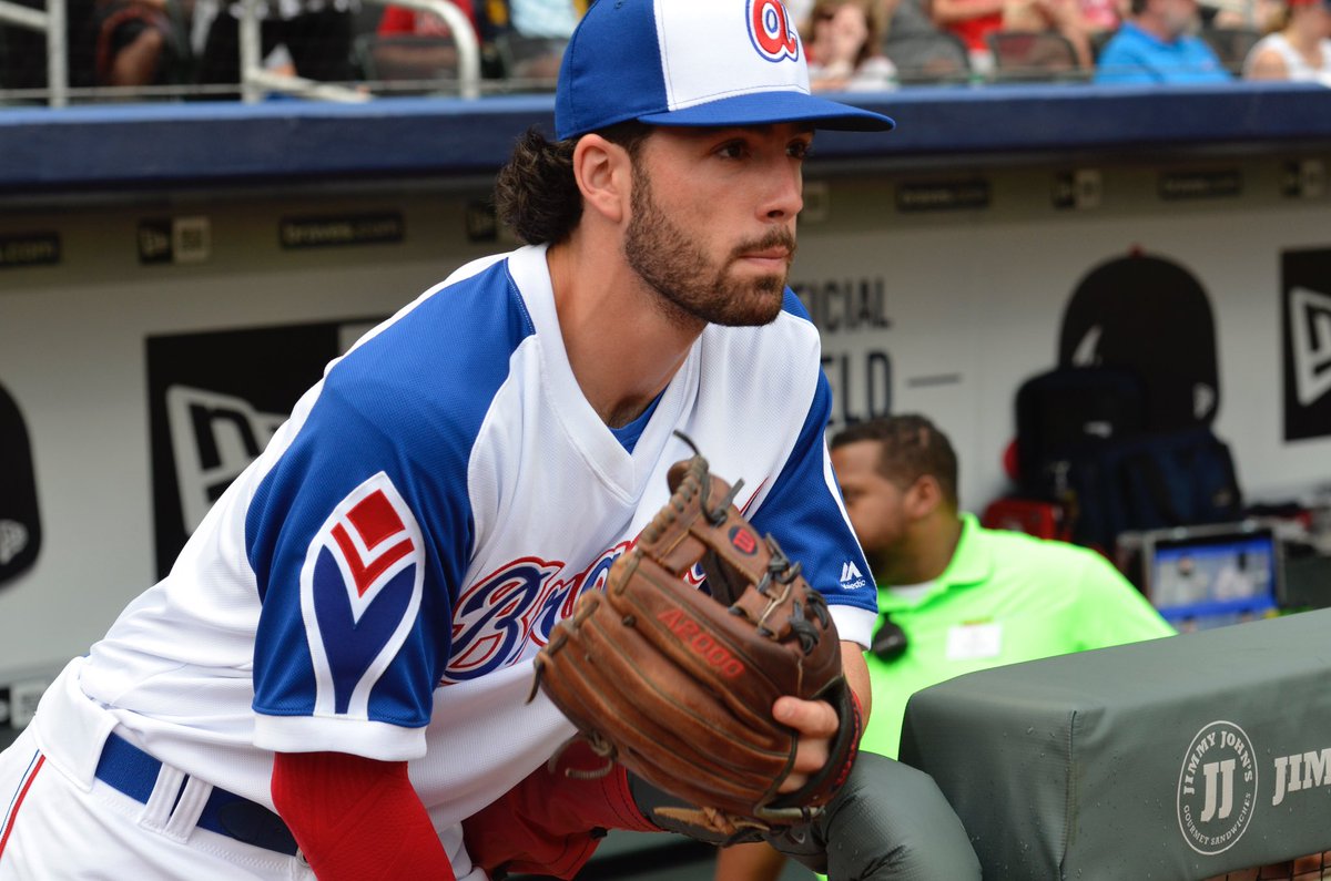
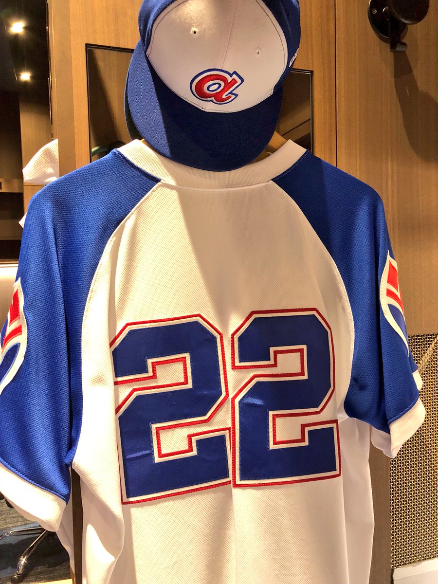
The Atlanta Braves are honoring the Hank Aaron with the 1974 throwback uniforms. The uniforms feature the old school lowercase script a on the front of the white panel hat. The front of the jersey features the Braves script mark without the tomahawk underneath it with the old school feather logo found on the sleeves.