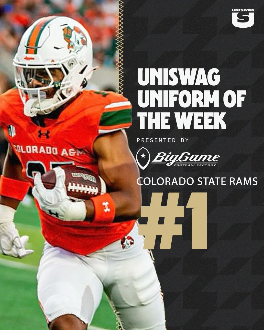
— Washington Commanders (@Commanders) July 9, 2025
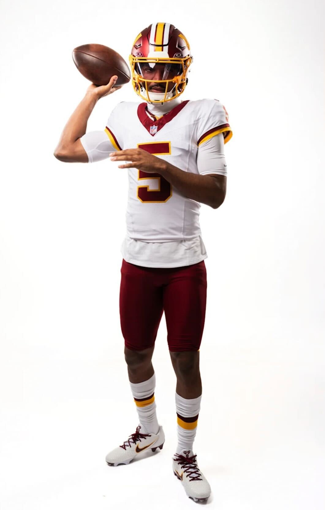
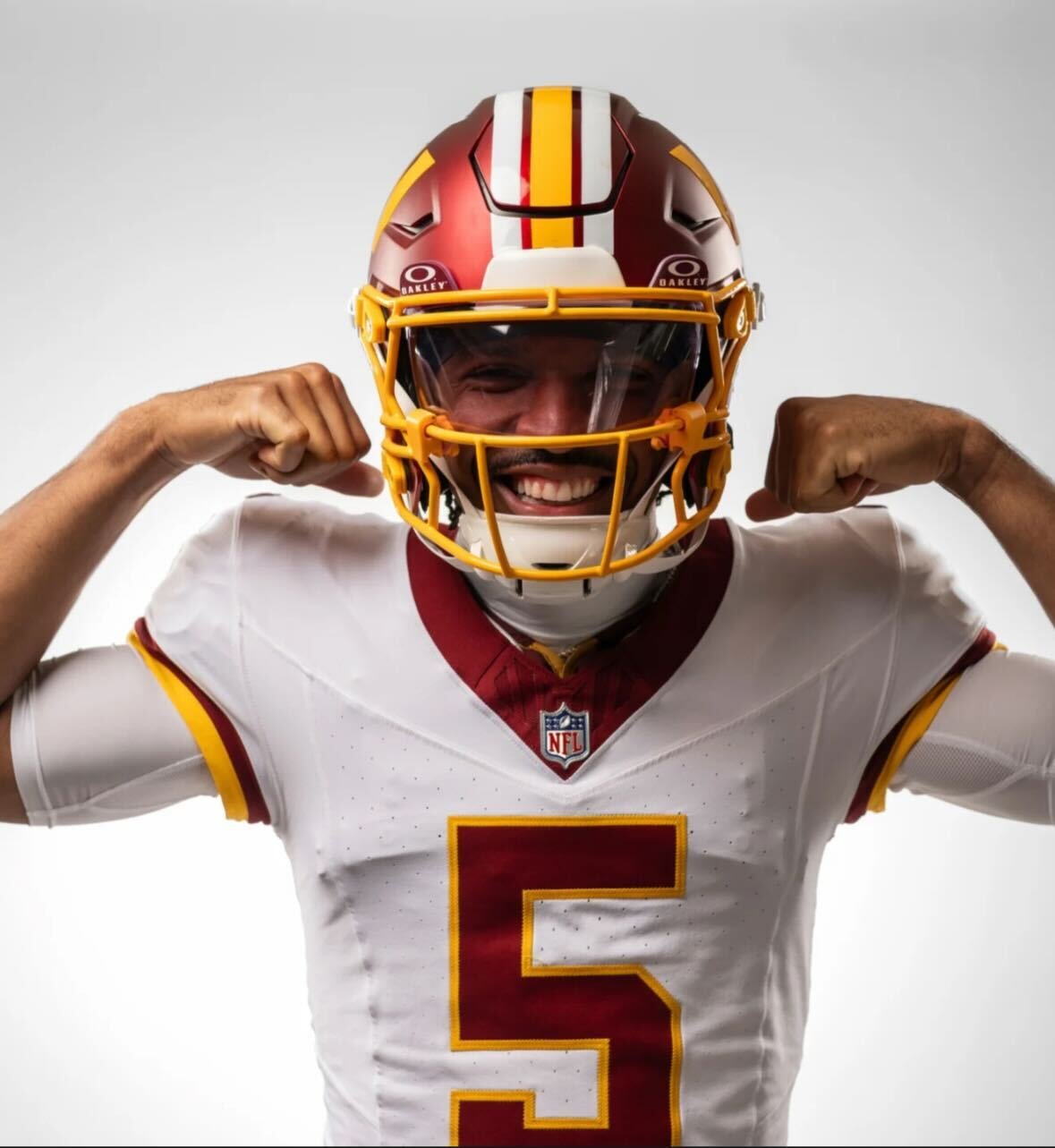
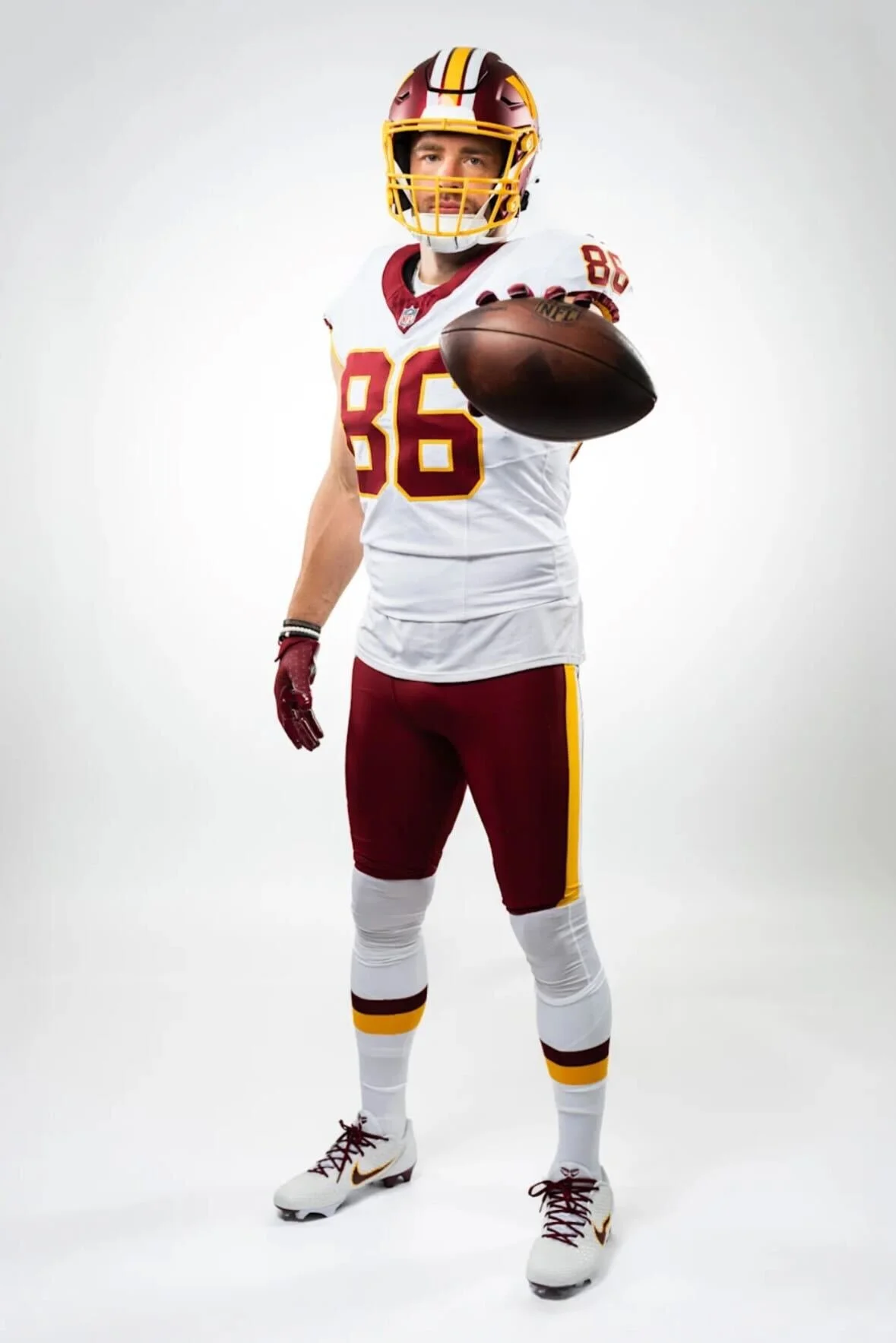
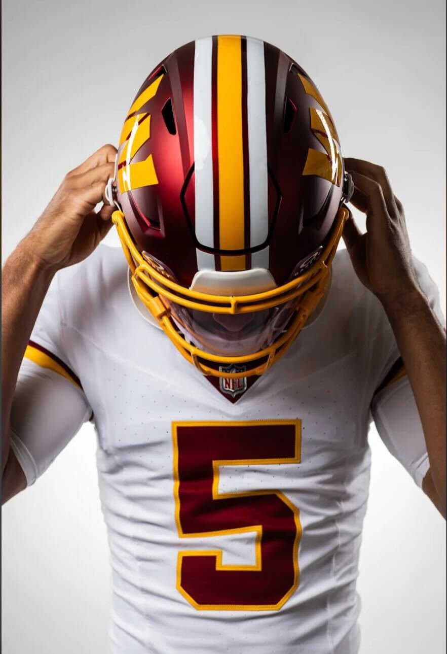
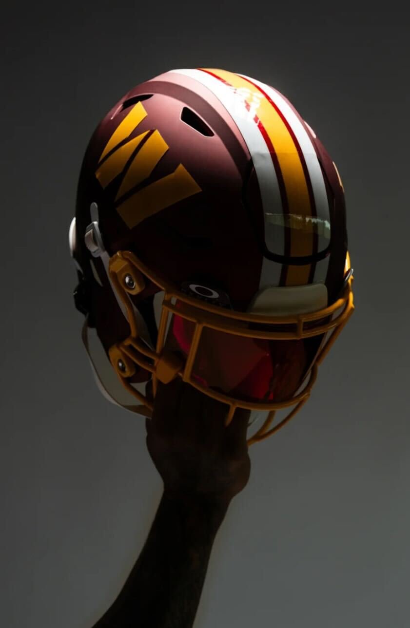
Washington is turning back the clock in a big way for the 2025 season. On the 93rd anniversary of the franchise's founding, the team officially unveiled a brand-new alternate uniform set inspired by their iconic Redskins “Super Bowl Era” — a nod to the glory days that brought Washington three championships in the 1980s and early 1990s.
The alternate uniforms includes a throwback-inspired helmet that will be worn three times during the season, starting with a primetime debut in Week 9 on Sunday Night Football against the Seattle Seahawks (Nov. 2). Fans will also see the set in action Week 13 vs. the Denver Broncos (Nov. 30) and on Christmas Day vs. the Dallas Cowboys (Week 17).
These alternates are rooted in history, pulling direct inspiration from the looks worn during Washington’s Super Bowl runs in 1982, 1987, and 1991. The white jersey is clean and classic, featuring burgundy numbers outlined in gold and gold stripes on the sleeves. Nameplates are burgundy with gold outlining — a subtle detail that stays true to the era.
Paired with burgundy pants that include gold and white striping, plus matching socks, the full uniform is a head-to-toe tribute to the franchise’s golden years as the washington redskins.
“We are excited to celebrate Washington's rich history with these iconic, Super Bowl Era uniforms this season,” said Commanders Team President Mark Clouse. “Ever since Josh Harris and our ownership group acquired the team back in 2023, they've placed great value in finding ways to connect the past and present and pay homage to those that made the Burgundy & Gold what it is today."
He continued, “These uniforms honor the most successful era of our franchise — one that reflects a culture of excellence and encompasses many historical moments and special memories amongst our fanbase. We look forward to bringing that nostalgic feeling back to fans, while incorporating a modern feel for our next generation of fans.”
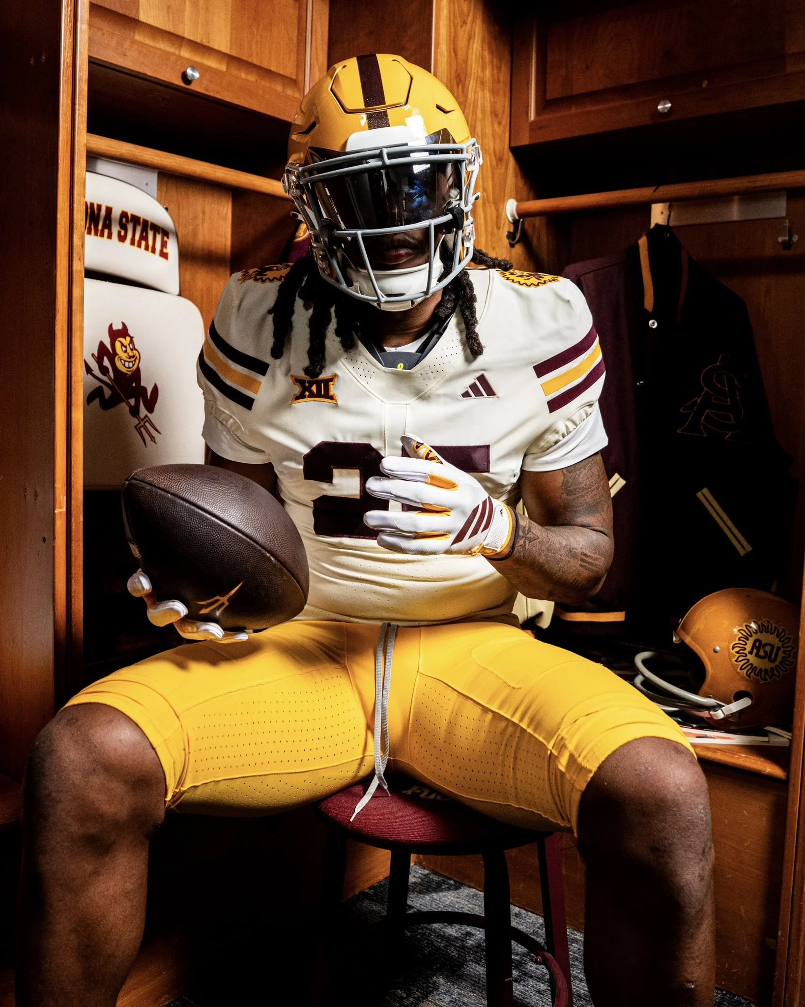
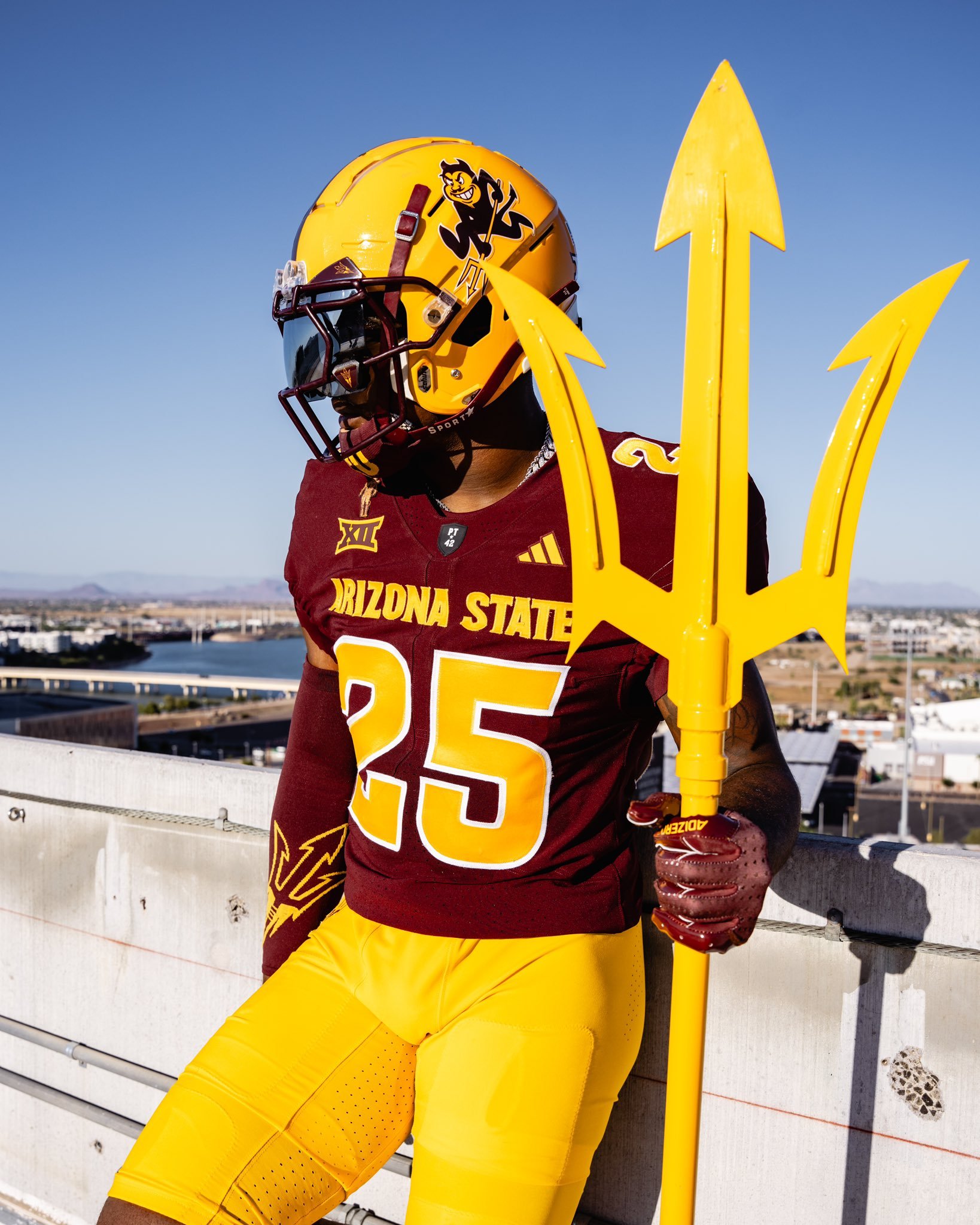
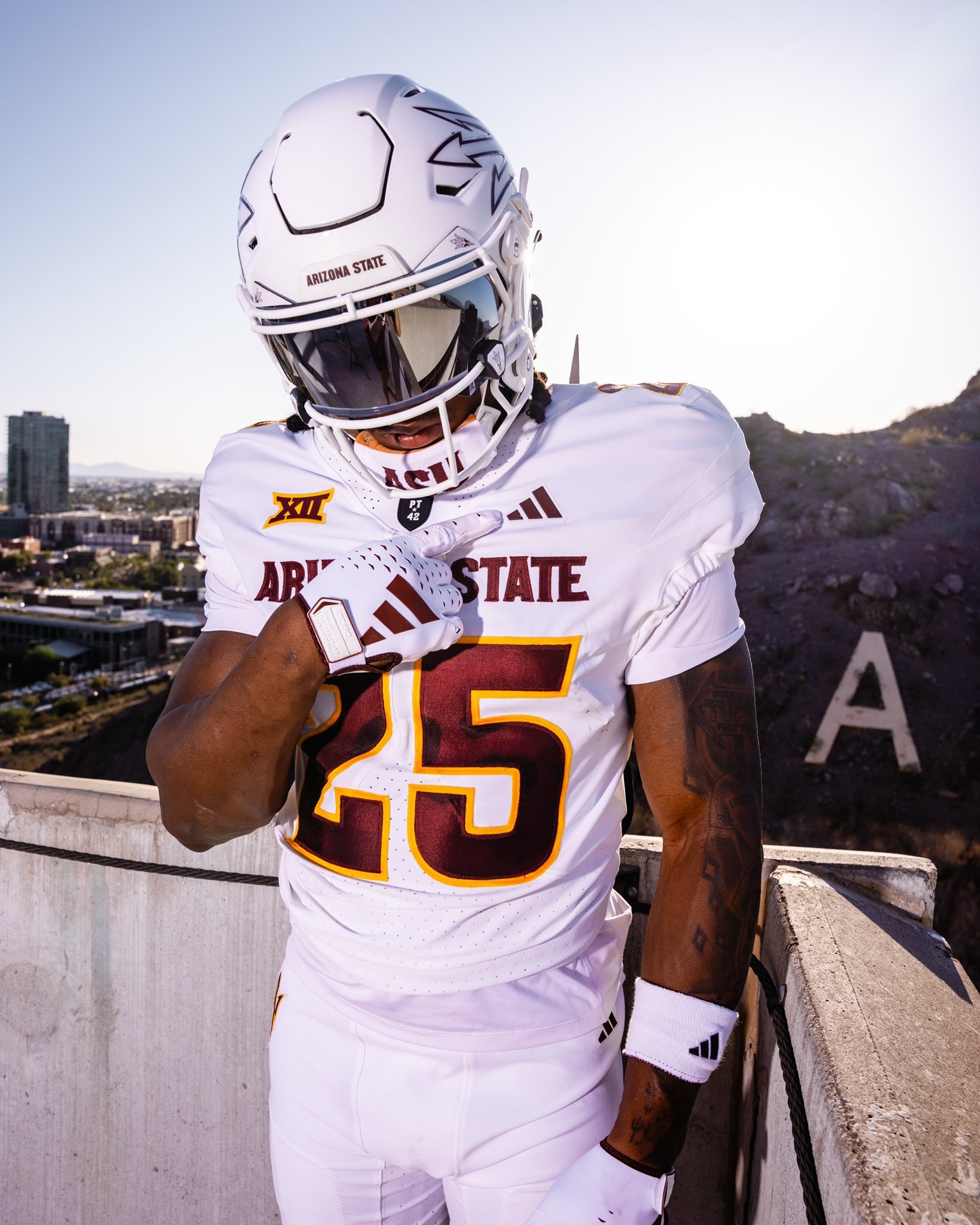
The Arizona State Sun Devils have officially revealed a bold new look. Dropped with the theme “Tradition meets evolution,” the updated uniforms showcase a fresh blend of heritage and modern flair.
ASU introduced two primary sets: a classic maroon and a clean white kit. The maroon jersey features gold numbers and lettering, with “Arizona State” emblazoned across the chest, paired with a gold helmet that proudly displays Sparky—the school’s iconic mascot. On the white set, maroon lettering and numbers are complemented by a sleek white helmet marked with the signature pitchfork logo.
While the color schemes and logos reflect ASU’s longstanding tradition, several updated touches signal a new chapter. Both jerseys include the Big 12 patch on the left shoulder. Under the neckline sits the revered “PT42” patch, a tribute to Pat Tillman, the legendary ASU alum and American hero. On the maroon jersey, a silhouette of Tillman himself is stitched above the Big 12 logo, further honoring his legacy.
The new uniforms strike a balance between honoring ASU’s storied past and embracing its future in a new conference. With tradition stitched into every detail and a bold aesthetic to match, the Sun Devils are geared up for a fresh era of football in the desert..
As the Tigers head into the new season, they’ve officially unveiled their uniforms—and while there’s no sweeping overhaul, the minor details show a program that respects its roots while sharpening its visual edge.
The home set sticks to the traditional navy jersey, highlighted by crisp orange and white sleeve stripes that have become synonymous with Auburn’s brand of football. On the road, the Tigers will again suit up in their signature “storm trooper” look—white jerseys with navy and orange sleeve striping, paired with white pants featuring navy and orange piping down the sides.
The helmets, as expected, remain unchanged: white shell, navy stripe, and the iconic interlocking AU on either side.
Where fans will notice something new is in the typography. Auburn has updated the font on both the numbers and nameplate. The numbers now appear in a bold, old-school block font—large, clean, and designed to pop from the field or on screen. Meanwhile, the nameplate adopts a taller, narrower style, giving the back of the jersey a sharper, more defined look than in recent years.
This minor update achieves what Auburn fans typically want: tradition respected, but visuals refreshed. The result is a uniform that feels unmistakably Auburn—with just enough evolution to keep things fresh in 2025.
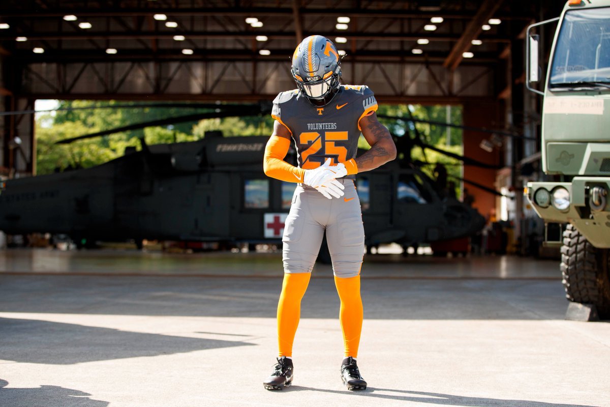
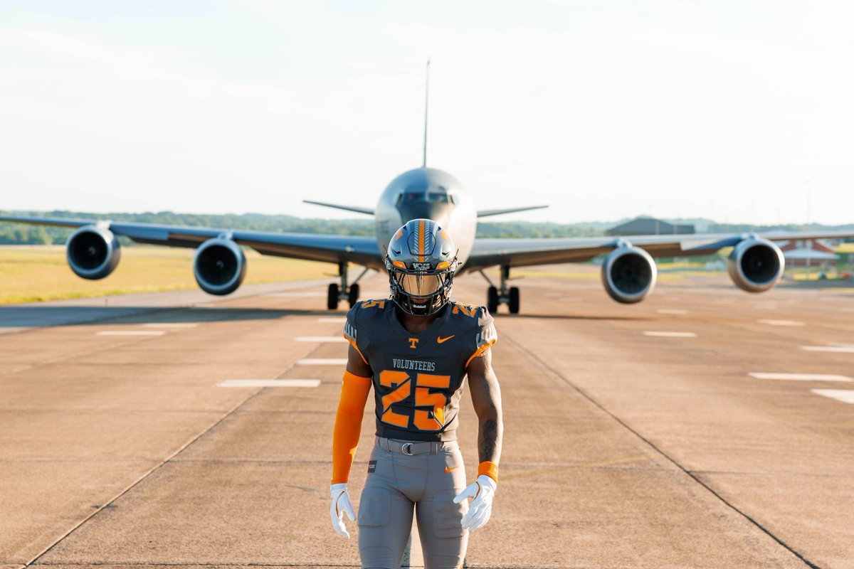
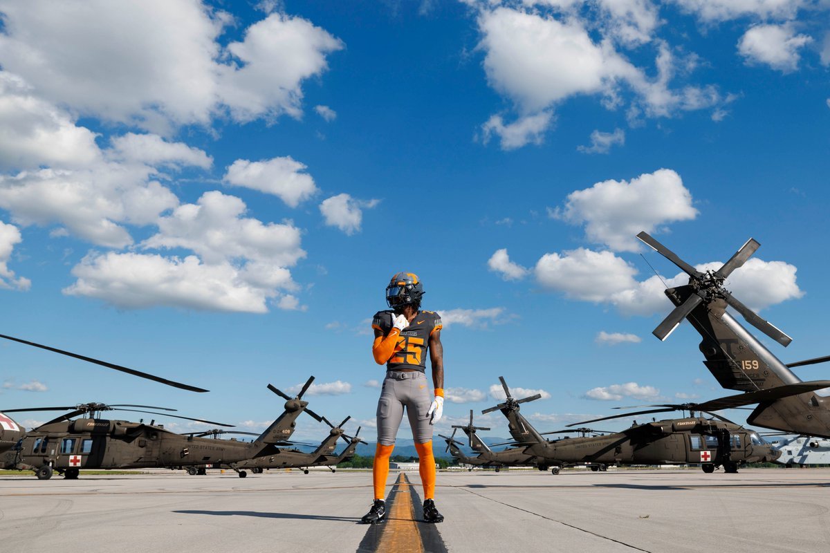
Tennessee Football is once again blending tradition, state pride, and service into the fabric of its game-day look with the unveiling of the 2025 edition of its Smokey Grey Series. This year’s theme, “Volunteer Spirit,” pays homage to the deep-rooted legacy of military service within the state of Tennessee, while honoring the brave individuals who have answered the call to protect and serve.
Set to debut on November 15, 2025, when the Volunteers host New Mexico State for their annual Salute to Service game, the uniform celebrates the backbone of the Tennessee identity: the spirit of service and sacrifice.
The “Volunteer Spirit” design draws on centuries of tradition, starting with one of Tennessee’s most legendary figures—Davy Crockett. Known as the “ultimate Volunteer,” Crockett and more than 30 Tennesseans gave their lives at the Battle of the Alamo in 1836. That legacy lives on in what Tennessee Football proudly wears on the field.
Prominent in the design is “The Davy Stripe”, a stylized take on Crockett’s famous fringed frontier uniform. It runs alongside the bold orange center stripe on the helmet and lines the sleeves of the jersey, adding a nod to Tennessee’s frontier past and military valor.
The uniform features a two-tone Smokey grey jersey and pant set, evoking the forged steel and tactical precision of military equipment. The stencil-style numbers on the chest, shoulders, and helmet echo standard military typography, while the word “Volunteers” is stitched boldly across the chest—a statement of both heritage and honor.
The helmet and pants also feature the return of the fan-favorite “Star Vols” logo, this time reimagined as a military-style patch, connecting Tennessee’s football identity with a respectful nod to our nation’s service members.
A custom Tennessee Tri-Star logo honoring the 134th Air Refueling Wing was created specifically for this edition, serving as a visual bridge between the state’s identity and its military strength.
This marks the fourth version of the Smokey Grey Series, a tradition launched in 2022. From the “OG” debut at LSU, to 2023’s “Artful Dodger” tribute to Condredge Holloway, and 2024’s “Volunteer State” uniform inspired by the Tri-Star flag, each edition has told a meaningful story.
— Cincinnati Football (@GoBearcatsFB) July 2, 2025
The Cincinnati Bearcats are leveling up in 2025 with a sharp, unified look that blends tradition and innovation. With three core colorways — black, white, and red — the Bearcats' latest Nike-designed uniforms are more than just fresh gear; they’re a bold statement about pride, identity, and a program on the rise.
The updated uniform lineup features three primary sets:
"Classic Black"
"Pure White"
"CINCY" Red
Each version includes matching pants and helmets, staying true to Cincinnati’s signature toughness while refreshing the visuals fans have come to know and love. The iconic C-Paw remains front and center on the helmet, now marking its 36th consecutive season as the program’s primary logo — a testament to its deep-rooted presence in Bearcat lore.
One of the standout changes? The brand-new "Cincy Stripe 2.0." The updated striping pattern, seen on the sleeves and running down the pants, adds a modern twist to a familiar motif, showing respect to the past while pushing forward with a sleeker, faster look.
In a first for Bearcats football, two-toned numbers make their debut. Designed exclusively for Cincinnati by Nike, the "Speed Block" number font adds a distinct edge and increased visibility. It’s the first time UC has featured a dual-color number scheme since 2007, and it instantly adds character to each uniform set.
Perhaps the most symbolic addition to the 2025 uniforms is the "Cincy" wordmark across the chest of the red alternate jerseys. First introduced by the basketball program in 2023, this branding element has quickly taken root among Bearcat athletes and fans. It captures the gritty, unapologetic spirit of both the university and the city itself.
This new uniform rollout does more than refresh the Bearcats’ look — it solidifies their identity. While the classic black and white looks anchor the team in its traditional visual DNA, the red "CINCY" alternate sends a clear message: this program isn’t just playing football — it’s building a brand, and doing so with a nod to its city’s culture and resilience.
The McLaren Formula 1 Team has teamed up with Google Chrome to debut a striking new look for the 2025 British Grand Prix, blending iconic design elements from the past with a future-focused edge. Aptly named the “Legacy at Speed” livery, this special edition paint scheme was revealed in dramatic fashion in front of a live crowd at McLaren Racing Live: London — a fan experience held in the heart of Trafalgar Square.
This new livery isn’t just about flash — it’s a meaningful nod to McLaren’s celebrated chrome era, modernized through a partnership with Google Chrome to reflect the digital speed of the modern era. By marrying McLaren’s legacy of pace on the track with Chrome’s reputation for speed on the web, the collaboration creates a design that’s both nostalgic and refreshingly current.
Fans immediately recognized the throwback influence, with shimmering chrome elements making a comeback on both race cars — a look that dominated during some of McLaren’s most memorable seasons. The design is more than a visual update; it’s a digital storytelling tool. Through Google Chrome, fans can now access McLaren’s rich history and racing culture with ease, instantly connecting with moments that have shaped the team.
Louise McEwen, Chief Marketing Officer at McLaren Racing, summed it up best:
“We know that, while we have millions of fans who have been with the McLaren Formula 1 Team for decades, there are millions more who are new to the sport and the team. Being able to celebrate and showcase our long history with the help of Chrome is a fantastic way of bringing these newer fans on the journey with us. To celebrate with so many of our fans in London this week as we get ready for our home race makes it even more special.”
As McLaren gears up for the British GP, all eyes will be on how the Legacy at Speed livery performs under race conditions. Whether you’re a long-time follower or new to the grid, this launch signals something important: the future of Formula 1 is as much about storytelling and culture as it is about speed and engineering.
The Los Angeles Lakers are stepping into the 2025-26 NBA season with a bold, refreshed look as they officially unveiled their new Statement Edition uniform—a modern twist on a fan-favorite from recent years.
Drawing inspiration from their 2022-23 purple Statement uniform, this year’s edition stays true to that heritage but brings a refined execution. The jersey features a crisp purple base, but instead of the previous gold lettering and darker numbers, both the “Lakers” wordmark and jersey numbers appear in white, trimmed with a sharp gold outline that pops against the royal backdrop.
Where this uniform truly sets itself apart is in the reimagined side panel. The black detailing from the previous version has been replaced by a purple, gold, and white strip, etched with “Los Angeles Lakers” for a radiant finish. The collar has also received a facelift, now outlined with white and purple striping for a balanced, modern neckline.
Paying homage to greatness, the phrase “Leave a Legacy” is stitched above the jock tag, while the number 17 is centered at the back neckline—recognizing the franchise’s illustrious 17 NBA championships.
In a first for a core Lakers uniform, the team’s signature “LA” logo will appear on both sides of the shorts, serving as a balanced finishing touch that completes the set.
The Statement Edition will join the Lakers' 2025-26 uniform lineup alongside their Icon (gold), Association (white), and anticipated City Edition looks.
— Georgia Tech Football (@GeorgiaTechFB) July 1, 2025
It’s July, and the countdown to kickoff is officially on. With fewer than two months until Georgia Tech takes the field under the Friday night lights in Boulder against Colorado, the Yellow Jackets just gave fans even more reason to get hyped.
The program dropped their 2025 uniform collection, showcasing three fresh looks—white, gold, and grey.
The white jersey with gold numbers returns from the 2024 set, a clean, classic look that honors Tech's traditional palette. But what really stands out in this new drop are the grey and gold-on-gold combinations, each offering a unique identity that blends innovation with tradition.
The grey-on-grey uniform features gold numbers and a modernized number font. While the design echoes Georgia Tech’s 2023 “ghost” uniforms, this year’s grey set takes a more grounded approach. It’s bold but wearable, offering a fresh alternative to the typical road or blackout looks.
Then there’s the gold-on-gold set, arguably the crown jewel of the collection. Featuring white numbers on a rich, metallic gold base, this uniform is a nod to both the literal color of Georgia Tech’s brand and the winning legacy rooted in The Flats.
While the uniforms are officially out, the helmet situation remains a mystery. Georgia Tech has yet to confirm whether they’ll debut new lids or stick with their standard design.
— Visa Cash App Racing Bulls F1 Team (@visacashapprb) July 1, 2025
The British Grand Prix is about to get a whole lot more colorful—and not just on the track.
Racing Bulls and their fashion partner HUGO have teamed up with Nigerian-born, London-based artist Slawn to debut a one-of-a-kind livery for this weekend’s race at Silverstone. Known for his unapologetic street art and vibrant caricature style, Slawn brings a disruptive creative edge to Formula 1 with a visual overhaul that’s as fast as it is fearless.
Unveiled at London’s Flannels X store with Racing Bulls reserve drivers Liam Lawson and Isack Hadjar, the new VCARB 02 livery features Slawn’s signature graffiti artwork, turning the car into a moving canvas. But it doesn’t stop there—Slawn’s art will also appear on the drivers’ race suits and throughout the team’s gear for the weekend.
Slawn won’t just be on the sidelines—he’ll be inside the paddock, live-designing the Racing Bulls garage on Thursday alongside Lawson and Hadjar. It’s yet another example of how this collaboration is pushing the sport beyond tradition and deeper into culture.
Rooted in his Yoruba heritage and London’s urban aesthetic, Slawn’s style is loud, emotional, and purposefully chaotic—a sharp contrast to the sleek uniformity usually seen in Formula 1 design. But that contrast is exactly the point.
“Slawn’s work is unlike anything we’ve seen in Formula 1,” said Racing Bulls CEO Peter Bayer. “Partnering with HUGO and Slawn has allowed us to push creative boundaries in a way that reflects the bold identity of our team.”
And the vision is clear: this is more than a livery—it’s a movement.
“This collaboration is a brilliant demonstration of the power of going your own way,” said James Foster, SVP of Global Marketing at HUGO BOSS. “All eyes will be on VCARB during the action at Silverstone.”
With a race-weekend wardrobe of statement-making style and a car that doubles as an art installation, Racing Bulls and Slawn are proving once again that in F1, the culture moves just as fast as the cars.
— Louisville Football (@LouisvilleFB) July 1, 2025
The Cardinals are taking the field in 2025 with a fresh look that blends historic identity and modern detail—Louisville Football has officially dropped its latest uniforms, and they’re filled with nods to the past, the city, and the fanbase.
For the first time since 2004, Louisville’s iconic primary mark—the bold, aggressive bird head—is back in a prominent way. You’ll now find it proudly stitched onto the collar line of the jersey, reestablishing one of the most recognizable visuals in the program’s history.
Custom-designed specifically for Louisville, a new fleur-de-lis pattern is subtly woven into the uniform’s striping. It’s a nod to the city’s French heritage and local pride—designed in the Ville, for the Ville.
Hidden within the collar is a simple, powerful message: For the Ville. It’s a quiet but constant reminder of who these players represent every time they suit up.
The uniform’s sharp linework mirrors the angles and weight of the fleur-de-lis design, while also reflecting the customized ligatures used in the Louisville wordmark. It’s subtle, smart, and uniquely Louisville.
Another throwback touch—numbers return to the shoulder pads, restoring a clean, classic football detail that helps with player identification and gives the jerseys that timeless gridiron feel.