San Antonio Spurs Unveil 2025 Statement Edition Uniform

Confident. Cut to stand out. That’s the mantra behind the San Antonio Spurs’ newest look, a design that blends sharp edges, modern textures, and a forward-focused attitude to represent a team built to stand together. The Spurs’ 2025 Statement Edition uniform isn’t just a jersey; it’s a declaration of identity and evolution.

From the bold “San Antonio” arc across the chest marking the first time since 1989 that the city’s name headlines a core uniform, to the subtle embossed rowel patterns woven throughout the fabric, every detail tells a story. This isn’t a throwback; it’s a step forward. The uniform celebrates the franchise’s deep roots while keeping its eyes locked firmly on the future.

The jersey’s sleek black design incorporates sublimated and embossed rowel patterns on both the shorts and jersey panels, a textured nod to the Spurs’ iconic symbol. The team’s secondary logo is featured prominently on the waistband, paying homage to the organization’s lasting mark on Texas basketball. Below the surface, the uniform also includes a special touch: the Spurs’ team anthem is placed above the jock tag, a subtle reminder of the pride that drives San Antonio.

From its clean typography to the modern construction, this Statement Edition captures the balance between tradition and innovation that defines the Spurs’ legacy. It’s confident. It’s refined. And above all, it’s San Antonio.

Shop Spurs Gear Here


See What Else Is New

2025 WEEK 7 UNISWAG COUNTDOWN

It’s time for the UNISWAG Weekly Countdown for the 2025 College Football Season, Presented by Big Game USA!

Each week, we highlight the cleanest, boldest, and most innovative uniforms across the college football landscape, all building toward that coveted No. 1 spot.

Check out the Week 7 Uniform of the Week Countdown as we celebrate the designs that made the biggest impact on the field!

Shop College Football Gear Here


See What Else Is New

Related Articles


FootballSkye TilsonComment
Houston Rockets Bringing Back “Dunkstronaut” City Edition for 2025-26 Season

The NBA and Nike are taking fans on a nostalgic trip this season with a “greatest hits” approach to the City Edition uniform program. For the 2025-26 campaign, teams across the league will revisit some of their most beloved City Edition looks, bringing back fan-favorite designs that helped define the early years of the series. While a few franchises will debut alternate color versions or slight updates, most are opting to “run it back” with their most iconic versions, and in Houston, that means the highly popular “dunkstronaut” set is making its return.

First unveiled during the 2023-24 season, the Rockets’ “dunkstronaut” uniforms quickly became one of the most talked-about City Edition designs in the NBA. The look pays tribute to Houston’s basketball legacy and the city’s deep connection to space exploration. The concept was part of Nike’s “Hometown Heroes” storyline, celebrating each franchise’s relationship with its community.

Across the chest, “H-Town” is displayed in a flowing script font, a nod to the name embraced by Houston players during the 1982-83 season, inspired by local legends Hakeem Olajuwon and Clyde Drexler. The duo’s high-flying days as members of the University of Houston’s Phi Slama Jama cemented Houston as a basketball city, and this uniform celebrates that legacy with style.

The jersey blends retro and modern design cues, featuring a clean, contemporary layout paired with bold, collegiate-style names and numbers. But the true standout detail and what made this look so iconic is the dunking astronaut logo running down the side of the shorts. Known affectionately as the “dunkstronaut,” the emblem perfectly captures the city’s “Space City” identity while honoring the explosive, above-the-rim energy of Phi Slama Jama.

Adding to the tribute, the shorts also include silicon print signatures from Olajuwon and Drexler, subtly placed near the bottom corner tag. The attention to detail even extended to the court design when the Rockets wore the “dunkstronaut” set, Toyota Center featured a matching court with the logo displayed prominently at midcourt, tying the entire theme together.

With the “dunkstronaut” look returning for 2025-26, Rockets fans can once again relive the perfect blend of basketball history and Houston pride. A uniform that celebrates the city’s heroes, its culture, and its cosmic connection, this one truly soars above the rest.

Shop Rockets Gear Here


See What Else Is New

East Carolina Unveils Black Uniforms

East Carolina football is turning up the heat this season with the reveal of their black uniforms, setting the tone for their matchup vs Tulsa.

The all-black base creates a fierce foundation, perfectly contrasted by a vibrant multi-colored stripe running along the sleeves. Gold outlines frame a rich purple stripe, tying together the school’s unmistakable colors in a sleek, modern way. That same eye-catching stripe pattern extends down the sides of the black pants, completing a uniform that feels both aggressive and refined.

Across the chest, “EAST CAROLINA” stands out in crisp white block lettering, paired with white jersey numbers outlined in purple — a subtle yet powerful nod to the team’s traditional palette. Rounding out the look, the Pirates will don purple helmets featuring a white Pirates script on each side, adding a touch of vintage flair to the otherwise bold and modern design.

SHOP ECU gear HERE


See What Else Is New

FootballSkye TilsonComment
2025 Week 7 UNISWAG Watchlist

The UNISWAG Uniform of the Week Countdown is back for Week 7 of college football!

Check out which teams are turning heads with their uniform combos this weekend. The official Top 10 drops monday, leading up to the reveal of the Week 7 Uniform of the Week winner.

SHOP COLLEGE GEAR HERE


north texas

Texas Tech

montana

penn state

Tulane

Texas A&m

smu

Oregon

Washington

UTsa

ulm

ucf

wmu

Georgia Tech

Illinois

Arizona state

cincinnati

emu

Kent State

Minnesota

Oregon State

App State

ole miss


See What Else Is New

Related Articles


FootballSkye TilsonComment
The Kings Reveal Third Jersey

In one of the boldest and most unique unveilings in sports history, the Los Angeles Kings stunned fans and media alike by debuting their brand-new third jerseys live on Opening Night against the Colorado Avalanche. After months of speculation, hints, and fan theories, the Kings simply took the ice wearing them. No buildup, no leaks, no warning. Just a jaw-dropping, real-time reveal that had the hockey world buzzing.

The new third jersey itself is a sleek, dark design, anchored in black and accented with a wave of shimmering silver. This bold look will primarily be worn at home, as dark jerseys typically are, allowing the Kings to fully showcase their new aesthetic in front of their fans. The choice of a dark base not only ties back to the team’s iconic look but also differentiates it from their previous third, a white uniform that was limited by logistical challenges when hosting games.

Front and center on the chest sits the Crown, making its first full-time appearance on a jersey since the 2022–23 Reverse Retro series and its first on a third jersey since the 2012–13 season. That year, of course, marked the Kings’ transition into the era that brought them their Stanley Cup victories in 2012 and 2014. The return of the Crown feels both nostalgic and fitting, connecting today’s Kings to their championship heritage while pushing the brand forward with a modern edge.

The details seal the deal. Complementary silver tones flow throughout the uniform, from the arm and hem striping to the team’s updated “Chrome Dome” helmets. This new wave of silver carries a mirror-like shine that captures the arena lights perfectly, giving the entire look an unmistakable futuristic vibe, one that reflects both the franchise’s Hollywood roots and its modern, championship-caliber identity.

SHOP Kings GEAR HERE


See What Else Is New

HockeySkye TilsonComment
UCF Launches 2025 Space Game Uniform

The tradition continues in Orlando, but this year, it’s going interstellar. The UCF Knights have unveiled their 2025 Space Game uniforms, themed Mission IX: HyperSpace. This annual celebration of the university’s ties to space exploration takes flight on November 7, when the Knights host Houston under the lights.

This year’s theme, Mission IX: HyperSpace, draws direct inspiration from the UCF HyperSpace Center, a cutting-edge research hub created in partnership with the U.S. Air Force. The center is at the forefront of hypersonics and space propulsion technology — the science that enables air travel at speeds between Mach 6 and Mach 17, or over 13,000 mph. Led by Professor Kareem Ahmed, a team of 40 undergraduates and 25 graduate students are transforming hypersonic flight from theory into reality, redefining what’s possible in both space exploration and aerodynamic design. The new Space Game uniforms bring that same mindset to the field: fast, bold, and built for the future.

At the core of this year’s design is a commitment to storytelling through detail. The center patch draws inspiration from HADES, the High-enthalpy Altitude-simulating Dynamic Experimental System, UCF’s hypersonic wind tunnel used for testing in the Mach 10 Oblique Detonation (MXOD) program. This detail connects the team’s on-field look to real-world innovation happening in UCF’s labs. The mission patch features a delta-shaped insignia that mirrors the aerodynamic form of hypersonic vehicles capable of Mach 17 speeds. Eight Polaris stars represent UCF’s previous eight Space Game missions, while a ninth, larger star symbolizes this year’s hypersonic breakthrough — the defining theme of HyperSpace.

The uniform’s design carries that same futuristic energy throughout. The sleeves and numbers visualize the concept of HyperSpace travel, symbolizing the push to make science fiction a reality. Reflective TV numbers, a traditional hallmark of UCF’s Space uniforms, return to add depth and dimension under the bright lights. The pant stripe proudly displays UCF’s alternate moniker, “SpaceU,” connecting the football program back to the university’s heritage as an institution built for the space age.

The helmet stripe continues the high-speed motif, taking inspiration from Mach diamonds, the brilliant formations that occur during high-speed combustion. This phenomenon, often replicated in UCF’s own high-speed combustion experiments, creates a stunning visual metaphor for power, precision, and progress. Finishing the design, the back bumper carries the phrase “Citius Est Futurum” — Latin for “The Future is Faster.” This unofficial motto of the MXOD program perfectly encapsulates UCF’s mission to push beyond what’s possible and redefine the limits of human achievement.

SHOP UCF gear HERE


See What Else Is New

Florida Panthers Unveil 2025 Stanley Cup Championship Rings

The Florida Panthers are once again on top of the hockey world, and now, they have the hardware to prove it. The Panthers celebrated their back-to-back championships as players, coaches, and staff received their 2025 Stanley Cup Championship Rings during a private ceremony at the War Memorial Auditorium in Fort Lauderdale.

Handcrafted in 14-karat white and yellow gold and featuring over 450 diamonds and genuine rubies, the ring captures both the legacy and the grit of a team that defended its title “against overwhelming odds.”

“When designing this ring we wanted to appropriately memorialize the story of the 2024-25 Florida Panthers,” said Panthers Owner & Alternate Governor Teresa Viola. “This ring symbolizes our continued pursuit of excellence, our commitment to the community and the values embodied by our players, coaches and staff.”

The ring’s top showcases ‘PANTHERS’ in 14-karat yellow gold, sitting above two Stanley Cups that represent the team’s 2024 and 2025 titles. Surrounding these Cups are 81 diamonds and 60 rubies, symbolizing the back-to-back championships. The perimeter features the words ‘STANLEY CUP CHAMPIONS’, also set in gold and adorned with an additional 145 diamonds, while another 122 diamonds and 18 princess-cut rubies complete the design.

“The 2025 ring features details that bring the back-to-back champions’ story to life,” said Chris Poitras, SVP and GM of The Champions Collective. “We are honored to present it to the Panthers organization.”

Each ring is personalized for its recipient, featuring their name and title on the left side, along with a panel shaped like the team’s primary shield logo. The right side displays ‘FLORIDA’ in yellow gold above the Leaping Cat logo, framed by two palm trees that represent the palms lining Amerant Bank Arena.

White gold palm trees wrap around the interior, leading to a prowling panther engraving on the outer edge, a sleek finishing touch that embodies the team’s fearless spirit.

Inside the ring, engravings tell the story of the Panthers’ journey:

“WE APOLOGIZE TO NO ONE,” the team’s rallying mantra, is boldly etched above the playoff series results.

The date of their championship-clinching victory — June 17, 2025 — is immortalized.

And finally, a small black rat engraving pays tribute to one of the most beloved fan traditions in hockey.

With over 450 gemstones totaling approximately 16.15 carats, the 2025 Stanley Cup ring isn’t just a symbol of victory—it’s a tribute to a team that has defined resilience, confidence, and culture in South Florida sports.

SHOP Panthers GEAR HERE


See What Else Is New

HockeySkye TilsonComment
2025 WEEK 6 UNISWAG COUNTDOWN

It’s time for the UNISWAG Weekly Countdown for the 2025 College Football Season, Presented by Big Game USA!

Each week, we highlight the cleanest, boldest, and most innovative uniforms across the college football landscape, all building toward that coveted No. 1 spot.

Check out the Week 6 Uniform of the Week Countdown as we celebrate the designs that made the biggest impact on the field!

Shop College Football Gear Here


See What Else Is New

Related Articles


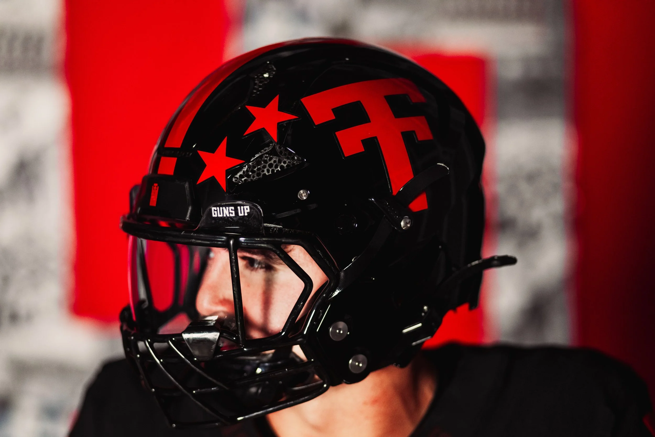
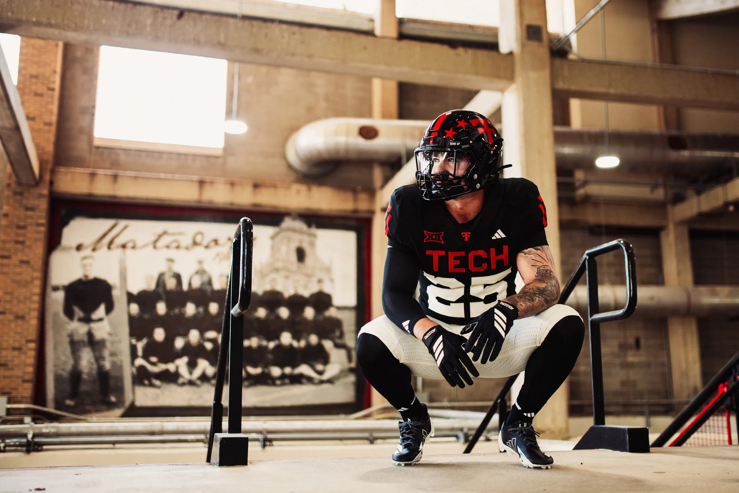
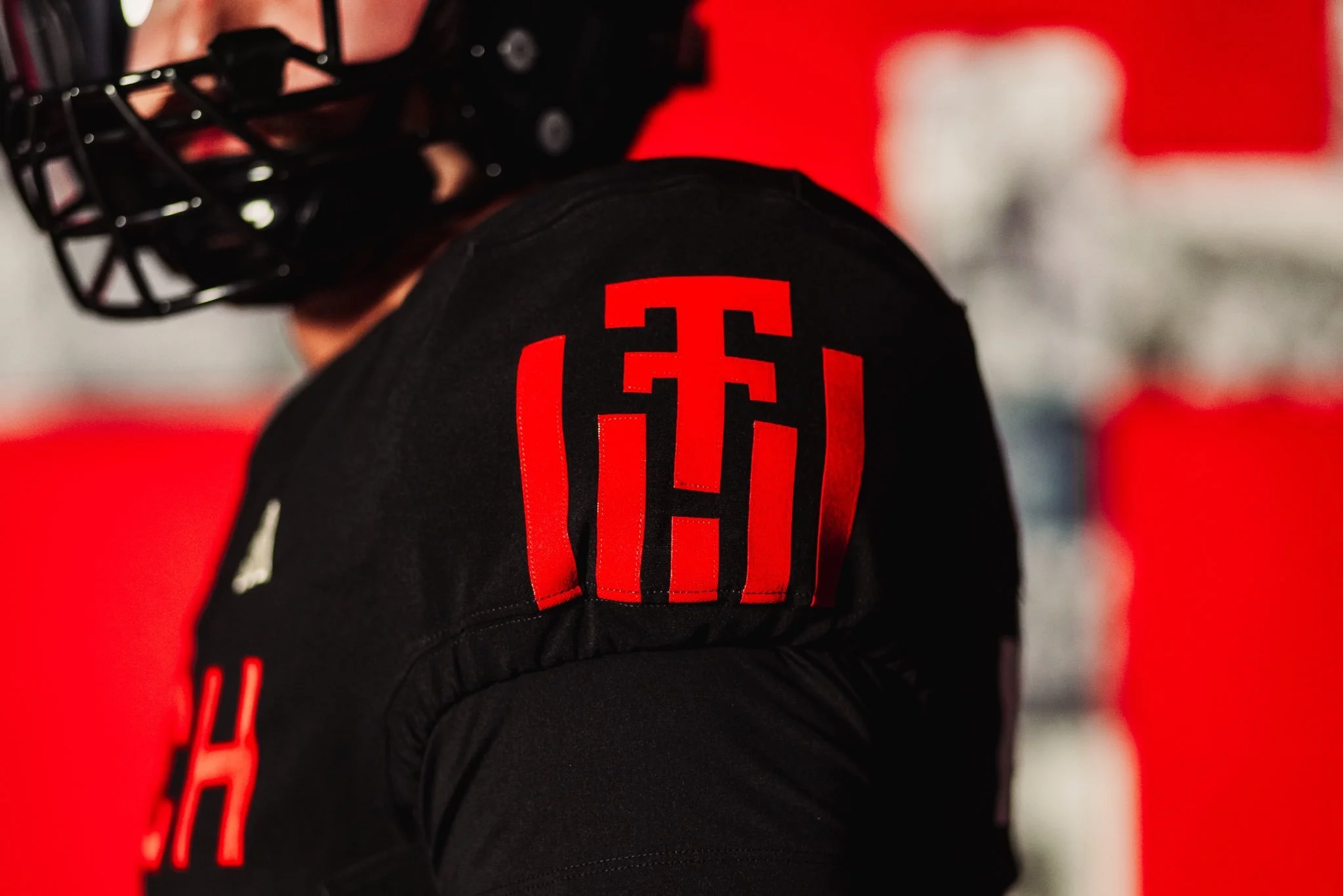
Texas Tech Celebrates 100 Years of Football with 2025 Throwback Uniform

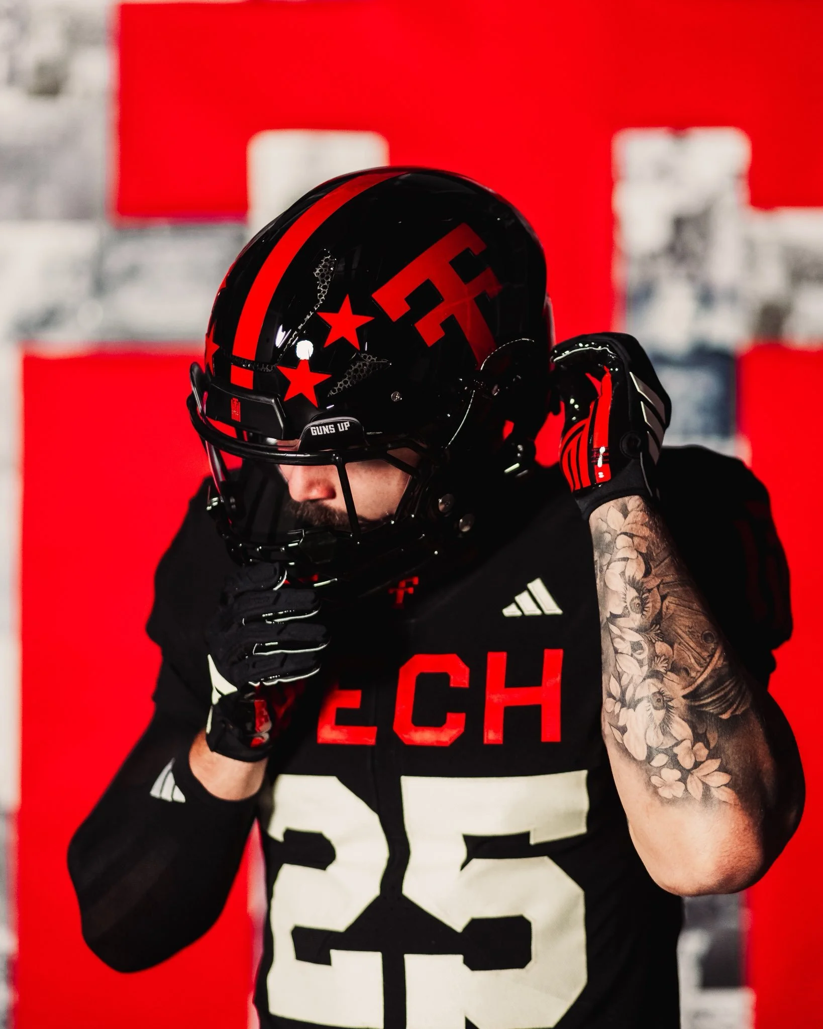
Texas Tech football is honoring a century of tradition in 2025 with a special throwback uniform celebrating the program’s 100th anniversary. The look not only nods to the Red Raiders’ historic past but also highlights key milestones in uniform design that shaped the team’s identity over the decades.

The program’s first football team took the field in 1925, when the “Tech” wordmark first appeared on the team’s uniform. Just a year later, in 1926, the now-iconic Double T made its debut, establishing a logo that would become one of the most recognizable marks in college sports.

By 1930, Texas Tech was already pushing the boundaries of uniform design by incorporating the Double T into traction stripes, a cutting-edge look for its time.

In 1935, the program introduced jersey numbers to the front of the uniform for the first time, bringing both functionality and identity to the design. Fast forward to the mid-1960s, when stripes inspired by the Masked Rider and the horse’s breast collar were added to the uniforms in 1965, further cementing a connection to Tech’s most famous tradition. Just a few years later, in 1969, helmet stars were introduced as awards, giving players a chance to showcase their individual achievements while adding another memorable layer of style.

Each detail in the 2025 throwback uniform is a nod to these defining eras, from the early wordmarks to the stripes and symbols that became staples of Texas Tech’s identity. By weaving in elements from across decades, the Red Raiders’ centennial look is a visual timeline of 100 years of grit, innovation, and football in Lubbock.

As the Red Raiders take the field in their anniversary throwbacks, the uniforms will stand as more than just a jersey; they’re a tribute to the players, coaches, and fans who built Texas Tech football into what it is today.

SHOP Texas Tech gear HERE


See What Else Is New