The Nike era has officially arrived in Columbia.
After months of anticipation, South Carolina football unveiled its new Nike football uniforms, giving Gamecock fans their first full look at the program's on-field identity for the 2026 season.
While the overall design doesn't stray dramatically from the uniforms South Carolina wore during its Under Armour era, the new Nike set introduces several noticeable updates that signal the beginning of a new chapter for the Gamecocks.
The reveal came through a cinematic hype video produced by South Carolina's creative team, showcasing two of the team's primary uniform combinations.
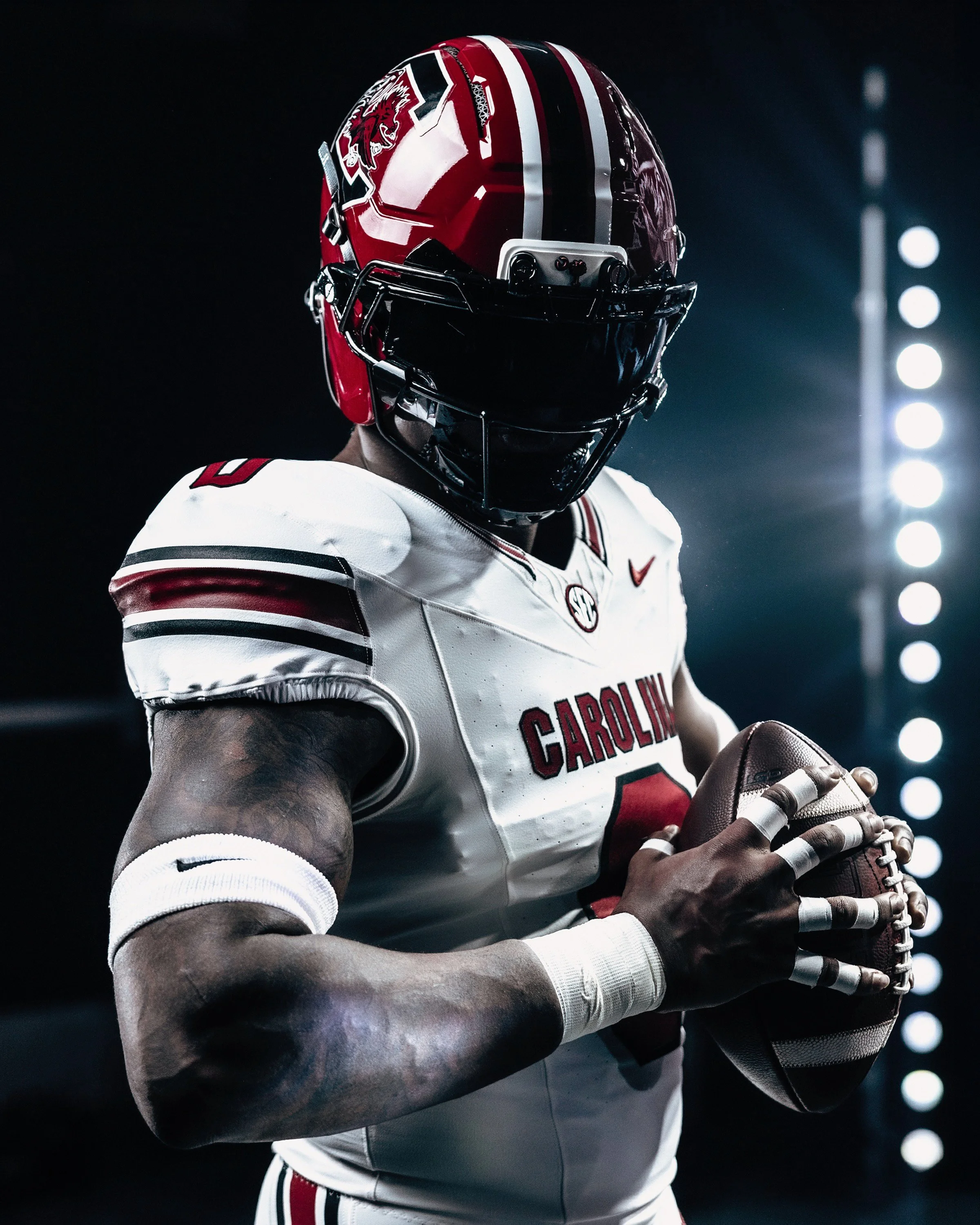
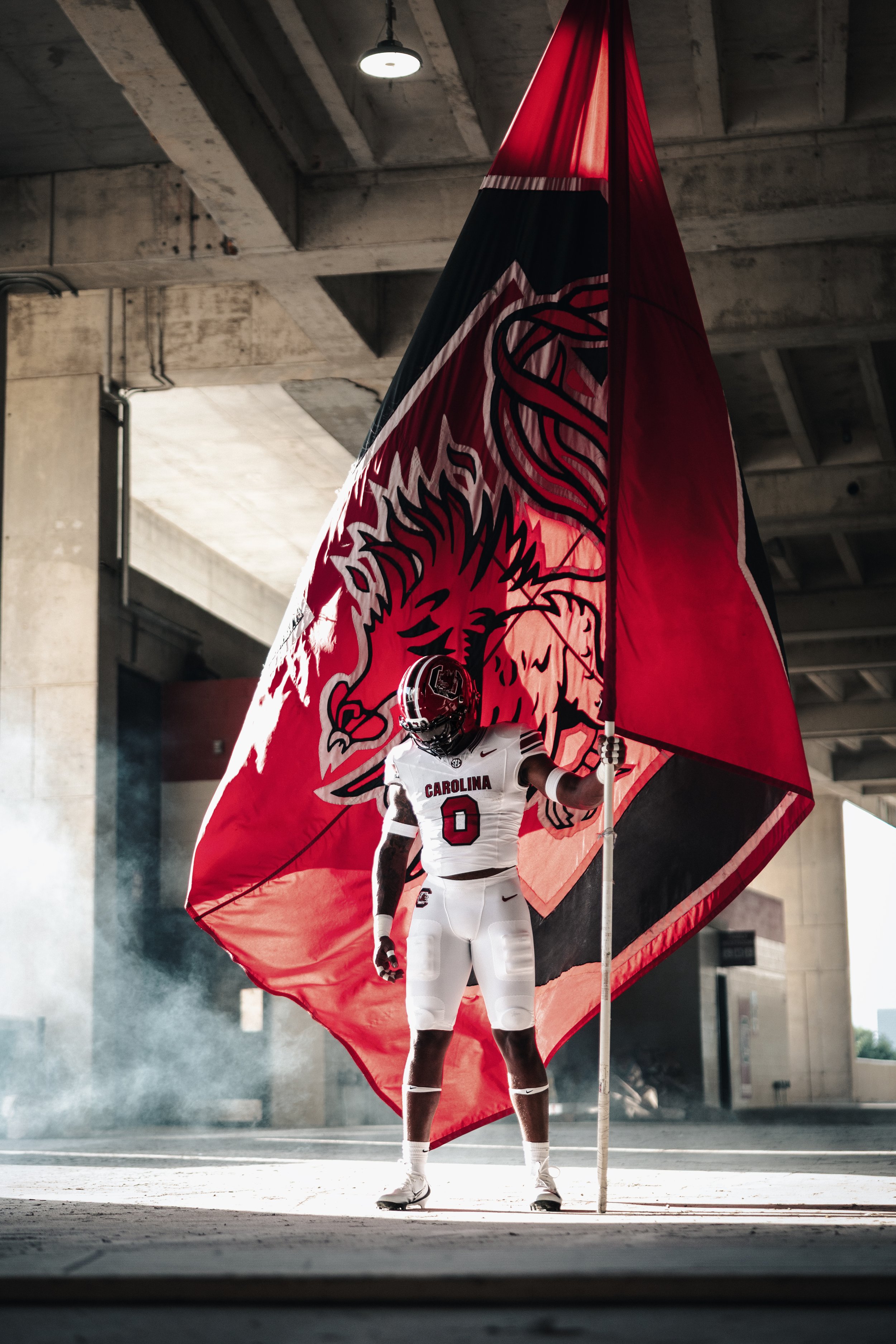
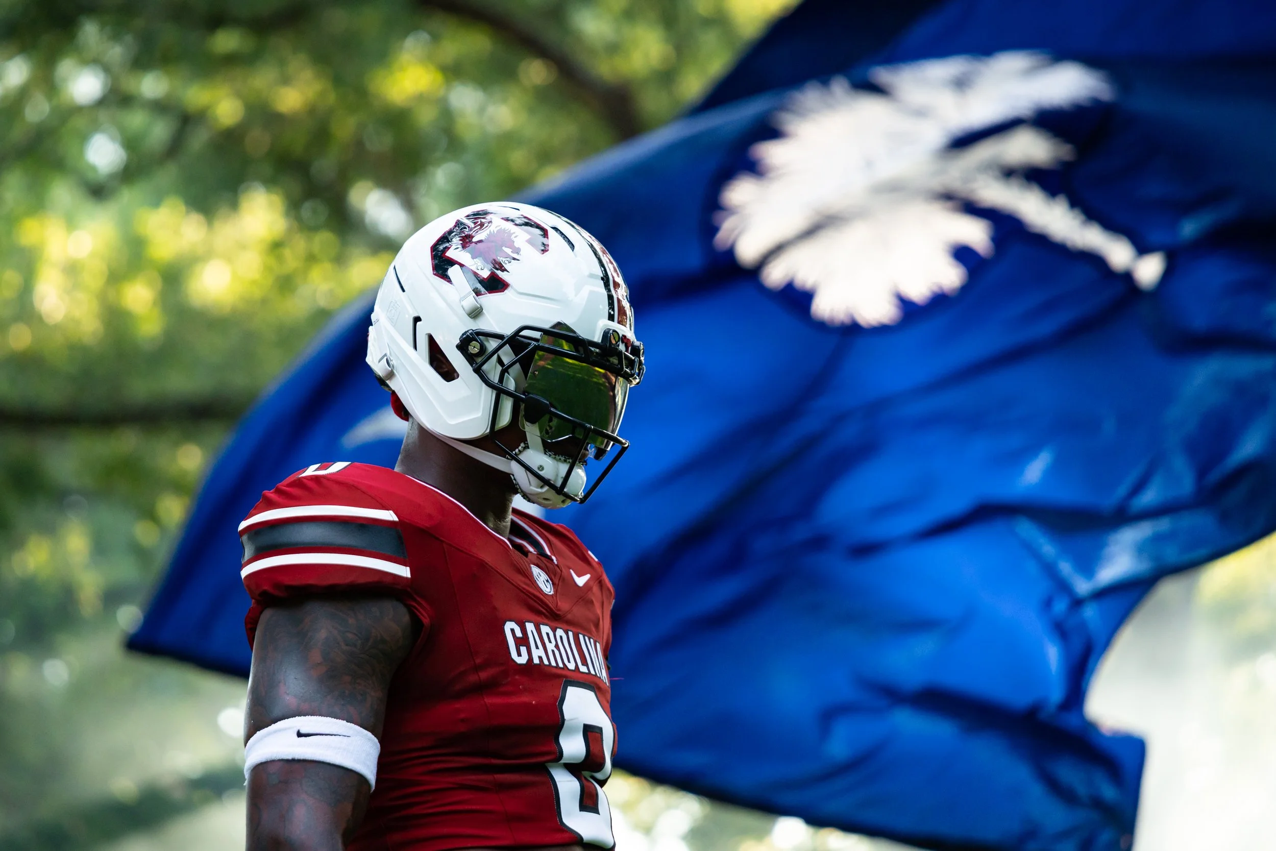
Fans got a look at the traditional white helmet, garnet jersey, and garnet pants combination expected to be worn at home, along with a garnet helmet, white jersey, and white pants combination for road games.
Although a full black alternate uniform wasn't shown, the video appeared to tease a glossy black helmet during its closing moments, hinting that additional uniform reveals could be on the way.
One of the most noticeable updates is found on the helmet. South Carolina has replaced the smaller Block C inside a white circle that has been featured in recent seasons with a larger standalone Block C, giving the helmet a cleaner, bolder appearance.
The center stripe has also been widened, creating a more prominent look from front to back.
While the uniform striping and jersey numbers remain very similar to previous designs, several smaller details separate the Nike version from its predecessor.
The placement of the logos on the pants has been flipped, with the Nike Swoosh now appearing on the left hip and the Block C logo positioned on the right leg.
Nike also integrated the SEC logo into the collar design, making it smaller and cleaner than the previous placement used on Under Armour uniforms.
Collectively, the updates create a more streamlined appearance while maintaining the overall look Gamecock fans have become familiar with over the past several seasons.
SHOP South carolina gear HERE


See What Else Is New
Featured

Related Articles
Featured