When the New York Jets reported to training camp this year, it wasn’t just the beginning of a new season — it was the unveiling of a game-changing upgrade to their home turf.
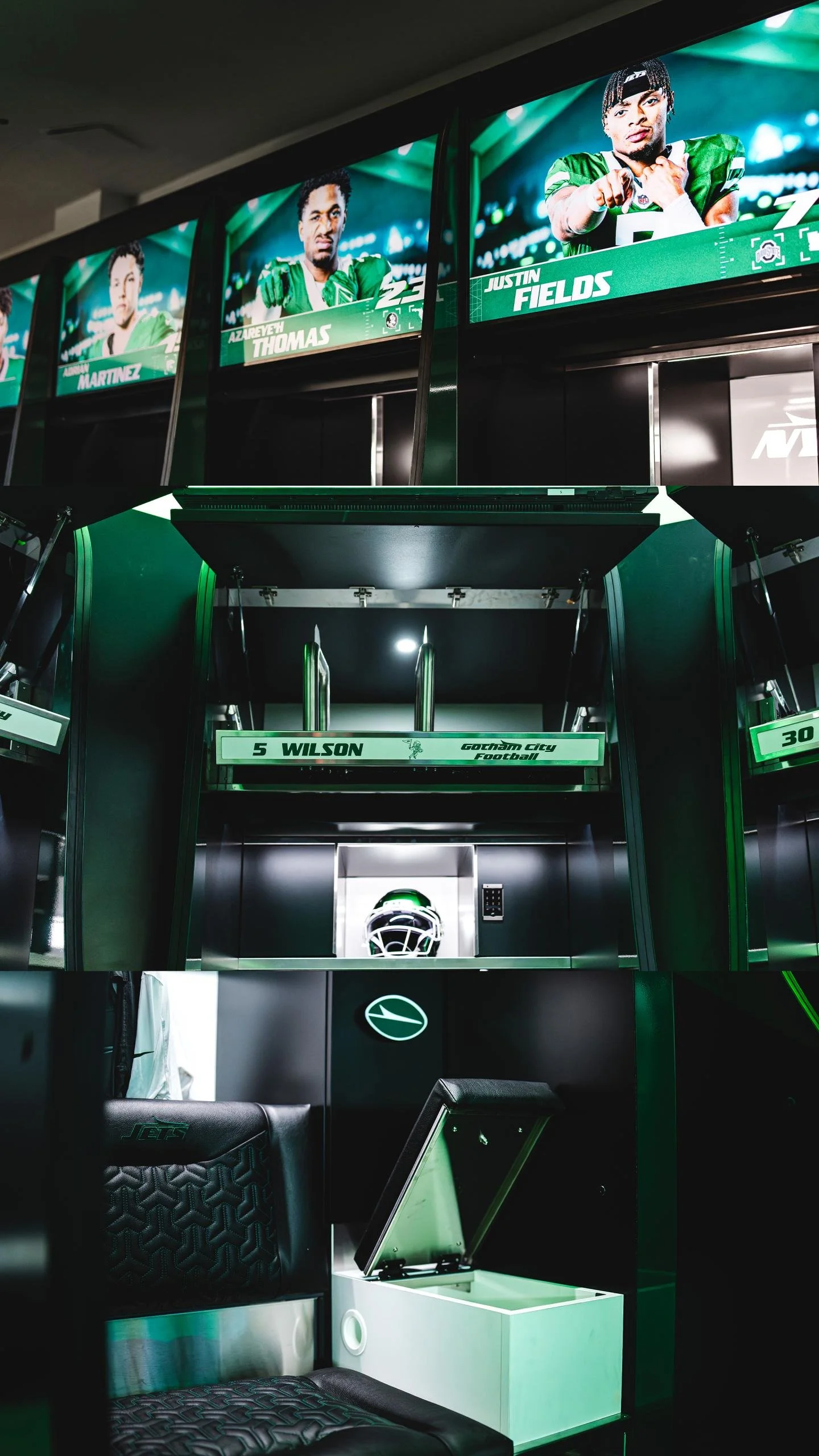
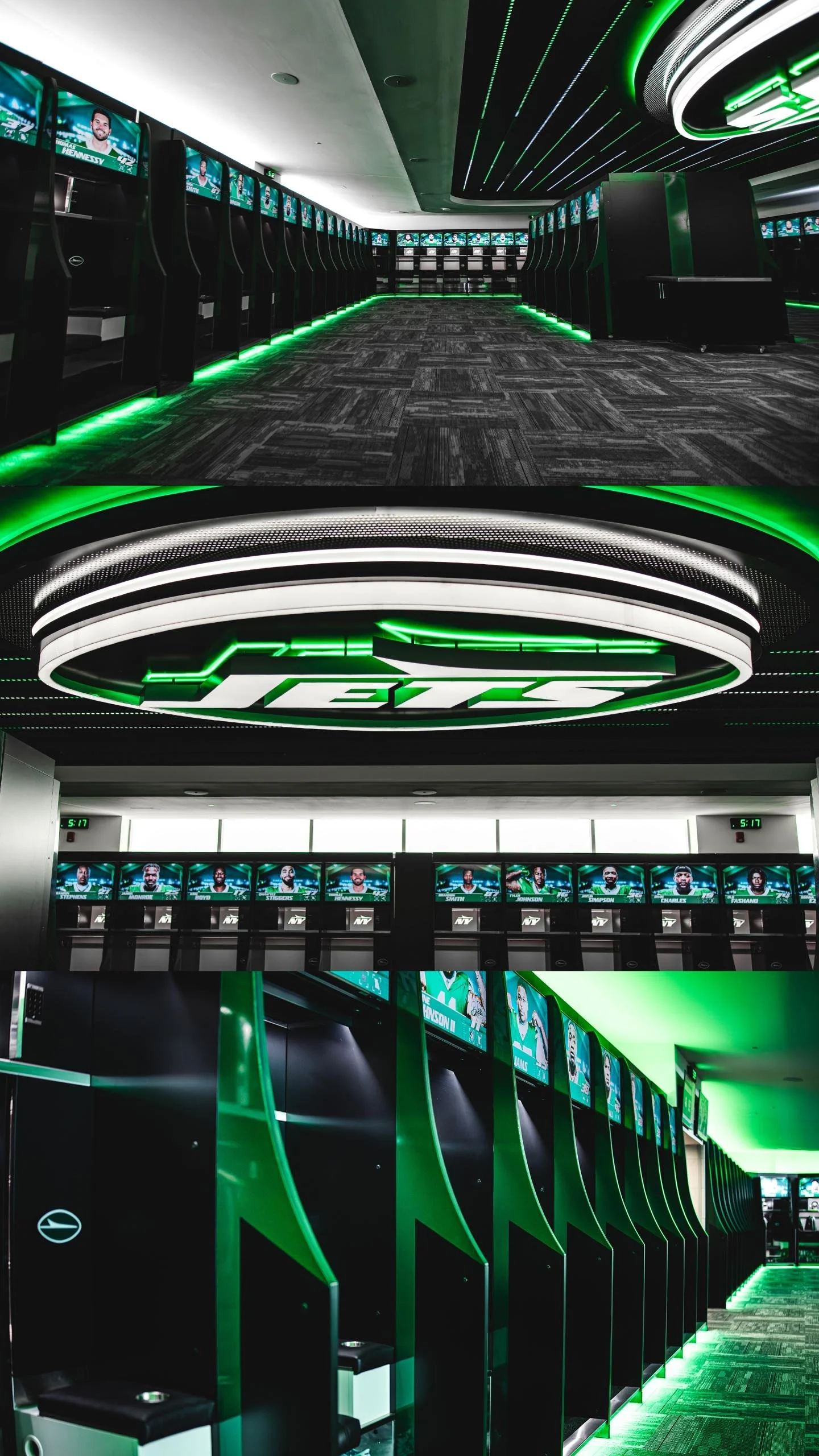
The Jets revealed a completely redesigned state-of-the-art locker room and team facilities at the Atlantic Health Jets Training Center, setting a new standard for player spaces in the NFL. From high-tech lockers and wellness enhancements to a vintage-inspired barbershop and a massive ceiling logo, the team’s facility is now a perfect blend of performance, comfort, and swagger.
The new setup features 92 custom-built lockers constructed from premium veneer, melamine, and stainless steel. These 1,000-pound units are anything but standard. Each one includes:
Automated video screens that can display schedules, messages, and motivational content.
Three ventilation fans dedicated to drying shoulder pads, helmets, and cleats.
USB charging ports, plush seats embroidered with the Jets logo, and green LED strip lighting that adds a glow of energy and edge to the room.
speakers integrated for a fully immersive audio experience.
The goal? Make every player feel like their locker is their own personal suite — and do it all in the name of wellness, performance, and pride.
“We are the first pro team or NCAA team to implement a fully automated video display into the lockers,” said Robert Mastroddi, Senior VP of Security and Facility Operations. “We made sure we had everything covered—from the size of the cupholders to the ventilation for gear. Every detail matters.”
Upgrades weren’t just for style. The wet area has been completely redone, and the new, larger sauna is optimized for recovery. Forced-air ventilation across the locker room minimizes moisture and reduces the risk of infection — all in service of peak player performance and longevity.
But perhaps the most jaw-dropping addition? A 2,000-pound, three-dimensional Jets logo suspended from the ceiling, featuring over 500 lights and a fully backlit and frontlit design. The hallway leading to the indoor fieldhouse now feels like a runway, with black textured wallpaper and green LEDs guiding players through the space.
Players won’t have to leave the facility to stay sharp. The Jets introduced a custom barbershop outfitted with two vintage black chairs from the 1950s, reimagined with green stitching and full personalization. It's a finishing touch that shows the franchise cares about every minute of a player's day — from workouts to wind-downs.
“Woody and Christopher Johnson have always been committed to providing a home for players that is second to none,” said Mastroddi. “That standard will never change.”
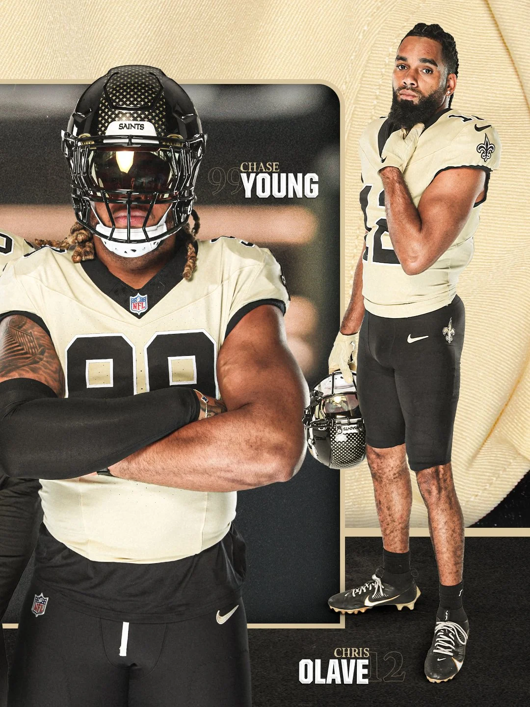
The New Orleans Saints are turning back the clock — with style.
the Saints officially unveiled their reimagined “Gameday Golds” alternate uniforms, marking a powerful return to a fan-favorite look with a modern twist. Set to debut during the 2025 NFL season, the new gold jerseys pay tribute to the franchise’s deep roots while signaling the start of a new era in the Crescent City.
The Saints haven’t worn gold jerseys since 2002, when they suited up against the Minnesota Vikings. Now, more than two decades later, the 2025 version refreshes that iconic energy with elevated design details, bold color choices, and a statement of pride for both the team and its fanbase.
The “Gameday Golds” were designed to evoke nostalgia for long-time fans while offering a sleek, updated aesthetic for a new generation of Saints supporters. The look ties the franchise’s past to its future, walking the line between vintage and cutting-edge — and it does so with swagger.
More info is still to come, including which matchup will mark the official on-field debut of the alternates, but one thing is for sure — the Superdome is about to shine brighter than ever.
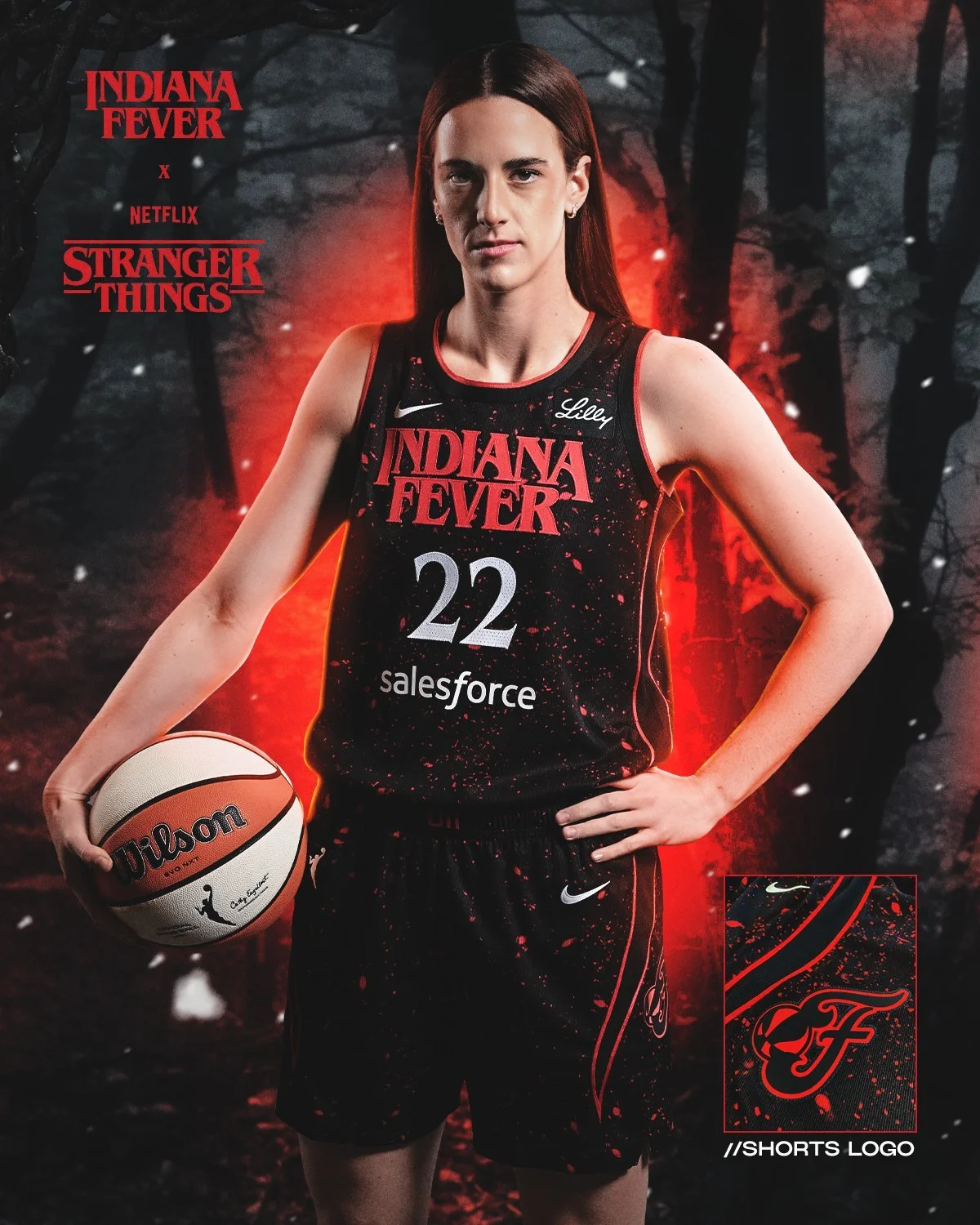
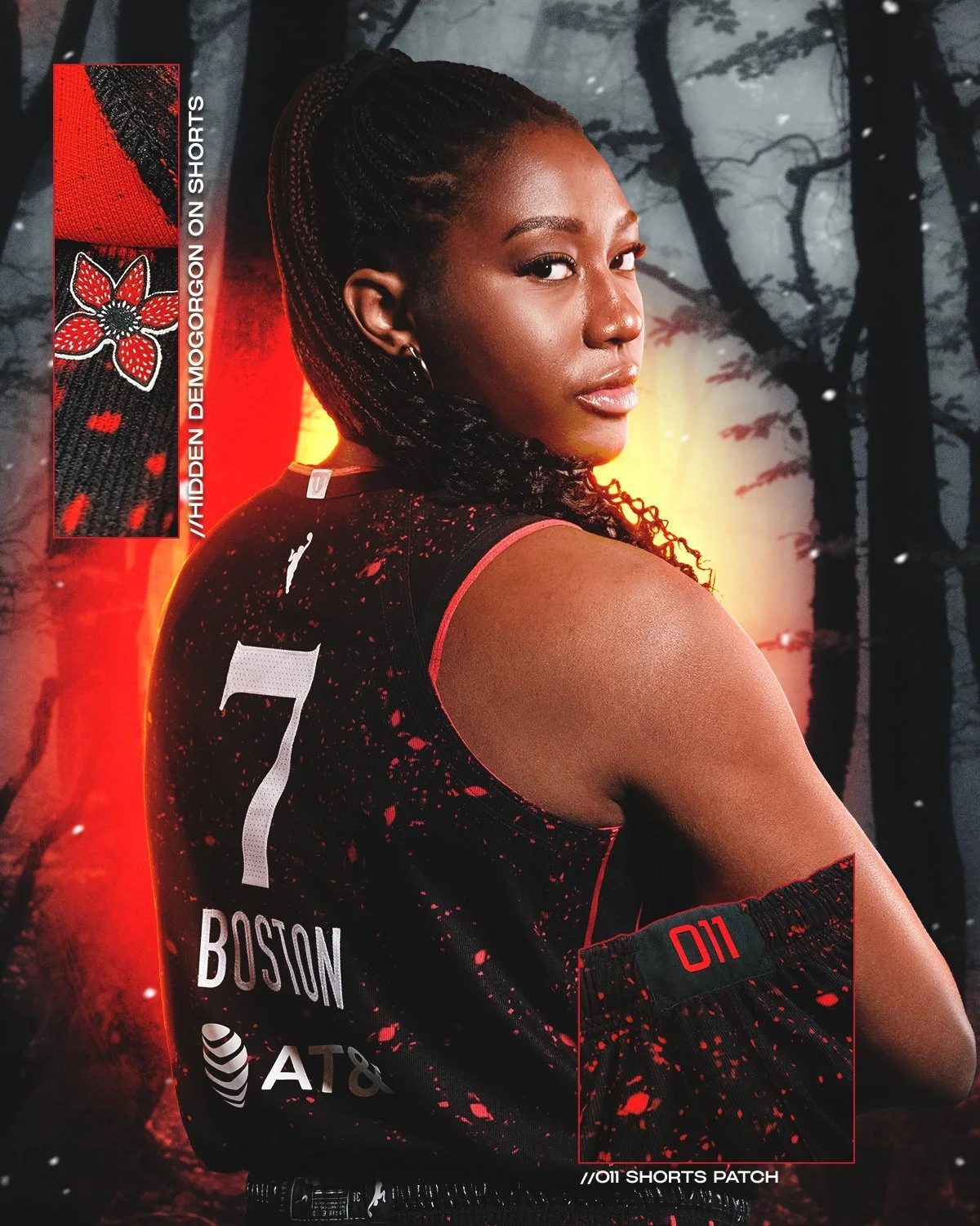
The Indiana Fever have teamed up once again with Netflix for a chillingly bold collaboration — the Stranger Things Rebel Edition Collection — and it's already turning heads. The limited-edition jersey fuses the Fever’s classic silhouette with the eerie aesthetic of Hawkins, Indiana. It’s a mash-up of basketball culture and pop culture that hits all the right notes.
This isn’t just a jersey — it’s a statement.
Drenched in dark black and haunting red tones, the uniform carries a vintage energy with the iconic Stranger Things font front and center. Sharp Demogorgon claw marks scratch across the sides, and perhaps the most striking detail of all? The waistband marked with “011”, a direct tribute to the series’ fan-favorite character, Eleven. It’s retro. It’s bold. It’s fearless.
“This jersey represents the fierce spirit of our team and the fearless energy of Stranger Things – two forces that never back down,” said Amber Cox, Indiana Fever Chief Operating Officer and General Manager. “As we celebrate our team and the cultural phenomenon that is Stranger Things, we’re thrilled to bring back this awesome collaboration with Netflix.”
This isn’t the first time we’ve seen the WNBA mix it up with pop culture, but the Fever are pushing the envelope by blending on-court swagger with supernatural storytelling. With players like Caitlin Clark and Aliyah Boston already elevating the team's national profile, this latest drop only adds to the hype.
The Stranger Things Rebel Edition Jersey is a must-cop for fans of the show, the team, and anyone who appreciates a fresh take on basketball aesthetics. Whether you're rocking it at Gainbridge Fieldhouse or in your own version of Hawkins, you’re repping something bigger than just a team — you’re repping a vibe.
When baseball meets horsepower, you get a uniform drop like no other.
On August 2nd, the Atlanta Braves and Cincinnati Reds will collide under the lights for the 2025 Speedway Classic, and the fits are going full throttle. While the matchup itself is one to circle on the calendar, it’s the racing-inspired gear that’s turning heads before first pitch.
Nike, New Era, and Rawlings teamed up to deliver a collection that blends the heart of Major League Baseball with the adrenaline of NASCAR. The jerseys stick close to the Braves’ and Reds’ traditional looks but inject just enough racing DNA to shift into high gear. Custom back numbers mimic those found on race cars — bold outlines, dynamic shadowing, and a sleek italicized design that gives off straight speed.
But it doesn’t stop at the jerseys.
New Era Caps: The Braves will sport a cap featuring flames blazing off the visor, while the Reds will bring the heat with checkered flag graphics — a nod to that finish-line energy.
Rawlings Batting Helmets: These helmets steal the show. Designed to resemble NASCAR lids, they come equipped with race car-style numbers, checkered flag emblems, and racing decals that make them feel more pit crew than dugout.
The Speedway Classic is bringing something fresh to the league — not just on the field, but in the threads too. Whether you’re a diehard baseball fan or a motorsports junkie, this is the kind of drop that hits in both worlds.
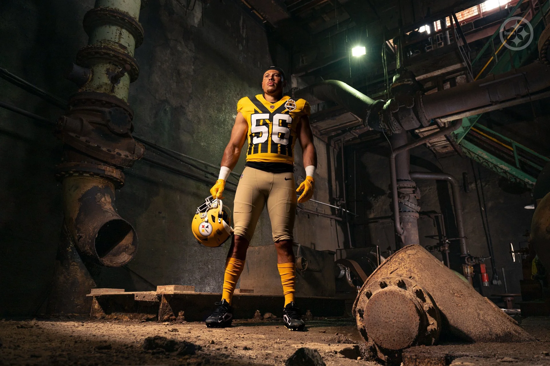
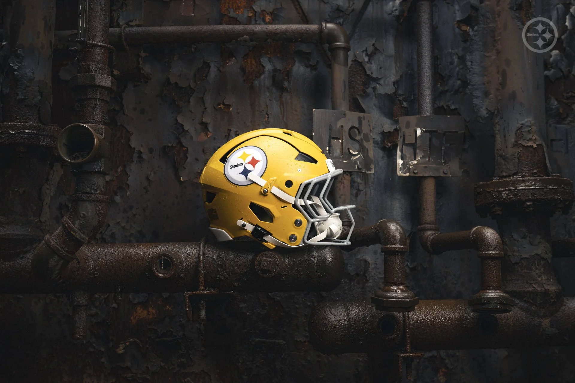
When you talk about Steelers football, you’re talking about legacy. Grit. History. A city and a team that go hand in hand. This season, the Pittsburgh Steelers are honoring that legacy in a big way — unveiling newly redesigned 1933 throwback uniforms set to debut under the primetime lights on Sunday Night Football against the Green Bay Packers in Week 8.
This isn’t just a uniform drop — it’s a tribute to where it all began.
The Steelers’ 2024 throwback pays homage to the franchise’s first-ever season in 1933, but with modern updates that elevate the look while keeping the roots intact. It’s a perfect blend of vintage detail and new-school energy, and the rollout is as thoughtful as the design itself.
“We're excited to unveil our new throwback uniforms, which not only pay tribute to the origins of the Steelers franchise but also to the deep connection we have to our hometown of Pittsburgh,” said Steelers President Art Rooney II. “It’s especially fitting that we’ll debut these uniforms on Sunday night, when we play the Packers – another historic franchise with deep NFL roots.”
The uniform tells a full story — from helmet to pants — with every piece dialed in to reflect Pittsburgh pride and football heritage:
Gold jersey with bold black stripes and white block lettering trimmed in black
The City of Pittsburgh crest on the left shoulder — a direct nod to the hometown connection
Black block numbers on the back keep it clean and classic
Matte gold helmet with a black center stripe and gray facemask — one of the most talked-about elements so far
The fit is completed with beige pants, tying the look together with a throwback twist
Linebacker Alex Highsmith summed up the vibe perfectly: “The first time I saw it, my jaw dropped. We haven't worn a jersey like that in a while. It's all so cool... the helmet is just sick.”
Tight end Pat Freiermuth echoed the excitement: “The yellow helmet is sweet. It gets players excited. It gets fans excited. After we wear them, I want to keep that helmet forever.”
The players are fully locked in — not just because of the new look, but because of what it represents. It’s not just about flash. It’s about representing decades of greatness and a city that lives and breathes Steelers football.
Unveiling the throwbacks on Sunday Night Football, with the entire nation watching, isn’t just smart — it’s symbolic. This is Pittsburgh’s time to shine, not just in the standings, but in style. The uniform is a visual reminder of where the Steelers started, how far they’ve come, and the pride that continues to define the franchise.
“It’s an honor to wear these uniforms, knowing the history of this organization,” said Highsmith. “We’ve got to wear it with pride.”
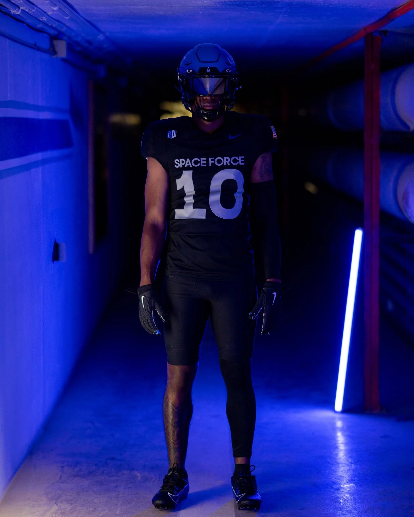
The United States Air Force Academy is reaching new heights with the latest uniform. This time, the Falcons are going intergalactic with a bold, blacked-out look that pays tribute to the United States Space Force, the newest branch of the U.S. military.
The 2025 special uniforms feature a sharp contrast in tones and texture. The jersey and pants are solid black, a dramatic departure from the traditional Air Force blue, designed to reflect the mystery and power of outer space.
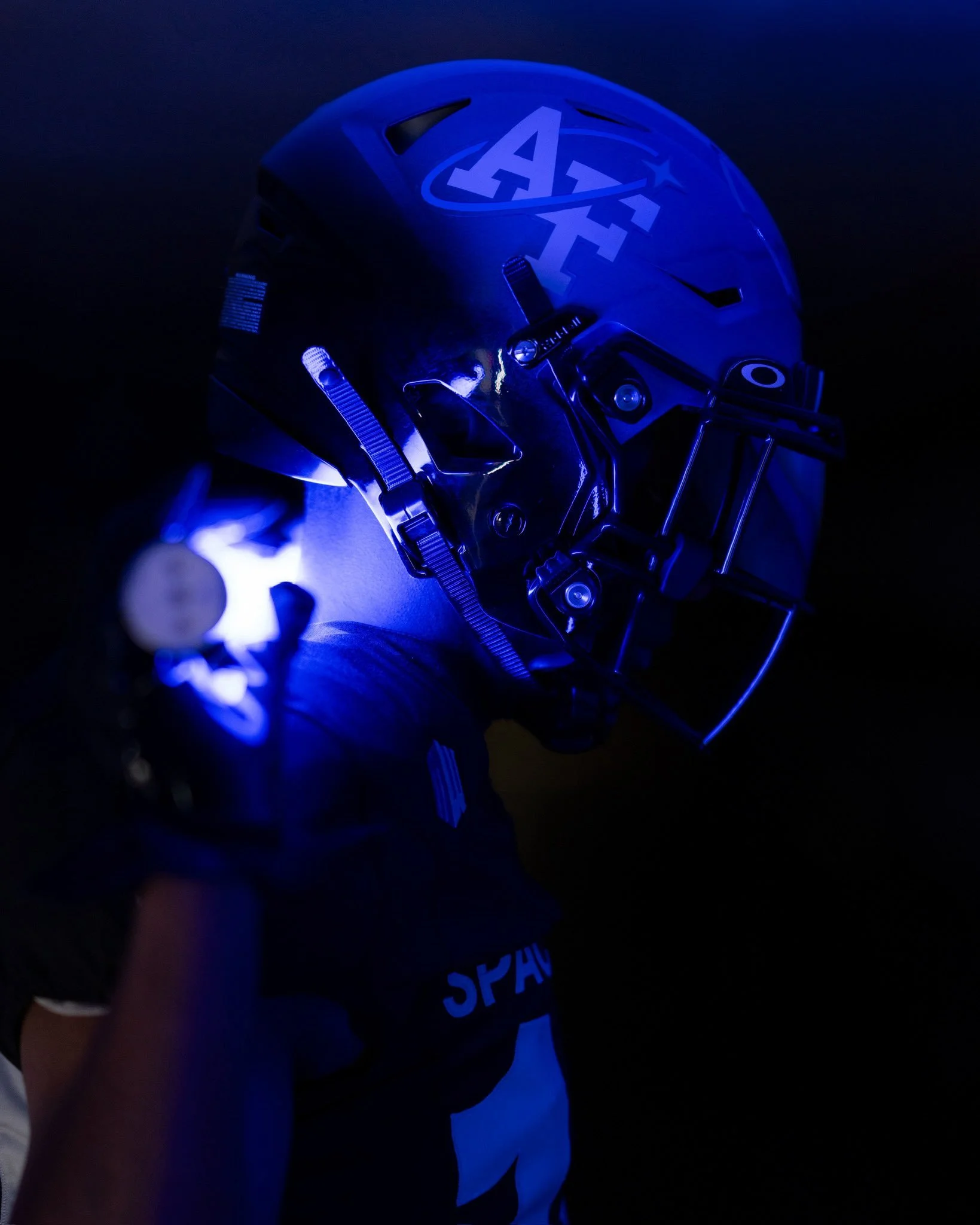
On the right side of the helmet, a white “AF” decal nods to tradition. The left side shifts focus toward the future, featuring a bold white “USSF” (United States Space Force) mark — a clean and powerful symbol of the Academy’s evolving mission. A black facemask ties the helmet into the uniform's overall stealth aesthetic.
The front of the jersey is simple and strong. “SPACE FORCE” is printed across the chest in sans-serif font, resting above the player number. A conference patch and maker’s mark complete the look. On the back, the uniforms replace traditional last names with the motto “SEMPER SUPRA”, Latin for “Always Above,” which is the official slogan of the U.S. Space Force. White numbers on the back maintain a high-contrast finish that pops against the black base.
On one pant leg, “USSF” runs vertically down the side — a powerful detail that reinforces the Space Force theme from top to bottom. While the opposite pant leg's design hasn't been fully revealed yet, the overall aesthetic leans into symmetry, stealth, and symbolism.
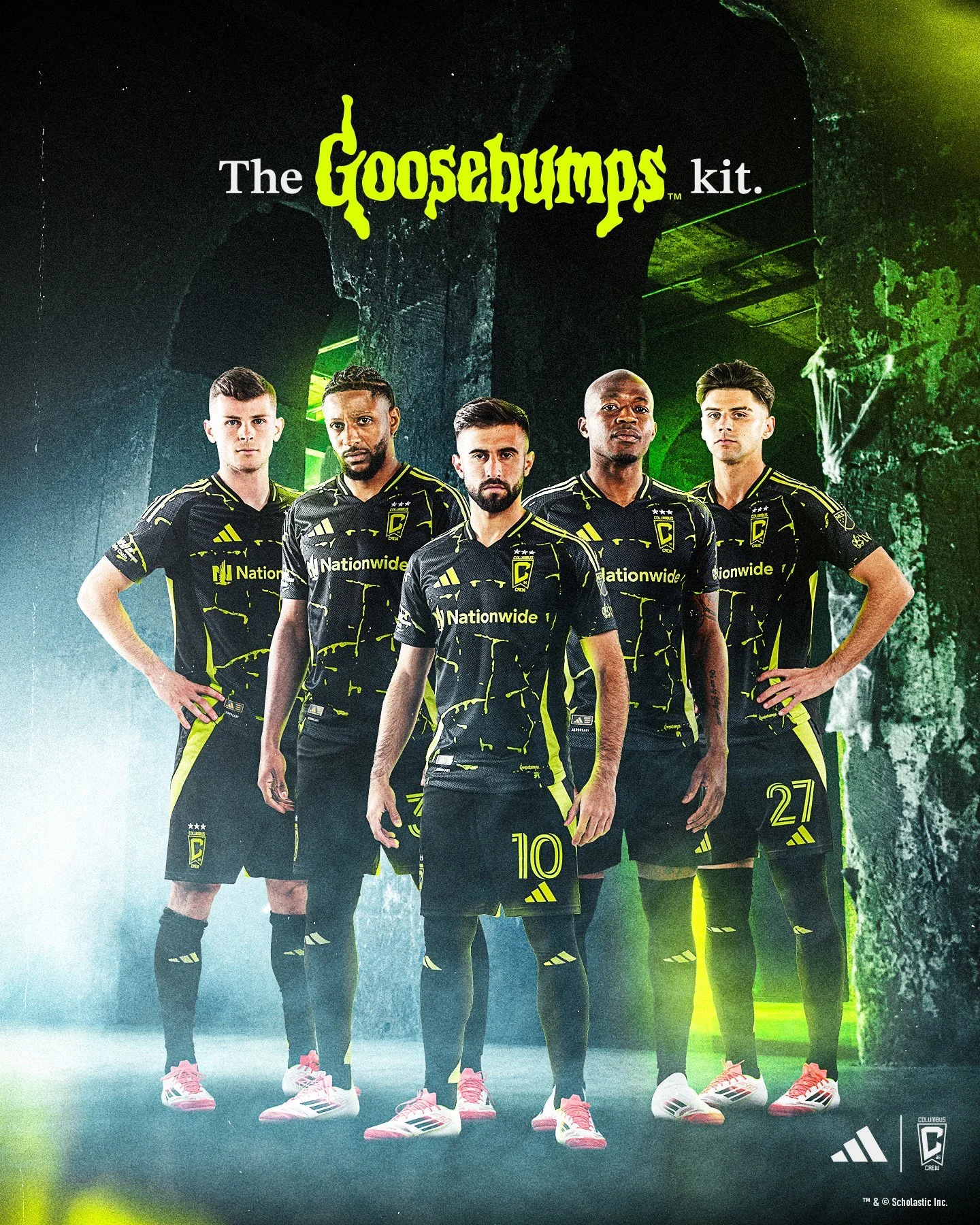
Major League Soccer and adidas are running it back — and this time, they're taking even more teams on a journey through time.
MLS officially dropped the latest wave of the adidas x MLS Archive Collection, featuring brand-new third kits for 10 MLS clubs that celebrate the bold style, nostalgia, and swagger of late-‘90s and early-2000s soccer. Alongside these throwback-inspired jerseys come matching Gazelle shoes and retro-style jackets, blending fashion, history, and hype in a way only adidas can.
Last year’s debut collection brought serious heat from clubs like Inter Miami, LA Galaxy, and Portland Timbers — and fans loved it. Now in year two, the Archive Collection is going coast-to-coast with a fresh drop that honors iconic logos, legacy crests, and vintage design elements from MLS’ golden age.
“Third jerseys are always a favorite amongst our fans,” said MLS SVP of Consumer Products Rachel Hoagland. “This collection’s take on soccer nostalgia exemplifies the League’s commitment to honoring the unique culture and history that exists across our clubs and communities.”
This year's Archive Collection features reimagined third kits for Charlotte FC, Colorado Rapids, Columbus Crew, D.C. United, FC Dallas, Minnesota United, Nashville SC, New England Revolution, San Jose Earthquakes, and Seattle Sounders FC. Each jersey pulls inspiration from a different era — but they all come with a modern twist that makes them wearable on the streets, in the stands, or anywhere the squad rolls.
adidas Senior Manager of Sports Marketing, Edward Martinez, called the project “a time capsule collection sprinkled with reminders of golden eras.” The goal: mix streetwear, sport, and legacy to deliver fan gear that doesn’t just rep a team — it reps an era.
Charlotte FC The Queen City gets the royal treatment with a kit that nods to Carolina roots and Charlotte’s rise as a bold, new soccer town. It’s heritage redefined.
Colorado Rapids Celebrating 30 years as an MLS original, the Rapids throw it back to their OG noble green and gold colorway — a subtle flex of legacy and rebirth.
Columbus Crew One of MLS’ founding clubs, the Crew honor their 30-season journey with a revival of their original crest, a retro wordmark, and a fresh ’96 jocktag. Timeless.
D.C. United The dynasty that helped shape the league brings back the swagger with an all-white kit featuring iconic black stripes and gold trim — pure ‘96 vibes, honoring four MLS Cups worth of dominance.
FC Dallas The past and present collide as Dallas revives the club’s original name and the classic black stallion crest — a galloping nod to their 30-season ride.
Minnesota United Drawing from Minnesota’s soccer history, this kit leans into old-school Loons script and adds a stylized PK design that blends local pride with retro flair.
Nashville SC The Music City goes full honky tonk with a kit that captures the unmistakable energy of ‘90s Nashville. It doesn’t just honor the era — it wears it.
New England Revolution This unapologetic throwback brings back the original Revolution wordmark, the bold colors of the '90s, and front-facing numbers — a signature style that’s finally back.
San Jose Earthquakes Channeling the chaos of the club’s “Clash” era, San Jose drops a kit with a fierce scorpion, bold retro wordmark, and the untamed attitude of MLS’ wild early days.
Seattle Sounders FC Inspired by the Sounders’ A-League glory days, Seattle’s kit is bursting with vibrant color and retro graphics, capped with the modern-day Orca crest to bridge the past and present.
And the best part? The Archive Collection is just getting started. adidas and MLS confirmed that the series will return next season — bringing even more clubs and throwback moments into the spotlight.
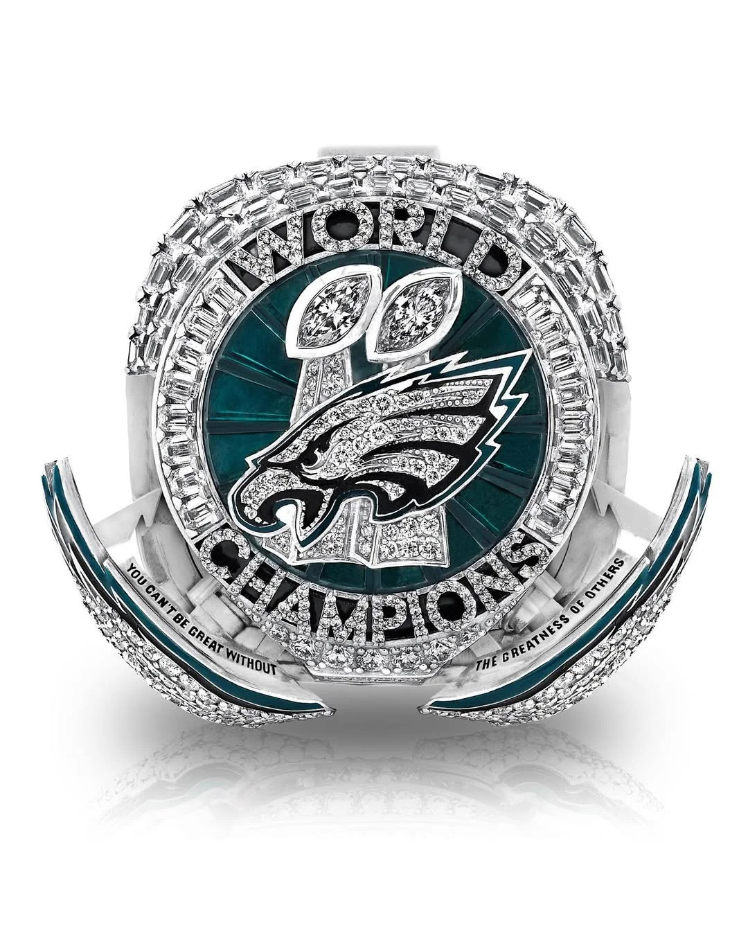
When you win the biggest prize in football, you celebrate big. And the Philadelphia Eagles went massive with their Super Bowl LIX Championship Ring — a 41-millimeter, 12-carat, 140-gram masterpiece that doesn’t just shine — it speaks.
Unveiled during a private ceremony in Philly, this ring is more than a symbol. It’s a story. One that starts in Brazil, peaks on Bourbon Street, and ends with over a million fans flooding Broad Street in celebration. Every single element of the ring has a purpose, a stat, or a message behind it. Here's how the Eagles turned their unforgettable 2024 season into wearable history.
From first glance, this ring hits hard. The bezel features 145 diamonds — a tribute to the Eagles’ 145 points scored during the postseason, setting a new NFL playoff record. Sitting atop the ring, the words “WORLD CHAMPIONS” are crafted with 40 points worth of diamonds, marking the 40 points the Eagles put up in their Super Bowl LIX win over the Kansas City Chiefs.
Just behind the Eagles’ logo are two Vince Lombardi Trophies, representing the franchise’s two Super Bowl titles — Super Bowl LII and the most recent LIX — both under owner Jeffrey Lurie. Inside the trophies is one carat of marquise-shaped diamonds, symbolizing a dominant defense that ranked first in total yards allowed per game (278.4), and a historic ground game led by Saquon Barkley, who racked up an NFL-record 2,504 rushing yards (including playoffs), becoming the league’s rushing champion.
Surrounding the top of the ring are 18 green stones — each one representing a win in the Eagles’ remarkable 2024 campaign. Tying an NFL record with 18 combined regular-season and postseason victories, the team tied a franchise best with 14 wins in the regular season before sweeping three home playoff games and capping it all off with the Super Bowl LIX title.
On one side of the ring, the Super Bowl LIX logo is placed between the Eagles wordmark and the game’s final score of 40-22. Embedded within the Super Bowl logo are 10 points of diamonds, commemorating the Eagles’ 10-game winning streak during the regular season — a franchise record that set the tone for a championship run.
The opposite side of the ring features each player’s last name and jersey number in diamonds, with a background design of Lincoln Financial Field, saluting the fans who packed the stadium all year. For team staff members, the rings instead feature the Eagles logo in the center of the same layout.
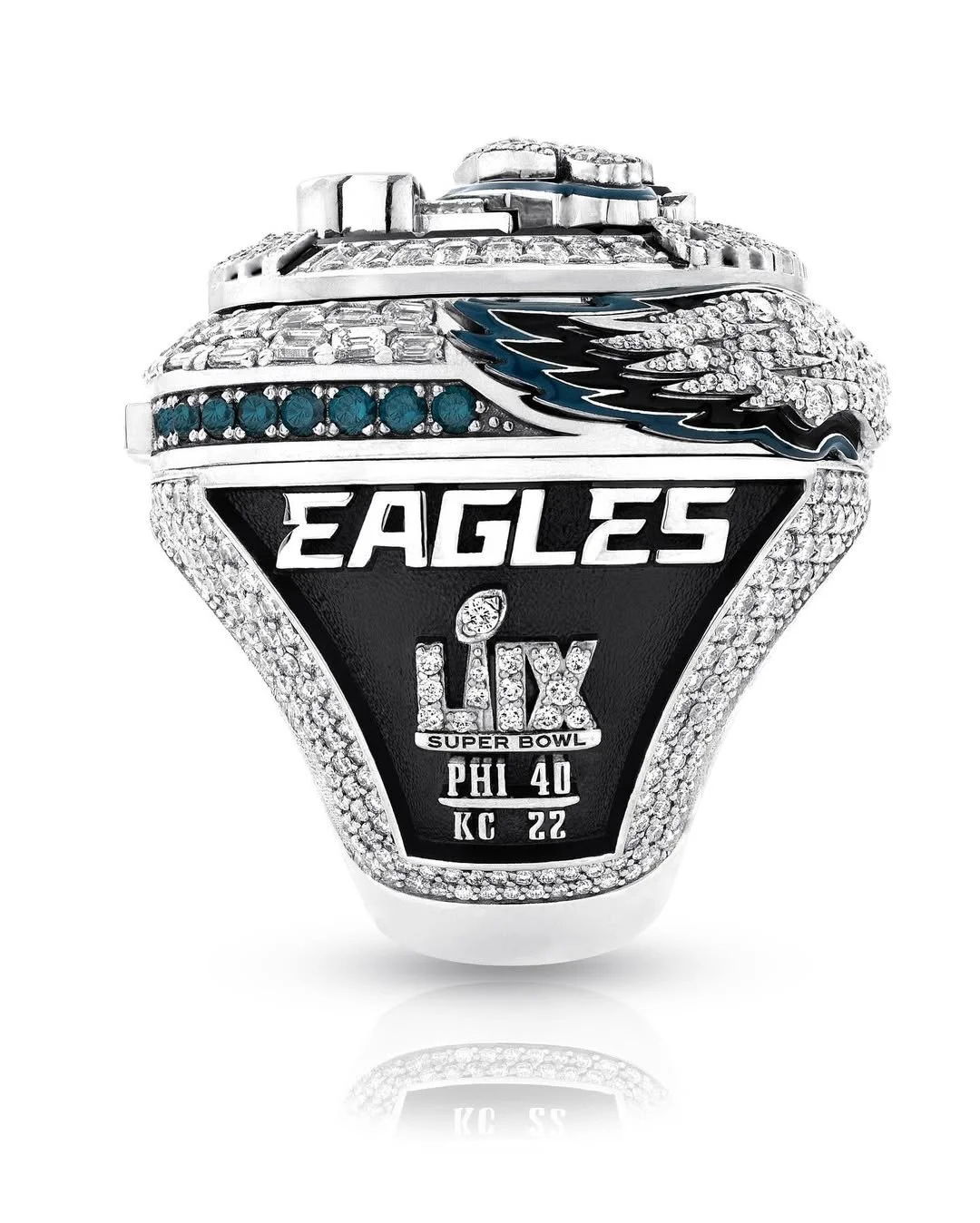
What truly sets this ring apart is the innovation. Built with a hidden button mechanism, each ring has wings that open from the bezel — the first of its kind in championship ring history. Once the wings spread open, they reveal the inscription: “YOU CAN’T BE GREAT WITHOUT THE GREATNESS OF OTHERS.” This powerful message reflects head coach Nick Sirianni’s season-long mantra of unity and selflessness — the heartbeat of the team’s culture.
On the wings themselves are 0.9 carats of diamonds, a nod to the six sacks and three turnovers delivered by the defense in Super Bowl LIX — one of the most dominant defensive performances the big game has ever seen. Players like Josh Sweat (2.5 sacks), Milton Williams (2 sacks), and Jordan Davis (1 sack) brought relentless pressure, while Cooper DeJean (pick-six), Zack Baun (interception), and Williams (fumble recovery) contributed to the trio of takeaways.
At the top of the ring’s button mechanism, five diamonds shine, each one representing a player who put points on the board in the Super Bowl. Jalen Hurts led the way with three total touchdowns. A.J. Brown added a 12-yard touchdown catch. DeVonta Smith hauled in a 46-yard score. Cooper DeJean struck with a pick-six, and kicker Jake Elliott tied the Super Bowl record for most field goals made.
Hidden inside the ring is a stamp of the Brazilian flag, commemorating the Eagles’ season-opening win against the Packers in São Paulo — the first NFL game ever played in South America. Beneath that, the words “TOUGH. DETAILED. TOGETHER.” — Coach Sirianni’s guiding values — are engraved as a constant reminder of what defined their locker room.
Also etched inside are the scores of all four playoff games and the number “145” in tribute to the Eagles’ record-setting playoff point total. Players' rings even include their signatures on the underside, while staff rings feature the phrase: “FROM BRAZIL, TO BOURBON, TO BROAD” — the perfect summary of the team’s championship journey from opening kickoff to parade confetti.
Chairman and CEO Jeffrey Lurie summed it up best:
“This ring represents the commitment, determination, and sacrifice of every member of our organization... It will forever serve as a reminder of just how magical the 2024 season was for our organization and fans.
The Eagles didn’t just design a ring. They built a tribute to dominance, unity, and grit — with every carat, every detail, every hidden gem. And once again, Philly proves: when it comes to UNISWAG, they don’t just win — they leave a legacy.
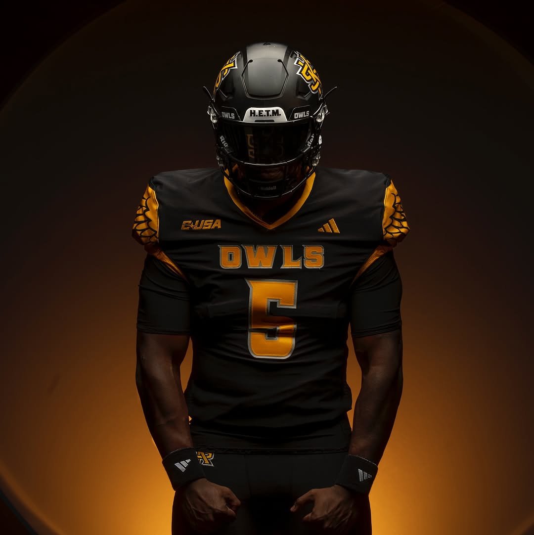
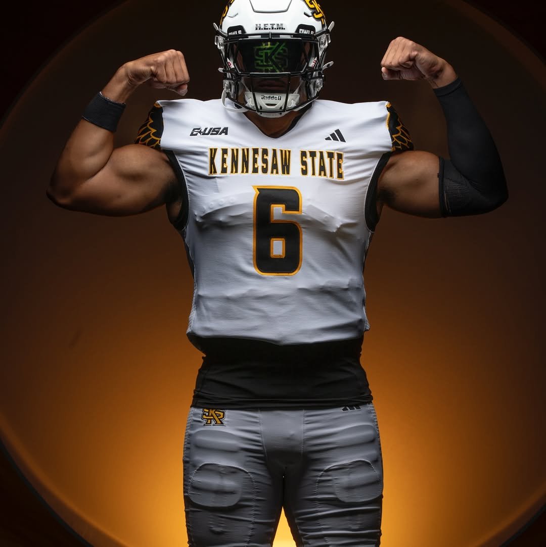
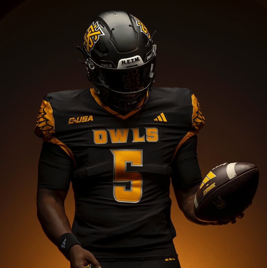
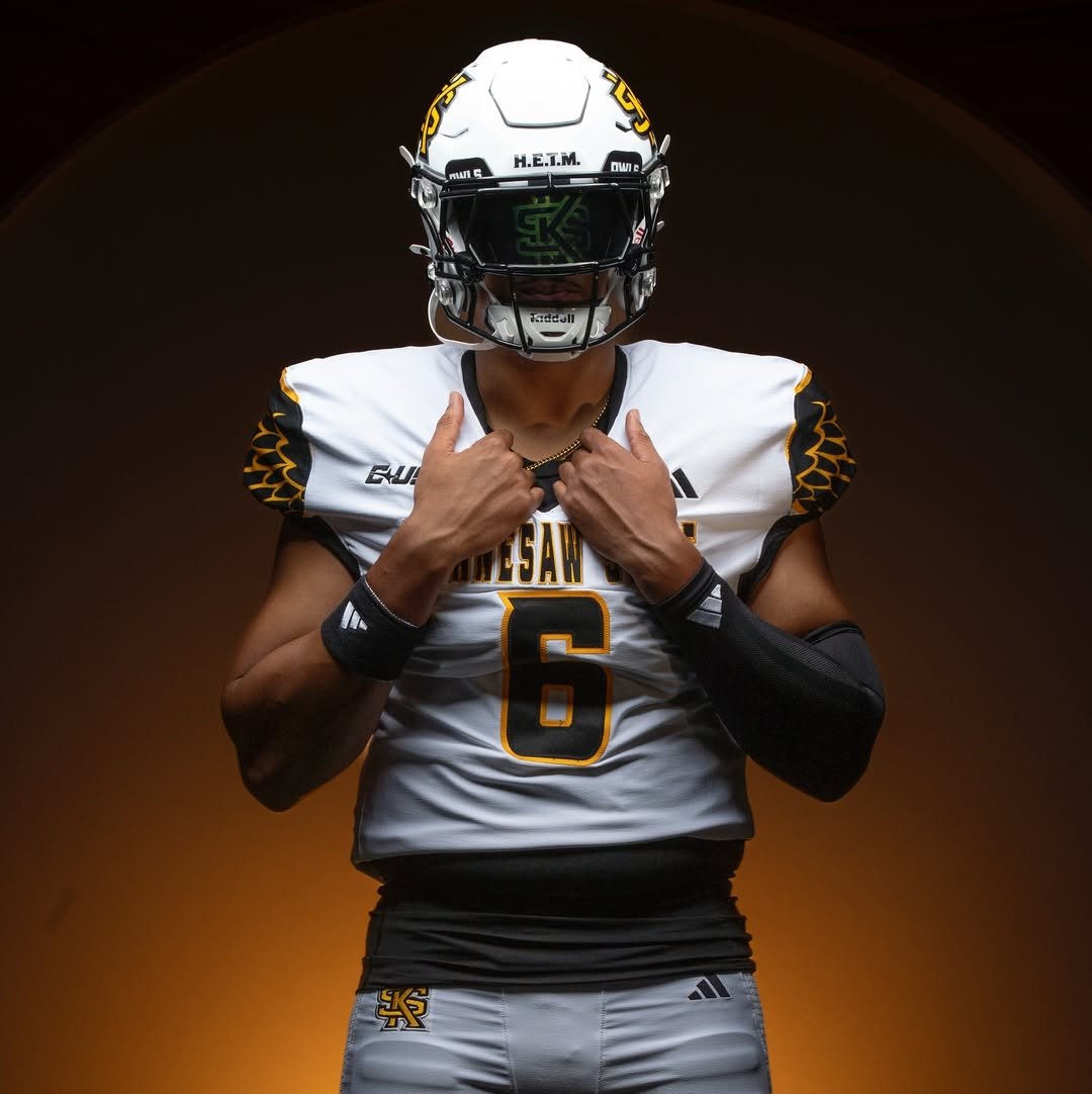
— Kennesaw State Football (@kennesawstfb) July 16, 2025
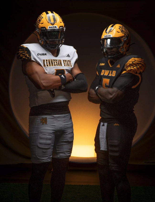
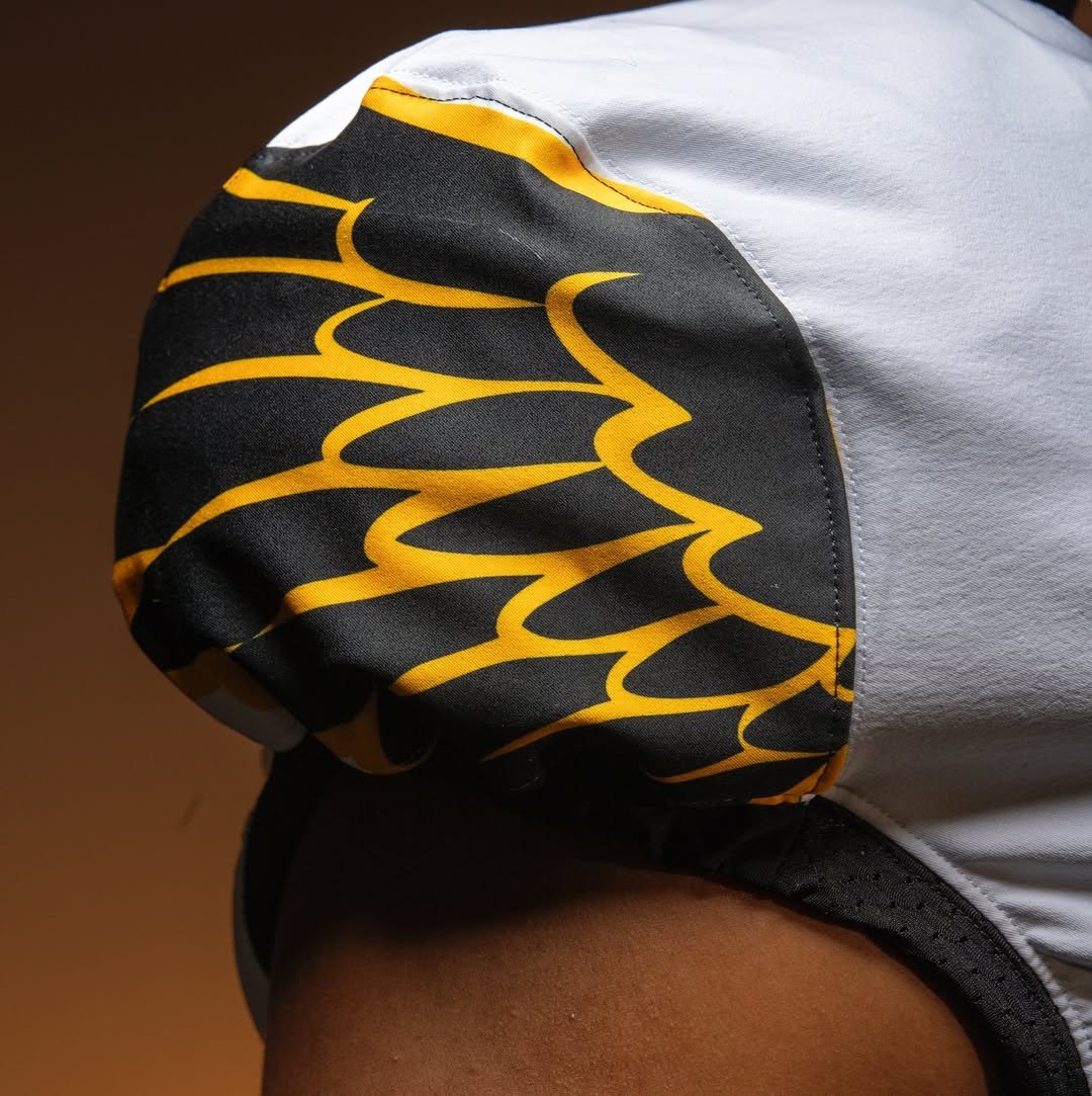
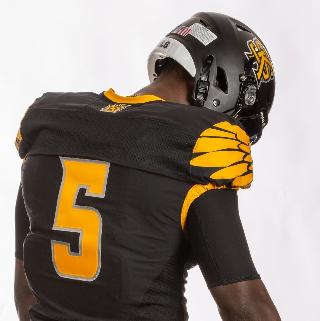
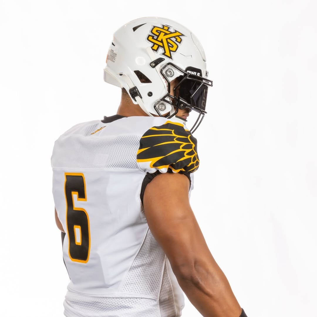
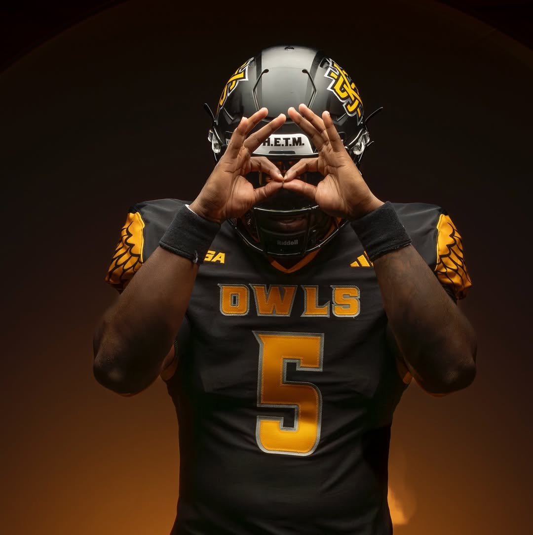
The Kennesaw State Owls are taking flight with an aggressive and symbolic uniform design. The most eye-catching element of the new uniforms is The wing pattern boldly spread across the shoulders. Golden feathers stretch over a black base, representing both the “Owls” nickname and a fearless elevation of their brand identity. The wing design isn’t just aesthetic.
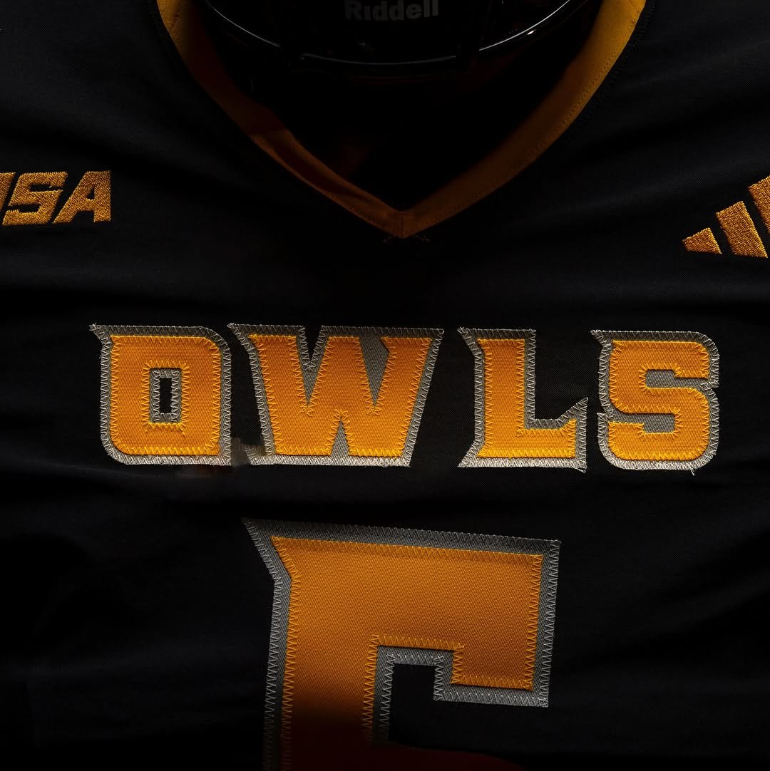
The primary uniform features a sleek black jersey with vibrant gold numbers outlined in silver, complemented by the word “OWLS” stitched across the chest in matching bold lettering. Kennesaw State’s iconic “KS” logo is proudly placed on the helmet, which sticks to a matte black base, adding a stealthy feel to the entire set.
The white uniform features striking black wings on the shoulders outlined in gold, adding a bold and dynamic look. Across the chest, the Kennesaw State wordmark is proudly displayed, while the numbers are black with gold outlines, creating a clean and cohesive design that ties the whole look together.
Subtle but sharp accents like the gold collar, embroidered conference and Adidas logos, and silver stitching give the uniform extra dimension. It’s clear these weren’t just designed—they were engineered with purpose. From the shoulder wings to the font and finish, every piece reflects a program that’s serious about taking the next step.
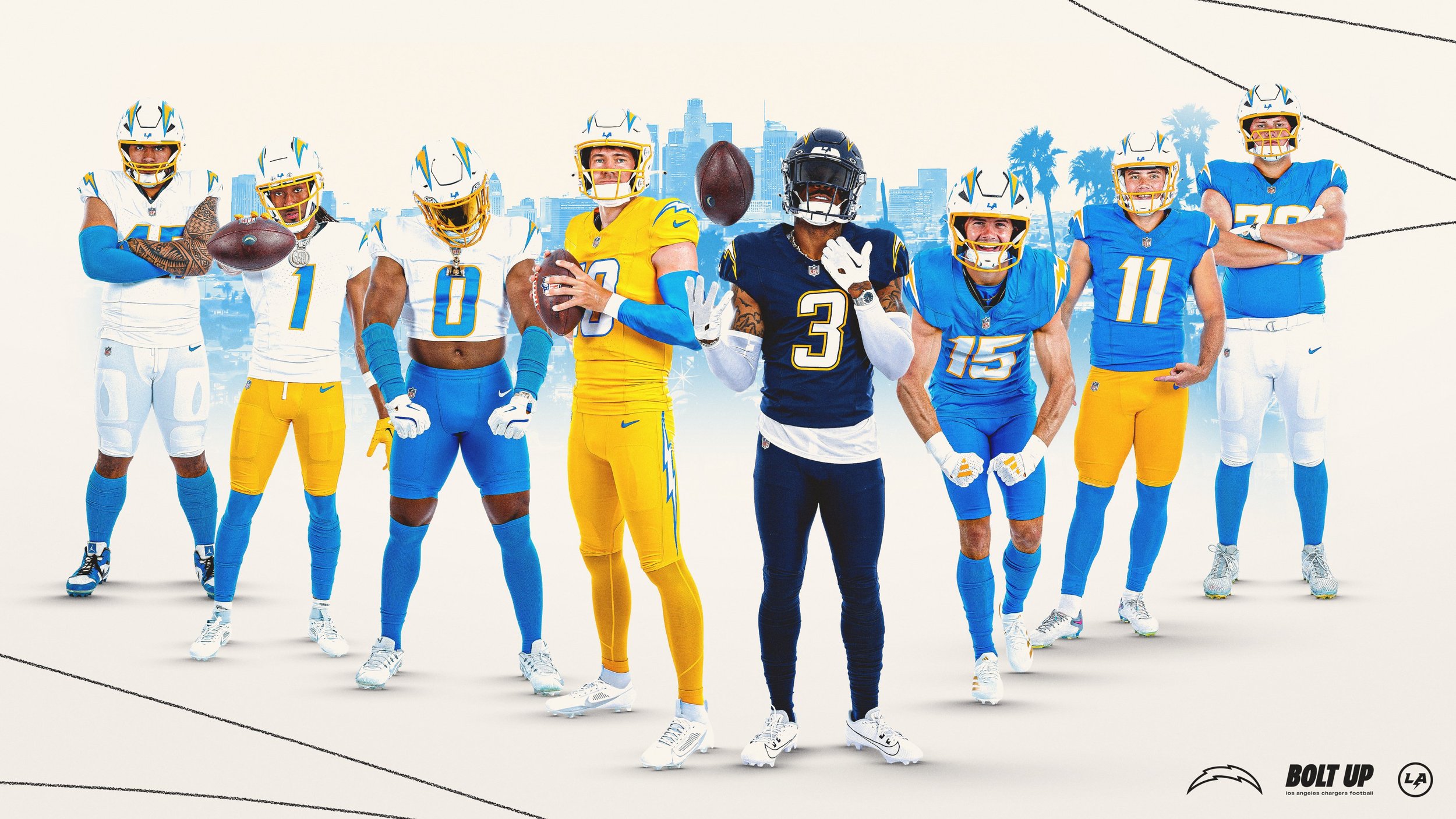
the Los Angeles Chargers delivered one of the boldest uniform drops of the NFL offseason, unveiling two fresh alternate looks—“Charger Power” and “Super Chargers”—plus the long-awaited debut of powder blue pants to their primary kit.
From the revolutionary “Air Coryell” days of the late ‘70s to the hard-hitting navy era of the 2000s, the Chargers are tapping into their past while adding a serious dose of modern swag.
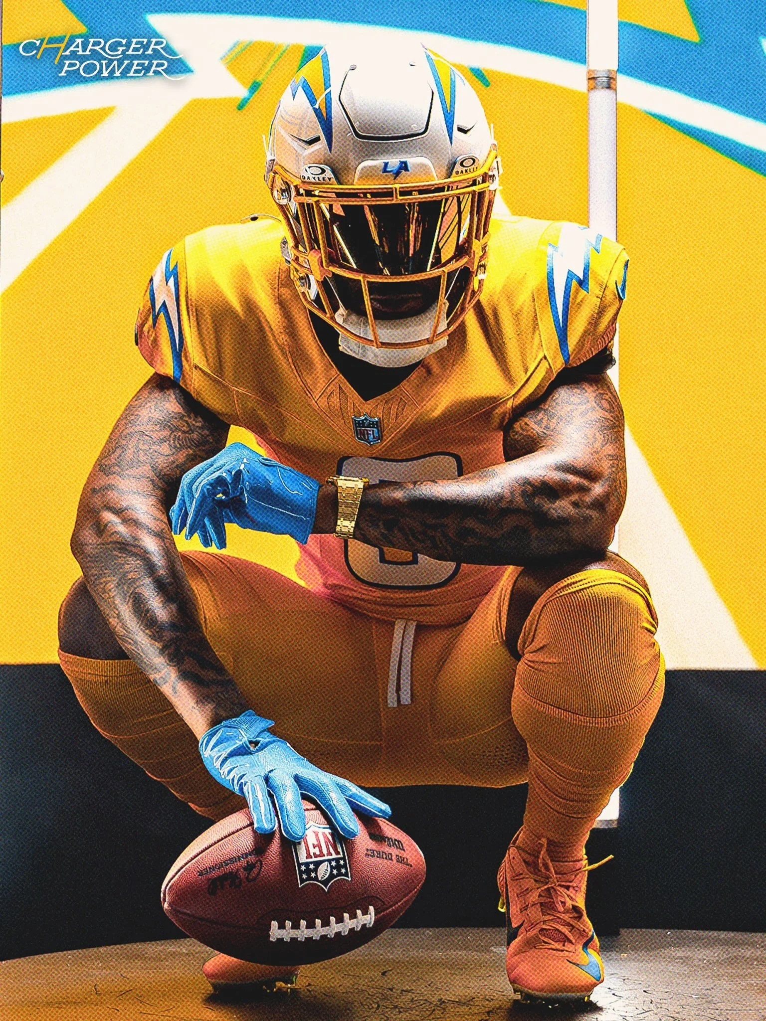
For the first time in franchise history, the Bolts are going gold—and they’re doing it right.
Dubbed Charger Power, this new alternate uniform features a vibrant gold jersey, paired with gold pants and the team’s current white helmet. It’s a bold look that honors the energy of the Air Coryell era, when Hall of Famer Dan Fouts and his legendary trio of Winslow, Joiner, and Jefferson transformed the game.
The gold jersey pops with white numbers outlined in powder blue, and the phrase Charger Power stitched on the collar adds an era-defining touch. Though gold jerseys have been sold in retail before, this is the first time the team will take the field in them—specifically in Week 7 against the Colts for Legends Weekend at SoFi.
From Derwin James Jr. to Tuli Tuipulotu, current Chargers are hyped:
“If you’re going to do gold, the way we did it with all gold, it looks amazing,” said James. “Once I put it on, it looked amazing. It’s one of my favorites. It’s fire,” added Tuipulotu.
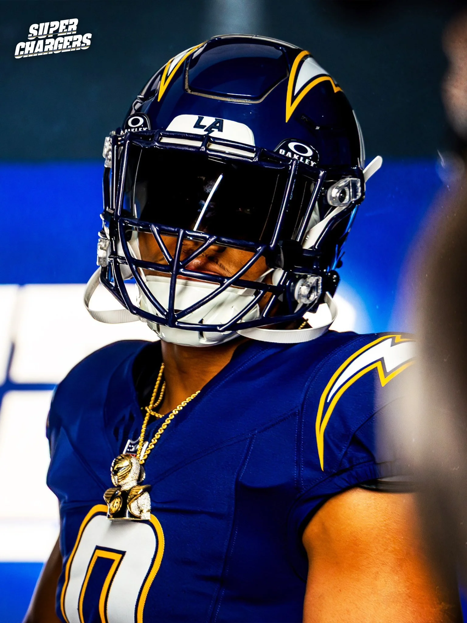
Next up: a return to one of the most iconic looks in franchise history.
The Super Chargers uniform is a full navy-on-navy set—helmet, jersey, and pants—all updated with modern cuts while staying true to the look worn by Chargers legends like LaDainian Tomlinson, Junior Seau, Rodney Harrison, Antonio Gates, and Shawne Merriman.
The navy helmet features the bolt, now more streamlined, along with a player’s number on the side—a clean nod to the early 2000s. The jersey is loaded with detail: white numbers trimmed in gold, smaller bolts on the shoulders, and Super Chargers stitched across the collar.
“When we came out in those navies, you knew what time it was,” Merriman said. “That jersey meant pain for the other team.”
The Chargers will debut the Super Chargers look at home in Week 8 vs. the Vikings. The navy set returns again in Week 13 against the Raiders.
Rounding out the drop: powder blue pants are officially part of the Chargers’ primary uniform kit.
While the Bolts have already dominated with their powder blue tops since the 2020 redesign, fans and players alike have been asking: Where are the powder blue pants?
Now, they’re here—and they look clean.
“They are sick,” said kicker Cameron Dicker. “All the blue just looks so good.”
These pants can now be paired with either the home powder blue jerseys or the road white tops, adding more versatility to what is already widely regarded as one of the best uniform sets in the league.
From top to bottom, the Chargers have once again positioned themselves as trendsetters in NFL uniform culture.
Three distinct looks. All tied to moments that made the franchise legendary. And now, they’re ready to make new memories—in gold, navy, and powder blue.