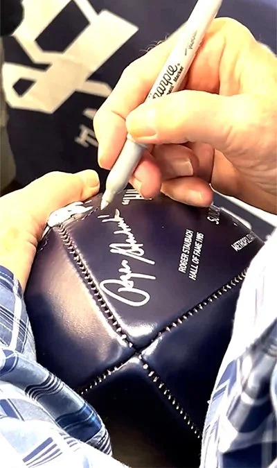
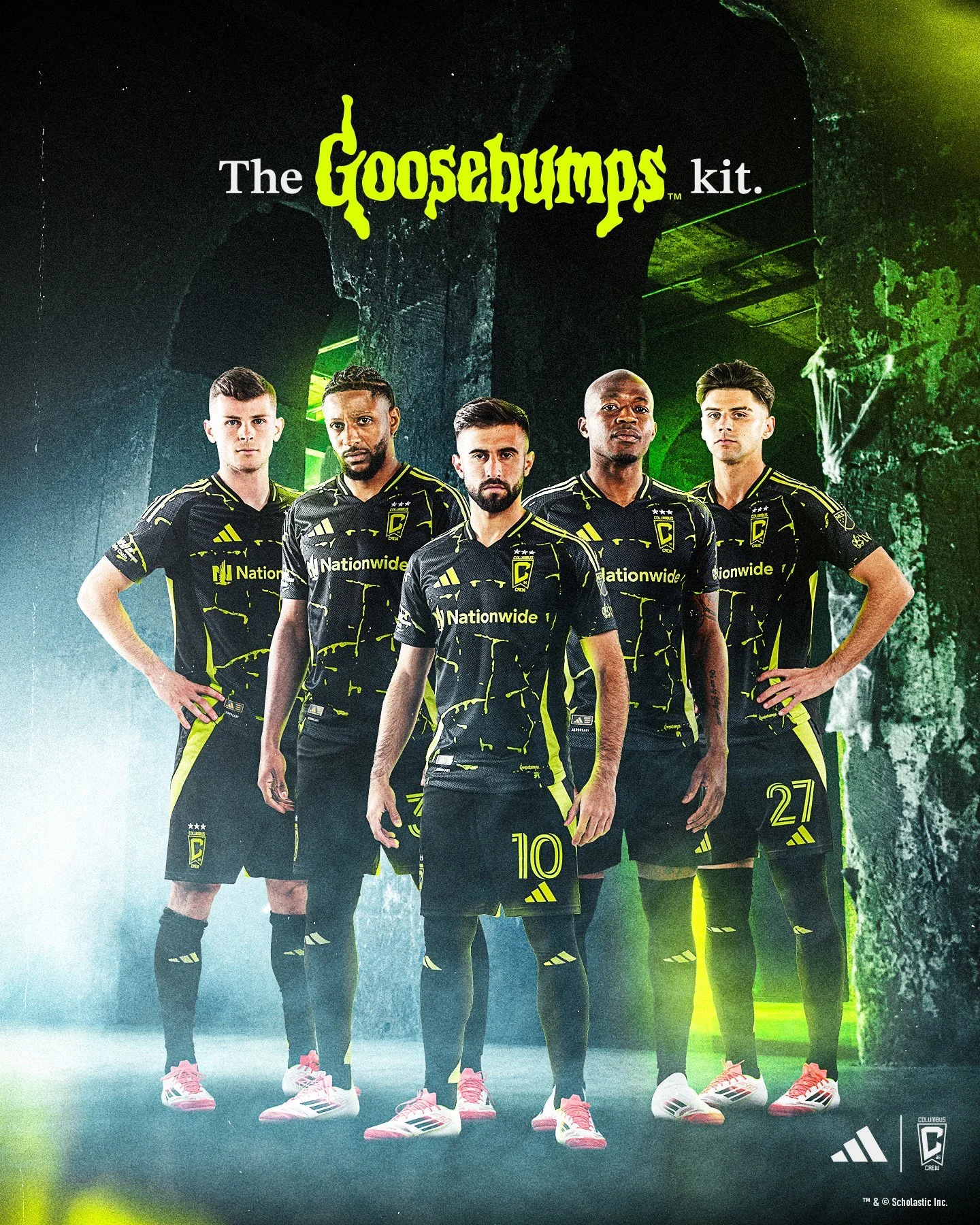
The University of Maryland football team has revealed their new team facilities. The Jones-Hill House is the latest state-of-the-art football facility to enter the college football world. The strength and condition area boasts 22 custom weight racks that include Perch video technology, which serves as a coaches eye to capture reps and speed of movement. The 24,000 square feet area features custom flooring as well as 40 yards of turf for different developmental work. The new locker room will have over 120 individual lockers with each featuring a recliner with ottoman, a custom turtle shell wireless phone charger and vents in all storage spaces to cool and dry gear. The players lounge is highlighted by custom pool table, a barber shop, a recording studio, and custom furniture throughout. Take look at the photos below to see all the custom and unique features of the Jones-Hill House for Maryland football.
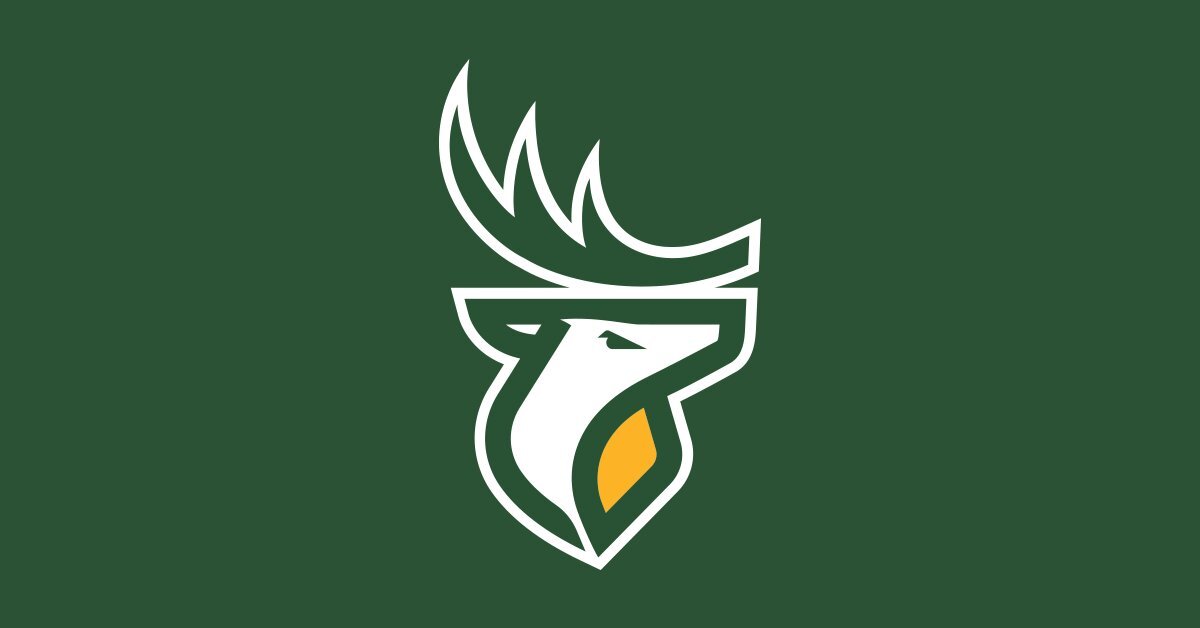
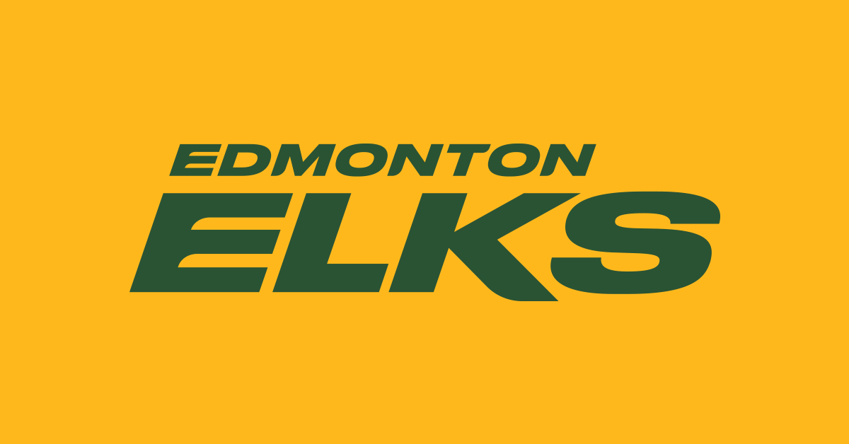
The Edmonton CFL team has released their new team name and logos. The team has transitioned away from the Edmonton Eskimos and will now be known as the Edmonton Elks. The new name received input from fans, players and coaches which saw the Elks name receive highest approval from each group. The team will keep their same green and gold colors while adding new marks. The elk logo will serve as the primary logo for the team and be on display at midfield for home games. While the team will have have a few new secondary logos, they are keeping the double EE logo with a new updated treatment to fit within the new brand identity.
“THE ENTIRE PROCESS HAS BEEN EXCITING. IT HAS ALLOWED US TO KEEP OUR ICONIC GREEN AND GOLD COLOURS AS WELL AS THE DOUBLE E, WHILE EXPLORING NEW OPPORTUNITIES WITH OUR NEW PRIMARY LOGO, SECONDARY LOGO AND WORDMARK. THIS MERGING OF THE OLD AND THE NEW ALLOWS US A CONTINUATION OF OUR GREAT HISTORY AND TRADITION. LISTENING TO EVERYONE THROUGH ENGAGEMENT SLOWED THE PROCESS BUT TAKING THE TIME TO LISTEN ALLOWED US TO BE RIGOROUS, AND THOUGHTFUL IN OUR PURSUIT OF EXCELLENCE. THE NAME WAS ULTIMATELY CHOSEN BY THE FANS. ‘ELKS’ FINISHED FIRST OR SECOND AMONG ALL SEGMENTS WHO PARTICIPATED. WE ARE LOOKING FORWARD TO PRESERVING OUR HERITAGE AND COMBINING THAT WITH THE OPPORTUNITIES TO USHER IN A NEW NAME AND NEW BRAND. PLEASE JOIN US IN PROTECTING AND HONOURING THE PAST, AND DEVELOPING THE FUTURE.” - CHRIS PRESSON, PRESIDENT AND CEO OF THE EDMONTON ELKS
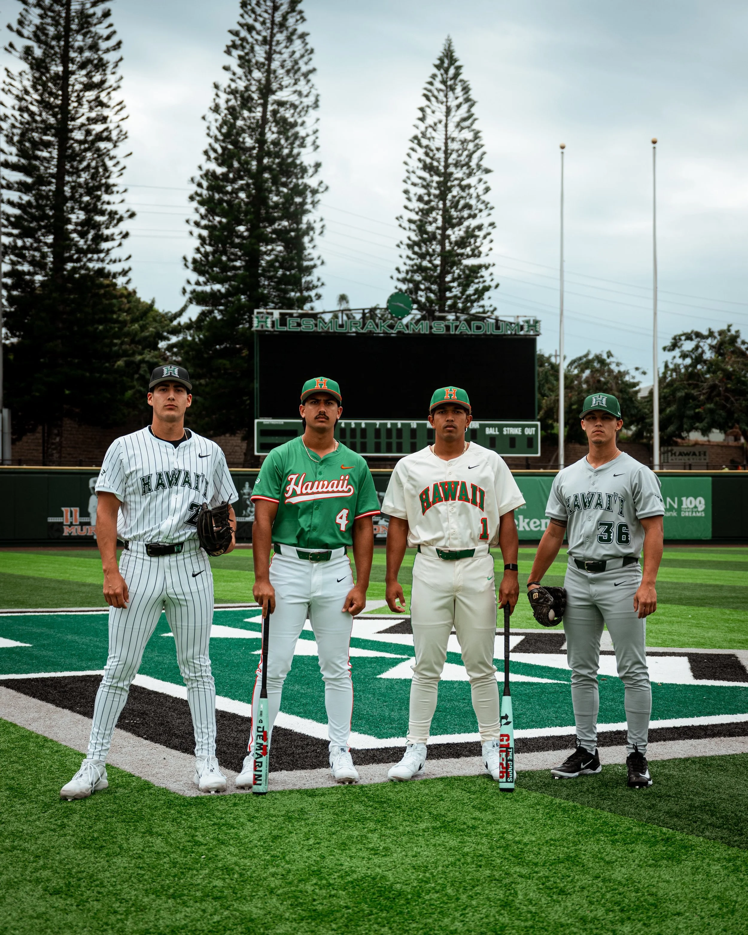
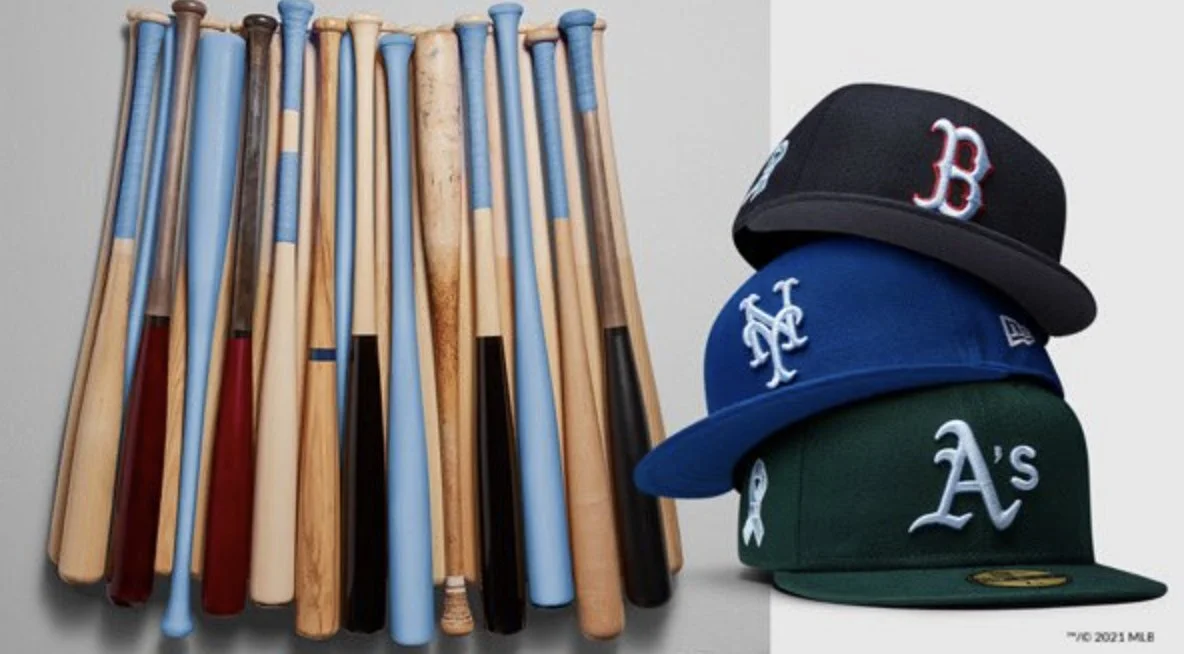
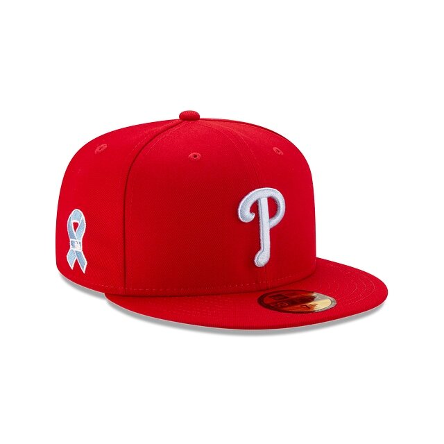
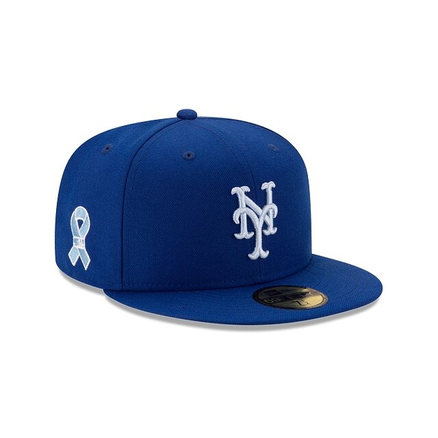
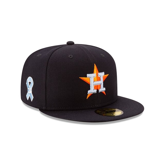
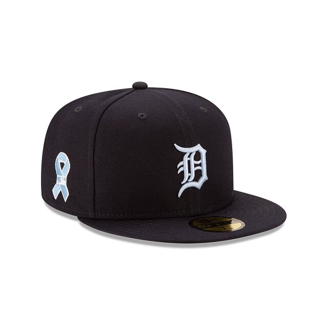
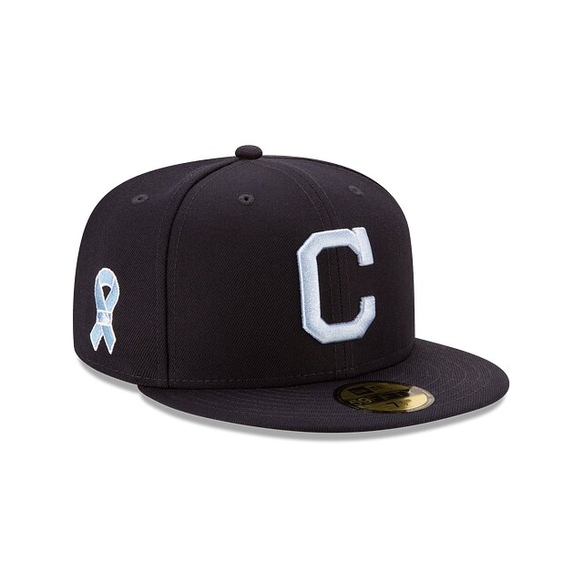
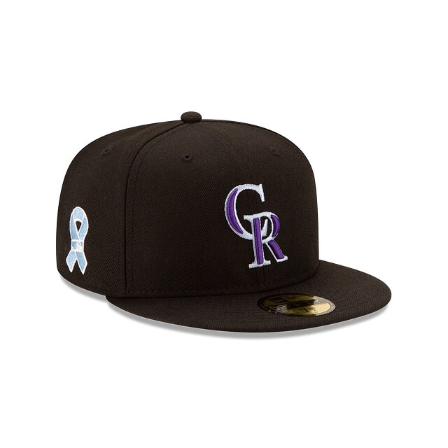
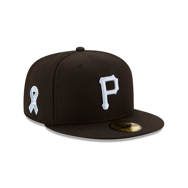
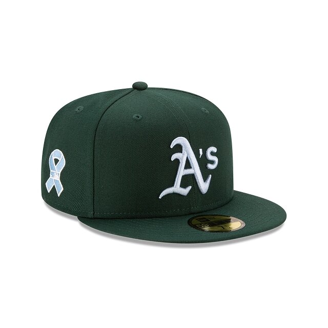
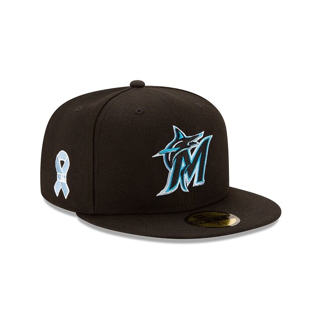
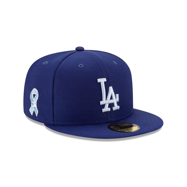
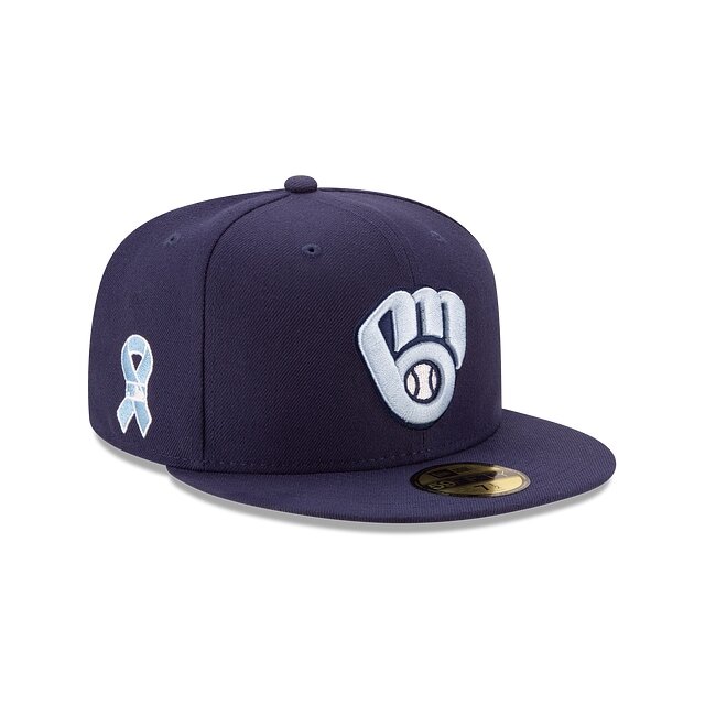
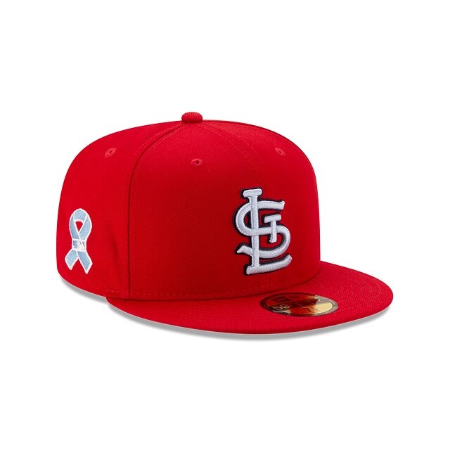
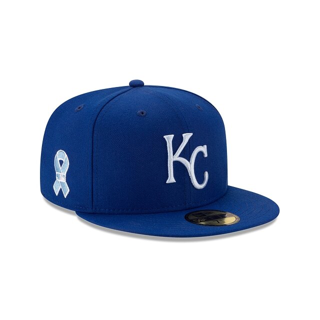
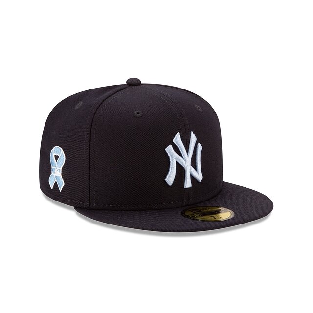
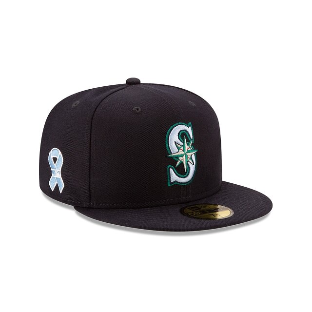
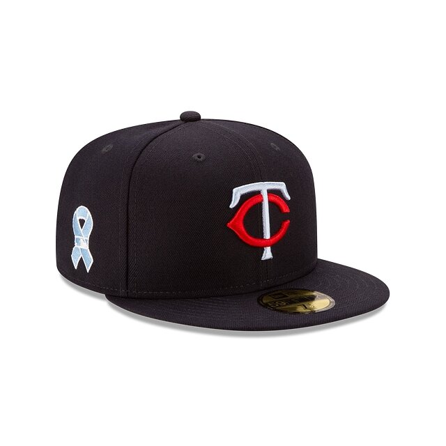
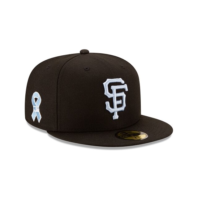
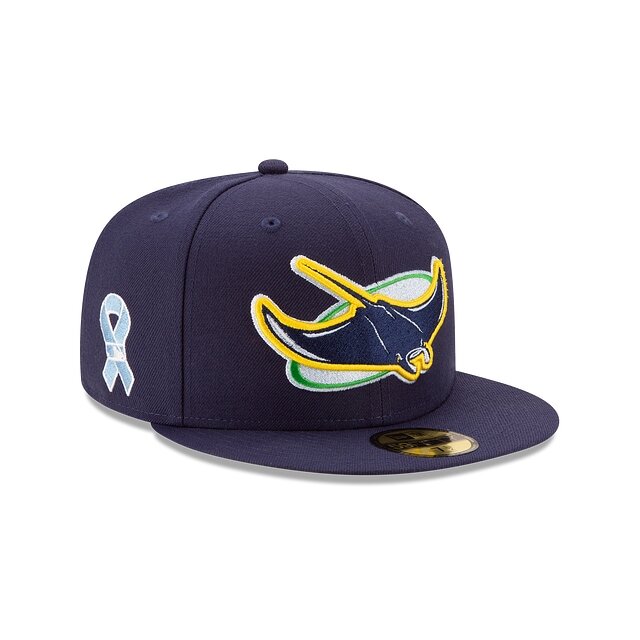
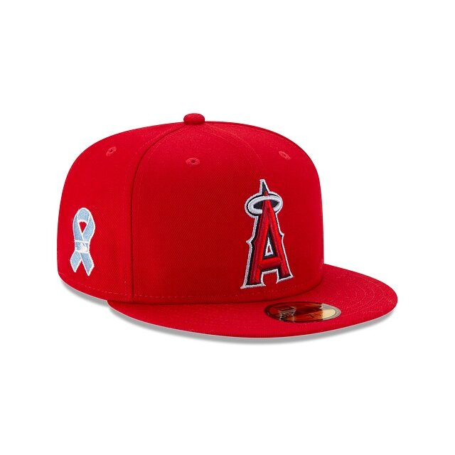
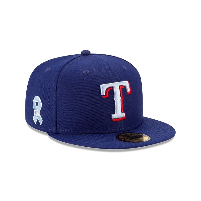
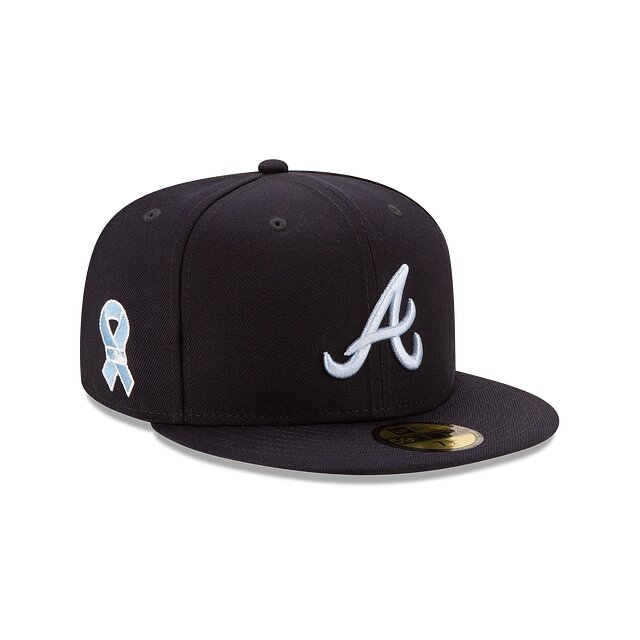
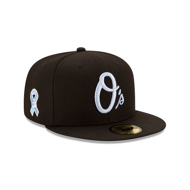
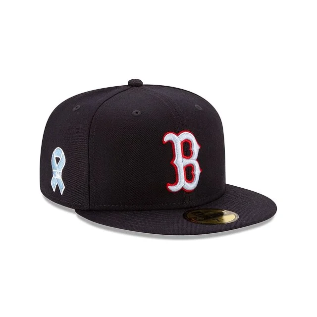
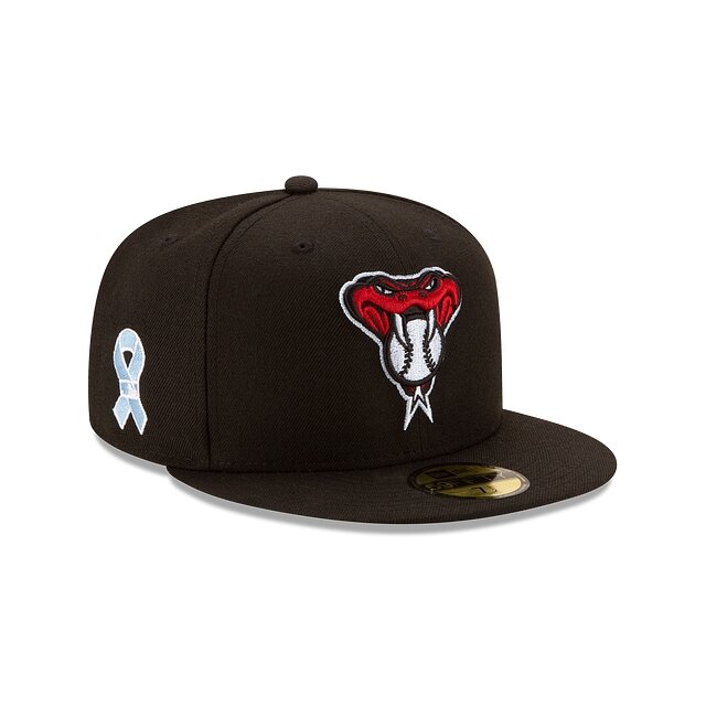
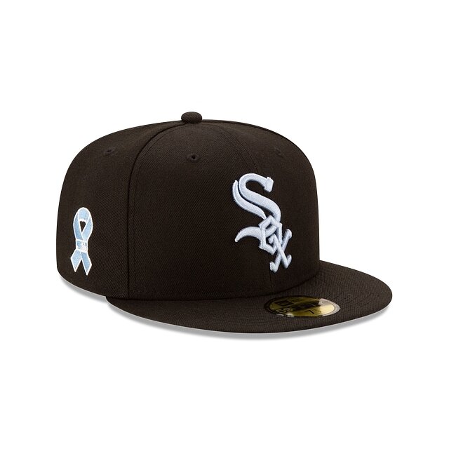
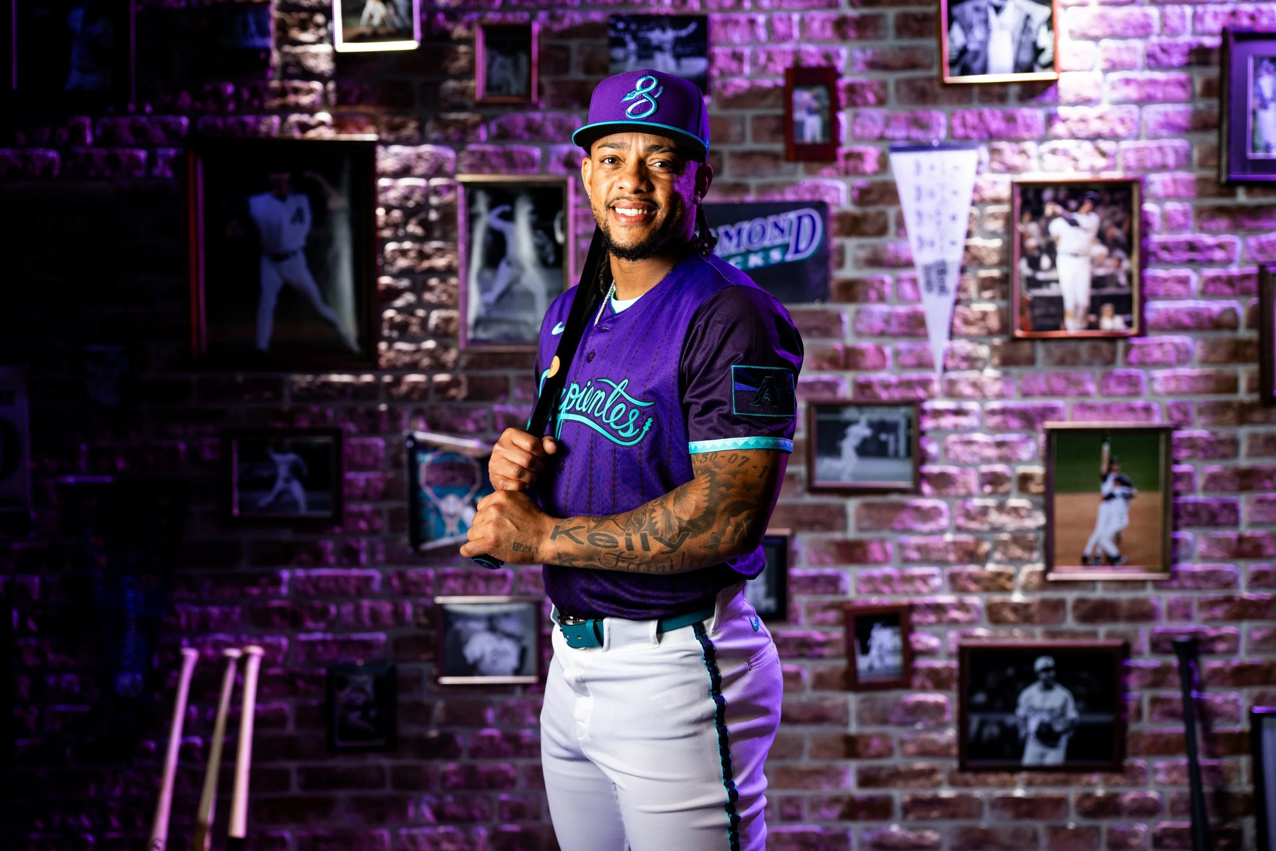
The MLB has revealed the 2021 Father’s Day hats for each team. The hat will feature the team’s main color with a blue logo on the front. The side of the cap features a blue ribbon with the MLB logo within it. Take a look at each of the team’s Father’s Day hats below.
— Cannons Lacrosse Club (@PLLCannons) May 24, 2021
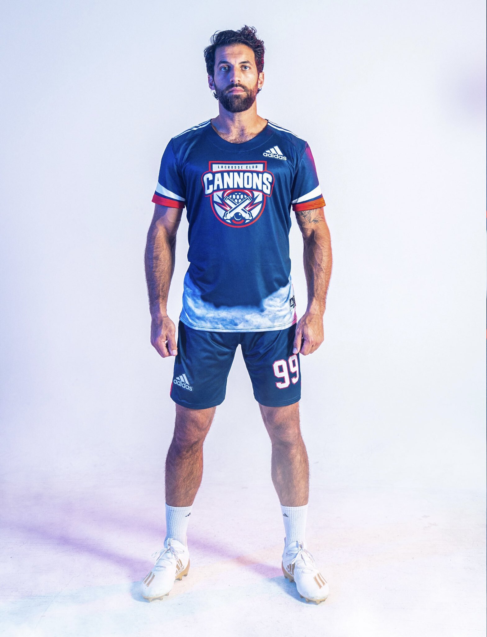
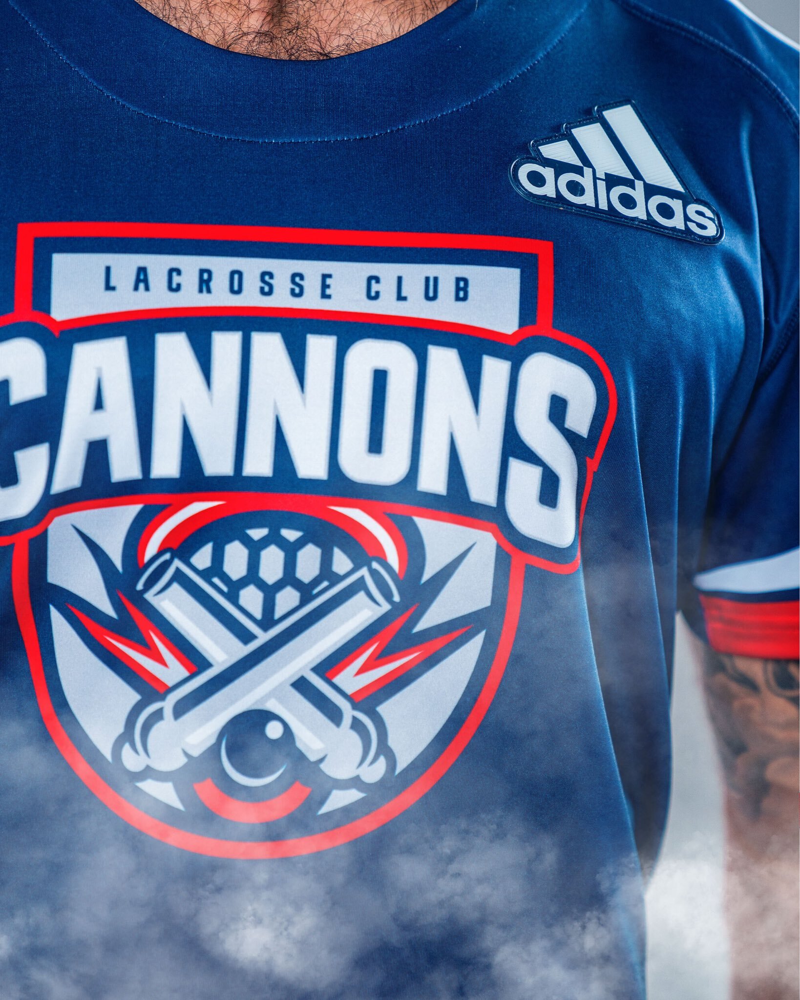
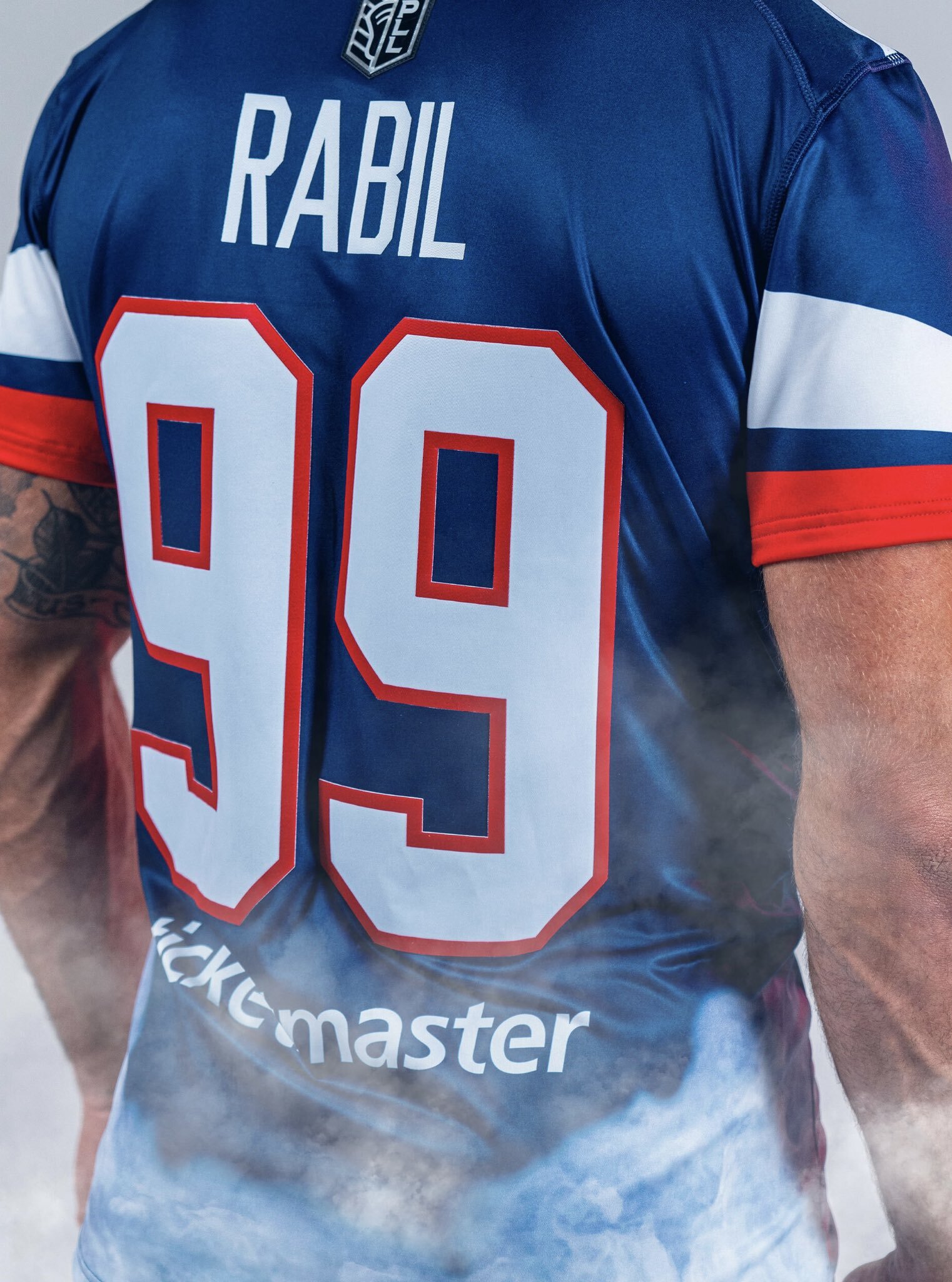
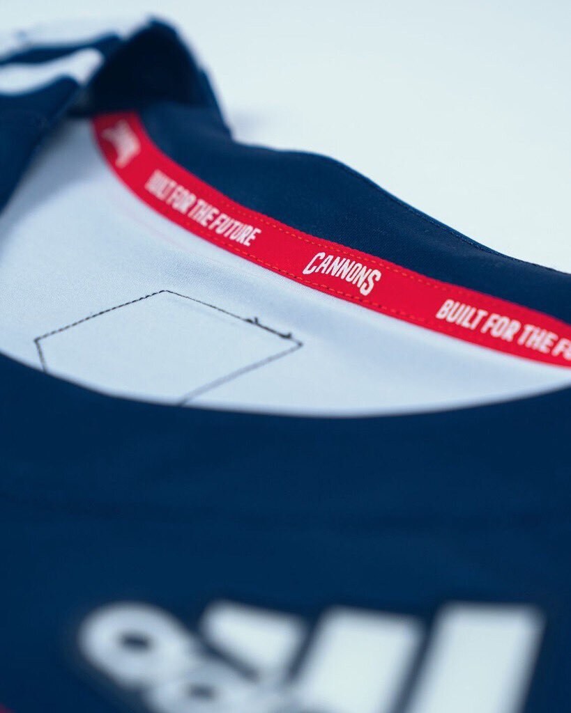
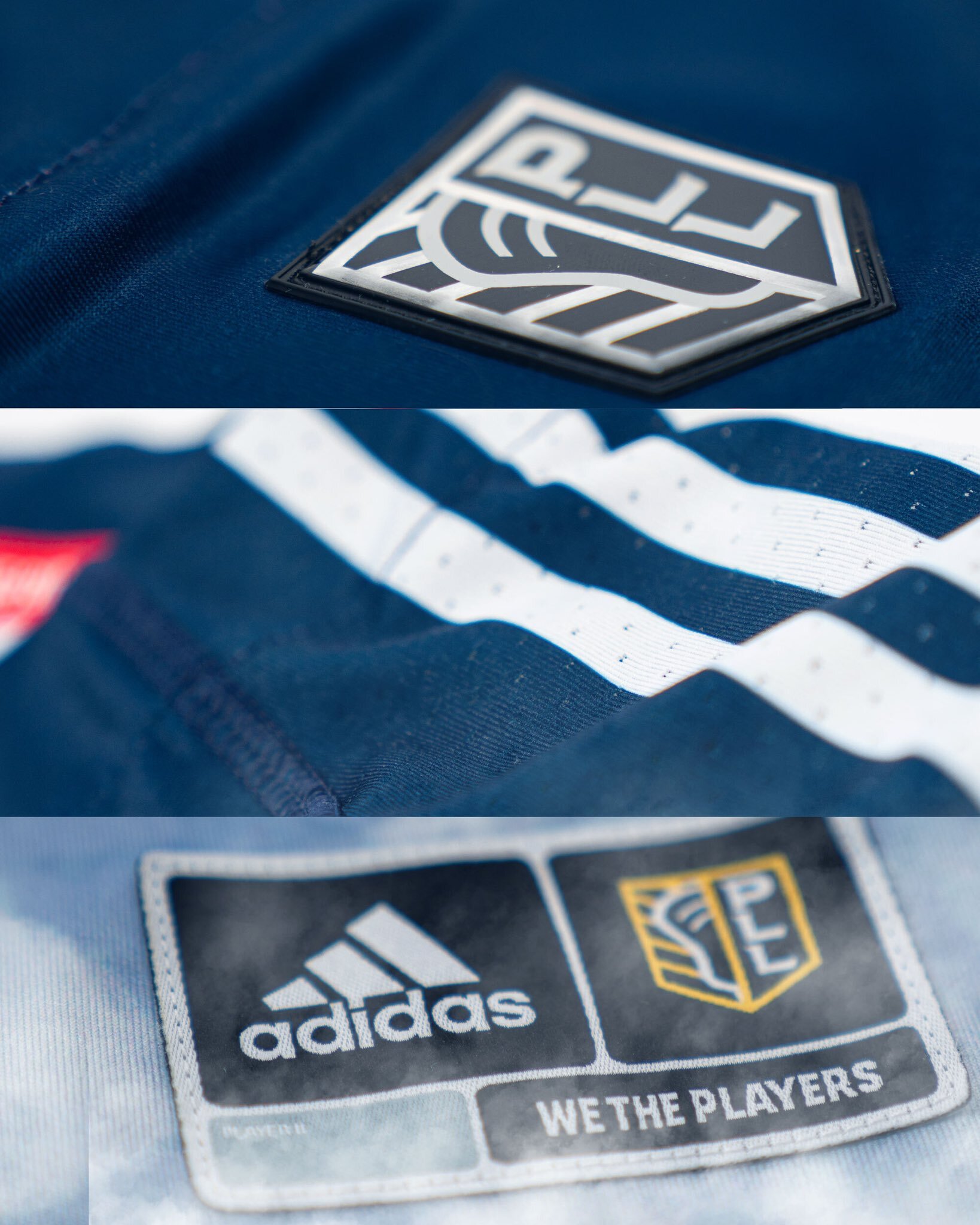
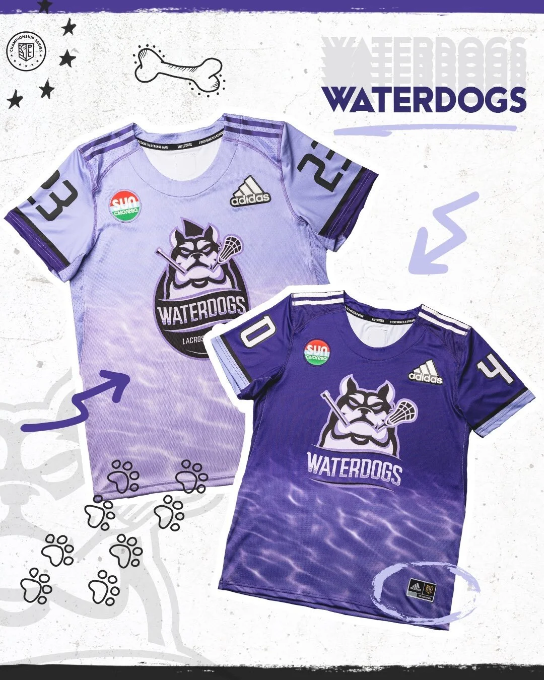
The Cannons Lacrosse Club has released their new uniform set for the upcoming season. The team will have a new blue and white uniform that features the Cannons logo on the front with red, white and blue accents. The bottom of the jerseys has a unique pattern meant to resemble that of cannon smoke. The final details comes on the inside of the neckline with the saying “Built for the Future” alternating with the Cannons wordmark.
Primeblue jerseys, made with Parley Ocean Plastic, raising awareness for environmental issues and helping create sustainable communities. #GreenerGoalspic.twitter.com/D7UgDjIM8V
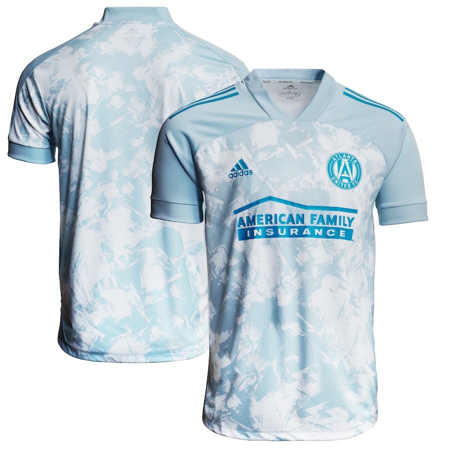
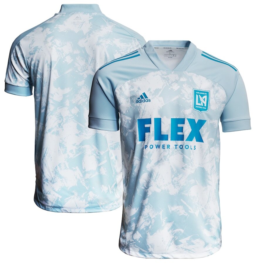
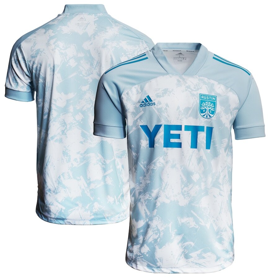
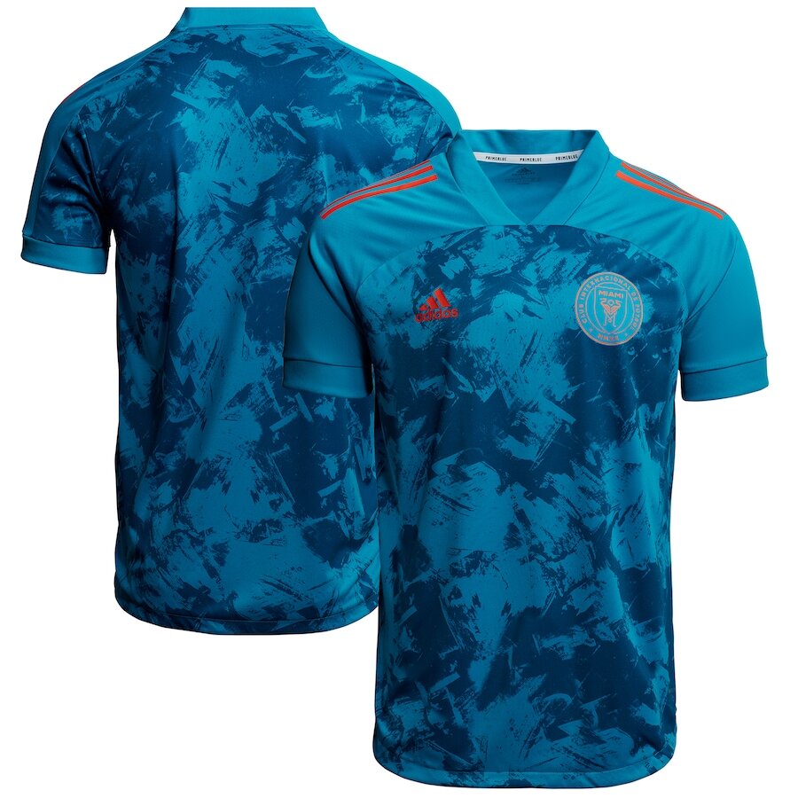
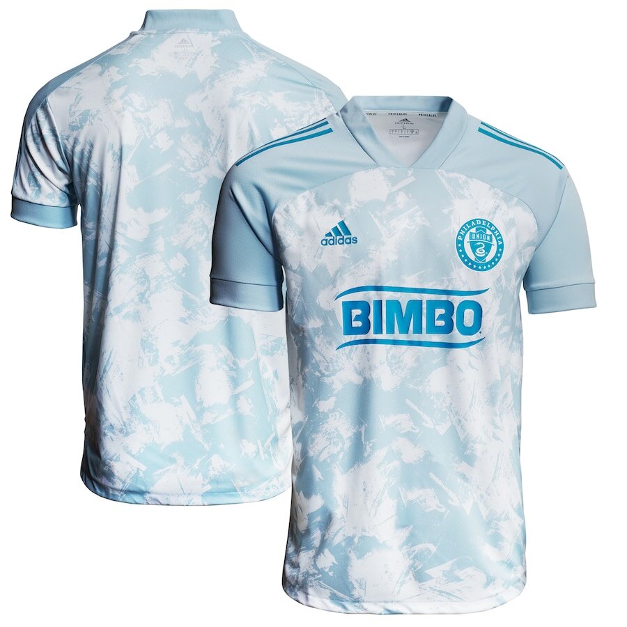
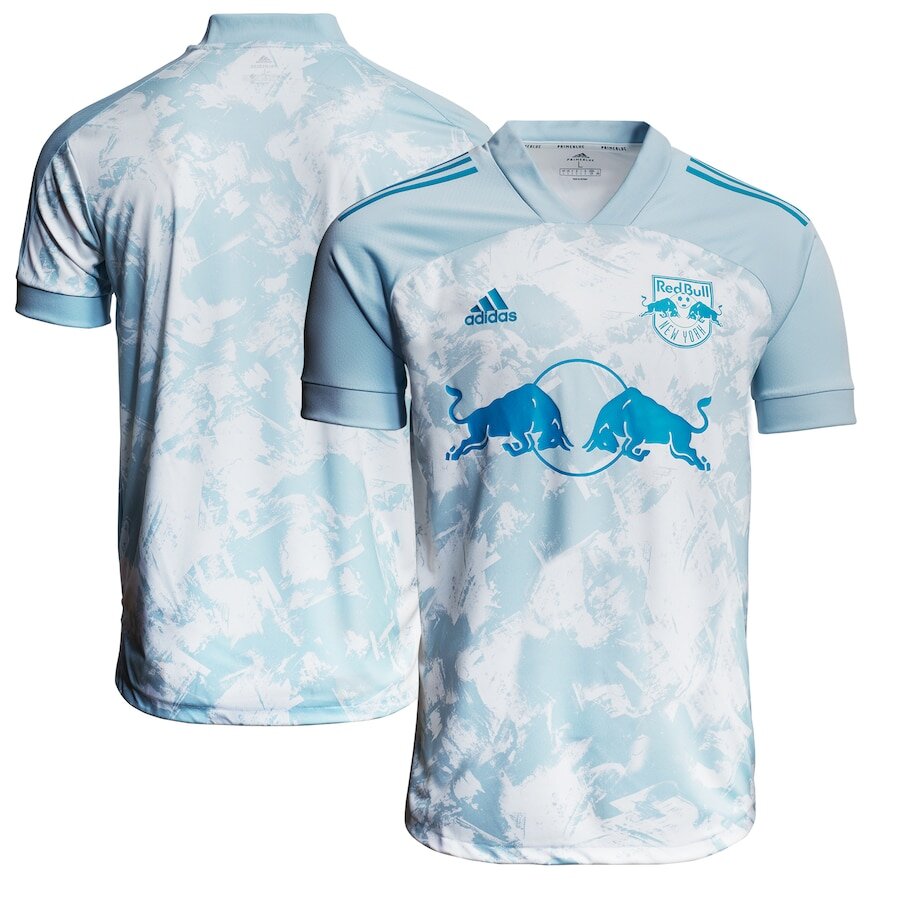
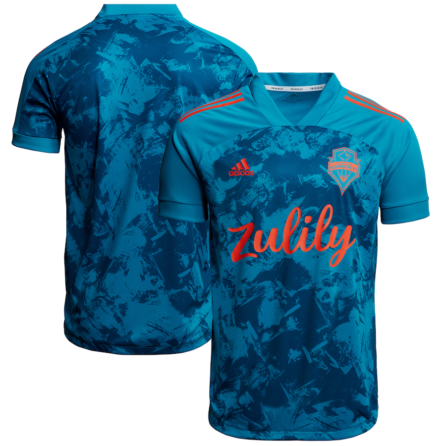
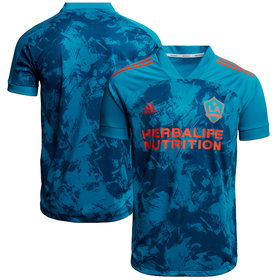
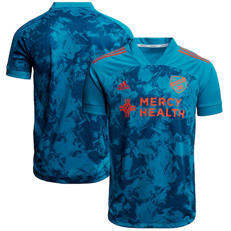
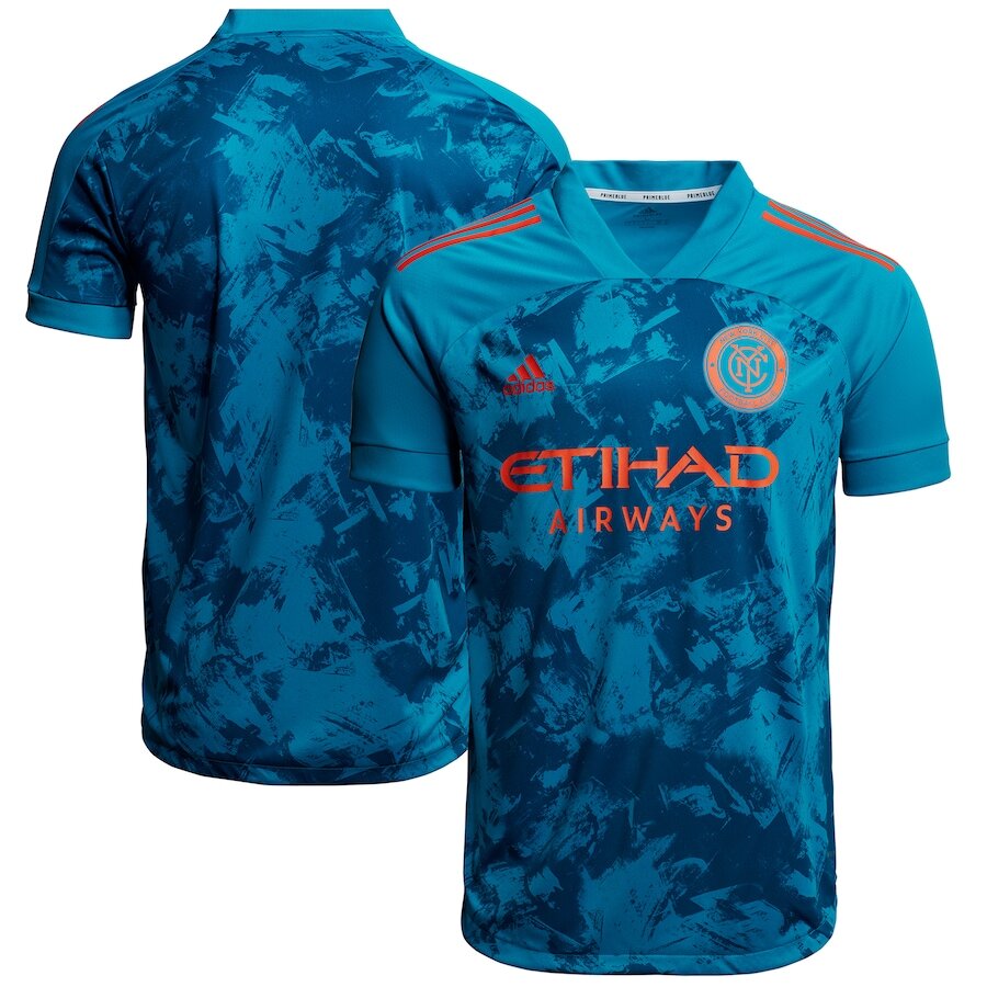
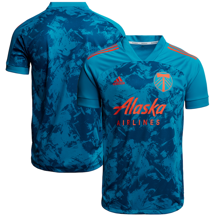
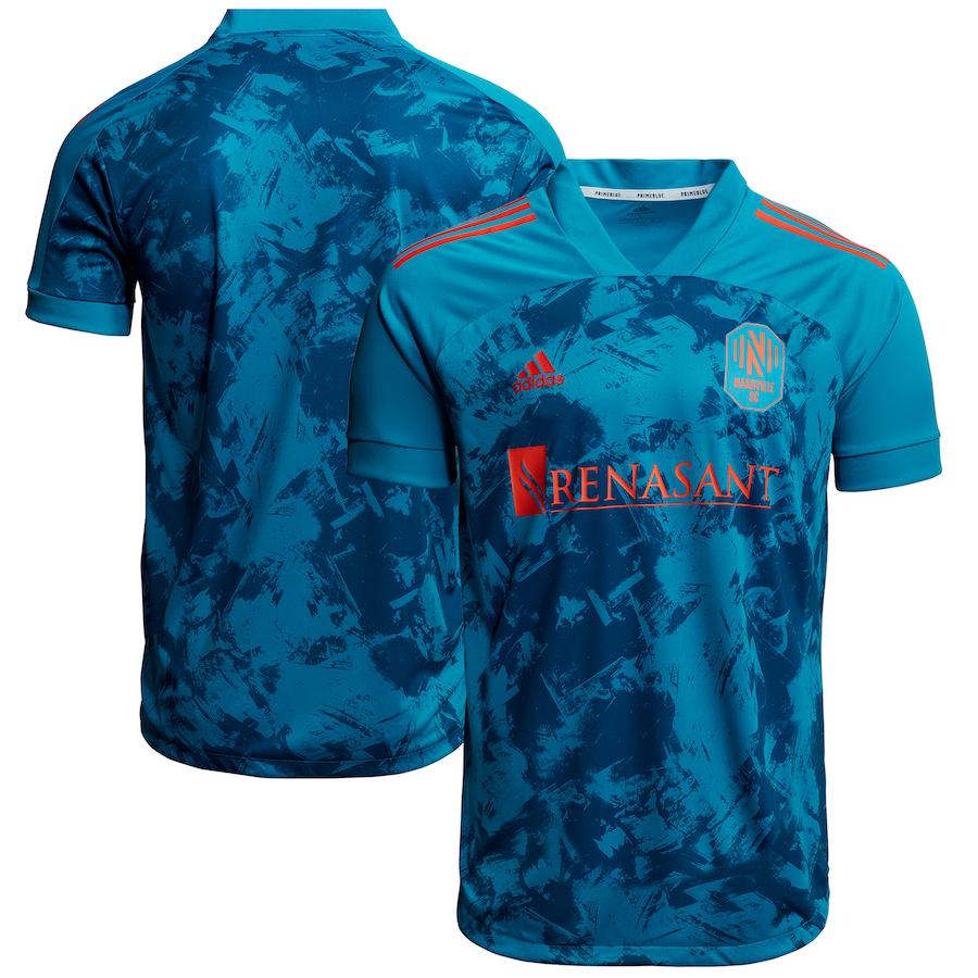
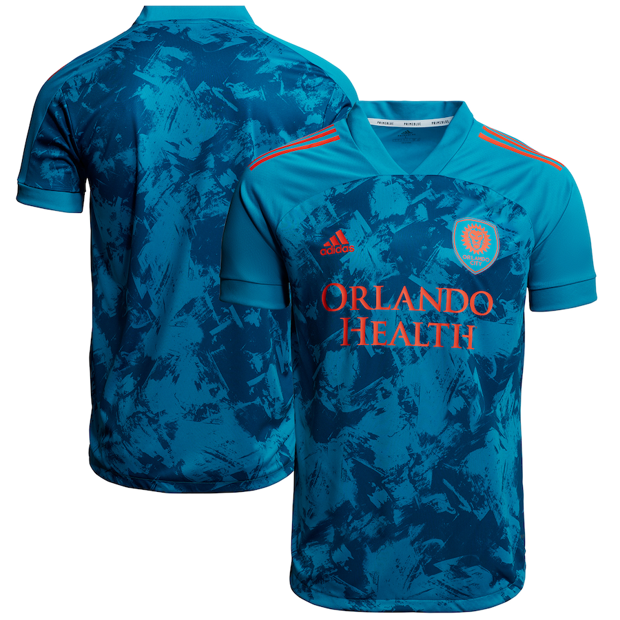
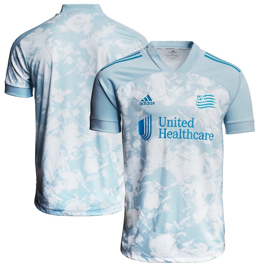
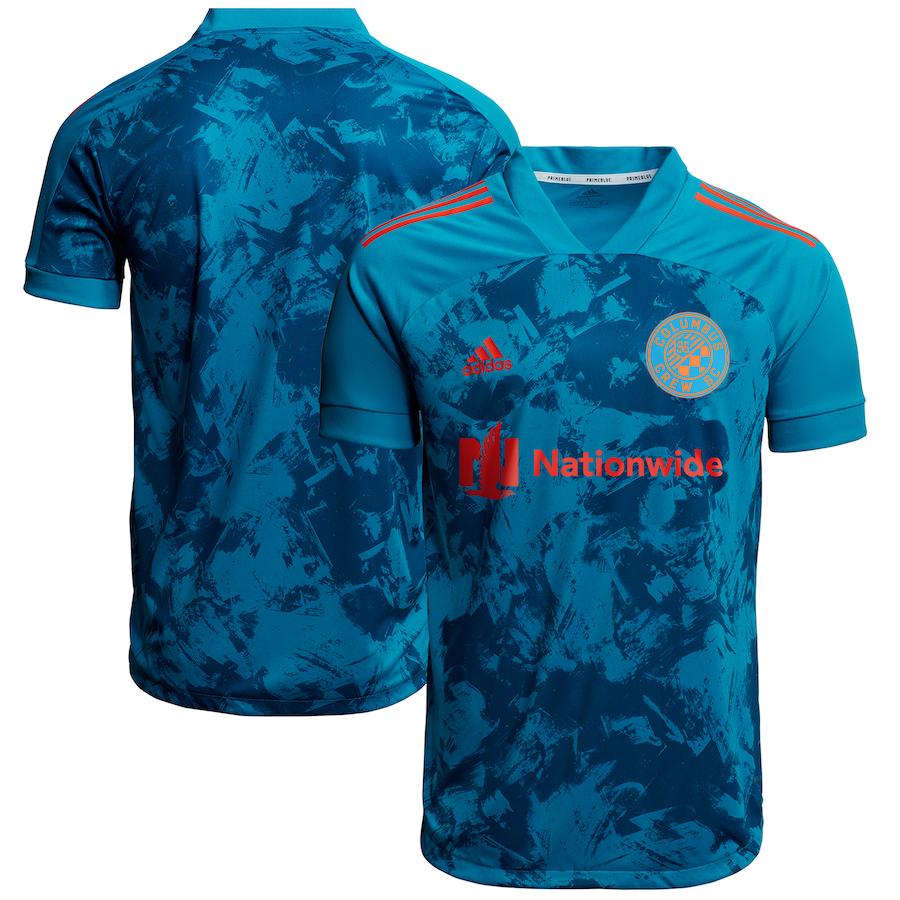
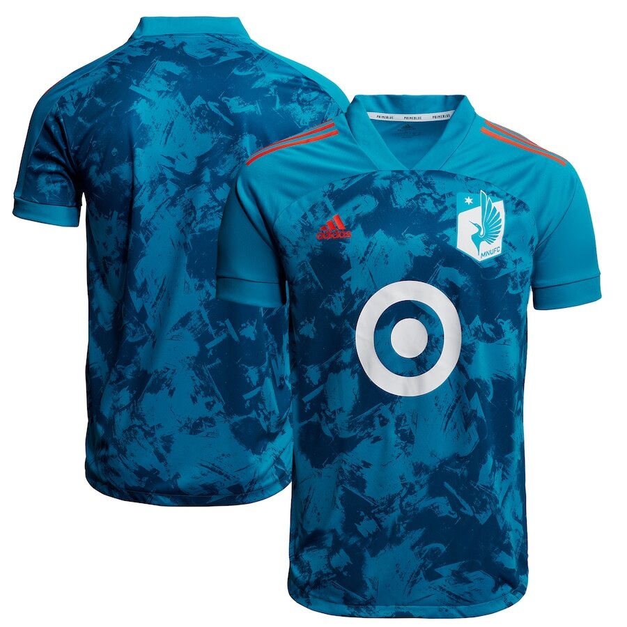
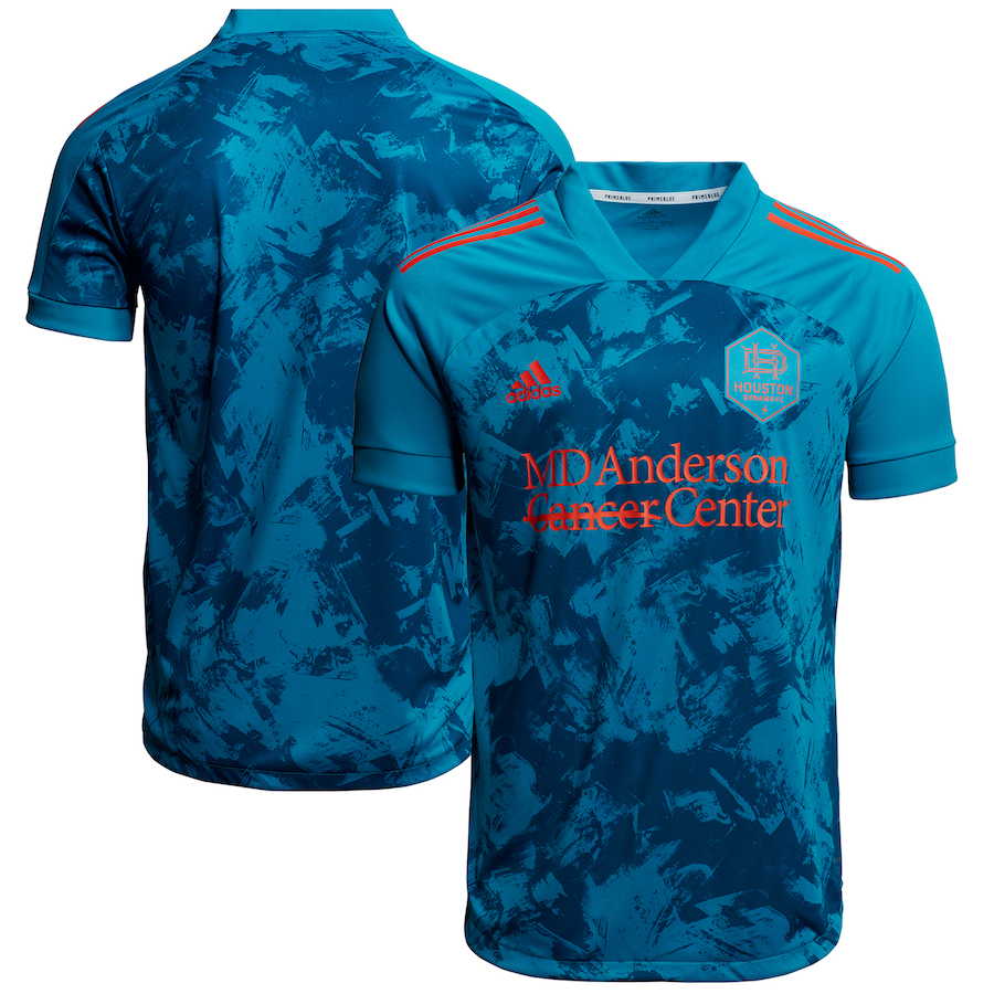
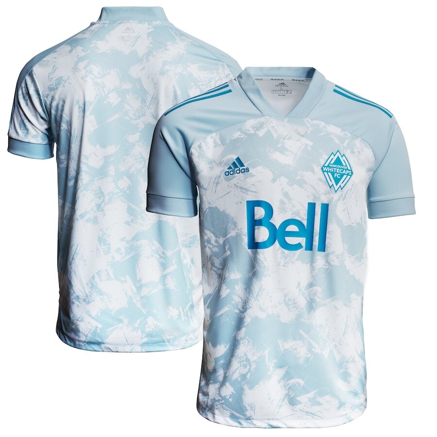
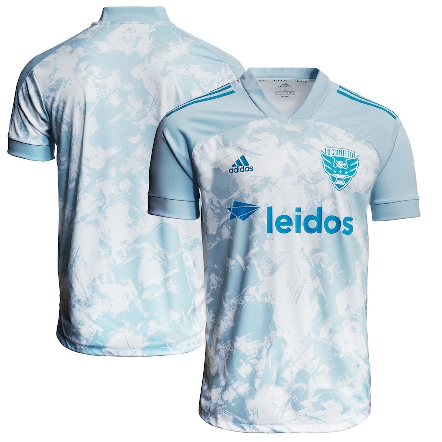
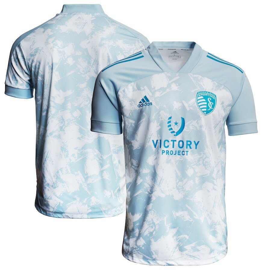
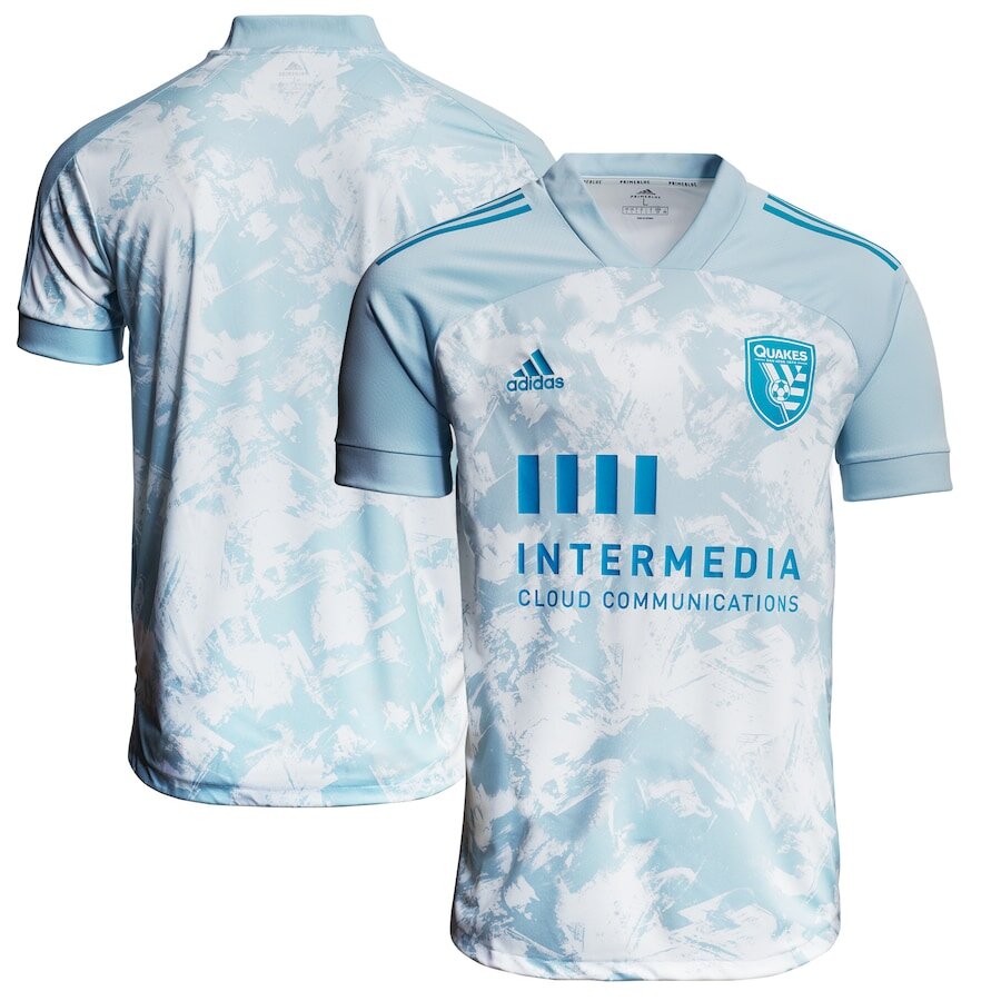
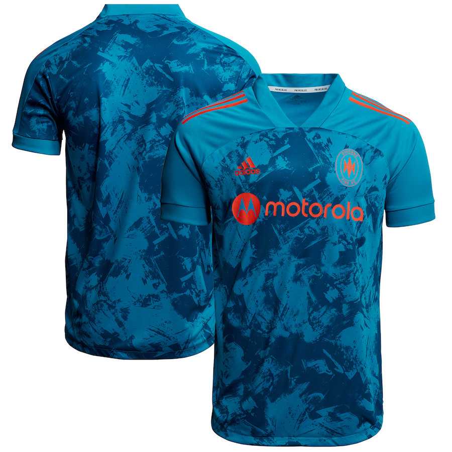
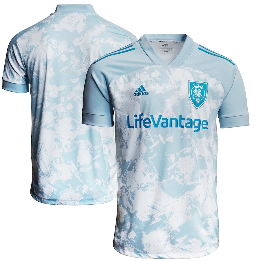
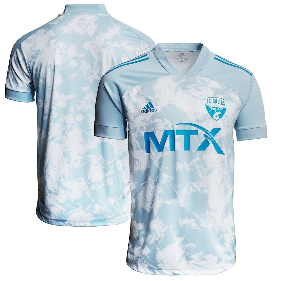
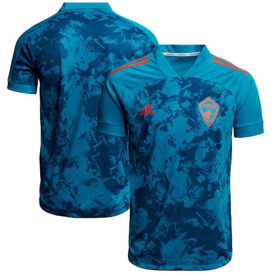
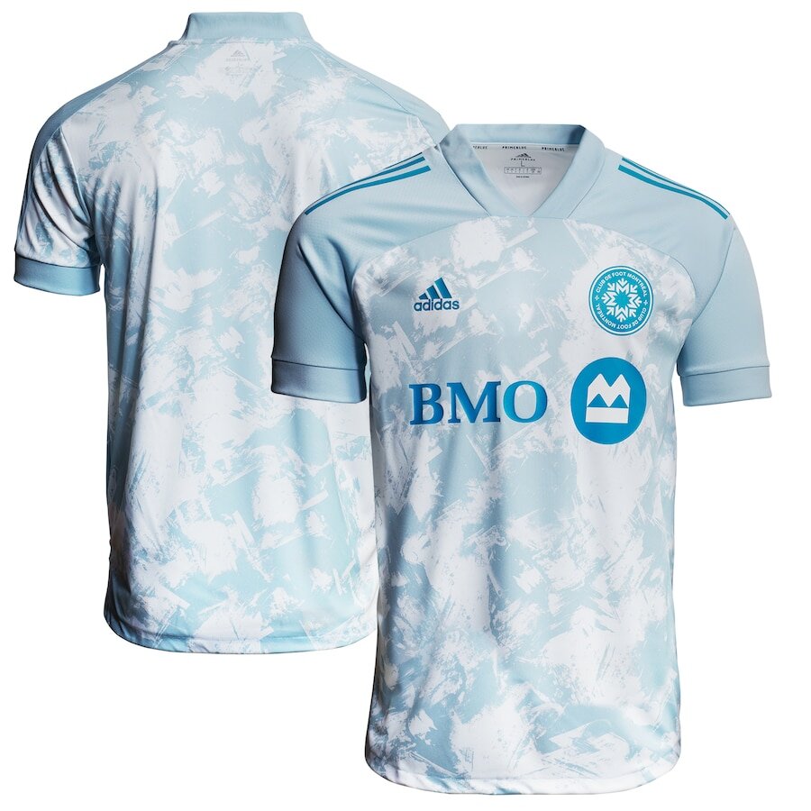
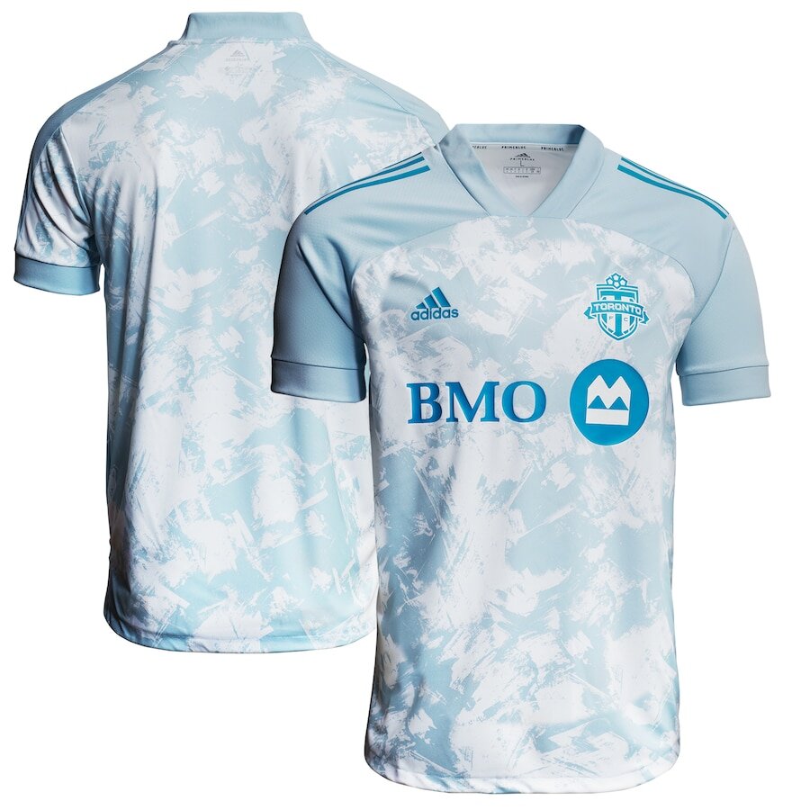
The MLS has released a special batch of jerseys for each of their teams to wear during their games on May 29 and 30. The jerseys dubbed “Primeblue” are the latest collaboration with Parley for the Oceans. The designs come in two different looks, half the teams will have a a white jersey with blue accents while the other teams will have blue jerseys with red accents.
The Primeblue is a high-performance yarn made with 50% Parley Ocean Plastic—upcycled plastic waste intercepted on shorelines and coastal areas, preventing it from polluting our oceans. MLS and adidas Primeblue kits are one of the many ways the league raises awareness for environmental issues and helps to create sustainable communities as part of MLS WORKS’ year-long Greener Goalsinitiative.
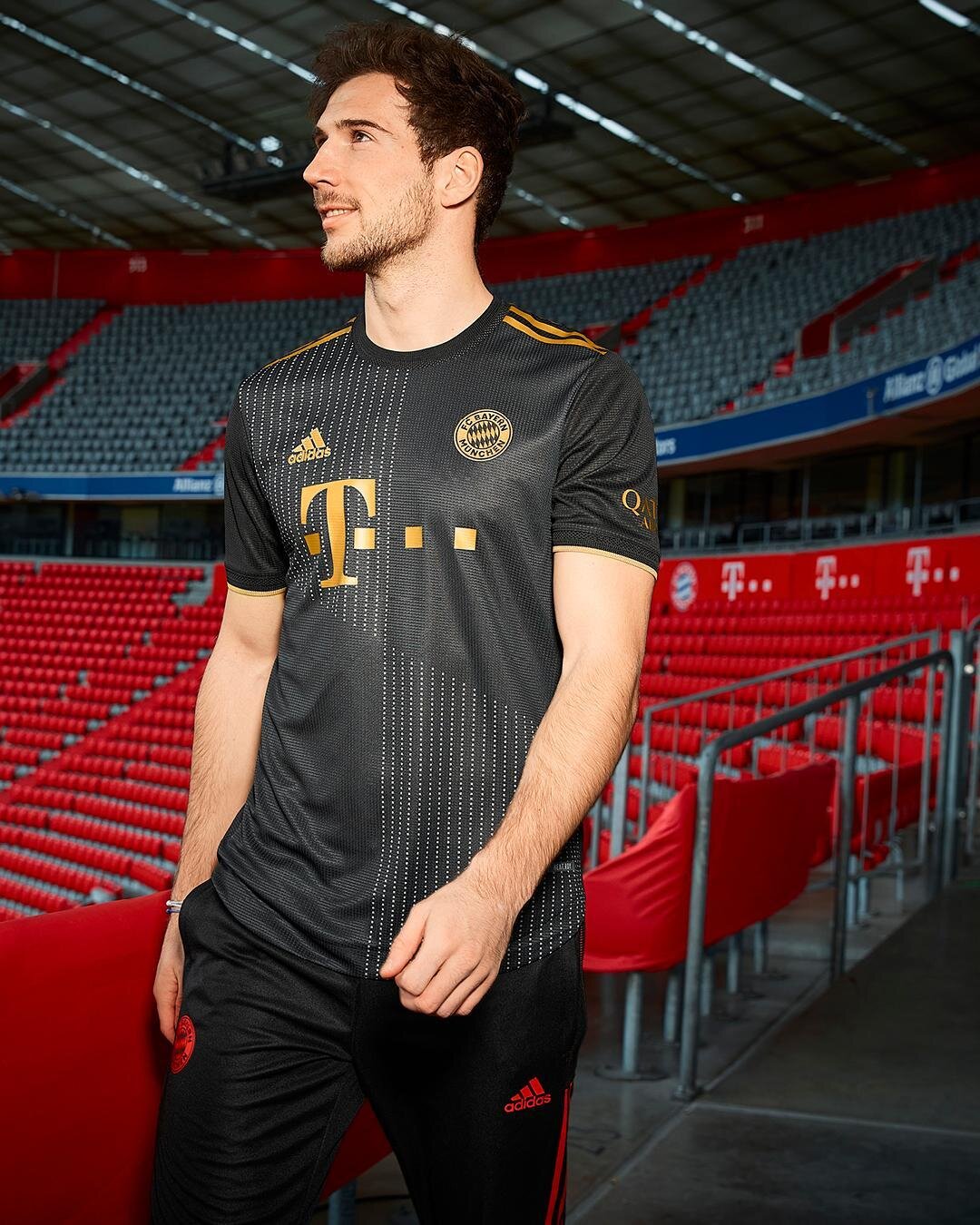
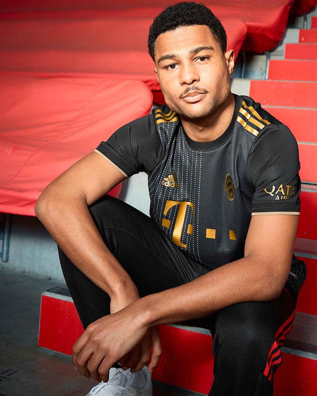
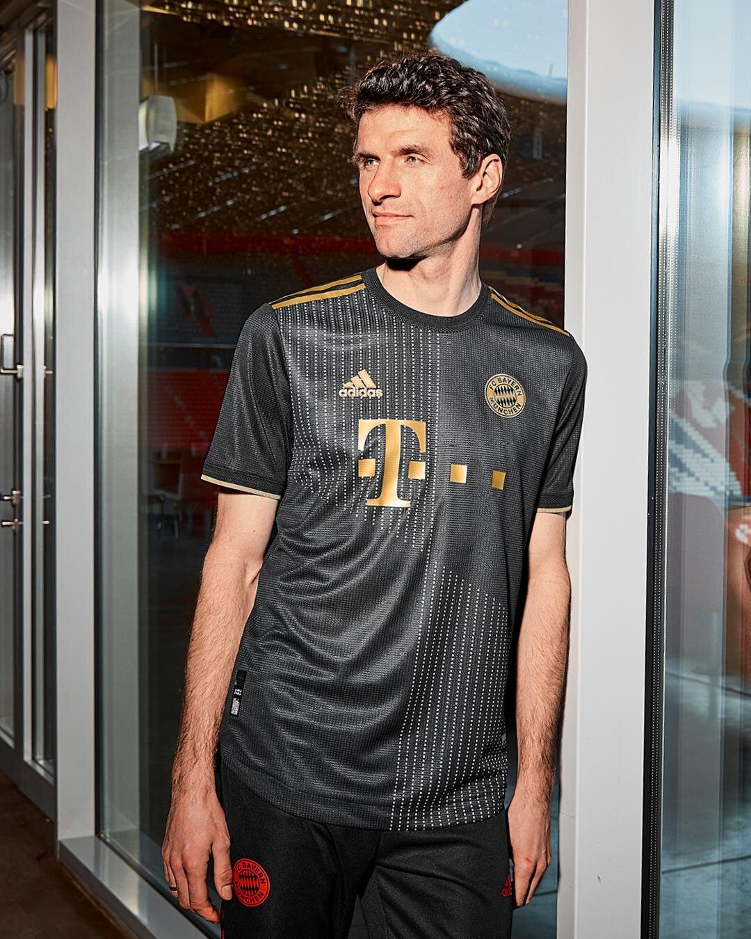
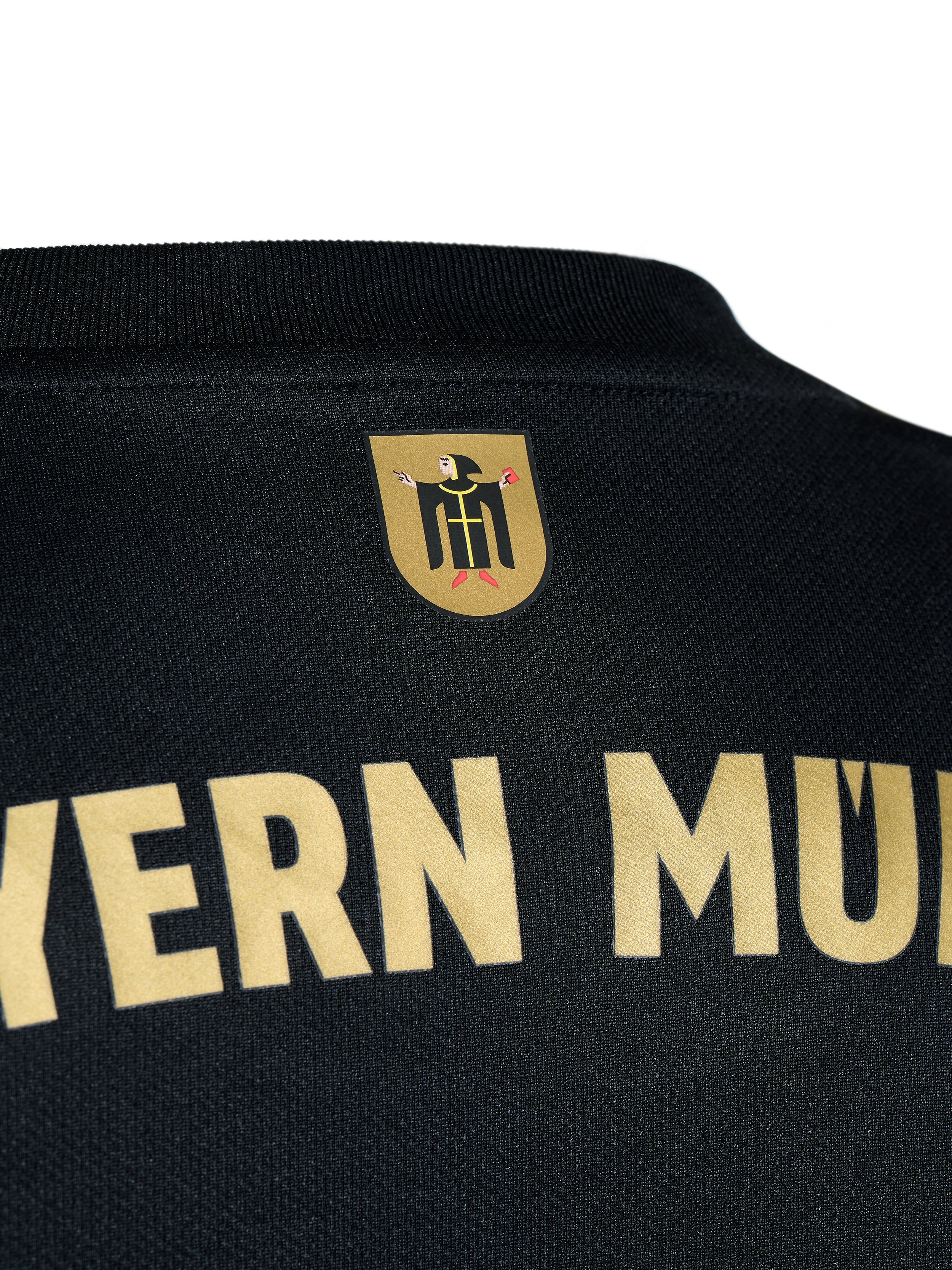
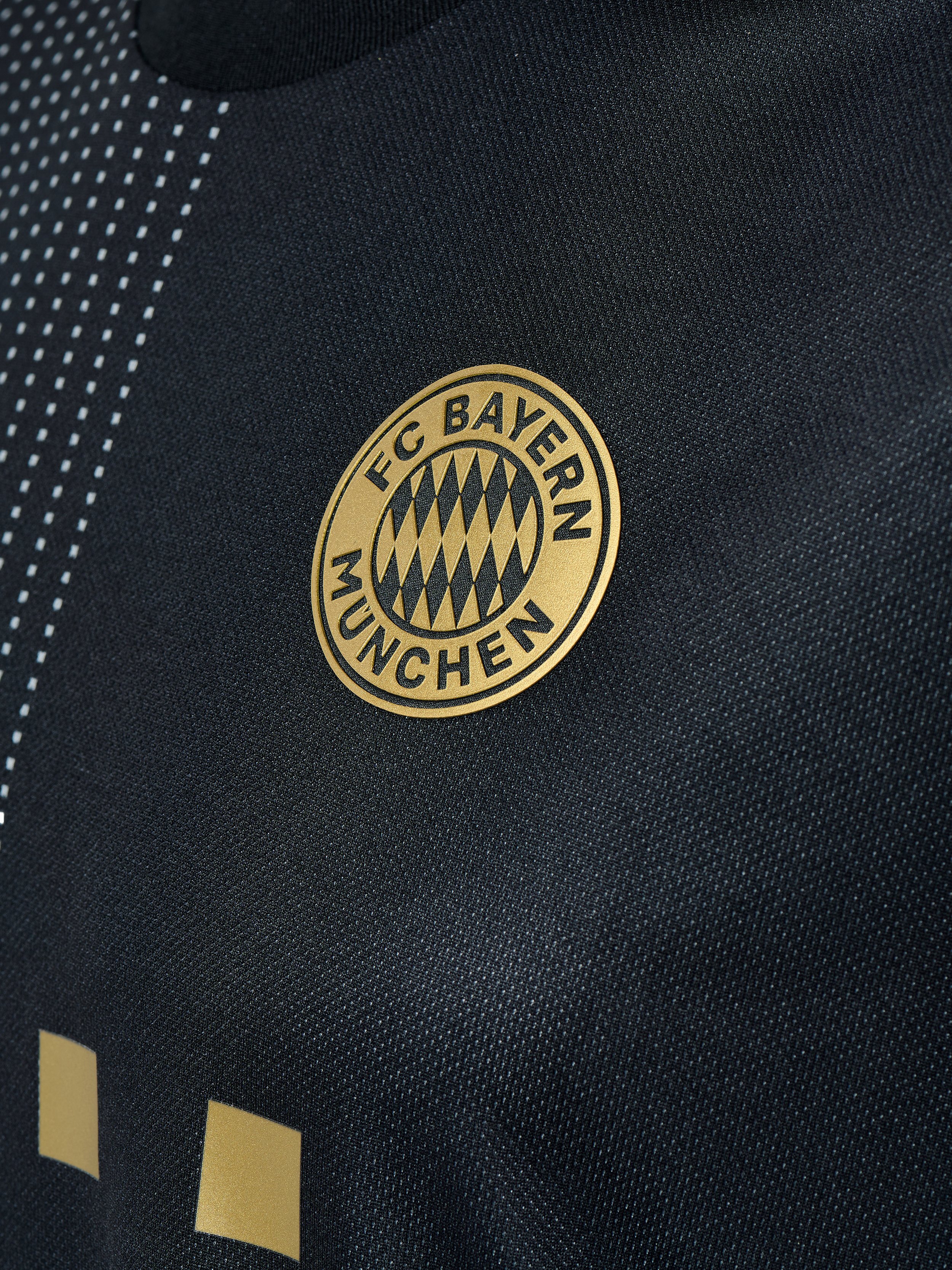
FC Bayern have revealed their new away kit for the 2021-22 season. The new design features a black base with gold accents in the clubs crest, lettering, numbers and shoulder stripes. On the back of the jersey’s collar is the "Münchner Kindl", the emblematic figure of the city of Munich depicted on the jersey. This detail is meant to symbolizes the club's ties to the Bavarian capital and is a reminder of the roots of the German record champions.
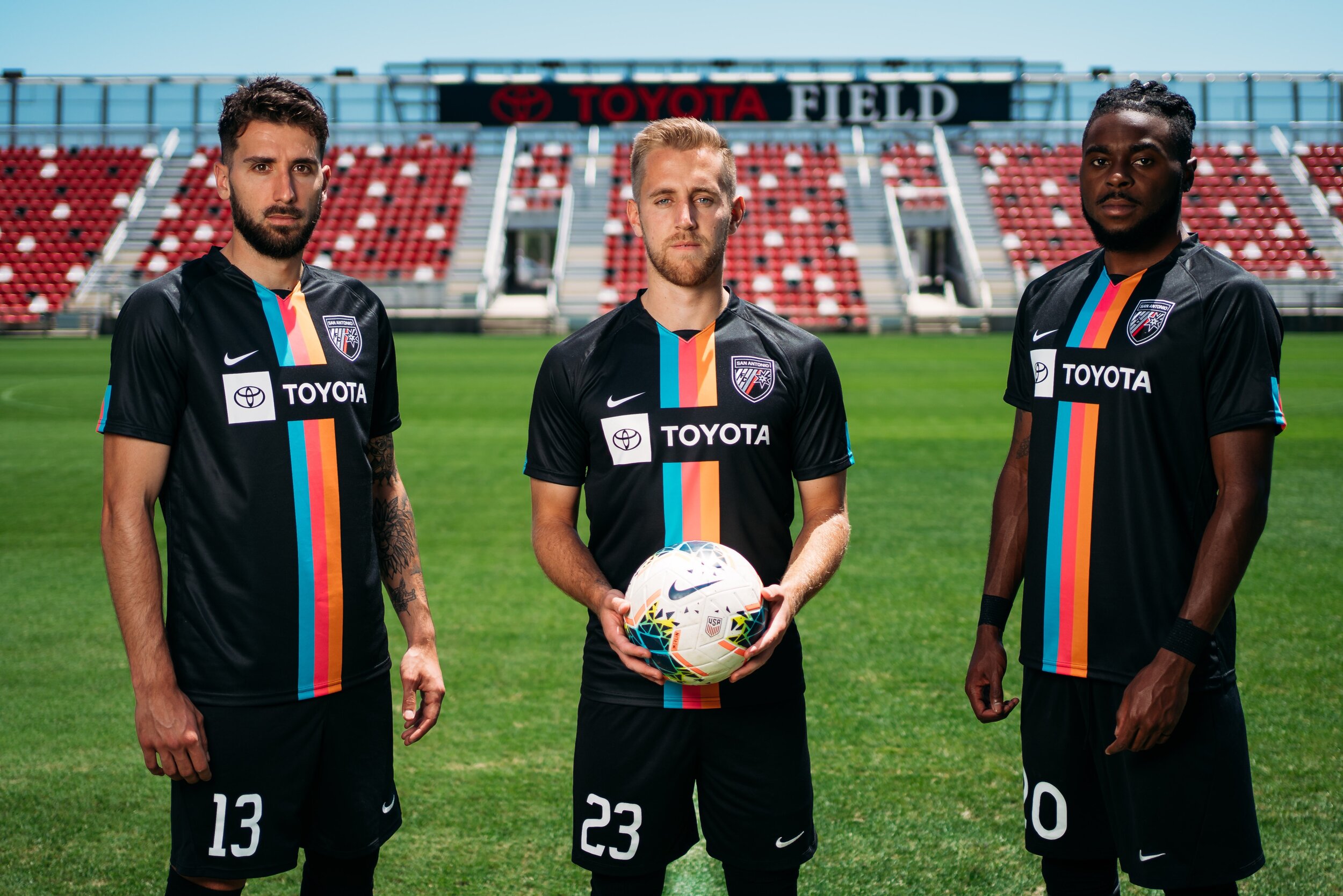
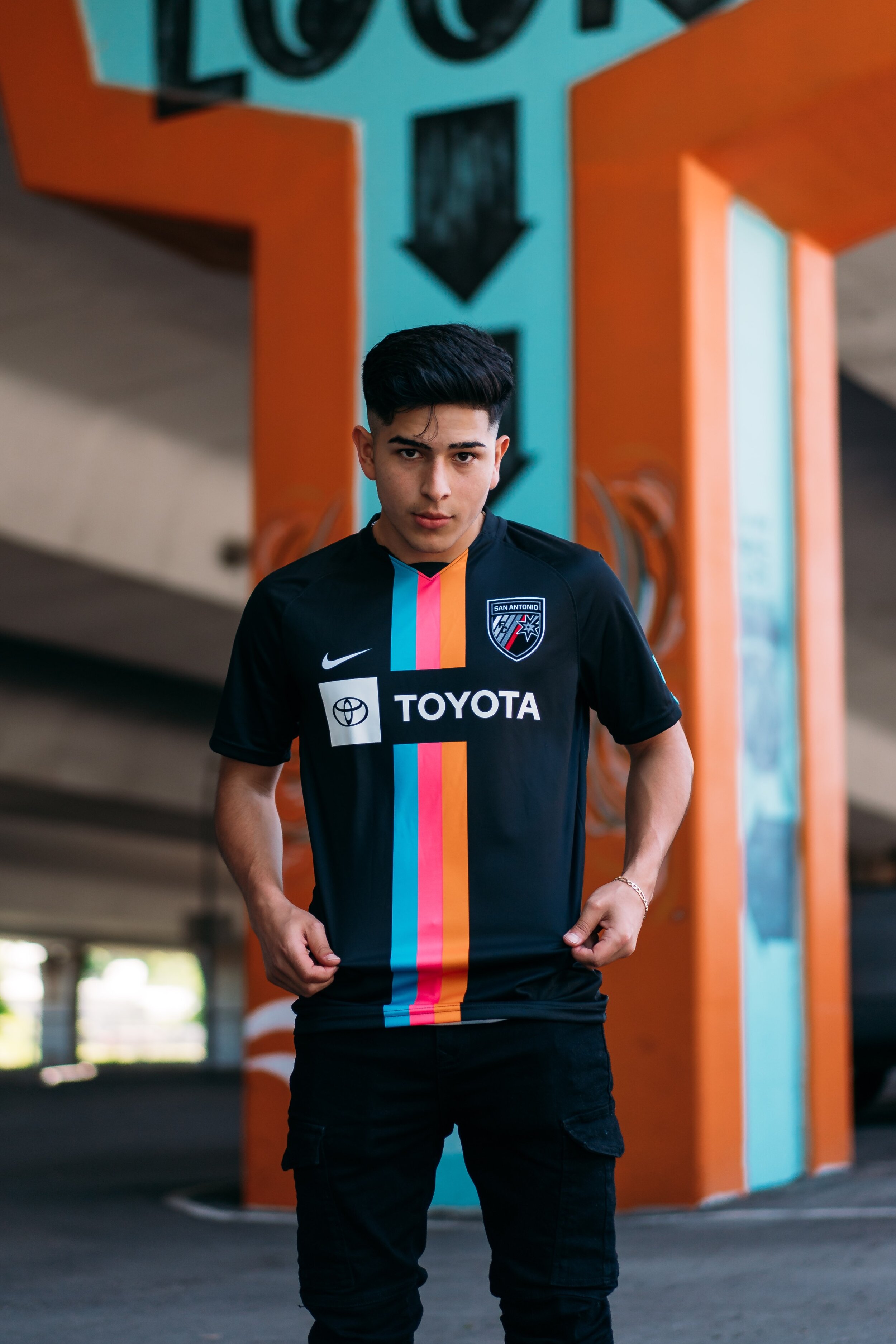
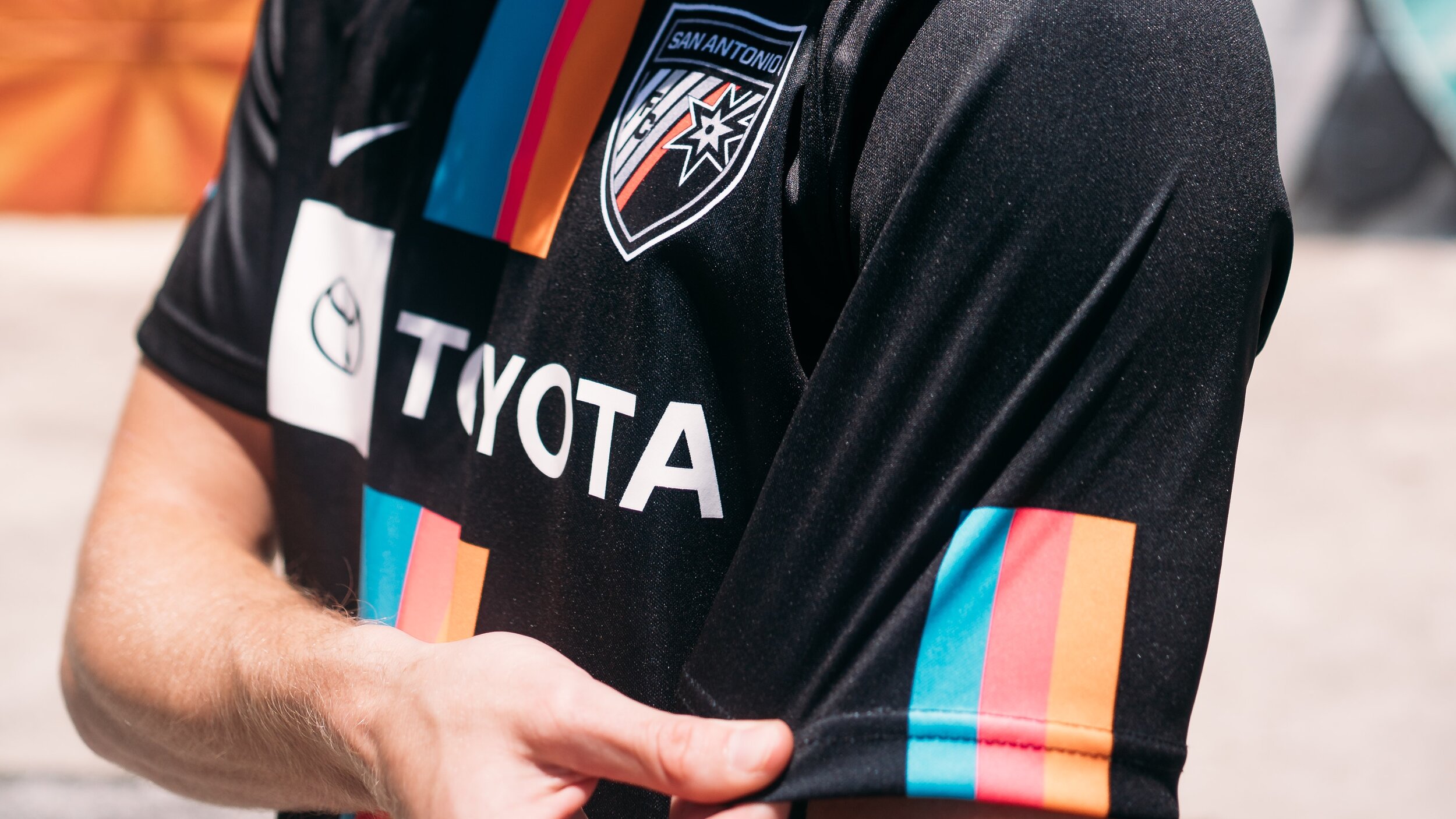
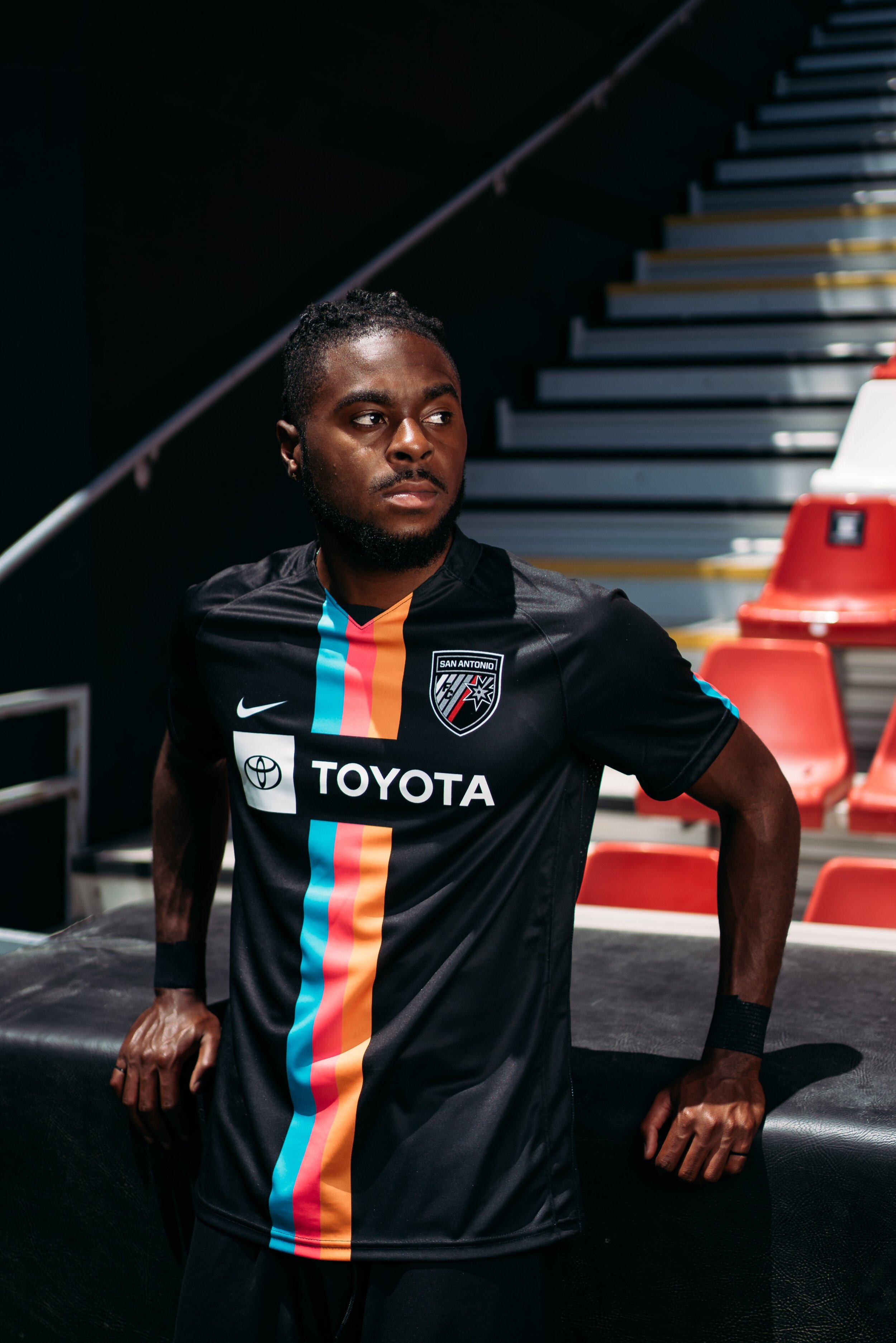
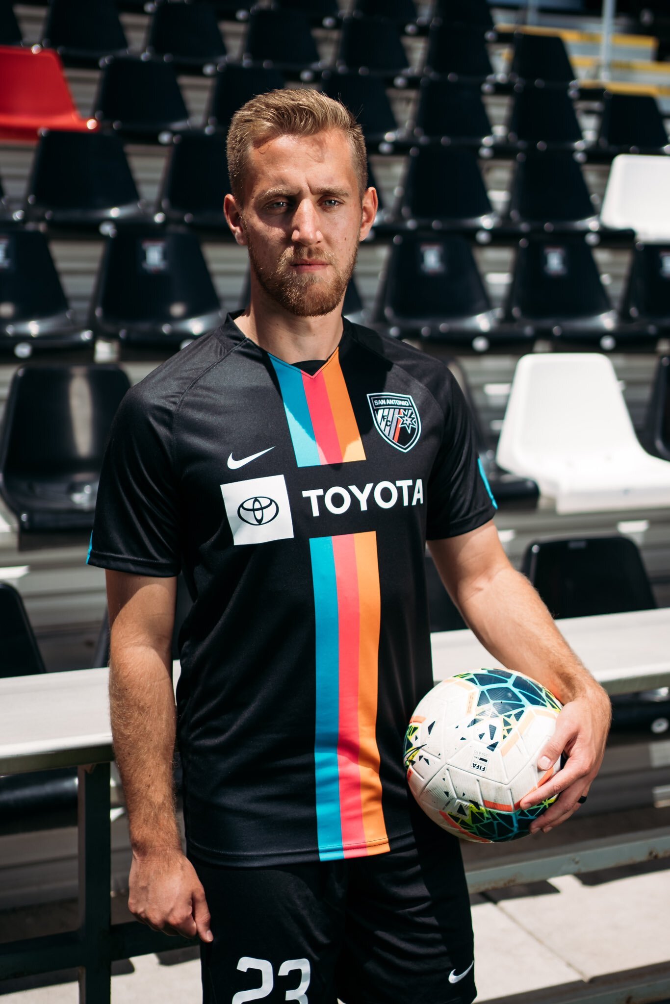
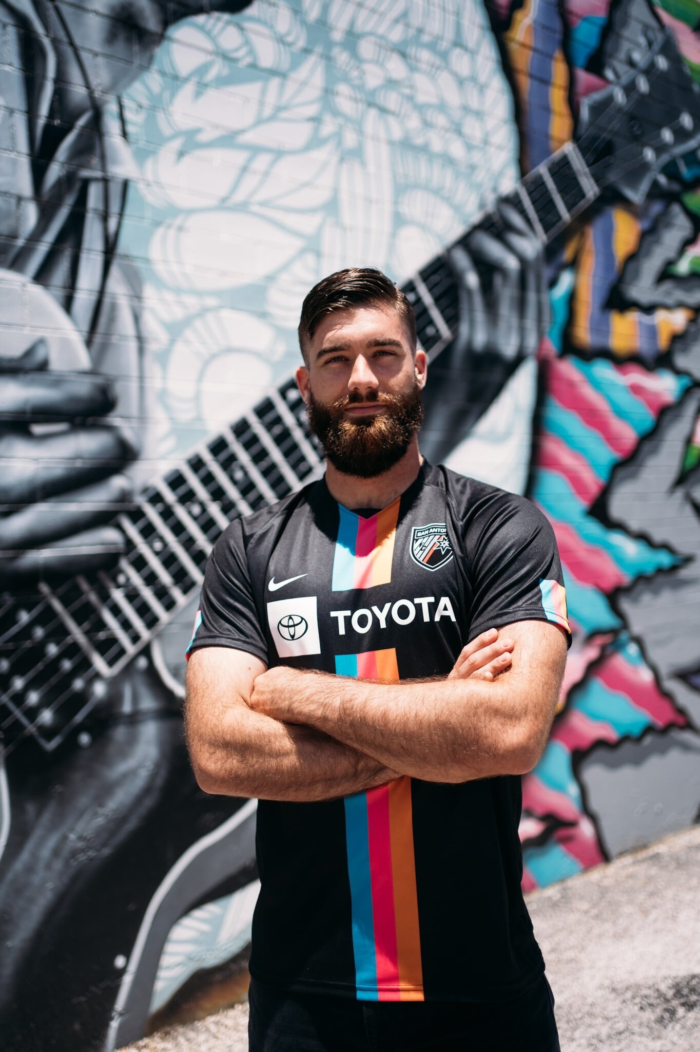
San Antonio FC has revealed the club’s newest kit dubbed the “Viva Kit”. The new look will serve as the third kit for the club and draws its inspiration from the spirit of Fiesta. The design of the jersey features three stripes of teal, pink and orange running down the front of the black jersey and on the sleeves edges.
The colors are associated with the Fiesta celebration which takes place in San Antonio in April, honoring the heroes of the Alamo and San Jacinto, pivotal 1836 battles in Texas’ successful fight for independence from Mexico.
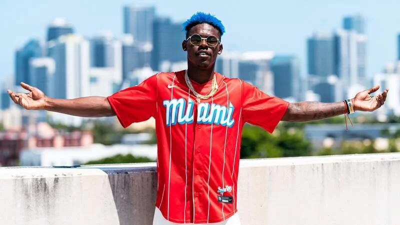
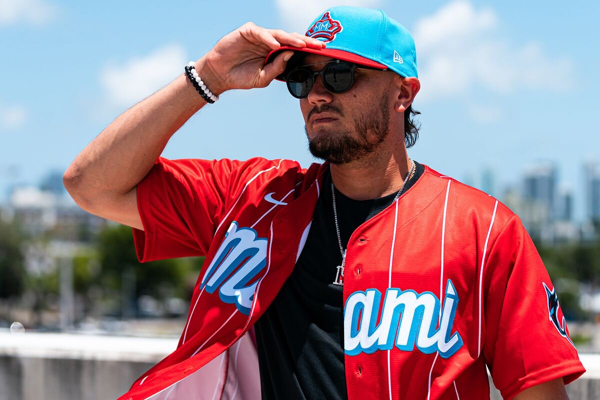
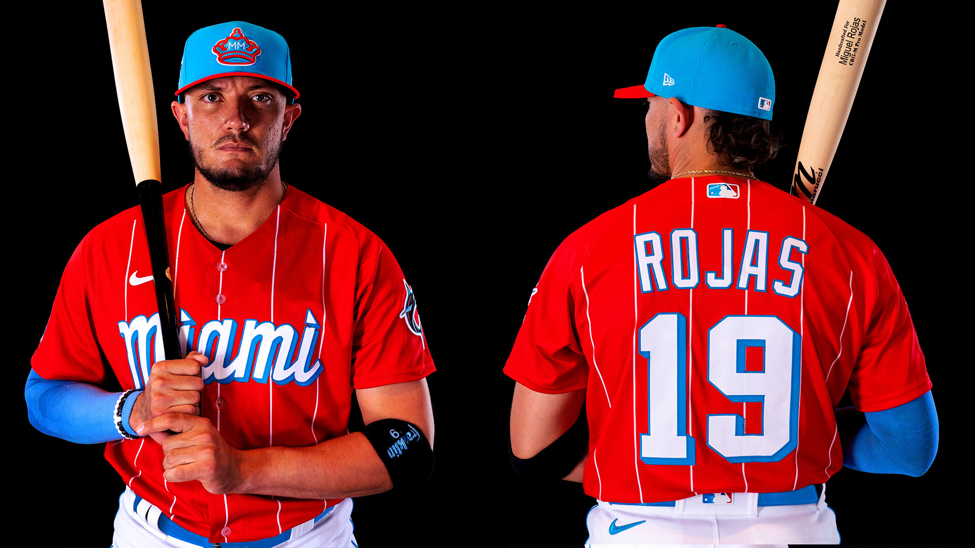
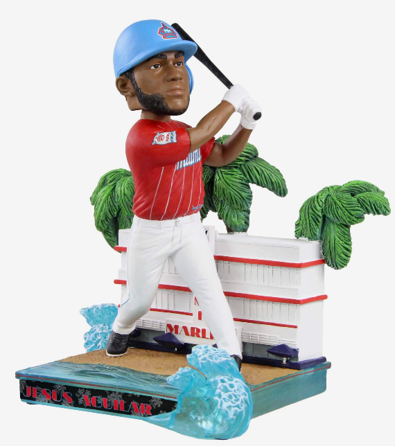
The MLB and Nike have announced a new uniform series dubbed the “City Connect Series”. The Miami Marlins are the latest team to reveal their special uniform that pays tribute to the Cuban Sugar Kings, the Triple-A Minor League team that won a Junior World Series Championship back in 1959. The red jersey with the white pinstripes design is an inverted version of the official Sugar Kings uniform. The Miami script is seen across the chest, while the marlins current logo is on the left sleeve. The patch on the right sleeve is a tribute to the original Sugar Kings patch but has been updated with MM in the crown and Miami Marlins under it, all within a bag of sugar. The hats for the uniform are blue with the updated Crown found on the front, the marlins current logo is seen on the right side and a red bill to finish off the look.
“Our new City Connect uniform seeks to blend sports and lifestyle fashion, remixing the Sugar Kings’ stylish uniform that embodies the unique sense of energy, passion and swagger from our community. Thanks to the collaborative efforts with Nike, we developed a refresh of the legendary uniform with a modernized look that embodies the legacy and heritage of past generations and embraces the future of our city. We’re looking forward to seeing our players and fans wear the new look at the ballpark and around the city, with a sense of pride and excitement.” -Miami Marlins VP of Experience and Innovation Michael Shaw
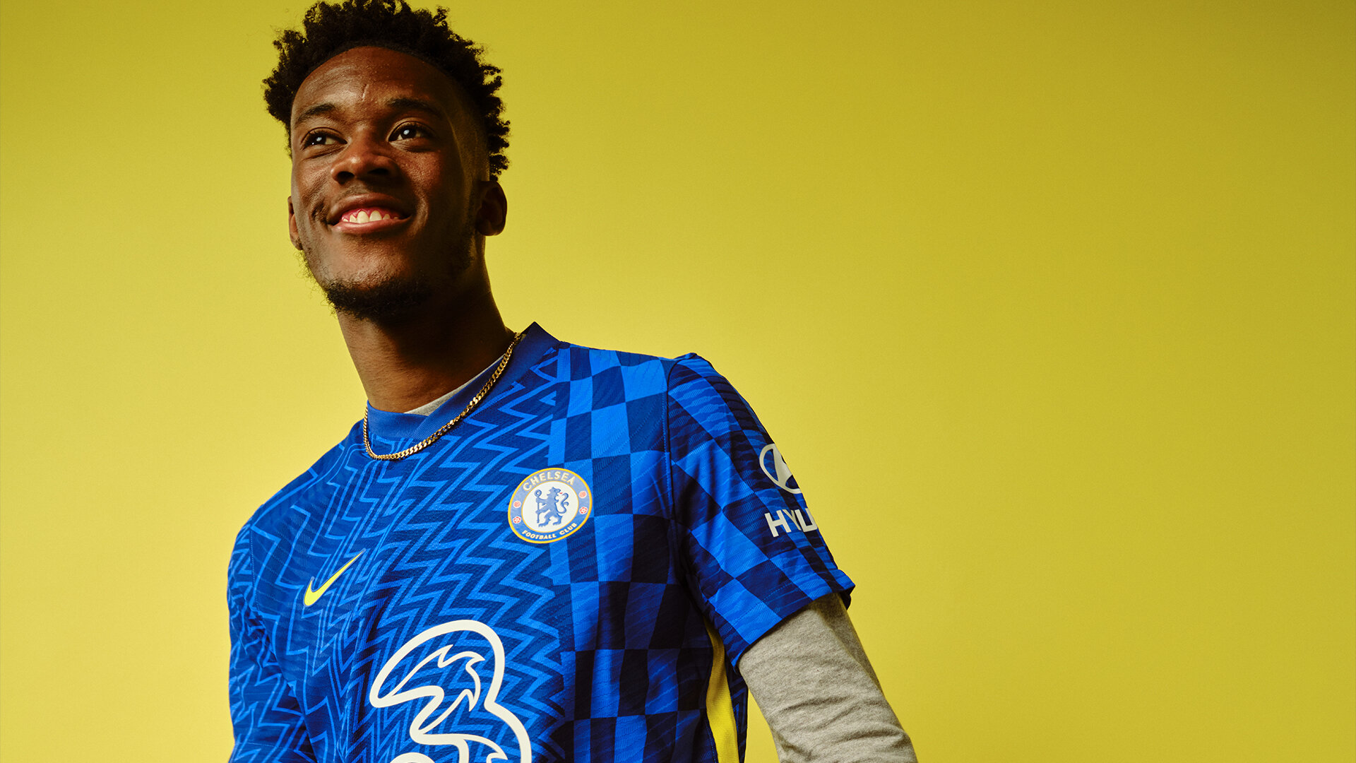
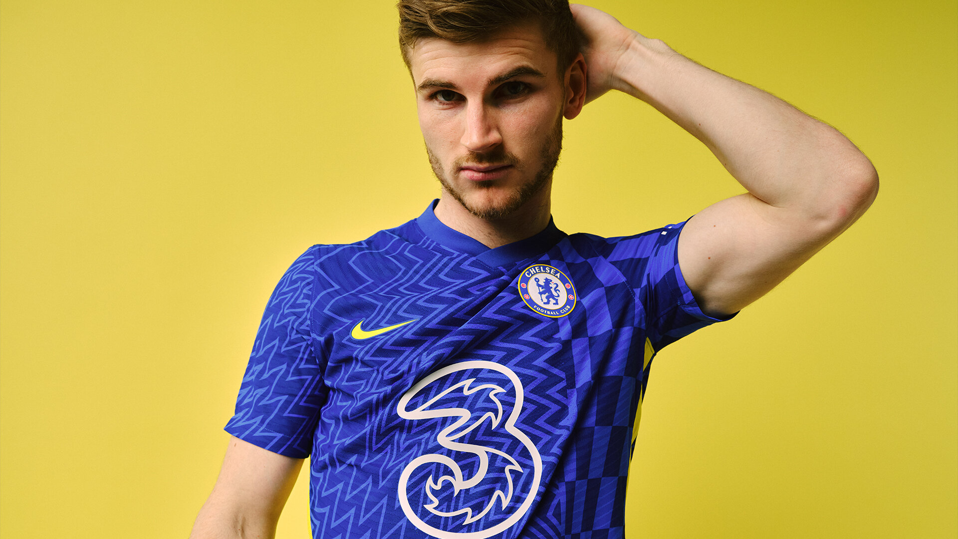
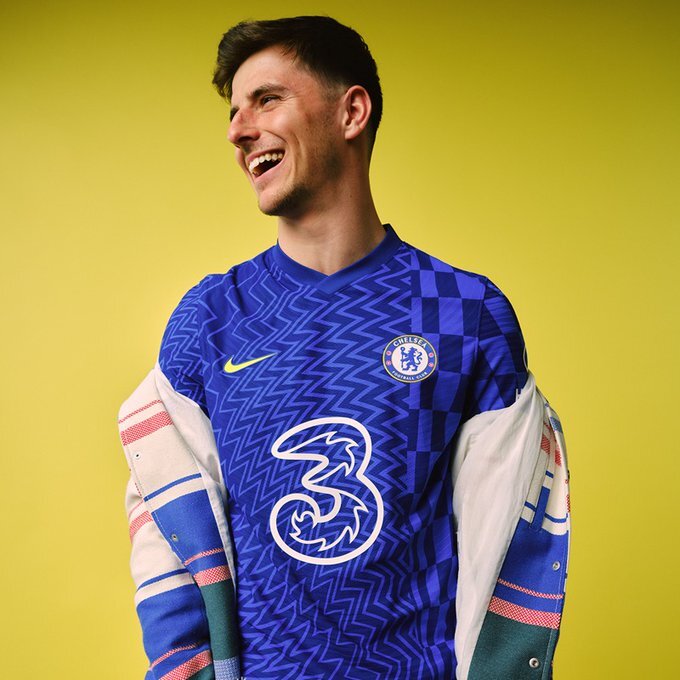
Chelsea has revealed their new home kit that features a 60s-inspired design. The blue jersey features a retro zig-zag and checker pattern giving it a very strong psychedelic feel. Nike used inspiration from the OP Art movement, the dynamic blueprint represents energy and vibrancy, synonymous with the new wave that is propelling the club forwards. The print continues onto the shorts and the full kit is complete with white socks featuring a sleek yellow and blue trim. The jersey is constructed with 100% recycled polyester fabric, which is made from recycled plastic bottles.
“This shirt is the most eye-catching yet and is so unique from the others I’ve worn. I think it’ll be a big hit with Blues across the globe. I feel like it really represents this younger generation rising up the ranks and I love the sustainability behind it. It’s really important to be mindful of our impact on the environment and it’s great to see football leading the way on sustainability.” - Midfielder Mason Mount
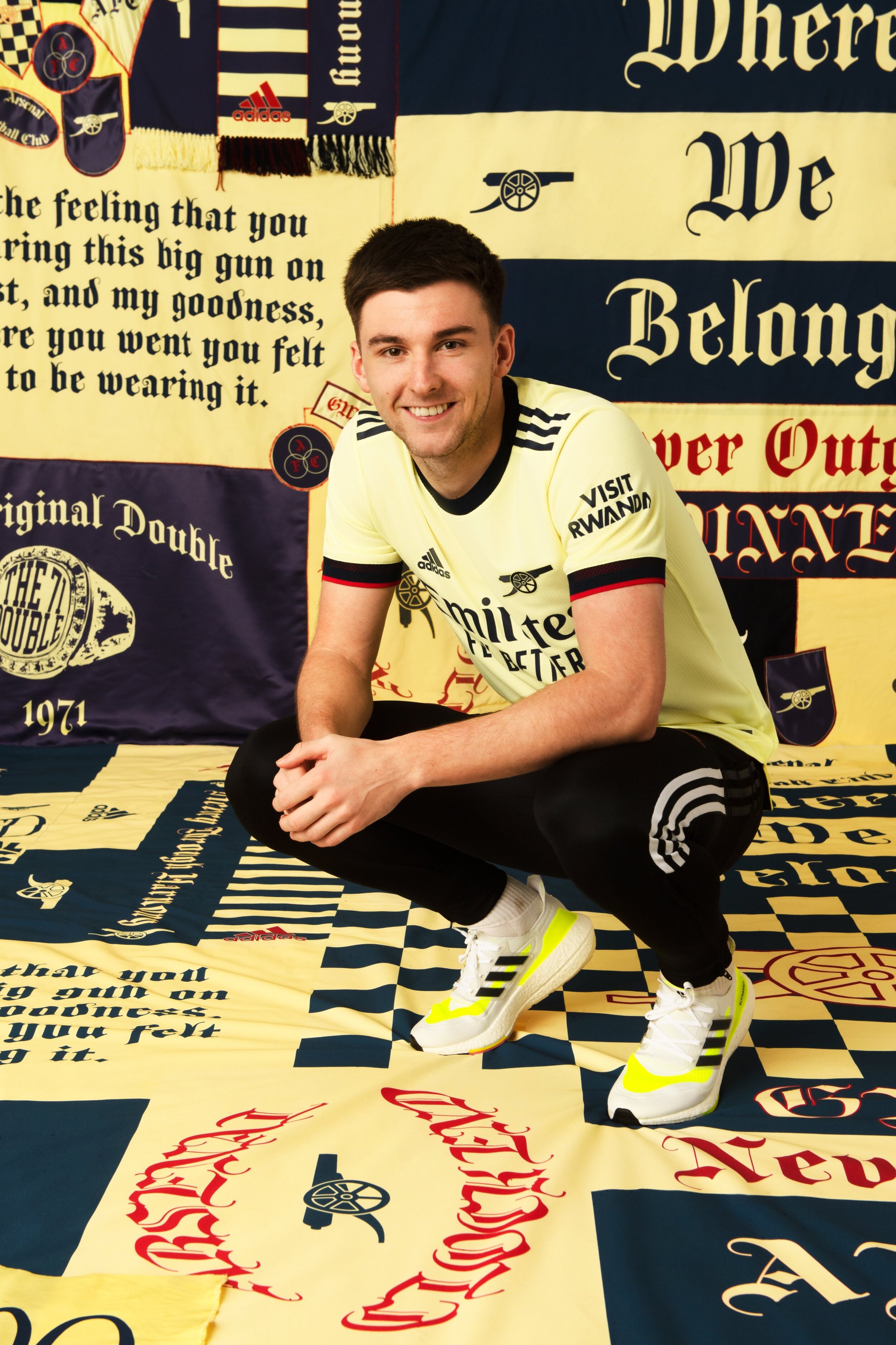
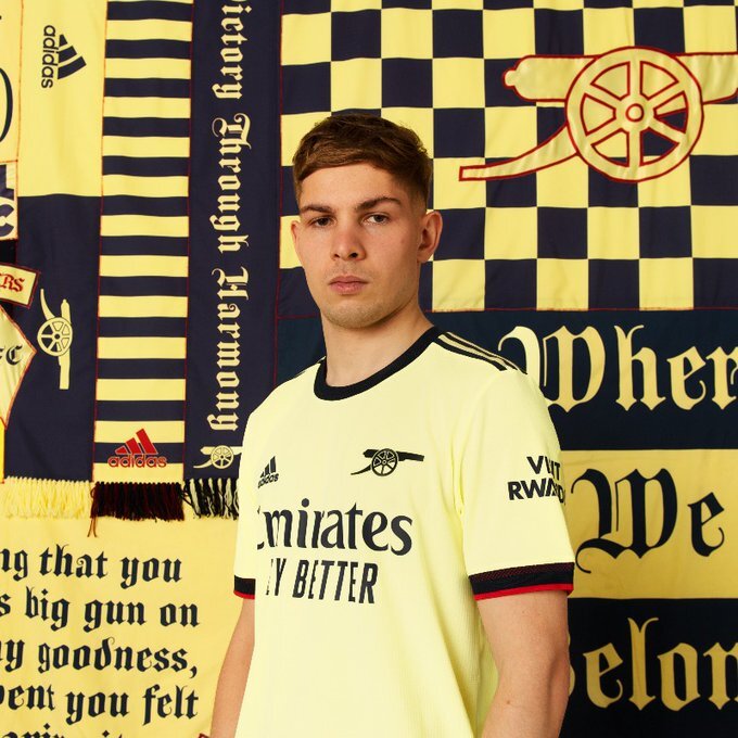
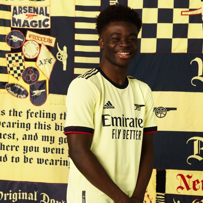
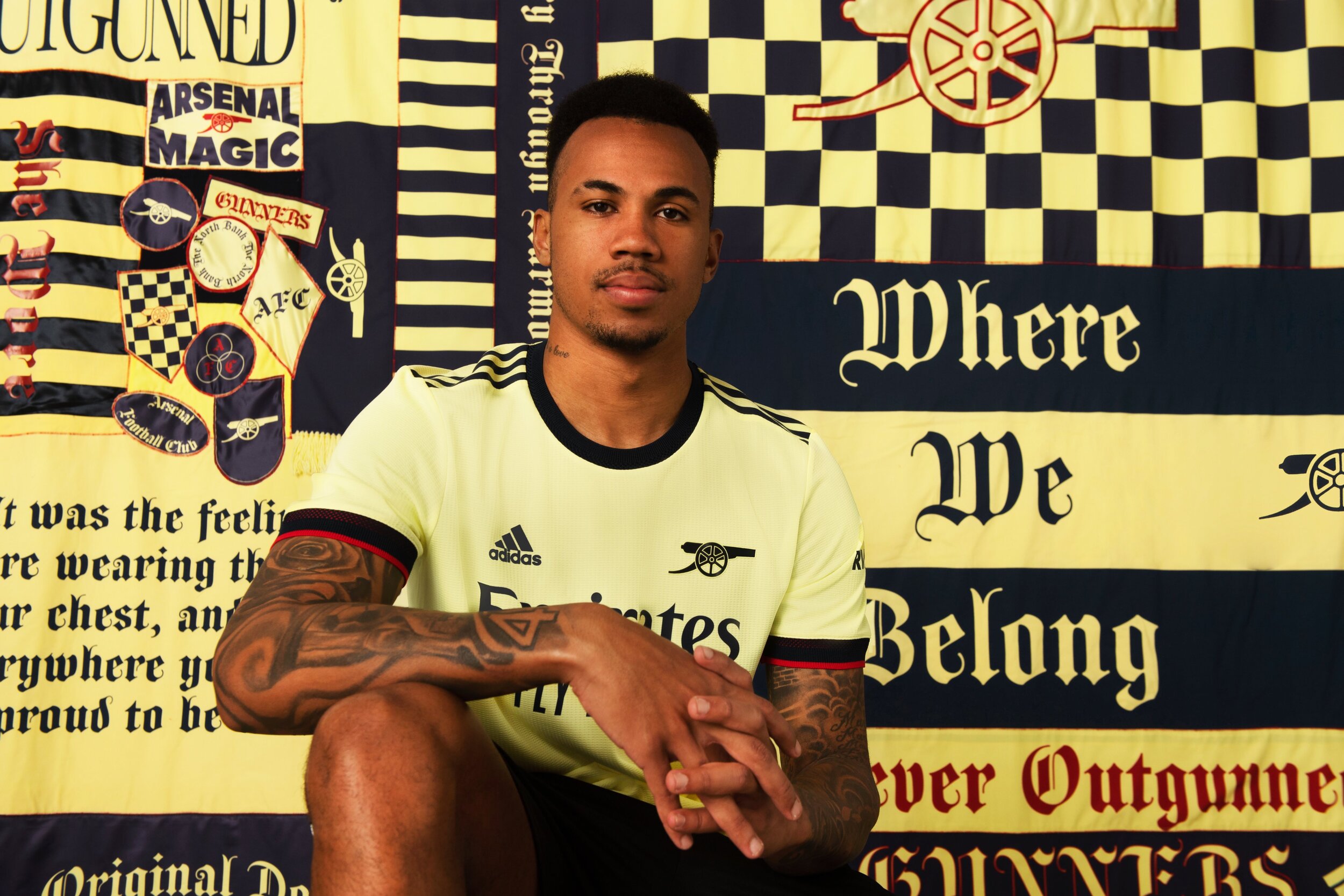
Arsenal is turning back the clock for their new 2021-22 away kit that is inspired by the 1970-71 season. The new yellow jersey features blue trim and the return of the famous Arsenal cannon, in place of our club crest. On the inside of the neckline a special message reads “Arsenal for Everyone”, a celebration of the diversity of the Arsenal family.
We will see the new kit hit the pitch for the club’s final away game of the season vs Crystal Palace, on Wednesday, May 19.