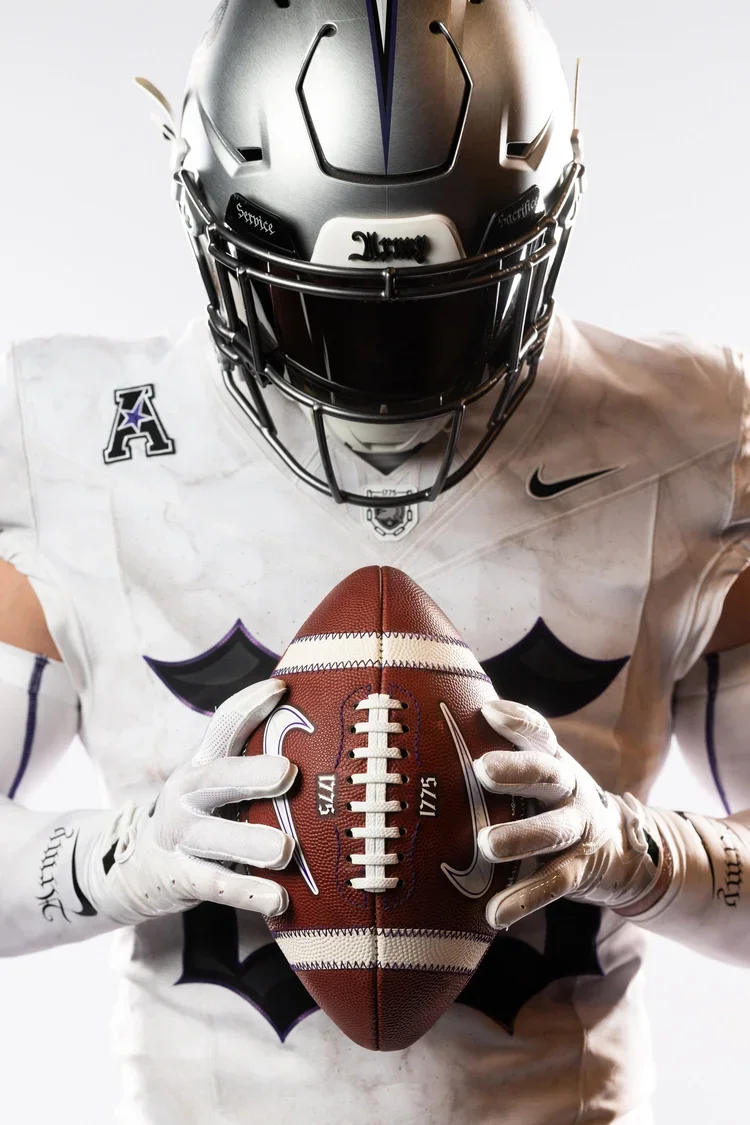
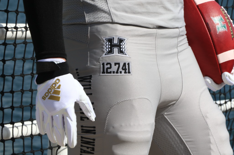
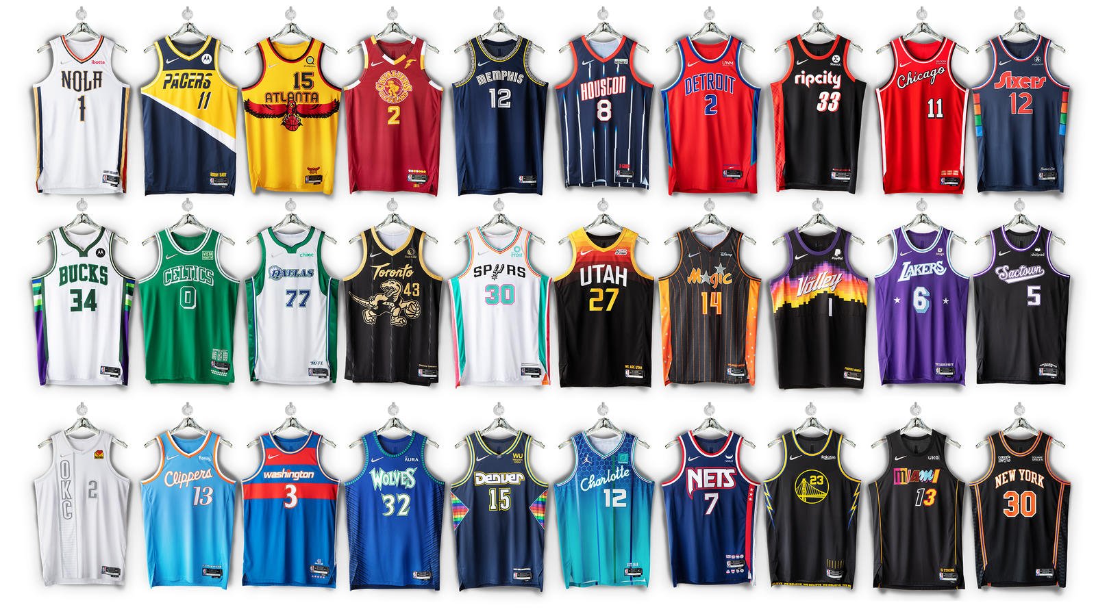
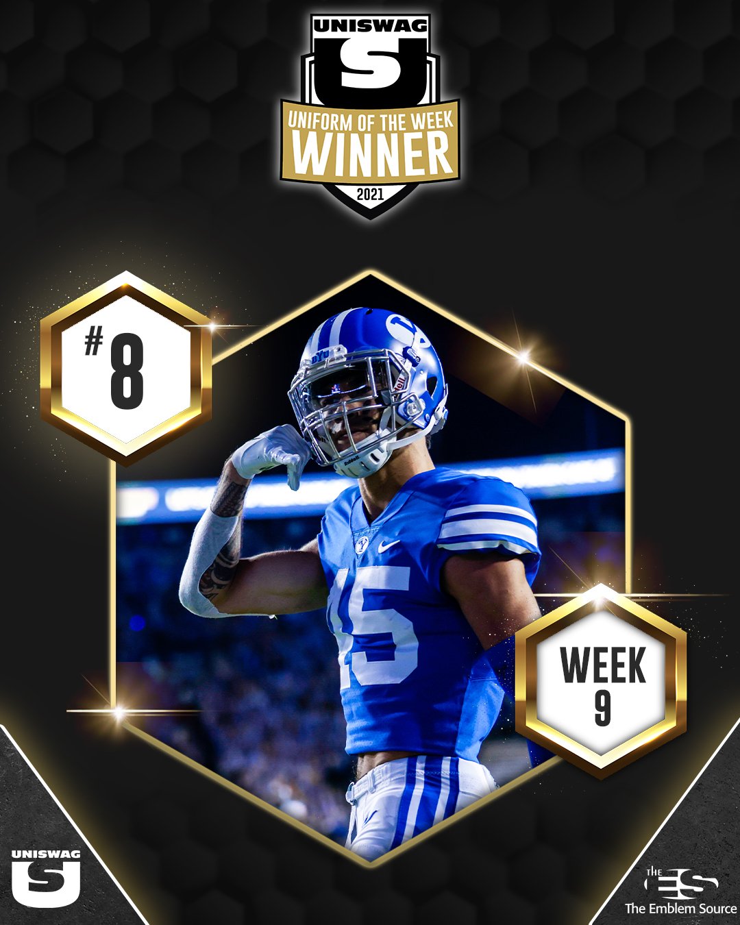
THE 2020-21 COLLEGE FOOTBALL SEASON is UNDERWAY WITH A NEW SEASON, and that brings the UNISWAG WEEKLY COUNTDOWN. EACH WEEK UNISWAG WILL highlight THE TOP 10 COLLEGE FOOTBALL UNIFORMS FROM THE WEEK LEADING UP TO THE #1 SPOT. THIS YEAR THE UNISWAG UNIFORM OF THE WEEK IS PRESENTED BY The Emblem Source AND THE WINNING TEAM EACH WEEK WILL BE AWARDED A stack of custom patches from the Emblem Source as well as a CUSTOM FOOTBALL TO PROUDLY PUT ON DISPLAY.
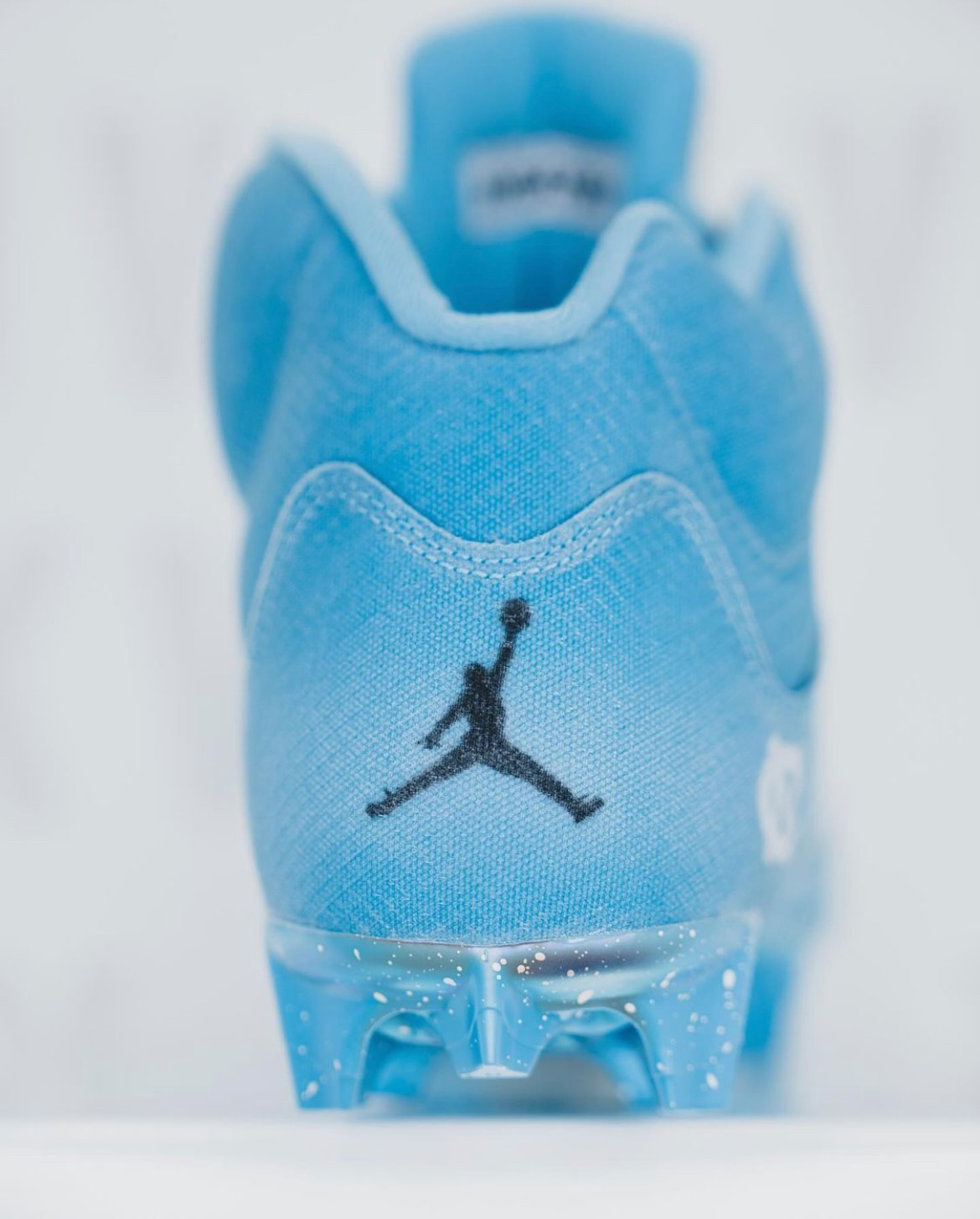
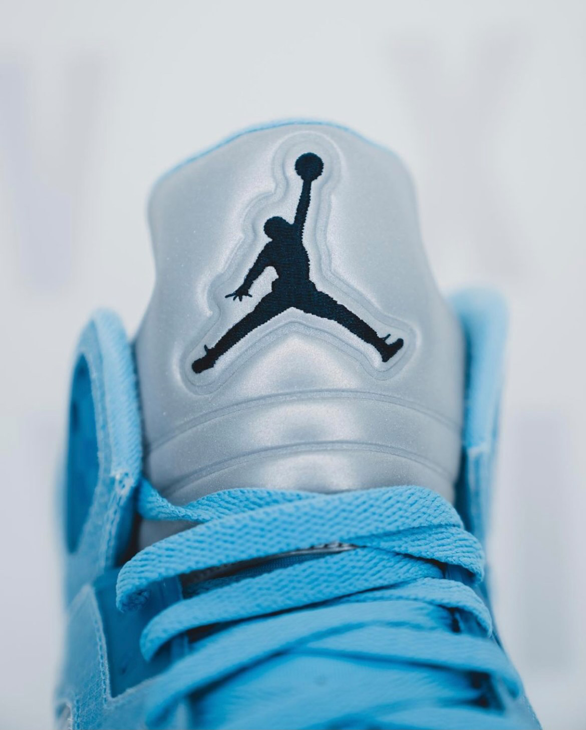
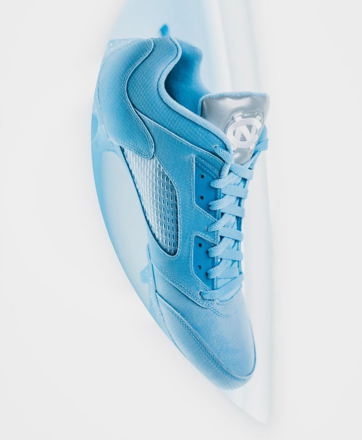
BELOW IS THE WEEK 10 UNIFORM OF THE WEEK COUNTDOWN.
SHOP COLLEGE FOOTBALL GEAR HERE


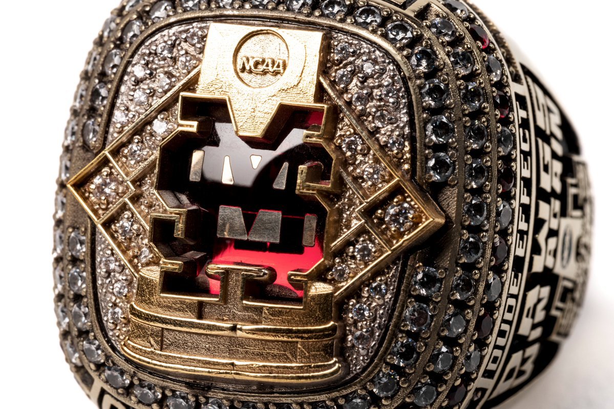
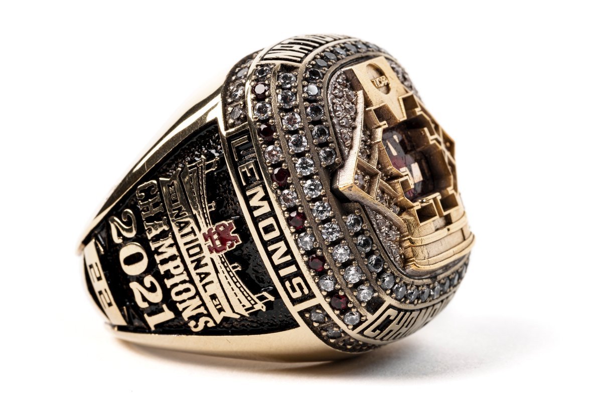
ABOUT THE EMBLEM SOURCE
AS A FAMILY COMPANY OPERATING OUT OF ADDISON, TEXAS, THE EMBLEM SOURCE TAKES GREAT CARE TO BE THE PREMIERE PATCH MANUFACTURER AND SUPPLIER TO HUNDREDS OF COLLEGES AND UNIVERSITIES EACH YEAR. THE PATCH IS AN ON-FIELD STAPLE ACROSS COLLEGE ATHLETICS AS A SYMBOL AND SIGN OF THE PRIDE EACH SCHOOL DISPLAYS DURING COMPETITION. IT IS A REAL, TANGIBLE, COLLECTIBLE PIECE OF MEMORABILIA THAT STANDS OUT AS A VISIBLE ADDITION TO THE UNIFORM. WHETHER IT IS FOR AN INDIVIDUAL SCHOOL, AN ATHLETIC CONFERENCE, OR AN NCAA CHAMPIONSHIP, WE ARE HAPPY TO BE THE SOURCE FOR ANY AND ALL PATCH NEEDS THAT COME OUR WAY.
See What Else Is New
Featured


Related Articles
Featured