We'll stop stiff-arming you now...
— Louisville Football (@LouisvilleFB) May 1, 2023
We're going back to our roots 🤝#GoCards pic.twitter.com/Kvb1ktkC4i
The University of Louisville is gearing up for an exciting new chapter in its football program with the installation of a brand new FieldTurf surface at L&N Stadium. This much-anticipated update has been in the works for some time, and will feature a strong sense of history and tradition infused into the look of the field and its markings.
Replacing the playing surface at L&N Stadium is no small feat, as the Cardinals haven't had a new field since 2013. The new design is set to feature the retro "Heisman Bird" at midfield and traditional varsity lettering in the endzones. This nod to the university's rich football history is in the same vein as the 2019 basketball court redesign, which also featured the "Dunking Bird."
The process of replacing the playing surface began on April 24th, with completion expected by early June. The new FieldTurf surface will feature the Vertex CORE system, which is designed using FieldTurf's heavyweight 3-layer infill technology. This advanced system has been proven to have a significantly lower incidence of injuries, optimizing performance and safety for student-athletes. The system is also equipped with two legendary FieldTurf fibers, the Classic HD slit-film fiber and the CORE monofilament super fiber, which delivers leading agility, durability, and aesthetics.
In addition to the new FieldTurf surface, the university has made the decision to give the old field away to season ticket members who have selected that option as part of their benefits for next season. This is just another example of how the university is putting its fans first and showing its appreciation for their unwavering support.
This new FieldTurf surface is much more than just an update to the stadium's aesthetics. It represents a new era for Louisville Football, one that honors its rich history while setting the stage for the program's future success.
SHOP LOUISVILLE GEAR HERE


See What Else Is New
Related Articles
Featured
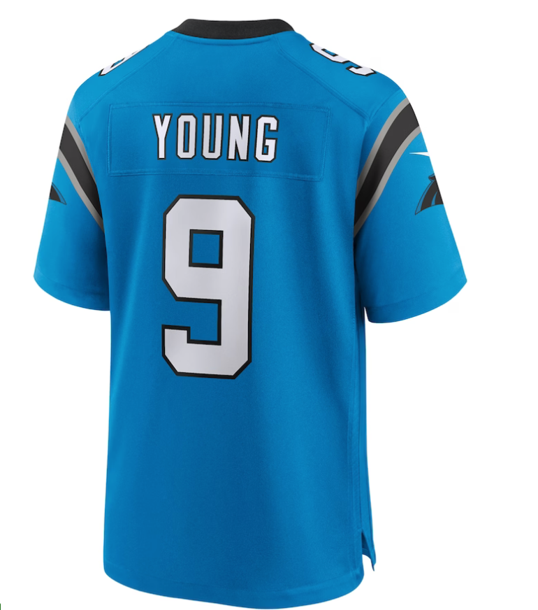
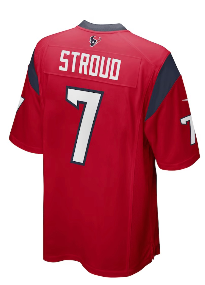
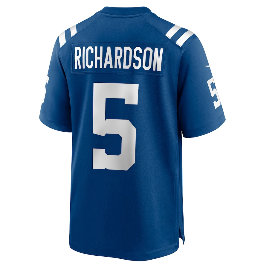
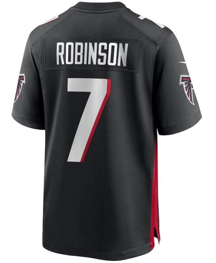
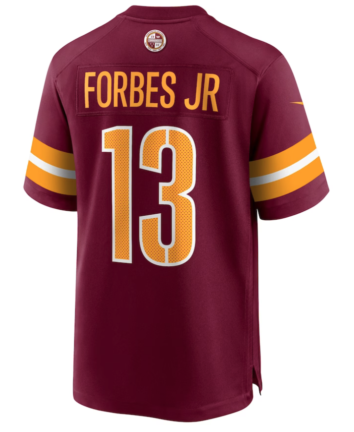
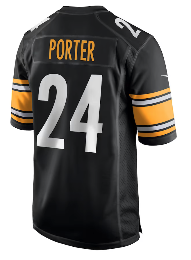
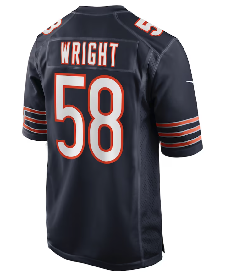
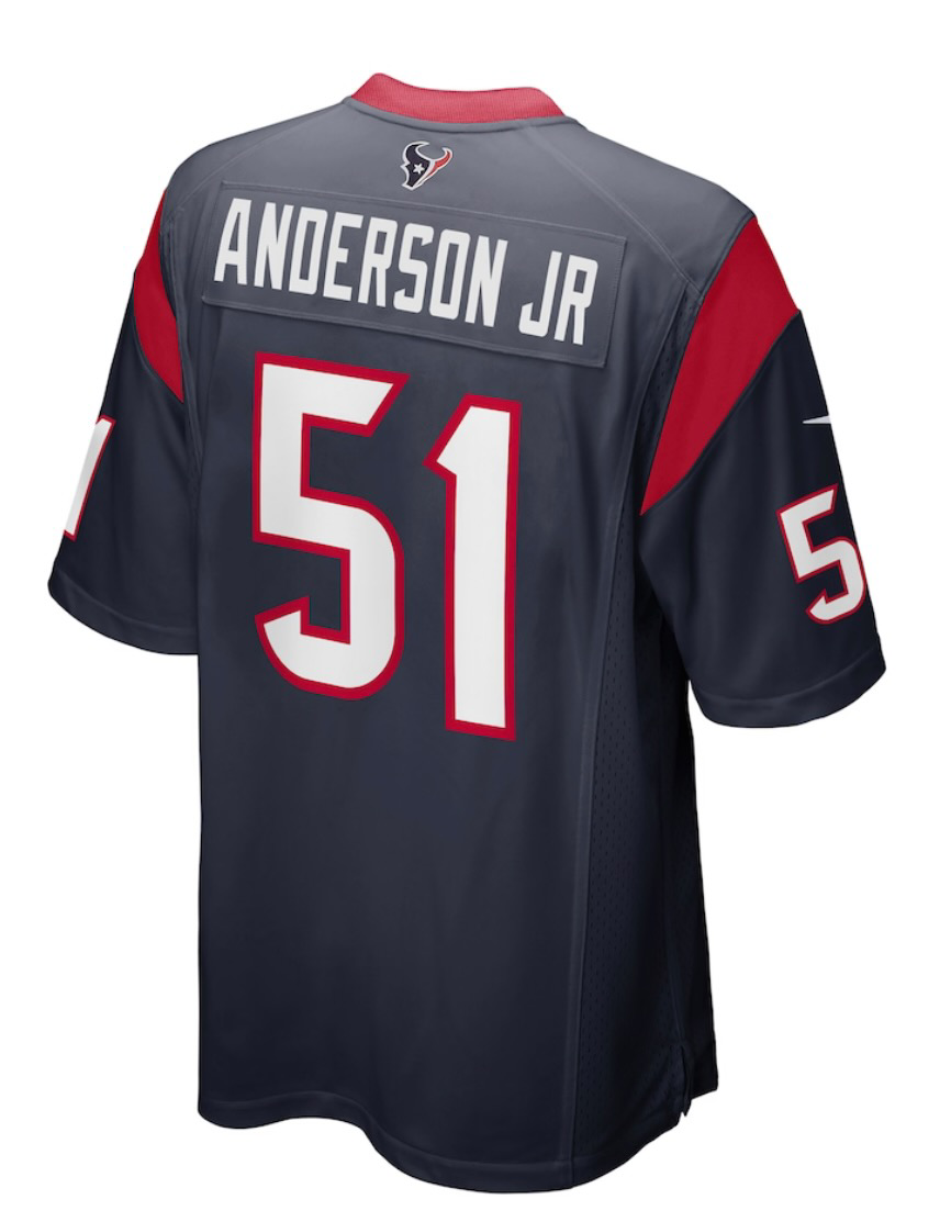
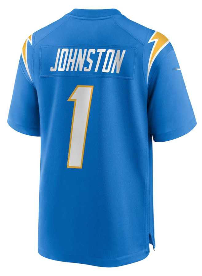
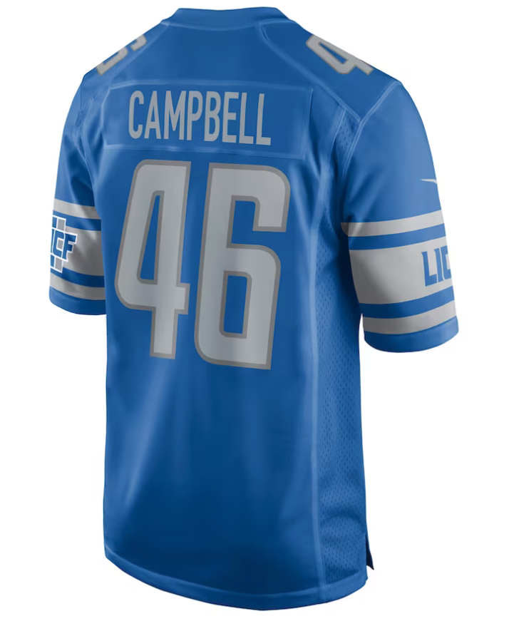
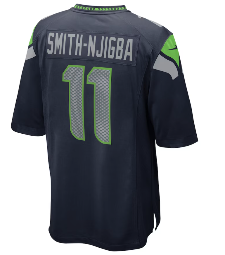
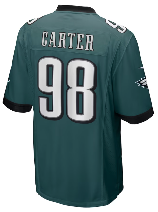
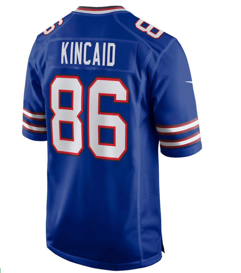
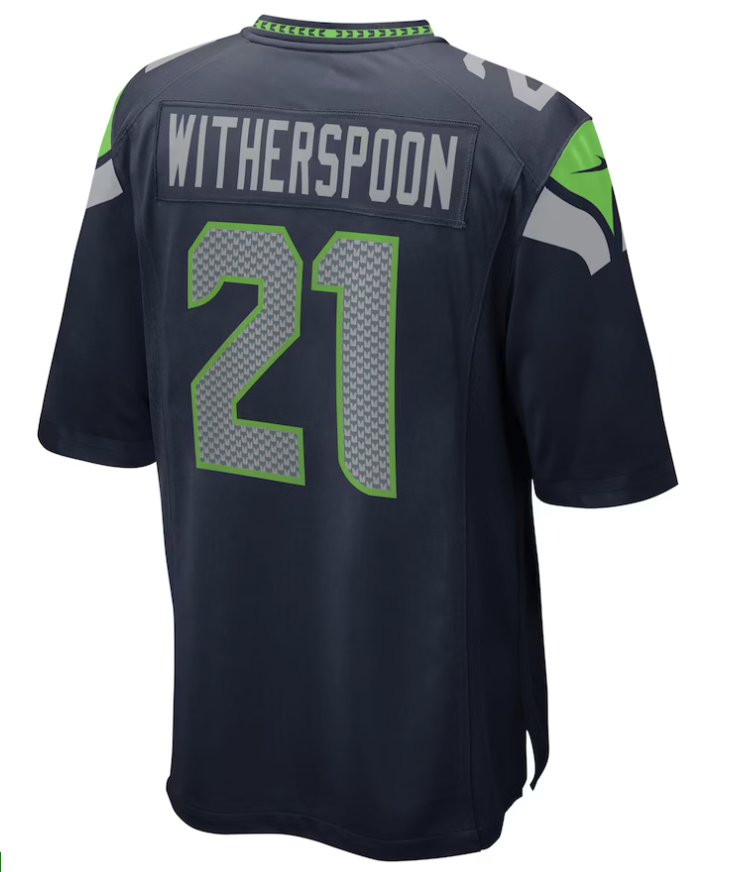
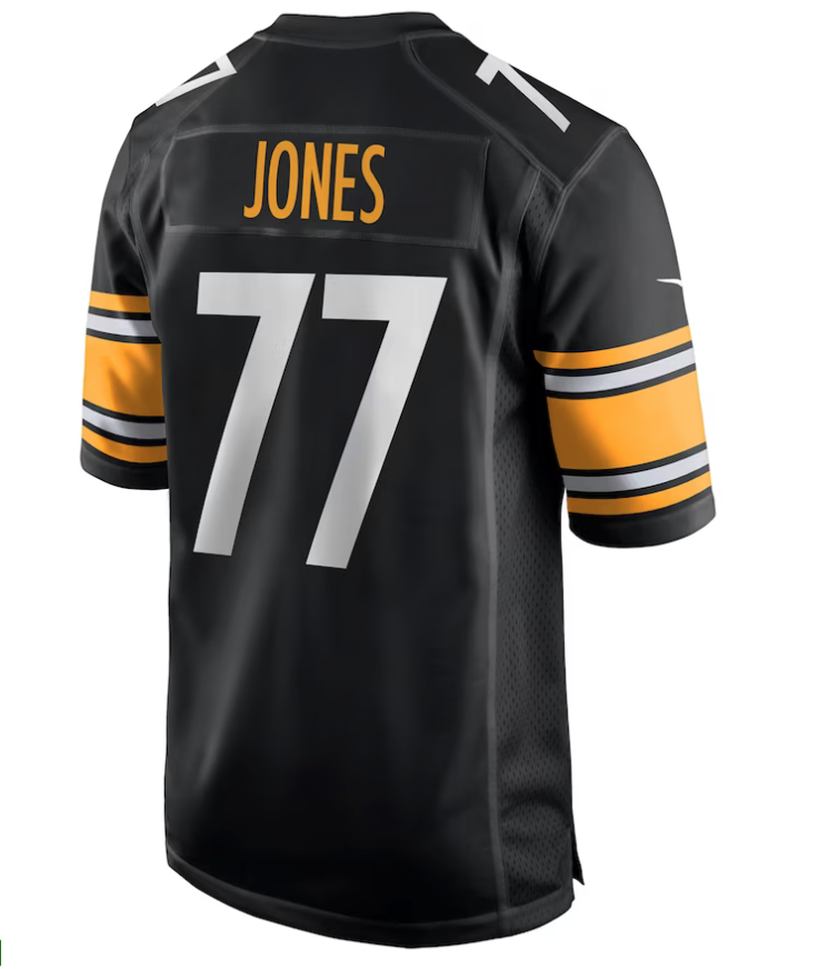
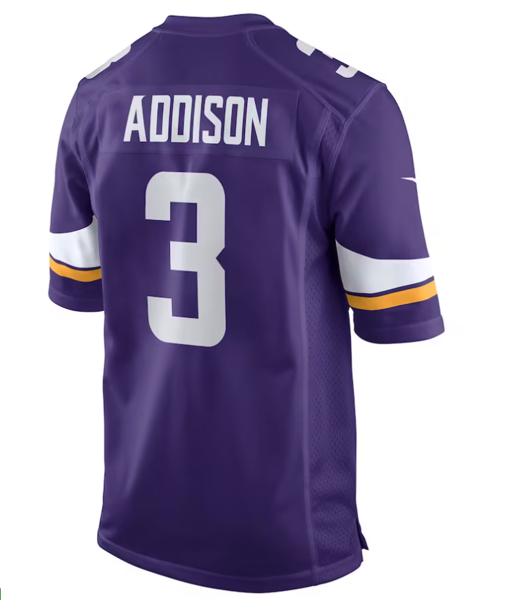
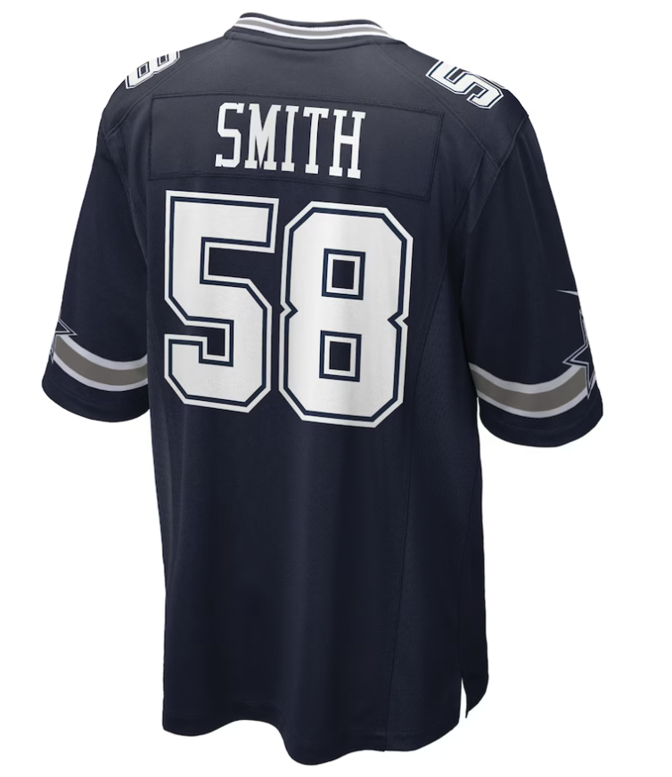
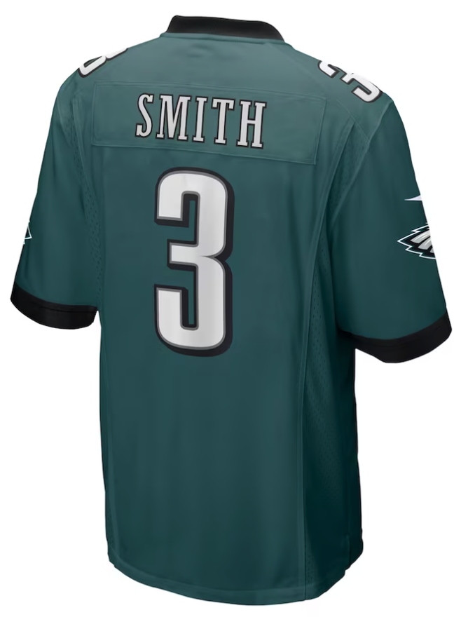
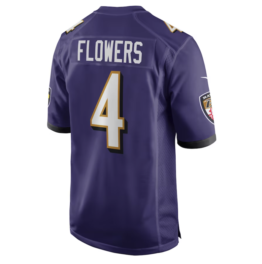
With the NFL draft now in the rearview mirror, the excitement is palpable as the top rookies make their way to their new teams. As the dust settles and these fresh faces acclimate to their new surroundings, one question lingers on the minds of fans and analysts alike: what number will each player choose to wear?
For some players, the decision is simple - they opt to stick with the number they donned in college, a symbol of the hard work and dedication that got them to where they are today. Others, however, seize the opportunity to start anew, opting for a fresh number that represents a new chapter in their career.
Shop NFL Rookie Gear here
See What Else Is New
Related Articles
Featured
The past presents the future. pic.twitter.com/gU6l4QdhpX
— Seattle Mariners (@Mariners) April 28, 2023
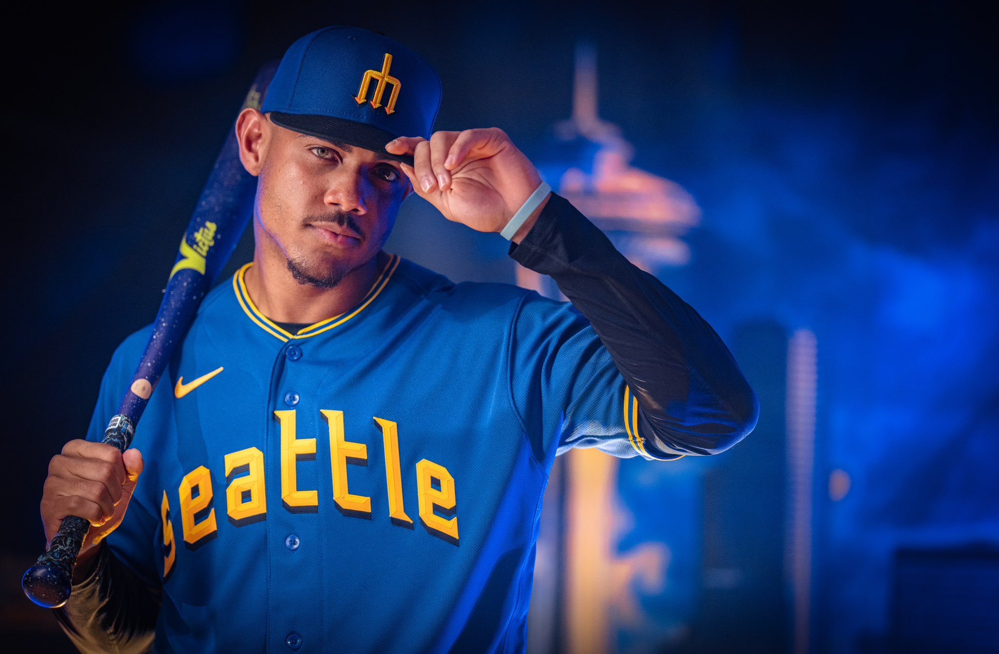
The Seattle Mariners have unveiled their City Connect uniforms, and These uniforms pay homage to the rich baseball history of Seattle while giving the team a fresh, modern look. The design includes nods to both the Pilots and the Steelheads, two teams that played a significant role in the city's baseball past.
One of the standout features of the uniform is the return of the trident logo. While the logo has been a source of controversy in the past, the team's senior vice president of marketing, Kevin Martinez, hopes that the City Connect uniforms will wipe the slate clean. "There's a lot of love for the trident here," Martinez said. "We've listened to our fans, and if you come to a ballgame here, you'll see it everywhere." The trident is prominently featured on the cap, which features a blue crown and a black visor, a color combination that has never been used in Seattle baseball history.
The front of the jersey features "Seattle" written in a font similar to the Seattle Pilots, the city's original MLB team that played one season in 1969. The typeface also includes a drop shadow used by the Seattle Rainiers, a minor league team that won the Pacific Coast League championship in 1955. This attention to detail is a testament to the Mariners' commitment to honoring the city's baseball history.
The uniform also includes two phrases that are sure to resonate with fans. "Sodo Mojo" is emblazoned across the front in reference to the neighborhood where the Mariners play. Additionally, "My oh my" appears on the jock tag, a reference to Hall of Fame broadcaster Dave Niehaus' iconic phrase. These phrases serve as a reminder of the team's connection to the city and its fans.
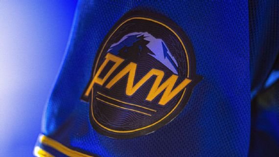
The sleeve of the uniform features a patch dedicated to the Pacific Northwest, featuring Mount Rainier, PNW lettering, and leaf embellishments meant to evoke the bills of the Pilots caps. This patch is a nod to the region's natural beauty and the Mariners' commitment to their community.
Overall, the Seattle Mariners' City Connect uniforms are a beautiful tribute to the city's baseball history. They give the team a fresh, modern look while honoring the past. The Mariners have a young, dynamic team, and these uniforms give them an identity as they move into a new era of Mariners baseball. With these uniforms, the team is sure to make a statement both on and off the field.
Shop Seattle Gear Here




See What Else Is New
Related Articles
Featured
Football fans all over the country are gearing up for the highly anticipated 2023 NFL Draft tonight. Among the highly touted prospects expected to be selected is former Alabama Crimson Tide quarterback Bryce Young.
the Jordan Brand has signed Young to a multi-year footwear and apparel deal. The brand took to its official Instagram account to share pictures of the young quarterback dressed in Jumpman gear. Young joins a select group of NFL athletes, including Dak Prescott, Deebo Samuel, Davante Adams, Jamal Adams, Chase Claypool, Stefon Diggs, Melvin Ingram, Cam Jordan, Tyran Mathieu, Kyle Pitts, Bobby Wagner, and Devin White, who have already partnered with Jordan Brand.
While Jordan Brand has dominated in the wide receiver position, it has yet to establish a strong presence in the quarterback position. This is where Young comes in - a dynamic quarterback who possesses both skill and star power. Young's partnership with Jordan Brand has the potential to further elevate the already-strong brand.
During his time at Alabama, Young wore Nike gear in crimson and white so the switch to jordan brand will be a familiar one.
SHOP Bryce Young GEAR HERE


See What Else Is New
Related Articles
Featured
Bringing The Heat 🔥 pic.twitter.com/Mp4CLg6p0H
— Arizona Cardinals (@AZCardinals) April 21, 2023
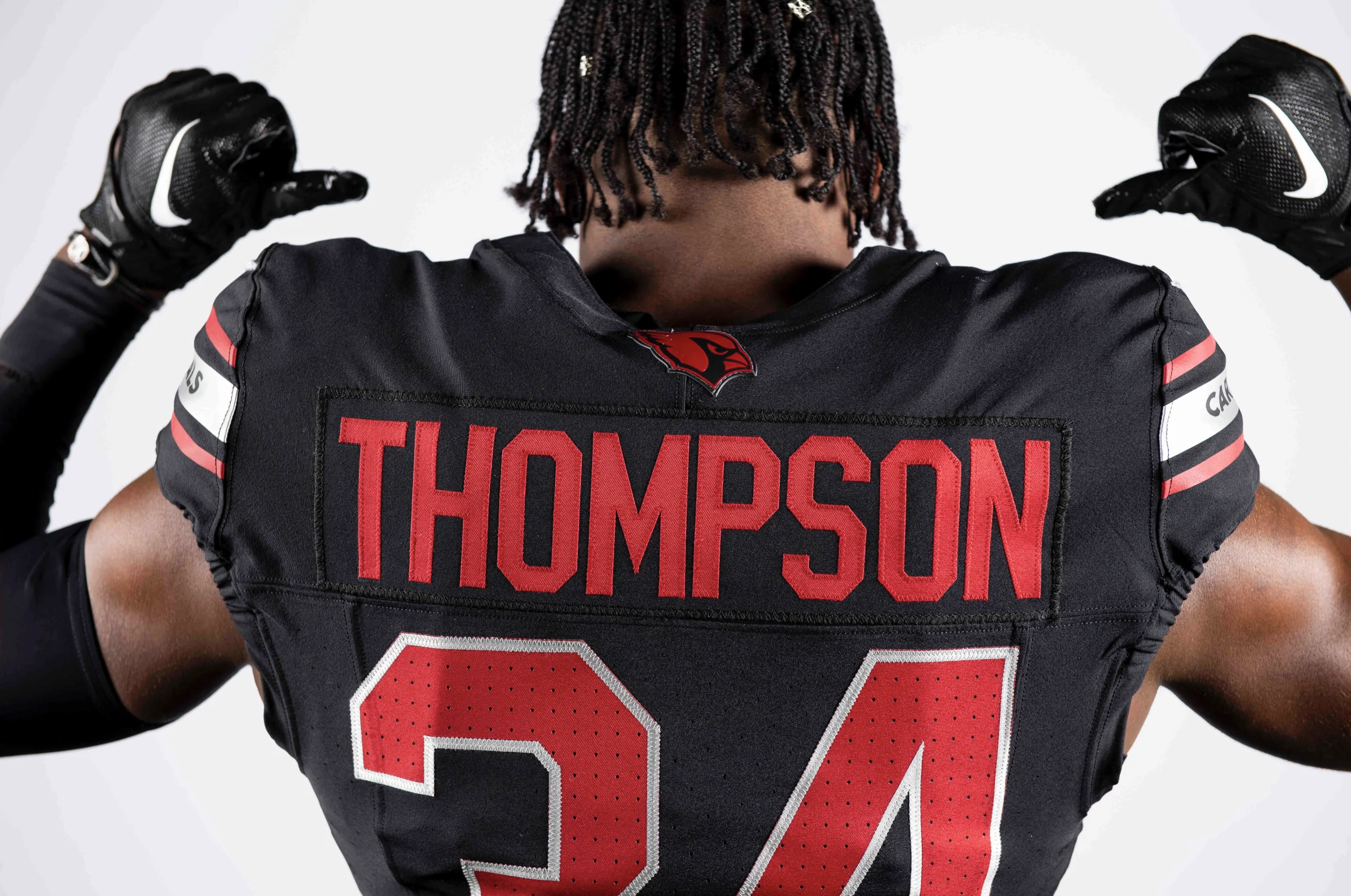
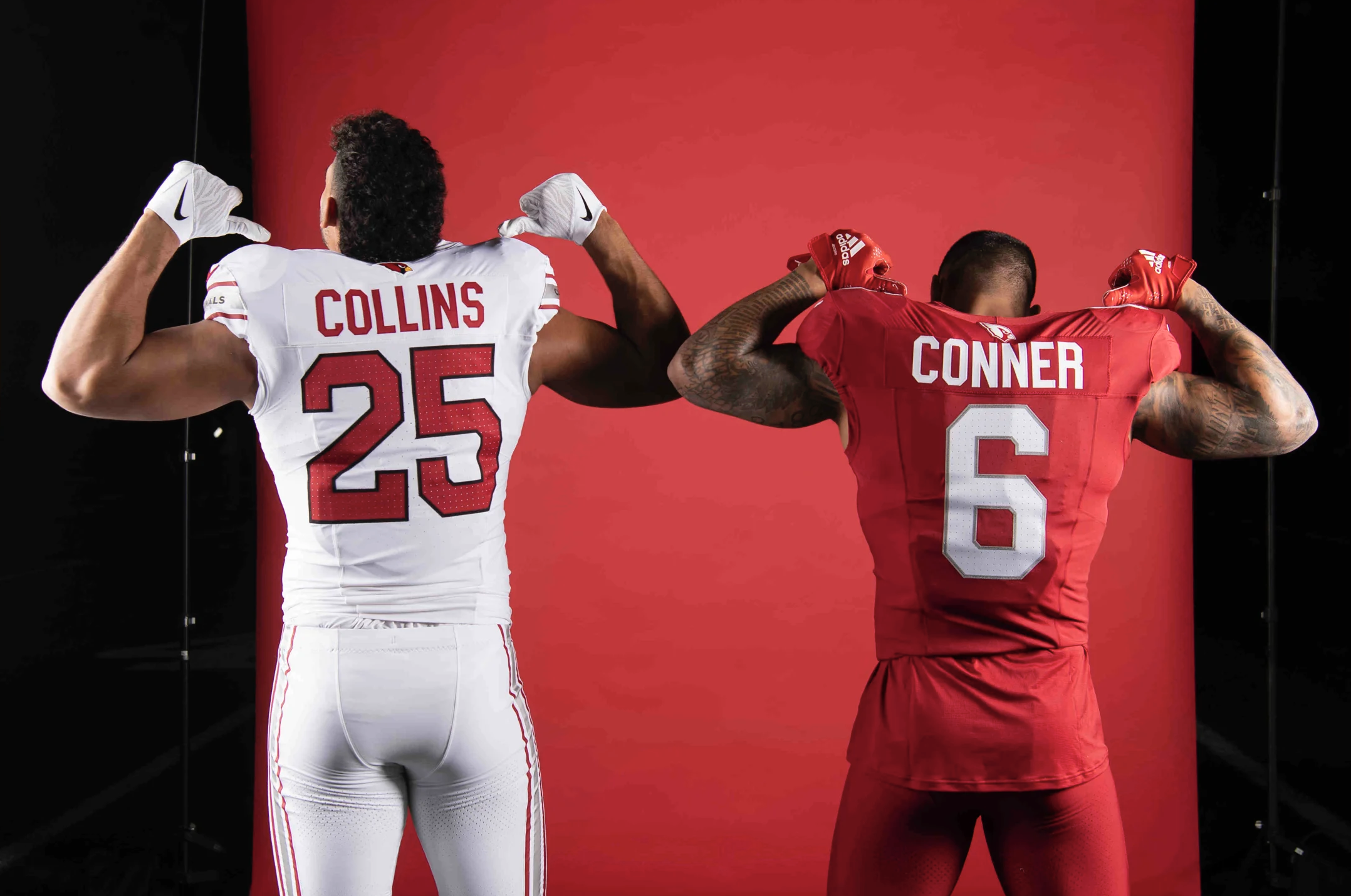
The Arizona Cardinals are stepping into the future with new uniforms that have been years in the making. The team officially unveiled their new jerseys on Thursday night at an event in downtown Phoenix. The Cardinals' new uniforms are a departure from the previous ones and have been designed to reflect the energy and vibrancy of the team.
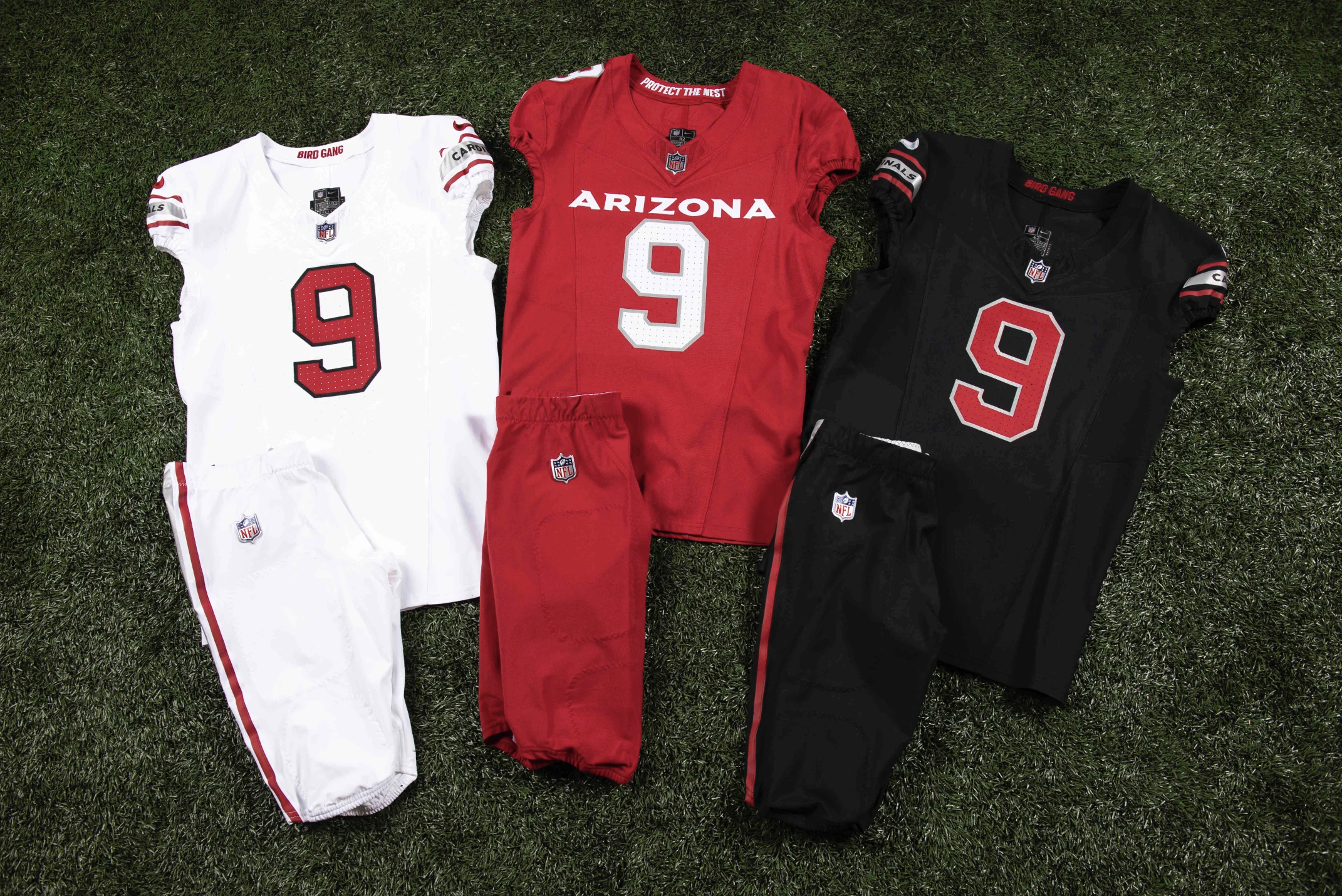
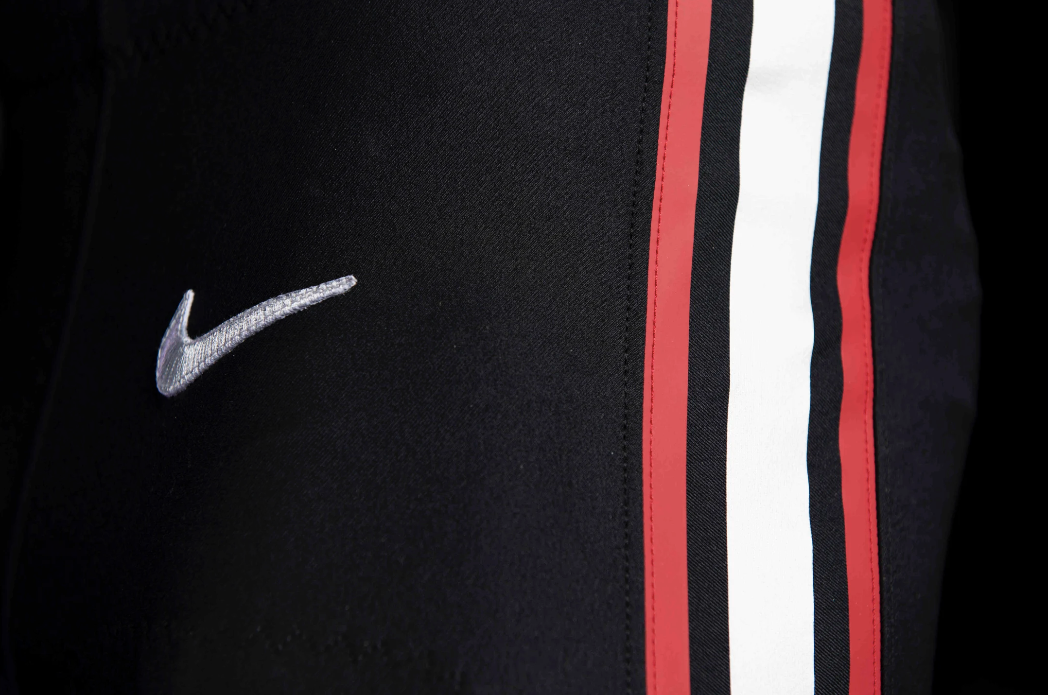
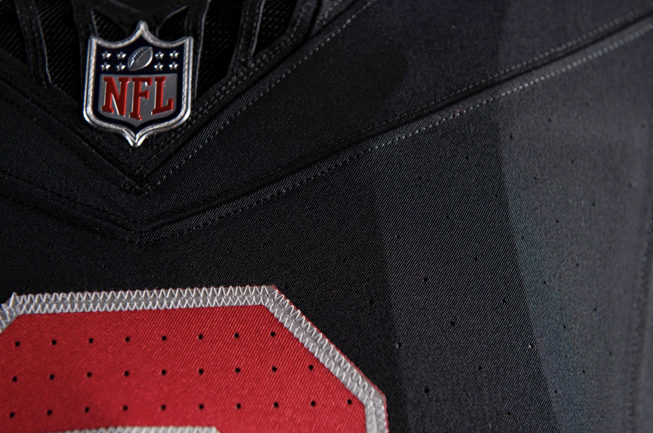
The new uniforms come in three distinct styles: all red for the home look, all white for the road, and all black for the alternate. The uniforms feature several details that have been altered, including the helmets, which have been given a fresh new look while still retaining the white base.
One of the most significant changes is the addition of an all-white uniform for the road games. It’s a clean and classic look that has been received positively by the team's players. Running back James Conner, who was part of the secretive photo and video shoot for the new look, emerged from the makeshift dressing room in the corner of the Cardinals' practice bubble wearing the new all-white road uniform. He had a wide smile on his face and was clearly enjoying the experience.
"It goes back to the old Deion (Sanders) quote, 'Look good, feel good; feel good, play good; play good they pay good,' " Conner said. "But man, I'll take it a step further. Even the first day of (workouts) it just has felt like a different energy in the whole building."
The new uniforms have been a long time coming. However, the team's owners were determined to create a fresh new look for the team. Owner Michael Bidwill spoke about the new uniforms, saying, "When we were looking at all of the different options and considering the elements we wanted to have involved, one of the things is we wanted a really clean look."
The Cardinals' new uniforms are a refreshing change from the previous ones and have been designed to reflect the team's energy and spirit. The clean and classic designs have been well-received by fans, and it seems that the players are also enjoying wearing the new look. With a fresh start all around, it will be exciting to see how the team performs on the field in their new uniforms.
SHOP Cardinals GEAR HERE







See What Else Is New
Related Articles
Featured
Ready for the LIGHTS!
— Navy Men's Lacrosse (@NavyMLax) April 17, 2023
From the Sea to the Stars! ⭐️#GoNavy⚓️🇺🇸🚀 | #BEATArmy@UnderArmour @MaverikLacrosse @CascadeLacrosse @FourgAthletics @NavyAthletics @NavalAcademy @NavyEquipment @ArmyNavyGame @Inside_Lacrosse @USALacrosseMag @NASA
🎥: Ethan Tolentino pic.twitter.com/OsKUL3CYDO
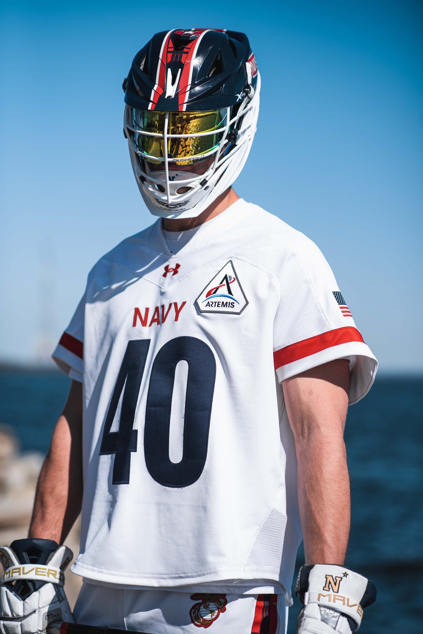
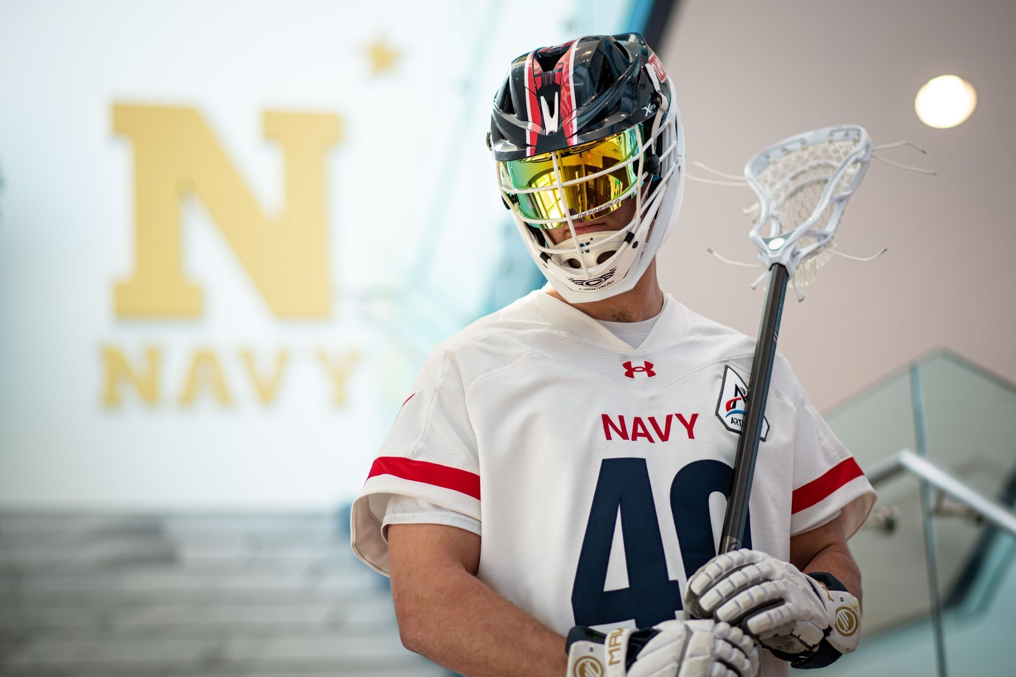
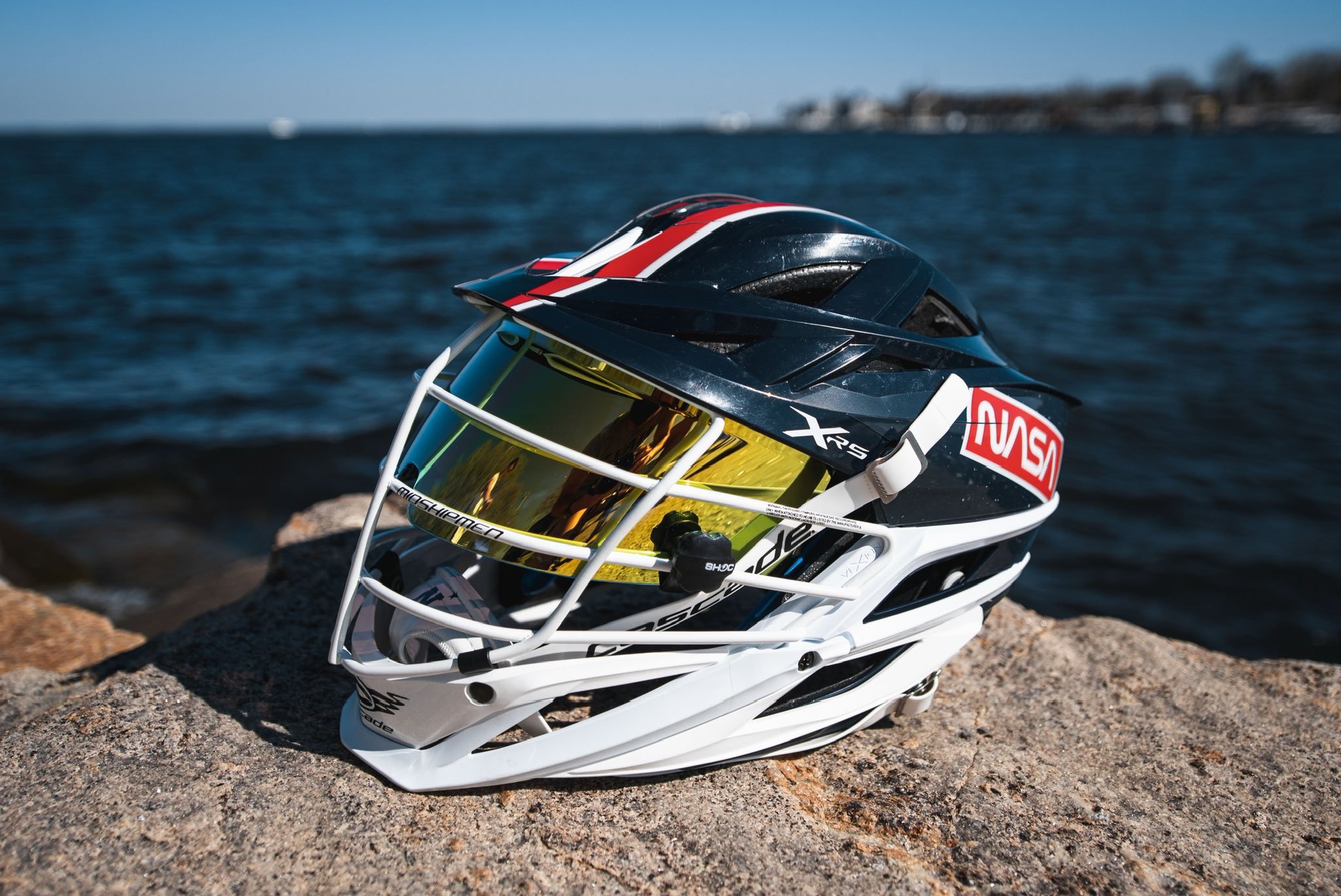
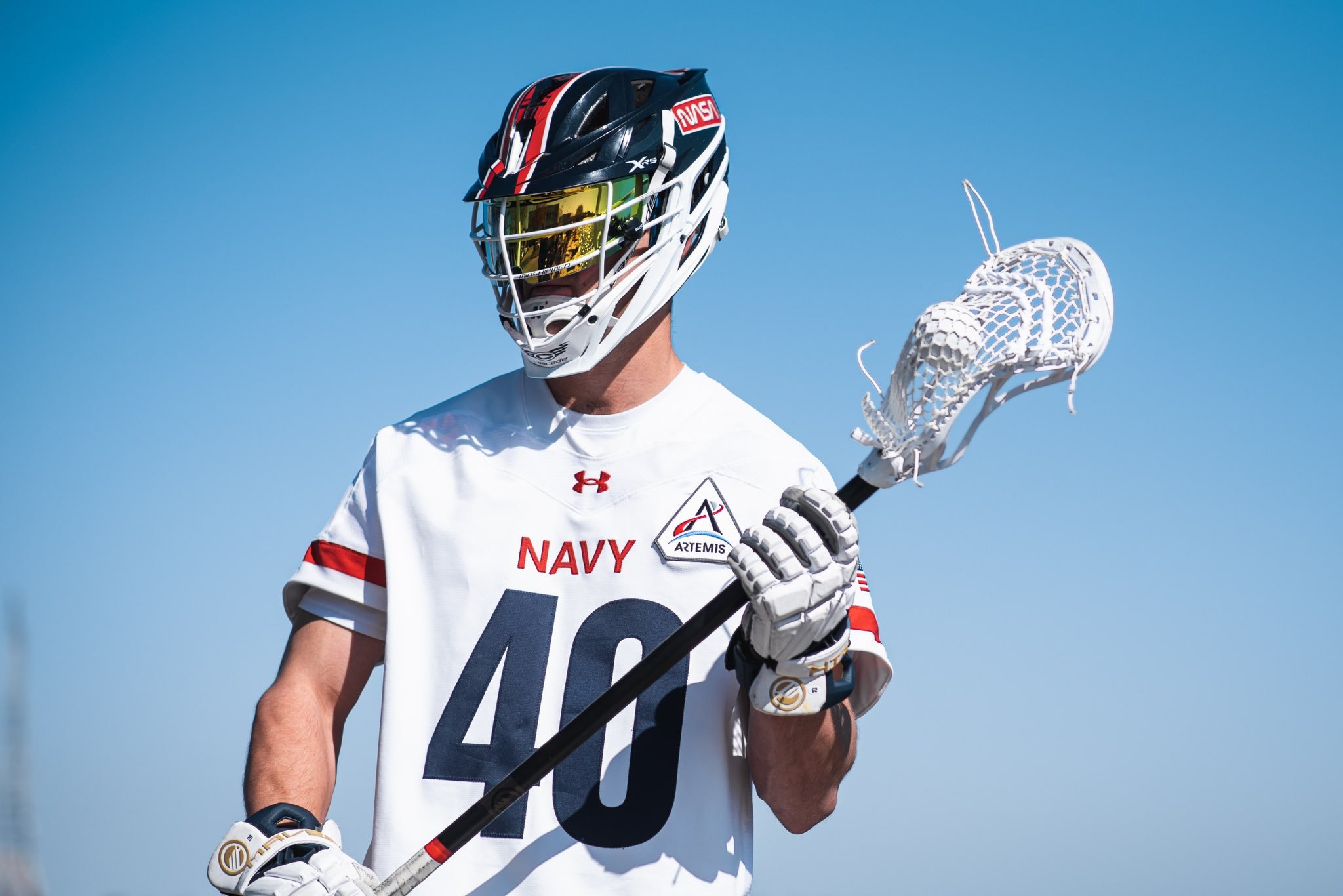
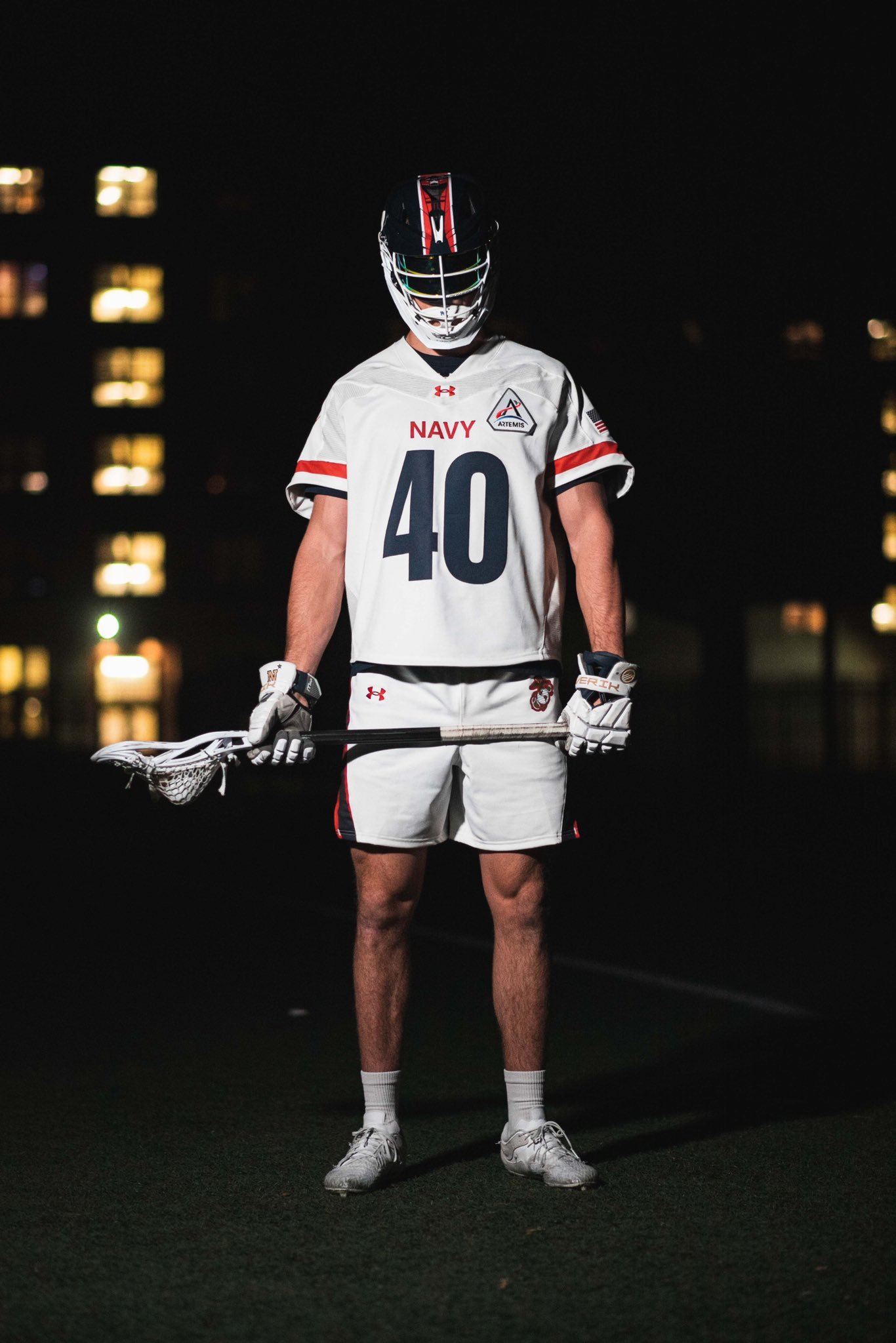
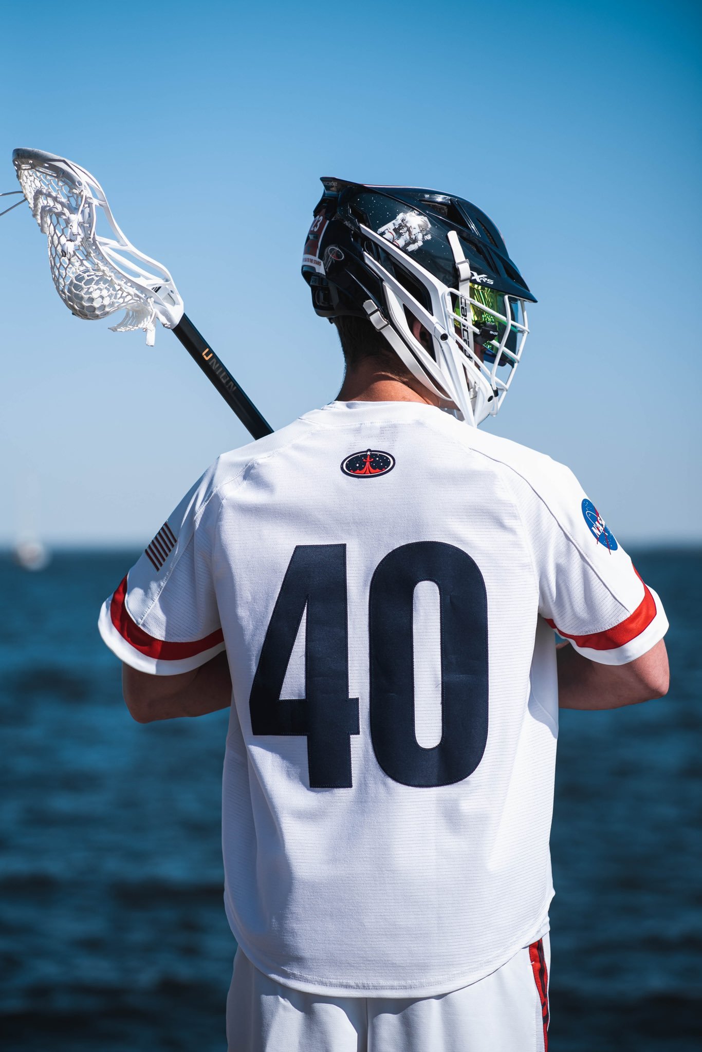
The Naval Academy has always been known for its rich history and tradition, and the Navy lacrosse team continues to honor that tradition with their unique and innovative uniforms. This year, the team has unveiled a new uniform that are inspired by NASA and its rich history.
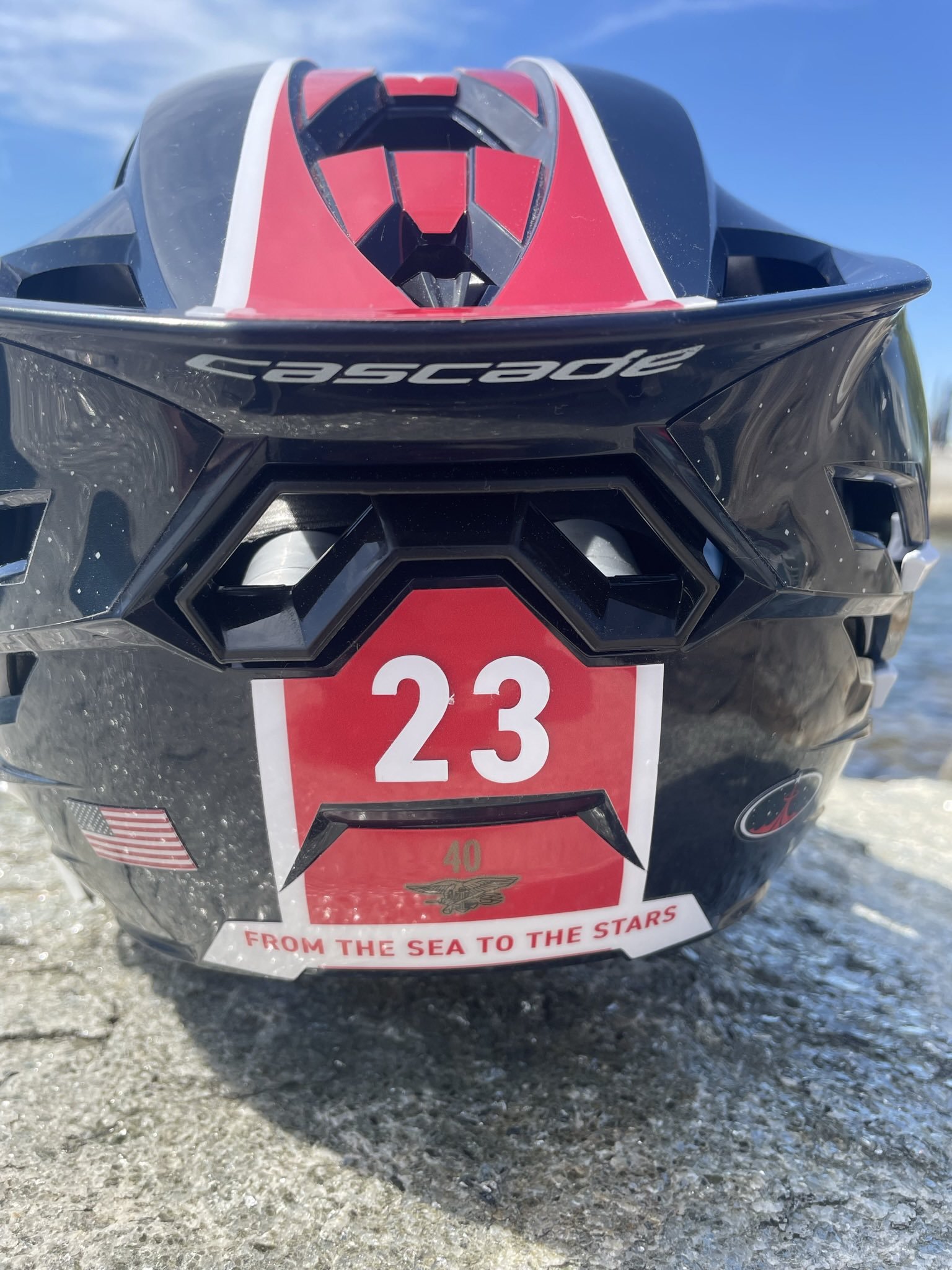
Navy Lacrosse has a unique connection to NASA, as 54 astronauts are Naval Academy graduates, the most of any institution, including Navy Lacrosse alum CAPT, USN Ret. Robert Curbeam. These uniforms pay homage to the connection between the Navy and NASA.
The white uniform with red stripes and the American flag mimic markings on the NASA spacewalk suit. The design of the uniform is sleek and sophisticated, with a modern feel that captures the spirit of the space program.
The helmet is truly a work of art. One side of the helmet features the iconic photo of McCandless untethered with the Earth in the background. The other side of the helmet features the classic NASA logo with the Moon behind it. The design is simple, yet powerful, and captures the spirit of exploration that is at the heart of both the Navy and NASA.
The uniforms also feature an Artemis patch. Artemis is the name of NASA's program to return humans to the Moon by 2024. The patch is a nod to the future of space exploration and the role that the Navy and its graduates will play in that future.
In conclusion, these new NASA-themed uniforms are a bold and innovative move for the Navy Lacrosse team. They honor the tradition of the Naval Academy and pay homage to the connection between the Navy and NASA. With their sleek and modern design, they capture the spirit of exploration and innovation that both institutions embody.
Shop Navy Gear Here

See What Else Is New
Featured
Related Articles
Featured
🙌 On Saturday, we pay homage to one of the most momentous eras in our program’s history, the 1980s!#GoHoos⚔️ pic.twitter.com/GcBhdiQKV2
— Virginia Men's Lacrosse (@UVAMensLax) April 18, 2023
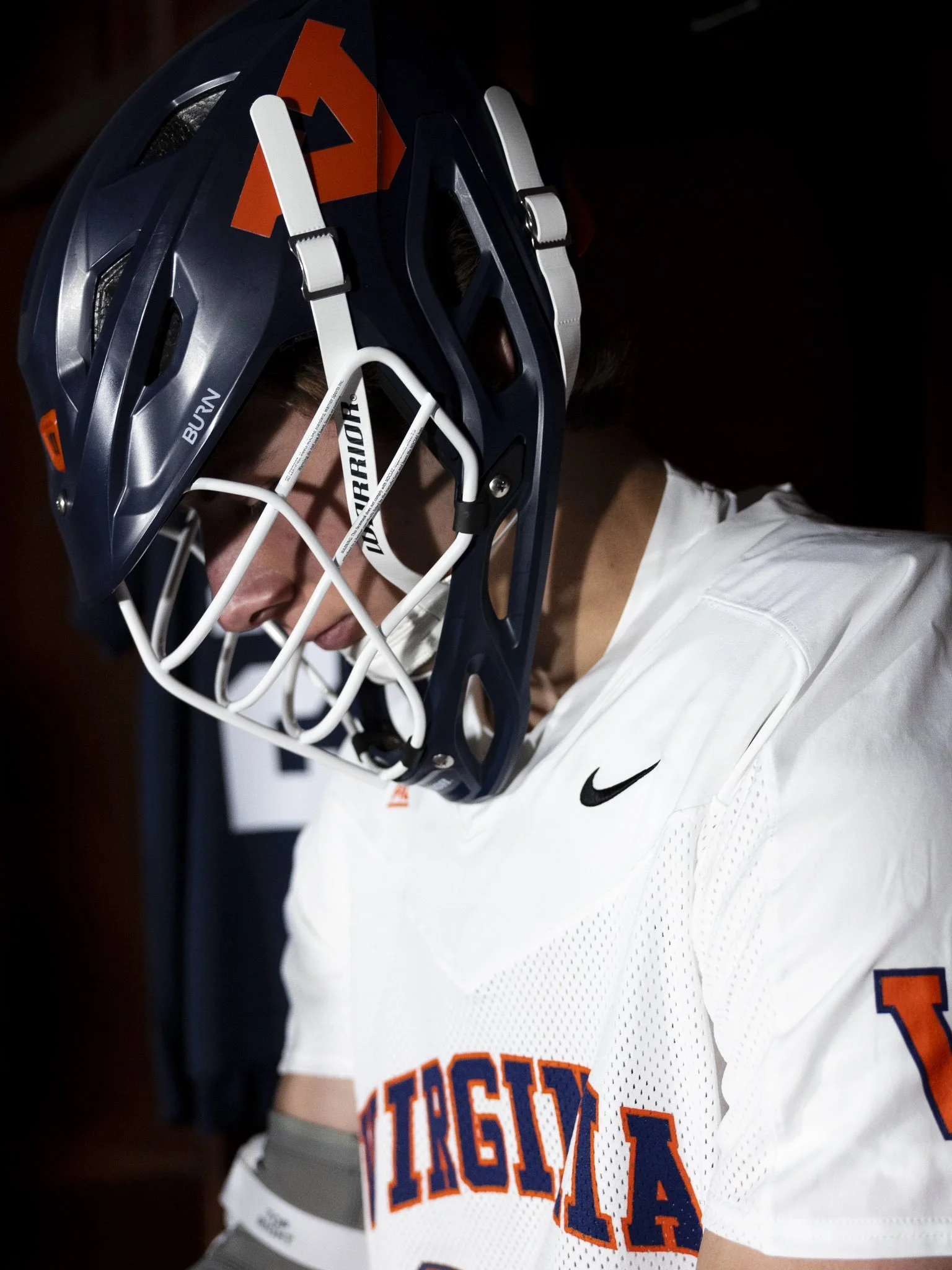
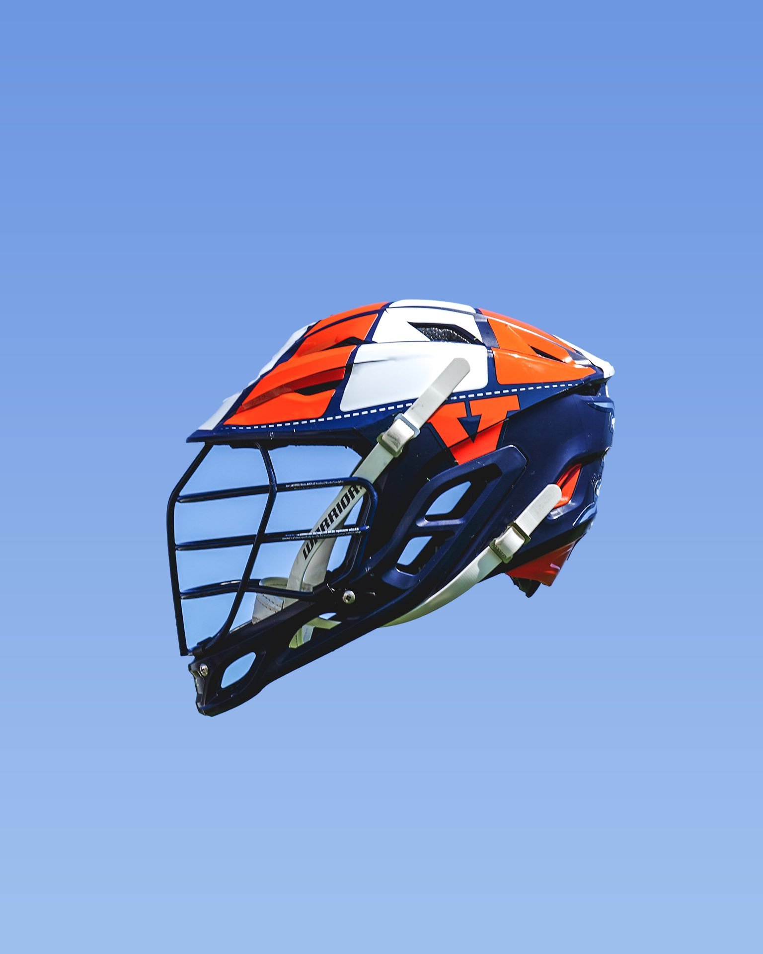
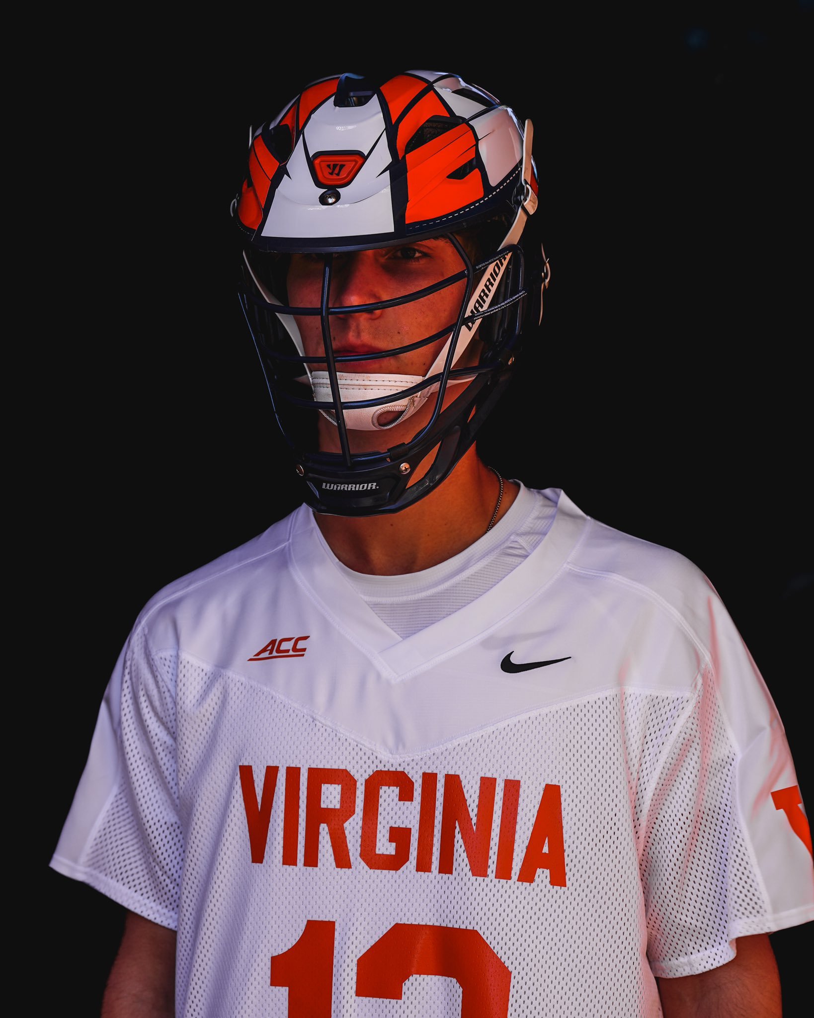
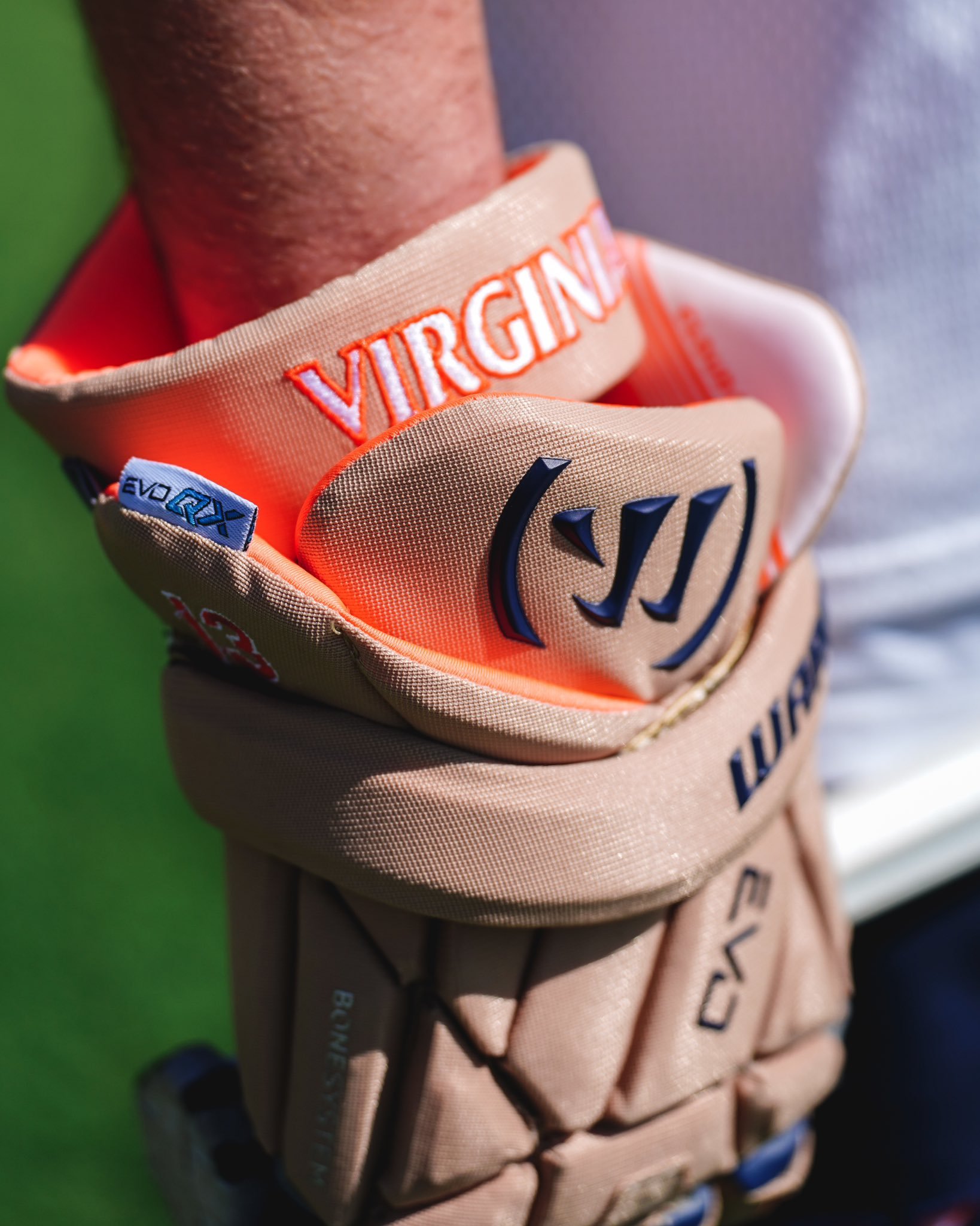
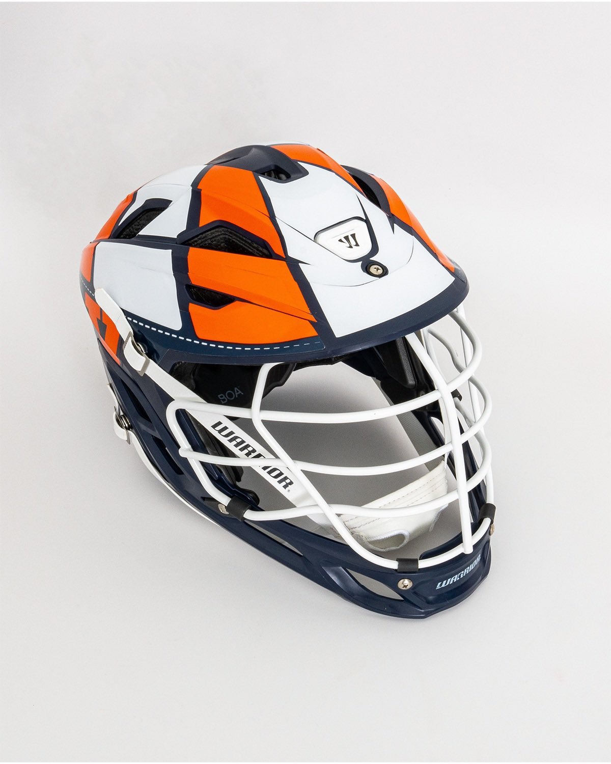
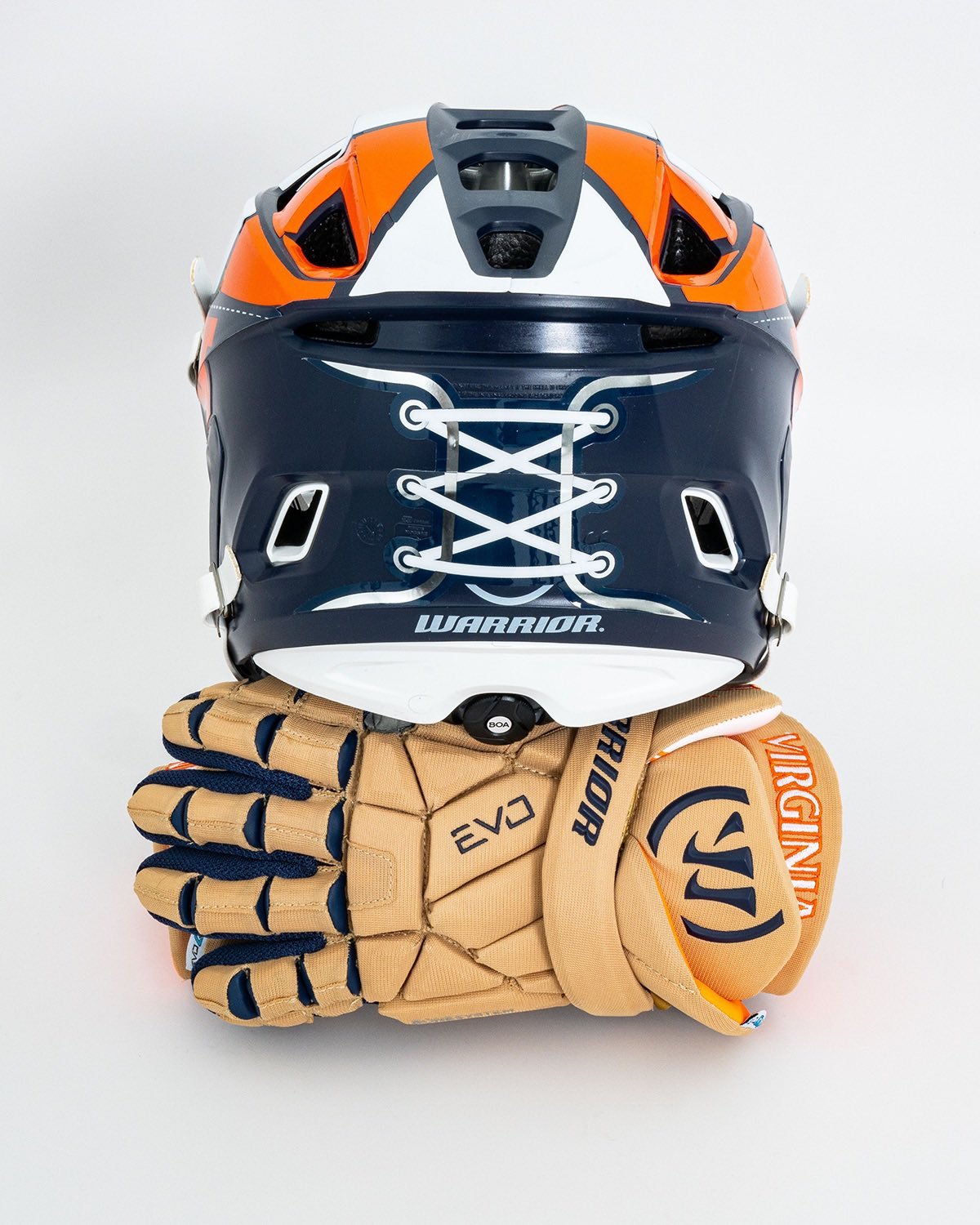
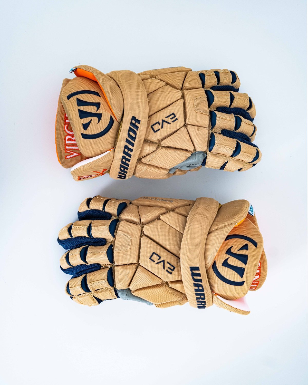
The University of Virginia lacrosse team has recently introduced a special throwback uniform, paying homage to one of the most momentous eras in the program's history, the 1980s. The new uniform features a number of classic elements, including retro helmets and vintage jerseys.
One of the most notable aspects of the new uniform is the throwback helmet design. The helmet features decals that give the look of a classic helmet, complete with laces in the back. This design is sure to evoke a sense of nostalgia in many long-time fans of the team, reminding them of some of the program's most successful years.
The white mesh jersey is also a nod to the past, featuring the word "Virginia" basic wordmark across the chest in orange lettering. The numbers on the back of the jersey are also orange, adding to the overall retro feel of the uniform. The combination of white and orange is a classic look for the UVA lacrosse team, and this design is sure to be a hit with fans.
To complement the white jersey, the team will be wearing blue shorts and tanish brown gloves. These colors are also a throwback to the team's classic look from the 1980s. The tanish brown gloves are a simple yet classic addition to the uniform.
Overall, the UVA lacrosse team's throwback uniform is a testament to the program's storied history. This classic look is sure to be a hit with fans of all ages, and will serve as a reminder of the team's past success. The combination of retro helmets, vintage jerseys, and classic colors creates a timeless design that will be appreciated by lacrosse fans for years to come.
Shop UVA Gear Here

See What Else Is New
Featured
Related Articles
Featured
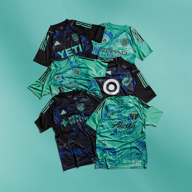
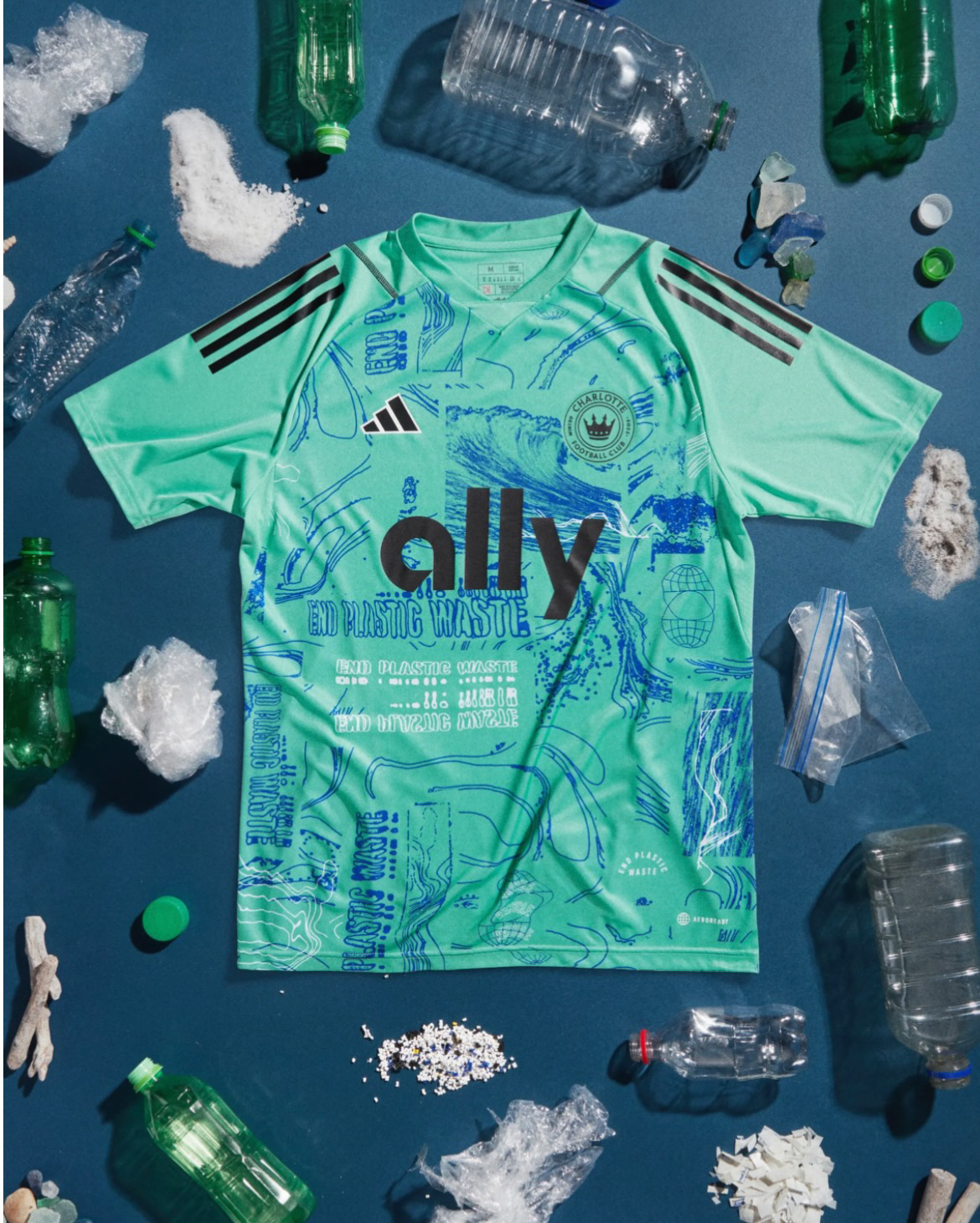
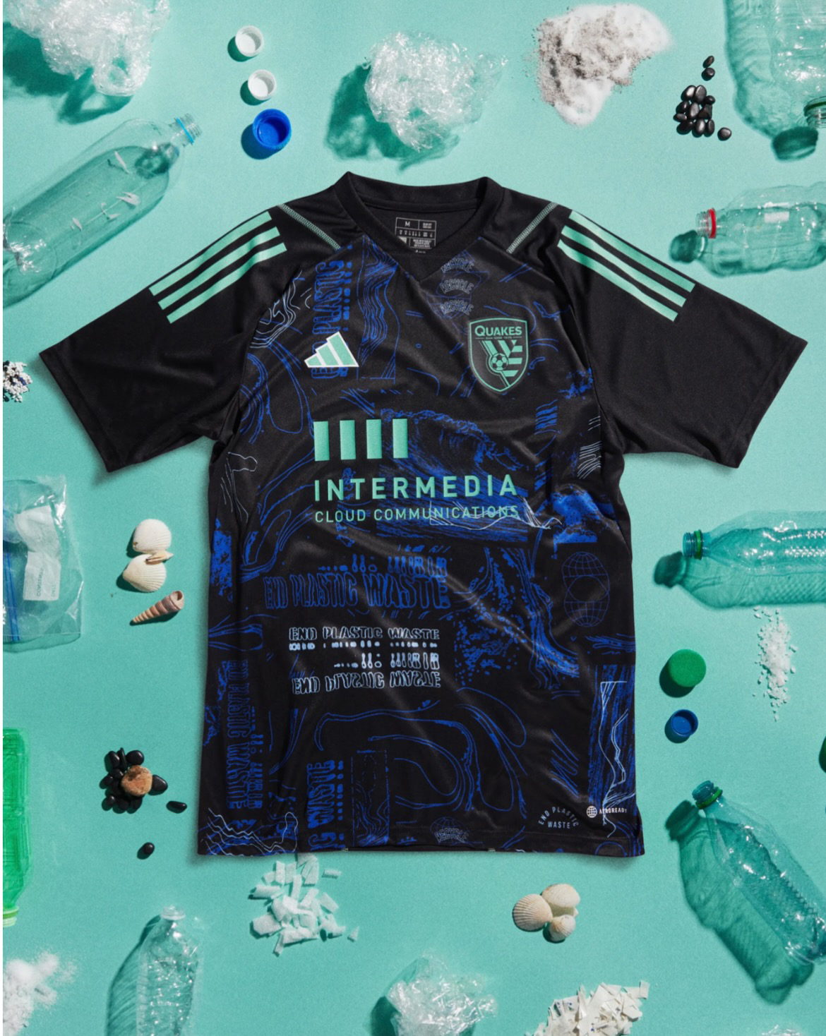
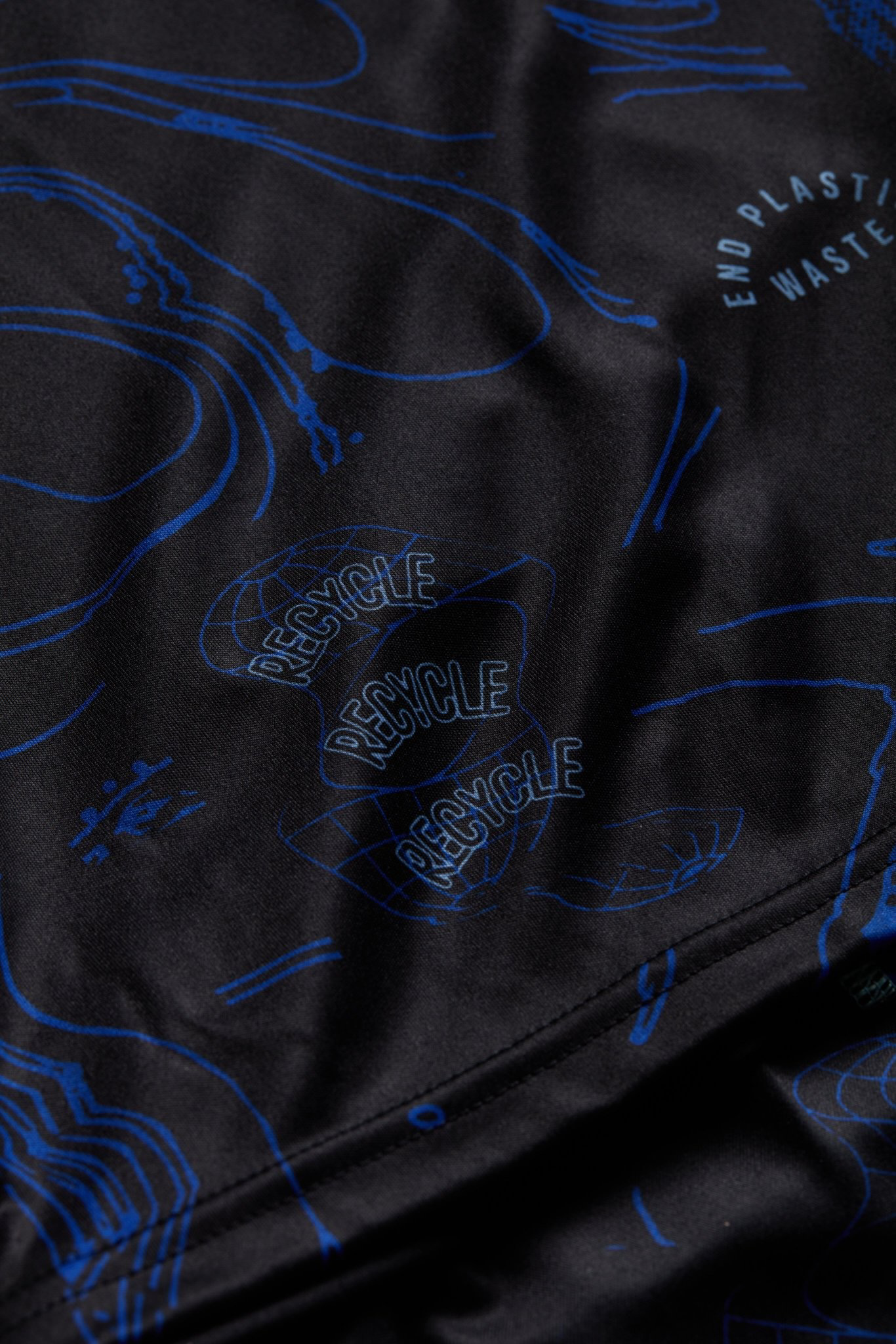
Major League Soccer and Adidas have teamed up to unveil the One Planet Kit. The kit will be worn by all teams in the league during Matchday 9, April 22-23, as MLS celebrates Earth Day and continues its goal of becoming the most sustainable league in sports.
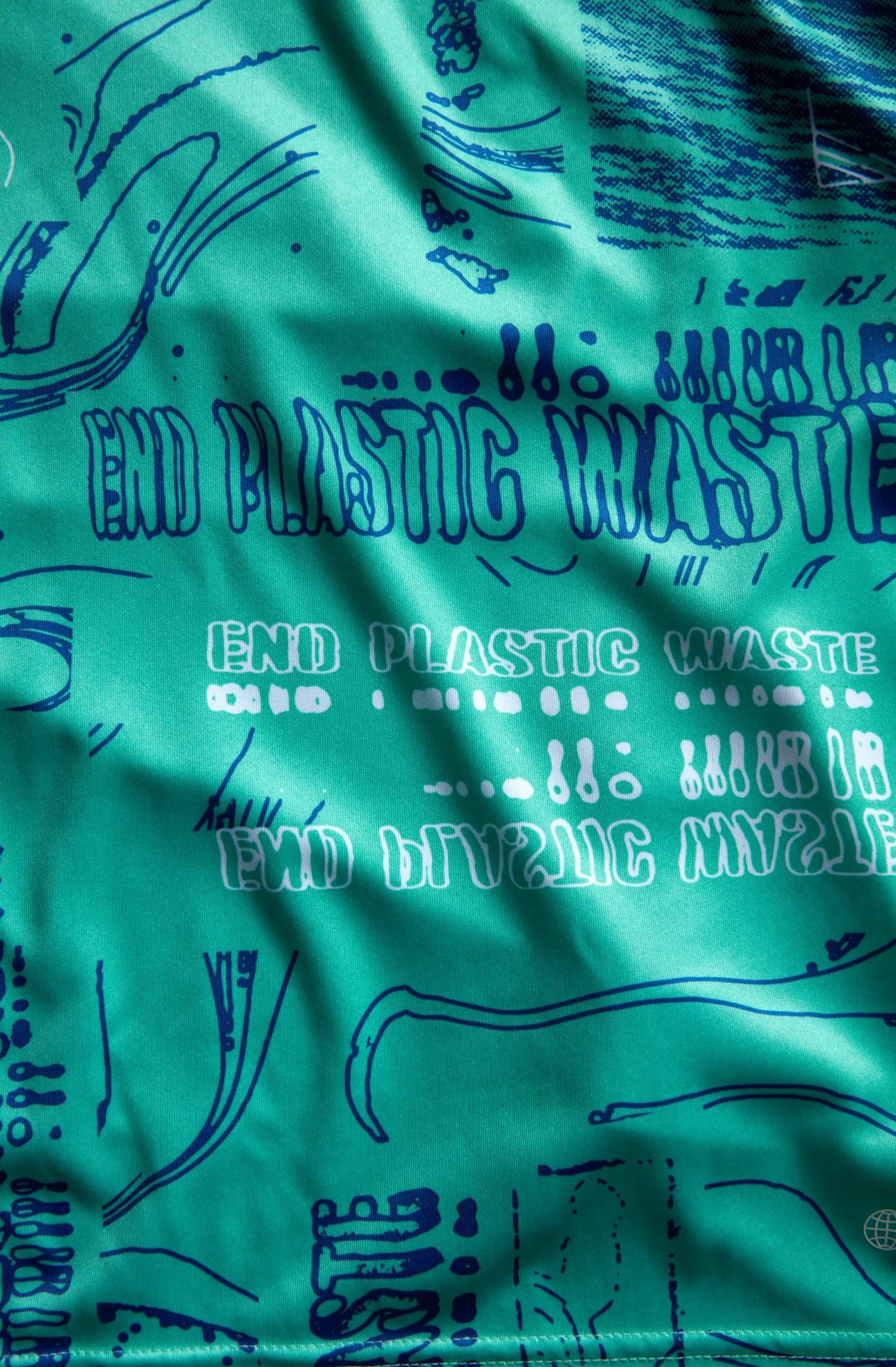
The One Planet Kit is made entirely out of Parley Ocean plastic, a recycled material created from reimagined plastic waste. The unique hand-drawn kit design pays homage to the ocean floor that each jersey aims to protect. The swirling print is blended into the repeating wordmark "End Plastic Waste," which serves as a call to action uniting each club in the collective stewardship of our planet. This message emphasizes that we all have a role to play in creating a more sustainable future.
To create these sustainable jerseys, Adidas intercepts plastics from remote islands, beaches, and coastal communities before they have the chance to reach high-risk ocean environments. The plastics are then shredded, melted, and mixed with a threaded material, ultimately completing the transformation from problem to performance. The result is a jersey that is not only stylish and comfortable to wear but also environmentally conscious.
MLS and Adidas have made a significant commitment to sustainability by creating the One Planet Kit. The league has set an ambitious goal to become the most sustainable league in sports, and this kit is just one of the many initiatives they have implemented to achieve that goal. In addition to the One Planet Kit, MLS has launched several environmental initiatives, including their Greener Goals program, which aims to reduce the league's carbon footprint and raise awareness of environmental issues among fans.
The kit is a testament to the power of collective action and serves as a call to action for us all to take steps towards a more sustainable future. As we celebrate Earth Day, let's remember that we only have one planet, one chance to make a difference.
Shop MLS Gear Here
See What Else Is New
Related Articles
Featured
UNVEILING THE COMPLETE UNIFORM SET FOR 2023 🔴⚪️
— Calgary Stampeders (@calstampeders) April 19, 2023
Get yours https://t.co/cLcuc800as#TogetherWeRide | #CFL pic.twitter.com/TjFmYPYLeM
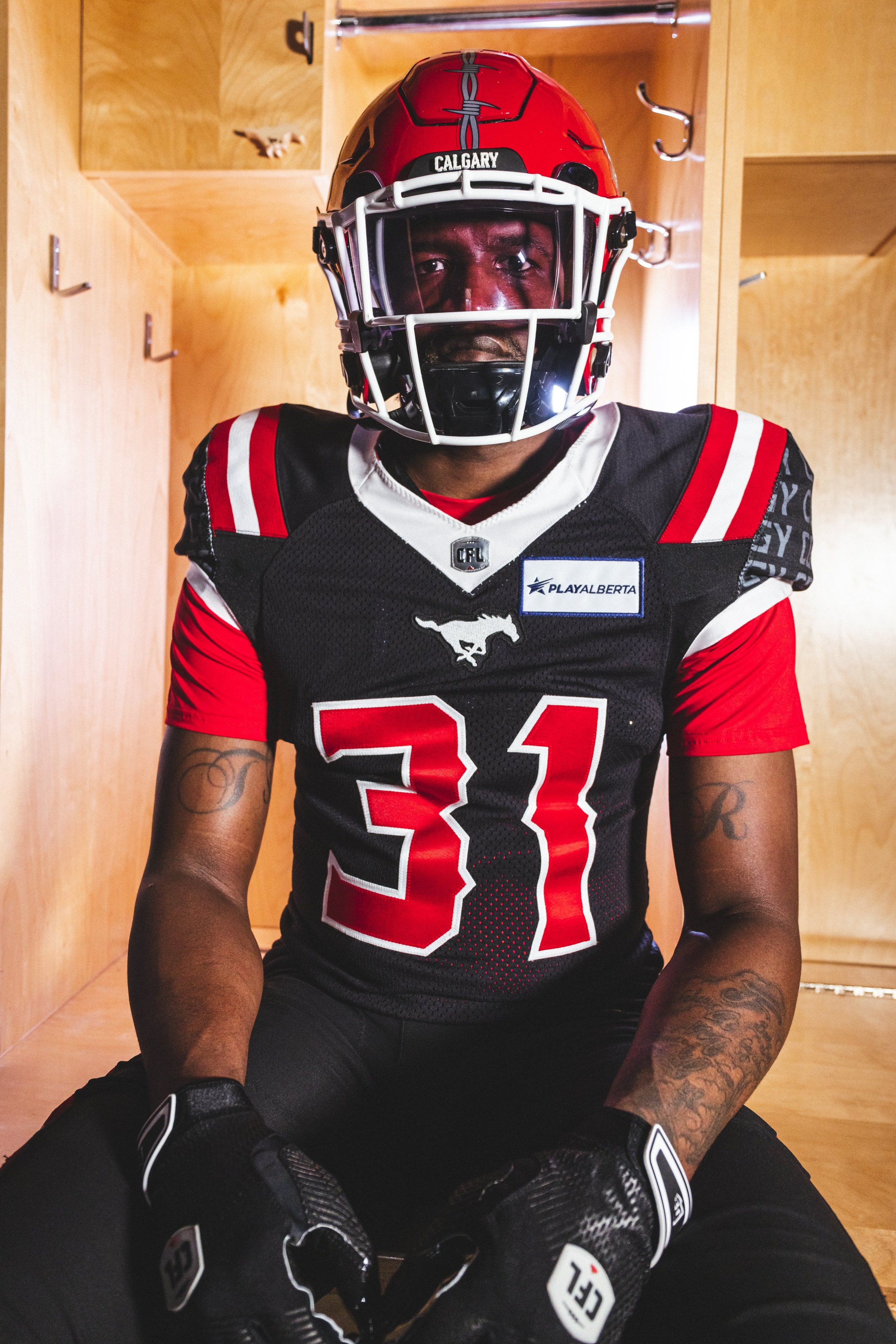
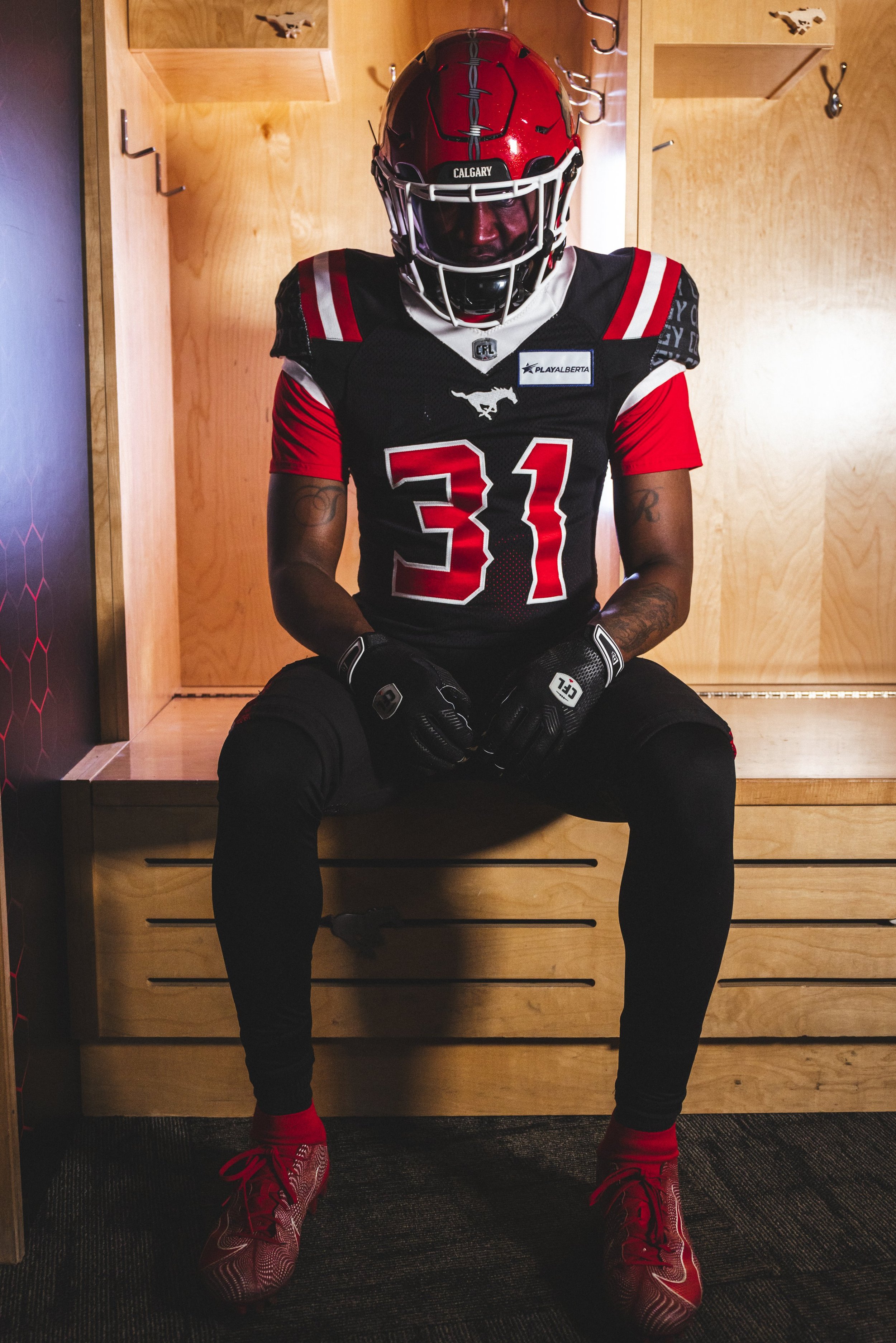
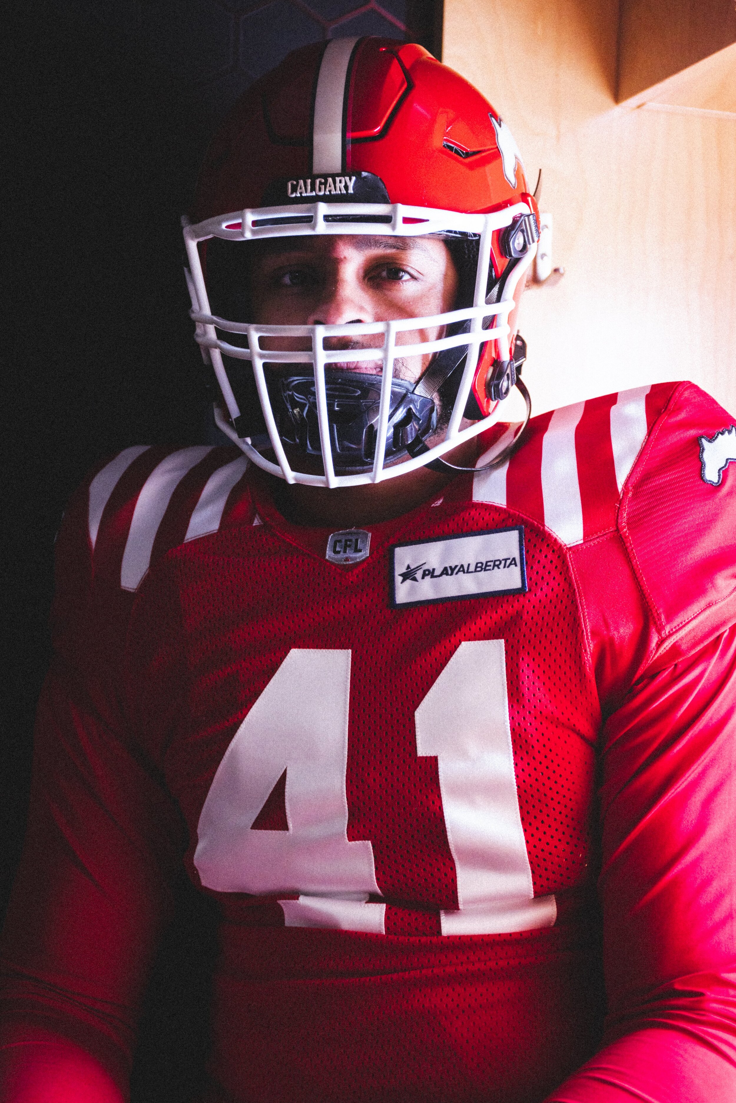
One of the most exciting times of the year for Canadian football fans is when teams reveal their new uniforms. For the 2023 CFL season, the Calgary Stampeders have unveiled their new home, away, and alternate jerseys, featuring a combination of old and new elements that are sure to excite fans.
The home uniforms are quite similar to the ones worn by the team during the 2021 season, which celebrated the Stampeders' 75th anniversary. These jerseys feature the team's classic red and white color scheme and have become the team's primary uniform since their introduction. The continuity of this design offers a sense of familiarity to fans, while the white facemasks provide a fresh update.
The away uniforms have undergone more noticeable changes compared to the previous season's designs. The black outline around the jersey numbers has been removed, and the black piping along the side of the jerseys has been eliminated. In their place, white stripes have been added to the shoulders and pants, creating a more streamlined and modern look. The white facemasks also give the away uniforms a new twist.
The alternate uniforms, which have been a fan favorite since their introduction in 1994, remain virtually unchanged from their previous iterations. The bold black design offers a striking contrast to the team's traditional red and white colors and is typically worn during the annual Labour Day Classic. The white facemasks add a new touch to the already iconic design.
The Stampeders have a rich history of incorporating black, silver, and gold accents into their uniforms. The introduction of black alternative uniforms in 1994 was a game-changer and has become a staple for the team. The new uniforms for the 2023 season maintain this tradition while adding a contemporary touch that reflects the team's evolution over the years.
In conclusion, the Calgary Stampeders' new uniforms for the 2023 CFL season are a combination of classic and modern design elements. The home uniforms maintain the team's traditional red and white color scheme, while the away and alternate uniforms offer a fresh update. The addition of white facemasks to all three designs pays homage to the team's history while offering a new twist. Overall, the new uniforms are sure to be a hit with fans and add to the excitement of the upcoming season.
SHOP Fan GEAR HERE




See What Else Is New
Related Articles
Featured

