The Florida Panthers are once again on top of the hockey world, and now, they have the hardware to prove it. The Panthers celebrated their back-to-back championships as players, coaches, and staff received their 2025 Stanley Cup Championship Rings during a private ceremony at the War Memorial Auditorium in Fort Lauderdale.
Handcrafted in 14-karat white and yellow gold and featuring over 450 diamonds and genuine rubies, the ring captures both the legacy and the grit of a team that defended its title “against overwhelming odds.”
“When designing this ring we wanted to appropriately memorialize the story of the 2024-25 Florida Panthers,” said Panthers Owner & Alternate Governor Teresa Viola. “This ring symbolizes our continued pursuit of excellence, our commitment to the community and the values embodied by our players, coaches and staff.”
The ring’s top showcases ‘PANTHERS’ in 14-karat yellow gold, sitting above two Stanley Cups that represent the team’s 2024 and 2025 titles. Surrounding these Cups are 81 diamonds and 60 rubies, symbolizing the back-to-back championships. The perimeter features the words ‘STANLEY CUP CHAMPIONS’, also set in gold and adorned with an additional 145 diamonds, while another 122 diamonds and 18 princess-cut rubies complete the design.
“The 2025 ring features details that bring the back-to-back champions’ story to life,” said Chris Poitras, SVP and GM of The Champions Collective. “We are honored to present it to the Panthers organization.”
Each ring is personalized for its recipient, featuring their name and title on the left side, along with a panel shaped like the team’s primary shield logo. The right side displays ‘FLORIDA’ in yellow gold above the Leaping Cat logo, framed by two palm trees that represent the palms lining Amerant Bank Arena.
White gold palm trees wrap around the interior, leading to a prowling panther engraving on the outer edge, a sleek finishing touch that embodies the team’s fearless spirit.
Inside the ring, engravings tell the story of the Panthers’ journey:
“WE APOLOGIZE TO NO ONE,” the team’s rallying mantra, is boldly etched above the playoff series results.
The date of their championship-clinching victory — June 17, 2025 — is immortalized.
And finally, a small black rat engraving pays tribute to one of the most beloved fan traditions in hockey.
With over 450 gemstones totaling approximately 16.15 carats, the 2025 Stanley Cup ring isn’t just a symbol of victory—it’s a tribute to a team that has defined resilience, confidence, and culture in South Florida sports.
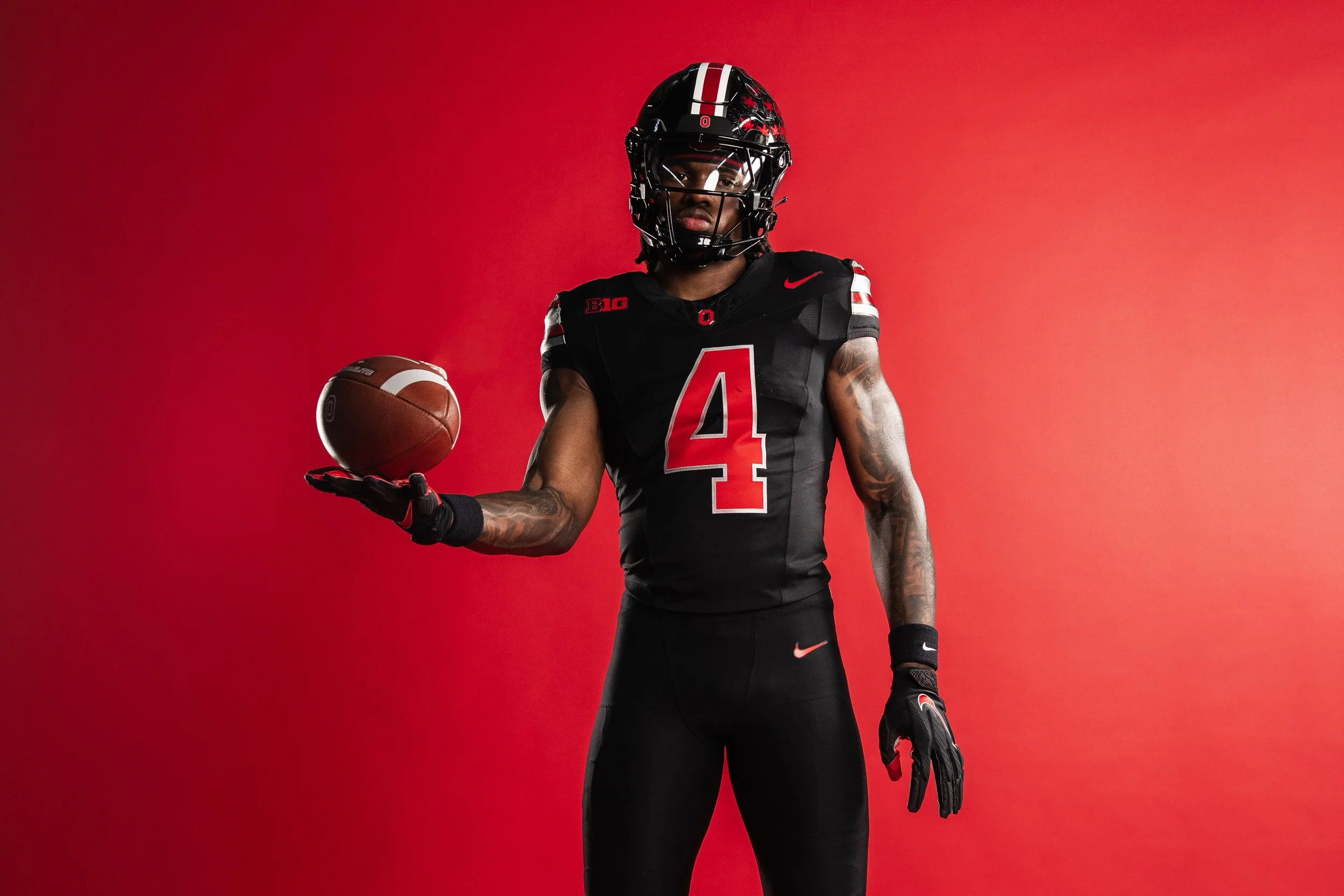
It’s time for the UNISWAG Weekly Countdown for the 2025 College Football Season, Presented by Big Game USA!
Each week, we highlight the cleanest, boldest, and most innovative uniforms across the college football landscape, all building toward that coveted No. 1 spot.
Check out the Week 6 Uniform of the Week Countdown as we celebrate the designs that made the biggest impact on the field!
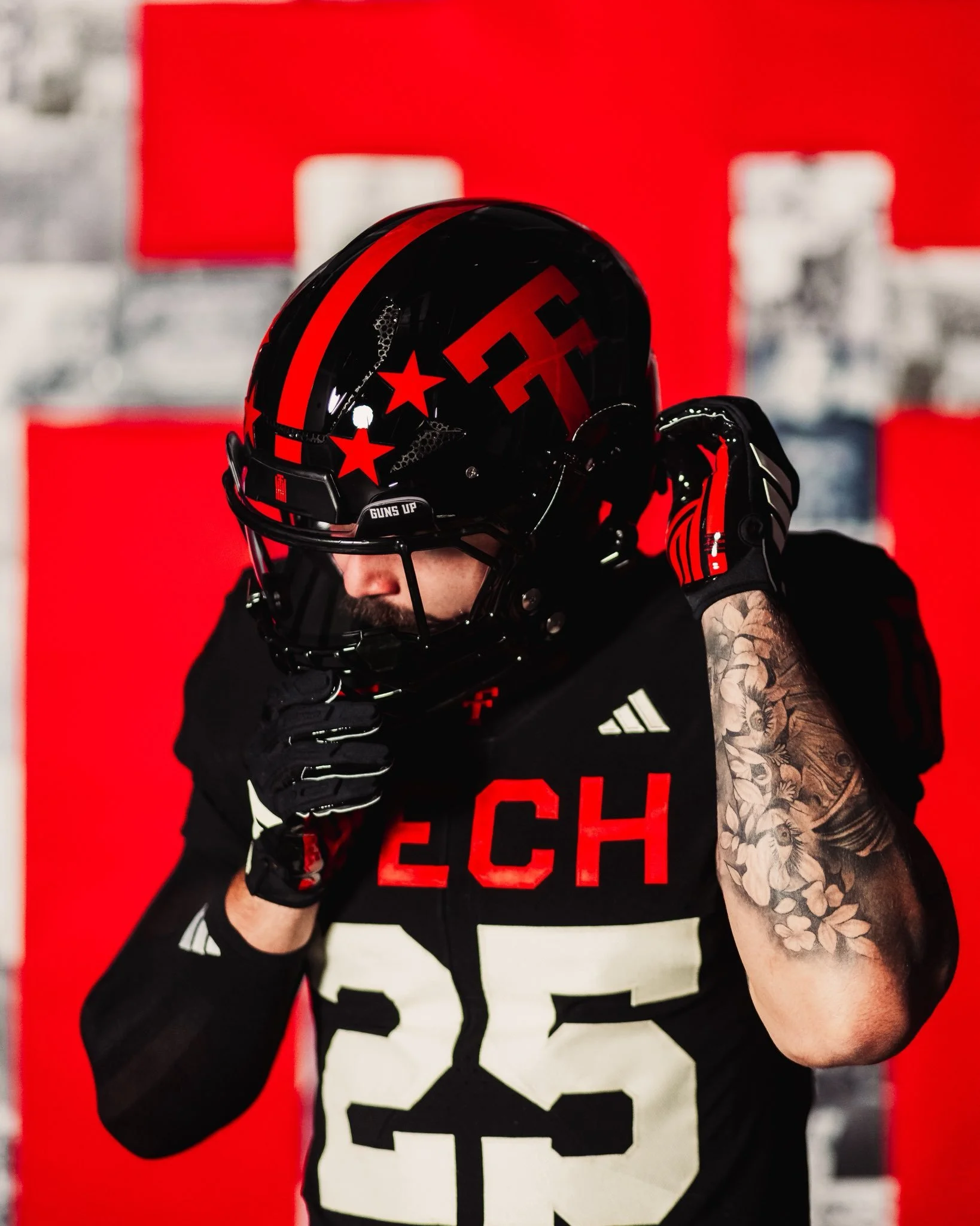
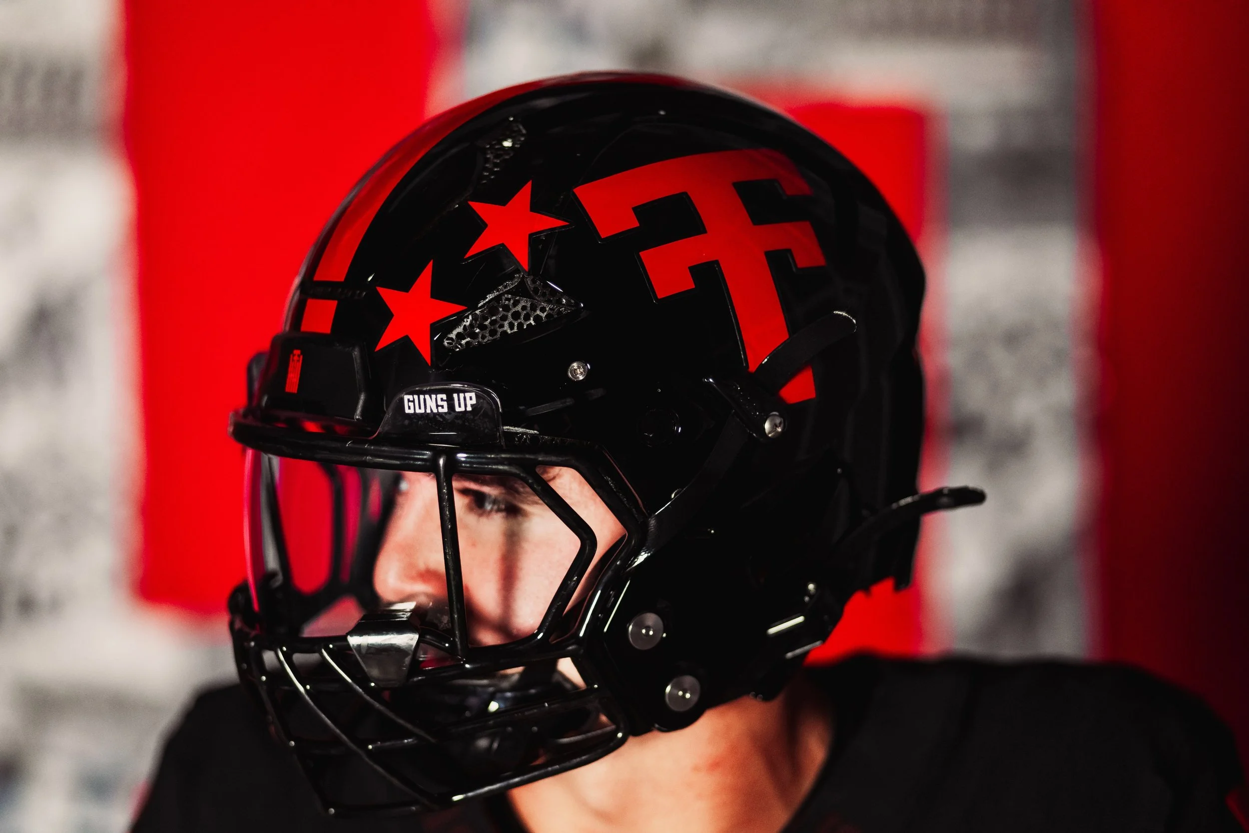
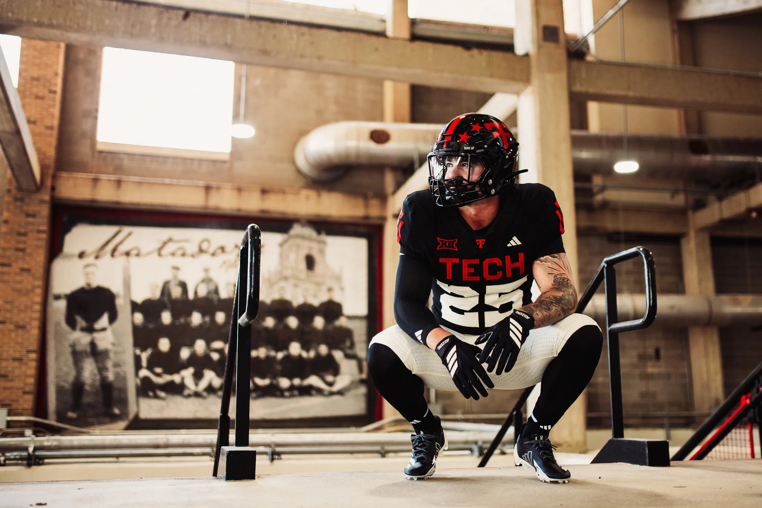
Texas Tech football is honoring a century of tradition in 2025 with a special throwback uniform celebrating the program’s 100th anniversary. The look not only nods to the Red Raiders’ historic past but also highlights key milestones in uniform design that shaped the team’s identity over the decades.
The program’s first football team took the field in 1925, when the “Tech” wordmark first appeared on the team’s uniform. Just a year later, in 1926, the now-iconic Double T made its debut, establishing a logo that would become one of the most recognizable marks in college sports.
By 1930, Texas Tech was already pushing the boundaries of uniform design by incorporating the Double T into traction stripes, a cutting-edge look for its time.
In 1935, the program introduced jersey numbers to the front of the uniform for the first time, bringing both functionality and identity to the design. Fast forward to the mid-1960s, when stripes inspired by the Masked Rider and the horse’s breast collar were added to the uniforms in 1965, further cementing a connection to Tech’s most famous tradition. Just a few years later, in 1969, helmet stars were introduced as awards, giving players a chance to showcase their individual achievements while adding another memorable layer of style.
Each detail in the 2025 throwback uniform is a nod to these defining eras, from the early wordmarks to the stripes and symbols that became staples of Texas Tech’s identity. By weaving in elements from across decades, the Red Raiders’ centennial look is a visual timeline of 100 years of grit, innovation, and football in Lubbock.
As the Red Raiders take the field in their anniversary throwbacks, the uniforms will stand as more than just a jersey; they’re a tribute to the players, coaches, and fans who built Texas Tech football into what it is today.
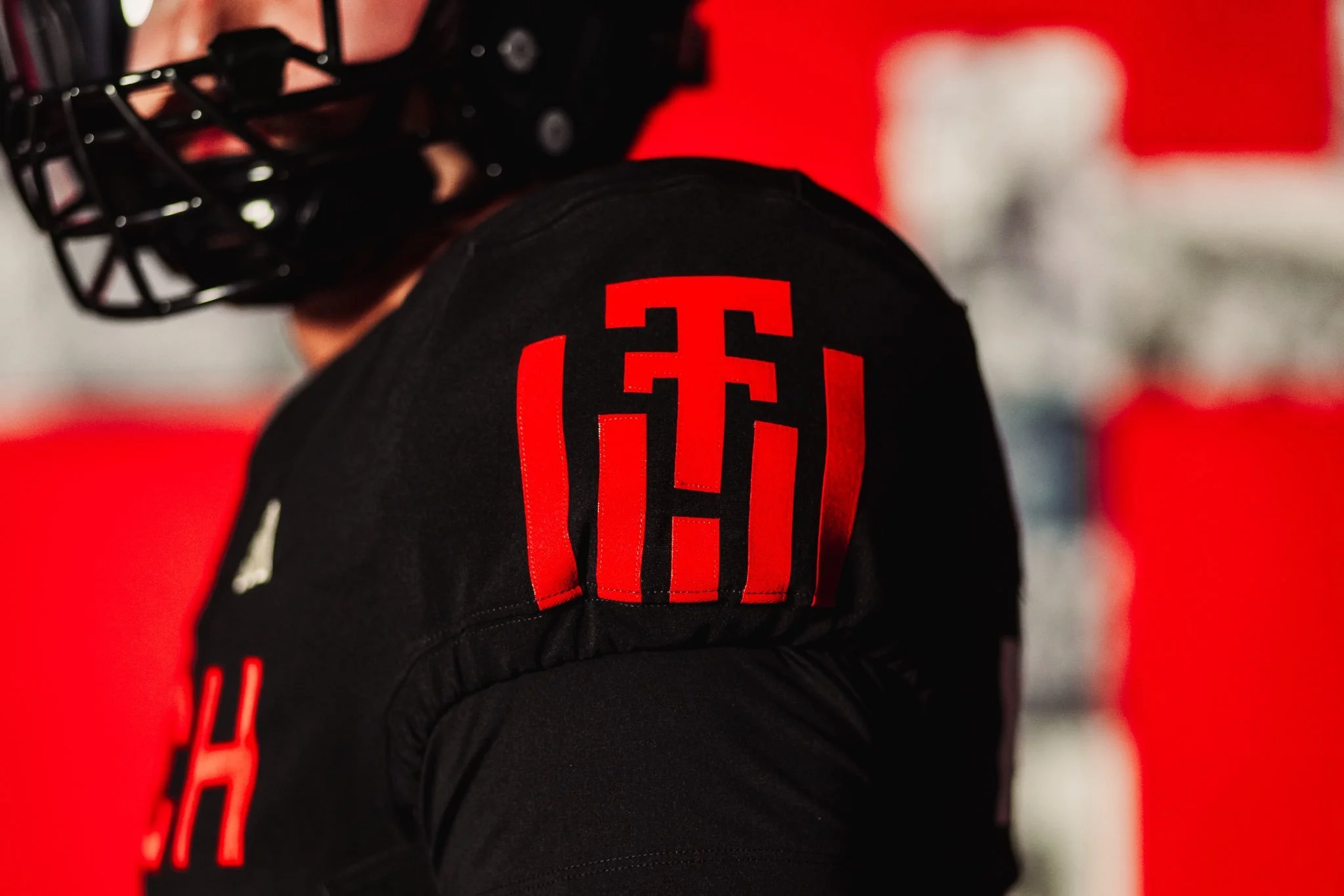
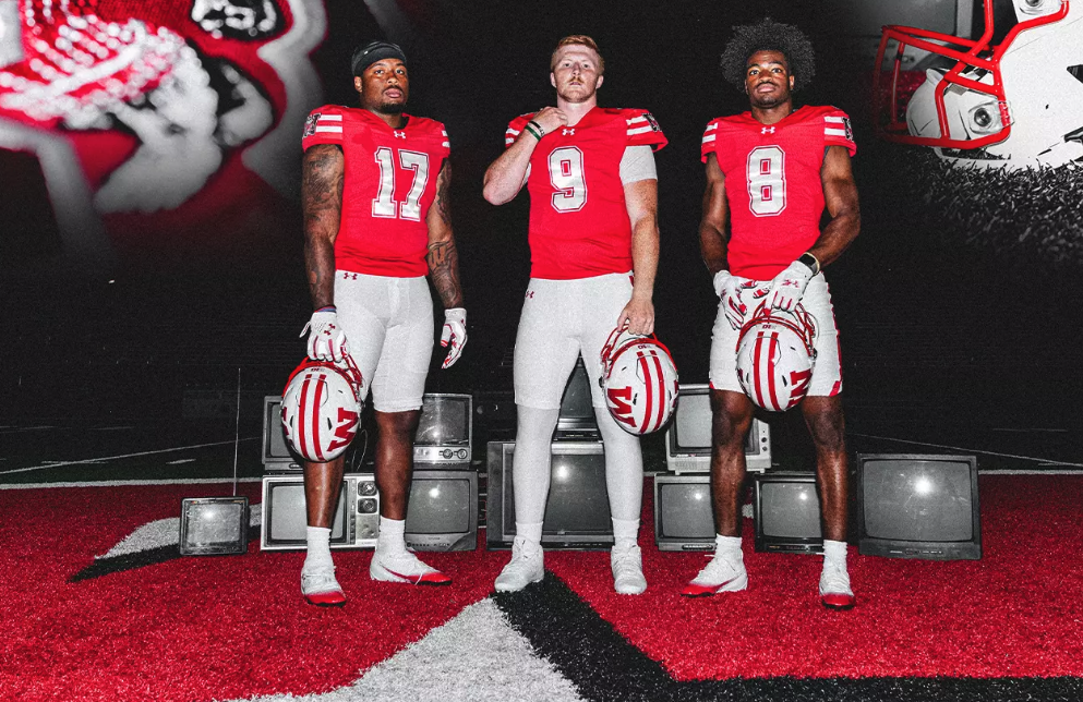
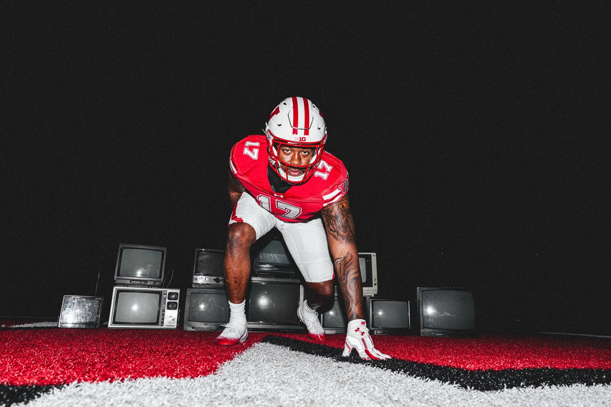
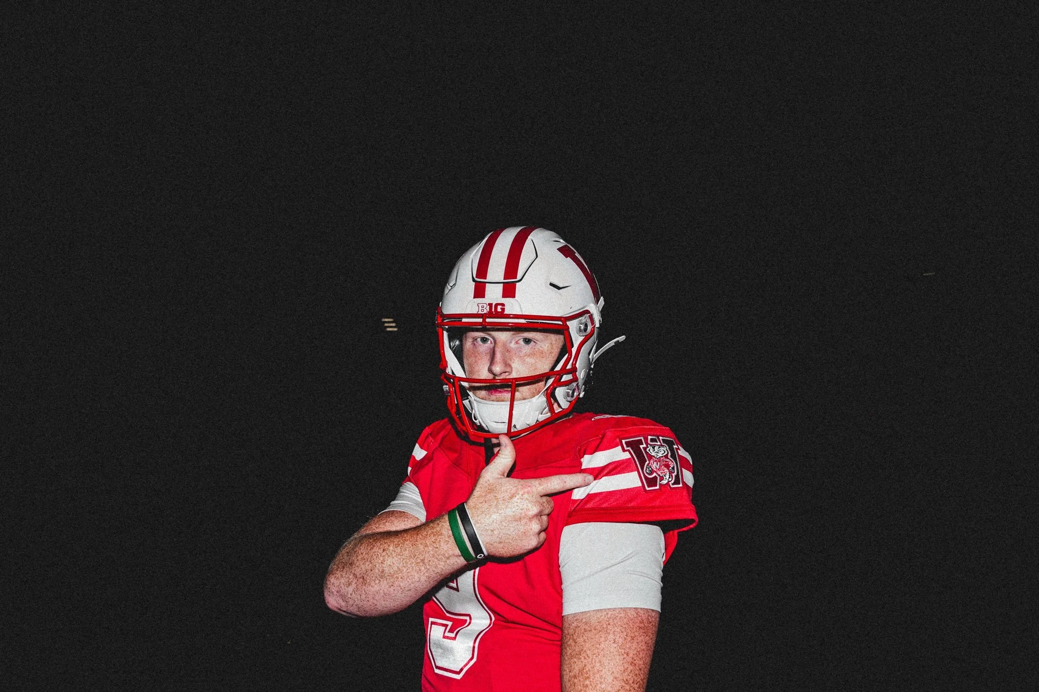
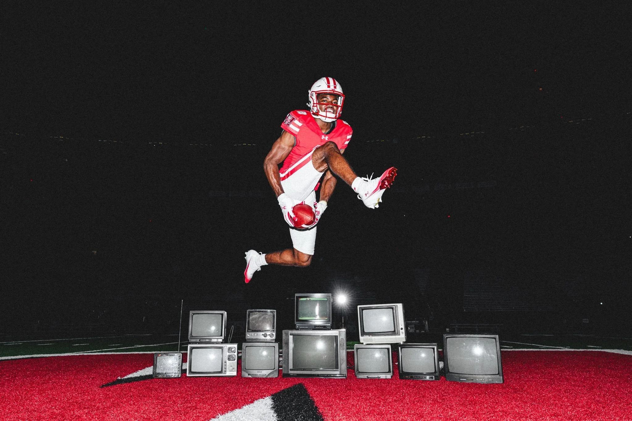
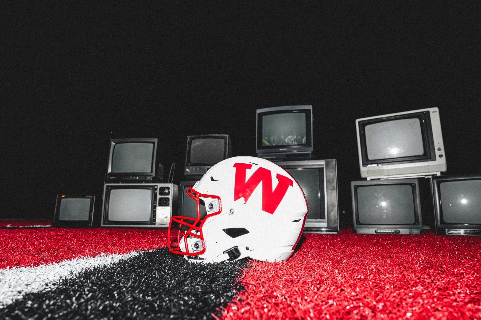
Wisconsin will debut a special throwback uniform on October 11, 2025, when the Badgers host Iowa for Homecoming. The look pays tribute to the program’s proud heritage, blending vintage design with modern performance technology.
The red jerseys carry a classic aesthetic, featuring bold block numbers outlined with a simple stripe. A block W and Bucky Badger logo add nods to past eras, appearing on the sleeves and the back of the uniform. To complete the look, the Badgers will sport white helmets with red facemasks, topped with the traditional block W that defined Wisconsin football in decades past.
This collaboration isn’t just about nostalgia; it’s a celebration of the history and culture that make Wisconsin Football unique. From the sound of “Jump Around” shaking Camp Randall to the program’s championship pedigree, the throwback set reminds fans and players alike of the legacy they carry every Saturday.
Come October, the Badgers won’t just be playing for a win against Iowa. They’ll be playing in a look that connects generations of Wisconsin fans to the tradition of one of college football’s most iconic programs.
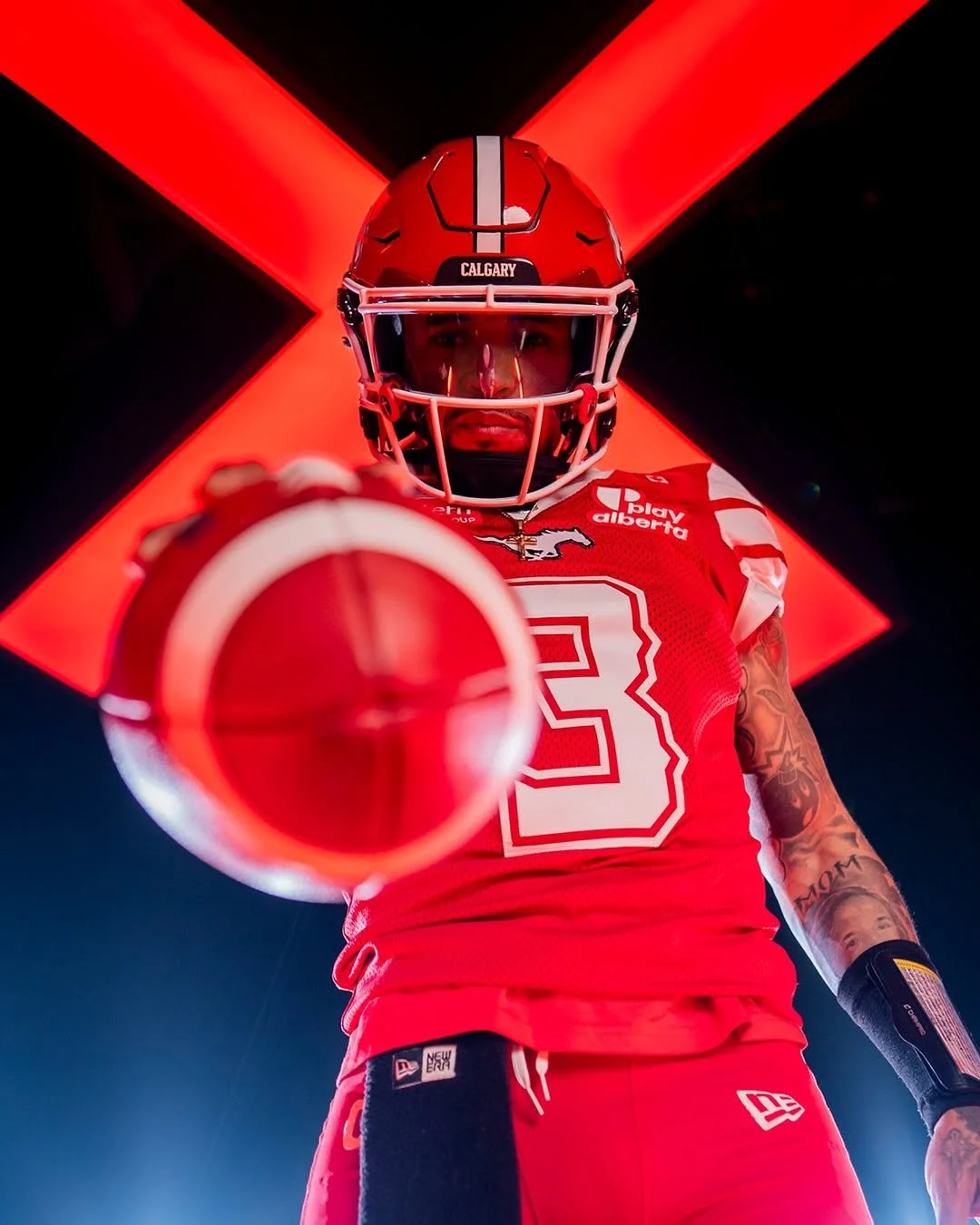
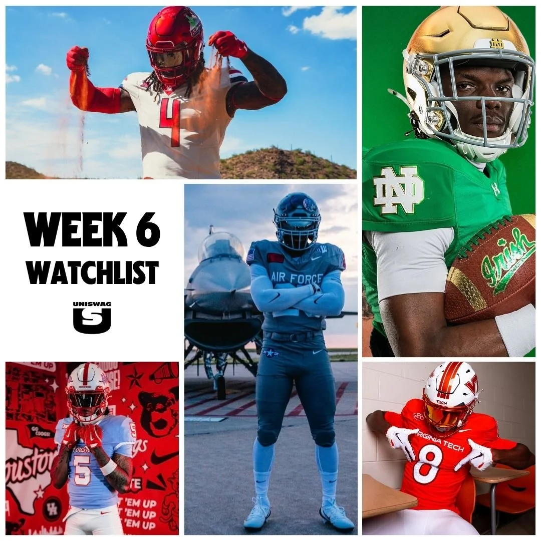
The UNISWAG Uniform of the Week Countdown is back for Week 6 of college football!
Check out which teams are turning heads with their uniform combos this weekend. The official Top 10 drops monday, leading up to the reveal of the Week 6 Uniform of the Week winner.
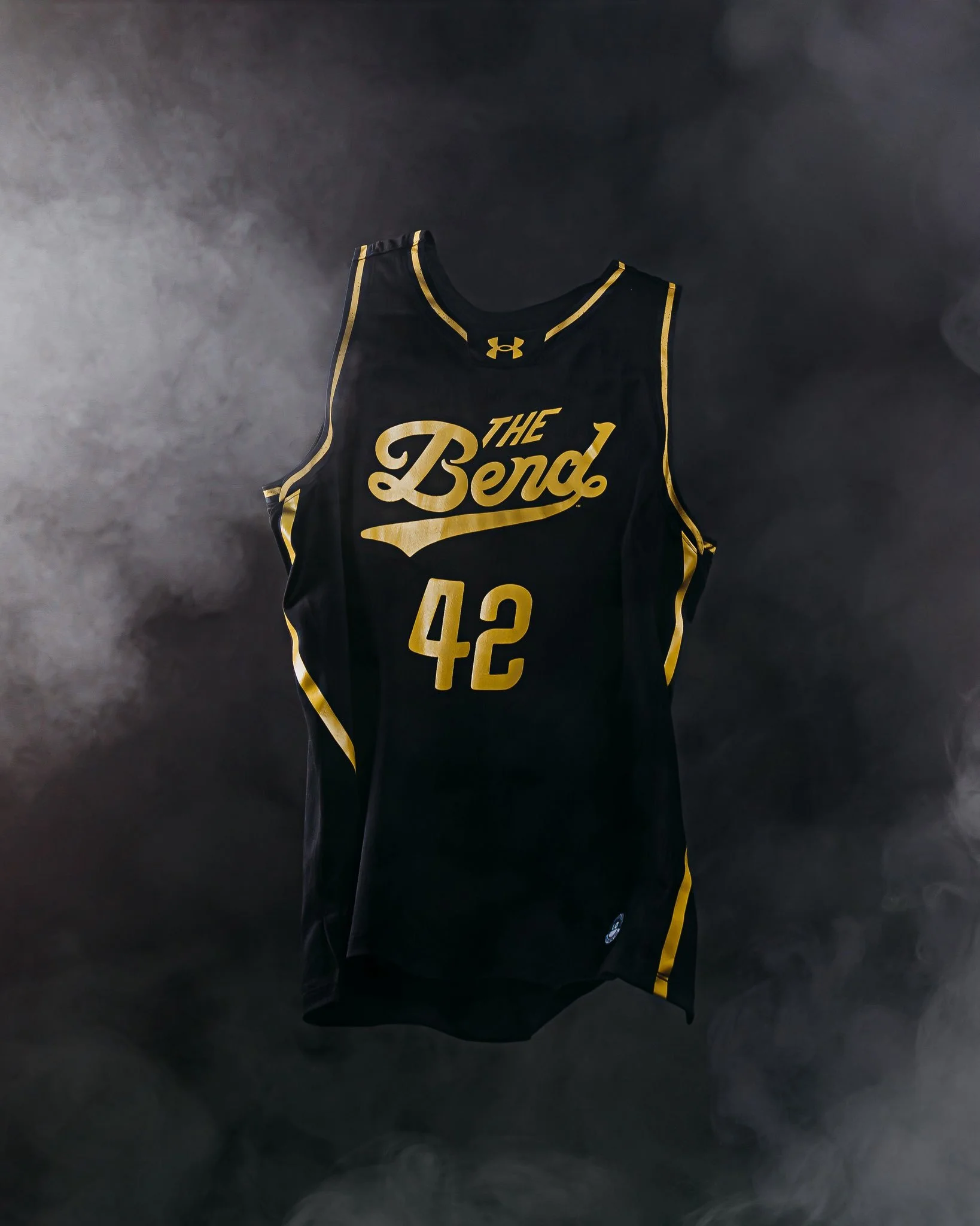
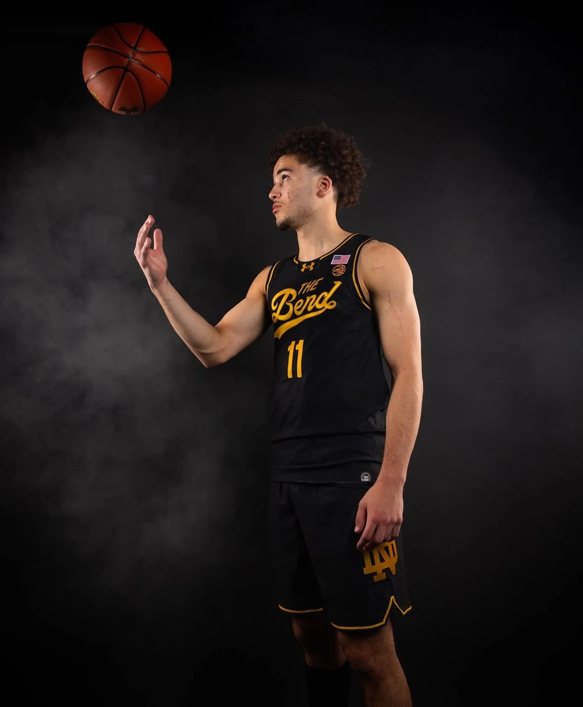
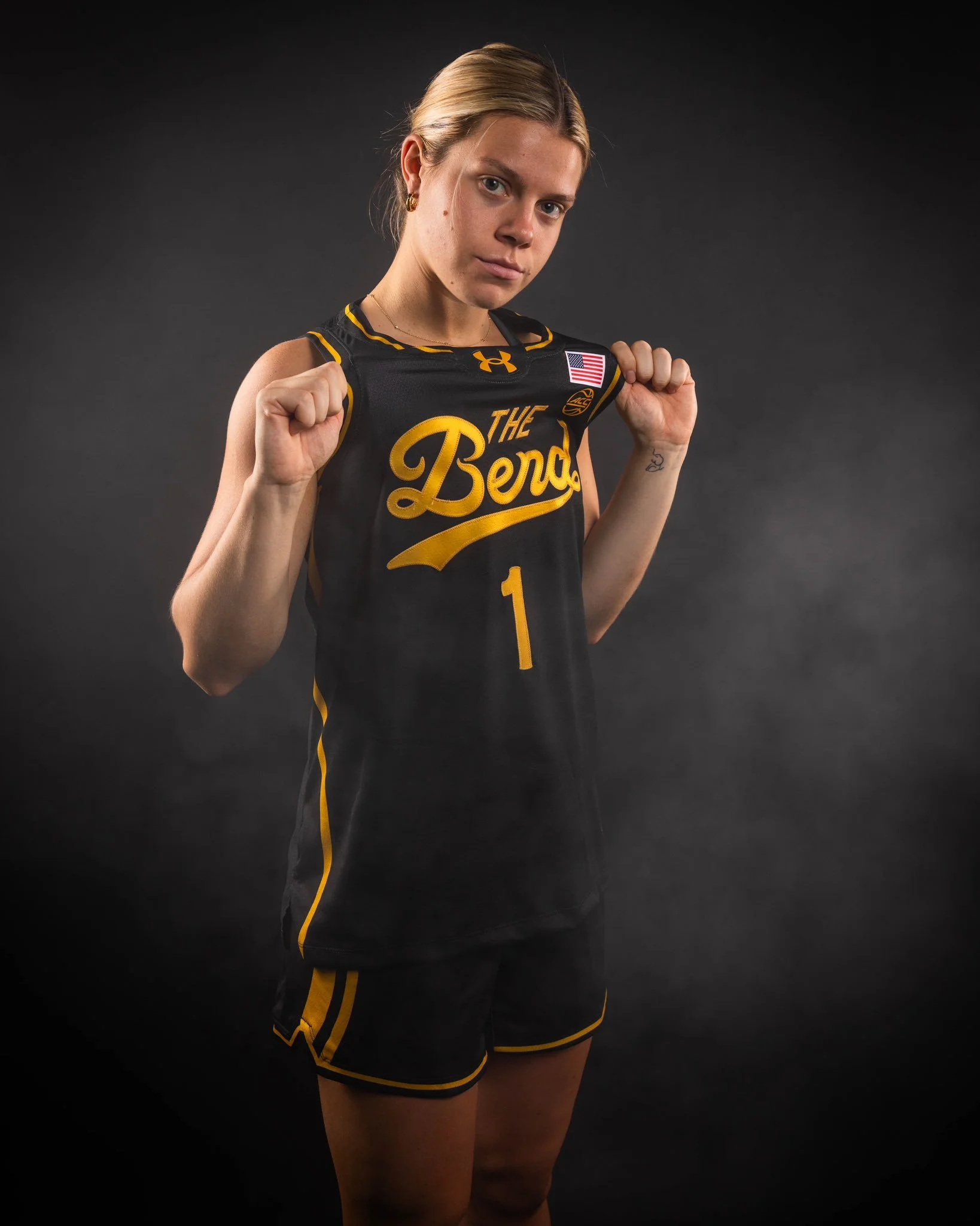
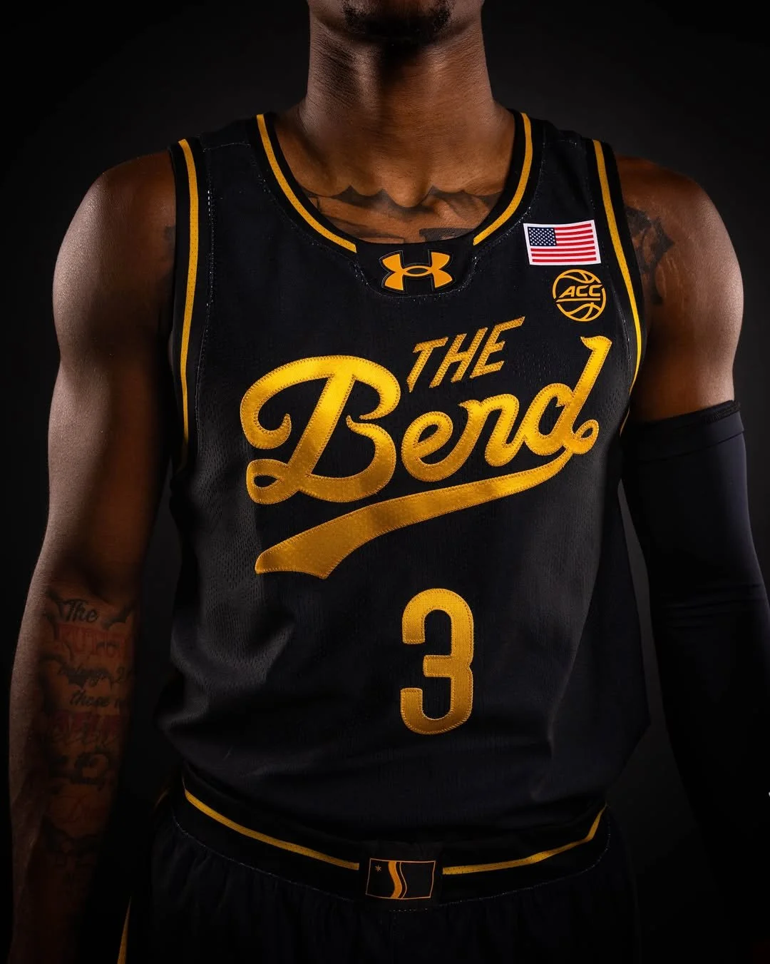
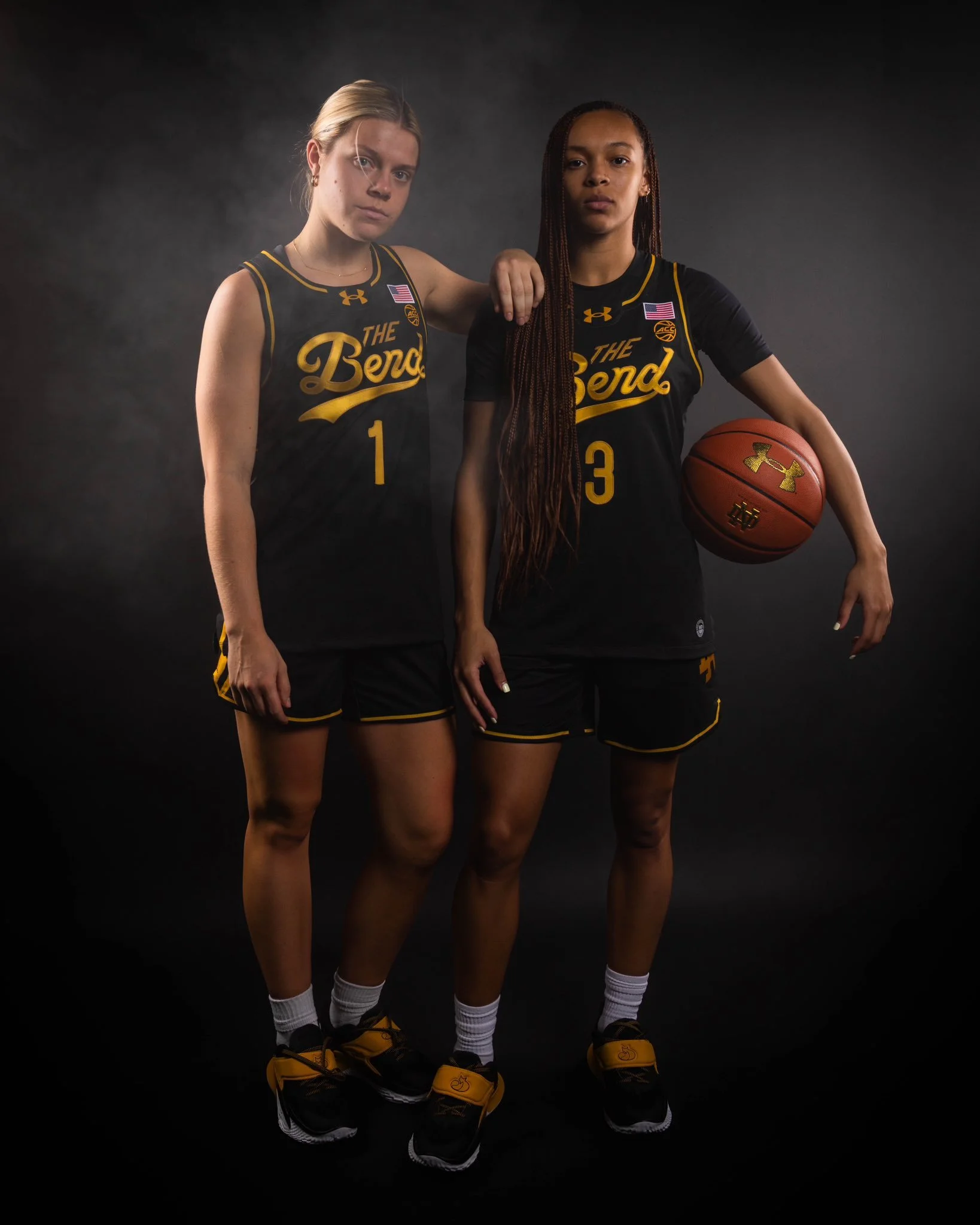
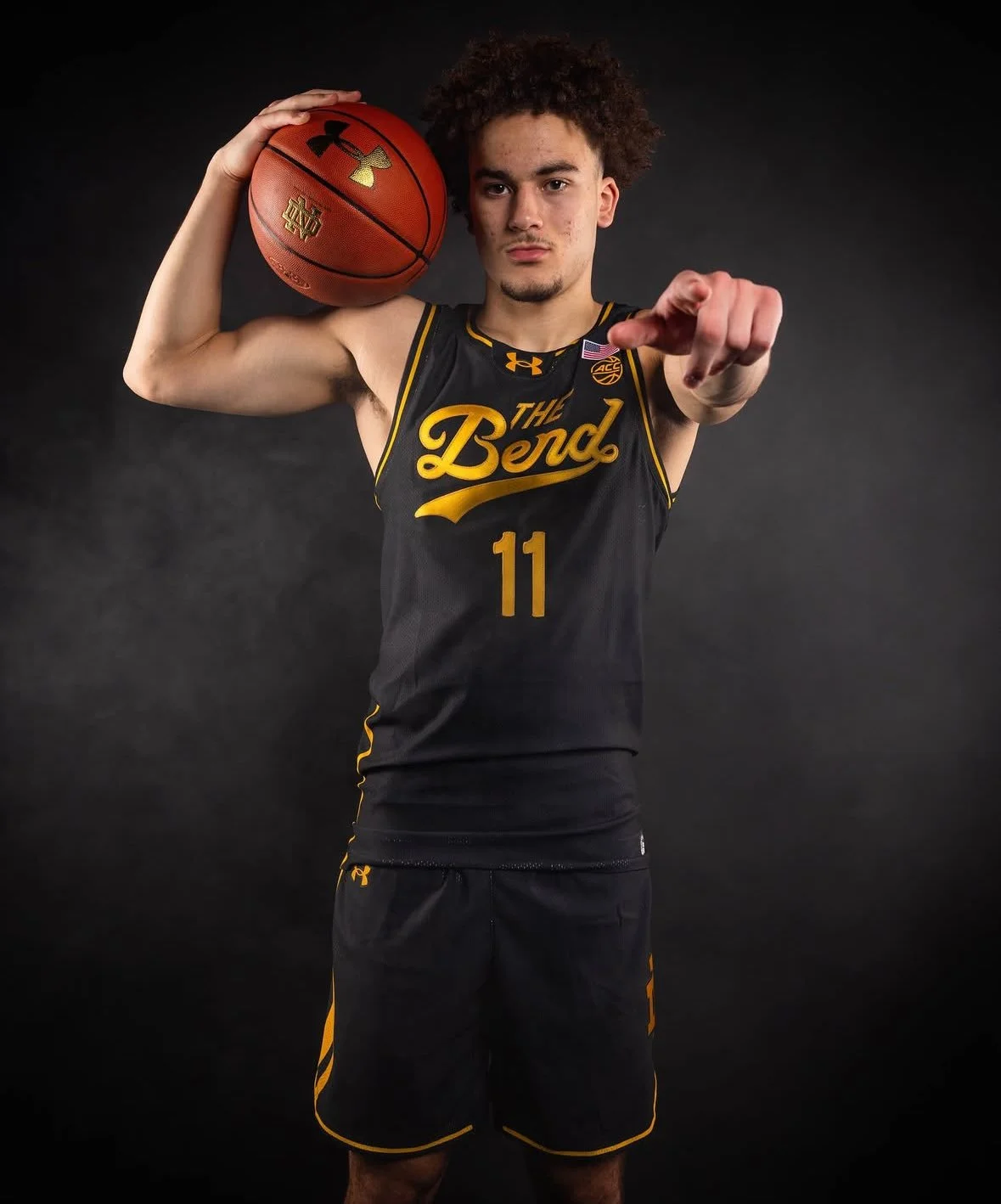
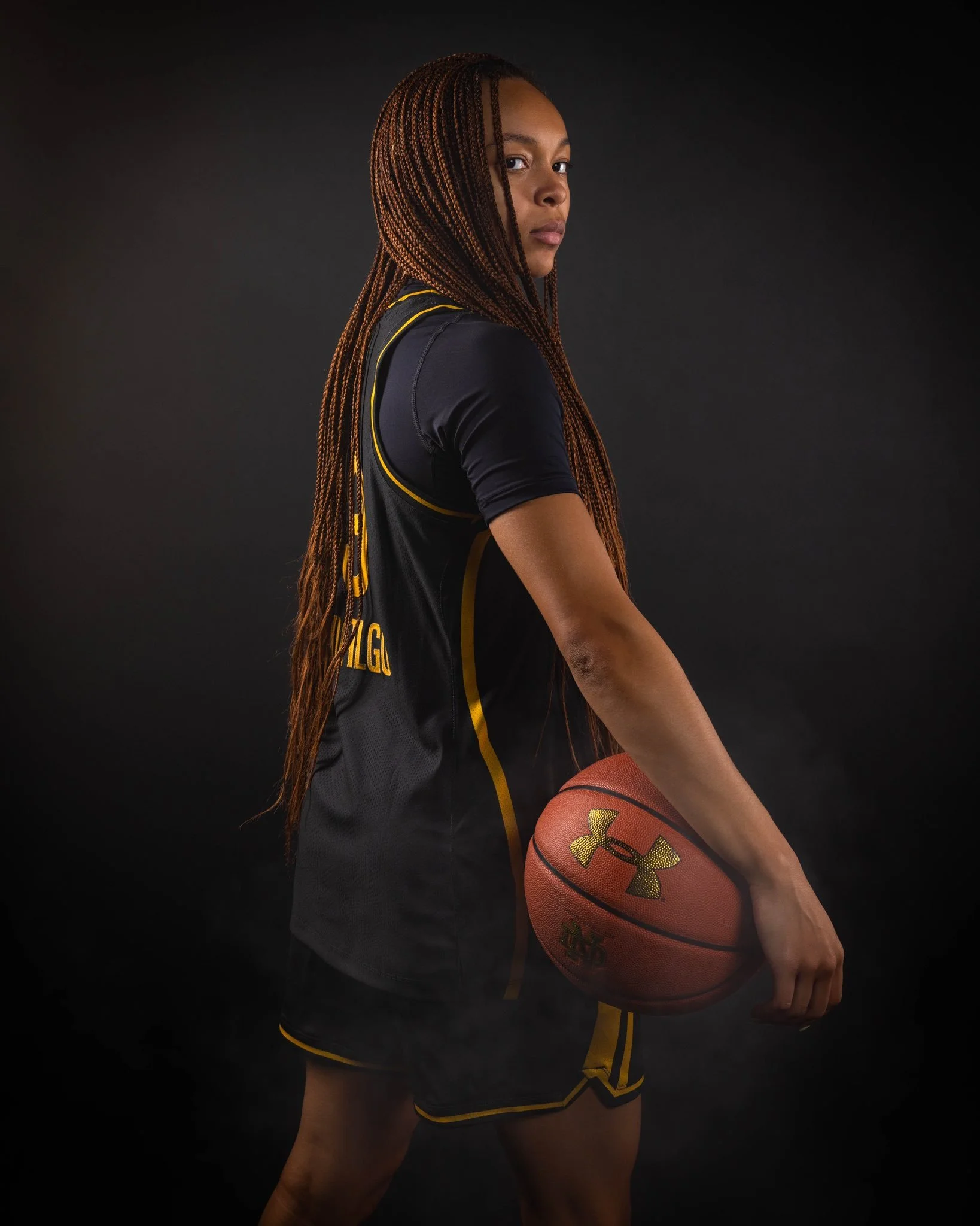
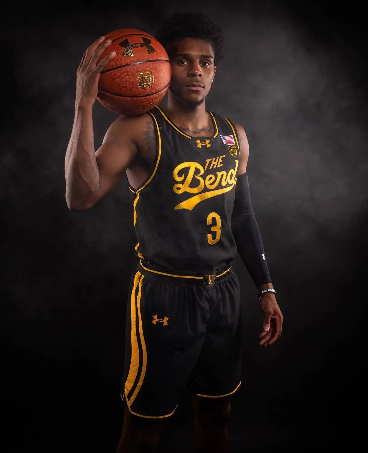
The Notre Dame men’s and women’s basketball programs are tipping off the season with a look that’s all about home. The Fighting Irish revealed a brand-new black and gold uniform set, dubbed “The Bend”, paying tribute to the history, culture, and character of South Bend, the city that has supported the program for generations.
Every part of The Bend jersey is rooted in South Bend’s heritage. The bold “Bend” script across the chest was inspired by the iconic marquee wall outside Madison Oyster Bar downtown. The jersey numbers feature a custom font modeled after Studebaker cars, one of the city’s most historic industries. Running up the side of the shorts are lines taken directly from the South Bend city flag, symbolizing the St. Joseph River and the city’s geographic namesake. To complete the look, the South Bend flag is stitched onto the waistband, a finishing touch that ties the uniform directly back to its community.
Fans won’t have to wait long to see The Bend in person. The jerseys will make their public debut at Irish Jam presented by Under Armour on Friday, October 3, at Eddy Street Commons. The free community event begins at noon with programming, leading into the main showcase featuring both basketball teams at 6 p.m.
Finally, the new uniforms will hit the court in live action to start the season. The men’s team debuts The Bend on November 7 against Detroit Mercy, while the women’s squad follows on November 9 against Chicago State.
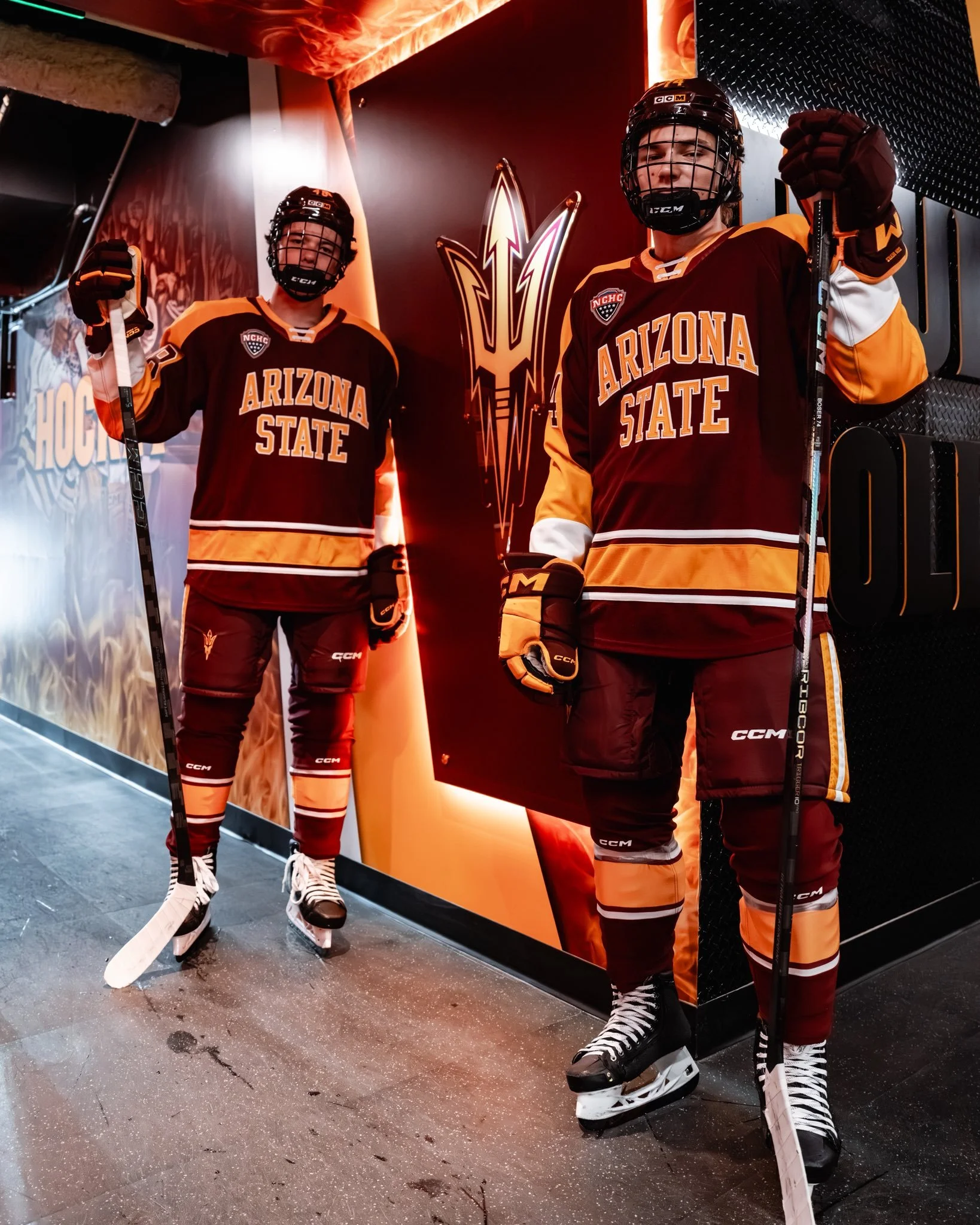
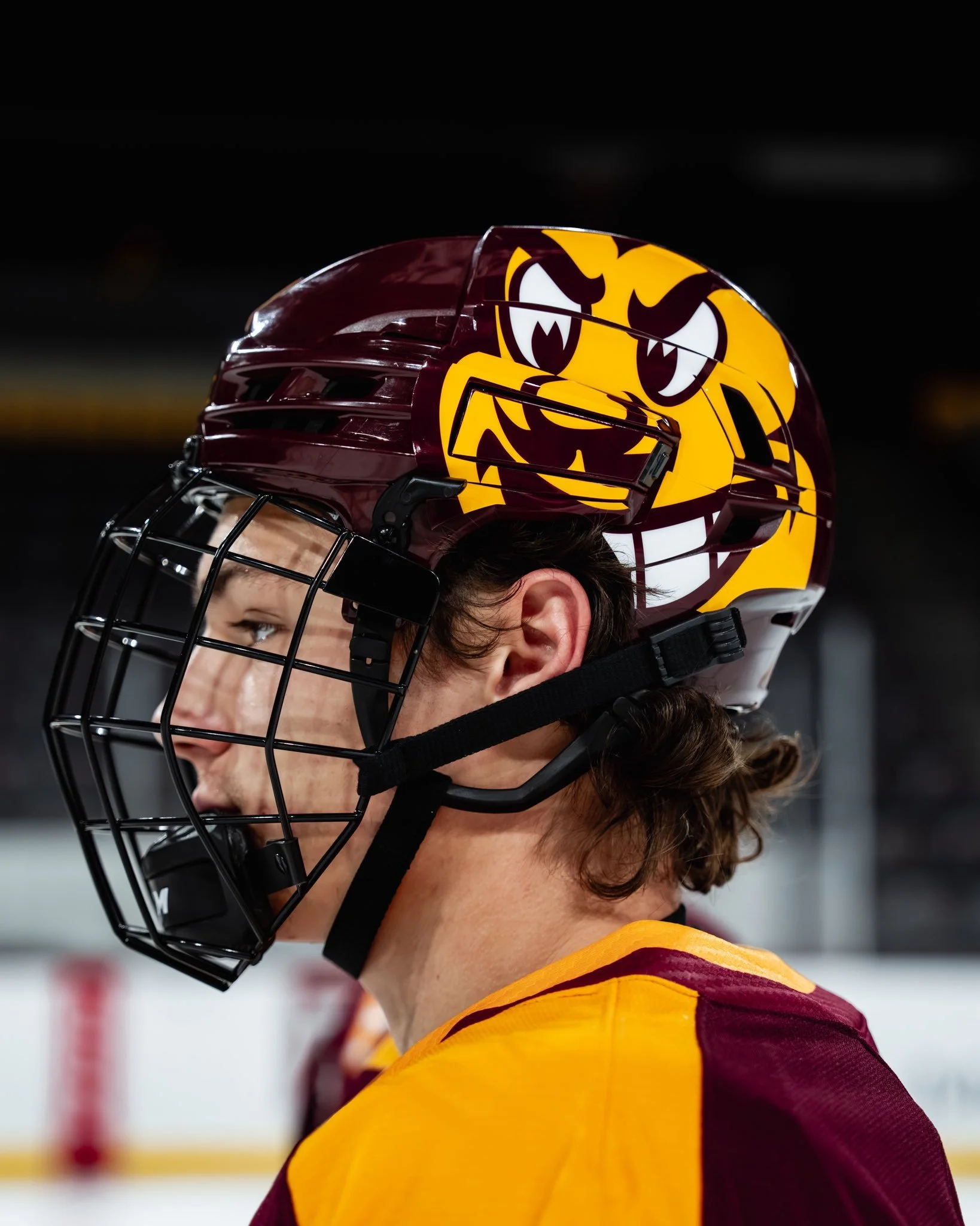
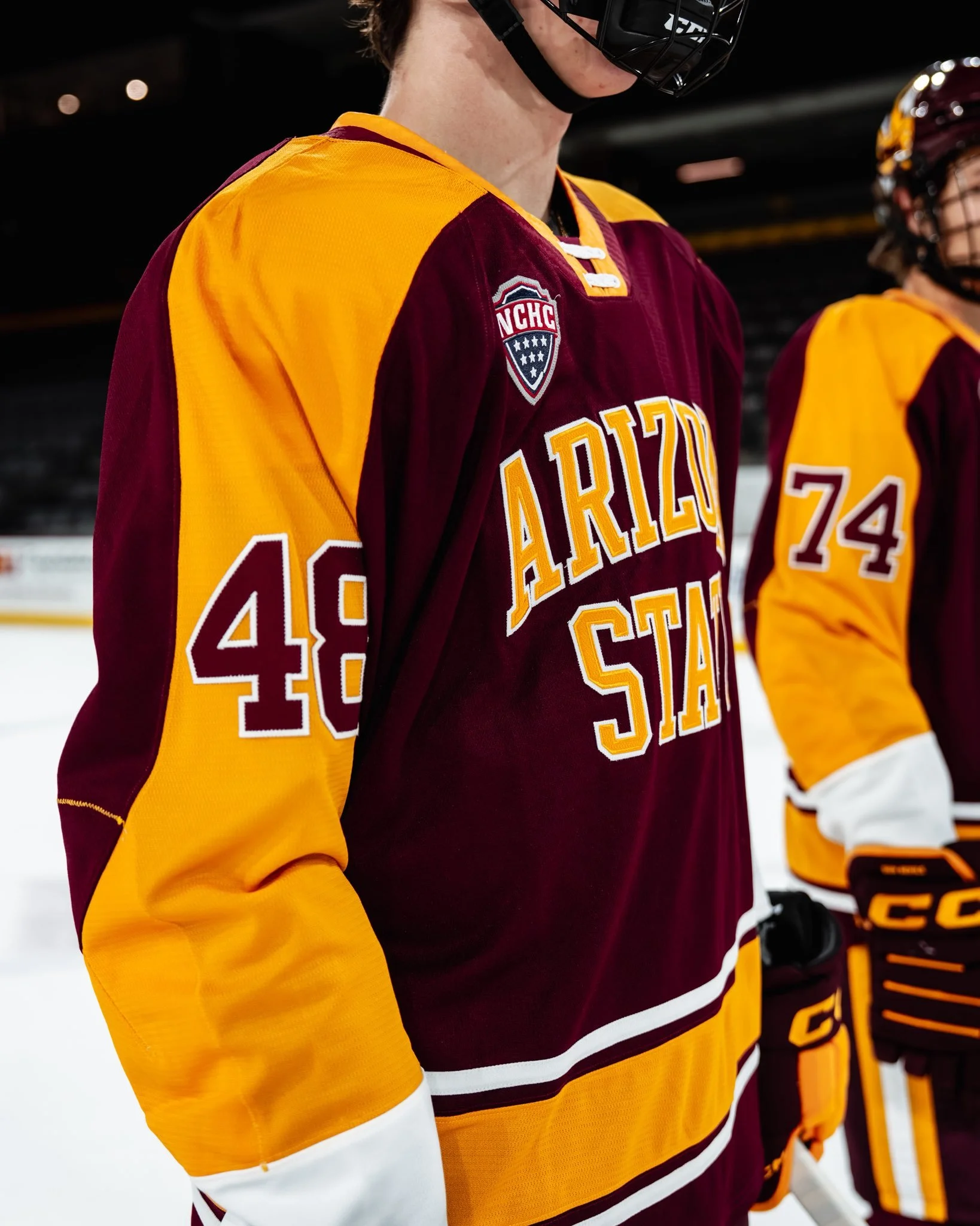
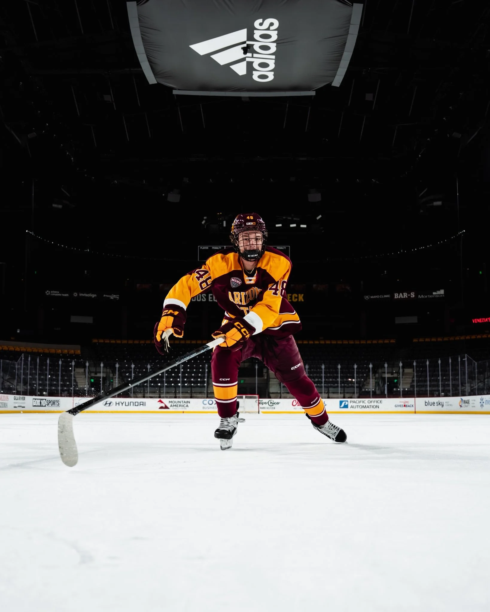
Arizona State hockey is skating into the new season with a fresh look that’s sure to turn heads. The Sun Devils revealed their latest uniform set, and it’s a perfect blend of school pride and hockey swagger.
The new jerseys feature a maroon base with “Arizona State” spelled proudly across the chest in gold lettering. Along the hem runs a thick gold stripe flanked by two crisp white stripes, giving the kit a traditional hockey vibe with a modern Sun Devil twist.
On the sleeves, thick gold paneling showcases the players’ numbers, ensuring visibility while tying the look together in true ASU fashion. The finishing touch might just be the most iconic, a large Sparky face stamped on the helmet, bringing the program’s beloved mascot into the spotlight every time the team hits the ice.
With this design, Arizona State has delivered a uniform that captures both tradition and attitude. It’s classic maroon and gold, but reimagined in a way that feels fresh and unmistakably Sun Devil. Fans in Tempe will have plenty to cheer for this season, and now they’ll get to do it with one of the sharpest looks in college hockey.
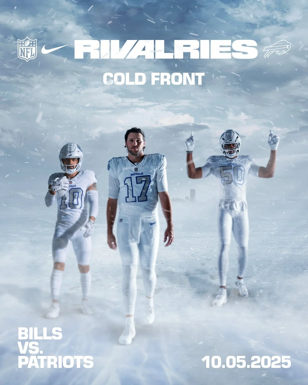
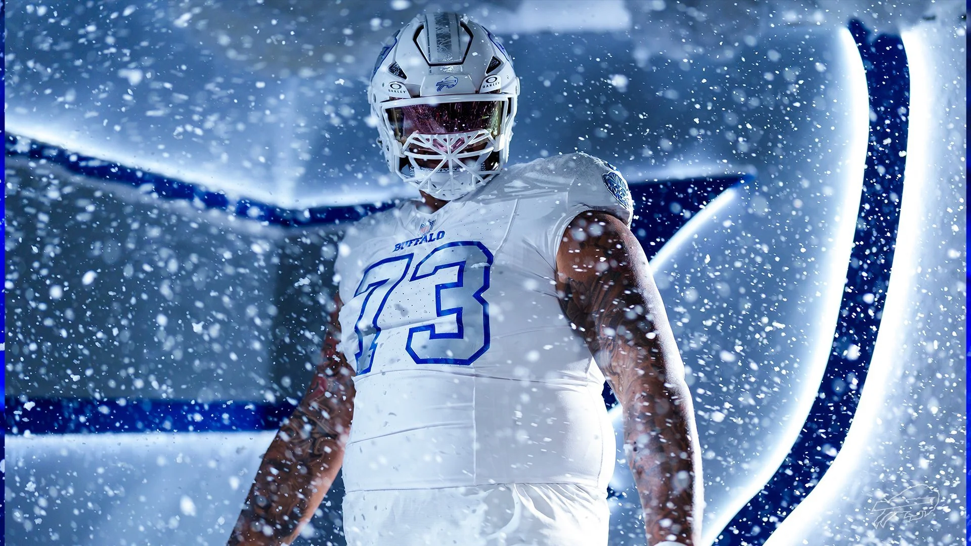
There’s nothing quite like facing your rival under the lights, and the Buffalo Bills are turning up the intensity with a brand-new look. The Bills will debut their “Cold Front” uniforms in Week 5 on Sunday Night Football when they host AFC East rival New England Patriots.
More than just a uniform, “Cold Front” represents Buffalo itself, a city built for the cold, defined by grit, and proud of its toughness. It’s ice in the air, resilience in the soul, and a fanbase that thrives in the elements. Simply put: it’s Buffalo, stitched into fabric..
As concepts were explored throughout 2023, one vision quickly stood out. “The clear choice was to celebrate our region’s climate, especially when it comes to later in the season,” said Aaron LaPorta, Bills Director of Design.
To create the icy, snow-covered identity, the design team made a bold move — stripping away the red. “Visually, red means warmth, and in order to create a true icy and snowy feel, it needed to be removed,” LaPorta explained. “That was a big decision for us, because we’ve never done anything like that.”
With red gone, the challenge became reimagining the Bills’ look through elevated uses of blue, white, and gray. “We don’t want to look like another team. We want to have our own identity,” LaPorta said. “So how do we achieve that?”
The result is “Cold Front,” a fresh but authentic take on Buffalo football — one that perfectly mirrors the team, the city, and the fans who embrace the cold like no other.
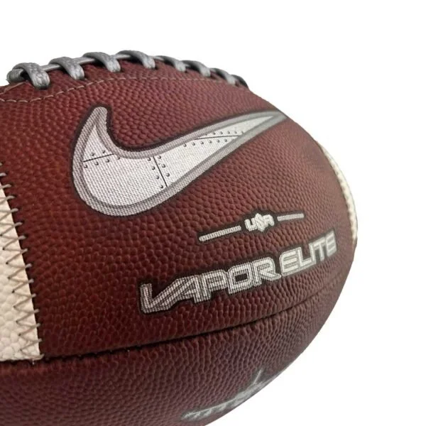
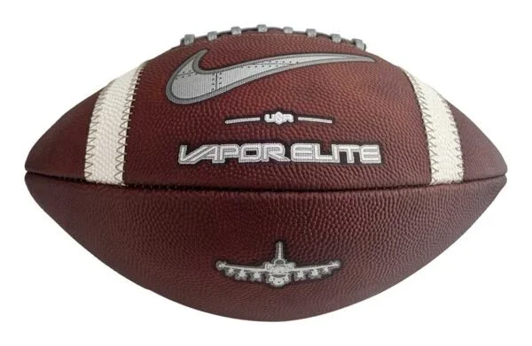
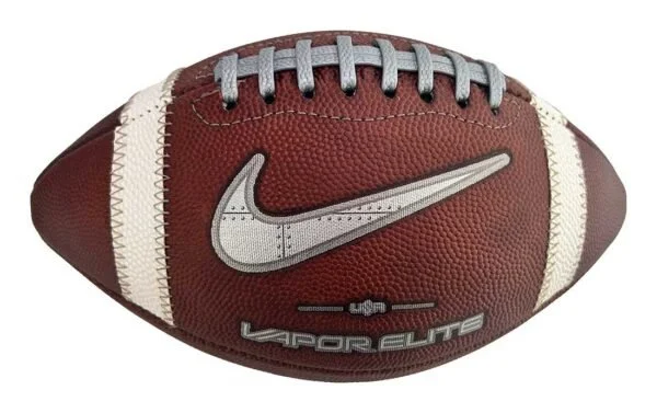
The Air Force Falcons are bringing history and innovation together with the launch of the Limited-Edition Air Force Legacy Series Nike Vapor Elite Football, a design inspired by the legendary F-16 Fighting Falcon and built to take the field when Air Force faces Navy on October 4, 2025.
This exclusive football is more than a game ball; it’s a tribute to Falcon heritage and a symbol of Air Force pride. From its cutting-edge performance features to the intricate design details, every element reflects the spirit of precision and power synonymous with the Academy.
Like the F-16 itself, this football is engineered for elite performance:
Grey pebbled lace with overlay stripe for enhanced grip and control
Every stitch and panel design nods to the legacy of Air Force football while honoring the innovation of U.S. Air Force aviation.
Each ball is handcrafted in the USA by Big Game, the factory trusted by more than 90% of FBS programs. resulting in A rare piece of craftsmanship that blends collectible value with elite on-field performance.
Fans and collectors alike can now secure the Air Force Legacy Series Nike Vapor Elite Football, a symbol of grit, tradition, and Falcon excellence.
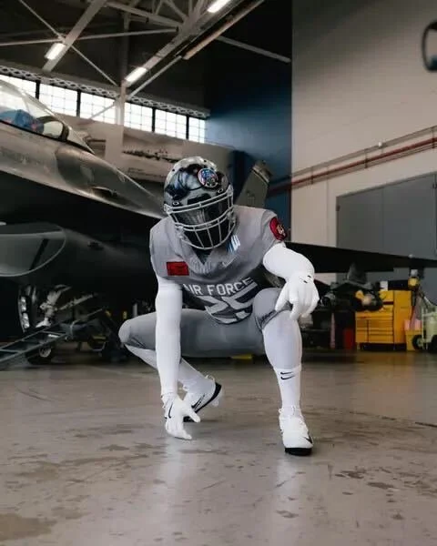
The Air Force football team is set to take the field in a powerful tribute for the 2025 edition of the Air Power Legacy Series, honoring the legendary F-16 Fighting Falcon. The Falcons will debut the special look when they face Navy on Saturday, Oct. 4, at Noon ET inside Navy-Marine Corps Memorial Stadium. The rivalry matchup will be broadcast nationally on CBS, giving fans everywhere a front-row seat to one of the most striking uniform reveals of the season.
The uniform’s most eye-catching element is the custom helmet, designed to replicate a fighter pilot’s gear.
Front bumper: A silhouette of the F-16.
Visor cover: Features the F-16 Fighting Falcon patch alongside the word “Psycho” — the call sign of Col. William Andrews, an F-16 hero who was shot down in Operation Desert Storm.
Back bumper: Reads “Viper”, the aircraft’s widely used nickname.
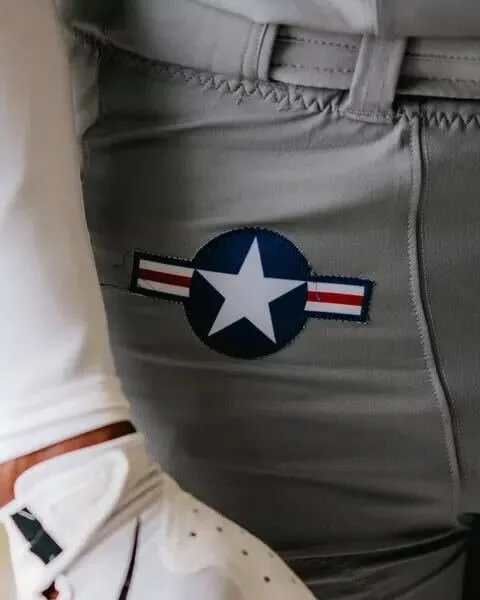
The pants carry the U.S. Air Force roundel on the hip, with “Viper” running down one leg and “Fighting Falcon” down the other.
The jersey front displays Air Force above the player’s number, along with the corresponding squadron patch. The sleeves feature both the American flag and the squadron’s insignia. On the back, players will sport the tail flash of their respective fighter squadron.
This year’s design honors multiple units, including:
The F-16 Fighting Falcon is a compact, multi-role fighter aircraft known for its unmatched maneuverability, proven combat record, and versatility in both air-to-air and air-to-surface missions. Capable of withstanding up to nine G’s, this lightweight yet powerful jet can deliver weapons with pinpoint accuracy, defend against enemy aircraft, and operate in all weather conditions.
Its bubble canopy offers pilots unmatched visibility, while a 30-degree seat-back angle enhances comfort and G-force tolerance. The aircraft’s fly-by-wire system, side stick controller, and advanced avionics make it one of the most reliable and efficient fighters in the world — a perfect symbol of speed, precision, and resilience for the Air Force football program.
The Air Power Legacy Series has become a tradition of honoring U.S. Air Force history through football uniforms, blending aviation heritage with game-day pageantry. The 2025 edition may be one of the boldest yet, paying tribute to an aircraft that has defined aerial dominance for decades.