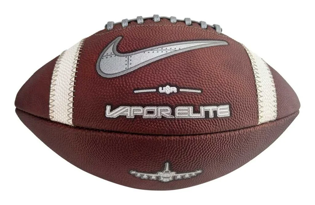
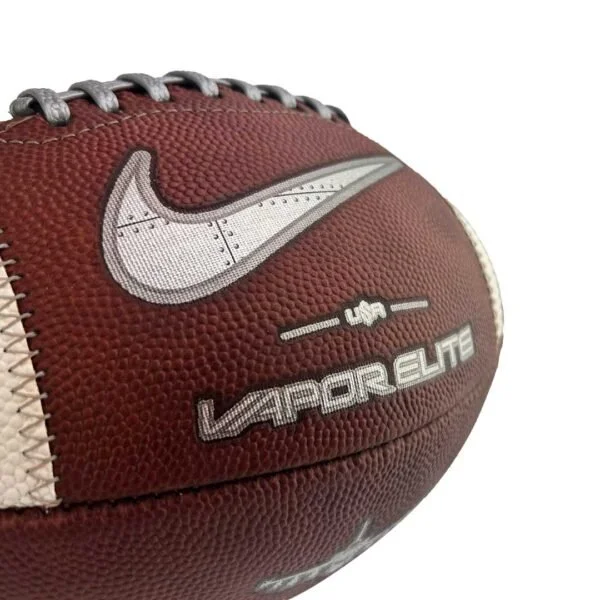
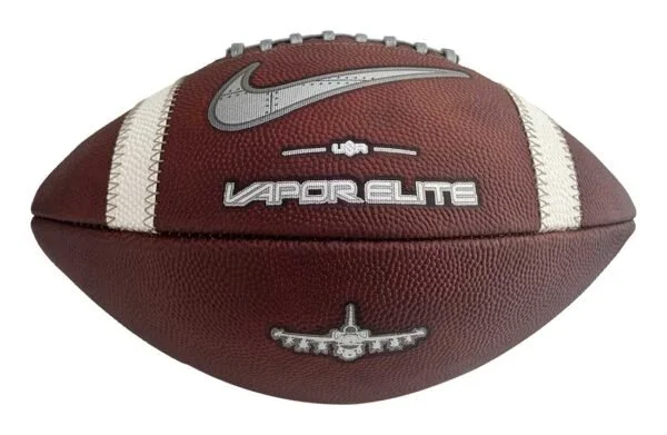
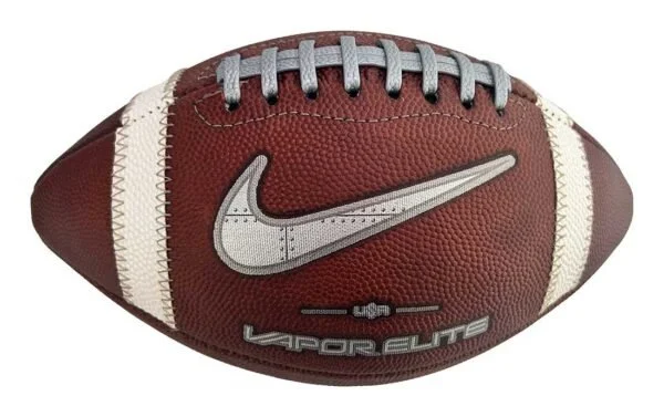
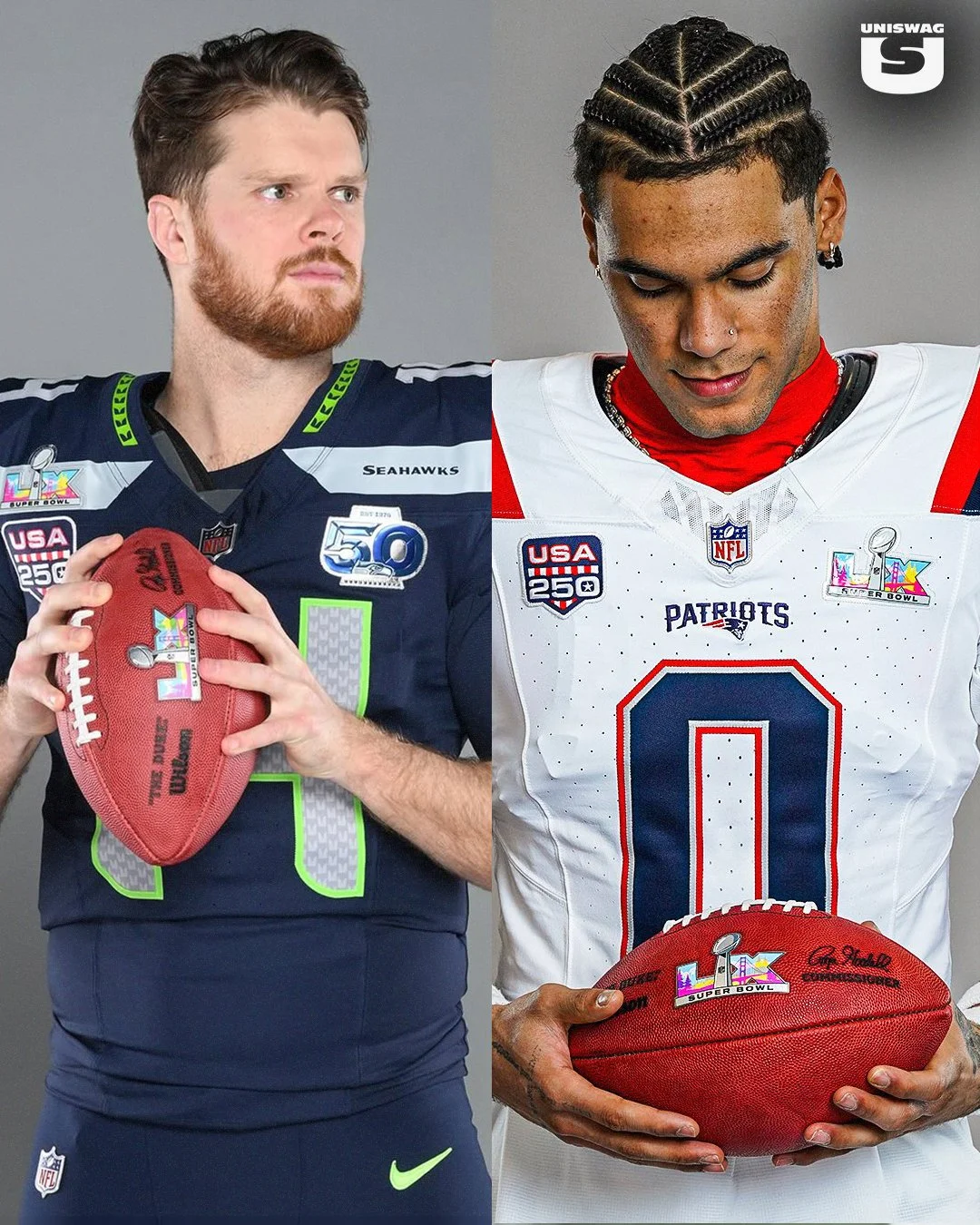
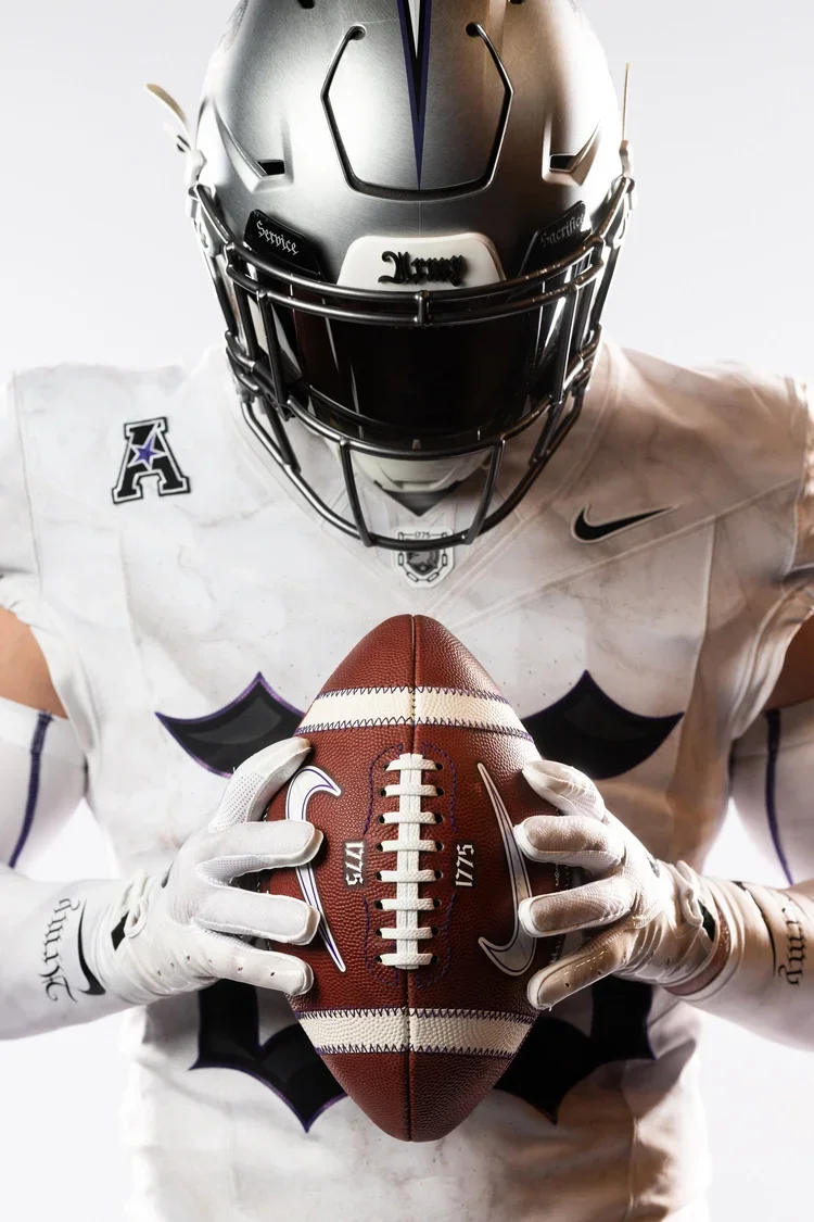
The Air Force Falcons are bringing history and innovation together with the launch of the Limited-Edition Air Force Legacy Series Nike Vapor Elite Football, a design inspired by the legendary F-16 Fighting Falcon and built to take the field when Air Force faces Navy on October 4, 2025.
This exclusive football is more than a game ball; it’s a tribute to Falcon heritage and a symbol of Air Force pride. From its cutting-edge performance features to the intricate design details, every element reflects the spirit of precision and power synonymous with the Academy.
Like the F-16 itself, this football is engineered for elite performance:
Grey pebbled lace with overlay stripe for enhanced grip and control
Every stitch and panel design nods to the legacy of Air Force football while honoring the innovation of U.S. Air Force aviation.
Each ball is handcrafted in the USA by Big Game, the factory trusted by more than 90% of FBS programs. resulting in A rare piece of craftsmanship that blends collectible value with elite on-field performance.
Fans and collectors alike can now secure the Air Force Legacy Series Nike Vapor Elite Football, a symbol of grit, tradition, and Falcon excellence.
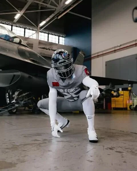
The Air Force football team is set to take the field in a powerful tribute for the 2025 edition of the Air Power Legacy Series, honoring the legendary F-16 Fighting Falcon. The Falcons will debut the special look when they face Navy on Saturday, Oct. 4, at Noon ET inside Navy-Marine Corps Memorial Stadium. The rivalry matchup will be broadcast nationally on CBS, giving fans everywhere a front-row seat to one of the most striking uniform reveals of the season.
The uniform’s most eye-catching element is the custom helmet, designed to replicate a fighter pilot’s gear.
Front bumper: A silhouette of the F-16.
Visor cover: Features the F-16 Fighting Falcon patch alongside the word “Psycho” — the call sign of Col. William Andrews, an F-16 hero who was shot down in Operation Desert Storm.
Back bumper: Reads “Viper”, the aircraft’s widely used nickname.
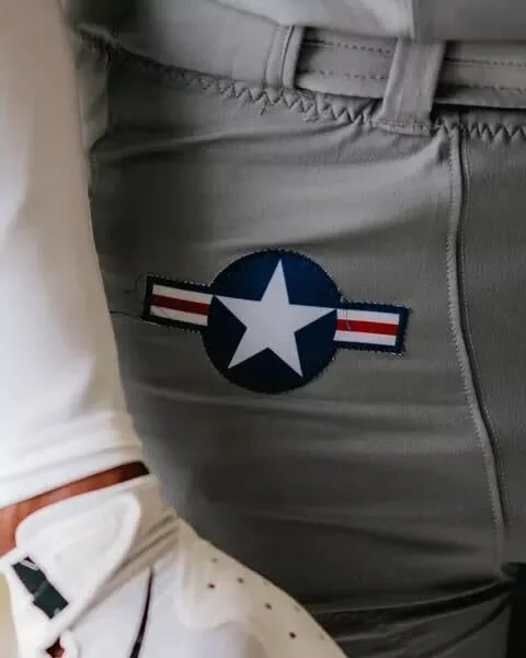
The pants carry the U.S. Air Force roundel on the hip, with “Viper” running down one leg and “Fighting Falcon” down the other.
The jersey front displays Air Force above the player’s number, along with the corresponding squadron patch. The sleeves feature both the American flag and the squadron’s insignia. On the back, players will sport the tail flash of their respective fighter squadron.
This year’s design honors multiple units, including:
The F-16 Fighting Falcon is a compact, multi-role fighter aircraft known for its unmatched maneuverability, proven combat record, and versatility in both air-to-air and air-to-surface missions. Capable of withstanding up to nine G’s, this lightweight yet powerful jet can deliver weapons with pinpoint accuracy, defend against enemy aircraft, and operate in all weather conditions.
Its bubble canopy offers pilots unmatched visibility, while a 30-degree seat-back angle enhances comfort and G-force tolerance. The aircraft’s fly-by-wire system, side stick controller, and advanced avionics make it one of the most reliable and efficient fighters in the world — a perfect symbol of speed, precision, and resilience for the Air Force football program.
The Air Power Legacy Series has become a tradition of honoring U.S. Air Force history through football uniforms, blending aviation heritage with game-day pageantry. The 2025 edition may be one of the boldest yet, paying tribute to an aircraft that has defined aerial dominance for decades.
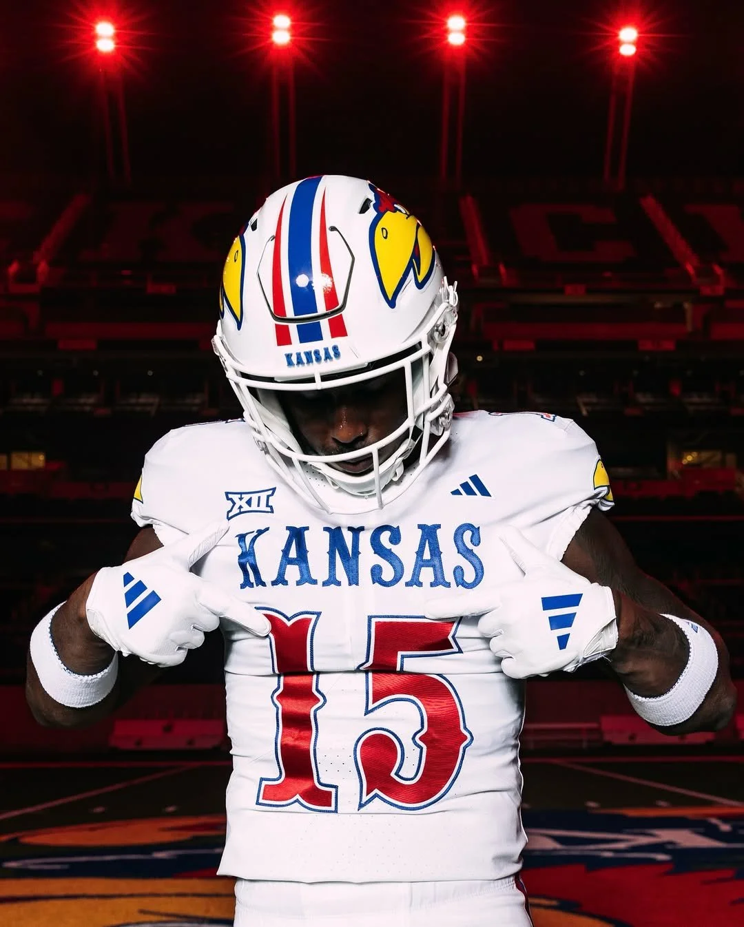
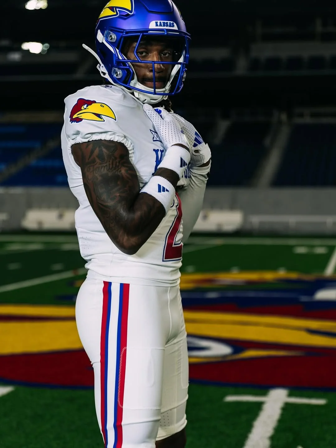
Kansas football is turning heads again with a twist on a fan-favorite alternate uniform. After debuting the all-black “Blackhawk” look a few years ago, KU is bringing that concept back for 2025, this time in white.
The “Blackhawk” first appeared in 2023 for a game against Illinois, featuring a full-on black palette: helmets, jerseys, pants, socks, and cleats. KU revived the look last year against UNLV, and fans loved it. The uniform’s defining features, the classic 1941 Jayhawk bird head, circus-style font spelling “Kansas,” and gameday flag on the back neck, made it instantly recognizable and deeply tied to the program’s traditions.
Adidas officially announced the 2025 return of the alternate, now dubbed the “Whitehawk.” Scheduled for KU’s Oct. 4 game against UCF, the Whitehawk flips the Blackhawk’s color scheme while retaining all the beloved elements. The jersey is white with red numbers outlined in blue, compared to the inverse on the black uniform. White pants complete the look, while helmet choices are still TBD, giving fans a chance to see multiple combinations in action.
A recent KU social media video showcases several ways the Whitehawk can be styled. Defensive end Justice Finkley wore the full white uniform, while quarterback Jalon Daniels modeled it with red pants, center Bryce Foster paired it with blue pants, and safety Lyrik Rawls added KU’s blue helmet. Running back Daniel Hishaw Jr. demonstrated a black helmet and black pants combination reminiscent of a previous road game at BYU. These mix-and-match options highlight the flexibility and creativity behind the alternate’s design.
The Whitehawk continues a three-year streak of KU experimenting with alternate looks. Beyond the Blackhawk, the Jayhawks wore all-red uniforms against TCU in 2024 and debuted a light-blue alternate for the 2024 season opener against Lindenwood. Each new uniform blends Kansas’ heritage with modern style, giving fans a fresh visual identity while honoring the program’s history.
With the Whitehawk, Kansas football proves it’s not afraid to take risks and embrace bold, memorable designs. Between the classic 1941 Jayhawk logo, circus font, gameday flag, and colorful striping, this alternate is a love letter to KU’s legacy — all while giving fans something new to rally behind in 2025.
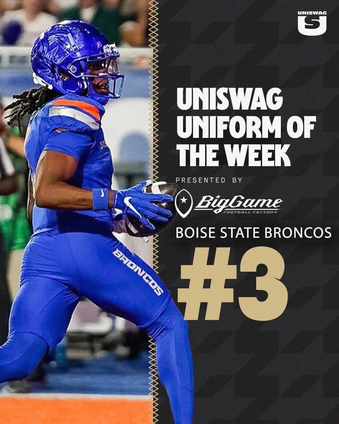
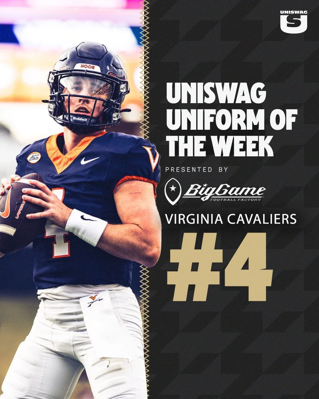
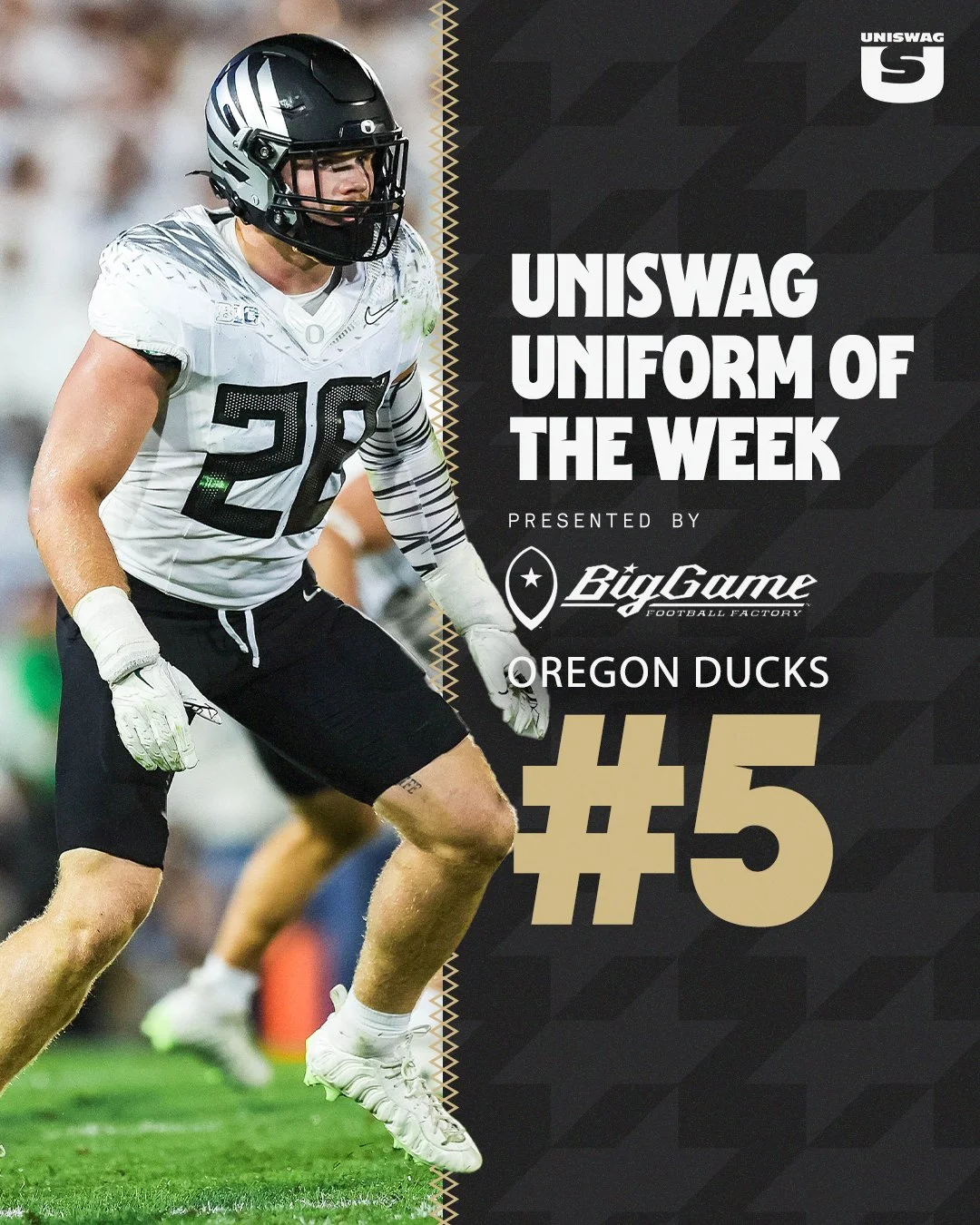
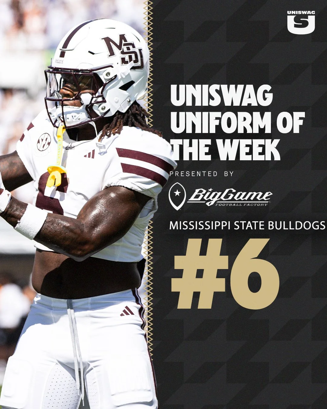
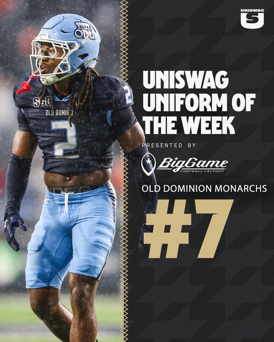
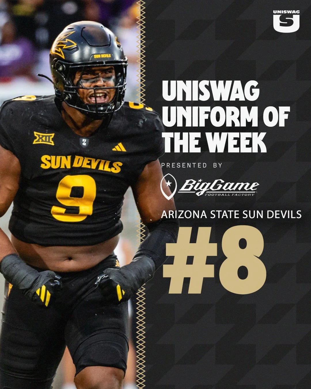
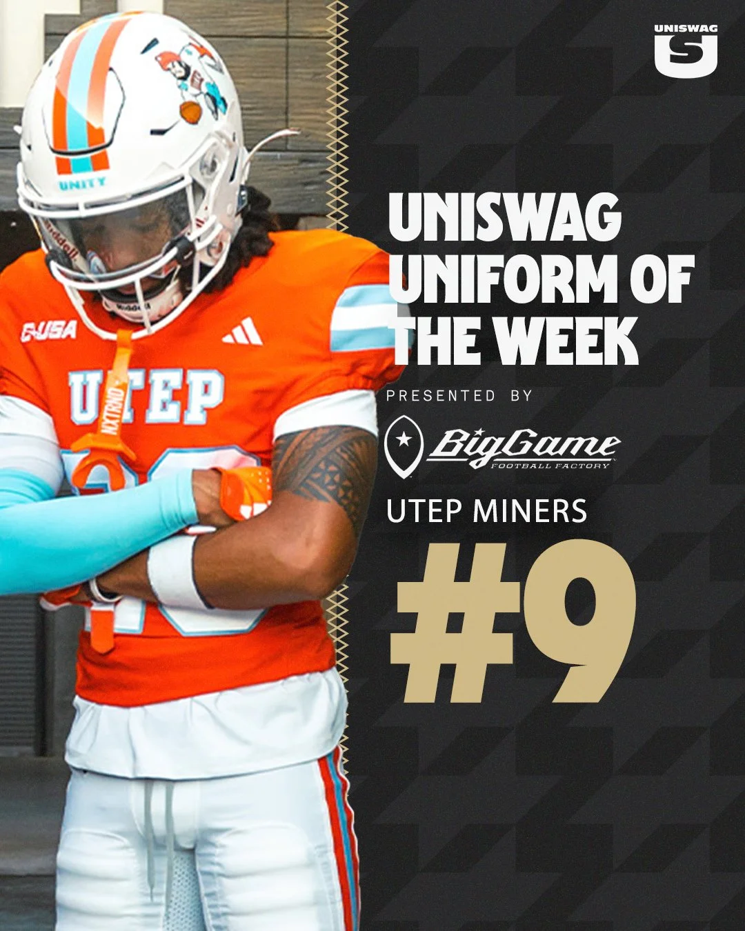
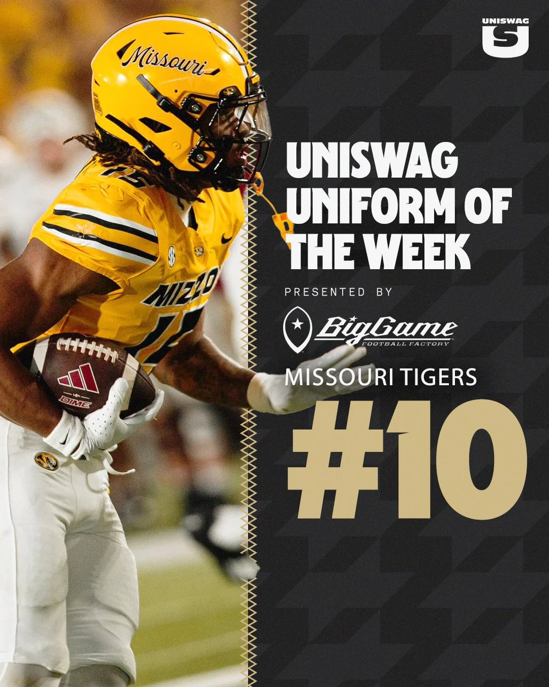
It’s time for the UNISWAG Weekly Countdown for the 2025 College Football Season, Presented by Big Game USA!
Each week, we highlight the cleanest, boldest, and most innovative uniforms across the college football landscape, all building toward that coveted No. 1 spot.
Check out the Week 5 Uniform of the Week Countdown as we celebrate the designs that made the biggest impact on the field!
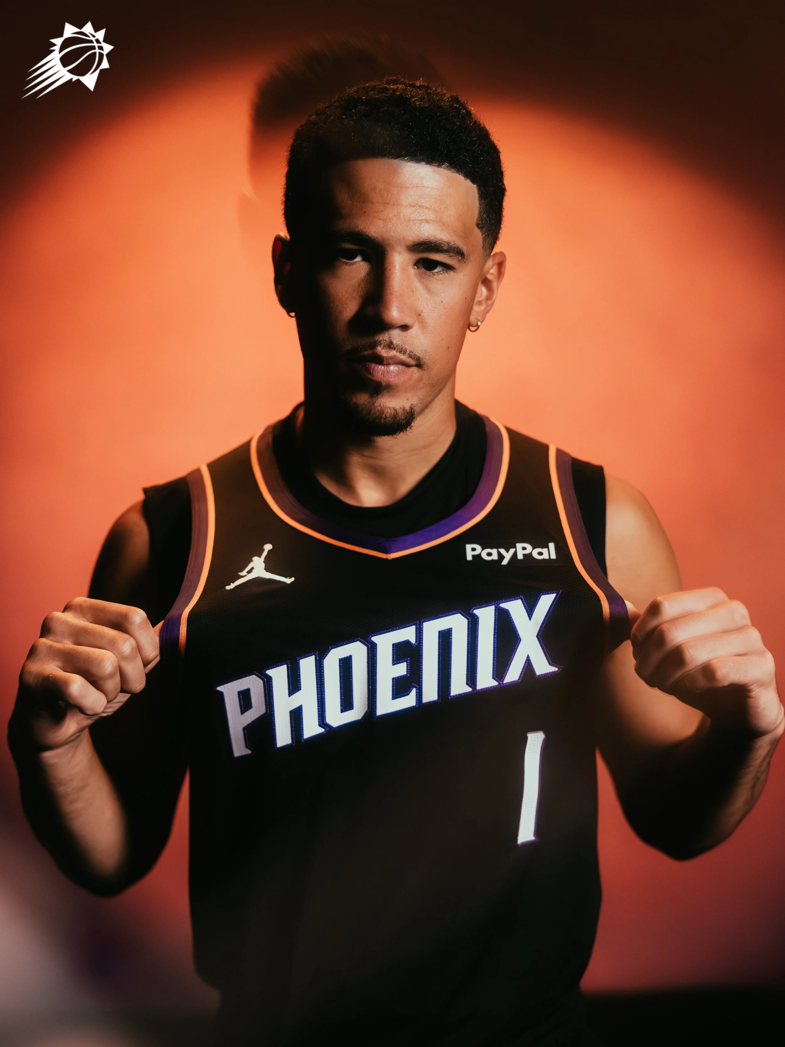
The Phoenix Suns are bringing a fresh look to the hardwood with the unveiling of their new Statement Edition uniform, a design that blends the team’s modern identity with bold updates inspired by the city and culture of Phoenix. The result is a jersey that channels both Valley pride and classic Suns swagger.
Front and center is a bold new “PHOENIX” wordmark stamped across the chest, a proud declaration of where the team plays and the community it represents.
The Suns’ iconic Sunburst logo gets a modern twist, reimagined with the team’s signature Valley gradient. This reinterpretation bridges the past and present, creating a symbol that feels both timeless and fresh.
The redeveloped Valley-inspired gradient runs throughout the jersey and shorts, drawing from Arizona’s signature desert sunsets. The look nods to the team’s fan-favorite “Valley” City Edition uniform while offering a unique spin for this Statement design.
This latest release is more than just a uniform; it’s a confident step forward for a franchise deeply connected to its city. From the sunset hues of the gradient to the bold Phoenix branding, the Suns’ Statement Edition is built to shine under the brightest lights.
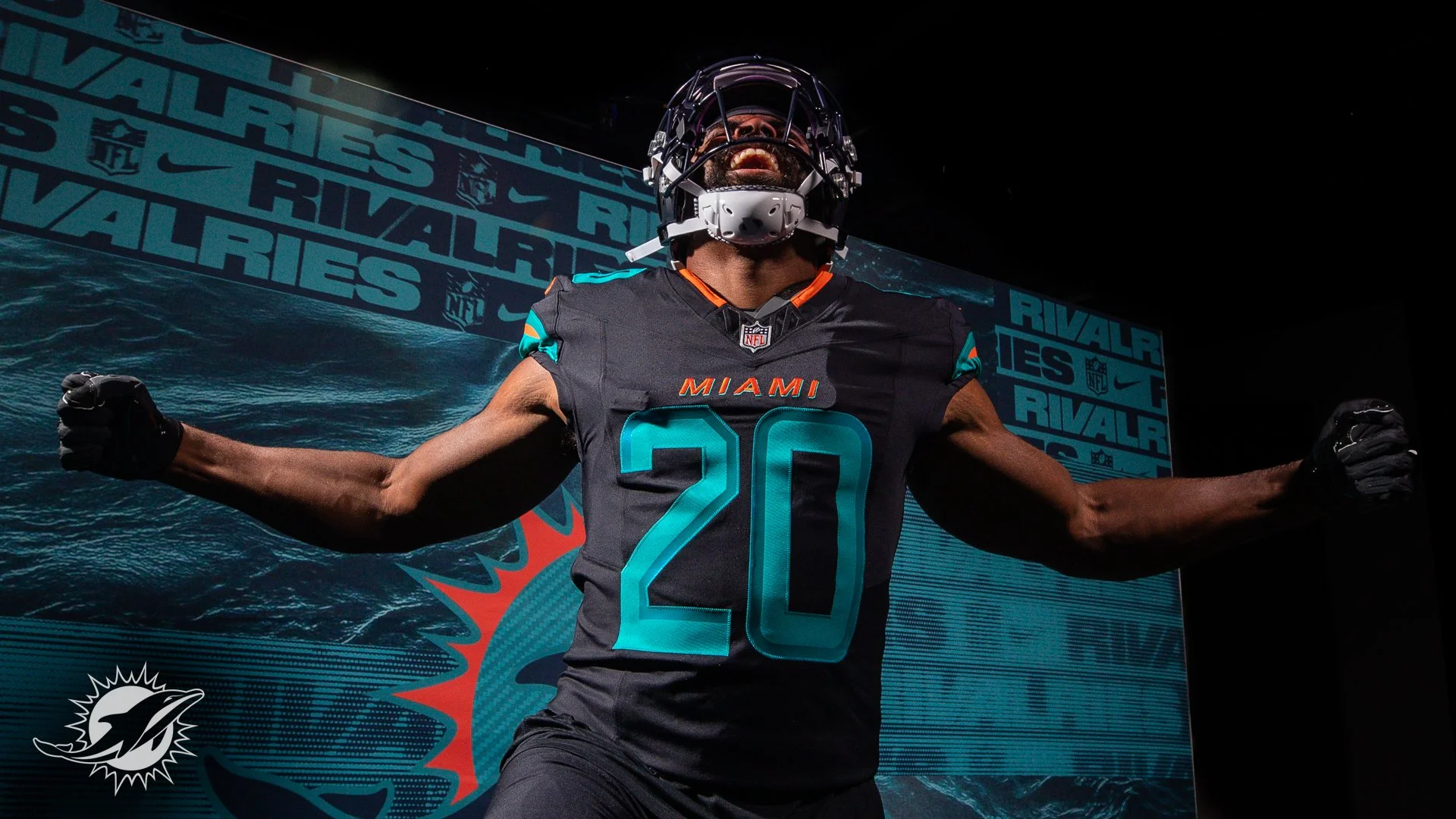
The Miami Dolphins are turning up the tempo in 2025 with the reveal of their all-new Rivalries uniform, a look designed to match the blazing speed of their roster and the energy of their fanbase.
With two of the league’s fastest playmakers in Tyreek Hill and De’Von Achane, Miami leaned into speed as the central theme of the design. The uniform introduces dark-pitch blue threads accented with iridescent aqua and sharp orange details, echoing the power and movement of dolphins cutting through water.
The helmet, sleeves, and pant stripes feature turbo green and orange striping, a bold nod to motion and acceleration. Inside the back collar, the Dolphins’ rally cry “Go Fins!” is stitched in orange — a detail built to fire up players and fans alike.
The uniform will make its on-field debut in one of the NFL’s classic rivalries: Miami vs. the New York Jets.
“The Jets have always been our biggest rival. They’re the team that, no matter what their record is, they’re always going to play us tough,” said former Dolphins wide receiver Nat Moore. “And with so many New Yorkers living in South Florida, the rivalry just feels that much more real.”
Completing the look are dark-pitch blue pants, giving the entire combination a sleek, modern edge.
This Rivalries drop continues the NFL and Nike’s effort to bring city and fan identity into uniform design. For the Dolphins, that identity is pure speed — and now it’s stitched into their game-day threads.
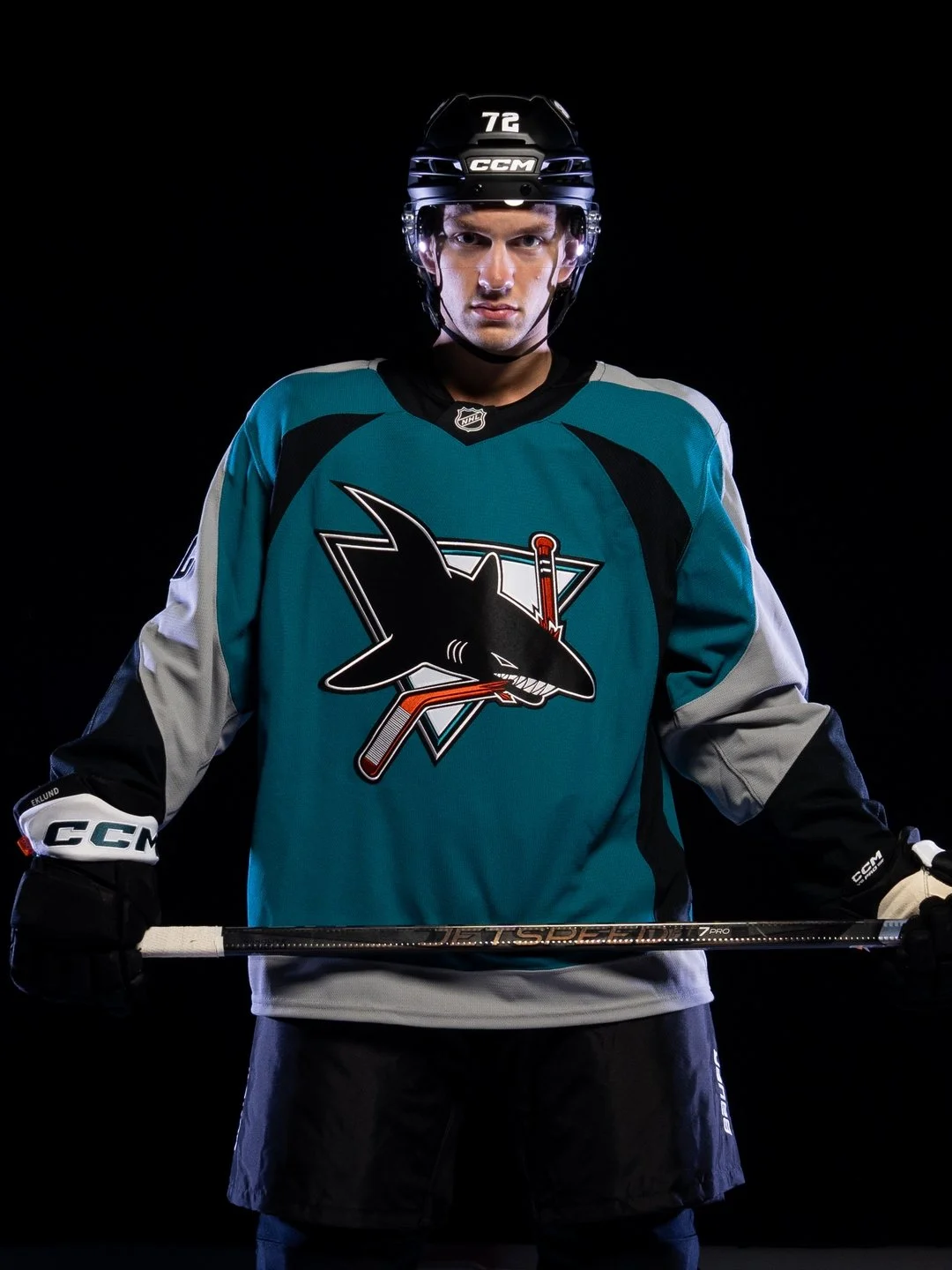
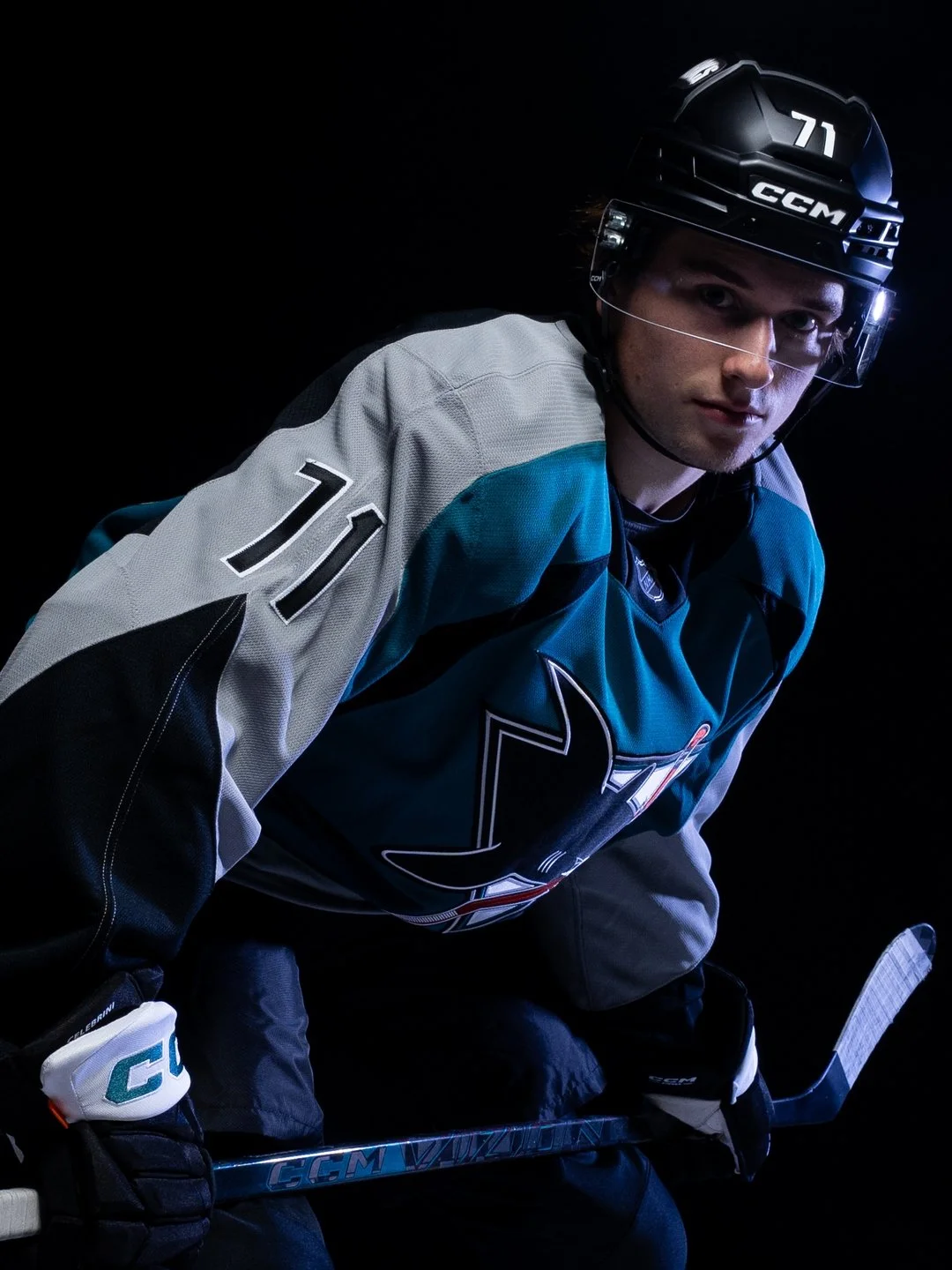
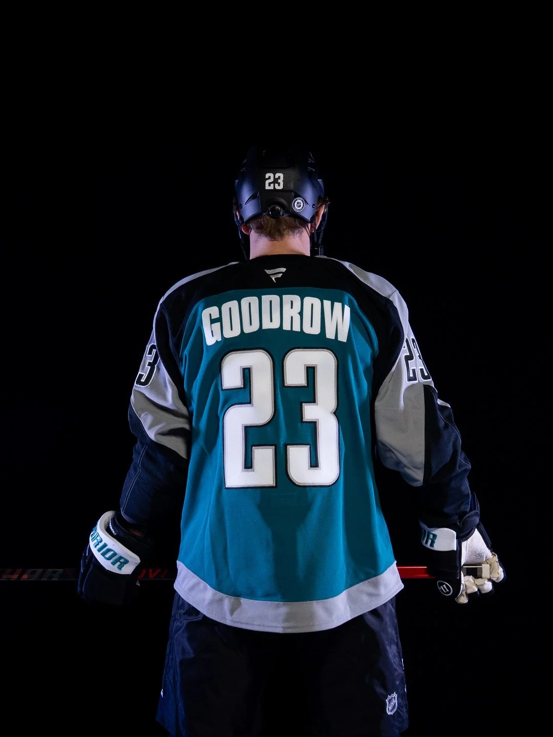
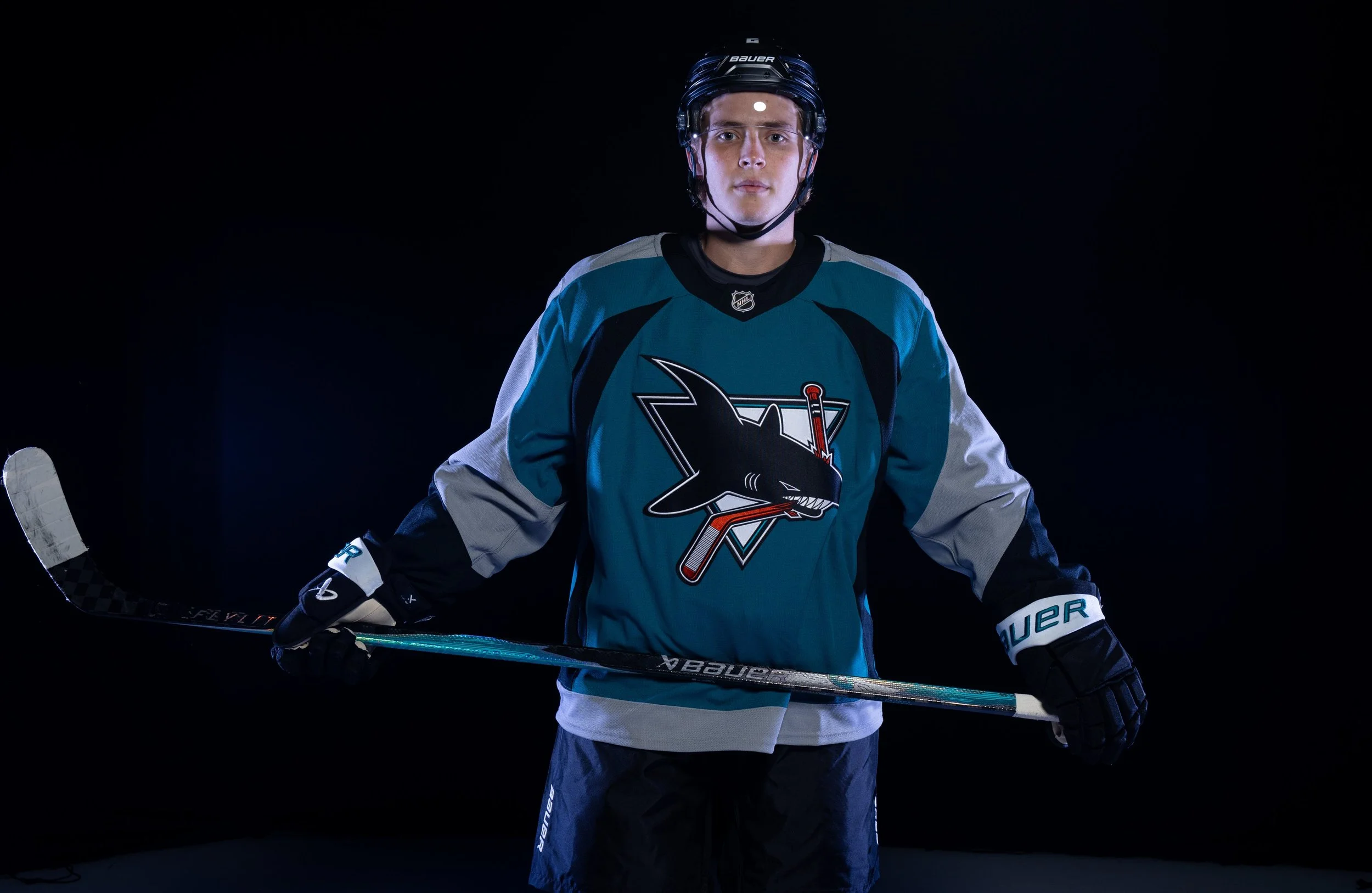
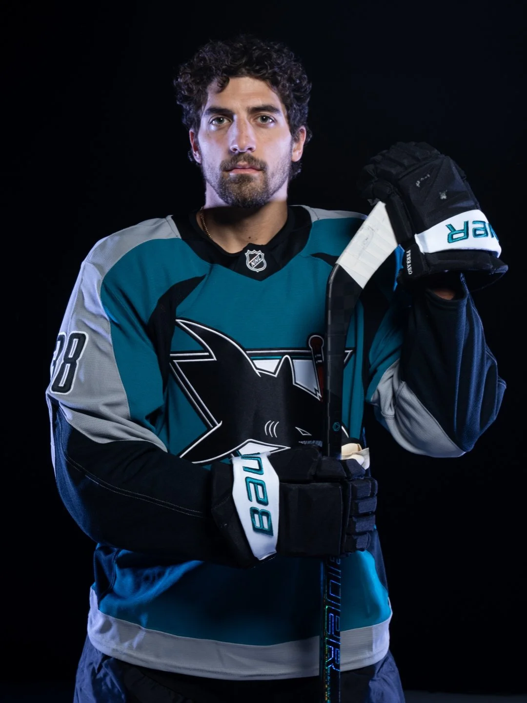
As the San Jose Sharks get ready to celebrate their 35th anniversary season, the team is turning back the clock while looking ahead to the future. The franchise unveiled the Sharks Heritage 2.0 jersey, a modern tribute to one of the most iconic looks in team history.
Originally worn between 1998 and 2007, the second-generation Sharks jersey became a symbol of an unforgettable era, defined by legends like Patrick Marleau, Joe Thornton, Evgeni Nabokov, Jonathan Cheechoo, Owen Nolan, and more. Now, the look is back with a fresh twist designed to connect fans across generations under one teal banner.
Heritage 2.0 carries forward the bold lettering and design of the original while refreshing the details for today’s game. The neckline “bleeds teal,” and every stitch is meant to tell the story of 35 years of Sharks hockey—from franchise-defining goals to the moments that built Sharks Territory.
Sharks Chief Marketing Officer Doug Bentz summed it up perfectly: “Heritage 2.0 isn’t just a jersey, it’s a symbol of the era that made us who we are, on and off the ice.”
The celebration extends beyond the ice. Fans can shop the full Heritage 2.0 merchandise line, which includes jerseys, hoodies, tees, hats, pins, pucks, and stickers—ensuring the look lives everywhere in Sharks Territory.
The UNISWAG Uniform of the Week Countdown is back for Week 5 of college football!
Check out which teams are turning heads with their uniform combos this weekend. The official Top 10 drops monday, leading up to the reveal of the Week 5 Uniform of the Week winner.
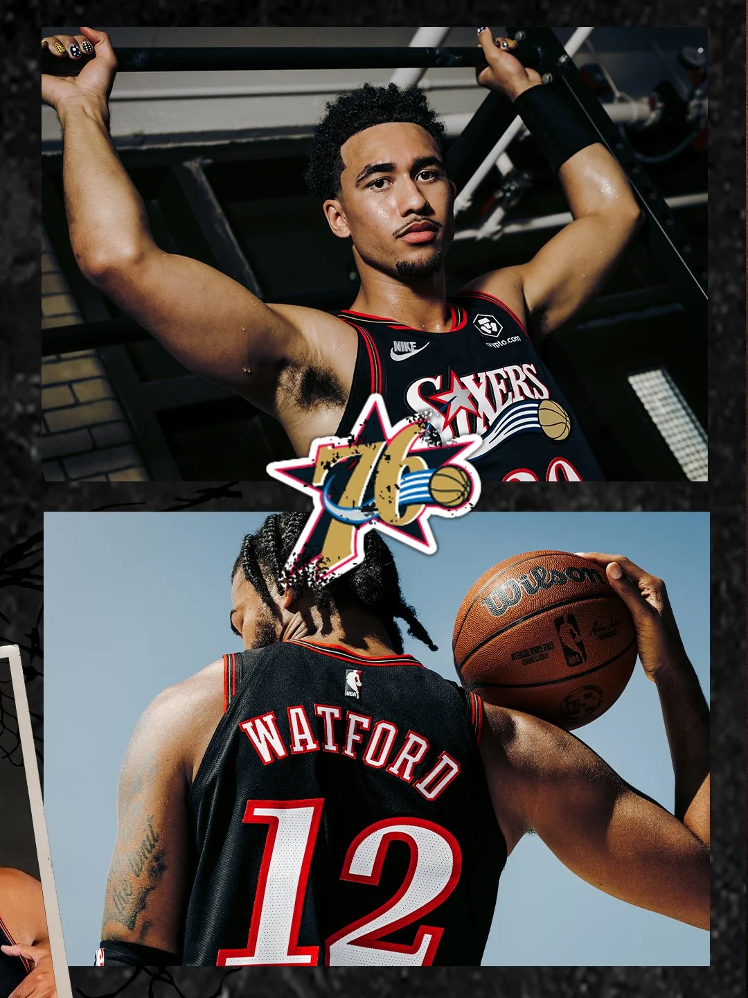
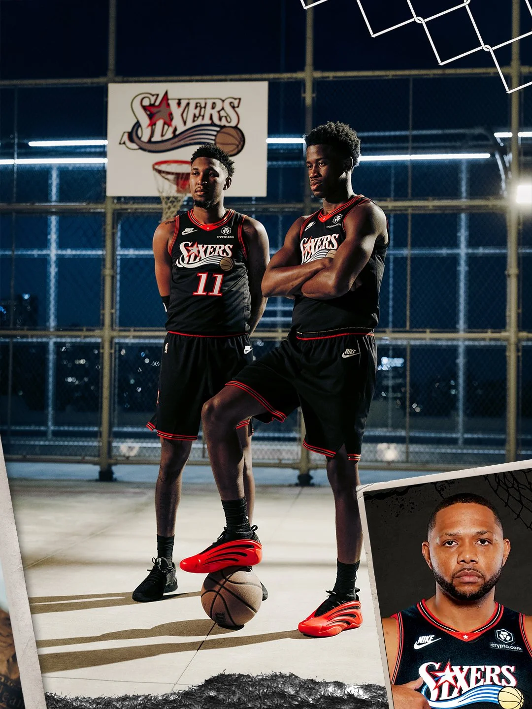
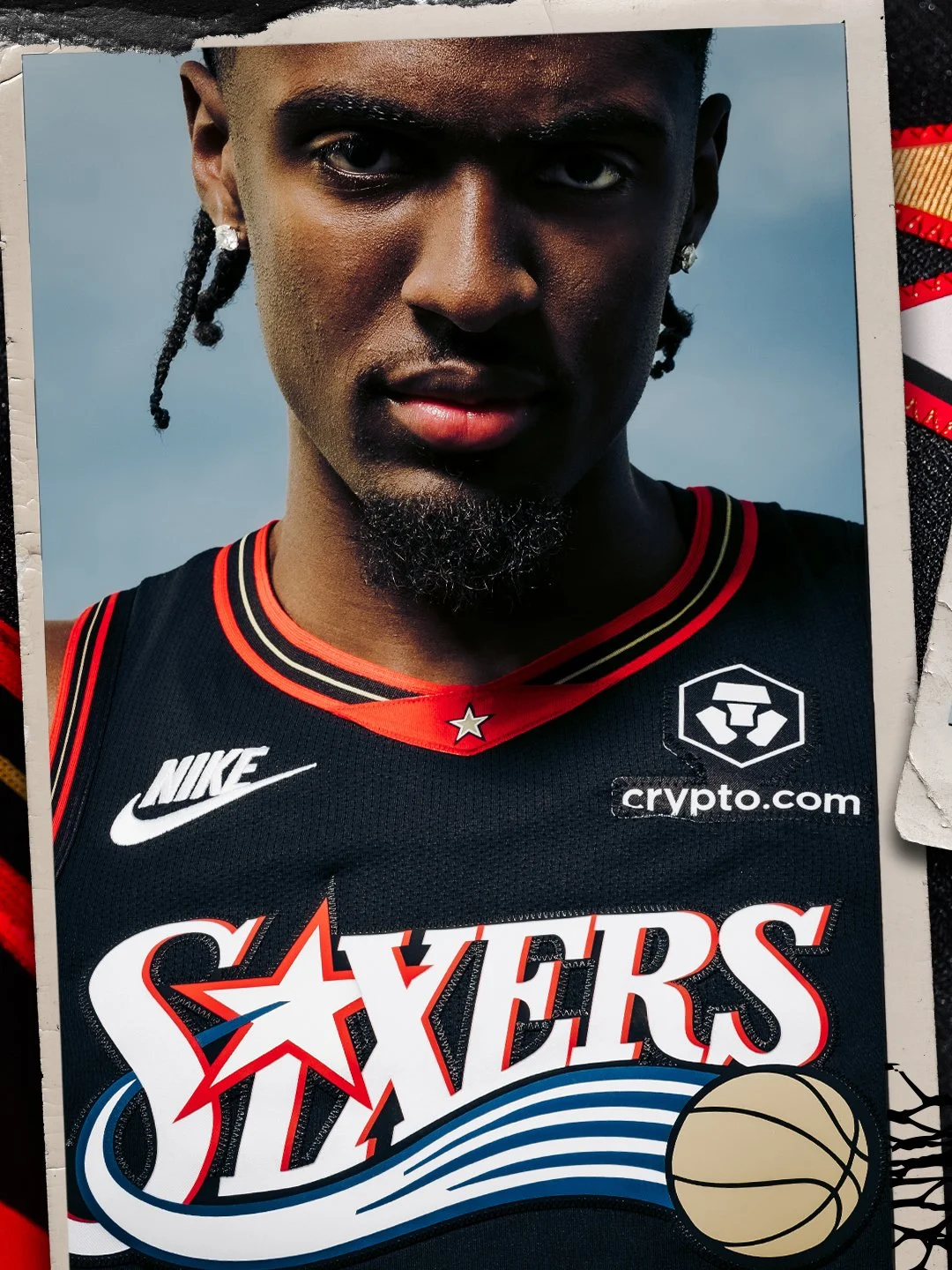
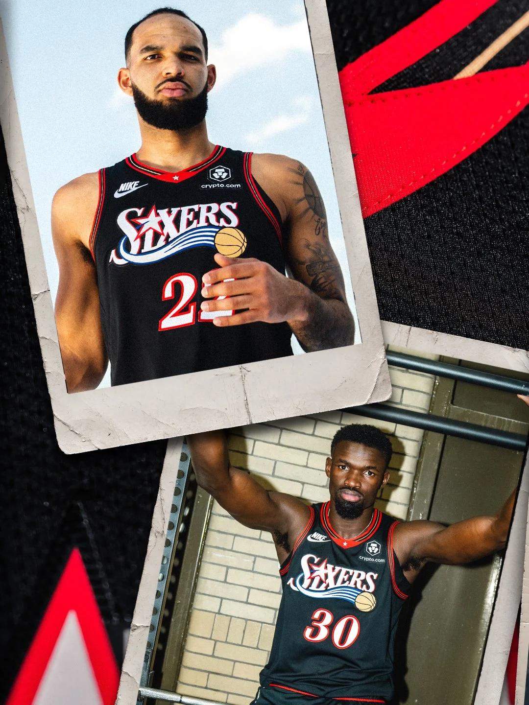
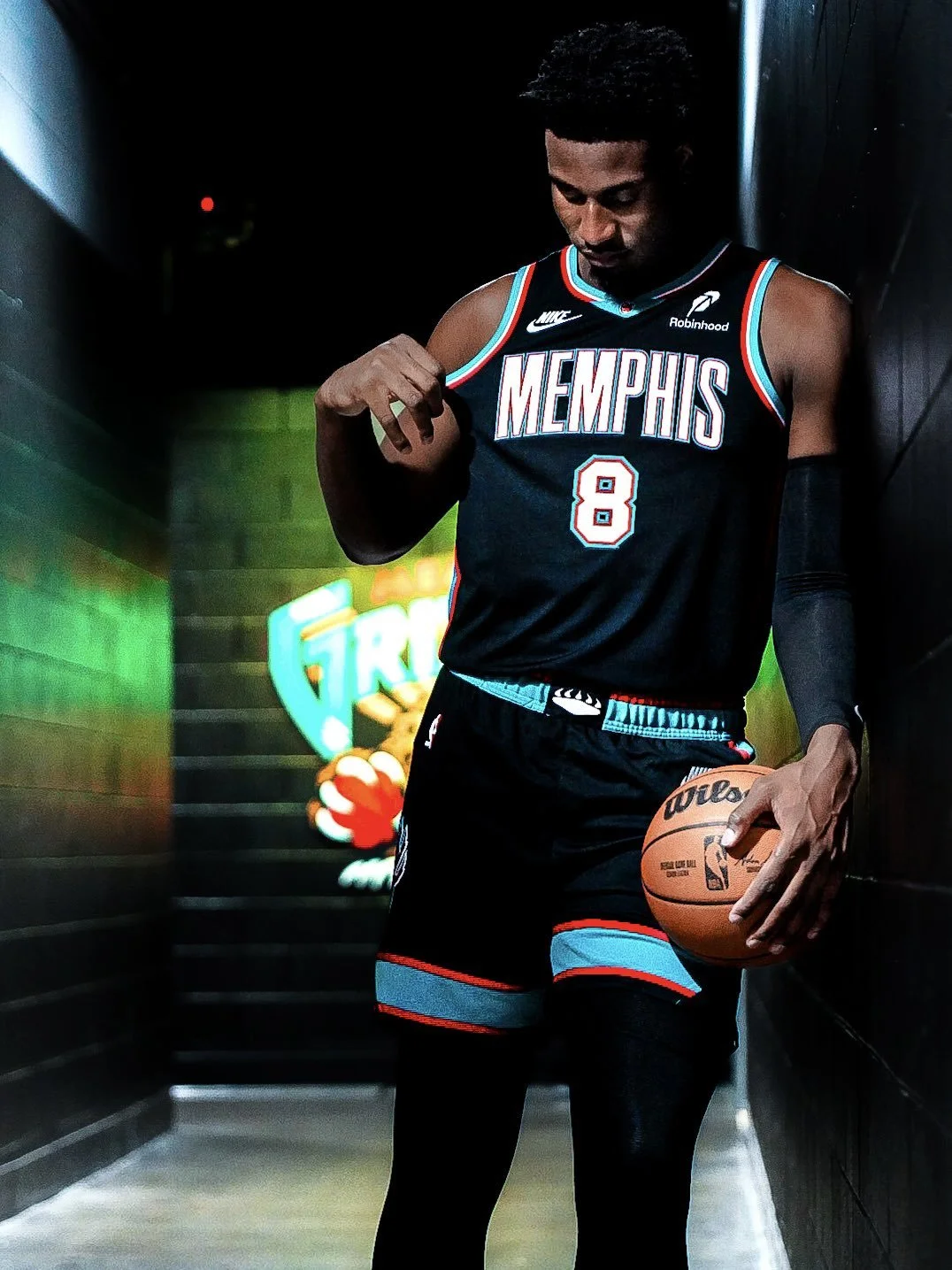
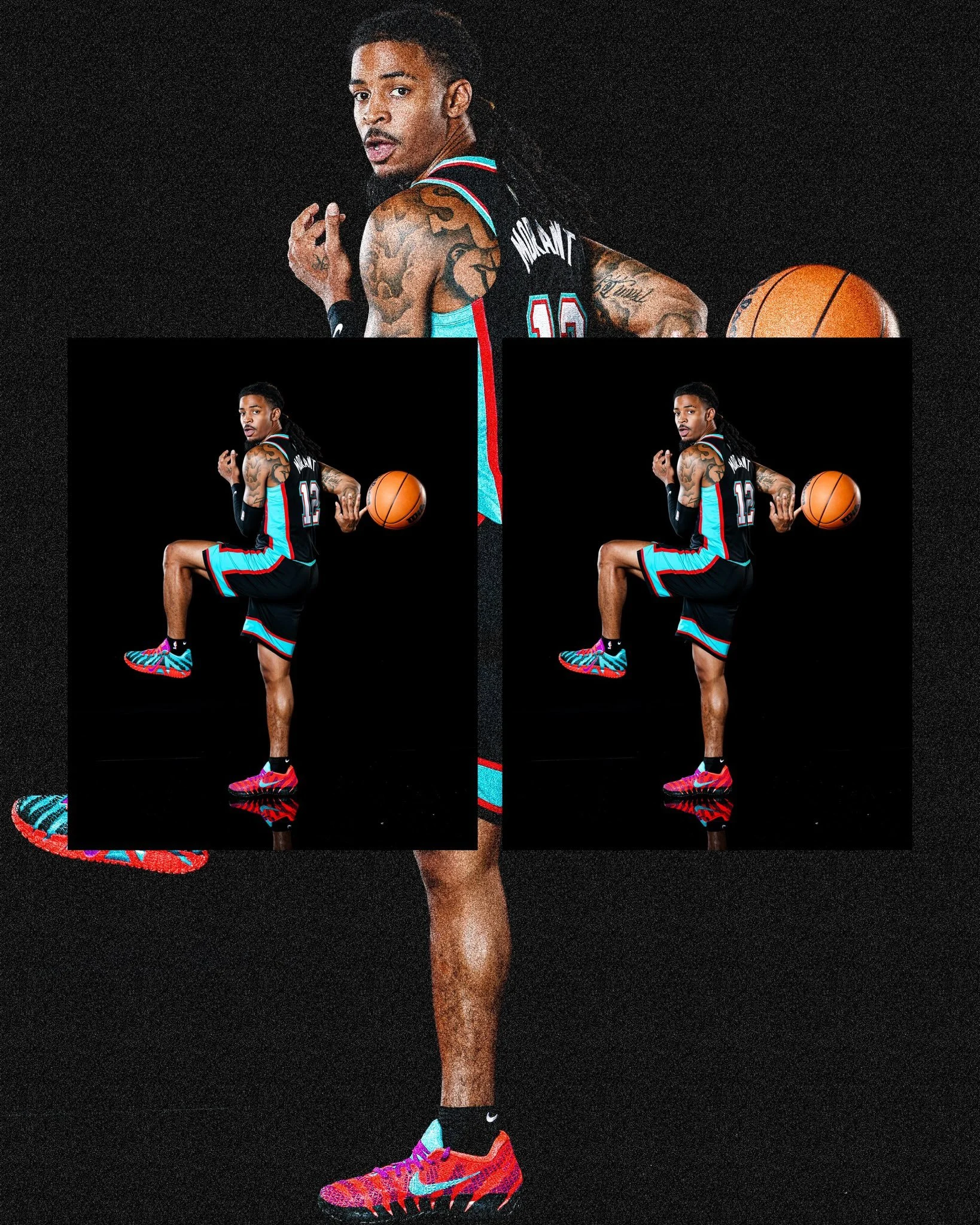
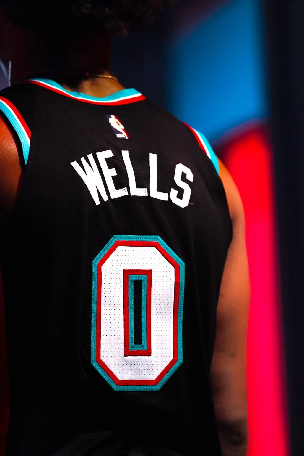
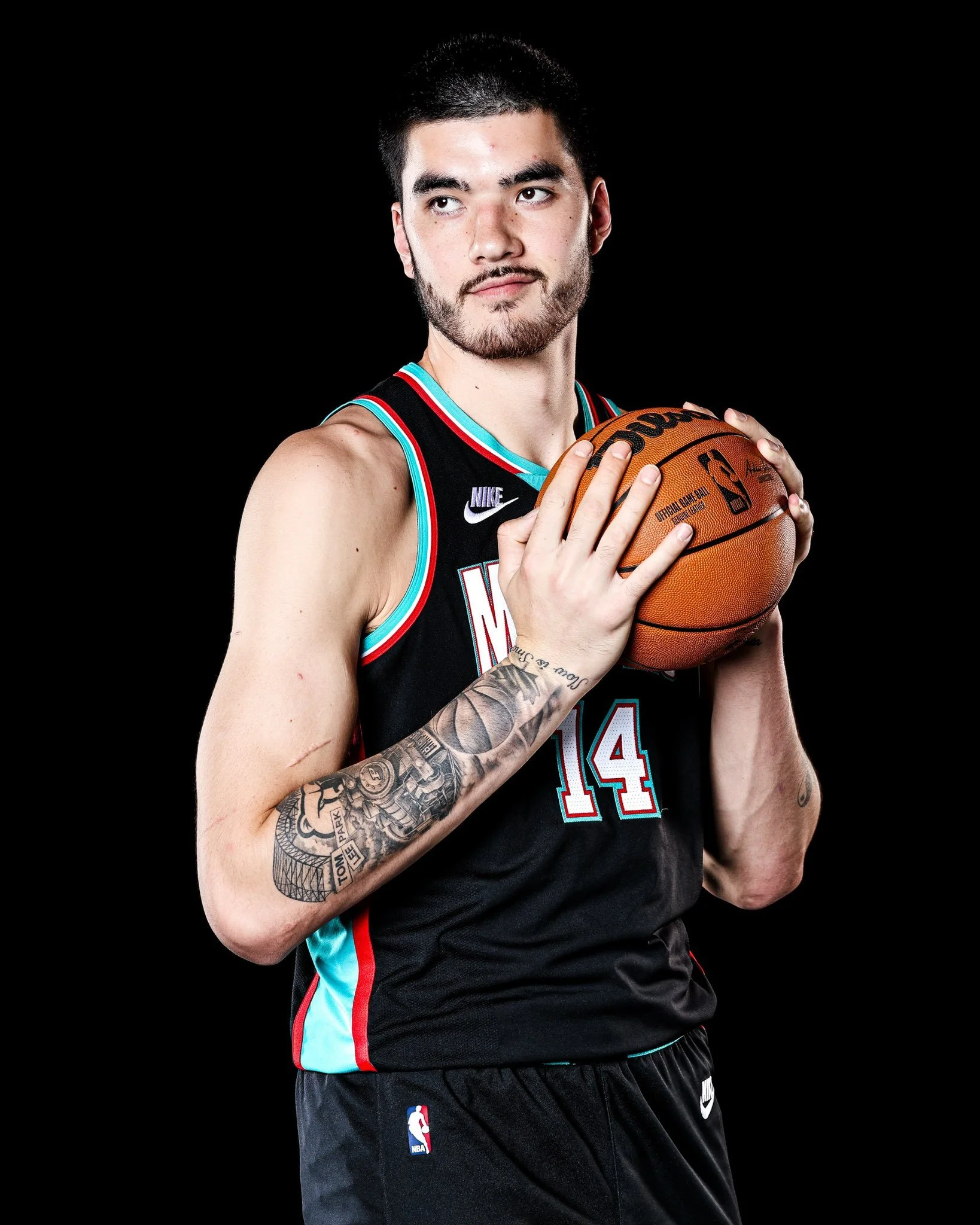
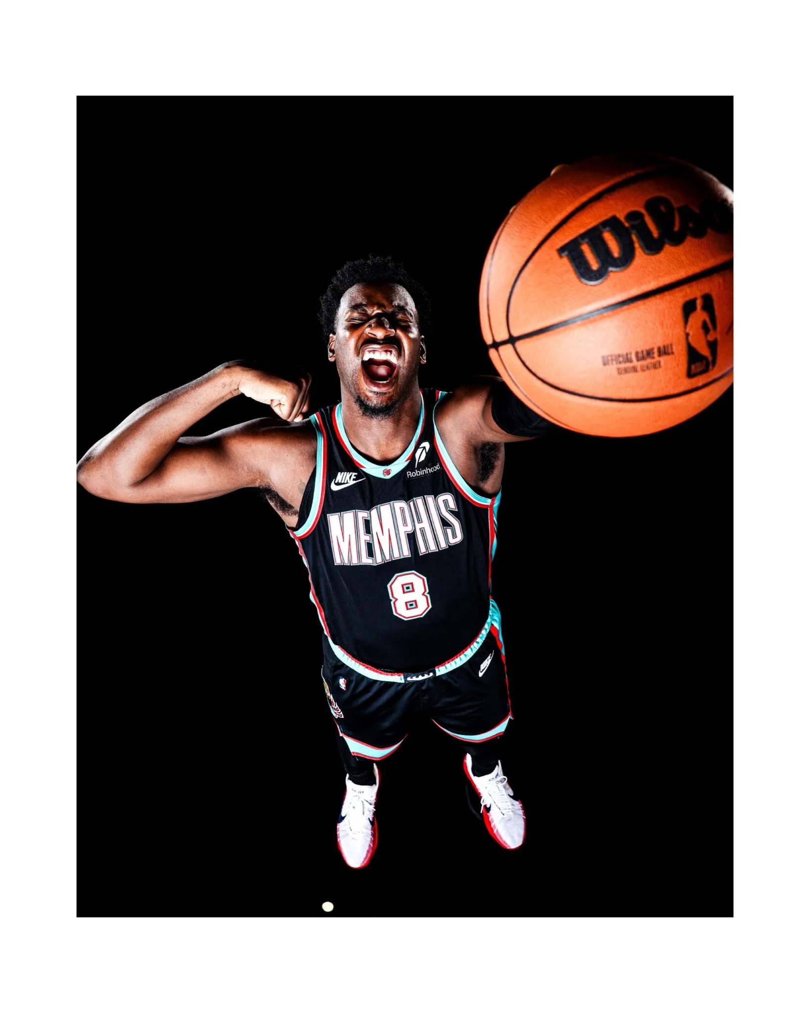
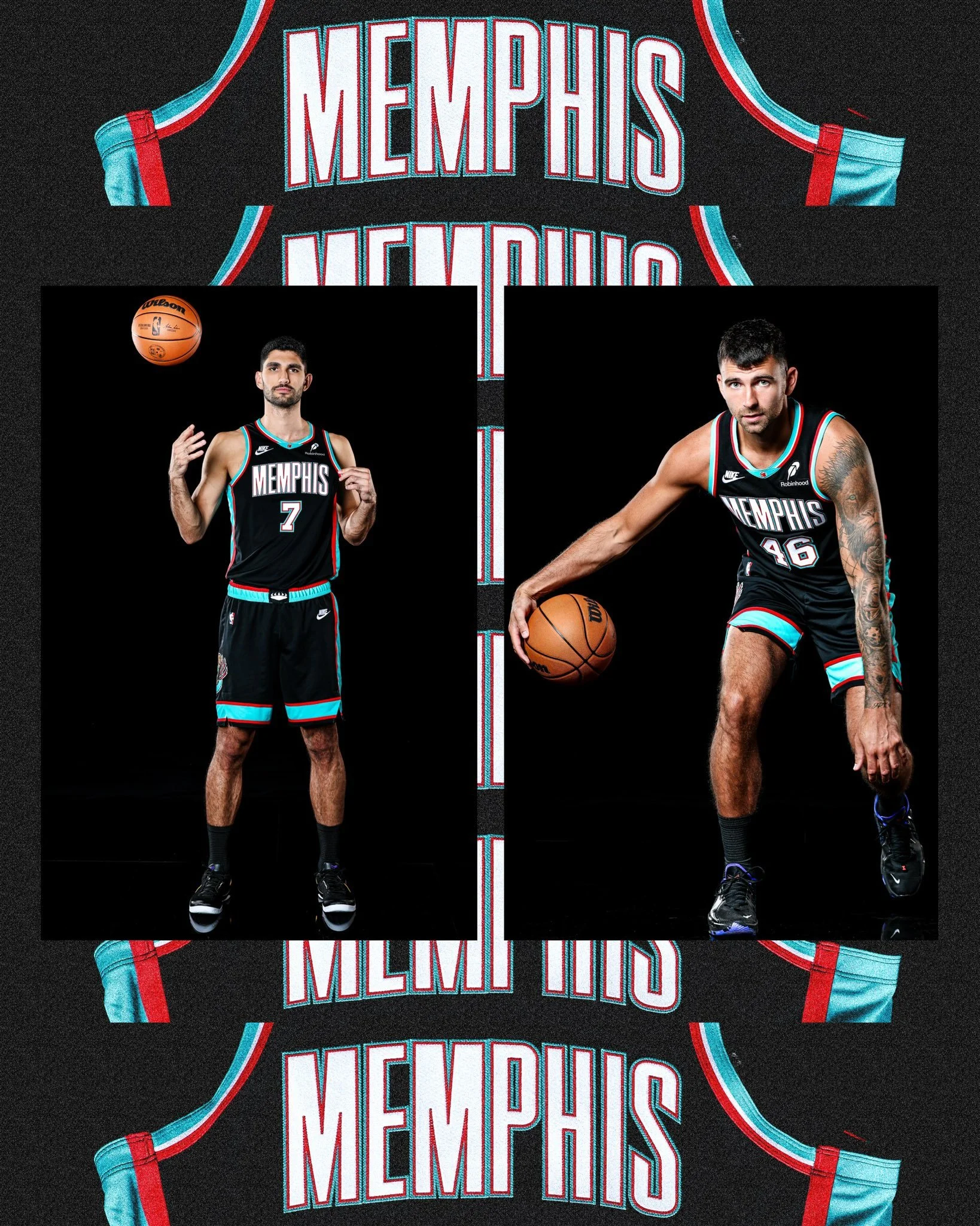
The Memphis Grizzlies are dialing up the nostalgia this season, taking the court in a bold throwback to their 2001-02 black uniforms, a look that represents the team’s very first year in Memphis.
When the franchise relocated from Vancouver to Memphis in 2001, the team brought along its alternate black uniform. But the Grizzlies quickly made it their own. The chest logo was swapped out for a sleek “Memphis” wordmark, paired with the signature asymmetrical trim in red, turquoise, and white. It was a fresh design that immediately gave the new era of Grizzlies basketball its identity.
For the first three seasons in Memphis, the team boldly featured “Memphis” across both home and away uniforms—a move that stood out in the NBA at the time, with very few teams opting to display their city so prominently.
The uniforms also featured the beloved Claw Ball, first introduced as a secondary logo in Vancouver back in 1995. It became part of the jersey in 2000 and still remains a staple of the Grizzlies’ brand identity over two decades later.
Another nod to the franchise’s roots, the G-Swipe logo, was carried over as well. First used during the inaugural Vancouver season, the fierce claw mark quickly came to symbolize the team’s intensity and edge on the court.
The return of the black 2001-02 uniforms isn’t just about looking back; it’s about celebrating the Grizzlies’ journey from their earliest days in Memphis to becoming a fixture of the city’s sports culture. For fans, it’s a chance to relive the moment when “Grizzlies Basketball” first took root in Tennessee, wearing one of the boldest kits of the early 2000s.
Memphis is making sure the throwback fits seamlessly with the present, honoring history while bringing a classic look back to the modern NBA stage.
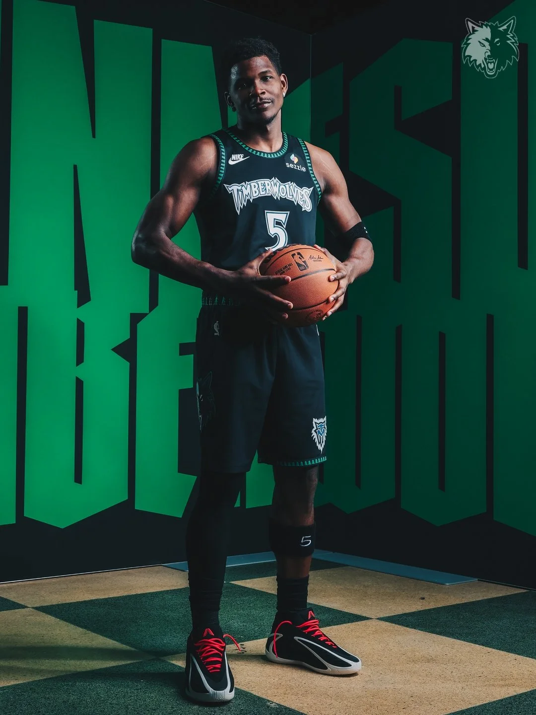
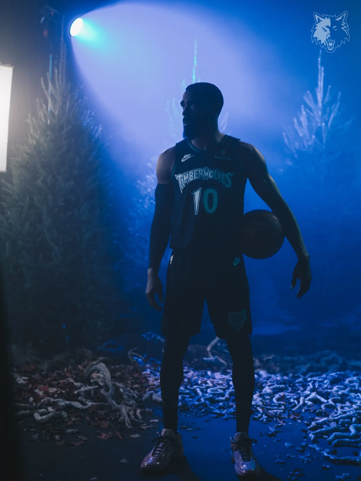
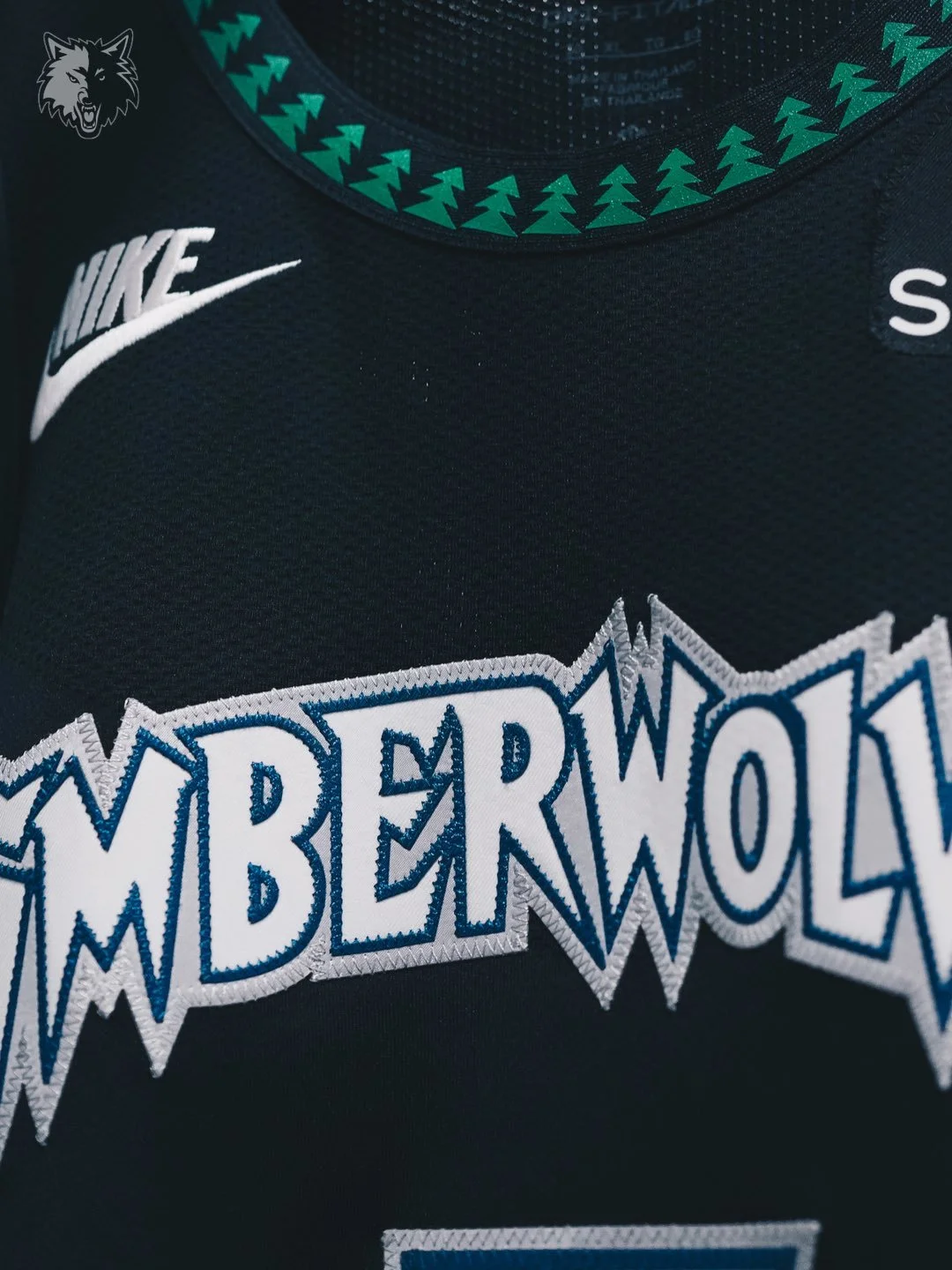
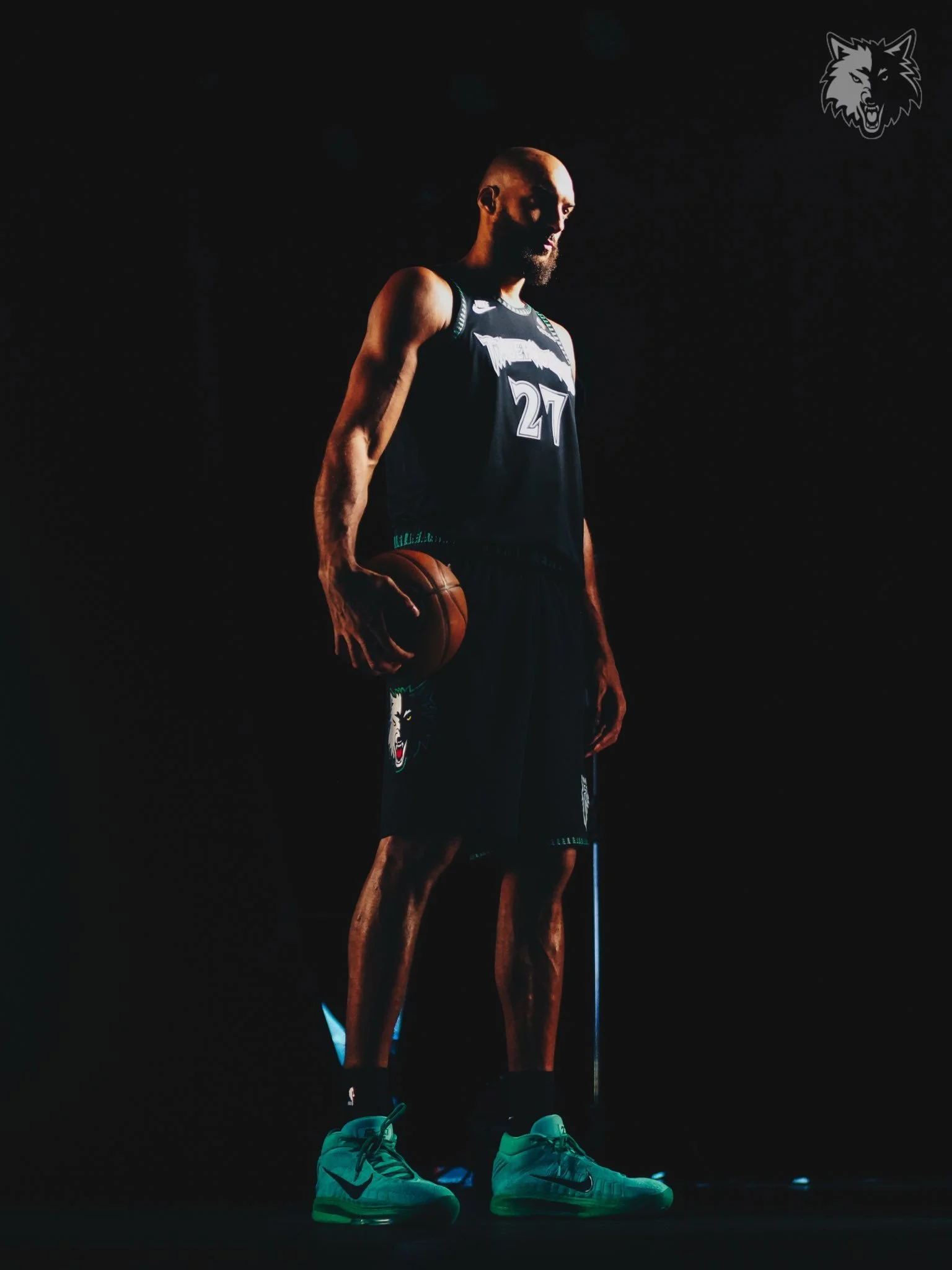
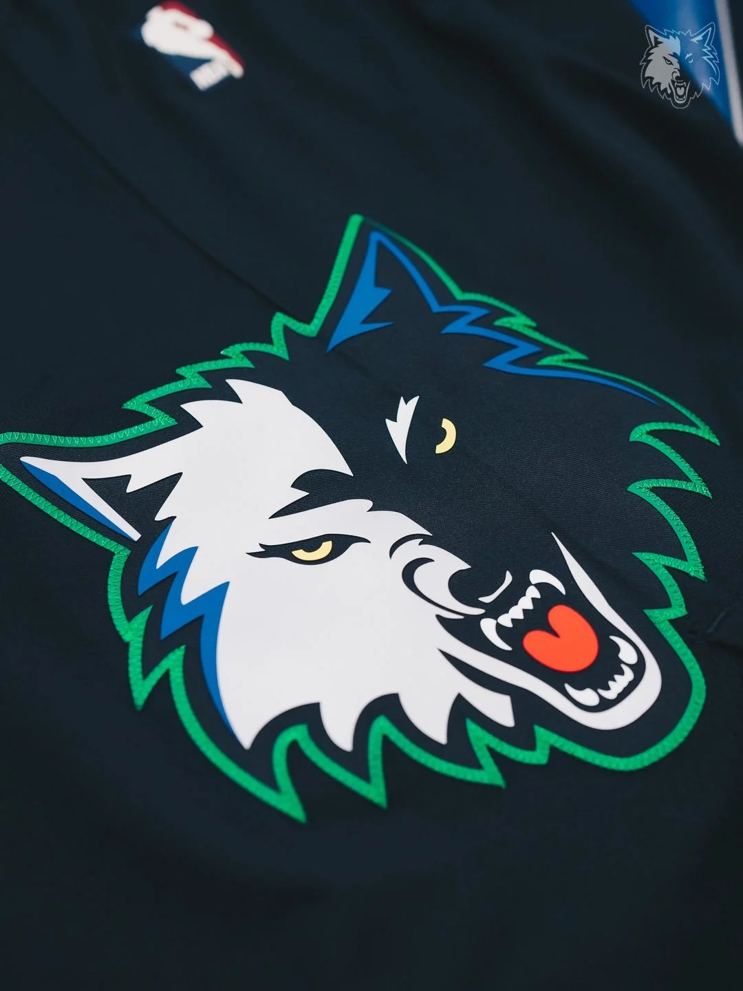
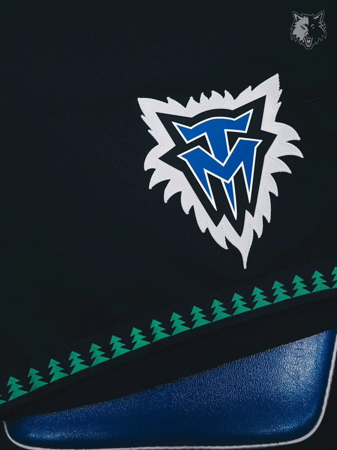
The Minnesota Timberwolves have officially brought back one of the most iconic looks in franchise history. The team unveiled their 2025-26 Classic Edition uniform and matching court design, reintroducing the legendary “Black Trees” set that has long been the most requested uniform among Timberwolves fans.
The Classic Edition uniform and court will make their season debut on October 26 when Minnesota hosts the Indiana Pacers at Target Center.
The “Black Trees” uniforms, originally worn during the 1990s and early 2000s, remain one of the most celebrated eras in Timberwolves history. With their bold black base and tree-patterned trim, the jerseys captured the culture, energy, and style of that era.
“These iconic uniforms hold a special place in our community, and bringing them back reflects our commitment to listening to fans and celebrating the moments they value most,” said Timberwolves and Lynx CEO Matt Caldwell. “Our Black Trees uniforms pay tribute to one of the most defining eras in team and league history, while introducing a new generation of fans to the Timberwolves’ legacy.”
The Wolves will wear the Classic Edition uniform for 28 games total this season, 21 at home and seven on the road.
To complete the throwback, the team also revealed a Classic Edition court, designed as a replica of the 1990s parquet hardwood floor from the original “Black Trees” era. The Wolves will play on this retro court for all 21 home games in which the uniform is worn.
With the return of the Black Trees, the Timberwolves aren’t just honoring their past, they’re giving fans a nostalgic reminder of one of the league’s most unique looks, while creating new memories for the next generation.