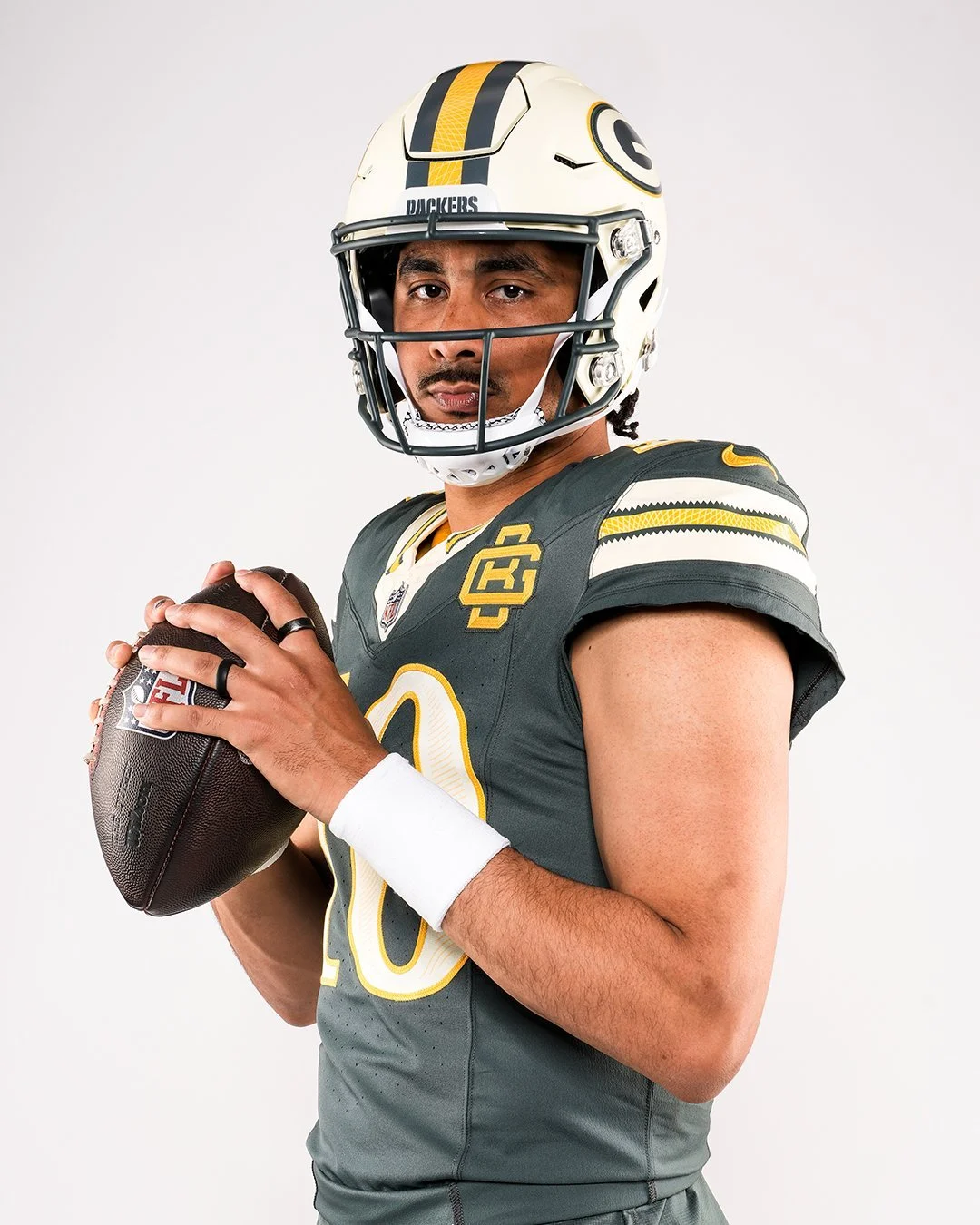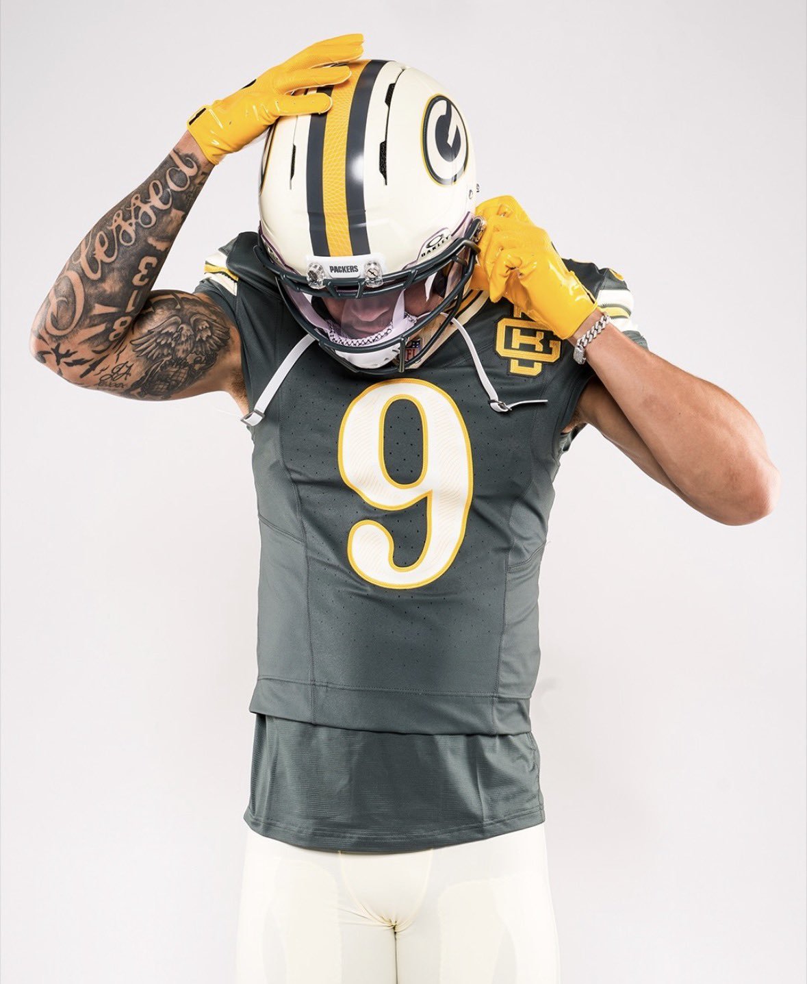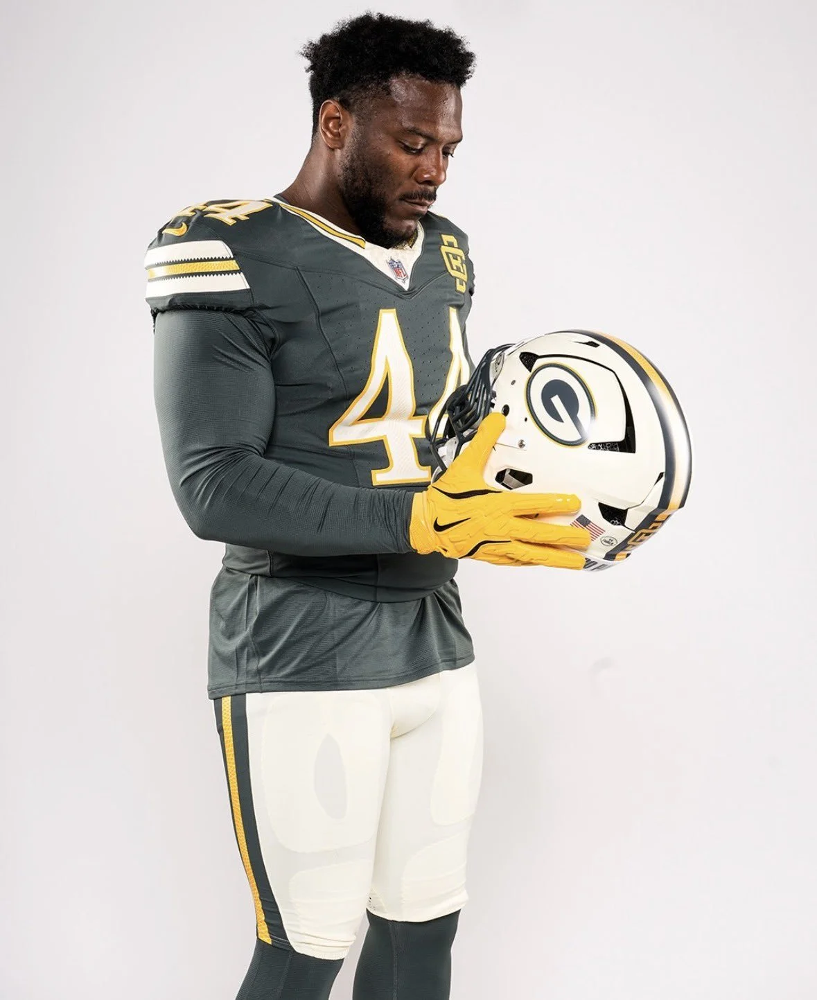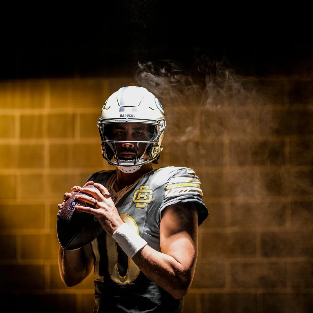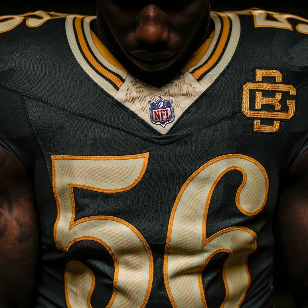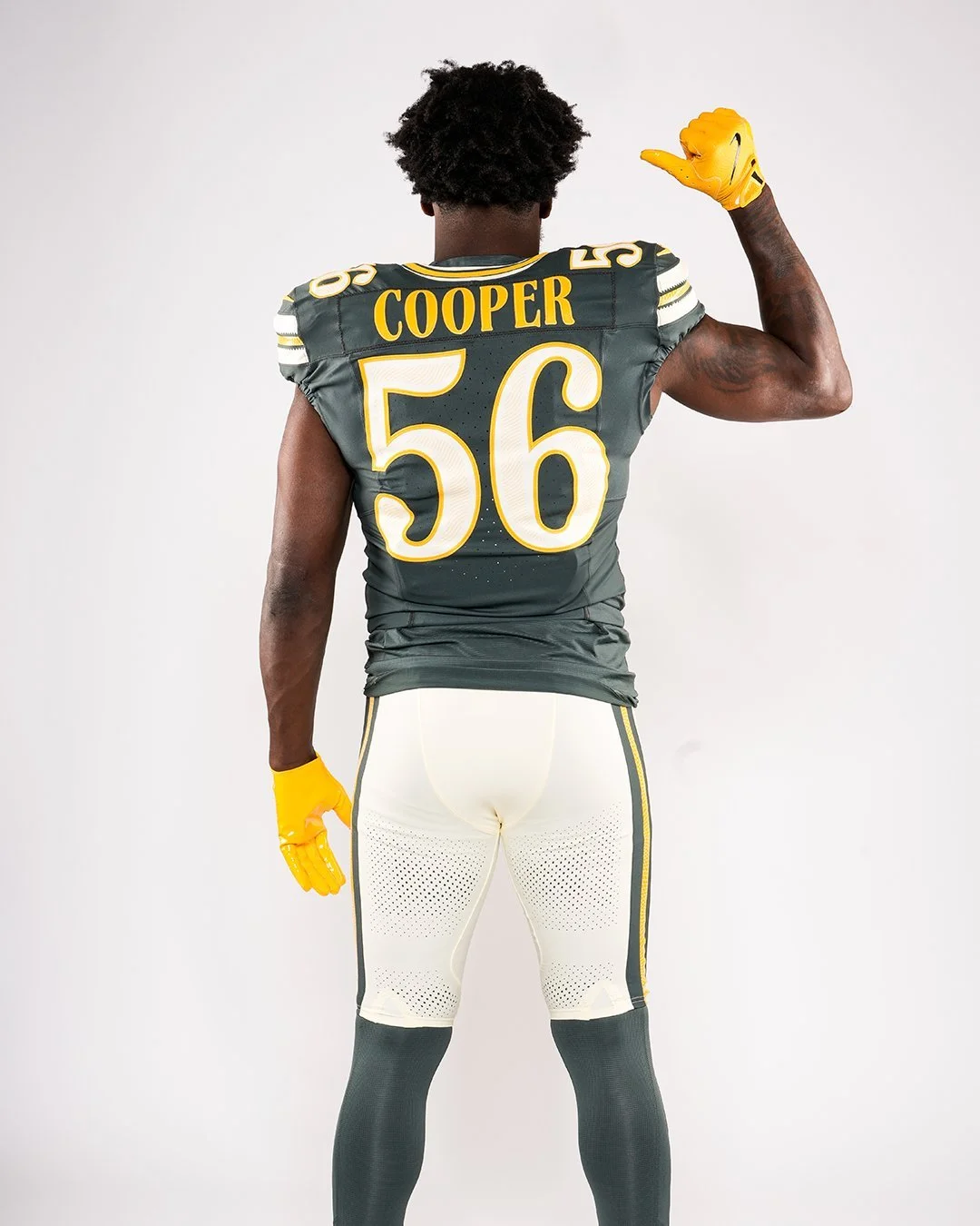
The Green Bay Packers are putting a unique spin on the NFL Rivalries program, using their alternate uniform to celebrate one of the most distinctive aspects of the franchise: the fans who literally own a piece of the team.
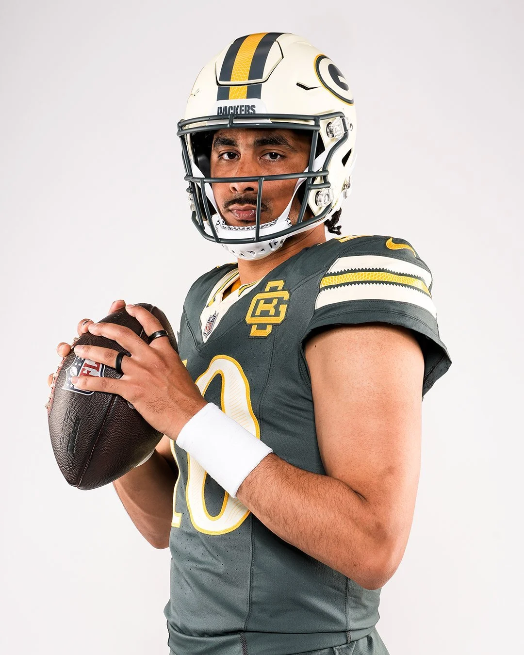
Green Bay unveiled its new Rivalries uniform Tuesday, with the look set to debut Oct. 11 against the Chicago Bears in the 214th meeting between the NFL's oldest rivalry. Rather than simply introducing another alternate take on green and gold, the Packers designed the uniform around the team's history of community ownership, small-town roots and generations of fan support.
The uniform features a desaturated vintage green jersey paired with alabaster and gold detailing. The alabaster color is inspired by the aged paper of the Packers' historic stock certificates, which have become one of the most recognizable symbols of the team's unique ownership structure. The concept is especially fitting given that Packers stock certificates are displayed in more than 500,000 homes across Wisconsin and around the country.
The financial-history theme continues onto the jersey numbers, which feature an engraved treatment inspired by the intricate lettering found on paper currency. It's a subtle detail that connects the uniform to the financial support that has helped sustain the Packers throughout their history.
A modernized version of the classic interlocking GB logo sits on the chest. The mark draws inspiration from the logo seen on Vince Lombardi-era sideline and practice gear, giving the new uniform another direct connection to Packers history.
The uniform's striping incorporates vintage-inspired alabaster and gold, while the pants are predominantly alabaster. The matching helmet features a matte finish, green and gold striping and a matte green facemask, giving the Packers a distinctly different appearance from their traditional glossy green helmet.
Even the helmet includes a nod to the fanbase, with "Go Pack Go" appearing on the back.
Inside the collar, the Packers added another historical detail: "Making History Since 1919." The phrase reinforces the century-plus history behind the franchise while tying together the team's past, present and future.
The result is one of the more conceptually detailed Rivalries uniforms of 2026. Instead of leaning exclusively into Green Bay's colors or its rivalry with Chicago, the Packers used the uniform to tell the story of what makes the franchise different from every other team in professional sports.
The Packers' fans aren't simply supporters, they are shareholders, and that relationship became the foundation for the design.
The Packers will debut the Rivalries uniform Oct. 11 against the Chicago Bears at Lambeau Field, adding another chapter to the historic rivalry.
The Minnesota Vikings are going to battle in a new look this season.
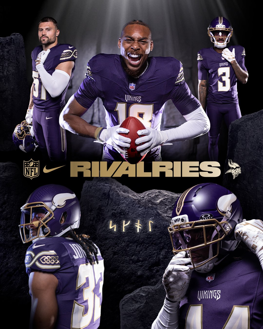
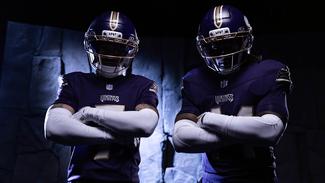
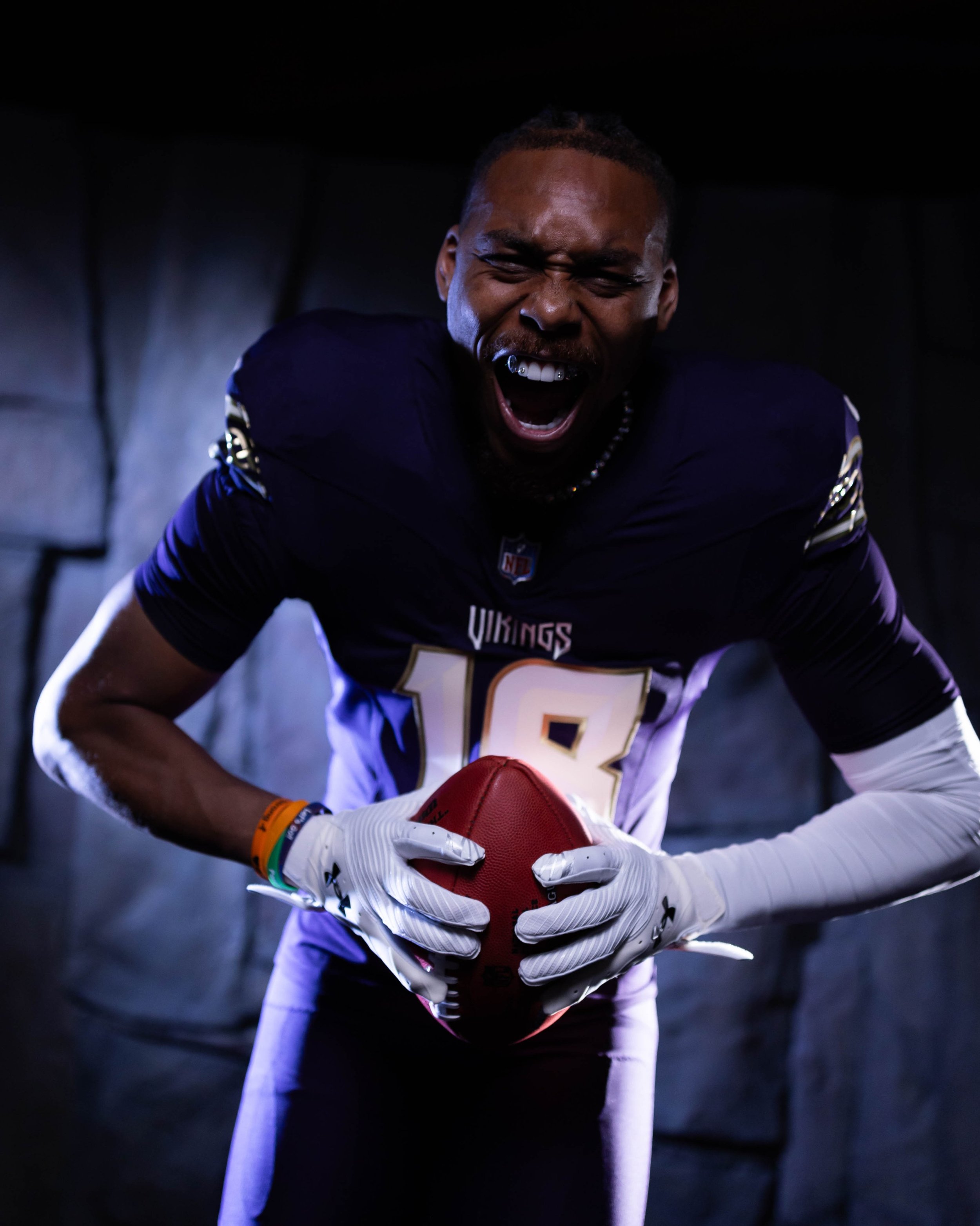
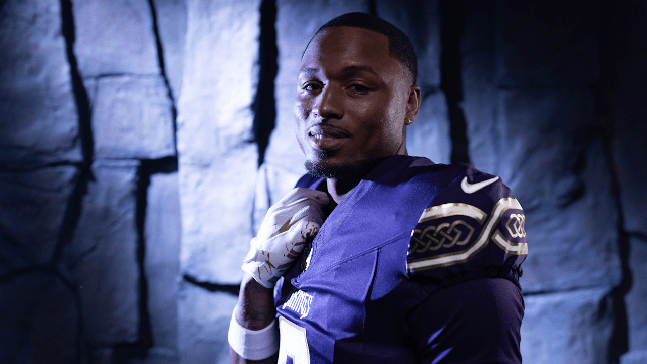
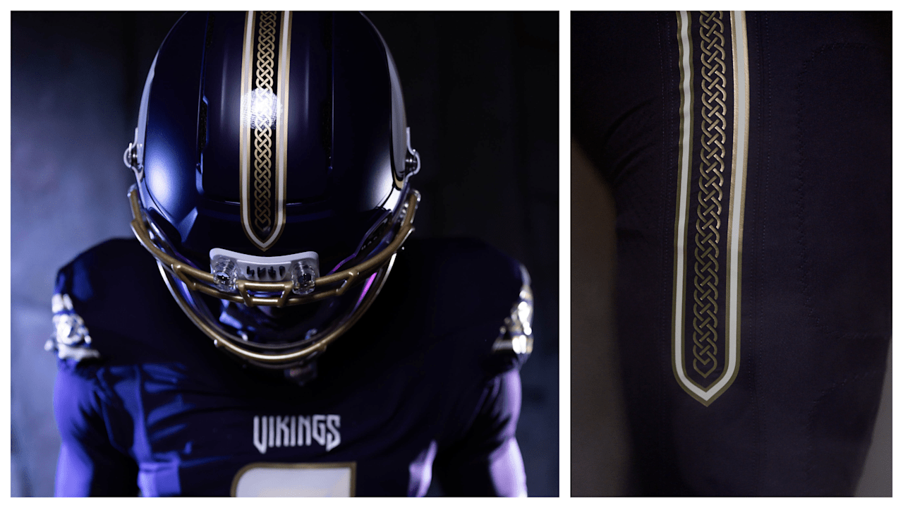
The Vikings have unveiled their 2026 Rivalries uniform, a design inspired by ancient Viking warriors, Minnesota's Northern identity and the team's own gameday traditions. The new uniform will debut Dec. 20 against the Detroit Lions.
The concept behind the uniform actually dates back to the development of Minnesota's Winter Warrior alternate. While the Vikings ultimately went with the all-white design for Winter Warrior, the team had also explored a darker Viking warrior concept featuring historical armor and textures.
When Nike introduced the opportunity to create a fifth uniform without the same restrictions placed on traditional alternates, the Vikings brought that darker concept back to life.
Rather than going with an all-black “dark mode,” the Vikings wanted something that felt uniquely theirs. Nike introduced the team to Purple Dynasty, an extremely deep purple that maintains the franchise's identity while creating a much darker appearance.
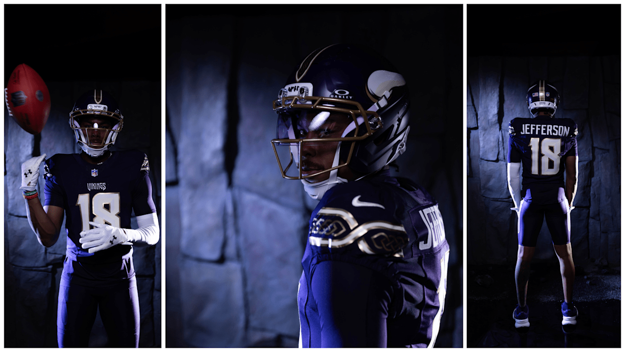
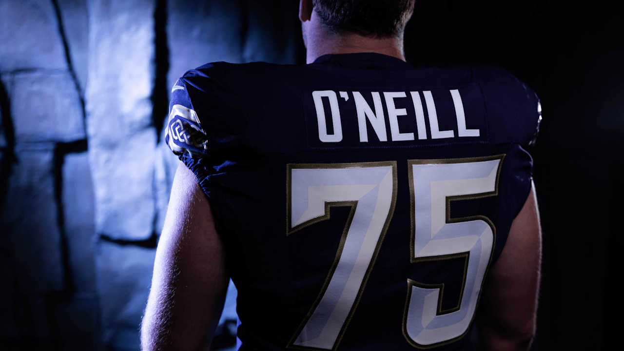
The uniform combines Purple Dynasty with ivory and metallic gold, giving the look an earthy, premium feel inspired by Viking armor, natural materials and precious metals.
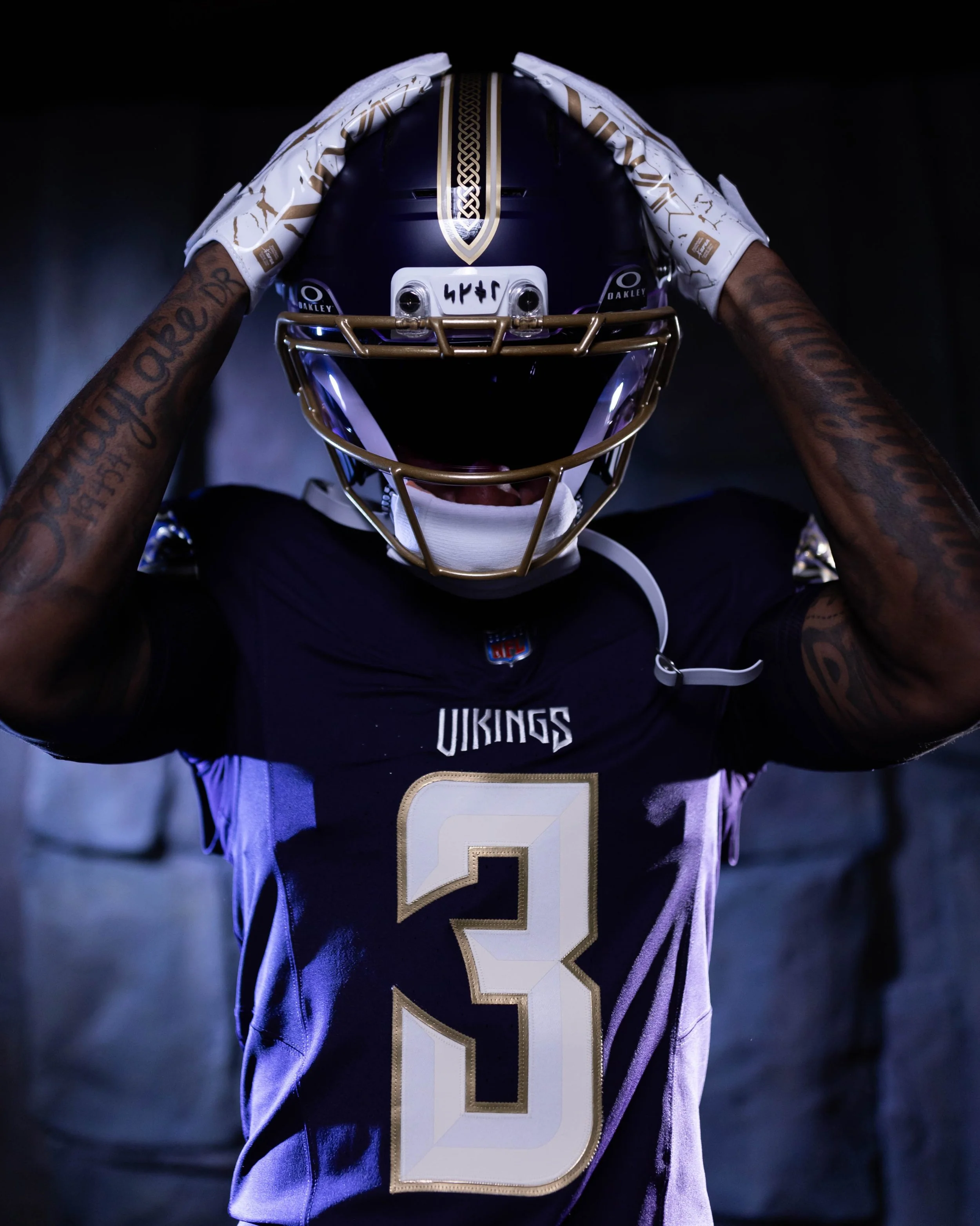
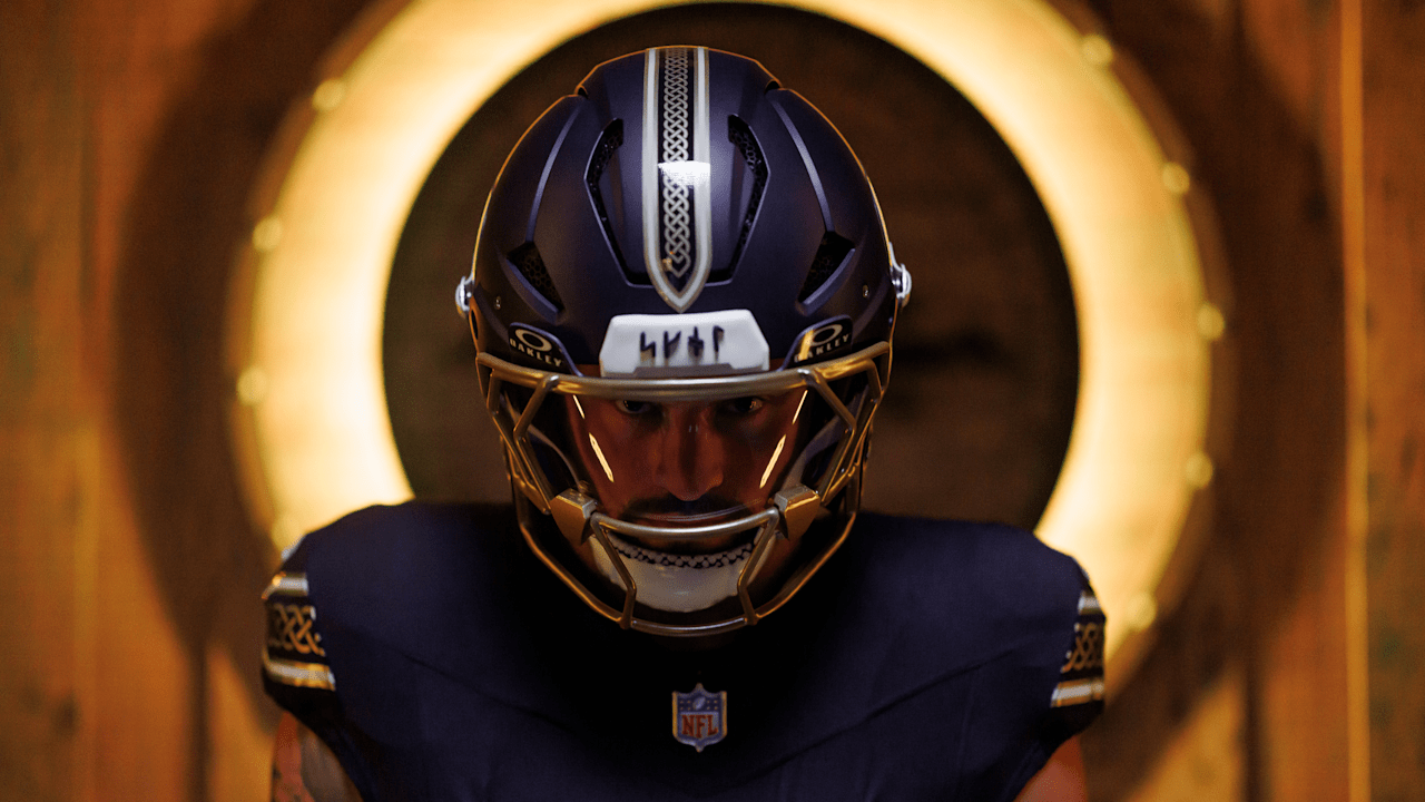
The Vikings went deep into their history and culture when designing the uniform. The SKOL wordmark appears in Younger Futhark runes, the 16-character alphabet used in Scandinavia during the Viking Age. Those same runic characters are featured on the runestones lining the team's tunnel at U.S. Bank Stadium and now appear on the inside collar and the helmet's 3D front bumper.
The uniform also features a Nordic knot pattern inspired by the design found on the Vikings' Gjallarhorn. That same pattern appears along the pants, where the stripe comes to a point resembling a battle sword. A similar design runs down the center of the helmet, inspired by the nose piece of an ancient Viking helmet.
The jersey numbers feature a two-tone treatment designed to make them look as though they were chiseled from stone or ivory, while a completely new VIKINGS wordmark takes inspiration from the structure of carved runes.
The color palette may be one of the strongest aspects of the uniform. Purple Dynasty brings back the darker purple associated with some of the franchise's earliest uniforms and helmets. Ivory is inspired by the Vikings' Gjallarhorn, while metallic gold elevates the traditional purple-and-gold identity and connects to the precious metals and artistry associated with Viking culture.
The result is a uniform that feels dramatically different from Minnesota's traditional combinations without abandoning what makes the Vikings recognizable.
From the deep purple and metallic gold to the runes, Nordic knots, Gjallarhorn references and battle-inspired elements, virtually every part of the uniform was designed to make the players look like a modern-day Viking preparing for battle.
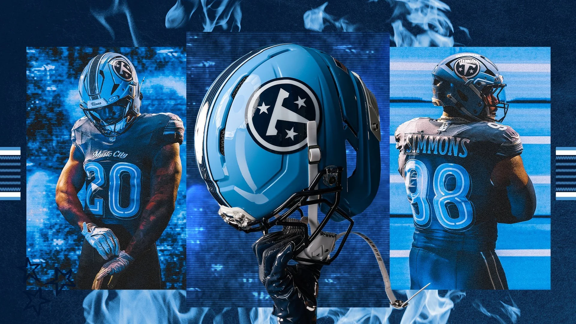
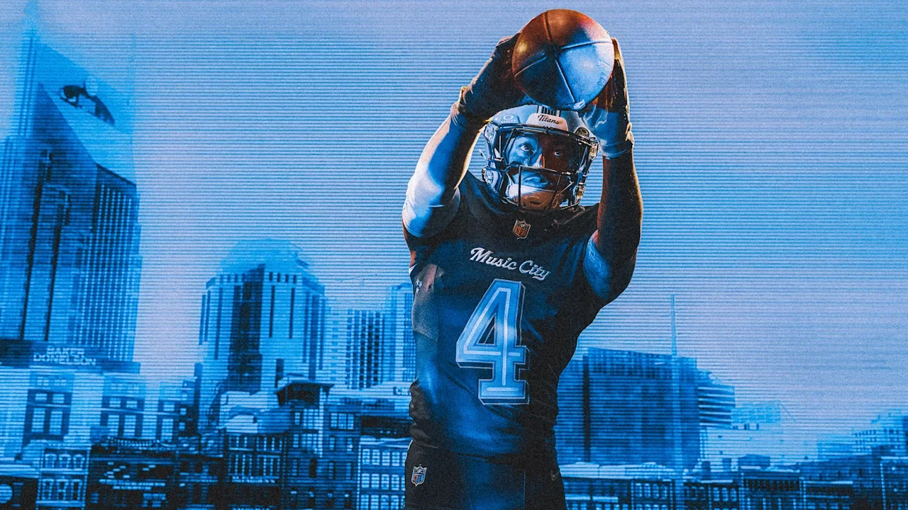
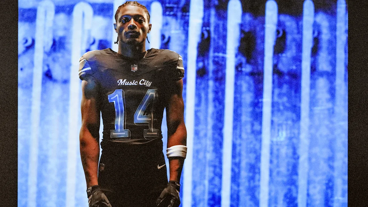
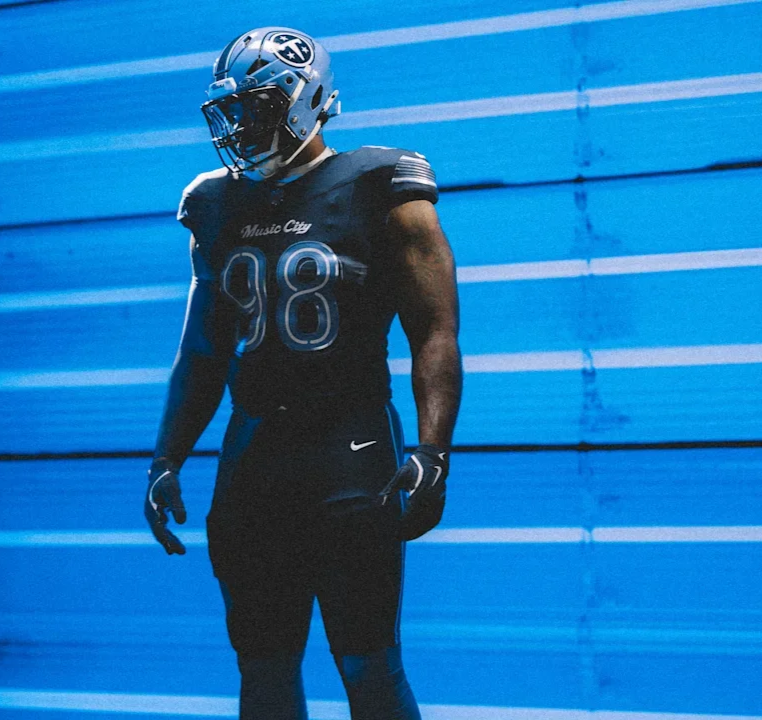
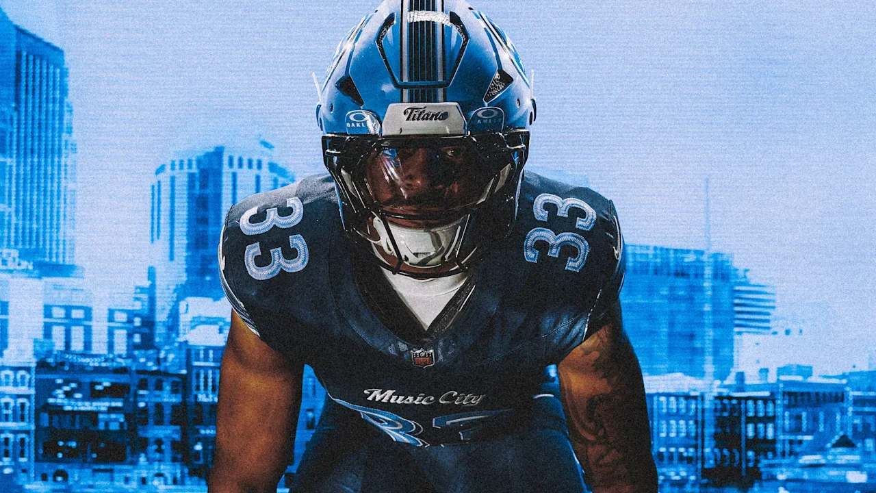
The Tennessee Titans are bringing the spirit of Nashville to the field. The Titans unveiled their new “Music City” Rivalries uniform, adding another look to the team's wardrobe.
The uniform will make its debut Nov. 15 against the Jacksonville Jaguars at Nissan Stadium.
the uniform blends the Titans' signature Two-Tone Blue color palette with visual elements inspired by Nashville's music and nightlife culture.
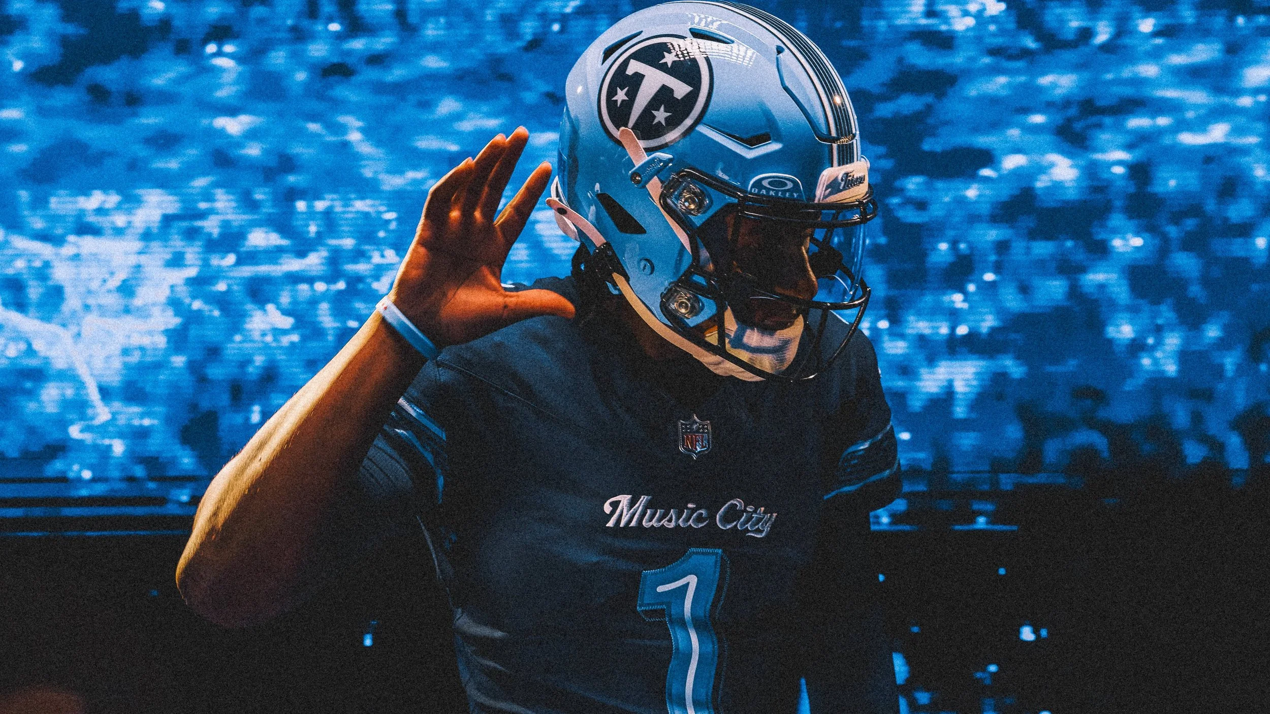
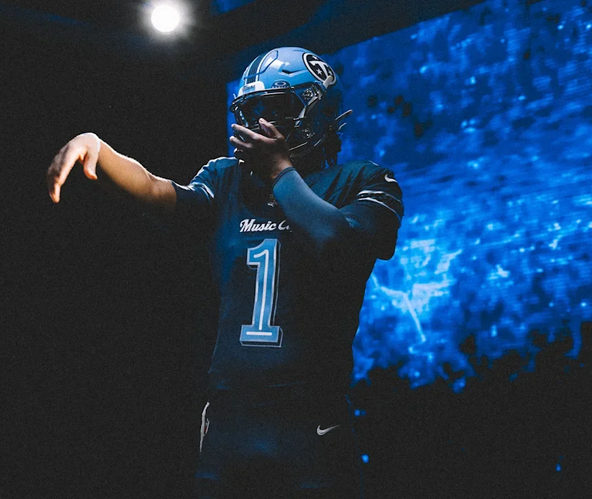
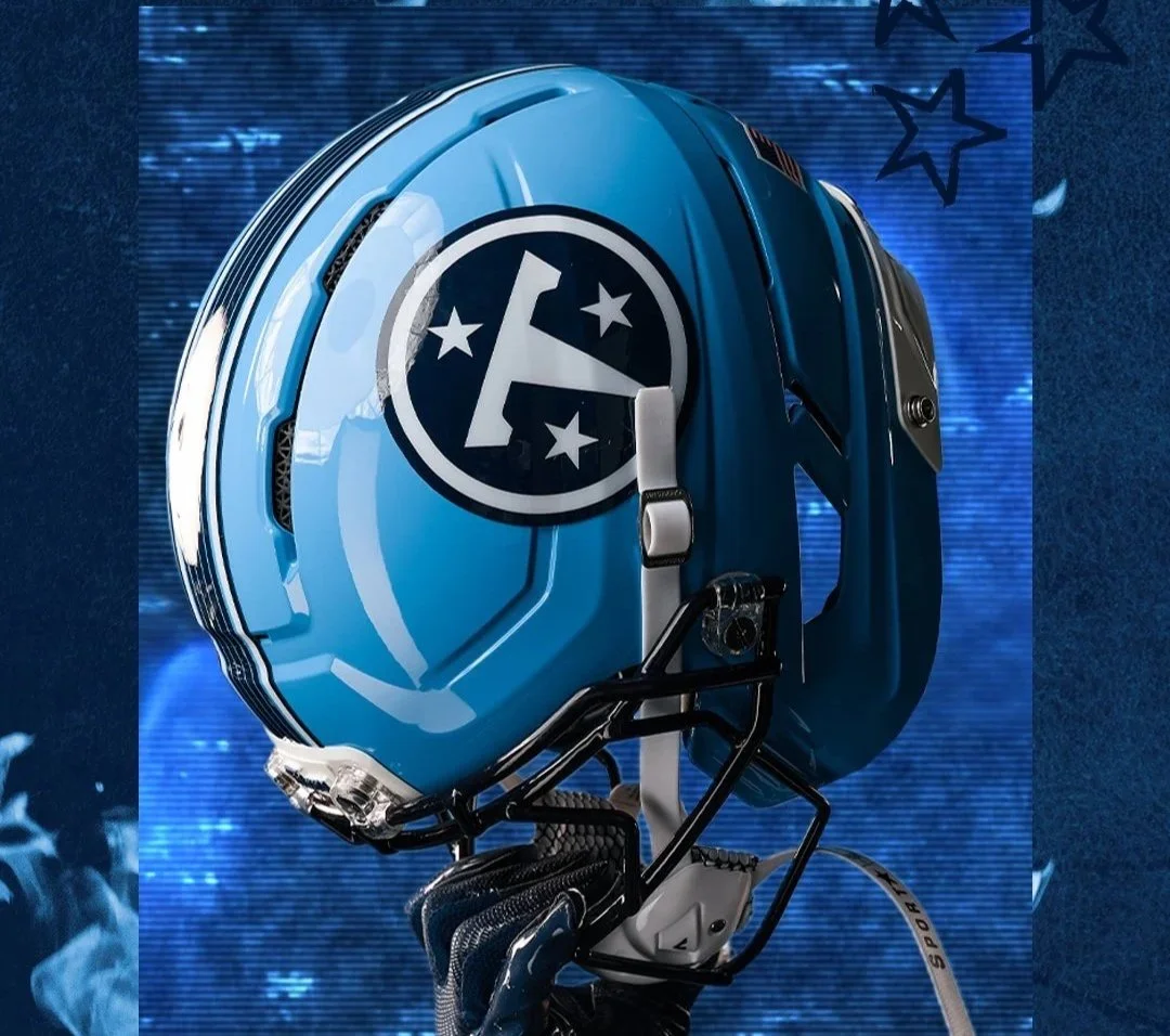
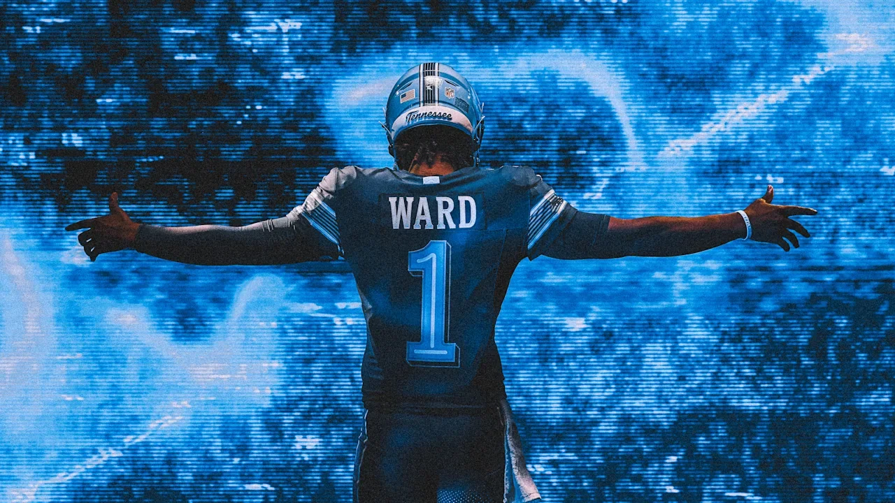
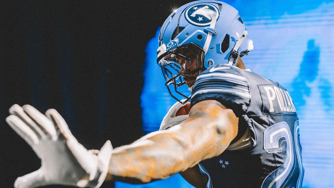
The “Music City” look features a Titans Blue helmet shell paired with a navy jersey and navy pants, creating a darker overall appearance than the team's traditional combinations. Across the chest is the team's “Music City” script, putting the nickname of Nashville front and center.
The jersey numbers take inspiration from the city's famous neon signs, featuring a neon-inspired font that gives the uniform a distinctly Nashville feel.
Perhaps the most unique detail comes on the pants, where a rhythmic six-string stripe runs down the side. The design serves as a direct nod to Nashville's reputation as one of the world's most recognizable music cities and its deep connection to guitar culture.
When the Jaguars come to Nashville in November, the Titans will have a uniform designed to make one thing clear: this is Music City.
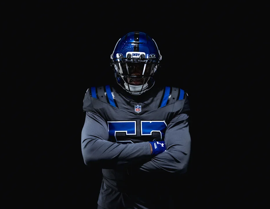
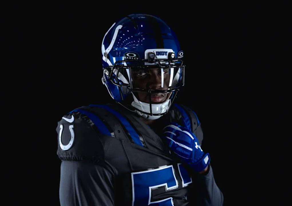
The Indianapolis Colts are bringing a completely different look to the field this season.
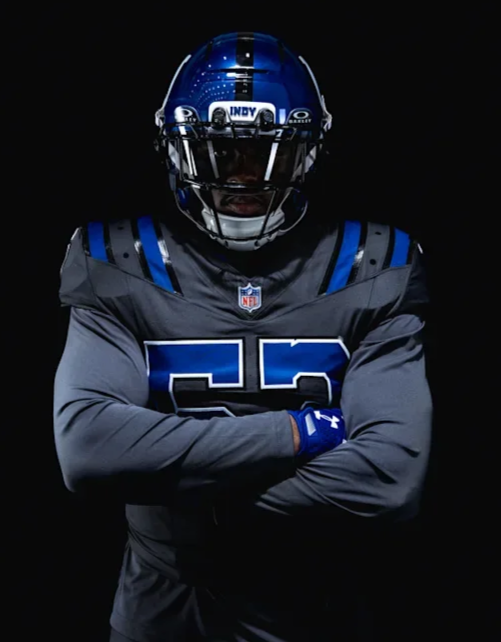
As part of the NFL Rivalries program, the Colts unveiled their new “Anvil Strike” Rivalries uniform, which will make its debut on Sept. 27 against AFC South rival the Houston Texans at Lucas Oil Stadium.
The design draws inspiration from the anvil, a symbol long associated with Colts football and representing strength, resilience and the relentless mentality of the franchise. The result is one of the boldest uniform departures in Colts history while still maintaining recognizable elements of the team’s identity.
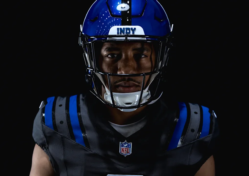
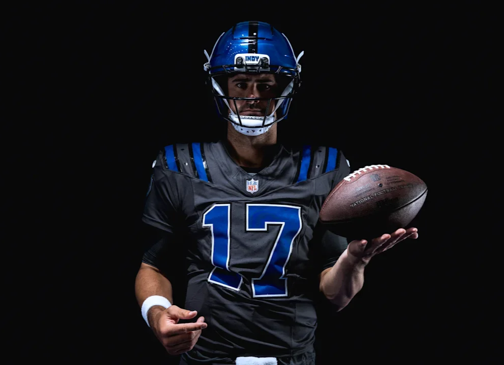
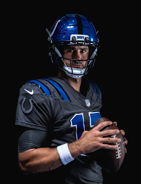
The centerpiece of the uniform is a metallic blue helmet featuring a high-shine finish that gives the Colts' traditional blue a completely different appearance. The helmet is finished with an “INDY” bumper on the front, paying tribute to the city the Colts call home.
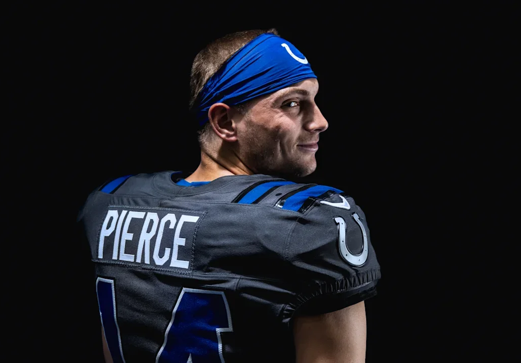
The jersey moves away from the Colts' traditional white and blue combination, instead utilizing a dark anthracite “Anvil Steel” color inspired by the look of forged steel. High-shine and reflective elements are incorporated throughout the uniform to mimic the sparks and movement created when an anvil is struck.
One of the biggest changes comes with the Horseshoe. For the first time in franchise history, the iconic symbol is integrated directly into the jersey design with a silver metallic finish.
The shoulder-pad striping receives an updated treatment, while horseshoe-inspired grommets add another subtle reference to the franchise's most recognizable symbol. The numbers remain in a classic Colts-inspired style, helping maintain a connection to the team's traditional identity despite the dramatically different color palette. Inside the collar, the phrase “FOR THE SHOE” serves as a rallying cry to Colts fans, while the metallic finishes throughout the uniform reinforce the overall forged-steel concept.
The result is a uniform that combines the Colts' traditional iconography with a much more aggressive, industrial aesthetic.
The Colts will debut the “Anvil Strike” look on Sept. 27 against the Houston Texans at Lucas Oil Stadium.
The “Anvil Strike” gives Indianapolis a striking new visual identity for one of its biggest divisional matchups, and adds another completely different look to the Colts' uniform rotation.
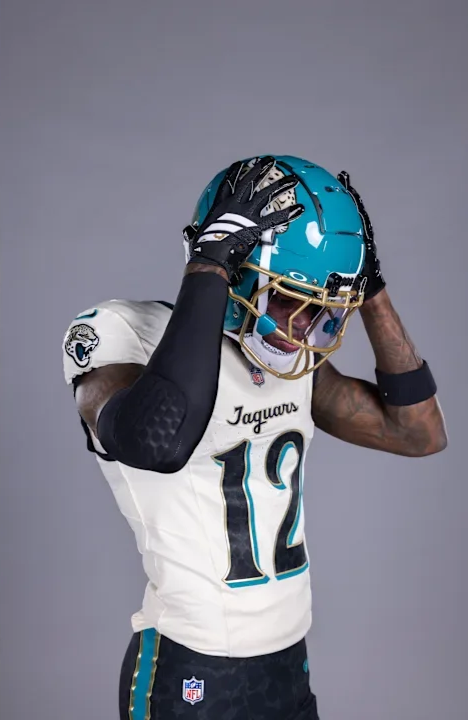
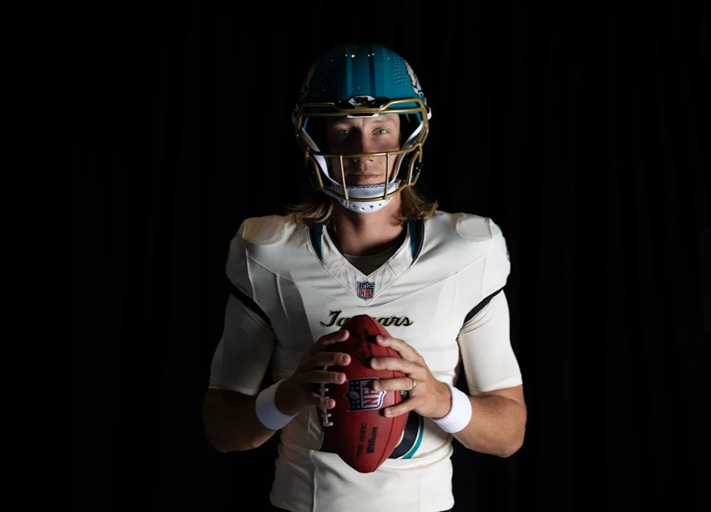
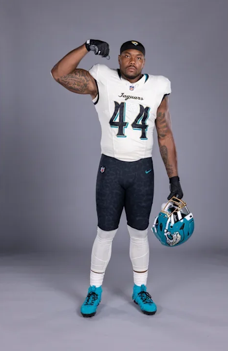
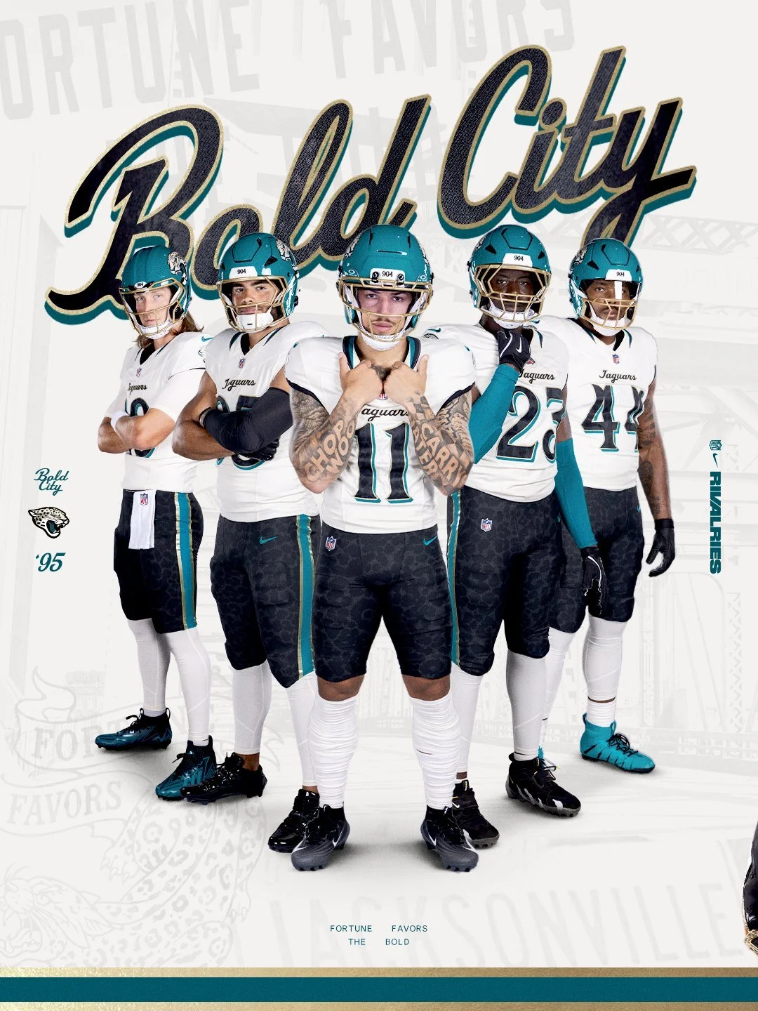
The Jacksonville Jaguars are putting Bold City pride front and center. As part of the second year of the NFL Rivalries program, the Jaguars have unveiled a new uniform designed specifically around the identity, history and confidence of Jacksonville. The Jaguars will debut the uniform Nov. 1 against AFC South rival the Indianapolis Colts.
The Rivalries program gives participating NFL teams an opportunity to create uniforms rooted in the communities they represent, with Nike, the NFL and each club working together to develop designs that go beyond traditional team branding.
For Jacksonville, the result is a look built around the city's motto and attitude: “Fortune Favors the Bold.”
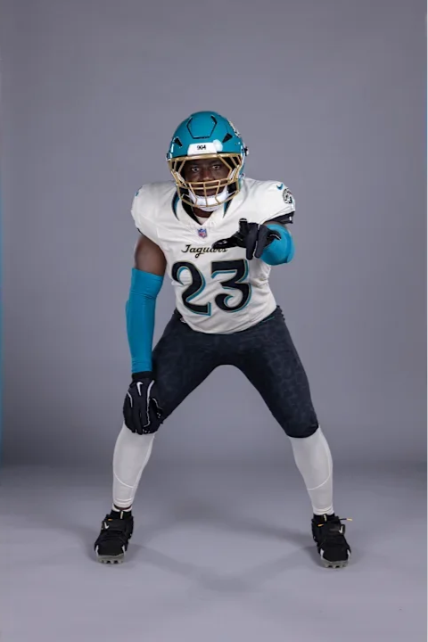
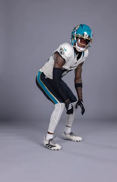
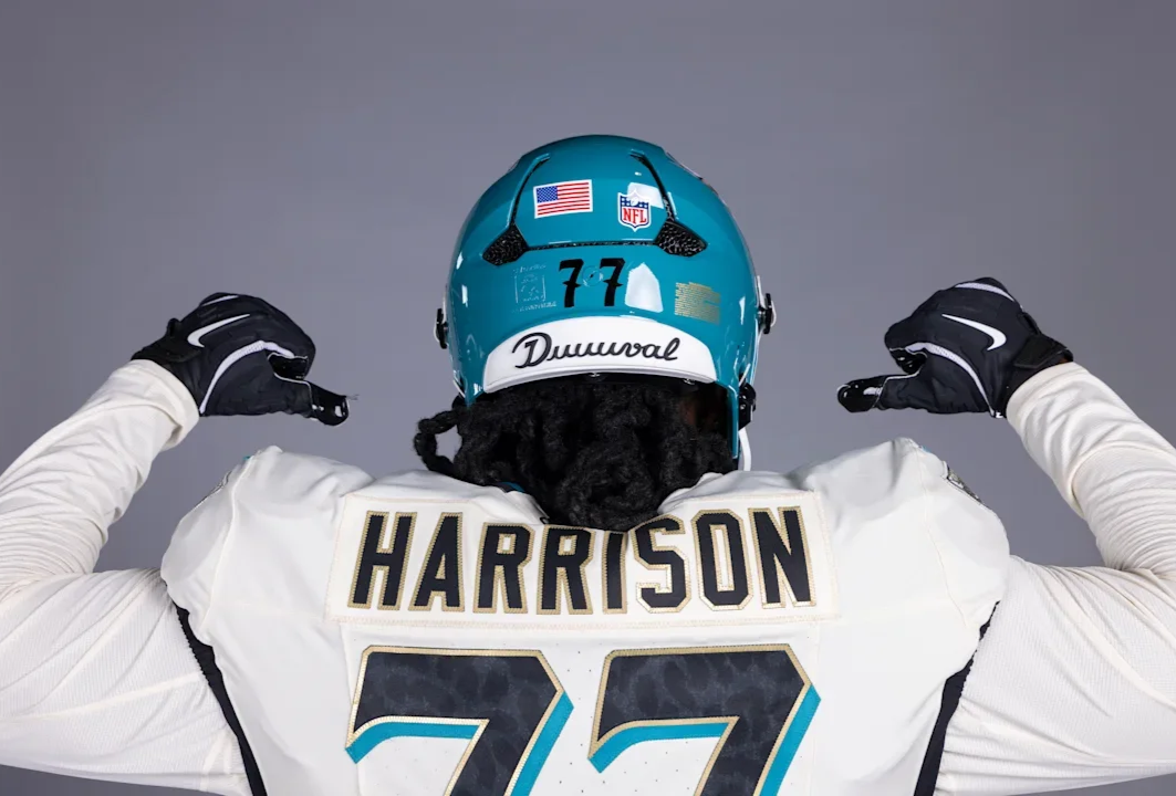
The centerpiece of the new uniform is the helmet. Jacksonville's teal shell gets a gloss finish, while a prominent “904” mark appears on the helmet, representing the area code that has become synonymous with Jacksonville.
The helmet is paired with a striking gold facemask, giving the Jaguars a unique combination that immediately separates the Rivalries look from their standard uniforms. It's a simple detail, but one that makes the helmet feel distinctly Jacksonville.
Another detail appears on the outside of the collar. “Since '95” commemorates the Jaguars' inaugural season and the beginning of the franchise's history in Jacksonville. The jersey also features a cursive “Jaguars” script, a nod to the team's Southern roots and another departure from the club's more traditional typography.
The Jaguars will wear the Rivalries uniform with a white jersey, black pants and white socks.
The black pants feature a prominent teal stripe with gold trim, but there's another detail hidden within the design. The pants feature a subtle jaguar-print pattern, creating a tonal texture that is easy to miss from a distance.
Hidden within the jaguar spots are the names of Jacksonville neighborhoods. It's one of the most personal details in the Rivalries collection, turning the pants into a representation of the communities that make up the city. Rather than simply putting Jacksonville's name on the uniform, the Jaguars incorporated the actual neighborhoods that make up the city.
The Rivalries uniform isn't a one-game-only special.
After debuting against Indianapolis on Nov. 1, the new look will become part of Jacksonville's regular uniform lineup for three years, joining the team's existing alternate uniforms.
For Jacksonville, the Rivalries uniform is more than another alternate. It's 904. It's DUUUVAL. It's Bold City.
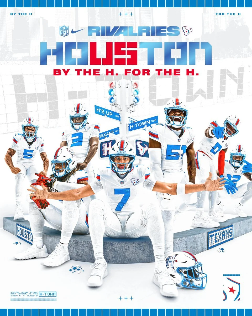
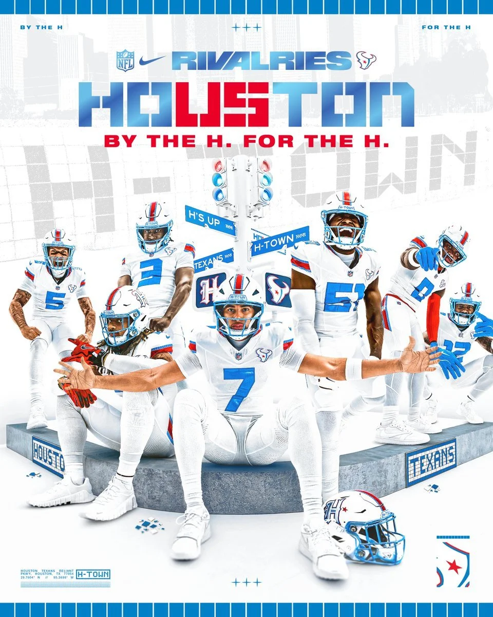
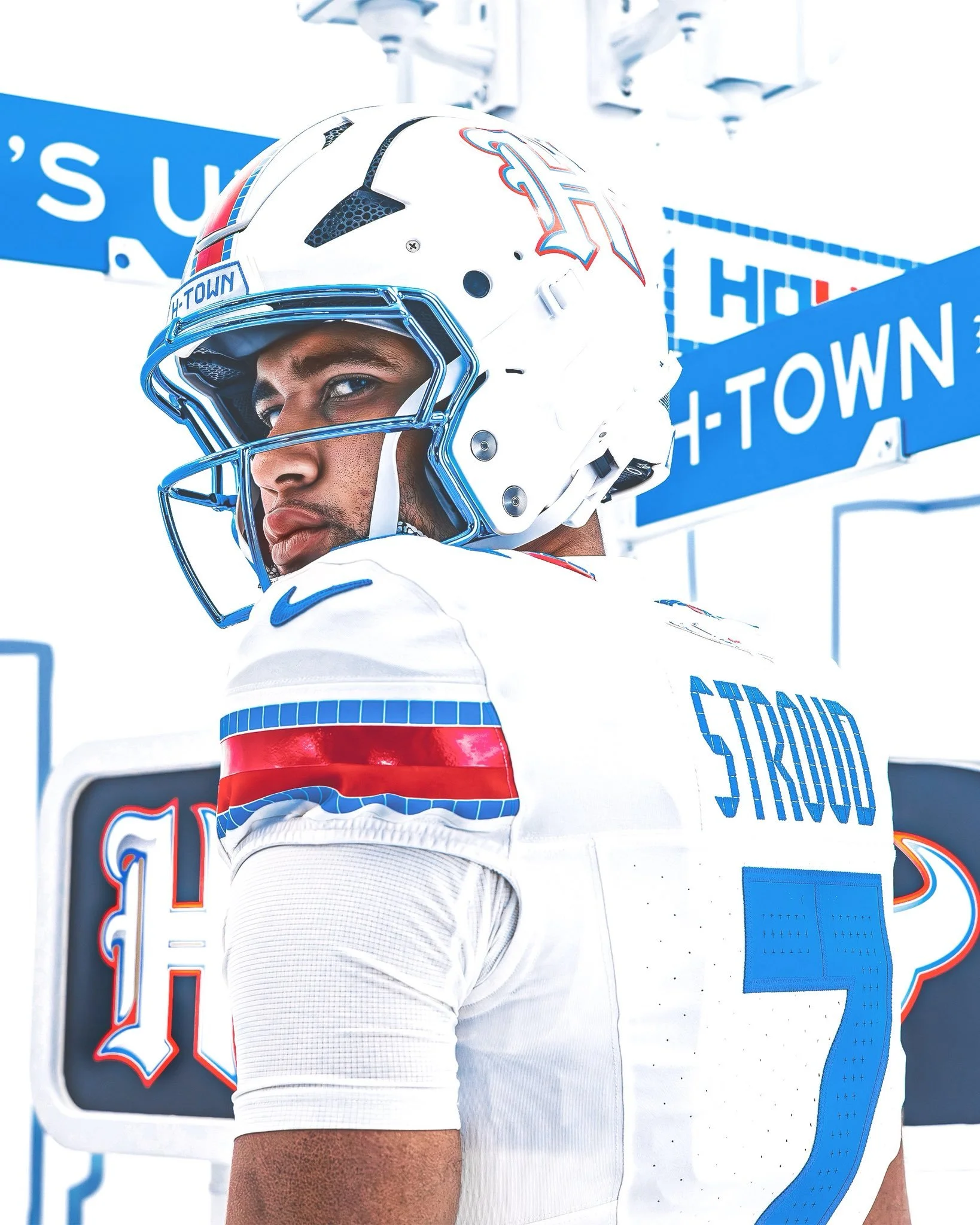
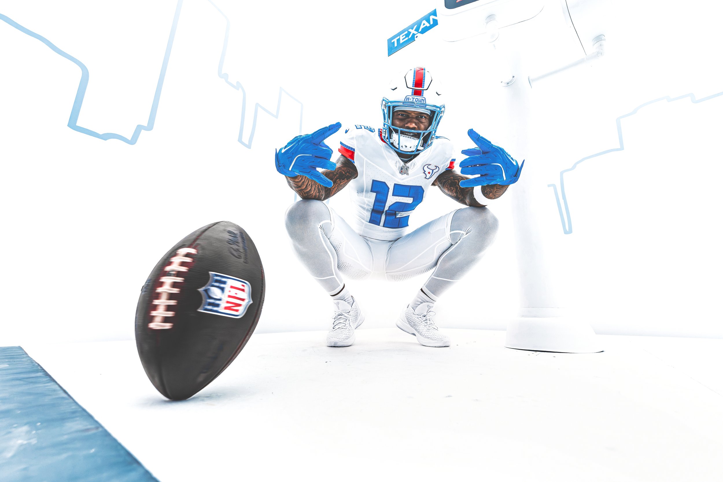
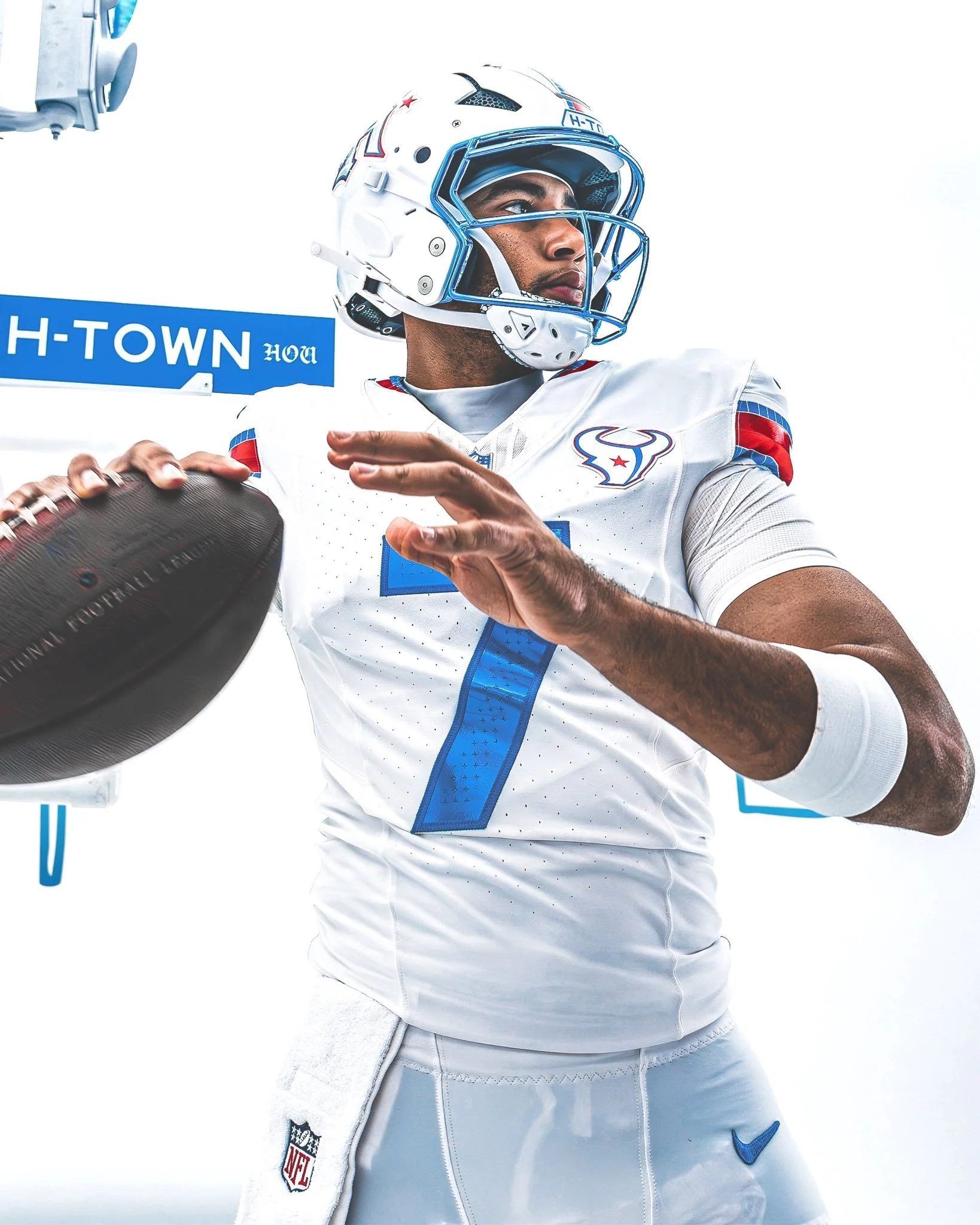
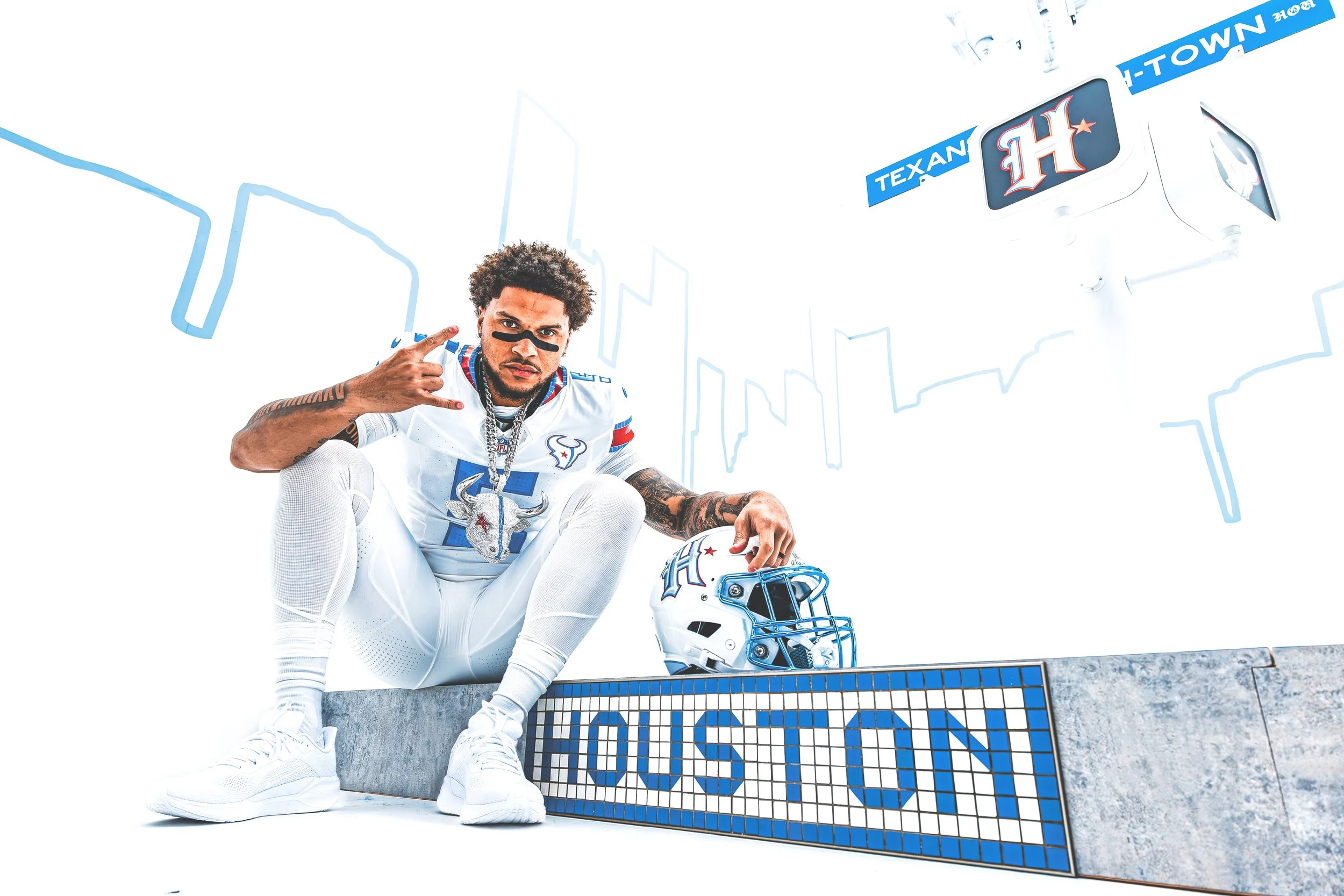
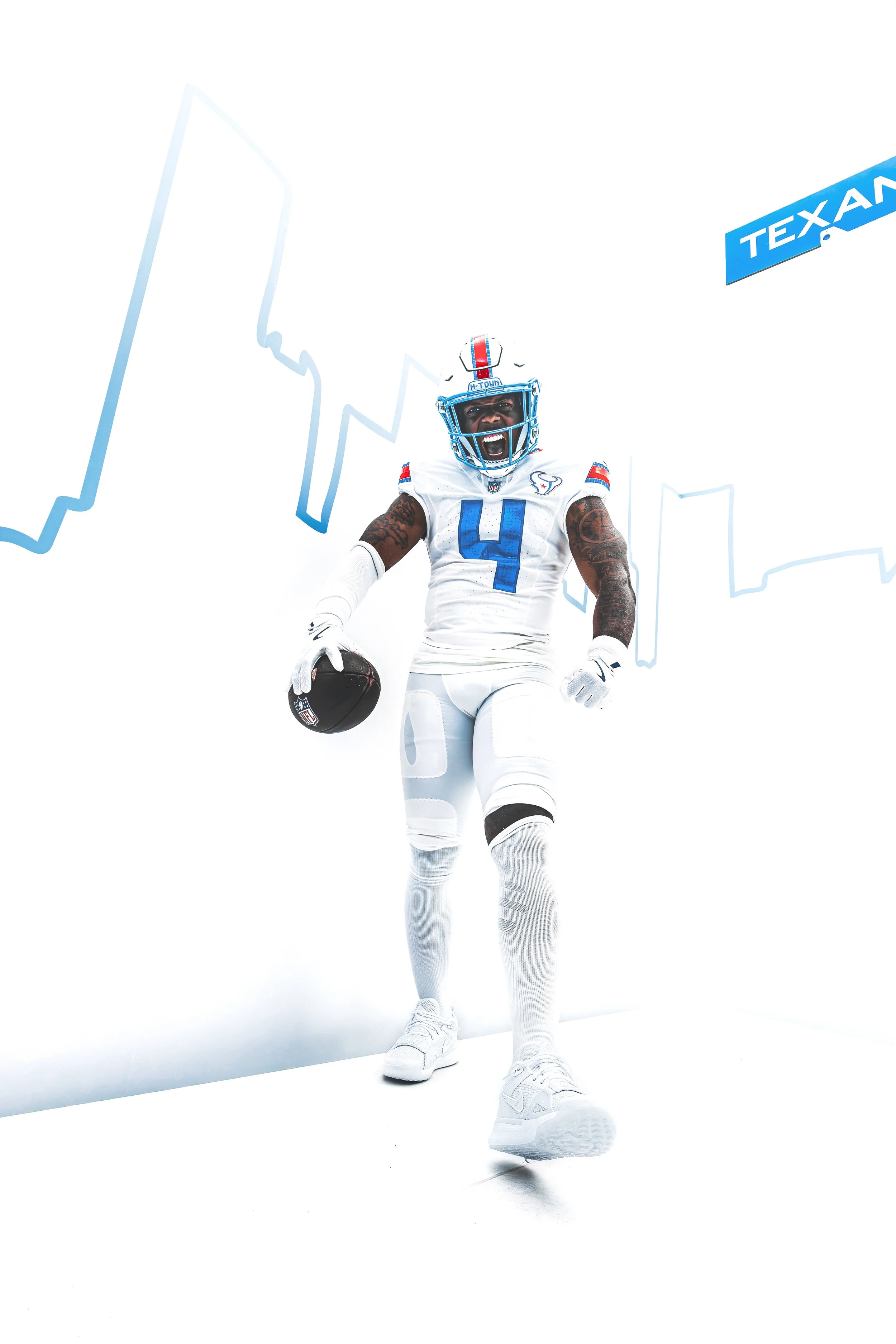
The Houston Texans are putting H-Town front and center. The Texans have officially unveiled their new “HOUSTON/US” Rivalries uniform. The new look is designed as a celebration of Houston, its culture and the millions of people who call the city home.
The Texans will debut the uniform in Week 11, when Houston hosts the Indianapolis Colts on Thursday Night Football.
The uniform is built around the idea of “By The H. For The H.”, bringing together visual elements from Houston's streets, art, car culture and iconic landmarks.
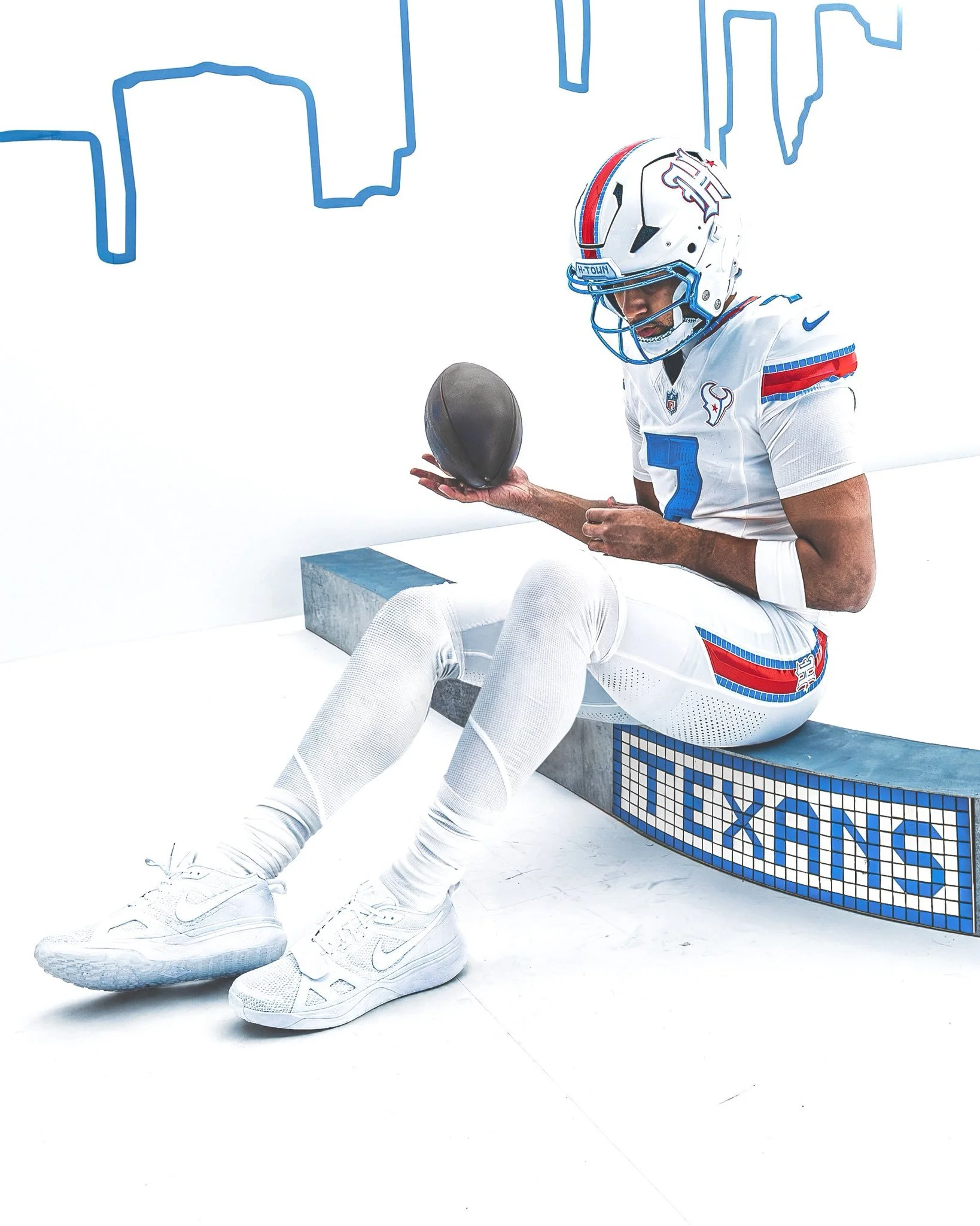
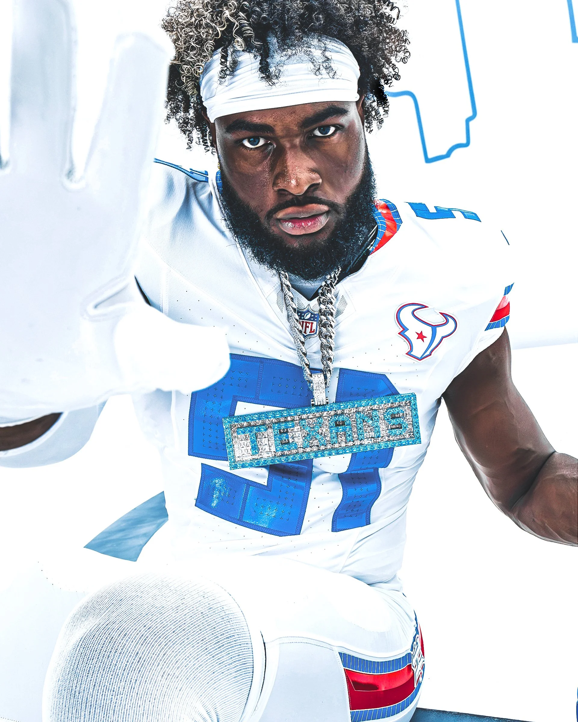
The color palette combines Liberty White, H-Town Blue and Battle Red, while the uniform incorporates Houston's signature blue-and-white street tiles, the “Be Someone” bridge and details inspired by the city's custom car scene.
The result is one of the most Houston-specific uniforms the Texans have ever created. “This is the most Houston uniform that will ever grace the gridiron,” Texans Senior Vice President and Chief Marketing Officer Doug Vosik said.
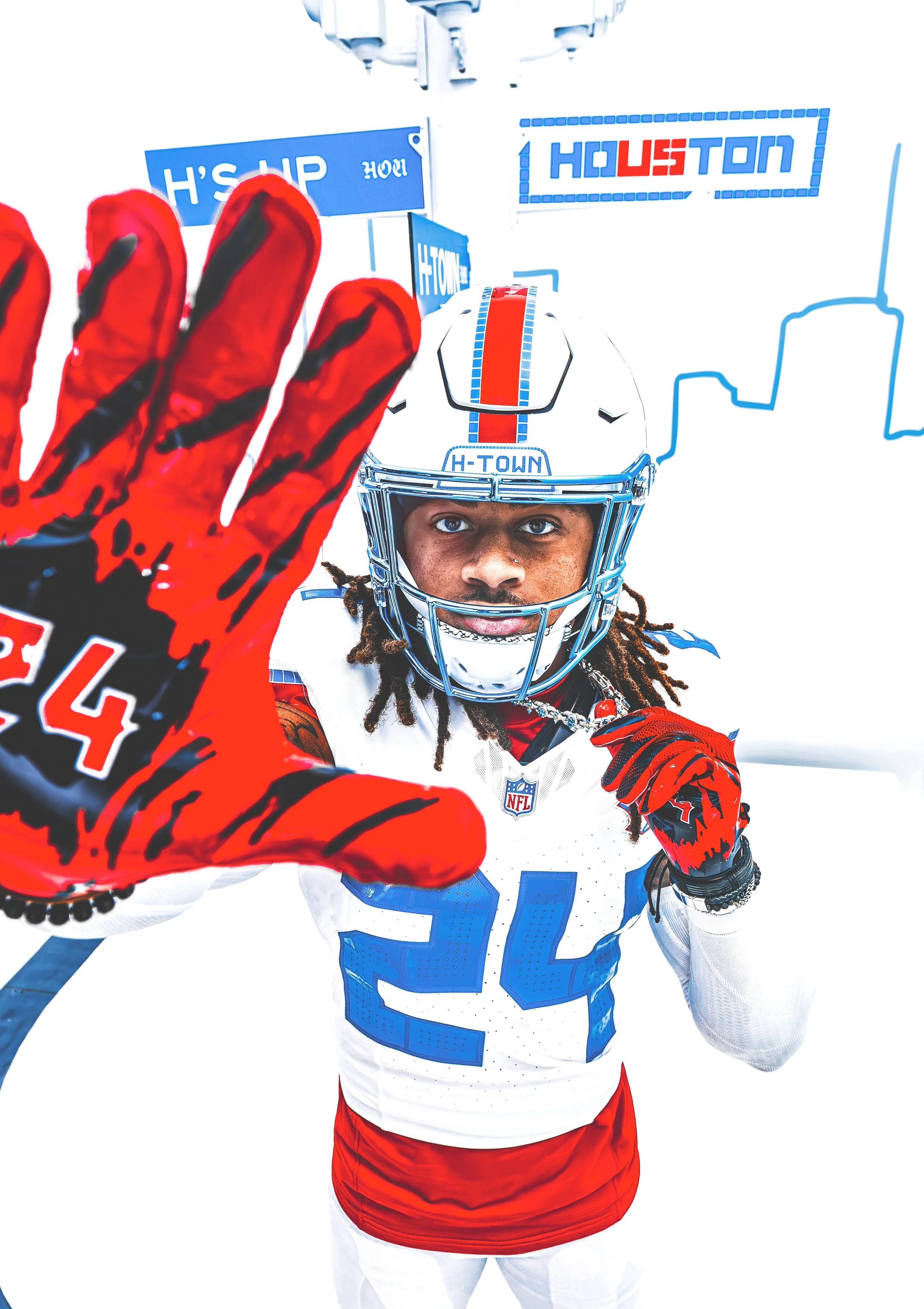
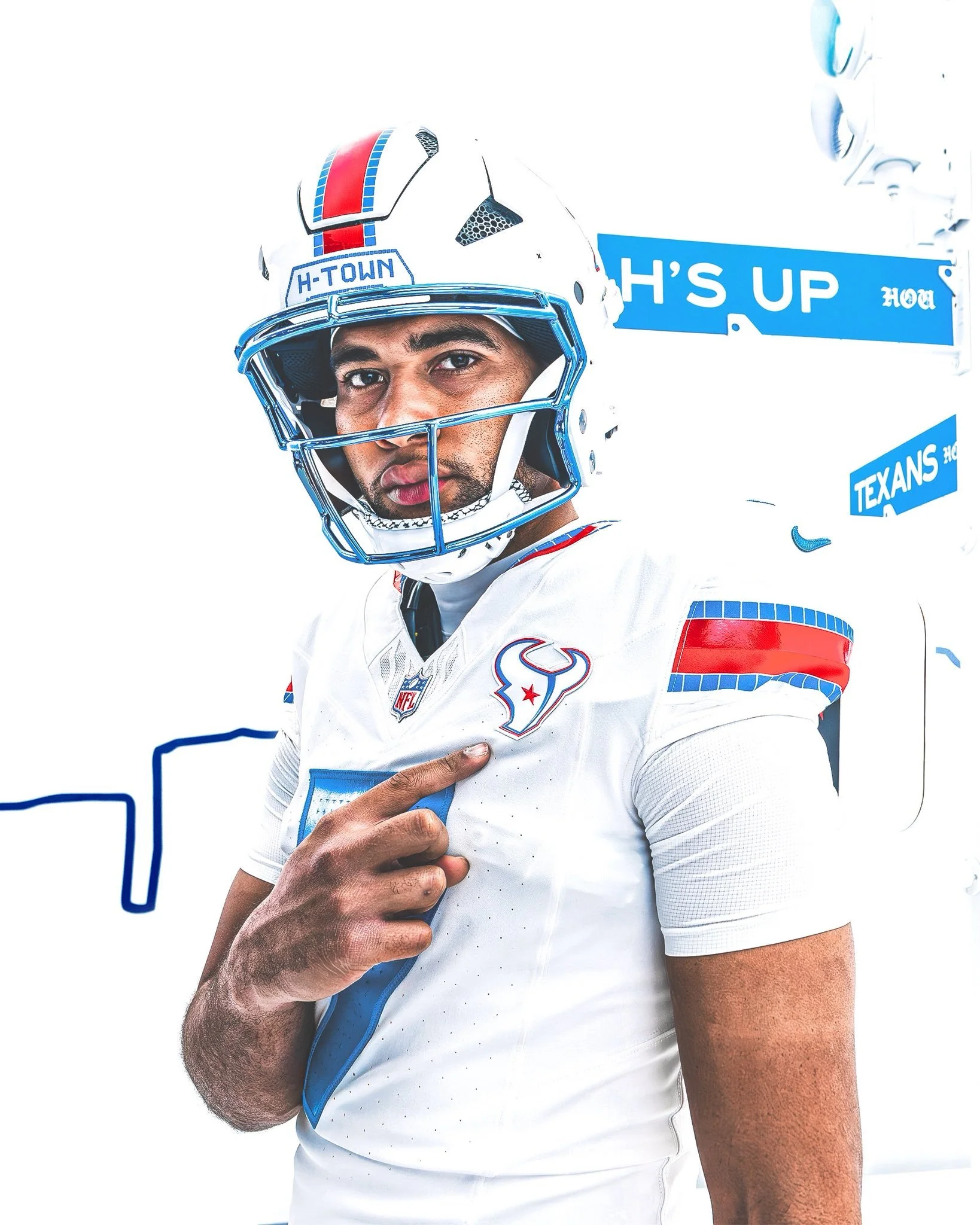
The centerpiece of the new look might be the Texans' first-ever Liberty White helmet. The helmet is a direct nod to the franchise's early history. Before the Texans ultimately settled on their iconic Deep Steel Blue helmet, late founder Robert C. McNair was photographed holding up an early white helmet prototype in 1999.
More than two decades later, that concept has been reimagined for the Rivalries uniform.
The helmet features a candy-paint-inspired finish, with Houston's blue-and-white street tiles incorporated throughout the design. The front bumper spells out “H-Town”, while “Texans” appears on the back.
The helmet also features a white version of the blackletter “H” logo introduced during the Texans' 2024 rebrand, with metallic silver, H-Town Blue and Battle Red accents.
One of the standout details is the facemask. The Texans went with a chrome H-Town Blue facemask, directly inspired by Houston's well-known custom car culture.
That same polished, candy-paint aesthetic carries into other elements of the uniform, giving the look a finish that feels more like a customized Houston ride than a traditional football uniform.
Houston's famous “Be Someone” bridge also makes its way onto the uniform. The jersey numbers feature a chrome H-Town Blue finish and use the distinctive stenciled block font associated with the bridge.
A tiled perforation texture surrounds the numbers, creating another connection to Houston's street-level identity. The nameplate takes the idea even further. Each player's last name is rendered in a tiled font inspired by Houston's iconic blue-and-white street signs, connecting the players directly to the city they represent.
The blue-and-white street tile pattern might be the most recognizable visual element throughout the uniform. The pattern appears across the helmet bumpers, nameplates and the sleeve, collar and pant stripes.
The stripes feature Houston's signature tiles lining a beveled, two-tone Battle Red stripe with the same candy-paint finish. It's a small detail that helps tie the entire uniform together.
The Texans are also changing the placement of one of their most recognizable logos. For the first time in franchise history, the Bullhead logo sits over the heart of the jersey. The logo is primarily white, with H-Town Blue and Battle Red accents, giving the front of the uniform a clean centerpiece while reinforcing the idea of Houston pride.
The final major detail is hidden inside the jersey. The inner collar features a Battle Red “Houston” wordmark using the same distinctive font associated with the “Be Someone” bridge. The word “Us” is highlighted in H-Town Blue. Together, it reads HOUSTON/US, representing the community connection between the Texans and the approximately 8 million people who call the Houston area home. It's also where the uniform's entire concept comes together: Houston isn't just where the Texans play. It's who they represent.
From the street tiles to the “Be Someone” bridge, custom cars and the franchise's original white helmet prototype, nearly every element has a story behind it.
The Texans call it “By The H. For The H.” And this might be the most Houston uniform they've ever put on the field.
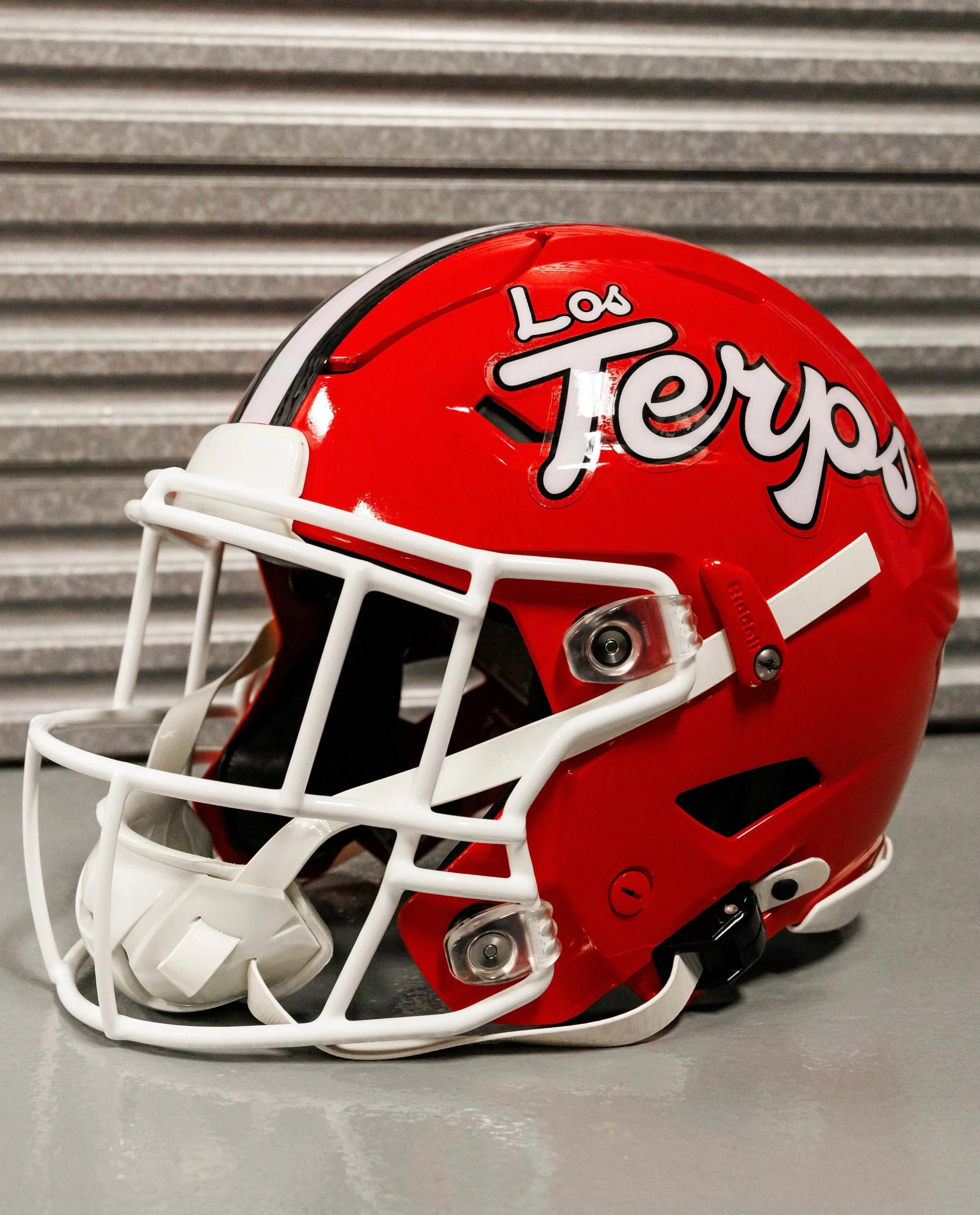
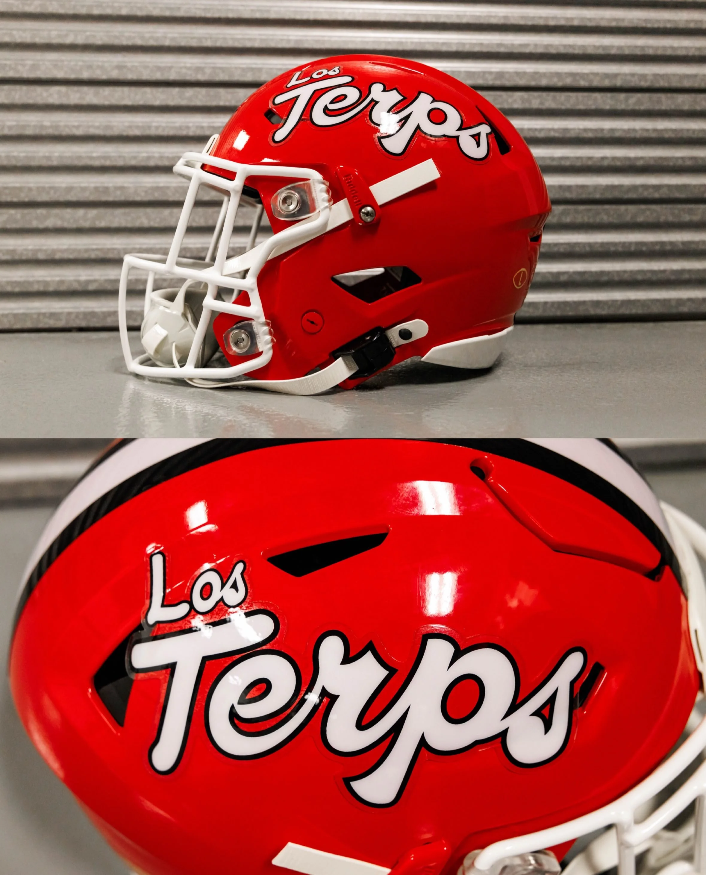
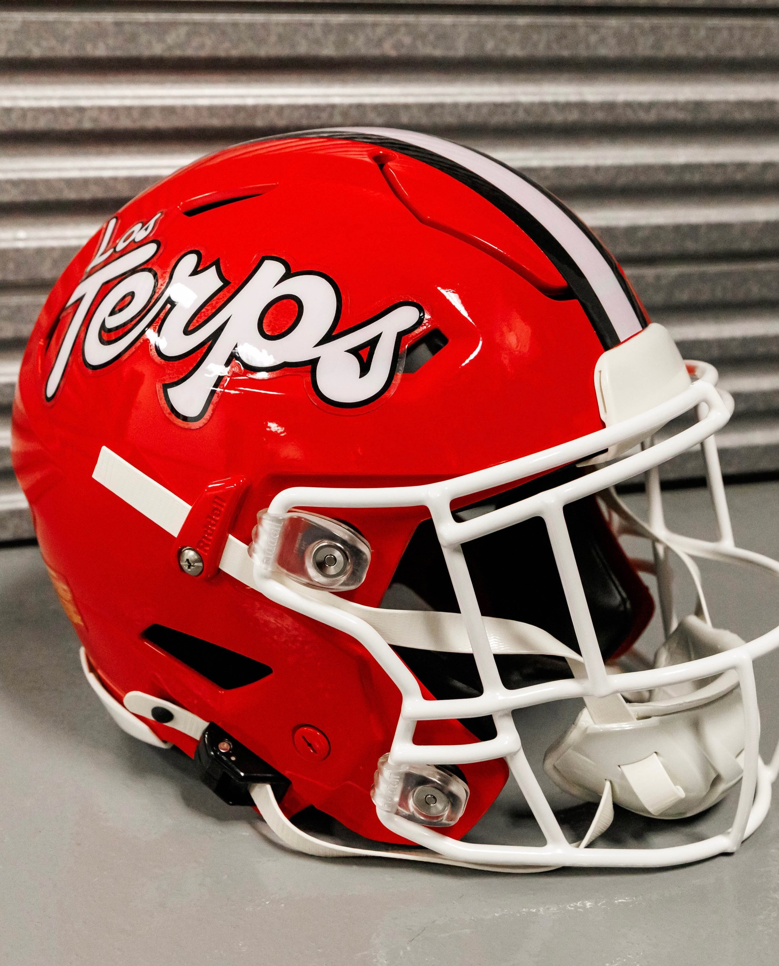
Maryland is adding another unique helmet to its ever-growing collection.
The Terrapins will wear a special “Los Terps” helmet on Sept. 19 when Maryland hosts Virginia Tech at SECU Stadium for Hispanic Heritage Night. The helmet is part of a larger celebration recognizing the Hispanic community throughout the DMV and Maryland’s diverse fanbase.
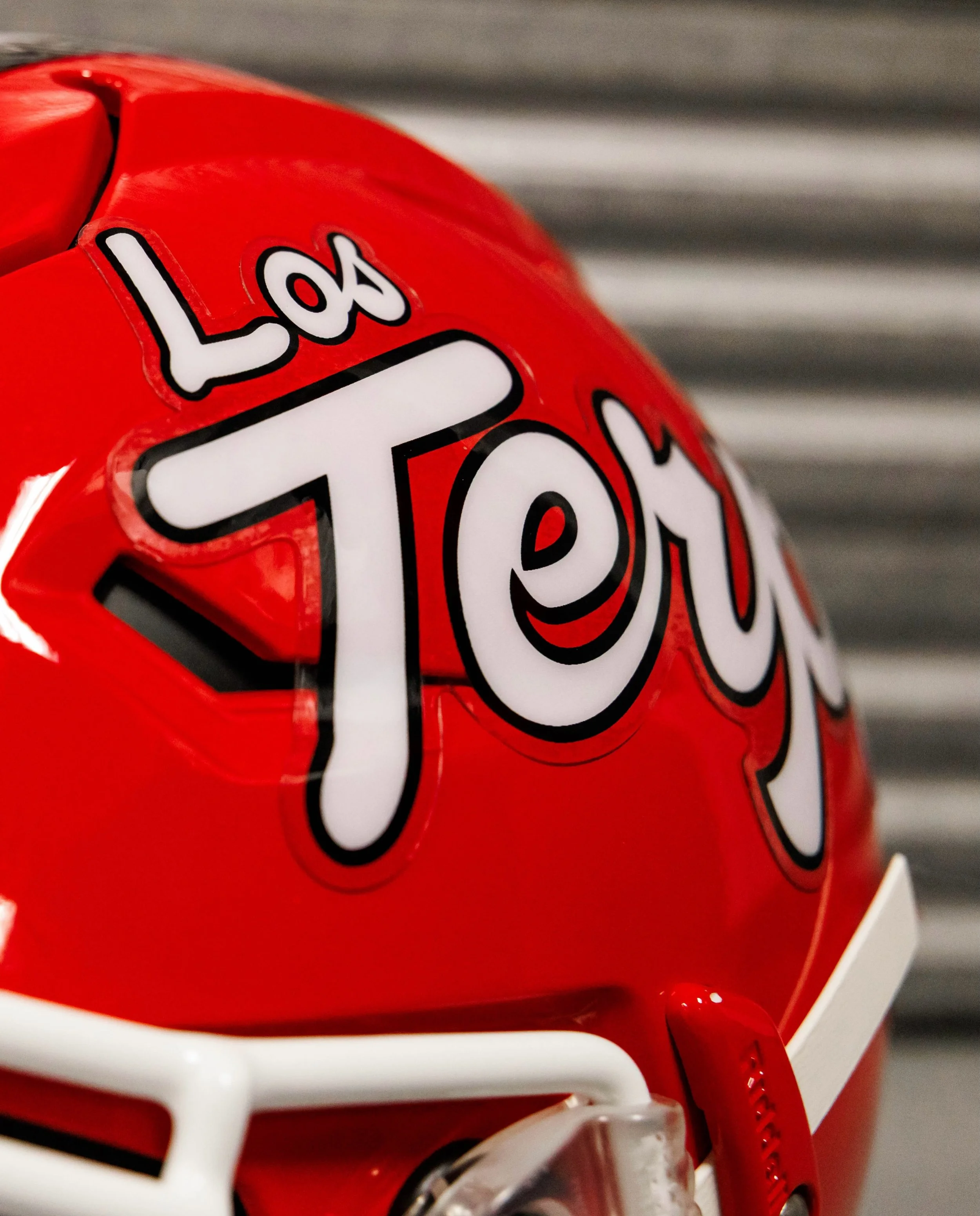
The helmet will feature Spanish-language “Los Terps” branding, giving Maryland another distinctive look while directly connecting the program to the Hispanic community it represents.
According to Maryland Athletics, the Terps are among the first collegiate football programs to feature Spanish writing on a football helmet.
Head coach Michael Locksley said the helmet and the Hispanic Heritage Night celebration provide an opportunity to recognize the diversity of the DMV while doing so on a national stage.
The helmet is part of a much larger Hispanic Heritage Night initiative involving Maryland Athletics and El Tiempo Latino, a Washington, D.C.-based Latino media company.
The “Los Terps” helmet will be available as a selectable uniform option in EA SPORTS College Football 27, with the helmet scheduled to appear in the game on Sept. 3.
That gives Maryland fans another opportunity to use the new look before the Terps even take the field in it.
The celebration is another example of Maryland using its uniforms and branding to tell a larger story about the program and its community.
Sunderland AFC is bringing a piece of the city's history onto the pitch.
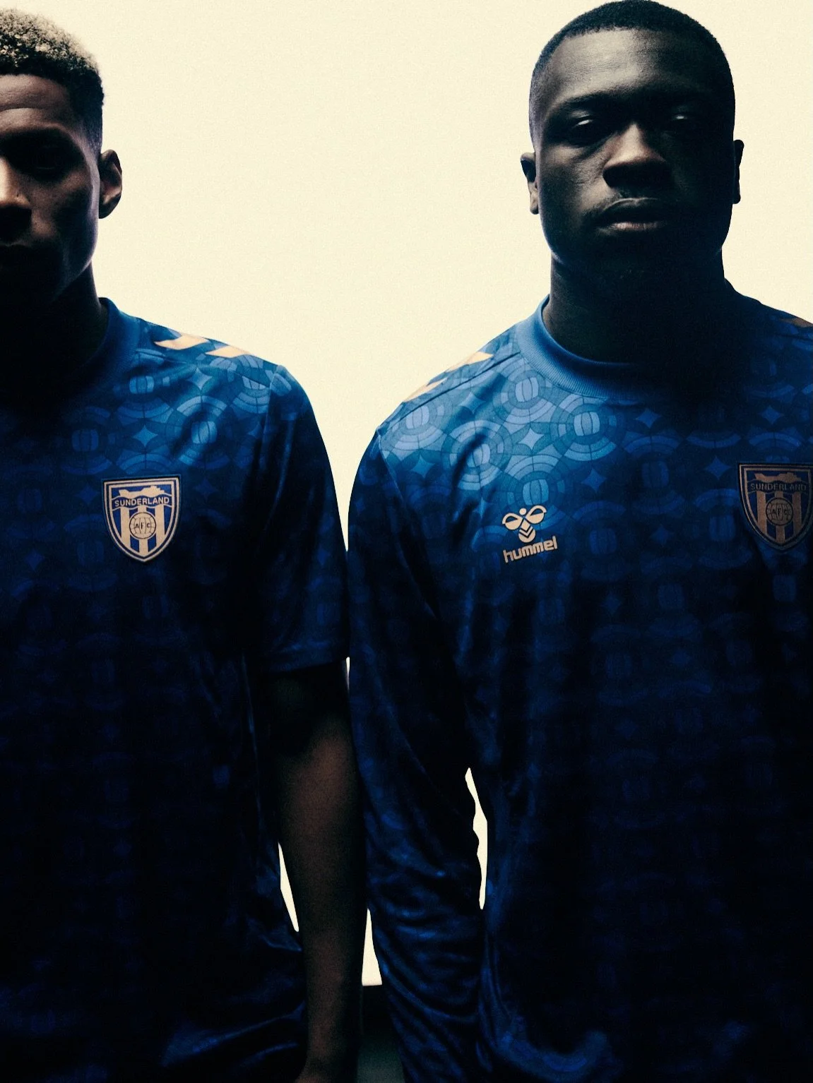
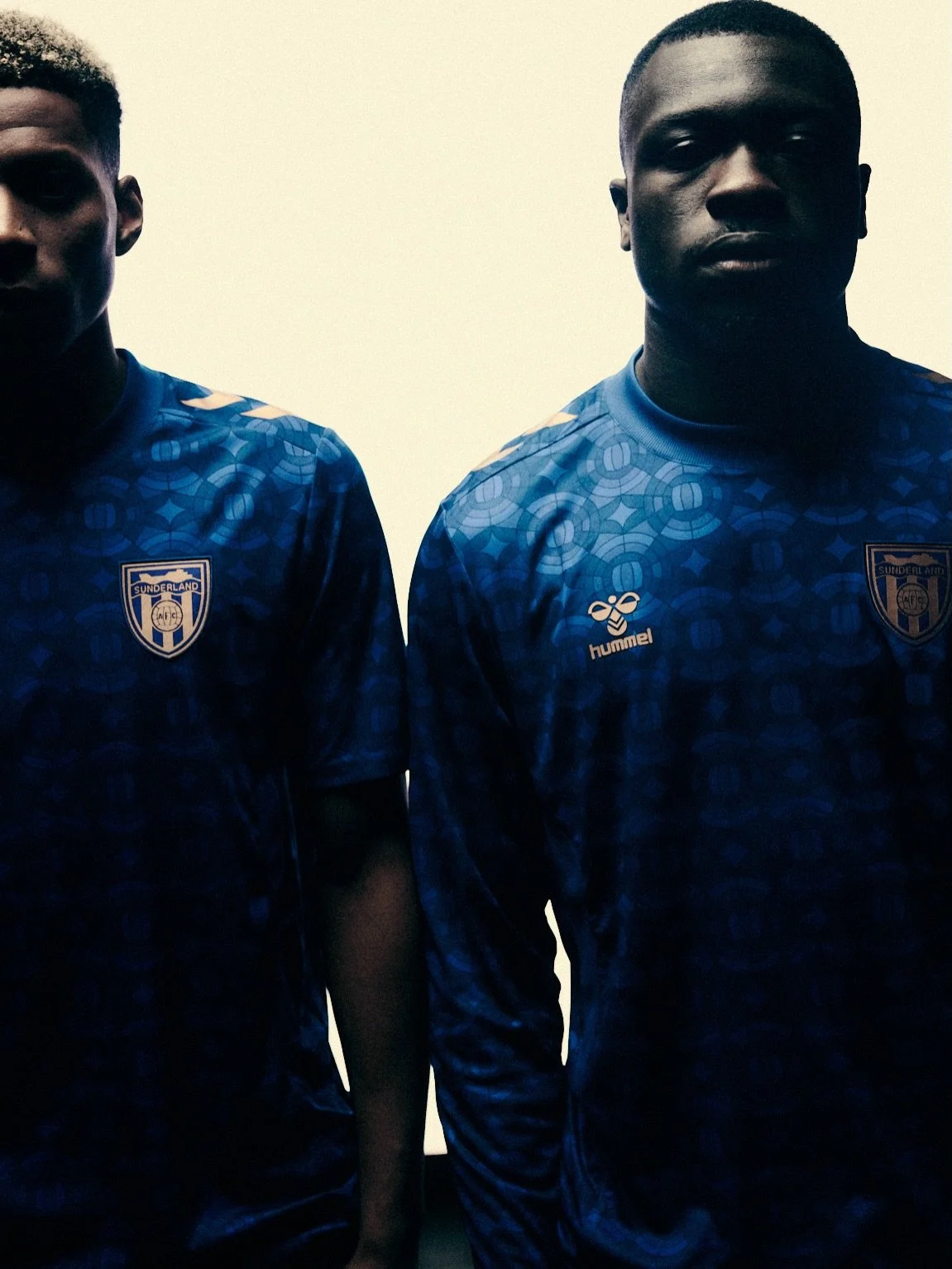
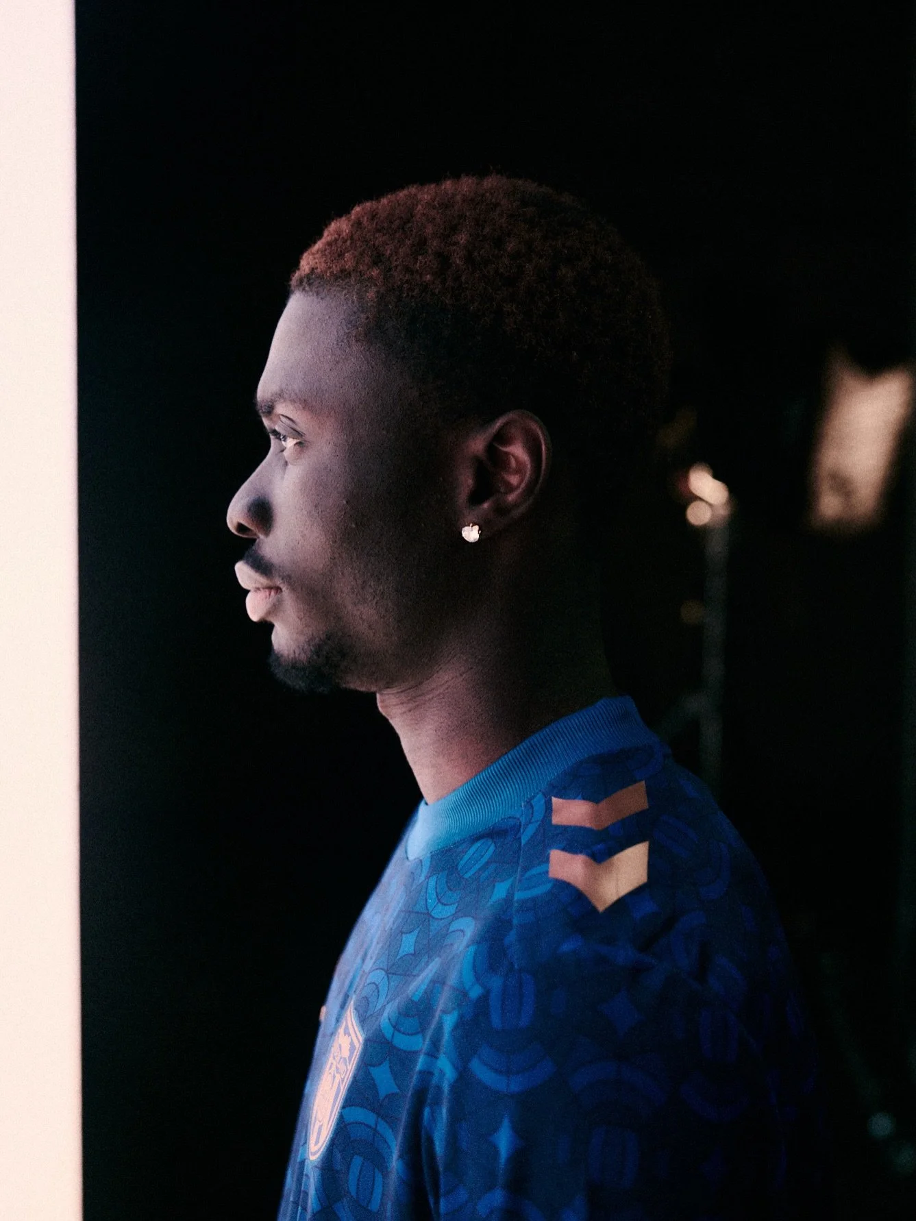
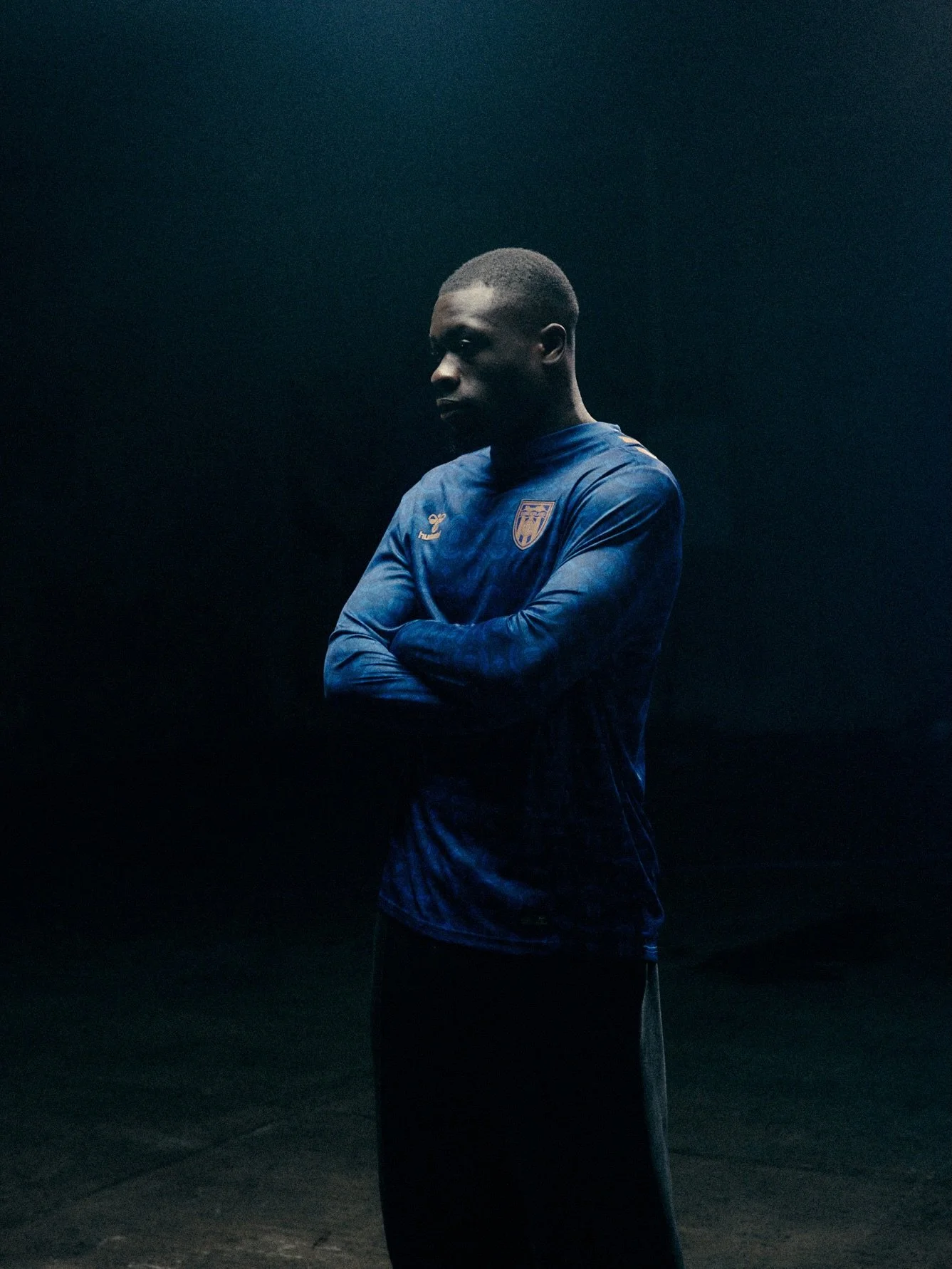
The club has unveiled its 2026-27 third kit, a striking design inspired by Sunderland's centuries-old glassmaking tradition and the city's deep connection to the craft.
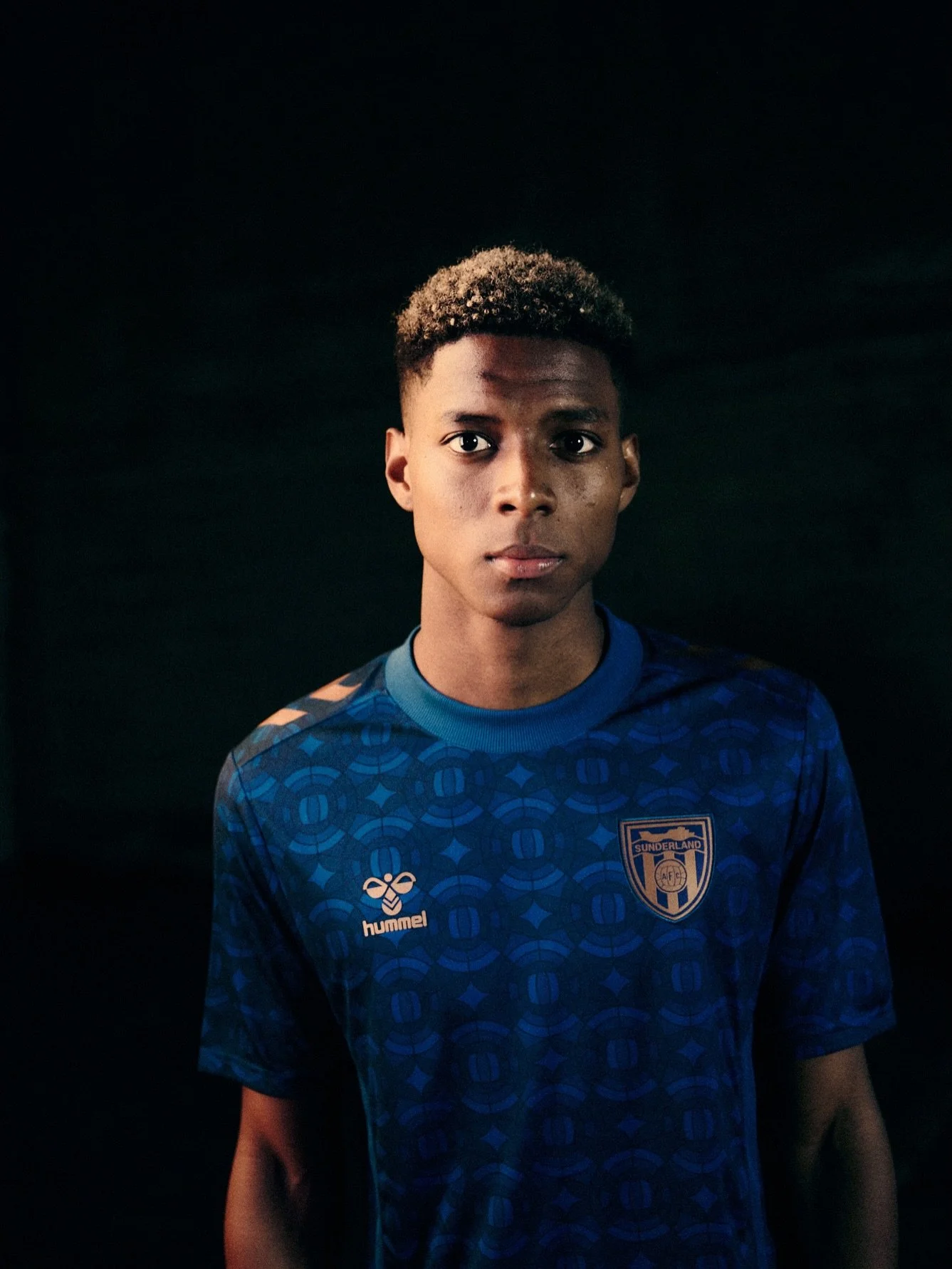
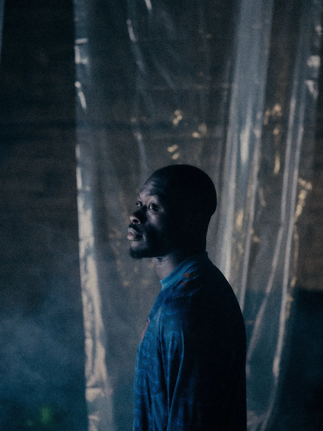
The new shirt combines a stained-glass-inspired graphic with shades of blue and copper detailing, creating a look that connects Sunderland's past with its return to the European stage.
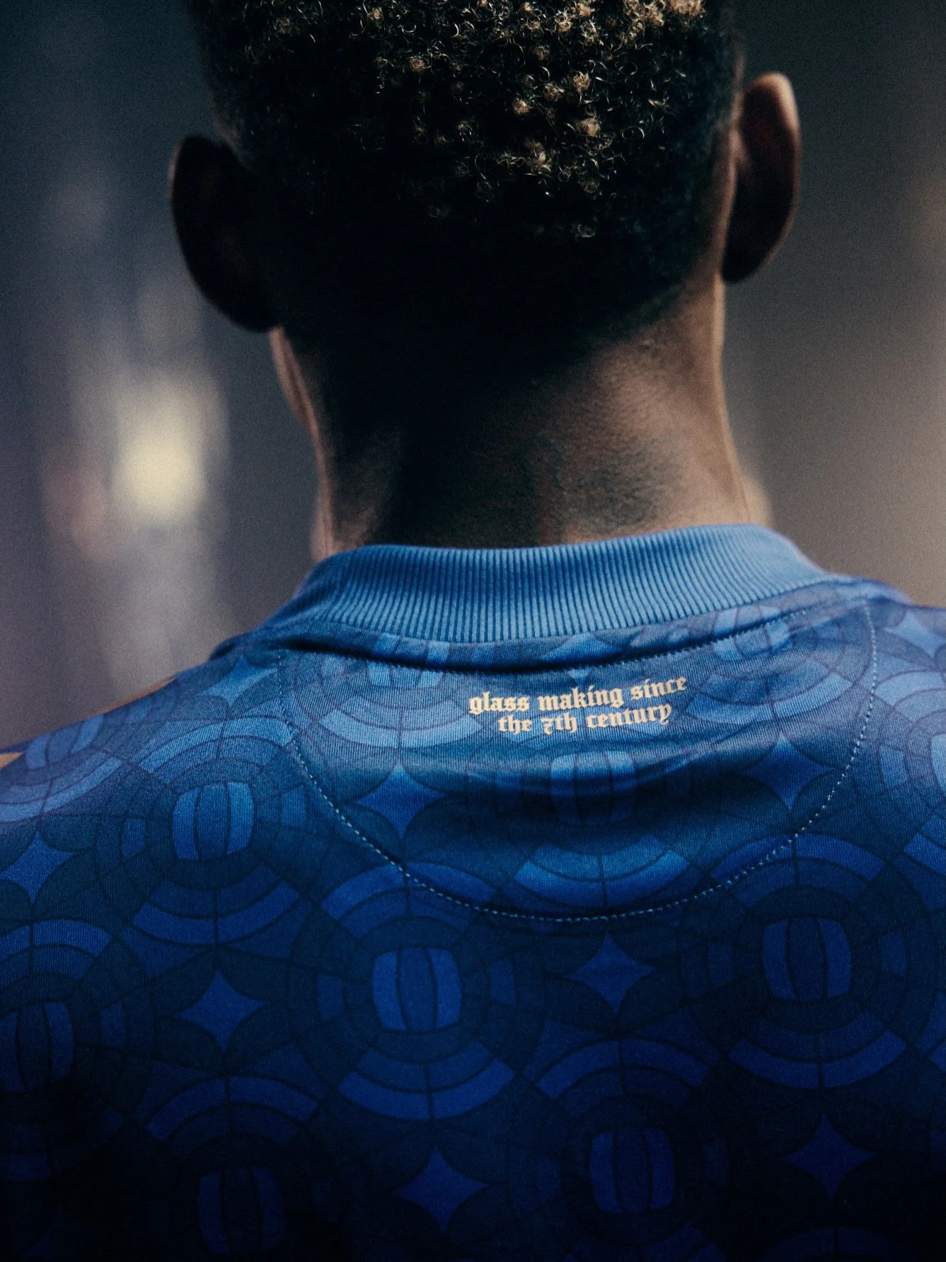
Glassmaking has been part of Sunderland's history for centuries, with the earliest known example of stained glass in the city dating back to the seventh century. That history became the foundation for the third kit's design.
The jersey features a repeating stained-glass pattern, with each panel depicting the football from inside Sunderland's iconic ship crest.
The various shades of blue throughout the design are intended to capture the effect of sunlight passing through stained glass, creating a visual representation of Sunderland's journey from darkness into the light.
It's a unique approach to a third kit, using a piece of the city's industrial and cultural history as the centerpiece rather than simply creating another alternate colorway.
The stained-glass graphic isn't the only historical reference.
Sunderland's iconic SAFC ship crest appears in copper on the chest, while matching copper Hummel chevrons run across the shoulders. The back of the neck features another nod to Sunderland's glassmaking heritage, with the words: "Glass Making Since The 7th Century"
The copper treatment gives the shirt a premium finish while tying the various elements of the design together.
The new third kit arrives at a particularly significant moment for Sunderland. The 2026-27 season marks the club's return to European football for the first time in 53 years, adding another layer of significance to the new design.
From Sunderland's glassmaking heritage to its return to European football, the new third kit brings together two important chapters of the club and city's history.
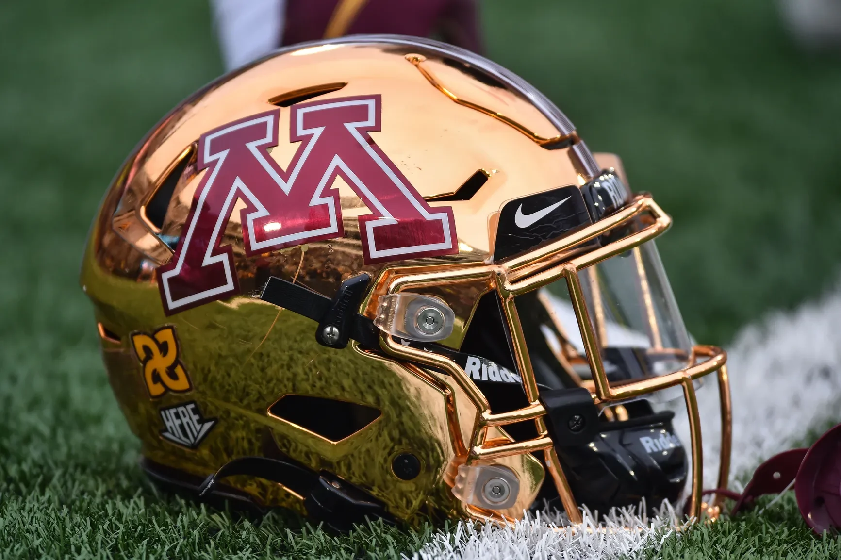
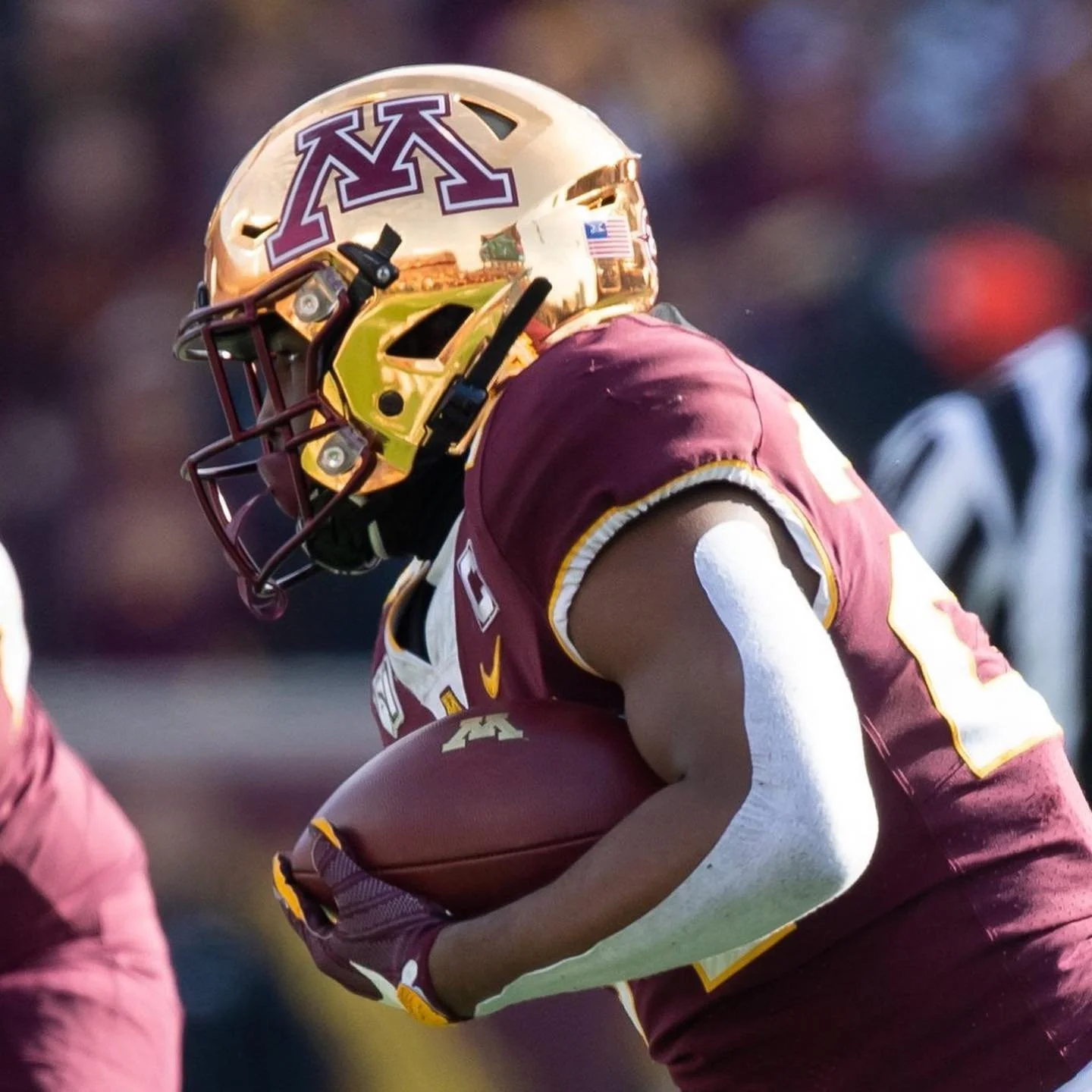
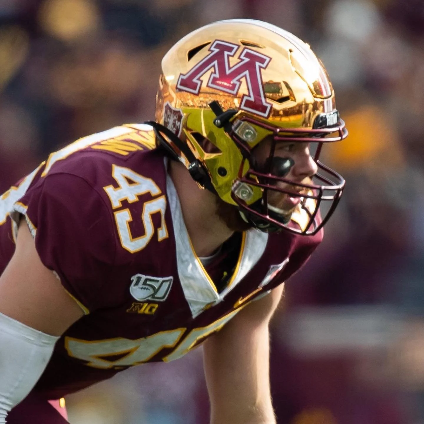
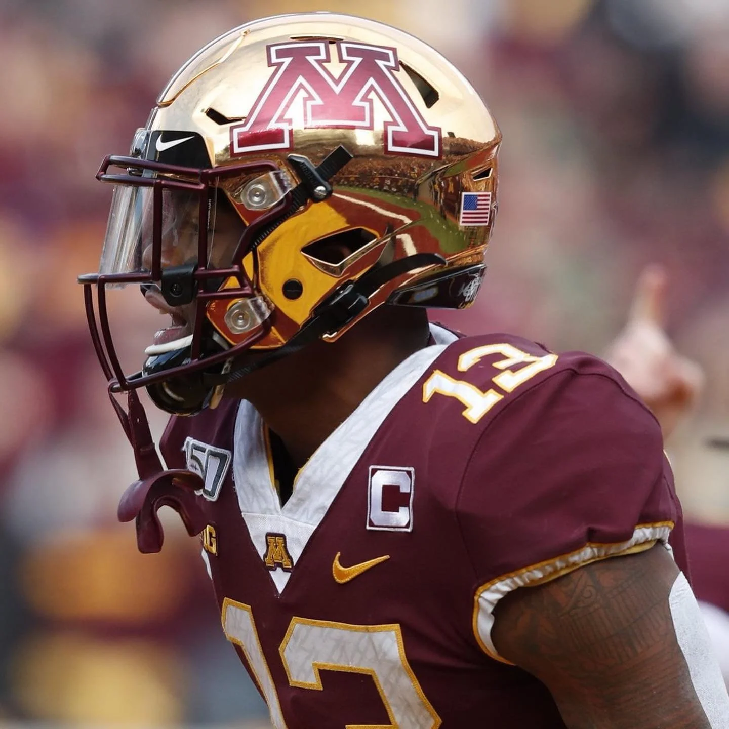
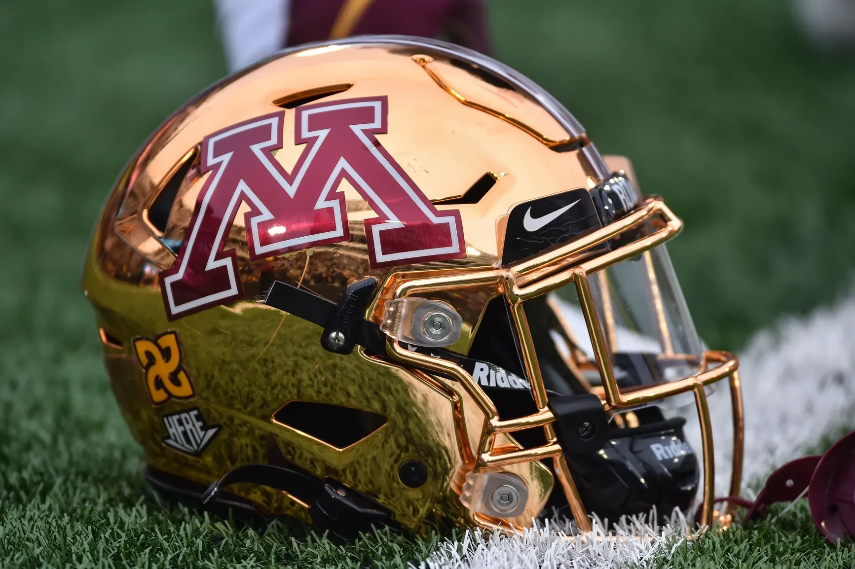
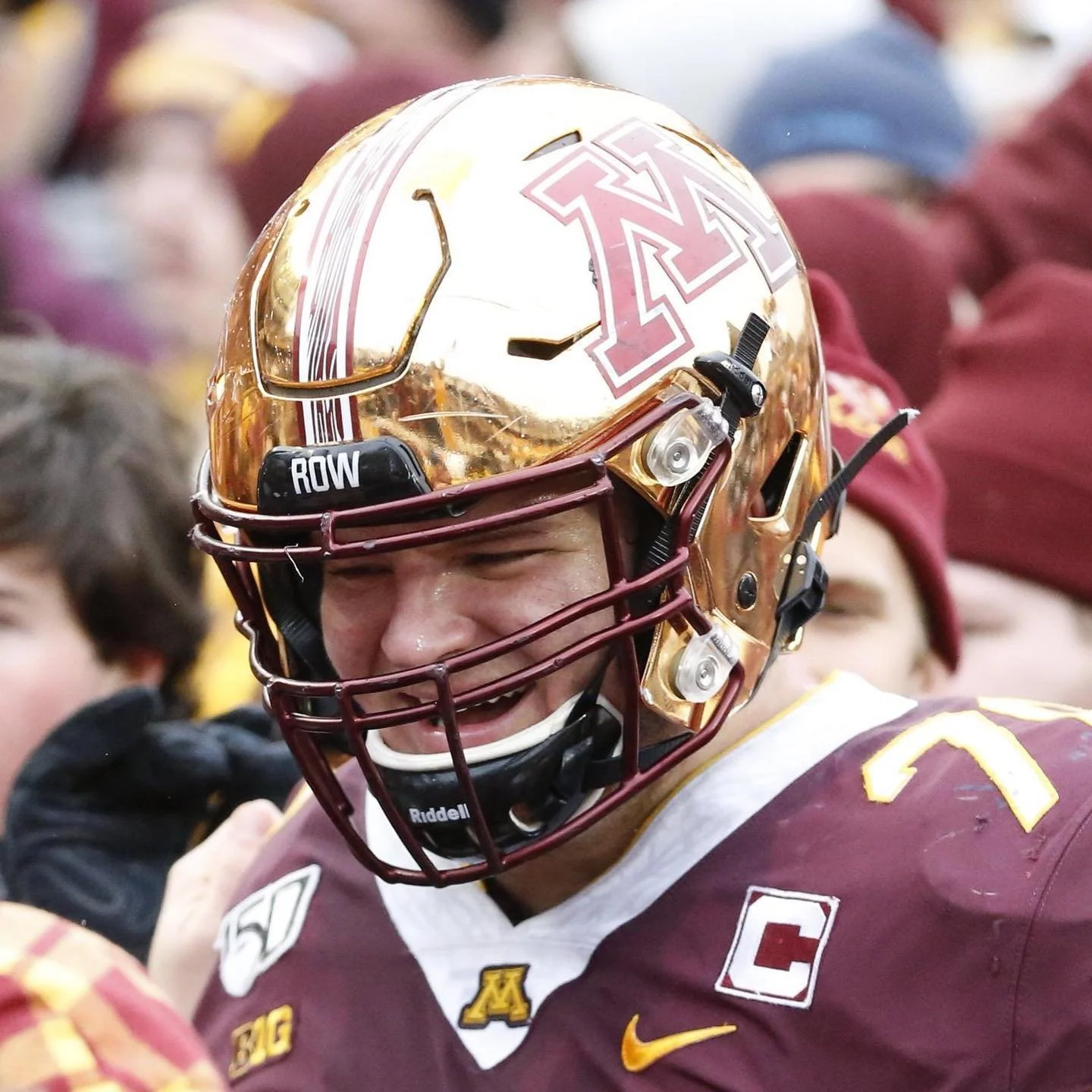
The Golden Gophers are bringing back the chrome. After sitting out the past two seasons, Minnesota's fan-favorite gold chrome helmets are officially returning to the Gophers' uniform rotation in 2026.
The program has not yet revealed exactly when the helmets will make their return to the field, but the announcement is already generating plenty of excitement among Gophers fans.
The gold chrome helmets became closely associated with Minnesota's magical 2019 season, when the Gophers finished 11-2 and capped the year with a win over Auburn in the Outback Bowl. The helmets continued to appear in Minnesota's rotation through the 2023 season before disappearing for the past two years.
Now, after two seasons on the shelf, one of the most recognizable pieces of Minnesota's recent uniform history is back.
Minnesota has gone through plenty of uniform combinations since P.J. Fleck took over the program in 2017, but the gold chrome helmet has remained one of the most popular looks among the fanbase.
Drake football is borrowing a page from one of the most iconic chapters in Bulldogs history.
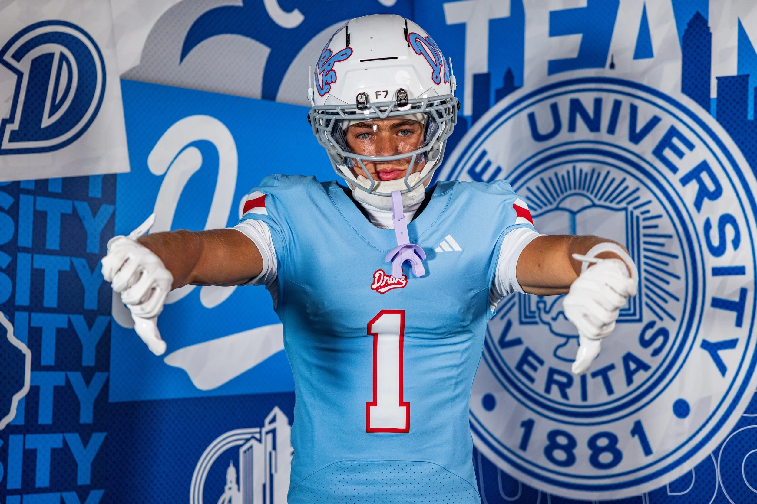
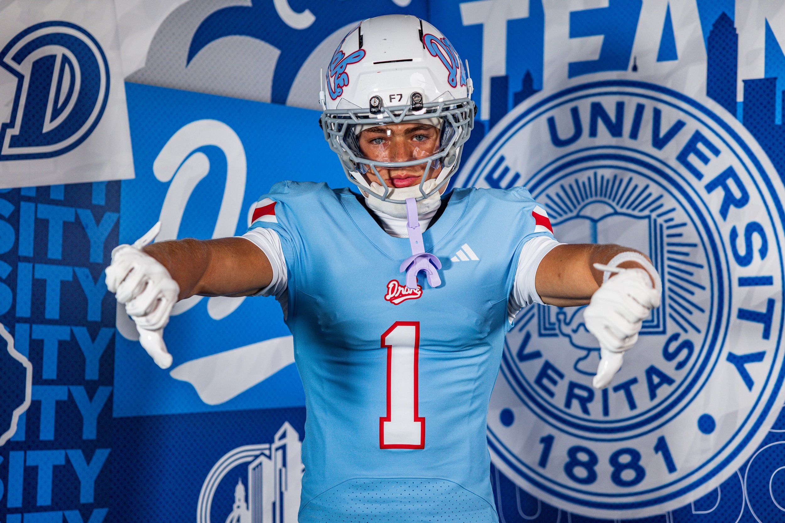
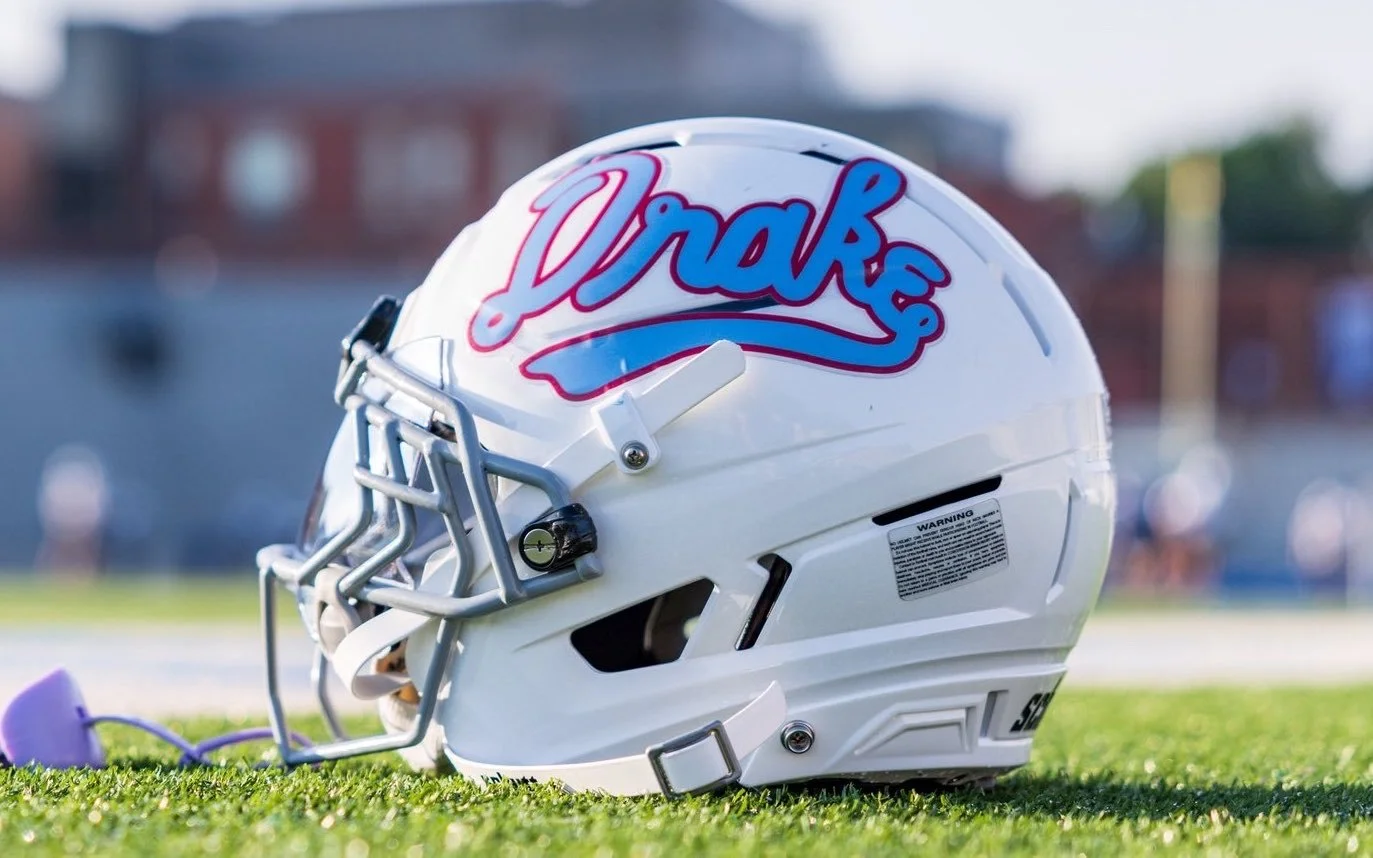
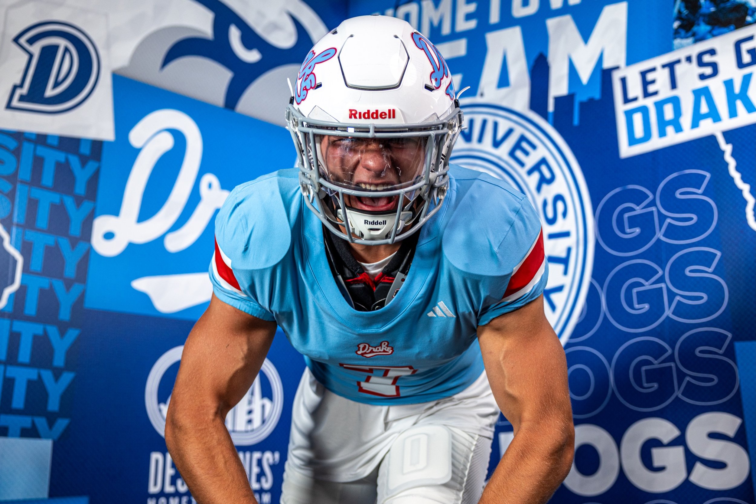
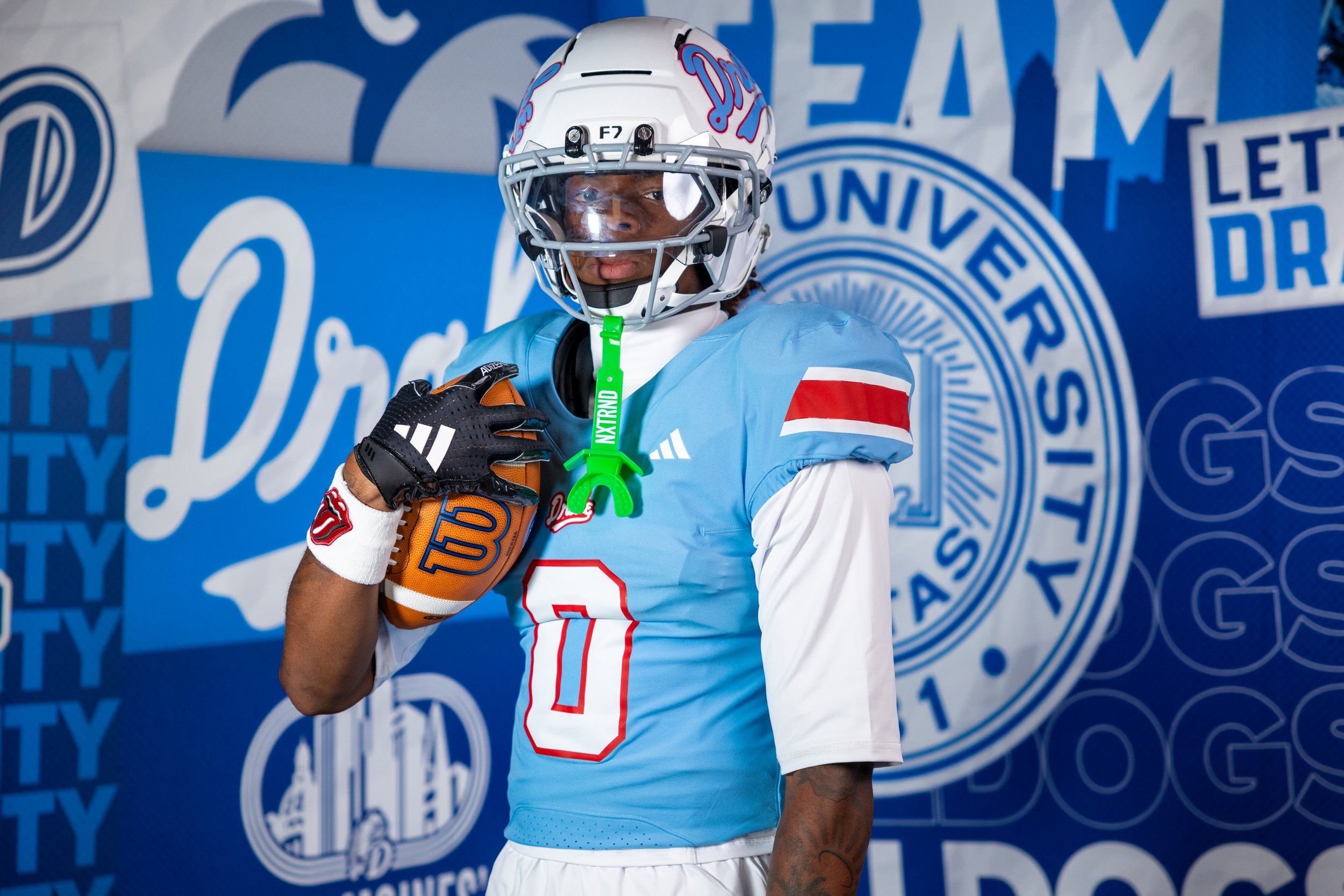
Ahead of the 2026 season, Drake unveiled a powder blue football uniform and matching helmet inspired by the school's legendary 1968-69 men's basketball team, bringing one of the most recognizable looks in Drake Athletics history to the gridiron.
The uniform combines powder blue with bold red accents, creating a look that feels distinctly different from a traditional football uniform while immediately connecting the Bulldogs to their basketball history.
The inspiration comes from Drake's unforgettable 1968-69 men's basketball team, which went 26-5 under head coach Maury John and advanced to the Final Four.
The standout detail on the football helmet is a vintage Drake script logo, taken directly from the white uniforms worn by the 1968-69 Final Four team.
The rest of the uniform embraces the same powder blue and red color combination that has become synonymous with Drake's basketball throwback looks.
The powder blue base gives the Bulldogs a completely different appearance from their typical football uniforms, while the red detailing provides the contrast needed to make the design pop.
It's a color combination that immediately reads as vintage, but the football construction keeps the look from feeling like a straight basketball uniform transplanted onto the gridiron.
What makes this uniform especially interesting is that Drake isn't celebrating a historic football team. Instead, the Bulldogs are taking one of the greatest moments in Drake Athletics history and translating it into another sport.
The 1968-69 basketball team's legacy remains deeply connected to the identity of the university. Drake has previously incorporated the team's script into basketball uniforms, merchandise and other throwback designs, and now football is getting its own interpretation.
It's a great example of how a school's uniform history doesn't have to stay confined to one sport.