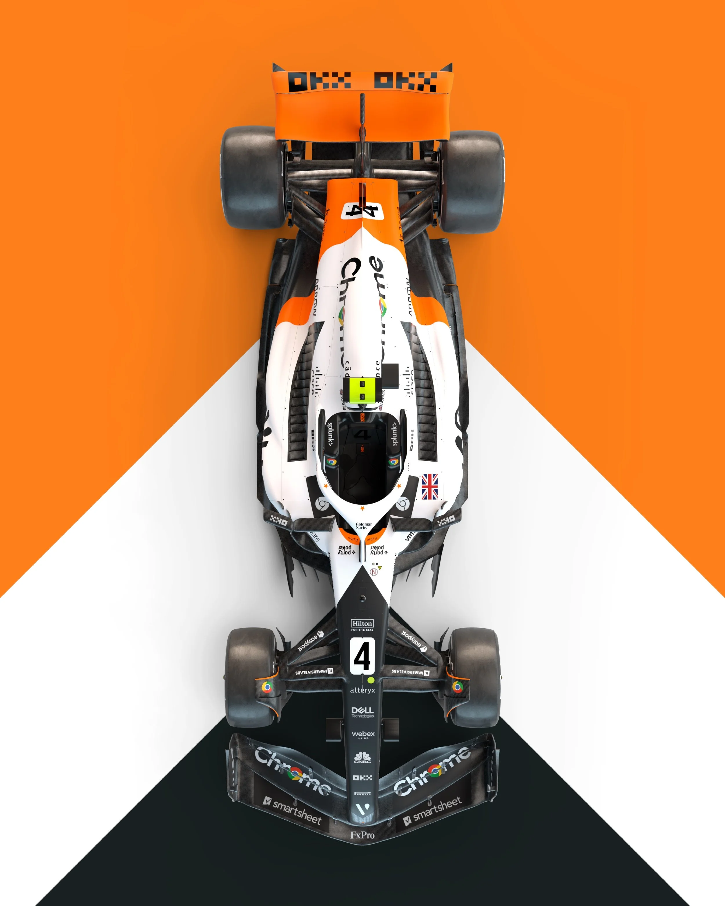
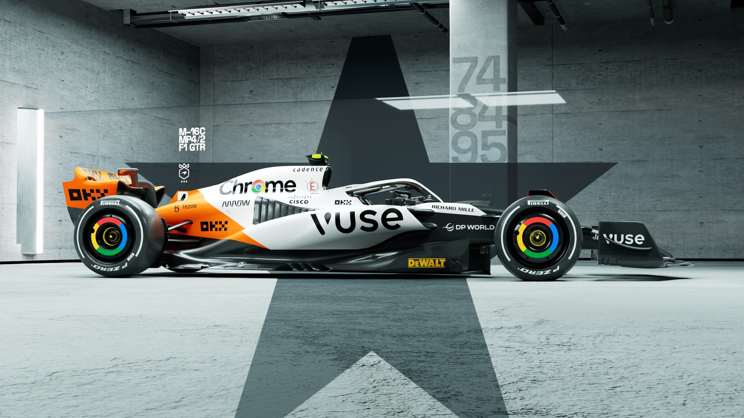
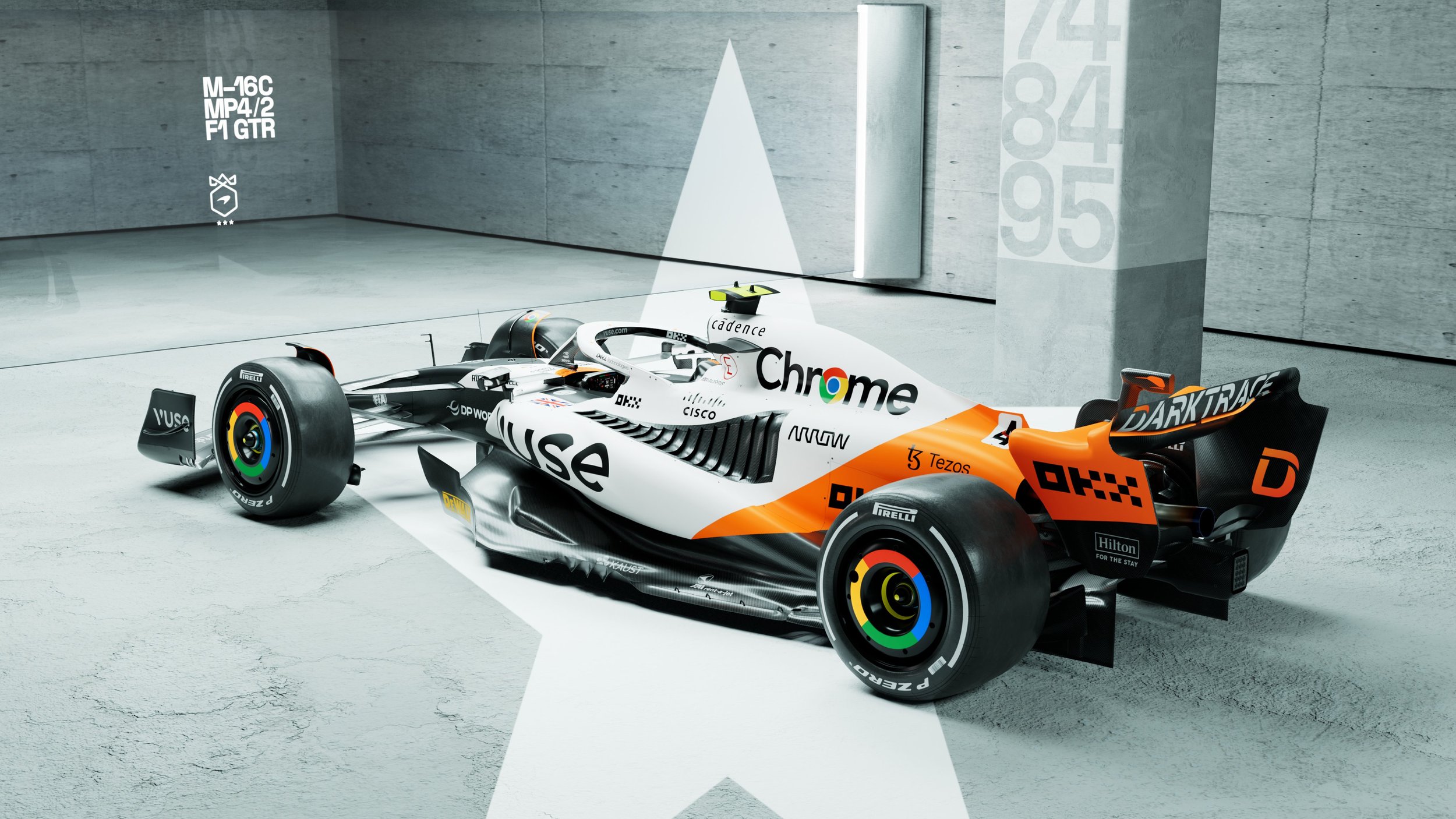
McLaren is set to dazzle fans with a special one-off livery at the upcoming Monaco Grand Prix. As part of their 60th anniversary celebrations, the renowned racing team will showcase a unique combination of colors, paying homage to their illustrious Triple Crown achievements. The Triple Crown consists of victories in Formula 1's Monaco Grand Prix, Indycar's Indy 500, and the legendary Le Mans 24 Hours endurance race. With a captivating blend of papaya, white, and black adorning the MCL60, McLaren aims to honor their rich history and commemorate their extraordinary triumphs.
Zak Brown, CEO of McLaren, expressed pride in celebrating the team's 60th anniversary and honoring the legacy of Bruce McLaren with this exceptional livery. The unique design pays homage to McLaren's remarkable achievement of winning the Triple Crown and showcases the team's rich history in motorsport. The special livery is a testament to the dedication and excellence that have defined McLaren over the years.
For Lando Norris, being part of McLaren Racing's 60th anniversary celebrations is an immense privilege. Combining three iconic race-winning liveries into one for the Monaco Grand Prix promises to be a special moment for the entire team. Norris, who experienced a podium finish in Monaco in 2021, is eager to race hard and celebrate Bruce McLaren's enduring legacy.
Oscar Piastri, in his first Monaco Grand Prix as a Formula 1 driver with McLaren, is thrilled to be a part of this momentous occasion. With McLaren's rich history at Monte Carlo, Piastri feels immensely proud to line up on the grid in the MCL60, adorned with the same colors as the three Triple Crown-winning race cars.
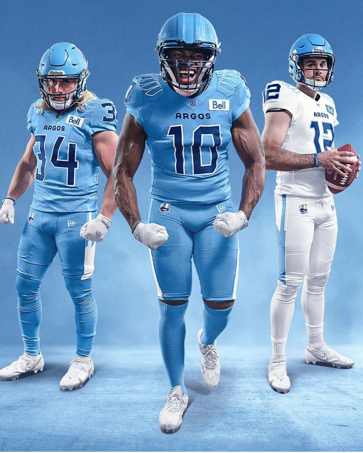
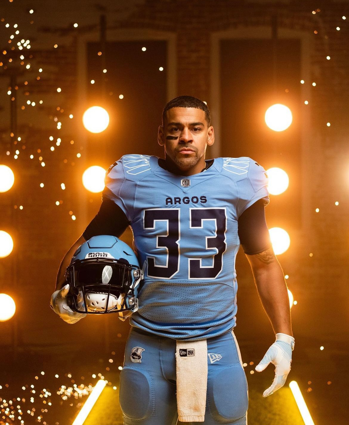
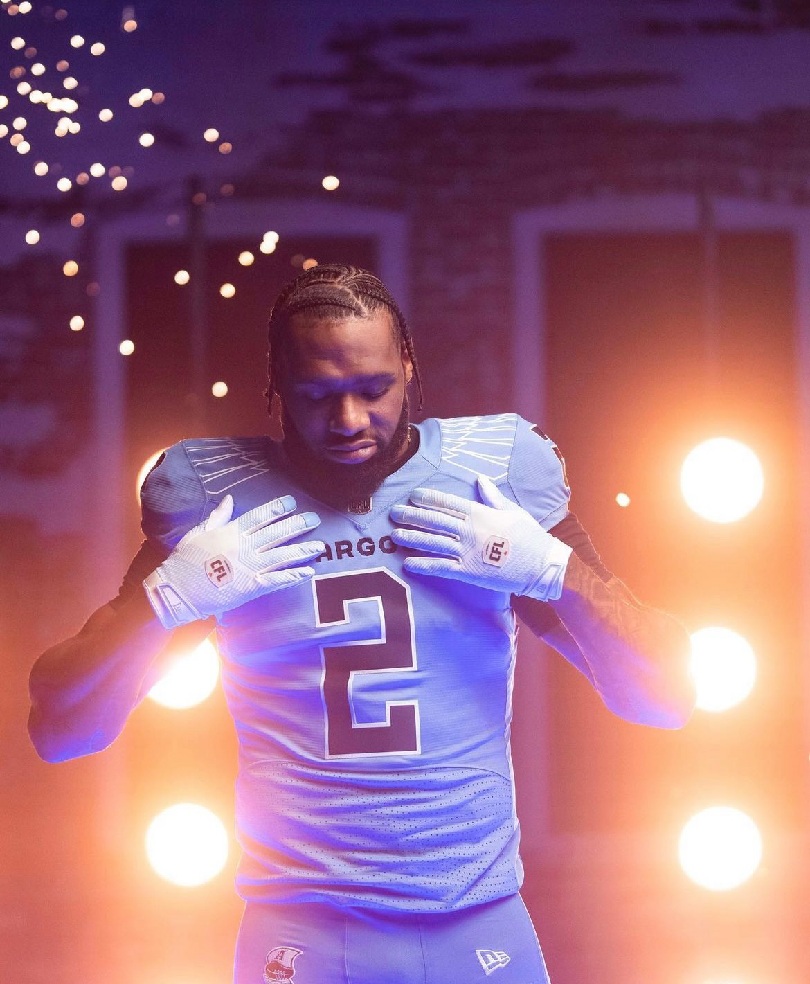
The Toronto Argonauts, reigning Grey Cup Champions, are set to make a bold statement this season with a brand new look that combines their rich traditions with fresh inspiration. As the franchise celebrates 150 years of football history, the Argos have unveiled a set of uniforms that pays homage to their nautical heritage, symbolizes unity, and creates a modern identity for the team. The new uniforms, designed in collaboration with New Era, encapsulate the spirit of the Argonauts as they defend their championship and embark on the next chapter of their storied franchise.
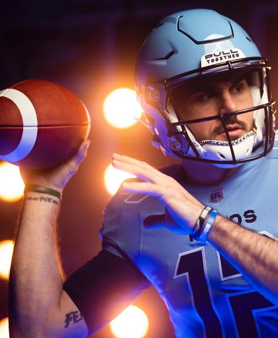
In a nod to the team's past, the Toronto Argonauts unveiled new helmets in Cambridge Blue, a color they haven't sported since 1962. The helmet design features an oversized version of the Argos 'Boat logo,' which made its return in 2020. The logo, depicting oars working in unison to propel a boat forward, embodies the team's rallying cry of "Pull Together." Through this symbolic representation, the Argonauts honor their origins with the Argonaut Rowing Club and the band of heroes in Greek mythology who sailed on the ship Argo in search of the Golden Fleece.
The newly unveiled home and away uniforms proudly showcase the team's traditional 'Double Blue' color scheme, composed of Cambridge and Oxford blues. This classic palette pays homage to the early 1960s, evoking a sense of nostalgia while maintaining a modern edge. The combination of these two blues creates a fresh and vibrant look that will inspire both players and fans alike.
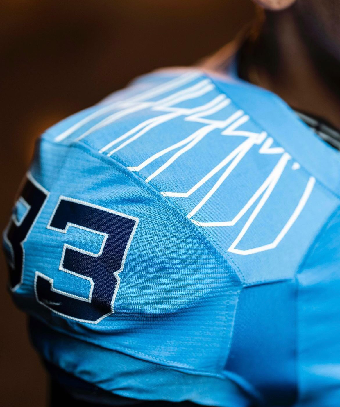
Every aspect of the new Argonauts uniform has been meticulously designed to reflect the team's heritage and create a unique identity. The Pro Force Edge jersey, a first of its kind in the CFL, features sleeker lines and shapes, emphasizing a modern aesthetic. The custom laser-cut mesh on the jersey creates a captivating 'wave' effect, symbolizing the team's connection to water and its nautical roots.
The graphic designs on the uniform pay tribute to the 12 players on the field, with six oars adorning each shoulder. Additionally, the traditional stripe on the pants has been replaced by a single oar on each side. The numbers on the jerseys draw inspiration from the Royal Canadian Navy ship numbers, modernized to perfectly fit the jersey and add a touch of distinction. Notably, inside the collar of the jersey, the team's motto, "Pull Together," serves as a constant reminder of the unity and resilience that define the Toronto Argonauts.
The Toronto Argonauts' new uniforms mark a momentous occasion in the franchise's history. As they take the field in these striking garments, the team proudly commemorates a century and a half of football excellence. The uniforms honor the team's legacy, capture the spirit of their nautical heritage, and create a modern identity that will inspire both players and fans throughout the season.
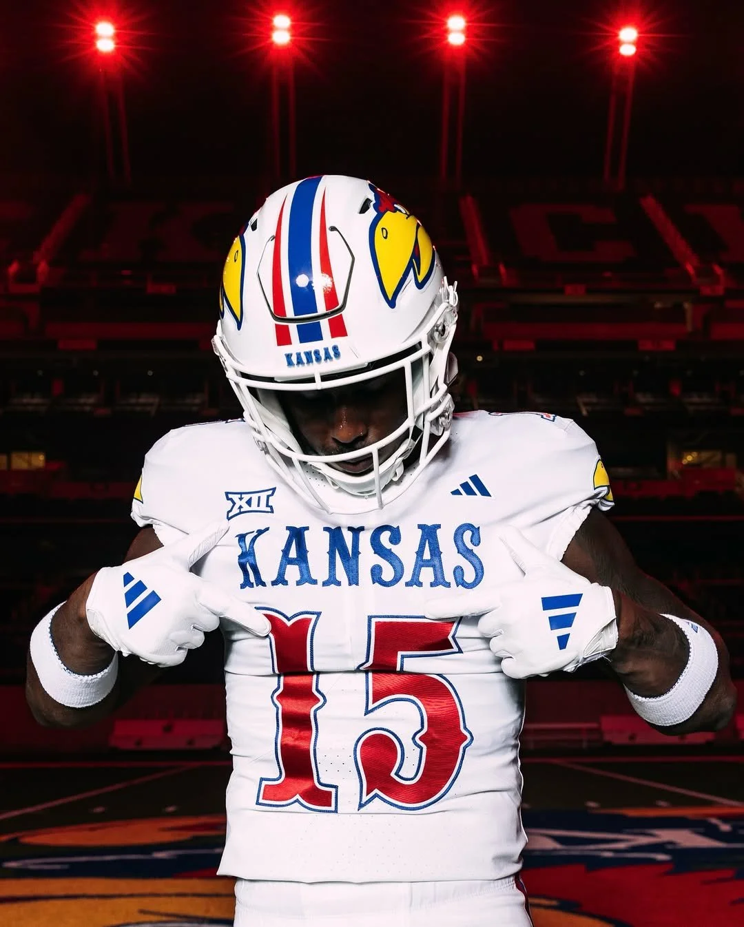
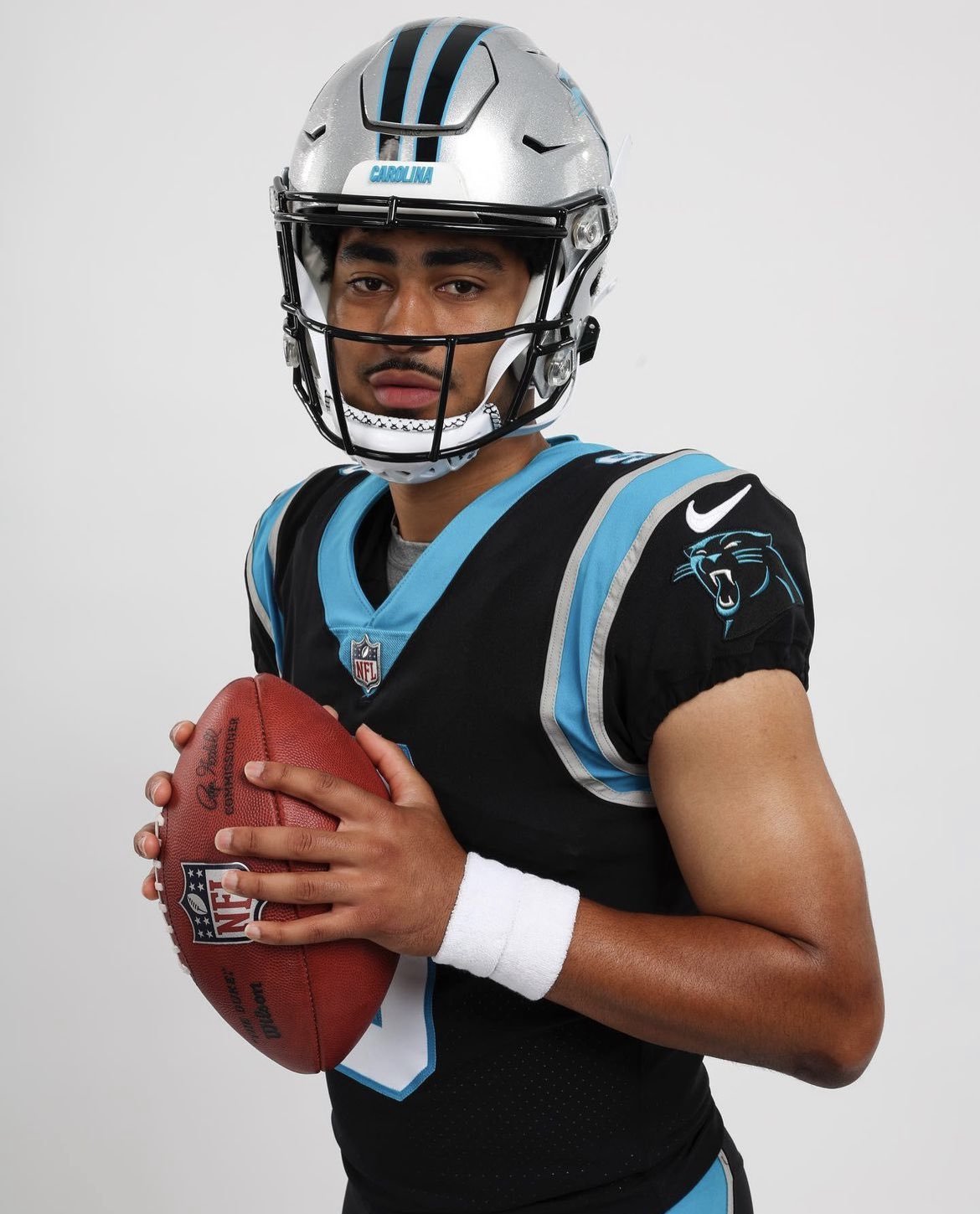
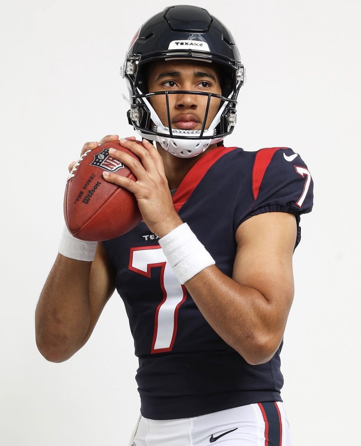
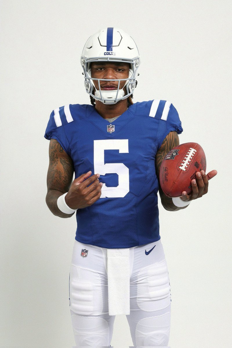
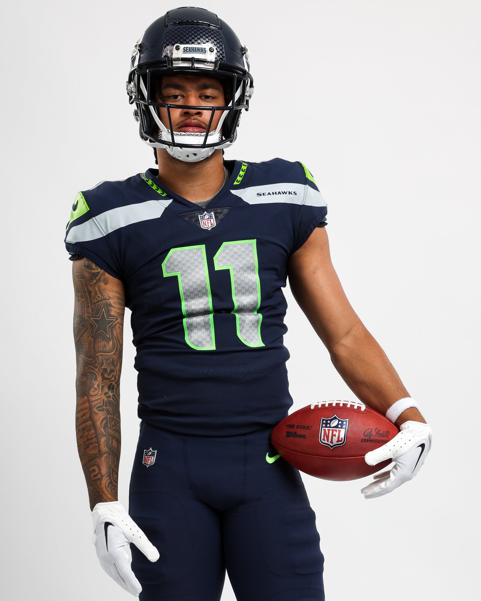
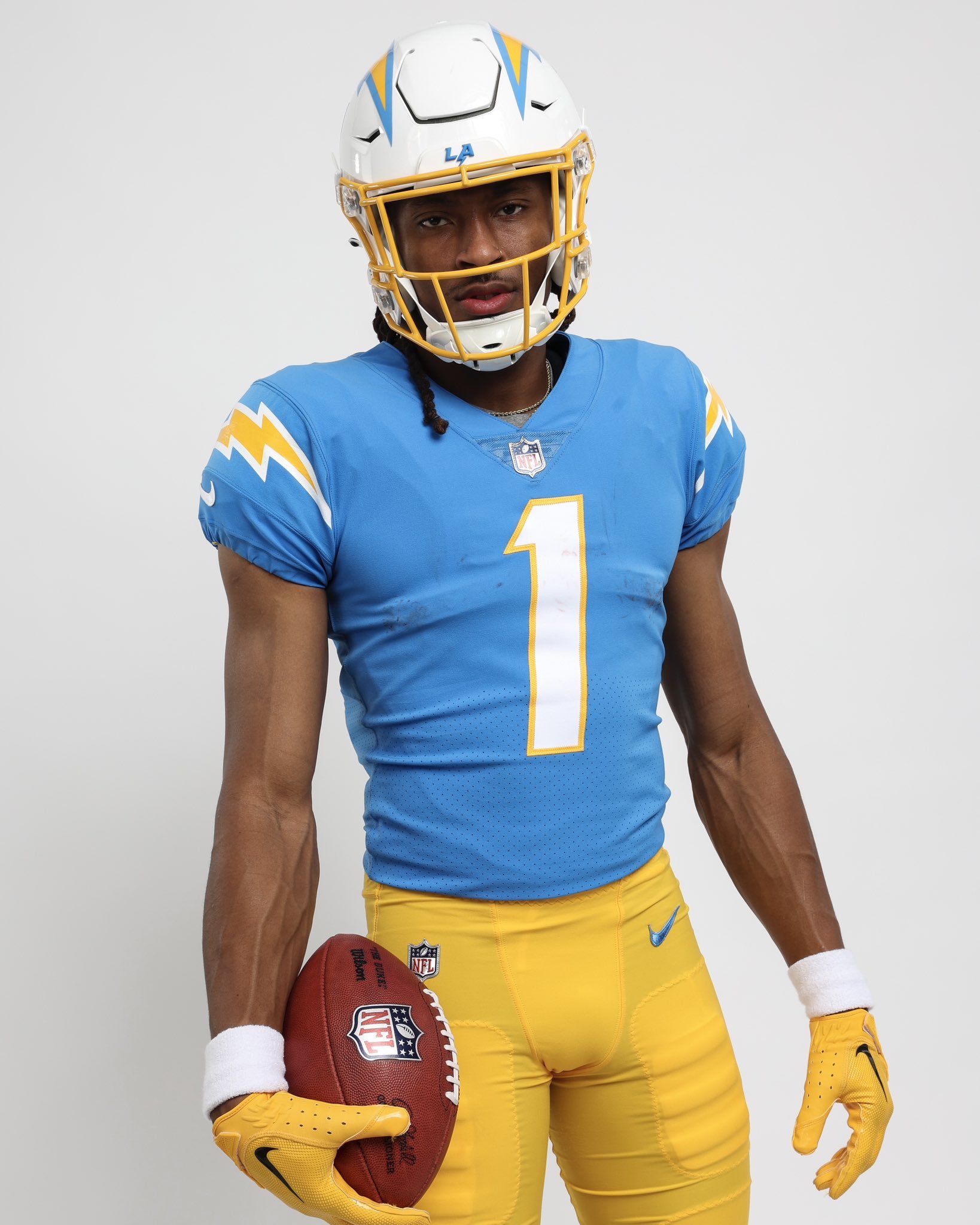
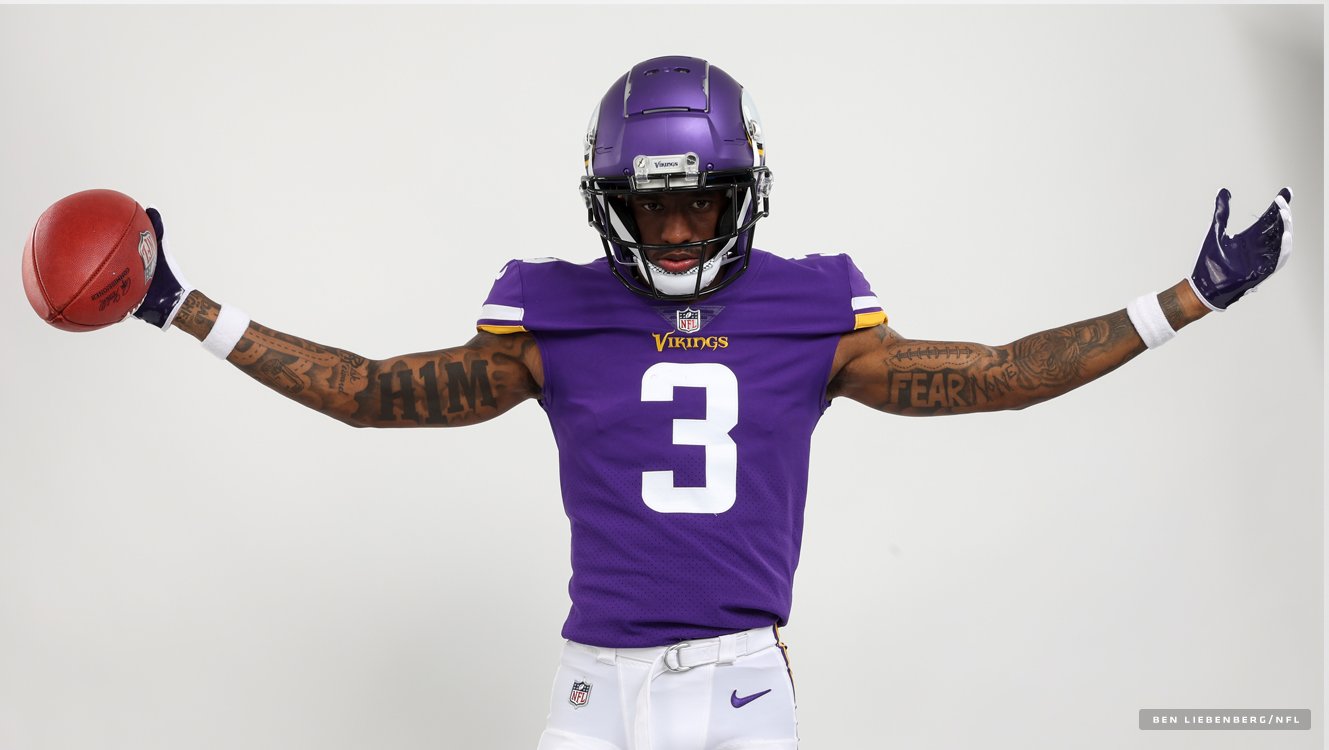
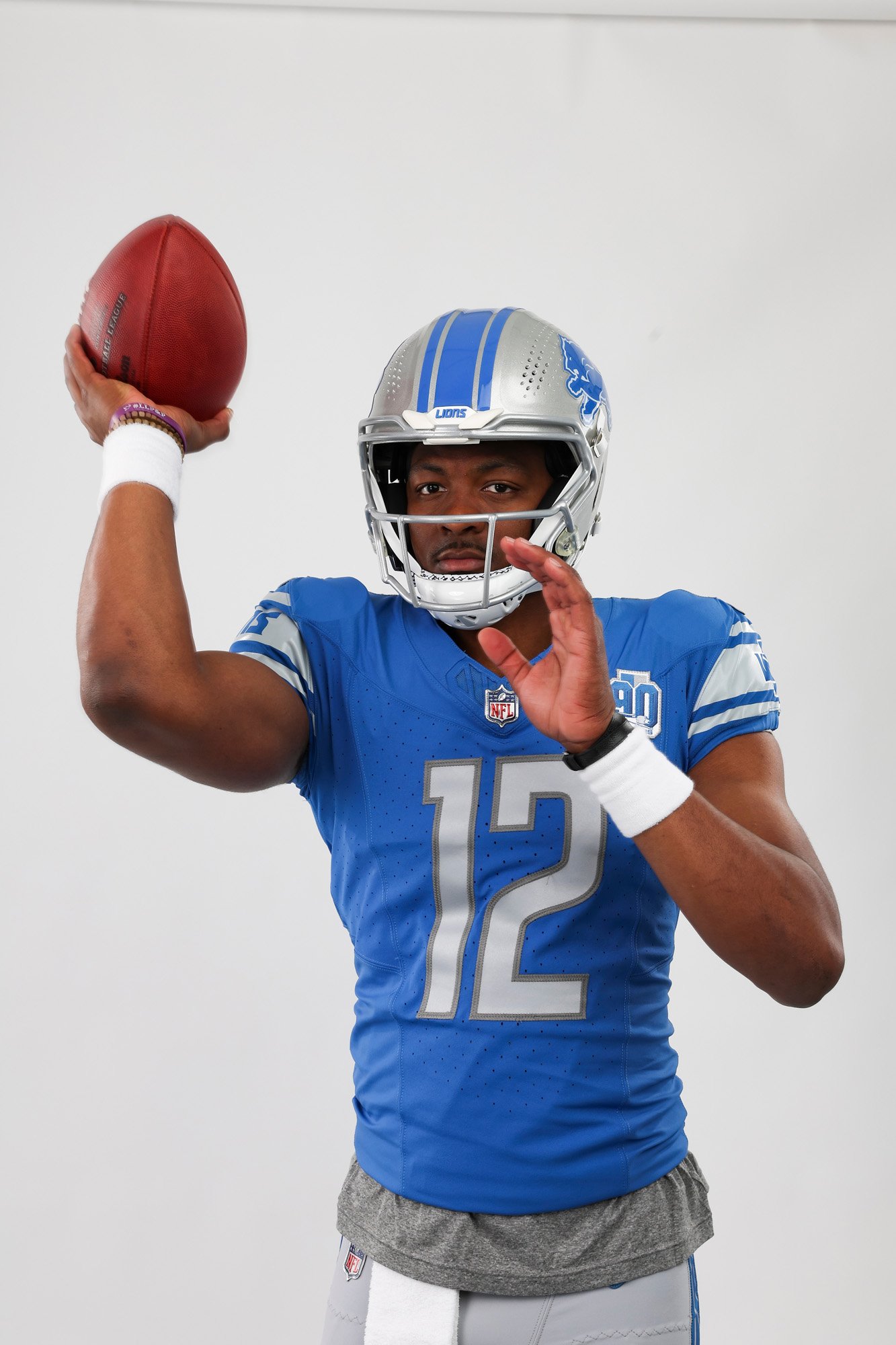
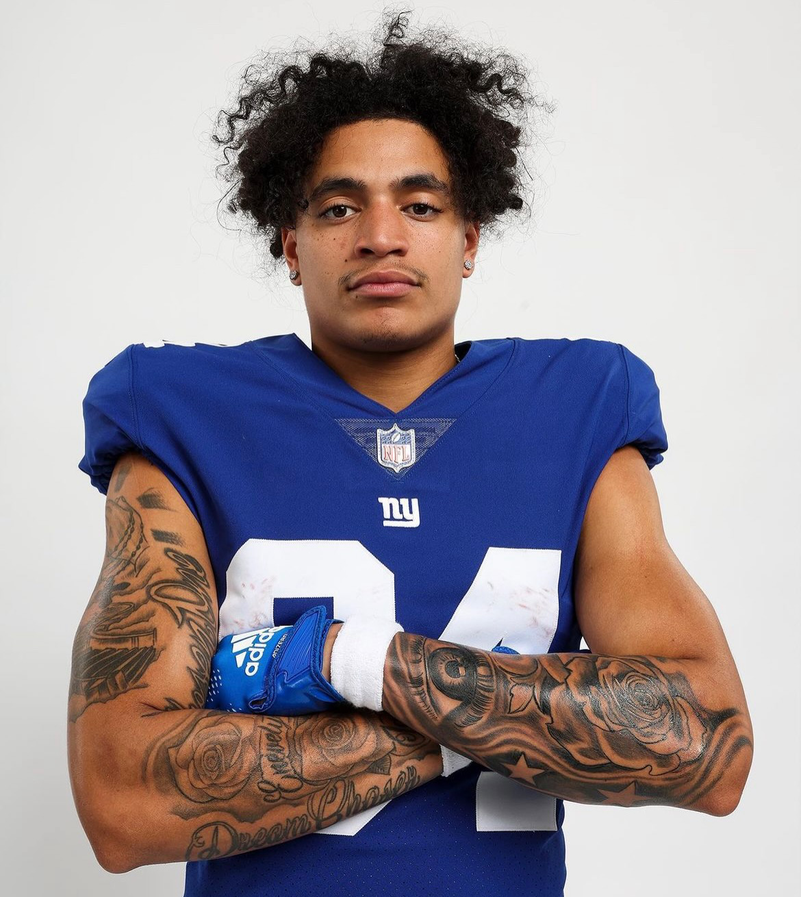
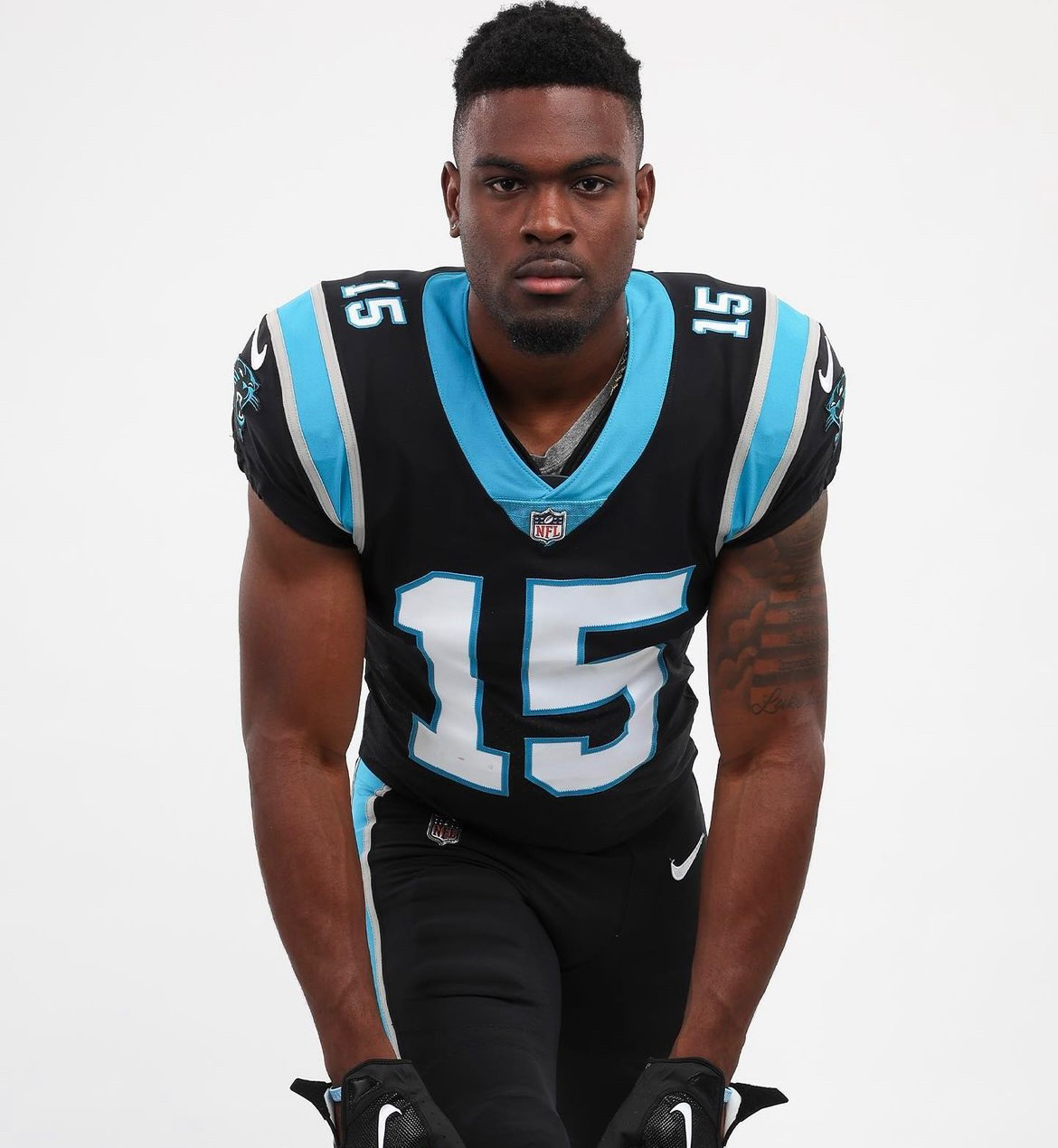
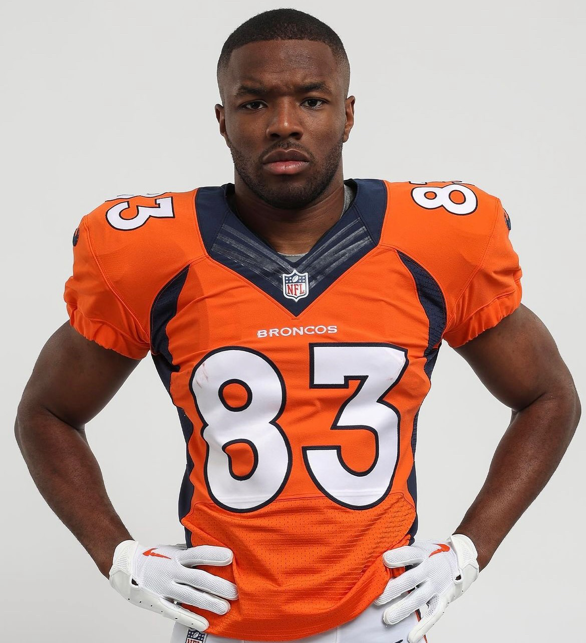
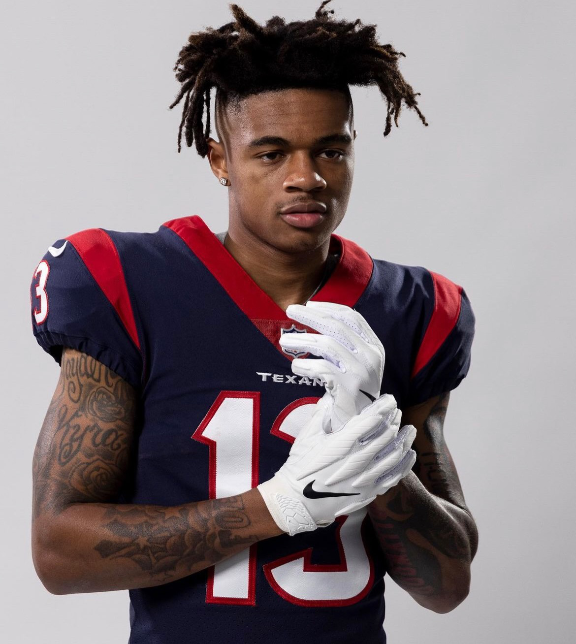
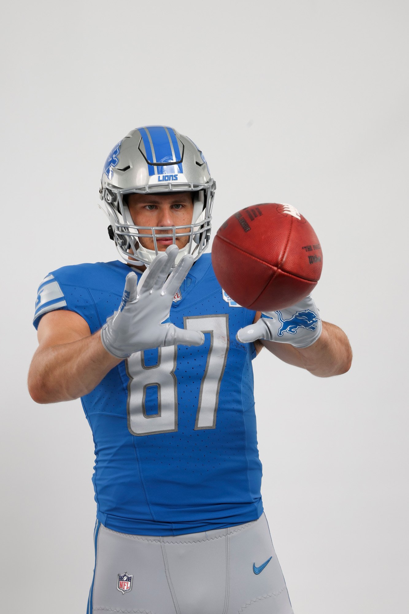
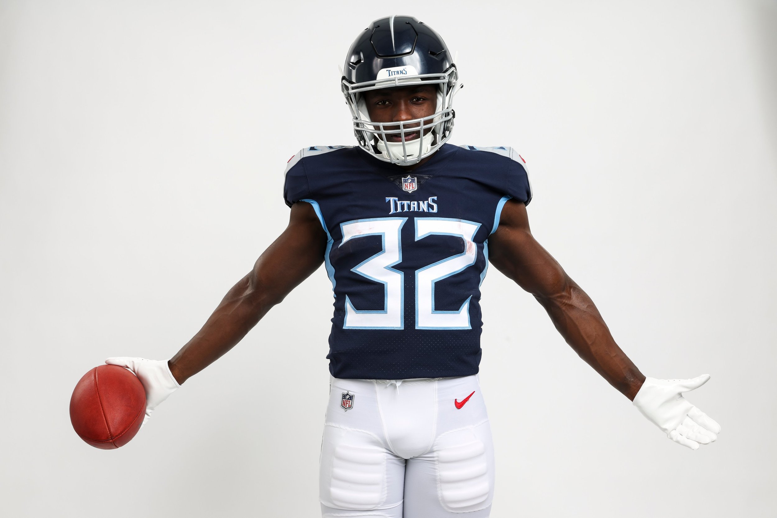
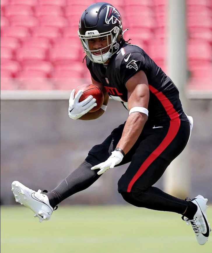
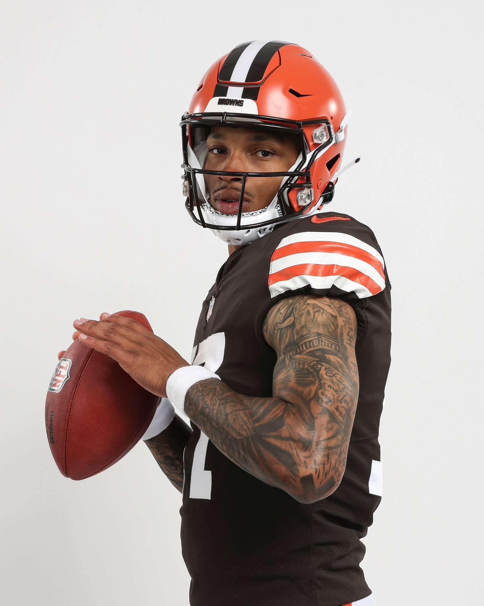
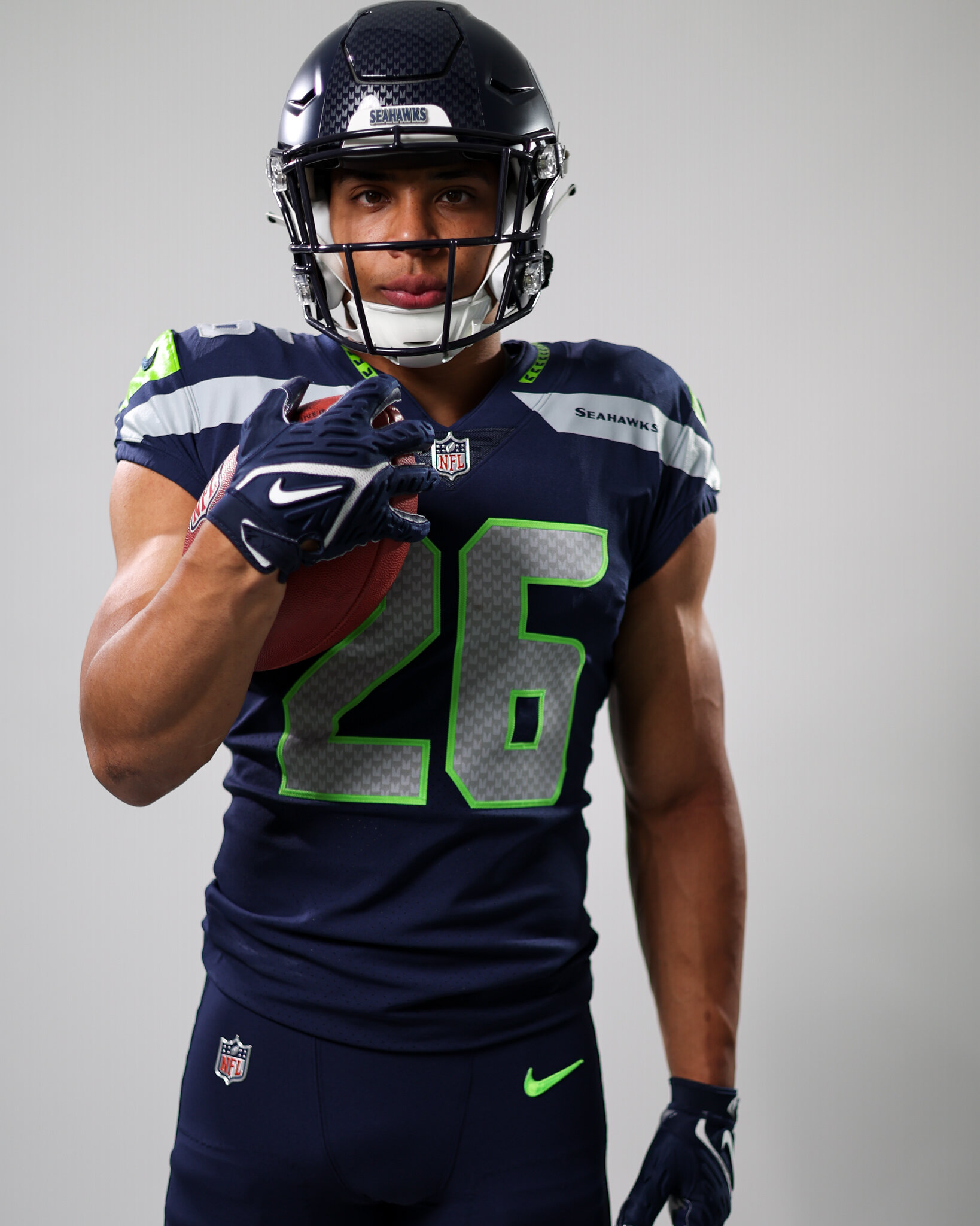
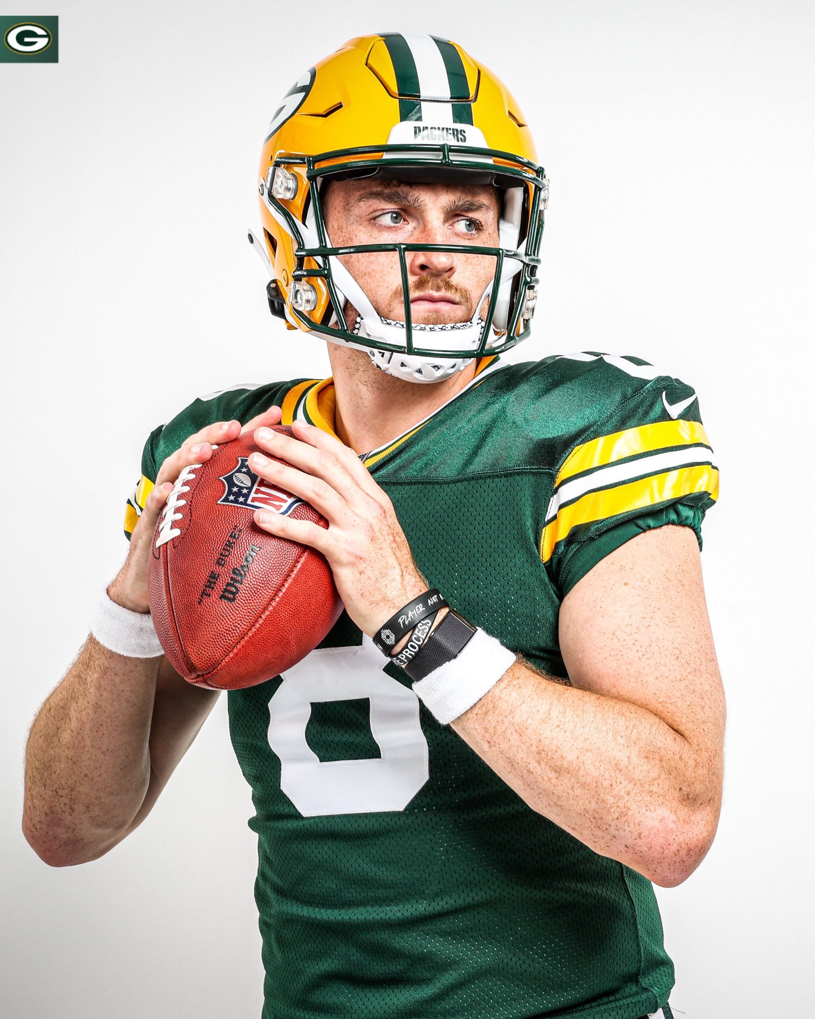
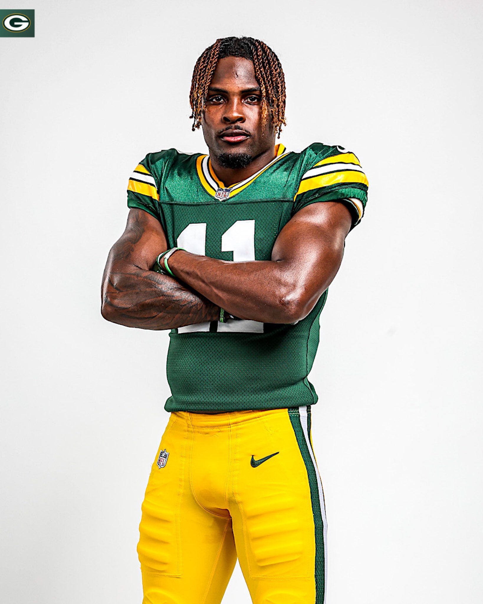
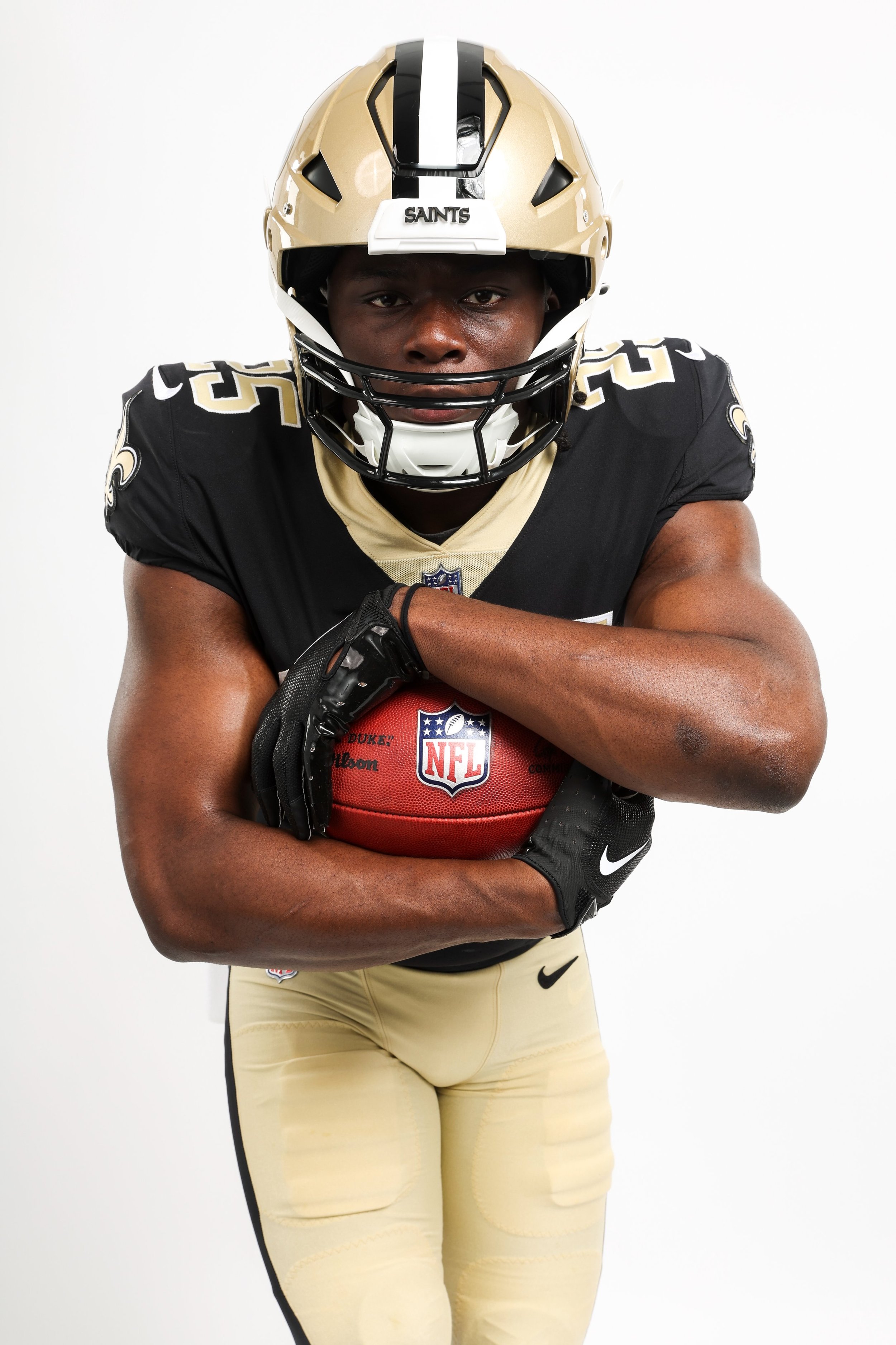
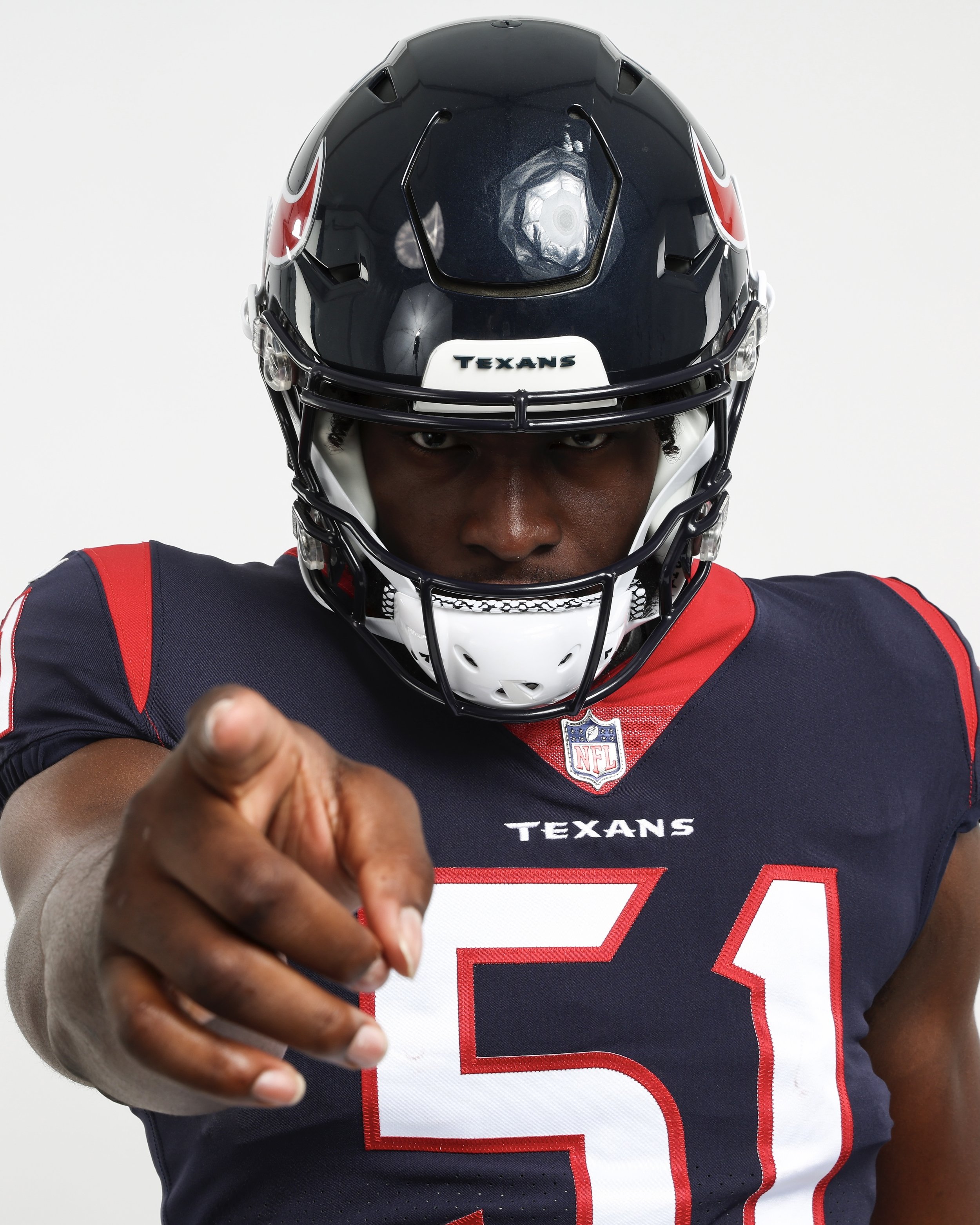
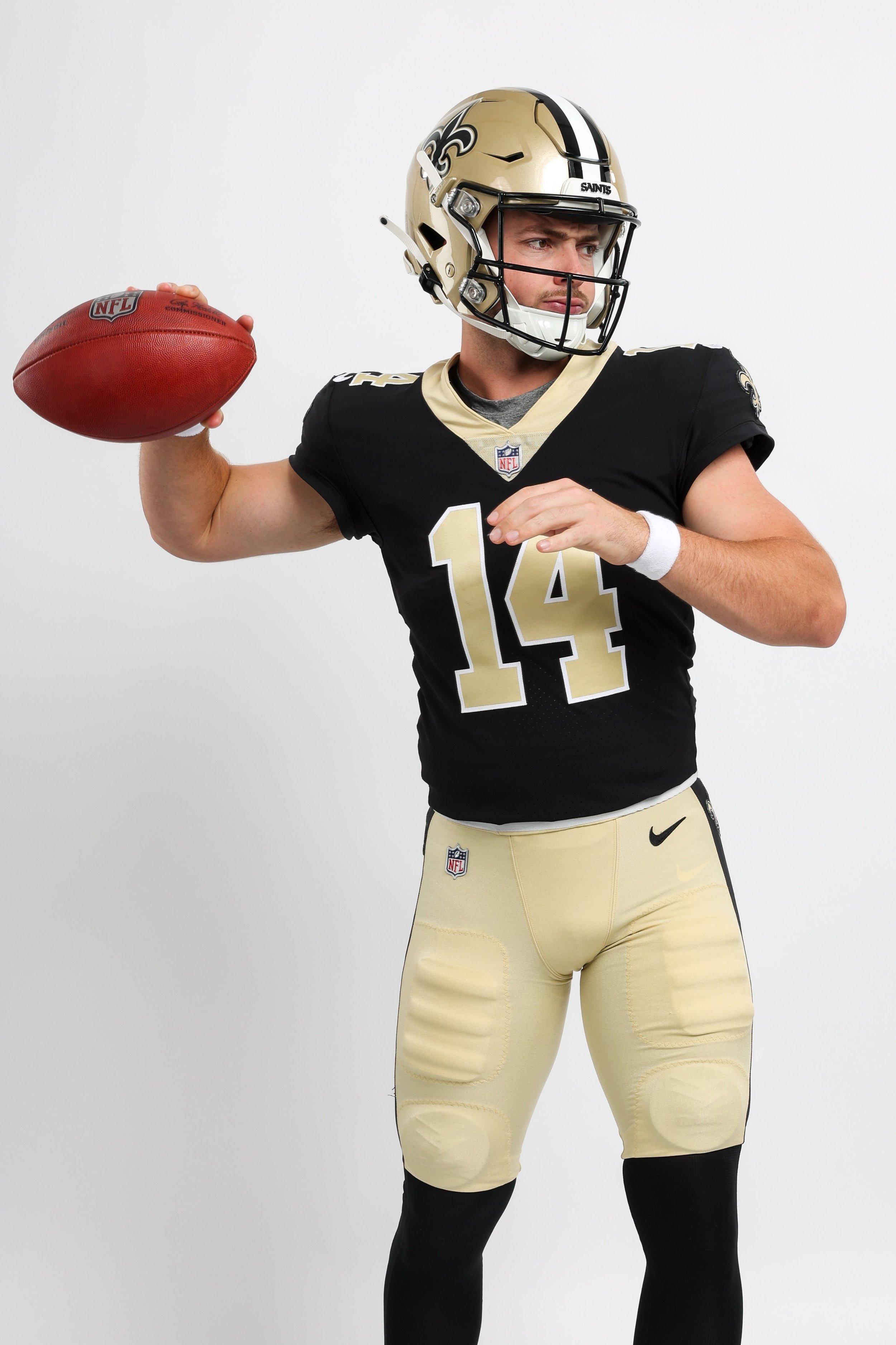
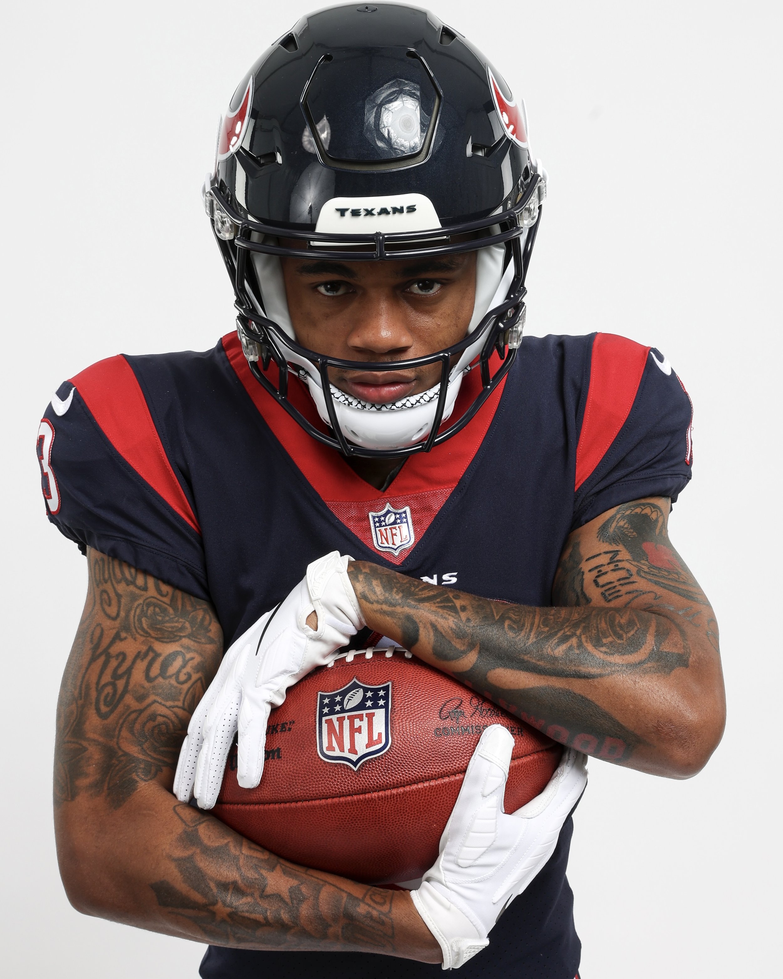
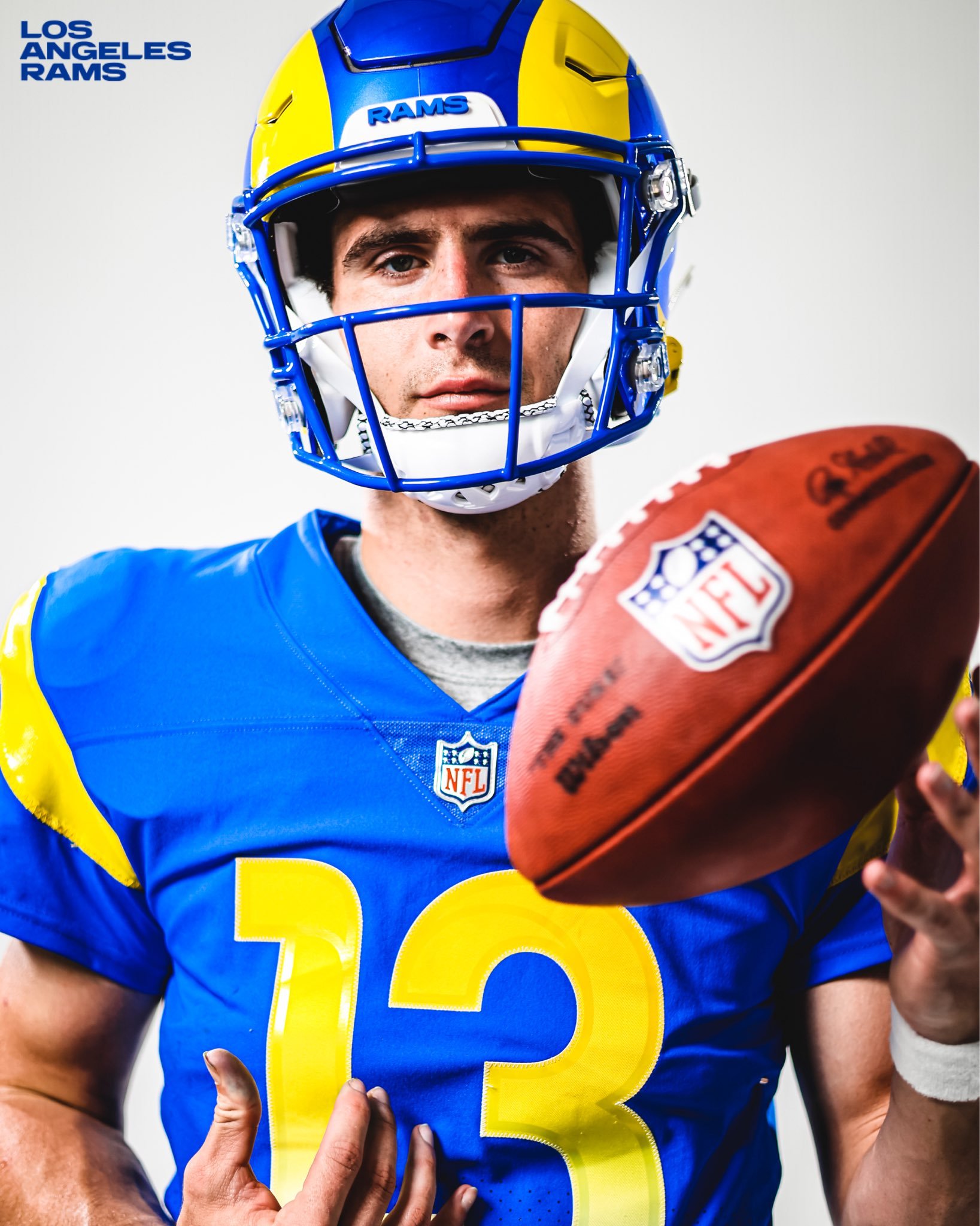
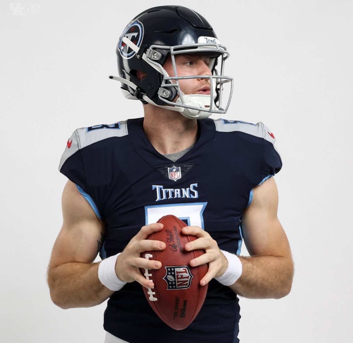
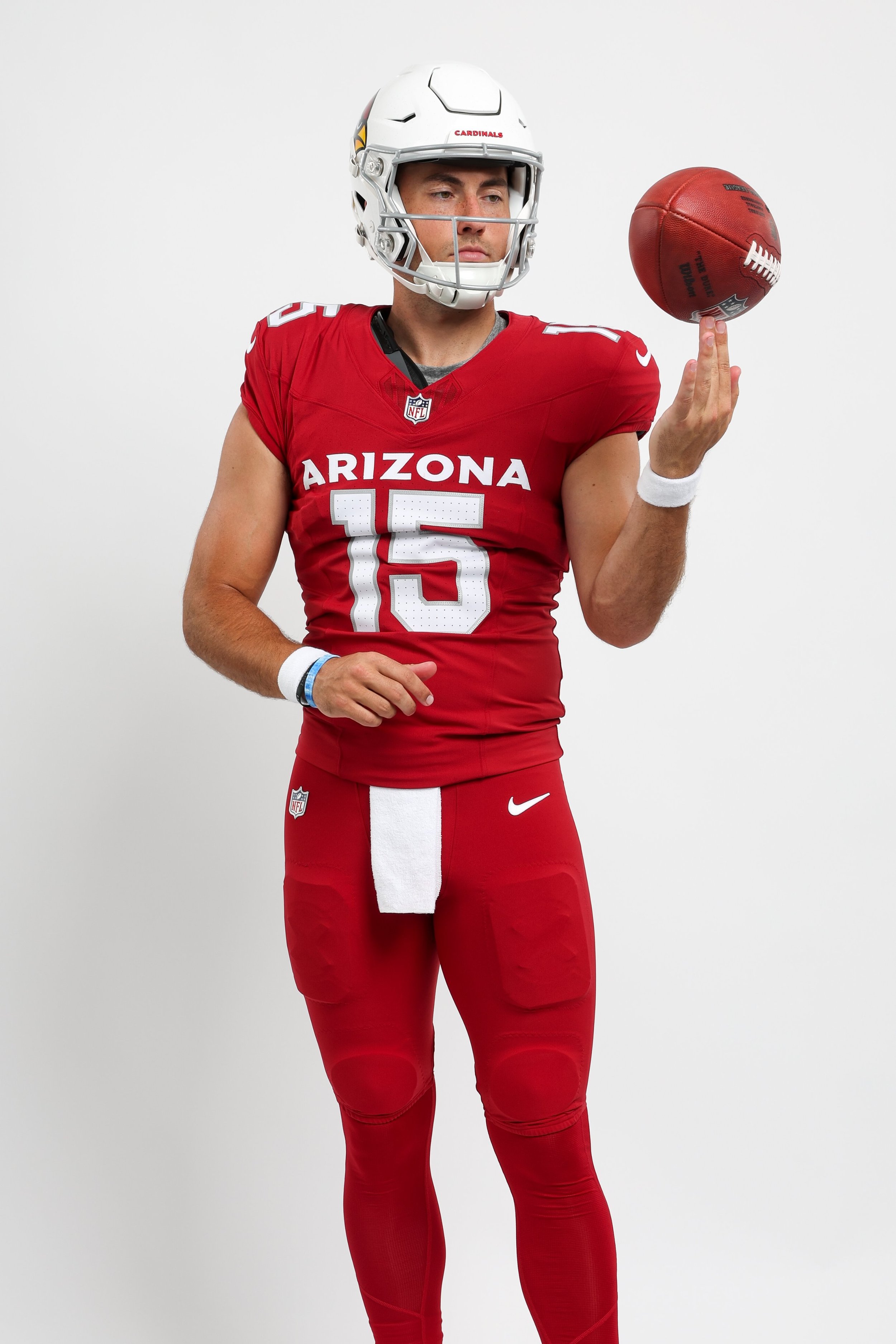
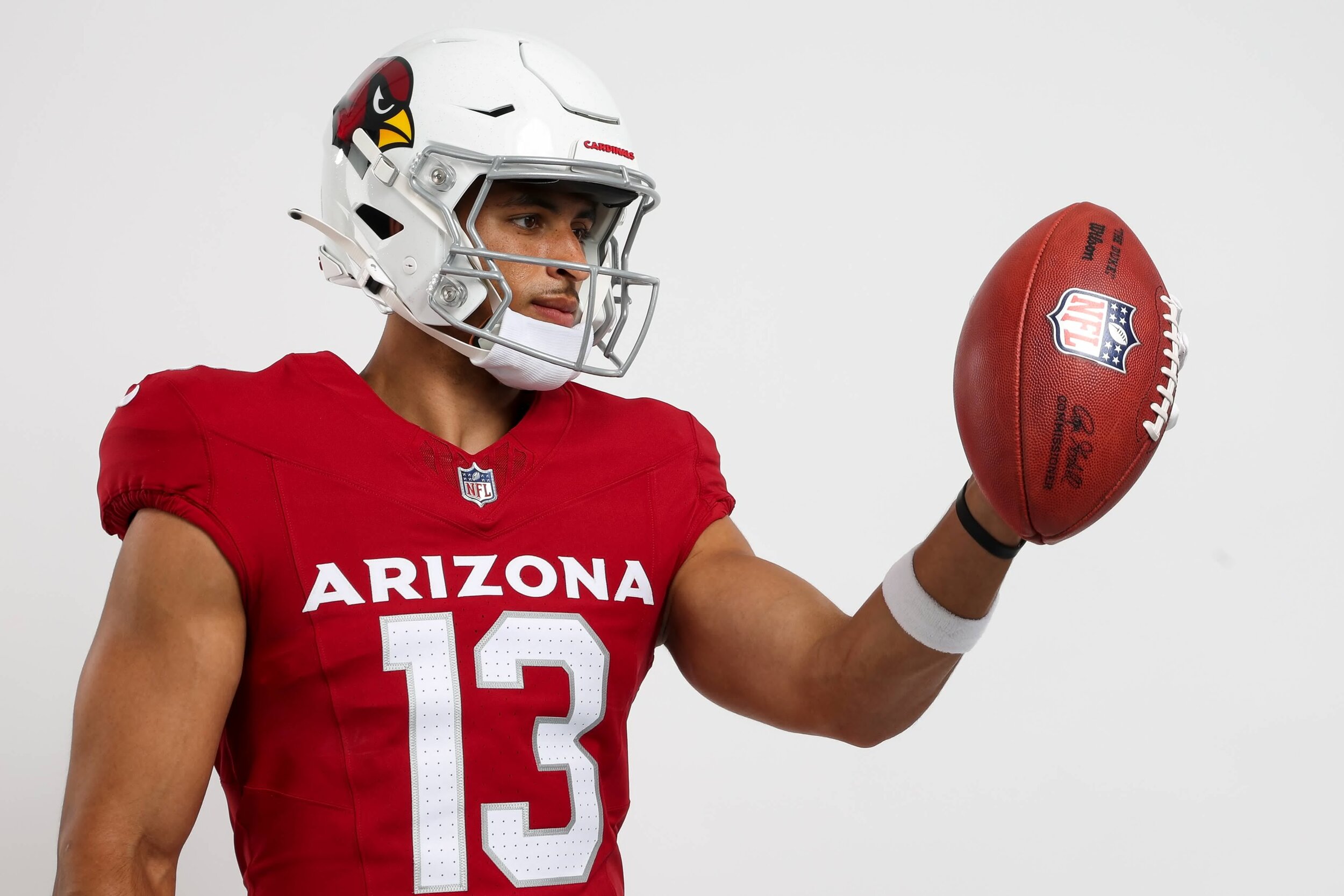
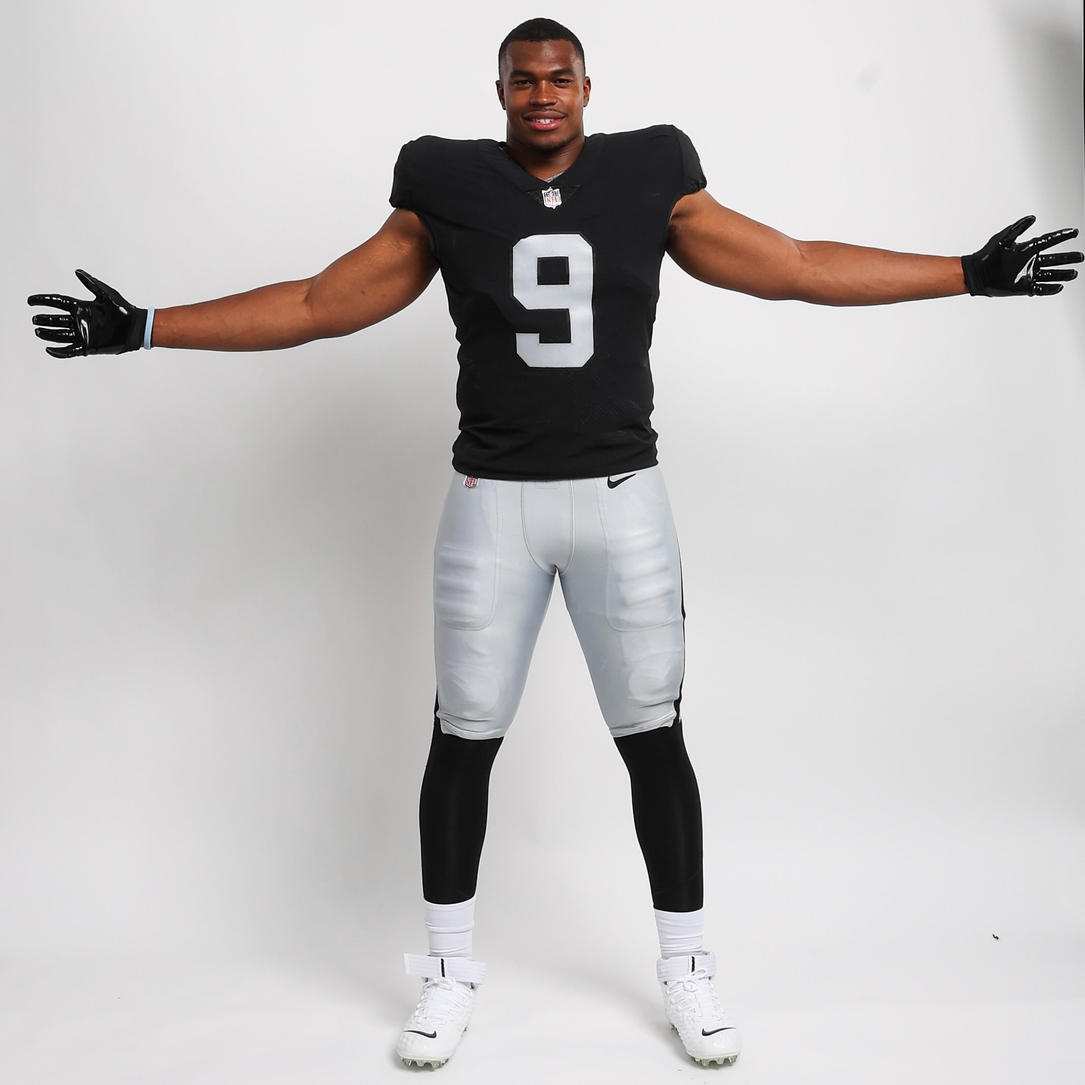
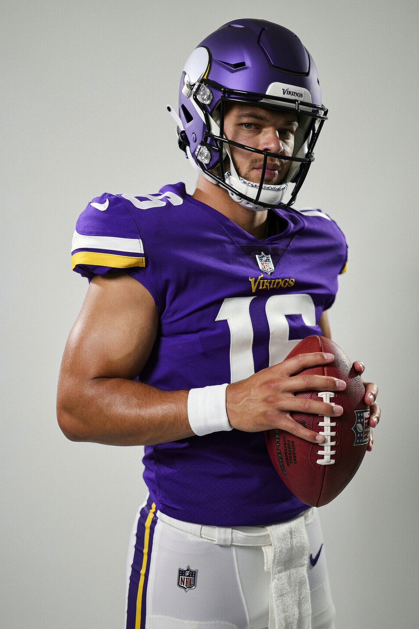
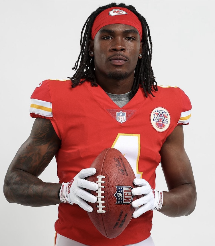
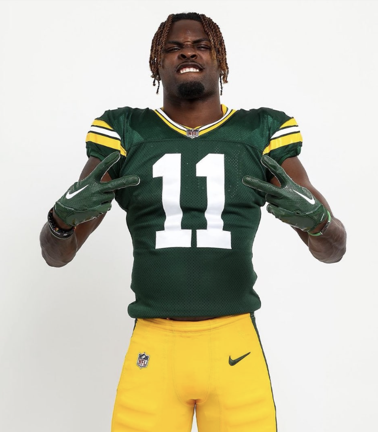
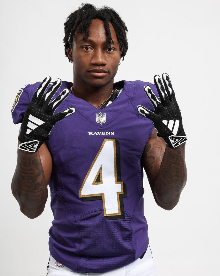
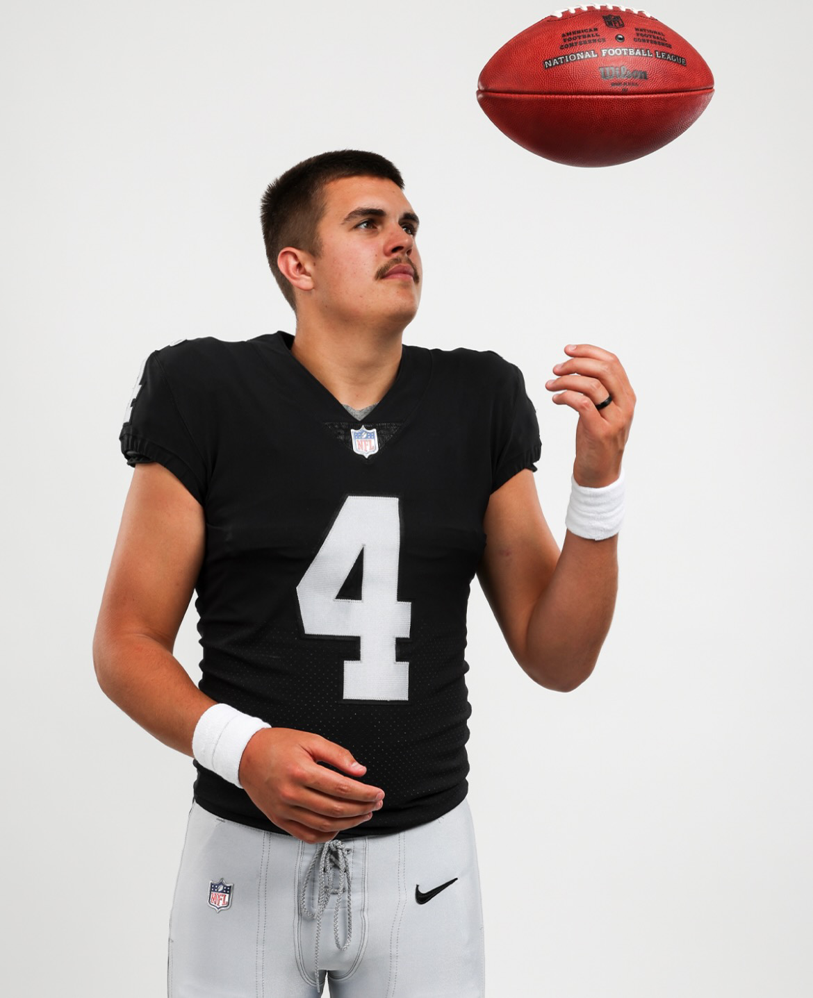
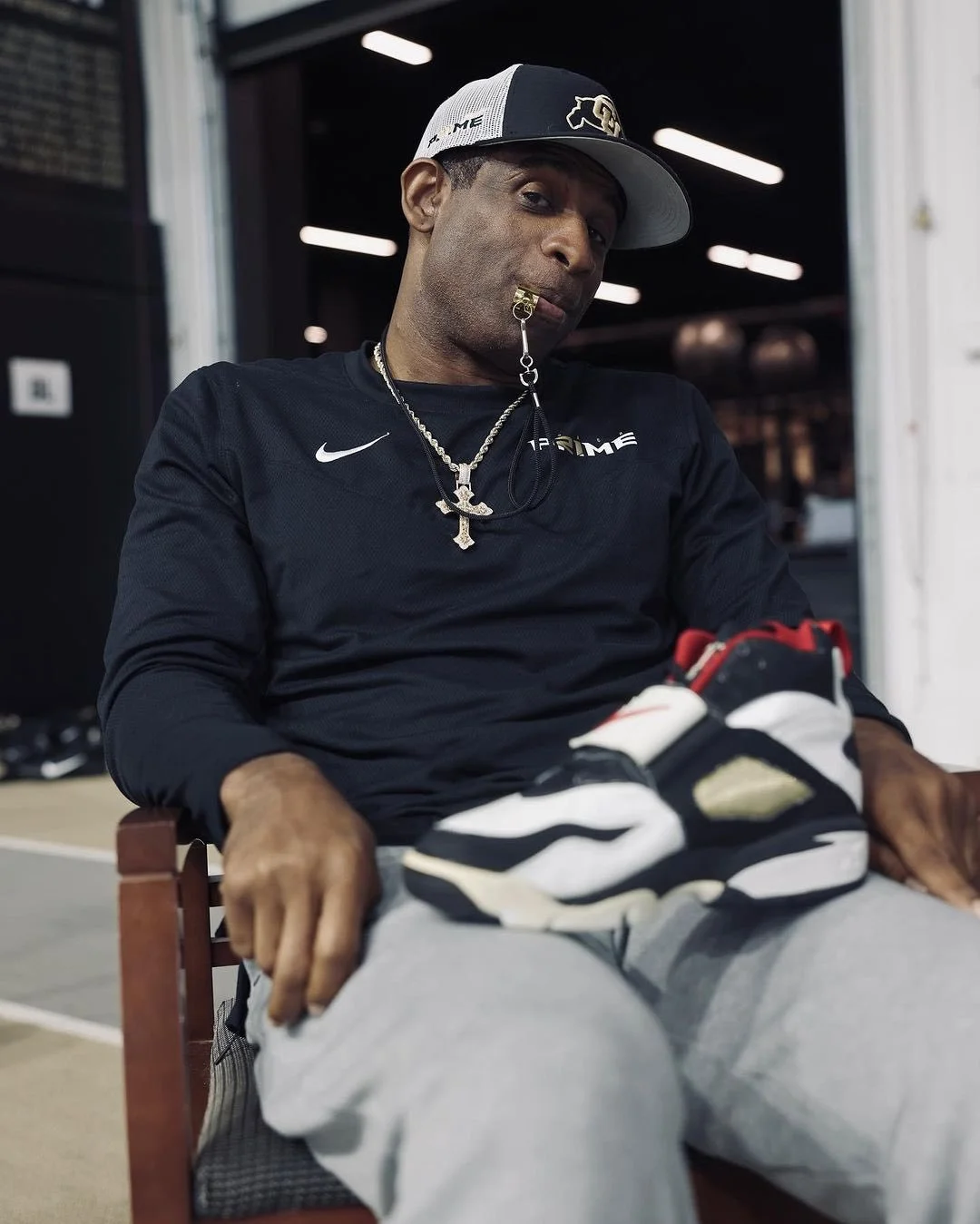
Excitement fills the air as NFL rookies proudly don their new team uniforms for the first time. These young athletes, fresh from the college ranks, step onto the professional stage with a blend of anticipation and determination. In their crisp jerseys and helmets adorned with iconic team logos, they represent the future of the game. With each fabric thread and emblem stitch, the rookies carry the weight of their team's history and the hopes of their loyal fans. As they prepare to make their mark on the gridiron, these rookies embody the dreams, hard work, and potential that define the NFL's next generation of stars.
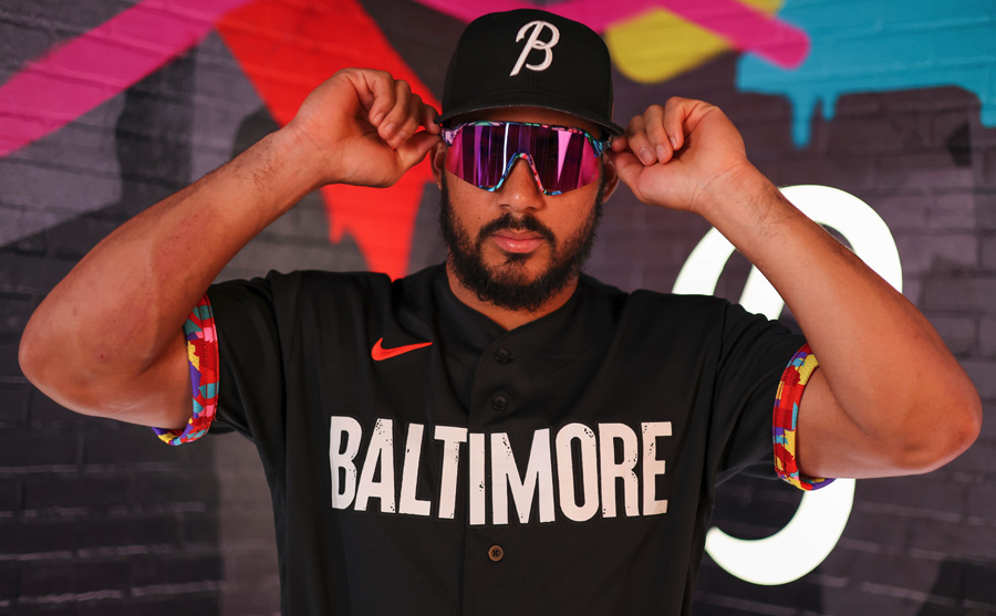
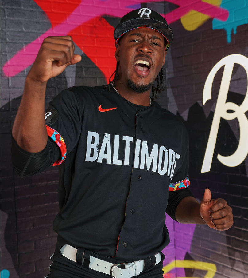
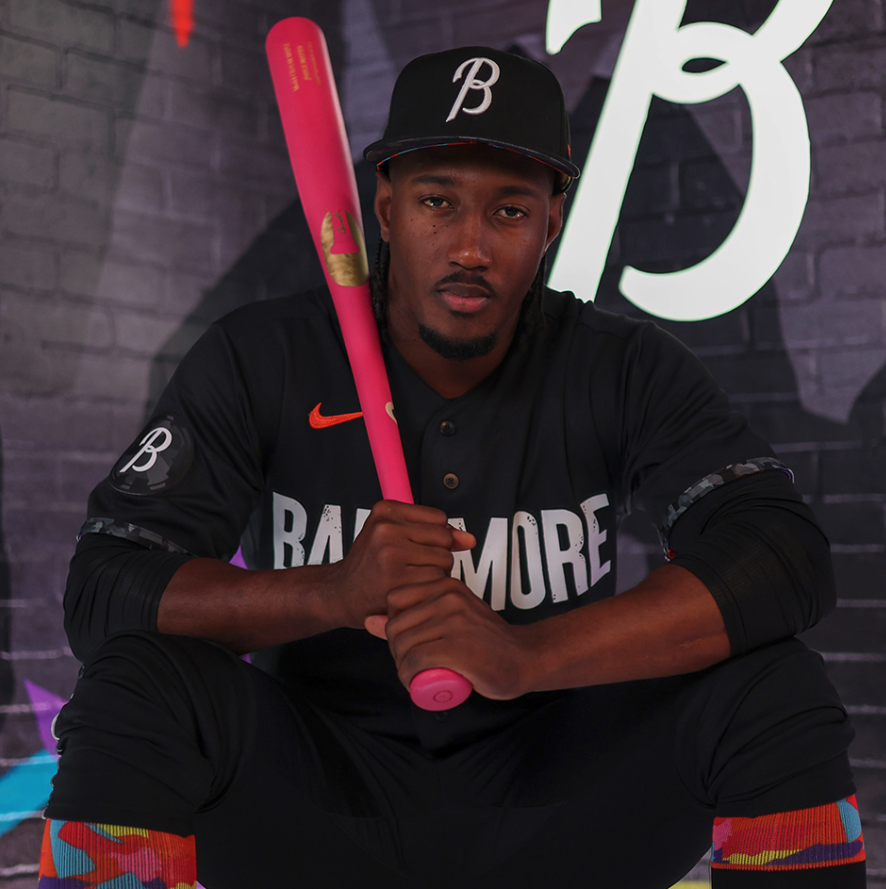
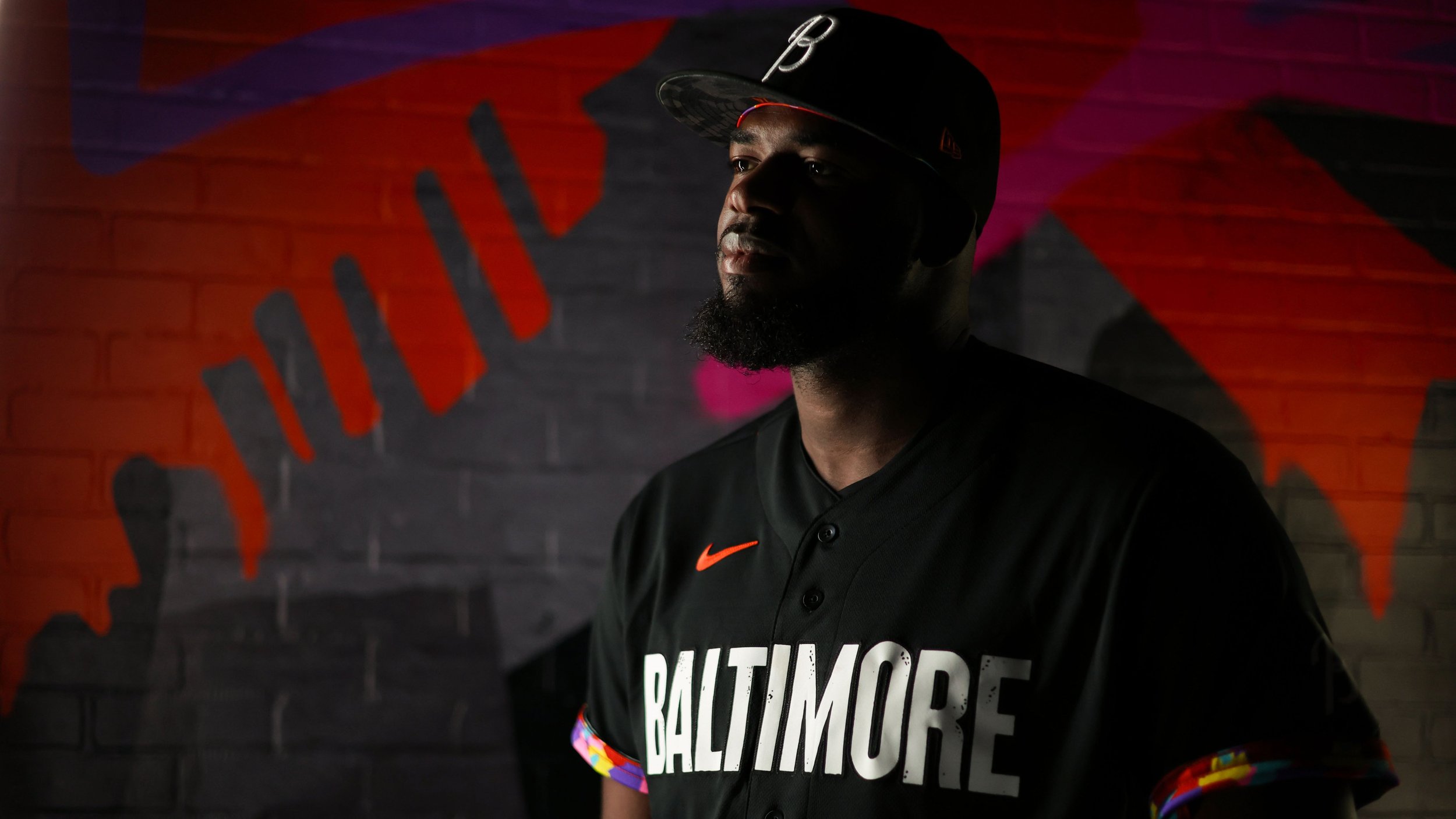
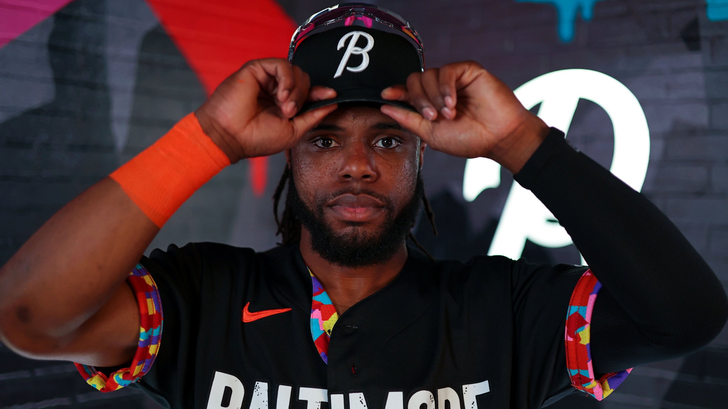
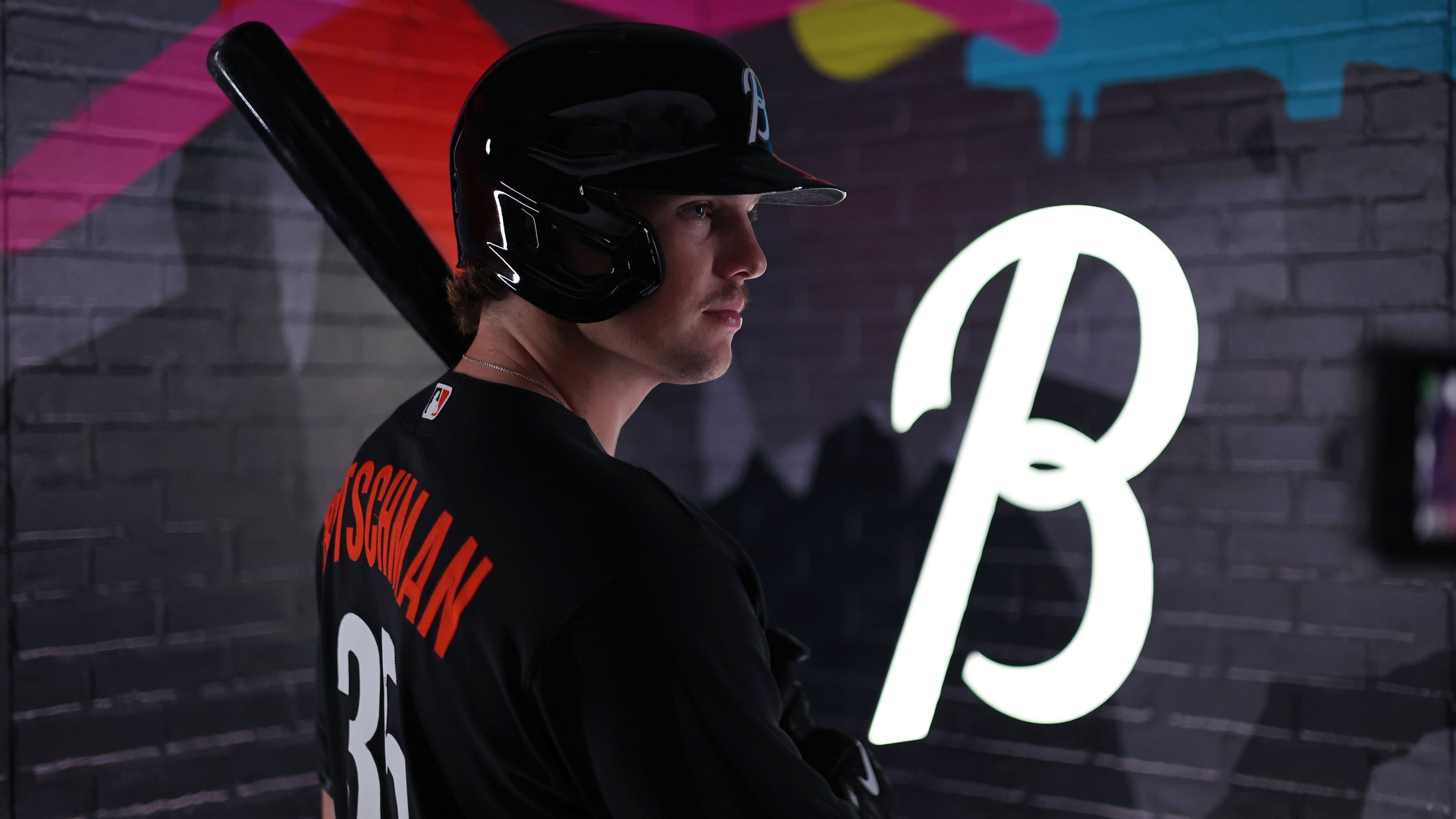
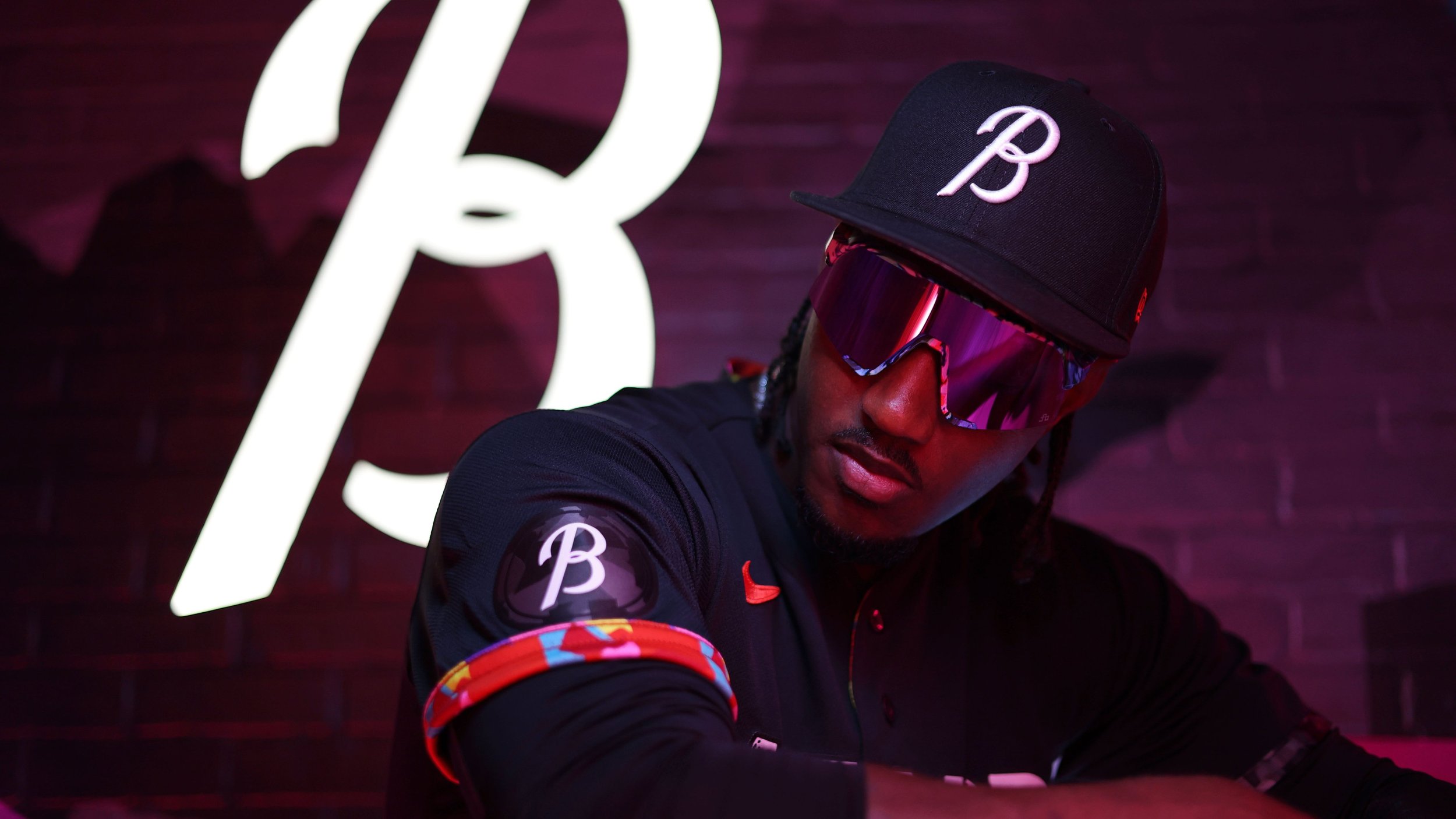
The Baltimore Orioles recently unveiled their highly anticipated City Connect uniforms, showcasing a bold and meaningful tribute to the diverse neighborhoods and rich stories that define the city. With a striking all-black aesthetic and unique design elements, the uniforms aim to honor Baltimore's cultural heritage and artistic spirit. The release marks a significant moment in Major League Baseball history, as the Orioles become the first team to incorporate an intricately designed interior into their jerseys, symbolizing the city's vibrant arts culture.
The City Connect uniform dons an all-black look, exuding a sense of elegance and strength. Emblazoned across the front in a block font reminiscent of the Globe Collection and Press at Maryland Institute College of Art, the word "Baltimore" serves as a powerful statement, representing the team's pride and commitment to their city.
the Orioles have incorporated a colored mosaic design inspired by Baltimore's arts culture into the interior of the jerseys. The captivating mosaic, symbolizing the city's vibrant tapestry, pays homage to the rich history of creativity and artistic expression that thrives within Baltimore's neighborhoods.
The sleeve piping and uniform socks also feature a black and white mosaic design, further embracing the essence of Baltimore's cultural diversity and artistic heritage. The visual tapestry beautifully weaves together various neighborhoods, celebrating the collective spirit and unity of the city.
Orioles outfielder Austin Hays expressed his excitement about donning the new uniform, noting the significance of wearing the city's name on the front. He spoke of the honor and privilege it is to represent Baltimore and its people through this unique tribute. Hays' sentiments echo the sentiments of the entire team, as they eagerly anticipate the opportunity to showcase their city's rich heritage on the field of Camden Yards.
The Baltimore Orioles' City Connect uniforms serve as a reminder that sports can be a platform for unity, celebration, and appreciation of the vibrant communities that shape our lives.
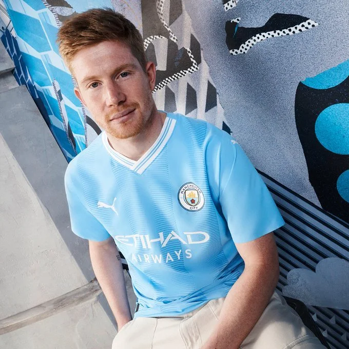
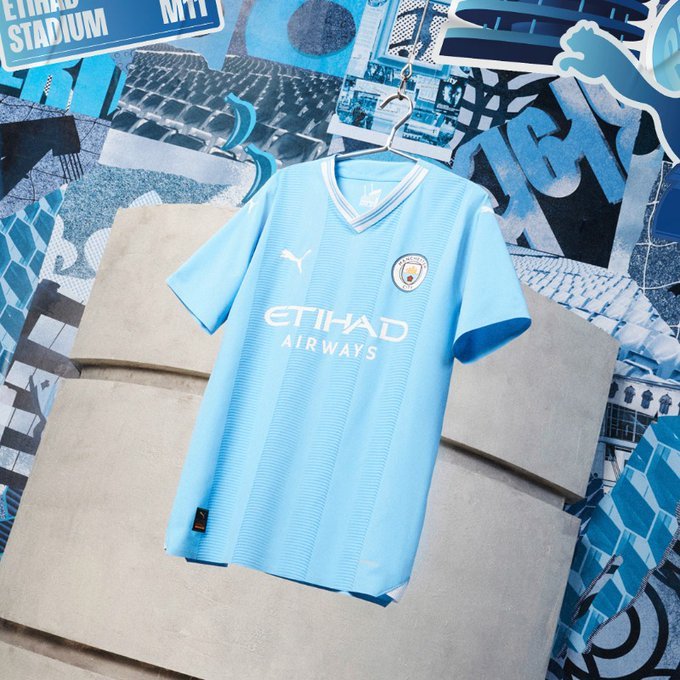
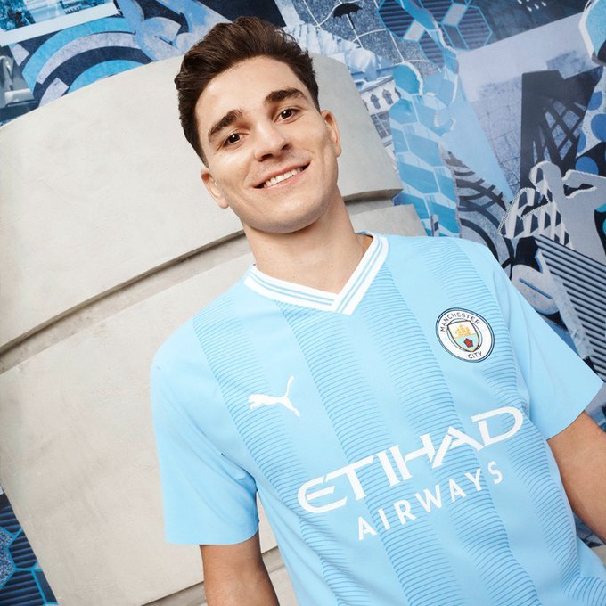
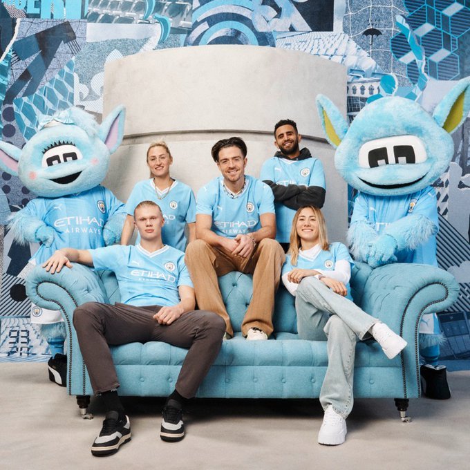
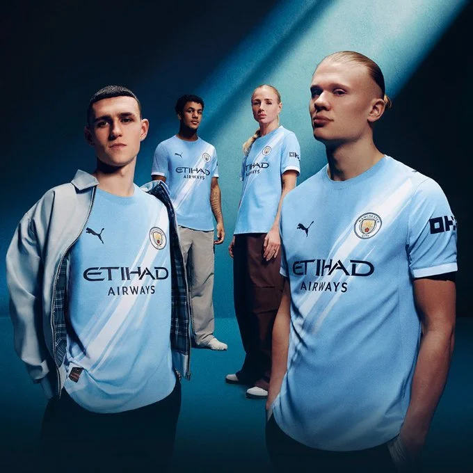
Manchester City Football Club has recently unveiled their highly anticipated home jerseys for the upcoming 2023-24 season. These new kits hold a special significance as they mark the 20th anniversary of the club's move to the iconic Etihad Stadium. Designed by PUMA, the jerseys pay homage to the team's inaugural season at the Etihad in 2003 and incorporate various elements inspired by the stadium itself.
The new jerseys evoke a strong sense of nostalgia by harkening back to the team's early days at the Etihad Stadium. PUMA has masterfully captured the essence of that historic season, and fans will undoubtedly appreciate the sentimental value that these jerseys carry. Drawing inspiration from the stadium's unique architectural features, the design includes vertical stripes on the front, reminiscent of the turrets that adorn the façade of the Etihad. This detail not only adds visual interest but also serves as a tribute to the iconic landmark that has become a cherished symbol of Manchester City.
Furthermore, the back of the jerseys bears the stadium's postcode, further commemorating the 20-year journey that the Etihad has been the proud home of Manchester City. This inclusion demonstrates the deep connection between the club and its iconic stadium, as it represents two decades of unforgettable memories, triumphs, and an unwavering fan base. The jerseys serve as a tribute to the unwavering support of City's passionate fans and symbolize the club's enduring legacy.
The unveiling of these special kits serves as a testament to the club's commitment to honoring its rich history while embracing the future. The 20th anniversary of Manchester City's move to the Etihad Stadium is a milestone worth celebrating, and these jerseys beautifully encapsulate the significance of this momentous occasion.
In addition to the jerseys, Manchester City has planned a series of events and initiatives throughout the season to commemorate their two decades at the Etihad. From special fan experiences to historical exhibitions, the club aims to involve supporters in the celebration and create lasting memories for everyone involved.
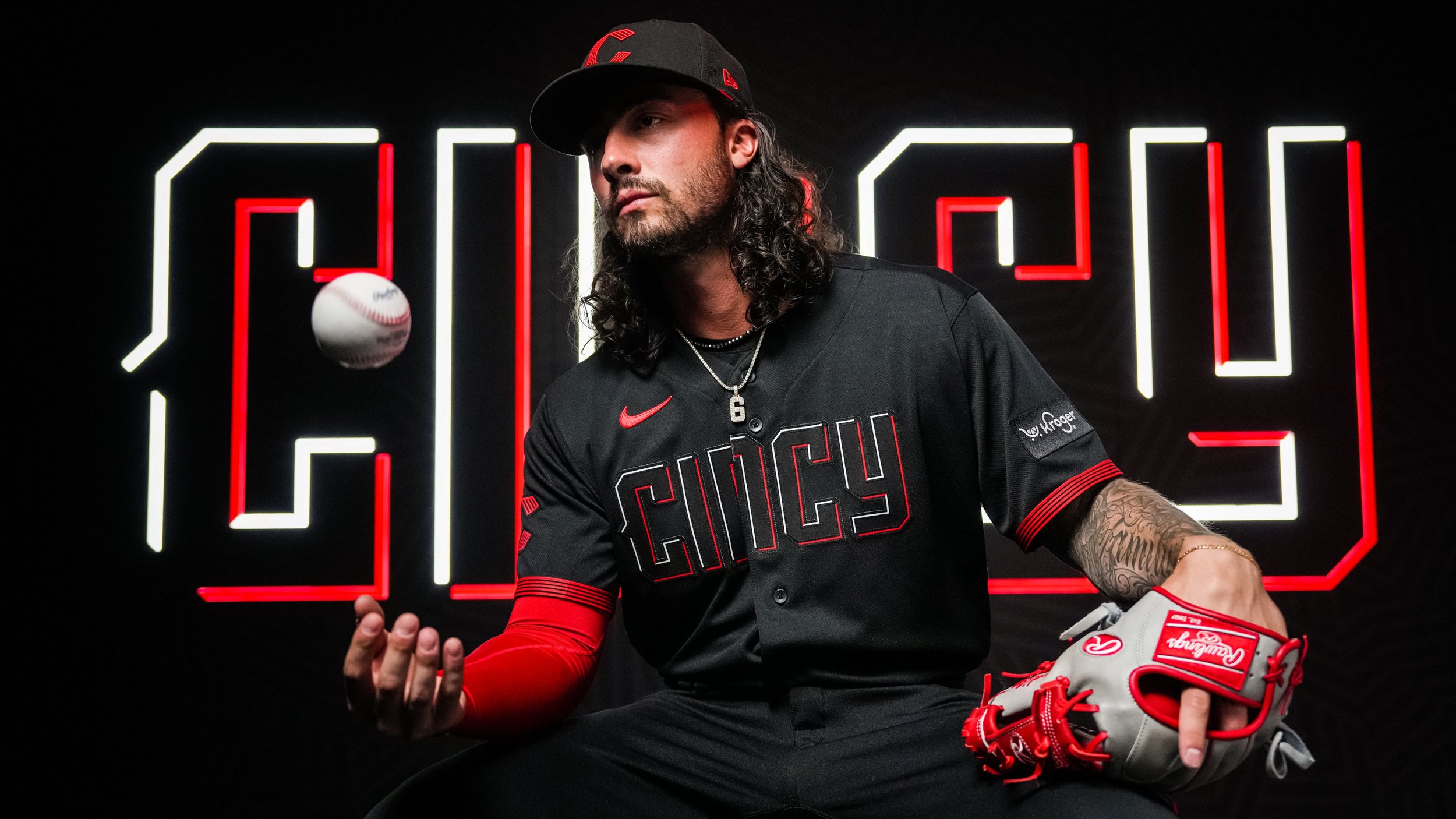
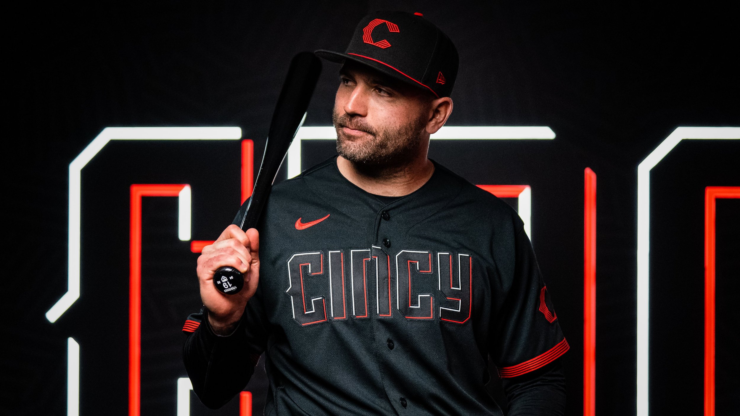
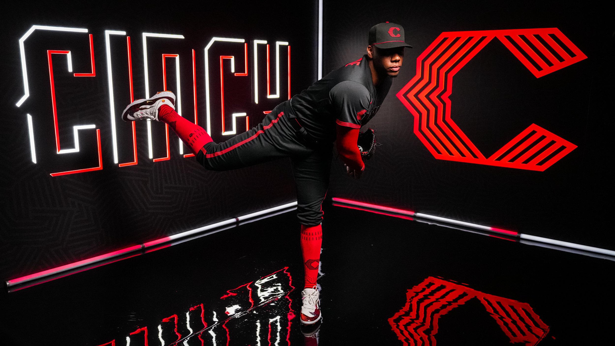
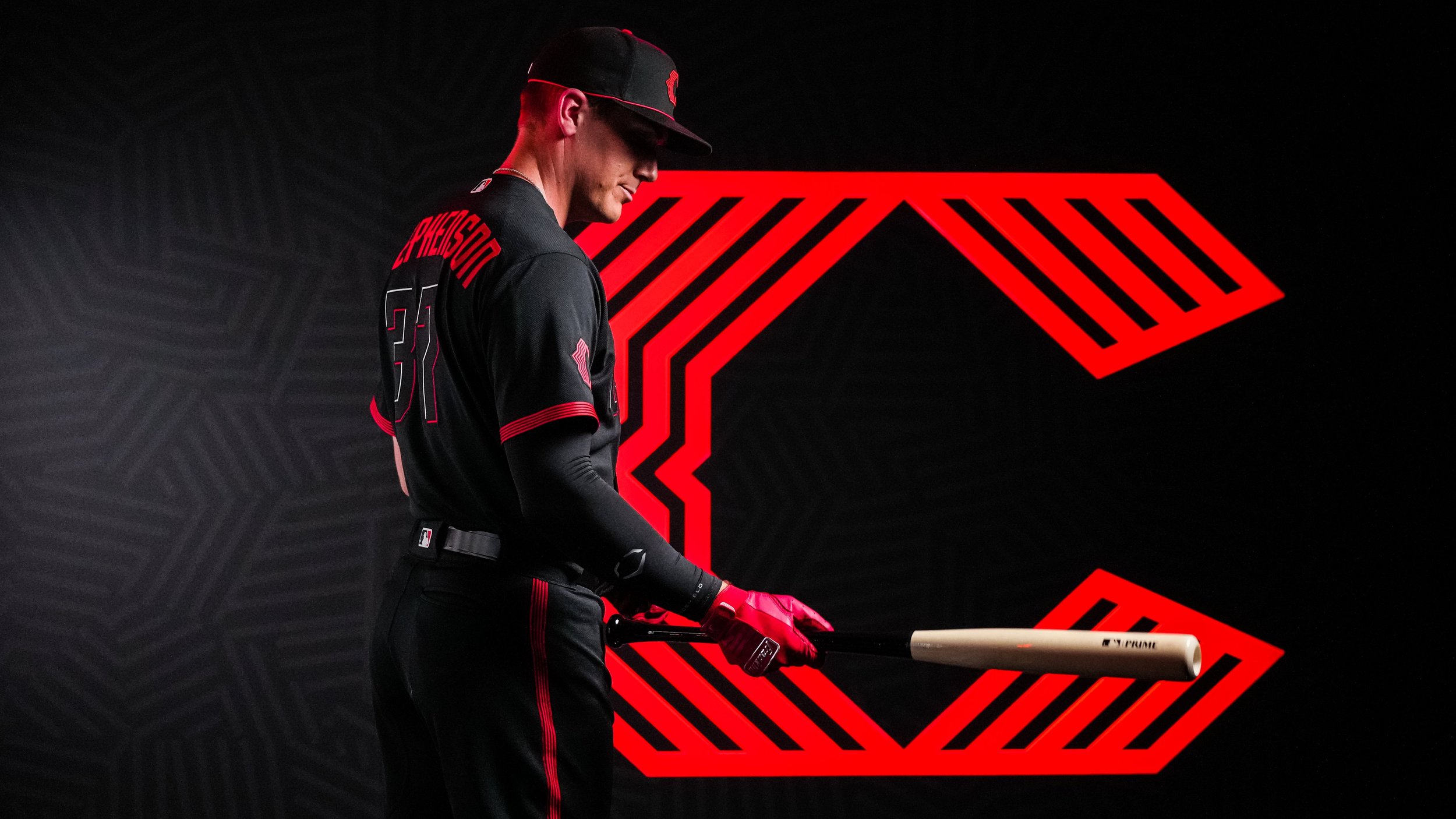
As the oldest professional franchise in baseball with a rich history spanning 154 years, the Cincinnati Reds have always celebrated their past. However, when it came to designing their City Connect uniforms in collaboration with Nike, the team decided to break away from tradition and embrace a futuristic aesthetic. The unveiling of the final design took place on Saturday, showcasing an all-black uniform with "Cincy" boldly emblazoned across the chest in a vibrant red and white font, giving it an infrared-style appearance. The purpose behind this bold departure from their previous uniforms was to appeal to a younger generation of fans.
The Reds' City Connect uniforms will make their debut during the series opener against the Yankees on Friday, and they will continue to be worn for all Friday home games throughout the remainder of the 2023 season. Ralph Mitchell, the club's vice president of communications and marketing, explained the inspiration behind the design choice: "We see Cincinnati as this vibrant, energetic city. It’s a cutting-edge city. We draw parallels from that to our current roster. We’re an energetic, young team. There’s a parallel path between the city and its evolution and the team and its evolution."
While the Reds have always cherished their history, they already took a nostalgic look back at their past uniform templates during their 150th anniversary season in 2019, where they sported multiple throwback uniforms. However, with the introduction of the MLB and Nike's City Connect program in 2021, the Reds aimed to create a forward-thinking look that would attract a new audience while still resonating with their existing fan base.
The Reds' City Connect uniform incorporates various key elements to create a cohesive and modern look. The black caps feature a contemporary 'C' logo in red, paying homage to the team's 1919-era caps from the Field of Dreams game in Iowa. The same logo also appears on the sleeve. The batting helmets mirror the caps' design with a sleek matte black finish.
The jersey lettering is designed to resemble illuminated neon lights, incorporating flashes of "infrared" red color. The pants feature five "wavelength lines" along the sides, symbolizing progress and lighting the way to the future. Nike explains that this contemporary piping represents moving forward and what lies ahead.
Inside the jersey's collar, the team proudly displays the city's Latin motto, "Juncta Juvant," which translates to "Strength in unity." Additionally, a modernized buckeye leaf, similar in style to the lettering and logos, represents the state of Ohio.
Forgus highlighted the vibrant red color used in the uniform, stating, "That color of red, if you look at it against our standard red, it’s much hotter. You needed it to come across as more luminescent."
Before the official unveiling, a select group of Reds players had the opportunity to preview their new uniforms during a top-secret photo shoot held at Goodyear Ballpark in Goodyear, Arizona, during Spring Training. Reds starting pitcher Hunter Greene expressed his excitement, stating, "The black and red is really cool. It will be cool to have black uniforms... The fact that they went all black is perfect."
By joining the City Connect program, the Reds become the 18th team to reveal their unique uniforms
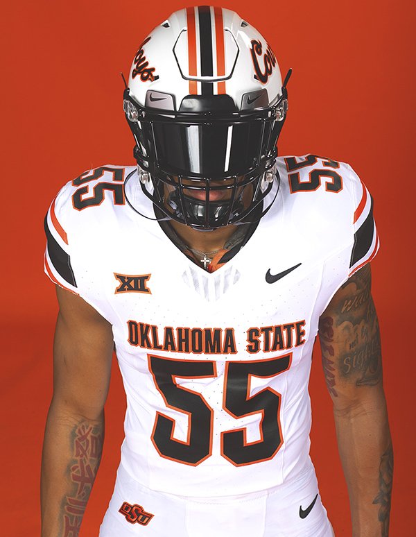
Oklahoma State University's football program has long been recognized for its rich traditions, passionate fanbase, and competitive spirit. As the Cowboys gear up for the upcoming season, they are set to make a bold statement both on and off the field with their new Nike-designed football uniforms. These state-of-the-art uniforms seamlessly blend the program's storied history, the present era, and a glimpse into the future. Let's dive into the details and explore how the new Oklahoma State football uniforms are pushing the boundaries of design and technology.
Nike, known for its innovation in sports apparel, has taken the uniform design to the next level. The uniforms feature cutting-edge materials and construction techniques that enhance performance and comfort for the athletes. Utilizing the latest advancements in textile engineering, the jerseys are constructed with a lightweight, breathable, and durable fabric that wicks away moisture, allowing the players to perform at their best even in intense game situations.
The new uniforms pay homage to the iconic Cowboy look that fans have come to love over the years. Drawing inspiration from Oklahoma State's classic orange and black color scheme, the uniforms incorporate modern design elements that give them a fresh and dynamic feel. The traditional stripes on the shoulders have been refined and streamlined, maintaining the essence of the past while embracing the future. While honoring tradition is vital, the new uniforms also incorporate modern aesthetics that appeal to today's athletes and fans. The sleek and streamlined design exudes a sense of speed, power, and agility, reflecting the dynamic playing style of the Cowboys. Bold typography and typography treatments on the jerseys and helmets give the team a distinctive and unified look.
The new Oklahoma State football uniforms represent more than just a change in appearance; they symbolize the program's commitment to tradition, innovation, and sustainability. Nike's meticulous design process has successfully weaved together the past, present, and future, creating uniforms that captivate the imagination of players, fans, and onlookers alike. As the Cowboys take to the field in these state-of-the-art uniforms, they will not only look the part but also feel empowered to make their mark on the college football landscape.
— Tennessee Track & Field (@Vol_Track) May 8, 2023
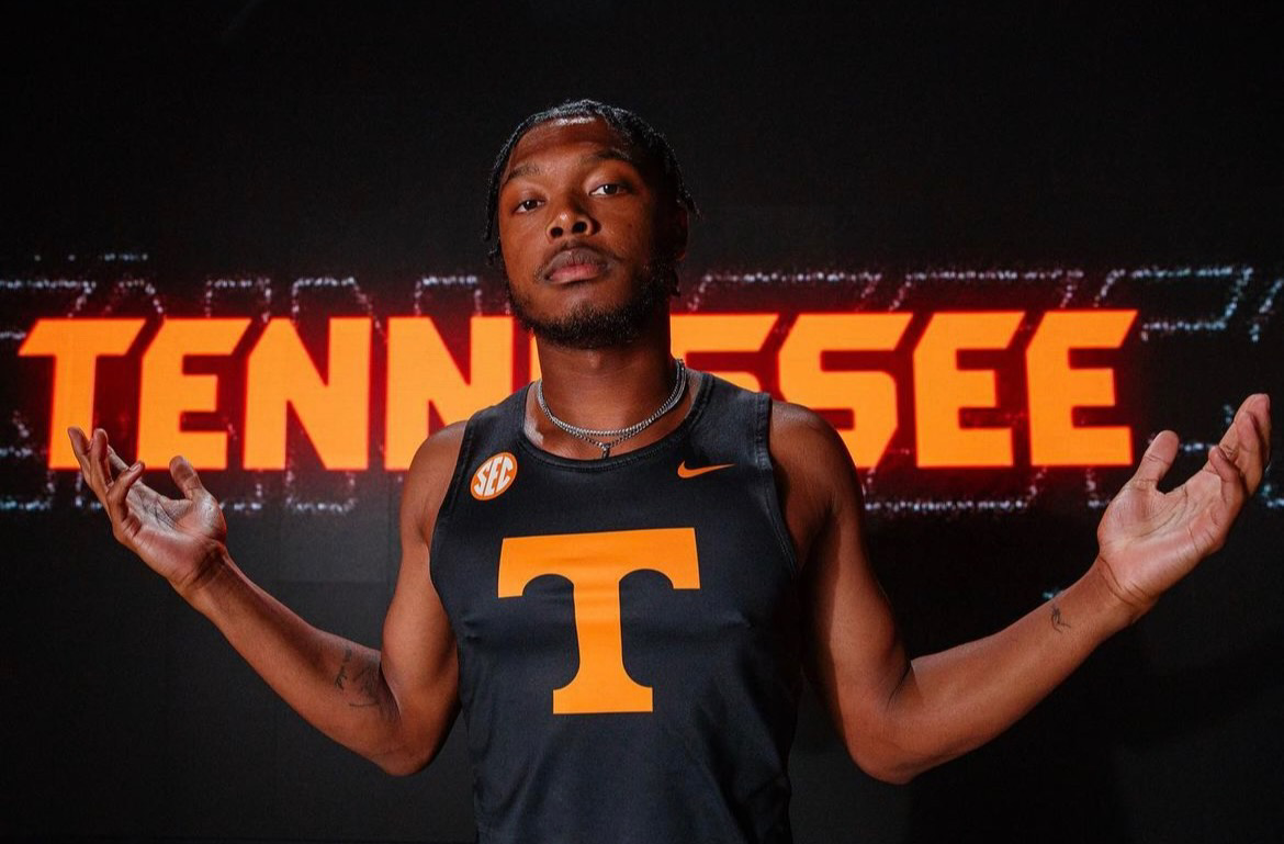
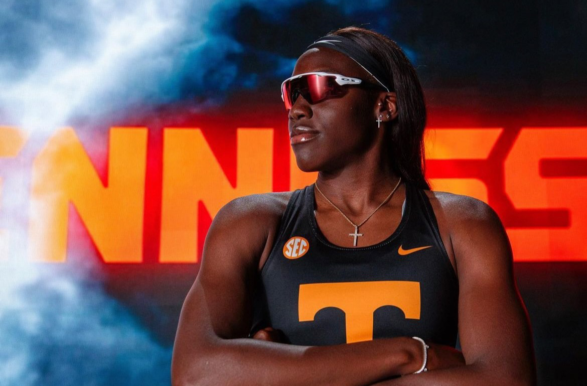
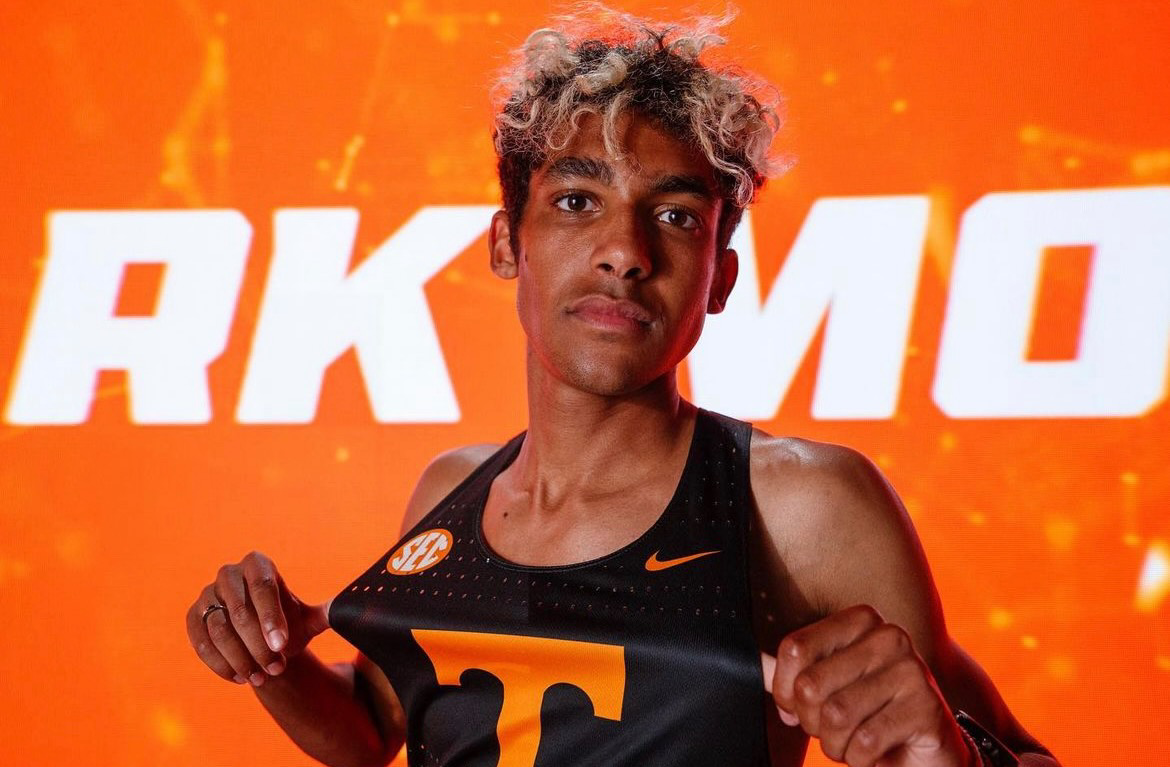
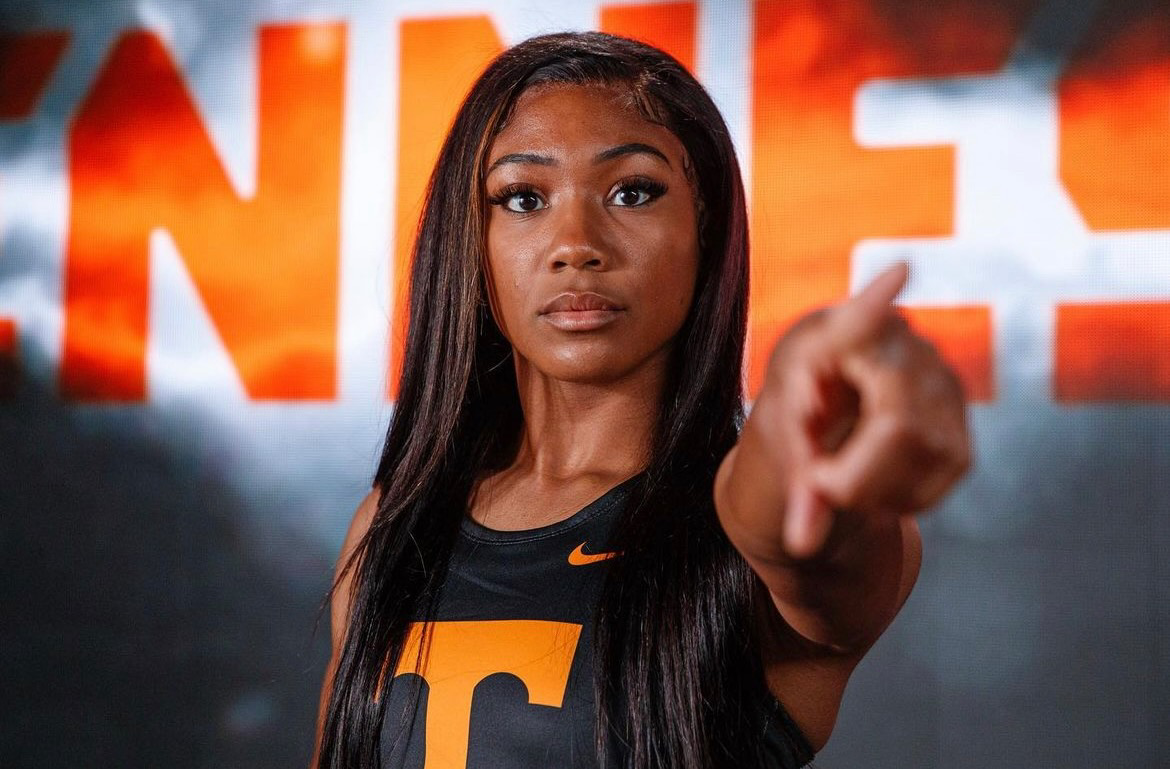
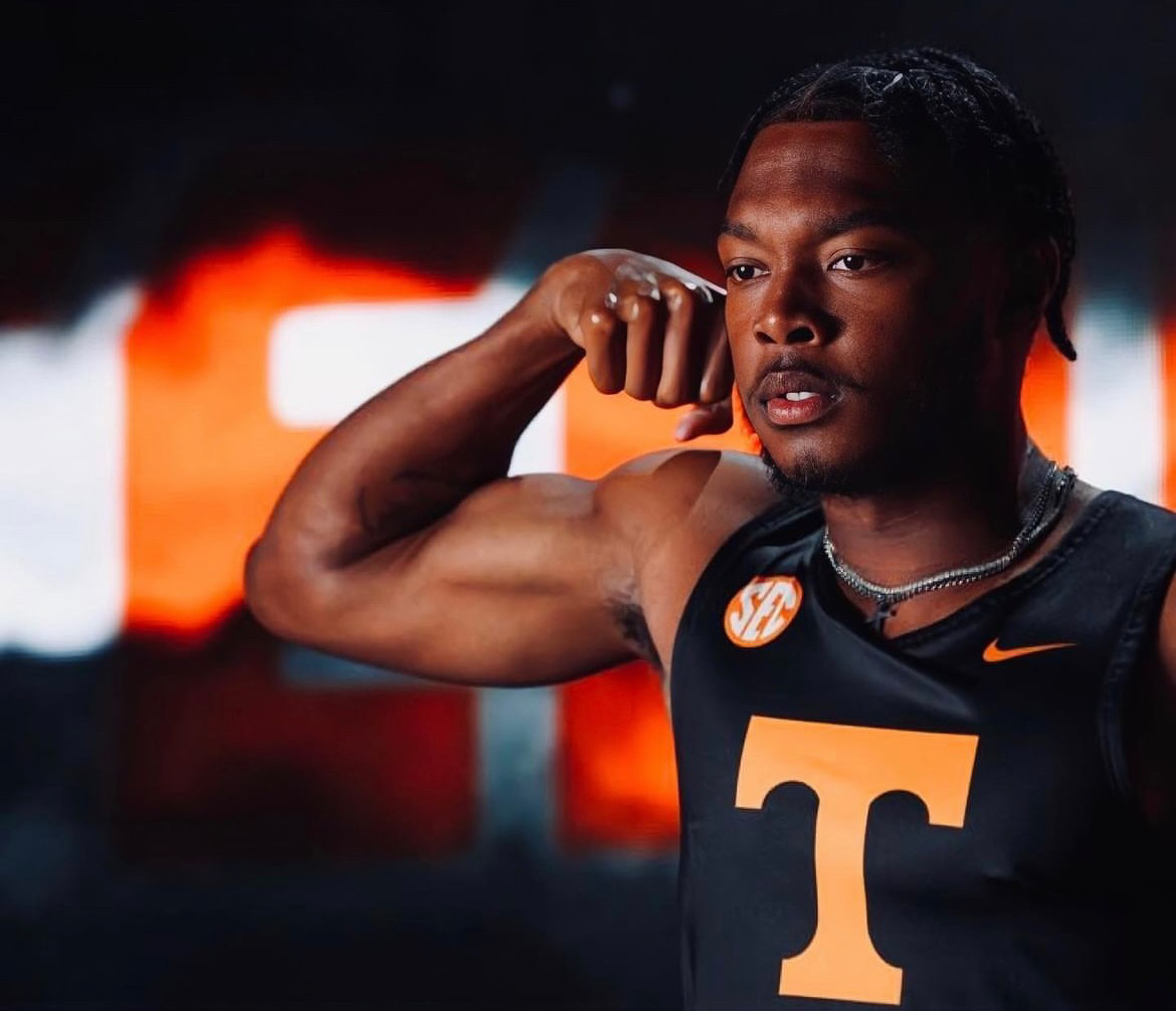
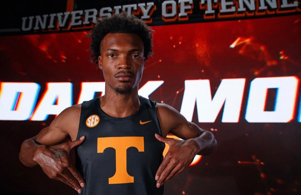
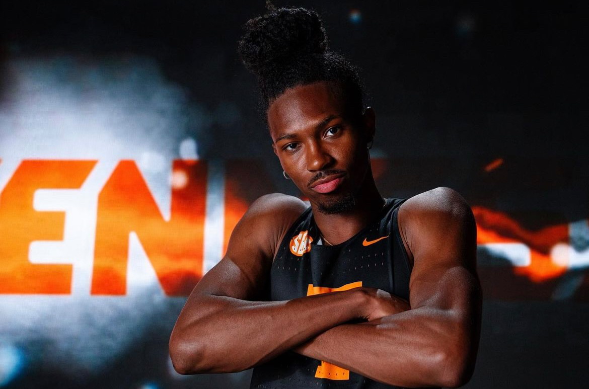
The University of Tennessee's Track and field team has recently unveiled their new black uniforms.
The Track and Field is the latest volunteer team to break out the dark mode threads. The black tops feature the Tennessee Power T in orange, front and center, with orange nike check and sec logo. Black shorts with orange nike swoosh will complete the Dark mode threads for the volunteers.
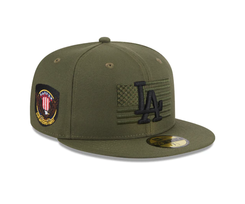
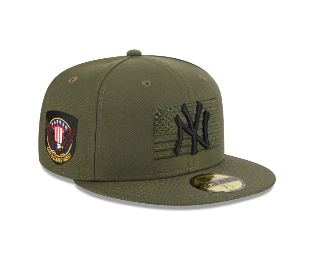
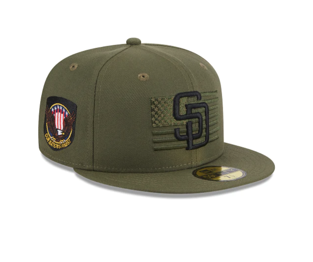
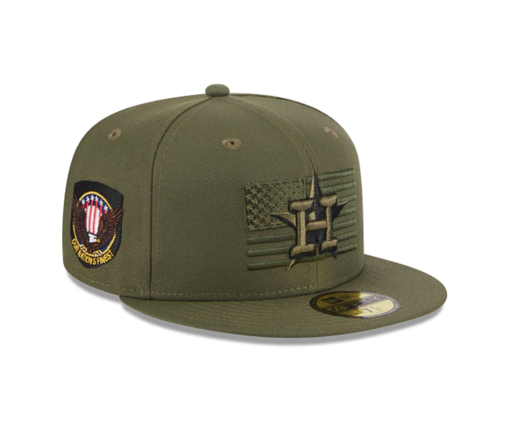
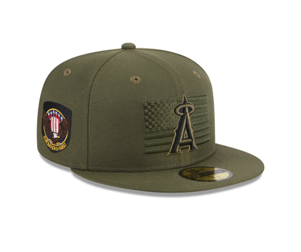
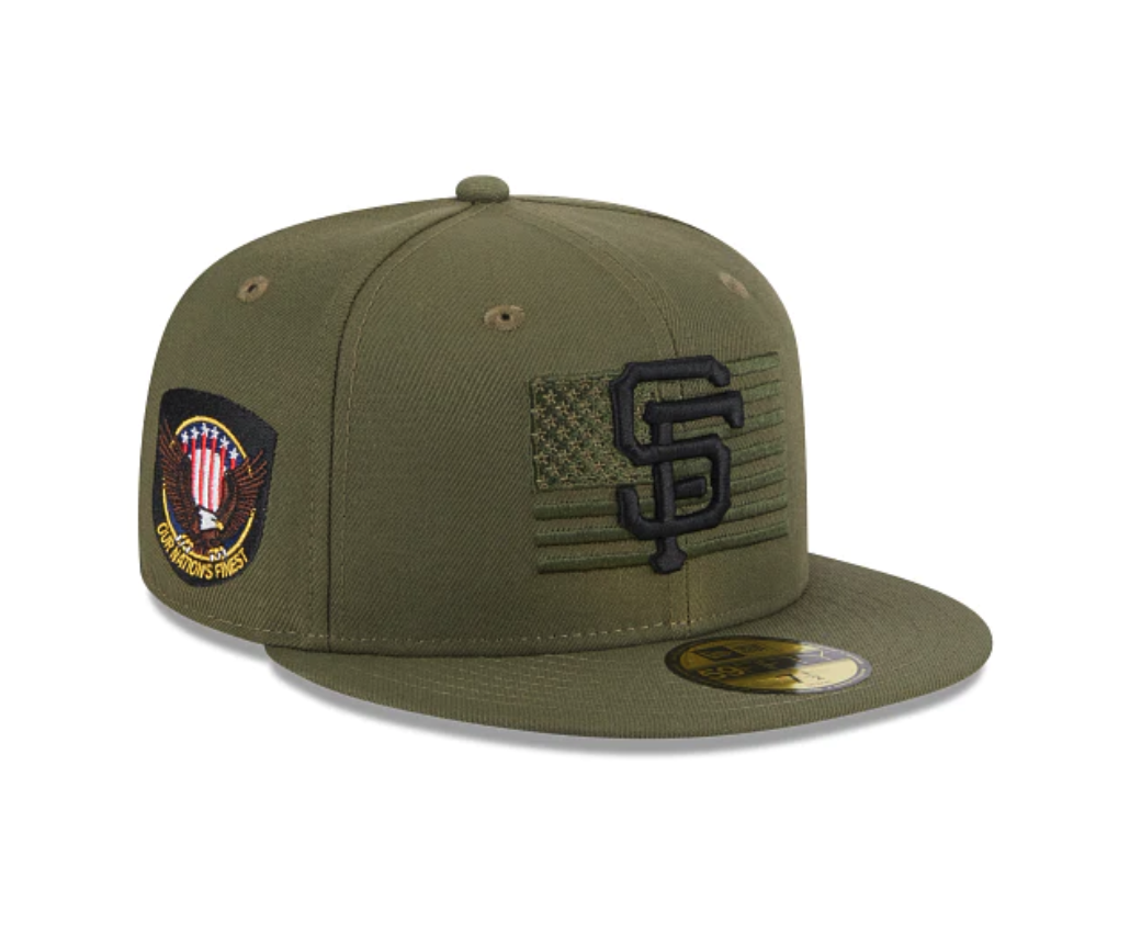
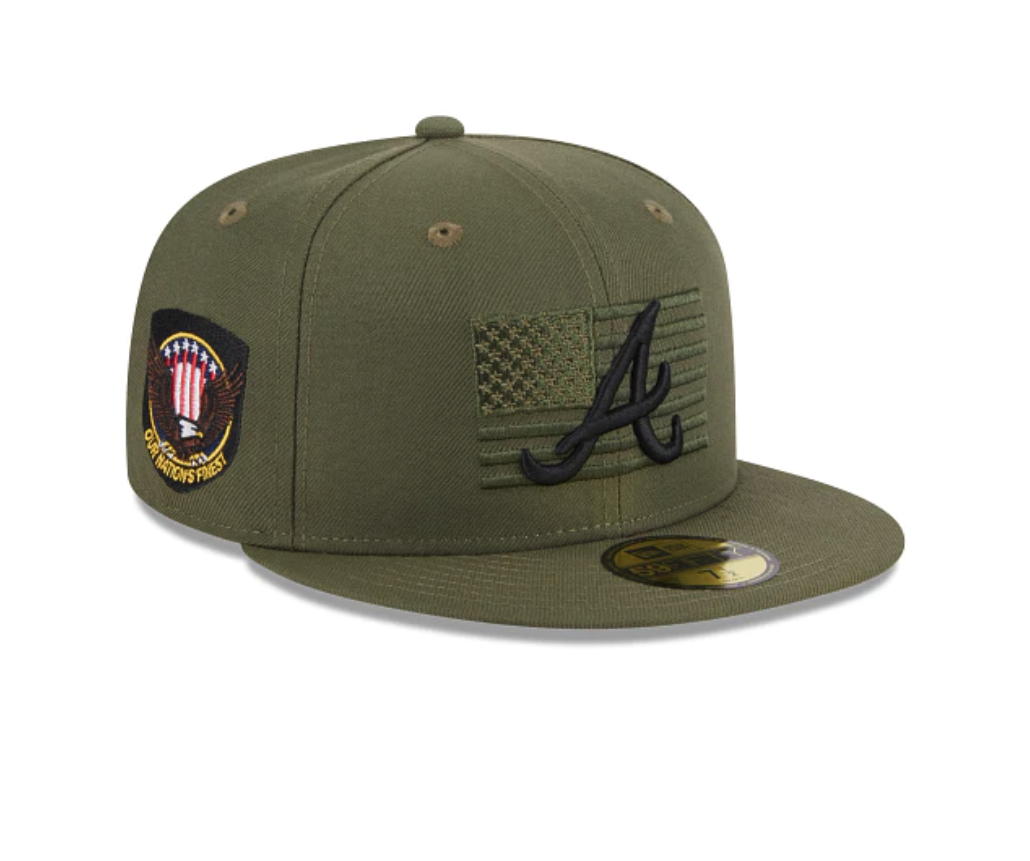
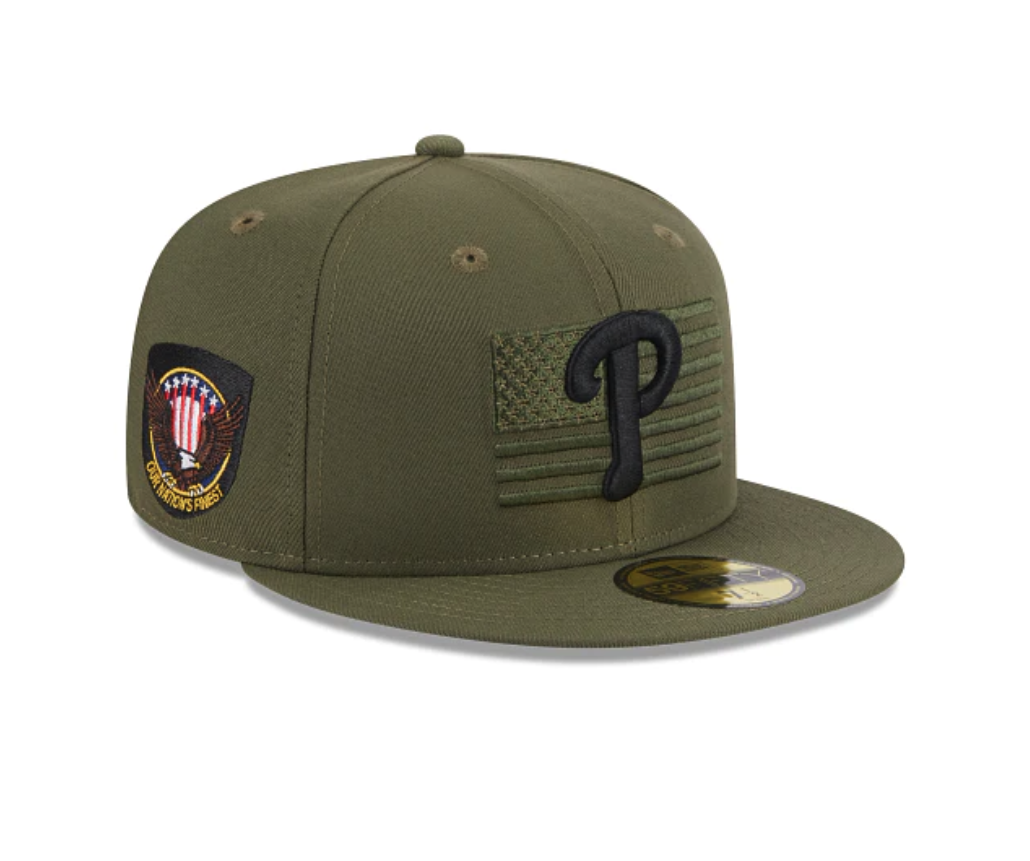
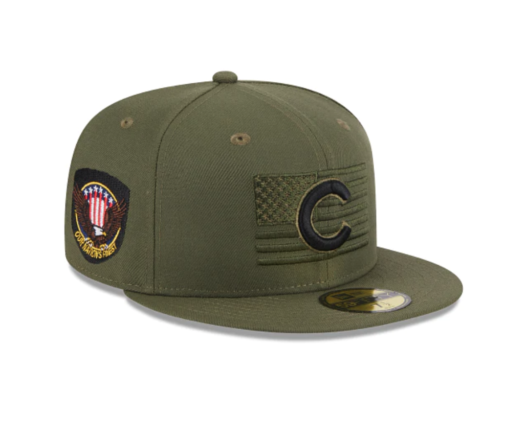
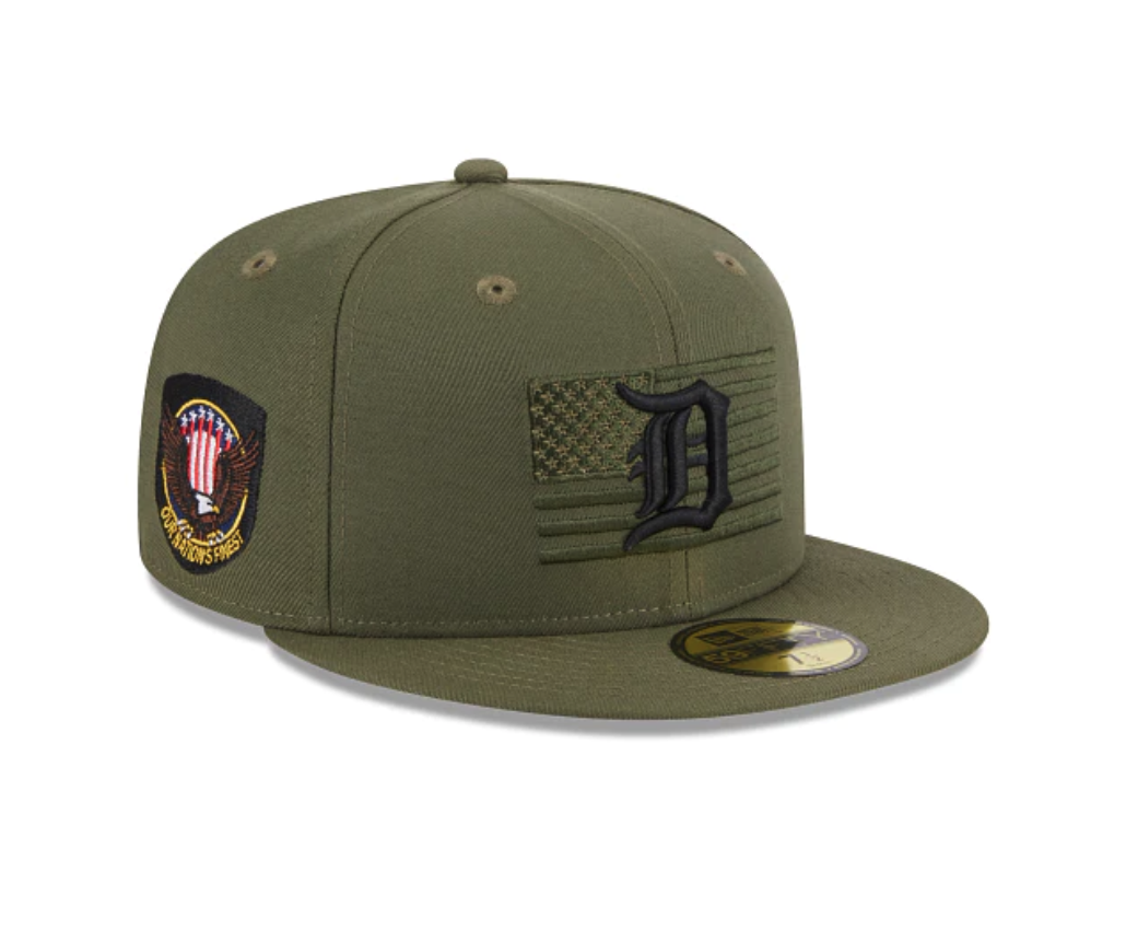
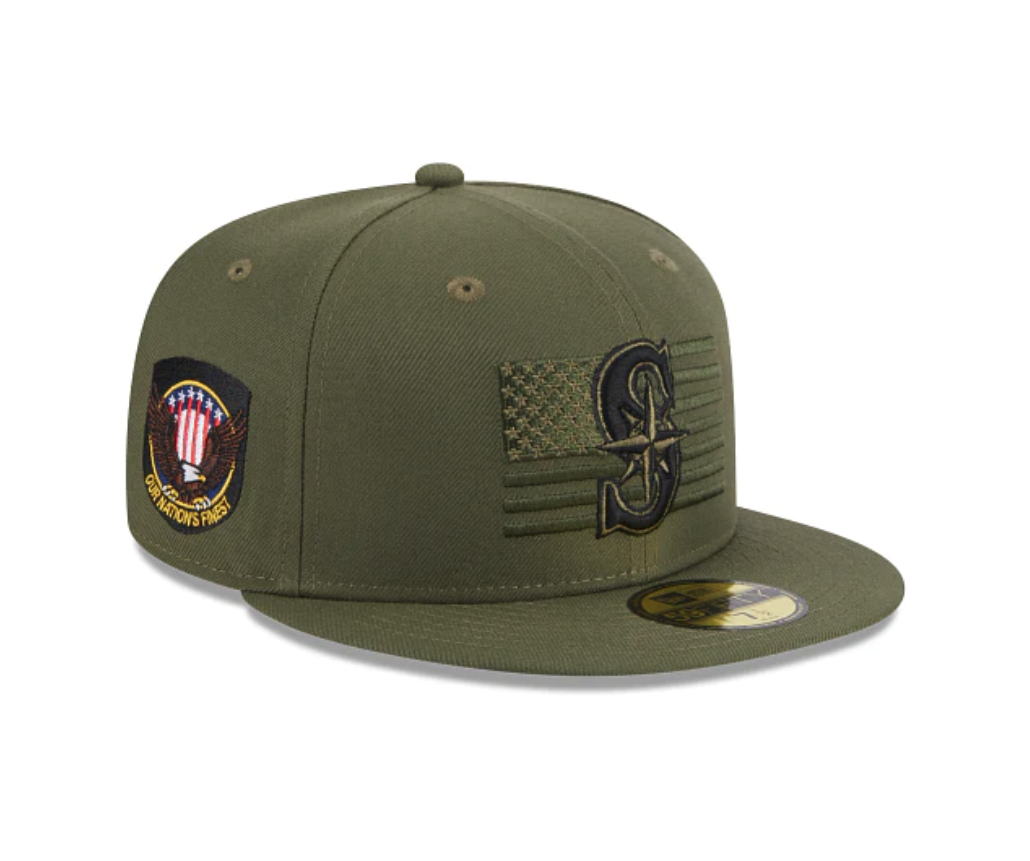
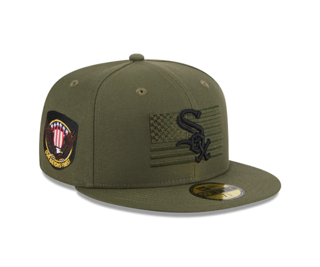
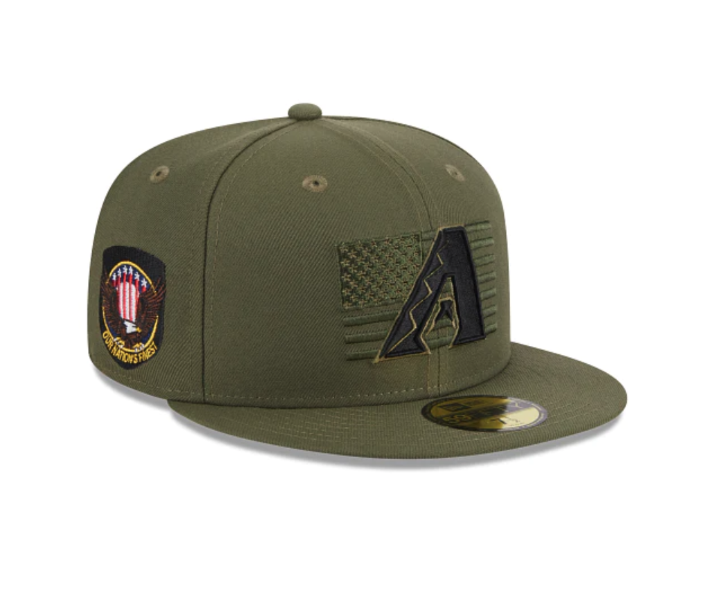
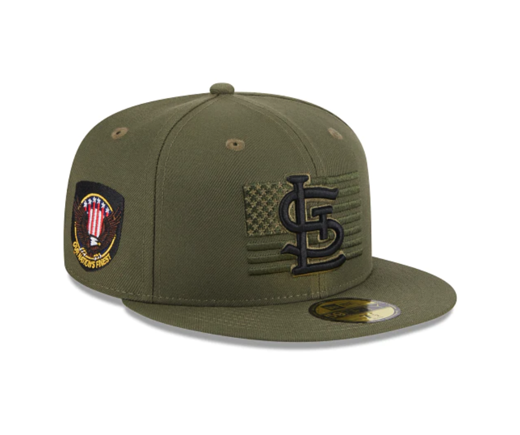
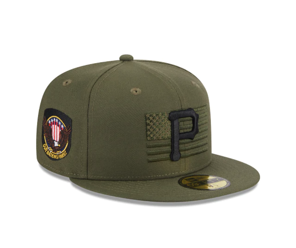
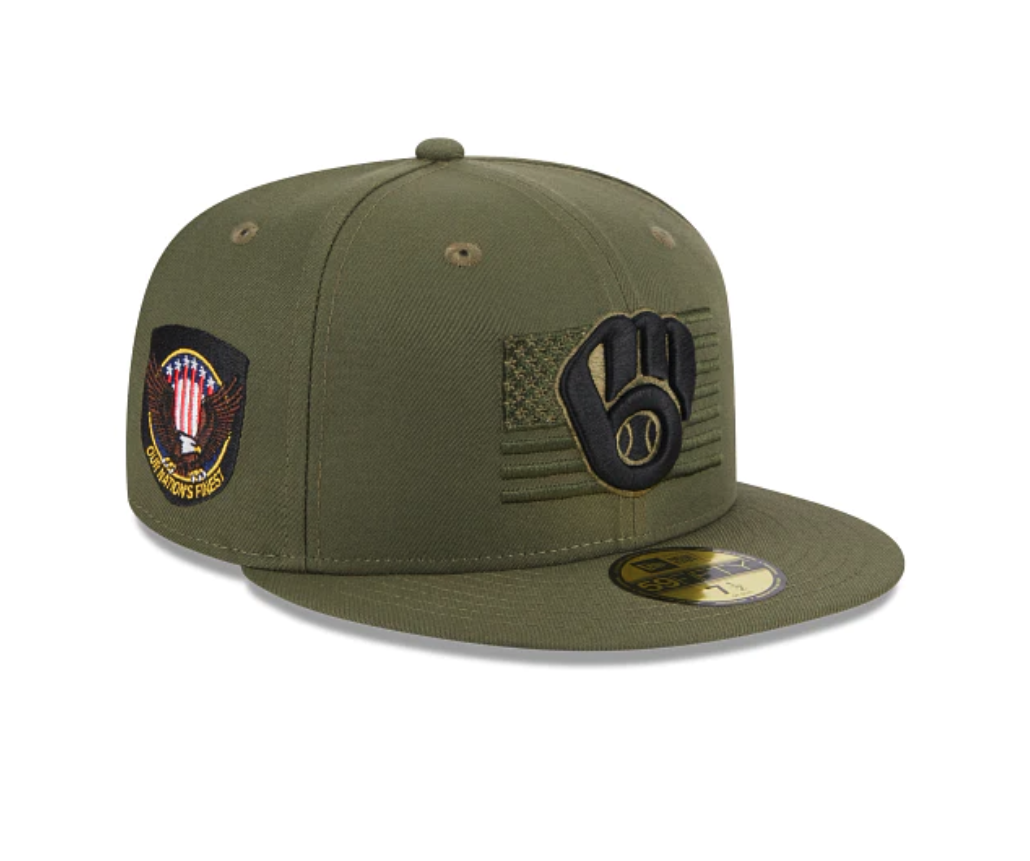
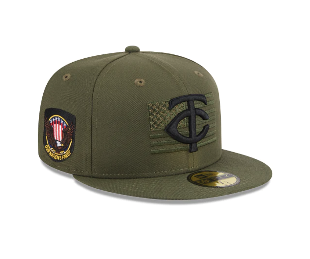
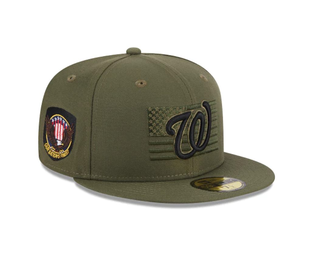
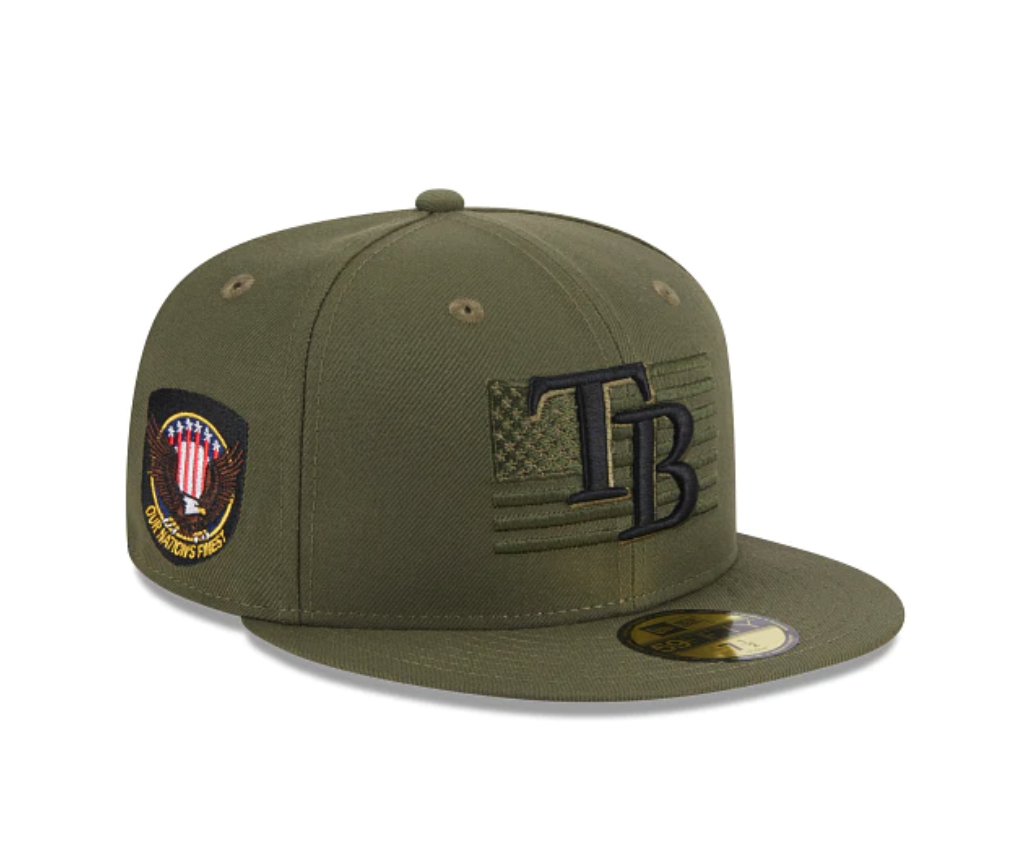
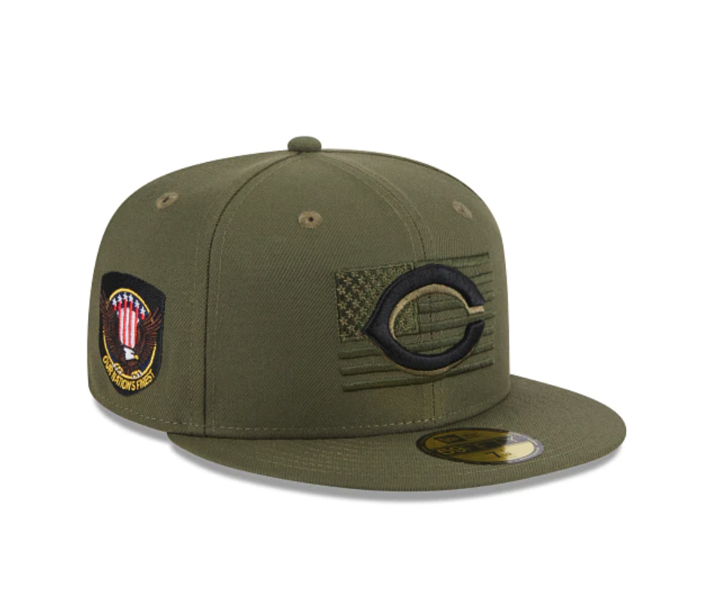
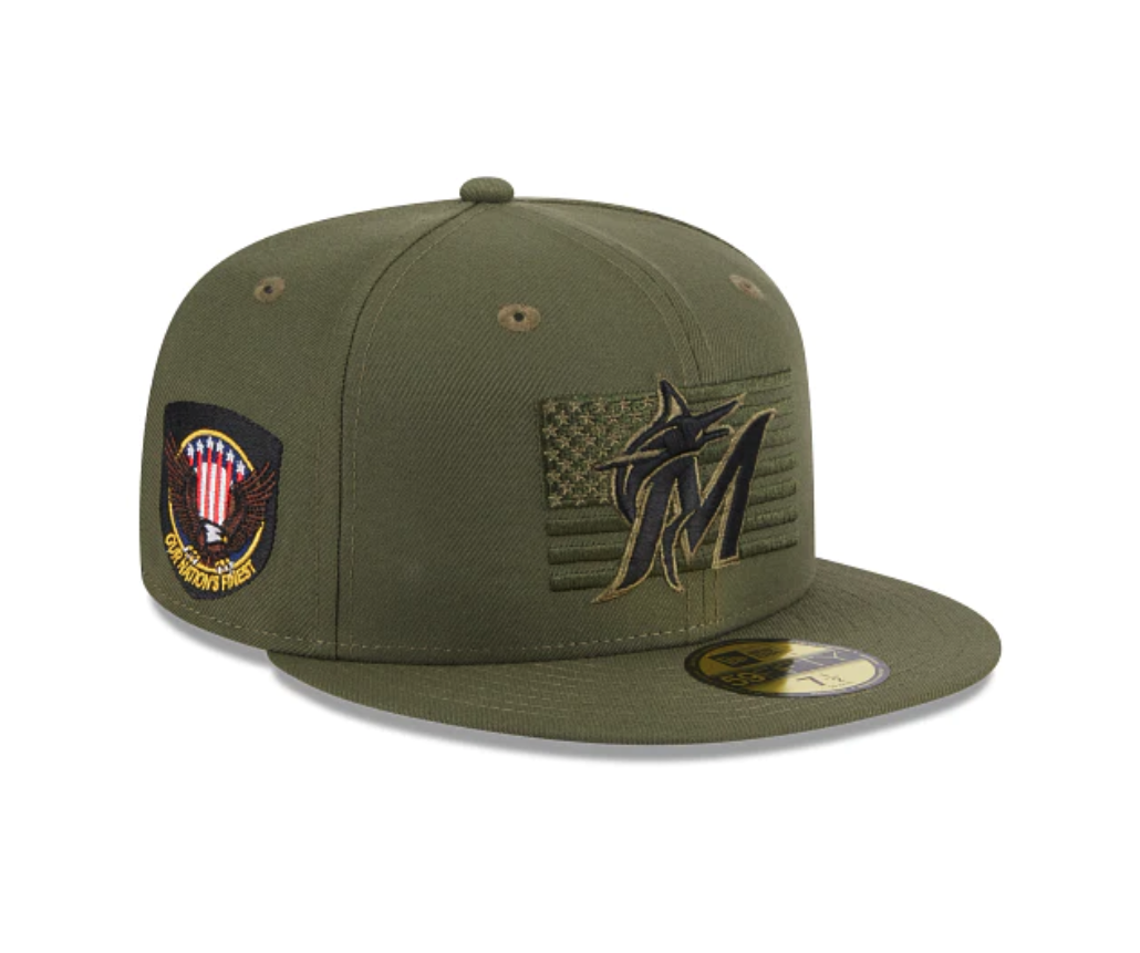
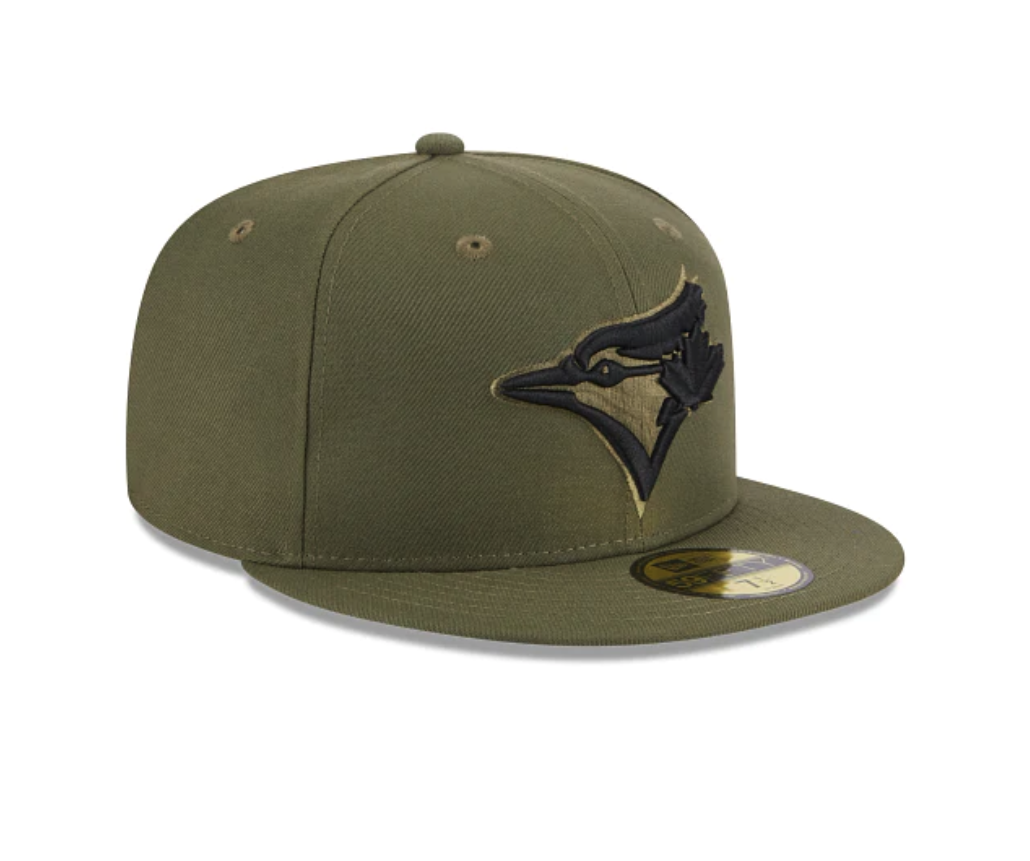
The 2023 MLB Armed Forces Day Hats have been official revealed. This year's hats are designed to honor the brave men and women who serve our country and keep us safe. The official on-field cap of Armed Forces Weekend is the perfect way to show your appreciation for those who have sacrificed so much for our freedom.
The 2023 MLB Armed Forces Day Hats are designed with a patriotic flair that's sure to turn heads. Each hat features the American Flag on the front with the team’s logo overlayed. the right side of the hat features Our Nation's Finest patch.
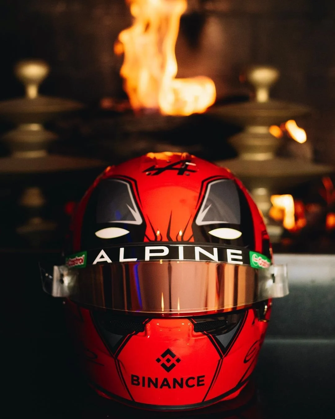
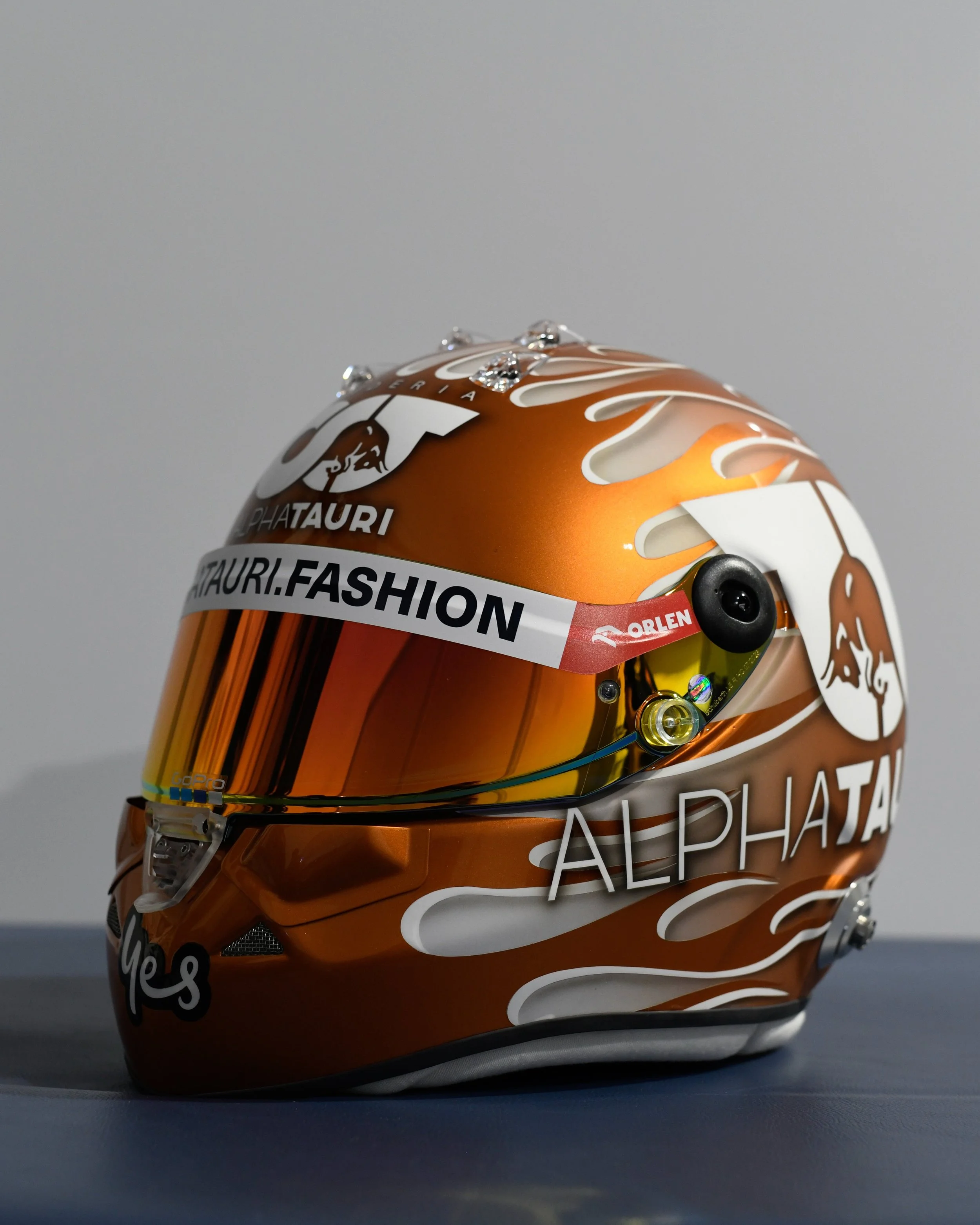
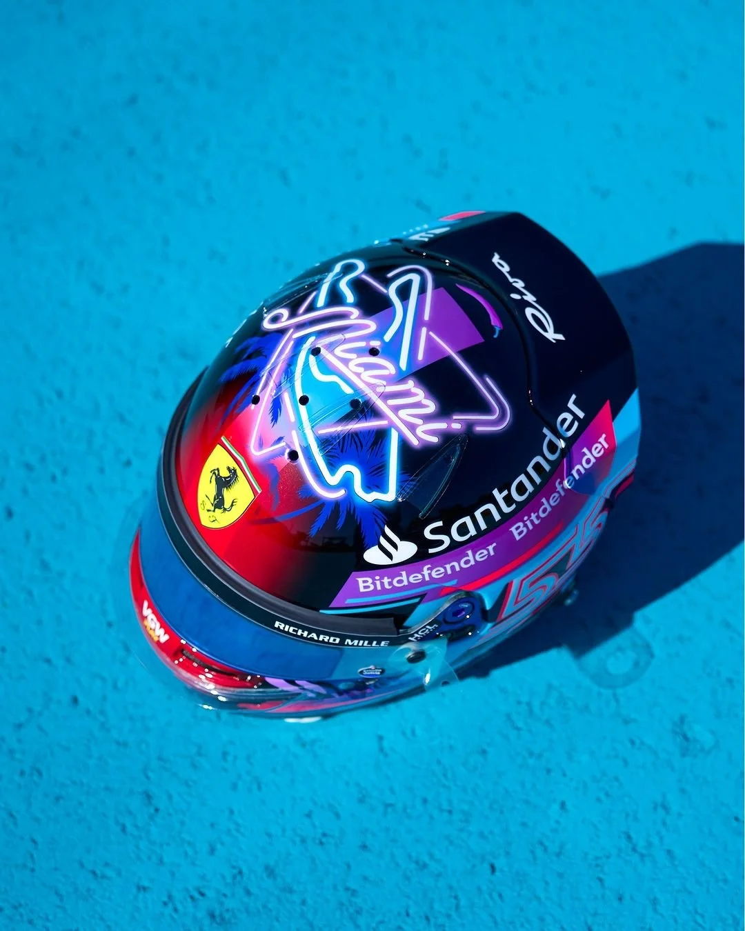
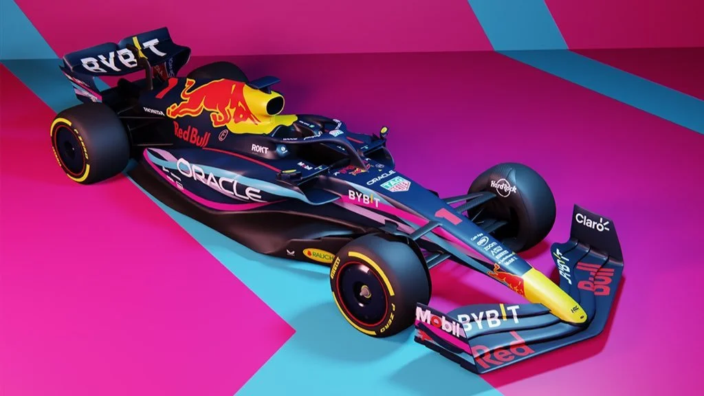
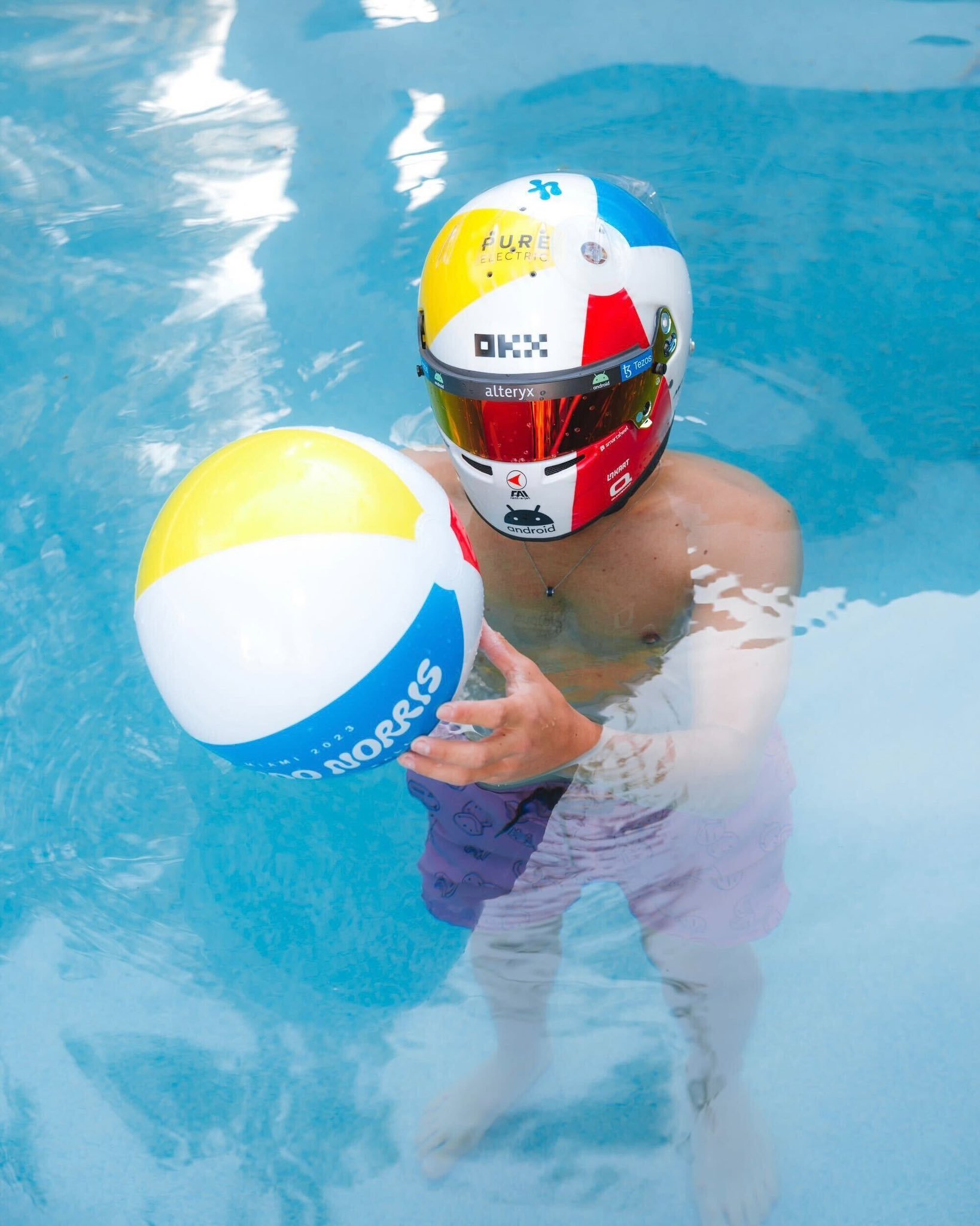
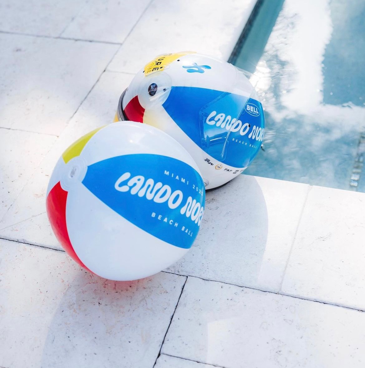
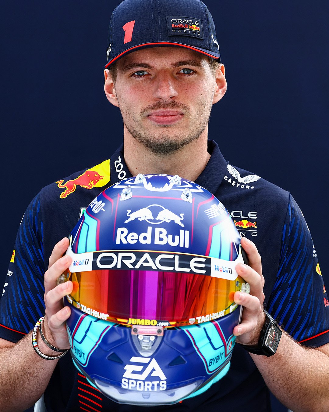
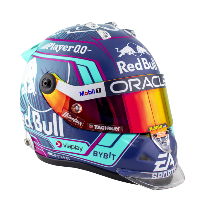
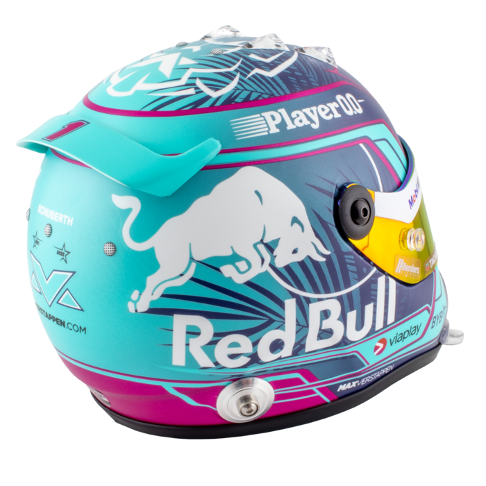
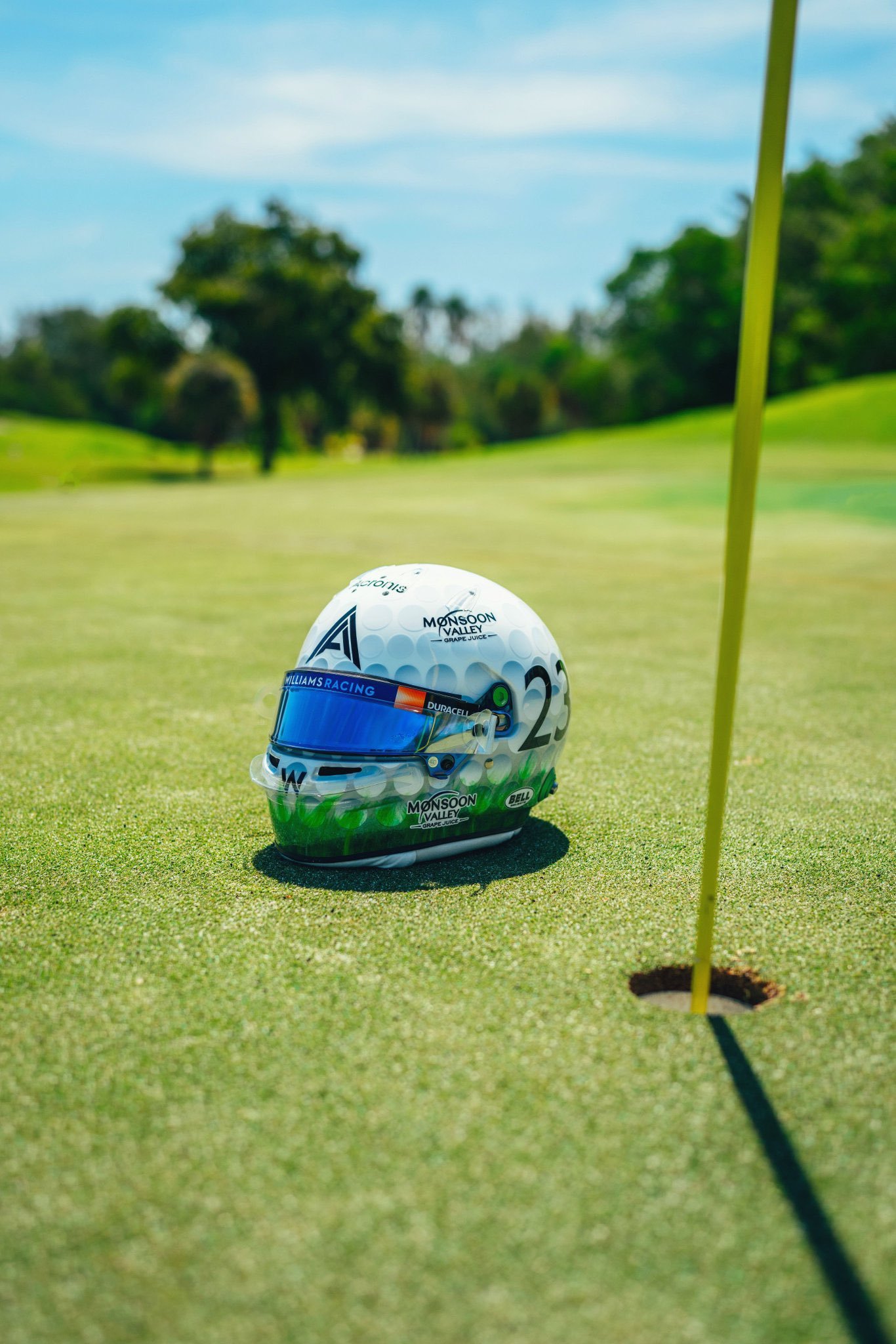
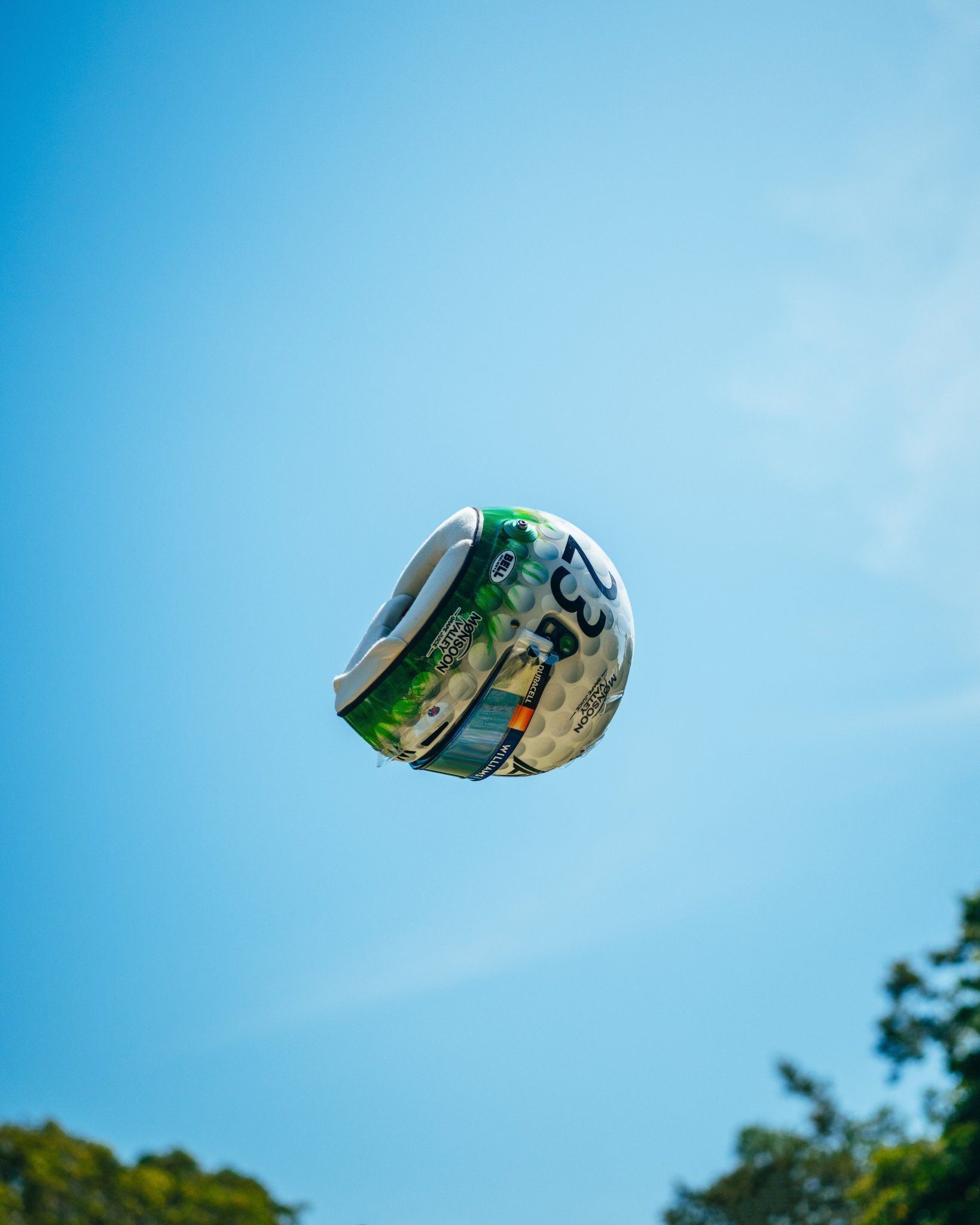
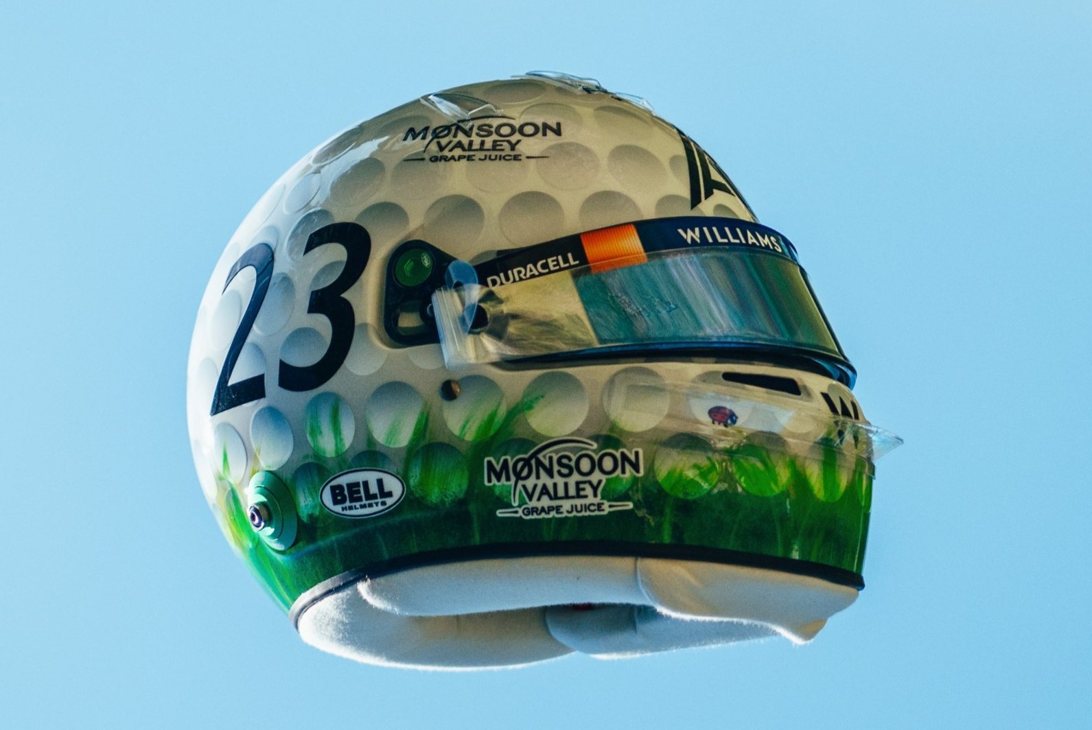
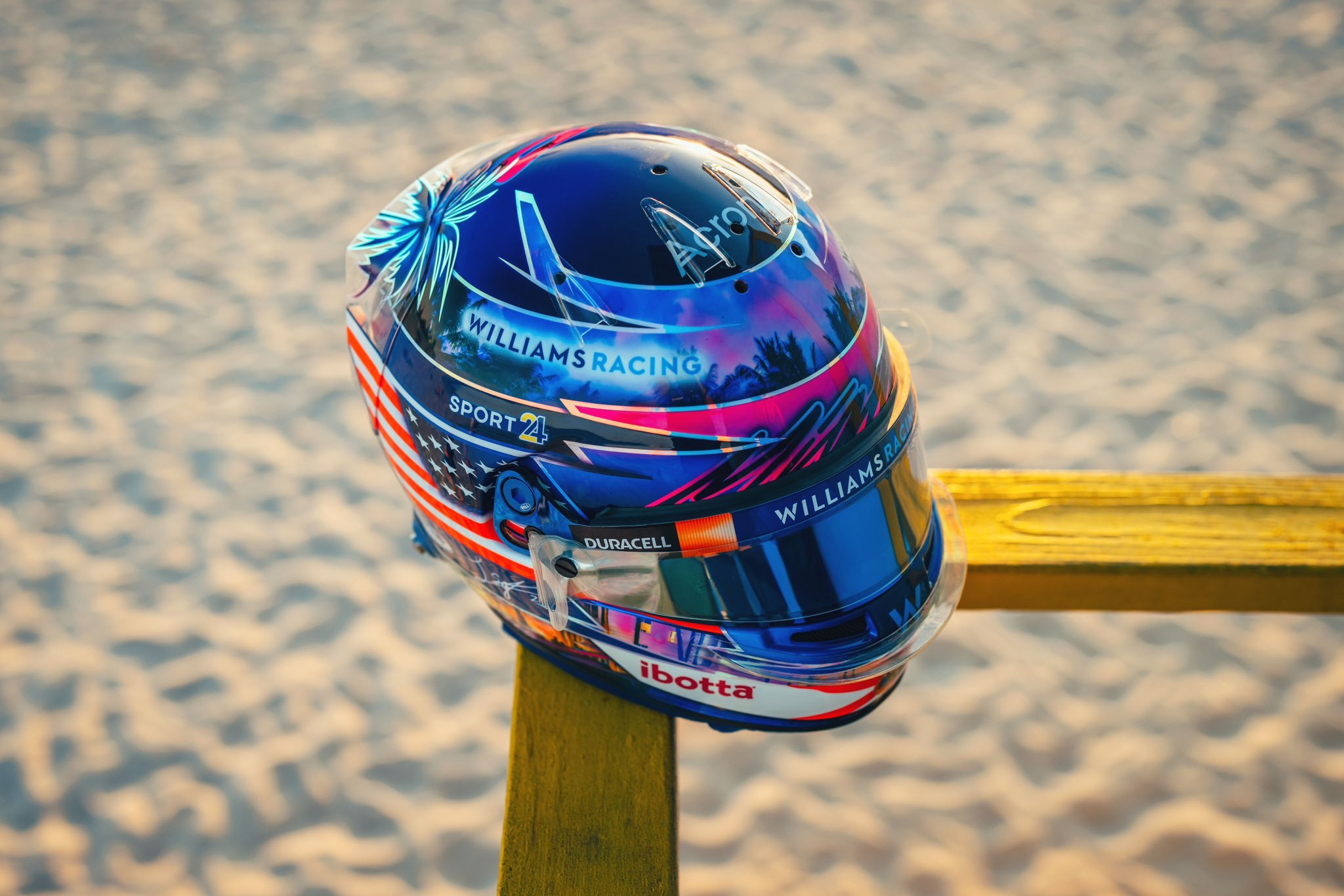
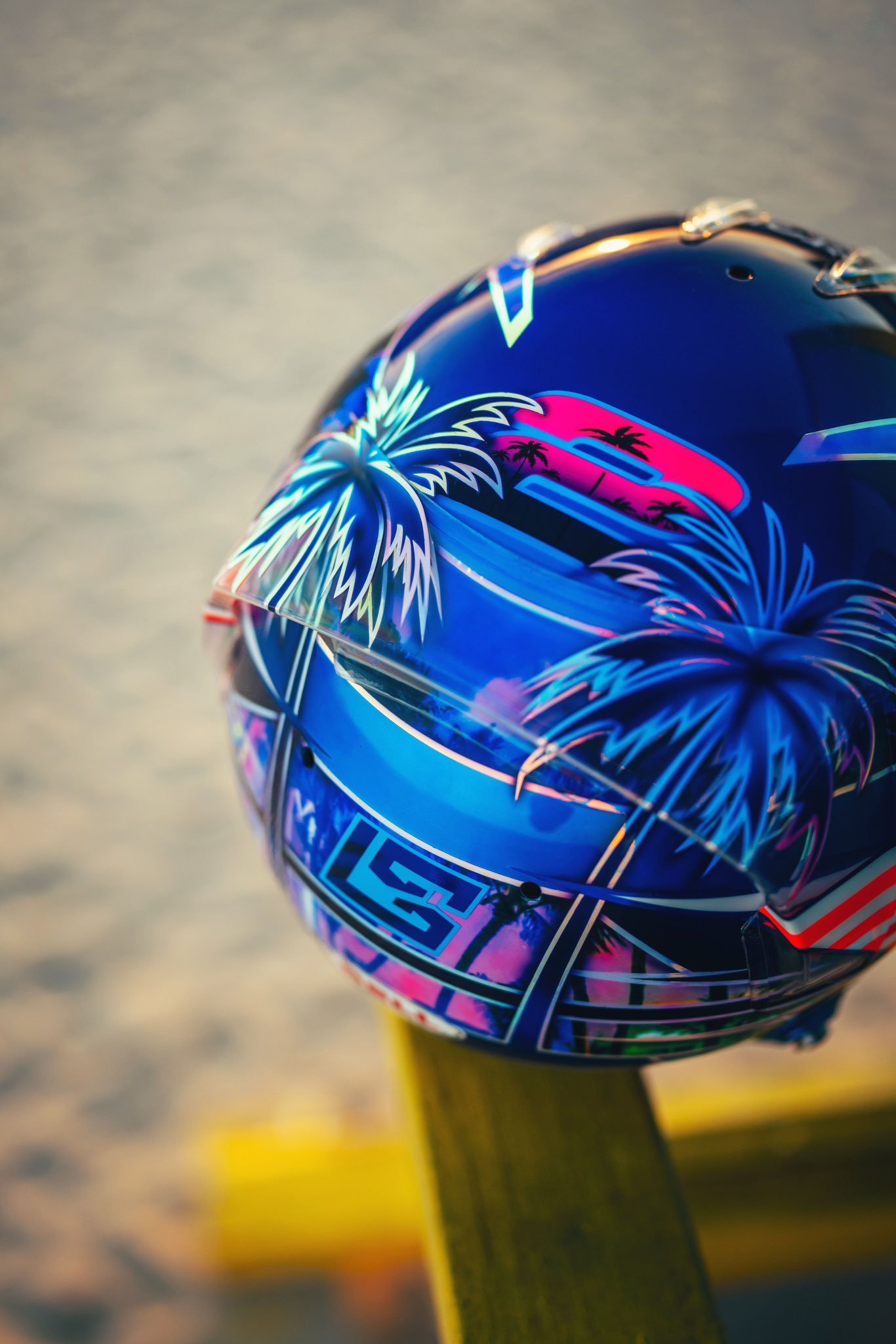
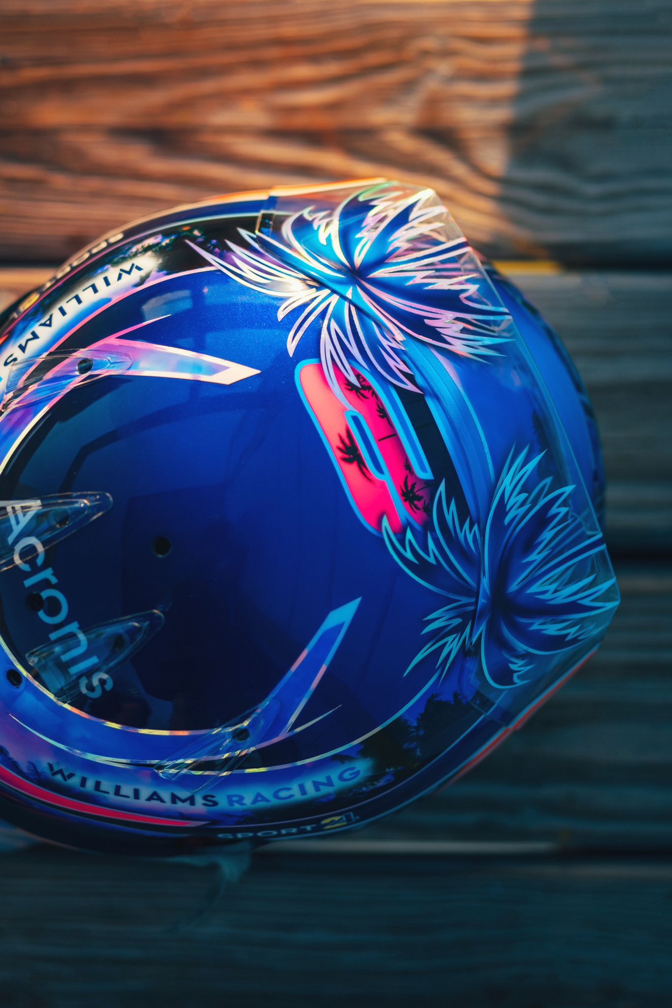
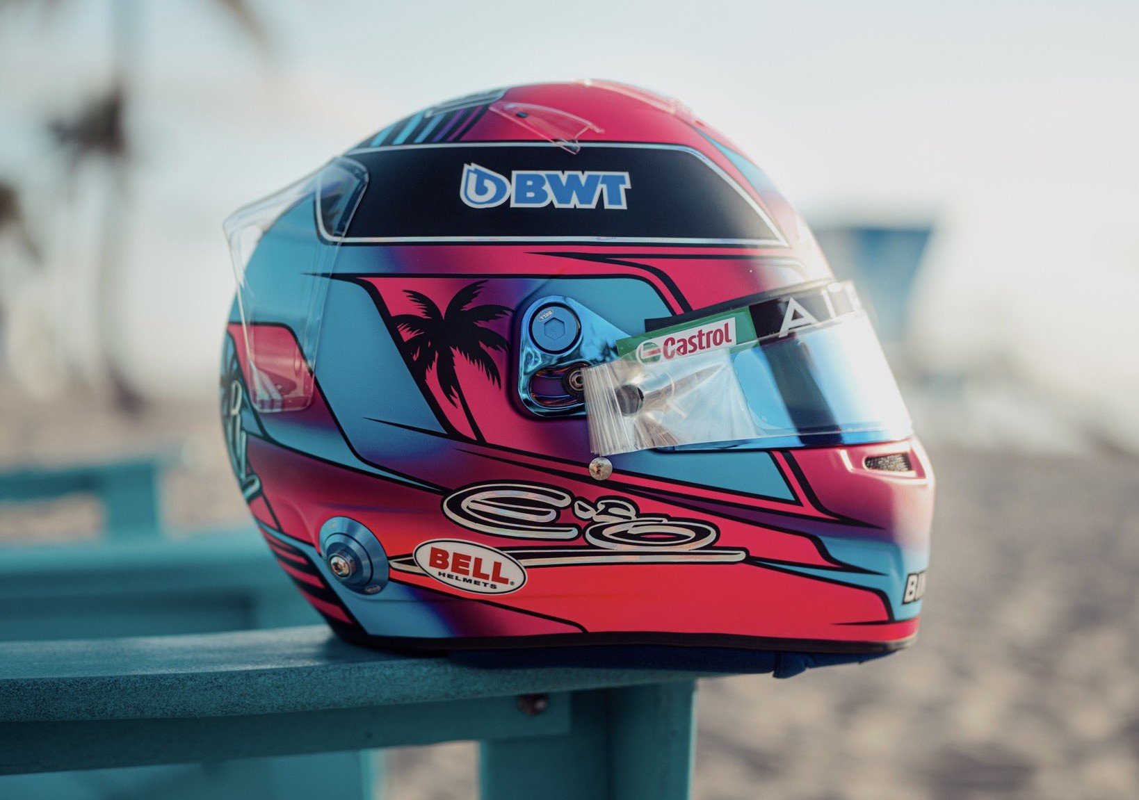
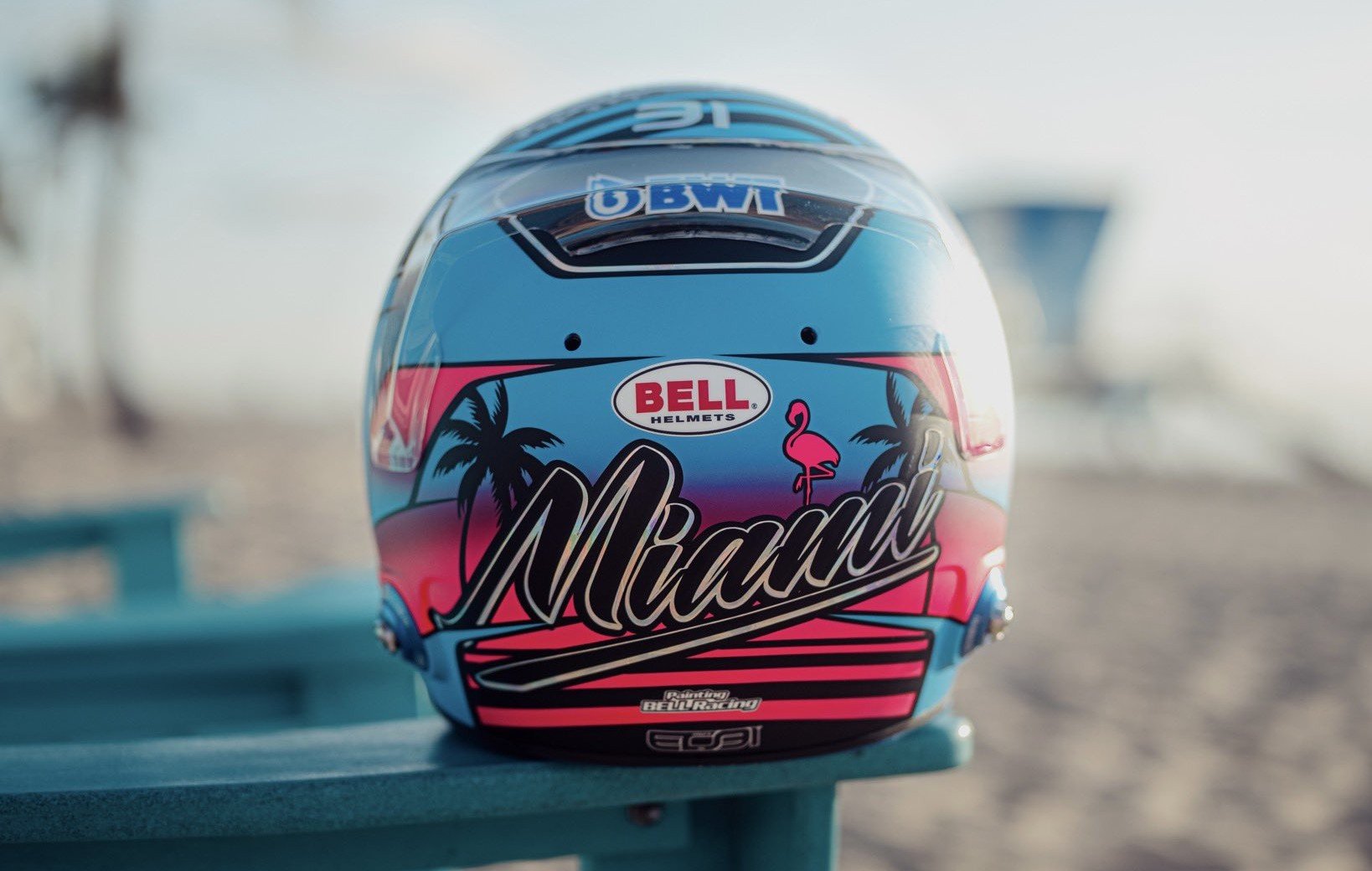
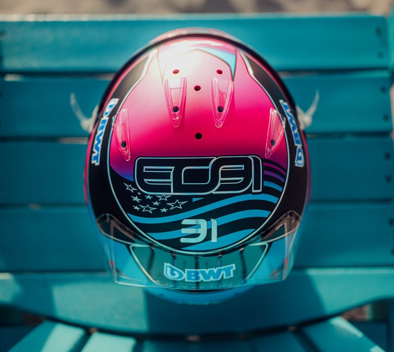
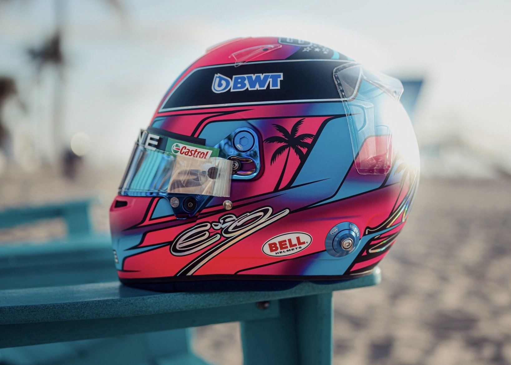
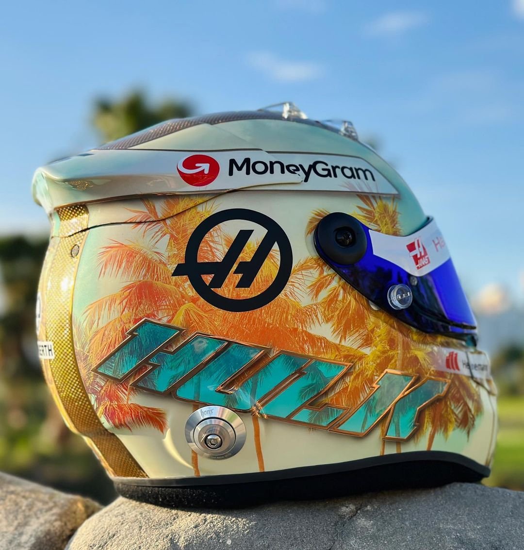
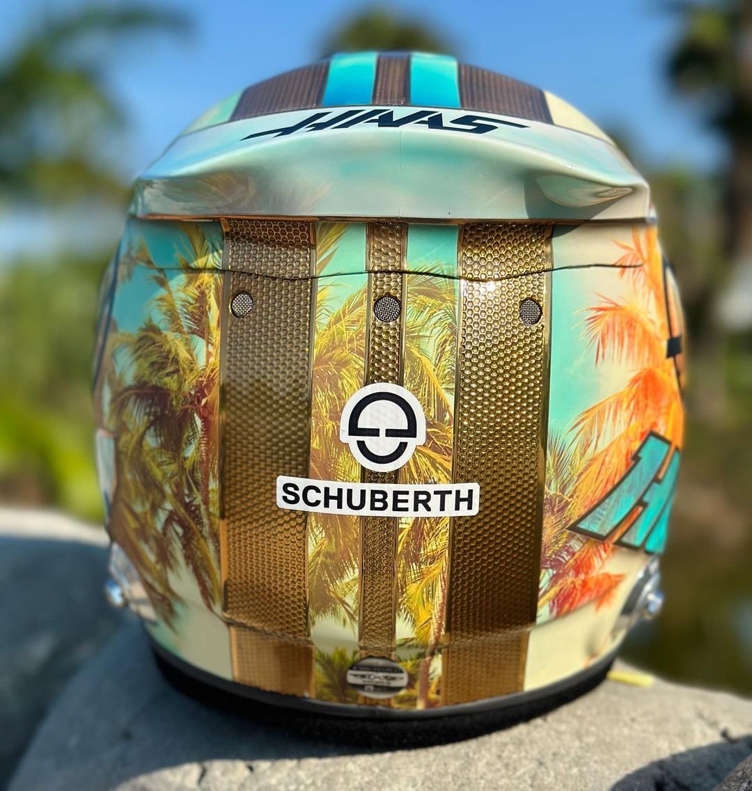
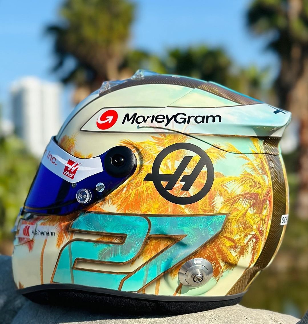
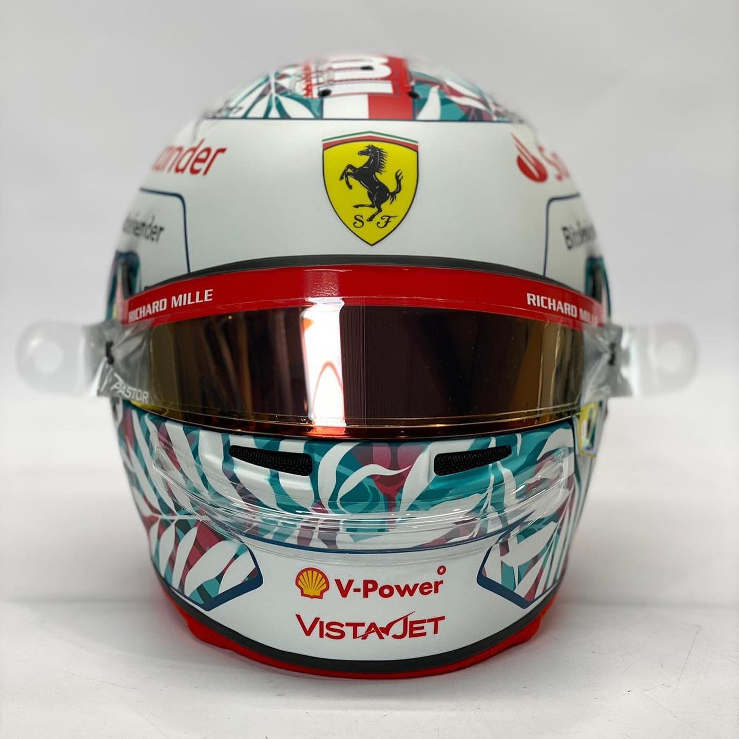
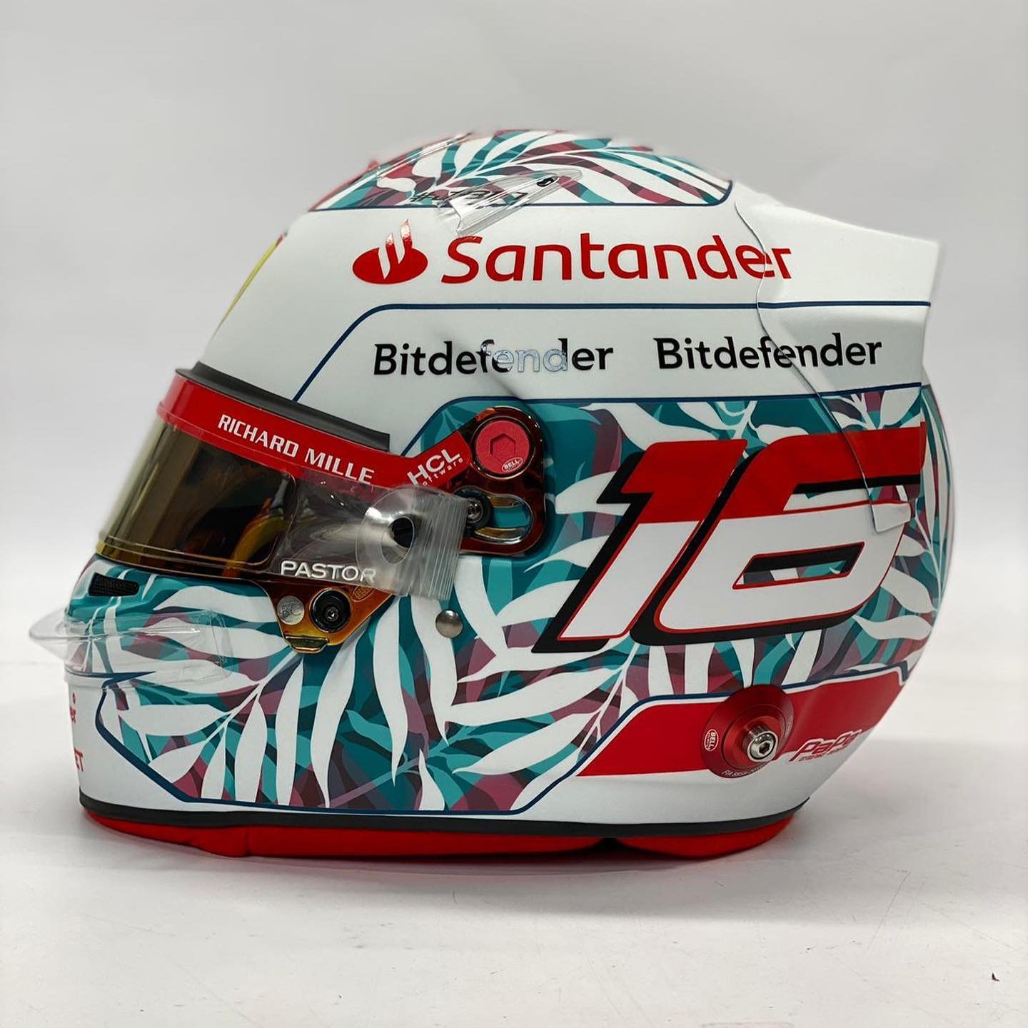
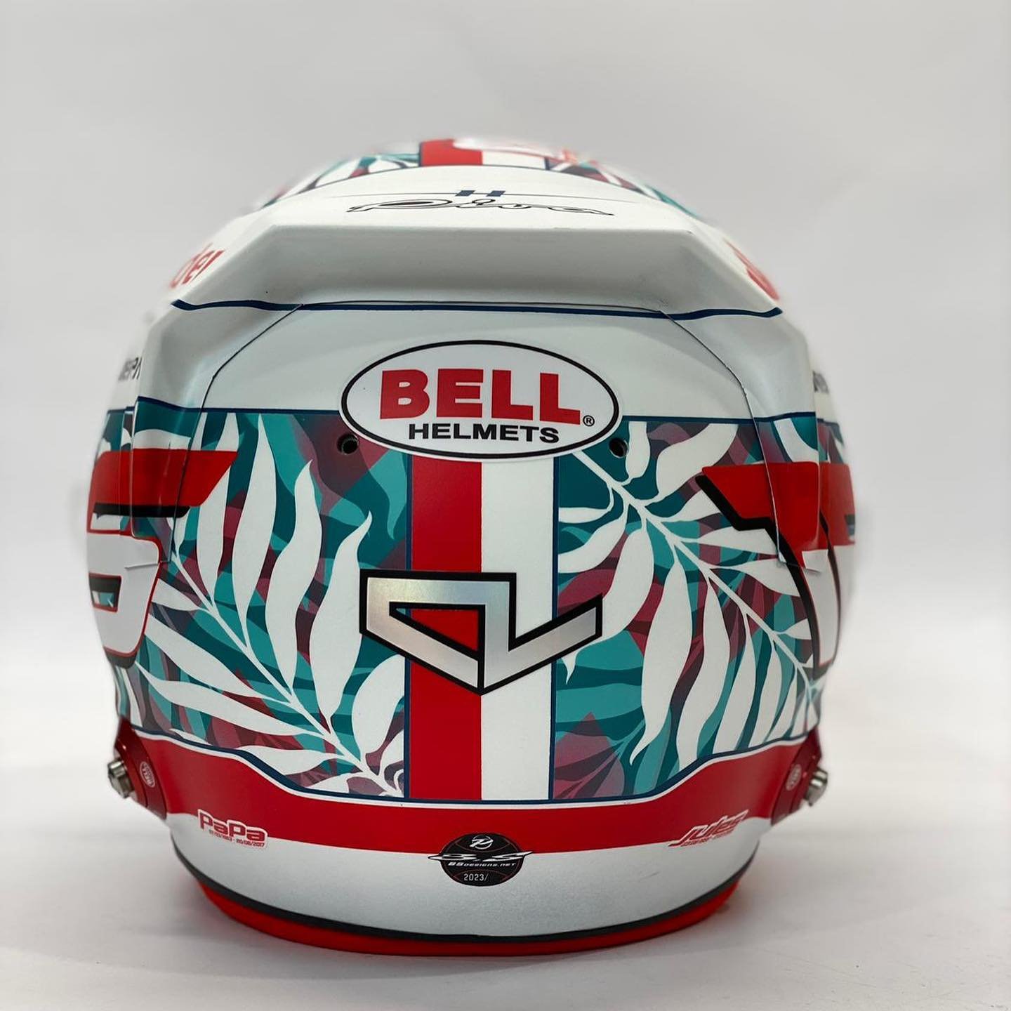
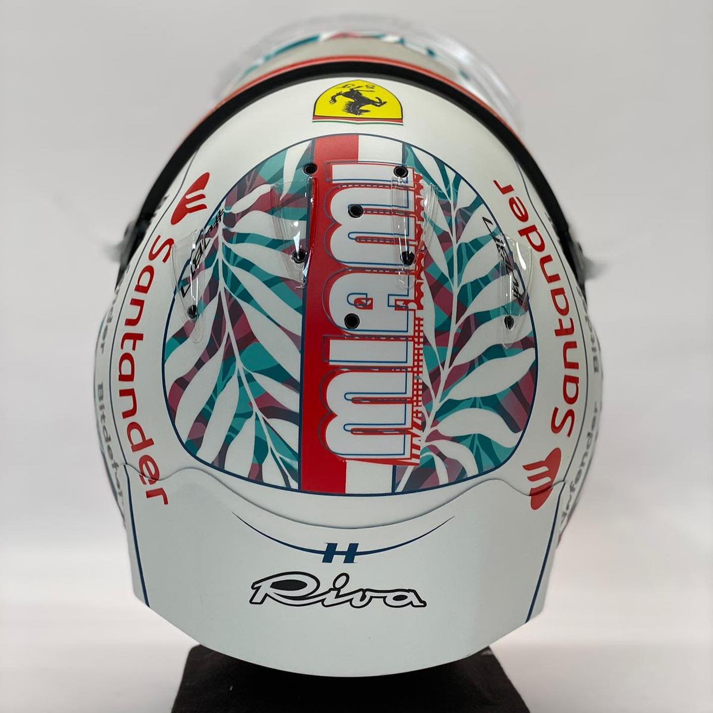
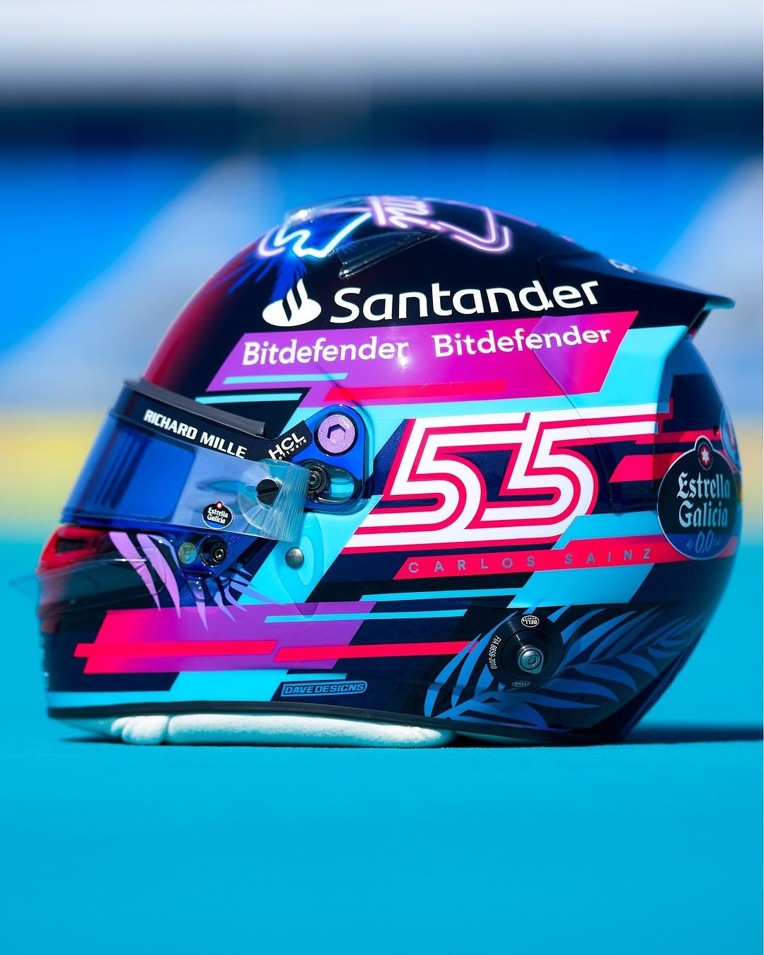
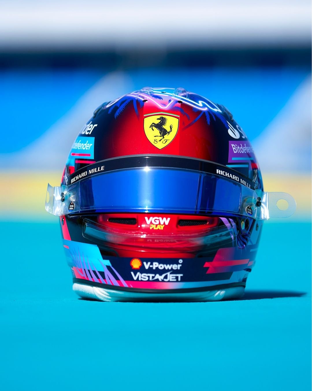
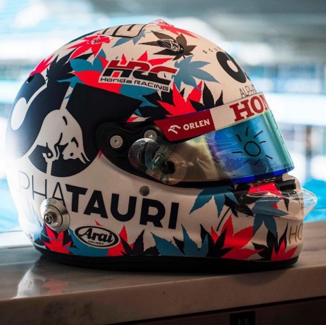
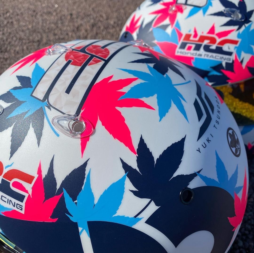
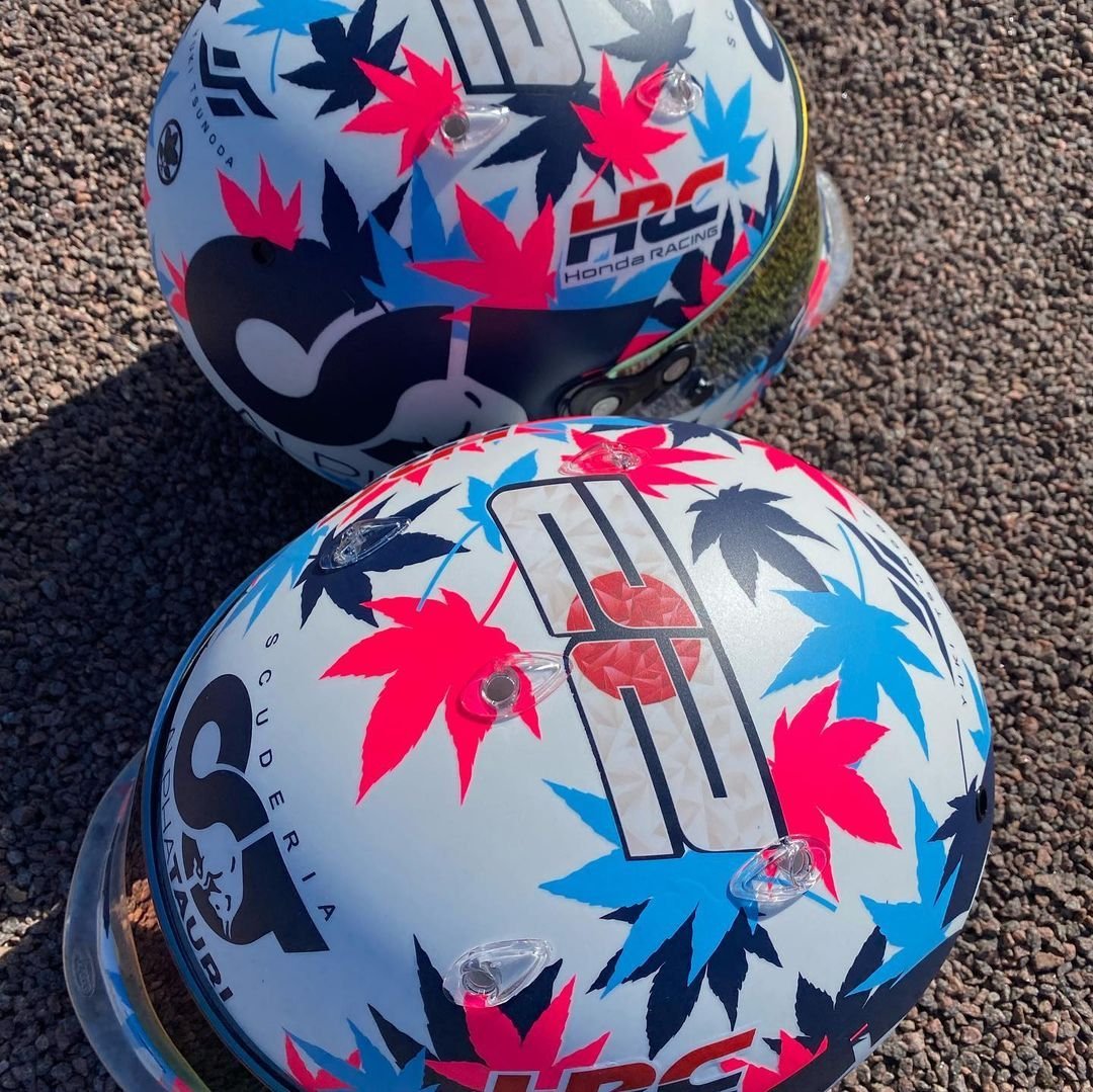
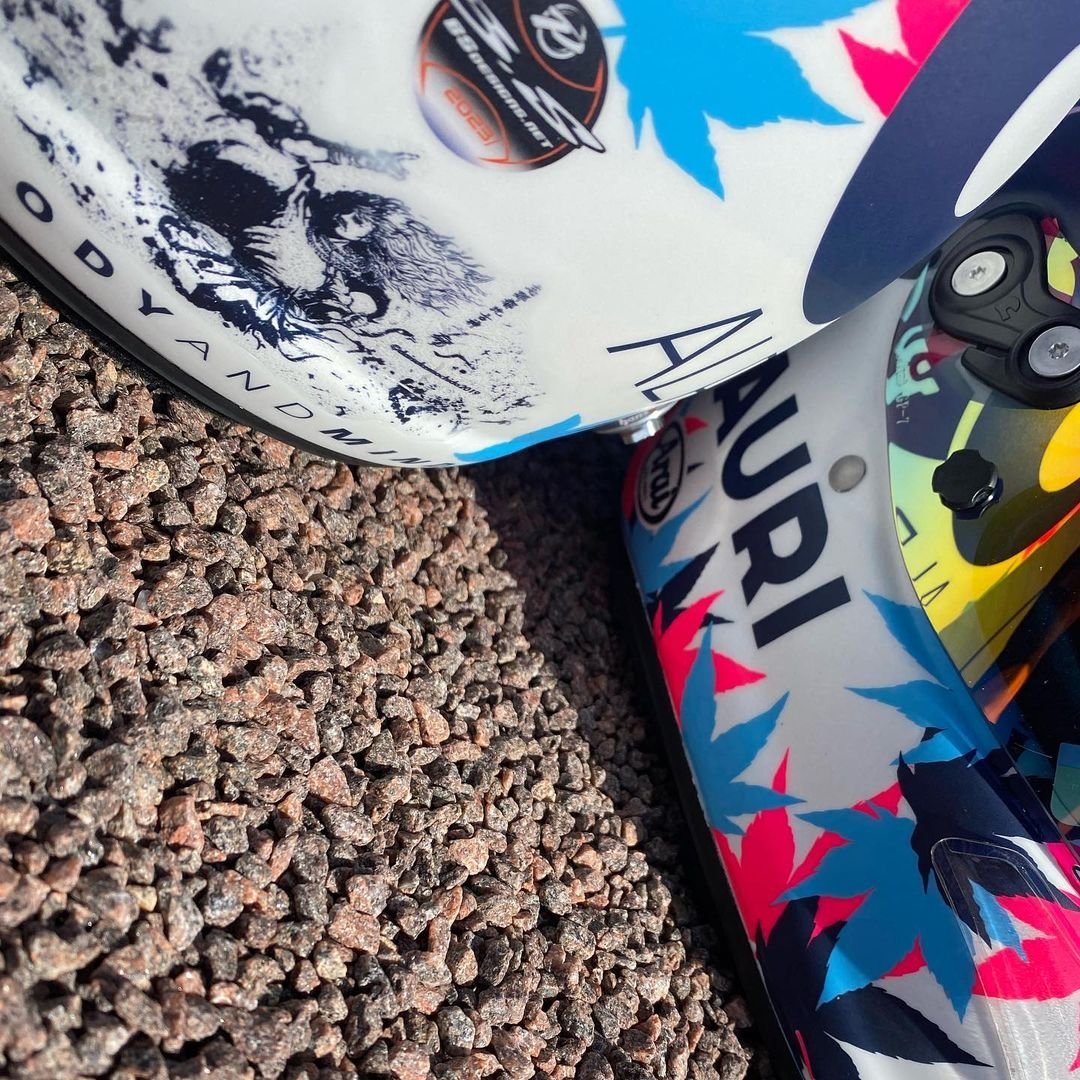
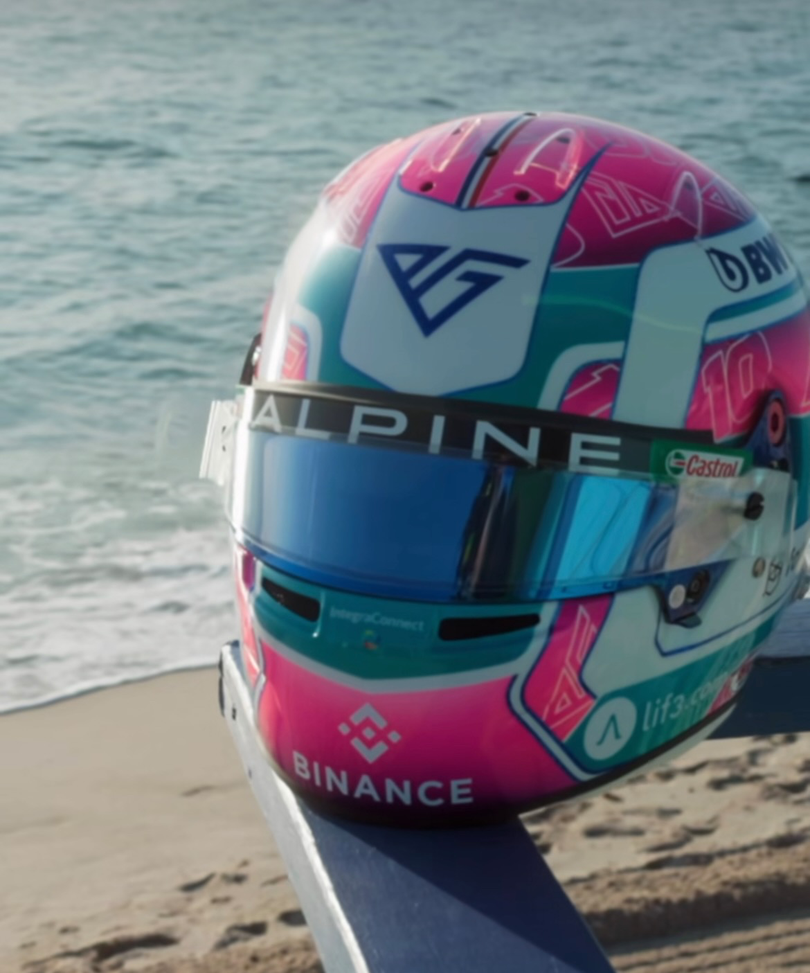
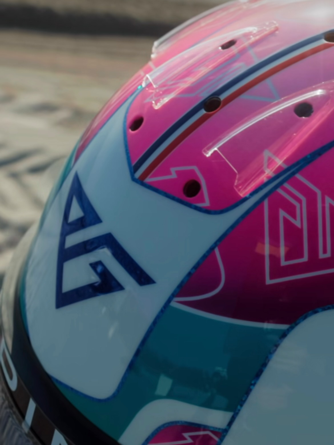
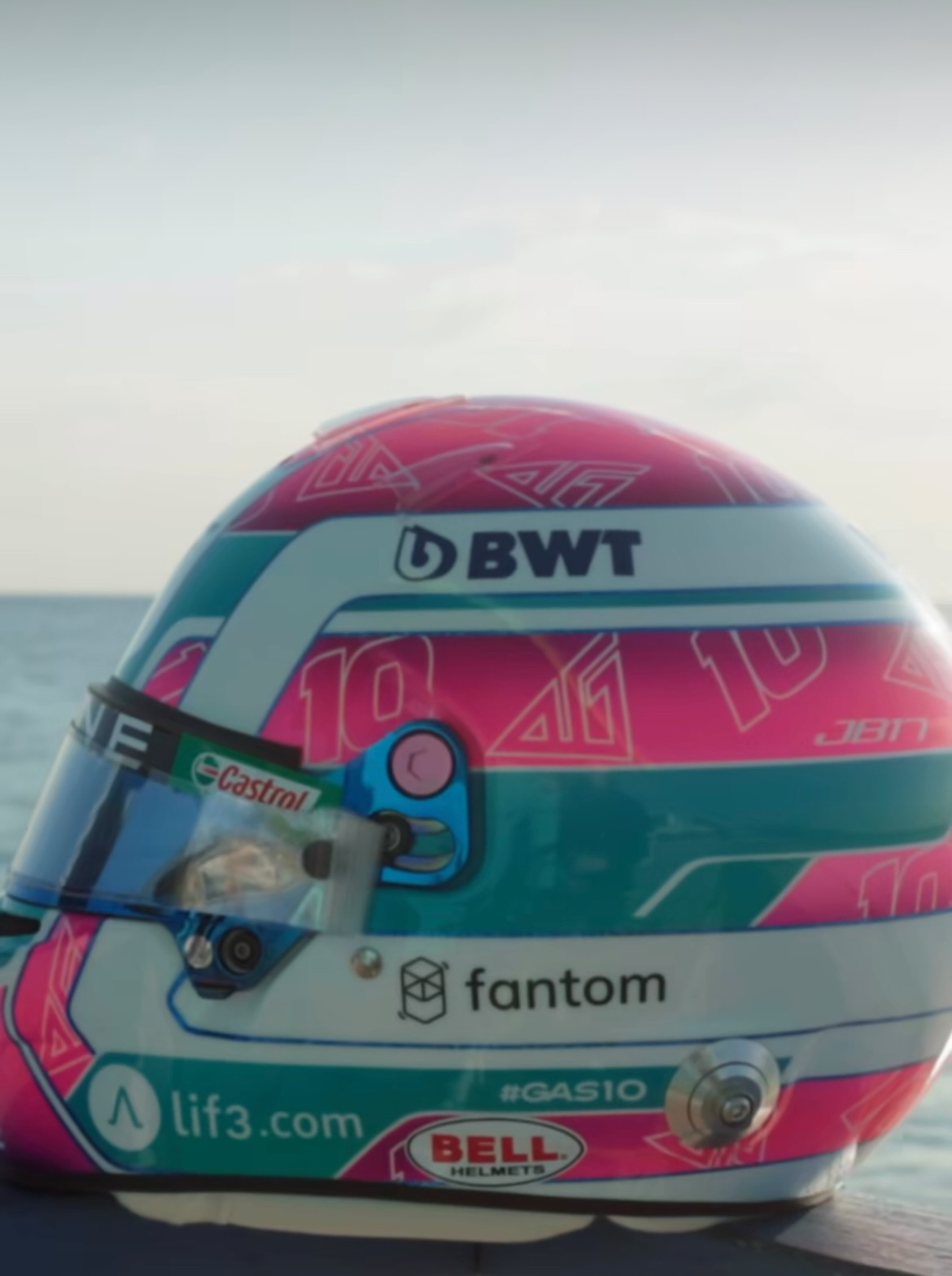
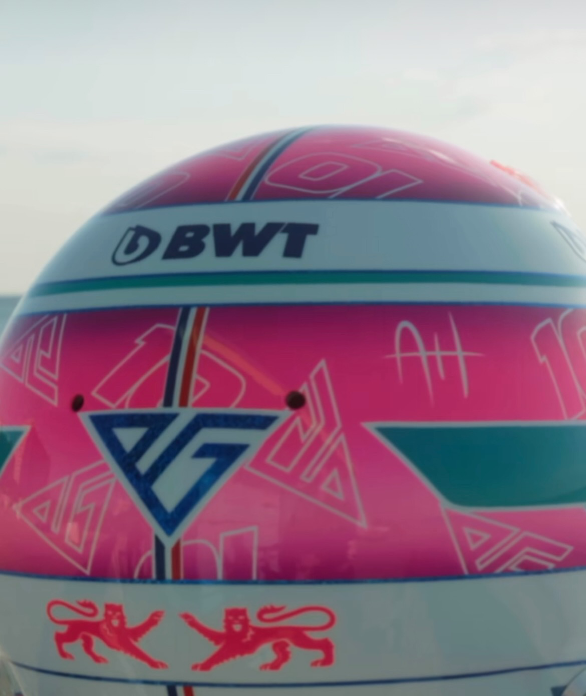
Formula One is back in Miami for the second time. The Miami Grand Prix is an opportunity to see each drive show off their style and flash with special Miami themed helmets. Take a look below at some of the top helmets from the weekend.