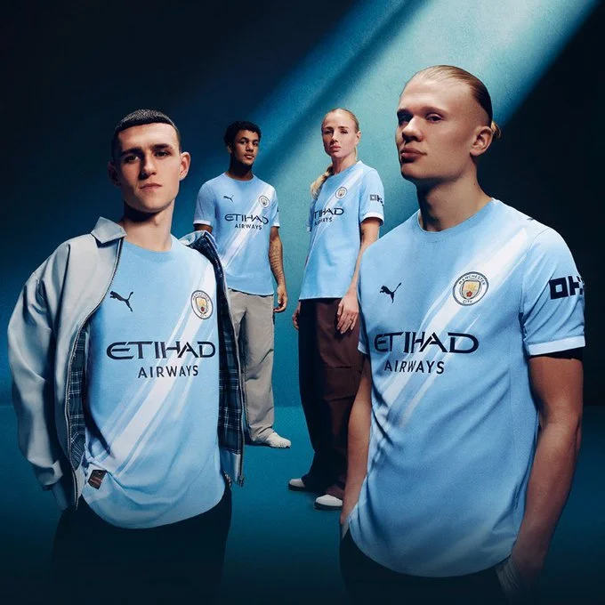
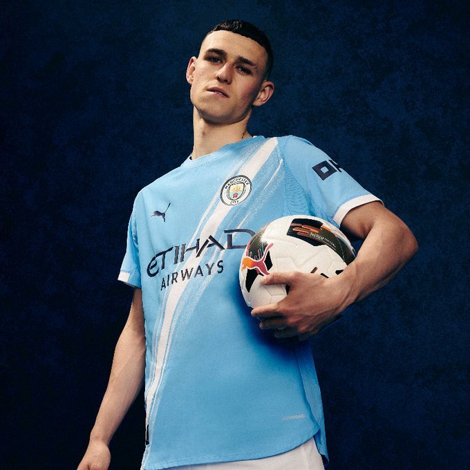
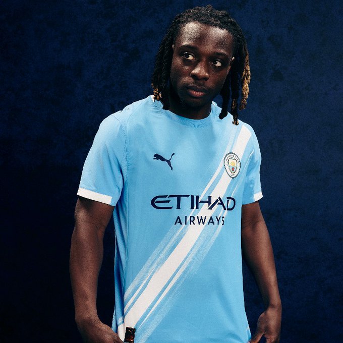
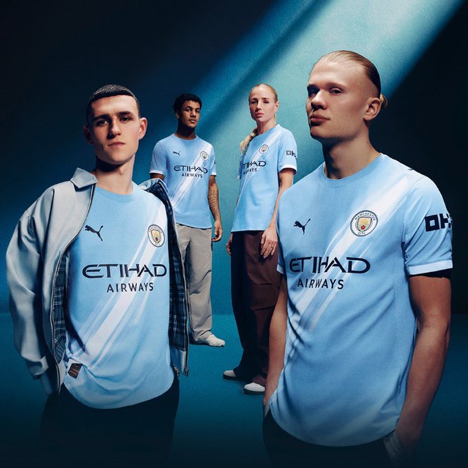
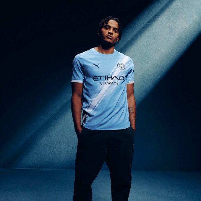
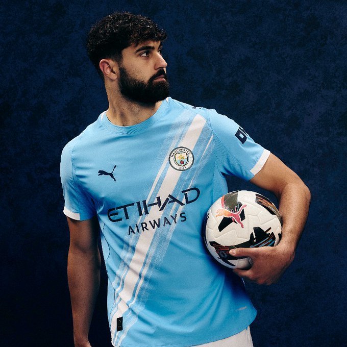
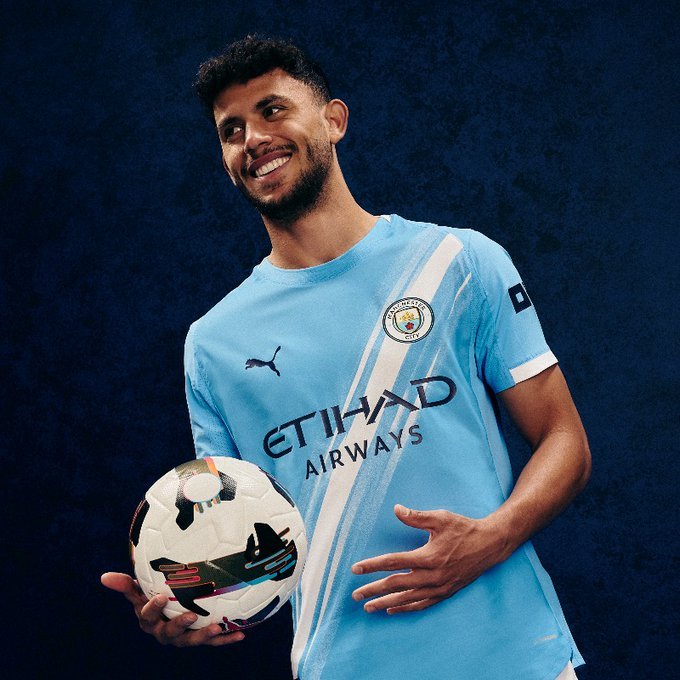
Manchester City and PUMA have officially unveiled the 2025/26 Home kit — and it’s one for the history books.
For the first time ever, the iconic “sash” design makes its debut on a Manchester City Home jersey. Long associated with Away kits worn by legends like Mike Summerbee, Colin Bell, Francis Lee, and Tony Book, the sash now takes center stage on City’s famous sky blue canvas. This reimagined white diagonal stripe connects the club’s rich heritage with a bold new era.
The sash first graced City kits in the 1970s and has since become a fan-favorite detail tied to unforgettable away-day moments. But for 2025/26, the design moves from memory to the main stage — a nod to tradition while signaling a new chapter for the club.
PUMA’s Marco Mueller, Senior Director of Product Line Management Teamsport Apparel, expressed the brand’s excitement: “We’re so excited to be featuring the iconic sash, made famous from away days of old, on the Home kit for the first time. With our partnership, we aim to push boundaries in design, creativity, and innovation.”
Fans won’t have to wait long to see the new look in action. The men’s first team will debut the sash-inspired kit at the upcoming FIFA Club World Cup this summer, hosted in the United States.
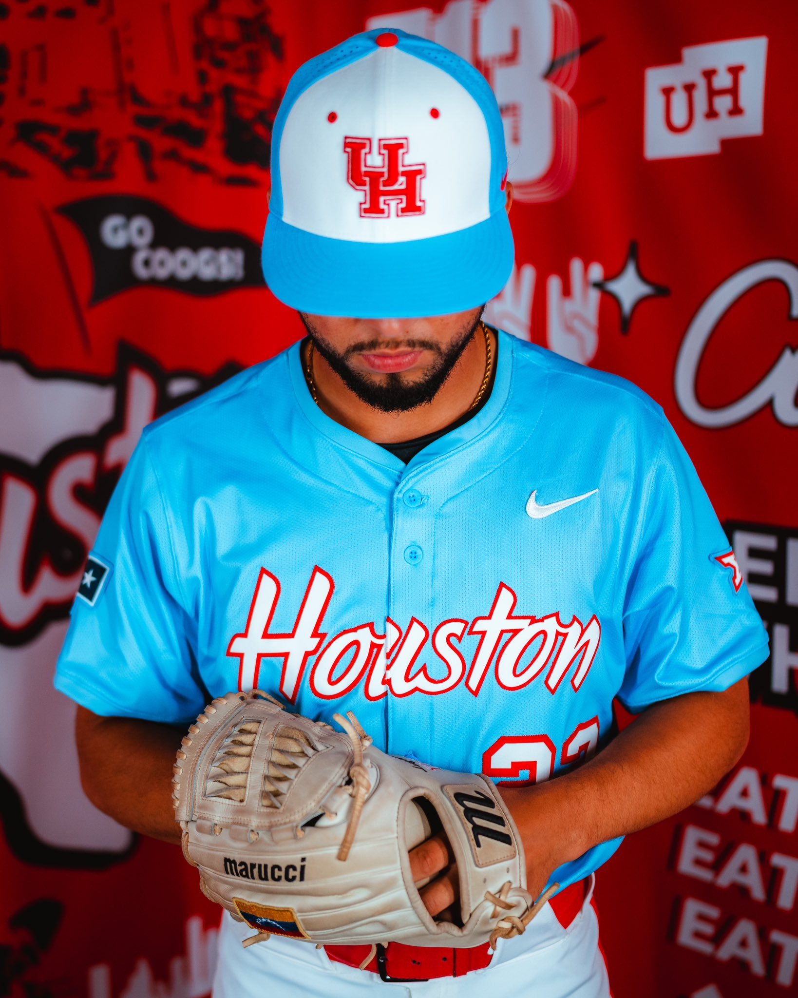
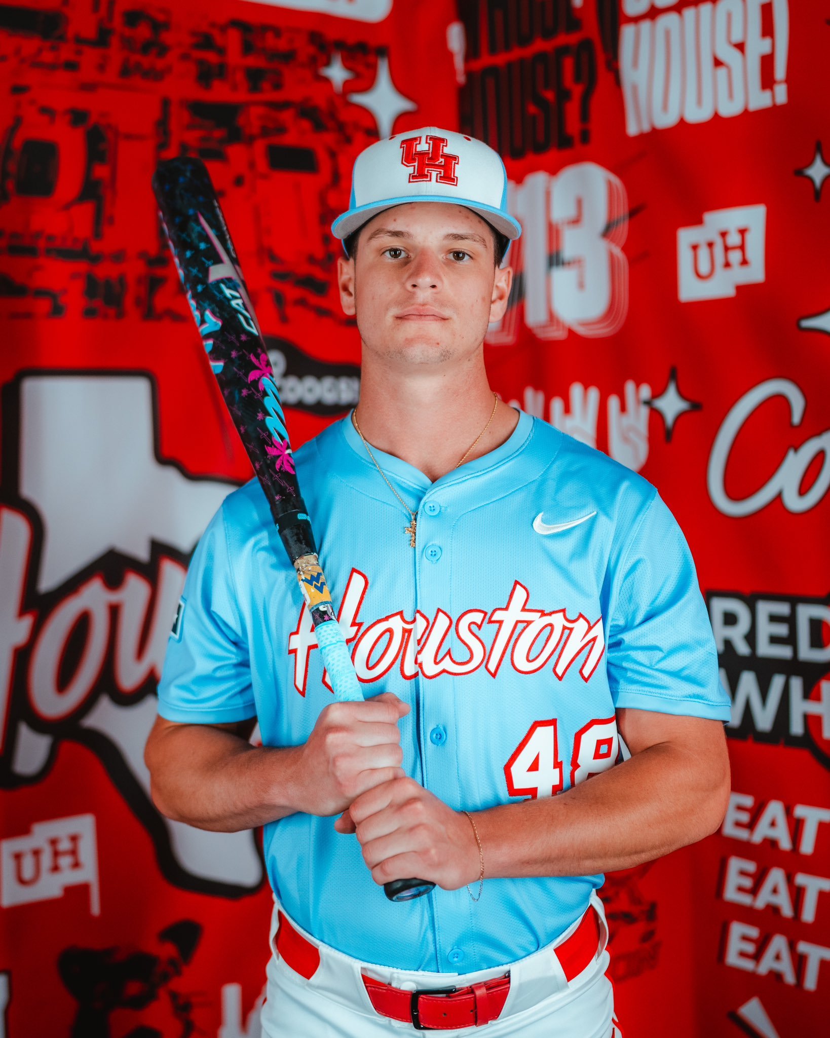
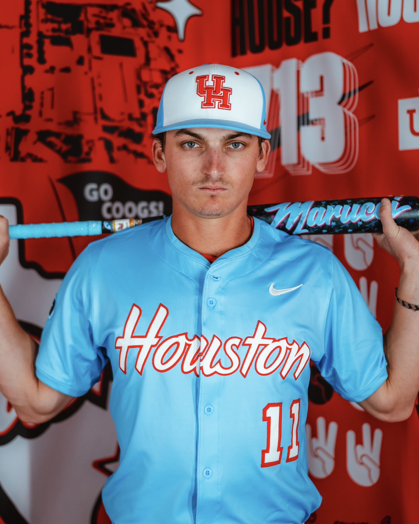
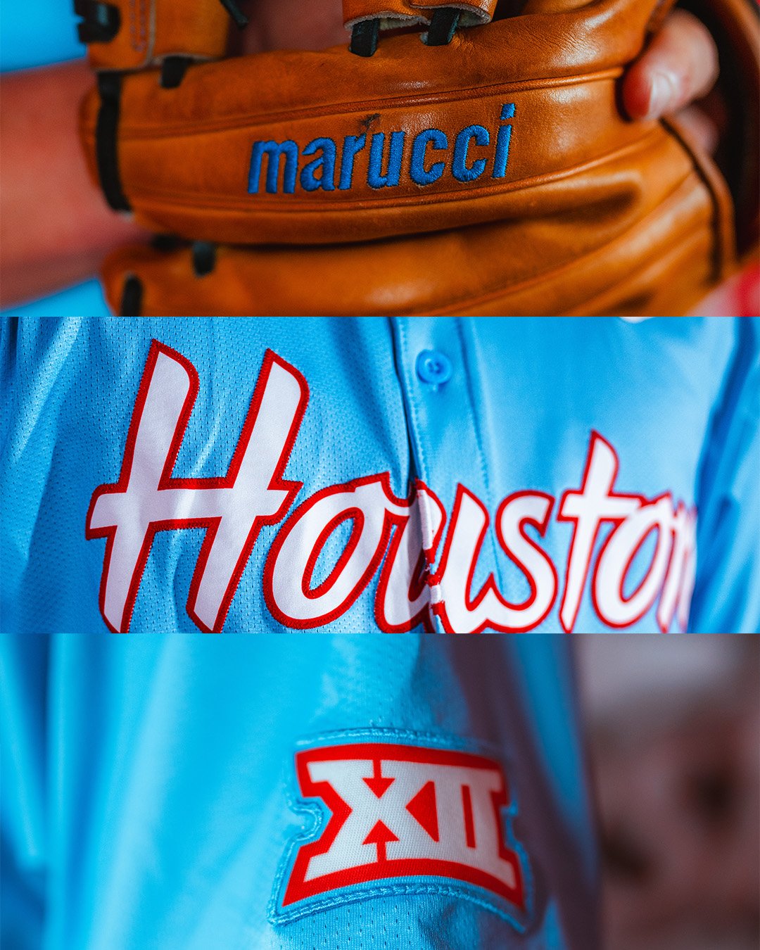
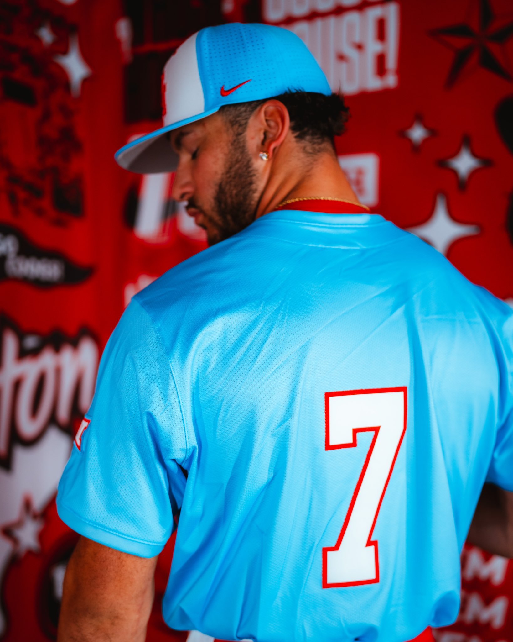
The Houston Cougars baseball team has officially stepped into the colorway crossfire, debuting a bold new set of uniforms unveiling what it’s calling ‘Houston Blue’ uniforms. And yes, they’ve entered the blue uniform conversation in a big way.
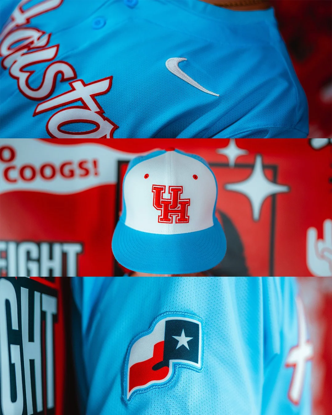
The uniforms feature light blue jerseys with ‘Houston’ written in clean white script, outlined in red—a nod to both tradition and bold experimentation. The colorway is immediately recognizable for its layered references, especially for longtime football fans in Texas. And that’s exactly why it’s turning heads.
The baseball cap features a light blue bill and back, contrasted with a white front panel that proudly displays the Cougars’ red UH logo.
Both sleeves are patched up—one with the Big 12 logo and the other with the Texas state flag.
To cap it off, players will rock custom Marucci gloves stitched in matching light blue script.
This isn’t just about aesthetics. The Cougars' use of Columbia blue continues a broader trend at the University of Houston that’s made waves across the state. For context: the Tennessee Titans, who own the rights to the former Houston Oilers’ brand and color scheme, have made clear their displeasure over others tapping into the iconic “Luv Ya Blue” visuals.
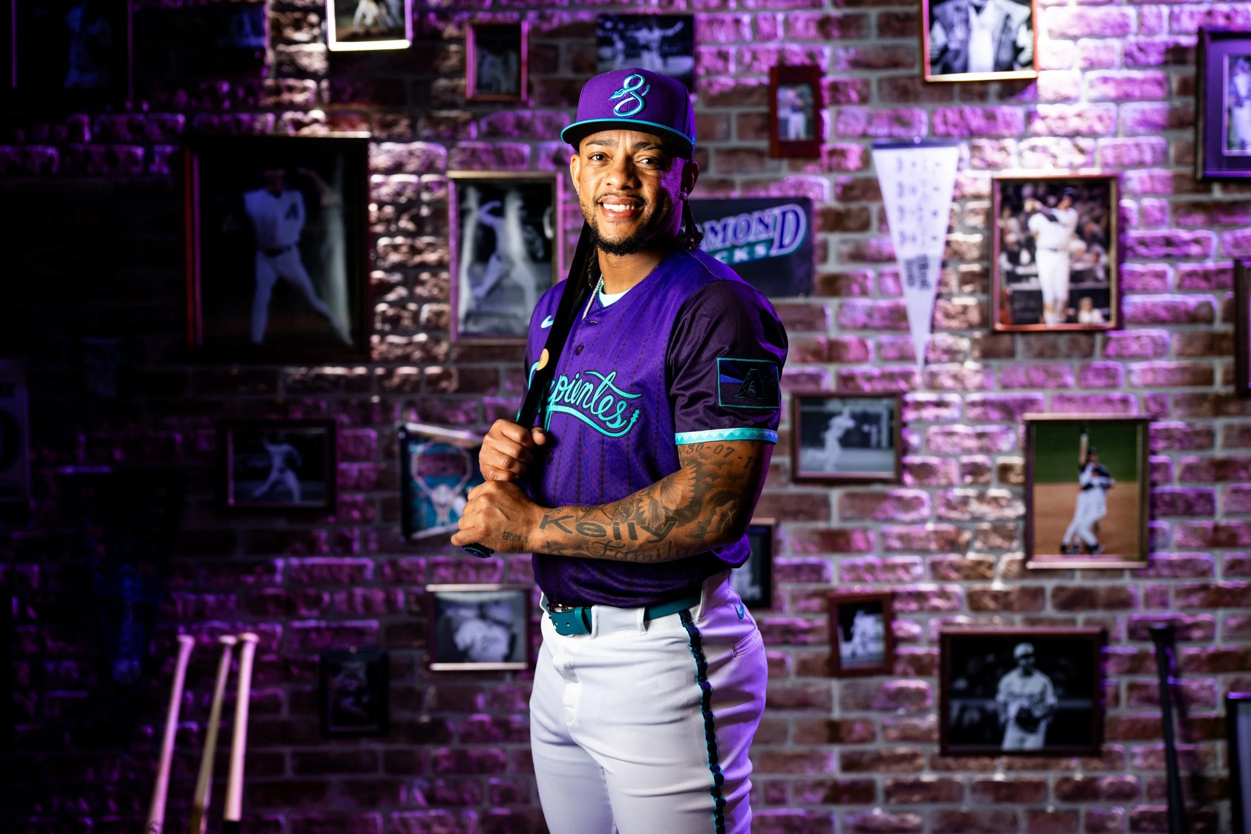
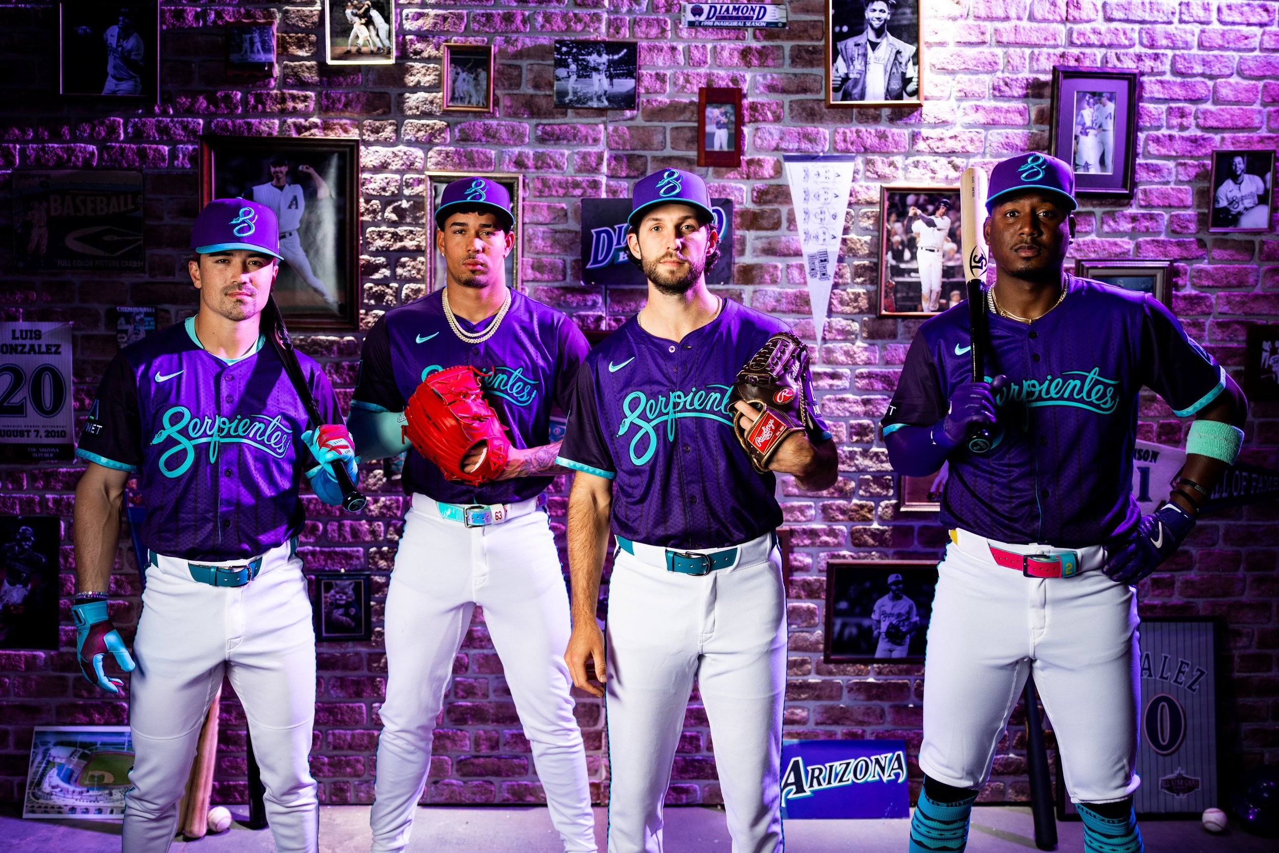
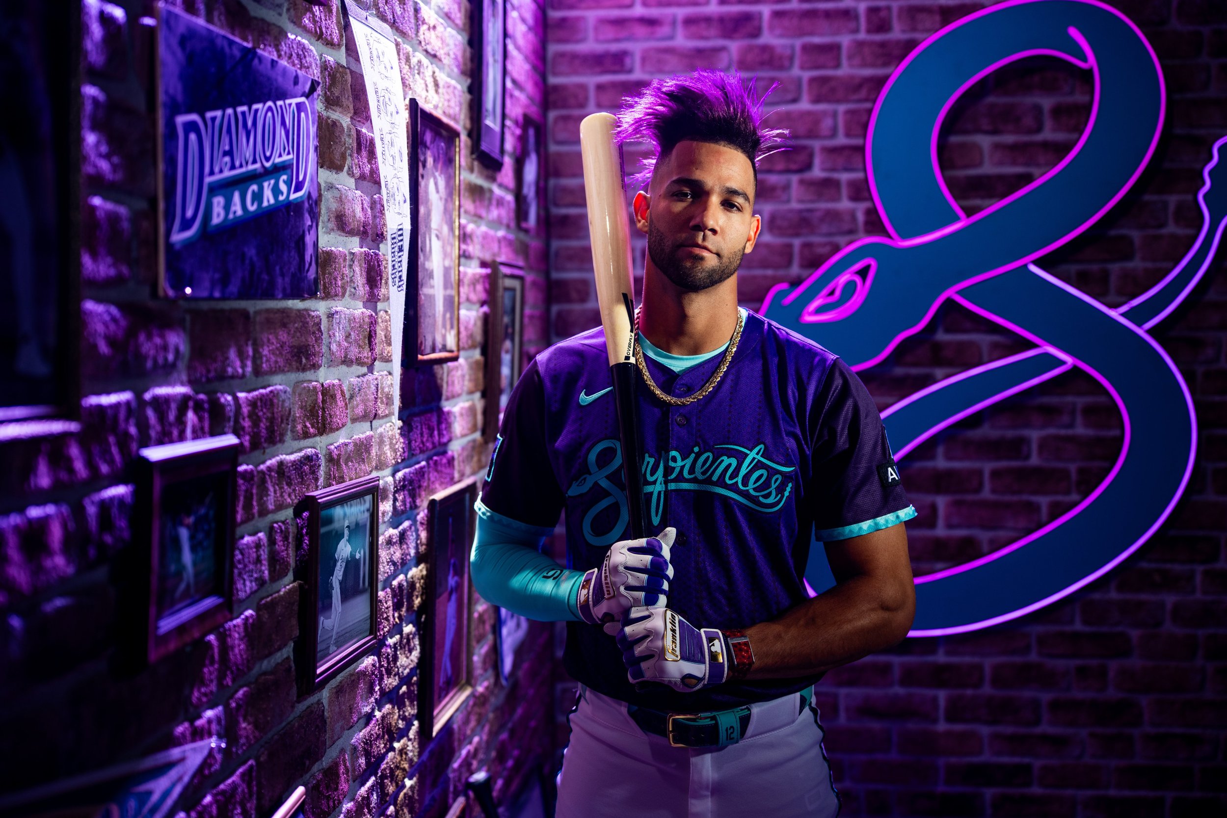
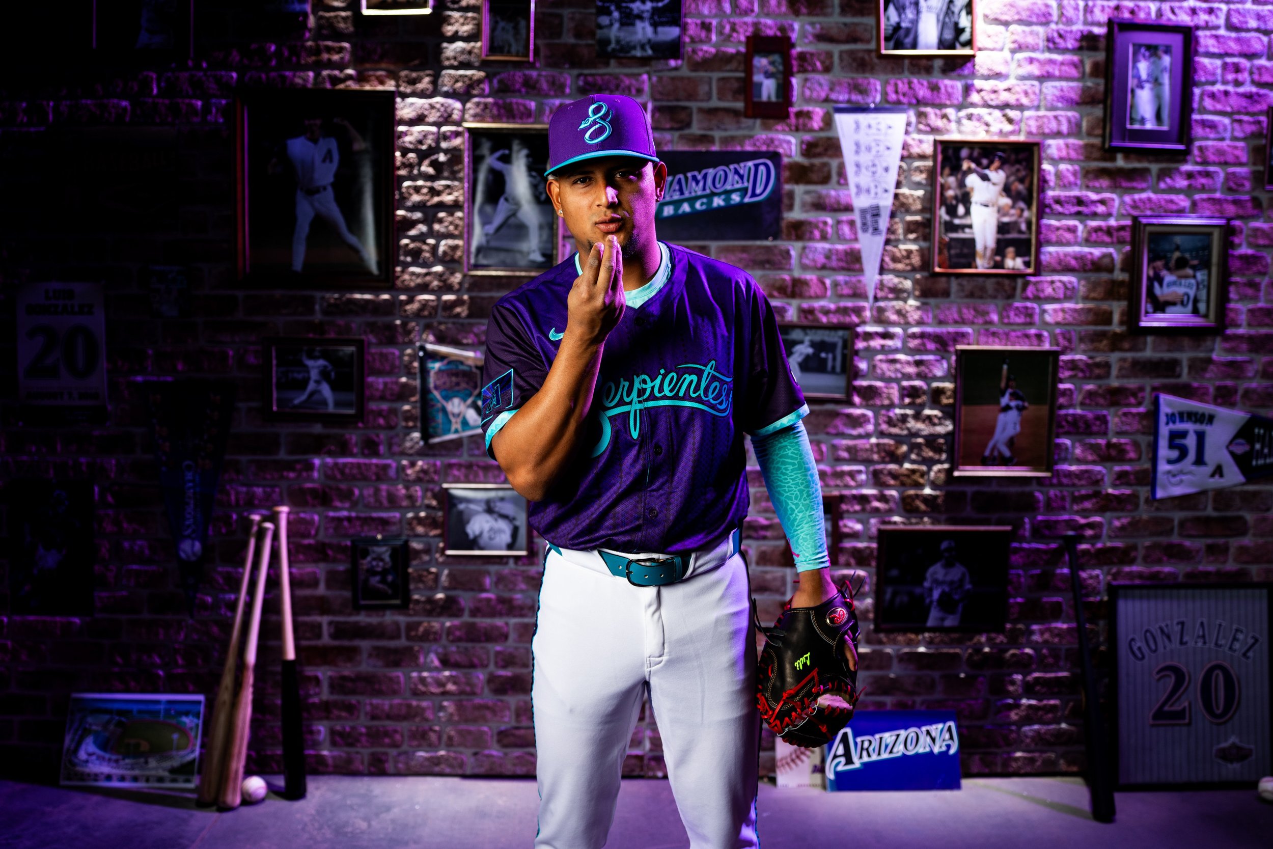
The Serpientes are back—and this time, they're bringing the throwback heat.
the Arizona Diamondbacks officially unveiled their City Connect 2.0 uniforms, giving fans a fresh look that’s equal parts nostalgia and next-gen design. For those who have longed for the return of the franchise’s original purple and teal color scheme, this drop hits home in a big way.
From the moment the jerseys were revealed, it was clear: this isn’t just a uniform—it’s a tribute.
The 2.0 version builds on the original City Connect uniform launched in 2021, keeping the iconic “Serpientes” script across the chest—complete with the coiled snake "S" that’s become a fan favorite. But everything else has leveled up.
Gone is the desert sand. In its place? A stunning fusion of Arizona’s original DNA and modern storytelling.
Purple and Teal dominate the palette, a direct nod to the franchise’s earliest and most successful years—including the 2001 World Series title.
Pinstripes meet snakeskin in a bold pattern that merges the inaugural jersey with the “evolutionary” 2016–19 design.
The sleeves feature updated braiding, reminiscent of classic alternates with a modern twist.
A unique “Arizona Born” graphic inside the collar reinforces that this team represents the entire state, not just Phoenix.
On the sleeve, a custom flag patch blends the “A” logo with the Arizona state flag, redesigned in purple and black.
“This uniform embodies every facet of what makes us the Arizona Diamondbacks,” said CEO Derrick Hall. “It celebrates our past, our culture, and our fans—their passion is in every thread.”
It’s a sentiment echoed by the players, too. Ace Zac Gallen gave it his stamp of approval, saying, “I think they did a good job… I'm glad that they're incorporating some purple.” Outfielder Lourdes Gurriel Jr. is already on-brand with purple hair, while Ketel Marte rocks purple and teal cleats—fitting tributes to the team’s roots.
The attention to detail stands out. From the collar graphic to the custom textures, the D-backs and Nike delivered a look that balances nostalgia with innovation. “There are some subtle things people won’t catch until they have one in hand,” Gallen added. “That’s what makes it cool.”
— West Virginia Football (@WVUfootball) May 5, 2025
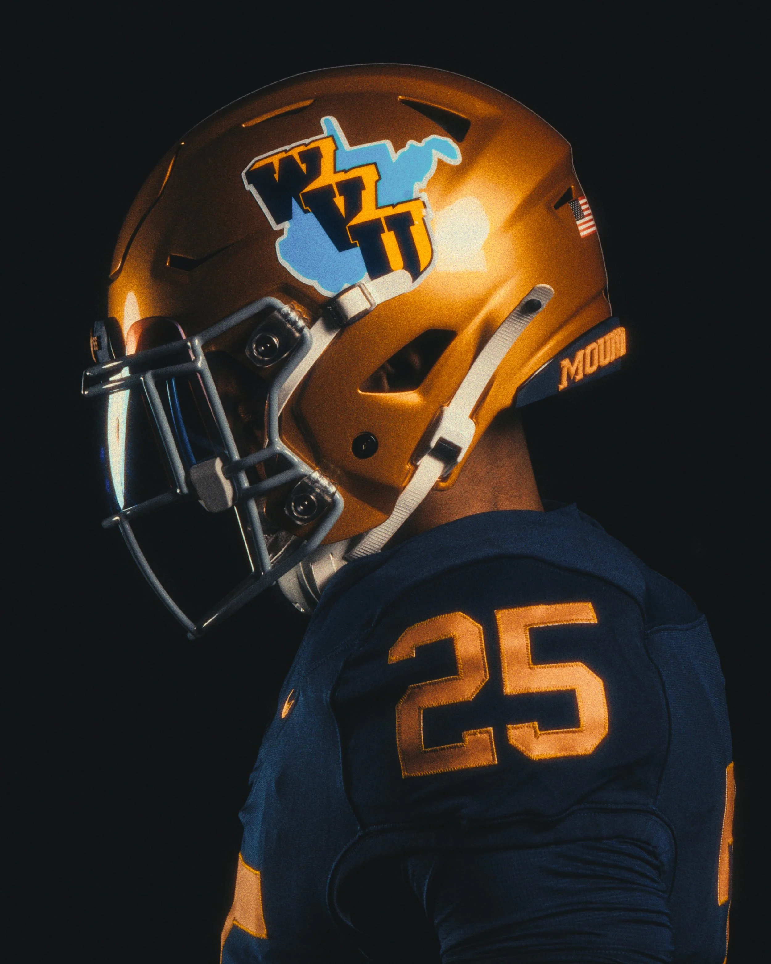
Cue the nostalgia — and the old gold. West Virginia University is throwing it all the way back to 1965 with a special edition uniform that’s more than just a retro look. It's a tribute to one of the most storied seasons in Mountaineer football history — and a design that has never truly been replicated... until now.
the 1965 throwback uniform marks a first-of-its-kind effort from WVU: a true historical replica that brings to life the textures, tones, and traditions of a team that not only dominated the Southern Conference but lit up the scoreboard in a record-setting Backyard Brawl.
“It was an opportunity to do a true throwback, which we haven’t done,” said WVU deputy director of athletics Matt Wells. “We thought with the unique nature of that helmet, and the helmet logo with the baby blue, it was probably the most unique element of any of the past uniforms that we could potentially replicate.”
It’s what turned heads then, and it’s what turns heads now: a three-dimensional navy blue WVU logo, outlined in gold, laid atop a light-blue silhouette of the state of West Virginia. Set against an old gold shell, it looked ahead of its time back in ’65 — like technicolor in a black-and-white world.
The helmet design was so iconic that WVU athletic director Wren Baker made it a personal mission to revisit the look as soon as he spotted it in the Hall of Traditions.
“The inspiration really came shortly after Wren got here,” Wells said. “He was familiarizing himself with the history of Mountaineer football, and he saw the 1965 helmet on display… that started a conversation of, ‘Hey, what can we do with that?’”
Some versions of the original helmet had a single blue stripe, while others didn’t. Split end Bob Dunlevy recalled, with a laugh, that the inconsistency probably came down to the infamous resourcefulness of longtime equipment manager Carl Roberts.
“I kept my helmet because I needed it to play in the North-South game after the season,” Dunlevy said. “I’m sure Carl was probably after me to return it, but I kept it, and I still have it.”
The throwback uniform does more than just replicate an old look — it marks 60 years since WVU’s 1965 conference championship season, a year highlighted by the highest-scoring Backyard Brawl in history, a 63-48 win over Pitt.
While the look came from the past, the design process was very much rooted in the present. Kristin Coldsnow, the creative force behind WVU’s recent themed uniforms, was brought back to lead the design — ensuring everything from the shade of blue to the state outline was authentic. She worked closely with Nike to match every detail.
Equipment staffer Austin Blake helped perfect the helmet’s bumper colors and logo placement, while WVU’s internal uniform brain trust — including Michael Fragale and Joe Swan — all contributed during the design phase.
What started as a temporary name and a blank slate has officially transformed into one of the boldest identities in professional hockey. After more than 850,000 votes and a year-long rebranding process, Utah’s NHL franchise has a name, a look, and a rallying cry: Utah Mammoth is here to stay — and it’s stomping in with purpose.
the new identity is the product of 13 months of community input, a rapid design timeline, and a vision to build something by Utah, for Utah. The team partnered with Doubleday & Cartwright to bring the brand to life, and fans showed up in force to help shape every element of the new look.
“The community chose the Utah Mammoth brand, and it stands as a symbol of who we are, where we came from and the unstoppable force we’re building together,” said owners Ryan and Ashley Smith.
The new identity centers on the "Mountain Mammoth" logo — a mammoth charging forward with the Wasatch Mountains on its crown, the outline of Utah carved into the peaks, and tusks forming a bold "U." It's a logo packed with meaning and motion, and it's now front and center on the franchise’s permanent home and away uniforms.
The home jersey features the Mountain Mammoth charging across the chest, while the away kit introduces a bold step-down “U-T-A-H” wordmark running diagonally down the front — an evolution of the team’s inaugural design.
Other design details include:
Primary Colors: Rock Black, Mountain Blue, and Salt White (a carryover from the inaugural season).
Typography: A custom-designed font called Mammoth Sans, which leans forward at a 10-degree angle, mimicking Utah’s jagged terrain. The “A” and “H” carry angular crossbars, linking back to the team’s original lettering.
Collar Detail: Both jerseys include “EST. 2024” stitched into the neckline — a nod to the franchise's roots.
Shoulder Logos: The home jerseys carry a new Utah Badge — a stylized patch with the state outline, “U-T-A-H,” and a hockey stick. The away jerseys carry the Mountain Mammoth on the shoulders.
Pant Detail: A tusk cuts through the “U” on both sets of pants, tying the whole identity together from top to bottom.
Very few professional teams have invited fans this deeply into the rebranding process, especially on such an accelerated timeline. The franchise began as the Utah Hockey Club after acquiring the Arizona Coyotes in April 2024. From there, it launched a four-round fan vote to determine the permanent name and identity.
That passion was rewarded with an identity that hits hard on every level: geographic, historic, visual, and cultural. From the Ice Age legacy of the mammoth to the modern, clean aesthetic of the jerseys, the Utah Mammoth feel fully formed — like they've been part of the NHL landscape for decades.
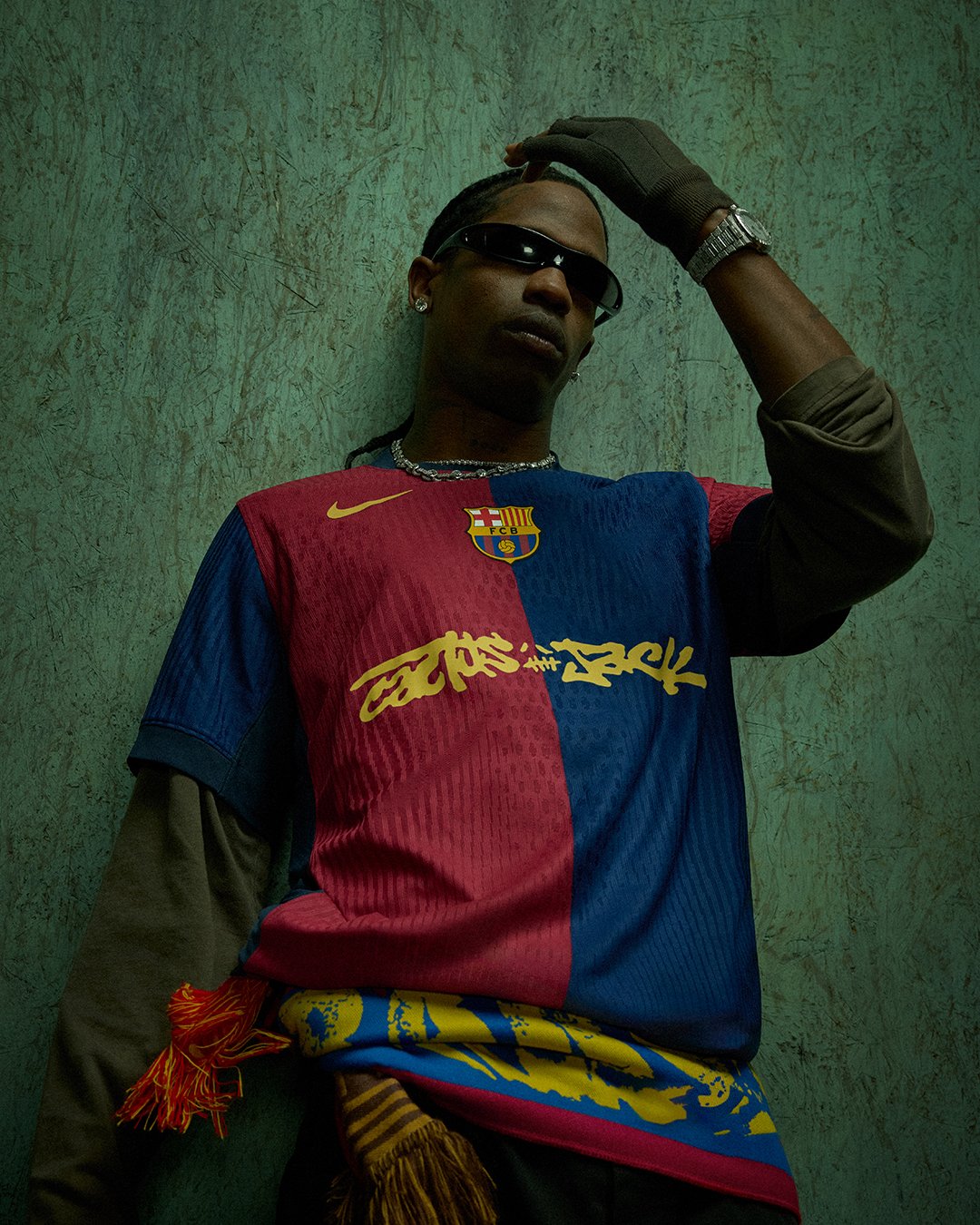
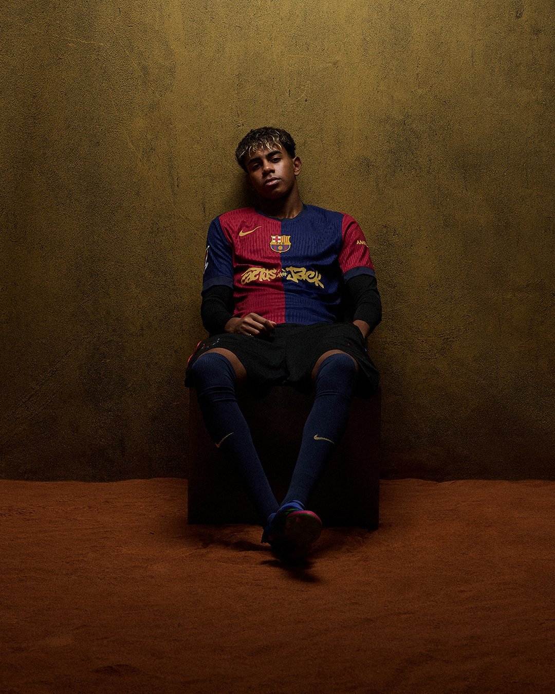
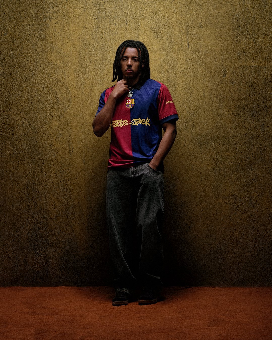
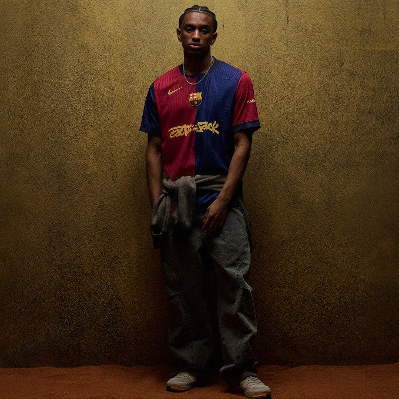
In a bold fusion of sport, music, and fashion, FC Barcelona and Spotify have announced their sixth jersey collaboration—this time with Travis Scott and his Cactus Jack brand. The special edition jersey will be worn during two of the biggest matches of the season: the men’s Clásico on May 11 and the women’s Liga F match on May 18.
Known for his genre-bending style and massive global following, Travis Scott becomes the latest artist to have his logo take center stage on the Barça jersey, following in the footsteps of icons like Drake, ROSALÍA, Coldplay, KAROL G, and The Rolling Stones.
“El Clásico is a moment the whole world taps into,” said Travis Scott. “Teaming up with Spotify and FC Barcelona lets me merge my universe with theirs. This wasn’t just about throwing Cactus Jack on a jersey. It’s about building something that blurs the line between sound and sport. Being the first artist to perform in Barcelona as part of this collaboration and sharing that moment with my fans just takes it to another level.”
For the first time in the Spotify x Barça partnership, the artist featured on the jersey will also take the stage. Travis Scott is set to perform a private concert on May 10—the night before El Clásico—at an iconic Barcelona location transformed for the occasion. This will be Scott’s first-ever performance in the city, and select fans will be invited via Spotify to experience this exclusive event.
To complement the jersey drop, a limited edition lifestyle collection will release on May 9 via Scott’s website. The capsule will include T-shirts, hoodies, jackets, scarves, shorts, caps, and even a retro-style football—offering fans a wearable glimpse into the Cactus Jack universe.
“As a longtime Travis fan and someone who cares about style, this collaboration with Spotify is powerful,” said FC Barcelona defender Jules Kounde. “Seeing the Cactus Jack logo on our jersey and being part of a drop that blends football with fashion and music is hugely inspiring. I’m proud to be part of a club that embraces that.”
— Stake F1 Team KICK Sauber (@stakef1team_ks) April 30, 2025
Kick Sauber is turning heads ahead of the 2025 Miami Grand Prix with the reveal of a bold, art-forward special livery that perfectly captures the energy and creativity of the Magic City.
Dubbed a “bold canvas of modern art,” the one-off design is drenched in neon green and is intended to look as though the car has just rolled out of an artist’s studio—freshly painted and full of life. It’s a visual tribute to Miami’s dynamic art culture, known worldwide for its color, edge, and unapologetic vibrance.
To fully commit to the theme, drivers Nico Hülkenberg and Gabriel Bortoleto will also don matching race suits, turning the entire race weekend into a rolling gallery installation. Even the team’s garage setup and pit equipment will reflect the special design, making this one of the most immersive liveries we’ve seen so far in the 2025 F1 season.
“This livery is more than just a new look—it’s a celebration of Miami’s creative spirit and our commitment to energizing the sport for our fans,” said Stefano Battiston, Kick Sauber’s Chief Commercial Officer. “Our objective when developing this livery with Stake was to stand out, not only for our dedication on the track, but also for our boldness and creativity off track.”
This striking reveal marks the first special edition look of the season for Kick Sauber, but fans can expect more surprises and bold statements from the team as the season progresses. As Formula 1 continues to lean into lifestyle, fashion, and pop culture, Sauber’s Miami livery is a statement of intent—a team unafraid to express itself and push the boundaries of design in motorsport.
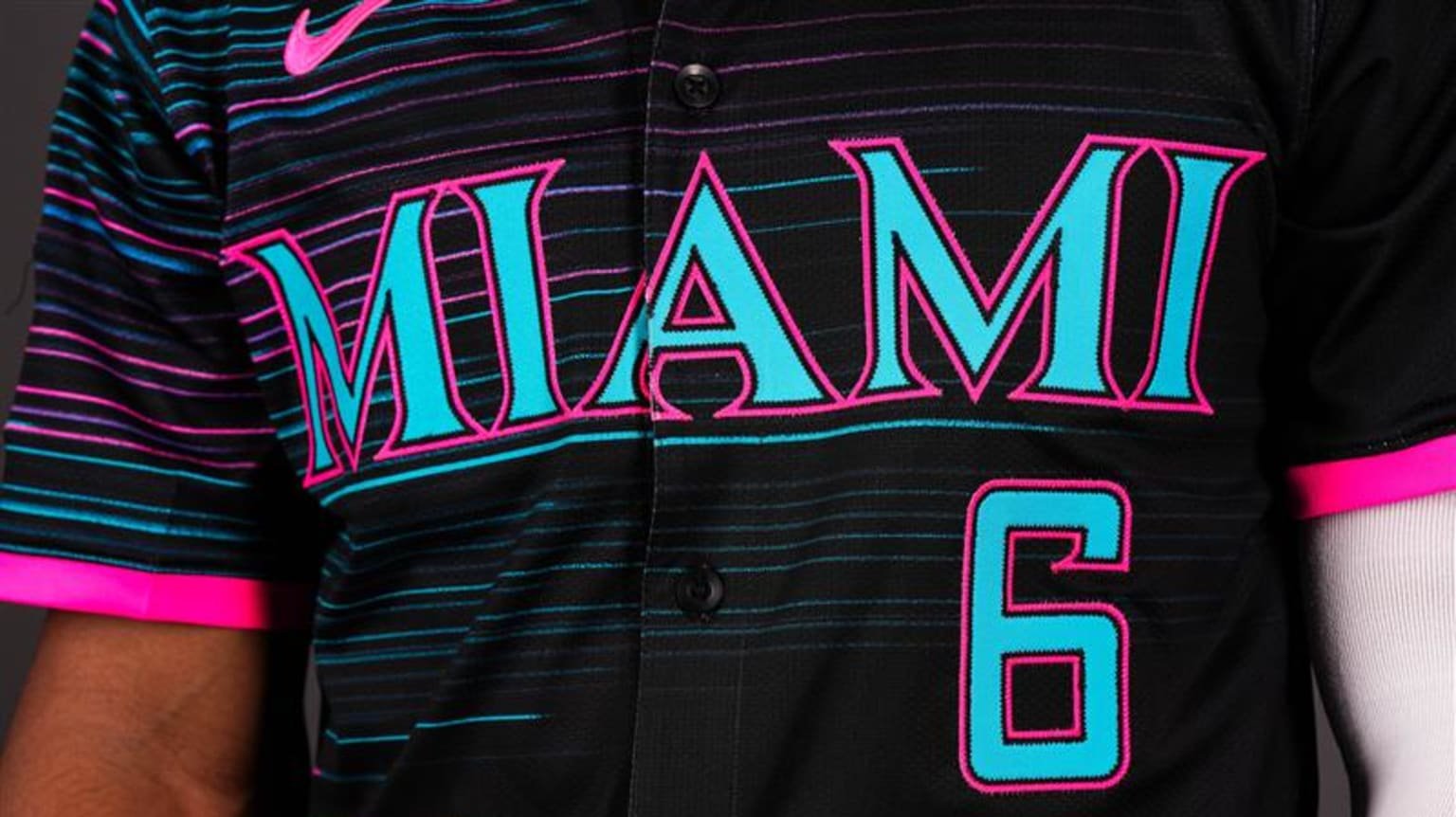
The Miami Marlins are diving into the vibrant energy of South Florida with the debut of their “Retrowave” City Connect 2.0 uniform — a bold tribute to the city’s culture, history, and future. The new look fuses nostalgic elements with modern flair, celebrating Miami’s electric personality and deep-rooted love for baseball.
“Our new Retrowave uniform combines the Marlins’ rich history with an innovative, forward-thinking approach that mirrors our organization’s trajectory,” said Marlins President of Business Operations Caroline O’Connor. “We aimed to celebrate our club’s storied past and special moments made in the teal, while looking forward to a bright future — all woven in a style that embodies the spirit of South Florida.”
The Marlins are no strangers to making a splash in the City Connect series. Their 2021 “Sugar Kings” uniforms were one of the most talked-about designs in the league. But with Retrowave, they take it a step further, pulling from the city’s multicultural makeup, neon nights, and iconic baseball moments.
One of the standout features of the Marlins’ new City Connect uniform is the 305 cap logo — a historic first in Major League Baseball. This marks the first time a team will wear its area code on the field. The bold "305" across the cap isn't just a shoutout to Miami proper, but a representation of the city’s heartbeat and its reach across South Florida, including areas like Fort Lauderdale’s 954. As ace Sandy Alcantara put it, “The 305 hat is amazing. It’s going to look very, very good on us. Hopefully the fans like it.”
The color palette of the Retrowave uniform is a deliberate blend of nostalgia and energy. The classic teal represents the past, a nod to the Marlins’ inaugural 1993 squad and the legacy they started. Meanwhile, pink accents inject the uniform with the vibrant personality of Miami’s skyline — loud, bold, and unmistakably full of life.
At the heart of the jersey lies the bold “Miami” wordmark, a design that channels the look and energy of the original Florida Marlins era. It's both a tribute to the franchise's roots and a modern statement piece, styled to match the city’s timeless yet ever-evolving aesthetic.
Instead of traditional vertical pinstripes, the Marlins went with horizontal pinstripes, offering a fresh visual rhythm that reflects the constant movement and cultural blend of South Florida. This twist captures both heritage and innovation, showing that the team — and the city — isn’t afraid to rewrite the rules.
The sleeve patch, designed in collaboration with ADT, also got a “Retrowave” makeover. The new logo incorporates retro themes with sleek, modern elements, mirroring the team’s intent to balance historical respect with a future-forward attitude.
Finally, the jock tag grounds the uniform in place and purpose. From the beaches to the ballpark, it celebrates Miami’s vibrant identity while also symbolizing the legacy the Marlins aim to build. As Connor Norby said, “There’s four major sports teams here. There’s music, beaches — it’s always hectic. When it comes to baseball, fans want a competitive team, and I think we’re getting to that point a lot quicker than expected.”
From the city’s neon-soaked nights to its championship history and electric fan base, the Marlins’ Retrowave uniforms are more than a uniform — they’re a cultural statement. It’s Miami baseball, reimagined.
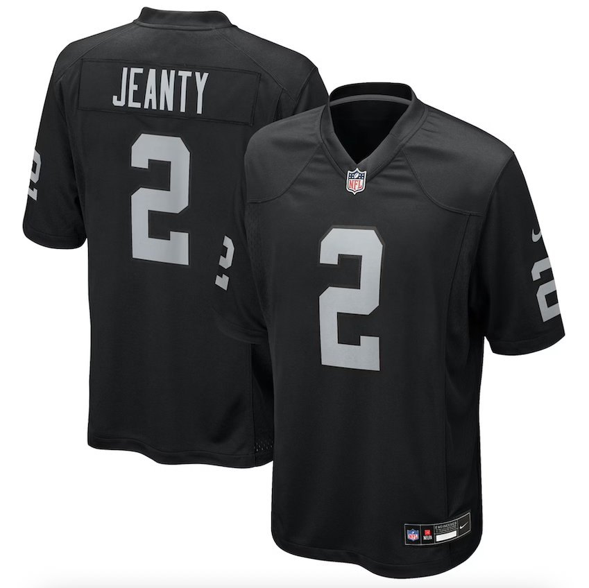
As the 2025 NFL Draft class officially joins the league, a new wave of excitement rolls in. Rookies across the country are proudly selecting their jersey numbers — a small detail with massive personal and historical significance. It’s more than just a number; it’s a symbol of identity, legacy, and the beginning of a new chapter.
For these young athletes, fresh off dominant college careers, choosing a number is a rite of passage. Some opt for digits they wore in college, while others seize the chance to start fresh in the pros. Each choice connects them to the past, nods to franchise legends, and hints at the player they hope to become.
With every stitched emblem and number pressed onto their new jerseys, these rookies carry more than just fabric — they carry the pride of their teams and the hopes of loyal fanbases. It’s the first step in becoming part of NFL history.
For fans, it’s an early glimpse of what’s to come — the names and numbers that could become household staples for years to follow.
The Chicago White Sox have officially raised the bar for MLB uniforms with the debut of their latest Nike City Connect Series release — and this one is for the history books.
The new City Connect uniform marks a first-of-its-kind collaboration between two iconic franchises: the White Sox and the Chicago Bulls. This groundbreaking on-field look pays tribute to the deep roots of Chicago sports culture, merging design elements from both clubs into one striking uniform.
The concept was born out of a challenge — how could the White Sox follow up their wildly popular “Southside” City Connect drop? According to Chief Revenue and Marketing Officer Brooks Boyer, the answer was clear: “No one has ever done a collaboration between a Major League Baseball team and an NBA team. In a market like Chicago with a history of both teams, how great would it be to collaborate with our partners in the Bulls, along with Nike and Fanatics, to do something that is unique and very different.”
The result is a bold black and red jersey that nods to the Bulls’ legendary '90s era while honoring the Sox’s own storied legacy. Pinstripes connect the two dynasties visually, and perhaps the most powerful detail sits just below the collar — nine stars, representing all the combined championships the franchises have claimed: three for the Sox (1906, 1917, 2005) and six for the Bulls (1991–1993, 1996–1998).
Making more history, the White Sox will also become the first team in the league to sport two on-field caps with the same City Connect set. One features classic pinstripes, while the other — dubbed the “Chicago Bred Cap” — leans into the cultural legacy of the city. Each cap’s interior includes nods to both franchises, a “Southside” script, and dual “Chicago” callouts to complete the theme.
“We couldn’t pick just one,” Boyer explained. “The detail inside the cap really tells the story — two teams, one city, united.”
The new uniforms will make their on-field debut this Friday, May 2, when the White Sox take on the Astros at home. The team plans to wear the collaboration look during every Friday game throughout the 2025 season as part of the second wave of MLB’s City Connect program.
With its sleeved silhouette evoking the look of a basketball jersey and a shared “Chicago” wordmark across the chest, the White Sox have redefined what a baseball uniform can be — and set the stage for future cross-league innovation.
Stay locked on UNISWAG for more uniform drops and exclusive behind-the-scenes looks as City Connect 2.0 takes over the diamond.